Plants are basically the perfect drawing subject: they’re forgiving, endlessly varied, and they look great in any style. Here are my favorite plant drawing ideas—starting with the classic go-tos and drifting into more playful, artsy experiments once you’ve warmed up your hand.
Classic Potted Houseplant Sketches
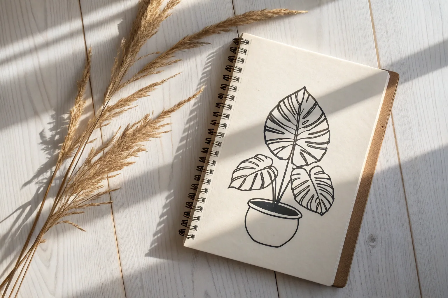
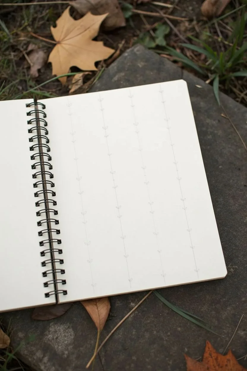
Capture the beauty of indoor greenery with these clean, minimalist botanical sketches. This project focuses on translating complex organic shapes into confident line work, creating a charming spread in your sketchbook.
Step-by-Step
Materials
- Sketchbook with smooth, heavy paper (around 160gsm)
- HB graphite pencil
- Kneaded eraser
- Fine liner pen (01 or 03 size, black ink)
- Ruler (optional, for pot symmetry)
Step 1: Preparation & Layout
-
Observe your subjects:
Before putting pencil to paper, take a moment to really look at your plants. Notice the main shapes: the heart-like form of the philodendron leaves, the sharp spikes of the succulent, or the rounded edges of the monstera. -
Lightly block in positions:
Using your HB pencil, very faintly sketch the rough placement for three distinct drawings on the right-hand page. Create a triangular composition: one high on the left, one low in the center, and one to the far right. -
Draft the pot shapes:
Focusing on the bottom two drawings, sketch simple geometric shapes for the planters. For the succulent (bottom center), draw a trapezoid that tapers downward. For the larger plant (right), draw a wider, shallow bowl shape.
Step 2: Sketching the Monstera Leaf
-
Outline the leaf shape:
Start with the top-left drawing. Sketch a large, broad heart shape that comes to a gentle point at the bottom. Keep your pencil grip loose to allow for natural curves. -
Add the central vein:
Draw a slightly curved line running from the top indentation down to the tip. This central spine will anchor your vein details. -
Detail the venation:
Sketch curved ribs extending from the center line out to the edges. These should be fairly symmetrical, mimicking the ribcage of the leaf. -
Ink the leaf contours:
Switch to your fine liner. Trace over your pencil outline, giving the edge a slightly wavy, organic feel rather than a perfect geometric line. -
Ink the veins:
Carefully ink the internal veins. You can make the central vein slightly thicker and the side veins thinner for variety.
Wobbly Lines?
Don’t stress if your lines aren’t perfectly straight or smooth. In botanical drawing, shaky lines often look more natural and organic, like the texture of a real leaf or stem.
Step 3: Drawing the Trailing Philodendron
-
Stem structure:
Moving to the right-side drawing, pencil in three or four long, slender stems rising from the pot. Let them arch gracefully in different directions. -
Attach the leaves:
At the end of each stem, draw a heart-shaped leaf. Angle them differently—some facing forward, some sideways—to create depth. -
Pattern the pot:
Add a cross-hatch or woven texture to the pot’s rim in pencil. This adds a lovely contrast to the smooth leaves. -
Final inking:
Go over your pencil lines with ink. When drawing the stems, try not to lift your pen to keep the lines fluid. Ink the pot texture with deliberate, small distinct strokes.
Add a Splash of Color
Once the ink is totally dry, use watercolor pencils or a light wash of green watercolor paint to fill the leaves, keeping the color loose and intentionally staying outside the lines.
Step 4: Creating the Spiky Succulent
-
Radiating lines:
For the bottom-center drawing, start by sketching faint guidelines radiating outward from the center of the pot, like a firework explosion. -
Define the leaves:
Turn those single lines into long, slender triangle shapes. Make the leaves in the front slightly shorter and wider, while the ones in the back are thinner. -
Decorate the planter:
Sketch a geometric diamond or crisscross pattern on the pot. This geometric element contrasts nicely with the organic spikes. -
Ink the succulent:
Trace the leaves with your pen. I find it helpful to start from the tip of the leaf and pull the pen back toward the plant’s base for a sharper point. -
Ink the pot pattern:
Carefully ink the diagonal grid lines on the pot. You don’t need a ruler here; a hand-drawn wobble adds character.
Step 5: Finishing Touches
-
Erase guidelines:
Wait at least 5-10 minutes for the ink to dry completely. Gently run your kneaded eraser over the entire page to remove all graphite marks. -
Add texture marks:
Look at the empty spaces on the leaves. Add a few very short, broken lines or dots near the veins to suggest curvature and shadow without full shading.
Now you have a permanent garden in your sketchbook that requires zero watering


Succulent Rosettes From Simple Shapes
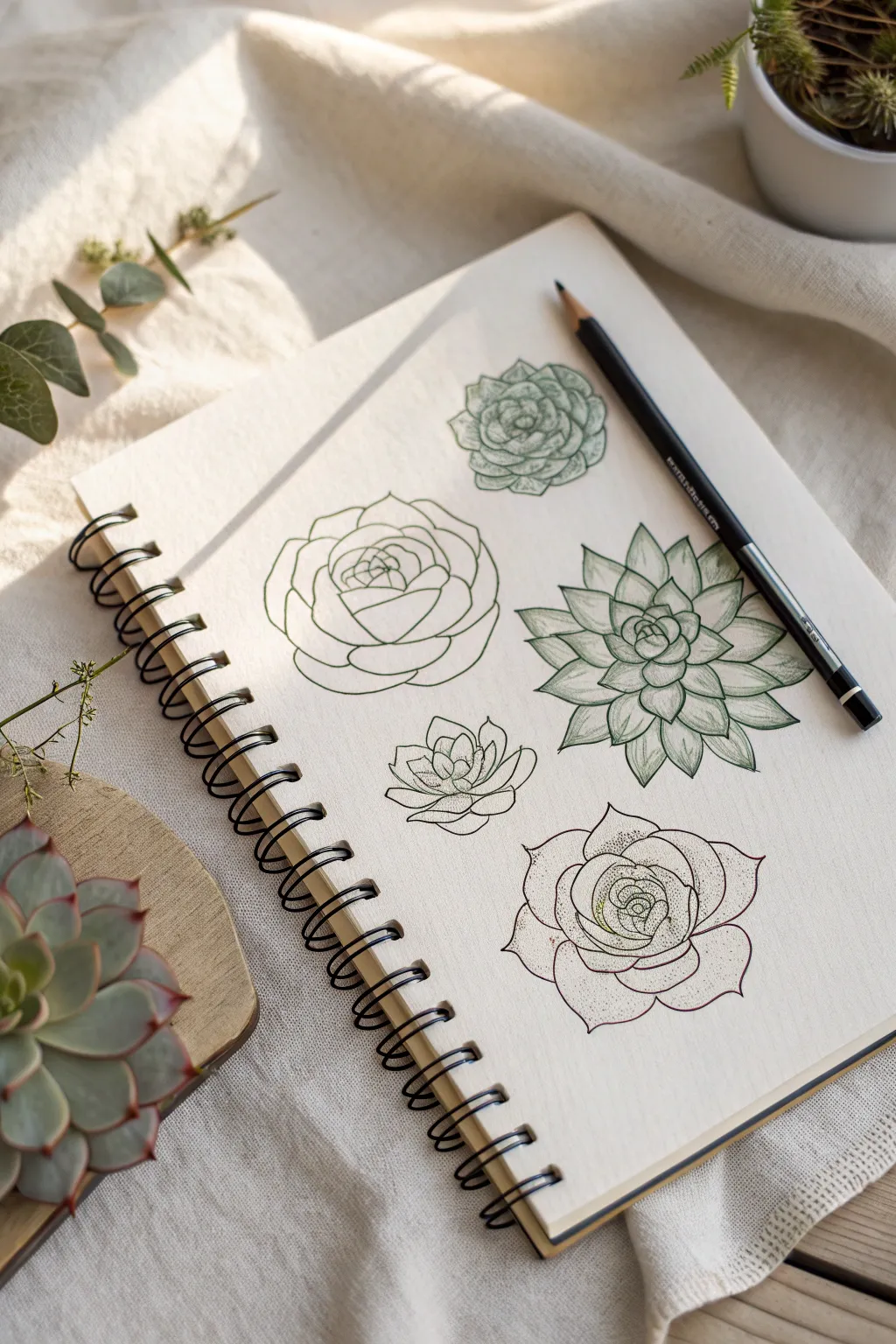
Master the art of botanical illustration by breaking complex succulents down into simple geometric forms. This study page explores five distinct rosette variations, moving from basic outlines to detailed, shaded specimens.
Detailed Instructions
Materials
- Spiral-bound sketchbook (heavyweight paper suitable for dry media)
- H or HB graphite pencil (for light initial sketching)
- 2B or 4B drawing pencil (or a fine liner pen for final lines)
- Kneaded eraser (to lift graphite gently)
- Reference photo of succulents or a live plant
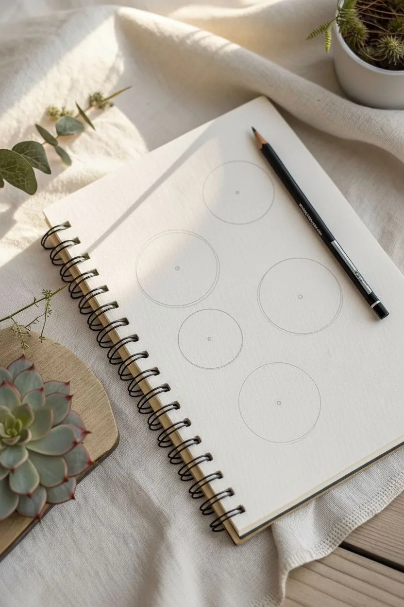
Step 1: Planning the Layout
-
Mark the positions:
Begin by lightly marking five distinct areas on your page where each succulent will sit. Visualize a rough grid or a scattered organic pattern to keep the composition balanced. -
Draw base circles:
Sketch a light, loose circle for each plant. This circle represents the outer boundary of the rosette and helps you keep the leaves contained within a specific size. -
Find the centers:
Place a small dot or a tiny circle in the middle of each base circle. This is your anchor point; all leaves will radiate outward from here.
Drawing From Life
Observe how leaves overlap. They rarely line up perfectly straight; usually, a new leaf grows in the gap between the two leaves below it.
Step 2: Drawing the Rosette Structures
-
Start the tightly closed center:
For the top-left wide-leaf succulent, draw the innermost leaves as a tight, overlapping bud. Think of them as small, curved cupped shapes hugging each other. -
Expand the classic rosette:
Moving to the large left-middle drawing, sketch broad, rose-petal-like leaves. Let each new layer of leaves emerge from behind the previous layer, alternating positions so the gaps are filled. -
Create the pointed Echeveria:
For the striking plant on the right, switch to triangular, pointed leaf shapes. Start small at the center and elongate the triangles as you move toward the outer edge, giving them sharp tips. -
Draw the loose, open variation:
For the bottom-center sketch, depict a smaller, flatter succulent. Keep the leaves slightly spaced apart to show an open structure, using gentle U-curves for the leaf tips. -
Sketch the final textured specimen:
Draft the bottom-right rosette with wider, flatter leaves that have a very slight point, similar to the first one but more opened up.
Step 3: Refining and Shading
-
Inking or darkening limits:
Use your darker pencil or a fine pen to go over the final contours. Keep your hand relaxed to create organic, slightly imperfect lines that mimic nature. -
Add detail to the top cluster:
Return to the top-small succulent. Use stippling (little dots) or very fine hatching on the shadowed parts of the leaves to give it a dense, compact look. -
Define the pointed leaves:
On the large pointed Echeveria, draw a distinct center line down the middle of each leaf. Shade one side of this line lightly to create a 3D ridge effect. -
Apply texture to the bottom right:
I particularly enjoy using stippling here. Dot the areas near the base of the leaves where shadows would naturally fall, fading the dots out toward the leaf tips. -
Review outlines:
Double-check your outlines on the simpler sketches (left-middle and bottom-center). Ensure the lines are clean and confident, erasing any stray sketch marks. -
Clean up the page:
Take your kneaded eraser and gently dab away the initial base circles and center dots, leaving only your finished botanical drawings floating on the paper.
Go Green
Use colored pencils instead of graphite. Try blending sage green with tips of burgundy or pink to mimic sun-stressed succulent edges.
Now you have a beautiful study page of succulents that captures their diverse geometric beauty.


Cactus Doodles With Ribs and Spines
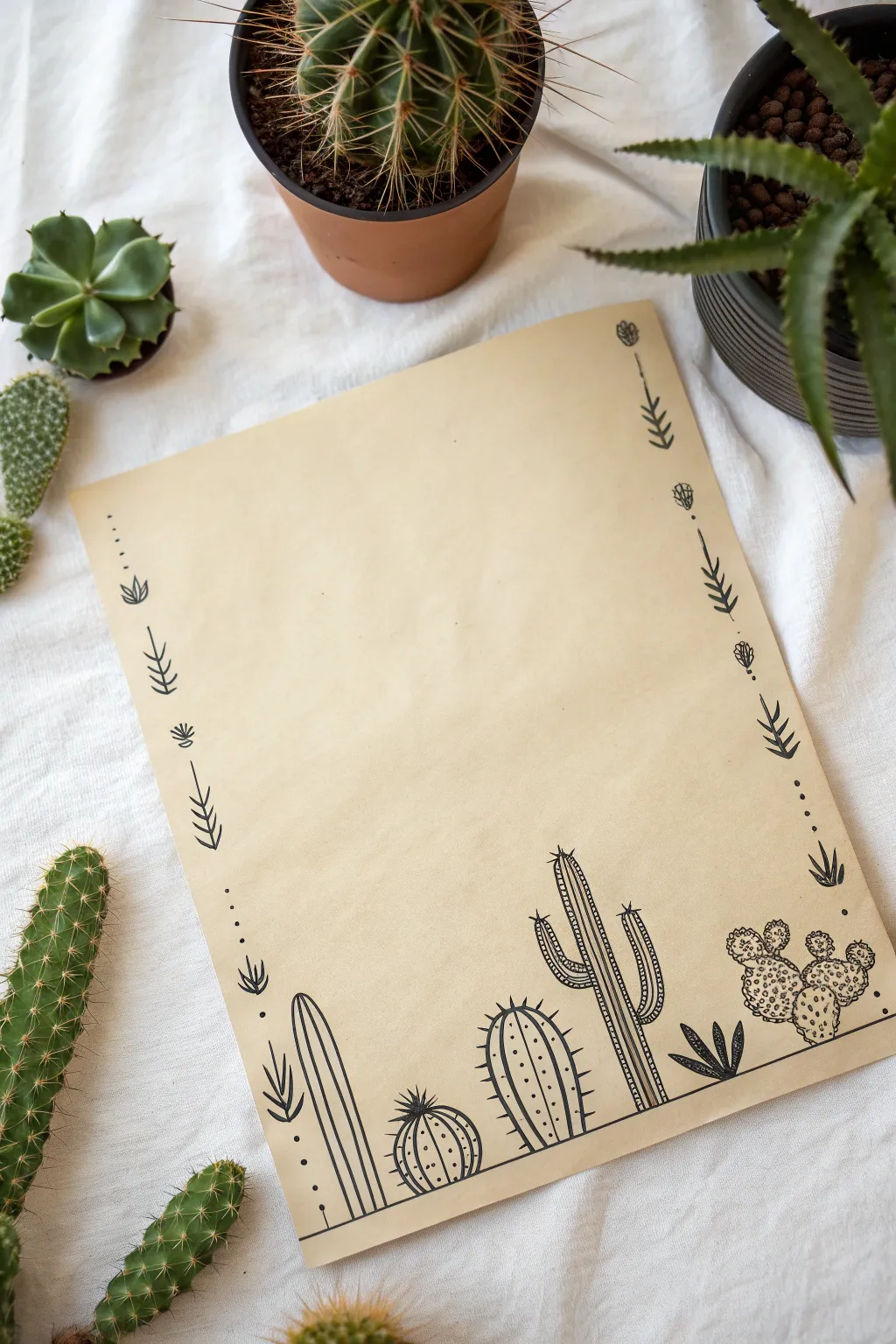
Transform a plain sheet of kraft paper into custom stationery with this charming cactus border design. By combining simple line work with classic succulent shapes, you’ll create a whimsical desert scene perfect for writing notes or framing as art.
Step-by-Step Guide
Materials
- Tan or kraft paper (A4 or letter size)
- Fine liner pen (black, 0.3mm)
- Medium liner pen (black, 0.5mm or 0.8mm)
- Pencil (HB or H)
- Eraser
- Ruler
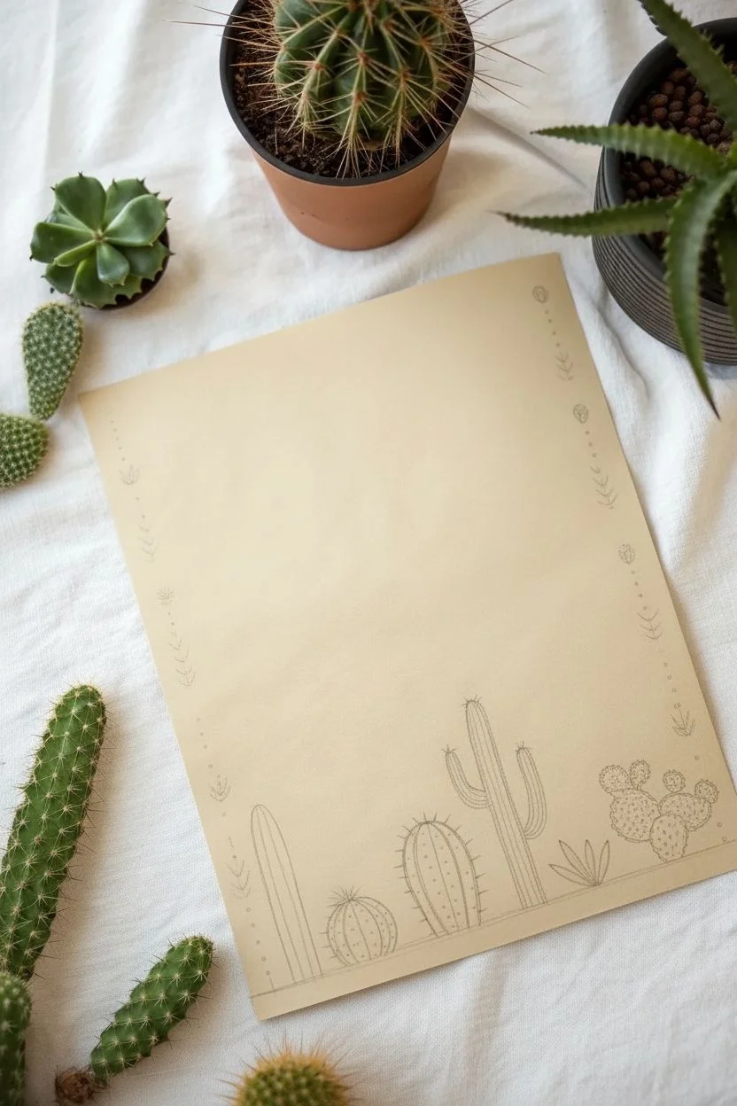
Step 1: Setting the Foundation
-
Establish the ground line:
Using your ruler and pencil, lightly draw a horizontal line about 1.5 inches from the bottom edge of the paper. This will serve as the baseline for your cactus family. -
Outline the main shapes:
Lightly sketch the basic outlines of five distinct cacti along your baseline. Start with a tall, thin column on the left and a large, multi-armed saguaro inspired shape towards the right to balance the composition. -
Fill in the family:
Sketch a round barrel cactus and a medium oval cactus between your taller shapes, and add a prickly pear cluster on the far right. Varying their heights creates visual interest. -
Sketch the side borders:
Lightly mark vertical paths up the left and right sides of the paper. Instead of a solid line, sketch small, evenly spaced dots or dashes to guide where your decorative arrows will go later.
Don’t Smudge!
Place a scrap piece of paper under your drawing hand. This protects the paper’s surface from hand oils and prevents you from smearing fresh ink as you move across the page.
Step 2: Inking the Cacti
-
Ink the anchor line:
Switch to your medium liner pen (like a 0.5mm) and carefully trace the horizontal ground line. Stop the line whenever it intersects with a cactus shape so the plants appear to sit on top of the ground. -
Define the tall column cactus:
Outline the tall, thin cactus on the far left. Draw a second inner line parallel to the outline to give it thickness, and add a small aloe-like plant at its base with sharp, triangular leaves. -
Detail the barrel cactus:
Draw the round cactus next. Create vertical curved stripes (ribs) running from the top center down to the base. Top it with a small, spiky flower shape. -
Create the oval cactus:
Outline the medium oval cactus. Draw vertical ribs like the previous one, but make the exterior outline slightly bumpy or scalloped to suggest a textured surface. -
Ink the saguaro:
Outline the large saguaro shape with its two arms. Draw vertical lines inside the main body and the arms to represent ribs. Leave small gaps between the lines to keep the look airy. -
Finish the prickly pear:
Draw the cluster of flat, paddle-shaped ovals on the right. Instead of ribs, fill these with tiny clusters of dots or small circles to represent their unique texture.
Add Pop of Color
Once the black ink is dry, use a white gel pen to add highlights on the sun-facing side of the cacti, or watercolor pencils to add subtle green tints.
Step 3: Adding Spines and Texture
-
Add spines to the ribs:
Switch to your fine liner (0.3mm) for delicate details. Along the vertical ribs of the barrel and oval cacti, draw tiny horizontal dashes or ‘v’ shapes to represent spines. -
Detail the tall cactus:
On the tall, thin cactus, draw small horizontal lines connecting the vertical ribs, creating a ladder-like effect. Add small dots between the rungs for texture. -
Texturize the saguaro:
Add horizontal hatching (short, closely spaced lines) along the shadowed sides of the saguaro arms and body to give it dimension. I find this really helps pop the shape off the page. -
Fill the gaps:
Draw a small succulent between the saguaro and the prickly pear using simple tear-drop shapes.
Step 4: Creating the Boho Border
-
Draw the arrow motifs:
Along the vertical paths you sketched earlier, use the fine liner to draw small, stylized arrow fletchings (feathers) pointing upwards. -
Add dividing elements:
Space out your arrows with small geometric symbols like circles, diamonds, or tiny flower buds. Alternating these creates a rhythmic, bohemian pattern. -
Connect with dots:
Use the fine liner to place three to four tiny dots between each design element along the border perfectly connecting the bottom scene to the top corners. -
Clean up:
Wait at least 15 minutes for the ink to fully cure, then gently erase all pencil guidelines to reveal your crisp black-on-tan artwork.
You now have a beautiful piece of hand-drawn stationery ready for your next letter or journal entry


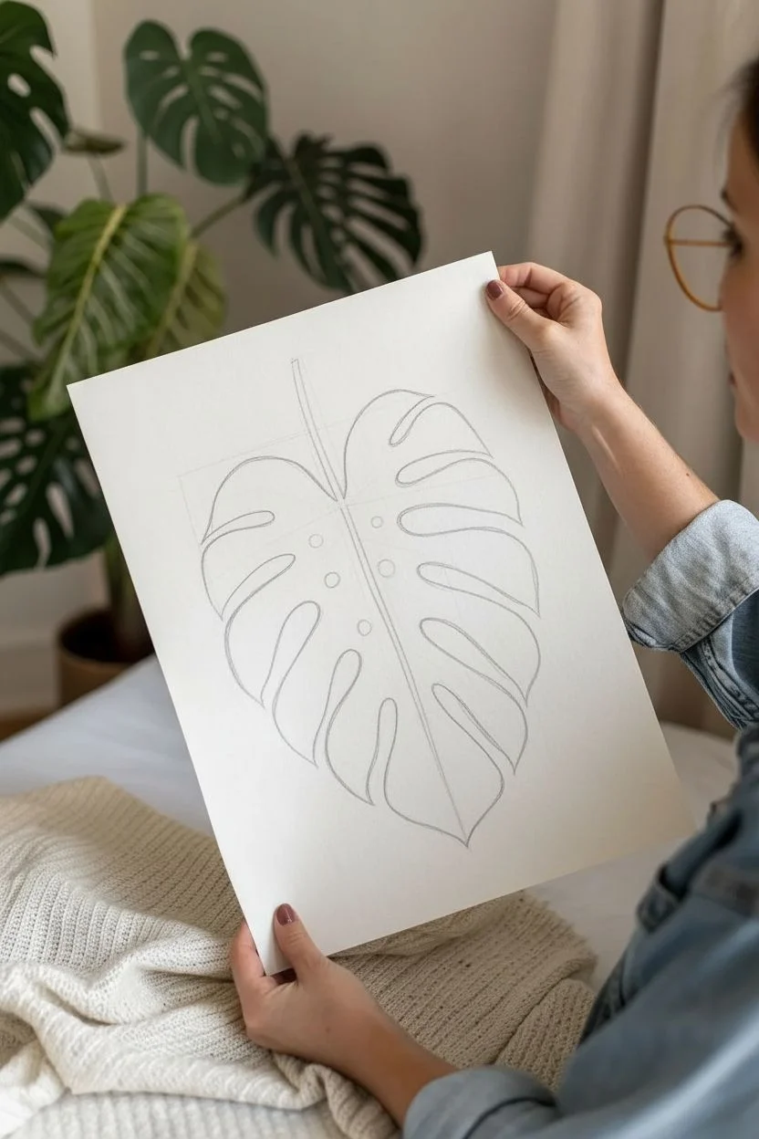
Monstera Leaf Cutouts and Negative Space
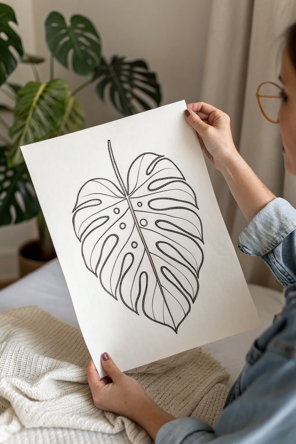
This project transforms a classic Monstera leaf into a striking piece of line art by combining bold contours with delicate stippling textures. The effect mimics a pseudo-3D look through careful ink work, creating a modern botanical print perfect for framing.
Step-by-Step
Materials
- High-quality heavyweight drawing paper (Cold press or Bristol board)
- Pencil (HB or H for sketching)
- Eraser (kneaded preferred)
- Fine liner pens (0.1mm, 0.3mm, 0.5mm, and 0.8mm)
- Ruler (optional, for centering)
- Reference image of a Monstera leaf
Step 1: Sketching the Framework
-
Establish the center line:
Start by lightly sketching a curved line down the center of your paper. This will serve as the main midrib of the leaf and help you maintain symmetry without making it look rigid. -
Outline the leaf shape:
Draw a large heart-shaped perimeter around your center line. Keep it loose; this is just a guide for where the leaf tips will eventually end. -
Carve out the fenestrations:
Sketch the deep splits (fenestrations) characteristic of a Monstera. Draw inward curves from the outer edge toward the center rib, leaving thick sections for the leaf blades. -
Add the inner holes:
Place a few circular or oval holes near the center rib within the leaf blades. These iconic ‘Swiss cheese’ holes add character to the composition. -
Refine the sketch:
Go over your pencil lines to define the exact shape you want, ensuring the leaf segments feel organic and flowing rather than perfectly geometric.
Stippling Rhythm
Keep your pen vertical while stippling. Slanted strokes create tiny dashes instead of clean dots, which ruins the texture effect. Patience is key.
Step 2: Inking the Contours
-
Ink the main veins:
Using a 0.5mm pen, trace the central midrib. Draw it as a double line that tapers slightly toward the top to give it physical width. -
Outline the leaf segments:
Switch to a 0.8mm pen for the outer perimeter of the leaf. A bolder line here helps separate the subject from the white background. -
Draw inner contour lines:
Inside each leaf segment, draw a secondary line that follows the shape of the outer edge, roughly 3-5mm inward. Use a 0.3mm pen for this to differentiate it from the main outline. -
Add vein details:
Draw a central vein line down the middle of each individual leaf segment, connecting from the main midrib toward the tip. -
Erase pencil marks:
Once the ink is completely dry—I usually wait at least 5 minutes to be safe—gently erase all underlying pencil sketches.
Go Gold
After the black ink dries, trace the inner vein lines with a metallic gold gel pen or paint marker for a luxurious, modern accent.
Step 3: Texturing and Stippling
-
Start the stippling process:
This is the meditative part. Using a 0.1mm or 0.3mm pen, begin placing dots along the inner side of your boldest outlines. -
Build density gradients:
Cluster the dots tightly right next to the line art to create a dark shadow effect. As you move away from the line toward the center of the segment, space the dots further apart. -
Highlight the midrib:
Add stippling along one side of the central midrib stem. This asymmetrical shading suggests a light source and gives the stem roundness. -
Detail the holes:
Don’t forget the inner circle cutouts. Add a rim of dots around their perimeter, or double-outline them with a lighter pen for emphasis. -
Review contrast:
Step back and look at the drawing. If certain areas look flat, go back in with your stippling pen and increase the dot density in the deepest corners and curves. -
Final line weight check:
If the outer silhouette feels overpowered by the texture, re-trace the very outer edge with your thickest 0.8mm pen to pop the shape one last time.
Now you have a sophisticated botanical illustration that celebrates negative space and intricate detail
BRUSH GUIDE
The Right Brush for Every Stroke
From clean lines to bold texture — master brush choice, stroke control, and essential techniques.
Explore the Full Guide
Fern Fronds for Repeating Patterns
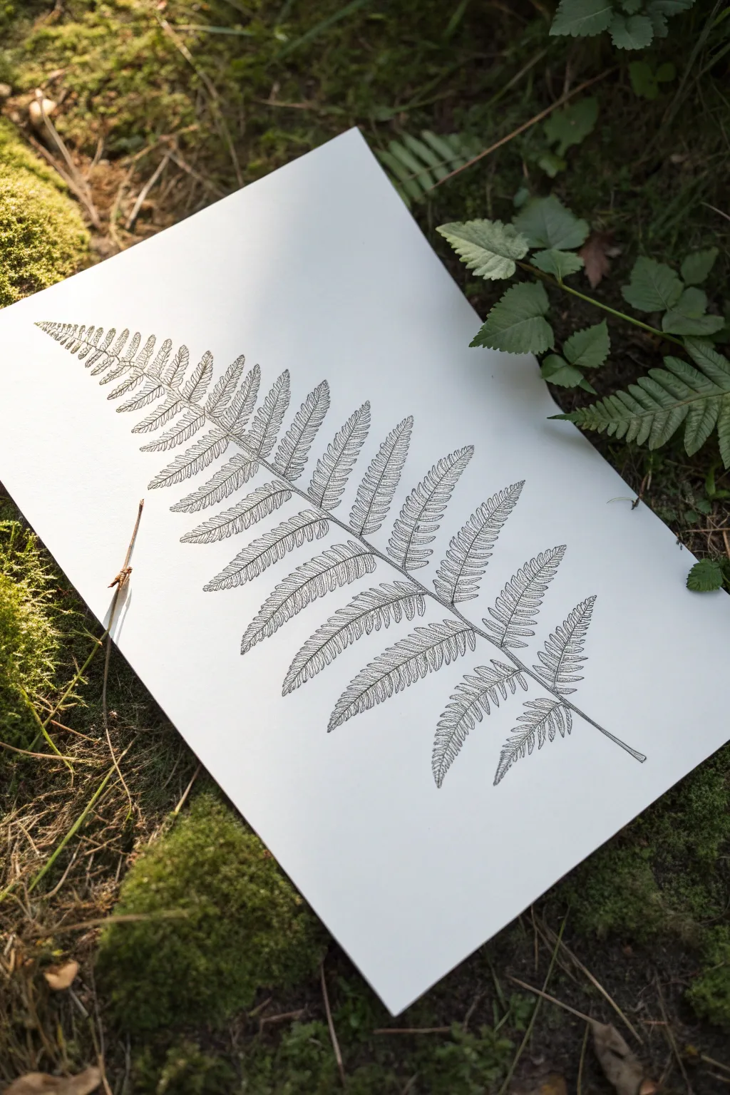
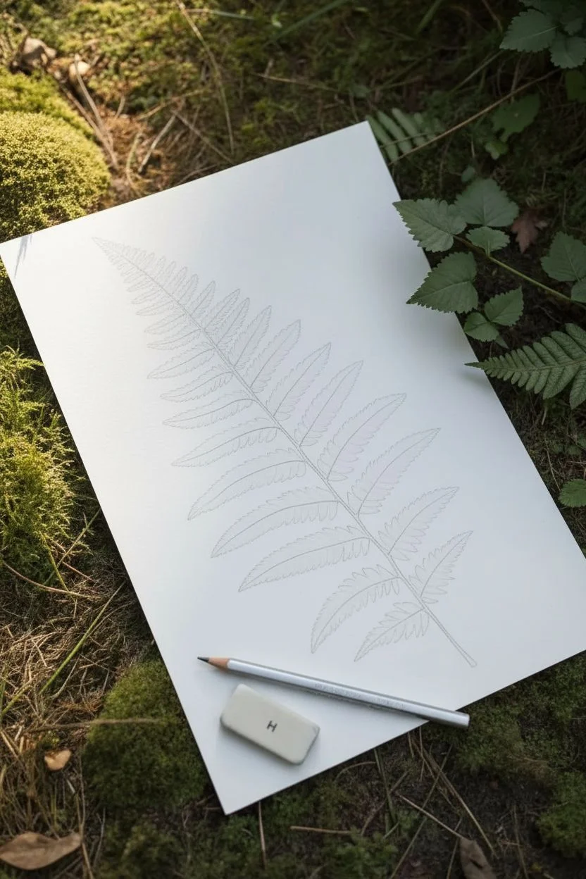
Capture the intricate beauty of the forest floor with this stylized pen and ink fern study. This project focuses on rhythm and repetition, using simple hatching techniques to turn a basic botanical outline into a sophisticated piece of art.
How-To Guide
Materials
- Hot press watercolor paper or smooth Bristol board (A4 size)
- Fine liner pens (sizes 0.05, 0.1, and 0.3)
- H pencil (hard graphite for light lines)
- High-polymer eraser
- Ruler (optional, for guiding the central stem)
Step 1: Sketching the Structure
-
Lay the foundation:
Begin by lightly drawing a diagonal, slightly curved line across your paper using your H pencil perfectly. This will be the rachis, or the main central stem of the fern. -
Mark the pinnae spacing:
Along the central stem, mark small tick marks where the leafy branches (pinnae) will emerge. Start closer together near the tip and gradually widen the spacing as you move down towards the base. -
Draft the leaf curves:
Sketch the midribs for each leaflet. These should curve gently upwards and outwards from the main stem, getting progressively longer towards the middle of the frond and slightly shorter again at the very bottom. -
Outline the leaf shapes:
Lightly pencil in the outer shape of the leaflets. Instead of drawing every tiny serrated edge right now, just draw smooth, long almond shapes to establish the overall width and flow of the frond.
Step 2: Inking outlines
-
Define the main stem:
Switch to a 0.1 fine liner. Carefully trace the central stem, thickening it slightly near the bottom by drawing a double line that tapers into a single line near the tip. -
Draw the leaflet edges:
Using the 0.05 pen for a delicate touch, outline the individual leaflets. Give them a slightly serrated or wavy edge rather than a perfectly smooth line to mimic organic plant matter. -
Add the central veins:
Draw the central vein down the middle of each leaflet. Try not to make this line perfectly straight; a little wobble adds life. -
Erase pencil guides:
Once the foundational ink is completely dry—give it at least five minutes to be safe—gently erase all your pencil marks with the high-polymer eraser.
Pro Tip: Hand Guard
Place a scrap piece of paper under your drawing hand while you work. This prevents the oils from your skin from transferring to the paper and stops you from smudging wet ink.
Step 3: Building Texture
-
Plan the hatching direction:
Observe how the texture in the reference image follows the curve of the leaves. Your hatch lines should run diagonally from the center vein outward toward the leaf edge. -
Start hatching the tips:
Begin at the top tip of the fern. Using the 0.05 pen, draw very fine, closely spaced diagonal lines filling one side of a leaflet. -
Vary line density:
To create volume, pack your lines tighter together near the center vein to create a shadow, and space them slightly further apart as you reach the outer edge. -
Repeat the process:
Work your way down the frond, filling each leaflet section by section. This creates a rhythm; I find this repetitive motion quite meditative once you get into the flow. -
Add deeper contrast:
Go back over the areas where the leaflets attach to the main stem with a 0.1 pen, adding a few extra tick marks or dots to deepen the shadows there. -
Enhance the stem:
Use the 0.05 pen to add tiny stippling dots or short vertical dashes along one side of the main stem to give it roundness and dimension. -
Refine the edges:
Inspect the outer edges of your leaves. If any look too flat, add a few broken lines or dots just inside the perimeter to soften the transition from ink to white paper. -
Final assessment:
Prop your drawing up and look at it from a distance. If the fern feels too light in areas, add a second layer of cross-hatching to the darkest zones for more punch.
Level Up: Gold Leaf
Once the black ink is fully dry, apply a tiny amount of size and gold leaf to just the main central stem. The metallic shine creates a stunning contrast against the black ink.
Take a moment to admire the satisfying rhythm of lines you have created on the page
Trailing Vines With Heart-Shaped Leaves
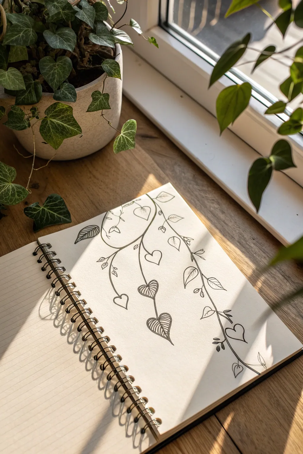
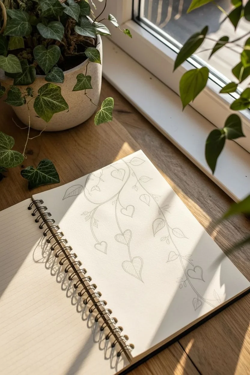
Capture the delicate beauty of houseplants with this simple yet elegant line drawing. This project features trailing vines created with confident black ink strokes, combining classic leaf shapes with playful heart motifs for a romantic, botanical feel.
Step-by-Step Tutorial
Materials
- Spiral-bound sketchbook (lined or blank paper)
- Black fine liner pen (0.3mm or 0.5mm)
- Pencil (HB or 2B) for sketching
- Soft eraser
- Ruler (optional)
Step 1: Planning and Foundation
-
Observe the Composition:
Before putting pen to paper, notice how the vines drape. The main vine starts near the top center and sweeps down towards the right, while a secondary vine branches off to the left. Using a pencil, lightly sketch these two main sweeping curves to establish the flow. -
Mark Leaf Placements:
Along your pencil guide lines, make small tick marks where you want your leaves to sit. Spacing them irregularly mimics nature’s randomness, so avoid placing them at perfect intervals. -
Draft the Heart Shapes:
Still using your pencil, lightly draw heart shapes at your tick marks. Vary the sizes—some tiny new growth near the tips, and larger, fuller hearts near the top. Orient them in different directions to show movement.
Uneven Lines?
Don’t worry if your stems aren’t perfectly straight. Nature is imperfect! Retrace wobbly lines once more to make the “mistake” look like intentional texture.
Step 2: Inking the Vines
-
Draw the Main Stem:
Switch to your black fine liner. Trace over your main pencil curve with a confident, continuous stroke. It doesn’t need to be perfectly smooth; a little wobble adds organic character. -
Add Secondary Branches:
Draw the smaller stem that branches off to the left side. Notice how the connections are slightly curved, not sharp angles, making the plant look flexible. -
Thicken Key Areas:
Go back over certain parts of the stem, particularly where branches split, adding a tiny bit of line weight to suggest shadow and thickness.
Add Depth
Use a slightly thicker pen (0.8mm) or double up your lines on the bottom edge of the leaves to create a subtle shadow effect giving the drawing more weight.
Step 3: Detailing the Leaves
-
Outline the Simple Hearts:
Ink the outline of the standard heart-shaped leaves. Keep your grip loose so the lines feel flowy rather than stiff. -
Create the Veined Leaves:
Select two or three prominent leaves to be ‘feature leaves’ (like the centralized ones in the reference). Draw the outer heart shape first, then draw a central line down the middle. -
Add Vein Texture:
On these feature leaves, draw closely spaced diagonal lines branching from the center vein to the outer edge. This striping technique mimics the texture of variegated ivy. -
Draw the ‘Folded’ Leaf:
Near the top left, create a leaf that looks slightly folded. Draw a slender oval shape, then add a diagonal line across part of it to represent the underside of the leaf turning over. -
Add Tiny Bud Clusters:
Along the main stem, draw small clusters of 2-3 tiny teardrop shapes. These represent new growth or small buds and fill in the negative space beautifully.
Step 4: Finishing Touches
-
Connect Leaves to Stems:
Draw short, thin petioles (leaf stems) connecting each heart shape back to the main vine. These should be delicate lines. -
Refine the Tips:
At the very end of your vines, draw a tiny, curling tendril or a very small leaf to show where the plant is still growing. -
Erase Pencil Guidelines:
Wait at least 5-10 minutes to ensure the ink is totally dry. I prefer to wait a bit longer just to be safe. Then, gently erase all your initial pencil sketches. -
Check Contrast:
Look at the overall drawing. If any leaf overlaps a stem, you might want to slightly thicken the line of the leaf to bring it to the foreground.
Now you have a charming botanical illustration that perfectly decorates your journal page

PENCIL GUIDE
Understanding Pencil Grades from H to B
From first sketch to finished drawing — learn pencil grades, line control, and shading techniques.
Explore the Full Guide
A Grid of 12 Plant Types as a Mini Collection
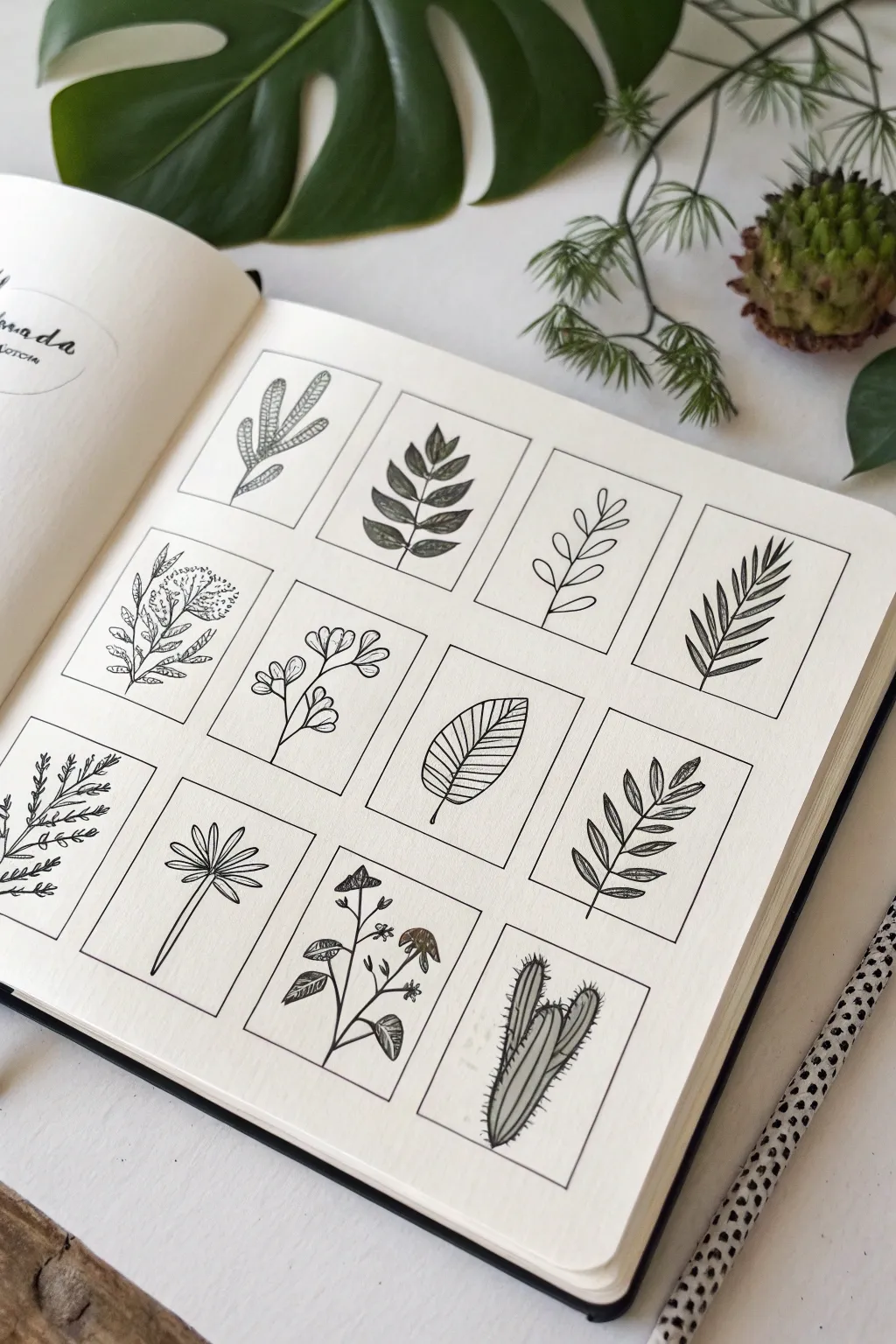
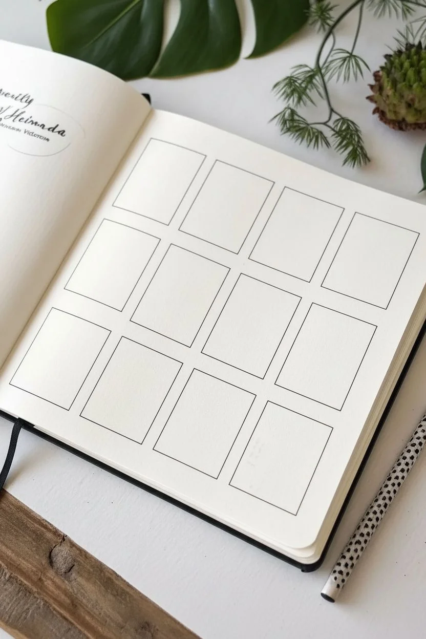
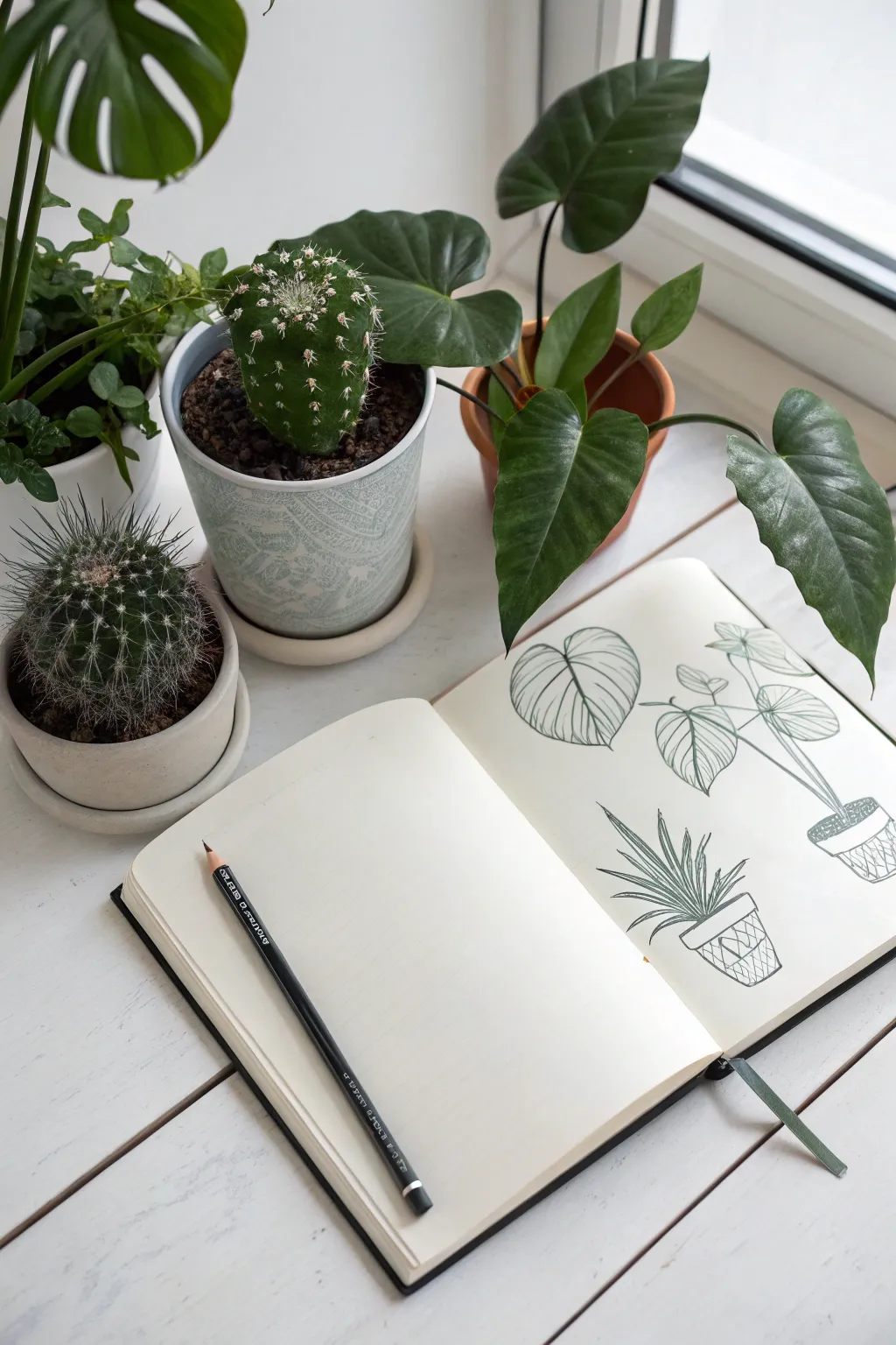
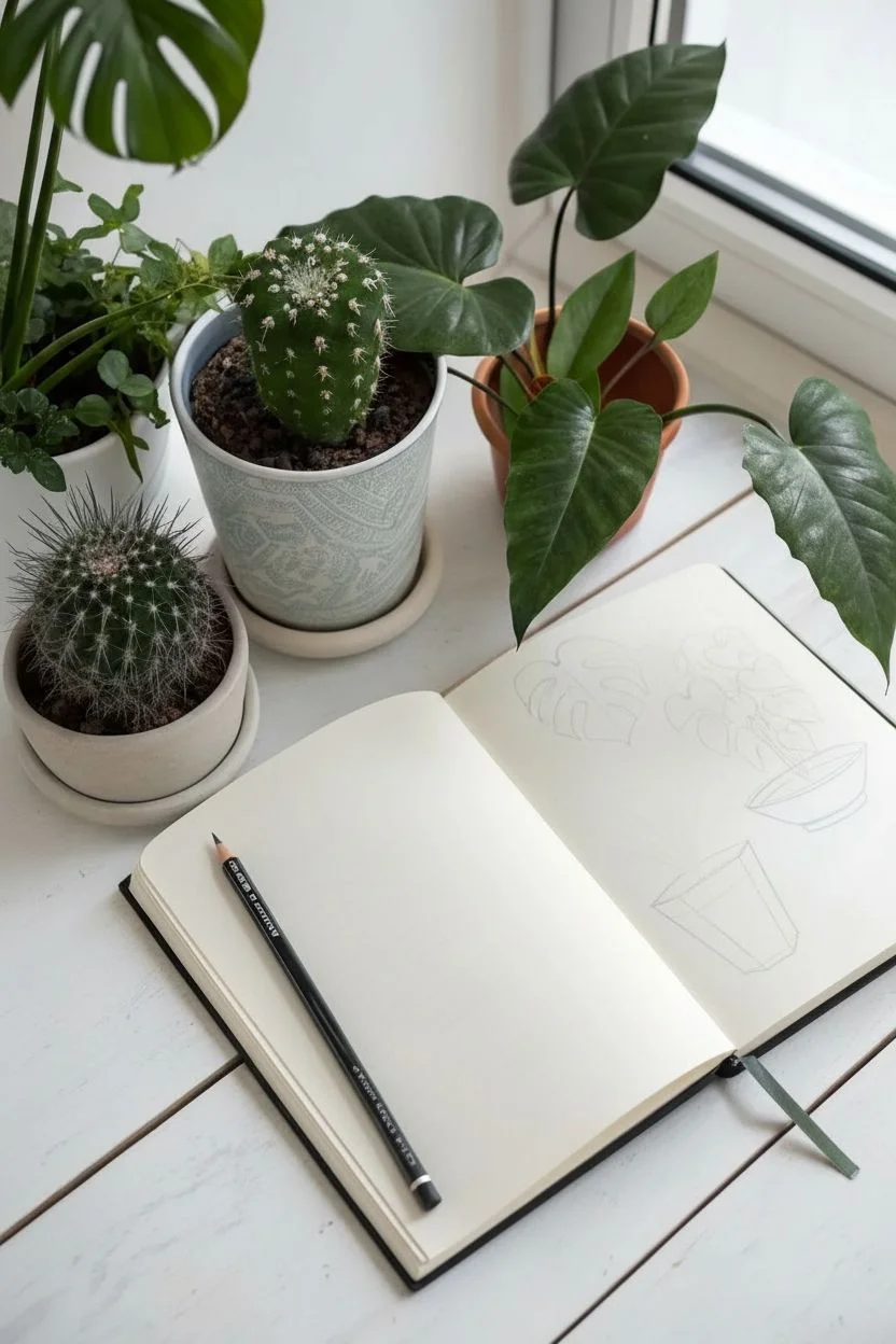
This project creates a satisfying and organized collection of miniature plant portraits, perfect for practicing different leaf shapes and textures. By confining each doodle to a neat rectangular frame, you transform simple sketches into a cohesive gallery page that looks beautiful in any sketchbook.
Detailed Instructions
Materials
- Sketchbook or heavy drawing paper (smooth texture preferred)
- Pencil (HB or mechanical)
- Ruler
- Fine liner pen (0.3mm or 0.5mm)
- Eraser
Step 1: Setting the Grid
-
Map out the layout:
Begin by lightly planning a 3×4 grid structure on your page using a pencil. You want three columns and four rows. Allow for a generous margin around the outer edge so the artwork feels centered. -
Draw the frame boxes:
Use your ruler to draw 12 identical vertical rectangles. Space them evenly apart—about 1–2 cm between each box looks tidy. The rectangles should be roughly 1.5 inches wide by 2 inches high, though you can adjust this to fit your page size. -
Ink the borders:
Once you are happy with the spacing, go over your pencil rectangles with the fine liner pen to create crisp, permanent borders. Let the ink dry completely before erasing any stray pencil guidelines.
Uneven Lines?
If your box borders look shaky, don’t worry. Go over them a second time to thicken the line weight. A bolder frame hides wobbles and makes the delicate plants inside pop more.
Step 2: Row One: Upward Growth
-
Sketch the first succulent:
In the top-left box, draw a central stem that splits into three segmented branches. Fill these oval segments with tiny stippled dots to suggest a cactus-like texture. -
Draw the striped fern:
For the second box, center a single stem and add pairs of pointed, oval leaves. Add diagonal stripes inside each leaf to create contrast and pattern. -
Create the simple vine:
In the third box, draw a loose, slightly wavy line. Add teardrop-shaped leaves on alternating sides of the stem, keeping the shapes open and airy. -
Draw the palm frond:
For the final box in the first row, draw a long, curved spine. Add many thin, needle-like leaves extending diagonally from both sides to mimic a palm branch.
Step 3: Row Two: Flowering and Broad Leaves
-
Sketch the wildflower:
Start the second row with a busier plant. Draw a central stem, then add small branches. On some tips, draw clusters of tiny dots for flowers; on others, draw simple narrow leaves with a central vein. -
Draw the rounded sprig:
In the next box, create a gentler plant with rounded, cloud-like leaf clusters. Give each leaf a middle vein and keep the lines soft and curvy. -
Detail the single broad leaf:
Dedicate the third box to one large leaf. Draw a broad oval shape with a pointed tip. Fill it with parallel diagonal veins close together for a graphic look. -
Create the symmetrical fern:
In the last box of this row, draw a straight vertical stem. Add symmetrical, almond-shaped leaves going up the stem, drawing a single line down the center of each leaf.
Add a Splash
Once the black ink is fully waterproof-dry, use watercolor or markers to add a single shade of green to just the leaves, or paint outside the frames for a negative-space effect.
Step 4: Row Three: Unique Textures
-
Draw the sprig:
Start the bottom row with a delicate branch. Use short, quick strokes to create feathery leaves that branch off the main stem. -
Create the fan palm:
In the second box, draw a long, thin stalk ending in a central point. From that point, radiate five to seven long, paddle-shaped leaves outward like a fan. -
Sketch the berry branch:
For the third box, draw a winding stem. Add standard leaves near the bottom and small clusters of three circles (berries) or triangular blooms near the top. -
Finish with the cactus:
In the final box (bottom right), draw a tall, thick cactus shape with two smaller arms. Draw vertical lines inside the shapes for ribs, and add tiny perpendicular dashes along the edges for spines.
Step 5: Final Touches
-
Refine and ink:
If you sketched the plants in pencil first, trace over them now with your fine liner. I like to rotate the sketchbook slightly to get better angles for the curves. -
Clean up:
Wait at least five minutes to ensure the ink is totally set, then gently erase all remaining pencil marks to reveal your clean black-and-white grid.
Now you have a charming botanical reference page that showcases variety and minimalist beauty
Plant Shelf Sketch: A Cozy Little Still Life
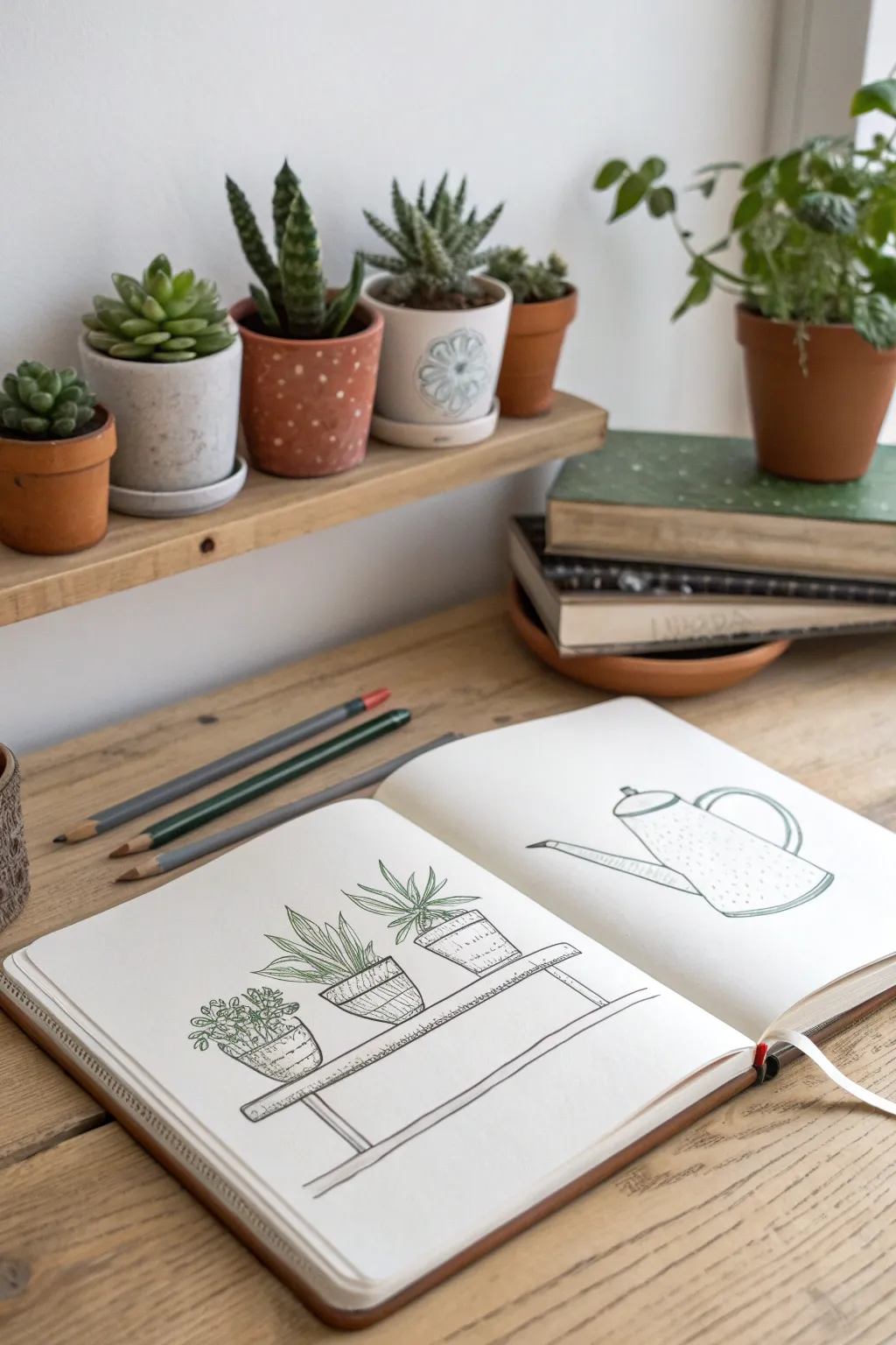
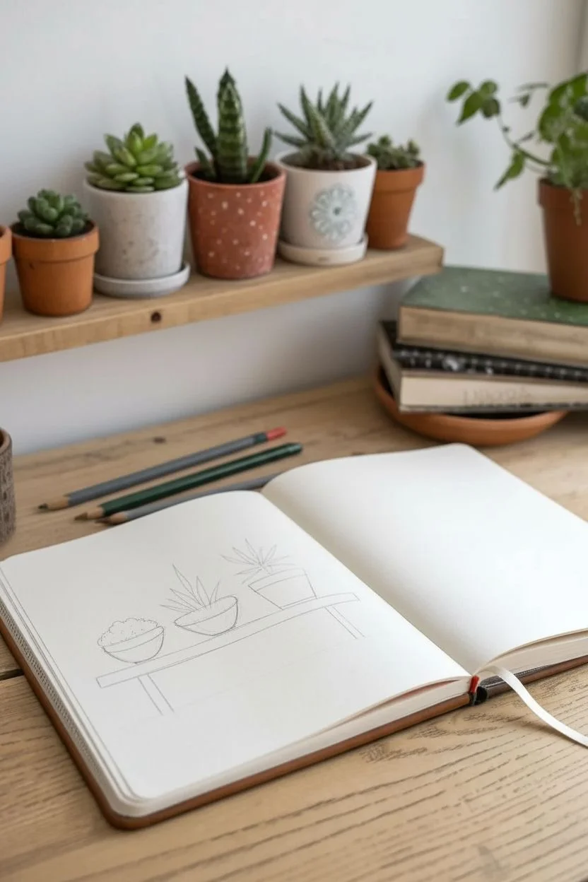
This charming sketchbook spread captures the cozy vibe of a plant lover’s shelf with simple, clean lines. It combines a trio of potted succulents on the left with a classic watering can on the right, perfect for practicing botanical forms and object study.
Step-by-Step Tutorial
Materials
- Sketchbook (heavyweight paper preferred)
- Graphite pencil (HB or 2B)
- Fine liner pens (black or dark grey, 0.3mm and 0.5mm)
- Colored pencils (sage green, forest green, grey)
- Eraser
- Ruler (optional)
Step 1: Setting the Scene: Left Page Construction
-
Draft the shelf structure:
Begin on the left page. Use your pencil to lightly draw a long, horizontal rectangle near the bottom third of the page to represent the shelf itself. Add two vertical lines extending downwards from the ends to suggest simple legs or brackets. -
Position the pots:
Lightly sketch three shapes sitting on top of your shelf line. Draw a small bowl shape on the far left, a slightly larger, angled bowl shape in the middle, and a more structured cylinder or bucket shape on the right. -
Refine the pot shapes:
Going back over your rough shapes, define the rims. Draw flattened ovals at the top of each pot to create the opening where the plants will sit. -
Block in the foliage:
Sketch the general direction of the plants. For the left pot, draw a low, rounded mound. For the middle and right pots, draw faint lines extending upward and outward like fireworks to guide where the spiky leaves will go.
Wobbly Lines?
Don’t stress about perfect straight lines for the shelf. A little waviness actually makes the drawing feel more organic and hand-drawn compared to using a ruler.
Step 2: Inking the Plant Shelf
-
Detail the succulent leaves:
Using your fine liner, start defining the plants. On the left, draw small, clustered rosettes with rounded petals. For the middle, draw long, pointed sword-shaped leaves. On the right, draw similar spiky leaves but shorter and more upright, resembling an aloe or zebra plant. -
Ink the shelf and pots:
Trace over your shelf and pot outlines with a steady hand. Add a second parallel line to the top of the shelf to give it thickness. -
Add texture to the pots:
Give the pots some character. Draw horizontal bands or weave-like diagonal cross-hatching to the middle pot. Add vertical lines to the rim of the right pot to suggest a classic terracotta design. -
Color the foliage:
Take your green colored pencils and gently fill in the leaves. I prefer using a sage green for the spiky plants and a slightly deeper green for the small rosette, keeping the coloring soft and somewhat sketchy rather than solid. -
Add pot shading:
Use a grey or light brown pencil to add very faint shading to one side of the pots and the underside of the shelf to ground the drawing.
Step 3: Drawing the Watering Can: Right Page
-
Basic shapes for the can:
Move to the right page. Lightly sketch a large cylinder that is slightly wider at the bottom for the body of the watering can. Tilt the perspective so you can see the top surface. -
Add the spout and handle:
Draw a long, thin tube extending from the lower left of the body, angling upwards. Then, sketch a large, curved ‘C’ shape attached to the top and back for the handle. -
Refine the outline:
Go over your sketch with the fine liner. Smooth out the connection points where the spout meets the body and define the rim of the opening at the top. -
Add structural details:
Draw a small circle on the top surface for the lid handle. Make sure the main handle has double lines to show thickness, just like the spout. -
Texture the surface:
Instead of coloring the can solid, use stippling. Take your pen and add tiny dots, concentrating them more densely on the shadowed side (usually the bottom right) and leaving the highlighted areas empty. -
Final clean up:
Once the ink is completely dry, take your eraser and gently remove all the underlying pencil graphite from both pages to leave a crisp, clean illustration.
Make It Yours
Try changing the patterns on the pots! Polka dots, zig-zags, or vertical stripes can completely change the look of your ceramic collection.
Enjoy your lovely new botanical spread that brings a bit of garden life onto the paper


Leaf Foreshortening for Depth and Realism
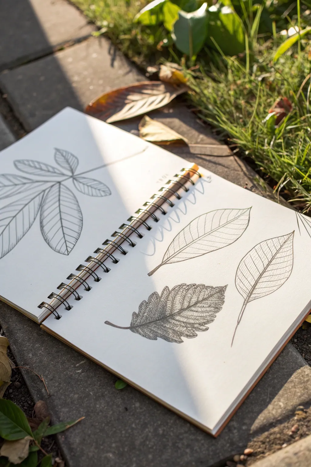
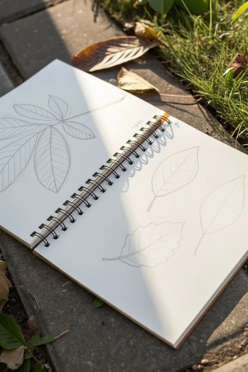
Capture the delicate structure of nature with these graphite leaf studies, focusing on varied vein patterns and textures. This project balances clean, linear illustrations with tonal shading to create depth and realism.
Step-by-Step
Materials
- Spiral-bound sketchbook (medium weight paper)
- Graphite pencils (HB, 2B, 4B)
- Fine liner pen (black, 0.1mm or 0.3mm)
- Kneaded eraser
- Real leaves for reference (chestnut, beech, or similar)
- Pencil sharpener
Step 1: Planning the Layout
-
Prepare your workspace:
Situate your sketchbook on a flat surface. Using a spiral-bound book allows you to work across a spread easily, but you can focus on one page at a time. Gather a few different leaf specimens to observe their distinct shapes. -
Gesture draw the palmate leaf:
On the left page, start with a light HB pencil to sketch the central stem of a compound leaf, like a horse chestnut. Draw five or six lines radiating from a central point to indicate the veins for each leaflet. -
Outline the leaflets:
Lightly sketch the teardrop or lance-shaped outlines of each leaflet around the vein guides. Don’t press too hard; these are just placement lines to ensure the composition feels balanced. -
Map the right page:
On the right page, plan for three separate leaves. Position two facing upward and one facing downward to create visual rhythm. Sketch loose ovals or teardrops to mark their positions.
Uneven Shading?
If graphite looks patchy, use a blending stump or tissue to smooth it out, then re-establish sharp veins with a hard pencil.
Step 2: Defining Structure and Veins
-
Refine the left page leaf:
Switching to a slightly sharper pencil or a fine liner if you prefer ink, trace over your clearer contour lines. For the large palmate leaf, ensure the tips come to a point and the stems join cleanly at the base. -
Add secondary veins:
For the palmate leaf, draw parallel secondary veins branching off the main midribs. Keep these lines consistently spaced. I find it helpful to start from the base and work toward the tip. -
Detail the simple leaves:
On the right page, take the top two simple leaves and draw clarity into their midribs. Draw secondary veins that curve gently toward the leaf edges, mimicking the ‘parallel’ venation style often seen in beech or hornbeam leaves. -
Create structure with lines:
Instead of shading fully, use fine, repeated hatching lines between the veins. This technique emphasizes the varying direction of the leaf surface without needing heavy graphite rubbing.
Step 3: Adding Texture and Depth
-
Sketch the serrated leaf:
For the bottom-middle leaf on the right page, focus on a serrated edge. Sketch jagged, saw-tooth edges around the perimeter. This contrasts nicely with the smooth edges of the other leaves. -
Shade the serrated leaf:
This specific leaf gets more tonal attention. Use the side of a 2B pencil to gently shade the body of the leaf. Press harder near the midrib and lighten your pressure as you move outward to create a curved, convex look. -
Darken the veins:
Go back over the veins of the shaded leaf with a 4B pencil. The dark veins against the mid-tone shading will make the texture pop. -
Create foreshortening:
Look closely at the leaf on the far right. To make it look like it’s turning away or curving, draw the veins closer together on one side of the midrib than the other. This compression tricks the eye into seeing a 3D form. -
Clean up stray marks:
Take your kneaded eraser and dab away the initial gesture lines that are still visible underneath your final drawing. Lighten any heavy smudges on the white space.
Try Colored Pencils
After the graphite base, lightly glaze over the leaves with earthy greens or autumnal browns to bring the sketch to life.
Step 4: Final Touches
-
Check line weights:
Review your drawings. Thicken the outline on the shadowed side of the leaves (usually the bottom edge) to give them weight on the page. -
Add stem details:
Ensure all stems have a tiny bit of thickness—they shouldn’t just be single lines. Shade one side of each stem slightly. -
Add a squiggle check:
You can add a small test squiggle or swatch of your pencil grades in the center gutter of the sketchbook, adding to that authentic ‘work in progress’ aesthetic shown in the reference.
Close your sketchbook knowing you’ve preserved a small piece of the natural world in graphite
Curling Leaves and Rolled Tips अभ्यास
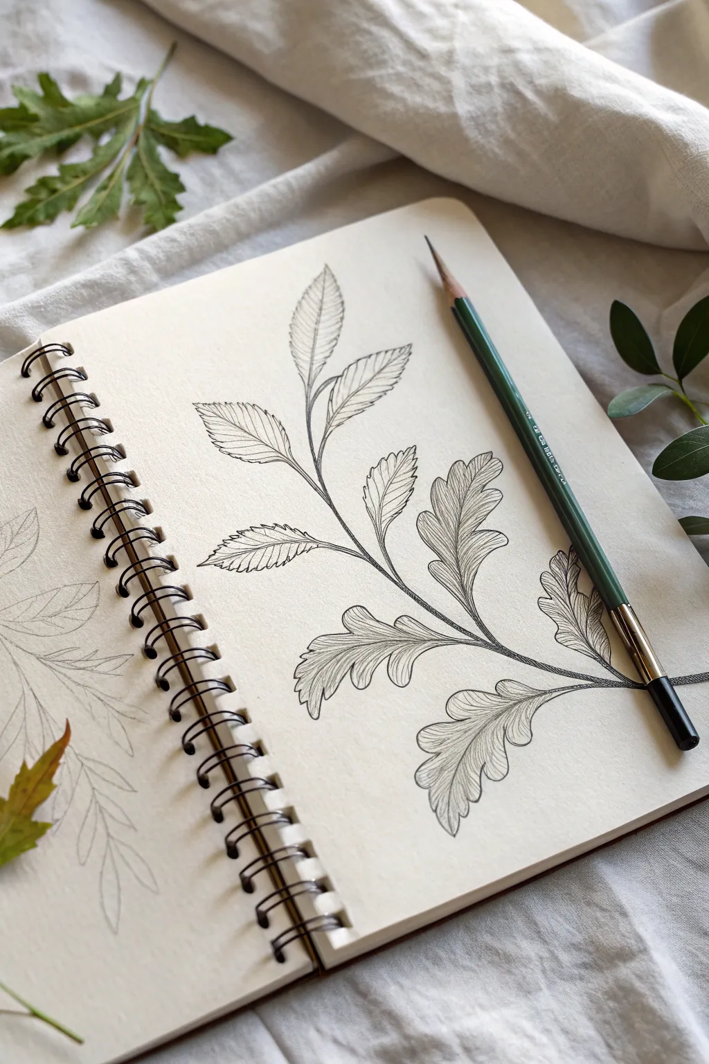
This tutorial guides you through sketching a delicate botanical study featuring textured, lobed leaves on a single graceful stem. The result is a clean, classic illustration that emphasizes organic flow and intricate vein details.
Step-by-Step Tutorial
Materials
- Spiral-bound sketchbook (smooth or mixed media paper)
- HB or 2B graphite pencil
- Fine liner pen (0.1mm or 0.3mm black)
- Kneaded eraser
- Reference photo or real leaf branch (optional)
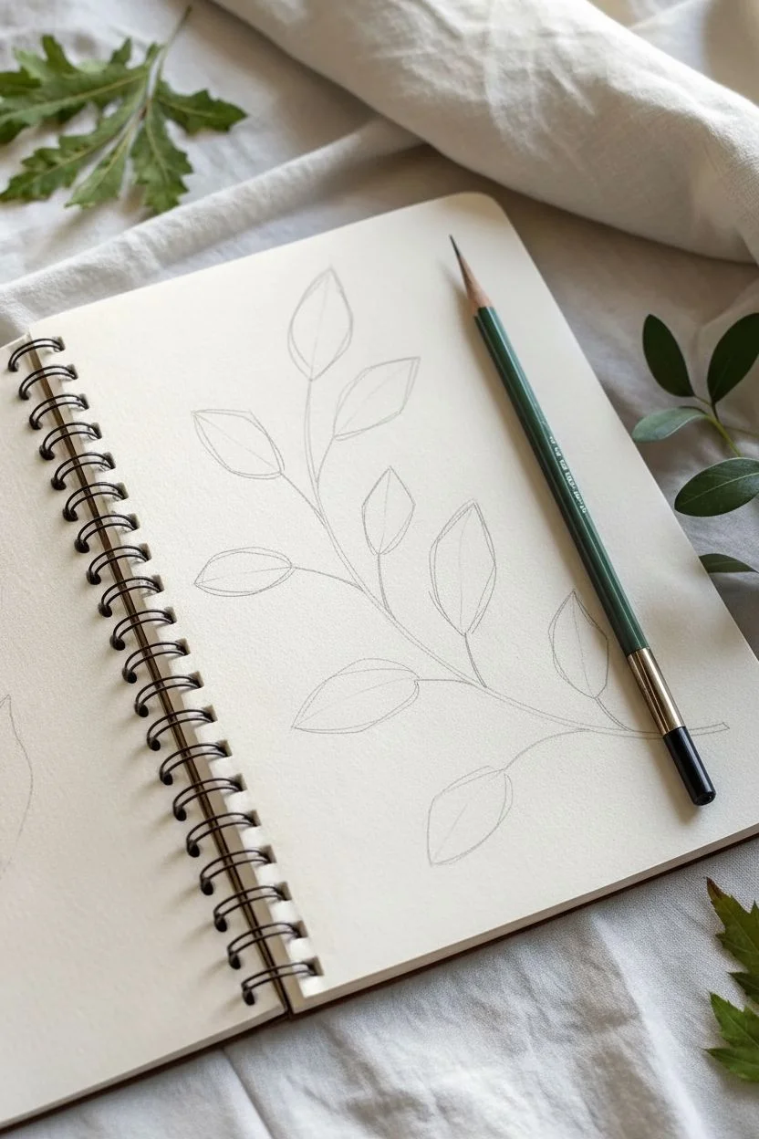
Step 1: Planning the Layout
-
Establish the main stem:
Begin by drawing a single, confident curve using your pencil. Start from the bottom right corner and sweep upwards to the top left, creating a gentle ‘S’ or ‘C’ curve to serve as the backbone of your composition. -
Mark leaf positions:
Along the main stem, lightly sketch short lines branching off on alternating sides. Space them out irregularly to mimic natural growth patterns, leaving slightly more space between the lower branches. -
Rough in leaf shapes:
At the end of each small branch line, draw light geometric shapes—ovals or tear-drops—to define the general size and angle of each leaf. Don’t worry about the jagged edges yet; just focus on the overall footprint.
Curve Control
When drawing veins, never use a ruler. Let your hand rest on a separate sheet of paper to avoid smudging, and pivot from your wrist for smoother curves.
Step 2: Refining the Outlines
-
Draw the lower lobed leaves:
For the leaves near the bottom, transform your basic oval shapes into lobed structures. Draw wavy, undulating edges that dip in and out, resembling an oak leaf pattern. Keep the lines soft and organic. -
Create upper serrated leaves:
As you move up the stem, transition the leaf style slightly. Make the upper leaves a bit simpler with serrated or saw-toothed edges rather than deep lobes, giving the plant a sense of developmental variety. -
Thicken the stem base:
Go back to the main stem and add a second line parallel to the first, tapering it so it’s thicker at the bottom and thinner at the tip. Add tiny bumps where the leaf stems join the main branch.
Step 3: Inking and Detailing
-
Outline with ink:
Switch to your fine liner pen. Carefully trace over your refined pencil lines. Use a confident hand, but allow for slight wobbles to keep the drawing feeling natural rather than mechanical. -
Intersecting stems:
Pay close attention where stems cross or leaves overlap. Ensure the line in front is continuous, breaking the line behind it to create depth. -
Draw the central veins:
In each leaf, draw a central vein running from the stem to the leaf tip. Follow the curve of the leaf, avoiding perfectly straight lines. -
Add secondary veins:
From the central vein, draw secondary veins extending out toward the tips of the lobes or serrations. I like to keep these lines very thin and light. -
Create fine texture:
Fill the space between the secondary veins with very delicate, closely spaced hatching lines. These should follow the contour of the leaf surface, suggesting curvature and rolling edges. -
Detail the stem:
Add tiny vertical hatching lines or small dots along the shadowed side of the main stem to give it cylindrical volume. -
Refine the tips:
Double-check the tips of your leaves. If any look too flat, add a tiny extra curl or fold line to suggest the leaf is twisting slightly in space. -
Erase pencil marks:
Once the ink is completely dry (wait at least a few minutes to avoid smudging), gently run your kneaded eraser over the entire drawing to lift the graphite guidelines. -
Final contrast check:
Step back and look at the drawing. If the drawing feels too light, go back and re-thicken the darkest shadow areas on the underside of the leaves or the stem base for added pop.
Watershading
Before the ink fully dries, go over shadow areas with a slightly damp brush. This will bleed the ink slightly, creating a soft, wash-like grey shadow.
Your sketchbook page now features a timeless botanical study ready for further exploration
Plants in Unusual Containers: Cups, Jars, and Bowls
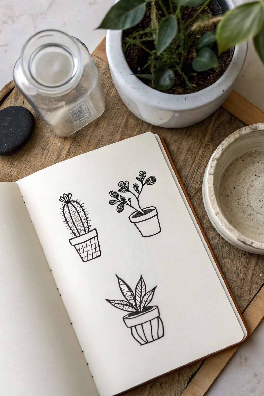
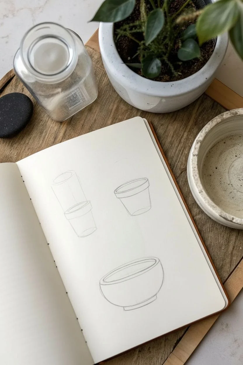
This simple yet striking project features three stylized potted plants drawn in bold black ink, perfect for practicing line work and composition. The clean lines and minimal shading create a modern, illustrative look that pops beautifully against a cream-colored notebook page.
Detailed Instructions
Materials
- Spiral-bound sketchbook or notebook (cream or white paper)
- Black drawing pen (fine tip, approx. 0.3mm to 0.5mm)
- Pencil (HB or H for sketching)
- Eraser
Step 1: Planning Composition
-
Pencil placement:
Begin by lightly sketching three general shapes to mark where your plants will go. Place one towards the top left, one at the top right, and the third centered below them to create a balanced triangular composition. -
Rough pot outlines:
Sketch the basic shapes of the pots first. For the top-left cactus, draw a slightly tapered cylinder. For the top-right plant, draw a standard flowerpot shape with a rim. For the bottom plant, sketch a rounded bowl-style pot with a wide rim.
Wobbly Lines?
Don’t stress about perfect straightness. If a line is shaky, go over it once more to thicken it deliberately. This creates a purposeful ‘sketchy’ style rather than looking like a mistake.
Step 2: Drawing the Cactus
-
Cactus body:
Using your black pen, draw a tall, rounded oblong shape rising from the first pot. Add a small ‘flower’ or bud shape at the very top using short, looped lines. -
Vertical texture:
Draw vertical lines running down the length of the cactus body to create ribs. These don’t need to be perfectly straight; a little wobble adds character. -
Spines and details:
Add small horizontal dashes or ‘x’ shapes between the vertical ribs to represent spines. Keep them somewhat random for a natural look. Ink the pot outline, then fill the pot’s surface with a simple grid pattern.
Step 3: Drawing the Leafy Plant
-
Main stem:
For the top-right plant, draw a thin, curving stem rising from the center of the pot, branching out into two or three main directions. -
Adding foliage:
Draw small, rounded clusters of leaves at the ends of the branches. Detail the leaves with tiny veins or scribbles to give them density without coloring them in solid. -
Pot finish:
Ink the pot’s outline with a confident stroke. Draw a curved line just below the top edge to create the appearance of a rim, and leave the pot body plain white for contrast.
Add Dimension
Use a light gray marker or very diluted watercolor wash to add a shadow on just one side of each pot. This instantly grounds the drawings and makes them look less flat.
Step 4: Drawing the Snake Plant
-
Leaf structure:
For the bottom plant, draw three or four pointed, sword-like leaves originating from a single center point. Make the center leaf the tallest and the side leaves curve slightly outward. -
Leaf patterns:
Inside each leaf, draw angled horizontal stripes or chevron patterns. This mimics the variegated look of a snake plant (Sansevieria). -
Pot decoration:
Ink the final pot’s outline, including a thick rim. Decorate the body of this pot with vertical stripes that curve slightly with the form of the pot to emphasize its roundness.
Step 5: Cleanup
-
Let it set:
I usually wait a full five minutes to ensure the ink is completely dry before touching it again, as smudging is heartbreaking at this stage. -
Erase guidelines:
Gently erase all your original pencil sketches. Brush away the eraser creative dust carefully so you don’t smear the fresh ink.
Now you have a charming page of botanical doodles ready to be admired
Botanical Silhouettes With Bold Ink Blocks
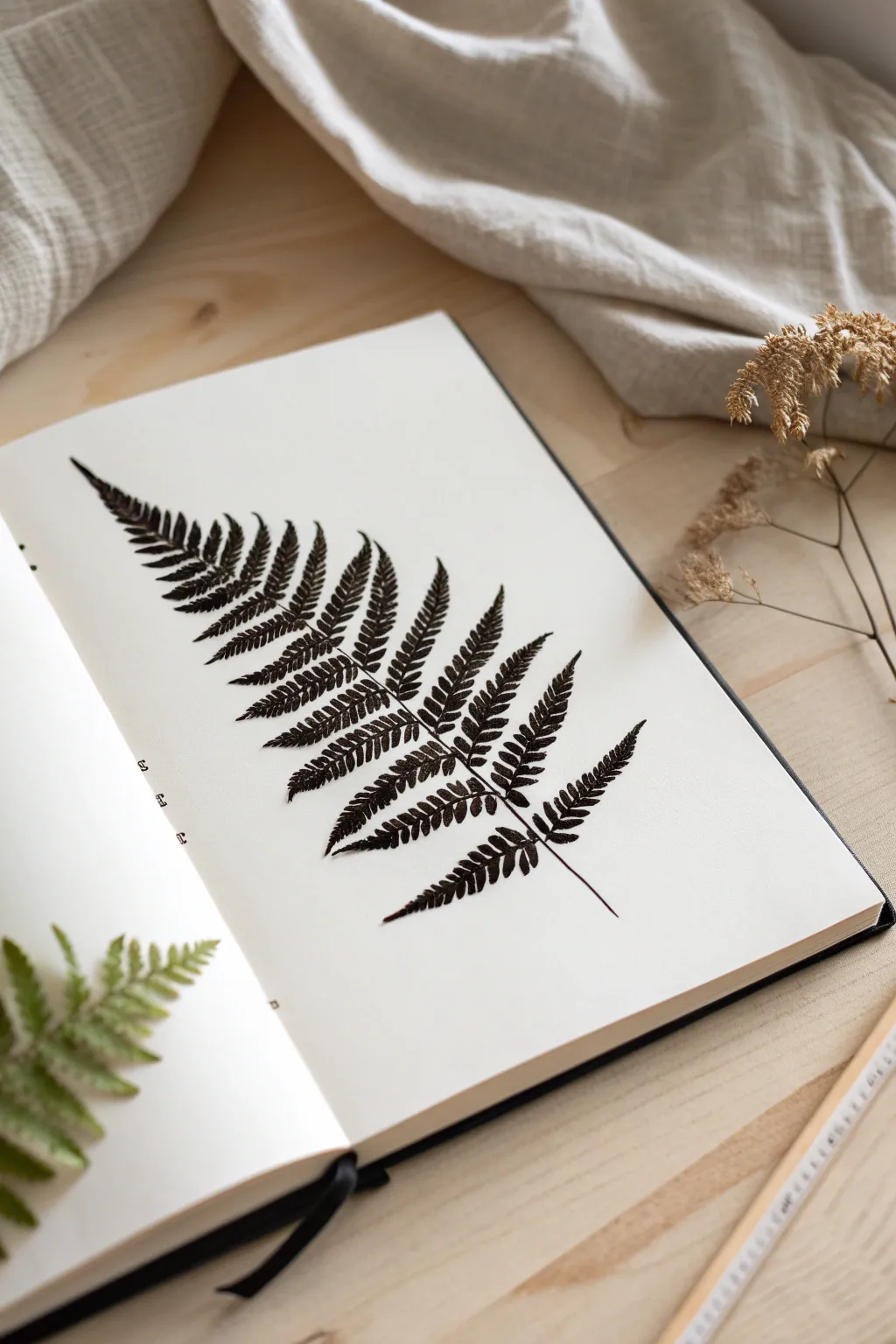
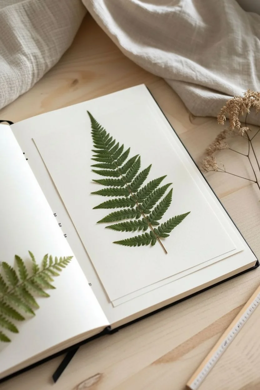
Capture the intricate beauty of nature with this striking botanical silhouette. By using a real fern frond as a natural stamp, you’ll create a highly detailed, high-contrast print that preserves the delicate structure of every leaf segment.
Step-by-Step Guide
Materials
- Fresh fern frond (flat and intact)
- Heavyweight sketchbook or mixed media paper
- Black block printing ink or heavy body acrylic paint
- Rubber brayer (roller)
- Plexiglass sheet or palette for rolling ink
- Sheet of scrap paper or newsprint
- Clean paper towel or rag
- Micro-pen (optional, for touch-ups)
Step 1: Preparation
-
Select your specimen:
Choose a fresh fern frond that lies naturally flat. Look for one with distinct, separated leaflets rather than a clumped or damaged one. A slightly stiffer frond works better than a very soft, wilting one. -
Press the fern:
Place your chosen fern inside a heavy book for about 30 minutes before starting. You don’t want it fully dried and brittle, just flattened enough to ensure good contact with the paper. -
Prepare the workspace:
Set your sketchbook on a flat surface. Place a piece of scrap paper behind the page you intend to print on to prevent any ink bleeding through to the next sheet.
Step 2: Inking the Frond
-
Load the brayer:
Squeeze a small line of block printing ink onto your plexiglass or palette. Roll the brayer back and forth over the ink until it is evenly coated. You want a velvety texture on the roller, not global or sticky peaks. -
Position the fern:
Lay the fern frond flat on a piece of scrap paper, with the underside (the side with the veins) facing up. This side usually has more texture and holds ink better. -
Apply the ink:
Roll the inked brayer over the fern. Apply firm, even pressure. Roll from the stem outwards towards the tips of the leaves to prevent them from lifting or folding over. -
Check coverage:
Inspect the fern. It should be fully black, but you shouldn’t see large blobs of ink connecting the tiny delicate spaces between the leaves. If it looks too gooey, blot it gently with a paper towel and re-ink lightly.
Use the Veiny Side
Always ink the underside of the leaf where the veins are raised. These raised veins act like a stamp’s ridges, resulting in a much sharper, more detailed print.
Step 3: Printing the Image
-
Place the fern:
Carefully lift the inked fern by the stem. Hover over your sketchbook page to align it diagonally, stemming from the bottom corner towards the top opposite corner. Drop it gently onto the paper. -
Mistake prevention:
Once the inked fern touches the paper, do not try to shift or slide it. Any movement now will create a smeared double image. -
Cover with scrap paper:
Place a clean sheet of scrap paper or newsprint directly over the fern. This protects your hands and helps distribute pressure evenly. -
Apply pressure:
Using the palm of your hand or a clean brayer, press down firmly over the entire surface of the scrap paper. Rub in small circles, paying special attention to the center stem and the very tips of the fronds. -
Check the edges:
Run your finger along the outline of the stem and leaves through the scrap paper to ensure the edges transfer crisply.
Smudged Image?
If your print looks like a blob, you used too much ink. The fern texture fills up easily. Apply a thinner layer next time, or blot the leaf specifically before printing.
Step 4: Finishing Touches
-
The reveal:
Remove the scrap paper first. Then, grab the thickest part of the fern stem and slowly peel the frond off the paper. Pull it straight up to avoid smearing. -
Dry time:
Allow the print to dry completely. Block printing ink can take longer than acrylics, often requiring at least an hour to be touch-dry. -
Refine the details:
Sometimes the stem line might break or a leaf tip might be faint. I prefer to use a fine micro-pen to carefully fill in any tiny missing gaps, maintaining the jagged, organic look of the print. -
Flatten the page:
Once fully dry, the paper might ripple slightly from the ink moisture. Close the sketchbook and place a heavy book on top overnight to flatten everything back out.
Enjoy the permanence of your botanical specimen captured on the page
Pattern Play: Repeat a Single Leaf Into a Motif
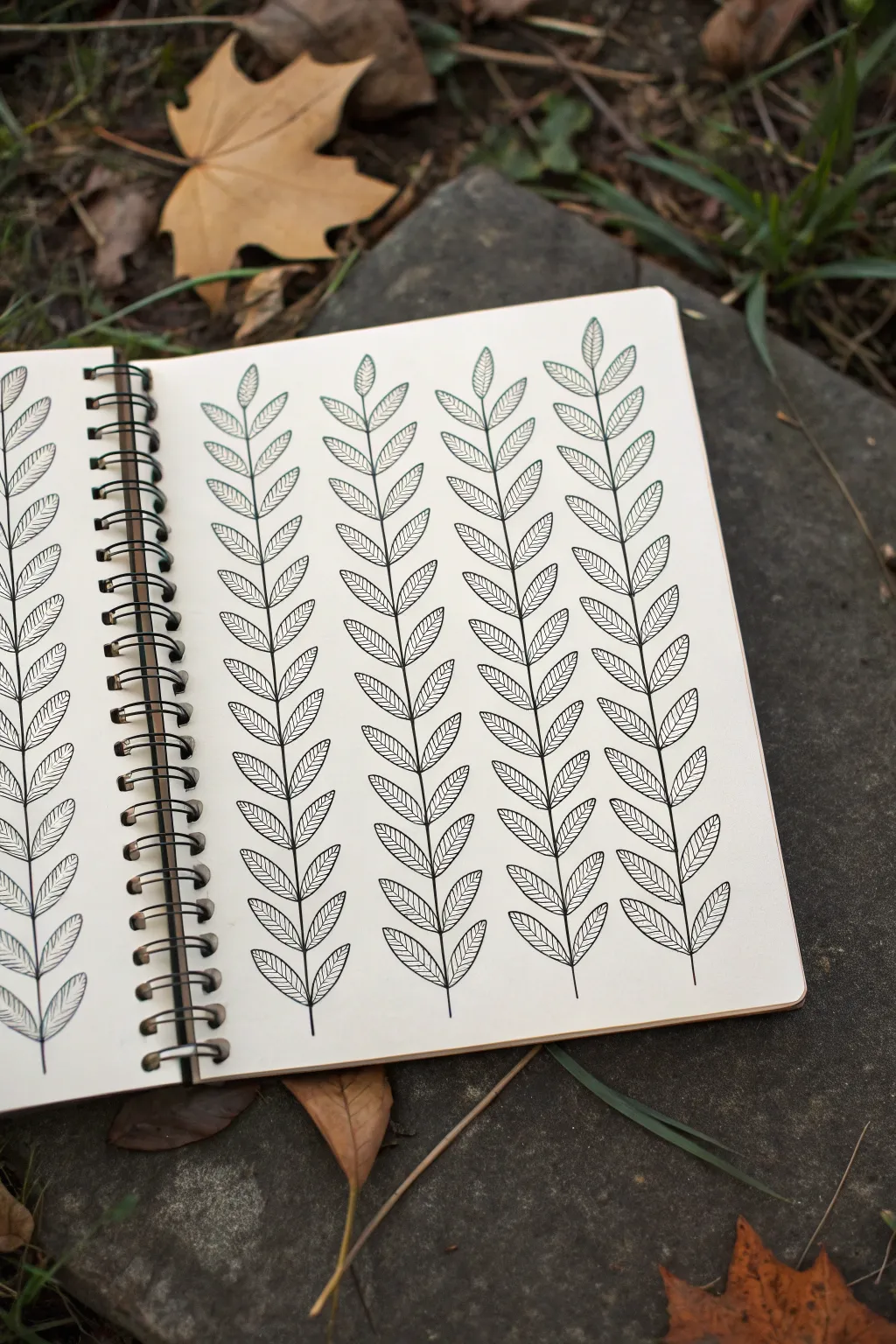
This meditative drawing exercise transforms a simple leaf shape into a striking, seamless pattern. By repeating vertical vines with precision and calm strokes, you create a satisfying botanical texture that fills the page with elegant greenery.
Detailed Instructions
Materials
- Fine-tip drawing pen (0.3mm or 0.5mm)
- Spiral-bound sketchbook or drawing paper
- Pencil (HB or 2B)
- Eraser
- Ruler (optional)
Step 1: Setting the Foundation
-
Assess your spacing:
Before putting pen to paper, look at the width of your page. Visualise dividing it into four or five equal vertical columns depending on your paper size, leaving a comfortable margin on all sides. -
Draw vertical guides:
Using your pencil and a ruler, very lightly sketch vertical lines to serve as the central stems for your vines. Space them evenly apart so the leaves won’t crowd each other later. -
Mark leaf intervals:
Along each vertical pencil line, make tiny tick marks every 1.5 to 2 centimeters. These marks will ensure your leaves originate from consistent points, keeping the rhythm of the pattern steady.
Keep it Clean
Place a scrap sheet of paper under your drawing hand as you work across the page. This barrier prevents skin oils from transferring to the paper and potential ink smudges.
Step 2: Developing the Structure
-
Ink the first stem:
Switch to your fine-tip pen. Starting from the bottom of the first column, draw a continuous vertical line following your pencil guide. It doesn’t need to be ruler-straight; a slight organic wobble adds charm. -
Add basic leaf shapes:
Starting at the bottom tick mark, draw a simple oval or lance-shaped leaf extending upward and outward to the right. Repeat on the left side, slightly offset or directly opposite depending on your preference. -
Establish the rhythm:
Continue moving up the stem, drawing pairs of leaves at each interval. Keep the angle of the leaves consistent, roughly 45 degrees relative to the main stem. -
Complete the first vine:
Work your way to the top of the page. Finish the vine with a single, smaller terminal leaf at the very tip to cap off the column neatly.
Step 3: Adding Detail
-
Draw the central vein:
Go back to the bottom leaf. Draw a single curved line down the center of the leaf shape, extending from the tip back to the main stem. -
Add side veins:
From this central vein, draw tiny diagonal lines extending outward to the leaf edges. I prefer keeping these lines very thin and delicate to distinguish them from the main outline. -
Check density:
As you detail the first vine, ensure the veins aren’t too crowded. A little white space inside each leaf keeps the drawing looking fresh and airy. -
Repeat for all vines:
Move to the next pencil guide and repeat the entire process: draw the stem, outline the leaves, and fill in the vein details. Work from left to right to avoid smudging fresh ink with your hand.
Color Variation
Instead of black ink, try this pattern using dark green or brown fineliners. You can also use watercolor to fill the leaves with a light wash after the ink is waterproof.
Step 4: Finishing Touches
-
Review the pattern:
Once all four or five vines are inked, look for any gaps or uneven line weights. Strengthen any stem lines that feel too thin compared to the leaves. -
Dry thoroughly:
Wait at least five to ten minutes to ensure the ink is completely dry. Drawing paper can hold ink in the fibers longer than you might expect. -
Erase guidelines:
Gently erase the pencil lines underneath your ink. Hold the paper taut with one hand while erasing to prevent wrinkling the page. -
Clean up:
Brush away the eraser crumbs and assess the final contrast. The stark black lines against the cream paper should now pop clearly.
Enjoy the rhythmic calm of seeing your sketchbook fill up with this ordered natural beauty
Mixed-Style Plant Page: Line, Dot, and Wash Together
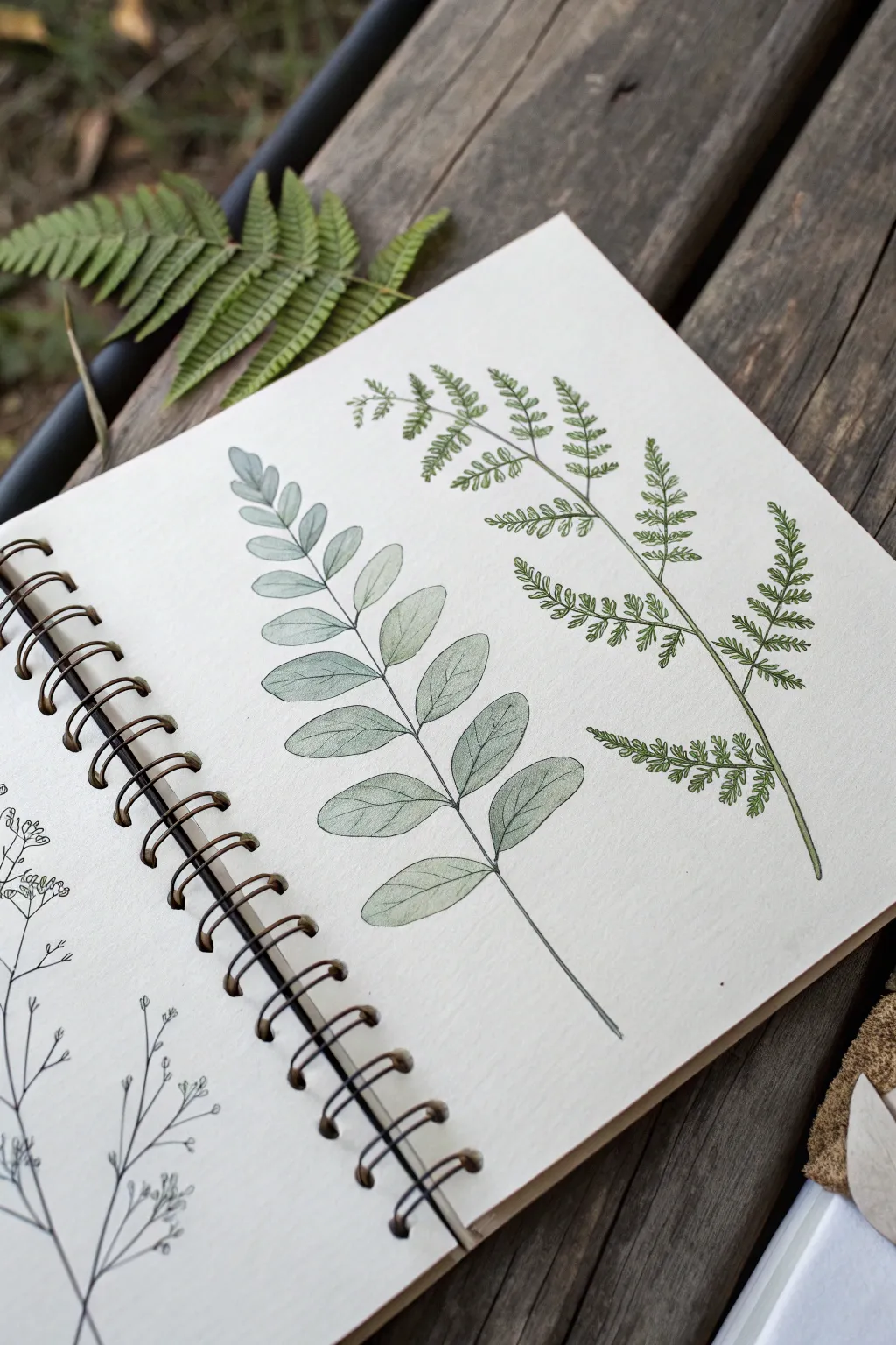
This project captures the delicate structure of botanical specimens by combining fine ink lines with soft watercolor washes. You’ll create two contrasting fern studies side-by-side to explore different leaf shapes and textures in a sketchbook format.
How-To Guide
Materials
- Spiral-bound sketchbook with mixed media or watercolor paper (approx. 160-200 gsm)
- Fine liner pens (sizes 0.1, 0.3, and 0.5) in archival black or dark sepia ink
- Watercolor paints (Sap Green, Olive Green, Hooker’s Green, Burnt Umber)
- Small round watercolor brush (size 2 or 4)
- HB Graphite pencil
- Kneaded eraser
- Jar of water and paper towel
Step 1: Planning compositions
-
Establish the spines:
Begin lightly with your HB pencil. Draw two gently curved lines to serve as the central stems (rachis) for your ferns. Place the left one slightly lower and curve it to the right; place the right stem higher, arching gracefully over the first. This creates a balanced, organic flow on the page. -
Sketch leaf placement:
For the left plant (broad-leaf fern), sketch faint oval shapes in pairs along the stem, getting smaller toward the tip. Avoid making them perfectly symmetrical; nature is rarely perfect. -
Outline the lace fern:
For the right plant (lace fern), draw triangular guidelines branching off the main stem. These will hold the intricate, tiny leaflet clusters later. Keep these pencil marks very light as they are just a skeleton.
Pro Tip: Line Weight
Vary your pen pressure. Press harder at the base of leaves and lift off quickly at the tips. This creates dynamic, tapering lines that look much more organic than uniform strokes.
Step 2: Inking the outlines
-
Inking the broad leaves:
Using a 0.3 pen, trace over your left-hand fern sketches. Define each leaflet with a smooth, continuous line. Notice how each leaf tapers to a point but has rounded sides. -
Adding the central vein:
Draw a single, thin line down the center of each broad leaf. Stop just short of the leaf tip to keep it looking natural and not stiff. -
Detailing the lace fern:
Switch to a finer 0.1 pen for the right fern. This plant requires small, jagged strokes rather than smooth curves. Draw tiny, saw-toothed edges for each miniature frond, following your triangular guidelines. -
Thickening the stems:
Go back to the main stems on both plants. Use a 0.5 pen or double up your 0.3 line at the base of the stems to give them weight, tapering to a whisper-thin line at the very top. -
Erase pencil guides:
Wait at least 10 minutes for the ink to fully dry. Gently rub your kneaded eraser over the page to lift all graphite marks, leaving a clean ink drawing ready for color.
Step 3: Applying watercolor wash
-
Mix a muted green:
On your palette, mix a watery wash of Sap Green with a tiny touch of Burnt Umber. This desaturates the green, making it look natural rather than artificial. -
First wash – broad fern:
Using a size 4 brush, paint the broad leaves on the left. Start at the base of each leaf and pull the color toward the tip. I like to leave tiny slivers of white paper unpainted near the veins to suggest light hitting the surface. -
Varying the tone:
While the paint is wet, drop a slightly darker green (add a touch of Hooker’s Green) into the lower half of some leaves. This creates a shadow effect where the leaves attach to the stem. -
Painting the lace fern:
Switch to a size 2 brush for the delicate right-hand fern. Mix a fresher, brighter green using Olive Green. Carefully dab paint onto the tiny fronds. You don’t need to stay perfectly inside the lines; a loose application adds movement. -
Stem shadows:
Run a very thin line of watery brown-green along the shadowed side (usually the bottom or right side) of the main stems to give them cylindrical volume.
Troubleshooting: Bleeding Ink
If your ink smudges when painting, your pen isn’t waterproof or you painted too soon. Ensure pens are marked ‘archival’ or ‘waterproof’ and always wait for the ink to cure fully.
Step 4: Refining textures
-
Dry brush veins:
Once the broad fern is completely dry, use a barely-damp brush with darker green pigment to enhance the secondary veins branching off the center line of the larger leaves. -
Stippling details:
Return to your 0.1 pen. Add tiny dots or stippling on the lace fern where the fronds meet the stem, adding depth and density to the foliage. -
Adding subtle imperfections:
Nature has blemishes. Use a touch of watered-down brown paint to add faint spots or browning tips on one or two leaves, which adds realism to the specimen study. -
Final assessment:
Step back and check the balance. If the illustration feels too light, re-line the outer edges of the closest leaves with the 0.5 pen to make them pop forward.
Close your sketchbook knowing you’ve preserved a fleeting botanical moment with ink and wash


Have a question or want to share your own experience? I'd love to hear from you in the comments below!