Whenever I need an art win that feels playful and calming, I reach for pointillism—just dots, patience, and a little color magic. Here are my favorite dot painting ideas, starting with the classic, beginner-friendly ones and drifting into some seriously fun twists.
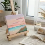
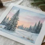
Simple Sunset Horizon in Pointillism Dots
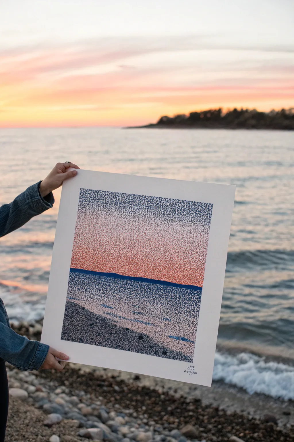
Capture the serene beauty of a coastal sunset using thousands of tiny, deliberate marks to build rich gradients and texture. This pointillism-style drawing transforms a simple landscape into a mesmerizing optical blend of warm sky and cool waters.
Step-by-Step Guide
Materials
- High-quality bristol board or hot-press watercolor paper (minimum 9×12 inches)
- Fine liner pens (0.05mm, 0.1mm, and 0.3mm sizes)
- Color palette: Pale pink, salmon/coral, deep blue, grey-blue, and black ink pens
- Pencil (HB or lighter)
- Ruler or straight edge
- Eraser
- Masking tape (low tack)
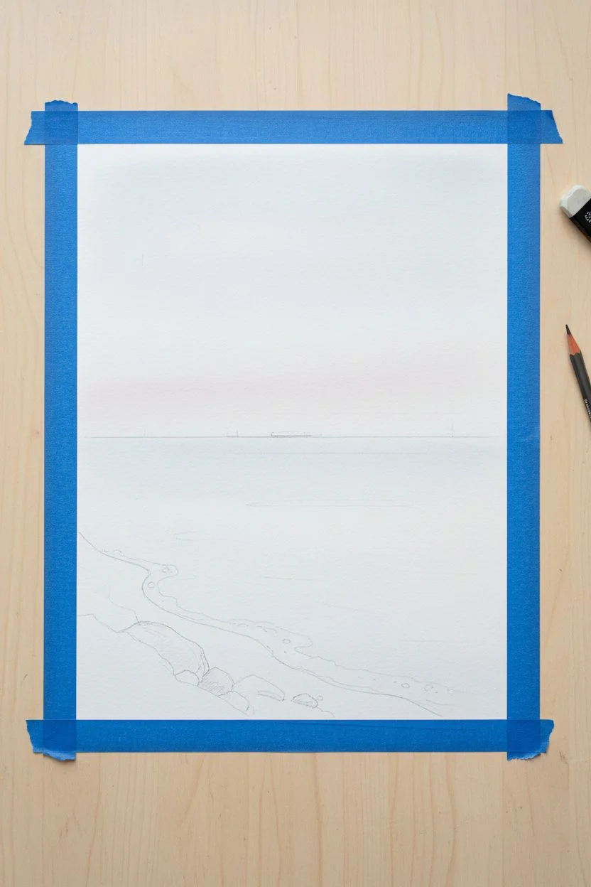
Step 1: Preparation and Sketching
-
Secure the paper:
Tape down the edges of your paper to a flat work surface. This creates a crisp white border around the final piece, giving it that professional matted look right from the start. -
Establish the horizon:
Using a ruler and a very light pencil touch, draw a straight horizontal line about one-third of the way up from the bottom. This will separate your sky from the water. -
Sketch the shoreline:
Lightly sketch a curved, diagonal line starting from the bottom left corner and moving towards the right side of the water section. This defines the rocky beach area. -
Mark color transitions:
Faintly mark where you want your sky gradient to shift from blue to pink, and where the deep water turns to shallow foam. These guide lines will disappear under the ink later.
Pro Tip: Texture Variety
Vary your mark-making! Use tiny ‘C’ shapes for waves and rounder dots for the sky. This subtle difference helps distinguish the water from the air.
Step 2: Stippling the Sky
-
Start with the darkest sky:
Begin at the very top of the paper with a dark grey-blue 0.1mm pen. Instead of perfect round dots, use tiny, organic stippling marks or micro-squiggles. Densely pack them at the top edge. -
Fade the blue:
As you work downward about two inches, gradually space your blue marks further apart. This creates the ‘dissolve’ effect needed for the transition. -
Introduce the pinks:
Switch to a pale pink or salmon-colored pen. Start intermingling these dots within the sparse blue area, then take over completely as you move down toward the horizon. -
Intensify the sunset:
Near the horizon line, switch to a more vibrant coral or orange-red pen. Increase the density of your marks here to represent the intense glow of the setting sun. -
Build the gradient:
Go back and forth between your blue and pink sections. Add dots of the opposing color into the transition zone to smooth out any harsh bands of color.
Step 3: Defining the Seascape
-
Draw the horizon line:
Use a dark blue 0.3mm pen to create a solid, distinct strip for the distant landmass or horizon. Make this strip solid and dark to anchor the composition. -
Stipple the deep water:
Under the horizon, use a medium blue pen. Create a dense field of stipples. Keep the texture consistent and horizontal to suggest calm water. -
Create wave movement:
Leave varying amounts of negative space (white paper) as you move closer to the shore. These lighter areas mimic the reflection of light on the water’s surface. -
Detail the shore break:
Near the diagonal beach line, use very sparse blue dots to represent white foaming water washing up on the stones.
Troubleshooting: Hand Cramps
Stippling is repetitive. If your hand cramps, stop immediately. Shake it out and take a break. Changing your grip or pen thickness can also reduce strain.
Step 4: The Rocky Foreground
-
Fill the beach area:
Switch to your darkest grey or black pen. The texture here should be coarser. Use slightly larger, irregular dots or small circular scribbles to mimic pebbles and stones. -
Add depth to the rocks:
Layer a second pass of black ink over the bottom-left corner to create a shadow gradient, making the beach feel like it is receding. -
Final inspection:
Step back from the piece. Look for any areas that feel empty or uneven and fill them with a few final strategic dots. -
Reveal the border:
Once the ink is completely dry, slowly peel away the masking tape at a 45-degree angle to reveal your crisp, clean edges.
Frame your stippled landscape and enjoy the permanent sunset you’ve created by hand

Radiating Sunburst Rays With Dot Gradients
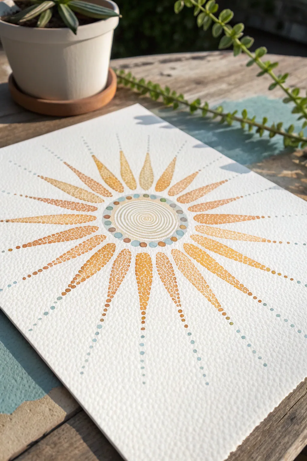
Capture the warmth of a summer soltice with this vibrant, radiating sunburst design. Using a stippling technique on textured watercolor paper, you will build up layers of tiny dots to create glowing gradients and sun rays.
Step-by-Step
Materials
- Cold press watercolor paper (textured surface is key)
- Fine liner pens or acrylic paint markers (0.3mm to 0.5mm)
- Palette: Golden yellow, burnt orange, light ochre, and soft teal/sage green
- Compass
- Pencil (HB or 2H)
- Eraser
- Ruler
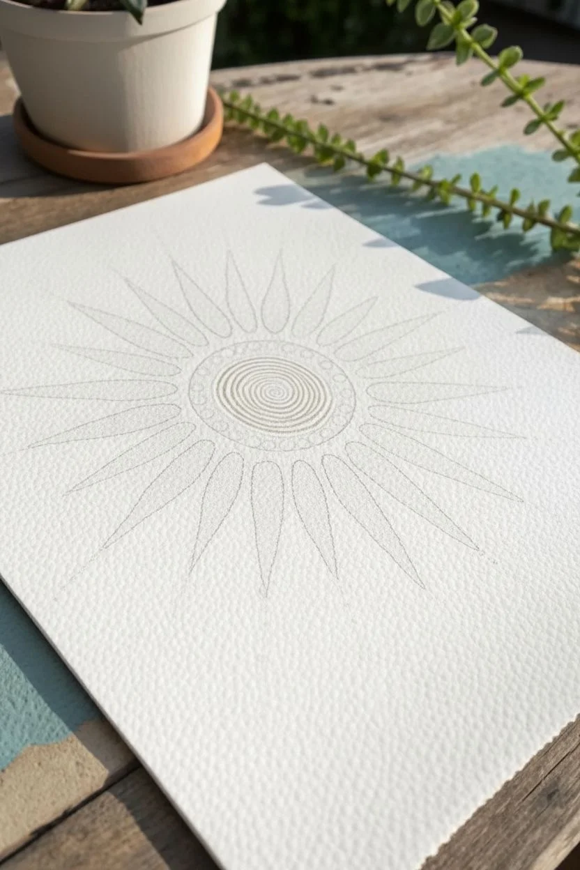
Step 1: Setting the Structure
-
Find the Center:
Begin by marking the exact center of your watercolor paper. A light pencil crosshair is helpful here. -
Draft the Core Circles:
Using your compass, draw a small central circle (about 1 inch in diameter), followed by a slightly larger concentric circle giving about a 1/4 inch gap for the decorative ring. -
Map the Rays:
Lightly sketch the radiating sunbeams. Start with the four cardinal directions (12, 3, 6, 9 o’clock) to ensure symmetry. Then, bisect those angles until you have roughly 16 evenly spaced rays. Keep the pencil lines incredibly faint so they don’t show later. -
Define the Ray Shape:
Sketch the teardrop shape for each ray. They should start narrow near the center circle, widen in the middle, and taper to a sharp point at the outer edge.
Step 2: The Central Motif
-
Spiral Center:
With a fine sage green or light grey pen, draw a tight, continuous spiral starting from the very center dot and winding outward to fill the inner circle. Keep the lines smooth and evenly spaced. -
Inner ring detailing:
In the gap between your two central circles, place alternating dots. Use large dots of teal and smaller accent dots of burnt orange to create a patterned border.
Steady Hand Trick
Rest your wrist on a clean sheet of scrap paper while dotting. This prevents oils from your hand transferring to the art paper and keeps your stippling hand stable.
Step 3: Dotting the Sunbeams
-
Base Outline:
Taking your golden yellow pen, carefully stipple the outline of one sun ray. Don’t draw a solid line; instead, place dots closely together to define the edge. -
Gradient Base:
Fill the bottom third of the ray (closest to the center) with densely packed orange or ochre dots. This creates visual weight at the center. -
Transitioning Color:
As you move toward the middle of the ray, switch to a brighter yellow. Space the dots out slightly more to let the white paper show through, creating a lighter value. -
Fading Tips:
For the pointed tip of the ray, use your lightest yellow. I find that allowing the dots to become very sparse at the tip creates a beautiful ‘vanishing’ effect. -
Repeat the Process:
Work your way around the circle, completing one ray at a time to maintain consistent color saturation.
Metallic Pop
Swap the golden yellow ink for a metallic gold paint pen for the center-most dots. When the light hits the texture, the sunburst will literally shimmer.
Step 4: Outer Radiance
-
Extended Trails:
Once the main rays are filled, use a ruler to lightly visualize a straight line extending from the tip of each ray. -
Teal Accents:
Along these extended lines, place a series of teal or sage green dots. Start with smaller dots near the ray tip, growing slightly larger as they move outward. -
Spacing Check:
Ensure the spacing between these outer dots increases as they move away from the center, mimicking the expansion of light. -
Clean Up:
Allow the ink to dry completely—give it at least 20 minutes to be safe. Gently erase any visible pencil guidelines, being careful not to smudge the ink.
Step back and admire how the simple placement of dots creates a glowing, cohesive image of the sun
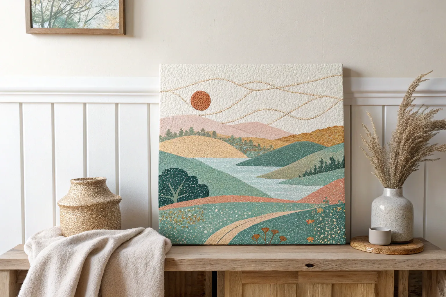
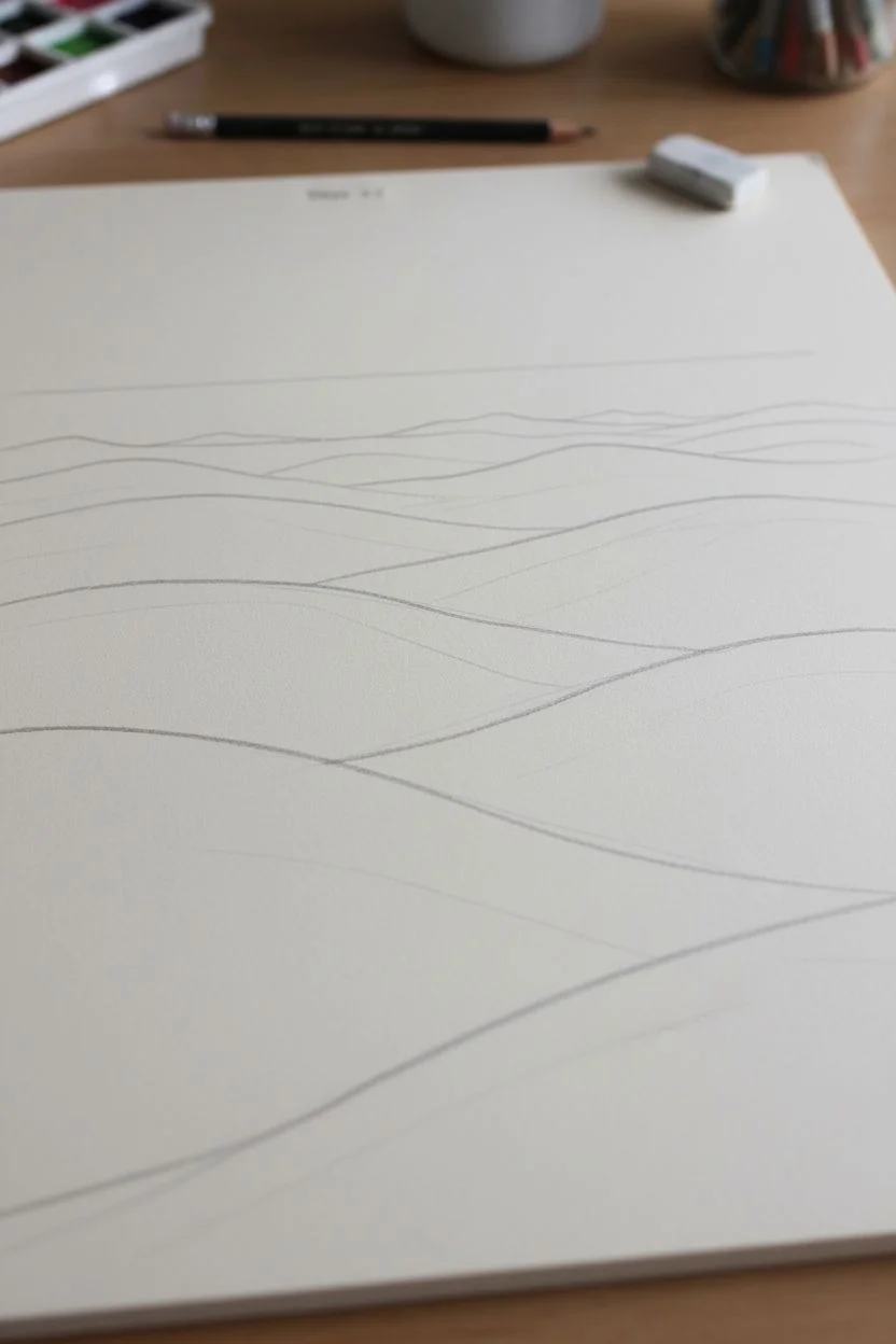
Easy Rolling Hills Landscape Using Color Blocks of Dots
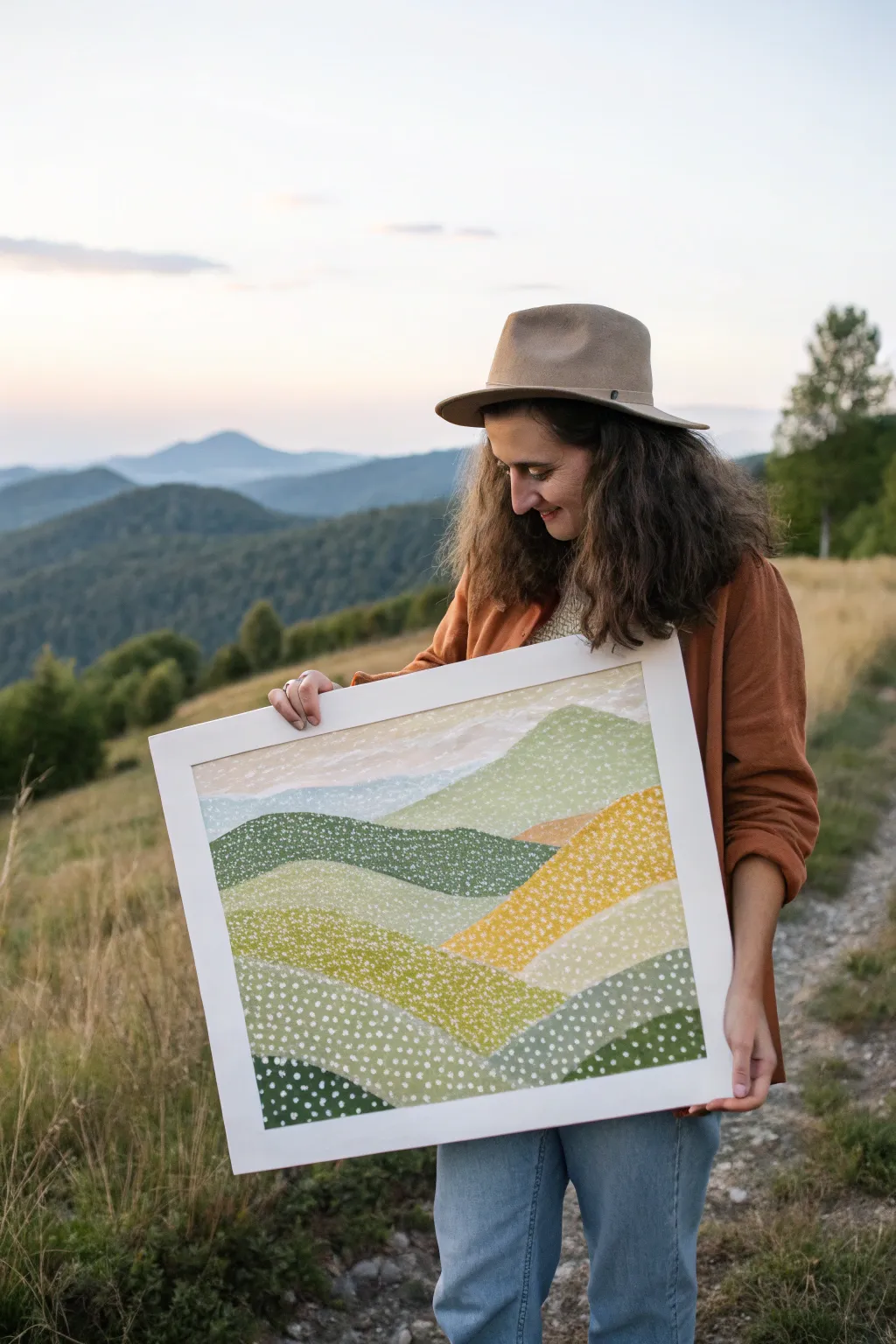
Capture the serene beauty of rolling mountains with this layered landscape project that combines solid color blocking with delicate stippling. This technique creates a wonderful sense of texture and depth, mimicking the way wildflowers cover a hillside in spring.
Detailed Instructions
Materials
- Large sturdy paper or canvas board (approx 18×24 inches)
- Acrylic paints (various greens, sunny yellow, warm beige, white, pale blue)
- Wide flat brush (for base layers)
- Small round brush or dotting tool (szie 1 or 2)
- Pencil
- Eraser
- Palette or mixing plate
- Water cup and paper towels
- White frame (optional, for display)
Step 1: Drafting the Landscape
-
Map the Horizon:
Start by lightly sketching a horizontal line near the top third of your paper to serve as the distant horizon. -
Sketch the Foreground Hills:
Draw large, sweeping curves at the bottom of the page. These should be the largest shapes, representing the hills closest to the viewer. -
Layer the Middle Ground:
Add overlapping hill shapes behind the foreground. Vary the peaks and valleys to create a natural, rolling rhythm. -
Refine the Distance:
Sketch smaller, flatter hill shapes near the horizon line to create perspective. The shapes should get progressively smaller as they move upward.
Uneven Dots?
If dots get globby, your brush is overloaded. Dip just the very tip continuously, or switch to the handle end of a paintbrush for uniform circles.
Step 2: Blocking in Color
-
Mix Your Palette:
Prepare several shades of green on your palette. You’ll need dark forest greens for shadows, bright grassy greens, and muted olive tones. -
Paint the Sky:
Using a very pale blue mixed with plenty of white, paint the sky area above the horizon line using your wide flat brush. -
Base Coat the Dark Hills:
Select a few non-adjacent hill sections and paint them with your darkest green. Painting non-touching areas first prevents wet edges from bleeding. -
Add Sunny Slopes:
Paint a few middle-ground hills with a bright yellow-ochre mix to represent sun-drenched fields. -
Fill Remaining Sections:
Fill in the remaining hill shapes with your lighter greens and beige tones. Don’t worry about texture yet; just get solid, opaque coverage. -
Let it Cure:
Allow the entire painting to dry completely. If the paint feels cool to the touch, it needs more time.
Add Depth
Instead of pure white dots, mix a tiny bit of light yellow or mint into the white for different hills to create subtle shifts in color temperature.
Step 3: The Pointillism Layer
-
Prepare the White Paint:
Squeeze out fresh titanium white paint. If it’s very thick, add a tiny drop of water to make it flow better for dotting. -
Start Dotting the Foreground:
Dip your small round brush or dotting tool into the white paint. Begin adding dots to the dark green foreground hills. -
Vary Density:
Cluster the dots closer together at the ‘top’ edge of each hill shape to suggest light catching the ridge, and space them out as you move down the slope. -
Work Middle Ground:
Move to the lighter green and yellow hills. Keep your dots consistent in size but allow the spacing to be a bit more random here. -
Soften the Background:
For the distant beige and pale green hills, use smaller, fainter dots. You can achieve this by wiping a bit of paint off the brush before applying. -
Check for Balance:
Step back from your work. Look for any large areas that feel too empty and add a few scattered dots to integrate them. -
Final White Frame:
Once fully dry, place your artwork in a wide-bordered white frame to make the colors pop and give it a polished, modern look.
Hang your new landscape in a well-lit room to bring a calm, natural vibe to your space

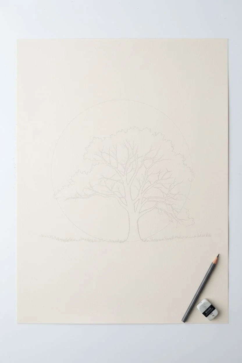
Moon and Tree Silhouette Against a Dotted Night Sky
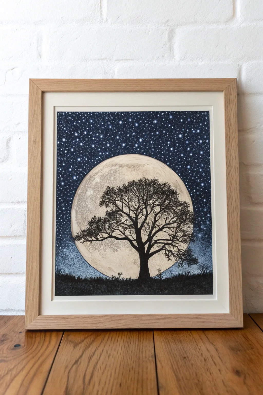
Capture the serene beauty of a full moon rising behind a solitary oak tree using the delicate art of stippling. This project contrasts deep ink silhouettes against a texture-rich, luminous moon and a twinkling starry sky.
Step-by-Step
Materials
- High-quality Bristol board or smooth watercolor paper (A3 or A4 size)
- Fine liner pens (sizes 0.05, 0.1, 0.3, and 0.5)
- Black India ink or black gouache
- Small round paintbrush (size 2 or 4)
- Circle template, compass, or a round plate to trace
- Graphite pencil (HB or 2H)
- Kneaded eraser
- White gel pen or opaque white gouache
Step 1: Planning the Composition
-
Trace the moon:
Begin by lightly tracing a large, perfect circle in the center of your paper using a compass or by tracing around a plate. Leave enough room at the bottom for the ground. -
Sketch the silhouette:
Lightly sketch the outline of the tree trunk rising from the bottom center into the moon. Draw main branches reaching outward, ensuring the tree looks balanced but organic. -
Outline the horizon:
Draw a slightly uneven horizontal line across the bottom of the circle to represent the grassy ground where the tree stands.
Ink Smearing?
If your hand smudges the ink, place a scrap piece of paper under your drawing hand. Always work from left to right (if right-handed) to keep your palm off fresh dots.
Step 2: Creating the Moon Texture
-
Start the stippling base:
Using your 0.05 fine liner, begin placing tiny dots inside the moon circle. Keep the dots relatively sparse in the center-left area to create a highlight. -
Build darker craters:
Group your dots closer together in specific patches to mimic lunar craters and ‘seas.’ Focus density on the right side and bottom edge for a shadowed 3D effect. -
Layering for depth:
Switch to a 0.1 pen and add a second layer of dots over the darker crater areas. The variation in dot size adds instant texture without needing solid lines. -
Define the edge:
Ensure the outer edge of the moon is defined purely by the contrast of dots, but you can lightly outline it with the 0.05 pen if you need a guide for the sky later.
Step 3: Inking the Silhouette
-
Fill the trunk:
Using the 0.5 pen or a brush with India ink, carefully fill in the trunk and the thickest main branches. The goal is a solid, pitch-black silhouette. -
Extend the branches:
Switch to thinner pens (0.3 and then 0.1) as you move outward to the finger-like twigs. Taper the ends so they look sharp, not blunt. -
Add leaf clusters:
Instead of drawing individual leaves, scumble or stipple tiny, dense clusters of black ink at the ends of the branches to suggest foliage. -
Draft the grass:
Fill in the bottom horizon line with solid black ink. Use short, upward flicking motions along the top edge of this black bar to simulate grass blades.
Level It Up
Make the moon glow by lightly tinting it with watered-down yellow or grey watercolor wash before you start stippling, adding warmth to the scene.
Step 4: The Starry Sky
-
Establish the background:
The sky needs to be dark but not solid black. Start stippling intensely around the outside of the moon using a 0.5 pen or even a 0.8 if you have one. -
Create the gradient:
As you move away from the moon towards the paper’s edges, space the black dots further apart. This creates a ‘glow’ effect around the moon. -
Fill to the edges:
Continue stippling until the entire sky area is filled. This takes patience; I like to put on a podcast during this phase because it is quite meditative. -
Darken the corners:
Go back over the top corners of the sky with your thickest pen, adding more dots to create a vignette effect.
Step 5: Final Details
-
Add the stars:
Once the black ink is fully dry, use a white gel pen to add stars. Place random dots over the dark sky stippling. -
Vary star sizes:
Make some stars slightly larger or cross-shaped to represent brighter celestial bodies. -
Verify contrast:
Step back and check the tree against the moon. If the tree doesn’t pop enough, go over the trunk again to ensure it is the darkest element on the page. -
Erase guidelines:
Gently gently erase any remaining pencil marks from your initial sketch, being careful not to smudge the ink.
Frame your stippled masterpiece in a simple wood frame to let the intricate texture shine.
BRUSH GUIDE
The Right Brush for Every Stroke
From clean lines to bold texture — master brush choice, stroke control, and essential techniques.
Explore the Full Guide
Autumn Leaf Studies With Warm Dot Blending
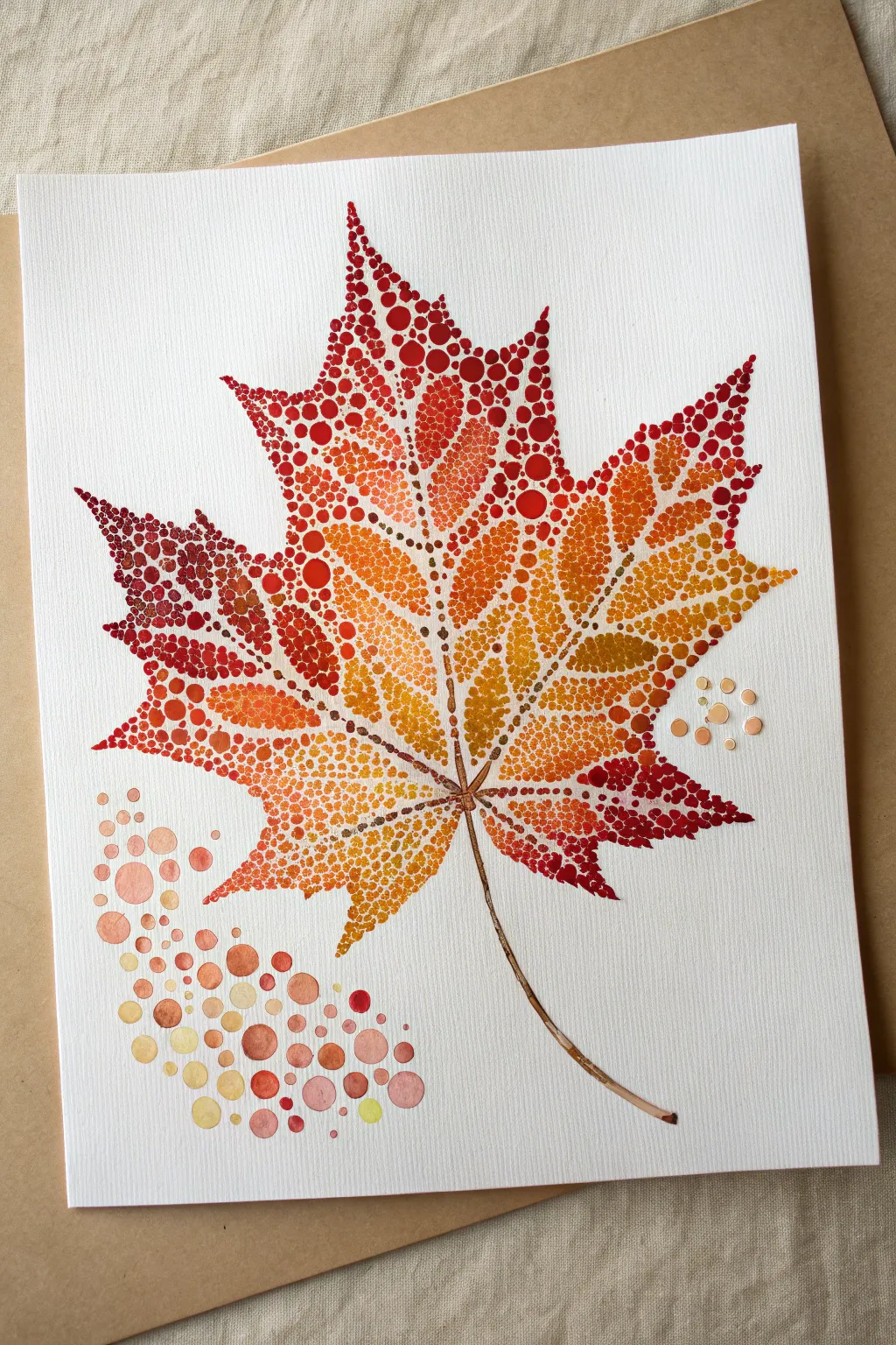
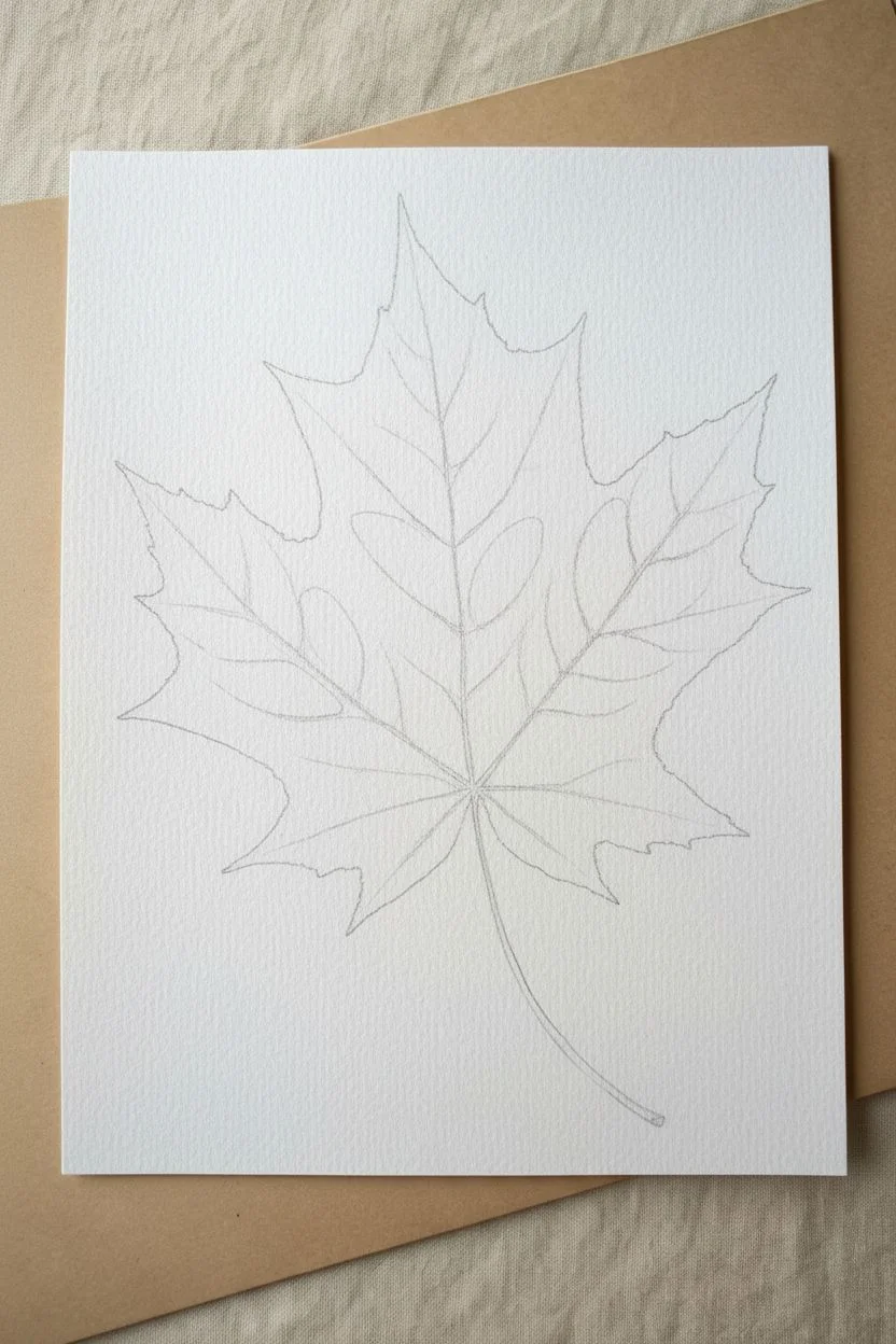
Capture the vibrant transition of fall foliage using the delicate art of pointillism. By carefully layering dots of watercolor to create seamless gradients, you’ll build a maple leaf that seems to glow from within.
Step-by-Step Guide
Materials
- Cold press watercolor paper (medium texture)
- Pencil (HB or lighter)
- Kneaded eraser
- Watercolor paints (Alizarin Crimson, Cadmium Red, Cadmium Orange, Cadmium Yellow, Burnt Sienna)
- Very fine round brushes (size 0, 00, or 000)
- Water cups
- Paper towel
Step 1: Sketching the Outline
-
Draw the basic shape:
Begin by lightly sketching the outline of a maple leaf in the center of your paper. Focus on the five main lobes and their jagged edges. -
Add vein structure:
Sketch the primary veins running through each lobe, meeting at the base of the leaf. These lines will serve as negative space guides later. -
Define the stem:
Draw the stem curving downwards from the base of the leaf, tapering slightly at the end. -
Lighten sketches:
Roll your kneaded eraser gently over the entire drawing. You want the graphite lines to be barely visible, just enough to guide your brush without showing through the translucent paint.
Uneven Dots?
If your dots are bleeding together, your brush is too wet. Blot it on a paper towel after dipping in paint so it holds pigment but isn’t dripping.
Step 2: Dotting the Structure
-
Mix your darkest red:
Prepare a rich, deep red by mixing Alizarin Crimson with a touch of Burnt Sienna. This will be used for the leaf tips and shadow areas. -
Outline tips with dots:
Using your smallest brush, start placing tiny dots along the very tips and edges of the leaf lobes. Keep the dots close together to define the sharp points. -
Create the veins with negative space:
Instead of painting the veins, paint *around* them. Place dots of deep orange or red along the vein lines you sketched, leaving a thin white gap where the vein itself sits. -
Establish the stem:
Switch to a thin wash of Burnt Sienna. Paint the stem using tiny, elongated strokes or dots that merge together to create a solid, woody texture.
Step 3: Layering the Gradients
-
Plan the color zones:
Visualize the gradient: deep red at the tips, transitioning to bright orange in the middle, and sunny yellow near the center and base. -
Fill the outer edges:
Continue with your red mix, filling the outer sections of each lobe with dense dots. Vary the dot size slightly for organic texture. -
Transition to orange:
Clean your brush and switch to Cadmium Orange. Start overlapping the red section slightly, intermingling red and orange dots to create a soft blend. -
Fill the mid-sections:
Work your way inward, filling the middle of the leaf lobes with vibrant orange dots. Keep the spacing consistent but not rigid. -
Introduce yellow centers:
Load your brush with Cadmium Yellow. Fill the center of the leaf and the areas near the veins where the sunlight would hit the strongest. -
Blend the yellow boundary:
Overlap yellow dots into the orange sections. The transparency of watercolors allows the orange to show through the yellow, creating a natural golden hue. -
Deepen contrast:
Go back with your darkest red mix and add a few more dots near the edges and the ‘valleys’ between lobes to increase the contrast and depth. -
Let it dry completely:
Pause here and allow the leaf to fully dry. If you add wet dots too close to others too quickly, they might bleed into a blob.
Add Metallic Flair
Mix a tiny amount of gold watercolor or ink into your yellow dots near the veins for a subtle shimmer that catches the light.
Step 4: Atmospheric Details
-
Add falling dots:
Imagine the wind blowing. To the left of the bottom lobe, paint a cluster of loose dots in varying sizes, using lighter oranges and diluted reds. -
Scatter small accents:
Place a few tiny, faint yellow or beige dots on the right side of the leaf to balance the composition, suggesting dust motes or distant leaves. -
Refine the stem connection:
Darken the point where the stem meets the leaf veins with tiny brown dots to anchor the structure. -
Final assessment:
Step back and look for any unintended white gaps that break the form. Fill them in with the appropriate color for that zone.
Frame your delicate leaf piece once dry to preserve those vibrant autumn hues
Butterfly Wings Made of Symmetrical Dot Patterns
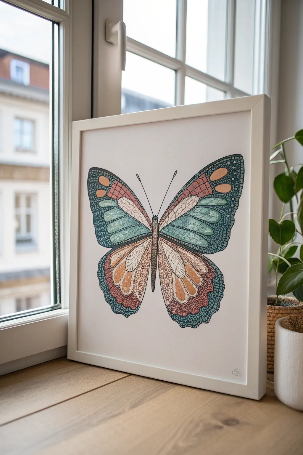
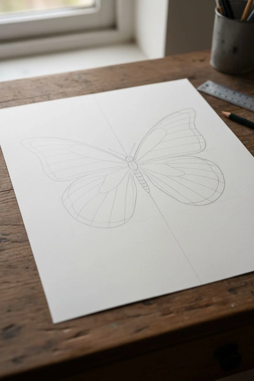
Bring the delicate beauty of nature indoors with this intricately patterned butterfly illustration. Combining structured symmetry with soft, stippled textures creates a piece that feels both scientific and wonderfully artistic.
Detailed Instructions
Materials
- Heavyweight drawing paper or Bristol board (A4 size)
- Pencil (HB or 2H)
- Eraser
- Ruler
- Fineliner pens (sizes 0.1, 0.3, and 0.5)
- Colored pencils or watercolor markers (teal, coral, peach, brown)
- White gel pen (optional for highlights)
Step 1: Sketching the Skeleton
-
Establish the centerline:
Use your ruler to draw a very faint vertical line down the center of your paper. This axis is crucial for maintaining the symmetry of the butterfly’s wings. -
Draw the body:
Along the centerline, sketch a slender, segmented body. Start with a small oval for the head, a slightly wider thorax, and a long, tapering abdomen. -
Map the wing shape:
Sketch the outer contour of the wings. The top wings (forewings) should be triangular with rounded tips, extending upwards and outwards. The bottom wings (hindwings) should be rounder and sweep downwards. -
Divide the wing sections:
Lightly sketch the internal veins of the wings. These lines will radiate from the body towards the wing edges, creating the ‘stained glass’ compartments you’ll fill later.
Step 2: Creating the Pattern
-
Define the borders:
Draw thicker borders around the edges of the wings and between the main vein sections. These thick bands will house the intricate bubble patterns. -
Sketch the details:
Inside the thick borders, lightly pencil in circles and ovals of varying sizes. Place larger ovals near the wing tips and smaller circles along the bottom edges. -
Refine the inner panels:
For the large inner sections of the wings, sketch curving lines that mimic the flow of the veins, preparing them for color blocking. -
Add antennae:
Draw two long, slender antennae extending from the head, ending in gentle clubs.
Steady Hands
When doing dense stippling, rest your wrist on a clean scrap of paper over your drawing. This prevents hand oils from smudging your work.
Step 3: Inking the Details
-
Outline the main structure:
Using a 0.5 fineliner, ink the main skeleton of the wings, the body, and the major veins. Keep your hand steady to ensure smooth, flowing curves. -
Detail the borders:
Switch to a 0.3 pen to outline the circles and ovals within the wing borders. Don’t worry if they aren’t perfect circles; organic shapes look more natural. -
Fill the gaps:
With a 0.1 pen, fill the negative space between the circles in the borders with tiny, dense stippling (dots) or a very tight cross-hatch pattern to create a dark, textured background. -
Texture the body:
Use the 0.1 pen to add small lateral lines or heavy stippling to the butterfly’s body, making the sides darker to give it a 3D cylindrical form.
Metallic Magic
Use metallic gold or copper ink for the spots on the wing borders. When the light hits the finished piece, the wings will shimmer.
Step 4: Adding Color and Depth
-
Base colors for upper wings:
Start coloring the inner panels. Use a soft teal or aqua for the middle sections of the forewings, shading lightly near the veins and leaving the centers slightly paler. -
Warm tones for lower wings:
Apply peach and coral tones to the hindwings. I find that layering the peach first and then deepening the edges with coral creates a lovely gradient effect. -
Color the pattern spots:
Fill the large ovals in the wing borders with contrasting colors. Use light peach for spots on the dark teal borders, and pale teal for spots on the reddish-brown borders. -
Add texture to smooth color:
Once the base color is down, go back in with your 0.1 fineliner. Add very subtle, widely spaced dots over the colored sections to mimic the powdery texture of butterfly scales. -
Deepen the shadows:
Use a darker shade of colored pencil (or a grey marker) to add shadows right alongside the black veins. This makes the colorful panels look slightly recessed. -
Final stippling pass:
Inspect the dark border areas. Add more black ink dots where necessary to ensure the contrast against the light spots is crisp and bold. -
Highlighting:
If you have a white gel pen, add tiny reflection dots to the eyes and a few small highlights on the darkest parts of the wing borders to make them pop.
Frame your symmetrical masterpiece in a simple white frame to let the colors truly sing

PENCIL GUIDE
Understanding Pencil Grades from H to B
From first sketch to finished drawing — learn pencil grades, line control, and shading techniques.
Explore the Full Guide
Cute Animal Portrait in Stippling-Style Dots
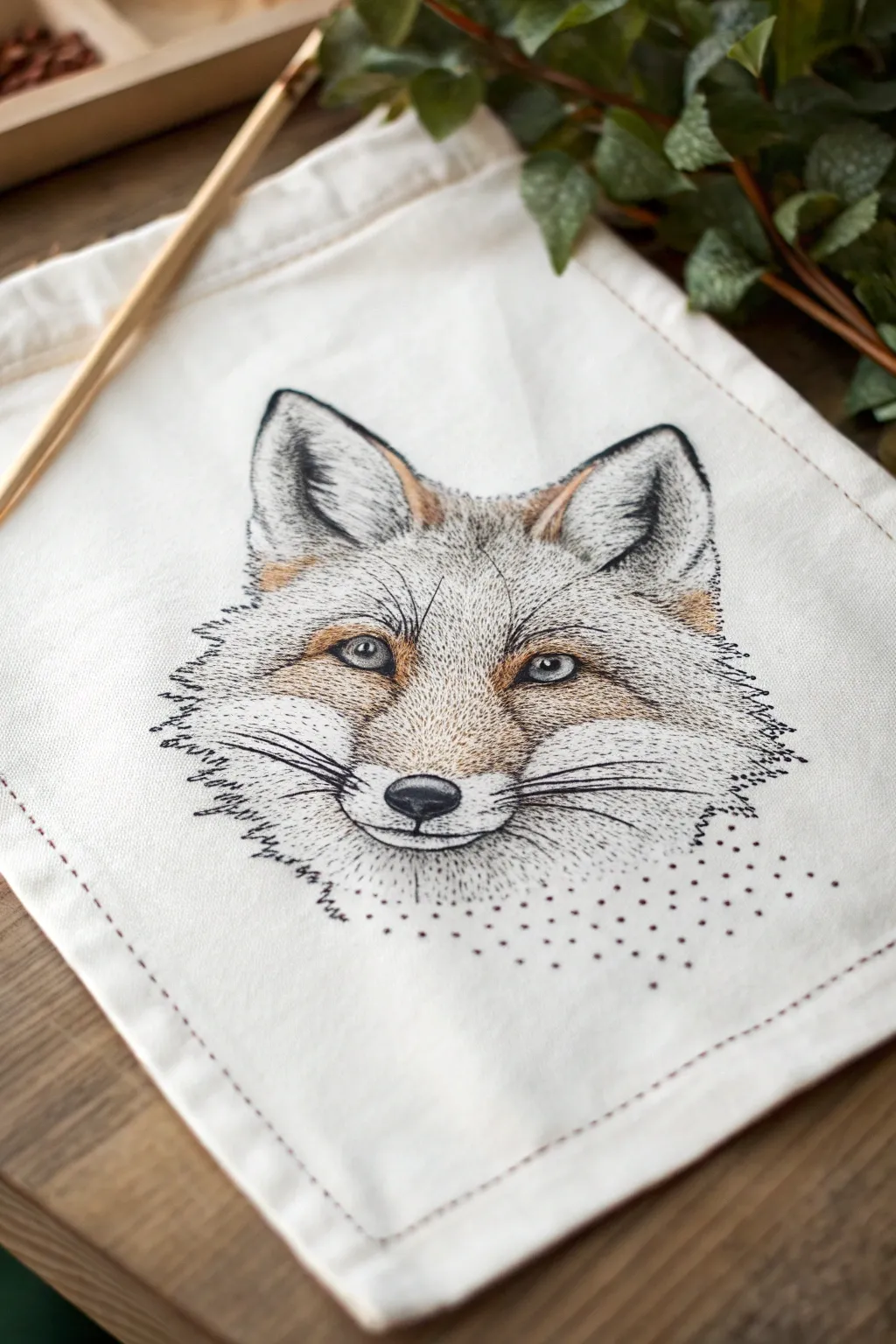
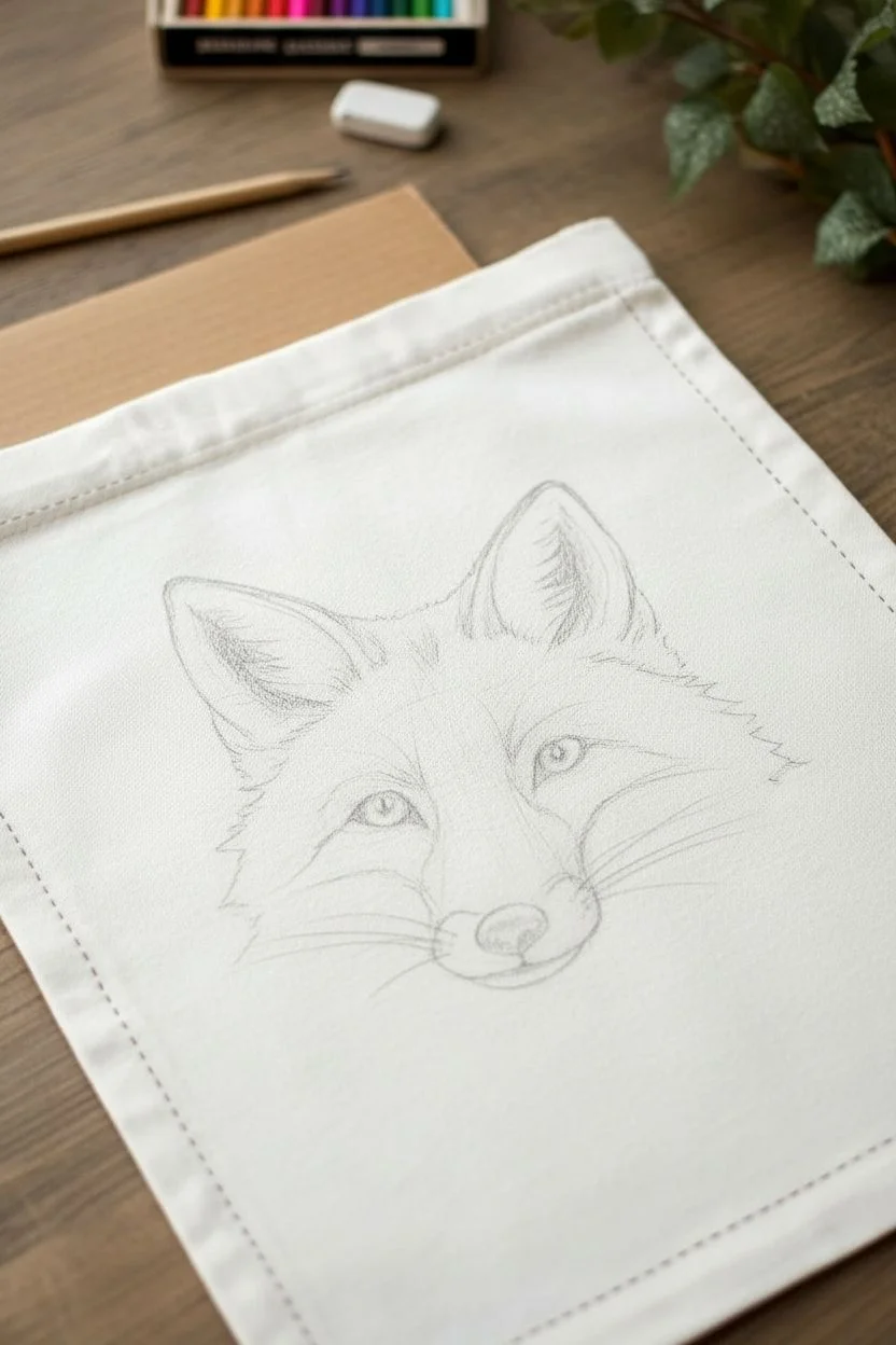
Transform a plain canvas tote into a woodland masterpiece with this delicate fox portrait. By combining fine liner pens with careful stippling, you’ll create a textured, lifelike animal illustration that feels modern and artistic.
Step-by-Step Guide
Materials
- Cotton or canvas tote bag (natural color)
- Fine liner pens (sizes 0.05, 0.1, and 0.5 – waterproof/archival ink)
- Fabric markers or textile paints (burnt sienna, ochre, white)
- Pencil (HB or lighter)
- Eraser
- Iron and ironing board
- Cardboard insert
- Carbon transfer paper (optional)
Step 1: Sketching the Outline
-
Prepare the Surface:
Begin by ironing your canvas tote to remove any creases, as a smooth surface is crucial for fine ink work. Slide a piece of cardboard inside the bag to prevent ink from bleeding through to the back layer. -
Draft the Shape:
Lightly sketch the basic triangular shape of the fox’s head using an HB pencil. Focus on symmetry, placing the ears high and wide, and tapering down to a refined muzzle. -
Refine the Features:
Draw the details of the eyes, nose, and inner ears. Keep these lines very faint; they are just guides for your ink and should be easily erasable later. -
Establish Fur Direction:
Sketch light directional lines to indicate how the fur flows—outward from the nose, sweeping back across the cheeks, and upward on the ears.
Ink Control Pro-Tip
Test your pens on a scrap piece of similar canvas first. If the ink bleeds too much into the fabric weave, spray the drawing area with a light coat of fixative or hairspray before inking.
Step 2: Inking the Details
-
Outline the Eyes:
Using a 0.1 fine liner, carefully ink the eyes. Leave a tiny white circle in each pupil for a catchlight, which brings life to the character immediately. -
Define the Nose:
Fill in the nose pad with the 0.5 pen, using a dense stippling technique rather than solid black to give it a leather-like texture. -
Create Fur Texture:
Switch to your finest 0.05 pen. Instead of solid lines, use broken, short strokes to trace the outer contours of the fur. This creates a fluffy, organic edge rather than a cartoonish outline. -
Whiskers and Heavy Lines:
Use a slightly thicker 0.3 or 0.5 pen to draw the long whiskers and the dark defined lines around the muzzle and jawline.
Step 3: Stippling and Shading
-
Begin Stippling Shading:
Start applying dots with the 0.1 pen in the darkest areas: inside the ears, under the chin, and around the eye sockets. Concentrate the dots heavily in shadow areas and spread them out as you move toward highlights. -
Build Mid-Tones:
Work on the cheeks and forehead using lighter stippling. The transition from the dense dots to open space creates the illusion of volume and roundness on the face. -
Add Texture to the Ears:
Use short, flicking strokes combined with dots inside the ears to mimic the look of tufted hair. -
The Bottom Fade:
At the bottom of the portrait (the neck area), create a purely stippled fade. Allow the dots to become sparse and scatter downward, dissolving the image into the fabric rather than drawing a hard neck line.
Level Up: Botanical Frame
Add a semicircle of stippled leaves and ferns underneath the fox to frame the portrait. Use olive greens and deep browns to complement the fox’s rusty tones.
Step 4: Adding Color
-
Layering Base Color:
Using a fabric marker or diluted textile paint in ‘burnt sienna’ or ‘rust’, gently stroke color into the iris of the eyes and the bridge of the nose. Keep the application sheer so the ink lines show through. -
Highlighting:
Add touches of ochre or light brown to the inner ears and cheeks. I like to keep the coloring minimal and somewhat sketchy to maintain the illustrative style. -
Brighten the White:
If your canvas is off-white, you can add tiny touches of white textile paint to the whiskers or eye highlights to make them pop against the natural fabric. -
Heat Set the Design:
Once the ink and paint are fully dry (give it at least an hour), place a thin cloth over the design and iron it on a high setting (no steam) to set the colors permanently. -
Finishing Touches:
Erase any remaining visible pencil marks gently. If you want a decorative border, stitch a simple running stitch with reddish-brown embroidery floss around the perimeter of the bag front.
Now you have a custom, nature-inspired accessory ready to carry your essentials
Underwater Fish Scene With Bubble Dots and Coral Dots
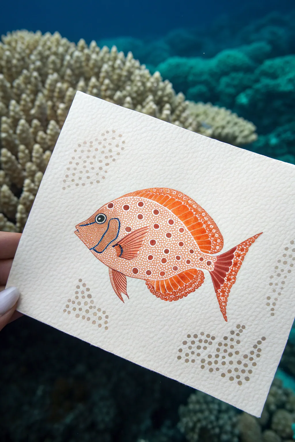
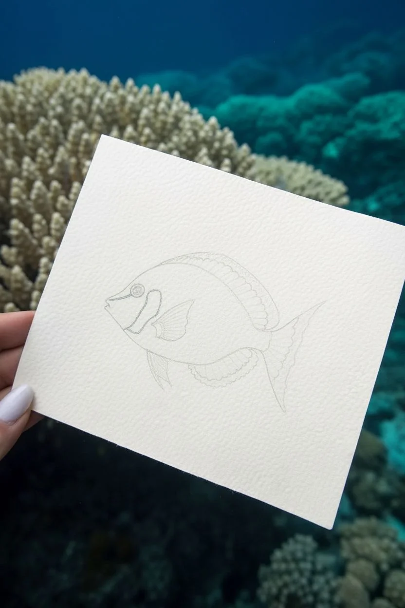
Capture the vibrant beauty of aquatic life with this detailed pointillism study of a spotted orange fish. Using simple dotting techniques on textured paper, you’ll create depth and pattern that mimics the natural scales and shimmering environment of the reef.
Detailed Instructions
Materials
- Heavyweight textured watercolor paper (cold press)
- Fine liner pens (Black, 0.1mm and 0.3mm)
- Orange alcohol-based markers or watercolor markers (various shades)
- White gel pen or opaque white gouache with a fine brush
- Light brown or beige fine liner pen
- Blue fine liner pen
- Pencil and eraser
- Reference photo of a spotted fish
Step 1: Sketching the Outline
-
Draft the fish shape:
Begin by lightly sketching the oval body shape of the fish in the center of your paper using a pencil. Keep the lines faint so they can be erased later. -
Add fin details:
Sketch the dorsal fin along the top, the pectoral fin on the side, and the tail fin. Pay attention to the curved, sweeping lines that give the fish movement. -
Define facial features:
Draw the gill curve, the mouth, and a circular eye. Mark out the distinctive blue cheek stripe area just below the eye.
Gel Pen Flow
If your white gel pen skips over the textured paper, try scribbling on your thumb or a smooth scrap of plastic first to get the ink flowing again.
Step 2: Base Coloring
-
Fill the base layer:
Using your medium orange marker, color in the entire body of the fish, avoiding the eye and the blue cheek stripe. Use a smooth motion to saturate the paper. -
Darken the fins:
Use a slightly darker orange or red-orange shade for the edges of the fins and tail. This creates a gradient effect, making the fins look translucent and textured. -
Add the blue accent:
Carefully outline the cheek stripe with a blue fine liner, leaving the inside slightly paler or filling it with a very light wash of color. -
Deepen the shadows:
Add a second layer of orange ink for shadowing near the bottom of the belly and under the pectoral fin to give the fish a rounded, 3D form.
Step 3: Pointillism Detailing
-
Create main body spots:
With your white gel pen, start adding large, distinct circular dots across the main body. Space them somewhat evenly, but allow for natural variation in size. -
Detail the head:
Change to smaller white dots for the face and head area. As you get closer to the mouth, the dots should become tiny speckles. -
Texture the fins:
Instead of solid dots, use fine white lines or streaks on the dorsal and tail fins to mimic the spine structure. Add tiny micro-dots at the very tips of the fins for a delicate edge. -
Create negative space dots:
For the darker orange spots seen on the fish’s back, outline small circles in dark orange ink and fill the space *around* them with tiny white stippling. This reverse-pointillism creates rings of color. -
Finalize the eye:
Color the pupil black, leaving a tiny white highlight to bring the fish to life. Outline the eye with a thin white ring using your gel pen.
Level Up: Glossy Eye
Once the ink is completely dry, add a tiny drop of clear dimensional glaze (like Glossy Accents) over just the eye. It creates a realistic, wet shine.
Step 4: Background Elements
-
Map out bubbles:
Visualize clusters of bubbles or coral particles in the corners of your paper to frame the fish. I like to keep these loose and organic. -
Stipple the background:
Using a beige or light brown fine liner, create clusters of dots. Vary the density: pack dots closely together for darker areas and spread them out for lighter areas. -
Add larger background dots:
Interperse larger, solid dots among your fine stippling in the background clusters using a slightly thicker marker in a muted sand tone. -
Review and refine:
Step back and look at the composition. If the fish needs more definition, gently outline the outer edge with a very fine dark orange or brown pen to separate it from the paper texture.
Enjoy your vibrant underwater scene and the texture created by thousands of tiny points


Rainbow Bands Built From Clean Rows of Dots
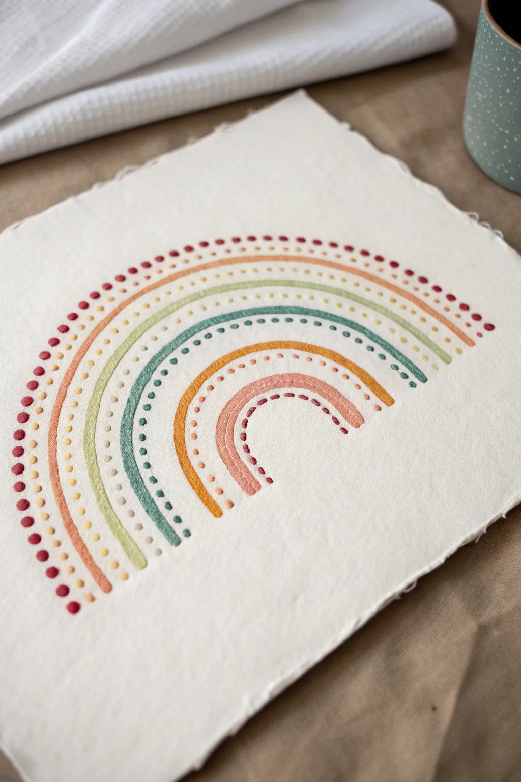
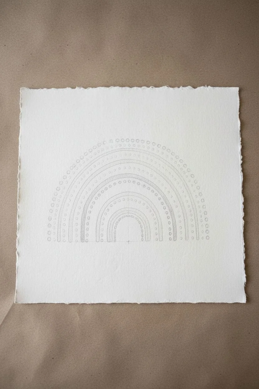
Embrace the soothing rhythm of dots and arches with this minimalist rainbow project on textured paper. By combining solid bands of color with delicate stippled rows, you’ll create a piece that feels both organic and delightfully structured.
Step-by-Step Tutorial
Materials
- Heavyweight watercolor paper or handmade cotton rag paper (rough texture preferred)
- Acrylic gouache or matte acrylic paints
- Color palette: Rust red, terracotta orange, sage green, teal blue, mustard yellow, dusty pink
- Round paintbrush (size 2 or 4)
- Dotting tool or the back end of a small paintbrush
- Compass or round objects for tracing
- Pencil
- Eraser
- Palette for mixing
Step 1: Planning the Arches
-
Prepare the canvas:
Begin with a square sheet of heavy textured paper. If you want that deckled edge look shown in the photo, you can carefully tear the edges of a larger sheet against a ruler rather than cutting with scissors. -
Mark the center:
Lightly mark the center bottom of your paper with a pencil. This will be the anchor point for all your concentric arches. -
Sketch the guides:
Using a compass set to different radii, or by tracing circular objects of varying sizes, lightly sketch six concentric arches. Leave roughly equal spacing between them to accommodate both the painted bands and the dot rows.
Wobbly Arches?
If your painted curves look shaky, don’t stress. Go back with a slightly thicker brush and widen the band slightly to smooth out the edge. The textured paper hides many imperfections.
Step 2: Painting the Solid Bands
-
Mix the outer band color:
Start with your rust red or deep terracotta shade. Ensure the paint consistency is creamy but opaque—acrylic gouache is perfect for this matte, flat finish. -
Paint the first solid arch:
Paint the second-to-largest arch as a solid band. Use a size 4 round brush, keeping the stroke smooth but allowing the paper’s texture to show through slightly. -
Add the green band:
Moving inward, skip a space (for dots later) and paint the next solid band using your sage green mixture. Focus on keeping the curve consistent. -
Paint the teal band:
Skip another space and paint the next inner arch with a deep teal or blue-green shade. -
Create the mustard arch:
Continue the pattern inward, painting a vibrant mustard yellow band. -
Finish the solid center:
Paint the smallest, innermost solid arch with a dusty pink or soft coral color. I find it helpful to rotate the paper as I paint these curves to keep my hand steady.
Add Dimension
Once the base dots dry, add a tiny highlight dot of white or cream on top of the larger colored dots. This creates a cute 3D effect that mimics embroidery knots.
Step 3: Adding the Pointillism Details
-
Test your dotting tool:
Dip your dotting tool or the back of a brush handle into the paint. Practice on a scrap paper to ensure you are getting consistent, round dots. -
Dot the outermost row:
Using the rust red shade, create a row of dots along the very top, outer edge of your rainbow sketch. Space them evenly, about 3-4mm apart. -
Add the second dot row:
Switch to a lighter peach or pale orange. carefully place dots in the gap between the solid rust band and the solid sage green band. -
Stipple the green gap:
Load your tool with a pale moss or cream color. Dot along the curve between the solid green and solid teal bands. -
Continue the pattern:
Between the teal and mustard bands, add a row of dots in a contrasting light blue or mint shade. -
Detail the inner curve:
Place a row of small terracotta dots in the space between the mustard band and the pink center band. -
Final inner dots:
For the finishing touch, place a final row of tiny rust-colored dots loosely running along the underside of the smallest pink arch. -
Let it dry:
Allow the artwork to dry completely flat. If pencil marks are still visible between the paint, gently erase them once you are 100% sure the paint is cured.
Frame this delightful piece in a simple wood frame to highlight the earthy tones and texture
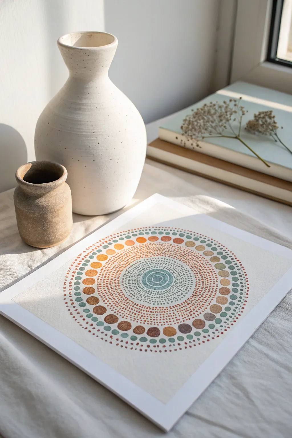
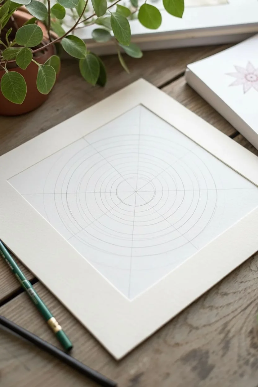
Geometric Mandala Made Entirely of Dot Rings
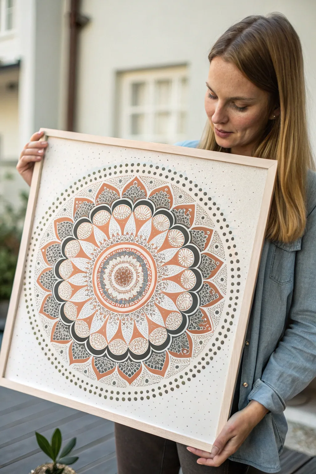
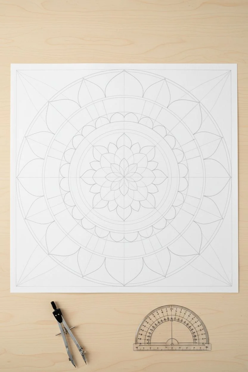
Blend geometric precision with organic textures in this warm, earth-toned mandala project. By combining solid shapes with delicate stippling and dot borders, you’ll create a piece with incredible depth that feels both modern and traditional.
Detailed Instructions
Materials
- Large square art paper (heavyweight, slightly textured, approx. 20×20 inches)
- Pencil and large compass (or string and pin method)
- Ruler and protractor
- Fine liner pens (Black, 0.1mm to 0.5mm)
- Acrylic paint or gouache (Terracotta/Rust, Slate Grey, and Cream/White)
- Fine detail paintbrushes (Size 0 and 00)
- White gel pen or acrylic paint pen
- Square wooden frame
Step 1: Planning the Geometry
-
Trace the concentric circles:
Begin by finding the exact center of your paper. Using your compass, lightly draw a series of concentric circles radiating outward. You will need about 8-10 distinct rings, spacing them variedly—some narrow for borders, some wide for the petal shapes. -
Mark the segments:
Use a protractor to divide your circle into equal segments (e.g., every 15 or 30 degrees) to act as guidelines. This ensures your petals and geometric motifs remain symmetrical as you work your way around the wheel. -
Sketch the primary shapes:
Lightly sketch the main petal shapes within the wider rings. Focus on the large central flower, the middling scalloped edges, and the outer pointed petals. Keep these lines faint so they can be erased later.
Uneven Dots?
If your painted dots look irregular, try using flat-headed tools like the end of a paintbrush handle, a dowel, or dedicated dotting tools dipped in paint for perfect circles.
Step 2: Building the Core
-
Paint the central medallion:
Start at the very center. Paint the innermost ring with a solid terracotta color. Once dry, use a white gel pen or thin brush to add tiny, intricate doodle patterns or lace-like details inside this colored circle. -
Create the first petal layer:
Move to the first ring of petals surrounding the center. Paint these in a soft slate grey or outline them heavily in black ink. Inside these petals, use pointillism (stippling) to create shading, clustering dots at the base and dispersing them toward the tip. -
Add the rust ring:
Paint the prominent ring of rounded rectangular shapes in the terracotta hue. Leave a thin border of white paper between each shape to define them. Let this layer dry completely before adding any overlay details. -
Inscribe white details:
Using your white paint pen or a very fine brush with cream paint, draw delicate Sanskrit-style loops or simple geometric patterns on top of the dried terracotta ring for a layered, printed look.
Add Metallic Flair
Swap the white gel pen details for a gold or copper metallic marker. The shimmer against the matte terracotta and grey paint adds a luxurious, high-end finish.
Step 3: Detailing the Outer Layers
-
Draft the large petals:
For the largest ring of petals, outline the shapes in bold black ink. Inside each petal, draw a smaller ‘seed’ shape at the center, leaving the surrounding space empty for now. -
Apply texture through stippling:
Fill the space around the ‘seed’ shapes with dense black or grey dots. I find it therapeutic to vary the density here—make the dots very tight near the outlines and looser near the center to create a gradient effect. -
Paint the leaf accents:
Between the large cream petals, identify the triangular negative spaces or ‘leaves.’ Paint these with your slate grey tones, adding white vein lines or dot work on top once the paint is matte and dry. -
Create the outer scallop border:
On the outer edge of the main design, create a scalloped border using the terracotta paint. These shapes should mimic the inner rings but on a larger scale. Fill them with scribbled textures or varied dot patterns in white.
Step 4: The Final Dot Border
-
Prepare the perimeter:
Draw two faint pencil circles outside the main design to serve as guides for your final floating dot border. This floating element frames the mandala beautifully. -
Execute the gradient dots:
Using slate grey paint, place large, distinct dots along the inner guideline. As you move to the outer guideline, use smaller dots. You can alternate colors here, using grey for the large dots and a mixed earth tone for the smaller outer ones. -
Erase and clean:
Allow the entire artwork to cure for several hours (or overnight). Once you are certain the ink and paint are bone dry, gently erase any visible pencil guidelines with a kneaded eraser. -
Frame your work:
Place your finished piece into a square wooden frame. A light wood like oak or pine complements the earthy rust and grey tones perfectly.
Hang your masterpiece in a brightly lit room to let those intricate details truly shine
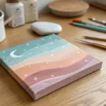
Swirly Night Sky Inspired Dot Painting
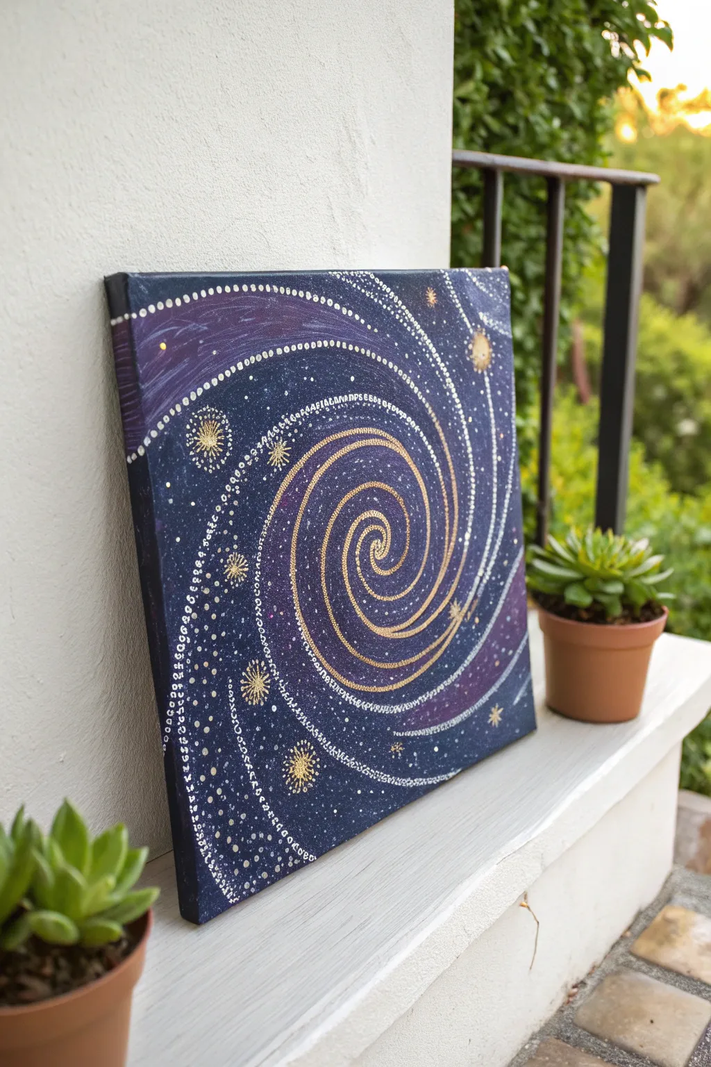
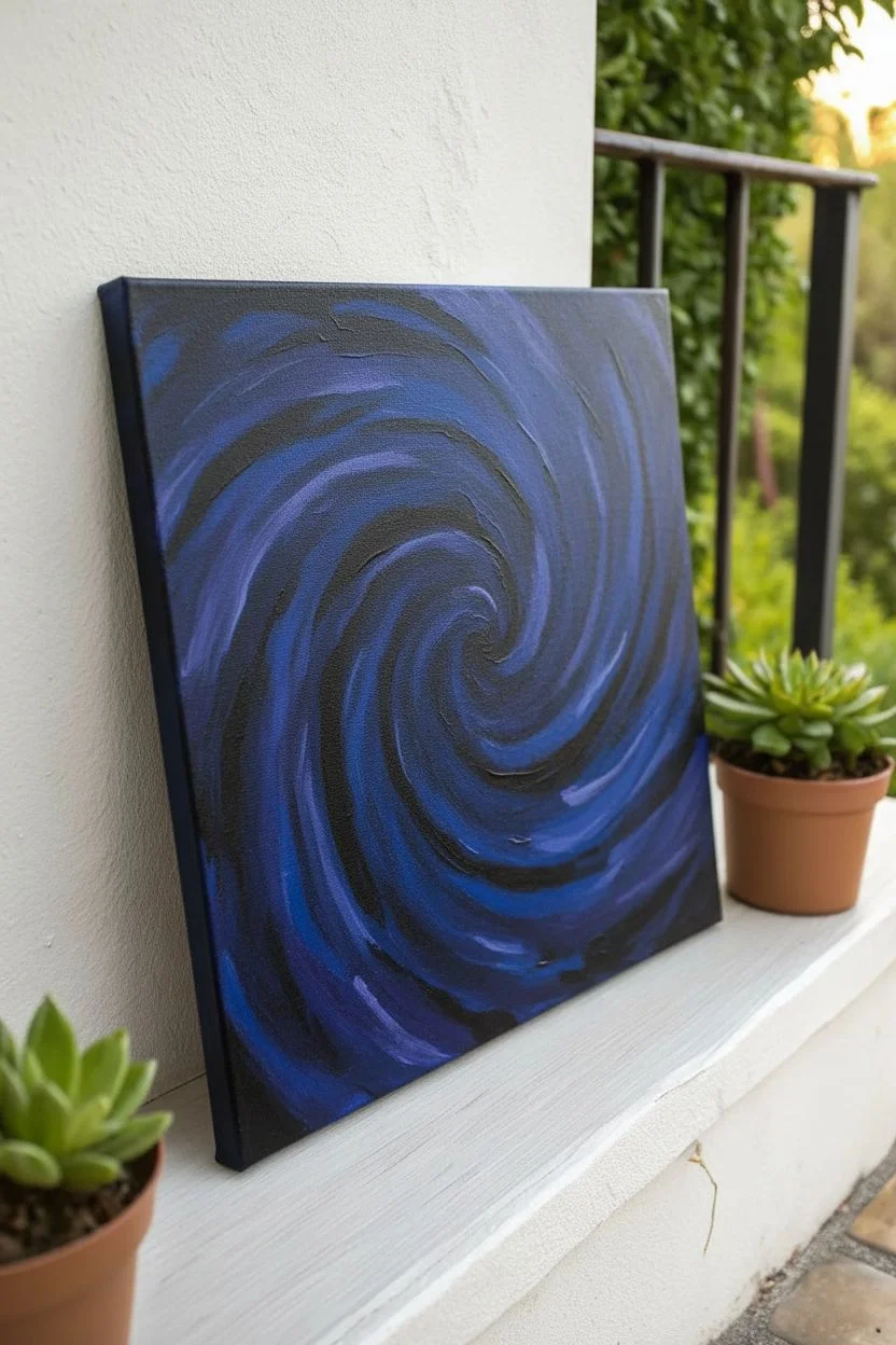
Capture the magic of a distant galaxy with this mesmerizing swirl design. Using a dark, moody background as your canvas, you will create luminescent spiral arms using metallic and white dots for a stunning celestial effect.
Step-by-Step Guide
Materials
- Square stretched canvas (e.g., 10×10 or 12×12 inches)
- Acrylic paints: Dark Blue (Navy/Midnight), Purple, Black, White, Metallic Gold, Metallic Silver
- Dotting tools (various sizes) or ends of paintbrushes/embossing styluses
- Flat paintbrush (for background)
- Small round paintbrush (for details)
- Palette or paper plate
- Cup of water and paper towels
- Chalk or slate pencil (optional, for sketching)
Step 1: Setting the Atmosphere
-
Prepare the canvas:
Start by ensuring your canvas is clean and free of dust. Place it on a protected work surface. -
Paint the base layer:
Mix a small amount of black into your dark blue acrylic paint to create a deep, midnight blue. Paint the entire surface of the canvas with this mixture using your flat brush. -
Add galaxy depth:
While the base coat is still slightly wet, blend in streaks of purple and pure black. Focus the purple in areas where you plan to have the outer edges of your galaxy swirl to create a nebular look. -
Let it cure:
Allow the background to dry completely. If the coverage looks streaky, apply a second coat for a solid, opaque finish and let that dry thoroughly.
Uneven Dots?
If your dots are peaking like Hershey’s Kisses, the paint is too thick. Mix in a tiny drop of water or pouring medium to thin it slightly for flatter, rounder dots.
Step 2: Mapping the Milky Way
-
Sketch the spiral:
Lightly trace a large spiral shape starting from the center of the canvas and winding outwards using chalk or a slate pencil. This line will guide your primary dotting path. -
Start the golden center:
Load a medium-sized dotting tool with metallic gold paint. Place your first dot directly in the dead center of the spiral. -
Create the core spiral:
Following your sketched line, place gold dots tightly together, winding outward from the center. Gradually increase the spacing slightly as the spiral grows. -
Thicken the gold path:
Along the inner sections of your gold spiral, add a second row of gold dots to make the central galaxy arm look denser and brighter. -
Add silver highlights:
Switch to metallic silver paint. Create a secondary spiral line that runs parallel to the gold one, or intertwines with it slightly, especially on the outer arms.
Glow Up
Mix glow-in-the-dark pigment or paint into your white acrylic before dotting the distant stars. Your galaxy will look ordinary by day but light up when the lights go out.
Step 3: Adding Stardust & Details
-
Introduce white star trails:
Using a smaller dotting tool and white paint, create delicate dotted trails that orbit the main golden spiral. Let these lines flow loosely, breaking apart as they reach the canvas edge. -
Vary dot sizes:
I find it helpful to vary the pressure on the tool here; create tapering lines where dots get progressively smaller to mimic fading comet tails. -
Paint geometric stars:
Choose 3-5 spots around the spiral to place ‘major’ stars. Paint a small circle of gold, then use a fine round brush/toothpick to pull paint outward into starburst spikes. -
Detail the major stars:
Once the starbursts act as a base, add tiny gold or white dots around their centers and along the spikes to integrate them into the pointillism style. -
Fill the void:
Take your smallest tool (or a toothpick) and dip it in white paint. Fill the empty dark blue spaces with tiny, random speckles to represent distant stars. -
Add distinct planets:
If you have larger gaps, create a few larger, singular gold or silver dots that stand alone as distant planets or brighter stars.
Step 4: Final Touches
-
Check density:
Step back and look at the composition. If an area looks too empty, add a faint trail of tiny white or silver dots to balance it out. -
Clean up guidelines:
Once the paint is 100% dry (give it plenty of time, as thick dots take longer), gently wipe away any visible chalk lines with a slightly damp cloth.
Hang your finished galaxy on a wall where it can catch the light, showing off those metallic shimmers
Negative Space Pointillism Silhouette in a Dotted Background
Capture the warmth of an earthy palette with this soothing concentric dot art piece. Using simple tools and a steady rhythm, you will build radiating layers of soft teals, burnt oranges, and warm browns to create a modern, minimalist mandala.
Step-by-Step
Materials
- Heavyweight mixed media or watercolor paper (square format recommended)
- Acrylic paints (Teal, Burnt Orange, Yellow Ochre, Deep Brown, Cream/White)
- Dotting tools set (various sizes) or alternative household items (pencil erasers, cotton swabs, toothpick ends)
- Pencil
- Compass or round objects for tracing
- Palette or paper plate
- Paper towels
- Ruler
Step 1: Preparation and Mapping
-
Prepare your paper:
Begin with a clean sheet of heavy paper. If yours is rectangular, you may want to measure and cut it into a square, or simply center your design. Tape the corners down lightly to prevent shifting. -
Find the center:
Use a ruler to lightly mark the exact center point of your paper. This reference point is crucial for keeping your circles symmetrical. -
Draw guide rings:
Using a compass, draw a series of very faint concentric circles radiating from the center. Space them about 0.5 to 1 inch apart depending on how dense you want your pattern. These lines will guide your dot placement but shouldn’t be visible in the end. -
Sketch the zones:
Decide which rings will be solid colors and which will be dotted. Lightly mark these zones so you don’t lose track of your pattern plan while painting.
Step 2: The Center Core
-
Mix the teal shade:
Mix a muted teal using blue, green, and a touch of white or gray to soften it. Ensure the paint consistency is creamy, like yogurt, so it holds a round shape. -
Create the central spiral:
Dip a fine-tip tool or small brush into the teal paint. Instead of a single dot, paint a tight, solid spiral or a series of concentric solid rings right at the center point, creating a ‘bullseye’ effect about an inch wide. -
Add the first dot ring:
Switching to a small dotting tool, place tiny dots of the same teal color just outside your solid center. Keep them tightly packed to create a textured transition.
Uneven Paint Peaks?
If your dots dry with sharp points on top (Hershey’s Kiss shape), your paint is too thick. Add a single drop of water or flow medium to your acrylics to help them settle into smooth domes.
Step 3: Radiating Layers
-
Transition to micro-dots:
Load a fine tool with the teal paint again. Fill the next concentric ring band entirely with hundreds of tiny, stippled dots. They don’t need to be in rows; a random, dense scattering creates a beautiful sandy texture. -
Introduce the burnt orange:
Clean your tool and switch to a burnt orange or terracotta color. Create a ring of medium-sized dots around the teal section. Try to keep the spacing between each dot consistent. -
Layer the lighter orange:
Mix a lighter, peachier orange by adding white to your terracotta. Using a slightly smaller tool, place a second row of dots directly outside the previous orange ring. -
Build the ‘sun ray’ section:
This is the widest band of the pattern. Use a very small tool and your light orange/peach mix to fill a broad ring with tiny, scattered stippling dots, similar to the teal texture you created earlier. -
Add defining large dots:
Select your largest dotting tool (or a pencil eraser). Dip it into deep brown, ochre, and teal paints, alternating colors as you stamp a ring of large, bold circles around the stippled orange band. -
Create the outer border:
Using a medium tool, create a definitive border ring using a mix of teal and brown dots. Place them strategically between the large dots from the previous step to interlock the design. -
Add final micro-details:
Go back with your tiniest tool and red paint to add microscopic accent dots between the larger outer circles. This adds intricate detail without overwhelming the balance.
Keep It Round
Reload your tool after every single dot for the most consistent size. As the paint runs out, dots get smaller; reloading ensures uniform circles throughout the ring.
Step 4: Finishing
-
Erase guide lines:
Allow the artwork to dry completely—I usually wait at least an hour to be safe. Once dry, gently erase any visible pencil marks from your initial mapping. -
Flatten the paper:
If the moisture from the paint has buckled the paper slightly, place the dry artwork under a heavy book overnight to crisp it up before framing.
Frame your new mandala in a simple white mat to let those earthy colors truly shine on your wall
Layered Pointillism With Pen Lines and Second-Pass Dots
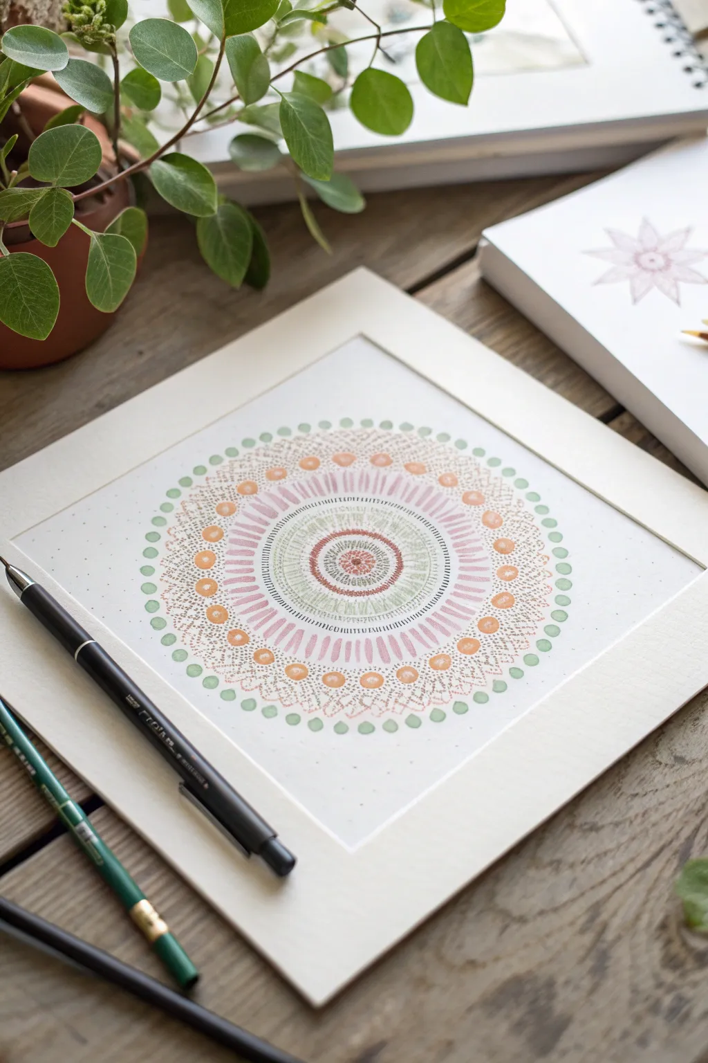
This delicate mandala project combines structured geometry with the softness of pointillism and line work. By layering peach, sage, and dusty rose tones in concentric rings, you’ll create a soothing, symmetrical artwork perfect for framing.
Step-by-Step Tutorial
Materials
- Square watercolor paper or heavy cardstock (approx. 8×8 inches)
- Pencil (HB or 2H)
- Compass
- Protractor
- Ruler
- Fine liner pens (sepia or dark brown, 0.1mm and 0.5mm)
- Pastel markers or colored fineliners (sage green, dusty pink, peach/light orange)
- Eraser (kneaded preferred)
- Square mat board for framing (optional)
Step 1: Planning the Structure
-
Find the center:
Begin by lightly marking the exact center of your square paper. Use a ruler to find the midpoint intersection. -
Draw guide circles:
Using your compass, draw a series of light concentric circles starting from the center point. Create about 8-10 rings with varying widths between them to serve as guidelines for your different pattern layers. -
Segment the circle:
To ensure your petals and dots stay evenly spaced, use a protractor to mark light radial lines every 10 or 15 degrees from the center, dividing your circle like a pie.
Steady Hand Trick
Rest your wrist on a clean sheet of scrap paper while drawing. This prevents skin oils from smudging the paper and keeps your hand steady for precise dots.
Step 2: Drawing the Core
-
Center details:
Start with the innermost circle. Using a brown 0.1mm fine liner, stipple a dense cluster of tiny dots right in the center. -
First ring:
Moving outward to the next guide circle, draw a tight ring of small, hollow red-brown circles or heavy dots. -
Radiating lines:
In the next band, use your sage green pen to draw very fine, short radial lines. Keep them closely packed together to create a textured, radiating effect. -
Inner definitions:
Define the boundary of this green section with a solid, thin brown ink line to separate it from the next layer.
Uneven Spacing?
If your pattern doesn’t close perfectly at the end of a ring, distract the eye by adding tiny ‘filler’ dots between the main shapes to mask the gap.
Step 3: Expanding the Pattern
-
Pink dashes:
In the next available wide band, switch to your dusty pink marker. Draw elongated dashes or ‘rice grain’ shapes radiating outward. I like to make these slightly thicker than fine lines for visual weight. -
Stipple shading:
Add depth to these pink dashes by adding tiny brown stippled dots at the base of each dash (closest to the center), creating a shadow effect. -
Dotted border:
Create a border for the pink section using a ring of evenly spaced peach-colored dots. -
Complex latticework:
For the next wide band, draw a series of small V-shapes or scallops in brown ink. Fill the negative space inside each V with tiny stippled dots.
Step 4: The Outer Rings
-
Large accent dots:
In a new ring, create larger, bold circles using the peach marker. Space them out so they align with your radial guide lines. -
Connecting the dots:
Between these large peach circles, add delicate arching lines or tiny brown dots to connect them visually. -
Final green perimeter:
For the outermost layer, draw a ring of sage green circles. These should act as the final frame for the mandala. -
Erase guides:
Wait at least 15-20 minutes to ensure all ink is completely dry. Gently erase all pencil circles and radial lines. -
Second pass details:
Inspect your work. Go back in with your finest brown pen and add extra stippling dots in any areas that look too empty or need more contrast. -
Matting:
Place your finished artwork behind a white mat board to give it a professional, gallery-style finish.
Step back and admire the rhythm and symmetry of your finished piece
Have a question or want to share your own experience? I'd love to hear from you in the comments below!