If you’ve ever wished your paintings had more depth without outlining everything, negative painting is about to become your favorite trick. You’ll build forms by darkening what’s around them—layer by layer—until your subject shows up like magic in the negative space.
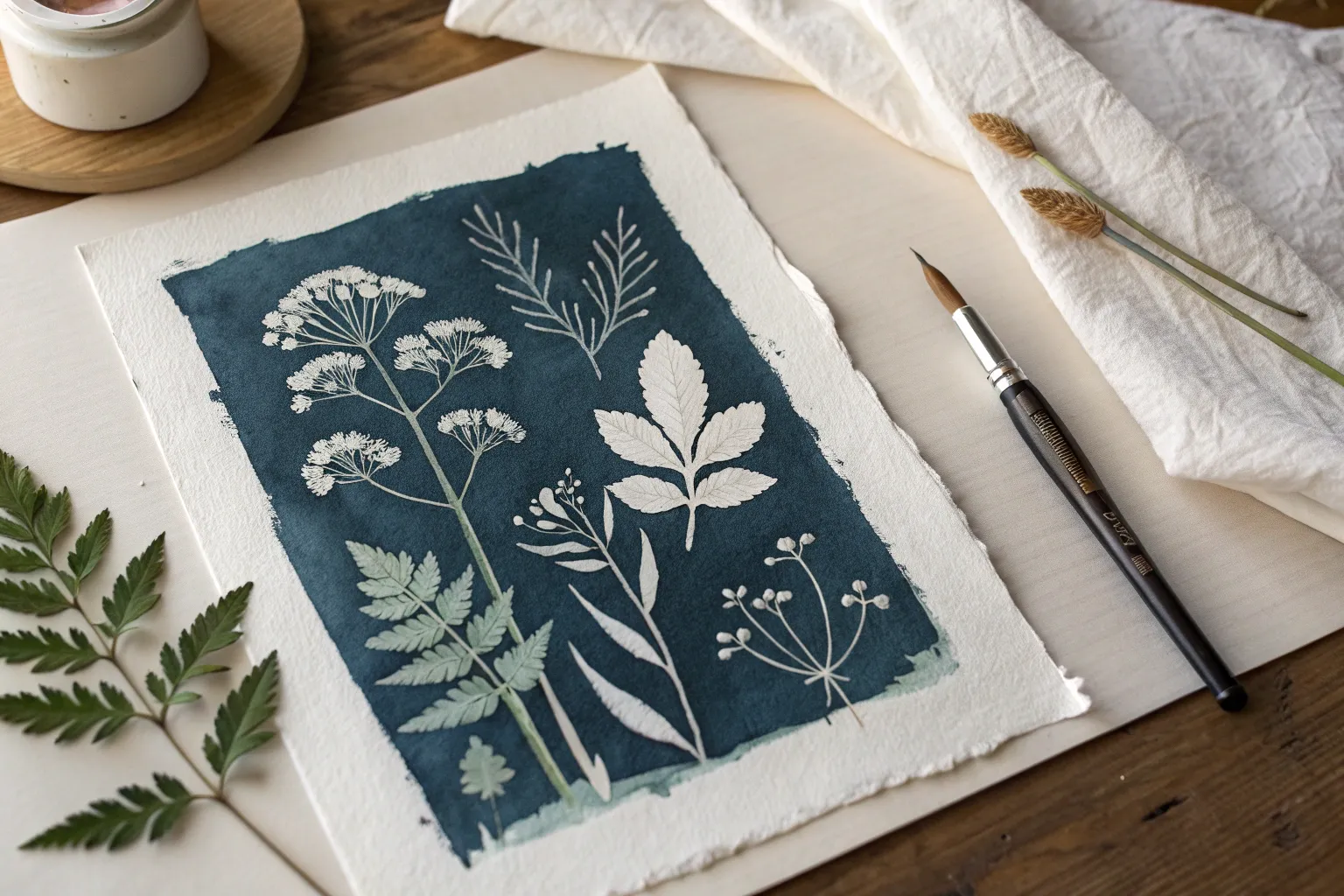
Loose Wildflower Bouquet With Negative Shapes as the Star
This project creates a striking botanical composition by painting the background around the flowers rather than just painting petals on white paper. The deep indigo wash creates a moody, atmospheric backdrop that makes the delicate white blooms pop with ethereal beauty.
Step-by-Step
Materials
- Heavyweight watercolor paper (300gsm cold press, preferably with deckled edges)
- Masking fluid (drawing gum) with applicator or old brush
- Watercolor paints: Indigo, Payne’s Grey, and Sepia
- Technical pen or fine liner (waterproof, black or dark grey)
- White gouache or white ink
- Round watercolor brushes (Size 4 and 8)
- Pencil (HB) and kneaded eraser
- Paper towels
- Painter’s tape or board for mounting
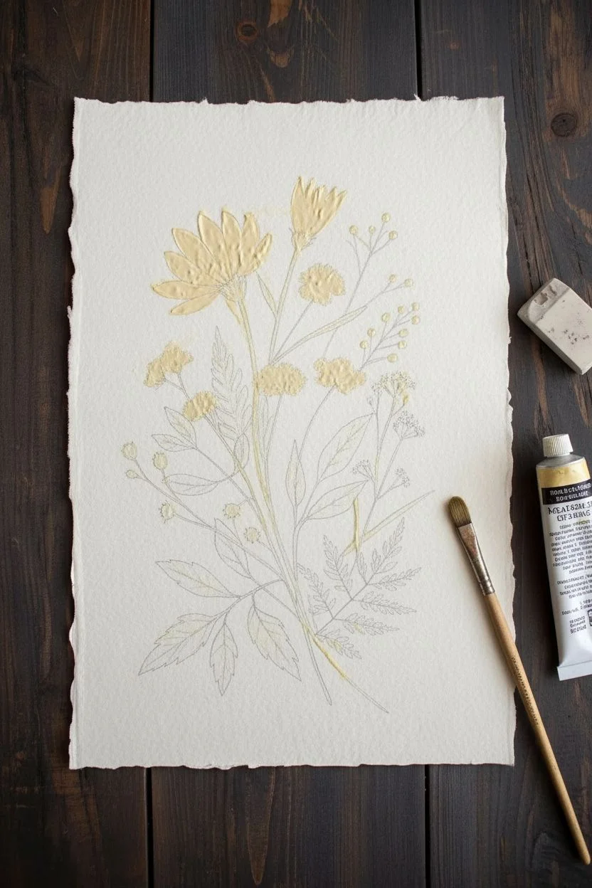
Step 1: Planning and Masking
-
Rough Sketching:
Begin by lightly sketching your floral arrangement in pencil. Focus on the large daisy shapes, the umbrella-like umbels, and the fern leaves at the bottom. Keep the stems long and intersecting for a natural, wild look. -
Refining Details:
Add small circles for berries or buds and define the jagged edges of the lower leaves. Don’t worry about shading yet; you just need clear outlines of where the white paper needs to be preserved. -
Applying Masking Fluid:
Using a masking fluid applicator or an old brush you don’t care about, carefully fill in all the flower shapes, stems, and leaves that you want to remain white. Be generous with the fluid but stay within your lines. -
Drying Time:
Let the masking fluid dry completely. It should feel rubbery and not tacky to the touch. This is crucial—if it’s wet, it will ruin your brush and the paper.
Clean Edges Tips
To keep clean edges when removing masking fluid, always pull the rubbery strand outwards, away from the painted area, rather than pulling it across the paint.
Step 2: The Negative Wash
-
Mixing the Indigo:
Prepare a large puddle of Indigo watercolor mixed with a touch of Payne’s Grey. You want a deep, saturated consistency, not too watery, to get that rich dark background. -
Painting the Background:
Using your size 8 brush, paint the large block of color behind the flowers. Don’t paint the entire page; leave a rough, organic border of unpainted paper around the edges to frame the composition. -
Creating Variation:
While the wash is still wet, drop in hints of plain water or slightly more diluted blue in some areas to create a soft, cloud-like texture. This prevents the background from looking flat. -
Fading the Edges:
For the bottom section where the stems end, dilute your paint significantly. Let the dark blue fade into a very pale wash or white paper near the bottom ferns, creating a gradient effect. -
Complete Drying:
Allow the paint to dry thoroughly. The paper must be bone dry before the next step to avoid tearing the surface.
Step 3: The Reveal and Detail
-
Removing the Mask:
Gently rub the dried masking fluid with your finger or a rubber cement pickup tool. Reveal the crisp white paper shapes underneath your dark wash. -
Inking the Blooms:
Switch to your waterproof technical pen. Carefully draw the centers of the daisies and add fine lines to the petals to suggest texture and veins. -
Defining Stems:
Trace the long stems with the pen. I like to break the line occasionally rather than drawing one solid stroke, which keeps the drawing feeling organic and less rigid. -
Adding Leaf Veins:
Draw the central veins and branching veins on the dark lower leaves. Since these leaves are white against a white background at the very bottom, use the pen to give them form. -
Painting Leaf Accents:
Mix a very dark grey-blue (Indigo + Sepia). Carefully paint inside some of the lower leaf shapes, leaving the veins white (negative painting within the leaf) or simply paint the leaves solid dark to balance the top.
Torn Paper Fix
If masking fluid tears your paper upon removal, the paper was too soft or the fluid stayed on too long. Use a tiny bit of white gouache to patch and smooth the texture.
Step 4: Final Touches
-
Green Hues:
Mix a very desaturated, pale olive green. Glaze this lightly over some of the stems and the buds to tint them, moving away from pure white without losing the contrast. -
Highlighting:
If any masked edges look too rough or if you want sharper petals, use white gouache to tidy up the outlines of the daisies against the dark blue background. -
Adding Depth:
Add tiny shadows with diluted grey paint under where the petals overlap or where stems cross each other to give the bouquet dimension. -
Splatter Texture:
Load a small brush with white gouache and tap it to create tiny white speckles over the dark blue area, simulating dust motes or pollen in the air.
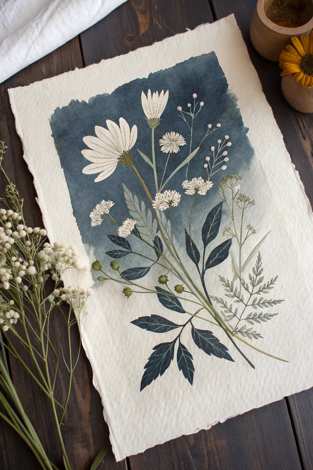
Step back and admire how the dark negative space transforms a simple sketch into a dramatic botanical portrait


Pumpkins and Vines Made From Negative Space Gaps
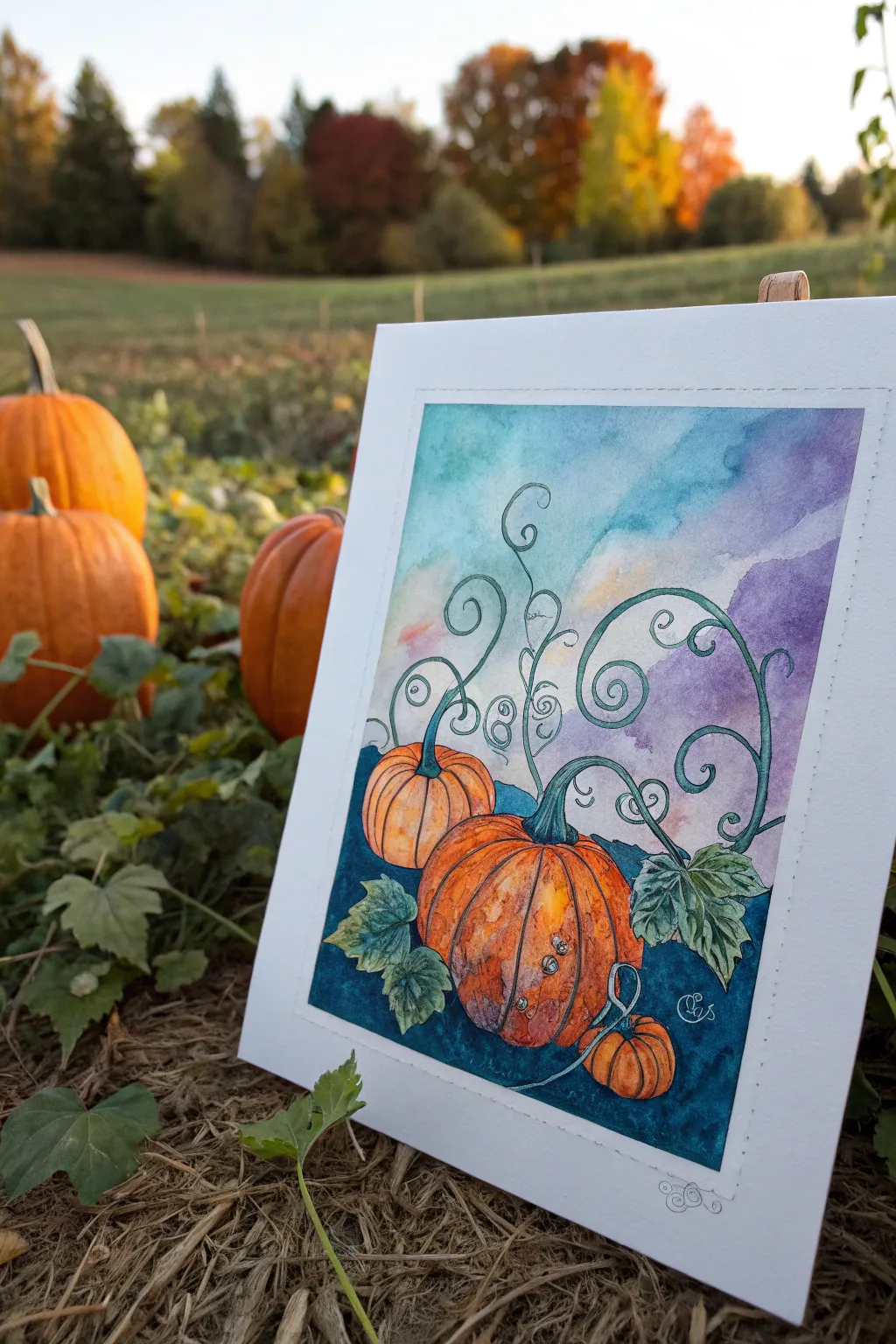
Capture the magic of autumn with this watercolor painting that uses clever negative painting techniques to make vines glow against a twilight sky. By painting around shapes rather than directly painting them, you’ll create depth and intricate details that pop.
Step-by-Step Guide
Materials
- Watercolor paper (140lb cold press recommended)
- Watercolor paints (Indanthrone Blue, Burnt Orange, Sap Green, Purple/Violet mix)
- Fine liner waterproof pen (black, 0.1 or 0.3mm)
- Round watercolor brushes (Size 2 and 6)
- White gouache or white gel pen (optional for highlights)
- Pencil and eraser
- Masking fluid (optional but helpful)
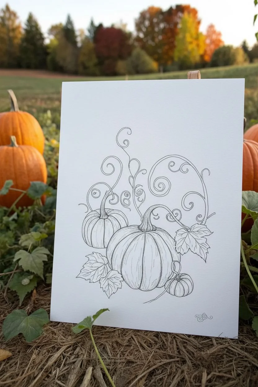
Step 1: Planning and Sketching
-
Sketch the Pumpkins:
Start with a light pencil sketch. Draw a large central pumpkin slightly off-center and a smaller one tucked behind it to the left. Just outline the main shapes and segments. -
Draw the Vines:
Lightly sketch the swirling vines rising from the pumpkin stems. These vines will be the key feature of your negative painting, so give them elegant, curling shapes that fill the upper negative space. -
Define the Leaves:
Sketch a few jagged pumpkin leaves near the base of the pumpkins. Keep the lines loose and organic. -
Ink the Details:
Using your waterproof fine liner, carefully trace over your pencil lines. Add texture lines on the pumpkin ribs and delicate veins on the leaves. Keep the vine lines fairly thin but distinct.
Step 2: Painting the Foreground
-
First Wash on Pumpkins:
Wet the inside of the pumpkin shapes with clean water. Drop in a diluted orange watercolor mix, letting the color bloom naturally. -
Deepen the Pumpkin Shadows:
While the orange is still damp, add touches of burnt sienna or a darker orange along the bottom curves and between the ribs to create volume. -
Paint the Leaves:
Paint the leaves with a mix of sap green and a touch of blue for a cool, autumnal foliage look. Let the color vary between light and dark green within the leaf shapes. -
Dry Completely:
Allow the pumpkin and leaf sections to dry thoroughly before moving on. This prevents the background color from bleeding into your focal points.
Clean Edges
For the crispest vines, use masking fluid on the vine lines before painting the dark background. Peel it off later to reveal perfect white lines.
Step 3: The Negative Painting Background
-
Mix Your Background Color:
Create a rich, dark twilight mix using Indanthrone Blue and a touch of cool green. Needs to be fairly saturated to contrast with the vines. -
Start the Negative Painting:
This is the crucial step. Carefully paint the dark blue mixture *around* the drawn vine lines and the pumpkin outlines. You are painting the negative space, leaving the paper white (or lightly washed) inside the vine shapes. -
Fade into the Sky:
As you move upward away from the pumpkins and vines, dilute your dark blue mix with more water or introduce purple and soft teal tones for a gradient sky effect. -
Detailing the Vine Gaps:
Use your smallest brush to get into the tiny loops of the vine swirls. Ensure the background color is solid right up to the ink line for a crisp edge. -
Soften the Horizon:
Let the dark background fade out softly towards the top turning into a wash of violet and pale blue to simulate an evening sky.
Color Harmony
Mix a tiny bit of your pumpkin orange into the dark blue background color. This creates color harmony and makes the scene feel cohesive.
Step 4: Finishing Touches
-
Refine Shadows:
Once the background is dry, glaze a very light blue or purple shadow on the bottom right of the pumpkins to anchor them to the ground. -
Highlight the Vines:
If the vines look too stark white against the dark background, glaze them with a very watery pale green or blue-green to integrate them into the scene. -
Add Texture:
Use the pen to add final stippling dots or small circles on the pumpkin skin for texture. -
Bright Highlights:
I like to use a tiny dot of white gouache or a gel pen on the top curve of the pumpkin ribs to make them look shiny and plump.
Now frame your work or turn it into a seasonal greeting card to celebrate the harvest season


Underwater Seaweed Forest in Layered Negative Painting
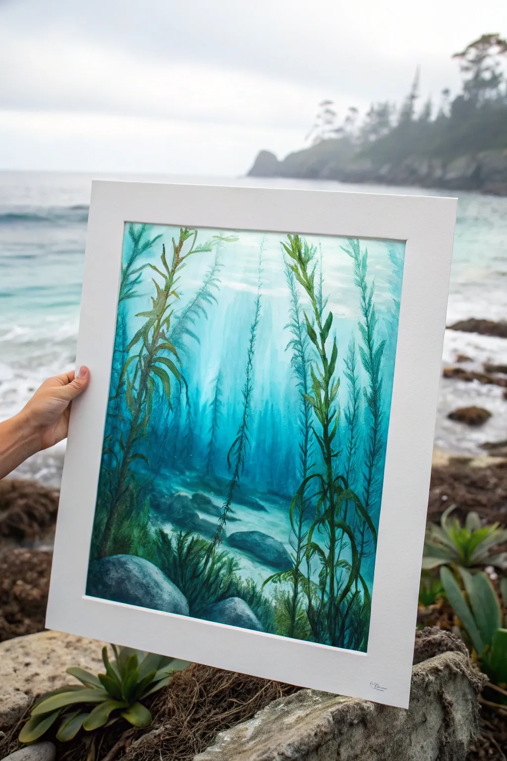
This captivating watercolor project uses negative painting techniques to build an ethereal, light-filled underwater scene. By carefully preserving lighter shapes and painting increasingly darker layers around them, you’ll create a powerful sense of depth and distance in your kelp forest.
Detailed Instructions
Materials
- High-quality watercolor paper (cold press, 140lb or heavier)
- Watercolor paints (Turquoise, Phthalo Blue, Sap Green, Indigo, Payne’s Gray)
- Masking fluid (optional but helpful)
- Round brushes (sizes 4, 8, and 12)
- Flat wash brush (1 inch)
- Masking tape and mounting board
- Paper towels
- Two jars of water
Step 1: The First Layer: Light and Distance
-
Prepare your surface:
Begin by taping your watercolor paper securely to a board. This prevents buckling during the wet washes. Ensure the tape edges are pressed down firmly to create that crisp white border later. -
Initial wash:
Mix a very watery, pale turquoise. Pre-wet the entire paper with clean water, then drop in your pale color, keeping it lightest near the top center to suggest sunlight piercing the water surface. -
Create distant kelp:
While the paper is still slightly damp but no longer shiny, mix a very faint, watery green-blue. Paint the shapes of a few distant kelp fronds. These should be soft and barely visible, as if far away in the murk. -
Full dry:
Allow this initial layer to dry completely. The paper must be bone dry before proceeding to the negative painting phase, or your sharp edges will bleed.
Pro Tip: Magic Eraser
If your ‘sunbeams’ get too dark, use a damp stiff brush or a tiny piece of slightly wet magic eraser sponge to gently lift pigment in diagonal lines from the top surface down.
Step 2: The Middle Ground: Defining Shapes
-
Sketch placement:
Lightly sketch the main flowing lines of your foreground and middle-ground kelp stalks with a hard pencil (H or 2H). Keep the lines faint so they don’t show through the transparent paint. -
Mix mid-tones:
Create a puddle of medium-strength turquoise mixed with a touch of sap green. This color needs to be distinctly darker than your first wash. -
Negative painting start:
Paint around the shapes of the kelp stalks you want to remain light (the ones closest to the light source). You are painting the water *behind* these stalks, carving out their shapes by darkening the negative space. -
Softening edges:
As you paint the negative space, use a clean, damp brush to soften the edges of the paint as it moves further away from the kelp stalks. This avoids harsh outlines everywhere and keeps the watery feel. -
Adding details:
While this layer is drying, you can add faint texture to the sea floor using horizontal strokes of the mid-tone mix, suggesting sand ripples or distant rocks.
Trouble: Hard Edges?
If your background water looks like a cutout because of hard paint lines, re-wet the area with clean water and gently blur the harsh edges into the surrounding color.
Step 3: The Foreground: Depth and Contrast
-
Darkest mixture:
Mix your darkest value using Phthalo Blue, Sap Green, and a bit of Indigo or Payne’s Gray. This should represent the deep shadows and the nearest vegetation. -
Foreground stalks:
Paint the most prominent kelp stalks in the foreground. Unlike the negative painting step, you are now painting the positive shapes of these closest plants directly over the background layers. -
Leaf details:
Use the tip of a size 4 round brush to add the flowing, ribbon-like leaves to the foreground stalks. Vary the pressure to make the ribbons twist and turn. -
Anchoring rocks:
Paint the large rocks at the bottom using a mix of Payne’s Gray and Blue. Keep the tops of the rocks lighter (lift out pigment if needed) to show where the filtered light hits them. -
Sea floor grass:
Add tufts of seagrass or smaller plants between the rocks using quick, upward flickering strokes with your smallest brush and the dark green mix. -
Shadows and depth:
Glaze a transparent layer of dark blue over the bottom corners of the painting. This vignette effect draws the viewer’s eye up toward the light source. -
Final highlights:
If you lost some highlights on the foreground leaves, use a tiny amount of white gouache or a white gel pen to add subtle rim lighting to the edges of the darkest kelp. -
Reveal:
Wait for the painting to be absolutely dry—check by touching the back of the paper to see if it feels cool. Once dry, carefully peel away the tape at a 45-degree angle to reveal the clean border.
Frame your underwater masterpiece in a simple white mat to let those deep blues really sing


Butterfly Wings Revealed by Negative Painting Patterns
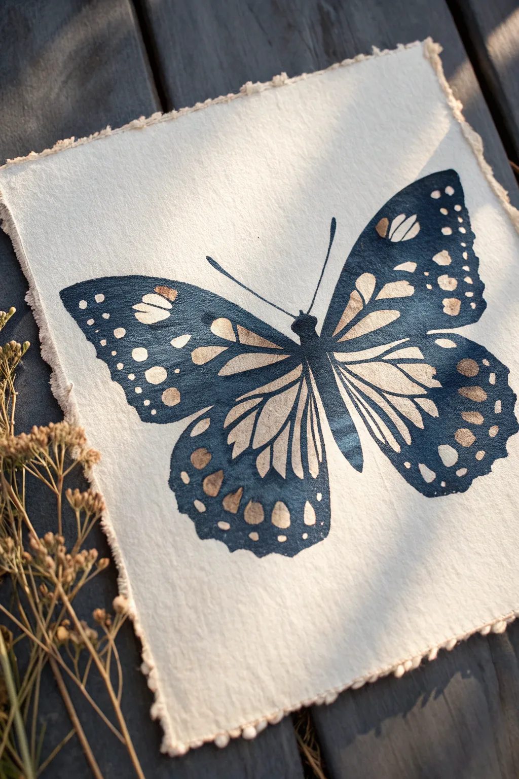
This project captures the delicate symmetry of a butterfly using a striking negative painting technique where the white of the paper creates the design. The gentle deckled edge of the paper adds a rustic, handmade charm that complements the deep indigo tones perfectly.
Step-by-Step Guide
Materials
- Cold press watercolor paper (deckle edge preferred)
- Indigo watercolor paint
- Paintbrushes: Size 4 or 6 round, and a Size 0 or 00 detail brush
- Pencil (HB or H)
- Kneaded eraser
- Masking fluid (optional, but recommended for beginners)
- Tracing paper (optional)
- Palette
- Water cups
- Paper towels
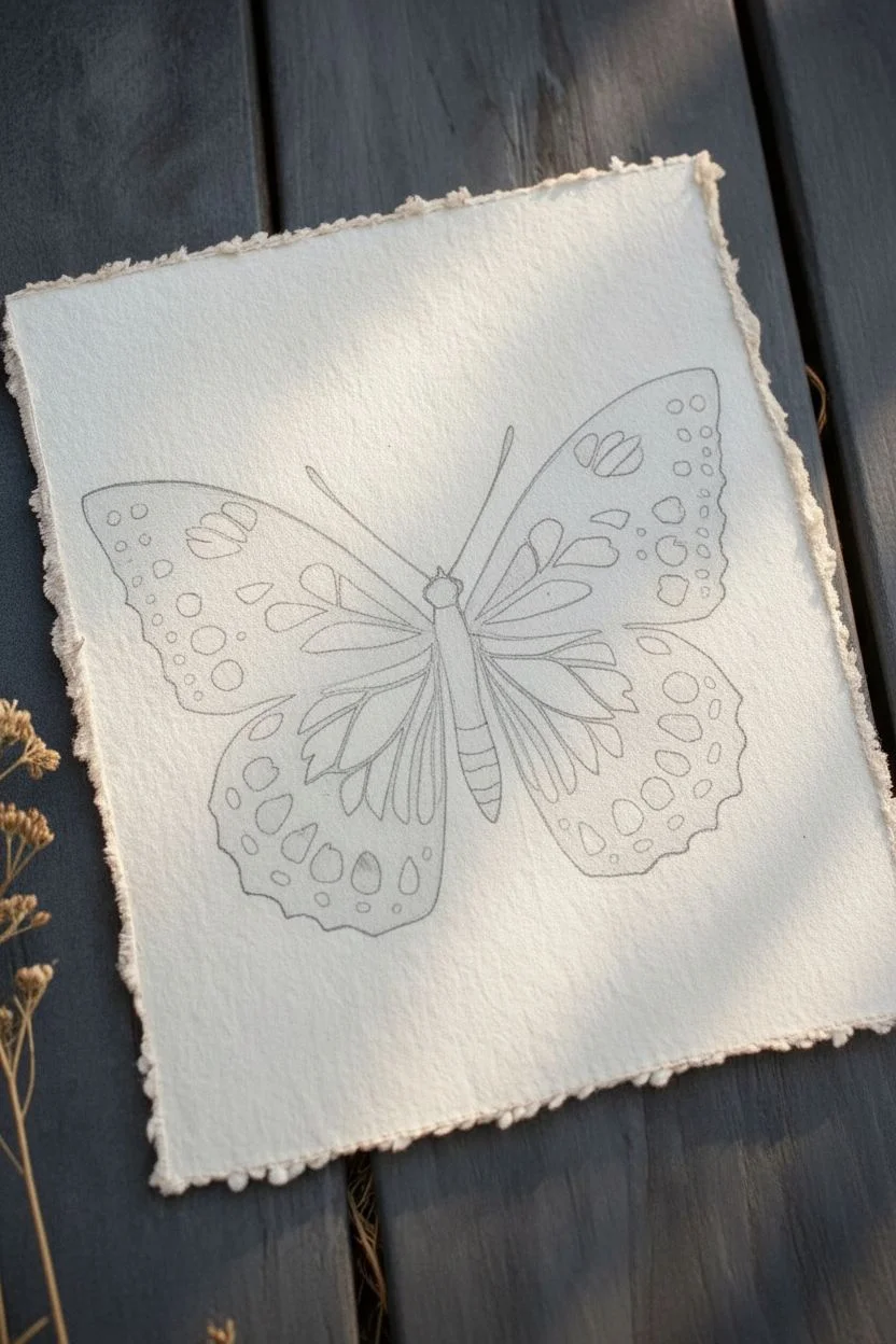
Step 1: Drafting the Design
-
Sketch the silhouette:
Begin by lightly sketching the outline of a butterfly on your watercolor paper. Focus on the main shape of the wings and the slender body in the center. -
Refine the wing divisions:
Draw the major veins that separate the wings into sections. These lines will guide where your negative shapes will go. -
Draw the interior patterns:
Inside each wing section, sketch the teardrop and circular shapes that will remain white. These are the negative spaces. -
Lighten your lines:
Take your kneaded eraser and gently roll it over the sketch. You want the pencil lines to be barely visible—just enough to guide your brush, but light enough not to show through the translucent watercolor.
Use Liquid Frisket
Struggling to keep the white shapes clean? Apply masking fluid (frisket) to the pattern shapes first. Once dry, paint freely over them, then rub the mask away at the end.
Step 2: The Negative Painting Process
-
Prepare your indigo:
Mix a generous amount of indigo watercolor on your palette. You want a creamy consistency—not too watery, but fluid enough to glide smoothly. -
Start at the center:
Begin painting the body of the butterfly with your smaller brush. Make it a solid, dark shape to anchor the composition. -
Define the upper wing edge:
Loading your Size 4 brush, carefully paint the solid dark swoops along the top outer edge of the upper wings. -
Painting around the shapes:
This is the core negative painting step. Dip your brush and carefully paint the space *around* your sketched teardrops and dots. You are painting the wing structure, leaving the pattern itself as bare paper. -
Watch your edges:
Keep your edges crisp. Use the tip of your brush to get into the tight corners between the white shapes. -
Work in sections:
I recommend finishing one wing section at a time so your paint drying remains consistent. If you work too slowly across the whole piece, you might get uneven drying lines. -
Create variation:
As you move towards the bottom wings, you can slightly dilute your paint with a touch more water to create subtle transparency variations, though keep the overall look dark. -
Add the antennae:
Switch to your Size 0 or 00 detail brush. With a steady hand, paint two very thin, curving lines extending from the head for the antennae.
Add a Vintage Touch
Before painting, lightly stain your paper with weak tea or coffee. This warms up the background so the ‘white’ negative spaces look like aged parchment.
Step 3: Building Layers and Depth
-
Second pass for depth:
Once the first layer is completely dry, you may notice some areas look lighter than others. Go back in with concentrated indigo to darken the areas closest to the butterfly’s body and the outer tips. -
Soften harsh transitions:
If any paint lines look too sharp where they shouldn’t be, use a slightly damp, clean brush to gently soften them while the paint is still workable. -
Review the negative space:
Check your white shapes. If you accidentally painted over a spot, you might be able to lift a little color with a stiff, damp brush, or just embrace the imperfection. -
Final darkening:
Add one last layer of saturated pigment to the very darkest spots, like the thorax and the wing tips, to maximize contrast against the white paper. -
Dry completely:
Let the painting sit undisturbed until the paper is cool to the touch and fully dry.
Display your artwork in a floating frame to show off that beautiful deckled edge
BRUSH GUIDE
The Right Brush for Every Stroke
From clean lines to bold texture — master brush choice, stroke control, and essential techniques.
Explore the Full Guide
Geometric Leaves: Negative Painting Meets Clean Design
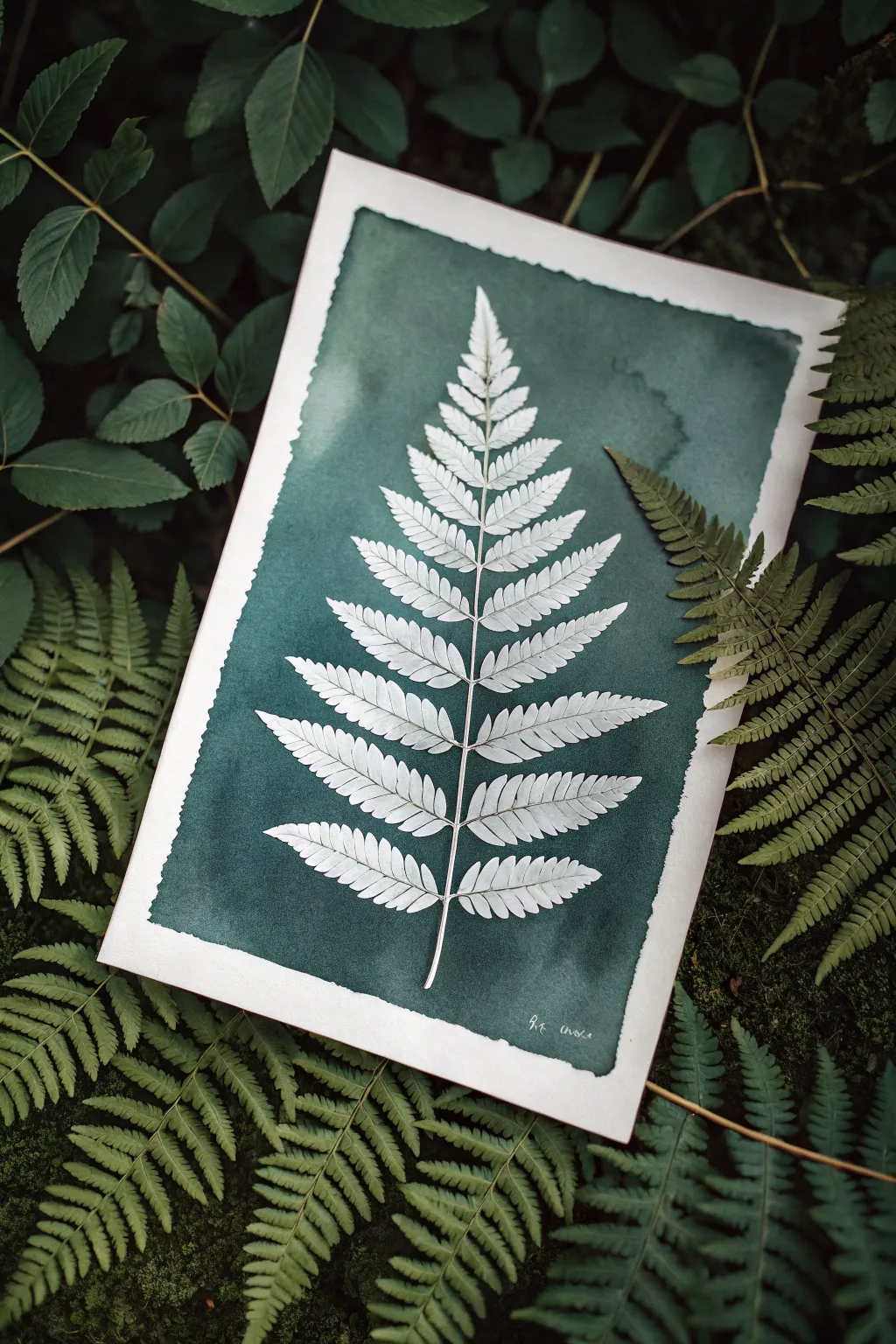
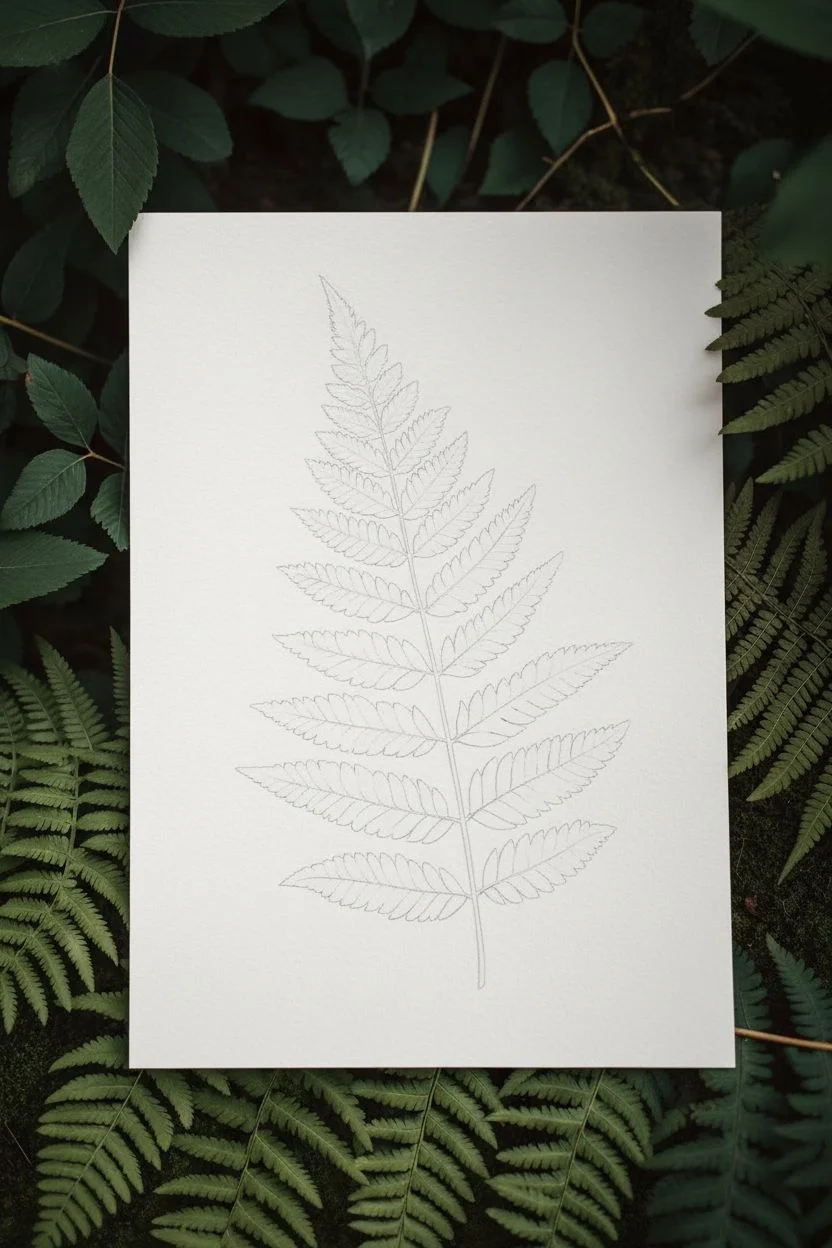
Capture the intricate beauty of a fern frond by painting the space around it rather than the leaf itself. This striking negative painting technique uses deep, moody greens to make the pristine white paper form a crisp, detailed silhouette.
How-To Guide
Materials
- Heavyweight cold-press watercolor paper (300 gsm)
- Deep viridian or Hooker’s green watercolor paint
- Indigo or Paynes gray watercolor paint (to deepen the green)
- Masking fluid (drawing gum) with a fine applicator tip
- Synthetic round brush (size 4 or 6)
- Real fern frond (for reference)
- Graphite pencil (HB or 2H)
- Kneaded eraser
Step 1: Preparation & Sketching
-
Analyze your subject:
Begin by selecting a real fern frond with a clear, symmetrical structure. Observe how the leaflets usually attach to the central stem and taper toward the tip. -
Lightly map the stem:
On your watercolor paper, use your pencil to draw a very faint, slightly curved vertical line to represent the central vein (rachis) of the fern. -
Outline the leaf shape:
Sketch the overall triangular shape of the fern lightly, marking where the widest bottom leaves will end and where the tip begins. -
Sketch the leaflets:
Draw the individual leaflets extending from the stem. Keep your lines incredibly light; you only need the suggestion of the shape. -
Refine the edges:
Go back over your sketch to add the jagged, sawtooth edges characteristic of fern leaves. This detail is crucial for a realistic silhouette.
Step 2: Masking the Subject
-
Apply masking fluid:
Using a fine applicator or an old brush dipped in soapy water, carefully fill in the entire fern shape with masking fluid. -
Check the edges:
Ensure your masking fluid creates sharp, crisp points on the leaf edges. Any blobby application here will result in a messy silhouette later. -
Mask the stem:
Don’t forget the very thin central stem and the tiny connections to each leaflet. I find a rigger brush or a toothpick helps with these delicate lines. -
Let it cure:
Allow the masking fluid to dry completely. It should feel transparent (or yellowish) and tough to the touch, with no tackiness remaining.
Paint seeping under mask?
This usually means the mask wasn’t 100% dry or the paper was too textured. If bleeding occurs, gently lift the error with a damp stiff brush or white gouache.
Step 3: Painting the Negative Space
-
Mix your deep green:
Create a rich, dark mixture using Viridian and a touch of Indigo. You want a color that is intense and opaque enough to contrast sharply with the white paper. -
Wet the background area:
Lightly brush clear water over the background area around the masked fern, stopping just short of the paper’s edge to create a natural border. -
Drop in color:
While the paper is damp, load your brush with the dark green mix and drop it onto the wet paper. Let the pigment bloom naturally. -
Define the edges:
Use the tip of your round brush to push the dark paint right up against the dried masking fluid. Be precise here—this defines the leaf’s shape. -
Create texture:
While the paint is still wet, you can drop in varying amounts of water or darker pigment to create subtle cloud-like textures in the background. -
Create the rough border:
Allow the paint edges to dry naturally along the perimeter without taping them down. This creates the organic, ragged edge visible in the reference. -
Dry completely:
Let the painting sit until the paper is bone dry and flat. If the paper is cool to the touch, it is still wet inside.
Level Up: Cyanotype Style
Swap the green paint for Prussian Blue to mimic a vintage sun-print. You can also sprinkle coarse salt into the wet background for a starry texture.
Step 4: The Reveal
-
Remove the mask:
Gently rub your finger or a rubber cement pickup tool over the masking fluid to peel it away, revealing the pristine white paper underneath. -
Clean up sketch lines:
Use a kneaded eraser to lift any visible pencil marks that were protected by the masking fluid, leaving only the clean white silhouette. -
Add subtle veining:
For a faint touch of realism, mix a very watery, pale gray-green and paint a single thin line down the center of each white leaflet.
Frame your botanical silhouette inside a simple mount to emphasize the elegant contrast between the dark background and the delicate white form
Night Sky Constellations Saved as Negative Space Stars
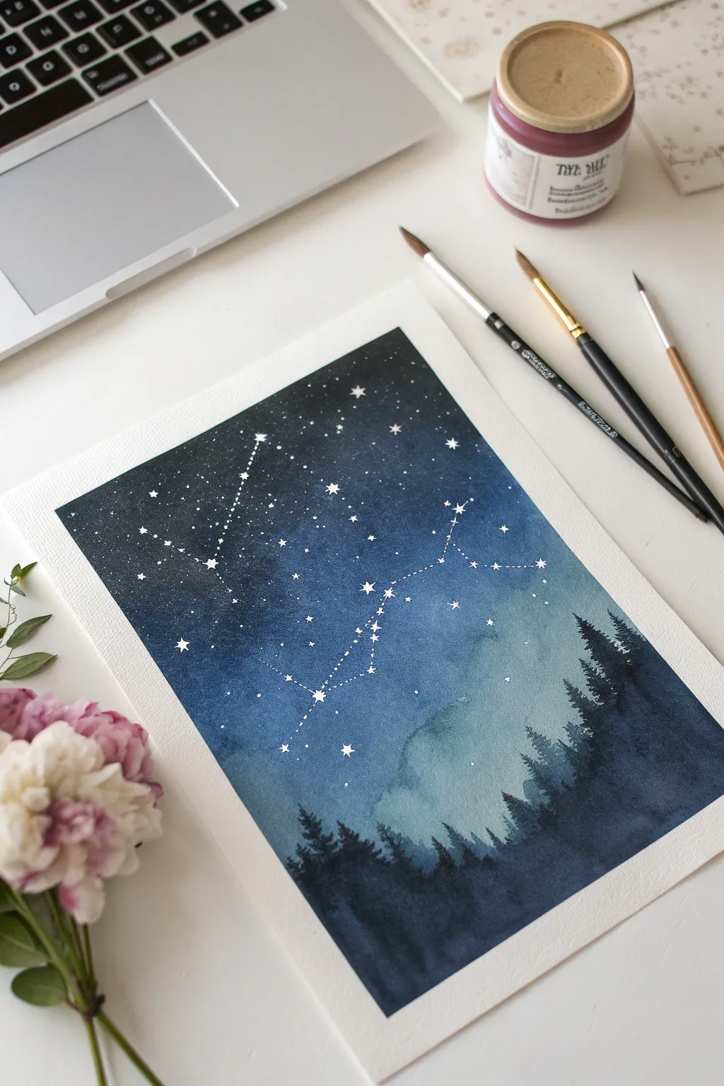
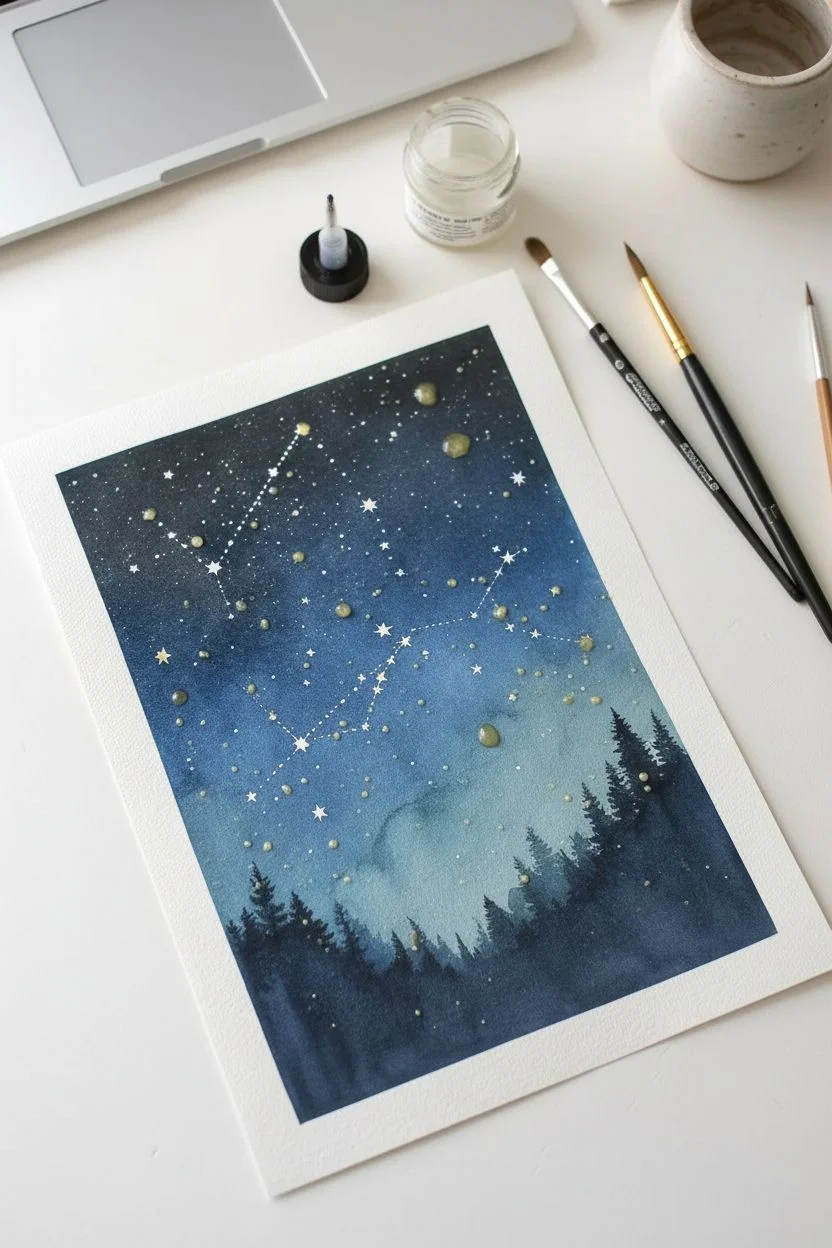
Capture the magic of a starry night with this deep indigo watercolor tutorial. using masking fluid to preserve brilliant white stars against a moody, washing sky.
Step-by-Step Tutorial
Materials
- Cold press watercolor paper (300 gsm)
- Masking fluid
- Pointed nib pen or fine detail brush
- Watercolor paints (Indigo, Payne’s Gray, Prussian Blue, Teal)
- Large round wash brush (size 10 or 12)
- Medium round brush (size 6)
- Small detail brush (size 0 or 2)
- Clean water
Step 1: Planning and Masking
-
Sketch the Constellation:
Begin by lightly sketching your chosen constellation pattern onto the paper with a pencil. You can use a reference image or create your own star map, placing small dots where the major stars will be. -
Map the Minor Stars:
Add smaller, random dots around the main constellation to represent distant stars, creating a dense, realistic sky field. -
Apply Masking Fluid:
Dip a fine-nib pen or an old, small brush into masking fluid. Carefully drop small varying sizes of fluid onto your pencil marks. I like to make the main constellation stars slightly larger than the background stars for emphasis. -
Create Connection Lines:
Use the very tip of your tool to draw extremely thin lines connecting the main stars of your constellation. These need to be delicate, so use a light hand. -
Let it Dry:
Allow the masking fluid to dry completely until it is hard and transparent. Touching it while tacky can ruin the paper surface.
Step 2: Painting the Atmosphere
-
Wet the Paper:
Using your large wash brush, apply a clean coat of water over the entire sky area, stopping just above where you want your tree line to begin. -
Drop in Light Blue:
While the paper is wet, drop in a watery mix of Teal or diluted Prussian Blue near the center and lower horizon area to create a glowing effect. -
Add Deep Indigo:
Load your brush with concentrated Indigo. Start from the top corners of the paper and work downwards, letting the dark paint swirl into the lighter blue. -
Intensify the Darkness:
Add Payne’s Gray to your Indigo mix for an almost-black hue. Apply this to the very top edge to create a vignette effect, drawing the eye toward the center. -
Create Soft Clouds:
Lift a little pigment with a damp, clean brush or paper towel in the lower sky area to create soft, misty atmospheric clouds. -
Dry the Sky:
Let the first wash dry completely. The paper should be flat and cool to the touch before proceeding.
Clean Edges Only
If the paper tears when removing masking fluid, you likely removed it too soon. The paper must be 100% bone dry. Wait an extra hour if you are unsure.
Step 3: Trees and Reveal
-
Mix Forest Colors:
Create a dark, cool green mix using Indigo, Payne’s Gray, and a touch of deep green. -
Paint the Distant Trees:
With a diluted version of your dark mix, paint a row of jagged, uneven tree shapes along the horizon line. Keep this layer lighter to simulate atmospheric perspective. -
Layer Foreground Trees:
Once the distant trees are tacky-dry, use the concentrated dark mix to paint larger, sharper pine silhouettes in the foreground. -
Detail the Branches:
Switch to your smallest brush to flick tiny, upward-curving branches on the tops of the pines for a natural, organic look. -
Fill the Bottom:
Wash the bottom of the paper with solid dark paint to ground the scene and complete the silhouette. -
Dry Everything:
Ensure the artwork is bone dry. This is crucial before removing the mask. -
Remove the Masking:
Gently rub your finger or a rubber cement pickup tool over the masked stars to peel away the fluid, revealing the crisp white paper underneath.
Sparkle Effect
After removing the mask, softly dampen a star with a clean brush and tap it with a tissue. This softens the hard edge for a glowing effect.
Frame your piece to protect the delicate surface and enjoy your own slice of the infinite cosmos

PENCIL GUIDE
Understanding Pencil Grades from H to B
From first sketch to finished drawing — learn pencil grades, line control, and shading techniques.
Explore the Full Guide
Double-Layer Silhouette: Portrait Shape Filled With Negative Botanicals
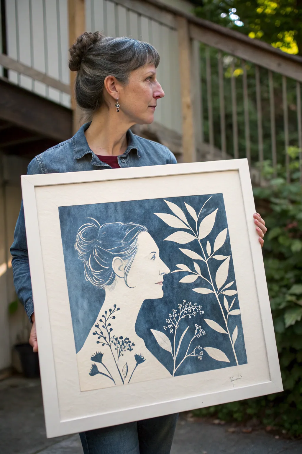
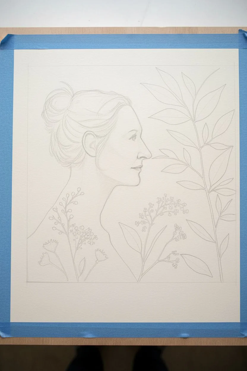
Capture the delicate beauty of a silhouette intersected by nature with this stunning negative painting project. Using the cyanotype process or acrylic gouache, you’ll create a striking deep blue background that reveals a pristine white portrait and botanical forms.
Step-by-Step Guide
Materials
- Heavyweight watercolor paper (hot press for smooth lines)
- Cyanotype sensitizer kit (Part A & Part B) OR Indigo/Payne’s Gray acrylic gouache
- Pencil and eraser
- Tracing paper
- Masking fluid (optional but helpful)
- Fine liner brush (size 0 or 00)
- Flat wash brush (1 inch)
- Drawing board and painter’s tape
- Reference photo for profile
- Dried pressed leaves or botanical stencils
Step 1: Preparation & Drawing
-
Secure the paper:
Begin by taping your watercolor paper down to a rigid board on all four sides. This prevents buckling when we add the wet medium later. -
Draft the profile:
Lightly sketch the profile of the woman using a hard pencil (like 2H) so the lines are faint. Focus on the contour of the forehead, nose, lips, and chin, letting the neck curve down gracefully. -
Detail the hair:
Sketch the hair bun loosely. Don’t worry about every strand yet; just establish the main shape of the messy bun and the hairline. -
Plan the botanicals:
Sketch a large, leafy branch entering from the right side. Let the leaves overlap the space where the blue background will eventually be. These leaves will remain white. -
Add floral details:
Draw delicate wildflowers or berry sprigs originating from the bottom edge. Crucially, draw some of these ‘inside’ the woman’s silhouette at the shoulder, which creates a beautiful double-exposure effect.
Fixing Painted Edges
Did your blue paint bleed into the white profile? Don’t panic. Use opaque white gouache to paint over the mistake and reshape the sharp edge.
Step 2: Defining the Negative Space
-
Refine the outlines:
Go over your sketch to ensure you have a continuous, closed boundary for every shape that needs to stay white. This includes the profile, each leaf, and the tiny stems. -
Protect detailed areas:
For the very fine hair strands or tiny floral details inside the silhouette, you can use a fine nib to apply masking fluid. This guarantees crisp white lines later. -
Mix your medium:
If using acrylic gouache, mix a deep Indigo with a touch of Payne’s Gray to mimic the cyanotype look. Dilute it slightly with water so it flows but remains opaque. -
Outline the main shapes:
Using your smallest detail brush, carefully paint the blue color *around* the outside of your pencil lines. You are defining the shape by painting the background, not the subject. -
tackle the ‘internal’ negative space:
Look closely at the botanical elements inside the body silhouette. Paint the stems and leaves in blue within the white body shape. This reverses the logic: here, blue marks the object, whereas outside, blue marks the background. -
Detail the hair strands:
Switch to your finest liner brush. To create the wispy hair look, simulate white hairs by painting the dark blue spaces between them. This requires patience and a steady hand.
Try Real Sun Printing
Level up by using actual cyanotype fluid. Paint the negative space with the chemical, place real clear film negatives over the face, and expose in the sun.
Step 3: Filling & Finishing
-
Fill the background:
Once all delicate edges are outlined with the fine brush, switch to your larger flat brush. Fill in the large open areas of the background with the dark blue mix. -
Create texture:
While painting the large areas, I like to blot the wet paint slightly with a paper towel or sponge. This gives it that mottled, organic texture seen in real cyanotypes. -
Check for consistency:
Let the first layer dry completely. If the blue looks streaky, apply a second thin wash to deepen the indigo tone. -
Remove masking:
If you used masking fluid for the hair or flowers, wait until the paint is bone dry, then gently rub it away with your finger or a rubber cement pickup. -
Refine contours:
Use a white gel pen or white gouache to touch up any ragged edges or to add back tiny flyaway hairs that might have gotten lost in the blue. -
Final erase:
Once absolutely dry, gently erase any visible pencil lines in the white areas to clean up the portrait.
Frame your monochromatic masterpiece in a wide white mat to emphasize the striking contrast you’ve created


Have a question or want to share your own experience? I'd love to hear from you in the comments below!