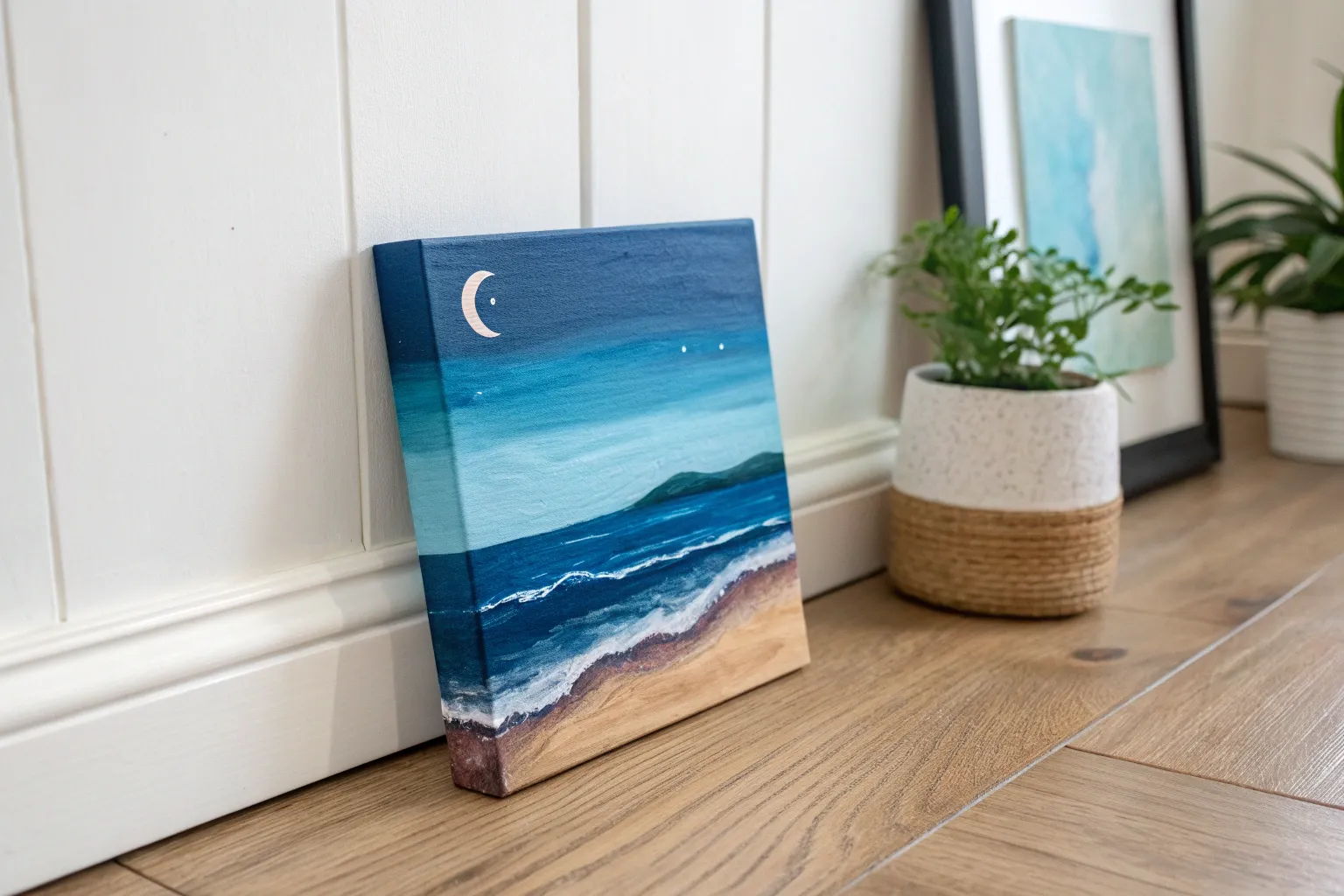
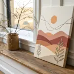
Whenever I’m stuck, I reach for blue painting ideas because blue can swing from calm to mysterious in a single brushstroke. Here are my favorite blue-forward subjects and techniques you can try today—no pressure, just play and paint.
Moonlit Night Sky With Silhouetted Trees
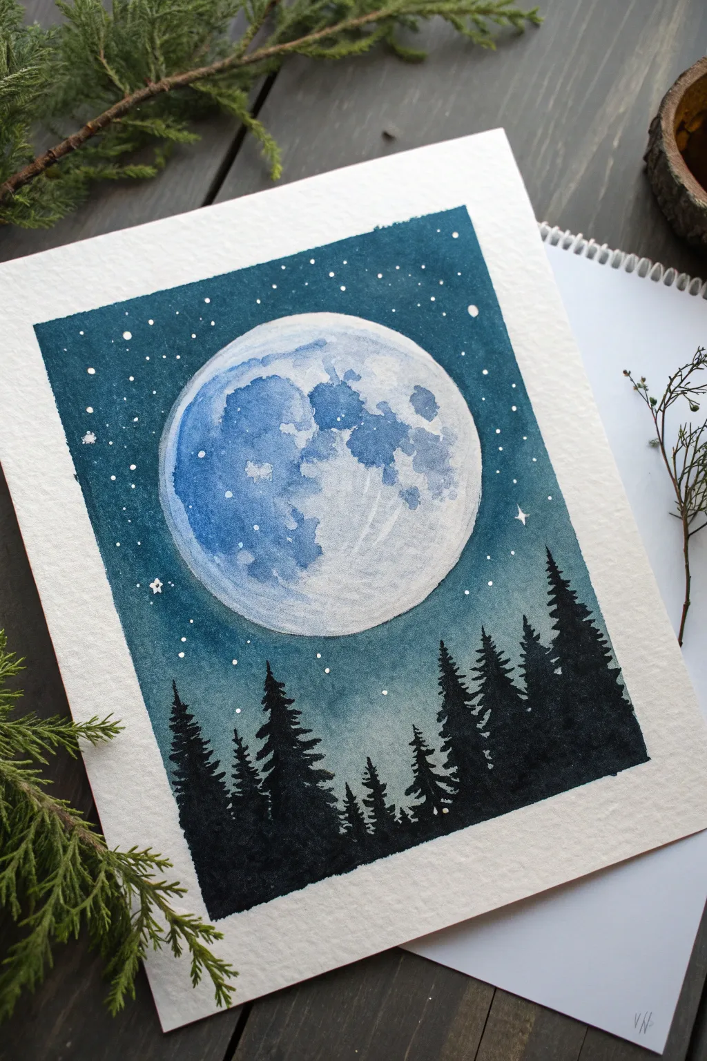
Capture the serene beauty of a crisp night with this watercolor project, featuring a glowing celestial body rising above a dark treeline. The contrast between the deep indigo sky and the textured moon creates a striking, magical effect perfect for framing.
How-To Guide
Materials
- Cold press watercolor paper (300gsm/140lb)
- Painter’s tape or masking tape
- Compass or a round object (canning lid, masking tape roll)
- Pencil and eraser
- Watercolor paints: Indigo, Prussian Blue, Paynes Gray, Black
- White opacity: White Gouache, white gel pen, or acrylic ink
- Round brushes: Sizes 2, 6, and 10
- Clean water and paper towels
- Salt (optional for texture)
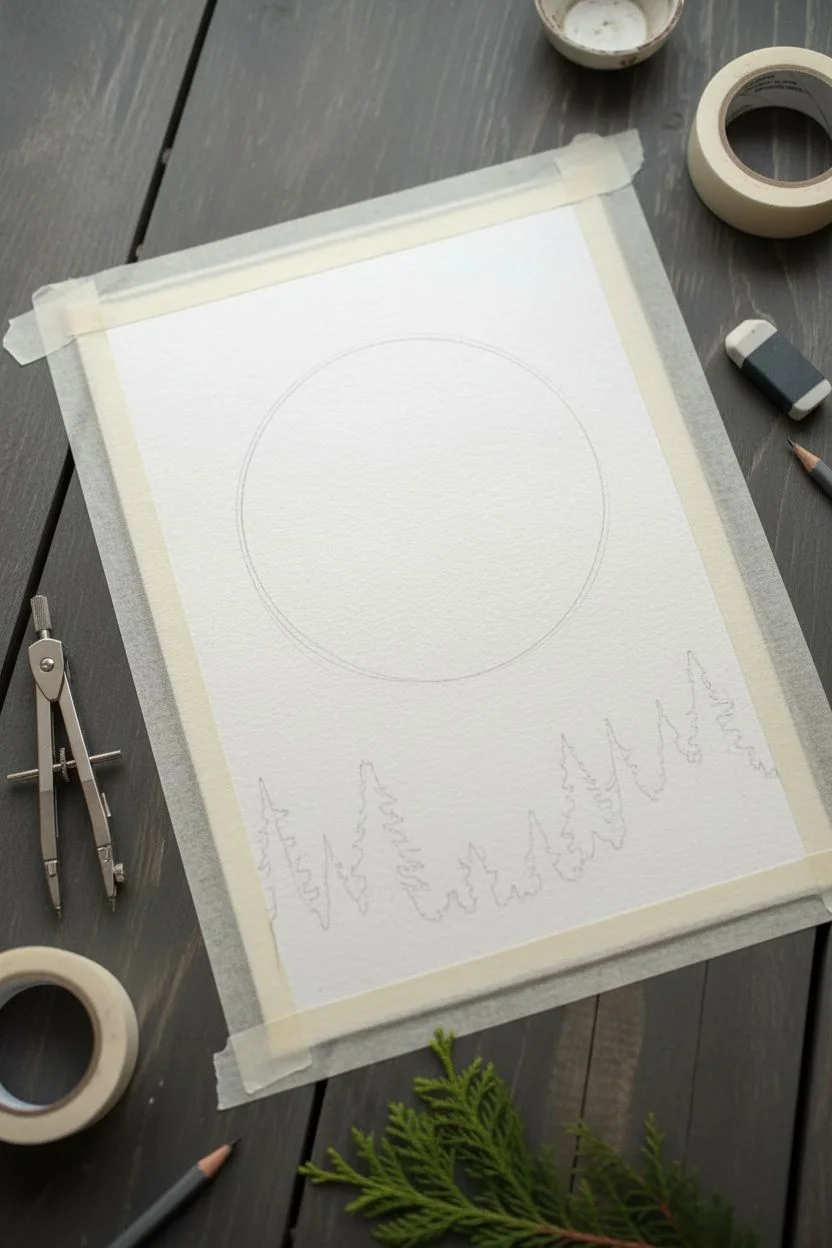
Step 1: Sketching and Masking
-
Tape the borders:
Begin by taping down all four edges of your watercolor paper to a board or table. This creates that crisp, clean white border seen in the reference image and keeps the paper buckle-free. -
Draw the moon:
Using a compass or by tracing around a circular object like a masking tape roll, draw a large circle in the upper center of the page. Keep your pencil lines extremely light so they don’t show through the paint later. -
Sketch the horizon:
Lightly sketch a rough, uneven line near the bottom third of the paper to indicate where the tops of the trees will generally start, though we will paint freehand over this later.
Moon Texture Trick
While the moon paint is still wet, drop a tiny pinch of table salt onto the blue pigment. When dry, brush it off to reveal unique, crater-like textures.
Step 2: Painting the Moon
-
Wet the moon:
Using your medium round brush and clean water, gently wet the inside of the moon circle. Be very careful to stay strictly inside the pencil line. -
Add craters and texture:
Load a small brush with diluted Indigo or Prussian Blue. Touch the wet paper to drop in color, focusing on the left side and bottom areas to create shadows and ‘craters.’ Let the water move the pigment naturally for soft edges. -
Soften the glow:
While the paint is still damp, lift out some pigment with a clean, semi-dry brush to create brighter highlights on the right side of the moon. This enhances the spherical look. -
Let it dry deeply:
Allow the moon area to dry completely before touching the sky. Ideally, it should be bone dry to prevent the dark sky color from bleeding into your pale moon.
Step 3: The Night Sky
-
Prepare the wash:
Mix a large puddle of deep night-sky color. I suggest combining Indigo with a touch of Prussian Blue for richness. You want a heavy pigment-to-water ratio for a dark, dramatic sky. -
Outline the moon:
Carefully paint around the dry moon circle first. Use a steady hand to carve out the round shape with the dark blue paint. This negative space technique defines the moon’s edge. -
Fill the sky:
Quickly fill the rest of the sky area, working your way down toward the tree line. As you get closer to the bottom (where the trees will be), dilute your paint slightly with water to create a subtle gradient or atmospheric haze. -
Add stars:
Wait for the sky to dry completely. Then, using white gouache or white acrylic ink, flick small speckles of paint across the sky using an old toothbrush or by tapping a loaded brush against another brush handle. -
Detail the stars:
Use a white gel pen or a fine detail brush with white gouache to add a few larger, deliberate stars or tiny cross-shapes for twinkling effects.
Level Up: Glowing Edge
Before painting the dark sky, wet the paper just slightly OUTSIDE the moon’s perimeter. The dark paint will bleed slightly away, creating a hazy ‘moonglow’ effect.
Step 4: The Silhouetted Forest
-
Mix the darkest shade:
Create your darkest value yet—mix Paynes Gray with Black or highly concentrated Indigo. The trees need to be substantially darker than the sky to stand out silhouettes. -
Paint tree trunks:
Using a size 2 or small detail brush, paint vertical lines of varying heights along the bottom section. Stagger them so they aren’t perfectly uniform rows. -
Add branches:
Starting from the top of a trunk line, use a stippling or tapping motion with the tip of your brush to create pine branches. Work your way down, making the branches wider as you reach the base of the tree. -
Create density:
Allow the trees to overlap. Fill in the gaps between the lower trunks with solid black paint to create a dense forest floor that grounds the composition. -
Final reveal:
Once everything is completely dry—give the trees extra time as the paint is thick—slowly peel away the painter’s tape at a 45-degree angle to reveal your clean edges.
Step back and admire the stark, peaceful contrast of your own moonlit wilderness


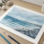
Classic Ocean Wave With White Foam
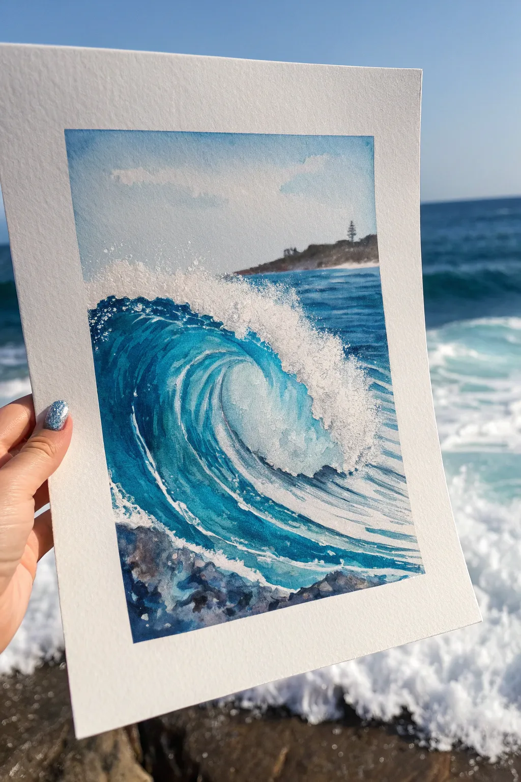
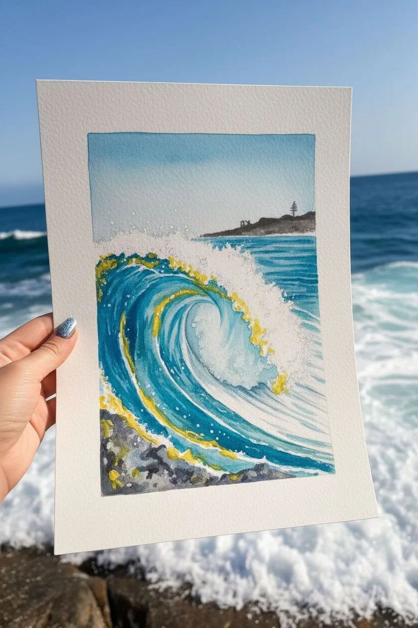
Capture the raw energy of the sea with this stunning watercolor tutorial featuring a translucent, curling wave. You will learn to layer vivid blues and turquoise while preserving pristine whites to create the dynamic crash of ocean foam.
Step-by-Step
Materials
- Cold Press watercolor paper (300 gsm or heavier)
- Masking fluid
- Watercolor paints (phthalo blue, turquoise, indigo, burnt umber, yellow ochre)
- Bleed-proof white gouache or white acrylic ink
- Set of brushes: large wash brush, round size 8, rigger or liner brush
- Old toothbrush (for splattering)
- Clean water and paper towels
- Painter’s tape and drawing board
Step 1: Preparation and Sky
-
Outline the Composition:
Lightly sketch the horizon line about two-thirds of the way up the paper. Draw the main curve of the wave, marking where the lip curls over, and lightly indicate the rocky area at the bottom left. -
Protect the Whites:
Before painting, apply masking fluid to the crashing foam area at the top of the wave and the bubbly whitewater at the base. Use an old brush or a silicone tool for this, creating random, organic dots to mimic spray. -
Paint the Sky:
Once the masking fluid is bone dry, wet the sky area with clean water. Drop in a very dilute wash of cerulean or cobalt blue, fading it out as you approach the horizon to suggest distance.
Don’t overwork the blue!
Watercolors dry lighter. Resist the urge to keep dabbing at the wave’s tunnel. Let the pigments bloom naturally to create that watery, translucent look.
Step 2: Distant Shore and Background Sea
-
Paint the Horizon Land:
Mix a muted dark green and brown. Paint the sliver of land on the horizon. While wet, lift a tiny spot for detail or add a darker vertical mark to suggest that lone pine tree. -
Background Water:
Using a horizontal stroke, paint the sea behind the main wave with a mix of phthalo blue and a touch of indigo. It should be darker than the sky but lighter than the foreground wave.
Sparkle Effect
For a magical touch, mix a tiny pinch of iridescent medium into your white gouache for the final highlights. The foam will shimmer like real water.
Step 3: The Main Wave
-
Base Color for the Wave:
Wet the main body of the wave. Paint a gradient starting with deep phthalo blue on the left (the shadowed side) transitioning into a bright turquoise or aqua in the center where the light hits. -
Deepening Shadows:
While the wave body is still damp but not soaking, drop concentrated indigo into the deepest curve under the curl. This high contrast is what makes the wave look three-dimensional. -
Water Texture Lines:
Switch to a liner or rigger brush. With a concentrated blue mix, paint sweeping, curved lines that follow the shape of the wave tunnel. This emphasizes the movement and speed of the water water. -
Defining the Curl:
Ensure the area inside the ‘tube’ of the wave remains lighter, perhaps almost white-blue, to show transparency. Gently soften any hard edges with a damp brush.
Step 4: Rocks and Finale
-
Painting the Foreground Rocks:
Mix indigo with burnt umber to get a dark, rocky grey. Paint the bottom left corner, leaving small gaps of white paper for wet highlights on the stones. -
Removing the Mask:
Ensure the entire painting is completely dry—touch the paper with the back of your hand to check. Gently rub away the masking fluid to reveal the crisp white paper underneath. -
Softening the Foam:
The revealed white shapes might look too sharp. I like to take a damp brush and gently soften the bottom edges of the foam clouds to integrate them into the blue water. -
Adding Texture with Gouache:
Dip an old toothbrush into white gouache. Run your thumb across the bristles to splatter fine mist over the crash zone, enhancing the splashing effect. -
Final Highlights:
Use a small brush and pure white gouache to paint thin, sharp veins of foam dragging up the face of the wave and bright highlights on the wet rocks.
Peel off your tape and admire the refreshing splash of your own painted ocean view

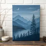
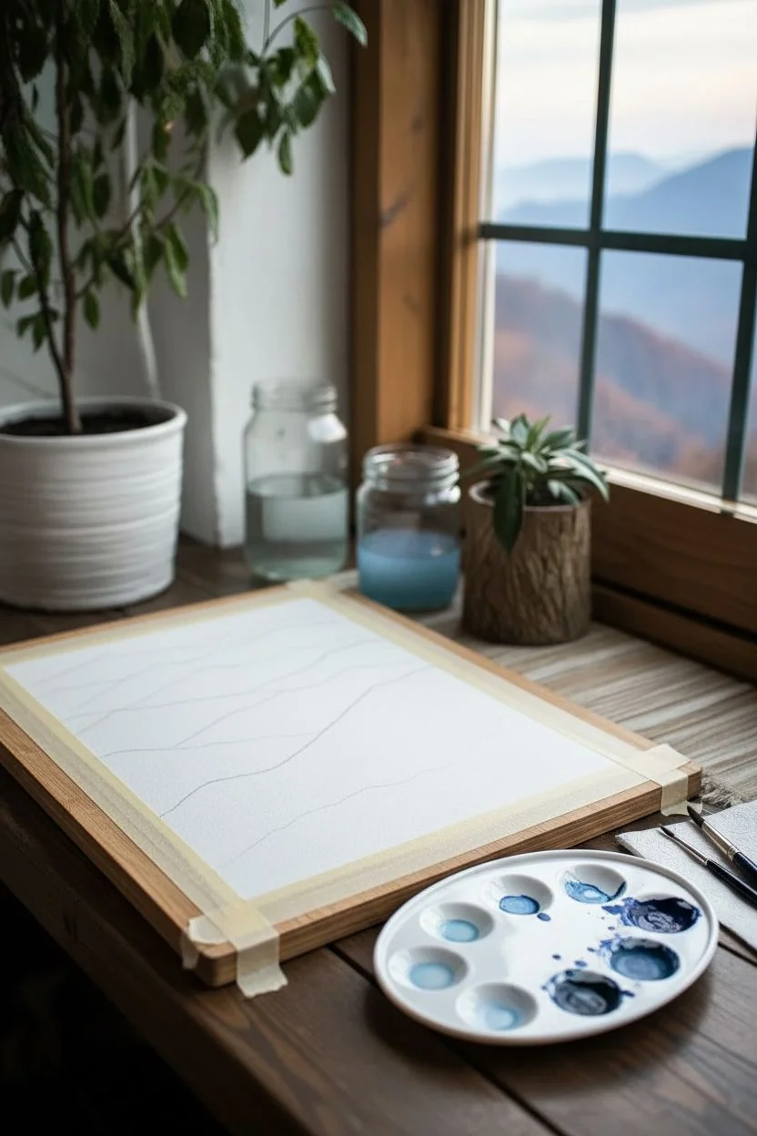
Blue Mountain Layers for Atmospheric Perspective
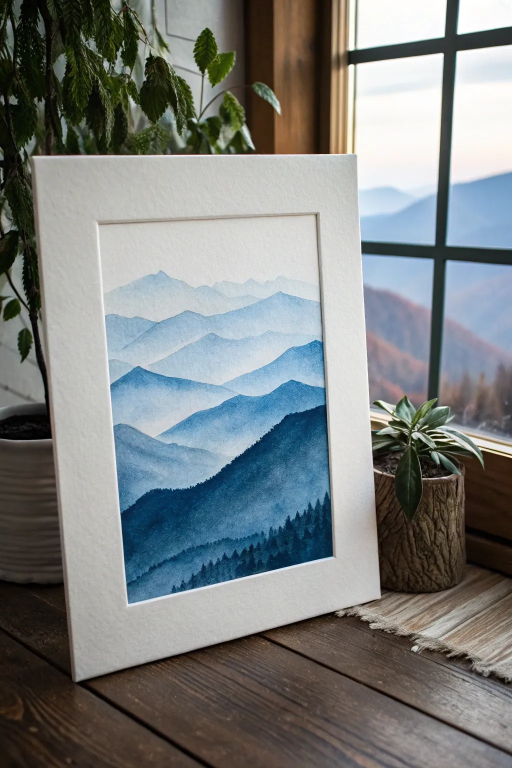
Capture the serene beauty of distant peaks with this monochrome watercolor study, focusing entirely on atmospheric perspective. By using a single color in varying dilutions, you will create convincing depth where distant mountains fade into the mist and foreground hills stand bold and sharp.
Step-by-Step Tutorial
Materials
- Cold press watercolor paper (300 gsm or heavier)
- Indigo or Prussian Blue watercolor paint
- Large round watercolor brush (size 10 or 12)
- Small liner or detail brush (size 2)
- Two jars of water (one for rinsing, one for clean blending)
- Palette for mixing washes
- Paper towels
- Painter’s tape or masking tape
- Drawing board
- Pencil (HB or H)
- White matting board (optional, for framing)
Step 1: Preparation and Sketching
-
Secure the paper:
Tape your watercolor paper down firmly to a drawing board on all four sides. This prevents the paper from buckling when we apply heavy washes of water and ensures you have a crisp, clean border once finished. -
Mix your base gradients:
Prepare four or five distinct puddles of blue paint on your palette. Start with a very watery, almost transparent mix for the furthest sky/mountains, and gradually add more pigment to each subsequent puddle until your final mix is a thick, dark indigo. -
Sketch the ranges:
Using a light pencil, gently sketch 5-7 overlapping mountain ridges. Keep the lines wavy and organic, ensuring they zigzag across the page rather than stacking perfectly straight. The highest ridge should be near the top third, leaving room for the sky.
Step 2: Painting the Distant Layers
-
Establish the sky:
Wet the sky area of the paper with clean water first (wet-on-wet technique). Drop in your lightest, most watery blue mix, letting it fade to white near the top edge of the first mountain range. -
Dry thoroughly:
Wait for the sky layer to be completely bone-dry. If you paint too soon, the subsequent layers will bleed into the sky, ruining the crisp mountain edge. -
First mountain ridge:
Load your large round brush with the second-lightest wash. Paint the silhouette of the furthest mountain range, bringing the wash down to the bottom of that specific shape. -
Fade the bottom edge:
Before this layer dries, rinse your brush and use clear water to soften the bottom edge of this mountain shape, fading it out into the white paper below. This creates that misty, atmospheric look.
Wet Edge Control
Keep a ‘thirsty’ clean brush nearby. If a wash pools too much at the bottom of a ridge, use the dry brush to soak up excess water instantly.
Step 3: Building Depth and Foreground
-
Progressive darkening:
Once the previous layer is dry, move to the next ridge down. Use a slightly more pigmented wash (your third puddle). Paint the solid shape, ensuring the top edge is crisp against the lighter mountain behind it. -
Repeat the gradient:
Continue working down the paper, layer by layer. I like to wait until each section is fully dry before starting the next to maintain sharp, distinct ridgelines. -
Introduce texture:
As you reach the middle-ground mountains, you can stop fading the bottom edges quite as much. Allow the paint to settle with a bit of texture (granulation) to suggest rougher terrain. -
Create the darkest ridge:
For the closest, largest mountain shape, use your darkest, most saturated indigo mix. Paint this shape boldly, covering the remaining white space at the bottom right. -
Add tree details:
While the foreground mountain is still damp (but not soaking), or after it dries for sharper lines, switch to your small detail brush. -
Paint the forest:
Using thick, un-diluted paint, dab in tiny vertical strokes along the ridge and slope of the foreground mountain to simulate the silhouette of a pine forest. Vary the heights slightly for realism.
Mist Effect
While a middle layer is still wet, splatter a few drops of clean water onto it. It creates ‘blooms’ that look like rising clouds or mist.
Step 4: Finishing Touches
-
Assess the values:
Step back and look at the value transition. If the jump between two layers looks too stark, you can gently glaze a very watery wash over the lighter layer to darken it slightly. -
Final drying:
Allow the entire painting to dry completely, preferably overnight if the paper is thick, to ensure it flattens out. -
Remove tape:
Peel the painter’s tape away slowly at a 45-degree angle, pulling away from the painted area to avoid tearing your paper. -
Mat and frame:
Place a clean white mat over the artwork to emphasize the contrast of the blue tones before placing it in a frame.
Hang your finished piece near natural light to let the transparency of the watercolor layers shine through.
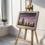
Soft Blue Sky Gradient With Puffy Clouds
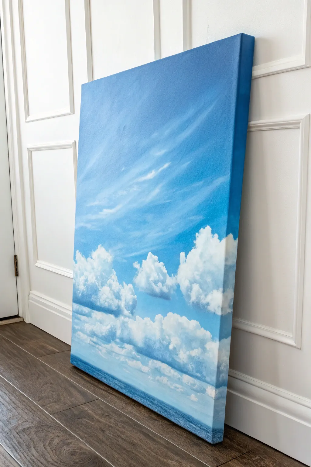
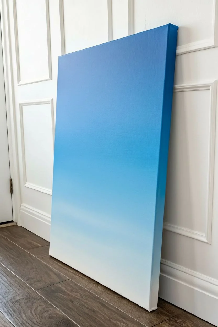
Capture the calm beauty of a summer day with this expansive sky study, featuring a smooth, gradient blue backdrop and soft, floating cumulus clouds. This vertical format draws the eye upward, creating a sense of limitless atmosphere perfect for brightening any room.
Detailed Instructions
Materials
- Large vertical stretched canvas (e.g., 24×36 inches)
- Acrylic paints: Titanium White, Ultramarine Blue, Phthalo Blue, Cerulean Blue, Burnt Umber
- Large flat brush (2-3 inch) for blending
- Medium round brush
- Small filbert brush
- Fan brush (optional)
- Palette knife
- Water container and paper towels
- Acrylic retarder or varying medium (slow drying medium)
Step 1: The Gradient Base
-
Prepare the canvas:
Start by ensuring your canvas is clean and ready. If it’s not pre-primed, apply a coat of gesso and let it dry completely. Squeeze out generous amounts of your blues and white onto your palette. -
Mix your darkest blue:
Create the deep sky color for the top of the canvas by mixing Phthalo Blue with a touch of Ultramarine Blue. Add a very small amount of white to make it opaque but keep it rich and deep. -
Mix the horizon blue:
For the bottom portion of the sky, mix a much lighter shade using Cerulean Blue and a large amount of Titanium White. It should be a pale, airy baby blue. -
Begin the top section:
Using your large flat brush, apply the darkest blue mix across the top third of the canvas. Use long, horizontal strokes that span the full width of the canvas. -
Apply the mid-tone:
Without cleaning your brush thoroughly, pick up some pure Cerulean Blue and blend it below the dark section. Overlap the wet paint edges to start a seamless transition. -
Finish the gradient:
Fill the bottom third with your palest blue mix. Work quickly while the paint above is still wet to ensure smooth blending. I find adding a drop of acrylic retarder here helps keep the paint workable longer. -
Paint the edges:
Don’t forget to wrap your sky colors around the sides of the canvas. Painting the edges gives the piece a polished, gallery-ready look without needing a frame. -
Smooth the transition:
Take a clean, dry large brush and lightly sweep back and forth over the entire canvas, moving from top to bottom. This softens any brushstrokes and perfects the gradient. Let this background layer dry completely.
Step 2: Wispy High Clouds
-
Mix a translucent white:
Dilute a small mount of Titanium White with water or glazing medium until it is thin and milky. You want this to be barely visible at first. -
Draft the cirrus clouds:
Using a dry brush or an old fan brush, lightly drag wisps of the thinned white diagonally across the upper middle section. Keep the pressure very light to create a feathery texture. -
Soften the edges:
Before the wisps dry, verify the edges are soft. If any lines look too harsh, dab them gently with a clean, dry cloth or a soft brush to blur them into the blue background.
Cloud Edges Too Sharp?
If your clouds look like cut-outs, use a clean, slightly damp brush to gently scrub the edges of the cloud into the blue sky while the paint is still tacky. This blurs the line for a fluffy feel.
Step 3: Puffy Cumulus Clouds
-
Mix cloud shadow colors:
Clouds aren’t just white; they need shadows for volume. Mix Titanium White with a tiny dot of Ultramarine Blue and the smallest hint of Burnt Umber to create a soft, warm grey. -
Block in cloud shapes:
Using a filbert brush and your grey mix, paint the general shapes of the fluffy clouds in the lower third of the canvas. Focus on interesting, organic lumps rather than perfect circles. -
Establish the light source:
Decide where your light is coming from (usually top-left or top-right). Load a round brush with pure Titanium White and dab it onto the top edges of your grey cloud shapes. -
Blend the volume:
While the white and grey paints are both wet, gently blend the white downward into the grey body of the cloud. Use a circular, scumbling motion to mimic the fluffy texture. -
Add the distant horizon:
At the very bottom edge, create a thin, straight line of darker blue to suggest a distant ocean or horizon line. This grounds the sky and adds depth. -
Detail the lower clouds:
Add smaller, flatter cloud formations near the horizon line using clearer horizontal strokes. These should be less defined than the main puffy clouds to suggest distance. -
Brighten the highlights:
Once the clouds are semi-dry, add a second layer of thick, undeniable white to the very brightest tops of the clouds. This ‘impasto’ touch adds physical texture. -
Final assessment:
Step back from the painting. If any cloud bottoms look too dark, glaze over them with a thin layer of the sky blue color to push them back into the atmosphere.
Add a Setting Sun
To change the mood, glaze a very thin wash of pale yellow or pink over the bottom white clouds and the horizon line. This instantly transforms a midday scene into a soft early evening.
Hang your new sky painting in a well-lit spot to enjoy the uplifting atmosphere you’ve created
BRUSH GUIDE
The Right Brush for Every Stroke
From clean lines to bold texture — master brush choice, stroke control, and essential techniques.
Explore the Full Guide
Starry Galaxy Swirl in Indigo and Cobalt
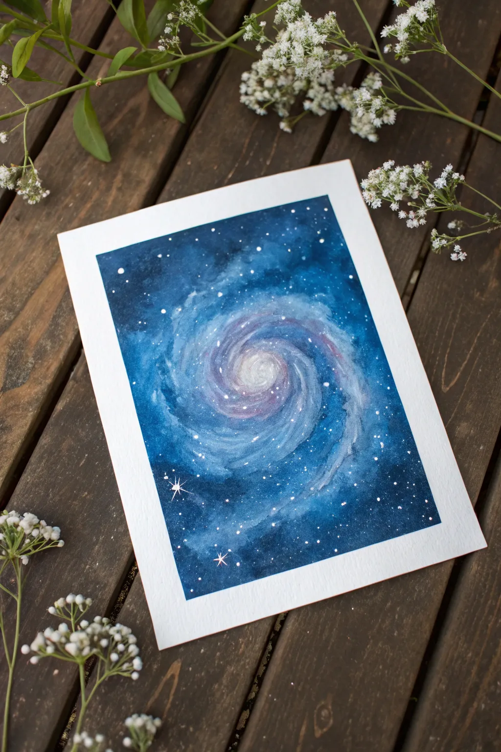
Capture the magic of the cosmos with this mesmerizing galaxy swirl painting. Using deep indigo and vibrant cobalt hues, you will learn to blend wet-on-wet layers to create a glowing, ethereal spiral of stars.
Step-by-Step Guide
Materials
- Cold press watercolor paper (300 gsm)
- Painter’s tape or masking tape
- Watercolor paints (Indigo, Cobalt Blue, Prussian Blue, Magenta/Purple)
- White gouache or white gel pen
- Round watercolor brushes (sizes 4, 8, and a fine liner)
- Jar of clean water
- Paper towels
- Mixing palette
Step 1: Preparation and Base Layer
-
Secure the borders:
Begin by taping down all four edges of your watercolor paper to a hard board or table. Press the tape firmly to ensure clean, crisp white borders when you peel it off later. -
Wet the paper:
Using your largest round brush and clean water, apply a thin, even layer of water to the entire rectangular area inside the tape. The paper should glisten but not have standing puddles. -
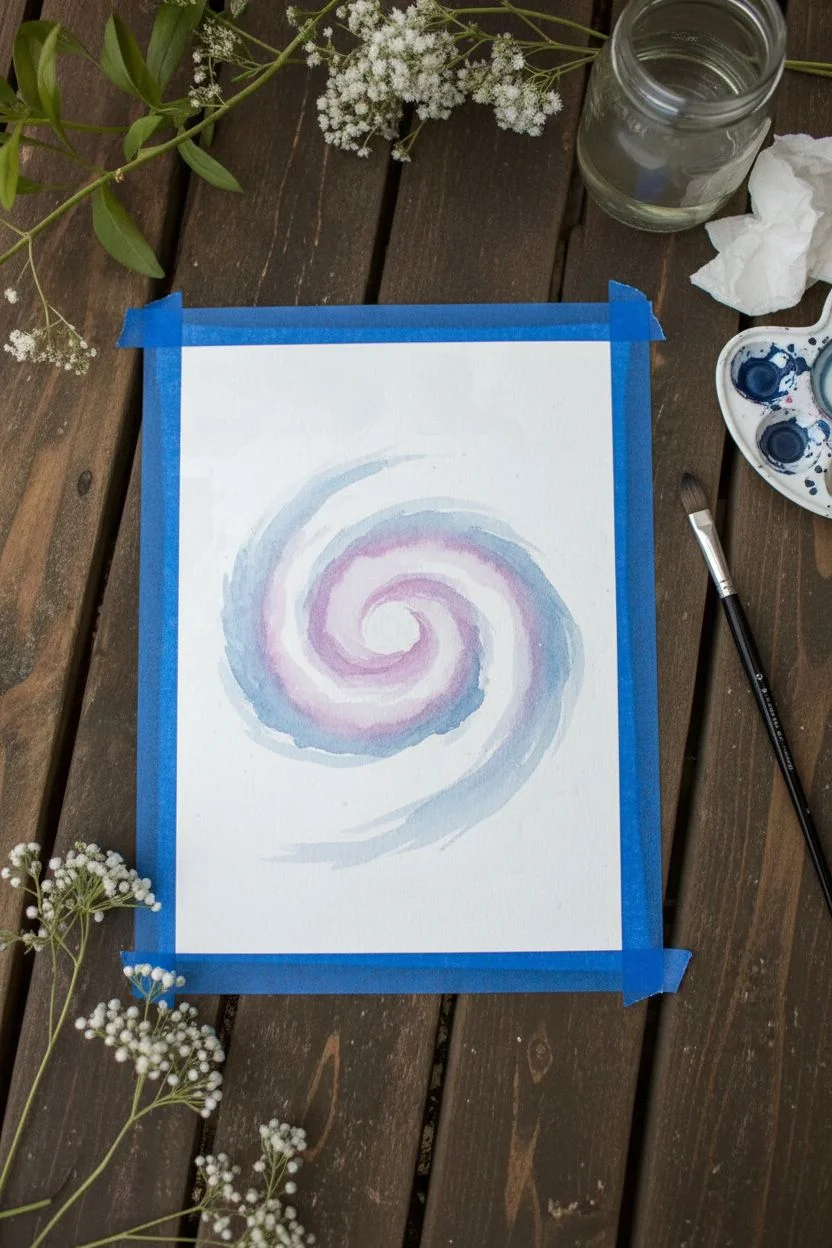
Establish the center:
While the paper is wet, lift a very dilute, watery mix of magenta or light purple. Drop this color gently into the center of the paper, forming a loose, pale circle. This will become the glowing core of your galaxy. -
Start the spiral:
Mix a light wash of Cobalt Blue. Paint a curved arm extending outward from your central pale circle, letting the wet paper soften the edges immediately.
Salt Texture Hack
While the dark indigo paint is still wet, sprinkle a pinch of table salt on it. As it dries, the salt pushes pigment away, creating natural starry textures.
Step 2: Building Depth and Shape
-
Darken the spiral arms:
Switch to a slightly thicker mixture of Cobalt Blue and Prussian Blue. Following the wet path you created, add more pigment to the swirling arms, leaving gaps of lighter blue in between to suggest movement. -
Introduce purple tones:
To add dimension, drop touches of purple or magenta into the wet blue spiral arms. Let the colors bleed naturally into one another; don’t over-mix them on the paper. -
Deepen the outer space:
Prepare a rich, dark mixture of Indigo and Prussian Blue. Begin painting the corners and edges of the paper, farthest away from the spiral. This represents the deep emptiness of space. -
Blend inwards:
Work that dark Indigo mix slowly toward the center spiral. As you get closer to the swirling arms, use a damp brush to soften the transition so the dark background fades into the lighter blue galaxy. -
Intensify the contrast:
While the paint is still damp but not soaking, I like to drop very concentrated Indigo into the darkest corners to make the blue center pop even more.
Step 3: Refining and Stars
-
Let it dry completely:
This is crucial: allow the painting to dry fully. The paper must be bone-dry before you add the stars, or they will blur and disappear. -
Create distant stars:
Load a toothbrush or a stiff bristle brush with diluted white gouache. Run your thumb over the bristles to flick a fine mist of tiny white specks across the entire painting. -
Paint larger stars:
Using a fine liner brush or a white gel pen, dot slightly larger distinct stars specifically around the spiral arms to highlight the galaxy’s shape. -
Add the focal stars:
Choose two or three spots in the dark indigo areas to place ‘hero’ stars. Paint a small dot, then carefully draw a vertical line and a horizontal line through it to create a four-point twinkle effect. -
Highlight the core:
If the center of your spiral dried too dark, use a very watery white gouache to glaze a small highlight right in the middle, re-establishing the glow. -
The reveal:
Once the white paint is totally dry, slowly peel away the masking tape at a 45-degree angle to reveal your crisp, clean borders.
Metallic Magic
Mix a tiny amount of iridescent medium or silver watercolor into your swirl layers for a galaxy that actually shimmers when the light hits it.
Frame your cosmic creation or gift this slice of the universe to a fellow stargazer
Blue-and-White Porcelain-Inspired Pattern Study
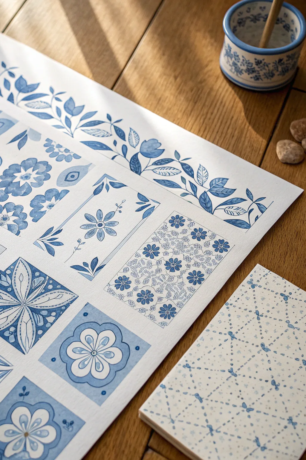
This project creates a stunning study sheet of various classic blue-and-white porcelain motifs, from delicate florals to geometric tile designs. The result is a crisp, clean artwork that mimics the look of traditional ceramics using simple watercolor techniques.
Step-by-Step Guide
Materials
- High-quality watercolor paper (cold press, at least 140lb)
- Watercolor paints (Indigo, Prussian Blue, Cobalt Blue)
- Small round brushes (sizes 0, 2, and 4)
- Pencil and eraser
- Ruler
- Mixing palette
- Jar of clean water
- Paper towels
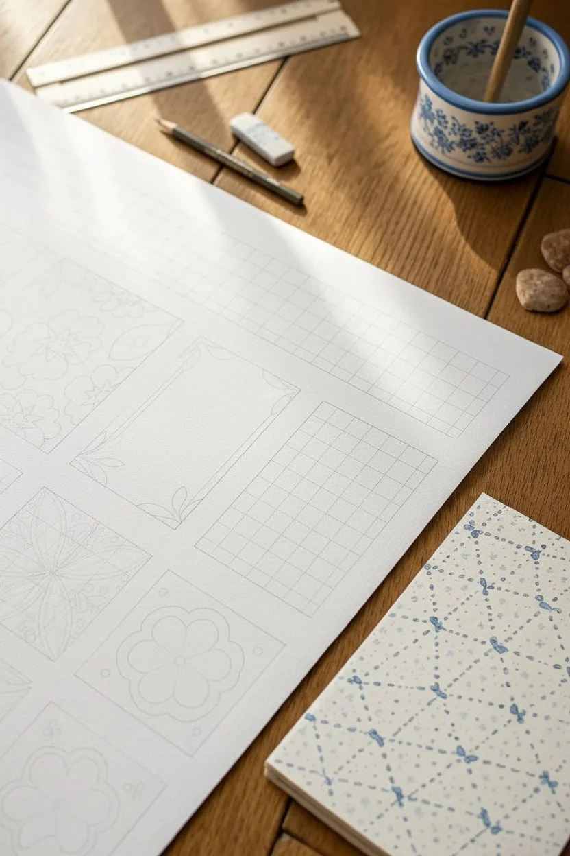
Step 1: Setting the Grid
-
Plan the layout:
Begin by lightly sketching a grid on your large sheet of watercolor paper using a ruler and pencil. Create a mix of square and rectangular sections to act as individual ’tiles’ for your patterns. -
Create the border space:
Leave a wide margin at the top of the paper specifically for a continuous floral vine border, separate from the tile grid below.
Step 2: Painting the Floral Border
-
Sketch the vine:
Lightly draw a winding, darker sine-wave line across the top margin to serve as the main stem of your floral border. -
Paint the stem and leaves:
Using your size 2 brush and a mix of Indigo and Cobalt Blue, paint the main stem. While wet, add small, pointed oval leaves branching off the stem. -
Add floral elements:
In the curves of the vine, paint simplified tulip or bell-shaped flowers. Vary the intensity of your blue wash—keep some petals pale and watery, and others saturated for depth. -
Detailing:
Once the initial layer is dry, use your smallest brush (size 0) to add fine veins to the leaves and definition lines to the flower petals.
Control Your Saturation
To get the true porcelain look, keep two water jars: one dirty, one clean. Use the clean water to fade out edges for that soft, glazed ceramic appearance.
Step 3: Creating the Tile Patterns
-
Sketch tile motifs:
Lightly sketch different traditional patterns into your grid boxes. Try a four-petal symmetry in one, a central daisy in another, and a dense micro-floral print in a third. -
Paint the solid square tile:
For the geometric tile (bottom left in the image), paint the negative space with a deep blue wash, leaving the floral shapes the white of the paper. This ‘resist’ look mimics painted ceramic glaze perfectly. -
Detail the central flower tile:
For the central rectangular tile, paint a delicate single flower stem. Use a very light wash for the petals, then frame the tile with corner flourishes that point inward. -
Execute the intricate pattern:
For the dense rectangular tile, paint many small, five-petaled flowers using a medium blue. Connect them with extremely fine, lace-like lattice lines using the tip of your size 0 brush. -
Add geometric frames:
Use a ruler and a steady hand to paint thin double borders around some of the tiles to sharpen their edges and separate the designs.
Antique the Paper
Before painting, lightly wash the entire paper with weak tea or coffee. This warms the background, making the blue ink pop like vintage pottery.
Step 4: The Geometric Sashiko Study
-
Prepare the smaller paper:
On a separate, smaller sheet or notebook, lay out a diamond grid pattern using pencil dots. -
Connect with dots:
Dip your smallest brush into concentrated blue paint. Instead of painting solid lines, connect your grid points with tiny, consistent dots or dashes to mimic Sashiko stitching. -
Vary the saturation:
As you dot the pattern, let the paint run out slightly on your brush before reloading. This creates natural variation in blue tones, adding texture to the geometric design.
Step 5: Finishing Touches
-
Erase guidelines:
Ensure the artwork is completely bone-dry. I usually wait at least an hour here to be safe. Gently erase any visible pencil lines from your initial grid. -
Final assessment:
Check for any areas that need a little more contrast. You can glaze a thin layer of dark blue over dry areas to deepen shadows or redefine lost edges.
Now you have a beautiful collection of patterns ready to frame or use as reference for future ceramic projects

PENCIL GUIDE
Understanding Pencil Grades from H to B
From first sketch to finished drawing — learn pencil grades, line control, and shading techniques.
Explore the Full Guide
Rainy Street Reflections in Cool Blues
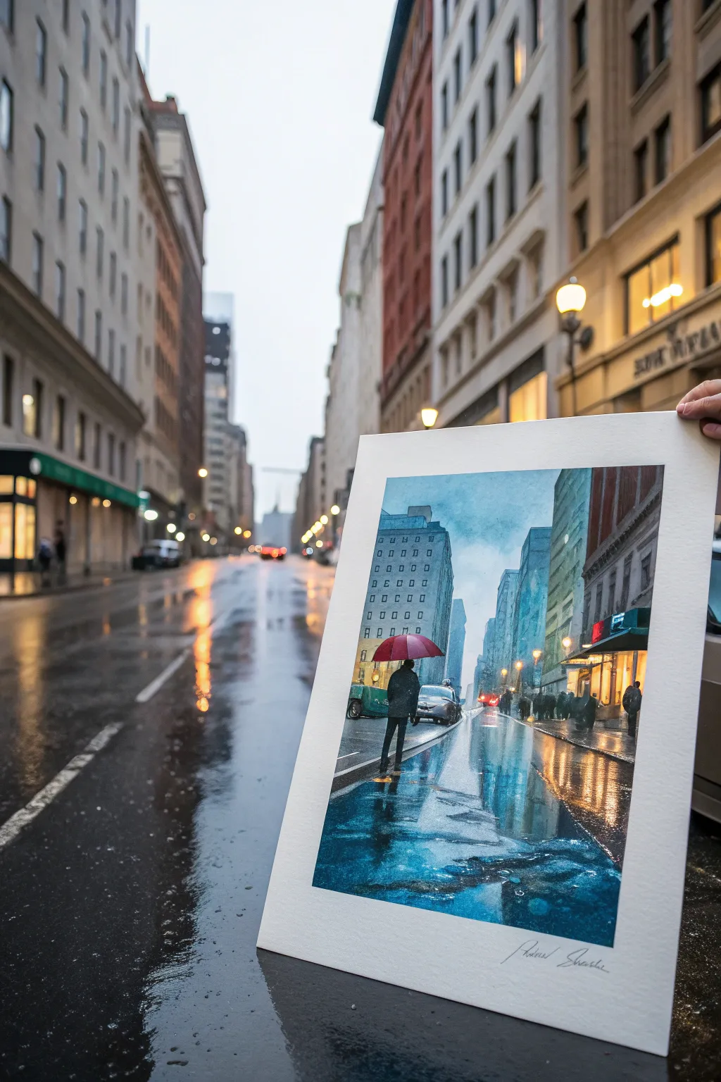
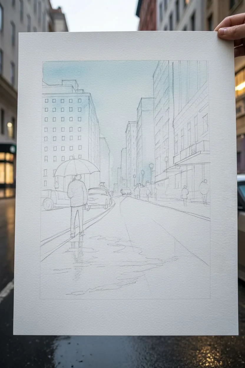
Capture the moody elegance of a rainy city street with this atmospheric watercolor painting. Focusing on cool blue tones and wet-on-wet reflections, you’ll learn how to transform a grey day into a vibrant, reflective masterpiece found right in your urban backyard.
Detailed Instructions
Materials
- Cold Press Watercolor Paper (140lb/300gsm, blocked or taped down)
- Watercolor Paints (Phthalo Blue, Ultramarine, Burnt Sienna, Cadmium Red, Yellow Ochre, Paynes Grey)
- White Gouache or White Gel Pen
- Large Flat Wash Brush
- Medium Round Brush (Size 8 or 10)
- Small Detail Brush (Size 2 or 4)
- Masking Tape
- Pencil (HB) and Kneaded Eraser
- Two Water Containers
- Paper Towels
Step 1: Sketch and Sky
-
Perspective Grid:
Begin by lightly sketching a one-point perspective grid. Place your vanishing point low on the horizon line, somewhat centered, to guide the angles of the buildings and the street. -
Structural Outline:
Sketch the major building shapes. Keep the lines loose; you don’t need every window detail, just the main vertical rectangles and the horizontal line of the sidewalk. -
Figure Placement:
Draw the main figure with the umbrella in the foreground off-center to the left. Add rough shapes for distant cars and pedestrians to populate the scene. -
Sky Wash:
Wet the sky area of your paper with clean water. Drop in a mix of Phthalo Blue and a touch of Paynes Grey, letting the color fade as it reaches the horizon line for an overcast look. -
Building Undertones:
While the sky is damp but not soaking, paint the distant buildings with a watery, pale blue-grey mix. This atmospheric perspective pushes them into the background.
Muddy Reflections?
If colors are turning brown on the street, let layers dry completely between cool (blue) and warm (orange) washes to prevent unplanned mixing.
Step 2: Architecture and Atmosphere
-
Mid-Ground Buildings:
Once the sky is dry, mix a slightly stronger grey-blue for the closer buildings. Use your flat brush to block in these shapes, leaving gaps for warm window lights later. -
The Red Accent:
Paint the umbrella with a bold, saturated Cadmium Red. This will be the focal point, so ensure the edges are crisp against the cooler background tones. -
Street Foundation:
Wet the entire street area. Drop in vertical strokes of bright turquoise and deep blue directly below the buildings and sky to establish the base for reflections. -
Warm Reflections:
While the street wash is still wet, drop in hints of Yellow Ochre and Burnt Sienna where streetlights or shop windows would reflect on the wet pavement. Let these colors bleed naturally. -
Darkening the Path:
Strengthen the foreground street area with a mix of Ultramarine and Burnt Sienna to create a dark, neutral shadow value, framing the bottom of the composition.
Step 3: Details and Highlights
-
Building Windows:
Using a small round brush, dab rows of small grey squares for windows on the taller buildings. Keep them irregular to suggest distance and angle. -
Shop Fronts:
Paint the lower storefronts on the right side with darker values, adding hints of red or green awnings to match the reference style. -
The Main Figure:
Paint the silhouette of the person under the red umbrella using a thick, dark mixture of Paynes Grey. Ensure details like the legs are distinct against the lighter puddle reflections. -
Car Shapes:
Add the shapes of the cars using mid-tones. Use horizontal strokes for the car bodies and darker blobs for tires. Don’t over-detail; suggest the form rather than drawing it perfectly. -
Refining Reflections:
Once the street layer is dry, glaze vertical strokes of color directly under objects (like the red umbrella or cars) to elongate their reflections on the wet asphalt. -
White Highlights:
Use white gouache or a gel pen to add bright spots: car headlights, streetlight orbs, and the glistening edges of the umbrella and wet curbs. -
Texture Splash:
I like to lightly splatter a bit of clean water or very diluted white gouache over the bottom street section to create the texture of raindrops hitting puddles.
Make It Personal
Change the umbrella color to yellow or transparent, or swap the city architecture to match your own hometown’s skyline.
Sign your name in the corner and enjoy the cozy feeling of a rainy day captured permanently on paper.
Cyanotype-Style Botanical Silhouettes in Deep Blue
Capture the stark beauty of nature with this stunning botanical silhouette project, featuring delicate ferns and wildflowers preserved in deep Prussian blue. The result is a crisp, high-contrast print that looks like a vintage scientific specimen but is surprisingly simple to create at home.
How-To Guide
Materials
- Cyanotype kit (Part A: Potassium Ferricyanide & Part B: Ferric Ammonium Citrate)
- High-quality watercolor paper (cold press, heavy weight 300gsm adds nice texture)
- Water
- Measuring cups and mixing jar
- Foam brush or wide hake brush
- Glass pane or picture frame glass (larger than your paper)
- Backing board (cardboard or MDF)
- Clamps or bulldog clips
- Fresh fern fronds and dried wildflowers (baby’s breath or cow parsley work well)
- Hydrogen peroxide (optional, for deepening color)
- Tray or tub for rinsing
Step 1: Preparing the Paper
-
Mix the Chemistry:
following the instructions on your cyanotype kit, mix equal parts of solution A and solution B in a small jar. Do this in a dimly lit room away from direct sunlight, as the solution is light-sensitive once combined. -
Coat the Paper:
Lay your watercolor paper on a protected surface. Using a foam brush or wide soft brush, apply the chemical mixture evenly across the paper. Aim for a consistent yellow-green tone. -
Create the Border:
To mimic the look in the reference image, leave a deliberate, slightly uneven white border around the edges. Don’t tape it off; just paint freely within the center to achieve that raw, artistic edge. -
Dry in the Dark:
Place the coated paper in a completely dark place, like a drawer or closet, to dry. It must be bone dry before you proceed, which usually takes about 30 to 60 minutes.
Step 2: Arranging the Composition
-
Prepare Your Botanicals:
While the paper dries, select your plant specimens. For this specific look, you need one large, pristine fern frond and a few stems of airy, delicate flowers like Queen Anne’s lace or baby’s breath. Press them slightly between books if they are too bulky. -
Set the Stage:
Once dry, bring your paper out (keep the room dim!). Place your backing board down first, then the sensitized paper face up. -
Place the Fern:
Lay the large fern frond on the right side of the paper, curving slightly towards the center. Ensure the leaflets are spread flat and not overlapping too much to keep the silhouette crisp. -
Add the Wildflowers:
Position the delicate flower stems on the left side, angling them so they cross slightly at the bottom with the fern, creating a natural bouquet effect. -
Secure with Glass:
Carefully lower your glass pane onto the arrangement. This is crucial for pressing the plants tight against the paper to ensure sharp lines. I find creating a ‘sandwich’ with the backing board helps keep everything stable. -
Clamp Tight:
Use clamps or bulldog clips around the edges of the glass and backing board to apply pressure. The tighter the contact, the sharper your final image will be.
Blurry Edges?
If your plant silhouettes look fuzzy, the plant wasn’t touching the paper tightly enough. Ensure your glass is heavy and you use clamps to press the botanical flat against the surface.
Step 3: Exposure and Development
-
Expose to Sunlight:
Take your clamped sandwich outside into direct sunlight. Position it so the sun hits the glass perpendicularly exactly parallel to the rays to avoid shadows. -
Watch the Color Change:
Let it sit in the sun. The exposed areas (the background) will turn from yellow-green to a steely blue-grey, and finally to a dull bronze color. This usually takes 5-20 minutes depending on UV intensity. -
Bring Inside:
Once the background looks ‘cooked’ (dark bronze), bring the assembly back indoors away from UV light before disassembling. -
Rinse the Print:
Remove the plants and immediately submerge the paper in a tray of cool water. Agitate it gently. You will see the yellow chemicals washing away, leaving the unexposed areas white. -
Wash Thoroughly:
Continue rinsing for at least 5 minutes, changing the water until it runs completely clear. If you leave chemicals in the paper, it will stain the white silhouette over time. -
Oxidize the Blue:
For that instantaneous deep, rich blue seen in the photo, dip the print into a water bath with a splash of hydrogen peroxide. The color shift is immediate and dramatic. -
Final Rinse and Dry:
Give it one last quick rinse in fresh water, then hang the print to dry on a line or lay it flat on a clean towel. -
Flatten the Artwork:
Once completely dry, the paper might be buckled. Place it under heavy books for 24 hours to smooth it out perfectly.
Pro Tip: Better Whites
Add a splash of white vinegar or lemon juice to your first rinse water. This acidity helps clear out the unexposed chemicals faster, ensuring your white silhouettes remain bright and crisp.
Hang your deep blue botanical art in a bright spot to enjoy the eternal summer vibes it brings to the room


Abstract Blue Color Blocking With Soft Edges
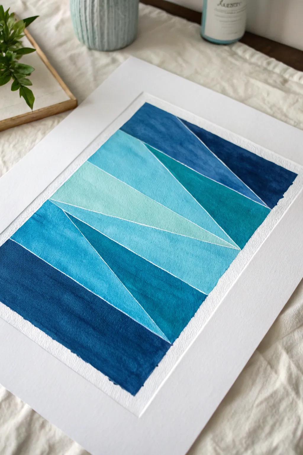
This abstract watercolor piece uses sharp masking techniques to create distinct shards of blue hues, ranging from deep indigo to airy turquoise. The white negative space lines provide a crisp structure that makes the colors pop while maintaining a modern, architectural feel.
Step-by-Step Tutorial
Materials
- Cold Press watercolor paper (140lb/300gsm)
- Watercolor paints (Indigo, Prussian Blue, Turquoise, Cerulean)
- Artist tape or fine line masking fluid
- Flat shader brush (size 6 or 8)
- Round brush (size 4)
- Ruler
- Pencil (HB or lighter)
- Palette for mixing
- Two jars of water
- Paper towels
- White mat board for framing
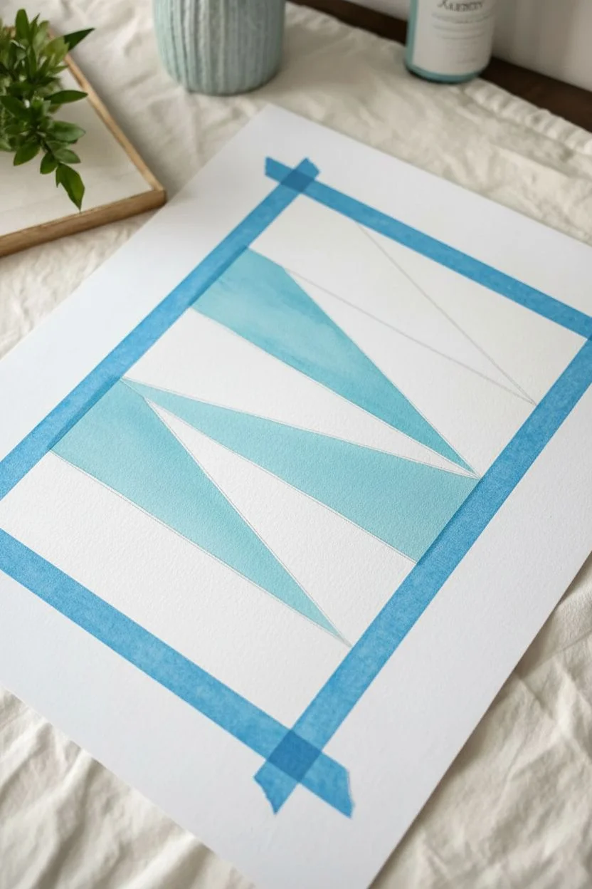
Step 1: Planning and Masking
-
Prepare your paper:
Cut your watercolor paper to your desired size. If you plan to mat it later, ensure you leave at least a half-inch border around the edge of the paper untouched by paint. -
Determine the layout:
Using a ruler and a very light pencil, sketch distinct geometric sections. Aim for a mix of triangles and trapezoids that span the width of the painted area, stacking them vertically like shattered glass. -
Mask the dividers:
This is the most critical step for those crisp white lines. Apply fine-lined masking fluid along your pencil lines. Alternatively, I sometimes prefer using very thin strips of artist tape (1/8 inch or thinner) pressed firmly down to separate the sections. -
Secure the edges:
Tape down the outer perimeter of your painting rectangle with artist tape. This will create the clean, straight borders on the left, right, and bottom of the composition. -
Burnish the tape:
Run a bone folder or the back of your fingernail along all tape edges to ensure a tight seal. This prevents paint from bleeding under the mask and ruining the crisp white gaps.
Step 2: Painting the Gradient
-
Mix your darkest shade:
On your palette, prepare a concentrated puddle of Indigo or Prussian Blue. You want a deep, saturated navy for the bottom-most shape to ground the composition. -
Paint the bottom section:
Fill in the lowest geometric shape with your darkest mix. Use a flat brush to work the paint evenly from edge to edge, ensuring full coverage. -
Mix a transition shade:
For the section immediately above the bottom block, mix a medium blue. Combine your Indigo with a touch of Turquoise or Cerulean to lighten it slightly while keeping it rich. -
Apply the second color:
Paint the next shape up. Try to lay the color down in confident strokes. If the paper creates a texture, let the ‘tooth’ show through slightly for that organic watercolor look. -
Create a teal mid-tone:
Move higher up the paper. Mix a strong Turquoise or Teal color. This should be vibrant and distinctly different from the navy tones below. -
Paint the middle sections:
Fill the central geometric shapes with this teal mix. You can vary the water-to-paint ratio slightly between adjacent shapes to create subtle depth differences. -
Lighten the load:
For the upper sections, dilute your Cerulean or light blue paint with plenty of water. You want these shapes to feel airy and translucent. -
Finish the top:
Paint the final top shapes with your lightest wash. Be careful close to the masking lines; you want the paint to pool slightly against the tape for a defined edge. -
Add a contrasting accent:
Notice the deep blue triangle in the top right corner of the reference? Add one final dark shape near the top to balance the composition and draw the eye upward.
Wet-on-Dry Technique
Apply wet paint to dry paper for this project. Avoid pre-wetting the paper, as you want controllable shapes with hard edges rather than soft, blending blooms.
Step 3: Finishing Touches
-
Let it dry completely:
Patience is key here. Allow the paper to dry until it feels room temperature to the touch. If it feels cool, it’s still damp. -
Remove the masking:
Once fully dry, gently peel away the masking fluid or tape. Pull at a 45-degree angle away from the painted area to avoid tearing the paper surface. -
Clean up:
If any pencil lines are visible in the white gaps, gently erase them with a kneaded eraser. -
Mat and frame:
Place a clean white mat over the piece. This elevates the simple geometric forms into a gallery-worthy display.
Bleeding Lines?
If paint bleeds under your tape, wait for it to dry completely. Then, use a small stiff brush with a tiny amount of water to scrub the error, creating a soft lift, or cover with white gouache.
Hang your new geometric masterpiece in a spot with natural light to let those blue gradients really shine
Navy and Metallic Gold Line Accents
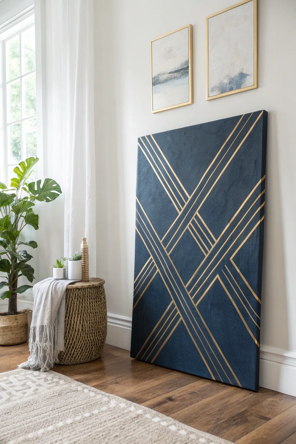
Transform a blank canvas into a sophisticated focal point with this striking deep navy and metallic gold design. The clean lines and bold contrast create a high-end look that belies how simple the tape-resist technique actually is.
Detailed Instructions
Materials
- Large stretched canvas (24×36 inches or larger)
- Deep navy blue acrylic paint (matte finish)
- Metallic gold paint (high shine)
- Painter’s tape (1/4 inch width)
- Painter’s tape (1/2 inch width)
- Wide flat paintbrush (2-3 inch)
- Small flat artist brush
- Drop cloth or unfinished cardboard
- Ruler or yardstick
- Pencil
- Gold spray paint (optional alternative base)
- Matte finish spray sealer (optional)
Step 1: Base Preparation
-
Prime the Surface:
Even if your canvas is gessoed, give it a quick wipe with a clean cloth to remove dust. If you want an ultra-smooth finish, apply a thin coat of white gesso and sand lightly once dry. -
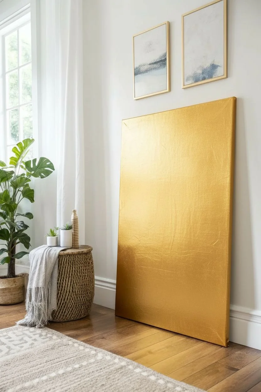
Apply the Gold Base:
Unlike typical painting, you are going to paint the accent color first. Cover the entire canvas with your metallic gold paint. Use long, even strokes to ensure solid coverage. -
Check Edges:
Don’t forget to paint the sides of the canvas gold as well. This creates a professional gallery-wrapped look where the design continues around the edge. -
Second Coat:
Metallic paints can sometimes be semi-transparent. Once the first layer is touch-dry (usually 20-30 minutes), apply a second coat of gold to ensure a rich, opaque shine. -
Full Cure:
Allow the gold base layer to dry completely. This is critical. I usually let this sit overnight just to be safe; if the paint is even slightly tacky, the tape in the next step will peel it right off.
Crisp Line Secret
Run an old credit card or brayer roller firmly over the tape strips before painting the top coat. This pressure activates the adhesive fully and prevents paint bleed.
Step 2: Taping the Design
-
Mark the Center:
To get that symmetrical X shape, use your ruler to lightly mark the exact center point of the canvas with a pencil. -
Place the Primary X:
Using your 1/4 inch tape, create the main X shape. Start from the top left corner and run a strip of tape through your center mark to the bottom right. Repeat from top right to bottom left. -
Create Parallel Clusters:
Working outward from your central X lines, add parallel strips of tape. The design in the image uses groups of three or four lines. Vary the spacing slightly between clusters for visual interest. -
Mix Tape Widths:
For a dynamic look, use the 1/2 inch tape for some of the outer parallel lines to create variation in the line thickness. Press all tape down firmly. -
Seal the Tape Edges:
This is the secret to crisp lines: Apply a very thin layer of the *gold* paint over the edges of your tape. This seals the gap so that if any paint bleeds under, it matches the base coat and won’t show.
Level Up: Texture
Mix a small amount of sand or modeling paste into your navy blue paint before applying. This adds tactile grit to the dark areas, making the smooth metallic lines pop even more.
Step 3: Applying the Navy
-
Prepare the Navy Paint:
Pour a generous amount of navy blue acrylic paint onto your palette. Ensure it is a matte formula to contrast nicely with the shiny gold. -
Paint Over Everything:
Using your wide flat brush, paint the entire canvas navy blue, painting directly over the tape. Work in smooth vertical strokes for a cohesive texture. -
Watch for Coverage:
Dark blue over metallic gold might require two coats to be fully opaque. Let the first coat dry to the touch before adding a second layer if you can still see the shimmer through the blue. -
Texture:
If you want the textured look shown in the inspiration photo, dab the brush slightly (stippling) rather than just smoothing it out. This gives the navy field a bit of dimension.
Step 4: The Reveal
-
Peel Wet-ish:
Ideally, peel the tape while the final coat of navy paint is still slightly damp but not soaking wet. This prevents the dried paint ‘skin’ from ripping. -
Remove Tape Carefully:
Pull the tape slowly at a 45-degree angle away from the painted edge. You should reveal crisp gold lines beneath. -
Clean Up:
If any navy paint managed to creep onto a gold line, use a very small stiff brush dipped in water (or rubbing alcohol) to gently scratch it away, or touch it up with a tiny bit of gold paint. -
Final Seal:
Once fully cured (24 hours), you can lightly spray the painting with a matte sealer to protect the deep blue surface from scuffs and dust.
Hang your new masterpiece in a well-lit area where the light can catch those metallic accents throughout the day
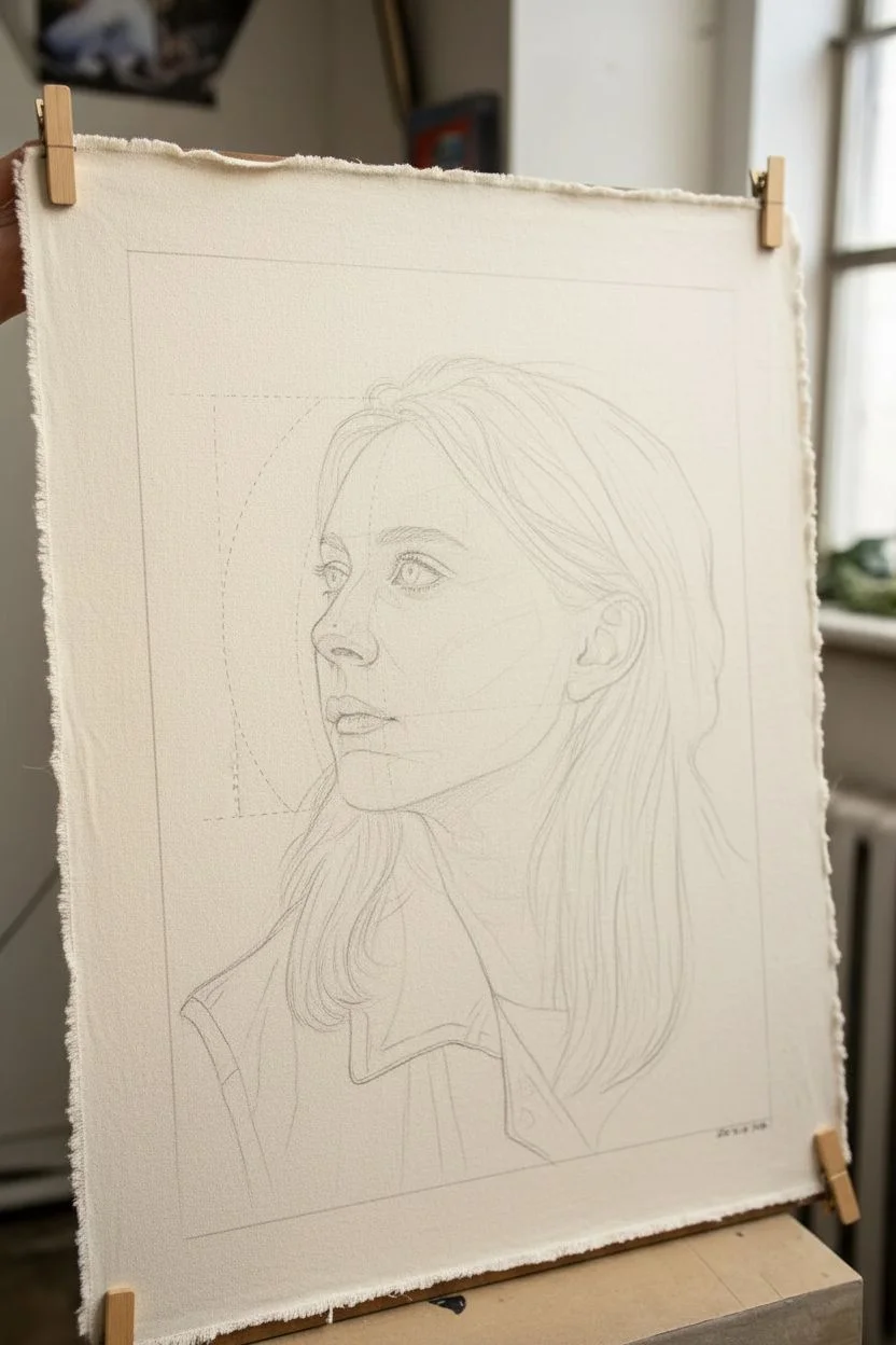
Monochrome Blue Portrait Using a Limited Palette
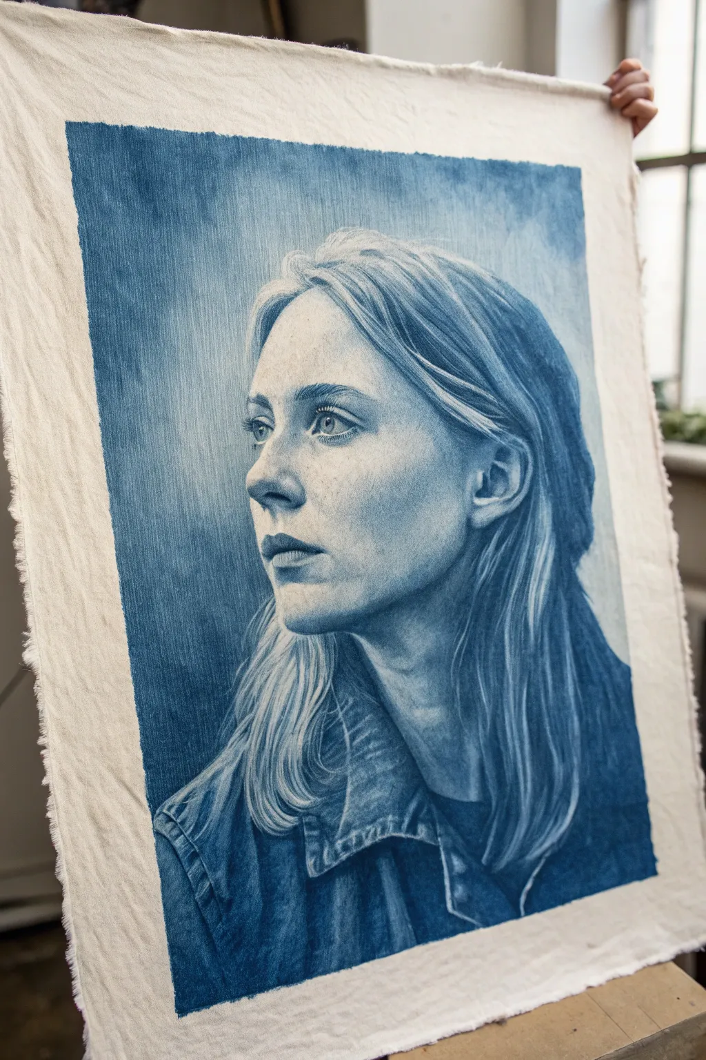
This project explores the delicate power of a single color by creating a photorealistic portrait using only shades of indigo blue. The result is a striking, cyanotype-inspired piece on unprimed canvas that feels both vintage and timelessly modern.
Step-by-Step Tutorial
Materials
- Unprimed cotton canvas or heavy linen fabric (approx. 18×24 inches)
- High-quality acrylic paints (Indigo, Prussian Blue, Titanium White, and a tiny bit of Black)
- Fabric medium (optional but recommended for smoother blending on raw cloth)
- Set of synthetic brushes: flat shaders (large and medium), rounds (small), and a fine liner
- Water container and mixing palette
- Painter’s tape or drawing board with clips
- Graphite transfer paper or soft charcoal pencil
- Reference photo of a side-profile portrait
Step 1: Preparation and Sketching
-
Prepare the canvas:
Cut your unprimed canvas to size, leaving rough, frayed edges for a rustic look. Secure it tightly to a rigid board using clips or tape to prevent it from buckling when wet. -
Map out proportions:
Using a very light charcoal pencil or graphite transfer paper, sketch the contours of the face, hair, and clothing. Focus heavily on measuring the distance between the eye, nose, and ear, as accuracy here is crucial for likeness. -
Define the light source:
Identify exactly where the light hits your subject in the reference photo. Lightly outline the highlight shapes on the forehead, cheekbones, and nose bridge so you remember to preserve these areas.
Step 2: Establishing the Values
-
Mix your mid-tone:
Create a watery mid-tone wash by mixing Indigo with a significant amount of water and a touch of fabric medium. The consistency should be like watercolor. -
Apply the first wash:
Paint the background first, using large vertical strokes. I like to keep this loose and somewhat uneven to give the piece texture and atmosphere. -
Block in shadow shapes:
Using the same watery indigo mix, fill in the darkest areas of the hair, the deep shadows under the chin, and the folds of the jacket. -
Soft transitions:
While the paint is still slightly damp, use a clean, moist brush to soften the edges of your shadow shapes, blending them outwards toward the lighter areas of the face.
Fixing “Muddy” Looks
If you blend too much on raw fabric, it can get blurry. Let the area dry completely, then re-establish sharp edges with opaque paint or white highlights.
Step 3: Building Depth and Detail
-
Deepen the darks:
Mix a heavier body paint using pure Indigo and a tiny dot of Black. Apply this to the absolute darkest points: the pupil, the lash line, the corner of the mouth, and the deepest crevices of the hair. -
Sculpt the features:
Switch to a smaller round brush. Carefully render the nose and lips using thinned paint. Build up layers slowly; it is much easier to darken a section than to lighten it on raw canvas. -
Painting the eyes:
Since the eyes are the focal point, take extra care here. Leave a tiny speck of unpainted canvas for the reflection in the iris, which brings life to the portrait immediately. -
Hair texture:
For the hair, use long, sweeping strokes that follow the direction of the growth. Leave gaps of raw canvas showing through to represent blonde or highlighted strands. -
Clothing details:
The denim jacket texture pairs perfectly with the rough canvas. Dry-brush blue paint over the fabric texture to simulate the weave of denim, darkening the folds and collars.
Go Mixed Media
Enhance the denim texture by actually stitching into the painted jacket area with blue embroidery thread for a tactile 3D effect.
Step 4: Refining and Highlighting
-
Adding opaque highlights:
Mix Titanium White with a very small amount of blue creates a pale, icy blue. Use this sparingly to reclaim highlights on the nose tip, lower lip, and brow bone if you lost them during the wash phase. -
Refining hair strands:
Use your finest liner brush and the pale blue mixture to paint individual flyaway hairs against the dark background. This adds realism and movement. -
Skin texture adjustments:
If the skin looks too flat, create a very faint glaze of water and blue. Stipple this gently over the cheek or forehead to suggest skin pores and natural unevenness. -
Background integration:
Check the edges where the head meets the background. Soften any harsh outlines so the subject feels like they are emerging from the blue rather than pasted on top. -
Final assessment:
Step back from the easel. Look for balance in contrast. If the darks look faded as they dried, go back in with one final layer of pure Indigo to punch up the contrast.
Once the paint is fully cured, you can hang this stunning piece using wooden magnetic poster rails to maintain its rustic, artistic charm
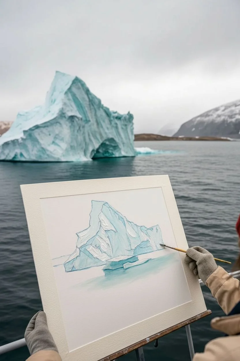
Iceberg and Arctic Sea Palette Practice
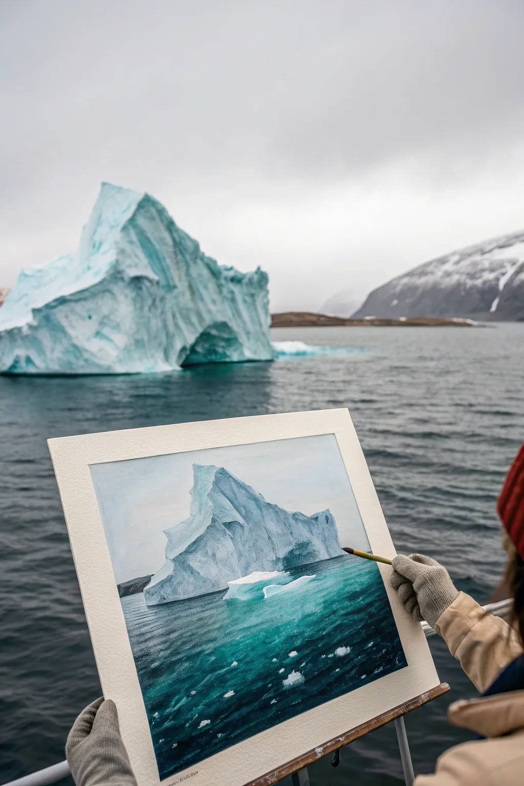
Capture the stark beauty of the poles with this acrylic study of a jagged iceberg floating in deep, frigid waters. You’ll work with a spectrum of cool tones, balancing the crystalline structure of the ice against the movement of the restless sea.
Step-by-Step Guide
Materials
- Heavyweight watercolor paper or primed canvas board (approx. 9×12 inches)
- Acrylic paints (Titanium White, Phthalo Blue, Ultramarine Blue, Hooker’s Green, Paynes Grey, Burnt Umber)
- Flat brushes (sizes 1/2 inch and 1 inch) for water
- Small round brushes (size 0, 2, and 4) for details
- Palette knife (optional for texture)
- Water container and paper towels
- Painter’s tape
Step 1: Iceberg Structure
-
Sketch the Form:
Begin by lightly sketching the outline of the main iceberg using a diluted mix of Ultramarine Blue and water. Focus on the main triangular peak and the smaller, lower chunk to the right. Don’t worry about perfect lines; ice is naturally jagged. -
Block in Shadows:
Mix Titanium White with a tiny touch of Paynes Grey and Phthalo Blue to create a cool shadow tone. Paint the left side of the iceberg, or wherever the shadows naturally fall based on your reference, establishing the 3D form early on. -
Define the Facets:
Using a slightly darker blue-grey, cut in the sharp angles and ridges within the shadow areas. These darker lines act as the ‘crevasses’ and structural breaks in the ice. -
Highlight the Peaks:
Load a clean brush with pure Titanium White. Paint the sunlit faces of the iceberg with thick, opaque strokes. I like to let the brush texture remain visible here to mimic the rough surface of snow and ice. -
Add Reflected Color:
Mix a very pale turquoise using Phthalo Blue, a touch of Green, and lots of White. Glaze this color near the waterline of the iceberg where the vibrant sea color reflects upward onto the ice.
Cooler Than Cool
Avoid using pure black for shadows. Mixing Paynes Grey with Phthalo Blue creates a much richer, colder shadow that feels more atmospheric.
Step 2: The Deep Ocean
-
Underpainting the Sea:
For the water, start with a dark gradient. Mix Phthalo Blue with a little Hooker’s Green and Paynes Grey. Paint the bottom third of the canvas in this deep teal, getting slightly lighter as you approach the horizon line behind the iceberg. -
Horizon Line:
Carefully paint the horizon line with a steady hand using a mix of Paynes Grey and Burnt Umber for the distant landmass, keeping it muted so it pushes into the background. -
Creating Depth:
While the underpainting is still tacky, mix a brighter turquoise (Phthalo Blue + Green + White). Using horizontal strokes, blend this color into the water area directly in front of and around the iceberg. -
Water Movement:
Switch to a smaller flat brush. Using a medium-dark blue, add short, horizontal dashes across the water surface to simulate small choppy waves. Keep the strokes smaller and closer together near the horizon to force perspective.
Step 3: Atmosphere and Details
-
Submerged Ice:
To create the look of ice underwater, thin down a bright turquoise paint with water or glazing medium. Paint broad, soft shapes extending from the iceberg base down into the dark water, blurring the edges. -
Surface Ripples:
Mix a light seafoam green color. Using just the tip of a round brush, add highlighting ripples to the wave crests, focusing especially on the area where the iceberg meets the water. -
Floating Debris:
Dot small, irregular shapes of pure white in the foreground water to represent ‘growlers’—small chunks of floating ice. Add tiny grey shadows to the bottom of these chunks to seat them in the water. -
Sky Wash:
Mix a very pale grey-blue glaze. Apply this to the sky area, keeping it smooth and unobtrusive so it doesn’t compete with the dramatic iceberg. -
Final Highlights:
Revisit the iceberg’s brightest points with fresh Titanium White to ensure maximum contrast. Add sharp white lines on the water surface closest to the foreground for sparkle. -
Clean Edges:
Once fully dry, remove your painter’s tape carefully to reveal the crisp border that frames your frozen landscape.
Chalky Colors?
If your ocean darks look chalky when dry, apply a gloss varnish or a thin glaze of clear medium mixed with Phthalo Blue to restore depth and saturation.
Step back and appreciate the chilly atmosphere you have captured on your canvas
Indigo Tie-Dye Spiral as a Painted Motif
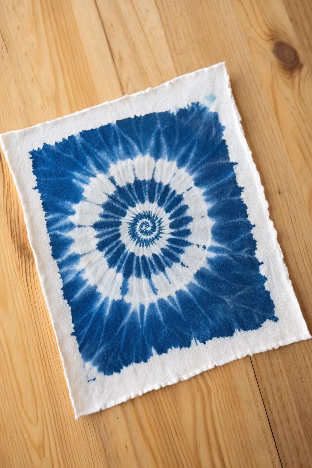
Capture the organic beauty of traditional indigo dyeing using watercolor paints on textured paper. This project creates a stunning optical illusion of fabric folds and dye bleed without the mess of actual fabric dyeing.
Detailed Instructions
Materials
- Heavyweight watercolor paper (300gsm cold press or rough texture suggested)
- Indigo or Prussian Blue watercolor paint (tube or liquid)
- Round watercolor brushes (sizes 4 and 8)
- Clean water jar
- Paper towel
- Pencil (HB or lighter)
- Ruler
- painter’s tape (optional)
- Deckle edge ruler or tearing tool (optional for edges)
Step 1: Preparation & Sketching
-
Prepare the paper edge:
To mimic the handmade feel of the reference, tear your watercolor paper into a square shape rather than cutting it. You can do this by folding and creasing the paper sharply, then moistening the fold with a little water before carefully pulling apart to create a ‘deckled’ look. -
Find the center:
Lightly mark the exact center of your square paper with a pencil dot. This will be the origin point for your spiral. -
Sketch the guides:
Sketch a very faint spiral shape starting from the center and expanding outward. Don’t worry about perfect lines; these serve merely as a skeleton for where the white ‘resist’ areas will go. -
Mark radial sections:
Draw faint lines radiating from the center like wheel spokes, dividing the paper into roughly 12 to 16 wedges. These intersections help keep the spiral consistent as you paint.
Too Much Spread?
If the paint bleeds too fast and ruins your white spaces, your paper is too wet. Let it dry for a minute or switch to a ‘thirsty’ brush to lift excess water immediately.
Step 2: Painting the Spiral
-
Mix your base color:
Prepare a puddle of intense indigo blue. You want a high pigment-to-water ratio for the darkest areas to emulate saturated dye. -
Wet the center:
Using clean water, lightly dampen the very center of the spiral, but leave a tiny dry spot in the middle to keep the white core crisp. -
Start the spiral core:
Load your smaller brush with concentrated paint. Touch the tip to the wet paper in a spiral motion, allowing the paint to bleed slightly outward but controlling it so it doesn’t flood the white spaces. -
Define the white bands:
As you move outward, visualize the white paper as the raised ‘folds’ of fabric. You are painting the darker ‘valleys’ between them. Paint distinct, jagged strokes radiating outward that stop short of the next spiral ring. -
Create the bleeding effect:
To simulate dye wicking into fabric, quickly run a semi-wet lining brush along the edges of your blue strokes while they are still damp. This softens the hard edges into a fuzzy, textile-like blur. -
Expand the pattern:
Continue working in concentric rings outward. Make your blue strokes wider and bolder as you move away from the center, maintaining that radial, spoke-like direction. -
Building contrast:
While the first layer is damp, drop darker, less diluted pigment into the center of the blue sections. This creates depth, mimicking where dye pools in fabric creases. -
Paint the background field:
Once the main spiral is established, fill in the four corners of the square with a solid wash of blue. I like to keep the inner edges of this field jagged and irregular to match the spiral’s energy. -
Connect edges to spiral:
Blend the solid blue corners into the outer ring of the spiral using jagged, inward-facing brush strokes. Leave gaps of white paper to ensure the spiral shape remains clearly defined against the background.
Salt Texture Trick
While the blue sections are still very wet, sprinkle a few grains of table salt into the pigment. As it dries, the salt pushes pigment away, creating amazing textile-like texture.
Step 3: Refining & Finishing
-
Soften harsh lines:
Inspect your work for any edges that look too ‘illustrated’ or sharp. Use a clean, damp brush to gently scrub and feather these areas out, enhancing the fuzzy, dyed appearance. -
Add bleeds:
With a very watery wash of pale blue, touch a few areas of the stark white paper ‘folds’ to bridge the gap between sections. Real tie-dye rarely has perfectly white resists. -
Enhance texture:
If your paper is very rough, use the ‘dry brush’ technique with concentrated paint on the outer corners to catch the texture of the paper, simulating the weave of heavy cotton cloth. -
Final drying:
Allow the piece to dry completely flat. If the heavy wash buckles the paper, you can flatten it under heavy books once it is bone dry. -
Erase guidelines:
Once fully dry, gently erase any visible pencil marks, being careful not to smudge the pigment.
Frame your faux-shibori piece in a simple wood frame to highlight the beautiful deckled edges and organic textures
Blue Ink Wash With Watercolor Drips
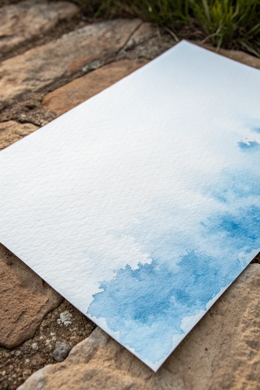
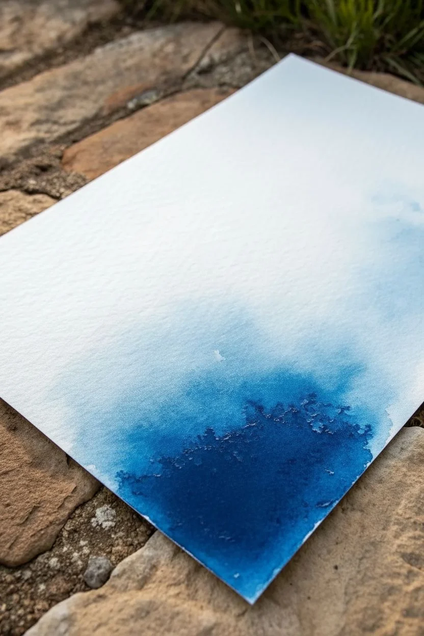
Capture the serenity of a drifting cloud with this minimalist blue ink wash project. The textured watercolor paper interacts beautifully with the fluid medium, creating natural blooms and organic edges that are unique to every attempt.
Step-by-Step Tutorial
Materials
- Cold press watercolor paper (300 gsm or higher)
- Blue liquid watercolor or acrylic ink
- Medium round watercolor brush (size 8 or 10)
- Clean water jar
- Paper towels
- Dropper or pipette (optional)
- Spray bottle with water (optional)
Step 1: Preparation and Wetting
-
Prepare your workspace:
Since this technique involves letting liquids run freely, ensure your surface is flat or slightly tilted depending on your desired effect. If you want more control, tape your watercolor paper down to a board, but leaving it loose allows you to tilt the paper manually. -
Load the brush:
Dip your round brush into clean water first to dampen the bristles, then blot slightly. Load the brush generously with your chosen blue liquid watercolor or ink directly from the bottle or palette. -
Initial application:
Start applying the color at the bottom right corner of the paper. Use a dabbing motion rather than long strokes to deposit a pool of pigment. This area will be your darkest saturation point. -
Soften the edge:
Quickly rinse your brush in clean water. While the initial blue pool is still wet, touch the clean, wet brush to the edge of the blue puddle. Watch as the pigment rushes into the clear water.
Edge Control
For sharper ‘hard’ edges in the cloud, let a puddle of water sit and evaporate naturally on the paper. For soft, misty edges, keep blotting the boundary with a damp paper towel as it dries.
Step 2: Creating the Wash Gradient
-
Extend upwards:
Continue using water to pull the color upwards and towards the center of the page. You want to drag the pigment out so it becomes lighter and more transparent as it moves away from that corner. -
Add texture:
To get that lovely, mottled texture seen in the example, tilt the paper slightly. Let gravity pull the excess water down or sideways for a moment before leveling it again. -
Create distinct blooms:
While the wash is damp but not soaking, drop tiny amounts of clear water into the middle of the blue areas. This displaces the pigment towards the edges, creating those fascinating ‘cauliflower’ blooms and hard drying lines. -
Deepen the contrast:
Go back to your original source of blue ink. While the very bottom corner is still wet, drop in pure, undiluted pigment. I like to let this spread naturally without touching it with a brush to keep the intensity high. -
Define the outer edge:
Use a damp (not dripping) brush to shape the outer boundary of the blue cloud. Leave the edge irregular and organic rather than smoothing it into a perfect line. -
Splatter details:
If you want tiny specks of darker blue, tap your loaded brush handle against a finger to flick minute droplets into the wet wash. This adds subtle texture without overwhelming the softness.
Metallic Accent
Once the blue ink is fully dry, trace the very outer edge of the main wash with a fine gold gel pen or gold leaf adhesive to add a luxurious, gilded border to your cloud.
Step 3: Drying and Refining
-
Let it settle:
Stop working the paper while it is still quite wet. Overworking watercolor ruins the fresh, spontaneous look. Allow the pools of water to sit undisturbed. -
Controlled drying:
Let the piece air dry flat. If you use a heat gun or hairdryer, you might push the liquid around too much and lose those delicate, hard edges where the water pooled. -
Assess the fade:
Once fully dry, check the gradient. The blue should fade seamlessly into the white of the paper. If there’s a harsh line where you wanted a fade, you can re-wet that specific edge very gently with clean water to soften it, though this is risky. -
Final touches:
If the clouds look too pale after drying (watercolor always dries lighter), you can glaze a second, very transparent layer over the darkest sections to build depth. -
Flattening:
If the paper buckled from the water, place the completely dry artwork under a heavy book for a day to flatten it back out before displaying.
Now you have a tranquil piece of abstract art ready to frame or give as a card
Blue Tonal Triptych From Dawn to Midnight
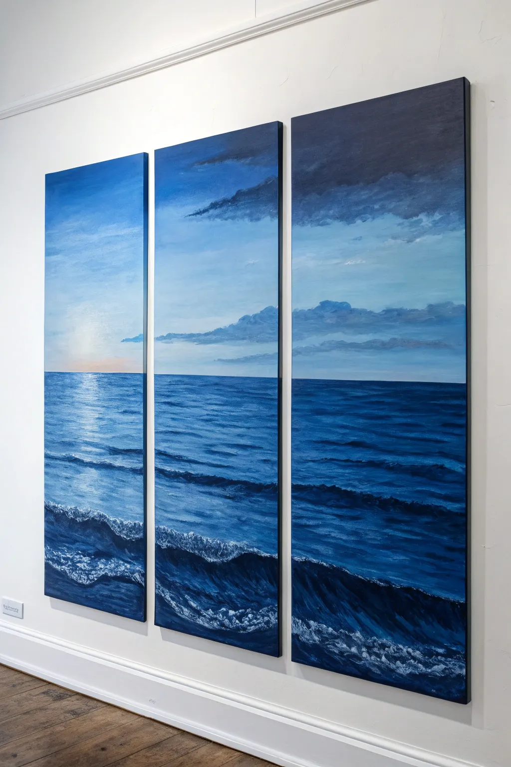
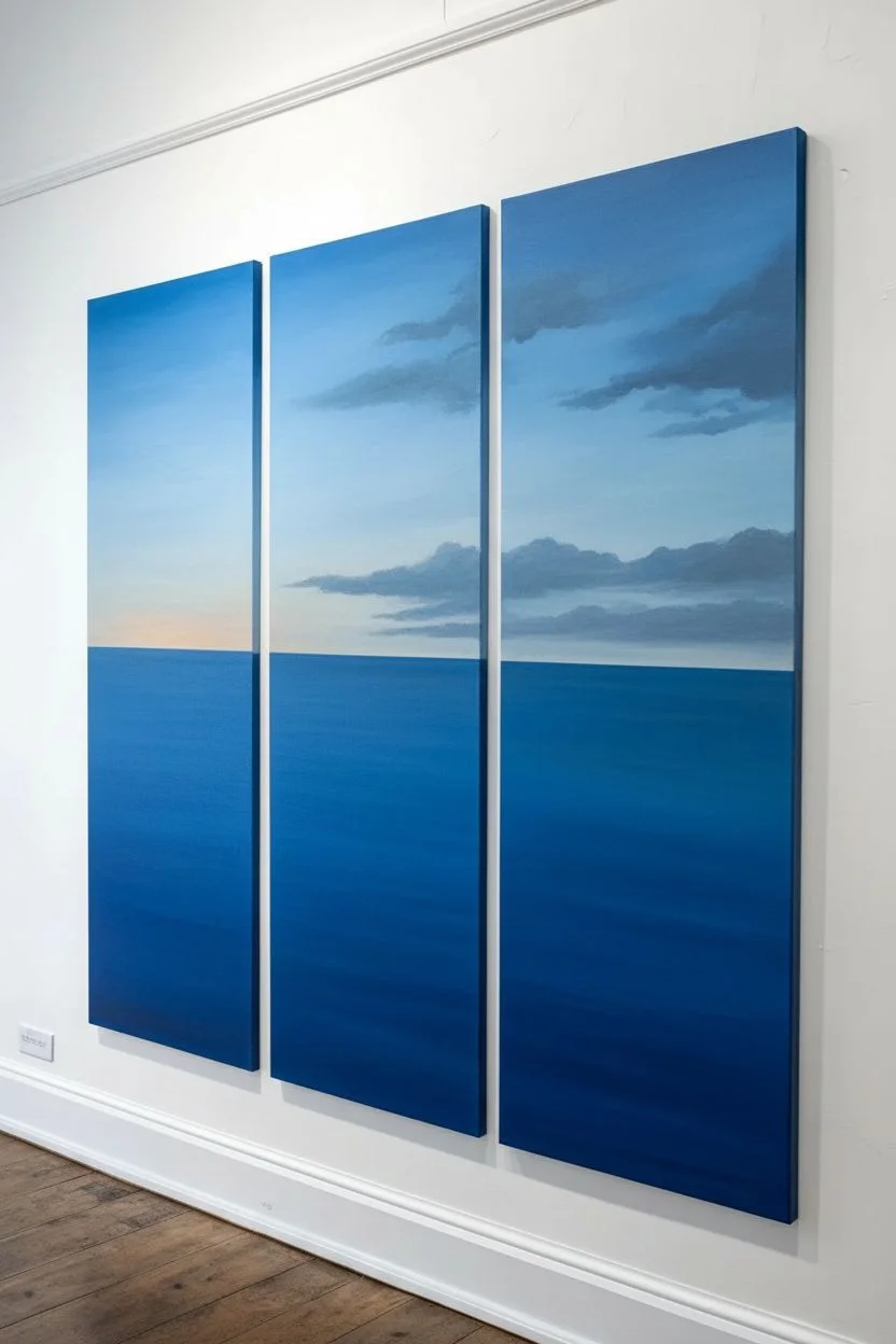
Create a stunning focal point for any room with this large-scale seascape spanning three canvases. This triptych captures the shifting light of the ocean, moving from a soft, sunlit glow on the left to dramatic, deep midnight blues on the right.
Step-by-Step Guide
Materials
- 3 Tall stretched canvases (e.g., 12×36 inches or similar)
- Acrylic paints (Titanium White, Phthalo Blue, Ultramarine Blue, Cerulean Blue, Payne’s Grey, Burnt Umber, Yellow Ochre)
- Large flat brush (2-inch)
- Medium filbert brush
- Small round detail brush
- Fan brush (optional)
- Palette knife
- Easel or wall space
- Water container and rags
Step 1: Preparation and Sky Gradient
-
Align the Canvases:
Set up your three canvases side-by-side on your easel or a protected wall, leaving a small gap (about 1 inch) between them. It is crucial to paint them simultaneously to ensure the horizon line and colors flow continuously. -
Mark the Horizon:
Using a ruler and a light pencil touch or a piece of painter’s tape, mark a straight horizon line across all three canvases. Place it slightly below the center point for a pleasing composition. -
Mix the Sky Gradient:
Prepare three piles of blue mixes on your palette. For the left canvas, mix White with a touch of Cerulean and a tiny speck of Yellow Ochre for warmth. For the middle, use pure Cerulean and White. For the right, mix Ultramarine and Payne’s Grey for a stormy look. -
Establish the Sky Base:
Using your large flat brush, apply the lightest blue mix to the top of the left canvas. Working quickly while the paint is wet, blend into the medium blue on the middle canvas, and finish with the dark mix on the right canvas. -
Blend the Transitions:
Wipe your brush dry and gently sweep back and forth across the gaps between canvases to soften the color transitions. The sky should get progressively darker from left to right. -
Paint the Lower Sky:
Near the horizon line, lighten all your mixtures with more White. On the far left canvas, add a hint of Yellow Ochre or light orange to suggest the rising sun source. -
Add Cloud Formations:
Switch to a filbert brush. Mix a soft grey-blue using touches of Burnt Umber and White. Dab in cloud shapes, keeping them loose on the left and making them heavier and darker on the right canvas.
Uneven Horizon?
If your horizon line looks crooked across the gap, use a long level or a taut string across the three canvases to re-mark it, then paint over the mistake with opaque acrylic.
Step 2: Painting the Ocean
-
Block in the Water:
Mix a deep ocean base color using Phthalo Blue and a touch of Burnt Umber. Apply this below the horizon line across all three canvases, darkening the mix with Payne’s Grey as you move to the right panel. -
Define the Horizon:
Use a steady hand or a piece of tape to paint a crisp, dark blue line exactly on your horizon mark. A sharp horizon is key to the illusion of depth. -
Create Distant Waves:
With a smaller flat brush and a slightly lighter blue mix, paint horizontal streaks near the horizon. Keep these marks thin and close together to represent distant ripples. -
Sunlight Reflection:
On the left canvas specifically, mix Titanium White with a tiny bit of the sky color. Paint horizontal dashes directly under the ‘sun’ area, letting the strokes get wider as they move down the canvas. -
Build Mid-Ground Movement:
In the middle of the canvases, use broad, sweeping strokes with the filbert brush to create the swelling of the water. I find varying the blues here helps create a sense of rolling motion. -
Form the Foreground Wave:
Across the bottom third of the triptych, paint a large, dark, curving shape to represent a crashing wave. This shadow shape should span across the gaps, connecting the panels visually.
Level Up: Texture
Mix heavy gel medium into your white paint for the foreground sea foam. Apply this with a palette knife to create actual 3D texture that catches the room’s light.
Step 3: Details and Highlights
-
Highlighting the Swell:
Mix a translucent highlight color (white with lots of water or glazing medium). Brush this over the top edge of your foreground wave to show where the light hits the curved water. -
Creating Sea foam:
Load a fan brush or an old, splayed bristle brush with thick Titanium White. Tap it gently along the crest of the foreground wave to create the texture of crashing foam. -
Foam Patterning:
Drag the foam texture down slightly into the dark trough of the wave using a dry brush. This creates the lacy, web-like patterns seen in churning water. -
Final Sparkles:
Using your smallest round brush, add tiny distinct dots of pure white on the left canvas water ripples to intensify the sun’s reflection. -
Paint the Edges:
Once the front is dry, paint the sides of the canvases. You can wrap the image around (continuation) or paint them a solid dark blue or black for a framed look. -
Varnish and Seal:
After the painting has cured for at least 24 hours, apply a gloss varnish to bring out the depth of the dark blues and protect the surface.
Hang these canvases with precise spacing to transform your wall into a window overlooking the open sea
Textured Blue Mixed Media With Salt and Scraping
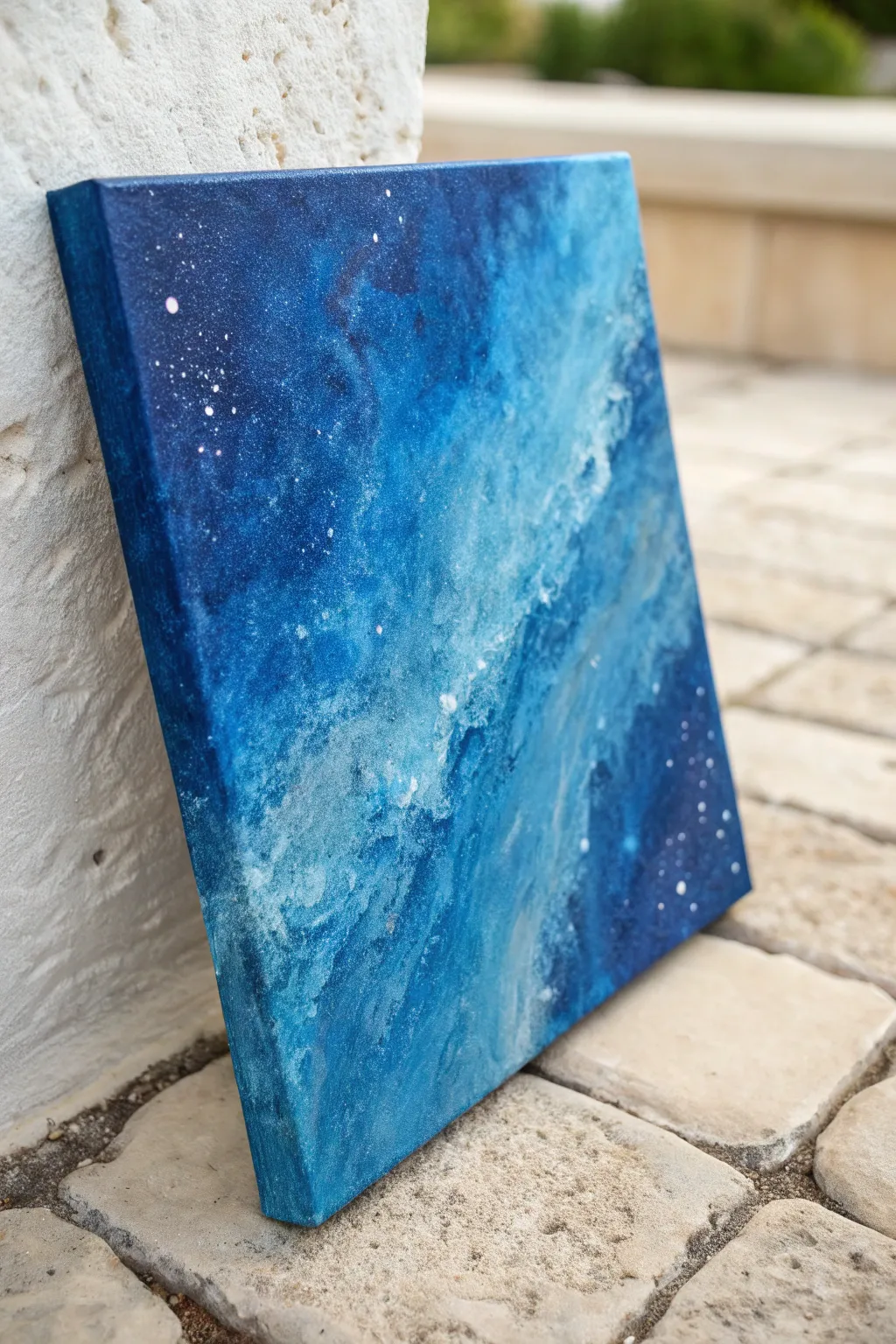
This project creates a stunning, ethereal galaxy or deep-ocean effect using simple chemistry and physical texture. By layering shades of blue and interfering with the drying process using salt, you will create organic patterns that look deceptively complex.
Detailed Instructions
Materials
- Square stretched canvas (e.g., 12×12 inches)
- Acrylic paints (Phthalo Blue, Ultramarine Blue, Turquoise, White, Black)
- Sea salt (coarse grains)
- Table salt (fine grains)
- Old credit card or palette knife for scraping
- Wide flat brush (1-2 inch)
- Small round brush for details
- Water spray bottle
- Paper towels
Step 1: Base Gradient
-
Prepare the canvas:
Start by lightly misting your canvas with water. This helps the acrylics blend more smoothly right from the start. -
Apply the dark corners:
Mix Ultramarine Blue with a tiny dot of Black to create a deep navy. Using the wide brush, paint the top left and bottom right corners, brushing inward. -
Blend the mid-tones:
While the navy is wet, load your brush with pure Phthalo Blue and Turquoise. Paint the remaining empty areas, blending seamlessly into the dark corners to get rid of hard lines. -
Add a diagonal highlight:
Mix Titanium White with Turquoise to make a bright, electric cyan. Swipe this diagonally across the center of the canvas where the light hits the nebulous cloud. -
Extend to the edges:
Don’t forget the sides of your canvas. Paint the edges to match the colors on the front face so it looks professional without a frame.
Salt Stuck?
If salt grains are stuck in dried paint, don’t force them. Dampen a cloth slightly to dissolve stubborn crystals, then gently wipe them away.
Step 2: Salt Texture & Scraping
-
Check wetness:
The paint needs to be wet, but not dripping. If it has started to dry, mist it lightly with your spray bottle again. -
Sprinkle coarse salt:
Take a pinch of coarse sea salt and drop it into the wetter, darker areas of the blue paint. The large grains will push pigment away, creating ‘starburst’ textures. -
Add fine salt:
Sprinkle fine table salt along the diagonal lighter path. This creates smaller, denser texture that mimics distant stardust or foam. -
Wait for reaction:
Let the canvas sit for about 10-15 minutes. You will see the salt starting to absorb water and push the pigment around. -
Scrape the highlight:
Using the edge of an old credit card or a palette knife, gently scrape across the center white/turquoise diagonal. Use a light hand; you want to drag some paint to create movement, not scrape it all off to the canvas. -
Create directional flow:
Use the scraping tool to push some of the dark blue into the light areas and vice versa, keeping the motion diagonal to maintain the composition’s energy. -
Full drying time:
This is the hardest part—waiting. Let the painting dry completely, preferably overnight. The salt needs to be 100% dry to work its magic.
Add Metallic Sheen
Mix silver or iridescent medium into your white paint for the center diagonal. The galaxy will shimmer beautifully when the light changes.
Step 3: Finishing Touches
-
Remove the salt:
Once totally dry, rub the surface with a dry cloth or your hand to brush off all the salt grains. You’ll reveal beautiful organic speckles underneath. -
Assess the texture:
If the center feels too flat after scraping, I often dry-brush a tiny bit of pure white over the highest ridges of the paint to catch the light. -
Add star clusters:
Water down a small amount of white paint until it’s fluid like ink. Dip a small brush in it and tap the handle against another brush to flick tiny platters over the dark blue corners. -
Paint specific stars:
Use your smallest round brush to dot in a few intentionally placed larger stars or bright points to anchor the composition. -
Seal:
Once the splatter is dry, seal the artwork with a gloss varnish to make the deep blues pop and look wet.
You have captured a piece of the universe on canvas that is ready to display


Have a question or want to share your own experience? I'd love to hear from you in the comments below!