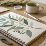
If you’re craving a creative reset, these easy painting ideas for adults are the kind of projects I love because they look polished without asking you to be “good at drawing.” Most of them lean on satisfying techniques like smooth blending, bold silhouettes, and simple shapes—so you can finish in a single sitting and actually want to hang it up.
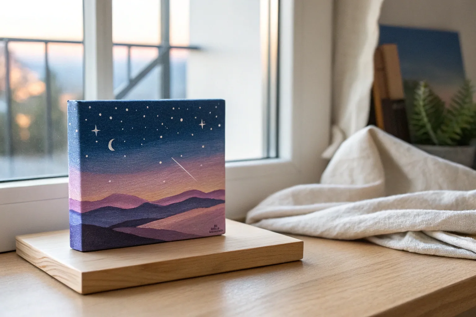
Sunset Ombre Sky With Easy Blending
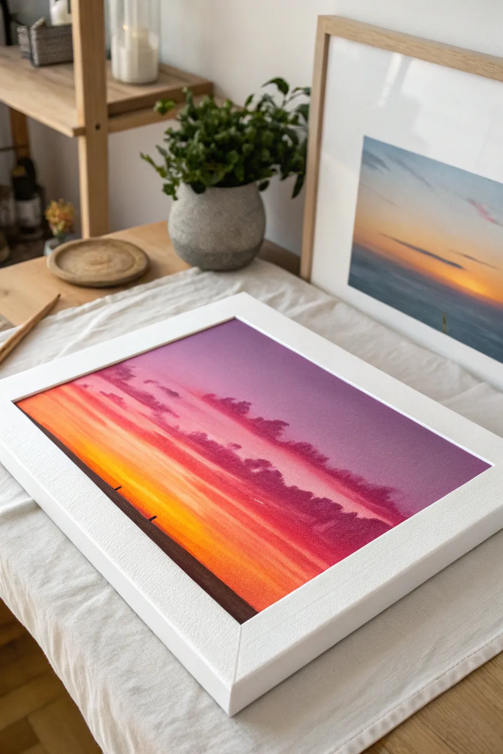
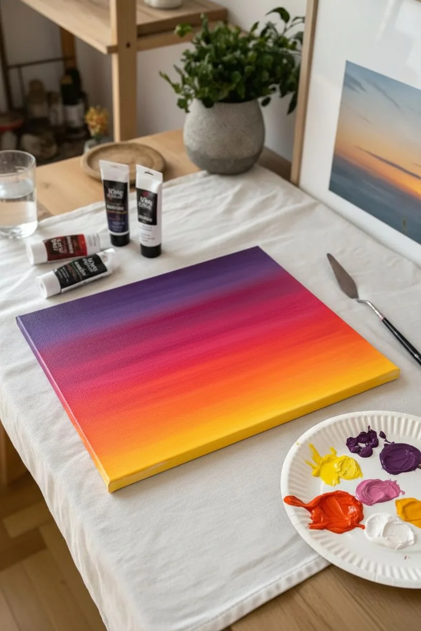
Capture the breathtaking transition of day to night with this vibrant sunset painting, featuring a seamless gradient from deep purple to blazing orange. This relaxing project focuses on simple blending techniques to create a glowing sky that serves as the perfect backdrop for silhouetted horizons.
Detailed Instructions
Materials
- Acrylic paints: Titanium White, Cadmium Yellow, Cadmium Orange, Magenta (or Quinacridone Red), Dioxazine Purple, Mars Black
- Canvas board, stretched canvas, or heavy mixed media paper (approx. 8×10 inches)
- Flat shader brushes (large 1-inch brush for background, medium size 6 or 8 for clouds)
- Small round detail brush (size 0 or 1)
- Palette knife (optional, for mixing)
- Palette or paper plate
- Cup of water and paper towels
- Painter’s tape (optional, for clean edges)
Step 1: Setting the Sky Gradient
-
Prepare your palette:
Squeeze out generous amounts of your sunset colors: purple, magenta, orange, and yellow. Keep the white and black separate for now. You’ll want plenty of paint to ensure the blending stays wet and workable. -
Start with purple:
Using your large flat brush, apply the deep purple across the top 20% of your canvas. Don’t be afraid to make this layer thick and juicy; dry brushing makes blending difficult later. -
Transition to magenta:
Clean your brush slightly (or just wipe off the excess purple) and pick up the magenta. Paint the next horizontal section right below the purple, slightly overlapping the wet edge where the two colors meet. -
Blend the upper sky:
With the brush straddling the line between purple and magenta, use long, horizontal sweeping strokes to merge them. The goal is a soft, fuzzy transition where you can’t tell exactly where one color ends and the other begins. -
Add the orange layer:
Wipe your brush clean. Pick up the orange paint and apply it below the pink section. Again, work quickly while the paint above is still tacky to ensure a smooth gradient. -
Create the glowing horizon:
Finish the bottom quarter of the sky with your bright yellow. Blend it upward into the orange using those same horizontal back-and-forth strokes. If the yellow gets ‘dirty’ from the darker colors, wipe your brush and pick up fresh yellow. -
Smooth the entire gradient:
Take a clean, slightly damp (but not dripping) large brush and do final long sweeps across the entire canvas from top to bottom to soften any harsh brushstrokes. I find looking at it from a distance helps satisfy my eye that the transition is smooth.
Step 2: Adding Clouds and Texture
-
Mix a cloud color:
While your background dries slightly, mix a dusky purple-pink. Combine a little purple, magenta, and a tiny dot of black. You want a color darker than the sky but not completely black. -
Paint the upper clouds:
Switch to your medium flat brush. Load it with your mixed cloud color and dab irregular, horizontal shapes into the purple and pink sections of the sky. Keep the edges soft and fluffy. -
Highlight the clouds:
Mix a light pink (magenta plus white). Gently tap the tops of your dark clouds with this lighter color to suggest sunlight catching the edges. -
Soften the cloud bottoms:
Wipe your brush dry and gently drag the bottom edges of the clouds sideways. This ‘whisps’ them out, making them look like they are floating rather than stuck on the canvas. -
Add lower haze:
Using a very dry brush with a tiny amount of orange-red, lightly scumble (scrub) some horizontal streaks across the yellow section to create distant, hazy atmosphere.
Blending Trouble?
If acrylics dry too fast to blend properly, mix a clear glazing medium or a ‘slow-dry’ medium into your paints. This keeps them wet longer, allowing for that buttery smooth gradient application.
Step 3: Painting the Silhouette Horizon
-
Establish the ground line:
Ensure the background is completely dry to touch. Using Mars Black and a medium flat brush, paint a solid horizon line across the bottom. You can tape this off if you want it razor-sharp, or freehand it for a natural look. -
Create distant trees:
Switch to your small detail brush. Along the black horizon line, dab tiny, vertical irregularities. These small bumps simulate a distant tree line or cityscape. -
Add foreground details:
If you want the effect of a closer hill or beach, paint a slightly angled black slope rising from the bottom corner, overlapping your straight horizon line. -
Define the silhouettes:
Paint two or three very small, simple vertical posts or tiny figures on the black foreground. Keep them minimal; the viewer’s mind will fill in the details. -
Final touches:
Step back and check your contrast. If the black looks patchy, give it a second coat for an opaque, solid silhouette.
Make it Sparkle
Wait for the painting to fully dry, then splatter tiny white stars over the purple section using a toothbrush. Adding a thin gloss varnish coat will also make the sunset colors pop vibrantly.
Frame this vibrant piece in white to make those sunset colors truly sing on your wall


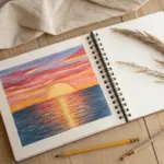
Desert Sunset Silhouette With Cacti
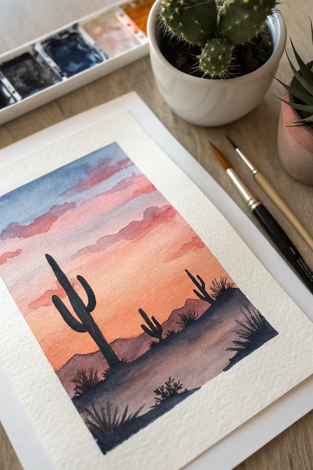
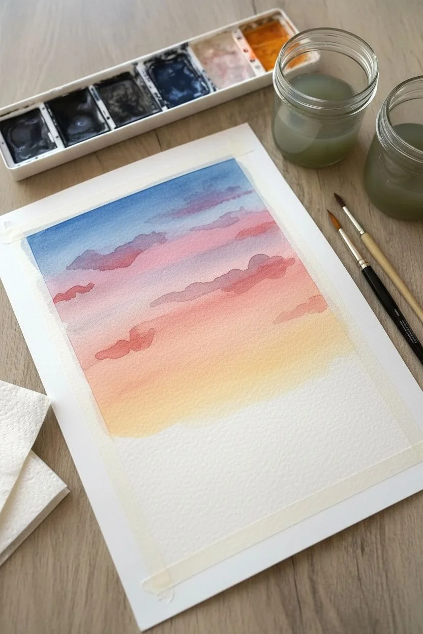
Capture the magic of the Southwest with this stunning watercolor sunset. You’ll learn how to blend a warm gradient sky and add striking black silhouettes for a high-contrast, professional-looking result that is surprisingly simple to achieve.
Step-by-Step Tutorial
Materials
- Cold press watercolor paper (approx. 140lb/300gsm)
- Watercolor paints (Indigo, Alizarin Crimson, Cadmium Yellow/Orange, Sap Green)
- Masking tape or painter’s tape
- Flat wash brush (large)
- Round brush (size 4 or 6 for silhouettes)
- Detail brush (size 0 or 1)
- Palette for mixing
- Two jars of water
- Paper towels
Step 1: Preparation & Sky Gradient
-
Prepare your surface:
Begin by taping down all four edges of your watercolor paper to a hard board or table. This creates that crisp white border you see in the photo and prevents the paper from buckling when wet. -
Pre-wet the sky area:
Using your large clean brush, apply a generous coat of clean water to the upper two-thirds of the paper where the sky will be. The paper should glisten but not have puddles. -
Start with blue:
Load your brush with a watered-down Indigo or Prussian Blue. Paint a horizontal strip at the very top of the wet paper, letting the color bleed downward naturally. -
Transition to pinks:
Rinse your brush and pick up a soft Alizarin Crimson or rose tone. Apply this just below the blue while both are still wet, allowing them to touch and mingle slightly to create purple transition areas. -
Add the warm glow:
Clean the brush again and switch to a warm yellow-orange mix. Paint the bottom portion of the sky, blending it upward into the pink. This creates the ‘setting sun’ effect near the horizon line. -
Create cloud textures:
While the sky is still damp (not soaking), mix a slightly thicker purple-grey using blue and a touch of red. Gently dab in horizontal, irregular shapes to suggest clouds drifting across the sunset.
Pro Tip: Better Gradients
Tilt your board slightly while painting the sky. Gravity helps pull the wet paint downward, creating a smoother, more natural blend between the blue, pink, and orange layers.
Step 2: Landscape & Mountains
-
Dry completely:
This is crucial: let the sky layer bone-dry. If you paint the mountains too soon, they will bleed into your beautiful sunset gradient. -
Paint the distant mountains:
Mix a watery purple-brown shade. Using a round brush, paint a jagged, uneven line across the horizon to represent distant mountains. Fill in the shape below this line with a wash of the same color. -
Let the first layer dry:
Allow this distant mountain range to dry completely before moving to the foreground. -
Add the foreground terrain:
Mix a darker, more saturated version of your mountain color (add more paint, less water). Paint a second, lower hill shape in the foreground, overlapping the first one to create depth. -
Darken the bottom:
While the foreground hill is wet, drop in some concentrated Indigo or dark grey at the very bottom edge to ground the scene.
Step 3: Silhouettes & Details
-
Mix the silhouette color:
Create your darkest color yet. I prefer mixing Indigo with a tiny bit of dark brown or black to get a deep, rich charcoal tone rather than using straight black from the tube. -
Draft the main cactus:
Using a smaller round brush, paint the main saguaro cactus on the left. Start with a vertical trunk, then add the signature curved arms. Keep the edges crisp. -
Add secondary cacti:
Paint a smaller cactus or two in the mid-ground (on the right side). Making these smaller than the main cactus enhances the feeling of distance. -
Paint desert shrubs:
Switch to your smallest detail brush. At the base of the cacti and along the foreground hills, use quick, upward flicking motions to create spiky desert grasses and small bushes. -
Add final texture:
Use the tip of your detail brush to add tiny dots or extra spikes to the silhouette edges if you want a rougher, more natural look. -
Reveal the border:
Once the painting is 100% dry to the touch, slowly peel away the masking tape at a 45-degree angle to reveal your crisp, clean edges.
Level Up: Starry Night
Once the sky is dry, use a stiff toothbrush to flick tiny specks of white gouache or opaque white watercolor onto the dark blue upper section for a starry effect.
Frame your desert masterpiece and enjoy the warm glow it brings to your space

Forest Line Silhouette Over a Colorful Horizon
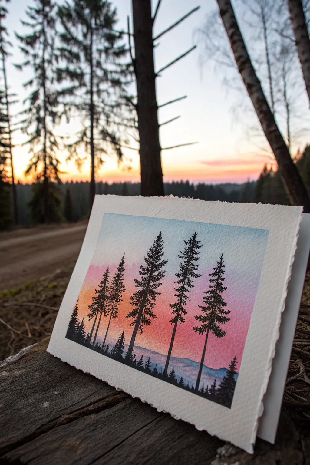
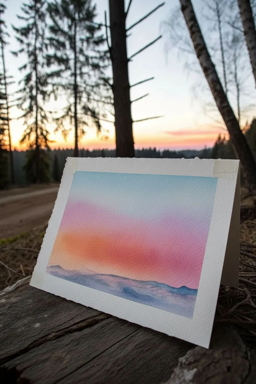
Capture the magic of twilight in the woods with this stunning watercolor and ink project. By blending a soft, colorful gradient background behind sharp black silhouettes, you’ll create a striking sense of depth and atmosphere that looks professional yet is surprisingly simple to achieve.
How-To Guide
Materials
- High-quality watercolor paper (300gsm, cold pressed with deckled edge preferred)
- Watercolor paints (Cyan/Blue, Magenta/Purple, Orange, Yellow)
- Flat wash brush (3/4 inch or similar)
- Fine liner pens (Black, sizes 0.1, 0.3, and 0.5)
- Black India ink or black gouache (optional, for darker areas)
- Small round brush (size 2 or 4)
- Masking tape
- Clean water and paper towels
Step 1: Painting the Sky Gradient
-
Prepare the paper:
Tape your watercolor paper down to a flat board. If you have deckled-edge paper like the example, tape just the corners or use a block to keep the beautiful edges exposed while preventing warping. -
Wet the surface:
Using your large flat brush and clean water, apply an even coat of water across the entire paper surface. You want a sheen, not puddles, to help the colors blend seamlessly. -
Apply the top blue:
Load your brush with a diluted cool blue (like Cerulean or Phthalo Blue). Paint a horizontal strip across the top third of the paper, letting the wet surface pull the color downward slightly. -
Blend in the purple:
Clean your brush and pick up a purple or magenta tone. Apply this directly below the blue while both are still wet, gently sweeping back and forth where they meet to create a soft transition. -
Add the warmth:
Move lower down the paper with an orange or coral hue. Blend this upward into the purple layer. Keep the color intensity moderate—we want a glowing twilight feel, not neon brights. -
Create the horizon haze:
Near the bottom quarter, mix a very faint, watery blue-purple. Paint rolling, uneven shapes to suggest distant mountains or hills sitting low on the horizon, allowing them to bleed slightly into the sky for a misty effect. -
Let it dry completely:
This is crucial. Walk away and let the paper dry until it is room temperature to the touch. If you paint the trees too soon, the ink will bleed into spiderwebs.
Bleeding Lines?
If your ink lines start fuzzing out, the paper is still damp deep down. Stop immediately! Use a hair dryer on a low, cool setting to fully dry the paper before continuing.
Step 2: Drawing the Forest
-
Plan the tree placement:
Visualize where your five main trees will stand. Stagger their heights and spacing so they don’t look like a picket fence; notice how the example groups two trees on the right and spreads others out. -
Draw the trunks:
Using a 0.5 pen or a small brush with black ink, draw the vertical trunks first. Make them thin and slightly tapering as they go up, but keep them roughly straight. -
Start the foliage:
Switch to your 0.3 pen. Starting from the very top of a tree, make tiny, downward-angled scribbles or ‘V’ shapes. I find keeping the top very sparse makes the tree look more realistic. -
Build the branches:
Work your way down the trunk, making the branches wider as you descend. Use a zigzag motion, leaving small gaps of sky visible through the branches so the tree doesn’t look like a solid triangle. -
Vary the texture:
For some trees, specifically the ones on the ends, use the 0.1 pen to create finer, denser needles. The variation in line weight adds visual interest. -
Anchor the trees:
At the bottom, create a silhouette of ground foliage. Use small, jagged up-and-down strokes to mimic grass, low bushes, or smaller saplings. This creates a solid black base that connects all the trunks. -
Add background trees:
Between the main trees, draw tiny, faint tree tops just poking up from the black base layer using your finest pen. This adds depth, implying a dense forest behind the main line. -
Deepen the blacks:
If your pen lines look a bit grey against the colorful sunset, go over the thickest parts of the trunks and the bottom ground layer with black gouache or India ink for a true, opaque silhouette.
Pro Tip: Scratchy Texture
For realistic pine needles, hold your pen loosely near the back end. This reduces control slightly, creating rapid, organic, and scratchy marks that look more natural than stiff, careful lines.
Now you have a serene twilight forest scene that perfectly captures the quiet beauty of the outdoors


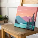
Calm Ocean Seascape With Simple Wave Lines
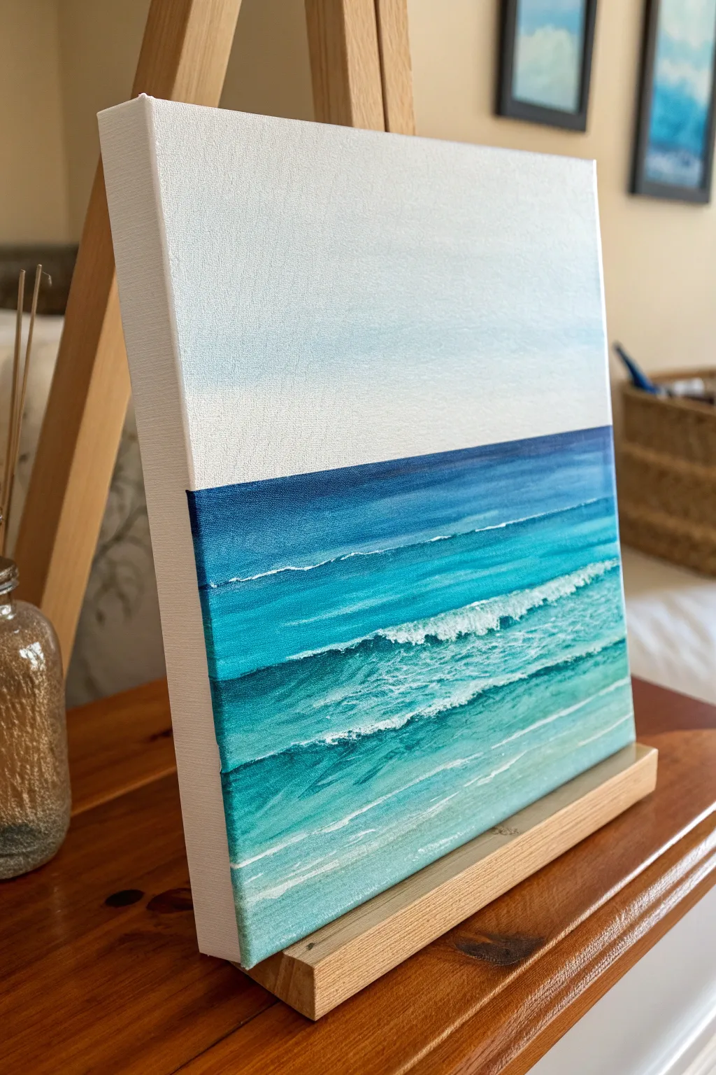
Capture the serenity of the ocean with this minimalist seascape painting that focuses on gentle gradients and relaxing wave lines. The clean horizon line and soothing teal palette make this piece perfect for bringing a breath of fresh air into any room.
Step-by-Step Tutorial
Materials
- Square stretched canvas (approx. 10×10 or 12×12 inches)
- Acrylic paints: Titanium White, Phthalo Blue, Turquoise Deep, Cerulean Blue
- Flat shader brush (1 inch) for background blending
- Small round brush for details
- Fan brush (optional, for soft frothy texture)
- Painter’s tape or masking tape
- Palette and water cup
- Paper towels
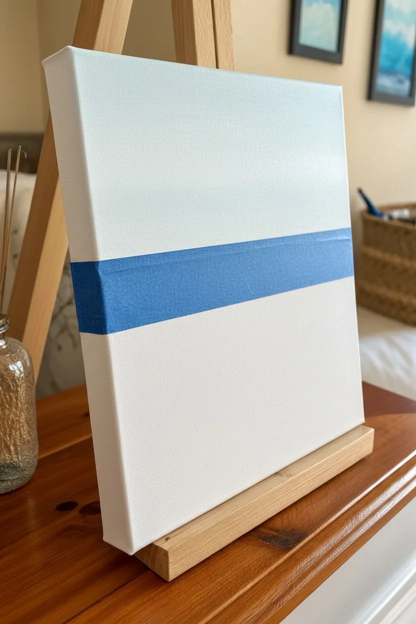
Step 1: Setting the Horizon
-
Tape the horizon:
Place a strip of painter’s tape horizontally across your canvas. Position it slightly above the halfway mark—about two-thirds of the way up—to create a pleasing composition. -
Seal the edge:
Press the tape down firmly, especially along the bottom edge where you will be painting the water. This ensures a crisp, clean horizon line later. -
Paint the sky:
Mix a large amount of Titanium White with a tiny dot of Cerulean Blue. The sky is extremely pale, almost white. Apply this mixture to the entire top section of the canvas using your wide flat brush. -
Fade the sky:
For a subtle gradient, add just a hint more white near the horizon line and blend upwards. Ensure the brushstrokes move horizontally for a smooth finish. Let the sky dry completely.
Pro Tip: Clean Lines
If you struggle with a steady hand, paint a little bit of the SKY color over your tape edge first. This seals the tape so the blue water won’t bleed underneath.
Step 2: Painting the Deep Water
-
Remove the tape:
Once the sky is dry to the touch, carefully peel away the tape to reveal your sharp horizon line. -
Mix the darkest blue:
Create your deep ocean color by mixing Phthalo Blue with a touch of Turquoise Deep. You want a rich, dark navy tone. -
Paint the horizon strip:
Using the flat edge of your wide brush, paint a straight, dark band directly below the sky line. Be careful to keep the edge neat against the white sky. -
Start the gradient:
While the dark paint is still wet, mix a slightly lighter teal by adding more Turquoise to your blue mix. Apply this below the dark band, blending the two together with horizontal strokes.
Level Up: Glossy Finish
Once the painting is cured (wait 24h), apply a coat of high-gloss varnish. It makes the water look permanently wet and deepens the teal colors.
Step 3: Creating the Wave Layers
-
Transition to turquoise:
Continue moving down the canvas, progressively adding more white and Turquoise to your mixture. The middle section of the water should be a vibrant, medium teal. -
Paint the foreground:
For the bottom third of the canvas, mix a very pale aqua color (mostly white with a touch of Turquoise). Paint this all the way to the bottom edge, blending slightly upwards into the medium teal. -
Continue securely:
Don’t forget to wrap your paint colors around the thick sides of the canvas. This gallery-wrap style makes the finished piece look professional without a frame. -
Dry the base layer:
Allow the entire ocean gradient to dry completely before adding texture. This usually takes about 10–15 minutes.
Step 4: Adding Detail and Foam
-
Mix the foam color:
Squeeze out fresh Titanium White. You can add a tiny speck of blue to keep it cool, but it should read as bright white. -
Paint the distant waves:
Using a small round brush, paint very thin, horizontal lines in the dark blue section. Keep these lines broken and subtle to represent distant swells. -
Create the crashing wave:
In the middle teal section, create a more prominent wave line. Use a tapping motion with your brush to create a rough, frothy texture along the top edge of this line. -
Add foamy texture:
Underneath the main wave crest, dry-brush a little white paint downwards. I find wiping most of the paint off the brush first helps achieve that misty, scumbled look of churning water. -
Highlight the foreground:
Paint long, sweeping curves in the pale foreground water to mimic shallow ripples washing toward the viewer. These lines can be slightly thicker than the distant ones. -
Final touches:
Step back and look for balance. Add a few extra highlights to the crests of your waves where the ‘light’ would hit the water.
Hang your finished seascape in a well-lit spot to enjoy those calming blue hues every day
BRUSH GUIDE
The Right Brush for Every Stroke
From clean lines to bold texture — master brush choice, stroke control, and essential techniques.
Explore the Full Guide
Moonlit Night Sky With Soft Clouds
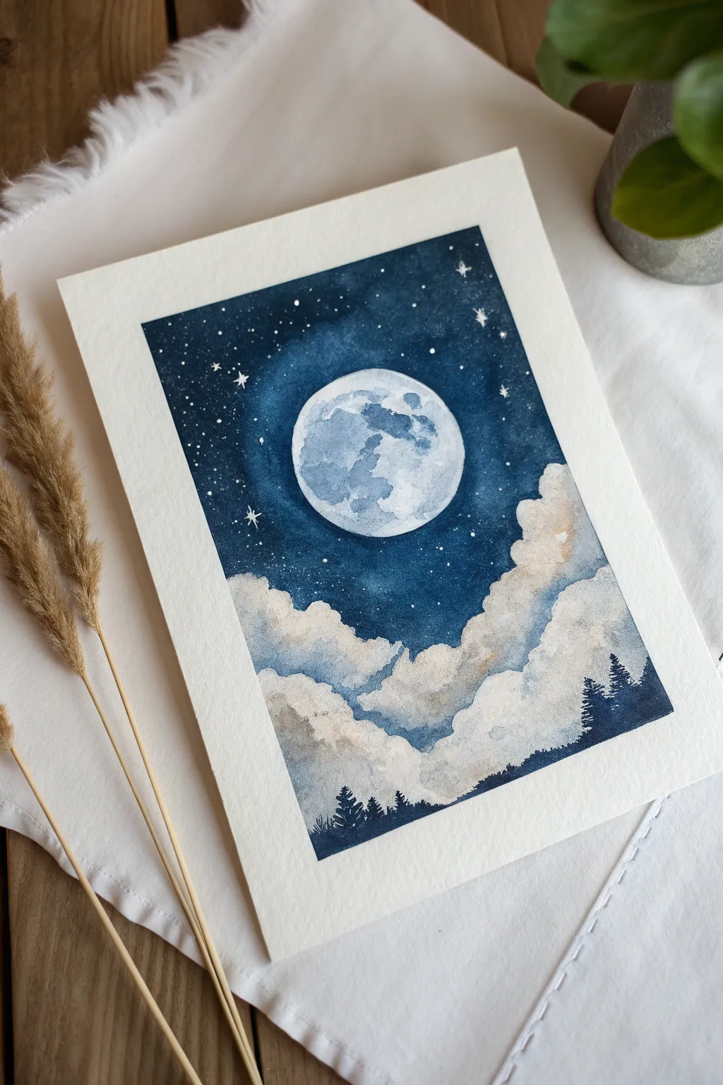
Capture the magic of a quiet night with this dreamy watercolor landscape featuring a glowing full moon nestled in deep indigo skies. By layering transparencies and using negative space techniques, you’ll create soft, billowing clouds that seem to float right off the page.
Step-by-Step
Materials
- Cold-pressed watercolor paper (140lb/300gsm is ideal)
- Painter’s tape or masking tape
- Pencil and circular object (for tracing)
- Masking fluid (optional but helpful)
- Watercolor paints: Indigo, Payne’s Grey, Burnt Umber or Sepia
- White opacity paint (gouache or white watercolor)
- Round watercolor brushes (sizes 2, 6, and 10)
- Two jars of water
- Paper towels
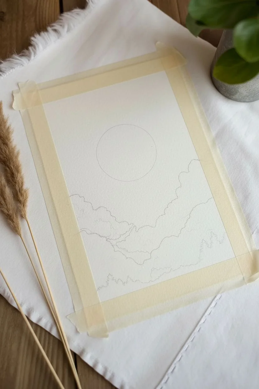
Step 1: Preparation & Drawing
-
Tape the edges:
Begin by taping down all four sides of your watercolor paper to a board or table. This creates that crisp, professional white border seen in the example and keeps the paper flat while wet. -
Sketch the moon:
Use a circular object (like a jar lid or tape roll) to lightly trace a circle in the upper center of your page. Keep your pencil pressure very light so the graphite doesn’t smudge later. -
Outline the cloud shapes:
Lightly sketch the tops of the cloud formations in the bottom half of the paper. You don’t need to draw every detail, just the main fluffy contours where the dark sky meets the white clouds.
Blooms appearing?
If you get cauliflower-like textures in the sky, you added water to paint that was already half-dry. Let layers dry completely before re-wetting.
Step 2: Painting the Mood
-
Mask the moon (optional):
If you have masking fluid, carefully paint it over the moon circle to protect the white paper. If not, you will just need to paint very carefully around this circle in the next steps. -
Mix your night sky color:
Create a rich, dark blue mix using Indigo. I like to add a tiny touch of Burnt Umber or a warm brown to the blue; this neutralizes it slightly, making the night sky feel deeper and more natural. -
Paint the upper sky area:
Using your largest round brush, begin painting the sky around the moon. Start with the color highly concentrated near the top corners and edges. -
Fade towards the moon:
As you get closer to the moon circle, dip your brush in water to dilute the paint. You want a soft, lighter blue halo immediately surrounding the moon to suggest a glow. -
Create the cloud edges:
Continue bringing the dark blue sky wash down towards your cloud sketches. Carefully paint around the tops of the clouds, defining their fluffy shapes with the negative space of the white paper.
Step 3: Defining the Clouds
-
Soften the cloud bottoms:
While the sky edge is still slightly damp or just after it dries, mix a very watered-down grey-blue (Indigo + lots of water). Paint the shadow areas within the white clouds. -
Add warmth to clouds:
While the grey shadows are wet, touch in a tiny amount of diluted warm brown or sepia. This creates that subtle, creamy glow on the cloud edges that reflects the moonlight. -
Layer the cloud forms:
To create depth, paint another layer of faint blue-grey shadows lower down, suggesting layers of clouds behind one another. Keep the tops of each cloud puff pure white.
Add some magic
Mix a tiny pinch of silver mica powder or metallic watercolor into your white paint for the stars to make the night sky actually shimmer in the light.
Step 4: The Moon & Details
-
Paint the moon’s craters:
Once the sky is bone dry, remove the masking fluid (if used). Mix a very watery, pale blue-grey. Paint organic, splotchy shapes inside the moon to represent the lunar mare (seas). -
Add tree silhouettes:
Load your smallest detail brush with thick, undiluted Indigo or Payne’s Grey. Paint tiny, jagged tree silhouettes peeking out from the bottom edge of the clouds on the right and center. -
Create the stars:
Cover the bottom of your painting with a paper towel to protect it. Dip a stiff brush (or toothbrush) into white gouache or acrylic, and flick the bristles to splatter tiny stars across the dark sky. -
Highlight specific stars:
Use your smallest brush and opaque white paint to manually add a few larger, cross-shaped stars for extra sparkle near the moon. -
Reveal the painting:
Wait until everything is completely dry to the touch, then slowly peel off the painter’s tape at a 45-degree angle to reveal your crisp white border.
Now you have a serene piece of lunar art perfect for framing or gifting to a stargazer
Easy Galaxy Background With Flicked Stars
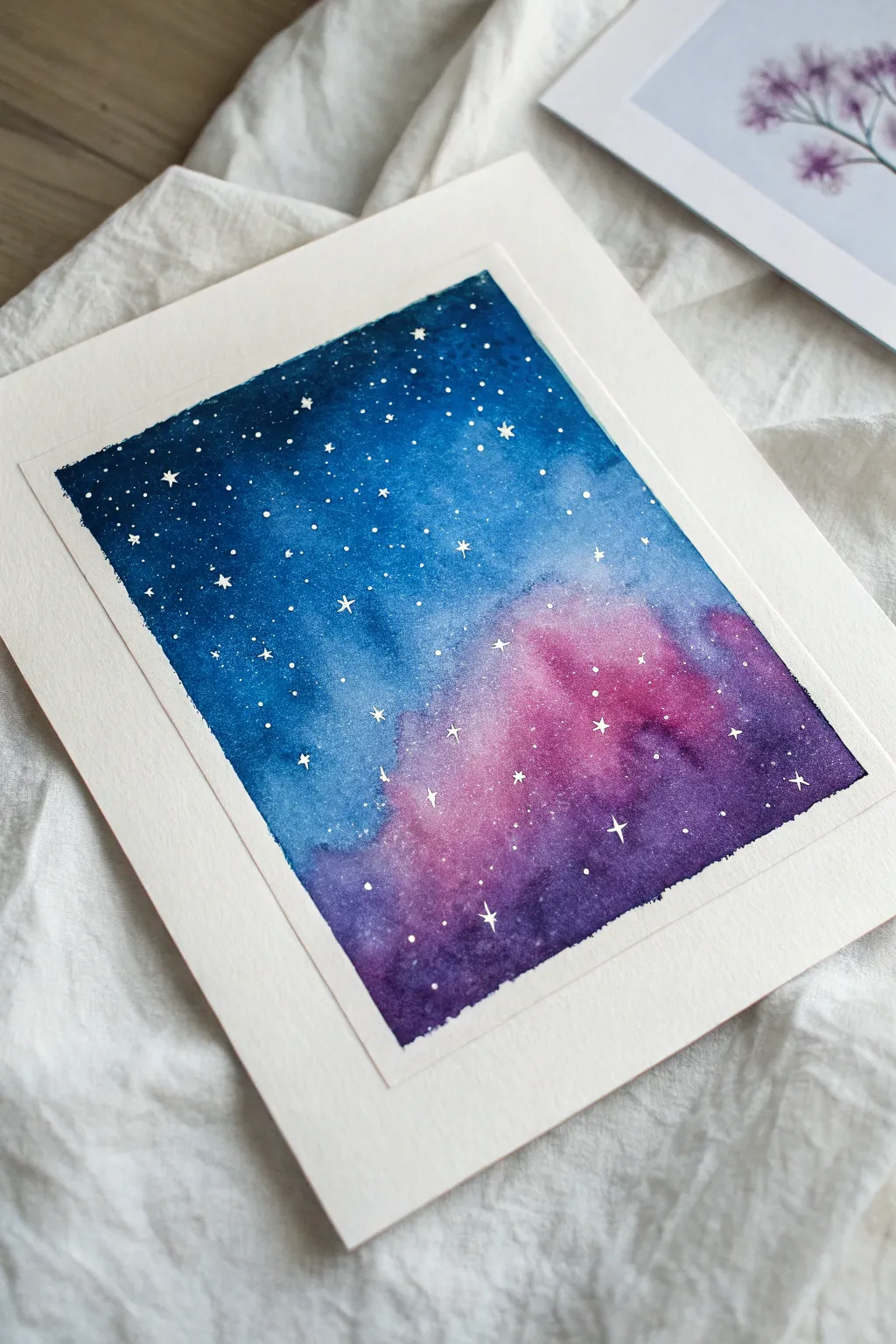
Capture the magic of deep space with this simple yet stunning watercolor project. By blending rich indigo, vibrant pink, and deep violet, you’ll create a nebulous backdrop for a field of sparkling white stars.
Step-by-Step Guide
Materials
- Cold press watercolor paper (300 gsm)
- Painter’s tape or masking tape
- Watercolor paints: Indigo (or Prussian Blue), Violet, Magenta/Pink, Black
- White gouache or white ink
- Round brushes (sizes 8 and 4)
- Small fine liner brush (size 0 or 00)
- Two jars of water
- Paper towels
- Palette or mixing plate
- Old toothbrush (optional for flicking)
Step 1: Preparation & First Wash
-
Tape edges:
Secure your watercolor paper to a board or table using painter’s tape on all four sides. Press the edges down firmly to ensure a crisp, clean border when you peel it off later. -
Activate paints:
Spritz your watercolor pans with water or squeeze out fresh tube paint onto your palette. You want your Indigo, Violet, and Magenta ready to go. -
Wet on wet base:
Using your largest brush, wet the entire rectangular area inside the tape with clean water. The paper should be glisten evenly but not have puddles. -
Apply the nebula colors:
While the paper is still wet, drop in patches of Magenta or Pink near the bottom right area. Let the edges bloom softly into the wet paper. -
Deepen with violet:
Introduce your Violet paint around the edges of the pink sections, blending them slightly where they meet to create a soft transition.
Splotchy Background?
If you get ‘cauliflowers’ or hard edges in the background, your paper likely dried too fast. Use more water in the first layer or work faster next time.
Step 2: Building Depth
-
Add the night sky:
Load your brush with rich Indigo or Prussian Blue. Start painting from the top left corner, bringing the dark blue down towards the violet and pink areas. Leave the pinkest parts untouched. -
Intensify corners:
Mix a tiny bit of Black into your Indigo to create a very dark midnight blue. Apply this to the top corners and furthest edges to create a vignetted look that draws the eye inward. -
Smooth the transitions:
Clean your brush and wipe it slightly damp. Gently tickle the areas where the blue meets the violet to ensure there are no hard lines, only soft, cloudy gradients. -
Let it dry completely:
This step is crucial. Allow the painting to dry fully. The paper must be bone dry before adding stars, or they will blur. Using a hairdryer on a low setting can speed this up.
Level Up: Silhouette
Once the galaxy is dry, paint a solid black silhouette of pine trees or a mountain range along the bottom edge for a scenic landscape look.
Step 3: Creating the Stars
-
Prepare white medium:
Squeeze out a small amount of white gouache or ink. It needs to be opaque but fluid enough to flick, like the consistency of heavy cream. -
Flick the stars:
Load a medium brush or an old toothbrush with the white mixture. Hold it over the paper and tap the handle (or use your thumb on the bristles) to spray fine speckles across the galaxy. -
Concentrate the spray:
Focus slightly more splatters near the diagonal transition between the blue and pink areas to suggest the Milky Way band. -
Paint larger stars:
Using your finest detail brush (size 0), manually dot in a few slightly larger stars to create variation in size. -
Add twinkling stars:
Select a few of the larger white dots and carefully paint a small cross or ‘starburst’ shape over them to make them look like they are twinkling. -
Final dry:
Wait for the white gauche to dry completely. It usually dries faster than the watercolor layers. -
Reveal the border:
Gently peel away the painter’s tape at a 45-degree angle, pulling away from the artwork to reveal those crisp, clean edges.
Frame your new celestial masterpiece or gift it to a space-loving friend

PENCIL GUIDE
Understanding Pencil Grades from H to B
From first sketch to finished drawing — learn pencil grades, line control, and shading techniques.
Explore the Full Guide
Simple Birch Tree Trunks on a Gradient Background
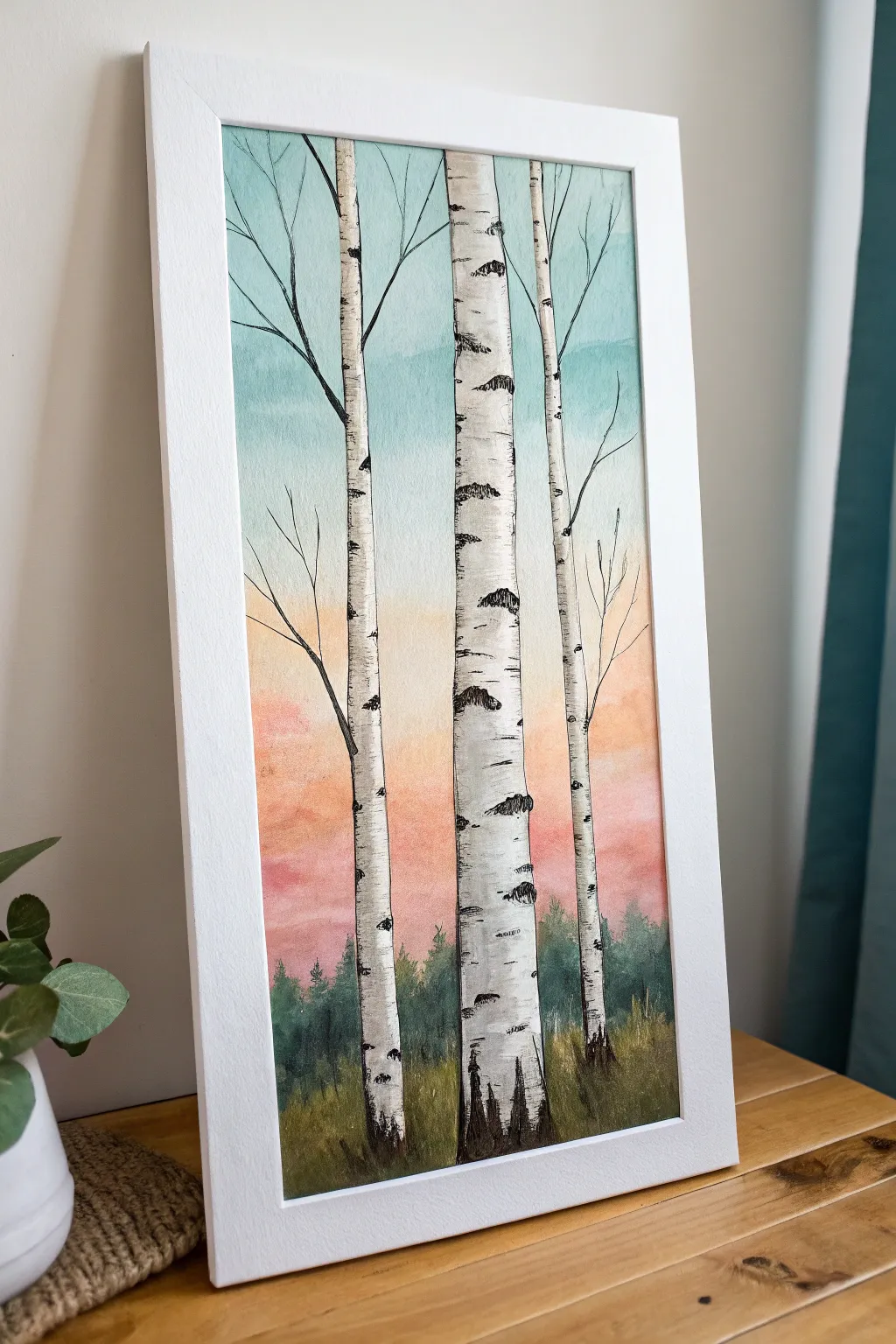
Capture the serene beauty of a twilight forest with this elegant watercolor project. Specifically focusing on birch tree trunks allows you to create striking contrast against a soft, blended gradient sky without needing complex drawing skills.
How-To Guide
Materials
- Watercolor paper (cold press, at least 140lb)
- Painter’s tape or masking tape
- Watercolor paints (teal/turquoise, peach/coral, pink, dark green, black)
- Wide flat brush for washes
- Round brushes (size 4 and size 0 or 1 for details)
- Masking fluid (drawing gum) and old brush or silicon applicator
- Pencil and eraser
- Two jars of water
- Paper towels
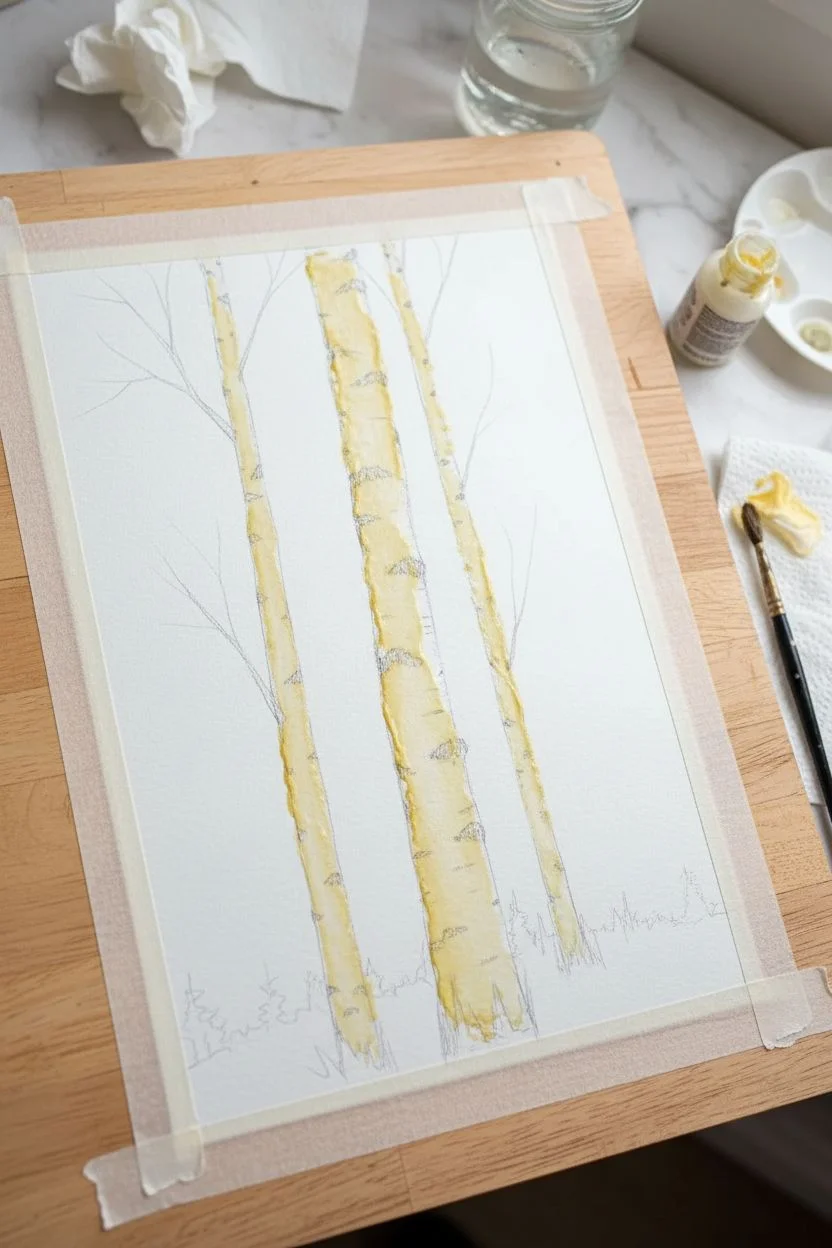
Step 1: Preparation & Sketching
-
Secure the paper:
Tape down all four edges of your watercolor paper to a board or table. This prevents buckling when we apply the wet wash later and creates a crisp white border. -
Sketch the trees:
Lightly draw three vertical birch trunks. Vary their widths slightly and allow them to curve or lean a tiny bit so they don’t look like stiff fence posts. One should be prominent in the center. -
Add branches:
Extend a few thin, jagged branches from the upper parts of the trunks. Keep your pencil lines very faint so they don’t show through the final paint. -
Apply masking fluid:
Using an old brush or applicator, carefully fill in the entire shape of the tree trunks and branches with masking fluid. This protects the white paper so we can paint the sky freely. -
Let it dry completely:
Wait until the masking fluid is translucent and tacky-free. It must be 100% dry before any water touches it.
Step 2: Painting the Sky Gradient
-
Wet the sky area:
Using your large flat brush, apply clean water over the entire sky area, going right over the masked trees. The paper should be glisten, but not have puddles. -
Start with the blue:
Load your brush with a watery teal or turquoise. Paint the top third of the sky, letting the color naturally diffuse downwards into the wet paper. -
Transition to warmth:
Rinse your brush and pick up a peach or light coral color. Paint the middle section, carefully blending it where it meets the blue to create a soft, neutral transition rather than a muddy green. -
Add the pink horizon:
At the bottom third (just above the imaginary ground line), drop in a vibrant pink or soft red. Let this bleed upwards into the peach for a glowing sunset effect. -
Paint the distant trees:
While the bottom pink layer is still slightly damp (but not soaking), dab in a line of dark green uneven shapes across the horizon line to create a distant, misty forest background. -
Dry the background:
Let the entire painting dry completely. You can use a hairdryer on a low setting if you are impatient.
Bleeding edges?
If paint seeps under your masking tape, don’t panic. Wait for it to dry, then gently use a barely damp stiff brush or a ‘magic eraser’ sponge to lift the unwanted color.
Step 3: Revealing & detailing the Trees
-
Remove masking fluid:
Once the paper is bone dry, gently rub off the masking fluid with your finger or a rubber cement pickup tool. You should now have stark white tree silhouettes. -
Paint the foreground grass:
Mix a muddy green-brown. Using upward flicking motions with a medium round brush, paint grass at the base of the trees to ground them. -
Create bark texture:
Switch to your smallest detail brush. Mix a diluted grey color and paint very subtle, curved shadows down one side of each trunk to give them a cylindrical volume. -
Add the lenticels:
Using concentrated black paint or a waterproof ink pen, drawing the distinctive birch markings. Make horizontal dashes that curve slightly around the trunk form. -
Darken the scarred areas:
Paint larger, dark triangular patches where branches meet the trunk and at the very base of the trees. The markings should be random—some thick, some thin. -
Add fine branches:
Extend the main branches with fine black lines, tapering them off into nothingness at the tips.
Add winter magic
For a winter scene, skip the green foreground. Instead, leave the bottom white for snow and add pale blue shadows at the base of the trees.
Peel off your tape to reveal those crisp edges and enjoy your peaceful forest scene
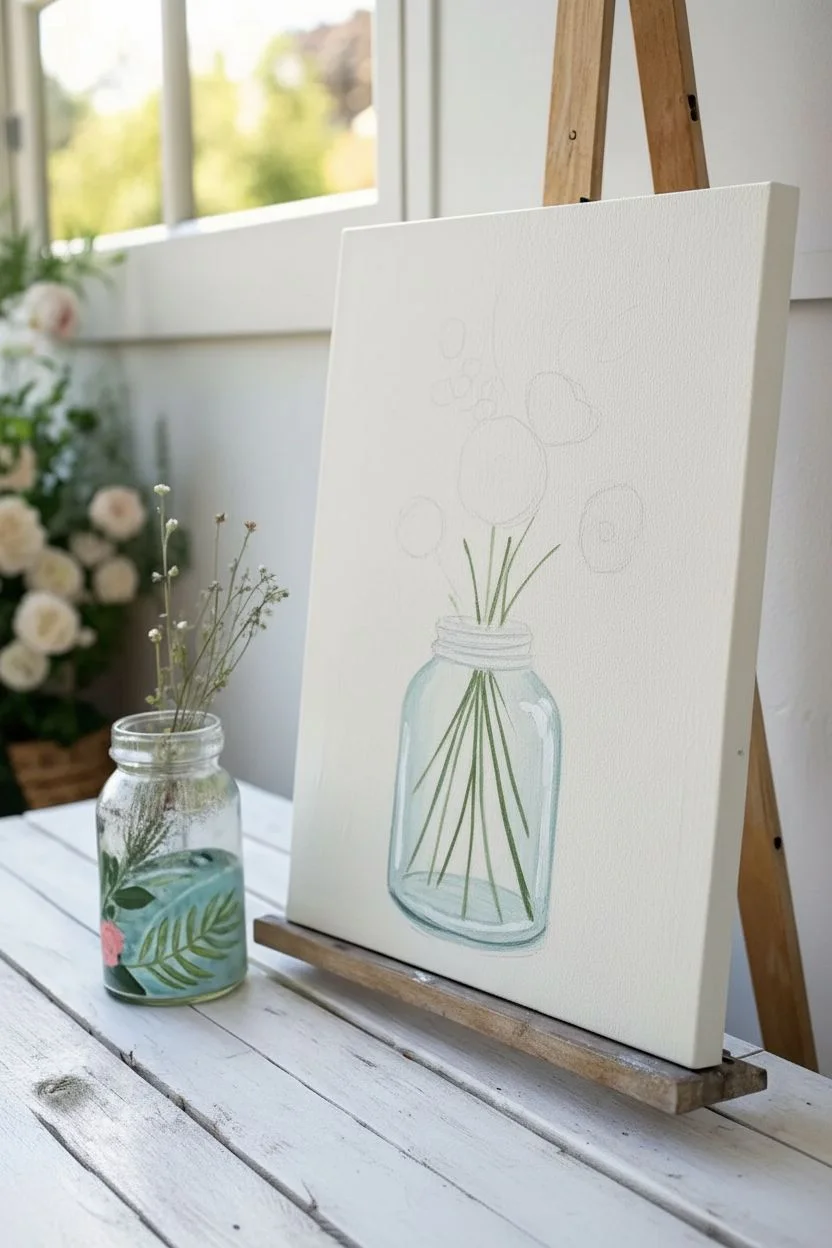
Loose Florals in a Glass Jar Bouquet
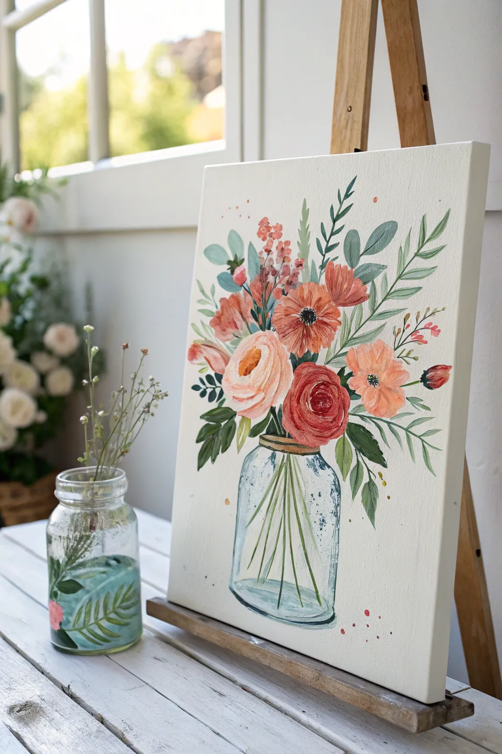
Capture the fresh, breezy feel of a garden bouquet with this beginner-friendly floral painting. You’ll layer soft peaches, deep reds, and vibrant greens to create a charming arrangement sitting in a classic glass jar.
Step-by-Step Tutorial
Materials
- Canvas panel or stretched canvas (approx. 11×14 inches)
- Acrylic paints (Titanium White, Burnt Umber, Hooker’s Green, Sap Green, Cadmium Red, Alizarin Crimson, Yellow Ochre, Peach/Flesh tint)
- Flat brush (3/4 inch)
- Round brushes (sizes 4, 6, and 8)
- Detail liner brush (size 0 or 1)
- Jar of water & paper towels
- Palette or paper plate
- Pencil
Step 1: Sketching and Glass Foundation
-
Sketch the outline:
Begin by lightly sketching the outline of a mason jar near the bottom center of your canvas. Keep the lines faint. Sketch loose circles and rough flower shapes above the jar to plan your composition. -
Mix the glass color:
Create a very pale, watery blue-grey mix. Combine a tiny dot of Hooker’s Green and a touch of Burnt Umber into a large amount of Titanium White. Add water to make it semi-transparent. -
Paint the jar body:
Using a flat brush, wash this pale color over the jar shape. The key is transparency, so don’t worry about perfect coverage—let the white of the canvas show through slightly. -
Add glass reflections:
Once the base wash is dry, take a size 4 round brush with pure Titanium White. Add vertical highlight stripes along the sides of the jar and curved strokes along the bottom rim to simulate reflective glass. -
Define the stems:
Mix Sap Green with a little water to make it fluid. With a size 4 brush, paint thin, straight lines crisscrossing inside the jar, extending upward to where your flowers will be.
Jar looking flat?
Add a darker blue-grey shadow line strictly on the bottom curve and up one side of the jar. This contrast against the white highlights instantly creates a 3D cylindrical effect.
Step 2: Painting the Main Blooms
-
Paint the large peach rose:
Mix Titanium White with Peach and a tiny touch of Yellow Ochre. Paint a large, loose circle for the main rose. While wet, blend in darker peach tones in a C-shape for the center petals. -
Add petal definition:
Using a smaller brush and a darker salmon pink, paint sweeping C-curves around the center of the peach rose to create the illusion of unfolding layers. -
Create the red rosette:
In the lower cluster, paint a circle using pure Alizarin Crimson. While the paint is wet, mix in a little white to create highlights on the upper edges of the petals. -
Structure the red rose:
Use a darker mix of Alizarin Crimson and a touch of Burnt Umber to paint the tight, spiral strokes in the center of the red flower, defining the deep shadows between petals. -
Paint the poppy shape:
For the orange-red flower near the center, use Cadmium Red mixed with a little Yellow Ochre. Paint large, open petals radiating from a central point. -
Detail the poppy center:
Once the poppy petals are dry, dot the center with black or dark brown. Add tiny white dots on top of the dark center for texture.
Level up your art
Wait for the painting to be 100% dry, then use a black ink pen or fine-liner to loosely outline some petals and leaves. This creates a trendy ‘illustrated’ look.
Step 3: Filler Flowers and Greenery
-
Add side blossoms:
Using a soft pink mix, paint the smaller, side-facing flowers. Think of them as cup shapes, lighter at the top and darker at the base where they connect to a stem. -
Block in main leaves:
Mix your Sap Green and Hooker’s Green for variety. Paint large, almond-shaped leaves tucked behind the main roses using a size 8 round brush. -
Paint spiky foliage:
Switch to a lighter yellow-green mix. Paint long, slender leaves sticking up from the bouquet to add height and movement. -
Add fern-like details:
With your liner brush and a dark green mix, paint delicate fern stems extending outward. Add tiny, individual leaves along these stems with short, quick dabs. -
Incorporate berry sprigs:
Mix a muted pink-brown tone. Paint thin stems branching out, and use the tip of your brush to dot small clusters of berries at the ends.
Step 4: Final Touches
-
Refine the jar rim:
Paint the rim of the jar with a mix of Yellow Ochre and Burnt Umber to look like a gold or rusty metal ring. Add a distinct dark line under the rim for shadow. -
Add whimsical splatters:
Water down your pink or red paint significantly. Load a brush, hold it over the canvas, and tap the handle against another brush to sprinkle tiny droplets for an artistic flair. -
Final highlights:
I like to take a step back here. If any flower looks too flat, add a tiny touch of pure white to the very edge of the petals that strictly face the light source.
Hang your new masterpiece in a bright spot to enjoy fresh flowers that will never wilt


Wildflower Meadow With Dot-and-Dab Strokes
Capture the serenity of a countryside landscape with this textured, layered painting that focuses on distant rolling hills and a vibrant foreground of wildflowers. By using simple dot-and-dab techniques, you can create a complex-looking field of blooms without needing to paint every single petal.
Detailed Instructions
Materials
- Acrylic paints (Phthalo Green, Yellow Ochre, Burnt Sienna, Titanium White, Ultramarine Blue, Alizarin Crimson, Lemon Yellow)
- Heavyweight watercolor paper or canvas board
- Flat brushes (Large 1-inch, Medium 1/2-inch)
- Round detail brushes (Size 2 and 0)
- Palette knife (optional, for mixing)
- Water cups and paper towels
- Masking tape
Step 1: Setting the Scene
-
Tape the Edges:
Before you begin, secure your paper to your workspace with masking tape. This prevents the paper from buckling when wet and creates that crisp, clean white border you see in the final piece. -
Paint the Sky Gradient:
Mix a very pale blue using mostly Titanium White with a tiny touch of Ultramarine Blue. Using your large flat brush, paint the upper third of the canvas with horizontal strokes, letting the color fade almost to white as you move downward toward the horizon line. -
Add Subtle Clouds:
While the sky is still slightly damp, mix a soft peach tone using White and a speck of Orange or Burnt Sienna. Dab in soft, sweeping cloud shapes near the left side of the sky to add warmth to the atmosphere.
Don’t Overmix!
When mixing greens for the grass, don’t blend the paint completely on your palette. Leaving streaks of yellow and blue in the mix creates natural color variation within a single brushstroke.
Step 2: Layering the Landscape
-
Notes on Perspective:
Remember that colors become cooler and lighter the further away they are. Keep your background hills muted and bluish, while the foreground should rely on richer greens and yellows. -
Farthest Hills:
Mix a hazy blue-grey using Ultramarine, a touch of Phthalo Green, and lots of White. Paint the most distant mountain ridge across the horizon; the edges don’t need to be perfect, as this suggests distance. -
Middle Ground Hills:
Create a rolling hill shape underneath the blue ridge using a mixture of Yellow Ochre and Phthalo Green. Keep this layer fairly flat and smooth and ensure it overlaps the base of the furthest mountains. -
Defining the Tree Lines:
Using a smaller flat brush and a dark green mix (Phthalo Green + Burnt Sienna), tap in the shapes of distant tree clusters along the ridges of the middle ground hills. These should look like irregular, dark hedges. -
Foreground Base Layer:
For the nearest grassy field, mix a vibrant green using Lemon Yellow and Phthalo Green. Paint the bottom half of the canvas with vertical, upward sweeping strokes to mimic the direction of growing grass.
Splatter Effect
For a magical, airy feel, load an old toothbrush with watered-down white paint and gently flick it over the foreground to create tiny pollen specks or distant baby’s breath.
Step 3: Creating Texture and Depth
-
Mid-Ground Shadows:
Add depth to the middle hills by painting diagonal streaks of darker green on the slopes. This implies the contour of the land and suggests valleys between the rolling hills. -
Tall Grass Textures:
Switch to your medium round brush. Load it with a mix of Yellow Ochre and White to create sun-bleached grass stalks. Flick your wrist upward to create thin, tapering lines throughout the foreground, varying their height. -
Deepening the Foreground:
To make the white flowers pop later, you need contrast. Mix a deep shadow green (Green + Blue + hint of Red) and paint vertical grassy strokes right at the bottom edge and corners of the painting.
Step 4: The Wildflower Meadow
-
Queen Anne’s Lace Stems:
Using your smallest detail brush (size 0), paint very fine, branching stems in light green randomly throughout the bottom third of the painting. -
Dabbing White Blooms:
Load a small round brush with pure Titanium White. Use a ‘dot-and-dab’ motion to create clusters of tiny dots at the tips of your stems. Group the dots into flat-topped umbrella shapes to mimic Queen Anne’s Lace. -
Adding Pink Accents:
Mix a soft rose pink using Alizarin Crimson and White. Using the same dabbing technique, add scattered pink clover-like flowers in the lower right corner and sporadically through the mid-field. -
Yellow Highlights:
With a clean small brush, dot in tiny specks of Lemon Yellow and Orange among the grass. These suggest buttercups or wildflowers catching the sunlight. -
Final Grass Details:
I like to take a very thin brush with watered-down light green paint and add a few final, sharp blades of grass that overlap some of the flower stems. This pushes the flowers back into the greenery so they look rooted rather than floating. -
Reveal the Border:
Once the painting is completely dry—usually about 20 minutes for acrylics—slowly peel away the masking tape at a 45-degree angle to reveal your crisp, professional border.
Now step back and admire how a few simple dabs of paint have transformed into a lush, tranquil meadow ready for display
Abstract Color Blocks With Clean Tape Edges
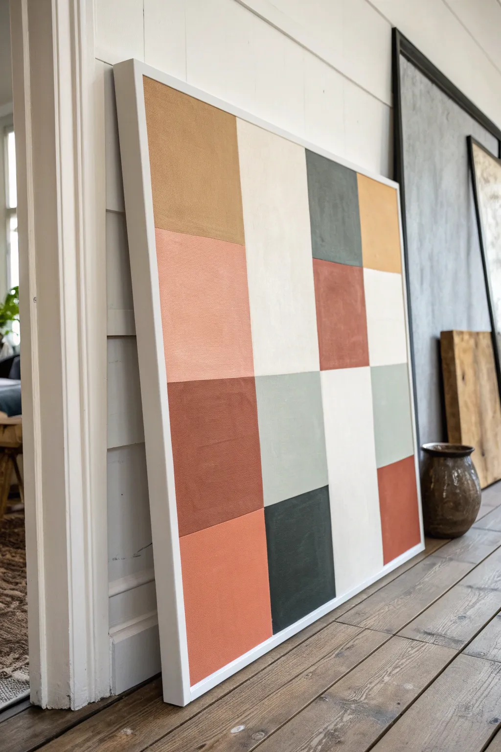
Achieve a high-end gallery look right at home with this structured, minimalist block painting. By combining warm terracotta, muted sage, and neutral creams in a clean grid layout, you’ll create a statement piece that feels both modern and organic.
How-To Guide
Materials
- Large square canvas (at least 24×24 inches)
- Acrylic paints (terracotta, mustard yellow, sage green, charcoal grey, warm cream)
- Painter’s tape (1-inch width works best)
- Flat synthetic brushes (various sizes)
- Ruler or yardstick
- Pencil
- White or clear gesso (optional)
- Matte varnish
- Palette or paper plates
- Water cup and paper towels
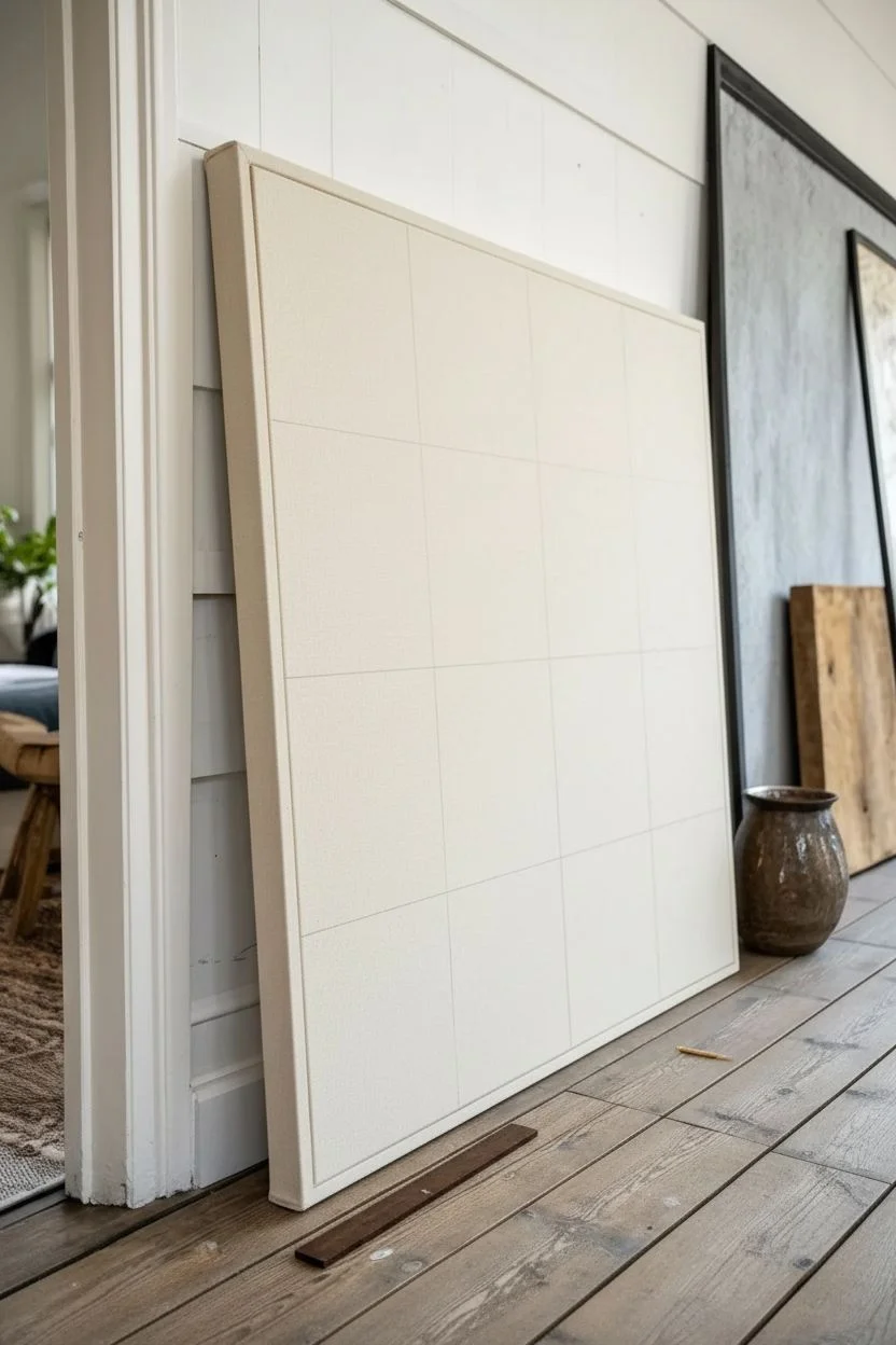
Step 1: Planning & Priming
-
Prep the canvas:
Begin by wiping down your canvas to ensure it is free of dust. If you want a smoother finish, apply a coat of gesso and let it dry completely, or you can skip straight to measuring for a more textured look. -
Measure the grid:
Decide on the layout of your blocks. This painting features a 4×4 grid. Measure the total width of your canvas and divide by four to determine the size of each square. -
Mark the lines:
Using a yardstick and a light pencil touch, mark horizontal and vertical lines across the canvas to form your grid. Keep the marks faint so they are easier to cover later. -
Check your spacing:
Step back and double-check that your lines look straight and evenly spaced. It’s much easier to erase a pencil line now than to fix a crooked painted square later.
Bleeding Lines?
If paint seeped under the tape, wait for it to dry completely. Re-tape along the correct line and paint over the mistake with the intended color to fix it neatly.
Step 2: Taping Strategy
-
Tape the first set:
Apply painter’s tape along the pencil lines. Crucially, you cannot paint all squares at once because the tape needs to separate them. Tape off a ‘checkerboard’ pattern first—selecting every other square to paint in the first round. -
Seal the edges:
Run your fingernail or a credit card firmly along the edge of the tape to ensure a tight seal. This prevents paint from bleeding underneath and ruining your crisp lines. -
Apply a base seal (optional):
For razor-sharp lines, I like to brush a tiny matching amount of the background color (or clear matte medium) over the tape edge first to seal it completely.
Step 3: Painting the first round
-
Mix your palette:
Prepare your acrylic colors. Aim for earthy, muted tones. If your colors are too bright, mix in a tiny bit of the complementary color or some brown to desaturate them. -
Paint the first squares:
Fill in the specific squares that are currently unified by your taping strategy. Use a flat brush and paint away from the tape edge initially to minimize bleed. -
Add a second coat:
Allow the first layer to dry to the touch (usually 15-20 minutes). Apply a second coat to ensure solid, opaque coverage without streaks. -
Remove tape while damp:
Carefully peel back the tape while the second coat is still slightly damp. Pull the tape away from the paint at a sharp 45-degree angle.
Clean Edges Trick
Paint white (or your base color) over the tape edge first. Let it dry, then paint your color. The first layer fills gaps, ensuring the final color line is perfect.
Step 4: Painting the second round
-
Wait for full dryness:
This is the patience test. You must wait until the painted squares are 100% dry before applying tape over them to paint the neighboring squares. -
Tape the remaining sections:
Apply tape over the dried painted edges to expose the blank squares you haven’t filled yet. Be gentle pressing down on fresh paint. -
Paint the remaining squares:
Fill in the remaining white spaces with your chosen colors, balancing the composition so no single color dominates one area too heavily. -
Peel and reveal:
Once the second coat on this batch is applied, remove the tape carefully. You should now have a complete grid of colored blocks.
Step 5: Finishing Touches
-
Touch up imperfections:
Inspect your lines. If any paint bled through, use a very small detail brush and the appropriate color to tidy up the edges. -
Seal the work:
Once the entire painting has cured for at least 24 hours, apply a thin layer of matte varnish to protect the surface and unify the sheen. -
Frame it:
Install the canvas into a floating frame as shown in the image to give it a polished, professional gallery appearance.
Hang your new masterpiece in a well-lit spot to enjoy the calming balance of your geometric design
Modern Herringbone Pattern Using Tape-Resist
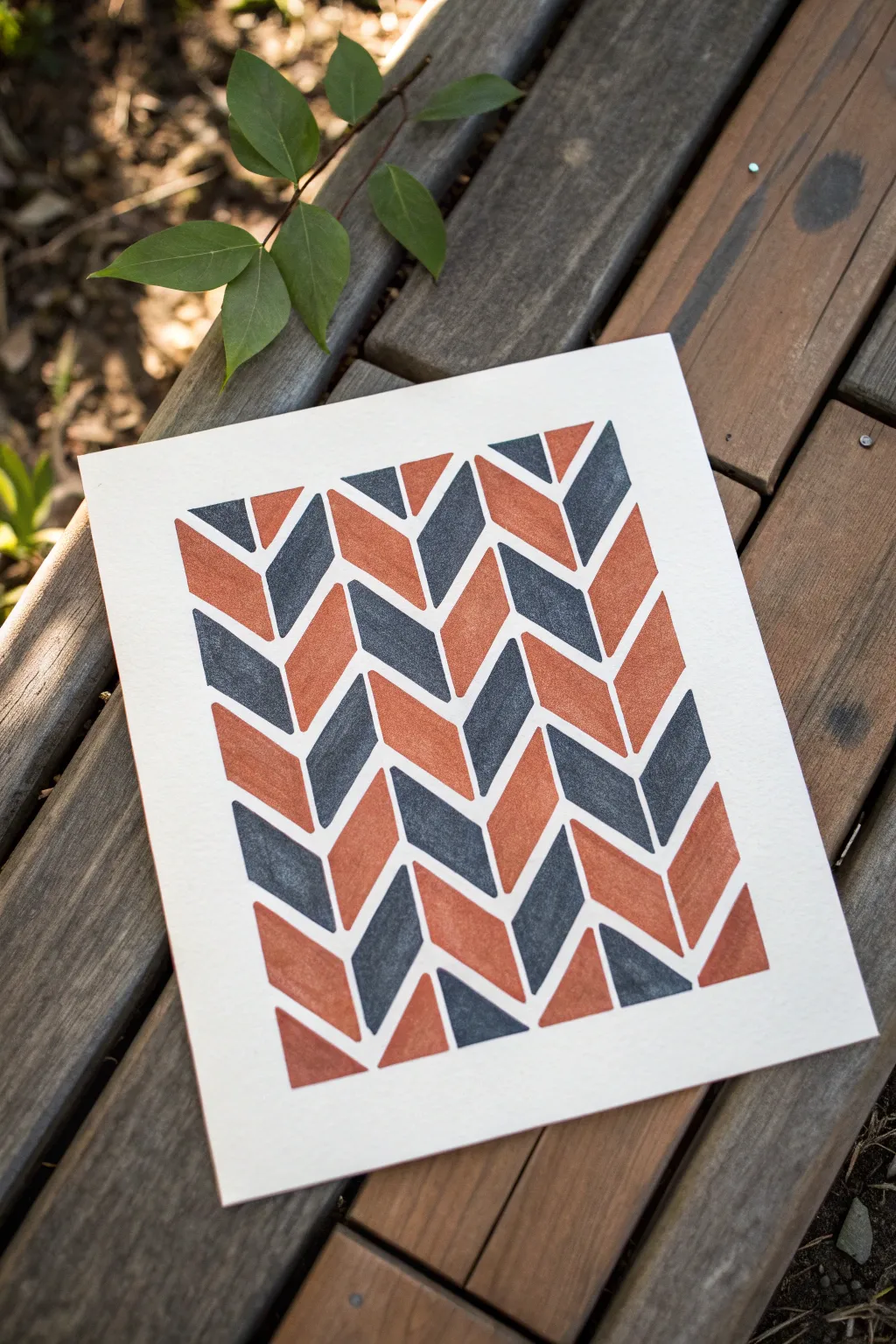
Master the art of clean lines and bold geometry with this satisfying modern pattern project. Using a simple tape-resist method, you will create a striking herringbone design featuring alternating terracotta and twilight blue hues.
Step-by-Step
Materials
- Thick watercolor paper or mixed media paper (at least 140lb/300gsm)
- Painter’s tape or washi tape (1/4 inch width is ideal)
- Acrylic paints (Burnt Orange and Navy Blue)
- Flat, angled paint brush (medium size)
- Ruler
- Pencil
- Eraser
- Palette or small plate for mixing
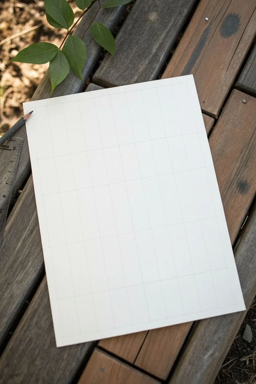
Step 1: Planning the Grid
-
Paper Prep:
Start by trimming your paper to your desired size. A standard 8×10 inch size works beautifully for this pattern density. -
Mark Vertical Guides:
Using your ruler and a pencil, lightly mark vertical lines down the length of your paper. Space them evenly, about 1.5 to 2 inches apart depending on how wide you want your columns. -
Add Horizontal Guides:
Lightly mark horizontal reference points along the vertical lines every 1 inch. These don’t need to be full lines across the page, just small tick marks to help you align your tape angles.
Seal Against Leaks
Before adding color, paint a thin layer of white acrylic or clear matte medium over the tape edges. This seals the gaps so any bleeding is invisible!
Step 2: Applying the Resist
-
First Diagonal Layer:
Begin taping your diagonals. Stick a piece of tape from a mark on one vertical line to the mark just below it on the next vertical line. This creates a downward diagonal. -
Complete the Zig-Zag:
Reverse the direction for the next column to create a ‘V’ shape. Continue this process, creating a continuous zig-zag pattern across the width of the paper. -
Repeat the ROWS:
Move down to your next set of pencil marks and repeat the taping process. Ensure the spacing between the strips of tape remains consistent to create uniform parallelogram shapes. -
Burnish the Edges:
Once all tape is applied, firmly run your fingernail or a bone folder over every edge of the tape. This is crucial for preventing paint bleed and achieving those crisp white lines.
Step 3: Painting the Pattern
-
Color Strategy:
Prepare your palette with burnt orange and navy blue. I find adding a tiny drop of water to acrylics helps them flow smoother into the corners. -
Start with Orange:
Select a specific geometric ‘column’ to start with. Paint the first shape orange. Skip the next shape in that same vertical column, preventing two of the same color from touching. -
Fill the Navy:
Go back to the empty shapes in that first column and fill them with your navy blue paint. Your column should now alternate orange-navy-orange-navy. -
Alternate Columns:
Move to the adjacent column. If the shape next to your first orange block is blue, you are on the right track. The colors should checkerboard horizontally as well as vertically. -
Complete the Pattern:
Continue filling in all the tape-bounded shapes. Be careful not to paint over the tape intersections too heavily, as this can sometimes cause peeling later. -
Double Check Edges:
Look closely at the corners of your shapes. Use the tip of your angled brush to ensure paint reaches all the way into the acute angles formed by the tape. -
Let it Dry:
Allow the paint to dry completely. Acrylics usually need about 20-30 minutes, but touch test a thick area to be sure.
Metallic Accent
Swap out one of the solid colors for a metallic gold or copper paint. The shimmer adds a luxurious, art-deco vibe to the geometric pattern.
Step 4: The Reveal
-
Peel Slowly:
Pick a corner of the tape and peel it back slowly at a sharp 45-degree angle away from the painted area. Do not rip it straight up. -
Clean Up:
If there are any pencil marks still visible in the white spaces, gently erase them once the paint is fully cured to avoid smudging.
Frame your sharp, geometric masterpiece in a simple wood frame to complement the warm tones
Paint-Scrape Abstract for Instant Texture
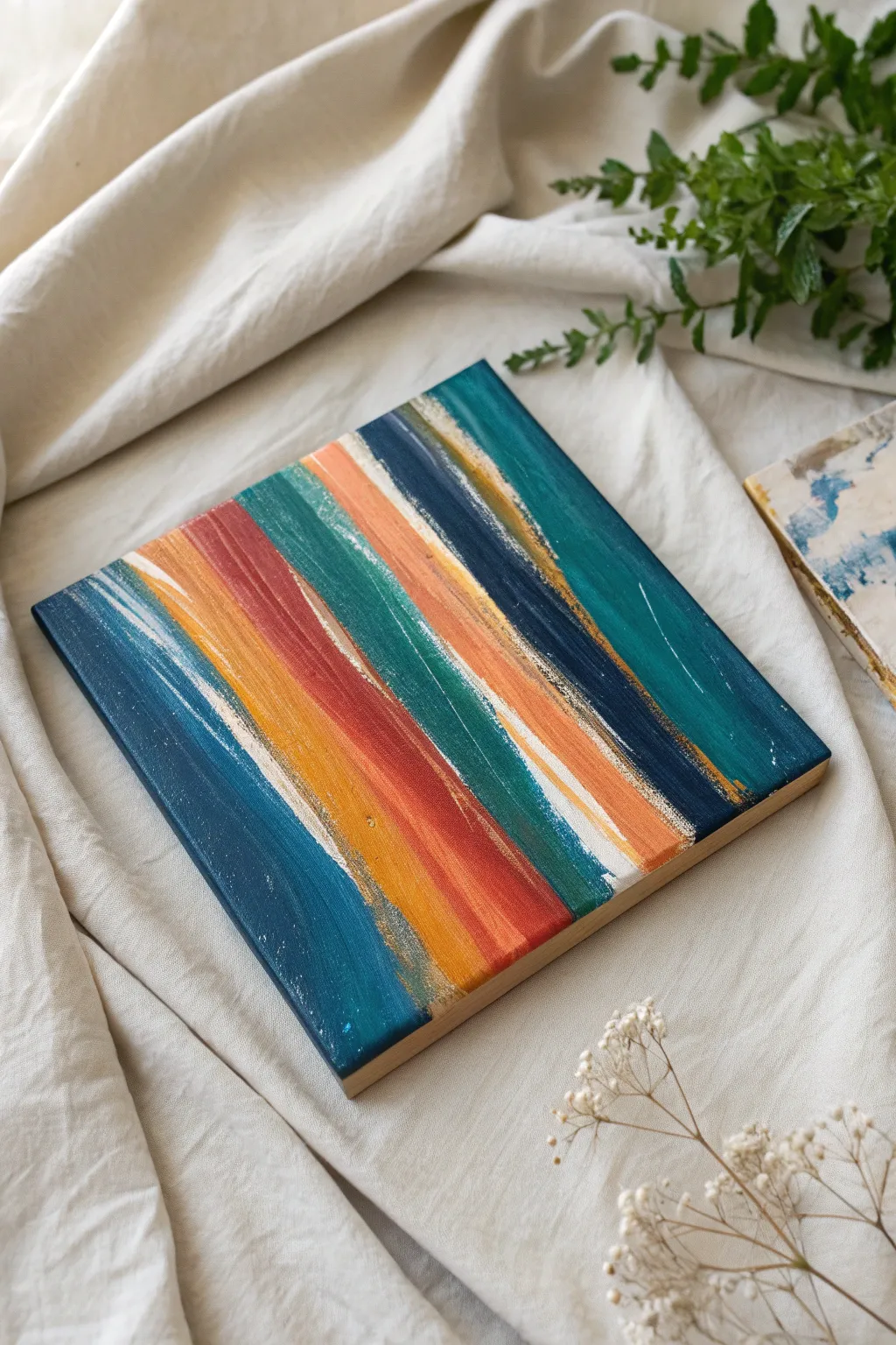
Create a striking piece of modern abstract art using nothing but bold colors and confident strokes. This project results in a textured, layered look with diagonal bands of deep teal, rust orange, and gold accents that feels sophisticated yet effortless.
Step-by-Step Tutorial
Materials
- Square wood painting panel (cradled) or stretched canvas (approx. 8×8 or 10×10 inches)
- Acrylic paints: Deep Teal/Phthalo Green, Navy Blue, Rust/Terracotta Orange, White, Gold Metallic
- Flat synthetic paintbrushes (1-inch width works best)
- Palette or paper plate
- Paper towels
- Pencil (optional)
- Masking tape or painter’s tape
- Ruler (optional)
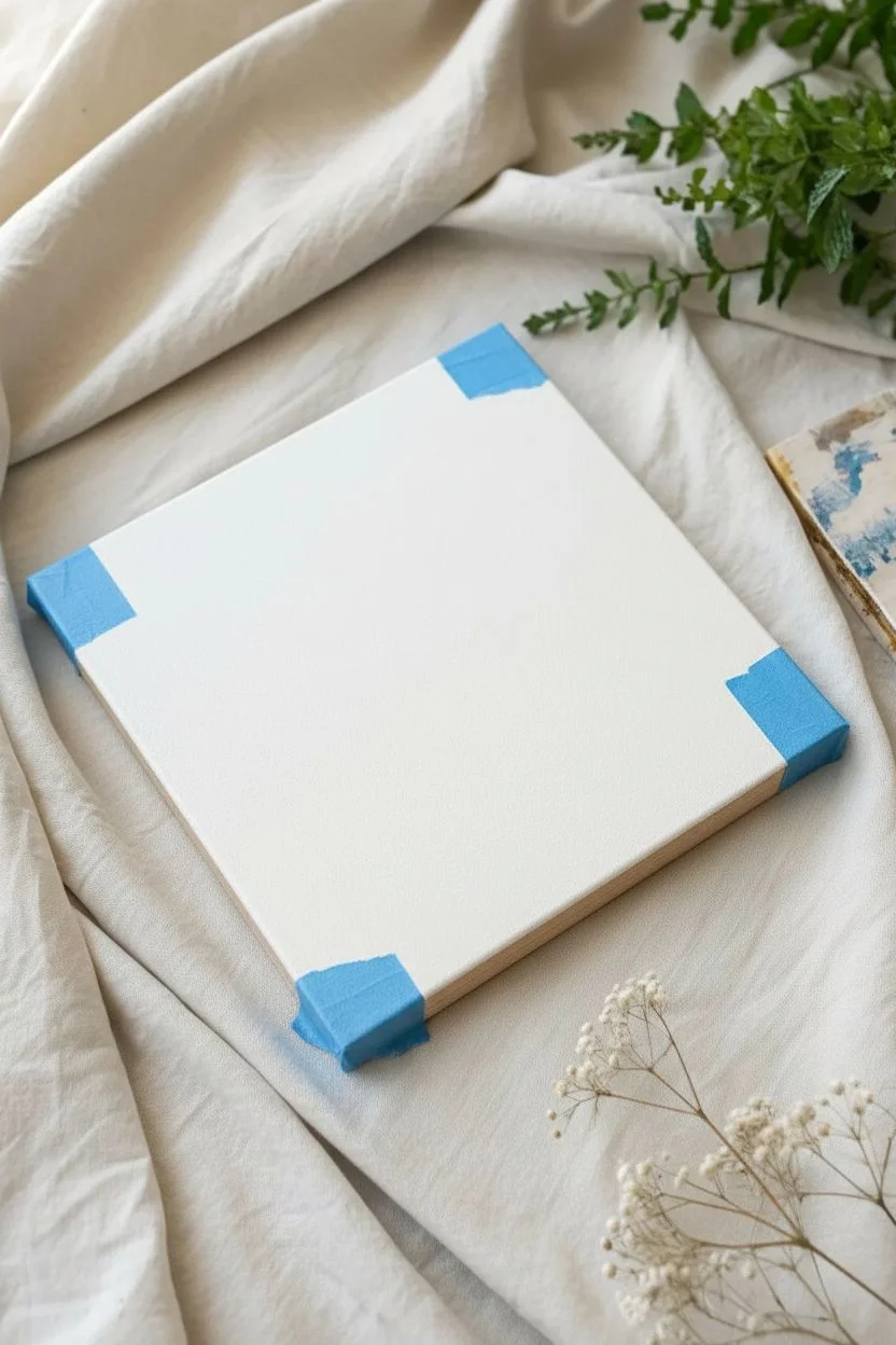
Step 1: Preparation & Base
-
Prepare your workspace:
Lay down a drop cloth or old newspaper to protect your table. Acrylic paint dries fast but can be messy, so it’s good to be ready. -
Prime the surface:
If you are using raw wood, apply a layer of white gesso or white acrylic paint to seal it. This ensures your colors pop and don’t soak into the grain. Let this base layer dry completely. -
Plan the direction:
This artwork relies on a strong diagonal composition. You can lightly mark a diagonal line from corner to corner with a pencil if you need a guide, but freehanding keeps it energetic. -
Tape the sides:
For a clean finish on a cradled wood panel, place masking tape along the side edges. If you prefer the painting to wrap around the sides, skip this step.
Dry Brush Secret
For the best ‘scraped’ texture, wipe 90% of the paint off your brush onto a paper towel before dragging it across the canvas surface.
Step 2: Layering the Colors
-
Mix your palette:
Squeeze out generous amounts of your Teal, Navy, Rust Orange, and White onto your palette. Keep the metallic Gold separate for later. -
Start with the darkest tones:
Load your flat brush with the Navy Blue. Starting near the center-right, paint a broad, straight diagonal stroke. Don’t worry about perfect coverage; a little texture is good. -
Add the teal accents:
Without fully cleaning your brush (wipe it on a paper towel instead), switch to the Deep Teal. Apply this next to your navy stroke, letting the colors kiss and slightly blend at the edges. -
Introduce the warmth:
Clean your brush thoroughly. Pick up the Rust Orange and paint a confident streak parallel to your cool tones. This color contrasts beautifully with the blues. -
Fill the corners:
Work your way towards the top-left and bottom-right corners. Use varying widths of strokes. I prefer to alternate between my teals and a custom mix of teal-plus-white for variety. -
Create a scratched look:
While the paint is fairly wet on the brush but thin on the canvas, drag the brush swiftly. This ‘dry brush’ technique allows the white background to peek through, creating that distressed, scraped texture.
Step 3: Adding Highlights & Details
-
Mix a lighter tint:
Combine a little White with your Rust Orange to create a soft peach tone. Add a thin streak of this adjacent to the orange band to create depth. -
Blend wet-on-wet:
Where two large bands of color meet, run a slightly damp clean brush lightly down the seam. This softens the transition just enough so it isn’t a hard line. -
Let the base dry:
Wait about 15-20 minutes. Since we want sharp, crisp overlays for the final details, the underlayer needs to be touch-dry. -
Apply the metallic gold:
Dip the very edge or corner of a clean flat brush into the Gold paint. Drag it alongside the navy and rust sections. Use a light hand so the gold looks like a shimmering highlight rather than a solid stripe. -
Add white motion lines:
Using a very dry brush with a tiny amount of White paint, swiftly flick or drag near the edges of your colored bands. This mimics a ‘speed line’ or scrape effect. -
Refine the edges:
Check the perimeter of your panel. If you are painting the sides, extend your strokes over the edge now for a gallery-wrap look. -
Remove the tape:
If you taped the sides, carefully peel the tape off at a 45-degree angle while the paint is still slightly tacky to ensure a crisp line. -
Final dry:
Let the entire piece cure for at least an hour before hanging or sealing with varnish.
Color Muddying?
If your stripes are turning brown where they touch, let each color strip dry for 5 minutes before painting the neighboring line next to it.
Step back and admire how a few simple diagonal movements transformed into a complex, energetic piece of art
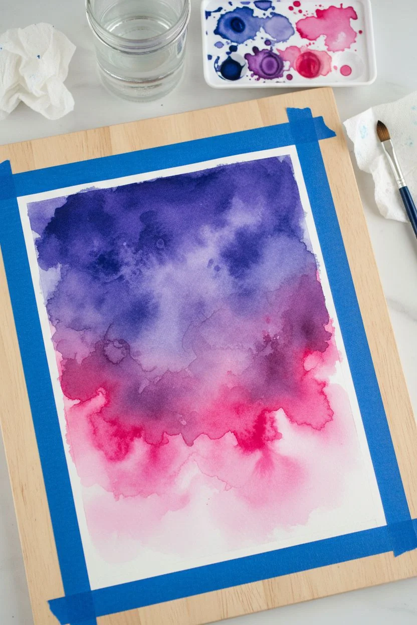
Beginner-Friendly Pour Painting With Tilted Layers
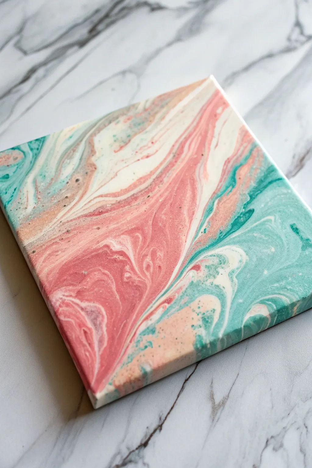
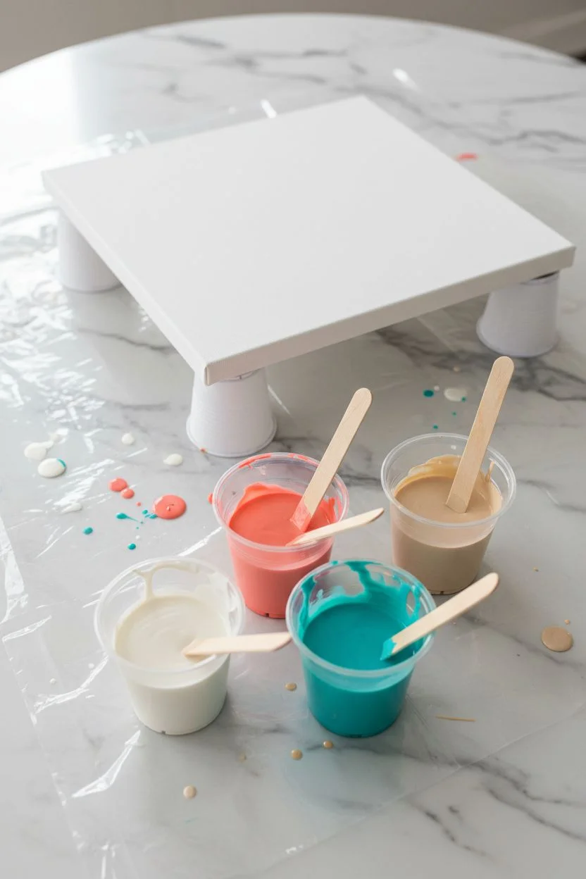
Create a breathtaking faux-stone effect using simple acrylic pouring techniques, blending soft coral, vibrant teal, and crisp white into an organic masterpiece. This method uses gentle tilting to retain distinct bands of color rather than blending them into a single muddy hue.
How-To Guide
Materials
- Small square stretched canvas (e.g., 8×8 or 10×10 inches)
- Acrylic craft paints (coral pink, teal/turquoise, white, beige/sand)
- Pouring medium
- 4 small mixing cups
- Wooden craft sticks or palette knife
- Plastic drop cloth or garbage bag
- Risors for the canvas (like push pins or overturned cups)
- Bakers twine or a toothpick
- Gloves
Step 1: Mixture Preparation
-
Prepare your workspace:
Cover your entire work surface with a plastic drop cloth. Place your canvas on risers (like small overturned cups) so the edges are lifted off the table, allowing paint to drip freely. -
Mix the white base:
In the first cup, mix white acrylic paint with pouring medium. Aim for a ratio of about 1:1, or follow the medium’s specific instructions. Stir gently until it resembles the consistency of warm honey. -
Prepare the colored paints:
Repeat the mixing process for the coral pink, teal, and beige paints in separate cups. Ensure all mixtures are fluid enough to run off a stick, but not as thin as water. -
Check consistency:
Lift your stir stick from the paint. The drizzle should sit on the surface for a second before sinking back in. Adjust with small drops of water if too thick, or more paint if too runny.
Step 2: The Pouring Process
-
Flood the canvas:
Pour a generous amount of the white mixture directly onto the center of the canvas and spread it thinly over the entire surface, including the edges, to help the other colors glide. -
Layer the main diagonal:
Pour a thick line of coral pink diagonally across the canvas, starting from one corner and moving toward the opposite side. Don’t worry about straight lines; organic waves work best. -
Add contrasting teal:
Follow the curve of the coral with a pour of teal paint immediately next to it. Let the colors touch but try not to overlap them completely just yet. -
Introduce the neutral tone:
Pour the beige or sand color in smaller, thinner ribbons between the teal and pink sections, or along the outer edges of your color bands. -
Fill gaps with white:
Add extra ribbons of white paint between the colored sections. This negative space is crucial for creating the separation seen in the photo.
Clean Edges Pro-Tip
Before pouring, apply painter’s tape to the underside of the canvas. Once the painting is dry, peel off the tape to remove dried drips for a professional finish.
Step 3: Tilting and Marbling
-
Initial tilt:
Gently lift the canvas and tilt it slowly to one side. Watch how the paint moves. The goal is to stretch the lines you poured, not to mix them together vigorously. -
Create the wave pattern:
Tilt the canvas back in the opposite direction. Continue tilting corner-to-corner to cover the entire surface, letting excess paint drip off the sides. -
Check the corners:
Ensure the paint explicitly flows over the corners. If a corner is stubborn, you can touch it with a paint-covered finger to encourage the flow. -
Refine the swirls:
If you want more intricate details like the small swirls in the photo, lightly drag a toothpick or the tip of a palette knife through the wet paint to gently disrupt the bands. -
Create cells (optional):
For tiny speckles or ‘cells’ like those near the pink sections, you can flick a tiny amount of plain pouring medium over the surface or tap the bottom of the canvas. -
Level and dry:
Place the canvas back on the risers. Ensure it is perfectly level so the design doesn’t slide off while drying. -
Allow to cure:
Let the painting dry undisturbed for at least 24 to 48 hours. The surface may look dry sooner, but the layers underneath need time to harden fully.
Add Metallic Glamour
Mix metallic gold or copper paint into your pour. Just a thin ribbon of gold running alongside the coral creates a stunning, geode-like shimmer.
Enjoy the soothing process of watching the colors drift and settle into their final unique positions
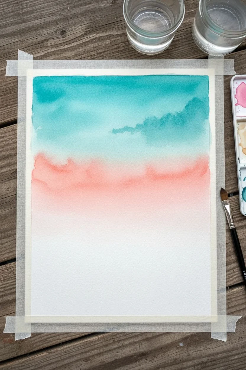
Reflective Lake Scene With Wiggly Mirror Lines
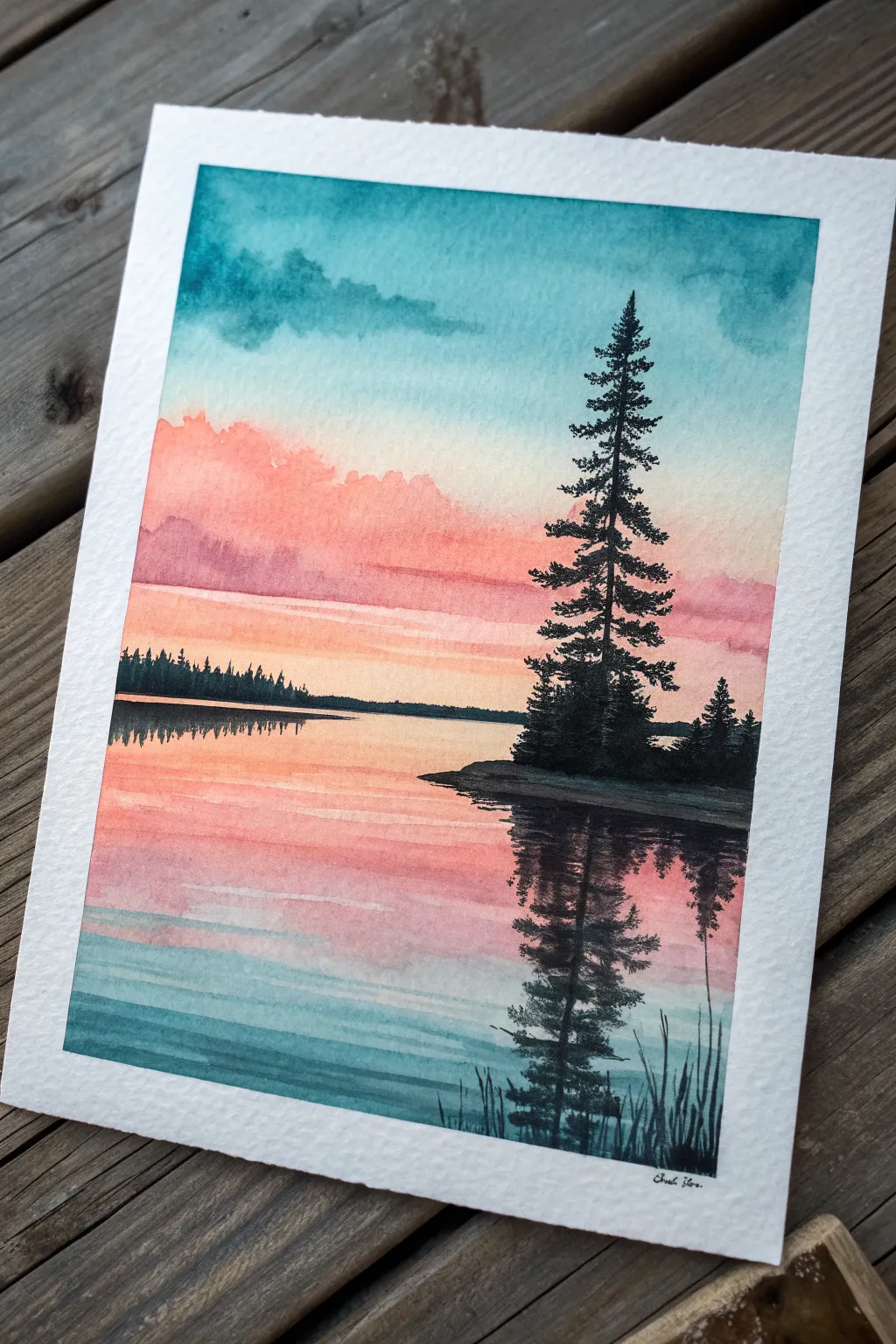
Capture the serene beauty of a quiet evening by the water with this stunning watercolor project. You will master the art of soft sky gradients and create believable water reflections using simple, rhythmic brushstrokes.
Step-by-Step
Materials
- Cold press watercolor paper (140lb/300gsm), taped down
- Watercolor paints: Turquoise/Teal, Coral/Salmon Pink, Indigo, Black
- Flat wash brush (3/4 inch)
- Round brush (size 6 or 8)
- Fine detail brush (size 0 or 1)
- Masking tape
- Two jars of water
- Paper towels
- Palette for mixing
Step 1: Painting the Sky Gradient
-
Prepare the Paper:
Since we need the colors to bleed softly, start by wetting the entire top two-thirds of your paper with clean water using your flat brush. The paper should be glisten, but not form puddles. -
Apply the Teal Sky:
Pick up a vibrant turquoise or teal mix. While the paper is still wet, paint a horizontal band across the very top edge. Let gravity help pull the color down slightly, or gently guide it with a damp brush to fade it out as it moves down. -
Add Clouds:
While the teal is still damp, dab in a slightly more concentrated teal-blue mix just below the top edge to suggest soft cloud formations. The wet paper will soften the edges for you. -
Transition to Peach:
Rinse your brush thoroughly. Mix a soft coral or salmon pink. Apply this color starting from the middle of the paper, working your way up to meet the fading teal. Allow the two colors to touch and mingle slightly, but avoid overworking the area where they meet to prevent mud. -
Deepen the Horizon:
As you move closer to the horizon line (about one-third up from the bottom), intensify the pinks and corals. This creates the glow of the setting sun. Stop painting just above where you want your water line to be and let this section dry completely.
Step 2: Creating the Reflective Water
-
Establish the Lake Surface:
For the water, we will mirror the sky colors but in reverse. Start just below the horizon line with your coral/pink mix. I find using horizontal strokes helps establish the calm water surface immediately. -
Fade into Teal:
As you move lower down the paper, blend your pinks into a soft wash of the teal color used in the sky. The bottom of the painting should be the darkest teal to frame the scene. -
Create Water Ripples:
While the water layer is mostly dry but perhaps slightly cool to the touch, load a small round brush with a watered-down teal. Paint gentle, horizontal zig-zag or wiggly lines across the foreground water. These breaks in color suggest gentle movement. -
Dry Completely:
Use a hairdryer or wait patiently. The paper must be bone dry before adding the sharp silhouettes in the next phase.
Bleeding Check
If your horizon line is bleeding into the sky, your background wasn’t dry enough. Wait for it to dry fully, then sharpen the edge with opaque paint.
Step 3: Adding Trees and Silhouettes
-
Paint the Distant Shore:
Mix a dark grey or deep indigo. Using a small round brush, paint a thin, uneven strip across the horizon line. Add tiny vertical ticks to suggest faraway pine trees. -
Start the Main Tree:
Mix a very opaque black or dense indigo. Identify where your main pine tree will stand on the right side. Draw a straight vertical line for the trunk, but don’t go all the way to the top yet. -
Form the Branches:
Starting from the top of your trunk line, tap your brush side-to-side to create pine boughs. Keep the top branches very short and widen them as you move down the tree, creating a classic triangular silhouette. -
Anchor the Island:
Paint the small landmass at the base of your tree. It should be a solid dark shape jutting into the water. -
Mirror the Reflection:
Directly below the island and tree, paint the reflection into the water. Use the same black paint but add more water to make it slightly transparent. Paint the tree upside down, but disturb the lines with horizontal wiggles to shatter the image like a reflection. -
Add Foreground Details:
In the bottom right corner, use your finest detail brush to flick quick, upward strokes. These represent tall lake grasses and frame the composition.
Pro Tip: Scratching Out
While the paint is damp on the tree reflection, use a clean, damp stiff brush to lift out horizontal lines, creating realistic water highlights.
Peel off the tape carefully to reveal those crisp white borders on your peaceful lake scene
Minimal Line Art Portrait With a Soft Wash
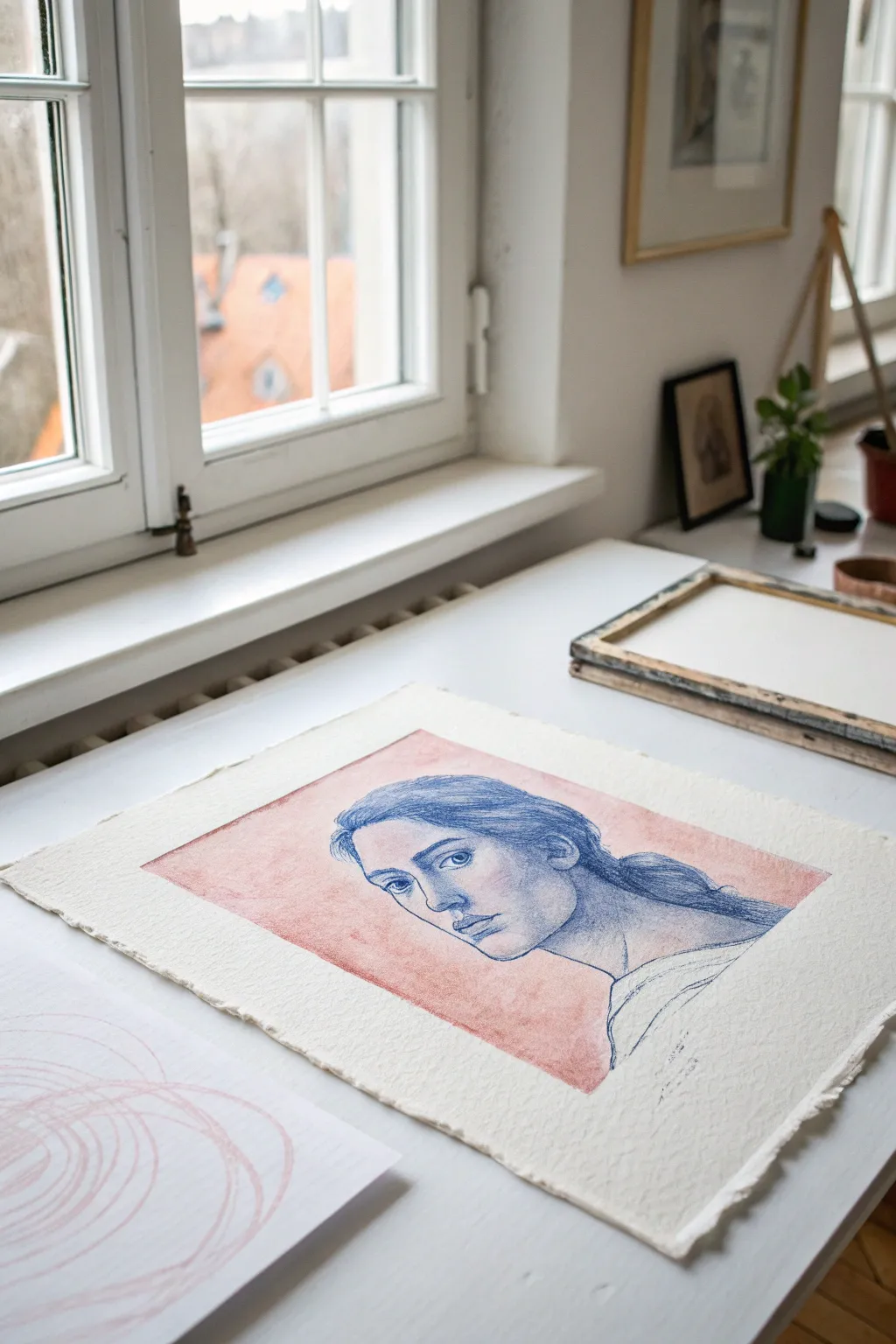
This elegant project combines the loose, organic fee of a watercolor wash with the precision of a classical line drawing. The result is a striking contrast between the soft, muted salmon background and the crisp blue lines of the portrait, all set on beautiful deckled-edge paper.
Step-by-Step Guide
Materials
- Heavyweight cold-press watercolor paper (300gsm or higher)
- Masking tape or painter’s tape
- Watercolor paint (Alizarin Crimson and a touch of Burnt Sienna)
- Wide flat wash brush (1-inch or similar)
- Blue colored pencil (Prismacolor indigo or cobalt blue)
- Graphite pencil (HB or 2H) for sketching
- Kneadable eraser
- Ruler
- Paper towel
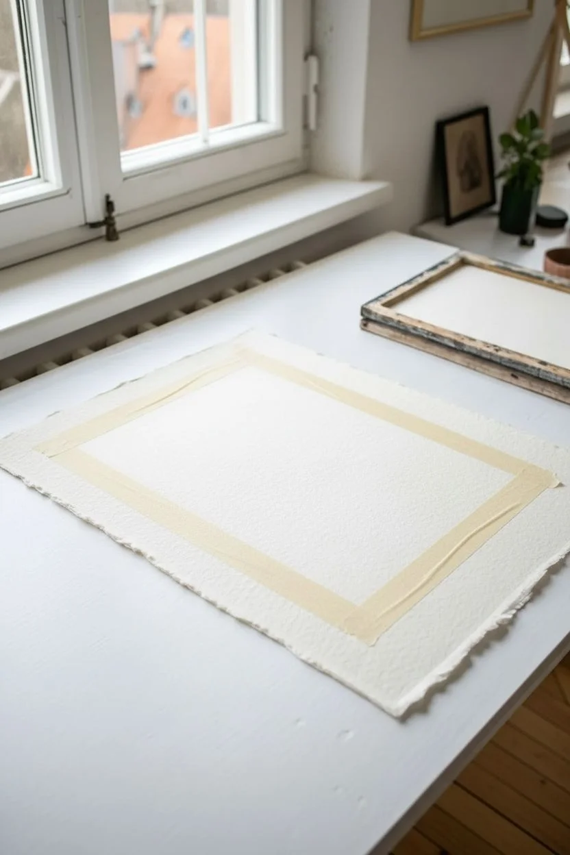
Step 1: Preparing the Surface
-
Select your paper:
Begin with a sheet of high-quality, heavyweight watercolor paper. If you want that authentic, artisanal look shown in the example, choose a paper with deckled edges, or tear your paper against a ruler edge to create a soft, ragged border. -
Tape the border:
Measure a rectangle within the center of your paper, leaving a generous white margin (about 2-3 inches) on all sides. Use low-tack masking tape to define this inner rectangle. Press the edges of the tape down firmly to ensure crisp lines later.
Tape Trick
Before applying your masking tape to the paper, stick it to your clothes once or twice. This removes some tact, ensuring it won’t rip your watercolor paper when removed.
Step 2: Creating the Soft Wash
-
Mix the color:
On your palette, mix a diluted wash of Alizarin Crimson with a tiny drop of Burnt Sienna to dull it down. You are aiming for a soft, vintage salmon or dusty pink hue. Test the color on a scrap piece of paper first; it should be transparent and subtle. -
Apply the first layer:
Dip your wide flat brush into clean water and dampen the area inside the tape ever so slightly. then, load your brush with the paint mixture and apply it across the taped area using horizontal strokes. -
Build texture:
While the first layer is still damp, dab a little more pigment into random areas to create the cloudy, mottled texture seen in the reference. I like to let the water pool slightly in some spots to encourage natural drying patterns (blooms). -
Dry completely:
Let the background paint dry thoroughly. This is crucial—if the paper is even slightly damp, your colored pencil lines later will snag or bleed. You can use a hairdryer on a low setting if you’re impatient. -
Remove the tape:
Once the paper is bone dry, carefully peel away the masking tape. Pull the tape away from the center of the painting at a 45-degree angle to prevent tearing the paper surface.
Upgrade the Ink
Instead of blue pencil, try using a dip pen with navy blue ink for the portrait. The varying line weight offers a classic, etching-like aesthetic.
Step 3: Drawing the Portrait
-
Find a reference:
Choose a reference photo of a face in a 3/4 view or profile. Look for an image with clear lighting to help you identify where the features should go. -
Light sketch:
Using a hard graphite pencil (like a 2H), very faintly sketch the outline of the head, the position of the eyes, nose, and mouth directly onto the pink wash. Keep these lines barely visible so they won’t show in the final piece. -
Start with the eyes:
Switch to your blue colored pencil. Ensure it is sharpened to a fine point. Begin defining the eyes, focusing on the eyelids and the iris. Use short, hatching strokes to denote the eyebrows rather than a solid line. -
Define the nose:
Draw the bridge of the nose and the nostril. Keep the line for the bridge lighter than the nostril shadow to indicate depth. -
Shape the lips:
Outline the lips, pressing slightly harder where the lips meet in the center. Use very light vertical hatching to suggest the texture and fullness of the bottom lip. -
Contour hatching:
This style relies on cross-hatching for shading. Use diagonal hatching lines on the shadowed side of the face (usually the side further from the light source) and under the chin to create volume. -
Draw the hair:
Outline the mass of the hair. Instead of drawing every strand, use long, sweeping strokes to follow the direction of the hair flow. Darken the areas behind the ear or at the nape of the neck to anchor the drawing. -
Refine the jawline:
Strengthen the jawline and neck contours. The blue line should serve as a distinct boundary against the pink background. -
Add shoulder detail:
Sketch the suggestion of clothing or the shoulder line loosely. These lines can be freer and less detailed than the face, fading out as they reach the bottom of the colored area. -
Clean up sketches:
Using your kneadable eraser, gently dab away any visible graphite sketch lines that weren’t covered by the blue pencil. Be careful not to smudge the blue pigment. -
Final assessment:
Step back and look at your portrait. If certain features feel flat, add a second layer of cross-hatching to deepen the blue shadows and increase the contrast against the salmon wash.
This sophisticated piece looks wonderful framed with a generous white mat to show off those lovely deckled edges


Have a question or want to share your own experience? I'd love to hear from you in the comments below!