When you’re new to paint, a small canvas feels like the perfect little playground—quick to finish, easy to redo, and way less intimidating than a big blank surface. These beginner-friendly mini canvas painting ideas are the ones I reach for when I want something simple that still looks polished when it dries.
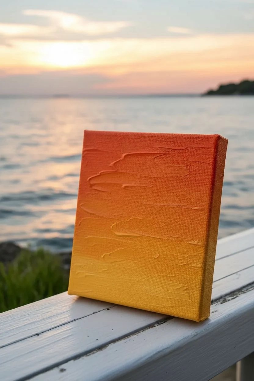
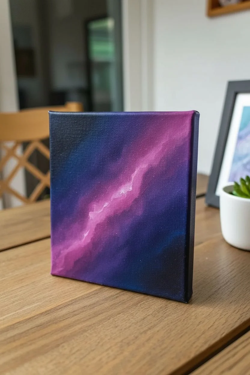
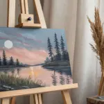
Blended Sunset Gradient Sky
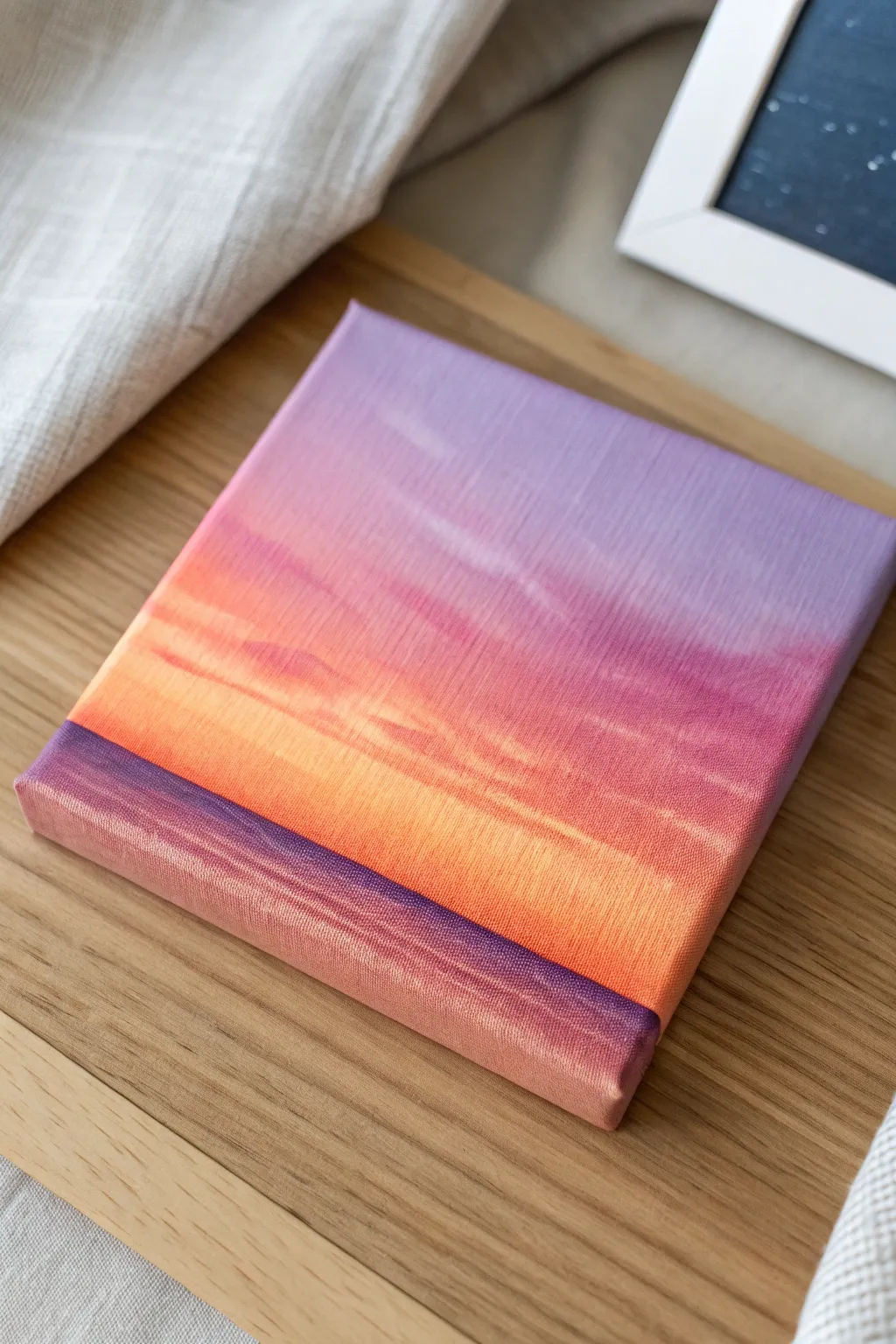
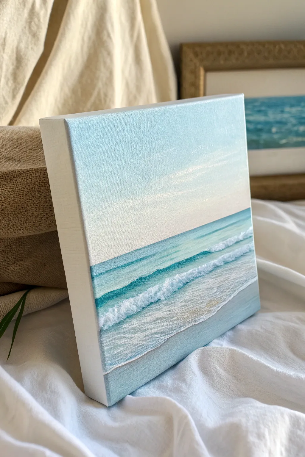
This project captures the mesmerizing transition of a sunset sky, blending deep purples into warm oranges and soft pinks on a miniature canvas. It is an excellent exercise in wet-on-wet blending to create a seamless, ethereal glow without harsh lines.
Step-by-Step Tutorial
Materials
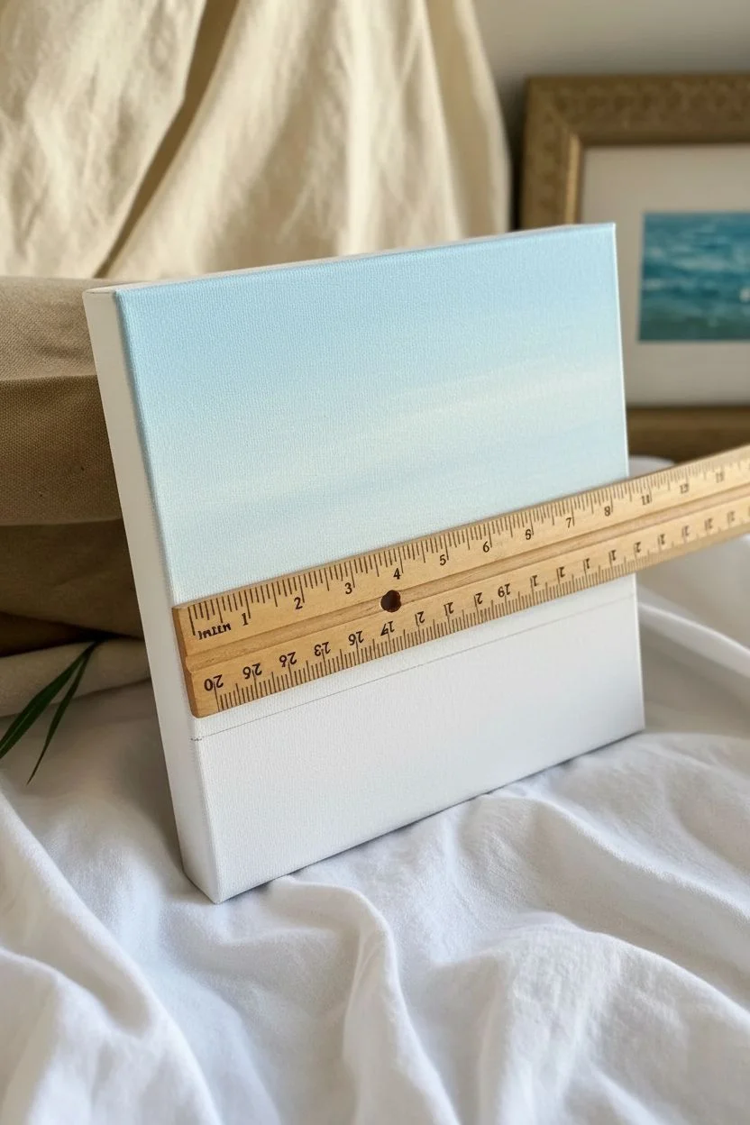
- Small square stretched canvas (e.g., 6×6 or 8×8 inches)
- Acrylic paints: Dioxazine Purple, Quinacridone Magenta, Cadmium Orange, Cadmium Yellow Medium, Titanium White
- Wide flat synthetic brush (3/4 inch or 1 inch)
- Medium flat brush (1/2 inch) for details
- Small round brush for bright highlights
- Palette or paper plate
- Cup of water
- Paper towels
- Masking tape (optional for horizon line)
Step 1: Preparing the Base
-
Prime the surface:
Begin by applying a thin, even coat of Titanium White across the entire canvas. This helps the subsequent colors pop and makes blending smoother. -
Define the horizon:
Visualize a line about one-third of the way up from the bottom edge. This will be your horizon line separating the sky from the water, but don’t mark it with a pencil just yet; painting over a mental line keeps it softer.
Stay Wet
Work quickly! Acrylics dry fast. Keep a spray bottle of water handy to mist your canvas lightly if the paint starts dragging or becoming too sticky to blend.
Step 2: Painting the Sky Gradient
-
Start with purple:
Load your wide flat brush with Dioxazine Purple and a touch of white. Paint horizontal strokes across the very top inch of the canvas. -
Transition to magenta:
Without cleaning the brush completely, pick up some Quinacridone Magenta. In the section directly below the purple, paint back and forth, allowing the magenta to mix with the wet purple edge above. -
Blend downwards:
Continue painting downwards. If the transition looks rough, gently sweep the clean, slightly damp brush back and forth over the meeting point of the two colors to blur the line. -
Introduce orange:
Clean your brush thoroughly. Load it with Cadmium Orange mixed with a little Titanium White. Paint a band below the pink section, blending upward into the pink slightly to create a peach tone. -
Add the glowing horizon:
For the brightest part of the sunset just above the water line, mix Cadmium Yellow with Titanium White. Apply this right at your imaginary horizon line, blending it upward into the orange. -
Smooth the gradient:
Take a clean, dry soft brush and very gently dust it horizontally across the entire sky while the paint is still tacky to remove visible brushstrokes and perfect the fade. -
Wrap the edges:
Don’t forget to carry these sky colors over the sides of the canvas. This gallery-wrap style makes the finished piece look professional without a frame.
Silhouette Drama
Once the background is fully dry, paint a tiny black silhouette of a sailboat, a pier, or distant mountains on the horizon line for added storytelling.
Step 3: Creating Clouds and Water
-
Add soft clouds:
Mix a pale lavender using Purple and White. Using the corner of a medium flat brush, scrub in very faint, horizontal cloud streaks in the upper purple section. Keep them sheer and subtle. -
Establish the water line:
Switch to Dioxazine Purple with a tiny bit of blue if you have it, or just plain dark purple. Paint a straight, horizontal line across the canvas where the yellow sky ends to establish the horizon. -
Paint the water base:
Fill the bottom third of the canvas with a mix of the purple and a touch of the orange tone to relate it to the sky. It should be darker than the sky but lighter than the horizon line. -
Refine the water gradient:
The water should be darker near the horizon and slightly lighter near the bottom foreground. Blend a little white into your purple mix as you move toward the bottom edge. -
Add water reflections:
Load a small round brush with your pale yellow/white mixture. Paint thin, short horizontal dashes in the center of the water area to mimic the sun reflecting on waves. -
Layer the highlights:
Add a few streaks of pale pink/orange in the water area as well, flanking the yellow reflection. This ties the water colors back to the sky colors. -
Final blending pass:
If the water highlights look too sharp, swiftly run a dry brush horizontally over the water area once to soften the reflection lines.
Step back and admire how simply blending a few colors can create such a glowing, tranquil atmosphere


Simple Mountain Silhouette Layers

Capture the serene beauty of a mountain range fading into the distance with this beginner-friendly layered landscape. Using just black and white paint to create a gradient of grays, you’ll build depth one simple layer at a time.
Detailed Instructions
Materials
- Small square canvas (e.g., 4×4 or 6×6 inches)
- Acrylic paint: Titanium White, Mars Black
- Flat shader brush (medium size)
- Small liner brush or detail brush
- Mixing palette
- Cup of water and paper towels
Step 1: Preparing the Sky
-
Mix the sky color:
Start by squeezing out a generous amount of white paint and a tiny dot of black. Mix them to create a very pale, almost-white grey. It should look like an overcast sky. -
Paint the background:
Using your flat brush, paint the top third of the canvas with this pale mixture. Ensure your brushstrokes move horizontally for a smooth finish. -
Soften the transition:
While the paint is wet, you can create a soft bottom edge by lifting the brush pressure slightly as you move down. Let this base layer dry completely before moving on.
Step 2: Layering the Mountains
-
Mix the first mountain shade:
To your sky mixture, add just a hint more black paint. You want a grey that is visibly darker than the sky but still quite light and airy. -
Paint the furthest range:
Paint a jagged line across the canvas, slightly overlapping the bottom of your sky section. Fill in the area below this line. The peaks should be gentle and rolling since they are far away. -
Darken the mix:
Once the previous layer is dry to the touch, add a bit more black to your grey pile. This creates the next level of depth. -
Add the middle range:
Paint another mountain range below the previous one. Make the peaks slightly sharper or more defined this time, and ensure you vary the height so it doesn’t look like a perfect staircase. -
Continue the gradient:
Repeat this process—adding more black for a darker grey, then painting a new mountain layer lower down—about two or three more times. -
Check your values:
As you work your way down the canvas, ensure each new grey layer is distinct from the one behind it. The contrast creates the illusion of distance. -
Paint the nearest mountain:
For the final large landmass at the very bottom, mix a dark charcoal grey (but not pure black yet). Fill this section in completely to the bottom edge of the canvas.
Values Merging Together?
If your mountain layers are blending into each other, you likely didn’t let the previous layer dry enough. Use a hair dryer on low heat for 30 seconds between layers to ensuring crisp edges.
Step 3: Adding Foreground Details
-
Load the detail brush:
Switch to your fine liner brush. Load it with pure Mars Black paint. Adding a tiny drop of water can help the paint flow smoother for crisp lines. -
Plant the tree trunks:
On the left side of the darkest bottom mountain, paint thin vertical lines of varying heights. These will become your pine trees. -
Stipple the branches:
Starting at the top of a trunk, use the very tip of your brush to tap or stipple small horizontal dashes. Keep them very narrow at the top. -
Fill out the trees:
Work your way down the trunk, making the branch strokes slightly wider as you go. I usually wiggle the brush slightly to create that organic, uneven pine texture. -
Group the forest:
Paint a cluster of trees on the left side, varying their heights to look natural. You can add a few tiny tree tops peaking out further down the slope. -
Create a solid base:
Ensure the bottom of the trees blend seamlessly into the dark mountain shape; you don’t want them to look like they are floating. -
Final touches:
Check the edges of your canvas. Painting the sides with the corresponding grey layers gives the piece a professional, finished look without needing a frame.
Clean Lines Pro Tip
For super sharp mountain peaks, try using a slightly angled shader brush instead of a flat one. The angle helps you carve out those crisp summits with a single confident stroke.
Step back and admire your misty mountain range, noting how simple shades of grey can build a stunning sense of atmosphere


Easy Ocean Horizon With Gentle Waves
Capture the tranquil beauty of a calm beach day with this soft and soothing seascape. Using gentle gradients and layered waves, you’ll create a realistic sense of depth and movement on a small canvas surface.
Step-by-Step
Materials
- Small square canvas (e.g., 6×6 or 8×8 inches)
- Acrylic paints: Titanium White, Phthalo Blue (or a teal shade), Ultramarine Blue, Burnt Umber or Raw Sienna
- Flat shader brushes (medium and small)
- Small round detail brush
- Palette knife (optional, for mixing)
- Water cup and paper towels
- Pencil and ruler
Step 1: Setting the Scene
-
Mark the Horizon:
Use your ruler and pencil to draw a faint horizontal line across your canvas. Position it slightly below the center point—creating a larger sky area helps the painting feel open and airy. -
Mix Your Sky Blue:
Create a very pale blue by mixing a tiny dot of Ultramarine Blue into a large amount of Titanium White. The goal is a whisper of color, almost white. -
Paint the Upper Sky:
Using a flat brush, paint horizontal strokes across the top third of the canvas with your sky mixture. Keep the strokes smooth and long to avoid choppy textures. -
Blend the Horizon:
Mix an even paler version of your sky blue (add more white) or use pure white with a touch of warmth (a speck of pink or orange if you have it, otherwise just white). Paint this from the horizon line up to meet your blue section, blending the wet edges together gently for a seamless fade.
Step 2: The Deep Water
-
Mix Teal Water:
Combine Phthalo Blue with Titanium White to create a vibrant turquoise. It should be darker than the sky but still bright. -
Establish the Horizon Line:
Carefully paint a straight line of this turquoise right below your pencil horizon mark. Make this the darkest part of your water to indicate depth and distance. -
Create the Gradient:
As you move down the canvas, gradually add more white to your turquoise mixture. Paint horizontal bands that get lighter as they approach the bottom, blending them while wet to soften the transition.
Uneven Blending?
If your gradient looks stripey, use a clean, slightly damp (not wet!) brush to lightly stroke back and forth over the meeting point of two colors.
Step 3: Waves and Foreground
-
Define the Wave Shape:
About two-thirds down the water section, paint a narrow, darker band of teal. This shadow suggests the water is curving up into a wave before it breaks. -
Add the Foam Line:
Load a small round brush with pure Titanium White. Paint a jagged, organic line right on top of your dark teal wave shadow. Use a tapping motion to make the paint look like crashing foam rather than a solid line. -
Create the Wash:
Below the main wave, mix a very watery, transparent white. Glaze this over the turquoise area to create the look of shallow, rushing water spreading over the sand. -
Paint the Wet Sand:
For the bottom inch of the canvas, mix White with a very small touch of Burnt Umber (and a tiny bit of blue to cool it down). This creates a greyish-tan ‘wet sand’ color. Apply this at the very bottom, blending upward into the shallow water.
Add Sparkle
Mix a tiny amount of glitter medium or iridescent gel into your white paint for the foam to make the water glisten in the light.
Step 4: Details and Highlights
-
Adding Seafoam Texture:
Using your smallest brush and thick white paint, add tiny horizontal dashes and dots in the shallow water area. These mimic the leftover bubbles and foam on the surface. -
Enhance the Main Wave:
Go back to your main breaking wave. Add a few brighter white highlights on the top crest to make it pop against the blue water behind it. I find adding a tiny bit of water to the white paint helps it flow better for these delicate details. -
Refine the Horizon:
Check your horizon line one last time. If it looks uneven, carefully run a clean, straight edge of paint across it to ensure it feels perfectly flat. -
Paint the Sides:
Don’t forget the edges of your canvas! Extend your horizontal lines of sky, water, and sand around the sides for a finished, gallery-ready look without needing a frame.
Step back and admire your personal window to the sea, ready to bring a breath of fresh air to any room.

Tiny Sailboat at Golden Hour
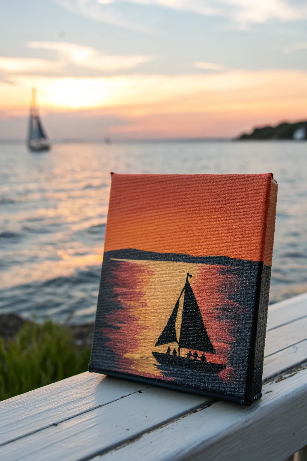
Capture the serene beauty of a sunset on the water with this vivid, miniature canvas project. Using bold horizontal strokes and a high-contrast silhouette, you’ll create a striking scene that glows with warmth.
How-To Guide
Materials
- Small square canvas (e.g., 4×4 or 5×5 inch)
- Acrylic paints: Bright Orange, Deep Yellow/Gold, Black, Dark Blue or Navy
- Flat brush (medium width)
- Small detail brush (round or liner)
- Palette or paper plate
- Cup of water and paper towels
Step 1: Creating the Sky
-
Prepare the orange base:
Squeeze a generous amount of bright orange paint onto your palette. Using your medium flat brush, paint the top half of the canvas using long, smooth horizontal strokes. -
Blend the gradient:
While the orange is still slightly wet, mix a tiny touch of yellow into it. Paint over the lower part of the sky area to create a subtle transition, making sure the color is solid and opaque all the way to the top edge. -
Paint the sides:
Don’t forget to wrap your orange paint around the top and side edges of the canvas for a polished, professional look when viewed from an angle.
Uneven Horizon?
If your hand is shaky, place a piece of masking tape horizontally across the dry sky layer before painting the water. Peel it off for a crisp line.
Step 2: Establishing the Horizon
-
Mix the dark water tone:
Create a dark, shadowy color by mixing black with a small amount of navy blue. This adds richness without being a flat, dead black. -
Paint the horizon line:
Using the edge of your flat brush, draw a straight horizontal line across the middle of the canvas. This separates your sky from the water. -
Form the distant land:
Just above your horizon line on the right side, gently dab a very low, uneven shape with the dark mix to suggest a distant shoreline or island. -
Fill the water base:
Use the dark mix to paint the bottom corners of the canvas, leaving a wide, unpainted triangular section in the center bottom for the reflection.
Add Subtle Texture
Use a dry fan brush or an old toothbrush to lightly splatter a few gold specs on the dark water for extra sparkling highlights.
Step 3: Painting the Reflection
-
Apply the gold light:
Clean your flat brush thoroughly. Load it with pure deep yellow or gold paint. Fill the empty center section of the water, brushing horizontally from the horizon line down to the bottom edge. -
Feather the edges:
While the paint is wet, gently pull the yellow paint outwards into the dark sides using short, flicking horizontal strokes. This creates the shimmering effect of light hitting waves. -
Darken the water texture:
Wipe your brush and pick up a tiny bit of the dark mix. Add very thin, dry horizontal streaks over the yellow section, especially near the bottom, to break up the light and add depth. -
Add orange highlights:
If you want extra warmth, glaze a sheer layer of orange over parts of the dark water on the left side to show the ambient sunset glow.
Step 4: Adding the Sailboat
-
Outline the hull:
Switch to your small detail brush and pure black paint. In the lower third of the canvas, paint a curved, boat-shaped hull centered in the golden reflection path. -
Paint the mast:
Draw a thin vertical line rising from the center of the boat toward the sky, stopping before you reach the top edge. -
Create the main sail:
Paint a large triangular shape on the right side of the mast. The bottom of the sail should be wider than the top, curving slightly to suggest wind. -
Add the jib sail:
On the left side of the mast, paint a smaller, narrower triangle for the front sail. -
Place the passengers:
Using the very tip of your detail brush, add tiny dots or small blobs along the hull to represent people sitting in the boat. -
Final touch:
Add a tiny flag or pennant at the very top of the mast fluttering to the right.
Let your tiny seascape dry completely before displaying it on a mini easel to bring warmth to any room
BRUSH GUIDE
The Right Brush for Every Stroke
From clean lines to bold texture — master brush choice, stroke control, and essential techniques.
Explore the Full Guide
Starry Night Galaxy With Paint Splatter
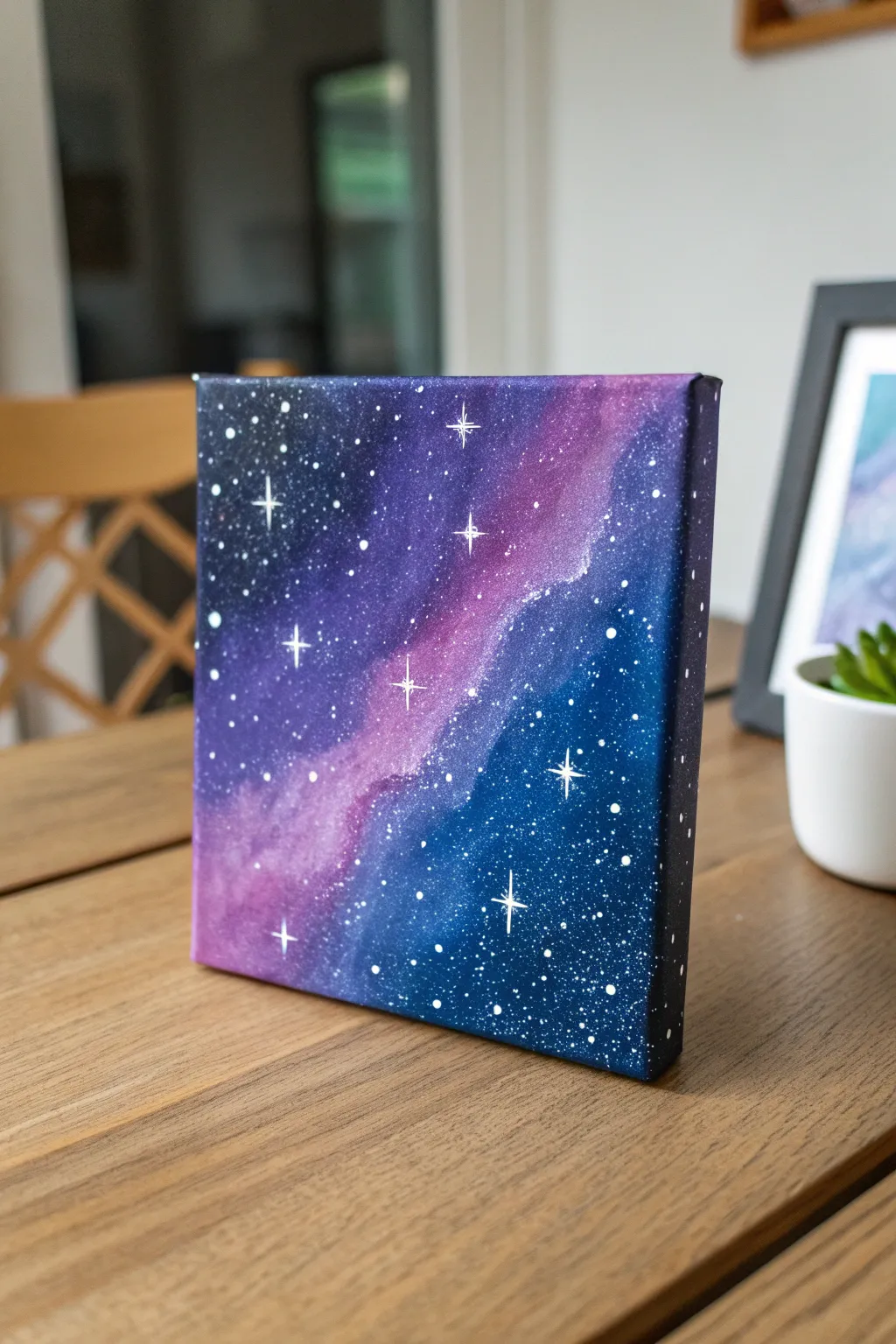
Capture the magic of deep space on a petite canvas with this vibrant galaxy painting. Using simple blending techniques and splatter effects, you’ll create a stunning nebula cloud drifting through a field of twinkling stars.
Step-by-Step Tutorial
Materials
- Small square canvas (e.g., 6×6 or 8×8 inches)
- Acrylic paints: Black, Navy Blue, Violet, Magenta, Titanium White
- Paintbrushes: Flat shader brush, medium round brush, fine liner brush
- Old toothbrush (optional for splattering)
- Palette or paper plate
- Cup of water
- Paper towels
Step 1: Setting the Background
-
Prepare the canvas:
Start by setting up your workspace with a protective covering. Place your small canvas flat on the surface. -
Map out the nebula:
Squeeze a generous amount of Magenta and Violet onto your palette. Using a medium round brush, paint a diagonal, wavy streak across the center of the canvas from top-right to bottom-left. -
Blend the edges:
While the pinkish streak is still wet, load your brush with Navy Blue. Apply it alongside the magenta streak, gently overlapping the edges so the colors blur together to create a soft, hazy transition. -
Adding depth:
Fill in the remaining outer corners (top-left and bottom-right) with a mix of Navy Blue and Black. This darkened background will make your nebula pop. -
Smooth transitions:
Use a clean, slightly damp flat brush to gently sweep over the boundaries between the black, blue, and purple zones. This soft blending technique creates that classic, cloudy galaxy look. -
Wrap the sides:
Don’t forget the edges! Continue your color pattern onto the sides of the canvas for a professional, finished appearance without needing a frame.
Muddy colors?
If your stars turn blue or gray, your background wasn’t dry enough. Let it dry fully, then re-splatter. If blending gets muddy, rinse your brush more often.
Step 2: Creating the Stars
-
Dry thoroughly:
Let the background layer dry completely. This is crucial; if the paint is wet, your stars will turn muddy instead of crisp white. -
Prepare splatter paint:
Mix a small amount of Titanium White paint with a few drops of water. You want a consistency similar to heavy cream or melted ice cream—fluid but not watery. -
Splatter stars:
Dip an old toothbrush or a stiff bristle brush into the watered-down white paint. Hold it over the canvas and flick the bristles with your thumb to spray tiny dots across the dark sky. -
Vary the density:
I like to concentrate a few more splatters near the lighter nebula streak to simulate a dense star cluster, leaving the darker corners slightly sparser. -
Add larger stars:
Dip the handle end of a paintbrush into pure, unthinned white paint. Gently dot it onto the canvas to create a few larger, distinct planets or distant suns.
Star Control
Test your splatter technique on a piece of scrap paper first. The distance and speed of your flick change the size of the stars dramatically.
Step 3: Finishing Touches
-
Paint the twinkles:
Using your finest liner brush and pure white paint, locate a few of your larger white dots. -
Create the cross shape:
Carefully paint a thin vertical line through a dot, followed by a horizontal line of the same length, creating a cross. -
Refine the glimmer:
For an extra sparkling effect, add two tiny diagonal strokes in the center of the cross on your biggest stars. -
Final drying:
Allow the white details to dry completely before handling or hanging your mini masterpiece.
Place your new galaxy painting on a small easel or shelf to add a touch of cosmic wonder to your room
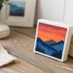
Simple Planets on a Deep Space Background

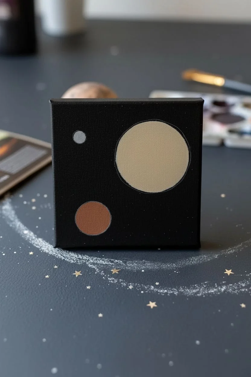
Capture the vastness of the cosmos on a tiny scale with this charming planetary study. Featuring a striped gas giant and its orbiting moons, this project uses simple blending techniques to create surprising depth against a star-flecked void.
Detailed Instructions
Materials
- Small square canvas (4×4 or 6×6 inches)
- Black acrylic paint (or gesso)
- Acrylic paints: Titanium White, Burnt Sienna, Yellow Ochre, Ultramarine Blue, Raw Umber
- Flat shader brush (medium)
- Small round detail brush (size 0 or 1)
- Clean toothbrush (for splatter)
- Palette or paper plate
- Water cup and paper towels
- Chalk or pastel pencil (optional for sketching)
Step 1: Setting the Stage
-
Prepare the Void:
Begin by painting your entire canvas with solid black acrylic paint. Don’t forget to paint the sides of the canvas as well for a polished, finished look. Let this base coat dry completely. -
Map Out the Planets:
Using a piece of chalk or a very light pencil touch, lightly sketch three circles. Place a large circle on the right side for the gas giant, a medium circle in the lower left, and a tiny circle near the top left. This composition creates a nice balance. -
Block in the Base Colors:
For the large gas giant, mix a soft beige using Titanium White and a tiny dot of Yellow Ochre. Fill in the circle completely. For the medium moon, use a mix of Burnt Sienna and White for a reddish-brown base. Paint the smallest moon a pale, cool grey.
Step 2: Painting the Gas Giant
-
Create the Atmosphere Bands:
While the beige base is dry, mix a few distinct colors on your palette: Raw Umber, Burnt Sienna, and a creamy off-white. Using a small flat brush, paint horizontal, slightly curved stripes across the large planet. -
Blend the Stripes:
While the stripes are still wet, gently stroke over the boundaries where colors meet to soften them. You want distinct bands, but not sharp, hard lines. -
Add Shadow for Volume:
To make the planet look spherical, mix a glaze of Ultramarine Blue with a lot of water (or glazing medium). Paint a crescent shape along the right-hand edge of the planet. This shadow pushes the edge back into space. -
Highlight the Curve:
Add a thin line of pure white along the very left edge of the bands to simulate sunlight hitting the curve of the atmosphere.
Too Many Stars?
If your toothbrush splatter gets out of hand and covers too much black, simply paint over the excess stars with fresh black paint. You can ‘edit’ the sky as much as you need.
Step 3: Detailing the Moons
-
Texture the Medium Moon:
On the reddish-brown moon in the lower left, dap on spots of lighter tan and darker brown using the tip of your round brush. I like to twist the brush slightly to create organic craters. -
Shade the Medium Moon:
Just like the large planet, add a translucent blue-black shadow to the right side of this moon. Add a crisp white highlight on the upper-left edge. -
Detail the Tiny Moon:
For the smallest moon, simply dab a tiny amount of white on the upper left side and let the grey base serve as the shadow on the right.
Softer Shadows
To make the shadow side of your planets look more realistic, mix a tiny bit of the background black into your shadow color. This blends the planet seamlessly into the dark void.
Step 4: Starry Finish
-
Create Distant Stars:
Dilute some white paint with water until it is inky. Dip your toothbrush into it, point it at the canvas, and run your thumb across the bristles to spray a fine mist of stars over the black background. Cover the planets with a paper scrap if you want them clean. -
Add Bright Stars:
Using your smallest detail brush, dot a few larger, brighter stars in the empty black spaces. Group them in random clusters rather than spacing them evenly. -
Final Protection:
Once everything is fully dry, you can apply a coat of gloss varnish to make the colors pop and protect your miniature galaxy.
Display your tiny celestial window on a shelf or desk to add a touch of cosmic wonder to your room

PENCIL GUIDE
Understanding Pencil Grades from H to B
From first sketch to finished drawing — learn pencil grades, line control, and shading techniques.
Explore the Full Guide
Pink Sky Moon With Soft Clouds
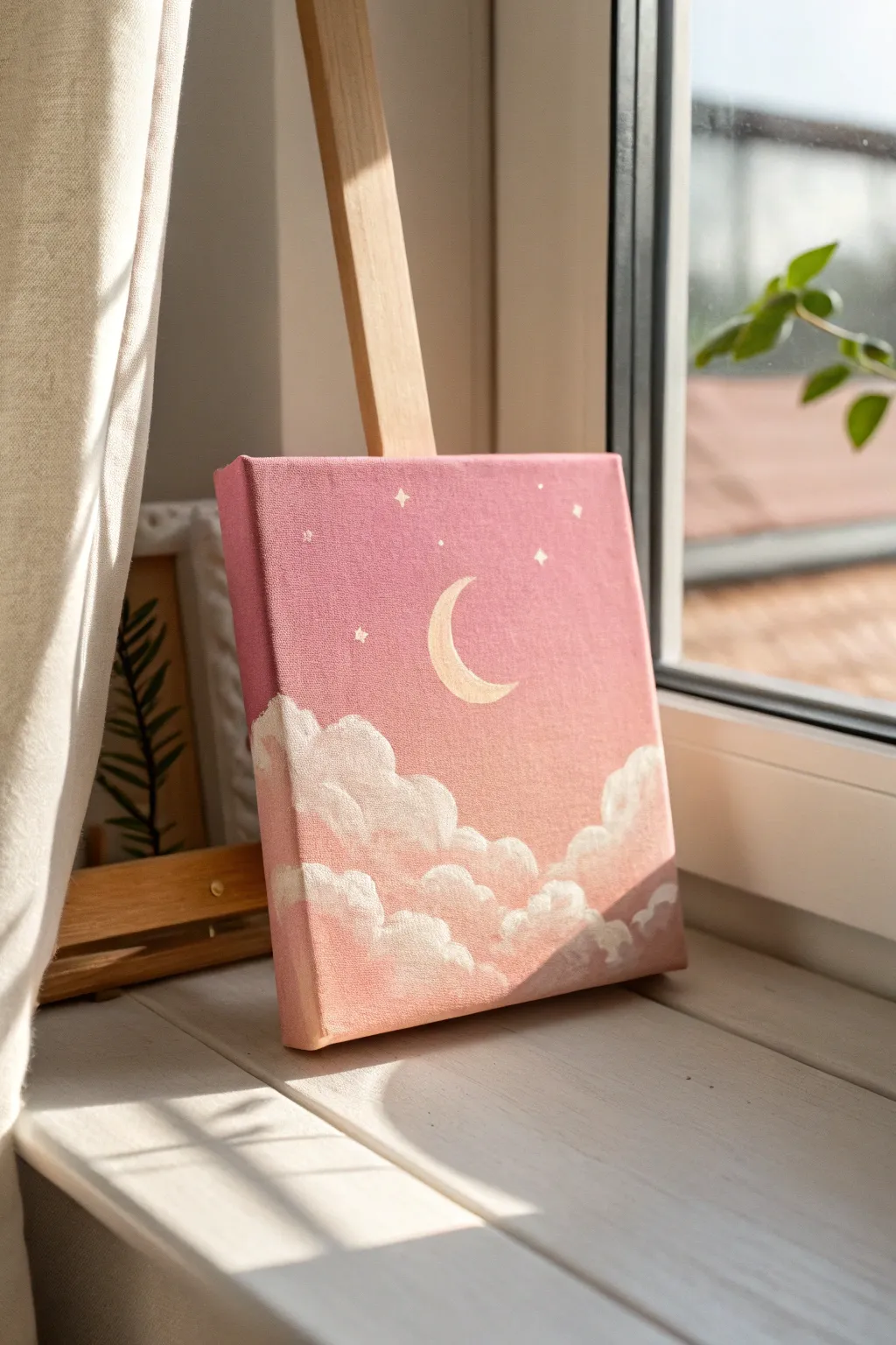
This sweet, celestial painting captures a moment of calm with its gradient pink sky and gentle, fluffy clouds. It is the perfect beginner project to practice blending acrylics and creating soft, dreamlike textures.
Step-by-Step Guide
Materials
- Small square canvas (e.g., 6×6 or 8×8 inches)
- Acrylic paints: Titanium White, Primary Red (or Magenta), Yellow Ochre (tiny amount)
- Flat brush (roughly 1 inch wide)
- Small round brush (size 1 or 2)
- Filbert brush or worn flat brush (medium size)
- Palette or paper plate
- Cup of water
- Paper towels
Step 1: Creating the Sky Gradient
-
Mix your base pink:
Start by mixing a generous amount of white with a very small dot of red or magenta. You want a soft, bubblegum pink as your mid-tone. Use your palette knife or brush to ensure the color is uniform. -
Paint the top section:
Using your flat brush, apply this pink mixture to the top third of the canvas. Don’t forget to paint the top edge and the upper sides of the canvas for a finished look. -
Create a lighter pink:
Add more white to your pink pile to create a lighter shade. Apply this directly below the first section, slightly overlapping the wet paint. -
Blend the transition:
While both paints are still wet, use long, horizontal brush strokes to blend the two pinks together. Swipe back and forth gently until the line between them disappears into a smooth gradient. -
Mix a peachy tone:
For the bottom third of the sky, mix white with a tiny touch of red and an even smaller speck of yellow ochre. This warms up the color, giving it a sunset glow. -
Apply the bottom layer:
Paint this peachy-pink mixture at the bottom third of the canvas. Again, overlap with the section above it. -
Final sky blend:
Clean your flat brush, wipe it slightly damp, and gently sweep horizontal strokes across the entire canvas from top to bottom to seamless blend all three zones. Let this background dry completely—usually about 10 to 15 minutes.
Cloud Tip
Use a scrubbing, circular motion (scumbling) for the clouds. Don’t smooth the paint out perfectly; the texture is what makes them look fluffy.
Step 2: Painting the Moon and Stars
-
Sketch the moon:
Using a very small round brush with a tiny bit of watered-down white paint, faintly outline a crescent moon shape in the center of the sky. -
Mix a cream color:
Mix a large amount of white with a pinhead-sized dot of yellow ochre. This creates a soft, warm cream color that looks more natural than stark white. -
Fill in the moon:
Carefully fill in your crescent shape with the cream color. You may need two thin coats to get solid coverage over the pink background. -
Add the stars:
Using your smallest detail brush and pure white paint, add tiny dots scattered around the moon. For the larger stars, paint a tiny cross shape (a plus sign) first. -
Refine the stars:
On the larger ‘cross’ stars, gently pull the paint outward from the center to taper the points, making them twinkle.
Step 3: Adding the Fluffy Clouds
-
Prepare the cloud brush:
Switch to a filbert brush or an old, fuzzy flat brush. Load it with pure Titanium White, but don’t overload it; a drier brush creates better texture. -
Dab the cloud tops:
Start forming the tops of the clouds by dabbing the brush in rounded, arch-like motions. Focus on the upper edges first to make them crisp and puffy. -
Build the cloud body:
Work your way down from the crisp tops, scrubbing the paint slightly as you go lower. Let the paint get thinner and more transparent towards the bottom of each cloud puff. -
Add pink shadows:
While the white is still tacky, pick up a tiny bit of your original dark pink color on the dirty brush. Gently blend this into the bottom area of the cloud clusters to create depth. -
Layer the clouds:
Create layers by painting a second row of smaller cloud tops in front of the first ones. Ensure the tops are bright white, while the bottoms blend into the pink background. -
Cloud highlights:
Add a final dab of thick, pure white paint to the very top curves of the clouds where the moonlight would hit them most strongly. -
Wrap around edges:
Extend the cloud painting onto the sides and bottom edge of the canvas so the artwork looks beautiful from every angle.
Make it Sparkle
Once the painting is fully dry, add a thin layer of glitter varnish or iridescent medium over the moon and star points for a magical shimmer.
Place your canvas on a mini easel near a window to enjoy the soft glow of your finished creation
Single Daisy on a Solid Color Field
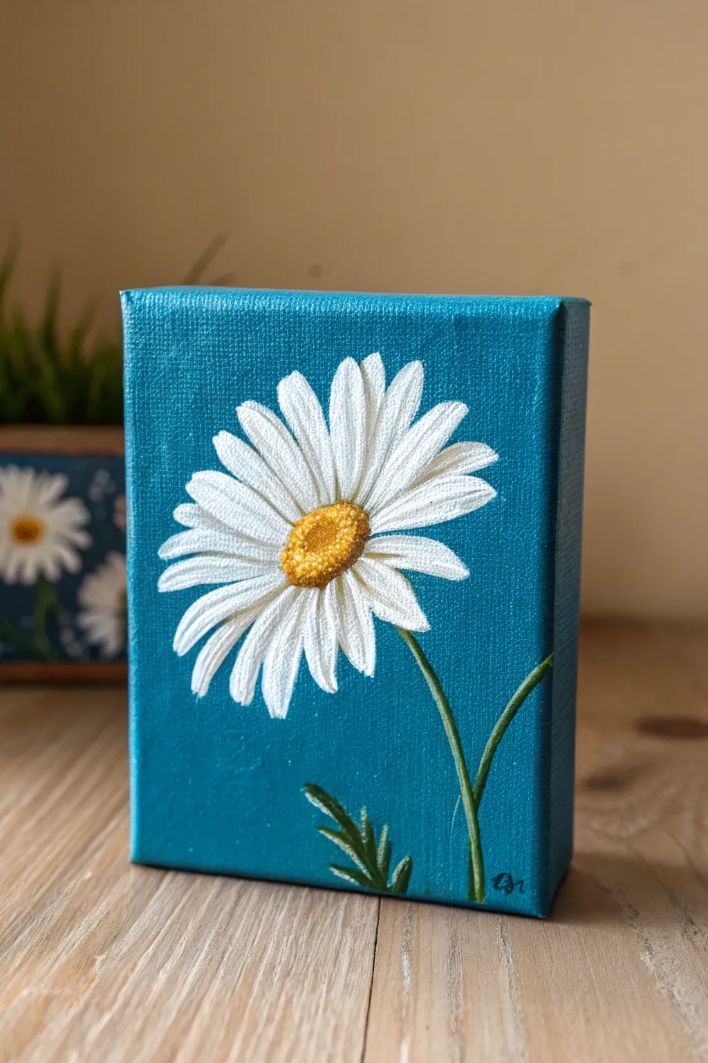
Capture the simple elegance of nature with this striking daisy study set against a deep teal background. The vibrant contrast between the white petals and the blue canvas makes this small artwork pop, perfect for brightening up any shelf or desk.
Step-by-Step
Materials
- Small deep-edge canvas (e.g., 4×6 or 5×7 inch)
- Acrylic paints: Teal/Turquoise, Titanium White, Cadmium Yellow, Yellow Ochre, Burnt Sienna, Sap Green, Dark Green
- Flat brush (3/4 inch or similar) for background
- Small round brush (size 2 or 3) for petals
- Fine liner brush (size 0 or 00) for details
- Palette
- Cup of water and paper towels
- Pencil for sketching (optional)
Step 1: Setting the Scene
-
Prepare the canvas:
Start by wiping your canvas clean of any dust. Mix a generous amount of teal acrylic paint; if you don’t have a pre-mixed teal, combine blue, a touch of green, and a tiny bit of white to get that rich, ocean-like hue. -
Paint the background:
Using your large flat brush, cover the entire front surface of the canvas with the teal paint. Apply long, smooth vertical strokes to minimize texture. -
Paint the edges:
Don’t forget the sides! Since this is a deep-edge canvas, painting the sides creates a finished, sculptural look that doesn’t require a frame. Let the background dry completely—usually about 20-30 minutes.
Smooth Petal Tip
Add a drop of water to your white paint to improve flow. This helps you create long, tapered petal strokes without the brush ‘skipping’ on the canvas texture.
Step 2: Building the Daisy
-
Sketch the placement:
Lightly sketch a small oval for the flower center slightly off-center on the canvas. Then, lightly mark the direction of a few key petals to guide you. Keep pencil lines very faint so they don’t show through the white paint. -
Base layer for the center:
Mix Yellow Ochre with a tiny dot of Burnt Sienna. Paint the oval center of the flower with a small round brush. It doesn’t need to be perfect yet, just a solid base of color. -
First layer of petals:
Load your round brush with Titanium White. Starting from the outside edge of a petal, pull the brush inward toward the yellow center. Lift the brush slightly as you near the center to taper the stroke. -
Complete the petal circle:
Work your way around the flower, painting the petals that appear to be ‘behind’ or furthest away first. Don’t worry if the teal shows through a bit; acrylics often need two coats for bright white. -
Second layer of petals:
Once the first layer is tacky dry, paint a second layer of white petals overlapping the first ones. Vary the lengths slightly—some petals should look like they are foreshortened or curving toward you. -
Refining the white:
Go back over your petals with fresh white paint to make them opaque. For a realistic touch, mix a tiny bit of grey or light blue into your white and add very subtle shadows at the base of the petals near the center.
Step 3: Texturing the Center
-
Stippling the pollen:
Using the tip of a small brush or a liner brush, dip into bright Cadmium Yellow. Use a stippling motion (tapping up and down) to create small dots over the top/highlighted part of the center oval. -
Adding depth:
Mix a darker golden-brown using Yellow Ochre and Burnt Sienna. Stipple this color along the bottom edge of the center oval to create a shadow, giving the center a domed, 3D appearance. -
Final center highlights:
Add a few tiny dots of pure white mixed with yellow on the very top of the center texture to catch the light.
Make it a Set
Paint two more canvases of the same size with different background colors like mustard yellow or dusty pink to create a trendy triptych wall display.
Step 4: Stem and Leaves
-
Drafting the stem:
Mix Sap Green with a touch of white to lighten it. Using the fine liner brush, paint a thin, curved line extending from behind the flower petals down to the bottom edge of the canvas. -
Adding leaves:
At the bottom right corner, paint small, jagged leaves. Daisy leaves are somewhat fern-like, so use short, flicking strokes branching off a central leaf vein. -
Adding stem variance:
Go back over the stem with a slightly darker green line on just one side (the right side usually works well) to create a shadow, making the stem look round rather than flat. -
Signature touch:
Use a tiny brush with a dark color (like navy or black) to add your initials in the corner. Painting the signature in a color that matches the tone of the artwork keeps it subtle.
Allow your painting to dry completely before displaying this cheerful bloom on your favorite shelf


Easy Tulip With Two-Tone Leaves
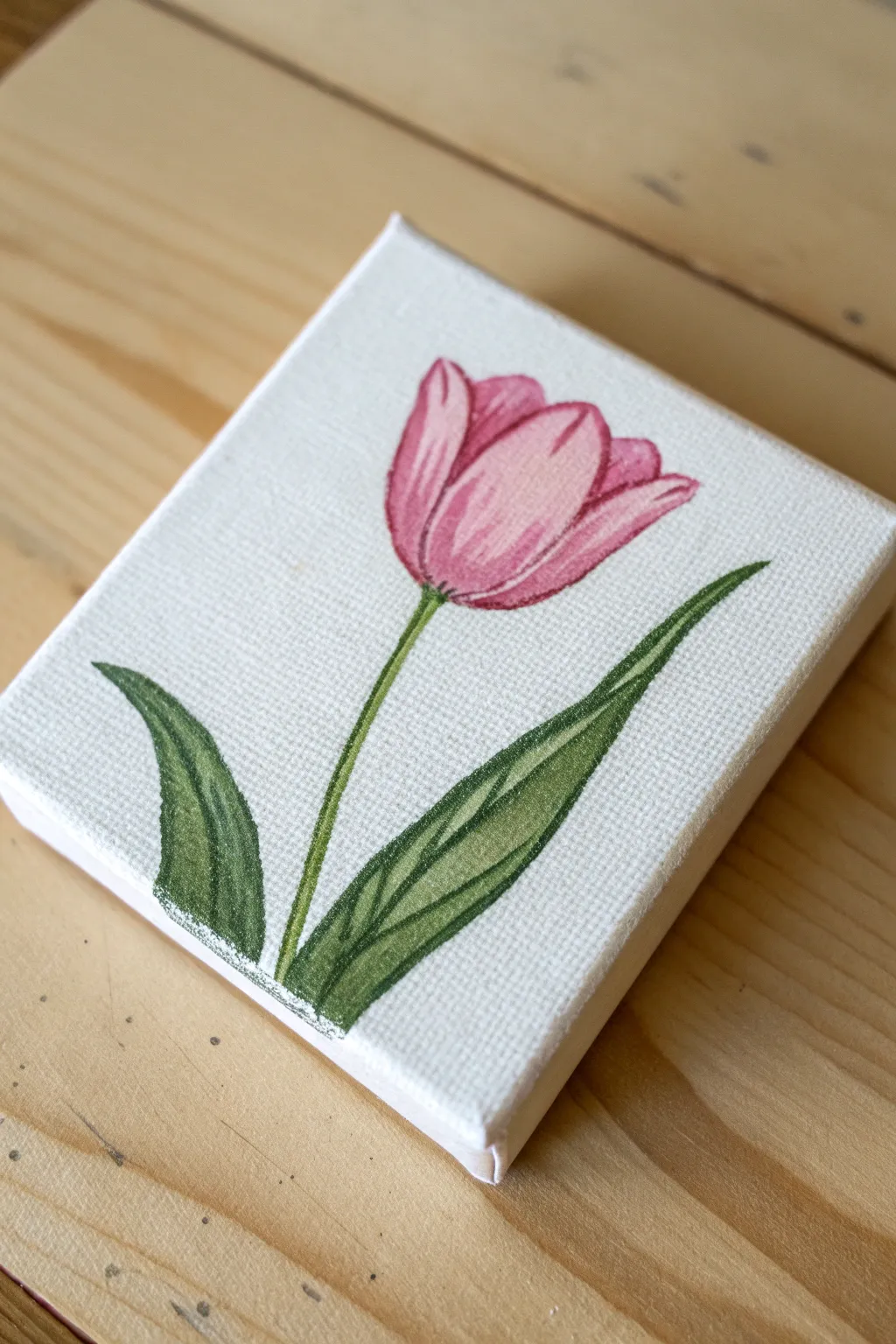
This charming project captures the delicate beauty of a single pink tulip on a clean white background. By using a clever layering technique for the petals and leaves, you will create a sense of depth that makes the flower pop right off the canvas.
Step-by-Step Tutorial
Materials
- Small square canvas (e.g., 4×4 or 6×6 inches)
- Acrylic paints: Titanium White, Magenta/Pink, Sap Green, Dark Green (or mix Sap Green with a touch of Black/Blue)
- Small round brushes (sizes 2 and 4)
- Fine liner brush (size 0 or 00)
- Pencil and eraser
- Palette or paper plate
- Water cup and paper towels
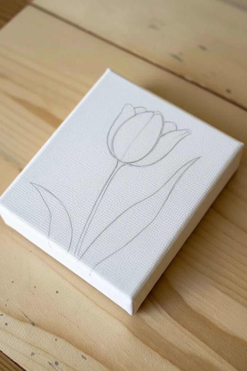
Step 1: Sketching the Flower
-
Center the flower head:
Start by lightly sketching the tulip bloom in the upper center of your canvas. Draw a simple ‘U’ shape for the base of the flower head, keeping your pencil lines very faint so they won’t show through the pink paint later. -
Define the petals:
Complete the flower head by drawing three main petal shapes. Draw a large central petal that is slightly rounded at the top, then add two side petals that curve inward to meet it, creating a closed cup shape. -
Draw the stem:
From the bottom center of the flower head, draw a single, slightly curved line extending down toward the bottom edge of the canvas. Add a second parallel line very close to it to give the stem some thickness. -
Add the leaves:
Sketch two long, tapered leaves starting from the bottom of the stem. Make the leaf on the right larger and taller, curving gently away from the flower, while the left leaf can be shorter and slightly wider.
Fixing Translucent Paint
If your pink or white paint looks streaky or see-through, let the first layer dry completely (about 10 mins). Apply a second thin coat rather than piling on thick wet paint, which creates lumps.
Step 2: Painting the Pink Bloom
-
Base coat the petals:
Mix a soft pink color using Magenta and plenty of Titanium White. Use your size 4 round brush to fill in the entire flower head shape. Don’t worry about shading yet; just get a solid, opaque layer of color down. -
Create the shadows:
While the base is drying, mix a darker version of your pink by adding more Magenta and a tiny touch of water to improve flow. Outline the individual petals with this darker shade using your fine liner brush to separate them. -
Blend the gradients:
Add shading to the bottom of the flower cup where the petals meet the stem. Use a damp, clean brush to gently pull this darker pink upward into the pale pink, creating a soft gradient. -
Highlight the tips:
Load your small round brush with pure white or very pale pink. Add highlights to the top edges and the center of the middle petal to simulate light hitting the curve of the flower.
Step 3: Adding Greenery
-
Paint the stem:
Using your fine liner brush and sap green, carefully trace the stem lines you drew earlier. Keep your hand steady and try to execute this in one or two smooth strokes. -
Fill the leaves:
Switch back to the size 2 or 4 round brush. Paint both leaves with a base coat of Sap Green. Ensure you cover the canvas texture thoroughly, painting within your pencil lines. -
Add leaf shadows:
This is the key step for the ‘two-tone’ look. Take your Dark Green paint and apply it to one vertical half of each leaf. I usually paint the shadow on the side of the leaf closest to the stem. -
Blend the leaf tones:
Before the paint dries completely, use a slightly damp brush to soften the line where the light and dark greens meet. This shouldn’t be a perfect blend; seeing the distinct sections gives the leaf its folded appearance. -
Define the veins:
If you want extra detail, use your liner brush and the darkest green to paint a very thin central vein line up the middle of the large leaf.
Try Watercolor Style
Make the acrylics look like watercolor by mixing them with more water (or glazing medium). Paint on a canvas panel instead of stretched canvas for a smoother texture that mimics paper.
Step 4: Final Touches
-
Clean up edges:
Once the flower is dry, look at the white background. If you accidentally smudged any paint outside the lines, use Titanium White to carefully paint over the mistake and crisp up the edges. -
Deepen contrast:
Check your tulip petals. If the separation isn’t clear enough, go back in with your darkest pink mixture and reinforce the lines between the petals for a bolder illustrative look. -
Let it dry:
Allow the canvas to sit undisturbed for at least an hour to ensure all layers, especially the thicker white corrections, are completely dry.
Prop up your lovely little canvas on a desk easel or hang it in a group for a fresh burst of floral color
Flowery Hills With Dabbed Blooms
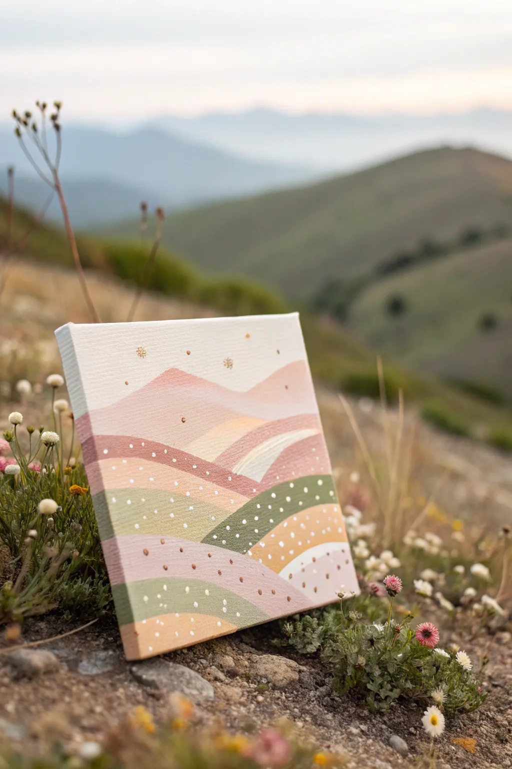
Capture the serenity of a mountain meadow with this stylized landscape painting, featuring soft pastel hills and whimsical dotted textures. The gentle layering of blush pinks, sage greens, and warm tans creates a calming, modern piece perfect for beginners.
Step-by-Step
Materials
- Small square stretched canvas (e.g., 6×6 or 8×8)
- Acrylic paints (Titanium White, Sage Green, Olive Green, Blush Pink, Dusty Rose, Warm Ochre/Tan)
- Flat shader brushes (medium and small)
- Round detail brush (size 1 or 2)
- Dotting tool or back of a paintbrush
- Palette or paper plate
- Cup of water and paper towels
Step 1: Planning and Sky
-
Prime the Surface:
Start with a clean canvas. If your canvas feels rough, apply a thin coat of gesso and let it dry, or simply ensure your surface is free of dust. -
Mix the Sky Color:
Create a very pale, creamy off-white for the sky. Mix a large amount of Titanium White with just a tiny droplet of Warm Ochre or Blush Pink to warm it up so it isn’t stark white. -
Paint the Sky:
Using a medium flat brush, paint the top third of the canvas with your sky mixture. Use horizontal strokes for a smooth finish and let this layer dry completely.
Uneven Dots?
If your dots look like Hershey’s Kisses with peaks, the paint is too thick. Mix a tiny drop of water into your puddle to thin it slightly for flatter, rounder dots.
Step 2: Layering the Hills
-
Outline the Background Peaks:
Mix a soft, light pink using White and Dusty Rose. With a small flat brush, paint two gentle triangle shapes overlapping the sky to form the distant mountains. -
Fill the Mountains:
Fill in these mountain shapes solidly. Don’t worry about the bottom edge being perfect, as it will be covered by the next layer. -
Create the First Green Hill:
Mix Sage Green with a little White to soften it. Paint a rolling hill shape that starts from the left side and curves downward, overlapping the base of your pink mountains. -
Add Warmth with Tan:
Using your Warm Ochre mixed with White (to make a sand color), paint a second hill slope coming from the right side, tucking it under or over the green hill depending on your preference. -
Paint the Foreground Hills:
Continue creating overlapping mound shapes moving down the canvas. Alternate your colors: use a darker Olive Green for depth, then a Blush Pink layer, and finally a Tan layer at the very bottom. -
Refine the Edges:
Once the initial blocks of color are dry, go back with a small round brush to neaten the upper curves of each hill. Crisp edges really make this style pop. -
Add the Stream (Optional):
Notice the small white patch in the middle right? Paint a small, curved swoosh of off-white amidst the hills to suggest a distant path or stream reflecting light.
Color Harmony Tip
To ensure all your colors look good together, mix a tiny bit of your ‘white sky’ color into every single hill color. This creates a cohesive pastel palette.
Step 3: Detailing and Dotted Blooms
-
Mix Dotting Colors:
Prepare small puddles of paint for your dots. You’ll want bright White, a deep Gold or Copper (if you have it, otherwise dark Ochre), and a dark Green. -
Test Your Tool:
I always test my dotting tool on a scrap piece of paper first. Dip the handle end of a paintbrush into the paint and practice making consistent dots. -
Dot the Dark Green Hill:
Start on the darkest green hill section. Apply random white dots to simulate a field of daisies. Keep the spacing somewhat irregular for a natural look. -
Add Texture to Pink Hills:
On the pink sections, use your dark ochre or gold paint to add tiny dots. These can represent rocks or dried wildflowers. -
Vary Dot Sizes:
For visual interest, use a smaller tool (like a toothpick) to add tinier dots in between the larger ones on the bottom-most tan hill. -
Add Sky Details:
Using the tip of your smallest brush or a toothpick, add a few tiny gold star-like specks or dots in the sky area above the mountains. -
Paint the Sides:
Don’t forget the edges of your canvas. Extend the lines of the hills around the sides for a professional, gallery-wrapped look. -
Final Inspection:
Let the dots dry completely—they take longer because the paint is thicker. Check for any translucent spots in your hills and add a second coat if needed.
Place your finished canvas on a small easel or shelf to bring a breath of fresh mountain air into your home
Cute Strawberry With Simple Highlights
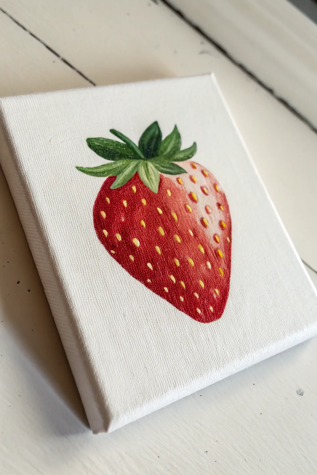
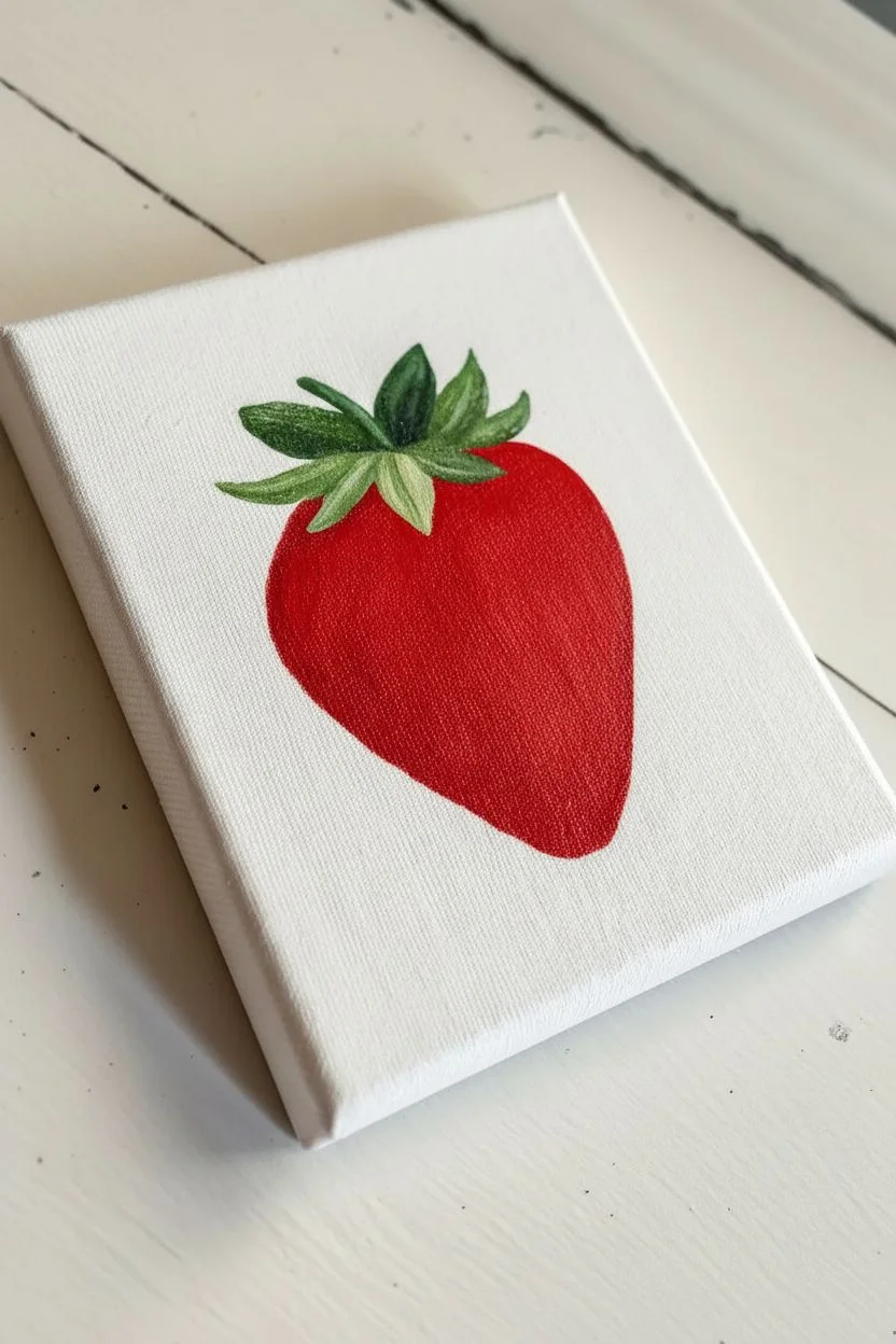
Capture the fresh, juicy appeal of a ripe strawberry with this charming little canvas study. By focusing on simple blending and rhythmic seed placement, you’ll create a realistic yet stylized fruit that pops against the crisp white background.
Detailed Instructions
Materials
- Small square canvas (e.g., 4×4 or 6×6 inch)
- Acrylic paints: Bright Red, Deep Red (Crimson), White, Yellow Ochre, Lemon Yellow, Sap Green, Dark Green
- Small flat brush (size 4 or 6)
- Small round brush (size 2)
- Fine detail liner brush (size 0 or 00)
- Pencil and eraser
- Palette and water cup
- Paper towels
Step 1: Sketching and Base Layers
-
Outline the Shape:
Begin by lightly sketching a rounded heart shape in the center of your canvas. The top should be slightly flatter where the leaves attach, and the bottom should taper to a gentle point. -
Add the Cap:
Sketch the leafy green cap (calyx) at the top. Draw 5-7 individual leaves splaying outward, some curving up and some hugging the fruit body. -
Base Red Coat:
Using your flat brush, fill in the entire body of the strawberry with Bright Red. Don’t worry about shading yet; just get a solid, opaque layer down. Let this dry completely. -
Base Green Coat:
Fill in the leaves with a mix of Sap Green and a touch of Yellow. This lighter base will help the darker details stand out later.
Paint Getting Muddy?
If your red colors are blending into a brown mess, stop and let the base layer dry completely. Acrylics layer best when dry. Clean your brush water often!
Step 2: Shading and Form
-
Create the Shadow:
Mix a small amount of Deep Red or Crimson with your Bright Red. Apply this darker shade along the left side and bottom curve of the berry to give it roundness. -
Blend the Gradient:
While the paint is still wet, gently blend the dark red into the bright red center using a clean, slightly damp brush to avoid harsh lines. -
Establish the Highlight Zone:
Mix a little White with Bright Red to make a soft pink. Paint a curved highlight area on the upper right side of the strawberry, blending it outward into the main red body. -
Deepen Leaf Shadows:
Use your round brush and Dark Green paint to add shadows where the leaves overlap and where they attach to the berry stem area. -
Leaf Highlights:
Mix Lemon Yellow with Sap Green. Paint thin strokes along the center and edges of the leaves to suggest veins and light hitting the tips.
Step 3: Seeds and Details
-
Mark Seed Positions:
Switch to your smallest detail brush. Using a dark reddish-brown (mix Deep Red with a tiny dot of Green), paint small, teardrop-shaped divots all over the berry surface. -
Stagger the Pattern:
Arrange these divots in vague diagonal rows, but keep them slightly irregular so it looks organic rather than like a wallpaper pattern. -
Paint the Seeds:
Clean your detail brush and pick up Yellow Ochre mixed with a tiny bit of White. Paint a small oval inside each dark divot you just created. -
Seed Placement Tip:
I usually offset the yellow seed slightly to the right within the dark divot; this creates the illusion of the seed sitting inside a small depression. -
Add Specula Highlights:
This is the secret sauce: Take pure White paint on your finest brush and add tiny dots or short dashes on the ‘shoulder’ of the strawberry (the upper right area) near the seeds to make it look wet and glossy. -
Refine the Leaves:
Go back to the green cap. If needed, add a fine line of very light green along the topmost edges of the leaves for sharpness. -
Final Cleanup:
If any red or green strayed onto the white background, use white paint to carefully touch up the negative space around the fruit for a crisp finish.
Make It Pop
Add a very faint gray shadow on the canvas underneath the strawberry’s tip. This grounds the object so it doesn’t look like it’s floating in space.
Step back and admire your fresh, summery creation, ready to hang in a kitchen nook
Citrus Slice Top View With Segments
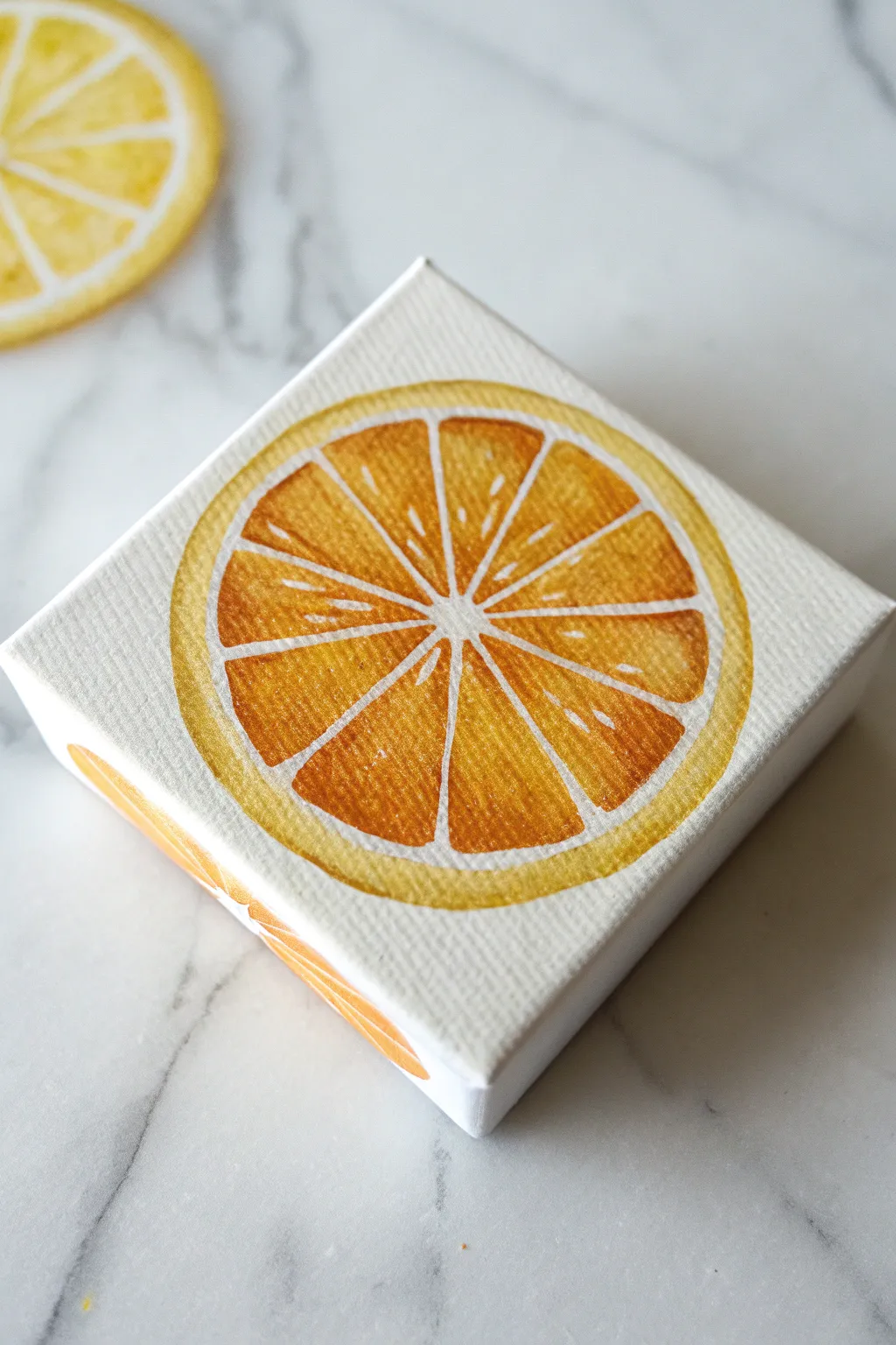
Bring a squeeze of summer to your walls with this bright and juicy orange slice painted on a miniature canvas. The design focuses on clean lines and translucent segments, creating a modern, graphic look that’s perfect for a kitchen or dining nook.
Step-by-Step
Materials
- Small square canvas (e.g., 4×4 or 5×5 inch)
- Acrylic paints (Titanium White, Cadmium Yellow, Cadmium Orange, Burnt Sienna)
- Pencil (HB or lighter)
- Drawing compass or a circular object to trace (like a cup)
- Ruler
- Small flat brush (size 4 or 6)
- Fine liner brush (size 0 or 00)
- Palette or paper plate
- Water cup and paper towels
Step 1: Sketching the Layout
-
Find the Center:
Begin by lightly marking the exact center of your square canvas with a pencil. You can find this by gently placing a ruler diagonally from corner to corner and making a tiny mark where they intersect. -
Draw the Outer Rind:
Using a drawing compass set to nearly the width of the canvas, place the point on your center mark and draw a large circle. This will form the outer edge of the orange peel. -
Create the Inner Boundary:
Adjust your compass or find a slightly smaller circular object to trace a second circle inside the first one. Leave about a quarter-inch gap between the two lines to represent the white pith of the fruit. -
Mark the Core:
Draw a very small circle right in the center, about the size of a pea. This acts as the central core where all the segments will meet. -
Divide into Segments:
Use a ruler to draw straight lines radiating from the center core to the inner circle boundary. Start with a vertical line, then a horizontal one to make a cross, and then bisect each quadrant to create eight equal triangular segments. -
Round the Corners:
The segments of an orange aren’t perfect triangles. Sketch rounded corners inside each pie slice shape you just drew, softening the edges so they look like organic fruit sacs rather than geometric shapes.
Wobbly Lines?
If you struggle with steady hands for the white lines, use a white paint pen or an acrylic marker instead of a brush for the final detailing.
Step 2: Painting the Fruit
-
Base Color Mixing:
Mix a vibrant orange hue on your palette. Combine Cadmium Orange with a touch of Cadmium Yellow to make it bright and zesty. -
Paint the Rind:
Using your small flat brush, carefully fill in the outer ring (between your two largest circles) with the orange mixture. Ensure you get crisp edges along the outside. -
Extend to Sides:
If you are using a gallery-wrapped canvas, continue the orange paint from the rind over the edges and paint the sides of the canvas for a finished, professional look. -
Fill the Segments:
Switch to a slightly smaller brush if needed. Fill in each of the eight triangular segments with the same orange mix. Be careful to leave the white canvas showing between the segments and the rind; these white lines form the essential pith. -
Deepen the Tone:
While the first layer is drying, mix a darker version of your orange by adding a tiny speck of Burnt Sienna or just using pure Cadmium Orange. Painted wet-on-dry or slightly damp, apply this darker tone near the outer wide edge of each wedge to create depth. -
Add Texture Detail:
Paint thin, faint streaks of the darker orange radiating from the center outward within each segment. This mimics the fibrous texture of citrus fruit.
Make a Fruit Salad
Paint two more canvases in the same style but change the palette: use bright yellow for a lemon slice and a cool yellow-green for a lime slice.
Step 3: Highlights and Refining
-
Refine the Pith:
Use your fine liner brush and Titanium White paint to clean up the lines between the segments. I find it helpful to thin the white paint slightly with water so it flows smoothly like ink. -
Sharpen the Center:
Fill the small central circle with white paint, blending it seamlessly into the radiating white lines that separate the segments. -
Mix a Highlight Color:
Create a very pale yellow-orange by mixing a large amount of White with a tiny dot of Yellow and Orange. -
Add Juicy Shine:
Using the fine liner brush, add tiny, scattered dashes or ‘seeds’ of this pale highlight color inside the orange segments. Place them randomly to suggest light catching the moist fruit sacs. -
Enhance the Rind:
Add a subtle highlight to the outer orange ring. Paint a very thin, lighter orange line along the top left curve of the rind to suggest a light source coming from that direction. -
Final Inspection:
Step back and check your symmetry. If any orange spilled into the white areas, cover it with a dab of opaque white paint once the orange is fully dry.
Now let your artwork dry completely before hanging it up to brighten your space
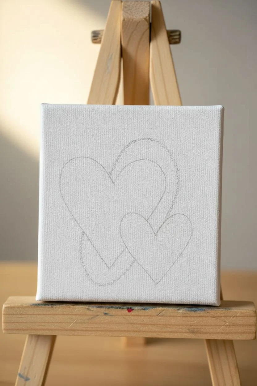
Two Hearts With a Minimal Ring Accent
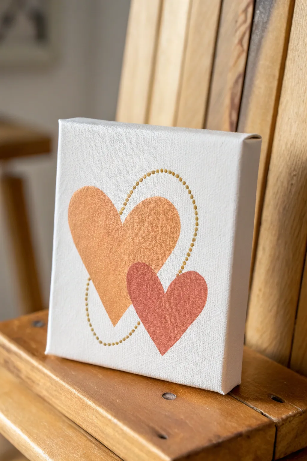
This charming little project features two distinct heart shapes, one nestled slightly in front of the other, linked together by a delicate ring of gold dots. The warm orange and coral tones create a cozy, vintage feel that looks beautiful on a shelf or desk.
Step-by-Step Guide
Materials
- Small square canvas (e.g., 4×4 or 6×6 inch)
- Acrylic paints: warm orange, coral or muted red, and metallic gold
- Pencil for sketching
- Small flat paintbrush (size 4 or 6)
- Small round paintbrush (size 2)
- Dotting tool or back of a paintbrush handle
- Palette or paper plate
- Cup of water and paper towels
Step 1: Planning and Sketching
-
Prepare the Background:
If your canvas isn’t pre-primed or you want an ultra-smooth finish, apply a thin coat of white acrylic paint first. Let it dry completely before starting your sketch. -
Sketch the Large Heart:
Using a pencil, lightly draw the larger heart shape on the left side of the canvas. The top left lobe should sit higher, and the point should angle slightly toward the bottom center. Keep your lines very faint so they don’t show through the paint. -
Sketch the Small Heart:
Draw the smaller heart overlapping the lower right section of the large heart. Position it so the bottom point of the small heart is the lowest vivid element on the canvas. -
Outline the Ring:
Lightly sketch a circle or oval shape that loops through both hearts. This will serve as your guide for the gold dots later, ensuring the dotted line flows naturally behind the hearts.
Step 2: Painting the Base Shapes
-
Mix Your Orange:
Squeeze out your warm orange paint. If it’s too bright, mix in a tiny drop of white or yellow ochre to soften it. You want a creamy, opaque consistency. -
Fill the Large Heart:
Using your flat brush, carefully fill in the larger heart shape. Use smooth strokes following the curve of the heart to minimize texture. Be precise around the edges. -
Double Coat for Opacity:
Acrylics can be translucent, especially yellows and oranges. Let the first coat dry to the touch, then apply a second coat to ensure the color is solid and even. -
Mix the Coral Color:
While the orange dries, prepare your coral or muted red shade. It should be darker than the orange to create visual depth. -
Paint the Small Heart:
Fill in the smaller heart shape with the coral paint. Carefully paint over the area where it overlaps the orange heart to create the illusion that the small heart is in the foreground. -
Refine the Edges:
Switch to your small round brush to touch up any uneven edges on both hearts. Sharp, clean lines are key to this minimalist look. -
Allow Full Drying Time:
Let both hearts dry completely. If the paint is wet, adding the gold accent nearby might cause accidental smudging.
Fix Smudged Edges
If you paint outside the lines, wait for the mistake to dry completely. Then, use white paint on a small brush to carefully ‘erase’ the error by painting over it.
Step 3: Adding the Gold Accent
-
Prepare the Gold Paint:
Shake your metallic gold paint well. Squeeze a small amount onto your palette. It needs to be fluid enough to leave a round dot, but thick enough not to run. -
Test Your Dotting Tool:
Dip a dotting tool or the back of a paintbrush handle into the gold paint. Practice one or two dots on a scrap piece of paper to gauge the size. -
Start the Dot Chain:
Establish the curve by placing dots along your pencil guideline. Start at the top of the large heart and work your way around the loop. -
Bridge the Gap:
Continue dotting along the line where it passes ‘behind’ the hearts. Avoid painting dots directly on top of the hearts unless you want the ring to look like it’s in front. The example shows the ring interacting with the negative space primarily. -
Maintain Spacing:
Try to keep the spacing between dots consistent. I find it helps to take a breath between each dot application to keep a steady rhythm. -
Clean Up Pencil Marks:
Once the gold dots are 100% dry (metallics can take longer), gently erase any visible pencil marks from your initial sketch.
Clean Dot Hack
If you don’t have a dotting tool, a Q-tip with the cotton removed (just the stick) or a toothpick with the tip cut off makes perfectly round, consistent paint dots.
Place this sweet artwork on a mini easel or hang it as part of a gallery wall for a lovely pop of color
Heart-Shaped Flame Candle With Cozy Glow
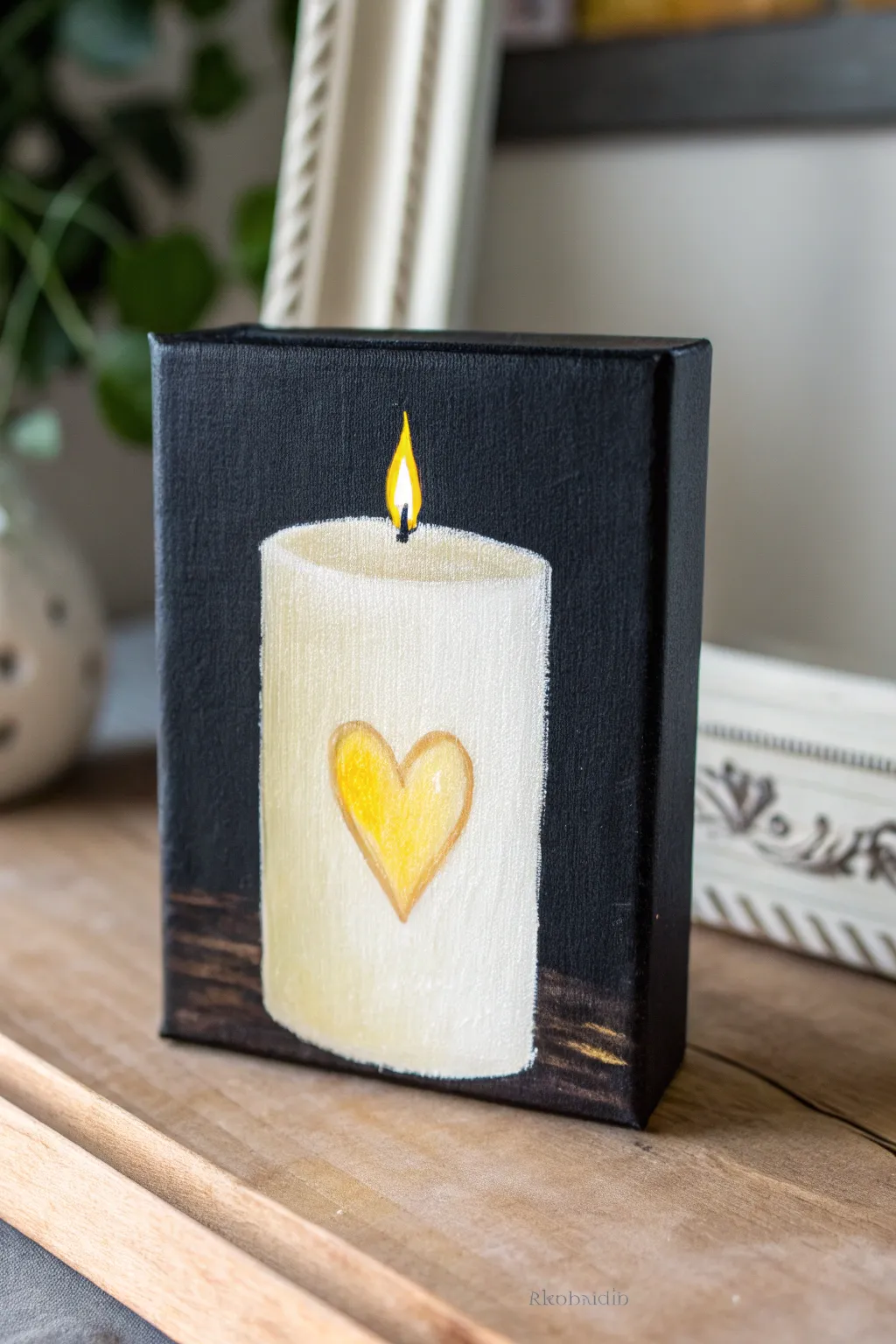
Capture the warmth of a candle’s glow with this charming acrylic painting on a mini canvas. The stark black background makes the creamy white wax and golden heart motif pop, creating a cozy piece of decor perfect for any bookshelf or mantel.
Step-by-Step
Materials
- Small stretched canvas (e.g., 5×7 or 6×8 inches)
- Acrylic paint: Black, Titanium White, Yellow Ochre, Cadmium Yellow (or Lemon Yellow), Burnt Umber
- Flat brush (medium size) for background
- Filbert brush (small size) for the candle body
- Round detail brush (fine point) for the flame and heart
- Palette or paper plate
- Cup of water and paper towels
- Pencil (optional)
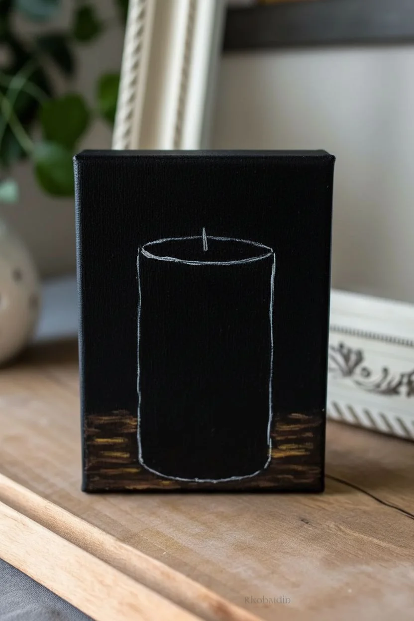
Step 1: Setting the Scene
-
Prepare the Background:
Start by painting the entire canvas surface with a solid coat of black acrylic paint. Don’t forget to paint the sides and edges for a finished, gallery-wrapped look. -
Add a Wooden Base:
While the black is mostly dry but slightly tacky, mix a small amount of Burnt Umber with black. Using the flat brush, create horizontal, rough strokes across the bottom quarter of the canvas to simulate a dark wooden table surface. -
Highlight the Wood:
Dip just the corner of your brush into a tiny bit of Yellow Ochre or White. Add a few very sparse, thin horizontal highlights to the wooden area to suggest grain and reflected light. -
Outline the Candle:
Once the background is completely dry, you can lightly sketch the outline of the candle with a pencil or use a thin brush with watered-down white paint. Draw a vertical rectangle with curved top and bottom edges to give the cylinder a 3D effect.
Paint Opacity Tip
Yellow and white can be transparent on black. Use a coat of white/grey first as a primer under the candle and flame for vibrant colors.
Step 2: Painting the Candle
-
Base Coat the Wax:
Mix Titanium White with a tiny drop of Yellow Ochre to create a warm, creamy off-white color. Fill in the candle shape using vertical strokes with your filbert brush. -
Create Depth:
While the white paint is still wet, blend a tiny amount of grey (white mixed with a dot of black) or light brown along the left and right vertical edges of the candle. I find this creates a nice shadow that emphasizes the cylindrical shape. -
Define the Top:
Paint the top oval of the candle with a slightly brighter white mixture. Keep the back edge of the oval slightly darker to separate the rim from the body. -
Add Texture:
Let the paint dry partially, then dry-brush a little pure white vertically down the center of the candle to act as a highlight. -
Paint the Heart:
Using your small round brush and Yellow Ochre, paint a simple heart shape in the center of the candle. Keep the outline visible but soft. -
Fill the Heart:
Fill the inside of the heart with a brighter Cadmium Yellow, blending it into the ochre outline so it looks embedded in the wax. -
Highlight the Heart:
Add a small swoosh of white on the upper left curve of the heart to make it look glossy and dimensional.
Make It Sparkle
Mix a tiny pinch of gold glitter into the yellow paint for the heart or the flame to make the artwork actually shimmer in the light.
Step 3: Adding the Flame
-
Draw the Wick:
Use your finest detail brush and black paint to draw a very small, thin line curving up from the center of the candle top. -
Shape the Flame:
Paint a teardrop shape around the wick using bright yellow. Start wider at the bottom and taper to a sharp point at the top. -
Intensify the Glow:
Add a dot of pure white right in the center of the yellow flame, near the wick. This is the hottest part of the fire and makes it look luminous. -
Add an Orange Halo:
If you have orange (or mix red and yellow), gently glaze the very outer tip of the flame for extra realism. -
Final Touches:
Review your edges. If the white candle paint looks uneven against the black background, use a small brush with black paint to clean up the silhouette precisely.
Allow your painting to dry completely before displaying it to bring a permanent warm light to your room
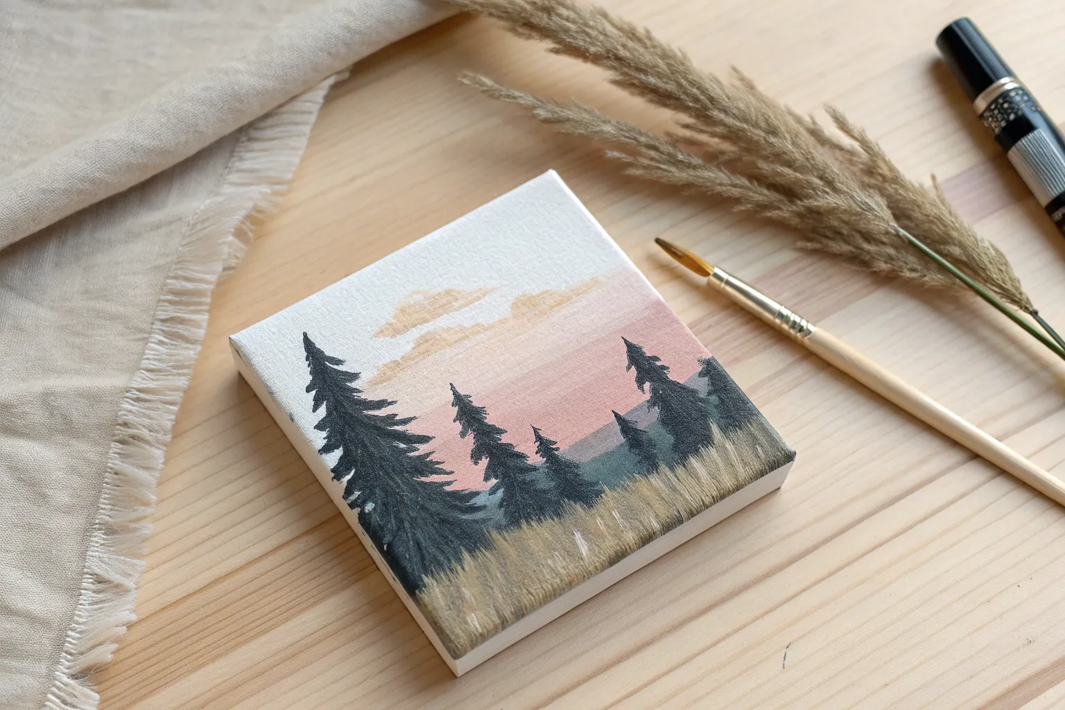
Winter Forest of Pine Silhouettes and Snow
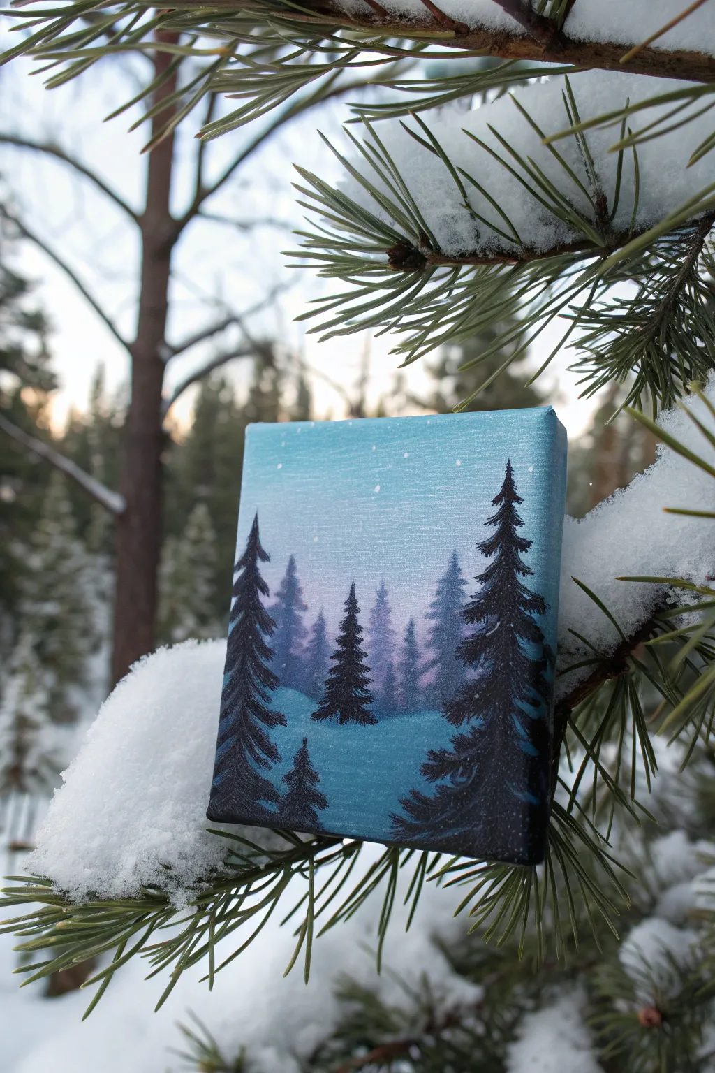
Capture the serene beauty of a snowy evening with this charming mini canvas project. Using a simple gradient technique and layered silhouettes, you’ll create a misty, depth-filled winter forest that fits in the palm of your hand.
How-To Guide
Materials
- Small rectangular canvas (e.g., 4×6 or 5×7 inches)
- Acrylic paints: Titanium White, Phthalo Blue (or similar scenic blue), Dioxazine Purple, Black
- Flat shader brush (approx. 1/2 inch)
- Small round brush (size 0 or 1)
- Small fan brush (optional, for texture)
- Cup of water and paper towels
- Palette or paper plate
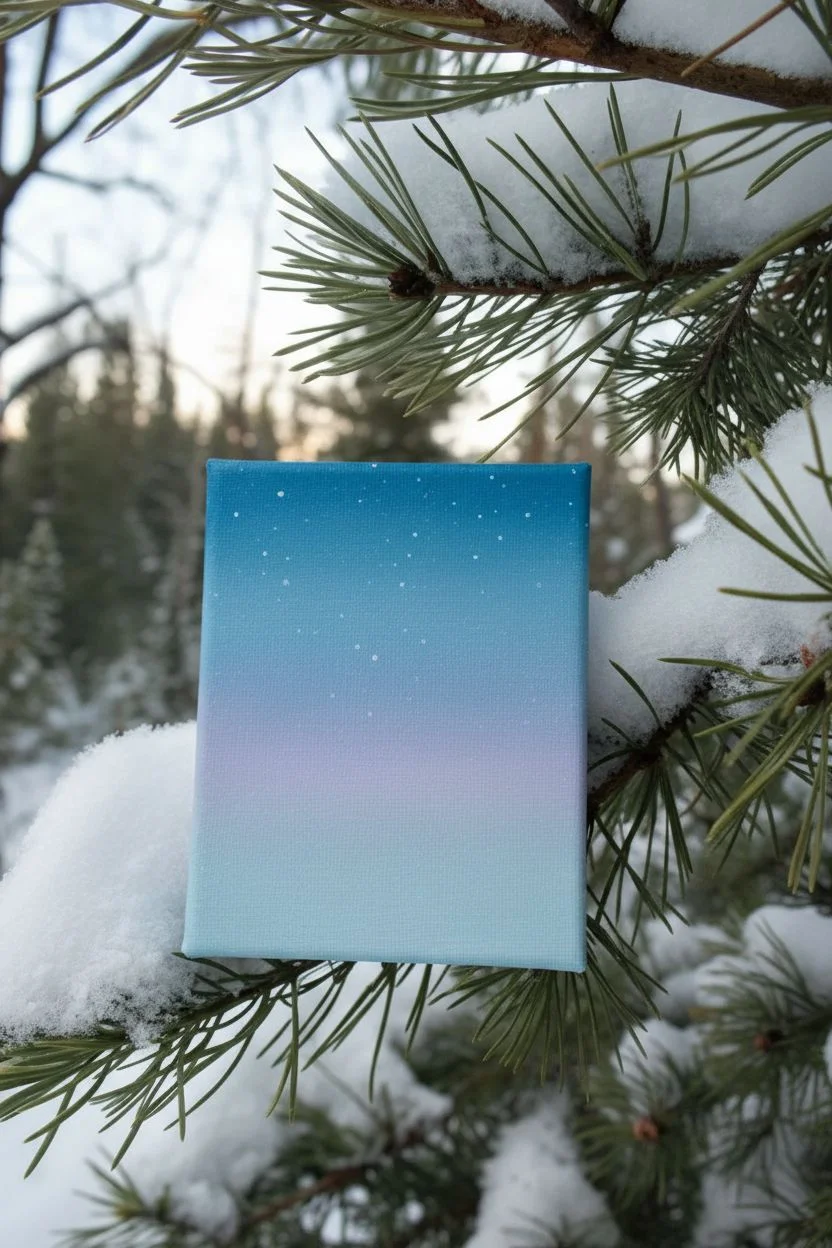
Step 1: Setting the Atmospheric Sky
-
Prepare the gradient colors:
On your palette, lay out a generous amount of Titanium White, a smaller amount of Phthalo Blue, and a touch of Dioxazine Purple. Create a graduating scale of mixes: a very pale sky blue, a medium blue, and a slightly purple-tinted deeper blue. -
Paint the upper sky:
Using your flat shader brush, start at the very top of the canvas with your medium blue mix. Paint horizontal strokes back and forth, ensuring you cover the top edge of the canvas as well for a finished look. -
Blend downwards:
Without cleaning your brush, pick up some of the paler white-blue mix. Blend this into the bottom of your first stripe, working your way down the canvas to create a smooth transition. The sky should get lighter as it approaches the horizon line. -
Add the twilight horizon:
Near the middle to lower-third of the canvas (where the tree line will be), mix a tiny bit of purple into your white and blend this soft lavender hue horizontally. This creates that magical ‘gloaming’ light often seen in winter evenings. -
Create the snowy ground:
Clean your brush thoroughly. Mix white with the tiniest speck of blue to create a cool snow color. Paint the bottom third of the canvas, blending the top edge slightly into the purple horizon line to create a sense of distance and mist. -
Let it dry:
Allow this background layer to dry completely. Acrylics on canvas dry relatively fast, but it needs to be dry to the touch before we add sharp details.
Step 2: Building the Forest Layers
-
Mix the distant tree color:
For the trees furthest away, you don’t want solid black. Mix a ‘ghost’ color using your blue, purple, and a fair amount of white. It should be just slightly darker than your sky background. -
Paint the background treeline:
Using the tip of your round brush (or the corner of a small flat brush), dab in vertical shapes along the horizon line. Keep these indistinct and varying in height to simulate a distant forest wall appearing through the mist. -
Darken the mix for mid-ground:
Add more blue and a little black to your ‘ghost’ mixture. Paint a few individual pine trees slightly lower on the canvas than the background layer. Use a tapping motion to create the texture of pine needles. -
Refine the tree shape technique:
To paint these pines, draw a faint vertical line for the trunk first. Then, starting from the top, tap your brush in a zigzag pattern, getting wider as you move down the trunk. -
Create the foreground silhouettes:
Now, load your small round brush with pure Black paint. Choose two or three spots in the immediate foreground (the very bottom of the canvas) for your main trees. One large tree on the right and a medium one on the left works well for balance. -
Detail the main trees:
Paint the black trees carefully. Start with a thin, sharp peak at the top. Use short, downward-curving strokes to mimic heavy, snow-laden boughs. Make sure these are the darkest and most detailed elements on the canvas. -
Ground the trees:
At the base of your black trees, create a small mound of shadow. Use a watered-down blue-black mix to glaze a small shadow under the tree, anchoring it to the snowy ground so it doesn’t look like it’s floating.
Muddy Skies?
If your sky blending looks muddy, stop overworking it. Let it dry completely, then apply a second thin layer. Wet-on-dry blending is often easier for beginners than wet-on-wet.
Step 3: Final Winter Touches
-
Highlight the snow:
Clean your brush and pick up pure Titanium White. Gently dry-brush (wipe most paint off on a paper towel first) some highlights onto the snowy ground, specifically in the open spaces between trees to make the snow look drifts. -
Add falling snow:
Thin down a bit of white paint with water until it’s inky. Dip a small brush or even a toothbrush into it, and gently flick the bristles with your finger to splatter tiny white speckles across the sky and trees. -
Paint specific stars:
I like to take the very tip of my smallest brush (or a toothpick) and dot in a few larger, distinct stars or snowflakes in the upper sky area to add intentional sparkle. -
Paint the canvas edges:
Don’t forget the sides of your canvas! Extend your sky and ground colors around the edges of the canvas block for a professional, finished appearance that looks great without a frame.
Pro Tip: Depth of Field
Make distant trees lighter/bluer and foreground trees darker/blacker. This ‘atmospheric perspective’ trick instantly adds miles of depth to a tiny canvas.
Now you have a peaceful winter scene that creates a calm atmosphere wherever you choose to display it
Geometric Waves Pattern With Limited Colors
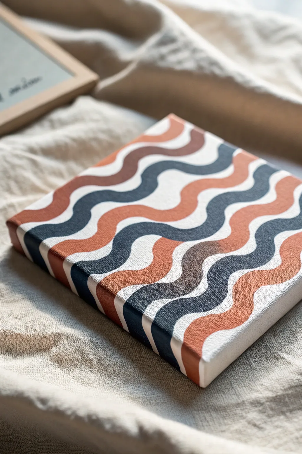
Embrace the soothing rhythm of the ocean with this geometric wave pattern that evokes a modern, bohemian aesthetic. Using a restricted color palette of terracotta, deep navy, and warm browns, you’ll create a sophisticated piece that looks deceptively simple but packs a visual punch.
Detailed Instructions
Materials
- Small square canvas (e.g., 6×6 or 8×8 inches)
- Acrylic paints: Burnt Sienna, Navy Blue, Raw Umber, Titanium White
- Pencil (HB or lighter)
- Small flat brush (size 4 or 6)
- Fine liner brush (size 0 or 1)
- Palette or paper plate
- Cup of water and paper towels
- Clean eraser
Step 1: Preparation & Sketching
-
Prepare the Base:
Start with a clean, primed canvas. If you want the white stripes to be extremely crisp, apply a fresh coat of Titanium White over the entire surface first and let it dry completely. -
Mark Guidelines:
Lightly mark small ticks on the left and right edges of your canvas at equal intervals. These will serve as the starting and ending points for your wavy lines to ensure the pattern stays consistent. -
Sketch the Waves:
Using a pencil, draw smooth, undulating wave lines connecting your left tick marks to the right ones. Aim for a gentle ‘S’ curve shape for each line. -
Mirror the Curves:
Continue drawing these parallel wave lines down the canvas. Try to keep the distance between lines roughly consistent, though slight variations add a hand-painted charm. Don’t forget to extend the lines over the edges of the canvas for a gallery-wrapped look. -
Review the Pattern:
Step back and check your sketch. The waves should flow rhythmically. Lightly erase and adjust any lines that look too jagged or uneven before you start painting.
Use Flow Aid
Mix a drop of water or acrylic flow improver into your paint. This helps the brush glide smoothly around curves, creating sharper, cleaner lines without drag.
Step 2: Color Application
-
Mix Your Palette:
Squeeze out your paints. Mix a little Titanium White with Burnt Sienna to create a softer terracotta tone if the raw color is too dark. Ensure you have a solid Navy Blue and a warm, medium brown ready. -
Plan Your Sequence:
Decide on a repeating color pattern. A good sequence for this look is: White (unpainted), Terracotta, White, Navy Blue, White, Brown. I like to lightly mark a tiny dot of the intended paint color in each sketched lane so I don’t get confused. -
Paint the Terracotta Waves:
Load your flat brush with the terracotta shade. Carefully fill in the designated lanes. Use the flat edge of the brush to create smooth, long strokes along the curve. -
Refine Edges:
Switch to your fine liner brush for the edges of the freshly painted terracotta waves. Trace slowly along your pencil line to make the boundary as crisp as possible. -
Paint the Navy Waves:
Once the terracotta is dry to the touch, load up the Navy Blue. Fill in the assigned wave sections, being careful not to let the wet paint touch any detailed white areas. -
Wrap the Edges:
As you paint each color, continue the stripe around the side of the canvas. This is crucial for that professional, finished object feel seen in the reference image. -
Paint the Brown Waves:
Apply the medium brown or raw umber tone to its specific sections. This neutral tone bridges the gap between the warm orange and cool blue. -
Second Coats:
Acrylics often dry a bit darker or more transparent than they look when wet. Apply a second coat to your colored stripes to ensure solid, opaque coverage without streaks.
Go Metallic
Swap the plain brown stripe for gold or copper metallic paint. The shimmer adds a luxurious, modern twist that catches the light beautifully.
Step 3: Finishing Touches
-
Clean Up Lines:
Inspect your white stripes. If any color bled over the lines, take a clean liner brush with Titanium White and carefully touch up the edges to restore the crisp separation. -
Erase Pencil Marks:
Once the painting is 100% dry—give it a few hours to be safe—gently erase any visible pencil lines that are showing through the white sections. -
Optional Varnish:
For longevity, apply a coat of matte or satin varnish. This unifies the sheen of the different paint colors and protects your new decor piece.
Place your finished canvas on a shelf or hang it as part of a gallery wall for an instant touch of modern art style
Have a question or want to share your own experience? I'd love to hear from you in the comments below!