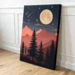
When I’m craving something fun and instantly feel-good, I reach for retro painting ideas—big shapes, groovy color, and that cozy 60s/70s nostalgia. Here are my favorite ways to bring psychedelic patterns, vintage palettes, and throwback vibes into your next piece.
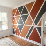
Wavy Checkerboard in Black and Cream
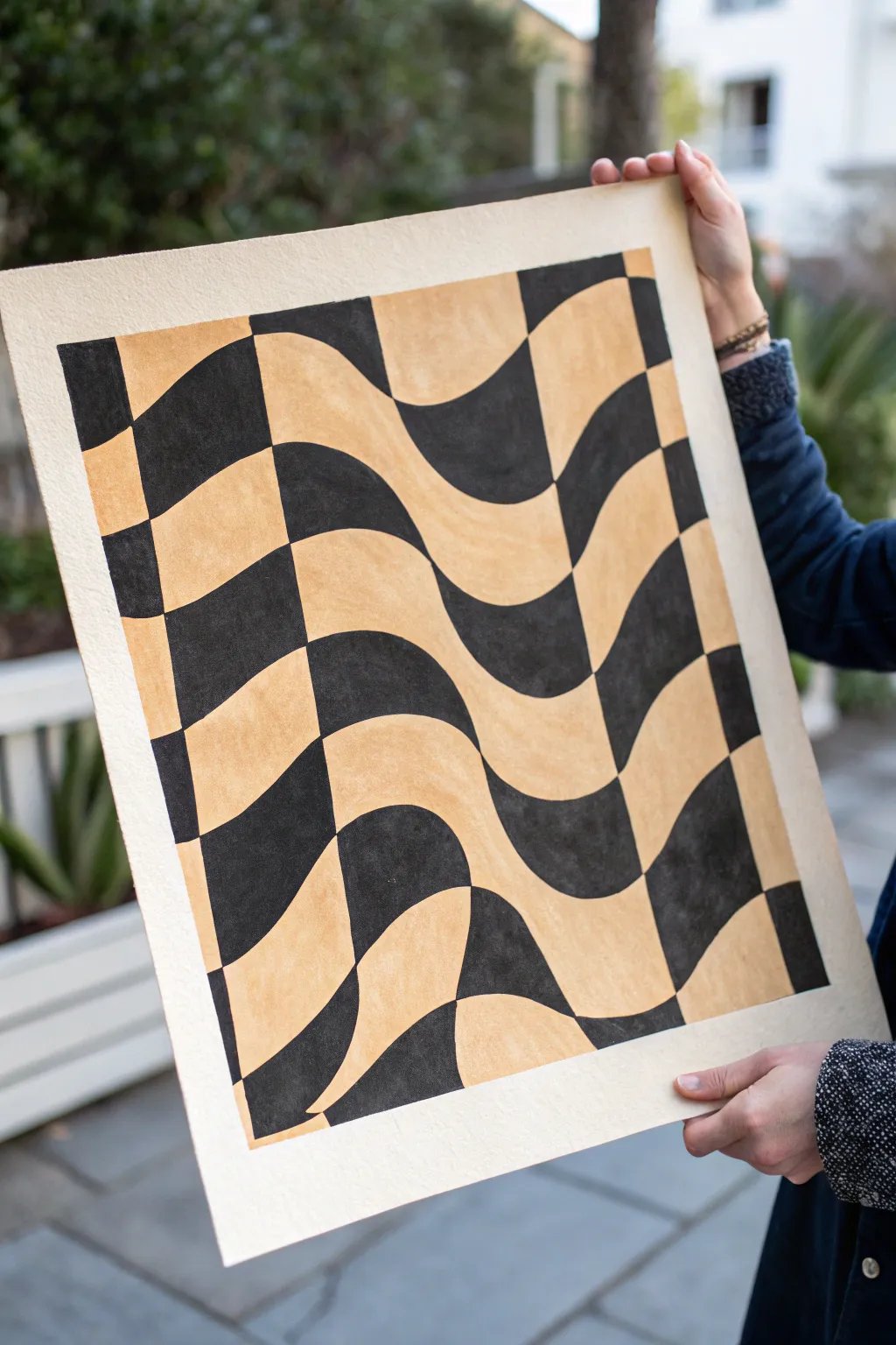
This striking optical art piece takes the classic checkerboard pattern and gives it a fluid, psychedelic twist that feels straight out of the 1960s. The distorted grid creates an illusion of movement and depth, making it a sophisticated yet approachable project for any skill level. Using varied line weights and contrasting tones creates a sculptural effect on the flat page.
Step-by-Step
Materials
- Large sheet of heavyweight watercolor paper or mixed media paper (ideally with deckled edges)
- Pencil (HB or lighter)
- Eraser
- Long ruler or straight edge
- Black gouache or acrylic paint
- Cream or beige gouache or acrylic paint (or mix white with a touch of ochre)
- Flat shader brushes (medium and small sizes)
- Painter’s tape or masking tape
- Palette for mixing
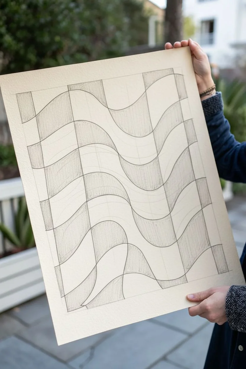
Step 1: Planning the Grid
-
Prepare your paper:
Start by securing your paper to a flat work surface with painter’s tape if needed, though for this specific heavy paper look, you might just want to work flat. If your paper doesn’t have deckled edges and you want that vintage look, you can carefully tear the edges against a ruler before starting. -
Draw vertical guides:
Using your pencil and ruler, lightly mark out even intervals across the top and bottom of your paper. Connect these marks to create straight vertical columns. These will act as the ‘bones’ of your structure. -
Sketch the wavy horizontals:
This is where the movement happens. Instead of straight horizontal lines, freehand draw flowing, wavy lines across the paper from left to right. I like to vary the amplitude—make some waves steep and others gentle—to create a sense of rolling fabric. -
Curve the verticals:
Now, go back to your straight vertical columns. Modify each vertical line so it curves slightly to follow the flow of the waves you just drew. The lines should bulge out where the wave peaks and pinch in where the wave dips. This distortion is key to the 3D effect. -
Refine the grid:
Darken your final lines slightly so they are visible under a light layer of paint, and erase the original straight guidelines completely. You should now have a grid composed of warped squares.
Step 2: Applying the Color
-
Mix your cream tone:
Prepare the lighter color first. If you don’t have a pre-mixed beige, combine white with a tiny dot of yellow ochre and perhaps a speck of raw umber to get that warm, vintage paper tone. Mix enough to cover half the surface area. -
Mark the light squares:
To avoid confusion, lightly place a small dot or ‘x’ in every other square where the cream paint will go. It’s very easy to lose track of the checkerboard pattern once you start painting. -
Paint the cream sections:
Using a medium flat brush, fill in the marked squares with your cream mixture. Use the flat edge of the brush to carve out the curved edges neatly. You want opaque coverage, so apply a second coat if the paper texture shows through too much. -
Let the first color dry:
Allow the cream paint to dry completely. If you paint the black too soon, the wet edges might bleed into each other, ruining the crisp graphic look. -
Prepare the black paint:
Squeeze out your black gouache or acrylic. Adding a drop or two of water can improve the flow, helping you get smoother curves without the brush dragging on the paper tooth. -
Paint the black squares:
Carefully fill in the remaining empty squares with black. This step requires a steady hand. I prefer to rotate the paper physically as I work so my hand is always in a comfortable pulling motion rather than pushing the brush. -
Sharpen the corners:
Switch to your smallest flat brush or even a round detail brush to tidy up the corners where the black and cream squares meet. Sharp, precise points are essential for the optical illusion to work effectively. -
Check for consistency:
Look over the black areas. Gouache can sometimes dry streaky. If the black looks uneven or gray in spots, apply a second thin layer to get a rich, velvety matte finish. -
Final clean up:
Once the entire piece is bone dry, take a clean eraser and gently remove any visible pencil lines that weren’t covered by the paint, being careful not to rub the paint itself too hard.
Uneven Edges?
If your curved lines look shaky, use a flexible curve ruler or the edge of a piece of stiff cardstock bent to the desired arc as a painting guide.
Level Up
Instead of solid black, use a very dark charcoal grey or deep navy blue. This softens the contrast slightly for an even more retro, faded-poster aesthetic.
Hang your finished piece in a simple frame to let the movement of the design take center stage


Psychedelic Swirl Gradient Abstract
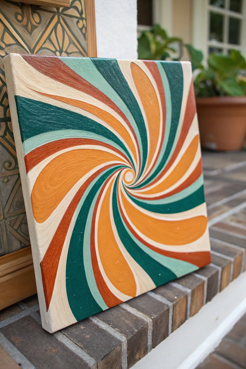
Transport your space back to the groovy era with this mesmerizing psychedelic swirl painting. Using a warm, retro color palette of rusts, emeralds, and creams, you will create a dizzying optical illusion that is surprisingly simple to draft and paint.
Step-by-Step Tutorial
Materials
- Square stretched canvas (12×12 or similar)
- Acrylic paints (Cream/Off-White, Rust/Burnt Orange, Emerald Green, Sage/Mint Green, Bright Orange)
- Pencil
- Ruler or straight edge
- Compass (optional but helpful)
- Round synthetic brushes (sizes 2 and 4)
- Flat shader brush (size 6 or 8)
- Palette or paper plate
- Cup of water and paper towels
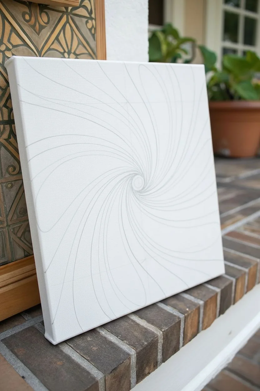
Step 1: Drafting the Design
-
Find the center:
Begin by using your ruler to very lightly mark an X on your canvas to locate the exact center point. This will be the eye of your storm. -
Draw the central eye:
Using a compass or by tracing a small coin, draw a small circle (about the size of a dime) directly over your center mark. -
Mark the perimeter:
Along the four outer edges of the canvas, make tick marks every 2 to 3 inches. These will serve as the endpoints for your swirling arms. -
Sketch the initial curves:
Starting from the edge of your small central circle, draw a curved line that arcs outward to one of your perimeter tick marks. The curve should look like an ‘S’ that has been stretched out. -
Repeat the pattern:
Continue drawing these curved lines from the center circle to each tick mark around the edge. Try to keep the curve shape consistent for each one to maintain the fluid motion effect. -
Refining the segments:
You should now have a pinwheel shape. Go back over your lines and thicken them slightly if needed, ensuring the segments taper thinly near the center and widen significantly as they reach the canvas edge.
Wobbly Lines?
If your hand is shaking while painting the thin center curves, rest your pinky finger on a dry part of the canvas for stability, or use a flow improver to make the paint glide smoother.
Step 2: Blocking in Color
-
Plan your palette:
Squeeze out your five colors onto the palette. Arranging them in the order you plan to paint (e.g., Cream -> Sage -> Rust -> Bright Orange -> Emerald) can help avoid confusion. -
Paint the cream segments:
Select your cream or off-white shade first. Paint every fifth segment with this color, using a flat brush for the wide outer areas and switching to a smaller round brush for the tiny points near the center. -
Apply the sage green:
Moving clockwise to the segment right next to your cream ones, fill these in with the lighter sage or mint green paint. Keep your edges crisp. -
Add the deep emerald:
Next to the sage, paint the segments with your dark emerald green. This high-contrast color anchors the retro look, so ensure it is opaque; apply a second coat if the canvas texture shows through. -
Fill with rust:
In the next available segment, apply the rust or burnt orange color. I find that reddish tones can be slightly transparent, so be prepared to do two thin coats rather than one thick gloppy one. -
Finish with bright orange:
Fill the final remaining segments with the brighter orange hue. This connects the warmth of the rust to the coolness of the greens. -
The central eye:
Paint the small central circle in the cream color to create a bright focal point that draws the viewer in.
Step 3: Finishing Touches
-
Clean up the edges:
Once the main colors are dry to the touch, use a small script liner or size 0 brush with the appropriate paint color to sharpen any wobbly lines where colors meet. -
Paint the sides:
Don’t forget the gallery wrap look. Extend your lines and colors over the side edges of the canvas so the pattern continues around the bend. -
Final inspection:
Check for any white spots of canvas showing through or pencil lines that need to be covered. Touch these up gently. -
Varnish (Optional):
To equalize the sheen of the different paint brands, apply a coat of gloss or satin varnish once the painting is completely cured (usually after 24 hours).
Go 3D
Add subtle white highlights on the convex side of the curves and darker shading on the concave side to make the swirls look like 3D tubes popping off the canvas.
Hang your new masterpiece and enjoy the groovy optical movement it brings to your room
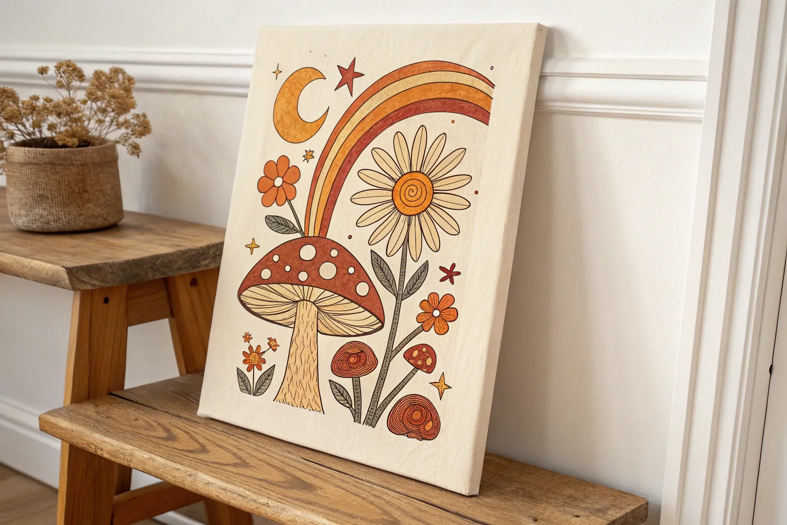
Mushrooms With Bold Spots and Stripes
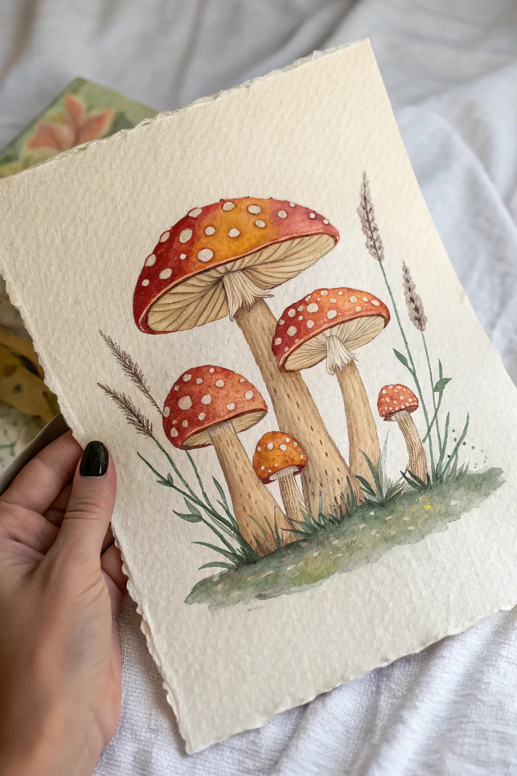
Capture the vintage charm of a classic botanical illustration with this delightful fly agaric mushroom study. Using textured paper and warm earthy tones, you’ll create a piece that feels like it was discovered in an old naturalist’s sketchbook.
Detailed Instructions
Materials
- Cold press watercolor paper (deckle edge optional but recommended)
- Watercolor paints (Cadmium Red, Yellow Ochre, Burnt Umber, Sap Green, Payne’s Gray)
- Round watercolor brushes (sizes 2, 4, and 6)
- White gouache or masking fluid
- HB pencil for sketching
- Kneaded eraser
- Two jars of water
- Paper towels
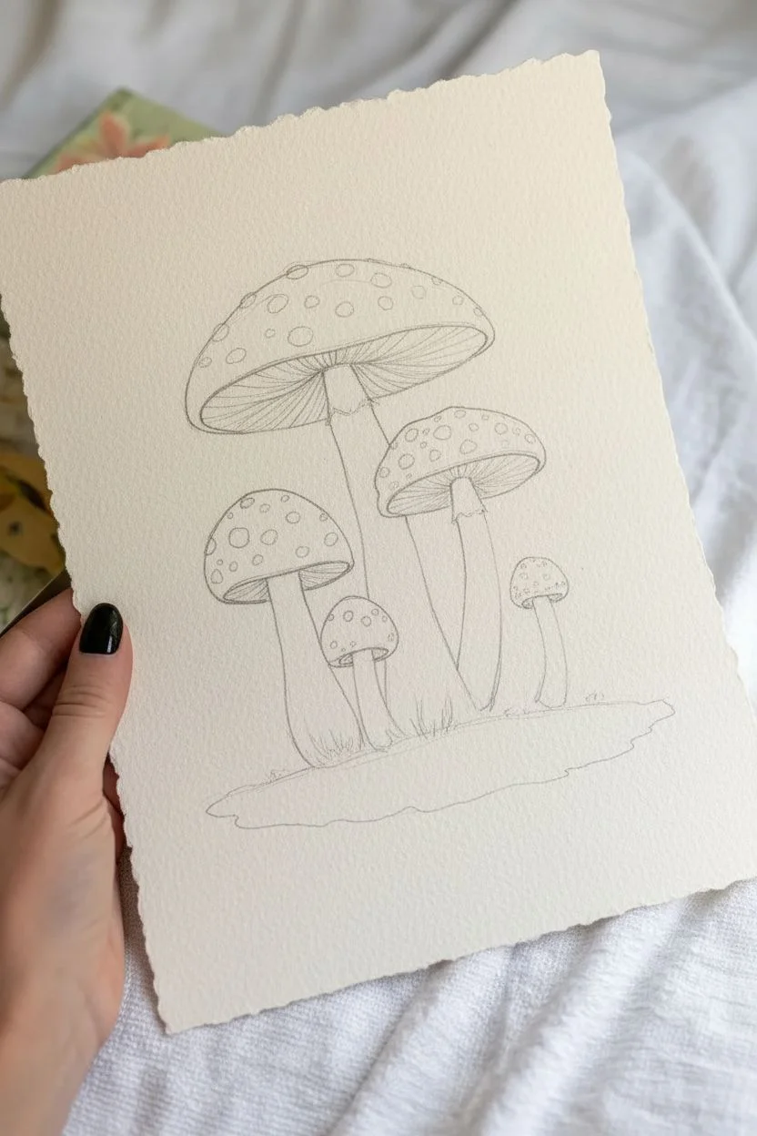
Step 1: Sketching the Composition
-
Outline the caps:
Begin by lightly sketching the five mushroom caps. Place the largest one near the top left, one slightly lower on the right, and tuck three smaller ones near the bottom to create a balanced cluster. -
Add stems and ground:
Draw the stems extending downwards from the center of each cap. Make them slightly curved and thick at the base. Mark a soft, undulating line at the bottom for the grassy mound they are growing from. -
Detail the gills:
Lightly sketch the gills under the opened caps. These lines should radiate from the top of the stem outward toward the rim of the cap, curving slightly to show form. -
Mark the spots:
Draw small, irregular circles on the mushroom caps where the white spots will be. Vary their sizes, placing larger ones near the center and smaller, flatter ones near the edges.
Clean Edges Trick
If your red paint bleeds into the white spots, wait for it to dry, then gently lift the unwanted color with a damp, stiff brush or cover it with opaque white gouache.
Step 2: Painting the Caps
-
Prepare the resist:
Carefully apply masking fluid to the circular spots on the caps. If you don’t have masking fluid, you can carefully paint around them, but masking fluid makes the wash much easier. -
First wash of red:
Mix a vibrant orange-red using Cadmium Red and a touch of Yellow Ochre. Apply a wet wash to the caps, starting lighter at the very top center where the light hits. -
Create gradients:
While the paint is still wet, drop in purer, deeper red along the bottom edges and sides of the caps to create a rounded, 3D effect. Let the water blend the colors naturally. -
Remove masking:
Once the red paint is completely bone dry, gently rub off the masking fluid to reveal the crisp white paper underneath. -
Soften the spots:
To make the spots look natural and less like stickers, take a damp, clean brush and gently soften one side of a few spots, adding a tiny touch of cream color to them so they aren’t stark white.
Step 3: Stems and Gills
-
Base coat for stems:
Mix a very watery wash of Yellow Ochre and Burnt Umber. Paint the stems with this pale beige tone, leaving the detailed skirt (the ring around the stem) unpainted for now. -
Define the texture:
Once the base is dry, use your smallest brush to make tiny, dashed texture marks on the stems using a slightly darker brown mix. Concentration these near the bottom and under the cap. -
Paint the gills:
Using a size 2 brush and a mix of dilute Burnt Umber, paint the fine lines of the gills. Leave tiny slivers of white paper between the lines to define the individual ridges. -
Shadowing the gills:
Glaze a transparent, darker brown shadow right where the gills meet the stem to create depth, making the cap look like it is casting a shadow.
Vintage Patina
Before painting, lightly stain your entire paper with tea or coffee and let it dry. This gives the background an authentic, aged parchment look suitable for botanical art.
Step 4: Ground and Flora
-
Paint the grassy mound:
Wet the bottom area of the paper and drop in Sap Green mixed with a little Burnt Umber. Let the color fade out loosely at the edges to create a vignette look. -
Add grass blades:
While the ground is damp but not soaking, use a rigger brush or the tip of your round brush to flick upward strokes of darker green, creating clusters of grass around the base of the stems. -
Sketch tall grasses:
Mix a sepia tone for the dried stalks. Paint thin, delicate lines reaching up behind the mushrooms. Add small, textured dots or dashes at the tops to mimic seed heads. -
Final foliage details:
Add a few broader, leafy shapes in a cooler green tone on the right side to balance the composition against the tall grass on the left.
Step 5: Finishing Touches
-
Deepen contrasts:
Mix a strong Burnt Umber or Sepia. Add tiny, sharp accents to the darkest areas, such as the bottom of the stems and the deepest recesses of the gills. -
Highlight recovery:
I like to use a tiny bit of white gouache to tidy up any spots on the caps that lost their shape or to add a bright highlight to the very top of the tallest mushroom.
Frame your botanical study in a simple wood frame to enhance its natural, rustic appeal


Mid-Century Shapes Collage Painting
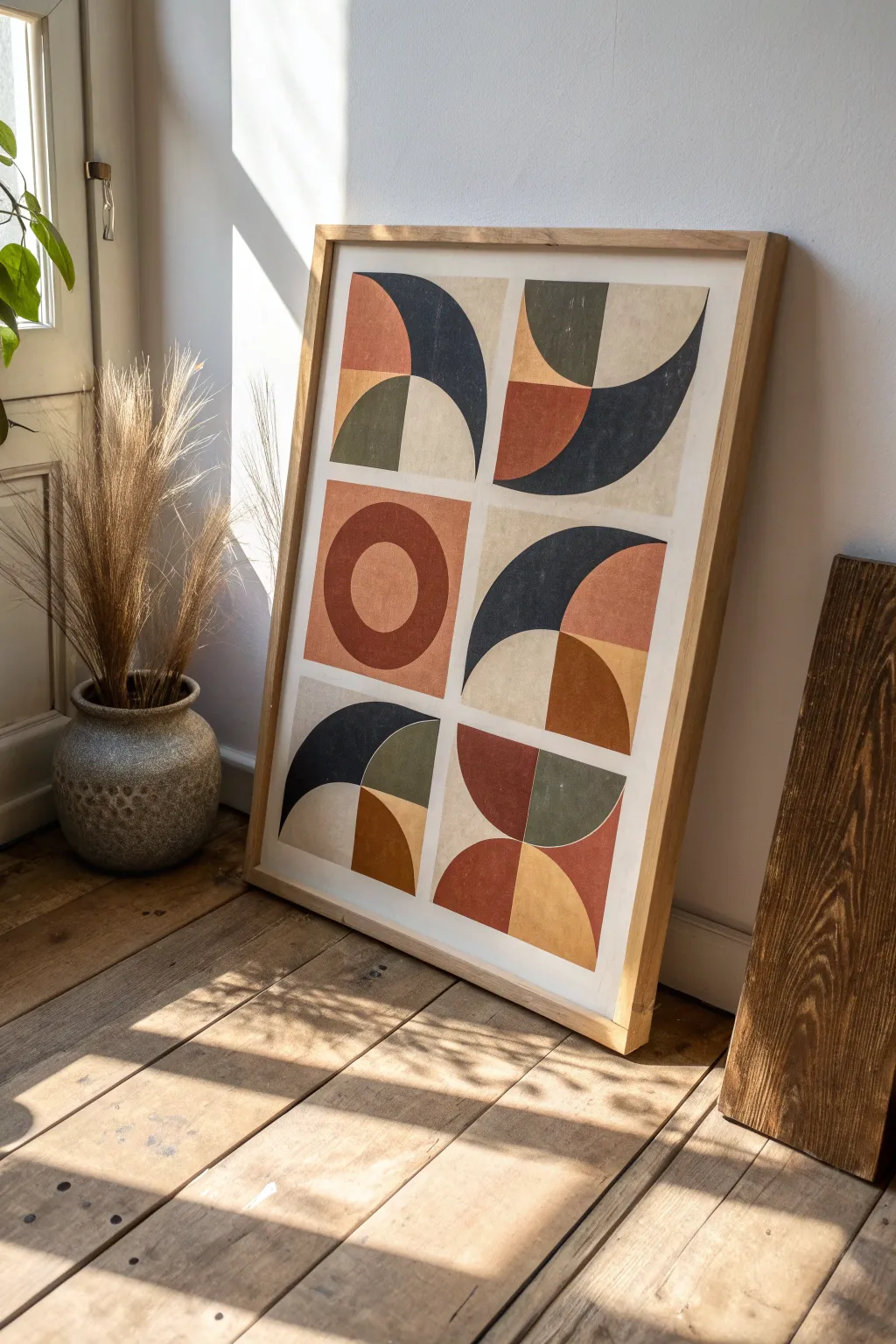
Capture the essence of 1950s design with this striking geometric composition featuring bold curves and an earthy color palette. The interplay of quarter-circles and arches creates a sophisticated rhythmic pattern that brings warmth and vintage character to any modern wall.
How-To Guide
Materials
- Large watercolor paper (heavyweight, 300gsm) or primed canvas (approx 16×20 or similar)
- Acrylic paints (rust, terracotta, mustard yellow, olive green, navy blue, charcoal, off-white)
- Flat shader brushes (medium and large sizes)
- Painter’s tape or masking tape (1/4 inch or similar thin width)
- Ruler or T-square
- Pencil
- Compass or round objects for tracing
- Eraser
- Palette or mixing plate
- Water cup and paper towels
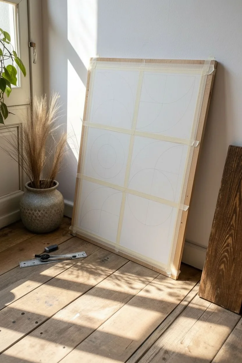
Step 1: Grid & Composition Setup
-
Prepare the surface:
If you are using paper, tape down the edges to a flat board to prevent buckling. If using canvas, ensure it is primed and dust-free. -
Measure the grid:
Calculate the dimensions of your surface to divide it into six equal rectangles (a 2×3 grid). Use your ruler and pencil to lightly mark these divisions. Leave a generous border around the entire outside edge to frame the composition later. -
Tape the boundaries:
Apply thin painter’s tape along your pencil lines to create crisp separations between the six blocks. This white space is crucial for the collage look. -
Sketch the shapes:
Lightly sketch the shapes inside each block. Looking at the reference, notice how each block contains 2-4 geometric elements. Use a compass for the circles and arches to keep the curves perfectly smooth. Don’t press too hard with the pencil.
Step 2: Color Mixing & Block Painting
-
Mix your palette:
Prepare your acrylics. You want a muted ‘retro’ feel, so mix a tiny dot of brown or black into your primary colors to desaturate them. You’ll need a burnt orange/rust, a deep mustard, a sage/olive green, a dark navy, and a soft beige/cream. -
Start with the lightest tones:
Begin painting the beige and cream sections first. These are often the background shapes or negative spaces. Use a flat brush to fill these areas, painting carefully up to your pencil lines. -
Paint the warm accents:
Focus on the rust and terracotta shapes next. For clean edges on curved lines, load your brush and use the flat edge to ‘cut in’ the curve before filling the center. -
Add the mustard details:
Apply the mustard yellow sections. If the paint feels too transparent, let the first coat dry completely and apply a second layer for solid opacity. -
Fill the cool tones:
Move on to the olive green sections. I find that turning the artwork upside down can sometimes help you reach awkward angles without smudging wet paint. -
Apply the dark contrast:
Paint the navy and charcoal sections last. These dark shapes anchor the composition. Be extra steady here, as dark paint is harder to fix if it strays.
Clean Curve Secret
For perfectly sharp curves, use masking fluid or frisket film over the areas you want to keep white. Paint over it freely, then rub it off once dry for a razor-sharp edge.
Step 3: Refining & Finishing
-
Check for consistency:
Look over the entire piece. Do the colors look flat and solid? If you see brushstrokes, apply another thin coat of paint to smooth out the finish. -
Dry generally:
Allow the painting to dry for at least 30 minutes to an hour. The paint must be fully set before the next crucial step. -
Peel the tape:
Very gently peel away the painter’s tape. Pull it at a 45-degree angle away from the painted areas to prevent ripping the paper or lifting paint. -
Clean up edges:
If any paint bled under the tape, use a tiny brush with a bit of white acrylic (or your background paper color) to tidy up the grid lines. -
Erase guidelines:
Once the paint is bone-dry, gently erase any visible pencil marks that weren’t covered by paint.
Add Texture
Mix a small amount of baking soda or fine sand into your acrylic paint before applying. This creates a gritty, tactile surface that mimics vintage frescos or stone.
Once framed in natural wood, your handmade geometric art will look like a timeless gallery piece
BRUSH GUIDE
The Right Brush for Every Stroke
From clean lines to bold texture — master brush choice, stroke control, and essential techniques.
Explore the Full Guide
Retro Travel Poster Cityscape
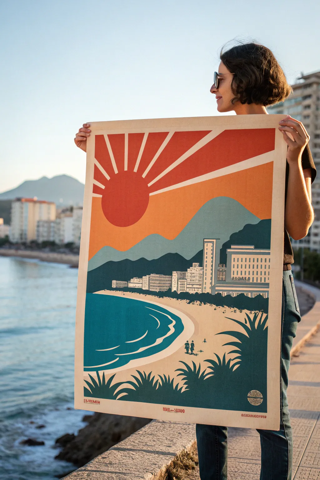
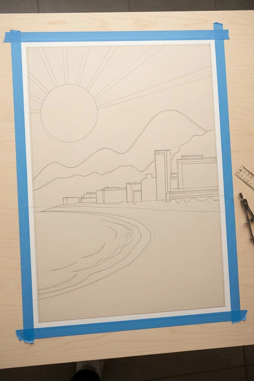
Capture the golden era of travel advertising with this bold, graphic cityscape poster. Using flat blocks of color and simplified shapes, you will create a nostalgic scene featuring a radiant sunburst over a coastal skyline.
Step-by-Step
Materials
- Large heavyweight mixed-media paper or illustration board (A2 or A3 size)
- Acrylic paints (Teal, Deep Blue, Cream/Beige, Terracotta Orange, Mustard Yellow, Slate Blue)
- Flat shader brushes (various sizes: 1-inch, 1/2-inch, and small detail)
- Painter’s tape or drafting tape
- Pencil and eraser
- Ruler
- Compass or round object for tracing (sun)
- Palette and water cup
Step 1: Drafting the Design
-
Establish the horizon:
Start by taping down the edges of your paper to create a clean white border. Use a ruler to lightly draw a horizon line about one-third of the way up from the bottom. -
Map out the landscape:
Sketch the curve of the coastline sweeping from the bottom left towards the center right. Above the horizon, lightly outline two layers of mountains—a closer, darker range and a distant, taller peak. -
Add the architecture:
Along the coastline, block in the simplified rectangular shapes of the hotels and buildings. Keep details minimal; focus on the silhouette created against the mountains. -
Position the sun:
In the upper left quadrant, use a compass or a bowl to trace a large circle for the sun. Draw straight lines radiating outward from the sun to the edges of the paper to form the iconic sunbeams.
Clean Lines Hack
For perfectly straight sun rays, apply strips of painter’s tape along your pencil lines. Seal the tape edge with a layer of clear matte medium before painting color to prevent any bleed.
Step 2: Blocking in Background Colors
-
Paint the sky gradient:
Mix a warm mustard yellow with a touch of orange. Paint the background sky area (excluding the sunbeams and sun). You want a flat, matte finish, so apply two thin coats if necessary. -
Fill the sunbeams:
Using a striking terracotta or reddish-orange, carefully paint the radiating beams. Use your ruler as a guide for your brush to keep lines razor-sharp. -
Create the sun:
Fill in the main sun circle with that same terracotta color. I find using a medium flat brush helps navigate the curve smoothly without leaving jagged edges. -
Paint the distinct mountains:
For the distant mountain, mix slate blue with a little white for a hazy look. For the closer mountain range, use a darker, unmixed slate blue or teal to create depth.
Level Up: Texture
To mimic an old screen print, lightly sponge a tiny bit of darker texture over the solid color blocks, or gently sand the finished dry surface with fine-grit sandpaper for a distressed look.
Step 3: The City and Shoreline
-
Define the ocean:
Paint the water area with a deep, rich teal. Ensure the curve where the water meets the sand is smooth and flowing. -
Paint the sandy beach:
Use a creamy beige tone to fill the beach area. Let this dry completely before moving on to the smaller details on top of it. -
Detail the buildings:
Paint the building silhouettes in a very light cream or white. Once dry, use a small detail brush with slate blue paint to add rows of tiny dashes for windows. -
Add water movement:
Using the cream color from the beach, paint thin, curving swoops in the teal water to represent gentle waves breaking near the shore.
Step 4: Foreground Silhouettes
-
Sketch the foliage:
Lightly pencil in spiky agave or yucca plants in the immediate bottom foreground. These should look like shadows framing the view. -
Paint the plants:
Fill these plant shapes with a very dark blue-green (almost black). Use a fine liner brush for the sharp tips of the leaves. -
Add tiny figures:
To give the poster scale, paint two or three tiny silhouette figures walking on the beach using the dark blue-green mix. Keep them very abstract. -
Final reveal:
Wait until the painting is bone dry, then slowly peel away the painter’s tape to reveal the crisp white border that gives it the authentic poster look.
Hang your finished piece in a simple wooden frame to bring a permanent vacation vibe to your wall
Anthropomorphic Sun, Moon, and Clouds
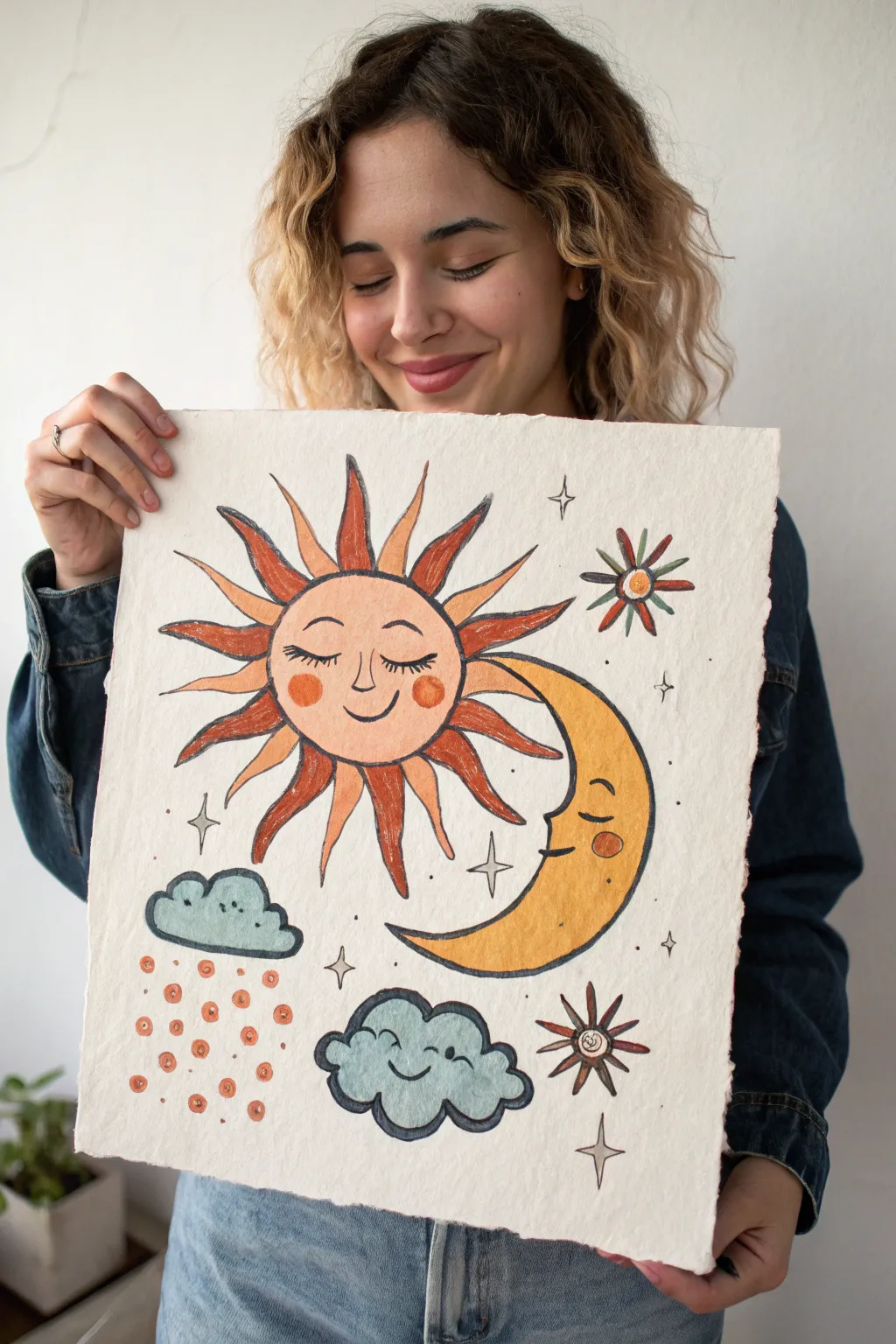
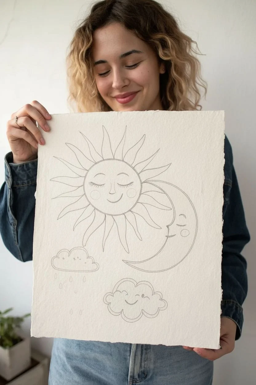
Capture the charm of vintage folk art with this heartwarming illustration of a sleepy sun, a peaceful moon, and happy clouds. The textured paper and warm, earthy color palette give this piece a distinctly retro feel that brings cozy vibes to any space.
Detailed Instructions
Materials
- Heavyweight cold-press watercolor paper (rough texture preferred)
- Pencil (HB) and soft eraser
- Watercolor or gouache paints (terracotta, ochre, muted teal, slate blue)
- Fine liner waterproof pigment pens (black, sizes 0.3 and 0.5)
- Round watercolor brushes (sizes 2 and 6)
- Cup of water and paper towels
- Compass or circular objects for tracing
Step 1: Sketching the Layout
-
Establish the sun:
Begin by finding the center of your paper, slightly towards the left. Use a compass or trace a cup to draw a perfect circle for the sun’s face. -
Add the sun’s rays:
Lightly sketch wavy, triangular rays radiating outward. Alternate between long and shorter rays to create dynamic energy, but leave a gap on the right side for the moon. -
Position the moon:
Tuck a crescent moon shape into the right side of the sun, letting it nestle close to the rays. The crescent should curve inward, mirroring the sun’s roundness. -
Shape the clouds:
Draw two distinct cloud shapes. Place a smaller, pillowy cloud above the moon’s tip on the left, and a larger, fluffier cloud centered at the bottom. -
Sketch the faces:
Add the personality. Draw closed, sleepy eyes with long lashes on both the sun and moon. Give the sun a gentle smile and rosy cheeks. Add a small, contented smile to the bottom cloud.
Use Rough Paper
Using handmade or cold-press paper with a heavy ‘tooth’ is key here. The texture grabs the pigment unevenly, instantly creating that aged, vintage look without extra effort.
Step 2: Adding Ink Details
-
Outline the main shapes:
Switch to your 0.5 waterproof pen. Go over your pencil lines for the sun, moon, and clouds with a steady hand. The lines don’t need to be mechanically perfect; a little wobble adds character. -
Refine the rays:
Outline the sun rays. For a vintage look, I like to double-line the interior of a few rays or add small hash marks near the base for shading. -
Draw decorative elements:
Fill the empty spaces with retro stars. Draw four-pointed stars (diamond shapes with curved sides) and simple starburst flowers with petals radiating from a center circle. -
Add the rain:
beneath the upper left cloud, draw several rows of small circles to represent stylized raindrops falling. -
Erase guidelines:
Once the ink is completely dry—give it a few minutes to be safe—gently erase all underlying pencil sketches.
Step 3: Painting with Warmth
-
Color the sun:
Mix a watery wash of peach or light terracotta. Fill in the sun’s face. While still damp, dab a slightly stronger orange onto the cheek circles for a soft blush effect. -
Paint the rays:
Alternate colors for the rays. Use a deep rust red for the longer rays and a muted orange for the shorter ones to create visual rhythm. -
Fill the moon:
Use a golden ochre or mustard yellow for the crescent moon. Keep the wash relatively flat, but you can darken the lower curve slightly for volume. -
Paint the clouds:
Mix a slate blue or grey-teal color. Paint both clouds, keeping the edges crisp against your ink lines. -
Detail the rain and stars:
Using a small size 2 brush, carefully fill the raindrops with rust orange. Use the same rust and slate blue to color the decorative stars and flower bursts.
Metallic Magic
For a magical touch, use gold metallic watercolor or a gold paint pen for the stars and the highlights in the sun’s rays. It catches the light beautifully.
Step 4: Final Textures
-
Add texture to the moon:
Once the yellow base is dry, use a very dry brush with slightly darker ochre ink or paint to stipple small dots on the moon for a cratered texture. -
Deepen the cloud shadows:
Add a second layer of blue to the bottom curves of the cloud ruffles to give them a bit of 3D weight. -
Enhance outlines:
If any paint obscured your initial lines, go back with the 0.3 pen to re-define the eyelashes and smiles, ensuring the expressions remain sweet.
Allow your painting to dry flat completely before framing or displaying your cheerful celestial scene

PENCIL GUIDE
Understanding Pencil Grades from H to B
From first sketch to finished drawing — learn pencil grades, line control, and shading techniques.
Explore the Full Guide
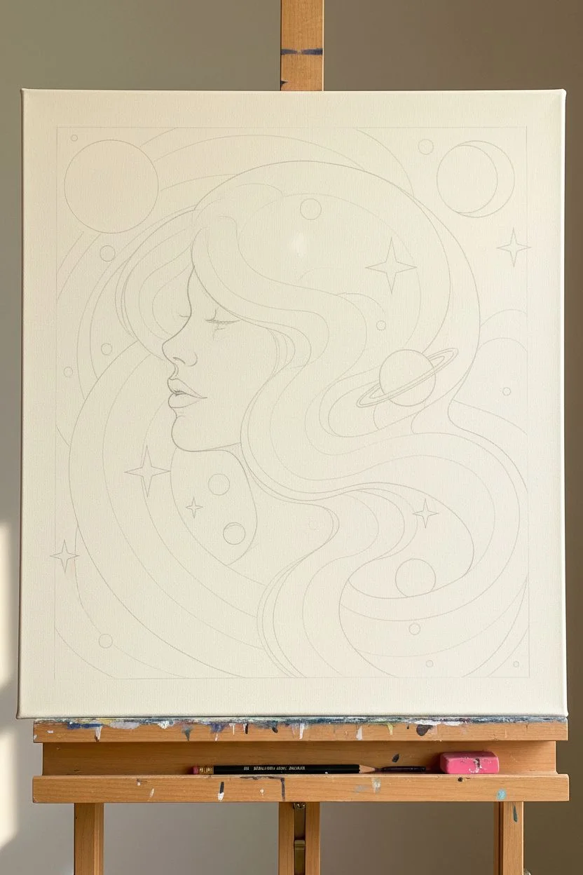
Space-Age Dreamscape With Planets and Rings
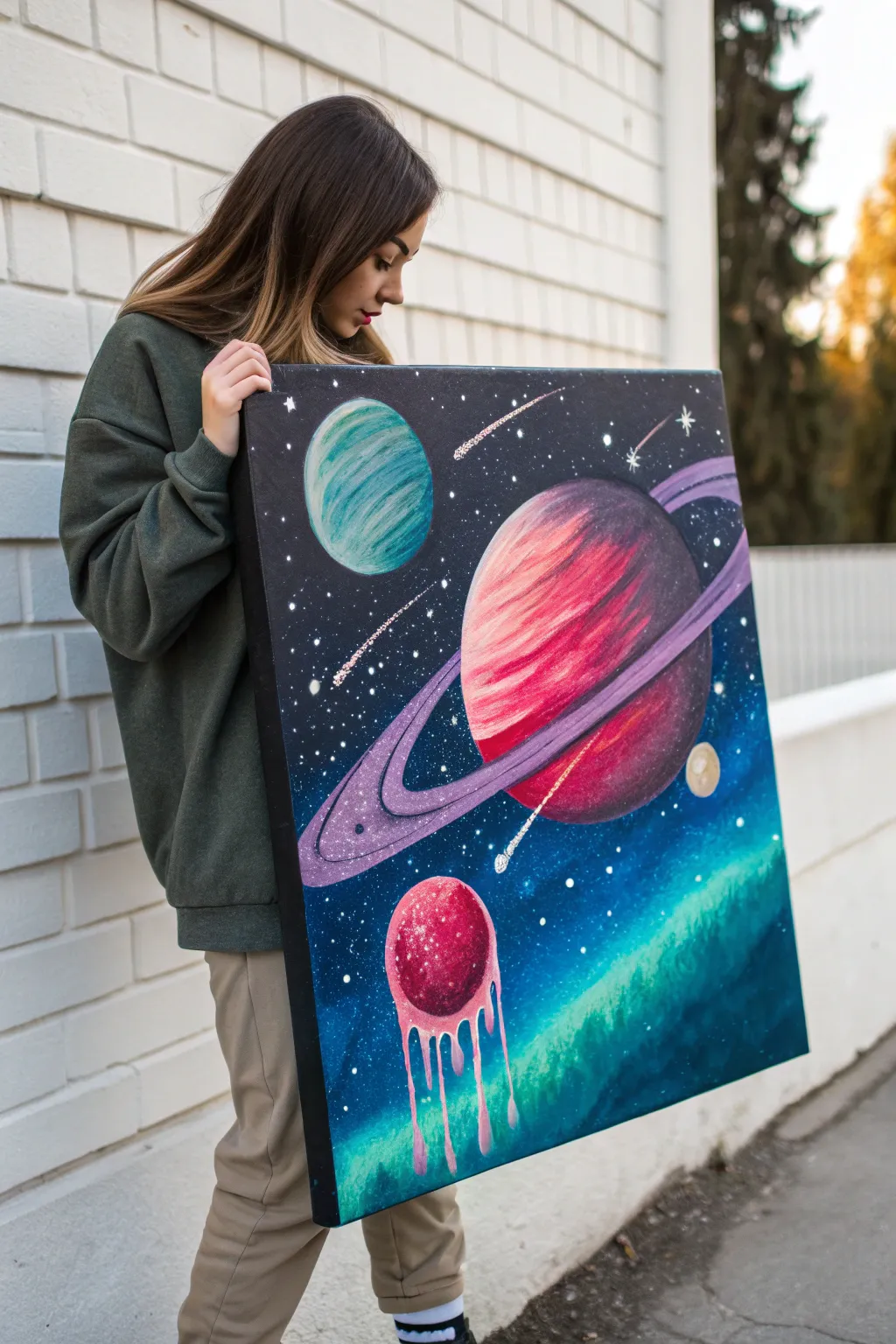
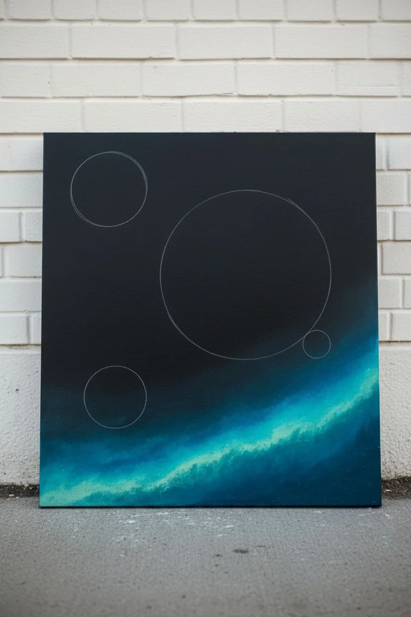
Capture the wonder of the cosmos with this vibrant acrylic painting that blends classic sci-fi aesthetics with a touch of surrealism. You will learn to layer bold planetary bodies over a deep, star-studded galaxy background for a striking piece of wall art.
How-To Guide
Materials
- Square canvas (approx. 24×24 inches)
- Acrylic paints: Black, Titanium White, Phthalo Blue, Teal, Magenta, Purple, bright Red, Golden Yellow
- Large flat brush (2-inch)
- Medium flat brush
- Small round detail brush
- Old toothbrush (for stars)
- Three round objects or compass (for tracing planets)
- Palette or paper plate
- Cup of water and paper towels
Step 1: Setting the Background
-
Prime the canvas:
Start by painting the entire canvas with a solid coat of black acrylic paint to create the deep void of space. Ensure total coverage, including the edges, and let it dry completely. -
Create the nebula gradient:
Load your large brush with a mix of teal and phthalo blue while the bottom third of the black background is slightly damp, blending upwards to create a soft, glowing transition. -
Outline the planets:
Once the background is dry, arrange your three round templates. Place a medium circle top-left, a large circle center-right, and a smaller circle bottom-center. Lightly trace them with chalk or a pencil.
Step 2: Painting the Main Planet (Saturn-esque)
-
Base coat the large planet:
Fill the largest circle with a dark purple base coat. Don’t worry about perfect opacity yet; this is just the foundation for the colors. -
Add vibrant stripes:
Using your medium flat brush, swipe curved bands of bright magenta, red, and a touch of orange across the face of the planet to simulate atmospheric storms. -
Blend the sphere:
While the paint is wet, gently soften the edges between the color bands. Add a shadow on the right side using a mix of purple and black to give the planet a spherical 3D form. -
Draft the rings:
Paint a long, elliptical ring shape surrounding the planet using a light purple mix. Ensure the ring goes ‘behind’ the planet at the top right and crosses ‘in front’ at the bottom left. -
Detail the rings:
Add definition to the rings by painting thin, concentric lines in lighter lilac and white. Darken the gap between the ring and the planet surface to create depth.
Use painter’s tape
For sharper rings around the main planet, temporarily apply thin, flexible masking tape to guide your brush strokes.
Step 3: The Blue and Melting Planets
-
Paint the blue planet:
Fill the top-left circle with a teal base. While wet, add curved strokes of darker blue and white to create a textured, gas-giant appearance similar to Neptune. -
Start the melting planet:
For the bottom planet, fill the circle with a deep red. Add texture by dabbing lighter pinks and white on the upper left side where the ‘light’ hits it. -
Create the drip effect:
Mix a fluid light pink paint. Using your round brush, drag paint from the bottom edge of the red planet downwards in wavy lines, ending in teardrop shapes to make it look like it is melting into the nebula. -
Add highlights:
On the melting drips, add tiny white reflective streaks on one side of each drip to make the liquid look glossy and viscous.
Add glitter glaze
Mix fine silver glitter into a clear gloss medium and brush it over the darker parts of space for a subtle, shimmering effect.
Step 4: Galactic Details
-
Splatter stars:
Dilute white paint with a little water until it is inky. Dip an old toothbrush into the mix and flick the bristles with your thumb to spray tiny stars across the black areas. -
Paint shooting stars:
Using a fine liner brush, paint a few diagonal white streaks with fading tails to represent comets or shooting stars zooming past the planets. -
Add larger stars:
Hand-paint a few larger, cross-shaped stars with a central dot to add variety to the starfield. -
Final highlights:
Add a tiny, crisp moon near the large planet using pale yellow or beige. I like to do one final check for contrast, adding pure white highlights to the brightest part of each planet for maximum pop.
Hang your cosmic creation on a well-lit wall and enjoy the view of your personal galaxy
Retro Portrait With Pop Color Shadows
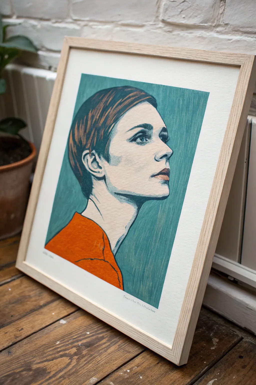
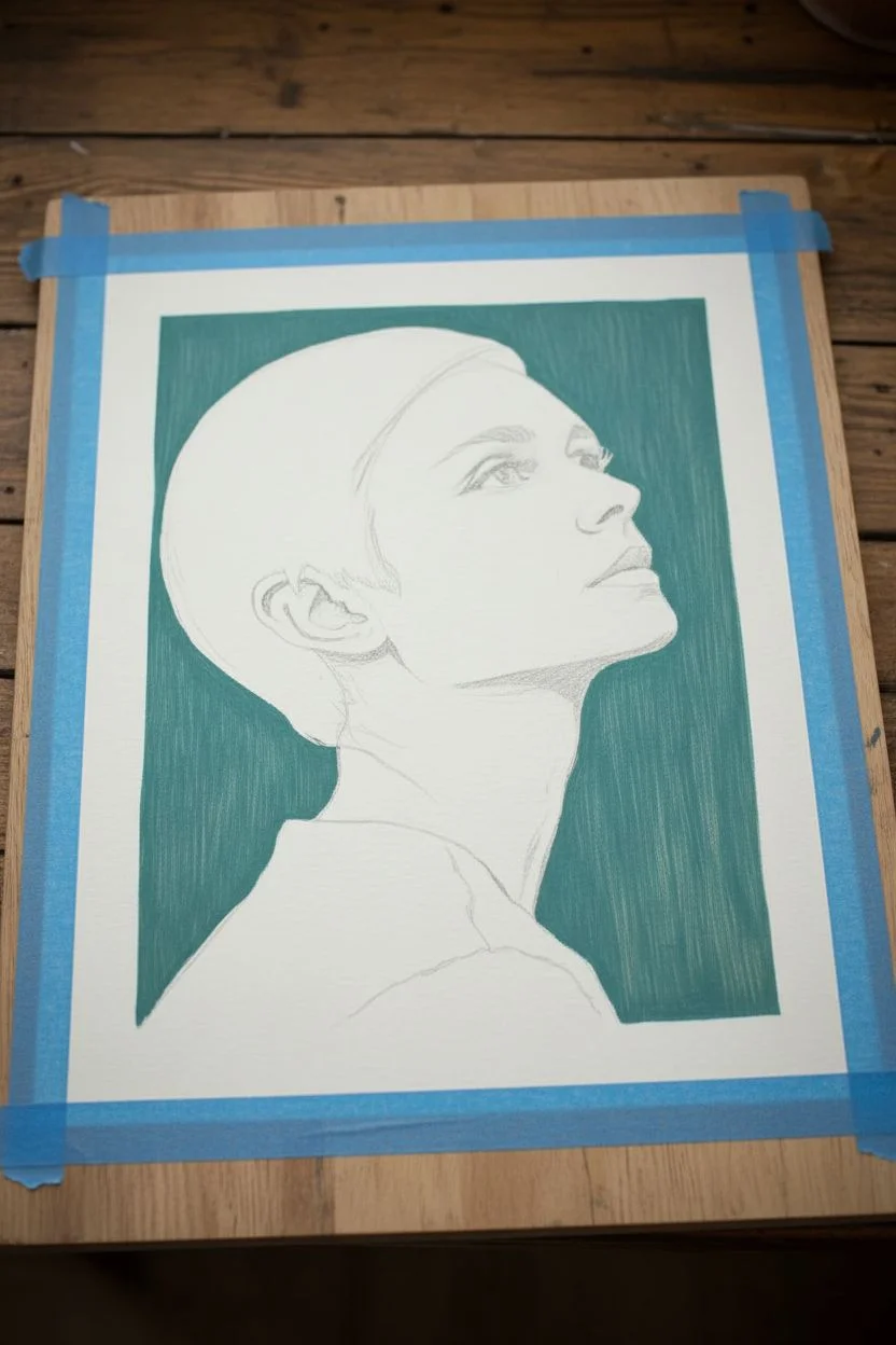
Capture the cool, effortless vibe of the 1960s with this stylized illustrative portrait. Using a muted teal background and a pop of tangerine orange, you’ll create a striking retro artwork that mimics the look of a vintage serigraph print.
Step-by-Step
Materials
- Heavyweight mixed media or watercolor paper (A3 size recommended)
- Acrylic gouache paints (Teal, Burnt Sienna, Titan Buff/Cream, Tangerine Orange, Navy Blue, White)
- Flat shader brushes (sizes 6 and 10)
- Fine liner brush (size 0 or 1)
- Graphite transfer paper
- Pencil for sketching
- Painter’s tape or masking tape
- Palette for mixing
- Jar of water
Step 1: Preparation and Background
-
Secure the paper:
Tape your paper down to a flat board or table using painter’s tape on all four sides. This prevents the paper from buckling when you apply the wet acrylic gouache. -
Sketch the subject:
Lightly sketch the profile of the woman. Focus on the sharp angles of the jawline, the pixie cut hair, and the upward gaze. If drawing freehand feels daunting, print a reference photo and use graphite transfer paper to trace the main outlines onto your surface. -
Mix the background color:
Create that specific retro teal by mixing a primary teal with a touch of white and a tiny dot of grey or burnt umber to desaturate it slightly. It shouldn’t be neon; think ‘vintage library book’ green. -
Paint the background:
Using the size 10 flat brush, paint the negative space around the profile. Use vertical strokes to create a subtle texture that mimics woodblock styling. Be careful to cut in cleanly around the hair and face profile.
Uneven Coverage?
If the background looks patchy, don’t overwork wet paint. Let it dry fully, then apply a second thin coat using vertical strokes for a uniform, linen-like finish.
Step 2: Painting the Features
-
Base the skin tone:
Mix a very pale cream color using Titan Buff and White. Fill in the face and neck area entirely. Don’t worry about shadows yet; we want a flat, graphic base layer. -
Add the signature garment:
Load your brush with pure Tangerine Orange. Paint the shoulders and collar area. I like to apply this layer fairly thickly to get a solid, opaque block of color that contrasts against the cool background. -
dry time:
Let these base layers dry completely. Acrylic gouache dries quickly, but give it at least 15 minutes so your next layers don’t lift the paint underneath.
Step 3: Details and Definition
-
Base layer for hair:
Mix Burnt Sienna with a little teal to create a dark, muted brown. Paint the main shape of the hair, following the curve of the skull. -
Hair highlights:
While the brown is still slightly tacky, mix a lighter copper tone and add streaks following the hair growth direction. This adds dimension without looking too realistic. -
Define the eyes:
Switch to your fine liner brush. Using a dark Navy Blue (almost black), carefully outline the upper eyelid and draw the iris. Leave the lower lash line lighter or broken to keep the look soft. -
Nose and lips:
Mix a soft terracotta pink for the lips. Paint the shape simply. Use the dark Navy mix to create the nostril and the corner of the mouth, keeping lines minimal. -
The crucial shadow:
To get that ‘pop’ look, mix a translucent grey-blue wash. Apply a distinct shadow under the jawline and below the chin. This hard-edged shadow is key to the retro illustrative style. -
Ear detailing:
Using the liner brush and the dark Navy mix, outline the complex curves of the ear. Keep the lines roughly uniform in thickness. -
Refining the clothes:
Add simple, sketchy black or navy lines over the orange shirt to suggest fabric folds or a collar. These lines should be loose and gestural.
Level Up: Texture
Before painting, apply a light coat of clear gesso or matte medium with a stiff brush. This creates ridges that catch the paint, mimicking canvas texture.
Step 4: Finishing Touches
-
Correcting edges:
Look at the silhouette where the face meets the teal background. If the line is shaky, use your teal mix to crisp up the edge from the outside in. -
Add texture (optional):
For a true vintage print look, you can use a dry brush with a tiny amount of lighter teal to scuff over the background vertically, enhancing that streaky texture seen in the reference. -
Sign and frame:
Once fully dry, sign your name in pencil at the bottom. Remove the tape carefully to reveal a clean paper border, then pop it into a light wood frame.
Hang your new portrait in a well-lit spot to show off those striking color contrasts


Paint-by-Number Style Scene With Flat Regions
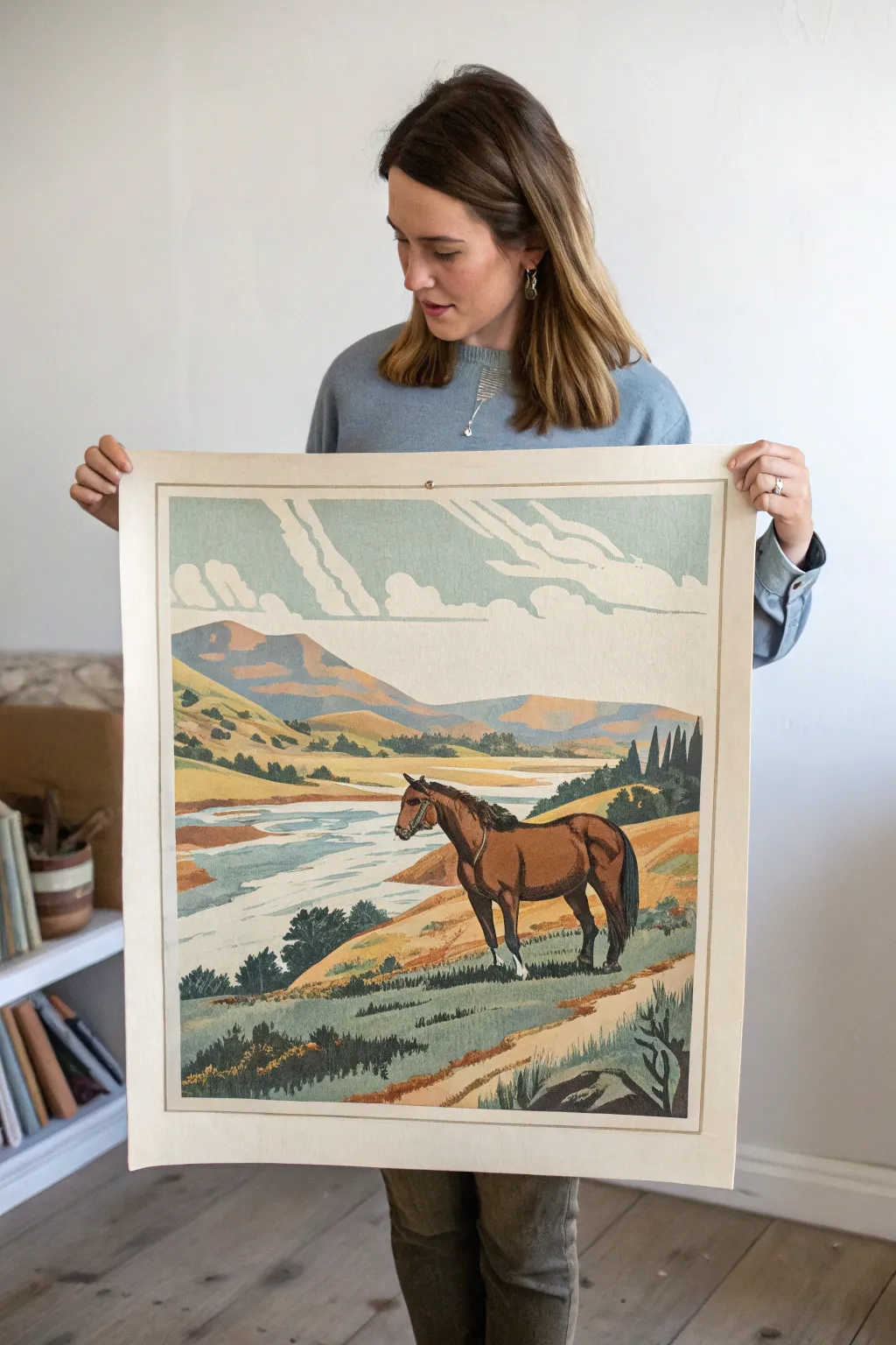
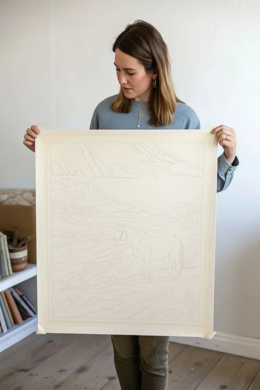
Capture the nostalgic charm of mid-century travel posters with this large-scale paint-by-number style landscape. This project features flat, distinct color regions that build up a serene scene of grazing horses and rolling hills, perfect for hanging as a statement piece.
How-To Guide
Materials
- Large heavyweight mixed-media paper or canvas board (approx. 24×36 inches)
- Acrylic paints (matte finish suggested)
- Gesso (if untamed canvas)
- Pencil (H grade for light lines)
- Fine liner brushes (sizes 0 and 1)
- Flat angular brushes (sizes 4 and 6)
- Masking tape
- Digital design software (optional for template creation)
- Projector or transfer paper
- Palette for mixing custom shades
Step 1: Preparation & Design
-
Prepare the substrate:
Begin by securing your large paper or board to a flat surface with masking tape. This creates a clean border later. If using raw canvas, apply a coat of gesso to ensure the paint sits smoothly on the surface rather than soaking in. -
Create the line art:
Sketch your design lightly. For this style, focus on ‘zoning’ the image into enclosed shapes rather than realistic shading. I like to visualize the landscape as a topographical map, breaking down the hills, river, and horse into distinct puzzle pieces. -
Transfer the guide:
If you aren’t comfortable freehand sketching, project a vintage reference image onto your paper and trace the major shapes. Focus on the hard edges where colors will change—these are your paint boundaries. -
Define the color palette:
Mix your acrylics before you start painting. You’ll need dusty earth tones: varying shades of sage green, ochre yellow, muted terracotta for the hills, and a pale, cool blue for the river.
Pro Tip: Paint Consistency
To get that smooth, printed look, mix a tiny drop of flow improver into your acrylics. It eliminates brush drag marks and keeps the color layers flat.
Step 2: Painting the Background
-
Start with the sky:
Using a flat brush, block in the sky area. Leave distinct, unpainted shapes for the clouds. Vintage posters often use negative space or very simplified white shapes for clouds, so keep the edges crisp. -
Lay down the distant mountains:
Paint the furthest mountains with a hazy purple-grey or muted blue. Keep the paint application flat and opaque; avoid blending colors on the canvas to maintain that printed poster aesthetic. -
Block in mid-ground hills:
Move forward to the rolling hills. Use your ochre and lighter greens here. Notice how the light hits the hills in the reference; paint the sun-facing slopes a lighter tan and the shadowed sides a darker olive green. -
Paint the river:
Fill in the winding river with a pale, milky blue. Use horizontal strokes to suggest water flow, but keep the color solid within its outlined shape. -
Add riverbank details:
Along the river edges, paint small, irregular shapes of darker sand or mud to create separation between the water and the grassy banks.
Level Up: Aged Effect
After the painting is dry, lightly sand the surface with very fine grit sandpaper or apply a thin wash of burnt umber to mimic aged vintage paper.
Step 3: The Foreground & Subject
-
Underpaint the horse:
Fill the silhouette of the horse with a mid-tone brown. Do not worry about muscle definition yet; just establish the solid block of the animal against the lighter background. -
Add foreground vegetation:
Using a smaller angle brush, dab in the foreground bushes and grasses. Instead of painting individual blades, paint jagged, leafy shapes in dark forest green to suggest texture without high detail. -
Detail the horse:
Once the brown base is dry, add the darker shadows on the horse’s underside and legs using a deep umber. Add the mane and tail with almost black paint. -
Highlight the form:
Mix a lighter reddish-brown and paint geometric shapes on the horse’s flank and shoulder to simulate muscle tone catching the light. Keep edges relatively hard. -
Add white markings:
carefully paint the white socks on the horse’s hooves and any facial markings. A fine liner brush is essential here for precision. -
Paint the dirt path:
Create the winding path in the foreground using a sandy beige color. Ensure the path narrows as it recedes into the distance to force the perspective.
Step 4: Finishing Touches
-
Review edges:
Step back and look for any gaps between your color zones. Use a fine liner to touch up areas where the canvas might be showing through between shapes. -
Clean up the border:
If you want a faux-matte look as seen in the image, paint a crisp cream or off-white border around the entire scene, covering any messy brushstrokes at the edges. -
Add textural hints:
For a true retro lithograph feel, you can dry-brush a tiny amount of texture over the large flat areas, but keep this very subtle. -
Seal the work:
Once fully dry, apply a matte varnish. A glossy finish would ruin the retro poster effect, so ensure your topcoat is flat/matte to mimic paper. -
Mount hanging hardware:
If you painted on heavy paper, attach wooden rails or grommets at the top for hanging. If on board, attach a sawtooth hanger to the back.
Hang your new oversized artwork in a well-lit spot to admire the serene, vintage atmosphere you have created
Disco-Inspired Night Scene With Sparkle Dots
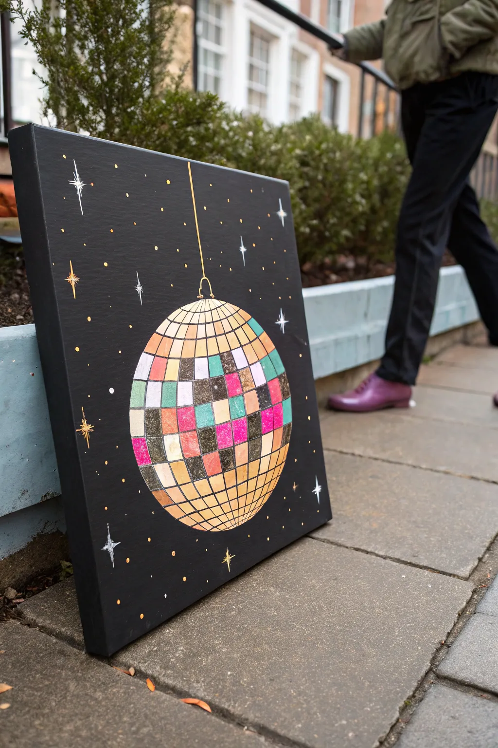
Transport yourself to a glamorous night out with this retro-inspired disco ball painting. The high-contrast design features distinct, colorful mirrored tiles against a deep black background, making the geometric sphere pop with vintage flair.
Step-by-Step Tutorial
Materials
- Square stretched canvas (approx. 16×16 or 20×20 inches)
- Acrylic paint: Mars Black, Titanium White, Metallic Gold
- Acrylic paint (colors): Magenta, Turquoise, Teal, Peach/Pale Orange, Yellow Ochre
- Circle template or compass
- Pencil and eraser
- Ruler
- Fine liner brush (size 0 or 00)
- Flat brush (1-inch) for background
- Small flat shader brush for tiles
Step 1: Setting the Stage
-
Base Coat:
Begin by covering your entire canvas with a solid coat of Mars Black acrylic paint. Use your large flat brush for smooth, even coverage. -
Second Coat:
Once the first layer is dry, apply a second coat of black to ensure no white canvas texture shows through. Let this dry completely before sketching. -
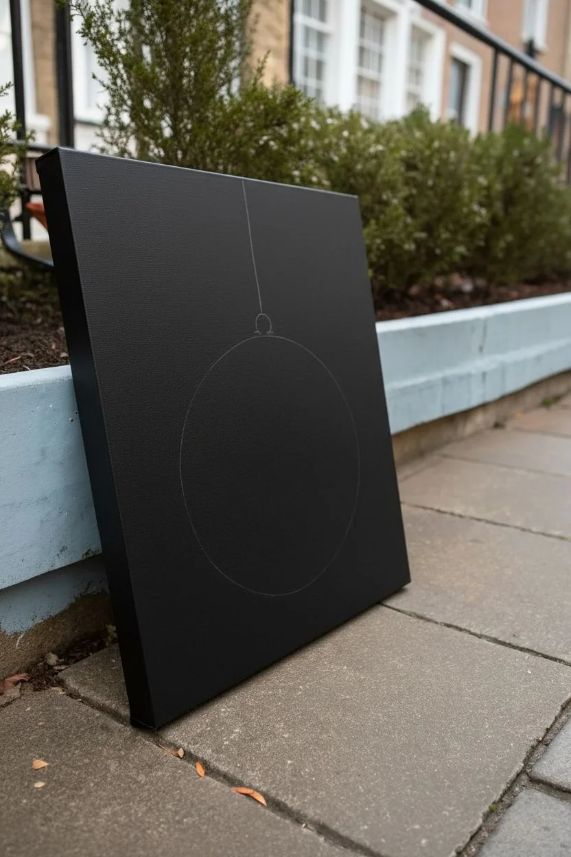
Outline the Sphere:
Using a compass or a large round object as a template, trace a large circle in the lower center of the canvas lightly with a pencil. Leave enough room at the top for the hanging string.
Clean Lines Hack
If you struggle with steady lines for the tile grid, use a gold or black permanent paint marker instead of a brush for the final outlining.
Step 2: Mapping the Grid
-
Vertical Curves:
Draw curved vertical lines contouring the shape of the ball. Start with a straight line down the center, then bow the lines outward progressively as you move toward the edges to create a 3D effect. -
Horizontal Curves:
Draw horizontal curved lines across the ball. These should curve slightly downward in the bottom half and upward in the top half (like lines of latitude on a globe) to define the specific tile shapes. -
Refine the Tiles:
Review your grid. The resulting squares should look slightly distorted near the edges due to the spherical perspective. This doesn’t need to be mathematically perfect; a little variation adds character. -
Add the Hanger:
Draw a small loop at the very top of the sphere and use a ruler to draw a straight vertical line extending off the top edge of the canvas.
Step 3: Applying Color
-
Top and Bottom Glow:
Paint the tiles at the very top and very bottom of the sphere with a mix of Metallic Gold and Yellow Ochre. These areas represent the strongest reflection and shadow gradients. -
The White Band:
Select a band of tiles running horizontally across the upper-middle section. Paint these Titanium White to simulate the bright highlight where the light hits directly. -
Color Blocking:
Fill in the central band of tiles with your colorful acrylics—magenta, turquoise, teal, and peach. Scatter the colors randomly, leaving some tiles empty for darker tones. -
Shadow Tiles:
For the remaining empty tiles, mix a dark grey or use a thinned black wash over the gold to create ‘shadow’ tiles that reflect the darkness of the room. -
Glitter Effect:
I like to dab a tiny amount of glitter paint or pure metallic gold onto the center of the colored tiles once dry to give them extra texture and shine.
Level Up: Real Shine
Apply a high-gloss varnish only onto the spherical part of the painting, leaving the black background matte. This makes the ball truly pop.
Step 4: Defining Details
-
Outline the Grid:
Load your fine liner brush with slightly thinned black paint. Carefully re-trace the grid lines between the colored tiles to crisp up the edges and separate the mirrors. -
Paint the String:
Use the Metallic Gold paint and the fine liner brush to paint the straight hanging line and the small loop attachment at the top of the ball. -
Main Sparkles:
create ‘starburst’ sparkles. Paint a cross shape with a long vertical line and a shorter horizontal line, then add a tiny ‘X’ in the center. Do this in white and gold. -
Secondary Sparkles:
Add smaller, simpler 4-point stars scattered around the background using Titanium White. Vary their sizes to create depth. -
Confetti Dots:
Dip the non-brush end of a paintbrush handle into gold or yellow paint. Dot the background randomly to create distant lights or floating dust motes.
Now step back and admire how the simple geometry comes together to create a dazzling party atmosphere
Faux Screenprint With a Limited Palette
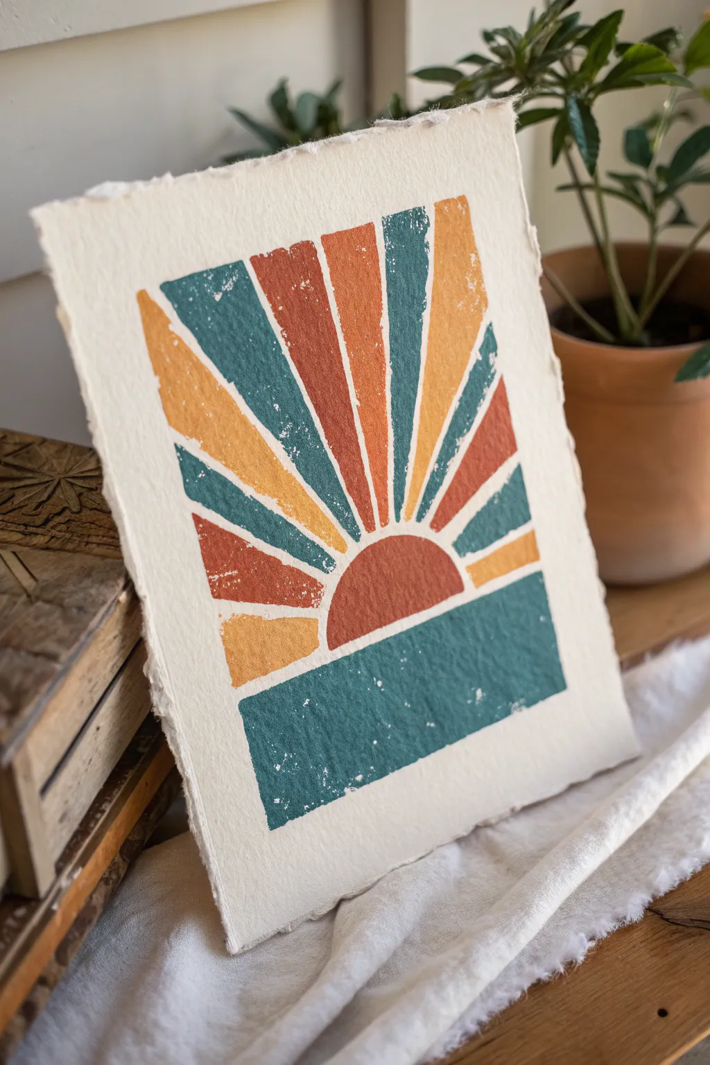
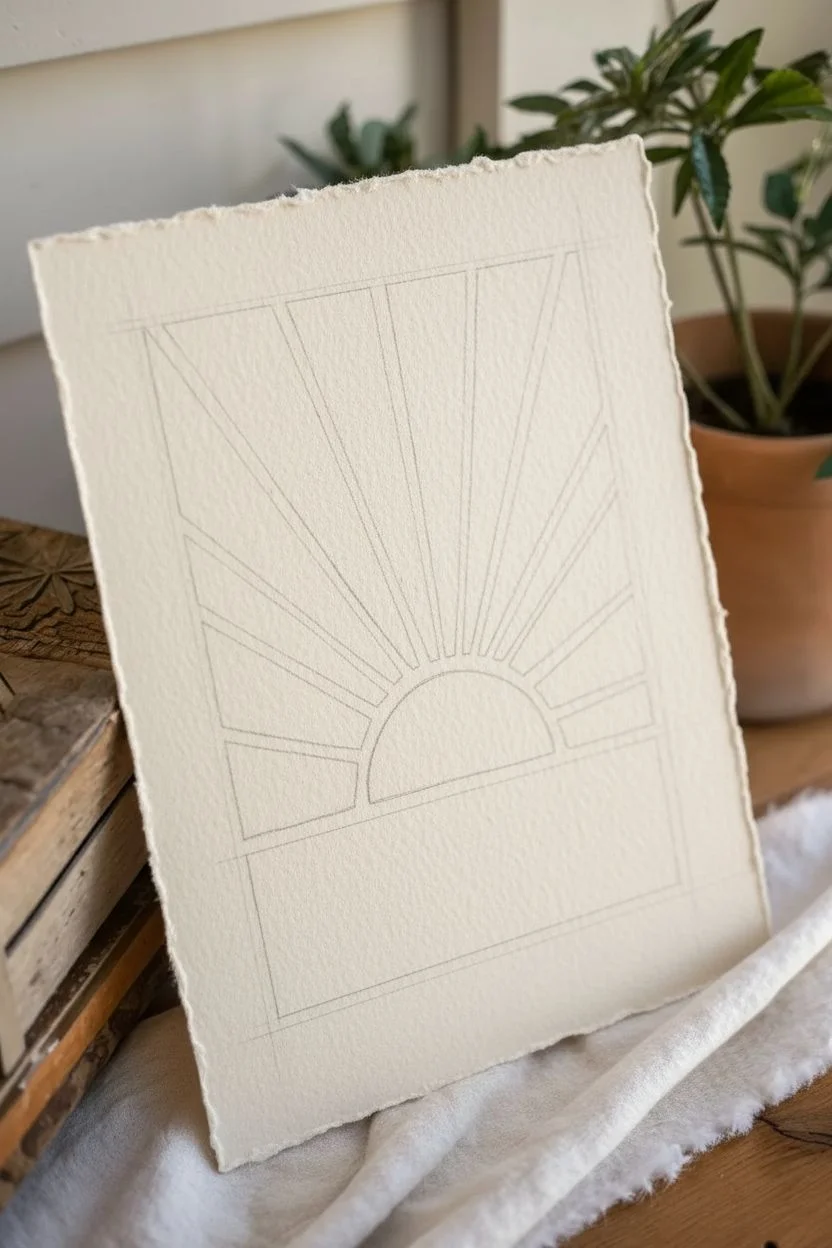
Capture the grainy, nostalgic charm of vintage posters with this simple faux screenprint technique. By using a limited palette of burnt orange, teal, and mustard, you’ll create a striking sunburst design that feels effortlessly retro.
Step-by-Step
Materials
- Heavyweight watercolor paper or mixed media paper (deckled edge optional)
- Acrylic paints: Burnt Sienna (orange), Deep Teal, Mustard Yellow
- Flat shader brushes (medium and small)
- Painter’s tape or masking tape (low tack)
- Paper plate or palette
- Old, dry sponge or stiff tinting brush
- Ruler
- Pencil
- Eraser
Step 1: Planning the Design
-
Measure the borders:
Begin by deciding on the size of your printed area. Measure about 1.5 inches in from all four edges of your paper to create a visual frame. Lightly mark these boundaries with a pencil. -
Draw the horizon block:
Using your ruler, draw a horizontal line roughly across the bottom third of your central working area. This rectangular block will serve as the abstract ‘ocean’ or ground. -
Sketch the sun:
Resting directly on top of that horizon line, draw a semi-circle in the center. This will be the hub of your sunburst. Don’t worry about perfect geometry; a hand-drawn feel adds character. -
Mark the sun rays:
From the curved edge of the semi-circle, extend straight lines outward toward the top and side borders you marked earlier. Fan them out evenly to create distinctive rays, leaving small gaps between each ray to let the paper color show through.
Step 2: Creating the Texture
-
Prepare the paint:
Squeeze distinct blobs of your Deep Teal, Burnt Sienna, and Mustard Yellow onto your palette. Do not add water; for a screenprint effect, the paint needs to be somewhat thick and opaque. -
Mask the bottom block:
Place strips of painter’s tape along the outside edges of your bottom rectangular block. This ensures crisp, straight lines where the design meets the blank paper. -
Paint the foundation:
Load a flat brush with Deep Teal. Paint the bottom rectangular block using horizontal strokes. Aim for mostly solid coverage but don’t overwork it—slight imperfections help the vintage look. -
Add the distress effect:
While the teal paint is tacky but not fully wet, take a dry sponge or a stiff, dry brush and dab perpendicularly onto the painted surface. This lifts tiny specks of paint, revealing the paper underneath to mimic a worn screenprint.
Too Much Paint?
If you accidentally apply too much paint and lose the texture, simply blot the wet area firmly with a crumpled paper towel to lift the excess pigment.
Step 3: Painting the Sunburst
-
Mask the sun center:
Once the teal block is dry to the touch, move your attention to the semi-circle sun. You can freehand the curve, but feel free to tape off the straight bottom edge where it meets the teal. -
Paint the sun hub:
Fill the semi-circle with Burnt Sienna. Use the same dabbing technique with a dry brush immediately after applying the color to maintain consistent texture across the piece. -
Outline the rays:
For the rays, I find it easiest to work one color at a time. Identify which rays will be teal, orange, or yellow. The pattern typically alternates to balance the composition. -
Paint the teal rays:
Using a smaller flat brush, carefully fill in the teal rays. Keep your edges relatively straight, but remember that a little wobble mimics the registration errors often seen in old prints. -
Apply texture to rays:
Just like before, dab the wet teal rays lightly to create that ‘noise’ or grain texture before moving on. -
Paint the orange rays:
Clean your brush thoroughly and switch to Burnt Sienna for the next set of rays. Apply the paint, ensuring it’s opaque enough to stand out against the paper. -
Paint the yellow rays:
Finish with the Mustard Yellow rays. This lighter color might require a slightly thicker application to match the opacity of the darker tones.
Old Brush Magic
Don’t use your best brushes for the stippling/distressing step. A frayed, stiff-bristled brush creates the best ‘random’ noise texture.
Step 4: Final Touches
-
Check the gaps:
Inspect the white spaces between your rays. These negative spaces act as the ‘grout’ of the design. If any gap feels too wide, you can carefully widen the adjacent painted ray to close the distance. -
Remove tape:
If you used tape for the straight edges, verify the paint is totally dry before peeling it off slowly at a 45-degree angle to prevent tearing the paper. -
Erase guidelines:
Gently erase any visible pencil marks remaining in the unpainted border areas. -
Deckle the edges (Optional):
To match the reference photo’s artisan feel, place a metal ruler along the edge of the paper. Wet the paper strip outside the ruler with water, wait a moment to soften, and gently tear it away to create a soft, fibrous edge.
Frame your new print in a simple wood frame or hang it with clips to let those textured edges shine
Trippy Mindscape With Melting Shapes
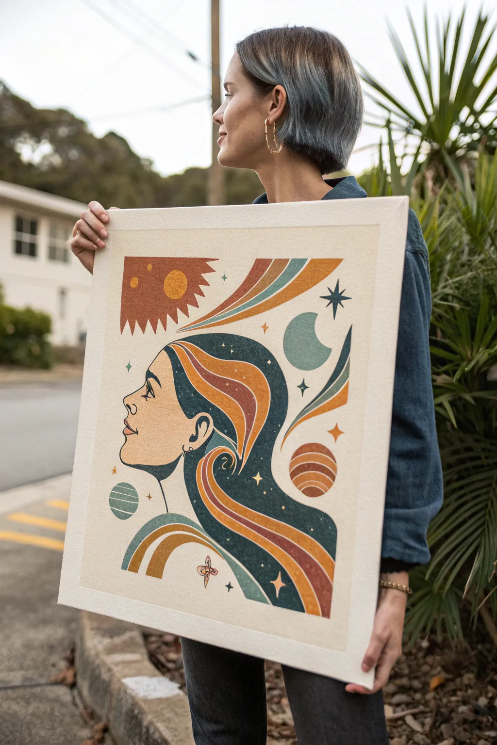
Capture the groovy essence of 1970s graphic design with this celestial profile portrait, characterized by flowing ribbon hair and warm, earthy tones. The finished piece combines flat illustration styles with a cosmic theme, perfect for adding a touch of vintage mystique to your walls.
Step-by-Step Guide
Materials
- Large stretched canvas (approx. 18×24 inches)
- Gesso (if canvas is unprimed)
- Acrylic paints (Cream/Off-white, Deep Teal/Navy, Terracotta/Rust, Mustard Yellow, burnt Sienna, Sage Green)
- Synthetic flat brushes (various sizes: 1 inch, 1/2 inch, 1/4 inch)
- Fine liner brush (size 0 or 00) for details
- Pencil (H or HB)
- Eraser
- Ruler or French curve (optional but helpful)
- Palette for mixing
- Water cup and paper towels
- Matte medium or matte varnish (optional)
Step 1: Planning and Sketching
-
Prepare the Background:
Begin by painting your entire canvas with two coats of a warm, creamy off-white acrylic paint. Let the first coat dry completely before applying the second to ensure solid, opaque coverage without any canvas texture showing through too aggressively. -
Map Out the Profile:
Using a light pencil, gently sketch the profile of the woman’s face on the left side of the canvas. Focus on a classic, serene expression with an upturned nose and slightly parted lips. Keep the lines very faint so they don’t show through the lighter paint later. -
Draft the Hair Flow:
Draw the outline of the hair. Instead of realistic strands, think of the hair as a large, fluid shape that mimics a galaxy or a wave. Extend the hair towards the right and bottom of the canvas, creating a large, solid mass that will serve as the background for the cosmic elements. -
Sketch Cosmic Elements:
Inside and around the hair shape, lightly sketch your celestial bodies. Place a large sun in the upper left, a crescent moon on step right, and various planets (like Saturn shapes) and four-pointed stars scattered throughout the composition. -
Define the Ribbons:
Draw the flowing ‘ribbon’ stripes that weave through the hair and background. Use smooth, confident curves that echo the shape of the hair mass. These stripes are a key retro visual element, so take your time getting the spacing consistent.
Tape for Sharper Lines
For those long, swooping ribbon curves, use flexible masking tape or painter’s tape designed for curves. Seal the tape edge with a layer of matte medium before painting to prevent bleed-under.
Step 2: Painting the Block Colors
-
Fill the Hair Base:
Mix a deep, dark teal or navy blue color. Use a medium flat brush to fill in the main body of the hair. Be careful around the edges where the hair meets the face and the ribbon stripes; you want crisp, clean lines here. -
Paint the warm Ribbons:
Starting with the darkest warm tone (Terracotta or Rust), paint the outer stripes of the ribbons. Alternate with your Burnt Sienna and Mustard Yellow for the inner stripes. I find using a flat brush the width of the stripe makes this step much easier and cleaner. -
Paint the Face:
Since the background is already cream, you can leave the skin the background color, or mix a very slightly different tint of beige if you want subtle contrast. Ensure the edge where the skin meets the hair is sharp. -
Add the Sun and Moon:
Paint the sun in the upper left using your Rust and Mustard colors. For the sun rays, use simple triangular spikes. Paint the crescent moon and the other planetary spheres, utilizing the teal and sage green tones to balance the warm reds.
Step 3: Detailing and Refining
-
Outline Facial Features:
Switch to your fine liner brush and thin down some black or very dark navy paint with a drop of water. Carefully paint the eye, eyebrow, nostril, and lip line. Keep the lines smooth and illustrative rather than realistic. -
Add Star Details:
Using the same fine brush, paint various four-pointed stars throughout the piece. Place some ‘sparkles’ inside the dark hair mass to mimic a night sky, and larger stars in the negative space around the head. -
Clean Up Edges:
Look closely at where your color blocks meet. If there are gaps or wobbly lines, use the appropriate color and a small detail brush to neaten the boundaries. The retro style relies on crisp graphic shapes. -
Create Texture (Optional):
To mimic the vintage print look seen in the photo, you can lightly stipple some of the colored areas (like the sun or planets) with a dry brush or sponge to add a bit of ‘noise’ or grain texture. -
Protective Coat:
Once the painting is fully dry (give it at least 24 hours), apply a layer of matte varnish or matte medium. This seals the acrylics and gives the piece a unified, professional finish without excessive shine.
Paint Looking Streaky?
Yellows and light teals often have poor opacity. Don’t glob it on; instead, apply multiple thin layers, letting each dry fully. This yields a flat, graphic print look.
Hang your cosmic masterpiece in a visible spot to bring some everyday magic to your space


Have a question or want to share your own experience? I'd love to hear from you in the comments below!