When I’m feeling stuck, I go straight back to mark making—it’s the fastest way to loosen up and find new energy in my lines. Think of these as playful prompts for building a personal library of textures, patterns, and lines you can pull from anytime.
Hatching and Cross-Hatching Warm-Up
This structured warm-up exercise transforms a simple grid into a playground for line control and precision. By combining geometric constraints with repetitive mark-making, you’ll build muscle memory while creating a satisfyingly organized aesthetic spread.
Step-by-Step Tutorial
Materials
- Dotted or grid notebook (A5 size recommended)
- Black fine liner pen (0.3mm or 0.5mm)
- Pencil (HB or 2B)
- Ruler (clear works best)
- Eraser
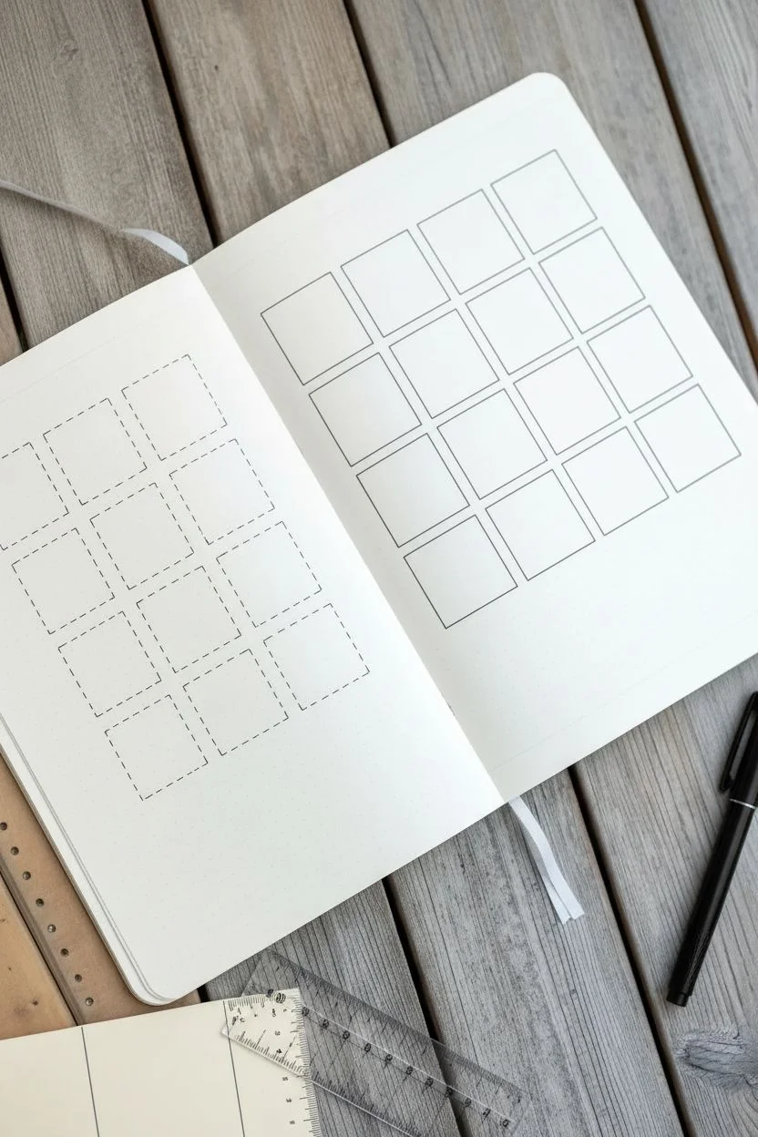
Step 1: Setting up the Foundation
-
Define the grid spacing:
Open your notebook to a fresh two-page spread. Using the dots on your page as a guide, count out squares that are roughly 4×4 or 5×5 dots wide. You want them large enough to hatch inside but small enough to act as quick drills. -
Draft the layout:
With your pencil and ruler, lightly mark out a series of boxes. Aim for a grid of 3 columns and 4 rows on the left page. Leave a comfortable margin around the edges of the page to keep things looking tidy. -
Repeat on the right:
Mirror this layout on the right-hand page. Drawing identical grids on both sides creates a cohesive look and gives you plenty of space to experiment with different patterns. -
Ink the outlines (Left Page):
Switch to your fine liner. On the left page, carefully trace over your pencil grid lines using a dashed or broken line style rather than a solid one. This softer border adds visual variety. -
Ink the outlines (Right Page):
On the right page, ink the grid squares with solid, continuous lines. Use your ruler to ensure corners are sharp and crisp. -
Erase guidelines:
Once the ink is completely dry, gently erase the underlying pencil marks from the box outlines to clean up the spread.
Steady Hands
Exhale as you draw each line. TIMING your breath with the stroke helps stabilize your hand and prevents shaky, uneven lines.
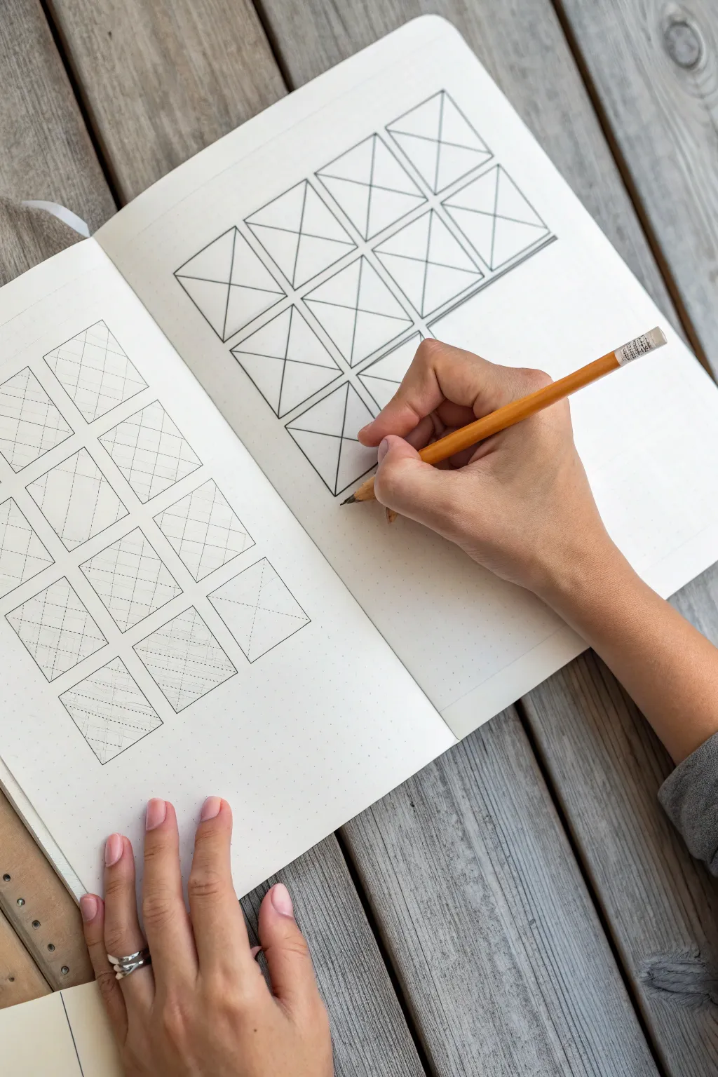
Step 2: Executing the Fill Patterns
-
Start the ‘X’ drill (Right Page):
We will start on the right page with the solid boxes. Place your ruler diagonally from the top-left corner to the bottom-right corner of the first box. Draw a clean line connecting them. -
Complete the ‘X’:
Draw the opposing diagonal line (top-right to bottom-left) in the same box. Repeat this distinct ‘X’ pattern across all boxes on the right page. -
Add vertical subdivisions:
Still on the right page, draw vertical lines inside the triangles formed by your ‘X’. Space them evenly. I find it helpful to start from the center and work outward to maintain symmetry. -
Begin the left page patterns:
Move to the left page with the dashed borders. Here, we will practice parallel hatching. In the first box, use your ruler to draw a series of diagonal lines from corner to corner. -
Vary the line weight:
For the second row of boxes, try changing your pen pressure or switching to a thinner nib if you have one. Create a lighter, airier hatching effect. -
Experiment with spacing:
In the third row, increase the gap between your hatched lines. Wider spacing emphasizes the individual stroke quality, while tight spacing creates a darker value. -
Try cross-hatching:
In the final row of the left page, lay down a set of diagonal lines, then cross them perpendicularly with a second set to create a mesh-like texture. -
Review and refine:
Scan both pages for any unfinished lines. If a corner didn’t quite connect, carefully touch it up with the tip of your pen. -
Final clean up:
Give the entire spread on final pass with your eraser to remove any remaining graphite dust or pencil markings within the hatching areas.
Values Check
Create a gradient effect by making the lines closer together in the top row and gradually spacing them further apart as you move down the page.
You now have a clean reference sheet of hatching techniques ready for your next project


Scribble Shading With Controlled Chaos
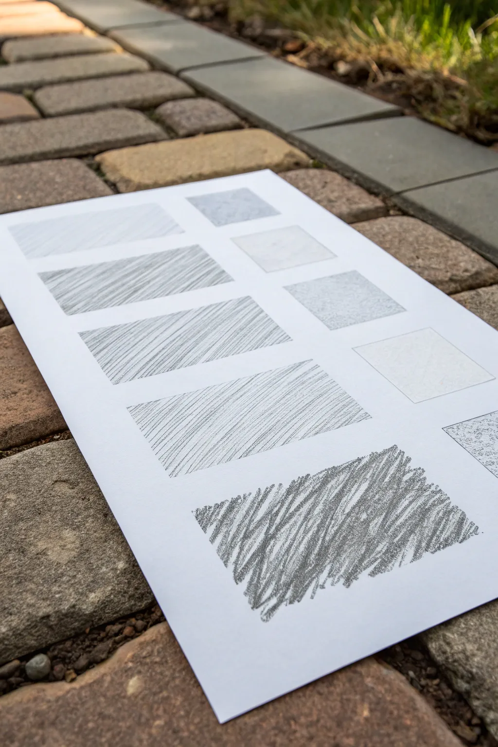
Embrace the beauty of imperfection by exploring scribble shading, a technique that turns rapid, chaotic marks into rich textures. This practice sheet helps you master control over density and pressure to create everything from light mists to deep shadows.
Step-by-Step Tutorial
Materials
- Drawing paper (smooth or bristol board recommended)
- Graphite pencils (various grades: 2H, HB, 2B, 4B, 6B)
- Ruler or straight edge
- Eraser (kneaded or vinyl)
- Pencil sharpener
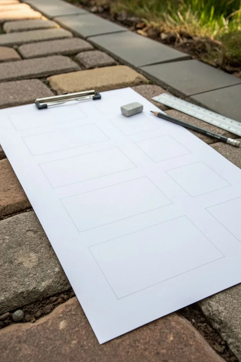
Step 1: Preparation and Layout
-
Prepare your surface:
Place your drawing paper on a smooth, hard surface. If you are working outside like in the photo, use a clipboard or drawing board to ensure the texture of the ground doesn’t interfere with your pencil marks. -
Mark layout guides:
Using a ruler and a light pencil (like a 2H), faintly mark out a series of rectangles. Create a column on the left for linear techniques and a column on the right for texture blocks. -
Create the heavy scribble box:
At the bottom of your sheet, mark out a larger rectangle. This will be the dedicated practice area for the heavy scribble shading shown prominently in the example.
Loose Grip
Hold the pencil farther back on the barrel, away from the tip. This reduces precision but increases fluidity, making your scribbles look more organic and energetic.
Step 2: Exploring Linear Techniques
-
Start with light hatching:
In the top-left box, use a harder pencil (H or HB) to draw diagonal lines very close together. Keep your pressure light and consistent to create a pale gray tone. -
Increase the angle:
Move to the next box down. Draw similar diagonal lines, but slightly increase your pressure or switch to a softer pencil like a B. Try to keep the spacing consistent. -
Vary line direction:
For the subsequent boxes in the left column, practice drawing lines at different consistent angles—some steep, some shallow. Observe how the direction changes the movement of the shading. -
Layer for density:
In the lower boxes of the left column, try hatching in one direction, then lightly hatching over it again in the same direction to build up density without cross-hatching.
Step 3: Creating Texture Blocks
-
Stipple and scumble:
In the right-hand column, use the tip of your pencil to create non-linear textures. Fill one box with tiny, random dots or light circular motions (scumbling) to create a soft, cloud-like texture. -
Soft rubbing:
For the faint, smooth boxes, use the side of your lead rather than the tip. Gently rub the graphite onto the paper to create a texture-free wash of gray.
Gradient Scribbles
Try creating a gradient with this technique. Start with heavy pressure and dense loops on the left, gradually loosening your grip and spacing out the loops as you move right.
Step 4: Mastering Controlled Chaos
-
Select a soft pencil:
For the main scribble shading patch at the bottom, switch to a soft, dark pencil such as a 4B or 6B. A blunt tip works better here than a freshly sharpened one. -
Begin the scribble motion:
Start in the center of the bottom rectangle. Move your hand rapidly back and forth in a tight, jagged zigzag motion. Don’t lift the pencil from the paper. -
Vary the direction:
While maintaining the continuous line, slightly change the angle of your strokes every few seconds. I find that rotating my wrist slightly helps create that tangled, messy look. -
Build up layers:
Go back over areas you’ve already covered. By layering the scribbles, the white gaps fill in, creating a dense, dark tone. -
Create distinct edges:
As you approach the edges of your rectangle, be deliberate with your loops to keep a somewhat defined border, contrasting the localized chaos inside with the clean shape outside. -
Vary pressure:
Press harder in some spots and lighter in others while scribbling. This creates depth and visual interest within the texture, preventing it from looking flat. -
Cleanup:
Once your boxes are filled, use your eraser to clean up any smudges or stray marks outside the rectangle boundaries to keep the presentation neat.
Now you have a dynamic reference sheet to inspire future shading choices in your artwork


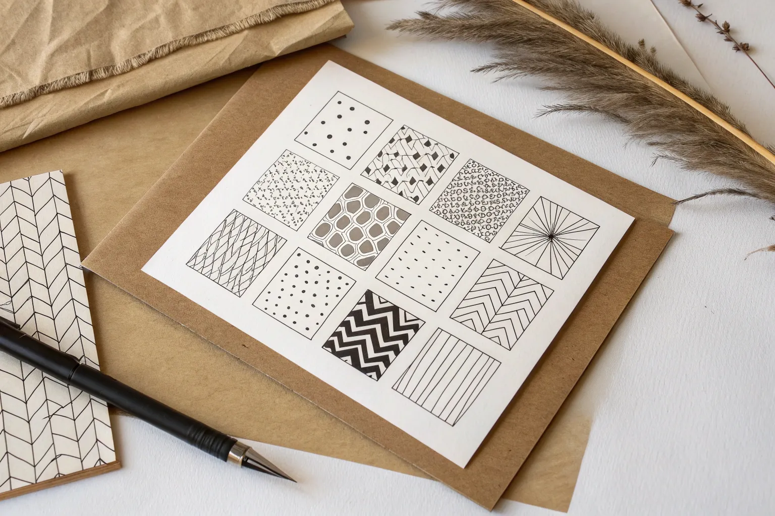
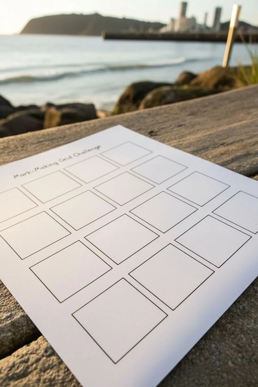
Mark-Making Grid Challenge (One Box, One Idea)
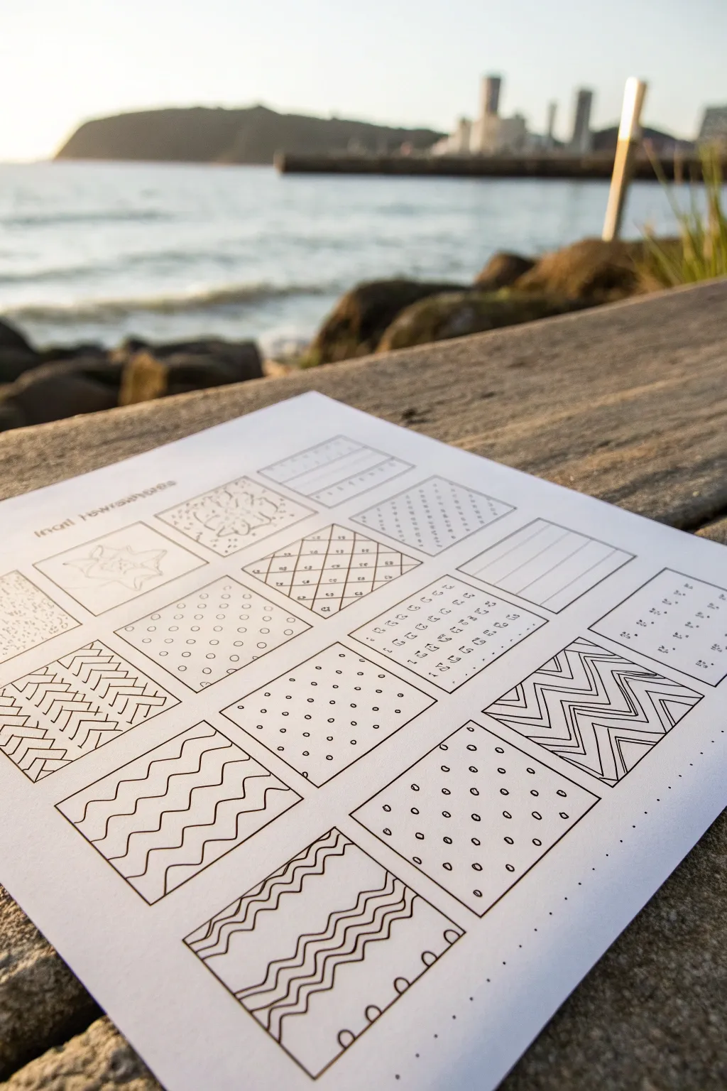
Embrace the meditative practice of mark-making with this structured grid exercise, perfect for warming up your hand or testing new pens. The result is a clean, minimalist sampler featuring a variety of textures, including waves, zig-zags, and stippling, all contained within neat boxes.
Step-by-Step Tutorial
Materials
- White cardstock or high-quality sketchbook paper (A4 size)
- Black fine liner pens (size 0.3 or 0.5)
- Ruler
- Pencil (HB or 2H)
- Eraser
Step 1: Setting the Grid
-
Measure the margins:
Start by lightly measuring a border around your paper with a pencil. Leave about an inch of space at the top for a title if desired, and even margins on the left and right sides. -
Draw the grid lines:
Using your ruler and pencil, lay out a grid of squares. Aim for boxes that are roughly 1.5 to 2 inches square. Create rows and columns with small gaps in between each box for a clean, separate look. -
Ink the outlines:
Once satisfied with the layout, go over your pencil squares with a fine liner pen. Use the ruler to keep these lines perfectly straight and crisp, creating nice, dark frames for your artwork. -
Clean up the page:
Allow the ink to dry completely to prevent smudging, then gently erase all the underlying pencil guidelines to leave a stark black-and-white grid.
Step 2: Creating Linear Patterns
-
Straight diagonals:
In one of the upper boxes, draw simple diagonal lines from corner to corner. Use a ruler if you want them sharp, or freehand them for a more organic feel. -
Cross-hatching grid:
Select another box and draw diagonal lines going one way, then cross them with perpendicular lines to create a small diamond net pattern. Add a tiny dot in the center of each resulting diamond. -
Herringbone texture:
For the box on the far left, create a herringbone or chevron floor pattern. Draw columns of stacked ‘V’ shapes or angled rectangles that interlock. -
Bold zig-zags:
In a middle-right box, draw horizontal zig-zag lines. Use thicker lines or double up your pen strokes to create bold, striped triangular waves.
Uneven Spacing?
If your freehand patterns start drifting or spacing gets uneven, lightly draw pencil guidelines first. Erase them after inking for a perfect finish.
Step 3: Adding Organic Marks
-
Stippling practice:
In the far left middle box, fill the space entirely with stippling. Create random dots, keeping them somewhat sparse to create a light texture, or cluster them for shading. -
Wavy lines:
Design a box filled with horizontal wavy lines. Try varying the amplitude—some shallow waves and some deeper curves—to mimic the ocean surface. -
Polka dots:
Fill a central square with an ordered grid of small circles. Keep the spacing consistent to practice hand control and rhythm. -
Dotted grid:
In a nearby box, create a pattern of tiny solid dots arranged in diagonal rows. This creates a more delicate, textile-like appearance compared to the open circles.
Level Up: Gradient density
Try varying the density of your marks within a single box. Make the lines or dots closer together at the bottom and further apart at the top to create a gradient effect.
Step 4: Complex & Mixed Textures
-
Looped Squiggles:
Select a bottom corner box and fill it with continuous, loopy lines. Imagine drawing a loose spring or handwriting loops repeatedly across the square. -
Segmented waves:
Draw vertical wavy lines, but interrupt them with perpendicular horizontal lines, creating a basket-weave or segmented effect. -
Abstract organic shapes:
In the top left box, sketch a faint, larger organic shape (like a flower or starburst) and outline it loosely. This breaks the pattern of purely geometric fills. -
Combination box:
For the bottom center box, alternate rows of wavy lines with straight lines. This combines the organic and geometric approaches you’ve practiced elsewhere. -
Final touches:
Review your grid. If any lines look too faint, go back over them to ensure the visual weight is balanced across the page.
Now you have a beautiful reference sheet of patterns that looks great framed or kept in your sketchbook for inspiration


Line Families: Dashes, Loops, and Zigs
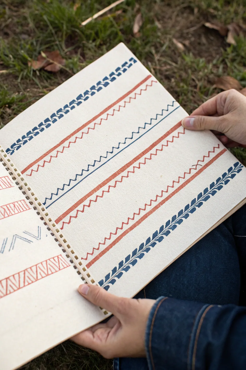
Explore the meditative quality of repetition with this simple yet striking line study. Using basic zig-zags, waves, and organic shapes, you’ll fill a page with structured patterns that serve as excellent practice for brush control and consistency.
Detailed Instructions
Materials
- Spiral-bound sketchbook (heavyweight mixed media or watercolor paper)
- Flat shader brush (size 6 or 8)
- Round detail brush (size 2 or 4)
- Acrylic or Gouache paint (Deep Blue and Terracotta Red)
- Ruler or straight edge
- Pencil (light hardness like 2H)
- Palette for mixing
- Water cup and paper towels
Step 1: Preparation & Guidelines
-
Prepare your workspace:
Find a comfortable, well-lit surface. Since this project relies on steady hands, ensure your arm has room to move freely across the page. -
Mix your colors:
Prepare two distinct puddles of paint on your palette: a deep, classic blue and an earthy terracotta red. Aim for a consistency similar to heavy cream so the paint flows smoothly without being transparent. -
Draw pencil guides:
Using a ruler and a light pencil, draw horizontal lines across the page to serve as baselines for your patterns. Space them evenly, leaving about an inch and a half between each line to allow room for the height of your marks.
Step 2: The Geometric Patterns
-
Start the top border:
Load your flat brush with blue paint. For the top pattern, you will create a ‘Greek Key’ or braid-inspired look. Start by stamping the flat edge of the brush at a 45-degree angle. -
Complete the blue braid:
Alternate small vertical strokes with angled strokes, keeping them connected to form a running geometric chain. Work slowly from left to right. -
Paint the first red band:
Switch to your red paint and clean your brush. Paint a thick, solid straight line across the page using the flat brush. This anchors the chaotic lines that follow. I find taking a deep breath before dragging the brush helps keep the line steady. -
Add the red zig-zags:
Using a smaller round brush and red paint, create a ‘heartbeat’ line just below the solid band. These should be sharp, irregular spikes—some tall, some short—mimicking a rugged landscape.
Steady Hand Trick
Rest your pinky finger on a dry part of the paper as a pivot point. It stabilizes your hand for long, continuous lines.
Step 3: The Jagged & Wavy Lines
-
Create the blue sawtooth:
With the round brush and blue paint, move to the next section. Paint a continuous, sharp zig-zag line. Focus on keeping the points sharp and the angles consistent, like the teeth of a saw. -
Paint the second red band:
Mirroring the earlier step, use the flat brush and red paint to create another solid horizontal band across the page. -
Add the square wave:
Beneath this second red band, use your round brush to paint a running ‘crenellated’ line. Instead of sharp points, think of these as boxy, open-topped squares connected in a row. -
Paint the third red band:
Lay down your final solid red stripe with the flat brush. Ensure the paint opacity is consistent with the previous bands. -
Create the soft wave:
Under the third red band, use the round brush to paint a tighter, more fluid zig-zag or soundwave pattern. Let this line feel a bit looser than the geometric ones above.
Mix It Up
Try varying the pressure on your brush within a single stroke to create thick-and-thin line variation for a more calligraphy-style look.
Step 4: The Leafy Footer
-
Draft the stem:
For the heavy bottom border, load your round brush with blue paint. Draw a single, slightly curved central spine that runs the entire width of the page. -
Paint the top leaves:
Starting from the left, press the belly of the round brush down and lift up quickly to create teardrop-shaped leaves along the top side of the stem, angling them forward. -
Paint the bottom leaves:
Repeat the leaf motion on the bottom side of the stem. Try to stagger them slightly so they sit in the gaps between the top leaves for a balanced, fern-like appearance. -
Erase guidelines:
Wait until the paint is bone dry—acrylics can be tricky and smear if rushed. Once safe, gently erase your initial pencil baselines.
Now you have a reference sheet of beautiful borders ready to frame or replicate in future journals


Have a question or want to share your own experience? I'd love to hear from you in the comments below!