
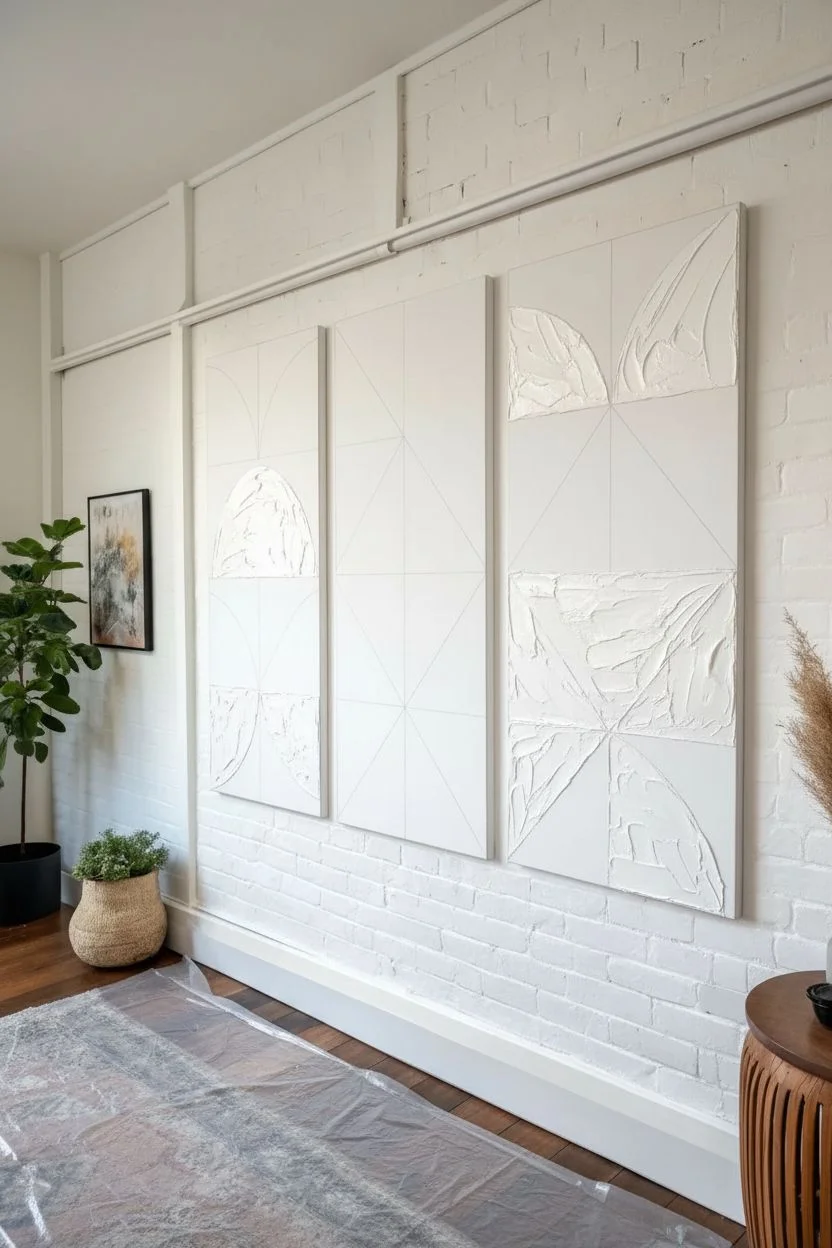
Split canvas paintings are such a fun way to make one image feel bigger, bolder, and more modern—just by breaking it across multiple panels. I love how the little gaps create instant drama, like your artwork is breathing on the wall.
Forest Tree With Branches Spanning Panels
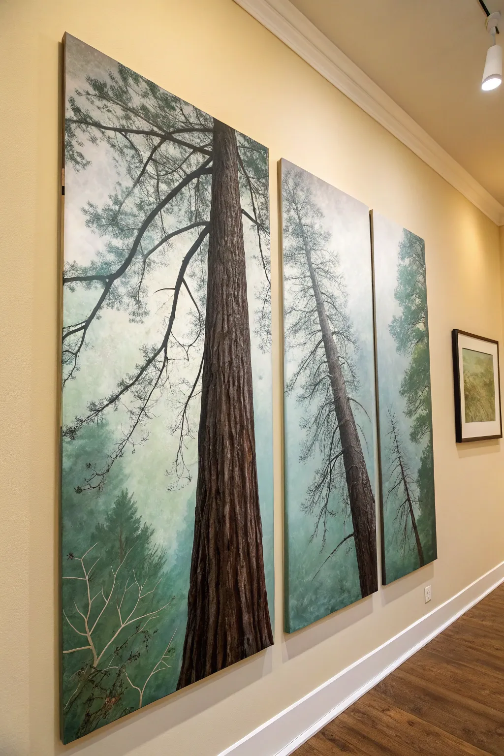
Bring the majestic height of an ancient forest into your home with this stunning three-panel split canvas project. By painting a continuous scene across separate surfaces, you create a dramatic window-like effect that emphasizes the soaring verticality of the trees.
Step-by-Step Guide
Materials
- 3 large gallery-wrapped canvases (e.g., 24×48 inches each)
- Acrylic paints: Burnt Umber, Raw Sienna, Mars Black, Titanium White, Sap Green, Hooker’s Green, Phthalo Blue
- Large flat brushes (2-3 inch) for background blending
- Medium filbert brushes for tree structures
- Small round liner brushes (size 1 or 2) for branches
- Sea sponge or stippling brush
- easel or large drop cloth for floor working
- Palette knife
- Water spray bottle
- Ruler and chalk
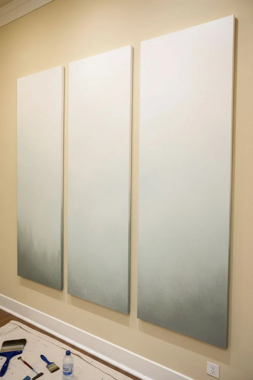
Step 1: Preparation and Sky Layer
-
Align the canvases:
Lay your three canvases side-by-side on your workspace, leaving a small gap (about 1 inch) between them to simulate how they will hang on the wall. This ensures your image flows naturally across the hidden edges. -
Mix the atmospheric base:
Create a very pale, misty sky color by mixing a large amount of Titanium White with a tiny touch of Hooker’s Green and Phthalo Blue. The goal is a foggy, off-white haze rather than a bright blue sky. -
Apply the background gradient:
Using your largest flat brush, cover the entire surface of all three canvases. While the paint is wet, blend in slightly darker grey-green tones near the bottom to suggest depth in the forest floor, fading to nearly pure white at the top. -
Soften the transition:
Mist the canvas lightly with your spray bottle to keep the acrylics workable. Use a clean, dry brush to smooth out brushstrokes, creating a soft, ethereal fog effect. Let this layer dry completely.
Step 2: Drafting the Giants
-
Sketch the composition:
Use chalk to lightly sketch the position of the trees. The main focal point—the largest trunk—should span across the first and second panels, dominating the view. Draw shorter, thinner trees on the third panel to create distance. -
Review the flow:
Step back and check that your horizontal branch lines «jump» correctly across the gaps between canvases. The lines should align visually as if the space between them is just a windowpane.
Branch Misalignment?
If your branches look disjointed across panels, lay the canvases flat on the floor pushed fully together. Painting the crossing branch as one continuous line, then separating them to dry, fixes this.
Step 3: Painting the Trunks
-
Block in the bark base:
Mix Burnt Umber with a touch of Mars Black. Using a medium filbert brush, paint the main vertical shapes of the tree trunks. Don’t worry about texture yet; just get the solid dark silhouette established. -
Add bark texture:
Once the base is tacky, mix Raw Sienna with Burnt Umber. Using a palette knife or a dry stiff brush, drag this lighter, warmer color vertically down the trunks. This mimics the deep fissures of redwood bark. -
Highlight the form:
On the left side of the main trunks, dry-brush a mixture of White and Raw Sienna to indicate a light source coming from the left, giving the flat shapes cylindrical volume. -
Deepen the shadows:
Glaze the right side of the trunks with a watered-down mix of Black and Burnt Umber to recede them into the shade.
Level Up: Texture Gel
Mix heavy gel medium into your bark paint colors. Apply it thickly with a palette knife to create actual 3D ridges on the trunk, making the tree feel touchable.
Step 4: Foliage and Detail
-
Create the distant canopy:
Mix Sap Green with a lot of White for a desaturated, misty green. Using a sea sponge or stippling brush, dab clusters of foliage high up in the background, keeping edges soft and undefined. -
Paint main branches:
Use your liner brush and thinned black-brown paint to draw the intricate network of jagged branches. Ensure some of these branches reach all the way across the canvas gaps, connecting the panels visually. -
Add foreground needles:
Switch to a darker, richer Hooker’s Green. With a small round brush, paint distinct clusters of pine needles on the lower branches that are closest to the viewer. -
Paint the wispy undergrowth:
At the very bottom left, use a liner brush with a light grey-green color to paint thin, bare twig structures rising up, suggesting small shrubs in the foreground fog. -
Final mist glaze:
To push the furthest trees back, apply a very thin glaze (mostly water, tiny bit of white paint) over the top sections of the background trees. This ‘atmospheric perspective’ makes the main trunk pop forward.
Step 5: Finishing Up
-
Paint the edges:
Don’t forget the sides of your gallery-wrapped canvas. Carry the misty grey background color around the edges so the image looks finished from all angles. -
Varnish:
Once the painting is cured (wait at least 48 hours for thick acrylics), apply a matte or satin varnish to unify the sheen and protect the deep darks of the bark.
Hang your masterpiece with consistent spacing and enjoy the serene atmosphere of the forest.

Minimal Abstract Color Wash Diptych
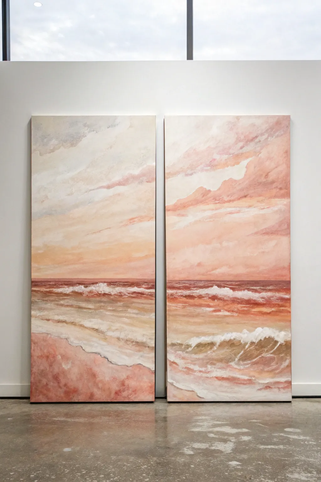
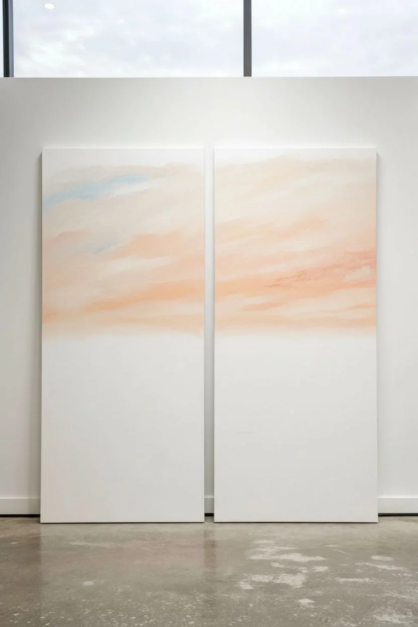
Capture the ethereal beauty of a sunset coastline across two large canvases with this painterly diptych project. Using soft washes of peaches, pinks, and creamy whites, you’ll create a cohesive horizon that flows seamlessly from one panel to the next.
How-To Guide
Materials
- Two large, tall rectangular canvases (e.g., 24×48 inches)
- Acrylic paints: Titanium White, Rose Madder, Yellow Ochre, Burnt Sienna, Payne’s Grey, and a soft Sky Blue
- Large flat brush (2-3 inch) for broad strokes
- Medium filbert brush for clouds and waves
- Small round brush for details
- Palette knife (optional, for texture)
- Water spray bottle
- Mixing palette
- Easels (or a large wall space to hang canvases side-by-side)
Step 1: Setting the scene
-
Arrange your surface:
Place both canvases side-by-side on your easel or work wall. Leave a small gap of about an inch between them, mimicking how they will hang. This ensures your horizon lines and cloud formations will match up perfectly across the split. -
Mix the sky base:
Create a pale, creamy peach color by mixing a large amount of Titanium White with a touch of Yellow Ochre and a tiny dot of Rose Madder. It should be very light and airy. -
Apply the sky gradient:
Using the large flat brush, paint the upper third of both canvases with your creamy peach mix. While the paint is still wet, blend in some pure Titanium White near the top edges to create a gentle fade. -
Add soft blue hints:
While the sky base is tacky but not fully dry, introduce very faint streaks of Sky Blue mixed with white in the upper left corner of the left canvas. Use a light hand to keep the color from becoming muddy.
Keep it Fluid
Keep a spray bottle handy to mist your acrylics. Keeping the paint damp allows for those soft, dreamy watercolor-style transitions in the sky without having to use oils.
Step 2: Building the clouds
-
Prepare cloud colors:
Mix a slightly darker, rosier pink using Rose Madder and White, and a shadow color using a hint of Payne’s Grey mixed into your pink. -
Form the cloud shapes:
With a medium filbert brush, scumble in diagonal cloud formations. Start on the right canvas and let the shapes flow continuously onto the left canvas. Focus on the organic, sweeping motion of wind-blown clouds. -
Highlighting the clouds:
Dip your brush into pure Titanium White and add highlights to the top ridges of your cloud forms. Soften the bottom edges of the clouds with a dry brush to make them look fluffy and distant. -
Adding warmth:
Glaze a thin layer of watered-down Burnt Sienna (mixed with plenty of white) just above the horizon line to suggest the warmth of the setting sun.
Texture Play
Mix a dab of modeling paste into your white paint for the crashing waves. This physical texture creates actual shadows and makes the foam look 3D.
Step 3: The horizon and ocean
-
Define the horizon:
Draw a straight line across both canvases roughly one-third of the way up from the bottom. Paint a dark, reddish-brown strip along this line using a mix of Rose Madder and Burnt Sienna to anchor the ocean. -
Block in the water:
Beneath the horizon line, paint horizontal strokes of a terra-cotta pink. Vary the intensity, making it slightly darker near the horizon and lighter as you move downward toward the shore. -
Create wave movement:
Using horizontal, sweeping strokes, layer in lighter peach and white tones over the water color. I like to keep my brush slightly dry here to let the darker underlayer peek through giving the illusion of ripples. -
Paint the crashing waves:
Load a copious amount of Titanium White onto your medium brush or palette knife. Create the main line of crashing foam across both canvases, positioning it lower on the right canvas to suggest perspective. -
Detailing the foam:
Use the small round brush to pull little squiggles and loops of white paint upward from the crashing wave line, mimicking spray and sea foam.
Step 4: The foreground shore
-
Paint the wet sand:
For the bottom section, mix Burnt Sienna, White, and a touch of Rose Madder to get a wet sand color. Apply this in the foreground, darkening the color slightly at the very bottom corners. -
Reflecting the sky:
While the sand paint is wet, brush in reflections of the pink clouds using your rosy mix. These reflections should be vertical and soft, blurring into the sand color. -
Sea foam on sand:
Create soft, scalloped edges of white foam where the water meets the sand. Ensure the lines connect visually from the left canvas to the right, showing the water receding. -
Final blending:
Mist the painting lightly with water. Use a large clean brush to gently soften any harsh transitions in the sky and distant water, creating that dreamy mood. -
Review and refine:
Step back and look at the diptych as a whole. Add final touches of pure white highlight to the crest of the nearest wave to make it pop before letting everything dry completely.
Hang your masterpiece with a small gap between the canvases and enjoy the calming coastal view you’ve created.
Geometric Blocks That Align Across Gaps
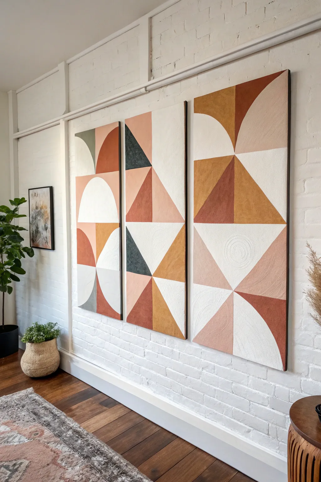
Transform a large wall with this stunning three-panel creation featuring bold geometric shapes in warm terracotta, mustard, and cream tones. The design cleverly uses split canvases to create a cohesive pattern that flows across the gaps, bringing a modern and sophisticated gallery feel to your space.
Step-by-Step
Materials
- Three large rectangular canvases (24×48 inches recommended)
- Acrylic paints (terracotta, rust, mustard yellow, dark forest green, beige, oatmeal/cream, white)
- Texture medium (modeling paste or sand texture gel)
- Painter’s tape (low tack)
- Large T-square or long ruler
- Pencil
- Palette knives (assorted sizes)
- Flat paintbrushes (1-inch and 2-inch)
- Plastic drop cloth
- Easel or large flat work surface
Step 1: Preparation and Mapping
-
Prepare the workspace:
Lay down your plastic drop cloth. Arrange your three canvases side-by-side on the floor or vertically against a wall, leaving a consistent gap of about 2 inches between them to simulate their final hanging position. -
Visualize the grid:
Imagine a grid overlying all three canvases. This design is built on rows of large squares or rectangles stacked vertically. Lightly mark horizontal lines across all three canvases at equal intervals to create three or four distinct rows depending on your canvas height. -
Sketch the primary shapes:
Using your T-square and pencil, lightly sketch the large geometric forms. Focus on aligning lines that cross the gaps—for instance, if a triangle point starts on the left panel, ensure the corresponding line continues naturally onto the middle panel. -
Draft the curves:
For the semicircles and quarter-circles, you can create a makeshift compass using a string and pencil, or trace large round objects like platters or bucket lids. Draw these curves carefully, paying attention to where colors will shift within the curve.
Clean Lines Hack
Apply a thin layer of the *background* color or matte medium over the tape edge first. This seals the gap, so if any paint seeps under, it’s invisible.
Step 2: Adding Texture
-
Mix the texture base:
Before adding color, mix your white acrylic base with a generous amount of texture medium or modeling paste. You want a consistency similar to thick frosting. -
Apply texture specifically:
Using a palette knife, apply this textured white mixture to the specific sections destined to be cream or oatmeal colored. Create subtle swirls or linear scrapes to add depth. -
Let it cure:
Allow the texture medium to dry completely. This usually takes several hours or overnight depending on thickness.
Fixing Texture Cracks
If your modeling paste cracks while drying, don’t panic. Mix a little more paste with water and smooth it into the cracks with a finger, then repaint.
Step 3: Block Painting
-
Tape the first shapes:
Choose a color to start with—perhaps the deep forest green. Use painter’s tape to mask off the crisp edges of the triangles where this color appears, pressing the tape down firmly to prevent bleed. -
Apply dark accents:
Paint the dark green sections using a flat brush. I prefer doing two thin coats rather than one thick one for better coverage. -
Remove tape and dry:
Peel the tape off while the paint is still slightly tacky to keep the edge sharp, then let that color dry completely. -
Paint the terracotta tones:
Move on to the rust and terracotta sections. Tape off neighboring dried sections to protect them. Apply the warm reddish-brown paint, potentially mixing in a tiny bit of texture medium if you want the colored sections to have grit as well. -
Block in mustard yellow:
Address the golden/mustard triangles and shapes next. Ensure your brush strokes follow the direction of the geometric shape—diagonal strokes for triangles, vertical for rectangles. -
Fill the creams:
Paint over your dried textured sections with an oatmeal or off-white color. You might want to dry-brush this layer slightly so the peaks of the texture remain lighter than the valleys.
Step 4: Connective Details
-
Check the alignment:
Place the canvases side-by-side again. Check if any lines that span across two canvases (like the large diagonal cuts) look disjointed. Correct them with a small brush if necessary. -
Refine the edges:
With the canvases apart, paint the side edges (the depth) of the canvas. Extend the geometric design around the corner for a high-end, gallery-wrapped look. -
Final touch-ups:
Use a small detail brush to fix any paint bleeds or uneven lines where different shapes meet. -
Seal the work:
Once fully cured (give it 24 hours), apply a matte varnish over all three panels to unify the sheen and protect the textured surface.
Hang your new triptych with evenly spaced gaps to let the large-scale geometric forms flow across the wall


Single Giant Flower Split Into Panels
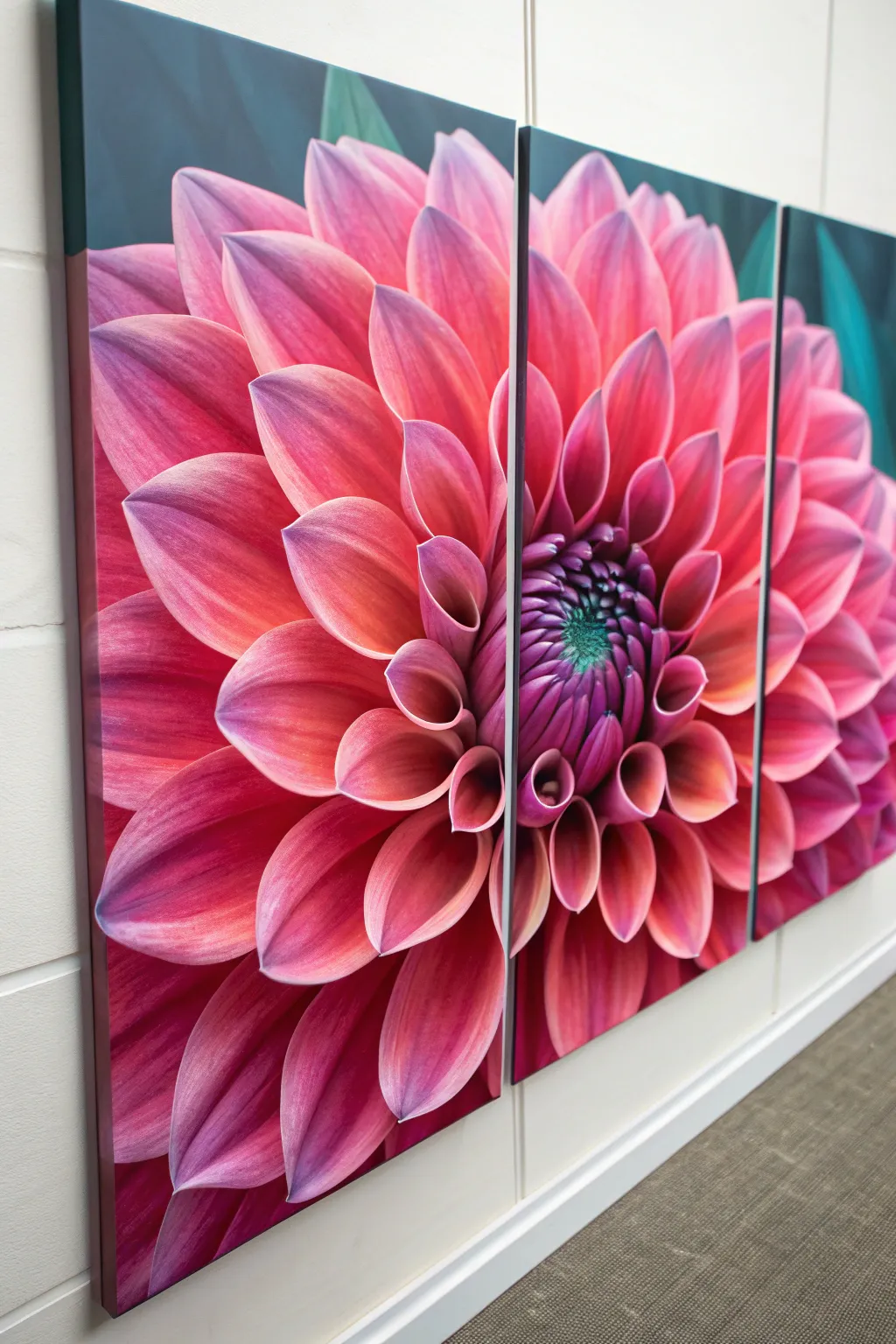
Transform a blank wall into a botanical garden with this stunning split-canvas project. By painting a single, giant dahlia across three separate panels, you create a seamless and modern statement piece that radiates vibrant pinks and deep purples.
How-To Guide
Materials
- 3 gallery-wrapped canvases (18×24 inches or larger)
- Acrylic paints (Titanium White, Magenta, Alizarin Crimson, Dioxazine Purple, Phthalo Green, Mars Black)
- Large flat brush (2-inch)
- Medium filbert brushes (sizes 8 and 10)
- Small round detail brush (size 2)
- Glazing medium
- Slow-drying medium (optional)
- Graphite transfer paper or projector
- Painter’s tape or masking tape
- Easel or large flat workspace
- Palette and water cup
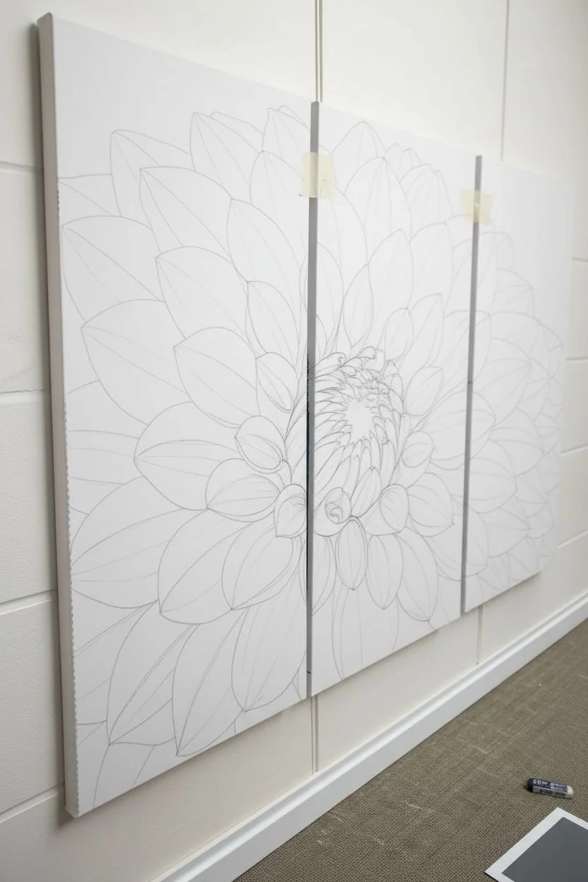
Step 1: Preparation & Layout
-
Arrange the canvases:
Lay your three canvases side-by-side on your workspace or mounted on a wall. Leave a small gap (about 1 inch) between them to simulate how they will hang, or push them tight together if you prefer to paint across the gap seamlessly. -
Secure the arrangement:
If working flat, place a strip of painter’s tape across the back of the frames to hold them temporarily in position. This ensures your lines stay straight as they cross from one canvas to the next. -
Transfer the flower outline:
Project an image of a dahlia onto the triptych or sketch it lightly with a pencil. Ensure the center of the flower—the ‘eye’—is positioned slightly off-center, landing near the split between the middle and right canvas for dynamic composition. -
Wrap the edges:
Mark where the petals flow over the sides of the canvas. You’ll want to paint the sides (gallery wrap style) so the image looks complete from an angle.
Mind the Gap
When sketching, treat the 1-inch gap between canvases as ‘invisible space.’ Imagine the petal continues through the air, rather than jumping instantly to the next canvas edge.
Step 2: Underpainting & Background
-
Mix the background color:
Combine Phthalo Green with a touch of Mars Black and a tiny bit of Dioxazine Purple. You want a deep, velvety teal that will make the pink pop. -
Apply the background:
Using the large flat brush, paint the negative space around the flower petals. Don’t worry about being perfect near the edges yet; overlap the pencil lines slightly. -
Paint the canvas sides:
While you have the dark teal mixed on your brush, paint the outer edges and the inner edges (the gaps) of the canvases so the background flows continuously. -
Base coat the petals:
Mix a medium pink using Magenta and Titanium White. Fill in all the petals with a flat, solid coat to block in the shape. Let this layer dry completely.
Step 3: Developing the Petals
-
Establish the shadows:
Mix Alizarin Crimson with a little Dioxazine Purple. Using a medium filbert brush, paint the base of each petal where it tucks under the petal above it. -
Blend the mid-tones:
Revisit your Magenta and White mix. I typically add a drop of slow-drying medium here to make blending easier. Apply this to the middle section of each petal, blending it wet-into-wet with the darker shadow color. -
Create the highlights:
Mix a very pale pink, almost white. Apply this to the outer rims and tips of the petals. Use distinct, sweeping strokes that follow the curvature of the petal shape. -
Enhance the depth:
For the petals closest to the center, deepen the shadows further with pure Dioxazine Purple. This creates the illusion of a deep, cone-like shape in the middle of the bloom. -
Smooth the transitions:
Use a clean, slightly damp soft brush to lightly feather the transitions between the shadow, mid-tone, and highlight while the paint is still tacky.
Muddy Pinks?
If your pinks look dull, don’t use black to darken them. Black kills the vibrancy of red tones. Instead, use deep purple or dark green to create rich shadows.
Step 4: The Center & Final Details
-
Detail the center eye:
For the tightly packed center petals, use the small round brush. Dot in deep purple and dark green in the very center, gradually switching to small loops of magenta as you move outward. -
Add crisp edges:
Mix a thin glaze of pure white. Carefully line the very tips of the most prominent petals to make them look sharp and crisp against the dark background. -
Check the gap alignment:
Separate the canvases slightly if they were touching. Check the inner edges where the image ‘breaks.’ Ensure the petal lines continue logically onto the side of the canvas frame so the image doesn’t look cut off when viewed from the side. -
Glaze for vibrancy:
Once fully dry, mix a tiny amount of Magenta with glazing medium. Brush this transparent layer over the mid-tones to unify the colors and boost saturation. -
Varnish and seal:
Apply a coat of satin or gloss varnish across all three panels. This protects the paint and gives the dark background a uniform sheen.
Hang your masterpiece with pride and enjoy the dramatic flair of giant florals in your space
BRUSH GUIDE
The Right Brush for Every Stroke
From clean lines to bold texture — master brush choice, stroke control, and essential techniques.
Explore the Full Guide
Butterfly Wings Spread Across Two Canvases
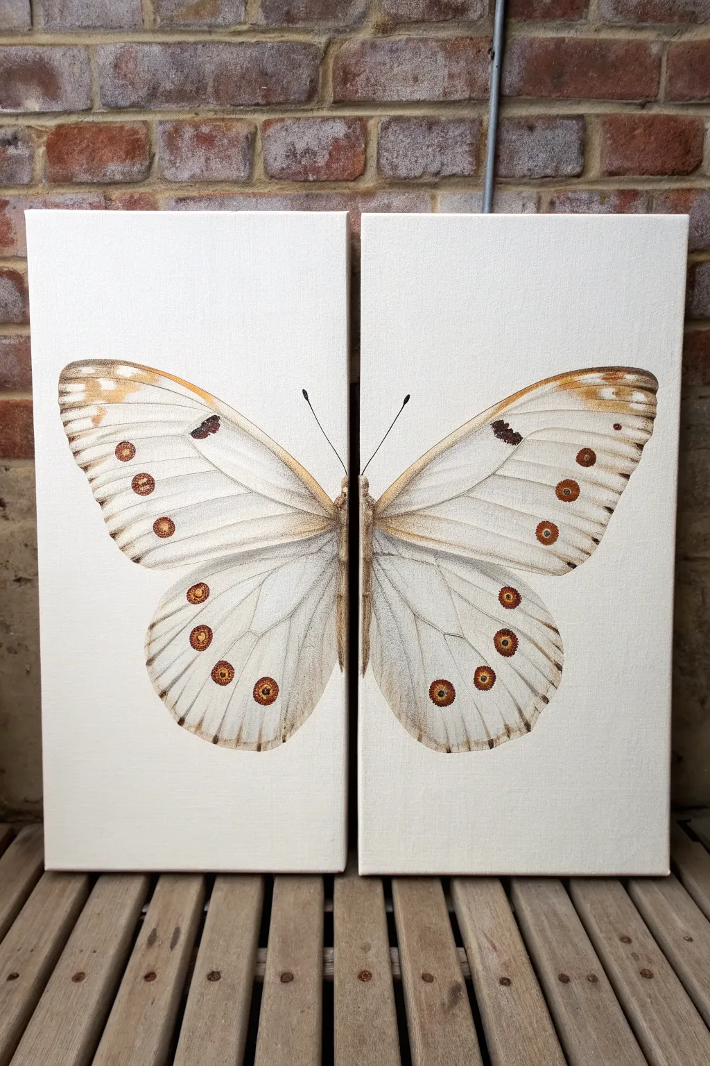
Create a stunning statement piece by spanning a single, delicate butterfly illustration across two separate canvases. This project captures the vintage charm of scientific drawings with a soft color palette and precise detailing that bridges the gap between the panels perfectly.
Step-by-Step
Materials
- Two 12×24 inch stretched canvases (or similar tall, rectangular size)
- Acrylic paints: Titanium White, Burnt Umber, Raw Sienna, Yellow Ochre, Black
- Floetrol or acrylic glazing medium (optional, for translucency)
- Flat brushes (1-inch for background)
- Round brushes (sizes 2, 4, and 6)
- Fine liner brush (size 0 or 00)
- Pencil and eraser
- Ruler or straight edge
- Tracing paper (large sheets)
- Artist tape or painter’s tape
- Easel or flat workspace
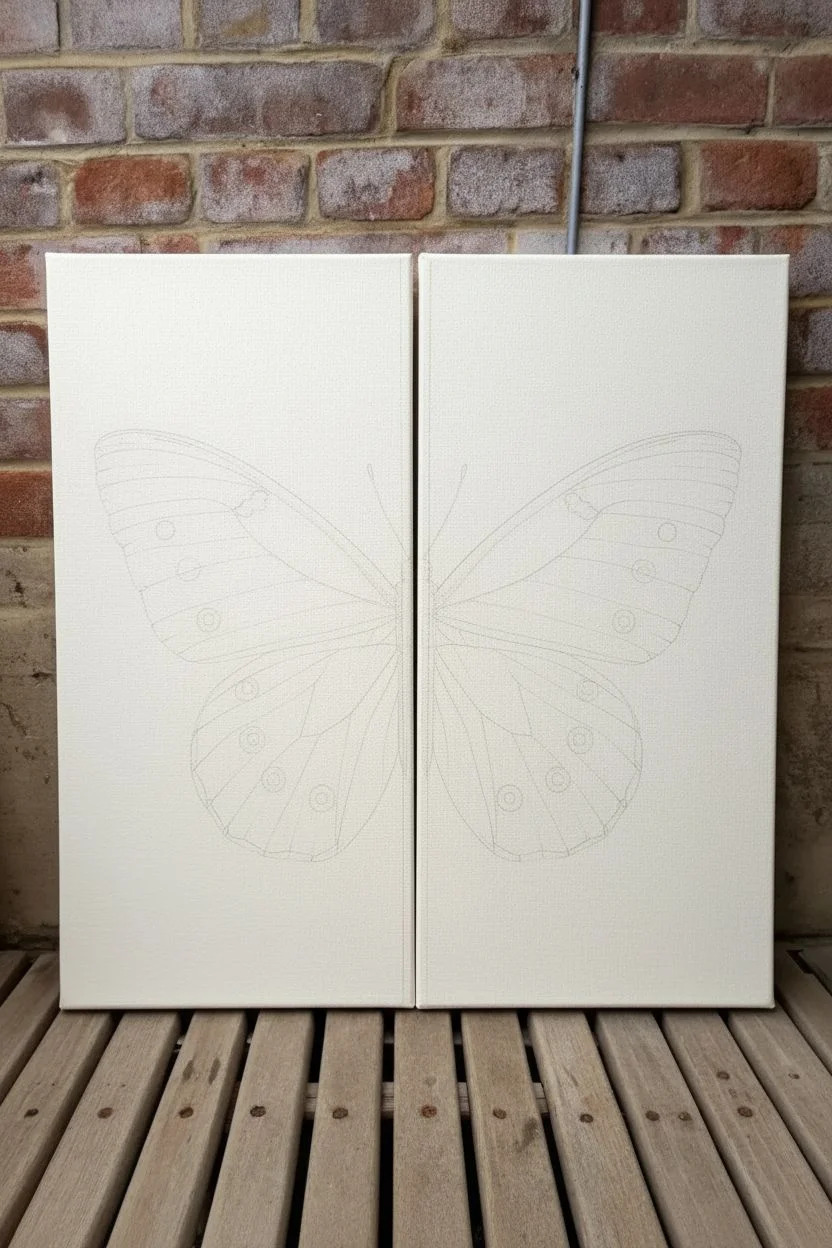
Step 1: Preparation & Sketching
-
Prepare the background:
Start by giving both canvases a base coat. Mix Titanium White with a tiny drop of Raw Sienna to create an antique off-white or cream shade. Apply this evenly across both canvases, including the sides, using your large flat brush. Let this dry completely before adding a second coat for full opacity. -
Align the canvases:
Push the two dry canvases snugly together on your work surface. Since the image relies on symmetry and continuity, you need them to act as one surface for the sketching phase. You might want to tape them together on the back temporarily to prevent shifting. -
Draw the centerline:
Lightly mark the exact center point where the two canvases meet. This vertical gap will be the body of the butterfly. From there, measure outwards to decide how wide the wings span, ensuring they reach almost to the edges for maximum impact. -
Draft the wing shape:
Using a pencil, lightly sketch the butterfly outline. It’s often easier to draw one wing entirely on tracing paper first. Once you’re happy with the shape, flip the tracing paper to transfer the exact mirror image onto the opposite canvas, ensuring perfect symmetry. -
Sketch the details:
Draw the internal vein structures and the characteristic circular ‘eye’ spots on the wings. Don’t press too hard with the pencil; you want these lines to be faint guides that won’t show through the final paint.
Step 2: Blocking Colors
-
Base the wings:
Mix a very pale grey-white using Titanium White and the smallest touch of Black or Burnt Umber. Fill in the entire shape of the wings, avoiding the circular spots and the body. This creates a separating layer from the background cream color. -
Paint the body:
Between the wings—right along the gap of the canvases—paint the thorax and abdomen using a mix of Burnt Umber and Raw Sienna. Use short, flicking brushstrokes to simulate a fuzzy, hairy texture rather than a solid block of color. -
Add warmth to the upper wings:
Mix a glaze of Yellow Ochre and water (or glazing medium). Gently wash this color over the upper, outer corners of the top wings. You want a soft gradient that fades into the white, mimicking the aged look of the reference image. -
Block in the spots:
Locate the circular patterns on your sketch. Paint the base of these circles with a warm Raw Sienna or diluted Burnt Umber. Keep the edges relatively soft for now; we will sharpen them later.
Bridge the Gap
When painting the inner edges (where the canvases touch), push the two canvases together and paint across the gap simultaneously. Then separate them to touch up the messy edges ensuring a perfect match.
Step 3: Detailing & Texture
-
Paint the veins:
Switch to your size 0 liner brush. Mix a thin, inky consistency of Burnt Umber and faint Grey. Carefully drag the brush from the body outward to the wing tips to create the delicate vein structure. I find it helps to hold my breath slightly for the steadiest lines. -
Detail the eye spots:
Refine the circles on the wings. Add a darker ring of Red-Brown (mix Umber and Ochre) around the edges of the spots. Place a tiny dot of black in the center of the lower wing spots to create depth. -
Create texture with dry brushing:
Load a clean, dry filbert or round brush with a small amount of un-thinned White paint. Wipe most of it off on a paper towel. Gently drag this over the wings, perpendicular to the veins, to create the powdery, scale-like texture characteristic of butterfly wings. -
Enhance the edges:
Add definition to the outer rim of the wings. Use short, dashed strokes of dark brown along the perimeter to give the wings a slightly ragged, natural edge rather than a perfectly smooth cartoon line. -
Paint the antennae:
Using your finest liner brush and thin Black paint, sweep two long, graceful lines extending from the head area near the top of the canvas gap. Ensure the curve breaks cleanly across the canvas edge if the antennae extend that far. -
Wrap the image:
This is crucial for the split-canvas effect: Paint the image over the sides of the canvas where they meet in the middle. The body and wing roots should wrap around the inner edges so that even if the canvases hang slightly apart, the image feels continuous. -
Add subtle shadowing:
To make the butterfly pop, mix a transparent glaze of Burnt Umber. Apply a very faint shadow underneath the lower wings where they overlap slightly with the bottom wings, adding dimension to the anatomy. -
Seal the artwork:
Once fully dry (give it at least 24 hours), apply a matte or satin varnish. This unifies the sheen of the different paint layers and protects that delicate cream background from dust.
Vintage Patina
For an older scientific illustration look, mix a tiny amount of brown paint with generous water and splatter fine droplets across the background before painting the butterfly to simulate aged paper.
Hang your canvases with about an inch of space between them to let the negative space become part of the art
Birds Flying From One Panel to the Next
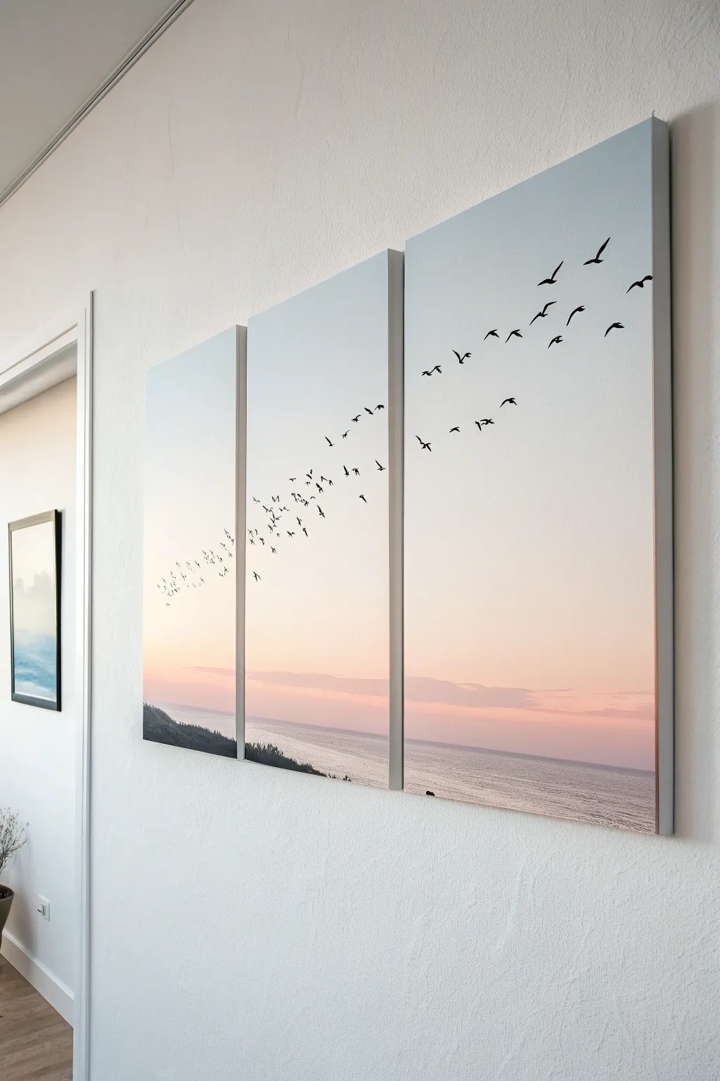
Bring the calming expanse of the coast into your home with this three-panel artwork featuring a seamless gradient sunset and a dynamic flock of silhouetted birds. The design spans across all canvases, creating a sense of movement and connection that feels larger than a single frame.
How-To Guide
Materials
- 3 Stretched canvases (same size, e.g., 16×24 inches)
- Acrylic paints: Titanium White, Sky Blue, Magenta or Peachy Pink, Black
- Large flat brush (2-3 inch) for blending
- Medium flat brush
- Small round detail brush (size 1 or 2)
- Painter’s tape or masking tape
- Pencil and eraser
- Reference photo of birds
- Palette for mixing
- Water cup and paper towels
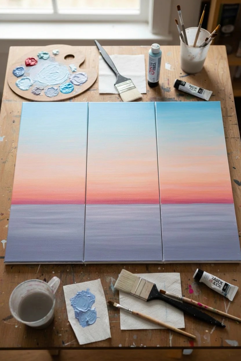
Step 1: Preparing the Sky
-
Arrange the Canvases:
Lay your three canvases side-by-side on a flat workspace. Push them completely together so they touch; this ensures your horizon line and gradient will flow perfectly across the gaps. -
Mix the Sky Blue:
On your palette, mix a soft sky blue using white and a touch of blue. You want this to be quite light and airy, resembling the upper atmosphere before dusk. -
Paint the Upper Section:
Using your large flat brush, apply the light blue mix across the top third of all three canvases. Use long, horizontal strokes that span across the gaps where the canvases meet to maintain continuity. -
Create the Sunset Hue:
Mix a soft warm tone using white and a tiny bit of magenta or peach. While the blue paint is still wet on the canvas, start painting the middle section, blending upwards into the blue to create a smooth transition. -
Deepen the Horizon:
Add a little more pink or peach to your mix for the area just above the horizon line. Paint this lower sky section, blending it upwards into the paler color. I find using a clean, dry brush helps soften any harsh lines between colors. -
Paint the Water:
For the sea below the horizon, mix a greyish-purple tone. Paint horizontal strokes, keeping them straighter than the sky to mimic water texture. Let the entire background dry completely before moving on.
Uneven Gradients?
If your sky blend dries with streaks, wait for it to dry fully, then apply a very thin wash of water over the area and add a second layer of paint. Acrylic blending medium also slows drying time.
Step 2: Adding the Silhouette Details
-
Sketch the Land:
Use a pencil to lightly sketch a sloping coastline on the bottom of the left canvas, extending slightly onto the middle canvas. It should be low and heavy on the left, fading out towards the right. -
Paint the Land Mass:
Using black paint mixed with a tiny bit of your water color (to soften the black), fill in the land shape. Use irregular dabbing motions along the top edge to simulate trees and vegetation. -
Plan the Bird Flight Path:
Lightly trace a sweeping curve with your pencil that starts low on the left panel and arches high up to the top right panel. This invisible line will guide where you place your birds. -
Practice Bird Shapes:
On a scrap piece of paper, practice painting small ‘V’ and ‘M’ shapes. Vary the openness of the wings to show different stages of flight. -
Paint the Flock Leader:
Using your small round brush and black paint, start with the largest birds in the upper right corner of the third canvas. These should be the most detailed since they appear closest. -
Fill in the Flock:
Work backwards along your pencil curve towards the left canvas. Make the birds progressively smaller as you go down and to the left to create perspective and depth. -
Check the Spacing:
Step back to look at the composition. Add a few stray birds slightly outside the main formation to make the flock look natural and organic rather than rigid. -
Paint the Edges:
Once dry, separate the canvases. Paint the sides of each canvas (the gallery wrap) to match the colors on the front face, ensuring the image looks finished from all angles. -
Final Varnish:
Allow the black contours to dry fully (at least 24 hours). Apply a coat of satin or matte varnish to seal the painting and unify the sheen of the different paint layers.
Add Metallic Touches
For a magical twilight effect, mix a tiny amount of silver or pearlescent medium into the water section of the painting to make the waves catch the light.
Hang your new masterpiece with about an inch of space between panels to let the image breathe

PENCIL GUIDE
Understanding Pencil Grades from H to B
From first sketch to finished drawing — learn pencil grades, line control, and shading techniques.
Explore the Full Guide
Split Portrait With Bold Shadow Shapes
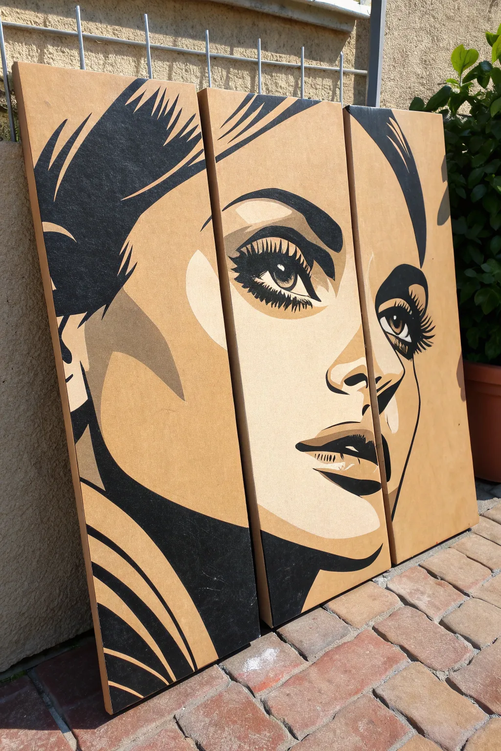
Transform three simple panels into a striking pop-art portrait that balances negative space with bold shadow shapes. This project uses the raw background of MDF or wood panels as a fourth color, creating an organic warmth that contrasts beautifully with sharp black graphics.
Step-by-Step Guide
Materials
- 3 deep-edge wooden painting panels or thick MDF boards (hollow core)
- Acrylic paint (Black, Soft Cream/Light Beige, Tan/Medium Brown)
- Gesso (clear or transparent) – optional but recommended
- Digital photo editing software or app (to posterize your reference)
- Charcoal stick or chalk for transfer
- Painter’s tape or masking tape
- Assorted synthetic brushes (flat shaders for large areas, fine liners for lashes)
- Graphite paper (optional)
- Sandpaper (medium grit)
- Matte or satin varnish
Step 1: Preparation & Design
-
Prepare the substrate:
Begin by sanding the edges and faces of your three wooden panels to ensure they are perfectly smooth. Wipe away all dust with a tack cloth or slightly damp rag. -
Seal the surface:
Since we want the raw brown color of the board to show through as the ‘mid-tone’ skin shadow, seal the entire surface with a clear acrylic gesso or matte medium. This prevents the wood from soaking up the paint later. -
Choose your image:
Select a high-contrast portrait photo. Crop it tightly around the face, focusing on the eyes and lips. -
Digital posterization:
Use photo editing software to apply a ‘posterize’ or ‘cutout’ filter. Adjust the settings until you have 3-4 distinct levels: Black, Highlights (white/cream), and Shadows. The original board color will serve as one of your shadow tones. -
Resize and split:
Scale your digital design to match the total width of your three panels combined. Slice the digital image into three vertical strips corresponding to your panel sizes.
Step 2: Transferring the Image
-
Print the template:
Print your three sections at full scale. If you don’t have a large format printer, print them on standard paper and tape the sheets together. -
Position the panels:
Lay your three wooden panels side-by-side on a flat surface, leaving a tiny gap (about 1/8 inch) between them to simulate how they will hang. -
Align the paper:
Place your paper templates over the boards, taping them securely in place so the face aligns perfectly across the gaps. -
Rub transfer method:
Slide graphite paper under the template, or coat the back of your printout with charcoal. Trace over the main outlines of the shadows, highlights, and black features with a pencil to transfer the guide onto the wood.
Fixing Bleeds
If paint bleeds into the wood grain, let it dry completely. Gently scrape the excess with an X-Acto knife or sand lightly, then retouch the edge with a tiny brush.
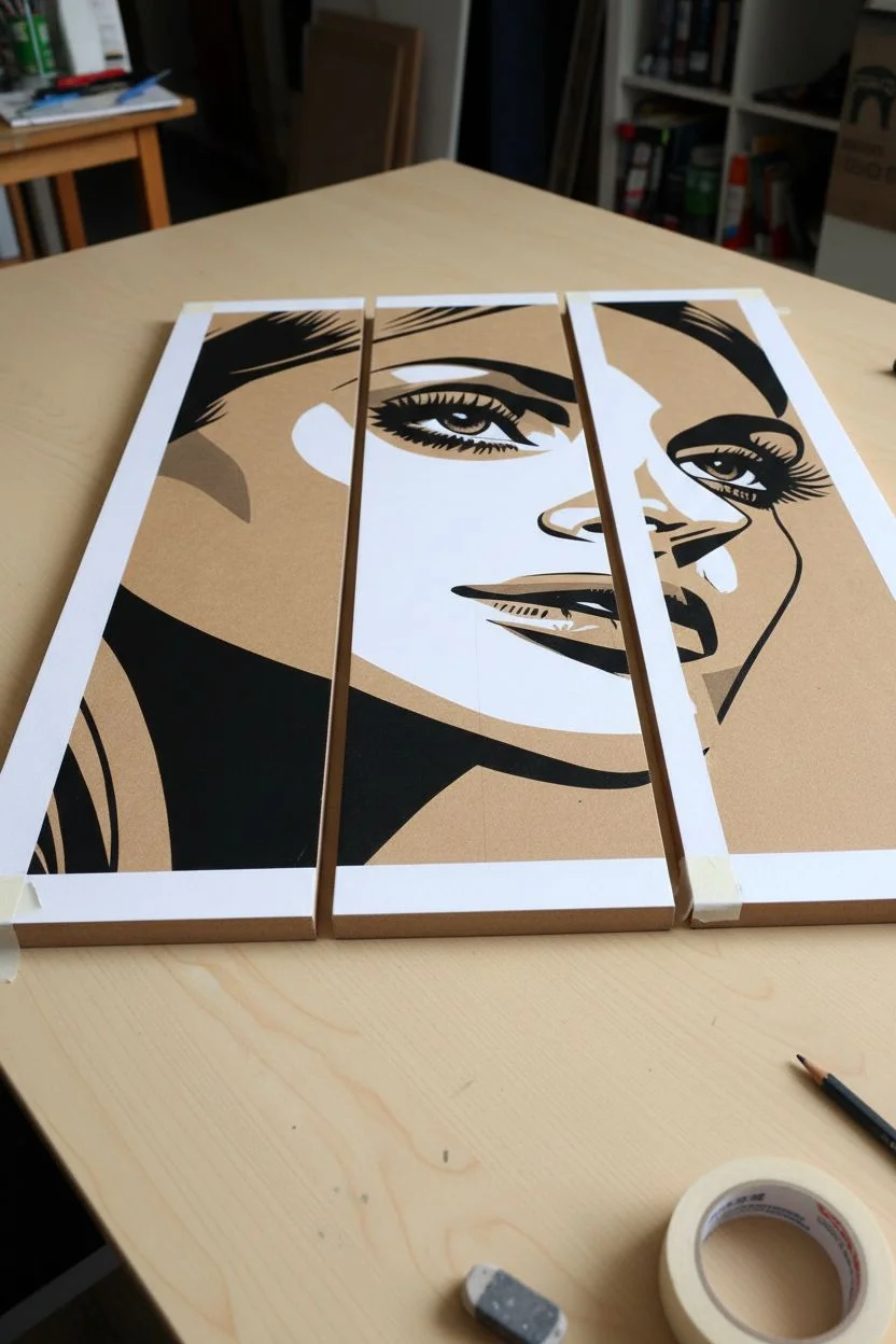
Step 3: Painting the Values
-
Start with highlights:
Mix a smooth, creamy light beige paint. Fill in the highlight areas first—cheekbones, nose bridge, and forehead. Use a flat brush for sharp edges. -
Apply the secondary shadows:
Look for the darker shadow shapes (like under the cheekbone or neck) that are darker than the raw wood but lighter than black. Paint these with your tan or medium brown acrylic wash. -
Define the black features:
Using your deepest black acrylic, paint the large blocky shapes of the hair and the darkest shadows under the chin. Keep your hand steady to maintain crisp lines. -
Detailing the eyes:
Switch to a fine liner brush for the eyes. Carefully paint the iris, pupil, and the iconic thick eyelashes. The contrast here is crucial, so take your time and reload your brush often for opaque coverage. -
Handling the edges:
When painting a shape that crosses from one panel to the next, I prefer to visually check the alignment frequently. Paint the design slightly around the side edge of the panel for a professional gallery-wrap look. -
Refine the lines:
Once the first layers are dry, inspect your edges. If the cream paint looks streaky, apply a second coat. Clean up any jagged lines carefully with a small angle brush.
Make It Pop
Swap the black paint for a deep navy blue or dark charcoal grey for a softer look, or use gold leaf for the highlight sections instead of cream paint.
Step 4: Finishing Touches
-
Erase guidelines:
Gently erase any visible charcoal or graphite transfer lines that weren’t covered by paint. -
Seal the artwork:
Finish by applying a uniform coat of matte or satin varnish across all three panels. This evens out the sheen difference between the raw wood and the acrylic paint.
Hang your panels with consistent spacing and enjoy the dramatic impact of your hand-painted triptych.
Negative Space Design With One Continuous Line
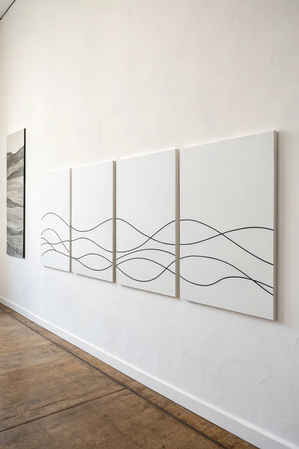
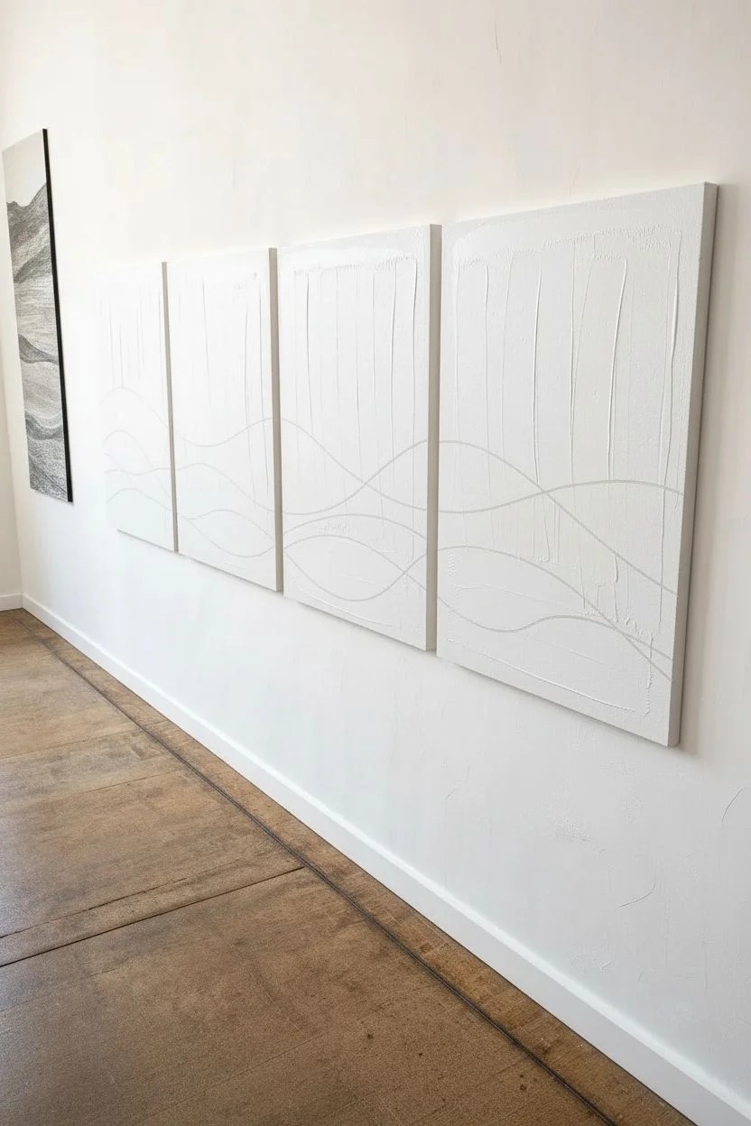
Embrace the elegance of negative space with this striking four-panel wall art featuring fluid, continuous lines that dance across split canvases. This project proves that simple black waves on a crisp white background can create a sophisticated, modern statement piece.
Step-by-Step
Materials
- 4 large rectangular stretched canvases (same size)
- White acrylic gesso or white acrylic paint
- High-flow black acrylic paint or black acrylic marker (chisel tip)
- Large flat paintbrush (2-3 inch)
- Long liner brush or rigger brush (if using paint)
- Pencil
- Eraser
- Ruler or level (for mounting alignment)
- Masking tape (optional)
Step 1: Canvas Preparation
-
Prime the surface:
Begin by coating all four canvases with a generous layer of white gesso or white acrylic paint. Even if the canvases came pre-primed, this fresh coat ensures a unified, bright white texture across all panels. -
Smooth the texture:
Use a large flat brush to smooth out the paint, brushing in one consistent direction (vertically or horizontally) to minimize distraction from the final line work. Let this base layer dry completely. -
Arrangement setup:
Lay your four canvases flat on the floor or a large table, pushing them tightly together side-by-side. They should touch so you can draw across them as if they were one single surface. -
Numbering backs:
Before you get too involved, lightly number the backs of the canvases 1 through 4. This simple habit prevents confusion later if you move them around while painting.
Bridge the Gap
Place a piece of scrap paper underneath the gap where two canvases meet. This catches drips and lets you paint right off the edge confidently.
Step 2: Drafting the Design
-
Plan your flow:
Visualize two or three main wavy lines that will intersect and diverge. The goal is an organic, rhythmic flow that moves from the left panel all the way to the right. -
Sketch broadly:
Using a light pencil, sketch your continuous lines across the entire assembly. Don’t worry about being perfect; focus on the overall movement. -
Create intersections:
Allow some lines to cross over each other gently. In the example, the lines dip and peak, sometimes nearing each other and sometimes spreading apart, mimicking rolling hills or ocean swells. -
Check the edges:
Pay special attention to where the pencil line jumps from one canvas to the next. Ensure the line meets the edge of one canvas and picks up at the exact same height on the adjacent one.
Textured Background
Mix sand or modeling paste into your white gesso base. The gritty texture adds depth and shadows, contrasting beautifully with the sleek black lines.
Step 3: Painting the Lines
-
Separate panels slightly:
Pull the canvases apart just a fraction of an inch. I find this prevents paint from bridging the gap and sticking the canvases together. -
Select your tool:
For the crispest control, a high-quality black acrylic marker with a medium or chisel tip works wonders. If you prefer a more painterly look, load a long liner brush with high-flow black acrylics. -
Begin the final lines:
Start tracing over your pencil sketches. Commit to long, sweeping arm movements rather than moving just your wrist; this keeps the curves smooth and not jittery. -
Work continuously:
Try to paint each individual wave in one session to maintain consistent line thickness and pressure throughout the piece. -
Refining the edges:
When your line hits the edge of a canvas, paint slightly over the side wrapping around the edge. This small detail makes the artwork look finished from viewing angles. -
Varying line weight:
If using a brush, vary the pressure slightly on the peaks and valleys to add a calligraphy-like elegance to the line weight. -
Clean up:
Once the black paint is fully dry, gently erase any visible pencil marks. Be careful not to smudge the black paint if it isn’t 100% cured.
Step 4: Final Touches and Display
-
Touch-ups:
Inspect your white background. If any graphite smudges persist, you can touch them up with a small dab of your original white paint. -
Protective coat:
Apply a clear matte varnish spray over all panels. This seals the graphite and protects the stark white background from dust and yellowing over time. -
Mounting considerations:
When hanging, spacing is crucial for the illusion to work. Leave a uniform gap (about 1-2 inches) between each canvas. -
Visual alignment:
Ensure the lines visually ‘jump’ the gap accurately. Your eyes should effortlessly connect the line from panel 1 to panel 2.
Step back and admire how a few simple curves can transform an entire wall into a cohesive gallery of motion


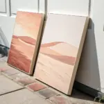
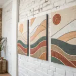
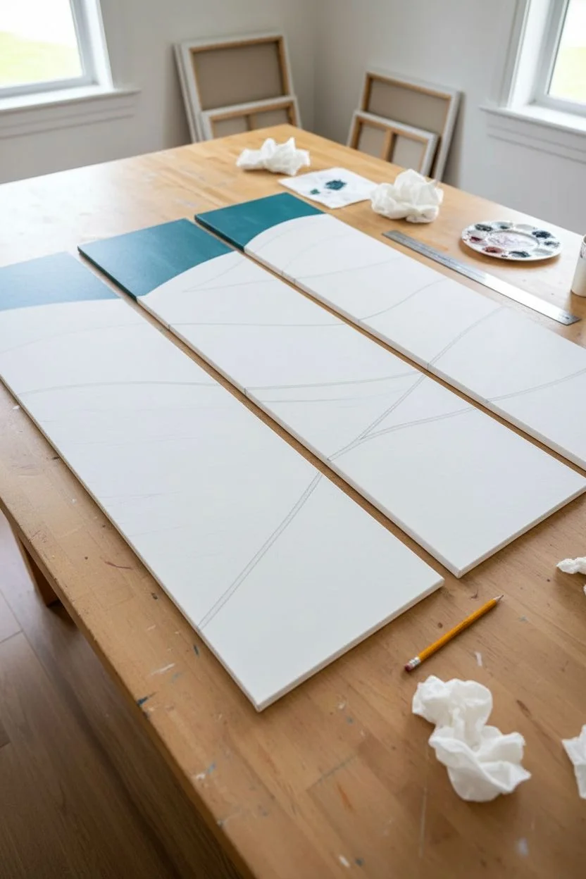
Asymmetrical Panel Sizes for a Dynamic Split
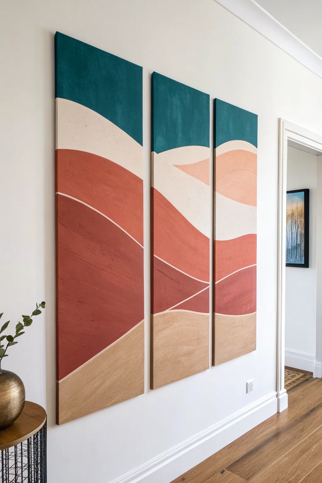
Create a serene, desert-inspired statement piece with this elegant three-panel abstract landscape. Using soft curves and a warm, earthy color palette featuring deep teal, terracotta, and sand, you’ll build a cohesive flow that travels seamlessly across split canvases.
Step-by-Step Tutorial
Materials
- Three tall, narrow stretched canvases (e.g., 12×36 inches each)
- Acrylic paints: Deep teal/petrol blue, cream, terracotta/rust, burnt sienna, warm beige, sandy ochre
- Gesso (white)
- Medium and large flat paintbrushes
- Angled sash brush (for cutting in edges)
- Pencil
- Ruler or straight edge
- Mixing palette or paper plates
- Painter’s tape or low-tack masking tape
- Water based matte varnish (optional)
- Easel or large flat work surface
Step 1: Preparation and Sketching
-
Prime the Surface:
Begin by applying a smooth coat of white gesso to all three canvases. This ensures your colors remain vibrant and provides a consistent texture. Let them dry completely, or sand lightly if you prefer an ultra-smooth finish. -
Arrange the Layout:
Lay your three canvases side-by-side on the floor or a large table, leaving a small gap (about 1-2 inches) between them. This gap simulates how they will hang on the wall and is crucial for aligning your design. -
Map the Horizon:
Using a pencil, lightly draw the flowing lines that will separate your color blocks. Start with the top wave for the sky, ensuring the line enters one canvas and exits the next at a consistent height to maintain visual continuity. -
Draft the Dunes:
Continue drawing undulating lines downwards to create the layers of dunes. Vary the thickness of these sections; some should be wide and bold, while others can be narrower accents. Remember, the lines don’t need to be perfectly symmetrical, just continuous across the gap.
Uneven Lines?
If painting freehand curves is difficult, use flexible masking tape (often used for auto detailing) to mask off your curves before painting each section.
Step 2: Color Blocking
-
Mix the Sky Tone:
On your palette, mix a deep teal or petrol blue. You want a color that is rich and opaque. If your paint is thin, you might need a second coat later. -
Paint the Top Section:
Fill in the uppermost section of all three canvases with your teal mix. Use a flat brush for the main area and an angled brush to get a crisp line along your pencil mark. -
Apply the Cream Layer:
Mix a warm cream color. Apply this to the section immediately below the teal. Be careful not to blend the wet paints; if you are unsteady, wait for the teal to dry before cutting in the cream edge. -
Create Depth with Terracotta:
Mix a medium terracotta shade. Paint the large middle section of the dunes. This is often the dominant color in this style, so ensure your brushstrokes are long and smooth to avoid patchy textures. -
Add Shadow Tones:
For the lower dune sections, mix a darker version of your terracotta by adding a touch of burnt sienna or brown. Paint these ‘shadow’ areas to give the landscape a sense of weight and dimension. -
Finish with Sand:
Paint the absolute bottom section with your sandy beige or ochre. This grounds the composition and balances the lightness of the cream layer above.
Level Up: Texture Medium
Mix sand texture gel or modeling paste into your beige and terracotta paints before applying. This adds physical grit to the ‘dunes’ for a tactile 3D effect.
Step 3: Refining and Sealing
-
Clean Up Edges:
Once the initial blocks of color are dry, inspect your lines. Use a small angled brush to sharpen any wobbly transitions between colors. I find it helpful to turn the canvas sideways to get a better angle on difficult curves. -
Paint the Sides:
Don’t forget the edges! Wrap the design around the sides of the canvas. Extend the color blocks onto the depth of the frame so the artwork looks finished from every angle. -
Second Coats:
Acrylics often dry darker or slightly transparent. Apply a second coat to any colors that look streaky, particularly the deep teal and the light cream. -
Add Subtle Texture (Optional):
To mimic the sandy look in the photo, you can dry-brush a slightly lighter shade over the terracotta sections. Dip a dry brush in paint, wipe most of it off, and lightly whisk it over the dried base color. -
Define the Separations:
If you want the white separation lines shown in some styles, use a very thin liner brush with white paint (or a white posca pen) to re-trace the boundaries between color blocks for a crisp, graphic look. -
Seal the Work:
Once absolutely dry (give it overnight to be safe), apply a coat of satin or matte water-based varnish. This unifies the sheen of the different colors and protects against dust.
Hang your new masterpiece with consistent spacing to let the landscape flow across your wall.


Have a question or want to share your own experience? I'd love to hear from you in the comments below!