Modern art doesn’t have to feel mysterious or hard to “get”—it can be playful, personal, and seriously fun to make. Here are my favorite modern art ideas you can try right away, from classic abstract painting looks to more unexpected, contemporary twists.
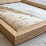
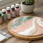
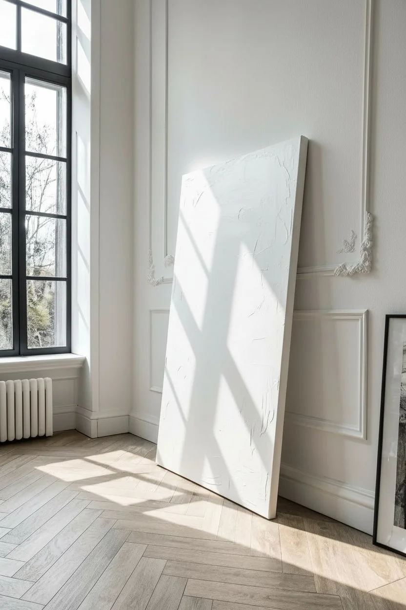
Textured Neutral Abstract Canvas
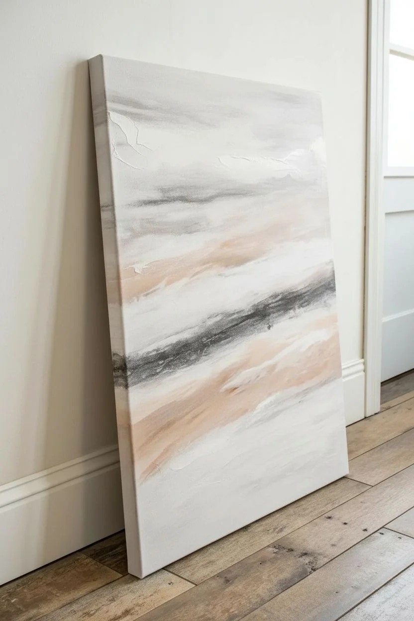
Bring the serene warmth of a desert landscape into your home with this highly textured abstract artwork. Merging heavy impasto techniques with a soothing palette of cream and gold, this piece acts as a stunning focal point that plays beautifully with natural light.
Detailed Instructions
Materials
- Large rectangular stretched canvas (24×36 or larger recommended)
- Heavy body acrylic paints (Titanium White, Yellow Ochre, Raw Sienna, Gold Metallic)
- Modeling paste (heavy or coarse texture)
- Large palette knives (assorted shapes, trowel style works best)
- Gesso (white)
- Wide flat paintbrush (2-3 inch)
- Sand or fine grit additive (optional for extra grit)
- Matte or satin varnish spray
- Painter’s tape (optional)
- Drop cloth
Step 1: Base Preparation
-
Set the Stage:
Begin by laying down your drop cloth and placing your canvas on a sturdy easel or flat work surface. Ensure the canvas is taught; if it feels loose, tap in the canvas keys on the back corners. -
Prime the Surface:
Apply a generous coat of white gesso over the entire canvas using your wide flat brush. This ensures the heavy texture medium will adhere properly without soaking into the fabric fibers. -
Initial Drying:
Allow the gesso layer to dry completely. It should be dry to the touch, which usually takes about 30 to 60 minutes depending on humidity.
Step 2: Laying the Deep Texture
-
Mix the Texture Medium:
Scoop a large amount of modeling paste onto a palette or paper plate. If you want an even rougher, stone-like feel, mix in a small handful of clean sand or a grit additive into the paste now. -
Apply the Lower Foundation:
Focusing on the bottom two-thirds of the canvas, use a large palette knife to spread a thick layer of the modeling paste. Don’t worry about smoothing it out; thickness is key here. -
Sculpt the Peaks:
Using the edge and flat side of the palette knife, press into the wet paste and pull upwards and diagonally. You are aiming to create ridges that mimic jagged rock faces or crashing waves. -
Refine the Lower Ridges:
Continue working the paste while it is wet. Create deep valleys and high peaks. I like to twist the knife slightly at the end of a stroke to create organic, unpredictable breaks in the surface. -
Transition Zone:
As you move upward toward the top third of the canvas, begin to flatten the texture out slightly. You want a distinct change from the chaotic lower section to the smoother, horizontal bands at the top. -
Horizontal Bands:
Apply thinner horizontal swipes of modeling paste across the top third. These should look like distant clouds or sediment layers, much smoother than the bottom section. -
The Long Wait:
This is crucial: Let the texture paste dry completely. Because the lower section is thick, this may take 24 hours. Do not paint until the paste is hard and no longer cool to the touch.
Clean Knife Trick
Keep a damp rag handy to wipe your palette knife between every few strokes. Built-up dried paste on the knife drags through wet texture and ruins the crisp ridges you are trying to sculpt.
Step 3: Painting the Layers
-
Base White Coat:
Once fully dry, paint over the entire textured surface with a layer of Titanium White heavy body acrylic. This acts as your unifying clean slate and helps the subsequent colors pop. -
Mixing the Gold Tones:
On your palette, prepare three pools of color: pure Yellow Ochre, a mix of Raw Sienna and Titanium White (for a sandy beige), and your Gold Metallic paint. -
Painting the Sky Bands:
Starting at the very top edge, apply the Gold Metallic paint in a horizontal sweeping motion. Let it fade out as you move down. -
Adding Warmth:
Just below the gold, introduce the Yellow Ochre. Blend the edge where the gold and ochre meet while the paint is still wet to create a soft, sunset-like gradient. -
Highlighting the Texture:
For the heavily textured bottom section, switch to a ‘dry brush’ technique. Dip your brush lightly into the sandy beige mixture (Raw Sienna + White) and wipe most of it off on a paper towel. -
Grazing the Surface:
Gently drag this dry brush over the raised ridges of the lower section. The paint should catch only on the peaks, leaving the deep crevices white. This instantly emphasizes the incredible 3D effect. -
Deepening Shadows:
If the texture looks too flat, take a very watered-down wash of Raw Sienna and dab it into the deepest crevices, then immediately wipe the surface with a rag. The dark color will stay in the low points. -
Final White Highlights:
Refresh your palette with pure Titanium White. Use a clean palette knife to scrape pure white paint very lightly over the highest points of the ‘sky’ bands to create brightness and separation. -
Seal the Work:
Once all paint layers are fully dry (give it another few hours), take the canvas outside or to a well-ventilated area and spray it with a matte or satin varnish to protect against dust and UV light.
Go Glamorous
For a luxe finish, press gold leaf sheets onto the tacky size in the horizontal bands instead of using metallic paint. It captures light much more intensely.
Hang your new masterpiece in a spot where the sun tracks across the room to see the shadows change throughout the day

Bold Color Block Modern Painting
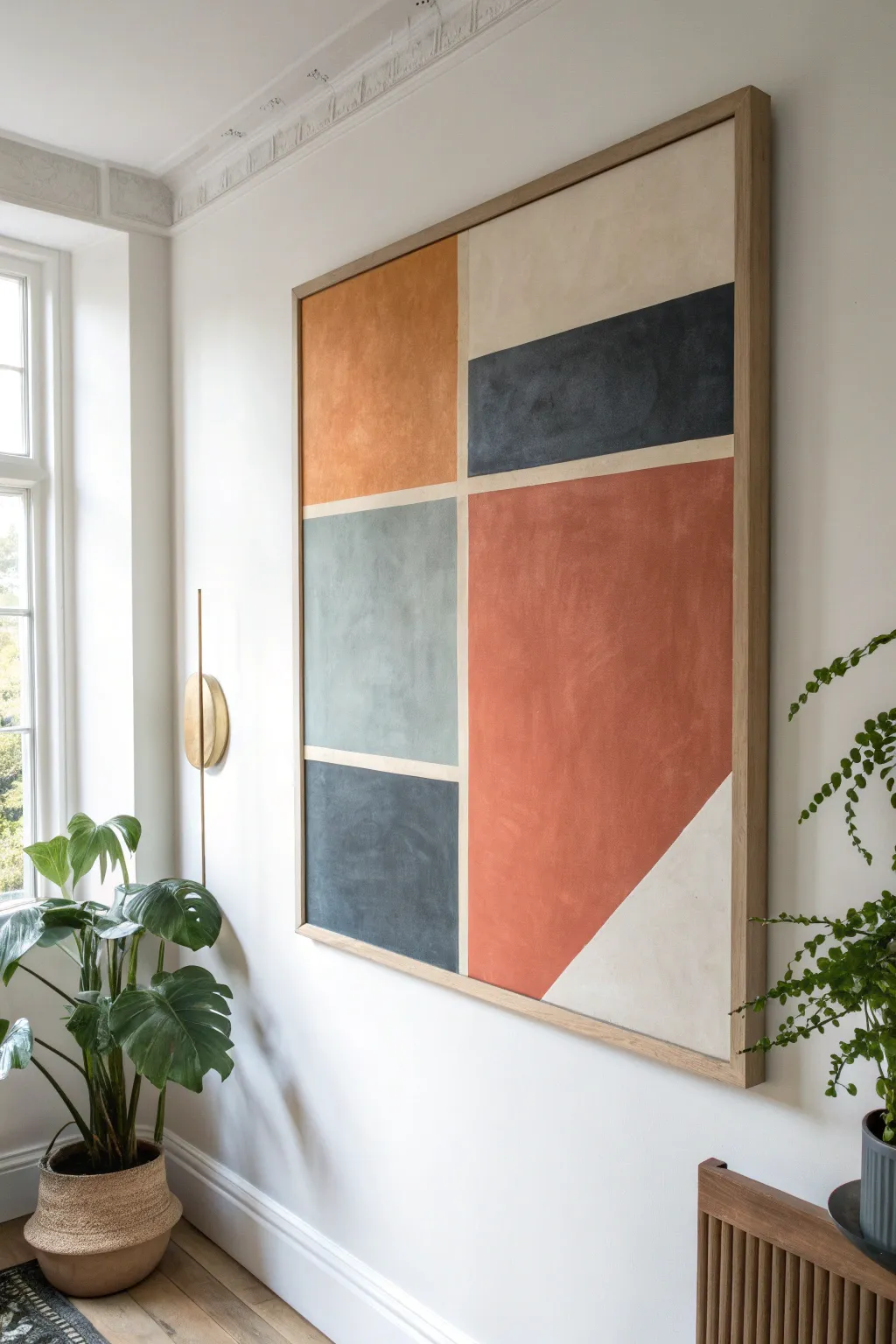
This large-scale modern art piece brings warmth and structure to any room with its bold geometric shapes and earthy color palette. The textured finish gives it an upscale, gallery-quality look that feels both contemporary and timeless.
Step-by-Step
Materials
- Large rectangular canvas (approx. 36×48 inches)
- Painter’s tape (various widths, 0.5 inch recommended)
- Acrylic paints (Terracotta, Navy Blue, Sage Green, Gray-Blue, Cream/Off-White)
- Texture medium or modeling paste
- Large flat paintbrushes (2-3 inch)
- Palette knives
- Floating wood frame (oak or light wood finish)
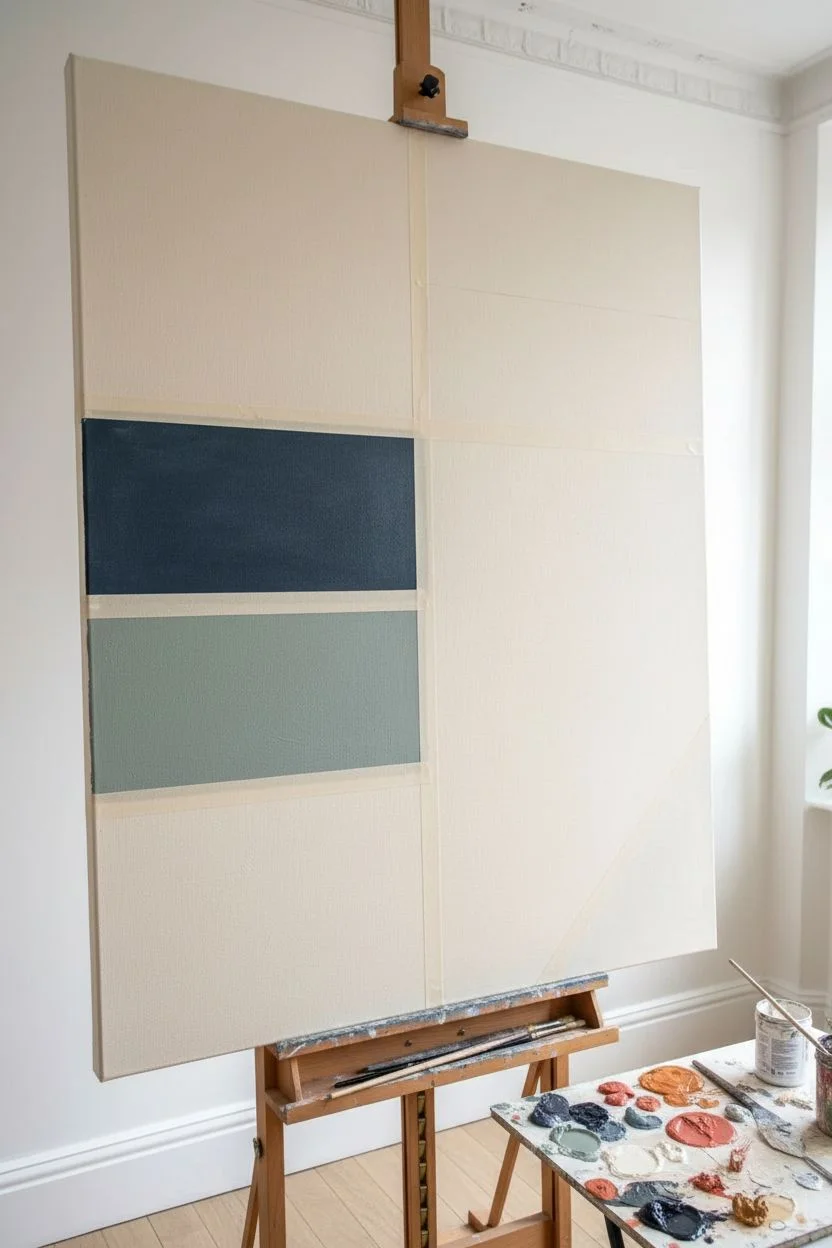
Step 1: Planning and Taping
-
Prime the canvas:
Begin by applying a base coat of Cream or Off-White acrylic paint over the entire canvas. This will serve as your negative space lines between the colored blocks. -
Map out the design:
Using a pencil and a ruler, lightly sketch the geometric grid. Draw a vertical line roughly one-third of the way from the left edge. Then, mark horizontal divisions to create the stacked blocks on the left and the larger sections on the right. -
Define the diagonal:
In the large bottom-right section, draw a diagonal line cutting off the bottom corner to create a triangle. This adds a dynamic element to the otherwise rectilinear composition. -
Apply painter’s tape:
Carefully place artist’s tape over your pencil lines. Press the edges down firmly to prevent paint bleed. The tape represents the cream-colored lines in the final piece, so ensure it covers the base coat completely where you want those lines to remain. -
Seal the tape edges:
Paint a very thin layer of your base cream color over the edges of the tape. This trick seals the tape and ensures that any seep-through matches the background, keeping your final color lines crisp.
Bleeding Lines?
If paint bleeds under the tape, wait for it to dry fully. Then, re-tape the colored area and paint over the bleed with your cream base color for a sharp fix.
Step 2: Creating Texture and Color
-
Mix texture medium:
Mix a generous amount of texture paste or modeling gel into your four main acrylic colors: Terracotta, Navy Blue, Sage/Gray-Green, and Dark Gray-Blue. You want a consistency similar to soft butter. -
Paint the top left block:
Start with the top-left square using the Terracotta mixture. Use a palette knife or a large brush to apply the paint with crisscross strokes to build up a visible, stucco-like texture. -
Fill the top right rectangle:
Move to the top right section. The upper portion remains the cream base color, so only paint the rectangular bar below it using the Navy Blue mixture. -
Paint the middle left block:
Fill the middle-left rectangular section with the Sage or Gray-Green mixture. Keep the texture consistent with the previous sections, ensuring complete coverage up to the tape lines. -
Execute the large red section:
Paint the large central area on the right with a deeper, reddish-terracotta hue. This is the largest color block, so take care to maintain an even texture throughout the large surface area. -
Complete the bottom sections:
Paint the bottom-left square with the Dark Blue-Gray mixture. Leave the triangular corner at the very bottom right unpainted, exposing the cream base coat.
Step 3: Finishing and Framing
-
Let the paint set:
Allow the paint to dry until it is tacky but not fully hardened. This usually takes about 30 to 60 minutes depending on the thickness of your texture medium. -
Peel the tape reveal:
Gently peel away the painter’s tape at a 45-degree angle. Pulling while the paint is slightly damp helps prevent the dry acrylic skin from tearing. -
Touch up edges:
Inspect the lines where the tape was removed. If any paint bled through, use a small detail brush and your cream base paint to tidy up the lines. -
Dry completely:
Let the entire canvas cure for at least 24 hours. The thick textured areas need time to harden completely before framing. -
Prepare the frame:
While the canvas dries, prepare your floating frame. Ensure the wood tone complements the warm terracotta colors in your painting. -
Mount the artwork:
Place the canvas into the floating frame. Secure it from the back using offset clips or screws, ensuring there is an even gap between the canvas edge and the frame for that professional ‘floating’ effect.
Pro Tip: Depth
Don’t overmix your colors. Leaving slight streaks of lighter and darker pigment creates a nuanced, sophisticated visual texture.
Hang your new masterpiece in a spot with natural light to really let those textures shine

Minimal Line Art With a Wash
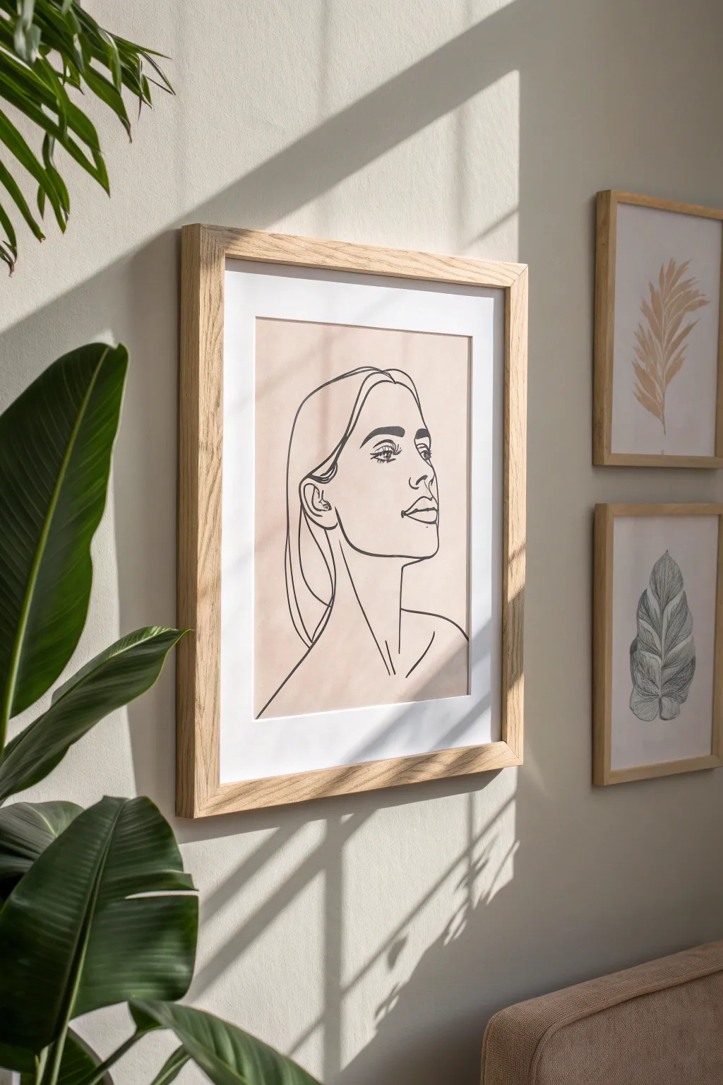

Enhance your walls with this sophisticated combination of abstract shapes and delicate line work. This DIY art project merges a soft, organic beige watercolor wash with a bold, continuous-line style portrait for a modern, gallery-worthy look.
Detailed Instructions
Materials
- Heavyweight watercolor paper (hot press for smoothness, 140lb/300gsm)
- Beige or dusty pink watercolor paint (or highly diluted acrylics)
- Large flat wash brush (about 1-2 inches wide)
- Fine liner marker or drawing pen (black, archival ink, size 05 or 08)
- Pencil (HB or H)
- Kneadable eraser
- Paper towels
- Painter’s tape
- Drawing board or flat surface
- Large wooden frame with white matting (to match image dimensions)
Step 1: Preparation & Watercolor Base
-
Secure the paper:
Begin by taping down all four edges of your watercolor paper to a board or table using painter’s tape. This prevents the paper from buckling when wet and creates a clean border, though the mat will likely cover the edges anyway. -
Mix the wash color:
Prepare your background color. Mix a dusty beige or pale terracotta hue using watercolors. You want a very watery consistency—think tea-stained water rather than thick paint. Test the shade on a scrap piece of paper first. -
Apply the first wash:
Using your large flat brush, apply a broad, uneven rectangle of color in the center of the paper. Don’t worry about perfect edges; the organic, slightly rough perimeter adds to the handcrafted aesthetic seen in the inspiration image. -
Build gentle texture:
While the paint is still wet, drop in tiny amounts of slightly more concentrated pigment in random areas to create subtle variation. Let the water move the pigment naturally. -
Wait for complete drying:
This step is crucial: let the background dry completely. The paper must be bone-dry and warm to the touch before you start drawing, or your ink will bleed. I often use a hair dryer on a low setting to speed this up.
Loose Washes
Don’t try to paint a perfect rectangle. Leave the edges of the wash ragged and uneven. This creates a beautiful contrast between the organic background and the sharp, clean lines of the portrait.
Step 2: Sketching the Portrait
-
Rough pencil placement:
Lightly sketch the basic oval of the face and the slope of the neck with your pencil. Keep your lines incredibly faint, just visible enough to guide you. Focus on the composition—ensure the face is centered within the colored wash. -
Refining features:
Sketch the profile view details. Mark the placement of the eyebrow, the almond shape of the eye, the slope of the nose, and the fullness of the lips. -
Mapping the hair:
Draw the outline of the hair tucking behind the ear. Keep the hair shapes simple and blocky rather than drawing individual strands. -
Clean up the sketch:
Use your kneadable eraser to dab away excess graphite. You want the pencil lines to be barely there, forming a ‘ghost’ image for your ink work.
Step 3: Inking & Final Touches
-
Start the main ink lines:
Take your black archival pen (size 05 or 08 for bold visibility). Start at the forehead and trace down the profile of the nose and lips. Commit to smooth, confident strokes to emulate that continuous-line feel. -
Detailing the eye:
Draw the eye carefully. Focus on the lashes and the iris. In the reference, the gaze looks slightly upward and to the right. Use lighter pressure here for delicate lashes. -
Drawing the ear and jaw:
Connect the jawline from the chin up to the ear. Add the simple inner cartilage details of the ear with quick, curved marks. -
Complete the neck:
Extend two long, elegant lines down for the neck, and suggest the collarbone with a V-shape or simple dashes at the base. -
Outline the hair:
Use long, sweeping strokes for the hair. Don’t lift your pen too often; let the lines flow down the back of the neck and frame the face. -
Erase pencil marks:
Wait at least 15 minutes for the ink to fully set. Gently erase any remaining pencil guidelines with the kneadable eraser. -
Framing:
Once your artwork is pristine, mount it behind a white mat inside a light wood frame (oak or birch works perfectly) to mirror the Scandinavian style of the photo.
Try Blind Contouring
For a truly modern, artistic look, try drawing the face without lifting your pen from the paper (continuous line drawing). It adds character and distinct style even if the proportions aren’t perfect.
Hang your new masterpiece in a well-lit spot to enjoy the subtle interplay of light and line

Modern Geometric “Shards” Composition
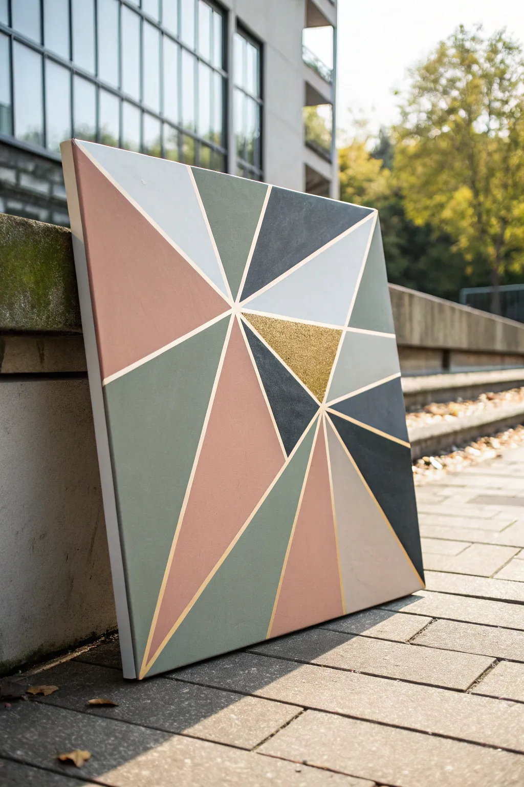
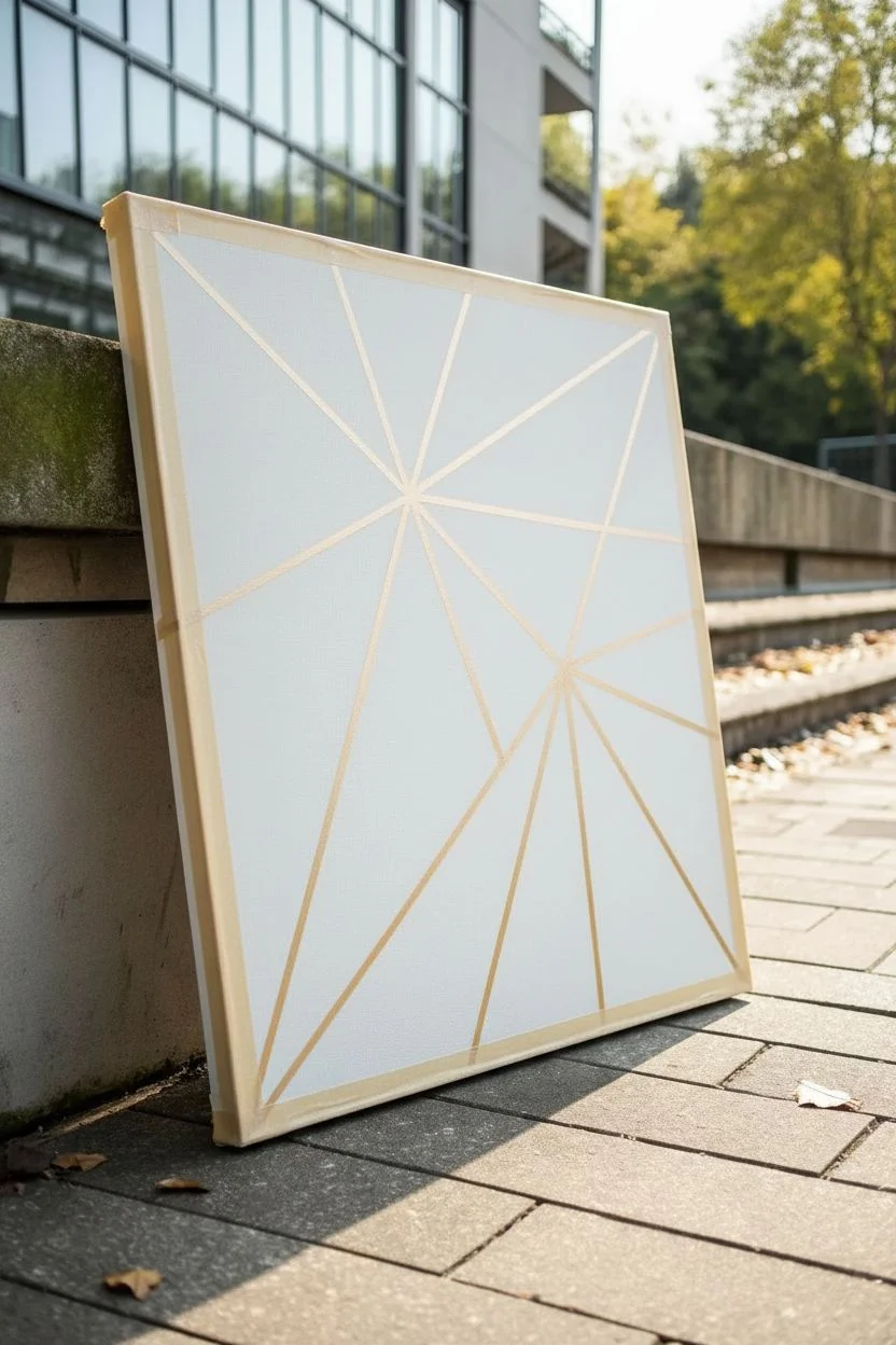
Bring sophisticated modernism to your space with this striking geometric shards canvas. Combining muted earth tones with a bold pop of gold leaf, this project creates a high-end gallery look that is surprisingly achievable for beginners.
Step-by-Step Tutorial
Materials
- Square stretched canvas (e.g., 20×20 inches)
- Acrylic paints (Dusty Rose, Sage Green, Charcoal Grey, Light Grey, White)
- Gold glitter paint or Gold Leaf kit (size adhesive + leaf sheets)
- Painter’s tape (multiple widths: 1/4 inch and 1/8 inch for variety)
- Ruler or straight edge
- Pencil
- gesso (optional, for priming)
- Flat paint brushes (various sizes)
- Matte varnish or sealant
Step 1: Planning and Taping
-
Prepare the Canvas:
Start with a clean canvas. If you want a smoother surface, apply a coat of gesso and let it dry completely, then lightly sand it down, but the raw canvas texture works fine for a rustic look too. -
Mark the Focal Point:
Decide on your focal point. Notice in the image, the lines radiate from a point slightly off-center to the right. Make a small pencil mark there as your guide. -
Map Main Radiating Lines:
Using your ruler, lightly draw straight lines extending from your focal point to the edges of the canvas. Vary the width of the resulting triangles; some should be wide wedges, others narrow shards. -
Add Secondary Intersections:
To create the complex shard effect, draw a few lines that connect existing lines without going all the way to the center, creating smaller subdivisions within the larger shapes. -
Apply the Tape:
Carefully apply painter’s tape over your pencil lines. The tape itself will become the white/gold separating lines later, so press down firmly. I prefer using a credit card to burnish the edges of the tape to prevent paint bleed. -
Protect the Edges:
Don’t forget to wrap the tape around the sides of the canvas. This ensures the design flows continuously and looks professional from every angle.
Clean Lines Secret
Paint a layer of white (or clear matte medium) over the tape edges first. This seals the tape, so any bleed is invisible, leaving your colored layers perfectly crisp.
Step 2: Painting the Shards
-
Plan Your Color Map:
Before dipping your brush, look at the masked canvas and decide which triangle gets which color. Aim for balance—don’t put two dark charcoal sections right next to each other unless intentional. -
Mix Custom Shades:
Mix your acrylics to get those specific muted tones. For the sage, add a touch of heavy body white and a tiny dot of black to green. For the dusty pink, mix red, plenty of white, and a hint of yellow ochre. -
Apply the Base Colors:
Paint the sections using a flat brush. Paint away from the tape edge, not toward it, to further minimize bleeding. You’ll likely need two coats for opaque coverage, especially with the pale grey and pink. -
The Gold Feature:
Select one prominent triangle near the center to be your gold accent. Apply gold glitter paint in thick layers, or use gold leaf adhesive, wait for it to get tacky, and press a gold leaf sheet onto it. -
Let It Cure:
Allow the paint to dry completely. Acrylics dry fast, but giving it an hour ensures you won’t smudge anything during the reveal.
Level Up: Texture
Mix modeling paste or sand into the charcoal or grey paint before applying. This adds physical grit and dimension, contrasting beautifully with the smooth metallic gold.
Step 3: The Reveal and Finish
-
Peel the Tape:
This is the most satisfying part. Slowly peel the tape at a 45-degree angle. If the paint feels rubbery, use a craft knife to gently score the edge before pulling. -
Touch Ups:
Inspect your lines. If any paint bled under the tape, use a tiny liner brush and white paint (or the color of your background canvas) to clean up the edges. -
Add Golden Lines:
The image features distinct gold dividing lines. Using a gold paint marker or a very fine brush with metallic gold paint, carefully trace over the white canvas lines revealed by the tape. -
Seal the Work:
Protect your masterpiece with a layer of matte varnish. This unifies the sheen of the different paints and protects the gold leaf from tarnishing over time.
Hang your stunning geometric creation in a well-lit area to watch the metallic accents catch the light throughout the day
BRUSH GUIDE
The Right Brush for Every Stroke
From clean lines to bold texture — master brush choice, stroke control, and essential techniques.
Explore the Full Guide
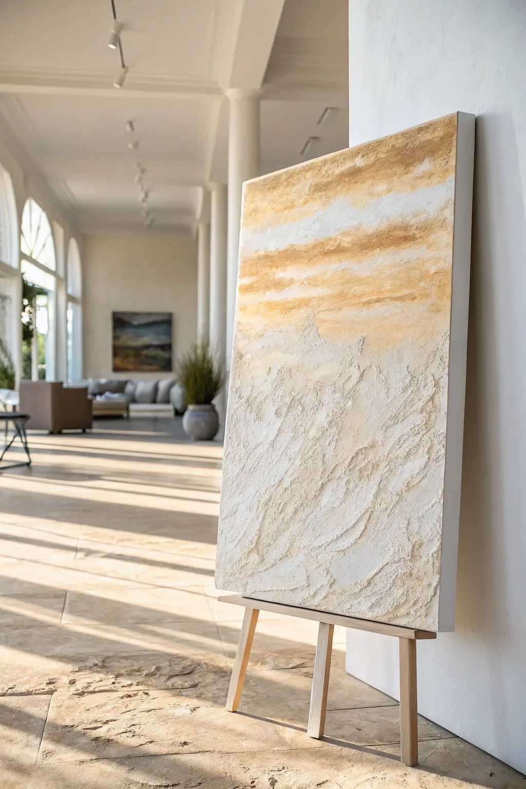
Oversized Vertical Statement Piece
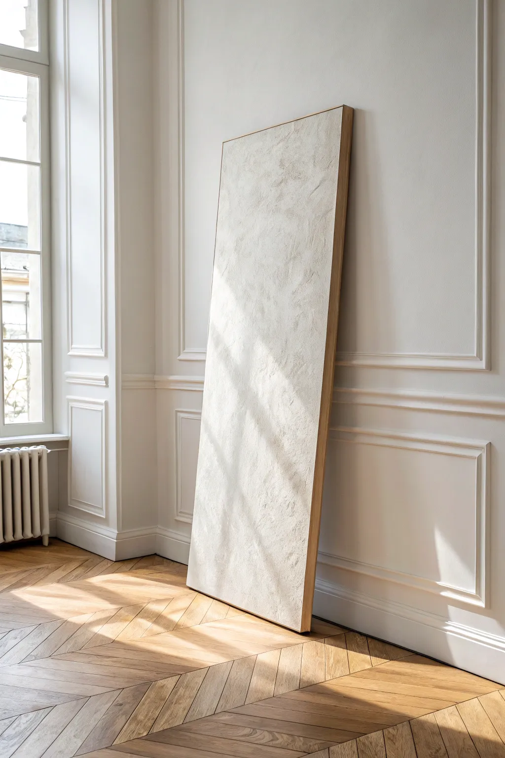
Bring sophisticated texture and scale to your space with this oversized vertical artwork that mimics the serene look of aged plaster. The subtle, monochromatic surface catches the light beautifully, turning simple materials into a high-end architectural statement.
Detailed Instructions
Materials
- Oversized gallery-wrapped canvas (approx. 36″ x 72″ or larger)
- Joint compound or modeling paste (large bucket)
- White acrylic gesso
- Cream/warm white acrylic paint (matte finish)
- Large trowel or drywall knife (6-inch and 10-inch)
- Medium-grit sandpaper sponge
- Matte varnish or polycrylic sealer
- Oak project boards (1×2 inch)
- Wood glue and finishing nails
- Drop cloth
Step 1: Preparing the Base
-
Set up your workspace:
Lay down a large drop cloth in a well-ventilated area. Because this project involves heavy paste and sanding, a garage or workshop floor is ideal, but a large living room area works if protected well. -
Prime the canvas:
Apply a coat of white acrylic gesso with a large brush to ensure the canvas is tight and ready to accept heavy moisture. Let it dry completely for about an hour. -
Support the center:
Since oversized canvases can sag under the weight of plaster, slide a few books or a block of wood under the center of the canvas (between the stretchers) to provide rigid support while you work.
Cracking Control
If hairline cracks appear as the paste dries, don’t panic. Simply mix a tiny amount of fresh paste with water and rub it into the cracks with your finger, then lightly sand once dry.
Step 2: Creating the Texture
-
Mix your medium:
Scoop a generous amount of joint compound into a tray. If you want a more durable, flexible finish less prone to cracking, mix the compound with a bit of white PVA glue or white acrylic paint. -
Apply the first layer:
Using your larger drywall knife, spread a thin, even base layer of compound across the entire surface. This doesn’t need to be textured yet; it just creates a unifying foundation. -
Let it set:
Allow this base layer to dry until it is firm to the touch but not fully cured—usually about 2 to 3 hours depending on humidity. -
Add the texture layer:
Now apply a second, thicker layer of compound. Use a rapid, cross-hatching motion with your trowel. I like to sweep the tool in random, multi-directional arcs to create those organic ridges and valleys visible in the photo. -
Refine the surface:
While the compound is still wet, lightly skim the cleanest edge of your trowel over the highest peaks to flatten them slightly. This creates that ‘knockdown’ stucco effect which looks more intentional than raw texture. -
Check the edges:
Ensure the texture wraps slightly around the sides of the canvas or stops crisply at the edge, depending on your framing plan. -
Full dry time:
Let the canvas dry completely overnight. If the compound is thick, it might take up to 24 hours. Don’t rush this step or cracks may form.
Step 3: Painting and Finishing
-
Sand for softness:
Gently run a medium-grit sanding sponge over the dry surface. You aren’t trying to remove the texture, just soften the sharpest jagged points to give it a weathered, stone-like feel. -
Dust off:
Wipe the surface carefully with a dry microfiber cloth or use a vacuum with a brush attachment to remove all plaster dust. -
Mix your color:
Combine your white paint with just a drop of beige or warm grey to create a creamy off-white. The goal is a color that looks like natural limestone. -
Paint the surface:
Using a wide brush or heavy-nap roller, paint the entire textured surface. Use a dabbing motion to ensure the paint gets into the deep crevices of the texture. -
Seal the artwork:
Once the paint is dry, apply a clear matte varnish. This protects the brittle plaster surface and makes it easier to dust in the future.
Level Up: Aged Patina
Mix a very watery wash of raw umber paint and lightly brush it over the texture, then immediately wipe it off with a rag. The dark pigment will settle in the texture for an antique look.
Step 4: The Floating Frame
-
Measure and cut lumber:
Measure the outer dimensions of your canvas. Cut your oak 1×2 boards to create a frame that allows for a 1/4-inch gap between the canvas and the wood on all sides. -
Assemble the frame:
Glue and nail the four sides of the frame together at the corners. Ensure the frame is completely square before the glue dries. -
Insert the canvas:
Place the canvas inside the frame. Use shims or spacers to keep the gap even on all sides. -
Secure from back:
Screw through the back of the frame directly into the wooden stretcher bars of the canvas to secure it in place. -
Final inspection:
Stand the artwork up and examine it in natural light to ensure the texture reads correctly and the frame sits straight.
Lean your massive new masterpiece against the wall to anchor the room with effortless minimalist style
Triptych Modern Abstract Set
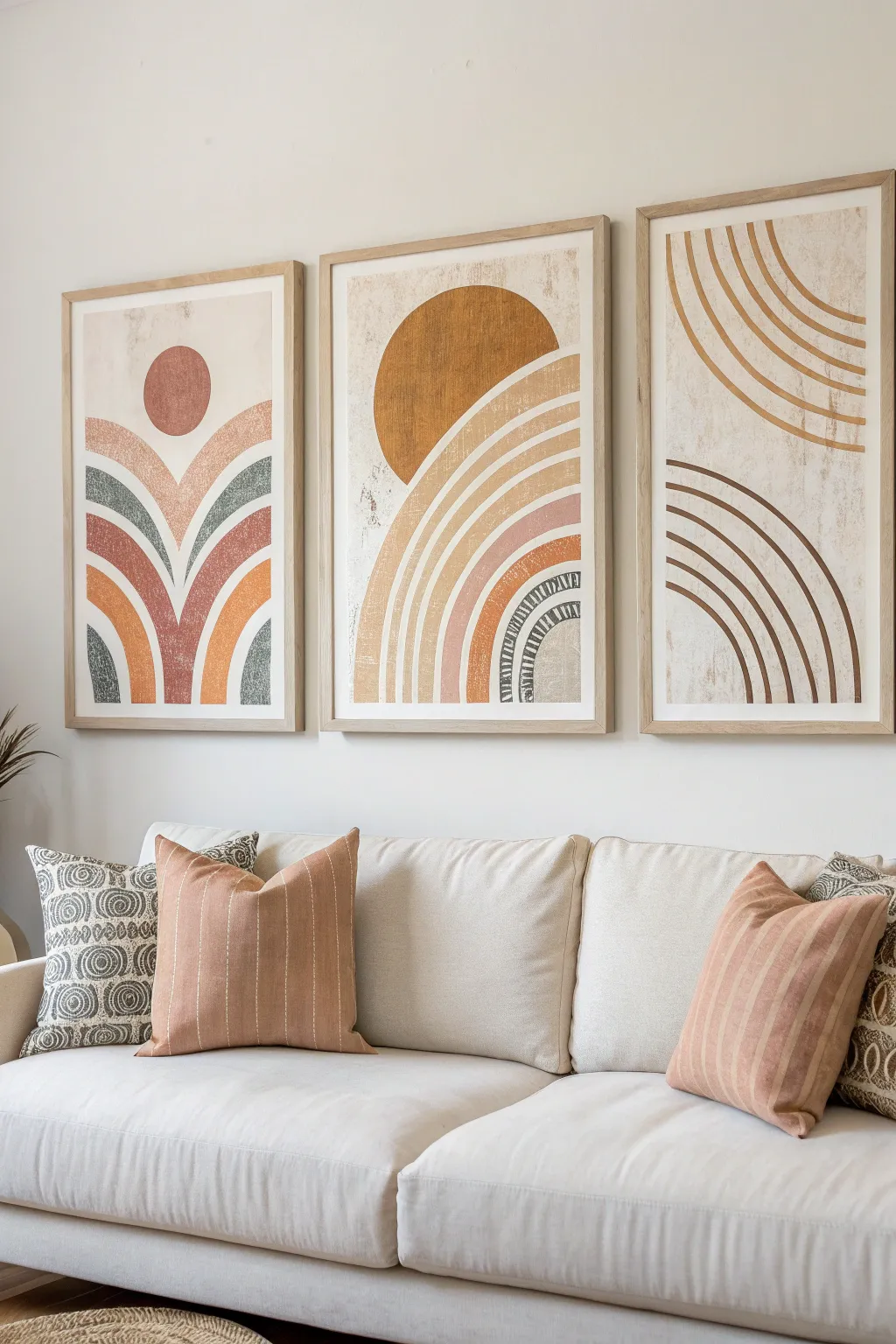
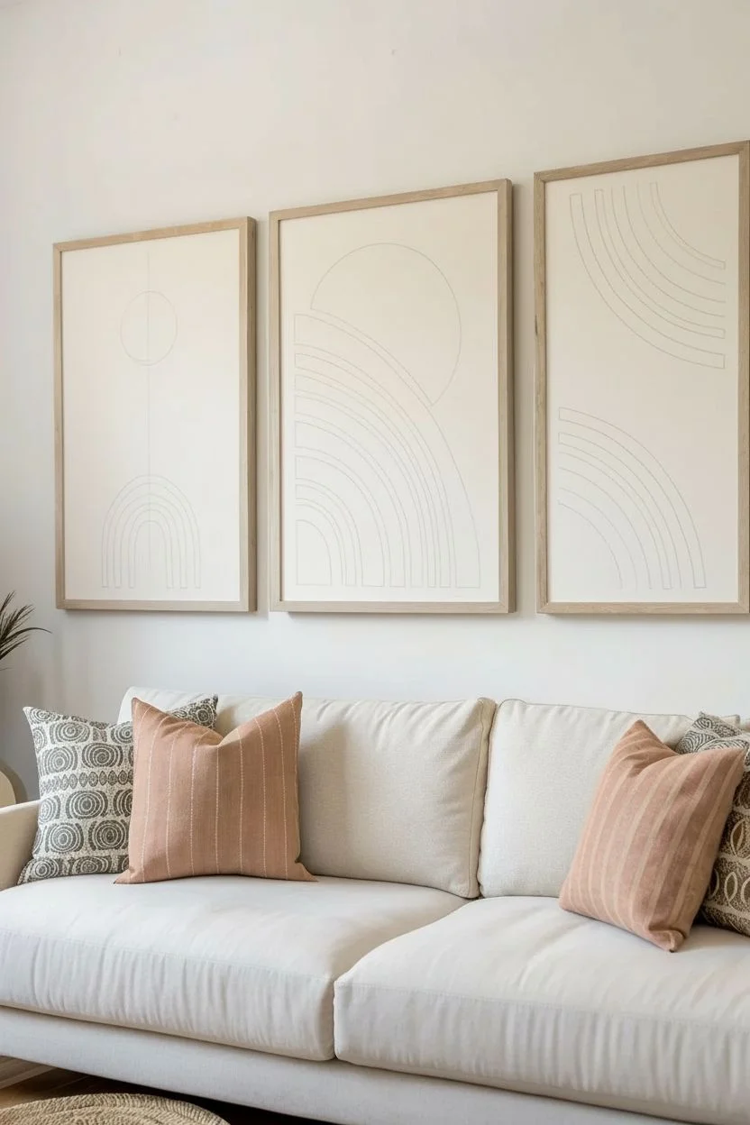
Bring warmth and modern style to your living space with this cohesive three-piece abstract art set. Featuring earthy tones like terracotta, ochre, and sage, these geometric designs use simple arches and circles to create a calming, balanced focal point.
Step-by-Step Guide
Materials
- 3 Large canvases (24×36 inches or similar)
- Acrylic paints (terracotta, burnt orange, mustard yellow, sage green, cream/off-white, dark brown)
- Pencil and large eraser
- Large compass or string and a tack (for drawing circles)
- Painter’s tape (various widths)
- Flat shader brushes (1-inch and 2-inch)
- Round detail brush (size 4 or 6)
- Texture medium or modeling paste (optional for texture)
- Matte varnish
- Mixing palette
- Ruler or straight edge
- 3 Light wood floating frames
Step 1: Preparation & Sketching
-
Prime the Surface:
Begin by painting all three canvases with a base coat of cream or off-white acrylic paint. This creates that soft, neutral background visible in the final piece. Let this dry completely before sketching. -
Plan the Left Panel:
On the first canvas, lightness sketch a vertical centerline. Use a coin or small compass to mark a circle near the top third for the sun shape. Below that, sketch cascading arches that curve outward from the center bottom, resembling fountain sprays. -
Plan the Middle Panel:
For the center piece, draw a large semi-circle starting from the top left corner, sweeping down towards the right. Inside this large curve, sketch concentric bands of varying widths. Add a solid quarter-circle shape in the upper left corner to anchor the design. -
Plan the Right Panel:
On the third canvas, you will create two distinct sets of arches. Use your compass or string method to sketch a set of arches curving from the top right corner downwards. Then, sketch a second set curving up from the bottom left corner. -
Refine the Lines:
Step back and look at all three canvases together. Ensure the spacing between your drawn bands is consistent and that the visual weight feels balanced across the triptych. I find it helpful to correct wobbly lines now before any paint touches the canvas.
Wobbly Arches?
If painting freehand curves is difficult, use thin flexible masking tape (often called quilting tape) to mask off the curves before painting. Peel it off while paint is still tacky.
Step 2: Painting the Shapes
-
Mix Your Palette:
Prepare your colors on the palette. You want a muted, earthy feel, so if your acrylics are too bright, tone them down by mixing in a tiny dot of brown or the complementary color. Create a distinct terracotta, a mustard ochre, a soft sage, and a deep brown. -
Paint the Solids:
Start with the solid shapes, like the circle on the left panel and the large quarter-sun on the middle panel. Use a flat brush to fill these in with your terracotta and mustard paints. Apply two coats for opacity if needed. -
Execute the Arches:
For the arched bands, use a steady hand and your 1-inch flat brush. Load the brush fully and pull it along the curve in one fluid motion if possible. Alternate colors between terracotta, sage, and cream to replicate the pattern shown. -
Add Texture Details:
Notice the textured, patterned arch in the middle panel. For this specific band, paint a base of dark brown. Once dry, use a smaller brush to paint cream-colored geometric hash marks or small triangles over it. -
Create the Distressed Effect:
To mimic the print-like texture seen in the inspiration, take a nearly dry brush with a tiny amount of cream paint. Lightly scumble or drag it over the colored sections, particularly the edges, to soften the look and add a vintage vibe.
Step 3: Finishing and Framing
-
Clean Up Edges:
Use your background cream color to tidy up the outer edges of your shapes. Use a small angled brush to sharpen the lines where different colors meet, ensuring the geometric forms look intentional but handmade. -
Erase Guidelines:
Once the paint is thoroughly dry—give it a few hours just to be safe—gently erase any visible pencil marks that weren’t covered by paint. -
Seal the Artwork:
Apply a layer of matte varnish over the entire surface of each canvas. This unifies the sheen, protects the paint from dust, and enhances the richness of the earth tones. -
Frame the Set:
Place each canvas into a light wood floating frame. Secure them according to the frame instructions. This natural wood tone complements the warm palette perfectly. -
Hang and Align:
Hang the triptych with equal spacing between the frames (about 2-3 inches apart usually looks best). Use a level to ensure the horizon lines and geometric flows connect visually across the wall.
Add Dimension
Mix modeling paste into your acrylics before painting the solid shapes. This adds a raised, tactile surface that catches the light and makes the artwork look more high-end.
Step back and enjoy the warm, sophisticated atmosphere your new custom artwork adds to the room

PENCIL GUIDE
Understanding Pencil Grades from H to B
From first sketch to finished drawing — learn pencil grades, line control, and shading techniques.
Explore the Full Guide
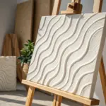
Palette Knife Movement Study
This project explores the tactile beauty of heavy texture paste combined with a soothing, monochromatic color gradient. Mimicking the soft, rhythmic motion of sand dunes or rolling waves, this piece serves as a perfect introduction to palette knife sculpting.
Detailed Instructions
Materials
- Square stretched canvas (approx. 20×20 inches)
- Heavy body acrylic paints (White, Cream, Peach, Terracotta, Burnt Sienna)
- Modeling paste or heavy texture gel
- Large palette knife (trowel shape)
- Medium palette knife (diamond shape)
- Disposable palette or mixing tray
- Pencil
- Ruler
Step 1: Preparation & Mapping
-
Prepare the canvas:
Ensure your stretched canvas is clean and tight. If it feels slack, spray the back lightly with water and let it dry to tighten the fabric. -
Map the diagonal flow:
Lightly sketch diagonal guidelines across the canvas using a pencil. These don’t need to be straight lines; gentle curves that mimic the flow of the final texture ridges will help guide your hand later. -
Mix your base texture:
Scoop a generous amount of modeling paste onto your palette. You will need a lot of volume to achieve the raised ridges shown in the artwork. -
Create the color gradient:
Divide your modeling paste into five separate piles. Leave one pure white. Mix the others with increasing intensity: cream, soft peach, dusty pink-terracotta, and finally a deep burnt sienna.
Clean Knife, Sharp Lines
Wipe your palette knife completely clean between every major stroke. Dried bits of paste on the blade will drag and ruin the smooth valleys between your textured ridges.
Step 2: Sculpting the Waves
-
Start with the lightest tone:
Begin at the top left corner with your pure white or lightest cream mixture. Load the large palette knife heavily. -
Apply the first sweeping stroke:
Press the knife against the canvas and drag it diagonally downwards. Lift the knife slightly at the end of the stroke to create a raised, jagged ridge—this is the signature look of the piece. -
Build the first layer:
Continue adding white/cream strokes along the top section. Ensure the ridges are prominent; don’t smoothie them flat. The rougher the edge, the better the final shadow play will be. -
Transition to the second tone:
Pick up the cream or very light beige mixture. Apply this directly below the white section, slightly overlapping the previous strokes to blend the transition zone visually. -
Overlap efficiently:
When moving between colors, I find it helpful to let the knife dirty the new color slightly with the old one, creating an organic gradient rather than harsh stripes. -
Introduce the peach tone:
Move to the middle section with your soft peach mixture. Use the same sweeping, diagonal motion, keeping the pressure consistent until the break where you lift the knife. -
Check density:
Step back and look at the canvas from the side. You should see significant height differences. If a section looks too flat, layer more paste on top while it is still wet. -
Applying the terracotta layer:
Apply the dusty pink-terracotta mixture below the peach band. By now, the weight of the paste might feel heavy; use firm pressure to adhere it well to the canvas. -
Final deep tones:
Finish the bottom right corner with the deep burnt sienna mixture. This dark anchor point balances the airy top corner. -
Refine the ridges:
Using the edge of a clean, medium palette knife, gently scrape horizontally across just the very tips of the highest ridges to accentuate them further or sharpen their peaks.
Step 3: Drying and Finishing
-
Clean edges:
Run a clean knife or your finger along the sides of the canvas to smooth out any paste that spilled over the edges, keeping the profile neat. -
Initial set time:
Let the painting sit undisturbed for at least 4-6 hours. The outer shell needs to harden before the inside dries. -
Deep drying:
Because the paste is thick, allow 24 to 48 hours for a complete cure. Do not hang it until it is perfectly solid to the touch. -
Optional varnish:
Once fully cured, you can apply a matte spray varnish to protect the porous texture from dust accumulation.
Metallic Accent
Once the piece is fully dry, gently dry-brush a tiny amount of gold leaf paint onto just the highest peaks of the texture to catch the light.
Hang your new textured masterpiece near a window to let natural light emphasize the dramatic ridges and valleys you’ve created.
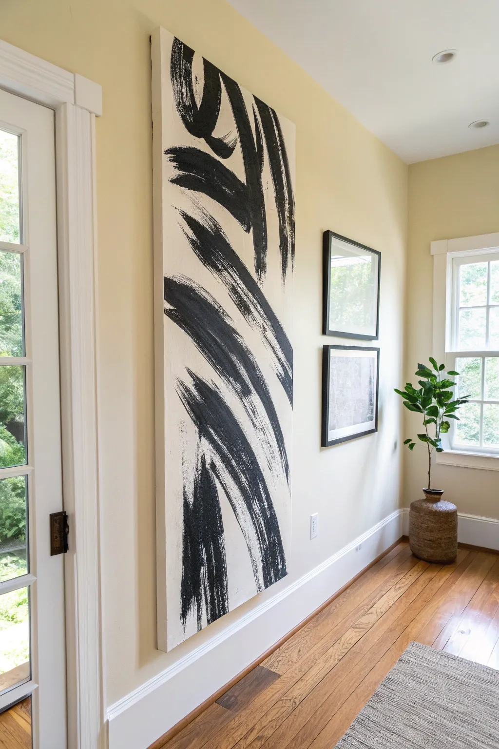
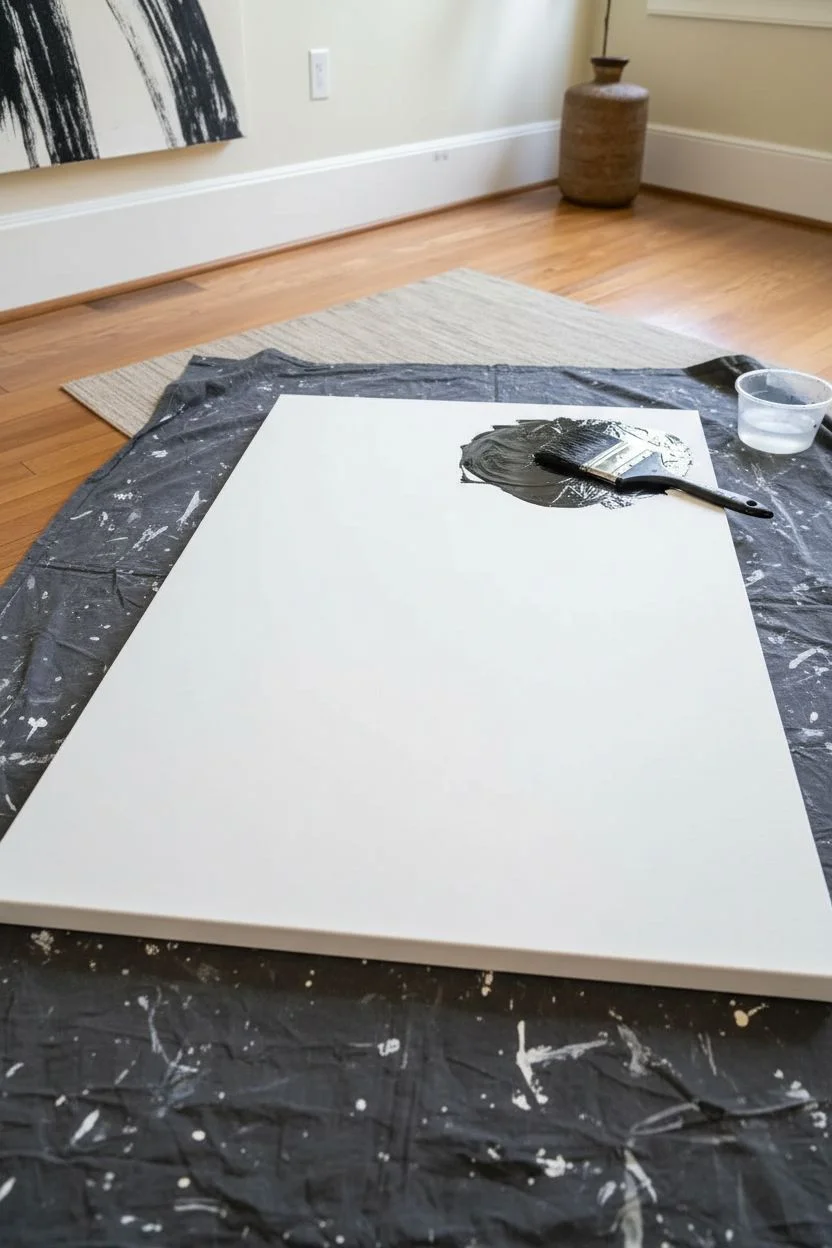
Monochrome Black-and-White Abstraction
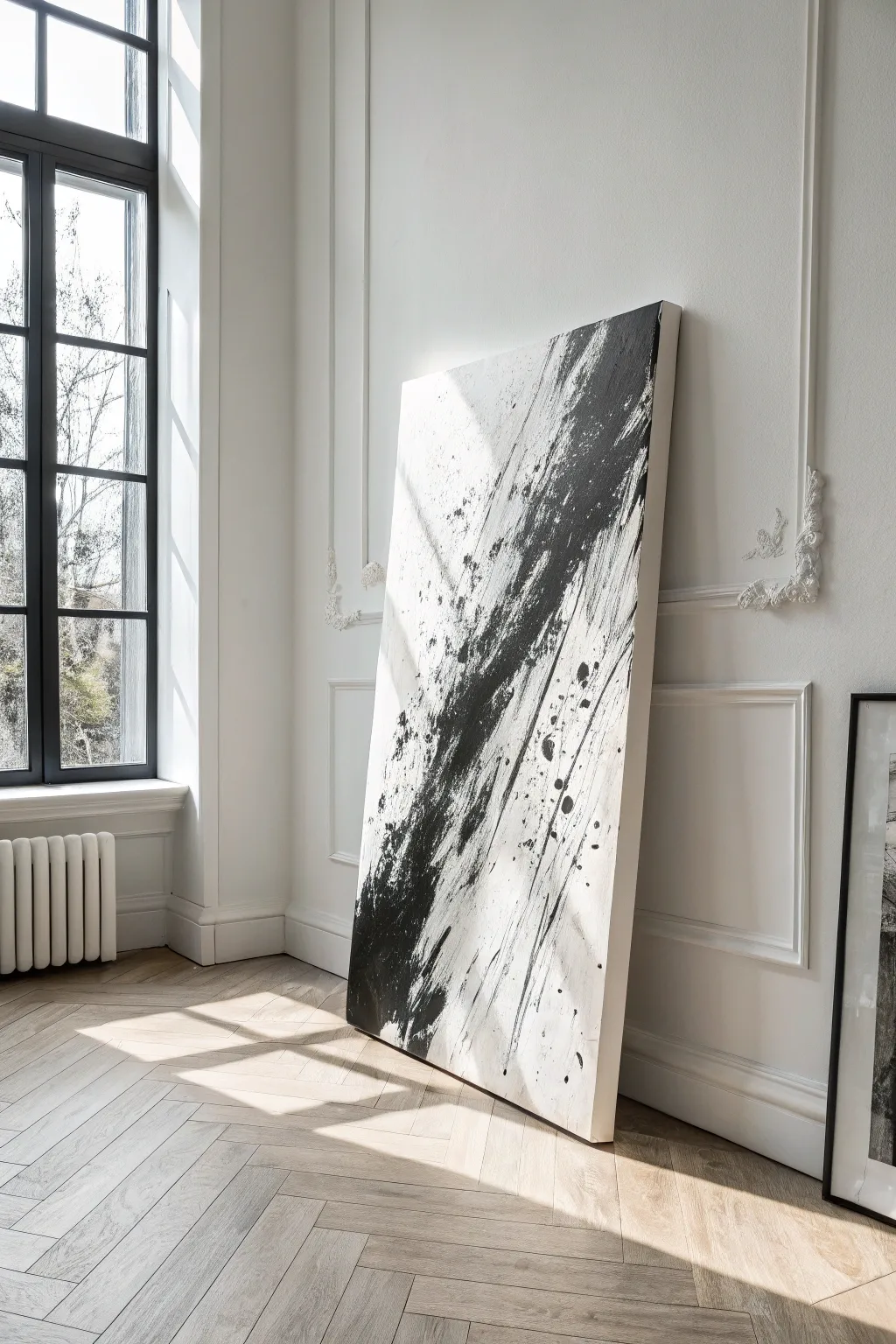
Embrace the bold drama of high-contrast minimalism with this large-scale abstract painting. This piece focuses on the raw energy of a single, powerful gesture, using heavy texture and striking black accents to create movement across a serene white canvas.
Step-by-Step Guide
Materials
- Large stretched canvas (gallery profile preferred)
- White gesso or acrylic primer
- Heavy body black acrylic paint
- Matte medium or texture paste
- Large wide house paintbrush (3-4 inch)
- Palette knife or wide scraper tool
- Small round brush for splattering
- Drop cloth
- Mixing container
- Water spray bottle
Step 1: Preparation and Base Layer
-
Prepare the workspace:
Since this project involves energetic splatters and large movements, lay down a generous drop cloth to protect your floor and surrounding furniture. -
Prime the canvas:
Apply a fresh coat of white gesso to your canvas, even if it came pre-primed. This ensures a uniform, bright white background that will make the black pop later. -
Create texture (optional):
If you want the white background to have more depth, mix a little texture paste into your white paint and apply it with random, sweeping strokes. Let this dry completely before moving on. -
Plan the composition:
Visualize a diagonal line cutting across the canvas from the bottom left to the top right. This will be the main ‘highway’ for your black paint.
Paint looks too flat?
If the black looks dull, you likely used fluid acrylics. Mix heavy texture gel into your paint before applying, or layer black paint over the top once the first coat is dry to build visible ridges.
Step 2: The Main Gesture
-
Mix the black paint:
In a mixing container, combine your heavy body black acrylic with a bit of matte medium. You want a consistency that is thick but spreadable—think soft butter. -
Load the tool:
Take your large house brush or wide scraper tool and load it generously with the black mixture. Don’t be shy; volume is key here. -
The first strike:
Starting near the bottom left visual quadrant, drag the paint upward diagonally. Use confidence and speed; hesitation creates shaky lines, while speed creates energy. -
Build the texture:
I like to go back over the main black shape while it’s wet, using a dry, rough brush to ‘scuff’ the edges. This creates that gritty, worn look where the white canvas peaks through the black stroke. -
Create drag marks:
Turn your brush perpendicular to the canvas or use a stiff piece of cardboard to scrape through the wet black paint, pulling it outward to create thin, streaky lines that follow the main diagonal direction.
Go for Gold
For a luxe twist, apply gold leaf flakes along the edges of the black sweep while the paint is tacky. The metallic shimmer adds incredible contrast against the matte black and white.
Step 3: Accents and Details
-
Add depth:
Mix a tiny drop of water into your black paint to make an ink-like consistency. Use this to darken the very center of your main diagonal sweep, giving the impression of density. -
Controlled splatters:
Dip a smaller round brush into the thinned black paint. Hold it over the canvas and tap the handle with another brush to send small droplets onto the white negative space. -
Directional flicking:
Flick the brush forcefully in the direction of your main diagonal line to create elongated drips that imply speed and motion. -
Soften harsh edges:
If a specific edge looks too solid or blocked-in, lightly mist it with water and use a clean rag to dab it, creating a softer, more organic transition. -
Review vertical balance:
Step back and check the balance. The heavy black should feel anchored but moving upward. If it feels too bottom-heavy, add a few light, ghostly gray strokes near the top to pull the eye up.
Step 4: Finishing
-
Dry thoroughly:
Because realistic texture holds a lot of moisture, let the painting dry flat for at least 24 hours to prevent the thick paint from running or cracking. -
Seal the work:
Once fully cured, apply a matte or satin varnish. This protects the stark white areas from dust and gives the deep blacks a uniform sheen. -
Frame or hang:
This style looks excellent leaned against a wall for a casual loft aesthetic, or you can float-frame it in black oak for a sharper gallery look.
Now you have a striking statement piece that brings modern gallery energy right into your living space


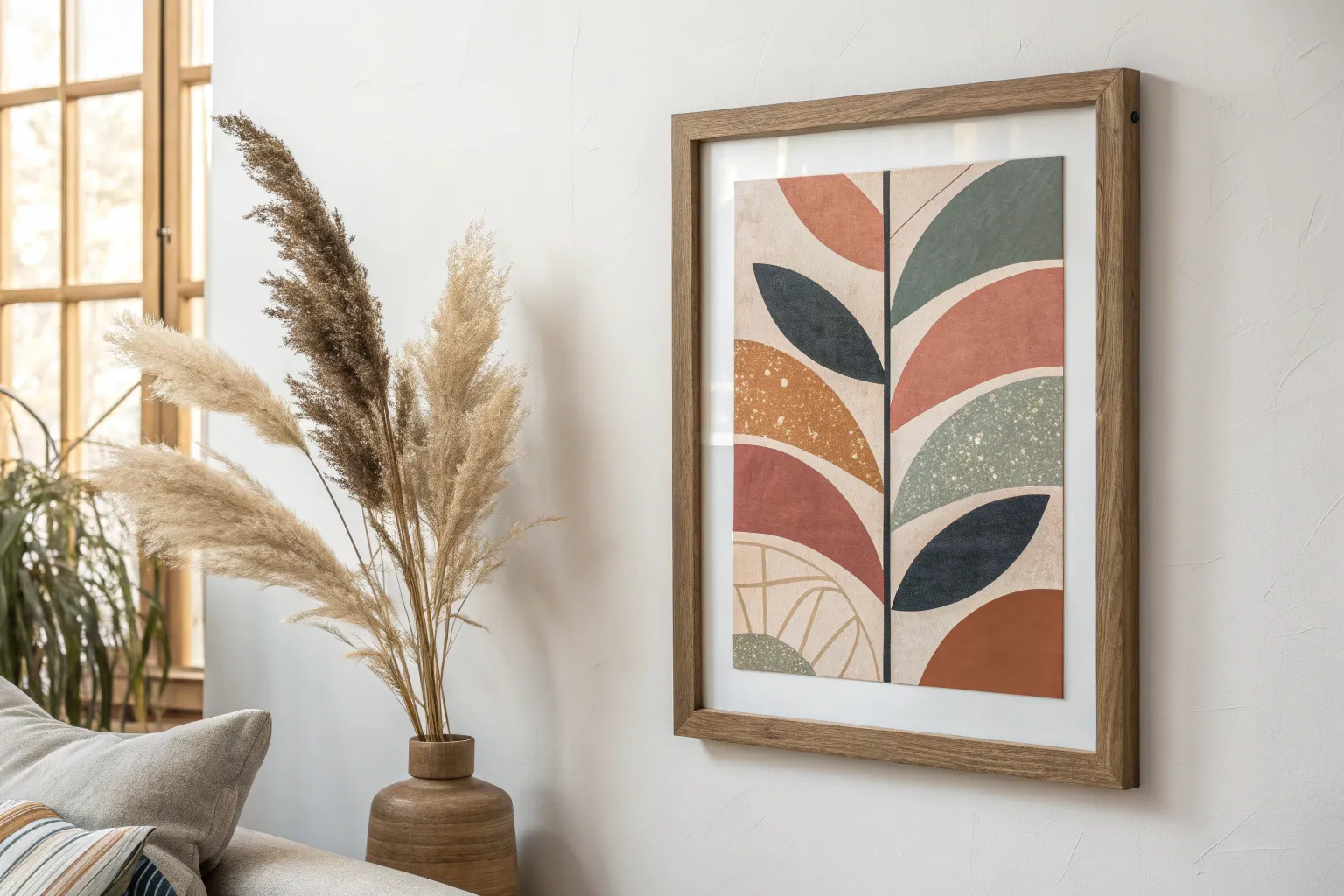
Modern Botanical Shapes, Simplified
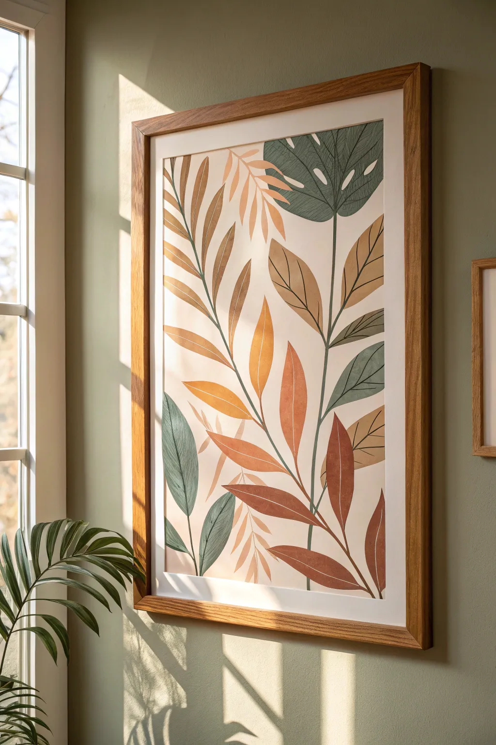
This minimal yet striking wall art combines warm terracotta and sage tones with clean, simplified botanical forms. By layering flat washes of color with delicate line work, you’ll create a sophisticated piece that feels both organic and modern.
Detailed Instructions
Materials
- Large heavy-weight smooth watercolor paper or mixed-media board (A2 or 16×20 inches)
- Gouache paints (burnt sienna, yellow ochre, sap green, teal, titanium white, burnt umber)
- Flat synthetic brushes (1-inch and 1/2-inch)
- Fine liner brush (size 0 or 00) or a fine-tip paint marker (brown/black)
- Graphite pencil (HB) and soft eraser
- Mixing palette
- Water cups and paper towels
- Light oak or natural wood frame with white matting
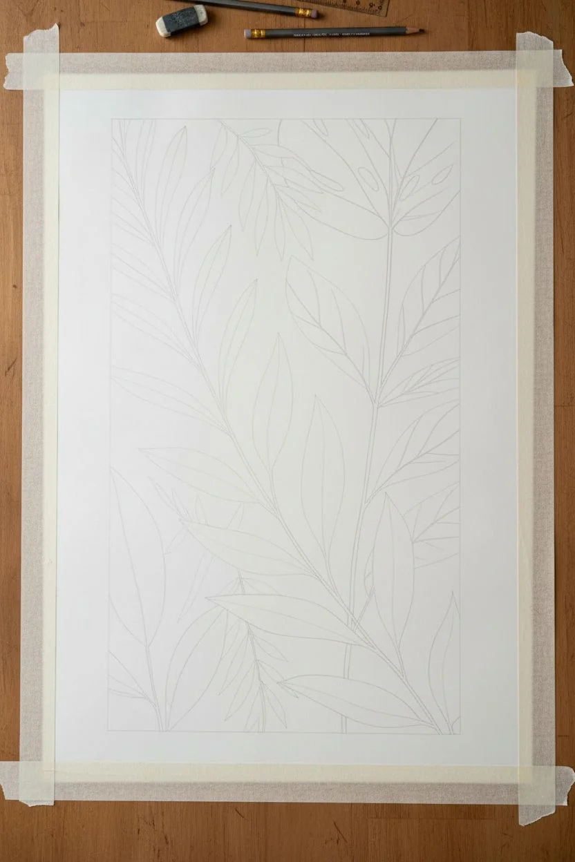
Step 1: Planning and Sketching
-
Prepare the surface:
Begin by taping down your paper to a hard surface using artist tape. This prevents buckling and ensures you have a crisp, white border around the edge of your artwork. -
Map the composition:
Lightly sketch the main stems first. Draw two primary vertical curves originating from the bottom center, allowing them to gently sway outwards towards the top corners. -
Outline leaf shapes:
Sketch the simplified leaf forms attached to the stems. Vary the shapes: create some large, rounded geometric leaves (like the monstera shape at the top right) and long, slender willow-like leaves lower down. -
Add background details:
Draw faint outlines for the ‘shadow’ leaves—these are the lighter, fern-like shapes that will sit in the background behind the main foliage.
Uneven Coverage?
Gouache can sometimes dry streaky. If your first layer looks patchy, wait until it’s completely dry and apply a second thin coat in the opposite direction.
Step 2: Painting the Background Layers
-
Mix your beige tone:
Create a very pale, warm beige wash using white, a touch of yellow ochre, and a tiny dot of burnt sienna. Thin it slightly with water so it flows smoothly but remains opaque. -
Paint the background leaves:
Using the beige mix, paint the fern-like shapes in the background. Keep the edges crisp but don’t worry about perfect opacity; a little texture adds character. -
Mix the sage green:
Combine sap green with a little teal and white to create a muted, cool sage color. Add a touch of burnt umber if it feels too bright. -
Block in green leaves:
Paint the monstera leaf at the top and the lower leaves on the left side with your sage mixture. Use the flat brush to get clean, confident strokes. -
Create the terracotta hue:
Mix burnt sienna with a little yellow ochre and white. You want a warm, earthy orange that isn’t too vibrant. -
Paint warm leaves:
Fill in the central and right-side leaves with the terracotta mix. I find it helpful to rotate the paper to maintain a comfortable hand angle for smooth edges. -
Introduce ochre accents:
Mix a golden ochre shade and paint the remaining few leaves to balance the composition. Let all paint layers dry completely before moving on.
Crisper Lines
For ultra-sharp leaf edges without wobble, lightly use masking tape or masking fluid for the larger shapes, peeling it away only when the paint is tacky-dry.
Step 3: Detailing and Finishing
-
Mix the line color:
Create a dark, contrasting color for the stems and veins. Mix burnt umber with a little sap green to get a deep, organic brownish-black. -
Draw the main stems:
Using your fine liner brush (or paint marker), carefully trace the main stem lines over your initial pencil marks. Keep the pressure steady for a consistent line width. -
Connect the leaves:
Draw the petioles (small stems) connecting each painted leaf shape to the main branches. -
Add central veins:
Paint fine lines down the center of each leaf. For the larger leaves, stick to a single central vein; for the wider leaves, you might add subtle branching veins. -
Detail the monstera:
On the top green leaf, draw the vein structure radiating from the center point. This leaf has a specific pattern, so reference the image to get the curve right. -
Erase guidelines:
Once the paint is 100% dry (give it an hour just to be safe), gently erase any visible pencil marks from your initial sketch. -
Frame the work:
Place your finished piece inside a white mat and mount it into the light wood frame to complete the modern, gallery-ready look.
Hang your new botanical artwork in a space that gets morning light to highlight those warm earth tones
Metallic Accents for a Modern Glow
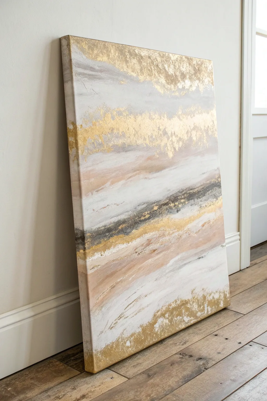
Bring sophisticated warmth to your walls with this textured abstract painting that balances soft, fluid strokes with luxurious metallic details. By layering acrylics and gold leaf, you’ll create a modern statement piece that catches the light beautifully.
Step-by-Step Tutorial
Materials
- Large stretched canvas (24×36 inches or similar)
- Acrylic paints: Titanium White, Unbleached Titanium (beige), Soft Grey, Blush Pink, Mars Black
- Gold leaf sheets
- Gold leaf adhesive (sizing)
- Wide flat brush (2-3 inch)
- Medium round brush
- Palette knife or plastic scraper
- Soft, dry brush (for gold leaf)
- Sealant or varnish (gloss or satin)
Step 1: Base Layers & Composition
-
Prepare the canvas:
Start by laying your canvas on a flat, protected surface. While you can work upright on an easel, laying it flat helps control drips during the initial heavy application of paint. -
Create the white foundation:
Squeeze a generous amount of Titanium White acrylic directly onto the top and bottom thirds of the canvas. Use your wide flat brush to spread this out, using long, horizontal strokes. Don’t worry about perfect coverage; some texture is good. -
Introduce soft grey:
While the white is still wet, add a touch of Soft Grey to your brush. Blend this into the upper white section, creating cloudy, ethereal transitions. Keep your strokes loose and horizontal. -
Add warmth with blush:
Mix a small amount of Blush Pink with Unbleached Titanium. Apply this mixture in the middle-lower section of the canvas, roughly where the horizon line might be. Blend the edges into the wet white paint above and below to soften the transition. -
Establish the dark contrast:
Using a palette knife or the edge of your brush, apply a streak of Mars Black mixed with a little grey across the center-right area. This dark band acts as an anchor. Scrape it slightly to create a distressed, organic look rather than a solid line.
Sticky Situation?
If gold leaf is sticking to places you didn’t intend, your brush might have had stray adhesive. Wait for it to dry completely, then paint over the accidental gold with your background color.
Step 2: Building Texture
-
Layering the beige tones:
Load your medium brush with Unbleached Titanium. Add sweeping curves below your dark contrast line, mimicking the look of sedimentary rock or windswept sand. Let these strokes drag dryly over the canvas weave for added texture. -
Enhancing the white space:
go back into your white areas with fresh white paint. Use a palette knife to apply it thickly in random patches, adding physical relief to the surface. -
Feathering the edges:
Use a clean, dry brush to lightly feather the boundaries between your colors. Specifically, soften the area where the blush pink meets the dark grey streak, creating a misty effect. -
Drying time:
Allow the acrylic layer to dry completely. This is crucial before applying the gold leaf sizing. Depending on paint thickness, this could take 1-2 hours.
Pro Tip: Metal Mixup
For deeper visual interest, mix slivers of copper or silver leaf in with the gold. The subtle color variation creates a richer, more antique metallic effect.
Step 3: Gilding the Artwork
-
Plan your gold placement:
Look at the image: the gold is concentrated at the top edge, a band across the upper-middle, and the bottom corner. Visualize these zones on your canvas. -
Apply the adhesive:
Brush the gold leaf adhesive (sizing) onto these specific areas. Apply it somewhat sporadically—edges should be rough and natural, not straight lines. -
Wait for tackiness:
Wait for the adhesive to turn from milky to clear and feel tacky to the touch. This usually takes about 15-30 minutes, but check your bottle’s instructions. -
Applying the gold leaf:
Gently lay the gold leaf sheets over the tacky adhesive. Don’t worry if they crack or overlap; I find the imperfections add to the organic aesthetic. -
Burnishing the gold:
Use a soft, dry brush to gently rub the back of the gold leaf sheets. buffer them into the canvas texture to ensure good adhesion. -
Remove excess leaf:
Once the gold is secure, use a stiffer dry brush to vigorously brush away the non-adhered flakes. This reveals the jagged, natural edges of your gold sections.
Step 4: Finishing Touches
-
Paint the edges:
Don’t forget the sides of your canvas. Extend the design around the edges, wrapping the colors and gold leaf around the corners for a professional, gallery-wrapped look. -
Final assessment:
Step back and look at the balance. If the dark grey feels too harsh, glaze over it with a very watered-down white to push it back into the distance. -
Seal the work:
To prevent the gold leaf from tarnishing over time, apply a clear gloss or satin varnish over the entire painting once everything is fully cured.
Hang your new masterpiece in a well-lit spot where the gold accents can catch the day’s changing light.
Graphic Brush Lettering as Modern Art
Using deceptively simple materials, this large-scale abstract piece creates a high-impact focal point that feels both modern and organic. The beauty lies in the sweeping, confident gestures of the black ink against a stark white background.
How-To Guide
Materials
- Large-scale gallery wrapped canvas (approx. 24” x 60” or custom stretched)
- Black acrylic paint or India ink (high viscosity acrylic is best for texture)
- White gesso (optional, for priming)
- Wide flat bristle brush (3-4 inches wide)
- Small round brush (for touch-ups)
- Drop cloth
- Water container
- Painters tape (optional)
Step 1: Preparation
-
Prepare the workspace:
Since this project involves energetic brush movements, lay down a drop cloth on the floor. It is much easier to paint this particular style flat on the ground rather than on an easel to prevent drips. -
Prime the canvas:
If your canvas isn’t pre-primed, apply two even coats of white gesso. Let it dry completely. Even for pre-primed canvases, a fresh coat of white ensures a crisp, bright background. -
Mix your medium:
Squeeze a generous amount of black acrylic paint into a wide container. If you want the slightly translucent, ink-like quality seen in some of the strokes, dilute the paint slightly with water or a flow improver.
Step 2: Creating the Composition
-
Practice your motion:
Before touching the canvas, practice the sweeping arm movement in the air. The artwork relies on long, continuous curves that start from the top left and sweep downward. -
Load the brush:
Dip your wide 4-inch brush into the black paint. You want the bristles fully saturated but not dripping excessively. Wipe the excess off on the side of your container. -
The first major stroke:
Start near the top left corner. Place the brush down firmly to create a wide starting point, then drag it down and to the right in a confident curve. -
Lifting off:
As you reach the end of the stroke, twist your wrist slightly and lift the brush while still moving. This creates that feathered, ‘dry brush’ texture at the tail end of the mark. -
Building the rhythm:
Move slightly lower on the canvas for the next stroke. Repeat the diagonal sweeping motion, keeping the angle roughly parallel to your first mark but varying the length. -
Varying pressure:
To achieve the organic look, press harder at the beginning of the stroke for solid black coverage, and lighten your pressure toward the end to let the canvas texture show through. -
Adding vertical counter-movements:
Notice the vertical strokes on the far right and bottom left. Add these now to balance the composition, allowing them to intersect slightly with your diagonal sweeps. -
Dry brushing technique:
For the rougher, scratchier textures seen in the reference, use a brush with very little paint left on it. Drag it quickly over the existing paths to add depth without adding solid weight.
Dry Brush Technique
Don’t reload your brush for every single stroke. Let the paint run out naturally as you drag the brush; this creates the beautiful, scratchy texture at the ends of the lines.
Step 3: Finishing Touches
-
Step back and assess:
Stand up and look at the canvas from a distance. Check for any large white gaps that feel unintentional or areas that need a bit more visual weight. -
Refine the edges:
I like to use a smaller brush here to clean up the starting points of the strokes if they look too messy, keeping that graphic ‘lettering’ aesthetic sharp. -
Let it cure:
Allow the paint to dry undisturbed for at least 24 hours. Because of the thick application in some areas, the surface may dry faster than the layers underneath. -
Seal the work:
Once fully dry, apply a coat of clear matte varnish spray. This protects the deep blacks from fading and prevents dust from settling into the canvas texture. -
Install hardware:
Attach D-rings or a wire to the back of the stretcher bars. Ensure the hardware is suitable for the weight of such a large canvas. -
Hang vertically:
Mount the artwork on your wall. The vertical orientation is crucial for mimicking the elongated, banner-like appearance of the original inspiration.
Go Big or Go Home
For a true statement piece, use a homemade canvas. Buy unfinished lumber for a frame and stretch drop cloth canvas over it to get custom massive dimensions cheap.
Now you have a striking, minimalist statement piece ready to transform your hallway or living room
Modern Textile-Inspired Pattern Painting
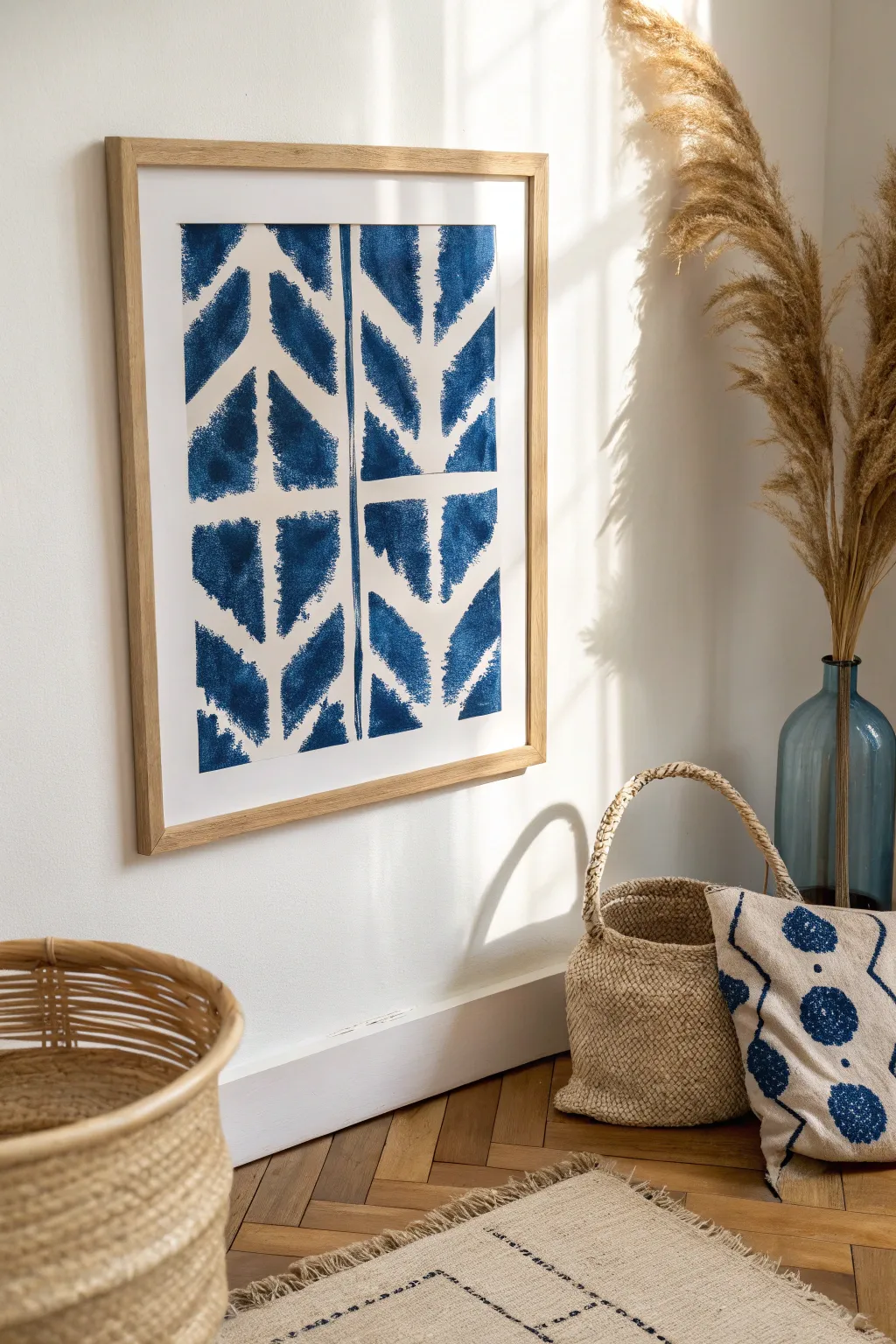
Capture the organic, breezy feel of traditional indigo dyeing without the mess of actual dye vats. This tutorial creates a mesmerizing chevron pattern with watercolor or acrylic ink that mimics the soft, bleeding edges of shibori textiles.
Step-by-Step Guide
Materials
- Large sheet of cold-press watercolor paper (A2 or similar size)
- Indigo or Prussian Blue watercolor paint (tube preferred) or high-flow acrylic ink
- Wide flat wash brush (1-2 inch)
- Medium round watercolor brush (size 8 or 10)
- Pencil
- Ruler
- Masking tape or painter’s tape
- Palette for mixing
- Paper towels
- Two jars of water
Step 1: Preparation & Layout
-
Tape it down:
Begin by securing your watercolor paper to a flat, hard surface using masking tape on all four sides. This prevents the paper from buckling when it gets wet. -
Find the center:
Measure the width of your paper and lightly mark the precise vertical center line with your pencil. Use a ruler to draw this line very faintly from top to bottom. -
Mark horizontal guides:
Along that central vertical line, make small tick marks every 4-5 inches to designate where your chevron ‘arrows’ will point and separate. Keep these marks extremely light so they don’t show through the paint later. -
The vertical divider:
Hand-paint a vertical line of varied thickness right over your pencil center line using your blue paint. Unlike a mechanical line, let this wobble slightly and vary in saturation to mimic a fold in dyed fabric. -
Mix your indigo:
Prepare a generous puddle of your indigo paint. I like to keep a second puddle that is slightly more watered down so I can dip between the two for natural tonal variation.
Step 2: Painting the Pattern
-
Start the first chevron:
Starting at the top left quadrant, load your flat brush. Paint a diagonal stroke moving downward and inward toward the center line, stopping about a half-inch before touching it. -
Create the rough edge:
While the paint is wet, quickly switch to a slightly damp round brush. gently tease the edges of your stroke outward to create a ‘fuzzy’ or bleeding effect, characteristic of dye soaking into cloth. -
Mirror the stroke:
Move to the top right quadrant and paint the mirrored diagonal stroke, ensuring it aligns with the left side. Again, leave a small white gap between this stroke and the center vertical line. -
Build the first tier:
Complete the top arrow shape by painting the lower diagonal strokes that connect to your first ones, forming a complete ‘V’ shape on each side of the center line. -
Spacing the pattern:
Move down to your next vertical tick mark. Leave a distinct horizontal gap of white space (about 0.5 to 1 inch) between the bottom of the first chevron block and the top of the next one. -
Repeat the process:
Continue painting these chevron blocks down the paper. Remember, uniformity is the enemy here; allow some strokes to be wider or darker than others to enhance the handmade look. -
Working wet-in-wet:
Occasionally drop a concentrated dot of pure pigment into a wet area of the blue shape. Watch it bloom and spread, adding depth and that authentic indigo saturation.
Wet Edge Technique
Pre-wet the paper with clean water in the chevron shape before adding paint. This forces the pigment to bleed naturally for an authentic dye look.
Step 3: Refining & Framing
-
Soften harsh lines:
Review your work while it’s still damp. If any outer edges look too crisp or geometric, run a clean, damp brush along them to soften the boundary. -
Check the white spaces:
The negative space is as important as the blue. Ensure your center vertical gap and horizontal dividers are visible, but they don’t need to be perfectly straight. -
Dry completely:
Allow the painting to dry fully flat. This will likely take several hours or overnight depending on how much water you used. The paper needs to be bone dry before untaping. -
Reveal the border:
Carefully peel away the masking tape at a 45-degree angle to reveal a crisp white border around your organic pattern. -
Framing:
Place your artwork in a light wood frame, preferably with a white mat, to complement the natural, bohemian aesthetic of the piece.
Fabric Texture Trick
For extra realism, gently press a piece of coarse linen fabric onto the wet paint and lift it off to leave a subtle woven texture behind.
Hang your new faux-shibori masterpiece in a bright room to enjoy those deep, calming indigo tones.
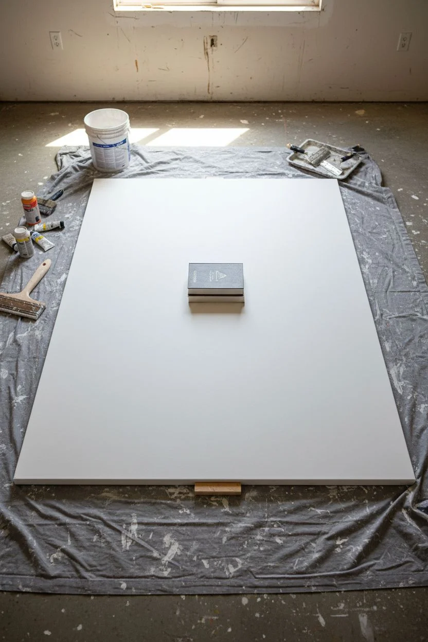
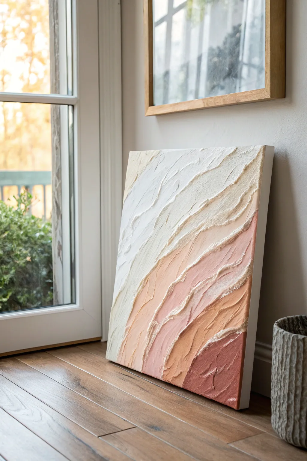
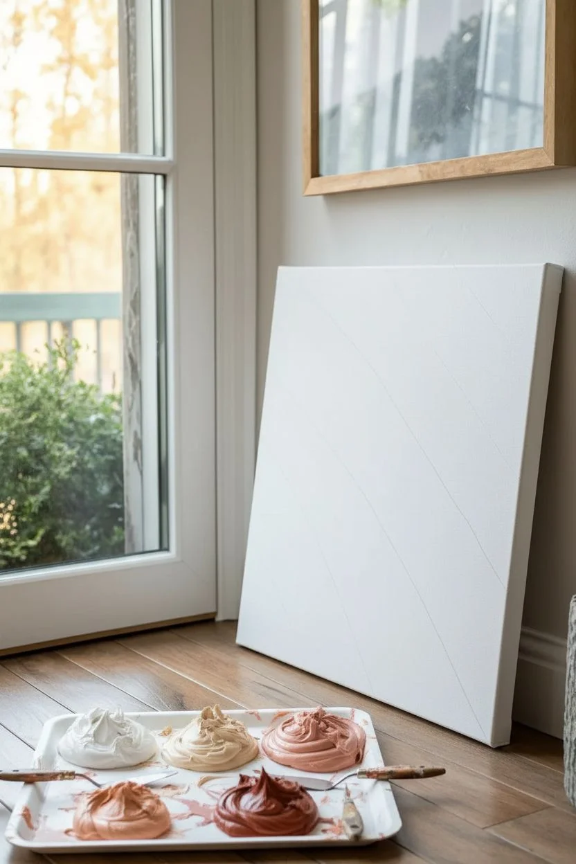
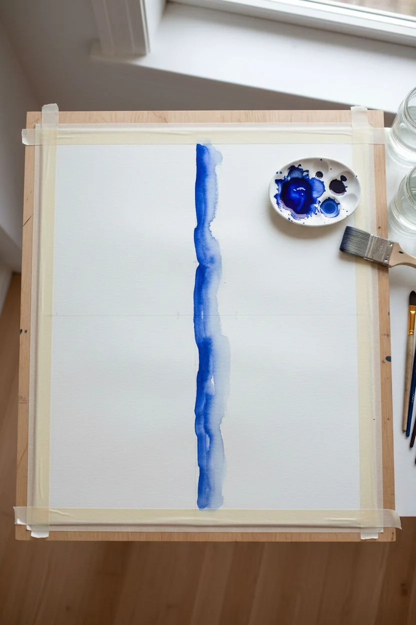
Soft Gradient Color Field Mood Piece
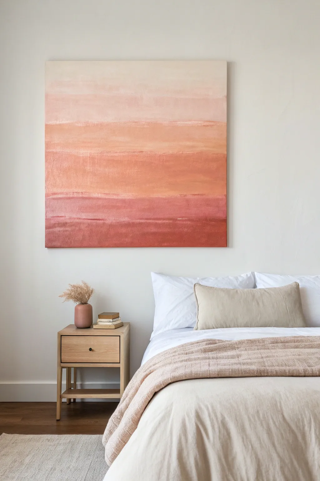
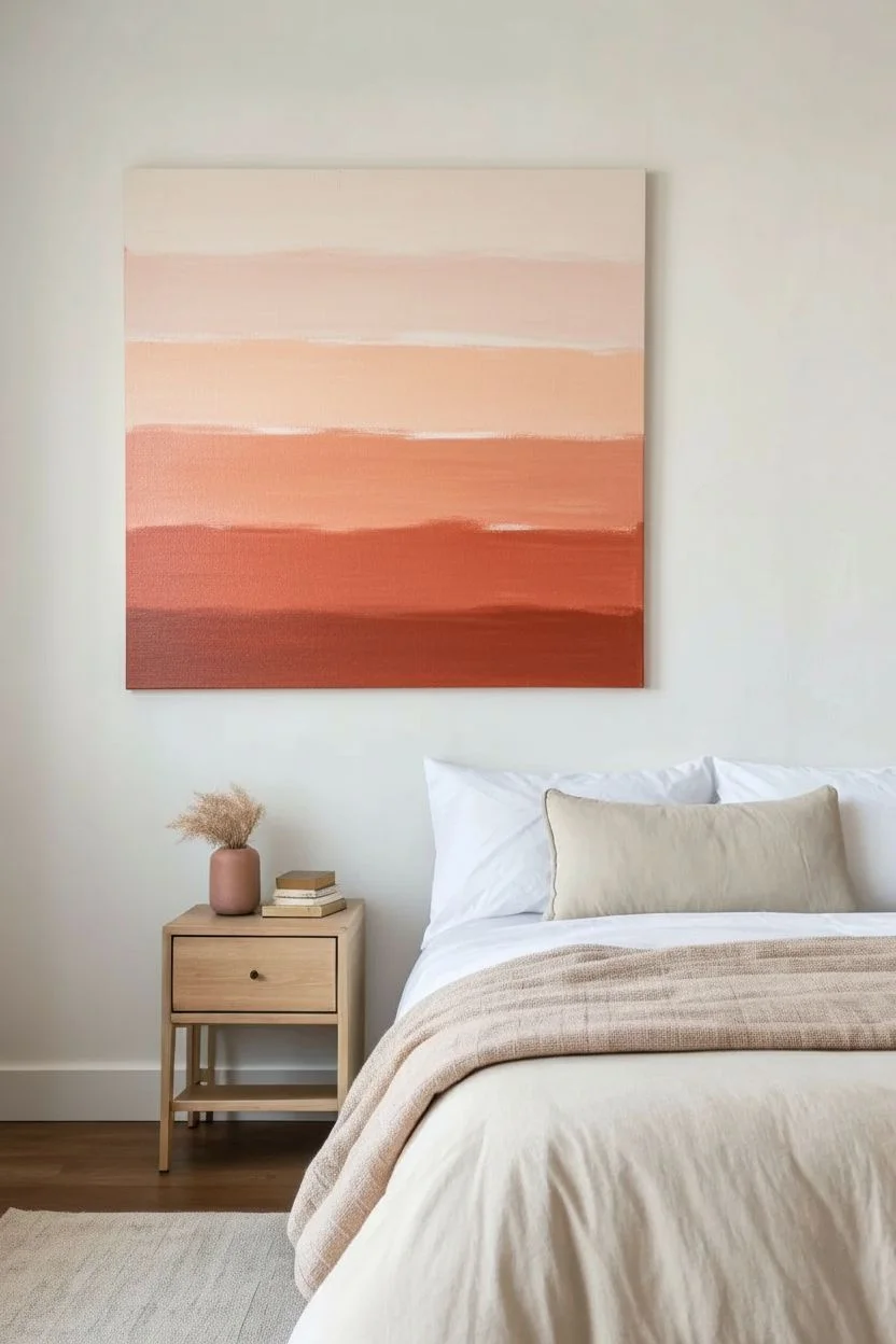
Capture the serenity of a desert sunset with this large-scale abstract painting, featuring horizontal bands of color that melt seamlessly into one another. The soothing gradient from cream to deep terracotta creates a warm, modern focal point perfect for a calming bedroom retreat.
Step-by-Step Tutorial
Materials
- Large square gallery-wrapped canvas (approx. 36″ x 36″ or larger)
- Heavy body acrylic paints: Titanium White, Unbleached Titanium, Light Pink, Peach, Burnt Sienna, Red Oxide, Burnt Umber
- Large flat paintbrush (2-3 inch width)
- Wide blending brush (dry softness is key, like a hake brush)
- Palette knife
- Water spray bottle (mister)
- Disposable palette or large paper plates
- Drop cloth
- Easel or flat working surface
Step 1: Preparation and Base Shades
-
Set the Stage:
Lay down your drop cloth and set up the canvas. For a piece this large, you might find it easier to work vertically on an easel to step back and view the gradient, though working flat can help prevent drips if your paint is thin. -
Mix the Lightest Tone:
On your palette, create a large batch of the top color. Mix Titanium White with a tiny touch of Unbleached Titanium and a speck of Light Pink to create a warm, barely-there blush cream. -
Mix the Mid-Tones:
Prepare your transition colors. You’ll want a soft peach (White + Peach), a true terracotta (Peach + Burnt Sienna), and a deeper rust (Burnt Sienna + Red Oxide). -
Mix the Darkest Tone:
Create the anchoring shade for the bottom. Mix Red Oxide with a touch of Burnt Umber to get a deep, earthy red-brown that will provide visual weight.
Keep it fluid
Add a retarder medium to your acrylic paints. This slows drying time significantly, giving you 20-30 extra minutes to blend those gradients perfectly without panic.
Step 2: Painting the Bands
-
Apply the Top Band:
Load your large flat brush with the lightest cream mixture. Paint the top 20% of the canvas using long, horizontal strokes. Don’t worry about perfect coverage yet; texture is good. -
Apply the Second Band:
Pick up the soft peach mixture without fully cleaning your brush. Paint the next section below the cream, overlapping the wet edge of the top color by about two inches. -
Move to Terracotta:
Continue down the canvas with the terracotta mixture. Apply this band across the middle section, again ensuring you overlap slightly with the peach band above it. -
Add the Deep Rust:
Apply the deep rust color to the lower-middle section. The transitions might look blocky right now, but that is expected at this stage. -
Finish with the Bottom Band:
Paint the bottom edge of the canvas with your darkest Red Oxide/Umber mix. Ensure you paint the sides of the canvas as you go so the color wraps around the edges cleanly.
Muddy colors?
If your blend turns grey or muddy, stop. Let the layer dry completely, then paint fresh color on top. Over-blending wet contrasting colors creates mud.
Step 3: Blending and Refining
-
Mist the Canvas:
Lightly mist the entire canvas surface with water using your spray bottle. I find this keeps the acrylics open longer, allowing for that dreamy, soft-focus look. -
Initial Wet Blend:
Take a clean, slightly damp large brush. Starting from the top, brush back and forth horizontally over the line where the cream meets the peach to soften the hard edge. -
Work Downward:
Continue this blending process down the canvas between each color band. Wipe your brush on a rag between zones so you don’t drag dark paint up into the light sky area. -
Dry Brush Technique:
Once the initial blend is done but the paint is still tacky, use a dry, soft hake brush. Lightly whisk horizontally across the transitions to feather them further. -
Layering for Depth:
Let the first layer dry completely (about 30 minutes). You will likely see some streakiness, which adds character, but we want more depth. -
Second Pass – Light:
Repeat the application of the top cream color. This time, bring it down slightly lower in thin, uneven strokes to create the illusion of clouds or atmosphere. -
Second Pass – Dark:
Glaze a thin layer of the dark rust over the bottom third. If the paint feels too heavy, mix it with a little glazing medium or water to make it translucent. -
Create Imperfect Lines:
Using a palette knife or the edge of a brush, drag a few thin, horizontal streaks of the lighter peach color into the darker terracotta area to simulate horizon lines. -
Final Softening:
Step back and look for any jarring lines. Use the dry brush to buff out any areas that feel too rigid. The goal is an organic, weathered appearance. -
Seal:
Allow the painting to cure for at least 24 hours. Because of the textured layering, a matte varnish works best to preserve the earthy, natural feel without adding glare.
Hang your finished canvas in a well-lit spot to let the subtle gradients warm up the entire room
Collage-and-Paint Modern Mixed Media
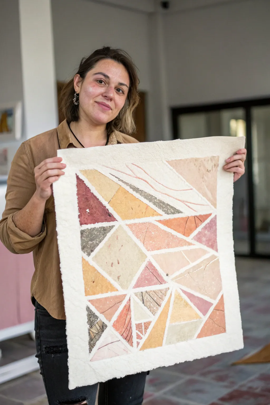
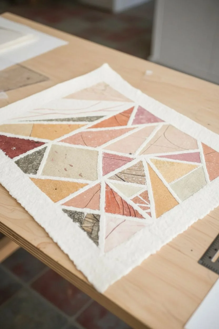
This project embraces the raw, tactile beauty of handmade paper to create a striking geometric composition. By assembling earth-toned fragments with visible, thick pulp borders, you achieve a modern mosaic effect that feels both structured and organic.
How-To Guide
Materials
- Various sheets of handmade paper (in rust, ochre, sage, soft pink, and charcoal colors)
- Thick white cotton watercolor paper or handmade paper (250gsm+) for the base
- PVA glue or archival matte medium
- Flat synthetic brush for glue application
- White paper pulp (or white handmade paper soaked and blended)
- Pencil and ruler
- X-acto knife or scissors
- Cotton swabs
- Heavy books or a weight
Step 1: Planning and Cutting
-
Map your design:
Begin by sketching your geometric layout lightly on a piece of scrap paper first. The design relies on interconnected triangles and trapezoids that radiate slightly from the center, so plan a balanced composition of shapes. -
Transfer to base:
Take your large sheet of thick white base paper. Using a ruler and a very light pencil touch, draw the main dividing lines of your design directly onto it. Leave about a 1/4-inch gap between every shape to act as the ‘grout’ line. -
Select your palette:
Gather your colored handmade papers. Look for sheets with visible fibers, inclusions, or variations in tone to give the final piece depth. Determine which color will go into which geometric segment. -
Create templates:
I find it helpful to trace each specific shape from your base layout onto tracing paper to use as a template, ensuring the colored paper will fit perfectly within its designated spot. -
Cut the shapes:
Using your templates, cut the colored handmade papers. You can use scissors for a clean edge, or tear them against a ruler if you prefer a rougher, more organic look, though clean edges contrast nicely with the textured dividers.
Pro Tip: Pulp Consistency
Mix a tiny bit of white glue into your damp paper pulp before applying it borders. This acts as a binder, ensuring the textured lines dry hard and won’t crumble off later.
Step 2: Assembly and Texture
-
Adhere the shapes:
Apply a thin, even layer of PVA glue or matte medium to the back of a cut shape. Press it firmly into its corresponding spot on the base paper. -
Smooth it out:
Use a brayer or clean dry brush to smooth the paper down from the center outward, ensuring there are no air bubbles trapped underneath. -
Repeat the process:
Continue gluing down all your geometric shapes, maintaining that crucial consistent gap between them. This negative space is just as important as the colored sections. -
Prepare the pulp:
If you don’t have ready-made paper pulp, take scraps of white handmade paper, soak them in water until soft, and blend them into a thick, mushy consistency. Ssqueeze out most, but not all, of the water. -
Fill the gaps:
Take small pinches of the damp white pulp. Carefully press this pulp into the gaps between your colored shapes. You want this to be slightly raised and textured, resembling a soft, fibrous grout. -
Create the border:
Extend this pulp application to the outer edges of the artwork to create a thick, deckled frame. Use your fingers to mold it, keeping it irregular and fluffy for that authentic handmade feel. -
Add surface texture:
While the pulp is still damp, you can gently press texture into it or drag a toothpick through parts of the colored paper if you want to distress them slightly to match the rustic vibe.
Step 3: Drying and Finishing
-
Initial drying:
Allow the piece to air dry flat on a clean surface. Because of the wet pulp, this stage is sensitive. Creating good airflow in the room will help. -
Pressing flat:
Once the pulp feels mostly dry to the touch but the paper is still cool (indicating internal moisture), place a sheet of wax paper over the art. -
Weight it down:
Place a heavy board and several books on top of the wax paper. Leave this for at least 24 hours. This prevents the base paper from buckling due to the moisture in the glue and pulp. -
Final inspection:
Remove the weights. Check for any loose edges on the colored shapes. If found, use a toothpick to dab a tiny bit of glue under the edge and press down.
Level Up: Botanical Inclusions
Before the white pulp border dries, press tiny dried flower petals, seeds, or bits of gold leaf into the wet fibers for an intricate, embedded detail.
Once fully dry, your textured collage is ready to be framed in a shadow box to show off its beautiful relief
Abstract Map Lines of Your Favorite Place
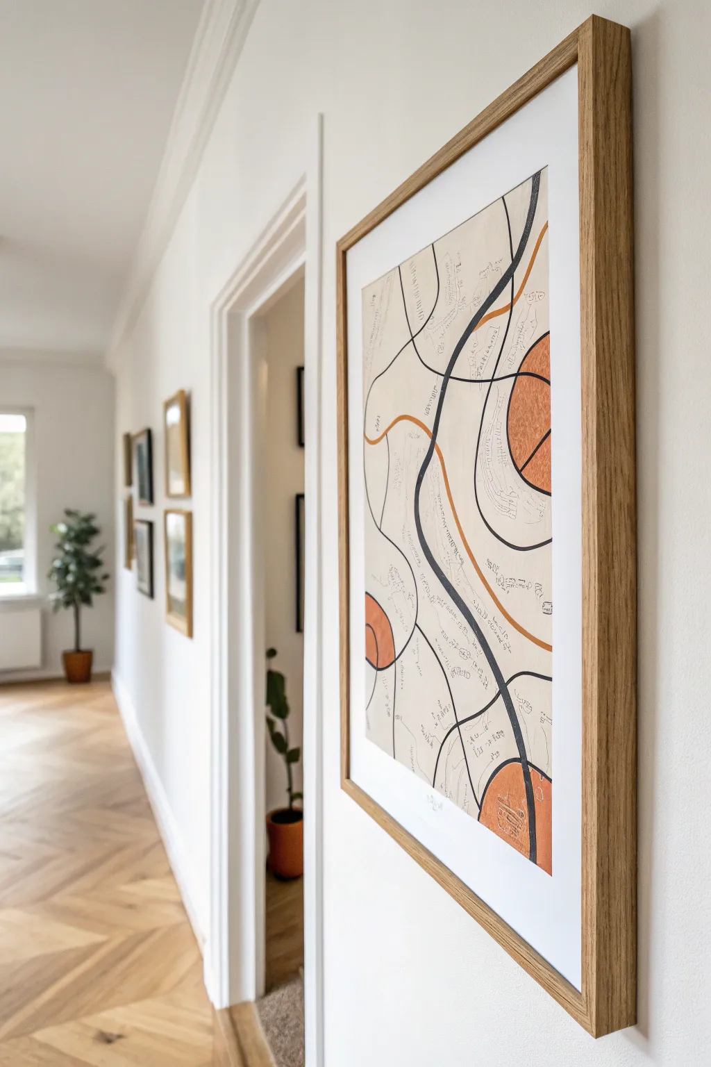
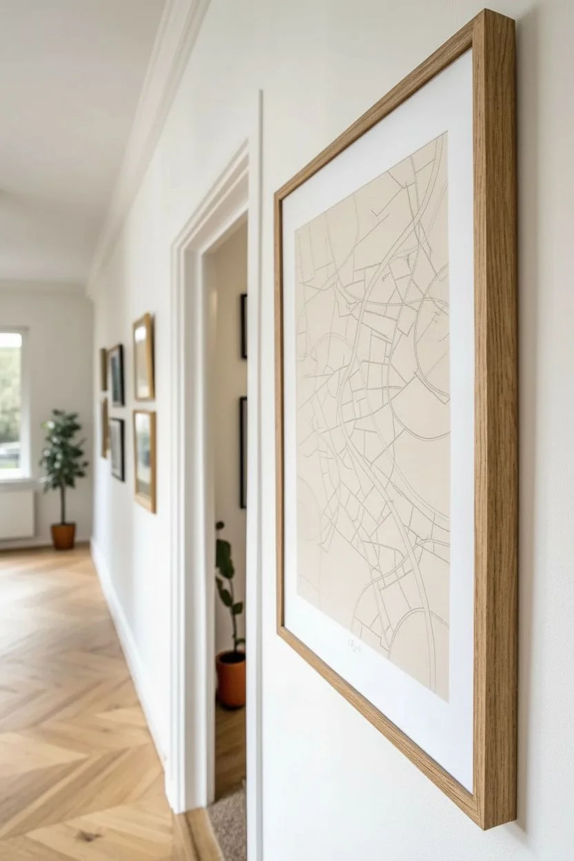
Turn your favorite city or a fictional landscape into modern wall decor with this minimalist map-inspired project. Using flowing lines, terracotta accents, and subtle text annotations, you can create a piece that feels both structured and organic.
Detailed Instructions
Materials
- High-quality watercolor or mixed media paper (A3 or larger)
- Black fineliner pens (various nib sizes: 0.1, 0.3, 0.5mm)
- Black brush pen or thick marker
- Terracotta or burnt orange watercolor paint (or gouache)
- Small round paintbrush
- Pencil and eraser
- Ruler (optional)
- Light oak wooden frame with mat board
Step 1: Conceptualizing and Sketching
-
Choose your location:
Decide on a map you want to abstract. It could be your hometown, a memorable vacation spot, or simply an imaginary terrain. Pull up a reference image like Google Maps to guide your lines. -
Draft the main arteries:
Lightly sketch a few major curved lines across your paper with a pencil. These will act as your ‘main roads’ or rivers. Keep them loose and flowing rather than jagged. -
Add secondary paths:
Branch off smaller lines from your main arteries. Think of these as side streets or topographical elevation lines. Allow some to intersect while others run parallel for a bit before veering off. -
Mark focal zones:
Identify two or three areas where you want to add color. Sketch large, semi-circular or organic blob shapes in these spots. These will become your bold color blocks later.
Pro Tip: Line Variation
Don’t be afraid to let lines wobble slightly. A bit of hand-drawn imperfection makes the map feel more organic and less like a computer printout.
Step 2: Inking the Lines
-
Trace principal lines:
Take your thickest black marker or brush pen and trace one or two of the most prominent curves. Varying the line weight here adds dynamic visual interest. -
Define the secondary network:
Switch to a medium nib fineliner (like a 0.5mm). Carefully trace the remaining major navigational lines you penciled in earlier. Keep your hand steady but relaxed to maintain smooth curves. -
Introduce fine details:
Using your finest pen (0.1mm), draw very delicate lines that echo the larger curves. You can create clusters of these fine lines to mimic elevation contours found on hiking maps. -
Double up:
Select a few random lines and draw a parallel line right next to them. This simple technique instantly makes the drawing look more like a structured map system.
Troubleshooting: Smudges
If you accidentally smudge wet ink, turn it into a feature! Draw a new ‘park’ or color block over the smudge to hide it naturally within the map design.
Step 3: Adding Color and Texture
-
Mix your paint:
Prepare a terracotta or burnt orange color. If you are using watercolor, keep it relatively opaque so it stands out against the stark black lines. -
Fill the focal shapes:
Paint the organic shapes you marked out in the first phase. I like to let the brush edge remain slightly rough or textured rather than perfectly smooth, as it adds an artistic touch. -
Add accent lines:
Once your brush is mostly dry or using a colored marker, trace one or two existing pencil lines in this same orange hue to weave the color through the rest of the composition. -
Allow to dry:
Let the paint dry completely. This is crucial before moving to the text step to avoid smudging ink into wet paint.
Step 4: Annotation and Finishing
-
Add tiny text:
Take your 0.1mm fineliner again. Write small, almost illegible notes along some of the lines. These can be street names, dates, or just abstract scribbles that mimic cartography text. -
Orient the text:
Make sure to curve your writing so it follows the path of the line it sits on. This integration creates that authentic map aesthetic. -
Erase guidelines:
Once all ink is 100% dry, gently erase any visible pencil marks. Be careful over the painted areas to not lift the pigment. -
Sign and date:
Add your signature in a bottom corner. Keep it small and unobtrusive to maintain the minimalist vibe. -
Frame it up:
Place your finished artwork behind a clean white mat and inside a light oak frame. The natural wood tone complements the terracotta paint beautifully.
Hang your new abstract map in a hallway or living space to add a sophisticated, personal touch to your home decor

Have a question or want to share your own experience? I'd love to hear from you in the comments below!