Painting can be such a gentle way to connect when words feel slippery, and it doesn’t have to be complicated to be meaningful. These easy painting ideas are designed to support dementia patients with simple steps, familiar imagery, and that lovely “I did it” feeling.
Watercolor Wash Sunsets
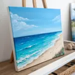
This soothing project focuses on the therapeutic flow of watercolors to create a soft, gradient sky over calm waters. The simple horizontal bands of color make it an intuitive and low-pressure activity that results in a professional-looking landscape.
Step-by-Step Tutorial
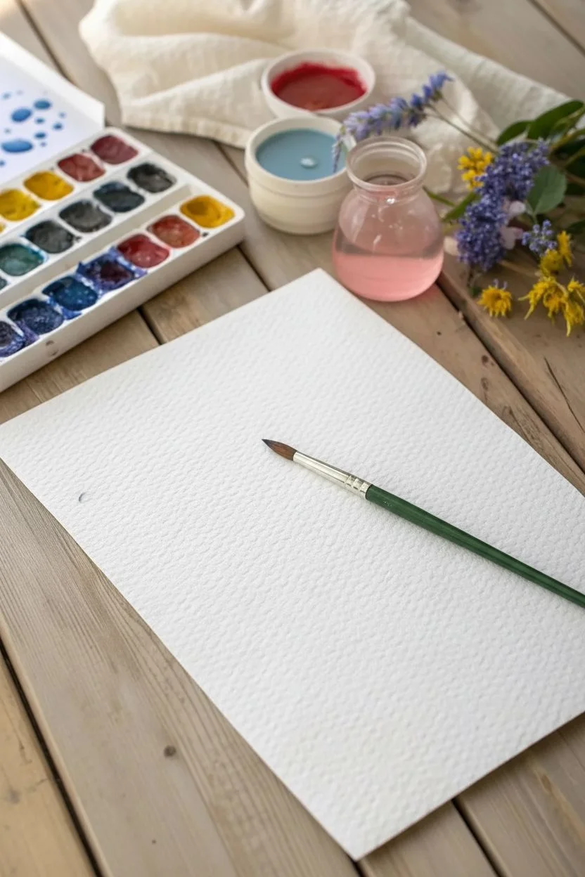
Materials
- High-quality watercolor paper (140lb/300gsm cold press recommended)
- Watercolor paints (Purple/Violet, Pink/Rose, Orange/Yellow Ochre, Blue/Indigo)
- Large flat brush or wash brush
- Medium round brush
- Fine liner pen (black, archival ink)
- Painter’s tape or masking tape
- Board or table surface to tape paper to
- Cup of clean water
- Paper towels
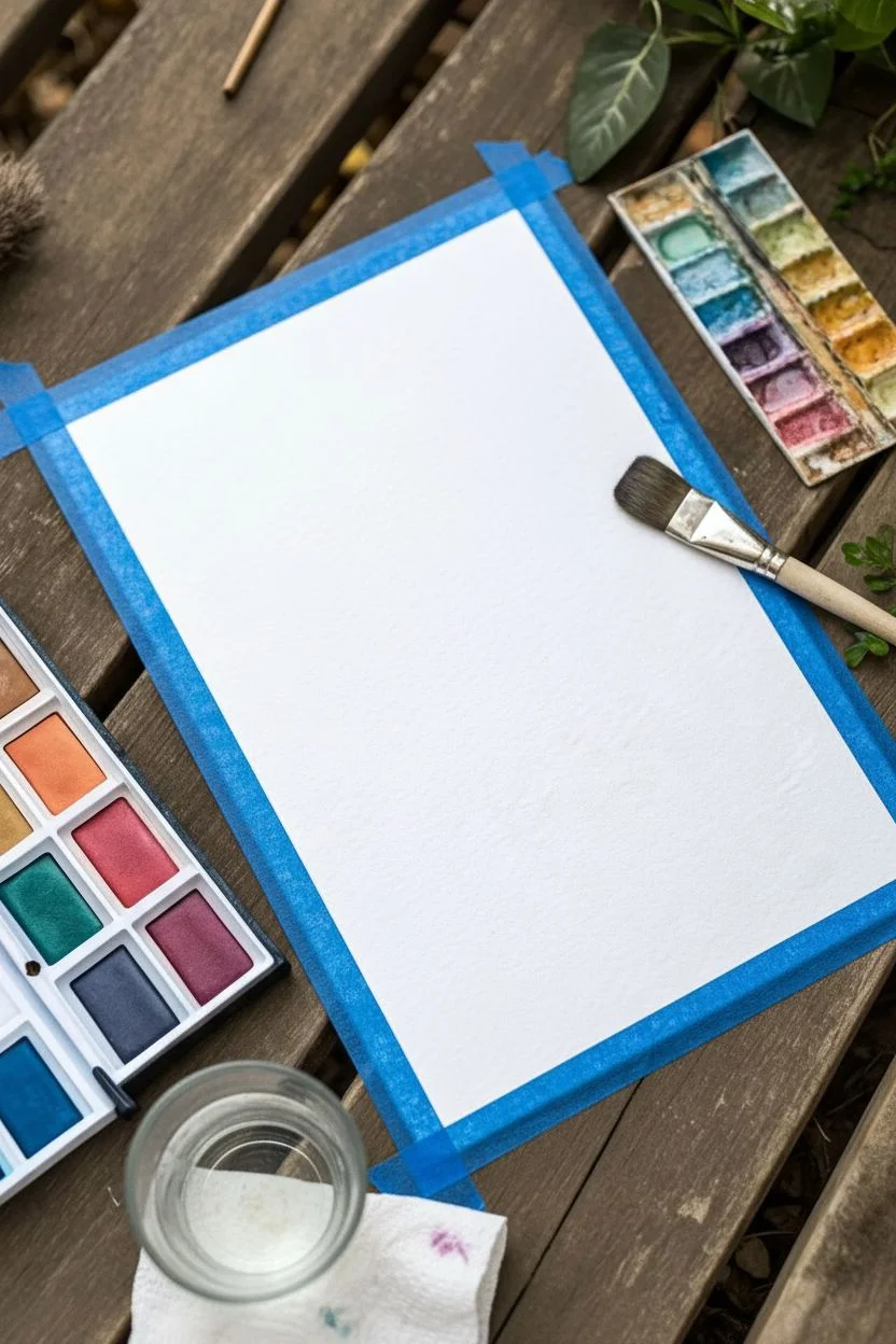
Step 1: Setting the Sky
-
Prepare the workspace:
Begin by taping your watercolor paper securely to a flat board or table using painter’s tape. This prevents the paper from buckling when it gets wet and creates a clean white border. -
Mix your palette:
Prepare three puddles of diluted paint for the sky: a deep violet, a warm pink, and a sunny yellow-orange. Ensure they are watery enough to flow easily. -
Wet the paper:
Using your large wash brush and clean water, gently wet the top two-thirds of the paper where the sky will go. The paper should glisten but not have standing pools of water. -
Apply the violet:
While the paper is damp, load your brush with the violet paint and apply a broad horizontal stripe across the very top of the sky area. -
Blend in the pink:
Rinse your brush slightly, pick up the pink paint, and apply a stripe just below the violet. Let the wet edges of the two colors touch and merge naturally. -
Finish the sunset:
Apply the yellow-orange stripe below the pink, blending it upwards slightly. This creates the glowing horizon line. -
Let the sky dry:
Allow the sky section to dry completely before moving on. I like to confirm it’s ready by checking that the paper feels room temperature rather than cool to the touch.
Step 2: Creating the Landscape
-
Paint the distant mountains:
Mix a diluted purple-grey wash. Using the medium round brush, paint a silhouette of mountain shapes that overlap the bottom edge of your yellow sky. Keep the top edge undulating and the bottom edge straight. -
Paint the water:
Below the mountains, paint horizontal bands of blue. Start with a lighter, watery blue just under the mountains to represent the reflection. -
Deepen the foreground:
As you move toward the bottom of the page, use a more concentrated, darker blue or indigo to suggest depth in the water closer to the viewer. -
Soften the water:
While the blue paint is still damp, run a clean, slightly damp brush horizontally across the water area to soften any hard lines and create a smooth, glassy look. -
Dry completely:
Wait for the entire painting to dry thoroughly. This is crucial before adding the final details to prevent ink from bleeding.
Wet-on-Wet Magic
For smoother gradients, tilt your board slightly while painting the sky. Gravity helps pull the pigment down, blending the colors seamlessly without overworking the paper.
Step 3: Final Details
-
Outline the mountains:
Take your fine liner pen and carefully trace the top edge of the purple mountain range. This adds definition and helps the landscape pop. -
Refine the horizon:
If desired, adding a very thin, straight line at the base of the mountains can help clearly separate the land from the water. -
Sign the work:
Choose a spot in the bottom white border or the corner of the painting to sign and date the artwork. -
Remove the tape:
Gently peel away the painter’s tape at a 45-degree angle, pulling away from the artwork to reveal the crisp, clean edges.
Add a Foreground
Once dry, paint a solid black silhouette of a tree branch or tall grass in the immediate foreground to create a dramatic sense of distance against the sunset.
Now you have a peaceful landscape ready to frame or give as a thoughtful gift

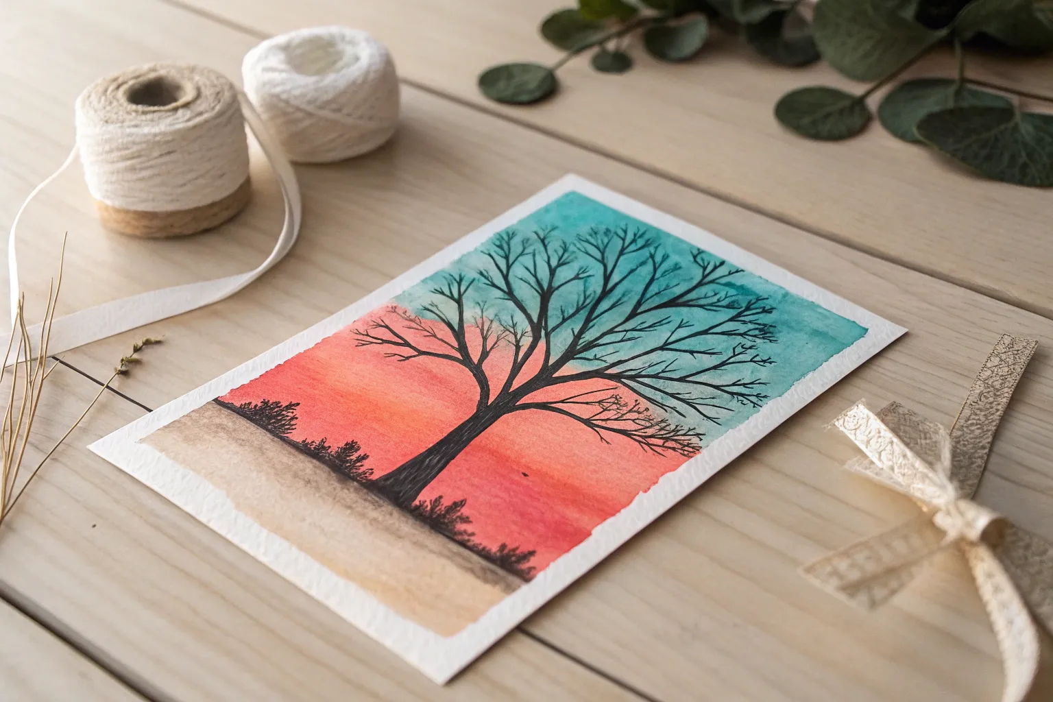
Tree Silhouette on a Colorful Background
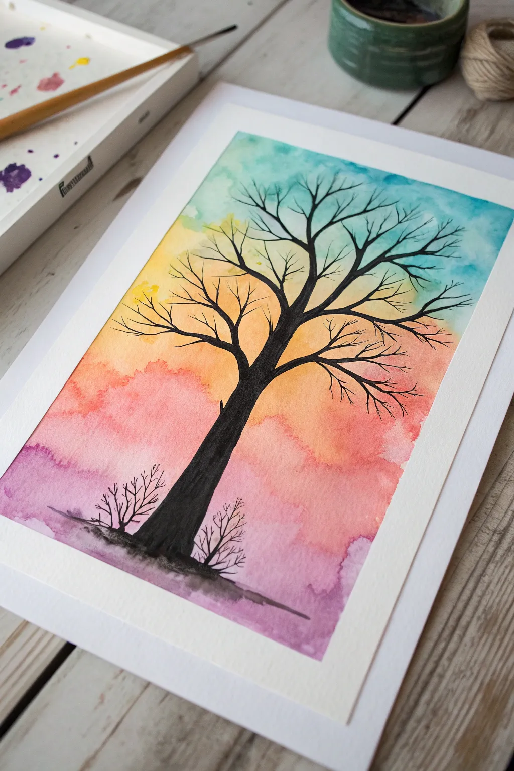
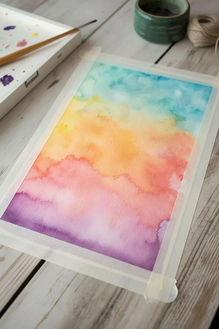
Create a calming and striking piece of art with this high-contrast tree silhouette set against a softly blended, colorful sky. The wet-on-wet watercolor technique makes the background effortlessly beautiful, while the stark black tree adds a bold focal point.
Detailed Instructions
Materials
- Watercolor paper (cold press, heavy weight)
- Watercolor paints (purple, pink, orange, yellow, blue/teal)
- Black watercolor paint, gouache, or India ink
- Large flat brush or wash brush
- Round detail brush (size 2 or 4)
- Small liner brush (optional for tiny twigs)
- Jar of clean water
- Paper towels
- Masking tape or painter’s tape
- Pencil (optional)
Step 1: Creating the Sky Background
-
Prepare your surface:
Begin by taping down the edges of your watercolor paper to a hard board or table. This creates that crisp white border you see in the final piece and keeps the paper from buckling when wet. -
Pre-wet the paper:
Take your large clean brush and embrace the wet-on-wet technique by coating the entire inner rectangle of the paper with clean water. The paper should be glistening but not forming puddles. -
Start with purple:
Load your brush with a watery mix of purple paint. Apply it loosely across the bottom section of the paper, letting the color bloom and spread naturally into the wet surface. -
Add pink tones:
Clean your brush slightly and pick up a vibrant pink or rose shade. Dab this color just above the purple, allowing the edges to touch and bleed together softly. -
Introduce warmth:
Move higher up the paper with an orange hue. Brush this into the middle area, blending it gently downward into the pink to create a sunset transition. -
Brighten with yellow:
Add a sunny yellow or gold tone above the orange. Keep your strokes horizontal but loose; the water on the paper will do most of the blending work for you. -
Finish the sky:
Complete the gradient by adding a teal or light blue to the very top section. Let this color touch the yellow below, creating a hint of green where they meet. -
Dry completely:
This is crucial: let the background dry 100% before moving on. I actually like to use a hairdryer on a low setting here to speed things up, ensuring the paper is bone dry.
Bleeding Lines?
If the black paint spreads into the background, the paper wasn’t dry enough. Wait longer or use a hair dryer before painting the tree layer.
Step 2: Painting the Tree Silhouette
-
Mix your black:
Prepare a very dark, opaque black paint. If using watercolor, use very little water to keep it dense, or switch to black gouache or ink for a truly solid look. -
Outline the trunk:
Using a round brush, paint the main trunk of the tree starting from the bottom purple area. Make the base wide and gradually taper it as you reach the center of the paper. -
Fill the trunk:
Fill in the trunk shape with solid black, ensuring no background color shows through. Anchor the tree by painting a small, uneven ground line at the very bottom. -
Start main branches:
From the top of the trunk, split the line into two or three thick main branches reaching upward and outward toward the corners. -
Add secondary branches:
Switch to a smaller brush if needed. Draw thinner branches growing out from the main ones, keeping lines slightly jagged and organic rather than perfectly straight. -
Create fine twigs:
Using just the very tip of your detail brush or a liner brush, add delicate twigs to the ends of the branches. These should be very fine lines that fan out into the blue and yellow sky. -
Paint bottom shrubs:
To balance the composition, paint two small, twiggy bushes on either side of the main tree trunk at the bottom, using the same black paint. -
Final touches:
Review your silhouette. If any black areas look transparent after drying, add a second coat of black to make the contrast pop. -
Reveal:
Once everything is completely dry, carefully peel away the masking tape at a 45-degree angle to reveal your clean white border.
Sharper Branches
For ultra-crisp, thin branches, skip the brush and use a fine-tip waterproof black marker or pen over the dried watercolor background.
You have captured a beautiful moment of nature with simple colors and bold shapes


Big-Shape Flowers With Pre-Drawn Outlines
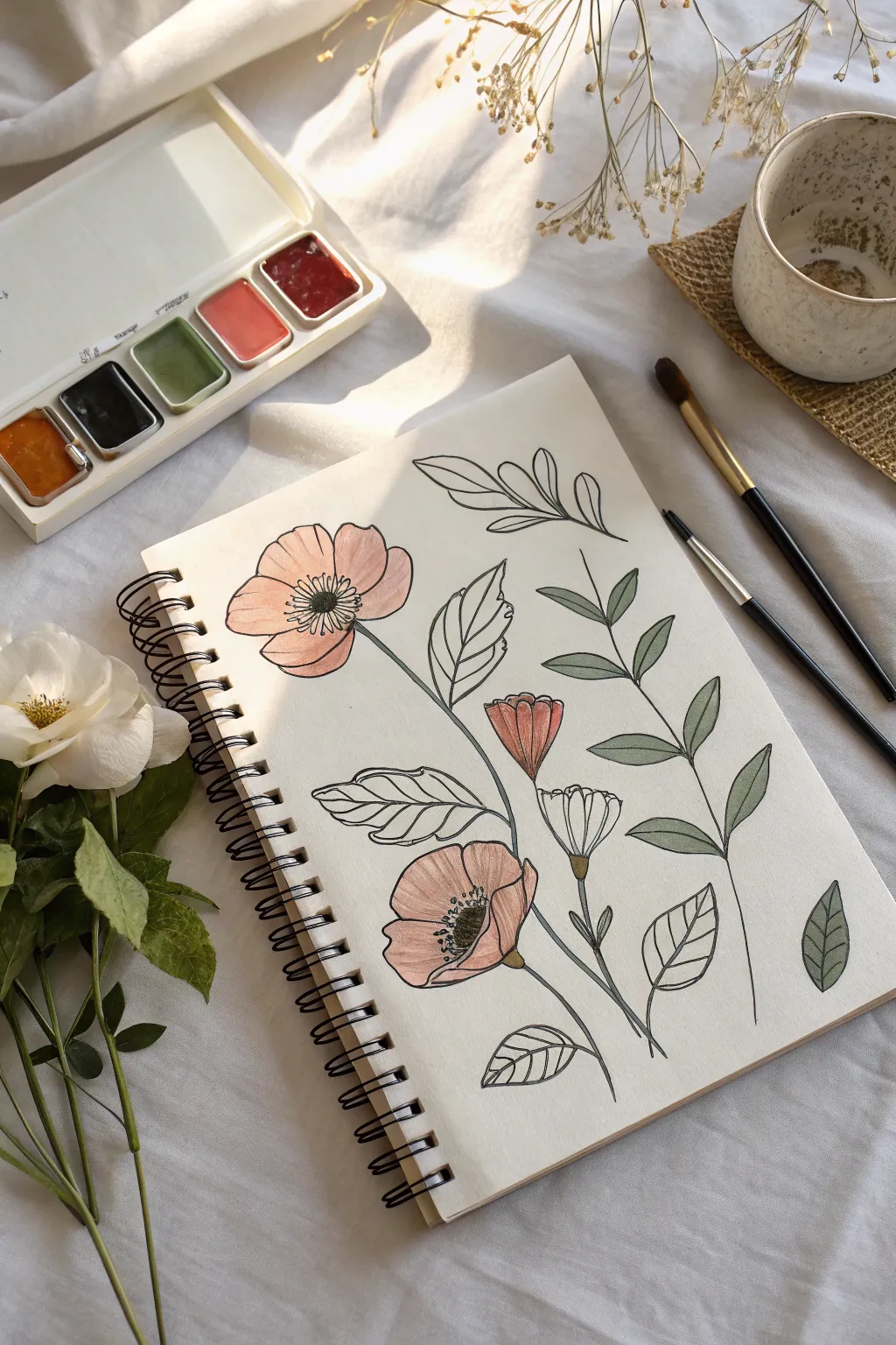
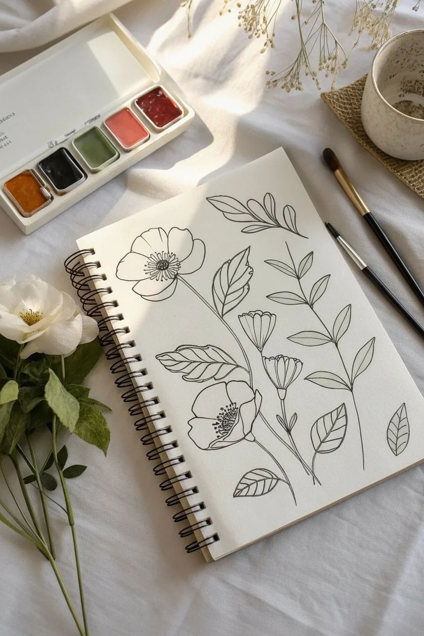
This relaxing project combines the structure of pen drawing with the freedom of loose watercolor to create a serene botanical study. The distinct black outlines make it easy to see where to paint, offering a stress-free creative experience that yields professional-looking results.
Step-by-Step Guide
Materials
- Spiral-bound sketchbook with mixed media or watercolor paper (cold press)
- Black waterproof fineliner pen (0.5mm or 0.8mm)
- Watercolor paint set (pan set with reds, greens, and ochre)
- Round watercolor brushes (size 4 and size 8)
- Cup of clean water
- Paper towel for blotting
- Pencil and eraser (optional for initial sketch)
Step 1: Drawing the Outline
-
Start with the main flower:
Begin near the top left of the page. Use your waterproof pen to draw a large, open poppy-style flower. Start with a small oval center, fill it with tiny circles for texture, and then draw four to five large, slightly wavy petals radiating outward. -
Add the stem:
From the base of this first flower, draw a single, thin line curving gently down toward the bottom right of the page. This anchors your composition. -
Draw a second flower:
Lower down on the page, draw a second bloom similar to the first but perhaps facing a slightly different angle. Draw its stem crossing over or connecting to the first stem line. -
Sketch the buds:
In the gap between the two main flowers, draw a smaller, tulip-shaped bud. Add another bud slightly lower down that hasn’t opened yet, keeping the shapes simple and distinct. -
Create leaf branches:
On the right side of the page, draw a long, vertical stem. Add pairs of oval-shaped leaves extending from it. Keep the leaves simple—just outlines with a center vein line. -
Fill empty spaces:
Look for empty spots around your flowers. Draw large, single leaves floating in these spaces. You can leave some leaves just as outlines without any inner veins for variety. -
Let the ink dry:
Pause here for a few minutes. It is crucial that the black ink is completely dry before adding water, or it will smear.
Step 2: Adding Color
-
Prepare your paints:
Activate your watercolor pans by adding a drop of clean water to a salmon pink, a deep red, an olive green, and a sage green. -
Wash the first flower:
Dip your size 8 brush into the salmon pink. Paint the petals of the top flower. Don’t worry about filling every white speck; a little white space adds sparkle to watercolors. -
Darken the center:
While the pink is still slightly damp, drop a tiny bit of deeper red or orange right near the center of the flower to create depth. -
Paint the second flower:
Repeat the process for the lower flower. I find using a slightly more watered-down pink here helps differentiate it from the top bloom. -
Color the buds:
Use a darker concentration of red or orange for the closed buds, as petals are often more vibrant when tightly packed. -
Paint the structured leaves:
Switch to your sage green paint. Carefully fill in the leaves on the long vertical branch on the right. Try to stay mostly within the lines, but don’t stress over perfection. -
Paint floating leaves:
For the singular floating leaves, use the olive green or mix a little brown into your green for variety. Paint some of them fully, and leave others completely unpainted (white) for a modern, illustration style. -
Detail the stems:
Using the smaller size 4 brush and a very light green mix, trace over the stem lines. You can also leave the stems as just black ink if you prefer high contrast. -
Final touches:
Once the flower centers are dry, you can dot a tiny bit of yellow or brown into the very middle of the black ink center for a pop of color.
Smudged Ink?
If your black pen bleeds when painting, it isn’t waterproof. Stop and let the outline dry for at least 24 hours, or switch to painting inside the lines with colored pencils instead.
Vintage Look
To make the page look aged and warm, apply a very watery wash of tea or diluted yellow ochre over the entire background before you start painting firmly.
Enjoy the calming rhythm of filling in these beautiful shapes one by one.


Paint-Inside-the-Shape Color Blocks
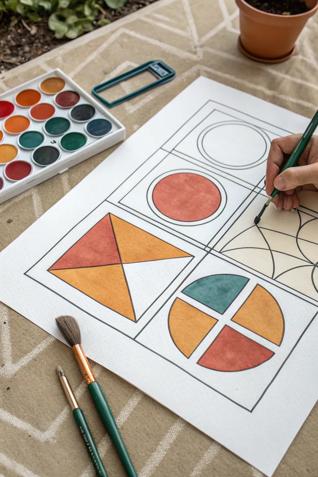
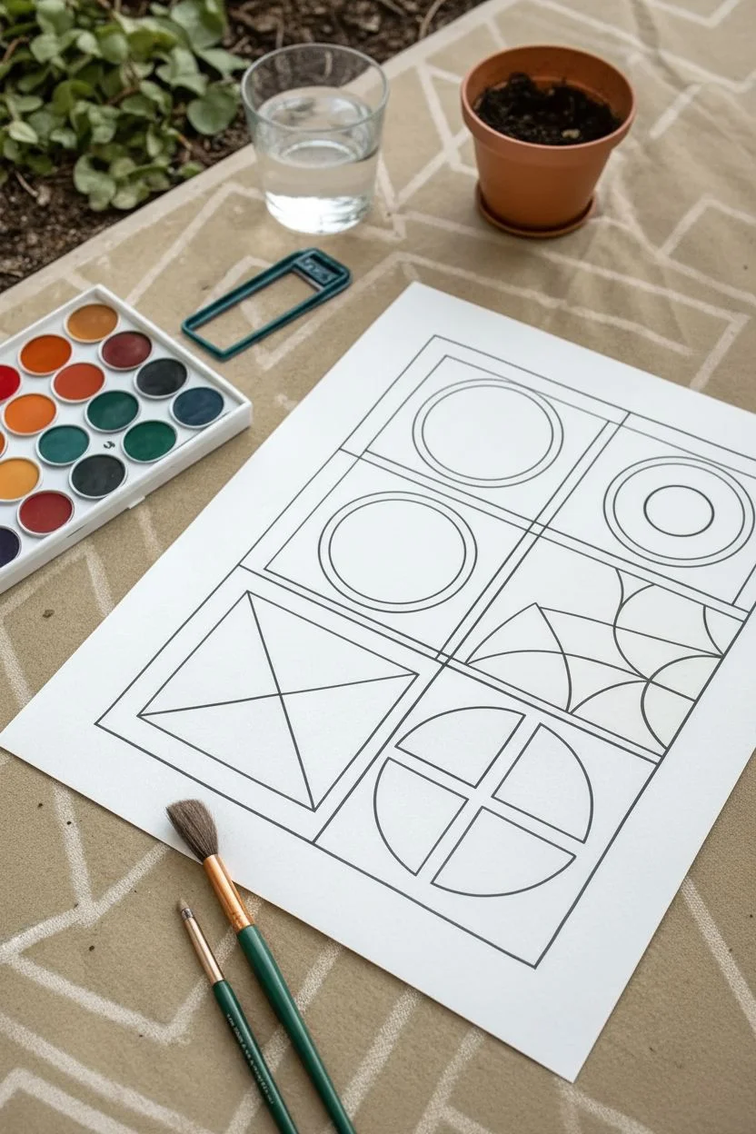
This calming and structured watercolor project focuses on filling simple geometric shapes with solid blocks of warm, earthy colors. The thick black outlines provide helpful boundaries, making it a relaxing exercise in brush control and color harmony.
Step-by-Step Tutorial
Materials
- Heavyweight watercolor paper (90lb or 140lb)
- Black waterproof fine liner pen (0.5mm or 0.8mm)
- Ruler
- Compass or circular objects for tracing
- Watercolor pan set (earth tones: sienna, ochre, terracotta, teal)
- Round watercolor brushes (size 4 and 8)
- Cup of water
- Paper towels
Step 1: Drawing the Layout
-
Create the main grid:
Start by drawing a large square in the center of your paper using a ruler and a pencil first if you want to be safe, then trace over with your waterproof pen. Divide this large square into four equal smaller squares. -
Add inner frames:
Inside each of the four squares, draw a slightly smaller square to create a frame effect. This ‘box within a box’ look adds a nice architectural feel to the finished piece. -
Draw the bottom-left design:
In the bottom-left square, draw a large ‘X’ from corner to corner. This divides the square into four triangles distinct from one another. -
Create the circle motifs:
For the top-right square, use a compass or trace a cup to draw a perfect circle centered in the frame. Inside that, draw a slightly smaller circle. -
Sketch the divided circle:
In the bottom-right square, draw a large circle. Then, use your ruler to draw a cross through it, splitting the circle into four equal pie slices. -
Design the top-left shape:
In the final top-left square, draw a circle like before, but inside this one, draw a smaller inner circle to create a target or donut shape. -
Finalize outlines:
Once your pencil sketches are done, trace all lines carefully with your black waterproof pen. Ensure the ink is completely dry before erasing any remaining pencil marks to avoid smearing.
Bleeding Lines?
If black ink runs when you paint, your pen isn’t waterproof. Test your pen on a scrap paper with water before starting the main project.
Step 2: Painting the Shapes
-
Prepare your palette:
Activate your watercolor pans with a few drops of clean water. Focus on an earthy palette: burnt orange (terracotta), golden yellow (ochre), and a muted teal or slate blue. -
Start with the divided circle:
Looking at the bottom-right design (the pie chart), load your size 8 brush with golden ochre. Paint the left and right quadrants carefully, staying within the lines. -
Add contrasting colors:
Rinse your brush thoroughly. Pick up the teal color and paint the top quadrant of that same circle. -
Finish the bottom quadrant:
Fill the final bottom slice of the split circle with the terracotta orange. The goal here is flat, even washes rather than shading. -
Paint the triangle design:
Move to the bottom-left square with the ‘X’. Paint the left triangle terracotta and the top and bottom triangles in golden ochre. Leave the right triangle distinct, perhaps white or a very pale wash. -
Fill the top circle:
For the top-left circle, fill the inner circle with a solid wash of terracotta. I find it helps to rotate the paper as I paint the curve to keep my hand steady. -
Address the unpainted circle:
The top-right circle remains currently unpainted in this study, serving as a ‘breathing room’ element, but feel free to add a very light beige wash if you prefer it not to be stark white. -
Paint the background accent:
In some of the squares, you can leave the background white for high contrast. In others, like the fan pattern shown partially on the right, apply a pale cream wash to distinguish the background from the shapes. -
Let it dry completely:
Allow the paint to dry fully. If the paper buckles slightly, you can place it under a heavy book overnight once it is bone dry.
Brush Control
Use a smaller brush (size 4) for the edges near the black lines, and a larger brush to fill the centers. This prevents accidental overpainting.
Display your colorful geometric grid in a simple frame to highlight the clean lines and warm tones
BRUSH GUIDE
The Right Brush for Every Stroke
From clean lines to bold texture — master brush choice, stroke control, and essential techniques.
Explore the Full Guide
Tape Resist Geometric Painting
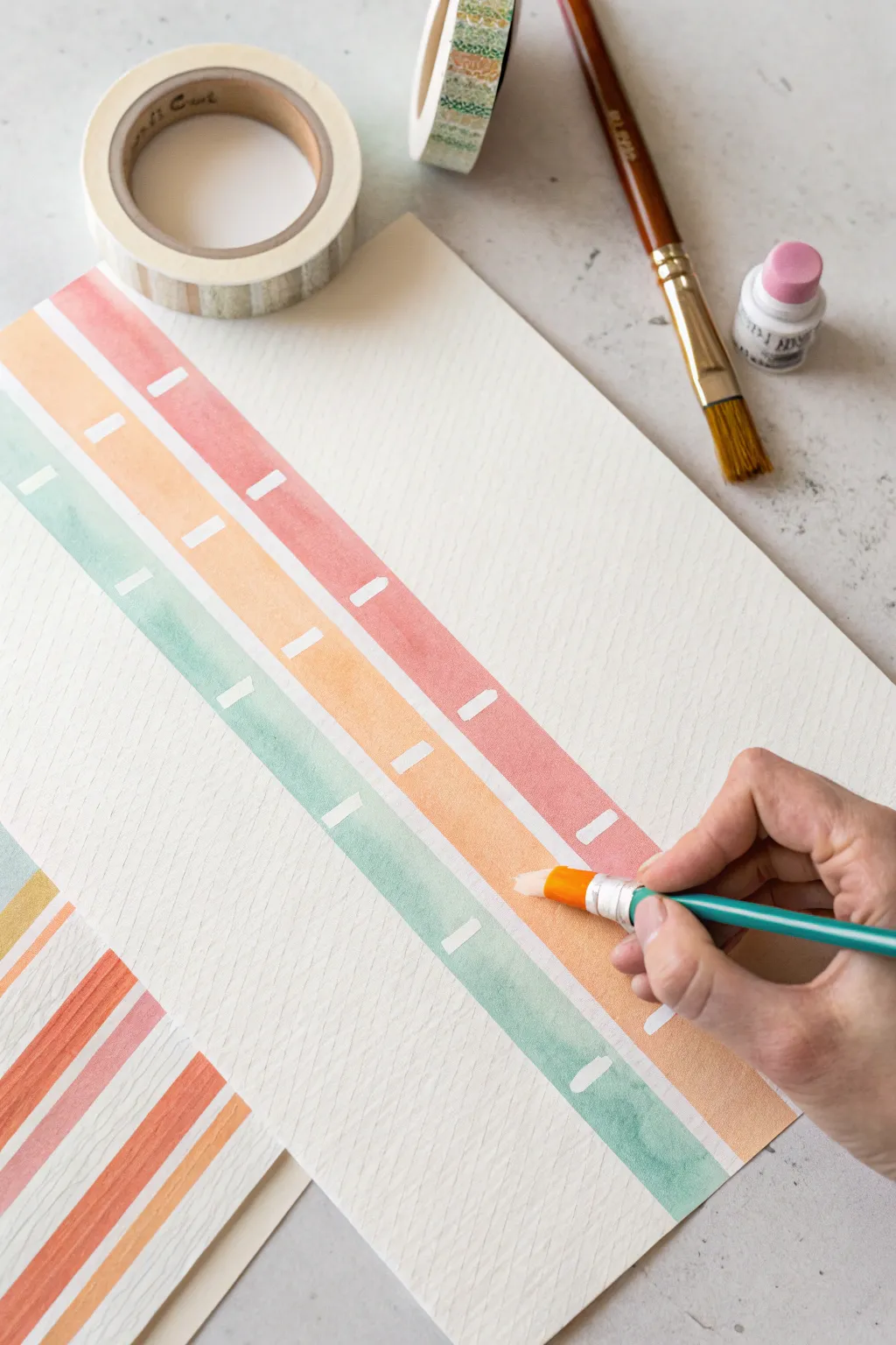
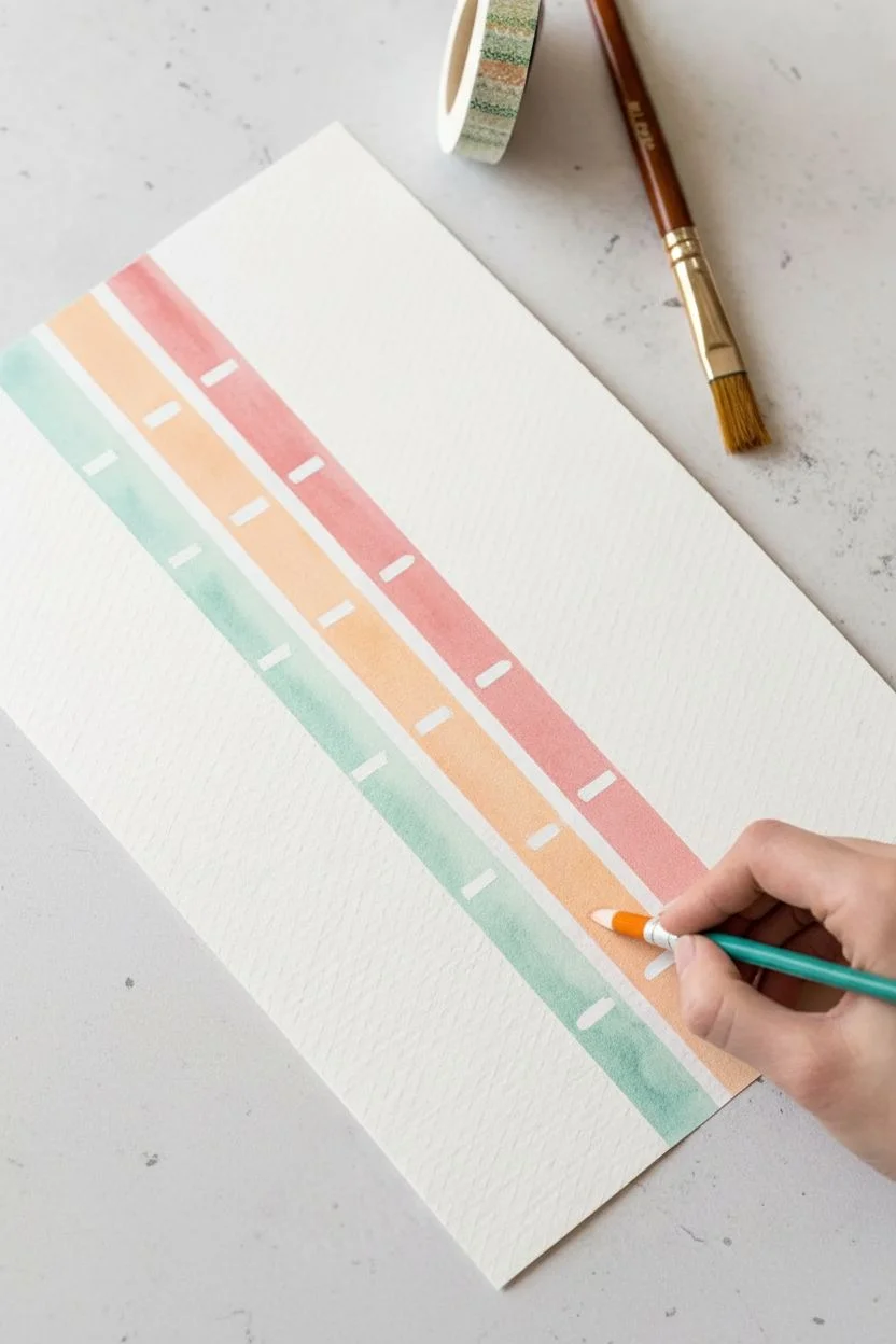
Create beautiful, crisp stripes using a simple tape resist technique that makes painting accessible and satisfying. The result features soft, harmonious bands of color separated by clean white lines, perfect for creating greeting cards or framed art.
How-To Guide
Materials
- Heavyweight watercolor paper or mixed media paper
- Washi tape or low-tack painter’s tape (various widths)
- Watercolor paints or fluid acrylics
- Flat paintbrush (medium size)
- Cup of water
- Paper towels
- A smooth work surface
Step 1: Setting the Stage
-
Prepare your paper:
Start with a clean sheet of heavy watercolor paper. Secure the corners to your table or a board with a small loop of tape on the back to keep it from sliding around while you work. -
Apply the first tape line:
Place a strip of washi tape or painter’s tape diagonally across the paper. Press it down mostly firmly, but don’t worry about sealing it perfectly just yet. -
Create the pattern:
Place subsequent strips of tape parallel to the first one, leaving gaps of varying widths between them. These gaps will become your painted stripes. -
Add visual breaks:
Tear off very small, short pieces of tape—about half an inch long—and place them perpendicularly across the open gaps where you plan to paint. These little ‘dashes’ create the white interruptions seen in the finished design. -
Seal the edges:
Once all your tape is positioned, run your fingernail or the back of a spoon gently along the edges of every piece of tape. This is critical to ensure the paint doesn’t seep underneath and keeps your lines crisp.
Step 2: Adding Color
-
Mix your first color:
Prepare a watery wash of color. For this project, a soft coral or salmon pink looks lovely. If using acrylics, water them down significantly so they flow like watercolor. -
Paint the first stripe:
Dip your flat brush into the paint and fill in one of the diagonal gaps. Paint right over the tops of those little perpendicular tape dashes you added. -
Choose a second color:
Rinse your brush thoroughly and pick a complementary color, like a soft teal or mint green. It helps to keep the palette pastel and soothing. -
Fill adjacent stripes:
Apply this second color to the next open gap. I find that alternating cool and warm tones (like pink then green) creates a nice rhythm on the page. -
Continue the pattern:
Proceed filling in the remaining gaps, alternating colors or introducing a third shade like a warm orange-yellow if you wish. -
Check for puddles:
Look closely at your wet paint. If there are big puddles sitting on top of the tape, gently dab them up with the corner of a paper towel so they don’t run when you lift the tape later.
Bleeding Lines?
If paint is seeping under the tape, try applying a thin layer of clear matte medium over the tape edges before painting your color to seal it completely.
Step 3: The Reveal
-
Let it dry completely:
Wait until the paper is bone dry. If it feels cool to the touch, it is still wet. Patience here prevents the paper from tearing. -
Remove the small dashes:
Start by carefully peeling off those tiny perpendicular pieces of tape first. You can use tweezers if they are hard to grab with fingertips. -
Peel the long strips:
Slowly peel back the long strips of tape. Pull the tape away from the painted area at a 45-degree angle, keeping it close to the paper’s surface rather than pulling straight up. -
Assess the lines:
If you see a tiny spot where paint bled through, you can often gently scratch it away with a craft knife or cover it with a tiny dot of white gouache. -
Flatten the artwork:
If the water caused the paper to buckle slightly, place the finished (dry) painting under a heavy book overnight to flatten it out.
Tape Tearing Paper?
Stick the tape to your clothing (pants or shirt) once or twice before applying it to the paper. This removes some stickiness and makes it gentler to remove.
Enjoy the satisfying process of revealing your clean, sharp geometric design
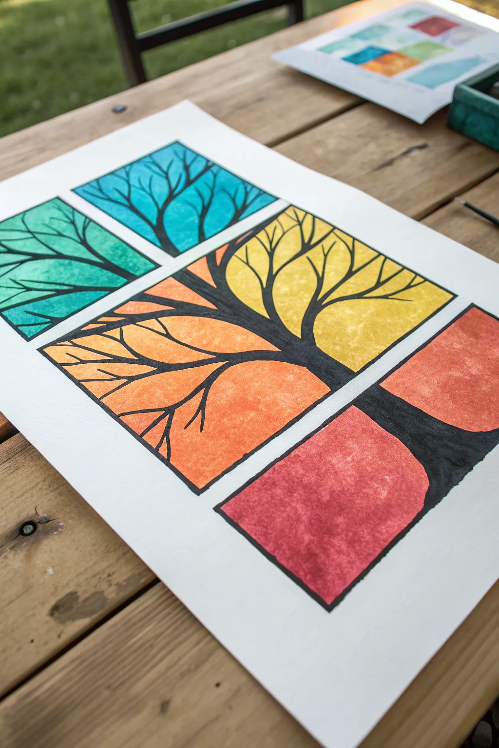
Q-Tip Dot Trees
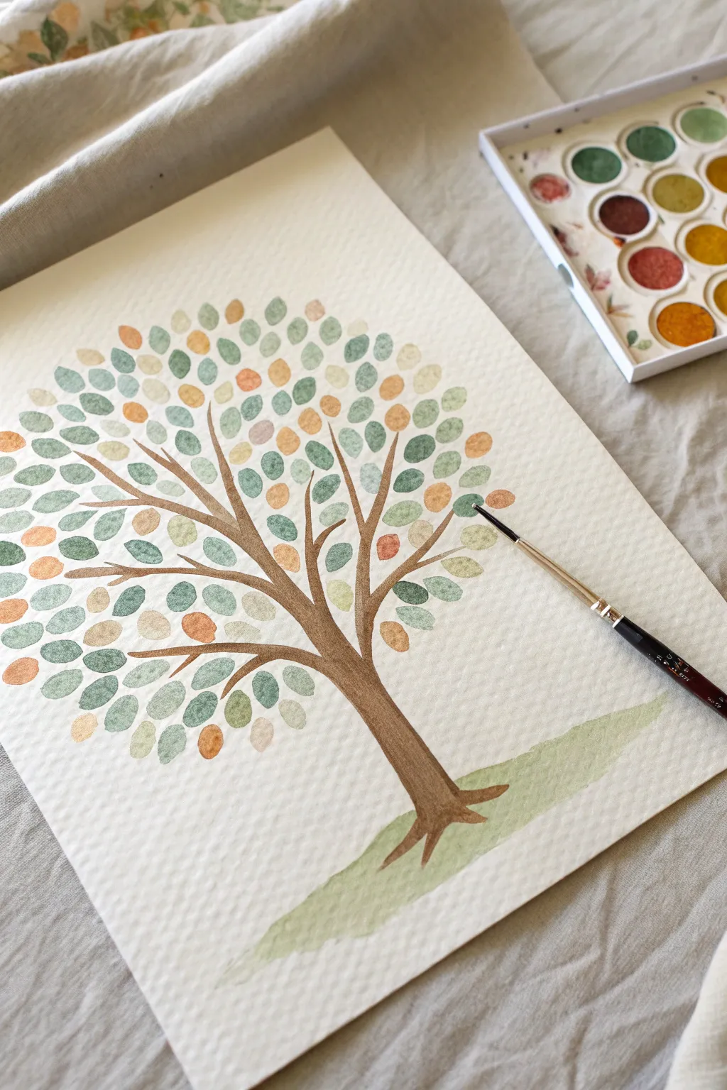
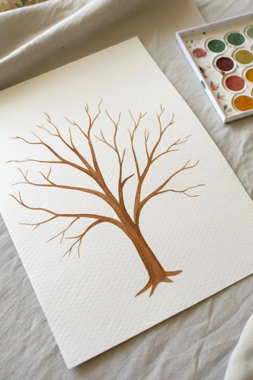
Create a soothing and beautiful tree using a simple dotting technique that feels more like play than work. The soft, rounded leaves in gentle earth tones form a lovely canopy, making this project perfect for relaxation and mindfulness.
Detailed Instructions
Materials
- Cold-press watercolor paper (at least 140lb)
- Watercolor pan set (earthy greens, warm oranges, muted browns)
- Small round brush (size 2 or 4)
- Small flat brush (optional, for the grass)
- Clean water in a jar
- Paper towels
- Pencil (optional)
Step 1: Painting the Trunk
-
Mix the trunk color:
Start by activating a warm brown color in your watercolor pan with a little water. You want a consistency that isn’t too watery, so the brown stays rich. -
Anchor the tree:
Near the bottom center of your paper, paint a short, sturdy vertical line. At the very bottom, flick your brush outward slightly to create root anchors. -
Extend the trunk:
Continue the trunk upwards, making it gradually thinner as you go. Curve it slightly to the left or right to give the tree character. -
Start the main branches:
About halfway up the trunk, begin painting branches that reach outward and upward. Think of creating a ‘Y’ shape. -
Add secondary branches:
From your main branches, paint thinner lines extending out. These should look like fingers spreading open to catch the sunlight. -
Fill the gaps:
Add a few smaller twigs in empty spaces, but keep the lines delicate. Let the entire trunk structure dry completely before moving on.
Step 2: Creating the Canopy
-
Prepare your palette:
You will need three or four colors for the leaves. I recommend a sage green, a muted teal, a soft orange, and a pale yellow-brown. -
Shape the first leaves:
Using your round brush, load it with the sage green. Press the belly of the brush down gently and lift up to create an oval, leaf-like shape. It doesn’t need to be perfect circles. -
Scatter the green:
Place these green dots randomly around the branches. Leave plenty of white space between them for other colors. -
Introduce teal tones:
Rinse your brush and switch to the muted teal or darker green. Paint more oval dots in the empty spaces, sometimes placing them near the branch tips. -
Add warmth with orange:
Now, use a warm orange or rust color to add contrast. These represent the changing seasons and add vibrancy to the painting. -
Fill with neutral tones:
Use the pale yellow-brown for the final set of leaves. This neutral tone helps blend the greens and oranges together harmoniously. -
Balance the canopy:
Step back and look at the tree. If there are large empty gaps, add a few more dots in whichever color feels missing. -
Let it bloom:
Ensure the leaves are mostly concentrated in a circular shape around the branches, but let a few stray dots float near the edges for a natural look. -
Dry break:
Give the leaves a few minutes to dry. This prevents colors from bleeding into the next step.
Too much water?
If your leaf dots are pooling with water, dab your brush on a paper towel before touching the paper. This helps control the moisture for distinct shapes.
Step 3: Grounding the Scene
-
Mix a wash:
Dilute some light green paint with extra water. You want this color to be very transparent and subtle. -
Paint the hill:
Using a sweeping motion, paint a soft, sloping mound right over the roots of the tree. -
Blend the edges:
While the green is still wet, dip your brush in clean water and soften the bottom edge of the grass so it fades gently into the white paper. -
Final check:
Look over your artwork. If any leaves look too faint, you can carefully dab a second layer of color over them once they are dry.
Try Q-Tips!
For an even easier method, skip the brush for the leaves and use cotton swabs (Q-tips). Dip them in paint and stamp onto the paper for perfect dots.
Now you have a gentle, colorful tree that captures the quiet beauty of nature.

PENCIL GUIDE
Understanding Pencil Grades from H to B
From first sketch to finished drawing — learn pencil grades, line control, and shading techniques.
Explore the Full Guide
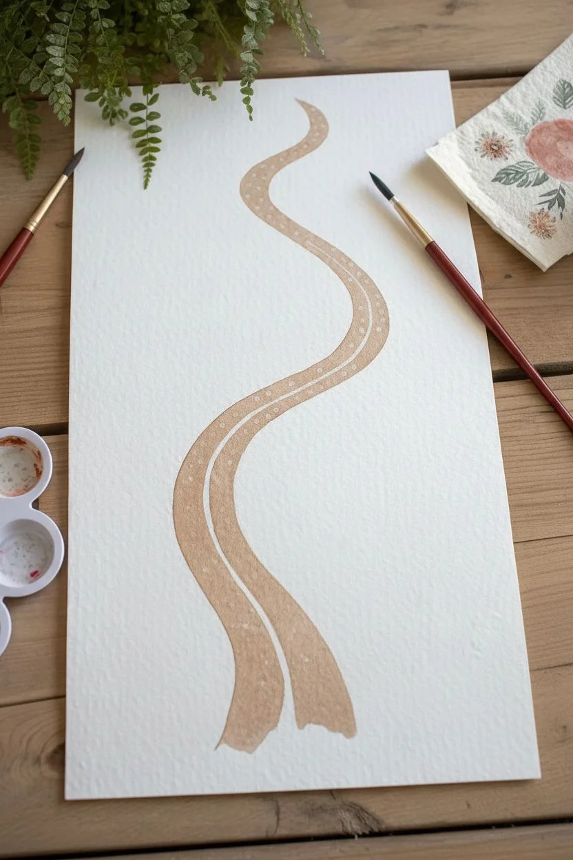
Finger-Painted Garden Paths
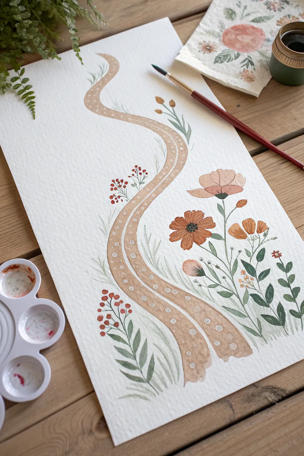
Create a soothing, flowing composition featuring a gentle garden walkway surrounded by cheerful blooms. This project emphasizes soft curves and simple shapes, making it a relaxing exercise in both watercolor and structure.
Step-by-Step
Materials
- Cold press watercolor paper (A4 or similar size)
- Watercolor paints (shades of brown/tan, olive green, earthy orange, rust red)
- Small round paintbrush (size 2 or 4)
- Medium round paintbrush (size 6 or 8)
- White gouache or white gel pen
- Clean water jar
- Paper towels
- Pencil (optional for light sketching)
Step 1: Planning the Flow
-
Visualize the path:
Before putting brush to paper, imagine a gentle snake-like shape curving from the bottom center up towards the top left. You can lightly sketch this with a pencil if it helps guide your hand. -
Mix the path color:
Create a warm, sandy tan color by mixing light brown with plenty of water. Keep the mixture fairly fluid. -
Paint the first curve:
Using your medium brush, paint a wide, curving stroke starting from the bottom right-center. Let it meander upwards and to the left, tapering slightly as it reaches the top. -
Double the path:
Paint a second, parallel curving line right next to the first one, leaving a tiny gap of white space between them if possible, or letting them just barely touch. This creates the look of a dual-track dirt road. -
Let the foundation dry:
Allow the path to dry completely. The paper should feel cool but dry to the touch before you add details on top.
Uneven Lines?
Wobbly lines actually enhance the charm here! If a stem or path edge isn’t perfectly straight, it just looks more organic and natural, like a real garden trail.
Step 2: Blooming Companion
-
Start the main flowers:
load your medium brush with an earthy orange. To the right of the path, paint a few simple, open flower shapes. I like to use four or five petal strokes that meet in a center point. -
Add variance:
Paint a taller, tulip-like bud near the top curve using a softer peach or pale orange tone. Keep the shapes loose and organic rather than rigid. -
Paint the flower centers:
Once the orange petals are damp but not soaking wet, dab a tiny dot of dark brown or black into the center of the open flowers. Let the color bleed slightly for a natural look. -
Introduce small berries:
Switch to your small brush and red paint. On the left side of the path, paint clusters of tiny red dots to represent berries.
Add Texture
Sprinkle a tiny pinch of salt onto the wet watercolor path or leaves while they are still drying. When dry, brush it off to reveal a lovely speckled texture.
Step 3: Greenery and Growth
-
Connect the stems:
Using thin, diluted olive green paint and the small brush, draw swaying lines connecting your flowers to the bottom of the page. -
Add leafy details:
Paint small, almond-shaped leaves along the flower stems. Vary the pressure on your brush—push down to widen the leaf, then lift up to create a sharp tip. -
Fill the gaps:
Add wispy, grass-like strokes in pale green around the base of the path and the flowers. This grounds the painting so the elements don’t look like they are floating. -
Leafy sprigs:
Paint a fern-like sprig near the berries on the left, using short, rhythmic strokes on either side of a central stem.
Step 4: Path Details
-
Prepare the highlights:
Ensure your tan path is 100% dry. Take your white gouache (mixed to a creamy consistency) or a white gel pen. -
Add the stones:
Paint small, evenly spaced white circles running down the center of each brown path strip. These represent stepping stones or pebbles. -
Refine the edges:
Add tiny white dots or dashes along the outer edges of the path to give it a finished, decorative border. -
Final assessment:
Check for any empty spots that might need an extra leaf or a small berry cluster to balance the composition.
This gentle painting captures the peaceful feeling of a morning walk in the garden
Wet-on-Wet Watercolor Blooms
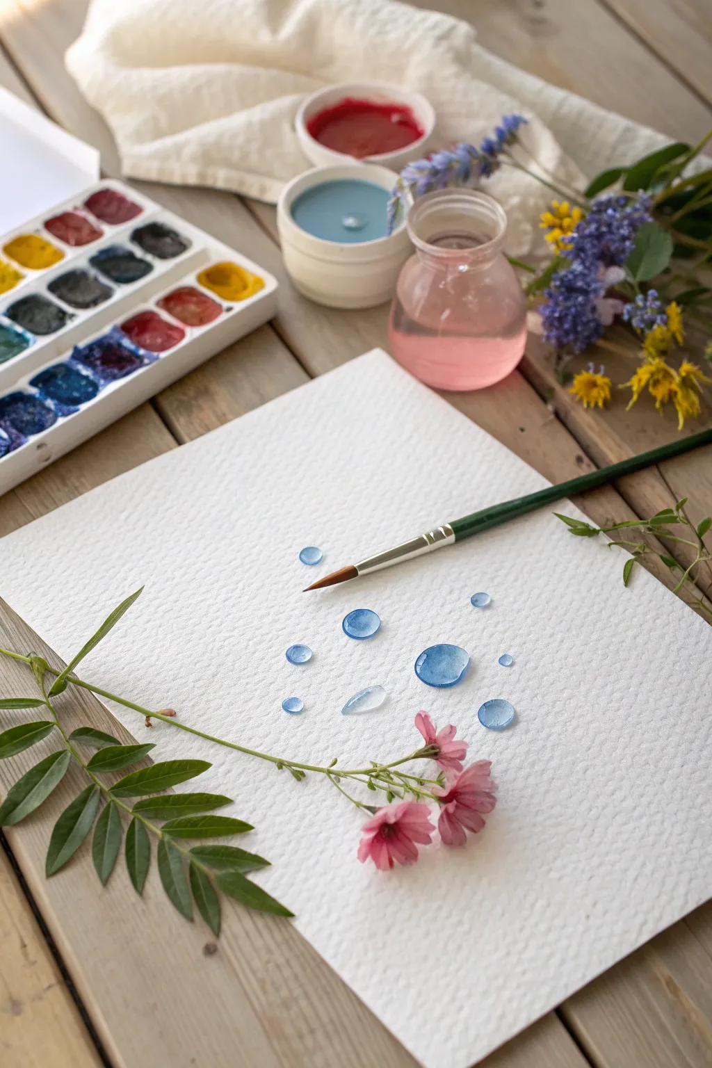
This serene project focuses on the simple beauty of translucent blue forms, resembling scattered rain droplets or soft petals on textured paper. The high contrast of the blue spacing against the white background makes it visually clear and achievable for any skill level.
Detailed Instructions
Materials
- Cold press watercolor paper (A4 or roughly 9×12 inches)
- Watercolor paint set (pan set preferred)
- Round watercolor brush (size 6 or 8)
- Clean water jar
- Paper towels
- Fresh flowers (optional, for inspiration)
- Small spray bottle (optional)
Step 1: Preparation
-
Set the scene:
Place your watercolor paper on a flat, stable surface. Tape the edges down with masking tape if you want to prevent the paper from buckling, though for these small droplets, loose paper works fine too. -
Activate the paints:
Using your wet brush or a small spray bottle, add a few drops of water to your blue watercolor pans. Let the water sit for a minute to soften the pigment, making it easier to pick up rich color. -
Prepare your brush:
Dip your round brush into the clean water jar. Gently tap it against the rim to remove excess dripping water, but keep the bristles fully saturated.
Highlight Hack
While the paint is still wet, use a twisted corner of a paper towel to dab a tiny dot in the center of a droplet. This creates a realistic light reflection instantly.
Step 2: Creating the Droplets
-
Load the brush:
Swirl your wet brush into a deep blue pigment. You want a moderate amount of paint—enough to show color, but watery enough to stay transparent. -
Paint the first drop:
Touch the tip of the brush to the paper and gently press down to fan the bristles out slightly. Lift the brush straight up to create a small, circular mark. -
Shape the droplet:
While the paint is still wet, use the tip of your brush to nudge the edges of the circle, making it as round or oval as you like. Leave the center watery. -
Add variety:
Repeat this process to create a larger droplet nearby. Press the brush down a bit harder or use more water to create a bigger pool of color. -
Create a gradient effect:
I like to rinse my brush partially so it has less pigment, then paint a new droplet. This creates a lighter blue drop that looks distinct from the darker ones. -
Lifting color:
If a droplet looks too dark or flat, dry your brush on a paper towel and touch the tip into the wet paint puddle. The brush will soak up some pigment, creating a lovely highlight effect. -
Vary the sizes:
Paint a few tiny droplets by just using the very point of your brush. Scatter these small dots around the larger pools to mimic a natural splash pattern. -
Experiment with shape:
Try dragging the brush slightly as you lift it to create a teardrop or petal shape instead of a perfect circle.
Step 3: Refining and Drying
-
Check for puddles:
Look at your droplets from the side. If any are heavily pooled with water, they might dry with uneven edges. You can wick away excess water with a corner of a paper towel. -
Add clear water drops:
Rinse your brush completely clean. Paint a circle using just clear water on the paper. Then, touch just the edge of it with a tiny bit of blue paint and watch the color bloom into the clear shape. -
Let it rest:
Allow the painting to dry undisturbed for at least 15-20 minutes. The colors will lighten slightly as they dry, giving that soft, airy look. -
Final touches:
Once fully dry, you can place a fresh flower stem across the paper for a beautiful mixed-media display, or simply frame your abstract water study as is.
Fixing “Cauliflowers”
If jagged edges form as paint dries, it means you added water to a drying spot. Next time, work faster or let the first layer dry completely before touching it again.
Now you have a calming collection of water droplets that captures the peaceful essence of painting with water


Stencil Painting With Familiar Shapes
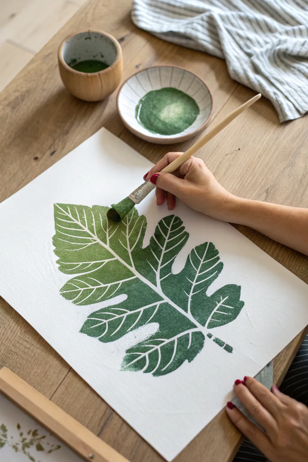
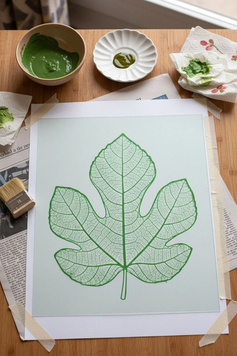
Create a stunning, crisp botanical print using a simple stencil technique that brings the beauty of nature indoors. This project features a large, iconic fig leaf shape with a lovely green gradient that is soothing to paint and beautiful to display.
Step-by-Step
Materials
- High-quality white watercolor paper or mixed media paper (A3 size)
- Large fig leaf stencil (store-bought or DIY cut from mylar)
- Acrylic paint in two shades: Sap Green and Olive Green
- Stencil brush or round sponge applicator
- Painter’s tape or low-tack masking tape
- Small ceramic bowl or palette for paint
- Paper towels
- Newspaper or drop cloth to protect the table
Step 1: Preparation & Setup
-
Prepare your workspace:
Start by laying down newspaper or a drop cloth on your table. This keeps cleanup easy and protects your furniture from stray paint marks. -
Secure the paper:
Place your sheet of white watercolor paper in the center of your workspace. Use small loops of painter’s tape on the back corners to keep it from shifting while you work. -
Position the stencil:
Lay your large fig leaf stencil over the paper. Take a moment to center it or place it at a pleasing angle. Once you are happy, tape down the edges of the stencil securely so it doesn’t slide. -
Prepare the paint:
Squeeze a generous amount of Sap Green and a smaller amount of Olive Green into your ceramic bowl or palette. I like to keep them slightly separate at first so I can control the mixing.
Clean Edges Secret
Use a repositionable spray adhesive on the back of your stencil instead of just tape. This seals every internal edge against the paper perfectly.
Step 2: Applying the Greenery
-
Load the brush:
Dip your stencil brush into the lighter Sap Green paint. Dab off the excess paint onto a paper towel; a dry brush technique is key to preventing paint from bleeding under the stencil edges. -
Begin at the top:
Start stenciling at the top tip of the leaf using an up-and-down dabbing motion. Avoid brushing side-to-side, as this can push paint under the stencil. -
Create the gradient:
As you move down towards the middle of the leaf, pick up a tiny bit of the darker Olive Green on your brush without cleaning it. Dab this blended color into the center section. -
Darken the base:
For the bottom lobes and stem area, switch primarily to the Olive Green. This creates a natural shadow effect where the leaf would attach to a branch. -
Check for coverage:
Look over your work. You want a textured, slightly speckled look rather than a solid, flat block of color. Dab lightly over any areas that look too thin.
Try Autumn Colors
Instead of green, create a fall version by stenciling a gradient from yellow at the top to burnt orange and red at the bottom.
Step 3: Revealing the Artwork
-
Let it set:
Allow the paint to dry for just a minute or two. It doesn’t need to be bone dry, but it shouldn’t be wet and runny. -
Lift the stencil:
Carefully peel up the tape. Lift the stencil straight up—don’t drag it across the paper—to reveal your crisp leaf shape. -
Touch up edges:
If there are any tiny bridges from the stencil that break up the outline unnaturally, you can use a small detail brush to fill them in, though leaving them adds to the authentic stencilled charm. -
Dry completely:
Let the finished painting sit undisturbed for at least 30 minutes to ensure the acrylic paint cures fully before handling or framing.
Frame your botanical masterpiece in a natural wood frame to complete the organic look
Simple Still Life With Fruit Circles
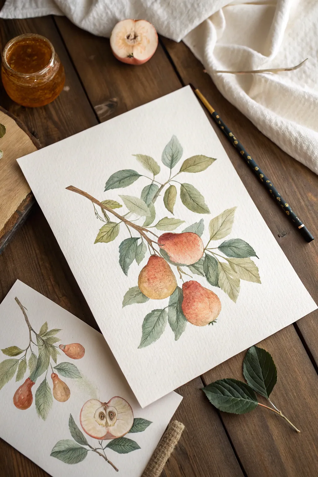
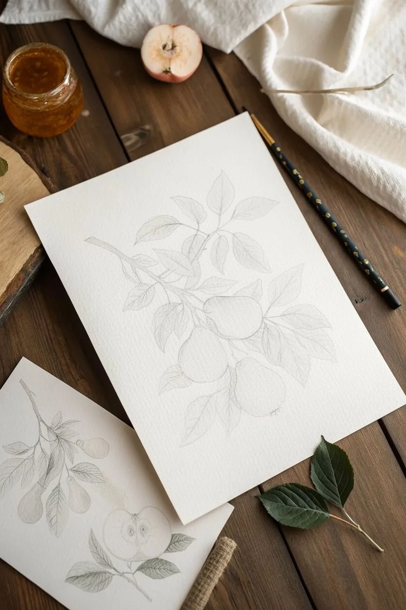
This tutorial guides you through creating a lovely, vintage-style botanical illustration of pears hanging from a branch. The soft watercolor washes and muted tones create a peaceful painting experience perfect for relaxation.
Step-by-Step Guide
Materials
- Cold press watercolor paper (A4 or similar size)
- Watercolor paints (Yellow Ochre, Burnt Sienna, Sap Green, Indigo, Red/Scarlet)
- Round watercolor brushes (Size 4 and Size 8)
- Pencil (HB) and eraser
- Jar of clean water
- Paper towels
Step 1: Drawing the Base
-
Outline the Branch:
Start by lightly sketching a main branch entering from the left side of the paper and curving slightly downward towards the center. Add a few smaller offshoot twigs to support the leaves. -
Sketch the Pears:
Draw three pear shapes hanging from the branch. Place the largest one near the center, one slightly below it, and the third one lower and to the right. Keep the shapes rounded at the bottom and tapered at the top. -
Add the Leaves:
Sketch almond-shaped leaves clustering around the pears and along the branch. Make some leaves point upwards and others drape downwards for a natural look. -
Lighten the Lines:
Before painting, gently roll a kneadable eraser over your sketch to lift up excess graphite so the lines won’t show through the transparent paint.
Pro Tip: Vintage Look
To get that muted, vintage botanical look, mix a tiny dot of brown or red into your green paint. It stops the leaves from looking unnaturally bright.
Step 2: Painting the Fruit
-
First Wash for Pears:
Mix a watery wash of Yellow Ochre. Using your larger brush, paint each pear shape, keeping the edges soft. Leave a tiny spot of white paper on the fullest part of each fruit for a highlight. -
Adding Blush:
While the yellow is still damp (wet-on-wet), drop in a small amount of watered-down Red or Scarlet onto the side of the pear where you want a blush. Let the colors bleed together naturally. -
Deepening Values:
Once the first layer is dry, mix a little Burnt Sienna with your yellow. Glaze this darker tone onto the shadowed side of the pears (usually the bottom and one side) to give them roundness and volume. -
Adding Texture:
For a speckled skin effect, I like to take a fairly dry brush with darker orange-brown paint and gently stipple tiny dots near the bottom of the fruit.
Step 3: Painting the Foliage
-
Mixing Green Tones:
Prepare two puddles of green: a lighter Sap Green mixed with a touch of yellow, and a darker, cooler green mixed with a little Indigo. -
Base Leaf Layer:
Paint the leaves using the lighter green first. Use the tip of the brush to fill the points and press down for the wider bodies of the leaves. -
Adding Dimension:
While the leaves are wet, touch the darker green mixture to the base of the leaves (where they meet the stem) or along one edge. This creates natural shadowing. -
Leaf Veins:
Wait for the leaves to dry completely. Using your smallest brush and a thin mixture of the dark green, paint a delicate central vein down the middle of each leaf.
Level Up: Background
Create a tea-stained background effect by brushing a very diluted wash of coffee or tea over the paper before you start painting for an antique feel.
Step 4: Finishing Touches
-
Painting the Wood:
Use Burnt Sienna mixed with a tiny bit of brown or black for the branch. Paint the main stem with careful, thin strokes. -
Connecting Stems:
Connect each pear to the main branch with a short, curved brown stem. Make these slightly thicker where they attach to the fruit. -
Final Details:
Check for contrast. If the pears look too flat, add one final, very faint glaze of reddish-brown to the darkest shadow areas to make them pop.
Now you have a timeless piece of botanical art to display or gift to a friend
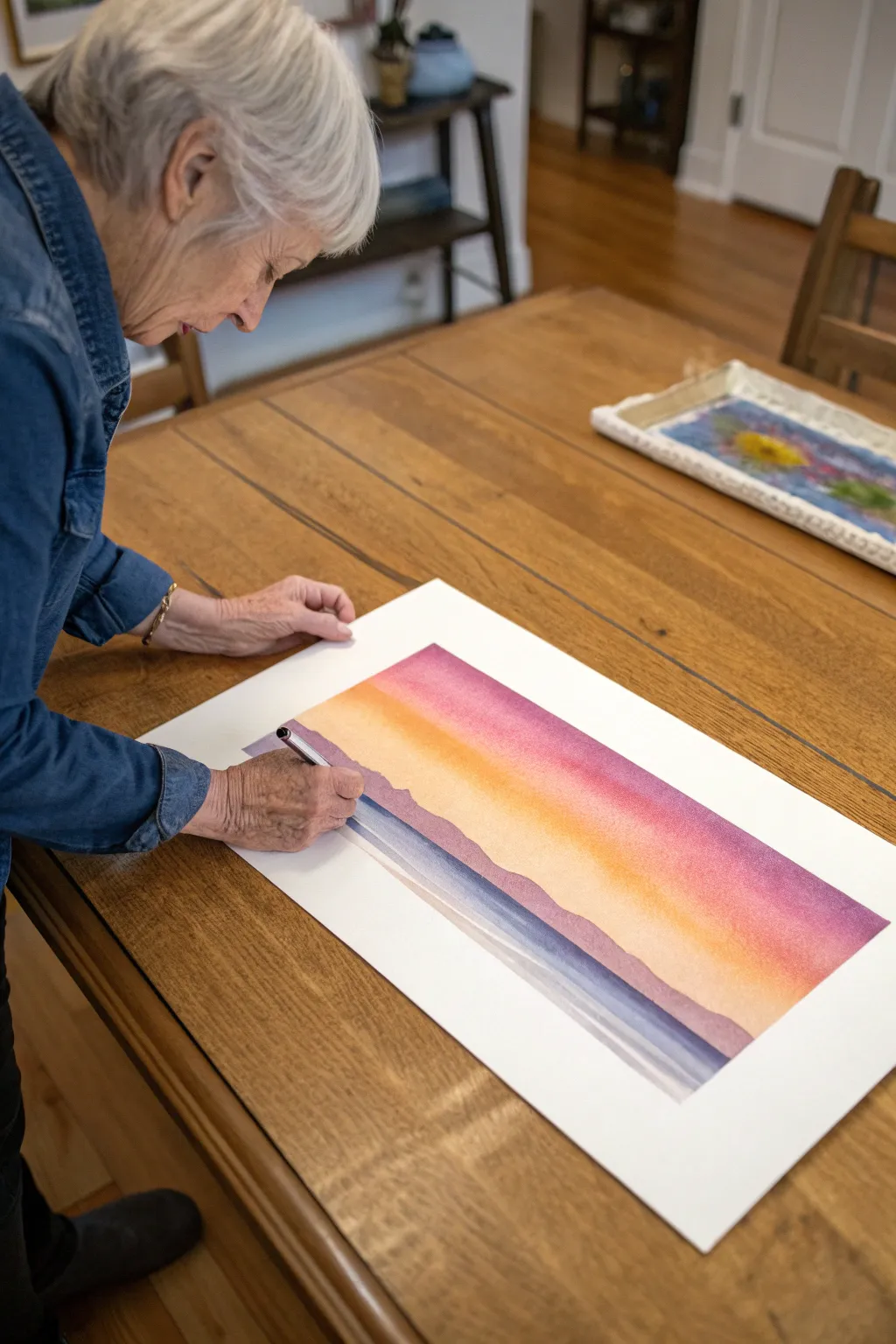
Monochrome Painting With One Calm Color
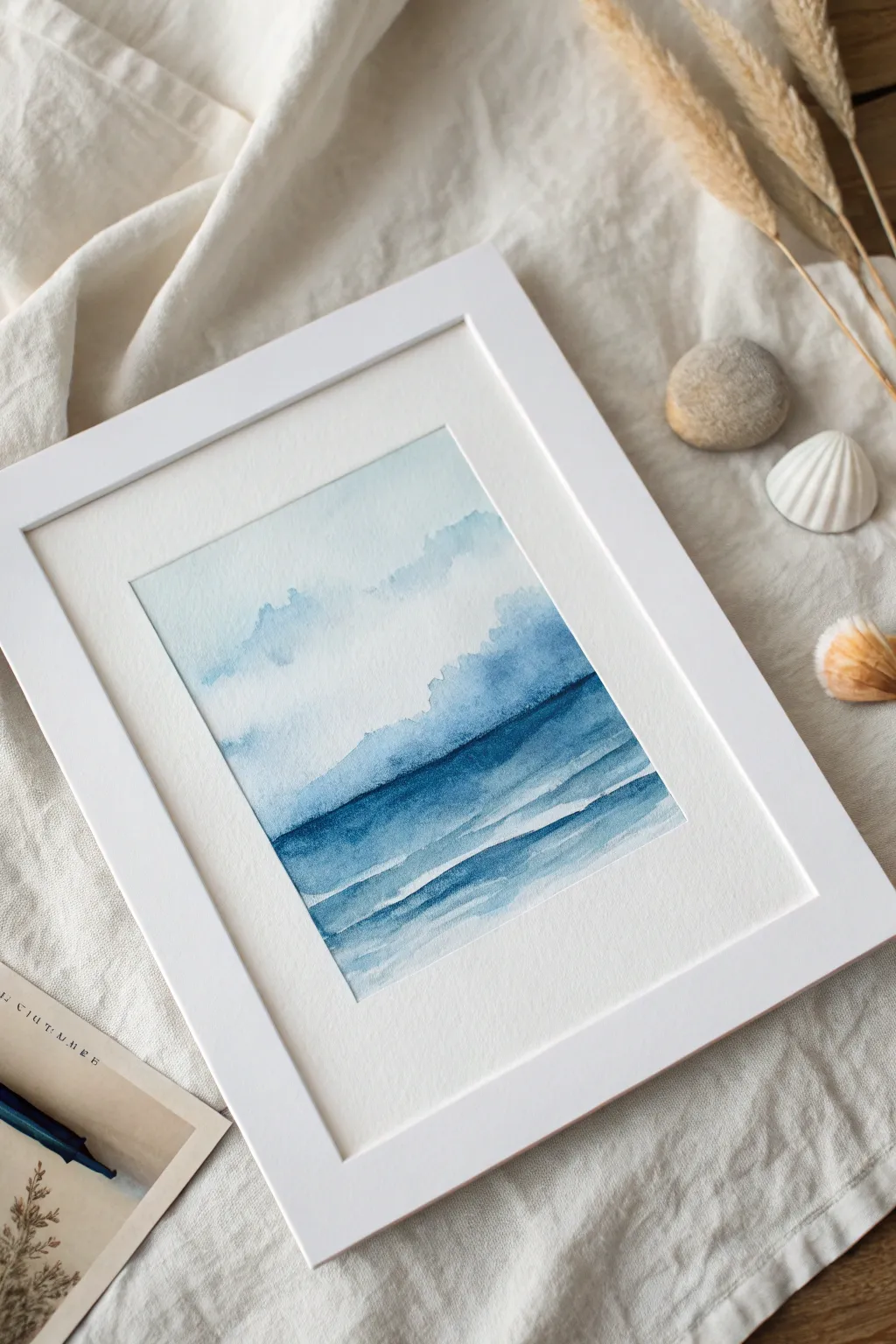
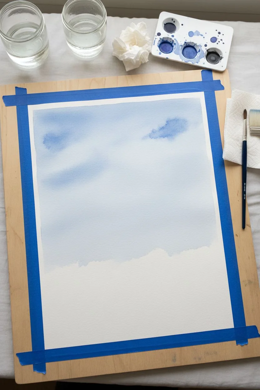
This calming watercolor project focuses on the soothing power of a single color, creating an abstract seascape with gentle gradients and soft layers. The simplicity of using just one shade of blue allows the mind to relax and focus entirely on the movement of water and pigment.
Step-by-Step
Materials
- Cold-press watercolor paper (approx. 5×7 inches)
- Watercolor paint (Indigo or Prussian Blue)
- Flat wash brush (3/4 inch)
- Round brush (size 6 or 8)
- Two jars of water (one for rising, one for clean water)
- Paper towels
- Painter’s tape or masking tape
- Drawing board or sturdy cardboard
Step 1: Preparation and Sky
-
Secure the paper:
Tape down all four edges of your watercolor paper onto a board using painter’s tape. This creates a crisp white border and prevents the paper from buckling while wet. -
Prepare your palette:
Squeeze a pea-sized amount of blue paint onto your palette. Create three separate puddles: one very watery and pale (tea consistency), one medium strength (milk consistency), and one dark and concentrated (cream consistency). -
Wet the sky area:
Dip your flat wash brush into clean water and gently wet the top two-thirds of your paper. You want the paper to sheen, but not have standing puddles. -
Apply the first wash:
Load the flat brush with your palest blue mix. Starting from the top, sweep the color across the wet paper, letting it fade naturally as you move downwards. -
Create cloud forms:
While the paper is still damp, dab a little of the medium-strength blue into the sky area using an irregular, tapping motion. Let the paint bloom and spread softly to suggest distant clouds. -
Let it dry completely:
This is crucial. Wait until the paper is bone dry and flat before proceeding. You can use a hairdryer on a low, cool setting if you wish to speed this up.
Step 2: Painting the Ocean Layers
-
Define the horizon:
Switch to your round brush. Load it with the medium-strength blue. paint a horizontal line roughly two-thirds down the page; it doesn’t need to be ruler-straight, a little waver adds a natural feel. -
Soften the horizon edge:
Immediately after painting the horizon line, rinse your brush and blot it slightly. Run the damp brush along the top edge of that line to soften it into the sky, creating a misty distance. -
Paint the middle ground:
Using the medium-strength mix, fill in a band of color below your horizon line, about an inch wide. Keep the bottom edge of this band rough and uneven. -
Add depth with darkness:
While the middle ground is still wet, drop in some of your darkest, concentrated blue right along the horizon line. Tilt the board slightly to help it bleed downward just a bit. -
Wait for partial drying:
Allow this layer to dry until it is no longer shiny but feels cold to the touch. This semi-dry state is perfect for layering without disturbing the paint underneath too much. -
Create the heavy wave:
Load your brush with the darkest blue mix. Paint a bold, sweeping horizontal stroke below the previous section. Vibrate your hand slightly as you pull the brush across to create a ragged, wave-like edge. -
Fade out the wave:
Dip your brush in clean water and drag the bottom edge of that dark wave downward, letting the color fade into white paper to suggest foam or light hitting the water.
Pro Tip: The Thirsty Brush
To fix mistakes or lighten an area, rinse your brush, squeeze it dry on a paper towel, and lift the wet paint off the paper like a sponge.
Step 3: Foreground Details
-
Paint the foreground ripples:
Using a lighter wash, paint one or two horizontal bands near the bottom of the page. Leave thin slivers of dry white paper between these strokes to represent the sparkle of water. -
Add final contrast:
With the very tip of your round brush and the darkest paint, add a few thin, broken lines right under the darkest wave to emphasize the shadow where the water rolls over. -
Review and dry:
Step back and look at your composition. If the sky looks too pale, you can add another very light glaze once it’s dry, but often less is more. Let the entire painting dry completely. -
The reveal:
Looking at a fully dry painting, carefully peel away the masking tape at a 45-degree angle, away from the painted area, to reveal your crisp, professional borders.
Level Up: Salt Texture
While the paint in the dark ocean section is still wet, sprinkle a tiny pinch of table salt on it. Brush it off when dry for a foamy texture.
Now you have a tranquil piece of art that captures the stillness of the ocean using just one simple color
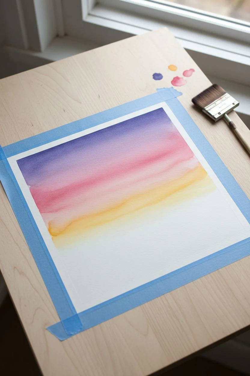
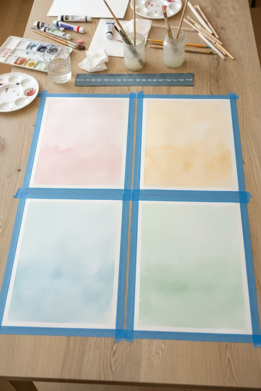
Memory Color Palette Painting
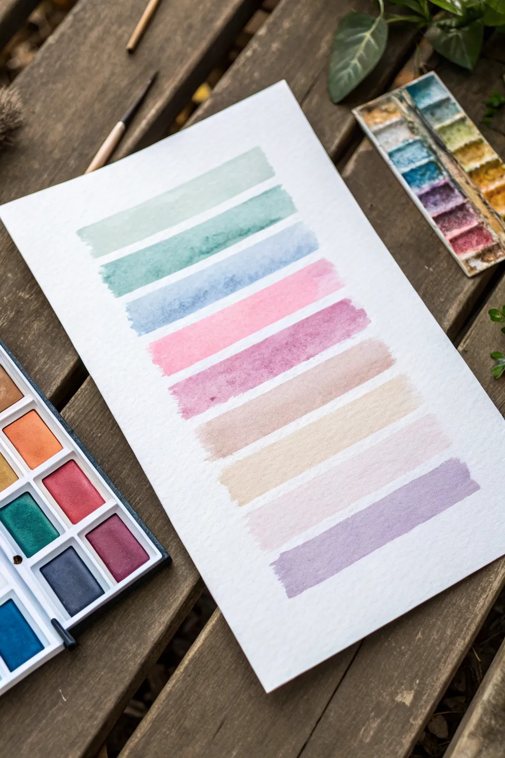
This calming project focuses on the simple joy of laying down color, creating a serene ladder of soft pastel hues. It’s a low-pressure way to explore the beauty of watercolor paints without needing rigorous drawing skills.
Step-by-Step
Materials
- Cold press watercolor paper (approx. 140lb/300gsm)
- Watercolor pan set (including greens, blues, pinks, earth tones)
- Medium-sized flat wash brush (size 6 or 8)
- Container of clean water
- Paper towels for blotting
- Painter’s tape or masking tape (optional)
Step 1: Preparation
-
Secure the paper:
Tape the corners of your watercolor paper down to a flat surface or drawing board. This prevents the paper from buckling too much when it gets wet and keeps it steady while you work. -
Activate the paints:
Using your brush or a small spray bottle, add a drop or two of clean water to each color pan you intend to use. This ‘wakes up’ the pigment, making it easier to pick up a rich color immediately. -
Plan your palette:
Look at the image as a guide. You will need a sequence of about nine colors: mint green, teal, sky blue, soft pink, mauve, warm taupe, cream/beige, pale lilac, and lavender. I find it helpful to arrange these mentally before starting.
Fixing “Blooms”
If a pool of water creates a jagged ‘cauliflower’ edge you don’t like, smooth it out instantly with a slightly damp, clean brush before it dries.
Step 2: Painting the Cool Tones
-
First stroke: Mint Green:
Load your flat brush with water and a light amount of mint green paint. Starting near the top left, drag the brush horizontally across the paper to create a wide bar. Keep the edges relatively loose and organic. -
Second stroke: Teal:
Rinse your brush thoroughly. Pick up a slightly deeper teal or seafoam green color. Leave a small gap of white space below the first stroke and paint a similar horizontal line underneath it. -
Third stroke: Sky Blue:
Clean the brush again. Mix a soft, airy blue with plenty of water to keep it transparent. Paint the third stripe, allowing the water to pool naturally and create texture within the brushstroke.
Make it Personal
Once the paint is fully dry, write a happy memory, a meaningful date, or the name of the color in black ink on top of each colored stripe.
Step 3: Painting the Warm & Earth Tones
-
Fourth stroke: Soft Pink:
Switch to your warm palette. Load your brush with a rose or baby pink. Ensure the consistency is milky—not too thick—and paint the next stripe below the blue. -
Fifth stroke: Mauve:
Mix a bit of purple into your pink to create a mauve shade. Paint this stripe just below the pink one. You might notice the ‘bloom’ effect where the water creates lovely irregularities; let this happen naturally. -
Sixth stroke: Warm Taupe:
Reach for a light brown or earth tone. Add plenty of water to dilute it into a soft taupe. Apply this stripe, keeping the width consistent with the previous ones. -
Seventh stroke: Cream or Beige:
Clean your brush very well to avoid muddying this delicate color. Use a yellow ochre mixed with lots of water, or a ‘buff titanium’ shade, to paint a very pale, sandy stripe.
Step 4: Finishing with Purples
-
Eighth stroke: Pale Lilac:
Mix a very light purple with a touch of white (if your palette has it) or just lots of water. This should be barely there, a whisper of color below the beige stripe. -
Ninth stroke: Lavender:
For the final stripe at the bottom, use a slightly more saturated lavender or violet. Paint this last bar with confidence to anchor the composition. -
Drying:
Allow the paper to lay flat while it dries completely. If you tilt it too soon, the wet paint might run and ruin the distinct separation between your colorful steps.
Enjoy the peaceful rhythm of watching the colors settle into the paper
Collage-and-Paint Landscapes
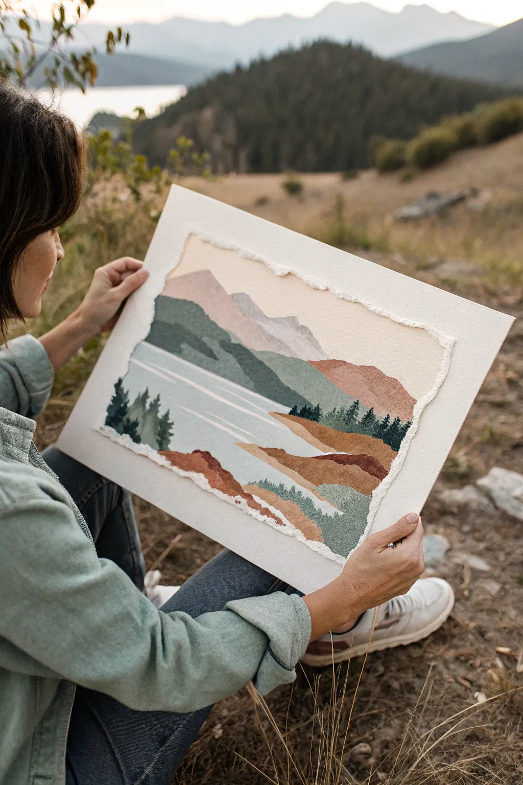
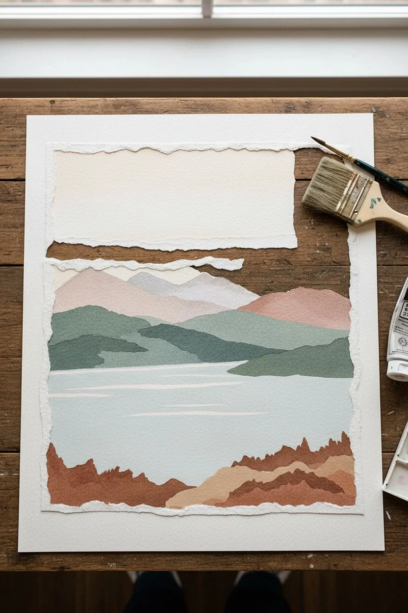
Bring the serene beauty of the outdoors inside with this tactile mixed-media project that combines painting with torn paper layering. The rugged, uneven edges of the paper naturally mimic mountain ridges, making this an ideal, forgiving technique for creating stunning landscapes without needing precise brushwork.
Step-by-Step Guide
Materials
- Heavyweight watercolor paper (smooth or cold press)
- Additional sheets of watercolor paper for tearing
- Acrylic paints (muted earth tones: sage green, ochre, burnt sienna, slate blue, dusty rose, titanium white)
- Flat synthetic brushes (various sizes)
- Decoupage glue or matte medium
- Large foam brush for gluing
- Pencil for light sketching
- A sturdy backing board or mat board
Step 1: Preparing the Components
-
Paint your palette sheets:
Start by painting several separate sheets of watercolor paper in solid, muted colors. Create one sheet for the sky (pale cream/pink gradient), one for distant mountains (dusty rose/purple), one for mid-ground hills (sage green), one for water (pale blue-grey), and one for the foreground (rust/ochre). Let these dry completely. -
Tear the mountain shapes:
Once the painted sheets are dry, take your distant mountain color sheet and slowly tear a strip off the top to create a jagged, natural-looking ridge line. -
Create the mid-ground layers:
Repeat the tearing process with your green and rust-colored sheets. Aim for different shapes—some long and sloping, others short and hilly. Don’t worry about perfection; the torn white edge of the paper adds a lovely textural frost effect. -
Form the water layer:
Tear a large, flatter section from your pale blue-grey sheet to represent the lake or river. Keep the top edge relatively straight but soft. -
Prepare the rough border:
For the signature look of this piece, take a large, clean sheet of heavy watercolor paper that will serve as your base. Carefully tear the outer edges of a smaller rectangle of watercolor paper to create a ‘deckled’ frame effect, or simply plan to float your collage on the larger backing board.
Step 2: Assembling the Landscape
-
Establish the sky:
On your base paper (which is slightly smaller than your backing board), glue down the sky piece first. Apply the matte medium to the back of the paper with a foam brush and smooth it down at the top of your composition. -
Layer the distant peaks:
Place your dusty rose mountain strip slightly overlapping the bottom of the sky. The torn edge should be at the top. Glue it down. -
Add the green hills:
Position your sage green torn shapes below the pink mountains. You can layer multiple green strips to create depth, placing lighter greens in the back and darker greens forward. -
Place the water:
Adhere the blue-grey water shape below the green hills. Ensure it stretches across the width of the landscape area. -
Build the foreground:
Glue your rust and ochre jagged strips at the very bottom, overlapping the water slightly to look like a shoreline.
Sticky Situation?
If the paper curls when glued, place the artwork under a sheet of wax paper and a heavy book overnight. This flattens seams without damaging surface texture.
Step 3: Painted Details & Mounting
-
Paint the trees:
Using a small, flat brush and dark green paint (mixed with a little blue for depth), dab vertical strokes along the ridge lines and shorelines to create simplified pine trees. -
Detail the water:
Mix a very pale off-white color. Use a thin brush to paint horizontal, slightly wavy lines across the blue water section to suggest reflections and ripples. -
Enhance texturing:
I like to dry brush a little bit of lighter pigment on the sun-facing sides of the foreground hills to give them dimension. -
Create the deckled focal point:
Once the collage is dry, carefully tear around the entire perimeter of your landscape rectangle, removing the straight factory edges to leave a raw, white fibrous border. -
Final mount:
Center your finished, torn-edge landscape onto the large, clean white backing board. Use glue or double-sided tape to secure it, leaving a wide, clean white border that frames the artwork elegantly.
Add Dimension
Use foam tape instead of glue for the foreground layers. This lifts the paper slightly off the background, creating physical depth and authentic shadows.
Step back and admire how the simple act of tearing paper has created a sophisticated, peaceful mountain scene
Faux Stained Glass With Bold Lines
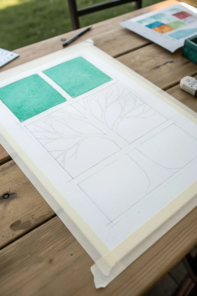
This project combines the clean structure of geometric shapes with the organic flow of a winter tree. By breaking the background into warm and cool panels, you create a striking faux stained glass effect that makes the black silhouette pop.
How-To Guide
Materials
- High-quality watercolor paper or heavy cardstock (white)
- Painter’s tape or masking tape (low-tack)
- Watercolor paints or diluted acrylics (Teal, Green, Orange, Yellow, Red)
- Black permanent marker (broad tip) or black acrylic paint
- Fine-point black liner pen (optional)
- Ruler
- Flat paintbrush (medium width)
- Fine round paintbrush (for details)
- Pencil and eraser
Step 1: Drafting the Design
-
Mask the borders:
Begin by taping down your paper to a work surface. Create a clean white border around the entire edge of the paper using your painter’s tape to establish the frame. -
Grid the background:
Using a pencil and ruler, lightly draw a grid of rectangles or squares. You don’t need them to be perfectly uniform; arranging a large central rectangle surrounded by smaller ones adds visual interest as seen in the example. -
Define the gaps:
Draw double lines for your grid to create space between the colored panels. These gaps will remain white to act as the ‘frame’ between your glass panes. -
Sketch the tree:
Lightly sketch the silhouette of a tree growing from the bottom right corner. Ensure the trunk is thick at the base and branches span across multiple grid sections.
Bleeding Lines?
If your black marker bleeds into the paint, the paper wasn’t dry enough. Let it dry longer, or swap to black acrylic paint which sits on top of the paper better.
Step 2: Painting the Panels
-
Prepare your colors:
Mix your watercolor paints. You want vibrant, saturated colors, so use a high pigment-to-water ratio. I like to prepare distinct pools of teal, green, orange, yellow, and deep red. -
Paint the cool tones:
Start with the top-left panels. Fill one with teal and another with green using your flat brush. Be careful to stay inside your pencil grid lines. -
Apply warm tones:
Move to the larger central and right-side panels. Paint these with your warm gradients—orange, yellow, and red. Notice how the colors are solid blocks rather than blended gradients. -
Let it dry completely:
Allow the paint to fully dry. If the paper feels cool to the touch, it’s still wet. Patience here prevents the black ink from bleeding later. -
Erase guide lines:
Once the paint is bone dry, gently erase any visible pencil lines in the white gutter spaces between the colored blocks.
Seasonal Shift
Change the mood by altering the palette. Use only blues and purples for a winter scene, or fresh greens and pinks for spring. You can even add tiny leaf buds.
Step 3: Inking the Silhouette
-
Outline the main trunk:
Using a black permanent marker or black paint, carefully outline the main trunk shape over the dried colored panels. -
Fill the trunk:
Fill in the thickest part of the tree trunk with solid black. If using paint, apply two coats to ensure opacity so the background color doesn’t show through. -
Extend main branches:
Draw the primary thick branches extending outward. Let them cross over the white ‘window frame’ gaps—this creates a lovely illusion that the tree is in front of the window. -
Add detail branches:
Switch to a finer liner pen or a very small brush. Add smaller twigs branching off the main limbs, reaching toward the edges of the colored squares. -
Refine the edges:
Go back over your black lines to crisp up any fuzzy edges where the marker met the watercolor paper texture. -
Frame the panels:
Using the ruler and a medium black pen, draw straight lines outlining each colored rectangle. This separates the color from the white paper lanes. -
Remove tape:
Ideally, peel the tape away slowly at a 45-degree angle to reveal your crisp white border.
Now you have a bold, graphic piece of art that brightens up any room
Group Painting With Shared Canvas Sections
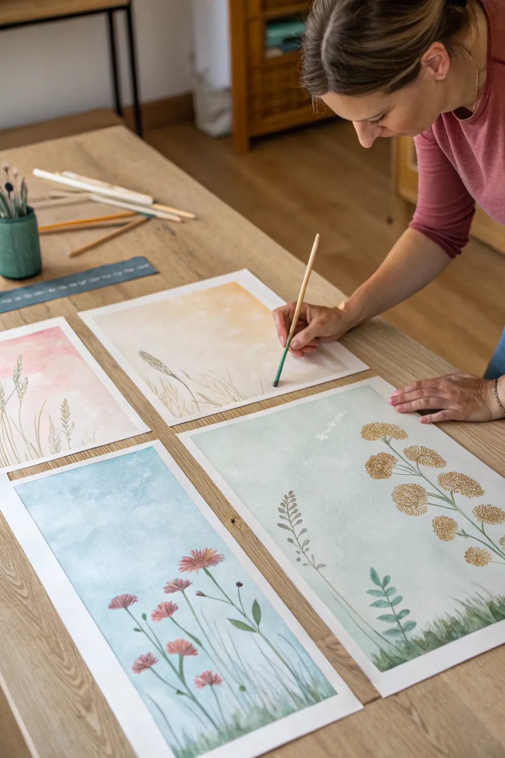
This calming project features four separate watercolor panels that feature soft, gradient skies and delicate floral silhouettes. While each painting stands alone beautifully, they can be displayed together to create a unified field of wildflowers.
Step-by-Step Guide
Materials
- 4 Sheets of heavy watercolor paper (A3 or 11×14 inches recommended)
- Watercolor paint set (tubes or pans)
- Large flat wash brush (1 inch)
- Medium round brush (size 6 or 8)
- Small liner or rigger brush (size 1 or 2)
- Masking tape or blue painter’s tape
- Two jars of water
- Paper towels
- Palette for mixing
- Reference images of meadow grass
Step 1: Preparation and Sky Washes
-
Prepare the workspace:
Clear a large table and lay out the four sheets of watercolor paper side-by-side. If the participants are working together, space the papers so everyone has room to move. -
Tape the edges:
Secure each sheet to the table using masking tape along all four edges. This creates a clean white border and prevents the paper from buckling when it gets wet. -
Mix the background colors:
Prepare four distinct, diluted washes for the backgrounds. Aim for very pale, watery consistencies: a soft rose pink, a warm ochre yellow, a pale sky blue, and a minty sage green. -
Wet the paper:
Using a clean large flat brush, apply clear water to the entire surface of the first sheet. The paper should be glisten but not have puddles. -
Apply the first wash:
Immediately brush your prepared color wash over the wet paper. I find that using broad, horizontal strokes helps the color spread evenly for that soft, dreamy look. -
Create a gradient:
While the paint is still wet, add a tiny bit more water to your brush and drag it towards the bottom of the page, making the color fade slightly as it reaches the ground level. -
Repeat for all panels:
Repeat the wet-on-wet wash process for the remaining three sheets, using a different color for each panel to create variety. Let all panels dry completely before proceeding.
Tape Removal Trick
To prevent tearing the paper, use a hairdryer on a low, warm setting to heat the masking tape for a few seconds before peeling it off.
Step 2: Painting the Flora
-
Mix stem colors:
Create a few shades of green on your palette. Mix sap green with a touch of brown for earthy stems, and a brighter green for fresh leaves. -
Practice dry brushing:
On a scrap piece of paper, practice using a damp brush with very little paint to create wispy grass textures. This technique is great for the bottom edge of the painting. -
Paint the grass line:
Using the medium round brush and your green mix, paint short, upward strokes along the bottom edge of each paper to suggest a grassy field. -
Add tall stems:
Switch to your thinner round brush or liner brush. Paint long, slender lines reaching up from the grass. vary the heights and curve them slightly so they look natural. -
Paint the left panel (Pink Background):
For the pink panel, paint delicate wheat-like stalks. Use the tip of the brush to dab small marks on alternating sides of the upper stems. -
Paint the center-left panel (Yellow Background):
On the yellow background, focus on a single, prominent wheat stalk bending in the wind. Use a brownish-gold paint for the head of the wheat to contrast with the yellow sky. -
Paint the center-right panel (Green Background):
This panel features a structured plant like Queen Anne’s Lace or yarrow. Paint a main stem that branches out near the top, and add clusters of small dots in ochre or brown at the tips of the branches. -
Paint the right panel (Blue Background):
For the blue sky panel, add pink or reddish wildflowers. Paint small oval shapes clustered together at the top of the stems to resemble clover or cosmos flowers. -
Add leaves and details:
Go back to all panels and add small leaves to the stems. Vary the shapes–some long and thin, others small and rounded–to make each plant look unique.
Level Up: Connect The Lines
Before painting stems, lightly draw a continuous horizon line across all four papers so the grass height matches perfectly when displayed.
Step 3: Finishing Touches
-
Add final textures:
If any area looks too empty, use a very dry brush with darker green paint to flick in a few more blades of grass at the very bottom. -
Remove the tape:
Once the paintings are 100% dry to the touch, slowly peel away the masking tape at a 45-degree angle to reveal the crisp white borders. -
Arrange together:
Place the finished paintings side-by-side to see how the grassy bottoms connect visually across the different colored skies.
Enjoy viewing your beautiful collaborative meadow scene individually or as a complete set


Have a question or want to share your own experience? I'd love to hear from you in the comments below!