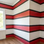
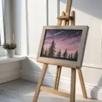
When I’m stuck or craving something bold, I reach for red—it instantly adds drama, romance, and a little mystery to whatever I’m painting. Here are my favorite red painting ideas to help you build a striking piece, whether you want something classic and beautiful or weird and unforgettable.
Red Sunset Reflections on Water
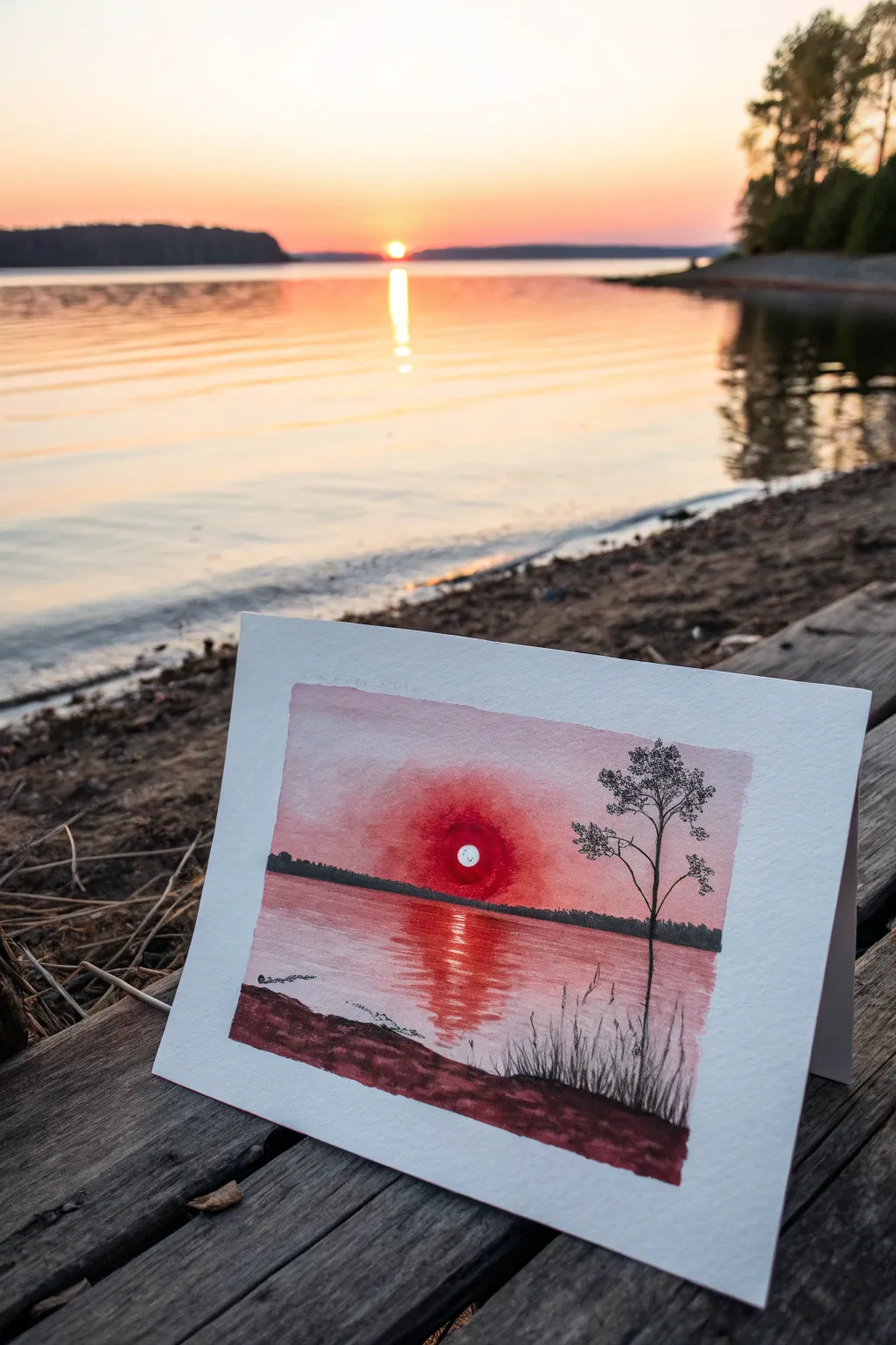
Capture the blazing drama of a sunset reflected on calm waters with this monochromatic watercolor study. Using just a few shades of red and black ink, you’ll create a striking landscape that glows with intense warmth.
Step-by-Step Guide
Materials
- Cold press watercolor paper (rough texture preferred)
- Painter’s tape
- Red watercolor paint (e.g., Alizarin Crimson, Cadmium Red)
- Black fine liner pen (01 or 03 size)
- Pencil for sketching
- Round watercolor brush (size 6 or 8)
- Flat shader brush (optional, for washes)
- Clean water and paper towels
- White gouache or white gel pen (for the sun)
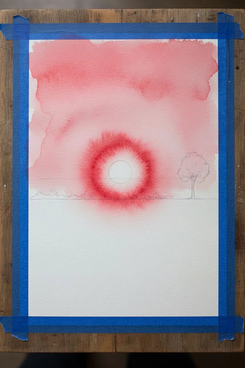
Step 1: Preparation & Sky Wash
-
Secure the paper:
Tape down all four edges of your watercolor paper to a board or table. This creates that crisp white border seen in the final piece and prevents the paper from buckling when wet. -
Initial sketch:
Lightly sketch a straight horizon line about one-third of the way up from the bottom. Mark the position of the sun slightly above the horizon in the center, and lightly pencil where the tree will stand on the right. -
Wet-on-wet sky:
Brush clean water across the entire sky area, stopping right at the horizon line. The paper should be glistening but not pooling with water. -
First wash:
Load your brush with a diluted red wash. Start at the top of the sky and paint downwards with broad strokes. Let the color naturally fade as it approaches the horizon to suggest distance. -
Deepening the sunset:
While the paper is still damp, mix a more saturated red. Drop this intense color around the sun area in a circular motion, letting it bleed outward to create a glowing halo effect. -
Sun mask:
If you painted over the sun area, don’t panic. You can lift paint out with a clean, damp brush now, or simply wait to add the bright white sun with gouache at the very end.
Step 2: Water & Reflections
-
Base water layer:
Once the sky is mostly dry (so colors don’t bleed across the horizon), wet the water area lightly. Apply a very pale, watered-down red wash across the entire lake surface. -
Horizon line definition:
Mix a dark, muddy red by adding a tiny touch of black or green to your red paint. Use the tip of your round brush to paint a thin, uneven line of distant trees right on the horizon line. -
Sun reflection:
Load your brush with saturated red paint. Starting directly under the sun, paint horizontal zig-zag strokes that get wider as they move toward the bottom of the page to simulate the sun’s reflection. -
Foreground water texture:
Add a few broken horizontal lines of darker red in the foreground water area to suggest ripples catching the light. -
Drying time:
Let the entire painting dry completely. The paper must be bone dry before you switch to ink, or the lines will feather and blur.
Edge Perfection Pro-Tip
To prevent paper tearing when removing tape, heat the tape briefly with a hairdryer on low. This softens the adhesive for a clean, damage-free removal.
Step 3: Inking Details
-
Foreground land:
Mix a dark, almost black-red watercolor shade. Paint an organic, undulating shape at the very bottom edge for the near shore. I like to keep this loose and textured. -
Drawing the tree trunk:
Using your black fine liner, draw the main trunk of the tree on the right side. Make the line slightly jittery and organic, not perfectly straight. -
Adding branches:
Extend thin branches outward from the trunk. Keep them sparse; this tree is a silhouette against the light, so you don’t need heavy foliage. -
Foliage texture:
To create the pine needles or leaves, use a stippling motion or small, scribble-like marks with the pen at the ends of the branches. Keep them clustered. -
Grasses and reeds:
On the dark foreground shore you painted earlier, use the fine liner to flick quick, upward strokes. These represent tall grasses growing at the water’s edge. -
The sun highlight:
If your sun isn’t pure white, use a small dot of white gouache or a gel pen to paint the sharp circle of the sun right in the center of the intense red glow. -
The reveal:
Gently peel away the painter’s tape at a 45-degree angle to reveal those satisfying, crisp white edges.
Level Up: Greeting Card
Paint this on a folded sheet of heavy watercolor paper to create a stunning, hand-painted greeting card. The minimal palette makes it elegant for any occasion.
Now you have a serene, fiery landscape captured in a beautiful miniature format.

Red Poppy Field at Golden Hour
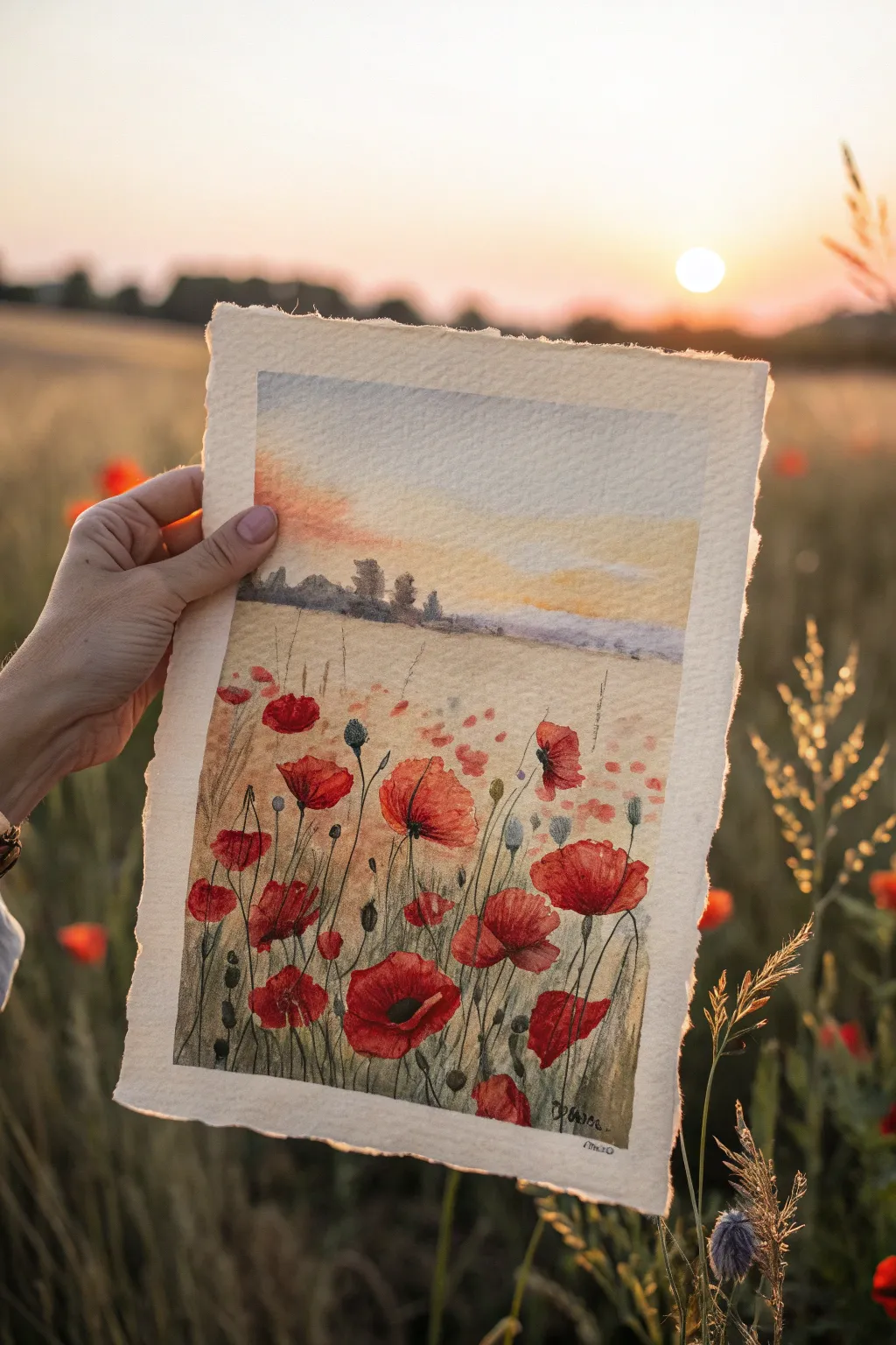
Capture the fleeting magic of golden hour with this vibrant watercolor field study. You will layer soft washes of yellow and blue to build a glowing sky before anchoring the composition with bold, dancing red poppies.
Step-by-Step
Materials
- Cold-pressed watercolor paper (300 gsm or heavier, deckled edge preferred)
- Watercolor paints (Cadmium Red, Alizarin Crimson, Sap Green, indigo, Yellow Ochre, Burnt Sienna)
- Round watercolor brushes (Size 2, 6, and 10)
- Masking fluid (optional)
- Painter’s tape or drawing board
- Clean water jars
- Paper towels
- Pencil (HB) and kneaded eraser
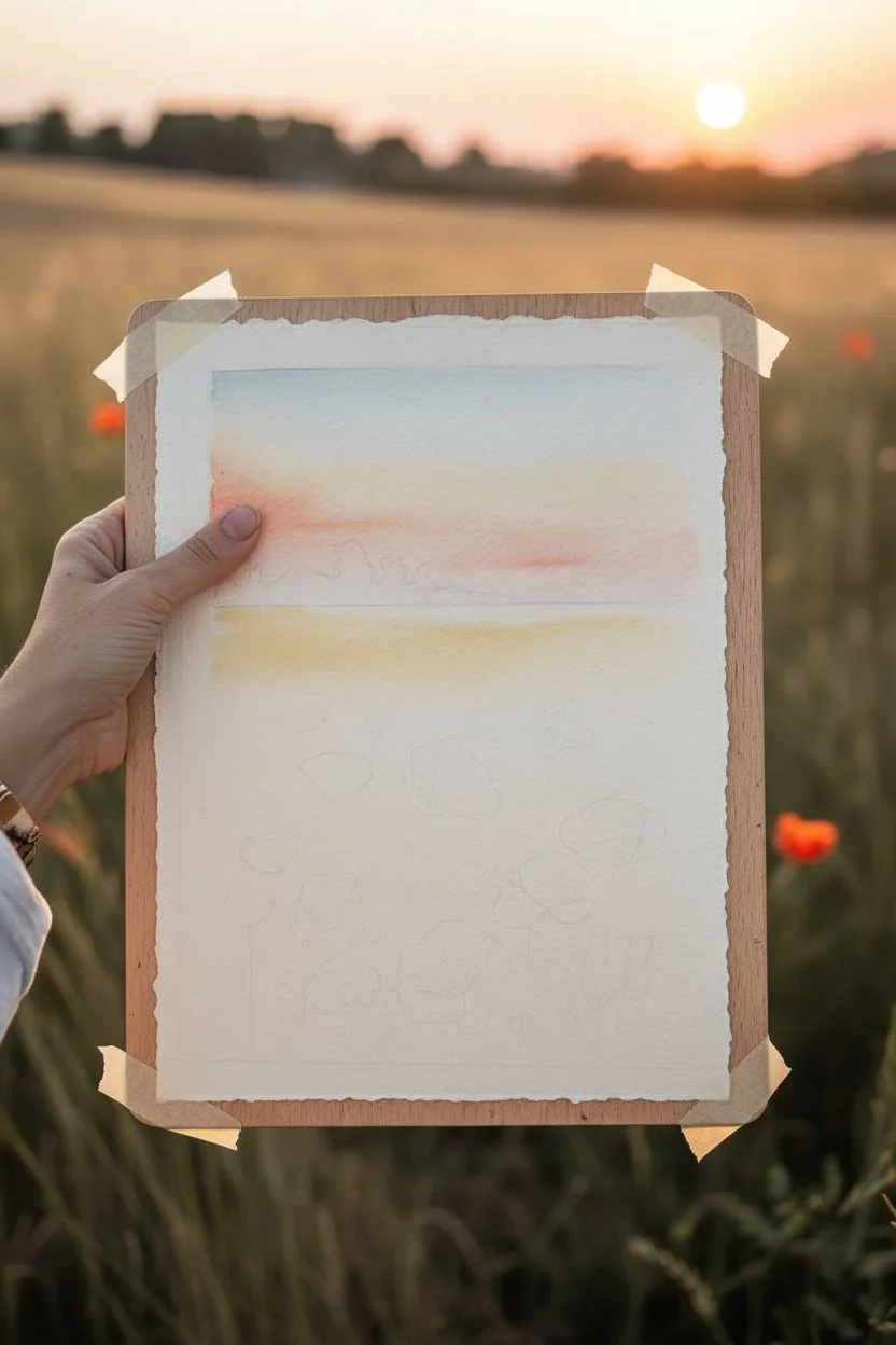
Step 1: Setting the Scene
-
Prepare your paper:
If you want that charming rustic look, tear your watercolor paper carefully against a ruler edge to create deckled edges rather than cutting it. Tape your paper down to a board to prevent buckling. -
Sketch the horizon:
Lightly sketch a horizontal line about one-third of the way down from the top of the paper. This will be your horizon line where the sky meets the distant hills. -
Draft the poppies:
Very faintly sketch oval shapes in the bottom third of the paper to indicate where your main poppy flowers will sit. Keep sizes varied—make the ones at the very bottom larger and the ones higher up smaller to create depth. -
Wet-on-wet sky:
Using your largest brush, wet the sky area with clean water. The paper should glisten but not have standing puddles. -
Paint the sunset glow:
Drop in a dilute wash of Yellow Ochre near the horizon line, letting it bleed upwards. While still wet, add touches of soft pink or orange just above the yellow. -
Add the upper sky:
Blend a very pale blue or grey into the top of the sky, allowing it to mix softly with the warmer tones below. Let this layer dry completely before moving on.
Edge Protection
To keep that crisp white border on your deckled paper, apply masking tape gently. Before sticking it down, tap the tape on your clothes first to reduce its tackiness so it won’t tear the paper later.
Step 2: Middle Ground & Distance
-
Paint the distant trees:
Mix a muted purple-grey using Indigo and a touch of Burnt Sienna. With a size 6 brush, paint a jagged, organic silhouette along the horizon line to represent distant trees and bushes. -
Create the golden field:
Paint the middle section (below the trees but above your poppy sketches) with a wash of Yellow Ochre and a tiny bit of brown. Keep this loose and watery to suggest dried wheat or grass. -
Soften the edges:
While the field wash is damp, use a clean, damp brush to soften the bottom edge so it fades into the white paper where your poppies will be. Let everything dry perfectly bone-dry.
Muddy Greens?
If your stems look too artificial or bright, mix a tiny dot of red into your green paint. The complementary color naturally desatures the green, making it look like realistic, organic foliage.
Step 3: Poppies & Details
-
First poppy layer:
Load a size 6 brush with watery Cadmium Red. Fill in your poppy shapes loosely. Don’t paint solid circles; leave white gaps in the center or edges to represent light hitting the petals. -
Add depth to petals:
While the red is still slightly damp, drop in concentrated Alizarin Crimson or a darker red into the lower parts of the flower heads to create shadow and volume. -
Paint the stems:
Using a size 2 brush and a mix of Sap Green and Indigo, paint thin, wavy lines for stems. Ensure the lines are not perfectly straight; poppy stems are naturally wiggly and erratic. -
Add buds and seed heads:
Paint small oval buds drooping downwards on curved stems using the green mix. Add small vertical dashes in the distance to suggest more wildflowers further back in the field. -
Define the poppy centers:
Once the red petals are totally dry, mix a very dark grey or black. Paint small, textured dots in the center of the open flowers. -
Add grass texture:
With a relatively dry brush (dry brush technique) and pale brown or green paint, flick upward strokes from the bottom edge to simulate tall grasses partially obscuring the lower stems. -
Splatter for texture:
I like to load a brush with watered-down red or yellow paint and tap it against another brush handle over the paper. This creates tiny speckles that look like pollen or distant flowers. -
Final assessment:
Step back and look at the contrast. If the foreground needs more punch, carefully glaze a second layer of vibrant red over the main poppies to make them pop against the muted background.
Now you have a stunning field of wildflowers to brighten up any room

Red Moon Over a Dark Sea
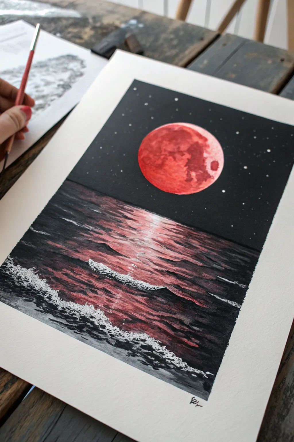
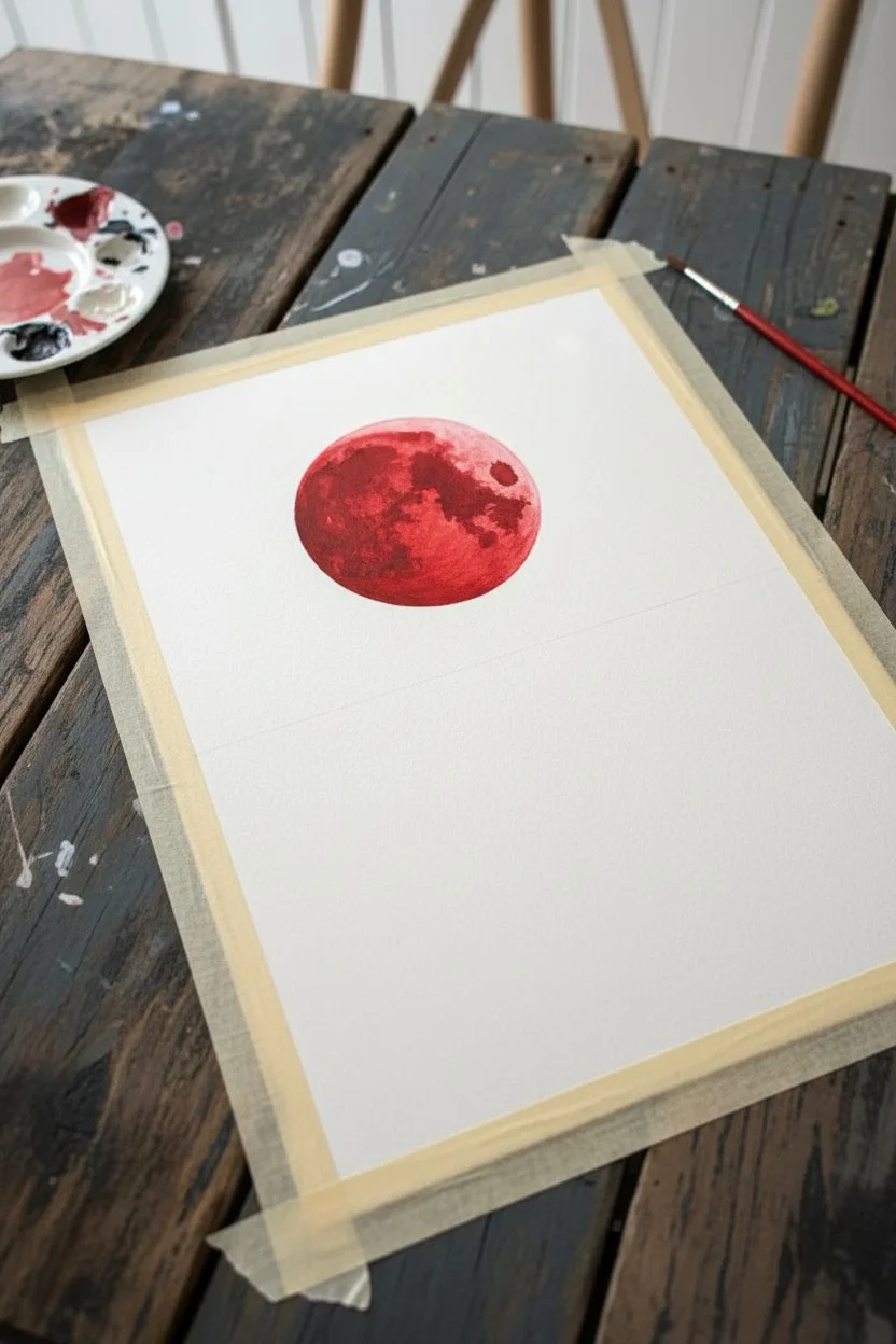
Capture the moody stillness of a blood moon rising over a dark ocean in this striking painting tutorial. Using vivid reds against deep blacks and greys, you will learn to create glowing reflections on water and the textured surface of the moon.
Detailed Instructions
Materials
- Heavyweight watercolor paper or mixed media paper (at least 300gsm)
- Painter’s tape or masking tape
- Gouache paints (Black, White, Crimson Red, Warm Yellow/Orange)
- Flat shader brush (approx. 1/2 inch) for backgrounds
- Round brush (size 4 or 6) for details
- Fine liner brush (size 0 or 00) for stars
- Circular stencil or masking fluid (optional)
- Palette for mixing
- Water cups and paper towels
Step 1: Preparation and The Moon
-
Tape the borders:
Begin by taping down all four edges of your paper to a flat surface. This key step ensures you get that crisp, clean white border at the end and prevents the paper from buckling under layers of paint. -
Establish the horizon:
Lightly sketch a horizontal line roughly halfway down the paper to separate the sky from the sea. Don’t worry about making it perfectly straight; a slight natural variance is fine. -
Outline the moon:
In the upper half, draw a distinct circle for your moon. You can trace a jar lid or roll of tape to get a perfect shape. -
Base coat the moon:
Mix a vibrant crimson red with a tiny touch of white to make it opaque. Fill in the moon circle completely. Let this layer dry fully before adding texture. -
Add lunar texture:
Mix a slightly darker red (add a drop of black/blue to your crimson) and a lighter orange-red. Use a mostly dry brush to dab these colors onto the moon, creating craters and visual interest. Keep the edges sharp but the interior blotchy.
Fixing “Flat” Skies
If your black sky looks streaky, don’t overwork wet paint. Let the first coat dry completely, then apply a second thin coat of black for a solid matte finish.
Step 2: The Night Sky
-
Paint the sky base:
Using jet black gouache, carefully paint around the moon and down to your horizon line. Ensure the paint is thick and opaque for a true night effect. -
Create the stars:
Once the black sky is bone dry, take your fine liner brush with pure white paint. Dot tiny stars randomly across the sky. Vary the sizes slightly, but keep them small and delicate. -
Add star clusters:
Group a few stars closer together in one or two spots to suggest distant constellations, rather than spacing them all perfectly evenly.
Level Up: Gloss Finish
Mix a clear gloss medium into your red paint ONLY for the moon and the water reflection highlights. This will make the light source literally shine against the matte black background.
Step 3: The Reflective Sea
-
Base the ocean water:
Mix a dark charcoal grey (black with a little white). Paint the entire bottom half of the paper with horizontal strokes. While it’s still wet, blend in some pure black at the corners to create a vignette effect. -
Map the reflection:
Visualize a vertical column directly under the moon. This is where your red reflection will live. Using your crimson red, paint horizontal, broken dashes down the center of the water. -
Layering the glow:
As you move down the reflection column, mix a little white into your red to make a soft pink. Add smaller, thinner highlight dashes on top of the red ones to simulate the brightest glimmers of light. -
Darkening the waves:
Switch back to pure black. Paint thin, undulating lines between your red reflections to represent the troughs of the waves. This contrast makes the red pop. -
Blend the reflection edges:
Ensure the red reflection doesn’t have hard vertical walls. Use a dry brush with a little dark grey to feather the edges of the red column into the surrounding dark water.
Step 4: Foam and Details
-
Adding foreground waves:
Focus on the bottom third of the painting. Use a mix of grey and white to paint larger, rolling wave shapes. These should look like they are closer to the viewer. -
Highlighting wave crests:
Using pure white paint on a small round brush, line the very tops of the nearest waves to create sea foam. Use a shaky hand here intentionally—wiggle the brush to create organic, foamy textures. -
Create sea spray:
Near the bottom edge, stipple (dot) white paint clustering around the wave crests. This mimics the chaotic spray of crashing water. -
Final reflection touch-ups:
Step back and look at the reflection. I find adding one or two distinct white horizontal lines right near the horizon line helps anchor the light source. -
Sign and reveal:
Once everything is completely dry, add your signature in the bottom corner with a fine brush or pen. Then, slowly peel back the tape at a 45-degree angle to reveal your clean edges.
Peeling that tape away to see the contrast between the dark sea and the crisp white border is a truly satisfying moment


Red Autumn Leaves on Stark Branches
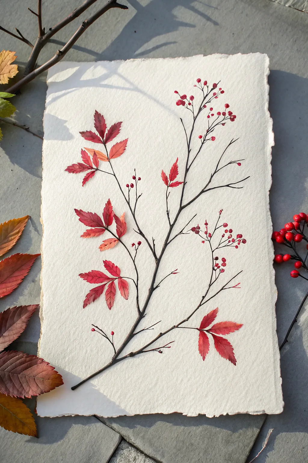
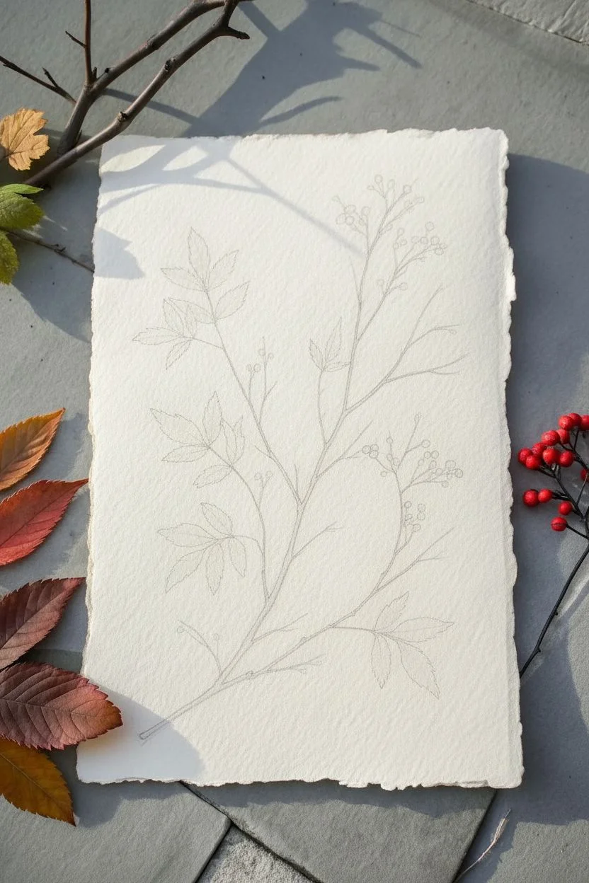
Capture the delicate transition of autumn with this elegant botanical painting featuring vibrant red leaves and tiny berries on a stark, twisting branch. The contrast of the crimson foliage against the creamy, textured rag paper creates a sophisticated piece perfect for seasonal decor.
Step-by-Step Guide
Materials
- Heavyweight rag paper or watercolor paper with deckle edges (300 gsm or higher)
- Pencil (HB or H)
- Kneaded eraser
- Watercolor paints (Alizarin Crimson, Burnt Umber, Ivory Black, Sap Green, Cadmium Red/Orange)
- Small round brushes (Size 0, 2, and 4)
- Fine liner brush (Size 000)
- Palette for mixing
- Jar of water
- Paper towels
Step 1: Sketching the Structure
-
Plan the composition:
Begin by observing the natural curve of a branch. Lightly mark the start of the branch at the bottom left corner, aiming gracefully towards the upper right. -
Draw the main stem:
Using your HB pencil, sketch the central woody stem. Keep the line slightly jagged and organic rather than perfectly straight to mimic real wood. -
Add secondary twigs:
Branch off smaller twigs from the main stem. Vary their angles and lengths, ensuring they taper thinner as they extend outward. -
Outline leaf clusters:
Lightly sketch the compound leaf shapes. Group them in threes or fives, typical of autumnal foliage, placing larger clusters lower down and smaller ones near the tips. -
Position the berries:
Indicate small circles for berries at the ends of the finest twigs, particularly in the upper right section of the composition. -
Clean up the sketch:
Gently roll a kneaded eraser over your drawing to lift excess graphite, leaving only a faint guide for your painting.
Uneven Washes?
If your red paint creates unwanted ‘blooms’ or watermarks on the leaves, try using slightly less water on your brush, or wait for the layer to be just damp before adding new color.
Step 2: Painting the Branch
-
Mix the bark color:
Create a deep, brownish-black hue by mixing Burnt Umber with a touch of Ivory Black. It should be dark enough to contrast sharply with the paper. -
Paint the main stem:
With a Size 2 brush, paint the main branch. Use the tip of the brush to keep the edges crisp. -
Detail the twigs:
Switch to a liner brush or Size 0 for the finer offshoots. Painting these with a slightly shaky hand can actually add realism to the woody texture. -
Add texture marks:
While the paint is still damp, drop in tiny specks of darker pigment at the joints or knots of the wood to create knots and depth.
Add Metallic Touches
For a magical twist, use metallic gold watercolor for the veins of the leaves or just trace the very tips of the berries for a festive, shimmering effect.
Step 3: Painting the Foliage
-
Mix varied reds:
Prepare a few puddles of red. Start with Alizarin Crimson for deep tones, and mix a separate puddle of Cadmium Red with a hint of Orange for brighter, sunlit leaves. -
Paint the first leaf layer:
Using a Size 4 brush, fill in the leaf shapes with your base red color. Work one leaf at a time to control the wetness. -
Introduce color variation:
While a leaf is wet, drop a tiny amount of the orange-red mix near the tip or edge to create a soft, natural gradient. -
Deepen the shadows:
Add a touch of the dark brown mix to the base of the leaves where they meet the stem, suggesting shadow and attachment. -
Paint the veins:
Let the leaves dry completely. Then, using your finest liner brush and a slightly darker red or brown mix, carefully paint the central vein and side veins.
Step 4: Final Details
-
Paint the berries:
Fill the small berry circles with bright red. Leave a tiny speck of white paper unpainted on each one to represent a highlight. -
Connect the berries:
Use the liner brush to draw hair-thin stems connecting each berry to the main branch structure. These lines should be incredibly delicate. -
Review and refine:
Step back to look at the balance. If any branch looks too empty, add a small bud or a single fallen leaf floating nearby.
Once dry, frame your artwork float-style to show off those beautiful deckle edges
BRUSH GUIDE
The Right Brush for Every Stroke
From clean lines to bold texture — master brush choice, stroke control, and essential techniques.
Explore the Full Guide
Red Gradient Wash From Maroon to Scarlet
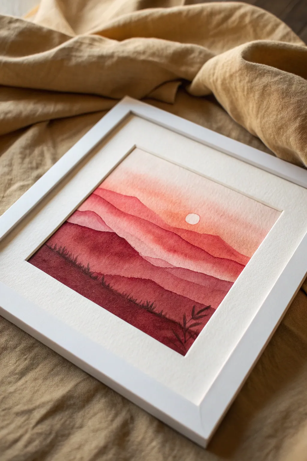
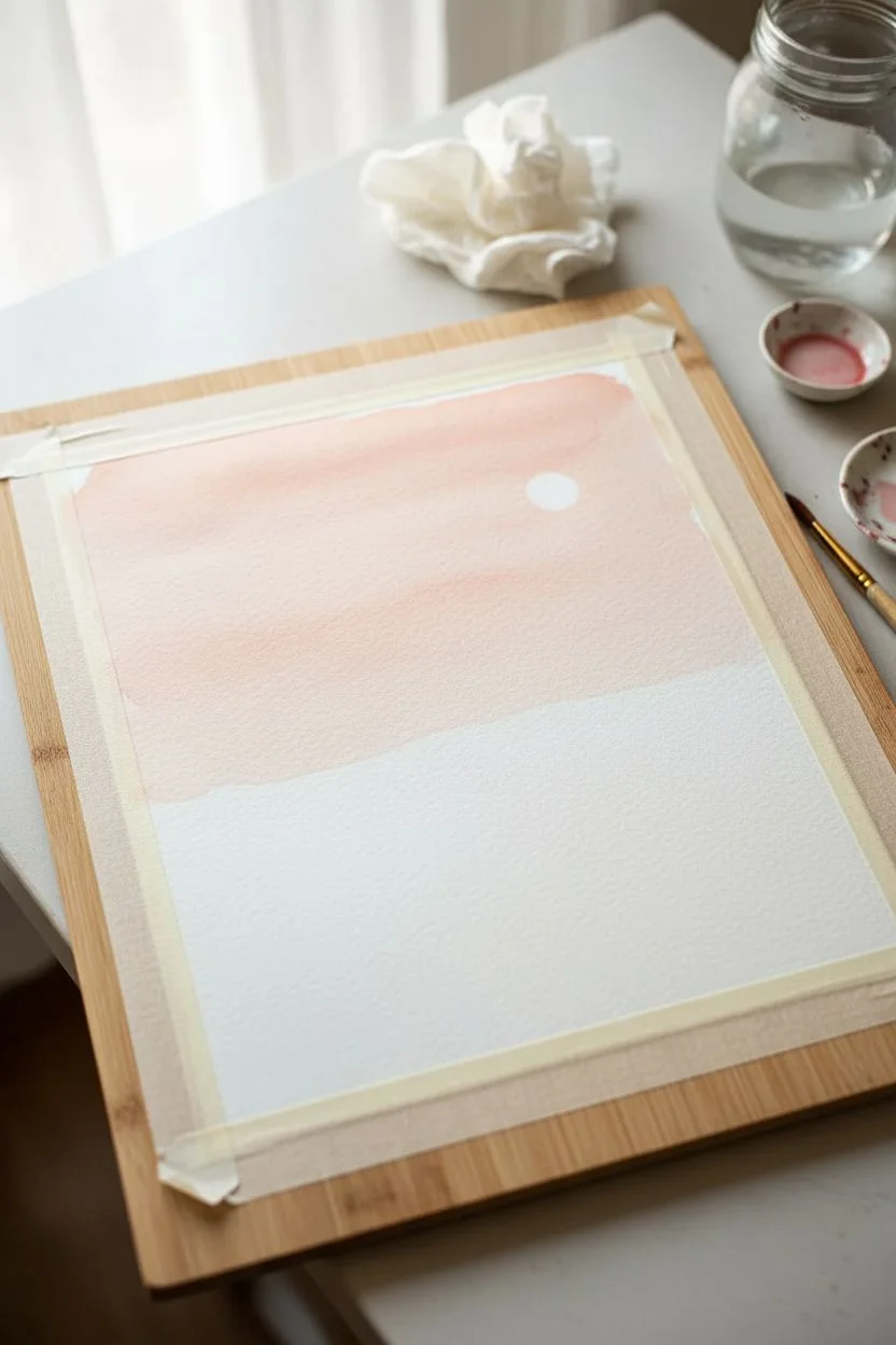
Capture the serene beauty of a fading sunset with this monochromatic watercolor study. Using a single color family ranging from deep burgundy to soft peach, you’ll build layered mountain ranges that seem to recede into a misty distance.
Step-by-Step Tutorial
Materials
- Cold press watercolor paper (square format, approx. 6×6 or 8×8 inches)
- Watercolor paints (Alizarin Crimson, Cadmium Red, Burnt Umber)
- Round watercolor brushes (Size 8 for washes, Size 2 for details)
- Masking fluid (or white gouache)
- Painter’s tape
- Jars of clean water
- Paper towels
- Pencil
- Palette
Step 1: Preparation & Sky
-
Secure the paper:
Tape down all four edges of your watercolor paper to a board using painter’s tape. This prevents buckling and creates a clean white border for framing later. -
Sketch the sun:
Lightly trace the outline of a small circle in the upper right quadrant to mark the sun. Keep your pencil pressure extremely light so the graphite doesn’t show through the paint. -
Mask the sun:
Apply a thin layer of masking fluid to the sun circle. If you don’t have masking fluid, you can carefully paint around it, but masking fluid yields the crispest edge. Allow it to dry completely. -
Mix the sky wash:
Dilute a small amount of Cadmium Red with plenty of water to create a very pale, peachy-pink wash. The consistency should be like tea. -
Paint the sky:
Using your large round brush, apply this pale wash across the entire upper section, starting from the top and fading out slightly as you reach the middle of the paper. Paint right over the masked sun. -
Let it dry:
Wait for the sky layer to be bone dry. If the paper feels cool to the touch, it is still wet giving it a few more minutes is crucial to prevent the next layers from bleeding.
Uneven Washes?
If you get ‘cauliflowers’ or harsh lines in your gradients, your brush may have been too wet when going back into drying paint. Let layers dry fully before re-wetting.
Step 2: Layering the Mountains
-
First mountain range:
Mix a slightly stronger version of your red, perhaps touching in the tiniest bit of Alizarin Crimson. Paint an undulating line across the middle of the page to represent the furthest mountains. -
Pull the color down:
Immediately after painting the top edge of the mountain, rinse your brush and use clear water to pull that pigment downward, fading it out into nothingness before it hits the bottom of the page. -
Dry and deepen:
Allow that layer to dry completely. For the next range, mix Alizarin Crimson with Cadmium Red for a mid-tone red. Paint a new mountain shape slightly lower than the first one. -
Add variance:
While this layer is still wet, I like to drop in a tiny bit of darker pigment along the ridge line to create volume and shadow. -
Repeat the process:
Continue creating mountain ranges, moving lower down the paper. With each new layer, add less water and more pigment to make the color deeper and more opaque. -
Introduce deep tones:
For the second-to-last layer, mix Alizarin Crimson with a touch of Burnt Umber. This creates a rich maroon shade. Paint a rugged shape that rises slightly higher on the left side, mimicking hills.
Step 3: Foreground & Details
-
The darkest foreground:
Mix your darkest value yet: a heavy concentration of Alizarin Crimson and Burnt Umber, using very little water. Paint the final foreground layer at the bottom, covering the previous fade-outs. -
Texture the grass:
While the bottom layer is wet but not soaking, use a damp brush to gently lift or dab at the top edge to simulate grassy textures. -
Add foliage details:
Switch to your Size 2 detail brush. Using the dark maroon mixture, paint delicate vertical strokes and small, leaf-like shapes rising from the bottom right corner. -
Reveal the sun:
Once the painting is absolutely dry to the touch, gently rub away the masking fluid to reveal the crisp white paper of the sun. -
Final touches:
If the sun edge looks too harsh, you can soften it gently with a clean, slightly damp brush, blending a tiny bit of the surrounding sky color inward. -
Remove tape:
Peel the tape away slowly at a 45-degree angle to reveal your clean edges, ready for framing.
Pro Tip: Depth Perception
Atmospheric perspective is key here. Ensure your top mountains are pale and watery, and your bottom foreground is thick and dark. This contrast creates the illusion of distance.
Place your dried painting in a simple white frame or mat to emphasize the rich warmth of the red tones
Red Storm Sky With Lightning
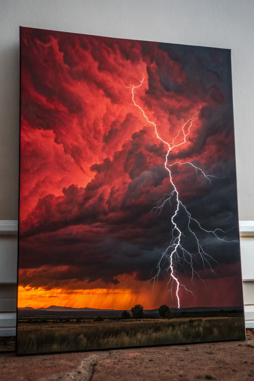
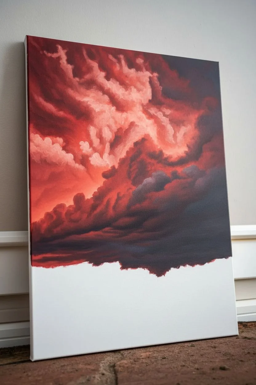
Capture the raw power of nature with this dramatic landscape featuring roiling red clouds and a brilliant strike of lightning. This painting balances high-contrast darks with burning sunset hues to create an unforgettable centerpiece for your wall.
Step-by-Step
Materials
- Rectangular stretched canvas (e.g., 18×24 or 24×36 inches)
- Acrylic paints: Cadmium Red, Alizarin Crimson, Burnt Umber, Payne’s Grey, Mars Black, Cadmium Yellow, Titanium White
- Large flat brush (2-inch)
- Medium filbert brush
- Small round detail brush (size 0 or 1)
- Fan brush
- Palette knife
- Water container and paper towels
- Spray bottle with water (for keeping acrylics wet)
Step 1: Setting the Fierce Sky
-
Prime the Background:
Begin by blocking in the upper 80% of the canvas with a wash of Cadmium Red. Don’t worry about being neat; just get color on the canvas to kill the stark white. -
Deepen the Reds:
While the base is still slightly tacky, mix Alizarin Crimson with a tiny touch of Burnt Umber. Apply this to the corners and top edge, blending inward to create a vignette effect that focuses the eye toward the center. -
Sculpt the Upper Clouds:
Using a medium filbert brush, start forming the billowy shapes of the clouds. Mix Cadmium Red with Titanium White to create a lighter salmon pink. Scumble this color in circular motions to define the illuminated tops of the storm clouds. -
Add Shadow Depth:
Mix a dark purple-grey using Alizarin Crimson and Payne’s Grey. Paint the undersides of the red cloud formations, blending the edges softly into the red to suggest heavy, rain-filled volume.
Pro Tip: Electric Glow
Don’t just paint a white line for lightning. Glazing a very faint halo of pink or yellow around the white bolt makes the electricity look hot and vibrant.
Step 2: The Dark Storm Front
-
Block in the Storm Wall:
Below the vibrant red clouds, establish the menacing storm front with a mix of Payne’s Grey, Mars Black, and a hint of crimson. This band should stretch diagonally across the middle-right section. -
Texture the Dark Clouds:
Use a dry brush technique with slightly lighter grey to pick out the rolling texture on the face of these dark clouds. This gives them three-dimensionality rather than looking like a flat black blob. -
Create the Rain Distant Curtain:
On the far right and beneath the dark clouds, thin your dark paint with water or a glazing medium. Drag the brush vertically downward to simulate sheets of heavy rain falling in the distance.
Step 3: The Glowing Horizon
-
paint the Sunset Strip:
Near the bottom, just above where your land will be, paint a horizontal band of intense Cadmium Yellow mixed with a little Cadmium Red. This represents the sun breaking through beneath the storm. -
Add Vertical Rain Streaks:
Using a clean distinct brush, pull streaks of diluted orange and yellow vertically down from the dark cloud layer into the sunset strip. This creates that beautiful ‘god ray’ rain effect seen on the left side. -
Establish the Distant Mountains:
With a mix of grey and blue, paint a low, jagged silhouette of mountains across the horizon line, right over the bottom edge of your sunset glow.
Level Up: Texture Medium
Mix modeling paste into your red and black paints for the upper cloud layers. The physical impasto texture will catch room light and make the storm look heavy.
Step 4: The Lightning Strike
-
Map the Bolt:
Wait for the sky layers to be completely dry. With your smallest round brush and watered-down Titanium White, lightly map out the tragic, jagged path of the main lightning bolt. -
Paint the Core Bolt:
Go over your sketch with pure, thick Titanium White. Make the line tremble slightly; lightning is never perfectly straight. Press harder for thicker segments and lift off for thin, wispy forks. -
Add the Glow:
I like to mix a very thin glaze of white and yellow. Carefully paint a translucent haze around the main bolt and the entry point in the clouds to make it look like it’s glowing intensely. -
Create Forked Tendrils:
Extend tiny, hairline fractures branching off the main bolt. Use a rigger brush or a very fine liner brush for these delicate electrical fingers.
Step 5: Foreground Landscape
-
Base the Ground:
Paint the bottom strip of the canvas with a dark mix of Burnt Umber and Black. This will be the shadowed earth. -
Add Silhouette Trees:
Using a fan brush or small flat brush turned sideways, dab in a few small, distant tree shapes along the horizon line. Keep them dark as they are backlit by the sunset. -
Detail the Grass:
With a fan brush and a mix of Burnt Umber and Ochre, flick upward strokes in the immediate foreground to create tall, dry grasses catching a tiny bit of ambient light. -
Final Adjustments:
Step back and check your contrast. If the lightning doesn’t pop enough, darken the clouds immediately behind the white bolt to maximize the visual impact.
Hang your masterpiece in a spot with good lighting to let those deep reds and bright whites truly command the room

PENCIL GUIDE
Understanding Pencil Grades from H to B
From first sketch to finished drawing — learn pencil grades, line control, and shading techniques.
Explore the Full Guide
Red Koi Fish in Inky Water
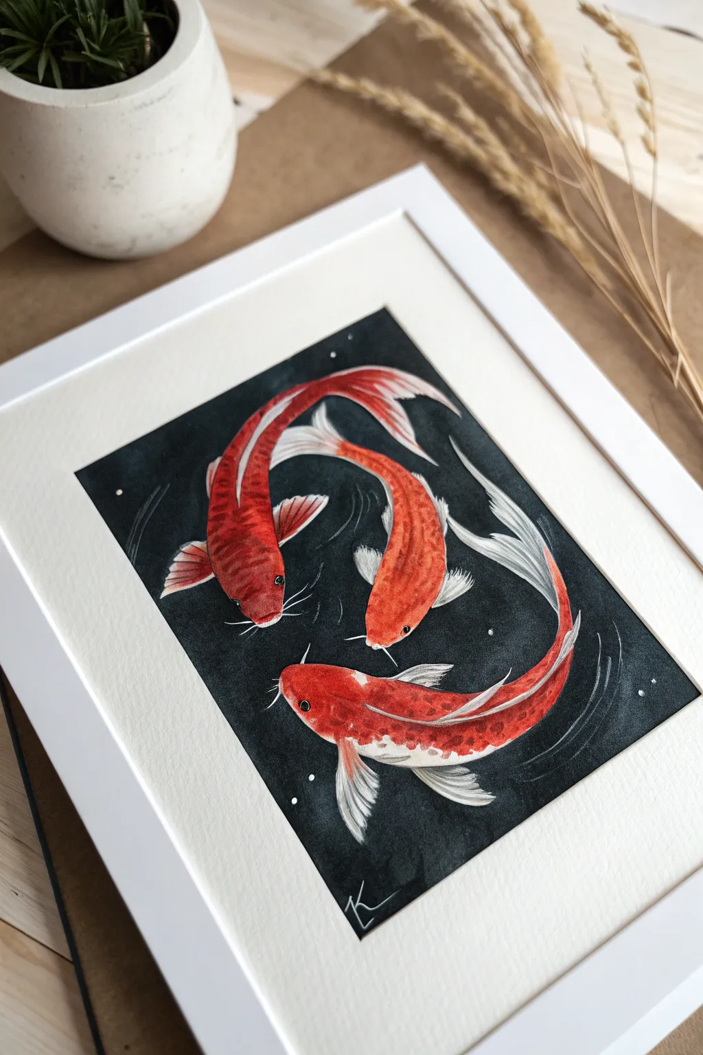
Capture the graceful movement of three koi fish circling in deep water with this striking high-contrast painting. By utilizing vibrant warm tones against a stark, dark background, you will create a sense of depth and luminosity that makes the fish appear to glow.
How-To Guide
Materials
- Heavyweight watercolor paper (300gsm cold press recommended)
- Watercolor paints: Cadmium Red, Vermilion, Lemon Yellow, Paynes Grey, Lamp Black
- White gouache or white gel pen
- Round watercolor brushes (sizes 2, 6, and 8)
- Fine liner brush (size 0 or 00)
- Pencil and eraser
- Palette for mixing
- Clean water jars
- Paper towels
- Masking tape
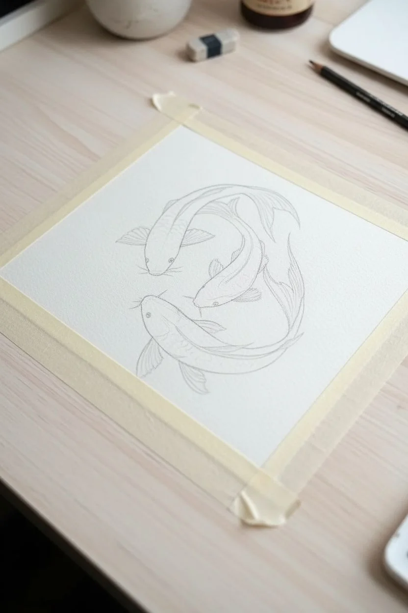
Step 1: Planning and Sketching
-
Tape your edges:
Before you begin, secure your paper to your work surface using masking tape on all four sides. This creates a crisp white border and prevents the paper from buckling under heavy washes. -
Sketch the composition:
Lightly sketch the outlines of three koi fish swimming in a circular motion. Arrange them so their bodies curve gently, guiding the viewer’s eye around the center of the page. -
Refine the details:
Add details for the fins, tails, and head shapes. Keep your pencil lines faint, especially where the fins are translucent, so the graphite won’t show through the lighter paint layers later.
Bleeding Lines?
If black paint seeps into your fish, don’t panic. Let it dry 100%, then use opaque white gouache to paint over the mistake. You can then glaze orange over the dried gouache.
Step 2: Painting the Koi
-
Base wash for the bodies:
Start with the lightest colors on the fish. Mix a watery wash of Lemon Yellow and Vermilion, applying it to the bodies of the fish, leaving some areas pure white for highlights and pattern variation. -
Build darker oranges:
While the first layer is still slightly damp, drop in stronger Cadmium Red along the spines and towards the heads. Let the colors bleed naturally into the lighter wash to create soft gradients. -
Define the fins:
Using a size 2 brush and a very diluted grey or pale red mix, paint the tails and fins. Leave thin slivers of white paper between the painted strokes to mimic the ribbing in the fins. -
Deepen the contrast:
Once the base layers are dry, mix a concentrated red-orange. Apply this to the scales and shadowed areas of the fish to give them volume and make them pop against the impending dark background. -
Add facial details:
Use a small brush to deepen the color around the eyes and gills. Carefully paint the eyes black, leaving a tiny pinprick of white paper (or add white gouache later) for the reflection.
Metallic Magic
For a stunning upgrade, use metallic gold paint for the scales or ripples. The gold will shimmer beautifully against the matte black background.
Step 3: The Inky Background
-
Preparing the dark mix:
Mix a large amount of Lamp Black with a touch of Paynes Grey. You want a very saturated, opaque mixture to achieve that deep, velvety look. -
Cut in around the shapes:
Using a size 6 brush, carefully paint the black background around the fish. I find it helpful to outline the fish first with the dark paint, then fill in the rest of the space. -
Protect the fins:
Work slowly around the delicate, translucent fins. The contrast between the sheer fins and the solid black water is crucial for the effect. -
Fill the background:
Continue filling the rest of the background with the dark wash. Work while the edge is wet to avoid streak marks, creating a solid field of darkness. -
Dry thoroughly:
Allow the black background to dry completely. If it looks patchy, add a second coat of black once the first is dry for an ultra-matte finish.
Step 4: Finishing Touches
-
Enhance white areas:
Use white gouache or a white gel pen to crisp up the edges of the fins and add opaque white scales or patterns on the fish bodies if the watercolor faded too much. -
Paint the whiskers:
Using your finest liner brush and white gouache (or the gel pen), draw delicate, sweeping whiskers (barbels) extending from the mouths of the fish into the dark water. -
Add water movement:
With very diluted white gouache, paint faint, curved ripple lines near the tails and fins to suggest movement through the water. -
Create ‘stars’ or bubbles:
Dip a brush in white gouache and gently tap it to splatter tiny dots across the dark background, or dot them intentionally with a pen. This adds a magical, starry quality to the water. -
Sign and reveal:
Add your signature in the corner with a white pen. Finally, slowly peel away the masking tape to reveal the clean, professional border.
Now you have a serene and dramatic piece of art ready to be framed and displayed
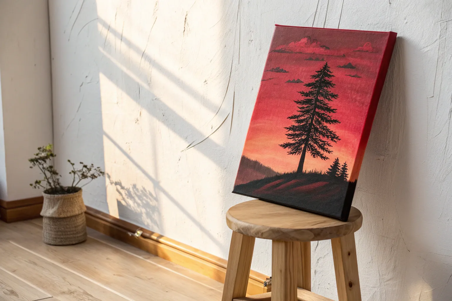
Red Triptych Tree Across Three Panels
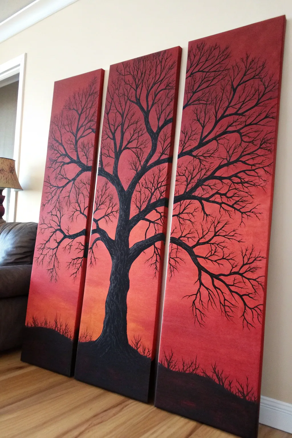
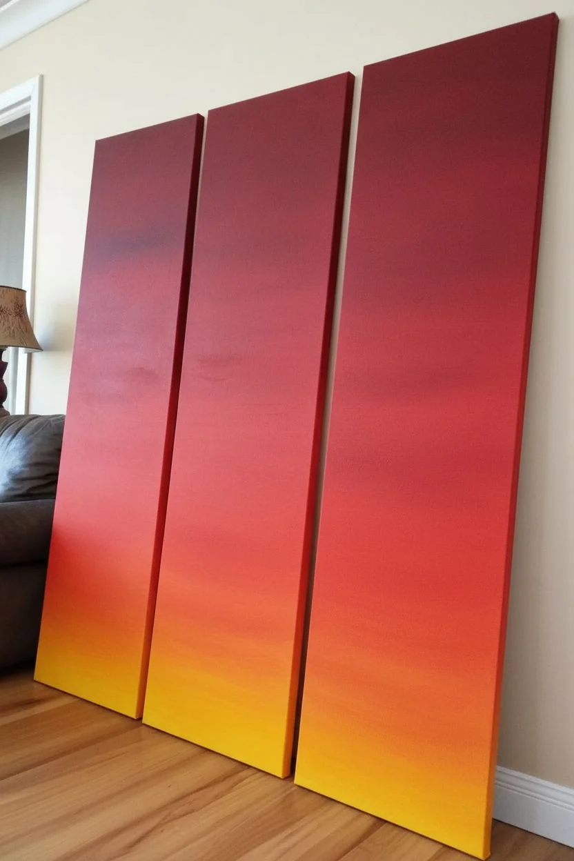
Transform a blank wall into a dramatic focal point with this bold triptych featuring a stark black tree silhouette against a fiery sunset gradient. Spanning three tall canvases, this artwork uses simple blending techniques to create a professional-looking continuous scene.
Step-by-Step Tutorial
Materials
- Three tall, narrow stretched canvases (e.g., 12×36 inches each)
- Acrylic paints: Cadmium Red, Cadmium Orange, Yellow Ochre, Mars Black
- Large flat brush (2-3 inch) for background blending
- Medium round brush for larger branches
- Fine liner brush (size 0 or 00) for delicate twigs
- Palette or paper plate
- Water cup and paper towels
- Pencil
- Easel or flat work surface
Step 1: Setting the Sky
-
Prepare the Canvases:
Lay your three canvases side-by-side on your work surface or easel. Push them close together so they are touching; this ensures your gradient and tree design will flow seamlessly across the gaps. -
Mix the Horizon Color:
Start by mixing a vibrant orange using Cadmium Orange and a touch of Yellow Ochre. This will be the glowing light at the bottom of the sky. -
Apply the Base Layer:
Using your large flat brush, paint the bottom third of all three canvases with your orange mixture. Use long, horizontal strokes that span across the panels where possible to keep the color consistent. -
Transition to Red:
While the orange paint is still wet, clean your brush slightly and pick up pure Cadmium Red. Begin painting the middle section of the canvases, overlapping the wet edge of the orange paint. -
Blend the Gradient:
Work your brush back and forth horizontally where the red meets the orange. The wet paints will mix on the canvas, creating a smooth transition from the glowing horizon to the deep red mid-sky. -
Darken the Top:
For the top third, use pure Cadmium Red again, or mix in the tiniest speck of black or dark brown to deepen it slightly. Blend this down into the middle red section until the entire background is a smooth, fiery ombre. -
Paint the Edges:
Don’t forget to wrap your colors around the sides of the canvases. This gives the finished piece a polished, gallery-ready look without needing a frame. Let the background dry completely before moving on.
Keep it flowing
Add a drop of water or flow improver to your black paint for the branches. Paint flows smoother off the brush, creating longer, crisper lines without stopping.
Step 2: Designing the Tree
-
Sketch the Trunk:
Once the sky is dry, lightly use a pencil to sketch the outline of your tree. Place the main trunk primarily on the center canvas, ensuring the base is wide and grounded. -
Plan the Branches:
Draw the main thick branches extending outward from the trunk, crossing over the gaps onto the left and right canvases. I prefer to step back occasionally to ensure the flow looks natural across the divide. -
Paint the Ground:
Switch to Mars Black paint. Using the flat brush, paint a rolling hill shape at the very bottom of all three panels. This creates the silhouette ground the tree stands on. -
Fill the Trunk:
Using a medium round brush, fill in the tree trunk with solid black. Apply a second coat if the red background shows through; you want a dense, opaque silhouette. -
Add Texture:
While the black trunk is wet, you can use a dry brush to drag faint vertical lines through it, creating the suggestion of bark texture, though a solid silhouette works beautifully too.
Step 3: Refining the Details
-
Extend Main Branches:
Continue using the medium brush to paint the thickest branches extending out from the trunk. Follow your pencil lines, tapering the branches as they reach toward the edges of the canvas. -
Check the Gaps:
Pay special attention to where branches cross from one canvas to another. Line them up visually so the eye ‘jumps’ the gap effortlessly. -
Switch to Fine Liner:
Load your fine liner brush with slightly thinned black paint (add a drop of water for better flow). This is essential for creating crisp, thin twigs. -
Create Tiny Twigs:
Paint delicate, spindly twigs growing off the larger branches. Use a flicking motion with your wrist to get natural, tapered ends that look like real growth. -
Add Scrub Brush:
Along the black horizon line at the bottom, use the liner brush to add tiny vertical twigs and grasses sticking up. This adds depth and realism to the ground level. -
Final Inspection:
Separate the canvases slightly to see them as individual pieces, then push them back together. Touch up any branch connections that feel misaligned or too thick.
Make it shimmer
Once the black paint is fully dry, paint a thin layer of gold or copper metallic glaze over just the tips of the branches to catch the light.
Hang your panels with a one-inch gap between them to fully appreciate the dramatic continuity of your creation


Have a question or want to share your own experience? I'd love to hear from you in the comments below!