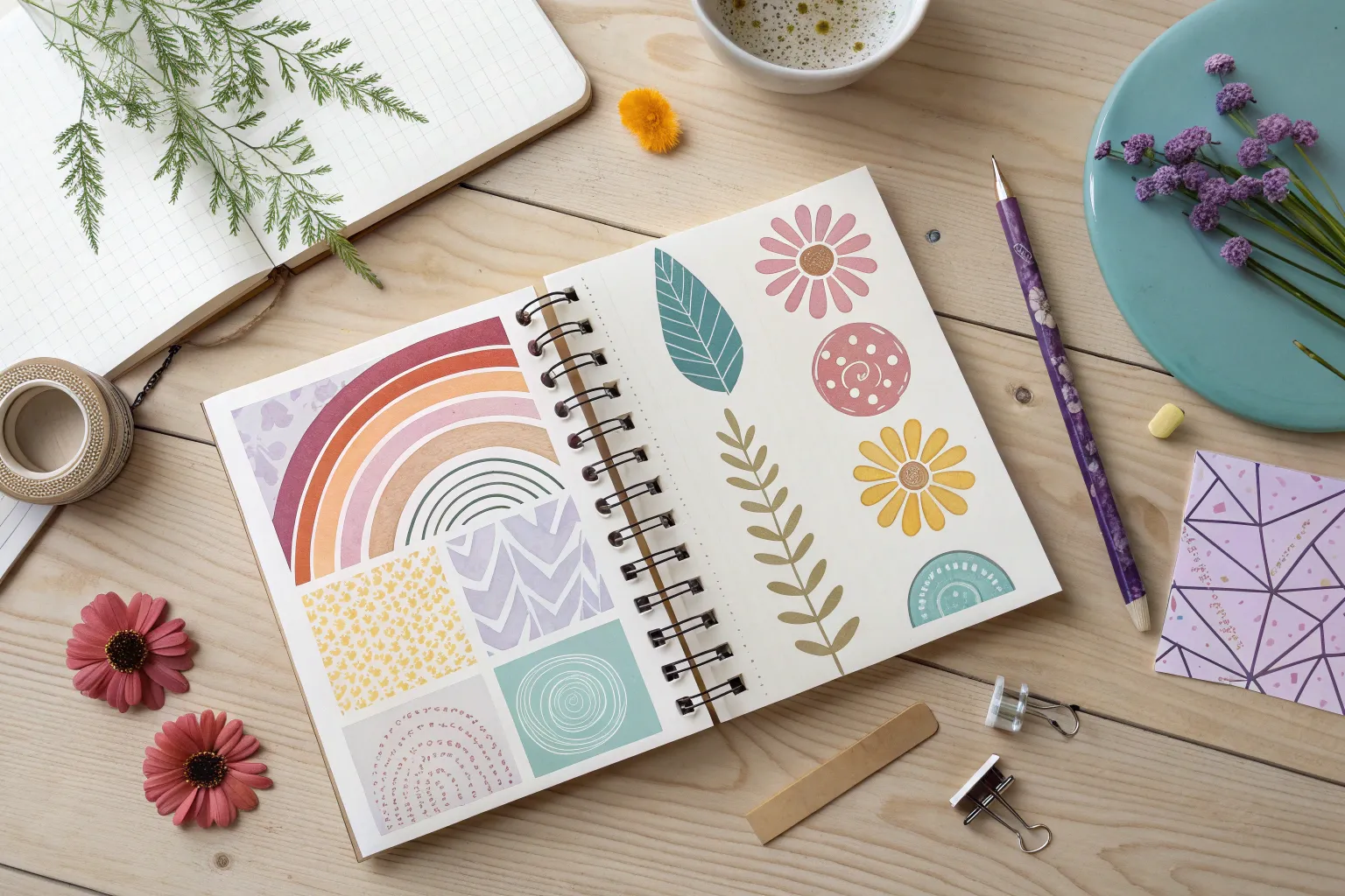
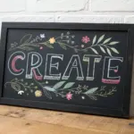
When my brain hits that blank-page freeze, I reach for quick, low-pressure art ideas that get my hand moving before my inner critic shows up. Here are 16 creative prompts I use (and teach) all the time—starting with the classics and ending with the weirder, wow-factor experiments.
Simple Doodle Grid Page
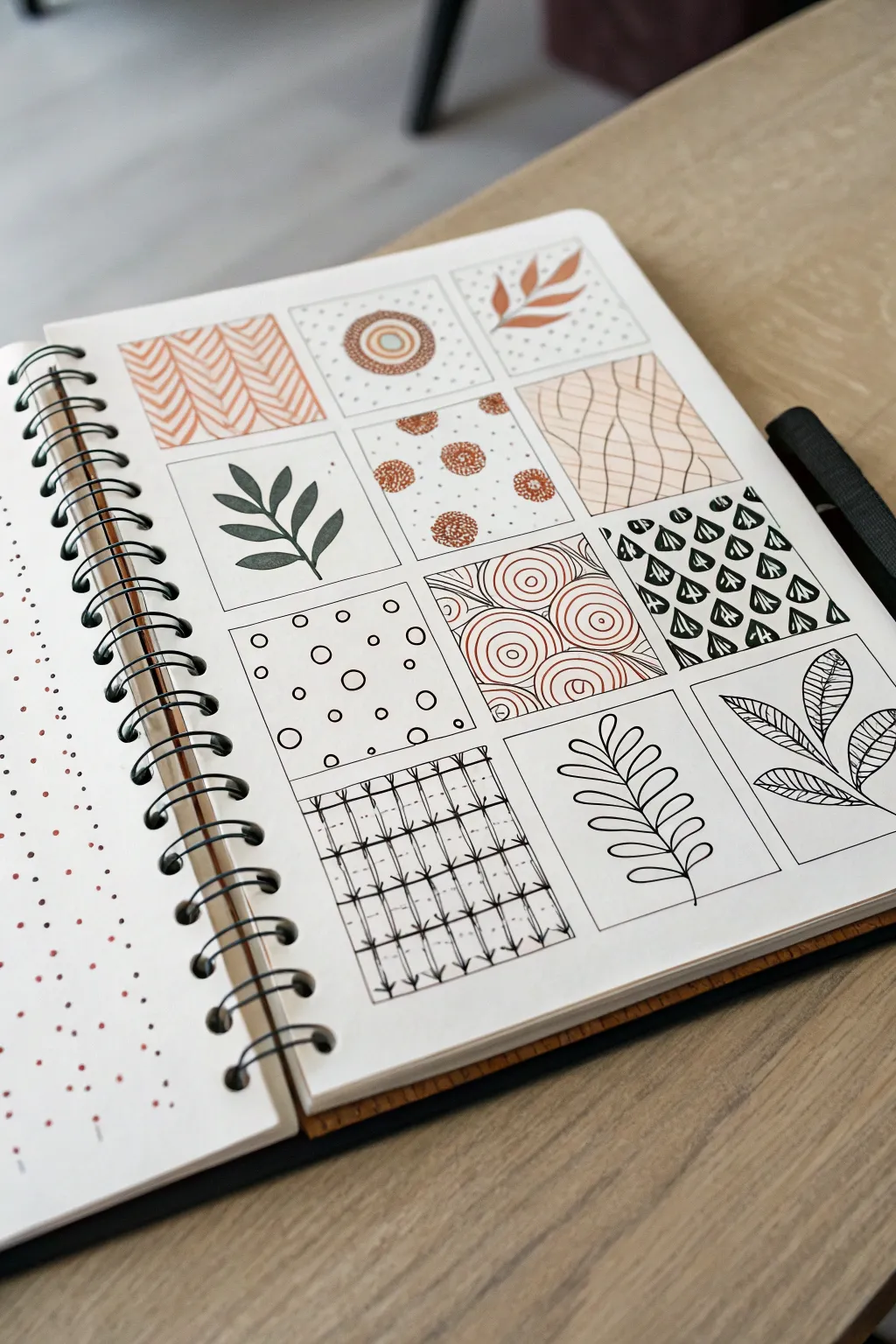
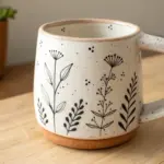
Embrace the slow, rhythmic practice of pattern drawing with this beautiful grid layout that mixes geometric precision with organic botanical shapes. Using a limited palette of crisp black ink and earthy terracotta, you’ll fill twelve square panels with varied textures that look stunning as a complete composition.
How-To Guide
Materials
- A5 or square sketchbook (heavyweight paper preferred)
- Black fine-line drawing pens (0.3mm and 0.5mm)
- Terracotta or rust-colored brush pen or marker
- Pencil (HB)
- Ruler
- Eraser
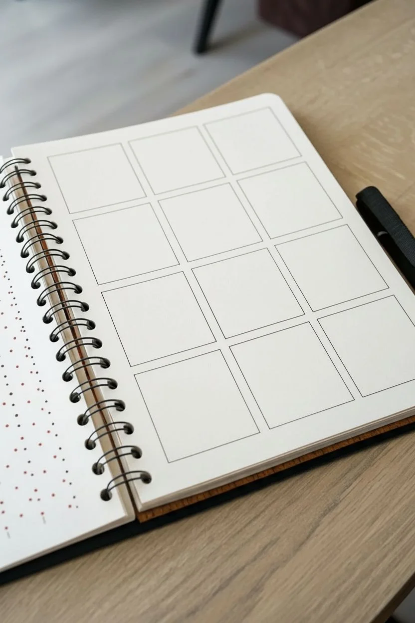
Step 1: Setting the Grid
-
Map out the squares:
Begin by lightly penciling a grid of twelve squares onto your page. Arrange them in three columns and four rows. Aim for squares that are roughly 1.5 to 2 inches in size, leaving a consistent small gap between each one to let the designs breathe. -
Refine the borders:
Once you are happy with the spacing, re-trace the square outlines using your 0.3mm black fine-liner. Use a ruler for sharp, perfectly straight edges. Let the ink dry completely for a moment before gently erasing the underlying pencil marks.
Pro Tip
Rotate your sketchbook as you draw lines, especially for the curved patterns. It’s much easier to pull a pen stroke toward your body than to push it away at an awkward angle.
Step 2: Row 1: Organic & Geometric Mix
-
Panel 1: Terracotta zigzags:
In the top-left square, switch to your terracotta marker. Draw a series of vertical zigzag lines packed closely together. The lines should mirror each other, creating a chevron or herringbone textile effect. -
Panel 2: The dotted target:
Move to the middle square. Use the terracotta marker to draw three concentric circles in the center. Switch to your 0.3mm black pen to stipple tiny dots around the outer ring, fading them out as you reach the corners of the square. -
Panel 3: Single leaf sprig:
For the top-right square, take your terracotta marker again. Draw a simple, single stem curving diagonally from the bottom-left toward the top-right. Add small, almond-shaped leaves along the stem. Keep the background clean and white.
Level Up
Try using metallic gold ink instead of terracotta for the colored sections. The shimmer adds an elegant, luxurious touch against the stark black ink lines.
Step 3: Row 2: Contrast & Flow
-
Panel 4: Solid black leaf:
In the first square of the second row, draw a bold botanical shape using the 0.5mm black pen. Create a central stem and large, dark leaves. Fill the leaves in completely with black ink for a silhouette look. -
Panel 5: Floral bursts:
In the center square, use the terracotta marker to draw five or six small, rough circular flower heads dispersed randomly. Use the black 0.1mm or 0.3mm pen to add tiny dots in the center of each flower and scatter distinct black dots in the white space around them. -
Panel 6: Wavy grid:
Take the terracotta marker to the right-hand square. Draw vertical wavy lines spaced evenly apart. Then, draw horizontal wavy lines crossing over them, creating a relaxed, flowing grid pattern.
Step 4: Row 3: Detailed Patterns
-
Panel 7: Bubbles and dots:
Switch back to black ink for the first square of the third row. Draw various sizes of circles scattered loosely. Inside the empty space between circles, place singular black dots to balance the composition. -
Panel 8: Circular ripples:
In the middle square, use the terracotta marker to draw sets of concentric semicircles starting from different points on the perimeter. Imagine ripples in a pond overlapping one another until the entire square is filled with curved lines. -
Panel 9: Black petal repeats:
For the right-hand square, create a dense black pattern. Draw rows of small teardrop or petal shapes using black ink. Alternate the direction of the petals in adjacent rows—some pointing up, some pointing down—and add simple line details inside each shape.
Step 5: Row 4: Botanical Line Work
-
Panel 10: The arrow grid:
In the bottom-left square, draw a standard grid with black ink. At every intersection, draw small diagonal ticks that fan outward, resembling little stylized palm trees or arrow feathers. -
Panel 11: Minimalist branch:
In the center square, use a thin black pen to draw a single vertical stem. Add symmetrical, looped leaves on either side, keeping the lines thin and open (don’t fill them in). This creates a light, airy feeling. -
Panel 12: Veined leaves:
Finish with the bottom-right square. Draw three large leaves entering from the corners. Use black ink to draw the outline, then carefully add detailed veins inside each leaf, curving the lines to show the rounded form of the foliage.
Once the final square is complete, take a moment to admire how these twelve tiny drawings come together to form a cohesive gallery on a single page


Sunset Silhouette Gradient
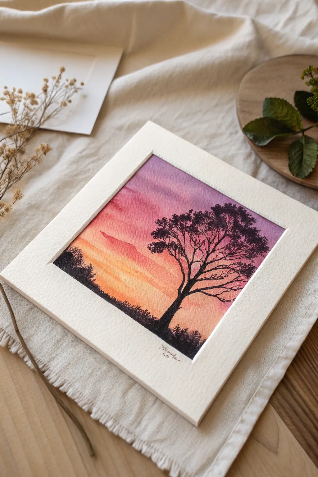
This project captures the serene beauty of dusk with a vibrant watercolor gradient transitioning from warm orange to cool purple. The stark black silhouette of a tree creates a stunning contrast against the colorful sky, perfect for a minimalist framed piece.
Step-by-Step
Materials
- Cold-pressed watercolor paper (140lb/300gsm)
- Watercolor paints (Cadmium Orange, Alizarin Crimson, Dioxazine Purple)
- Black gouache or waterproof black ink
- Large flat wash brush (3/4 inch)
- Small round detail brush (size 0 or 1)
- Masking tape
- Pencil and kneaded eraser
- Water cups and paper towels
- White mat board or cardstock frame
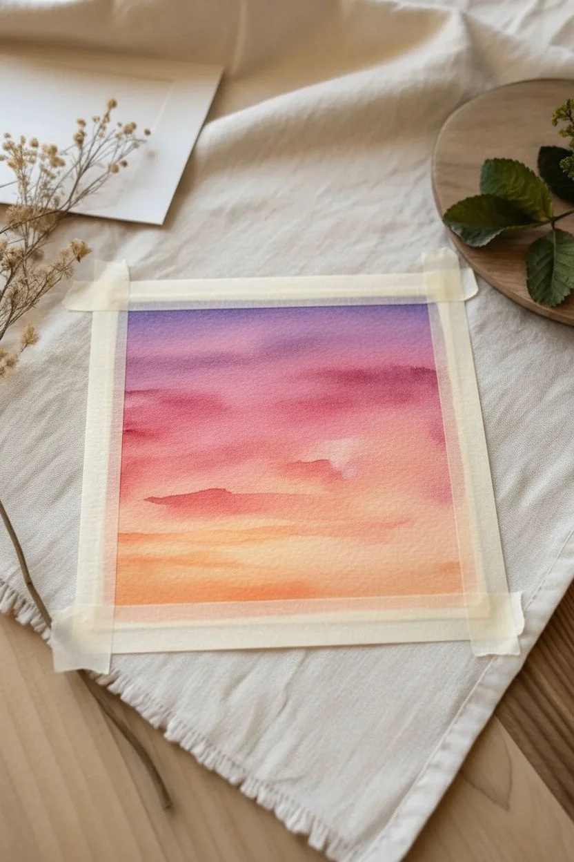
Step 1: Preparation & Sky Gradient
-
Secure the paper:
Begin by taping down all four edges of your watercolor paper to a hard board or table. This prevents buckling and creates a clean white border for your painting. -
Pre-wet the sky area:
Using your large flat brush and clean water, apply an even coat of water across the entire paper surface. The paper should be glisten, but ensure no puddles form. -
Apply the orange base:
Load your brush with a diluted orange wash. Starting from the bottom third of the paper, paint horizontal strokes, allowing the color to fade or streak slightly upwards into the wet paper. -
Blend in the pinks:
While the paper is still wet, mix a reddish-pink hue. Apply this directly above the orange section, letting the two colors bleed together naturally where they meet. -
Add the purple top:
Clean your brush and pick up the purple paint. Apply this to the top third of the paper, dragging it down to meet the pink. Tilt your board slightly to encourage a downward drift of pigment. -
Create cloud textures:
Before the wash dries completely, use a slightly thirsty brush (wipe it on a towel) to lift out distinct horizontal streaks in the orange and pink zones, suggesting wispy clouds. -
Let it dry completely:
Allow the background gradient to dry thoroughly. The paper must be bone-dry and flat before you attempt the silhouette, or the black ink will bleed into the sky.
Step 2: Painting the Silhouette
-
Sketch the horizon:
Lightly sketch a low, uneven horizon line with your pencil. You can add a small suggestion of the tree trunk position, but avoid detailed drawing as lines are hard to erase under dark paint. -
Paint the ground:
Using black gouache or ink, fill in the ground area below your horizon line. Stipple the top edge of this shape with the brush tip to simulate swaying grass and low bushes. -
Outline the trunk:
Switch to your fine detail brush. Paint the main trunk of the tree, making it thicker at the base and gradually tapering as it reaches upwards into the purple sky. -
Branch structure:
Add the primary branches extending from the trunk. Remember that trees are organic; avoid perfect symmetry and allow the branches to twist and reach in different directions. -
Adding fine twigs:
Using the very tip of your smallest brush, add delicate twigs to the ends of the main branches. A shaky hand actually helps here to make them look more natural and weathered. -
Create leaf clusters:
I like to use a nearly dry brush with thick black paint to stipple clusters of leaves near the ends of the branches. Keep these sparse to let the beautiful sunset show through. -
Secondary foliage:
Add a smaller, secondary bush or tree silhouette on the left side of the horizon to balance the composition.
Pro Tip: Better Gradients
Work quickly while the paper is wet! If the paper starts to dry mid-gradient, you’ll get hard edges. Keep a spray bottle handy to mist the paper lightly if needed.
Step 3: Finishing Touches
-
Remove tape:
Once the black paint is completely dry, carefully peel away the masking tape at a 45-degree angle away from the painting to reveal crisp edges. -
Sign your work:
Use a fine liner pen or tiny brush to sign your name discreetly at the bottom, perhaps just below the painted area. -
Mount the artwork:
Place your finished painting behind a white mat board or frame it similarly to the reference image to enhance the luminosity of the colors.
Level Up: Golden Hour
Once dry, add tiny dots of gold gouache or metallic watercolor to the horizon line to mimic the sun catching on distant objects or fireflies.
Now you have a tranquil sunset scene ready to hang or gift to a friend

Zentangle-Inspired Pattern Strips
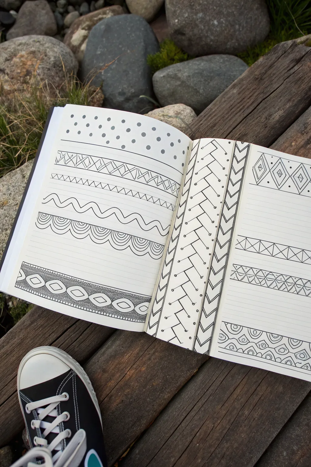
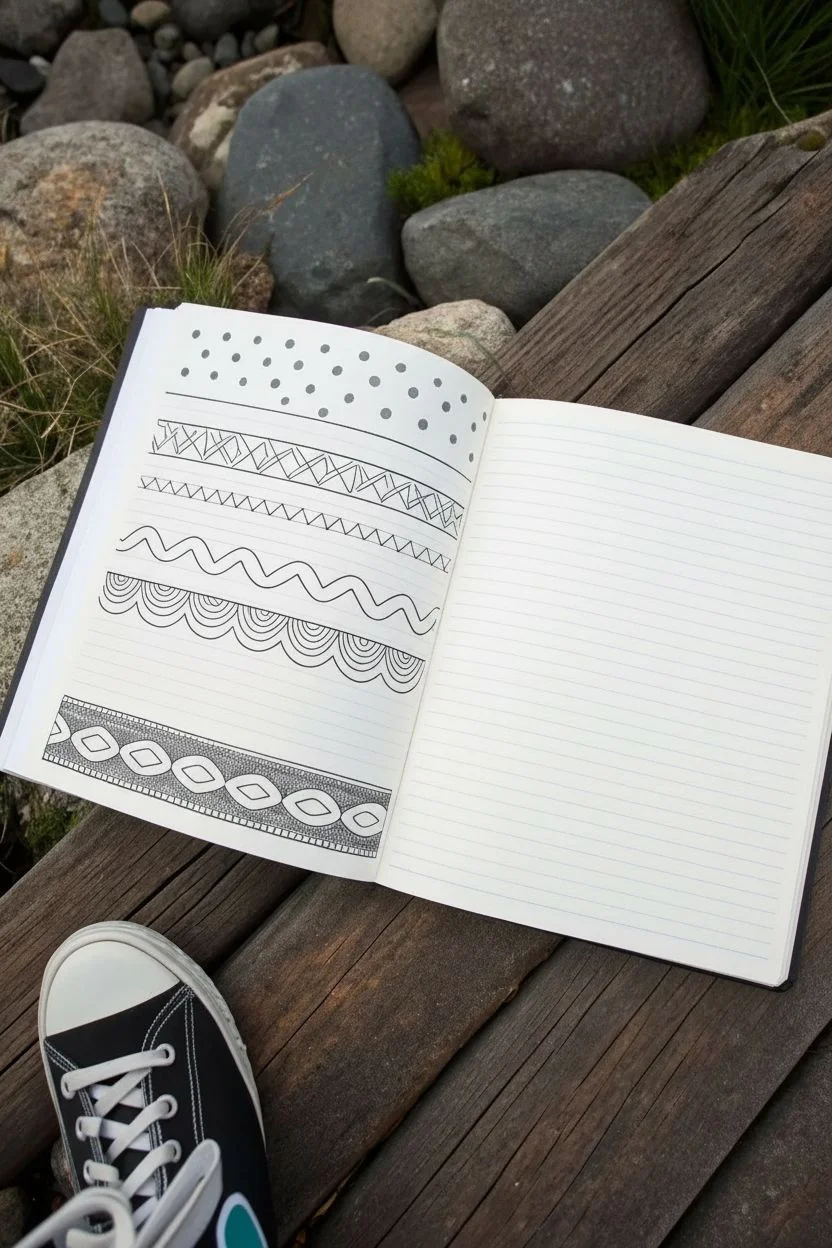
This project transforms a simple lined notebook into a library of geometric and organic doodle patterns. Using just a black fine-liner, you’ll create diverse strips of texture ranging from simple zig-zags to complex woven designs.
How-To Guide
Materials
- Lined notebook or journal
- Black fine-liner pen (0.3mm or 0.5mm)
- Pencil (optional for guidelines)
- Eraser
Step 1: Left Page Patterns
-
Start with Dots:
Begin at the very top of the left page. Create a simple field of polka dots. Draw solid black circles, spacing them somewhat randomly but evenly to fill the top two inches of the page. -
Geometric Diamonds:
Below the dots, draw two parallel horizontal lines about an inch apart. Inside this strip, draw a zig-zag line that touches the top and bottom borders. Draw a second zig-zag line mirroring the first to create diamond shapes, then fill the voids with smaller triangles or hatching. -
Simple Zig-Zags:
Move down a few lines. Draw a single, sharp zig-zag line across the page. To add weight, draw a second line right next to it, or double up specific segments to create a ribbon effect. -
Wavy Lines:
Create a more organic feel with the next strip. Draw two parallel wavy lines. Let them flow naturally. This acts as a separator or a ‘river’ between the sharper geometric patterns. -
Scalloped Borders:
Draw widely spaced scallops (semi-circles) along a horizontal line. Inside each scallop, draw 3-4 smaller concentric semi-circles, echoing the shape like ripples in water. -
Intricate Beaded Band:
At the bottom of the left page, create a wider band. Draw a chain of horizontal ovals or ‘beads’ in the center. Surround this central chain with a textured background—dense stippling or tiny circles—to make the main shapes pop.
Wobbly Lines?
Don’t stress if your straight lines aren’t perfect rulers. Embrace the ‘hand-drawn’ look; simply thicken the line slightly to mask any major bumps or shakes.
Step 2: Right Page & Vertical Strips
-
Vertical Weave Setup:
On the far left edge of the right page, draw a long vertical rectangle spanning the page height. Divide this column deeply with a zig-zag line running down the center. -
Vertical Faux-Braid:
Turn that center zig-zag into a braid pattern. Extend lines from the points of the zig-zag to the edges of the column, creating a ‘chevron’ or herringbone look. Add small dots or circles in the negative spaces for detail. -
Arrow Column:
Draw a second, thinner vertical column next to the braid. Fill this with a stack of downward-pointing ‘V’ shapes or chevrons. Double the lines for emphasis. -
Diamond Row:
Moving to the horizontal space on the right page, draw a row of distinct diamond shapes. Keep them separated. Inside each, draw a smaller diamond, and place a tiny dot in the very center. -
Cross-Hatch Strip:
Midway down the page, draw a horizontal band defined by two straight lines. Fill the interior with ‘X’ shapes to create a series of triangles, then draw vertical lines through the center of each X for a structured geometric look. -
Leafy Vine:
below the cross-hatch, sketch a horizontal vine. Draw a central wavy stem, then add leaf shapes or loops alternating on the top and bottom of the stem. Fill these loops with simple hatching. -
Bottom Scallops:
Finish the bottom of the right page with another scalloped border design. This time, try stacking rows of scallops like fish scales, filling the bottom row with concentric arches and the top row with simple dots. -
Final Ink Check:
Review your work. I like to go back and thicken the outer border lines of each strip to give the page a clean, finished appearance. Erase any pencil guidelines once the ink is fully dry.
Add Depth
Use a grey marker or a soft pencil to add shading to one side of your patterns (like the inside of the scallops). This makes the doodles look 3D.
Enjoy filling your sketchbook with these meditative, repetitive designs


Two-Color Value Study
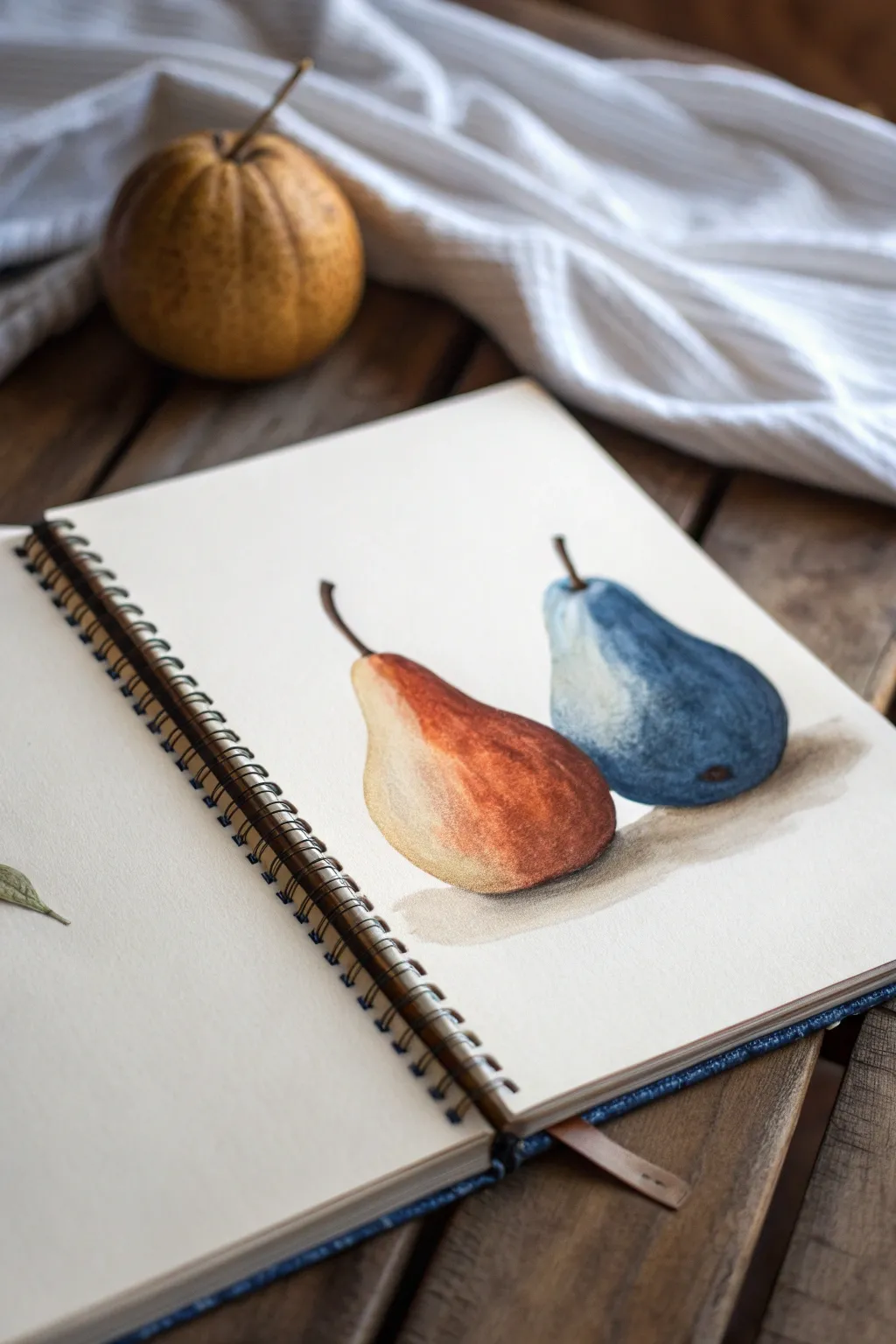
Master the art of value and temperature with this striking two-fruit study that uses a limited but potent color palette. By painting one pear in warm russet tones and its twin in cool indigo, you’ll learn how opposing colors can create volume and visual harmony on the page.
Detailed Instructions
Materials
- Spiral-bound sketchbook (heavyweight mixed media or watercolor paper)
- Watercolor paints (Burnt Sienna, Yellow Ochre, Indigo, Ultramarine Blue, Burnt Umber)
- Round brushes (sizes 4 and 8)
- Pencil (HB) for light sketching
- Kneaded eraser
- Clean water jar and paper towels
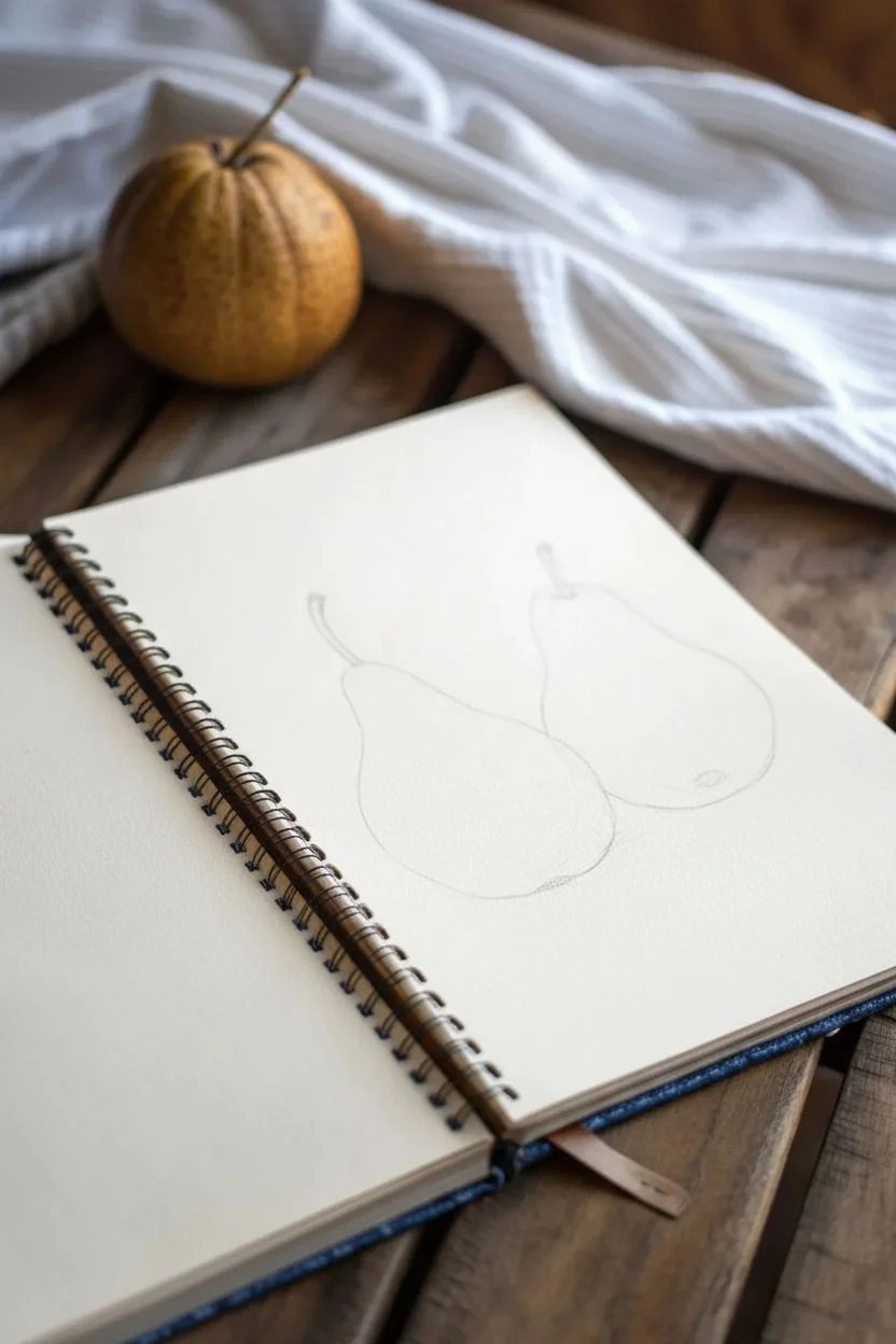
Step 1: Sketching the Shape
-
Outline the left pear:
Begin on the left side of your page with an HB pencil. Lightly sketch a pear shape that leans slightly to the right. Keep the bottom heavy and round, tapering up to a narrow neck. -
Outline the right pear:
To the right and slightly behind the first shape, draw the second pear. This one should lean inward to the left, mimicking the curve of the first fruit to create a pleasing interaction between the two forms. -
Add stems and refine:
Draw slender stems emerging from the tops of both pears. The left stem should curve left, and the right stem should curve right. use your kneaded eraser to lift almost all the graphite until only a faint ghost image remains.
Muddy colors?
If your blue and brown pears accidentally touch while wet, they will mix into gray mud. Ensure the first pear is bone-dry before starting the second one or leave a tiny hairline gap between them.
Step 2: The Warm Pear (Left)
-
Yellow ochre wash:
Mix a watery wash of Yellow Ochre. Using your larger round brush, cover the entire body of the left pear, leaving a small sliver of white paper on the upper left shoulder for a highlight. -
Introduce burnt sienna:
While the yellow layer is still damp (wet-on-wet), drop in diluted Burnt Sienna on the right side of the pear’s belly. Let the pigment bloom naturally into the yellow to create soft transitions. -
Deepen the shadows:
Mix Burnt Sienna with a tiny touch of Burnt Umber for a darker reddish-brown. Apply this along the bottom edge and the far right curve to establish the core shadow. -
Paint the stem:
Switch to your smaller brush. Using a thick mix of Burnt Umber, paint the stem with a single, confident stroke, slightly widening it where it joins the fruit.
Level Up: Salt Texture
While the paint on the pears is still wet, sprinkle a few grains of table salt onto the darkest shadow areas. Once dry, brush it off to reveal unique, speckled textures.
Step 3: The Cool Pear (Right)
-
Pale blue base:
Clean your brush thoroughly. Create a very dilute wash of Indigo or Payne’s Gray. Paint the right pear, again reserving a crisp white highlight on the upper left side. -
Building saturation:
Load your brush with a richer mix of Indigo or Ultramarine. Apply this to the right side of the fruit while the paper is still moist, focusing the deepest color on the lower right curve where the shadow would naturally fall. -
Adding texture:
Once the blue layer is semi-dry, use a slightly drier brush to dab a few darker blue spots near the bottom to suggest the pear’s skin texture. Add a tiny dark dot at the base for the blossom end. -
Cool stem detail:
Paint the second stem using a dark brown, but mix in a touch of blue to harmonize it with the cool fruit. Keep the line crisp.
Step 4: Grounding and Final Touches
-
Mixing a shadow gray:
Combine your leftover brown and blue paints on your palette to create a neutral shadowing gray. It should be transparent and watery. -
Cast shadow placement:
Paint a horizontal shadow underneath both pears. I find it works best start directly under the fruit where the shadow is darkest, then pull the color out to the right, letting it fade into the paper white. -
Softening edges:
Before the shadow dries completely, run a clean, damp brush along the outer edges of the cast shadow to soften it, ensuring it doesn’t look like a cutout. -
Evaluate values:
Step back and look at your contrast. If the dark sides of the pears look too pale, glaze a final layer of your shadow colors (rust and deep blue) over the dried paint to punch up the volume.
Close your sketchbook knowing you’ve successfully balanced temperature and value in a classic still life composition
BRUSH GUIDE
The Right Brush for Every Stroke
From clean lines to bold texture — master brush choice, stroke control, and essential techniques.
Explore the Full Guide
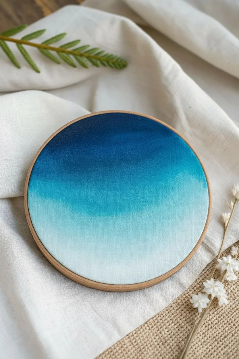
Abstract Color Gradient Bands
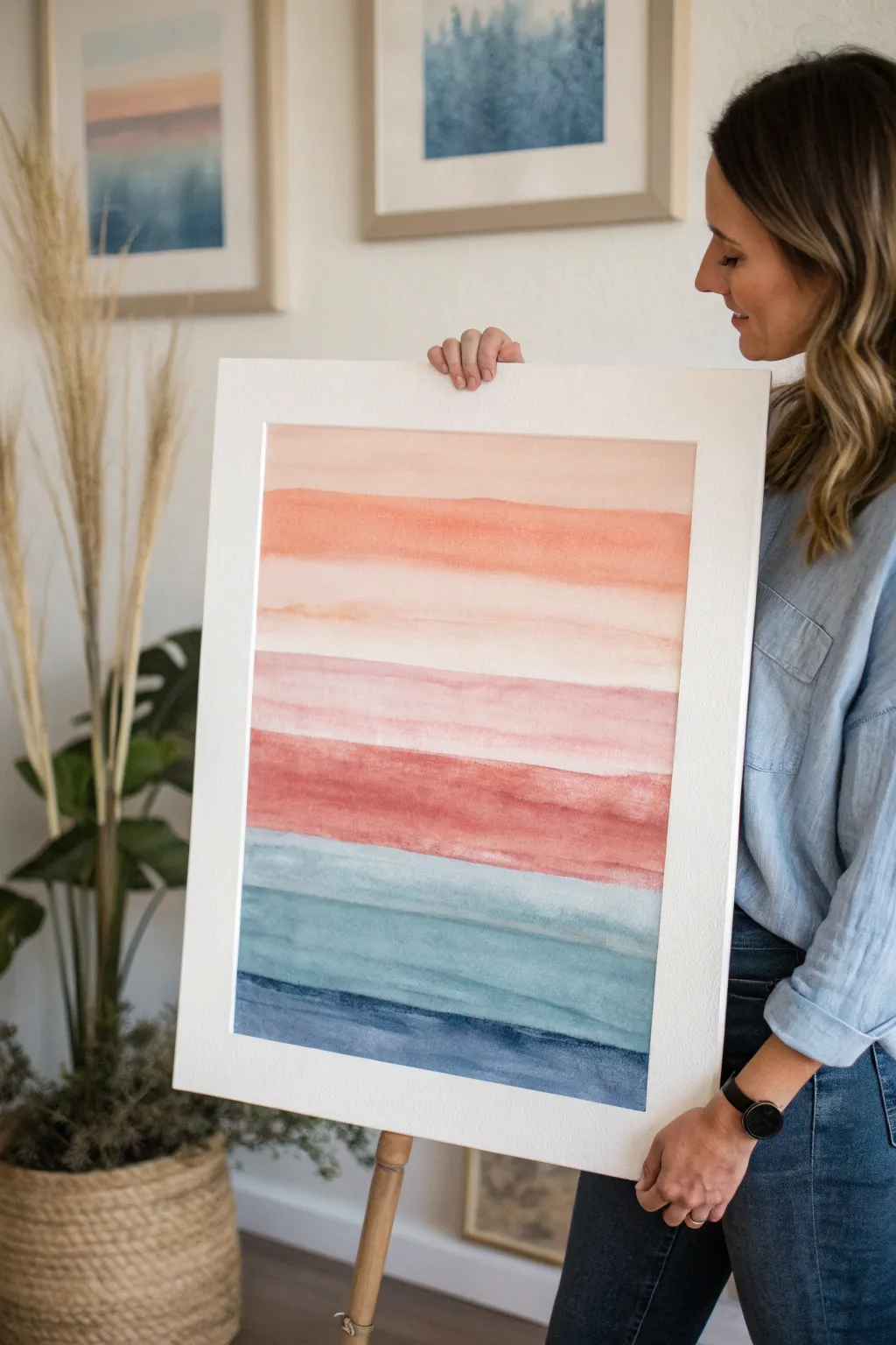
Capture the serene transition of a sunrise meeting the sea with this stunning horizontal gradient study. This large-scale watercolor piece uses broad, fluid strokes to blend soft warm peaches into deep, cool indigos, creating a calming focal point for any room.
Step-by-Step Guide
Materials
- Large sheet of cold press watercolor paper (minimum 18×24 inches)
- Watercolor paints: Peach, Coral/Terracotta, Crimson, Teal/Turquoise, Indigo
- Large flat wash brush (2-inch or wider)
- Round watercolor brush (size 10 or 12)
- Clean water containers (2)
- Painter’s tape or masking tape
- Rigid drawing board or work surface
- Paper towels
- White or mat board frame for finishing
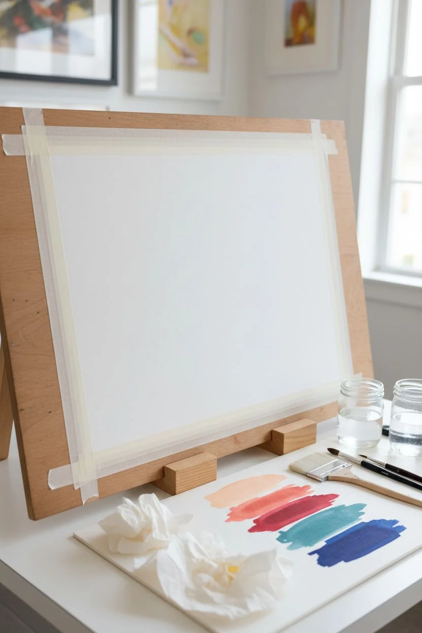
Step 1: Preparation and Palette Setup
-
Secure Your Paper:
Begin by taping down all four edges of your large watercolor paper onto your rigid board. Ensure the tape is pressed firmly to prevent paper buckling when wet. -
Pre-mix Your Palette:
Since this project requires working quickly while the paper is damp, pre-mix generous puddles of your five key colors: pale peach, warm coral, deep crimson, muted teal, and deep indigo. Test the colors on a scrap piece of paper to ensure the transition creates a harmonious gradient. -
Slight Incline:
Prop up the top of your drawing board slightly (by about 2-3 inches). This allows gravity to help the water and pigment flow naturally downward, assisting your gradients.
Fixing Water Blooms
If water back-runs into a drying section and creates a ‘cauliflower’ bloom, wait for it to fully dry. Then, gently scrub the hard edge with a barely damp stiff brush to soften it.
Step 2: Painting the Gradient
-
Wet the Top Section:
Using your large wash brush and clean water, dampen the top 4 inches of the paper. You want an even sheen, not puddles. -
First Band: Soft Peach:
Load your brush with the pale peach mixture. Apply a broad horizontal stroke across the very top wet area. Let the color naturally bloom into the water. -
Transitioning to Coral:
While the bottom edge of the peach is still wet, clean your brush slightly and pick up the coral/terracotta color. Paint a band directly below the peach, allowing the top edge of the coral to touch the wet peach band so they bleed together softly. -
Adding Texture:
For that organic watercolor look, don’t overwork the stroke. I like to let the brush skip slightly or leave heavier deposits of pigment in some areas to create natural variation. -
The Middle Warmth:
Move to the crimson or deeper red tone. Apply this band across the middle section. These central bands should be slightly less watery than the top layer to heighten color intensity. -
The Crucial Cool Shift:
Before moving to the cool colors, leave a tiny, barely perceptible drying gap or use a slightly drier brush for the first teal stroke. This prevents the red and green-blue from mixing into muddy brown. -
Teal Waters:
Apply the teal band. If the red above is dry, use a clean damp brush to gently soften the edge between the dry red and wet teal, creating a hazier transition. -
The Deepest Blue:
Finally, load your brush with the heavy indigo pigment. Paint the bottom-most band, ensuring it is the darkest and most saturated section of the painting to anchor the composition. -
Refining Edges:
While the paint is still settling, use a clean, damp round brush to gently feather any hard lines between color bands that look too separated, but maintain the distinct horizontal stripe feel.
Step 3: Finishing and Framing
-
Allow to Dry Completely:
Let the painting dry flat. This might take several hours due to the heavy washes. Resist the urge to use a hair dryer, as it can push pigment around and ruin the soft granulations. -
Remove Tape:
Once bone dry, carefully peel the tape away at a 45-degree angle to reveal your crisp white borders. -
Flattening:
If the paper has buckled slightly, place the artwork face down on a clean sheet, cover the back with another clean sheet, and pile heavy books on top overnight. -
Mounting:
Center your artwork on a large white mat board. The wide white border creates a gallery-quality look that enhances the colors. -
Final Assembly:
Place the matted artwork into your frame, ensure the glass is clean, and seal the back.
Pro Tip: Color Harmony
To unify the palette, mix a tiny drop of the crimson into your indigo, and a tiny drop of peach into your teal. Sharing pigments across bands makes the gradient feel seamless.
Hang your new masterpiece in a well-lit area to let those watercolor textures truly shine
Rock Painting Mini Motifs
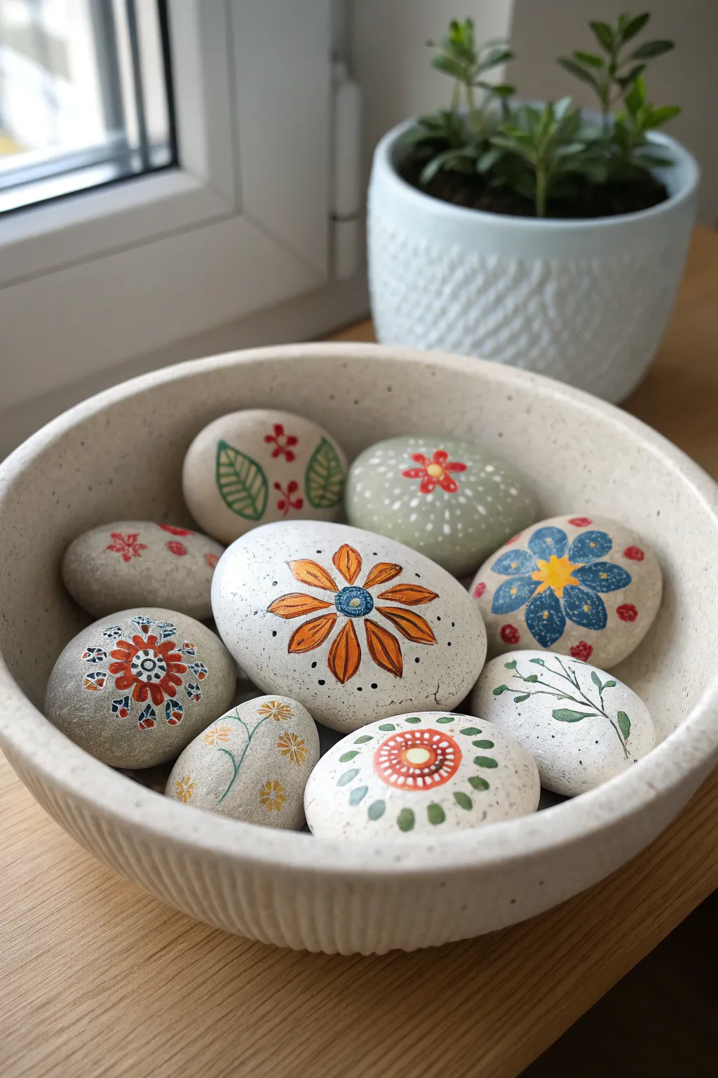
Bring the garden inside with this charming collection of hand-painted river rocks featuring delicate floral patterns and geometric mandalas. The soft, earthy palette combined with intricate details creates a relaxing craft that results in beautiful, tactile decor pieces.
How-To Guide
Materials
- Smooth river rocks (various sizes, round/oval)
- Acrylic paints (white, orange, red, green, blue, yellow)
- Fine tip paint pens (black, white, gold)
- Detail brushes (sizes 0 and 00)
- Dotting tools or toothpicks
- Pencil for sketching
- Spray sealer (matte or satin finish)
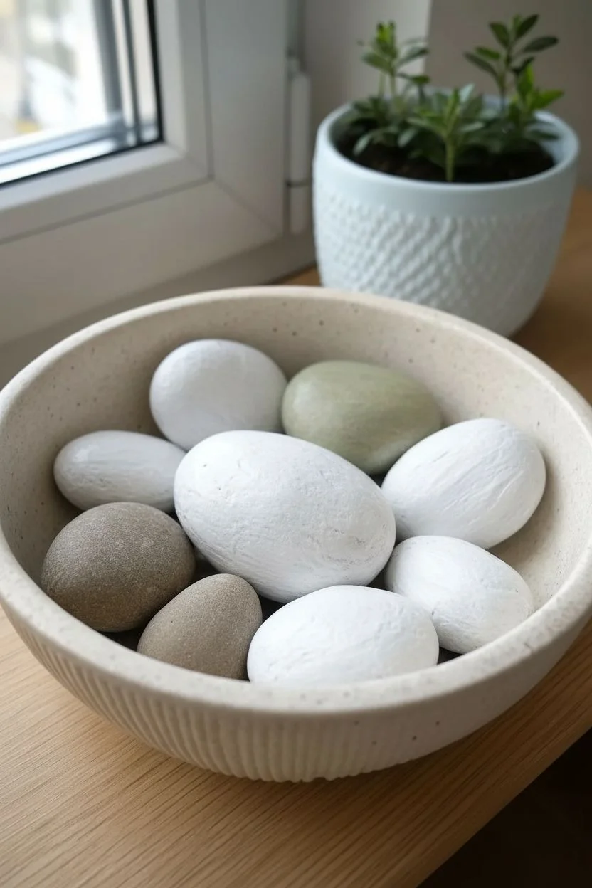
Step 1: Preparation & Base Layers
-
Clean and dry:
Begin by thoroughly washing your river rocks with warm soapy water to remove any dirt or grease, then let them dry completely. -
Apply base coats:
Select a few rocks to paint fully with white acrylic paint. It will likely take 2-3 coats to get solid coverage, letting each layer dry in between. Leave other rocks natural for a rustic look. -
Create a wash:
For the light green rock, mix a tiny drop of green paint with white and a touch of water. Apply a thin, semi-opaque layer over a natural stone to create a soft, muted background.
Step 2: Designing the Large Focal Flower
-
Sketch the center:
On your largest white stone, lightly pencil a small circle in the middle for the flower center. -
Add petals:
Draw eight elongated teardrop shapes radiating from the center circle to form the main petals. -
Paint the petals:
Fill the petals with a warm orange paint. You might need a second coat to make the color pop against the white background. -
Detail the center:
Paint the center circle blue. Once dry, use a fine brush or white paint pen to add a tiny grid or spiral pattern inside the blue. -
Outline and accent:
Use a fine liner brush with black paint (or a black paint pen) to outline each petal and the center. Add small dots or lines inside the petals for texture.
Uneven Coverage?
If your white base coat looks streaky, sponge the paint on rather than brushing. This stippling technique creates a solid, uniform surface without brush marks.
Step 3: Creating the Blue Daisy Rock
-
Lay out the shape:
On a natural grey stone, paint five large blue heart-shaped petals meeting at a central point. -
Add the center:
Paint a bright yellow starburst or circle in the middle where the petals touch. -
Decorate petals:
Once the blue is dry, use a white paint pen to draw small dots, lines, or snowflake-like patterns inside each blue petal. -
Finish with tiny blooms:
Surround the main blue flower with tiny red dots or mini-flowers scattered around the stone’s edge for a border effect.
Add Some Shine
Level up by adding tiny accents of metallic gold paint to the center of your flowers or as tiny dots in the mandala patterns for a subtle shimmer.
Step 4: Painting Delicate Vines & Mandalas
-
Draft the vine:
On a smaller white stone, paint a thin, curving black or dark green line across the surface. -
Add leaves:
Paint small, simple leaf shapes branching off the vine. Keep them loose and airy. -
Start a mandala:
For the geometric rocks, start with a central dot (like red or orange) and work outward in concentric circles. -
Layer dots and diamonds:
Paint a ring of small diamonds or triangles around your center dot. I find it helpful to paint north, south, east, and west points first to keep it symmetrical. -
Add intricate details:
Use your finest brush or a toothpick to place tiny white or contrasting dots inside your larger painted shapes to add complexity.
Step 5: Finishing Touches
-
Clean up lines:
Check all your designs for rough edges. You can touch up the background paint (white or natural grey) to fix any mistakes. -
Final drying:
Allow all rocks to cure for at least 24 hours to ensure the paint adheres perfectly to the stone surface. -
Seal the art:
Spray the rocks with a matte or satin sealer. This protects the paint from chipping and gives them a uniform professional finish.
Arrange your finished pebbles in a shallow bowl or scatter them on a windowsill to enjoy your miniature art garden

PENCIL GUIDE
Understanding Pencil Grades from H to B
From first sketch to finished drawing — learn pencil grades, line control, and shading techniques.
Explore the Full Guide
Doodle Art Inside Overlapping Shapes
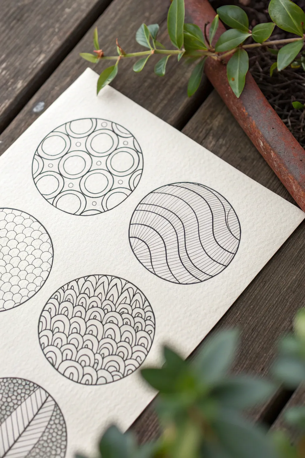
This meditative project focuses on filling simple circular forms with intricate, repetitive patterns to create a visually striking texture study. The contrast between bold, black ink and heavy, textured paper gives these doodles a polished, professional feel.
Step-by-Step Tutorial
Materials
- Heavyweight watercolor paper or mixed media paper (cold press texture recommended)
- Black drawing pens (fineliners) in various sizes (e.g., 0.1, 0.3, 0.5, 0.8mm)
- Circle stencils, a compass, or round objects to trace (various sizes)
- Pencil (HB or 2B)
- Soft eraser
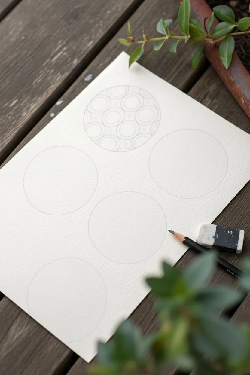
Step 1: Preparation and Layout
-
Paper selection:
Choose a heavyweight paper with visible tooth or texture. The slight roughness of cold press watercolor paper adds character to the ink lines. -
Drafting the circles:
Using a pencil and your chosen circular template (a compass or jar lid works great), lightly draw five large circles spread across the page. Allow them to touch or slightly overlap if desired, though the example shows them spaced out. -
Lightening guidelines:
Gently roll a kneaded eraser over your pencil circles. You want the lines valuable enough to see, but faint enough that they won’t interfere with your ink later.
Fixing Wobbly Lines
Don’t panic if a line isn’t perfectly straight. Simply thicken the line intentionally to mask the wobble, making it look like a deliberate stylistic choice.
Step 2: Pattern 1: The Scaled Grid
-
Drawing the grid:
In the lower-left circle, start by drawing a simple grid of curved lines that mimic fish scales or roof tiles. I find it easiest to work from bottom to top. -
Adding weight:
Switch to a slightly thicker pen (0.3mm) and re-trace the top of each ‘scale’ curve to make the pattern pop against the white background.
Step 3: Pattern 2: The Retro Circles
-
Mapping the interior:
For the top-left circle, draw smaller circles inside the main boundary. Try to arrange them in a somewhat organized cluster. -
Concentric detailing:
Inside each small circle, draw a second, smaller circle. This creates a donut or washer shape. -
Filling the negative space:
Use a 0.5mm pen to darken the tiny diamond-shaped gaps between the circles. This high-contrast step is crucial for defining the forms.
Level Up: Gold Accents
Use a metallic gold gel pen or gold leaf to fill in specific segments—like the center of the retro circles or alternating waves—to add a luxurious finish.
Step 4: Pattern 3: Wavy Contours
-
Drawing major waves:
In the middle-right circle, draw thick, flowing wavy lines horizontally across the shape using a 0.8mm pen. -
Hatching the bands:
Switch to your finest pen (0.05 or 0.1mm). Fill every other band with vertical hatching lines. Keep these lines very close together for a shading effect. -
Alternating texture:
Leave the alternating bands completely empty to create a rhythm of dense texture and open space.
Step 5: Pattern 4: Organic Petals
-
Base layer petals:
Move to the bottom-center circle. Start at the bottom edge and draw two rows of small, rounded humps (like hills). -
Layering up:
Continue stacking these rounded shapes upward, but elongate them slightly as you reach the top so they look like leaf or petal tips. -
Detailing the humps:
Inside every single loop or petal, draw two smaller concentric loops. This mimicry of the outer shape creates a mesmerizing, vibrating effect.
Step 6: Pattern 5: Leaf Sections
-
Dividing the circle:
For the final partial circle at the bottom, draw a large diagonal leaf shape that cuts through the center. -
Veining:
Fill the leaf shape with diagonal parallel lines meeting at a center spine. -
Background texture:
Fill the remaining space outside the leaf with tiny, tightly packed circles (neighboring bubbles) to create a dark, textured background.
Step 7: Finishing Touches
-
Define the perimeter:
Once all patterns are dry, take your thickest pen (0.8mm) and trace over the original main circle outlines to frame your artwork clearly. -
Clean up:
Wait at least 15 minutes for the ink to fully cure, then gently erase any remaining pencil guidelines to leave a crisp black and white finish.
Enjoy the rhythmic process of filling these shapes and watching your page transform into a gallery of textures
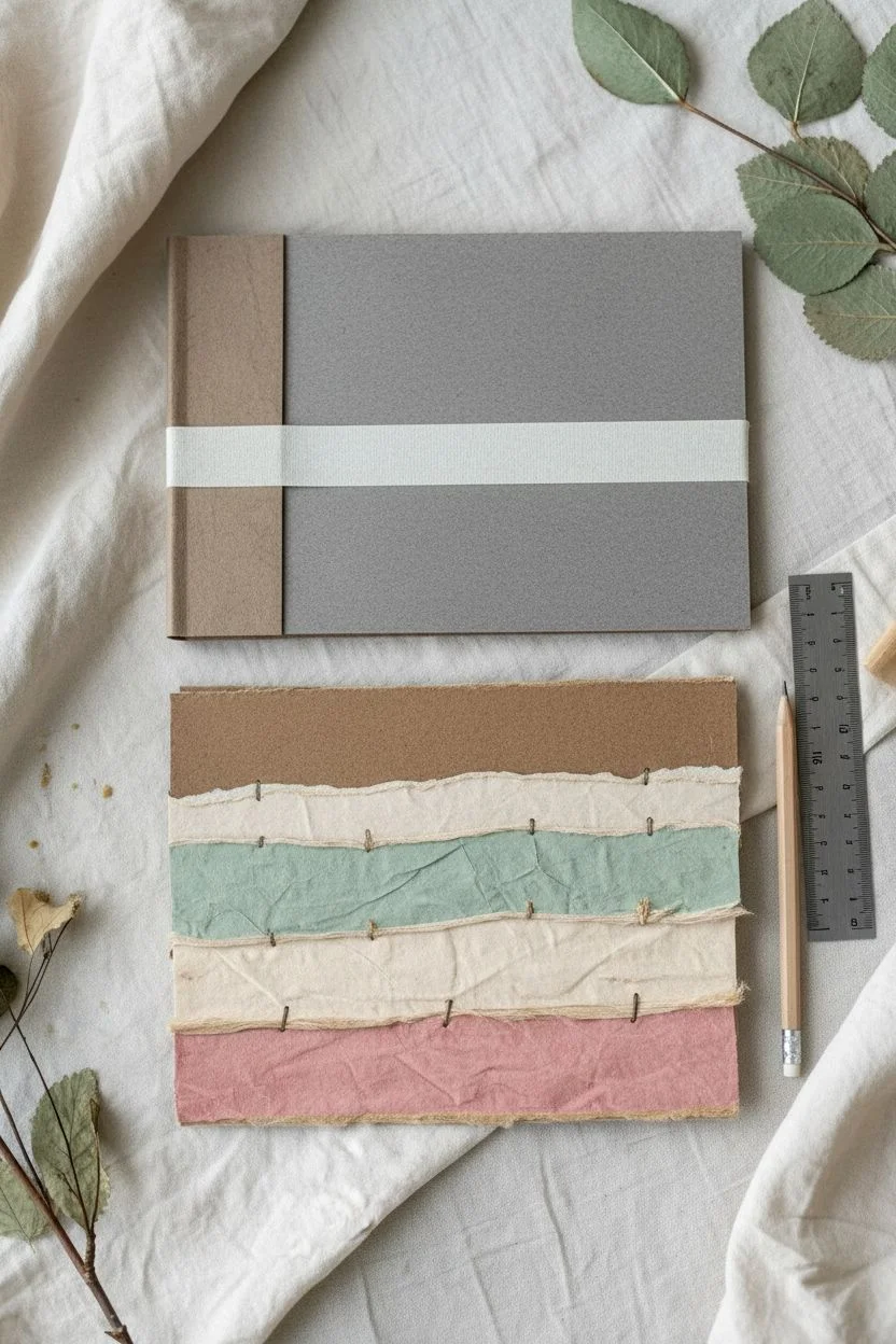
Mixed Media Paper Collage Base
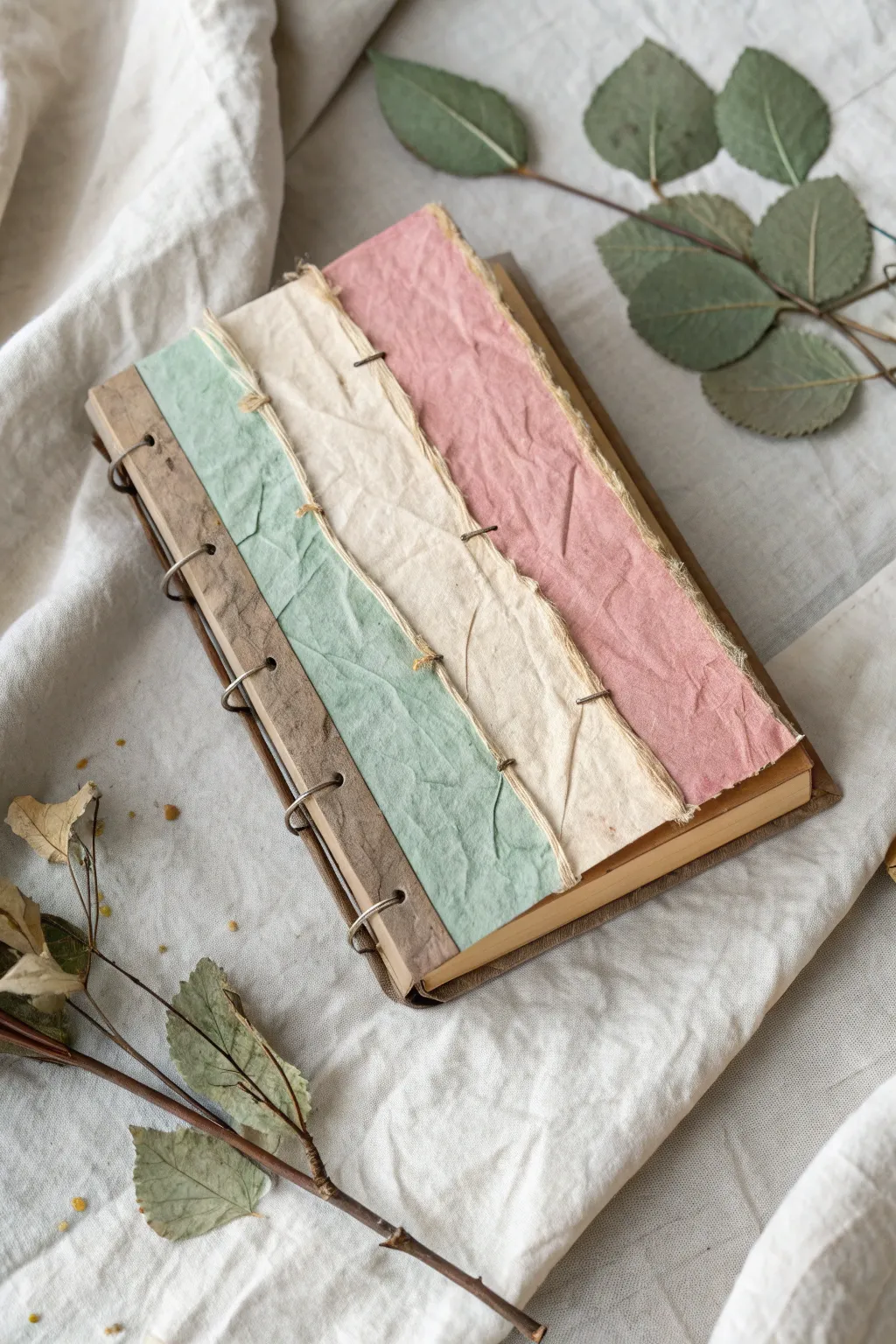
This rustic, textured journal combines the charm of handmade paper with an exposed spine binding technique. By layering torn strips of muted, earthy paper and sturdy cardstock, you’ll create a tactile cover that feels as good to hold as it does to fill with your ideas.
Step-by-Step Guide
Materials
- Heavyweight greyboard or bookbinding board (A5 size)
- Textured colored paper (dusty pink, cream, sage green, kraft brown)
- Standard sketchbook paper or mixed media paper (for pages)
- Metal binding rings or heavy-gauge wire
- PVA glue or heavy gel medium
- Awl or heavy-duty hole punch
- Bone folder
- Ruler
- Pencil
- Waxed linen thread or embroidery floss (neutral color)
- Needle
- Clips or clamps
Step 1: Preparing the Cover Base
-
Cut the board:
Cut your greyboard to your desired journal size (e.g., 5.5 x 8.5 inches) using a ruler and craft knife. You will need a front cover and a back cover. -
Create the spine hinge:
For the front cover, measure about 1 inch from the left edge (the spine edge). Cut this strip off completely. This separated strip will act as your binding hinge allowing the cover to open fully. -
Rejoin the hinge:
Place the 1-inch strip back next to the main cover piece, leaving a tiny gap (about 1/8 inch). Bridge this gap by gluing a strip of strong fabric or Tyvek tape across both pieces on the *inside* face only. This creates a flexible hinge. -
Tear the decorative paper:
Take your colored textured papers. Instead of cutting them with scissors, tear them lengthwise to create soft, deckled edges. You need four distinct strips: kraft brown (for the spine), green, cream, and pink.
Step 2: Collaging the Cover
-
Apply the first strip:
Brush an even layer of PVA glue onto the 1-inch spine strip you created earlier. Adhere the torn kraft brown paper here, wrapping the excess around the left edge to the back for a clean finish. -
Layer the green strip:
Apply the sage green strip next. It should slightly overlap the raw edge of the kraft paper, covering the hinge gap area. I like to smooth this down gently with a bone folder to ensure good adhesion without flattening the paper’s texture too much. -
Add the cream strip:
Glue the cream strip so it overlaps the green one. The torn edge should face the right side of the book. -
Finish with the pink strip:
Finally, glue the dusty pink strip to cover the remaining board on the right side. Wrap the excess paper around the right, top, and bottom edges of the board to tidy up the cover.
Wrinkled Paper?
If your paper bubbles when glued, you likely used too much glue. Apply a thin, even coat and smooth specifically from the center outward with a brayer.
Step 3: Stitching the Texture
-
Pre-pierce holes:
Along the seams where the paper strips overlap (green/cream and cream/pink), use your awl to poke pairs of small holes about 1 inch apart vertically. -
Add decorative stitches:
Thread your needle with waxed linen thread. Sew simple stitches through these holes to visually ‘bind’ the paper strips together. This mimics the look of the photo and adds a wonderful tactile element. -
Secure the thread:
Tie off the threads on the inside of the cover. A dab of glue on the knots will keep them secure.
Tearing Technique
To get a specific torn shape, paint a line of water on the paper first. Wait 30 seconds for it to soak in, then pull gently apart along the wet line.
Step 4: Binding the Book
-
Prepare the signatures:
Fold your interior paper sheets in half to create signatures. Stack them to match the thickness of your spine. -
Mark binding holes:
On your cover’s spine strip (the kraft brown section), mark 5 equally spaced points for the rings. Use a template to ensure the back cover and all paper signatures are marked in the exact same spots. -
Punch the holes:
Using a heavy-duty punch or a drill for thick stacks, punch holes through the covers and paper signatures at your marked points. -
Insert the rings:
Feed the metal loose-leaf rings or wire loops through the back cover, the stack of paper, and finally the front cover. -
Close the binding:
Snap the rings shut or twist the wire closed with pliers. Ensure the closures are tucked inside the back of the book so they don’t snag. -
Final touches:
Glue a decorative lining paper on the inside of the front and back covers to hide the thread knots and the hinge tape mechanism.
Now you have a fully customized journal ready to house your next wave of inspiration


Watercolor Word Art
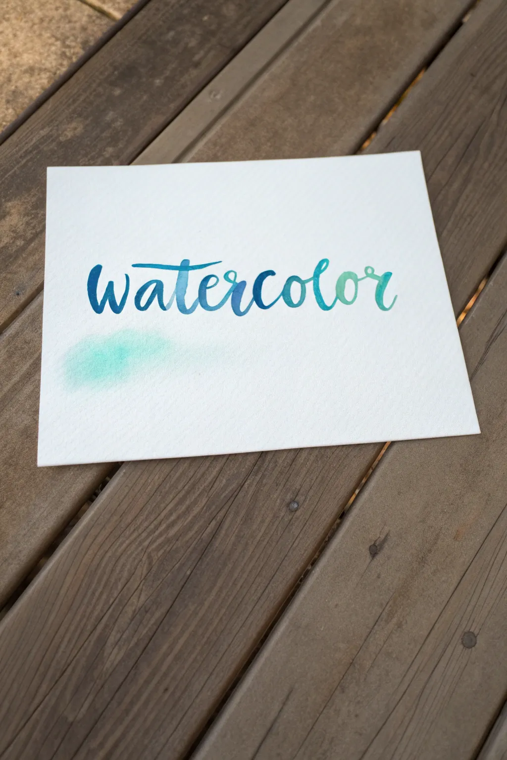
Master the art of blending with this simple yet striking hand-lettered piece that features a seamless gradient shift. You will learn to control pigment density to create a beautiful ombre effect from deep ocean blue to soft mint green.
Step-by-Step
Materials
- Cold press watercolor paper (140lb/300gsm recommended)
- Round watercolor brush (size 4 or 6)
- Watercolor paints (Indigo or Prussian Blue, and Viridian or Phthalo Green)
- Clean water jar
- Paper towel
- Pencil and eraser (optional for guidelines)
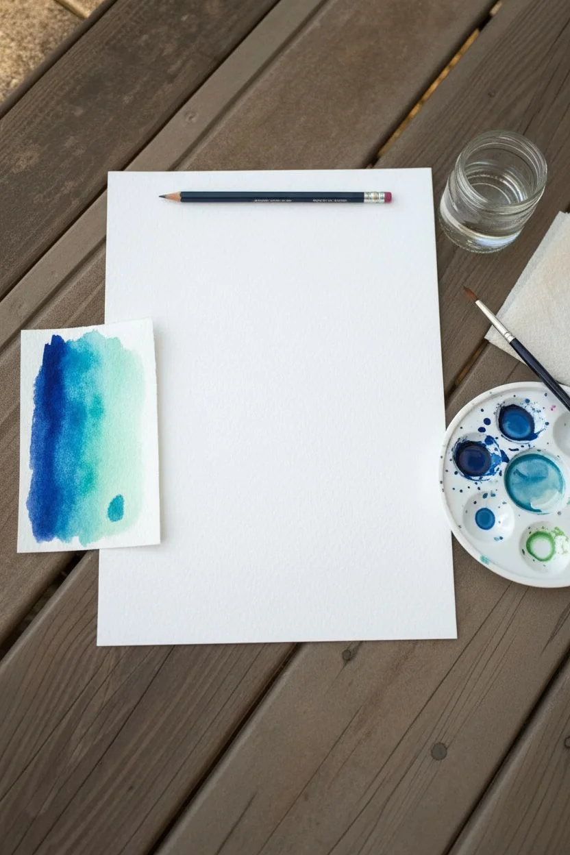
Step 1: Preparation & Practice
-
Paper selection:
Begin with a high-quality sheet of cold press watercolor paper. The texture helps hold the pigment in place and adds a lovely character to the lettering. -
Prepare your palette:
Activate your watercolor pans or squeeze tube paint onto a palette. You will need a concentrated dark blue (like Indigo) and a vibrant turquoise or green. -
Create a gradient test:
On a scrap piece of paper, practice blending your dark blue into your green. Mix them in the middle on the palette to find a nice transitional teal shade before you start the final piece. -
Pre-mixing colors:
Prepare three distinct puddles on your palette: pure dark blue, a mid-tone teal mix, and a watery light green. Having these ready prevents the paint from drying on the paper while you mix.
Water Control Tip
If a puddle forms at the bottom of a letter, dry your brush on a paper towel and touch the tip to the puddle to soak up excess water like a sponge.
Step 2: Drafting
-
Light sketching:
Using a pencil, very lightly sketch out the word ‘watercolor’ in a loose, bouncy cursive script. Keep the pressure minimal so the lines are easy to erase later. -
Check spacing:
Verify that your letters are evenly spaced and centered on the paper. The word ‘watercolor’ is quite long, so ensure you have enough room for the final ‘r’.
Step 3: lettering the Gradient
-
Start with the ‘w’:
Load your brush with the concentrated dark blue. Paint the first letter ‘w’ using varied pressure—push down for thick downstrokes and lift up for thin upstrokes. -
Transitioning the ‘a’:
While the ‘w’ is still wet, rinse your brush slightly and pick up a tiny bit of the mid-tone teal. Start the ‘a’ so it touches the wet tail of the ‘w’, allowing the dark blue to bleed naturally into the next letter. -
Lettering ‘t’ and ‘e’:
Continue with the darker teal mixture for the ‘t’ and ‘e’. I find that adding just a drop of water to the brush here helps lighten the value naturally as you move right. -
Crossing the ‘t’:
Go back and cross the ‘t’ immediately with a long, sweeping stroke that hovers over the previous letters. Use the dark blue for this to maintain balance with the start of the word. -
The middle section:
For the ‘r’, ‘c’, and ‘o’, switch entirely to your mid-tone teal mix. Ensure your brush is wet enough to keep the edges crisp but pool slightly in the downstrokes. -
Shifting to green:
Rinse your brush thoroughly. Load it with the light turquoise or mint green shade. Paint the ‘l’ and connect it to the previous ‘o’, watching the colors merge. -
Refining the blend:
If the transition looks too harsh between letters, quickly touch the wet connection point with a clean, slightly damp brush to encourage the pigments to mingle. -
Finishing the word:
Complete the final ‘or’ using the lightest, most watery version of your green paint. The end of the word should look significantly lighter than the beginning. -
Adding the wash:
To create the soft smudge shown in the example, load a clean brush with very watery turquoise. Gently dab a small, irregular cloud of color beneath the first few letters. -
Softening the wash:
While the wash is wet, blot it gently with a paper towel if it becomes too dark. You want a subtle ‘ghost’ of color, not a heavy blob.
Make It Sparkle
Once the paint is dry, use a metallic gold gel pen to outline the letters or add small shadow lines to the downstrokes for an elegant finish.
Step 4: Final Touches
-
Drying time:
Allow the artwork to sit undisturbed until completely flat and dry to the touch. Watercolor often dries lighter, so be patient. -
Erase guidelines:
Once you are 100% certain the paint is bone dry, gently erase any visible pencil marks with a kneadable eraser to avoid smudging.
Display your beautiful gradient lettering on a desk or frame it for a splash of color
Dense Cityscape With Simple Perspective
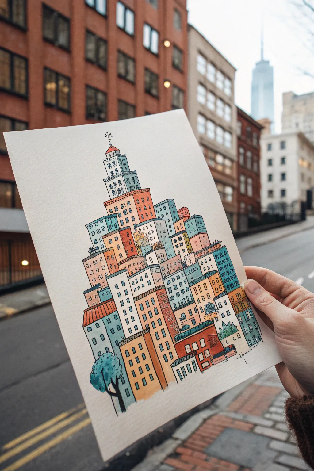
Construct a charming, densely packed urban tower filled with wonky windows and colorful facades. This illustration project combines the meditative quality of stacking shapes with vibrant ink and wash techniques.
Detailed Instructions
Materials
- Heavyweight drawing paper or hot-press watercolor paper
- Pencil (HB or 2H)
- Fine liner pen (black, waterproof, size 03 or 05)
- Watercolor paints or colored art markers
- Small round watercolor brush (size 4 or 6)
- Eraser
- Ruler (optional, for the initial axis)
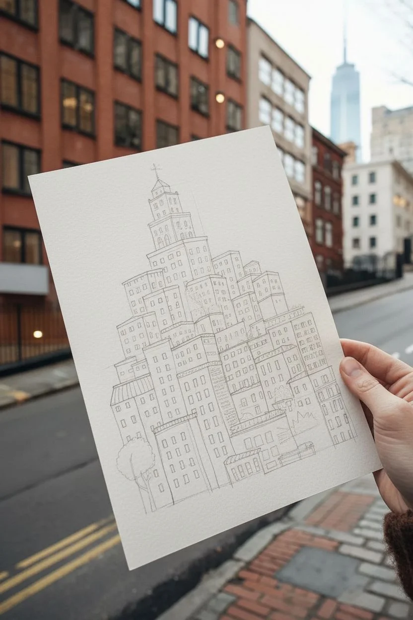
Step 1: Conceptualizing the Stack
-
Establish the Foundation:
Start by lightly sketching a central vertical axis on your paper. This invisible line will help keep your tower from leaning too far to one side as you build upwards. Draw a wide, uneven rectangle at the bottom to serve as the sturdy base. -
Draft the Building Blocks:
Begin stacking rectangular prisma shapes on top of each other. Think of this like playing Tetris; distinct blocks should nestle together. Vary the sizes—some squat and wide, some tall and thin. Don’t worry about perfect perspective; a flat, isometric-like look is part of the charm. -
Create the Pyramid Shape:
As you move higher, gradually reduce the total width of your cluster. The structure should taper roughly into a triangle or pyramid shape. Leave small gaps between some buildings to suggest alleys or setbacks. -
Top It Off:
At the very peak, add a singular, distinct tower. In the reference, this is a tiered white structure with a small spire. Sketch a tiny flag or weathervane at the absolute pinnacle to give it character. -
Detail the Facades:
Go back into each rectangular block and sketch grid lines for windows. Avoid using a ruler here; hand-drawn wobbly lines add whimsy. Mix up the window styles—some square grids, some tall arches, and some simple dots.
Step 2: Inking the Outline
-
Trace the Main Structure:
Using your waterproof fine liner, carefully trace the outer edges of your buildings. I prefer to make the outline of each major building block slightly bolder than the interior details to help them pop. -
Define the Windows:
Ink the window grids you sketched earlier. You can leave some windows open (just the frame) and fill others in solid black to create a sense of depth and unlit rooms. -
Add Texture and Roofing:
Identify the roofs of the lower buildings. Draw vertical lines or scalloped patterns to suggest shingles or standing seam metal roofs. This differentiates the top of one building from the face of the one behind it. -
Incorporate Tiny Details:
Look for empty spaces to add life. Sketch a tiny tree near the base (like the blue one in the example), add railings to a roof, or draw small potted plants on ledges. Erase all your pencil marks once the ink is dry.
Uneven Ink Lines?
Don’t stress over wobbly lines! In this style, ‘mistakes’ add architectural character. If a line goes astray, thicken it slightly to make it look intentional.
Step 3: Applying Color
-
Plan the Palette:
Select a limited color palette to keep the piece cohesive. The example uses muted oranges, teals, slate blues, and warm creams. Test your colors on a scrap piece of paper first to see how they look side-by-side. -
Wash the Facades:
Start painting the main body of the buildings. Since you are looking for a stylized effect, flat washes work best. Paint neighbor buildings in contrasting colors—if one is orange, make the one next to it blue or cream. -
Leave White Space:
Crucially, leave the top tower white or very pale gray to draw the eye upward. You can also leave the window panes white, or color them a very pale yellow or blue later. -
Paint the Roofs:
Use darker or more saturated versions of your facade colors for the roofs. For example, a light orange building might look good with a deep rust-colored roof. -
Shading and Depth:
Once the base layers are dry, mix a diluted grey or purple. Paint a thin shadow line on the side of the buildings that would be cast by the building next to it. This simple step instantly separates the flat shapes. -
Final Touches:
Paint the tree element with a loose, watery green or teal. If any ink lines look faded after painting, go over them one last time with your pen to crisp up the drawing.
Level Up: Hidden Life
Make the city feel lived-in by drawing tiny silhouettes of cats, birds, or people in a few random windows or standing on the rooftops.
Now you have a bustling, colorful metropolis captured on a single page, ready to be framed or gifted
Animal Portrait With Shimmery Highlights
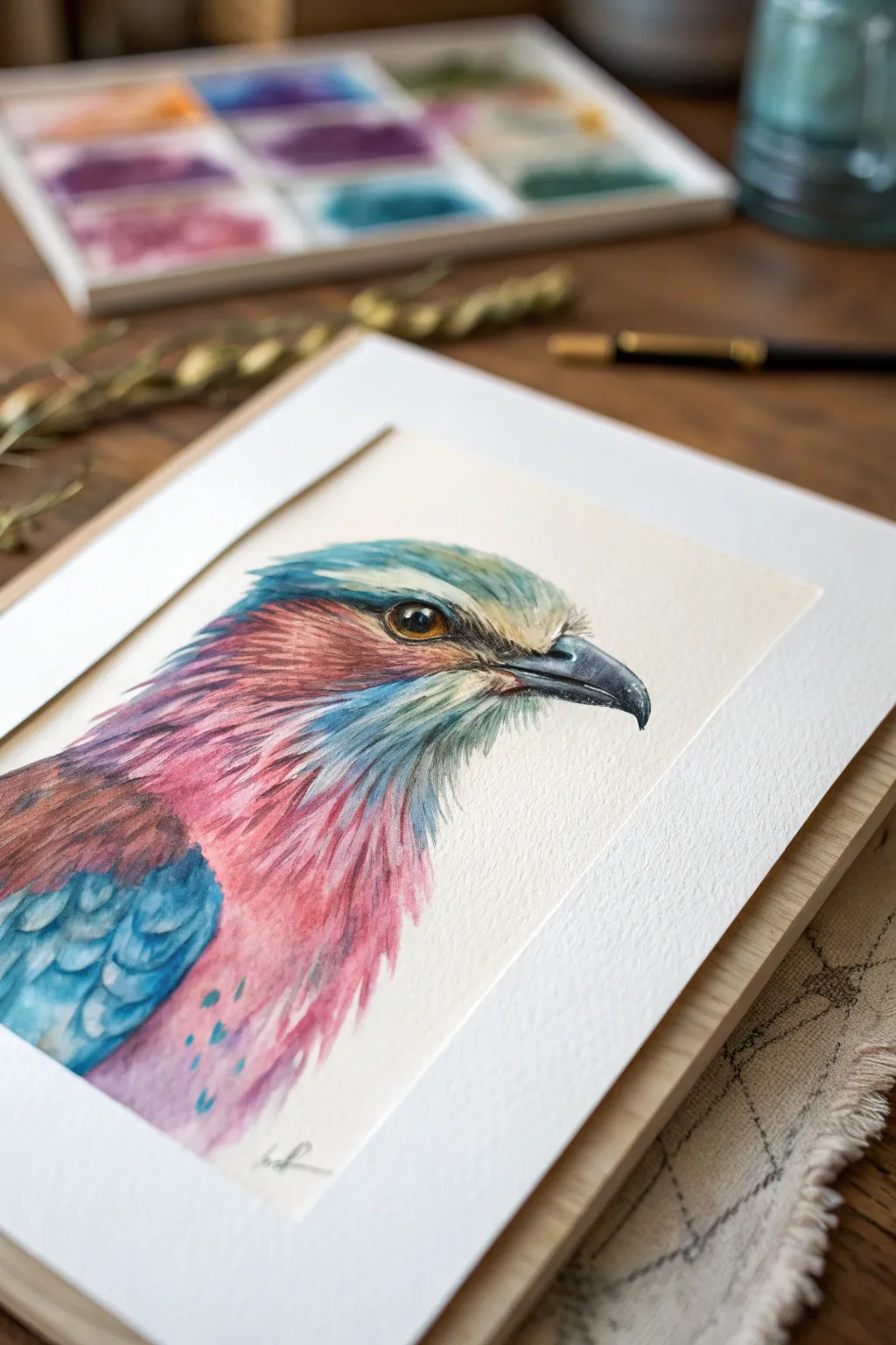
Capture the iridescent beauty of nature with this vibrant watercolor portrait of a Lilac-breasted Roller. This project combines wet-on-wet blending for soft feathers with fine details and subtle metallic accents to bring the bird’s stunning plumage to life.
Step-by-Step
Materials
- Hot press watercolor paper (300gsm)
- Watercolor paints (Turquoise, Magenta, Indigo, Burnt Sienna, Payne’s Gray, Yellow Ochre)
- Metallic watercolor or iridescent medium (Gold or Pearl)
- Round brushes (Size 8 for washes, Size 2 and 00 for details)
- Graphite pencil (HB) and kneaded eraser
- Masking fluid (optional)
- Two jars of water
- Paper towels
- White gel pen or gouache
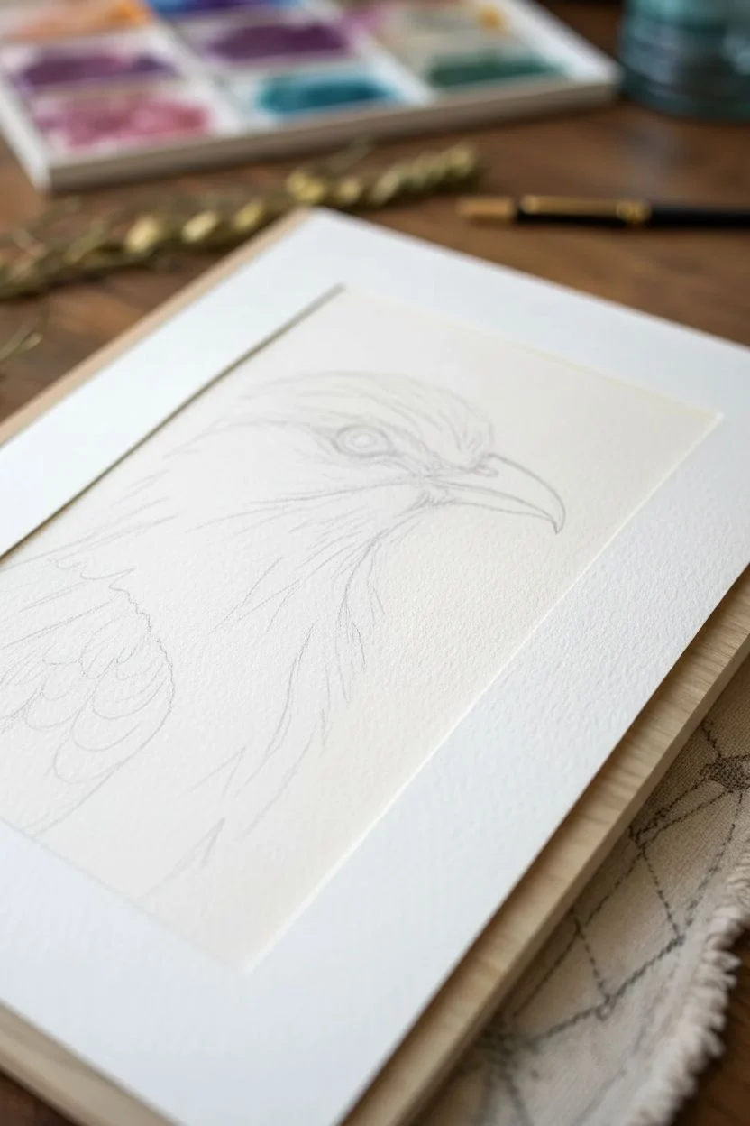
Step 1: Sketching and Preparation
-
Outline the Subject:
Begin with a light pencil sketch of the bird’s profile. Focus on the beak shape, the eye placement, and the general flow of the feathers down the neck. Keep lines faint so they don’t show through the transparent watercolor layers. -
Preserve Highlights:
If you are using masking fluid, apply a tiny dot to the bird’s eye to preserve the catchlight. You can also add thin strokes along the beak’s ridge or feather tips where you want pure white paper to shine through later.
Step 2: Painting the Eye and Beak
-
Base Eye Color:
Start with the eye to anchor the portrait. Paint a wash of Yellow Ochre mixed with a touch of Burnt Sienna. Let it dry completely. -
Dedepening the Eye:
Add a darker ring around the pupil using concentrated Burnt Sienna or Sepia. Leave the center lighter to create depth and roundness. -
Pupil and Definition:
Fill the pupil with black or deep Payne’s Gray. Carefully outline the eye with a fine liner brush using a dark grey mix to simulate the delicate skin folds. -
Beak Structure:
Wash the beak with a diluted Payne’s Gray. While still damp, drop in darker pigment towards the tip and the center line where the mandibles meet to create volume.
Pro Tip: Directional Strokes
Always paint your brushstrokes in the direction the feathers grow. This builds realistic anatomy even in loose, watery areas.
Step 3: Creating the Plumage
-
Wet-on-Wet Head Feathers:
Wet the crown area with clean water. Drop in turquoise and a hint of muted green, letting the colors bleed naturally towards the back of the head. I find lifting a little pigment with a dry brush helps create a soft highlight here. -
Face Mask Detail:
Switch to a smaller brush to paint the characteristic reddish-brown swoops around the eye and cheek. Use short, directional strokes to mimic the texture of small feathers. -
The Lilac Chest:
For the signature lilac breast, mix Magenta with a tiny bit of Indigo. Apply this to the chest area using a wet-on-wet technique, allowing the paint to diffuse softly into the white paper below. -
Wing Feathers Base:
Paint the visible wing shoulder with a vibrant turquoise. Use more pigment and less water here to get a strong, saturated block of color. -
Defining Feathers:
Once the base washes are dry, use your size 2 brush to paint ‘u’ shaped shadows on the turquoise wing feathers using a mix of Indigo and Turquoise. This creates the layered scale effect. -
Neck Texture:
Connect the head and chest colors using short, flicking strokes. Allow the turquoise of the head to overlap slightly with the lilac chest to blend the transition naturally.
Troubleshooting: Muddy Colors?
If the lilac and turquoise turn grey where they meet, let the first color dry completely before glazing the second color over it.
Step 4: Finishing Details and Shimmer
-
Deepening Shadows:
Mix a dark purple-grey. Add contrast under the beak, behind the eye, and between the wing feathers to make the form pop. -
Fine Hair Strokes:
Using your smallest 00 brush and a fairly dry mix of Payne’s gray, add tiny hair-like strokes around the beak base and chin area for realistic texture. -
Adding the Shimmer:
Load a brush with your metallic watercolor or iridescent medium. Lightly glaze over the turquoise head feathers and the wing shoulder. In the light, this will give the bird a magical, iridescent quality. -
Final Highlights:
Remove any masking fluid. If the eye highlight isn’t bright enough, use a white gel pen or a dot of white gouache to re-establish that spark of life. -
Splatter Effect:
For a loose, artistic finish, load a brush with watered-down turquoise and tap it against a pencil to create tiny splatters on the lower feathers.
Once dry, frame your shimmering bird portrait in a simple mount to let those iridescent details truly shine
Black Paper Neon Nature Drawing
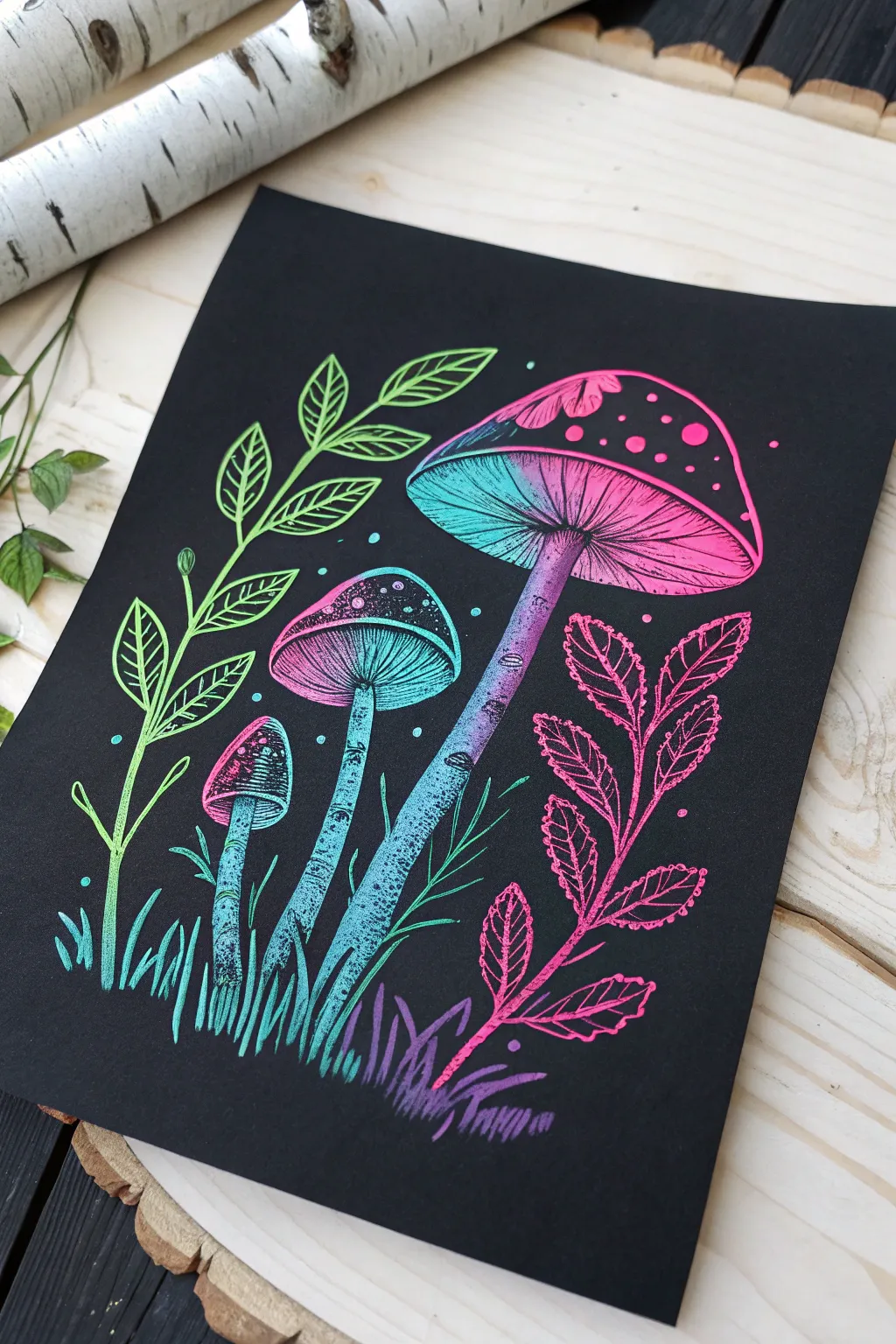
Capture the magic of bioluminescence with this striking drawing that pops against a dark background. Using a gradient technique with neon gel pens or opaque markers, you will create a glowing, ethereal forest floor scene.
Step-by-Step Guide
Materials
- Heavyweight black cardstock or mixed media black paper
- White gel pen or white charcoal pencil (for sketching)
- Neon/Fluorescent Gel Pens (Green, Teal, Pink, Purple)
- Posca markers (Extra Fine tip) in neon colors (optional alternative)
- Pencil sharpener
- Soft eraser
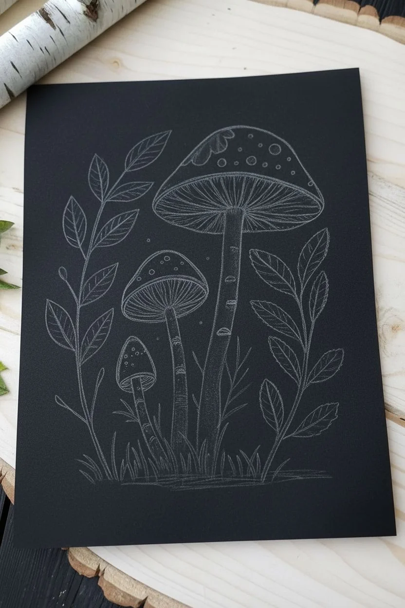
Step 1: Sketching the Layout
-
Establish the composition:
Begin by lightly sketching the main shapes using a white charcoal pencil or a very light touch with a regular pencil. Place the largest mushroom on the right side, tilting its cap slightly downward. -
Add the smaller mushrooms:
Draw the medium-sized mushroom in the center, positioning it lower than the first. Add the smallest mushroom button to the left of the medium one, varying the height to create a natural cluster. -
Outline the foliage:
Sketch a long, curving stem rising on the far left side with paired, leaf-shaped outlines. Next, sketch a similar leafy stem on the far right that curves inward toward the mushrooms. -
Ground the scene:
Lightly indicate clusters of grass blades at the base of the mushroom stems to anchor them to the ground.
Step 2: Creating the Glow Gradient
-
Start the green transition:
Using a neon green gel pen, trace the heavy lines of the left-most plant stem and the leaves attached to it. Fill in the leaves with open, sketchy strokes rather than solid coloring to maintain texture. -
Blend into teal:
Switch to a teal or light blue pen. Color the grass directly below the green plant and start outlining the smallest mushroom cap on the left. -
Color the middle mushroom:
Use the teal pen to draw the gills under the cap of the middle mushroom. Create tight, radiating lines from the center stem outward to the rim. -
Transition the mushroom caps:
For the largest mushroom cap, visualize a split down the middle. Color the left half of the gills and cap details with teal, and switch to a bright neon pink or magenta for the right half. -
Detail the stems:
Draw the texture on the mushroom stems. Use stippling (dots) and short horizontal dashes. Use teal for the lower left stems, blending into purple as you move up the large mushroom’s stem.
Pro Tip: Gradient Blending
To blend gel pens, lay down the first color, then immediately draw the second color over the edge while the ink is wet. This mixes them on the paper.
Step 3: Adding Vibrant Details
-
Execute the pink foliage:
Take your neon pink pen and trace the right-side plant. Just like the green side, use loose, interior scribbles to vein the leaves, keeping the black paper visible through the ink. -
Add purple accents:
Use a purple pen to draw the grass blades at the very bottom right, beneath the pink plant. I like to overlap a few purple strokes into the teal grass for a smoother visual blend. -
Decorate the caps:
Draw the spots on top of the mushroom caps. Outline irregular circles and fill some in completely while leaving others as open rings. Make sure the colors match the gradient (teal on the left, pink on the right). -
Intensify the contrast:
Go back over your main structural lines—the edges of the caps and the main stems—with a second pass of ink to make them stand out boldly against the black. -
Add atmospheric spores:
Dot the background with tiny specks of neon ink. Place teal dots near the teal sections and pink dots near the pink sections to simulate floating glowing spores. -
Clean up:
Once the ink is completely dry (give it a few minutes to prevent smearing), gently erase any visible white sketch lines to leave only the glowing colors.
Troubleshooting: Ink Skipping
If your gel pens skip on the textured paper, try scribbling on a scrap piece of smooth paper or your thumbnail to get the ball rolling again.
Now you have a stunning, luminescent forest piece that looks like it’s glowing in the dark
Recycled Round Canvas Scene
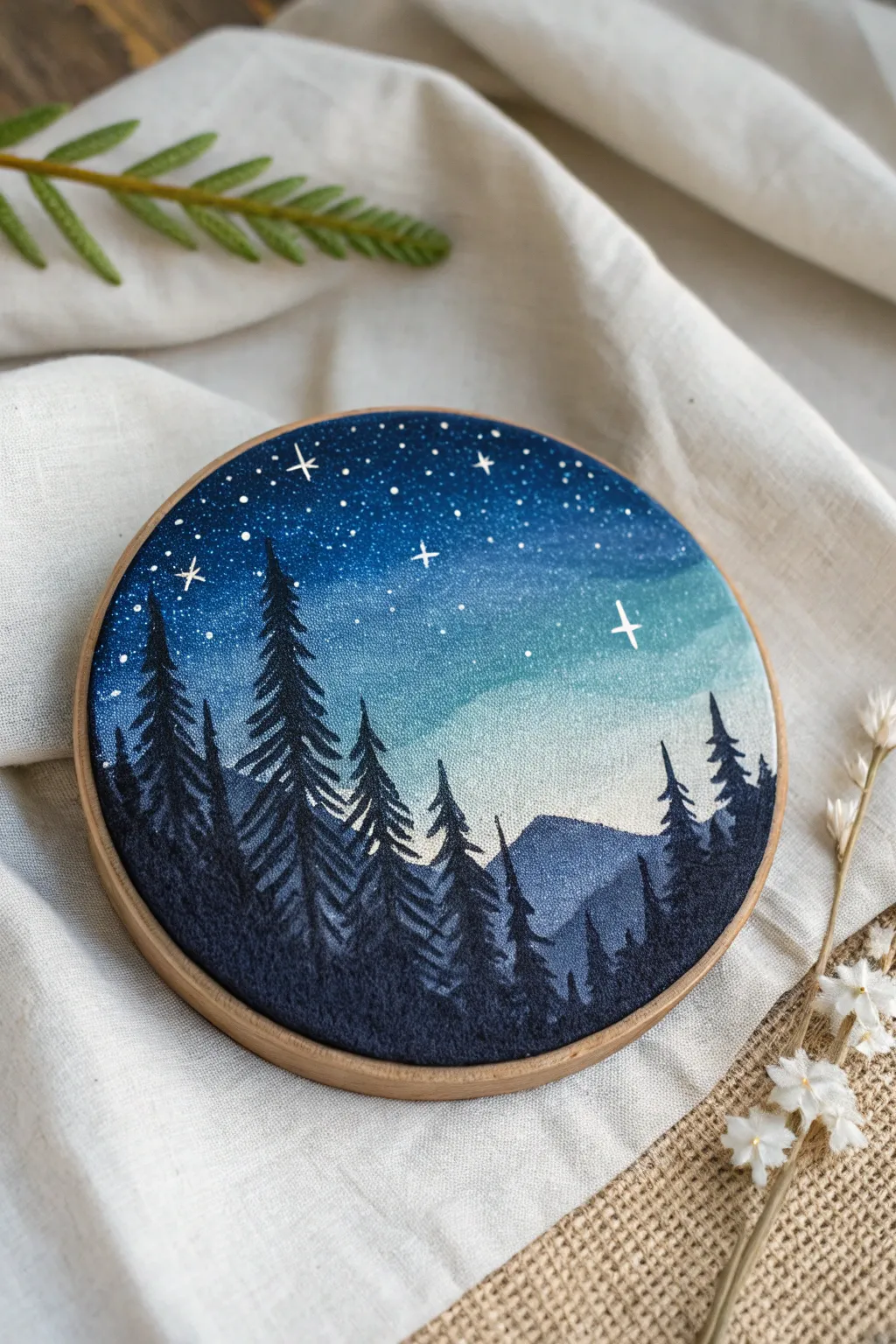
Transform a recycled round canvas or fabric stretched in an embroidery hoop into a breathtaking window onto a night sky. This project combines acrylic blending techniques with silhouette painting to create a serene, starry forest scene.
Step-by-Step
Materials
- Small round stretched canvas or thick cotton fabric in an embroidery hoop (6-8 inches)
- Acrylic paints: Navy blue, phthalo blue, teal, white, black
- Gesso (if using fabric)
- Flat shader brushes (medium and large)
- Detail liner brush (size 0 or 00)
- Mixing palette
- Cup of water and paper towels
- Old toothbrush (optional for stars)
Step 1: Preparing the Sky Gradient
-
Prime the Surface:
If you are using raw fabric in a hoop, apply a layer of gesso first to stiffen the material and prevent the paint from soaking through. Let it dry completely. If you are using a pre-primed round canvas, you can skip this step. -
Mix Your Palette:
Prepare your sky colors. You will need a deep navy blue for the top, a mid-tone blue, a teal, and a very pale blue-white for the horizon line. Mixing these ahead of time ensures a smoother workflow. -
Paint the Top Band:
Using a large flat brush, apply the darkest navy blue to the top third of the circle. Curve your strokes slightly to mimic the shape of the hoop, ensuring full coverage. -
Blend Downward:
While the navy paint is still wet, introduce the mid-tone blue below it. Use back-and-forth sweeping motions where the colors meet to create a seamless transition. I like to keep my brush slightly damp to help the acrylics blend more easily. -
Add the Teal Horizon:
Continue painting downward with your teal shade, blending it into the mid-tone blue. As you approach the bottom third of the canvas, mix in a significant amount of white to create a glowing, pale horizon line just above where the mountains will sit.
Step 2: Creating the Stars
-
Dry the Base:
Ensure your gradient background is completely dry before proceeding. You can speed this up with a hairdryer on a cool setting if you’re impatient. -
Splatter Technique:
Dilute a small amount of white acrylic paint with water until it has an ink-like consistency. Load an old toothbrush or a stiff bristled brush, hold it over the canvas, and flick the bristles to create a spray of tiny, distant stars. Focus the density near the darker top section. -
Hand-Paint Larger Stars:
Take your fine liner brush and dip it into pure white paint. Carefully dot a few larger stars around the sky. For the brightest stars, paint small crosses or four-pointed shapes to give them a twinkling effect.
Paint Viscosity
If your black paint drags or skips on the canvas texture while painting fine tree branches, mix in a drop or two of water to improve the flow for sharper lines.
Step 3: Painting the Silhouette Landscape
-
Outline the Background Mountains:
Mix a dark grey-blue color (use your navy mixed with a little black and white). Paint the shapes of distant mountains along the lower horizon line. These should be lighter than the foreground trees to create atmospheric perspective. -
Start the Tree Layer:
Switch to pure black paint or a very dark midnight blue. Using the tip of your liner brush, draw a vertical line to establish the trunk of your first pine tree. Make it taller than the mountains. -
Building Branches:
Starting from the top of the trunk, use small, dabbling strokes to create pine branches. Keep the strokes very narrow at the top and gradually widen them as you move down the tree. -
Add Texture to Trees:
Don’t make the trees solid triangles; leave small gaps between branches to let the sky peek through. This makes the foliage look realistic and organic. -
Fill the Foreground:
Paint a row of trees of varying heights. I usually group a few large ones on the left and right, leaving the center slightly lower to frame the glowing horizon. -
Highlights (Optional):
For added depth, mix a tiny bit of the sky color into your black paint. Use this to gently highlight the top edges of the mountain ridges or the very tips of the pine trees, suggesting moonlight hitting them. -
Final Detail Check:
Look over your composition. If any tree trunks look too thin at the base, thicken them slightly. Ensure the bottom edge of the canvas is fully blacked out to ground the scene.
Make it Sparkle
Once fully dry, glue tiny rhinestones or crystals onto the largest painted stars. This adds a subtle 3D element that catches the light beautifully.
Hang your miniature masterpiece on the wall or prop it on a shelf to bring a slice of the midnight forest indoors
Surreal Mashup: Anatomy Meets Botanicals
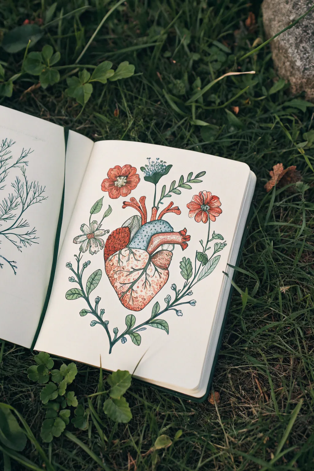
Blend biological precision with whimsical flora in this striking sketchbook study. This project features a medically styled anatomical heart that sprouts vibrant wildflowers instead of veins, creating a beautiful juxtaposition of life and nature.
Detailed Instructions
Materials
- Heavyweight sketchbook or mixed media paper
- HB or 2H graphite pencil
- Fine liner pens (black, sizes 0.1, 0.3, and 0.5mm)
- Alcohol-based markers or watercolors (reds, oranges, blues, greens)
- White gel pen (optional for highlights)
- Eraser (kneaded preferred)
Step 1: Conceptual Sketching
-
Outline the Heart Shape:
Start by lightly sketching the central anatomical heart shape with your graphite pencil. Think of it as a tilted, lopsided pear. Don’t worry about perfect medical accuracy yet; just capture the main ventricles and the top aortas. -
Add Arterial Stems:
Where the major arteries (like the aorta and pulmonary artery) usually exit the top, sketch curving lines extending upward and outward. These will become the stems for your main flowers. -
Sketch the Large Blooms:
Draw circles or ovals at the ends of your upper stems to mark the placement of the poppy-like red flowers. Add a smaller, fan-shaped outline near the center top for a cluster of tiny buds. -
Frame with Foliage:
Starting from the bottom tip of the heart, sketch two long, curving vines that wrap upwards around the heart’s sides. These act as a wreath or frame, so keep them balanced but asymmetrical. -
Detail the Leaves:
Along your side vines and upper stems, lightly sketch in lance-shaped leaves. Vary the angles so some point up and some droop slightly naturalistically.
Step 2: Inking the Structure
-
Outline the Heart Texture:
Switch to a 0.3mm fine liner. Ink the outline of the heart, using slightly broken or jittery lines to suggest organic tissue rather than rigid plastic. Ink the major division lines between the heart chambers. -
Add Muscle Striations:
Using a 0.1mm pen, draw thin, scratchy hatching lines on the heart’s surface. These lines should follow the curve of the muscle, creating volume and texture. -
Ink the Botanicals:
Outline your flowers and leaves with the 0.3mm pen. For the red poppy petals, use wavy lines to mimic soft, folded edges. For the leaves, add a central vein line. -
Stippling Effects:
Use the 0.1mm pen to add stippling (tiny dots) to the center of the flowers and the shaded areas of the heart chambers. This adds depth without solid black shadows. -
Erase Guidelines:
Wait until the ink is completely dry to avoid smudging, then gently erase all your pencil sketches.
Ink Smearing?
If using alcohol markers, they can smudge certain fine liners. Test your pen on a scrap piece of paper first. If it bleeds, do your coloring first and add your fine liner details on top after the ink dries.
Step 3: Coloring and Definition
-
Base Tone for the Heart:
Using a light fleshy pink or beige marker, color the entire bottom section of the heart. For the upper right chamber (the atrium), use a light muted blue. -
Layering Muscle Colors:
Go over the pink sections with a warmer reddish-orange marker to create shadows. Focus on the edges and the areas where the chambers meet. -
Coloring the Flowers:
Use a vibrant coral or red-orange for the main flowers. Leave tiny slivers of white paper showing near the petal edges to suggest light reflection. -
Tinting the Leaves:
Apply a sage or olive green to the leaves and stems. I find that using a desaturated green looks more vintage and scientific than a bright neon green. -
Enhancing the Blue Atrium:
Add dots of a darker teal or blue over the light blue chamber section to create a textured, porous look. -
Branching Veins:
With a fine brown or dark red pen, draw the capillary veins branching across the front of the heart. Make them look like lightning bolts or tree roots spreading across the surface. -
Final Contrast:
Revisit your darkest areas with the 0.5mm pen to deepen the shadows between the heart valves and where the stems emerge.
Go Vintage
To get an old medical textbook look, lightly wash the background with watered-down coffee or tea before starting. It creates an aged parchment effect that suits the anatomical theme perfectly.
Now you have a stunning piece of anatomical art that bridges the gap between biology and botany


Have a question or want to share your own experience? I'd love to hear from you in the comments below!