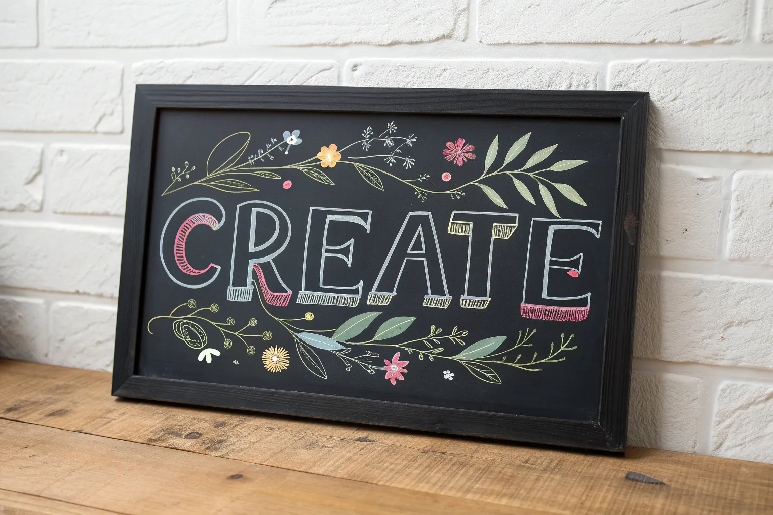
If you love art that’s bold, clean, and super satisfying on dark surfaces, chalk markers are about to become your new obsession. I’m sharing my favorite chalk marker art ideas that lean into that dreamy high-contrast pop and all the fun layering you can do with liquid chalk.
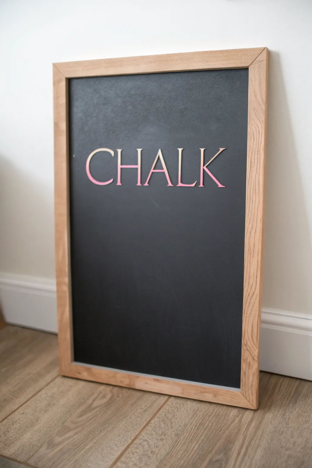
Classic Hand-Lettered Quote Board
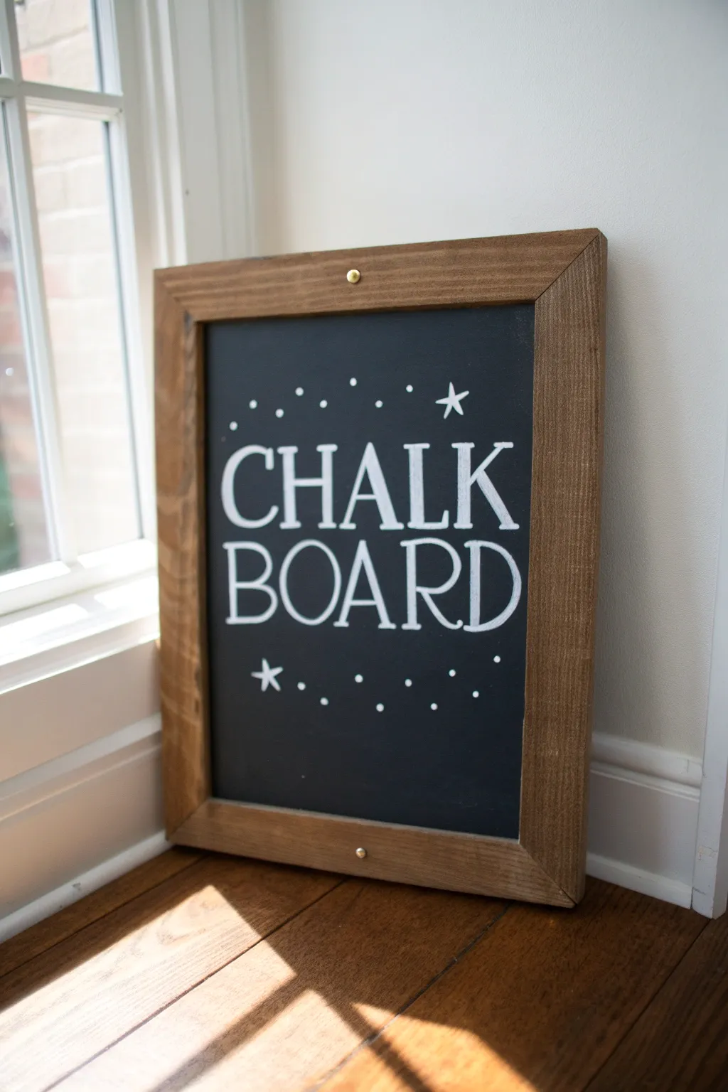
Capture the charm of classic signage with this delightfully simple typography project that pairs bold lettering with a sprinkling of celestial details. The contrast of crisp white marker against a dark slate background makes this piece pop in any room.
Detailed Instructions
Materials
- Framed chalkboard (dark slate surface)
- White liquid chalk marker (medium bullet tip)
- White liquid chalk marker (fine or extra-fine tip)
- Ruler or straight edge
- Piece of white chalk (standard school chalk)
- Microfiber cloth or damp paper towel
- Cotton swabs (for cleanup)
- Pencil and paper (for sketching)
- Painter’s tape (optional)
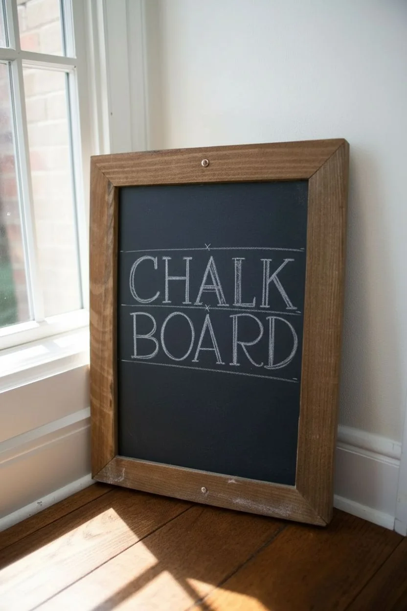
Step 1: Planning and Layout
-
Study the font style:
Before touching the board, analyze the lettering style shown. Notice the classic serif font where the letters are all capitalized. The ‘O’ is widely rounded, and the serifs (the little feet on the letters) are thin horizontal lines. -
Draft on paper:
Sketch your design on a piece of scrap paper first to get a feel for the spacing. Draw the word ‘CHALK’ on one line and ‘BOARD’ on the second, ensuring they are roughly the same width. -
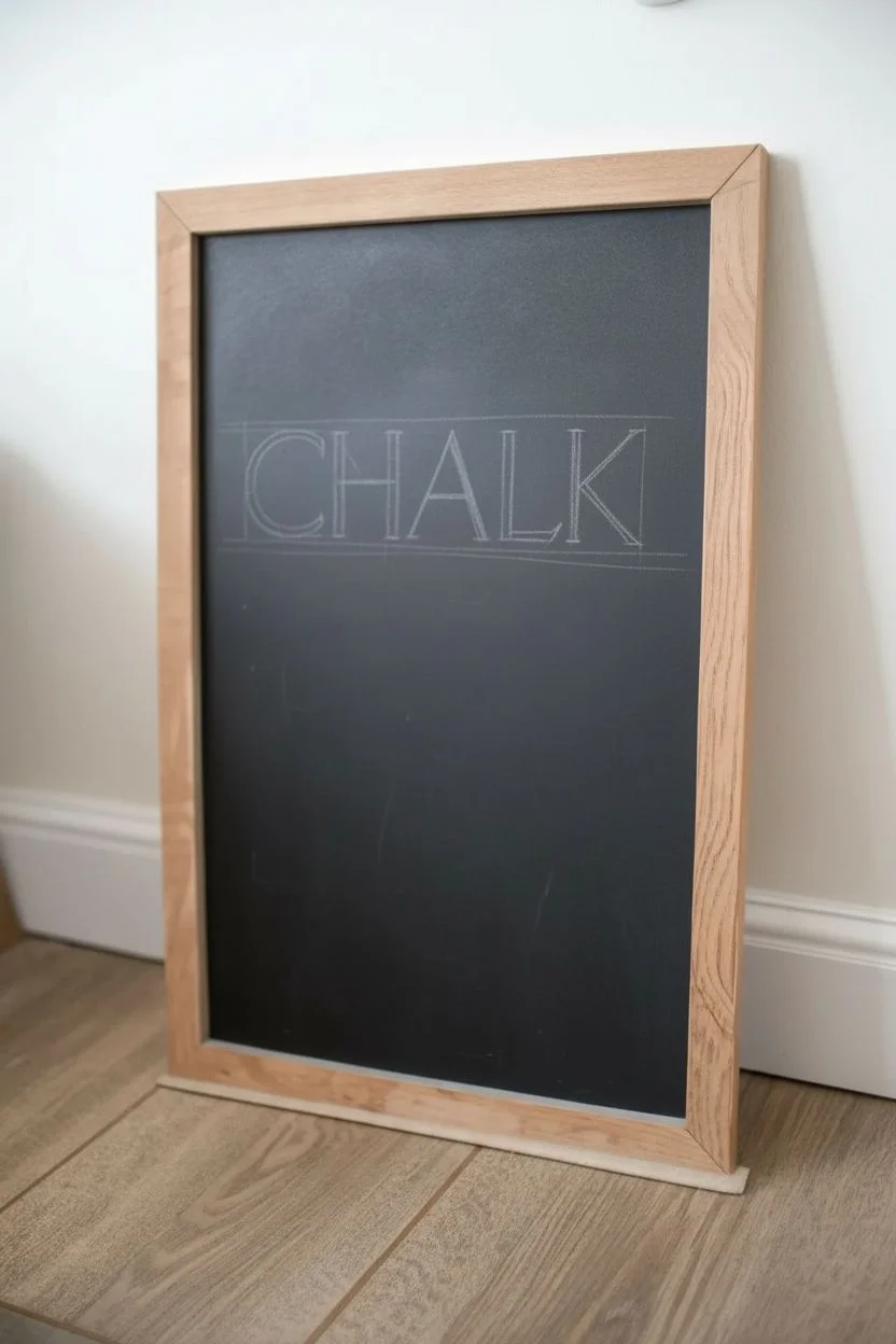
Season the board (optional):
If your chalkboard is brand new, rub the side of a piece of regular chalk over the entire surface and wipe it off. This ‘seasoning’ prevents ghosting later on. -
Mark your guidelines:
Using your ruler and a piece of regular dry chalk (not the marker yet), lightly draw two horizontal baselines and two top lines across the board. These will ensure your text stays straight and even. -
Find the center point:
Measure the width of your writing area and make a tiny, faint mark at the center point on your guidelines. This helps you center the words perfectly.
Sharpen Your Serifs
For crisp serif edges, use a piece of tape or a stiff card as a stencil edge while drawing the straight lines, preventing marker bleed.
Step 2: Lettering the Design
-
Prime your markers:
Shake your white chalk marker well. Press the tip down on a scrap piece of paper repeatedly until the white ink flows completely into the nib. -
Draft the letters with dry chalk:
I always recommend sketching the actual letters onto the board with regular dry chalk first. Draw ‘CHALK’ and ‘BOARD’ lightly. If you make a mistake, it’s easy to dry-wipe away and retry. -
Trace the main strokes:
Using the medium tip chalk marker, go over your chalk sketch. Focus on the vertical and curved strokes first, keeping your hand steady. Don’t worry about the serifs just yet. -
Add the serifs:
Once the main strokes are down, go back and add the horizontal serifs—the ‘feet’ and ‘tops’ of the letters. Use the edge or corner of the marker tip to keep these lines slightly thinner than the main stems. -
Refine the ‘B’ and ‘R’:
Pay special attention to the counters (the enclosed spaces) in the letters ‘B’, ‘O’, ‘A’, ‘R’, and ‘D’. Make sure they look open and consistent. -
Let the ink dry:
Allow the lettering to dry completely for about 5-10 minutes. Chalk marker can smudge easily when wet.
Step 3: Adding Decorations and Finish
-
Clean up guidelines:
Once the ink is bone dry, gently erase the faint chalk guidelines you drew earlier. Use a dry cloth for this to avoid smearing the marker. -
Draw the primary stars:
Switch to your fine tip marker if you have one, or use a light touch with the medium tip. Draw a five-pointed star above the ‘K’ and below the ‘C’. These serve as the anchors for your border. -
Add the arch of dots:
Starting from the top star, gently dot an arching line downward to the left, creating a ‘shooting star’ debris tail. Vary the spacing slightly for a hand-drawn feel. -
Mirror the design:
Repeat the dotting process on the bottom, creating an upward curve of dots starting near the bottom star and spacing them out across the bottom of the board. -
Detail correction:
Inspect your letters. If any lines look shaky or uneven, a slightly damp cotton swab works perfectly as a precision eraser to clean up edges. -
Final wipe down:
Give the area around the artwork one last gentle wipe with a microfiber cloth to remove any remaining chalk dust, leaving the black background rich and dark.
Ghosting Issues?
If regular chalk won’t erase fully during the layout phase, a Magic Eraser sponge slightly dampened with water removes stubborn residue instantly.
This charming board is now ready to lean on a mantel or hang in an entryway.
Cafe-Style Menu Chalkboard Layout
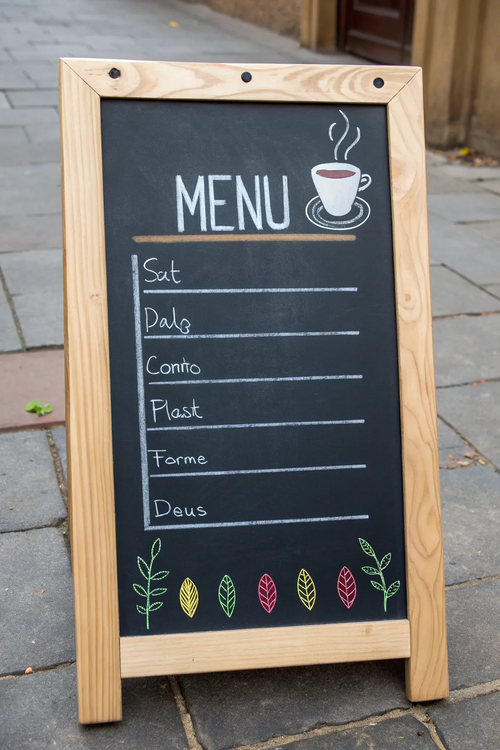
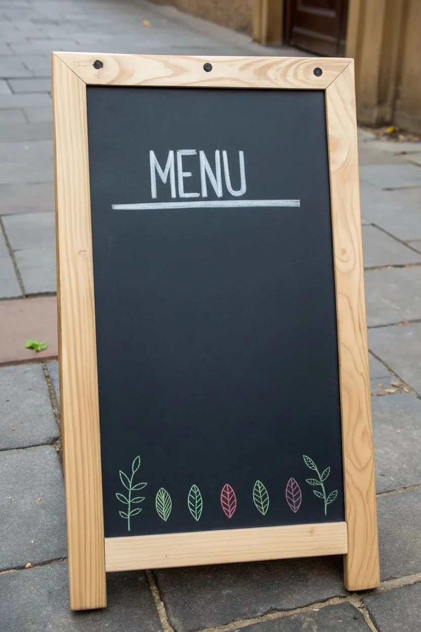
Bring the inviting atmosphere of a European street café into your space with this clean, minimalist chalkboard menu design. Featuring crisp lettering, a steaming coffee cup illustration, and a charming botanical border, this layout is perfect for listing weekly specials or organizing your personal agenda.
Step-by-Step
Materials
- A-frame chalkboard (medium size with wooden frame)
- White liquid chalk marker (fine tip)
- White liquid chalk marker (bullet or chisel tip)
- Color chalk markers (yellow, green, pink/red)
- Ruler or straight edge
- Pencil and eraser (for sketching)
- Damp cloth or cotton swabs (for corrections)
Step 1: Setting the Structure
-
Clean the surface:
Begin with a pristine surface. Wipe down your chalkboard with a damp cloth to remove any dust or old chalk residue, ensuring a smooth base for your markers. -
Sketch placement:
Lightly sketch your layout using a regular pencil. Chalk markers can glide over pencil lines easily, and this helps you center the word ‘MENU’ and space out your six list items evenly. -
Draw the main header:
Using your thicker white chalk marker (bullet or chisel tip), write the word ‘MENU’ in tall, condensed capital letters at the top center. Keep the letters close together for a stylized look. -
Add the underline:
Switch to a colored marker (a beige or light brown works well here to mimic wood, or just use white) and draw a thick, straight line underneath ‘MENU’ to anchor the title.
Pro Tip: Crisp Edges
For super sharp lettering, pump the nib of your chalk marker on a piece of scrap paper first to get the ink flowing, rather than pressing hard on the board.
Step 2: The Coffee Illustration
-
Outline the cup:
To the right of the ‘MENU’ title, use the fine tip white marker to draw a simple teacup shape. It should be slightly tapered toward the bottom with a small curved handle on the right. -
Draw the saucer:
Add an oval shape underneath the cup to represent the saucer. Draw a second, slightly smaller concentric arc inside the back of the saucer to give it dimension. -
Add the coffee:
Fill the top opening of the cup with a dark reddish-brown color to symbolize the coffee or tea inside. A simple oval shape works perfectly. -
Create steam lines:
Draw three wavy, vertical lines firmly rising from the cup using the fine white marker. Variate their heights slightly to make the steam look natural.
Troubleshooting: Smudges
If you smudge a line, don’t wipe it immediately while wet. Wait for the chalk to dry completely, then use a barely damp Q-tip to erase the mistake cleanly.
Step 3: Listing the Items
-
Draw the vertical spine:
On the left side of the board below the title, draw a long, single vertical line. This acts as the spine for your list items. -
Create horizontal dividers:
Using your ruler, draw six horizontal lines extending from the vertical spine to the right. Leave enough space between each line for writing text. -
Lettering the labels:
In the spaces created above each line, write your labels using the fine white marker. The example uses ‘Sat’, ‘Palo’, ‘Conto’, ‘Plast’, ‘Forme’, and ‘Deus’. Use a casual, sans-serif handwriting style. -
Touch up lines:
Go back over your horizontal lines if they look faint. I find that a second pass often makes the grid look much sharper against the black background.
Step 4: The Botanical Border
-
Draw outer stems:
At the very bottom left and right corners, use a bright green marker to draw slightly curved stems rising upwards. -
Add sketch leaves:
On these green stems, draw simple leaf outlines—just the stroke, no fill—alternating sides as you go up the stem. -
Create center leaves:
In the gap between the two green stems, draw four individual, large leaf shapes. Space them out evenly. -
Color and detail:
Color these center leaves with alternating solids or outlines using yellow, green, and pink/red markers. Add vein details inside the colored leaves using a contrasting color or by leaving negative space.
Step back and enjoy the satisfaction of seeing your professional-looking menu layout ready for business or display
Easy Floral Corner Frames
Transform a simple framed chalkboard into an elegant display piece with this delicate botanical design. Featuring soft sage green leaves mixed with crisp white line art, these organic corner accents create a perfect frame for your daily menus or favorite quotes.
Step-by-Step Tutorial
Materials
- Framed chalkboard (slate or non-porous surface)
- Chalk markers (1mm or extra-fine tip: white, pale sage green, light golden brown)
- Microfiber cloth
- Cotton swabs
- Water or chalkboard cleaner
- Pencil (optional for sketching)
Step 1: Preparation & Layout
-
Clean the surface:
Begin by wiping down your chalkboard surface thoroughly with a damp microfiber cloth to remove any dust or oils. A clean slate ensures crisp lines and prevents marker bleeding. -
Sketch the flow:
Visualize an invisible diagonal line connecting the top-left corner to the bottom-right corner. This asymmetrical balance will guide your main floral clusters, while the other two corners will have lighter accents.
Step 2: Top-Left Corner: Sage Leaves
-
Draw the main stem:
Using your white chalk marker, draw a gentle, curving line originating from the top-left corner, swooping slightly inward. -
Fill sage leaves:
Switch to your sage green marker. Draw teardrop-shaped leaves extending from the main stem. Fill them in completely for a solid, opaque look. If the ink looks streaky, let it dry for a minute and add a second coat. -
Add vein details:
Once the green ink is fully dry, take the fine-tip white marker and draw a central vein line down the middle of each green leaf. Add tiny, angled veins branching off for realistic texture. -
Accent with gold sprigs:
Using the light golden brown marker, draw a few wispy, bare branches tucking behind the green leaves. Add small oval buds at the tips of these branches.
Ink Ghosting?
If you erase a mistake and see a faint ‘ghost’ image, use a melamine sponge (Magic Eraser) slightly dampened to gently buff the residue away without damaging the slate.
Step 3: Top-Right Corner: White Line Art
-
Create the skeleton:
In the top-right, draw a long, sweeping stem coming down from the top edge using the white marker. -
Outline leaves:
Instead of filling these leaves, draw only the outlines. Create elongated, pointed oval shapes attached to your stem. -
Detail with hatching:
Inside each outline leaf, draw a central spine. Then, use very light, quick strokes to draw diagonal hatching lines on just one side of the leaf vein, creating a shadowed effect. -
Add a delicate berry sprig:
Draw a thin, trailing vine hanging vertically near the leaves. Add tiny open circles along the vine to represent berries or small blossoms.
Pro Tip: Line Variation
Press harder on the downstrokes of your stems to make them thicker, and lift pressure on upstrokes to keep tips whimsical and thin.
Step 4: Bottom-Right Corner: Mixed Botanical
-
Draw the golden stems:
Anchor this corner with the golden brown marker. Draw two stems rising upward. Add large, lance-shaped leaves to these stems. -
Texture the gold leaves:
Inside the golden leaves, use the white marker (ensure the gold is dry first!) to draw a series of parallel curved lines that mimic the leaf’s shape, leaving a small gap between lines. -
Layer in white foliage:
Tuck a small white sprig behind the golden leaves. Use the same hatching technique from the top-right corner to maintain consistency.
Step 5: Bottom-Left Corner: Finish & Refine
-
Balance with green:
Mirror the top-left style here. Draw a stem curving inward and add sage green leaves. Wait for them to dry. -
Highlight the green leaves:
Add your white vein details over the dry green ink. I like to keep the lines very thin here so the green remains the dominant color. -
Insert filler sprigs:
Look for empty gaps near the frame edge. Draw small, simple sprigs with tiny dots at the ends using the golden brown marker to tie the color palette together. -
Clean up edges:
Dip a cotton swab in a little water or cleaner. Gently erase any smudges or lines that went too far, sharpening the tips of your leaves for a professional finish.
Step back and admire your beautifully framed chalkboard, now ready for your message

Bold Serif Letters With Color Fill
Elevate a simple storefront or home message board with this clean, elegant signage style. Featuring crisp serif lettering and a soft, trendy color palette, this project transforms basic handwriting into professional-looking typography using chalk markers.
How-To Guide
Materials
- Large black chalkboard (A-frame or wall-mounted)
- White chalk marker (6mm chisel tip recommended)
- Peach or blush pink chalk marker (6mm chisel tip)
- Ruler or T-square
- Pencil (standard graphite or white charcoal pencil)
- Microfiber cloth or chalkboard eraser
- Cotton swabs
- Water spray bottle
Step 1: Planning and Layout
-
Clean surface:
Begin by thoroughly cleaning your chalkboard surface. Wipe it down with a damp cloth followed by a dry microfiber cloth to ensure no dust or ghosting remains from previous designs. -
Draft horizontal guides:
Using your ruler and a pencil, lightly draw horizontal lines to serve as the baseline for each row of text. Space them evenly, leaving slightly more room between the main header and the sub-list below. -
Sketch the letters:
Lightly sketch your text onto the lines using the pencil. Focus on using a classic serif font style—think Times New Roman or Garamond—with distinctive ‘feet’ on the letters. Don’t press hard; you just need a faint guide. -
Check kerning:
Step back and look at your spacing. Ensure the letters within words like ‘MARKERS’ aren’t crowded together. Adjust your sketch now before applying permanent ink.
Step 2: Inking the Header
-
Prime the white marker:
Shake your white chalk marker vigorously and press the tip on a scrap piece of paper until the ink flows opaque and bright. -
Outline the main text:
Start with the top line ‘CHALK’. Carefully trace over your pencil sketch. I prefer pulling the marker down towards me for vertical strokes to keep lines straight. -
Add serif details:
Go back to the ends of your straight lines and add the small horizontal ticks (serifs). Keep these sharp and distinct. -
Repeat for ‘MARKERS’:
Continue with the second line, maintaining the same letter height. Since ‘MARKERS’ is a longer word, consistency in width is crucial here. -
Dry and refine:
Let the white ink dry completely. If any letters look thin, apply a second coat to make the white pop against the black background.
Smudgy Lines?
If you make a mistake, don’t wipe it immediately while wet. Let the smudge dry completely, then use a damp Q-tip to lift the dried chalk off cleanly without streaking.
Step 3: Adding the Boho Color List
-
Switch to blush:
Prime your peach or blush pink marker. Use this color for the words ‘BOHO’ and ‘BLUSH’ to create visual interest and hierarchy. -
Letter the accent words:
Write ‘BOHO’ using a slightly thinner stroke if possible, but keep the same serif style. The color change does the heavy lifting for emphasis. -
Write the white list items:
Switch back to your white marker. Fill in ‘TONES’, ‘TERRACOTTA’, ‘SAGE’, and ‘SAND’ on their respective lines. -
Maintain alignment:
Ensure all these words are centered relative to the ‘CHALK MARKERS’ header. If a word is short like ‘SAGE’, guard against stretching it too wide.
Level Up: Faux Calligraphy
To add weight, thicken the vertical downstrokes of your letters. Simply draw a second parallel line next to the downstroke and fill in the gap for a bold effect.
Step 4: Final Touches
-
Erase guidelines:
Once the ink is bone dry (wait at least 15 minutes to be safe), use a dry cotton swab to gently rub away the visible pencil lines between the letters. -
Sharpen edges:
Dip a fresh cotton swab in a tiny bit of water. Run it along the edges of any letters that look fuzzy or uneven to crisp up the typography. -
Add detail dots:
Place a small white dot before the final word ‘SAND’ if you need to balance the space, or leave it clean for a minimalist look.
Now your perfectly lettered sign is ready to catch eyes and offer a warm, welcoming vibe to passersby

PENCIL GUIDE
Understanding Pencil Grades from H to B
From first sketch to finished drawing — learn pencil grades, line control, and shading techniques.
Explore the Full Guide
Layered Ombre Lettering
Elevate a simple chalkboard message with this striking two-tone gradient technique that mimics a sunset glow. By blending creamy yellow into soft pink, you create a dimension that makes standard block letters pop off the board.
Step-by-Step
Materials
- Large framed chalkboard
- Chalk markers (pastel pink and cream/light yellow)
- Ruler or straight edge
- Painter’s tape or masking tape
- Cotton swabs or a small blending brush
- Graphite transfer paper (optional)
- Pencil
- Damp cloth for corrections
Step 1: Preparation & Layout
-
Clean the surface:
Start with a perfectly clean slate. Wipe down your chalkboard with a damp cloth to remove any dust or old chalk residue, then dry it completely with a lint-free towel. -
Plan your spacing:
Visualize where you want the word ‘CHALK’ to sit. Ideally, it should be centered horizontally in the top third of the board for visual balance. -
Create guidelines:
Use a ruler and a very faint pencil line (or strips of painter’s tape) to mark the top and bottom heights for your letters. This ensures every letter stands at the exact same height. -
Draft the letters:
Lightly sketch the block letters ‘C-H-A-L-K’ using a pencil. If you aren’t confident in your freehand lettering, you can print the word on paper and trace it onto the board using graphite transfer paper. -
Refine the shapes:
Go back over your sketch to ensure the vertical strokes are even in width and the spacing between letters is consistent.
Muddy colors?
If blending creates brown sludge, your colors might be too dark or wet. Let the first layer dry slightly, or wipe the nib frequently to keep the pigment pure.
Step 2: Layering Color
-
Prime the markers:
Shake your chalk markers well and press the nibs on a piece of scrap paper until the ink flows smoothly. Do not pump the nibs directly on the final artwork to avoid puddles. -
Apply the top color:
Starting with the cream or light yellow marker, fill in just the top half of the first letter. Don’t worry about a perfect bottom edge yet. -
Feather the edge:
While the ink is still wet, use quick, downward strokes to thin out the ink where the color will transition. I like to keep this layer slightly uneven to help the blend later. -
Apply the bottom color:
Immediately switch to the pink marker. Fill the bottom half of the letter, bringing the color up to meet the yellow section. -
Create the overlap:
Allow the pink ink to slightly overlap the yellow section while both are still wet. -
Blend the transition:
Use a cotton swab, a small brush, or even your finger to gently dab the area where the two colors meet. Work quickly before the chalk marker dries completely. -
Repeat for all letters:
Move to the next letter and repeat the process: yellow top, pink bottom, overlap, and blend. Doing one letter at a time ensures the ink stays wet enough to mix.
Step 3: Refining & Finishing
-
Clean up edges:
Once the lettering is fully dry, use a damp Q-tip or a precision eraser to sharpen the outside edges of the letters, removing any ink that drifted outside your sketch lines. -
Check opacity:
Step back and look at the letters. If the colors look translucent or streaky, carefully apply a second coat over each section, repeating the blending step. -
Remove guidelines:
Gently erase your pencil guidelines or peel off any tape you used for spacing, being careful not to scratch the chalk paint. -
Final polish:
Give the rest of the chalkboard a quick wipe to remove any hand smudges or chalk dust settled during the drawing process.
Pro Tip: The Palette Trick
Scribble both colors onto a plastic palette or plate first. Dip a brush into the mixed ink on the palette and paint the transition on the board for a smoother gradient.
Enjoy the warm glow of your new gradient artwork as it brightens up your space
Doodle Dividers, Banners, and Icons
This tutorial guides you through creating a delightful sampler of hand-drawn doodles, including banners, hearts, and botanical dividers. The result is a charming, rustic chalkboard display perfect for practicing your line work and adding a touch of personality to any space.
Step-by-Step Tutorial
Materials
- Small framed chalkboard (approx. 11×14 inches)
- Chalk markers (fine tip: white, teal/light blue, pink, orange/copper)
- Clean, damp microfiber cloth (for corrections)
- Pencil (optional, for light sketching)
- Cotton swabs (for fine erasing)
Step 1: Setting the Stage
-
Surface Prep:
Begin by ensuring your chalkboard surface is completely clean and dry. A quick wipe with a damp cloth followed by a dry one removes any dust that could clog your marker tips. -
Marker Activation:
Shake your chalk markers well with the cap on to mix the ink. Press the nib gently on a scrap piece of paper until the color flows smoothly before touching the board.
Smudge Control
If you make a mistake, don’t wipe it immediately while wet, as this creates a ghostly smear. Wait for the ink to dry completely, then use a damp Q-tip to erase precisely.
Step 2: Top Banner & Hearts
-
Draw the Ribbon Outline:
Using the light blue or white marker, draw a wavy ribbon banner across the top third of the board. Start with the central wavy rectangle, then add the folded tails on either side. Curl the ends with decorative flourishes. -
Add Lettering:
Inside the banner, write a short word like ‘DREAM’ or a name in simple, thin capital letters. Keep the spacing loose and airy. -
First Heart Cluster:
Below the left side of the banner, draw a large heart with a white marker. Fill it with vertical sketch lines for a textured look. -
Second Heart Cluster:
Draw two smaller hearts next to the first one: outline one in pink with messy scribbles inside, and outline the next in teal with vertical stripes. -
Final Hearts:
Complete the row with two solid-colored hearts—one in pink and one in a copper or orange tone. Use quick, diagonal strokes to fill them in loosely.
Sharpen Your Lines
For crisper details on the leaves and stars, wipe the marker tip on a paper towel every few minutes to prevent ink buildup from making your lines too thick.
Step 3: Central Botanical Flourish
-
Central Stem:
In the center of the board, below the hearts, use the light blue or white marker to draw two curved stems growing outward from a central point. -
Adding Leaves:
Draw small, slender almond-shaped leaves along both sides of each stem. Keep the lines thin and delicate. -
Circular Accents:
To the left of the stems, draw a small circle containing a simple wheat stalk doodle. To the right, draw a small circle with the number ‘360’ or a small word inside. -
Flower Accent:
On the far right of this section, sketch a loose, multi-petaled flower shape using thin, sketchy lines for a hand-drawn feel.
Step 4: Middle Banner & Dividers
-
Orange Ribbon Banner:
Draw a straight banner with notched ends using the orange/copper marker. Make the ribbon slightly angled. -
Banner Text:
Inside the orange banner, write ‘HOME’ or a similar word in white block capitals. Add small dots between the letters for detail. -
Sunburst Doodle:
On the left side of the orange banner, create a small sunburst or gear-like icon with radiating dashes. -
Leafy Vine Divider:
Below the banner, draw a long, horizontal leafy vine using the white or light blue marker. Start with a central line and add paired leaves all the way across.
Step 5: Bottom Borders & Stars
-
Star Border:
Create a row of five-pointed stars. I like to alternate the sizes slightly—some small, some larger hollow stars—across the width of the board. -
Simple Line Divider:
Draw a straight horizontal line below the stars. Add tiny diagonal tick marks along the top side of the line to create a stitched effect. -
Geometric Divider:
Below the stitched line, draw a pattern of connected loops or small shapes that look like a chain link or lace pattern. -
Flower Footer:
Finish the bottom edge by drawing a row of simple five-petaled flowers. Draw them in a loose, continuous line style without lifting the marker too often.
Your chalkboard is now filled with a cheerful array of hand-drawn art ready to display
BRUSH GUIDE
The Right Brush for Every Stroke
From clean lines to bold texture — master brush choice, stroke control, and essential techniques.
Explore the Full Guide
Seasonal Swap-Out Message Sign
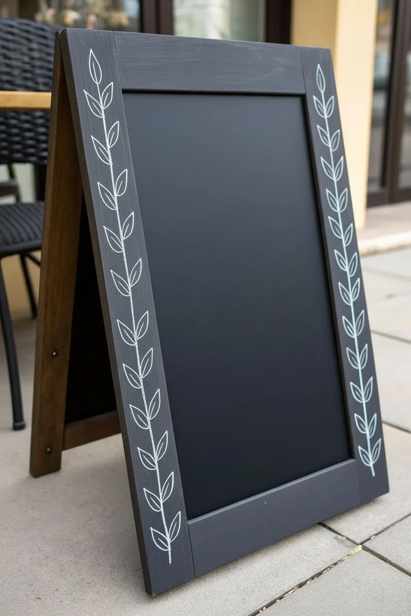
Transform a plain A-frame chalkboard into a welcoming masterpiece with this delicate botanical design. Featuring intricate white vines, stylized snowflakes, and pops of pastel color, this border leaves plenty of open space for your daily menu or greeting.
Detailed Instructions
Materials
- A-frame wooden chalkboard (sandwich board)
- White liquid chalk marker (fine tip, 1-2mm)
- White liquid chalk marker (medium tip, 3-5mm)
- Metallic or pastel pink chalk marker
- Metallic or pastel yellow/gold chalk marker
- Metallic or pastel teal/blue chalk marker
- Green chalk marker (optional, for leaves)
- Damp microfiber cloth
- Cotton swabs (for precise erasing)
- Pencil (optional, for sketching)
Step 1: Preparation and Frame Borders
-
Prepare the surface:
Begin by ensuring your chalkboard surface is completely clean and dry. Wipe away any old residue with water and a microfiber cloth. -
Prime your markers:
Shake your white chalk markers vigorously to get the pigment moving. Press the tip gently on a scrap piece of paper until the ink flows smoothly and consistently. -
Draw the left vertical vine:
Starting at the bottom left corner of the wooden frame, use your fine-tip white marker to draw a long, slightly curved line extending upwards about two-thirds of the frame’s height. -
Add leaves to the frame:
Along this vine, draw pairs of elongated, pointed leaves. Draw the outline first, then add a simple center vein line to each leaf for a classic botanical look. -
Mirror the right side:
Repeat this process on the right wooden frame leg. Draw a vine climbing upwards from the bottom, adding similar leaf pairs. Don’t worry about perfect symmetry; slight variations look organic.
Seasoning the Surface
Before drawing, rub the side of a piece of chalk over the entire board and erase it. This prevents ‘ghosting’ where images leave permanent shadows.
Step 2: Top and Bottom Florals
-
Create the top banner:
Moving to the top horizontal frame piece, draw two large, decorative leaves in the corners pointing inward. Give these leaves intricate internal patterns, like a grid or lace-like texture. -
Add a central snowflake:
Between the two top leaves, draw a stylized snowflake or starburst. Start with an ‘X’ over a ‘+’, then add dots and small V-shapes to the tips of each line. -
Sketch the bottom border:
On the bottom frame piece, draw two smaller, simple leaves lying horizontally, pointing towards the center. Add two smaller starbursts between them. -
Add color accents:
Using your colored markers (pink, yellow, teal), add small dots and simple circles around your top and bottom frame drawings to give the design some sparkle.
Step 3: Inner Board Details
-
Drape the top vines:
Now, move onto the black chalkboard surface itself. At the very top edge, sketch a series of hanging vines. Draw short, curved stems drooping downward, with small leaves attached. -
Detail the hanging leaves:
I like to vary the leaf styles here—make some solid outlines and others filled with simple lines to create visual texture. -
Anchor the bottom corners:
In the bottom corners of the chalkboard surface, draw small sprigs of foliage growing upward and inward. Keep these relatively low to preserve the writing space in the center. -
Draw the side accents:
On the left side of the black surface (mid-height), draw a large, six-pointed snowflake and a five-petaled flower below it. Use the fine tip for crisp lines. -
Create the right side accent:
On the right side, roughly opposite the snowflake, draw a tall, straight stem with leaves growing upward. Top this stem with a pink and yellow flower. -
Refine with color:
Take your pink marker and fill in the petals of the flower on the right. Add a yellow center to the flower on the left. -
Add final embellishments:
Scatters tiny white dots across the top vine area to mimic falling snow or pollen. Add small yellow stars near the bottom border for extra charm. -
Clean up edges:
Inspect your lines. If any ink smudged, dip a cotton swab in water and carefully erase the mistake, then dry the spot before redrawing.
Fixing Shaky Lines
If your lines look wobbly, work faster. Moving the marker slowly causes hesitation marks; quick, confident strokes create smoother curves.
Now you have a stunning, professional-looking frame ready for your daily quote or menu
Chalkboard Calendar With Mini Illustrations
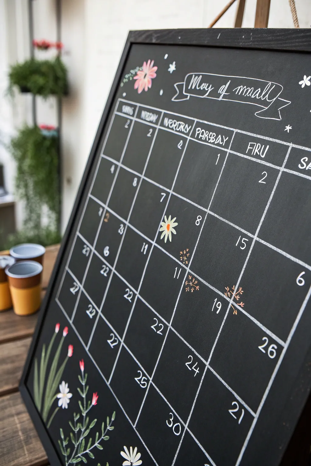
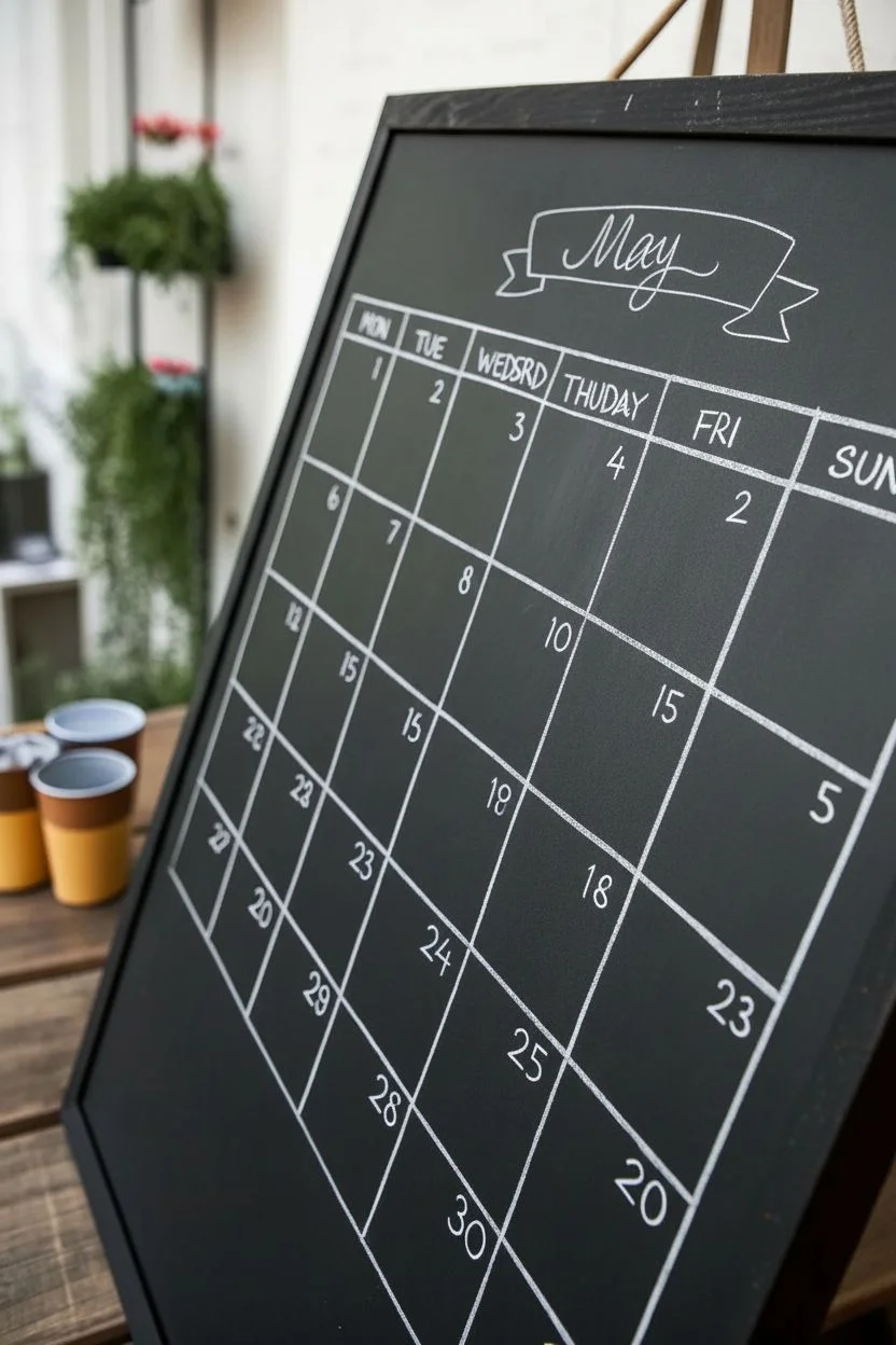
Bring organization and whimsy together with this charming botanical calendar design. Featuring delicate floral borders and a crisp white grid, this layout turns your monthly schedule into a functional piece of art.
Detailed Instructions
Materials
- Large framed chalkboard
- White fine-tip chalk marker
- Pink chalk marker
- Green chalk marker
- Yellow chalk marker
- Ruler or straight edge
- Damp cloth or cotton swabs (for corrections)
- Pencil (optional, for drafting)
Step 1: Setting the Structure
-
Define the header:
Begin by leaving the top 20% of the board free for your title art. Use a ruler and your white chalk marker to draw a long horizontal line across the board just below this area to start your grid. -
Draft the columns:
Measure the width of your board and divide it by seven. Mark these intervals lightly along your top horizontal line. Draw six vertical lines down from these marks to create your seven columns for the days of the week. -
Complete the grid:
Draw five or six horizontal lines (depending on how many weeks are in the month) to create the individual day boxes. Try to keep the rows evenly spaced, but don’t worry if they look slightly hand-drawn; that’s part of the charm. -
Add day headers:
At the top of each column, write the days of the week in a casual, all-caps serif font. To mimic the reference, you can use slightly stylized or playful spelling, or stick to standard abbreviations like MON, TUE, WED. -
Create the banner:
In the open header space, draw a classic ribbon banner shape. Start with a rectangle in the center, then add folded ‘tails’ on either side. Write the month name (e.g., ‘May’) inside the banner in a loose cursive script.
Sharper Lines
If your chalk marker lines look transparent, pump the nib on scrap paper to encourage ink flow. Let the first layer dry completely, then trace over it for opaque, bright white lines.
Step 2: Adding the Dates
-
Number the days:
Using the fine-tip white marker, fill in the dates in the upper right or left corner of each box. Keep the numbers simple and legible. -
Highlight special dates:
Select a specific date to highlight (like a birthday or event). Instead of a plain number, draw a small daisy shape using a yellow center and white petals, placing the number near it or leaving it iconic. -
Draw mini fillers:
In empty boxes where the month hasn’t started or has already ended, add tiny decorative elements. Small clusters of dots or tiny starbursts in white and orange chalk create a lovely texture without cluttering the space.
Season It
Change the floral illustrations to match the season! Swap the spring daisies for autumn leaves, winter holly berries, or summer sunflowers to keep the board fresh all year.
Step 3: Floral Illustrations
-
Start the bottom border:
In the bottom left corner, draw long, sweeping stems using your green marker. Let them curve naturally, reaching up towards the grid. -
Add leaves:
Along these stems, add long, slender leaves. Draw them with a single confident stroke, tapering at the ends to mimic grass or tulip leaves. -
Draw base flowers:
At the base of the stems, near the frame, sketch small white daisy shapes with yellow centers. Group them in threes for a balanced look. -
Add red buds:
On the taller stems, draw small, closed tulip buds using the pink or red marker. Keep them simple—just a small oval shape with a tiny green sepal at the bottom. -
Decorate the top corners:
Mirror the floral theme in the top left corner. Draw a smaller cluster of greenery and a single open pink flower to frame the month banner. -
Add loose petals:
Scatter a few tiny white star shapes or ‘petals’ around the header text to fill any negative space and add a magical feel. -
Clean up lines:
Use a slightly damp cotton swab to sharpen any smudged edges on your grid lines or lettering. This crispness makes the hand-drawn nature look professional.
Step back and enjoy your organized, garden-inspired month ahead


Tile or Coaster Mini Pattern Series
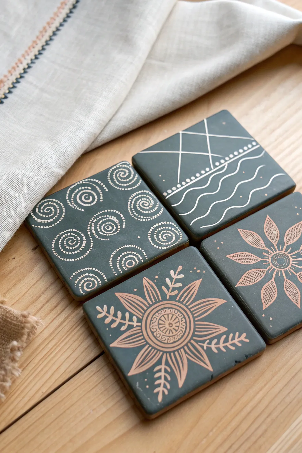
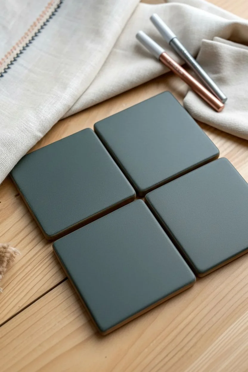
Transform plain dark tiles or coasters into stunning home decor pieces with these intricate metallic doodles. The contrast of shimmering silver and rose gold ink against a matte charcoal background creates an elegant, globally-inspired aesthetic perfect for any coffee table.
Detailed Instructions
Materials
- 4 dark grey or black ceramic/slate square coasters
- Fine tip chalk marker (white or silver)
- Fine tip chalk marker (rose gold or bronze)
- Pencil (optional for sketching)
- Damp cloth or cotton swabs
- Clear spray sealant (matte or satin finish)
Step 1: Preparation
-
Clean surface:
Ensure your coasters are completely clean and dry. Wipe them down with a damp cloth to remove any dust or oils, as these can interfere with the marker adhesion. -
Prime markers:
Shake your chalk markers vigorously and press the nibs down on a scrap piece of paper until the ink flows smoothly. Do not do this directly on the coaster to avoid blobs.
Step 2: Design 1: Dotted Spirals
-
Center spiral:
Using the silver/white marker, start near the center of the first coaster. Instead of drawing a solid line, create a spiral shape using small, evenly spaced dots. -
Outer spirals:
Work your way outwards, adding four or five more spiral clusters around the edges. I find it helpful to rotate the coaster as I work to keep my hand angle consistent. -
Fill gaps:
If there are large empty spaces between the main spirals, add smaller curved lines of dots to connect the visual flow.
Clean Lines Secret
Rest your pinky finger on a clean paper towel while drawing. This acts as a bridge, keeping your hand steady and preventing oil transfer to the tile.
Step 3: Design 2: Geometric Waves
-
Divisional line:
On the second coaster, draw a horizontal line slightly above the center using the silver marker. -
Mountain peaks:
Above the line, draw two intersecting triangles to represent mountain peaks. Keep the lines crisp and straight. -
Dotted border:
Draw a series of small dots along the main horizontal line to add texture. -
Ocean waves:
In the bottom half, draw four fluid, wavy lines parallel to each other. Add a few stray dots between the waves for extra detail.
Oops! A Smudge
Since tile surfaces are non-porous, a wet Q-tip acts like a precision eraser. Wipe away mistakes instantly, dry the spot, and redraw.
Step 4: Design 3: Metallic Floral
-
Central circle:
Switch to your rose gold marker for the third coaster. Draw a small circle in the center, and add a second ring around it. -
Petal outline:
Draw eight long, pointed petals radiating from the center. Try to keep them roughly the same size. -
Detailed shading:
Inside each petal, use very fine cross-hatching or stippling (lots of tiny dots) to fill them in. This gives it a textured, lace-like appearance. -
Center details:
Go back to the center circles and add tiny lines or a small flower shape in the very middle to complete the look.
Step 5: Design 4: Sunflower Burst
-
Intricate center:
Using the rose gold marker, draw a larger center circle (about an inch wide). Draw patterns inside it like concentric rings and small ticks. -
Loose petals:
Draw large, loose petals extending almost to the edge of the coaster. These should be more curved and flowing than the previous design. -
Leaf sprigs:
In the spaces between the main petals, draw delicate stems with small leaves coming off them. -
Final accents:
Add a few stray dots floating around the petals to balance the negative space.
Step 6: Finishing
-
Dry thoroughly:
Let the ink dry completely for at least 30 minutes. Chalk marker can smudge easily if touched while damp. -
Seal to protect:
To make these functional coasters, take them outside and spray a light, even coat of clear acrylic sealer over the top. This prevents the chalk from washing away with condensation.
Place your warm mug on your new art pieces and enjoy the custom handcrafted vibe
Negative Space Mandala on Black
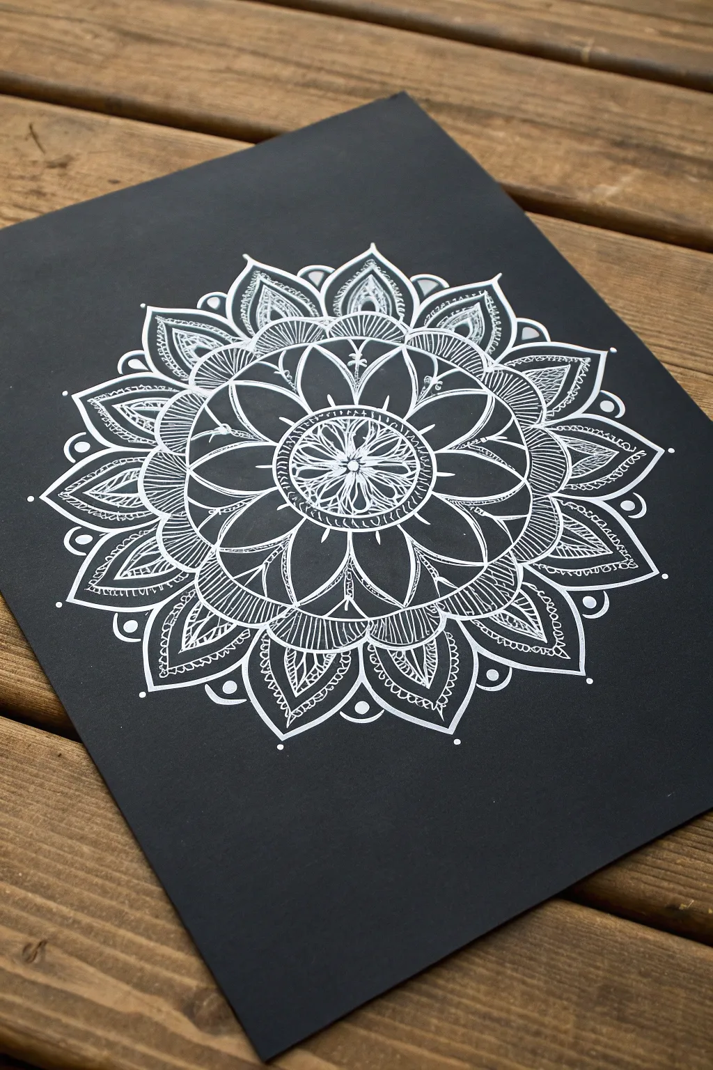
This striking project utilizes the high contrast of white ink on deep black paper to create a mesmerizing visual pop. By building concentric layers of petals and patterns, you’ll create a soothing, detailed mandala that looks far more complex than it actually is.
How-To Guide
Materials
- Black cardstock or mixed media paper (smooth texture preferred)
- Fine-tip white chalk marker or gel pen (0.5mm – 1mm)
- Circle template or compass
- Pencil (H or HB)
- Ruler
- Eraser
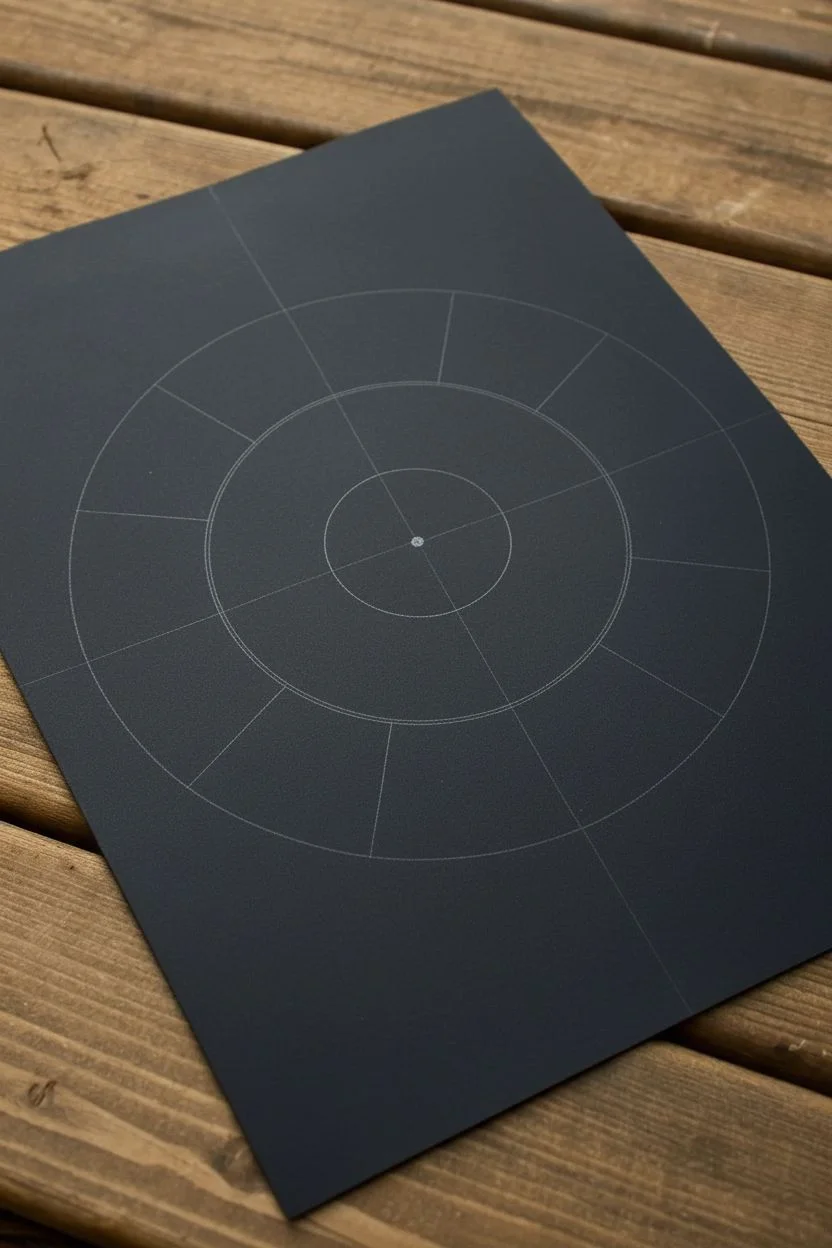
Step 1: Planning and Structure
-
Find the center:
Begin by finding the exact center of your black paper. Use a ruler to measure and mark a faint dot with your pencil to serve as the anchor for your entire design. -
Draw guide circles:
Using a compass, draw a series of light concentric circles radiating from your center point. Start with a very small center circle about 1 inch diameter, then add 3-4 larger rings spaced roughly 1-1.5 inches apart to guide your petal layers. -
Divide the space:
Lightly draw straight lines intersecting through the center point like a pie chart. Doing 8 or 12 sections works best to keep your symmetry consistent as you work outward.
Step 2: Drawing the Core
-
Start the center rosette:
Switch to your white marker. In the very center circle, draw a small flower shape with thin petals that meet in the middle. Add a few stamens or lines inside each petal for texture. -
Create the first border:
Surround your center flower with a double ring—draw two circles close together. Inside this narrow band, draw tiny vertical tick marks or small dots to create a textured border. -
Draw the primary petals:
Using your next pencil guide circle, draw large, rounded petals. The base of each petal should touch the textured border, and the tip should touch the pencil guide line. -
Detail the primary petals:
Inside each of these large petals, draw a smaller, tear-drop shape. This creates a ‘double’ petal look and adds depth without shading.
Smudge Prevention
Work from the center outward and rotate your paper constantly. This keeps your hand from resting on wet ink as you expand the design.
Step 3: Expanding the Pattern
-
Add separation layers:
Between the primary petals and the next layer, draw curved lines connecting the tips of the petals. I find that arching these lines slightly inward creates a nice ‘webbed’ effect. -
Fill the negative space:
In the triangular gaps between the primary petal tips, add fine line details. Simple horizontal hatching or small V-shapes work beautifully here to darken the negative space. -
Draft the outer petals:
On the next guide ring, draw a layer of pointed, leaf-like shapes. Position these so the points align with the gaps of the previous layer (staggered arrangement). -
Intricate filling:
Fill these pointed leaves with intricate patterns. Try a mix of small circles at the base and horizontal lines toward the tip to mimic leaf veins.
Add Subtle Dimension
Use a grey colored pencil to add faint shading under the petal tips. This makes the white layers look like they are floating.
Step 4: The Final Flourishes
-
Create the lace edge:
For the outermost layer, draw wide, shallow scallops or arches. These should be the largest shapes in your mandala. -
Detail the outer rim:
Inside these large scallops, draw a smaller, identical shape. Fill the space between the two lines with tiny zig-zags or loops to create a ‘lace’ appearance. -
Add accent dots:
Place a single, bold white dot at the very tip of each outer scallop. Add smaller dots in any large black areas that feel too empty to balance the design. -
Erase guidelines:
Allow the white ink to dry completely—chalk markers can smudge easily if wet. Once bone dry, gently erase your pencil circles and grid lines. -
Clean up lines:
Review your work for any faint lines. Go over important structural lines one more time with the marker to make them pop against the black background.
Step back and enjoy the hypnotic contrast of your finished black and white masterpiece
Faux Neon Sign Glow Effect

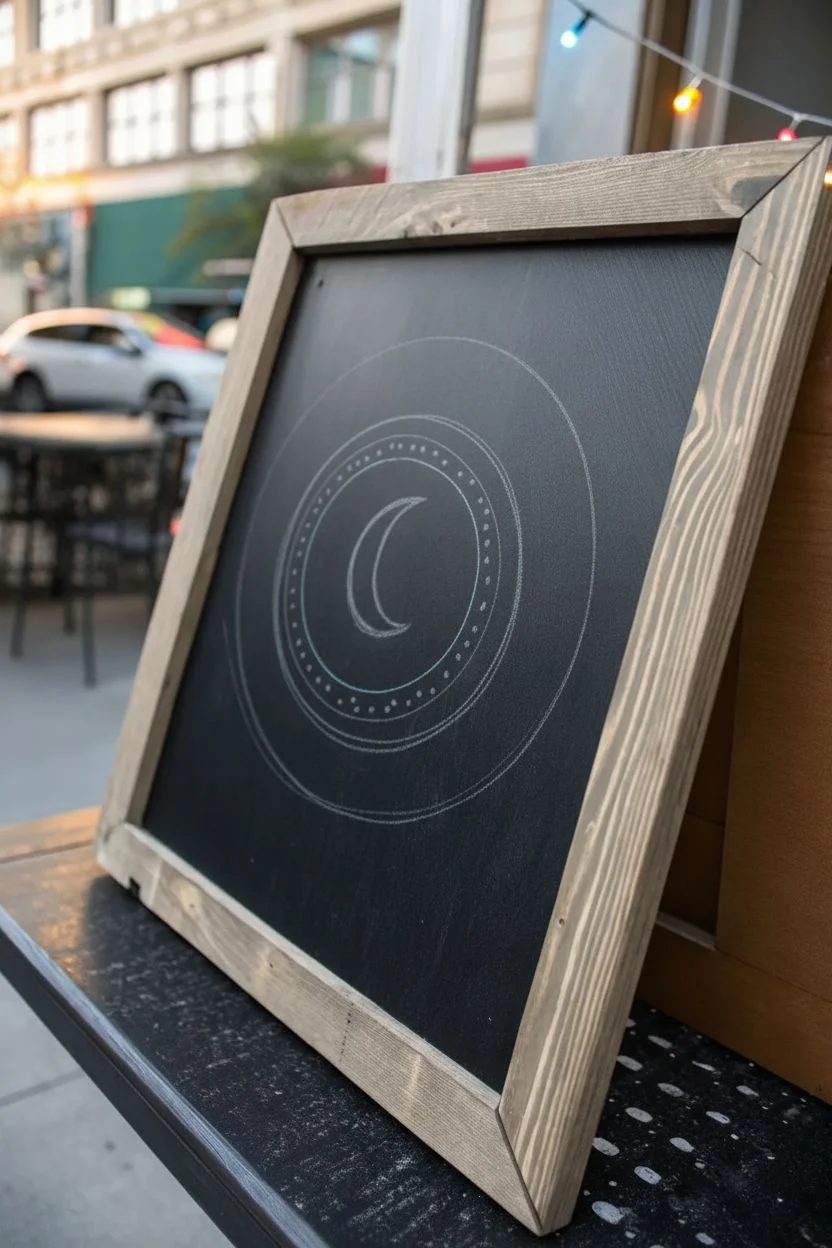
Create a captivating optical illusion with this celestial chalkboard design that mimics the vibrant glow of a neon sign. Using high-contrast chalk markers, you’ll draw a stylized sun and moon motif that pops against the dark background, perfect for adding a mystical touch to any cafe or home decor.
Detailed Instructions
Materials
- Framed chalkboard (non-porous surface recommended)
- Neon pink liquid chalk marker (medium tip)
- Neon teal/cyan liquid chalk marker (medium tip)
- White liquid chalk marker (fine and medium tip)
- Ruler
- Compass or two round objects (one large, one slightly smaller)
- Pencil (for initial sketching)
- Damp cloth (for corrections)
Step 1: Setting the Composition
-
Clean surface:
Begin by wiping down your chalkboard with a damp cloth to remove any dust or grease. Let it dry completely to ensure the markers adhere smoothly. -
Find drawing tool:
Locate the exact center of your board. You can use a ruler to measure specifically or eyeball it if you prefer a more organic feel. -
Draft the moon:
Using a pencil lightly, sketch a crescent moon shape in the very center. Draw the outer curve first, then the inner curve to connect the points. -
Draft the rings:
Use a compass or trace a circular object to pencil in a circle around the moon. Then, draw a second, slightly larger concentric circle around the first one to create a band.
Uneven Flow?
If the marker trails off, press the nib on a scrap paper to re-saturate it. Never pump the nib directly on your artwork, or you risk a puddle.
Step 2: Drawing the Neon Core
-
Outline the moon:
Shake your white chalk marker well. Carefully trace over your pencil sketch of the crescent moon, keeping the line weight consistent. -
Double the line:
I like to go over the white moon a second time once the first layer dries to make the white incredibly opaque and bright. -
Draw inner ring:
Switch to the neon teal chalk marker. Trace the inner circle you sketched earlier. Try to keep your hand steady and pull the marker towards you for smoother curves. -
Draw outer ring:
With the same teal marker, trace the outer circle. The gap between these two teal rings should be about half an inch wide. -
Add detail dots:
Inside the band created by your two teal circles, place evenly spaced teal dots all the way around the circumference.
Step 3: Radiating Rays
-
Plan the rays:
Lightly mark pencil points outside the circle where your major sun rays will go. Space them equally around the circle. -
Draw large rays:
Using the neon pink marker, draw long, narrow V-shapes (triangles without a bottom) pointing outward from the circle. There should be roughly 12-14 of these main rays. -
Fill the gaps:
Between each pink V-shape, draw a single straight line using the teal marker. These should be slightly shorter than the pink rays. -
Add white highlights:
To enhance the ‘neon’ effect, take your fine-tip white marker and draw a very thin line down the center of each pink ray. This mimics the bright filament inside a neon tube. -
Highlight the teal:
Add small white highlights or dashes on the teal circles and the straight teal rays to make them appear to glow.
Level Up: Gloss Finish
Add a tiny dot of white acrylic paint at the brightest points for extra shine, or use metallic silver marker for the ‘hardware’ connecting the neon tubes.
Step 4: Final Touches
-
Clean up sketch lines:
Once all ink is 100% dry to the touch, use a slightly damp Q-tip or a soft cloth to gently wipe away any visible pencil marks. -
Sharpen edges:
If any lines look fuzzy or uneven, use the damp Q-tip to clean up the edges, making the shapes crisp. -
Boost the glow:
Optional: lightly smirk/smudge a tiny bit of matching colored chalk dust around the lines to create a soft halo effect, though the markers alone provide a stark, clean neon look.
Step back and enjoy the vibrant glow of your handmade neon sign art

Have a question or want to share your own experience? I'd love to hear from you in the comments below!