Forests are basically the perfect subject when you want something calming, layered, and full of texture. Here are my favorite forest drawing ideas—from classic scenes you can sketch today to more playful twists that still feel totally “woods-y.”
Pine Forest Silhouette at Sunset
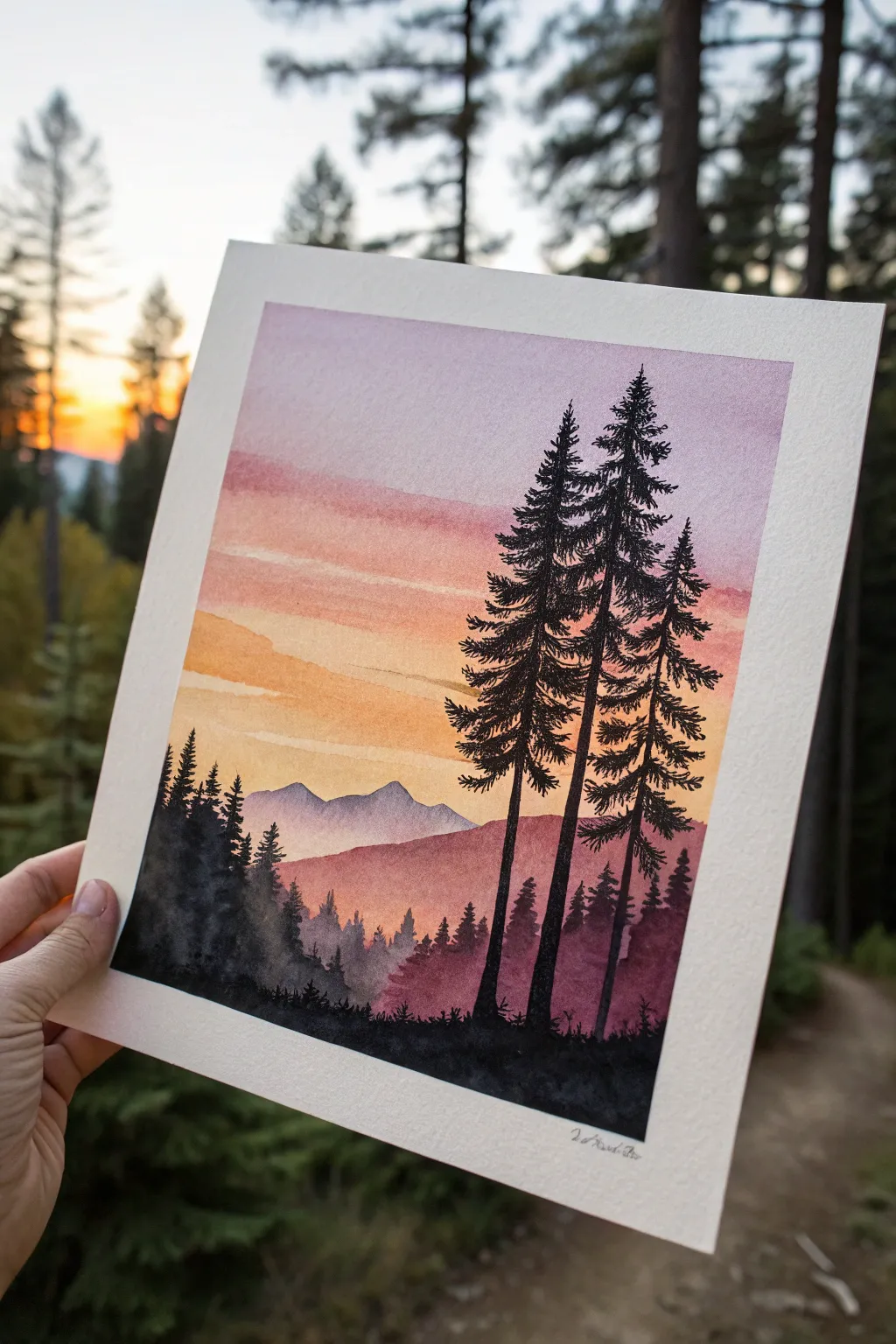
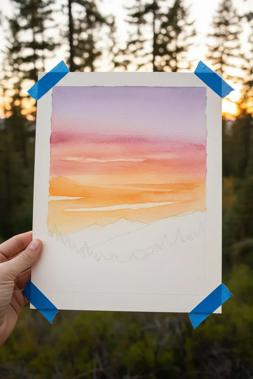
Capture the serene beauty of twilight in the mountains with this layered watercolor and ink project. You will blend a vibrant sunset gradient into distant misty peaks, finishing with striking black pine silhouettes.
How-To Guide
Materials
- Cold press watercolor paper (300 gsm)
- Watercolor paints (Purple, magenta/rose, orange, yellow, Payne’s gray or black)
- Round watercolor brushes (size 8 or 10 for washes, size 2 or 4 for details)
- Black waterproof fine liner pen or black pigment ink
- Masking tape
- Clean water and paper towels
- Pencil and eraser
Step 1: Painting the Sunset Sky
-
Tape boundaries:
Secure your watercolor paper to a board using masking tape along all four edges. This creates a crisp white border and prevents the paper from buckling when wet. -
Wet the sky area:
Using your largest round brush, apply clean water to the upper two-thirds of the paper. You want an even sheen, not puddles, to prepare for the wet-on-wet technique. -
Apply the top gradient:
Start at the very top with a soft purple or violet wash. Let the pigment flow naturally down slightly, keeping the color strongest at the top edge. -
Blend into warmth:
While the purple is still damp, introduce a rose or magenta hue just below it. Allow the colors to touch and bleed together softly to create a transition zone. -
Add the glowing horizon:
Moving downward, blend in an orange tone, and finally a warm yellow near where the mountains will begin. Ensure the transition to yellow is clean so the sky looks luminous. -
Detail the clouds:
While the sky is drying but still damp (damp-dry stage), use a slightly thirsty brush to lift out horizontal streaks or add slightly more concentrated orange pigment to suggest thin, floating clouds. -
Dry completely:
It is crucial to let the sky layer bone-dry before moving on. I like to use a hairdryer on a low setting if I’m impatient, but air drying works best for evenness.
Step 2: Creating the Mountain Layers
-
Sketch the outline:
Lightly sketch the outline of the distant mountain range and a second, closer hill layer with a pencil. Keep the lines very faint. -
Paint the distant mountains:
Mix a watery, pale purple-gray. Fill in the furthest mountain shape. because it’s in the distance, it should be much lighter and less saturated than the foreground. -
Layer the middle ground:
Once the distant mountains are dry, mix a slightly darker, reddish-purple tone. Paint the second hill layer that sits in front of the mountains, creating depth through value change. -
Suggest trees on the hill:
While the middle hill layer is still wet, dab tiny vertical strokes of slightly darker pigment along the ridge to suggest a distant forest texture.
Branch technique
Use a ‘stippling’ or tapping motion rather than long strokes for the pine needles. This creates a fluffy, natural texture for the trees.
Step 3: Inking the Silhouette Trees
-
Plan the foreground:
Using a very concentrated dark mix (Payne’s gray with barely any water) or black ink, block out the solid black ground at the very bottom of the paper. -
Establish the main trunks:
Draw three tall, slightly curving vertical lines for the main pine trees on the right side. Make the trunks thicker at the base and taper them to a needle point at the top. -
Add texture to the trunks:
Don’t make the lines perfectly straight; give them a little wobble to mimic organic bark. -
Paint branches from top down:
Starting at the tip of the tree, use quick, short flicks of your brush or pen to create branches. Keep the top branches short and pointing slightly upward. -
Build the canopy:
As you move down the trunk, make the branches longer and heavier. Use a jagged, scribbling motion to simulate bunches of pine needles rather than individual leaves. -
Fill the left side forest:
On the left side of the paper, paint a cluster of smaller, shorter pine trees rising from the dark foreground. These should be less detailed than the three main trees to maintain focus. -
Add grassy details:
Use a fine liner or the tip of your smallest brush to flick tiny blade-like strokes upward from the black ground layer to simulate wild grass. -
Final reveal:
Wait until the black ink is completely dry to the touch to avoid smudging. Gently peel off the masking tape at a 45-degree angle to reveal your crisp white border.
Muddy sky fix
If colors turn brown where they mix, stop! Let it dry completely, then glaze a single pure color over the top to unify the area without overworking it.
Step back and admire your peaceful mountain view made from paper and paint


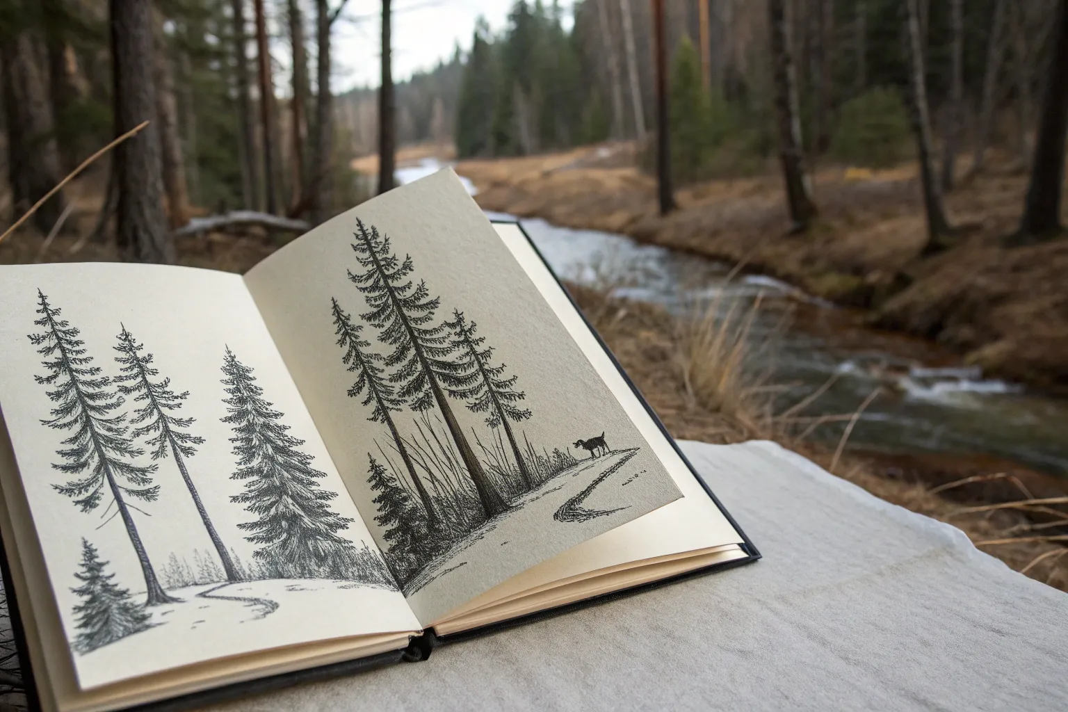
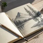
Misty Morning Forest Layers
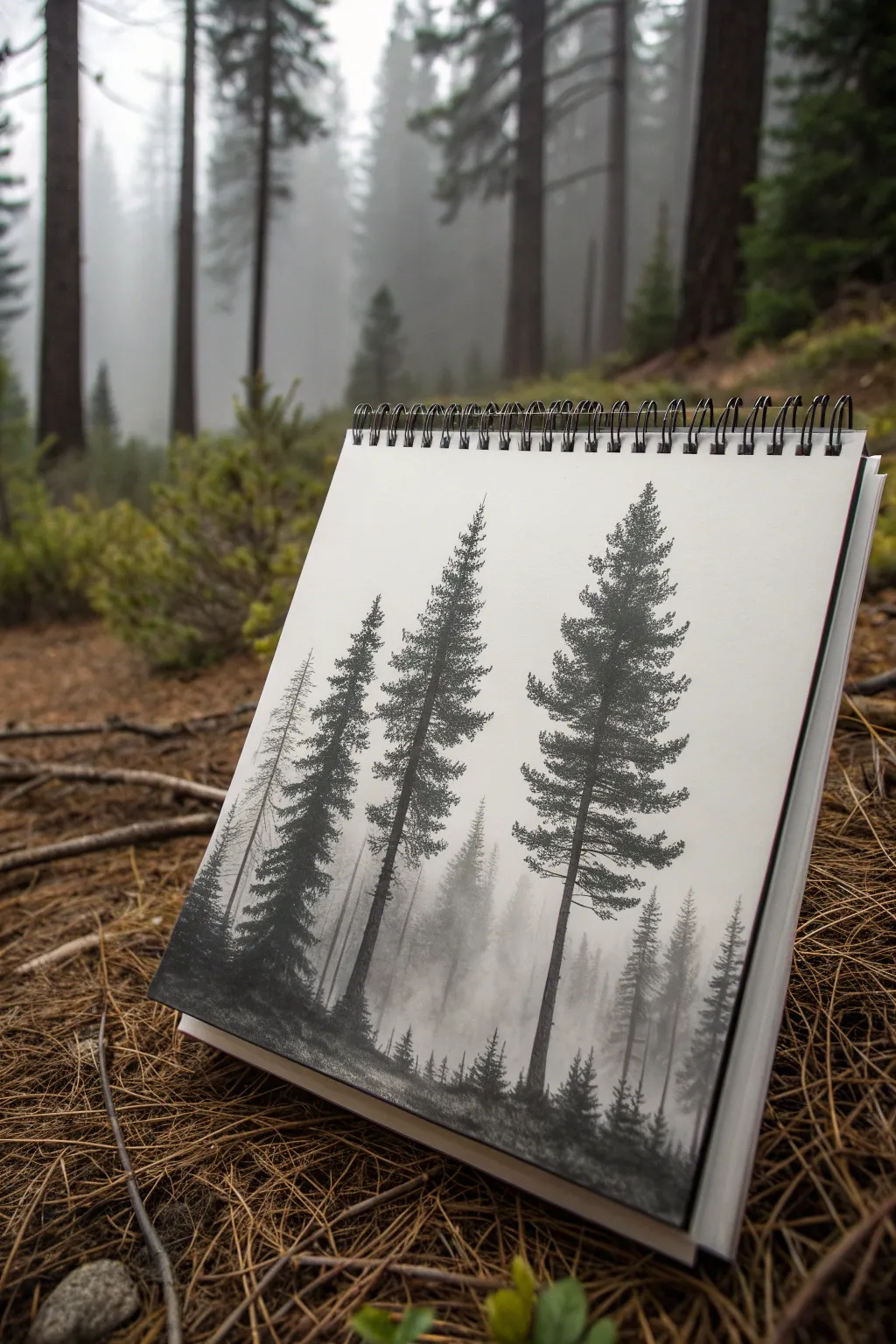
Capture the serene mood of a foggy forest with this layered monochromatic drawing. By using simple graphite shading techniques, you will create depth that makes the distant trees disappear into the mist while the foreground pines stand tall and sharp.
How-To Guide
Materials
- Sketchbook with smooth heavyweight paper
- Set of graphite pencils (2H, HB, 2B, 4B, 6B)
- Blending stump (tortillon) or cotton swab
- Kneaded eraser
- Precision eraser (pencil style) or white gel pen (optional)
- Tissue paper for hand resting
Step 1: Setting the Atmosphere
-
Establish the background mist:
Before drawing any trees, lightly shade the lower two-thirds of your page using a 2H pencil. Hold the pencil almost flat against the paper to create a smooth, cloudy texture. -
Blend for softness:
Take a clean tissue or blending stump and gently rub the graphite you just laid down. Use circular motions to create a seamless, foggy gray wash that will serve as the distant atmosphere. -
Suggest the distant treeline:
Using an HB pencil with extremely light pressure, sketch gentle, vertical strokes in the background mist. These shouldn’t look like detailed trees yet—just ghostly silhouettes fading into the fog. -
Refine the faint layer:
Use your blending stump to smudge these background vertical lines upwards, making their tops indistinct. This mimics how fog obscures distant objects.
Step 2: The Middle Ground
-
Draw the secondary pines:
Switch to a 2B pencil. To the left side of the page, draw a tall, thin vertical line for a trunk. This tree should be distinct but not fully dark yet. -
Add texture to the trunk:
Sketch short, jagged branches extending horizontally from the trunk. Keep the strokes somewhat loose to suggest pine needles without drawing every single one. -
Create the smaller background trees:
To the right of your main trees, sketch varying heights of smaller pines using the HB pencil again. These should be slightly darker than your initial misty layer but lighter than the tree you just drew. -
Soften the base:
Where these middle-ground trees meet the ground, use the blending stump to pull the graphite downward and sideways. This ‘roots’ the trees into the foggy forest floor rather than having them float.
Fog vanishing too fast?
If your background layer looks too scratchy, rub a little graphite powder directly onto your blending stump and swirl it on the paper instead of drawing directly with the pencil.
Step 3: The Foreground Giants
-
Place the main focal trees:
Using a 4B pencil, draw the prominent trunks of the two largest trees in the foreground. Press firmly to get a dark, rich line that stands out against the pale background. -
Draft the branch structure:
Mark light horizontal guides where the main branches will go. Notice how pine branches often droop slightly downwards before curving up. -
Foliage technique:
Use a scribbling motion or rapid stippling with your 4B or 6B pencil to create the dense clusters of needles. Focus on the undersides of the branches to simulate shadow. -
Build the canopy shape:
Work your way from the top (narrower) to the bottom (wider). Leave gaps between branch clusters so the misty background shows through; this negative space is crucial for realism. -
Add deep contrast:
Switch to your darkest 6B pencil. Go back into the deepest parts of the foreground trees—right against the trunk and under grand branches—and darken them to create dramatic contrast.
Try Charcoal accents
For the absolute darkest blacks in the foreground trees, swap your 6B graphite for a charcoal pencil. The matte black will make the drawing pop significantly.
Step 4: Ground and Final Details
-
Sketch the forest floor:
Using a 4B pencil, scribble rough, textured lines at the very bottom of the page to represent uneven ground, grass, and fallen needles. -
Plant tiny saplings:
Draw very small, dark, triangular tree shapes along the bottom ridge. These tiny details give the large trees a sense of massive scale. -
Lift out highlights:
Take your kneaded eraser and pinch it into a sharp wedge. gently tap or ‘lift’ graphite away from the tops of the foreground branches to mimic light hitting the needles. -
Enhance the mist:
If your background got too dark, lightly sweep the kneaded eraser horizontally across the middle section to re-introduce the fog. -
Final assessment:
Stand back and check your values. The foreground should be nearly black, and the background nearly white. Darken the closest trunks one last time if needed.
Close your sketchbook and enjoy the depth of your atmospheric forest scene


Forest Clearing With a Deer Focal Point
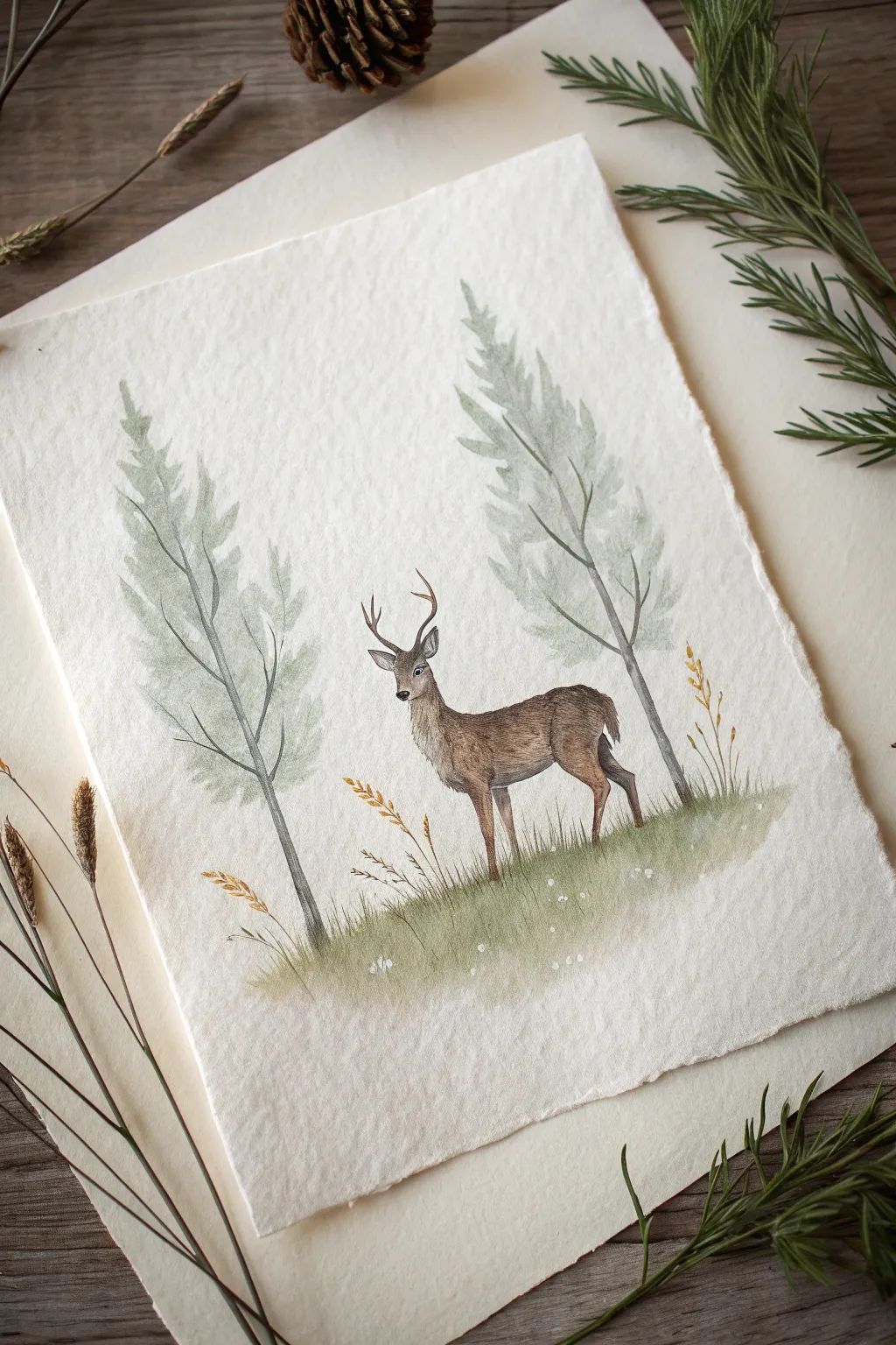
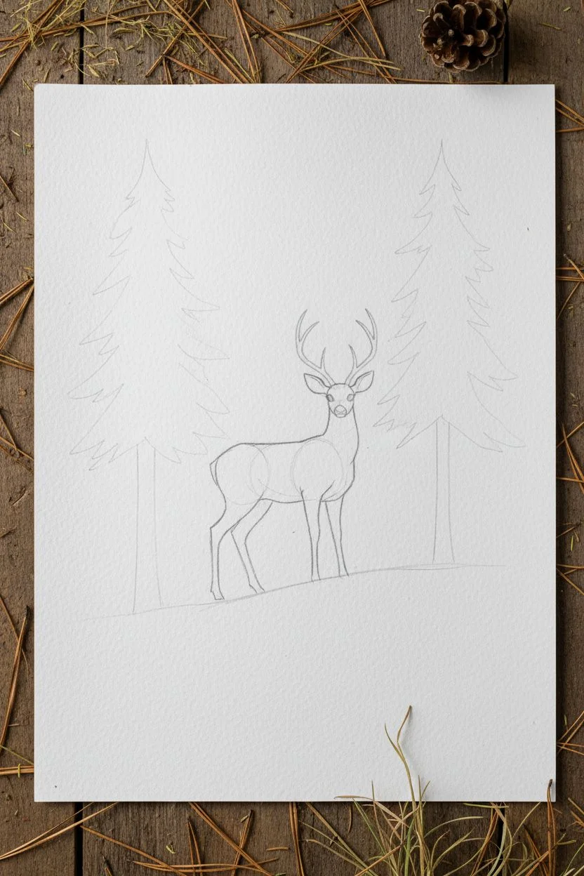
This serene illustration captures the quiet grace of a deer standing between two towering conifers on textured paper. Using a mix of soft graphite and delicate watercolor washes, you’ll build up a scene that feels both misty and wonderfully detailed.
Detailed Instructions
Materials
- Heavyweight watercolor paper (rough or cold press texture)
- Graphite pencils (H, HB, 2B)
- Watercolors (Sap Green, Burnt Umber, Yellow Ochre, Paynes Gray)
- Small round brushes (size 0 and 2)
- Fine liner pen (brown or sepia, optional)
- Mixing palette
- Water cups and paper towels
Step 1: Planning the Composition
-
Lightly sketch the trees:
Begin with a very hard pencil (H) to mark out the placement of your two main trees. Draw faint vertical lines for the trunks, placing one on the far left and one on the right, leaving the center open. -
Position the deer:
In the lower center gap between the trees, sketch the basic geometric shapes of the deer. Use an oval for the body and a smaller circle for the head, connecting them with a gentle slope for the neck. -
Refine the deer’s outline:
Using your HB pencil, carefully refine the deer’s anatomy. Add the slender legs, the ears, and the gentle curve of the back. -
Add the antlers:
Draw the antlers curving upward and slightly back. Keep the tips relatively simple, as this is likely a younger buck. -
Define the ground line:
Sketch a soft, sloping hill beneath the deer’s feet, suggesting where the grass will grow.
Natural Texture
For that vintage look, tear the edges of your paper manually instead of cutting. Use a ruler as a guide and rip slowly for a beautiful deckled edge.
Step 2: Painting the Foliage
-
Mix a misty green:
Create a very watery mix of Sap Green and a touch of Paynes Gray. You want a desaturated, pale pine color. -
Wash in the tree shapes:
Using a size 2 brush, paint the foliage of both trees. Instead of detailed needles, use upward, sweeping dabs to create a soft, feathery silhouette that tapers at the top. -
Add depth to the trees:
While the first layer is still slightly damp, drop in a slightly more concentrated green mix near the center ‘trunk’ line of the trees to create volume. -
Paint the tree trunks:
Use a thin mix of Burnt Umber and Paynes Gray to paint the slender trunks. Let the lines be slightly broken where the foliage covers them. -
Create the grassy base:
Wash a horizontal band of watery Sap Green mixed with a little Yellow Ochre across the bottom. Let the edges remain soft and undefined.
Winter Variation
Swap the green grass wash for pale blue-gray shadows and leave the ground white to transform this into a snowy winter scene instantly.
Step 3: Detailing the Deer
-
Base coat the deer:
Mix a warm light brown using Burnt Umber and plenty of water. Paint the entire body of the deer, leaving tiny slivers of white paper for highlights on the back or ears. -
Build fur texture:
Once the base is dry, use a size 0 brush with a thicker brown mix. Create tiny, directional strokes to mimic fur, focusing on the neck ruff and the darker patch on the back. -
Darken the legs and face:
Add darker brown accents to the hooves, the nose, and the eyes. Leave a tiny white dot in the eye to bring it to life. -
Enhance the antlers:
Paint the antlers with a pale ochre wash, darkening the base where they meet the head.
Step 4: Final Atmosphere
-
Add grass blades:
Using your smallest brush or a fine liner, flick distinct grass blades upward from the green wash. Vary the heights and angles for realism. -
Include golden accents:
Paint a few taller stalks of dry grass or wheat using pure Yellow Ochre or Burnt Sienna to add warmth to the scene. -
Add small white details:
If you have opaque white gouache or a gel pen, add tiny dots in the grass to suggest small wildflowers. -
Final pencil reinforcing:
Once everything is perfectly dry, take a sharp 2B pencil and very lightly reinforce the darkest shadows on the deer and the main lines of the tree trunks to make them pop.
Step back and admire the calm, woodland narrative you have created on the page


A Hidden Cabin Between the Trees
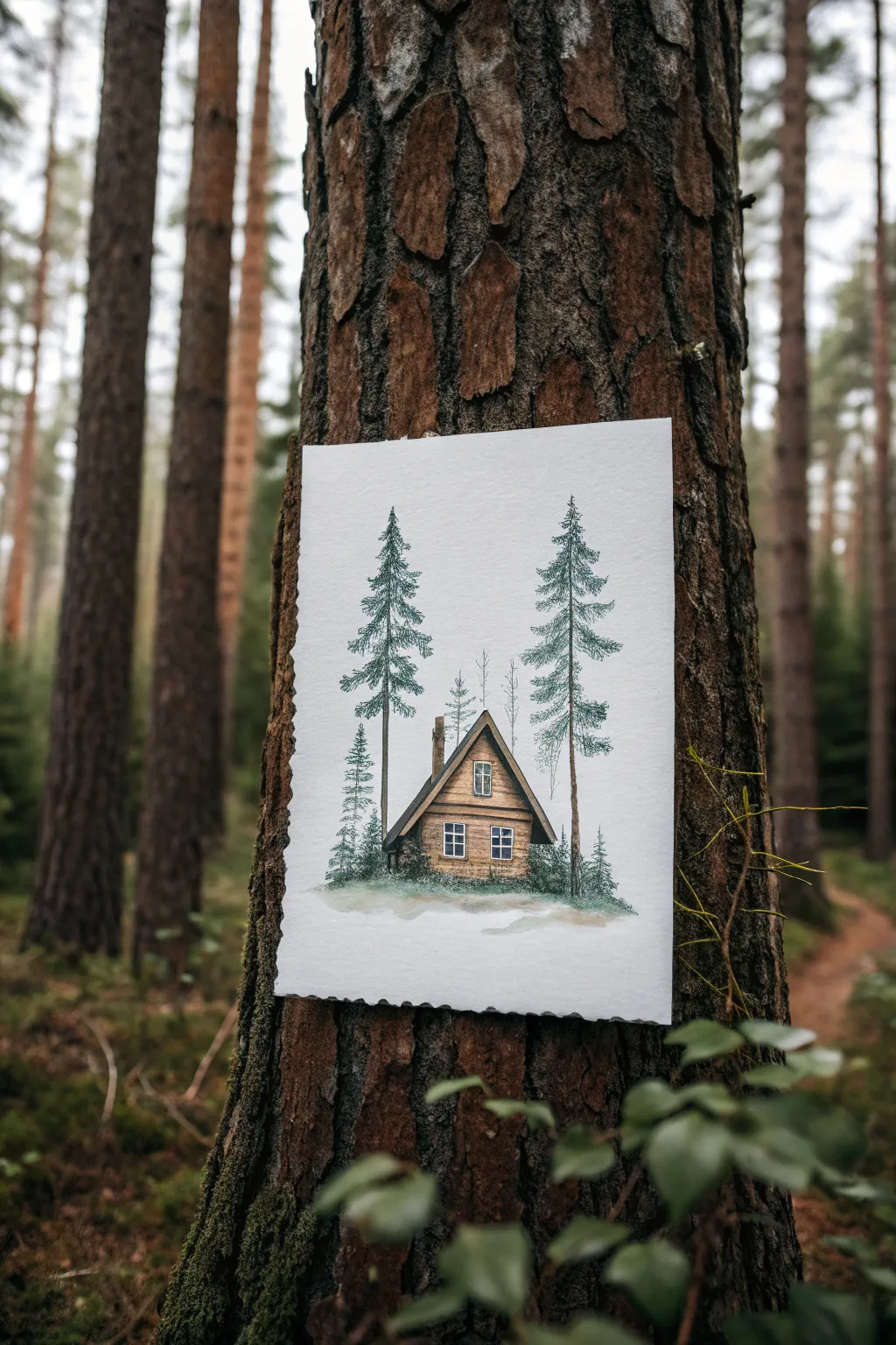
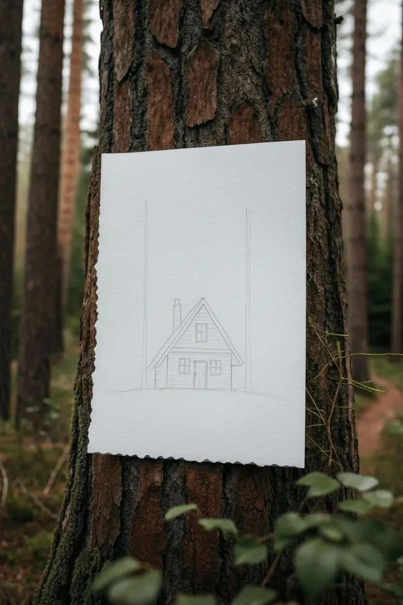
Transport yourself to a quiet woodland retreat with this mixed-media illustration featuring a rustic A-frame cabin nestled between towering pines. By combining precise fine liner detailing with soft watercolor washes, you’ll capture both the architectural charm and the organic wildness of the forest.
Step-by-Step Tutorial
Materials
- Cold press watercolor paper (deckle edge optional)
- Fine liner pens (sizes 0.1, 0.3, and 0.5)
- Watercolor paints (Sap Green, Burnt Sienna, Yellow Ochre, Paynes Gray)
- Round watercolor brushes (size 4 and size 0/detail)
- pencil (HB or H)
- Kneaded eraser
- Ruler
- Paper towel
Step 1: Drafting the Scene
-
Establish the horizon:
Begin by lightly penciling a soft, slightly uneven horizontal line about one-third of the way up your paper to create the ground level. -
Outline the cabin shape:
Center a simple house shape on top of your ground line. Draw a steep triangle for the roof and a rectangular box for the main structure, using your ruler if you want crisp architectural lines. -
Position the trees:
Flank the cabin with two vertical lines reaching high up the paper to mark the trunks of your main pine trees. Make sure the left one sits slightly in front and the right one tucks just behind the cabin’s edge. -
Add architectural details:
Sketch in the chimney on the left roof slope, the central door, and the two main windows—one on the upper level and one below.
Ink Smearing?
Ensure your ink is waterproof before painting. If you only have water-soluble fineliners, do the watercolor painting first, let it dry completely, and then draw your lines on top.
Step 2: Ink Work
-
Define the cabin structure:
Switch to your 0.5 fine liner. Trace the main outline of the roof and walls, allowing the lines to wiggle slightly for a rustic, hand-built feel rather than perfect geometry. -
Draw the logs:
Fill the wall space with horizontal stripes to represent the logs. I like to break these lines occasionally to suggest texture and age. -
Detail the windows:
Use a 0.1 pen for the delicate window panes, ensuring the frames remain white. -
Create tree texture:
For the pine trees, use a scribbling motion with your 0.3 pen. Start with the trunk, adding vertical bark lines, then move to the branches using quick, downward-sloping erratic strokes to mimic evergreen needles. -
Add background trees:
Sketch thinner, fainter bare trees behind the cabin using the 0.1 pen to create depth without overwhelming the main subjects.
Step 3: Watercolor Application
-
Paint the wood:
Dilute Burnt Sienna with a touch of Yellow Ochre. Wash this over the cabin walls, letting the color pool slightly at the bottom of each log for natural shadowing. -
Darken the roof:
Mix Paynes Gray with a little Burnt Sienna to get a charcoal tone. Carefully paint the roof, leaving tiny specks of white paper showing through for texture. -
Greenery base layer:
Apply a wash of watery Sap Green to the pine trees. Don’t worry about staying perfectly inside the inked lines; the loose color adds character. -
Deepen the foliage:
While the first green layer is damp, drop in a more concentrated Sap Green mixed with a tiny bit of Paynes Gray into the center of the tree masses to create volume. -
Ground the scene:
Paint the ground with a mix of green and brown, using loose, horizontal strokes. Fade the edges out into the white paper to create that vignette look.
Make it Winter
Leave the tops of the roof logs and the upper surfaces of the pine branches unpainted (white paper). Add a pale blue wash to the ground for snow shadows.
Step 4: Final Touches
-
Add window reflections:
Dilute a tiny amount of blue or gray and glaze over the window glass, leaving one corner of each pane white for a reflection. -
Enhance shadows:
Once everything is bone dry, take your 0.1 pen and add extra hatching under the roof eaves and at the base of the cabin to firmly plant it in the landscape. -
Add white highlights:
If you lost any crisp highlights, use a white gel pen to add small accents to the window frames or the tips of the pine branches.
Now you have a charming woodland miniature ready to display or gift to a nature lover
BRUSH GUIDE
The Right Brush for Every Stroke
From clean lines to bold texture — master brush choice, stroke control, and essential techniques.
Explore the Full Guide
Circular Forest Vignette Composition
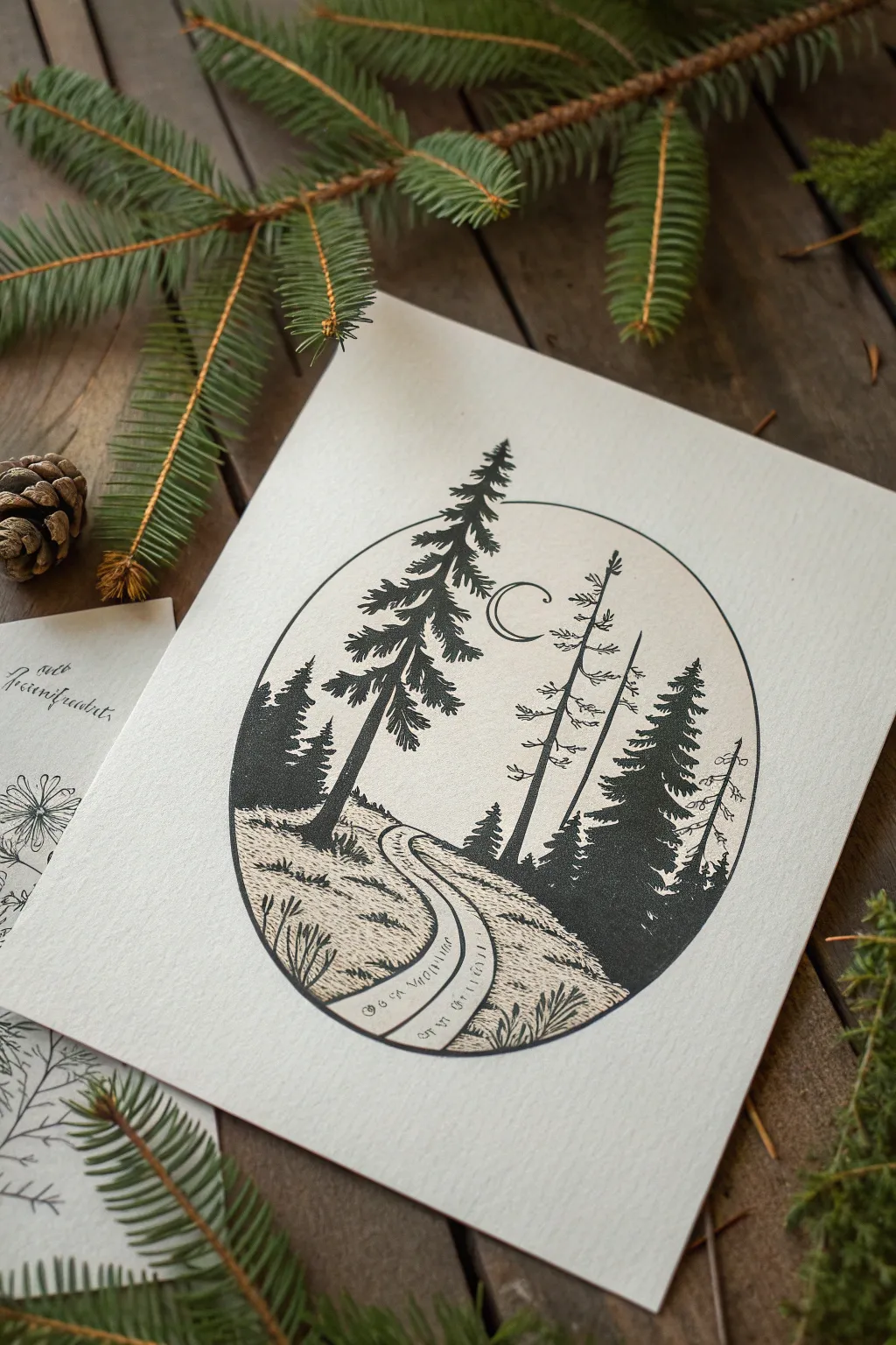
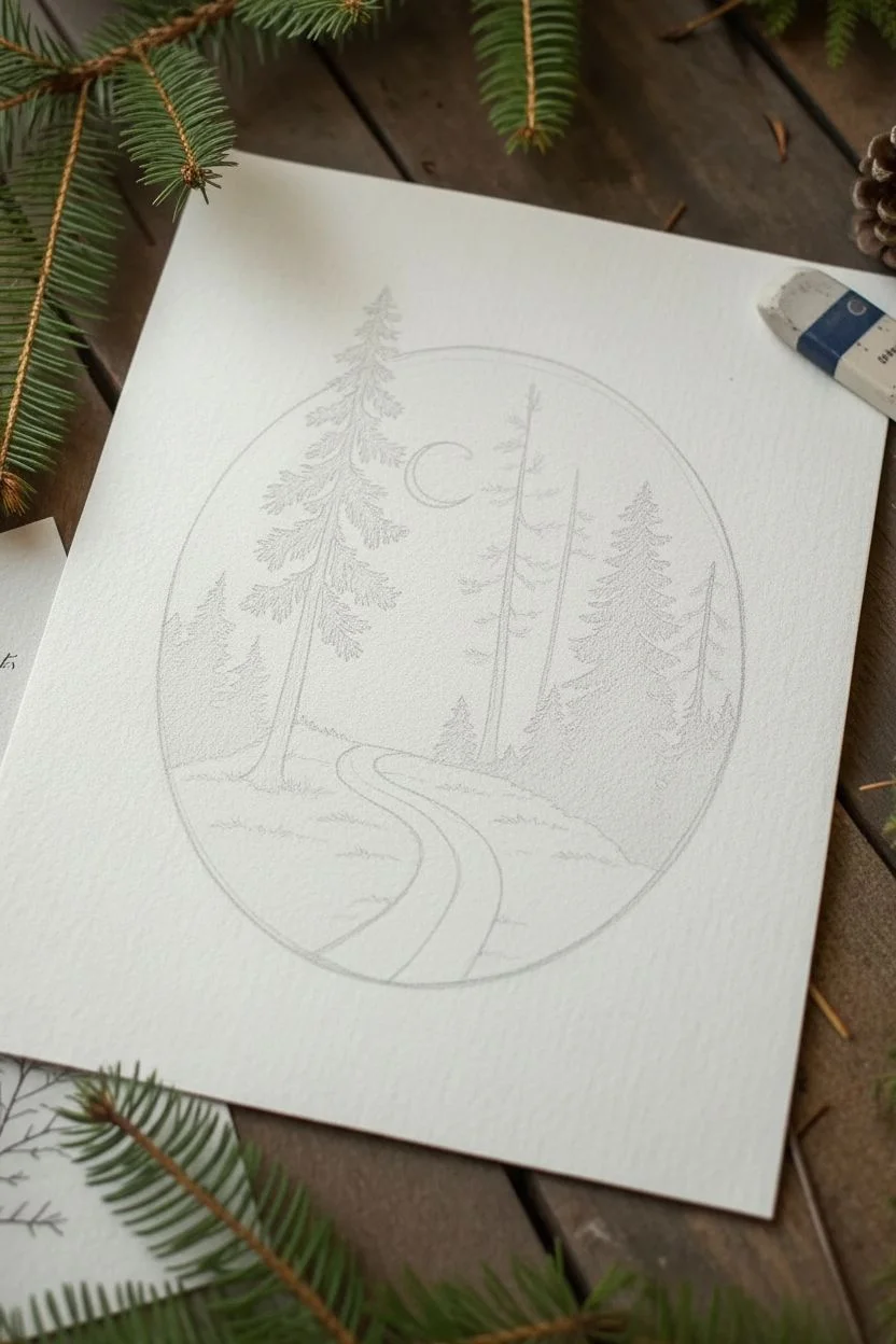
Capture the serene solitude of a night walk with this structured yet organic pen and ink drawing. The composition uses an oval frame to focus the viewer’s eye on a winding path flanked by majestic conifers under a crescent moon.
How-To Guide
Materials
- Heavyweight textured drawing paper (approx. 5×7 inches)
- Pencil (HB or 2H)
- Eraser (kneaded preferred)
- Fine liner pens (sizes 005, 01, 03, and 05)
- Oval stencil or compass
- Ruler
Step 1: Setting the Scene
-
Draw the boundary:
Begin by lightly tracing an oval shape in the center of your paper. If you don’t have an oval stencil, you can sketch a light cross to mark the height and width, then freehand the curves to connect them, aiming for symmetry. -
Sketch the horizon:
About one-third of the way up from the bottom of the oval, sketch a gentle, rolling horizon line. It doesn’t need to be perfectly straight; a slight unevenness adds to the natural terrain feel. -
Map the path:
Draw two curving lines starting wide at the bottom center and converging as they wind up towards the horizon line. This creates the forest road that anchors the perspective. -
Place the trees:
Sketch vertical guidelines for your trees. Place a large, dominant tree on the left foreground, a few thinner trunks in the middle distance, and a cluster of pines on the right. Add a small crescent moon near the upper center.
Step 2: Inking the Structure
-
Outline the frame:
Using an 05 pen, carefully trace over your pencil oval. A smooth, confident line works best here, but don’t worry if it has tiny organic wobbles—it adds character. -
Ink the main trunks:
Switch to an 03 pen to draw the trunks of the trees. For the large left tree, make the base slightly wider. For the middle, thinner trees, keep the lines somewhat broken to suggest bark texture. -
Draw the path edges:
Use an 01 pen to outline the road. Keep these lines slightly sketchy rather than solid rigid lines, implying grass or dirt edges interacting with the path.
Uneven Ink Flow?
If your pens skip over the textured paper, slow down your stroke speed. Let the ink soak in for a split second longer rather than pressing harder, which can damage the tip.
Step 3: Detailing the Trees
-
Create pine branches (Left):
On the main left tree, use the 01 or 03 pen to add downward-sloping branches. Start from the trunk and flick outward. Near the top, the branches should be short and tight; as you go down, make them wider and heavier. -
Fill the silhouette:
Fill in the tree clumps with solid black, but leave small gaps of white between branches to let ‘light’ through. This prevents the tree from looking like a solid black triangle. -
Add dead snags:
For the two thin trees in the center, draw very sparse, short horizontal scratches for dead branches. These trees should look stark and nearly skeletal compared to the lush pines. -
Dense forest (Right):
On the right side, draw the pine trees densely. Use overlapping scribbles or tight zig-zags to build up dark values, creating a sense of deep, shadowed woods. -
Background trees:
Behind the path on the horizon, sketch tiny, simple triangular shapes to suggest a distant forest line. Keep these small to enhance the feeling of depth.
Add Winter Magic
Turn this into a snowy scene by leaving the tops of the branches white (outlined only) and adding white gel pen dots over the black areas for falling snow.
Step 4: Ground and Atmosphere
-
Texture the grass:
Using your finest 005 pen, add short, vertical hatching lines along the banks of the road. Group them in little tufts rather than covering the whole area evenly. -
Detail the path:
Add a few very fine distinct lines inside the road path to suggest wagon wheel ruts or footprints. Keep the center of the path mostly white. -
Ground shadows:
Add stippling (dots) or cross-hatching at the base of the trees to ground them. This shadow weight helps the trees feel like they are growing out of the earth, not floating. -
Ink the moon:
Carefully trace the crescent moon with your 01 pen. Keep the line crisp and clean to contrast with the textured forest. -
Final erase:
Wait at least 15 minutes for the ink to fully cure. Here I like to test a tiny corner first to be safe, then gently erase all remaining pencil guidelines to reveal the high-contrast look.
Frame your miniature landscape or send it as a greeting card to a nature-loving friend
Forest Waterfall With Spray and Ferns
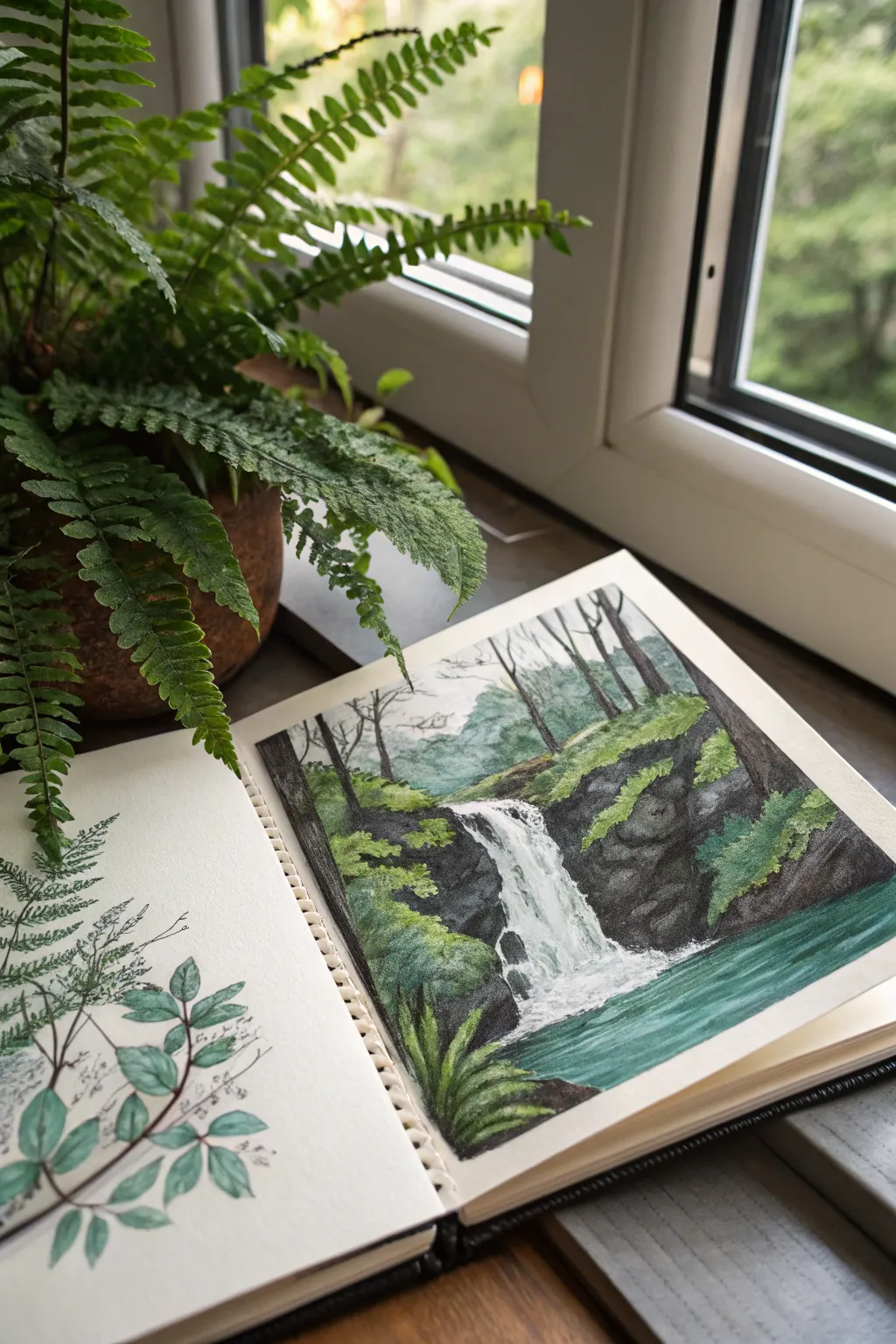
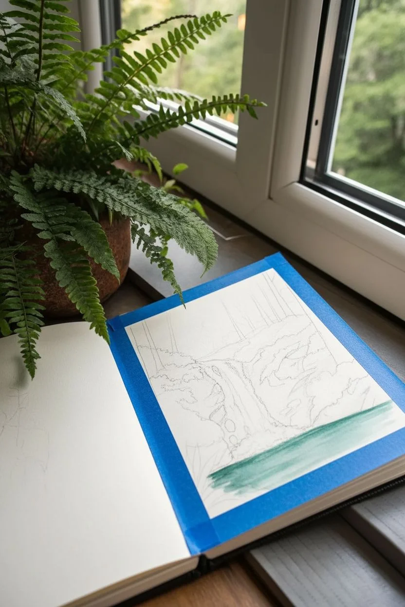
This serene sketchbook spread captures the moody atmosphere of a hidden forest waterfall using mixed media techniques to create depth and texture. By combining watercolor washes with precise colored pencil details, you’ll build contrast between the dark, wet rocks and the bright, rushing water.
Step-by-Step Guide
Materials
- Heavyweight mixed media or watercolor paper sketchpad
- Watercolor paints (payne’s gray, sap green, ultramarine blue, burnt umber)
- White gouache or white gel pen
- Colored pencils (various greens, dark grey, black, teal)
- Round watercolor brushes (size 4 and 8)
- Fine liner pen (optional for left page sketches)
- Masking tape (for clean edges)
- Paper towel
Step 1: Planning and Underpainting
-
Tape the borders:
Begin by applying artist’s tape or washing tape around the edges of your right-hand page. This will give you that crisp, professional frame seen in the example image. -
Pencil sketch:
Lightly sketch the main composition. Mark the vertical lines for the tree trunks, the jagged shapes of the rocks, and the flow of the waterfall. Keep the waterfall shape loose and organic. -
Base wash for the water:
Mix a watery teal using ultramarine blue and a touch of sap green. Apply this wash to the pool at the bottom of the page, keeping horizontal strokes to suggest movement. -
Rock foundation:
Using a very diluted payne’s gray or charcoal uniform wash, block in the areas where the rocks will be. Don’t go too dark yet; we are just mapping the shadows.
Pro Tip: Lifting Out
If the rocks get too dark, use a clean, damp brush or paper towel to ‘lift’ pigment while it’s still wet. This creates natural highlight areas where the rock faces catch the light.
Step 2: Building the Landscape
-
Deepening the rocks:
Once the initial wash is dry, mix a thicker, darker grey. Paint the rocky cliffs on either side of the waterfall, leaving the paper white where the water is falling. -
Adding the background forest:
For the distant trees at the top, use a pale, misty green mixed with plenty of water. Paint vague, soft shapes to create atmospheric perspective, making the background look further away. -
Defining the trees:
Switch to a smaller brush and use a dark brown-black mix to paint the thin, vertical trunks of the trees standing on the rocks. Let branches span outward naturally. -
Layering foliage:
Dab various shades of sap green and olive green onto the rocks and around the tree bases to represent moss and bushes. Allow colors to bleed slightly for a soft, natural look.
Step 3: Refining Details with Pencil
-
Texture with colored pencils:
Once the paint is completely dry, use dark grey and black colored pencils to enhance the cracks and crevices in the rocks. I find this creates a nice gritty texture that paint alone sometimes misses. -
Highlighting the moss:
Use a bright lime green or yellow-green pencil to scribble over the painted green areas on the rocks. This mimics the way sunlight catches the tips of moss. -
Drawing the foreground fern:
In the bottom left corner, draw sharp, blade-like fern leaves using a dark green pencil. Press firmly to make them stand out against the blurred background. -
Refining the water pool:
Use a teal or turquoise colored pencil to add precise horizontal lines to the water pool, intensifying the color closer to the rock edge.
Level Up: Texture Paste
Before painting, apply a little modeling paste to the rock areas. Once dry, paint over it. The physical texture will make the cliffs look incredibly realistic and rugged.
Step 4: The Waterfall and Finishing Touches
-
Creating the waterfall:
If you preserved the white paper, refine the edges with grey paint. If you lost the white, use opaque white gouache to paint the rushing water. -
Adding spray and movement:
Use a dry brush technique with white gouache (or a white gel pen) to create tiny dots and dashed lines at the base of the waterfall where it hits the pool. -
Left page botanical sketch:
On the opposite page, sketch a delicate fern sprig using a fine liner or graphite pencil. Keep it minimal to balance the heavy color on the right side. -
Adding color to the sketch:
Lightly wash the leaves of your sketch with watery green paint, leaving some areas unpainted for an artistic, study-like feel. -
Final reveal:
Carefully peel away the masking tape at a 45-degree angle to reveal your clean edges and complete the spread.
Close your sketchbook and enjoy knowing you’ve captured a peaceful moment of nature forever

PENCIL GUIDE
Understanding Pencil Grades from H to B
From first sketch to finished drawing — learn pencil grades, line control, and shading techniques.
Explore the Full Guide
Night Forest With Moonlit Highlights
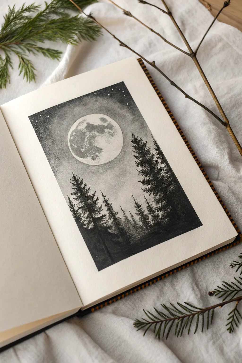
Capture the serene mystery of a night forest with this stunning monochromatic illustration. Using stippling and shading techniques, you’ll create a glowing moon that illuminates a silhouette of majestic pines.
Step-by-Step Tutorial
Materials
- High-quality sketchbook or drawing paper (heavyweight)
- Black fineliner pens (sizes 0.1, 0.3, and 0.5)
- Graphite pencils (HB, 2B, 4B)
- Blending stump or tortillon
- White gel pen or white gouache
- Ruler
- Compass or circle template
- Kneaded eraser
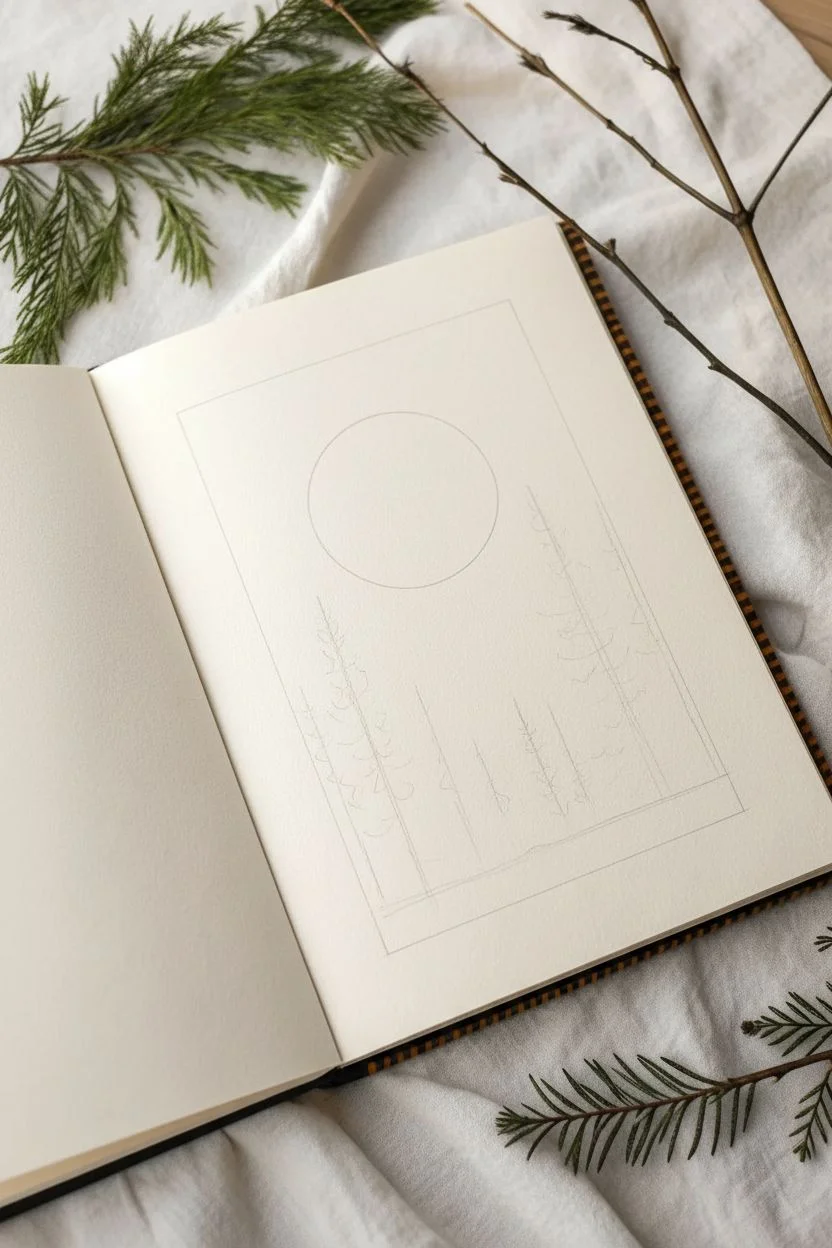
Step 1: Setting the Scene
-
Create the boundary:
Begin by using your ruler and a pencil to lightly draw a rectangular frame in the center of your page. This frame will contain your entire composition, so ensure the lines are straight and the corners are sharp. -
Draft the moon:
Inside the frame, near the upper center but slightly offset to the left, use a compass or a circular object to trace a perfect circle. This will form the full moon. -
Map the horizon:
Lightly sketch a low, uneven horizon line near the bottom quarter of the frame. Roughly mark vertical lines where your tallest trees will stand, varying their heights to create a natural rhythm.
Keep it Clean
Place a loose sheet of paper under your drawing hand while you work. This prevents the graphite sky from smudging onto your palm or the clean borders.
Step 2: The Night Sky
-
Start the gradient:
Using a graphite pencil (2B), begin shading the sky area, starting darkest at the top corners of the frame. As you move closer to the moon, lighten your pressure significantly to create a glowing halo effect. -
Deepen the contrast:
Switch to a 4B pencil or use cross-hatching with your 0.1 fineliner to make the corners of the sky intensely dark. The goal is a smooth transition from pitch black at the edges to a soft grey around the moon. -
Stipple the atmosphere:
To add texture to the night sky, use your 0.1 fineliner to add tiny dots (stippling) in the darker areas. Decrease the density of the dots as you approach the light source. -
Blend the sky:
Take a blending stump and gently smudge the graphite shading to create a smooth, misty atmosphere. Be careful not to smudge graphite into your clean white moon circle just yet.
Go Metallic
Instead of white paint for stars, try using silver or gold metallic ink. It adds a magical shimmer that catches the light when you turn the page.
Step 3: Texturing the Moon
-
Detail the craters:
Inside the moon circle, use a light HB pencil to sketch irregular shapes representing the lunar maria (the darker plains). Keep these shapes organic and centered mostly on the left side. -
Add lunar texture:
Use stippling with your finest pen (0.05 or 0.1) to shade these crater shapes. Concentrate the dots heavily in the center of the blemishes and fade them out toward the edges. -
Soften the glow:
Lightly blend the stippled areas with a touched blending stump (one that already has some graphite on it) to give the moon a realistic, dusty surface appearance without making it too dark.
Step 4: Drawing the Forest
-
Establish the trunks:
Using a 0.5 fineliner, draw the central trunk lines for your pine trees. Make the lines slightly thicker at the base and taper them to a fine point at the top. -
Form the branches:
Starting from the top of each tree, use short, scribbled zig-zag strokes to create pine branches. Keep the top branches short and pointing slightly upward, widening the span as you move down. -
Create density:
As you work your way down the trees, overlap your scribbles to create dense foliage. The trees should be silhouettes, so feel free to fill them in completely with black ink, leaving only tiny specks of white for dimension. -
Vary the heights:
Ensure the tree on the right is the dominant foreground element, reaching almost to the top of the moon. Place smaller, thinner trees in the background on the left to create depth. -
Ground the forest:
Fill in the ground area at the bottom with solid black ink or heavy charcoal shading. Rough up the top edge of this ground layer so it looks like uneven earth or underbrush rather than a flat line.
Step 5: Final Highlights
-
Add stars:
Using a white gel pen or a tiny brush with white gouache, dot small stars into the darkest parts of the sky at the top. Keep them random and vary the sizes slightly. -
Highlight the trees:
If your trees look too flat against the dark ground, you can use the white pen to add very subtle rim lighting to the tips of a few branches, implying moonlight hitting them. -
Clean the edges:
I always do a final pass with an eraser around the outside of the rectangular frame to remove any stray graphite smudges, ensuring a crisp, professional border.
Step back and admire the calm, silent atmosphere you’ve captured in your sketchbook
Autumn Forest With Crunchy Leaf Shapes
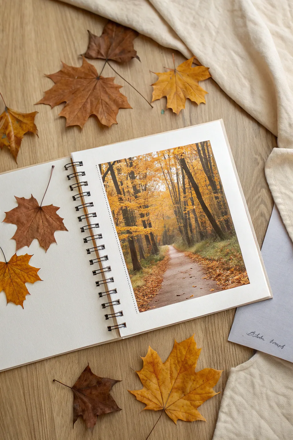
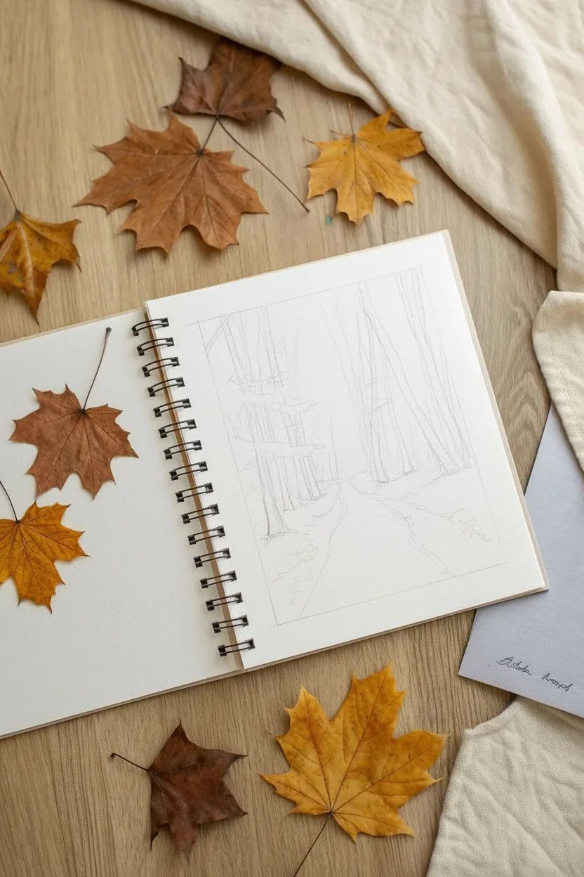
Capture the golden warmth of an autumn trail with this detailed sketchbook project that invites viewers to take a stroll. The composition focuses on depth and light, framing a glowing path between towering seasonal trees.
Step-by-Step Guide
Materials
- Spiral-bound sketchbook (smooth or mixed media paper, A4 size)
- Set of colored pencils (professional grade wax or oil-based)
- Fine liner pen (0.05mm, black or sepia)
- Graphite pencil (HB) and eraser
- Ruler
- Blending stump or colorless blender pencil
- Reference photo of an autumn forest path
- Masking tape (low tack)
Step 1: Setting the Scene
-
Define the borders:
Begin by deciding on the size of your drawing area within the sketchbook page. Use a ruler to lightly draw a rectangular border, leaving a generous white margin around the edges, especially on the left side near the spiral binding. -
Sketch the perspective:
Lightly sketch the path using your HB pencil. In this composition, the path starts wider at the bottom right and narrows as it curves toward the center-left ‘vanishing point’ deeper in the forest. This creates the essential feeling of depth. -
Place the tree trunks:
Sketch vertical lines for the tree trunks. Vary the thickness—make those in the foreground (left and right edges) thickest and darkest, while trees further down the path should appear thinner and lighter. Don’t make them perfectly straight; natural curves add realism.
Use Color Temperature
Make distant trees cooler (bluish-grey) and lighter, while keeping foreground trees warmer (rich browns) and darker. This creates instant atmospheric depth.
Step 2: Creating the Background
-
Establish the light source:
Identify where the light is coming from—in this scene, it’s filtering through the distant canopy. Use a very light cream or pale yellow pencil to gently shade this central area where the path vanishes. -
Canopy base layer:
Apply a wash of golden yellow across the upper two-thirds of the box, working around the main trunks. Keep strokes light and loose to mimic the airy feeling of leaves. -
Deepen the distance:
Add layers of light orange and ochre towards the top corners, blending slightly into the central yellow light. Use a blending stump here to soften the transition, creating a hazy, misty atmospheric effect.
Muddy colors?
If your yellows and browns turn muddy when blending, you’re likely layering too many heavy coats. Use light pressure for initial layers and only burnish at the very end.
Step 3: Drawing the Trees
-
Darken the trunks:
Switch to dark browns and cool greys for the tree trunks. Press firmly on the foreground trees to create strong contrast against the bright leaves. Leave the edges significantly rough to suggest bark texture. -
Add tree shadows:
On the side of the trunks facing away from the light source, lay down black or dark umber pencil. This rounding effect gives the flat shapes volume. -
Draw finer branches:
b ranching out from the main trunks, draw thinner limbs reaching upward. Let these taper off into nothingness as they get covered by the leaf canopy.
Step 4: The Path and Ground
-
Pave the way:
Color the path with a mix of cool grey and light taupe. Apply horizontal strokes to flatten the ground plane. Keep the color lighter in the distance and slightly darker in the immediate foreground. -
Create scattered leaves:
Use orange, rust, and brown pencils to stipple small dots and dashes along the edges of the path. Concentrate these ‘leaves’ heavily on the sides, leaving the center of the path mostly clear. -
Ground the trees:
The base of the trees needs to feel anchored. Add darker scribbles of brown and deep green at the foot of each trunk to represent undergrowth and shadows cast on the forest floor.
Step 5: Final Details
-
Enhance leaf texture:
Go back over the canopy area with sharper orange and dark gold pencils. Add distinct stippling or small, rough circular motions to suggest individual clusters of leaves rather than just a wash of color. -
Add the dotted border:
To give the drawing a polished, framed look, take your fine liner pen and ruler. Carefully draw a dashed or dotted line just inside the left edge of your drawing area, or around the entire perimeter if preferred. -
Contrast check:
Step back and squint at your drawing. If the foreground trees don’t pop out enough, deepen the darkest shadows again with a black pencil for that final crispness.
Now perfectly framed, your autumn path is ready to inspire your next outdoor adventure


Have a question or want to share your own experience? I'd love to hear from you in the comments below!