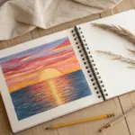
Whenever I need quick, satisfying color, I reach for oil pastels—they’re basically instant joy in stick form. Here are my favorite oil pastel painting ideas that lean into smooth blending, bold layers, and those “how did you make that glow?” moments.
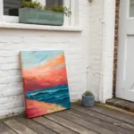
Oil Pastel Sunset Silhouettes
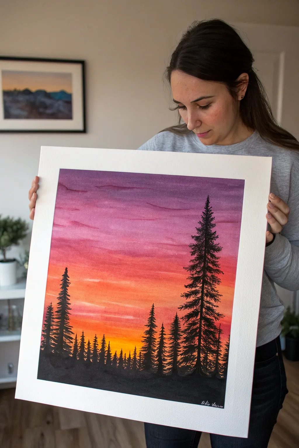
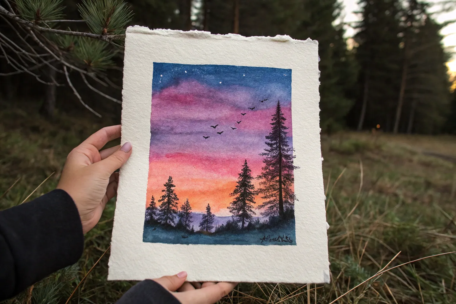
Capture the blazing beauty of a forest at dusk with this vibrant oil pastel project. This piece combines a glowing, multi-colored sky gradient with stark black tree silhouettes for a high-contrast look that pops off the page.
Detailed Instructions
Materials
- High-quality oil pastels (sets containing violet, pink, orange, yellow, and black)
- Thick white drawing paper or mixed media paper (heavyweight to handle blending)
- Painter’s tape or masking tape
- Paper towels or blending stumps (tortillons)
- Black fine-liner pen or black acrylic paint (optional for finest details)
- Baby oil or mineral spirits (optional, for smoother blending)
- Cotton swabs
Step 1: Setting the Stage
-
Prepare your canvas:
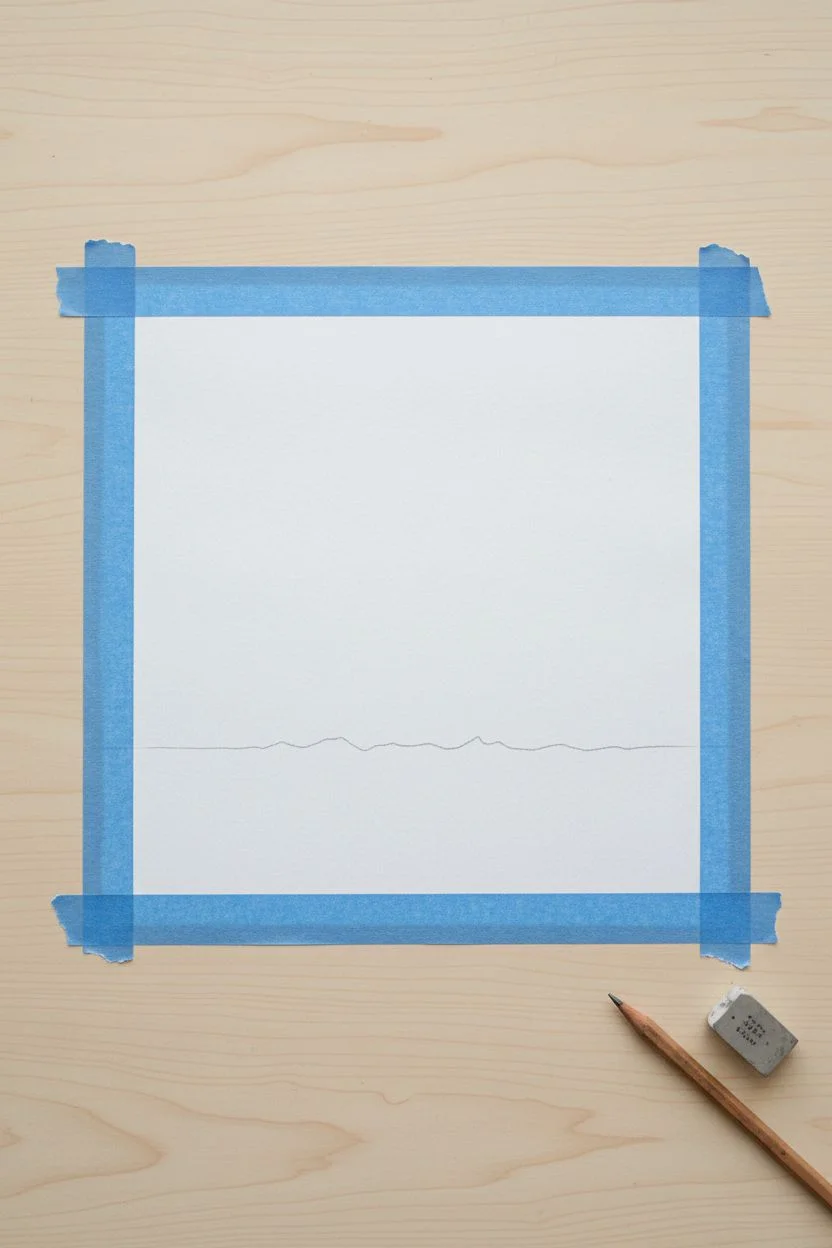
Begin by securing your paper to a flat surface using painter’s tape along all four edges. This creates a clean, professional border once removed and keeps the paper from shifting while you blend vigorously. -
Establish the horizon:
Visualizing the bottom third of your paper as the ground, lightly sketch a faint horizontal line where the darkest part of the forest floor will eventually be. Don’t worry about making it perfectly straight; organic is better.
Step 2: Creating the Sunset Gradient
-
Start with the brightest light:
Near your horizon line, apply a generous layer of bright yellow pastel. This will serve as the glowing core of your sunset, right where the sun has just dipped below the trees. -
Transition to orange:
Directly above the yellow, layer in a vibrant orange. Allow the orange to overlap slightly with the top edge of the yellow strip to make the upcoming blending step easier. -
Add the pink layer:
Continuing upward, add a band of hot pink or magenta. This transition color bridges the gap between the fiery lower sky and the cooler upper atmosphere. -
Finish with violet:
Fill the remaining top portion of the paper with a deep purple or violet pastel. Apply strong pressure here to get rich, opaque coverage. -
Initial blend:
Using a folded paper towel or your fingertip, start rubbing the colors horizontally. Always work from light (yellow) to dark (purple) to avoid muddying your bright sun area with dark pigments. -
Refining the gradient:
I like to go back in with the original pastel sticks to smooth out the transitions. Re-apply orange over the yellow-orange border and pink over the orange-pink border, blending again until the shift looks seamless. -
Adding cloud textures:
Take a slightly darker shade of purple or a dark magenta and gently streak horizontal, wispy lines across the top purple section to suggest thin clouds.
Smooth Blending Trick
Use a cotton swab dipped in a tiny drop of baby oil to blend the sky. It breaks down the binder, turning the pastel essentially into paint for a flawless gradient.
Step 3: Drafting the Silhouettes
-
Lay the foundation:
Using a black oil pastel, color in the entire bottom section below your horizon line. Press hard to ensure solid, opaque black coverage for the forest floor. -
Mark the tree trunks:
Decide where your main trees will stand. Draw vertical black lines rising from the ground—make one particularly tall line on the right side for the focal feature tree, and a medium one on the left. -
Varying heights:
Fill the space between the main trunks with shorter vertical lines of varying heights. These will become the dense backdrop of distant pine trees.
Make It Glossy
Once fully dry and set, you can gently buff the sky area with a soft cloth or tissue. This polishes the waxy surface, giving the sunset colors a deeper, vibrant sheen.
Step 4: Detailing the Pines
-
Building branches:
Starting at the top of your tallest tree, use the sharp edge of your black pastel or a black colored pencil to flick small, downward-slanting lines outward from the trunk. -
Create volume:
As you move down the trunk, make the branches wider and thicker. Pine trees generally have a triangular or conical overall shape, so keep the base much wider than the tip. -
Texture the foliage:
Don’t make the branches too uniform. Use quick, jagged strokes to mimic pine needles and rough bark texture. It’s okay if some gaps of sunset show through the branches. -
Fill the middle ground:
Repeat this process for the medium-sized trees. For the very small background trees, simple scribbled triangles or jagged humps often suffice to suggest a dense forest line. -
Sharpening details:
If your pastel stick is too blunt for the finest tips at the top of the trees, accurate detail can be tricky. This is where I sometimes grab a black charcoal pencil or fine marker to crisp up those tiny points. -
Ground blending:
Where the tree trunks meet the ground, gently blend the black pastel upward just a tiny bit into the yellow to soften the harsh line, creating a hazy, misty effect at the base. -
The final reveal:
Carefully peel away the painter’s tape at a 45-degree angle away from the drawing to reveal crisp white borders.
Hang your masterpiece where it can catch the evening light and enjoy the serene view.

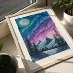
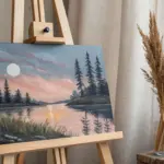
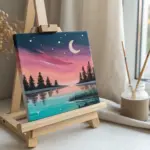
Glowing Moonlit Night Gradient
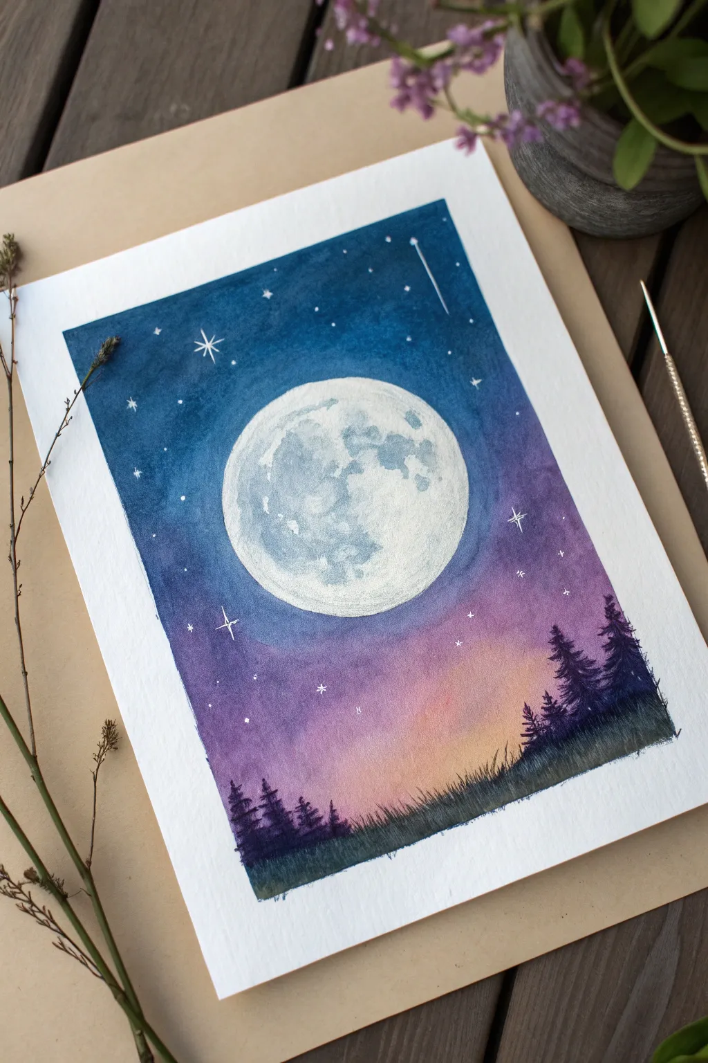
Capture the serene beauty of a full moon rising over a twilight forest with this vibrant oil pastel project. The smooth gradient from deep indigo to soft peach creates a stunning backdrop for the detailed lunar surface and shadowy pine silhouettes.
How-To Guide
Materials
- Oil pastels (dark blue, indigo, purple, magenta, pink, peach/orange, white, black, dark green)
- Heavyweight drawing paper or mixed media paper (smooth texture preferred)
- Masking tape or painter’s tape
- Paper blending stumps or clean tissues
- Cotton swabs
- White gel pen or white acrylic paint with a fine brush
- Pencil
- Circular object for tracing (like a lid or roll of tape)
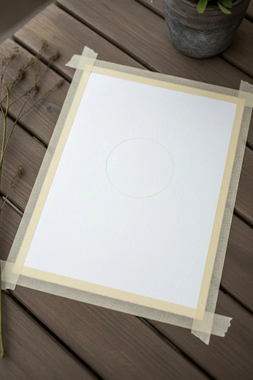
Step 1: Setting the Scene
-
Prepare the canvas:
Secure your paper to a work surface using masking tape on all four sides. This will keep the paper flat and create a crisp, clean border when you finish. -
Outline the moon:
Place your circular object near the center, slightly towards the top half of the paper. lightly trace a perfect circle with a pencil. Do not press too hard, as you want the line to be faint.
Step 2: Creating the Sky Gradient
-
Lay down the darkest tones:
Start at the very top using your darkest blue or indigo oil pastel. Color heavily around the top corners and edge, working your way down about an inch. -
Transition to purple:
Below the indigo, apply a layer of purple or violet. Ensure you overlap the indigo section slightly to make blending easier later. -
Add magenta warmth:
Continue downwards with a magenta or deep pink shade. Carefully work around the pencil circle of the moon—avoid coloring inside the moon shape for now. -
Finish with the horizon glow:
Near the bottom third of the sky, transition into a lighter pink and finally a soft peach or pale orange just above where the tree line will be. -
Blend the sky:
Using a paper towel or your fingertip, rub the colors horizontally to blend them together. Start from the lightest color (peach) and work your way up to the dark blue to keep the light colors clean. Smooth out the transitions until the gradient is seamless.
Fixing Smudges
If dark sky color accidentally gets into your moon circle, scrape it off gently with a craft knife or the edge of a credit card before layering the white pastel over it.
Step 3: The Lunar Surface
-
Fill the moon base:
Clean your hands thoroughly. Fill the entire moon circle with white oil pastel. Apply a thick, even layer to cover the paper texture. -
Add gentle craters:
Using a very light touch with a light grey or pale blue pastel, dab irregular shapes onto the white moon surface to represent the ‘seas’ or maria. Keep these marks subtle. -
Detail the moon texture:
Use a cotton swab to softly smudge the grey patches, blurring their edges into the white so the moon looks dimensional rather than sketchy.
Level Up: Texture
Scratch fine lines into the wet black pastel of the trees using a toothpick or empty ballpoint pen to reveal hints of the background color, simulating moonlight hitting branches.
Step 4: Silhouettes and Stars
-
Establish the ground:
At the very bottom of the page, use black mixed with dark green to color a solid, uneven strip for the ground. -
Draw pine trees:
Using the sharp edge of a black pastel or a harder pastel pencil, draw vertical lines for tree trunks rising from the ground. Add short, downward-sloping strokes on either side of the trunks to create pine branches. Vary the heights, making the trees on the right taller. -
Add grassy texture:
Flick short, upward strokes along the very bottom edge with black and dark green to suggest tall grass in the foreground. -
Create main stars:
With a white gel pen or fine brush with white paint, dot a few larger stars in the dark blue section of the sky. Add cross shapes to a couple of them for a twinkling effect. -
Add the star field:
Sprinkle smaller dots throughout the upper sky. Adding a shooting star with a long, trailing tail in the upper right corner adds a nice dynamic touch. -
Reveal the border:
Slowly and carefully peel away the masking tape from the edges, pulling away from the center of the artwork to prevent tearing.
Now you have a tranquil night scene ready to display or frame
Ocean Horizon With Reflections
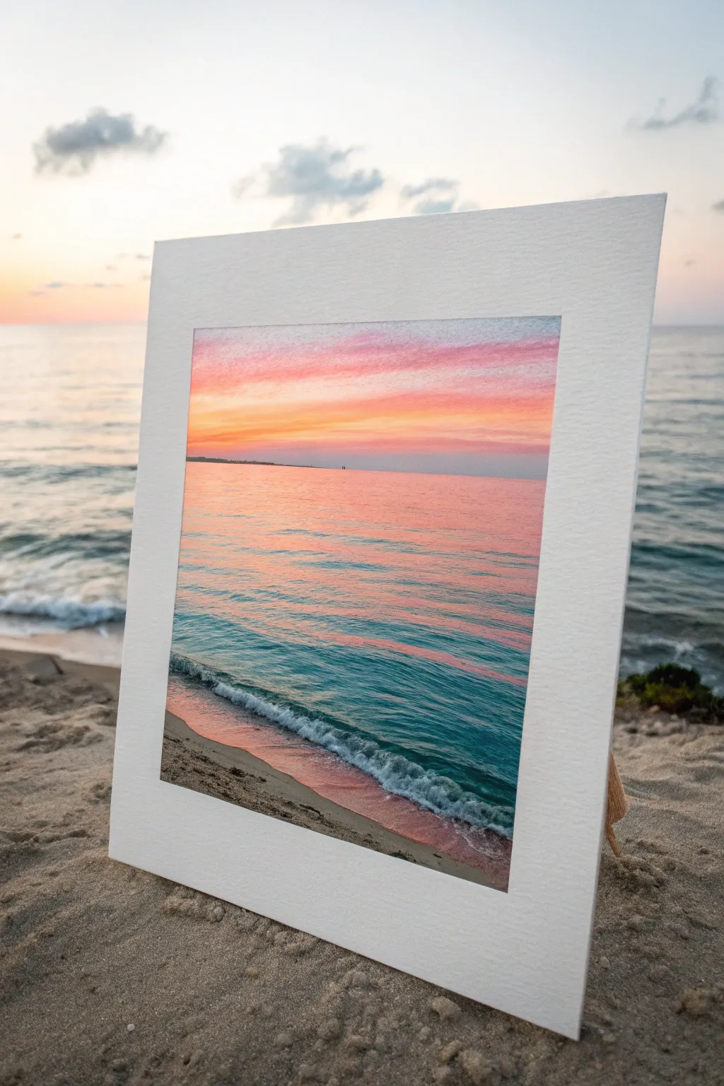
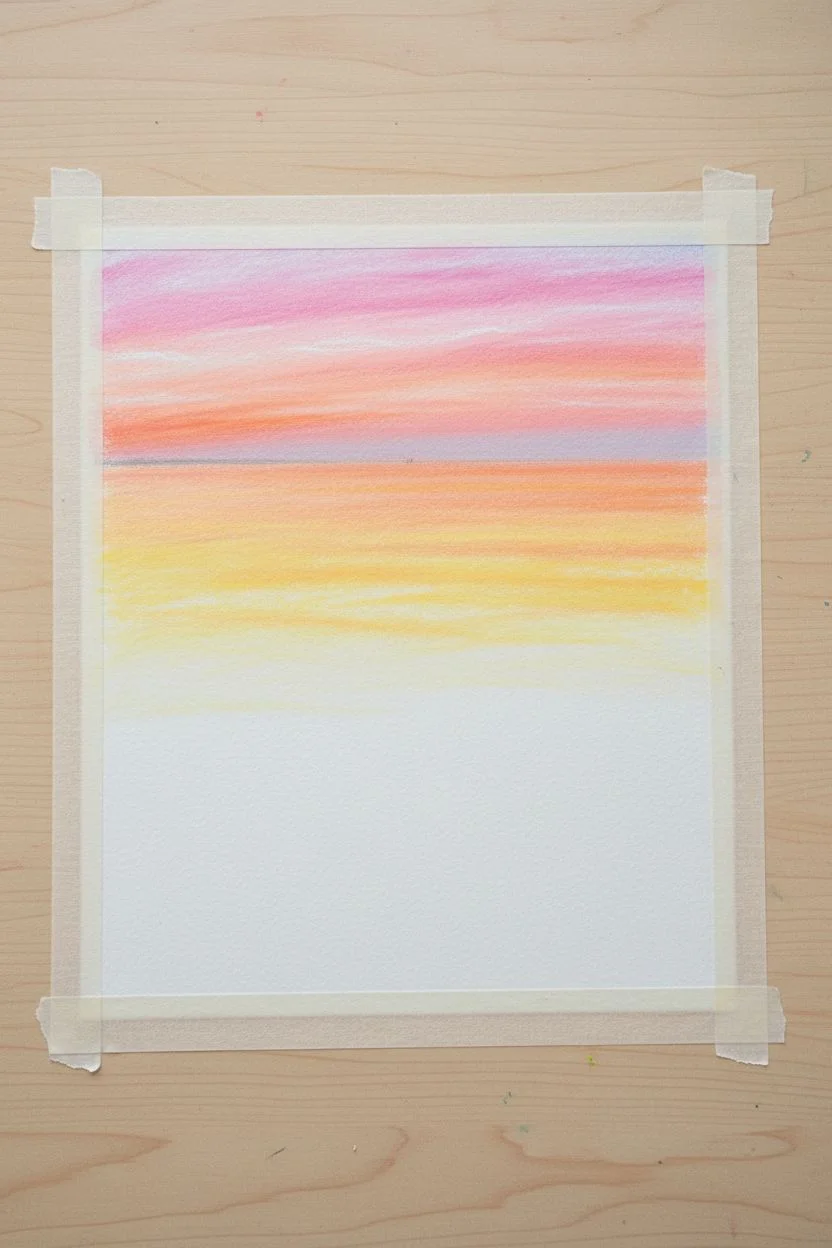
Capture the serene beauty of a twilight ocean with this vibrant oil pastel study. You’ll master blending warm sky tones into cool water reflections, creating a seamless transition from a fiery horizon to the crashing teal waves.
Step-by-Step Guide
Materials
- Oil pastel set (including white, lemon yellow, orange, magenta, teal, dark blue, ultramarine, and ochre)
- Heavyweight mixed-media or pastel paper (approx. 8×8 inches)
- Masking tape
- Paper towels or blending stumps
- A ruler or straight edge
- Palette knife or credit card edge (for scraping)
Step 1: Setting the Sky
-
Prepare the Horizon:
Tape down all four edges of your paper to a flat surface with masking tape to create a crisp border. Using a ruler, lightly sketch a horizon line about one-third of the way down from the top edge. -
Layer the Top Sky:
Starting at the very top edge, apply a band of light magenta oil pastel. Keep your strokes horizontal and light. -
Add Warmth:
Below the magenta, apply a layer of orange, followed by a bright lemon yellow right above the horizon line. Leave small slivers of white paper showing through to create brightness. -
Blend the Sky:
Using a clean finger or a paper towel, gently smudge the sky colors horizontall to blend them. I like to start with the lightest yellow and work my way up to the darker pinks to keep the horizon bright. -
Define Clouds:
Take a white oil pastel and scumble thin, wispy cloud lines over the pink upper sky. Smudge them slightly to soften the edges.
Step 2: Creating the Reflective Water
-
Mirror the Horizon:
Directly below the horizon line, replicate the sky’s colors in reverse order. Apply a band of yellow, then orange, then pink. These strokes should be slightly choppier than the sky to mimic water texture. -
Introduce the Teal:
Below the pink reflection, begin layering a vibrant teal oil pastel. Overlap it slightly with the pink area above to create a purplish transition zone. -
Deepen the Sea:
As you move further down the paper, darken the water color. Mix dark blue or ultramarine into the teal to create a deep, rich ocean color -
Add Wave Texture:
Use the edge of a dark blue pastel to draw short, horizontal dashes across the pink and orange reflection area. This breaks up the solid color and makes it look like rippling gentle waves.
Muddy Colors?
If your ocean reflection turns brown, clean your blending finger/tool immediately before switching between warm sky tones and cool water tones.
Step 3: The Shoreline and Finish
-
Form the Crashing Wave:
Identify where the wave will break near the bottom. Leave a rough, organic band of paper blank here, or apply a thick heavy layer of white oil pastel. -
Paint the Wet Sand:
In the bottom right corner triangle, apply a mix of ochre and light brown. To make the sand look wet, lightly glaze some pink and orange over it, reflecting the sunset sky. -
Darken the Wave Shadow:
Right underneath the white foam of the wave, draw a thin, dark line using dark blue or even a touch of black to create a shadow that lifts the foam off the sand. -
Create Sea Foam:
Use a palette knife or the edge of a fingernail to scratch into the thick white pastel area, creating texture. Apply dots of pure white pastel above the crashing line to suggest spray. -
Final Highlights:
Add a few sharp streaks of white in the deep teal water to suggest catching light on the wave crests. -
Reveal the Border:
Carefully peel away the masking tape at a 45-degree angle to reveal your clean, crisp edges.
Add Sparkle
For extra dimension, scrape tiny flecks of white pastel off the stick and press them firmly onto the wave crests for impasto foam texture.
Step back and admire how the warm sky glows against the cool water in your finished seascape

Mountain Range at Golden Hour
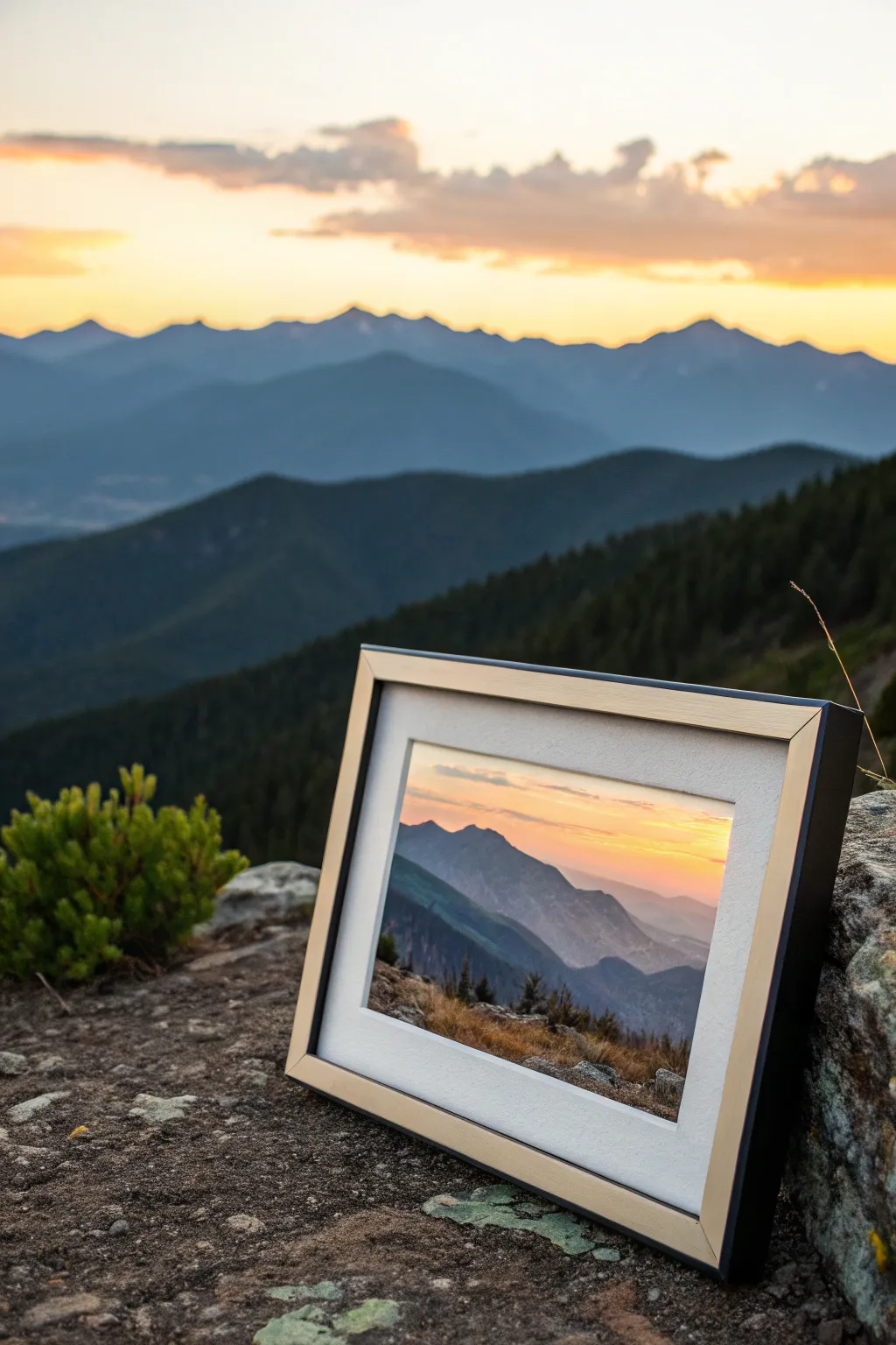
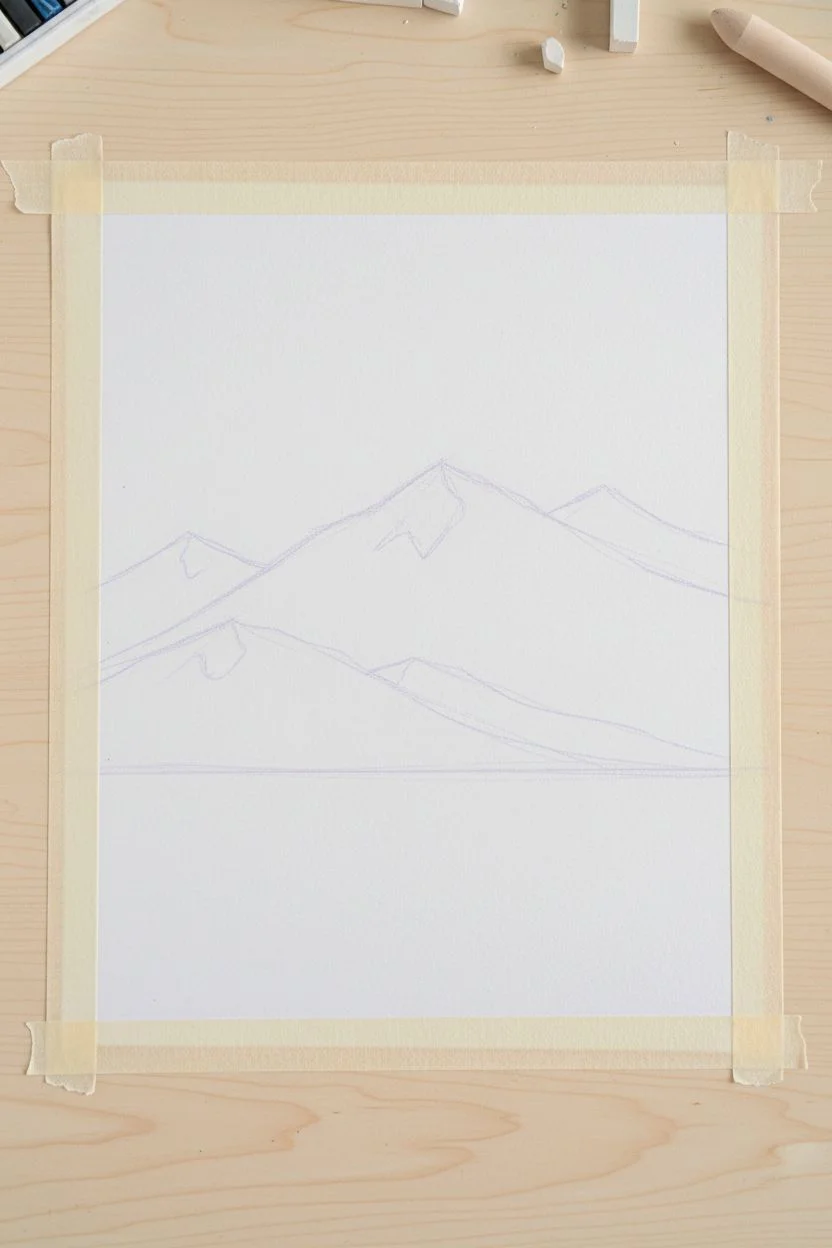
Capture the serene beauty of distant mountains bathed in the warm, fading light of sunset with this layered oil pastel study. You’ll build depth through atmospheric perspective, creating a soft, glowing sky that transitions into rugged, shadowed peaks.
Step-by-Step Tutorial
Materials
- Heavyweight mixed media or pastel paper (textured)
- Oil pastels (soft, artist-grade recommended)
- Colors: White, pale yellow, golden orange, peach, lilac, slate blue, indigo, dark green, black
- Paper towel or blending stump (tortillon)
- Masking tape
- Fixative spray (optional)
- Picture frame with mat (optional for display)
Step 1: Setting the Scene
-
Tape the edges:
Secure your paper to a flat work surface using masking tape on all four sides. This not only keeps the paper steady but creates a crisp, clean border for your finished mountain landscape. -
Sketch the horizon:
Using a very light touch and a pale lilac or light grey pastel, roughly sketch the outline of your mountain ranges. Place the horizon line about 1/3 from the bottom to give plenty of space for the vast sky and distant peaks.
Muddy Colors?
If your sky gets muddy while blending, your finger might have darker pigment on it. Always switch to a clean finger or fresh paper towel when moving from dark mountains back to the light sky.
Step 2: Creating the Glowing Sky
-
Apply the lightest warm tones:
Start at the horizon line just above your sketched mountains. Apply a solid layer of pale yellow, blending upwards into a soft golden orange. Keep your strokes horizontal to mimic the natural banding of the sky. -
Add upper sky gradients:
As you move higher up the paper, transition from the golden orange into a soft peach or very pale pink. If you want a hint of early twilight, you can add the faintest touch of pale blue at the very top edge. -
Blend the sky:
Use a clean paper towel or your fingertip to smudge the sky colors together. Rub in horizontal motions to create a seamless, creamy gradient. The goal is a soft, out-of-focus glow without visible stroke marks. -
Highlight the sun’s position:
Take a clean white pastel and press firmly in the center of your yellow horizon area to create the brightest point of the sun’s glow. Blend the edges of this white spot softly into the surrounding yellow so it feels like radiant light rather than a white circle.
Scraping for Texture
Use a palette knife or an old credit card to gently scrape away small lines in the dark foreground layers. This reveals the paper underneath and mimics rocky cracks or tree trunks.
Step 3: Layering the Mountains
-
Base layer for distant mountains:
For the furthest mountain range, use a pale lilac or hazy blue. These mountains should look faint due to atmospheric perspective. Apply the pastel lightly, allowing some of the paper texture to show through initially. -
Refine the distant edges:
Smooth out the distant mountains with a blending stump. Their edges should be soft but distinct against the bright sky. Ensure the color is uniform and lacks heavy detail to push them into the background. -
Middle ground ridges:
Move forward to the next set of peaks. Choose a slate blue or a cool grey that is slightly darker than the previous layer. Draw the jagged ridge line firmly, overlapping the base of the pale mountains behind them. -
Add shadows to middle peaks:
On the side of the mountains facing away from your light source (the right side, if the sun is central-left), scumble in a darker indigo. Don’t blend this too perfectly; leave some texture to suggest rocky terrain.
Step 4: Developing the Foreground
-
Establish the nearest peaks:
The closest mountain range needs the darkest values. Use a deep indigo mixed with dark green to block in these large shapes in the lower third of the composition. -
Create rugged texture:
Instead of blending smoothly here, use short, choppy strokes. Layer black or very dark blue into the valleys and crevices to create deep contrast and the look of heavy shadow. -
Add foreground vegetation:
At the very bottom edge, suggest trees or scrub by using a dark green and black pastel. Tap the pastel tip against the paper to create stippled textures that resemble treetops or rocky outcrops. -
Highlight the foreground ridges:
If the light is catching the top of a near ridge, use a touch of rusty orange or burnt sienna on the very tips of the foreground mountains. This connects the foreground to the warm light of the sky.
Step 5: Final Touches
-
Evaluate contrast:
Step back and look at your tonal values. The sky should be bright and airy, while the foreground should have weight and darkness. If the foreground looks too washed out, add another layer of deep blue or black. -
Create distinct separation:
If any mountain layers seem to blend into each other too much, use a sharp edge of your pastel (or a pastel pencil) to redefine the ridge line of the darker mountain against the lighter one behind it. -
Remove the tape:
Once you are happy with the blending and the layers, slowly peel away the masking tape at a 45-degree angle away from the drawing to reveal your crisp white border.
Frame your landscape with a wide mat to give the expansive view breathing room and enjoy your permanent golden hour
BRUSH GUIDE
The Right Brush for Every Stroke
From clean lines to bold texture — master brush choice, stroke control, and essential techniques.
Explore the Full Guide
Simple Flower Vase Still Life
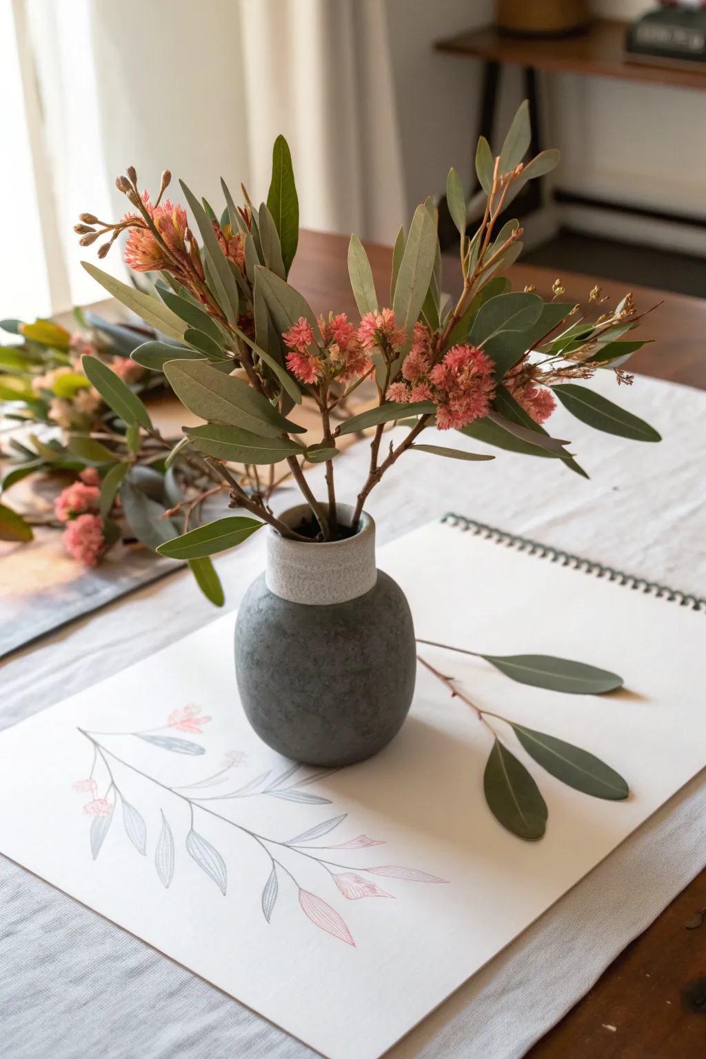
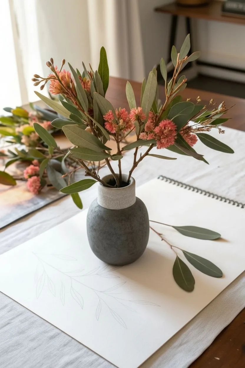
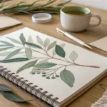
This tutorial guides you through sketching a delicate botanical study of eucalyptus and pink blooms using oil pastels and colored pencils. The result is an airy, minimalist drawing that captures the graceful lines of foliage alongside a reference vase.
Step-by-Step
Materials
- Heavyweight sketchbook or mixed media paper
- Oil pastels (dark green, olive green, muted pink, dusty rose)
- Colored pencils (grey, muted teal, red-orange)
- Small blending stump or tortillon
- Kneaded eraser
- Graphite pencil (HB or 2H)
Step 1: Drafting the Shapes
-
Lightly Map the Stem:
Begin by lightly sketching the main central stem using a hard graphite pencil (2H). Draw a long, graceful curve that starts from the bottom left and extends towards the upper right. -
Branching Out:
Add thinner, shorter lines branching off the main stem to indicate where the leaves will attach. Keep these lines faint so they don’t show through later. -
Leaf Outlines:
Sketch the lance-shaped leaves. They should be tapered at both ends. Vary their angles—some flat, some turning slightly downwards—to create a sense of natural movement.
Keep it Clean
Place a scrap piece of paper under your drawing hand to prevent oil pastel from smudging onto the white background while you work.
Step 2: Coloring the Foliage
-
Base Leaf Color:
Using a grey or muted teal colored pencil, lightly shade the interior of the leaves. Use short, directional strokes that follow the vein of the leaf. -
Defining the Edges:
Take a sharpened dark green oil pastel or a soft colored pencil and outline the leaves you just shaded. Keep the line weight varied—thicker on the shadowed side of the leaf, thinner on the light side. -
Adding Veins:
Draw the central vein of each leaf using the same dark green tool. A single, confident line down the center works best here. -
Layering Depth:
For a more realistic look, add a touch of olive green pastel at the base of the leaves where they meet the stem. Blend this slightly outward with your finger or a stump.
Step 3: Adding the Blooms
-
Pink Accents:
Identify the spots on your branch where the small flower clusters will sit. Use a muted pink oil pastel to create small, irregular dots or dashes. -
Detailing the Flowers:
Switch to a red-orange colored pencil to draw delicate lines within the pink pastel areas. This mimics the fuzzy texture of the specific blooms shown in the reference. -
Connecting the Blooms:
Ensure the pink clusters are connected to the main stems with very fine brown or green lines.
Sharpening Pastels
Oil pastels too blunt for fine stems? Freeze them for 10 minutes, then sharpen them with a knife for a temporarily fine point.
Step 4: Finishing Touches
-
Stem Definition:
Go back over the main wood-like stem with a dark grey or brown pencil to solidify it. Adding a little pressure at the joints makes the plant look sturdier. -
Clean Up:
Use a kneaded eraser to lift any stray graphite marks or smudges around the leaves. I find keeping the white background pristine is crucial for this minimalist style. -
Final Assessment:
Step back and look at the balance. If the drawing feels too light, add a few more dark green strokes to the leaf tips for contrast.
Now you have a serene botanical study that perfectly captures the quiet beauty of a still life setting
Juicy Fruit Slice Close-Up
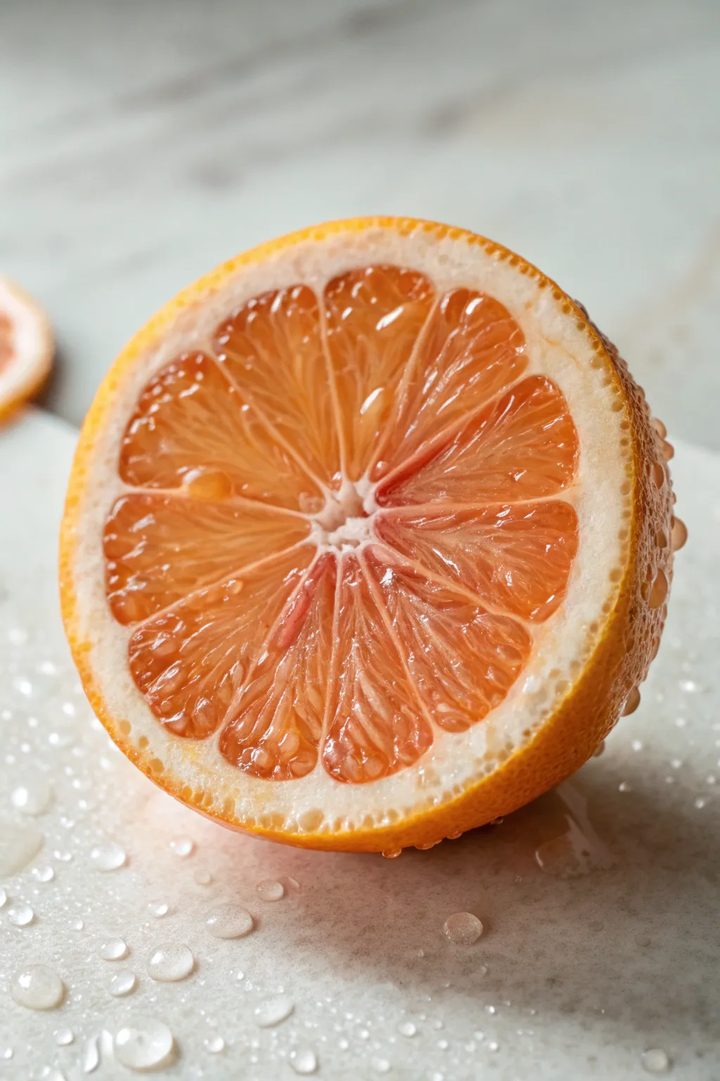
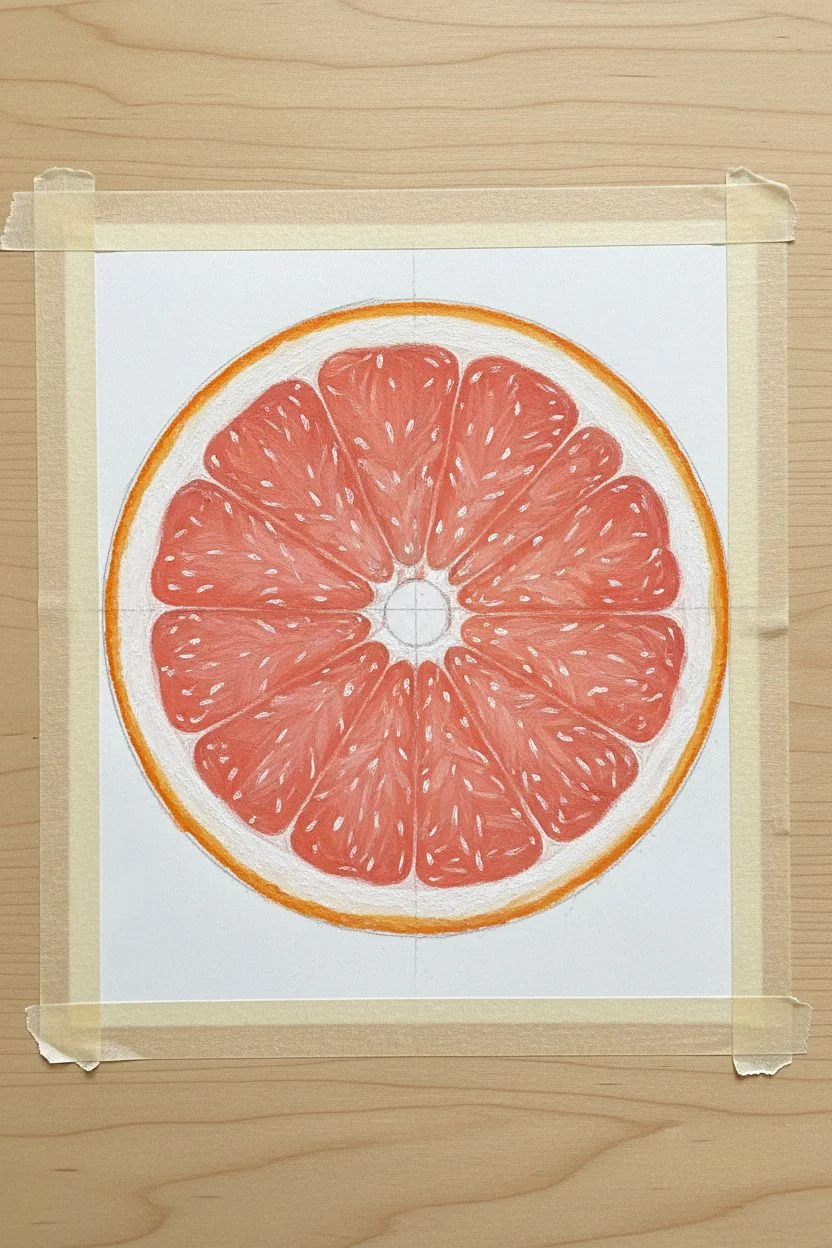
Capture the glistening translucency of a fresh grapefruit slice using the rich, buttery texture of oil pastels. This project focuses on building layers to create depth within the fruit segments and mastering the illusion of water droplets on a smooth surface.
How-To Guide
Materials
- Heavyweight mixed media paper or pastel board
- Soft oil pastels (shades of orange, salmon pink, red, deep yellow, white, and warm grey)
- Blending stumps or tortillons
- Palette knife
- Cotton swabs
- Masking tape
- Pencil (H or HB)
Step 1: Sketching and Base Layers
-
Tape your borders:
Secure your paper to your workspace with masking tape to create a clean border and prevent shifting while you work. -
Outline the fruit:
Lightly sketch a large circle for the grapefruit. Inside, draw a smaller circle for the pith (the white part) and mark out the center point. Radiate lines outward from the center to define the triangular fruit segments. -
Establish the pith:
Using a creamy white pastel, fill in the thick outer ring of the rind and the thin lines separating the segments. Don’t press too hard yet; just establish the shapes. -
Base color for the skin:
Apply a bright orange along the very outer edge of your circle, blending it slightly inward into the white pith area to create a soft transition. -
Initial pulp layer:
Fill the fruit segments with a base layer of salmon pink. Leave tiny, irregular gaps of white paper showing through—these will eventually become highlights.
Step 2: Building Juicy Texture
-
Deepen the hues:
Layer a darker red-orange or coral color near the outer edges of each segment and close to the center core. This creates the rounded, plump look of the pulp sacs. -
Define the vesicles:
Use the edge of a harder orange pastel or a palette knife to scratch or draw delicate, curved lines inside the segments. These lines should mimic the direction of the juice sacs radiating from the center. -
Add translucent depth:
I like to gently dab a deep red into the deepest corners of the segments where shadows would naturally fall, blending slightly with a cotton swab to soften the look. -
Brighten the pith:
Go back over the white dividing lines (membranes). Make them crisp but slightly irregular, as organic structures aren’t perfectly straight. -
Highlight the pulp:
Take your white pastel and add strong, sharp dots and dashes on top of the pink/orange segments where the light hits the moist surface.
Muddy Colors?
If your pinks and whites are turning gray, clean your pastel tip on a scrap paper before every stroke. Oil pastels pick up other colors easily.
Step 3: Refining and Background
-
Create the rind texture:
Stipple (dot) a darker orange and a touch of yellow-brown onto the outer skin area to give it that porous citrus peel texture. -
Background wash:
Color the background with a very light grey or cool white. Blend it smoothly with a tissue to create a soft, out-of-focus surface look like marble. -
Add the shadow:
Apply a warm grey beneath the fruit to ground it. Smudge the shadow edges so they are soft and diffused, unlike the sharp edges of the fruit. -
Drafting water droplets:
Draw small, irregular ovals on the table surface and the fruit skin using a dark grey pencil. These map out your water droplets. -
Shading droplets:
Inside each droplet oval, place a tiny crescent of dark grey shadow at the top and a bright white highlight at the bottom. This inversion creates the refraction effect. -
Final highlights:
Add a final, thick dot of pure white to the top of the water droplets and the wettest parts of the fruit pulp for maximum shine.
Make it Pop
Use a scratching tool (sgraffito) to scrape away tiny lines of the top layer of pastel to reveal the white paper underneath for ultra-thin highlights.
Step back and admire the vibrant, refreshing texture you have captured on the page

PENCIL GUIDE
Understanding Pencil Grades from H to B
From first sketch to finished drawing — learn pencil grades, line control, and shading techniques.
Explore the Full Guide
Easy Pet Portrait With Soft Fur
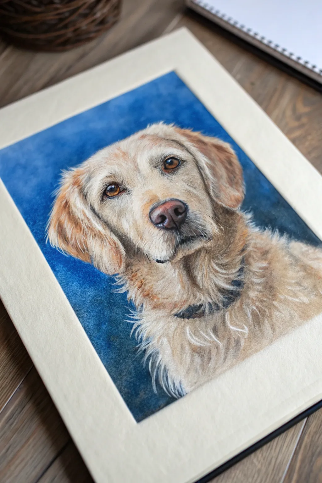
Immortalize your furry Best friend with this heartwarming oil pastel portrait, focusing on soulful eyes and textured, realistic fur. The deep blue background makes the warm golden tones of the dog’s coat pop, creating a striking contrast that draws the viewer in immediately.
Detailed Instructions
Materials
- Heavyweight mixed media or pastel paper (tan or grey tone recommended)
- Oil pastels (set including ochre, burnt sienna, dark umber, cream, white, black, dark blue, cerulean blue)
- Graphite pencil (HB or 2B) for sketching
- Kneaed eraser
- Blending stumps or tortillons
- Cotton swabs
- Palette knife or scraping tool
Step 1: Laying the Foundation
-
Sketch the outline:
Begin by lightly sketching the dog’s head and shoulders using an HB pencil. Focus on the triangular shape of the ears, the broadness of the snout, and the positioning of the eyes. Keep your lines faint so they won’t show through the pastel later. -
Map the features:
Refine the facial features, paying close attention to the nose shape and the almond curve of the eyes. Mark the direction of the fur growth with light arrows or strokes—this roadmap is crucial for realistic texture later. -
Establish the background:
Before tackling the fur, fill in the entire background area. Use a dark blue pastel to create a vignette effect around the edges, transitioning into a lighter cerulean blue closer to the dog’s head. Apply heavy pressure to cover the paper tooth. -
Blend the backdrop:
Using a finger or a paper towel, blend the blue background vigorously to create a smooth, seamless field of color. This soft background will contrast beautifully with the sharp details of the fur you’re about to add.
Muddy Fur Remedy
If fur colors turn grey or muddy, you’re over-blending. Stop rubbing! Scrape off the messy layer and re-apply fresh, distinct strokes without touching them.
Step 2: Eyes and Nose
-
Base coat the eyes:
Layer a warm amber or light brown into the iris area. Add the pupils with a sharp black pastel, pressing firmly for depth. -
Add life to the gaze:
Place a tiny, sharp dot of pure white pastel in the upper corner of each pupil to create the ‘catchlight.’ This single step instantly wakes up the portrait and gives the dog a soul. -
Sculpt the nose:
Fill the nose area with a mix of dark plum and burnt sienna. Use black to define the nostrils and the shadow underneath the nose, blending slightly with a small stump to keep the texture -
Highlight the nose texture:
Dab tiny specks of pink or light grey on the top curve of the nose to suggest moist, cobblestone texture.
Pro Tip: Directional Strokes
Always move your hand in the direction the hair grows. Even with abstract strokes, correct directionality subconsciously tells the viewer ‘this is fur’.
Step 3: Building the Fur
-
Apply the shadow layer:
Identify the darkest areas of the fur—under the chin, inside the ears, and around the collar area. Lay down strokes of dark umber and burnt sienna in the direction of hair growth. -
Create mid-tones:
Working over the rest of the face, apply yellow ochre and warm cream pastels. Don’t smooth this layer out too much; let the strokes remain visible to mimic individual hairs. -
Feather the edges:
Where the fur meets the blue background, use short, flicking strokes of ochre and cream that overlap onto the blue. This creates a fluffy, realistic silhouette rather than a hard cutout look. -
Detailing the chest:
The chest fur is often longer and more chaotic. Use broader, looser strokes here, mixing cream and white to show volume and fluffiness.
Step 4: Refining Texture
-
Scraping technique:
For fine whisker details or individual stray hairs, take the edge of a palette knife or a scraping tool and gently scratch through the top layer of pastel to reveal the lighter color or paper underneath. -
Add final highlights:
Take your sharpest white pastel and add distinct, crisp hairs on top of the mid-tones. Focus on the eyebrows, the bridge of the nose, and the tips of the ears. -
Define the collar:
If your subject wears a collar, block it in with black or dark grey now. Keep the edges soft where the fur overlaps it so it looks like it’s sitting deep within the coat. -
Enhance contrast:
Step back and look at your composition. Deepen the darkest shadows around the jowls and ears with a final touch of black or dark brown to make the form feel three-dimensional. -
Clean up:
Use a kneaded eraser to pick up any stray pastel dust from the background or white border, ensuring a clean presentation.
Now you have a soulful companion on paper that captures both their softness and spirit
Misty Forest Path Greens
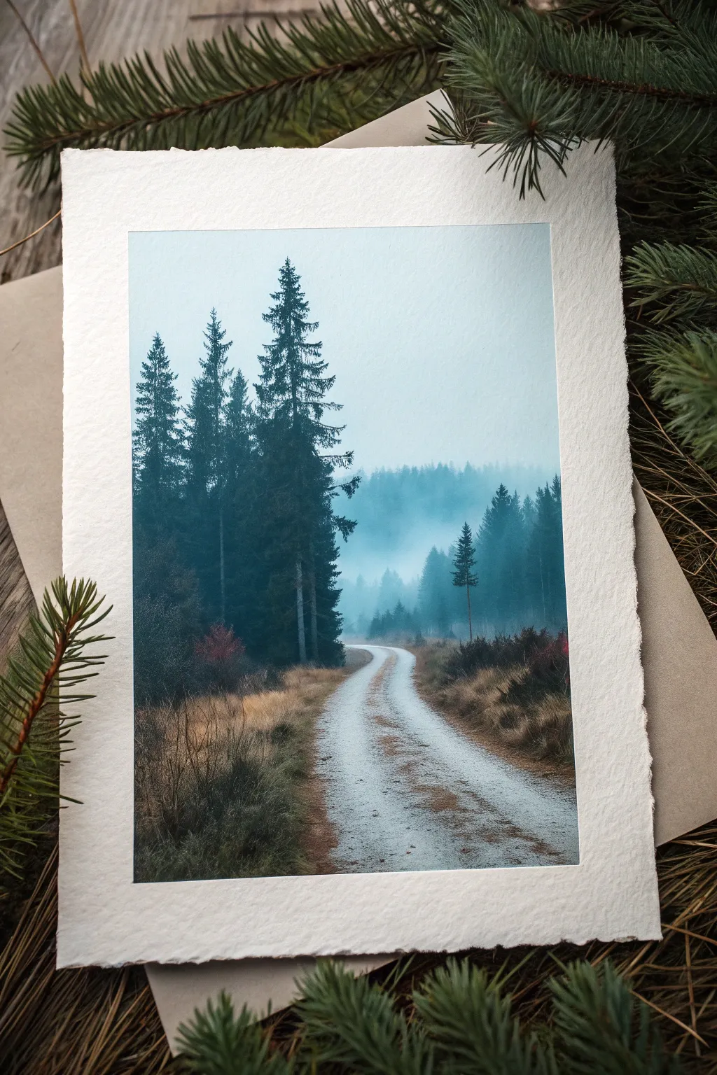
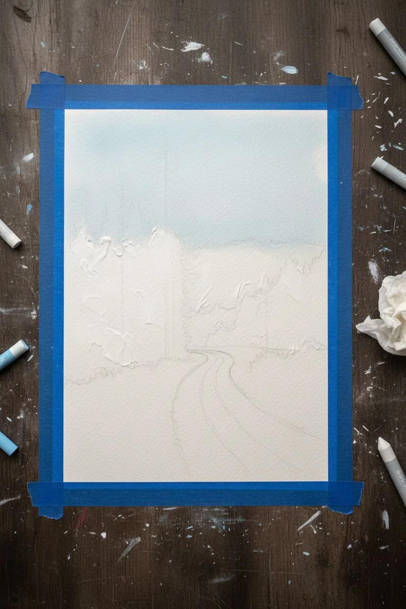
Capture the serene hush of a foggy morning with this atmospheric oil pastel landscape. You will learn to layer cool blues and greens to create depth and mystery, contrasting sharp trees against a soft, misty background.
Step-by-Step Guide
Materials
- Heavyweight cold-press watercolor paper or pastel paper (textured)
- Set of soft oil pastels (specifically: dark green, prussian blue, light blue, grey, white, ochre, rust/burnt sienna, and black)
- Blending tools (tortillions, paper towels, or cotton swabs)
- Masking tape
- Palette knife or credit card (for scraping)
- Fixative spray (optional)
Step 1: Preparation and Base Layers
-
Secure the paper:
Tape down all four edges of your textured paper to a flat surface. This creates that crisp, professional border seen in the photo and keeps the paper from shifting. -
Sketch the composition:
Lightly sketch the horizon line about 1/3 up from the bottom. Mark the curve of the S-shaped path, ensuring it starts wide at the bottom and narrows significantly as it disappears into the trees. -
Establish the sky:
Using a very light blue or a mix of white and pale grey, block in the sky area. We want this to be flat and misty, so don’t press too hard yet. -
Create the mist:
Blend white oil pastel heavily into the horizon area where the trees will meet the ground. This transition zone needs to be creamy and opaque to simulate dense fog.
Mastering the Mist
To get realistic fog, don’t use grey! Use white over your background colors. The transparency creates a milky, optical grey that looks much more like real atmosphere.
Step 2: Building the Distant Forest
-
Block in background trees:
Use a medium grey-blue or desaturated teal to draw faint, vertical shapes in the distance, right into the misty area. These should have soft edges. -
Smudge for atmosphere:
Take a paper towel or your finger and smudge these distant trees vertically. They should look ‘out of focus’ to create depth. -
Mid-ground trees:
Select a slightly darker, cooler green. Add a layer of trees closer to the viewer on the right side. Make these shapes slightly more defined but still hazy.
Step 3: The Foreground Giants
-
Draw the main trees:
Using your darkest green and perhaps a touch of Prussian blue, begin drawing the prominent trees on the left. Press firmly to get rich, deep color. -
Add branch texture:
Use the edge of the pastel stick to create jagged, downward-sloping branches. Don’t be afraid to leave some gaps; these trees are naturally irregular. -
Darken the shadows:
I like to add touches of black or deep indigo only in the very deepest crevices of the main trees to make them pop against the pale mist. -
Add the lone tree:
Place the small, distinct pine tree on the right side of the path. It acts as a visual anchor, balancing the heaviness of the left side.
Muddy colors?
If colors get muddy when layering, your paper tooth might be full. Scrape off excess pastel with a palette knife before adding a fresh, clean layer on top.
Step 4: The Winding Path and Ground
-
Base the path:
Fill the path area with white, blending in a tiny amount of pale grey. The path reflects the sky, so it should be quite bright. -
Add texture to the road:
Lightly scumble (rub lightly) some ochre and light brown tones onto the path to suggest tire tracks or dirt, keeping the center strip mostly white. -
Create the grassy verge:
Use yellow ochre, rust, and burnt sienna for the tall grasses lining the road. Use short, upward strokes to mimic the texture of dry autumn grass. -
Blend the grass base:
Rub the bottom of the grassy areas slightly to ground them, but leave the tops of the strokes crisp. -
Add foreground details:
On the immediate left foreground, use dark brown and dark green to suggest heavier shrubbery in the shadows.
Step 5: Final Touches
-
Scraping highlights:
Use a palette knife or the edge of a credit card to gently scrape away small vertical lines in the tall grass or on the tree trunks to reveal the light paper underneath. -
Refine the mist:
If the mist looks too dark, layer more white pastel over the transition area between the trees and the ground, blending smoothly. -
Remove the tape:
Slowly peel the masking tape away from the paper at a 45-degree angle to reveal your clean, deckled-style edge.
Step back and enjoy the quiet solitude of the forest path you have created.


Bold Black Paper Neon Landscape
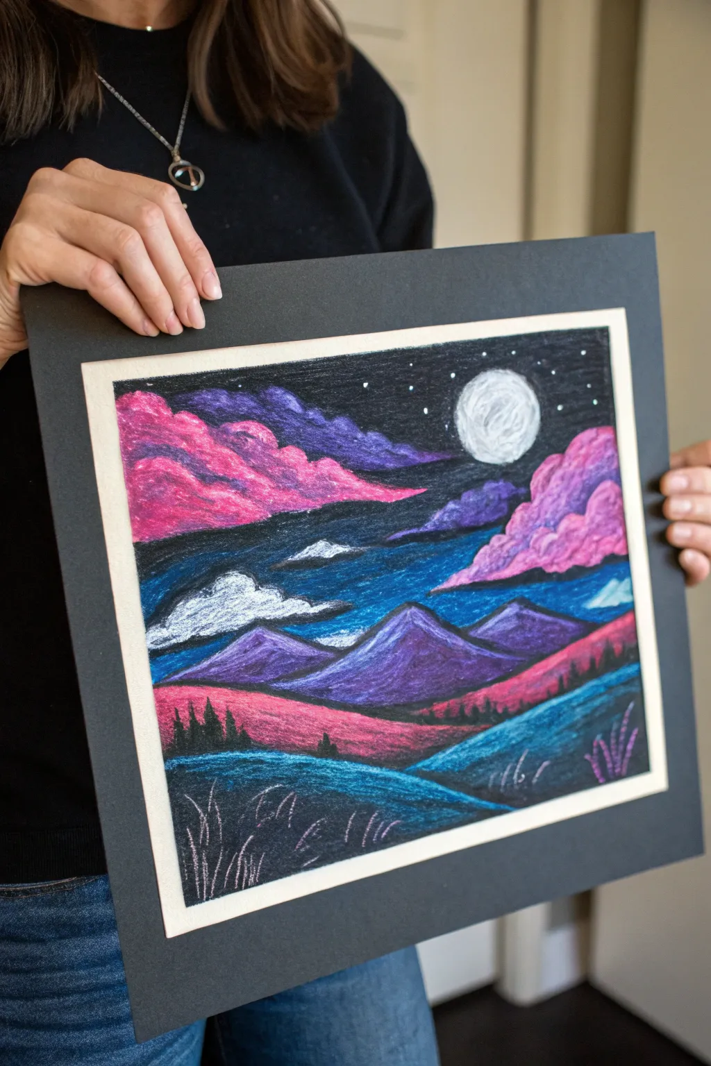
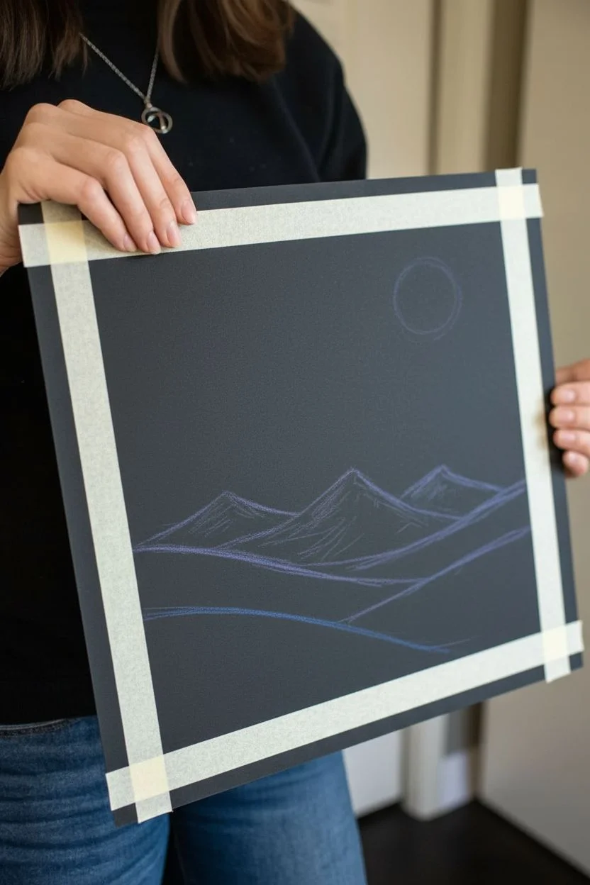
Contrast is king with this striking landscape, where punchy neon pinks and teals pop dramatically against a deep black paper background. The scene features rolling hills, moonlit clouds, and jagged peaks, all rendered with the creamy texture of oil pastels.
Step-by-Step
Materials
- Black construction paper or pastel paper
- Oil pastel set (must include: neon pink, neon purple, teal/turquoise, white, black, dark blue)
- Black mat frame (optional, for mounting)
- Masking tape or artist tape
- Blending tools (paper stump, cotton swab, or stiff brush)
- Ruler (optional)
Step 1: Setting the Scene
-
Tape the borders:
Use artist tape or masking tape to create a clean rectangular border on your black paper. This will ensure sharp edges and a built-in frame when you peel it off later. -
Sketch the horizon:
Lightly sketch the basic landscape lines using a dark blue or purple pastel. Draw a wavy line about a third of the way up for the foreground hills, jagged triangles for the mountains in the middle, and leave the top half for the sky. -
Place the moon:
In the upper right quadrant of the sky, sketch a circle for the moon. Don’t fill it in yet; just establish its position.
Step 2: Sky and Clouds
-
Create the clouds:
Using your neon pink pastel, draw billowing, fluffy cloud shapes on the left side and right side of the sky. Press firmly to get opaque coverage. -
Add cloud shadows:
Layer a deep purple on the underside of your pink clouds. Use your finger or a blending stump to smudge the purple slightly upward into the pink, creating a smooth transition. -
Fill the dark sky:
Color the background sky around the clouds and moon with black pastel. Scumble (lightly scribble) some dark blue over the black near the horizon line to add depth without losing the darkness. -
Render the moon:
Fill the moon shape with white pastel. To give it texture, dab a tiny bit of grey or light blue in the center, but keep the edges bright white. -
Add stars:
With a sharp corner of your white pastel, dot the black areas of the sky with small stars. Vary the pressure to some stars appear brighter than others.
Clean Colors Only
Black paper shows every smudge. Keep a paper towel nearby and wipe your pastel sticks constantly, especially when switching from dark colors back to the neon pinks or white
Step 3: Mountains and Mid-ground
-
Color the mountains:
Fill the triangle mountain shapes with a medium purple. I like to apply the color heavily on the right side of each peak and lighter on the left to simulate moonlight hitting them. -
Highlight the peaks:
Take a light blue or white pastel and draw a line down the illuminated side of the mountain ridges. Blend this slightly into the purple base. -
Add misty clouds:
Below the main clouds but above the mountains, draw thin, horizontal wisps of white and blue clouds over the dark sky background. -
Create the rolling mid-ground:
Color the hilly section directly below the mountains with a vibrant neon pink or magenta. -
Add silhouette trees:
Using a sharp black pastel or a black charcoal pencil, draw tiny vertical spikes along the top ridge of the pink hill to represent distant pine trees.
Paper Tooth Problem
If the pastel stops sticking to the paper, you’ve saturated the ‘tooth.’ Carefully scrape off excess wax with a palette knife or old credit card before adding more layers
Step 4: Foreground and Details
-
Base layer for foreground:
Fill the closest hill shape at the bottom with a dark teal color. Don’t press too hard yet; allow some of the black paper to peek through for texture. -
Brighten the grass:
Layer a lighter turquoise or cyan on the top curves of the foreground hill to show where the moonlight hits the grass. -
Blend the foreground:
Use your finger to gently blend the light turquoise into the dark teal, following the curve of the hill. -
Draw grassy details:
Use a light lavender or pale pink pastel to draw quick, upward-flicking strokes in the bottom foreground to create tall blades of alien-looking grass. -
Final touches:
Review your contrast. If the black paper is showing through too much in your bright areas (like the moon or pink clouds), apply a second heavy layer of pastel. -
The reveal:
Carefully peel away your masking tape at a 45-degree angle to reveal the crisp, clean borders.
Step back and admire how those vibrant colors practically glow in the dark on your finished piece
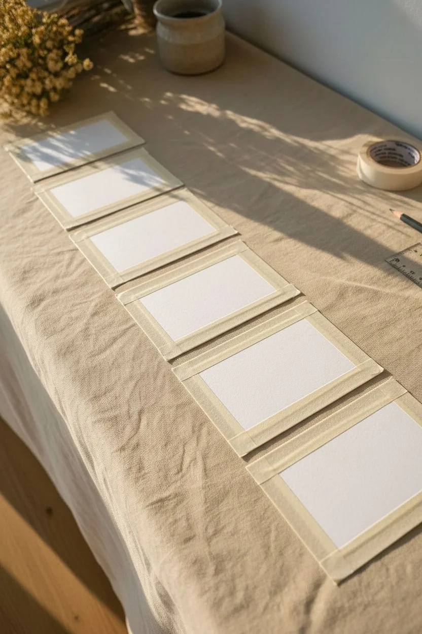
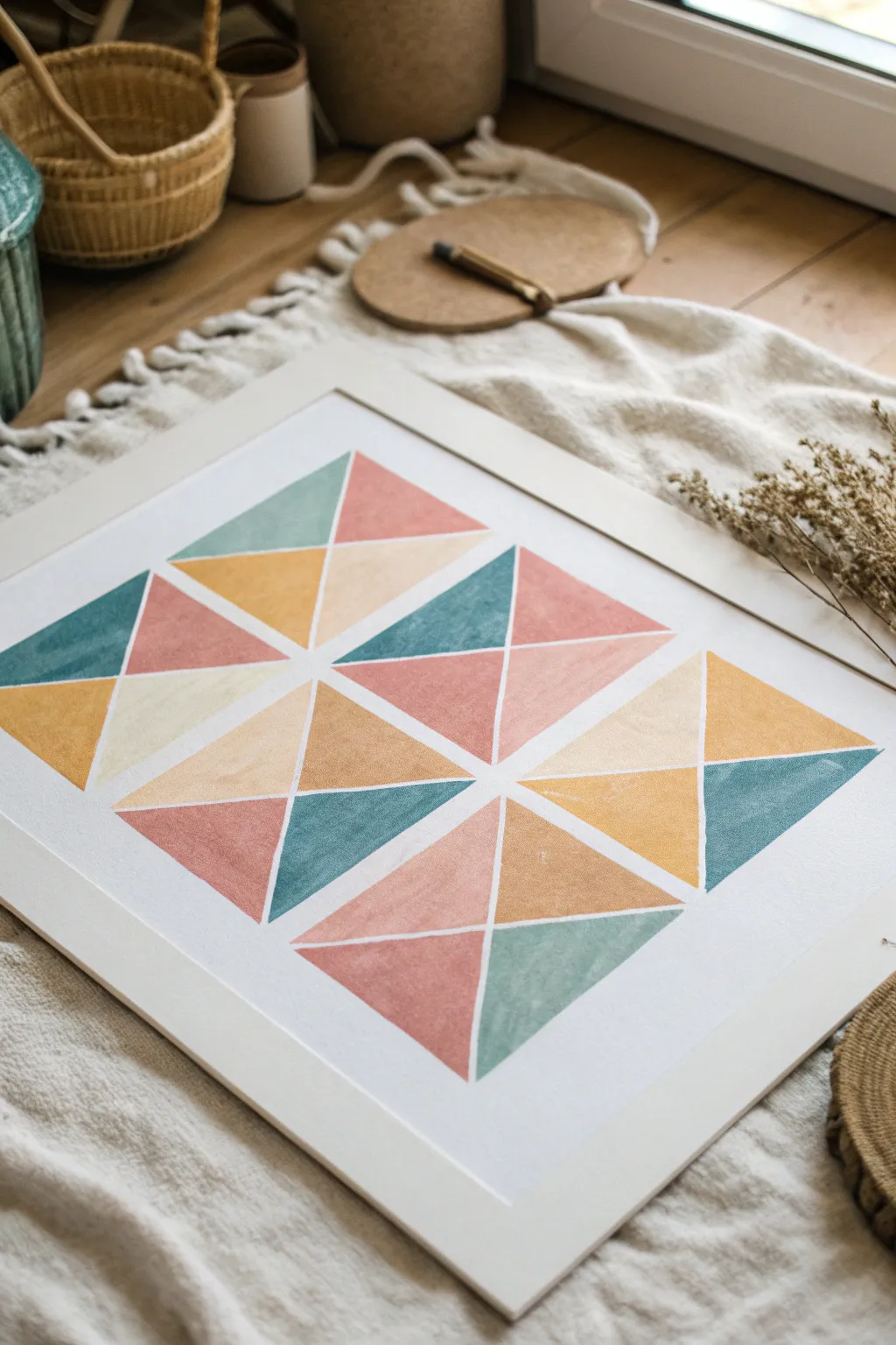
Limited Palette Color Study Cards
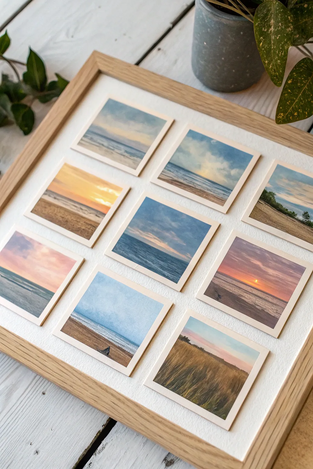
Create a captivating gallery wall in miniature with this grid of nine small-scale landscape and seascape studies. Using a limited palette for each square allows you to explore color relationships and atmospheric effects without the pressure of a large canvas.
Step-by-Step Tutorial
Materials
- Heavyweight watercolor paper or mixed media paper (at least 300gsm)
- Oil pastels (artist grade preferred for better blending)
- Masking tape or painter’s tape
- Ruler and pencil
- Paper stump or blending tortillon
- Cotton swabs
- Palette knife or old credit card (for scraping)
- Fixative spray (specifically for oil pastels)
- A clean rag or paper towels
- Square wooden frame with bright white mat or backing board
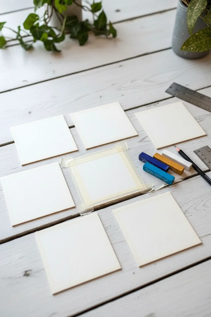
Step 1: Preparation & Layout
-
Measure and cut:
Begin by measuring and cutting nine identical squares from your heavyweight paper. A size of 3×3 inches or 4×4 inches works perfectly for this project. -
Secure the paper:
Tape down all four edges of one square onto your work surface using masking tape. This secures the paper and creates a crisp, clean border around the painting later. -
Select your palette:
For the first square, choose a limited palette of 3-4 distinct colors plus white. For example, a deep indigo, a cerulean blue, and a warm ochre for a beach scene.
Step 2: Creating the Landscapes
-
Establish the horizon:
Lightly sketch a horizon line using a pale blue or grey pastel. Vary the placement—sometimes high for emphasis on the foreground, sometimes low to highlight the sky. -
Block in background colors:
Apply your lightest sky colors first near the horizon line. Use broad, side-strokes of the pastel to cover the tooth of the paper. -
Add depth to the sky:
Layer darker blues or purples at the very top of the square, blending them downward into the lighter horizon colors using your finger or a paper stump for a smooth gradient. -
Develop the water:
For seascapes, lay down horizontal strokes of deep blue or teal below the horizon. Leave small gaps of white paper to suggest foamy crests or light reflecting on the waves. -
Create the foreground:
Introduce warmer tones like burnt sienna, deep yellow, or beige at the bottom for sand or drying grass. Apply heavier pressure here to create texture. -
Blend and soften:
Use a cotton swab to soften the transition line where the ocean meets the sky. This atmospheric perspective makes the painting feel deeper. -
Add detail:
Use the edge of a darker pastel to add defining marks—ripples in the water or blades of grass in the foreground. Keep these marks loose and impressionistic. -
Highlighting:
Scrape away tiny bits of pastel with a palette knife to reveal the paper for bright highlights, or layer thick white pastel over the top for crashing waves or clouds. -
Repeat the process:
Carefully remove the tape and repeat the steps for the remaining eight squares. Vary the time of day in each: try a pink sunset, a moody grey storm, or a bright midday scene.
Clean Colors Pro-Tip
Keep a paper towel handy to wipe the tip of your pastels between strokes. Oil pastels pick up other colors easily, and a dirty tip will turn your beautiful sky muddy in seconds.
Step 3: Assembly & Framing
-
Apply fixative:
Once all nine squares are complete, take them to a well-ventilated area and apply a light coat of oil pastel fixative to prevent smudging. -
Prepare the backing:
Take the backing board from your frame. Calculate the spacing so the nine squares sit in a perfect grid with equal margins between them. -
Mark positions:
I find it helpful to lightly mark the corners of where each square will go with a pencil to ensure perfect alignment. -
Mount the artwork:
Use double-sided acid-free tape or adhesive dots on the back of each painting. Press them firmly onto the backing board in their designated spots. -
Final framing:
Ensure the glass of the frame is clean. Place the backing board with your mounted art into the frame and secure the clips. Your miniature gallery is ready to hang.
Level Up: Texture
Try ‘sgraffito’ on the foreground sections. Layer a dark color over a light one, then scratch through the top layer with a toothpick to reveal the bright color underneath for grass or pebbles.
Step back and admire how these small color studies come together to form a cohesive and serene window into nature
Mini Instant-Photo-Style Series
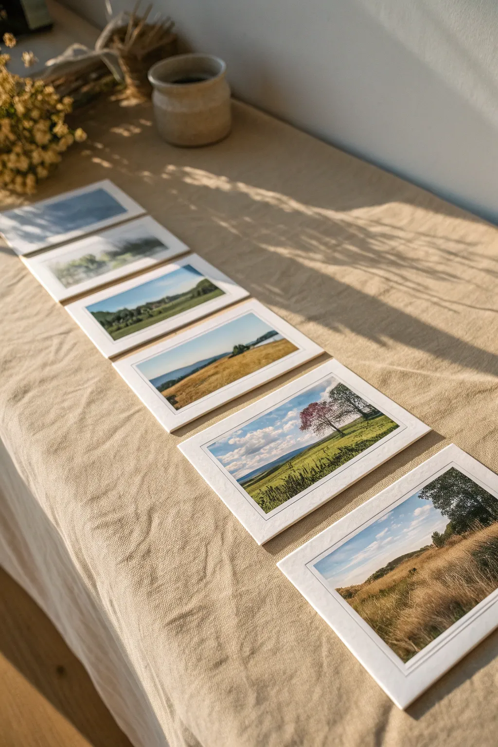
Create a charming series of miniature landscapes that mimic the nostalgic look of instant photographs. These small-scale oil pastel drawings, framed by crisp white borders, capture serene scenes from rolling hills to golden fields.
How-To Guide
Materials
- Heavyweight textured paper (watercolor or mixed media paper)
- Oil pastels (student or artist grade)
- Masking tape or artist’s tape
- Ruler
- Scissors or craft knife
- Blending tools (paper stump, cotton swabs, or fingers)
- Graphite pencil (HB)
Step 1: Preparation & Layout
-
Cut the paper base:
Start by cutting your textured paper into uniform rectangles. A size of about 3.5 x 4.25 inches works perfectly to mimic the classic instant photo dimensions. -
Create the border:
Using masking tape, tape off the edges of each rectangle. Leave a wider space at the bottom (about 1 inch) and narrower, even borders on the top and sides (about 0.25 inches) to replicate the iconic Polaroid frame. -
Secure to surface:
Press the tape down firmly to prevent pastel bleed-through. You can tape these directly onto your work surface or a drawing board to keep the paper steady while you blend.
Clean Lines Pro Tip
For the sharpest borders, apply a layer of white acrylic gesso or clear matte medium over the tape edge before applying pastel. This seals the paper gap.
Step 2: Painting the Sky
-
Base sky color:
Select a light blue oil pastel for clear days or a soft grey for moody scenes. Apply this color horizontally across the top third of your taped-off area. -
Add cloud details:
Use a white pastel to scumble in fluffy shapes over the blue. Don’t worry about being too precise; organic shapes look more natural. -
Blend the sky:
Using your finger or a paper stump, gently smudge the blue and white together. This softens the edges and creates a dreamy, atmospheric gradient.
Step 3: Creating the Landscape
-
Establish the horizon:
Draw a faint horizon line about two-thirds down the image area. This is where your land will meet the sky. -
Block in background hills:
For distant hills, use cooler, lighter colors like hazy purples or desaturated greens. Apply these with a light touch right at the horizon line. -
Layer the mid-ground:
Move closer to the viewer by adding bands of color below the hills. I like to use vibrant greens or golden ochres here to represent fields or meadows. -
Add foreground textures:
At the very bottom of the image area, apply your darkest or warmest colors. Use short, upward strokes with a dark green or brown pastel to suggest tall grasses or wheat.
Fixing Smudges
If pastel smudges onto the white border during peeling, use a white vinyl eraser to gently lift the pigment. Avoid scrubbing, or you’ll ruin the paper texture.
Step 4: Final Details & Revealing
-
Insert focal points:
Add tiny details to give the scene scale. A single tree silhouette, a small distant house, or a cluster of shrubs can be drawn with a darker pastel edge or a harder drawing tool. -
Refine the textures:
Go back over the foreground with a sharp edge of a pastel or a toothpick to scratch back into the color, creating defined blades of grass. -
Clean the edges:
Before removing the tape, brush away any oil pastel crumbs that have gathered near the tape lines to prevent smudging. -
The peel reveal:
Slowly and carefully peel away the masking tape at a 45-degree angle. This crisp white border is what truly sells the instant-photo effect. -
Set the series:
Arrange your finished mini-paintings together. The consistent framing ties different color palettes together into a cohesive collection.
Now you have a nostalgic collection of painted memories ready to display or gift
Sgraffito Stars in a Galaxy Sky
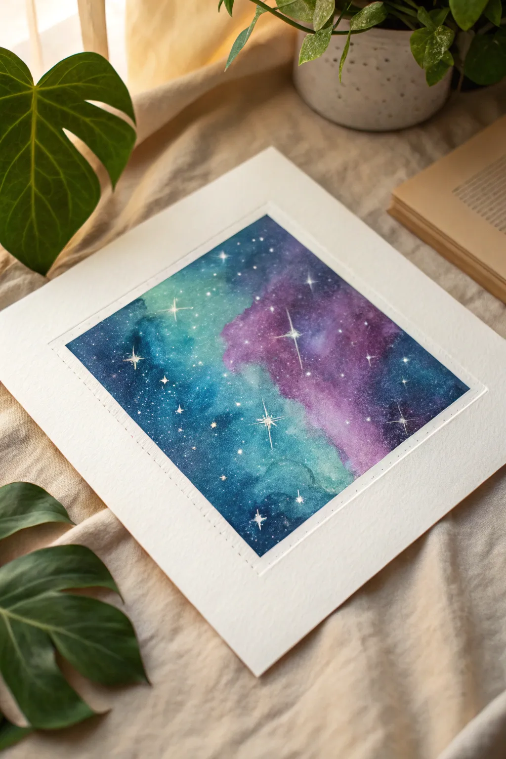
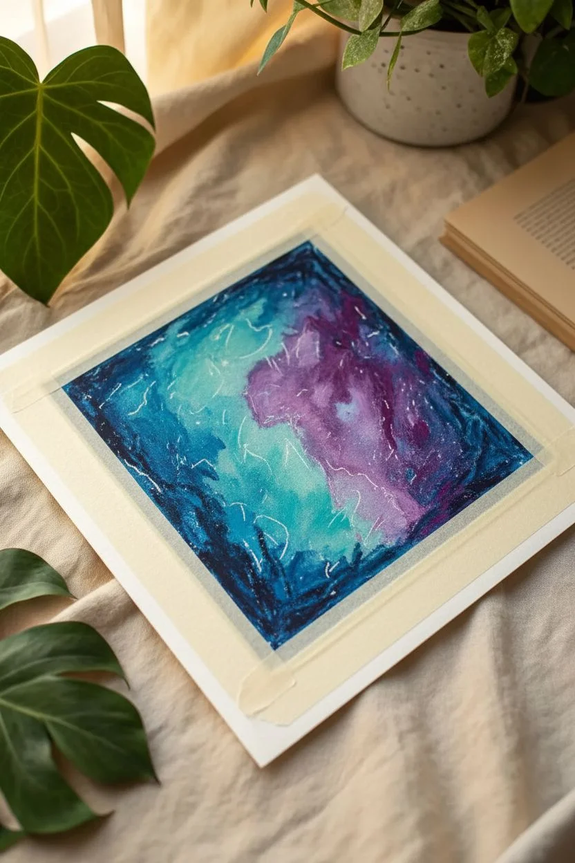
Create a mesmerizing window into deep space using the rich blending capabilities of oil pastels. This project features a nebulous blend of teals and purples, punctuated by brilliant stars etched directly into the pigment.
Step-by-Step
Materials
- Heavyweight mixed media or watercolor paper (square format)
- Oil pastels (dark blue, teal/turquoise, violet, black, white)
- Paper towels or blending stumps
- Masking tape or painter’s tape
- Scraping tool (palette knife or craft knife)
- White gel pen (optional)
- White acrylic paint (optional)
Step 1: Preparation and Base Layer
-
Tape the Edges:
Secure your square paper to your work surface using masking tape. This will create that crisp, clean white border shown in the final piece and keep the paper from shifting while you blend. -
Map color zones:
Lightly sketch out cloud-like shapes using your white oil pastel. These don’t need to be precise; just mark areas where you want the lightest teal nebulas versus the darker purple voids. -
Apply the teal:
Start with a bright teal or turquoise oil pastel. Fill in the areas you marked for the nebula clouds, coloring heavily to get a thick layer of pigment. -
Add violet tones:
Next to the teal sections, apply a rich violet or purple hue. Let the edges of the purple slightly overlap the teal regions to prepare for blending later. -
Deepen the corners:
In the remaining negative space, particularly the corners and edges furthest from the center, color heavily with a dark navy blue or deep indigo.
Clean Edges Trick
Before peeling the tape, run your scraping tool gently along the tape edge to break the seal of the thick pastel layer. This prevents tearing.
Step 2: Blending the Nebula
-
First heavy blend:
Using a folded paper towel or your finger, rub the teal areas firmly. Push the pigment into the paper tooth until it looks creamy and consistent. -
Create the transition:
Blend the purple areas next. When you reach the border where purple meets teal, use a circular motion to mix them, creating a soft transition rather than a hard line. -
Darken the void:
Blend the dark navy sections last to avoid muddying your lighter colors. Drag some of the dark blue slightly into the purple areas to add depth. -
Add true black:
To make the colors pop, add touches of black oil pastel to the very darkest corners and blend them out. This high contrast makes the ‘light’ of the nebula appear brighter. -
Highlighting:
Take your white oil pastel and layer it over the brightest center of the teal nebula. Blend it gently to create a glowing effect.
Level Up: Star Dust
Flick a toothbrush dipped in diluted white acrylic paint over the drawing (masking the edges first) to create a subtle field of tiny dust-like stars.
Step 3: The Sgraffito Technique
-
Plan your stars:
Before scratching, visualize where your largest ‘hero’ stars will go. You want a balanced composition, not too clustered. -
Scratch the center:
Using the tip of a craft knife or a palette knife, gently scrape away a small dot of the colored pastel layers to reveal the white paper underneath. This is the sgraffito technique. -
Create the rays:
For the larger stars, scratch fine lines radiating outward from the center dot. Try a cross shape (+) or an ‘X’ shape with a longer vertical line. -
Refine the points:
I find it helpful to wipe off the scraping tool after every few strokes so you don’t accidentally smear dark pigment back onto your bright white star. -
Add distant stars:
Use the very point of your tool to prick tiny dots randomly across the dark blue and purple areas. These represent distant stars in the galaxy. -
Intensify (Optional):
If the paper underneath isn’t bright enough, add a tiny dot of white gel pen or acrylic paint to the very center of your scratched stars for extra brilliance. -
The Reveal:
Carefully peel away the masking tape at a 45-degree angle away from the drawing to ensure a sharp, clean border.
Now you have a stunning piece of cosmic art that captures the mystery of deep space
Textured Old Door and Brick Study
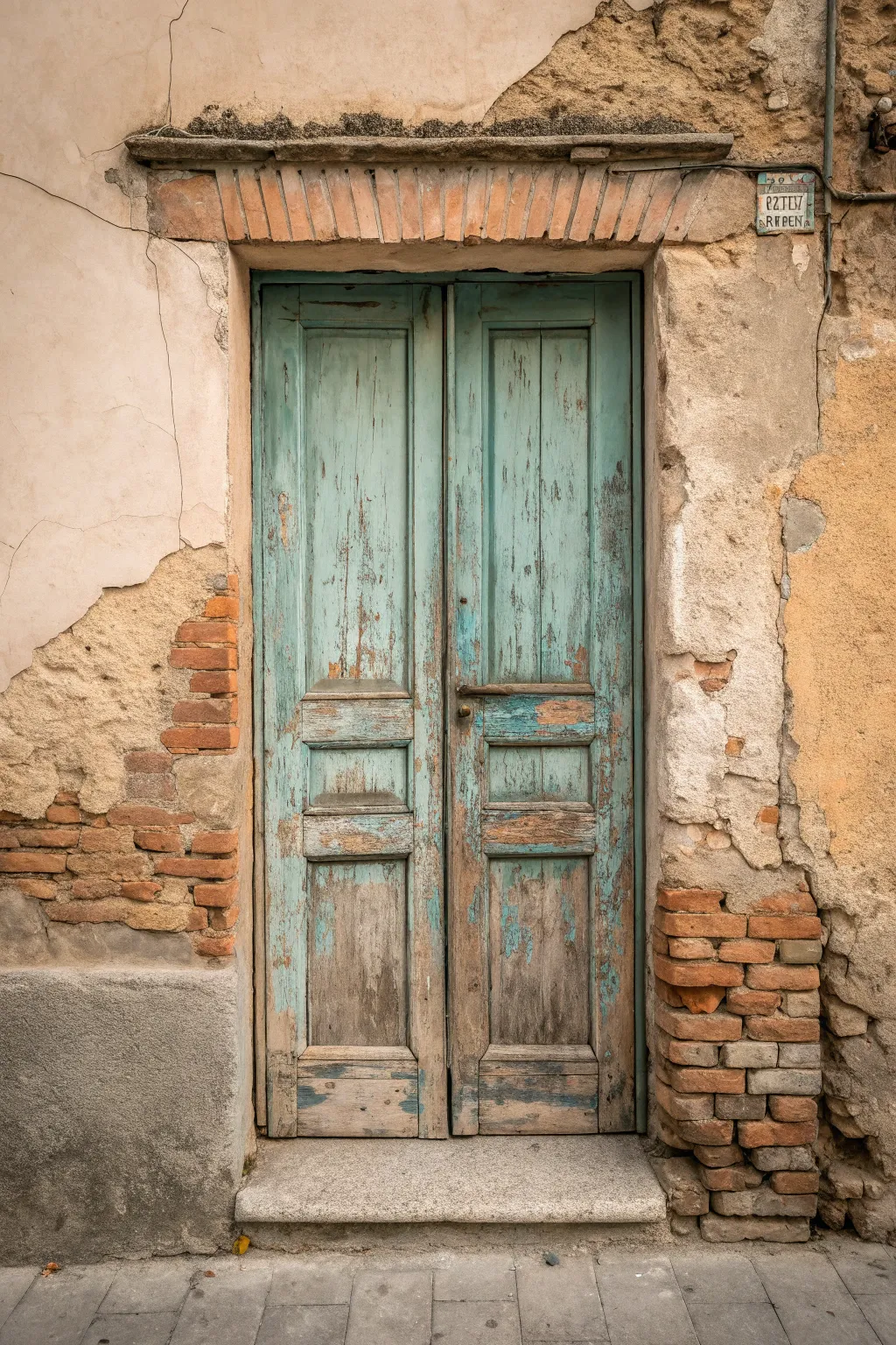
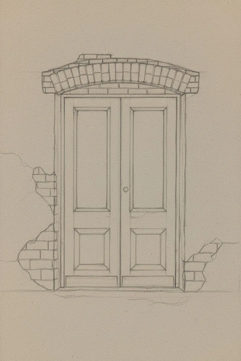
Capture the charm of decay with this textured study of an old Italian doorway. You will learn to layer oil pastels to mimic peeling paint, exposed brickwork, and the rugged feel of ancient plaster.
How-To Guide
Materials
- Heavyweight textured pastel paper (grey or tan toned recommended)
- Oil pastels (set including teal, turquoise, ochre, burnt sienna, dark brown, greys, and white)
- Blending stumps (tortillons)
- Palette knife or old credit card for scraping
- Graphite pencil (HB) for sketching
- Masking tape
- Paper towels
Step 1: The Architectural Framework
-
Scale and proportions:
Begin by lightly sketching the main rectangle of the door in the center of your page. Ensure the two door panels are equal in width. -
Defining the panels:
Sketch the inner recessed panels of the door—a tall upper rectangle and two smaller squares below it on each side. Don’t use a ruler; a slightly wobbly hand captures the age better. -
Mapping the damage:
Lightly outline the irregular shapes where the plaster has fallen away to reveal the brick underneath on the left and bottom right. -
The brick arch:
Draw the individual bricks that form the flat arch (lintel) directly above the door frame. Keep them slightly uneven.
Muddy Colors?
If your brick red is blending too much with the teal door, let the first color set for a few minutes, or use a piece of scrap paper as a shield while coloring adjacent areas.
Step 2: Building the Ancient Wall
-
Base layer for plaster:
Using a light cream or warm beige pastel, block in the plaster surrounding the door. Apply it unevenly, leaving some paper showing through for texture. -
Adding the shadows:
Take a light grey pastel and scribble loosely over the beige in areas where the plaster looks dirty or shadowed, particularly under the lintel. -
Exposed brickwork foundation:
Fill in the exposed brick areas with a mix of terracotta and burnt sienna. Don’t color them solid; scribbling creates a rougher brick texture. -
Defining individual bricks:
Use a dark brown or charcoal grey to outline the gaps between the bricks. Smudge these lines slightly so they look like old mortar, not harsh cartoons. -
Highlighting the masonry:
Touch the top edges of the protruding bricks with a pale ochre or white to show where the light hits.
Step 3: Painting the Weathered Door
-
Wood undertones:
Before adding the teal, apply a patchy layer of dark brown and raw sienna over the entire door surface. This represents the bare wood showing through the paint. -
Applying the teal:
Layer a muted teal or turquoise pastel over the brown. Press firmly in the center of panels but use a light, broken stroke near the edges and bottom where paint would naturally peel. -
Scraping technique (Sgraffito):
Use your palette knife or an old credit card to scratch vertical lines down the door. This removes the top teal layer and reveals the brown wood underneath, instantly creating a peeling paint effect. -
Deepening the recesses:
Use a dark blue-grey or charcoal to shade the inside edges of the door panels. This gives the door depth and makes the molding pop. -
The center gap:
Draw a firm, dark vertical line down the center where the two doors meet, breaking it occasionally to show wear.
Pro Tip: The palette knife
Don’t just scratch lines! Use the flat side of a painting knife to scrape away broad patches of teal pastel. This mimics large flakes of paint that have fallen off over time.
Step 4: Final Textures and Details
-
The lintel bricks:
Color the bricks above the door with a mix of orange-brown and grey. They should look dustier than the wall bricks, so blend them gently with a finger. -
Cracks and fissures:
With a sharpened dark grey pastel or charcoal pencil, add the fine cracks running through the plaster walls. -
The threshold step:
Create the stone step at the bottom using cool greys. Use horizontal strokes to differentiate the stone texture from the vertical wood grain. -
Grounding shadow:
Add a dark, soft shadow under the stone step to ground the building. -
Dusty finish:
I like to lightly drag a white pastel on its side over the roughest brick areas to simulate accumulated dust and lime efflorescence.
Step back and admire the history you’ve captured in the worn textures of your door.
Abstract Gradient Shapes With Tape Masks
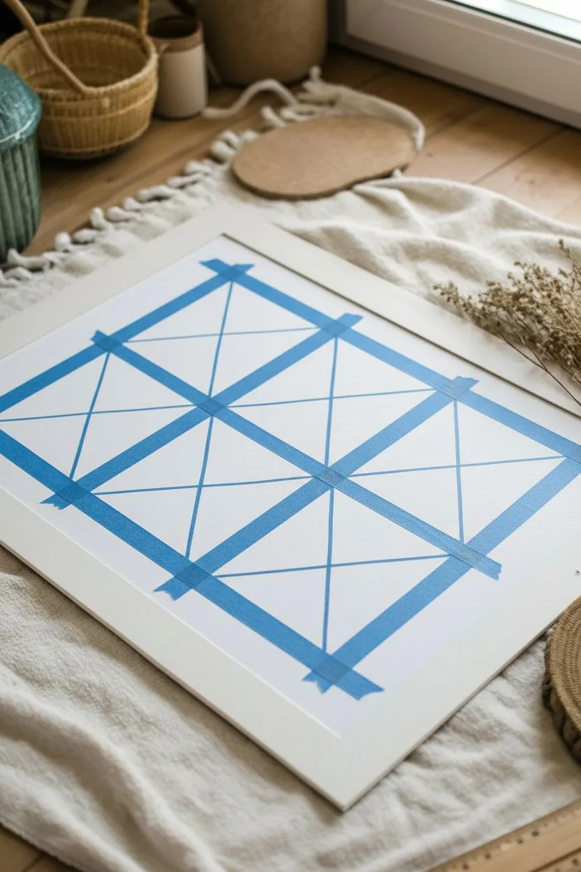
Bring soft, harmonious colors into your space with this modern geometric design that looks far more complex than it actually is. By using simple tape masking and blending techniques, you can achieve clean lines and a beautiful matte texture perfect for minimalist decor.
Step-by-Step Tutorial
Materials
- Heavyweight white drawing paper or mixed media paper (A3 or larger)
- Oil pastels (soft teal, coral/salmon, mustard yellow, beige/cream)
- Painter’s tape or low-tack masking tape (approx. 1/4 inch width)
- Ruler
- Pencil
- Paper towels or blending stumps
- Fixative spray (optional)
- White or light wood frame
Step 1: Grid & Tape Masking
-
Measure the Perimeter:
Start by measuring a large, even border around your paper to ensure the artwork sits centered. Lightly mark this boundary with a pencil. -
Divide the Space:
Within your marked boundary, divide the area into four equal vertical rectangles. Use your ruler to ensure they are perfectly evenly spaced. -
Create the ‘X’ Patterns:
Lightly draw diagonal lines from corner to corner inside each of the four rectangles, creating an ‘X’ shape in each that divides them into four triangles. -
Initial Taping:
Apply your tape directly over your pencil lines. Start with the vertical and horizontal dividing lines first, pressing the edges down firmly to prevent color bleed. -
Diagonal Taping:
Tape over the diagonal ‘X’ lines next. Since the tape will overlap, plan your taping order so you can easily peel it away later, or cut the tape at intersections with a craft knife for ultra-precise corners.
Step 2: Color Application
-
Select Your Palette:
Gather your four main colors: teal, coral, mustard, and beige. Grouping them beforehand helps visualize the balance. -
First Triangle Set:
Begin coloring the top triangles of your grid. Apply the teal pastel heavily near the edges of the tape and lighter toward the center. -
Blending the Texture:
Use your finger or a paper towel to smudge the pastel inward, filling the triangle completely. This creates that smooth, velvety gradient look. -
Rotating Colors:
Move to the next triangle in the pattern (perhaps the right-side ones) and apply the coral tone. Color firmly to ensure the white paper doesn’t show through the grain. -
Filling the Pattern:
Continue filling each triangular section, alternating colors according to the reference image or your own random pattern. Try not to have two identical colors touching directly without a tape line. -
Handling Edges:
When coloring near the tape, stroke *away* from the tape edge onto the paper, not *into* the tape edge, to minimize the risk of paste pushing under. -
Layering for Depth:
For the beige or lighter sections, I like to add a tiny touch of white pastel on top and blend it out to make the color appear creamy and consistent. -
Final Touch-ups:
Scan the artwork for any patchy spots. Add a second layer of pastel where needed to simulate the rich, opacity seen in the example.
Clean Edges Only
Pastel bleeding under the tape? Ensure you burnish (rub hard) the tape edges with a spoon before painting. Also, use harder pastels for edges and softer ones for filling.
Step 3: Reveal & Finish
-
Peeling the Tape:
Slowly peel back the tape at a sharp 45-degree angle. Start with the diagonal pieces that are on top, moving gently to avoid ripping the paper. -
Clean Up Lines:
If any pastel bled under the tape, use a white eraser or a sharp craft knife to gently scrape it away and restore the crisp white line. -
Fixative:
In a well-ventilated area, lightly mist the artwork with a fixative spray to prevent the oil pastels from smudging during framing. -
Framing:
Once dry, place your artwork into a simple white frame with a mat board to elevate the presentation.
Level Up: Metallic Pop
Swap the beige tone for a gold or copper oil pastel. The subtle metallic sheen catches the light beautifully and adds a high-end, luxurious feel to the geometric layout.
Hang your new geometric masterpiece in a spot with natural light to highlight the rich texture of the pastels


Have a question or want to share your own experience? I'd love to hear from you in the comments below!