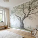
Ombre painting is one of those magical tricks that instantly makes a space or artwork feel softer, moodier, and more dimensional. If you’ve been craving that dreamy color gradient look, here are my favorite ombre ideas to try—starting with the classics and sliding into some seriously fun twists.
Ocean-Inspired Blue Ombre Wall
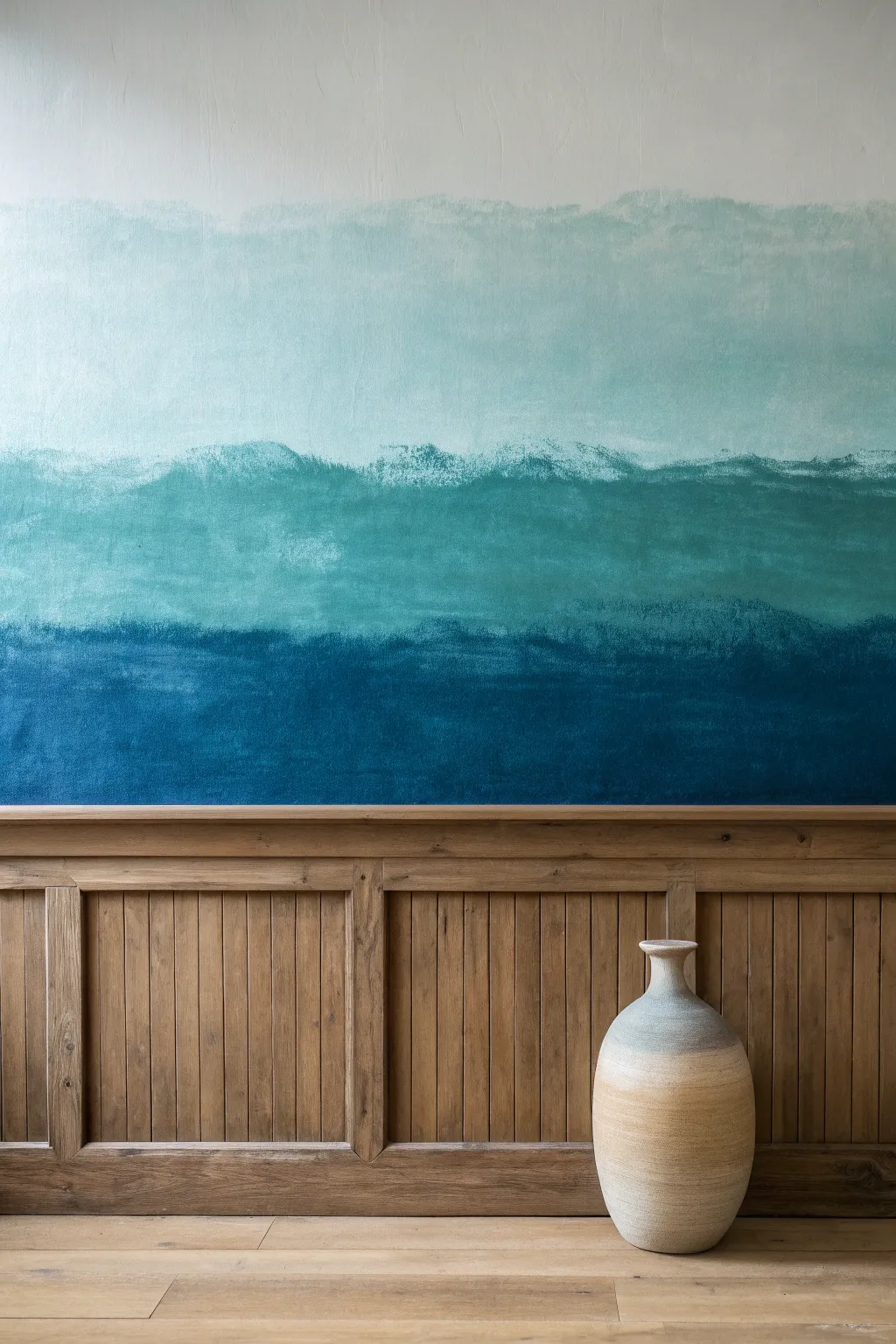
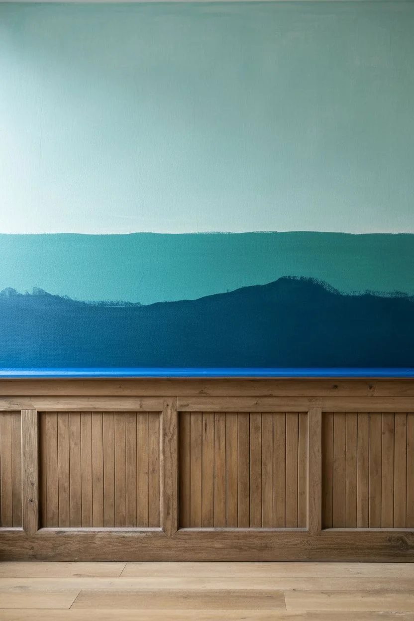
Bring the calming gradients of the ocean into your home with this layered, textured ombre wall treatment. By creating distinct yet blended bands of teal, turquoise, and deep blue, you can mimic the serene look of a distant sea horizon.
Step-by-Step
Materials
- Three shades of matte interior latex paint (Dark Navy, Teal, Soft Aqua)
- White latex paint (for blending)
- Painter’s tape
- Drop cloths
- 9-inch paint roller and tray
- 3-4 High-quality roller covers (3/8″ nap)
- 4-inch paint brush (natural bristle preferred for blending)
- Two paint mixing buckets
- Clean rags
- Water spray bottle (optional)
Step 1: Preparation and Base
-
Clear and Protect:
Move all furniture away from the wall you intend to paint. Lay down drop cloths to protect your flooring. -
Tape the Trim:
Apply painter’s tape carefully along the top edge of your wainscoting or baseboards. Press the tape edge down firmly with a putty knife or your fingernail to prevent bleed-through. -
Visualize the Horizons:
Stand back and look at your wall. Mentally divide it into three horizontal sections. The bottom band will be the darkest, the middle medium, and the top the lightest. You can make light pencil marks at the desired transition heights if it helps. -
Mix Your Mid-Tones:
In your spare buckets, pour a small amount of your darkest color and mix it with the medium teal to create a specific bridge color. Do the same with the teal and the lightest aqua. These custom mixes will help smooth the transitions later.
Keep It Wet
Speed is key for ombre. Work in 4-foot wide vertical sections at a time so the paint remains wet enough to blend. If you do the whole wall width at once, the paint will dry before you can merge the colors.
Step 2: Applying the Color Bands
-
Roll the Deep Blue:
Start with the darkest navy blue paint. Load your roller and apply it to the bottom third of the wall, working from the taped edge upward. -
Create the Lower Edge:
Stop the solid dark blue application about 6 inches below where you want the first transition to happen. Don’t worry about a perfectly straight line here; an organic, wavy edge adds to the ocean feel. -
Apply the Middle Teal:
Switch to a fresh roller cover. Apply the medium teal color to the middle section of the wall, leaving a gap of about 8-10 inches between this wet paint and the dark blue below it. -
Paint the Upper Aqua:
Using a third clean roller, apply the lightest aqua shade to the top section of the wall, again leaving a gap between this color and the teal mid-section. -
Extend to the Ceiling:
Roll the lightest color all the way to the ceiling line (or tape line if you aren’t painting the ceiling). Ensure good coverage here as this area won’t be blended.
Add Sea Texture
For a ‘frothy’ wave look, dab a sea sponge dipped in water and a drop of white paint along the transition lines. Press lightly to lift a little color and deposit watermark textures.
Step 3: Wet Blending Technique
-
Fether the Dark Transition:
Return to the gap between the dark blue and teal. Dip your 4-inch dry brush lightly into the dark paint and apply it to the unpainted gap using upward strokes. -
Cut in the Mid-Tone:
Quickly wipe the brush (or use the other side) and drag the teal paint downward into the dark blue. I like to keep the brush fairly dry here to create a scumbled, textured look. -
Cross-Hatch for Texture:
Where the two colors meet, use an ‘X’ motion with your brush to mechanically mix the wet paint on the wall. This breaks up any hard lines. -
Use the Bridge Color:
If the transition looks too harsh, dip your brush into the custom dark/teal mix you prepared earlier. Feather this over the transition zone to soften the gradient. -
Mist if Necessary:
If the paint is drying too fast, lightly spritz the wall with water. This keeps the latex paint workable for blending a bit longer. -
Blend the Upper Horizon:
Move to the gap between the teal and the light aqua. Repeat the cross-hatching technique, pulling the teal up and the aqua down. -
Create Organic Waves:
Instead of blending this line into a perfect blur, allow some brush strokes to remain visible horizontally. This mimics the look of waves or distant clouds. -
Soften the Top Edge:
For the very top transition near the ceiling (or white wall above), use a mostly dry brush with a tiny bit of white paint to create a hazy, faded finish where the aqua meets the unpainted space. -
Final Assessment:
Step back about 10 feet. Look for any areas that seem like stripes rather than gradients. Go back in with a slightly damp brush to soft-blend these areas while the paint is tacky. -
Dry and Reveal:
Allow the wall to dry completely for at least 4 hours. Once dry, carefully peel away the painter’s tape at a 45-degree angle to reveal your crisp wainscoting line.
Step back and enjoy the serene, watercolor effect of your new feature wall
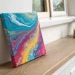
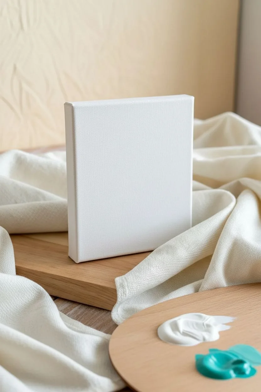
Sunset Ombre Canvas Background
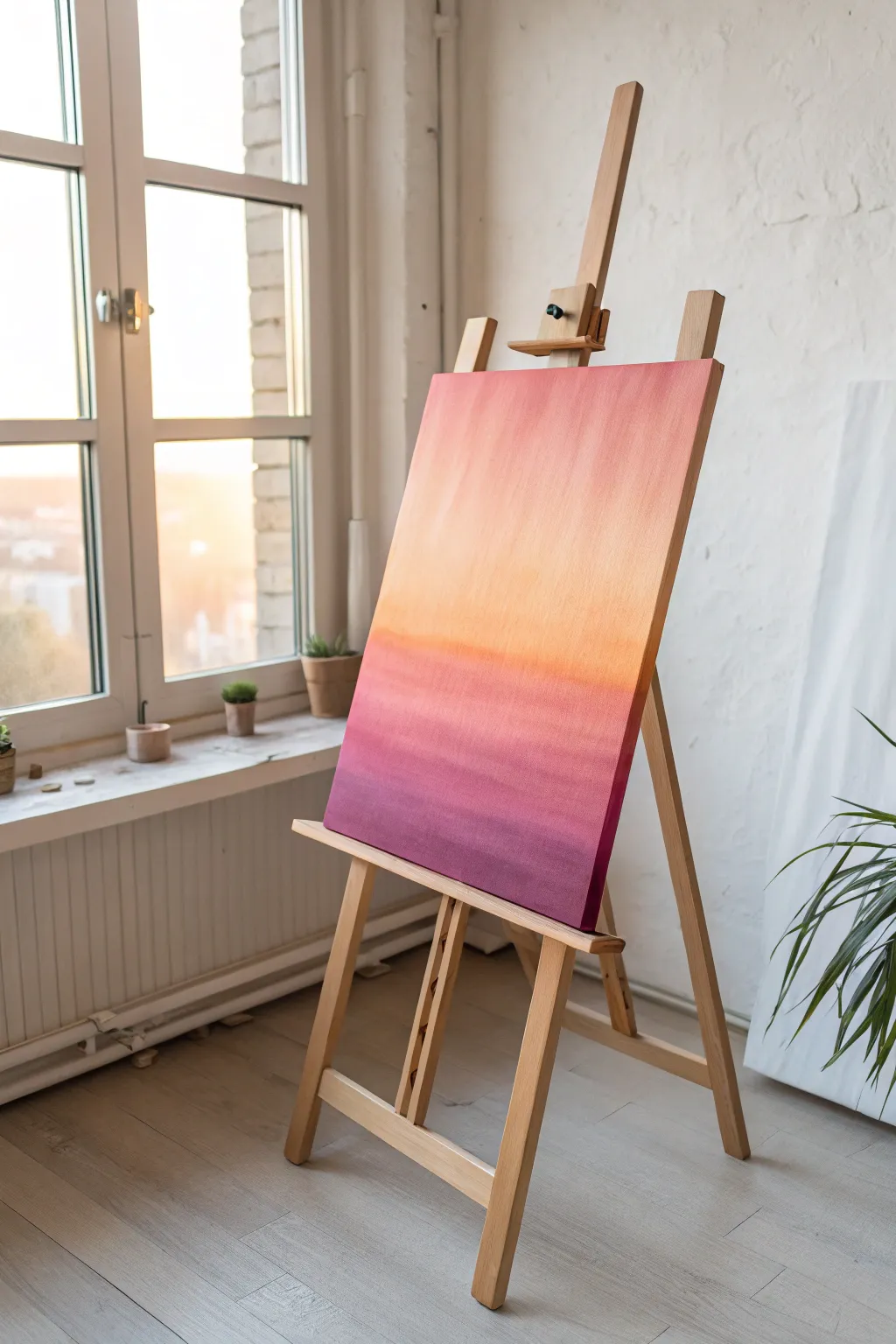
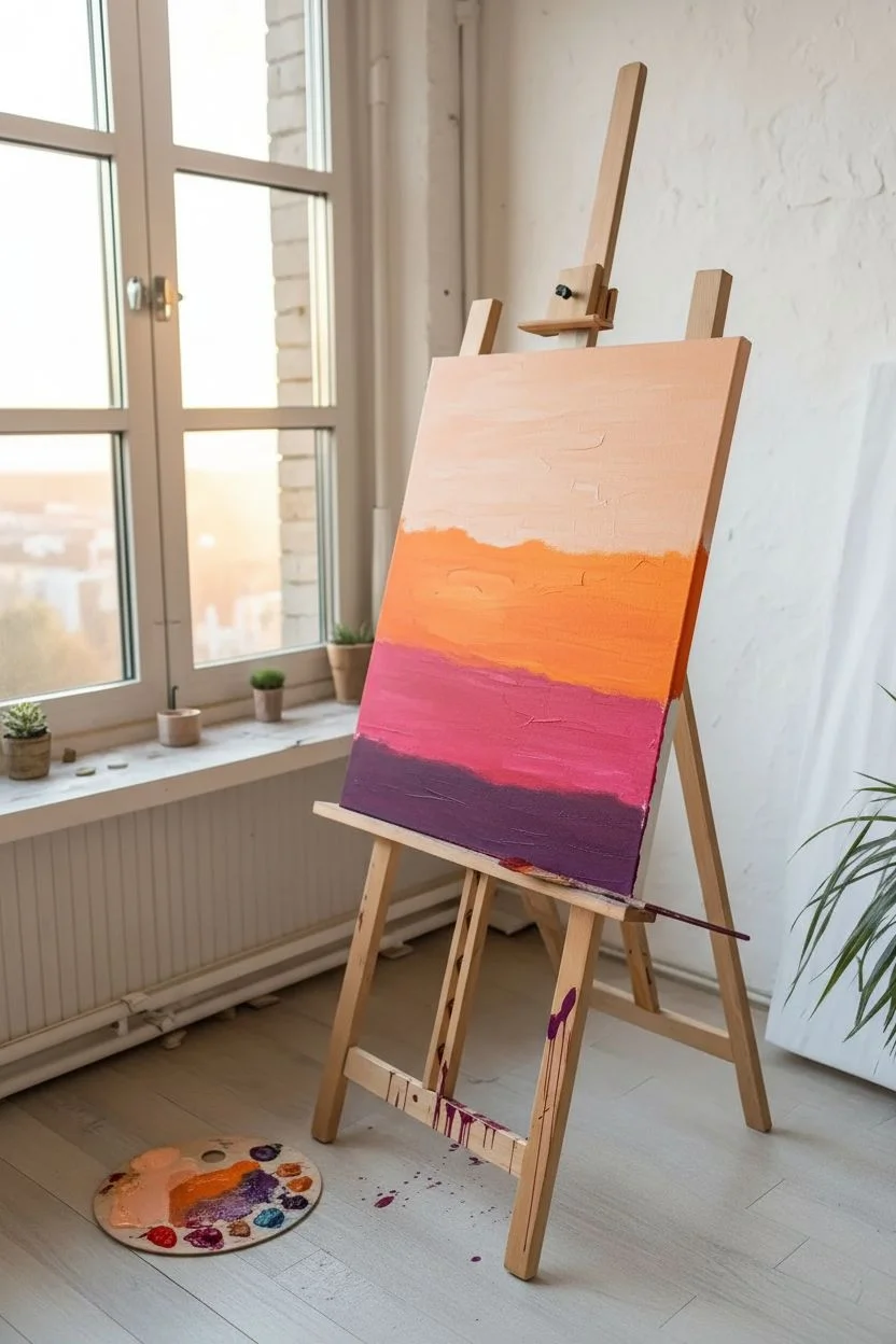
Capture the fleeting beauty of twilight with this stunning abstract gradient painting. This project focuses on seamless blending techniques to create a soothing transition from soft peach to deep magenta.
Detailed Instructions
Materials
- Large rectangular stretched canvas (18×24 or similar)
- Acrylic paints: Titanium White, Light Peach or Salmon, Bright Orange, Magenta, Deep Violet
- Large flat paintbrush (2-3 inch width)
- Medium flat paintbrush
- Palette mister or small spray bottle with water
- Mixing palette or paper plate
- Cup of water
- Paper towels
- Gesso (optional, for priming)
Step 1: Preparation and Base Layout
-
Prime the Surface:
If your canvas isn’t pre-primed, apply a coat of white gesso and let it dry completely. This ensures the colors will sit vibrantly on the surface. -
Prepare Your Palette:
Squeeze out generous amounts of your four main colors: Light Peach, Bright Orange, Magenta, and Deep Violet. Keeping them separate but accessible is key for speed. -
Dampen the Canvas:
Lightly mist your canvas with water using the spray bottle. You don’t want it dripping wet, just slightly humid to help the acrylics blend more slowly. -
Apply the Top Band:
Using your large flat brush, load up the Light Peach paint. Apply this color to the top third of the canvas using long, horizontal strokes. -
Add the Middle Band:
Without cleaning the brush perfectly (a little mixing is good), pick up the Bright Orange paint. Apply this across the middle section of the canvas, just below the peach. -
Apply the Base Band:
Wipe your brush on a paper towel, then load it with Magenta. Paint the lower third of the canvas, leaving a small strip at the very bottom for the darkest tone. -
Anchor with Violet:
Finally, apply a thick strip of Deep Violet along the very bottom edge to ground the composition with visual weight.
Fixing Streaks
Result looking streaky? Your paint dried too fast. Mist the canvas lightly with water and run a clean, dry brush horizontally over the transition area to re-soften.
Step 2: Blending the Ombre
-
Initial Melding:
Now that the colors are roughly placed, return to the area where the Peach meets the Orange. Use horizontal, sweeping strokes to feather the orange up into the peach. -
Keep the Brush Wet:
If the paint starts to drag or feel sticky, give your brush a tiny mist of water. Moisture is the secret to a smooth gradient. -
Mid-Section Transition:
Move down to the Orange and Magenta border. Blend these by brushing back and forth across the seam, gradually widening your stroke until the hard line disappears. -
Deepen the Bottom:
Blend the Magenta into the Deep Violet at the bottom. I find that pulling the darker color upwards slightly creates a more natural ‘fading light’ effect. -
Smooth the Entire Surface:
Take a clean, slightly damp large brush. Starting from the very top, make one continuous horizontal stroke all the way across, then move down slightly and repeat. -
Eliminate Brush Marks:
Continue these long, edge-to-edge strokes all the way to the bottom. This unifies the texture and removes choppy brush marks. -
Check the Edges:
Don’t forget to paint the sides of the canvas! Wrap the corresponding colors around the deep edges for a professional gallery-wrapped look. -
Softening Correction:
Stand back and look for any harsh lines. If you see one, lightly dab a clean, dry brush over the area to soften the transition while the paint is still tacky. -
Final Dry:
Acrylics dry darker, so don’t panic if the colors shift slightly. Let the painting dry undisturbed for at least 24 hours in a dust-free area.
Add a Silhouette
Once fully dry, paint a solid black silhouette of a tree line, a city skyline, or birds in flight along the bottom edge to create a foreground scene.
Hang your new masterpiece in a well-lit room to let the gradient glow
Monochrome Ombre From Dark to Light
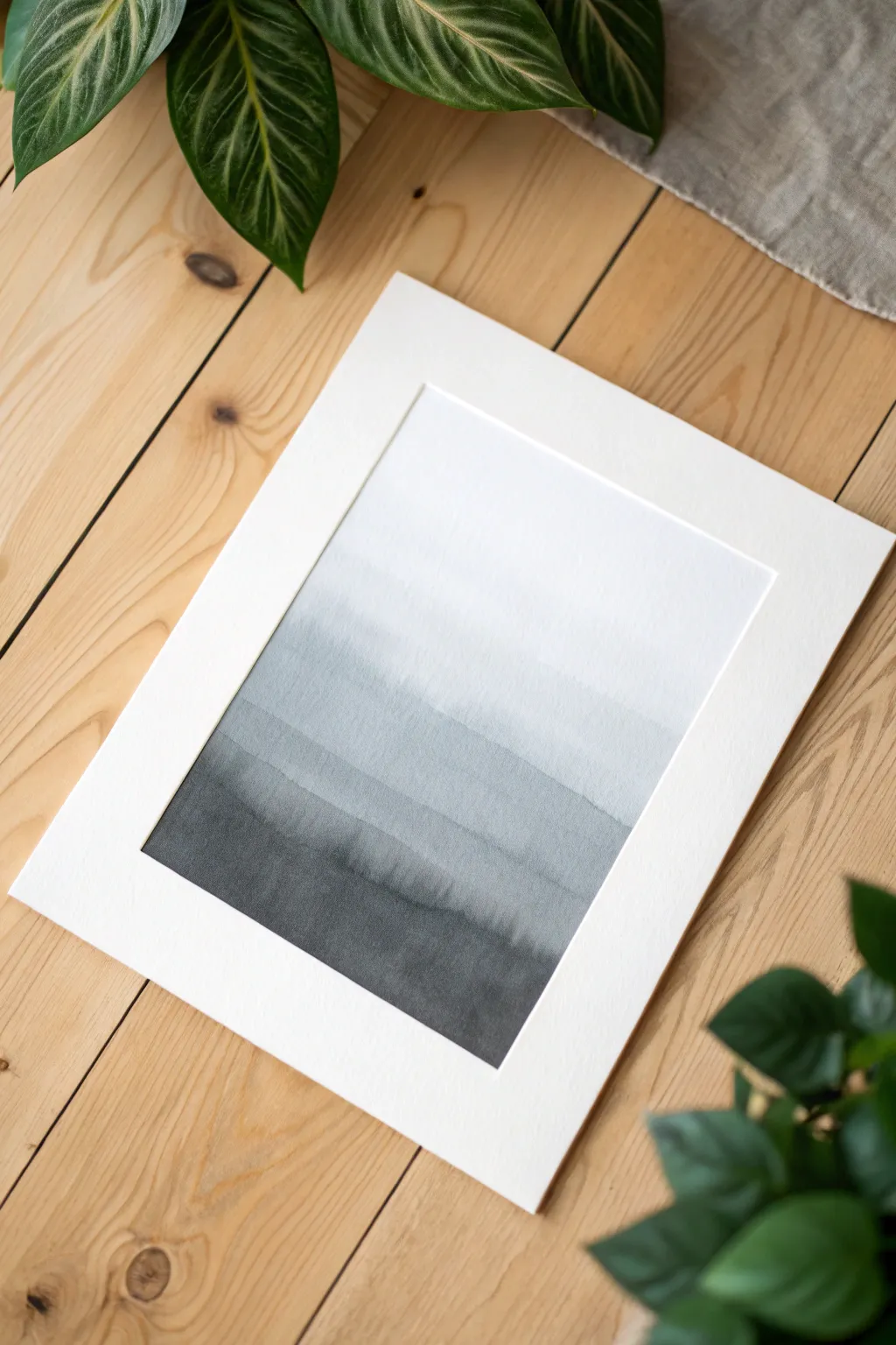
Capture the serene beauty of a foggy landscape with this minimalist black and white ombre painting. Using simple watercolor washes, you’ll create atmospheric depth that transitions seamlessly from charcoal depths to airy whites.
How-To Guide
Materials
- Cold press watercolor paper (300 gsm)
- Black watercolor paint (Payne’s Grey or Lamp Black)
- Wide flat brush or hake brush (1-2 inch)
- Round brush (size 6 or 8) for details
- Two jars of water (clean and dirty)
- Painter’s tape or masking tape
- Paper towels
- Mixing palette
- Pre-cut mat board for framing
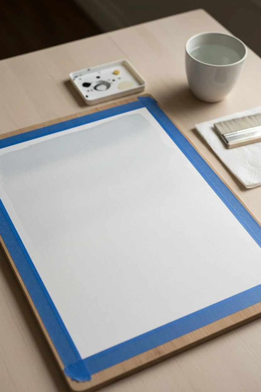
Step 1: Preparation & First Wash
-
Secure the paper:
Tape your watercolor paper down firmly to a flat board or table on all four sides. This prevents the paper from buckling when it gets wet and creates a clean, professional white border. -
Pre-wet the paper:
Using your large flat brush and clean water, apply an even coat of water across the entire upper two-thirds of the paper. You want a sheen, but not puddles. -
Mix a light wash:
Dilute a very small amount of black paint with plenty of water to create a consistent, pale grey wash. It should be barely visible, like a faint shadow. -
Apply the first sky layer:
Starting just above the middle of the paper, drag your charged brush horizontally across the wet surface. Let the paint bleed upwards into the wet area to create a soft, diffused horizon line. -
Initial drying:
Allow this first layer to dry completely. The paper must be flat and cool to the touch before moving on, or the next layers will muddy the crisp edges we want later.
Fixing “Cauliflowers”
Did water bloom and create jagged edges? Don’t panic. Once dry, wet a stiff brush and gently scrub the edge to soften it, or turn the bloom into a deliberate mountain peak.
Step 2: Building the Middle Landscape
-
Mix a medium grey:
Add a bit more pigment to your palette to create a medium-strength grey. Test it on a scrap piece of paper; it should be distinct from the sky but still transparent. -
Paint the second ridge:
Load your brush and paint a ragged horizontal strip below your first wash. Don’t make the line perfectly straight; gentle undulations mimic distant hills. -
Soften the bottom edge:
Immediately after painting the strip, rinse your brush and drag clean water along just the bottom edge of that paint line, pulling the pigment down to fade it out. -
Create texture:
While this layer is still damp, you can drop tiny amounts of slightly darker water into the wet edge to create “blooms” that look like distant trees. -
More drying:
Let this mid-layer dry completely. Patience is key with watercolors to get those defined, layered edges.
Add Metallic Accents
Once fully dry, trace the very top edge of one mountain ridge with a fine gold ink pen or gold watercolor. It catches the light and adds a modern luxury touch.
Step 3: Deepening the Foreground
-
Mix charcoal tones:
Prepare a dark, rich grey mixture. It should be noticeably darker than your previous layer but not yet solid black. -
Paint the lower hills:
Paint a new band across the paper, starting lower than the previous one. Overlap the faded bottom of the previous layer to build density. -
Bleed technique:
Tilting your board slightly upward can help the pigment settle towards the bottom edge of this shape, creating a natural gradient within the shape itself. -
Final dark layer:
Mix your darkest value—almost pure black with very little water. I like to use Lamp Black here for opacity. -
Anchor the composition:
Paint the bottom-most section of the paper with this dark pigment. This visual weight anchors the ombre effect. -
Blend downward:
Ensure the bottom edge is solid straight against the tape line, but allow the top edge of this dark mass to be soft and organic like tree tops.
Step 4: Final Touches
-
Assess the transitions:
Step back and look at your gradient. If the transition between layers feels too harsh, you can gently glaze a very sheer wash over the harsh area once it’s bone dry. -
Full dry:
Leave the painting to dry for at least an hour. The paper needs to contract and flatten out completely. -
The reveal:
Slowly peel the painter’s tape away at a 45-degree angle, pulling away from the painting to ensure you don’t rip the paper surface. -
Mounting:
Place your finished piece behind the pre-cut white mat board. This instantly elevates the simple gradient into a gallery-worthy piece.
Now you have a moody, atmospheric landscape ready to frame and display on your wall
Soft Watercolor Ombre Wash
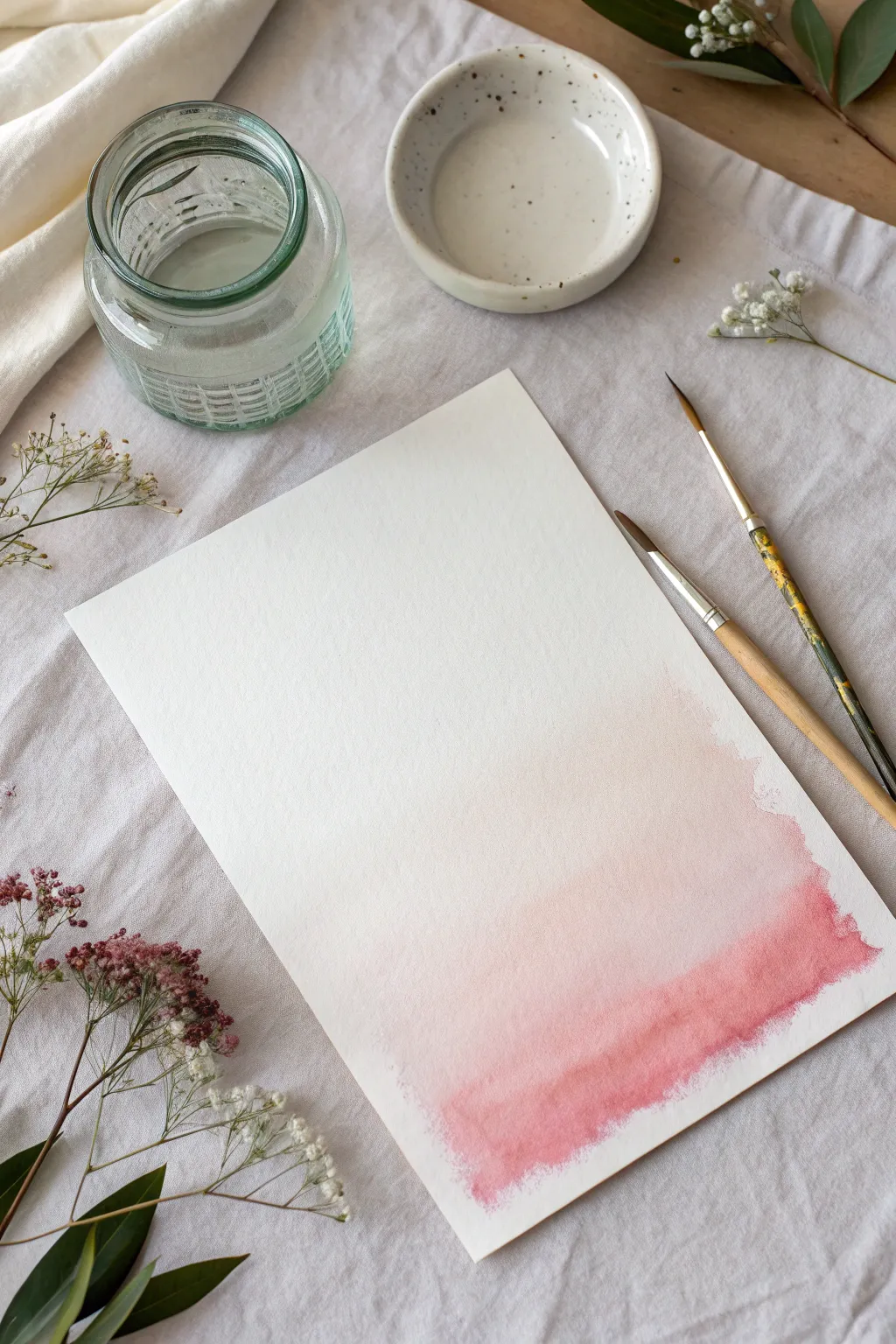
This project creates a dreamy, ethereal aesthetic using a single pigment to achieve a seamless gradient. The result is a soft wash of color that transitions from a rich berry pink into the pure white of the paper, perfect for subtle background art or stationery.
Step-by-Step Guide
Materials
- Cold press watercolor paper (300 gsm)
- Watercolor paint (Alizarin Crimson or Rose Madder)
- Medium round paintbrush (size 6 or 8)
- Small round paintbrush (size 2 or 4)
- Jar of clean water
- Ceramic or plastic mixing palette
- Paper towel
- Masking tape (optional)
Step 1: Preparation and Mixing
-
Secure the paper:
Place your watercolor paper on a flat surface. If you want a crisp border, tape the edges down with masking tape, but for this specific raw-edge look, you can leave it loose. -
Prepare your water:
Fill your glass jar with clean water. Having clear water is crucial for a soft ombre, as dirty water will muddy the white sections. -
Mix the base color:
Squeeze a small pea-sized amount of your pink watercolor paint into the mixing dish. -
Activate the pigment:
Add a few drops of water to the paint and mix it thoroughly with your brush until it reaches a consistency similar to heavy cream or whole milk. This will be your most saturated tone.
Wet Edge Watch
Work quickly! If the paint edge dries before you add the next layer, you’ll get a hard line instead of a soft fade. Keep the leading edge wet at all times.
Step 2: Applying the Wash
-
Load the brush vertically:
Using your medium round brush, load it fully with the concentrated paint mixture you just created. -
Paint the bottom edge:
Start at the very bottom right corner of the paper. Lay down a horizontal stroke that covers about an inch of height, moving from right to left. -
Create the saturated baselayer:
While the paint is still wet, add a second stroke just above the first one, letting them merge. This bottom section should hold the deepest color intensity. -
Clean your brush partially:
Dip your brush into the water jar for just a second, then dab it once on a paper towel. You want to dilute the paint on the brush, not remove it entirely. -
Begin the transition:
Paint the next stroke directly above your previous wet edge. Allow the wet paint to touch and bleed upwards slightly. -
Soften the blend:
Rinse your brush again, swishing it a bit more this time to remove about 50% of the pigment. -
Continue upward:
Apply the next band of color. You should see the pink becoming significantly lighter now as you move toward the middle of the page. -
Switch to clean water:
Rinse your brush completely until it is removing clear water. Blot it slightly so it isn’t dripping wet. -
Feather the edge:
Apply this clean, damp brush fast along the top edge of your last pink stroke. This pulls the pigment upward into a very pale, almost invisible wash. -
Create the organic fade:
Instead of a straight line, use the clean water to pull the color up higher on the right side and lower on the left, creating a diagonal drift. -
Refine the bottom:
I sometimes notice the bottom dries lighter than expected. If this happens, dab a tiny bit of concentrated paint back into the very bottom wet edge to weigh it down visually.
Step 3: Drying and Texture
-
Let gravity help:
If you want a smoother blend, slightly tilt your board so the paint flows downward into the darker section while it’s still wet. -
Create texture (optional):
While the paper is damp, you can lightly tap the brush to release tiny micro-blooms, which adds that lovely handmade watercolor grain. -
Allow to dry completely:
Let the paper sit undisturbed until it is bone dry. The colors will look softer and lighter once the moisture evaporates. -
Flatten the paper:
If the paper buckled slightly during painting, place it under a heavy book once it is fully dry to flatten it out.
Gold Dust Finish
Once fully dry, load a stiff brush with gold watercolor or ink and flick it over the painting for a speckled, high-glam finish.
You now have a delicate backdrop ready for calligraphy or framing on its own
BRUSH GUIDE
The Right Brush for Every Stroke
From clean lines to bold texture — master brush choice, stroke control, and essential techniques.
Explore the Full Guide
Horizontal Ombre for Wide Spaces
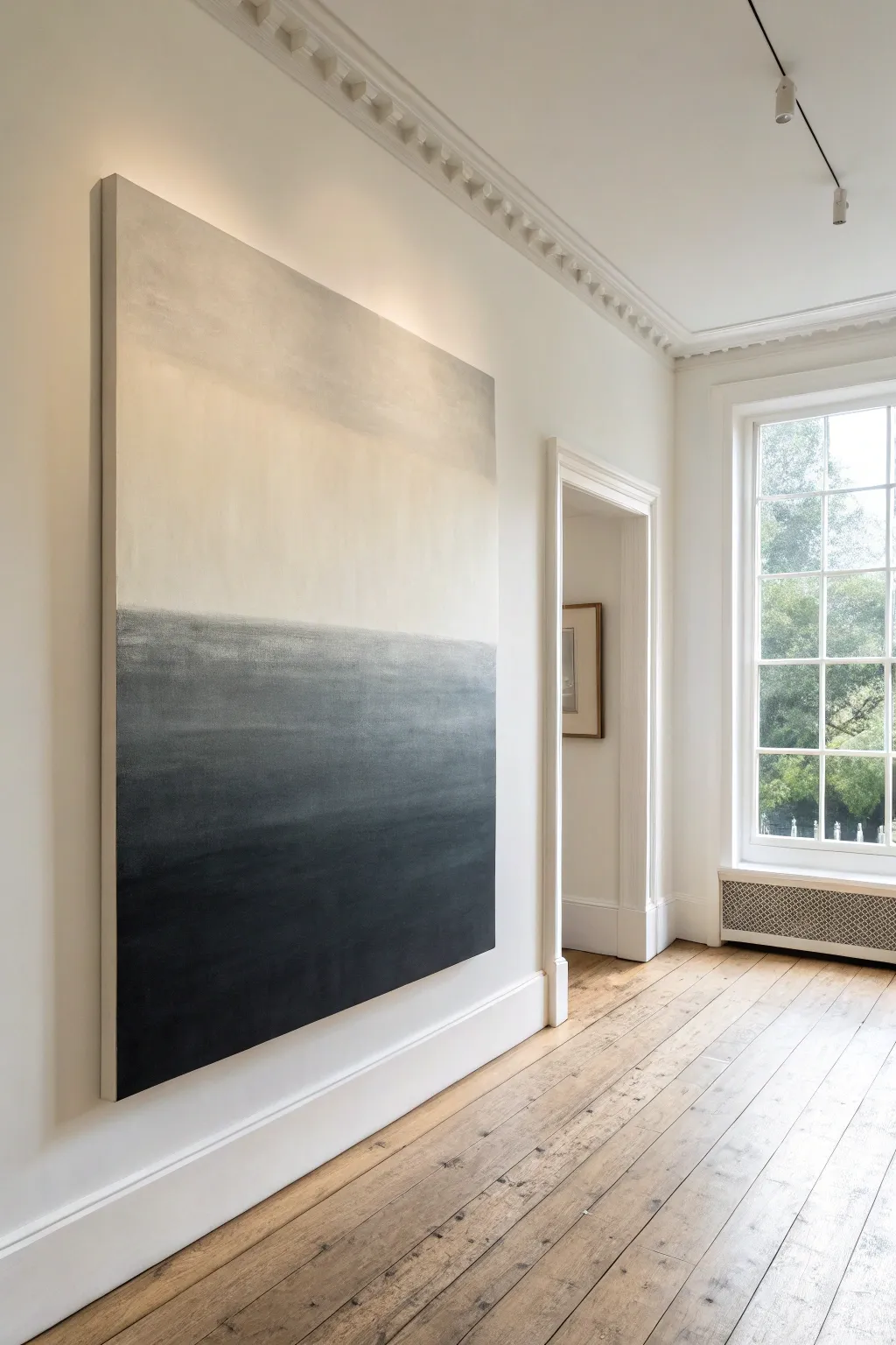
This captivating, large-scale abstract piece anchors a room with its dramatic transition from charcoal depths to ethereal cream heights. By mastering the wet-on-wet blending technique, you can create a sophisticated gradient that mimics a foggy horizon line.
Step-by-Step
Materials
- Large deep-edge canvas (e.g., 48″ x 60″)
- Heavy body acrylic paints: Titanium White, Unbleached Titanium (cream), Burnt Umber, Mars Black
- Large flat paintbrush (3-4 inch width)
- Wide soft blending brush or hake brush
- Spray bottle with water
- Plastic drop cloth
- Palette knife
- Large palette or paper plates
- Gesso (optional, for priming)
Step 1: Preparation & Base Tones
-
Surface setup:
Begin by laying down your plastic drop cloth in a well-ventilated area. Place your large canvas flat on the floor or upright on a sturdy easel if available. Verify the canvas is clean and free of dust. -
Prime the canvas:
If your canvas isn’t pre-primed, apply a coat of gesso with your large flat brush to ensure the paint adheres smoothly. Let this dry completely before moving on. -
Mix the darks:
On your palette, create a rich, deep charcoal tone. Mix a large amount of Mars Black with a touch of Burnt Umber to warm it up slightly, preventing it from looking too flat. -
Mix the mid-tones:
Create a transition color by mixing Unbleached Titanium with a very small amount of your dark charcoal mix. You want a soft, muddy grey-beige color. -
Prepare the lights:
Set out a generous amount of pure Titanium White and a separate pile of Unbleached Titanium for the upper sections.
Keeping It Fluid
Use a retarder medium mixed into your acrylics. This slows drying time significantly, giving you a wider window to achieve that perfect, smoky blend without panic.
Step 2: Applying the Gradient
-
Paint the bottom third:
Using your large flat brush, apply the dark charcoal mixture to the bottom third of the canvas. Use long, horizontal strokes and ensure solid coverage without gaps. -
Extend the darks up:
Continue painting upward, but as you reach the middle section, start lightening your pressure on the brush so the paint layer becomes slightly thinner. -
Apply the creamy top:
Clean your brush thoroughly (or switch to a fresh one). Start from the very top edge of the canvas painting downwards with pure Titanium White, transitioning into the Unbleached Titanium as you move lower. -
Meet in the middle:
Continue bringing the light cream color down until it is just a few inches away from your wet dark paint. -
The transition zone:
In the gap between the dark bottom and light top, apply your pre-mixed grey-beige mid-tone. Don’t worry about perfect blending yet; just get the color on the canvas.
Removing Brush Strokes
If brush marks are too visible, your paint might be too thick. Mist lightly with water and use a feather-light touch with a hake brush to smooth the ridges down.
Step 3: Refining the Ombre
-
Mist the canvas:
Lightly mist the entire surface with your water bottle. The acrylics need to stay wet to blend properly, but be careful not to make them runny. -
Initial blend:
Take your dry, wide blending brush. Starting at the border where the dark meets the mid-tone, brush back and forth horizontally. I find that working quickly here prevents the paint from becoming tacky. -
Work upwards:
Gradually move your blending strokes upward into the light section. Wipe your brush on a rag frequently to avoid dragging too much dark pigment into the pristine white areas. -
Softening the horizon:
Focus on the ‘horizon line’ where the heavy grey meets the cream. Use soft, feathery X-shaped strokes to break up any hard lines, then smooth them out with long horizontal sweeps. -
Adjusting values:
Step back and look at the gradient. If the middle looks too muddy, add fresh Unbleached Titanium directly onto the canvas and blend it out to regain brightness. -
Deepen the anchor:
If the bottom edge lost some intensity during blending, re-apply a layer of pure Mars Black to the very bottom 6 inches to ground the composition. -
Final smooth:
Do one last pass with a very soft, dry brush across the entire transition area to ensure a seamless, foggy look. -
Paint the edges:
Don’t forget the sides of the canvas. Extend the colors around the deep edges—dark at the bottom, light at the top—for a professional, gallery-wrapped finish. -
Dry and seal:
Allow the painting to dry undisturbed for at least 24 hours. Because acrylic dries darker, double-check your colors before sealing with a matte varnish if desired.
Hang your masterpiece in a hallway or above a sofa to bring a sense of expansive calm to your home
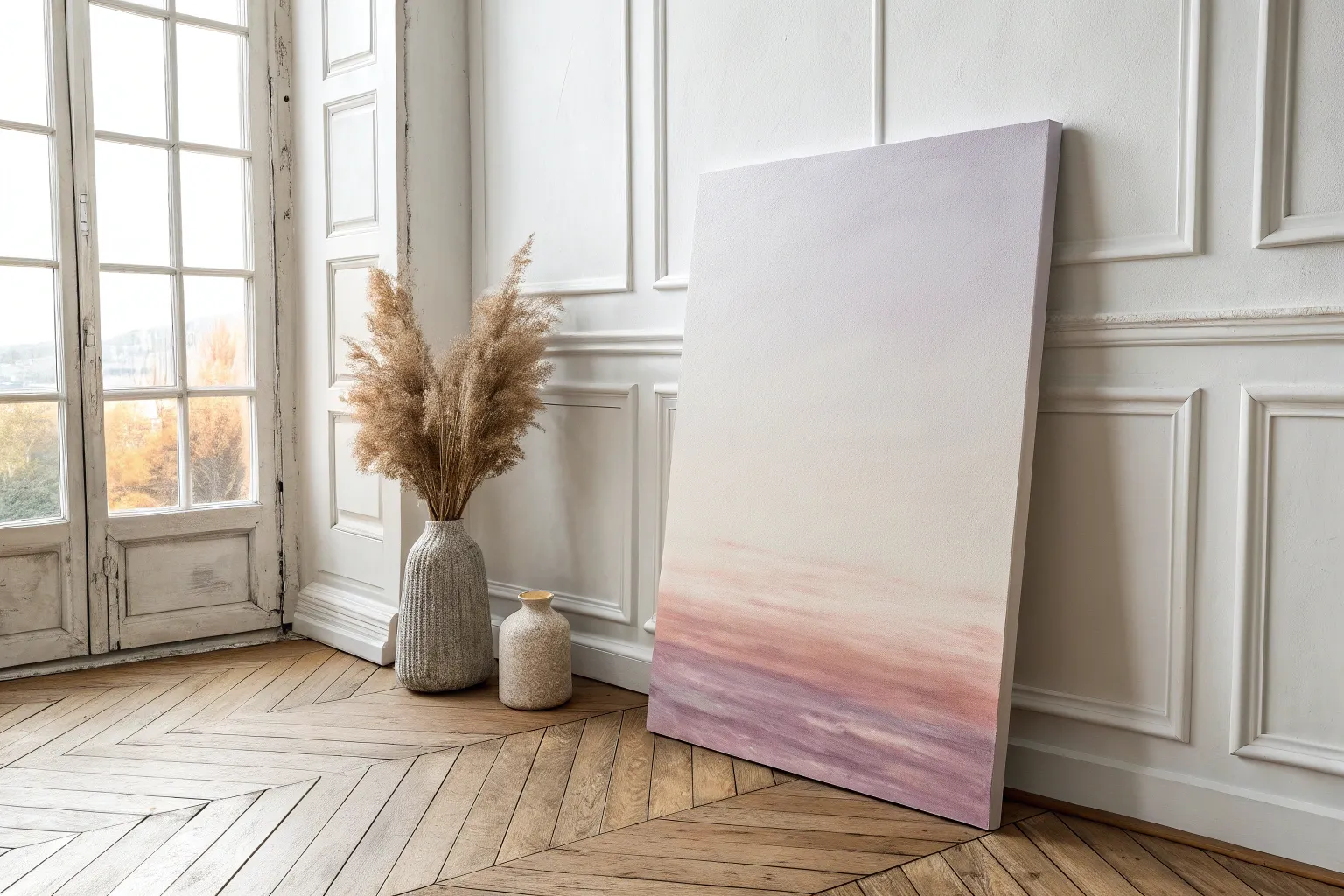
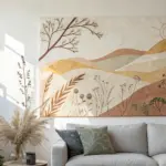
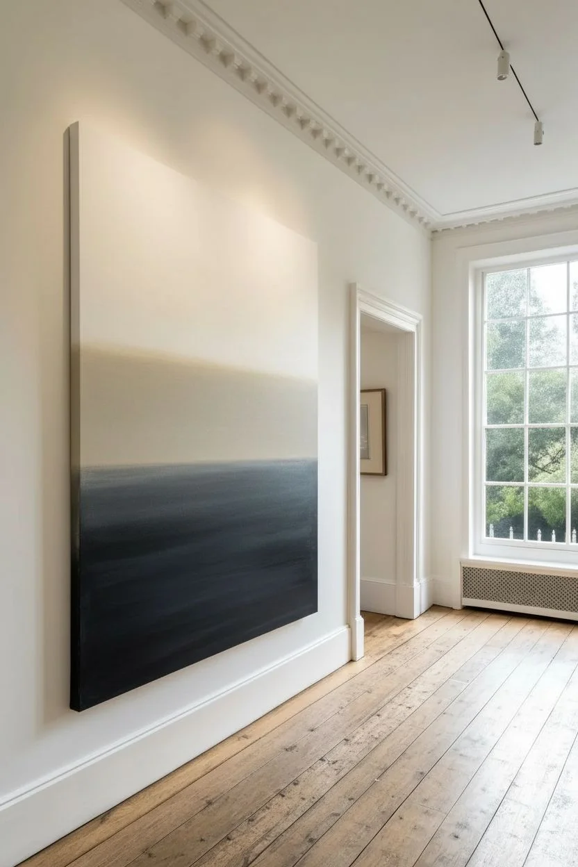
Pastel Ombre for a Calm, Airy Look
Capture the tranquility of a coastal morning with this ultra-smooth pastel ombre canvas. This project focuses on achieving a seamless transition from pure white into a soft, airy teal that feels fresh and modern.
How-To Guide
Materials
- Small square stretched canvas (e.g., 6×6 inch)
- Acrylic paint: Titanium White
- Acrylic paint: Phthalo Turquoise or Teal
- Flat synthetic paint brush (1 inch width)
- Soft blending brush or mop brush
- Palette or mixing plate
- Cup of water
- Paper towels
- Gesso (optional, for priming)
Step 1: Preparation & Base Coat
-
Prime the surface:
If your canvas isn’t pre-primed, apply a thin coat of white gesso to smooth out the texture. Let it dry completely. -
Lay the foundation:
Paint the entire canvas, including the sides, with a solid coat of Titanium White. This ensures your gradient will look bright and clean rather than dull. -
Observe the edges:
Double-check the wrapped edges of the canvas; painting them properly gives the piece a professional, finished look even without a frame. -
Prepare your palette:
Squeeze out a generous amount of Titanium White and a smaller amount of Teal on your palette. Leave plenty of space between them for mixing.
Step 2: Creating the Gradient
-
Paint the top section:
Using your flat brush, apply pure Titanium White to the top 40% of the canvas. Keep the strokes horizontal and smooth. -
Apply the bottom color:
Clean your brush thoroughly. Pick up your Teal paint (you might want to mix it with a tiny bit of white to soften it slightly) and paint the bottom 20% of the canvas. -
Paint the sides:
Don’t forget to wrap those colors around the sides of the canvas as you work, corresponding to the colors on the front. -
Mix the mid-tone:
On your palette, mix some Teal into the White to create a very pale, pastel version of the color. This will be your transition shade. -
Fill the gap:
Apply this mixed pastel shade in the open space between the white top and the teal bottom. It’s okay if the lines between colors are hard right now.
Keep It Wet
Acrylics dry fast! To keep the paint movable for longer blending time, mix in a few drops of acrylic retarder or slow-drying medium.
Step 3: Blending for Smoothness
-
Start the blend:
While the paint is still wet (this is crucial), use your brush to gently stroke back and forth horizontally where the white meets the pastel mid-tone. -
Clean and repeat:
Wipe your brush on a dry paper towel to remove excess paint, then blend the seam between the pastel mid-tone and the darker bottom teal. -
Switch to a dry brush:
Here I prefer to grab a clean, dry blending brush (like a soft makeup brush or mop brush) to lightly feather the surface. -
Feather the transitions:
Using extremely light pressure—just the tips of the bristles—sweep across the canvas horizontally from top to bottom to blur any brushstrokes. -
Check for streaks:
If you see streaks, wipe your blending brush clean again and gently work over that area. Avoid overworking it, or the paint will start to lift. -
Final smooth:
Do one last very soft pass across the entire surface to unify the texture. Let the painting dry undisturbed.
Add Texture
Once dry, use a palette knife to dab thick white molding paste onto the bottom teal section to simulate foamy ocean waves crashing.
Display your new calming artwork on a shelf or desk where you need a moment of peace

PENCIL GUIDE
Understanding Pencil Grades from H to B
From first sketch to finished drawing — learn pencil grades, line control, and shading techniques.
Explore the Full Guide
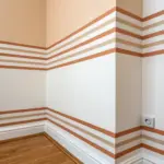
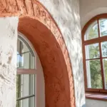
Ombre Wall With Subtle Texture Layering
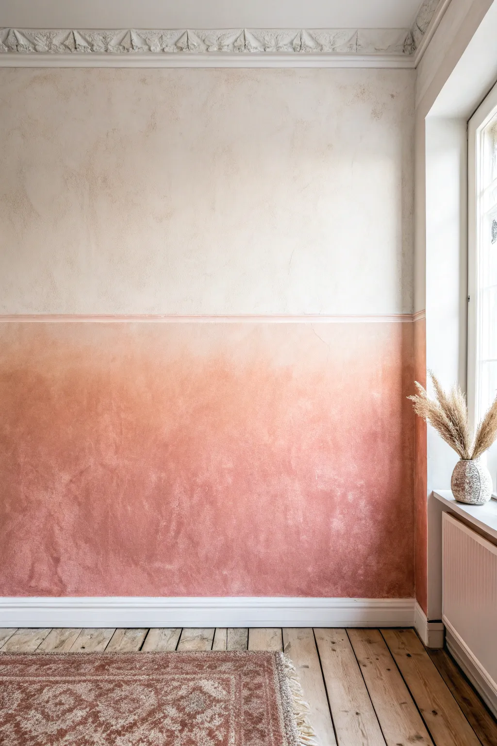
This sophisticated wall treatment combines the trendy warmth of terra-cotta with a cloudy, plaster-like texture that adds instant history to a room. By using a distinct chair rail to separate the saturated base from the creamy upper wall, you achieve a grounded, architectural ombre effect full of character.
Step-by-Step Tutorial
Materials
- High-quality matte interior paint (Terra-cotta/Rust color)
- High-quality matte interior paint (Cream/Off-white color)
- Glaze medium or textural additive (optional, for transparency)
- Large block brush or wide synthetic staining brush
- Wooden dado rail molding
- Construction adhesive or finishing nails
- Hammer or nail gun
- Painter’s tape
- Drop cloths
- Sanding block
- Bubble level
- Pencil
- Clean lint-free rags
- Water spray bottle
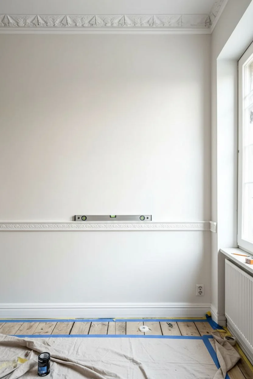
Step 1: Preparation and Molding Installation
-
Prepare the workspace:
Clear the room of furniture or move it to the center. Lay down drop cloths to protect your flooring, ensuring they are taped down at the edges so they don’t slide while you work. -
Clean and patch walls:
Wipe down the walls with a damp cloth to remove dust and grease. Fill any existing nail holes or cracks with spackle, let dry, and sand smooth. -
Mark the rail height:
Decide on the height of your chair rail. A standard height is usually around 32-36 inches from the floor, or about one-third of the wall height. Use a tape measure and pencil to mark this height at several points. -
Draw a level line:
Using a long bubble level or a laser level, connect your pencil marks to create a continuous, perfectly horizontal guideline across the entire length of the wall. -
Install the chair rail:
Cut your wooden molding to length. Attach it to the wall along your level line using construction adhesive for a seamless look, or secure it with finishing nails into the studs. -
Prime the molding:
Once the adhesive is dry or nails are set, caulk the gaps above and below the rail. Then, apply a coat of primer to the raw wood molding to ensure the paint adheres evenly.
Too Streaky?
If brushstrokes look too harsh, lightly mist the wall with water while the paint is wet and soften the edges with a clean, dry cloth.
Step 2: Painting the Base and Texture
-
Tape off edges:
Apply painter’s tape to the baseboards, the top edge of the chair rail, and adjoining walls to protect them from the darker paint color. -
Mix the base wash:
To achieve that cloudy, limewash look, dilute your terra-cotta paint with a small amount of water (about 10-20%) or mix it with a clear glaze medium. This increases translucency. -
Apply the first base coat:
Using a large block brush, apply the paint to the bottom section of the wall. Use a cross-hatch motion (X-shapes) rather than straight up-and-down strokes to build varied texture. -
Create cloudy depth:
While the first coat is still tacky, go back in with a slightly dryer brush or a rag. Dab areas that look too uniform to lift a bit of pigment, creating subtle high and low variations. -
Intensify the color:
Once the first layer is dry, apply a second coat of the terra-cotta mixture. Focus on making the color densest near the floor and slightly more washed out as you approach the chair rail. -
Address the chair rail:
Remove the tape from the rail’s top edge. Carefully paint the chair rail itself in a solid, undiluted version of the terra-cotta color (or a shade slightly lighter) to act as a definitive border.
Step 3: Upper Wall and Blending
-
Prepare the top section:
Ensure the bottom section and rail are fully dry. Tape off the top edge of the chair rail to protect your fresh work. -
Apply the upper cream coat:
Paint the upper wall with your creamy off-white color. I prefer using a roller for the main areas but switching to a brush near the rail to maintain a hint of that hand-painted texture. -
Add subtle aging (optional):
If the plain cream looks too flat against the textured bottom, mix a tiny drop of beige into a glaze and dry-brush sporadic, faint clouds on the upper wall to mimic aged plaster. -
Soften the join:
The goal is a seamless visual transition despite the physical rail. If paint accumulated in the corners of the rail, use a clean, damp brush to smooth it out before it cures. -
Final reveal:
Slowly peel away all remaining painter’s tape at a 45-degree angle while the paint is still slightly damp to ensure crisp, clean lines. -
Inspect and touch up:
Check the wall in different lighting. If any areas of the bottom section look too patchy rather than intentionally textured, dab a little more diluted paint onto those spots.
Limewash Shortcut
Use a specialized mineral or limewash paint instead of standard latex. It naturally dries with that suede-like, cloudy finish without extra glazing techniques.
Step back and admire how this tactile, layered finish brings a sense of warmth and history to your space
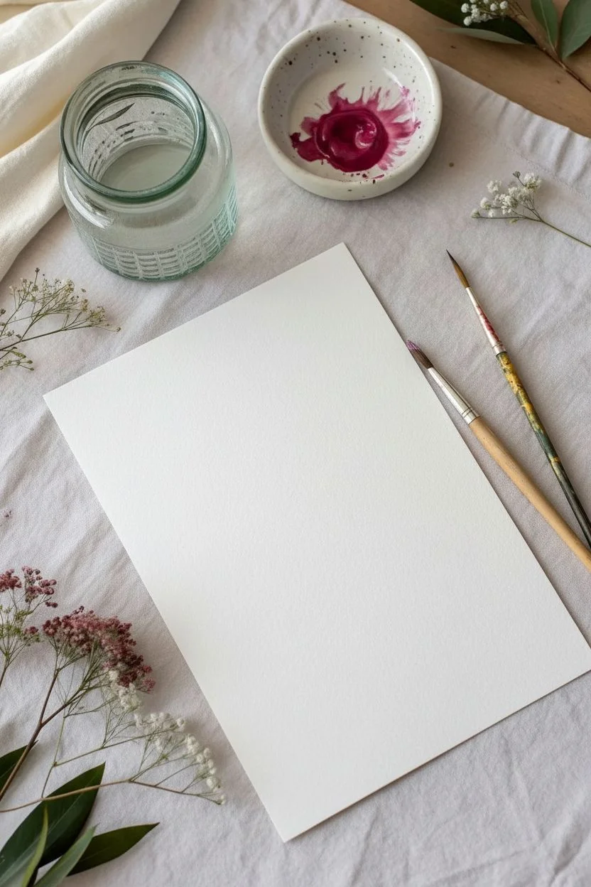
Ombre Dip-Dye Effect on Paper Edges
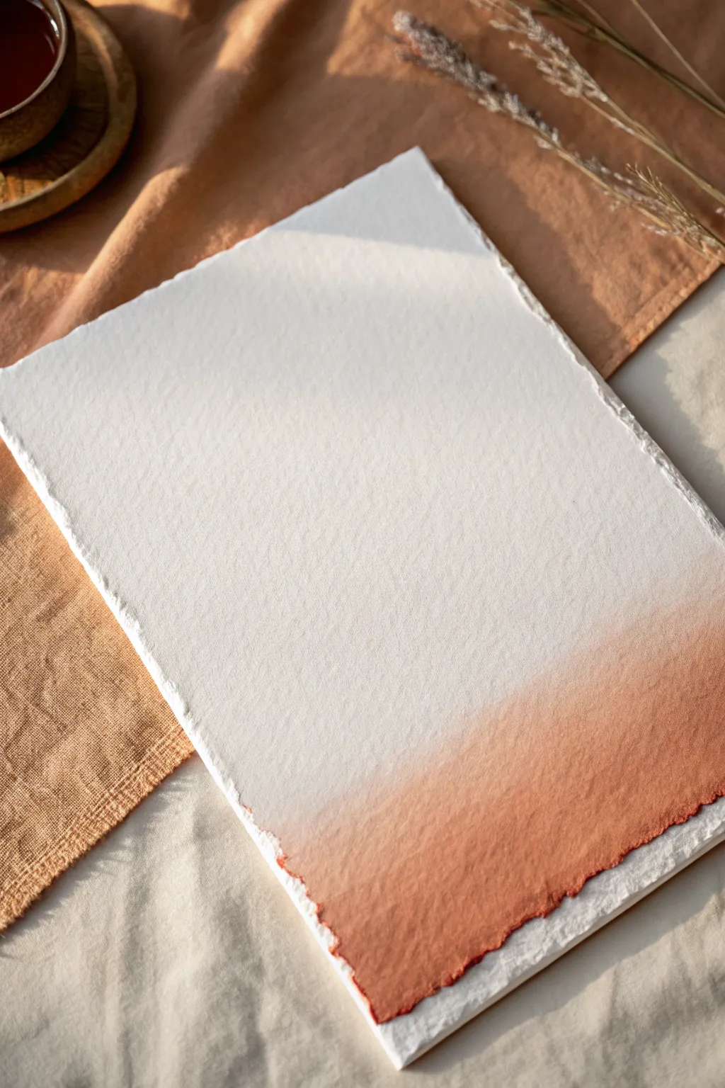
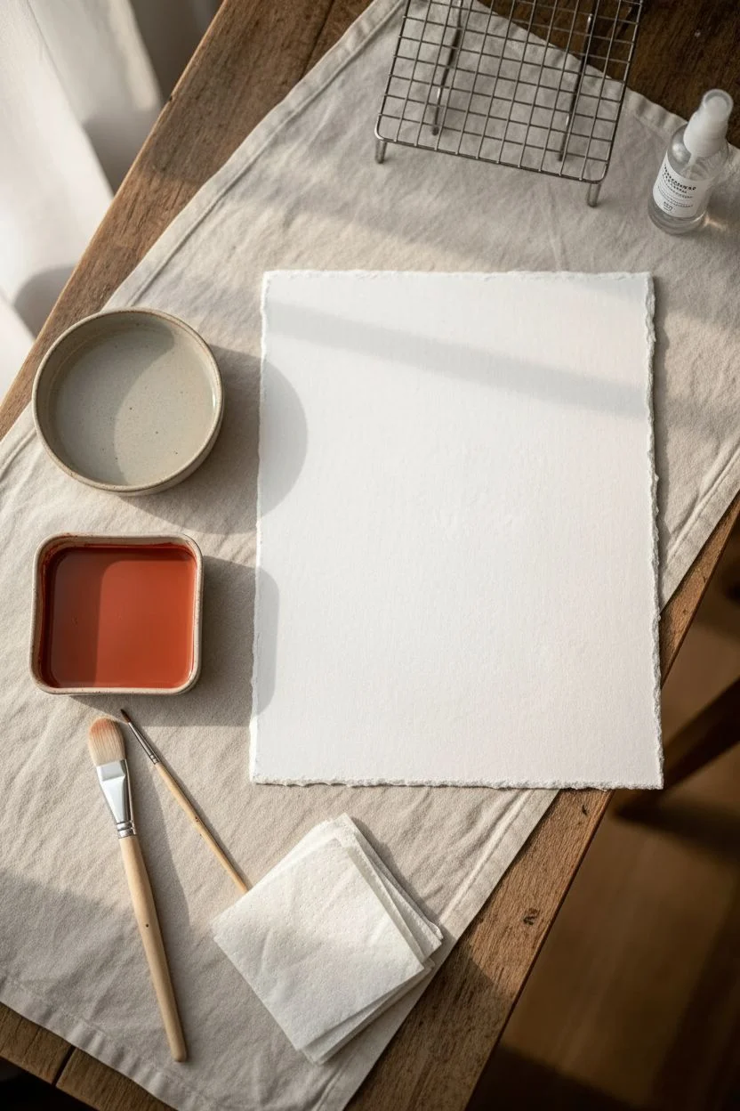
Embrace the beauty of imperfection with this delicate dip-dye project that transforms simple handmade paper into a work of art. The soft fade from creamy white to rich terracotta creates a stunning backdrop for calligraphy, wedding invitations, or minimalist wall art.
Detailed Instructions
Materials
- Heavyweight handmade cotton paper (deckle edge)
- Liquid watercolor or high-flow acrylic ink (terracotta or burnt sienna)
- Two shallow trays or wide bowls
- Clean water
- Soft synthetic watercolor brush (large size)
- Clean paper towels
- Drying rack or non-stick surface
- Spray bottle with water (mister)
Step 1: Preparation and Mixing
-
Prepare your workspace:
Lay down a protective covering on your table, as liquid pigments can stain quickly. Set up your drying rack nearby so you don’t have to walk across the room with wet, dripping paper. -
Set up the dipping stations:
Fill one shallow tray with clean water about an inch deep. In the second tray, pour your terracotta liquid watercolor or ink. If the ink feels too opaque, I like to dilute it slightly with a few drops of water to ensure transparency. -
Test your paper:
If you have a scrap piece of the same paper, dip a corner to see how fast it absorbs liquid. Handmade cotton rag paper is very thirsty and will wick moisture rapidly, which affects your timing.
Step 2: Creating the Ombre Fade
-
Pre-wet the ombre area:
Using your large clean brush or the spray bottle, lightly dampen the bottom third of the paper with clean water. This pre-wetting encourages the pigment to travel and feather upwards, creating that seamless gradient instead of a harsh line. -
First dip:
Hold the paper by the top corners and gently lower the bottom edge into the colored ink tray. Dip it about half an inch deep and hold it there for 5-10 seconds. -
Watch the wick:
Observe how the paint travels up the damp fibers. You want the color to naturally climb higher than the dip line. -
Soften the transition:
Lay the paper flat on a non-absorbent surface. While the ink is still wet, use a slightly damp brush to gently pull the color upwards from the saturated edge toward the white section, fading it out. -
Create the second layer:
Once the first layer has settled but isn’t dry, dip the very bottom edge (just the jagged deckle tips) into the concentrated ink again. This creates the dark, defined rim seen in the reference. -
Encourage the bleed:
Tilting the paper slightly can help gravity pull the pigment down or up, depending on where you want the fade to go. Keep the paper flat if you are happy with the current spread. -
Blot excess moisture:
If a pool of water forms at the transition line, gently touch the surface with the corner of a paper towel to lift the excess liquid without removing too much pigment.
Control the Flow
Work on a slight incline using a drawing board. Gravity helps pull the pigment downwards, preventing it from creeping too high up the white section of the paper.
Step 3: Drying and Refining
-
Initial drying:
Move the paper to your drying rack. Lay it flat rather than hanging it, as hanging might cause the color to drip off or run down excessively. -
Check for hardness:
After about 10 minutes, check the gradient line. If a hard edge is forming where the water stopped, lightly mist that specific area with water to reactivate and soften the edge. -
Let it cure:
Allow the paper to dry completely, preferably overnight. Handmade paper holds moisture deep in the fibers, and it will look lighter when fully dry. -
Flattening the sheet:
The water may cause the paper to buckle slightly. Once 100% dry, place the paper under a heavy book between two sheets of clean parchment paper to flatten it back out.
Too Much Bleeding?
If the color runs too fast, your paper is too wet. Let the pre-wet section air dry for a minute before adding ink, or switch to a ‘dry brush’ technique for more control.
Enjoy the serene process of watching the colors merge and settle into your unique paper creation


Have a question or want to share your own experience? I'd love to hear from you in the comments below!