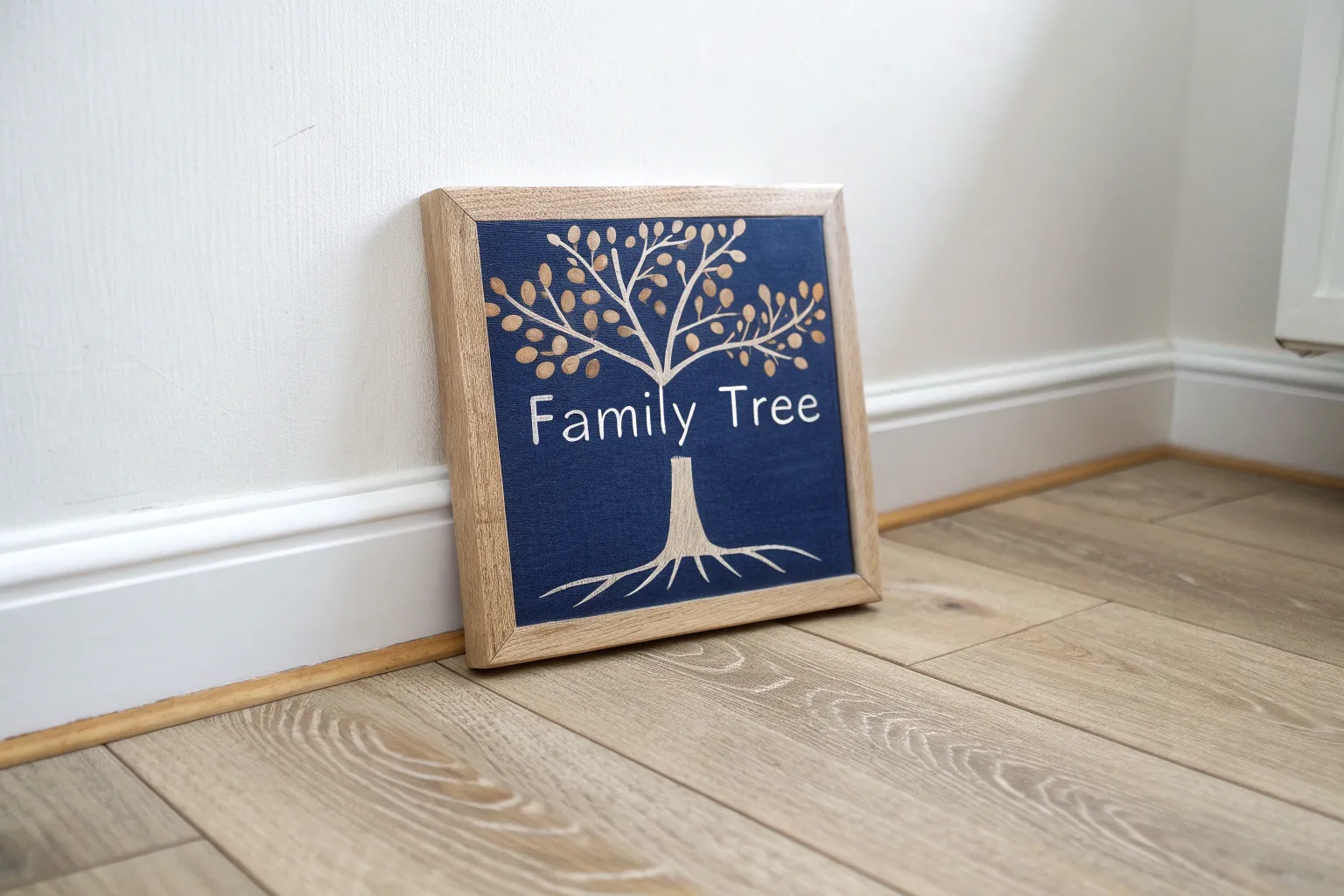
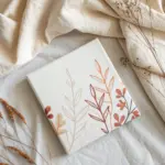
If you want an easy, cozy way to connect, a family paint night turns ordinary time together into something you can actually hang on the wall. I’m sharing a mix of beginner-friendly classics and a few creative twists so everyone—from little kids to grown-ups—feels included and proud of what they make.
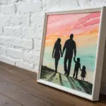
Classic Family Sunset Silhouette
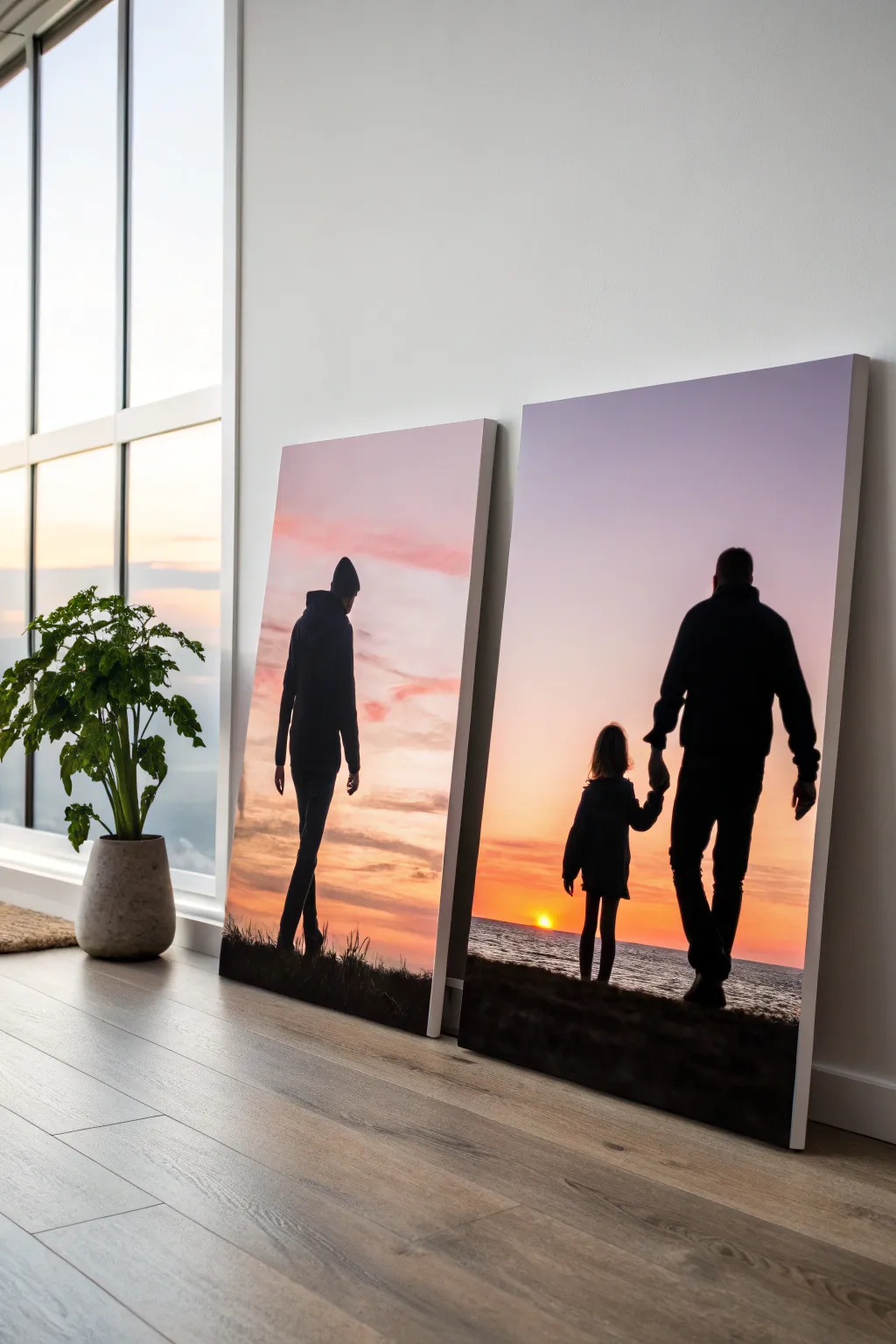
Capture the warmth of a fading day with these striking gradient sunset paintings featuring deep black figures in silhouette. This project relies on smooth blending techniques to create a realistic sky that makes your subjects pop in dramatic contrast.
Step-by-Step Tutorial
Materials
- Large rectangular stretched canvases (24×36 or similar)
- Acrylic paints: Titanium White, Lemon Yellow, Cadmium Orange, Alizarin Crimson, Dioxazine Purple, Ultramarine Blue, Mars Black
- Large flat brush or blending sponge
- Medium round brush
- Small liner brush (for details)
- Water spray bottle (mister)
- Chalk or pastel pencil
- Palette knife and plate
- Easels (optional but helpful for large canvases)
Step 1: Painting the Gradient Sky
-
Prime the canvas:
Begin by covering the entire canvas with a thin, even coat of Titanium White paint. This wet base layer is crucial—it acts as a lubricant that will help your colors blend seamlessly without drying too fast. -
Apply the horizon line:
About one-third up from the bottom, quickly lay down a stripe of bright yellow and orange paint where your sun will eventually sit. Don’t worry about being neat; just get the color on the canvas. -
Build the colorful middle:
Above the yellow band, add stripes of orange, then red, and finally a mix of purple and blue at the very top edge. Work quickly so the paint stays wet. -
Blend the transition:
Using a clean, wide brush or a damp sponge, start blending from the yellow section upwards. Use long, horizontal strokes to pull the lighter colors slightly into the darker ones above them. -
Refine the gradient:
Continue working upward, wiping your brush often to avoid muddying the colors. If the paint feels sticky or dry, give it a very light mist with your water spray bottle to reactivate blending capabilities. -
Create the sea (optional):
For the bottom third, mix a dark blue-grey using Ultramarine Blue and a touch of black. Paint horizontal strokes, leaving a few lighter gaps near the horizon line to reflect the setting sun. -
Add cloud texture:
While the sky is still tack-dry, mix a soft pinkish-purple. Use a dry brush to scumble in wispy, horizontal clouds across the middle section. Keep these edges soft and unfocused. -
Paint the sun:
Once the background is mostly dry, paint a small, clean semi-circle of white mixed with lemon yellow right at the horizon line where the water meets the sky. -
Let it cure:
Allow the background to dry completely. Since we used a wet-on-wet technique, this might take an hour or more. Using a hair dryer on a cool setting can speed this up.
Keep It Steady
Work from top to bottom on the figures so your hand doesn’t smudge wet black paint. Need stability? Rest your pinky finger on a dry part of the canvas while painting detailed edges.
Step 2: Adding the Silhouettes
-
Sketch the figures:
Use a piece of chalk or a pastel pencil to lightly outline your family figures. I find chalk works best because it wipes away easily with a damp cloth if you need to make adjustments. -
Block in the shapes:
Load a medium round brush with Mars Black paint. Don’t add water; you want the paint opaque. Fill in the center of your figure outlines first to get a feel for the paint consistency. -
Refine the edges:
Carefully paint the outer edges of the silhouettes. Pay special attention to recognizing features like the curve of a hood, the shape of a beanie, or the profile of a face. -
Connect to the ground:
Extend the black paint downwards to create the foreground terrain. Use uneven, choppy strokes along the top edge of the ground to simulate grass and rough earth texture. -
Add distinct details:
Switch to your small liner brush. Paint fine details like the little girl’s hair strands, the shoelaces, or the defined fingers holding hands. These tiny sharp details make the silhouette look realistic rather than blob-like. -
Simulate grass:
Using the tip of the liner brush or an old fan brush, flick quick upward strokes of black paint along the ground line to create the look of tall grass blades overlapping the figures’ feet. -
Second coat:
Once the black paint is dry to the touch, check for any streaky areas where the sunset shows through. Apply a second coat of black if necessary to ensure a solid, deep shadow. -
Final cleanup:
Wait for everything to dry completely, then gently wipe away any visible chalk lines with a damp cloth or sponge.
Use A Reference
Take a photo of your actual family members posing against a bright window or white wall. Print it out and trace the outline onto your canvas for a truly personal silhouette.
Step back and admire how the stark black figures bring your glowing sunset colors to life.

Handprint Heart Keepsake Canvas
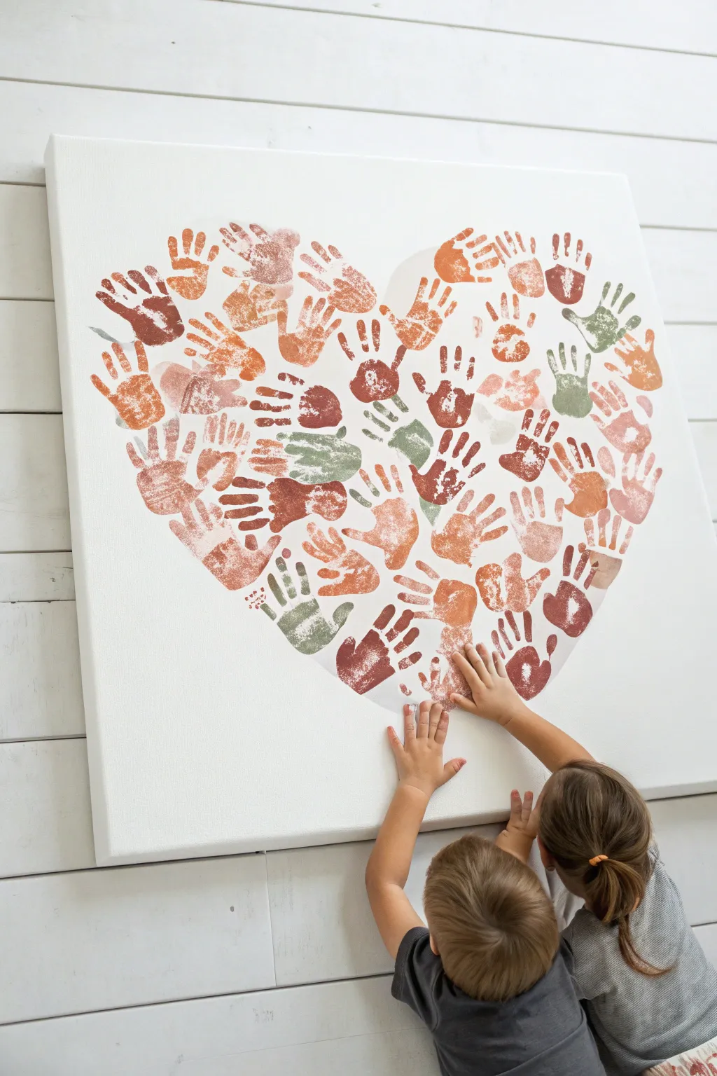
Capture a moment in time with this heartwarming collaborative art piece where every family member’s touch creates a unified symbol of love. The result is a stunning, gallery-worthy canvas featuring an array of handprints arranged in a perfect heart shape, utilizing a soft, earthy color palette.
Detailed Instructions
Materials
- Large stretched canvas (24×24 or larger recommended)
- Pencil
- Large sheet of paper or butcher paper (same size as canvas)
- Scissors
- Acrylic paints in earthy tones (terracotta, sage green, blush, burnt sienna, cream)
- Paper plates or palettes
- Foam brushes or sponge rollers
- Baby wipes or damp rags (essential for quick cleanup)
- Matte spray varnish (optional)
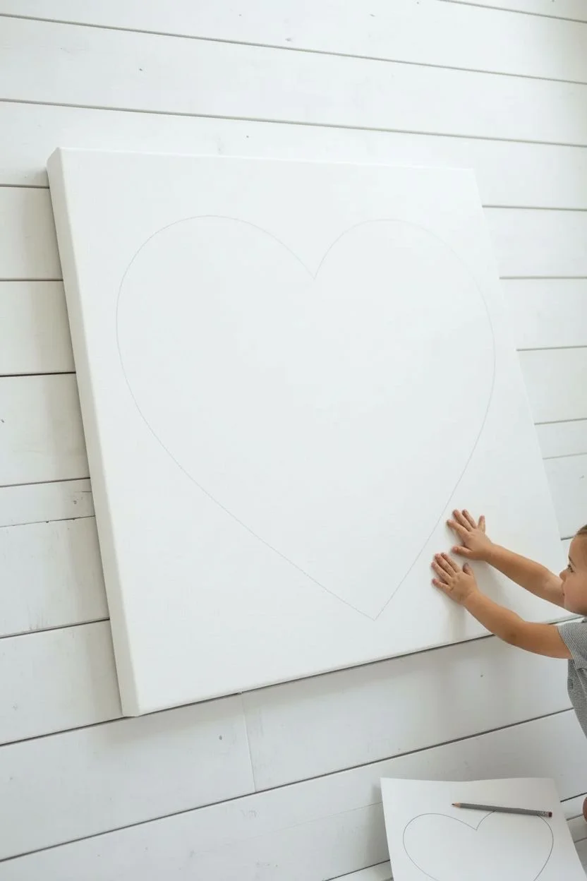
Step 1: Planning the Layout
-
Create a Heart Template:
Before touching the canvas, cut your large sheet of butcher paper to the exact size of your canvas. Fold it vertically in half and cut out a large half-heart shape to create a symmetrical heart template when unfolded. -
Trace the Guide:
Center your paper heart template on the canvas. Lightly trace the outline with a pencil. This faint line will guide the outer placement of the handprints to ensure the final shape is crisp. -
Plan positions:
Gather the family and decide on a rough placement strategy. It often looks best to distribute smaller hands and larger hands evenly, rather than clustering all big hands in one spot.
Smudged a print?
Don’t panic! Use a clean, damp Q-tip to gently lift the wet paint smudge. If it’s already dry, paint over the smudge with white acrylic paint to mask it.
Step 2: Applying the Handprints
-
Prepare the Palette:
Squeeze different paint colors onto paper plates. For a cohesive look like the example, mix a little white into the darker terracotta or green shades to create softer, muted variations. -
Apply Paint to Hand:
Use a foam brush or sponge roller to apply a thin, even layer of paint to a family member’s hand. Avoid dipping the hand directly in paint, which often spreads too thick and obscures the fingerprints. -
Start at the Edges:
Begin placing handprints along the pencil line first. Angle the fingers outward or inward slightly to follow the curve of the heart, ensuring the palm or fingertips touch the pencil guide without going too far over. -
Press and Lift:
Press the painted hand firmly onto the canvas. Gently push down on each finger and the center of the palm. Lift the hand straight up—not dragging it—to get a clean impression. -
Immediate Cleanup:
Have the person wipe their hand immediately with a baby wipe before washing in the sink to prevent accidental smudges on the white canvas. -
Rotate Colors:
Switch colors for the next print. I find that alternating between warm tones (rust, pink) and cool tones (sage) keeps the composition balanced. -
Fill the Interior:
Once the outline is established, work your way inward. Place handprints in the empty white spaces, overlapping slightly if necessary, but try to keep each print distinct. -
Vary Orientation:
Don’t have every hand pointing straight up. Rotate the canvas or the hand placement so some hands point diagonally, filling awkward gaps more naturally. -
Tiny Hands Last:
Save the smallest baby or toddler prints for filling small gaps between the larger adult handprints. Their smaller size makes them perfect for tight spaces. -
Check for Balance:
Step back frequently to look at the canvas from a distance. Look for any large white gaps that disrupt the heart shape and fill them with a well-placed print.
Pro Tip: Texture
Use “heavy body” acrylics for this project. They hold the ridges of the fingerprints much better than watery craft paints, giving the artwork a tactile feel.
Step 3: Finishing Touches
-
Erase Guidelines:
Once the paint is completely dry (give it at least an hour), use a clean eraser to gently remove any visible pencil marks from your initial outline. -
Let it Cure:
Allow the canvas to dry for a full 24 hours to ensure the thicker parts of the paint are set throughout. -
Seal the Artwork:
If desired, take the canvas outside and spray it with a clear matte varnish. This protects the prints from fading and dust over the years.
Hang your collective masterpiece in a central gathering spot where you can always be reminded of this time together
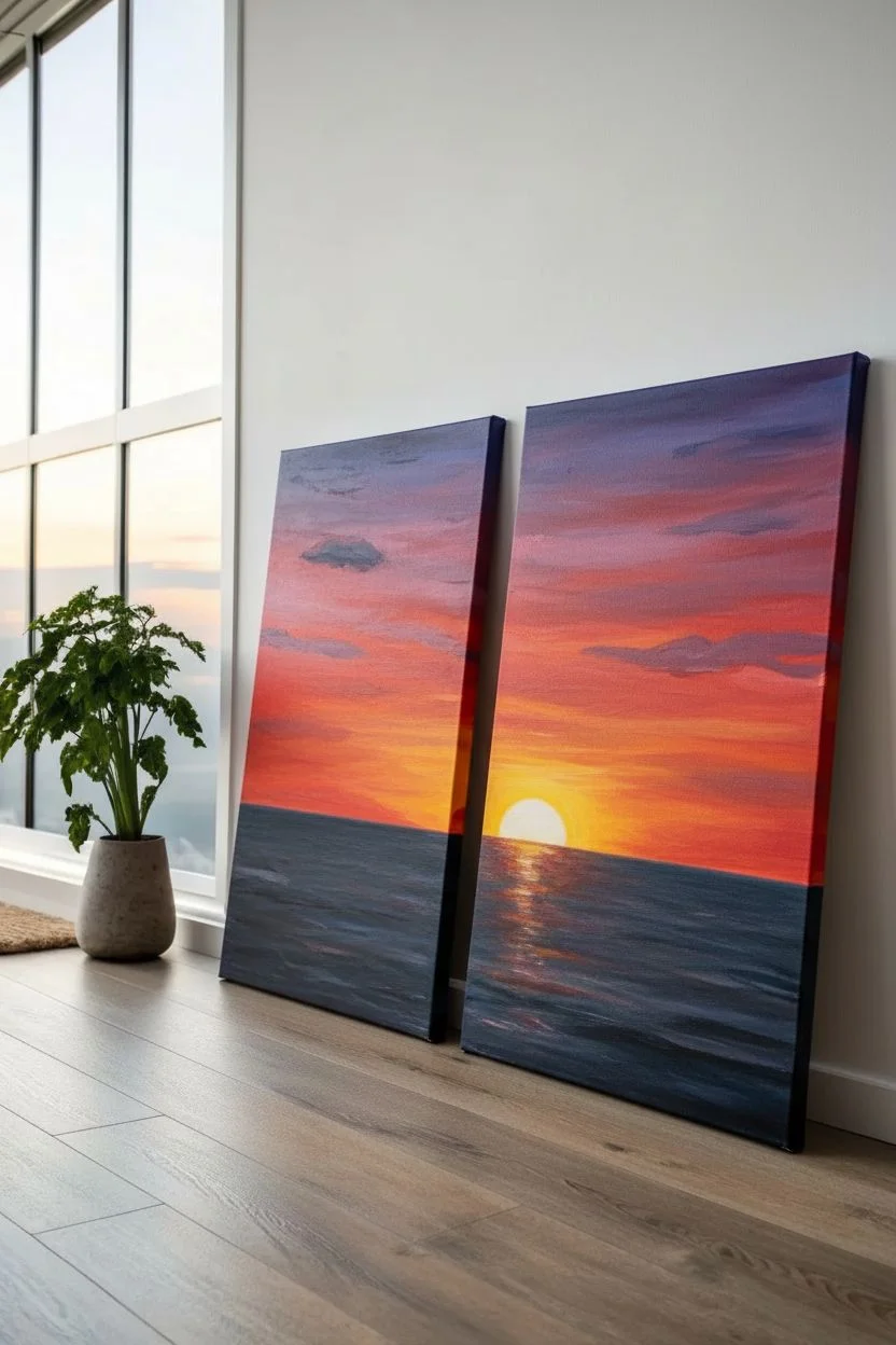
Multi-Canvas Family Puzzle Painting
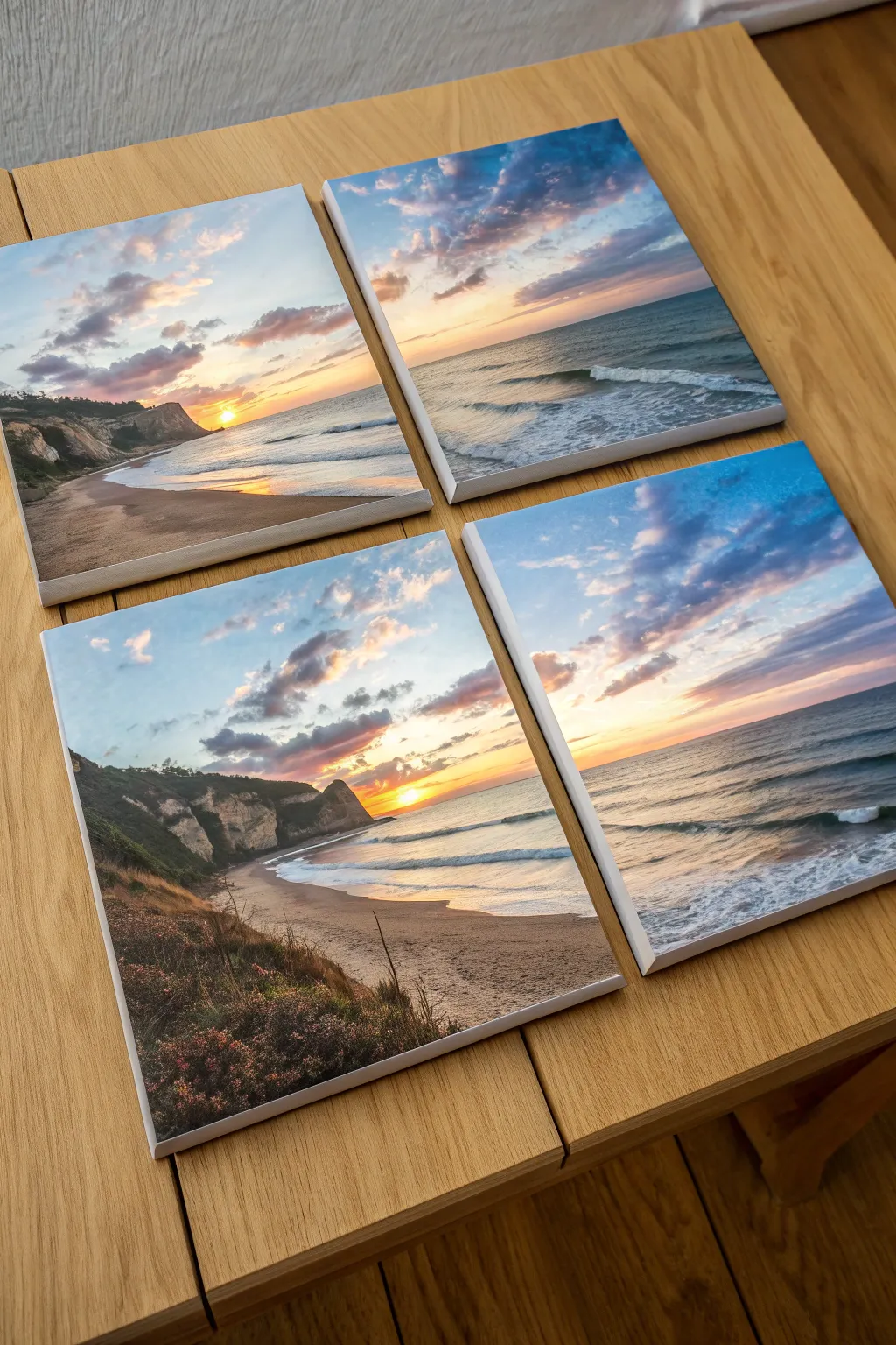
Transform a single breathtaking beach landscape into a collaborative masterpiece by splitting the image across four separate canvases. This project creates a stunning window-like effect on your wall and allows multiple family members to work on different sections of the same view simultaneously.
How-To Guide
Materials
- 4 square stretched canvases (e.g., 8×8 or 10×10 inches)
- Acrylic paints (Titanium White, Phthalo Blue, Cadmium Yellow, Alizarin Crimson, Burnt Umber, Burnt Sienna, Sap Green, Black)
- Wide flat brush (1 inch)
- Medium filbert brush
- Small round detail brush
- Palette or paper plates
- pencil
- Masking tape or painter’s tape
- Ruler or straight edge
- Reference photo of a sunset beach
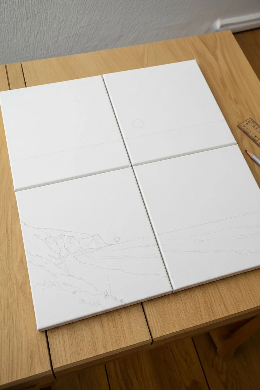
Step 1: Preparation & Sketching
-
Grid arrangement:
Lay your four separate canvases flat on a table, pushing them together so they touch to form a large square. This 2×2 grid will act as your single surface. -
Secure the canvases:
Flip the canvases over carefully and use masking tape on the back to temporarily hold them together, or simply be very careful not to shift them while sketching. -
Establish the horizon:
With a pencil and ruler, lightly draw the horizon line across the two canvases—place it slightly below the center line to give more room to the dramatic sky. -
Outline the landscape:
Sketch the major shapes: sketch the jagged cliff line on the left side, sloping down towards the beach, and mark the waterline where the waves meet the sand. -
Trace the sun:
Draw a small circle for the sun just above the horizon line, positioning it so it sits near the intersection of the canvases or firmly on one side, depending on your reference.
Mismatched Edges?
If lines don’t align perfectly when reassembled, simply repaint the 1-inch area near the gap while the canvases are side-by-side to blend them.
Step 2: Painting the Sky & Water
-
Separate the canvases:
Now, separate the canvases so each person can take one, or you can paint them individually. This prevents paint from bridging the gaps and gluing them together. -
Base coat the sky:
Using the large flat brush, paint the upper sky area relative to your specific canvas. Mix Phthalo Blue and White for the top corners, transitioning into lighter blues as you move down. -
Sunset gradients:
Near the horizon line, blend in Cadmium Yellow and a touch of Alizarin Crimson while the paint is still wet to create a soft, peachy sunset glow. -
Painting clouds:
With a filbert brush, dab in purples (mix Blue and Crimson) for the clouds. Keep the bottoms of the clouds flat and the tops fluffy, highlighting the edges closest to the sun with bright yellow or orange. -
Ocean base layer:
For the water sections, use horizontal strokes of teal (Blue + little Yellow + White). Darken the water as it gets further away from the shore. -
Sun reflection:
Add a vertical streak of yellow and orange reflection on the water directly beneath where the sun is placed, using loose, horizontal zigzag strokes.
Step 3: Land & Details
-
Cliff foundation:
Block in the dark shape of the cliffs on the left canvases using Burnt Umber mixed with a tiny bit of Black. Don’t worry about details yet; just get the silhouette solid. -
Sandy beach:
Mix Burnt Sienna with White to create a sand color. Paint the beach area, sweeping the brush in the direction of the shoreline. -
Highlighting the cliffs:
Once the dark cliff base is dry, use a smaller brush to add lighter browns and greens to suggest vegetation and rock faces catching the sunset light. -
Creating waves:
Using titanium white on a small round brush, paint thin, rolling lines for the waves crashing on the shore. I like to dry brush the foam slightly to make it look misty. -
Foreground vegetation:
In the bottom-left corner canvas, use a fan brush or small round brush to flick upward strokes of dark green and brown, creating tall grasses and coastal shrubs. -
Adding wildflowers:
Dot tiny specks of pink or white onto the foreground bushes to imply wildflowers growing on the dunes. -
Final alignment check:
Bring all four canvases back together on the table to check the continuity. Touch up any lines (like the horizon or shoreline) that don’t match up perfectly across the gaps.
Wrap It Around
Don’t stop painting at the front face! Continue the image onto the sides of each canvas for a polished, gallery-quality look when hung.
Hang your finished quartet with about an inch of spacing between each canvas to complete the window-pane effect
Paint Your Pet as a Family
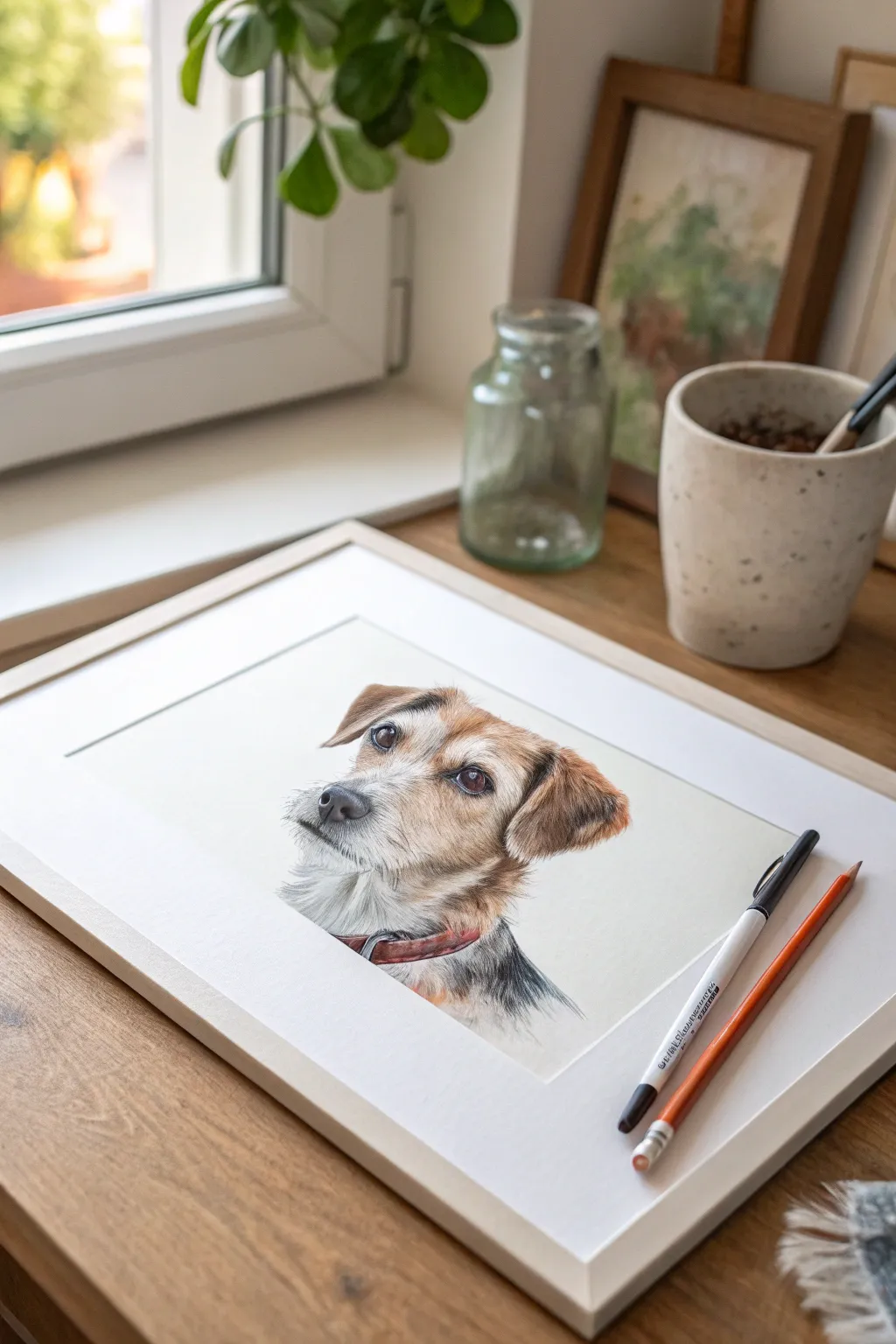
Capture the spirit of your furry friend with this detailed and realistic portrait technique. Using layered colored pencils, you will create a soft, lifelike texture that brings out the personality in your pet’s eyes and fur.
Step-by-Step
Materials
- High-quality colored pencils (earth tones, white, black, grey)
- Heavyweight drawing paper or Bristol board (smooth surface)
- Graphite pencil (HB or 2H)
- Kneadable eraser
- Fine-point mechanical pencil or detail pen (optional)
- Pencil sharpener
- Reference photo of your pet
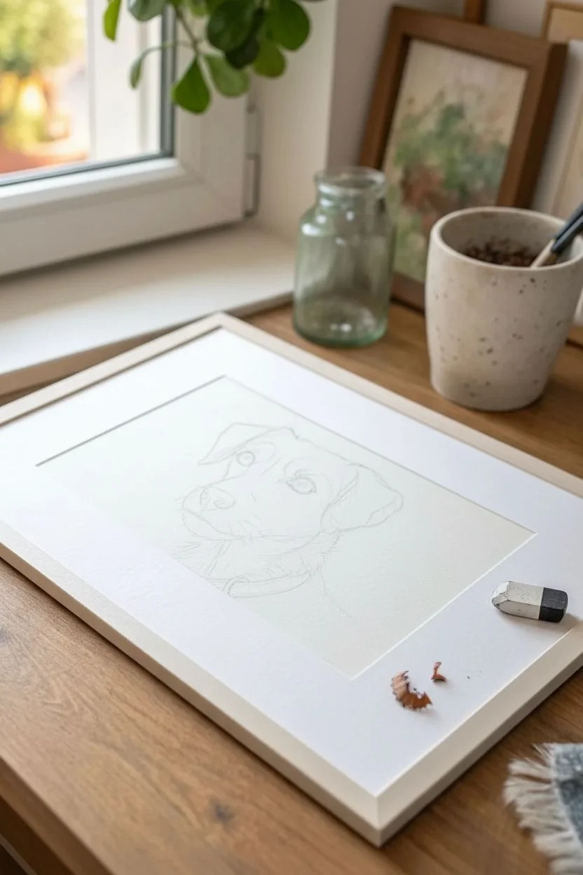
Step 1: Preparation and Sketching
-
Select your reference:
Choose a clear, high-resolution photo of your pet where the eyes are sharp and well-lit. Natural lighting works best for capturing true fur colors. -
Light outline:
Using an HB or 2H graphite pencil, lightly sketch the basic shapes of the head, ears, and neck. Keep your pressure extremely light so lines can be erased later. -
Refine the features:
Draw the specific outlines of the eyes, nose, and mouth. Pay attention to the direction the fur grows in different areas and mark these flow lines lightly. -
Lift graphite:
Roll your kneadable eraser gently over the sketch to lift up most of the graphite, leaving just a faint ghost image to guide your coloring.
Step 2: Eyes and Nose
-
Base layer for eyes:
Start with the eyes, as they bring the drawing to life immediately. Apply a light base layer of brown or amber, leaving the highlight completely white. -
Deepen the shadows:
Use dark browns and black to define the pupil (if visible) and the upper eyelid shadow. Layer gently to build depth rather than pressing hard. -
Add reflections:
Ensure the white catchlight remains crisp. If you accidentally color over it, intricate details like this can be restored with a white gel pen later. -
Build the nose:
Layer cool greys and blacks for the nose. Use a stippling motion (tiny dots) to create the bumpy leather texture found on most dog noses.
Fixing Muddy Colors
If fur colors look muddy, stop layering wax pencils. Spray a light fixative, let it dry, and then return with fresh sharp strokes on top to regain clarity.
Step 3: Building Fur Texture
-
Underpainting the fur:
Apply a wash of the lightest local color found in the fur. For this terrier, I use cream and light tan strokes in the direction of hair growth. -
Mid-tone strokes:
Sharpen your pencils to a fine point. Begin adding individual hairs using mid-tone browns and greys. Use short, flicking motions to mimic wire-haired texture. -
Darker definitions:
Introduce darker browns around the ears and markings. Observe your reference deeply; fur often clumps together, creating small shadow gaps. -
The whiskers and muzzle:
Pay special attention to the muzzle area. Use very sharp grey or black pencils for the whisker spots, keeping the strokes crisp. -
Layering the neck:
Work down to the neck, using longer strokes for the rougher coat here. Blend darker greys into the white chest area to show shadow and volume.
Framing Tip
Use a mat board when framing. It keeps the glass off the drawing surface, preventing the waxy pencil layers from sticking or smearing over time.
Step 4: Details and Finishing
-
Add the collar:
Sketch and fill in the collar. Use a solid block of color (like the red shown here) and add a dark line underneath it to cast a shadow on the fur. -
Highlighting whiskers:
Use a sharp white pencil or an indentation tool to add the long whiskers. Press firmly to make them stand out against the darker muzzle fur. -
Final contrast check:
Stand back and squint at your drawing. Darken the deepest shadows (under the ears, beneath the chin) to increase contrast. -
Soft blending:
If some areas look too scratchy, lightly go over them with a white or cream pencil to burnish and blend the layers together smoothly. -
Clean up:
Erase any smudge marks on the white background paper to ensure a professional, gallery-ready look.
Now you have a heartwarming keepsake that freezes a moment with your beloved pet in time
BRUSH GUIDE
The Right Brush for Every Stroke
From clean lines to bold texture — master brush choice, stroke control, and essential techniques.
Explore the Full Guide
Our Home Portrait on Canvas
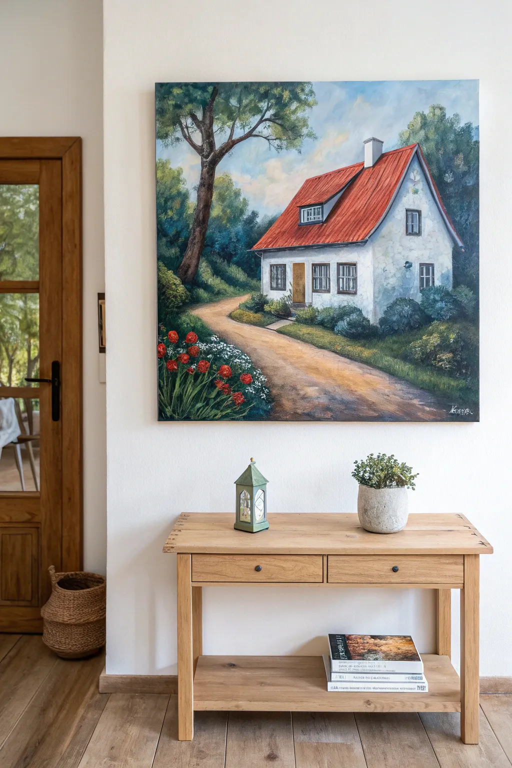
Immortalize a charming home with this vibrant acrylic painting project, featuring a classic red-roofed cottage nestled among lush greenery. The finished piece captures the inviting warmth of a countryside retreat, complete with a winding dirt path and cheerful flower garden.
How-To Guide
Materials
- Large square canvas (approx. 24×24 inches or similar)
- Acrylic paints: Titanium White, Burnt Umber, Yellow Ochre, Cadmium Red, Phthalo Blue, Sap Green, Emerald Green, Lamp Black
- Assorted brushes: 1-inch flat brush, #6 round brush, #2 liner brush, large mottler brush for sky
- Pencil and eraser
- Palette and container for water
- Paper towels
- Ruler (optional)
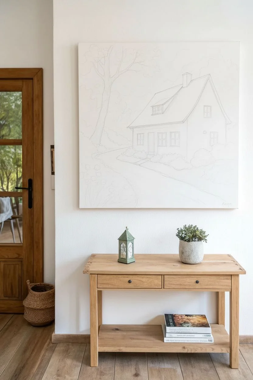
Step 1: Sketching the Scene
-
Horizon and path:
Begin by lightly sketching a sloping horizon line about one-third of the way up the canvas. Draw a winding S-curve shape starting wide at the bottom center and narrowing as it leads up towards the middle right to form the dirt path. -
House structure:
Draft the basic shape of the cottage in the right-center area. Start with a rectangle for the main body and add a steep triangular shape on top for the roof. Add a smaller dormer window shape protruding from the left side of the roof sketch. -
Architectural details:
Sketch the placement of the windows and the front door. Add a chimney on the roof’s peak and lightly outline the large tree on the left side, letting its branches reach over the house.
Pro Tip: Depth Perception
Make colors cooler and lighter as things get further away (atmospheric perspective). Keep your warmest, darkest colors in the foreground.
Step 2: Painting the Background
-
Sky gradient:
Mix Titanium White with a tiny touch of Phthalo Blue. Using the large mottler brush, paint the entire sky area, keeping it lighter near the horizon and slightly darker at the very top. Add fluffy white cloud shapes while the paint is still wet for a soft blend. -
Distant trees:
Mix Sap Green, a little White, and Phthalo Blue to create a cool, muted green. With a round brush, stipple in the distant tree line behind the house, keeping the edges soft to suggest depth. -
Base layer for grass:
Cover the grassy areas on either side of the path with a mix of Sap Green and Yellow Ochre. Don’t worry about texture yet; just aim for solid coverage.
Troubleshooting: Wobbly Lines
If your window frames look messy, let the paint dry completely. Then, use a fine-tip acrylic paint marker or a ruler to clean up the straight edges.
Step 3: The Centerpiece: The Cottage
-
White facade:
Paint the walls of the house with Titanium White mixed with the tiniest drop of Phthalo Blue or Black to create a cool shadow tone for the corners and under the eaves. Keep the central parts pure white. -
Red roof:
Mix Cadmium Red with a touch of Burnt Umber to dull it slightly. Paint the roof area using the flat brush, following the angle of the roof slope. Paint vertical lines with slightly darker red to simulate standing seam metal roofing or tiles. -
Windows and trim:
Use the liner brush and dark grey (Black mixed with White) to outline the window panes. Fill the window glass with a dark, reflective blue-grey tone. Paint the door a warm Yellow Ochre wood tone.
Step 4: Foreground and Details
-
Dirt path:
Paint the path using Burnt Umber mixed with White and Yellow Ochre. Apply the brushstrokes horizontally across the path to mimic the ground’s texture, adding darker brown shadows along the edges. -
The prominent tree:
Using Burnt Umber and Black, paint the large tree trunk on the left. I like to add highlights of lighter brown on the right side of the trunk where the light hits it. Paint the dark green canopy foliage with a stippling motion. -
Shrubbery foundation:
Use Emerald Green and Sap Green to paint bushes hugging the foundation of the house. Use a dabbing motion to create a leafy texture. -
Garden blooms:
In the bottom left corner, paint tall green stems for the flowers. Add bright pops of Cadmium Red for the tulips or poppies, and small dabs of white for baby’s breath or smaller wildflowers. -
Final highlights:
Using your smallest brush and pure Titanium White, add final highlights to the window frames, the chimney edge, and the tips of the grass blades in the foreground sunlight. -
Shadows and depth:
Glaze a thin, watery layer of dark green or brown under the bushes and trees to ground them significantly. Sign your name in the corner once dry.
Step back and admire the cozy atmosphere you have captured on your canvas
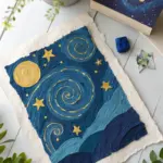
Fireflies in a Jar Family Night
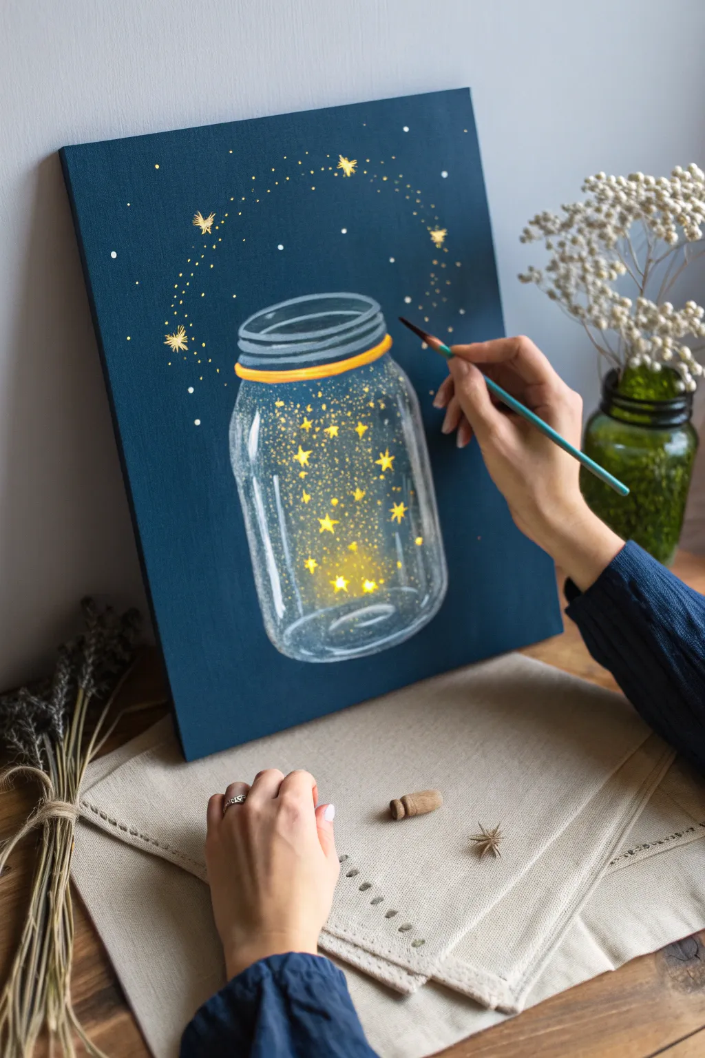
Capture the magic of a summer evening with this charming acrylic painting. You’ll create a glowing glass jar effect on a deep midnight blue background, filled with radiant stars that seem to dance right off the canvas.
Detailed Instructions
Materials
- Canvas panel or stretched canvas (11×14 inches recommended)
- Acrylic paints: Navy Blue, Titanium White, Cadmium Yellow, Orange, Black or Dark Grey
- Flat brush (3/4 inch) for background
- Round brushes (sizes 2, 4, and 6)
- Detail liner brush (size 0 or 00)
- Cup of water and paper towels
- White chalk or watercolor pencil (for sketching)
- Palette or paper plate
Step 1: Setting the Scene
-
Paint the background:
Start by covering your entire canvas with Navy Blue paint. Use wide, even strokes with your large flat brush to ensure solid coverage. Let this base layer dry completely before moving on. -
Sketch the jar:
Once dry, use white chalk to lightly outline a Mason jar shape in the center. Draw two parallel ovals at the top for the rim, a short neck, and a rounded rectangular body. Don’t press too hard; you want these lines to be erasable later. -
Add the rim detail:
Mix a small amount of Yellow with a tiny touch of Orange. Paint a solid band just under the top rim of the jar to represent the lid ring or a decorative tie.
Step 2: Creating the Glass Effect
-
Outline the glass:
Mix Titanium White with a drop of water to make it fluid. Using a size 4 round brush, paint over your chalk outline. Keep the lines somewhat loose and varying in thickness to mimic light reflecting off glass. -
Add reflection highlights:
On the left side of the jar and the shoulder, add thicker, pure white strokes. These represent the strong glare of light hitting the curved glass surface. -
Paint the bottom reflections:
Curve your brush strokes along the bottom of the jar to show its roundness. I like to add a few horizontal dashes inside the bottom curve to suggest the thick glass base. -
Soft glass haze:
Dilute a tiny bit of white paint with a lot of water to create a transparent wash (glaze). Lightly brush this inside the jar, specifically near the edges, to make the glass look foggy and distinct from the dark background.
Jar looking uneven?
Don’t stress about perfect symmetry! Real, antique Mason jars often have imperfections. If a line is too thick, wait for it to dry and tidy it up with the dark blue background color.
Step 3: Adding the Bioluminescence
-
Paint the main glow:
Mix Yellow with a speck of White. Paint soft, hazy circles inside the jar where your brightest fireflies will be. Scumble (rub dryly) the paint so the edges are soft and fuzzy, not sharp. -
Create the star shapes:
In the center of your hazy yellow spots, use a smaller brush to paint distinct five-pointed stars. Use pure, bright Yellow for this step. -
Add smaller floating stars:
Fill the rest of the jar with smaller stars and dots. Use varying sizes to create depth—some stars should be tiny specks, while others are more defined. -
Highlight the stars:
Take your smallest detail brush and pure Titanium White. Add a tiny dot to the very center of the largest stars to make them look like they are shining intensely.
Make it shimmer
Once the acrylic paint is fully dry, paint over the yellow stars with a clear glitter glaze or metallic gold paint to make them actually sparkle in the light.
Step 4: The Magical escape
-
Plan the swirling path:
Imagine a path swirling out from the top of the jar. You can lightly dot this path with chalk first if you need a guide for the motion. -
Paint the escaping magic:
Using the detail brush and yellow paint, create a trail of tiny dots and small stars rising from the jar opening and arching over the top. -
Add movement lines:
Paint very thin, dashed lines along the swirling path using pale yellow or white. This emphasizes the movement of the magic leaving the jar. -
Create background stars:
Dip a stiff brush or old toothbrush into watery white paint. Gently flick the bristles to splatter tiny white stars across the dark blue background outside the jar. -
Final touches:
Step back and look at your composition. Add a few larger, defined stars in the background sky using gold or pale yellow to balance the negative space.
Now you have a captured jar of starlight to brighten up any room in your home

PENCIL GUIDE
Understanding Pencil Grades from H to B
From first sketch to finished drawing — learn pencil grades, line control, and shading techniques.
Explore the Full Guide
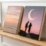
Family Vacation Memory Paintings
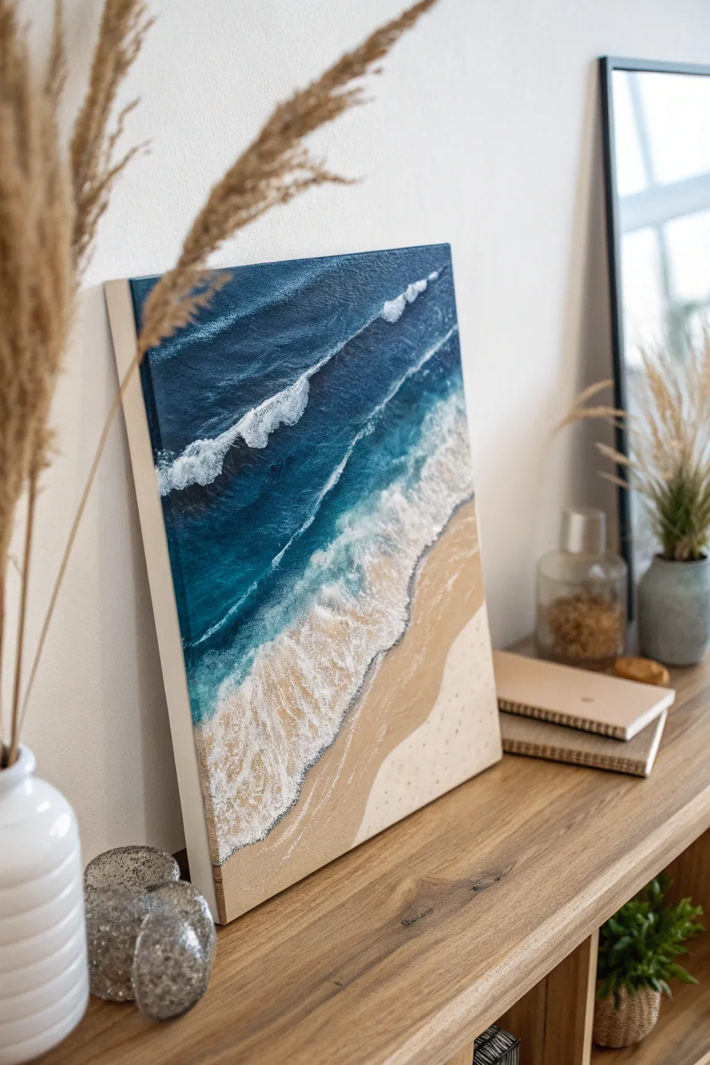
Capture the salty air and soothing rhythm of the ocean with this aerial-view beach painting. Using texture paste and fluid acrylic techniques, you’ll create realistic crashing waves that look like they’re rolling right onto the sand.
Step-by-Step Tutorial
Materials
- Rectangular stretched canvas (16×20″ or similar)
- Heavy body acrylic paints: Phthalo Blue, Turquoise, Titanium White, Raw Sienna, Beige/Unbleached Titanium
- Texture paste or modeling paste
- Palette knife
- Large flat paintbrush (1 inch)
- Medium round brush
- Old fan brush or stiff bristle brush
- Cup of water and paper towels
- Optional: High-gloss varnish or resin
Step 1: Setting the scene
-
Mark the horizon line:
Visualize the composition diagonally. Unlike a traditional landscape, we are looking down from above. Lightly pencil a diagonal line across the bottom right third of the canvas to separate the sand from the water. -
Mix the sand colors:
Prepare two shades for the beach. Mix Raw Sienna with a generous amount of White for the dry sand, and use pure Raw Sienna mixed with a tiny drop of Phthalo Blue or Brown for the darker, ‘wet’ sand area near the shoreline. -
Paint the dry beach:
Using the large flat brush, fill the bottom right corner with your lightest sand color. Paint in slightly curved strokes parallel to your diagonal line to mimic the natural contour of the shore. -
Create the wet sand transition:
While the dry sand is still slightly damp, paint a strip of the darker wet sand color right along the water line. Blend the two sections gently with your brush so there is no hard separation line.
Use a Straw
For realistic sea foam, blow on the wet white paint with a drinking straw. This spreads the paint into natural, erratic lacing patterns quicker than a brush.
Step 2: Pouring the ocean
-
Deep ocean blue:
Start at the top left corner of the canvas with pure Phthalo Blue. Paint a wide band of this deep color, covering about half of the remaining white space on the canvas. -
Turquoise transition:
Mix Phthalo Blue with Turquoise and a little White. Apply this lighter teal shade next to the deep blue, working your way toward the sand. Use horizontal, sweeping strokes to mimic the movement of currents. -
Shallow water wash:
For the area touching the wet sand, thin down some Turquoise and White paint with a little water. Glaze this over the edge of the wet sand color so the underlying darker sand shows through, looking like transparent shallow water. -
Blend the gradients:
Use a clean, slightly damp brush to smooth the transitions between the deep blue, turquoise, and shallow water sections. The goal is a seamless gradient from deep ocean to shore.
Step 3: Making waves
-
Prepare the texture:
Mix Titanium White acrylic paint with modeling paste on your palette. You want a thick, frosting-like consistency that will hold its shape. -
Apply the main wave:
Using a palette knife, scoop up the white paste mixture. Apply it along the transition line where the turquoise water meets the shallow area. Don’t smooth it down; let it sit high and textured. -
Drag the foam back:
Wipe the palette knife clean. Gently drag the back edge of the thick white line outward into the deeper water. This creates the ‘tail’ of the wave and the look of wind-blown foam. -
Add secondary waves:
Create 2-3 smaller, thinner lines of white texture further out in the deep blue section. These represent rolling swells before they break. Keep them roughly parallel to your main shoreline wave. -
Stipple the sea foam:
Take a stiff bristle brush or an old fan brush and tap straight down into the wet white paint along the shore. This ‘stippling’ motion creates tiny air bubbles and chaotic sea foam texture. -
Create lacing effects:
Dip a fine round brush into fluid white paint. Paint thin vivid lines connecting the main foam areas, creating a web-like pattern that floats on top of the turquoise water.
Add Real Elements
Mix actual fine sand into your beach-colored paint for authentic grainy texture, or glue tiny seashells near the water line before varnishing.
Step 4: Final touches
-
Shadows under waves:
To make the waves pop, mix a dark navy blue (Phthalo Blue + a touch of black or brown). Carefully paint a very thin shadow line right underneath the crest of the textured white waves. -
Highlight the sand:
Once the sand is dry, I like to spatter infinitesimal dots of watered-down white and brown paint over the beach area to mimic the texture of individual sand grains. -
Finish the edges:
Don’t forget the sides of your canvas. Wrap the painting around the edges—blue on top, sand color on bottom—so it looks polished even without a frame.
Now you have a refreshing slice of the ocean to hang on your wall and enjoy regardless of the season
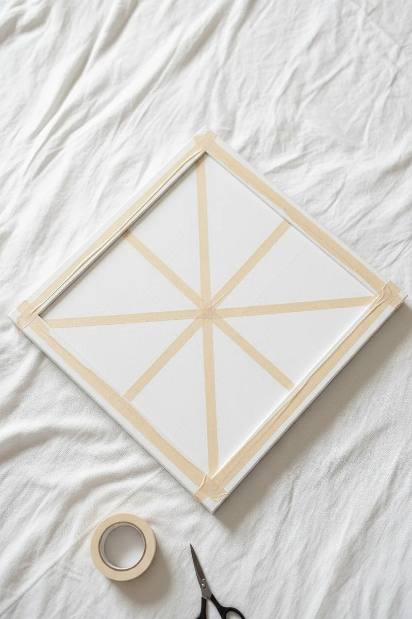
Tape-Resist Family Geometric Art
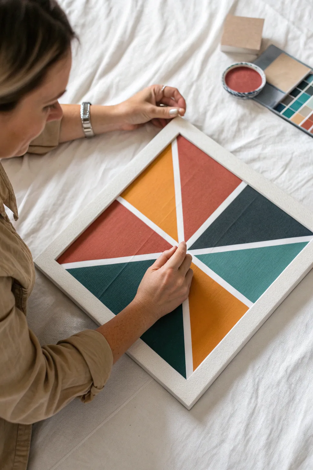
Create a striking piece of modern art with crisp lines and bold blocks of color using the simple tape-resist method to achieve professional-looking results. This geometric design uses a balanced palette of warm terracotta and mustard against cool teal and navy to make a sophisticated statement piece.
Step-by-Step
Materials
- Square stretched canvas (e.g., 12×12 or 16×16 inches)
- White acrylic paint or gesso
- Acrylic paints (terracotta, mustard yellow, dark teal, slate blue/navy)
- Painter’s tape or wash tape (approx. 1/4 inch width)
- Flat paintbrush (medium size)
- Small touch-up brush
- Palette or paper plate
- Paper towels
- Water cup
- Scissors
- Optional: Wood frame to fit canvas
Step 1: Preparation & Taping
-
Prime the canvas:
Start by giving your canvas a solid coat of white acrylic paint or gesso. This ensures your white lines will be bright and crisp later on, rather than the raw color of the canvas fabric. Let this base layer dry completely before moving on. -
Plan your center point:
Visualize where the center of your design will be. For this ‘burst’ pattern, you don’t need to measure the exact center; an off-center convergence point often makes the composition feel more dynamic and modern. -
Apply the first tape lines:
Cut a long strip of painter’s tape and stretch it across the canvas, crossing through your chosen center point. Smooth it down firmly, especially along the edges, to prevent paint bleed. -
Create the geometric sections:
Continue adding strips of tape, all intersecting at that same central point. Think of cutting a pizza into uneven slices. Aim for about 6 to 8 distinct triangular sections. -
Seal the tape edges:
This is a crucial step often skipped: paint a very thin layer of your white base color over the tape edges. This seals the tape, meaning any bleed-under will be white and invisible, leaving your colored lines perfectly sharp.
Seal Makes Perfect
Painting a thin layer of white over the tape before adding color is the secret to razor-sharp lines. It blocks leaks so your colors stay strictly in their zones.
Step 2: painting & Finishing
-
Plan your palette:
Squeeze out your four accent colors: terracotta, mustard, dark teal, and slate blue. Decide which triangle will carry which color. I like to arrange them so similar colors (like the two blues) aren’t touching directly. -
Paint the first section:
Load your flat brush with the terracotta paint. Fill in one of the triangular ‘slices’ completely. Use confident strokes from the tape inward to avoid pushing too much paint under the tape edge. -
Continue filling sections:
Move to a non-adjacent section for your next color, perhaps the slate blue. Letting wet sections sit apart helps prevent accidental smudging while you work. -
Apply the remaining colors:
Fill in the rest of the triangles with your mustard and teal paints. If the paint looks streaky or translucent, let the first coat dry to the touch and apply a second coat for opaque, solid coverage. -
Let it dry partially:
Allow the paint to dry until it feels tacky but not fully hardened. Removing tape from bone-dry paint can sometimes chip the acrylic, while removing it from wet paint can result in messy drips. -
The reveal:
Gently peel back the tape at a 45-degree angle. Pull slowly and steadily. This is the most satisfying part of the process seeing those crisp white lines emerge between your color blocks. -
Touch ups:
Once the tape is gone and the paint is fully dry, inspect your white lines. Use a small detail brush and white paint to fix any minor bleeds or jagged edges. -
Frame your work:
To mimic the look in the photo, place your finished canvas into a simple white or light wood floating frame. This elevates the craft project into a true piece of wall decor.
Tape Peeling issues
If the paint starts lifting with the tape, your paint might be too thick or dry. Score the edge of the tape lightly with a craft knife before peeling to separate the film.
Hang your new geometric masterpiece in a well-lit spot to enjoy the contrast of the colors


Family Color-Mixing Challenge Night
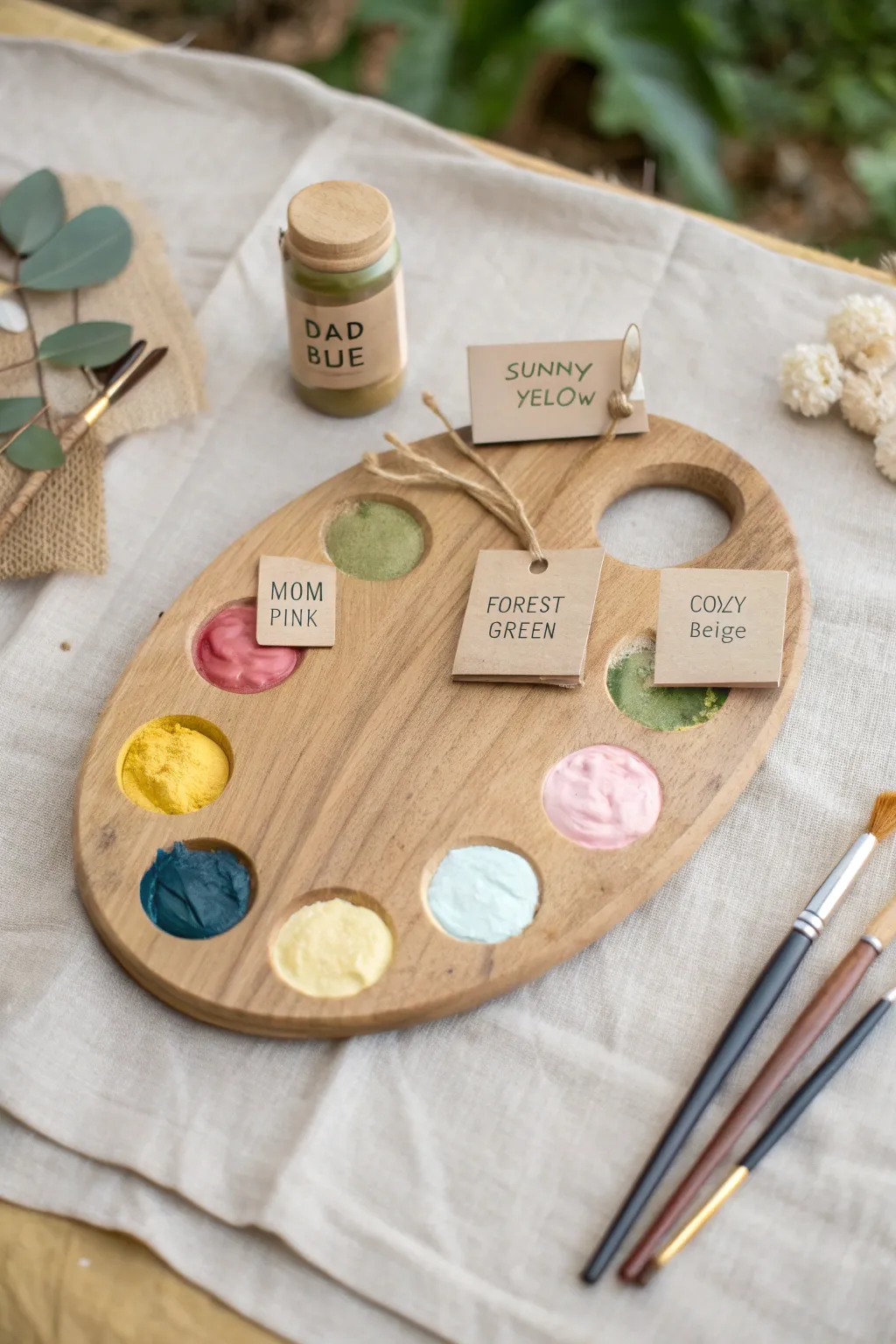
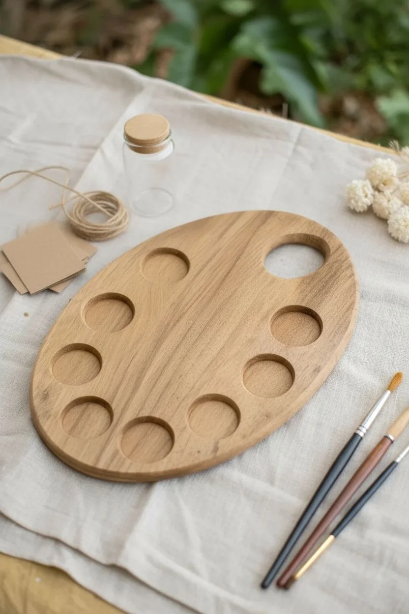
Transform a simple wooden palette into a charming family keepsake or prop for your next creative night. This project involves filling an artist’s palette with custom-mixed, thick-bodied paints and labeling each hue with whimsical, hand-lettered names representing family members or moods.
Step-by-Step Tutorial
Materials
- Oval wooden artist palette with wells
- Thick-body acrylic paints or modeling paste mixed with acrylics (various colors)
- Small kraft paper tags or cardstock cut into rectangles
- Thin jute twine or hemp cord
- Fine-point black permanent marker or pen
- Small hole punch
- Palette knife or clean popsicle sticks
- Small glass jar (optional, for prop styling)
- Paintbrushes (for display)
- Clear matte varnish (optional)
Step 1: Preparing the Palette
-
Clean the surface:
Begin with a clean, dry wooden palette. If your palette is brand new, distinct wood grain adds a nice rustic touch, so wipe it down gently with a dry cloth to remove any dust. -
Select your color scheme:
Decide on a color palette that feels cohesive but varied. The example uses a mix of earthy tones like forest green, mustard yellow, and beige, balanced with softer pastels like blush pink and baby blue.
Pro Tip: Texture Magic
Mix baking soda into your acrylic paint if you don’t have modeling paste. It creates a thick, matte, fluffy texture perfect for this look.
Step 2: Mixing and Filling
-
Thicken your paint:
To achieve the textured, fluffy look seen in the photo, standard acrylics might look too flat when dry. I like to mix my acrylic paints with a bit of modeling paste or heavy gel medium to give them body. -
Mix the ‘Sunny Yellow’:
Combine a bright yellow with a tiny touch of white to soften it. Using a palette knife, scoop a generous dollop into one of the left-side wells, swirling the top slightly for texture. -
Create ‘Mom Pink’:
Mix a deep rose pink with a hint of terracotta. Fill a well near the top left, ensuring the mixture sits high and rounded within the depression. -
Blend ‘Forest Green’ and others:
Prepare a muted sage or forest green and fill the top center well. Continue mixing and filling the remaining wells with your chosen colors: deep teal, soft cream, light blue, baby pink, and beige. -
Add powder effects (optional):
If you want a dry, pigment-like texture as seen in the yellow and green wells, sprinkle a tiny pinch of dry pigment powder or crushed pastel over the wet paint before it dries.
Step 3: Creating the Labels
-
Cut the tags:
Cut small rectangles from kraft paper or cardstock. They should be roughly 1.5 inches wide. -
Letter the names:
Using a fine-point black marker, hand-letter creative names for your colors. Use simple, all-caps printing for a clean look. Examples include ‘MOM PINK’, ‘DAD BLUE’, ‘COZY BEIGE’, and ‘SUNNY YELOW’. -
Punch holes:
Punch a small hole in the center top of one tag (like the ‘Forest Green’ tag) and the top corner of another (like the ‘Sunny Yellow’ tag). -
Prepare label placement:
For tags that will sit directly on the paint or palette, you don’t need holes. Just set them aside for the final assembly.
Troubleshooting: Curling Tags
If the moisture from the paint curls your paper tags, laminate them with matte tape on the back side before placing them on the wet paint.
Step 4: Assembly and Styling
-
Allow to dry partially:
Let the paint dollops set for about 30 minutes. You want them to form a skin so the paper tags don’t sink in and get ruined, but are still tacky enough to hold them in place. -
Attach the string tags:
Thread a piece of jute twine through the ‘Forest Green’ tag and tie it loosely around the center bridge of the palette. Do the same for the ‘Sunny Yellow’ tag, perhaps tying it to a small prop jar or just draping it. -
Place flat tags:
Gently press the ‘MOM PINK’ tag near the pink well and the ‘COZY Beige’ tag near the beige well. If the paint is too dry, use a tiny dot of glue; if wet, rest it carefully on the edge. -
Create the jar prop:
Take a small glass jar, fill it with green paint mixture, and wrap a kraft paper label around it reading ‘DAD BLUE’ or your chosen name to complete the scene. -
Final drying:
Let the entire project dry undisturbed for 24 hours if you used modeling paste, as thick layers take time to cure completely.
Display your personalized palette on a shelf or use it to kick off a color-themed family game night
Rock Painting and Family Display Set
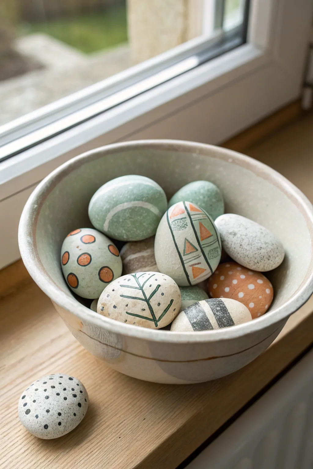
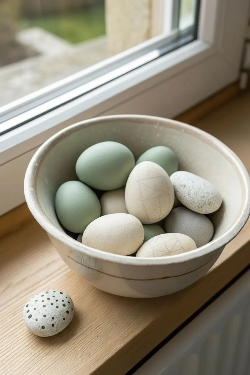
Transform smooth river stones into a sophisticated, rustic centerpiece that mimics the look of artisanal ceramic eggs. Using a muted, earthy color palette and simple geometric patterns, this project creates a timeless decoration perfect for spring or year-round display.
Detailed Instructions
Materials
- Assorted smooth river rocks (egg-shaped and sized)
- Acrylic craft paints (sage green, terracotta orange, off-white/cream, charcoal grey, warm beige)
- Fine-grit sandpaper (optional)
- Set of paintbrushes (fine tip liner brush, small flat brush, medium flat brush)
- Graphite pencil
- Matte finish spray sealant or Mod Podge
- Ceramic or wooden bowl for display
- Palette or paper plate
- Water cup and paper towels
Step 1: Preparation and Base Coats
-
Clean and prep stones:
Begin by washing your river rocks thoroughly with soap and water to remove any dirt or oils. Let them dry completely. If any stones have rough patches, lightly sand them down for a smoother painting surface. -
Select your palette:
Mix your base colors. You want earthy, muted tones rather than bright primaries. create a soft sage green, a stone grey, and a creamy off-white. -
Apply solid base coats:
Select about half of your rocks to paint in solid colors. Paint two coats of sage green on one, grey on another, and cream on a third. Let the first coat dry fully before adding the second to ensure opacity. -
Create a speckled texture:
For the stone-look egg (the grey speckled one), mix a watery grey wash. Paint the rock solid white first. Once dry, flick bristles of an old toothbrush dipped in diluted grey paint to create tiny, natural-looking speckles.
Paint Slipping?
If acrylic paint slides off the slick rock surface, paint a layer of white glue or sheer matte Mod Podge first. This acts as a primer, giving the paint something to grip onto.
Step 2: Pattern Design
-
Sketch the designs:
Once your base coats are bone dry, use a graphite pencil to lightly sketch your patterns. Plan for a mix of designs: some geometric with triangles, some botanical, and some simple dots. -
Paint the terracotta dot egg:
Take a rock painted with a pale sage or grey base. Using a small round brush or the back end of a paintbrush handle, stamp medium-sized circles using terracotta paint. Space them irregularly for an organic feel. Add black outlines if desired. -
Design the geometric band egg:
On a cream or light green rock, use your fine liner brush and charcoal paint to draw vertical lines dividing the rock into sections. Inside these bands, paint small triangles in terracotta and add hash marks or zig-zags. -
Create the botanical leaf egg:
Choose a smooth, light-colored stone. With your liner brush and dark green or charcoal paint, draw a single vertical stem line. Add simple, curved leaf shapes extending outward from the stem, keeping the lines thin and delicate. -
Paint the black-and-white stripe rock:
For a bold contrast, take a cream-colored rock and paint thick, charcoal-colored bands horizontally across it. I like to leave the edges a little rough to maintain that hand-painted ceramic aesthetic. -
Detail the polka dot stone:
For the small stone sitting outside the bowl, paint a base of white or light grey. Use the very tip of a brush handle dipped in black paint to add tiny, dense black dots all over the surface. -
Add the spotted terracotta egg:
Paint one rock solid terracotta orange. Once dry, add small white or cream dots scattered randomly across the surface using a dotting tool or toothpick.
Pro Tip: Perfect Circles
Don’t struggle painting circles freehand. Use household items as stamps: pencil erasers for medium dots, Q-tips for small dots, and toothpick ends for tiny speckles.
Step 3: Finishing Touches
-
Review and touch up:
Look over all your rocks. If any pencil lines are still visible, gently erase them. If the paint looks transparent in areas, carefully dab on a little extra color. -
Seal the artwork:
To protect the paint from chipping and give the rocks a unified finish, apply a coat of matte spray sealant. A matte finish is crucial here to keep them looking like natural stone or unglazed ceramic; glossy would look too plastic. -
Allow to cure:
Let the sealant dry according to the manufacturer’s instructions, usually at least 24 hours, before handling them extensively. -
Arrange your display:
Select a rustic ceramic or wooden bowl. Pile your finished rocks inside, mixing the patterns and colors so no two identical styles are right next to each other. Place the small black-dotted stone casually next to the bowl.
Now you have a stunning, durable centerpiece that brings a touch of nature indoors without any maintenance
DIY Spin Art as a Family Twist
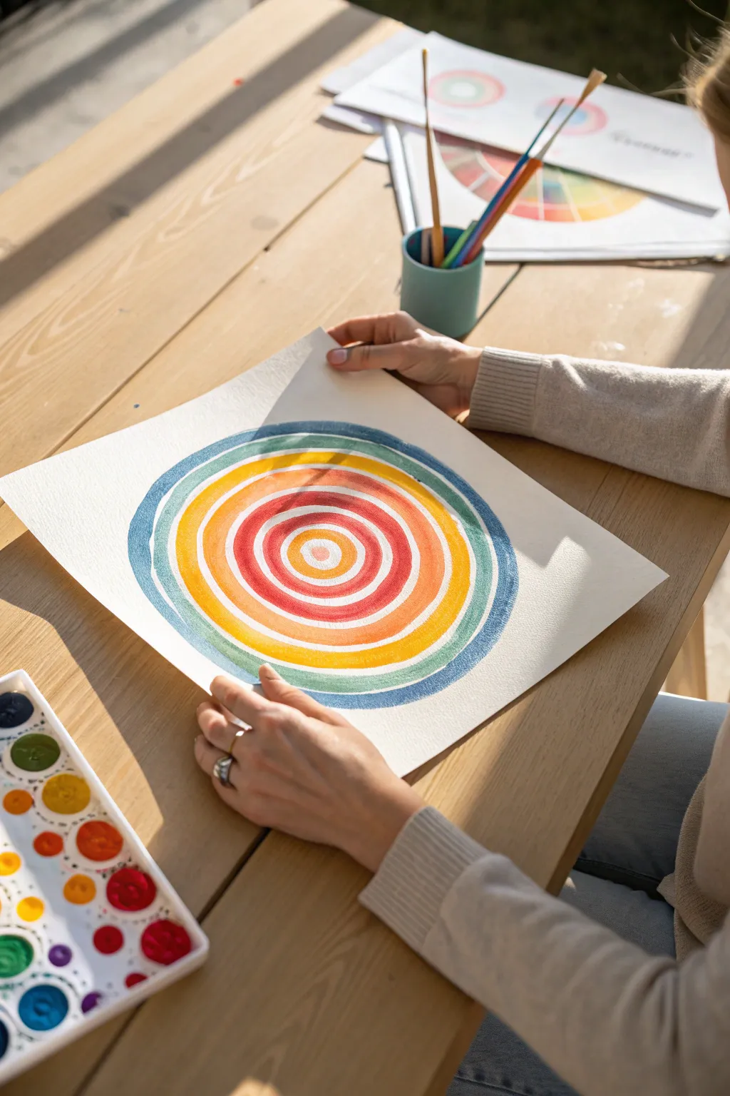
Embrace the calming rhythm of painting circles with this vibrant watercolor project that mimics the energy of spin art but with manual precision. The textured cold-press paper absorbs the pigment beautifully, creating soft, organic edges that give each ring a unique character.
Step-by-Step
Materials
- Square sheet of cold-press watercolor paper (approx. 10×10 or 12×12 inches)
- Watercolor palette set with pans (similiar to the one shown)
- Round watercolor brushes (medium size, approx. size 6 or 8)
- Pencil (optional)
- Compass (optional)
- Cup of clean water
- Paper towels
Step 1: Preparation and Center
-
Prepare your space:
Set up your workspace outdoors or near a sunny window if possible, as natural light helps distinguish the subtle watercolor variations. Ensure your paper is flat and clean. -
Plan the structure:
While you can paint freehand for an organic look, you can lightly mark the center of your paper with a pencil if you want precise symmetry. -
Optional guide lines:
If you are worried about your circles wobbling, use a compass to faint draw concentric circles as guides, but keep the pencil pressure extremely light so it doesn’t show through the paint. -
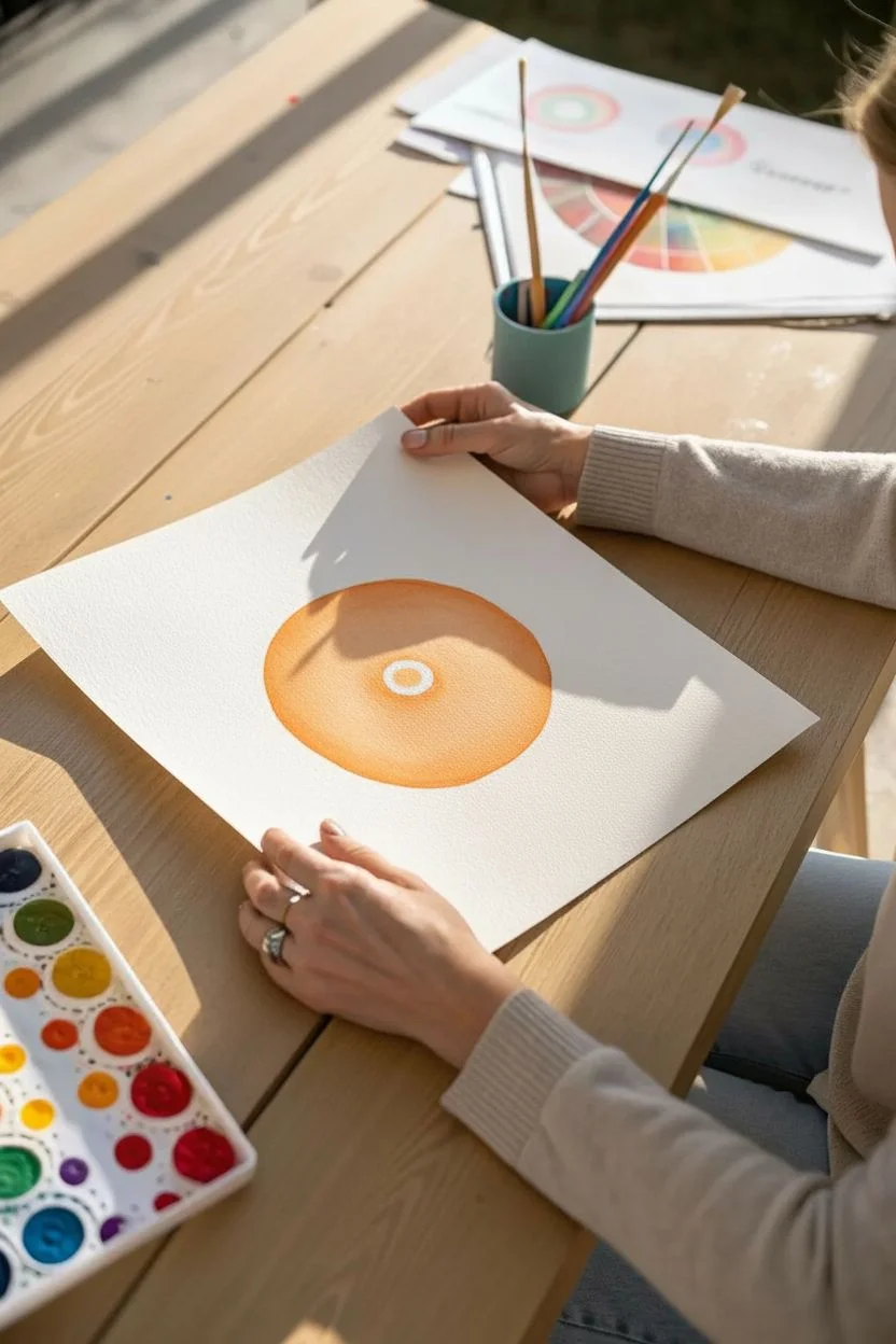
Mix the center color:
Load your brush with water and pick up a warm, light orange or peach color. The consistency should be fluid but pigment-rich. -
Paint the bullseye:
Paint a small, solid circle right in the center of the paper, about the size of a large coin. Leave a tiny sliver of white paper unpainted in the very middle if you like a highlight.
Pro Tip: Paper Rotation
Don’t twist your wrist awkwardly! Instead, place the paper on a lazy susan or simply rotate the sheet manually with your non-painting hand as you draw the brush.
Step 2: Building the Warm Layers
-
First ring application:
Switch to a slightly deeper orange-red. Painting wet-on-dry (meaning the paper is dry), create a ring around your center bullseye. -
Leave a gap:
Crucially, leave a thin, consistent gap of white paper between the center circle and your new ring. This negative space adds vibration to the piece. -
Second ring: Deep Red:
Rinse your brush and load it with a saturated red. Paint the next ring, slightly wider than the previous one, maintaining that steady hand to keep the white gap consistent. -
Third ring: Bright Red:
Continue expanding outward with a brighter, classic red tone. I find it helpful to rotate the paper physically as I pull the brush to keep the curve natural. -
Fourth ring: Orange transition:
Move back toward orange on your palette. Paint a ring that is distinct from the reds, signaling a shift in the gradient. -
Fifth ring: Yellow-Orange:
Mix a sunny yellow with a touch of orange. This ring should feel lighter and more transparent than the dense red rings. -
Sixth ring: Pure Yellow:
Apply a band of pure, bright yellow. This acts as a glowing halo between the warm inner core and the cooler outer rings.
Level Up: Salt Texture
While the paint is still wet on the wider rings, sprinkle a pinch of table salt on the pigment. Once dry, brush it off to reveal a stunning starry texture.
Step 3: Cooling Down the Gradient
-
Transition to green:
Clean your brush thoroughly. Pick up a light, grassy green and paint the next ring. The contrast against the yellow will make the artwork pop. -
Teal ring:
Mix a bit of blue into your green to create a teal or turquoise shade. Apply this ring, perhaps making it slightly thinner for variety. -
Blue ring:
Move to a standard blue tone. Watch your water control here; if the brush is too dry, the texture of the paper will show through heavily (creating a ‘dry brush’ effect). -
Outer edge: Indigo:
For the final, largest ring, use a deep indigo or denim blue. This dark border frames the vibrant energy of the inner circles. -
Review edges:
Look over your circles. If any edge looks too ragged, you can carefully smooth it with a damp brush, but don’t overwork it—imperfections add to the handmade charm. -
Final dry:
Let the piece dry completely flat. If the paper buckles slightly from the water, you can press it under a heavy book once it is bone dry.
Now you have a mesmerizing piece of art that radiates color and warmth from every angle
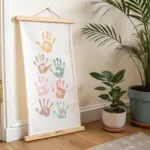
Blind-Contour Family Portrait Relay
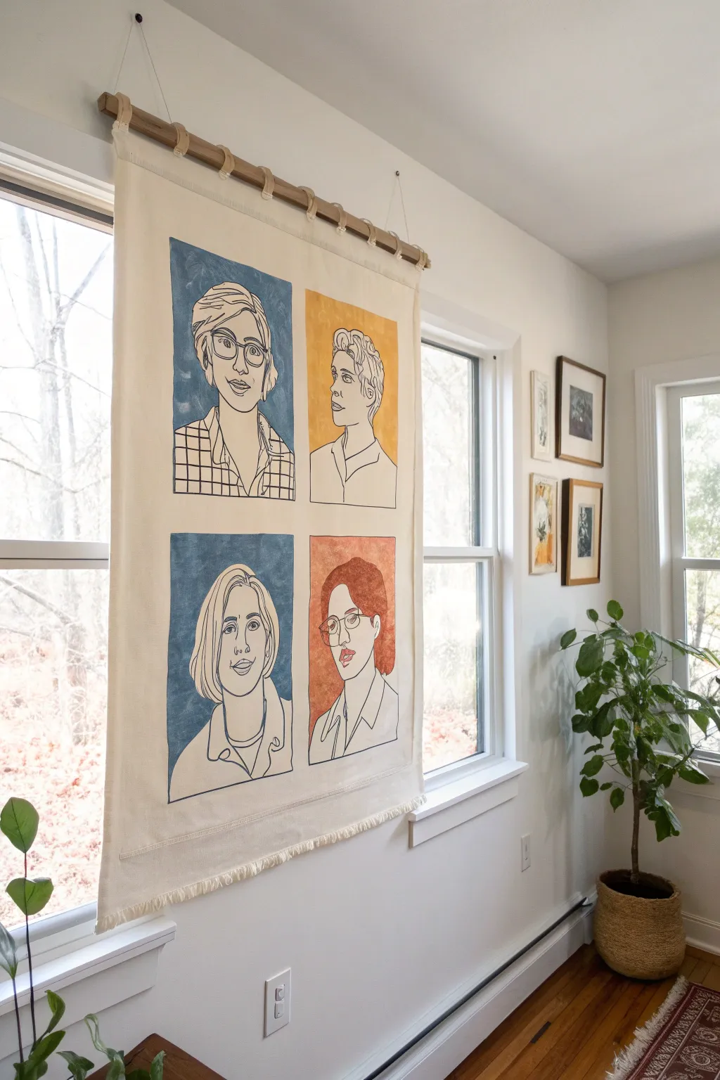
Transform simple contour drawings into a statement wall hanging with this modern, minimalist fabric project. By combining bold color blocks with delicate line work on canvas, you create a sophisticated piece of art that celebrates your family’s unique features.
Detailed Instructions
Materials
- Heavyweight cotton canvas or duck cloth (approx. 24″ x 36″)
- Fabric medium
- Acrylic paints (navy blue, mustard yellow, terracotta orange)
- Black fabric marker or fine-tip fabric paint pen
- Flat paintbrush (1-inch width)
- Wooden dowel (1-inch diameter)
- Cotton twill tape or canvas strips for loops
- Sewing machine (or fabric glue for intricate seams)
- Pencil and eraser
- Iron and ironing board
- Fray Check or sewing supplies for hemming
Step 1: Fabric Preparation
-
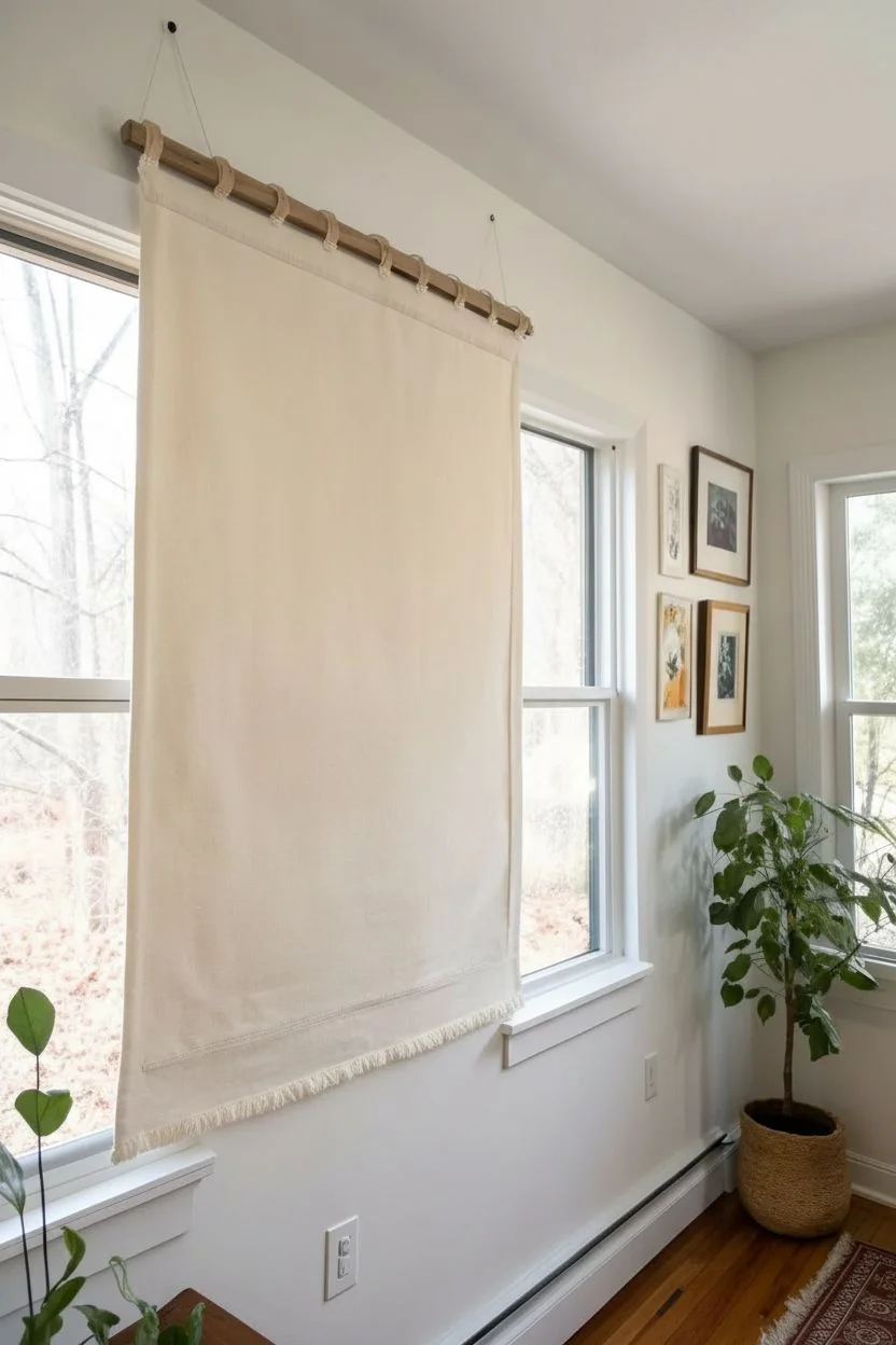
Cut and Hem the Canvas:
Begin by cutting your heavyweight canvas to your desired size, adding an extra inch on all sides for seam allowance. Fold the long edges over twice to create a clean hem and stitch them down using a sewing machine. Do the same for the bottom edge. -
Create the Top Loops:
Cut six to eight strips of cotton twill tape, each about 4 inches long. Fold them in half to create loops and pin them evenly along the top raw edge of your canvas. -
Sew the Top Edge:
Fold the top raw edge down (covering the raw ends of your loops) and stitch across firmly. I like to reinforce this stitch since it will hold the weight of the dowel. -
Fray the Bottom (Optional):
For a softer, boho look like the example, you can skip hemming the very bottom edge and instead pull horizontal threads loose to create a 1-inch fringe.
Step 2: Painting the Color Blocks
-
Safety check:
Iron the fabric completely flat. Any wrinkles now will permanently distort your painted rectangles later. -
Map the Grid:
Using a pencil and a ruler, lightly mark out four equal rectangular zones on your canvas. Leave about 2 inches of breathing room between each box and the edges. -
Prepare the Paint:
Mix your acrylic paints with the fabric medium according to the bottle’s ratio (usually 2:1 paint to medium). This ensures the paint moves with the fabric rather than cracking. -
Paint the Backgrounds:
Using a flat 1-inch brush, paint in your four rectangles. Don’t worry about getting the edges perfectly razor-sharp; a slightly organic, hand-painted edge adds charm. -
Let it Dry:
Allow the painted blocks to dry completely. This usually takes about 2-4 hours depending on humidity. Do not proceed to drawing until the paint is dry to the touch.
Keep the Paint Flexible
Don’t skip the fabric medium! Acrylics alone dry into a stiff plastic that will crack if the tapestry rolls or bends. The medium keeps the weave soft.
Step 3: Drawing the Portraits
-
Practice Your contours:
Before touching the fabric, practice ‘blind contour’ drawing on paper. Look at your subject (or a photo of your family member) and draw without lifting your pen or looking down at the paper. -
Sketch Lightly:
Once you are confident, lightly sketch the portraits onto the dry painted blocks using a pencil. You can refine the ‘blind’ look here to ensure the features are recognizable but still stylized. -
Ink the Lines:
Take your black fabric marker or fabric paint pen. Trace over your pencil lines with a steady hand. Varying the pressure slightly can give the line distinguishable character. -
Heat Set:
Once the ink is fully dry (wait at least 24 hours to be safe), iron the reverse side of the fabric on a high setting (no steam) to heat-set the design permanently. -
Assembly:
Slide the wooden dowel through the top loops. Tie a long piece of twine or cord to both ends of the dowel for hanging.
Uneven Paint Coverage?
If the canvas texture is showing through too much after the first coat, wait for it to dry and apply a second thin coat rather than glomming on thick paint.
Hang your new family heirloom in a well-lit spot to admire your artistic teamwork
Pass-the-Painting Family Storyboard
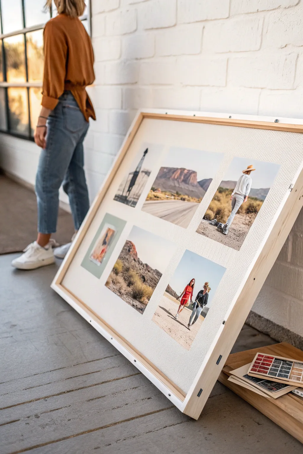
Transform a collection of favorite travel memories or inspirational images into a stunning, gallery-worthy display with this large-scale storyboard project. Using a simple wooden frame and a clean white mount, this project creates a cohesive narrative from six distinct photos, perfect for capturing the essence of a family adventure.
How-To Guide
Materials
- Large wooden canvas stretcher frame (approx. 24×36 inches or larger)
- Heavyweight white mounting board or foam core (cut to fit frame)
- 6 high-quality printed photographs (matte finish recommended)
- Spray adhesive or double-sided archival tape
- Ruler or T-square
- Pencil
- X-Acto knife or craft knife
- Self-healing cutting mat
- Staple gun with staples
- Point driver (optional, for securing backing)
- Hanging hardware
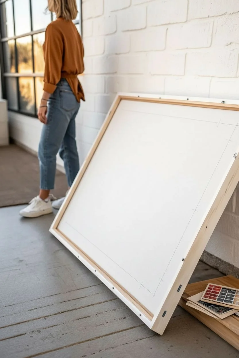
Step 1: Preparing the Base
-
Measure the frame:
Begin by measuring the inside dimensions of your wooden frame precisely. You need the backing board to fit snugly within the recessed opening at the back of the frame. -
Cut the mounting board:
Transfer these measurements to your heavyweight white mounting board. Using a T-square for straight lines, mark your cutting path lightly with a pencil. -
Trimming to size:
Place the board on a self-healing mat. With your craft knife and a straight edge as a guide, carefully slice through the board. You may need multiple passes for thicker foam core. -
Test the fit:
Insert the cut board into the frame to ensure a perfect fit. It shouldn’t buckle or leave large gaps. Remove it and set it flat on your work surface for the layout phase.
Wrinkle Rescue
If a photo bubbles while mounting, prick the air pocket with a fine needle and gently smooth the air out through the tiny hole toward the edges.
Step 2: Designing the Layout
-
Select your images:
Choose six images that tell a story together. Look for a cohesive color palette—like the warm desert tones and cool blues seen here—to unify the storyboard. -
Plan the grid:
Arrange the photos in two rows of three. Leave generous matching margins around the outside edges and consistent gutters (spaces) between the photos. -
Measure spacing:
Use your ruler to calculate the exact placement. A good rule of thumb is to make the space between photos half the width of the outer border for a balanced look. -
Mark placement guides:
Lightly mark the corners of where each photo will sit on the white board using a sharp pencil. These tick marks will guide your final adhesion.
Pro Tip: Consistency
Edit all your digital photos with the same preset or filter before printing. This ensures color harmony across the grid.
Step 3: Mounting and Assembly
-
Apply adhesive:
Working with one photo at a time, apply spray adhesive to the back of the print. I prefer doing this inside a cardboard box to contain any overspray sticky mess. -
Position the first photo:
Carefully align the photo with your pencil marks. Lay it down gently, starting from one edge and smoothing it out to prevent air bubbles. -
Press and smooth:
Place a clean sheet of paper over the photo and use a brayer or a soft cloth to press it firmly onto the board, ensuring the corners are stuck down well. -
Repeat the process:
Continue mounting the remaining five photos, checking your alignment frequently to ensure the rows remain straight. -
Erase guidelines:
Once the adhesive has set completely, gently erase any visible pencil tick marks from the white board. -
Secure firmly:
Place the mounted storyboard face down into the wooden frame. Use a staple gun or point driver to secure the backing board permanently into the frame rebate. -
Add hanging hardware:
Install D-rings and wire or sawtooth hangers on the back of the frame, ensuring they are level so your storyboard hangs perfectly straight.
Lean your finished masterpiece against a wall for a casual look or hang it as the centerpiece of your room
Have a question or want to share your own experience? I'd love to hear from you in the comments below!