If you’ve been craving a big painting moment but don’t want a fussy, perfection-heavy project, I’ve got you. These big painting ideas easy enough for beginners are all about bold shapes, forgiving textures, and simple steps that still look like a serious statement piece.
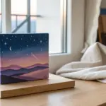
Big Sunset Gradient and Dark Horizon
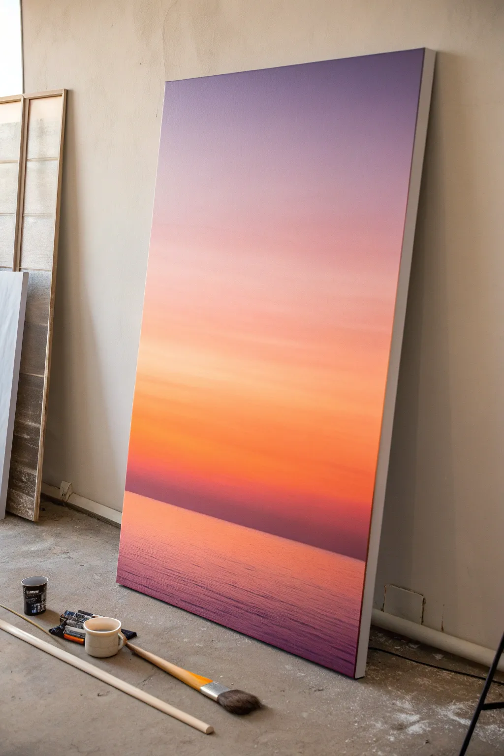
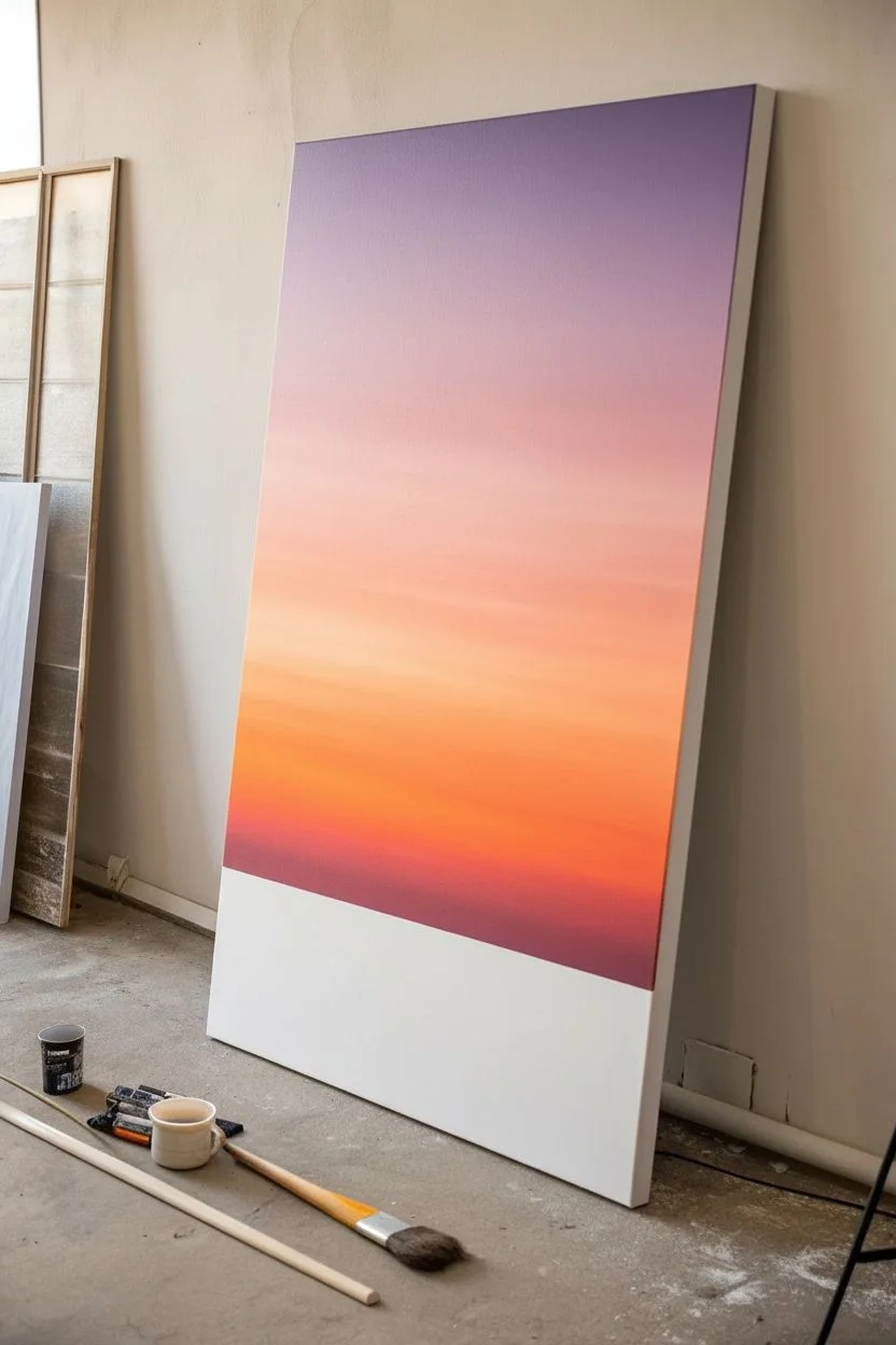
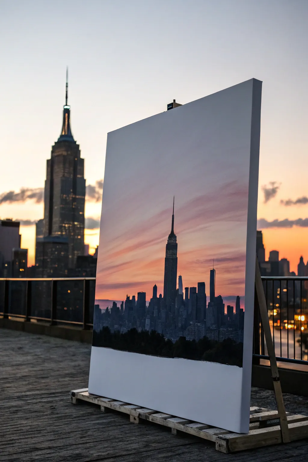
Capture the tranquil beauty of dusk with this oversized sunset painting that relies on smooth blending and minimal details. This project focuses on creating a seamless gradient from a soft violet sky down to a vibrant orange horizon, grounded by textured ocean waves.
Step-by-Step Guide
Materials
- Large stretched canvas (at least 36×48 inches)
- Acrylic paints (Titanium White, Lavender/Light Violet, Magenta, Cadmium Orange, Burnt Umber, Deep Purple)
- Wide flat wash brush (2-3 inches)
- Medium flat brush (1 inch)
- Trowel or palette knife
- Water spray bottle (mister)
- Palette or disposable plates
- Rags or paper towels
- Painter’s tape (optional)
Step 1: Painting the Sky Gradient
-
Prepare the canvas:
Begin by ensuring your large canvas is free of dust. If it’s raw canvas, apply a coat of gesso first. Position the canvas vertically against a wall or on a sturdy easel, as the size makes it easier to paint upright. -
Mix the top sky color:
On your palette, mix a generous amount of Lavender with a touch of Titanium White to create a soft, hazy purple. You want enough paint to cover the top third of the canvas. -
Apply the upper sky:
Using the wide wash brush, apply the lavender mix to the top of the canvas. Use long, horizontal strokes that span the width of the canvas as much as possible to keep the coverage even. -
Transition to pink:
While the lavender section is still wet, mix a soft pink using Magenta and White. Start painting this color just below the lavender, allowing the brush to overlap the two colors. -
Blend the upper gradient:
Clean your wide brush slightly, leaving it damp but not soaking. Run the brush back and forth over the meeting point of the lavender and pink to soften the line. I like to mist the canvas very lightly with water here to help the acrylics stay workable for smoother blending. -
Introduce the peach tones:
Mix a peach shade using White, a little Cadmium Orange, and a tiny dot of Magenta. Paint this band below the pink section, again overlapping slightly with the wet edge above it. -
Intensify to orange:
As you move lower towards where the horizon will be, switch to a pure Cadmium Orange mixed with a little White to keep it opaque but bright. This should be the most vibrant part of the sky. -
Create the horizon glow:
Just above the intended horizon line, blend in a deeper, reddish-orange. This suggests the sun has just dipped below the water, leaving a concentrated band of warmth. -
Final sky smoothing:
Take a clean, dry, soft brush and very gently sweep it horizontally across the entire sky gradient to remove brush marks and create that airbrushed look. Let the sky dry completely.
Step 2: Creating the Ocean and Horizon
-
Establish the horizon line:
Determine where your water begins—make it about the bottom third of the canvas. You can use painter’s tape to ensure this line is perfectly straight, or just use a steady hand with a ruler as a guide. -
Mix the deep horizon shadow:
Combine Burnt Umber with Deep Purple and a touch of Magenta. You want a very dark, rich color that isn’t quite black. This will form the shadowed band of water furthest away on the horizon. -
Paint the distant water:
Using a medium flat brush, paint a distinct, straight horizontal strip right at your horizon line using the dark mixture. Feather the bottom edge of this strip downwards so it’s not a hard line on the bottom. -
Mirror the sky colors:
The water reflects the sky, so mix the same orange and pink tones you used earlier. Apply these below the dark horizon band, but this time use short, choppy horizontal strokes. -
Blend downward into violet:
As you move to the bottom of the canvas, gradually transition your paint mixture back to the lavender/purple tones used at the very top of the sky. -
Add water texture:
Instead of smooth blending like the sky, keep your brushstrokes visible. The texture should look like little horizontal dashes to mimic ripples on the ocean surface. -
Refine the reflection:
While the water paint is wet, drag a clean, dry brush horizontally through the paint in a few areas to blur the reflections slightly, giving the water a glassy but moving appearance. -
Check the edges:
Step back and look at the painting from a distance. Ensure the horizon line feels level. If you used tape, peel it off now to reveal the crisp edge between sky and sea. -
Paint the canvas sides:
Don’t forget the deep edges of your canvas. Extend the gradient colors around the sides for a professional, gallery-ready finish that doesn’t require framing.
Paint Drying Too Fast?
Acrylics dry quickly on large surfaces. Keep a spray bottle of water handy to mist the canvas lightly as you work, or mix a slow-drying medium into your paints to extend blending time.
Pro Tip: The Horizon
For a razor-sharp horizon line, apply painter’s tape. Paint a thin layer of the *sky color* over the tape edge first to seal it. Once dry, paint the dark water color. No bleeds!
Hang your massive sunset masterpiece in a well-lit room and enjoy the calm atmosphere it brings to your space


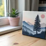
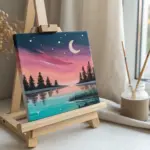
Moonlit Sky With Pine Silhouettes
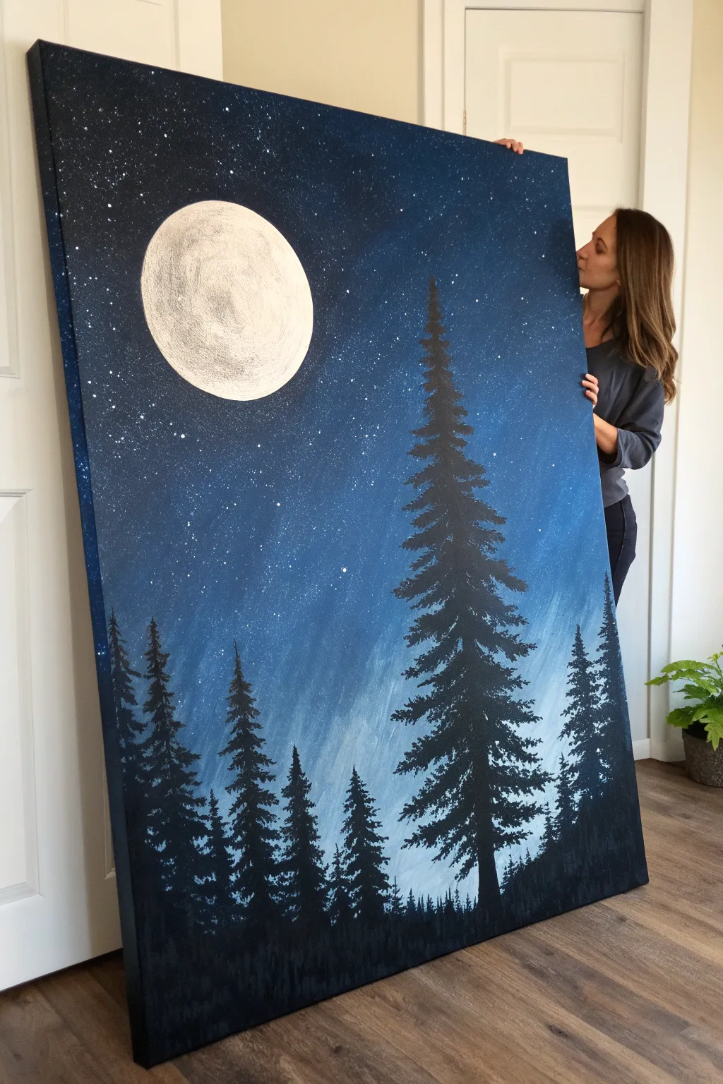
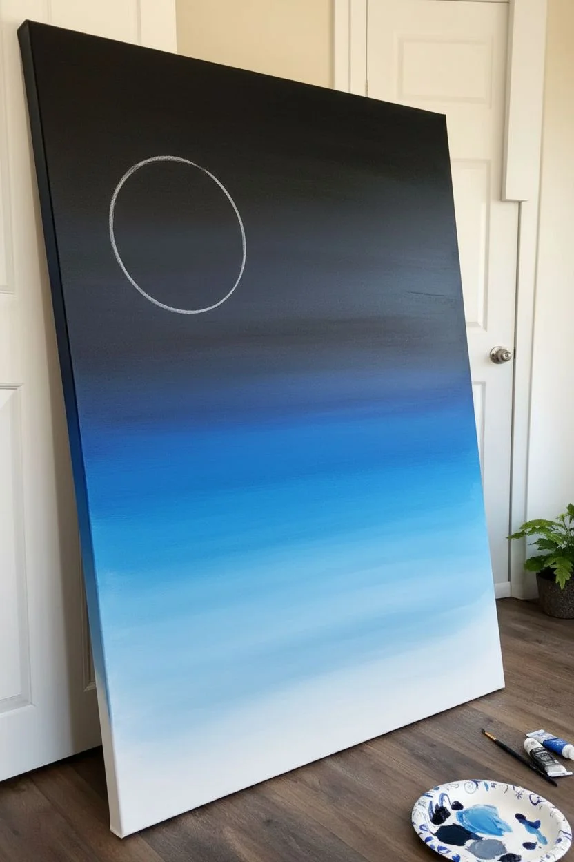
Transform a blank canvas into a serene nocturnal landscape featuring a glowing full moon and towering pine trees. This large-scale painting relies on simple blending techniques and silhouette work using acrylics to create dramatic depth and atmosphere.
Step-by-Step Tutorial
Materials
- Large stretched canvas (e.g., 36” x 48”)
- Acrylic paints: Black, Phthalo Blue, Titanium White, and darker Navy Blue
- Large flat brush or blending sponge
- Medium round brush
- Small liner brush or fan brush
- Old toothbrush (for stars)
- Paper plate or palette
- Cup of water and paper towels
- Chalk or pencil
Step 1: Creating the Night Sky
-
Identify the light source:
Decide on the placement of your moon early. In this piece, it sits high on the upper left, which means the sky will be lightest just below it and darken as you move outward. -
Mix your base colors:
Prepare three piles of paint on your palette: a deep blend of Black and Navy for the top corners, pure Phthalo Blue for the mid-sky, and a mix of Blue with plenty of White for the horizon area. -
Paint the horizon glow:
Using a large flat brush, apply the lightest blue-white mixture across the bottom third of the canvas. Use broad, horizontal strokes. -
Transition to mid-tones:
While the bottom layer is still wet, introduce the Phthalo Blue above it. Work the brush back and forth where the colors meet to create a smooth, seamless gradient. -
Deepen the upper sky:
Fill the top portion of the canvas with your darkest black-blue mixture. Blend this downwards into the mid-blue tone, ensuring the transition isn’t a harsh line. -
Smooth the gradient:
With a clean, slightly damp brush, sweep across the entire canvas horizontally one last time to soften any visible brushstrokes and unify the sky.
Smoother Blends
Keep a spray bottle of water nearby. misting the canvas lightly while blending the blue sky gradient keeps the acrylics wet longer, allowing for a seamless transition.
Step 2: Painting the Moon and Stars
-
Sketch the moon:
Once the background is completely dry, use a piece of chalk or a pencil to lightly trace a large circle in the upper left section. A dinner plate makes a great stencil for this. -
Fill the base layer:
Paint the entire circle with Titanium White. Create a solid, opaque layer; you may need two coats if the blue shines through. -
Add lunar texture:
Mix a tiny drop of black or grey into some white paint. Use a dry brush or a crumpled paper towel to dab faint, cloudy textures onto the moon’s surface, keeping the edges crisp white. -
Create the stars:
Dilute a small mount of white paint with water until it’s fluid. Dip an old toothbrush into it and flick the bristles with your thumb to spray tiny starry specks across the darker parts of the sky. -
Paint larger stars manually:
Use a detail brush to place a few distinct, larger dots among the spray to represent brighter stars or planets.
Step 3: Adding the Forest
-
Establish the ground line:
Mix a pure black paint. Along the very bottom edge of the canvas, paint an uneven, solid black strip to represent the deep forest floor. -
Mark the main tree:
Draw a vertical line with black paint where your largest tree will stand on the right side. It should reach nearly to the top of the canvas. -
Start the pine branches:
Starting at the top of your line, use a small brush to dab short, downward-sloping strokes. Make the very top pointy and narrow. -
Widen the shape:
As you move down the tree trunk, make your branches progressively longer and wider. I find that using a tapping motion creates jagged, realistic pine needles. -
Add secondary trees:
Paint smaller vertical lines for the background trees on the left side. These should vary in height but remain lower than your main focal tree. -
Fill in the forest:
Repeat the tapping branch technique on these smaller trees. Allow some trees to overlap slightly, creating a dense forest wall effect. -
Final touches:
Step back and check the balance. If the forest floor looks too empty, add small vertical dashes along the horizon line to suggest distant tree tops.
Add Moonlight Glow
For extra dimension, lightly dry-brush a tiny bit of white or pale blue on the top-left edges of the tree branches to suggest moonlight hitting them.
Hang your masterpiece in a room where it can catch the light and create a peaceful atmosphere

Easy Abstract Ocean Bands
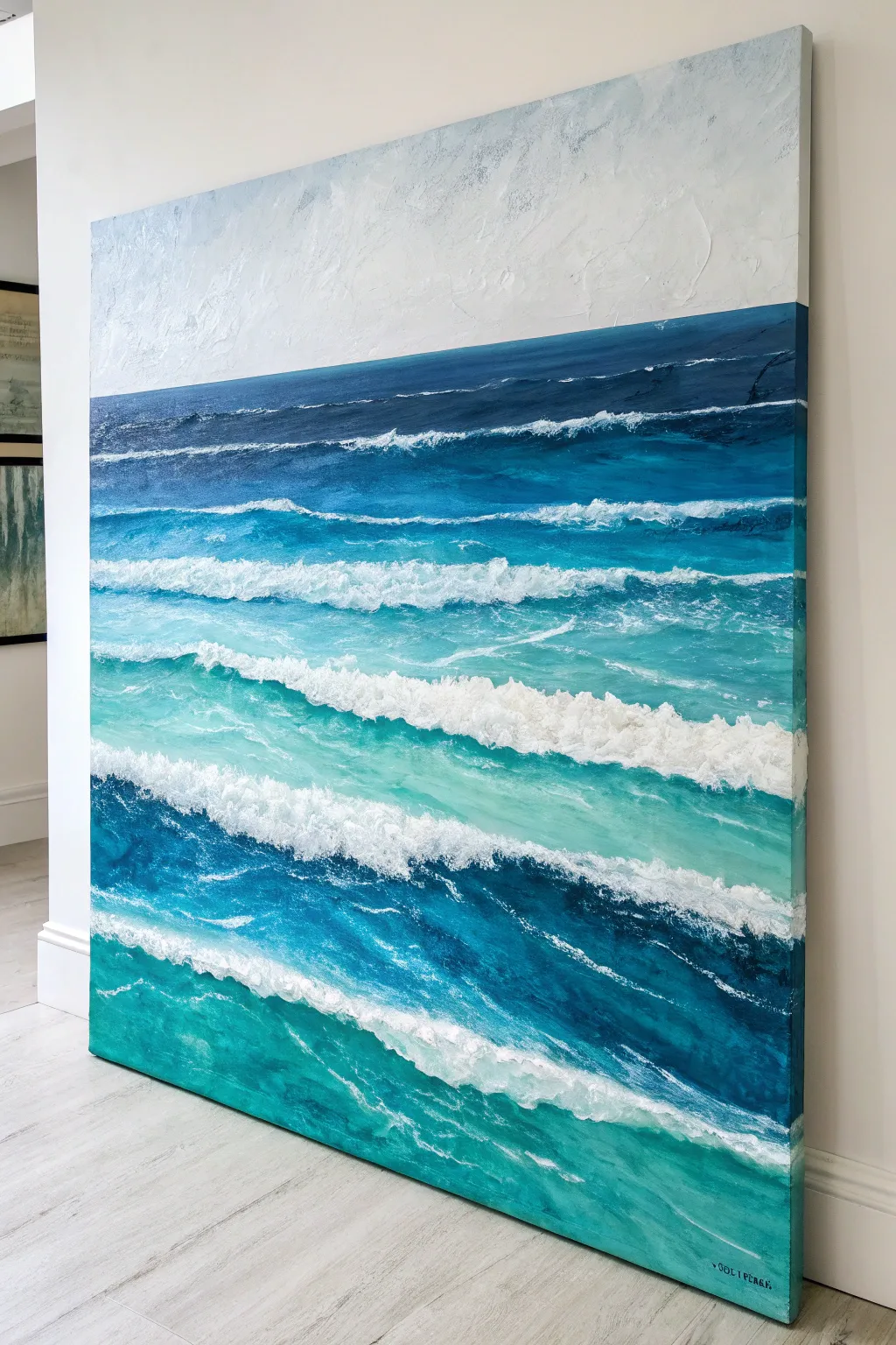
Capture the endless rhythm of the sea with this large-scale abstract painting that uses simple banding techniques to create depth. By layering thick acrylics and modeling paste, you will build crashing waves that literally stand out from the canvas.
Step-by-Step Guide
Materials
- Large square canvas (36×36 inch or larger)
- Heavy body acrylic paints (Phthalo Blue, Ultramarine Blue, Teal/Turquoise, Payne’s Grey, Titanium White)
- Modeling paste or heavy gel medium
- Large flat paintbrush (2-3 inch)
- Medium palette knife (trowel shape)
- Fan brush (optional)
- Painter’s tape
- Palette or paper plates
- Water spray bottle
Step 1: Setting the Horizon
-
Define the sky:
Begin by marking a horizon line about one-third of the way down from the top of your canvas. You can use painter’s tape for a crisp edge, or freehand it for a more organic feel. -
Paint the background:
Mix a large amount of Titanium White with just a tiny speck of Ultramarine Blue and Payne’s Grey to create a cool, misty white. Apply this to the entire top sky section using your large flat brush. -
Add sky texture:
While the sky paint is still wet, use distinct, crisscross brushstrokes. I like to layer a bit of pure white over the slightly grey mix to create a subtle, cloud-like depth. -
Establish the deep ocean:
Directly below your horizon line, paint a band about 4-5 inches wide using a mix of Phthalo Blue and Payne’s Grey. It should be dark and intense to represent the deep, distant water.
Muddy Waters?
If your blues and whites turn gray while blending on canvas, stop! The paint is overworked. Let it dry completely, then add a fresh layer of distinct color on top.
Step 2: Building the Gradient
-
Transitions to teal:
Below the dark navy band, mix Phthalo Blue with a touch of Teal. Paint the next horizontal band, allowing the top edge to blend slightly into the navy section above. -
Mid-ocean brightness:
As you move down the canvas, gradually add more Teal and Titanium White to your mixture. Create irregular, horizontal bands of this lighter turquoise color. -
Create variation:
Don’t make your bands perfectly straight. Let them wobble and dip slightly to mimic the natural unsteadiness of flowing water. -
The foreground water:
For the bottom third of the canvas, use your brightest Teal mixed with a little water or glazing medium to keep it vibrant and translucent. This represents shallow water.
Glossy & Wet
Once fully dry (give the paste 24 hours), coat the entire water section with a high-gloss varnish. Leave the sky matte for a stunning contrast.
Step 3: Creating the Waves
-
Mix the texture:
In a separate container, mix equal parts Titanium White paint with modeling paste. This mixture needs to be stiff enough to hold a peak. -
Apply the first crest:
Using the side of your palette knife, scoop up the white mixture and drag it horizontally across the boundary between your navy and teal sections. This is your first distant wave. -
Forming the main breakers:
Select two or three areas in the middle section of the canvas to be your primary waves. Apply the paste mixture thickly here, using a scraping motion to pull the white ‘foam’ down into the blue underneath. -
Softening edges:
Before the paste dries completely, use a clean, dry brush loosely along the bottom edge of the white foam to feather it out, creating the spray effect. -
Adding shadow:
Once the white waves are tacky, carefully paint a thin, dark line of Phthalo Blue right underneath the thickest white ridges. This shadow lifts the wave off the canvas visually.
Step 4: Refining the Details
-
Foam networks:
Use the tip of your palette knife to scratch thin, vein-like white lines into the teal sections. This suggests surface foam and water movement between the big waves. -
Highlighting the foreground:
In the very bottom teal section, add broad, flatter strokes of pure white (less textured) to show water rushing toward the viewer. -
Enhancing the deep blue:
Go back to your top dark navy band. If it dried dull, add a glaze of gloss medium mixed with Phthalo Blue to bring back the deep, wet look. -
Final texture check:
Look at the painting from the side. If you want more dimension, dab extra modeling paste onto the highest points of the white crests.
Hang your new seascape in a well-lit room where the shadows will catch the textured waves and bring the ocean to life


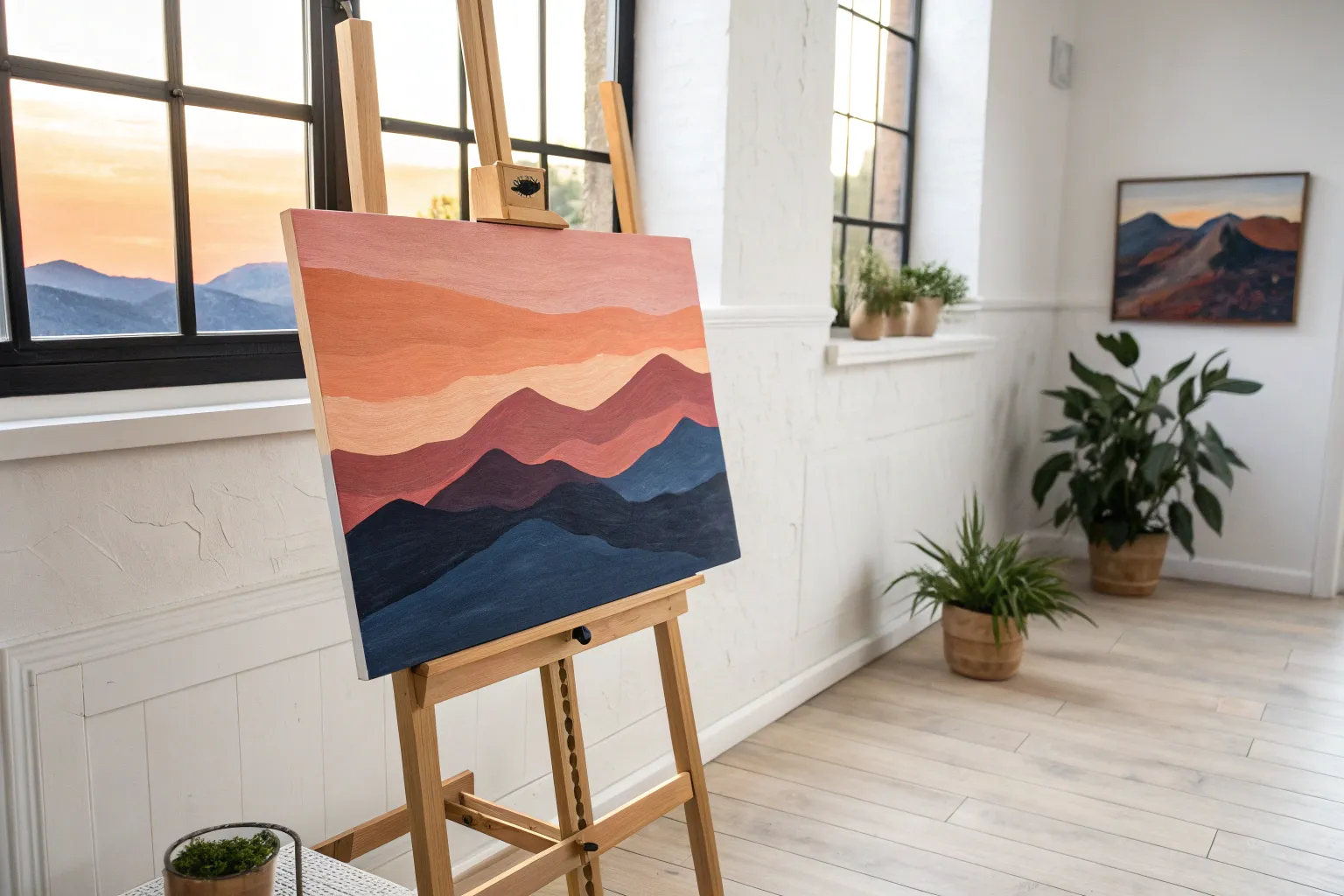
Minimal Mountain Layers in Neutrals
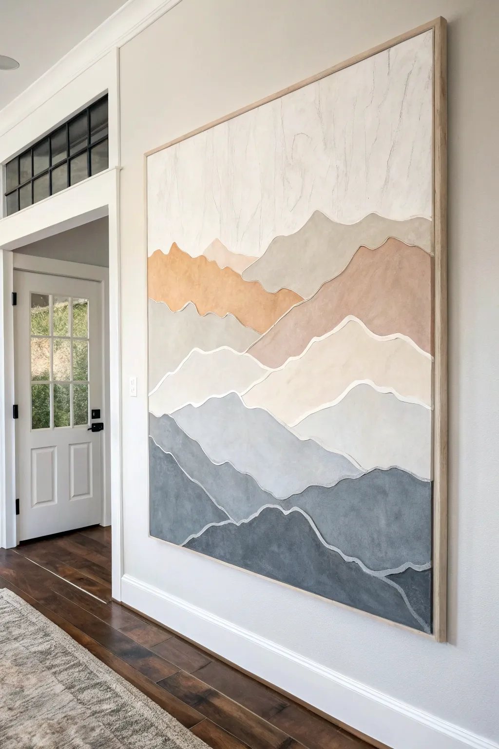
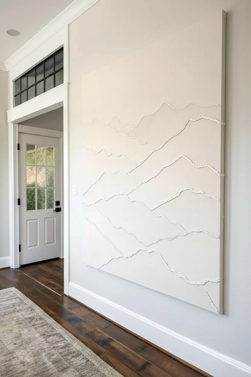
Create a serene focal point for your room with this large-scale abstract mountain art. By using textured outlining and a soft, earthy palette, you’ll build dimension that transforms a flat canvas into a sophisticated landscape.
How-To Guide
Materials
- Large canvas (36×36 or 48×48 inches)
- Cotton piping cord or thick yarn (white)
- White PVA craft glue or heavy gel medium
- Acrylic paints (Titanium White, Unbleached Titanium, Mars Black, Burnt Sienna, Raw Umber, Yellow Ochre)
- Wide flat paintbrushes (2-3 inch)
- Small detail brush
- Pencil
- Palette or paper plates for mixing
- Drop cloth
- Wood strip framing (optional)
Step 1: Design & Texture
-
Clean the surface:
Ensure your canvas is free of dust or lint. If the canvas texture is very rough, you might want to apply a quick coat of gesso to smooth it slightly, though the texture can add character. -
Sketch the mountains:
Lightly sketch your mountain ranges using a pencil. Start from the top third of the canvas for the distant peaks and work downwards. Create about 6-8 distinct layers with wavy, organic lines that span the full width. -
Prepare the cord:
Cut lengths of your cotton piping cord or thick yarn to match the curves of your pencil lines. It’s helpful to cut them slightly longer than the canvas width to trim later. -
Apply adhesive:
Working one line at a time, apply a bead of strong craft glue or heavy gel medium directly over your pencil sketch. The bead should be roughly the same width as your cord. -
Lay the texture:
Gently press the cord into the wet glue. Don’t stretch it tight; let it follow the organic curves naturally. Wipe away any excess glue that squeezes out with a damp finger or cloth. -
Dry completely:
Allow the glue to cure fully. This anchor needs to be solid before painting so the cord doesn’t shift. I usually let this sit overnight to be safe.
Step 2: Painting the Layers
-
Planning the palette:
Mix a gradation of colors. The top ‘sky’ area should be the lightest (mostly white with a hint of cream). The mountains will get progressively darker and cooler as you move down. -
Mix the warm tones:
For the upper mountains, mix Unbleached Titanium with small touches of Yellow Ochre and Burnt Sienna to create warm, sandy beige and soft terracotta tones. -
Mix the cool tones:
For the lower mountains, transition into greys. Mix Titanium White with Mars Black, then add a tiny dot of Raw Umber to keep the grey from looking too metallic or blue. -
Paint the sky:
Start at the very top. Use a wide brush to paint the sky area in an off-white or cream. Paint right up to the top edge of the first cord line, but try not to paint the cord itself yet. -
Fill the top peaks:
Move to the first mountain layer below the sky. Use your lightest beige mix. Apply the paint smoothly, ensuring solid coverage. -
Progress downwards:
Continue painting each section, switching to your darker and cooler mixes as you go down. The bottom-most layer should be a deep, charcoal grey. -
Detail the cord:
Once the main blocks of color are dry, use a small detail brush to paint the cord lines carefully. Paint them white or a very pale cream to make the layers pop visually against the colored sections. -
Refine edges:
Check for any gaps where the paint meets the cord. Use your small brush to touch up these edges for a crisp, professional finish.
Clean Lines Pro Tip
If you struggle with shaky hands while painting the cord, paint the cord FIRST, let dry, then use painter’s tape carefully over it before painting the colored sections.
Step 3: Finishing Touches
-
Seal the art:
Apply a clear matte varnish over the entire piece if desired. This unifies the sheen of the different paint mixes and protects the cord from dust. -
Frame it out:
To mimic the inspiration image, attach thin strips of light wood (like pine or oak) to the outer edges of the canvas using finishing nails or wood glue.
Level Up: Texture
Mix baking soda or sand into your acrylic paint for the mountain sections. This creates a grainy, stone-like texture that contrasts beautifully with the smooth cord lines.
Hang your new masterpiece and enjoy the calm atmosphere brings to your space
BRUSH GUIDE
The Right Brush for Every Stroke
From clean lines to bold texture — master brush choice, stroke control, and essential techniques.
Explore the Full Guide
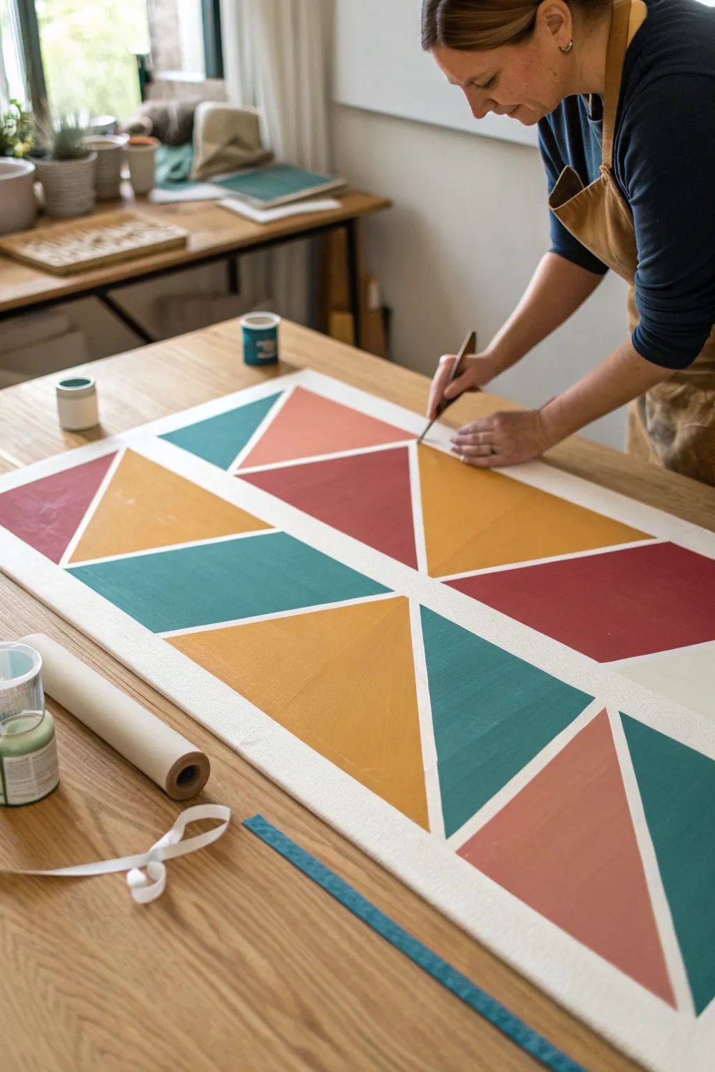
Bold Color-Blocked Landscape Shapes
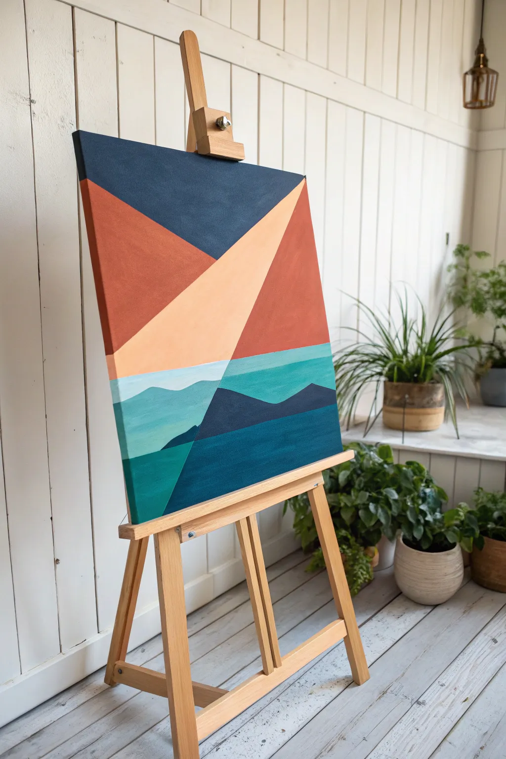
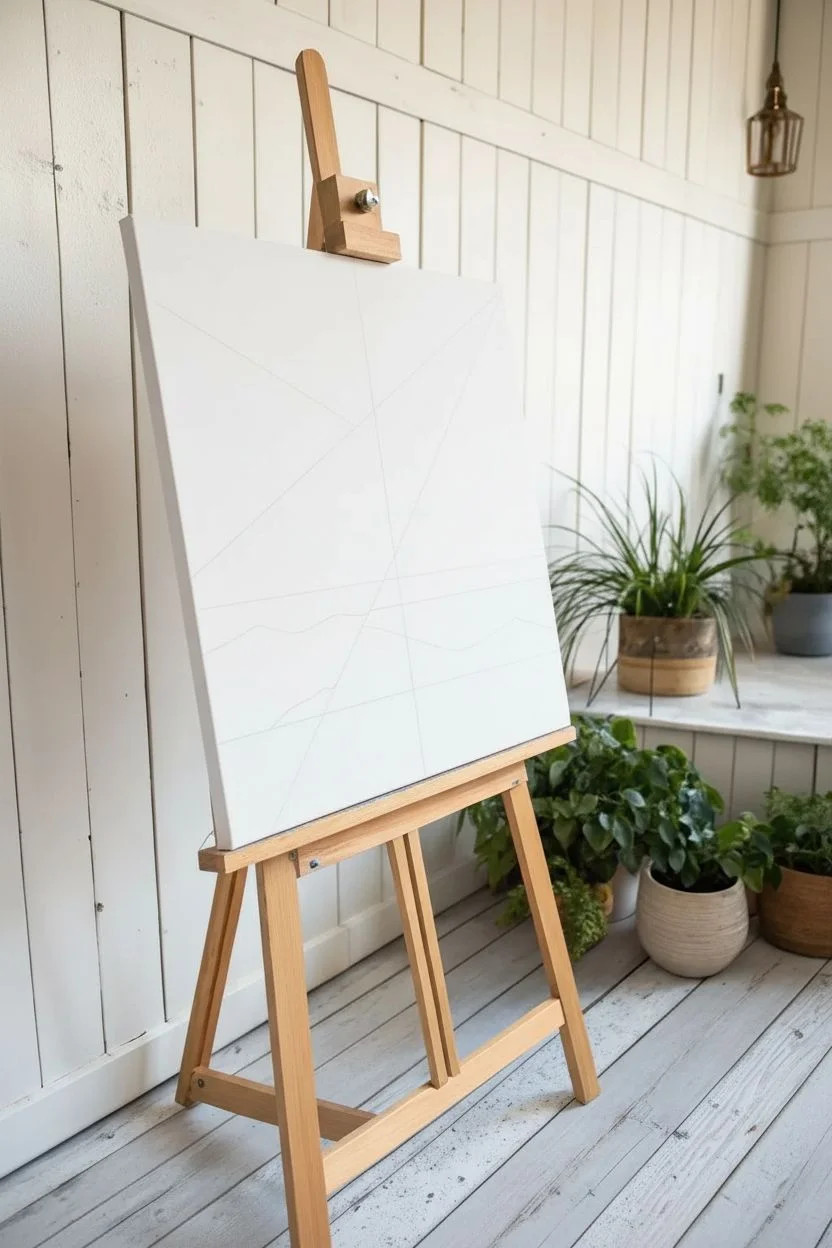
This striking geometric landscape breaks down a complex scene into bold, angular shapes with a sophisticated palette of terra cotta, navy, and teal. It is the perfect project for beginners because it relies on clean lines and masking tape rather than intricate brushwork.
Step-by-Step
Materials
- Large square canvas (approx. 24 x 24 inches or larger)
- Acrylic paints (Navy Blue, Burnt Orange, Peach/Light Coral, Teal, Aqua, White)
- Painter’s tape or masking tape (1 inch width)
- Flat synthetic brushes (various sizes, focusing on 1-inch and 2-inch)
- Palette or paper plate for mixing
- Ruler or straight edge
- Pencil
- Cup of water and paper towels
Step 1: Planning and Mapping
-
Analyze the Composition:
Before touching the canvas, study the reference image. The painting is divided into roughly two zones: an upper ‘sky’ section dominated by large triangles, and a lower ‘landscape’ section with layered mountains and water. -
Sketch the Main Horizon:
Using your pencil and ruler, lightly draw the main horizon line. This isn’t perfectly straight; it dips slightly in the middle where the large peach triangle meets the teal water. -
Draw the ‘V’ Shape:
Mark out the large ‘V’ shape that dominates the top half. Draw a diagonal line from the top right corner down to the center-left, and another from the top left corner meeting that first line. This creates the three main upper segments. -
Map the Mountains:
Lightly sketch in the jagged peaks of the mountains in the lower section. You want a foreground range (darkest) and a background range (lighter aqua) to create depth.
Bleeding Edges?
If paint bleeds under tape, wait for it to dry fully. Then, re-tape the line slightly over the mistake and paint over it with the original background color to ‘erase’ the bleed.
Step 2: Painting the Upper Geometries
-
Tape the Navy Section:
Apply painter’s tape along the pencil lines for the large top triangle. Press the edges of the tape down firmly with your thumbnail to prevent paint bleed. -
Fill in the Navy:
Mix a deep Navy Blue acrylic. Using a wide flat brush, paint the top inverted triangle section. Long, smooth strokes work best here for a solid, opaque finish. -
Remove Tape and Dry:
Peel the tape off while the paint is still slightly wet to ensure a crisp edge. Let this section dry completely before moving to the adjacent colors. -
Tape for Burnt Orange:
Once dry, apply fresh tape along the boundaries of the left-hand triangle section. Ensure the tape sits *over* the dried navy paint to protect the edge. -
Paint the Burnt Orange:
Fill this left section with a rich Burnt Orange or Terracotta hue. Apply two coats if necessary to cover the white canvas texture fully, letting it dry between coats. -
Create the Peach Segment:
Follow the same taping process for the large central diagonal beam. Mix White with a touch of Burnt Orange and Yellow to create a soft Peach color. Paint this central shape. -
Finish the Top Right:
Paint the remaining top-right triangle with a slightly darker, reddish-brown version of your Burnt Orange to add subtle variety.
Step 3: Layering the Landscape
-
Mix the Aquatic Tones:
Prepare three shades of blue-green: a light Aqua (white + teal), a medium Teal, and a deep Teal/Navy mix. -
Paint the Background Water:
Start with the light Aqua. Paint the horizontal strip just below the peach triangle. I find free-handing this wavy line looks more organic than using tape. -
Add the Middle Water Layer:
Using the medium Teal, paint the band below the light aqua. Follow the slight wave pattern you sketched earlier. -
Block in the Dark Mountains:
For the prominent mountain shapes in the foreground, use a very dark blend of Navy and a touch of black or deep purple. Use a smaller flat brush to cut in the sharp peaks. -
Paint the Lower Left Sea:
Fill the bottom left corner with a rich Emerald or dark Teal. This section sits ‘under’ the peach beam visually, anchoring the composition. -
Fill the Bottom Right:
Complete the canvas by painting the large bottom-right section in a vibrant, deep Blue-Green. Ensure this shape has a clean, straight diagonal edge where it meets the other sections. -
Final Touches:
Check your edges. If any paint bled under the tape or lines look wobble, use a small detail brush with the correct color to neaten them up.
Seal the Tape
For razor-sharp lines, paint a thin layer of the *base* color (or white) over the tape edge first. This seals the gap, so the new color sits perfectly on top without seeping under.
Step back and admire how simple geometric shapes combine to form a modern, structured landscape
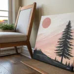
Single Oversized Tree Silhouette
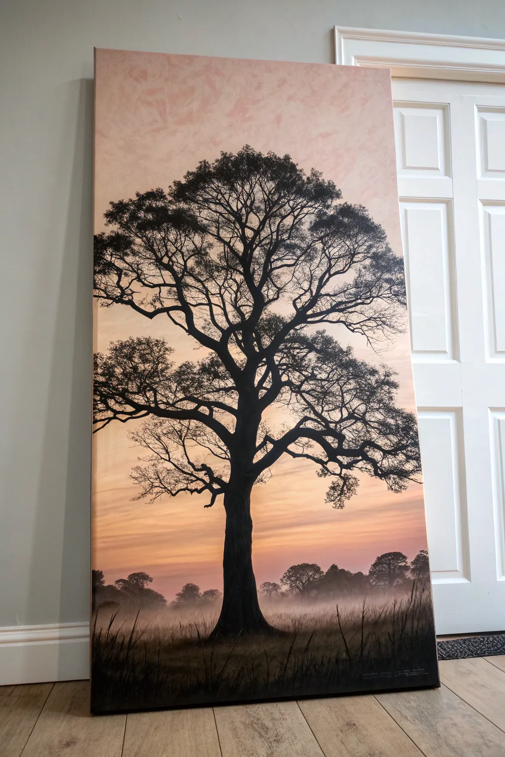
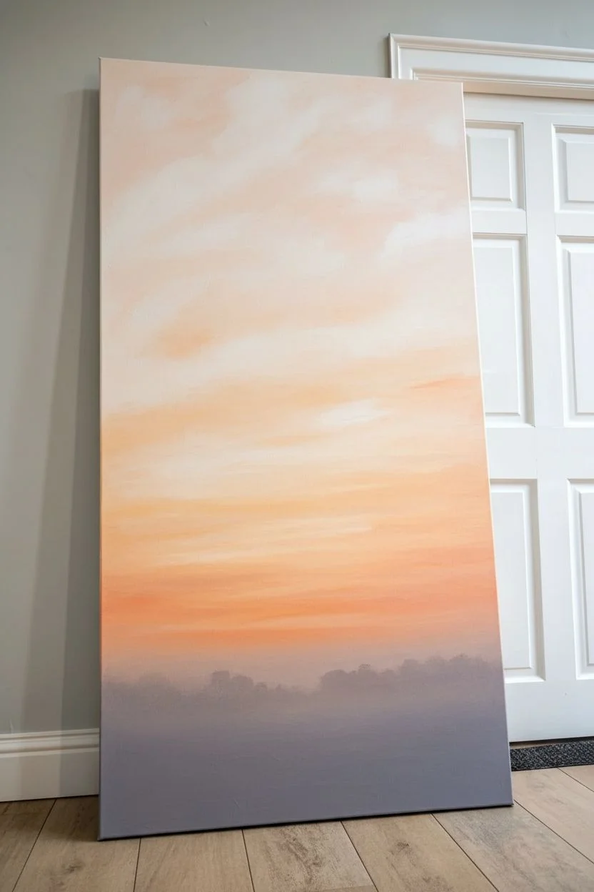
Transform a blank canvas into a stunning sunrise landscape featuring a majestic, oversized tree silhouette against a soft, misty sky. This project relies on simple blending techniques and patience with fine lines to create a dramatic statement piece that looks far more expensive than it is.
Detailed Instructions
Materials
- Large vertical canvas (approx. 24″ x 48″ or similar ratio)
- Acrylic paints: Titanium White, Peach, Light Orange, Burnt Umber, Mars Black
- Large flat wash brush (2-3 inch)
- Medium round brush
- Fine liner brush (size 0 or 00)
- Palette for mixing
- Water container and paper towels
- Pencil or charcoal stick
- Reference photo of a tree (optional)
Step 1: Creating the Atmosperic Sky
-
Prepare the gradient palette:
Begin by squeezing out generous amounts of white, peach, and light orange onto your palette. You want enough paint to cover the large surface area without stopping to mix more. -
Start at the top:
Using your large wash brush, apply a mix of white and a tiny touch of peach to the very top third of the canvas. Use long, horizontal strokes to create a smooth, cloud-like texture. -
Blend downwards:
As you move down the canvas, gradually introduce more peach into your brush without cleaning it. This creates a natural transition. Keep your strokes loose and slightly criss-crossed to simulate atmospheric clouds. -
Intensify the horizon:
In the middle and lower-third sections, start mixing in the light orange. The color should be warmest and most saturated just below the center, where the sun would naturally hit the horizon. -
Create the misty base:
For the bottom 6-8 inches of the canvas, blend a soft grey-purple by mixing a tiny dot of black and peach into white. Apply this loosely to create a foggy ground layer where the grass will sit. -
Dry completely:
Let this background layer dry fully. If you try to paint the tree over wet sky paint, the black will turn muddy.
Muddy Sky Fix
If your sky blend gets muddy, stop and let it dry. Apply a thin wash of white over the bad area, let dry again, then re-glaze with your intended color.
Step 2: Painting the Tree Silhouette
-
Sketch the skeleton:
Lightly sketch the main trunk and primary heavy branches using a pencil or charcoal stick. Focus on creating a strong, thick trunk that tapers as it rises. -
Block in the trunk:
Mix Mars Black with a small amount of Burnt Umber. While the silhouette reads as black, the brown adds warmth. Use a medium round brush to fill in the trunk and the thickest lower branches. -
Build the branch structure:
Switch to a smaller round brush and extend the main branches outward. Think of them as ‘Y’ shapes, constantly splitting into smaller forks as they move away from the center. -
Add secondary branches:
Start filling the canopy with medium-sized branches. Allow them to curve and twist naturally; straight lines rarely exist in old trees. -
Detail with the liner brush:
This is the most time-consuming part but crucial for realism. Use your fine liner brush with slightly watered-down black paint to create hundreds of tiny twigs at the ends of the branches. -
Creating leaf texture:
Instead of painting individual leaves, use an old, dry bristle brush. Dip just the tip in black paint, blot most of it off, and stipple (dab repeatedly) clusters of leaves on the outer edges of the branches.
Step 3: Grounding and Final Details
-
Paint the distant tree line:
Mix a dark grey (black + white) and paint small, bumpy shapes along the horizon line created in the misty section. These should look faint and far away compared to your main tree. -
Add foreground grass:
Using the liner brush and pure black paint, flick upward from the very bottom edge of the canvas. Vary the height and angle of these strokes to look like tall, wild grass. -
Soften the base:
I like to take a dry brush with a tiny amount of the mist color (grey-purple) and lightly glaze over the bottom inch of the tree trunk. This makes it look like the tree is sitting *in* the mist, not just on top of it. -
Final assessment:
Step back about six feet from your painting. Look for any ‘bald spots’ in the canopy that need a few more twigs or stippled leaves to balance the composition.
Golden Hour Glow
Mix a tiny amount of metallic gold paint into your orange horizon layer. It adds a subtle shimmer that catches the light like a real sunrise.
Hang your new masterpiece in a hallway or landing where the vertical scale can truly shine

PENCIL GUIDE
Understanding Pencil Grades from H to B
From first sketch to finished drawing — learn pencil grades, line control, and shading techniques.
Explore the Full Guide
Simple City Skyline at Dusk
Capture the magic of a city skyline at dusk with this large-scale acrylic painting project. Using soft gradients for the sky and bold silhouettes for the buildings, you’ll create a stunning focal piece that brings urban energy into your home.
Step-by-Step
Materials
- Large stretched canvas (e.g., 24×36 inches or larger)
- Acrylic paints: Titanium White, Cadmium Yellow, Orange, Alizarin Crimson, Ultramarine Blue, Mars Black
- Wide flat brush (2-3 inches) for blending
- Medium flat brush (1 inch)
- Small round detail brush (size 2 or 4)
- Straight edge or ruler
- Pencil
- Palette or mixing plate
- Water cup and paper towels
- Easel (optional but helpful for large canvases)
Step 1: Painting the Sky Gradient
-
Establish the horizon:
Decide where your city will sit. For this composition, draw a very faint horizontal line with your pencil about one-third of the way up from the bottom of the canvas to mark the water line. -
Mix your sunset colors:
Prepare your palette with generous amounts of white, yellow, orange, crimson, and blue. You will need plenty of paint to ensure smooth blending on a large surface. -
Paint the upper sky:
Start at the very top of the canvas using your wide brush. Mix a soft lavender-blue using white, a touch of ultramarine, and a tiny bit of crimson. Apply this in long horizontal strokes. -
Transition to pinks:
As you move down the canvas, slowly mix more white and crimson into your dirty brush. Blend this dusty pink band seamlessly into the blue above while the paint is still wet. -
Add the golden glow:
Approaching the horizon line, introduce orange and finally yellow into your mix. The area just above the city silhouette should be the brightest and warmest part of the sky. -
Create the clouds:
While the background is still slightly tacky, use a smaller flat brush with a mix of grey-purple (blue + crimson + bit of black) to streak in diagonal cloud formations leading toward the center. -
Soften the clouds:
I like to take a clean, dry brush and very gently feather the edges of these clouds to make them look windswept rather than solid stripes. Let the entire sky dry completely.
Step 2: Buidling the Cityscape
-
Sketch the major landmarks:
Using a pencil, lightly outline the cityscape. Focus on the central Empire State Building shape first, ensuring it is the tallest point, then map out the surrounding lower skyscrapers. -
Block in the silhouettes:
Mix a dark blue-grey using Mars Black and a touch of Ultramarine Blue. Pure black can look too flat, so the blue adds atmospheric depth. Fill in the building shapes with your medium flat brush. -
Refine the edges:
Switch to your small round brush to sharpen the corners and antennas of the buildings. Use the straight edge to help steady your hand for long vertical lines if needed. -
Add atmospheric perspective:
For buildings that act as a background layer behind the main skyline, mix a slightly lighter grey. This subtle difference helps separate the foreground towers from the distant city mass. -
Paint the foreground trees:
At the very bottom of the canvas, mask the base of the buildings with a solid, dark, uneven line representing the treeline or park in shadow. Use a tapping motion with your brush to mimic foliage texture.
Wet-on-Wet Blending
Work quickly on the sky! Acrylics dry fast. Keep a spray bottle of water handy to mist your canvas lightly, keeping the paint workable for smoother gradients.
Step 3: Final Details
-
Highlight the spire:
The Empire State Building needs a focal point. Mix a tiny amount of white into your dark mix and paint the illuminated sections of the spire and upper observation decks. -
Add city lights:
Using the tip of your smallest brush and some watered-down white or yellow paint, dot in tiny windows mostly on the lower half of the buildings. -
Blend the reflection:
If your composition includes water at the bottom, drag some of the dark building color downwards into the water area, keeping the strokes strictly vertical. -
Glaze the water:
Wash a very thin, watery layer of your sunset orange over the water area to reflect the sky, painting right over your dark reflection strokes to push them back. -
Paint the sides:
Don’t forget the edges of your canvas. Paint them black or continue the image wrapping around the sides for a professional, frameless look. -
Final varnish:
Once the painting is fully cured (usually 24 hours), apply a coat of satin or gloss varnish to deepen the dark colors and protect your work.
Add Metallic Pop
Use a metallic gold or copper paint for just a few of the city lights or the very tip of the spire to make the painting shimmer when light hits it.
Now step back and admire how a few simple colors transformed into a glowing metropolitan view
Giant Loose Floral Close-Up
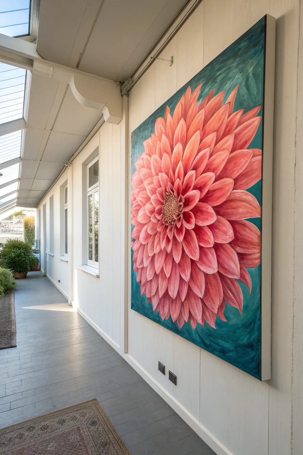
Transform a blank canvas into a stunning botanical focal point with this oversized dahlia painting. By zooming in on the intricate geometry of the petals against a moody teal backdrop, you create a dramatic, modern floral that commands attention.
How-To Guide
Materials
- Large gallery-wrapped canvas (at least 36×48 inches)
- Acrylic paints: Alizarin Crimson, Cadmium Red, Titanium White, Phthalo Blue, Hookers Green, Burnt Umber, Yellow Ochre
- Large flat brushes (2 inch and 1 inch)
- Medium filbert brushes (size 8 and 12)
- Small round detail brush (size 2)
- Chalk or pastel pencil for sketching
- Palette knife
- Slow-drying medium or retarder
- Water container and rags
Step 1: Planning and Background
-
Prime the Surface:
Even if your canvas is pre-primed, adding a coat of gesso mixed with a tiny drop of burnt umber creates a warm, neutral base that helps glow through later layers. Let this dry completely before moving on. -
Map the Composition:
Using a piece of chalk, lightly sketch the center of the flower slightly off-center to the left. Draw concentric circles radiating outward to guide your petal lengths, ensuring the flower fills nearly the entire canvas and runs off the edges. -
Block in the Background:
Mix Phthalo Blue, Hookers Green, and a touch of Burnt Umber to create a deep, rich teal. Apply this to the negative space around your chalk circle guidelines, using the large flat brush in crisscross strokes to create a textured, loose backdrop. -
Refine the Background Edges:
Bring the teal paint slightly into the circle area where the petal tips will be. This ensures no white canvas shows through the gaps later.
Petal Proportion Fix
If your petals look stiff, they likely lack curve variation. Repaint a few edges with an ‘S’ curve rather than a simple arc to add organic movement.
Step 2: Building the Bloom
-
Establish the Darkest Values:
Mix Alizarin Crimson with a little Burnt Umber. Use a filbert brush to paint the shadows between the petals, focusing heavily on the area immediately surrounding current center circle. These dark recesses will give the flower depth. -
Paint the Petal Base Layer:
Create a mid-tone coral pink using Alizarin Crimson, Cadmium Red, and a little White. Block in the basic shape of each petal, starting from the back (outermost) layer and working inward. Don’t worry about details yet; just get the color down. -
Shape the Outer Petals:
As you move to the outer edges, make the petals longer and slightly curved. Use the chisel edge of your flat brush to create crisp tips that overlap the teal background. -
Layering the Inner Petals:
For the petals closer to the center, mix more Titanium White into your coral blend. Paint these smaller, tighter petals overlapping the larger ones underneath. I find it helpful to let the underlayers tack up slightly so the colors don’t muddy. -
Adding Highlights:
Mix a pale pink (mostly White with a touch of Cadmium Red). Using a clean filbert brush, sweep this color down the center of each petal, following the curve. This creates the illusion of a convex shape catching the light. -
Deepening Shadows:
Go back in with your dark crimson/umber mix. reinforce the V-shapes at the base of the petals where they connect to the center or tuck behind another petal. Soften these shadow edges with a clean, slightly damp brush.
Step 3: Defining the Center and Details
-
Prepare the Center Texture:
For the flower’s disk, mix Burnt Umber with Yellow Ochre. Use a scruffy or old stiff brush to stipple this color into the center circle. -
Highlight the Pollen:
Dip the very tip of a small round brush into pure Yellow Ochre and Titanium White. Dot small highlights onto the textured center to mimic the tiny individual florets found in a dahlia’s eye. -
Refine Petal Edges:
Use your smallest round brush with a mix of White and your palest pink to add a thin, crisp line along the very edge of the most prominent petals. This separates them visually from the layers behind. -
Glazing for Vibrancy:
Once the petal layers are dry to the touch, mix a transparent glaze using slow-drying medium and Alizarin Crimson. Brush this thinly over the shadowed areas to unify the colors and boost the saturation. -
Final Background Adjustments:
Look at the teal background again. If it feels too flat, dry brush a lighter mix of teal and white near the flower edges to create a glowing effect, or darken the corners for a vignette feel. -
Varnish and Protect:
Allow the painting to cure for at least 24-48 hours. Once fully dry, apply a satin or gloss varnish to protect the surface and bring out the richness of the deep teal and crimson tones.
Metallic Pop
Mix a tiny amount of gold fluid acrylic into your yellow ochre center details. It adds a subtle shimmer that catches the light beautifully.
Step back and admire the powerful impact of your oversized floral creation.


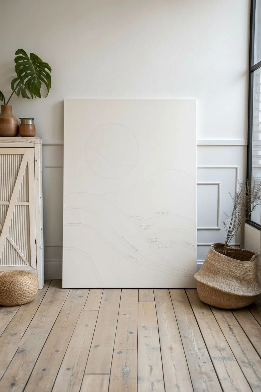
Desert Sun Disk and Soft Dunes
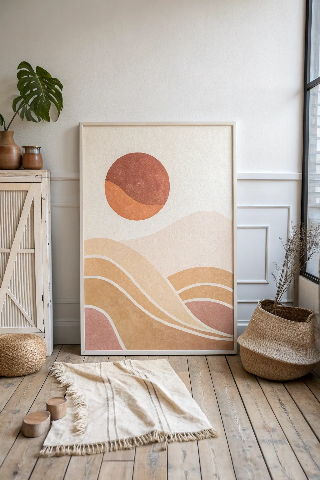
Bring warmth to any room with this large-scale abstract painting featuring gentle, rolling dunes and a textured sun disc. Using a soothing palette of terracotta, beige, and dusty rose, this project relies on smooth curves and negative space to create a serene desert atmosphere.
Step-by-Step Guide
Materials
- Large canvas (e.g., 24×36 inches or larger)
- Acrylic paints: Burnt Sienna, Yellow Ochre, Titanium White, Unbleached Titanium, Mars Black (for darkening)
- Wide flat brush (2-3 inches)
- Medium filbert brush
- Small round brush for details
- Pencil and eraser
- Circular object for tracing (plate or lid) or a compass
- Painter’s tape (optional)
- Mixing palette
- Cup of water and paper towels
Step 1: Preparation and Sketching
-
Prepare the canvas:
Start by ensuring your canvas is clean and taut. Use a layer of gesso if the canvas isn’t pre-primed, though most store-bought canvases are ready to go. -
Sketch the sun:
Decide on the placement of your sun disc. In the reference, it’s positioned in the upper-left quadrant. Place your circular object or compass there and lightly trace a perfect circle. -
Draw the horizon lines:
Sketch the rolling dunes. Start with the highest dune line in the background, roughly one-third down from the top. Make these lines gentle and wavy, overlapping them slightly to create depth. -
Plan the color block zones:
Lightly mark inside your sketched waves which colors will go where. Notice how the bands of color flow parallel to each other. Mark the narrow white strip lines that separate the colored bands.
Wobbly Lines?
If you struggle painting smooth curves freehand, lightly draw the line with a watercolor pencil first. Alternatively, use a long liner brush which naturally trails smoother lines.
Step 2: Painting the Background and Sky
-
Mix the sky color:
Create a very pale, warm beige/cream color. Mix a large amount of Titanium White with a tiny touch of Yellow Ochre and a dot of Burnt Sienna. -
Fill the background:
Using your wide flat brush, paint the entire sky area around the sun disc. Paint carefully around the circle’s edge to keep it sharp. Leave the dune area bare for now. -
First layer of the sun:
Mix a terracotta shade using Burnt Sienna and a little White. Paint the upper two-thirds of the sun circle with this color. I find a filbert brush works best here to hug the curve. -
Second tone of the sun:
Lighten your terracotta mix with more Yellow Ochre. Paint the bottom curve of the sun disc, blending slightly where the two colors meet for a soft transition.
Step 3: Creating the Dunes
-
Mix the lightest dune shade:
Create an oat-colored beige by mixing Unbleached Titanium with a drop of Yellow Ochre. This is darker than the sky but lighter than the foreground dunes. -
Paint the background dune:
Fill in the large, soft dune shape directly below the sky. Use long, sweeping horizontal strokes to mimic the flow of sand. -
Mix the mid-tone ochre:
Prepare a warm mustard-ochre color. This will be the dominant color in the central flowing bands. -
Paint the central waves:
Apply this ochre mix to the middle wave sections. Be strictly careful to leave a thin line variable of unpainted canvas (or paint it white later) between this section and the one above it. -
Mix the dusty rose:
Create a muted pink tone by mixing Burnt Sienna, White, and a tiny touch of Red if you have it, or just thin out the Burnt Sienna aggressively with white. -
Fill the accent areas:
Paint the bottom-left corner dune and the small pocket on the right side with this dusty rose shade. -
Paint the darkest earth tone:
Use a darker variation of your ochre/sienna mix for the lowest, foundational dune layers to anchor the composition visually.
Pro Tip: Custom Texture
Mix a teaspoon of baking soda or cornstarch into your acrylic paint for the dunes. This creates a gritty, sandy texture that dries matte and looks incredible in light.
Step 4: Refining and Detailing
-
Define the separation lines:
Once the color blocks are dry, take a small round brush and your sky color (or pure Unbleached Titanium). Carefully paint clean, confident lines between the colored dune sections to separate them visually. -
Add texture to the sun:
To mimic the textured look in the photo, sponge a little pure Burnt Sienna lightly over the dried sun area to give it a weathered, stone-like feel. -
Clean up edges:
Inspect the edges of your curves. Use a small brush to smooth out any wobbly lines, sharpening the distinction between the dunes. -
Final coat and protection:
Allow the painting to dry overnight. If desired, apply a matte varnish to protect the surface and unify the sheen of the different paint mixes.
Hang your desert landscape in a spot with natural light to highlight the warm, earthy palette you’ve created
Ombre Wash With Splatter Stars
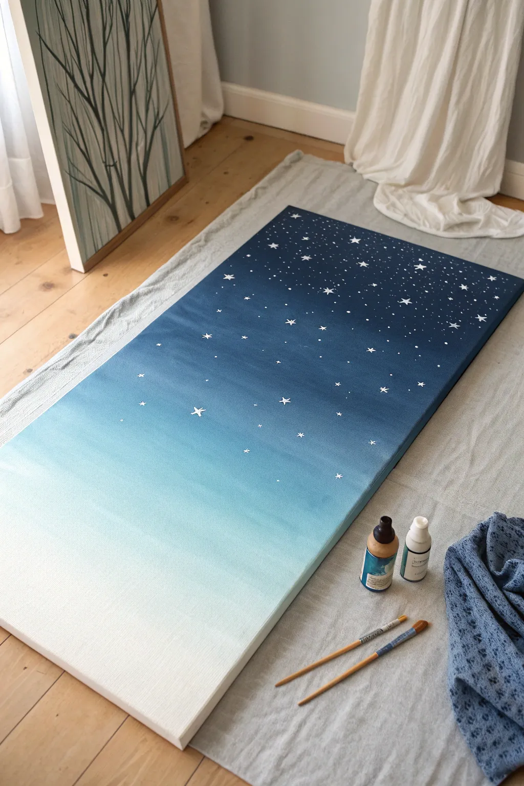
Bring the magic of a starry night sky indoors with this surprisingly simple large-scale art project. The smooth gradient creates a dreamy backdrop for twinkling stars, making a bold statement piece that requires no advanced painting skills.
Step-by-Step Tutorial
Materials
- Large rectangular canvas (e.g., 24″ x 48″ or similar)
- Acrylic paints: Navy Blue, Phthalo Blue (or a medium true blue), Teal or Turquoise, and Titanium White
- Large flat brush or foam brush (2-3 inches wide)
- Medium round brush
- Fine detail brush (size 0 or 1)
- Palette or paper plates for mixing
- Cup of water and paper towels
- Drop cloth or old sheet to protect your floor
- Spray bottle with water (optional, for blending)
Step 1: Creating the Ombre Gradient
-
Prepare your workspace:
Lay down your drop cloth on a flat surface. This project is easiest to paint while the canvas is lying flat on the floor or a large table, as it prevents drips and gives you better leverage for long brushstrokes. -
Mix your base colors:
Squeeze out generous amounts of your four main colors: Navy, Phthalo Blue, Teal, and White. You’ll want plenty of paint ready to go because acrylics dry fast. -
Start with the darkest night:
Using your large flat brush, apply the Navy Blue paint to the top 1/4 of the canvas. Use long, horizontal strokes that go all the way from the left edge to the right edge. -
Introduce the mid-tones:
Without washing your brush, pick up some Phthalo Blue. Paint the next section down, overlapping slightly with the Navy while the paint is still wet to encourage blending. -
Create the transition:
Work quickly back and forth over the line where the Navy meets the Phthalo Blue. If the paint feels sticky, a very light mist of water from a spray bottle can help the colors merge smoothly. -
Add the teal layer:
Wipe off excess dark paint from your brush onto a paper towel, then load it with the Teal/Turquoise paint. Apply this to the middle section of the canvas, blending it upwards into the Phthalo Blue using the same horizontal strokes. -
Begin the fade to white:
Mix a little White into your Teal paint to create a light sky blue. Apply this below the pure teal section, blending upwards. -
Finish with the lightest horizon:
Clean your brush thoroughly. Load it with pure Titanium White and paint the bottom 1/4 of the canvas. Blend remarkably gently upwards into the light blue section so there is no harsh line, just a soft fade. -
Check the edges:
Don’t forget to paint the sides of the canvas with the corresponding colors so the artwork looks finished from every angle. Let the entire background dry completely for at least an hour.
Step 2: Adding the Stars
-
Plan your constellations:
Decide where you want your largest stars to be. Focus them mostly in the darker top half of the painting where they will contrast best against the deep blue. -
Paint the large stars:
Using a fine detail brush and pure Titanium White, paint small 5-pointed stars. I find it easiest to paint an upside-down ‘V’ first, then cross it with a horizontal line, refining the points as needed. -
Add medium stars:
Scatter slightly smaller 5-pointed stars around the large ones. Variation in size creates a sense of depth and distance in your sky. -
Stipple distant stars:
Dip the handle end (the non-brush end) of a paintbrush into white paint. Dot it onto the canvas to create perfect, tiny circles that look like distant planets or stars. -
Create a splatter effect:
Mix a small amount of white paint with a few drops of water until it has the consistency of heavy cream. Load a medium brush with this mixture. -
Flick the paint:
Hold the brush over the canvas and tap the handle firmly against another brush handle or your finger. This will send a spray of tiny white specks onto the canvas. Focus this mostly at the very top. -
Refine the galaxy:
Step back and look at the composition. If any area looks too empty, add a few more hand-painted stars or dots to balance it out.
Blending Secret
Keep a spray bottle of water handy. A faint mist over the transition lines keeps acrylics wet longer, making that seamless ‘butter-soft’ gradient much easier to achieve.
Glow Up
Mix a tiny bit of glow-in-the-dark medium into your white paint for the stars. During the day it looks normal, but at night your artwork will literally light up the room.
Hang your new celestial masterpiece once it’s fully dry and enjoy the peaceful view
Tape-Resist Geometric Blocks
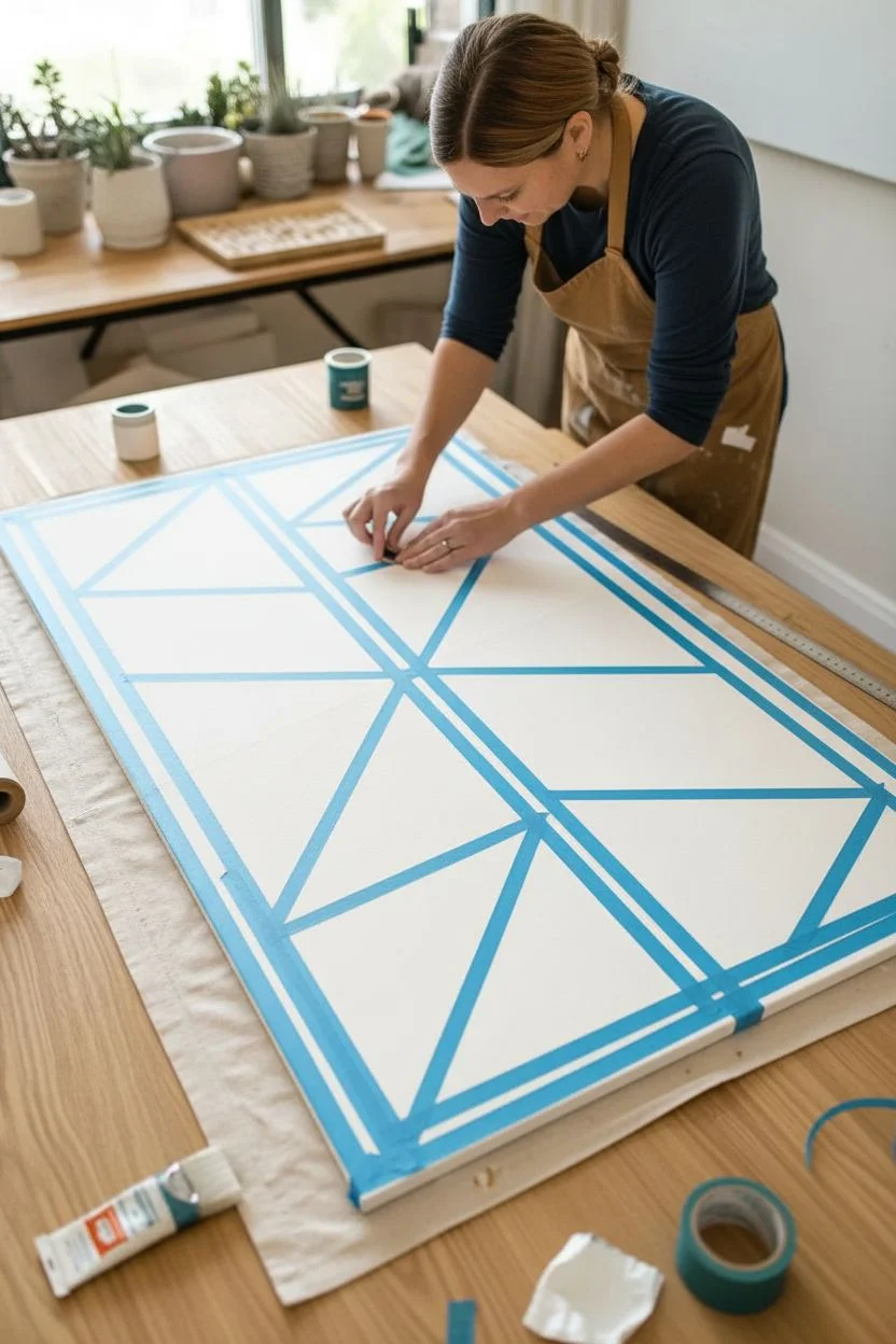
Transform a large, blank canvas into a modern masterpiece with clean lines and bold colors using simple painter’s tape. This project combines geometric precision with a warm, earthy color palette to create striking wall decor that looks professionally designed but is surprisingly easy to execute at home.
Step-by-Step
Materials
- Large stretched canvas or sturdy painting board
- Painter’s tape (1/4 inch to 1/2 inch width)
- Acrylic paints (Teal, Dusty Rose/Terracotta, Mustard Yellow, Deep Red)
- Small foam roller or flat synthetic paintbrush
- Palette or small containers for paint
- Drop cloth or kraft paper
- Measuring tape or ruler
- Pencil
- Matte sealant (optional)
Step 1: Preparation and Taping
-
Prepare your workspace:
Lay down kraft paper or a drop cloth on a large flat surface like a dining table or clean floor. Make sure you have ample room to move around all sides of your canvas. -
Prime the canvas:
If your canvas isn’t pre-primed, apply a coat of gesso. Even for pre-primed canvases, I like to apply a base coat of white acrylic paint to ensure the white lines revealed later are crisp and bright. -
Plan your grid:
Using a measuring tape and a pencil, lightly mark the center point of the canvas both vertically and horizontally. This will help you keep your geometric shapes balanced. -
Create the central cross:
Apply a strip of painter’s tape directly down the vertical center and another across the horizontal center, creating four large, equal quadrants on the canvas. -
Tape the diagonals:
Inside each of the four quadrants, run a diagonal line of tape from corner to corner. This subdivides your rectangles into triangles. -
Add secondary diagonals:
Continue adding diagonal tape lines to break down larger triangles into smaller ones. Refer to the image for the specific asymmetrical pattern, or improvise your own layout. -
Seal the edges:
Run your fingernail or a credit card firmly along the edges of every piece of tape. This is crucial to prevent paint from bleeding underneath. -
The white seal trick:
For razor-sharp lines, paint a thin layer of your white base color over the tape edges first. This seals any tiny gaps with white paint instead of color.
Bleeding Lines?
If paint seeps under the tape, wait for it to dry fully. Then, scrape the excess gently with an X-Acto knife or paint over the bleed with white.
Step 2: Painting and Finishing
-
Mix your palette:
Prepare your acrylic colors: a deep teal, a soft terracotta or rose, a mustard yellow, and a darker brick red. If the paints are too thick, water them down slightly for smoother application. -
Assign your colors:
Mentally map out which triangles will be which color. Aim for a balanced look where no two identical colors touch directly. -
Paint the first color:
Start with the teal paint. Apply it to your chosen sections using a flat brush or small roller, painting away from the tape edge to minimize bleed. -
Apply the warm tones:
Wash your brush thoroughly and move on to the mustard yellow sections. Apply an even coat, ensuring you don’t leave heavy ridges of paint near the tape. -
Fill the remaining shapes:
Complete the pattern with your terracotta and brick red shades. I find stepping back occasionally helps ensure the color distribution feels balanced across the whole piece. -
Check for coverage:
Once the first coat is dry to the touch (usually 15-20 minutes), inspect the canvas. If the canvas texture shows through too much, apply a second coat for opacity. -
The perfect peel time:
Wait until the paint is semi-dry—tacky but not wet. Peeling when completely dry can sometimes rip the paint skin. -
Remove the tape:
Slowly peel the tape back at a steep 45-degree angle. Pull gently and steadily to reveal the crisp white lines underneath. -
Touch up lines:
If any paint bled through, use a tiny liner brush and white paint to tidy up the edges carefully once the colors are fully dry. -
Seal (Optional):
To protect your art from dust and fading, you can apply a clear matte spray varnish over the entire piece once it has cured for 24 hours.
Add Metallic Flair
Swap the white base coat for gold or copper metallic paint. When you peel the tape, your geometric shapes will be separated by shimmer.
Hang your new geometric artwork in a well-lit spot to let the bold colors energize the room
Big Minimal Line Art Over Color Field
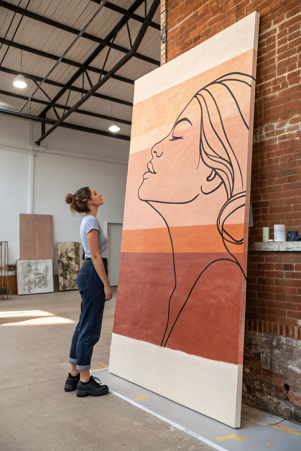
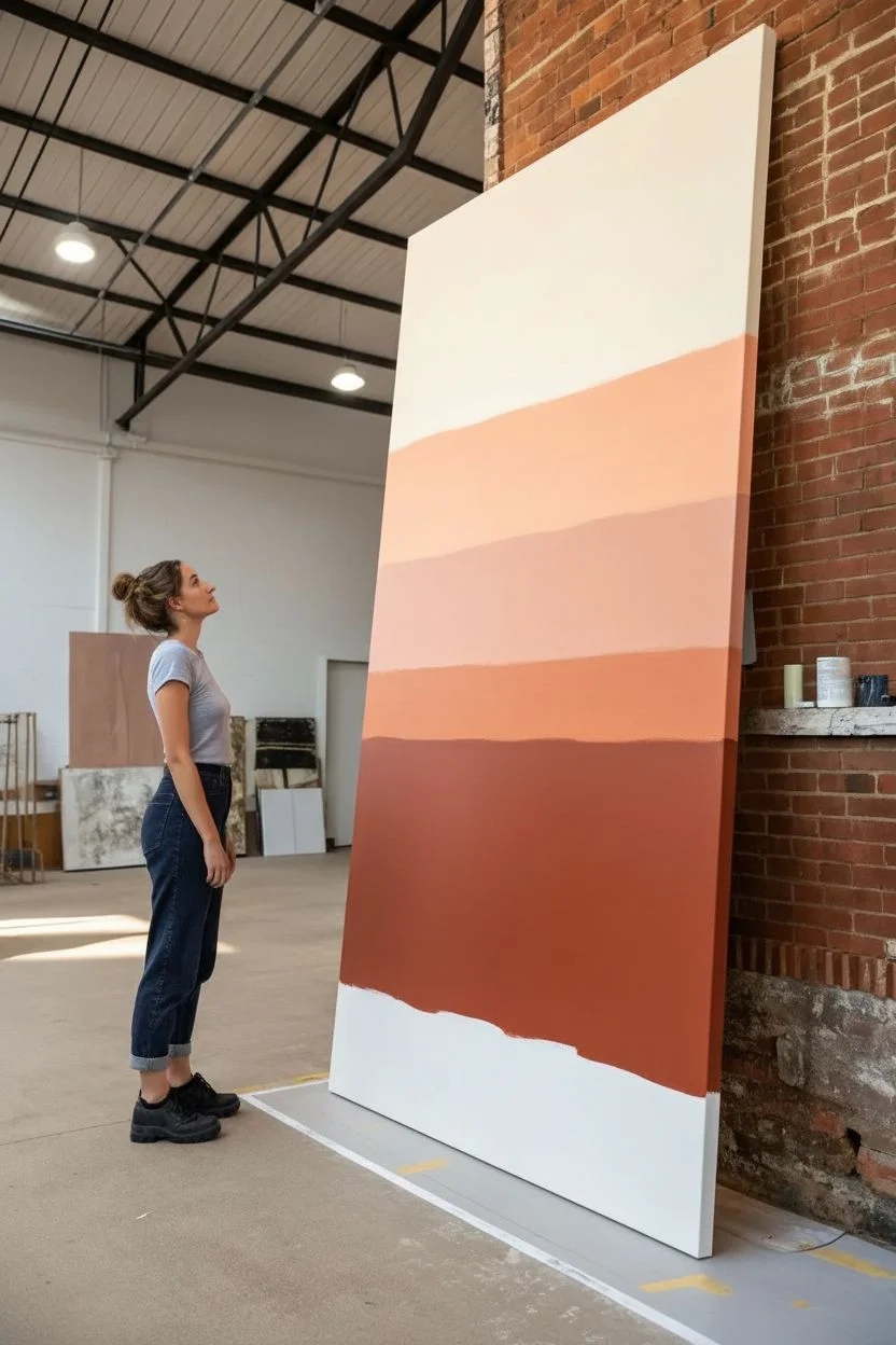
Transform a massive canvas into a stunning statement piece by combining soothing, earthy gradients with bold minimalist line work. This project marries the simplicity of abstract color fields with the elegance of a continuous-line style portrait for a modern, gallery-worthy look.
Step-by-Step Guide
Materials
- Large stretched canvas (at least 48” x 72” or custom built)
- Acrylic paints (Cream, Peach, Terra Cotta, Burnt Sienna, Black)
- Wide flat paintbrush (3-4 inch) for background
- Round brush (size 6-8) or black paint marker for line work
- Painter’s tape (optional)
- Pencil and eraser
- Projector (optional but recommended for scale)
- Mixing palette or plastic cups
- Water container
- Drop cloth
Step 1: Preparing the Color Fields
-
Map out your zones:
Visualize your canvas divided into roughly five horizontal bands. Lightly mark these divisions with a pencil if you want crisp lines, or eyeball it for a more organic feel. The bottom band should be the largest, aiming for a heavy visual anchor. -
Mix your palette:
Prepare four distinct shades ranging from light to dark. Mixing a base of burnt sienna with varying amounts of white creates a harmonious monochromatic gradient. Your lightest shade should be near-white cream, and the darkest a deep rust. -
Paint the bottom section:
Start with the bottom-most band using your Deep Rust color, but leave a distinct white block at the very bottom edge unpainted if you want to replicate the specific framing in the reference image. Use long, horizontal strokes with your wide brush for smooth coverage. -
Apply the middle tones:
Moving upward, paint the next band with your Medium Terra Cotta shade. You can tape off this line for sharpness, or carefully cut in with the brush for a hand-painted look. Ensure the paint is opaque; a second coat might be necessary. -
Add the lighter bands:
Continue upward with your Light Peach tone, followed by the Cream/Off-White tone at the very top. I prefer to slightly overlap the wet edges just a hair if I want a softer transition, but distinct blocks work best for this specific graphic style. -
Let it cure:
Allow the entire background to dry completely. Since you’ll be drawing and leaning on the canvas later, give it at least 2-4 hours, or overnight to be safe.
Step 2: Designing the Portrait
-
Project or sketch:
For a canvas of this magnitude, freehand drawing is risky. Project a line art profile image onto the canvas to get proportions right. If you don’t have a projector, grid out your reference image and lightly sketch the main contours with a pencil. -
Refine the composition:
Position the face profile so the nose and lips face left. The bottom curve of the neck should dip deep into the dark rust section, while the hair flows up into the lighter peach bands. This interplay connects the color zones. -
Check your lines:
Step back about 10 feet. The pencil lines should be visible enough to follow but light enough to erase if adjustments are needed. Ensure the flow of the hair feels loose and organic, not stiff.
Steady Hand Trick
Use a mahl stick (or a clean yardstick) as a hand rest while painting the black portrait lines to prevent smudging the background.
Step 3: Executing the Line Art
-
Prepare your black paint:
Squeeze out fluid black acrylic paint. If using tube acrylics, thin it slightly with water or a flow medium until it has an ink-like consistency that glides smoothly without dripping. -
Test the flow:
On a scrap piece of paper or cardboard, practice your brushstrokes with the round brush. You want a consistent line width that doesn’t break. Alternatively, a jumbo black acrylic paint marker offers great control here. -
Start the facial profile:
Begin at the forehead and work your way down the nose and lips. Commit to the stroke. Moving your entire arm rather than just your wrist helps keep long lines smooth and confident. -
Paint the neck and jaw:
Continue the line under the chin, creating a strong jawline, and sweep down into the long, elegant curve of the neck. Let this line taper off naturally or extend all the way to the bottom edge. -
Detail the features:
Carefully paint the eye and eyebrow. These are the focal points of the expression. Keep the eye closed or looking down for a serene, contemplative mood. -
Flow the hair:
Use sweeping, broad strokes to define the hair. Don’t worry about individual strands; outline the major shapes and waves. Let the lines cross over the color bands freely. -
Clean up edges:
Once the black lines are dry, identify any spots where the background paint looks thin or messy near your lines. Use a small detail brush to touch up the background colors carefully if needed. -
Seal the work:
Apply a clear satin or matte varnish over the entire piece. This unifies the sheen of the different paint colors and protects that large surface area from dust.
Level Up: Texture
Mix a little modeling paste or sand into the background paint colors to give the color fields a subtle, tactile plaster-like texture.
Now step back and admire how this grand-scale artwork completely transforms the energy of your room
Concentric Circle Burst in Two or Three Colors
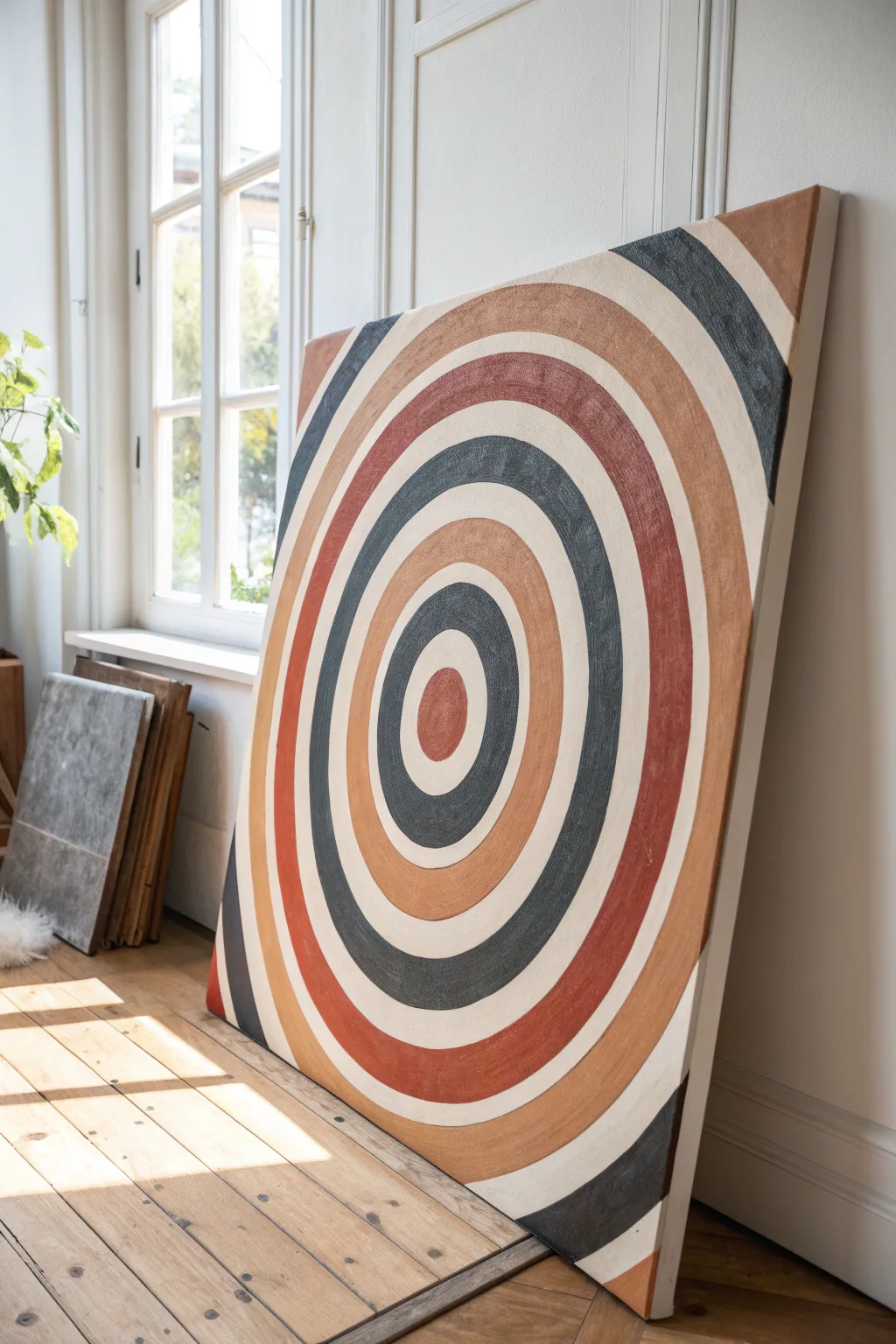
Transform a large, blank canvas into a striking focal point with this surprisingly simple concentric circle design. Using a warm, earthy palette of rust, terracotta, ochre, and charcoal, you’ll create a modern abstract piece that adds depth and texture to any minimal interior.
How-To Guide
Materials
- Large stretched canvas (e.g., 36×48 inches)
- Acrylic paints: Burnt Sienna, Yellow Ochre, Mars Black, Titanium White, and a warm Terracotta
- Wide flat paintbrush (2-3 inches)
- Medium flat paintbrush (1 inch)
- Ppencil
- String or twine
- Push pin or thumbtack
- Ruler or measuring tape
- Palette or paper plates for mixing
- Painter’s tape (optional)
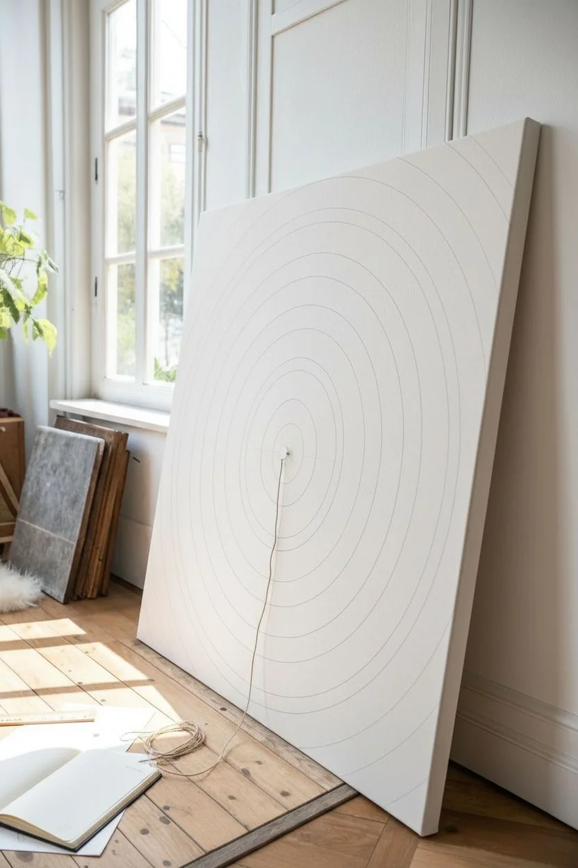
Step 1: Planning and Sketching
-
Find the center:
Lay your large canvas flat on the floor or a workspace table. Use a ruler to measure the width and height, marking the exact center point lightly with your pencil. -
Create a compass tool:
Cut a piece of non-stretchy string slightly longer than half the width of your canvas. Tie one end securely around the pencil and the other end around a push pin. -
Draw the central circle:
Place the push pin into the center mark you made earlier. Hold the string taut and draw a small circle in the very middle of the canvas. This will be your bullseye. -
Map out the rings:
Adjust the length of your string, making it about 2-3 inches longer, and draw the next circle outside the first one. Continue lengthening the string incrementally to create expanding rings until you reach the canvas edge. -
Refine the spacing:
Don’t worry if the spacing isn’t perfectly identical between every ring; slight variations add to the organic, hand-painted feel. I like to keep the bands relatively thick to make the painting process easier.
Steady Hand Trick
Rest your pinky finger on a dry part of the canvas while painting curves. It acts as a stabilizer pivot, helping you paint smoother arcs without shaking.
Step 2: Painting the Bands
-
Mix your colors:
Prepare your palette. You’ll need distinct shades: a deep charcoal (black mixed with a tiny bit of white), a rust red, a lighter terracotta, sand/beige (white with a touch of ochre), and a plain off-white. -
Start with the center:
Paint the innermost circle first. Use the rust red shade and a medium flat brush to fill in the bullseye shape carefully. -
Paint the first light band:
For the ring immediately surrounding the center, use your off-white or cream color. This high contrast helps the center pop. -
Apply the dark ring:
Moving outward, paint the next ring in the deep charcoal color. Use the wide flat brush here to get smooth, confident strokes that follow the curve. -
Add warmth:
Paint the next ring with the jagged terracotta or ochre shade. Use a fair amount of paint on your brush to create a slight texture on the canvas. -
Continue the pattern:
Keep working your way outward, alternating between your dark greys, light creams, and warm earth tones. Refer to the image to mimic the specific color order: White, Grey, Rust, White, Ochre, Grey, White, Rust. -
Handle the edges:
When you reach the rings that go off the edge of the canvas, paint right over the side to give the artwork a professional, gallery-wrapped finish.
Texture Boost
Mix a small amount of baking soda or modeling paste into your acrylic paints. This creates a gritty, stone-like texture that makes the earth tones feel more organic.
Step 3: Refining and Sealing
-
Touch up the lines:
Once the foundational layers are dry to the touch, use a smaller brush to tidy up the edges where colors meet. You don’t need machine-perfect lines, but crisping them up makes a big difference. -
Add a second coat:
Some lighter colors, especially the cream and ochre, might look streaky after one coat. Apply a second layer to ensure solid, opaque coverage. -
Create texture:
For a more artistic touch, use a dry brush with very little paint to drag lightly over the colored bands, adding subtle streaks that mimic the woven canvas texture. -
Let it cure:
Allow the entire painting to dry for at least 24 hours. Acrylics dry fast, but thick layers need time to set completely. -
Erase guidelines:
If any pencil marks are still visible through lighter paint layers, very gently erase them or dab a tiny bit more paint over those specific spots.
Once dry, lean your massive new artwork against a wall or hang it up to bring a warm, modern vibe to your space
Chunky Texture Fields With a Scraping Tool
Transform a blank canvas into a sculptural statement piece using heavy body mediums and simple scraping tools. This project creates an organic, earth-toned texture that mimics the look of natural stone or windswept sand dunes on a grand scale.
Step-by-Step Tutorial
Materials
- Large heavy-duty canvas or wooden panel (at least 36″ x 48″)
- Gesso primer (if using raw wood)
- Texture paste or joint compound (large bucket)
- Plaster of Paris (optional, for faster setting)
- Wide putty knives (4-6 inches)
- Large trowel or scraping tool
- Cream or beige acrylic paint
- Matte varnish spray
- Drop cloth
- Sandpaper (medium grit)
Step 1: Preparation & Base Layer
-
Surface Prep:
Lay down your drop cloth in a well-ventilated area, as this project can get messy. If you are using a wooden panel, start by applying a coat of gesso to seal the wood and prevent it from absorbing moisture from the compound. -
Mixing the Medium:
In a separate bucket, mix your joint compound. I like to add a small amount of Plaster of Paris at this stage if I want the ridges to hold their shape stiffly without sagging, but straight joint compound works well too. -
Initial Application:
Using a wide putty knife, scoop a generous amount of compound onto the center of your panel. Spread it outward to cover the entire surface with a layer about 1/4 inch thick. -
Smooth the Base:
Quickly run your trowel over the surface to ensure even coverage. Don’t worry about perfection here; this layer is just the foundation for the texture to grip onto.
Step 2: Sculpting the Ridges
-
Adding Bulk:
Now, apply a second, thicker layer of compound in random patches across the canvas. Focus on areas where you want the most dramatic ridges to appear. -
Creating Movement:
Take your large trowel or scraping tool and press the edge into the wet compound at a shallow angle. Drag the tool in long, sweeping curves, lifting slightly as you go to create raised edges. -
Defining the Veins:
Use the corner of your putty knife to carve deeper valleys that mimic organic veins or riverbeds. Vary the pressure to create both thick, chunky ridges and delicate, shallow lines. -
Layering Textures:
If the compound feels too flat, slap the flat side of the trowel against the wet surface and pull straight up. This creates rough peaks that can then be lightly smoothed down for a stone-like effect. -
Working the Edges:
Pay special attention to the edges of the canvas. Ensure the texture wraps slightly around the sides or fades intentionally before the edge for a polished, professional look. -
Dry Time:
Allow the sculpted texture to dry completely. For a heavily textured piece like this, it may take 24-48 hours. The thicker areas will take the longest, so be patient.
Keep it workable
Add a teaspoon of white glue to your joint compound mix. It slows drying time slightly, giving you a wider window to sculpt before the texture sets.
Step 3: Refining & Painting
-
Sanding Down:
Once fully dry, take your medium grit sandpaper and lightly sand the highest peaks. This knocks down any dangerously sharp points while keeping the visual roughness intact. -
Dust Removal:
Use a dry bristle brush or a vacuum with a hose attachment to remove all sanding dust from the crevices. This is crucial for paint adhesion. -
Base Color Coat:
Mix a creamy beige acrylic paint with a little water to improve flow. Apply this mixture over the entire textured surface using a large brush, ensuring you get into every deep crevice. -
Adding Depth:
While the base coat is still slightly tacky, mix a slightly lighter shade of cream. Dry brush this color over the raised ridges only, highlighting the texture and adding dimension. -
Final Sealing:
To protect your artwork from dust and minor scuffs, spray the entire piece with a matte varnish. Hold the can about 12 inches away and apply in even, sweeping motions.
Add grit
Mix fine sand or coffee grounds into your base paint layer. When applied, this adds a microscopic gritty texture that makes the ‘stone’ look incredibly realistic.
Hang your new textured masterpiece in a spot with side lighting to really make those dramatic ridges pop
Drip-and-Drag Vertical Abstract
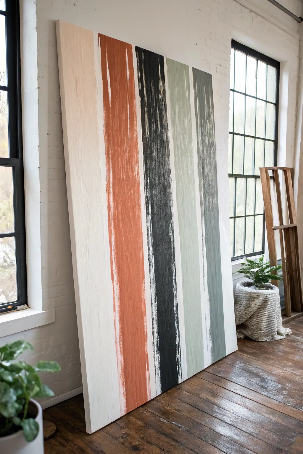
Create a stunning statement piece with this oversized vertical stripe painting, perfect for adding height and organic texture to any room. Using a simple drag-and-layer technique, you’ll achieve that effortless, earthy look featuring broad strokes of terracotta, charcoal, rubbed sage, and grey.
Step-by-Step
Materials
- Large stretched canvas (at least 36″ x 48″)
- Acrylic paints: Titanium White, Burnt Sienna, Mars Black, Sage Green, Paynes Grey
- Wide flat bristle brushes (3-4 inches wide)
- Painter’s tape or masking tape
- T-square or long ruler
- Pencil
- Mixing palette or paper plates
- Water container
- Rag or paper towels
Step 1: Preparation and Base Layer
-
Prepare your canvas:
Since this is a large-scale project, lay your canvas flat on a protected floor or a very large table. It is much easier to apply even pressure when the canvas is horizontal rather than upright on an easel. -
Prime the background:
Even if your canvas is pre-primed, apply a fresh coat of Titanium White across the entire surface. This ensures a uniform texture and brightness under your stripes. Let this base coat dry completely. -
Plan your spacing:
Using a pencil and your ruler, lightly mark the vertical zones for your stripes. You don’t need distinct lines for every edge, but marking the center point of each colored stripe helps keep things balanced. Aim for varying widths to keep the composition dynamic.
Step 2: Painting the Texture
-
Mix the terracotta shade:
Combine Burnt Sienna with a touch of Titanium White to soften it. You want an earthy, warm rust color. Keep the paint relatively thick; don’t dilute it too much with water. -
Execute the first stripe:
Load your wide brush heavily. Starting from the very top edge, drag the brush down in a long, continuous motion. Don’t worry if the paint breaks or runs out before the bottom—this creates the desired distressed texture. -
Extend the stroke:
Reload the brush and continue dragging downwards to complete the stripe. I like to let the bristles run ‘dry’ near the edges of the stroke to create that jagged, organic border where the white background peeks through. -
Prepare the charcoal stripe:
Clean your brush thoroughly or switch to a fresh one. Mix Mars Black with a tiny drop of white to create a soft, matte charcoal tone rather than a harsh jet black. -
Apply the black stripe:
Apply this stripe next to the terracotta one, leaving a significant gap of white space in betwen. Use the same long, vertical drag technique. Apply slightly more pressure in the center of the stroke and less on the edges for a feathered look. -
Mix the sage green:
Mix Sage Green with a bit of grey or white to mute the saturation. This stripe should feel calm and earthy. -
Paint the sage stripe:
Paint this stripe to the right of the black one. Experiment with the texture here—try doing one pass, letting it sit for a minute, and then dry-brushing over it again to build visible bristle marks. -
Create the final grey-blue tone:
Mix Paynes Grey with white to create a slate blue-grey. This will be the right-most stripe in the composition. -
Complete the composition:
Paint the final vertical stripe. Ensure the start and end points at the top and bottom of the canvas are somewhat uneven across the four stripes; having them ‘fade in’ or ‘fade out’ differently adds to the handmade charm.
Paint Too Solid?
If your stripes look too blocky, lightly mist the canvas with water before dragging the brush. This helps the paint glide and feather out naturally at the edges for that vintage look.
Step 3: Refining and Sealing
-
Touch up whites:
Once the colored stripes are dry to the touch, examine the white gaps. If any stray paint splashes look messy rather than artistic, paint over them with a small brush and Titanium White. -
Distress edges (optional):
If a stripe looks too solid or blocky, take a clean, dry brush with a tiny amount of white paint and lightly drag it vertically over the colored edge to break up the line. -
Check the sides:
Decide if you want the stripes to wrap around the edges of the canvas. For a gallery-wrapped look, create a continuation of the stripe on the side. If framing, you can leave the sides white. -
Final drying time:
Allow the entire painting to cure for at least 24 hours. Because the paint was applied thickly in parts to create texture, it may take longer to dry than a standard thin coat.
Pro Tip: Custom Textures
For extra grit, mix a tablespoon of baking soda or plaster into your acrylic paint before applying. This creates a rough, stonelike finish that catches the light beautifully.
Lean your massive new artwork against a wall for a casual loft vibe, or hang it proudly to anchor your space
Soft Cloudscape With a Sponge Dab
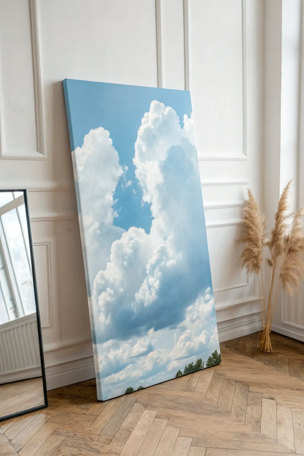
Transform a large blank canvas into a stunning window to the sky with this surprisingly simple painting technique. By layering soft blues and crisp whites, you’ll create depth and volume that mimics towering cumulus clouds on a perfect summer day.
Detailed Instructions
Materials
- Large vertical canvas (approx. 24×48 inches)
- Acrylic paints: Cerulean Blue, Ultramarine Blue, Titanium White, and Sap Green
- Gesso (optional, for priming)
- Natural sea sponge
- Large flat brush (2-3 inch)
- Medium round brush
- Small fan brush (optional)
- Paper plate or palette
- Water container for rinsing
- Paper towels
Step 1: Setting the Sky Base
-
Prepare the Surface:
Begin by ensuring your large canvas is clean and dust-free. If it’s raw canvas, apply a coat of gesso and let it dry completely. For pre-primed canvases, you can jump straight in. -
Mix the Base Blue:
On your palette, mix a generous amount of Cerulean Blue with a touch of Titanium White. You want a bright, mid-tone sky blue that feels vibrant but realistic. -
Paint the Gradient:
Using your large flat brush, paint the entire canvas blue. Start at the top with a slightly darker mix (add a drop of Ultramarine) and gradually add more white as you work your way down to the bottom third. This atmospheric perspective creates immediate depth. -
Blend Smoothly:
While the paint is still wet, use long, horizontal strokes to blend the gradient transitions. The goal is a seamless fade from the deeper blue top to the lighter horizon line. Let this base layer dry completely before moving on.
Cloud Lifting Trick
If you make a cloud too dense, use a clean, damp sponge to lift wet paint away from the center. This reveals some blue underneath and creates instant transparency.
Step 2: Building the Cloud Formations
-
Draft the Shape:
Lightly sketch the general outline of your clouds using a very diluted white paint and a round brush. Don’t worry about details yet; just map out a large, towering column structure slightly off-center. -
Prepare the Sponge:
Dampen your natural sea sponge and wring it out thoroughly so it’s barely moist. This is crucial for texture—a soaking wet sponge will just smear the paint. -
Load the Cloud Color:
Dip the textured face of the sponge into Titanium White paint. Dab the excess onto a paper towel; you want a ‘dry brush’ effect, not a glob of paint. -
Dab the Main Shapes:
Press the sponge onto the canvas within your drafted outlines. Use a twisting motion as you lift the sponge to create organic, irregular fluffy edges. Fill in the main body of the cloud with this texture. -
Create Shadow Zones:
Mix a tiny amount of Ultramarine Blue and a speck of gray with your white paint to create a soft slate color. Dab this shadow color into the lower, recessed areas of the cloud mass to give it volume. -
Blend the Shadows:
While the shadow paint is fresh, lightly tap over the edges where the shadow meets the white with a clean part of your sponge to soften the transition. Clouds shouldn’t have harsh internal lines.
Fixing Hard Edges
Clouds looking too much like cotton balls? Don’t panic. Glaze over the hard edges with a very watery mix of your sky-blue color to push them back into the distance.
Step 3: Refining and Highlighting
-
Add Brightest Highlights:
Clean your sponge or grab a fresh piece. Load it with pure, thick Titanium White. Attack the upper edges of the cloud puffs where the imaginary sun would hit. -
Intensify the Contrast:
I find that layering this pure white thickly on the very top curves makes the clouds pop against the blue background. Use a dabbing motion to build up physical texture. -
Soften the Edges:
If any cloud edges look too sharp or ‘stuck on,’ use a dry, clean brush to gently sweep over the very edge into the blue sky, creating a misty, wispy effect. -
Check the Composition:
Step back about five feet from your hanging canvas. Look for areas that seem flat and add another layer of highlights or shadows as needed to enhance the fluffiness.
Step 4: Final Details
-
Mix Tree Colors:
Mix Sap Green with a tiny touch of Ultramarine Blue and distinct touches of yellow to create a varied foliage palette. You want a dark base green and a lighter highlight green. -
Paint the Treetops:
Use the small fan brush or the tip of a round brush to stipple a tiny tree line at the very bottom edge of the canvas. Keep these small to emphasize the massive scale of the clouds above. -
Add Tree Highlights:
With the lighter green mix, dab the tops of the tiny trees to suggest sunlight catching the leaves. -
Final Varnish:
Allow the painting to dry for at least 24 hours. Apply a coat of satin or matte varnish to protect the acrylics and unify the sheen of the different paint layers.
Hang your masterpiece where it can catch natural light to really show off those ethereal textures
Leaf Prints on a Big Gradient Background
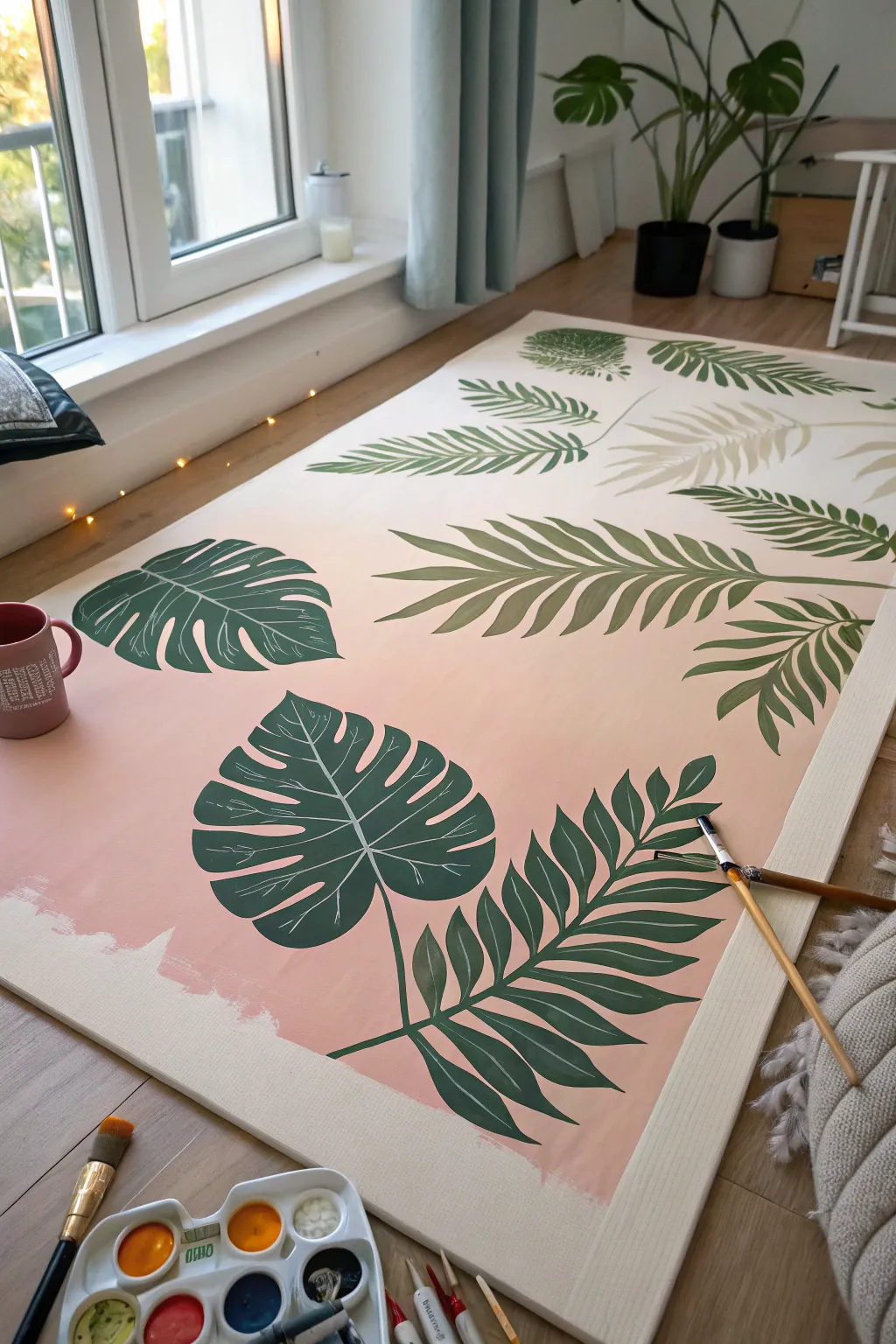
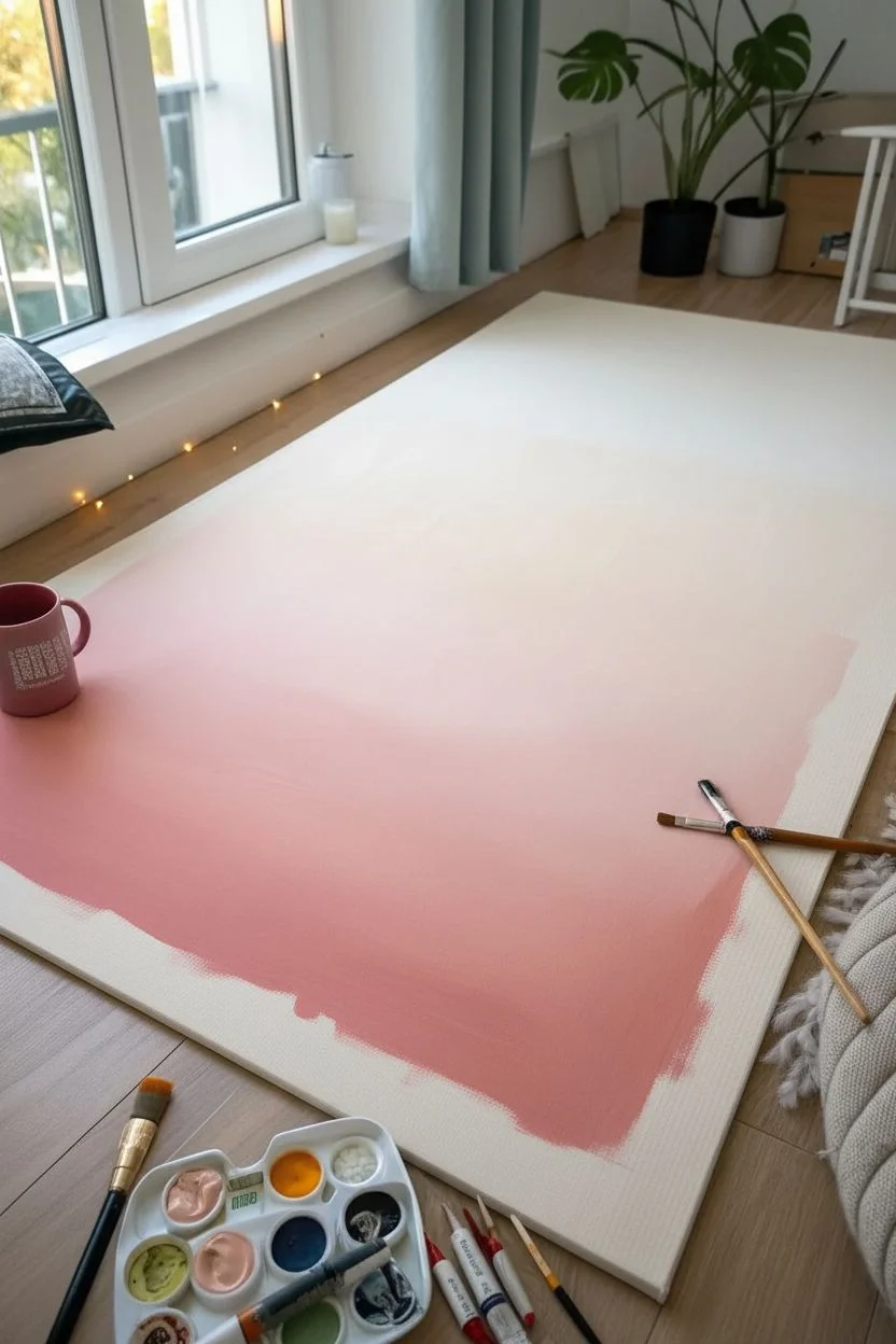
Bring a fresh, botanical vibe to your room with this large-scale canvas project that combines a soft, sunset-like gradient with bold tropical foliage. The smooth transition from cream to blush pink creates a dreamy backdrop for the structured, deep green leaves, filling a blank wall with personality.
Step-by-Step Guide
Materials
- Large stretched canvas (at least 24×36 inches or larger)
- Acrylic paints (Titanium White, Cream/Off-White, Blush Pink, Peach, Sap Green, Phthalo Green, Dark Green)
- Large flat brush or foam roller (for the background)
- Wide flat brush (for base leaf shapes)
- Medium round brush (for detailing)
- Fine liner brush (for veins)
- Pencil
- Water cups and paper towels
- Palette or paper plate
- Painter’s tape (optional for edges)
Step 1: Creating the Ombré Base
-
Prepare the workspace:
Since this is a large canvas, lay it flat on a drop cloth or old sheet on the floor, just like in the photo. This gives you plenty of arm room for broad strokes. -
Mix your gradient colors:
On your palette, prepare three piles of paint: a pure cream/off-white, a mid-tone mix of cream and blush pink, and a deeper blush pink mixed with a tiny touch of peach for warmth. -
Apply the top color:
Using your large flat brush or a roller, apply the cream color to the top third of the canvas. Keep the paint relatively wet to help with blending later. -
Add the middle tone:
Paint the middle section with your cream-pink mix. While both sections are still wet, work your brush back and forth horizontally where the colors meet to create a seamless blur. -
Finish the bottom gradient:
Apply the darkest pink shade to the bottom third. Blend it upward into the middle section using long, horizontal strokes until the transition looks smooth and misty. -
Let it cure:
Allow the background to dry completely. If the colors look transparent, I find adding a second coat really makes the gradient pop before moving on to the leaves.
Keep it Wet
To get that super smooth gradient blend, mist your acrylics lightly with a spray bottle of water while you work. It keeps the paint open longer for blending.
Step 2: Drafting the Design
-
Sketch the layout:
Lightly sketch the outlines of your leaves using a pencil. Plan for a mix of broad monstera leaves and long, feathery palm fronds to add variety. -
Establish placement:
Start your sketch from the edges and corners, having the leaves point inward. This creates a natural framing effect and keeps the composition balanced.
Step 3: Painting the Foliage
-
Mix your main green:
Create a base green tone by mixing Sap Green with a little Phthalo Green. You want a lush, vibrant shade that stands out against the pale background. -
Block in the shapes:
Use a wide flat brush to fill in the main bodies of the leaves. Don’t worry about the tiny details yet; just get the solid color down smoothly. -
Refine the edges:
Switch to a medium round brush to sharpen the tips of the palm fronds and the distinctive notches of the monstera leaves. -
Add depth diversity:
For visual interest, mix a slightly darker green (add a touch of blue or black) and a lighter olive green. Paint a few leaves in these alternate shades so they don’t all look identical. -
Create the veins:
Using your fine liner brush and the lightest white-green mix, carefully paint a central vein down the middle of each leaf. -
Add delicate details:
Extend thin, branching veins outward from the center line. Keep your hand loose and lift the brush at the end of the stroke for a tapered line. -
Touch up the background:
If you accidentally went outside your lines, use a small brush and your background colors to “erase” mistakes once the green paint is dry. -
Final assessment:
Step back and look at the whole piece. If any leaf looks too flat, add a second coat of green to increase richness and opacity.
Splotchy Background?
If your gradient looks streaky after drying, apply a very thin, watery wash of the dominant color over the whole area to unify the transition.
Hang your massive botanical masterpiece in a well-lit spot to enjoy those soothing summer vibes all year round
Paper Shape Collage Under a Painted Wash
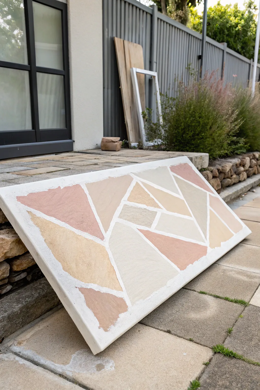
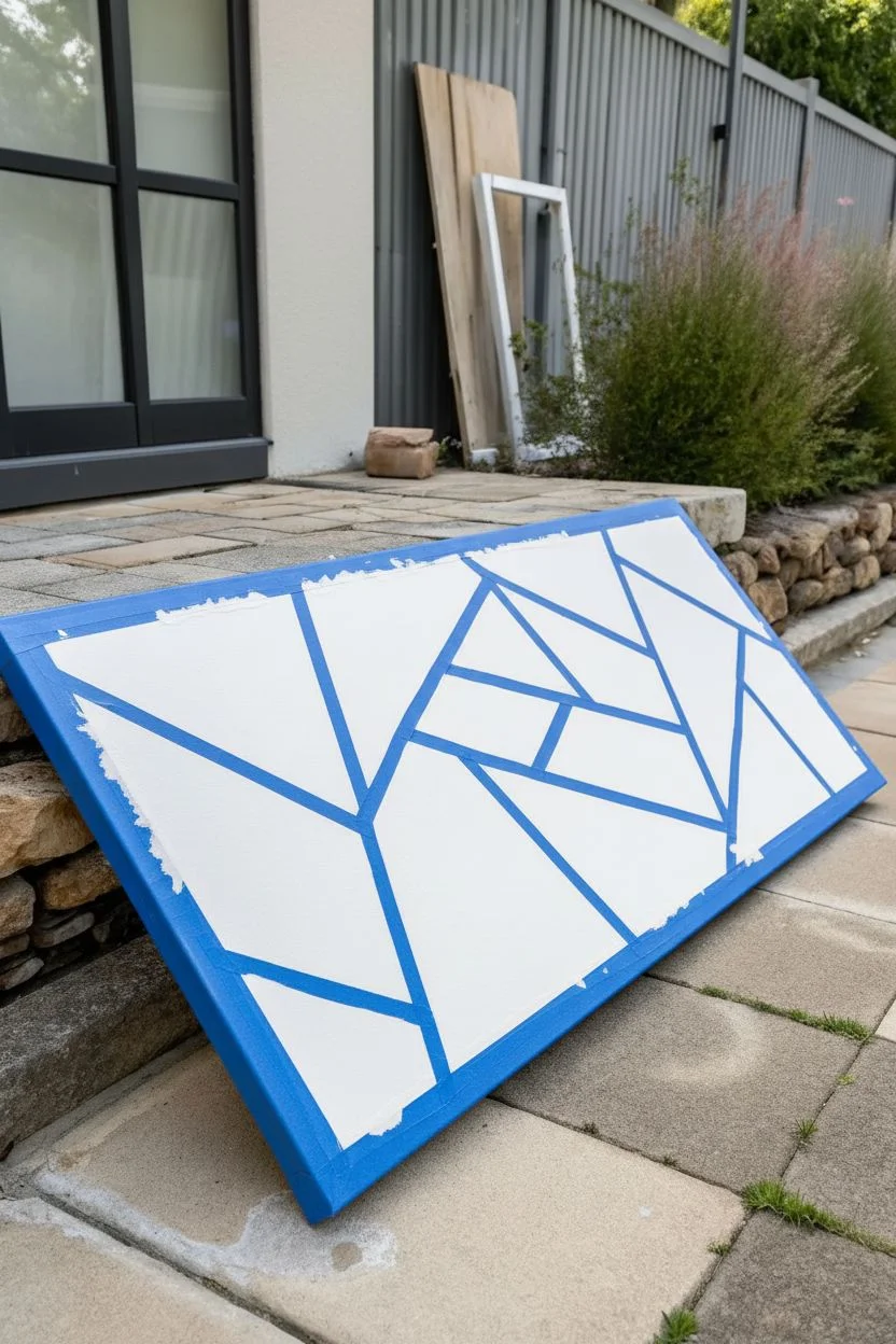
Transform a large, blank canvas into an architectural statement piece that mimics the look of crazy paving or flagstone. using earthy tones and clever masking techniques, you can create a structured yet organic design that brings natural warmth to any space.
Step-by-Step
Materials
- Large stretched canvas (at least 24×36 inches)
- Painter’s tape (various widths, 0.5-1 inch)
- Acrylic paints (terracotta, beige, cream, sandstone)
- Texture medium or modeling paste
- Palette knives
- Large flat brushes
- Sea sponge (optional)
- Matte varnish
Step 1: Preparation & Masking
-
Prime the surface:
Begin by applying a base coat of white acrylic paint or gesso to your canvas if it isn’t already primed. This ensures your ‘grout’ lines remain bright white later. -
Plan the layout:
Visualize a broken stone pattern. You want irregular geometric shapes—triangles, trapezoids, and polygons that fit together like a puzzle but don’t touch. -
Apply the tape:
Use painter’s tape to map out your ‘grout lines.’ These will be the white spaces between your colored stones. Press the tape down firmly to prevent bleed-under. -
Vary the angles:
Avoid creating perfect grids. Let lines intersect at various sharp and obtuse angles to mimic the randomness of natural stone paths. -
Seal the tape edges:
Paint a thin layer of white paint or matte medium over the tape edges. This is a crucial trick to ensure crisp, clean lines when you peel the tape later.
Bleeding Lines?
If paint bleeds under the tape, turn it into a feature. Use a stiff brush to scrub the edge, making the stones look chipped and aged rather than fixing it.
Step 2: Creating Texture & Color
-
Mix your palette:
Prepare 3-4 distinct earthy colors. Think sandstone, desert pink, warm beige, and a lighter cream. Aim for a harmonious, low-contrast palette. -
Add texture:
Mix a dollop of texture medium or modeling paste into your acrylic paints. This gives the ‘stones’ a realistic, tactile grit. -
Apply base colors:
Start fill in the taped-off sections with your colors. I like to scatter the colors randomly so identical shades don’t sit right next to each other. -
Create variation:
Don’t just use one flat color per shape. While the paint is wet, streak in a little of a neighboring color to create a natural, weathered stone look. -
Dab and stipple:
Use a sea sponge or a scrunched-up rag to dab the wet paint gently. This lifts a little pigment and adds organic porosity to the surface. -
Build layers:
If the coverage looks too thin, let the first coat dry and apply a second, slightly thicker layer to build up the physical height of the ‘stones’.
Add Sparkle
Mix a tiny pinch of fine sand or mica powder into your paint mix. It catches the light subtly, mimicking the quartz found in real flagstones.
Step 3: Revealing the Design
-
Check dryness:
Wait until the paint is dry to the touch but not fully cured. If the paint is too rubbery, it might peel; if too wet, it will smudge. -
Peel the tape:
Carefully pull the tape up at a 45-degree angle. Move slowly to reveal the stark white ‘grout’ lines beneath. -
Touch up edges:
If any paint bled through, use a small detail brush and white paint to tidy up the lines. -
Enhance the texture:
For extra dimension, you can sponge a tiny bit of grey or beige onto the white grout lines so they don’t look too pristine. -
Seal the artwork:
Once fully cured (wait 24 hours), apply a coat of matte varnish. This protects the finish and unifies the sheen of the different paint mixes.
Hang your new textural masterpiece in a well-lit area to let the shadows play across the surface
Easy Diptych With Matching Color Bands
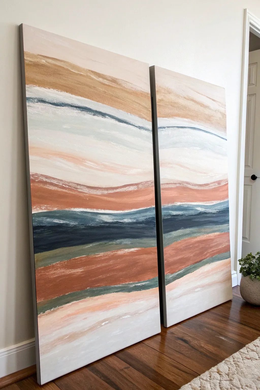
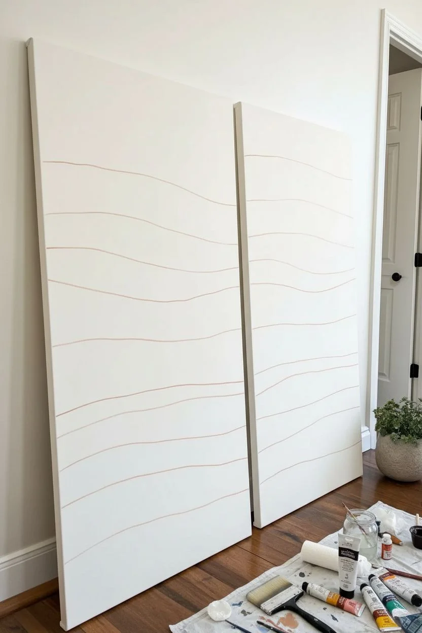
Transform your space with this stunning large-scale diptych that mimics the serene layers of coastal dunes. By working across two canvases simultaneously with sweeping horizontal bands of earth tones, you’ll create a cohesive statement piece that feels both organic and modern.
Step-by-Step Guide
Materials
- Two large framed canvases (approx. 24×48 inches each or larger)
- Acrylic paints: Titanium White, Unbleached Titanium (Beige), Burnt Sienna, Yellow Ochre, Payne’s Grey, Phthalo Blue, Olive Green
- Large flat paintbrush (2-3 inch width)
- Medium filbert brush
- Palette knife (optional for texture)
- Water container
- Paper towels or rags
- Drop cloth
- Easel or wall space to hang canvases side-by-side
Step 1: Preparation and Layout
-
Set the Stage:
Position your two canvases side-by-side on your easel or against a wall. It is crucial they touch or are very close together so you can paint continuous lines across the gap. -
Prime the Background:
Mix a large amount of Titanium White with a tiny dot of Unbleached Titanium to create an off-white base. Coat both canvases entirely to ensure a smooth, uniform starting surface. -
Plan the Horizon:
Using a very diluted wash of Burnt Sienna on a small brush, lightly sketch roughly 7-8 wavy horizontal lines that span across both canvases. These guides will separate your color bands.
Keep It Flowing
Mix a glazing medium into your acrylics. This extends drying time, allowing you to blend the bands wet-on-wet for smoother, mistier transitions.
Step 2: Layering the Earth Tones
-
Mix the Sand Tone:
Combine Yellow Ochre, Unbleached Titanium, and a touch of Burnt Sienna. You want a warm, golden-sand color. -
Apply the Top Band:
Using your large flat brush, fill in the top section of the canvas with the sand mixture. Use long, sweeping strokes that travel from the left canvas directly onto the right canvas. -
Create the Rust Layer:
Mix Burnt Sienna with a little white to create a soft terracotta or rust shade. Apply this to the wide middle band, allowing the brushstrokes to maintain a loose, organic wave shape. -
Add the Base Rust:
Paint a second, thicker band of this rust color near the bottom third of the canvas. Vary the pressure on your brush to create some semi-transparent streaks where the white shows through slightly.
Step 3: Adding Depth and Contrast
-
Mix the Deep Ocean Blue:
Combine Payne’s Grey and Phthalo Blue. You want a very dark, moody navy. If it looks too bright, add a touch of Burnt Sienna to dull it down. -
Paint the Shadow Band:
Apply this dark blue in the band directly below the central rust layer. This dark stripe anchors the painting and provides the highest contrast. -
Feather the Edges:
While the blue is still slightly wet, take a clean, slightly damp brush and softly feather the top edge where it meets the lighter colors to avoid a harsh, cartoonish line. -
Introduce the Green:
Mix Olive Green with a fair amount of Payne’s Grey and White to create a dusty, muted eucalyptus color. -
Apply Subtle Green Accents:
Paint thin, flowing bands of this green just below the navy blue section and again near the bottom rust band. These should feel like transitional shadows.
Muddy Colors?
If your colors are turning brown where they touch, let each band dry completely before adding the next. You can always blend them later with a dry-brush glaze.
Step 4: blending and Refining
-
Mix a Creamy Highlight:
Create a large batch of thick off-white paint (Titanium White plus a drop of Beige). -
Fill Negative Space:
Fill in the remaining empty bands with this creamy white. Don’t worry about being perfect; overlap the colored bands slightly. -
Dry Brushing Texture:
Dip a dry brush into pure Titanium White. Wipe most of it off on a paper towel, then lightly drag it horizontally over the dried colored sections to mimic the look of wind-swept sand. -
Connect the Diptych:
Step back and check the gap between canvases. If any lines don’t match up perfectly, use a small brush to bridge the colors across the edges so the flow is uninterrupted. -
Softening Transitions:
I like to take a clean, dry filbert brush and gently rub the areas where two colors meet. This creates that dreamy, soft-focus aesthetic characteristic of atmospheric landscapes. -
Paint the Sides:
Don’t forget the deep edges of the canvas. Extend your horizontal lines around the sides for a professional, gallery-wrapped finish. -
Final Varnish:
Once fully dry (give it at least 24 hours), apply a satin varnish to protect the surface and unify the sheen of the different colors.
Hang your new masterpiece with a small gap between the canvases to let the wall color breathe through the design
Giant Arch Shapes in Earthy Tones
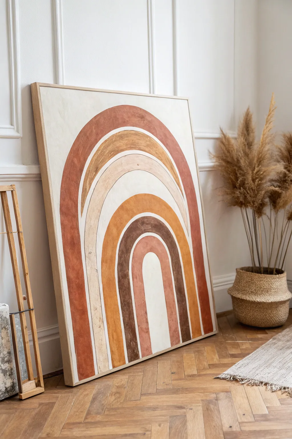
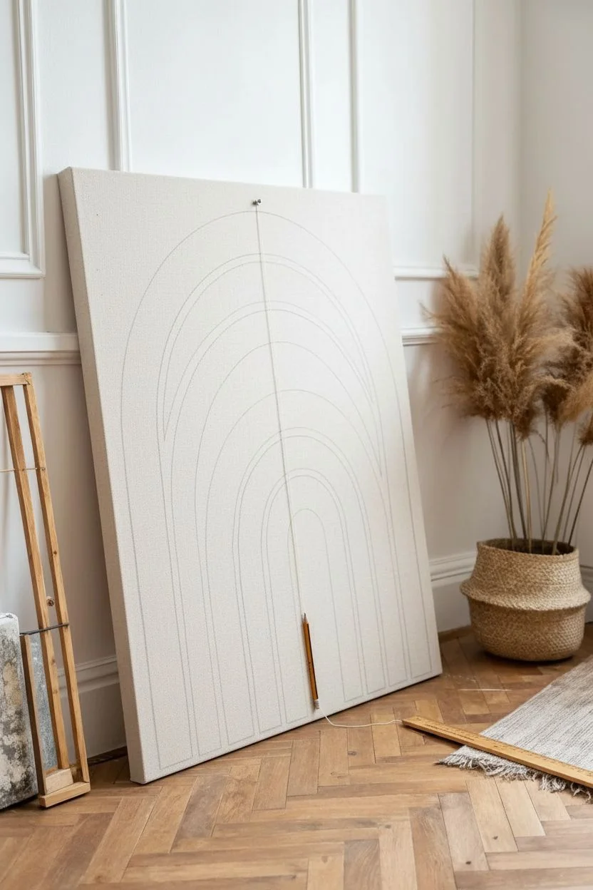
Embrace the warmth of nature with this large-scale arch artwork featuring soothing terracotta, ochre, and beige tones. The mesmerizing, nested shapes create a modern bohemian focal point perfect for adding height and texture to any room.
Detailed Instructions
Materials
- Large canvas (approx. 36×48 inches)
- Acrylic paints (Terracotta, Burnt Sienna, Yellow Ochre, Raw Umber, Titanium White, Beige)
- Wide flat paintbrushes (various sizes)
- Pencil
- String and push pin (or a large compass tool)
- Painter’s tape (optional)
- Ruler or straight edge
- Mixing palette or paper plates
- Drop cloth
Step 1: Planning the Arches
-
Prepare your canvas:
Lay your large canvas on a flat surface or prop it securely on an easel. If you want a textured background similar to the inspiration, you can apply a base coat of gesso mixed with a tiny bit of sand, or simply use an unprimed linen canvas for a raw look. -
Mark the center:
Measure the width of your canvas to find the exact horizontal center point at the bottom edge. Mark this lightly with a pencil. -
Create a compass:
Tie a piece of non-stretchy string to a pencil. Pin the other end of the string to your center mark at the bottom of the canvas. This creates a makeshift compass to draw perfect semi-circles. -
Sketch the largest arch:
Extend the string so the pencil is near the top edge of the canvas, leaving a few inches of border. Keeping the string taut, swing the pencil from the bottom left to the bottom right to draw the outermost arch. -
Sketch the inner arches:
Shorten the string by about 3-4 inches and draw the next arch inside the first. Repeat this process until you have 5-6 concentric arches, varying the width between them slightly to create visual interest like the original reference. -
Extend the legs:
Use a long ruler or straight edge to draw vertical lines extending straight down from the ends of your semi-circles to the bottom edge of the canvas. This gives the arches their tall, elongated shape.
Step 2: Painting the Layers
-
Mix your first color:
Start with the outermost arch. Mix a deep Terracotta hue using Burnt Sienna and a touch of Red. It should be rich and earthy. -
Paint the outer layer:
Fill in the largest arch shape. Use a flat brush to carefully follow your pencil lines. Don’t worry about complete opacity; a slightly streaky texture adds to the rustic feel. -
Mix the second tone:
For the second arch, mix Yellow Ochre with a little Titanium White and maybe a speck of Brown to dull it down. You want a warm, golden wheat color. -
Leave a gap:
When painting the second arch, leave a very thin sliver of the canvas background showing between this color and the terracotta arch. This negative space defines the shapes clearly. -
Create a beige layer:
Mix a soft beige or cream color for the third arch. Apply this layer carefully, maintaining that raw texture. -
Apply the warm ochre:
The fourth layer is a vibrant golden orange. Mix Yellow Ochre with a tiny bit of Terracotta. Paint this arch with bold strokes. -
Add the darkest tone:
For the fifth arch, use Raw Umber mixed with a little black or dark blue to create a deep chocolate brown. This dark band adds necessary contrast. -
Paint the center:
For the smallest, innermost arch, mix a soft pinkish-terracotta. Add plenty of White to your original Terracotta mix. -
Fill the core:
Paint the very center core (the ‘hole’ of the rainbow) with a creamy off-white or very light beige to make the colors pop.
String Theory
Use non-stretchy string like dental floss or twine for your compass. Yarn stretches too much, which will result in wobbly, egg-shaped arches.
Step 3: Creating Texture
-
Dry brushing:
Once the base layers are dry to the touch, take a dry brush with a tiny amount of a slightly lighter version of each color. Lightly scuff this over the corresponding arches to enhance the moody, weathered texture. -
Refine the edges:
Go back with a small angled brush to tidy up any wobbly lines, but remember that the organic, hand-painted look is part of the charm. -
Final drying:
Allow the entire painting to cure for at least 24 hours before moving it. If desired, you can frame it with a simple light wood floating frame to match the aesthetic.
Texture Twist
Mix baking soda into your acrylic paint (1 part soda to 2 parts paint) to create a gritty, plaster-like texture that mimics actual stone or fresco walls.
Step back and admire how these warm, grounding colors transform your space into a cozy sanctuary


Have a question or want to share your own experience? I'd love to hear from you in the comments below!