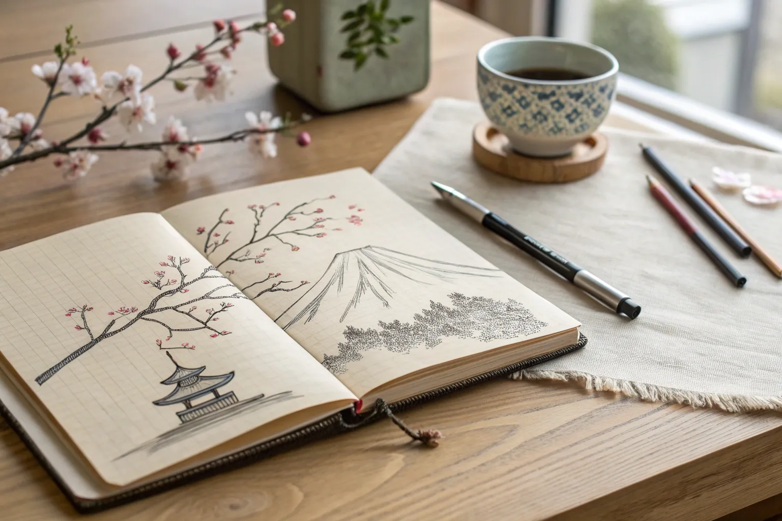
If you’re craving subjects that feel instantly recognizable and satisfying to sketch, Japanese-inspired drawings are a total goldmine. I love how you can say so much with a few confident lines, a little ink wash, and lots of breathing room.
Mount Fuji With Snowcap
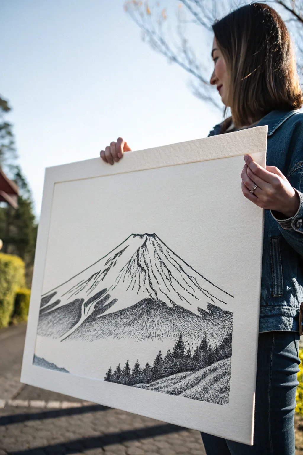
Capture the iconic, timeless beauty of Mount Fuji using classic pen and ink techniques on high-quality paper. This project combines precise line work with patient stippling and hatching to create a dramatic contrast between the brilliant snowcap and the shadowed mountain slopes.
Step-by-Step Guide
Materials
- Large sheet of textured watercolor paper or heavy mixed-media paper (at least A3 size)
- Fine liner pens (sizes 0.05, 0.1, 0.3, and 0.5)
- Graphite pencil (HB or 2H)
- Kneaded eraser
- Ruler
- Reference photo of Mount Fuji
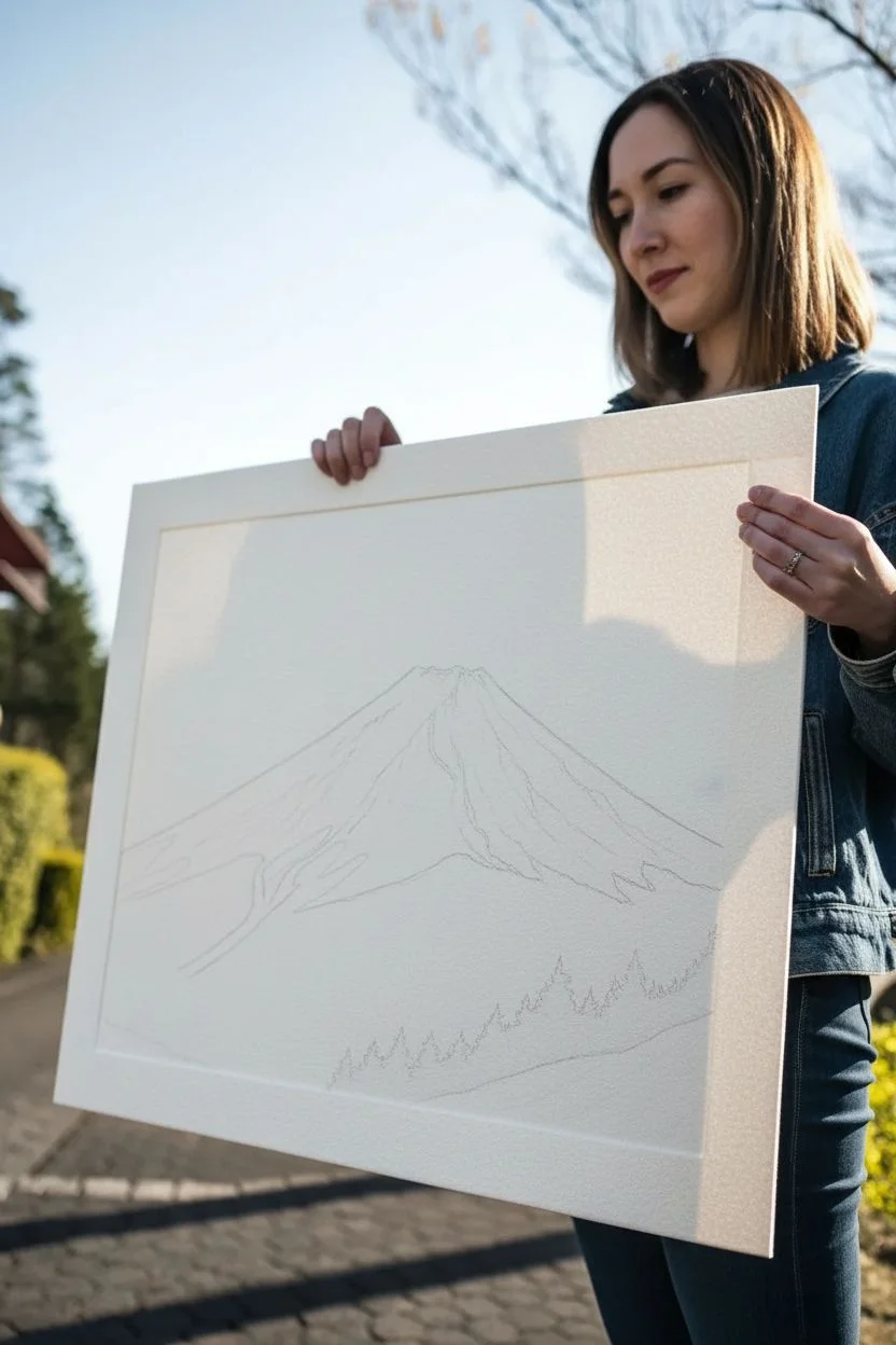
Step 1: Sketching the Composition
-
Establish the horizon:
Begin by lightly sketching a low horizon line about one-quarter of the way up from the bottom of your paper. This leaves ample space for the majesty of the mountain. -
Outline the mountain shape:
Draw the iconic triangular silhouette of Mount Fuji. Keep the slopes gentle and symmetrical, flattening out near the peak. The top should have a slightly uneven, crater-like rim rather than a perfect point. -
Define the snow line:
Lightly sketch the jagged, irregular line where the snowcap ends and the dark rock begins. This line should zig-zag down the mountain’s crevices, not go straight across. -
Add foreground details:
Sketch in a sloping hill or field in the immediate foreground at the bottom right, and indicate the placement of a tree line at the base of the mountain to create depth.
Step 2: Inking the Mountain Peak
-
Outline the peak:
Using a 0.3 pen, carefully ink the very top crater rim and the primary ridges of the snowcap. Keep these lines somewhat broken and organic to represent rock and ice. -
Add texture to the snow:
Switch to your finest 0.05 pen. Add very delicate, sparse vertical lines and broken dashes on the white snowcap to suggest wind-blown snow and subtle ridges. Leave most of the paper white here for high contrast. -
Define the crevices:
Where the rock breaks through the snow near the summit, specific deep crevices need emphasis. Use a 0.1 pen to draw jagged, downward-flowing lines that mimic the mountain’s erosion paths.
Uneven Ink Flow?
If your pens start skipping over the textured paper, slow your hand speed down significantly. The ink needs a split second to soak into the valleys of the paper grain.
Step 3: Creating the Dark Slopes
-
Start the transition:
At the snow line, begin stippling (creating dots) and short hatching strokes. You want a sudden transition from the white paper to the dark texture. -
Build the mid-tones:
Using a 0.1 and 0.3 pen, fill the middle section of the mountain with dense cross-hatching. Follow the slope of the mountain with your lines—diagonal strokes that slide down towards the base. -
Deepen the shadows:
On the shadowed side or deep crevices, layer your hatching to create near-black values. I find that switching direction slightly with each layer builds a rich, woven texture that looks like volcanic rock. -
Fade the base:
As you reach the bottom of the mountain, let your hatching become slightly looser and lighter to suggest atmospheric perspective or mist rising from the valley.
Pro Tip: Directional Strokes
Always hatch in the direction of gravity. On the mountain slopes, lines should flow downwards. On the hills, lines should curb with the terrain to show volume.
Step 4: The Foreground and Trees
-
Draw the distant treeline:
At the very base of the mountain, use tiny, vertical scribbles with a 0.1 pen to create a dense forest silhouette. These should be small and tightly packed. -
Ink the foreground trees:
Moving to the foreground hill on the right, draw larger, distinct pine tree shapes. Use a 0.5 pen here for bolder, darker lines that push these trees visually to the front. -
Texture the foreground field:
Use directional hatching on the bottom right slope to simulate tall grass or crops. The lines should follow the curve of the hill. -
Final stippling pass:
Return to the darkest areas of the mountain and add a final layer of stippling over your hatch marks. This breaks up the linearity and solidifies the mass of the mountain. -
Clean up:
Wait at least 15 minutes for the ink to cure completely, then gently erase all remaining graphite pencil lines with your kneaded eraser.
Step back and admire the stark contrast and serene grandeur of your finished ink landscape


Rising Sun Minimal Poster Look
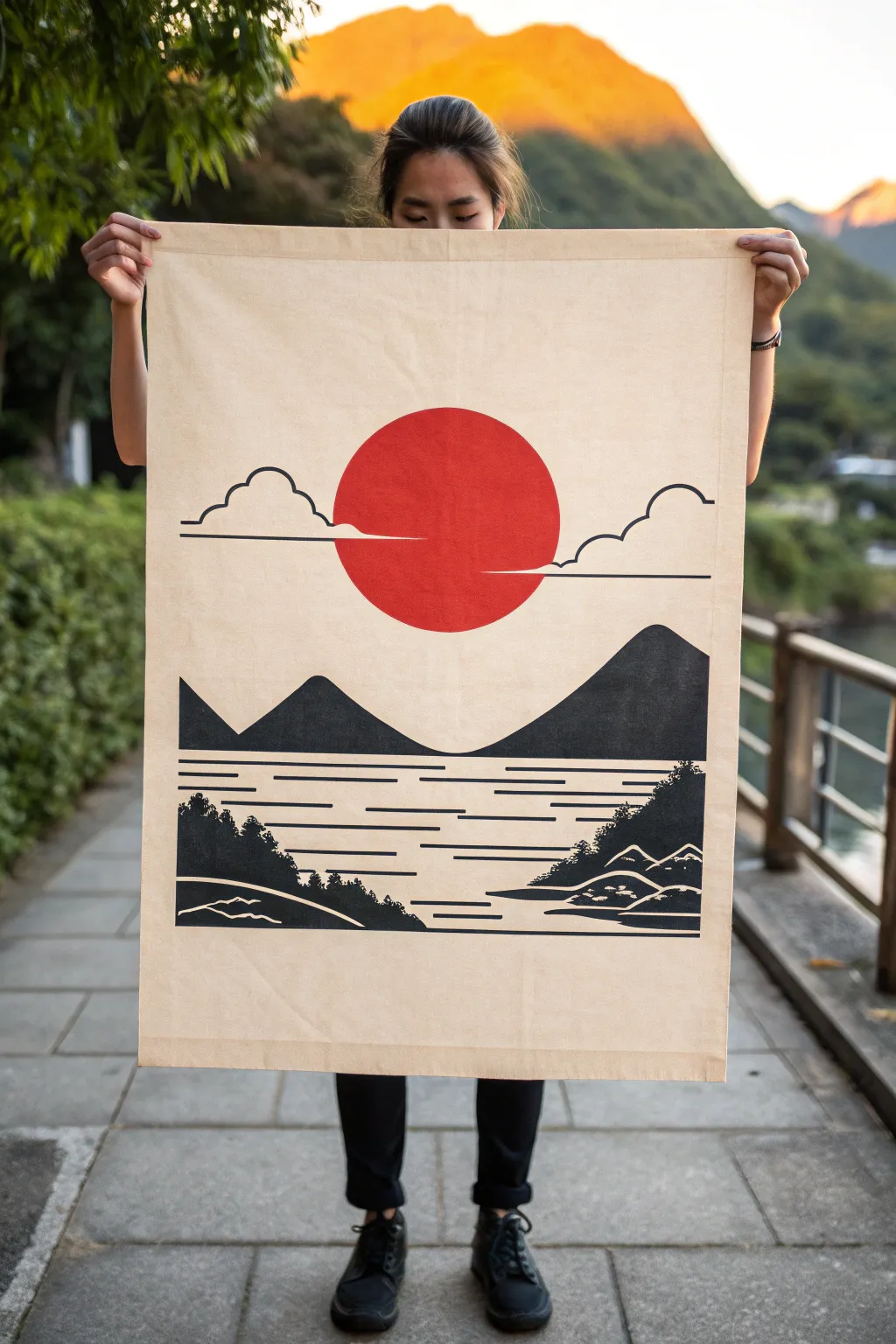
Embrace the serene beauty of Japanese minimalism with this striking fabric wall hanging. Featuring bold silhouettes and the iconic rising sun, this project transforms a simple canvas drop cloth into a sophisticated piece of statement art.
Step-by-Step
Materials
- Large canvas drop cloth or heavy cotton fabric (approx. 24 x 36 inches)
- Fabric paint (black and bright vermilion red)
- Wide flat brush (1-2 inch)
- Medium round brush
- Small detail brush
- Painter’s tape or masking tape
- Large circular object (like a serving platter or bucket lid) or compass
- Pencil
- Ruler or straight edge
- Iron and ironing board
- Old newspapers or cardboard (for surface protection)
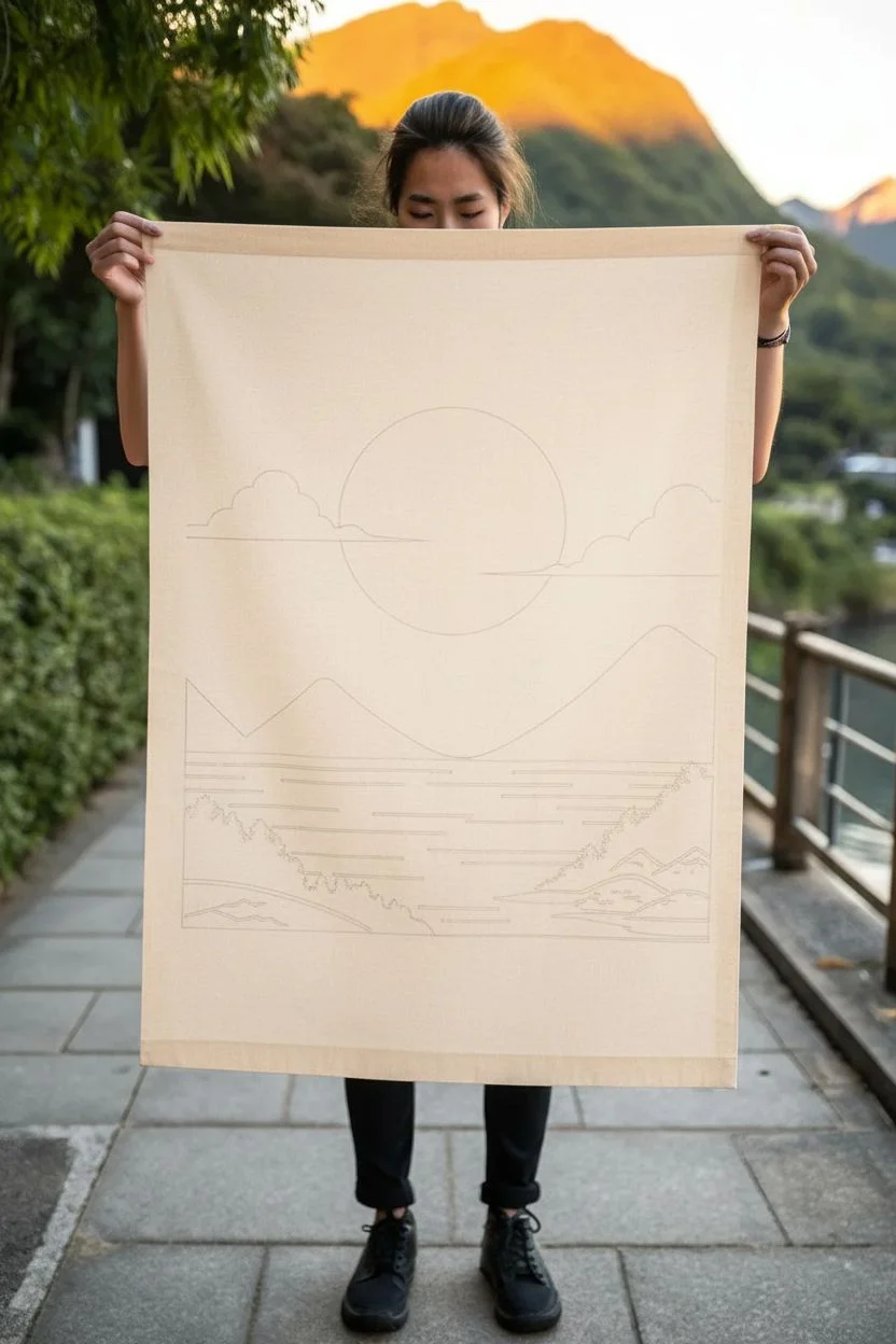
Step 1: Preparation & Layout
-
Prepare your canvas:
Start by cutting your fabric to your desired size (around 24 by 36 inches works well) and ironing it perfectly flat to remove any creases. -
Hem the edges:
Fold over the raw edges about half an inch and press them with an iron. You can sew a simple straight stitch to secure them, or use fabric glue for a no-sew option. -
Protect your workspace:
Lay down plenty of newspaper or cardboard on your table, as the fabric paint might bleed through the canvas weave. -
Draft the sun:
Position your large circular object centrally in the upper third of the fabric. Trace lightly around it with a pencil to create the sun outline. -
Sketch the landscape:
Using your pencil, lightly sketch the horizon line about halfway down. Draw the rolling peaks of the mountains and the distinct cloud shapes floating near the sun.
Bleeding Lines?
If paint bleeds into the fabric weave, don’t panic. Let it dry, then use a white paint pen or a stiff brush with white acrylic to tidy up the messy edges.
Step 2: Painting the Sun & Sky
-
Outline the sun:
Load your medium round brush with vermilion red fabric paint. Carefully paint along the pencil line of the circle to create a crisp edge. -
Fill the circle:
Switch to a wider flat brush to fill in the rest of the sun. Apply the paint evenly, working in one direction to minimize brushstrokes. -
Create the clouds:
Using a thin detail brush and black paint, trace the outlines of the clouds. Keep the lines consistent in thickness for that graphic, poster-like quality. -
Add cloud details:
Horizontal lines anchor the clouds; ensure these lines are perfectly straight by using a ruler if your hand isn’t steady.
Make it hang
Create a loop at the top hem and slide a wooden dowel through it. Tie a piece of jute twine to both ends of the dowel for an authentic rustic hanging mechanism.
Step 3: The Mountains & Water
-
Paint the mountain peaks:
With black paint and a flat brush, fill in the mountain shapes. Ensure the paint is opaque; I often apply a second coat here for deep, solid coverage. -
Design the water ripples:
Below the mountains, use a ruler and pencil to mark out evenly spaced horizontal lines for the water ripples. -
Paint the ripples:
Using the medium brush and black paint, go over your ripple guides. Vary the lengths of the lines creates a sense of movement and reflection.
Step 4: Foreground Details
-
Add foreground land:
In the bottom corners, sketch and paint irregular black shapes to represent the shoreline or rocky outcrops. -
Paint silhouettes:
Use the tip of your detail brush to dab small, textured shapes along the top of the foreground land, mimicking the look of distant trees or bushes. -
Add white highlights:
If you are painting on a darker beige fabric, you might need a touch of white paint for the stylized waves or mountain caps in the foreground, though negative space works too. -
Set the paint:
Allow the entire piece to dry for at least 24 hours. Once dry, heat set the ink by ironing the back side of the fabric on a cotton setting.
Hang your new masterpiece in a well-lit spot to admire the bold contrast and peaceful energy it brings to the room


Ukiyo-e Style Great Wave
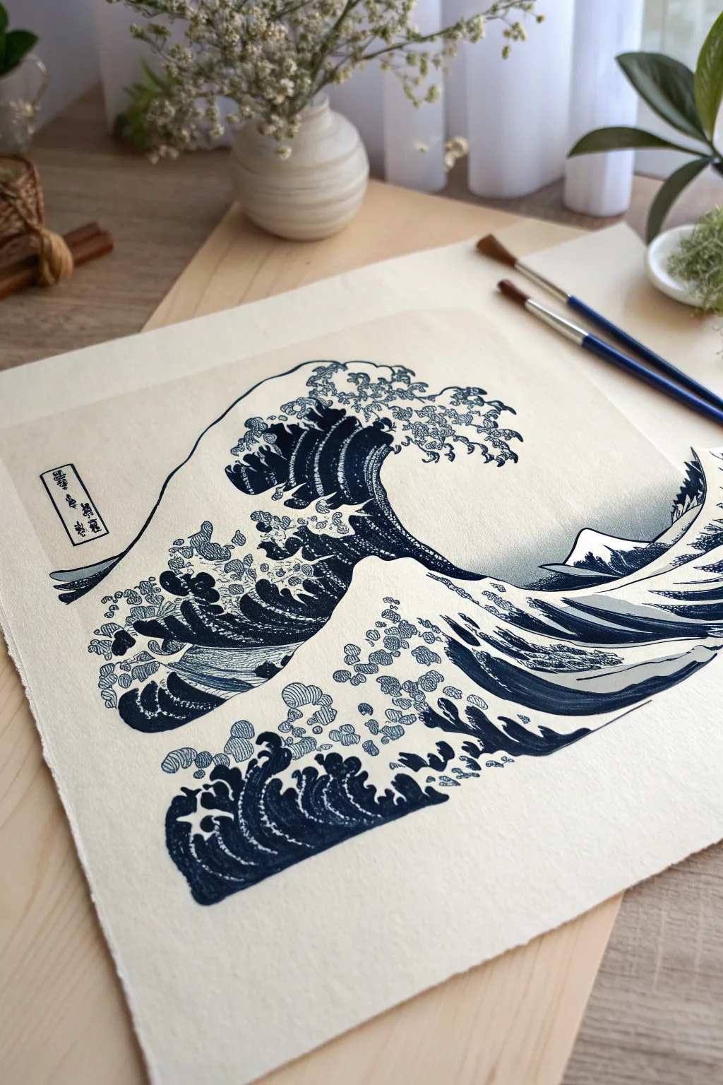
Immortalize the power of the ocean by recreating one of the most famous images in art history, The Great Wave off Kanagawa. This project guides you through capturing the distinctive claw-like crests and deep indigo hues using watercolors on textured paper for an authentic Ukiyo-e aesthetic.
Step-by-Step Tutorial
Materials
- Cold press watercolor paper (heavyweight, 300gsm)
- Pencil (HB or H)
- Kneaded eraser
- Watercolors (Prussian Blue, Indigo, Ivory Black)
- Round brushes (sizes 2, 4, and 6)
- Fine liner brush (size 0 or 00)
- Masking tape
- Mixing palette
- Jar of water
- Paper towels
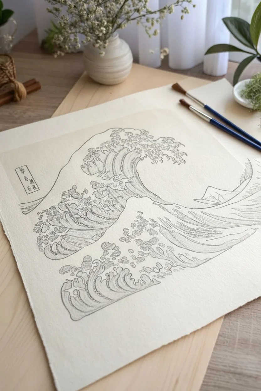
Step 1: Sketching the Composition
-
Prepare the paper:
Tape down your watercolor paper to a board to prevent buckling. Because we want a specific vintage look, you can lightly tone the paper first with a very diluted wash of yellow ochre or tea and let it dry completely, though standard white works beautifully too. -
Map the horizon:
Start your pencil sketch by placing the low horizon line about one-third of the way up the page. Draw a small triangular shape for Mount Fuji in the background, keeping it off-center to the right. -
Draft the main curve:
Draw the iconic sweeping curve of the great wave. Start from the left, sweeping down low, and then arching high up towards the center-left. This primary line dictates the energy of the piece. -
Sketch the secondary wave:
In the foreground, draw the smaller, second wave swelling up from the bottom right corner. Its peak should look like a smaller sibling to the massive wave above it. -
Detail the crests:
Carefully sketch the jagged, claw-like foam at the top of the wave. These shouldn’t be random scribbles; look closely at the reference to replicate the distinctive ‘fingers’ of foam reaching out. -
Add the boats (optional):
If you want to be true to the original, sketch the long, thin rowing boats tucked into the troughs of the waves. In our featured image, they are subtle, so you can omit them for a pure seascape focus.
Step 2: Applying the Prussian Blue
-
Mix your blues:
Prepare two puddles of blue paint. One should be a pure Prussian Blue (a bright, deep blue) and the other a darker Indigo (Prussian Blue mixed with a touch of Ivory Black). -
Paint the wave stripes:
Using a size 4 brush and your Indigo mix, paint the distinct stripes inside the main body of the wave. These bands of color should follow the curve of the water, leaving thin white paper gaps between them. -
Fill the gradients:
Switch to the lighter Prussian Blue. While the dark stripes are still slightly damp (but not wet), fill in the upper sections of the wave body. I find this helps blend the edges slightly for a woodblock print effect. -
Darken the depths:
Apply the darkest Indigo mix to the trough behind the second wave and the underside of the great wave’s arch. This contrast creates the feeling of volume and depth. -
Paint the background sky:
Using a very diluted grey or pale blue, wash in the sky area. Leave the area around Mount Fuji and the foam completely white. Keep this wash transparent to mimic the aging of a woodblock print.
Brush Control Tip
For the crispest “claw” lines on the foam, hold your brush perpendicular to the paper. Breathing out as you make the stroke steadies your hand.
Step 3: Refining Details and Linework
-
Outline the foam:
Once the main blue areas are dry, take your size 0 liner brush with a concentrated Indigo mixture. Carefully outline the white foam claws. The line weight should vary slightly—thicker at the base, thinner at the tips. -
Dot the spray:
Using the tip of your small brush, add the detached dots of foam spraying off the main wave. These circles should be deliberate and separate, hanging in the air like frozen droplets. -
Define Mount Fuji:
Paint the body of the mountain with a dark blue wash, blending up toward a white, snowy peak. Use your liner brush to add a crisp outline to the mountain. -
Texture the water surface:
Add fine, rhythmic lines to the smaller wave in the foreground. These lines represent the ripples and current, moving in the direction of the swell. -
Clean up edges:
Check the boundaries where the blue water meets the white foam. If the contrast isn’t sharp enough, carefully go back in with your liner brush to crisp up those edges. -
Add the cartouche:
If you’re feeling adventurous, draw the small rectangular box in the top left corner. Use a fine liner to simulate the Japanese characters (Kanji) for the title and signature.
Level Up: Tea Staining
After the ink is totally waterproof/dry, lightly brush diluted black tea over the whole paper. This mimics the aged paper look of antique 19th-century prints.
Now step back and admire how a few shades of blue have captured the eternal motion of the sea


Koi Fish in a Circular Pond
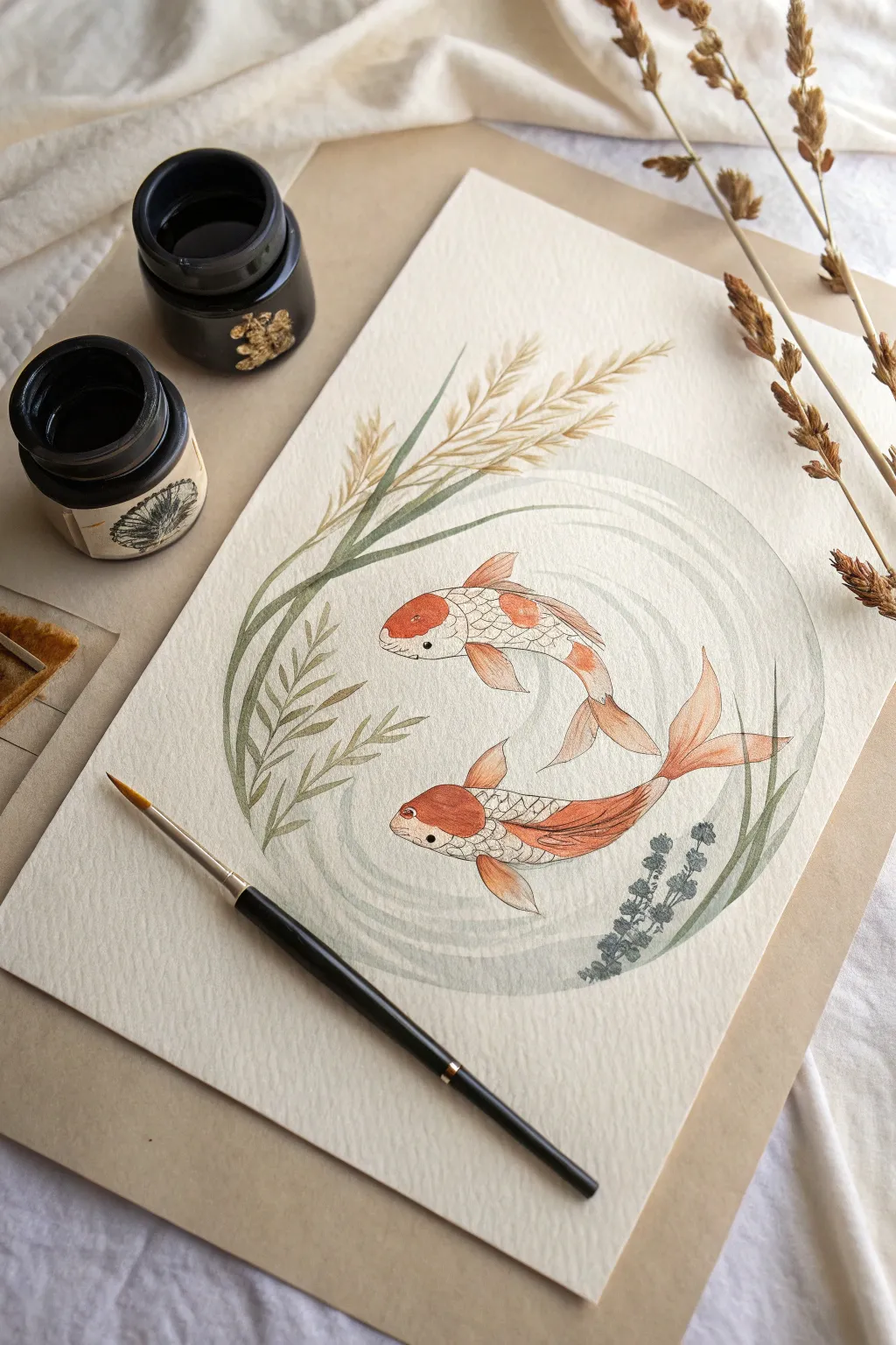
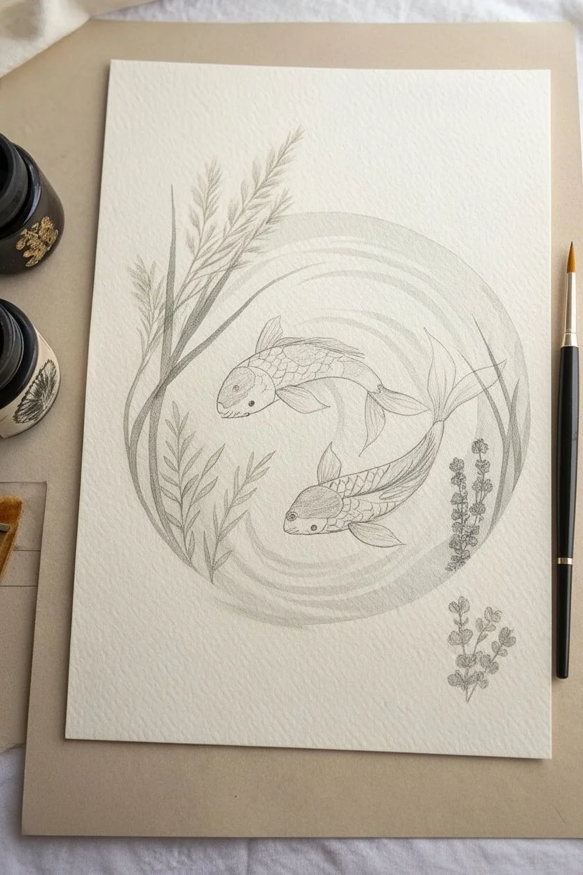
Capture the tranquil beauty of nature with this illustrative watercolor painting featuring two koi fish swimming in a harmonious loop. The composition uses a circular water motif and gentle reeds to frame the subjects, creating a balanced and peaceful piece of art.
Detailed Instructions
Materials
- Cold press watercolor paper (300 gsm)
- HB pencil for sketching
- Kneaded eraser
- Waterproof fine liner pen (brown or sepia, 0.1mm)
- Watercolor paints (Vermilion, Burnt Sienna, Sap Green, Olive Green, Indigo, Payne’s Grey)
- Round watercolor brushes (sizes 2, 4, and 6)
- Small flat brush (optional, for lifting)
- Clean water jars
- Paper towels
Step 1: Sketching the Composition
-
Establish the ripple guide:
Begin by lightly drawing a large circle in the center of your paper using your HB pencil. This doesn’t need to be perfect, as it serves as a loose guide for the water ripples later. -
Outline the koi bodies:
Sketch two curved teardrop shapes swimming opposite each other within the circle. Position the top fish swimming left-to-right and the bottom fish right-to-left to create a yin-yang flow. -
Add fin details:
Draw the pectoral fins extending from the sides and the dorsal fin along the back. Sketch the sweeping tail fins, keeping the lines fluid to suggest movement through water. -
Position the flora:
Sketch long, sweeping blades of grass entering from the bottom left and top left corners. Let them curve naturally around the circular water boundary without being too rigid. -
Refine the seeds and leaves:
Add small, seed-like clusters to the ends of the taller grass stalks and sketch the smaller, leafier plants near the bottom right to balance the composition.
Step 2: Inking the Lines
-
Ink the main outlines:
Using a sepia or brown waterproof fine liner, carefully go over your pencil lines. The brown ink gives a softer, more organic look than black. Leave the circular ripple lines un-inked; we will paint those. -
Add scale texture:
Draw a delicate cross-hatching or net pattern on the bodies of the fish to represent scales. Keep this texture light, especially on the white areas of the koi. -
Erase pencil marks:
Once the ink is completely dry (give it a few minutes to be safe), gently remove the graphite sketch with a kneaded eraser, leaving only the faint pencil guide for the water ripple circle.
Clean Water Is Key
Since the colors here are muted and delicate, dirty water will muddy your painting instantly. Change your rinse water jars as soon as they look cloudy.
Step 3: Painting the Koi
-
Base wash for the markings:
Mix a watery Vermilion with a touch of Burnt Sienna. Paint the patches on the koi’s head and back. I like to drop in a tiny bit more pigment while the wash is wet to create depth. -
Shadowing the white scales:
Dilute a tiny amount of Payne’s Grey or a light beige. Gently paint along the bottom edge of the fish bodies to give them volume, keeping the centers bright white. -
Coloring the fins:
Use a light wash of the orange mixture for the fins and tails. As you reach the tips, transition to a slightly darker, more reddish tone to define the edges. -
Painting the eye:
Carefully paint the eye solid black or dark brown, leaving a tiny pinprick of white paper unpainted for the highlight.
Make It Shimmer
Add a touch of metallic gold watercolor to the fish scales or the water ripples for a magical, light-catching effect that mimics sunlight.
Step 4: Painting the Surroundings
-
Greenery base layer:
Mix Sap Green with a little Olive to get a natural, muted tone. Paint the long grass blades, varying the pressure on your brush to get thick and thin lines. -
Detailing the seeds:
Use a warm beige or light brown for the seed heads at the top. Use a stippling motion with the tip of your smallest brush to create texture. -
Darker plant accents:
For the small plant in the bottom right, use a mix of Indigo and Green for a darker, cooler tone that contrasts with the warm fish.
Step 5: Creating the Water
-
Mixing the water tone:
Create a very dilute wash of greenish-grey. You want this to be incredibly faint—barely there. -
Painting the ripples:
Using a size 6 brush, paint curved strokes following your original circular guide. Leave gaps of white paper between the strokes to simulate light reflecting on ripples. -
Softening edges:
If a water line looks too hard, quickly run a clean, damp brush along the edge to soften it into the paper.
Step 6: Final Touches
-
Deepening contrast:
Once the first layers are dry, come back with slightly more concentrated orange paint to deepen the shadows on the koi markings. -
Highlighting scales:
If you lost any scale definition, use your fine liner to re-emphasize a few key lines, particularly near the gills and dorsal fin.
Allow your painting to dry completely flat before framing or displaying your peaceful pond scene

PENCIL GUIDE
Understanding Pencil Grades from H to B
From first sketch to finished drawing — learn pencil grades, line control, and shading techniques.
Explore the Full Guide
Bamboo Stalks and Leaves Practice
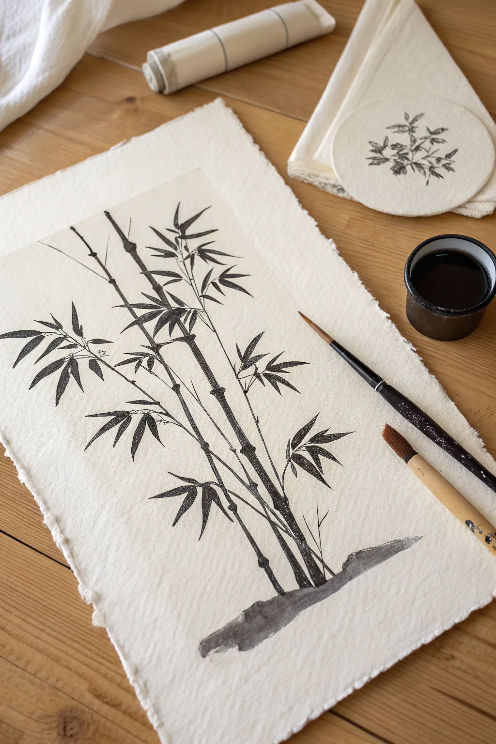
Master the gentle art of sumi-e with this elegant bamboo composition, where each stroke captures the strength and flexibility of the plant. Using deep black ink on textured, deckle-edged paper, you’ll learn to balance negative space with striking, organic forms.
Step-by-Step
Materials
- Textured watercolor paper or handmade rice paper (deckle edge recommended)
- Black Sumi ink or liquid India ink
- Medium pointed round brush (bamboo brush or calligraphy brush)
- Fine detail brush (liner or rigger)
- Small ceramic ink dish
- Paper towels
- Pencil (optional for light guides)
- Water container
Step 1: Preparation and Grounding
-
Paper Selection:
Choose a heavyweight, textured paper with rough, torn edges to mimic the rustic look of the example. Place it vertically on your work surface. -
Ink Preparation:
Pour a small amount of liquid ink into your dish. If using an ink stick, grind it until you have a rich, opaque black tone. -
The Ground Line:
Dip your medium brush into the ink and blot excess moisture. Create the earthy base at the bottom center of the page with a few broad, horizontal sweeping strokes. Vary the pressure to create a jagged, natural rock-like shape.
Step 2: Painting the Stalks
-
First Stalk Placement:
Start with the main stalk on the right. Using the medium brush, paint an upward stroke starting from the ground base. Lift the brush slightly at the end of the segment to create the ‘node’. -
Building Height:
Continue adding segments upward in a straight line, leaving tiny gaps between each segment to represent the bamboo nodes. I generally make the lower segments slightly thicker than the upper ones. -
Adding the Second Stalk:
Paint a second, slightly thinner stalk to the left of the first one. Angle it slightly outward so the two stalks aren’t perfectly parallel. -
The Third Stalk:
Add a third stalk crossing behind or in front of the others, creating a pleasing asymmetry. Ensure the segments maintain that bone-like structure typical of bamboo. -
Connecting the Nodes:
With a fine detail brush or the very tip of your round brush, draw thin, curved lines across the gaps between segments to distinctively mark the joints.
Ink Bleeding Too Much?
If your ink spreads uncontrollably, your brush is too wet or the paper is too absorbent. Try blotting your brush on a paper towel before painting or switch to a ‘sized’ paper.
Step 3: Branches and Leaves
-
Sprouting Branches:
Switch to your finer brush. Draw thin, angular branches emerging from the nodes of the stalks. Use quick, confident flicks rather than slow drags. -
Leaf Technique:
Practice the classic bamboo leaf stroke on a scrap paper first: press the belly of the brush down firmly, then lift quickly as you pull away to create a sharp point. -
Grouping Leaves:
Paint clusters of 3 to 5 leaves attached to the branch tips. Arrange them in fan-like patterns, ensuring some overlap for depth. -
Directional Flow:
Vary the direction of the leaf clusters. Some should point upwards towards the sun, while lower ones might droop slightly under their own weight. -
Adding Density:
Fill in the middle section of the composition with more dense clusters of leaves, keeping the top and bottom airier to maintain balance. -
Tiny Details:
Use the finest tip to add very small, twig-like offshoots near the base or on bare sections of the branches. -
Ground Integration:
Add a few small, grass-like strokes springing up from the ink wash base you created in the first step to ground the composition. -
Final Assessment:
Step back and look at the overall balance. If a spot looks too empty, add a small floating leaf or a thin twig, but be careful not to overwork it.
Mastering the Stroke
Hold the brush perpendicular to the paper. Use your arm and shoulder, not just your wrist, to pull the brush for longer, more fluid bamboo stalk lines.
Let the ink dry completely to reveal the beautiful contrast of the deep black against the natural paper tone
Paper Lanterns on a String
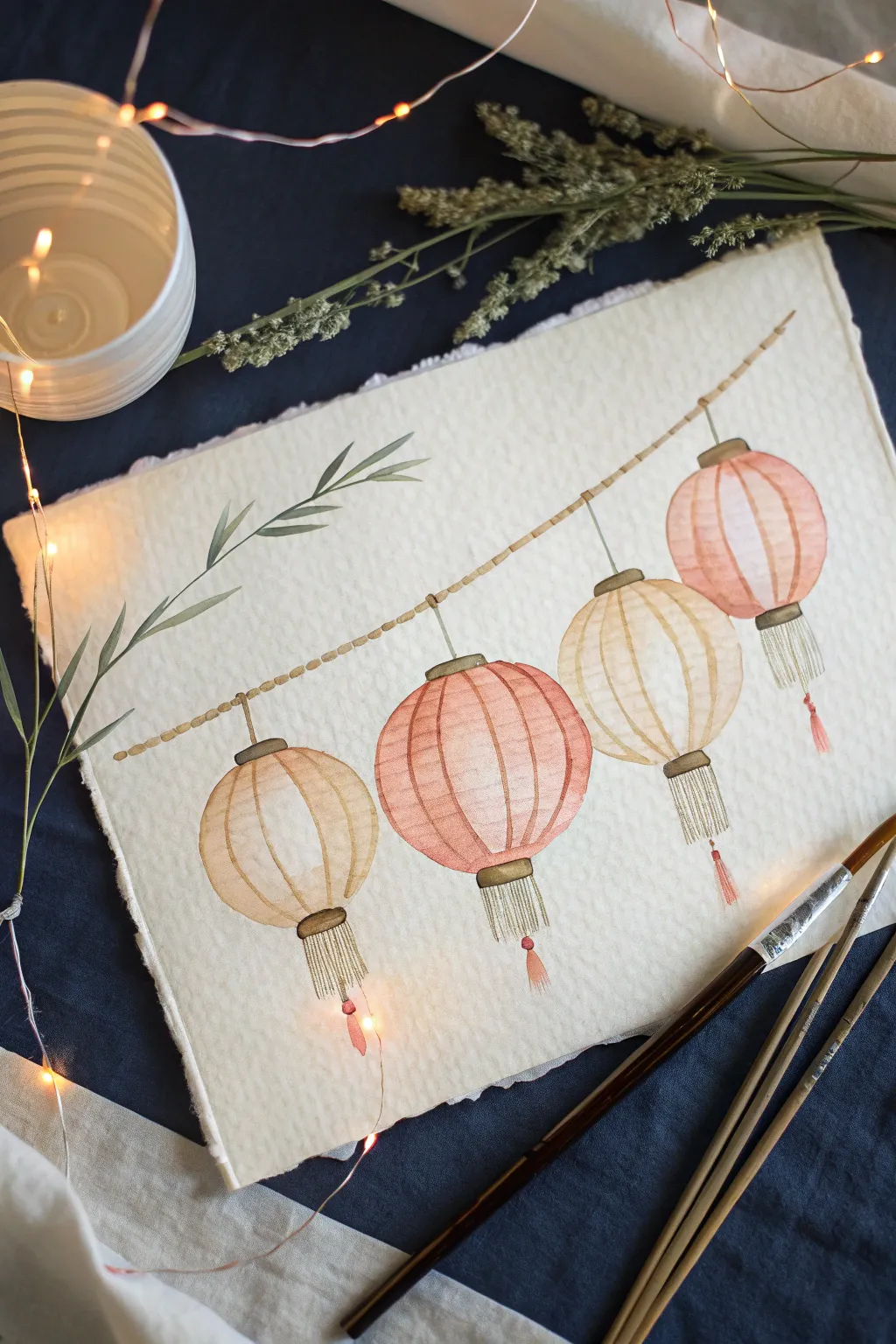
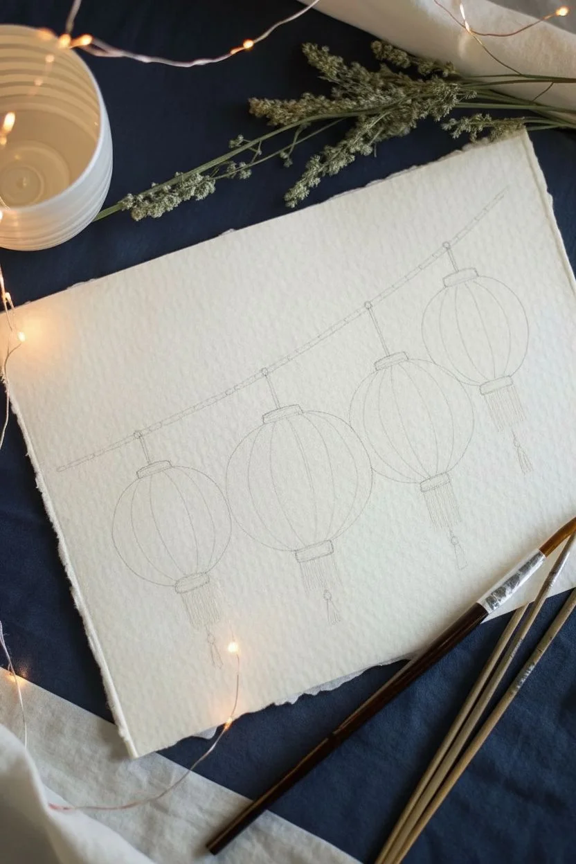
Capture the soft glow of a gentle evening with this delicate watercolor illustration featuring four paper lanterns strung casually across the page. The warm peach and cream tones create a cozy, nostalgic atmosphere perfect for beginners looking to practice wet-on-dry techniques.
Step-by-Step Guide
Materials
- Cold press watercolor paper (deckled edge optional)
- Watercolor paints (Peach, Burnt Sienna, Yellow Ochre, Paynes Gray)
- Round brushes (flats sizes 4 and 0 for details)
- Pencil (HB or 2H)
- Kneadable eraser
- Clean water jar
- Paper towel
Step 1: Sketching the Layout
-
Draw the main line:
Begin by lightly sketching a diagonal, slightly curved line across your paper from the top right to lower left. This will serve as the string holding your lanterns. -
Outline the lantern shapes:
Sketch four oval shapes hanging from the string. Make them slightly different sizes to add natural variety, ensuring they are evenly spaced but not rigid. -
Add structural details:
At the top and bottom of each oval, draw small rectangular caps. From the bottom cap, lightly sketch vertical lines to indicate where the tassels will hang. -
Define the ribs:
Draw curved vertical lines following the contour of each oval to represent the bamboo ribs of the lanterns. These should curve outward, mimicking the roundness of the form. -
Lighten the pencil marks:
Gently roll your kneadable eraser over the entire sketch. You want the lines purely as a faint guide so the graphite doesn’t muddy your transparent watercolors.
Step 2: Painting the Lanterns
-
First wash – Peach lanterns:
Mix a watery wash of Peach with a touch of Burnt Sienna. Paint the second and fourth lanterns (counting from the left). Use the wet-on-dry technique, filling the segments between the ribs carefully. -
First wash – Cream lanterns:
While the pink lanterns dry, mix Yellow Ochre with plenty of water for a pale cream tone. Paint the first and third lanterns. Leave tiny slivers of white paper near the center of a few segments to suggest a highlight. -
Adding dimension:
Once the first layer is barely damp, take a slightly more concentrated mix of your respective colors. touched along the outer edges of the lantern segments to create a rounded, 3D effect. -
Painting the caps:
Using a small brush and a mix of Paynes Gray and Burnt Sienna, paint the top and bottom caps of each lantern. Keep this color muted and earthy rather than a harsh black. -
Defining the ribs:
With your smallest brush (size 0) and the dark brown mix, carefully trace over the vertical rib lines you sketched earlier. Keep your hand loose so the lines don’t look too perfect.
Preserve the Glow
To make the lanterns look illuminated, leave the center of each segment unpainted or blot it with a tissue while wet. This white space mimics light shining from within.
Step 3: String and Tassels
-
Painting the rope:
Using the same earthy brown mix, paint the diagonal string. Instead of a solid line, use small, dashed strokes that connect to resemble a twisted rope texture. -
Creating tassel bodies:
For the tassels, mix a very dilute gray-green or beige wash. Paint fine, vertical strokes hanging from the bottom caps. Keep these dry and wispy. -
Detailing the tassels:
I like to add a tiny dot of red or pink at the very bottom of the tassel string or the connecting knot for a pop of color, just like traditional designs. -
Adding connecting hooks:
Draw a thin vertical line connecting the top of each lantern cap to the main rope string, showing how they dangle. -
Finishing touches:
Step back and assess your values. If the lanterns look too flat, add a final glaze of color to the shadow sides (usually the bottom left) to deepen the form.
Add Metallic Magic
Once fully dry, trace the bamboo ribs or the tassel strings with a gold gel pen or metallic watercolor. It catches the light beautifully when you hang the art.
Now you have a serene string of lanterns ready to brighten up your sketchbook or wall
BRUSH GUIDE
The Right Brush for Every Stroke
From clean lines to bold texture — master brush choice, stroke control, and essential techniques.
Explore the Full Guide
Geisha-Inspired Profile Sketch
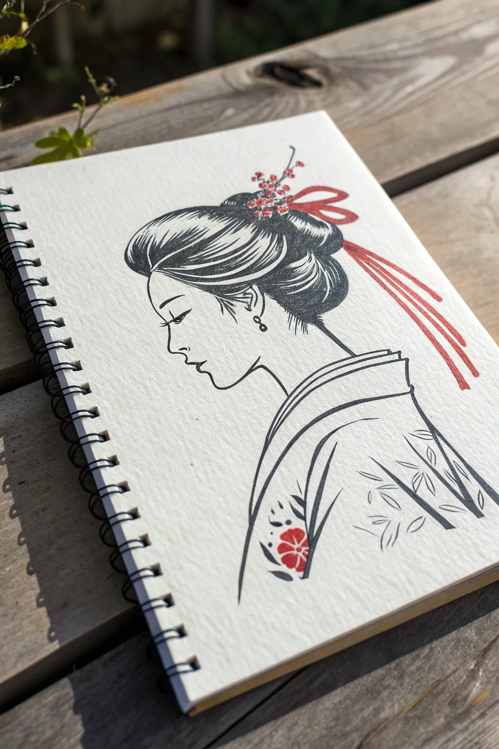
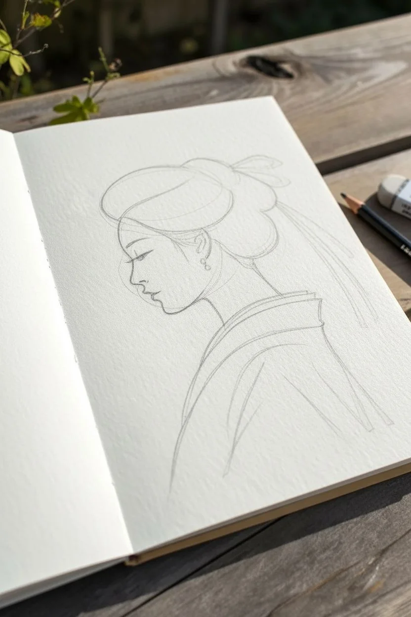
Capture the graceful silhouette of a traditional figure with this minimalist black ink drawing featuring striking red accents. Using a clean line style that mimics woodblock prints, this sketch focuses on the delicate profile, elaborate hairstyle, and simple kimono details.
Step-by-Step Guide
Materials
- Spiral-bound sketchbook (heavyweight mixed media paper recommended)
- Fine liner pens (Black, sizes 0.1, 0.3, and 0.5)
- Brush pen or bold marker (Black)
- Red fine liner or gel pen
- Red marker or watercolor brush pen
- Pencil (HB or 2B)
- Eraser
Step 1: Planning the Silhouette
-
Rough pencil framework:
Begin by lightly sketching a loose oval for the head and a gentle curve extending downward for the neck and shoulder. Position the head slightly to the left to leave room for the elaborate hair. -
Profile refinement:
Carve out the facial profile using your pencil. Focus on a high forehead, a small indent for the eye socket, a delicate nose, and clearly defined lips and chin. Keep the lines soft at this stage. -
Hair volume:
Sketch the large, rounded shape of the hair bun (shimada style) at the back of the head and the sweeping volume over the forehead. Draw the cascading ribbons trailing down the right side. -
Kimono neckline:
Draft the collar of the kimono. It should dip low at the back of the neck (classic geisha styling) and wrap around the shoulders with clean, distinct folds.
Step 2: Inking the Features
-
Defining the face:
Switch to your 0.1 black fine liner. Carefully trace the profile line you established. Draw the closed eye with a sweeping lash line and a thin, curved eyebrow above it. -
Ear and earring:
Ink the ear detail just behind the jawline. Add a small dangle earring using a tiny circle and a teardrop shape. -
Neck and shoulder:
Extend the ink line down the neck and across the shoulder. Keep this line smooth and continuous to emphasize elegance.
Smudge Prevention
If you are right-handed, work from left to right to avoid smearing the wet ink. If smudges happen, turn them into falling petals or extra hair strands.
Step 3: Hair and Ornamentation
-
Hair strands texturing:
Using a 0.3 pen, draw long, sweeping curves inside the hair outline to represent strands. Follow the direction of the hair being pulled back into the bun. -
Adding weight:
Switch to a thicker brush pen or 0.5 marker to fill in the darker shadowed areas of the hair, particularly at the nape of the neck and the underside of the bun. Leave white highlights visible to show shine. -
Floral hairpins:
With your red fine liner, draw tiny five-petaled flowers clustering where the bun meets the main hair section. Add small stems connecting them. -
The ribbon:
Outline the flowing ribbon with red ink. Fill the ribbon shape using a red marker or by hatching closely with the red pen, leaving small gaps for texture.
Stamp Texture
To mimic a woodblock print, don’t color the black areas perfectly solid. Leave tiny flecks of white paper showing through for a rustic, hand-stamped look.
Step 4: Garment Details
-
Collar lines:
Use the 0.5 black pen to outline the thick kimono collar. Create a double line to show the layers of the garment folding over each other. -
Sleeve and body:
Draw the swooping curve of the kimono sleeve. The lines should feel weighted—thicker in shadow areas and thinner at the top edges. -
Bamboo pattern:
On the back of the kimono, sketch simple bamboo leaf shapes using swift, tapered strokes with a brush pen or thick marker. -
Shoulder motif:
Near the front shoulder, draw a small floral motif. Outline the leaves in black and accent the flower center with your red marker. -
Final clean-up:
Wait at least 10 minutes for all ink to dry completely. Gently erase all visible pencil guidelines to leave a crisp, high-contrast illustration.
Now you have a serene and classic piece of art ready to display in your sketchbook
Samurai Helmet and Katana Study
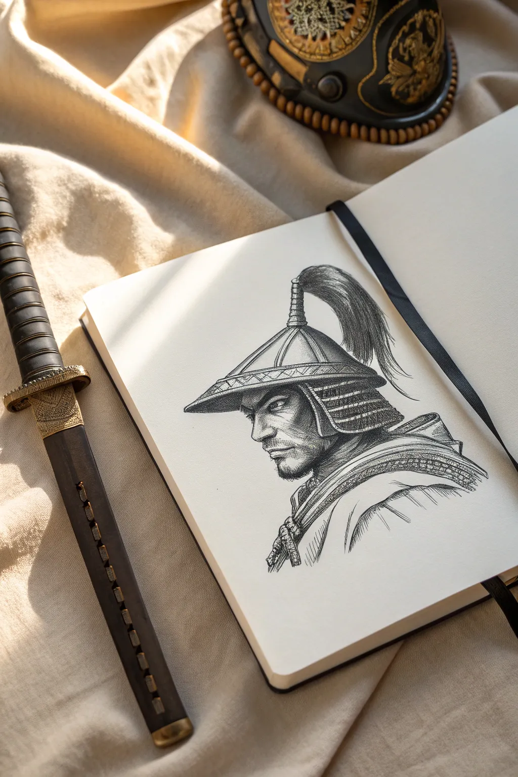
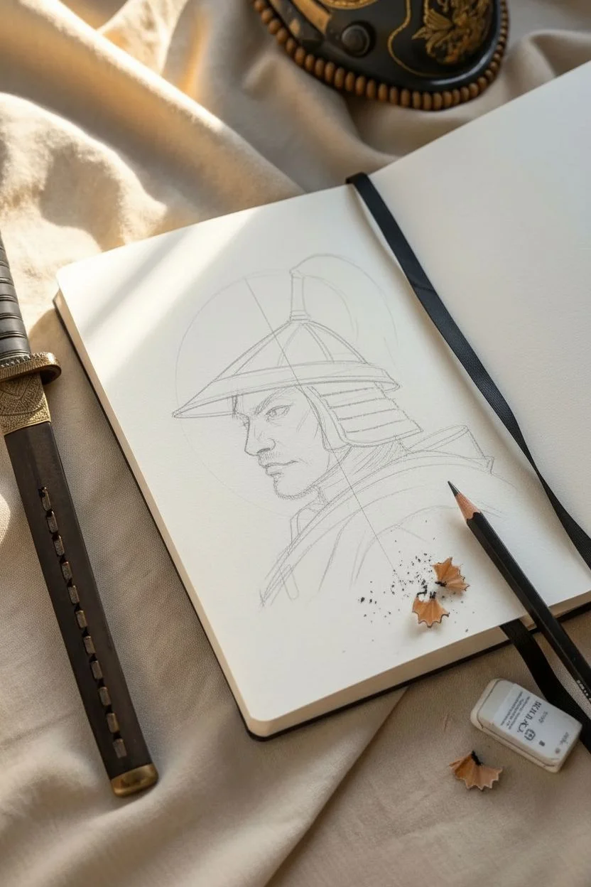
Capture the stoic intensity of a feudal warrior with this detailed pen and ink study. By focusing on cross-hatching textures and strong profile lines, you will create a drawing that feels both historical and strikingly modern.
Detailed Instructions
Materials
- High-quality sketchbook (smooth or vellum finish)
- Fine liner pens (sizes 0.05, 0.1, 0.3, and 0.5mm)
- HB graphite pencil for sketching
- Kneaded eraser
- Ruler (optional for helmet angles)
Step 1: Structural Sketching
-
Establish the Head Shape:
Begin with your HB pencil, drawing an oval for the main head shape and a vertical line to mark the profile edge. Keep your pressure extremely light so these lines can be erased easily later. -
Outline the Jaw and Neck:
Refine the jawline, making it strong and angular. Extend the neck lines down into the collar area, suggesting the thick fabric of the under-armor. -
Rough in the Helmet Geometry:
Draw the basic triangular shape of the kabuto (helmet) sitting atop the head. Mark the curved brim that extends over the forehead and the tiered neck guard (shikoro) at the back. -
Position Facial Features:
Mark the eye placement just beneath the helmet’s brim shadow. Sketch the nose bridge and the stern set of the mouth to establish the warrior’s determined expression.
Hatching Secret
Don’t cross-hatch at 90-degree angles immediately. Layer diagonal lines at slight angle variations to build up deeper, richer shadows gradually.
Step 2: Defining the Features
-
Initial Eye Detail:
Switch to your 0.1mm fine liner. Carefully outline the eye, adding the heavy upper lid and the intense pupil. Leave a tiny speck of white for a highlight. -
Nose and Brow Construction:
Use the 0.1mm pen to trace the profile of the nose and the heavy brow line. Use short, flicking strokes to suggest the texture of the eyebrow hair. -
Refining the Beard:
With the 0.05mm pen, start adding the stubble and beard. Instead of drawing a solid block, use hundreds of tiny dots and short dashes to build up the density of the facial hair on the chin and jaw. -
Contouring the Face:
Use minimal hatching lines under the cheekbone and around the temple to give the face three-dimensional form without overworking it.
Step 3: Armor and Helmet Work
-
Inking the Helmet Brim:
Outline the helmet’s brim with a thicker 0.3mm pen to give it weight. Add the decorative triangular patterns along the edge using fine lines. -
Constructing the Neck Guard:
Draw the horizontal tiers of the neck guard. Use the 0.1mm pen to add vertical hatching between the tiers, simulating the laced cords (odoshi) that hold the armor plates together. -
Creating Metal Texture:
On the main dome of the helmet, use vertical hatching lines that follow the curve of the metal. Keep these lines consistent to show the sheen of the material. -
Drawing the Crest:
Outline the Tehen (the fixture at the top of the helmet) and sketch the long, flowing horsehair tail. Use long, sweeping S-curves with the 0.3mm pen to show the hair’s movement. -
Adding Volume to the Hair:
Go back into the crest with your 0.05mm pen. Add much finer lines in between the thick ones to create depth and softness in the horsehair plume.
Aged Aesthetic
Lightly wash the paper with diluted tea or coffee before drawing. Once dry, your ink drawing will look like it was sketched on ancient parchment.
Step 4: Texturing and Final Touches
-
Collar Fabrics:
Outline the robes and armor collar. Use cross-hatching to differentiate the textures—tight cross-hatching for the heavy armor collar, and looser, flowing lines for the fabric underneath. -
Deepening Shadows:
Switch to a 0.5mm pen to darken the deepest shadows: under the helmet brim, beneath the chin, and in the folds of the neck guard. This high contrast brings the drawing to life. -
Skin Texture:
I like to return to the face at this stage with the 0.05mm pen, adding very faint stippling (dots) across the cheek and nose to suggest skin pores and weathering. -
Cleanup:
Once the ink is completely dry—give it a good five minutes to be safe—gently erase all underlying pencil sketch lines with your kneaded eraser. -
Final Contrast Check:
Step back and look at the drawing. Strengthen the outer contour line of the entire figure with a 0.5mm pen to make it pop off the page.
With the final shadows in place, you now have a timeless piece of warrior art ready to display


Maneki-Neko Lucky Cat Doodle
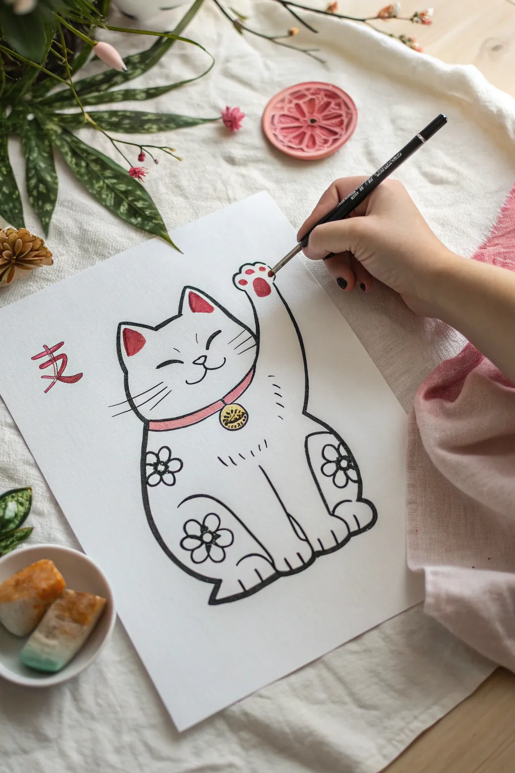
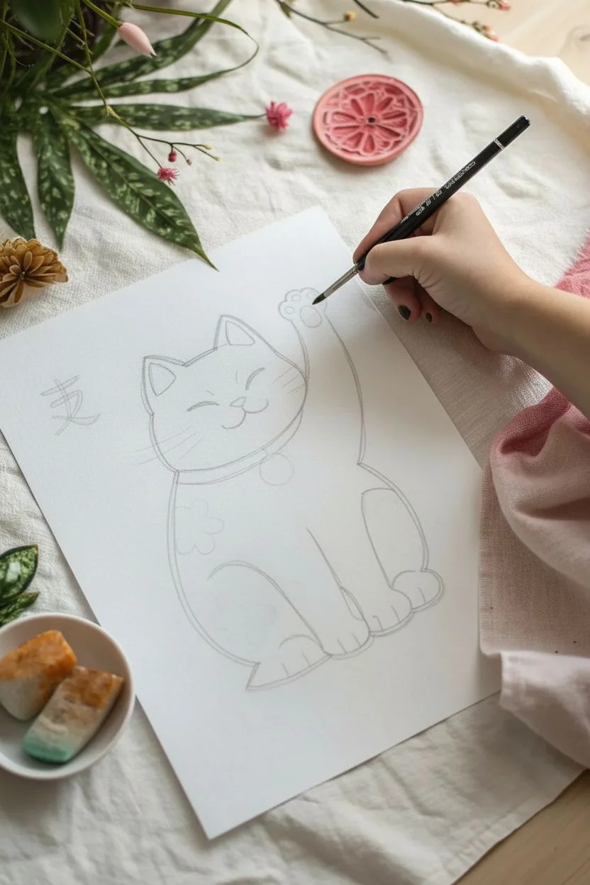
Summon good fortune to your sketchbook with this charming Maneki-Neko illustration. Featuring bold, clean lines and gentle pops of red and gold, this friendly feline is a delightful exercise in creating character through simple shapes.
Step-by-Step Tutorial
Materials
- Heavyweight drawing paper or mixed media paper
- Fine liner pen (Black, 0.5 or 0.8mm)
- Thicker marker or brush pen (Black)
- Watercolor paints or colored markers (Red, Pink, Gold/Yellow)
- Small round paintbrush (size 2 or 4)
- Pencil (HB)
- Eraser
Step 1: Sketching the Framework
-
Outline the body shape:
Begin with a light pencil sketch. Draw a large, soft oval shape for the body, slightly wider at the bottom to give the cat a seated posture. -
Add the head and ears:
Sketch a rounded shape on top for the head, seamlessly connecting it to the body. Add two triangles for ears, softening the tips so they aren’t too sharp. -
Draw the raised paw:
Extend the right arm upwards in a welcoming wave. The paw should curve slightly inward, with defined rounded toes at the very top. -
Sketch the resting legs:
Define the front legs within the main body shape. The left leg should be straight down, ending in a paw, while the back legs appear as rounded humps on either side of the base.
Step 2: Inking the Details
-
Refine the face:
Using your pencil, place the features. Draw two closed, curved eyes for a happy expression, a small triangular nose, and a ‘w’ shape for the mouth. -
Add the collar and accessories:
Draw a curved band around the neck for the collar. Attach a small circle hanging from the center for the traditional bell. -
Sketch floral patterns:
On the cat’s body, lightly sketch three simple five-petal flowers—one on the left shoulder area, one on the right haunch, and one on the lower left side. -
Start the ink outline:
Switch to your thicker black marker or brush pen. Carefully trace the main outer profile of the cat, using varying pressure to create a dynamic line weight. -
Ink the facial features:
Use a finer liner pen for the delicate facial features to keep the expression sweet and uncluttered. -
Detail the paws:
Add small vertical lines on the paws to denote toes. On the raised paw, draw the paw pads—one central pad and smaller toe beans. -
Define the whiskers:
With quick, confident strokes of the fine liner, draw three whiskers extending from each cheek. -
Ink the bell and flowers:
Go over the collar, bell, and floral patterns with the black pen. Draw the kanji character meaning ‘Luck’ or ‘Friendship’ to the left of the cat if desired. -
Erase pencil lines:
Wait for the ink to dry completely to avoid smearing, then gently erase all underlying pencil sketches.
Stroke Confidence
When inking the long curves of the body, move your entire arm rather than just your wrist. This creates smoother, more confident lines compared to jittery short strokes.
Step 3: Adding the Color
-
Paint the red accents:
Load your brush with a vibrant red watercolor or use a marker. Fill in the inside of the ears and the paw pads on the raised hand. -
Color the collar:
Using a softer pink or a diluted wash of the red, carefully color the band of the collar. -
Add gold to the bell:
Paint the small bell with a yellow or metallic gold paint. I find that a metallic gel pen works wonders here for extra shine. -
Detail the kanji:
If you included the Japanese character, carefully trace over it with a red brush or marker to make it stand out. -
Final touches:
Add tiny dashed lines on the body for texture or ‘fur’ marks to break up the white space.
Gold Leaf Finish
Instead of yellow paint, use a tiny dab of glue and a scrap of gold leaf on the bell. It adds a genuine metallic texture that catches the light beautifully.
Display your new artwork where you need a little extra luck or cheer
Enso Circle Scene With Minimal Ink Wash
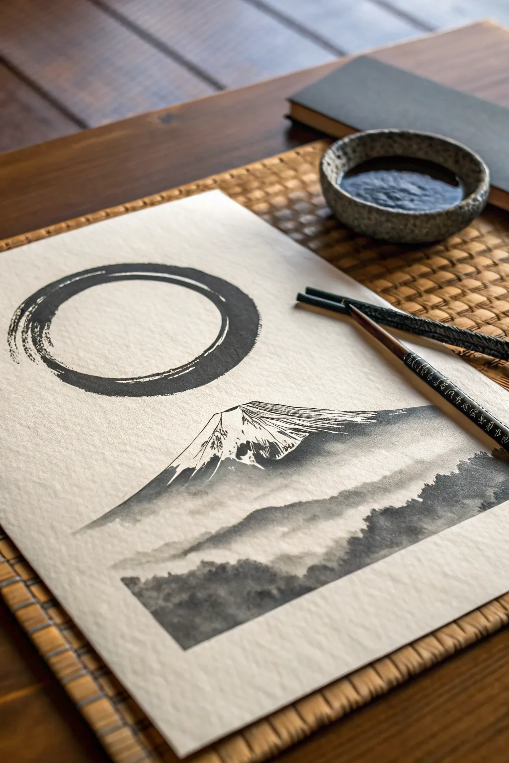
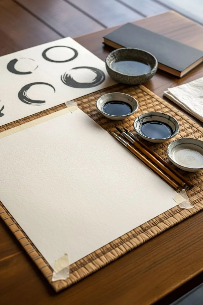
Capture the stillness of a mountain landscape crowned by a dynamic Enso circle using traditional ink wash techniques. This project combines bold, decisive brushwork with delicate tonal gradients to create a striking monochromatic composition.
Step-by-Step Tutorial
Materials
- Heavyweight watercolor paper or Sumi-e rice paper (roughly A4 size)
- Black Sumi ink (liquid or stick)
- Ink stone or small ceramic dish for mixing
- Large bamboo calligraphy brush (for the Enso)
- Medium pointed round brush (for the mountain)
- Small detail brush
- Two water containers (one for clean, one for dirty)
- Paper towels
Step 1: Preparation & Composition
-
Prepare your ink dilutions:
Begin by pouring pure black ink into your dish. Create two additional puddles: one mixed with a little water for a dark grey, and one with more water for a light, misty wash. -
Practice the Enso stroke:
Before touching your final paper, grab a scrap sheet. Load your large brush fully. The goal is to draw the circle in one or two continuous, breathable motions, not a perfect geometric circle. Let the bristles splay slightly. -
Position the paper:
Tape your paper down or place a paperweight at the top. Orient it vertically to allow room for the mountain below the circle.
Step 2: The Enso Circle
-
Load the large brush:
Saturate your large bamboo brush with the pure, undiluted black ink. Wipe the excess slightly on the rim so it doesn’t drip, but keep it juicy. -
Execute the stroke:
Starting near the top left (around 10 o’clock), sweep the brush clockwise. Press down firmly to create the thick part of the ring, then lift slightly as you complete the circle, leaving a small gap or ‘flying white’ streak where the ink runs dry. -
Let it breathe:
Don’t go back to fix it. The beauty of the Enso lies in its imperfections and the honesty of that single moment.
Ink Bleeding Too Much?
If you’re using unsized rice paper, ink spreads instantly. Use less water and move the brush faster. For beginners, watercolor paper or ‘sized’ Xuan paper gives you more control.
Step 3: Mount Fuji
-
Outline the peak:
Switch to your medium brush with the dark grey ink. About a third of the way down the page, lightly sketch the triangular apex of Mount Fuji. Keep the lines somewhat broken to suggest rocky texture. -
Create the snowy cap:
Using a dry brush technique—wipe most ink off your brush—drag distinct streaks downward from the peak. These dry, scratchy lines represent the crevices in the snow. -
Paint the mountain shadow:
Reload with the dark grey mix. Paint the right side of the mountain slope with a solid, sweeping wash. Let this fade out as it moves to the left interaction with the snow, creating contrast. -
Suggest the left slope:
Use a very pale wash to define the left edge of the mountain. Leave the center of the cone mostly paper-white to act as the brilliant snow.
Add a Red Seal
Finish the piece like a true master by carving a small eraser into a square or shape, painting it with red acrylic or ink pad, and stamping your signature near the bottom corner.
Step 4: Mist & Landscapes
-
Form the first mist layer:
While the base of the mountain is still slightly damp, take a wet brush with very light grey ink. Run a horizontal wash across the mountain’s base to soften it into a cloud layer. -
Add distant ridges:
Below the mist, use a medium grey tone to paint a soft, undulating ridge line. Keep the top edge crisp, but use water to fade the bottom edge into nothingness. -
Paint the foreground forest:
For the bottom-most section, switch to a darker ink mix. Use a stippling motion (tapping the brush tip) to create the texture of treetops. -
Layer the trees:
Vary the vertical height of your stippling to suggest a dense, uneven forest canopy. I usually make the foreground darker to increase the sense of depth. -
Connect the elements:
Use clean water to blur the bottom edge of the distant ridge into the top of the foreground forest, creating a seamless misty transition.
Step 5: Details & Drying
-
Add texture details:
Once the mountain is mostly dry, take your smallest detail brush with pure black ink. Add tiny, erratic cracks or rocky outcrops near the shadowed side of the peak for definition. -
Dry properly:
If your paper is buckling, tape down the edges if you haven’t already. Let the piece dry completely flat to prevent ink pooling.
Now you have a serene piece that captures the spirit of zen on paper


Have a question or want to share your own experience? I'd love to hear from you in the comments below!