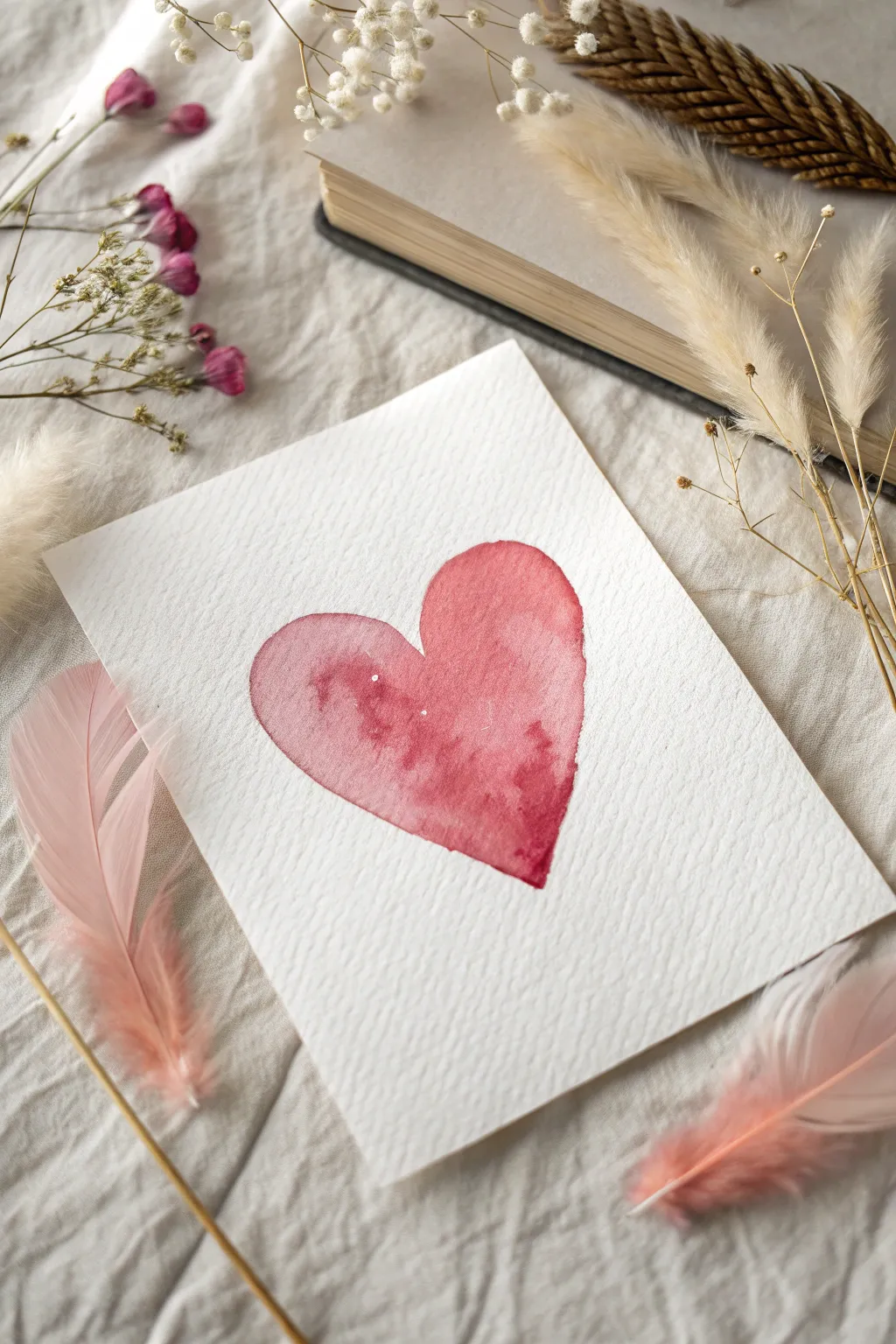
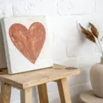
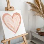
Whenever I want a painting that feels instantly cute but still artful, I lean into aesthetic heart painting ideas that play with color, texture, and a little bit of mood. These are the kinds of hearts you can match to your room’s color palette, gift to someone you love, or just paint because it feels good.
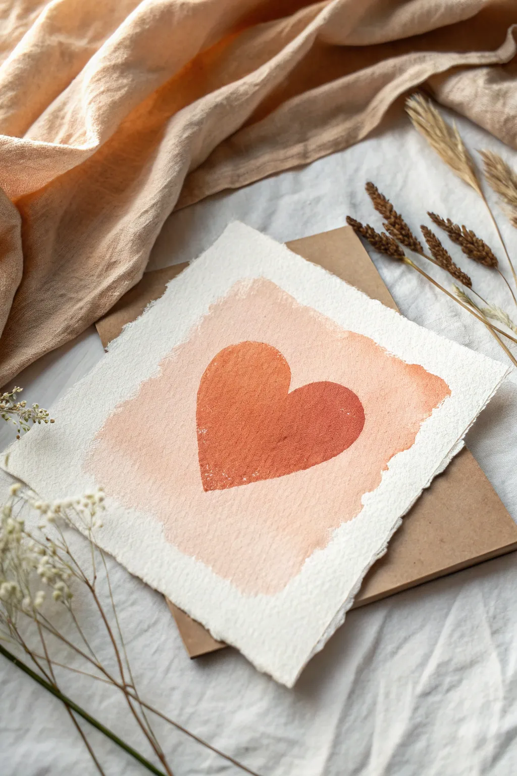
Classic Blush Gradient Heart
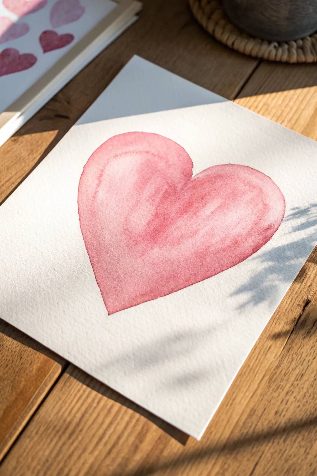
Capture the soft elegance of a simple shape with this classic blush gradient heart painting. The natural watercolor bleeds and uneven tone give it a warmth that feels organic and handcrafted, perfect for a minimalist wall hanging or a thoughtful card.
Step-by-Step Tutorial
Materials
- Cold-pressed watercolor paper (300gsm/140lb)
- Round watercolor brush (size 10 or 12)
- Red watercolor paint (e.g., Alizarin Crimson or Permanent Rose)
- Jar of clean water
- Paper towel
- Pencil (light H or HB)
- Kneaded eraser
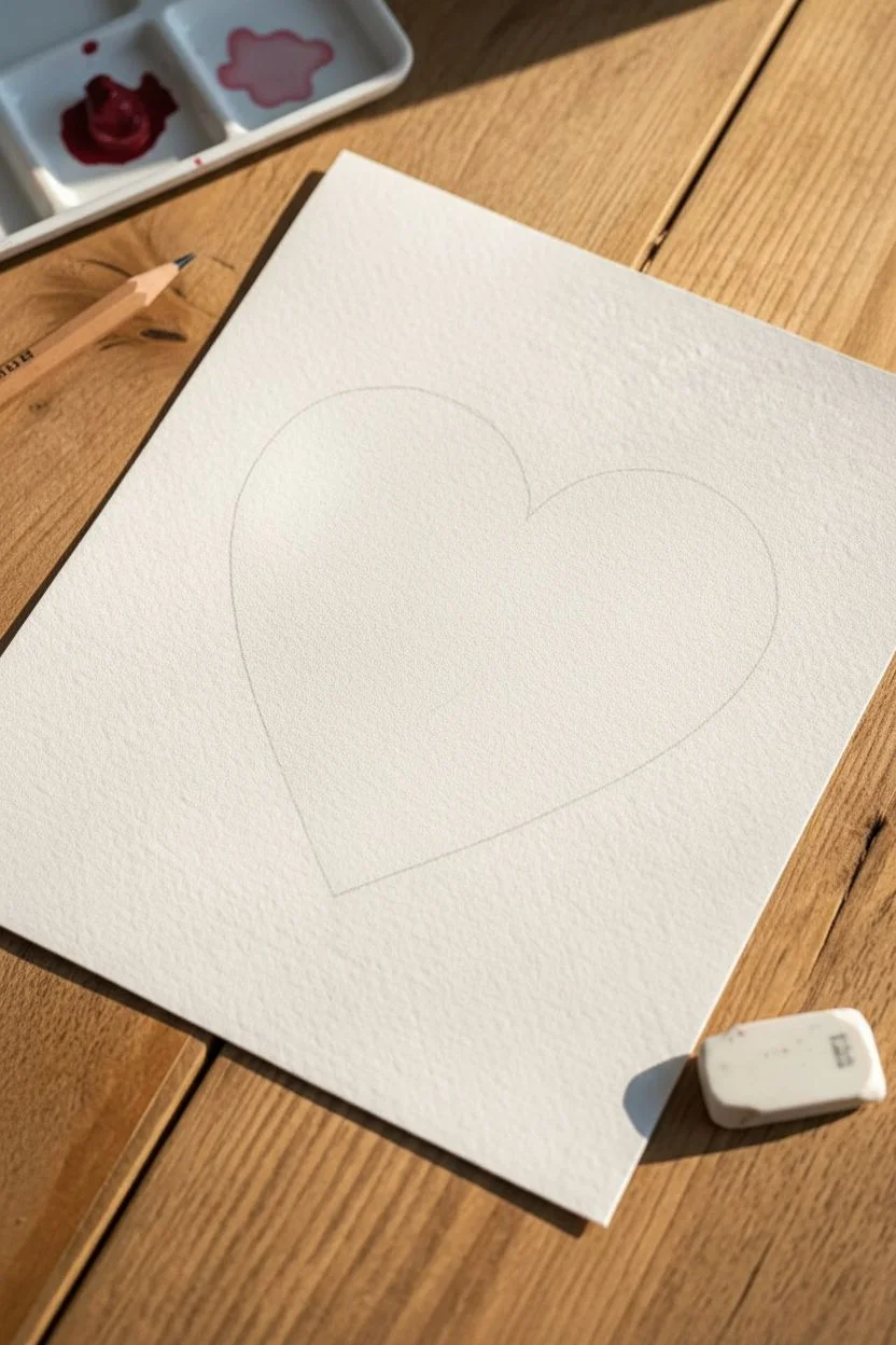
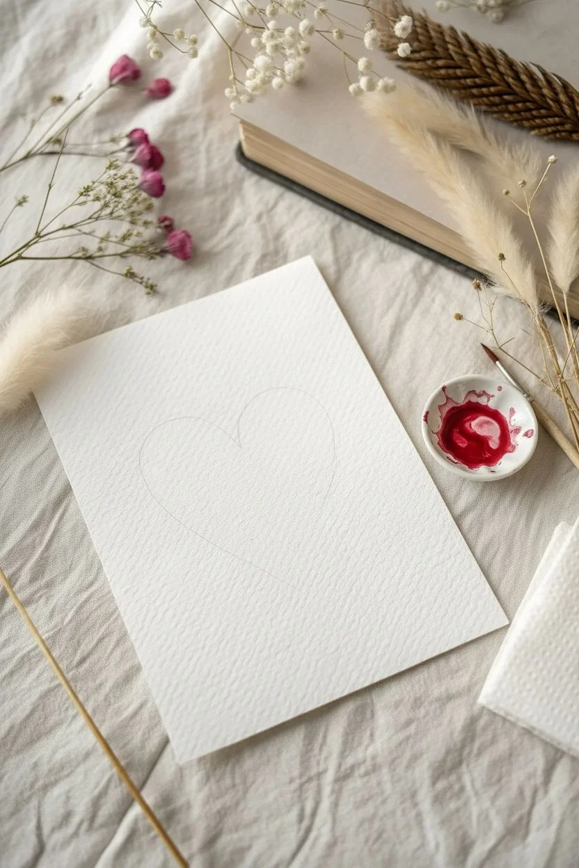
Step 1: Planning and Preparation
-
Light Sketching:
Begin by lightly sketching the outline of a heart in the center of your paper. Keep your pencil pressure extremely light so the graphite doesn’t show through the translucent paint later. -
Softening the Lines:
Take your kneaded eraser and gently dab (don’t rub) over your sketch. You want to lift up almost all the graphite, leaving only the faintest ghost of a line to guide your brush. -
Preparing the Palette:
Squeeze a pea-sized amount of red paint onto your palette. Mix a puddle of color with plenty of water to create a tea-like consistency for your base tone.
Step 2: Painting the Wash
-
Loading the Brush:
Fully saturate your round brush with your prepared watery red mix. The belly of the brush should be full, but not dripping uncontrollably. -
The First Stroke:
Start at the top curve of the left lobe. Place your brush tip down and apply pressure to widen the stroke, following the curve of the heart downwards toward the point. -
Completing the Shape:
Reload your brush slightly if needed and paint the right lobe, pulling the color down to meet the first stroke at the bottom point. Don’t worry about unevenness yet; that’s part of the charm. -
Pooling the Color:
While the shape is still very wet (this is crucial), drop a bit more pigmented paint along the edges and the top curves. I like to let gravity help here by tilting the paper slightly. -
Creating the Gradient:
Rinse your brush and dab it on a paper towel so it’s damp but thirsty. Touch the center of the heart to lift away some pigment, creating a highlighted area that makes the heart look puffy.
Wet-on-Wet Magic
Work quickly! If the paper dries before you finish the shape, you’ll get hard lines inside the heart. Keep the whole shape glistening wet until you are happy with the color flow.
Step 3: Adding Depth and Drying
-
Refining the Edge:
Use the tip of your brush to carefully smooth out the perimeter line if it looks too jagged, ensuring a crisp, clean edge against the white paper. -
The Bloom Effect:
Now, observe the paint as it sits. If you want those beautiful ‘cauliflower’ or ‘bloom’ textures seen in the photo, drop a tiny droplet of clean water into the drying paint near the top left. -
Concentrating Color:
Add a final touch of darker, more concentrated red to the very bottom point and the ‘V’ dip at the top to accentuate the shape’s volume. -
Initial Drying:
Let the paper sit completely flat. Do not touch it or use a heat gun yet, as moving air will push the pigment around and destroy those natural water marks. -
Checking for Puddles:
If you see a large puddle forming that looks too dark, use the corner of a paper towel to barely touch the surface and wick up the excess. -
Final Dry:
Allow the piece to dry undisturbed for at least 30 minutes. The paper may buckle slightly, which adds to the authentic watercolor aesthetic.
Add Metallic Splatter
Once fully dry, load a brush with gold watercolor or gold ink. Tap the handle against your finger to sprinkle fine metallic specks over the heart for a luxe finish.
This simple yet striking heart demonstrates the beauty of letting watercolor do what it does best


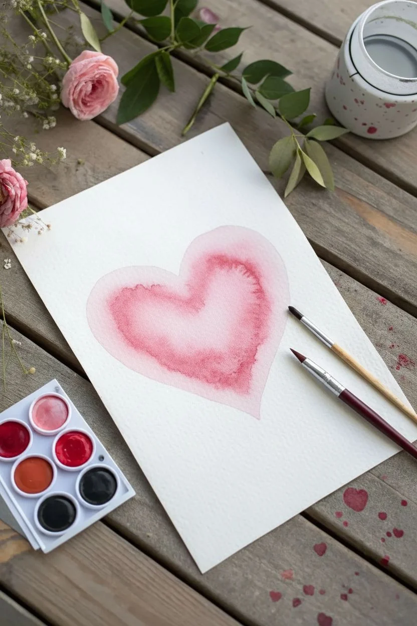
Watercolor Bleed Heart Wash
Capture the delicate beauty of watercolor with this simple yet classic wet-on-wet heart. The natural blooms and soft edges create a romantic, textured look that perfectly showcases the medium’s unpredictable charm.
Step-by-Step Guide
Materials
- Cold press watercolor paper (300 gsm)
- Red watercolor paint (Alizarin Crimson or similar)
- Clean water
- Round synthetic brush (size 6 or 8)
- Paper towel
- Palette or mixing tray
- Pencil (optional)
Step 1: Preparation
-
Prepare your workspace:
Clear a flat surface and lay down your watercolor paper. If you are using a block, you can leave it attached; if using a loose sheet, tape the edges down with masking tape to prevent warping. -
Sketch the outline:
Using a pencil, very lightly sketch a simple heart shape in the center of your paper. Keep your lines faint so they won’t show through the translucent paint later. Alternatively, you can skip this if you feel confident painting freehand. -
Mix your base color:
Squeeze a small amount of red watercolor paint onto your palette. Add water to create a juicy, semi-transparent puddle of paint. You want a consistency similar to tea—colored but fluid.
Step 2: Painting the Heart
-
Wet the paper:
Dip your clean brush into plain water. Carefully paint the inside of your heart shape with just the water. Ensure the paper is glisteny wet but not holding a deep puddle. -
Drop in the color:
Load your brush with the red paint mix you prepared. Touch the tip of the brush to the wet paper inside the heart shape, starting near the top curve. -
Watch the bloom:
Allow the paint to spread naturally through the wet area. This is the ‘bleed’ effect that gives watercolor its character. -
Define the edges:
Gently guide the paint toward the pencil lines using the tip of your brush. Be careful to stay inside your sketched boundary to keep a crisp edge against the dry outer paper. -
Add depth:
While the first layer is still very wet, pick up more concentrated pigment (less water) on your brush. -
Create gradients:
Drop this darker pigment into the bottom point of the heart and along one side. This creates a natural shadow and makes the heart look less flat. -
Lift highlights:
Rinse your brush and dry it thoroughly on a paper towel. Use the clean, damp brush to ‘lift’ some color away from the top left curve of the heart to create a soft highlight. -
Refine the shape:
Check the edges of your heart. If any spots are uneven, smooth them out now while the paper is still damp.
Clean Water Is Key
Keep two jars of water: one for rinsing dirty brushes and one that stays pristine for blending and wetting the paper. This keeps your pinks bright, not muddy.
Step 3: Adding Texture
-
Create water blooms:
Wait until the paint has lost its initial shine and is just starting to dry (the satin stage). Load your brush with clean water. -
Drop water droplets:
Touch the tip of the wet brush to a few spots inside the heart where the pigment is darkest. The water will push the pigment away, creating those beautiful ‘cauliflower’ textures seen in the reference. -
Let it settle:
Don’t touch these water drops again. Let them dry completely undisturbed to maximize the texture effect. -
Final drying time:
Allow the painting to dry completely flat. This might take 15-30 minutes depending on humidity. -
Erase guidelines:
Once the paper is bone dry, gently erase any visible pencil marks from the perimeter of the heart.
Salt Texture Trick
While the paint is still wet, sprinkle a few grains of table salt onto the heart. As it dries, the salt absorbs pigment, leaving starry, crystalline textures behind.
Frame your delicate heart or gift it as a handmade card to someone special

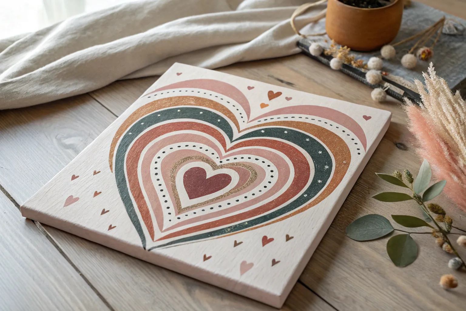
Concentric Tunnel Hearts
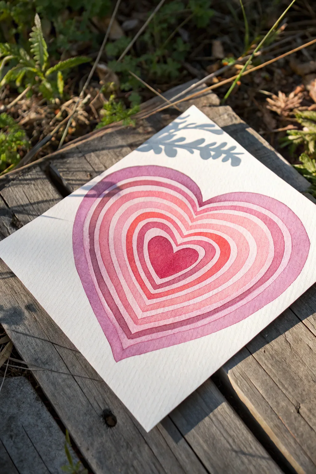
This captivating painting features concentric heart shapes that ripple outward in deepening shades of pink and rose, creating a mesmerizing tunnel effect. Using simple watercolor techniques, you can achieve this soft, glowing aesthetic that feels both modern and romantic.
Detailed Instructions
Materials
- Cold press watercolor paper (approx. 140lb/300gsm)
- Watercolor paints (shades of pink, red, magenta, and purple)
- Round watercolor brushes (sizes 4 and 6)
- Pencil (HB or lighter)
- Eraser
- Clean water jar
- Paper towels
- Painting palette
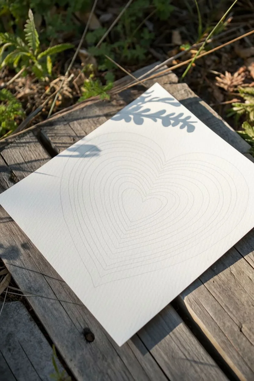
Step 1: Planning and Sketching
-
Center the heart:
Start by finding the rough center of your watercolor paper. Lightly sketch a small heart shape right in the middle; this will be the central ‘gem’ of your painting. -
Sketch concentric layers:
Drawing lightly, outline a slightly larger heart around the first one. Aim for an even spacing of about a quarter-inch between the lines. -
Continue expanding:
Keep drawing larger and larger heart outlines, maintaining that consistent gap between each layer, until the outermost heart fills most of the page. -
Refine the shape:
Check your symmetry. The hearts don’t need to be mathematically perfect, but the ‘tunnel’ effect works best if the spacing is somewhat uniform. -
Lighten the lines:
Gently dab a kneaded eraser over your sketch to lift up excess graphite. You want the lines barely visible so they don’t show through the translucent paint.
Keep It Steady
For steadier lines on curved sections, lock your pinky finger against the dry paper. It acts as an anchor, giving you better control over the curves of the heart.
Step 2: Painting the Layers
-
Prepare your palette:
Mix a spectrum of pinks and reds. You’ll want a saturated berry red for the center, transitioning into softer pinks, and finally a muted mauve-purple for the outer ring. -
Paint the center heart:
Load your brush with your most vibrant, saturated red-pink mix. Carefully fill in the smallest central heart, ensuring the edges are crisp. -
Paint the first ring:
Skip the space immediately surrounding the center heart for a moment. This white gap is crucial for separation. Instead, paint the *next* ring out with a slightly lighter pink. -
Wait for drying:
Let the center heart dry completely before attempting to paint any adjacent sections. Wet paint touching wet paint will bleed and ruin the concentric effect. -
Paint the alternating rings:
Once dry, paint the ring immediately surrounding the center heart. Use a slightly lighter or different tone of pink to create variation. -
Work outward systematically:
Continue painting alternate rings, working your way outward. skipping every other ring allows you to work faster without waiting for every single line to dry. -
Adjust color values:
As you move to the outer rings, gradually introduce a cooler purple or mauve tone to your mix, deepening the color value slightly to frame the heart. -
Leave white gaps:
Be incredibly careful not to let the painted rings touch. Leave a hairline of white paper between each painted band to define the layers distinctively. -
Fill remaining rings:
Go back and fill in any rings you skipped earlier, now that their neighbors are dry. Ensure your color transitions feel smooth from the center out. -
Soften edges if desired:
If you want a softer look, you can use a slightly damp clean brush to feather the paint within a ring, but keep the outer boundaries sharp. -
Final outer layer:
Paint the largest, outermost heart with your purplish-pink mix. I find using a size 6 brush here helps cover the larger area more smoothly.
Step 3: Finishing Touches
-
Check for gaps:
Look closely at your white spaces. If any gap is too wide or uneven, you can carefully widen a painted ring to correct the balance. -
Erase stray marks:
Once the painting is 100% bone dry (touch it to be sure), gently erase any remaining pencil lines that are visible in the white gaps. -
Flatten the paper:
If your paper has buckled from the water, place the dried painting under a heavy book overnight to flatten it out perfectly.
Bleeding edges?
If paint accidentally bridges a white gap, don’t panic. Quickly dab it with a clean paper towel to lift the color, then let it dry fully before trying to fix the edge.
Display your radiant heart creation in a place where it can catch the light and brighten your day

Crisp Stenciled Heart on Ombre
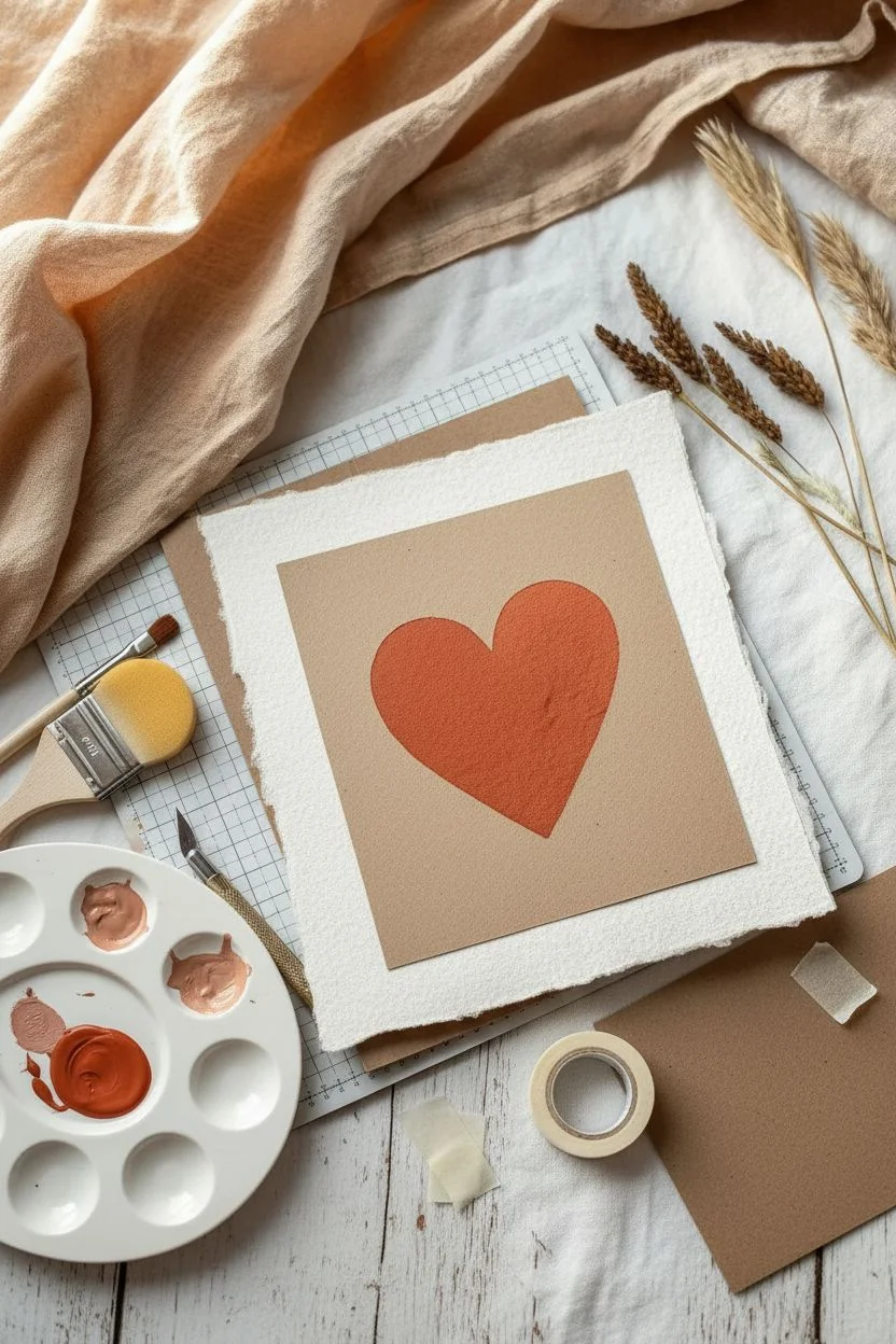
This project combines soft washes of terracotta and apricot tones with crisp stenciling for a look that feels both modern and handmade. The rough texture of cotton rag paper adds a beautiful, tactile element that makes this piece perfect for framing or gifting.
Step-by-Step
Materials
- Heavyweight handmade cotton rag paper (deckled edge)
- Watercolor or gouache paints (Burnt Sienna, Yellow Ochre, White)
- Wide flat wash brush (1-inch)
- Cardstock or acetate for stencil
- Craft knife or scissors
- Pencil
- Low-tack masking tape or painter’s tape
- Palette for mixing
- Water cups and paper towels
- Sponge dabber or stencil brush
Step 1: Preparation & Color Mixing
-
Paper Selection:
Begin with a square sheet of heavy cotton rag paper. The uneven, deckled edges are crucial for this aesthetic, so avoid trimming them straight. -
Create the Stencil:
On a piece of cardstock or acetate cut to the same size as your paper, draw a simple, symmetrical heart in the center. Carefully cut out the heart shape using a craft knife to create a negative stencil. -
Mix the Base Wash:
On your palette, mix a very pale apricot color. I usually start with a lot of white gouache, adding just a tiny dot of Burnt Sienna and Yellow Ochre until it’s a soft, sandy peach tone. -
Mix the Heart Color:
In a separate well, mix a darker, richer version of that same hue. Use more Burnt Sienna to achieve a warm terracotta or rusty orange color. It should be opaque but fluid.
Bleeding edges?
If paint seeps under the stencil, your brush was too wet. Wait for it to dry, then use a tiny detail brush with the background color to carefully ‘erase’ the mistake.
Step 2: Painting the Background
-
Apply the Wash:
Using your wide flat brush, load up the pale apricot mixture. Paint a rough, organic square shape in the center of the rag paper. -
Soften the Edges:
Intentionally leave the edges of this wash jagged and uneven. This ‘dry brush’ look adds to the rustic charm. -
Assess Coverage:
Ensure the painted area is large enough to extend past where your heart borders will eventually be. -
Let it Dry Completely:
This step is non-negotiable. The base layer must be bone dry before you apply the stencil, or the tape will tear the paper fiber.
Step 3: Stenciling the Heart
-
Position the Stencil:
Lay your heart stencil over the dried background wash. Center it visually so it sits nicely within the painted square. -
Secure the Stencil:
Use small pieces of low-tack tape to hold the stencil corners down. Press the stencil edges near the heart firmly to prevent paint bleeding under. -
Load the Dabber:
Dip your sponge dabber or stencil brush into the darker terracotta paint. Dab off excess paint onto a paper towel until the sponge is almost dry. -
Apply the Heart Layer:
Gently tap the paint into the heart opening. Use an up-and-down motion rather than brushing side-to-side to keep the edges crisp. -
Build Opacity:
Apply the paint in thin layers. It’s better to do two light coats than one heavy, wet coat which might seep under the stencil. -
Check Edges:
Pay special attention to the very rim of the heart shape to ensure a sharp silhouette. -
Remove Stencil:
While the paint is still slightly tacky (but not wet), carefully peel up the tape and lift the stencil straight up. Let the final piece dry completely.
Pro Tip: Texture boost
For that grainy look in the photo, sponge your paint onto the stencil VERY lightly. Let the texture of the rag paper show through the heart layer slightly.
Once dry, display your heart on a small wooden easel or mount it on kraft cardstock for a lovely contrast
BRUSH GUIDE
The Right Brush for Every Stroke
From clean lines to bold texture — master brush choice, stroke control, and essential techniques.
Explore the Full Guide
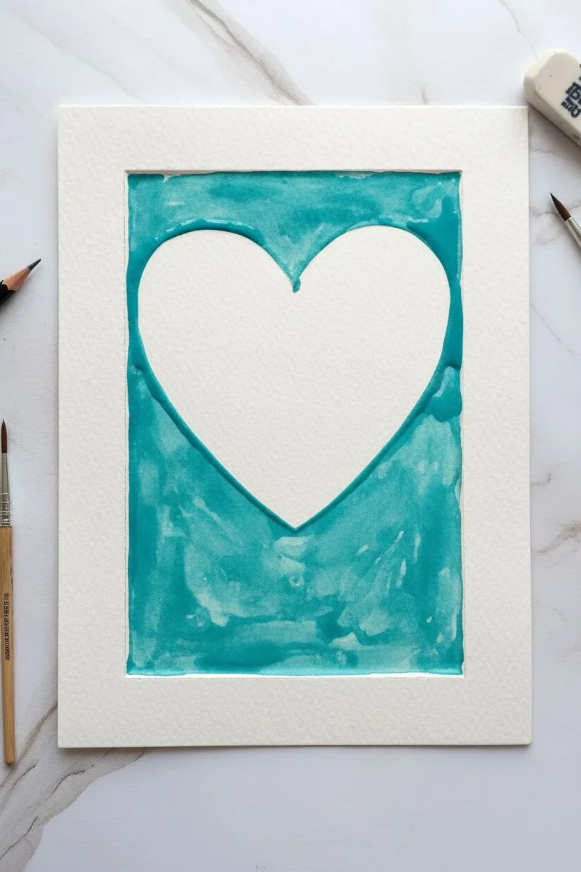
Negative Space Heart With Dotted Glow
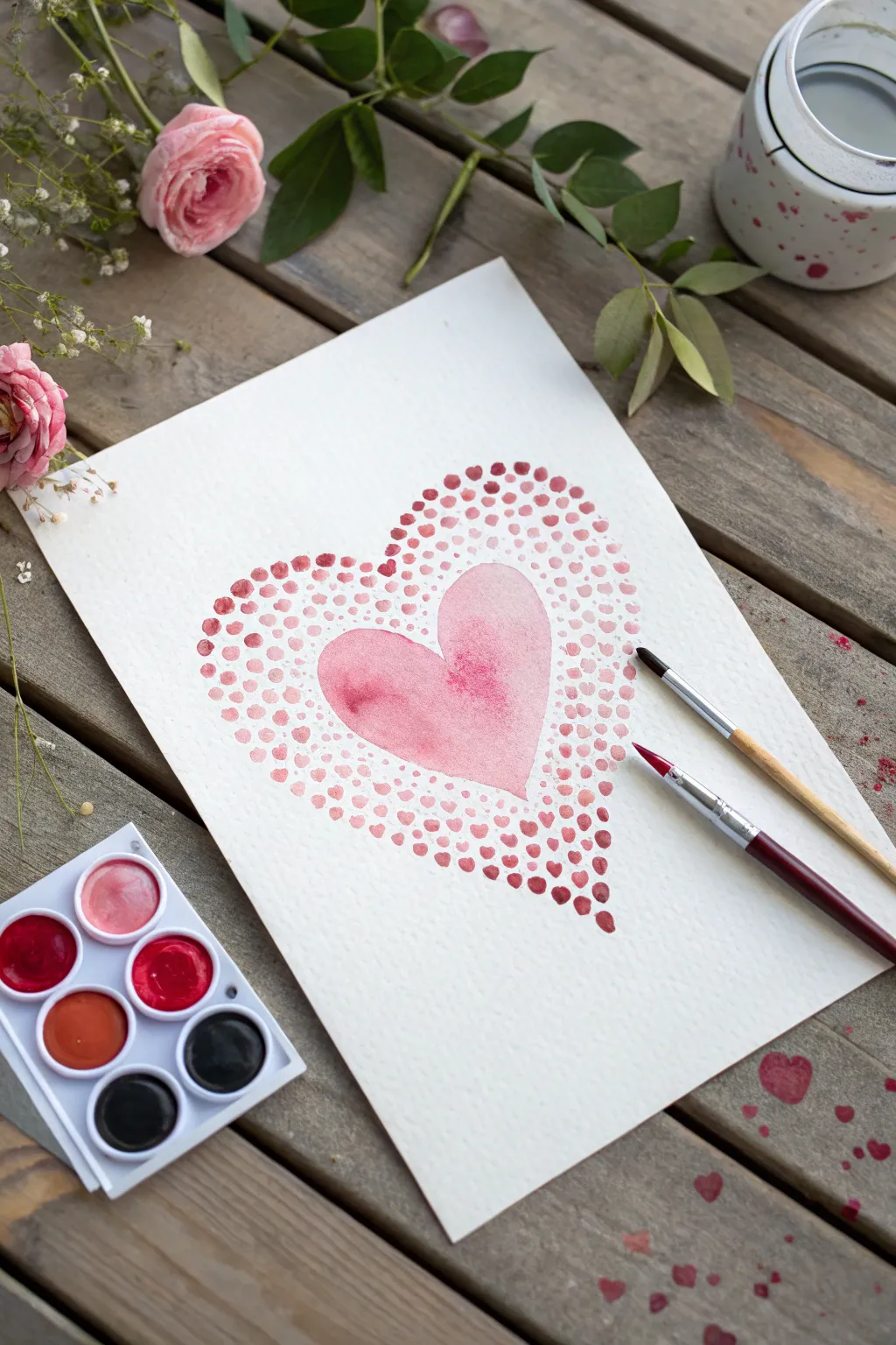
This lovely watercolor project combines a classic central heart shape with a mesmerizing halo of stippled dots. The gradient effect creates a soft, radiating glow that feels romantic and handmade, perfect for a card or framed art piece.
How-To Guide
Materials
- Cold press watercolor paper (A4 or A5 size)
- Watercolor paint palette (pinks, reds, crimsons)
- Round watercolor brush (size 6 or 8 for the heart)
- Small round detail brush (size 2 or 4 for dots)
- Jar of clean water
- Paper towel
- Pencil (optional)
- Eraser (optional)
Step 1: Painting the Central Heart
-
Sketch the outline:
Lightly sketch a medium-sized heart in the center of your paper using a pencil. Keep the lines very faint since watercolor is transparent and you won’t want graphite showing through. -
Prepare the pink wash:
Mix a diluted, watery puddle of pink paint. You want a soft, transparent value for the base of the heart, not a thick opaque layer. -
Apply the base layer:
Using your larger round brush, fill in the heart shape with the light pink wash. Work reasonably quickly to keep the drying edge wet (wet-on-dry technique) so you get a smooth finish. -
Add a wet-on-wet bloom:
While the heart is still glistening and wet, dip your brush into a slightly more concentrated or darker pink/red pigment. Touch the tip of the brush into the center of the wet heart and let the color bloom outward naturally. -
Create texture:
Tilt the paper slightly if you want to guide the bloom, or dab in a tiny bit more water to create ‘cauliflower’ textures. Let this central heart dry completely before moving to the next phase.
Fixing Blobs
If two wet dots accidentally touch and merge into a blob, quickly dab the area vertically with a corner of a clean paper towel to lift the paint, then re-dot once dry.
Step 2: Creating the Dotted Halo
-
Mix your palette:
Prepare three distinct puddles of paint: a light pink (similar to your heart base), a medium rose, and a deep crimson or burgundy. -
Start the inner ring:
Switch to your smaller detail brush. Load it with the lightest pink shade. Begin stippling small dots loosely around the perimeter of the painted heart. -
Spacing the first layer:
Keep these inner dots relatively close to the heart’s edge but not touching it—leave a tiny ravine of white paper between the painted heart and the dots to let it ‘breathe’. -
Introduce medium tones:
As you move slightly outward, start dipping into your medium rose color. Intersperse these medium dots with the lighter ones, creating a gentle transition. -
Define the outer heart shape:
Continue adding rings of dots, gradually creating a larger heart shape composed entirely of stippling. The dots should act as a frame mirroring the central shape.
Step 3: Deepening the Gradient
-
Add the darkest value:
Load your brush with the deep crimson or burgundy paint. Begin adding these darker dots towards the outer edges of your stippled area. -
Vary dot sizes:
I find the piece looks more organic if you vary the pressure on your brush slightly, making some dots tiny and others a bit juicier and larger. -
Check density:
The dots should be denser closer to the center heart and gradually become more spaced out as they radiate toward the edge of the paper. -
Blend the transition:
Go back with a mid-tone color and fill in any gaps where the transition from light to dark looks too abrupt. The goal is a seamless ombre effect. -
Create the fade-out:
For the outermost perimeter, use your brush with very little paint left on it to create faint, dry-brush dots that look like they are fading into nothingness. -
Final assessment:
Stand back and look at the overall shape. Add a few rogue dots here and there to correct symmetry or fill empty patches. -
Dry completely:
Let the artwork sit flat until every dot is completely dry to avoid smudging.
Add Some Sparkle
Once the watercolor is fully dry, painting over random dots with metallic gold watercolor or a gold gel pen adds a beautiful shimmer to the piece.
Now you have a radiantly textured heart painting ready to be gifted or displayed on your wall
Dry Brush Wispy Heart
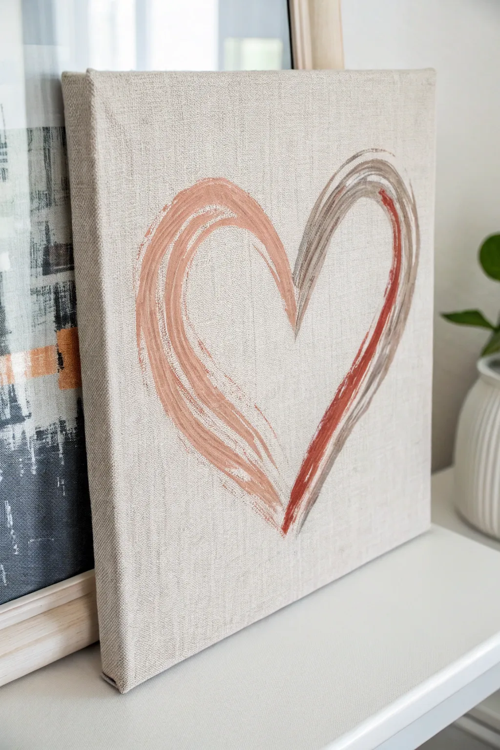
Embrace the beauty of minimalism with this understated dry-brush artwork painting, featuring muted earth tones on natural linen. The textured fabric background adds depth and warmth, making this simple heart silhouette feel sophisticated and modern.
Step-by-Step
Materials
- Stretched linen canvas (natural beige/unprimed look)
- Acrylic paints (Terracotta, Burnt Sienna, Taupe, and Warm Grey)
- Flat bristle brush (roughly 1 inch wide)
- Palette or paper plate
- Paper towels
- Pencil (optional)
Step 1: Preparation
-
Prepare the canvas:
Start with a raw or clear-gessoed linen canvas. The natural beige texture is a crucial part of the aesthetic, so ensure you aren’t using a standard white canvas unless you plan to paint a beige background first. -
Load the palette:
Squeeze out small amounts of your acrylic paints onto your palette. You will want a dusty pink or terracotta shade for the left side, and a mix of taupe and burnt sienna for the right side. -
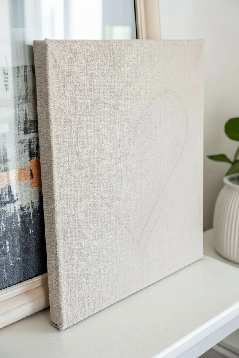
Trace a guide (optional):
If you are nervous about free-handing the shape, lightly sketch the heart shape onto the linen with a pencil. Keep the lines very faint so they don’t show through the wispy paint strokes.
Dry Brush Mastery
Use an old, stiff brush rather than a new soft one. The ragged bristles help create the separated, scratchy lines that give this piece character.
Step 2: Painting the Left Arch
-
Load the brush:
Dip your flat bristle brush into the terracotta paint. Don’t overload it; we want to maintain a textured look. -
Blot excess paint:
Tap the brush bristles onto a paper towel once or twice. This removes the bulk of the wet paint, which is the secret to achieving that scratchy, dry-brush effect shown in the example. -
Start the stroke:
Position your brush at the bottom point of the heart. Using a sweeping motion, pull the brush upward and curve it to form the left arch of the heart. -
Widen the stroke:
Go back over the bottom section of this arch. Press a little harder to widen the band of color, letting the bristles fan out slightly to create those jagged outer edges. -
Refine the top curve:
As you reach the top of the curve, lighten your pressure significantly so the stroke trails off naturally rather than stopping abruptly. -
Add texture:
Without reloading the brush, do one more quick sweep over the thick part of the arch to deposit any remaining pigment and enhance the linen texture showing through.
Fixing Heavy Globs
Applied too much paint? Immediately dab it with a clean, dry paper towel to lift the excess pigment before it dries to restore the texture.
Step 3: Painting the Right Arch
-
Clean and switch colors:
Wash your brush thoroughly and dry it well. Now, pick up the taupe or warm grey color. -
Create a multi-tone load:
For the right side, I like to double-load the brush. Dip one corner slightly into the burnt sienna (rust) color so you get a streak of darker definition within the grey stroke. -
Blot again:
Just like before, blot the excess on your paper towel. The brush should feel almost dry to the touch. -
Start from the bottom:
Place your brush tip right next to the starting point of your terracotta stroke at the bottom vertex of the heart. -
Sweep upward:
Pull the brush up and to the right, curving inward to meet the center divot of the heart. The darker rust color should ideally be on the inner or outer edge depending on how you angled the brush. -
Layer the accent:
If the rust color didn’t show up enough, take a tiny bit of burnt sienna on the very edge of the brush and drag it lightly along the curve of the taupe stroke to define the shape. -
Connect the center:
Ensure the two arches meet somewhat near the center divot, but don’t worry about them touching perfectly. The gap adds to the artistic, sketchy feel. -
Review the texture:
Step back and look at the canvas. The weave of the linen should be visible through the paint strokes. If an area looks too solid, leave it alone—trying to fix it often makes it worse.
Step 4: Finishing
-
Dry completely:
Acrylics dry fast, but because of the linen texture, give it about 20 minutes to fully set. -
Erase guidelines:
If you used a pencil sketch and any lines are visible outside the paint, gently erase them now.
Hang this lovely piece in a bright corner of your home for a subtle touch of warmth and love

PENCIL GUIDE
Understanding Pencil Grades from H to B
From first sketch to finished drawing — learn pencil grades, line control, and shading techniques.
Explore the Full Guide
Radial Streak Burst Heart
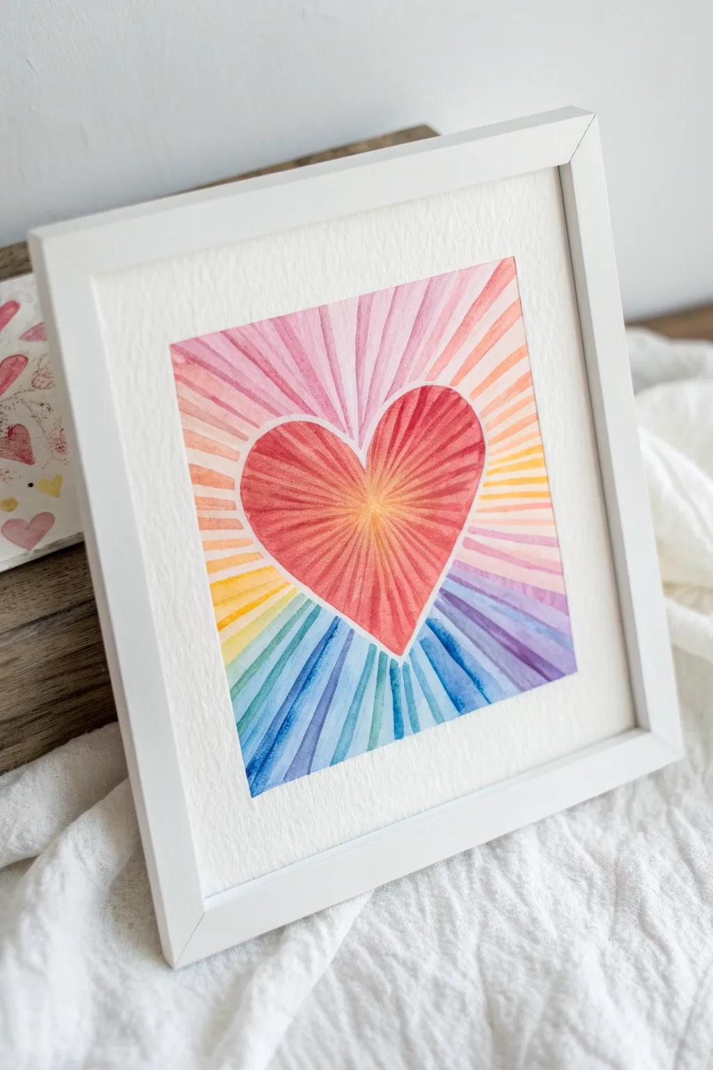
Capture the energy of love with this vibrant watercolor project that features a glowing heart surrounded by a spectrum of radiating light beams. The defined white borders and translucent color layers create a beautiful stained-glass effect that brightens any room.
Step-by-Step Tutorial
Materials
- Cold press watercolor paper (acid-free, 140lb/300gsm)
- Watercolor paints (tube or pan set)
- Masking fluid or white wax crayon (optional)
- Painter’s tape or washi tape
- Pencil and eraser
- Ruler
- Round watercolor brushes (sizes 2 and 6)
- Clean water jar and paper towels
- Palette for mixing
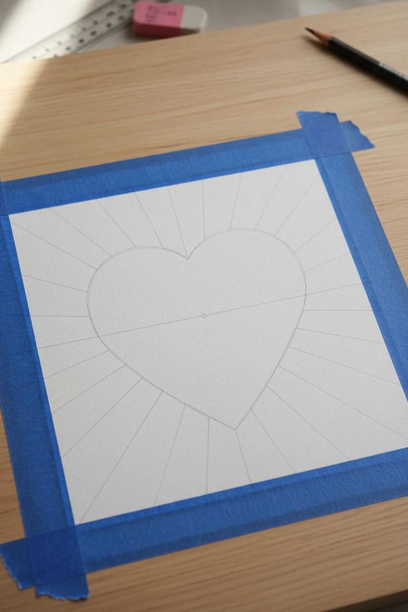
Step 1: Drafting the Design
-
Prepare your canvas:
Begin by taping down all four edges of your watercolor paper to a hard board or table. This creates a clean border and prevents the paper from buckling when wet. -
Sketch the heart:
Lightly draw a large, symmetrical heart in the center of the paper. Keep your pencil lines very faint so they can be easily erased later. -
Mark the center point:
Place a tiny dot in the very center of the heart. This will act as the vanishing point from which all your radiant lines will originate. -
Draw radial lines:
Using a ruler, lightly draw lines extending from that center dot outward toward the edges of the paper. Space them unevenly for a more natural look—some sections wide, some narrow. -
Create the heart border:
Draw an inner line about 1/8th of an inch inside your original heart shape. This gap will remain white.
Clean Border Trick
Apply masking fluid to the white gap outline before painting. This acts as a barrier, allowing you to paint freely without worrying about accidentally ruining the crisp white heart shape.
Step 2: Painting the Heart
-
Mix warm tones:
Prepare a palette of warm colors: crimson, vermilion, and a touch of deep orange. Ensure the paint is fluid but pigment-rich. -
Paint the inner segments:
Start painting the pie-shaped segments inside the heart shape. Use the smaller brush (size 2) to stay strictly within the lines. -
Create a gradient:
As you paint the segments near the center dot, keep them lighter or yellowish-orange to simulate a glowing core. Transition to darker reds as the segments reach the outer heart edge. -
Maintain the gap:
Stop painting exactly at the inner pencil line you drew for the heart. Leave the small channel between the heart and the background completely unpainted white paper.
Step 3: Painting the Background Burst
-
Plan the rainbow:
Visualize a color wheel around the heart. I like to place pinks at the top, moving clockwise to oranges, yellows, greens, blues, and finally purples. -
Start at the top:
Begin painting the background rays at the top using diluted pinks and soft reds. Ensure the paint stops at the outer heart line, preserving that white border. -
Transition colors:
Work your way around the heart. As you switch from pink to orange, mix the two colors slightly on your palette first so the transition between neighboring rays feels cohesive. -
Vary the saturation:
Make some rays slightly more opaque and others distinctive and watery. This variation adds depth and mimics the shimmering quality of light. -
Paint the cool tones:
Continue into the teals and blues at the bottom. Use the side of your larger brush to fill standard rays, switching to the fine tip near the heart outline for precision. -
Keep edges crisp:
Unlike a wet-on-wet wash, try to keep the edges of each ray distinct. Let one ray dry for a minute before painting its immediate neighbor if you want perfectly hard edges.
Metallic Accent
Once the watercolor is dry, use a gold pen or metallic watercolor to outline the rays or fill in the white gap around the heart for a luxurious, shimmering finish.
Step 4: Finishing Touches
-
Check for gaps:
Look closely at your white border. If any paint accidentally crossed the line, dab it gently with a clean, damp tissue while still wet. -
Dry completely:
Allow the painting to dry fully. If the paper feels cool to the touch, it is still damp deep down. -
Erase guidelines:
Once bone dry, take a soft kneaded eraser and gently remove any visible pencil lines, particularly in the white border area. -
Remove tape:
Peel off the painter’s tape slowly, pulling it away from the painting at a 45-degree angle to reveal your crisp, clean edges.
Frame your radiant heart with a simple mat to let those vibrant colors truly shine.
Gold-Accented Abstract Heart Scribbles
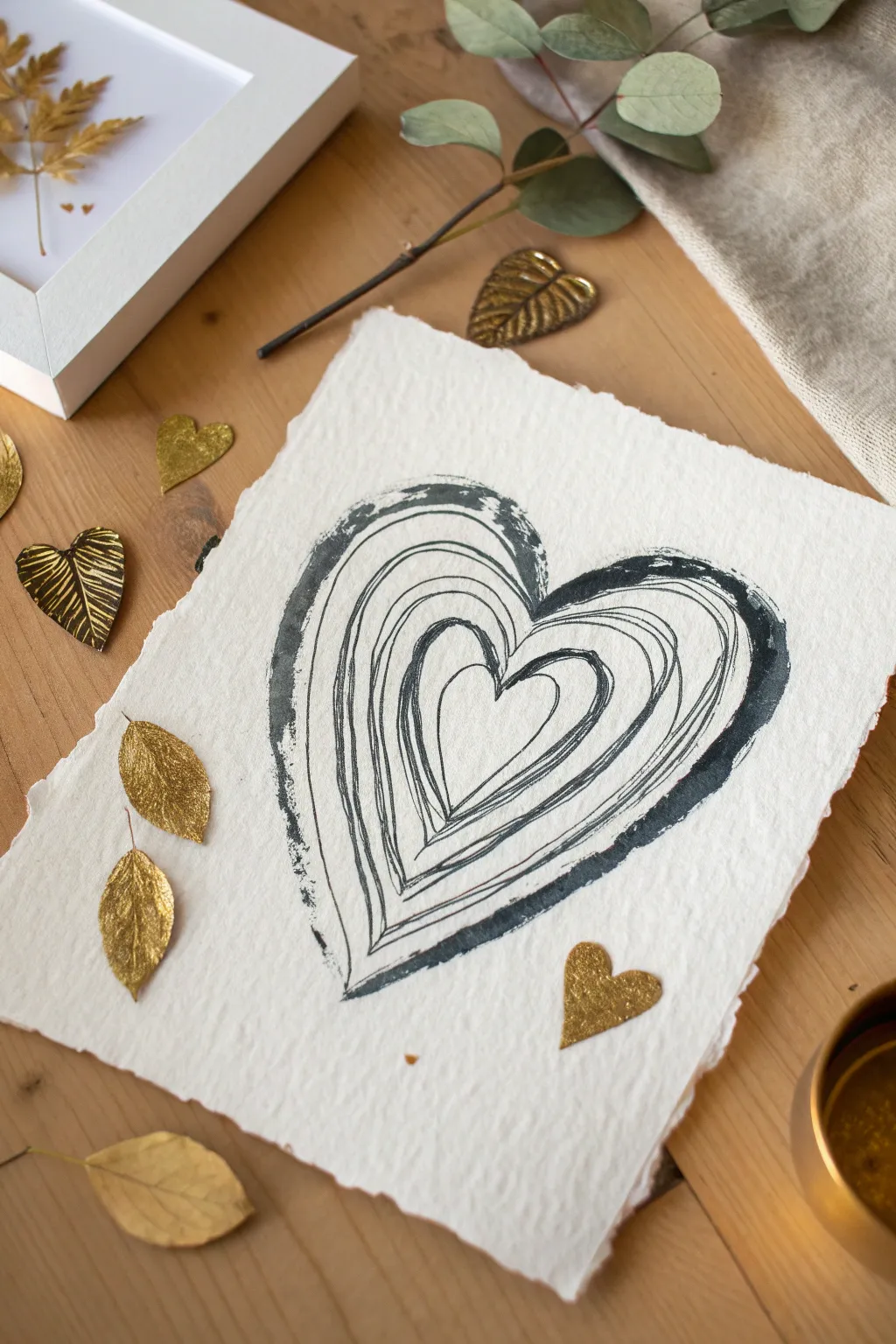
Capture the elegance of rustic simplicity with this striking black ink design on handmade cotton paper. The contrast of the heavily textured deckle edge against the organic, flowing lines creates a sophisticated yet heartfelt piece perfect for framing or gifting.
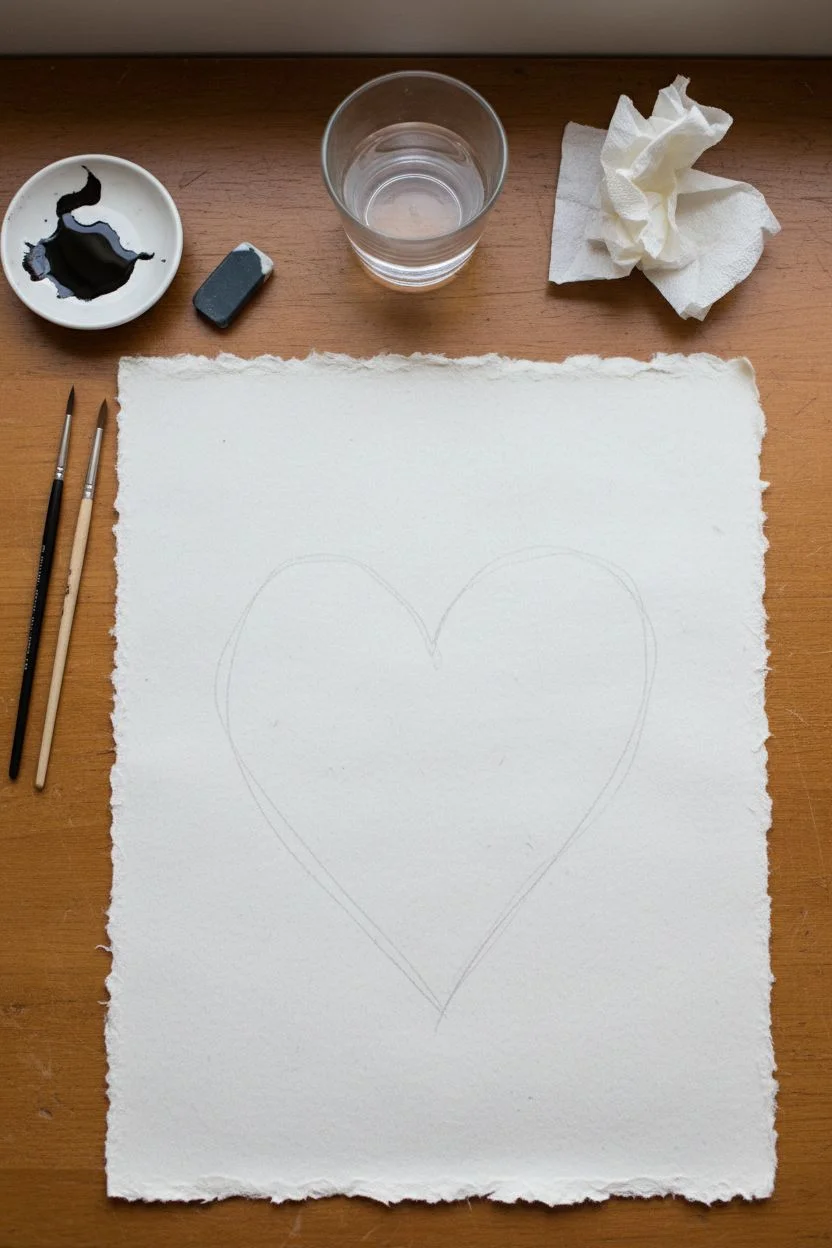
Detailed Instructions
Materials
- Heavyweight handmade cotton rag paper with deckle edges (white or off-white)
- Black India ink or high-flow acrylic ink
- Fine liner brush (size 0 or 00)
- Medium round watercolor brush (size 4 or 6)
- Small mixing palette or dish
- Water cup
- Pencil (optional for sketching)
- Kneaded eraser (optional)
- Paper towels
Step 1: Preparation & Planning
-
Select your canvas:
Choose a piece of handmade cotton rag paper. The heavy texture and fluffy deckle edges are essential for achieving the specific look in the photo. -
Prepare the ink:
Pour a small amount of black India ink into your palette. If the ink feels too thick, add a single drop of water to help it flow more smoothly over the rough paper texture. -
Light sketching (optional):
If you are nervous about freehanding, very lightly sketch the outermost heart shape with a pencil. Keep the lines faint so they don’t show through the ink later.
Dry Brush Technique
For the rough outer edge look, wipe most of the ink off your brush before painting. Dragging it quickly over the bumpy paper skips the valleys for great texture.
Step 2: Painting the Exterior
-
Load the medium brush:
Dip your medium round brush into the ink. It should be fully saturated but not dripping. -
Create the outer boundary:
Start painting the outermost heart shape. Instead of a single smooth stroke, use a slightly jagged, dry-brush motion. -
Build the texture:
Allow the texture of the paper to grab the ink, leaving some tiny white valleys visible within the black line. -
Thicken the line:
Go back over the outer rim to thicken it, making it the boldest part of the composition. The top curves and the bottom point should feel grounded and heavy. -
Feather the edges:
Use the tip of the brush to create a few rough, feather-like strokes on the exterior edge of the heart line to enhance that organic, hand-drawn aesthetic.
Step 3: The Inner Layers
-
Switch brushes:
Move to your fine liner brush for the interior work. Alternatively, you can use the very fine tip of your round brush if it holds a point well. -
The first interior loop:
Draw a second heart shape just inside the thick outer rim. Keep a small gap of white space between them. -
Embrace imperfection:
Don’t try to make this line perfect. Let your hand wobble slightly; the charm of this piece lies in the scribbled, relaxed nature of the lines. -
Create the middle layer:
Draw the next heart inward. Paint this one with two or three lines that overlap and intersect slightly, creating a “sketchy” bundle of strokes rather than one clean line. -
Vary line weight:
Press a little harder in the curves at the top of the heart to widen the line, and lift up as you move toward the bottom point for a thinner stroke. -
The center heart:
Paint the smallest, innermost heart. Make this one relatively simple and closed, acting as the focal point of the tunnel effect. -
Gap management:
Check the spacing between your distinct heart layers. If a white gap feels too wide, add a very thin, partial line in between to bridge the visual space.
Gilded Upgrade
Once the black ink is dry, use a lining pen to add thin traces of gold leaf adhesive over select lines, then apply gold foil for a luxurious shimmer.
Step 4: Finishing Touches
-
Assess the balance:
Step back and look at the overall weight. The outer ring usually needs to remain the darkest element to frame the vibration of the inner lines. -
Dry thoroughly:
Let the ink dry completely. The thick cotton paper absorbs distinctively, so give it extra time to ensure the deep blacks don’t smudge. -
Erase guidelines:
If you used any pencil marks at the beginning, gently dab them away with a kneaded eraser once you are 100% sure the ink is bone dry.
Now you have a beautifully textured piece of art that celebrates the beauty found in imperfect lines


Heart Window Landscape
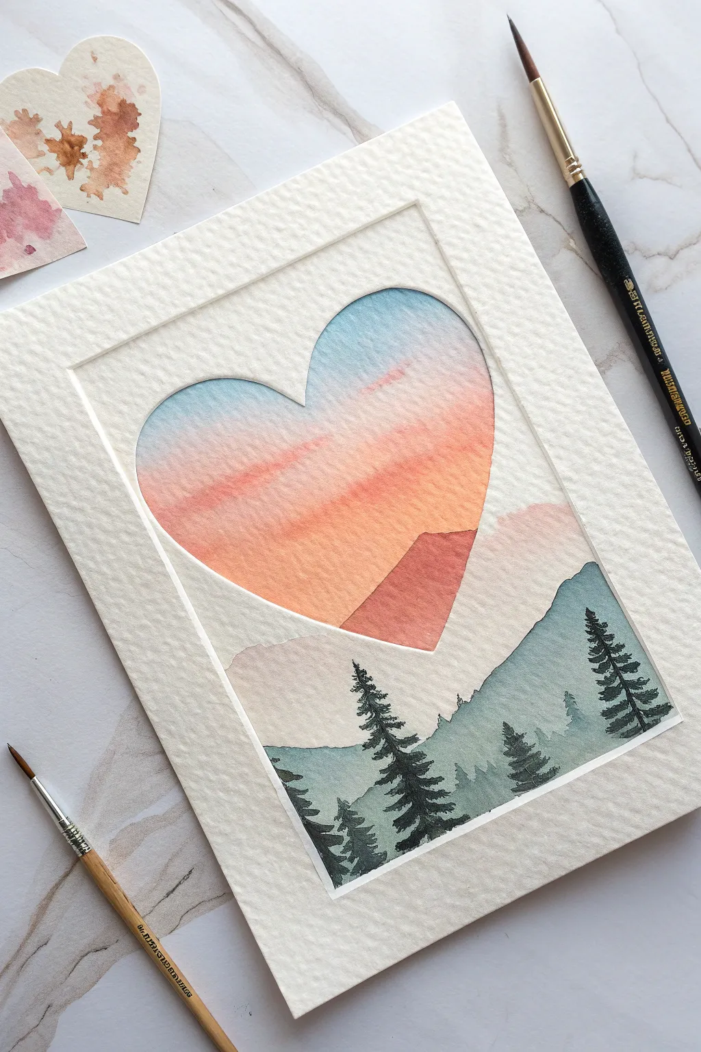
This elegant watercolor project uses a masking technique to create a clean, crisp heart shape overlaying a dreamy mountain landscape. The contrast between the rigid geometric border and the soft, flowing gradients of the sunset creates a striking piece of art perfect for a card or framed display.
How-To Guide
Materials
- Cold press watercolor paper (300 gsm)
- Masking fluid or masking tape
- Heart-shaped stencil or cutter
- Watercolor paints (Indigo, Sap Green, Payne’s Gray, Rose Madder, Cadmium Orange, Cerulean Blue)
- Round watercolor brushes (sizes 2, 6, and 10)
- Pencil and eraser
- Jar of clean water
- Paper towel
Step 1: Preparing the Mask
-
Outline the heart:
Begin by lightly tracing a heart shape in the upper center of your watercolor paper using a pencil. If you want a perfect shape, use a stencil or a cookie cutter as a guide, keeping your lines very faint so they are easily erased later. -
Define the window:
Draw a rectangular border around the heart, leaving about an inch of white space from the paper’s edge. This creates the ‘frame’ look seen in the reference image. -
Mask the outer area:
Apply masking fluid carefully over the entire area *outside* the heart shape but *inside* the rectangular border. Alternatively, you can cut a piece of masking tape or contact paper into the negative shape of the heart and adhere it down. This protects the white paper while you paint the sky.
Step 2: Painting the Sunset Sky
-
Pre-wet the paper:
Using your size 10 brush and clean water, gently wet the area inside the heart shape. You want the paper to be damp and glistening, but not glimmering with puddles. -
Apply the blue:
Drop a diluted wash of Cerulean Blue into the very top curve of the heart. Let the paint flow naturally downwards slightly; the wet paper will help soften the edges. -
Blend in the sunset:
While the blue is still damp, introduce a soft Rose Madder tone below it, followed by Cadmium Orange. Allow these colors to bleed into each other to create a gradient. -
Create cloud textures:
I like to lift out a little pigment with a thirsty (damp but clean) brush while the paint is settling to suggest soft, streaky clouds across the pink and orange sections. -
Add the distant mountain:
Once the sky is semi-dry (damp, not wet), paint a jagged triangular shape near the bottom right of the heart using a mix of Rose Madder and a touch of purple. This represents the furthest, sun-drenched mountain peak.
Fixing Bleeds
Did paint sneak under your mask? Don’t panic. Wait for it to dry fully, then use a stiff, damp brush to gently scrub and lift the unwanted paint, or cover it with opaque white gouache.
Step 3: Layering the Landscape
-
Remove the mask:
Ensure the sky is 100% bone dry. Gently rub away the masking fluid or peel up your tape. You should now have a clean white border around your heart. -
Paint the middle ground:
Mix a very diluted wash of Indigo and Payne’s Gray. Paint the silhouette of distant rolling hills. This layer should start inside the heart and extend downwards below the heart shape, breaking that bottom boundary. -
Deepen the foreground mountains:
Mix a stronger, darker value of Indigo and Sap Green. Paint a second, larger mountain range in front of the previous one, covering the bottom section of the artwork. -
Create textural variety:
While this green layer is drying, dab it lightly with a paper towel in random spots to create the uneven texture of a forested hillside.
Starry Night Effect
Instead of a sunset, paint the heart with deep indigo and black. Once dry, flick white gouache over the heart area with a toothbrush for a starry night sky version.
Step 4: Adding Trees and Details
-
Mix the darkest value:
Prepare a thick, saturated mix of Payne’s Gray and Sap Green. It should be almost black in intensity for the foreground silhouette. -
paint the main pine trees:
Using your size 2 brush, paint vertical lines for the tree trunks. Start from the bottom edge and extend upward, overlapping the mountain layers. -
Add pine branches:
Using quick, small dabbing motions, add branches to your trees. Start narrow at the top and widen the branches as you move down the trunk. -
Vary tree heights:
Ensure your trees are different heights. The tallest trees should pierce up into the mountain layers, adding depth and scale to the scene. -
Final border touch-up:
If your paint bled slightly under the mask, use a little white gouache to tidy up the sharp edges of the heart shape and the rectangular frame.
Once dry, carefully erase any remaining pencil lines to reveal your crisp, layered landscape window
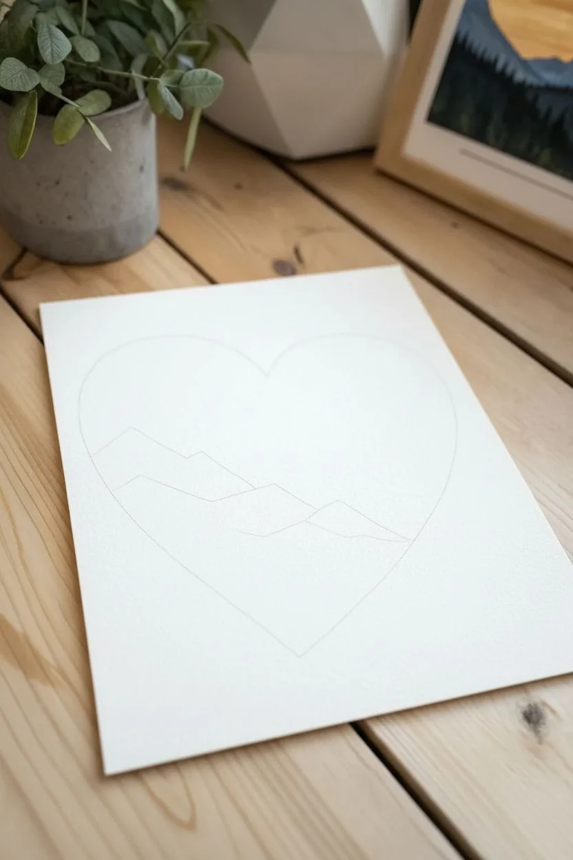
Day-and-Night Split Heart Scene
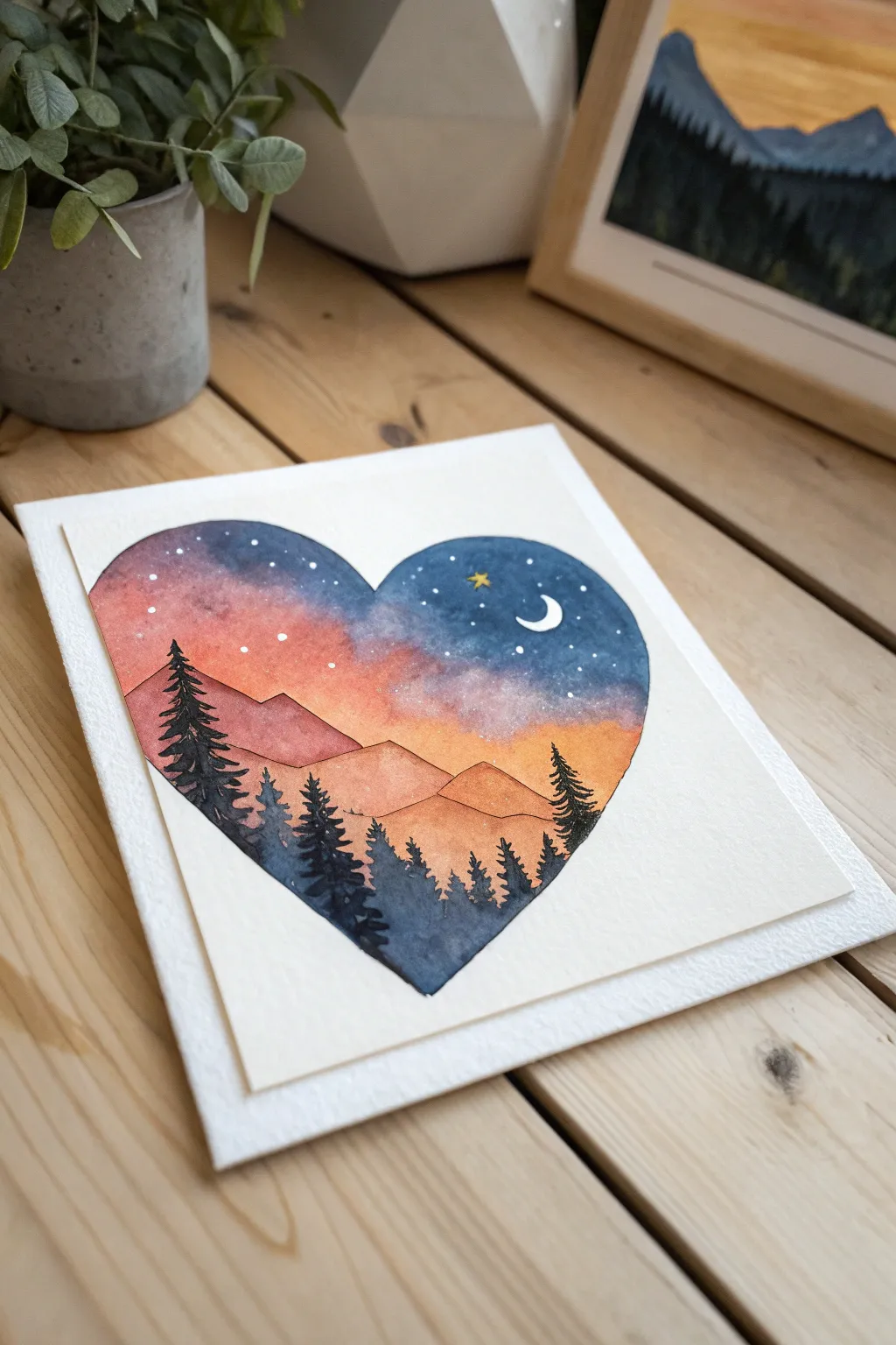
Capture the magic of a fading sunset within a romantic heart silhouette using watercolor blending techniques. This project features a stunning gradient sky that transitions from peach to starry indigo, framed by silhouette pine trees.
Step-by-Step
Materials
- Cold press watercolor paper (300 gsm recommended)
- Pencil and eraser
- Medium round watercolor brush (size 6 or 8)
- Small detail brush (size 0 or 1)
- Watercolor paints: Indigo, Violet, Crimson, Cadmium Orange, Yellow Ochre
- White gouache or white gel pen
- Masking tape or painter’s tape
- Paper towel and water jar
- Heart stencil (optional)
Step 1: Preparation & Sketching
-
Outline the Heart:
Begin by lightly sketching a large, symmetrical heart in the center of your watercolor paper. If you struggle with freehand symmetry, trace a cut-out paper heart or use a stencil. -
Define the Horizon:
Lightly draw two or three jagged lines across the lower third of the heart to represent mountain ranges. Keep the pencil strokes very faint so they don’t show through the final paint.
Muddy Colors?
If blue and orange mix too much, they turn brown. Keep a strip of pink or purple between them as a buffer zone when blending the gradient.
Step 2: Painting the Sky Gradient
-
Wet on Wet Base:
Using your medium brush and clean water, dampen the entire sky area inside the heart outline, stopping right at the top mountain line. This wet canvas helps create smooth blends. -
Apply the Warm Tones:
Start near the mountains with diluted Yellow Ochre, quickly blending upward into Cadmium Orange. Keep the colors vibrant but somewhat transparent. -
Introduce Cool Tones:
While the paper is still damp, paint the top curve of the heart with Indigo. Bring it down to meet the orange, introducing a touch of Violet or Crimson in the middle to create a seamless transition without making muddy colors. -
Deepen the Night Sky:
Add a second, more concentrated layer of Indigo to the very top corners of the heart to create contrast against the bright stars we will add later. -
Dry Completely:
Allow the sky layer to dry fully. If the paper feels cool to the touch, it is still damp; wait until it is room temperature.
Step 3: Adding the Mountains
-
First Mountain Range:
Paint the furthest mountain range (the one touching the sky) using a pale, watered-down wash of Crimson or terracotta. Let this layer dry. -
Second Mountain Range:
Paint the next range closer to the foreground using a slightly darker, more saturated mix of orange and brown. This atmospheric perspective gives the scene depth.
Make it Sparkle
Mix a tiny pinch of silver mica powder or iridescent medium into the dark indigo sky paint for a subtle, magical shimmer.
Step 4: Silhouettes & Details
-
Mix the Darkest Tone:
Create a very dark, near-black mixture using Indigo and a touch of brown or Payne’s Grey. Your paint consistency should be thicker here, like heavy cream. -
Paint Foreground Trees:
Using the detail brush, paint vertical lines for tree trunks starting from the bottom point of the heart. Add jagged branches angling downward to form pine tree silhouettes. -
Layering Trees:
Place a few taller trees on the left and right edges to frame the scene, varying their heights to look natural. -
Fill the Bottom:
Fill in the remaining bottom point of the heart with the dark tree color, suggesting a dense forest floor. -
Add the Moon:
Once the sky is bone dry, use white gouache or a gel pen to draw a crisp crescent moon in the upper right indigo section. -
Paint the Stars:
Dot tiny specks of white across the darker sections of the sky. Vary the pressure to create stars of different sizes. -
The Final Star:
Paint a small, four-pointed star near the moon in yellow gouache for a charming focal point.
Now you have a serene twilight landscape captured perfectly inside a heart
Starry Galaxy Heart
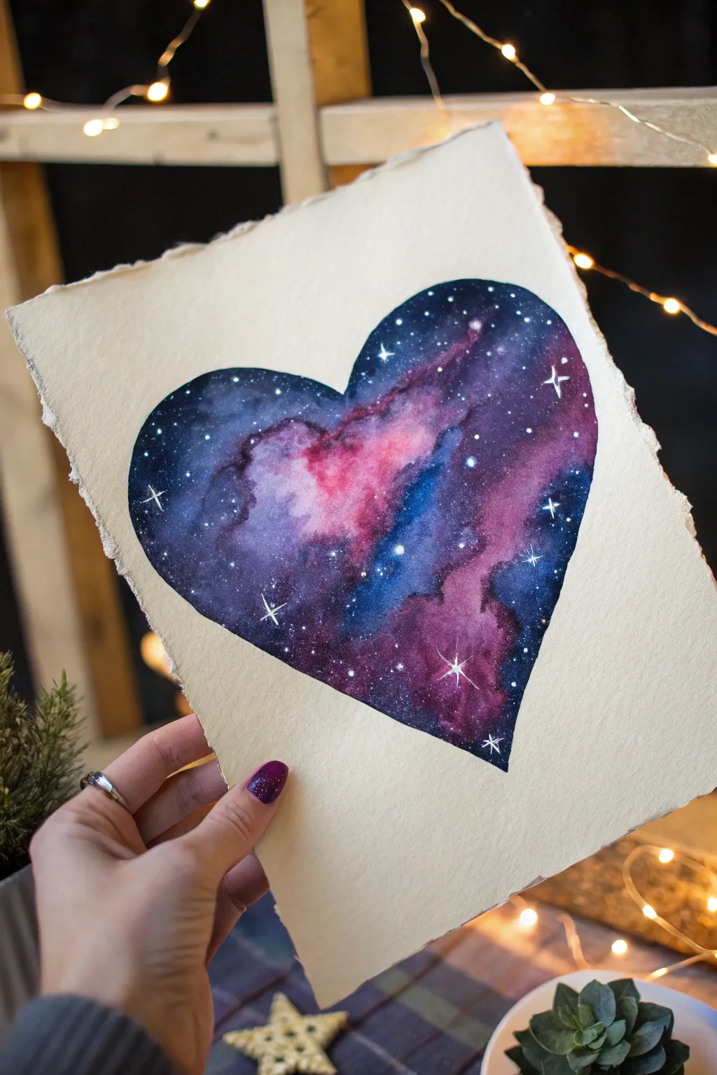
Capture the infinite beauty of the universe within a simple shape with this mesmerizing galaxy heart painting. Using wet-on-wet watercolor techniques, you’ll blend deep indigos, vibrant magentas, and touches of midnight black to create a stunning nebula effect.
Step-by-Step Tutorial
Materials
- High-quality watercolor paper (cold press creates nice texture)
- Watercolor paints (Indigo, Black, magenta/crimson, violet/purple, cyan)
- White opacity ink, white gouache, or a white gel pen
- Pencil and eraser
- Masking tape or painter’s tape
- Round watercolor brushes (sizes 6 and 2 recommended)
- Two jars of water (one for clean, one for dirty)
- Paper towels
- Optional: Ruler (to tear paper edges)
Step 1: Preparation & Sketching
-
Prepare the Paper:
Begin by tearing your watercolor paper down to size if desired. To achieve the beautiful deckled edge seen in the example, run a wet brush along a ruler’s edge on the paper, wait a moment, and gently tear along the damp line. -
Secure the Surface:
Tape your paper down to a board or table. This prevents buckling when we add lots of water later, which is crucial for galaxy paintings. -
Outline the Heart:
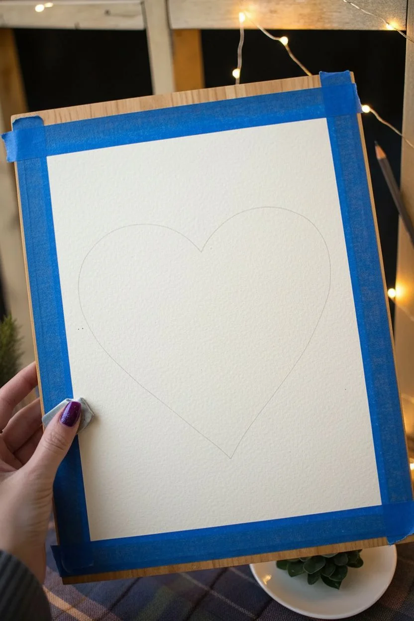
Lightly sketch a large heart shape in the center of your paper using a pencil. Keep your lines very faint so they won’t show through the lighter parts of the nebula later. -
Clean Up Edges:
Use a kneaded eraser to lift up any graphite that is too dark, leaving just a ghost of the outline to guide you.
Wet-on-Wet Magic
Work quickly while the paper is wet. If it starts to dry, avoid adding water mid-wash or you’ll get ‘cauliflower’ water blooms.
Step 2: Painting the Galaxy
-
Wet the Heart:
Using your larger round brush and clean water, fill in the entire heart shape. The paper should be glisten with a sheen but not have puddles sitting on top. -
First Color Drops:
While the paper is wet, drop in your lightest colors first. Load your brush with vibrant magenta or pink and touch it to the paper in a diagonal drift across the heart. Watch the paint bloom naturally. -
Adding Blues:
Clean your brush and pick up a cyan or bright blue. Add this near the pink areas, allowing them to touch slightly and blend into purple, but try to keep some distinct blue patches. -
Deepening the Space:
Now, mix a strong indigo or dark violet. Apply this to the outer edges of the nebula cloud, working your way toward the edges of the heart shape. -
Creating Contrast:
To make the colors pop, introduce concentrated black or Paynes Grey. I like to carefully dab this into the very corners of the heart and the spaces surrounding the diagonal nebula streak. -
Refining Edges:
Use a smaller brush (size 2) to carefully tidy up the outline of the heart with your dark colors. The contrast between the sharp edge of the heart and the soft blend inside is key. -
Lifting Color:
If an area gets too dark, rinse your damp brush, tap it on a paper towel, and lift some pigment away to reveal a ‘glowing’ spot. -
Drying Time:
Let this layer dry completely. The paper must be bone-dry before the next step to prevent the stars from feathering.
Step 3: The Starfield
-
Splatter Stars:
Dilute a small amount of white gouache or opaque white ink. Load a brush, hold it over the heart, and tap the handle against another brush to splatter tiny white specks across the galaxy. -
Painting Larger Stars:
Using your smallest brush or a white gel pen, manually dot a few slightly larger stars in the darker areas for variety. -
Adding Flares:
Select 3-5 of your brightest stars and turn them into ‘twinkles’ or lens flares. Draw a small cross (+) through the dot, extending the vertical line slightly more than the horizontal one. -
Final Highlights:
Add a few tiny diagonal lines crossing your star centers to create an eight-point flare on the biggest stars for extra sparkle. -
Remove Tape:
Once the white ink is fully dry, slowly peel away your masking tape at a 45-degree angle to reveal your finished cosmic heart.
Metallic Touch
Mix a tiny bit of metallic silver or gold watercolor into your splatter mix for stars that actually shimmer in the light.
Now you have a piece of the universe captured on paper to display or gift to a loved one
Monochrome Blue Heart Minimalism
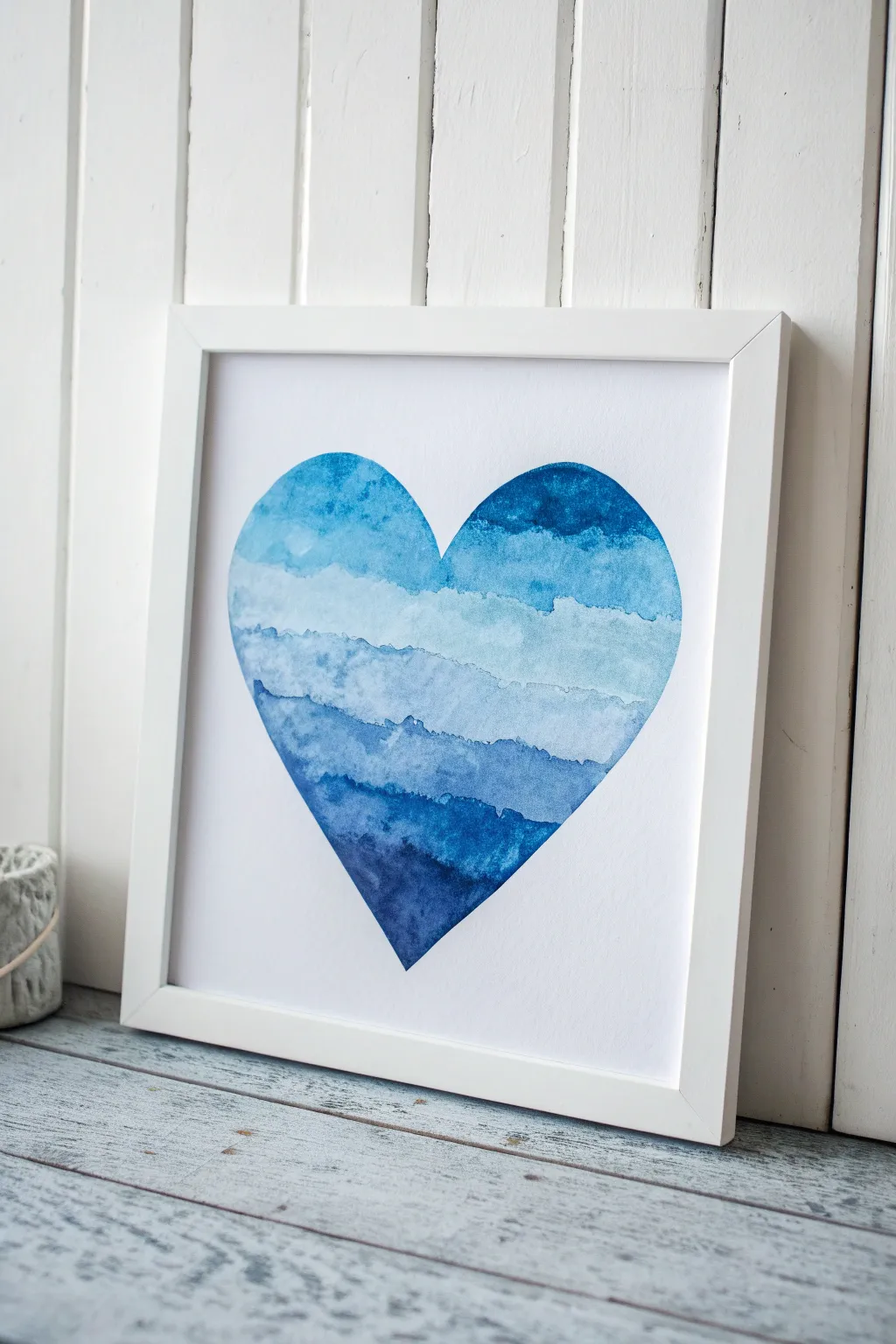
Capture the calming rhythm of ocean waves with this simple yet striking watercolor project. By layering horizontal bands of indigo, cerulean, and teal within a crisp heart silhouette, you’ll create a piece of modern art that feels both structured and organic.
Step-by-Step Guide
Materials
- Cold press watercolor paper (300 gsm)
- Watercolor paints (Indigo, Prussian Blue, Cerulean, Turquoise)
- Round watercolor brushes (size 6 and 10)
- Pencil
- Heart stencil (or paper to make one)
- Masking fluid (optional, but recommended for crisp edges)
- Painter’s tape or Washi tape
- Paper towels
- Two jars of water
- White or light wood frame (square)
Step 1: Preparation and Outline
-
Prepare your workspace:
Tape your watercolor paper down to a hard board using painter’s tape. This prevents the paper from buckling when it gets wet and ensures a flat surface to work on. -
Draft the shape:
Lightly trace a large heart shape onto the center of your paper using a pencil. If you aren’t confident drawing freehand, cut a symmetrical heart out of printer paper first to use as a stencil. -
Lighten the lines:
Take a kneaded eraser and gently roll it over your pencil sketch. You want the line to be barely visible—just enough for you to see, but light enough that it won’t show through the final paint. -
Optional: Mask the edges:
For the crispest possible outline, apply a thin layer of masking fluid carefully along the *outside* perimeter of your pencil heart. Let this dry completely before painting.
Step 2: Painting the Layers
-
Mix your palette:
Prepare three to four puddles of blue paint on your palette, ranging from a deep indigo/navy to a watery sky blue. I find keeping them separate initially helps control the gradient better. -
Start at the bottom:
Load your brush with the darkest indigo shade. Paint the very bottom tip of the heart, filling a jagged, uneven horizontal section about an inch high. -
Create the first edge:
While the top edge of that first layer is still wet, rinse your brush slightly and tap it along the wet edge to encourage a bit of blooming, or leave it to dry for a hard ‘water line’ effect. -
Second layer application:
Mix a slightly lighter blue. Paint the next horizontal strip directly above the first one. Let the brush naturally wiggle to create an organic, wave-like line. -
Blending technique:
If you want the layers to bleed together, touch the wet new layer to the previous damp layer. If you prefer the striped look in the photo, wait for the bottom layer to be mostly dry before adding the next one. -
Mid-tone layers:
Continue moving upward, switching to your medium blue tones. Vary the width of your stripes—some can be narrow, others wide—to mimic the unpredictability of tides. -
Texture trick:
For that mottled, watery texture seen in the reference, drop a tiny bit of clean water or a different shade of blue into a still-wet stripe and let it disperse on its own. -
Approaching the top:
As you reach the upper lobes of the heart, water down your pigment significantly. These top layers should be the palest and most transparent. -
The final curve:
Carefully paint the two rounded tops of the heart with your lightest wash. Use the smaller size 6 brush here to ensure the curve is smooth and stays within your pencil marks. -
Dry completely:
Let the painting sit undisturbed until it is bone dry. Watercolor paper feels cool to the touch if it is still damp, so wait until it feels room temperature.
Uneven Blooms?
If you get ‘cauliflower’ edges where you don’t want them, your brush was too wet when you went back into drying paint. Blot your brush on paper towel before touching damp areas.
Step 3: Finishing Touches
-
Remove masking:
If you used masking fluid, gently rub it away with your finger or a rubber cement pickup tool to reveal the clean white paper surrounding the heart. -
Clean up edges:
Inspect the edges of the heart. If any paint bled outside the line or looks uneven, you can gently scrub it with a damp stiff brush and blot it, or cover it with a tiny bit of opaque white gouache. -
Flattening:
Remove the tape. If the paper has curled, place it under a heavy book overnight to flatten it out before framing. -
Framing:
Place your artwork into a square frame. A white mat helps draw focus to the blue tones, usually giving it a more professional gallery look.
Salt Texture Trick
While a layer is still very wet, sprinkle a few grains of table salt onto the pigment. Let it dry completely, then brush it off. This creates stunning starburst textures that look like sea foam.
Now you have a serene piece of custom art ready to bring a cool coastal vibe to your wall
Checkerboard Heart Pop Pattern
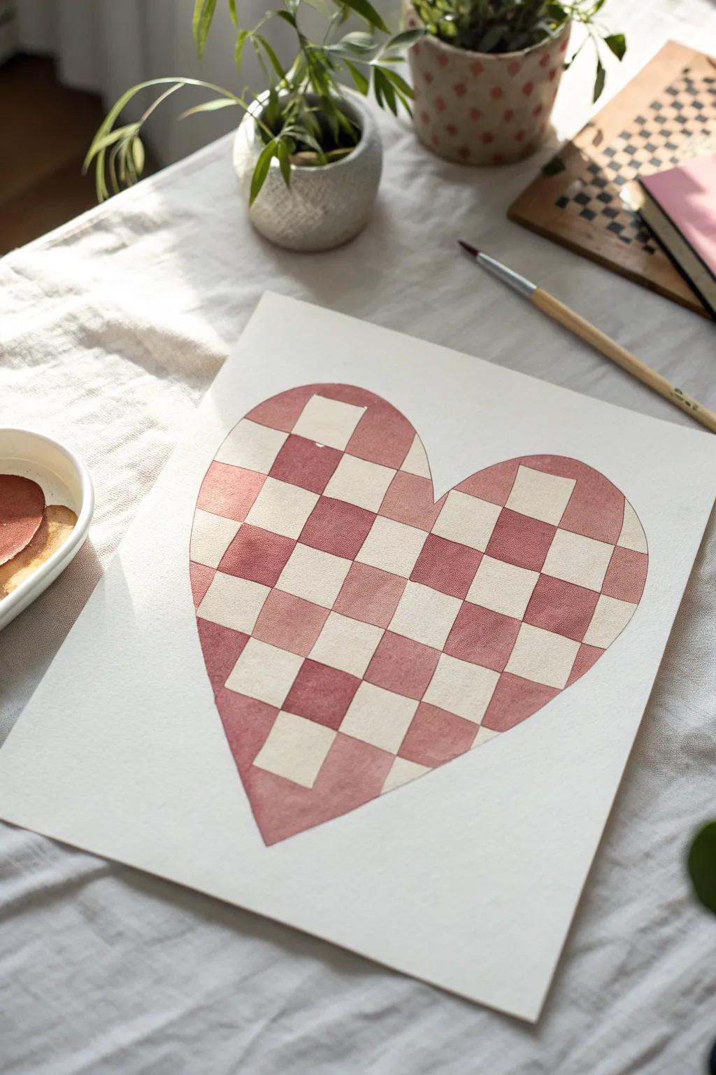
Embrace the trendy, warped aesthetic with this checkerboard heart painting that blends structure with a fun, liquified effect. The gentle, dusky rose tones give it a warm, vintage feel perfect for wall art or a heartfelt card.
Step-by-Step
Materials
- Cold press watercolor paper (A4 or similar size)
- Pencil (HB or H)
- Kneaded eraser
- Watercolor paints (Dusky Pink, Terra Cotta, or Venetian Red)
- Small round watercolor brush (size 2 or 4)
- Ruler (optional, but a flexible curve ruler is better)
- Painters tape (optional for edges)
- Clean water jar
- Paper towel
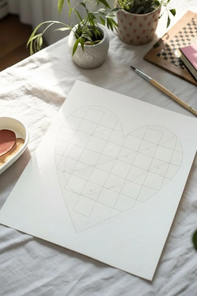
Step 1: Drafting the Design
-
Outline the heart:
Begin by lightly sketching a large heart shape in the center of your paper. Keep your pencil pressure very light so the graphite doesn’t show through the paint later. -
Draw vertical flow lines:
Instead of straight lines, draw 5-6 vertical lines that curve and warp slightly as they move down the heart. Imagine the lines are flowing like liquid to get that trendy ‘melted’ look. -
Add horizontal curves:
Cross your vertical lines with horizontal curves to create the grid. Again, avoid straight lines; let them dip and wave to follow the form of the heart. -
Refine the grid:
Check your grid to ensure you have distinct ‘squares’ (even if they are warped). Use your kneaded eraser to lift ample graphite, leaving only faint guidelines visible. -
Mark your squares:
To avoid confusion while painting, lightly put a tiny dot in every other square that needs to be painted. This checkerboard logic is easy to mess up once you have a brush in hand.
Bleeding Edges?
If paint bleeds into a white square, act fast. Blot it with a clean, dry tissue immediately. Then, wet a clean brush, scrub the spot gently, and blot again.
Step 2: Painting the Pattern
-
Mix your color:
Prepare a watery mix of your chosen pink or reddish-brown hue. I like to test the transparency on a scrap piece of paper first; you want a wash that is consistent but not opaque. -
Start with isolated squares:
Begin painting the dotted squares that are not touching each other. Painting non-adjacent squares first prevents wet edges from bleeding into each other. -
Outline then fill:
For each check, use the tip of your brush to carefully outline the warped shape first, then quickly fill in the center with the belly of the brush. -
Control the puddle:
If a square has too much water pooling in it, dab your brush on a paper towel and touch it to the puddle to soak up the excess. -
Let the first batch dry:
Wait until the first set of squares is completely dry to the touch. This patience is crucial for crisp edges. -
Continue the pattern:
Once dry, paint the remaining designated squares. Working next to the dry sections is now safe and allows you to butt the color right up against the previous squares. -
Adjust color variation:
It creates a lovely texture if some squares are slightly more pigmented than others. Don’t worry about keeping the mix perfectly uniform throughout.
Pro Tip: Liquid Look
Make the grid lines curve more dramatically near the edges of the heart. This creates an optical illusion of volume, making the heart look 3D and puffy.
Step 3: Finishing Touches
-
Clean the edges:
Inspect the outer edges of the heart. If any paint expanded beyond your initial pencil sketch, you can gently reshape the outer line with a slightly more saturated brush stroke. -
Final erase:
Once the painting is bone-dry—wait at least an hour to be safe—gently run your kneaded eraser over the whole piece to pick up any remaining pencil lines in the white squares. -
Flatten the paper:
If your paper has buckled from the water, place the dry artwork under a heavy book overnight to smooth it out.
Frame this modern piece in a simple wood frame to complement the warm, earthy tones of your paint
Botanical Heart Wreath
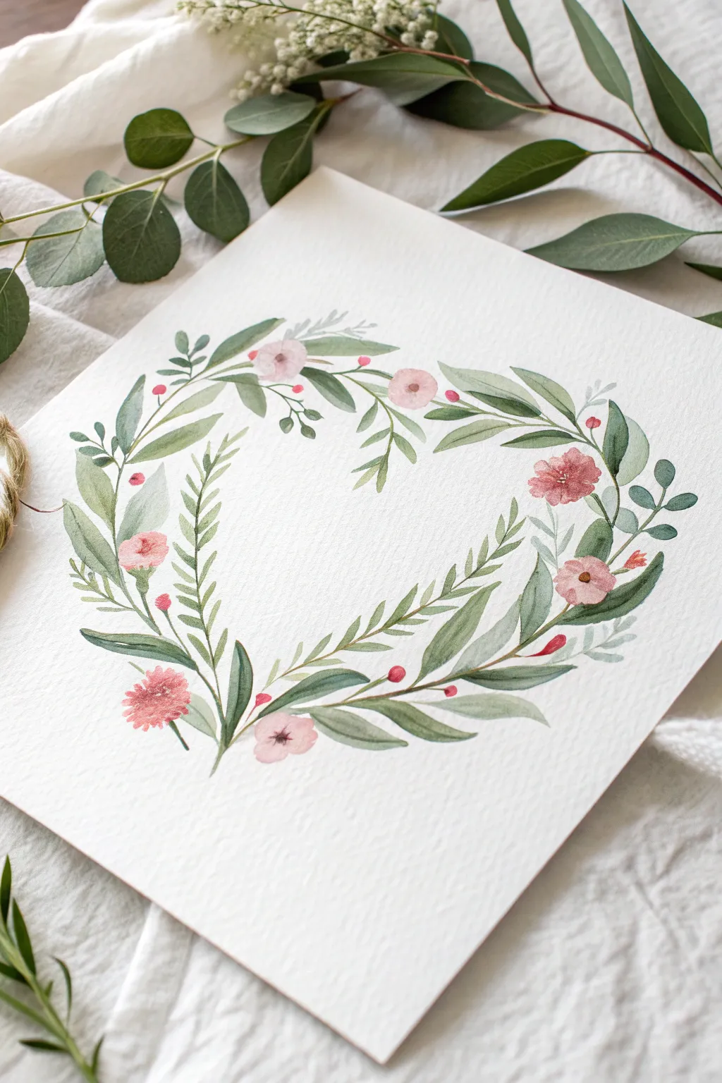
Capture the soft romance of nature with this botanical heart wreath, featuring gentle green sprigs and blushing pink blooms. This watercolor project relies on layering translucent washes to create depth and an organic, airy feel perfect for cards or wall art.
How-To Guide
Materials
- Cold press watercolor paper (300 gsm)
- Watercolor paints (Sap Green, Olive Green, Alizarin Crimson, Burnt Sienna)
- Round watercolor brushes (Size 2 and Size 6)
- H pencil and kneaded eraser
- Paper towels
- Two jars of water
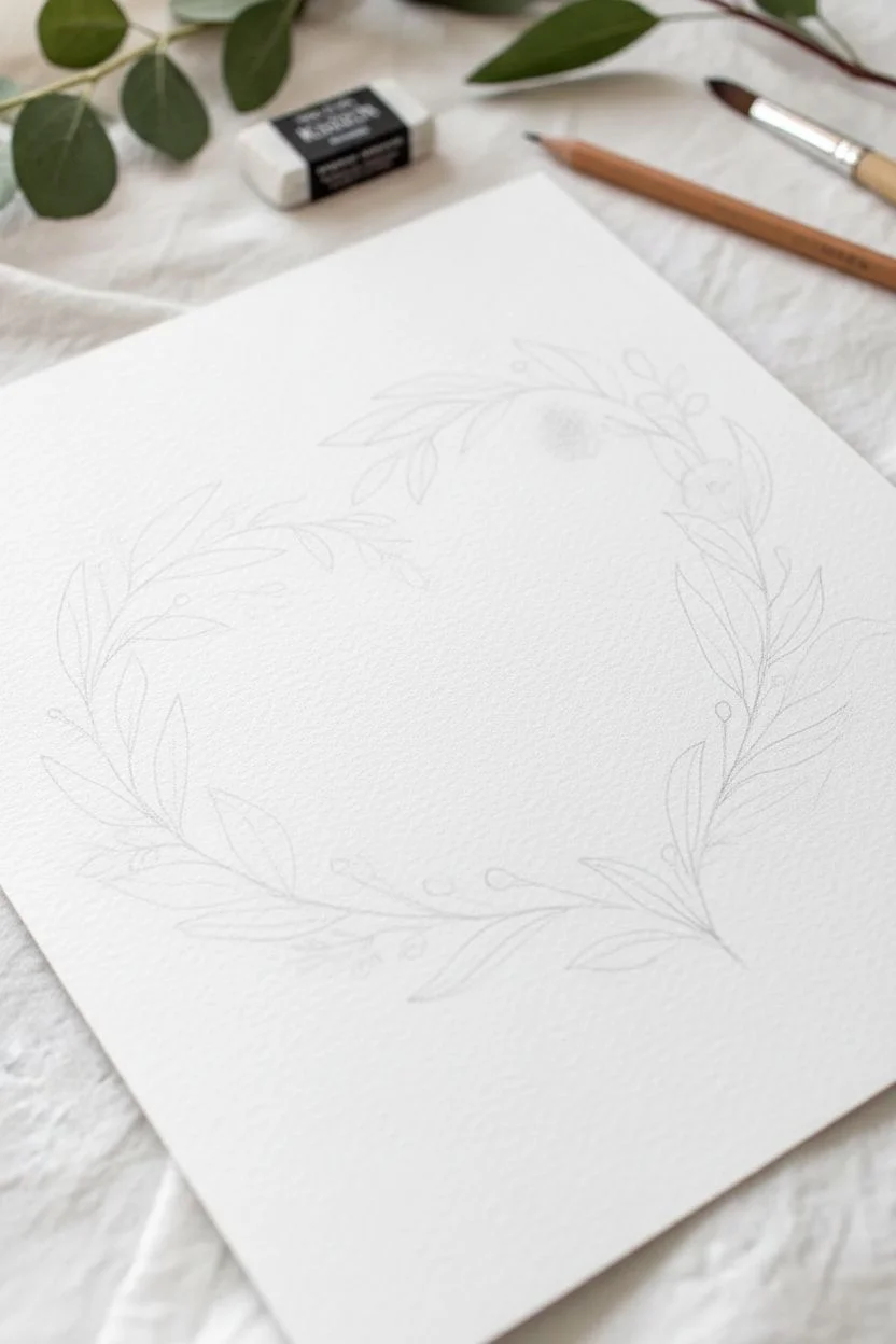
Step 1: Planning and Sketching
-
Trace the heart shape:
Begin by lightly sketching a heart shape on your paper using an H pencil. If you struggle with symmetry, cut a heart from scrap paper and trace around it very faintly. -
Map the main stems:
Sketch two main curving lines that follow the left and right contours of your heart, meeting at the bottom point and leaving a small gap at the top center. Let the lines be slightly wavy and organic rather than perfectly rigid. -
Fade the guidelines:
Take your kneaded eraser and dab—don’t rub—over your pencil lines until they are barely visible. Graphite can muddy watercolor paint, so you want these to be as faint as possible while still guiding you.
Muddy Colors?
If leaves bleed into flowers creating brown, ensure the green layer is bone-dry before painting pink near it. Use a hair dryer on low heat to speed up drying.
Step 2: Painting the Foliage
-
Mix your greens:
Prepare two shades of green on your palette: a lighter yellow-green (Sap Green with a touch of water) and a cooler, deeper green (Olive Green mixed with a tiny dot of Burnt Sienna or blue). -
Paint the first layer of leaves:
Using the size 6 round brush, load it with the lighter green mix. Start at the bottom point of the heart and paint almond-shaped leaves extending outward, following the curve of your guideline. -
Vary the pressure:
To get the classic leaf shape, touch the tip of the brush to the paper, press the belly down to widen the stroke, and lift up gradually as you pull away to create a sharp point. -
Add secondary sprigs:
While the first layer is drying, use the size 2 brush and the deeper green mix to add smaller, thinner stems branching off the main curve, tucking them into the empty spaces. -
Paint fern-like details:
On the inner curve of the left side, paint delicate, fern-like fronds using short, quick dashes with the tip of your small brush. These add texture and break up the solidity of the larger leaves. -
Layer darker leaves:
Once the first light leaves are completely dry, paint a few overlapping leaves using the darker green mix. This overlap creates a sense of volume and shadow without needing complex shading techniques. -
Include dusty tones:
I like to mix a very watered-down blue-green for a few ‘ghost’ leaves behind the main wreath. This subtle background layer makes the wreath look fuller.
Step 3: Adding Florals and Details
-
Mix the floral pink:
Dilute Alizarin Crimson with plenty of water to create a soft blush pink. For variety, keep a slightly more concentrated version of the red on the side of your palette. -
Paint the main blooms:
Identify three or four spots on the wreath for the main flowers. Using the size 6 brush, paint 5-petal shapes with wet, loose strokes, leaving tiny white gaps between the petals. -
Soften the edges:
While the flower paint is still wet, rinse your brush and run a clean, damp brush along the outer edges of the petals to soften them into the paper. -
Add buds and berries:
Switch to your size 2 brush. Dot small pink circles attached to thin stems randomly around the wreath to represent berries or unopened buds. -
Detail the flower centers:
Once the pink flowers are dry, mix a dark brownish-red. Use the very tip of your smallest brush to stipple tiny dots in the center of each open bloom. -
Connect the elements:
Look for floating leaves or flowers. Use your thin brush and green paint to draw thin hairlines connecting these floating elements back to the main branch structure. -
Final assessment:
Step back and look at the overall shape. If there are large gaps, fill them with tiny sprigs or a single berry to balance the heart silhouette.
Add Gold Accents
Once fully dry, use metallic gold watercolor or a gold gel pen to trace veins on a few leaves or add dots to the flower centers for a lux finish.
Allow the painting to dry flat completely before framing it or carefully cutting it out for a card project
Tape-Line Stained-Glass Heart
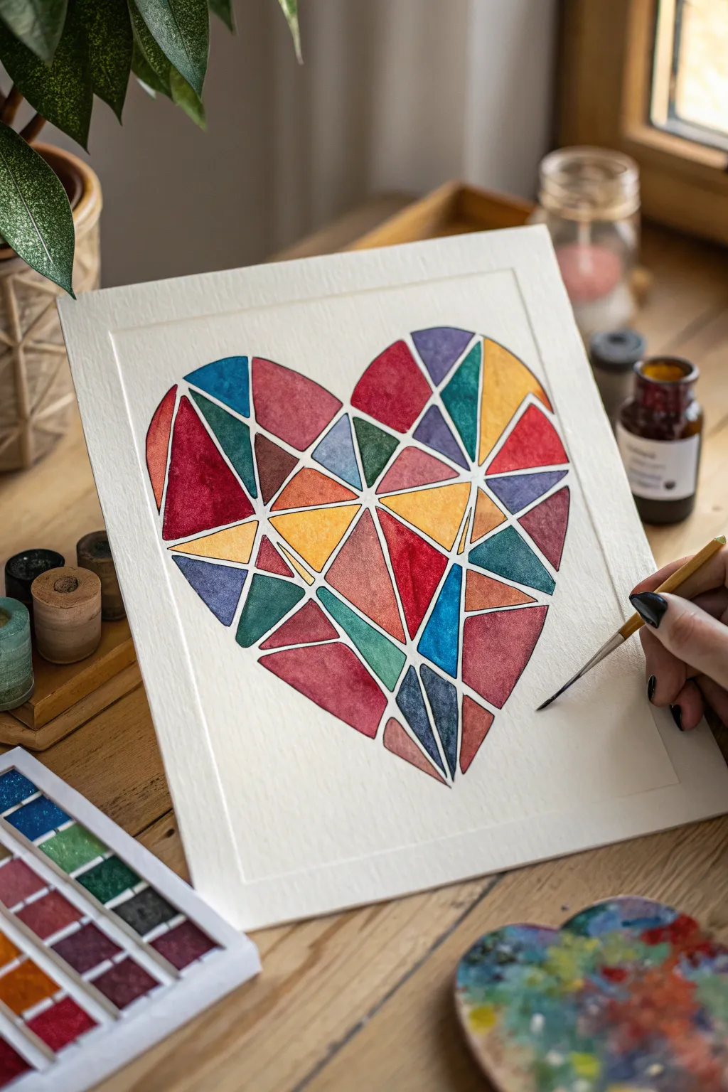
Transform a simple heart shape into a vibrant mosaic of color with this satisfying resist-art project. The clean white lines created by masking tape give the watercolor shards a polished, stained-glass effect that pops beautifully against crisp white paper.
Step-by-Step Guide
Materials
- High-quality watercolor paper (cold press creates nice texture)
- Artist’s masking tape or thin washi tape (approx. 1/8 inch or 3mm width is ideal)
- Pencil and eraser
- Watercolor paints (pan or tube)
- Round watercolor brushes (sizes 4 and 6)
- X-Acto knife or craft knife (optional, for precise trimming)
- Palette for mixing
- Jar of water
- Paper towels
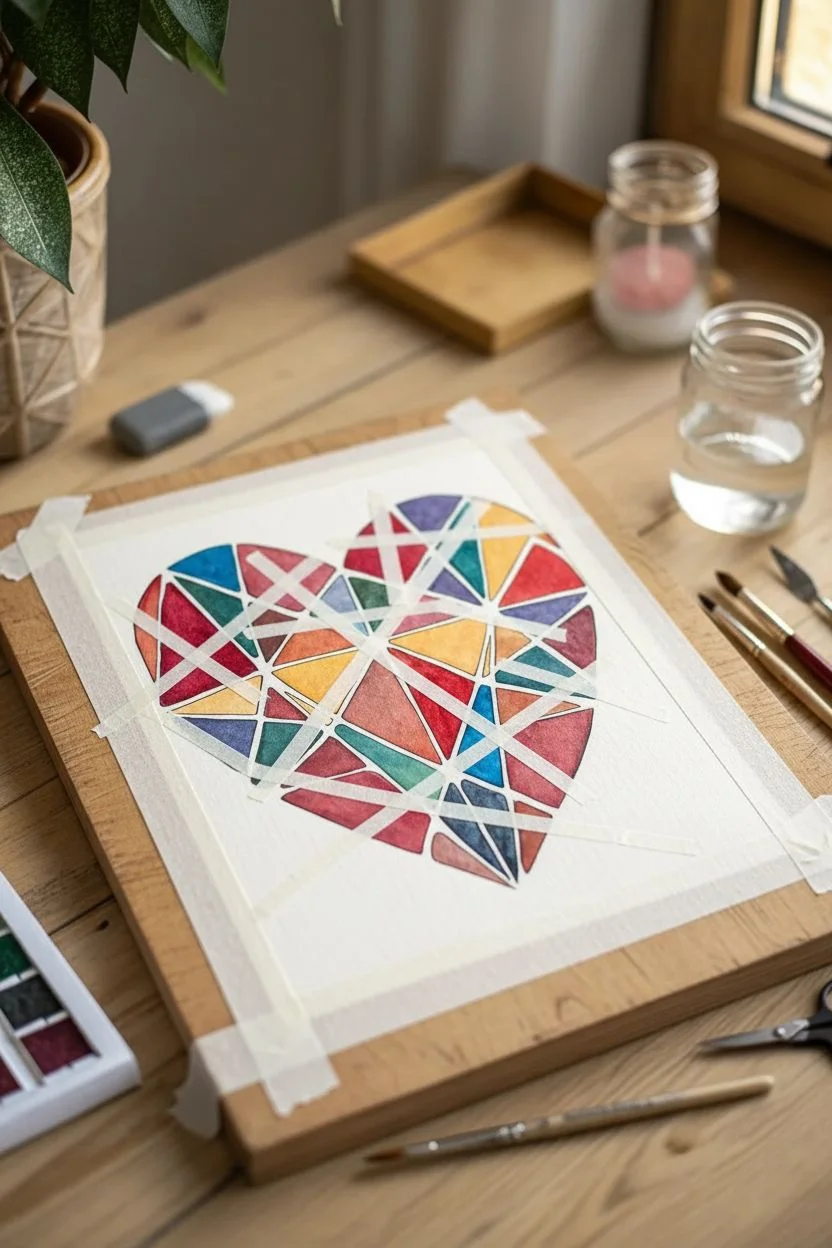
Step 1: Preparation & Taping
-
Paper Setup:
Begin by taping down your sheet of watercolor paper to a drawing board or table. Secure all four edges with masking tape to create a clean border and prevent the paper from buckling when wet. -
Sketch the Outline:
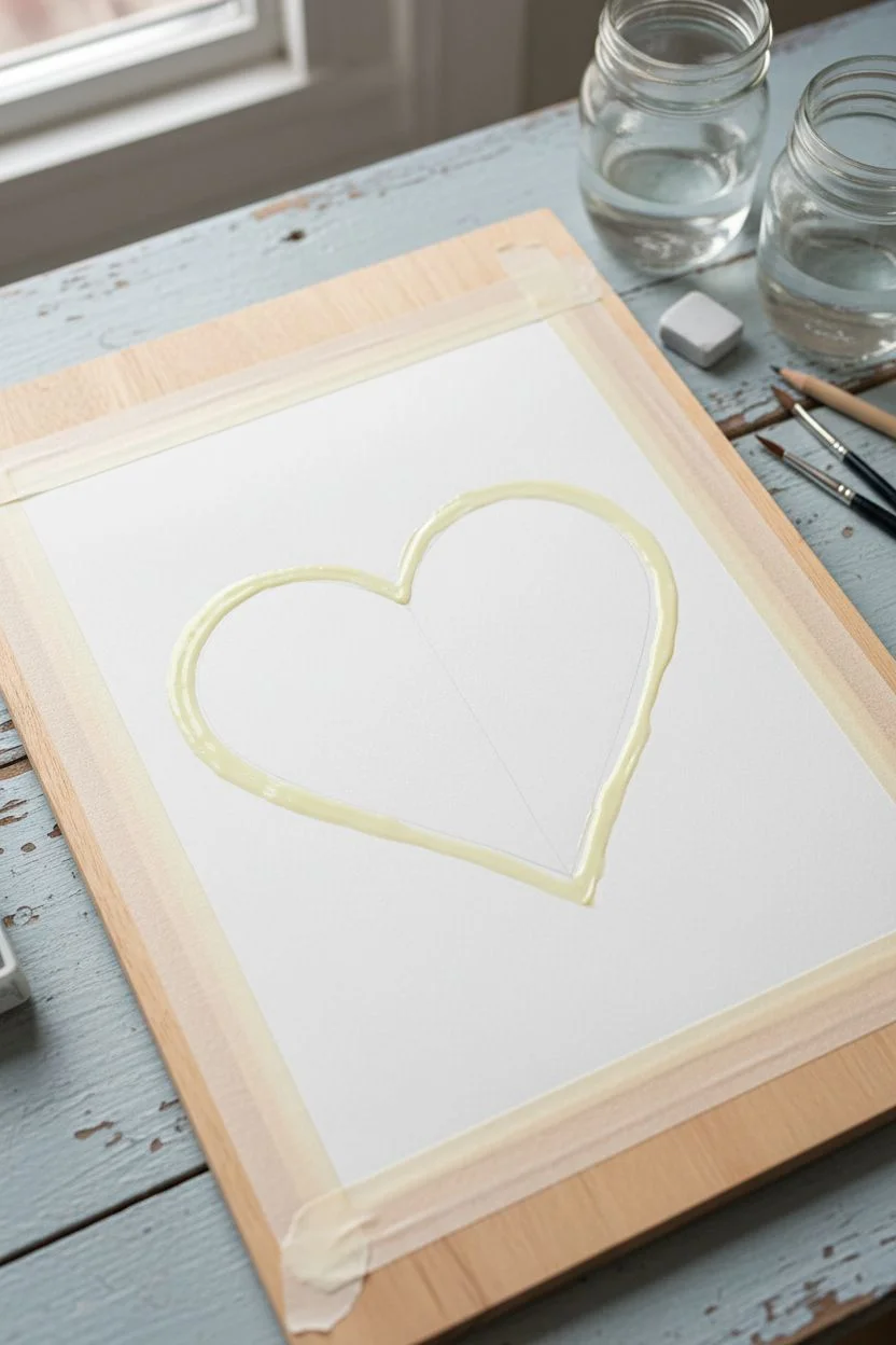
Lightly sketch a large heart shape in the center of your paper using a pencil. Keep your lines faint so they won’t show through later, or allow yourself to erase them easily. -
Apply the Outline Tape:
Using your thin masking tape, carefully trace the outline of your pencil heart. You’ll need to use many small, short strips of tape to navigate the curves smoothly without pleating the tape too much. -
Create the Geometric Web:
Now for the fun part: dividing the space. Take long strips of your thin tape and run them across the heart in random, crisscrossing directions. -
Vary the Shapes:
Aim for a mix of triangles and irregular quadrilaterals. Some lines can go all the way across, while others can intersect within the heart. Ensure you press the tape down firmly. -
Refine the Edges:
If your interior tape strips extend past the heart’s outline, use an X-Acto knife to gently trimming the excess tape right at the border, or carefully tear them so the heart shape remains distinct. -
Seal the Tape:
Run the back of your fingernail or a bone folder firmly over all the tape edges. Essential step! This prevents paint from bleeding under the adhesive and ruining your crisp white lines.
Bleeding Lines?
If paint leaked under the tape, wait until completely dry, then use a white gel pen or white gouache to carefully paint over the bleed and restore the crisp line.
Step 2: Painting & Revealing
-
Plan Your Palette:
Choose a color scheme that speaks to you. The example uses a rich mix of jewel tones—deep reds, teals, mustards, and cobalts. Activate your paints with a little water on your palette. -
Start Painting Sections:
Load your brush and fill in one geometric section at a time. I find it helpful to jump around the canvas rather than painting adjacent shapes immediately, which helps prevent colors from bleeding if your tape seal isn’t 100% perfect. -
Vary Color Intensity:
Experiment with the water-to-paint ratio. Make some sections dense and opaque with pigment, and let others remain translucent and watery for that authentic glass-shard look. -
Wet-on-Wet Effects:
For added texture, try wetting a section with just clean water first, then dropping in two different colors to let them swirl and blend naturally within that single shape. -
Fill Every Shape:
Continue until every geometric ‘shard’ within the heart is filled. Don’t worry if you paint over the tape lines; that’s what they are there for. -
Let It Dry Completely:
Patience is key here. Let the painting dry fully. If the paper is cool to the touch, it’s still damp. Using a hairdryer on a low setting can speed this up, but air drying is safest. -
The Reveal:
Once bone dry, begin peeling the tape. Start with the interior crisscross pieces first. Pull the tape slowly at a 45-degree angle away from the paint to minimize paper tearing. -
Remove Borders:
Finally, remove the tape outlining the heart shape, and then the border tape holding the paper to the desk.
Add Some Sparkle
Once the watercolor is dry, paint a thin layer of glitter glaze over specific shards, or use metallic gold watercolor for a few sections to add a luxurious foil effect.
Step back and admire your geometric masterpiece with its satisfyingly crisp edges and vibrant colors


Have a question or want to share your own experience? I'd love to hear from you in the comments below!