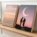
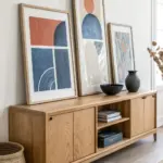
A good diptych is basically a little magic trick: two separate canvases that still read as one satisfying image. Here are my favorite diptych painting ideas that make the most of that tiny center gap—from classic scenes to playful, unexpected concepts.
City Skyline Across Two Panels
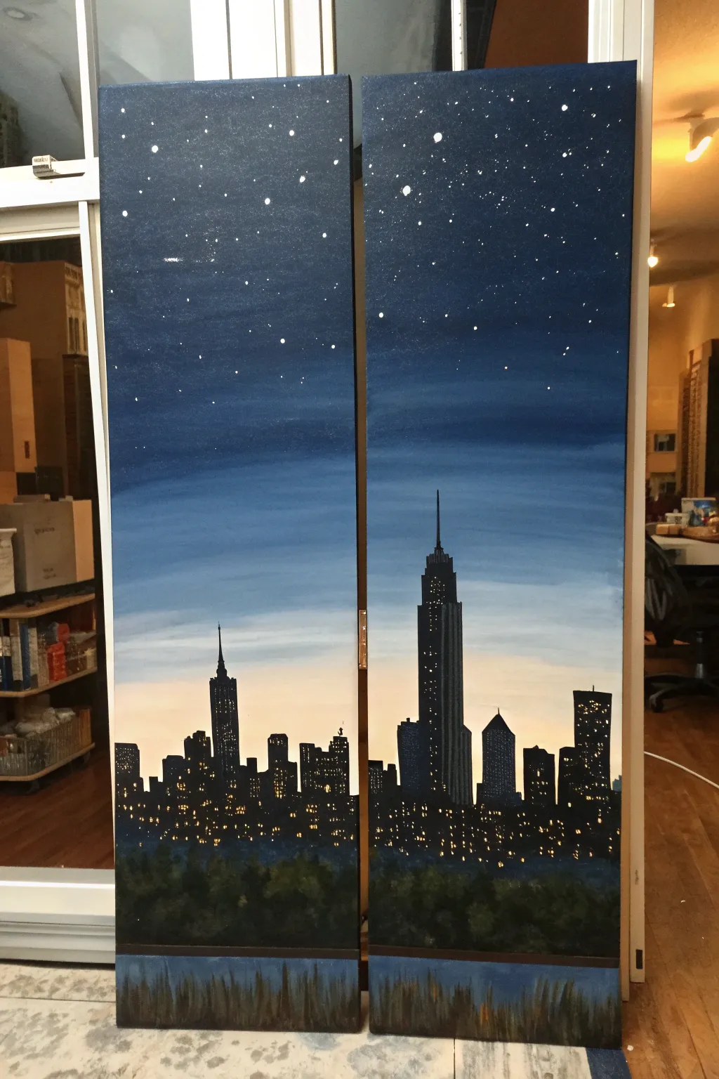
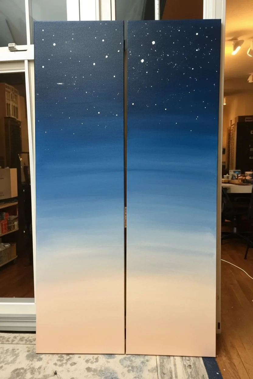
Capture the magic of a city waking up as the sun goes down with this stunning two-panel painting. You will learn to blend a smooth twilight gradient and create a dramatic silhouette skyline that stretches seamlessly across two canvases.
Detailed Instructions
Materials
- Two tall, narrow canvases (e.g., 10×30 or 12×36 inches)
- Acrylic paints: Prussian Blue, Ultramarine Blue, Titanium White, Pale Peach/Light Orange, Mars Black, Burnt Umber, Yellow Ochre
- Large flat brush (1-2 inch) for background blending
- Medium flat brush for buildings
- Small round detail brush (size 0 or 1) for windows and stars
- Fan brush (optional) for trees
- Ruler or straight edge
- Chalk or pastel pencil for sketching
- Cup of water and paper towels
- Palette
Step 1: Setting the Sky
-
Prepare the Background:
Place your two canvases side-by-side, touching each other. This ensures your horizon lines and gradients flow perfectly across the gap. If they slide around, you can use a bit of masking tape on the back to hold them temporarily together. -
Mix Your Gradient Colors:
Prepare a gradient palette. You’ll need a deep Prussian blue mixed with a touch of black for the very top, pure Ultramarine blue for the mid-sky, a mix of blue and white for the lower sky, and a very pale peach (white with a tiny drop of orange) for the horizon line. -
Paint the Deep Night Sky:
Using your large flat brush, paint the top third of both canvases with your darkest blue mixture. Use horizontal strokes that span across both panels to maintain consistency. -
Blend Mid-Tones:
While the top paint is still slightly wet, introduce the Ultramarine blue below it. Brush back and forth where the colors meet to create a soft, seamless transition. Work your way down, gradually adding more Titanium White to the blue as you descend. -
Create the Horizon Glow:
For the bottom third of the sky area, switch to your pale peach mixture. Blend this upwards into the light blue. The goal is a soft fade from the dark night above to the lingering sunset glow near the horizon line. -
Add the Stars:
Once the sky is completely dry, mix watery white paint. Dip a stiff brush or old toothbrush into it and flick the bristles to splatter tiny stars across the dark upper section. Use a small detail brush to manually tap in a few larger, brighter stars.
Keep Edges Sharp
Use the edge of a ruler as a guide for your brush when painting long skyscrapers. Wipe the ruler clean after every single stroke to avoid smudging paint.
Step 2: Building the Skyline
-
Sketch the Outline:
With the sky dry, lightly sketch your city skyline using chalk. Draw a horizontal line across the bottom third for the horizon. Sketch varied building heights, placing the tallest skyscraper (like the Empire State Building) slightly off-center on the right canvas. -
Paint Building Silhouettes:
Mix Mars Black with a tiny touch of Burnt Umber to soften the starkness. Use a medium flat brush to block in the shapes of the buildings. Ensure the edges are sharp and straight—a ruler can help guide your brush for the long vertical lines. -
Refine the Edges:
Switch to a smaller brush to paint the antennas and spires on top of the buildings. These delicate lines add realism and scale to the silhouette. -
Create the Foliage Foreground:
Below the buildings, dab in a textured dark area for the trees using a fan brush or a scruffy round brush. Use a dark green-black mix (Black + Yellow Ochre + Blue) to distinguish it slightly from the buildings. Don’t make it a solid block; keep the top edge uneven to mimic leaves. -
Add the Water Reflection:
At the very bottom of the canvas, paint a dark blue section for water. I find that pulling the brush vertically downwards with sheer dark paint creates a nice ‘reflection’ effect that mimics the foliage above.
Step 3: Illumination Details
-
Dot the Windows:
Mix a warm yellow color using Yellow Ochre and White. Using your smallest detail brush, start adding tiny dashes and dots to the buildings. Vary the spacing—some buildings have grid-like patterns, others have scattered lights. -
Vary the Light Intensity:
For added depth, mix a slightly darker orange-yellow and add a few dimmer lights. Leave large sections black to represent unlit floors or shadows. -
Highlight the Tree Line:
Using a dark, muted green, stipple minimal highlights onto the tops of the tree foliage area. This separates the trees from the buildings and the water. -
Final Water Touches:
Add subtle vertical streaks of the yellow window color into the water section at the bottom, mirroring where the brightest buildings are located, but keep them very faint and blurry.
Add a Bridge
Connect the two panels visually by painting a suspension bridge (like the Brooklyn Bridge) with cables that start on one panel and end on the other.
Hang your canvases with a small one-inch gap between them to complete the modern gallery look

Birds Facing Each Other
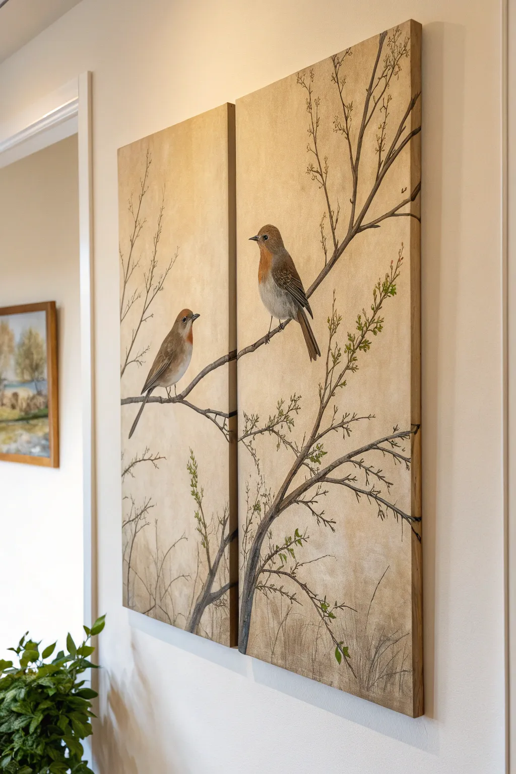
Bring the quiet beauty of nature indoors with this elegant two-panel painting featuring delicate birds perched on slender branches. Using soft earth tones and fine brushwork, you’ll create a cohesive scene that flows seamlessly across two canvases.
Step-by-Step
Materials
- Two tall rectangular canvases (e.g., 12×24 inches)
- Acrylic paints: Titanium White, Raw Sienna, Burnt Umber, Yellow Ochre, Lamp Black, Terracotta or dull Orange, Olive Green
- Large flat brush (for background)
- Medium round brush
- Fine liner brush (size 0 or 00)
- Sea sponge or crumpled paper towel
- Pencil and eraser
- Palette for mixing
- Water cup and paper towels
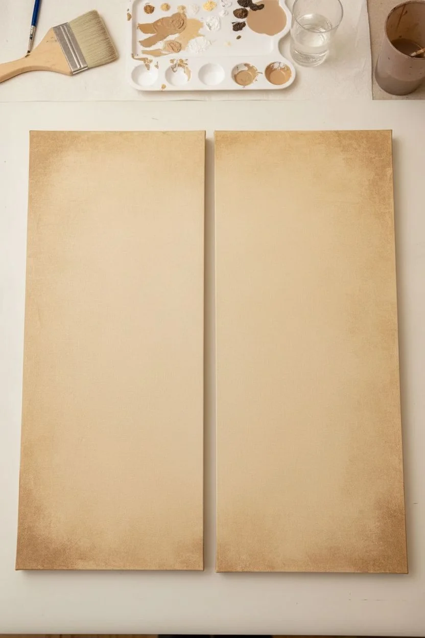
Step 1: Preparing the Background
-
Align the canvases:
Place your two canvases side-by-side on your workspace, leaving a tiny gap between them. It is crucial to treat them as a single surface during the sketching and planning phase. -
Mix the base color:
Create a warm, creamy beige by mixing a large amount of Titanium White with a touch of Raw Sienna and a tiny speck of Yellow Ochre. You want a color that looks like aged parchment. -
Apply the base coat:
Paint both canvases entirely with your beige mixture using the large flat brush. Aim for solid coverage, but don’t worry about complete smoothness yet. -
Add vintage texture:
While the base is still slightly tacky, mix a slightly darker version of your beige using a bit more Raw Sienna. Lightly dab this onto the canvas using a sea sponge or crumpled paper towel, focusing on the edges and corners to create a vignette effect. -
Dry completely:
Let the background layer dry fully before moving on. This usually takes about 20-30 minutes for acrylics.
Branch Misalignment?
If the branches don’t line up perfectly across the gap, paint a small leaf or a knot in the wood exactly at the edge of the canvas to disguise the transition.
Step 2: Sketching the Composition
-
Draw the main branch:
Lightly sketch a primary branch that starts low on the left canvas and extends upward across the gap to the right canvas. The connection point is critical, so ensure the lines match up horizontally. -
Add secondary twigs:
Sketch thinner twigs reaching upwards vertically from the main branch. Keep the lines somewhat jagged and organic, rather than perfectly straight. -
Outline the birds:
Draw the outline of the first bird (the female or smaller one) on the left panel, facing right. Draw the second bird on the right panel, perched higher and facing left, creating a visual connection between them.
Add Dimension
Mix a glaze of water and Raw Sienna. Lightly brush it over the dried background in random patches to create an antique, aged paper look.
Step 3: Painting the Elements
-
Paint the branches:
Mix Burnt Umber with a touch of Black to get a deep brown. Using the medium round brush, paint the main thick branches. Add a little water to your paint to help it flow for the longer strokes. -
Detail the twigs:
Switch to your fine liner brush. With the same dark brown mixture, carefully paint the very thin, vertical twigs reaching toward the top of the canvas. -
Base coat the birds:
Fill in the bird shapes with a flat, light grey-brown color (White + Burnt Umber). Let this dry. This provides a neutral ground for the feather details. -
Add bird coloration:
For the chests, mix a soft Terracotta or dull Orange with White. Gently dry-brush this color onto the breast area of both birds. For the wings, use a darker brown. -
Detail the feathers:
I find that using a liner brush with slightly watered-down dark grey helps create realistic separation here. Paint short, flicking strokes on the wings to resemble folded feathers. -
Paint the eyes and beaks:
Use pure Lamp Black on the liner brush to dot the eyes, leaving a tiny pinprick of white for a highlight. Carefully paint the beaks, keeping them sharp and petite. -
Add fresh foliage:
Mix a muted Olive Green. Using the tip of a small round brush, dab small, leaf-like shapes sparsely along the thinner twigs. Don’t overdo it; keeping the leaves sparse maintains the delicate ‘early spring’ look.
Step 4: Final Touches
-
Check the continuity:
Step back and look at the gap between the canvases. If the branch line looks disjointed, carefully thicken or adjust the paint at the edges to ensure the eye travels follows the line smoothly. -
Paint the canvas sides:
Don’t forget the edges! Paint the sides of the canvas with the background beige color (or continue the image around the side) for a professional, frameless finish. -
Seal the artwork:
Once fully dry (give it 24 hours), apply a matte varnish to protect the painting and unify the sheen of the different paint colors.
Hang your new diptych with a small gap between the panels to let the composition breathe.

Botanical Leaf Halves
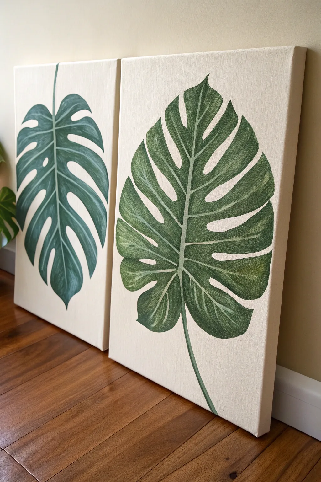
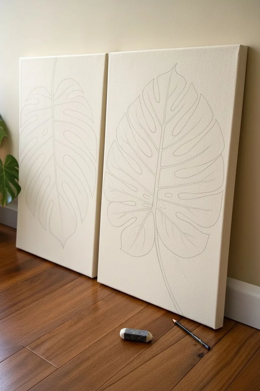
Bring the lush elegance of the botanical world indoors with this striking diptych project. By splitting a single Monstera leaf composition or creating two complementary leaves across separate canvases, you create a modern, cohesive statement piece that feels organic and textured.
Step-by-Step Tutorial
Materials
- Two stretched canvases (16×20 or 18×24 inches suggested)
- Acrylic paints (Titanium White, Unbleached Titanium/Cream, Hooker’s Green, Sap Green, Burnt Umber)
- Pencil and large eraser
- Flat shader brushes (sizes 6 and 10)
- Round liner brush (size 1 or 2)
- Palette or paper plate
- Cup of water and paper towels
Step 1: Preparation & Sketching
-
Prime the Background:
Mix a generous amount of Titanium White with a small touch of Unbleached Titanium or a tiny drop of brown to create a warm, creamy off-white. Apply two even coats to both canvases, painting the sides as well for a polished look. -
Let it Cure:
Allow the background essential drying time. It must be completely dry to the touch before sketching, otherwise, your pencil will dig into the paint. -
Plan the Composition:
Place the two canvases side-by-side on a flat surface or easel. Decide if you want one giant leaf spanning both or two separate leaves; the reference image features two distinct but harmonious leaves. -
Draft the Hearts:
Lightly sketch a large heart shape on each canvas as the base for your Monstera leaves. Keep the pencil pressure extremely light. -
Add the Fenestrations:
Carve out the iconic Monstera holes and slits (fenestrations) from your heart shapes. Draw veins leading to the center stem ensuring they curve naturally with the leaf’s form.
Chalky Paint?
If your acrylics dry too dull or chalky, wait until the swaying is totally dry and apply a coat of gloss or satin varnish. This mimics the natural waxy sheen of a real Monstera.
Step 2: Blocking & Texture
-
Mix Your Greens:
Prepare three shades of green on your palette: a dark shadow green (Hooker’s Green + tiny bit of Burnt Umber), a mid-tone true green, and a highlight green (Sap Green + White). -
Base Coat:
Using a flat shader brush, fill in the leaf shapes with your mid-tone green. Don’t worry about perfect opacity yet; a little streakiness adds to the natural look later. -
Establish the Stem:
Paint the central vein (midrib) and the petiole (stem) using a light mixture of green and white. This acts as your anchor for the leaf structure. -
Directional Painting:
When applying further layers, always pull your brush strokes in the direction of growth—from the center vein outward toward the leaf edges. This is crucial for realism. -
Deepen the Shadows:
Take your darkest green mix and apply it near the center vein and along the bottom edges of the leaf splits. This adds immediate depth. -
Feather the Edges:
Use a slightly dry brush to blend the dark paint into the mid-tone areas. You want soft transitions rather than harsh stripes.
Step 3: Detailing & Refining
-
Add Veining:
Switch to your fine liner brush. Using a mix of white and light green, carefully trace the lateral veins branching out from the center. -
Highlight the Texture:
I like to use a ‘scumbling’ technique here—taking a dry brush with very little light green paint and lightly dragging it over the raised areas of the leaf to catch the texture of the canvas. -
Enhance Contrast:
Go back in with your darkest shadow color. Add tiny, sharp lines right next to the lightest veins to make them pop visually. -
Refine the Outlines:
If your edges got messy, use the background cream color to clean up the outline of the leaf, essentially ‘erasing’ any jagged green marks. -
Final Glaze (Optional):
For a unified look, mix a tiny bit of yellow or sap green with glazing medium (or water) and wash it over the entire dry leaf to warm up the tones.
Go 3D
Mix visual texture paste into your green paint during the blocking phase. Use a palette knife to apply it for the veins, creating actual raised ridges you can feel.
Hang your twin canvases with a few inches of space between them to let the composition breathe.


Bloom and Bud Side-by-Side
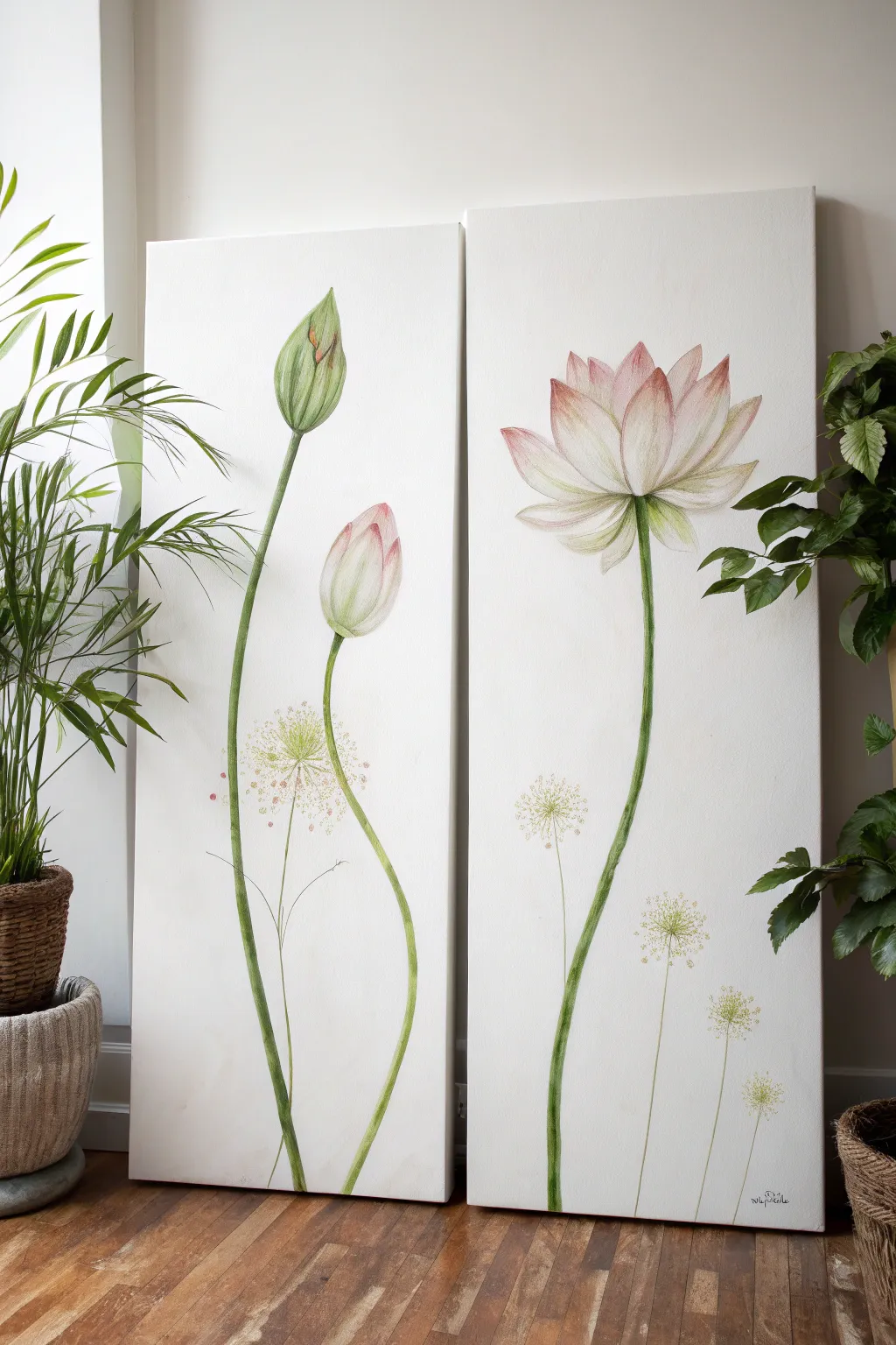
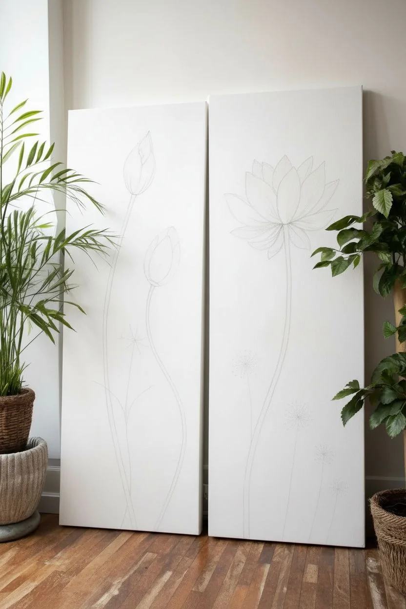
Capture the serene beauty of botanical growth with this elegant two-panel painting featuring lotus flowers in various stages of bloom. The minimalist white background allows the delicate pinks and greens of the stems and petals to truly sing, creating a peaceful statement piece for any room.
Step-by-Step
Materials
- Two tall vertical canvases (e.g., 12×36 inches or similar ratio)
- Acrylic paints: Titanium White, Sap Green, Olive Green, Alizarin Crimson, Cadmium Yellow, Raw Umber
- Gesso (if canvases aren’t pre-primed)
- Large flat brush (for background)
- Filbert brushes (sizes 4 and 8)
- Round brushes (sizes 0, 2, and 6)
- Fine liner brush
- Palette for mixing
- Cup of water and paper towels
- Pencil for sketching
Step 1: Preparation and Sketching
-
Prime the canvases:
Even if your canvases are pre-primed, I like to apply a fresh coat of Titanium White gesso to both panels. This ensures a bright, crisp white background which is essential for this minimalist look. Let it dry completely. -
Plan the composition:
Place the two canvases side-by-side on a flat surface or easels. Visualize the flow of the stems; they should look related but not perfectly continuous. The left panel will hold the buds, and the right will feature the full bloom. -
Sketch the stems:
Using a light pencil touch, draw the long, winding stems. On the left canvas, draw two stems rising from the bottom—one reaching high for the top bud, one slightly lower. On the right canvas, draw a single dominant stem for the large flower. -
Outline the floral elements:
Sketch the two teardrop-shaped buds on the left panel. On the right panel, sketch the large open lotus flower, starting with a central petal and fanning out symmetrical layers of petals around it.
Fixing Wobbly Stems
If your long stems look shaky, don’t worry. Wait for the green to dry, then use Titanium White paint to ‘cut in’ from the background, effectively erasing the wobbly edges for a smooth line.
Step 2: Painting the Stems
-
Mix your stem green:
Create a natural green by mixing Sap Green with a touch of Cadmium Yellow and a tiny bit of Raw Umber to desaturate it. You want a fresh, organic color, not an artificial bright green. -
Base coat the stems:
Use a round brush (size 6) to paint the stems. Use long, confident strokes to prevent choppiness. Vary the width slightly—thicker at the bottom, tapering near the flower heads. -
Add stem texture:
While the base green is still slightly tacky, mix a darker version using Olive Green and a dot of Alizarin Crimson (which deepens green beautifully). Paint a shadow line along the right side of each stem to create cylindrical form. -
Highlight the stems:
Mix a lighter green with white and yellow. Carefully paint a thin highlight on the left side of the stems where light would hit.
Level Up: Metallic Accent
Mix a tiny amount of iridescent or pearl medium into your white paint for the flower petals. It adds a subtle shimmer that changes as you walk past.
Step 3: Painting the Buds and Bloom
-
Base the left buds:
For the closed bud (top left), paint the outer sepals with your light green mix. Leave the tip slightly exposed. For the slightly open bud (lower left), paint the main shape in a very pale pink (White + tiny dot of Alizarin Crimson). -
Detail the buds:
Add definition to the green sepals with your darker green mix. For the pink bud, deepen the pink at the tip of the petals and blend it down into the white base for a soft gradient. -
Paint the open bloom petals:
On the right canvas, start painting the lotus petals. Use a flat or filbert brush to lay down a base of Titanium White for each petal. Work from the back petals forward. -
Add the pink blush:
While the white is wet, introduce your pale pink mix to the tips of the petals. Use a clean, slightly damp soft brush to blend the pink downwards, fading into the white center. -
Define the petals:
Use a size 2 round brush with a slightly darker pink to separate overlapping petals. Paint delicate lines radiating from the base of the petals to suggest texture and veins. -
Paint the bloom’s base:
Where the flower meets the stem, paint the green receptacle and small sepals hugging the bottom of the bloom, blending the green softly into the base of the white petals.
Step 4: Delicate Details
-
Sketch the seed heads:
Lightly pencil in tiny, dandelion-like spheres near the bottom of both canvases. These should be much lower than the main flowers to balance the composition. -
Paint fine stems:
Use a liner brush and very watered-down green paint (almost like watercolor) to draw the hair-thin stems for these seed heads. -
Create the seed clusters:
Stipple tiny dots using the liner brush. Use a mix of pale yellowish-green and faint pink. Keep these very airy and transparent; they should look like ghost flowers in the background. -
Final touches:
Step back and check the balance. If the white background got smudged, touch it up with fresh white paint to carve out the shapes of the flowers perfectly.
Hang your canvases with about two inches of space between them to complete the visual flow.
BRUSH GUIDE
The Right Brush for Every Stroke
From clean lines to bold texture — master brush choice, stroke control, and essential techniques.
Explore the Full Guide
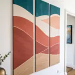
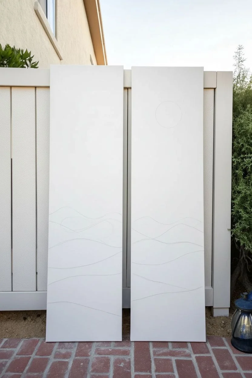
Day and Night in One Scene
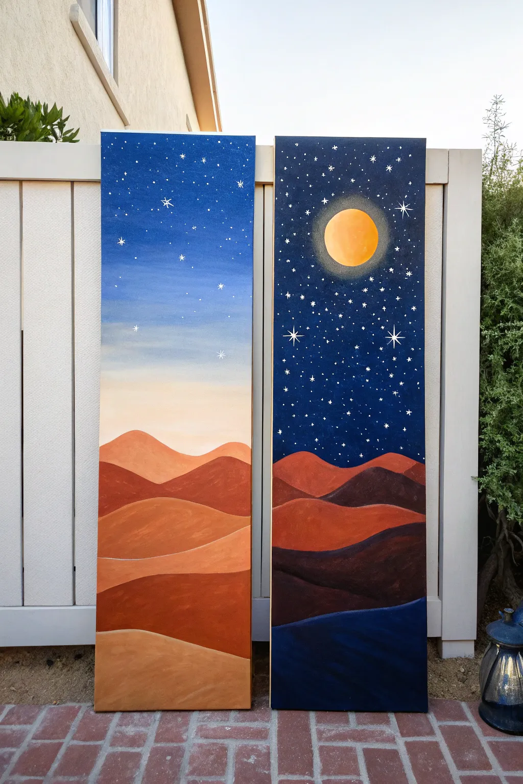
Capture the magic of a shifting desert sky with this stunning diptych that splits a single landscape between day and night. By mirroring the rolling dune shapes across two tall canvases, you’ll create a seamless transition from a soft, starry twilight to a deep, moonlit midnight.
Step-by-Step Tutorial
Materials
- Two tall, narrow stretched canvases (e.g., 10×30 or 12×36 inches)
- Acrylic paints: Titanium White, Phthalo Blue, Mars Black, Burnt Sienna, Yellow Ochre, Cadmium Orange, Cadmium Red
- Large flat brush (2-inch) for blending backgrounds
- Medium filbert brush for dunes
- Small round detail brush (size 0 or 1) for stars
- Pencil
- Palette for mixing
- Water cup and paper towels
- Masking tape (optional)
Step 1: Planning and Sketching
-
Position the canvases:
Place your two canvases side-by-side on your workspace or easel, leaving a very small gap between them. Treat them as one single surface for the sketching phase. -
Sketch the horizon:
Lightly sketch the rolling dune lines with a pencil. Start about one-third up from the bottom for the highest dunes, ensuring the lines flow continuously from the left canvas to the right canvas to connect the scene. -
Map out the celestial bodies:
On the right canvas (the night side), lightly trace a circle for the moon in the upper third area. Leave the left canvas sky empty for now.
Uneven Gradients?
If your sky blending looks streaky, the acrylics are drying too fast. Mist the canvas with water or use a ‘slow-drying medium’ to keep the paint workable longer for smoother blends.
Step 2: Painting the Sky Gradient
-
Mix the day sky colors:
For the left canvas, prepare a gradient palette: a medium blue for the top, a pale blue for the middle, and a creamy peach (White + tiny dot of Orange/Yellow Ochre) for the horizon line. -
Paint the day gradient:
Using a large flat brush, apply the medium blue at the top. While wet, blend in the pale blue downwards, and finally blend the peach color near the dune line. Use horizontal strokes to ensure a smooth transition. -
Mix the night sky colors:
For the right canvas, mix a deep midnight blue (Phthalo Blue + Black) for the top and a slightly lighter navy blue for the lower sky area. -
Paint the night gradient:
Apply the dark midnight mix to the top of the right canvas, painting around your moon circle. Blend it into the lighter navy as you reach the dune line. I like to let this dry briefly before doing a second coat for opacity.
Level Up: Metallic Touch
Mix a tiny amount of gold mica powder or metallic gold paint into the highlight color for the dune ridges. It will make the sand shimmer subtly when the light hits the canvas.
Step 3: Creating the Dunes
-
Block in the day dunes:
On the left canvas, mix varying shades of warm earth tones. Use Burnt Sienna mixed with Orange for the shadows, and Yellow Ochre mixed with White for the sunlit tops. Paint the dunes in flowing, wavy bands. -
Add dimension to the day side:
While the paint is workable, blend the lighter tops into the darker bottoms of each dune ridge to create a 3D effect. The dunes closest to the viewer (bottom) should be slightly darker and richer in color. -
Block in the night dunes:
On the right canvas, the dunes need to look shadowed. Use Burnt Sienna mixed with a little Black or Purple to desaturate the earth tones. Paint the same dune shapes, but much darker than the left side. -
Deepen the night shadows:
For the lowest dunes on the night side, mix a very dark blue-black shade (almost matching the sky) to show deep shadow. This heavy contrast anchors the bottom of the painting.
Step 4: Celestial Details
-
Paint the moon:
Fill the moon circle on the right canvas with a mix of Titanium White and a tiny touch of Yellow Ochre. Paint the center brightest white and trace the edges with a very sheer, dry-brushed yellow to create a glowing halo effect. -
Create the star field:
Load a small round brush with watered-down white paint. Carefully dot stars onto the night sky. Make some dots larger than others for variety. -
Add ‘day stars’:
Wait for the day sky to dry completely. Add a few very subtle, small white dots in the blue section of the left canvas to suggest stars fading into the morning light. -
Paint the twinkle stars:
Select a few prominent stars on the night side and paint a cross shape ‘+’ followed by a smaller ‘x’ over the center to create a magical twinkling effect. -
Highlight the dune edges:
Use a thin line of pale yellow-white to trace the very top edge of the night dunes. This represents the moonlight catching the ridge of the sand.
Step back and admire how the colors shift across the gap, creating a beautiful passage of time in your living space
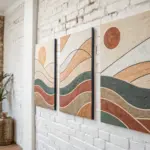
Seasonal Contrast Tree
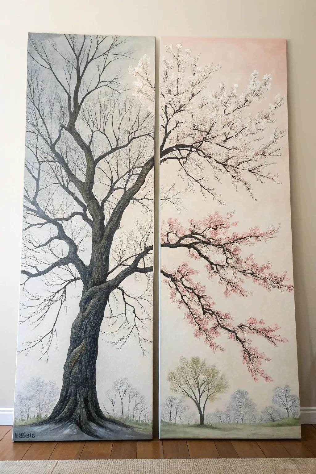
Capture the elegant transition of seasons with this stunning large-scale diptych featuring a single majestic tree split across two canvases. One panel showcases stark, leafless winter branches while the other bursts into life with delicate white and pink blossoms, all set against a soft, atmospheric background.
Step-by-Step Guide
Materials
- Two large tall stretched canvases (e.g., 24×60 inches each)
- Acrylic paints: Titanium White, Mars Black, Burnt Umber, Payne’s Grey, Sap Green, Alizarin Crimson (or a deep pink)
- Flow improver medium
- Large flat brush (2-3 inch)
- Assorted round brushes (sizes 2, 6, 10)
- Fine liner or rigger brush
- Sea sponge or stippling brush
- Palette and water container
- Easels (or wall space) to hold both canvases side-by-side
- Charcoal pencil or chalk for sketching
Step 1: Preparing the Atmosphere
-
Setup:
Position your two canvases side-by-side with a small gap (about 1-2 inches) between them. This is crucial because you need to visualize the composition as one continuous image before painting. -
Sky Gradient – Left Panel:
Mix Titanium White with a tiny touch of Payne’s Grey. Using your large flat brush, paint the left canvas starting from the top. Keep it predominantly cool gray-white, fading into a slightly warmer, creamy off-white near the bottom third. -
Sky Gradient – Right Panel:
For the right panel, introduce a very subtle pink tint to your white at the top, blending down into a creamy beige-yellow hue. This hints at the warmth of spring sunlight compared to the cold winter light on the left. -
Background Horizon:
Near the bottom of both canvases (about 6 inches up), create a soft, misty horizon line. Use a wash of watered-down grey-green for the ‘ground’ area, keeping it very indistinct and foggy.
Step 2: Constructing the Main Tree
-
Sketching the Skeleton:
Using a charcoal pencil, lightly sketch the main trunk. Position the thickest part of the trunk almost entirely on the left panel, leaning slightly inward. Draw the major branches reaching across the gap onto the right panel. -
Base Coding the Trunk:
Mix Mars Black with Burnt Umber and a touch of flow improver. Paint the main trunk solid dark first to establish the weight of the tree. Let the brush strokes follow the vertical grain of the bark. -
Bark Texture:
Once the base is dry, dry-brush lighter grey and brown tones over the trunk. Focus on the edges to create a 3D cylindrical effect. I find that dragging the brush vertically with uneven pressure creates the best natural bark texture. -
Branch Structure – Left (Winter):
Switch to your medium round brush. Paint the primary branches reaching upward. As you move to the tips, switch to a rigger brush and thinned black-grey paint to create intricate, spidery twigs that fill the upper left corner. -
Branch Structure – Right (Spring):
Extend the thick branches from the left panel onto the right. These should be smoother and slightly simpler than the winter side, as many of the fine details will be covered by blossoms later. -
Adding Dimension:
Go back over the main crotches of the branches (where they split) with darker paint to deepen the shadows, emphasizing the twisted, gnarled nature of the old wood.
Seamless Connection
Step back frequently to ensure the branches flow naturally across the gap. If painting on separate easels, push them together momentarily to check alignment.
Step 3: Foliage and Atmosphere
-
Background Trees:
Mix a very pale, watery grey. Paint small, ghost-like tree silhouettes along the bottom horizon line on both panels. These should look distant and foggy, lacking sharp details. -
Distant Spring Tree:
On the bottom of the right panel, add a slightly more defined small tree using Sap Green mixed with Yellow Ochre for a fresh, new-leaf look. Keep it semi-transparent. -
White Blossoms – Upper Right:
On the upper branches of the right panel, use a small filbert brush or a sponge loaded with thick Titanium White. Dab clusters of flowers along the top branches. -
Pink Blossoms – Lower Right:
For the lower sweeping branch on the right panel, mix Alizarin Crimson with White to make a soft pink. Stipple these blossoms loosely, allowing the dark branch to peek through occasionally. -
Falling Petals:
Use your smallest brush to add tiny dots of pink and white floating in the empty space below the branches on the right, suggesting petals falling in the breeze. -
Winter Transition:
On the very top right edge of the *left* panel, add just a few tiny clusters of white buds. This visually bridges the gap and suggests the winter tree is just starting to wake up. -
Grounding Shadows:
Add a soft, dark wash at the very base of the main trunk on the left panel to anchor it to the ground. Add faint cast shadows under the distant background trees.
Fixing Heavy Branches
If a branch looks too thick or clunky, don’t panic. Wait for it to dry, then use the sky background color to ‘cut in’ and slim the branch down from the outside edges.
Hang these pieces with a small gap between them to let the negative space become part of your beautiful seasonal story.

PENCIL GUIDE
Understanding Pencil Grades from H to B
From first sketch to finished drawing — learn pencil grades, line control, and shading techniques.
Explore the Full Guide
Mirror-Image Portrait Pair
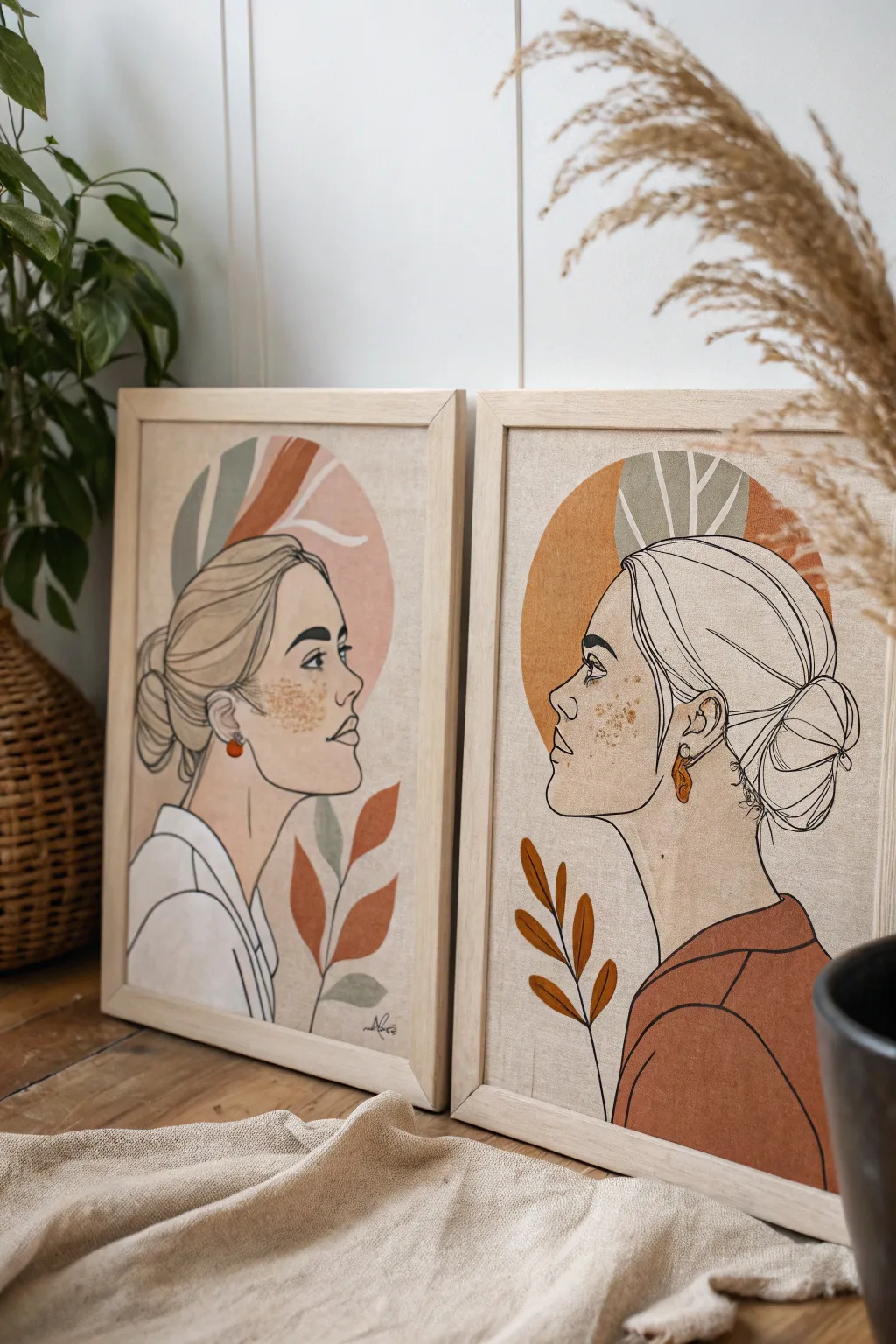
Create a striking gallery wall focal point with this elegant diptych featuring mirroring profiles in warm, earthy tones. The combination of fine line work and abstract botanical shapes gives these pieces a sophisticated, minimalist aesthetic synonymous with modern bohemian decor.
Detailed Instructions
Materials
- Two 11×14 or A3 textured canvas boards or heavyweight watercolor paper
- Two matching light wood frames (natural oak or pine finish)
- Acrylic paints (Warm Ochre, Terracotta, Sage Green, Cream, Dusty Pink, and Titanium White)
- Fine liner marker pens (black, archival, sizes 03 and 05)
- Pencil (HB) and eraser
- Tracing paper (optional but recommended)
- Flat shader brushes (sizes 6 and 10)
- Fine detail brush (size 0 or 00)
- Gold metallic acrylic paint or gold leaf pen
- Mixing palette and water cup
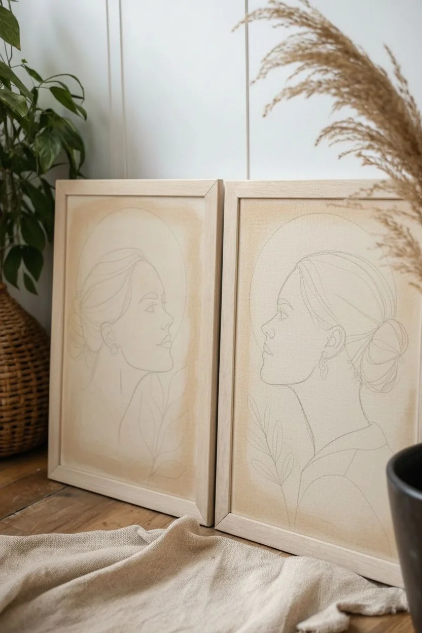
Step 1: Preparation & Sketching
-
Prepare the surface:
If using raw canvas or paper, apply a thin wash of a very light cream or warm beige acrylic to the entire surface. This eliminates the stark white background and gives the piece an aged, organic feel. Let this base layer dry completely. -
Study the composition:
Observe how the two profiles face each other. The left portrait depicts a woman facing right, and the right portrait depicts a woman facing left. Their features should roughly align horizontally. -
Draw the first profile:
On the first canvas, lightly sketch the profile of the woman’s face using your HB pencil. Focus on the graceful curve of the neck, the jawline, and the up-swept bun hairstyle. Keep the lines faint so they can be erased easily later. -
Create the mirror image:
To ensure symmetry, trace your first sketch onto tracing paper. Flip the tracing paper over and transfer the graphite outline onto the second canvas. This guarantees the two women are effectively ‘looking’ at each other. -
Sketch the background elements:
Lightly draw the circular/oval shapes behind the heads and the flowing botanical leaves. On the left canvas, place leaves at the bottom right; on the right canvas, place them at the bottom left to maintain balance.
Clean Lines Pro-Tip
Can’t paint a perfect circle? Lightly trace a dinner plate or bowl onto your canvas for the background shapes before adding color.
Step 2: Color Blocking
-
Paint the background circles:
Mix a muted dusty pink for the left painting’s background oval and a warm ochre/terracotta for the right painting’s circle. Use a flat shader brush to fill these shapes in, keeping the edges relatively crisp. -
Fill in the clothing:
Paint the clothing blocked areas. The left figure wears a white shirt (use Titanium White with a tiny drop of brown to soften it), while the right figure wears a deep terracotta top. -
Add botanical hues:
Paint the leaves that frame the figures. Use sage green for the upper leaves and mix variations of burnt orange and ochre for the lower botanical sprigs. -
Let the paint set:
Allow all the color blocks to dry completely. If the canvas texture shows through too much, I sometimes apply a second coat for a smoother finish.
Step 3: Detailed Line Work
-
Outline the profiles:
Using the 05 black fine liner, carefully trace over your pencil lines for the facial profiles, hair, and clothing folds. Use a steady hand and varying pressure—press slightly harder on shadow areas like the jawline and hair bun. -
Refine the hair details:
Switch to the finer 03 pen to add individual strands of hair within the bun and loose fly-aways near the forehead. This adds delicate realism to the stylized drawing. -
Outline the botanicals:
Use the pen to outline the painted leaves and background shapes, but consider leaving some shapes un-outlined for a softer, mixed-media look.
Level Up With Texture
Mix a small amount of baking soda or modeling paste into your acrylic paints for the background shapes to create a raised, plaster-like texture.
Step 4: Finishing Touches
-
Add freckles and texture:
Mix a watery brown paint or use your gold metallic paint. Dip a stiff brush or toothbrush into the pigment and gently flick or stipple tiny speckles across the cheeks and nose of both figures. -
Embellish with jewelry:
Paint the earrings (a small hoop or drop shape) using a solid pop of burnt orange or gold paint to draw the eye to the earlobe area. -
Clean up:
Once the ink is bone dry, gently erase any visible pencil marks. Place the finished artworks into the light wood frames.
Hang your new diptych side-by-side with a few inches of spacing to let the conversation between the portraits flow
Still Life That Spills Over
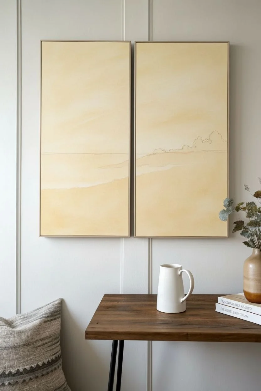
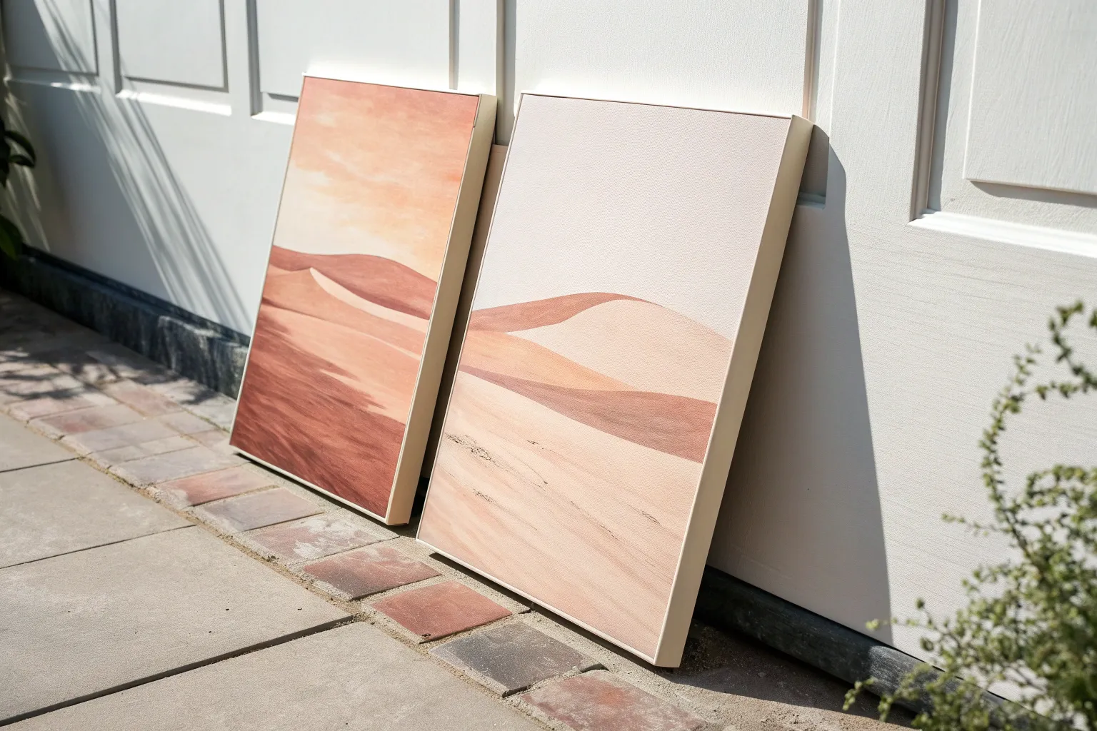
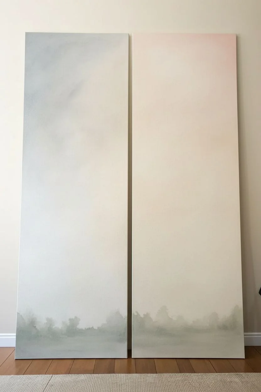
Capture the serene transition of a coastal field with this expansive diptych that allows the landscape to flow seamlessly across two canvases. The soft, dreamy palette of burnt siennas, misty blues, and creamy whites creates a cohesive scene that feels both modern and timeless.
Step-by-Step Tutorial
Materials
- Two 12×24 inch stretched canvases (or similar tall, narrow aspect ratio)
- Acrylic paints (Titanium White, Burnt Sienna, Yellow Ochre, Raw Umber, Paynes Grey, Burnt Umber)
- Medium and large flat brushes
- Small round detail brush (size 2 or 4)
- Fan brush (optional, for texture)
- Palette knife
- Water spray bottle
- Easel or flat workspace big enough for both canvases side-by-side
Step 1: Setting the Scene
-
Prepare the workspace:
Place your two canvases side-by-side on your easel or table. It is crucial to paint them simultaneously as if they were one single surface to ensure the horizon lines and color gradients match perfectly. -
Prime the surface:
Apply a thin wash of Yellow Ochre mixed with plenty of water over both canvases. This warm underpainting will peek through later layers, giving the landscape an inner glow and preventing stark white spots. -
Sketch the horizon:
Using a small brush and diluted Raw Umber, lightly mark your horizon line about one-third of the way down from the top. Draw this line straight across both canvases to connect them instantly. -
Map out the midground:
Roughly sketch in the rolling hills and the distant tree line on the right canvas, allowing the shapes to gently fade as they move toward the left canvas.
Alignment Check
If your horizon lines don’t match up perfectly when hanging, don’t repaint! Simply adjust the hanging wire on the back of one frame to raise or lower it slightly.
Step 2: Building the Sky and Background
-
Mix the sky colors:
Create a gradient palette for the sky: a pale creamy mix (White + tiny touch of Yellow Ochre) and a soft peach (White + Burnt Sienna). -
Apply the sky base:
Using a large flat brush, apply the creamy white at the horizon line and blend upwards. While wet, introduce the peach tones in sweeping, diagonal strokes that span across the gap between the canvases. -
Add cloud movement:
Mix a very faint grey-blue using White and a dot of Paynes Grey. Scumble this loosely into the upper corners to hint at cloud shadows, keeping the strokes loose and dreamy. -
Paint the distant hills:
For the furthest landmass, mix Paynes Grey with White to get a hazy, atmospheric blue-grey. Paint a thin strip just above the horizon line on both canvases to push the perspective back.
Step 3: The Foreground Textures
-
Block in the field:
Mix a rich, reddish-brown using Burnt Sienna and a touch of Burnt Umber. Block in the lower two-thirds of the painting, focusing on the foreground area where the tall grass will be. -
Create depth in the grass:
While the reddish-brown is still tacky, mix a lighter tan color using White, Yellow Ochre, and Raw Umber. Apply this in vertical, flicking strokes to simulate the underlayer of dried field grass. -
Add the distant tree line:
On the right canvas, mix a muted green-grey using Paynes Grey and Yellow Ochre. Dab this along the horizon line to create the suggestion of distant bushes and trees, softening the bottom edges into the field. -
Blend the transition:
I like to use a dry brush here to gently soften the line where the red field meets the distant blue hills, making the landscape look misty rather than sharp.
Soft Edges Formula
To get that dreamy, out-of-focus look on the distant hills, mist your canvas lightly with water before applying the paint. The damp surface blurs the edges automatically.
Step 4: Details and Unification
-
Paint the tall stalks:
Using your small round brush and a mix of Raw Umber and White, paint long, sweeping stems on the left canvas. Start from the bottom and flick your wrist upward to get a natural taper. -
Add wheat heads:
At the top of these stalks, use a small flat brush or side of your round brush to dab in the seed heads. Use a warm golden color to make them pop against the pale sky. -
Highlight the foreground:
Mix a pale wheat color (White + Yellow Ochre). Use rapid, upward flicking motions across the bottom of both canvases to create the texture of wind-blown grass in the immediate foreground. -
Connect the composition:
Ensure some of the grassy strokes near the center seam ‘point’ toward the other canvas or appear to continue across the gap, reinforcing the idea of a single scene. -
Refine the sky:
If the sky looks too flat, dry brush a little bit of pure White in diagonal streaks to suggest wispy cirrus clouds catching the light. -
Final assessment:
Step back and look at the canvases together. Darken any shadows in the foreground grass with Burnt Umber to anchor the painting and add final contrast.
Hang your canvases with a small gap between them to let the wall color breathe through the landscape


Corner-Wrap Diptych Design
Capture the stark beauty of a winter coast with this two-panel landscape project that emphasizes subtle textures and muted earth tones. By spreading a single horizon line across two canvases, you’ll create an expansive feeling that draws the viewer into a quiet, windswept moment.
Step-by-Step Guide
Materials
- Two gallery-wrapped canvases (same height, 24×24 or larger recommended)
- Acrylic paints: Titanium White, Burnt Umber, Raw Sienna, Yellow Ochre, Payne’s Grey, Mars Black
- Gesso (optional for priming)
- Texture paste or modeling paste
- Palette knife
- Large flat brushes (2-inch)
- Medium filbert brushes
- Small liner brush (for branches)
- Natural sea sponge
- Easel or flat workspace
Step 1: Preparation and Sky
-
Surface Prep:
Place your two canvases side-by-side on your easel or work surface. Treat them as a single long canvas for now. If you want extra smoothness, apply a coat of gesso and sand lightly once dry. -
Horizon Line:
Use a ruler or straight edge to lightly draw a horizon line across both canvases. Place it slightly below the vertical center (roughly the bottom third) to emphasize the expansive sky. -
Mixing Muted Tones:
Mix a large batch of ‘overcast sky’ color. Combine Titanium White with a tiny touch of Raw Sienna and the smallest drop of Payne’s Grey. You want a warm, dusty cream color, not a cold grey. -
Sky Base Coat:
Using a large flat brush, cover the entire sky area on both panels. Use horizontal strokes that span across the gap between canvases to ensure the color flow creates a continuous visual. -
Cloud Texture:
While the base is still slightly tacky, mix a slightly darker version of your sky color (add more Raw Sienna/Burnt Umber). Use a scumbling technique or a dry brush to create soft, indistinct cloud formations near the top, keeping edges very blurry.
Uneven Horizon?
If your horizon lines don’t match up perfectly when hanging, don’t repaint! Simply adjust the hanging wire on the back of one canvas to raise or lower it until they align.
Step 2: The Water and Horizon
-
Blocking the Water:
Mix Titanium White with Payne’s Grey to create a steel-blue grey for the water. Apply this in the band just below the horizon line on both canvases. -
Adding Movement:
Take a clean, dry brush with pure Titanium White. Drag it horizontally across the water area to create the look of distant chop or whitecaps. Keep these lines perfectly horizontal to maintain perspective. -
Darkening the Horizon:
Use a small brush with a dark mix (Payne’s Grey and Burnt Umber) to paint a very thin, sharp line right at the horizon. Soften the top edge of this line slightly so it recedes into the distance.
Step 3: Foreground Textures
-
Shoreline Underpainting:
For the sandy, grassy foreground, mix Burnt Umber and Yellow Ochre. Paint the bottom section of both canvases solid with this dark base. -
Adding Texture:
This is where I like to use a palette knife. Mix modeling paste with Raw Sienna and lightly scrape it over the dried foreground underpainting. This creates physical grit that mimics sand and dead grass. -
Grassy Layers:
Using an old, splayed bristle brush or a fan brush, flick upward strokes using a mix of Yellow Ochre and White. Start from the bottom edge and work upward toward the water. -
Varying Values:
Repeat the grass flicking process with darker tones (Burnt Umber) and lighter highlights (nearly pure White) to create depth. Ensure the visual density of the grass matches on both panels where they would meet. -
Sponge Dabbing:
Use a natural sea sponge with dark brown paint to dab irregular patches near the bottom corners. This simulates dense bushes or shadowed scrub.
Gold Leaf Accent
For a contemporary twist, apply a very thin line of gold leaf along the horizon line or sparingly in the dry grass highlights to catch the light.
Step 4: Detailing the Tree
-
Positioning the Subject:
Focus on the left canvas. Sketch the main trunk of the leafless tree starting from the bottom left quadrant, extending up into the sky. -
Painting the Trunk:
Mix Mars Black with Burnt Umber. Paint the main trunk, keeping it slightly thicker at the base and tapering as it rises. -
Adding Branches:
Switch to your liner brush. Add the secondary branches and fine twigs. Use a ‘shaky hand’ technique—letting your hand tremble slightly helps create organic, gnarled branch shapes rather than stiff straight lines. -
Highlighting Bark:
Mix a light grey-brown. Paint thin highlights on the right side of the trunk and main branches (assuming the light source is uniform) to give them 3D volume. -
Final Integration:
Paint a few tall grasses in the immediate foreground over the base of the trunk to set the tree essentially ‘into’ the landscape, rather than floating on top.
Hang your canvases with a two-inch gap between them to let the eye bridge the distance and complete the serene landscape.
Shadow Cast Across Two Panels
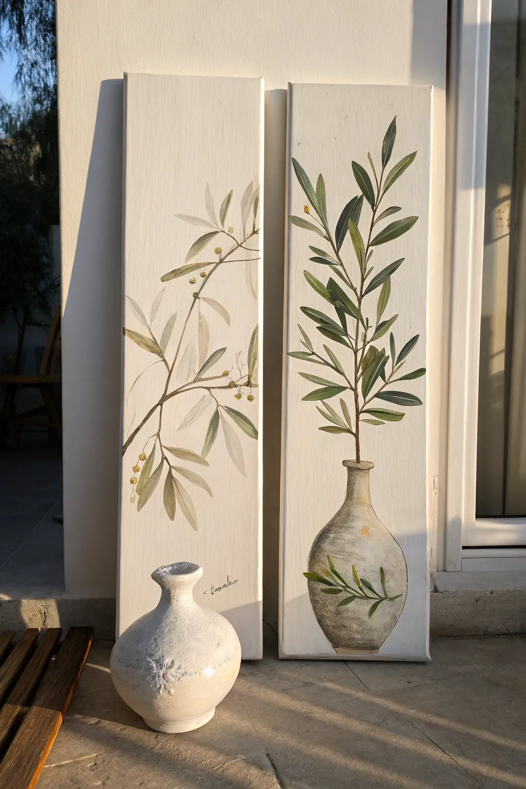
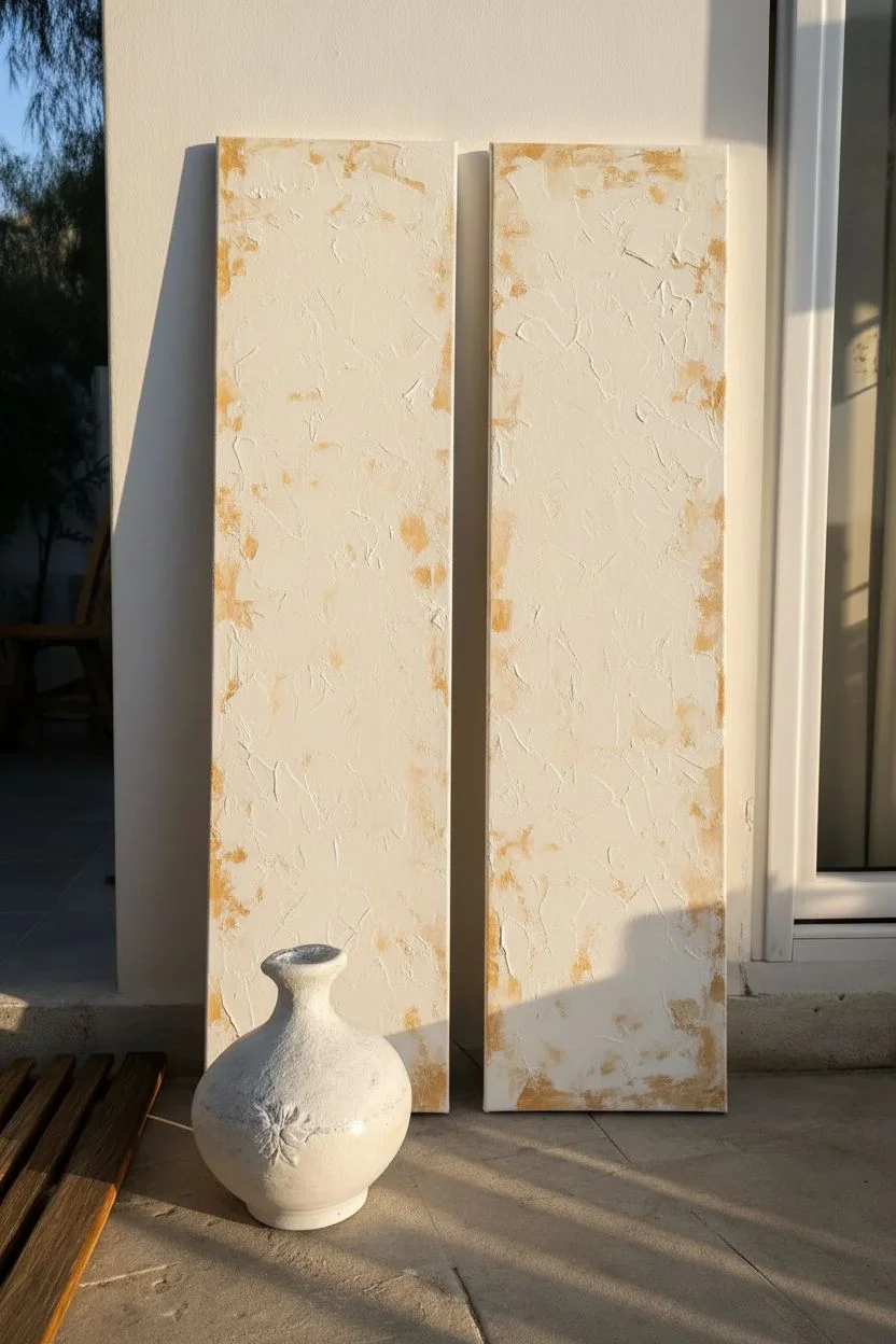
Capture the serene beauty of the Mediterranean with this elegant two-panel painting featuring graceful olive branches and textured pottery. The soft greens and earthy neutrals create a cohesive, calming aesthetic perfect for bringing a touch of nature indoors.
Detailed Instructions
Materials
- Two tall vertical canvases (e.g., 10×30 inches)
- Acrylic paints: Titanium White, Unbleached Titanium, Olive Green, Sap Green, Burnt Umber, Raw Sienna, Yellow Ochre
- Gesso (optional, for priming)
- Texture paste or modeling paste
- Palette knife
- Assorted synthetic brushes: Flat (1 inch), Filbert (size 6), Round (size 2 and 4), Liner (size 0)
- Pencil and eraser
- Paper towels
- Water cup
- Matte varnish
Step 1: Preparation and Background
-
Prime and Texture:
Begin by applying a coat of white gesso mixed with a small amount of texture paste to both canvases. Use a palette knife to spread it unevenly, creating subtle ridges and bumps that will mimic an old plaster wall. Let this dry completely, usually overnight. -
Create the Base Color:
Mix a large amount of Titanium White with a touch of Unbleached Titanium and a tiny drop of Raw Sienna. You want a warm, creamy off-white color. -
Apply Background Layer:
Paint the entire background of both canvases with your cream mixture. Use a large flat brush and purposeful, crisscross strokes to enhance the underlying texture. -
Add Subtle Aging:
While the background is still slightly tacky, lightly dry-brush a very faint mix of Raw Sienna and white near the edges and corners to give the surface an aged, sun-baked look.
Layering Trick
For the ‘faded’ leaves in the background, mix a drop of glazing medium into your paint. This transparency makes them look further away than the bold foreground leaves.
Step 2: Drafting the Composition
-
Sketch the Right Panel:
On the right canvas, lightly sketch a rounded vase shape at the bottom using a pencil. Draw a single, strong central stem rising from the vase neck, branching out towards the top. -
Sketch the Left Panel:
On the left canvas, sketch a branch entering from the left side and cascading downwards. Ensure the flow of the leaves complements the upward motion of the right panel, creating a visual conversation between the two. -
Outline Leaves:
Loosely sketch the lance-shaped leaves along the stems. Don’t worry about perfect symmetry; natural variation looks better.
Step 3: Painting the Vase
-
Base Coat the Vase:
Mix Titanium White with a little Burnt Umber and Raw Sienna to create a ‘stone’ grey-beige. Fill in the vase shape on the right panel. -
Add Texture and Shadows:
Using a smaller brush or sponge, dab darker grey-brown mix (Burnt Umber + White) onto the shadow side of the vase (usually the left/bottom). Add pure White highlights to the right side where the light hits. -
Detail the Vase Motif:
Using a small round brush, paint a simple olive sprig directly onto the belly of the vase using Olive Green and Sap Green to match the larger branches.
Level Up Your Art
Use actual crackle paste on the vase portion before painting. When it dries and cracks, apply a dark wash to settle into the crevices for an authentic antique pottery feel.
Step 4: Painting the Branches
-
Paint the Stems:
Mix Burnt Umber with a little Olive Green. Use a liner brush or small round brush to paint the main stems and smaller twigs. Vary the pressure to make the lines taper naturally. -
Leaf Base Layer:
Mix a mid-tone green using Olive Green and a touch of White. Fill in all the leaf shapes. Paint some leaves slightly transparent or faded in the background, specifically on the left panel, to create depth. -
Add Shadows to Leaves:
Mix Sap Green with a tiny bit of Burnt Umber. Paint the undersides of the leaves and the areas where leaves overlap to create volume. -
Highlight the Leaves:
Mix your base green with more Yellow Ochre and White. Add strokes to the tips and top edges of the leaves to suggest sunlight catching the foliage.
Step 5: Finishing Touches
-
Add Olives/Buds:
Using Yellow Ochre mixed with a dot of Green, paint small dots or ovals near the leaf joints to represent flower buds or small olives. Add a tiny dot of brown to the base of each for realism. -
Refine the Connection:
Step back and view both panels side-by-side. If the composition feels disconnected, extend a leaf or twig slightly on either canvas to bridge the gap visually. -
Varnish:
Once the paint is fully cured (give it at least 24 hours), apply a clear matte varnish to seal the work and protect the textured surface without adding unwanted gloss.
Hang your new artwork in a well-lit spot to let the texture catch the light beautifully


Have a question or want to share your own experience? I'd love to hear from you in the comments below!