If you’ve been staring at a blank wall thinking, “Something needs to live here,” you’re in the right headspace. These wall art painting ideas are meant to help you picture the finished vibe in a real room—and make it feel totally yours.
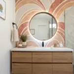
Big Abstract Acrylic Canvas
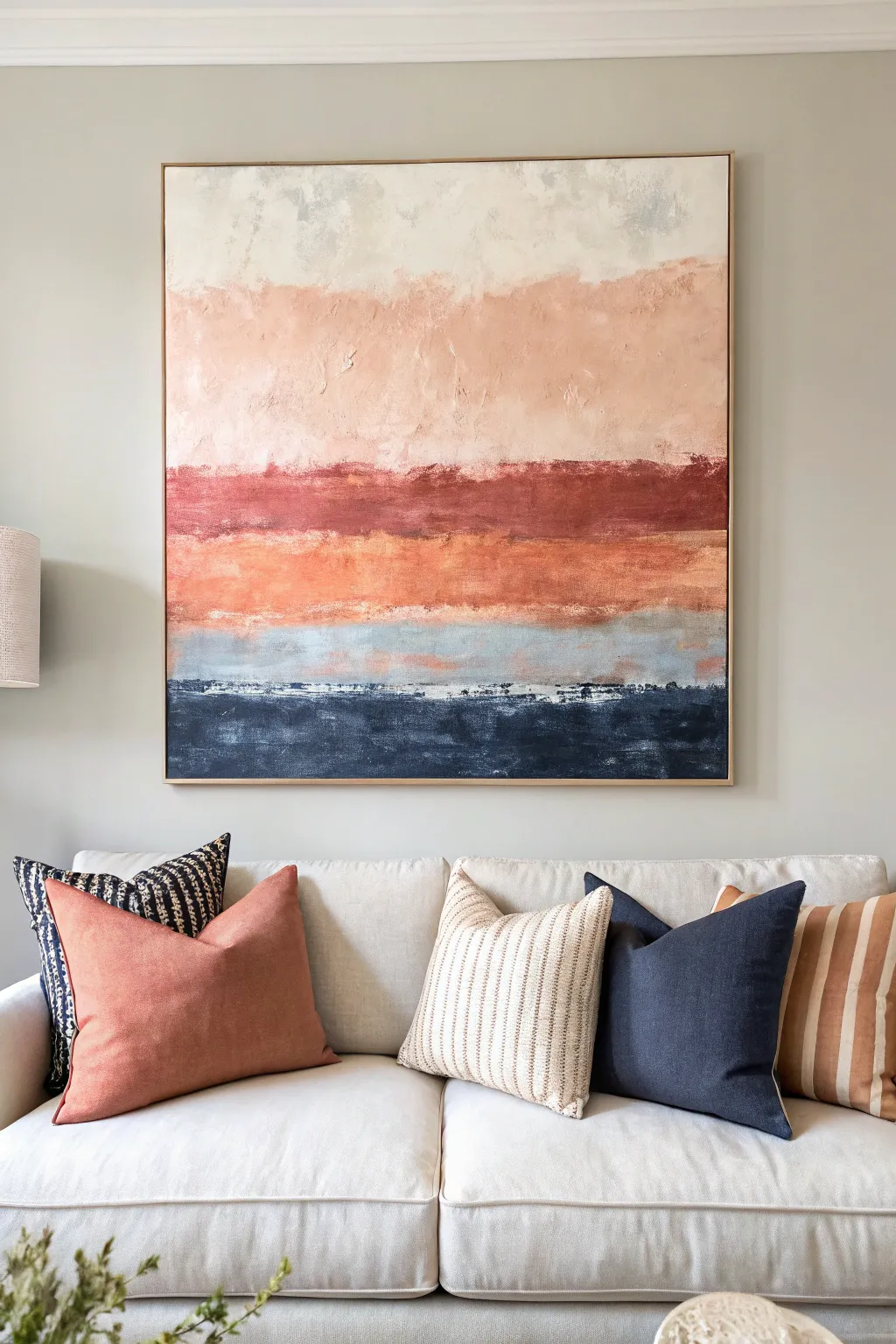
This large-scale abstract painting brings a calming, modern aesthetic to any living space with its soft gradient of earth tones and deep blues. By layering horizontal bands of acrylics, you’ll create a textured, landscape-inspired piece that mimics the feeling of a sunset over the ocean.
Step-by-Step Tutorial
Materials
- Large canvas (e.g., 36×36 or 40×40 inches)
- Acrylic paints (Titanium White, Unbleached Titanium, Blush Pink, Terra Cotta, Burnt Sienna, Orange, Paynes Grey, Navy Blue)
- Large flat paintbrush (2-3 inches wide)
- Medium palette knife
- Gesso (optional but recommended for texture)
- Water spray bottle
- Mixing palette or paper plates
- Drop cloth
- Floating wooden frame (optional)
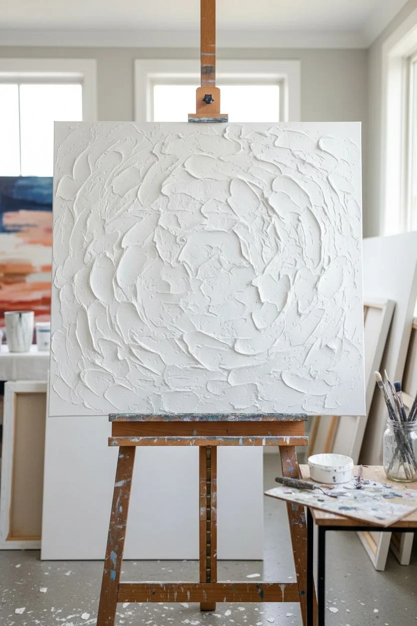
Step 1: Preparation & Texture
-
Prime the Surface:
Lay your large canvas on a flat, protected surface or an upright easel. Ensure it is free of dust. -
Add Texture Base:
If you want the painting to have the tactile feel seen in the example, apply a layer of white gesso or modeling paste randomly across the canvas using a palette knife. Don’t smooth it out perfectly; rough ridges catch the paint beautifully later. -
Let it Cure:
Allow this texture layer to dry completely, which may take a few hours depending on thickness.
Step 2: Top Layers: The Sky
-
Mix the Clouds:
Start at the very top. Mix Titanium White with a tiny touch of Unbleached Titanium to create a warm, off-white cream color. -
Apply the Top Band:
Using your large flat brush, paint the top 25% of the canvas with horizontal strokes. Keep the strokes loose and slightly uneven at the bottom edge. -
Introduce Blush:
While the white is still tacky, mix your Blush Pink with a little White on the palette. Apply this below the cream section, filling the next 20% of the canvas. -
Blend the Transition:
Use a slightly damp, clean brush to gently feather the meeting point between the cream and blush sections. The goal is a soft, cloud-like transition, not a hard line.
Paint Dried Too Fast?
Keep a spray bottle of water handy. A very fine mist over the canvas keeps acrylics workable for longer blending times without diluting the pigment.
Step 3: Middle Layers: The Horizon
-
Create the Rust Band:
Mix Terra Cotta with a dab of Burnt Sienna to get that rich, deep rust color. Paint a bold, defined horizontal strip below the pink area. -
Add Texture with Knife:
Take your palette knife and scrape some of the rust paint across the canvas horizontally. This creates the ‘broken’ look where the paint skips over the canvas grain. -
Layering the Orange:
Below the rust, introduce a band of muted Orange. I like to mix a little white into the orange to tone it down so it isn’t too neon against the earth tones. -
The Misty Transition:
Create a thin transitional band below the orange using a mix of White and a tiny drop of Paynes Grey. This represents the misty horizon line and separates the warm sky from the cool water.
Add Metallic Shimmer
Mix a small amount of gold leaf paint into the orange or rust sections. It catches the light subtly, enhancing the sunset effect.
Step 4: Bottom Layers: The Ocean
-
Paint the Deep Blue:
Load your brush generously with Navy Blue and a touch of Paynes Grey. Paint the bottom 25% of the canvas solidly. -
Highlight the Water:
Dip just the tip of your brush into white paint. Lightly drag it horizontally through the upper section of the blue area to create the look of distant waves or reflection. -
Refine the Edges:
Step back and look at your bands. If any transition looks too harsh, use a dry brush to lightly sweep over the line, blurring the wet paints together. -
Final Touch-Ups:
Use your palette knife to add thick distinct dabs of pure white or cream near the textural transition points for added visual interest. -
Seal Surface:
Once fully dry (give it 24 hours), apply a satin varnish to protect the colors and unify the sheen. -
Frame It:
For the professional look shown in the photo, install the canvas into a simple light-wood floating frame.
Enjoy the warmth and depth this massive statement piece brings to your room


Soft Watercolor Botanical Set
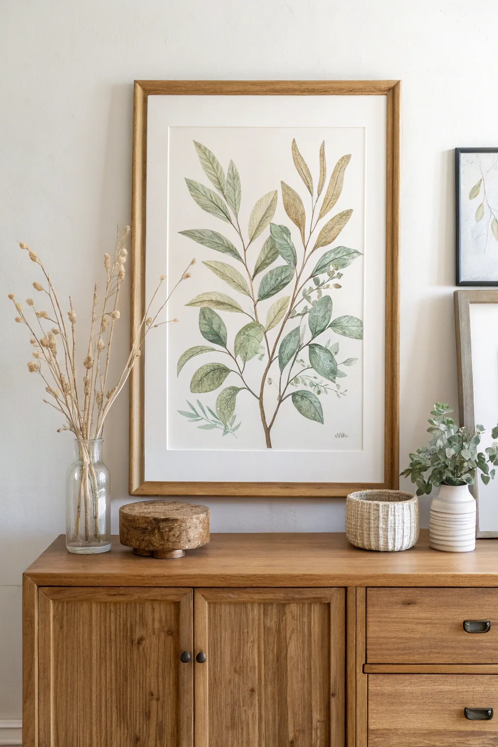
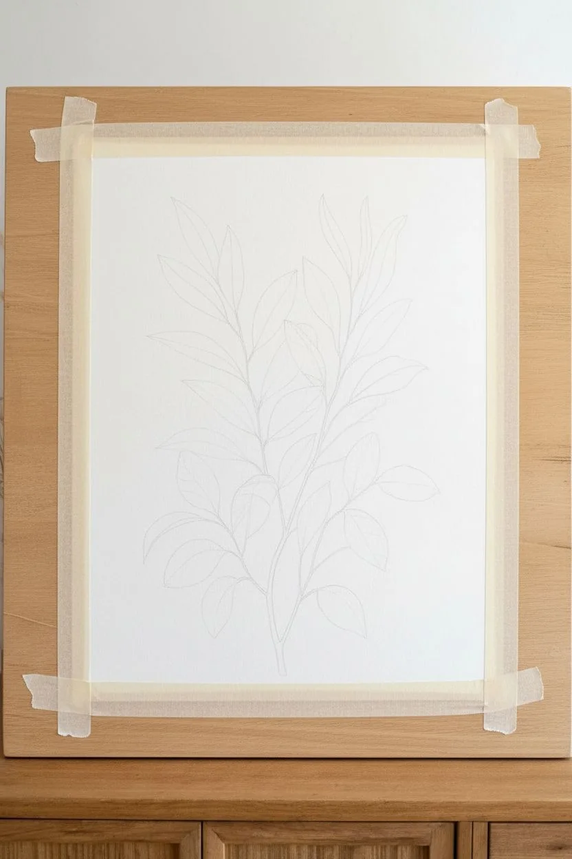
Capture the serene beauty of nature with this elegant botanical watercolor study featuring soft greens and warm ochres. This painting focuses on delicate leaf layering and a flowing composition, perfect for bringing a peaceful, organic touch to any blank wall.
Step-by-Step
Materials
- Cold press watercolor paper (140lb/300gsm), preferably A3 or 11×14 inches
- Watercolor paints (Sap Green, Olive Green, Yellow Ochre, Burnt Umber, Payne’s Gray)
- Round brushes (sizes 2, 6, and 8)
- Pencil (HB or 2H)
- Kneaded eraser
- Two jars of water
- Paper towels
- Masking tape
- Wooden frame (optional for finishing)
Step 1: Preparation and Sketching
-
Secure the paper:
Begin by taping your watercolor paper down to a flat board using masking tape. This prevents the paper from buckling when wet and ensures you have a crisp, clean border if you choose to frame it with a mat later. -
Establish the central stem:
Using your HB pencil, lightly draw a curved line starting from the bottom center, reaching upward and slightly to the right. This will be the main anchor for your leaves, so keep the curve gentle and organic. -
Map out the branches:
Sketch smaller offshoot stems branching out from the main line. Aim for an asymmetrical look—nature is rarely perfectly balanced. Add a primary brand stretching to the top left and another toward the top right. -
Outline the leaves:
Lightly draw the leaf shapes attached to your stems. These should be elongated ovals with pointed tips, characteristic of olive or eucalyptus leaves. Vary the sizes, placing larger leaves near the bottom and smaller ones at the tips. -
Refine the sketch:
Use your kneaded eraser to lift off excess graphite. You want the lines to be barely visible—just faint enough to guide your brush without showing through the translucent watercolor.
Water Control Fix
If you get a ‘cauliflower’ bloom (a hard edge inside the leaf), damp a clean stiff brush and gently scrub the edge to soften it, then blot with a tissue.
Step 2: Painting the Foliage
-
Mix your base greens:
Prepare three puddles of color on your palette: a cool sage green (Olive Green + a touch of Payne’s Gray), a warm yellow-green (Sap Green + Yellow Ochre), and a plain Yellow Ochre for the autumnal leaves. -
Paint the first wash:
Start with the largest leaves on the left side. Using a size 8 brush, wet the leaf shape with clear water first, then drop in your cool sage green. Let the pigment flow naturally to the edges. -
Introduce color variation:
While the first leaves are still damp, touch the very tip or the base with a slightly darker green mix. This creates a lovely soft gradient as the paint dries. -
Paint the golden accents:
Moving to the upper right section, use your Yellow Ochre mix to paint the leaves reaching towards the top. I like to keep these quite diluted at first so they don’t overpower the greens. -
Layer the middle tones:
Fill in the remaining central leaves with your warm yellow-green mix. Be careful not to paint adjacent wet leaves, or the colors will bleed into each other—unless that’s the look you want. -
Add the stem detail:
Switch to a size 2 brush and mix Burnt Umber with a tiny bit of darker green. Carefully trace the stems, starting from the bottom and working up. Ensure the lines are thin and taper off as they reach the leaf attachments. -
Let it dry completely:
Wait for this initial layer to be bone dry. If the paper feels cool to the touch, it’s still wet.
Pro Tip: Color Harmony
Mix a tiny bit of your stem brown into your green leaf mixtures. This unifies the color palette and makes the plant look like one cohesive organism.
Step 3: Detailing and Depth
-
Define the veins:
With a fine size 2 brush and a slightly more concentrated green blooming from your palette, paint a thin central vein down the middle of the classic green leaves. Keep the line broken in places for a natural feel. -
Add texture to golden leaves:
For the ochre leaves, use a light brown mix to add subtle veining stripes. These leaves mimic dried foliage, so a little extra texture works well here. -
Create shadows:
Mix a darker shadow color (Olive Green + Payne’s Gray). Glaze this sheer color over the bottom half of leaves that are ‘behind’ other leaves to create depth and dimension. -
Paint the background sprigs:
Some of the leaves in the reference look ghostly and faint. Mix a very watery, pale gray-green. Paint small, delicate sprig shapes in the open spaces between the main branches to fill the composition. -
Final stem touches:
Go back over the main wooden stem at the bottom with a second layer of Burnt Umber to anchor the painting visually.
Step 4: Finishing Touches
-
Add tiny buds:
If you have empty spots, use the tip of your brush to dot tiny clusters of buds or berries near the stem intersections using a dark brown or dark green. -
Review contrast:
Step back and look at the whole piece. If the image looks too flat, darken the area where the stem meets the leaves to push the foliage forward. -
Sign and un-tape:
Once absolutely dry, sign your work with a small brush or archival pen. Peel the tape away slowly at a 45-degree angle to reveal your clean white border.
Frame your new botanical masterpiece in natural wood to echo the organic feel of the painting.


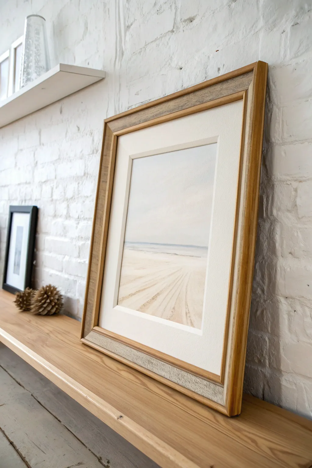
Calm Landscape Horizon Painting
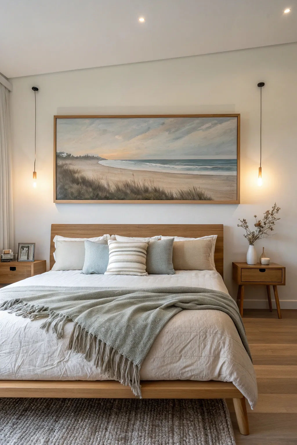
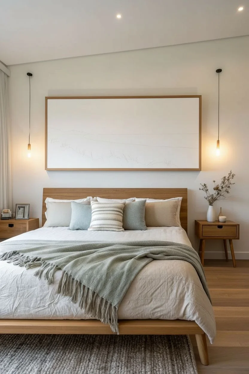
Bring the calming essence of the seaside into your bedroom with this expansive landscape painting. Featuring soft pastel skies, gentle rolling waves, and textured dune grasses, this piece captures the quiet beauty of a beach at twilight.
How-To Guide
Materials
- Large-scale gallery wrapped canvas (approx. 24×60 inches)
- Acrylic paints (Titanium White, Ultramarine Blue, Burnt Umber, Yellow Ochre, Alizarin Crimson, Phthalo Blue)
- Gesso (optional, for priming)
- Large flat brushes (2-inch and 1-inch)
- Medium round brushes (size 6 and 8)
- Fan brush or rigger brush (for grass)
- Palette knife
- Water container and rags
- Slow-drying medium (retarder) to help with blending
- Floating wooden frame (oak or pine finish)
Step 1: Setting the Scene
-
Prepare the canvas:
Begin by ensuring your large canvas is clean. If creating from scratch, stretch your canvas tight. Apply a coat of gesso if it feels too rough, sanding it lightly once dry for a smooth painting surface. -
Map the horizon:
Using a ruler and a faint pencil line or watered-down Burnt Umber, mark your horizon line slightly below the vertical center. This composition emphasizes the expansive sky, which is key to the peaceful mood. -
Outline the shoreline:
Sketch a gentle, curving line starting from the left middle-ground that sweeps diagonally down towards the right foreground. Avoid a perfectly straight line; let it mimic the natural ebb and flow of water on sand.
Step 2: Painting the Sky and Sea
-
Mix sky colors:
On your palette, prepare a gradient of colors. You’ll need a pale blue-grey for the upper sky (White + tiny touch of Phthalo Blue + speck of Burnt Umber) and a warm peachy-cream for the horizon (White + Yellow Ochre + touch of Crimson). -
Apply the background sky:
Using your largest flat brush, paint the upper sky first. As you work downward, blend in your warmer peach mixture near the horizon line. Mixing a slow-drying medium here helps keep the acrylics wet enough to create a seamless, soft gradient. -
Add cloud structures:
With a smaller flat brush, scumble in soft diagonal cloud formations using a mix of White and subtle Grey-Purple. Keep the edges soft and indistinct to mimic movement. -
Paint the deep ocean:
For the distant water, mix Phthalo Blue with a touch of Burnt Umber and White to get a deep, muted teal. Paint a horizontal band right against the horizon line, keeping it perfectly straight and level. -
Create the shoreline waves:
Transition the water color to a lighter turquoise as it nears the sand. Use horizontal strokes with a flat brush. -
Add the white wash:
Using pure Titanium White, paint the breaking whitewater where the ocean meets the sand. Use a dry brush technique to drag the white paint slightly over the sand area to look like foam.
Uneven Horizon?
If your ocean line looks crooked, use low-tack painter’s tape to establish a perfectly straight line. Paint over the tape edge, then peel it off while wet for a crisp horizon.
Step 3: The Sandy Foreground
-
Base coat the sand:
Mix a large amount of sand color using White, Yellow Ochre, and a small amount of Burnt Umber. Cover the entire beach area. Make the sand darker and ‘wetter’ near the waterline, and lighter and drier towards the bottom foreground. -
Add tonal variation:
While the sand paint is still tacky, streak in subtle bands of darker brown and grey horizontally. This mimics the uneven surface of a beach. -
Establish the dune shadows:
Defining the grassy area starts with shadow. Use a dark mix of Burnt Umber and Ultramarine Blue to paint rough, organic shapes along the bottom left ledge where the grass will grow.
Level Up: Texture
Mix modeling paste into your white paint for the crashing waves. Apply this with a palette knife to create actual 3D texture that catches the light.
Step 4: Textures and Framing
-
Paint back layer of grass:
Using a fan brush or a medium round brush, flick upward strokes in a dark olive green tone (Yellow Ochre + Black/Blue mix) over your dark shadow base. Vary the height and angle. -
Add highlights to grass:
Mix a lighter dried-grass color (White + Yellow Ochre). With a rigger brush or the edge of a palette knife, add sharp, thin lines over the dark grass to represent sun-bleached stalks. -
Soften the edges:
I find that lightly glazing the bottom corners with a transparent dark wash helps vignette the image, drawing the eye toward the sunset center. -
Varnish the work:
Once the painting is fully cured (give it at least 24 hours), apply a satin varnish to protect the surface and unify the sheen of the different paint layers. -
Frame the piece:
Install the canvas into a light oak floating frame. Leave a small gap between the canvas edge and the frame to create that professional gallery look.
Now step back and admire the tranquil view creates a stunning focal point in your room

Minimal Line-Art Portrait Painting
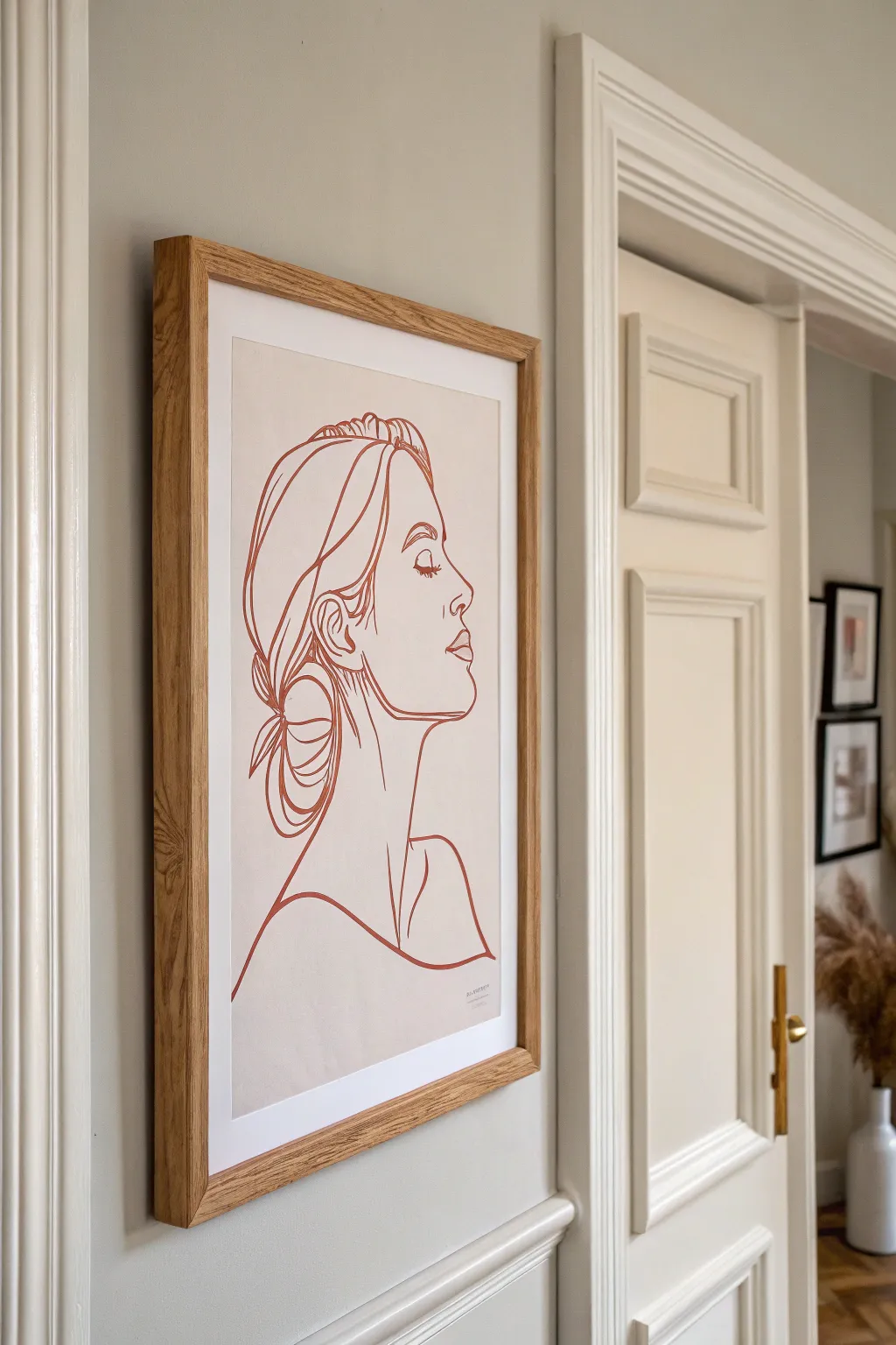
Capture understated elegance with this clean, continuous-line style portrait that adds sophisticated warmth to any wall. The simple rust-red lines against a soft beige background create a modern, serene focal point perfect for minimalist interiors.
Step-by-Step Guide
Materials
- High-quality watercolor paper or heavy mixed-media paper (A3 size)
- Beige or oatmeal-colored paper for mounting (optional)
- Acrylic paint or gouache in terracotta/burnt sienna
- Fine liner brush (size 0 or 00)
- Pencil (HB or 2H)
- Kneadable eraser
- Light box or sunny window (for tracing)
- Washi tape or masking tape
- Oak frame with mat board
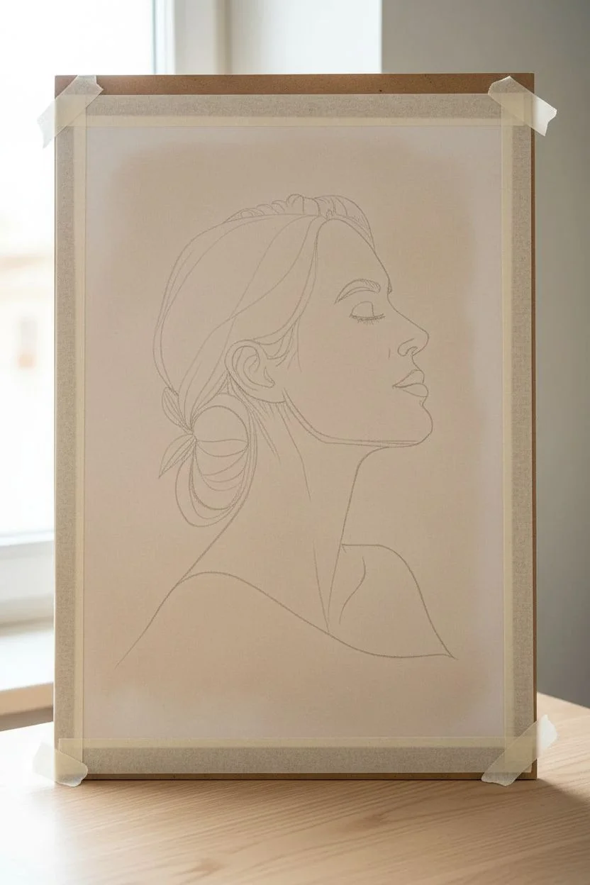
Step 1: Planning and Sketching
-
Choose your subject:
Select a profile photograph as your reference. Look for images with clear silhouettes and defined features like the nose bridge, jawline, and hairline, as these translate best into line art. -
Prepare your paper:
If you want a tinted background like the reference, you can either buy beige pastel paper or lightly wash your watercolor paper with a very diluted tea or coffee stain. Let it dry completely flat before proceeding. -
Draft the outline:
Using a very light hand and an HB pencil, sketch the basic shapes of the head and shoulders. Don’t worry about details yet; just focus on getting the proportions and placement right on the page. -
Refine the line work:
Once proportions are set, darken your desired final lines slightly. Focus on simplifying complex areas like hair into flowing, abstract shapes rather than individual strands. -
Simplify facial features:
For the face, less is more. Mark only essential details: the curve of the nostril, the line of the closed eye and lashes, and the parting of the lips. Leave the rest as negative space. -
Clean up the sketch:
Use a kneadable eraser to lift away messy sketch lines, leaving only a faint ‘ghost’ image as your guide. This ensures graphite won’t muddy your paint later.
Shaky hands?
If you struggle with steady lines, try ‘pulling’ the brush toward you rather than pushing it away. You can also rest your pinky finger on a dry part of the paper for stability.
Step 2: Painting the Lines
-
Mix your paint:
Prepare your terracotta acrylic or gouache. You want a consistency similar to heavy cream—fluid enough to flow off the brush smoothly, but thick enough to be opaque in one stroke. -
Test the flow:
I usually do a few practice strokes on a scrap piece of paper first. If the line breaks or skips, add a tiny drop of water to your paint mix. -
Start with the main contour:
Begin painting the main profile line—forehead, nose, lips, and chin. Try to execute long, continuous strokes rather than short, choppy ones to maintain fluidity. -
Paint the hair:
Move onto the hair shapes. Vary your pressure on the brush slightly to create subtle shifts in line width, which adds organic character to the strands and bun. -
Detail the features:
Switch to your finest brush (size 00) for delicate areas like the eyelashes and the ear. These require a steady hand and very light pressure. -
Add the neck and shoulders:
Complete the composition by drawing the neck and shoulder line. Let this line trail off or fade slightly at the bottom edge for an artistic, open-ended feel. -
Sign your work:
Add a tiny, discreet signature or date in the artwork’s color near the bottom right shoulder line. Keep it small so it doesn’t distract from the main subject. -
Let it dry completely:
Allow the painting to dry flat for at least 2-3 hours. If you used gouache, be careful not to touch the lines as moisture from your hands can reactivate the paint.
Go digital hybrid
Draw your design on a tablet first, print it faintly onto high-quality textured cardstock, and then paint over the printed lines for a ‘cheat’ that guarantees perfect proportions.
Step 3: Framing and Assembly
-
Check for imperfections:
Review your dried artwork. If any pencil lines are still visible outside the paint, very gently erase them now. -
Prepare the frame:
Clean the glass of your oak frame on both sides to remove dust and fingerprints. Dust is the enemy of minimalist art. -
Mount artwork:
Tape your painting to the back of the mat board using acid-free tape. Ensure it is perfectly centered within the window. -
Final assembly:
Place the mounted art into the frame, secure the backing, and hang it at eye level to enjoy your modern masterpiece.
Now step back and admire how a few simple curves can capture so much emotion and style
BRUSH GUIDE
The Right Brush for Every Stroke
From clean lines to bold texture — master brush choice, stroke control, and essential techniques.
Explore the Full Guide
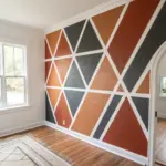
Modern Geometric Color-Block Art
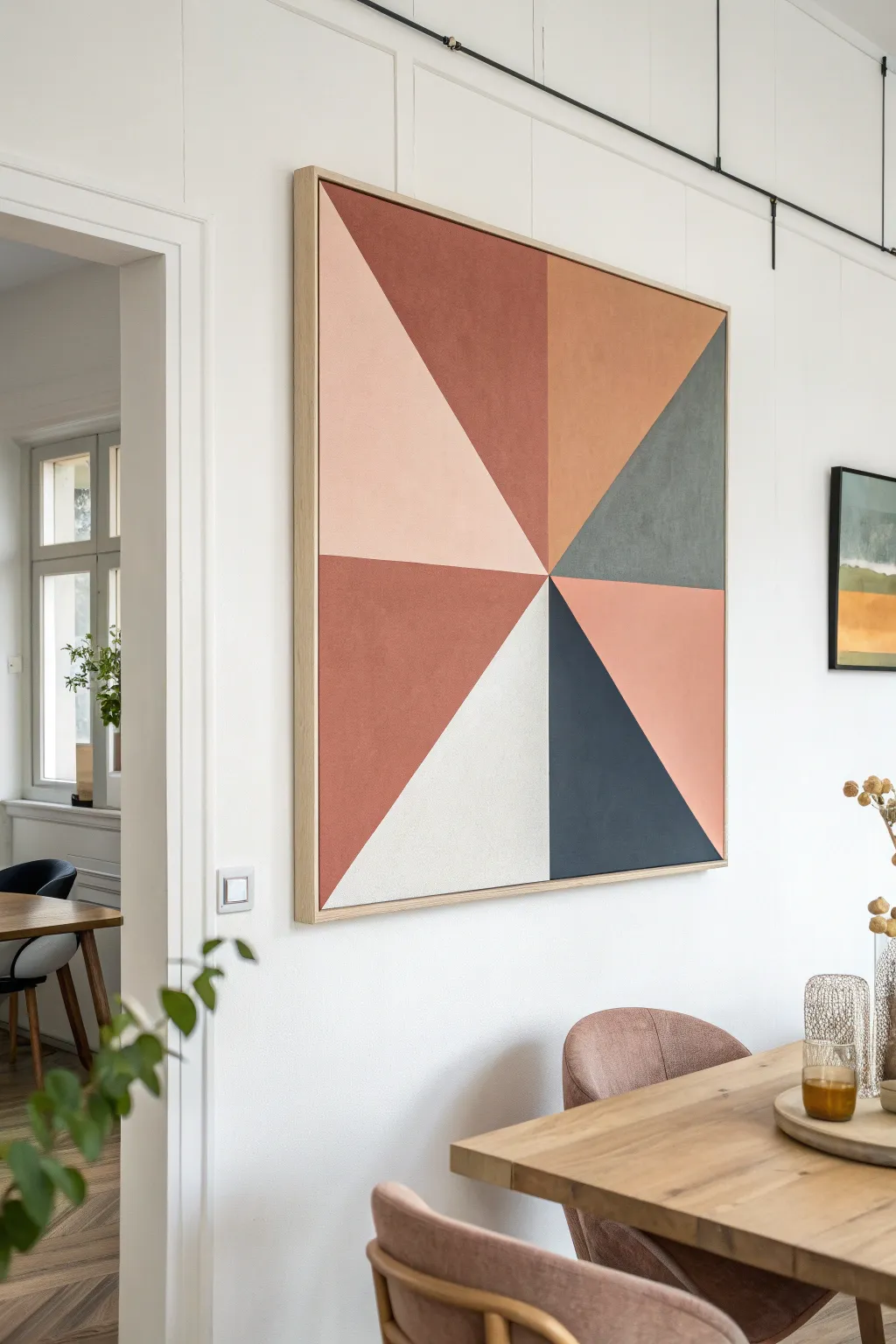
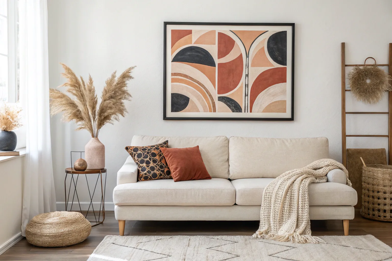
This modern geometric statement piece uses a pinwheel design to bring warmth and structure to your walls. The earthy palette of terra cotta, blush, and slate creates a sophisticated yet approachable focal point for any dining or living space.
How-To Guide
Materials
- Large square canvas (36×36 inch minimum recommended)
- Floating wooden frame (raw oak or pine)
- Acrylic paints (Terra Cotta, Blush Pink, Burnt Orange, Slate Grey, Navy Blue, Cream/White)
- Painter’s tape (high quality for crisp lines)
- Long ruler or yardstick
- Pencil
- Large flat paintbrush (2-inch)
- Medium flat paintbrush (1-inch)
- Gesso (optional, for priming)
- Matte varnish spray
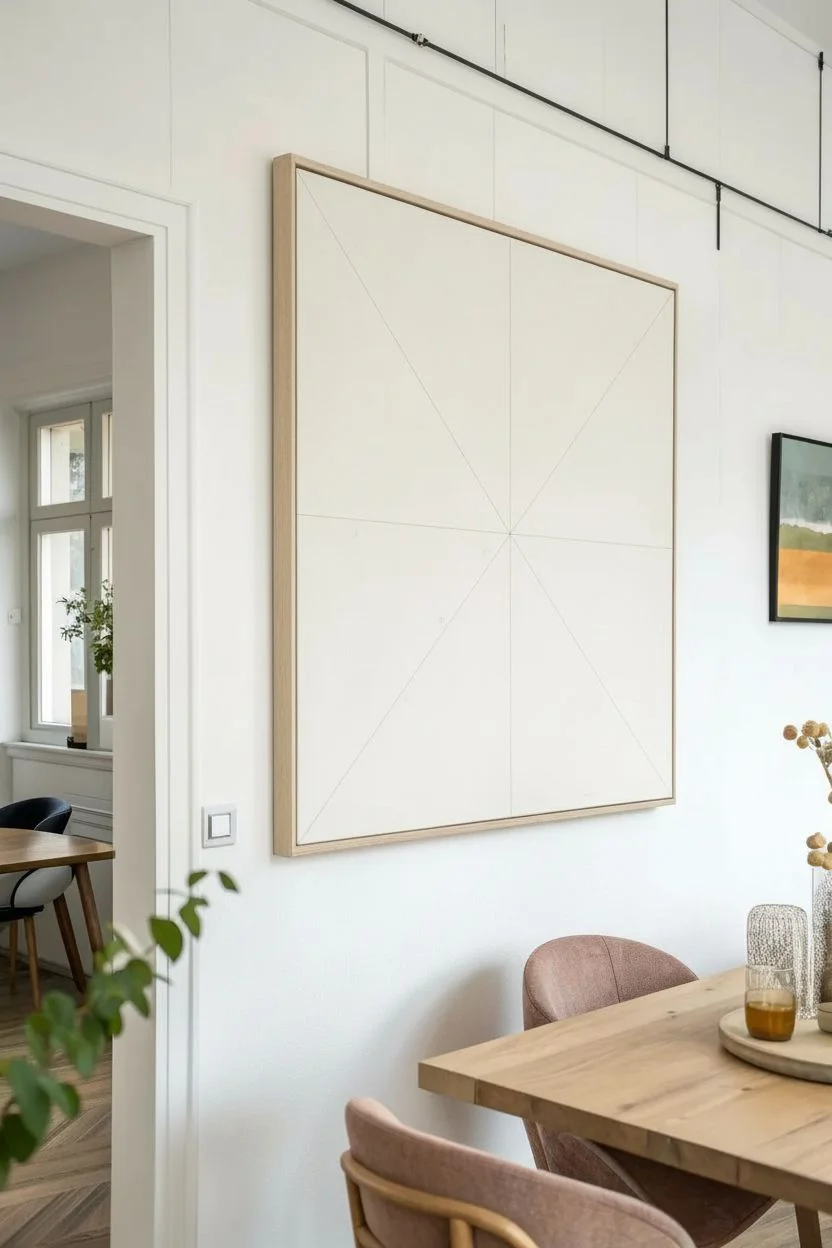
Step 1: Preparation & Layout
-
Prepare the canvas:
Begin by ensuring your canvas surface is clean and smooth. If creating this from scratch, applying a coat of gesso can help the paint adhere better and create a slightly textured finish. -
Find the true center:
Measure the width and height of your canvas to locate the exact center point. Mark this spot lightly with your pencil; everything will radiate from here. -
Mark the corners:
Using your yardstick, draw diagonal lines connecting opposite corners of the canvas, passing through your center point. This creates your first four large triangles. -
Define the midpoints:
Measure the halfway point of each of the four outer edges of the canvas. Mark these spots clearly on the frame edge. -
Complete the pinwheel:
Draw straight lines from the center point to each of the four edge midpoints you just marked. You should now have eight triangular sections of varying sizes radiating from the middle.
Step 2: Taping & Painting
-
Plan your color map:
Before painting, lightly note which color goes in which triangle using a pencil. Reference the image: large left triangle is blush, top left is rust/terra cotta, bottom center is cream, etc. I find this prevents mistakes once the paint is out. -
Tape the first batch:
Apply painter’s tape along the pencil lines for non-adjacent sections. You cannot paint two touching triangles at the same time because the wet paint will bleed under a shared piece of tape. -
Seal the edges:
Press the tape down firmly with your fingertip or a credit card to ensure a tight seal. This is the secret to those razor-sharp geometric lines. -
Paint the first colors:
Using your flat brush, fill in the exposed triangles with their designated colors. Use smooth strokes starting from the tape and pulling inward to prevent seepage. -
Apply second coats:
Let the first layer dry to the touch, then apply a second coat for solid, opaque coverage. Lighter colors like the blush and cream might need a third pass. -
Remove tape while damp:
Carefully peel back the painter’s tape while the final coat is still slightly tacky, pulling away from the paint edge at a 45-degree angle. -
Dry completely:
Allow these first sections to dry fully—wait several hours or overnight to ensure the tape won’t damage the new paint in the next step. -
Tape remaining sections:
Once dry, apply fresh tape over the painted edges to mask off the remaining empty triangles. Be gentle when pressing the tape onto the freshly painted areas. -
Paint remaining colors:
Fill in the remaining triangles (Terra Cotta, Navy, Slate Grey) using the same technique: brush inward from the tape edge and apply multiple thin coats.
Clean Line Secret
Paint a thin layer of the base color (or white) over the tape edge first. This seals any gaps so the main color can’t bleed under.
Step 3: Finishing Touches
-
Remove final tape:
Peel off the last strips of tape carefully to reveal your complete geometric design. -
Touch up lines:
Inspect the meeting points of the triangles. If any paint bled, use a tiny angled brush and the correct color to crisp up the lines manually. -
Seal the artwork:
Once fully cured (wait 24 hours), spray the entire canvas with a matte varnish to protect the surface and unify the sheen of the different paint colors. -
Frame the piece:
Place the canvas into a raw wood floating frame. Secure it from the back to give it that polished, gallery-ready appearance shown in the inspiration photo.
Peeling Paint?
If paint lifts when removing tape, you waited too long. Score the edge gently with a craft knife before pulling the tape next time.
Hang your new masterpiece in a well-lit spot and enjoy the graphic impact it brings to the room
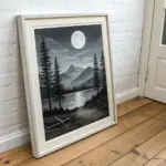
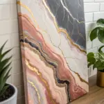
Moody Monochrome Abstract
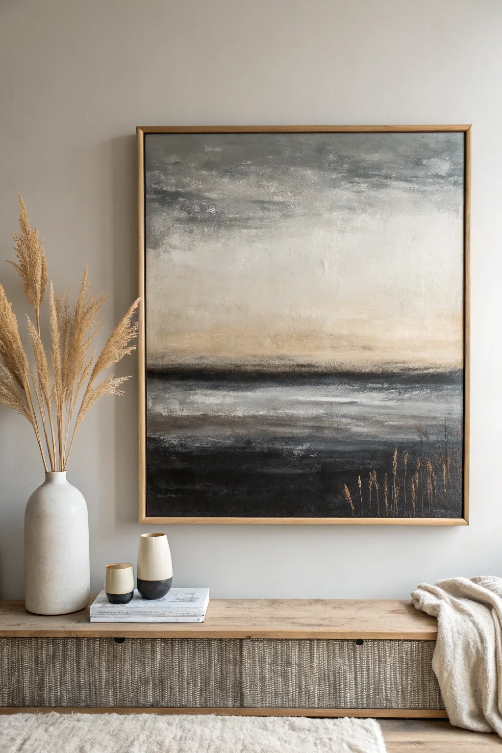
Capture the serene beauty of a misty shoreline with this moody, monochromatic abstract painting. By layering blended gradients of gray, beige, and charcoal, you’ll create a sophisticated landscape that feels both modern and timeless.
Step-by-Step Tutorial
Materials
- Large square canvas (30×30 inches recommended)
- Acrylic paints (Titanium White, Mars Black, Raw Umber, Unbleached Titanium/Beige, Payne’s Gray)
- Large flat brush (2-3 inch)
- Medium filbert brush
- Small liner brush or rigger brush
- Palette knife (optional for mixing)
- Water spray bottle
- Paper towels or rag
- Floating frame (natural wood finish)
Step 1: Setting the Background
-
Prepare the canvas:
Start by confirming your canvas is clean. If you want a smoother surface, apply a coat of gesso and sand lightly once dry, but the raw texture works well for this rustic look. -
Mix the sky tone:
Create a large mixture of Titanium White with a tiny touch of Payne’s Gray and Unbleached Titanium. You want a very pale, warm off-white, not a stark white. -
Apply the upper sky:
Using your large flat brush, cover the top third of the canvas with this pale mixture. Use long, horizontal strokes to establish a calm, wide feeling. -
Transition to the horizon:
While the paint is still wet, mix a slightly darker beige using Unbleached Titanium and a speck of Raw Umber. Blend this into the bottom edge of your sky section, working downwards towards the middle. -
Create the heavy clouds:
Load a small amount of Payne’s Gray and Raw Umber onto your dirty brush. Lightly sweep this across the very top edge of the canvas to create a moody, darker cloud cover, blending it softly downward into the pale sky.
Step 2: Forging the Horizon
-
Define the horizon line:
Mix Mars Black with Raw Umber to create a deep, warm charcoal. Paint a strong horizontal band just below the center line of the canvas. This doesn’t need to be perfectly straight; a little organic wavering looks more natural. -
Soften the edges:
Before the dark band dries, use a clean, slightly damp brush to feather out the top edge into the beige section above. This creates that misty, distant look. -
Add the middle ground:
Below the dark horizon line, introduce a band of medium gray (mix Black and White). Apply this loosely, allowing some of the dark horizon color to streak through. -
Mist the paint:
Lightly spritz the canvas with water if your acrylics are drying too fast. This helps blend the gray middle ground into the darker band above without hard lines. -
Highlight the water:
Take pure Titanium White on a dry brush. Drag it horizontally across the middle gray section to simulate light reflecting on water. Use a very light touch so the texture of the canvas catches the paint.
Blending Too Fast?
If acrylics dry before you can blend, use a retarder medium instead of water. It keeps paint open longer for smoother gradients.
Step 3: Depth and Detail
-
Anchor the bottom:
Paint the bottom third of the canvas with your darkest mixture involves Mars Black and a touch of Payne’s Gray. This represents the foreground shoreline or deep water. -
Blend the transition:
Work the dark bottom color upwards into the gray section. I find using a dry brush here helps create a ‘scumbled’ texture that mimics choppy water or rough earth. -
Refine the atmosphere:
Step back and look at the whole piece. If the transitions look too harsh, take a dry brush with a tiny bit of Unbleached Titanium and glaze over the areas where colors meet to soften the atmosphere. -
Paint the foreground grasses:
Switch to your liner or rigger brush. Dilute some Raw Umber and Unbleached Titanium with water until it’s inky. Paint thin, vertical stalks rising from the bottom right corner. -
Add grass details:
Vary the height and angle of the stalks. Add small dots or dashes near the tops of the stems to suggest seed heads, keeping the color light enough to stand out against the dark background. -
Final highlights:
Mix a very light beige and add final highlights to the tips of the grasses and a few extra horizontal streaks in the water area for sparkle. -
Frame the work:
Once fully dry, install the canvas into a natural wood floating frame. The gap between the canvas and frame adds a professional gallery shadow effect.
Create Texture
For the water highlights, wipe most of the paint off your brush first. Use the ‘dry brush’ technique to grapple only the canvas weave.
Hang your new masterpiece in a well-lit spot to let the subtle textures shine

PENCIL GUIDE
Understanding Pencil Grades from H to B
From first sketch to finished drawing — learn pencil grades, line control, and shading techniques.
Explore the Full Guide
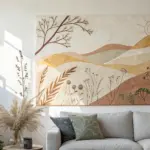
Oversized Floral Still Life
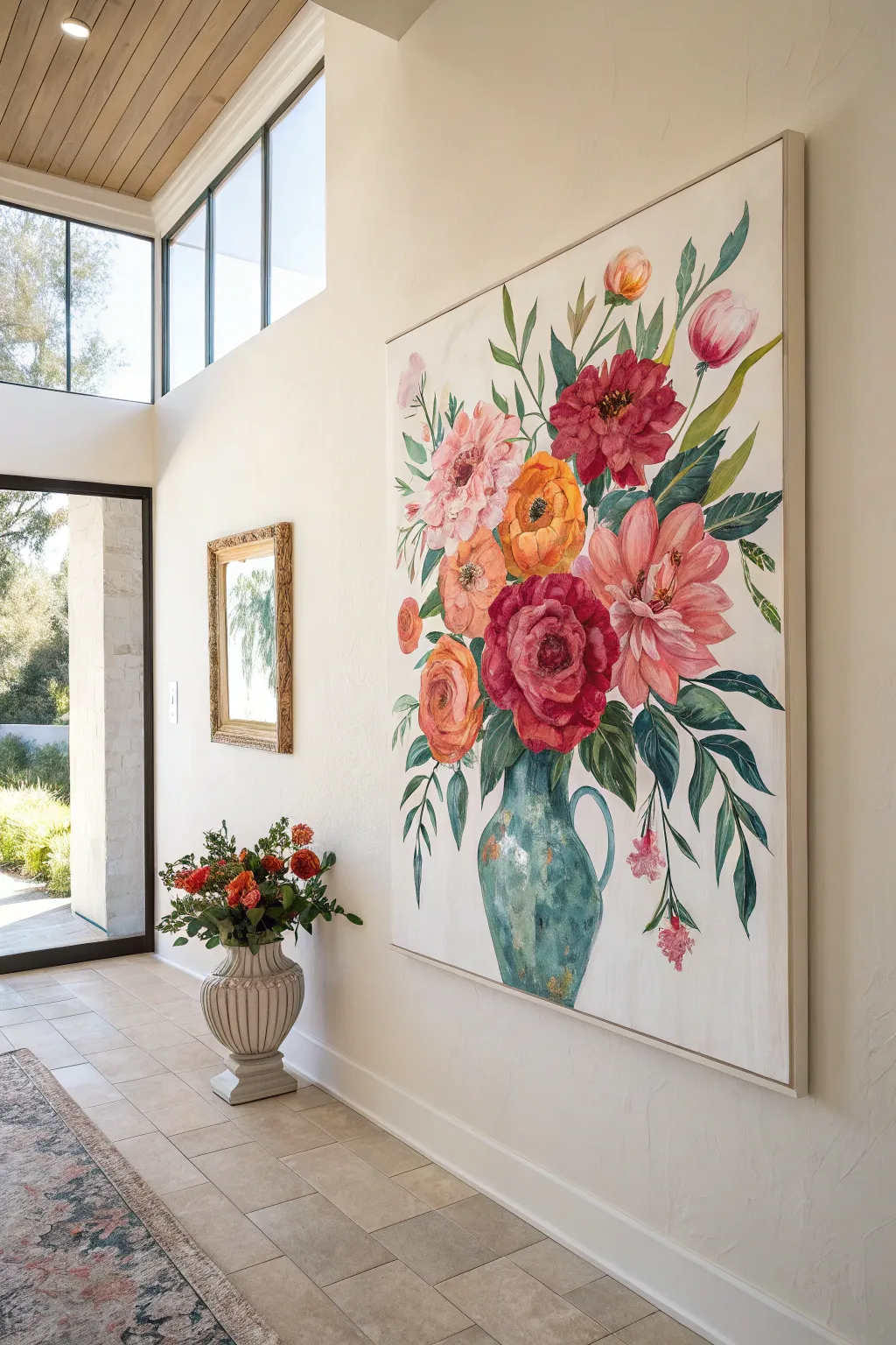
Transform a blank wall with this joyous, large-scale floral still life that brings the vibrancy of a garden indoors. Utilizing layered acrylic washes to mimic the softness of watercolor, this project captures the delicate interplay of light and shadow on lush blooms and trailing leaves.
How-To Guide
Materials
- Large canvas (at least 36×48 inches)
- Acrylic paints (Titanium White, Alizarin Crimson, Cadmium Red, Cadmium Yellow, Sap Green, Phthalo Blue, Burnt Umber)
- Acrylic glazing medium or flow improver
- Large flat brushes (2-3 inch)
- Medium filbert brushes
- Small round detail brushes
- Palette or disposable plates
- Water container and paper towels
- Pencil or charcoal stick for sketching
- Reference photo of flowers in a pitcher
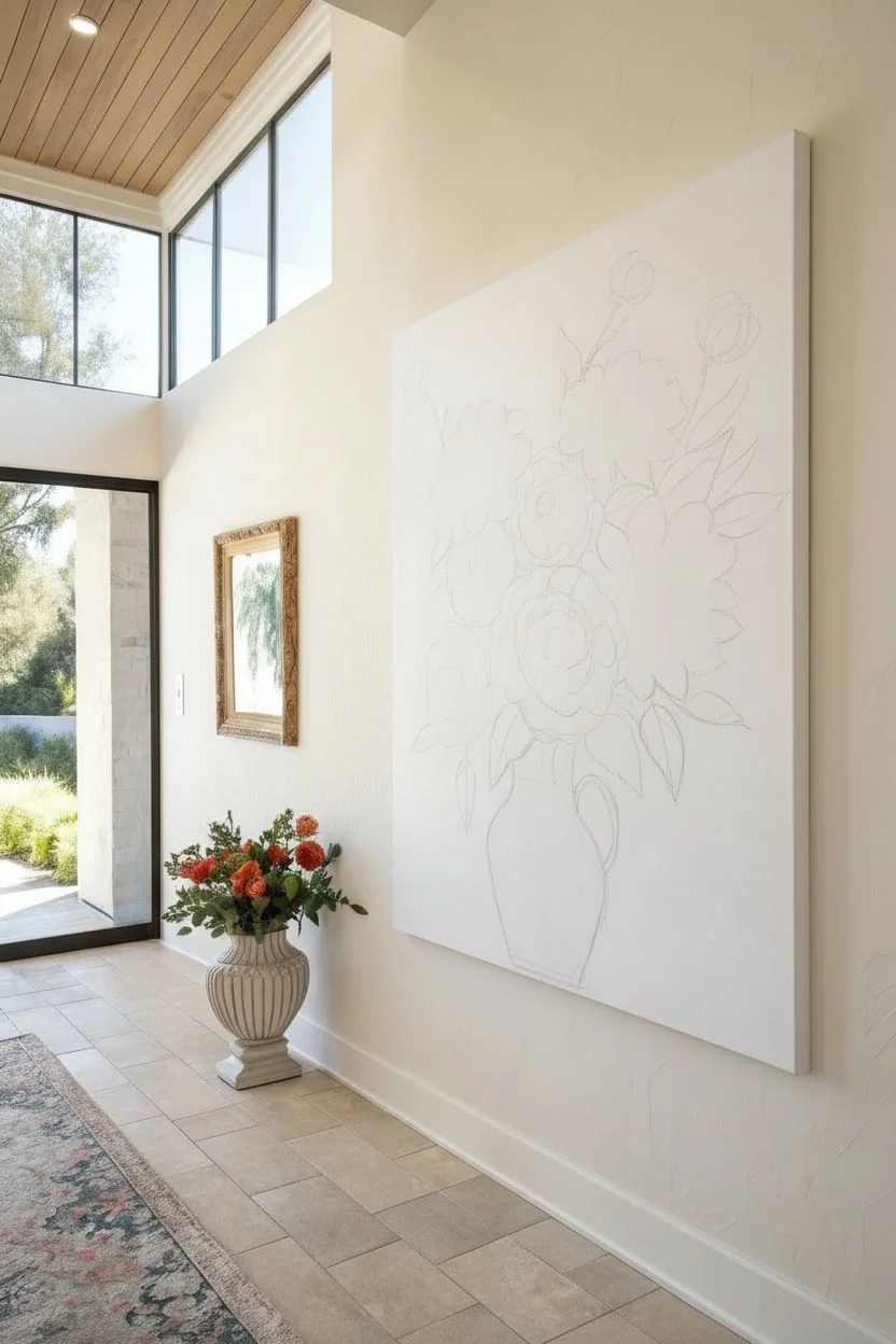
Step 1: Setting the Composition
-
Prepare the canvas:
Begin by applying a very thin wash of watered-down white acrylic over the entire canvas to create a smooth, receptive surface. Let this dry completely before starting your sketch. -
Sketch the main shapes:
Using charcoal or a light pencil, loosely map out the composition. Start with the pitcher shape at the bottom center, slightly offset to the right. Draw large, rough circles to represent where the main flower heads will go—focus on the large red peony, the orange ranunculus, and the pink dahlias. -
Add directional lines:
Sketch sweeping lines extending outward and upward from the pitcher to guide the placement of stems and leaves. This establishes the flow and movement of the bouquet.
Paint drying too fast?
Acrylics dry quickly on large surfaces. Keep a misting spray bottle handy to lightly spritz your palette and canvas, or mix in a retarder medium to extend working time.
Step 2: Painting the Pitcher
-
Base coat the vase:
Mix Phthalo Blue with a touch of Sap Green and White to create a soft teal. Apply a translucent wash of this color to fill the pitcher shape, keeping the paint thin to allow some light to show through. -
Build depth and shadow:
While the base is still slightly tacky, mix a darker version of the teal using less white and a dot of Burnt Umber. Apply this to the right side and bottom of the pitcher to create a curved, three-dimensional effect. -
Add high-lights:
Using pure Titanium White mixed with a tiny amount of glazing medium, dry-brush highlights onto the rounded ‘belly’ of the pitcher and the handle to suggest a glossy ceramic texture.
Framing for Impact
To get the look in the photo, build a simple float frame from thin lattice wood strips. Paint the frame a creamy off-white to make the artwork pop without distraction.
Step 3: Layering the Blooms
-
Block in base colors:
For the flowers, work from light to dark. Paint the base shapes of the pink, peach, and yellow flowers using very watery paint. Don’t worry about petals yet; just fill the sketched circles with soft pools of color. -
Define the red focal point:
Mix Alizarin Crimson with a touch of Cadmium Red for the large central flower. Apply this more boldly than the other blooms, as this is your visual anchor. I like to use a filbert brush here to naturally create rounded petal shapes. -
Develop petal structures:
Once the base washes are dry, mix slightly more opaque versions of your flower colors. using a medium brush, paint C-shaped strokes overlapping each other to form the petals, leaving some of the lighter underpainting visible. -
Add deep centers:
Mix Burnt Umber into your reds and oranges to create deep, dark centers for the poppies and ranunculus. Dab this color into the middle of the blooms to create a recess. -
Highlight the petals:
Mix white into your original flower colors to create tints. subtly highlight the tips of the petals that would be catching the sunlight, particularly on the top-most flowers.
Step 4: Foliage and Details
-
Mix varying greens:
Create three piles of green on your palette: a yellow-green (Sap Green + Yellow), a blue-green (Sap Green + Phthalo Blue), and a dark shadow green. This variety is key for a realistic look. -
Paint structural stems:
Use a small round brush and the dark green mix to paint the stems connecting the flowers to the vase. Keep your hand loose so the lines aren’t too rigid. -
Add large leaves:
Using the blue-green mix, paint the large, drooping leaves near the base of the bouquet. Use long, sweeping strokes that taper at the end. -
Fill in lighter foliage:
Use the yellow-green mix to add lighter, younger leaves near the top of the arrangement. These should feel airier and more delicate than the heavy bottom leaves. -
Refine the edges:
Stand back from the canvas. If any edges look too sharp, use a clean, damp brush to gently soften them while the paint is drying, enhancing that watercolor aesthetic. -
Final touches:
Add tiny details like the stamens in the flower centers using a fine liner brush and yellow or black paint. Add a few ‘floating’ petals or small buds to balance the composition.
Hang your masterpiece in a prominent spot where the natural light can play off the beautiful layers you have created
Black-and-White Ink Wash Panels
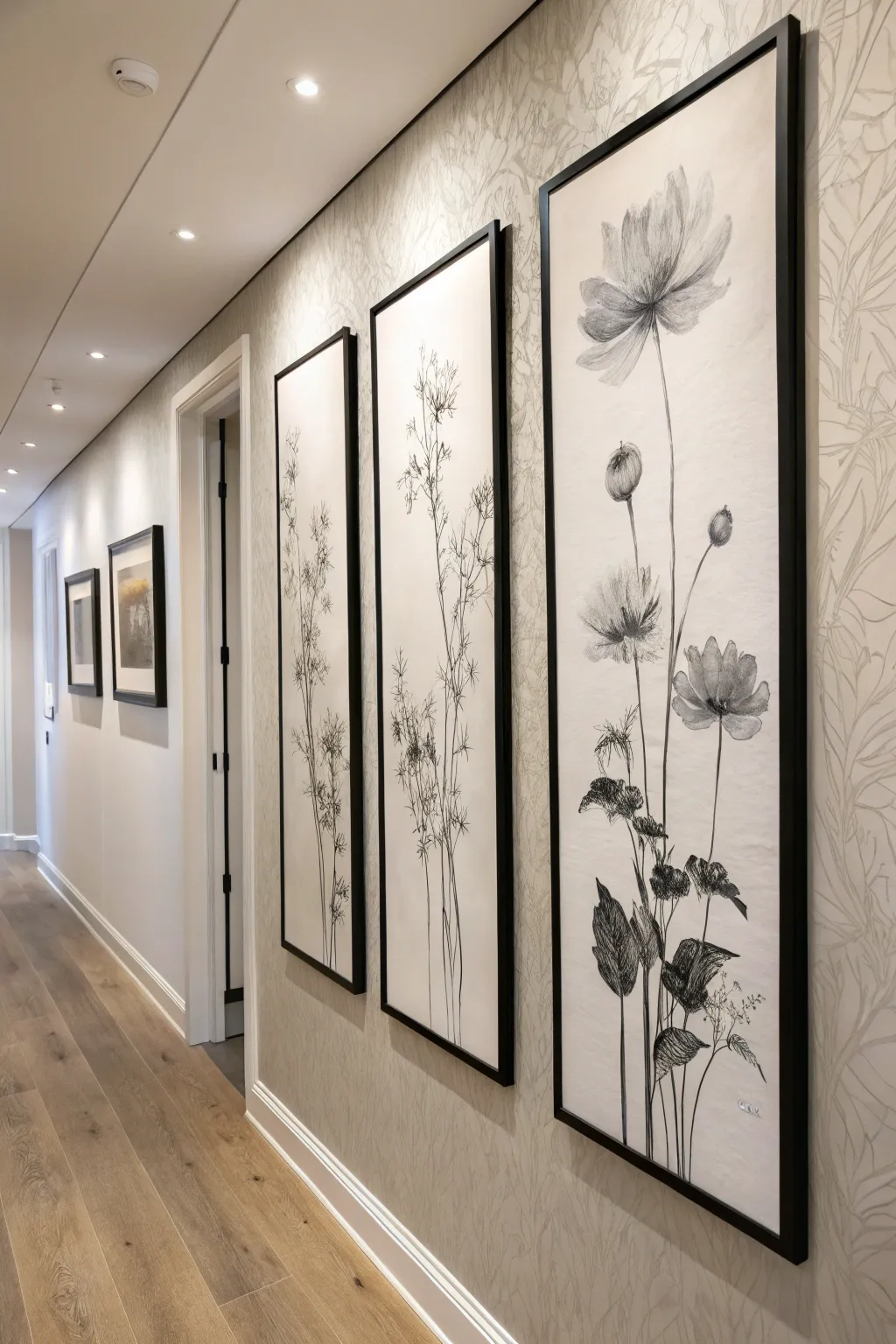
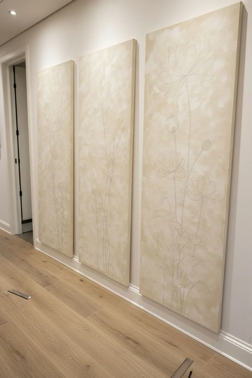
Transform your hallway with these dramatic, large-scale botanical panels that mimic the elegance of vintage scientific illustrations. Using simple ink wash techniques on tall canvases, you will create a cohesive triptych that feels both modern and timeless.
Detailed Instructions
Materials
- 3 large vertical canvases or wood panels (approx. 24″ x 60″)
- Gesso primer
- Cream or off-white acrylic paint (for background)
- Black India ink
- Graphite pencil (HB or 2B)
- Assorted brushes: round synthetic brushes (sizes 2, 6, and 12)
- Fine-liner pens (black, archival, 0.5mm and 0.8mm)
- Clean water jar
- Paper towels or rag
- Matte spray varnish
- Black floating frames (custom sized to panels)
Step 1: Preparing the Surface
-
Prime the canvases:
Begin by applying two smooth coats of gesso to your canvases. Allow the first coat to dry completely before sanding lightly and applying the second for a smooth, professional finish. -
Create the parchment look:
To mimic the textured, aged paper look in the photo, mix a tiny drop of brown or ochre into your cream acrylic paint. Apply this base coat unevenly, perhaps using a scrunched rag or a sponge brush to create subtle texture and tonal variation. -
Sketch the composition:
Lay all three canvases side-by-side on the floor. Using your graphite pencil, lightly sketch the skeleton of your plants. This is crucial for flow—ensure the stems curve naturally and that the visual weight feels balanced across the triptych.
Mastering the Ink Flow
India ink dries very fast. Keep two water jars: one for cleaning brushes and one for diluting ink. Test your wash dilution on a scrap piece of paper first to avoid ‘too dark’ mistakes.
Step 2: Building the Botanicals
-
Draft the stems:
Dip your size 6 round brush into the black India ink. Start at the bottom of the canvas and pull long, confident lines upward to create the main stalks. Don’t worry about wobbles; organic imperfections make it look realistic. -
Add delicate branches:
Switch to a smaller number 2 brush for secondary branches. Focus on the finer stems that will hold the flower heads, keeping your hand loose. -
Sketch flower outlines:
Before adding heavy ink, refine the flower shapes with your pencil directly on the dry base coat. For the large bloom in the foreground, create petal shapes that overlap, giving the flower depth. -
Ink the main blooms:
Using a slightly watered-down ink wash (mix a few drops of water with ink on your palette), fill in the shadow areas of the petals. Keep the highlights the color of the background. -
Detail with fine-liners:
Once the wash is dry, use your 0.5mm fine-liner to tackle the intricate details. Draw the veins on the petals and the tiny stippling texture on the seed pods. -
Create the leafy base:
At the bottom of the panels, sketch larger, darker leaves. I find filling these in with solid black ink or very dense hatching anchors the composition visually.
Wobbly Lines?
If your long stem lines look shaky, thicken them deliberately in certain spots to mimic the knots and joints of a real plant stem. It turns a mistake into a realistic detail.
Step 3: Adding Texture and Depth
-
Layering washes:
Go back over your dried ink work with a very sheer, watery gray wash. Apply this only to the darkest parts of the leaves and stems to create a mid-tone between the deep black and the cream paper. -
Scribble texture:
For the wispy, feathery plants in the middle panel, use rapid, scribbly motions with the 0.8mm pen. This mimics the chaotic nature of dried grasses or fennel. -
Strengthen the contrast:
Step back and look at the panels from a distance. Use pure, undiluted India ink to darken the deepest shadows, particularly where stems overlap or leaves twist. -
Clean up edges:
If you smudged any ink outside the lines, touch it up carefully with your original cream background paint.
Step 4: Finishing and Framing
-
Seal the artwork:
India ink is permanent when dry, but acrylics need protection. Once everything is cured (give it 24 hours), spray the panels with a matte varnish to unify the sheen and protect against dust. -
Install the frames:
Place your panels into black floating frames. These frames have a small gap between the canvas and the edge, which creates a sophisticated shadow line that makes the art pop. -
Hang with precision:
Hang the panels with equal spacing between them (about 2-3 inches is standard). Use a level to ensure the vertical lines of the stems remain strikingly upright.
Step back and admire how these towering, elegant florals bring a serene garden atmosphere into your home


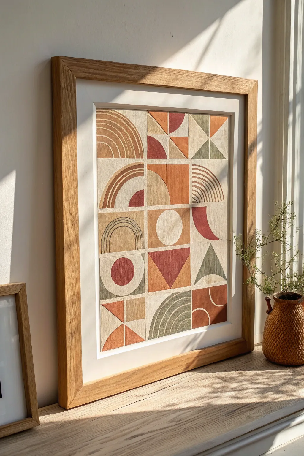
Mini Series Grid Wall Art
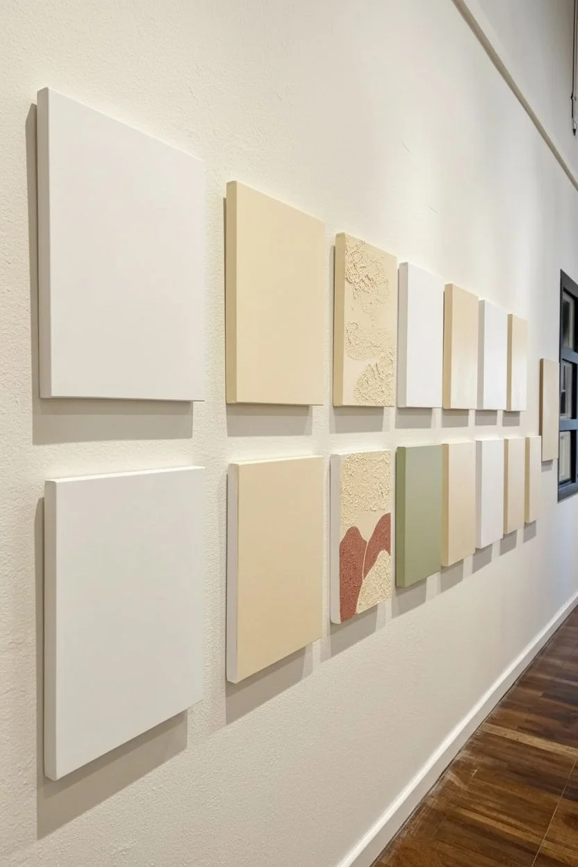
Transform a blank wall into a curated exhibition with this series of cohesive mini-paintings. By limiting your palette to warm earth tones and mixing botanical line work with abstract landscapes, you can create a sophisticated gallery feel that looks unified yet distinct.
Step-by-Step Tutorial
Materials
- Unfinished wood panels or gallery-profile canvases (approx. 5×7 or 6×8 inches)
- Acrylic paints (terracotta, sage green, cream, mustard, black, slate blue)
- White gesso primer
- Gesso or texture paste (optional for raised texture)
- Fine liner brushes (size 00 or 0)
- Flat shader brushes (medium and small)
- Pencil for sketching
- Ruler or painter’s tape
- Matte varnish
- Command strips or small nails for hanging
Step 1: Preparation & Base Layers
-
Prime the surface:
Begin by applying a smooth coat of white gesso to all your wood panels or canvases. This ensures the wood grain doesn’t absorb your paint too quickly and provides a bright, clean background for the earth tones. -
Plan the layout:
Arrange your blank panels on the floor in your desired grid pattern (e.g., two rows of six). Decide which panels will feature botanical sprigs and which will be abstract landscapes to ensure a balanced visual rhythm. -
Apply background colors:
For the panels that will remain largely negative space, paint a solid base coat of cream or a very pale warm off-white. Let this dry completely before moving on. -
Add texture (optional):
If you want the textured look seen in some of the landscape panels, mix a little sand or texture paste into your cream or terracotta paint before applying it to specific sections, creating a tactile contrast.
Step 2: Painting the Motifs: Series A (Botanicals)
-
Sketch the stems:
Using a pencil very lightly, draw vertical, slightly curved lines to act as the central stems for your plant designs. Vary the height and curve direction so they don’t look identical. -
Draft the leaves:
Sketch outline shapes for tea leaves, rounded distinct petals, or small berries coming off your stems. Keep the shapes simple and graphic rather than hyper-realistic. -
Fill with color:
Using a small flat brush, fill in select leaves with flat washes of sage green, terracotta, or muted mauve. Leave some leaves merely as outlined shapes to maintain an airy feel. -
Refine the lines:
Once the color blocks are dry, take your fine liner brush loaded with thinned black paint or ink. Trace over your pencil stems and outline the leaves. Use varying pressure to make the lines feel organic and hand-drawn.
Uneven Lines?
If your fine lines look shaky, your paint is likely too thick. Thin it with a drop of water until it has an ink-like consistency, allowing the brush to glide smoothly without drag.
Step 3: Painting the Motifs: Series B (Abstract Landscapes)
-
Block in horizons:
For the landscape panels, use a pencil to mark out rolling hills or mountain peaks. Keep the compositions simple—usually just two or three overlapping organic shapes work best. -
Paint color fields:
Fill the bottom shapes with darker tones like terracotta or slate blue, and use lighter creams or mustards for the sky or upper hills. I find applying two thin coats gives a much smoother finish than one thick gloppy one. -
Add detailing striations:
To mimic plowed fields or wind textures, use your liner brush to paint thin, repetitive parallel lines inside some of the landscape shapes. For example, add vertical white stripes over a beige hill. -
Create distinct shapes:
On panels featuring ‘sun’ or ‘moon’ motifs, use a circle template or a small cup to trace a perfect circle. Paint these in a solid feature color like deep orange to draw the eye.
Wrap the Art
Instead of leaving the wood edges raw, continue your painting design over the sides of the panel. This creates a sculptural, finished object look visible from all angles.
Step 4: Finishing Touches & Installation
-
Clean up edges:
Check the sides of your wood panels. If you got paint on the raw wood edges, either sand it off for a clean look or paint the edges a solid coordinating neutral color. -
Erase guidelines:
Once the paint is 100% dry to the touch, gently erase any visible pencil marks that weren’t covered by paint or ink lines. -
Seal the work:
Apply a coat of matte varnish over each piece. This unifies the sheen between the different paint colors and protects the surface from dust. -
Grid installation:
Use a long level and painter’s tape to mark a straight horizontal line on your wall. Spacing is key here—measure exactly 2 to 3 inches between each panel to keep the grid looking tight and intentional.
Step back and admire how your individual small paintings come together to form one impressive, harmonious statement piece
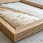
Painted Frame Illusion on Canvas
Capture the stillness of a secluded beach with this soft, airy acrylic painting that includes a clever trompe-l’oeil twist. By painting a faux mat and using a textured wooden frame, you create a sophisticated gallery look without the custom framing price tag.
How-To Guide
Materials
- Stretched canvas (16×20 or similar)
- Acrylic paints (Titanium White, Unbleached Titanium, Raw Sienna, Ultramarine Blue, Burnt Umber)
- Painter’s tape or masking tape (1-inch width)
- Ruler and pencil
- Large flat brush (1-2 inch)
- Medium filbert brush
- Small round brush for details
- Palette knife (optional for texture)
- Mixing palette
- Jar of water and paper towels
- Wooden frame (to fit canvas size)
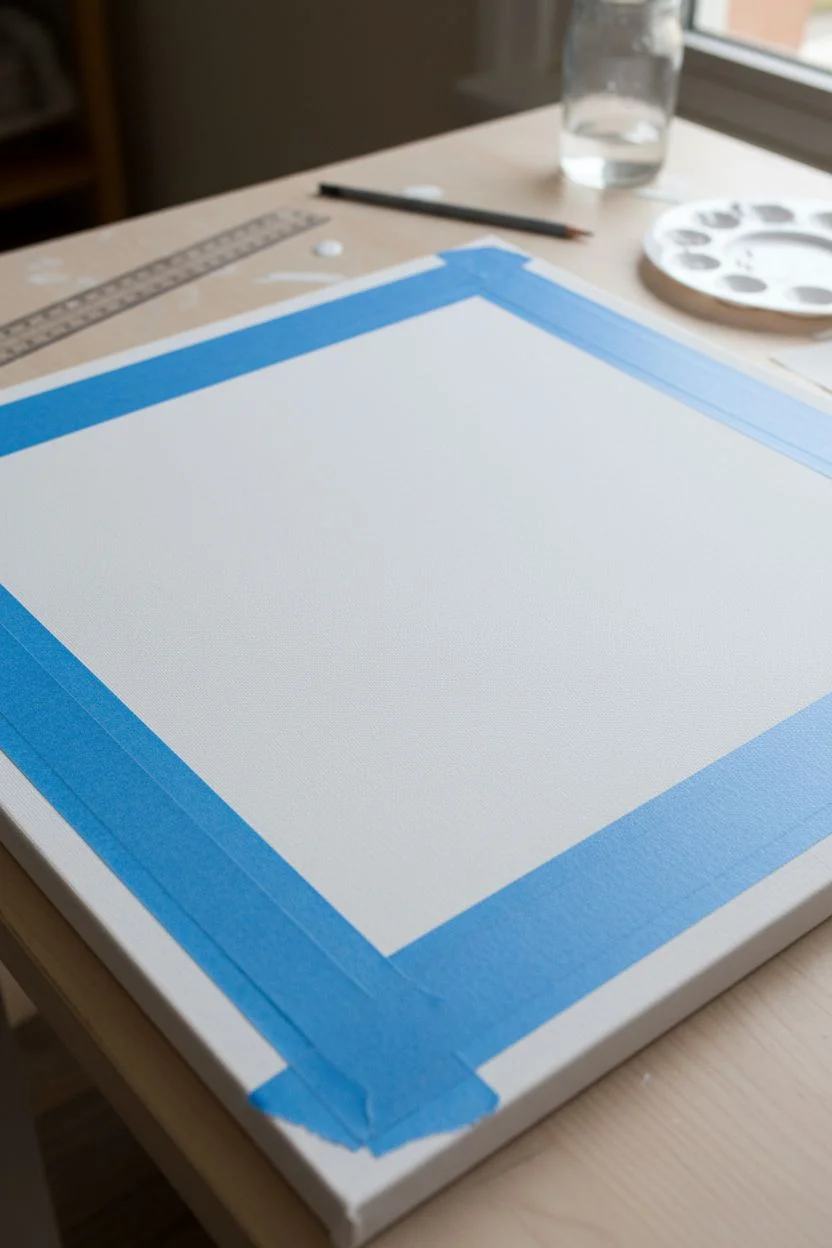
Step 1: Planning and Foundation
-
Prime the Surface:
Begin by applying an even coat of Titanium White across the entire canvas to ensure a bright, luminous base. Let this dry completely before moving on. -
Measure the Faux Mat:
Using your ruler and pencil, measure about 2-3 inches inward from each edge of the canvas. Connect these marks to draw a rectangle in the center. This inner rectangle will be your painting area, and the outer border will become the ‘mat’. -
Tape the Boundary:
Apply painter’s tape along the pencil lines, placing the tape on the *outer* side (the mat side) of the line. Sealing the edges firmly with your fingernail prevents paint from bleeding into your future mat border.
Bleeding Edges?
If paint seeped under your tape, don’t panic. Wait for it to dry, then use a flat brush with heavy body white paint to carefully touch up and straighten the line.
Step 2: Painting the Sky and Horizon
-
Mix the Sky Tone:
Create a very pale blue-grey by mixing a large amount of Titanium White with a tiny dot of Ultramarine Blue and a speck of Burnt Umber to desaturate it. -
Apply the Gradient:
Using the large flat brush, paint the upper two-thirds of the inner rectangle. Start with the blue-grey at the top and gradually mix in more white as you move down towards the horizon line to create an atmospheric fade. -
Define the Horizon:
Mix a slightly darker, cooler blue for the distant ocean line. With a steady hand or a ruler as a guide, paint a thin, straight horizon line about one-third up from the bottom tape line. -
Soften the Transition:
While the paint is still slightly wet, use a clean, dry brush to gently blend the sky into the horizon line, making the distance look misty rather than sharp.
Step 3: Creating the Sand and Texture
-
Base Sand Color:
Mix Titanium White with Unbleached Titanium and a touch of Raw Sienna. Apply this creamy beige to the bottom third of the painting area, meeting the ocean line. -
Add Subtle Depth:
Mix a slightly darker version of your sand color using a bit more Raw Sienna. Paint horizontal strokes near the water’s edge to depict wet sand. -
Create Dune Lines:
Using the filbert brush, gently sweep diagonal lines starting from the bottom corners towards the center. These strokes mimic the tracks and natural drifts found on a sandy beach. -
Highlight the Textures:
Once the base sand is tacky or dry, use a dry-brush technique with almost pure Titanium White. Lightly whisk over the diagonal dune lines to catch the ‘peaks’ of the sand, adding dimension. -
Final Adjustments:
Step back and check the balance. If the sea looks too dark, glaze over it with a watered-down white. Ensure the sky remains the lightest, airiest part of the composition.
Add Visible Texture
Mix a little modeling paste or sand into your acrylics for the beach section. This adds gritty, realistic texture that contrasts beautifully with the smooth ‘mat’ border.
Step 4: The Faux Mat and Finishing
-
Remove the Tape:
Carefully peel away the painter’s tape to reveal the crisp edges of your central painting. It’s always satisfying to see that clean line emerge. -
Paint the Inner Bevel:
Re-tape the *inside* edge of the painting (covering the art slightly) or paint carefully freehand. Paint a thin, 1/4-inch strip around the artwork using a shade slightly darker than white (like a light cream) to simulate the bevel of a cut mat board. -
Paint the Mat Border:
Fill in the remaining outer border with Titanium White or a very light Off-White. Use smooth, long strokes to ensure it looks like heavy paper stock rather than painted canvas. -
Seal the Work:
Once completely dry, apply a matte varnish over the entire canvas. A gloss finish would ruin the illusion of the paper mat, so matte is crucial here. -
Frame It:
Place your canvas into the wooden frame. Because you painted the faux mat, you can skip the glass and real mat board, giving the piece a modern, textured feel.
Now you have a serene coastal view that looks professionally framed and ready to bring a breath of fresh air to your wall
Mixed-Media Painted Collage Wall Piece
This striking wall art combines the warmth of rustic textiles with clean, modern geometry, creating a patchwork illusion that feels both crafted and contemporary. By layering painted paper or fabric scraps in earthy terracotta, sage, and ochre tones, you’ll build a rich, tactile surface that catches the light beautifully.
Step-by-Step Guide
Materials
- Heavyweight textured paper (watercolor or handmade paper) OR unbleached cotton fabric sheets
- Acrylic paints (terracotta, burnt orange, sage green, mustard yellow, cream)
- Flat shader brushes (medium and small)
- Fine liner brush
- Pencil and ruler
- Craft knife and cutting mat
- Matte gel medium or decoupage glue
- Large sheet of sturdy backing cardstock or illustration board (to fit frame)
- Wooden picture frame with mount
- Masking tape
Step 1: Preparation & Color Mixing
-
Prepare the base:
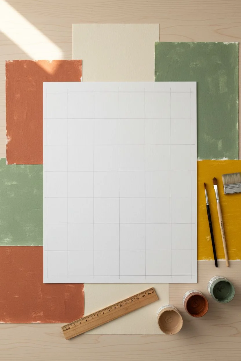
Cut your sturdy backing board to the exact size of your frame’s internal opening. Measure a grid on this board lightly with a pencil. Based on the image, a 3×5 or 4×5 grid works well; these squares will guide your collage placement. -
Mix your palette:
Create an earthy palette. Mix burnt sienna with a touch of white for a soft terracotta. Blend sap green with a little grey and white for a muted sage. Keep a pot of pure cream or unbleached titanium for the neutral backgrounds. -
Create texture sheets:
Instead of painting directly on the final board, paint separate sheets of your textured paper or fabric. Paint one sheet entirely in terracotta, one in sage, one in mustard, and keep one natural/cream. I like to apply the paint slightly unevenly to enhance the organic, textile look.
Wrinkle Rescue
If your paper bubbles when glued, place a sheet of wax paper over it and weigh it down with a heavy book overnight. The pressure will flatten the fibers as the glue cures.
Step 2: Designing the Grid
-
Draft the shapes:
On a separate piece of scrap paper, sketch out your geometric designs for each square of your grid. Use simple shapes: half-circles, triangles, arches, and quarter-circles. -
Cut the background squares:
From your cream/neutral painted sheet, cut out squares that match the grid size you drew on the backing board. These will serve as the base for each individual tile. -
Cut geometric elements:
Using your sketches as a guide, cut shapes from your colored texture sheets. For the arches, you might use a compass to draw the curve on the back before cutting with a craft knife for precision.
Step 3: Assembly & Detail
-
Dry fit the layout:
Lay out all your cream background squares on a table. Place your colored geometric cutouts on top of them to finalize the composition. Move pieces around until the balance of color feels right. -
Glue the layers:
Using matte gel medium, adhere the colored shapes onto the cream squares. Apply the medium thinly to avoid warping the paper. Press down firmly, smoothing from the center outward. -
Add line work:
Some tiles feature delicate rainbow arches or stripes. Use a fine liner brush with watered-down paint (or a fine-tip paint pen) to draw these details directly onto the cream squares. Keep your hand loose; slight wobbles add to the handmade charm. -
Assemble the full collage:
Once individual tiles are dry, glue them onto your main backing board, aligning them perfectly with your initial pencil grid so they touch edge-to-edge seamlessly.
Textile Twist
Swap the painted paper for actual fabric scraps like linen or raw canvas. Use iron-on adhesive (fusible web) to attach the shapes for a cleaner, no-sew finish.
Step 4: Framing
-
Check for adhesion:
Inspect the edges of every square. If any corners are lifting, use a toothpick to dab a tiny bit of glue underneath and press down until set. -
Clean and protect:
Brush the entire surface lightly with a clean, dry brush to remove any dust or eraser crumbs. If you want extra protection, apply a very thin coat of matte spray varnish, but be careful not to darken the paper. -
Mount and frame:
Place your collage behind the mount (mat board) of your wooden frame. The white border of the mount provides necessary breathing room for the busy geometric pattern. -
Final securement:
Secure the back of the frame and check the front for any trapped dust before hanging.
This sophisticated collage brings a calm, orderly beauty to your space with its harmonious earth tones.


Have a question or want to share your own experience? I'd love to hear from you in the comments below!