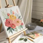
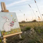
Spring is basically nature’s permission slip to play with color, and I love turning that fresh energy into quick, joyful sketches. Here are spring drawings ideas you can try right now, starting with classic blooms and drifting into more playful, unexpected little scenes.
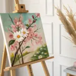
Wildflower Meadow Landscape
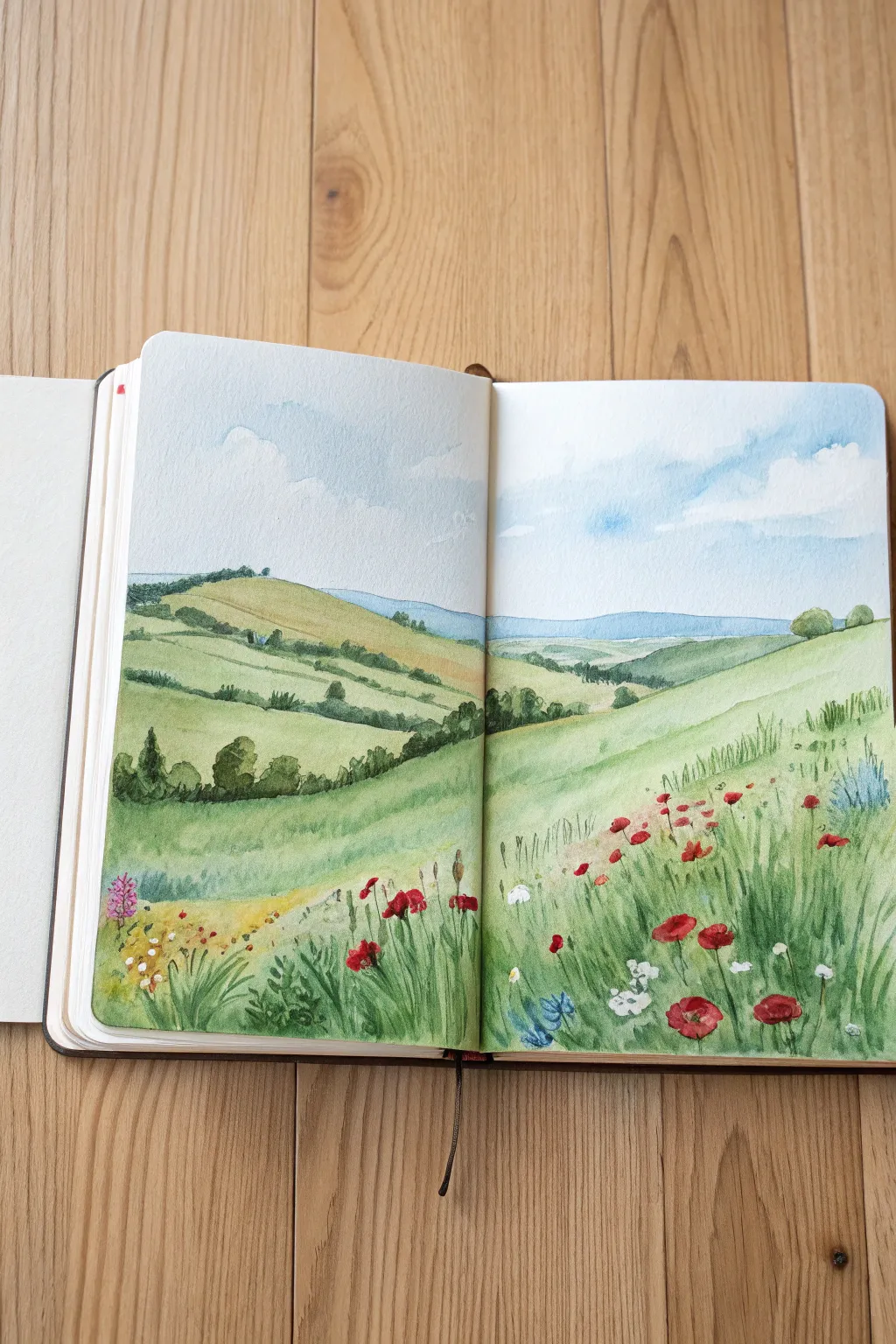
Capture the fresh, sweeping beauty of a spring countryside with this double-page watercolor landscape. This project focuses on atmospheric perspective, gentle layers of green, and vibrant pops of red to create a serene wildflower meadow.
Step-by-Step Guide
Materials
- Watercolor sketchbook (cold press paper recommended)
- Watercolor paints (Sap Green, Olive Green, Hooker’s Green, Cadmium Red, Alizarin Crimson, Cerulean Blue, Ultramarine, Yellow Ochre, Burnt Sienna)
- Round brushes (sizes 4, 8, and a rigger or size 0 for details)
- Pencil (HB) and kneadable eraser
- Two jars of water
- Paper towels or cloth
- Masking tape (optional for page edges)
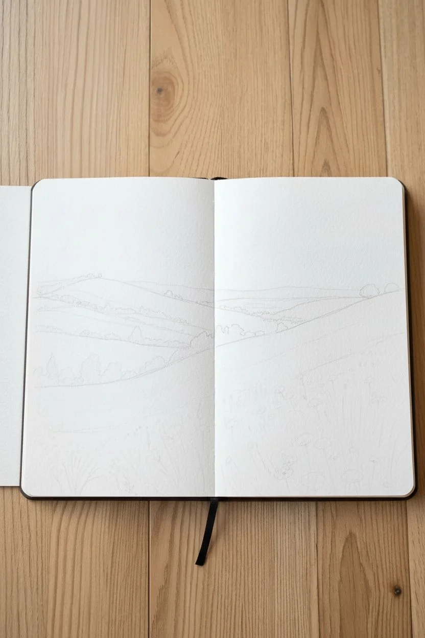
Step 1: Planning the Horizon
-
Pencil Sketch:
Lightly sketch the composition across both pages. Start with the rolling hills in the background, keeping the lines gentle and curved. Mark the distant tree line and the V-shaped valley where the hills meet in the center binding. -
Foreground Details:
Sketch the prominent slope in the right foreground. You don’t need to draw every blade of grass, but lightly indicating the height and direction of the wildflower clumps helps guide your brush later.
Paint the Sky First
Always paint the sky and let it dry fully before starting the hills. If the green washes touch a wet sky, the horizon line will blur and bleed upward.
Step 2: Painting the Sky
-
Wet-on-Wet Sky:
Using a clean brush, wet the sky area with clear water, being careful not to soak the paper too much. Leave random organic shapes dry to represent the bright white clouds. -
Adding Blues:
While the paper is still damp, drop in a light wash of Cerulean Blue mixed with plenty of water. Let the blue bleed naturally around the white cloud shapes for soft edges. Fade the color out as it reaches the horizon line. -
Shadows:
Add a tiny touch of faint violet or grey to the undersides of the cloud shapes to give them volume. Let this layer dry completely before moving to the land.
Muddy Greens?
Watercolors get muddy if over-mixed. Mix your greens on the palette, not on the paper. If a layer looks dull, let it dry completely before glazing a pure color over top.
Step 3: Layering the Landscape
-
Distant Hills:
Mix a pale, cool blue-green. Paint the furthest band of hills on the horizon. The atmospheric perspective requires this layer to be light and desaturated to make it recede. -
Mid-Ground Greens:
Mix a warm Sap Green with a little Yellow Ochre. Paint the large, rolling hill on the left page. Use horizontal, sweeping brushstrokes that follow the contour of the land. Leave some patches slightly lighter to suggest sunlight hitting the slopes. -
Hedgerows:
While that wash is drying but still just damp, dab in darker greens (Hooker’s Green) along the ridges to create soft hedgerows and tree clumps. This ‘charging’ technique creates natural variation without hard lines. -
Right Foreground Slope:
Paint the large hill on the right page with a fresh, bright green mix. As you move toward the bottom right corner, incorporate vertical flicking strokes to start suggesting the texture of tall grasses.
Step 4: Wildflowers & Textures
-
Defining Trees:
Once the mid-ground is dry, use your size 4 round brush to paint distinct tree shapes along the ridge lines with a dark Olive Green. Vary the heights and shapes to keep it looking organic. -
Grass Texture:
Switch to your rigger brush or a fine-tip round brush. Using various shades of green, paint rapid, upward strokes in the foreground. I like to vary the pressure to get thick-and-thin lines that mimic wild grass. -
Poppy Placement:
Load your brush with concentrated Cadmium Red. Paint the poppies using small, irregular dabs. Don’t paint perfect circles; think of cup shapes and tilted ovals. -
Flower Variety:
Add touches of Alizarin Crimson for darker poppies, and mix in some tiny dots of blue and white (gouache works well here if you have it) for cornflowers and daisies scattered among the red. -
Stems:
Use a very watery green to draw thin, wiry stems connecting the floating flower heads to the grassy base. -
Final Contrast:
Add the deepest darks now—mix green with a touch of red or brown to create a near-black shade. Apply this sparingly at the base of grass clumps and underneath the densest tree lines to make the bright colors pop.
Allow the sketchbook to remain open until the paint is bone dry to prevent the pages from sticking together
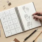
Spring Doodle Icon Sheet
Capture the fresh energy of the season with this charming collection of simple line-art doodles. Using just a fine liner and grid paper, you’ll create a cohesive spread of clouds, buzzing friends, and blooming flowers that feels effortless and sweet.
Detailed Instructions
Materials
- Grid paper notebook (A5 or B6 size ideal)
- Fine liner pen (black, 0.3mm or 0.5mm)
- Pencil (HB for sketching)
- Eraser
- Real flowers for reference (optional)
Step 1: Setting the Scene
-
Grid layout:
Open your notebook to a fresh spread. The grid lines are your best friend here—they act as invisible guides for keeping your doodles proportionate without needing a ruler. -
Visual spacing:
Mentally divide the page into rough rows or a loose grid pattern. You want about 12-15 distinct icons, so leave plenty of ‘white space’ between each imagined spot to keep the page looking airy.
Wobbly Lines?
Don’t stress over mistakes! If a line goes astray, thicken it slightly to make it look intentional, or turn a slip of the pen into a new petal or leaf.
Step 2: Drawing the Sky Elements
-
Fluffy cloud:
Start near the top left with a classic cloud shape. Draw a flat bottom line first, then stack three or four distinct humps on top. Inside, add a tiny ‘w’ shape to suggest texture or a sleepy face. -
Sun-cloud variant:
Slightly lower down, try a smaller cloud variation. Draw a simple bumpy outline, then add a small circle peeking out from behind one of the bumps to represent the sun. -
Floating petals:
Scatter a few tiny, isolated shapes around the clouds—small circles or heart-like petals—to mimic pollen or cherry blossom petals drifting in the breeze.
Step 3: Blooming Flowers
-
Classic daisy:
Draw a small circle for the center. Add 6-8 elongated U-shaped petals radiating outward. Don’t worry if they aren’t perfect; irregularity adds charm. -
Spoken flower:
Create a more graphic flower by drawing a small circle, shading it in (perhaps green if you have colored pens, or just black), and drawing thin straight lines radiating out like wheel spokes. -
Simple rosebud:
Draw a U-shape for the flower cup. Inside, add a small spiral or swirl to indicate tightly packed petals. Add a simple stem underneath. -
Trio of tulips:
Dedicate a row to tulips. For the first, draw a U-shape cup with a zig-zag top. Add a stem and two long, slender leaves curving upward from the base. -
Closed tulip:
Next to it, draw a more closed bud—an oval shape with a single line splitting the top slightly. Give it a slightly curved stem. -
Wildflower sprig:
Draw a long, curved vertical line. Along the top half, add tiny dashes or teardrops on alternating sides to resemble lavender or wheat.
Make it a Border
Instead of a full page, try drawing these icons in a single line along the bottom of your weekly planner spread for a custom springtime footer.
Step 4: Garden Visitors
-
Side-view butterfly:
Draw a thin, curved body. Add two wings on one side—a larger top wing shaped like a rounded triangle, and a smaller, rounder bottom wing. Add thin antennae. -
Open butterfly:
Near the bottom, draw a vertical line for a body. Add symmetrical wings on both sides—large top loops and smaller bottom loops. -
Busy bee:
Sketch a small oval body and stripe the back half with black ink. Add two semicircular wings on top and tiny stick legs underneath. -
Flight paths:
Connect your winged creatures to flowers using dotted trails. Loop-de-loops indicate a buzzy, erratic flight path.
Step 5: Finishing Touches
-
Tiny details:
Fill in any awkward gaps with very small filler elements, like single circles (bubbles), tiny hearts, or small groupings of three dots. -
Erase guidelines:
If you used any pencil to plan your spacing, wait until the ink is completely dry—give it a few minutes—before gently erasing the graphite. -
Add accent color:
I like to take a green or yellow highlighter or colored pencil and selectively color just one or two tiny elements, like a flower center or a single leaf, to make the page pop.
Now you have a refreshing page of spring inspiration relevant for any journal entry


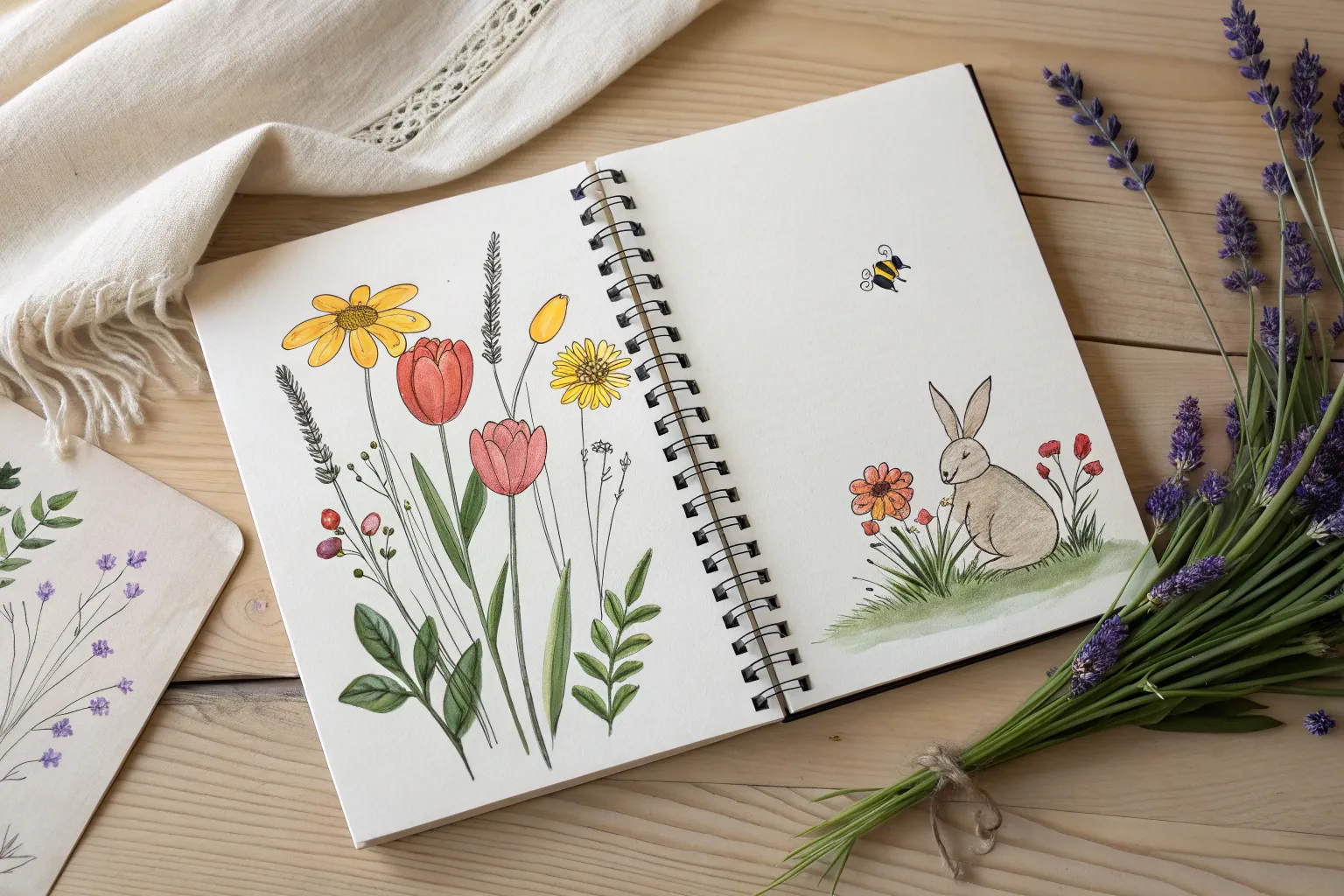
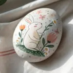
Bunny in a Clover Patch
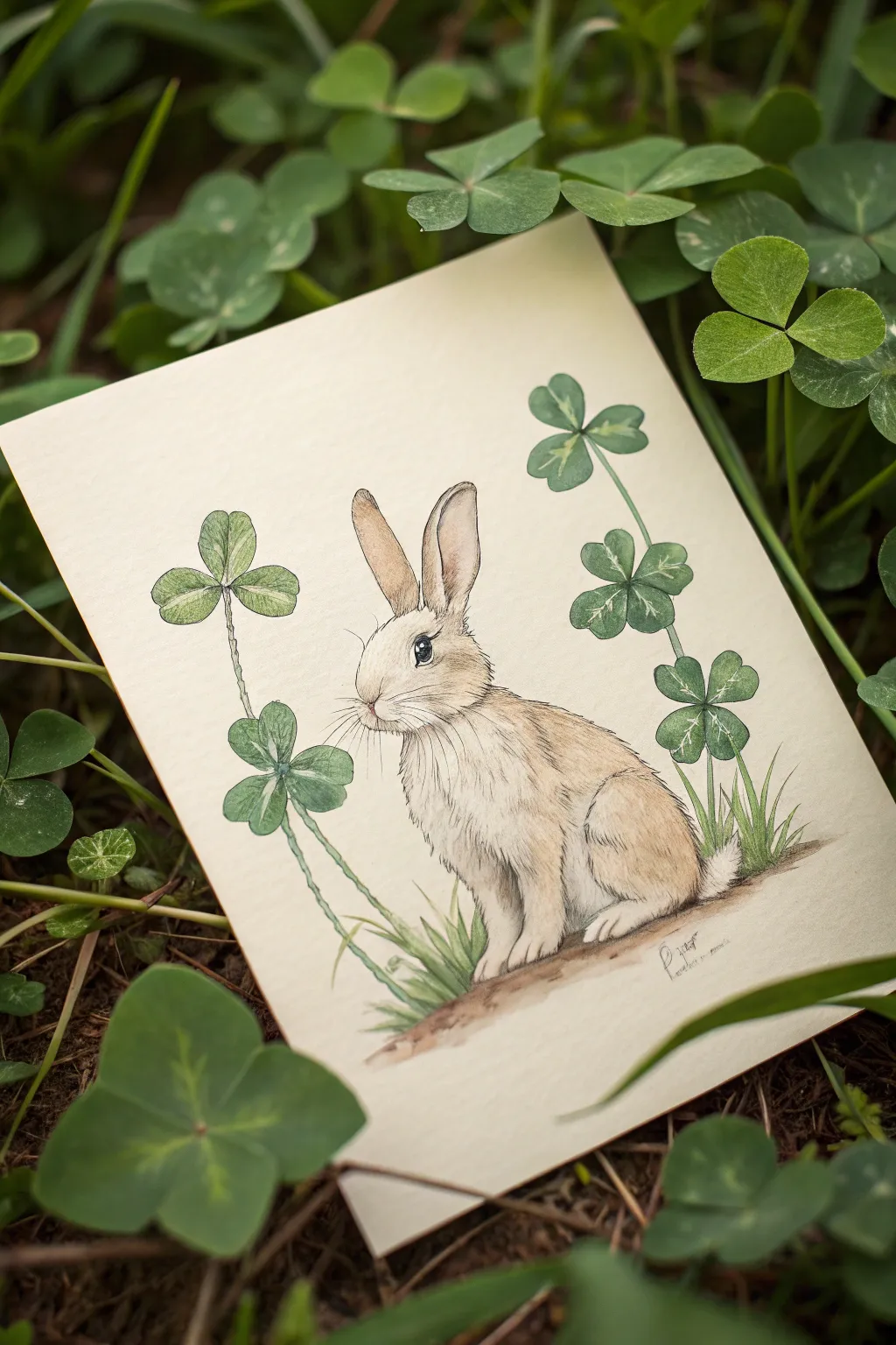
Capture the essence of spring with this delicate mixed-media illustration featuring a gentle rabbit nestled among lucky clovers. Using a combination of fine liner pens and soft watercolor washes, you’ll create a piece that feels both vintage and fresh.
How-To Guide
Materials
- Hot press watercolor paper (smooth texture)
- HB pencil and good quality eraser
- Waterproof fine liner pens (sizes 0.1, 0.3, and 0.5 – black or sepia)
- Watercolor paints (pans or tubes)
- Small round brushes (sizes 2 and 4)
- Detail brush (size 0 or 00)
- Paper towel
- Two jars of water
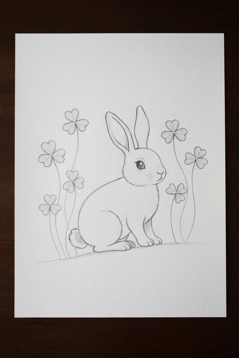
Step 1: Sketching the Layout
-
Draft horizontal placement:
Begin by lightly marking a gentle slope near the bottom third of your paper to serve as the ground line where the bunny will sit. -
Shape the bunny’s body:
Sketch the rabbit using simple ovals. Draw a larger oval for the body angled slightly upward, and a smaller circle for the head above it. Connect them with a soft neck curve. -
Add key features:
Sketch two long ears pointing straight up but slightly apart. Add the curve for the haunches (hind leg) and the front paws planting firmly on the ground line. -
Position the clovers:
Draw three to four tall, curving stems rising on either side of the rabbit. Top them with four heart-shaped leaves each to create the four-leaf clovers. -
Refine the sketch:
Go over your shapes to create the final outline. Add a small puffy tail and refine the face, ensuring the nose is small and the eye is large and expressive.
Step 2: Inking the Details
-
Outline main forms:
Using a 0.3 pen, carefully trace the outline of the rabbit. Use broken, short strokes rather than a solid continuous line to suggest fur texture. -
Detail the clovers:
Switch to a 0.5 pen for the clover stems and leaves to give them a slightly bolder definition, adding small veins inside the leaves with a 0.1 pen. -
Create fur texture:
With your finest 0.1 pen, add directional strokes inside the rabbit’s body. Focus on the chest, neck, and haunches, flicking the pen in the direction the fur grows. -
Define the eye:
Color in the pupil with the 0.5 pen, leaving a tiny crisp white circle for the highlight. This sparkle is crucial for bringing the character to life. -
Erase pencil marks:
Wait until the ink is completely dry—I usually give it at least five minutes to be safe—then gently erase all graphite lines.
Uneven Fur Texture?
If your fur looks too spiky, try holding the pen further back on the barrel. This loosens your wrist and creates softer, more natural flicks.
Step 3: Painting with Watercolors
-
Base wash for the bunny:
Mix a very watery wash of yellow ochre and a touch of burnt sienna. Apply this lightly over the rabbit, leaving the chest and belly white. -
Deepen the fur tones:
While the first layer is slightly damp, drop in stronger brown tones near the ears, back, and paws to create shadow and volume. -
Paint the inner ears:
Mix a pale, dusty pink using alizarin crimson and lots of water. Gently paint the insides of the ears. -
Greenery base layer:
Color the clover leaves with a light sap green. Don’t worry about perfect coverage; a little variation looks natural. -
Shadowing the leaves:
Once the green is dry, maintain the same green but add a tiny bit of blue. Paint one half of each clover leaf or near the center to add dimension. -
Ground the subject:
Use a mix of burnt umber and sepia to paint the ground beneath the rabbit. Keep the edges soft and faded so it looks like a vignette. -
Add grass blades:
Using the size 0 brush and fresh green paint, flick upward strokes from the ground patch to create blades of grass around the bunny’s feet. -
Final touches:
Add tiny pink dots for the nose and very subtle whiskers with your finest pen if the paint covered the original ones.
Adding Softness
For a dreamy look, wet the paper slightly before adding the ground shadow. The paint will bloom outward, creating a soft, out-of-focus effect.
Now you have a charming woodland friend ready to frame or turn into a heartfelt greeting card.


Rainbow After a Spring Shower
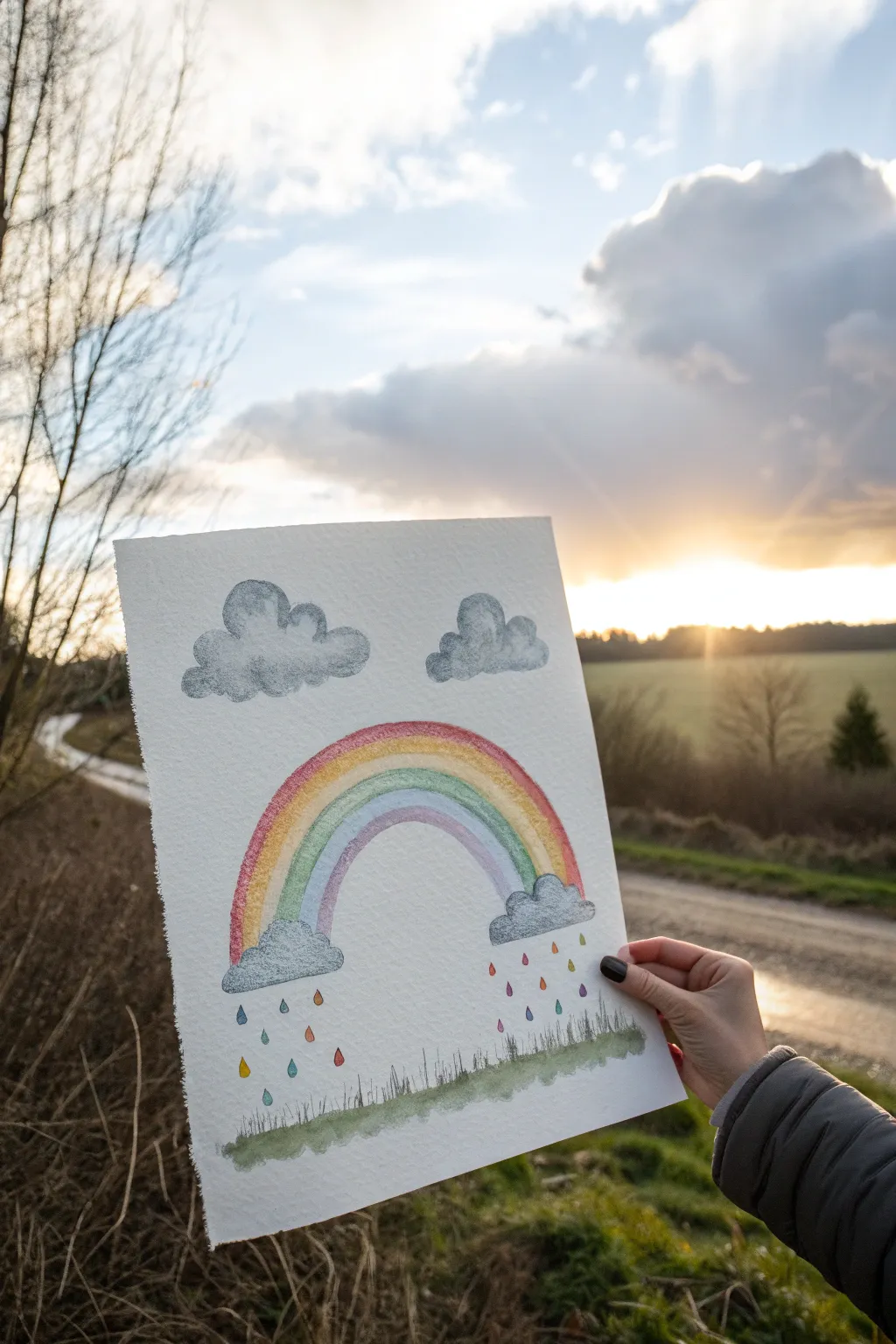
Capture the fresh feeling of a passing storm with this mixed-media rainbow drawing. Using the soft texture of watercolor paper combined with the precision of colored pencils, you’ll create a gentle scene complete with fluffy grey clouds and colorful raindrops.
Step-by-Step
Materials
- Cold press watercolor paper (A4 or roughly 9×12 inches)
- Watercolor pencils or soft colored pencils
- Water brush or small round paintbrush
- Cup of water
- Paper towel
- Pencil (HB or 2H)
- Eraser
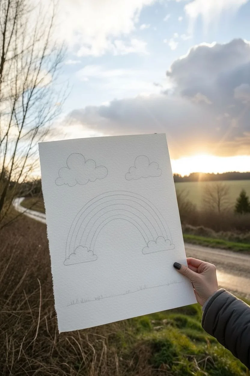
Step 1: Setting the Scene
-
Sketch basic shapes:
Begin by lightly sketching the outline of your rainbow arches. You want a classic semi-circle shape. Don’t press too hard, as you want these lines to disappear under the color. -
Add cloud outlines:
At the base of each side of the rainbow, sketch a small, fluffy cloud. Draw two additional, slightly larger clouds floating above the rainbow in the sky. Use bumpy, rounded strokes for a cartoon-like softness. -
Draw the ground:
Sketch a gentle, uneven line near the bottom of the page to represent the grassy ground. Add small vertical flicks to suggest blades of grass growing upward.
Keep it Clean
Work from top to bottom when activating watercolor pencils. This prevents your hand from resting on wet areas and smearing the artwork.
Step 2: Building the Rainbow
-
Color the arches:
Start coloring your rainbow bands with watercolor pencils. Work from the outside in: red, orange, yellow, green, blue, shading lightly but evenly. -
Layer the purple:
Finish the innermost arch with a soft purple or violet. Ensure the bands touch each other without leaving white gaps, which helps with blending later. -
Activate with water:
Dip your brush in clean water and gently paint over each color band. Wipe your brush on a paper towel between colors so the red doesn’t muddy the yellow, and the blue doesn’t dull the orange. -
Let it dry:
Allow the rainbow area to dry completely before moving on to avoid smudging the colors into the surrounding white space.
Step 3: Creating Atmosphere
-
Color the clouds:
Use a grey watercolor pencil to shade the clouds. Focus the color on the bottom edges and the little bumps, leaving the tops whiter to create a highlighted, 3D effect. -
Soften the clouds:
With a barely damp brush, gently blur the grey pencil strokes. This mimics the watery, diffuse look of a raincloud. I find a circular motion helps keep them looking fluffy. -
Darken the cloud bases:
While arguably optional, adding a second layer of darker grey just at the very bottom line of each cloud gives them more weight and realism. -
Draw falling rain:
Beneath the two clouds attached to the rainbow, draw small teardrop shapes falling towards the ground. Use multiple colors—blue, pink, orange, green—to make it a magical rain shower. -
Add scattered drops:
Draw a few more colorful droplets closer to the ground, varying their heights so they don’t look like they are falling in a single rigid line.
Colors bleeding?
If your rainbow bands are running into each other too much, your brush is too wet. Blot it on a paper towel until it’s just damp, not dripping.
Step 4: Grounding the Scene
-
Color the grass:
Fill in the bottom grassy strip with a mix of olive and bright green pencils. Use short, upward strokes to mimic the texture of grass blades. -
Add depth to the grass:
Go over the very bottom edge with a darker green or even a touch of brown to ground the image. This adds weight to the bottom of the composition. -
Wash the ground:
Lightly wet the grass area to blend the greens together, creating a soft, uneven wash that looks like a watercolor painting. -
Define grass blades:
Once the green wash is dry, take a sharpened dark green or grey pencil and draw distinct, thin vertical lines over the top to bring back the crisp grassy texture. -
Final touches:
Step back and check your raindrops. If they look too faint, carefully outline them again with your colored pencils to make them pop against the white paper.
Now you have a cheerful spring scene that perfectly celebrates the beauty of a rainy day
BRUSH GUIDE
The Right Brush for Every Stroke
From clean lines to bold texture — master brush choice, stroke control, and essential techniques.
Explore the Full Guide
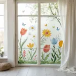
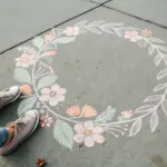
Spring Nature Journal Page With Map
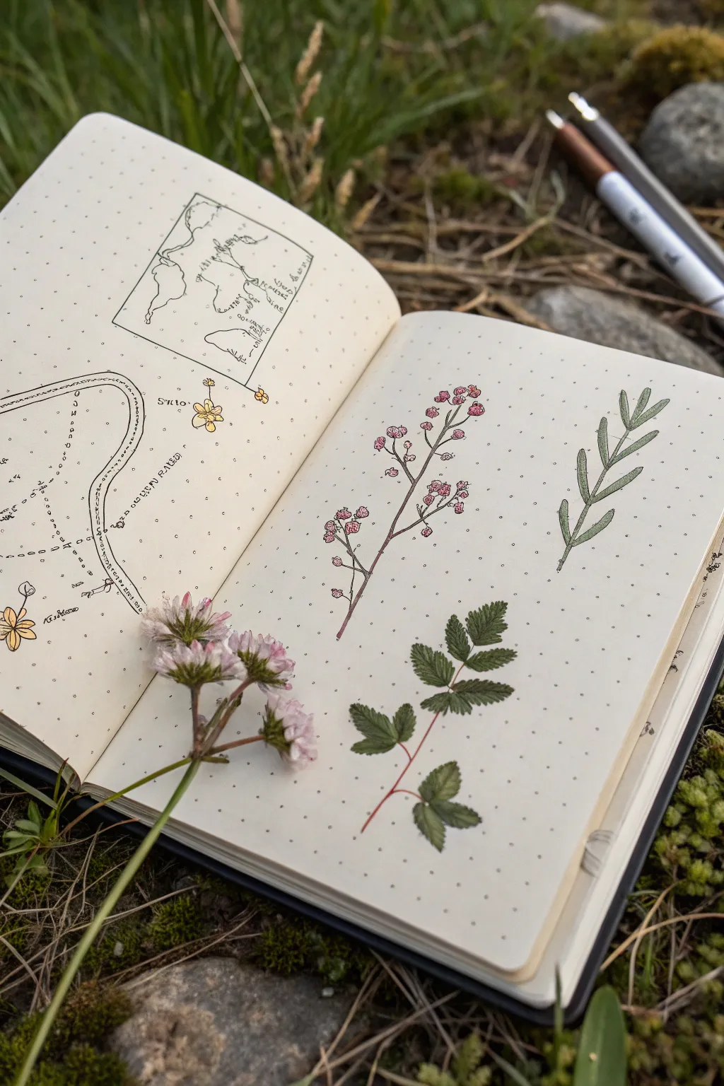
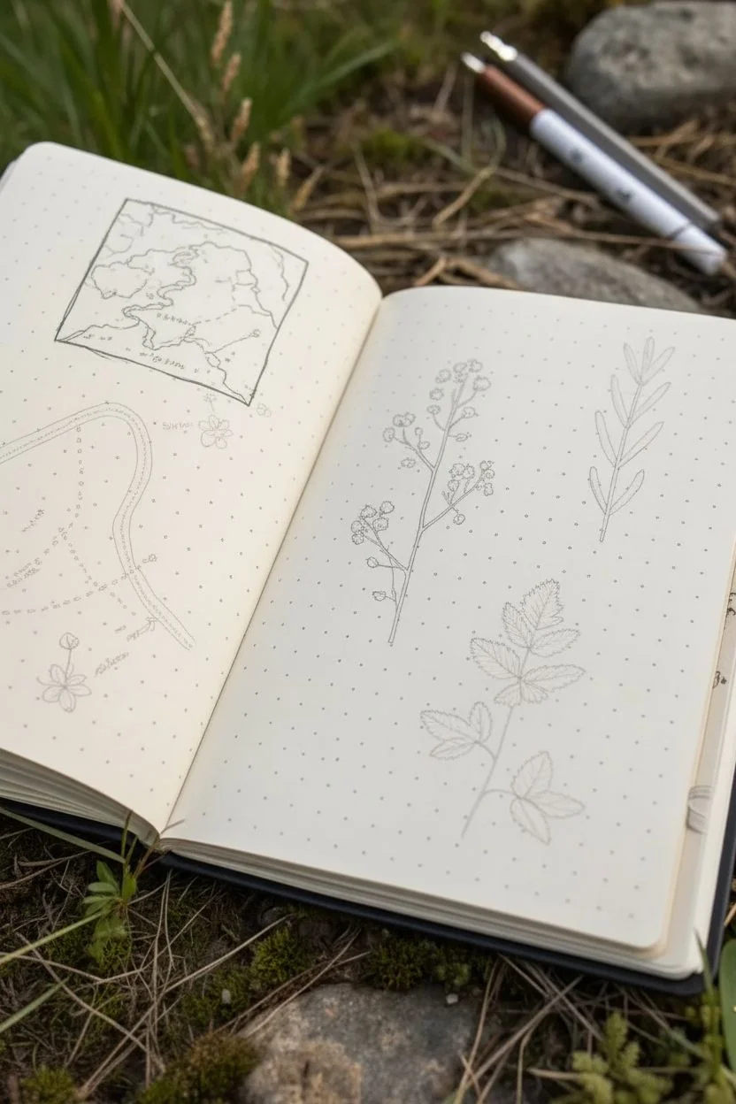
Capture the delicate beauty of a spring walk with this mixed-media nature journal spread. This layout features precise botanical illustrations alongside hand-drawn trails and maps, perfect for documenting your outdoor discoveries.
Step-by-Step Tutorial
Materials
- Dot grid notebook or journal
- Fine liner pens (0.1mm and 0.3mm in black)
- Colored pencils or fine-tip markers (sage green, forest green, dusty pink, yellow)
- Pency for sketching
- Eraser
- Real wildflower sprig (optional, for reference)
Step 1: Planning the Layout
-
Lightly sketch the composition:
Begin by opening your journal to a fresh spread. Using a pencil, lightly block out the main areas: a rectangular map box on the top left page, a winding path below it, and three distinct plant specimens spaced evenly on the right page. -
Define the map border:
On the left page, use your 0.1mm fine liner to draw a rectangular frame in the upper section. Don’t worry about using a ruler; slightly wobbly lines add to the organic, hand-drawn field guide aesthetic.
Ink Smudging?
If your fine liners smudge when erasing pencil lines, wait at least 15 minutes for the ink to fully cure, or switch to pigment-based waterproof pens.
Step 2: Left Page: Mapping the Journey
-
Draw the map interior:
Inside your rectangular frame, sketch a simplified topographical map. Draw winding lines to represent coastlines or riverbanks, and add small dashed lines to indicate a walking route. -
Detail the main path:
Below the map box, create a larger, stylized representation of your walking path. Draw two parallel curving lines that widen and narrow. I like to add dashed lines running through the center to suggest movement. -
Add nature notations:
Along the path, draw tiny icons. Sketch a small yellow wildflower at one bend and perhaps a small tree or rock formation at another. Label these with tiny, neat handwriting (or scribbles that mimic text) to mark specific finds. -
Ink the left page:
Go over your pencil sketches with the fine liner. Use a stippling technique (tiny dots) on the map to create texture for the landmasses.
Step 3: Right Page: Botanical Trio
-
Sketch the flowering sprig:
On the left side of the right page, sketch a tall, thin vertical stem with branching offshoots. Draw clusters of small circles at the tips of these branches to represent tiny buds or berries. -
Sketch the leaf structures:
In the center, lightly outline a compound leaf structure (like a wild rose or rowan leaf) with jagged edges. On the far right, sketch a simpler, vertical climbing vine with paired, oval-shaped leaves. -
Ink the stems:
Trace your stems with a brown or dark red fine liner or pencil. Keep your lines thin and delicate to reflect the fragility of spring growth. -
Add color to the pink cluster:
Using a dusty pink pencil or marker, color in the small clusters on the first plant. Use a stippling motion rather than solid shading to give the impression of many tiny individual petals. -
Color the center leaf:
For the middle specimen, use a forest green pencil. Press harder at the base of each leaflet and fade out toward the tips to create depth and dimension. Leave tiny slivers of white for veins. -
Color the vine:
On the rightmost plant, use a sage or lighter green. Apply the color evenly, but outline the leaves again with a slightly darker green pen to make them pop against the paper.
Pro Tip: Depth via Dots
Use the dot grid of the journal to your advantage. Connect dots to keep stems straight, or use them as a guide for evenly spacing your descriptive text.
Step 4: Finishing Touches
-
Add red details:
If you have a red fine liner, trace the central vein of the middle leaf specimen. This red-green contrast mimics many real wild plants and adds visual interest. -
Review and erase:
Once all ink and color is completely dry, gently erase any visible pencil sketch lines across both pages. -
Stage for photography:
To recreate the look of the photo exactly, place a real flower sprig (like clover or a small wildflower) diagonally across the bottom of the spread, overlapping the drawing slightly.
Now you have a charming, scientific-style record of your spring adventures ready to be filled with more memories
Nighttime Spring Blooms on Dark Paper
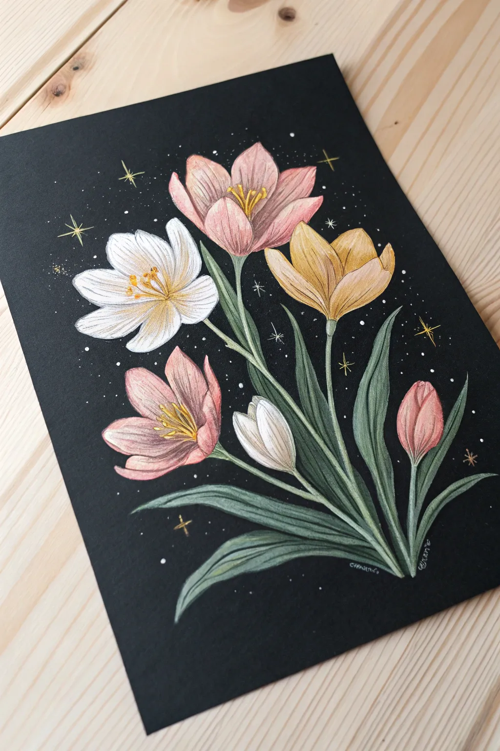
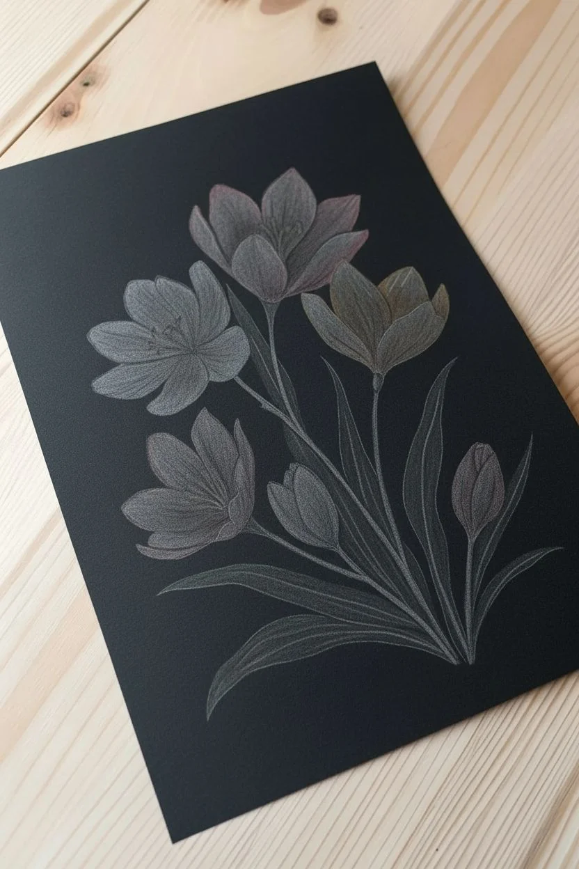
Capture the enchanting stillness of spring nights by drawing vibrant crocuses against a dramatic black background. This mixed-media approach uses the opacity of gel pens and the soft texture of colored pencils to make the petals glow.
Detailed Instructions
Materials
- Black sketchbook paper or cardstock
- High-quality colored pencils (wax or oil-based)
- White gel pen (fine and medium tip)
- Gold or metallic gel pen
- Graphite pencil (HB) and eraser
Step 1: Sketching the Layout
-
Plan the composition:
Visualize a diagonal flow for your bouquet, starting from the bottom right and fanning out towards the top left. This creates a natural, growing movement. -
Lightly sketch boundaries:
Using your graphite pencil very lightly, draw faint oval shapes where each flower head will sit. You will want roughly five main blooms and two closed buds. -
Define the stems:
Draw long, slender lines curving downward from your flower ovals to a central gathering point at the bottom right corner. -
Outline the petals:
Inside your ovals, sketch the crocus petals. They are teardrop-shaped and overlap slightly. Keep the white crocus on the left, the golden one on the right, and the pinks central. -
Add foliage:
Sketch long, grass-like leaves that interweave with the stems. These should look like sleek ribbons extending from the base.
Step 2: Layering Color
-
Base layer for leaves:
Start with a dull, sage green pencil. Fill in the leaves and stems with medium pressure, leaving the edges slightly softer to blend later. -
Deepen the greens:
Take a darker forest green and shade the base of the leaves and any areas where stems overlap, creating shadow and depth. -
White flower base:
For the white crocus, use your white pencil to fill the petals. Apply heavier pressure at the tips and lighter pressure near the center. -
Coloring pink blooms:
Fill the pink flowers using a soft dusty rose color. Layer a creamy white over the top halves of the petals to create a highlight effect. -
Golden flower base:
Use a mustard or ochre yellow for the right-hand flower. I like to add a touch of light brown near the base of these petals for a realistic gradient. -
Adding petal texture:
Sharpen your pencils to a fine point. Draw delicate lines from the base of each petal outward to mimic the natural veins of the flower.
Pencils Not Showing?
If your colors look dull on black paper, lay down a base of white pencil first. Color over the white to make the pigments pop vividly.
Step 3: Details & Highlights
-
Deepen the shadows:
Use a dark purple or indigo pencil to shade the very bottom of the bouquet where the stems meet, blending it into the black paper. -
Stamen details:
Draw the stamens in the center of the open blooms using a bright yellow or gold pencil. Make them look like tiny clusters. -
White gel outlines:
Take your white gel pen and selectively outline the tops of the white and pink petals. Don’t outline everything; broken lines look more organic. -
Leaf highlights:
Add very thin white gel pen lines along the ridge of the detailed leaves to make them look glossy. -
Celestial sparkles:
Using the white pen, dot the background with ‘stars’ of varying sizes. Add a few cross-shaped stars for variety. -
Gold accents:
Use the gold gel pen to add a few larger, four-pointed stars in the background and to add sparkle to the flower stamens. -
Final touches:
Check your contrast. If the flower centers need more pop, gently layer a bit more white pencil over the surrounding petals to push the darkness back.
Level Up: Metallic glow
Use metallic watercolor paint instead of a gold pen for the stars. Flick the brush bristles for a natural, random galaxy splatter effect.
Step back and admire how your floral arrangement glows beautifully against the dark background
Have a question or want to share your own experience? I'd love to hear from you in the comments below!