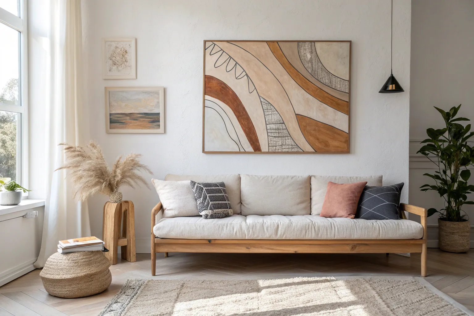
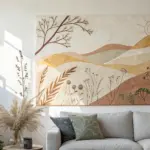
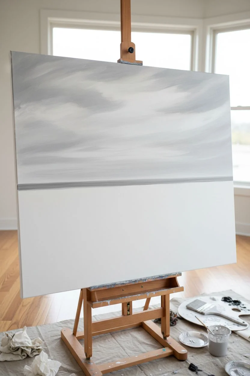
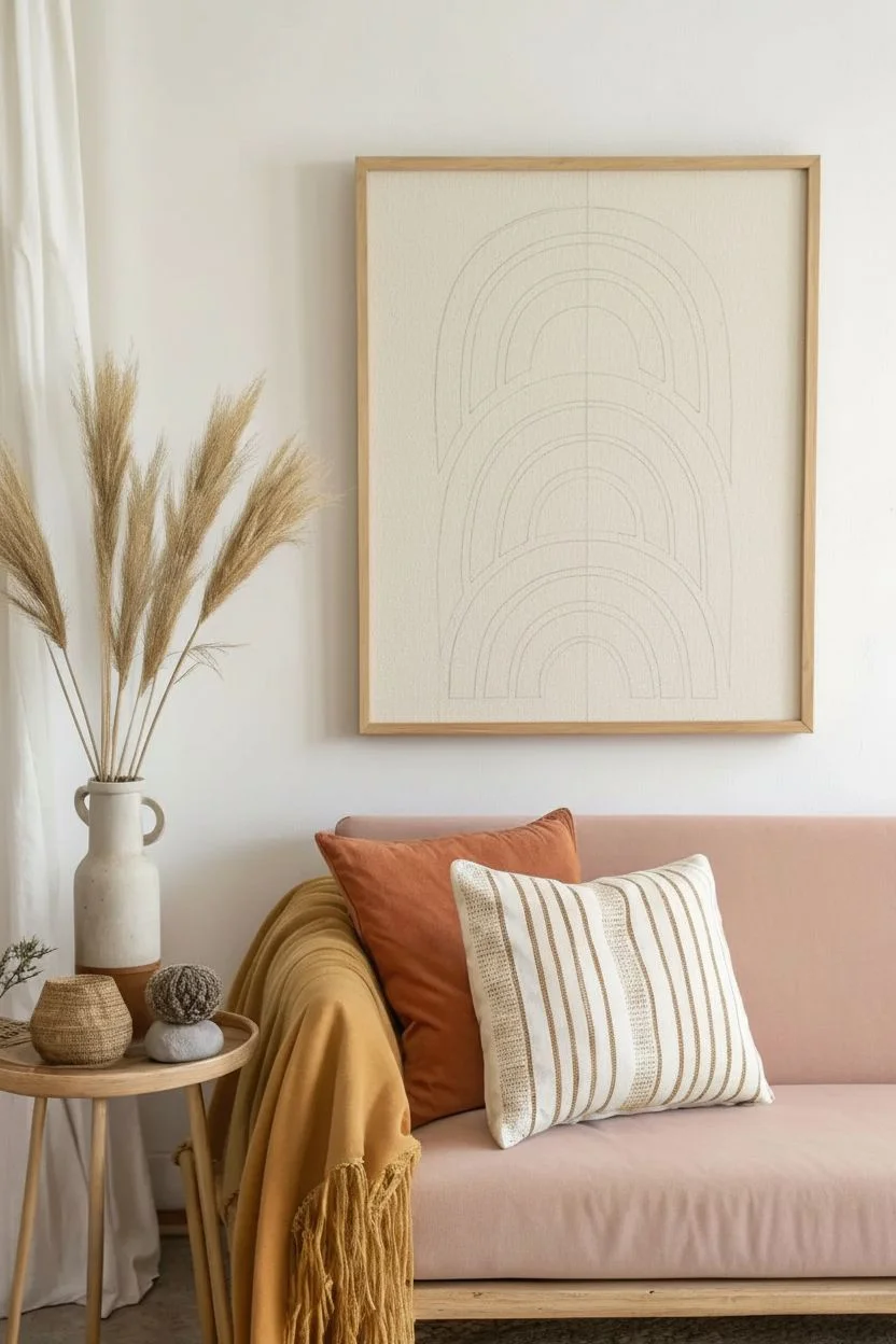
If your living room wall feels a little empty, a DIY canvas painting is one of my favorite ways to make it feel intentional fast. These ideas are meant to be totally doable, but still polished enough to hang above the sofa like a real statement piece.
Big Abstract Color Blocks
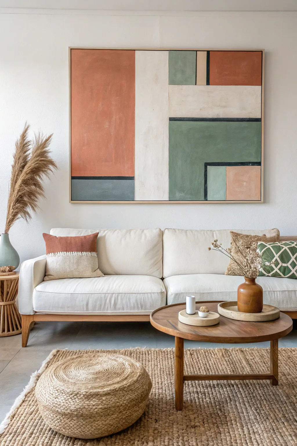
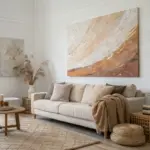
This large-scale canvas project brings sophisticated warmth to any living space through its balanced composition of terracotta, sage green, and neutral cream blocks. The beauty lies in its textured, imperfect finish and the strategic use of negative space to create a modern, harmonious look.
Step-by-Step Guide
Materials
- Large canvas (at least 36×48 inches)
- Acrylic paints (Terracotta/Burnt Sienna, Sage Green, Deep Forest Green, Slate Blue/Grey, Cream/Titanium White, Black)
- Wide flat paintbrushes (2-inch and 1-inch)
- Detail brush (for black lines)
- Painter’s tape (1-inch or wider)
- Pencil and ruler (or T-square)
- Palette or paper plates for mixing
- Water cup and paper towels
- Lightweight framing timber (optional, for floating frame)
Step 1: Planning and Layout
-
Prepare your canvas:
Start by wiping down your canvas to remove any dust. If you want a smoother surface, apply a thin coat of gesso and let it dry completely before beginning. -
Map out the grid:
Using a pencil and a long straight edge, lightly sketch the main vertical division. Place it slightly off-center to the left, creating a ‘rule of thirds’ effect rather than cutting the canvas perfectly in half. -
Define the horizontal blocks:
Sketch the horizontal lines to create the rectangular sections. Notice that the lines on the left side don’t necessarily align with the lines on the right; this asymmetry is key to the artwork’s interest. -
Tape the boundaries:
Apply painter’s tape firmly along your pencil lines. To prevent paint bleed, run your fingernail or a credit card along the tape edges to seal them tight against the canvas texture.
Clean Lines Hack
Before painting color, paint a layer of white over the tape edge. This seals the tape so any bleed is invisible white, keeping your colors crisp.
Step 2: Color Application
-
Mix the terracotta hue:
Combine Burnt Sienna with a touch of Cream and a tiny drop of Red to get that warm, earthy clay color. You want it muted, not bright orange. -
Paint the large left block:
Fill in the large upper-left rectangle with your terracotta mix. Don’t worry about perfect opacity; visible brushstrokes add to the organic feel. -
Mix the sage tones:
Create a sage green by mixing Green, a little Yellow Ochre, and plenty of White. You’ll need a darker variation for the main green block and a lighter, dustier version for accents. -
Apply the main green section:
Paint the large lower-right block with your darker sage mix. Use vertical strokes to keep the texture consistent with the vertical orientation of the canvas. -
Paint the neutral cream column:
Fill the central vertical strip with a warm Cream or Off-White. I like to mix a tiny bit of the terracotta into the white to warm it up so it doesn’t look stark against the other distinct colors. -
Add the smaller color blocks:
Fill in the remaining smaller rectangles: the slate blue-grey at the bottom left, the small peach square at the bottom right, and the upper right corner block in terracotta. -
Dry and remove tape:
Allow the paint to become touch-dry (usually 20-30 minutes for acrylics) before carefully peeling off the painter’s tape. Pull the tape away at a 45-degree angle for the cleanest edge.
Step 3: Refining and detailing
-
Touch up the edges:
If any paint bled under the tape, use a small flat brush and the background color (cream) to tidy up the lines. A sharp, clean edge makes the piece look professional. -
Prepare the black line work:
Mix a soft black (Black with a touch of Brown or Green) so it isn’t too harsh. You want these structural lines to look hand-painted, not printed. -
Paint the horizontal dividers:
Using a steady hand or a ruler as a guide, paint the thin black horizontal lines that separate the color blocks. These lines act as anchors for the composition. -
Add the ‘L’ shape detail:
Paint the distinct black right-angle line in the bottom right green section. This creates a ‘frame within a frame’ look around the smaller lighter blocks. -
Layer for texture:
Once the base layers are fully dry, dry-brush a lighter shade of each color over the centers of the blocks. This adds depth and that ‘worn’ canvas look seen in the inspiration photo. -
Finish with a frame:
For the ultimate polished look, build or buy a simple light-wood floating frame. The natural wood tone complements the terracotta beautifully.
Add Subtle Texture
Mix a teaspoon of baking soda or cornstarch into your acrylic paint. It creates a matte, velvety texture that mimics plaster or expensive chalk paint.
Hang your new masterpiece in a well-lit spot to let those earthy tones warm up the room


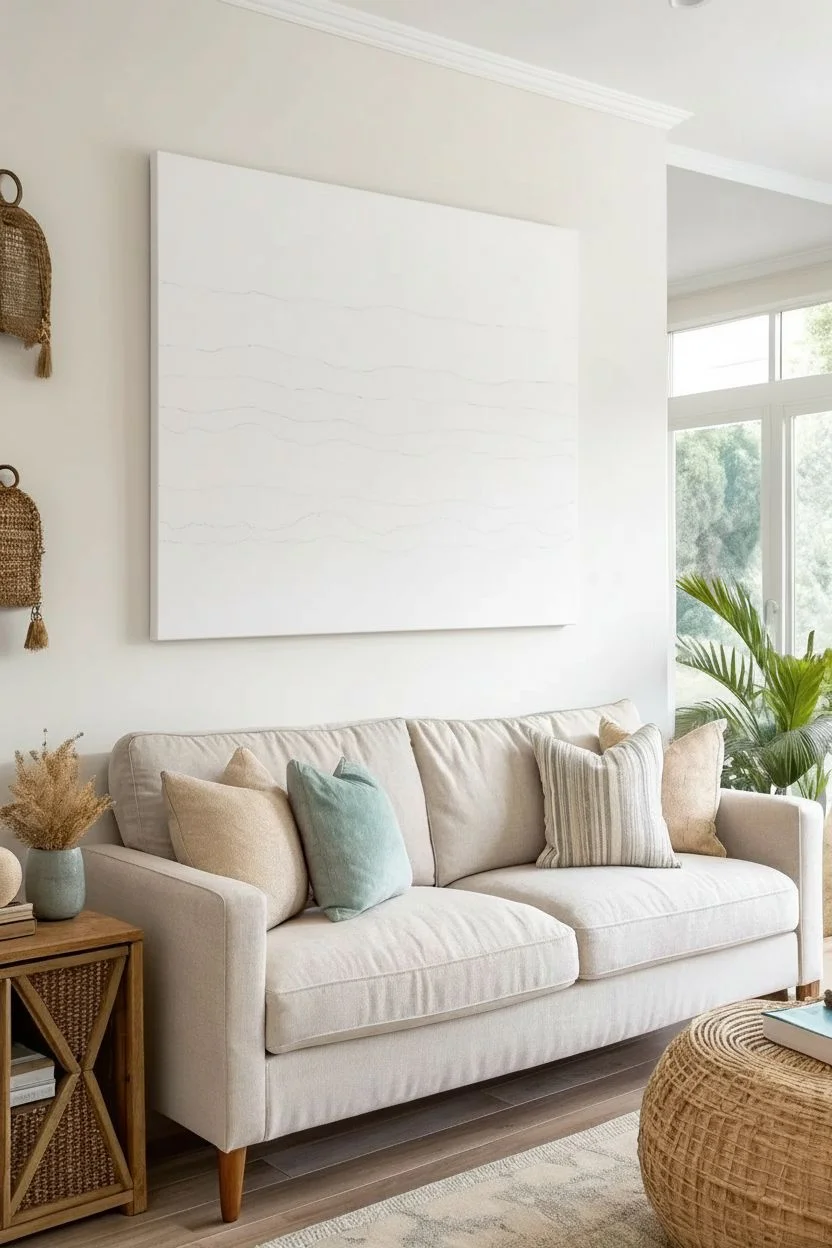
Soft Neutral Minimalist Abstract
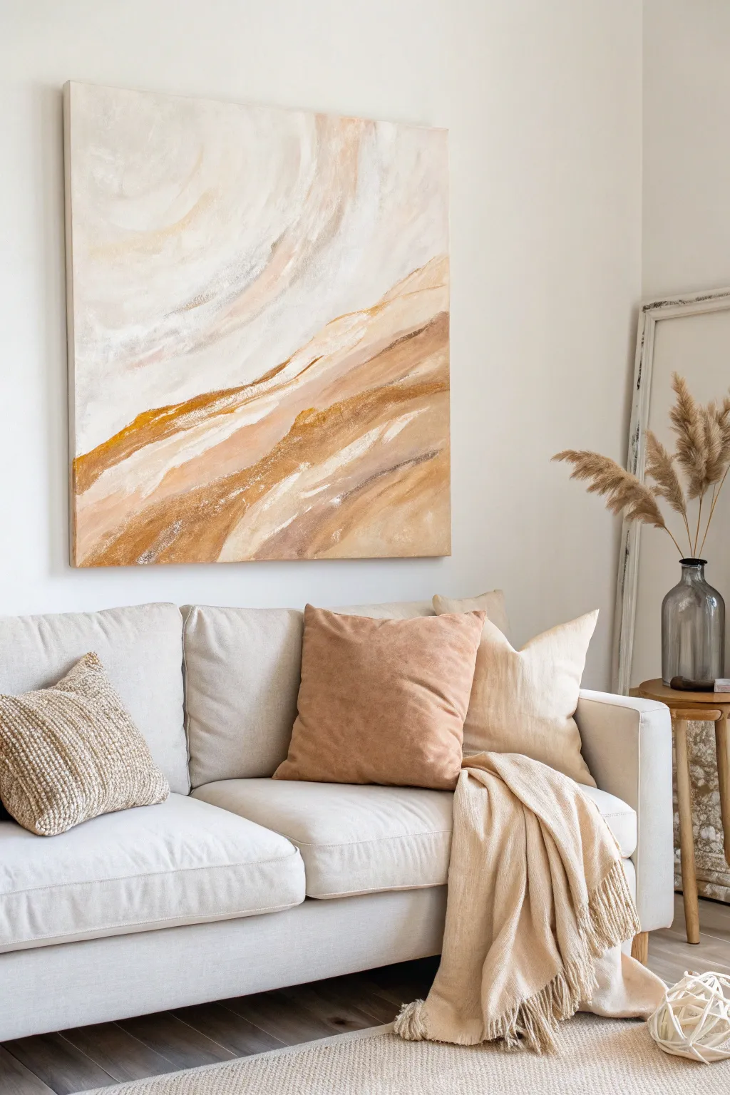
Bring a sense of calm serenity to your space with this soft, neutral abstract piece that evokes wind-swept sand dunes and layered stone. This large-scale minimalist project uses blending techniques and a limited earthy palette to create a sophisticated, high-end look on a budget.
Step-by-Step Tutorial
Materials
- Large stretched canvas (at least 24×30 inches)
- Acrylic paints: Titanium White, Unbleached Titanium (cream), Raw Sienna, Burnt Umber, Yellow Ochre
- Large flat paintbrush (2-3 inch width)
- Medium round paintbrush
- Palette knife (optional, for texture)
- Water spray bottle
- Paper plate or palette
- Paper towels
- Drop cloth
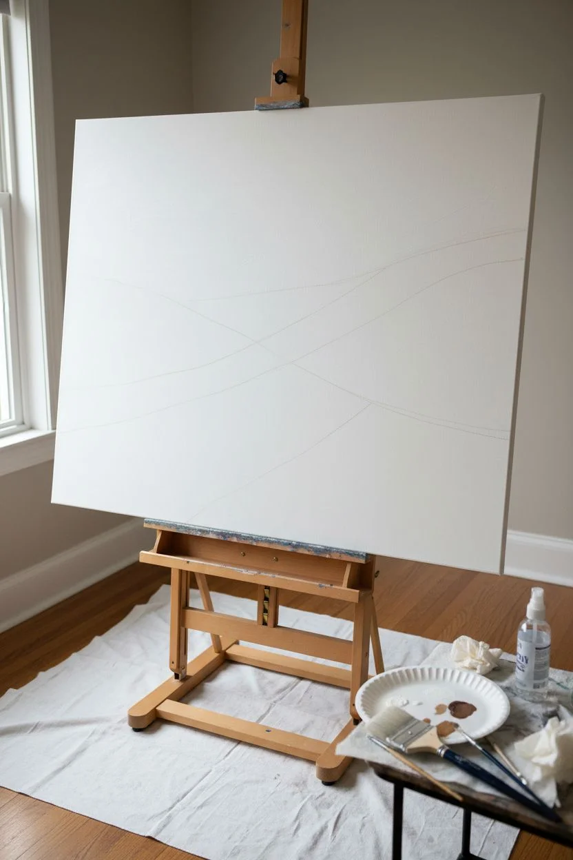
Step 1: Planning the Composition
-
Prepare the canvas:
Lay down your drop cloth and set up the canvas on an easel or flat on a table. Ensure the surface is clean and free of dust. -
Visualize the flow:
Look at the inspiration image. Notice the diagonal movement; the composition flows from the bottom left upwards towards the right, creating overlapping ‘hills’ or layers. -
Sketch distinct zones:
Lightly sketch curved, diagonal lines across the canvas with a pencil or diluted Raw Sienna paint to map out where your darker bands and lighter sky areas will sit.
Mist for Magic
Keep a spray bottle handy. A light mist while blending acrylics keeps them workable longer and creates those dreamy, cloud-like transitions.
Step 2: Creating the Background Layer
-
Mix the base cream:
On your palette, mix a large amount of Titanium White with a touch of Unbleached Titanium. You want a very pale, warm off-white. -
Apply the background:
Using your large flat brush, paint the upper two-thirds of the canvas with this creamy mix. Use broad, sweeping strokes that curve slightly upwards to the right. -
Soften the edges:
While the paint is wet, lightly mist it with water. This helps smooth out brushstrokes and creates that ethereal, cloudy look seen in the top portion of the art.
Add Metallic Touches
For a luxe upgrade, mix gold leaf flakes or gold metallic paint into the darkest brown ridges to catch the light beautifully.
Step 3: Building the Earthy Layers
-
Mix the mid-tones:
Create a sandy beige by mixing Unbleached Titanium with a small dot of Raw Sienna. This will be your transition color. -
Paint the first ‘dune’:
Apply this beige color below your cream background, following the diagonal sketch lines. Overlap the wet background slightly to encourage soft blending where they meet. -
Deepen the palette:
Mix a darker tone using Raw Sienna and a tiny bit of Burnt Umber. This creates the rich, golden-brown bands. -
Add the contrast stripes:
Paint distinct bands of this darker golden-brown. Focus on the areas that look like shadows or ridges in the reference image—specifically the sharp diagonal divides between the lighter sections. -
Feather the edges:
Before the dark paint dries, use a clean, slightly damp brush to feather the top edge of these dark bands into the lighter colors above them. The bottom edge can remain sharper for contrast.
Step 4: Adding Texture and Detail
-
Introduce texture:
I like to take a fairly dry brush with white paint and drag it horizontally across the dried darker areas. This ‘dry brushing’ technique mimics the look of sediment or grain. -
Layering the bottom:
Fill the bottom left corner with a mix of Raw Sienna and Unbleached Titanium. Keep the strokes loose and energetic, following the upward diagonal flow. -
Highlight the ridges:
Mix a small amount of bright White opaquely. Paint thin, decisive lines along the top ridges of your darkest bands to make them pop. -
Add subtle warmth:
If parts feel too cool, glaze a very watered-down Yellow Ochre over the mid-sections to warm up the ‘sand’ areas without covering the texture underneath. -
Step back and assess:
Walk away from the painting for five minutes. When you return, check if the composition feels balanced. Add more dark brown accents if it feels too washed out. -
Final dry brush:
Once mostly dry, do one final pass of dry-brushing with your lightest cream color over the busiest areas to unify the layers. -
Paint the edges:
Don’t forget to wrap your design around the sides of the canvas for a professional, gallery-wrapped finish.
Hang your new masterpiece and enjoy the tranquil atmosphere it adds to your living room


Simple Triptych Horizon Landscape
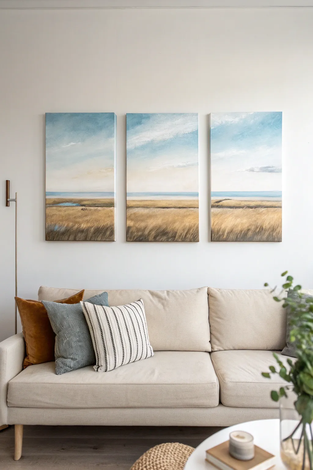
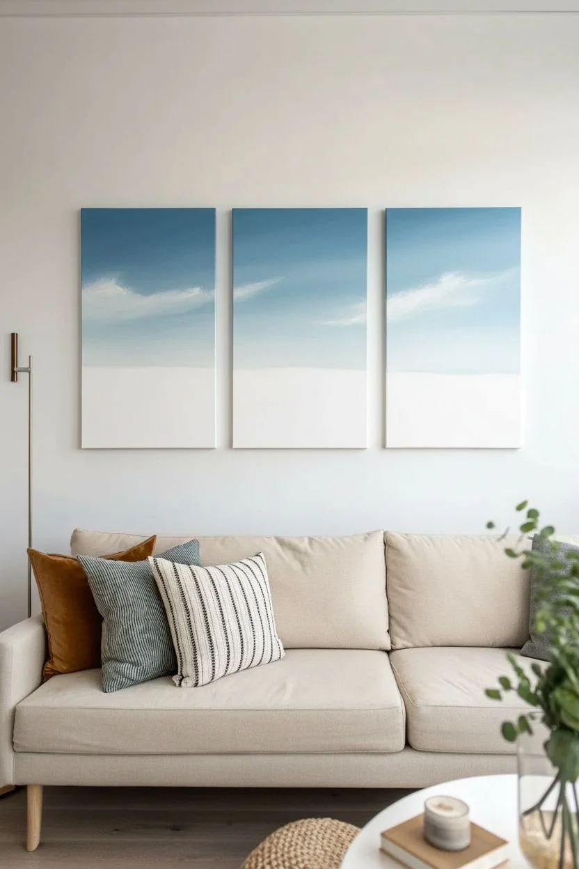
Capture the calm of a coastal horizon with this elegant three-panel landscape. By splitting a single continuous scene across three canvases, you create a modern, high-end look that brings warmth and quiet beauty to any living space.
Step-by-Step
Materials
- 3 rectangular stretched canvases (approx. 16×24 inches each)
- Acrylic paints: Titanium White, Ultramarine Blue, Phthalo Blue, Yellow Ochre, Burnt Umber, Raw Sienna
- Large flat wash brush (2-3 inch)
- Medium flat brush (1 inch)
- Fan brush
- Small round detail brush
- Painter’s tape or masking tape
- Palette knife (optional for texture)
- Water container and paper towels
- Easel or flat work surface
Step 1: Preparation and Sky Layer
-
Set the Stage:
Arrange your three canvases side-by-side on your workspace or easel. Leave a small gap (about 1 inch) between them, exactly as they will hang on the wall. This ensures your horizon line flows perfectly across all three. -
Mark the Horizon:
Decide where your land meets the water. For this composition, place the horizon line low—about one-third of the way up from the bottom. Lightly pencil this line across all three canvases to guide you. -
Mix the Sky Gradient:
On your palette, prepare a large amount of sky blue. Mix a gradient starting with a deeper blue (Ultramarine + White) for the top and a very pale, almost white blue for the horizon. -
Paint the Upper Sky:
Using your large wash brush, apply the darker blue mixture to the top third of each canvas. Use long, horizontal strokes that span the width of the canvas to keep the texture smooth. -
Blend Downward:
While the top paint is still wet, pick up your lighter blue mixture. Blend it into the darker blue as you move down the canvas, creating a soft ombre effect that fades to near-white just above your pencil horizon line. -
Add Wispy Clouds:
Wipe your brush clean and dry it slightly. Pick up a tiny amount of pure Titanium White. Gently scumble (rub lightly) wispy cloud shapes into the wet sky, keeping them diagonal and airy. Soften any hard edges with a clean, dry brush.
Cloud Control
Clouds looking too heavy? Don’t panic. Dip a clean brush into a tiny bit of water and gently circular-rub the paint to lift some pigment, revealing the blue underneath for a softer look.
Step 2: The Water and Horizon
-
Define the Water Line:
Mix a muted teal-blue using Phthalo Blue, a touch of Burnt Umber to desaturate it, and plenty of White. Using a medium flat brush, paint a distinct strip right along your pencil line to represent the distant ocean. -
Soften the Horizon:
The line between the sky and water shouldn’t be razor-sharp. Take a damp brush and very gently blur the top edge of your water line into the white sky just above it creating atmospheric perspective. -
Add Variation:
Mix a slightly darker version of your water color. Add thin, horizontal streaks within the water band to suggest depth and gentle waves, but keep this area relatively flat and calm.
Wrap It Up
Paint the sides of your canvases! Continue the horizon line and colors around the deep edges. This gallery-wrap technique makes the art look finished and professional without needing a frame.
Step 3: The Grassy Foreground
-
Block in the Base Color:
Mix Yellow Ochre with a bit of Raw Sienna and White for a warm, sandy gold base. Fill the entire bottom section of all three canvases with this solid color. -
Create Depth with Shadows:
Mix Raw Sienna with Burnt Umber. Using the medium flat brush, paint abstract patches of shadow near the bottom corners and in horizontal bands across the middle of the field to create rolling terrain. -
Introduce Water Inlets:
On the left canvas specifically, paint a small, irregular patch of blue (matching your ocean color) amidst the grass to look like a marshy inlet or puddle reflecting the sky. -
Texture the Grass:
Switch to a fan brush or an old, splayed-out bristle brush. Dip it into a mix of Yellow Ochre and White. Use upward, flicking strokes to create the illusion of tall grasses swaying in the wind. -
Layer the Highlights:
I like to let the first layer dry briefly before adding the brightest highlights. Mix Titanium White with a tiny dot of Yellow Ochre. Add selective flicks on the tips of the grass, focusing on the foreground for maximum texture. -
Refine the Edges:
Using the detail brush, paint a few distinct, taller stalks of grass in the immediate foreground (bottom edge) that overlap the other layers. This breaks up the uniform texture and adds realism. -
Final Consistency Check:
Step back and look at the three canvases together. Ensure the horizon line connects logically and the colors flow from one panel to the next. Add small touch-ups to bridge any gaps visually.
Hang your new masterpiece with equal spacing between panels to let the landscape flow across your wall


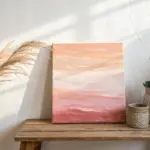
Easy Ombre Gradient Sunset
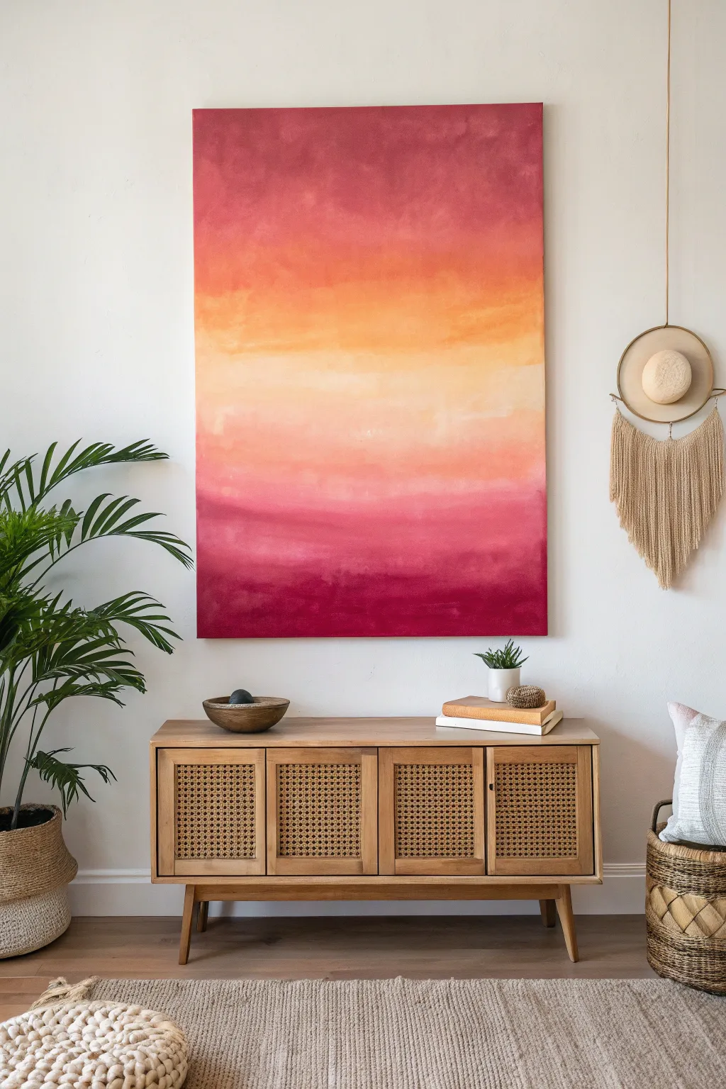
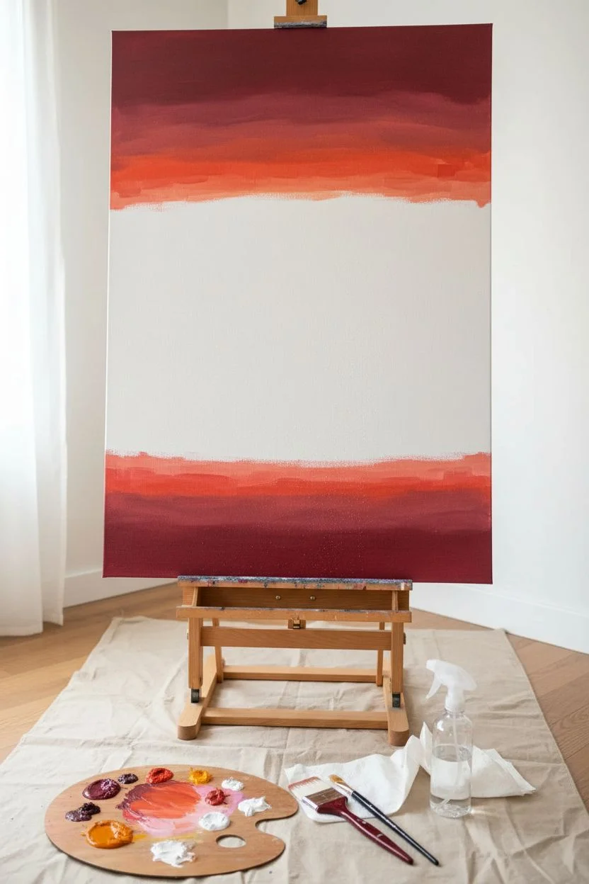
Bring the warmth of a summer evening into your living room with this stunning gradient masterpiece. By blending rich berry tones with soft peaches and creams, you’ll create a soothing focal point that mimics the glow of a setting sun.
Detailed Instructions
Materials
- Large vertical stretching canvas (24×36 or similar)
- Acrylic paints: Deep Maroon (Alizarin Crimson), Burnt Orange, Peach/Coral, Warm Yellow, Titanium White
- Large flat paintbrush (2-3 inch)
- Medium flat paintbrush (1 inch)
- Palette or paper plates
- Spray bottle with water (mister)
- Clean rags or paper towels
- Easel or drop cloth for floor painting
Step 1: Preparation and Base Colors
-
Set up your workspace:
Place your canvas on an easel or lay it flat on a drop cloth. Laying it flat can sometimes help control drips if you are using very wet paint, but an easel allows you to step back and view the gradient. -
Prepare your palette:
Squeeze out generous amounts of your paint colors. You will need more of the Deep Maroon and Titanium White than the other shades, as they form the anchors and blending mediums for the piece. -
Mist the canvas:
Lightly mist the entire canvas with water using your spray bottle. This helps the acrylic paint glide smoothly and stays wet longer for better blending. -
Apply the top dark section:
Using the large flat brush, load up the Deep Maroon. Paint a horizontal band across the top 1/5 of the canvas using long, sweeping strokes from left to right. -
Apply the bottom dark section:
Repeat the previous step at the very bottom of the canvas with the same Deep Maroon shade, covering the bottom 1/5. This creates the ‘frame’ for your sunset.
Keep It Wet
Acrylics dry fast! Keep a spray mister handy. If blending gets difficult, a light spritz directly on the canvas will reactivate the paint and make transitions buttery smooth.
Step 2: Building the Sunset Gradient
-
Mix the transition color:
On your palette, mix Deep Maroon with a little Burnt Orange to create a rusty red. Apply this directly below the top maroon band and directly above the bottom maroon band. -
Blend the edges:
While the paint is still wet, dip your brush (don’t rinse it fully, just wipe off excess) into the new rusty red color. Brush over the seam where the maroon and rust meet to soften the transition. -
Add the orange layer:
Clean your brush slightly. Load it with pure Burnt Orange and paint the next section moving inward towards the center. Do this for both the top and bottom sections. -
Introduce the peach tones:
Mix Burnt Orange with the Peach/Coral shade. Apply this lighter orange band moving further toward the middle. I find that keeping your strokes strictly horizontal is key to maintaining that calm ripple horizon look. -
Create the central glow:
Now, focus on the middle 1/4 of the canvas. Mix Titanium White with Warm Yellow and a tiny dot of Peach. This should be a very pale, creamy yellow. -
Fill the center:
Paint the center strip with this pale yellow mixture. Don’t worry about hard lines yet; just get the color onto the canvas.
Add Metallic Shimmer
Once fully dry, dry-brush a tiny amount of gold metallic paint horizontally across the lightest center section for a sun-kissed sparkle that catches the light.
Step 3: Refining and Blending
-
Wet blending technique:
Mist the canvas lightly again if the paint feels tacky. Take a clean, slightly damp large brush and run it across the boundary between the pale yellow center and the peach sections above and below it. -
Work outwards:
Continue blending outward from the center. Use a dry brush technique to drag a little of the darker paint into the lighter areas and vice versa, creating a hazy, atmospheric look. -
Layering for depth:
Once the first layer is semi-dry, go back in with your Deep Maroon at the very top and bottom corners to darken them further. This vignette effect draws the eye to the bright center. -
Add cloud wisps:
Using the smaller 1-inch brush, pick up a mix of the peach and white. Lightly streak a few horizontal lines through the darker orange sections to suggest faint clouds catching the light. -
Final softening:
Step back five feet to look at your work. If any transition looks too harsh, lightly mist that specific area and gently feather it out with a soft, clean dry brush. -
Paint the edges:
Don’t forget the sides of your canvas to give it a finished, gallery-ready look. Extend the colors around the edges to match the front.
Let the painting dry completely before hanging it up to enjoy the eternal sunset glow in your room
BRUSH GUIDE
The Right Brush for Every Stroke
From clean lines to bold texture — master brush choice, stroke control, and essential techniques.
Explore the Full Guide
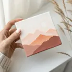
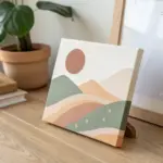
Modern Mountain Silhouette
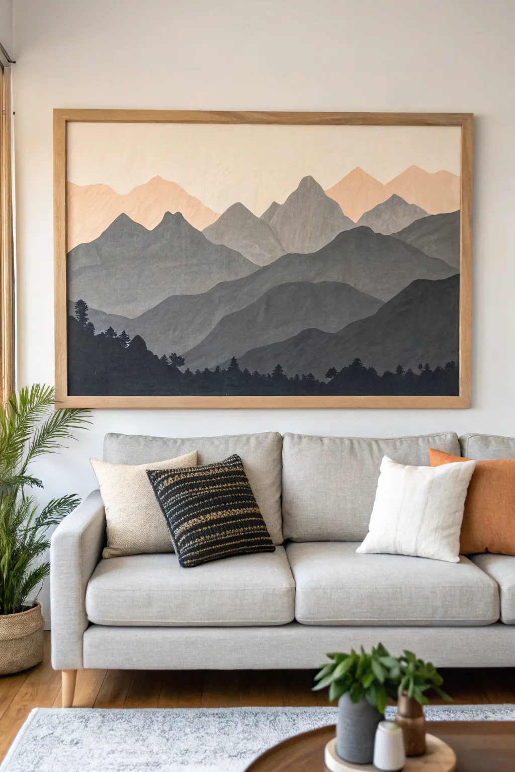
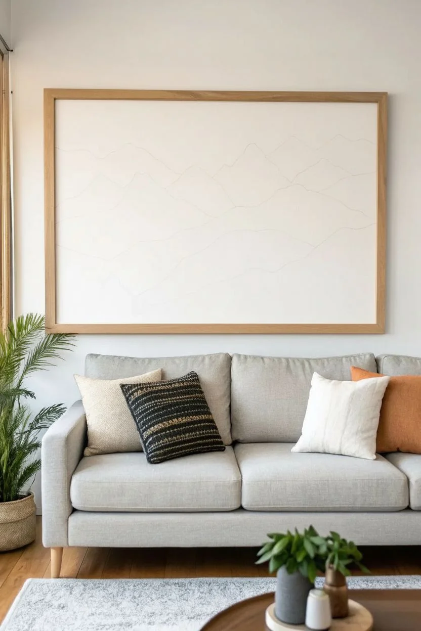
Bring the calming majesty of a mountain range into your living room with this large-scale layered landscape. Using atmospheric perspective, you’ll create depth by gradually lightening your paint colors as the mountains recede into the distance.
Step-by-Step Guide
Materials
- Large canvas (at least 36×48 inches)
- Wooden float frame (optional but recommended for the look)
- Acrylic paints: Carbon Black, Titanium White, Raw Umber, Unbleached Titanium
- Soft pink or peach acrylic paint (or mix Red and Yellow Ochre with White)
- Set of flat synthetic brushes (1-inch, 2-inch, and a small detail brush)
- Palette or disposable plates
- Pencil
- Cup of water and paper towels
- Easel or large flat workspace
Step 1: Preparation and Sketching
-
Prime the canvas:
Ensure your canvas is clean and primed with gesso if it isn’t pre-primed. A smooth surface helps with the gradient effect, so you might want to do a light sanding if the texture is very rough. -
Sketch the horizon lines:
Using a pencil, lightly draw the outlines of your mountain ranges. Start from the bottom with the foreground hills, then layer about 4-5 distinct ranges behind them. The peaks should get smaller and less jagged as they go higher up the canvas. -
Plan the sky area:
Leave the top third of the canvas open for the sky and the faintest, most distant peaks. Don’t worry about perfect lines; natural mountains are irregular.
Uneven Ridges?
If your mountain edges look shaky, use a bit of thinned paint on a liner brush to re-cut the edge. A steady hand rests better on a mahl stick or dry area.
Step 2: Painting the Sky and Background
-
Mix the sky color:
Create a very pale, creamy color using Titanium White and a tiny drop of Unbleached Titanium. Paint the very top section of the canvas with this off-white shade. -
Paint the distant peaks:
Mix your soft peach or pink color with a significant amount of white. You want this to be just a shade darker than the sky. Paint the furthest mountain range (the top layer of peaks) with this warm, hazy tone. -
Blend the transition:
While the paint is still slightly wet, soften the bottom edge of this peach layer so it will blend naturally behind the next grey layer, though hard edges are also fine for a flatter, graphic look.
Step 3: Layering the Mountains
-
Mix the lightest grey:
For the first grey mountain range below the peach ones, mix a light grey. Use White, a touch of Black, and a tiny bit of Raw Umber to warm it up so it harmonizes with the peach sky. -
Paint the first grey range:
Fill in the shape carefully. I like to use a 1-inch flat brush to cut in the sharp edges of the peaks first, then fill the body of the mountain. -
Darken the mix:
Add a bit more Black and perhaps a tiny touch of blue (if you want a cooler tone) to your remaining grey mixture. This next range should be noticeably darker than the previous one. -
Paint the mid-ground ranges:
Paint the next two layers of mountains, darkening your paint mix incrementally for each new layer. Let each layer dry for about 15 minutes before painting the one in front of it to avoid smudging the edges. -
Add variance:
Don’t make every mountain the same texture. You can create subtle vertical strokes or slight color variations within one range to suggest rock faces and shadows.
Atmospheric Depth
Add a tiny drop of the sky color (peach/white) into your distant grey mixes. This simulates atmosphere and ties the color palette together perfectly.
Step 4: The Foreground
-
Mix the darkest shade:
For the bottom-most layer, mix a ‘soft black’ or charcoal color. Use Carbon Black with a touch of Raw Umber or Dark Blue so it isn’t a flat, dead black. -
Block in the foreground:
Paint the large rolling hills at the very bottom. This dark mass anchors the entire composition. -
Add tree details:
Switch to your small detail brush. Along the top ridge of this dark foreground layer, paint tiny vertical uneven lines to represent pine trees. -
Refine the tree line:
Dab the brush gently to create the foliage texture of the trees. Vary their heights so they look organic, grouping some together and leaving others solitary.
Step 5: Finishing Touches
-
Check for gaps:
Step back and look for any white canvas showing through between the mountain layers. Touch up these areas with the appropriate color. -
Frame the piece:
Once fully dry (give it at least 24 hours), install the canvas into a light oak float frame to match the clean, modern aesthetic of the inspiration image.
Hang your new masterpiece and enjoy the view of the mountains from the comfort of your sofa
Calm Coastal Wave Bands
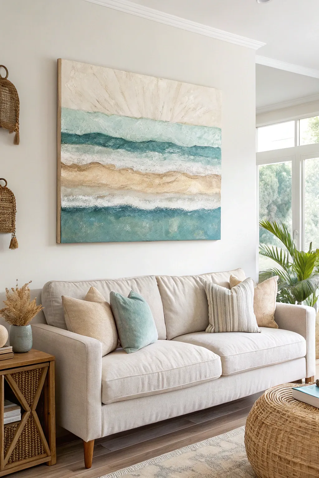
Bring the serene feeling of the shoreline into your living space with this large-scale abstract painting. Using thick textures and soothing horizontal bands of teal, cream, and gold, this piece mimics the tranquil rhythm of ocean waves meeting the sand.
How-To Guide
Materials
- Large canvas (at least 36×36 inches or larger)
- Acrylic paints: Titanium White, Unbleached Titanium (Beige), Phthalo Turquoise, Teal, Raw Sienna, Gold metallic paint
- Modeling paste or heavy structure gel
- Large palette knives (various sizes)
- 3-inch wide flat paintbrush
- Texture comb or stiff-bristled brush
- Sand (clean, craft sand) or pumice gel
- Spray water bottle
- Painter’s tape (optional, for edges)
Step 1: Preparing the Base
-
Prime the Surface:
Even if your canvas is pre-primed, apply a fresh coat of Titanium White across the entire surface using your large flat brush. This ensures a clean, bright base for the translucent colors to follow. -
Map the Horizon:
Lightly sketch five or six horizontal undulating lines across the canvas with a pencil. These don’t need to be straight; gentle waves work best to designate your color zones: sky, upper ocean, breaking wave, sand bar, foam line, and deep water.
Step 2: Building Texture
-
Mix the Texture Medium:
In a separate container, mix modeling paste with a small amount of Raw Sienna acrylic. For an authentic gritty feel, I like to stir in actual craft sand or pumice gel into this mixture until it feels like wet cement. -
Apply the Sandy Ridge:
Using a palette knife, scoop up your sandy mixture and apply it to the middle band of the canvas (the ‘sand bar’). Spread it thickly, leaving peaks and valleys rather than smoothing it flat. -
Create the Foam Lines:
Clean your knife and use pure white modeling paste to create the ridges where the white ‘foam’ lines will be. Apply this just above the bottom turquoise section and right below the top sky section. -
Let it Cure:
Texture mediums take time to dry. Allow the canvas to sit flat for at least 12-24 hours until the paste is completely hard to the touch.
Cracking Paste?
Thick modeling paste can crack if it dries too fast. If cracks appear, don’t panic—fill them with a bit more fluid paint, or leave them for an intentional weathered driftwood look.
Step 3: Layering Color
-
Paint the Sky:
Start at the very top. Mix Titanium White with a tiny drop of Unbleached Titanium. Brush this on with vertical, upward strokes to simulate sun rays or atmospheric light, fading it out as you reach the first colored band. -
Upper Ocean Gradient:
Mix Teal with a large amount of White. Apply this to the band below the sky, using horizontal strokes. While the paint is wet, mist it slightly with water to let the edges bleed softly into the sky area. -
Deepen the Tones:
For the darker bands (one near the top, one at the very bottom), mix Phthalo Turquoise with a touch of gray or black to desaturate it. Paint these sections using the large flat brush, working the paint into the heavy texture of the canvas. -
Highlight the Sand:
Once the sandy texture band is painted with a base of Raw Sienna, dry brush Unbleached Titanium over the raised ridges to highlight the texture. -
Metallic Accents:
Dip your finger or a small dry brush into Gold metallic paint. Gently rub this over the highest points of the sandy band and sparingly into the white foam areas for a sun-kissed glint.
Pro Tip: Palette Knives
Use the flat back of the palette knife, not the edge, to ‘frost’ the canvas. This prevents cutting into the fabric and creates those smooth, satisfying sweeps of color.
Step 4: Final Details
-
Refine the White Caps:
Load a palette knife with pure Titanium White. Drag the knife horizontally over the dried textured foam lines. The paint should catch on the rough parts, creating a broken, organic look. -
Blend Transitions:
Look for areas where color bands feel too separated. Use a clean, slightly damp brush to gently feather the boundaries between the teal and white sections. -
Add Depth Shades:
Mix a dark teal glaze (paint mixed with water or glazing medium). run a thin line of this dark shadow right underneath the thickest white foam ridges to make them pop forward visually. -
Final White Wash:
If any colors feel too bold, apply a very watery whitewash over select areas to mute them back into a coastal pastel palette. -
Seal the Work:
Once fully dry (give it another 24 hours), apply a satin varnish to protect the textures and unify the sheen of the different paints.
Hang your new masterpiece and enjoy the calming coastal vibes it brings to your daily life

PENCIL GUIDE
Understanding Pencil Grades from H to B
From first sketch to finished drawing — learn pencil grades, line control, and shading techniques.
Explore the Full Guide
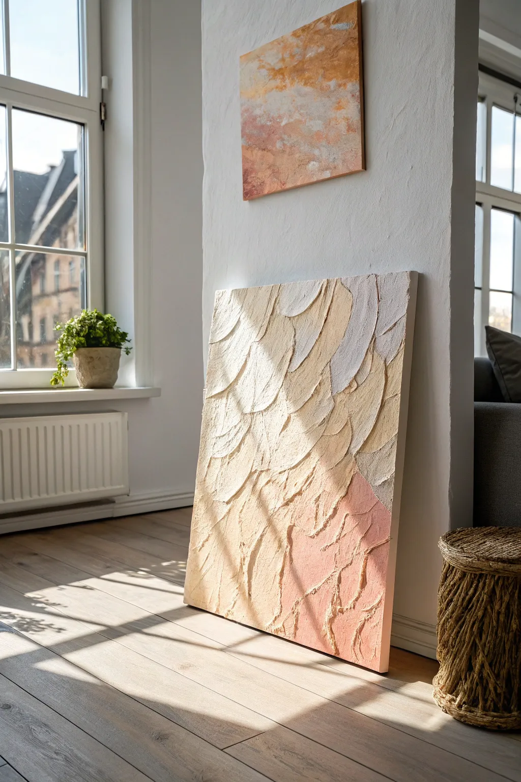
Oversized Botanical Leaf Study
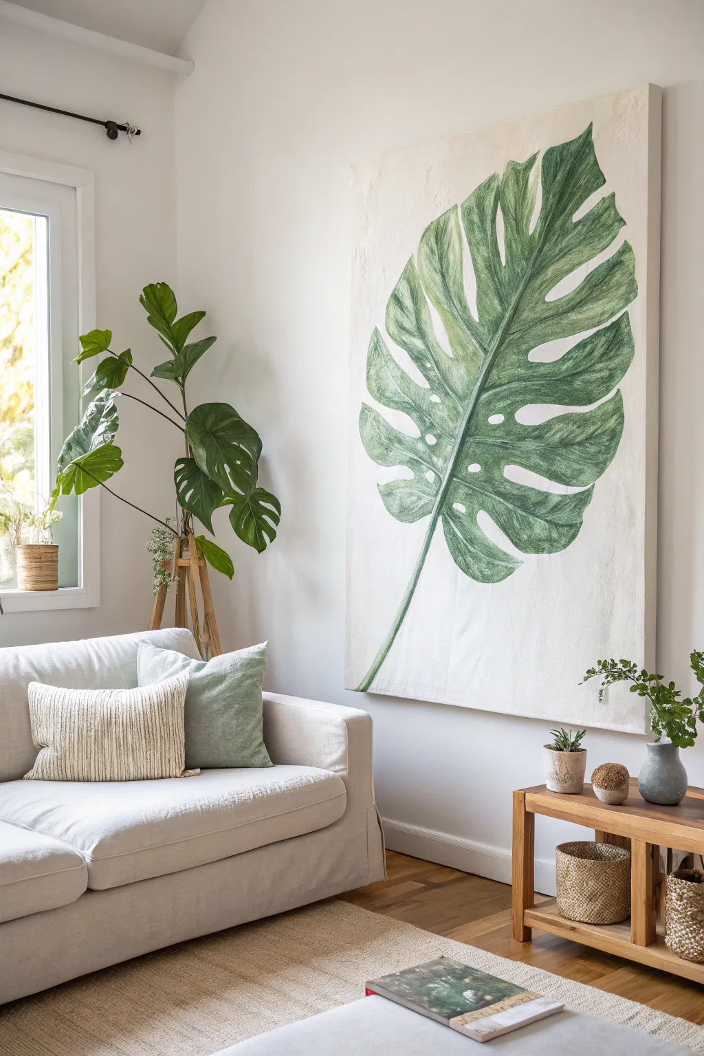
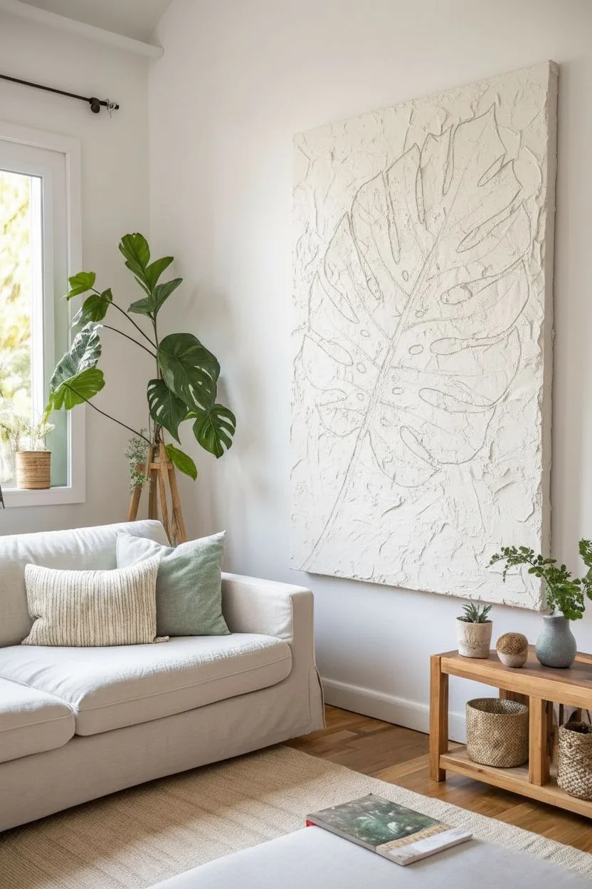
Transform a large blank canvas into a stunning focal point with this oversized botanical study of a monstera leaf. The piece features a textured, off-white background that mimics vintage botanical paper, contrasted with varying shades of forest green to create depth and dimension.
Detailed Instructions
Materials
- Large stretched canvas (at least 36×48 inches)
- White gesso
- Modeling paste (optional for extra texture)
- Acrylic paints: Titanium White, Unbleached Titanium, Sap Green, Hooker’s Green, Burnt Umber, Yellow Ochre
- Large flat brush (2-3 inch) for background
- Medium filbert brush (size 10-12)
- Small round brush (size 4) for details
- Pencil and eraser
- Palette knife
- Water container and paper towels
Step 1: Prepping and Sketching
-
Texture the background:
Mix white gesso with a small amount of Unbleached Titanium and a dollop of modeling paste if you have it. Apply this mixture unevenly across the entire canvas using a palette knife or large brush to create a subtle, plaster-like texture. -
Let it cure:
Allow the textured background to dry completely. This creates that lovely, aged-wall look seen in the inspiration image. -
Draft the central vein:
Using a pencil, draw a long, slightly curved line starting from the bottom left corner and extending diagonally toward the top right. This will be the main spine of your leaf. -
Outline the leaf shape:
Sketch the large, heart-shaped perimeter of the leaf around your central vein. Keep it loose and organic; nature isn’t perfectly symmetrical. -
Add the fenestrations:
Draw the signature deep splits (indentations) coming in from the edges toward the center. Add a few oval holes (fenestrations) near the central vein, particularly in the wider sections of the leaf.
Step 2: Painting the Base Layers
-
Mix your base green:
Create a mid-tone green by mixing Sap Green with a touch of Yellow Ochre and White. You want a natural, leafy hue rather than a bright artificial green. -
Block in color:
Using your medium filbert brush, fill in the leaf shape with your base green. Don’t worry about perfect coverage; letting some brushstrokes show adds character. -
Establish the veins:
While the paint is wet or just tacky, re-define the central vein using a lighter mix (Yellow Ochre + White). Paint smaller veins branching out from the spine into each leaf segment. -
Dry time:
Let this base layer dry completely before moving on to shading. This prevents your colors from turning into mud.
Pro Tip: Vintage Background
To get that aged botanical chart look, dry brush a little watered-down Burnt Umber mixed with glazing medium around the very outer edges of the canvas background.
Step 3: Adding Depth and Detail
-
Mix shadow tones:
Create a deep shadow green by mixing Hooker’s Green with a tiny bit of Burnt Umber. This dark color will bring the leaf to life. -
Apply shading:
Paint this dark green along the edges of the central vein and in the ‘valleys’ between the smaller veins. I find it helpful to imagine the leaf is slightly rippled to guide where shadows naturally fall. -
Feather the shadows:
Use a slightly damp, clean brush to gently feather the edges of your dark paint, blending it softly into the lighter mid-tone green. -
Highlight the ridges:
Mix a pale, minty green using White and a speck of Sap Green. Dry-brush this color onto the ‘high points’ of the leaf sections between the veins to simulate light hitting the curved surface. -
Detail the stem:
Paint the stem at the bottom using a gradient. Start with a lighter green near the leaf base and transition to a brownish-green using Burnt Umber at the very bottom where it would attach to the plant.
Troubleshooting: Flat Leaf
If your leaf looks too 2D, you likely need more contrast. Don’t be afraid to go almost black-green in the deepest crevices and nearly pure white on the highest ridges.
Step 4: Final Refinements
-
Refine the edges:
Use your background color (Unbleached Titanium mix) and a small brush to clean up the outer edges of the leaf, sharpening the tips and smoothing any errant green strokes. -
Enhance texturing:
For a painterly look, add very thin, scratchy lines of lighter green following the direction of the veins. This mimics the fibrous texture of a real monstera leaf. -
Final contrast check:
Step back from the canvas. If the leaf looks flat, deepen the darkest shadows right next to the lightest veins to increase the pop.
Hang your oversized masterpiece in a well-lit spot to enjoy the calming, botanical atmosphere it brings to the space
Black-and-White Brushstroke Drama
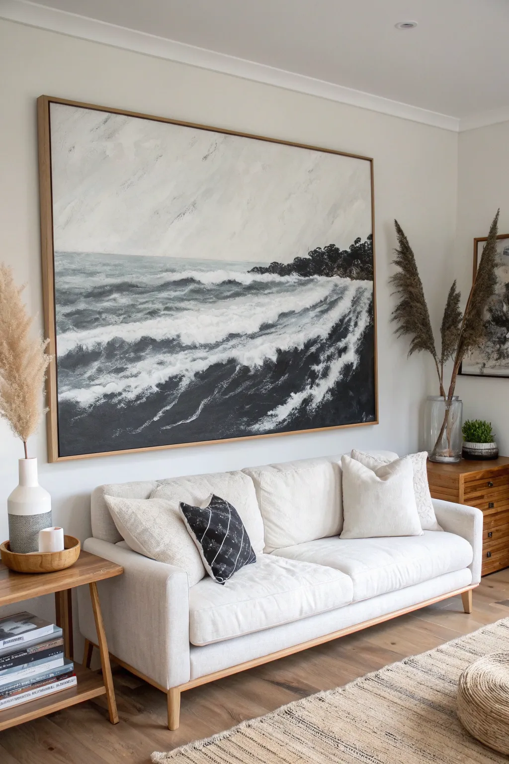
Capture the raw power of a stormy sea with this impressive large-scale canvas project that relies on expressive brushwork rather than fine detail. The striking contrast between deep charcoal waters and frothy white waves creates a moody, sophisticated focal point perfect for a modern living room.
Step-by-Step Tutorial
Materials
- Large canvas (at least 36×48 inches)
- Acrylic paints (Titanium White, Mars Black, Payne’s Gray, Raw Umber)
- Wide flat brush (3-4 inch) for background blending
- Medium round brush for details
- Palette knife (optional, for texture)
- Water spray bottle
- Mixing palette or paper plates
- Easel or drop cloth for floor work
- Rags or paper towels
Step 1: Setting the Atmosphere
-
Prepare the Sky Tone:
Begin by mixing a large amount of Titanium White with a tiny touch of Payne’s Gray. You want a very pale, overcast grey color that is almost white but has visible depth. -
Paint the Upper Canvas:
Apply this pale mixture to the top third of your canvas using your widest flat brush. Use broad, sweeping horizontal strokes that crisscross slightly to mimic the movement of clouds. -
Create Atmospheric Haze:
While the sky paint is still wet, introduce a slightly darker grey mix near the top corners and randomly throughout the sky area. Blend these softly with a clean, dry brush to create a misty, overcast effect. -
Establish the Horizon:
Determine your horizon line about one-third of the way down from the top. Paint a straight but soft line using a medium grey mix to separate the sky from the impending ocean.
Dry Brush Technique
For realistic sea foam, don’t use water on your brush. Load a small amount of thick paint and drag it lightly over the canvas weave to create natural, broken textures.
Step 2: Deep Waters & Coastline
-
Mix the Deep Ocean Color:
Combine Mars Black, Payne’s Gray, and a hint of Raw Umber to create a deep, complex dark shade. This won’t be pure black, but a rich, stormy charcoal. -
Block in the Dark Sea:
Fill the bottom two-thirds of the canvas with this dark mixture. Don’t worry about perfect coverage; letting some canvas texture show through adds to the rugged look. -
Paint the Distant Coast:
On the right side of the horizon line, dab in a rugged shape using your darkest black mixture to represent a protruding headland or rocky coastline. Keep the edges jagged to suggest trees and rocks. -
Soften the Transition:
Where the dark water meets the paler sky at the horizon, use a slightly damp brush to blur the line just a fraction. This pushes the horizon back into the distance.
Step 3: Creating the Waves
-
Map the Wave Direction:
Visualize the waves rolling in diagonally from the left towards the rocky coast on the right. Usually, I like to lightly sketch these flow lines with a piece of chalk before painting, just to get the motion right. -
Layer the First Whitecaps:
Load your medium brush with pure Titanium White. Paint the crests of the waves following your diagonal flow. Use quick, choppy strokes to simulate breaking water. -
Build the Foam patterns:
dragging the white paint downwards from the crests into the dark water area. Allow the brush to run dry as you pull down, creating a scumbled, foamy texture that fades into the darkness. -
Add Turbulence:
In the foreground (bottom left), create more chaotic splashes. Use a stippling motion or dab the brush vigorously to create the look of churning water where waves are crashing. -
Refine the Coastline Waves:
Paint white wash rushing up against the dark rocky headland on the right. Ensure the white paint ‘climbs’ slightly up the dark shapes to look like splashing impact.
Add Metallic Glint
Mix a tiny drop of metallic silver or pearlescent medium into your white paint for the final highlights. It catches the light like wet water without being overly glittery.
Step 4: Textures and Highlights
-
Intensify Highlights:
Go back over the brightest parts of the waves—the very tops of the crests—with thick, unmixed Titanium White. A palette knife works wonders here to lay the paint on thickly for actual 3D texture. -
Add Sea Spray:
Dilute a small amount of white paint with water. Load a stiff brush and flick the bristles with your thumb to splatter tiny droplets of ‘spray’ over the turbulent areas. -
Deepen the Shadow:
Look for areas under the white wave crests that need more contrast. Glaze a thin layer of pure black right underneath the white foam to make the waves pop forward. -
Final Blending:
Step back and view the painting from a distance. If any wave transitions look too sharp or cartoonish, use a dry brush to gently feather the edges of the foam into the dark water. -
Seal the Work:
Once fully dry (give it at least 24 hours due to the thick paint), apply a satin varnish to protect the surface and unify the sheen of the darks and lights.
Hang your dramatic seascape in a well-lit area where the textures can catch the light and bring the storm to life


Textured Palette Knife Abstract
Bring the serene warmth of desert dunes into your living space with this highly textured abstract piece. Using heavy modeling paste and soft, earthy tones, you’ll create sweeping, scalelike strokes that catch the light beautifully.
Step-by-Step Tutorial
Materials
- Large gallery-wrapped canvas (24×30 or larger)
- Heavy body acrylic paints (Titanium White, Unbleached Titanium, Yellow Ochre, Burnt Sienna, Napthol Red Light)
- Modeling paste (also known as molding paste)
- Large palette knife (trowel shape with a rounded tip)
- Disposable palette or large plastic plate
- Gesso (optional, for priming)
- Drop cloth
Step 1: Preparation & Base Texture
-
Prepare the workspace:
Lay down your drop cloth. This project uses a significant amount of paste, so ensure your surface is protected. If your canvas isn’t pre-primed, apply a coat of gesso and let strict. -
Mix the texture medium:
Scoop a generous amount of modeling paste onto your palette. It should be the consistency of thick frosting. We are going to mix our base color directly into the paste to save time and ensure even coverage. -
Create the base cream tone:
Mix a large dollop of Unbleached Titanium and a touch of Titanium White into the modeling paste. You want a very pale, warm off-white color. Ensure it is fully incorporated so there are no clear streaks of medium left. -
Apply the first layer:
Using your large palette knife, apply a thin, flat layer of this cream mixture over the entire canvas. This doesn’t need texture yet; it simply covers the white canvas weave so no gaps show through later.
Step 2: Color Mixing
-
Mix the sand beige:
On your palette, create a new pile of modeling paste. Mix in Unbleached Titanium with a tiny dot of Yellow Ochre to create a warm, sandy beige. -
Mix the terracotta pink:
Create a third pile of paste. Add a very small amount of Napthol Red Light and Burnt Sienna, then temper it with plenty of White. You are aiming for a soft, desaturated terracotta or dusty clay pink. -
Mix the accent white:
Prepare a final small pile of paste mixed only with pure Titanium White for bright highlights.
Knife Angle Matters
Keep the knife at a low angle (almost flat) to glide over the surface. A steep angle will scrape paint off instead of laying it down.
Step 3: Applying The Texture
-
Start at the top:
Begin at the top left corner. Load the bottom of your palette knife generously with the cream-colored paste mixture. -
Create the stroke shape:
Press the knife flat against the canvas and pull downwards in a curved, ‘U’ or ‘C’ shape. Lift the knife away at the end of the stroke to leave a raised ridge of paste. -
Build the pattern:
Repeat this motion, overlapping the strokes slightly like roof shingles or fish scales. Vary the pressure; deeper pressure creates flatter areas, while lighter pressure leaves more bulk texture. -
Introduce the beige:
As you move toward the middle right section of the canvas, switch to your sandy beige mixture. Don’t clean the knife perfectly between colors; blending them on the canvas creates a lovely natural transition. -
Add accent strokes:
In the upper right quadrant, intersperse a few strokes of the pure white paste. This adds dimension and mimics the look of sun hitting the textured ridges. -
Transition to pink:
As you work your way down to the bottom right corner, begin picking up the terracotta pink mixture. Apply these strokes in the same sweeping, curved motion. -
Blend the zones:
I like to go back and add a few pink strokes into the cream area, and cream strokes into the pink area, just to keep the composition cohesive and organic. -
Maximize the ridges:
Check your work from the side. The beauty of this piece relies on the shadows cast by the ridges. If an area looks too flat, scoop up more paste and lay a fresh, thick stroke right on top.
Add Metallic Sheen
Once fully dry, dry-brush a tiny amount of pale gold metallic paint lightly over just the highest ridges for a sun-kissed glint.
Step 4: Finishing Touches
-
Modify edges:
Use the edge of your knife to gently scrape or roughen any strokes that look too perfect or manufactured. The goal is a rustic, earthen feel. -
Clean the sides:
Use your knife to smooth any excess paste around the edges of the gallery-wrapped canvas so it looks neat when hung unframed. -
Extended drying time:
Because the paste is applied thickly, let the painting dry flat for at least 24-48 hours. Do not stand it up vertically until the thickest peaks are firm to the touch.
Hang your new textured masterpiece in a spot with natural side-lighting to really make those dramatic ridges pop
Raised Plaster Arches
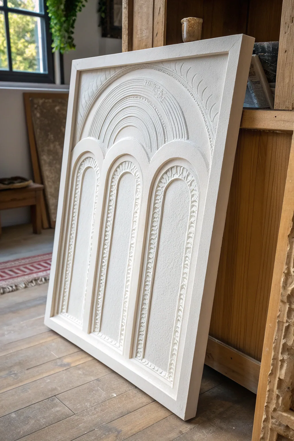
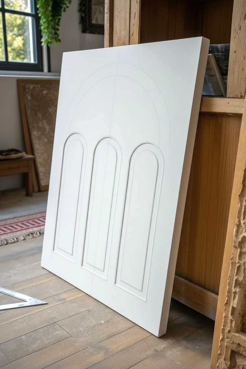
Elevate your living space with this sophisticated monochromatic artwork that relies on texture rather than color. By layering joint compound or plaster over a simple sketched design, you can create a dimensional illusion of architectural arches that brings a modern-organic feel to any wall.
Step-by-Step
Materials
- Large wooden panel or heavy-duty canvas (24×36 or larger)
- Joint compound or pre-mixed finishing plaster
- Gesso primer
- Pencil and large ruler/straightedge
- Compass tool for large circles (or string and tack)
- Piping bag with medium round tip
- Palanquin knife or 3-inch putty knife
- Fine-grit sandpaper (220 grit)
- Matte white acrylic paint or chalk paint
- Wide flat paintbrush
- Small carving tools or dental picks (optional)
Step 1: Drafting the Design
-
Prepare the Surface:
Begin by applying a coat of gesso to your wooden panel or canvas to ensure a grippy surface. Let it dry completely. -
Mark the Centerline:
Using your ruler, lightly draw a vertical line down the exact center of the board. This will be the anchor for your symmetry. -
Draft the Lower Arches:
Measure and draw three equal rectangular boxes for the lower arches. Use your compass to top each rectangle with a perfect semi-circle. -
Create the Upper Arch:
Position the point of your compass on the central vertical line, slightly above the lower arches. Draw a large, sweeping semi-circle that encompasses the width of the three lower arches. -
Add Depth Lines:
Sketch inner outlines inside all your arches—about half an inch inward—to guide where the raised decorative ridges will go.
Cracking Plaster?
Hairline cracks are normal as compound dries. Mix a tiny bit of water into fresh paste and rub it into the cracks with your finger, then sand smooth once dry.
Step 2: Building the Texture
-
Apply the Base Layer:
Scoop a generous amount of joint compound onto the panel. Use the putty knife to spread a smooth, even base layer about 1/8 inch thick over the entire negative space (outside the arches). -
Define the Shapes:
Carefully smooth the compound inside the arch shapes, keeping the layer slightly thinner here to create a subtle recessed look. -
Pipe the Arch Borders:
Fill your piping bag with joint compound. Make sure the consistency is like thick frosting. Pipe a steady, thick line along the main outlines of your three lower arches. -
Pipe the Upper Arch:
Continue piping the large over-arching curve at the top. You may want to pipe two or three concentric lines here to create that stepped architectural look. -
Flatten the Ridges:
Wait about 10–15 minutes for the piped lines to firm up just slightly. Gently run a damp finger or a small palette knife over the rounded tops to flatten them into clean, raised ribbons.
Pro Tip: Piping Ease
If the joint compound feels too stiff to pipe smoothly, mix in a teaspoon of white acrylic paint. It softens the texture without making it runny.
Step 3: Carving Details & Finishing
-
Add Decorative Tooling:
While the compound is still pliable but not wet, use a small carving tool or the back of a paintbrush to press repeating angled hash marks or ‘leaf’ shapes into the piped ridges. -
Create the Top Texture:
For the large top arch, use a comb tool or the tines of a fork to drag curved lines through the wet plaster, creating the striated rainbow effect seen in the reference. -
Full Dry Time:
Let the piece dry for at least 24 hours. I usually place it flat in a warm room to prevent sliding. Thick distinct ridges might need up to 48 hours. -
Sand Imperfections:
Once bone dry, take your fine-grit sandpaper and very gently smooth down any sharp peaks or unwanted crumbly bits. Wipe away the dust with a dry cloth. -
Final Coat:
Paint the entire piece with matte white acrylic or chalk paint. This seals the porous compound and unifies the texture and the background color.
Hang your architectural relief in a spot with side-lighting to truly show off those beautiful shadows
Metallic Accent Split Canvas
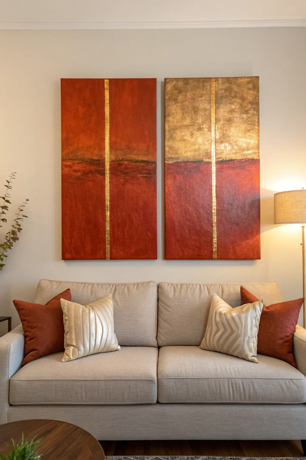
Bring warmth and sophistication to your living space with this striking diptych that combines rich rust tones with luxurious gold leaf. The vertical metallic accent acts as a unifying thread between the two canvases, creating a modern yet timeless focal point.
Step-by-Step Tutorial
Materials
- Two large rectangular stretched canvases (e.g., 24×48 inches)
- Acrylic paints: Burnt Sienna, Red Oxide, Raw Umber, Titan Buff (or Unbleached Titanium), and Metallic Gold
- Gold leaf sheets and gilding adhesive (sizing)
- Painter’s tape (1-inch width)
- Large flat paint brushes (2-3 inches)
- Medium round brush
- Soft gilding brush or makeup brush
- Palette or paper plates for mixing
- Sealant or varnish (gloss or satin finish)
- Rags or paper towels
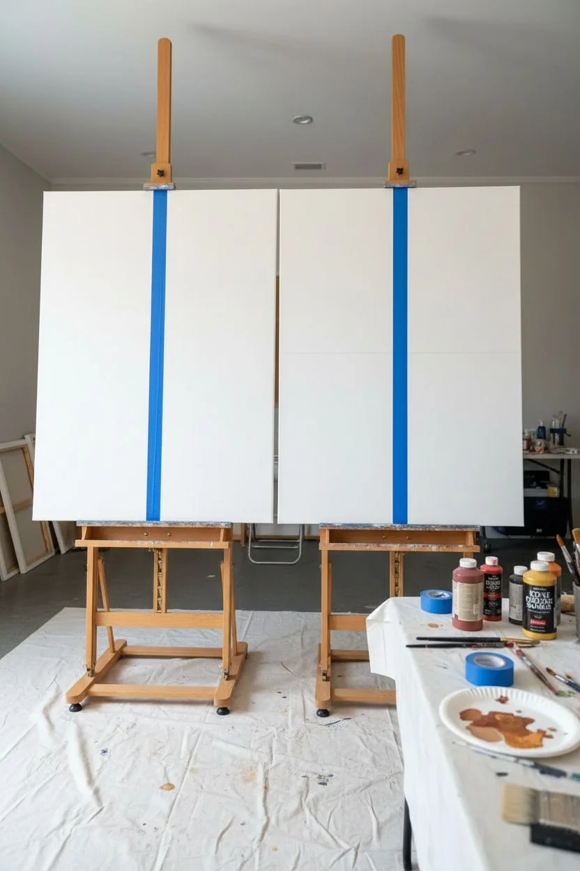
Step 1: Preparation & Base Layout
-
Prepare the workspace:
Lay down drop cloths or old newspapers to protect your floor. Set up both canvases side-by-side on easels or flat on the floor to ensure the designs align perfectly across the gap. -
Tape the vertical line:
Measure exactly halfway across the width of each canvas. Run a strip of painter’s tape vertically from the top edge to the bottom edge of each canvas. This reserved space will later become the gold stripe. -
Define the horizon line:
Decide where your horizontal division will be. In the example, it sits at about the 1/3 mark from the top on the right canvas, and slightly lower on the left. Lightly sketch this line with a pencil or mark it with a small piece of tape as a guide.
Sticky Situation
Gold leaf is incredibly light and will fly away with the slightest breeze. Turn off ceiling fans and close windows before opening your packet of leaf sheets.
Step 2: Painting the Texture
-
Mix the rust tones:
On your palette, mix Red Oxide with a touch of Burnt Sienna to create a deep, earthy red. Prepare a second pile where you mix this red base with a little Raw Umber for the darker, shadowy sections. -
Apply the base coat (Lower Section):
Using a large flat brush, apply the Red Oxide mixture to the bottom 2/3 of both canvases. Use vertical strokes to create a subtle texture, but don’t worry about perfect coverage yet; layering adds depth. -
Add depth and shadows:
While the paint is still slightly wet, blend in the darker Raw Umber mixture near the ‘horizon’ line you marked earlier. This creates a moody, landscape-like effect. -
Paint the upper section (Left Canvas):
For the top of the left canvas, mix Red Oxide with a bit of Titan Buff to lighten it. Paint the upper section, blending it softly into the darker horizon line below. -
Paint the upper section (Right Canvas):
The right canvas features a distinct gold upper section. Paint this area with a base coat of Metallic Gold acrylic paint. This acts as an underpainting for the gold leaf later, ensuring no white canvas shows through. -
Create the horizon detail:
Dip a medium round brush into pure Raw Umber. Paint an irregular, horizontal line where the top and bottom sections meet on both canvases. Feather this dark line downward slightly to suggest depth and separation. -
Add texture with a rag:
While the red sections are tacky, I find lightly dabbing the surface with a crumpled dry rag creates a beautiful, mottled stone-like texture that makes the piece look more expensive. -
Let it dry:
Allow the acrylic paint to dry completely. This usually takes about 1-2 hours depending on how thick your application was.
Level Up: Texture Pop
Mix modeling paste into your acrylic paint for the red sections. Apply it with a palette knife for a heavy, impasto texture that contrasts beautifully with the smooth gold.
Step 3: Gilding the Accents
-
Reveal the strip:
Carefully peel away the vertical painter’s tape from both canvases. reveal the clean white canvas underneath. -
Apply sizing:
Brush a thin, even layer of gilding adhesive (sizing) onto the exposed white vertical strip. Also apply sizing to the entire upper gold-painted section of the right canvas. Let it sit until it gets tacky (usually 15-20 minutes). -
Apply gold leaf:
Gently lay the gold leaf sheets over the tacky distinct areas. The vertical strips and the large upper block on the right canvas should be fully covered. Don’t worry if the sheets overlap; this adds character. -
Burnish the gold:
Use a soft, dry brush to gently rub the gold leaf into the adhesive. This process, called burnishing, smooths out the metal and adheres it firmly. -
Remove excess leaf:
Brush away the loose flakes of gold leaf that didn’t stick. Save these flakes in a jar for future smaller projects. -
Distress the gold (Optional):
If the gold looks too perfect, lightly scuff it with a dry, coarse brush to let a tiny bit of the underpainting show through, matching the rustic vibe of the red sections.
Step 4: Finishing Touches
-
Seal the artwork:
To prevent the gold leaf from tarnishing and to protect the acrylics, apply a coat of clear varnish over the entire surface of both canvases. -
Final inspection:
Stand the canvases next to each other again to ensure the horizon lines and colors flow logically from one piece to the next before hanging.
Hang your shiny new masterpieces with a slight gap between them to complete this modern gallery wall look
Stenciled Arch Color Layers
Bring warmth and modern geometry to your space with this layered arch painting featuring soothing earth tones and a lovely textured finish. The stacked design creates visual height while the distressed application adds a cozy, lived-in feel perfect for a relaxing living room corner.
Step-by-Step Guide
Materials
- Large stretched canvas (at least 24×36 inches)
- Acrylic paints (terracotta, mustard yellow, sage green, blush pink, cream/white, gold)
- Pencil and eraser
- Protractor or large compass (DIY string compass works too)
- Painter’s tape or stencil film
- Flat shader brushes (medium and large)
- Natural sponge or stenciling brush
- Ruler or straight edge
- Palette for mixing
- Medium-grit sandpaper
Step 1: Planning and Sketching
-
Prepare the canvas:
Start with a clean canvas. If you want that specific textured background look, paint the entire canvas with a mix of white and a tiny drop of cream to warm it up. Let this base coat dry completely. -
Mark the center line:
Use your ruler to find the exact vertical center of the canvas. Draw a very faint vertical line from the bottom edge up to where you want the highest arch to peak. This will ensure your arches stay perfectly aligned. -
Draft the bottom arch:
Measure the desired width of your bottom arch. Mark the start and end points equidistant from your center line. Use a compass (or a string tied to a pencil) to sketch the semi-circle top. Use a ruler to extend the sides straight down to the ‘horizon’ line of the arch. -
Draft the middle arch:
Move up the canvas to draw the middle arch. It should be slightly wider than the bottom one to create a tiered effect. Leave a small gap (about 1/2 inch) between the top of the bottom arch and the legs of this middle arch. -
Draft the top arch:
Finally, sketch the top arch. This one is often the tallest or widest to cap off the composition. Ensure the spacing between this tier and the one below matches the gap you left previously for a cohesive look. -
Detail the inner bands:
Within each main arch shape, lightly sketch parallel lines to create the inner bands or rainbows. Vary the thickness—some bands can be thick and bold, while the innermost semicircle can be solid.
Step 2: Painting and Texturing
-
Mix your palette:
Prepare your colors. You want earthy, muted tones. Mix burnt sienna with white for terracotta; add a touch of brown to yellow for mustard; and desaturate your green with a little grey or red. -
Paint the top outer arch:
Start with the outermost band of the top arch using the terracotta mix. Use a flat brush for the crisp edges, but apply the paint somewhat sparingly to let the canvas texture show through slightly. -
Fill the top inner bands:
Continuing on the top arch, paint the next inner band with a muted blush pink. For the small innermost semi-circle, mix a soft gold or beige. I like to keep my brush slightly dry here to avoid heavy globs of paint. -
Paint the middle arch layers:
Move to the middle tier. Use the mustard yellow for the large outer band. This brings a sunny contrast to the piece. Fill the subsequent inner bands with a lighter cream-yellow tone to create a gradient effect. -
Paint the bottom arch components:
For the bottom arch, use the sage green on the outer band to ground the artwork. Fill the inner sections with a mix of sandy beige or another stripe of the terracotta to tie the colors together. -
Create the distressed texture:
Once the initial layers are tacky but not fully wet, take a nearly dry sponge or a stippling brush with a tiny amount of white or cream paint. Lightly dab and drag it over the painted areas to create a weathered, vintage look. -
Refine the edges:
This style forgives imperfection, but if any edges are too messy, clean them up with a small brush and your background white color. The goal is ‘hand-painted’, not sloppy. -
Light sanding (optional):
If the paint looks too new and shiny after drying completely, take your medium-grit sandpaper and very gently scuff the surface in random patches. This enhances the rustic aesthetic. -
Seal the artwork:
Finish by applying a matte varnish spray over the entire canvas. This protects your work without adding an unwanted glossy sheen that would clash with the earthy vibe.
Dry Brush Secret
Load brush with paint, then wipe 80% off on a paper towel before hitting canvas. This creates that scratchy, textured look instantly.
Shaky Lines?
If painting curves freehand is difficult, use painter’s tape cut into small strips to guide your brush, or use a stencil film for crisp edges.
Hang your masterpiece in a prominent spot where its soothing curves can add a sense of balance to the room.
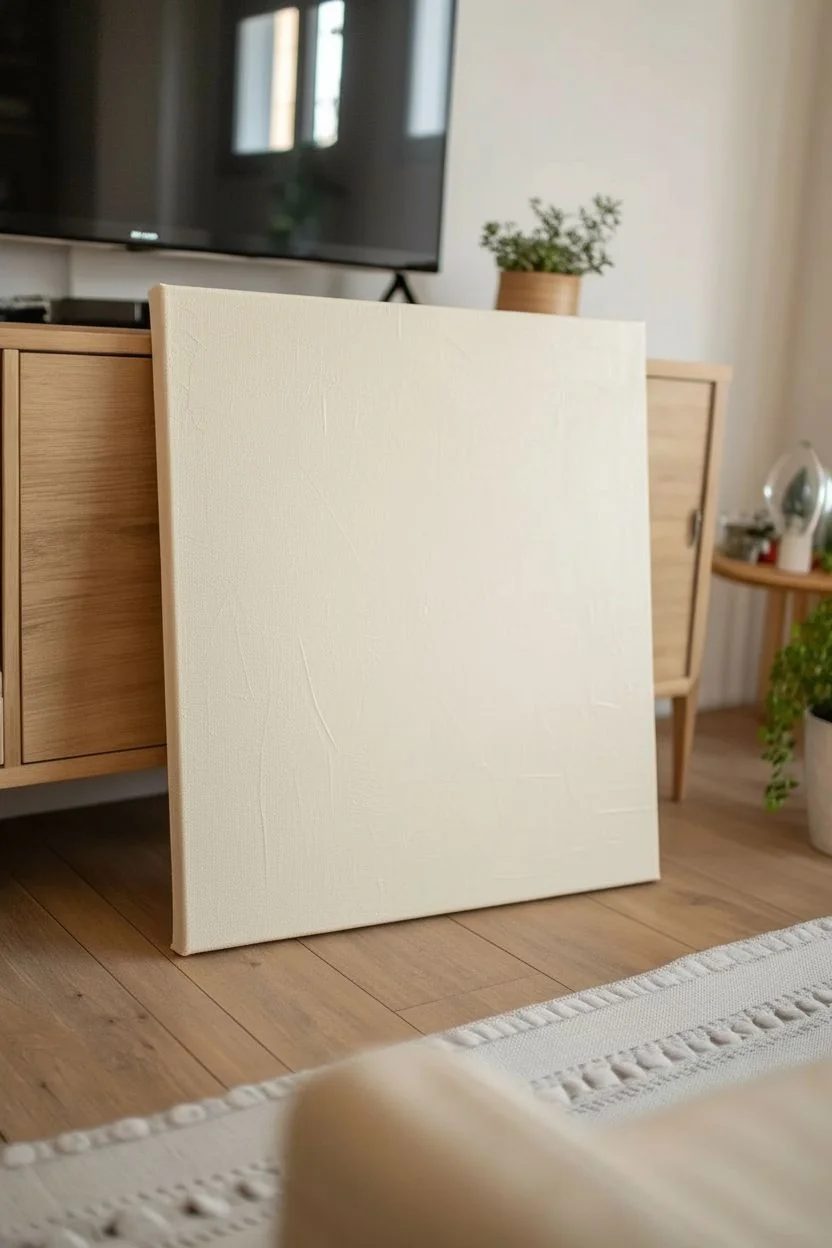
Typography Statement Canvas
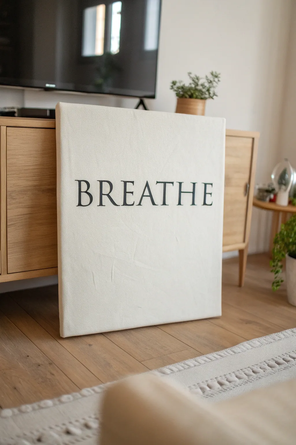
Bring a sense of calm to your living space with this clean, minimalist typography art. The stark contrast of bold serif lettering against a textured off-white background creates a modern focal point that serves as a gentle daily reminder to pause.
Step-by-Step
Materials
- Large stretched canvas (24×30 or similar)
- White gesso or acrylic primer
- Cream or off-white acrylic paint
- Carbon black acrylic paint
- Wide flat brush for background
- Small flat brush or angled shader brush for lettering
- Fine liner brush for detailing
- Printing paper
- Printer
- Pencil
- Graphite transfer paper (or charcoal)
- Painter’s tape
- Ruler or tape measure
Step 1: Preparing the Foundation
-
Base coat application:
Begin by applying a generous layer of white gesso to your canvas. I like to use crisscross strokes here rather than perfectly smooth lines to build up a subtle, tactile texture that adds character to the finished piece. -
Adding color warmth:
Once the gesso is fully dry, mix a small amount of cream acrylic into your white paint to create an off-white, linen-like tone. -
Painting the background:
Apply two coats of this off-white mixture to the entire canvas surface, ensuring you paint the sides for a professional, gallery-wrapped look. -
Drying time:
Allow the background to cure completely for at least 2-3 hours. If the paint is even slightly tacky, the transfer paper in the next phase might smudge the pristine surface.
Clean Edges Trick
For ultra-crisp lines on large letters, use thin masking tape or washi tape to outline the straight vertical stems before painting.
Step 2: Designing the Layout
-
Choosing the font:
Select a classic serif font such as Times New Roman, Garamond, or Baskerville on your computer. Type the word ‘BREATHE’ in all caps. -
Sizing the text:
Scale the text so it spans nearly the full width of your canvas, leaving about 2-3 inches of margin on either side. -
Printing the template:
Print the word out. Since it likely won’t fit on one standard page, print it across multiple sheets in ‘poster’ or ’tile’ mode. -
Assembling the stencil:
Trim the margins of your printed pages and tape the letters together securely to form one long continuous word strip. -
Centering the design:
Measure the canvas to find the exact vertical and horizontal center. Align your paper banner so the word sits perfectly in the middle. -
Securing the template:
Use painter’s tape to hinge the paper template to the top of the canvas so it doesn’t shift while you work.
Add Dimension
Mix a tiny amount of modeling paste into your black paint to give the letters a slight 3D raised texture against the flat canvas.
Step 3: Lettering and Finishing
-
Setting up the transfer:
Lift the paper flap and slide a sheet of graphite transfer paper underneath, dark side facing down onto the canvas. -
Tracing the outline:
Using a sharp pencil or ballpoint pen, firming trace the outline of every letter. Press hard enough to leave a mark, but not so hard that you dent the canvas. -
Revealing the guide:
Remove the tape, paper, and transfer sheet to reveal faint grey outlines of your text. -
Initial filling:
Load a small flat brush with carbon black acrylic paint. Carefully fill in the thickest vertical parts of the letters first, using smooth, confident downward strokes. -
Detailing the serifs:
Switch to a fine liner brush to paint the delicate serifs (the ‘feet’ of the letters) and the thin horizontal connectors. -
Refining edges:
Go back over any jagged edges with the liner brush to crisp up the lines. If you make a mistake, wait for it to dry and touch it up with the background cream color. -
Second coat:
Black paint can sometimes appear streaky on the first pass; apply a second layer to the letters once the first is dry for a solid, opaque finish. -
Final drying:
Let the artwork sit undisturbed overnight to ensure the thick paint is fully cured before hanging or leaning it.
Place your new artwork on a sideboard or hang it prominently to create a peaceful atmosphere in your home
Marbled Acrylic Pour Look
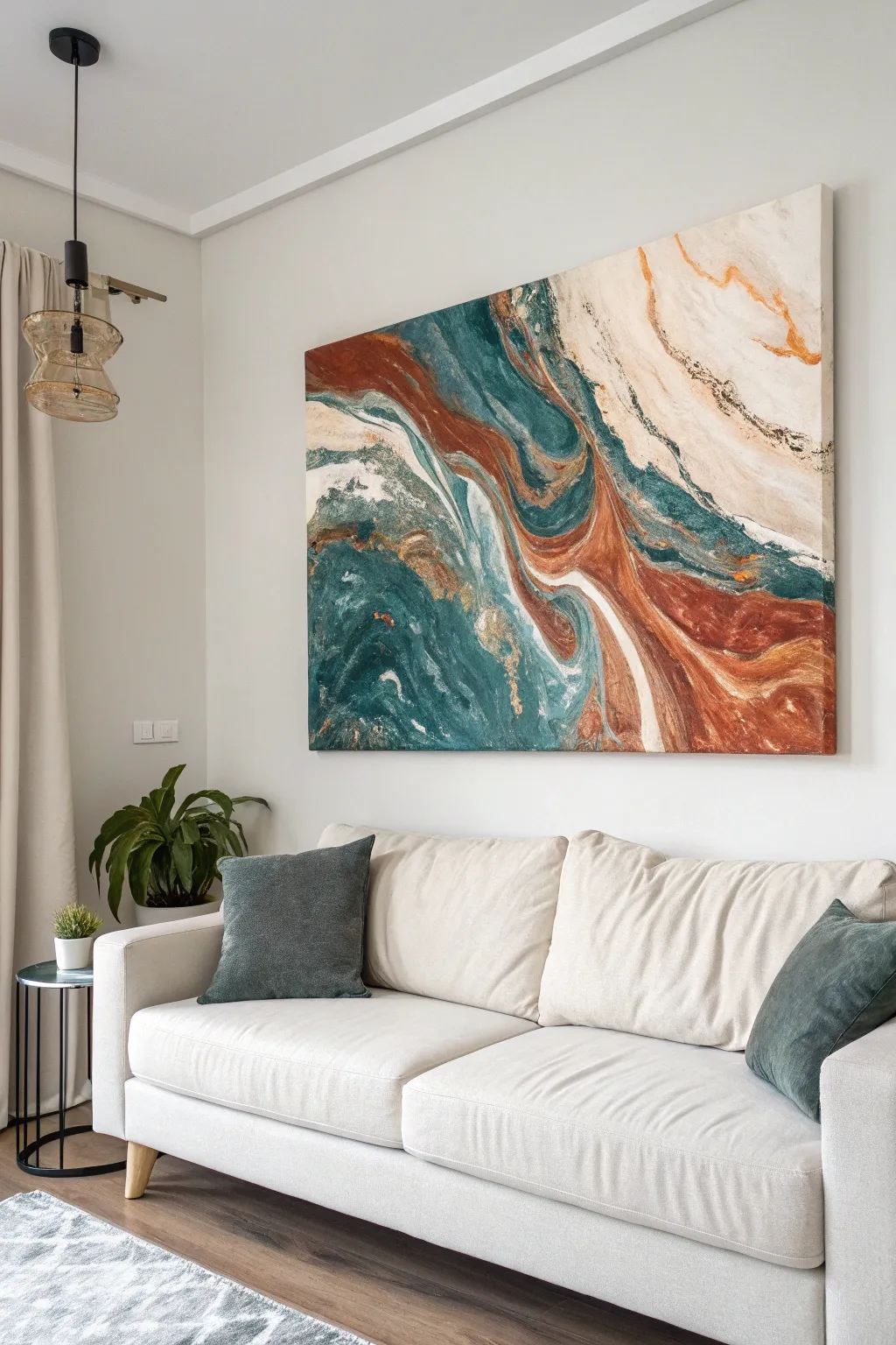
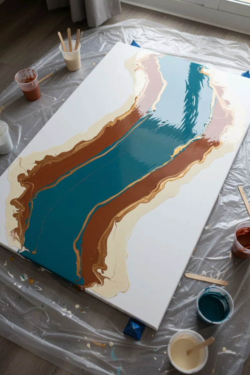
Recreate the swirling, organic beauty of geode slices and ocean currents on a grand scale with this fluid art technique. By manipulating acrylics with pouring medium and forced air, you’ll achieve those mesmerizing strata of teal, burnt sienna, and cream without needing masterful brush skills.
Detailed Instructions
Materials
- Large rectangular stretched canvas (approx. 36×48 inches)
- Acrylic paints: Teal/Turquoise, Burnt Sienna (rust), Parchment/Cream, White, and Gold Metallic
- Floetrol or dedicated Acrylic Pouring Medium
- Silicone oil (optional, for cells)
- Plastic cups for mixing
- Craft sticks for stirring
- Hair dryer (essential for moving paint)
- Plastic drop cloth or garbage bags
- Level
- Push pins or painter’s pyramids (to elevate canvas)
Step 1: Preparation and Mixing
-
Set the Stage:
Lay down your plastic drop cloth on a large, flat table or floor space. This process gets messy, so ensure you have ample room to work around all sides of the canvas. -
Elevate and Level:
Insert large push pins into the four back corners of your canvas frame or rest it on painter’s pyramids. Check with a level to ensure the canvas is perfectly flat; if it’s tilted, the design will slide off while drying. -
Prepare the Pouring Medium:
The key to this look is the consistency. In separate cups, mix your acrylic paints with the pouring medium. A standard ratio is 1 part paint to 2 parts medium, but check your specific medium’s instructions. -
Check Consistency:
Stir each color thoroughly. The mixture should flow like warm honey—pouring off the stick in a continuous stream without breaking, but not watery. Add small amounts of water if needed to thin it out. -
Add Metallic Accents:
Mix the gold paint separately. Metallic pigments are often heavier, so you might need slightly less water. I find adding 1-2 drops of silicone oil here helps create interesting separation.
Step 2: Creating the Composition
-
Base Layer Application:
Pour a generous amount of white or cream paint directly onto the canvas. Use a wide spatula or simply tilt the canvas to coat the entire surface thinly. This ‘wet canvas’ helps the colored paints glide easier. -
Pouring the Color Rivers:
Begin pouring your colors in diagonal, waving ribbon shapes across the canvas. Start with the darkest teal as a defining channel through the center. -
Layering Contrast:
Pour the burnt sienna next to the teal, allowing them to touch but not fully mix yet. The contrast between the cool blue and warm rust is central to this specific look. -
Adding Light:
Pour the cream and white mixtures around the edges of the darker colors. These lighter tones will act as the ‘negative space’ or marble veins. -
Metallic Highlights:
Drizzle fine lines of the gold mixture sparingly throughout the composition, focusing on the boundaries where colors meet.
Muddy Colors?
If your colors turn brown where they meet, you are over-mixing or the paint is too thin. Stop blowing immediately and let the paint settle; keep colors separate in future pours.
Step 3: Manipulation and Drying
-
The Air Pushing Technique:
Turn on your hair dryer to the ‘low’ setting with ‘cool’ air. Position the nozzle a few inches from the canvas and gently push the white/cream paint *over* the edges of the colored paints to soften the lines. -
Creating Waves:
Using the air, push the teal and rust colors outward and into each other. Use quick, sweeping motions to create those organic, rippled ‘fingers’ seen in the reference image. -
Refining Details:
If you see a section that looks too blocky, blow directly downwards to spread it out, or use a straw to blow smaller, precise details by mouth. -
Tilting for Flow:
Gently lift the canvas corners to tilt the artwork slightly. Let gravity stretch the pattern diagonally, elongating the shapes to mimic natural stone strata. -
Cleaning Edges:
Check the sides of the canvas. Use your finger to smooth out drips, ensuring the pattern wraps nicely around the edges for a professional gallery finish. -
The Wait:
Leave the canvas strictly undisturbed for at least 24-48 hours. Acrylic pours dry slowly, and moving it too soon can cause cracking or shifting. -
Sealing:
Once fully cured (after a few weeks), apply a gloss varnish to protect the paint and make the colors pop, giving it that polished rock appearance.
Add Texture
For a geode effect, sprinkle crushed glass or glitter along the gold veins while the paint is wet. This adds physical texture that catches light beautifully.
Hang your new masterpiece proudly as a stunning, abstract focal point for your living room.
Have a question or want to share your own experience? I'd love to hear from you in the comments below!