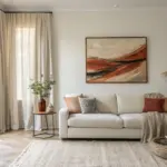
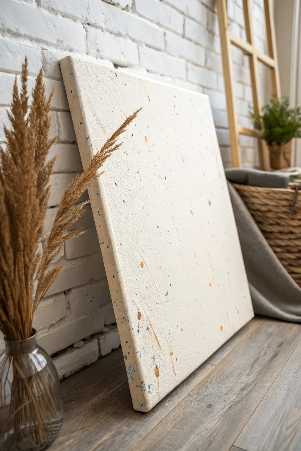
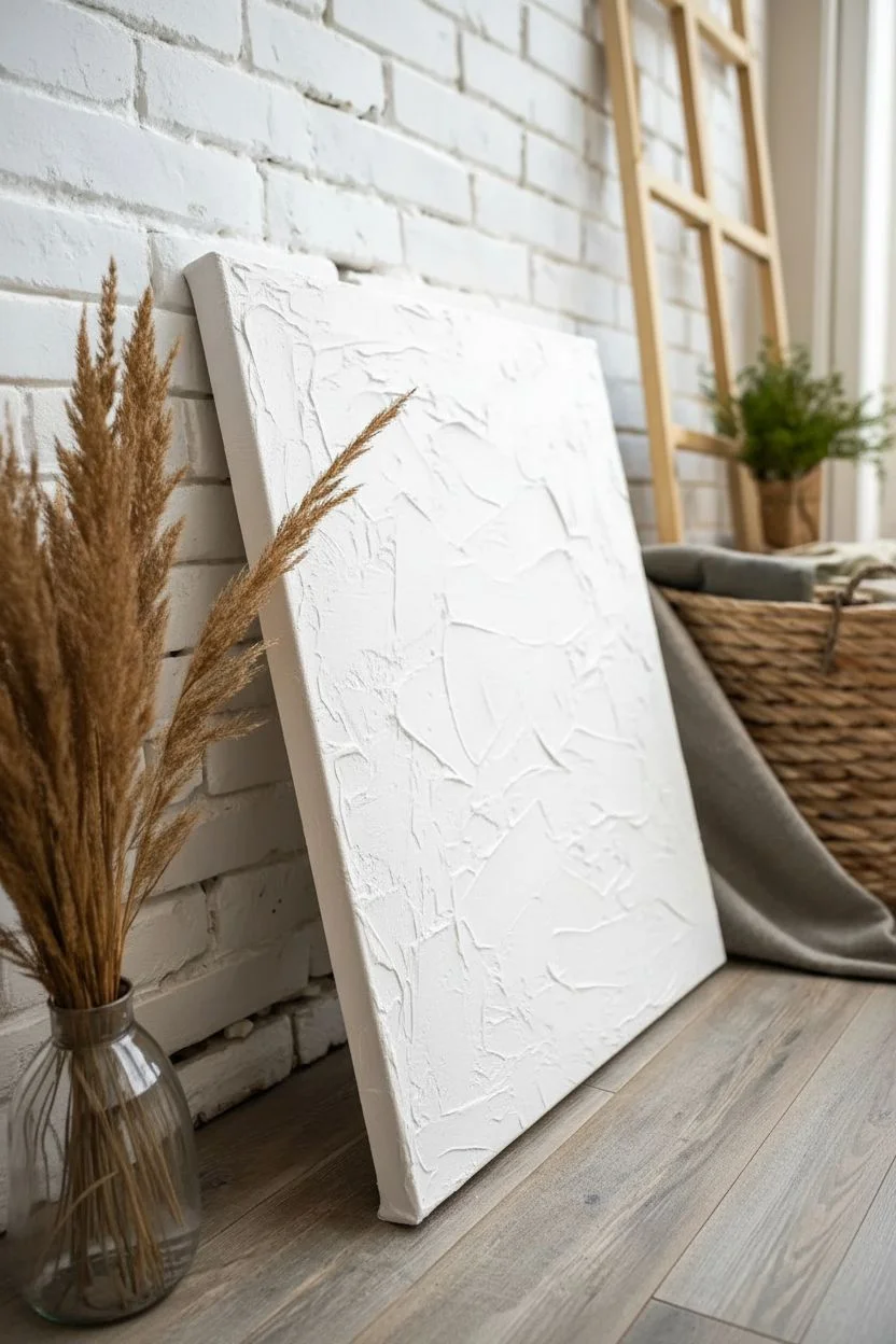
A good canvas background is like setting the mood before the main story starts—suddenly everything you paint on top feels more intentional. Here are my favorite canvas background ideas that fill the blank space fast and make your subject pop.
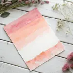
Simple Ombre Gradient Wash
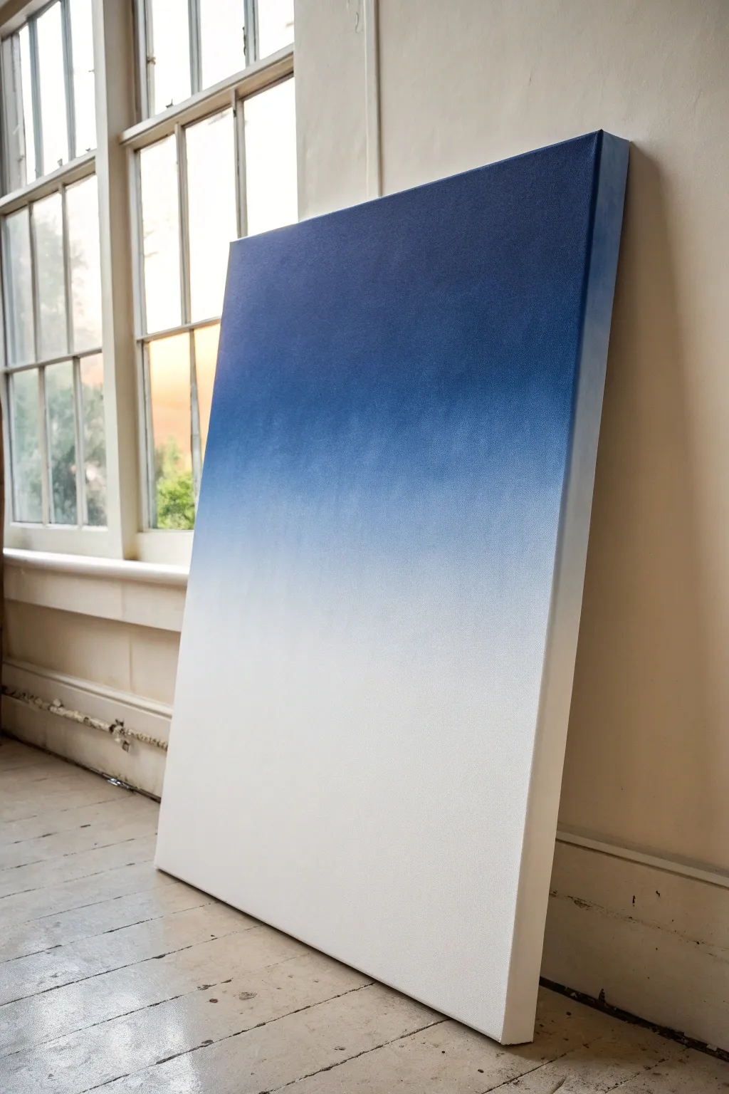
Recreate the serene beauty of the early morning sky with this minimalist ombre wash canvas. This project focuses on achieving a flawless, seamless transition from deep indigo to pure white, creating a modern statement piece for any room.
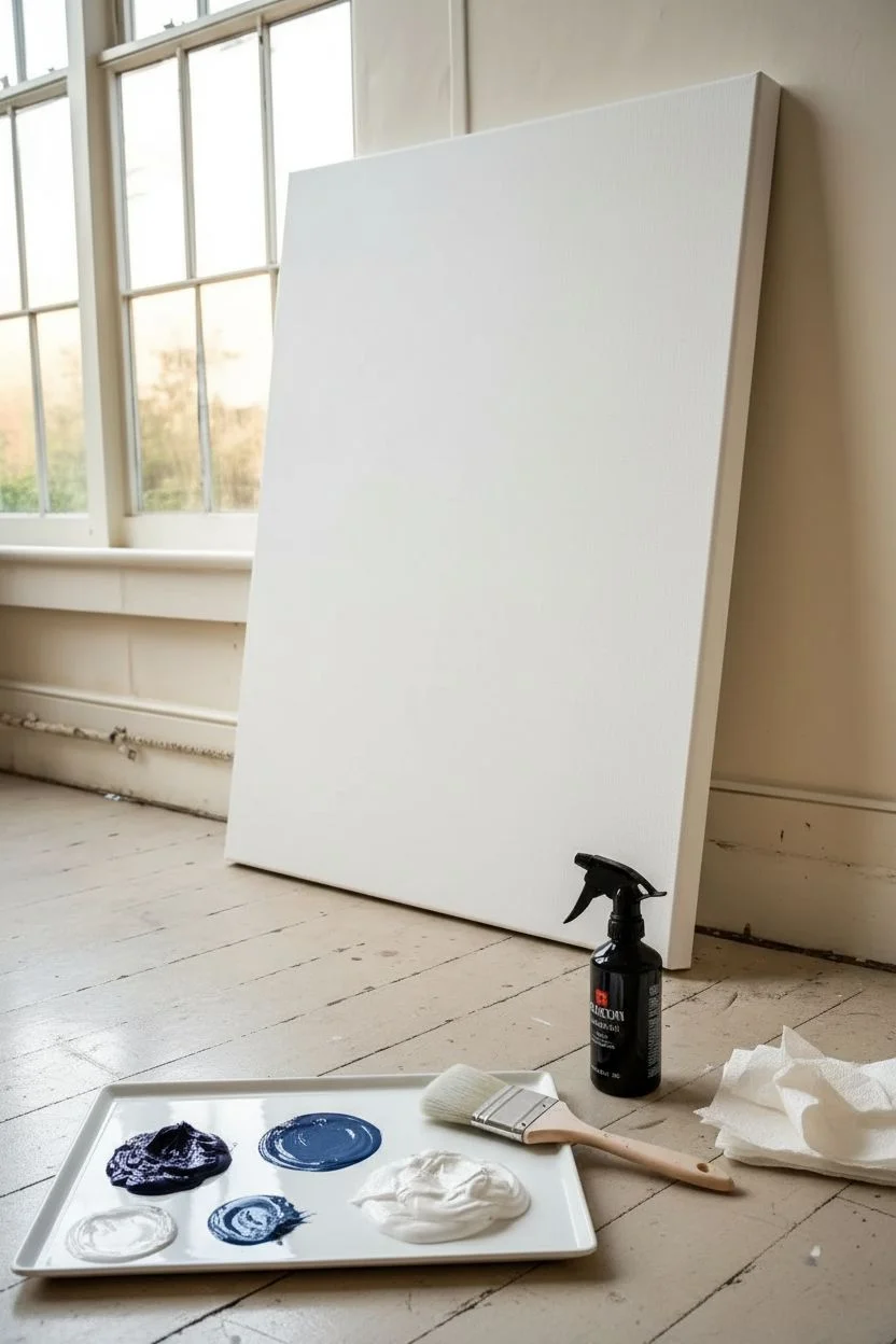
Detailed Instructions
Materials
- Large stretched canvas (e.g., 24×36 inches or larger)
- Gesso (white)
- Acrylic paint: Indigo or Phthalo Blue
- Acrylic paint: Titanium White
- Wide flat wash brush (2-3 inch)
- Large blending mop brush or soft synthetic brush
- Spray bottle with water (mister setting)
- Palette or disposable mixing plate
- Drop cloth
- Paper towels
Step 1: Preparation and Base Layer
-
Prime the Surface:
Begin by applying a fresh coat of white gesso to your entire canvas. Even if the canvas came pre-primed, this extra layer ensures a smooth, non-absorbent surface which is crucial for blending gradients. -
Let it Dry:
Allow the gesso to dry completely. If you want an ultra-smooth finish, you can lightly sand the surface with fine-grit sandpaper after it dries and wipe away the dust. -
Prepare Your Palette:
Squeeze out a generous amount of Indigo (or your chosen dark blue) and a separate, larger pile of Titanium White. You will need more white paint than you think to get that creamy, opaque bottom section. -
Pre-mix a Mid-tone:
To make blending easier later, mix a small amount of a mid-tone blue on your palette—roughly 50% dark blue and 50% white.
Sticky Situation?
If the paint starts dragging or peeling, stop! It’s drying. Let it dry completely, then mist slightly and apply a thinned glaze of color over the bad spot to fix it.
Step 2: Applying color
-
Dampen the Canvas:
Before painting, lightly mist the upper half of the canvas with your spray bottle. The surface should be damp but not dripping wet; this extends the drying time of acrylics. -
Apply the Darkest Tone:
Using your wide flat brush, load up the pure Indigo paint. Start at the very top edge of the canvas and paint horizontal strokes across the full width. -
Work Downwards:
Bring the dark color down about one-third of the way. Re-dip your brush as needed to keep the coverage solid and opaque. -
Paint the White Section:
Clean your brush thoroughly or switch to a clean one. Load it with pure Titanium White and paint the bottom third of the canvas, ensuring solid coverage right down to the bottom edge. -
Apply the Mid-tone:
In the empty middle strip between the blue and white, apply your pre-mixed mid-tone blue. Don’t worry about perfect blending just yet; just get the color on the canvas so all three zones touch.
Step 3: The Blending Process
-
Mist Again:
Give the area where the dark blue meets the mid-tone a very light mist of water. Acrylics dry fast, so keeping moisture on the surface is the secret to a smooth gradient. -
Blend the Upper Transition:
Take your dry, soft blending brush (or a clean wash brush). Using long, horizontal sweeping motions, work back and forth where the dark blue meets the mid-tone to blur the hard line. -
Clear Excess Paint:
Periodically wipe your blending brush on a paper towel. If the brush gets overloaded with paint, it will just drag color around rather than smoothing it. -
Blend the Lower Transition:
Move down to where the mid-tone meets the white. Use the same horizontal sweeping motion to marry these two sections. I find it helps to stroke slightly upward into the blue rather than dragging blue down into the pure white. -
Refine the Smoothness:
Step back and look for streaks. If you see any, very lightly mist that specific spot and gently feather it out with the soft brush using a light touch. -
Paint the Sides:
Don’t forget the edges of the canvas. Extend the gradient around the sides so the artwork looks finished from every angle, matching the blue top and white bottom. -
Final White Highlight:
If the bottom white section got a little muddy during blending, wait for it to dry, then apply a fresh, thin coat of pure Titanium White to the very bottom to brighten it back up.
Starry Night Twist
Once the blue gradient is totally dry, flick a toothbrush loaded with thinned white paint over the dark top section to create a subtle starry night effect.
Allow the canvas to dry vertically in a dust-free area before hanging your new atmospheric masterpiece


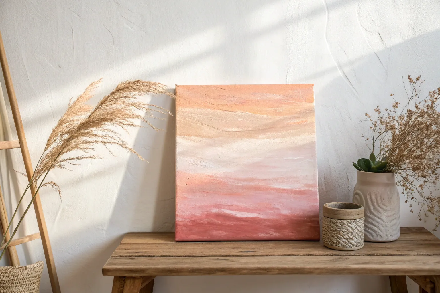
Two-Color Sky Blend Background
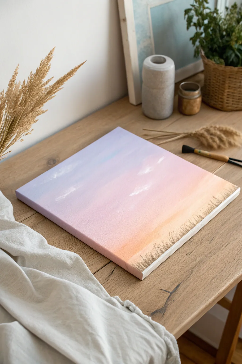
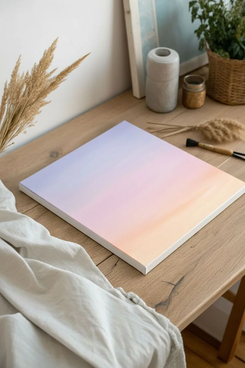
Capture the serene beauty of dusk with this gentle gradient painting that melts lavender into soft peach. This project focuses on mastering the wet-on-wet blending technique to create a seamless, cloud-streaked sky that looks professional but is surprisingly beginner-friendly.
Step-by-Step
Materials
- Square stretched canvas (approx. 12×12 inches)
- Acrylic paints: Titanium White, Lavender (or Light Purple), Soft Pink, Peach (or Light Orange), Black
- Large flat brush or wash brush (2-inch)
- Medium flat brush
- Small detail brush or liner brush
- Palette or paper plate
- Cup of water
- Paper towels
- Spray bottle with water (optional)
Step 1: Preparing the Gradient Base
-
Prepare your palette:
Squeeze out generous amounts of your three main sky colors: Lavender, Soft Pink, and Peach. You’ll need more white than the other colors to assist with blending. -
Moisten the canvas:
Before applying paint, lightly mist your canvas with water or use a damp, clean brush to wet the surface. This helps acrylics stay workable longer for smooth blending. -
Apply the top color:
Using your large flat brush, apply the Lavender paint across the top third of the canvas. Use long, horizontal strokes that go all the way from the left edge to the right edge. -
Add the middle tone:
Without washing your brush (unless it’s overloaded), pick up the Soft Pink paint. Apply this directly below the purple section, letting the colors slightly overlap. -
Blend the transition:
While both paint strips are still wet, work your brush back and forth horizontally where the pink and purple meet. If the transition is too harsh, add a tiny bit of white to your brush to soften the boundary. -
Apply the bottom color:
Wipe your brush on a paper towel to remove excess cool tones. Pick up the Peach paint and apply it to the bottom third of the canvas. -
Finalize the gradient:
Blend the Peach upward into the Pink section using long, consistent horizontal strokes. I find that working quickly here is key to preventing the acrylics from drying tacky before they are smooth. -
Paint the edges:
Don’t forget to wrap the colors around the sides of the canvas. Painting the edges gives the piece a finished look without needing a frame.
Fixing Choppy Blends
If your gradient looks stripey, your paint dried too fast. Mist the canvas lightly with water and go over the transition area with a clean, slightly damp brush to re-activate and smooth it out.
Step 2: Adding Heavenly Details
-
Initial cloud placement:
While the background is still slightly damp but not soaking wet, load a medium flat brush with a small amount of Titanium White. -
Create wispy textures:
Use a light, dry-brush technique to scrub in a few airy clouds. Focus these primarily in the pink transition area. Keep the paint irregular and sheer. -
Soften the clouds:
Wipe your brush clean and gently drag it over the white patches created in the previous step. This blurs the hard edges, making the clouds look distant and ethereal. -
Dry completely:
Allow the entire background layer to dry fully. It should be cool and dry to the touch before you add the silhouette.
Make It Sparkle
Once the sky is bone dry, splatter extremely watered-down white paint using a stiff toothbrush to create faint stars, turning this sunset into a magical twilight scene.
Step 3: Foreground Silhouettes
-
Mix a soft grey-brown:
Instead of pure black, which can look harsh against pastels, mix a small dot of black into your leftover peach and purple mix, or use a dark grey. You want a muted, earthy dark tone. -
Start the grass line:
Using your smallest detail brush or a liner brush, begin painting the grass in the bottom right corner. Start with the brush tip at the bottom edge and flick upward quickly. -
Vary the lengths:
Paint individual blades of grass, making some tall and curved, and others short and straight. This variety creates a natural, organic appearance. -
Add density:
Layer more blades over your initial strokes to thicken the patch of grass. Ensure the base is solid color while the tips remain feathery and distinct. -
Fade out:
As you move toward the center of the canvas, make the grass sparser and shorter until it naturally fades away, leaving the left side of the canvas open.
Hang your new artwork in a spot that catches the evening light to enhance those beautiful soft hues


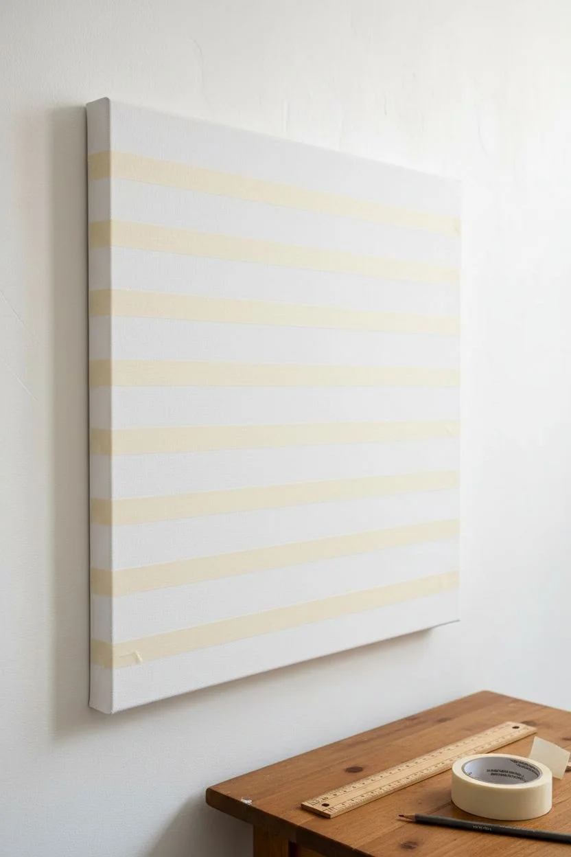
Sunset Band Stripes Background
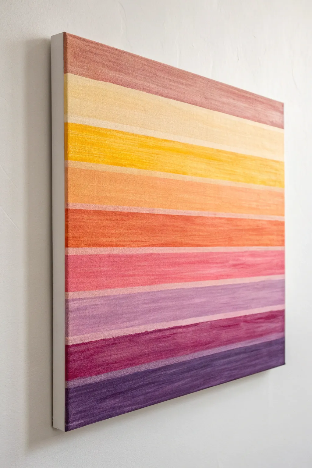
Capture the warmth of dusk with this soothing, linear gradient background that mimics the sky’s transition from day to night. Using a textured dry-brush technique, you’ll create soft, horizontal bands of color ranging from deep violet to pale peach.
Detailed Instructions
Materials
- Square stretched canvas (12×12 or similar)
- Acrylic paints (deep purple, violet, magenta, pink, orange, yellow, pale peach, dusty rose)
- Wide flat bristle brush (1-inch width)
- Mixing palette or paper plate
- Painter’s tape (1-inch width)
- Ruler
- Pencil
- Paper towels
- Jar of water
Step 1: Preparation and Planning
-
Prime the Surface:
Begin by ensuring your canvas is clean and ready. If it isn’t pre-primed, apply a coat of white gesso and let it dry completely to ensure the colors pop. -
Mark Guidelines:
Place your canvas on a flat surface. Using a ruler and a pencil, lightly mark horizontal ticks along the left and right edges. Space them unevenly to create bands of varying thickness, ranging from half an inch to two inches. -
Tape the Gaps:
This design features very thin, unpainted (or lighter) gaps between the color bands. Apply thin strips of painter’s tape horizontally across your pencil marks to mask off these separation lines. Press the edges down firmly.
Dry Brush Secret
Wipe most of the paint off your brush onto a paper towel before hitting the canvas. This ‘dry brush’ method creates that distinct scratchy texture.
Step 2: Painting the Cool Tones
-
Start at the Bottom:
Squeeze out your deep purple paint. Using the wide flat brush, load a moderate amount of paint—not too gloopy—and apply it to the very bottom band using long, horizontal strokes. -
Create Texture:
Instead of filling the stripe solidly, keep your brush slightly dry. Drag the bristles horizontally so the canvas texture shows through slightly, giving it a fibrous, woven look. -
Move to Violet:
Clean your brush thoroughly and dry it on a paper towel. Mix a slightly lighter violet or reddish-purple shade and apply it to the second band from the bottom. -
Add Magenta:
For the third band, transition to a deep magenta or berry color. Remember to paint right over the tape edges; this ensures crisp lines later. -
Soft Pink Layer:
Move upward to the next section with a soft, medium pink. As you work your way up, try to keep your brushstrokes strictly horizontal to maintain the linear aesthetic.
Metallic Accent
Mix a tiny amount of gold mica powder or metallic medium into the yellow and orange bands for a subtle shimmer that catches the light.
Step 3: Painting the Warm Tones
-
Transition to Orange:
As you reach the middle of the canvas, switch your palette to warm tones. Apply a vibrant orange to the next band, blending slightly with a touch of pink on your palette before application for harmony. -
Apply Golden Yellow:
For the upper-middle section, brush on a rich golden yellow. I like to let the brush run almost dry at the end of the stroke to enhance that organic, striated texture. -
Lightest Yellow:
Paint the next band a very pale, buttery yellow. This represents the last light of the sun. -
Top Band:
Finish the topmost band with a dusty rose or brownish-mauve color, framing the ‘sunset’ with a hint of dusk clouds.
Step 4: Finishing Touches
-
Side Edges:
Don’t forget the sides of the canvas. Extend each color band around the corner to the side edges so the artwork looks finished from all angles. -
Let it Dry:
Allow the paint to dry to the touch, usually about 20-30 minutes for acrylics applied this thinly. -
Reveal the Lines:
Carefully peel away the painter’s tape strips. Pull them off at a 45-degree angle to prevent ripping the paint. -
Touch Ups:
If any paint bled under the tape, use a small detail brush and a bit of white or off-white paint to clean up the separating lines. -
Seal (Optional):
If you want to protect the textured surface, apply a matte varnish spray over the entire piece once fully cured.
Hang your new striped gradient painting in a space that needs a little extra warmth and calm


Soft Cloudy Haze With Dry Brush
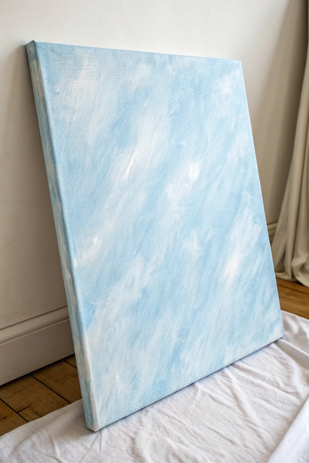
Capture the serenity of a sunlit sky with this soft, cloudy canvas background. Using a dry brush technique creates a dreamy, atmospheric texture perfect for a standalone piece or a subtle backdrop for further art.
How-To Guide
Materials
- Large stretched canvas (primed)
- Acrylic paint: Titanium White
- Acrylic paint: Light Blue or Sky Blue
- Mixing palette or paper plate
- Large flat paintbrush (2-3 inches wide)
- Medium round bristle brush
- Jar of water
- Paper towels or textured rag
- Drop cloth
Step 1: Preparation & Base Mixing
-
Set the scene:
Lay down your drop cloth to protect the floor. Place your canvas upright against a wall if possible, or flat on the floor if you prefer working horizontally. -
Load the palette:
Squeeze out a generous amount of Titanium White and a moderate amount of Light Blue onto your palette. -
Mix a pale base:
Take a scoop of white and a tiny dot of blue to create a very pale, almost white, base tone. Leave plenty of pure white and pure blue separate for later stages.
Pro Tip: Contrast Check
Take a photo of your canvas with your phone and turn it to black and white. This helps you check if you have enough value contrast between the light clouds and the blue sky.
Step 2: Establishing the First Layer
-
Apply the first stroke:
Using your large flat brush, dip into the pale mix and apply it to the canvas in long, diagonal strokes starting from the top left corner. -
Maintain diagonal movement:
Continue covering the canvas with these broad, sweeping diagonal motions. This directionality mimics falling rain or light shafts. -
Vary the pressure:
Press firmly in some areas and lightly in others to create natural inconsistency in the paint coverage. -
Blend while wet:
While the paint is still damp, pick up a little bit of the unmixed blue on your dirty brush. -
Integrate the blue:
Streaking that darker blue into the wet base creates soft transitions rather than harsh lines. Work quickly to cover the entire white surface of the canvas.
Step 3: Creating the Dry Brush Haze
-
Prepare for dry brushing:
Clean your large brush thoroughly and dry it completely with a paper towel. It must be bone-dry for this effect to work properly. -
Load minimal paint:
Dip just the tips of the dry bristles into pure Titanium White. Dab the excess off onto a paper towel until almost no paint comes off. -
Feather in the clouds:
Lightly sweep the white over the blue background using a rapid, cross-hatching motion. This creates the ‘scumbled’ texture. -
Focus on light patches:
Concentrate this white dry brushing in random clusters to mimic cloud formations. I find it helpful to squint at the canvas to see where the natural highlights should go. -
Soften edges:
If a white patch looks too solid, use a clean, dry rag to gently rub the edges until they fade into the blue background. -
Add depth:
Switch to the medium round brush. Load a tiny amount of the darker blue (dry brush style) and whisk it into the shadow areas between the white clouds.
Troubleshooting: Too Streaky?
If your brushstrokes look too harsh or scratchy, your brush might be too stiff or dry. Lightly mist the canvas with water (use a spray bottle) and blend with a soft rag.
Step 4: Final Touches
-
Layering up:
Repeat the white dry-brushing process in the brightest areas to build opacity. Several thin, dusty layers look more realistic than one thick one. -
Paint the sides:
Don’t forget the edges of the canvas. Wrap the painting around the sides by continuing your diagonal strokes so it looks finished from any angle. -
Step back and assess:
Move back several feet to view the composition. Look for any areas that feel too uniform and break them up with a quick whisk of contrasting color. -
Final cure:
Let the painting dry completely for at least 24 hours before hanging or using it as a backdrop.
Enjoy the calming atmosphere this piece brings to your space
BRUSH GUIDE
The Right Brush for Every Stroke
From clean lines to bold texture — master brush choice, stroke control, and essential techniques.
Explore the Full Guide
Solid Color With Subtle Texture Layer
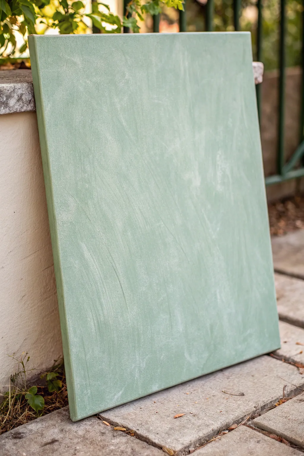
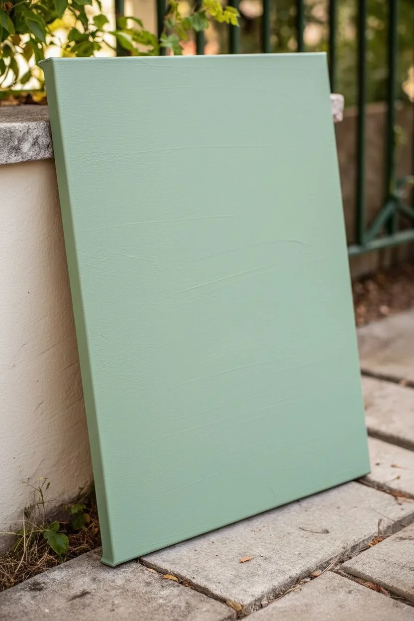
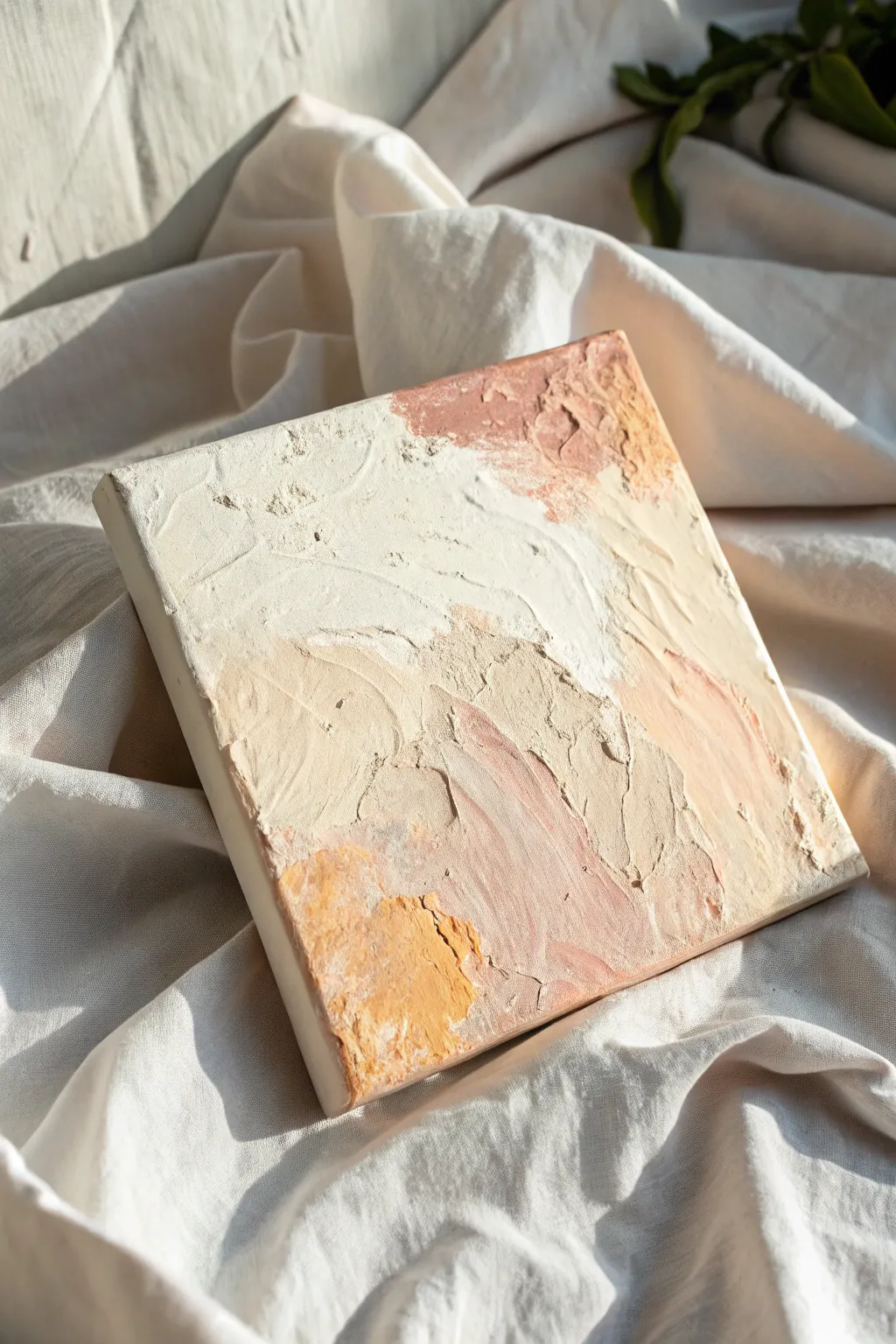
Create a soothing, minimalist backdrop perfect for product photography or calming wall decor with this sage green textured canvas. By layering matte paints and using a dry-brush technique, you’ll achieve a subtle, cloud-like depth that looks sophisticated without being distracting.
Step-by-Step
Materials
- Stretched canvas (12×16 or larger)
- Gesso primer
- Acrylic paint (Sage Green)
- Acrylic paint (Titanium White)
- Acrylic paint (Raw Umber or light grey for tinting)
- Wide flat synthetic brush (2-3 inch)
- Chip brush or old bristle brush for texture
- Palette or paper plate
- Water cup
- Paper towels
- Fine-grit sandpaper (optional)
- Matte spray varnish
Step 1: Preparation & Base Coat
-
Prime the surface:
Begin by applying a generous coat of Gesso to your stretched canvas. Even if the canvas came pre-primed, an extra layer adds a bit of tooth and ensures a smooth, non-absorbent starting point for your background. -
Let it cure:
Allow the Gesso to dry completely. It should feel chalky and cool to the touch but not tacky. This usually takes about 20-30 minutes. -
Mix the base color:
On your palette, squeeze out a large amount of Sage Green. To give it that earthy, muted tone seen in the reference, mix in a tiny drop of Raw Umber or grey. You want a solid, mid-tone green. -
Apply the first layer:
Using your wide flat synthetic brush, paint the entire canvas with your mixed sage green. Use long, horizontal strokes to cover the white gesso completely. -
Paint the edges:
Don’t forget to paint the sides of the canvas. This gives the piece a professional, finished look, even if it’s just leaning against a wall. -
Dry the base:
Let this base coat dry thoroughly. If the white canvas is still peeking through, apply a second coat of the solid green and let it dry again.
Too Scratchy?
If brush strokes look too distinct, dampen a sea sponge and gently dab over the wet paint. This softens harsh bristle marks into a smooth, mottled stone effect.
Step 2: Adding Texture & Depth
-
Create a lighter shade:
Take your original sage green mix and add a significant amount of Titanium White to it. You are aiming for a pale, milky version of your base color. -
Unload the brush:
Dip your chip brush (or coarse bristle brush) into the pale green mixture. Important: wipe most of the paint off onto a paper towel until the brush is almost dry. -
Begin dry brushing:
Start scrubbing the dry brush onto the canvas using swirling, random motions. I like to start in the center and work outward to avoid heavy paint blobs on the edges. -
Vary your pressure:
Press harder in some areas and lighter in others. The goal is to create wispy, cloud-like variances rather than distinct shapes. The underlying darker green should still show through significantly. -
Directional change:
Instead of just circular motions, add some long, sweeping diagonal strokes across the canvas. This creates that ‘brushed plaster’ look seen in the reference image. -
Create a dark wash (optional):
If the texture looks too flat, mix a tiny bit of water with your original darker green to create a thin wash. -
Apply the shadow:
Lightly dab this darker wash into corners or random patches to add subtle lowlights, then immediately smudge it out with a dry rag to blend it softly. -
Evaluate the texture:
Step back about five feet from the canvas. The texture should look distinct but blended. If it looks too scratchy, use a clean, slightly damp brush to soften the harsh lines while the paint is still semi-wet. -
Knock it back:
If your white highlights are too bright, lightly sand the surface with fine-grit sandpaper once the paint is bone dry. This distresses the layers and unifies the surface.
Step 3: Finishing Touches
-
Dust off:
If you sanded the piece, use a microfiber cloth or tack cloth to remove all paint dust from the surface. -
Check for glare:
Look at the canvas under a light source. If the paint dried with shiny patches, these will create hotspots in photos. -
Apply varnish:
Take the canvas to a ventilated area. Shake your matte spray varnish vigorously and apply a light, even mist over the entire surface. -
Final cure:
Let the varnish dry for at least 24 hours before using the background for photography or handling it extensively to prevent fingerprints.
Pro Tip: Plaster Effect
Mix a tablespoon of baking soda into your acrylic paint before the second layer. This creates a gritty, physical texture that mimics real concrete or plaster walls.
Enjoy the versatile, moody beauty of your new textured canvas background
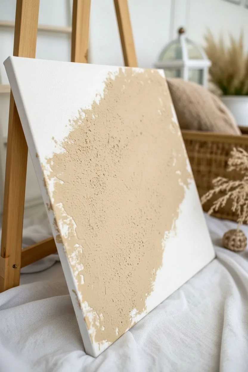
Sponge Dab Texture Background
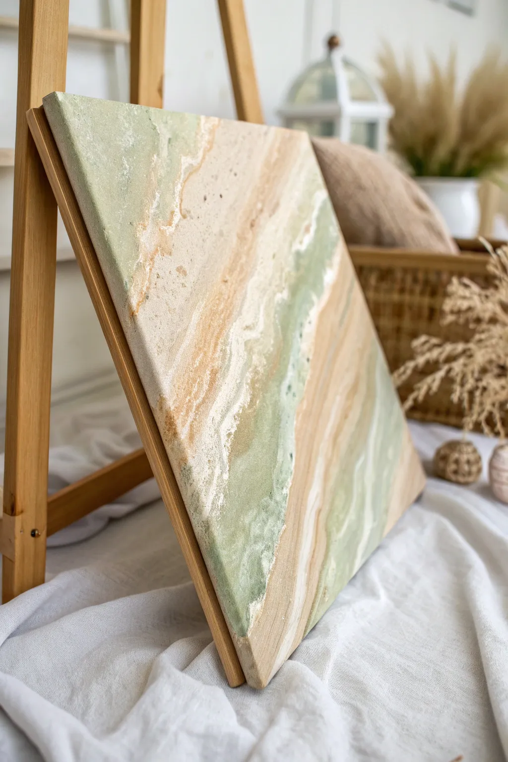
Capture the organic beauty of sedimentary rock and rolling tides with this beautifully layered sponge dabbing technique. The soft transitions between sage green, sandy beige, and crisp white create a calming, natural aesthetic perfect for modern interiors.
Step-by-Step Tutorial
Materials
- Stretched canvas (square or rectangular)
- Acrylic paints (Sage Green, Unbleached Titanium/Beige, White, Raw Sienna)
- Natural sea sponges (various sizes)
- Synthetic kitchen sponge (cut into small blocks)
- Palette or paper plates
- Paper towels
- Spray bottle with water
- Matte medium or texture paste (optional for extra grit)
Step 1: Preparation & Base Tones
-
Prime the Surface:
Begin by ensuring your canvas is clean and dry. If you want a smoother starting point, apply a thin coat of gesso, but for this textured look, the raw canvas weave works well too. -
Prepare the Palette:
Squeeze out generous amounts of your four main colors: Sage Green, White, Beige, and a touch of Raw Sienna. Keep them separate at first but ready for mixing. -
Dampen the Sponges:
Dip your natural sea sponges into water and wring them out thoroughly. They should be damp and pliable, not dripping wet, to ensure they pick up paint effectively without thinning it down. -
Create the First Band:
Load a sea sponge with Unbleached Titanium (beige). Dab it diagonally across the canvas to establish the primary angle of your ‘strata’ layers. Don’t worry about perfect coverage yet.
Step 2: Layering Colors
-
Introduce the Green:
Using a fresh sponge, pick up the Sage Green paint. Dab this color alongside the beige band you just created, allowing the edges to kiss and overlap slightly. -
Blend the Transition:
While the paint is still wet, use a clean, damp sponge to gently tap over the area where the green and beige meet. This softens the line and creates that organic, diffused look. -
Add Depth with Sienna:
Mix a tiny amount of Raw Sienna into your beige paint. Sponge this warmer, darker sandy tone into the beige sections to add depth and mimic the variations found in natural stone. -
Softening with White:
Load a kitchen sponge block with White paint. Press and lift in the lighter areas to create high-contrast highlights, mimicking sea foam or quartz veins. -
Building Texture:
I like to let this first layer dry for about 10 minutes so subsequent layers sit on top rather than muddrying together. Taking a break here helps keep the colors distinct.
Sponge Selection Secret
Use natural sea sponges for irregular, organic shapes and synthetic kitchen sponges for sharper, linear textures. Varying the pore size is key to realistic stone effects.
Step 3: Refining the Details
-
Create Veining:
Using the sharp edge of a cut kitchen sponge or a small brush, drag a thin line of white paint along the border of your color bands to define the separation. -
Distress the Veins:
Immediately tap over that thin white line with a dry sponge. This breaks up the solid line, making it look like a natural mineral deposit rather than a painted stripe. -
Enhance the Green Zones:
Go back into the green sections with a mixture of Sage Green and White. Dab this lighter green in clusters to create a mottled, marbled effect. -
Adding Sediment Specs:
Dip an old toothbrush or stiff bristle brush into watered-down Raw Sienna. Run your thumb over the bristles to gently flick tiny speckles onto the canvas, adding authentic stony grit. -
Review Balance:
Step back and look at the composition. If one color feels too dominant, sponge a translucent layer of White or Beige over it to push it into the background.
Level Up: Gold Leaf
Once the paint is fully dry, apply gold leaf along the jagged white veins. The metallic shine contrasts beautifully with the matte, earthy finish.
Step 4: Finishing Touches
-
Edge Work:
Don’t forget the sides of the canvas! Wrap the texture around the edges by dabbing the remaining paint onto the sides for a professional, gallery-wrapped finish. -
Final White Highlights:
For the crispest texture, wait until the surface is tacky. Apply thick, un-thinned White paint to the highest points of your design with a very light touch. -
Dry and Seal:
Allow the painting to dry completely for at least 24 hours. Because of the texture, thick areas may take longer. Finish with a matte varnish spray to protect the surface without adding unwanted shine.
Hang your new textured masterpiece in a well-lit spot to let the shadows play across the sponge-dabbed surface

PENCIL GUIDE
Understanding Pencil Grades from H to B
From first sketch to finished drawing — learn pencil grades, line control, and shading techniques.
Explore the Full Guide
Splatter And Flick Paint Underlayer
Embrace the beauty of imperfection with this minimalist canvas project featuring gentle flicks of gold and blue. This technique creates an airy, modern texture that adds depth without overwhelming the space, perfect for a calming interior accent.
Step-by-Step
Materials
- Stretched canvas (rectangular, medium grain)
- White gesso
- Cream or off-white acrylic paint
- Titanium white acrylic paint
- Gold metallic acrylic paint
- Navy or dark blue acrylic paint
- Wide flat brush (2-3 inch)
- Stiff bristle brush (e.g., old toothbrush or hog bristle brush)
- Palette knife
- Water cup
- Drop cloth or newspapers
- Paper towels
Step 1: Base Preparation
-
Set up your workspace:
Begin by covering your work area extensively with newspaper or a drop cloth. Splatter techniques can get messy, so ensure you have plenty of room to move around the canvas. -
Prime the canvas:
Apply a generous coat of white gesso to the entire surface of the stretched canvas using a wide flat brush. -
Add texture:
While the gesso is still wet, use the brush to create subtle ridges and peaks. You want a slightly uneven surface to catch the paint later. -
Let it dry completely:
Allow the gesso layer to dry fully. This usually takes about 30-60 minutes, but check that it’s dry to the touch before proceeding.
Step 2: Creating the Background
-
Mix the base color:
On your palette, mix a large amount of Titanium White with a very small touch of Cream or Off-white. Aim for a warm, milky white tone rather than a stark bright white. -
Apply the first coat:
Paint the entire face of the canvas with your mixed base color. Use long, sweeping strokes to ensure even coverage. -
Paint the edges:
Don’t forget the sides of the canvas. Paint them with the same base mixture so the artwork looks finished even without a frame. -
Add a second coat:
Once the first coat is dry, apply a second coat if needed to ensure the raw canvas texture is adequately covered and the color is solid. -
Create slight variation:
I like to take a palette knife with a tiny bit of pure white and scrape it lightly over random areas while the base is tacky. This highlights the texture created in the gesso phase.
Control Your Chaos
Use a piece of cardboard as a shield while splattering. Hold it over areas you want to keep clean to create negative space or control where the specks land.
Step 3: The Splatter Technique
-
Prepare the gold paint:
Squeeze a small amount of gold metallic acrylic paint onto your palette. Mix in a few drops of water to thin it to an ink-like consistency. -
Test the consistency:
Test your splatter on a piece of scrap paper first. The paint should flick easily off the bristles without being so watery that it drips uncontrollably. -
Flick the gold:
Load your stiff bristle brush or toothbrush with the thinned gold paint. Hold the brush near the canvas and run your thumb across the bristles to flick tiny specks onto the surface. -
Vary the density:
Concentrate slightly more splatters near the bottom corners or edges to create a sense of visual weight, leaving the center more open. -
Prepare the blue paint:
Clean your brush thoroughly. Now, thin down a small amount of navy or dark blue acrylic paint with water, just as you did with the gold. -
Apply blue accents:
Repeat the flicking motion with the blue paint. Use a lighter hand here; you want fewer blue specks than gold ones to keep the warm tone dominant. -
Create larger drops:
Dip a small round brush into the gold paint and tap the handle against another brush over the canvas. This creates slightly larger, organic droplets compared to the fine mist from the toothbrush. -
Address the sides:
Ensure that some of your splatters wrap around the painted edges of the canvas for a continuous look. -
Review and refine:
Step back about five feet to view the composition. If an area looks too empty, add a few more flicks. If a spot is too heavy, you can gently dab it with a clean paper towel while wet. -
Final drying time:
Let the paint splatter dry completely flat. Do not stand the canvas up until the larger droplets have solidified to prevent running.
Metallic Leaf Upgrade
Instead of gold paint, use gold leaf size on random splatter spots. Once tacky, press small flakes of gold leaf onto them for a genuine metallic shine.
Hang your new textured masterpiece in a well-lit spot to let the metallic accents catch the light beautifully
Drip Down Rain Effect Background
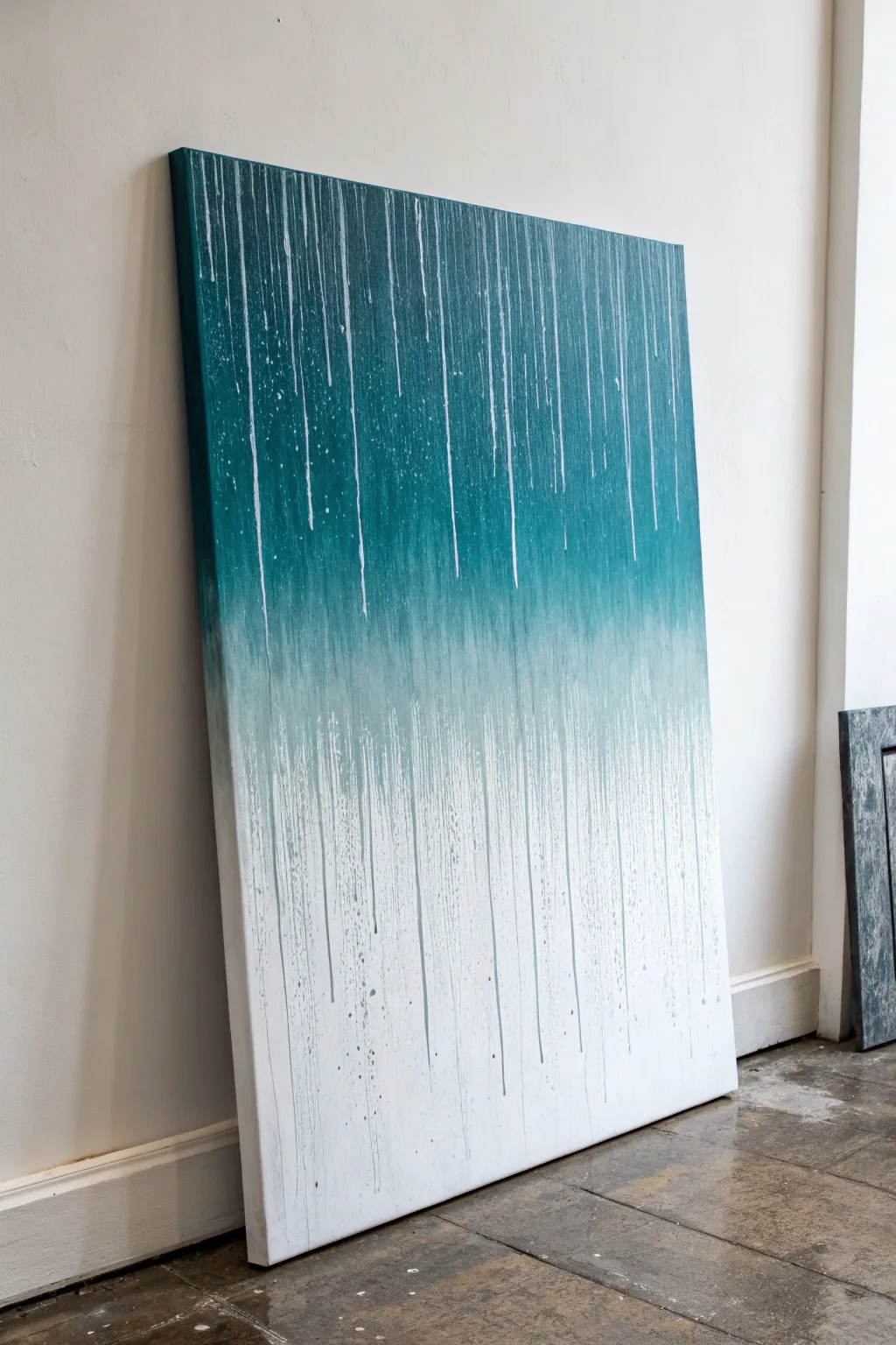
Capture the serene beauty of a summer storm with this mesmerizing drip art canvas. By blending a deep teal gradient into stark white and allowing controlled drips to break the surface, you’ll create a modern, textured piece that brings a sense of calm movement to any room.
Step-by-Step Tutorial
Materials
- Large rectangular stretched canvas (e.g., 24×36 inches)
- Heavy body acrylic paint (Phthalo Green or Teal)
- Heavy body acrylic paint (Titanium White)
- Acrylic flow improver or pouring medium
- Large flat paintbrush (2-3 inch width)
- Spray bottle with water
- Plastic drop cloth or tarp
- Paper towels or rag
- Cups for mixing paint
- Easel or wall prop area
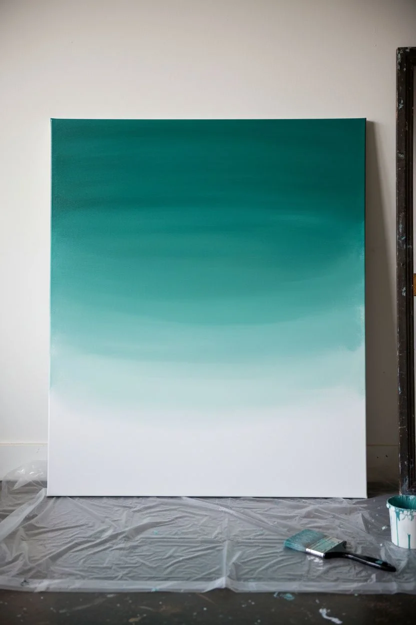
Step 1: Creating the Ombré Base
-
Prepare the workspace:
Lean your canvas against a vertical surface like a wall protected by plastic, or clear a large floor space. Since this project involves dripping, ensure your floor is well-covered with a drop cloth to catch any runoff. -
Mix your transition colors:
Squeeze out a generous amount of Phthalo Green/Teal and Titanium White. In a separate cup, mix a mid-tone by combining approximately two parts white with one part teal to create a soft bridge color. -
Apply the dark top section:
Using your large flat brush, apply the pure teal paint to the top third of the canvas. Use horizontal strokes to get solid coverage, ensuring the paint is thick and opaque. -
Establish the white bottom:
Clean your brush thoroughly or switch to a fresh one. Paint the bottom third of the canvas with pure Titanium White. Don’t worry about the middle just yet; focus on getting a clean, bright white base at the bottom. -
Blend the middle section:
Take your mixed mid-tone teal and paint the middle strip of the canvas. While the paint is still wet, use long, horizontal sweeping strokes to blend the mid-tone upward into the dark teal and downward into the white. -
Refine the gradient:
To get that seamless foggy look, I like to use a slightly damp brush (not soaking) to feather the edges where colors meet. Continue blending until you have a smooth transition from dark top to light bottom.
Drips stopping too soon?
Mix more water or flow medium into your paint. If the canvas surface is too dry, mist it lightly with water before dripping to help the paint slide further down.
Step 2: The Rain Drip Technique
-
Dilute for dripping:
In a cup, mix a small amount of white paint with flow improver (or water) until it reaches the consistency of thin milk. You want it fluid enough to run quickly but pigmented enough to show up against the teal. -
Prop the canvas vertically:
If your canvas was flat for blending, prop it up vertically now. It needs to be steep so gravity can pull the paint straight down. -
Initiate top drips:
Load a smaller brush or a pipette with the thin white mixture. Gently press the brush or squeeze drops along the very top edge of the teal section, letting the liquid naturally run down the face of the canvas. -
Control the flow:
Vary the amount of fluid you release at different intervals. Some drips should travel all the way down, while others can stop midway. If a drip is moving too fast, wipe the bottom lightly with a paper towel to stop it. -
Create teal drips:
Mix a thin wash of your dark teal color. Apply this sparingly near the middle transition zone, allowing subtle dark streaks to run down into the white section, creating depth and contrast. -
Mist for texture:
For a more organic ‘rain’ look, lightly squeeze your water spray bottle at the top of the canvas. The water will catch the wet paint and create micro-drips and a weathered texture. -
Enhance opacity:
Once the first layer of drips is tacky, go back over the most prominent white lines at the top with slightly thicker white paint to make them pop against the dark background. -
Splatter detailed texture:
Flick the bristles of a paint-loaded brush to create tiny specks of white spray near the top and teal spray near the bottom. This adds chaotic energy that mimics a real storm. -
Final drying position:
Leave the canvas standing vertically while it dries. Laying it flat too soon might cause the drips to pool or spread sideways, ruining the vertical rain effect.
Metallic Rain
Mix sliver or pearlescent medium into your white drip mixture. The finished piece will shimmer like wet glass when the light hits it from different angles.
Hang your masterpiece once fully dry and enjoy the soothing atmosphere of your permanent rain shower


Palette Knife Scrape Background
Achieve a stunning, tactile finish with this minimalist abstract piece that celebrates earthy tones and rugged textures. By layering thick modeling paste with soft neutral acrylics, you’ll create a canvas that looks like a slice of desert stone or weathered plaster.
Detailed Instructions
Materials
- Small square canvas (e.g., 6×6 or 8×8 inch)
- Modeling paste or texture paste (heavy body)
- Acrylic paints: Titanium White, Unbleached Titanium (beige), Burnt Sienna, Yellow Ochre
- Palette knife (trowel shape preferred)
- Palette or mixing surface
- Paper towels
Step 1: Preparing the Texture Base
-
Prepare your palette:
Squeeze out a generous dollop of modeling paste onto your mixing surface. You will want enough to cover the canvas thickly. -
Mix the base colors:
Separate the modeling paste into three small piles. Leave one pile white (or mix with a touch of Titanium White for brightness). -
Create a beige tone:
Mix a small amount of Unbleached Titanium into the second pile of paste. Keep the color subtle and creamy. -
Mix the accent color:
For the third pile, mix in a tiny drop of Burnt Sienna to create a soft, dusty pink or terracotta shade. You want these colors to be pastel and muted, not vibrant.
Muddy Colors?
If your colors are turning into a single brown blob, wipe your palette knife clean between every single color switch. Distinct zones keep it fresh.
Step 2: Building the Layers
-
Apply the white base:
Using the back of your palette knife, scoop up the white paste mixture. Spread it across the upper left and center areas of the canvas. -
Add texture immediately:
Don’t smooth it out perfectly. Instead, press the knife down and lift it up to create small peaks, or scrape sideways to create drag marks. -
Introduce the beige:
Pick up the beige paste mixture. Apply this to the lower middle section, slightly overlapping with the wet white paste. -
Blend lightly:
Gently drag your knife over the seam where the white and beige meet. Let the colors marble together naturally rather than over-mixing them into a single color. -
Add the terracotta tones:
Apply your terracotta/pink paste to the upper right corner and patches near the bottom right. This adds warmth and balances the composition. -
Create the rough scrape effect:
Clean your palette knife. With a clean, dry knife, scrape firmly across some of the thicker areas of paste. This ‘scraped’ look reveals the texture beneath and flattening high spots.
Step 3: Adding Depth and Detail
-
Mix a darker accent:
On your palette, mix a small amount of plain acrylic paint (no paste this time) using Burnt Sienna and a touch of Yellow Ochre to get a deeper rust color. -
Apply accent patches:
I prefer to use just the very tip of the knife to dab this darker rust color into the wet paste in the bottom left corner and a few spots on the right edge. -
Integrate the accents:
Use the flat side of the knife to smudge these darker spots into the surrounding beige paste, creating a weathered, organic transition. -
Refine the surface:
Look for areas that seem too smooth. Use the edge of the knife to slice into the paste or create ridges that catch the light. -
Check the edges:
Make sure you wrap some texture around the sides of the canvas for a finished look, or scrape them clean if you plan to frame it. -
Final drying time:
Lay the canvas flat to dry. Because the paste is thick, let it cure for at least 24 hours before handling or sealing.
Crackle Magic
For an even more rugged look, mix a little sand into your modeling paste before applying, or use a crackle medium topcoat on specific patches.
Once dry, display your textured masterpiece where the changing daylight can play across its ridges and valleys
Black-And-White Value Gradient Background
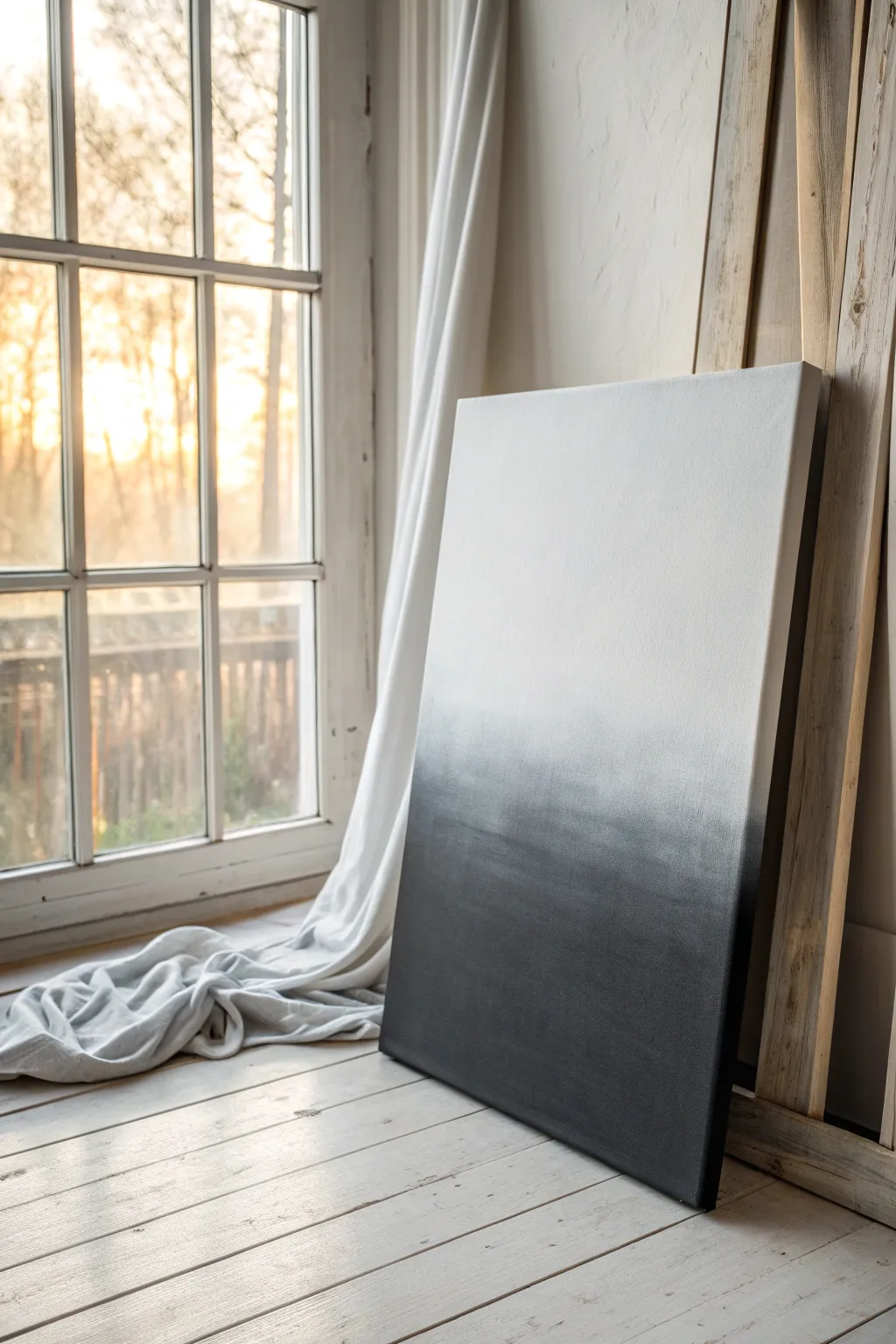
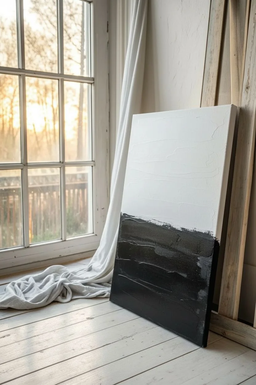
Mastering a smooth gradient is a fundamental skill for any artist, and this monochrome piece proves that simplicity can be striking. This tutorial guides you through creating a flawless fade from jet black to crisp white, resulting in a modern, versatile canvas backdrop or standalone artwork.
Detailed Instructions
Materials
- Large stretched canvas (e.g., 24×36 inches)
- Heavy body acrylic paint (Mars Black or Lamp Black)
- Heavy body acrylic paint (Titanium White)
- Large flat paintbrush (2-3 inches wide)
- Soft blending brush or dry mop brush
- Palette or disposable mixing plate
- Water spray bottle (mister setting)
- Paper towels
- Easel or wall support
Step 1: Preparation & Base Layers
-
Set up your workspace:
Prop your canvas upright against a wall or easel. Ensure you have good lighting to see the subtleties of the paint values as you work. -
Prime with white:
Even if the canvas is pre-primed, apply a fresh coat of Titanium White over the entire surface. This ensures the canvas weave is saturated and creates a slicker surface for blending later. -
Map out the zones:
Mentally divide the canvas into three roughly equal horizontal sections: the bottom for pure black, the middle for the transition gray, and the top for pure white. -
Apply the anchor black:
Load your large flat brush with black paint. Apply it generously to the bottom third of the canvas using horizontal strokes. Ensure the bottom edge is fully opaque. -
Apply the anchor white:
Clean your brush thoroughly (or use a second clean brush) and apply a generous amount of fresh Titanium White to the top third of the canvas, painting downwards toward the middle.
Paint drying too fast?
Mix an acrylic glazing liquid or retarder into your paints before starting. This extends the ‘open time,’ giving you up to 30 extra minutes to blend without the paint becoming sticky.
Step 2: Creating the Mid-Tone
-
Mix a dark grey:
On your palette, mix black with a small amount of white to create a dark charcoal grey. -
Apply above the black:
Paint this dark grey mixture immediately above your solid pure black section, slightly overlapping the wet black paint. -
Mix a light grey:
Create a new mixture on your palette that is significantly lighter, akin to a silvery mist. -
Apply below the white:
Paint this light grey right below your pure white top section, allowing it to touch the wet white edge. -
Bridge the gap:
Fill the remaining empty strip in the very center with a medium grey tone. You should now have horizontal stripes of value ranging from black to white.
Step 3: The Blending Process
-
Moisten the paints:
If the paint feels tacky or dry, lightly spritz the entire canvas with water from your spray bottle. Do not soak it; a fine mist is enough to reactivate the acrylics. -
Initial rough blend:
Using a clean, slightly damp large brush, stroke horizontally back and forth across the ‘seams’ where two colors meet. I find it easiest to work from light to dark to prevent dragging too much black upwards. -
Refine the dark transition:
Wipe your brush. Blend the pure black into the dark grey using long, sweeping horizontal arm movements. Go all the way across the canvas without lifting the brush. -
Refine the light transition:
Clean the brush again. Blend the white top down into the light grey section. Keep your strokes parallel to the floor. -
Soft blending technique:
Switch to a dry, soft blending brush or a clean mop brush. Very lightly tickle the surface of the canvas where the gradients look streak -
Fixing hard lines:
If you see a hard line, add a tiny amount of the adjacent color to your brush and work it into the line with a criss-cross motion, then smooth it out horizontally. -
Final smooth:
Perform one last pass of gentle, long horizontal strokes across the entire middle section to marry the values together seamlessly. -
Check the edges:
Don’t forget to paint the sides of your canvas! Continue the gradient around the edges for a professional, frameless finish. -
Dry and assess:
Step back and let the painting dry completely. Be aware that acrylics often dry slightly darker, so you may need a second pass on your white section if it looks too grey.
Add Texture
Before painting, apply a coat of white gesso mixed with fine sand using a palette knife. Let it dry, then paint the gradient over it for a tactile, stony surface.
Once dry, you have a sophisticated monochromatic foundation perfect for layering quotes, silhouettes, or displaying as minimalist art
Masking Tape Geometric Blocks Background
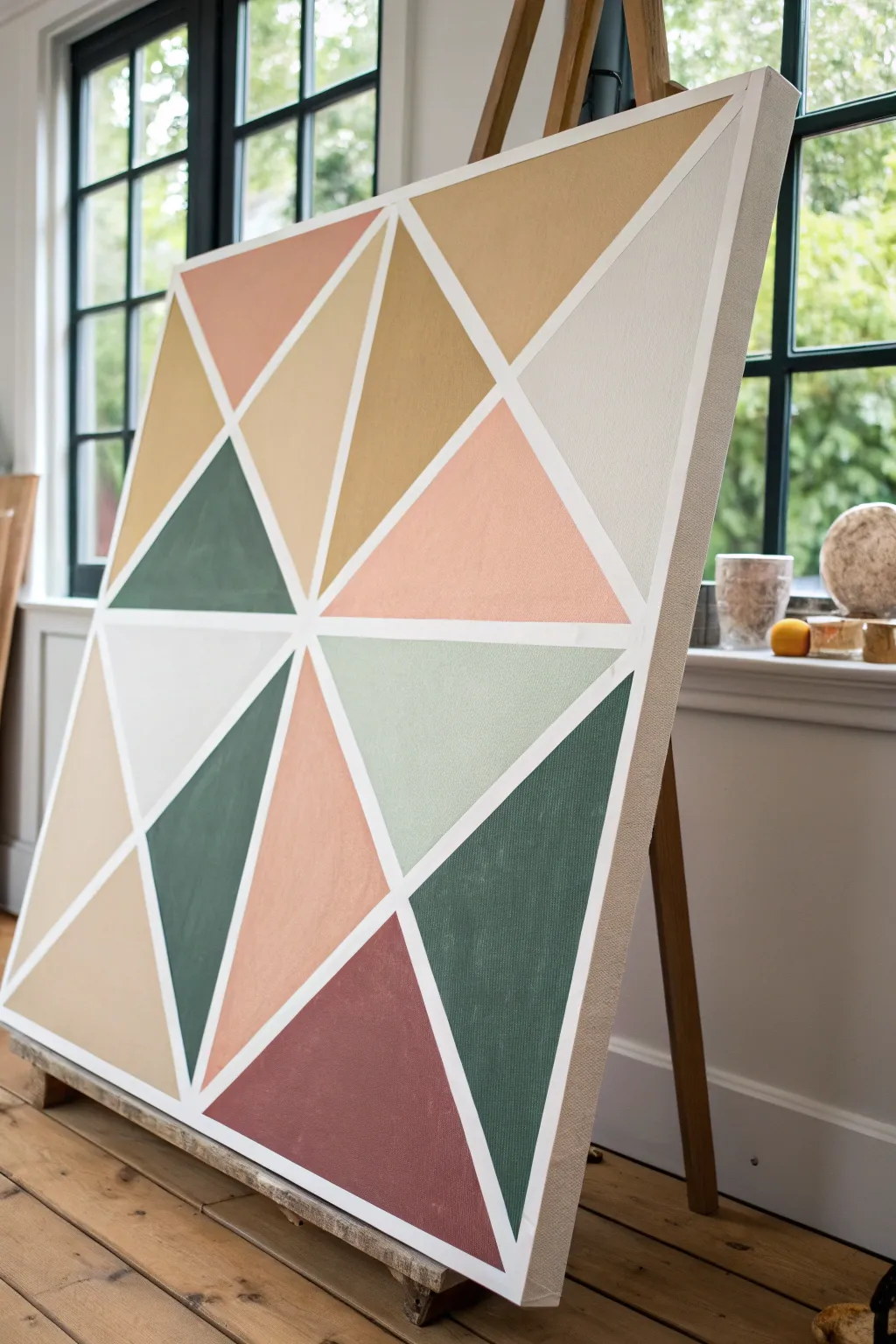
Transform a blank canvas into a stunning modern statement piece using crisp white lines and warm, earthy tones. This geometric block technique relies on negative space created by masking tape to form a structured yet harmonious composition perfect for minimalist interiors.
How-To Guide
Materials
- Large stretched canvas (24×36 or larger recommended)
- Painter’s tape or dedicated drafting tape (1/4 inch or 1/2 inch width)
- Acrylic paints (terracotta, ochre, sage green, forest green, pale peach, white)
- Flat synthetic paintbrushes (medium and large)
- White gesso or primer (optional but recommended)
- Matte varnish
- Ruler or straight edge
- Palette or mixing tray
- Cup of water and paper towels
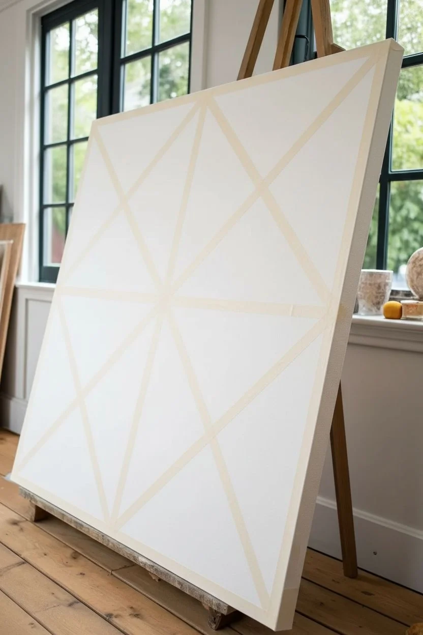
Step 1: Planning and Taping
-
Prepare the Base:
Begin by ensuring your canvas is clean and taut. If you are using raw canvas, apply a coat of white gesso to ensure the colors pop later; if pre-primed, you can skip this, though a fresh coat of white acrylic paint ensures the lines revealed later are bright and crisp. -
Plan the Focal Point:
The design radiates somewhat from a central point, though it’s asymmetrical. Locate a spot slightly off-center to the left as your primary intersection point. -
Lay the Primary Lines:
Apply your first strips of painter’s tape across the entire length of the canvas, intersecting at your chosen focal point. Press them down firmly as you go to prevent air bubbles. -
Create the Sub-Sections:
Add additional tape lines to break up the large spaces into smaller triangles. Aim for a variety of sizes—some large and dominant, others smaller and supportive—to create visual rhythm. -
Burnish the Edges:
I always take an extra moment here to run a fingernail or a credit card firmly along every edge of the tape. This seal is crucial for preventing paint bleed. -
The Color Seal Trick:
For razor-sharp lines, paint a thin layer of your base white color over the tape edges first. This fills any microscopic gaps with white paint so that any bleed is invisible.
Step 2: Painting the Color Blocks
-
Mix Your Palette:
Prepare your acrylics. You want a harmonious earth-tone palette: mix a deep maroon-brown, a soft terracotta peach, a mustard yellow-ochre, a deep forest green, and a lighter sage green. Keep a pure off-white for contrast sections. -
Start with Dark Tones:
Begin filling in triangles with your darkest colors first—the deep forest green and maroon. Place these ensuring they aren’t touching each other directly if possible, to balance the visual weight. -
Apply Mid-Tones:
Move on to the ochre and terracotta shades. Use a flat brush to work the paint from the tape inward; this direction helps minimize the chance of pushing paint under the tape. -
Add Light Accents:
Fill remaining sections with the pale peach, sage, and off-white. The off-white sections are vital as they give the eye a place to rest. -
Second Coats:
Acrylics often dry slightly translucent. Apply a second coat to each colored section once the first layer is touch-dry to ensure solid, opaque coverage without brushstrokes showing. -
Dry Completely:
Let the painting sit until the paint is thoroughly dry to the touch. Rushing this step can cause the paint to peel up with the tape.
Bleeding Lines?
If paint seeps under the tape, wait for it to dry completely. Then, place a fresh piece of tape over the colored area and carefully paint over the bleed with titanium white to crisp up the line.
Step 3: The Reveal and Finish
-
Peel the Tape:
Slowly peel back the tape at a 45-degree angle. Pull gently and steadily; if you feel resistance, adjust your angle. This is the most satisfying part of the process. -
Touch Up:
Inspect the white lines. If any color bled through, use a small detail brush with white paint to carefully tidy up the edges. -
Seal the Work:
Once fully cured (usually 24 hours), apply a coat of matte varnish. This unifies the sheen of the different paint colors and protects the surface from dust.
Textured Effect
Mix a small amount of modeling paste or baking soda into your acrylic paints before applying. This adds a subtle, gritty texture to the triangles, mimicking the look of stone or plaster.
Now step back and admire how simple lines and colors have created a sophisticated piece of abstract art.
Diagonal Color Sweep Background
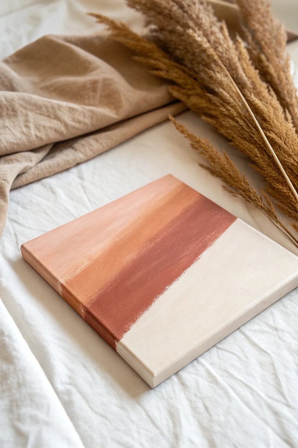
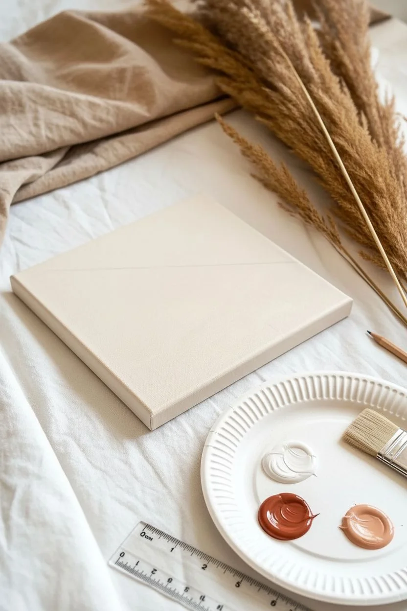
Bring warmth and modern simplicity to your space with this earthy, abstract canvas design. The distinct diagonal lines create movement, while the soft transition from terracotta to cream keeps the overall look peaceful and grounded.
Step-by-Step
Materials
- Square stretched canvas (e.g., 10×10 or 12×12 inch)
- Acrylic paints: Burnt sienna or terracotta, white, unbleached titanium (beige)
- Flat paintbrush (1-inch width)
- Palette or paper plate for mixing
- Pencil (optional)
- Ruler (optional)
- Painter’s tape (optional, depending on desired edge style)
Step 1: Planning and Prep
-
Visualize the diagonal:
Before putting paint to canvas, visualize a diagonal line cutting across the surface. This design roughly splits the canvas in half diagonally, but you can adjust the angle to be steeper or flatter depending on your preference. -
Mark the guide:
If you struggle with freehand straight lines, use a ruler and a very light pencil stroke to mark your main diagonal divide. This line separates the painted color section from the lighter cream section. -
Prepare your palette:
Squeeze out your burnt sienna/terracotta paint and your white paint. Create a third puddle by mixing the terracotta with a significant amount of white to make a pale peach or light coral tone.
Step 2: Applying the Gradient
-
Start with the darkest tone:
Load your flat brush with the pure terracotta color. Start painting immediately along the diagonal guide line you visualized or marked. -
Create the defining edge:
Use the flat edge of the brush to create a reasonably straight line along the diagonal. Don’t worry if it’s slightly textured or rough; that adds to the organic, handmade charm seen in the photo. -
Fill the dark band:
Paint a solid band of this dark terracotta color about 2-3 inches wide, moving ‘up’ and ‘away’ from the diagonal line toward the top left corner. -
Blend the mid-tone:
While the dark paint is still slightly wet, pick up your mixed peach/coral color. Apply this next to the terracotta band, overlapping slightly to encourage a soft blend between the two hues. -
Paint the top corner:
Continue painting toward the top left corner. As you reach the very corner, mix in even more white to your peach color so the gradient fades into a very whisper-light pink at the topmost tip. -
Ensure side coverage:
Don’t forget the sides of the canvas. Carry the color bands over the edges of the frame to give the artwork a finished, gallery-wrapped appearance.
Straight Line Struggles?
Can’t get a crisp diagonal? Apply a strip of painter’s tape across the canvas. Paint the dark side, let it dry fully, then peel the tape and carefully paint the light side up to the edge.
Step 3: Finishing the Contrast
-
Clean the brush:
Thoroughly rinse your brush and dry it well. You need it clean for the light section to prevent muddying the creamy tone. -
Mix the cream tone:
Prepare the bottom color. If you have unbleached titanium, use it directly. If not, mix a large amount of white with a tiny dot of yellow oxide or light brown to get a warm, off-white cream. -
Paint the bottom half:
Fill the entire bottom right section of the canvas with this cream color. Paint boldly up to the terracotta line you created earlier. -
Refine the meeting point:
Carefully bring the cream paint up to meet the terracotta edge. You can leave a slight textural gap or overlap very gently. The goal is a clean visual break between the dark and light sections. -
Check opacity:
Lighter acrylics often require two coats. If the canvas texture shows through too much on the cream section, let it dry and apply a second layer. -
Touch up edges:
Inspect the painted edges of the canvas again. Ensure the diagonal line continues logically down the sides. -
Dry flat:
Place the canvas flat in a dust-free area to dry completely. Acrylics usually dry to the touch within 20-30 minutes.
Make It Shimmer
For a luxe upgrade, mix a drop of metallic copper paint into your darkest terracotta stripe. It will catch the light subtly without overpowering the matte boho vibe.
Once dry, this clean and calming piece is ready to prop on a shelf or hang on your gallery wall
Stenciled Pattern Background Layer
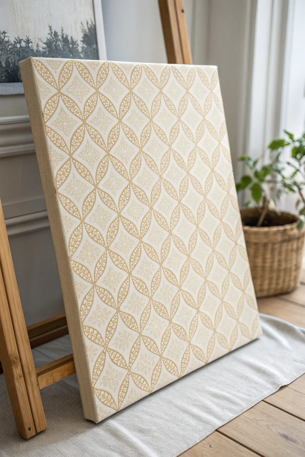
Transform a plain white canvas into a sophisticated piece of decor using the power of stencils and tonal layering. This project creates an elegant, latticework effect in soft gold and cream that looks like expensive wallpaper but is entirely hand-painted.
How-To Guide
Materials
- Stretched canvas (rectangular)
- Acrylic paint (Cream or Off-White base)
- Acrylic paint (Metallic Gold or Champagne)
- Large geometric repeating pattern stencil (lattice or tessellating floral design)
- Stencil adhesive spray or painter’s tape
- High-density foam roller or stencil brush
- Paper plate or palette
- Paper towels
- Matte or Satin varnish (optional)
Step 1: Base Preparation
-
Prime the surface:
Begin by applying a generous coat of cream or off-white acrylic paint to the entire face of the canvas. While many canvases come pre-primed white, adding a tinted base coat gives the final piece a warmer, more cohesive look. -
Paint the edges:
Don’t forget the sides of the canvas canvas. Continue your cream base color around all four edges to ensure a professional finish, especially if you plan to hang it unframed. -
Let it dry completely:
Allow the base coat to dry fully. If the coverage looks streaky, apply a second coat and wait for it to cure again. This step is crucial because if the base is tacky, the stencil might peel it up later.
Step 2: Applying the Stencil
-
Position the stencil:
Place your large geometric stencil over the canvas. Align the pattern so it looks balanced; I usually try to center the main motif so the cut-off points at the edges are symmetrical. -
Secure the stencil:
Lightly mist the back of the stencil with spray adhesive for the crispest lines, or secure the corners firmly with painter’s tape to prevent shifting. -
Load the roller:
Pour a small amount of metallic gold paint onto a paper plate. load your foam roller, then roll most of the paint *off* onto a paper towel until the roller feels almost dry. This ‘dry rolling’ technique prevents paint from bleeding under the stencil edges. -
Apply the first pass:
Gently roll over the stencil using light to medium pressure. Focusing on multiple thin layers rather than one thick one is the secret to crisp edges. -
Build opaque coverage:
Reload your roller (off-loading excess again) and continue to build up the gold color until you reach your desired opacity. The texture of the canvas might require a few passes to fill the weave. -
Check your progress:
Carefully lift one corner of the stencil just a peek to check your coverage and edges. If it looks good, press it back down to finish; if not, keep rolling.
Bleed Patrol
If paint bleeds underneath the stencil, don’t panic. Wait for it to dry completely, then use a small flat brush and your base cream color to ‘cut in’ and cover the mistake.
Step 3: Repeating the Pattern
-
Align for extension:
If your stencil is smaller than the canvas, you will need to move it. Locate registration points—parts of the design you just painted—and carefully line the stencil up over them to continue the pattern seamlessly. -
Protect finished areas:
When moving the stencil over areas you already painted, make sure the previous paint is dry to the touch so you don’t smudge your work. -
Continue rolling:
Repeat the rolling process for the remaining sections of the canvas, maintaining consistent paint density so specific sections don’t look darker than others. -
Detailing the edges:
Pay special attention to the very edges of the canvas face. Ensure the pattern extends all the way to the fold for a clean look.
Glazed Depth
Mix a tiny drop of brown paint with glazing medium and lightly wipe it over the dry canvas. This settles into the texture, making the gold pattern look aged and antique.
Step 4: Finishing Touches
-
Remove stencil:
Once the final section is painted, lift the stencil straight up to avoid smearing any wet edges. -
Touch up:
Inspect the canvas for any bleed-through. You can use a small detail brush and your base cream color to tidy up any fuzzy lines. -
Seal the artwork:
If desired, apply a coat of matte or satin varnish to protect the surface and even out the sheen between the metallic and matte paints.
Now you have a stunning, high-end patterned background ready to display on its own or serve as a base for further art
Salt Speckle Galaxy-Style Background
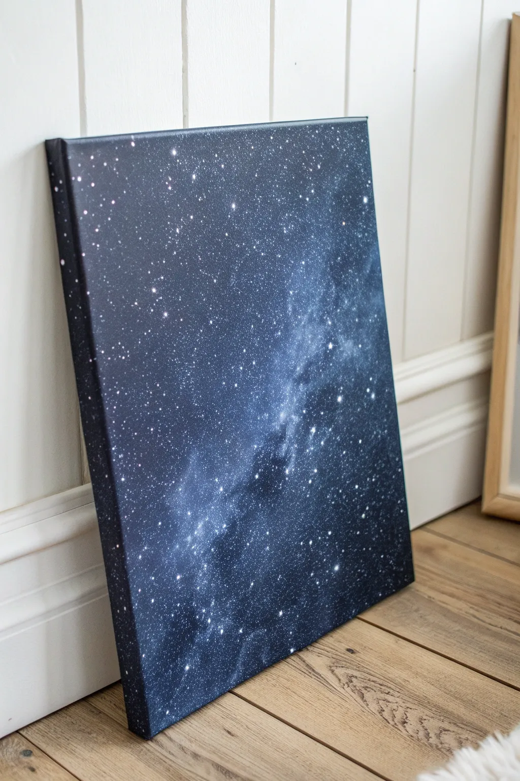
Bring the vast beauty of the cosmos into your home with this surprisingly simple galaxy painting technique. By layering deep blues and blacks with a scattered salt reaction, you can create a starry night effect that looks incredibly complex but is beginner-friendly.
Step-by-Step Tutorial
Materials
- Stretched canvas (16×20 or similar size)
- Black acrylic paint
- Dark blue acrylic paint (Phthalo Blue or Navy)
- Purple acrylic paint (Dioxazine Purple)
- White acrylic paint
- Large flat brush (1-2 inch)
- Medium round brush
- Old toothbrush
- Table salt or sea salt
- Water cup
- Paper towels
- Palette or paper plate
Step 1: Setting the Scene
-
Prepare the canvas:
Start by laying down a protective covering for your workspace, as the splatter technique later can get messy. Wipe your canvas with a dry cloth to remove any dust. -
Base coat application:
Using your large flat brush, apply a solid coat of black acrylic paint to the entire surface of the canvas. Ensure you paint the sides of the canvas frame as well for a polished, professional look. -
First drying phase:
Let this base layer dry completely. If the canvas texture is still showing through too much, apply a second coat of black to get a deep, rich void.
Step 2: Creating the Nebula
-
Mixing nebula colors:
On your palette, mix your dark blue paint with a tiny dot of black to deepen it. In a separate spot, have your purple paint ready. -
Sponging or brushing color:
While the black background is dry, use a slightly damp sponge or a crumpled paper towel to dab the dark blue paint diagonally across the canvas. This creates the ‘milky way’ band. -
Adding depth:
Before the blue dries, dab small amounts of purple into the edges of the blue areas to create a transition zone. -
The salt reaction:
While the blue and purple paint is still wet (this is crucial), sprinkle a pinch of salt onto the wettest areas. The salt will absorb the pigment and create unique, star-like textures as it dries. -
Highlighting the cloud:
Mix a very small amount of white into your blue paint to make a lighter milky blue. Lightly dab this into the center of your galaxy band to give it a glowing core. -
Blending the edges:
Use a clean, dry brush to very softly feather the edges of your colored nebula into the black background so there are no harsh lines.
Too Many Blobs?
If your star splatter creates giant unwanted blobs, wait for them to dry completely, then paint over them with black before trying again.
Step 3: Wait and Reveal
-
Full dry time:
Allow the canvas to dry completely. The salt reaction needs time to work its magic, so be patient here. -
Remove the salt:
Once the paint is bone dry, gently rub the salt crystals off the canvas with your hand or a dry cloth to reveal the speckled texture underneath.
Level Up: Glow
Mix a small amount of glow-in-the-dark medium into your white star paint. The piece will look normal by day but reveal a secret galaxy at night.
Step 4: The Starfield
-
Prepare splatter paint:
Mix a dollop of white acrylic paint with a few drops of water. You want a consistency similar to heavy cream or thin yogurt—fluid enough to fly off bristles, but thick enough to be opaque. -
Load the toothbrush:
Dip an old toothbrush into your watered-down white paint. Tap off any huge drips onto a paper towel first. -
Create distant stars:
Hold the toothbrush bristles facing down over the dark areas of the canvas. Run your thumb firmly across the bristles to flick a fine mist of white specs onto the black background. -
Layering the stars:
Focus some heavier splatter near the center of your nebula band to make it look denser with stars, and go lighter as you move toward the edges. -
Painting hero stars:
Using a fine round brush or a toothpick, manually dot a few larger, brighter stars in random spots. I usually place these in the darker areas to create contrast. -
Adding a sparkle:
For the largest stars you just painted, use a very fine brush to pull tiny cross-shapes outward from the center dot to create a twinkling effect. -
Final assessment:
Step back about five feet to view your galaxy. If it feels empty in spots, add a few more splatters. -
Sealing the work:
Once absolutely everything is dry, apply a coat of clear gloss varnish to protect the paint and make the dark colors pop even more.
Hang your cosmic creation on the wall and enjoy the view of deep space from your own room
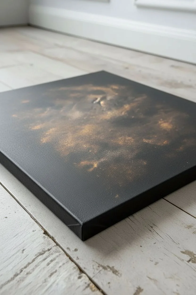
Metallic Accent Streaks In The Background
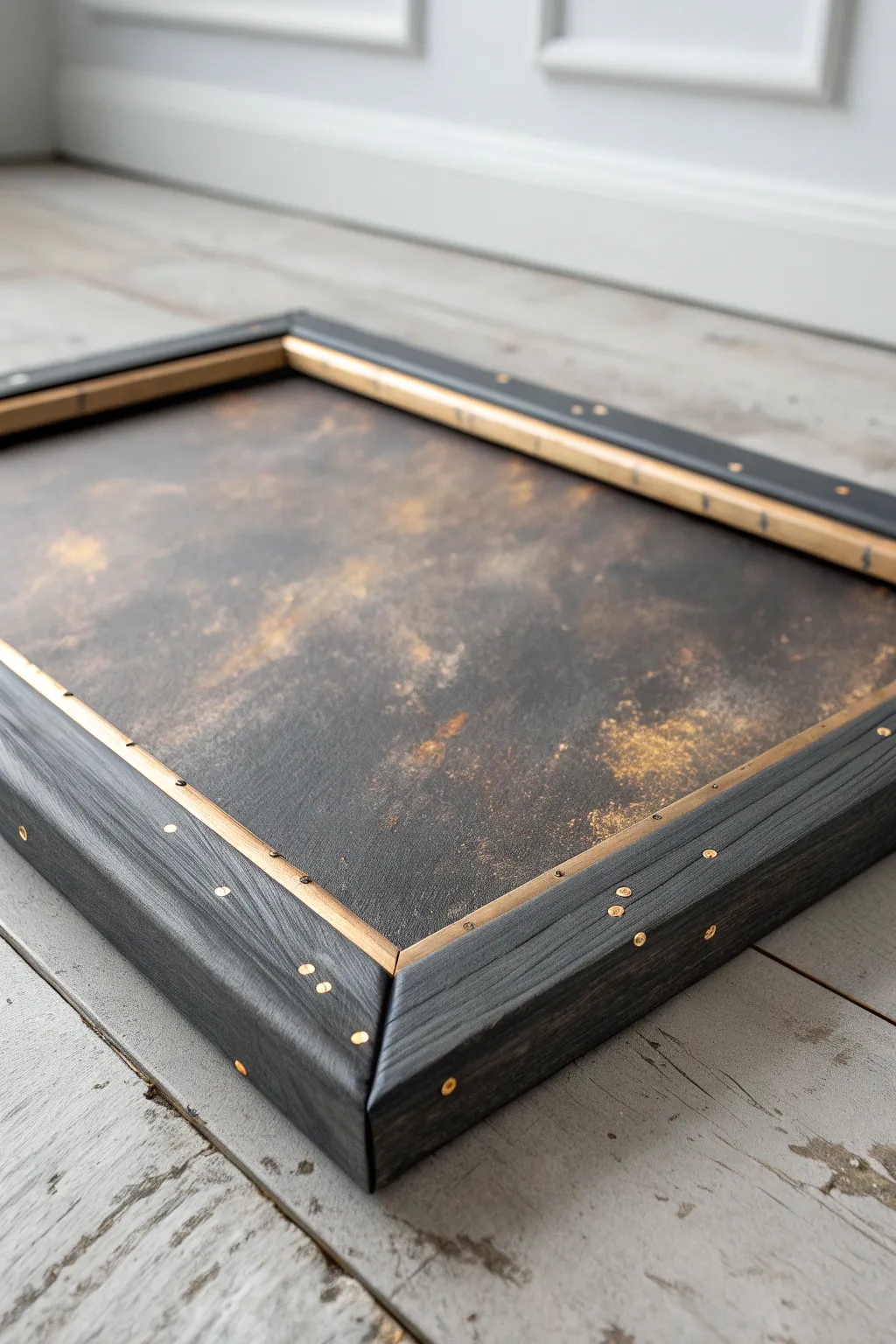
This striking project combines moody, atmospheric texture with industrial chic framing. The deep, cloudy canvas provides a perfect backdrop for metallic gold highlights, while the custom-built studded frame creates a bold, finished statement piece.
How-To Guide
Materials
- Stretched canvas (size of choice)
- Black acrylic paint
- Burnt umber or dark brown acrylic paint
- Metallic gold acrylic paint
- Sponge applicator or sea sponge
- Large flat paintbrush
- Four wood planks (1×2 or similar size, for the frame)
- Black wood stain or watered-down black paint
- Decorative upholstery nails or brass tacks
- Wood glue
- Miter saw or hand saw with miter box
- Fine-grit sandpaper
- Hammer
- Clean rag
Step 1: Creating the Atmospheric Background
-
Base Coat Application:
Begin by covering the entire canvas with a solid coat of black acrylic paint. Ensure you paint the edges as well, even though they will be framed later, just in case any gaps show. -
Mixing the Haze:
While the black base is still slightly tacky but mostly dry, mix a small amount of burnt umber with a drop of black on your palette to create a very deep espresso color. -
Creating Clouds:
Using a slightly damp sea sponge, dab the espresso mixture randomly across the canvas. Focus on the center and leave the corners darker to create a vignette effect. Don’t overthink the placement—irregularity creates the best ‘stormy’ look. -
Adding Texture:
While the brown layer is wet, take a clean, dry rag and gently blot some areas to lift the paint, softening the edges of your sponge marks so they look like drifting smoke or clouds. -
Applying the Gold:
Once the dark layers are completely dry to the touch, load a small amount of metallic gold paint onto a dry sponge. Dab off most of the excess on a paper towel until the sponge is almost dry. -
Building the Shimmer:
Lightly graze the sponge over the textured areas of the canvas. The goal is to catch the raised texture of the canvas weave, creating a ‘dusty’ metallic effect rather than solid gold blobs. -
Final Gold Accents:
For a bit more drama, use a small brush to add slightly more concentrated gold patches in the lightest parts of your ‘clouds’ to serve as focal points.
Step 2: Constructing the Studded Frame
-
Measuring the Cuts:
Measure the outer dimensions of your canvas. Mark your wood planks to these lengths, remembering that these measurements will be the *inside* edge of your miter cuts. -
Cutting the Angles:
Use a miter saw or hand saw to cut 45-degree angles at the ends of each wood plank so they fit together like a picture frame around your canvas. -
Staining the Wood:
Sand the wood pieces lightly to remove rough splinters. Apply a coat of black wood stain (or watered-down black paint) with a rag. Wipe away excess to let the wood grain show through, giving it a weathered look. -
Assembling the Frame:
Apply wood glue to the mitered corners and press the frame pieces together. Use a strap clamp or masking tape to hold the corners tight while the glue cures completely. -
Planning the Hardware:
Once the frame is solid, use a pencil to mark minimal, evenly spaced dots along the face of the frame where you want your brass accents. A spacing of about 2-3 inches works well. -
Adding the Studs:
Gently hammer the decorative upholstery nails or brass tacks into your marked spots. Try to drive them in straight to keep the look uniform. -
Installing the Canvas:
Flip the frame over. Place your painted canvas face down inside the frame. Because this is a chunky frame, you may need to nail the canvas stretcher bars directly into the frame from the back, or use offset clips. -
Distressing the Edges:
For a final touch, lightly sand the sharp outer edges of the frame to reveal a tiny bit of raw wood, matching the rustic aesthetic of the painting.
Uneven Paint?
If your sponge marks look too unnatural or stamp-like, mist the canvas lightly with water and use a soft, dry brush to feather out the edges while the paint is still wet.
Framing Tip
Instead of standard brass tacks, use different sizes of upholstery nails or even small washers underneath screw heads to create a more industrial, steampunk aesthetic.
Hang this moody masterpiece in a well-lit area to let the metallic flecks catch the light throughout the day

Have a question or want to share your own experience? I'd love to hear from you in the comments below!