
Whenever I’m craving that nostalgic, timeworn vibe, I reach for vintage drawing ideas—they instantly turn a simple sketch into a little story from the past. Let’s play with charming old objects, classic subjects, and a few “aged” techniques that make your lines feel like they’ve lived a life.
Postcard Sketch With Stamp Border
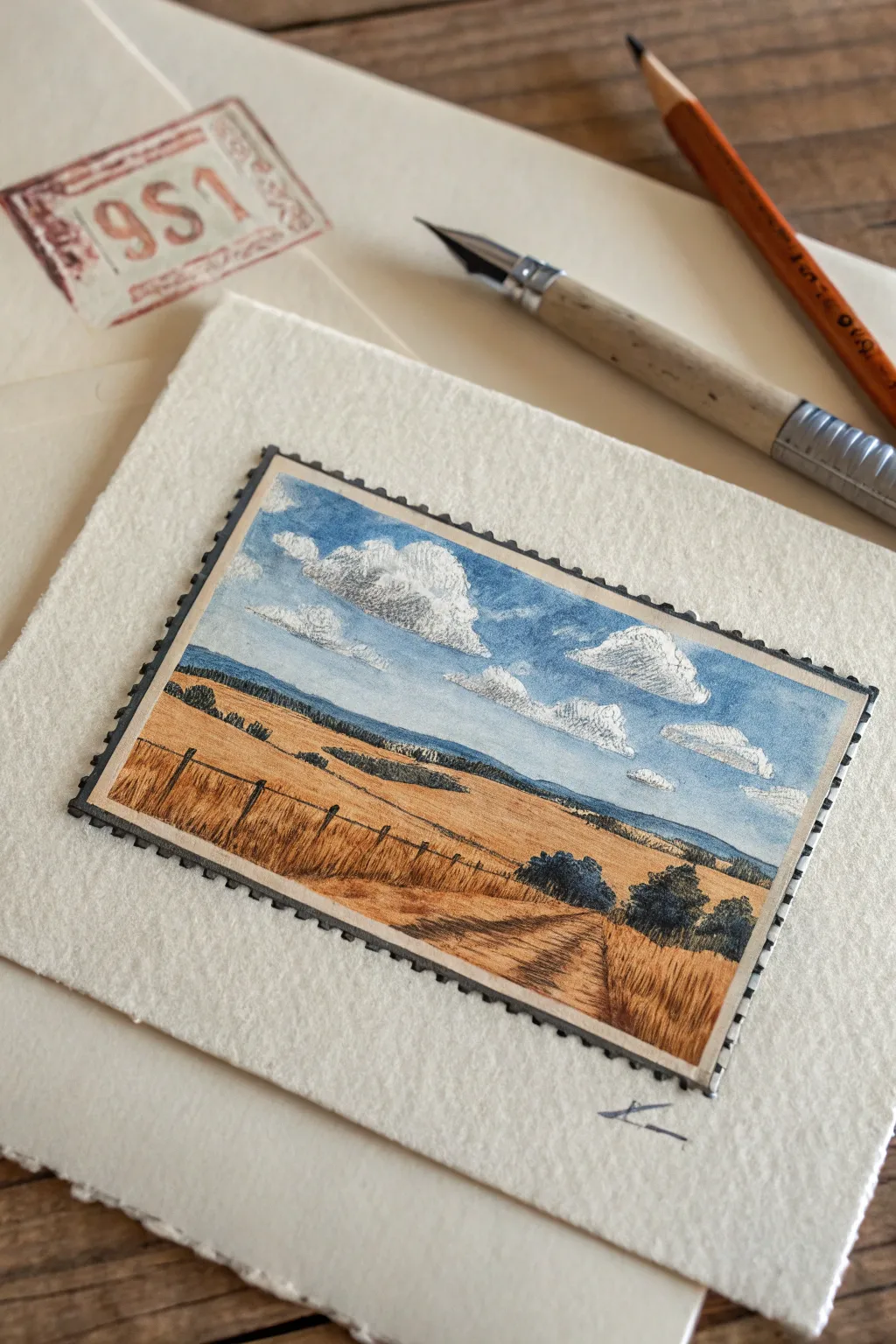
Transport yourself to the countryside with this charming miniature landscape designed to look like a vintage postage stamp. Using a combination of fine liner pens and watercolor or colored pencils, you’ll create a detailed golden field scene framed by a playful serrated border.
Step-by-Step Tutorial
Materials
- Heavyweight textured drawing paper or cold-press watercolor paper
- Fine liner pen (Black, 0.1mm or 0.05mm)
- Pencil (HB or 2B) for sketching
- Eraser
- Watercolors (Cobalt Blue, Yellow Ochre, Burnt Sienna, Payne’s Gray)
- Small round paintbrush (Size 0 or 2)
- Ruler
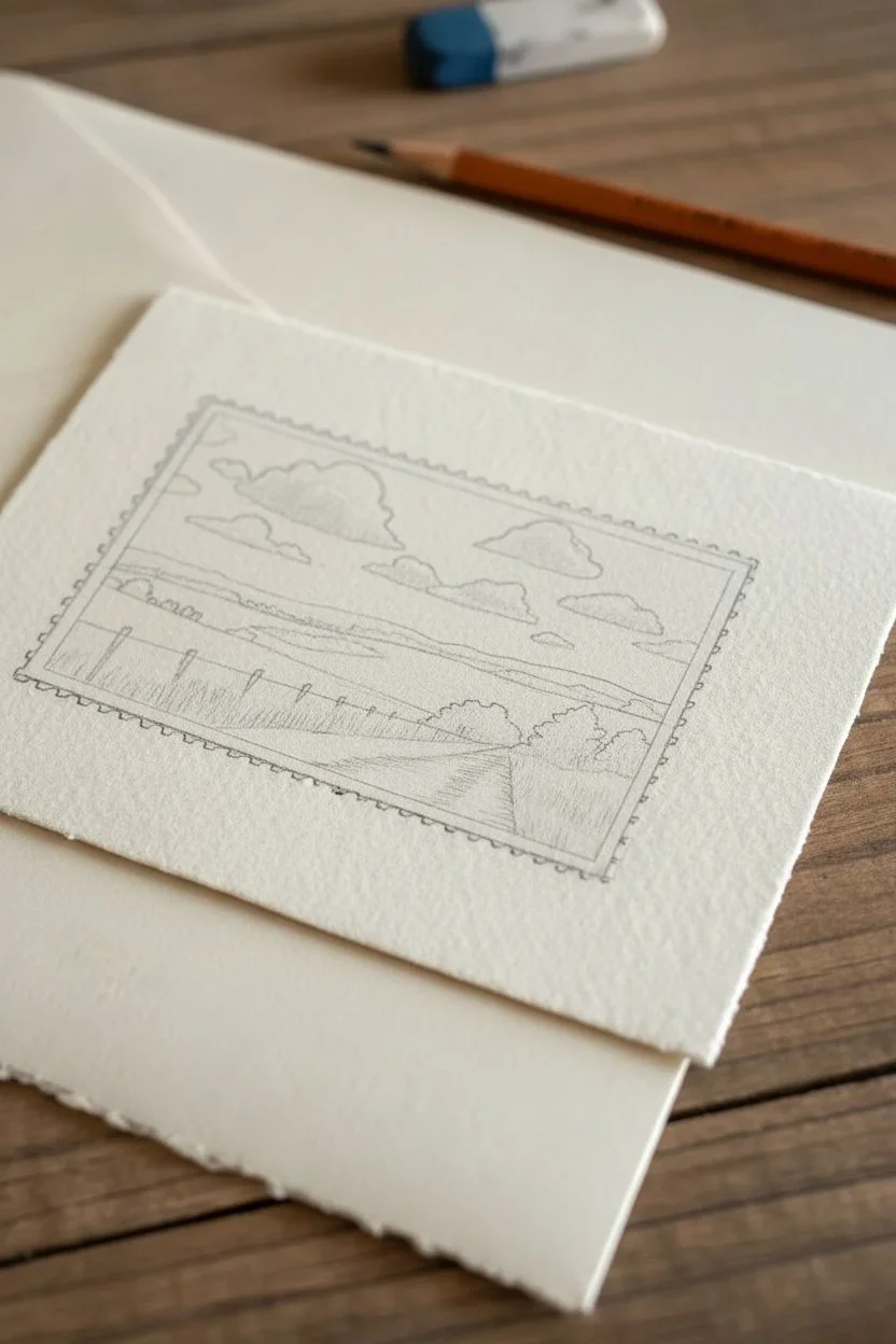
Step 1: Planning the Composition
-
Outline the boundary:
Begin by lightly drawing a rectangle on your paper using a pencil and ruler. A size of about 3×2 inches works perfectly for this miniature scale, giving you enough room for detail without being overwhelming. -
Establish the horizon:
Sketch a horizon line roughly one-third of the way up from the bottom of your rectangle. This placement emphasizes the expansive sky, which is a key feature of this composition. -
Map out key elements:
Lightly sketch in the rolling hills in the distance, the clusters of trees in the middle ground, and the fence posts running diagonally from the bottom left. Don’t worry about perfect details yet; just get the shapes in place. -
Draft the clouds:
Draw loose, fluffy cloud shapes in the sky area. Keep the tops rounded and billowy, while flattening the bottoms slightly to give them perspective and weight.
Step 2: Inking the Details
-
Create the stamp border:
Using your fine liner pen, carefully draw the serrated edge of the stamp. Instead of a straight line, draw small, repeating semi-circles or ‘teeth’ along the pencil rectangle guide. Once finished, draw a second straight line just inside the teeth to create a solid frame. -
Ink the landscape contours:
Go over your pencil sketches with the fine liner. Use a very light touch for the distant clouds and horizon line to suggest depth. For the foreground fence posts and grass texture, use slightly firmer pressure. -
Add texture with hatching:
To create the look of dry grass in the foreground, use short, quick vertical strokes with your pen. Add cross-hatching to the shadowed side of the trees to give them volume. I find that broken lines work best for the clouds to keep them looking soft. -
Clean up:
Once the ink is completely dry—give it a few minutes to be safe—gently erase all the underlying pencil lines to reveal a clean, crisp drawing.
Uneven Ink Lines?
If your hand shakes while drawing the straight framing lines, don’t panic. Go over the line again slightly thicker to hide wobble, or accept the rustic look—it adds vintage charm.
Step 3: Adding Color
-
Paint the sky:
Dilute your Cobalt Blue heavily with water for a soft wash. Paint the sky area, carefully painting *around* the cloud shapes to leave the white of the paper visible. Let pure water fade the blue out as it nears the horizon. -
Identify cloud shadows:
Mix a tiny amount of Payne’s Gray or a diluted black to create a very pale grey. Apply this to the undersides of the clouds to give them three-dimensional form. -
Wash the fields:
Mix Yellow Ochre with a touch of Burnt Sienna to create a warm, golden wheat color. Apply a broad wash across the field area, leaving lighter patches where the sun hits the grass. -
Deepen the foreground:
While the field wash is still slightly damp, drop in more saturated Burnt Sienna near the bottom corners and along the fence line. This wet-in-wet technique adds richness and suggests shadow texture. -
Define the vegetation:
Use a mix of Payne’s Gray and Blue to paint the distant hills and the darker trees in the middle ground. The cool, dark tones will help push these elements back into the distance, enhancing the depth. -
Final ink touches:
After the paint uses completely dry, you may want to re-emphasize the fence posts or adding a few distinct blades of grass in the foreground with your pen to make them pop against the color. -
Sign your work:
Add a small initial or signature below the stamp border to finish the piece with an artist’s touch.
Level Up: Authenticity
Use a rubber stamp with red ink to lightly stamp over a corner of your finished drawing. This mimics a real postmark cancellation and completes the postcard illusion.
Now you have a tiny window into a peaceful landscape that captures the nostalgia of handwritten correspondence


Sepia Portrait With Soft Charcoal
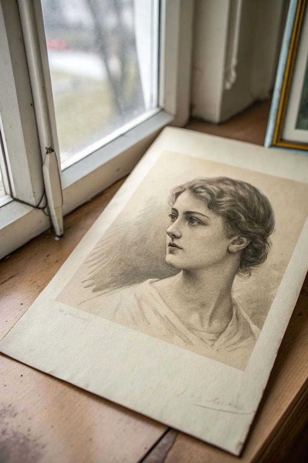
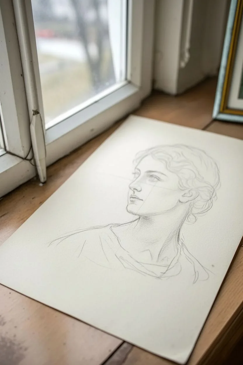
Capture the elegance of a bygone era with this soft, atmospheric portrait study. By combining soft charcoal shading with warm, toned paper, you’ll create a piece that feels like a discovered treasure from an antique sketchbook.
How-To Guide
Materials
- Cream or off-white drawing paper (smooth bristol or hot press watercolor paper)
- Willow charcoal sticks (thin and medium)
- Compressed charcoal pencil (medium/hard)
- White pastel pencil or white charcoal pencil
- Kneadable eraser
- Blending stump (tortillon)
- Soft tissue or chamois cloth
- Workable fixative spray
Step 1: Laying the Foundation
-
Map the head shape:
Start with a light willow charcoal stick to sketch a loose oval for the head. Keep your grip loose and far back on the charcoal to prevent stiff lines. -
Establish the axis:
Draw a vertical centerline that curves slightly to the left, indicating the three-quarter turn of the face. Add a horizontal line for the eyes, halfway down the oval. -
Block in features:
Lightly mark the placement of the eyes, the bottom of the nose about halfway between eyes and chin, and the mouth just beneath that. Don’t worry about details yet; just focus on proportion and placement. -
Outline the hair mass:
Sketch the general volume of the hair. Avoid drawing individual strands; instead, look for the big shapes where the hair waves around the forehead and tucks behind the ear. -
Define the neck and shoulders:
Draw the cylinder of the neck and slope of the shoulders. Since she is wearing a draped garment, suggest the folds of the fabric lightly around the neckline.
Muddy Shadows?
If shadows look dirty rather than deep, you’ve overworked the paper. Lift excess dust with a kneadable eraser, re-apply fresh charcoal, and blend less aggressively.
Step 2: Developing Form and Value
-
Initial shading pass:
Using the side of your willow charcoal, gently lay down a mid-tone shadow on the left side of the face (her right side) and under the chin. This immediately creates volume. -
Smooth the skin tones:
Take a soft tissue or a chamois cloth and gently rub the charcoal you just applied. This pushes the dust into the paper’s tooth and creates that dreamy, soft vintage skin texture. -
Define the eyes:
Switch to your compressed charcoal pencil for precision. carefully draw the upper lash line, the iris, and the pupil. Leave the paper white for the highlight in the eye to bring it to life. -
Sculpt the nose and mouth:
Using the pencil, deepen the shadow under the nose and the line where the lips meet. Avoid outlining the nose bridge; let the shadow define its shape. -
Hair flow and texture:
Return to the willow charcoal to darken the hair. Follow the direction of the growth—sweeping curves from the part line down to the ear. Use the blending stump to smudge sections, creating depth behind the waves.
Age the Paper
Before drawing, enhance the vintage feel by lightly washing the paper with strong brewed tea or coffee. Let it dry completely flat for an authentic antique look.
Step 3: Refining and Highlighting
-
Deepen the darkest values:
Identify the darkest points: the pupils, the corners of the mouth, the deep folds of the hair behind the ear, and the shadow cast by the chin. Reinforce these with the compressed charcoal. -
Background atmosphere:
Lightly scumble some willow charcoal behind the head, specifically on the left side. Gently blend this out into nothingness to create a sense of space without drawing a specific backdrop. -
Lifting lights:
Shape your kneadable eraser into a fine point. dab away charcoal on the bridge of the nose, the cheekbone, and the forehead to reclaim the paper’s lightness. -
Add white accents:
I like to use a white pastel pencil here for the final pop. Apply it sparingly to the whites of the eyes, the tip of the nose, and the highest point of the cheekbone. -
Detail the clothing:
Keep the clothing sketchy and loose compared to the face. vivid lines for the folds, smudged lightly, will suggest fabric without detracting attention from the portrait. -
Final assessment:
Step back and look at the whole image. If the transition from light to shadow on the cheek feels too harsh, use the clean side of your chamois to soften the gradient. -
Fix and preserve:
Once satisfied, spray a light coat of workable fixative in a well-ventilated area to prevent your soft charcoal work from smudging.
Now you have a stunning, classical portrait that captures a moment of quiet reflection.


Botanical Plate Illustration With Labels
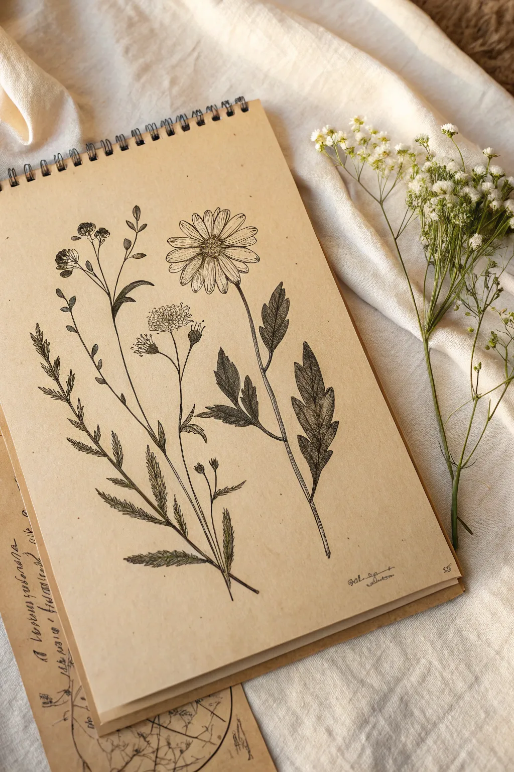
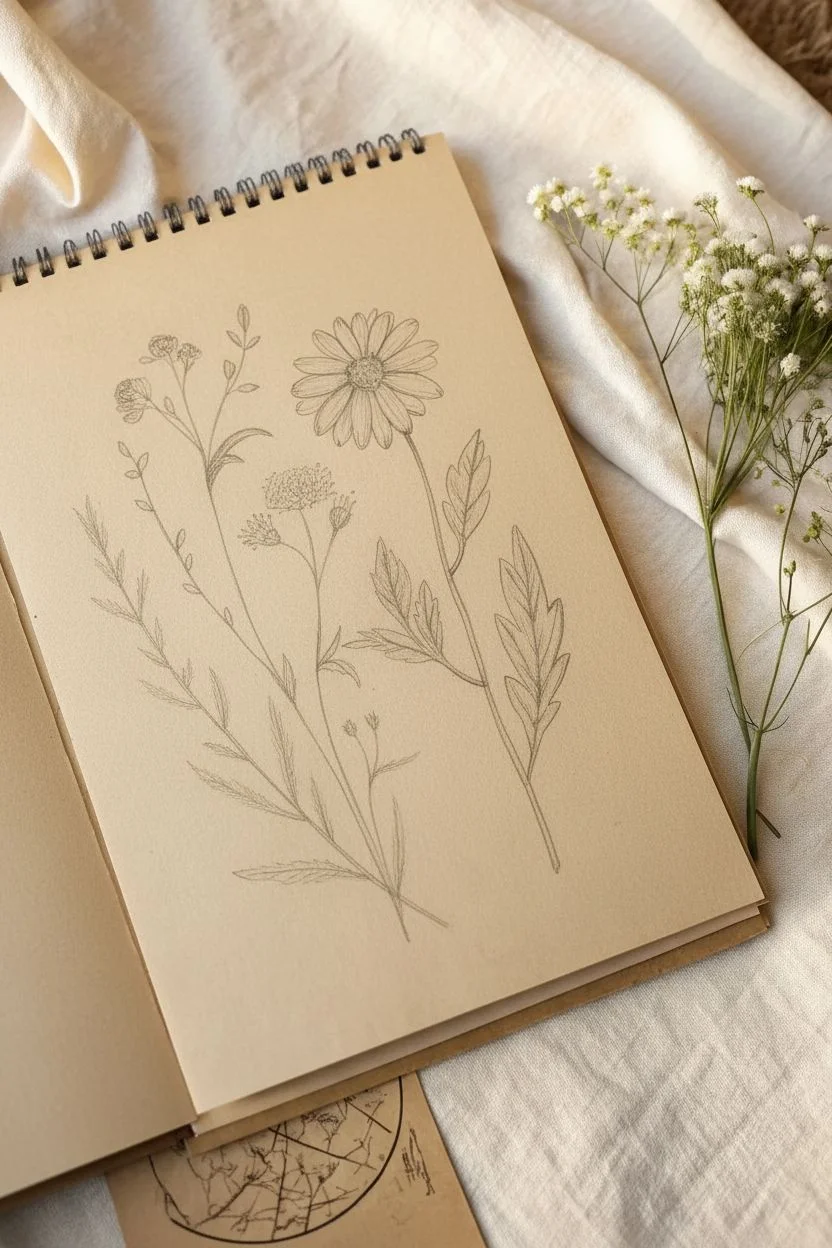
Capture the delicate beauty of a meadow with this fine-line botanical illustration on kraft paper. The warm tone of the sketchbook provides an instant vintage feel, while precise pen work brings the wildflowers to life.
How-To Guide
Materials
- Tan or kraft paper sketchbook (spiral bound)
- Fine liner pens (sizes 0.05, 0.1, and 0.3)
- HB graphite pencil
- Kneaded eraser
- Fresh baby’s breath flowers (for reference)
- Ruler (optional)
Step 1: Planning and Sketching
-
Observe your composition:
Begin by analyzing the layout. This piece features three main vertical stems: a leafy fern-like plant on the left, a central cluster with buds, and a prominent daisy-like flower on the right. Notice how they fan out slightly from a central point at the bottom. -
Draft the stems:
Using your HB pencil with a very light hand, draw three sweeping, slightly curved lines to establish the main height and direction of each plant. The rightmost stem should be the tallest. -
Block in the flower heads:
Sketch a simple oval at the top of the right stem for the daisy. For the center plant, draw small circles to mark where the bud clusters will sit. The left plant is mostly leaves, so just mark the tip. -
Place the leaves:
Lightly outline the general shape of the leaves. The right plant has large, jagged leaves near the bottom. The left plant has fern-like fronds growing upwards. Keep these shapes loose and gestural for now. -
Refine the pencil sketch:
Go back over your rough shapes and add specific details. Define the petals on the daisy and the serrated edges of the leaves. It’s crucial to get the drawing accurate now before ink touches the paper.
Step 2: Inking the Outlines
-
Outline the main daisy:
Switch to a 0.1 fine liner. Carefully trace the petals of the main flower. Don’t close every line perfectly; leaving tiny gaps at the tips or bases can make the petals look more organic and delicate. -
Ink the stems:
Draw the stems using confident, long strokes. If your hand shaky, try creating the line in shorter, connected segments that mimic natural plant nodes. -
Detail the fern leaves:
Move to the leftmost plant. Use the 0.05 pen for these delicate, feathery leaves. Draw the central vein of each small leaflet first, then flick the pen outward to create the edges. -
Define the large leaves:
For the heavy leaves on the right stem, use a 0.1 or 0.2 pen. Outline the jagged ‘toothed’ edges clearly. I like to add a center vein line that doesn’t quite touch the tip of the leaf.
Smudge Prevention
Place a scrap piece of paper under your drawing hand. This acts as a shield, preventing oils from your skin or wet ink from dragging across the porous kraft paper.
Step 3: Shading and Texture
-
Stipple the flower center:
Using your 0.05 pen, create the center of the daisy by making a tight cluster of dots. Pack them densely on the lower-left side to create a shadow and give the center dimension. -
Add petal texture:
Draw very fine, short lines radiating from the center of the flower out into the petals. This gives them a ribbed, realistic texture. -
Shade the heavy leaves:
This is the most critical step for contrast. Use a technique called ‘hatching ‘—drawing closely spaced parallel lines. darker areas, like the underside of the leaves, require lines that are closer together or cross-hatched. -
Darken the stem joints:
Add tiny patches of shadow where leaves meet the stems and where stems branch off. This grounds the drawing and adds structural weight. -
Texture the fern elements:
On the left plant, add minimal shading. Just a few ticked lines at the base of each small leaflet are enough to suggest volume without overpowering the delicate form.
Aged Paper Effect
If you don’t have a tan sketchbook, draw on smooth white paper. Once the waterproof ink is dry, gently brush strongly brewed tea over the page for an authentic antique stain.
Step 4: Finishing Touches
-
Clean up the drawing:
Wait at least 15 minutes to ensure the ink is completely dry. Gently erase all visible pencil lines with the kneaded eraser to reveal the crisp ink work. -
Evaluate contrast:
Step back and look at the whole piece. If the large leaves on the right look too flat, go back with your 0.1 pen and add more hatching to deepen the shadows. -
Add a signature:
Sign your name or add a date in small, cursive script near the bottom right corner to complete the scientific plate look.
Now you have a timeless botanical study ready to be framed or kept as part of your nature journal.


Ephemera Collage Page in Pencil
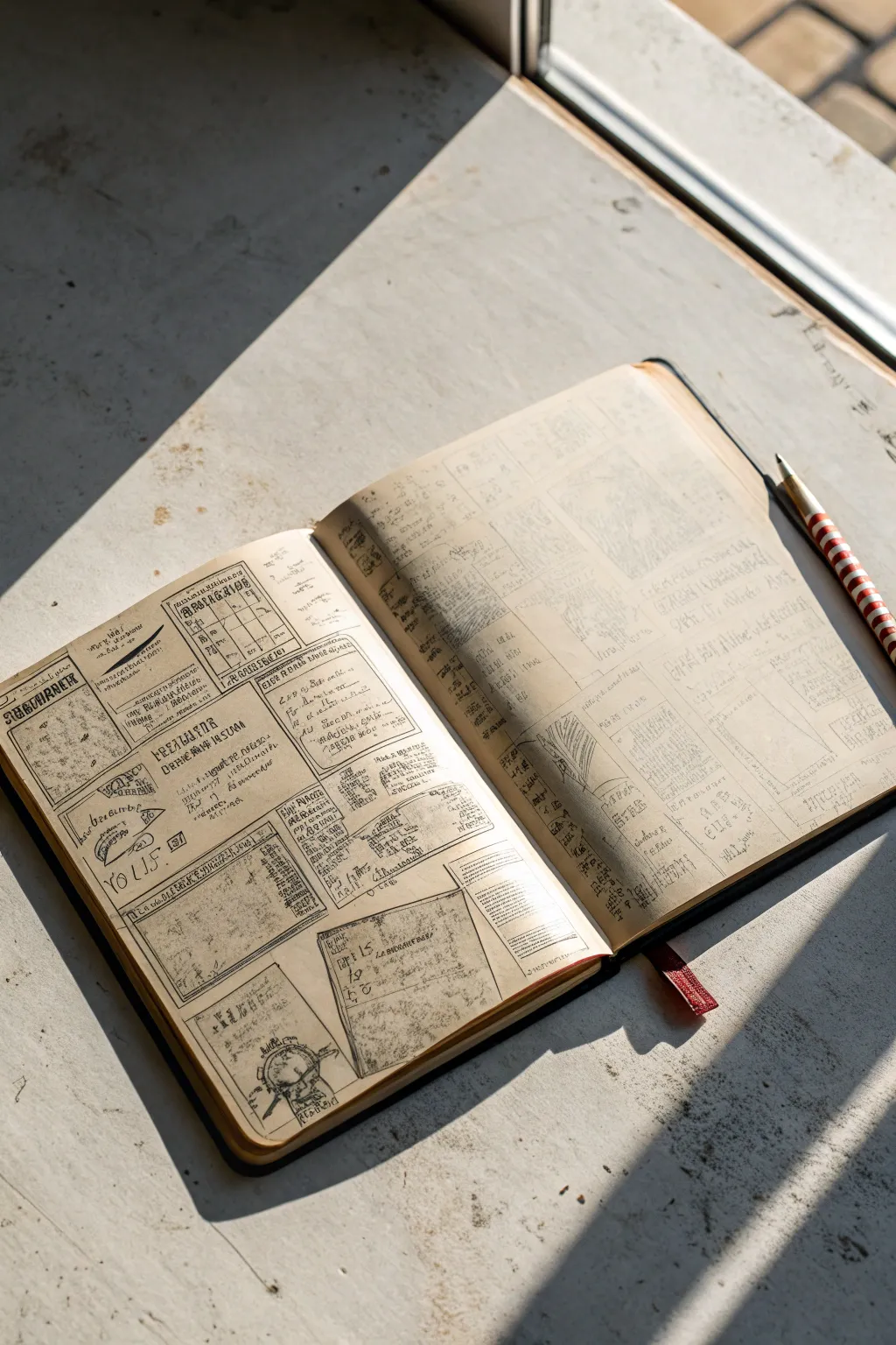
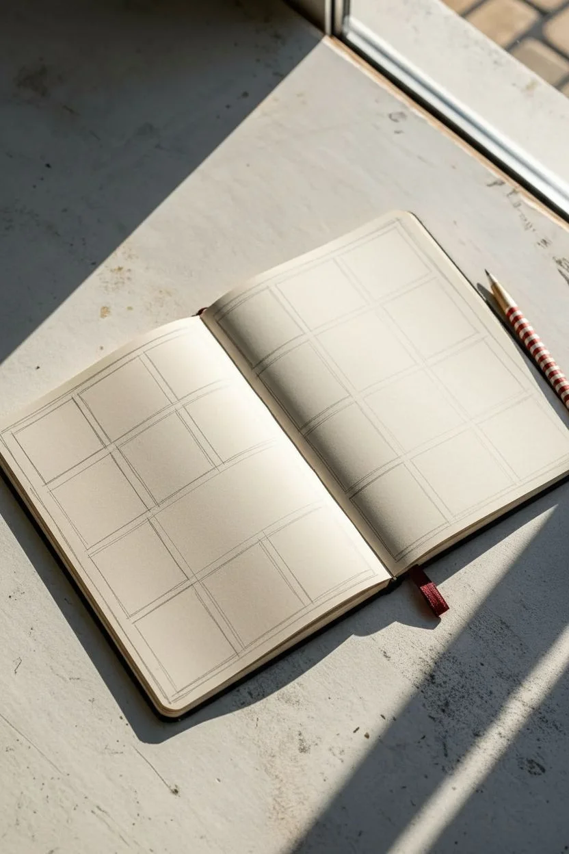
Transport your sketchbook back in time by creating a crowded, fascinating page of hand-drawn vintage advertisements and diagrams. This project mimics the look of an old newspaper collage or scientific journal using nothing but pencil and clever layout techniques.
Step-by-Step Guide
Materials
- A hardcover sketchbook with cream or off-white paper (A5 size works well)
- Graphite pencils (HB for layout, 2B or 4B for darker details)
- Fine-liner pens (sepia or dark grey for an aged look, optional)
- Ruler or straight edge
- Eraser (kneaded eraser is best)
- Reference images of vintage advertisements, Victorian receipts, or botany diagrams
Step 1: Planning the Layout
-
Rough blocking:
Start with your open sketchbook. Lightly sketch a series of boxes and rectangles across the left page using your HB pencil. Vary the sizes—some tall and narrow like newspaper columns, others square or horizontal. -
Grid structure:
Don’t worry about perfect alignment; a slightly jaunty, uneven arrangement adds to the scrapbooked feel. extend this grid onto the right page, but leave larger open spaces on this side for bigger diagrams or ‘handwritten’ notes. -
Defining margins:
Go back over your boxes and double the lines on some of them to create borders. Vintage ads often had decorative, thick frames.
Old Print Trick
To mimic bad printing press alignment, draw your text or image slightly outside its box border, or leave a small white gap between the ink and the frame.
Step 2: Drafting the Content
-
Headline placement:
In the top portion of your larger boxes on the left page, sketch guidelines for headers. Use block lettering or serif styles to mimic old typography. -
Visual anchors:
Select 3-4 boxes to feature illustrations rather than text. Sketch simple outlines: a pointing hand, a mechanical wheel, a botanical leaf, or a simple bottle shape work perfectly for this aesthetic. -
Faux text generation:
For the body copy inside the boxes, you don’t need to write real words. Create ‘lorem ipsum’ visuals by drawing squiggly horizontal lines that resemble tiny lines of text from a distance. Occasionally throw in a legible word like ‘SALE,’ ‘NEW,’ or ‘PATENT.’ -
Right page focus:
On the right page, choose one large area to draw a more detailed diagram, perhaps a map section, a gear mechanism, or a chart. Keep the lines faint and sketchy.
Step 3: Detailing and Refining
-
Darkening borders:
Switch to a softer pencil (2B) or a fine-liner. Trace over your panel borders, making some lines uneven or broken to simulate uneven printing press ink. -
Typography work:
Fill in your headlines. adding small serifs (the little feet on letters) instantly makes the text look older. I find that varying the font weight within a single word adds a nice hand-printed quirkiness. -
Illustrative details:
Shade your small illustrations. Use hatching (parallel lines) and cross-hatching to shade, as this mimics the engraving style found in old newspapers. -
Faux texture:
Add tiny dots or ‘stippling’ around the corners of your boxes to simulate paper grain or aging spots. -
Diagram labels:
On your right-hand page diagram, draw thin lines pointing to specific parts and label them with tiny, unreadable scribbles or capital letters (A, B, C).
Level Up: Coffee Stain
Once the graphite is set, lightly dab a wet tea bag on a scrap piece of paper first, then stamp it onto a corner of your drawing for an authentic aged watermark.
Step 4: Final Aging Touches
-
Smudging:
Gently rub your finger or a blending stump over the denser areas of pencil graphite. This softens the crisp lines and gives the page a worn, handled look. -
Ghost text:
On the right page, fill the empty background space with very faint, diagonal handwriting. It should look like notes taken quickly. Keep the pressure extremely light so it recedes into the background. -
Erase guidelines:
Take your kneaded eraser and lightly dab—don’t rub—any initial construction lines that are too distracting, leaving the rest to look like a raw sketch.
Close your sketchbook and enjoy knowing you’ve created a piece of history from scratch

Have a question or want to share your own experience? I'd love to hear from you in the comments below!