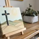
When I’m painting for breast cancer awareness, I always start by thinking about how to show strength and hope without needing a lot of extra detail. Here are some heartfelt breast cancer painting ideas you can make your own, whether you’re creating a gift, a fundraiser piece, or something personal for healing.
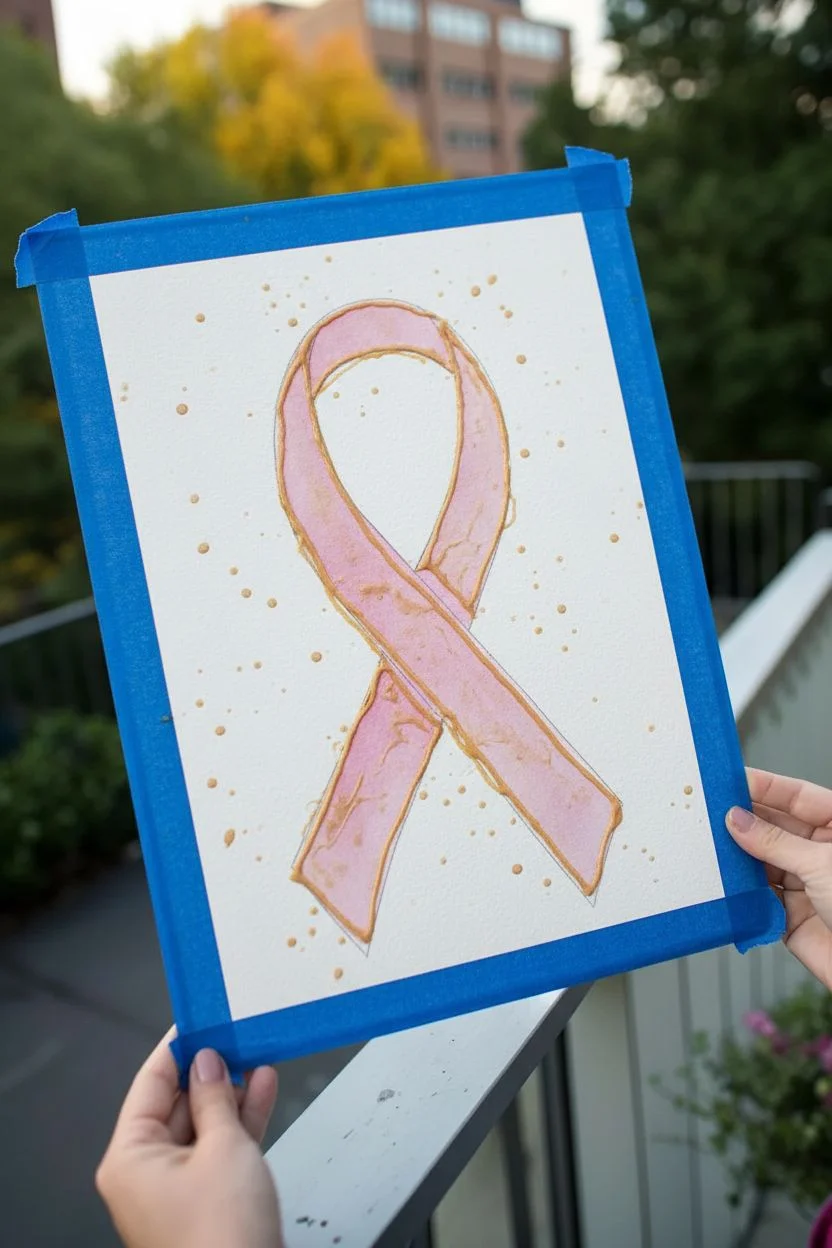
Pink Ribbon With Bold Hope Lettering
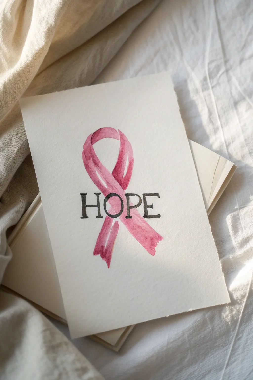
This elegant watercolor project combines the iconic pink ribbon with bold, grounding lettering to create a powerful message of support. The beauty of this design lies in the contrast between the fluid, organic washes of pink and the rigid structure of the serif text.
How-To Guide
Materials
- Cold press watercolor paper (300 gsm or roughly 140 lb)
- Watercolor paints (Alizarin Crimson, Rose Madder, or Quinacridone Rose)
- Round watercolor brush (size 6 or 8)
- Fine liner watercolor brush (size 0 or 1)
- Black waterproof fine liner pen or archival ink marker (0.5mm)
- HB Pencil
- Kneaded eraser
- Ruler
- Water cups and paper towels
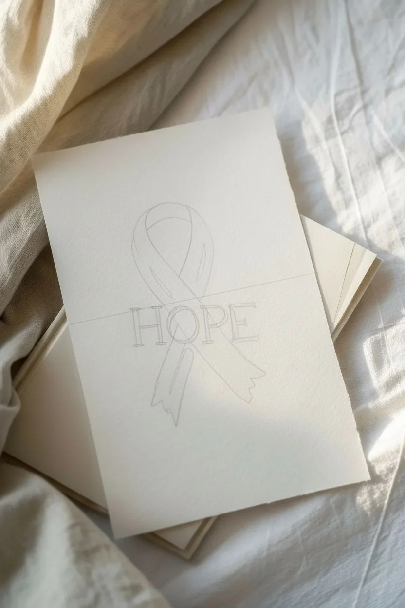
Step 1: Preparation & Sketching
-
Prepare your paper:
Begin by cutting your watercolor paper to your desired card size. A 5×7 inch rectangle works beautifully for this composition. Taping the edges down with painter’s tape can help keep the paper flat, though free-floating is fine for this simple wash. -
Sketch the ribbon shape:
Lightly sketch the outline of the looped ribbon in the center of the paper with an HB pencil. Focus on getting the classic loop shape right, with one tail crossing over the other. -
Draw the lettering guidelines:
Using a ruler, draw a very faint horizontal line across the middle of the ribbon loop where the word ‘HOPE’ will sit. This ensures your text remains straight. -
Lettering placement:
Sketch the word ‘HOPE’ in a serif font. The letters should be large enough to extend slightly beyond the width of the ribbon on both sides. Keep your pencil lines extremely light so they don’t show through the transparency of the paint later.
Master the Texture
Use cold-press paper specifically. The ‘bumpy’ texture allows pigment to settle in the valleys, creating that lovely, imperfect granulated look seen in the photo.
Step 2: Painting the Ribbon
-
Mix your pinks:
Create a puddle of watery pink paint on your palette. I like to have two consistencies ready: one very diluted wash for the base and a slightly more saturated mix for shadows. -
Apply the first wash:
Using your size 6 round brush, wet the shape of the ribbon with clean water first (wet-on-wet technique), avoiding the areas inside the letters ‘H’, ‘O’, ‘P’, and ‘E’ if you can, though painting over them is also a valid style. For this specific look, paint the entire ribbon shape first. -
Drop in color:
While the water glaze is still wet, touch your brush loaded with the lighter pink mix to the paper. Let the color bloom and flow naturally to fill the ribbon shape. -
Add depth:
While the first layer is still damp but not soaking, drop the darker, more saturated pink mix into the areas where the ribbon twists and folds, specifically at the crossover point and the bottom tips. -
Create hard edges:
Once the main wash is done, use the tip of your brush to tidy up the outer edges of the ribbon. You want crisp, clean lines on the outside to contrast with the soft blends inside. -
Lifting highlights:
If an area looks too dark, use a clean, thirsty (slightly damp but paint-free) brush to lift some pigment away from the curved top of the loop to create a highlight. -
Let it dry completely:
This is crucial. The paper must be bone dry before you attempt the lettering step to prevent the black ink from bleeding into the pink paint.
Fixing Bleeds
If black ink bleeds into the pink, your paint wasn’t dry. Stop immediately. Let it dry, then use white gouache to gently touch up the bled area before fixing the line.
Step 3: Inking the Lettering
-
Outline the text:
Using your black waterproof fine liner, carefully trace the outline of your ‘HOPE’ letters. Pay close attention to the serifs (the little feet) on the letters. -
Fill the letters:
Slowly fill in the letters with black ink. You can use the pen for this, or switch to a small brush with black ink or watercolor if you have a steady hand. The black needs to be opaque and bold. -
Refine the edges:
Go back over the edges of your letters to ensure they are crisp and sharp. Any jaggedness will be noticeable against the soft watercolor background. -
Erase guidelines:
Once you are 100% certain the black ink is dry, gently run your kneaded eraser over the area to pick up any remaining pencil lines.
Step 4: Finishing Touches
-
Assess the transparency:
Look at where the letters cross the ribbon. The black should sit boldly ‘on top’ of the pink imagery. -
Optional texture:
If you want the edges of the ribbon to look more organic like the example, you can take a slightly damp brush and gently soften just a few random spots along the ribbon’s contour. -
Final drying:
Allow the card to rest flat for at least an hour to ensure no paper buckling remains.
This heartfelt card makes a beautiful gift or display piece to inspire strength and solidarity

Ribbon Heart in Negative Space
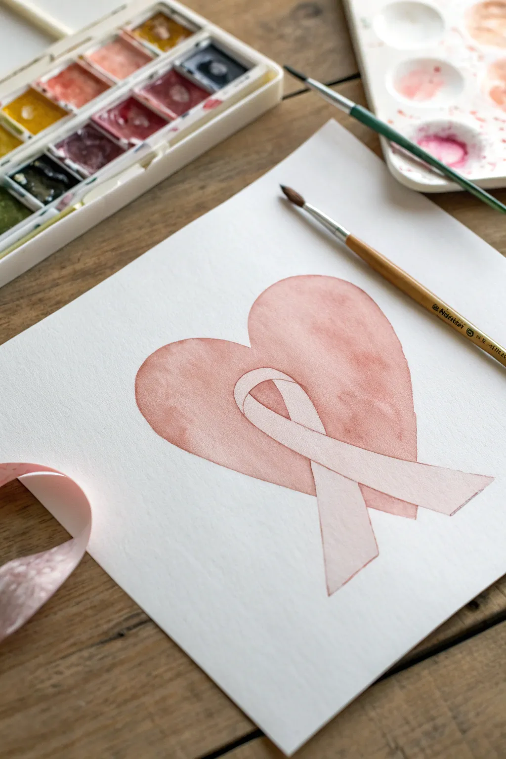
This delicate watercolor project uses the technique of negative space to reveal a pristine white awareness ribbon nestled inside a soft, blush-pink heart. It’s a symbolic and serene piece that balances simple shapes with emotive color.
Step-by-Step Guide
Materials
- Cold press watercolor paper (300 gsm)
- Pencil (HB or H)
- Kneaded eraser
- Watercolor paints (Alizarin Crimson, Sap Green, Burnt Umber)
- Round watercolor brush (size 6 or 8)
- Small detail brush (size 2)
- Palette for mixing
- Jar of clean water
- Paper towels
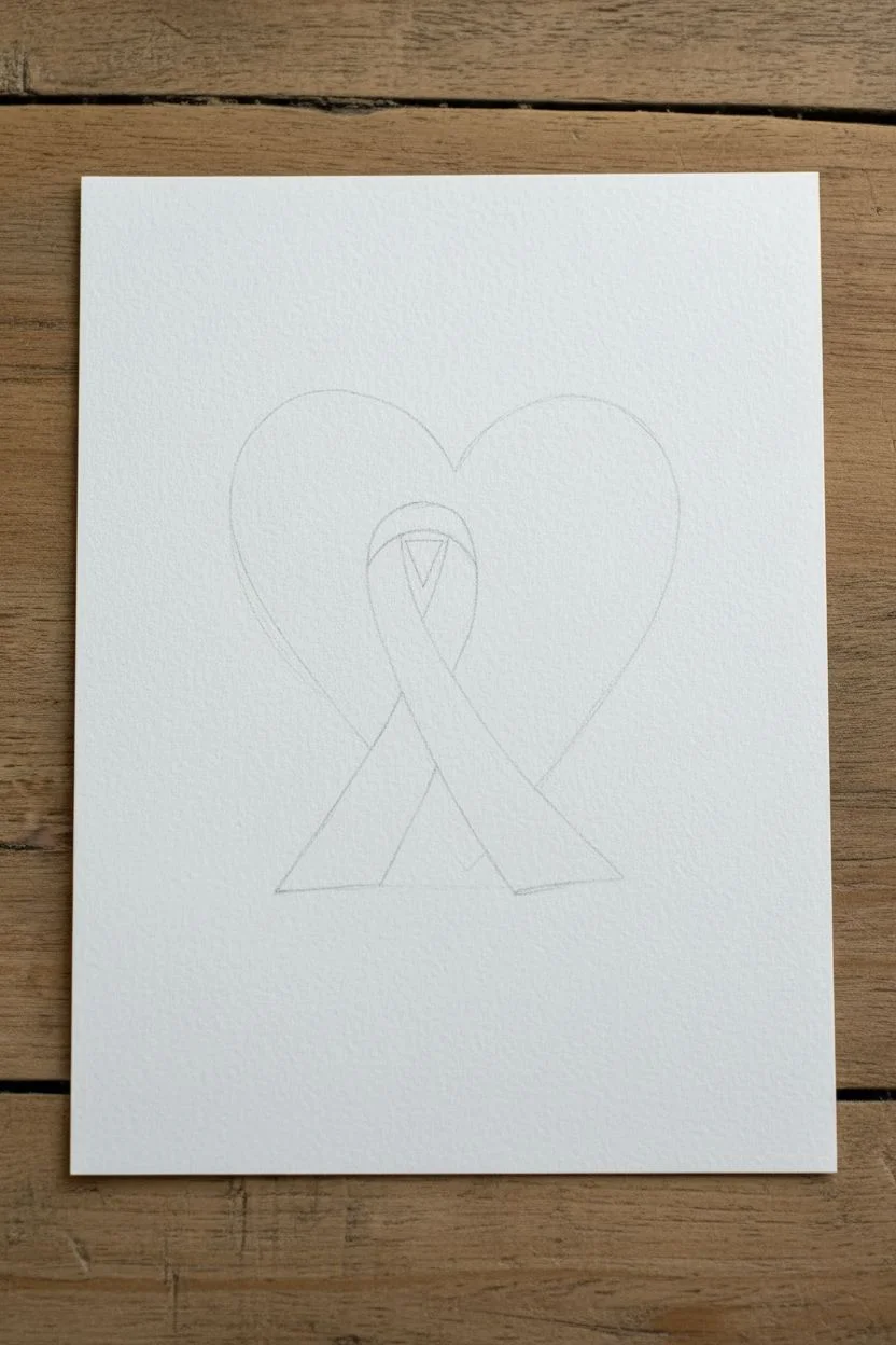
Step 1: Sketching the Layout
-
Center layout:
Begin by lightly marking the center of your paper to ensure your heart is positioned well. -
Draw the ribbon first:
Since the ribbon will be white (negative space), draw it first. Sketch a classic looped ribbon shape in the center. Make the loop prominent and let the two tails cross over each other elegantly. -
Outline the heart:
Draw a large, symmetrical heart shape around the ribbon. The ribbon should sit comfortably inside the heart, with the ends of the ribbon tails extending slightly towards the bottom point of the heart but stopping before the edge. -
Refine the lines:
Go over your sketch to ensure the curves are smooth. The ribbon needs distinct ‘over and under’ sections where the fabric creates a fold. -
Lighten the graphite:
Gently roll a kneaded eraser over the entire sketch. You want the lines to be barely visible—just enough to guide your brush but distinct enough not to show through the sheer paint later.
Uneven Edges?
If paint bleeds into the white ribbon area, wait for it to dry completely. Then, use a stiff brush dampened with clean water to gently scrub and lift the unwanted paint.
Step 2: Mixing the Perfect Shade
-
Start with red:
On your palette, place a dab of Alizarin Crimson or a similar cool-toned red. -
Desaturate the color:
To get that dusty, vintage rose color seen in the example, add a tiny touch of Sap Green to the red. Green neutralizes the red slightly, taking away the brightness. -
Create a wash:
Add plenty of water to your mix. Isolate a puddle of paint that is quite watery; test it on a scrap piece of paper. It should dry to a soft, semi-transparent blush tone.
Bloom Effect
While the heart wash is still damp, sprinkle a tiny pinch of salt onto the paint. Let it dry fully, then brush the salt off. This creates unique starred textures in the background.
Step 3: Painting the Heart
-
Start at the perimeter:
Load your size 6 round brush with the watery paint mix. Begin painting at the top curve of the heart, pulling the color downward. -
Mind the gap:
As you paint inwards, carefully stop your brush strokes right at the pencil line of the ribbon. I like to switch to a slightly smaller brush here to get crisp edges around the white shape. -
Create a seamless wash:
Keep the ‘bead’ of wet paint moving. Don’t let an edge dry before you’ve filled the adjacent area, or you’ll get hard lines. Work relatively quickly to fill the heart shape. -
Define the loop:
Paint the small triangular area inside the top loop of the ribbon. This is crucial for defining the ribbon’s knot. -
Soften the texture:
While the paint is still wet, drop in tiny amounts of clear water or slightly more pigment in random spots to create that subtle ‘blooming’ texture characteristic of watercolor.
Step 4: Adding Depth and Detail
-
Shade the ribbon:
Once the heart is totally dry, mix an extremely pale, watered-down wash of your red/brown mix. Using the detail brush, paint a very faint shadow on the back section of the ribbon loop to show it sits behind the front strip. -
Shadow the crossover:
Paint a small, faint shadow where the ribbon tails cross over each other. This implies dimension, suggesting one piece of fabric is lying on top of the other. -
Wait for drying:
Let these tiny shadow details dry completely. If they are too dark, blot them immediately with a clean tissue. -
Clean up edges:
Inspect the edges where the paint meets the white ribbon. If any pencil marks are still visible, use your eraser gently to remove them without disturbing the paint surface.
Now you have a thoughtful piece of art that speaks volumes through its gentle simplicity


Pink Ribbon Watercolor Wash Background
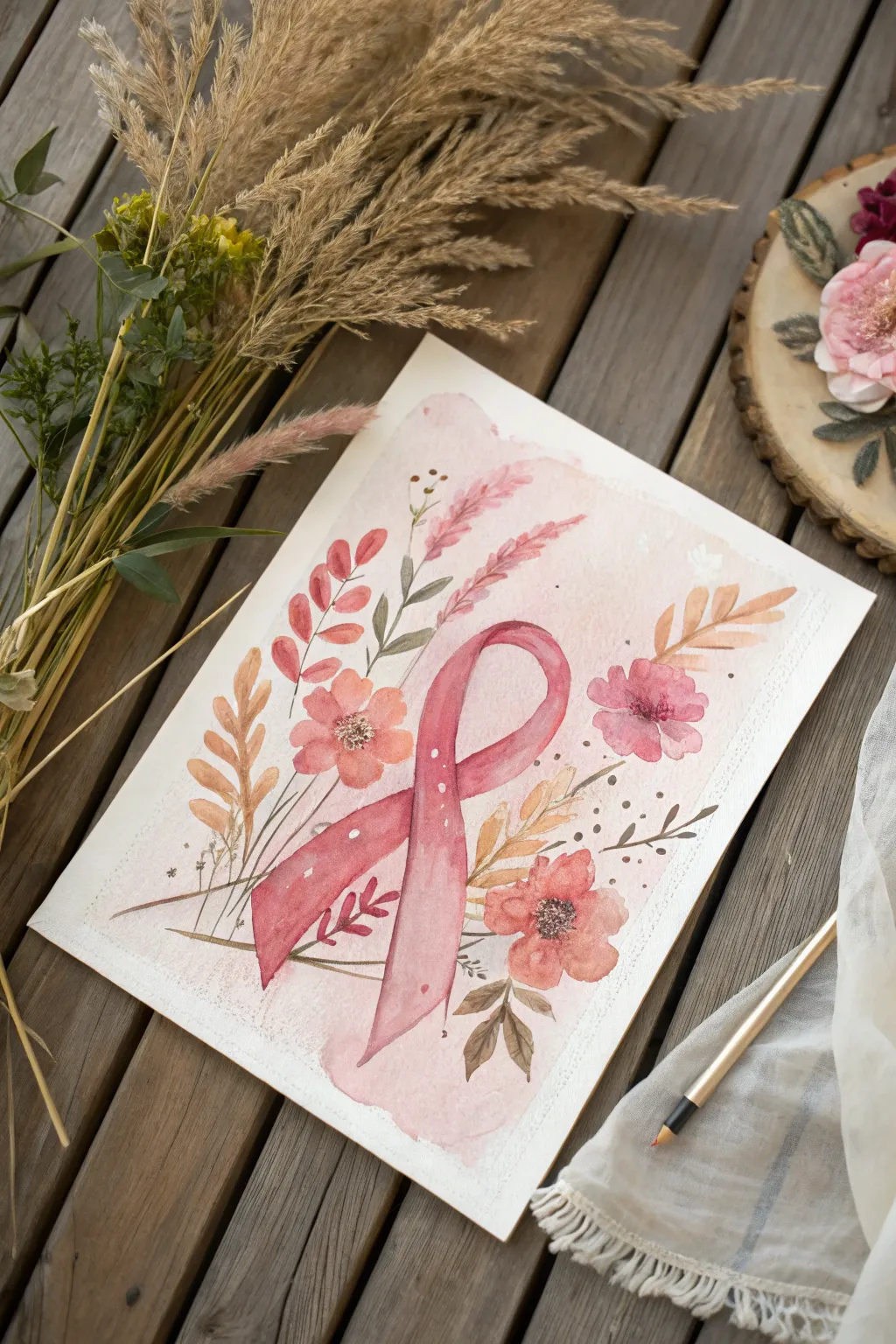
This soft, evocative project combines a classic pink ribbon with delicate botanical elements on a gentle wash background. The loose watercolor style creates a warm, supportive piece perfect for breast cancer awareness or a thoughtful gift.
Step-by-Step Guide
Materials
- Cold press watercolor paper (300 gsm)
- Watercolor paints (shades of pink, rose, peach, brown, and sage green)
- Round watercolor brushes (sizes 2, 4, and 8)
- Pencil (HB or H)
- Kneaded eraser
- Clean water jars
- Paper towels
- White gel pen or gouache (optional)
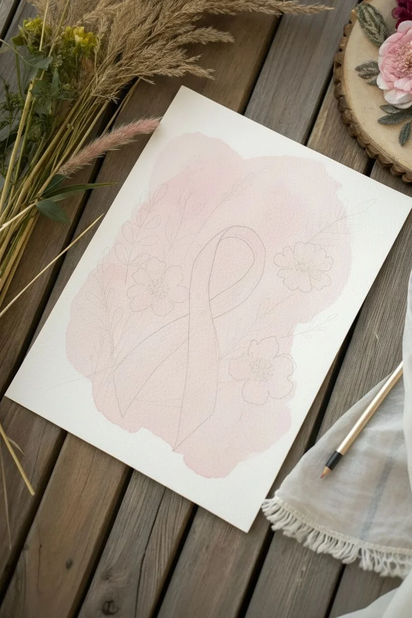
Step 1: The Sketch & Base Layer
-
Outline the Ribbon:
Lightly sketch the central ribbon shape in the middle of your paper using an HB pencil. Aim for a flowing, relaxed loop where the top curve is slightly wider than the tails. -
Sketch Botanical Placement:
Visualize a loose oval or diamond shape around the ribbon. Lightly mark positions for three main flower heads: one to the left, two to the right. Add faint lines indicating where stems and leaves will flow outward. -
Soften the Sketch:
Use your kneaded eraser to gently lift the graphite until the lines are barely visible. This prevents the pencil from showing through the translucent watercolor layers later. -
Create the Background Wash:
Mix a very watery, pale pink wash. Using your largest brush (size 8), apply an irregular, cloudy shape behind where your main elements will sit. Keep the edges ragged and watery for that loose, organic look.
Muddy colors?
If your pinks and greens turn brown where they touch, let the first color dry completely before painting a neighbor. Wet-on-wet mixes colors; wet-on-dry layers them cleanly.
Step 2: Painting the Ribbon
-
First Ribbon Glaze:
Mix a medium-strength rose pink. Paint the entire ribbon shape with this flat wash. While it’s still wet, I like to drop in slightly darker pigment at the crossover point to suggest a shadow. -
Define the Loop:
Once the first layer is barely damp, deepen your pink mixture. Carefully paint the back part of the loop (the part ‘inside’ the ribbon) a slightly darker shade to push it into the background. -
Add Dimension:
When completely dry, glaze a darker berry tone along the edges of the ribbon and underneath the loop where the fabric would cast a shadow on itself. This creates the 3D folded effect. -
Decorative Dots:
With a fine brush or a white gel pen, add tiny white dots in a vertical line down the left tail of the ribbon for a touch of whimsy.
Go Metallic
For a stunning finish, use gold watercolor paint or metallic ink for the splatters and the flower centers. It catches the light beautifully.
Step 3: Adding the Florals
-
Paint Main Blooms:
Using a size 4 brush, create loose five-petal flowers in soft peach and muted rose tones. Keep the paint wet and allow the petals to bleed slightly into one another. -
Darken Flower Centers:
While the flowers are still damp, drop a concentrated dark brown or deep plum color into the very centers. Let this pigment naturally spread outward to create depth. -
Tall Grasses:
Mix a pink-beige color. Using the tip of a size 2 brush, pull long, feathery strokes upward from the center, mimicking ornamental grass or wheat. Let them curve naturally. -
Warm Leaves:
Switch to an ochre or golden-brown shade. Paint simple, single-stroke leaves attached to thin stems on the left side of the composition. -
Cool Leaves:
Balance the warmth with a desaturated sage green. Paint small, leafy sprigs tucked behind the ribbon and main flowers. Keep these shapes varying in size for visual interest.
Step 4: Final Details
-
Speckle Texture:
Load a brush with watery brown paint. Hold it over the paper and tap the handle against another brush to splatter tiny droplets across the background. This adds energy and texture. -
Deepen Contrast:
Look for areas that feel flat. Add tiny touches of your darkest brown or maroon to the deepest crevices of the leaves and just under the flower petals. -
Stamen details:
Once the flower centers are bone dry, use a fine liner brush or pen to draw tiny stamen circles in the center of the blooms for realistic detail. -
White Highlights:
Use a white gel pen or opaque white gouache to add final tiny highlights on the flower petals or leaves to make them pop.
Allow your painting to dry flat completely before framing this meaningful tribute


Monochrome Portrait With Pink Ribbon Accent
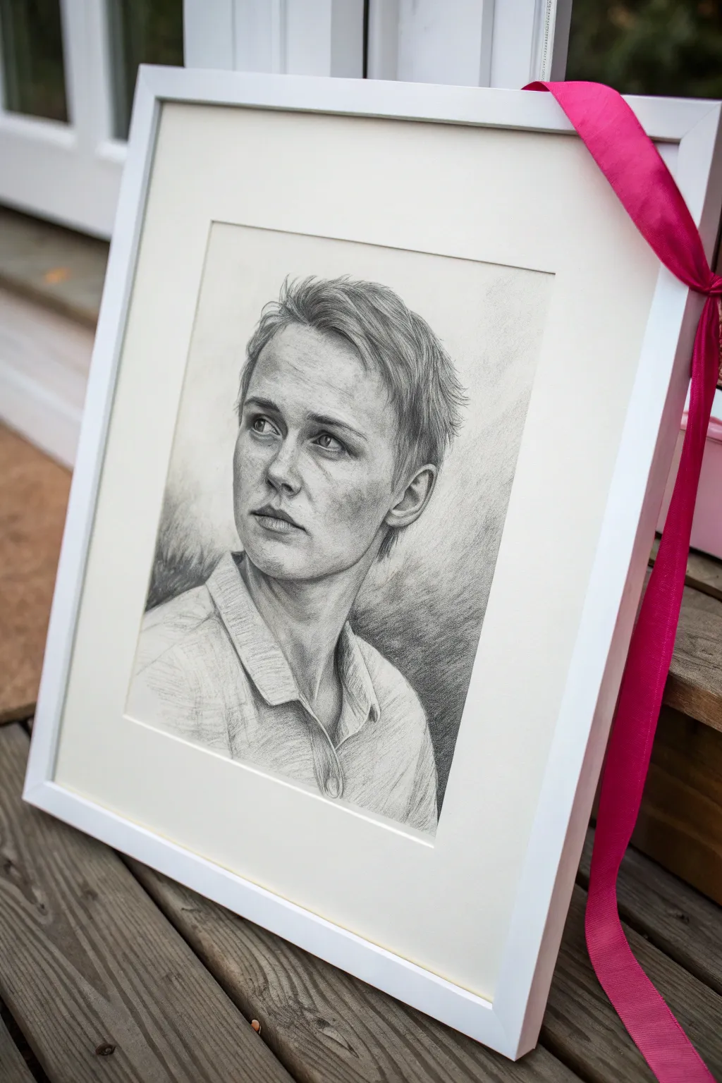
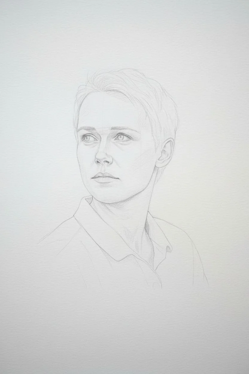
This project combines the timeless elegance of a realistic charcoal portrait with a singular pop of color to symbolize awareness and strength. The result is a deeply moving tribute that balances stark, monochromatic realism with a bright, hopeful accent.
How-To Guide
Materials
- High-quality drawing paper (smooth or vellum finish, approx. 11×14 inches)
- Graphite pencils (HB, 2B, 4B)
- Charcoal pencils (soft, medium, hard)
- White pastel pencil or charcoal (for highlights)
- Blending stumps (tortillons) in various sizes
- Kneadable eraser
- Standard white hi-polymer eraser
- Workable fixative spray
- White or off-white mat board (pre-cut or custom)
- Simple white wooden frame (approx. 16×20 inches)
- Broad satin pink ribbon (1.5 – 2 inches wide)
- Scissors and framing tape
Step 1: Drafting the Foundations
-
Establish the reference:
Choose a high-contrast reference photo of your subject. This technique works best with lighting that casts distinct shadows, sculpting the face’s features. -
Light sketch outline:
Using an HB graphite pencil, lightly block in the basic shapes of the head, neck, and shoulders. Keep your pressure very light so these lines don’t indent the paper. -
Map feature placement:
Mark the eye line, nose base, and mouth center. Pay close attention to the tilt of the head; in our example, the subject is looking up and away, so the eyes will be positioned slightly higher. -
Refine the contours:
Once the proportions feel right, gently refine the outline of the jaw, the collar of the shirt, and the hairline. Only move to shading when you are confident in this line work.
Smudged Up?
Place a scrap sheet of clean paper under your drawing hand while you work. This acts as a barrier, preventing oils from your skin from smearing your carefully placed charcoal lines.
Step 2: Rendering Form and Depth
-
Lay down initial shadows:
Switch to a 2B graphite pencil or a hard charcoal pencil to build the initial shadow maps under the eyebrows, the nose, and the jawline. -
Deepen the darks:
Use a soft charcoal pencil for the darkest areas, such as the pupils, nostrils, and deep creases in the clothing. Charcoal provides that rich, matte black that graphite sometimes lacks. -
Mid-tone development:
I like to use a medium charcoal pencil for the hair. Use short, flicking strokes that follow the direction of hair growth to create texture rather than just solid blocks of color. -
Blend for skin texture:
Use a clean blending stump (tortillon) to soften the transitions on the cheeks and forehead. Be careful not to over-blend; leaving some pencil texture adds life to the drawing. -
Lift out lights:
Take your kneadable eraser and gently press it onto areas that need to be lighter, ‘lifting’ the charcoal dust away. Use this for the bridge of the nose and the cheekbones. -
Add high-contrast highlights:
Using a white pastel pencil or white charcoal, touch up the brightest spots: the catchlights in the eyes and the tip of the nose. This creates a striking 3D effect.
Step 3: Clothing and Background
-
Sketch the clothing:
Keep the clothing sketch looser than the face. Use broad strokes with the side of a 4B pencil to suggest folds in the fabric without detailing every thread. -
Atmospheric background:
Create a subtle background gradient. Shade heavily behind the lighter side of the face and lighter behind the shadowed side of the face to create separation. -
Smudge the periphery:
Using a large blending stump or even a soft tissue, smudge the background and the lower edges of the clothing so they fade out, keeping the focus entirely on the face.
Make It Personal
Instead of a store-bought ribbon, weave a thin strip of pink fabric from a recovered loved one’s shirt or scarf into the frame corner for a deeply personal, sentimental touch.
Step 4: Finishing and Framing
-
Seal the artwork:
Take the drawing to a well-ventilated area and spray it with a workable fixative. This prevents the charcoal from smudging against the glass later. -
Prepare the mat:
Once dry, center your drawing behind the mat board. Use framing tape to secure the paper to the back of the mat, ensuring the horizon line is straight. -
Clean the glass:
Ensure the inside of your frame glass is impeccably clean and free of dust specks before placing the matted artwork inside. -
Assemble the frame:
Place the glass, matted art, and backing board into the white wooden frame and secure the clips or points on the back. -
Tie the accent ribbon:
Cut a generous length of pink satin ribbon. Wrap it diagonally around the top right corner of the frame. -
Create the knot:
Tie a simple, clean knot or bow at the corner, letting the tails drape naturally down the side. This pop of pink transforms the monochrome piece into a symbol of awareness.
Now you have a stunning, respectful tribute that honors the subject with artistic integrity
BRUSH GUIDE
The Right Brush for Every Stroke
From clean lines to bold texture — master brush choice, stroke control, and essential techniques.
Explore the Full Guide
Ribbon-as-Dress Statement Painting
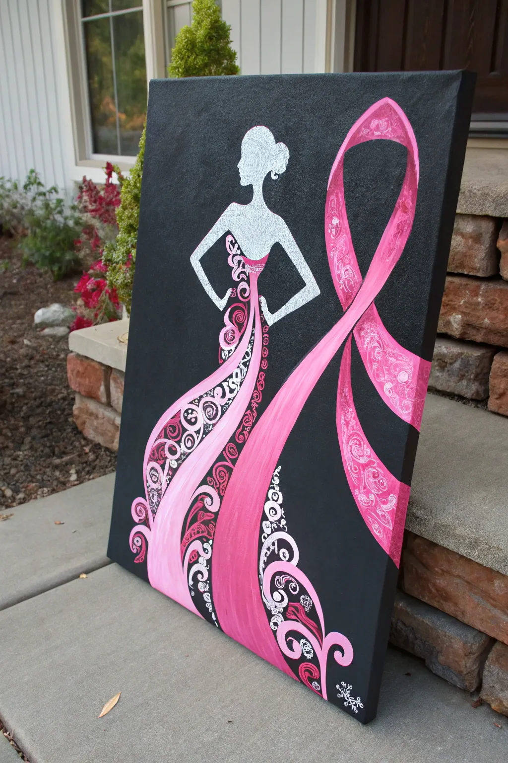
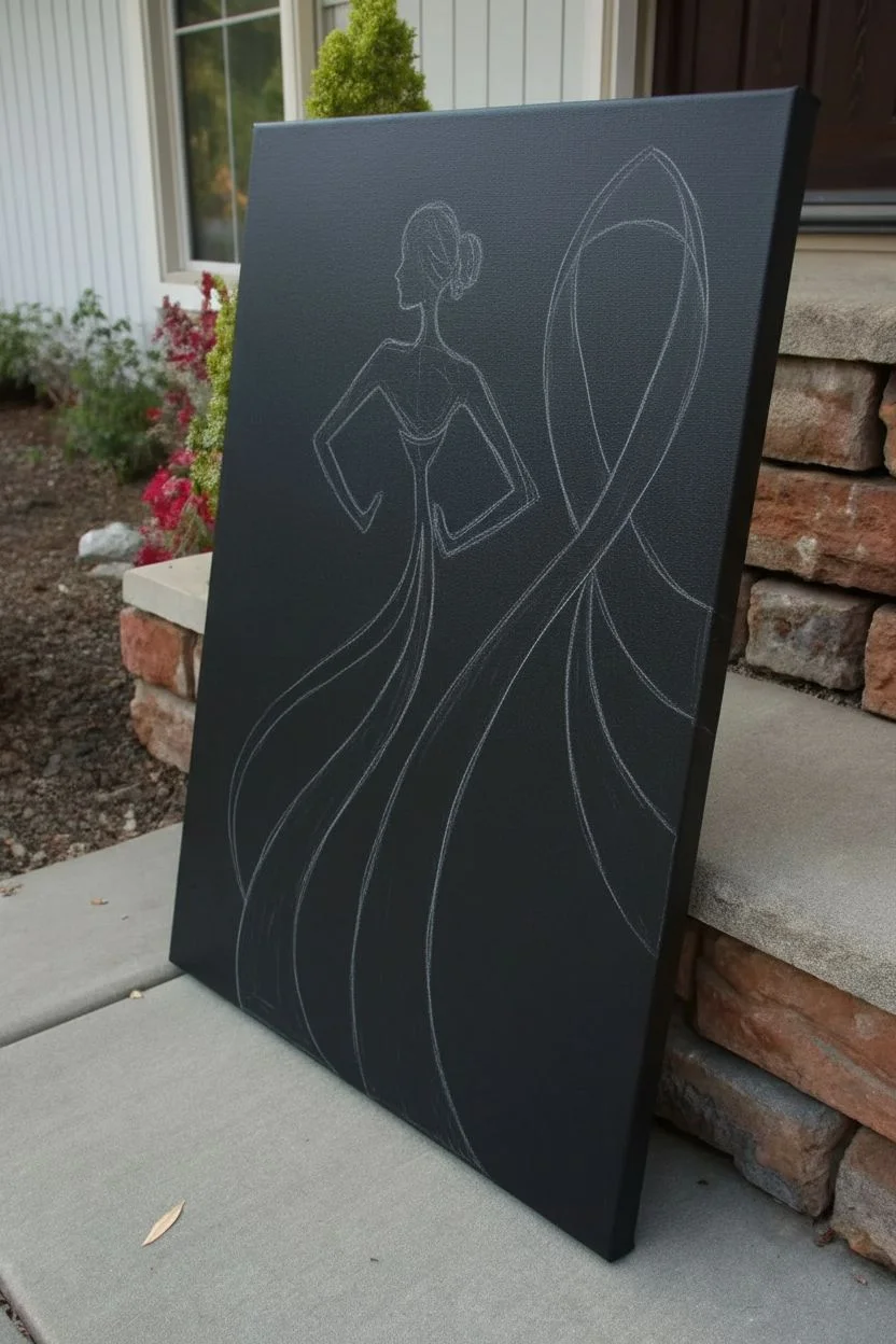
This stunning statement piece combines the grace of a stylized feminine silhouette with the powerful symbol of the pink ribbon. The artwork seamlessly blends a flowing gown into the iconic awareness loop, creating a striking contrast against a bold black background.
Step-by-Step
Materials
- Large rectangular canvas (approx. 18×24 inches)
- Black acrylic paint (matte finish)
- Titanium white acrylic paint
- Various shades of pink acrylic paint (light, magenta, deep rose)
- Silver metallic paint or paint pen
- Flat shader brushes (large and medium)
- Detail liner brush (size 0 or 00)
- Chalk or white charcoal pencil
- Painter’s tape (optional)
- Reference image of silhouette
Step 1: Preparation and Base Layer
-
Prime the background:
Start by coating the entire canvas with black acrylic paint. Use a large flat brush to ensure smooth, even coverage. You may need two coats to get a solid, opaque black without streaks. Let this dry completely before moving on. -
Sketch the silhouette:
Using a piece of white chalk or a white charcoal pencil, lightly sketch the outline of the woman’s figure. Focus on the head, bun hairstyle, and the triangular shape of the upper torso and arms on hips. Don’t worry about the dress details yet. -
Draft the ribbon:
Extend the sketch to create the ribbon dress. Draw a large loop starting from the waist, extending upwards to the right and looping back down. Let the other end of the ribbon flow downwards to become the skirt of the dress.
Clean Lines Hack
If you struggle with steady lines for the ribbon edges, use painter’s tape to mark off the long, straight sections of the ribbon before painting the pink interior.
Step 2: Painting the Figure
-
Fill the body shape:
Mix a small amount of silver into your white paint for a subtle shimmer, or stick to pure white. Fill in the head, neck, arms, and upper torso area using a medium flat brush. -
Texture the figure:
While the white paint is still slightly tacky, dab it gently with a dry brush or sponge to give the silhouette a textured, almost glittery appearance without actual glitter. -
Define the hair:
Use a smaller brush to refine the edges of the hair bun, adding a few loose strands at the nape of the neck for a natural, elegant look.
Step 3: Creating the Ribbon flowing Dress
-
Block in the pinks:
Paint the main shape of the ribbon and skirt with a medium pink shade. Use long, sweeping strokes to mimic the look of fabric and movement. -
Add shadows:
Where the ribbon twists or folds (like under the loop or at the waist), blend in a darker rose or magenta paint. This creates depth and makes the ribbon look three-dimensional. -
Highlight the curves:
Apply a lighter pastel pink to the highest points of the ribbon curve and the center of the skirt panel to simulate light hitting satin fabric. -
Refine the edges:
Go back with your black background color and a steady hand to clean up any messy edges where the pink meets the black, ensuring sharp, crisp lines.
Add Real Sparkle
For a mixed-media 3D effect, adhere small clear rhinestones or silver glitter glue along the white swirled patterns once the paint is fully dry.
Step 4: Intricate Detailing
-
Plan the patterns:
The beauty of this piece lies in the swirl patterns. Lightly sketch distinct sections within the dress and ribbon where you want to add decorative swirls. -
Start the white swirls:
Using your finest liner brush and white paint (thinned slightly with water for better flow), paint delicate filigree swirls along the side of the skirt and inside parts of the ribbon loop. -
Layer pink swirls:
Intertwine darker pink swirls among the white ones. I find that alternating the direction of the spirals adds a lovely organic complexity to the design. -
Add black negative space:
Paint small black swirls or dots on top of the solid pink areas. This ‘reverse’ detailing helps breaking up the large blocks of color. -
Detail the bodice:
Paint the bodice area where the dress meets the white skin. Use intricate floral-like swirls in black and deep pink to create a lace effect. -
Final embellishments:
Add tiny dots or ‘pearls’ of white paint along the swirl lines for extra texture. Sign your name in a discreet corner using white or silver paint.
Display this meaningful artwork in a prominent place to inspire hope and awareness
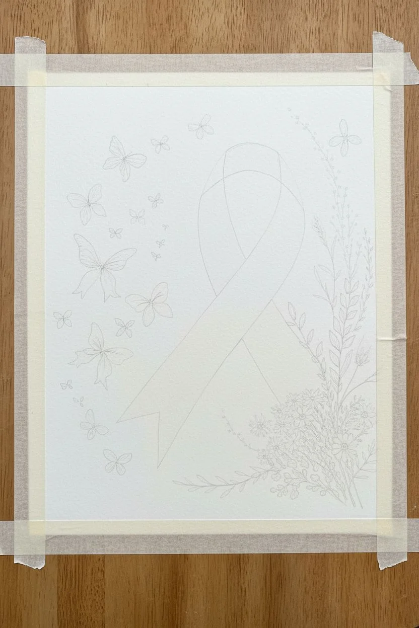
Butterflies Emerging From a Ribbon
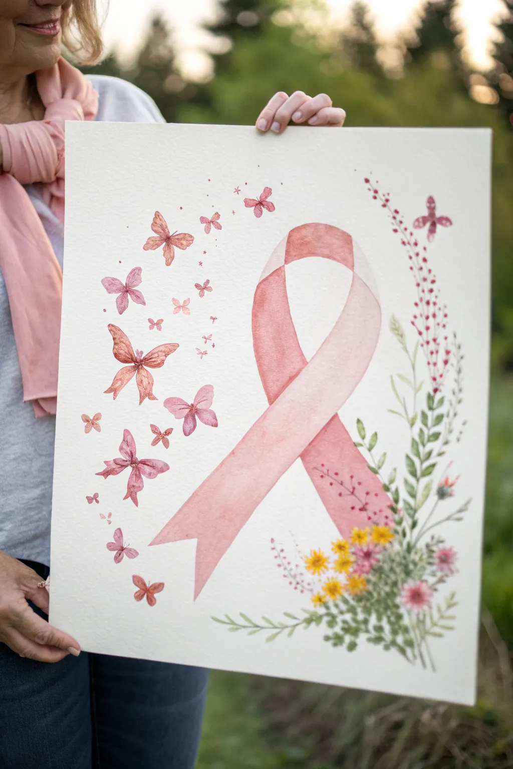
This tender watercolor piece combines the strength of the pink ribbon symbol with the hopeful imagery of butterflies taking flight. Soft, transparent layers of pink create a gentle, airy aesthetic that is perfect for honoring a survivor or remembering a loved one.
How-To Guide
Materials
- Cold press watercolor paper (140lb/300gsm), preferably 11×14 or larger
- Watercolor paints (Alizarin Crimson, Opera Rose, Yellow Ochre, Sap Green, Burnt Sienna)
- Round watercolor brushes (sizes 2, 6, and 10)
- Pencil (HB or H) and kneaded eraser
- Two jars of water
- Paper towels
- Masking tape (for securing paper)
- Palette for mixing
Step 1: Sketching the Composition
-
Prepare your surface:
Begin by taping down all four edges of your watercolor paper to a board. This prevents the paper from buckling when we add the wet washes later. -
Outline the ribbon:
Lightly sketch a large, looped ribbon in the center-right of the paper. Focus on getting the iconic crossover shape correct. The ribbon looks best if it’s slightly tilted, rather than perfectly vertical. -
Mark the butterflies:
On the left side of the ribbon, lightly draw the outlines of various butterflies. Make them different sizes, with larger ones closer to the ribbon and smaller ones fading away toward the top left corner to create a sense of movement. -
Sketch the florals:
Around the bottom right base of the ribbon, sketch light stems and leaf shapes curving upward. These will become our wildflower bouquet.
Fixing “Cauliflowers”
If you see uneven water marks (blooms) drying on the ribbon, dampen a clean brush and very gently scrub the hard edge to soften it into the surrounding color.
Step 2: Painting the Ribbon
-
Mix your base pink:
Create a watery mix of Opera Rose with a tiny touch of Yellow Ochre to warm it up. The color should be very diluted for the first layer. -
Wash the ribbon base:
Using your size 10 brush, apply this pale pink wash to the entire ribbon shape. Work wet-on-dry to keep the edges crisp, but move quickly so the wash remains even. -
Adding shadow depth:
While the first layer is still slightly damp (but not soaking), mix a slightly more concentrated pink by adding a touch of Alizarin Crimson. Drop this color into the areas where the ribbon twists or folds to suggest three-dimensional depth. -
Let it dry completely:
This step is crucial. Wait until the paper is cool to the touch but bone dry before proceeding, or the butterfly details will bleed into the ribbon.
Make It Sparkle
Once the painting is fully dry, paint a thin layer of iridescent medium or clear glitter glue over just the butterfly wings for a magical, shimmering effect.
Step 3: Creating the Butterflies
-
Paint the first butterfly wings:
Switch to a size 6 brush. Mix a variation of pinks—some leaning towards coral (add more yellow) and some clearer pink. Paint the wings of the largest butterflies first, leaving tiny white gaps between the upper and lower wings. -
Layering butterfly tones:
For the butterflies closest to the ribbon, use slightly more saturated paint. As you move outward to the smaller butterflies, add more water to your brush to make them look fainter and more distant. -
Adding body details:
Once the wings are dry, use a size 2 brush and a mix of Alizarin Crimson and Burnt Sienna to paint the tiny bodies and antennas. Keep these lines very fine and delicate.
Step 4: The Wildflower Bouquet
-
Paint the stems:
Using a size 2 brush and watery Sap Green, trace the stems you sketched on the right side. Vary the pressure to make the lines look organic—sometimes thin, sometimes slightly thicker. -
Add leaves:
Use the size 6 brush to press and lift leaf shapes along the stems. I like to vary the green intensity here by dipping the tip of the brush in slightly darker green for some leaves to add variety. -
Bloom details:
Using the tip of your brush, dab small dots of yellow and pink among the greenery to represent small wildflowers. Keep these loose and impressionistic rather than detailed. -
Connect the elements:
Add a few very faint, watery pink dots or tiny leaves floating near the butterflies to visually connect the floral section with the flight path. -
Final touches:
Review your painting. If the ribbon needs more definition, you can add a final, very transparent glaze of darker pink along the edges once everything is 100% dry.
Remove the tape carefully to reveal the crisp white border of your inspiring artwork, ready to be framed

PENCIL GUIDE
Understanding Pencil Grades from H to B
From first sketch to finished drawing — learn pencil grades, line control, and shading techniques.
Explore the Full Guide
Tree of Life With Ribbon Roots
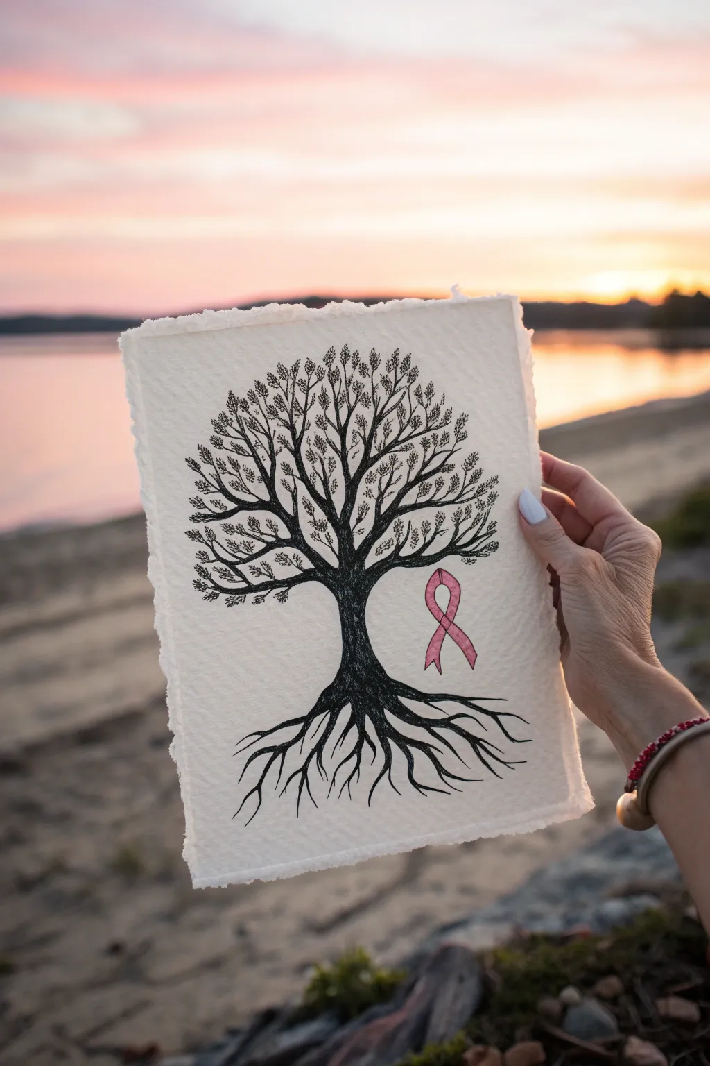
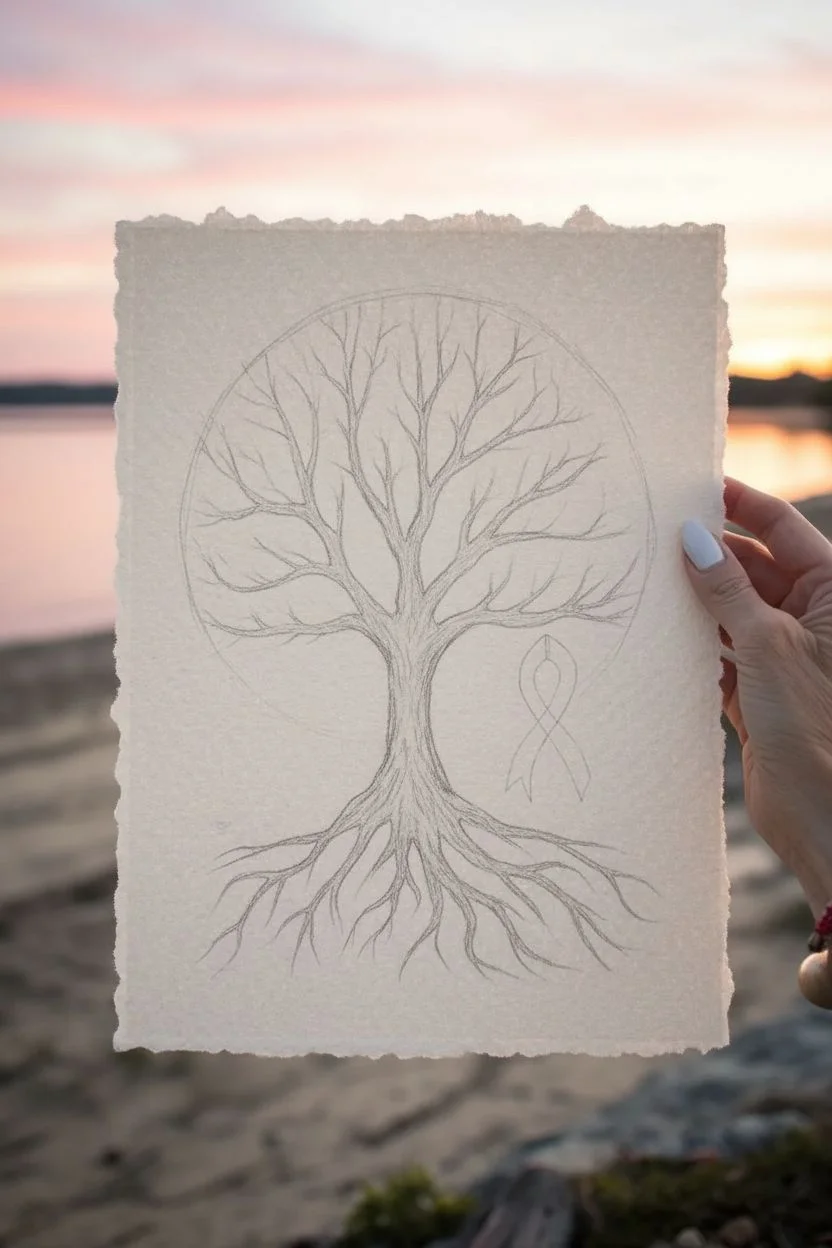
This poignant piece combines the strength of the Tree of Life with the gentle symbolism of the pink ribbon, drawn in stark black ink against soft, textured paper. The finished artwork features delicate leaves and intricate roots, representing resilience and grounding.
Step-by-Step Tutorial
Materials
- Heavyweight textured paper (deckled edge watercolor paper or cotton rag)
- Black archival ink fine liner pens (sizes 005, 01, and 05)
- Graphite pencil (HB or 2H)
- Kneaded eraser
- Pink watercolor paint or colored pencil (rose or light magenta)
- Small round paintbrush (size 2, if using paint)
- Ruler (optional)
- Paper towel
Step 1: Sketching the Foundation
-
Prepare your paper:
Begin with a sheet of heavyweight, textured paper. If possible, choose paper with a deckled (torn-looking) edge to match the rustic, organic feel of the original piece. -
Outline the trunk:
Using your graphite pencil, lightly sketch the central trunk. It should be thickest at the base and taper gently as it reaches the middle of the page. -
Mark the ribbon placement:
Before drawing branches, lightly sketch the outline of the cancer awareness ribbon to the right of the trunk. It should sit just below the lowest branch line, floating slightly above the roots. -
Map out the roots:
Draw the main root lines extending downwards from the trunk base. Let them spread wide and create a tangled, grounded network, mimicking the spread of the branches above. -
Sketch the canopy:
Roughly outline the main branches reaching upward. Don’t worry about individual leaves yet; just establish the skeleton of the tree ensuring it fans out symmetrically.
Master the Texture
Use a rough watercolor paper (cold press). When dragging the pen, the textured surface will naturally break up the line, instantly creating a realistic bark effect.
Step 2: Inking the Framework
-
Outline the trunk and branches:
Switch to your 05 black fine liner. Carefully trace over your pencil lines for the trunk and the thickest primary branches, using slightly shaky, organic strokes to simulate bark. -
Detail the roots:
Continue with the 05 pen to ink the main roots. As the roots taper into finer tendrils, switch to a 01 size pen to keep the ends sharp and delicate. -
Add texture to the bark:
Using the 01 pen, add vertical dashed lines and small stippling dots along the trunk and major roots. This creates depth and shadows effectively. -
Draw the secondary branches:
Extend the branch network outward using the 01 pen. Create V-shapes that split into smaller and smaller twigs, filling the upper half of the paper. -
Ink the ribbon outline:
Very carefully outline your pencil sketch of the ribbon using the 01 pen. Keep the line weight consistent and clean, as this is a focal point.
Step 3: Foliage and Finishing
-
Start the leaves:
Switch to your finest pen, the 005. Begin drawing clusters of small, oval-shaped leaves at the tips of the smallest twigs. -
Build leaf density:
Continue adding leaves, grouping them in small bunches. I find it helpful to start at the outer edges of the canopy and work inward toward the trunk. -
Create leaf details:
Add a tiny central line or a few dots inside some leaves to give them texture. Leave some leaves as simple outlines to prevent the canopy from looking too heavy. -
Color the ribbon:
Using watercolor paint or colored pencil, gently fill in the ribbon. If using paint, apply a very light wash of rose pink first, let it dry, and add a second layer to the loop’s crossover point for shadow. -
Erase guidelines:
Once the ink is completely dry—give it a few extra minutes to be safe—gently roll the kneaded eraser over the entire drawing to lift any remaining graphite marks. -
Final assessment:
Step back and look at the balance. If the roots look too thin compared to the canopy, use the 05 pen to thicken the main root lines slightly.
Ink Bleeding?
If your fine liner bleeds into the paper fibers, switch to a harder nib pen or work faster. Slow strokes allow ink to soak in too deep and spread.
This serene and meaningful drawing is now ready to be framed or gifted as a symbol of strength
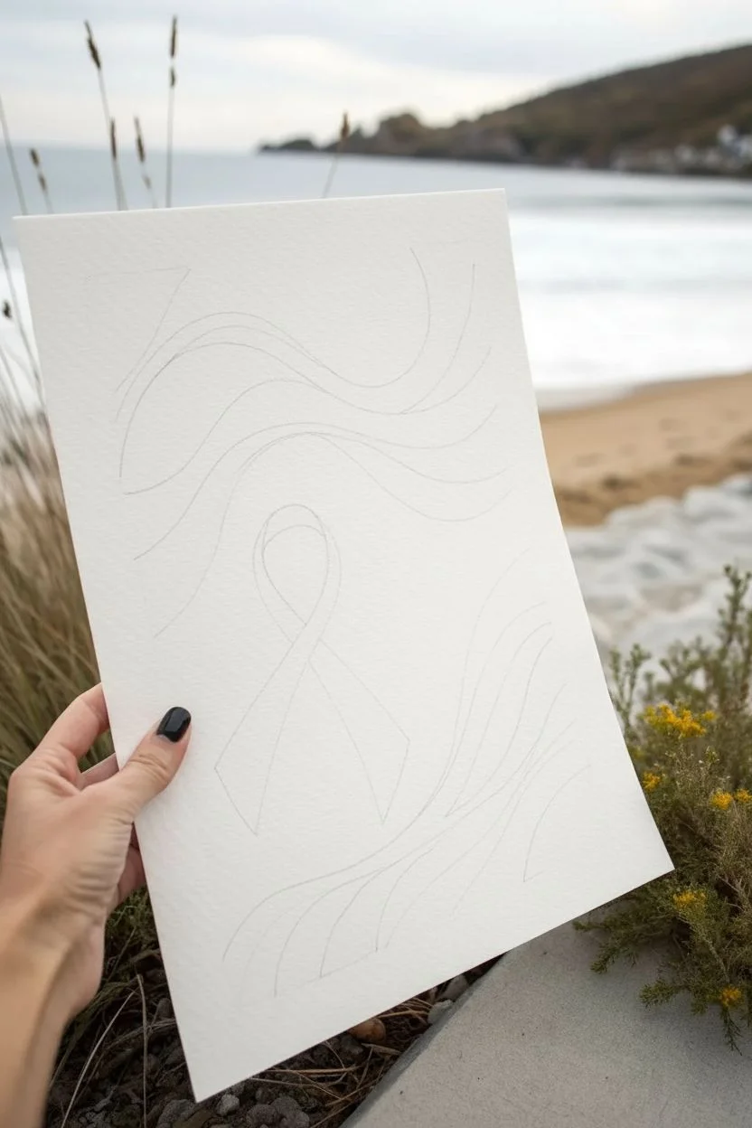
Abstract Pink-and-Gray Ribbon Waves
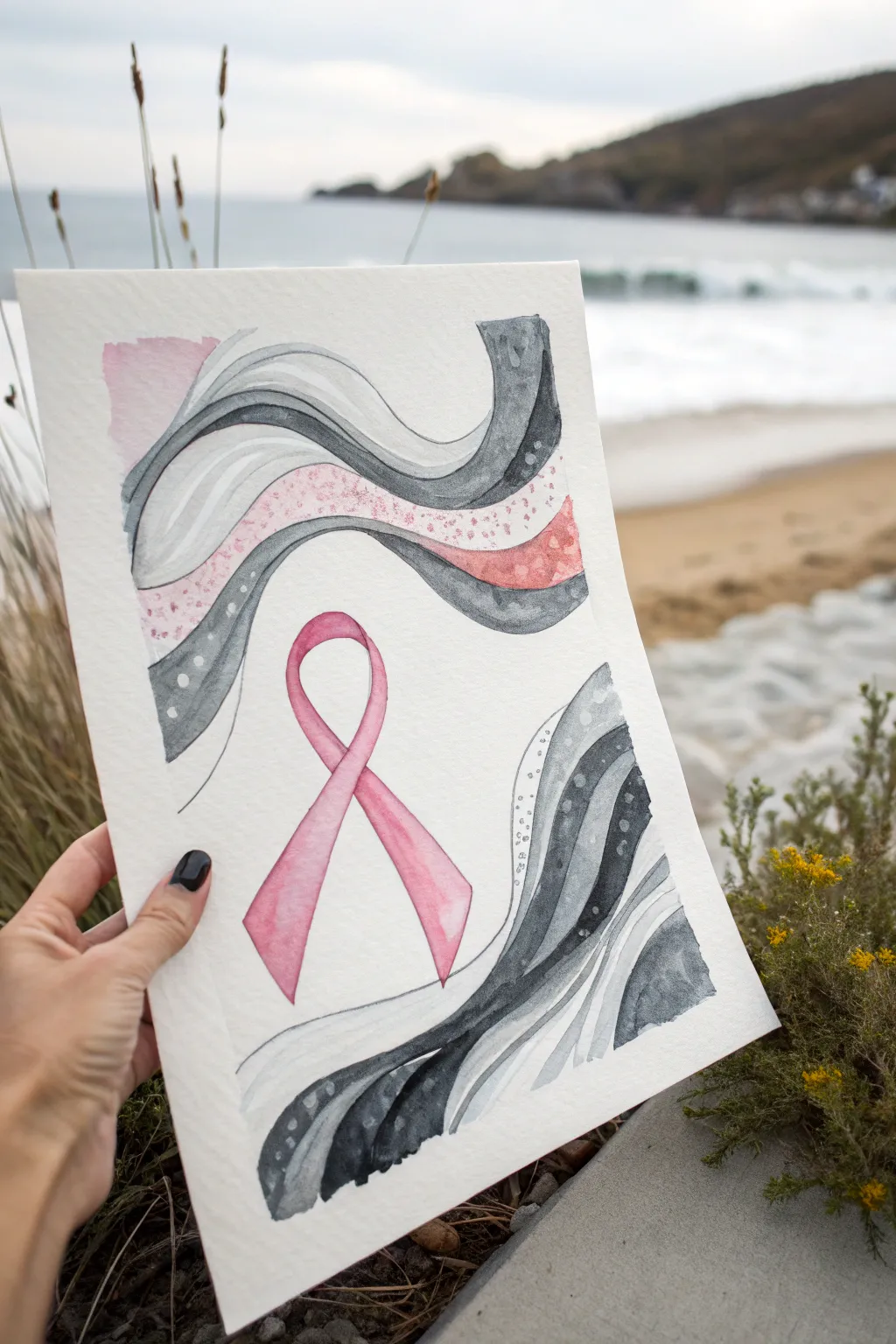
This elegant watercolor piece combines the iconic breast cancer awareness ribbon with soothing, abstract waves in grayscale and silver tones. The contrast between the rigid ribbon shape and the fluid background creates a balanced and meaningful tribute.
Detailed Instructions
Materials
- Cold press watercolor paper (A4 or similar size)
- Watercolor paints (pink, Payne’s gray, black)
- Metallic silver or white gouache/ink for detailing
- Round watercolor brushes (size 4 and 8)
- Pencil (HB or H for light lines)
- Eraser
- Masking tape (optional, for borders)
- Two jars of water
- Paper towels
Step 1: Planning the Composition
-
Sketch the ribbon:
Begin by lightly sketching the central awareness ribbon in the middle lower third of your paper. Focus on getting the loop symmetrical and the ends crossing over naturally. -
Outline the waves:
Draw flowing, wavy lines radiating outward from the top and bottom corners. These shouldn’t touch the ribbon but frame it. Create bands of varying thickness to fill the negative space.
Step 2: Painting the Ribbon
-
Base wash:
Mix a diluted, soft pink. Paint the entire ribbon shape with this wash, keeping it light and even. -
Adding depth:
While the base is still slightly damp or just dried, add a saturated, darker pink to the areas where the ribbon twists and overlaps to create shadow and dimension. -
Define edges:
Use the tip of your smaller brush with the darker pink to crisp up the edges of the ribbon for a sharp silhouette.
Clean Edges Pro-Tip
To keep the white spaces between waves crisp, wait for one wave to be bone-dry before painting its neighbor. This prevents colors from bleeding across the gap.
Step 3: Creating the Abstract Waves
-
Top gray waves:
Start with the top section. Paint one of the wavy bands with a medium-strength gray wash. Let the pigment pool naturally in some areas for texture. -
Darker accents:
Paint the adjacent band with a much darker, almost black mixture (like Payne’s gray) to create strong contrast against the white paper. -
Gradient effect:
For wider bands, try a gradient technique: load your brush with dark gray, paint one edge, then use clean water to pull the color across the band, fading it out. -
Pink integration:
Select one specific wave band near the middle and paint it with a soft pink wash that matches your ribbon, integrating the theme into the background. -
Bottom waves:
Repeat the process for the bottom corner waves, mirroring the flow of the top section but keeping the shapes organic and unique. -
Let it dry completely:
Step away and allow the piece to dry fully. If you rush the next steps, the details will bleed.
Trouble with Blobs?
If you create a ‘cauliflower’ bloom in your gray wash, don’t panic. These watermarks add organic texture. Emphasize it by adding dots or lines over the texture.
Step 4: Detailing and Textures
-
Layering dots:
Load a small brush with white gouache or silver ink. Carefully add dot patterns inside specific gray waves, following the curve of the line. -
Pink speckling:
On the pink wave or a light gray section, add tiny specks of darker pink or metallic rose gold if you have it, creating a terrazzo-like texture. -
White lines:
Use your white or silver medium to draw thin, flowing lines inside the darkest gray bands to break up the heavy color. -
Splatter effect:
I like to cover the central ribbon with a scrap of paper, then tap a loaded brush to create a very subtle splatter of pink or gray over the abstract sections. -
Final outline check:
Once everything is dry, if the ribbon feels lost, you can very gently outline it with a slightly darker pink or a fine liner pen, though keeping it soft is often best. -
Erase guidelines:
Gently erase any visible pencil sketch lines that weren’t covered by paint.
Frame this meaningful piece in a simple white mat to let the colors speak for themselves


Galaxy Ribbon in a Starry Sky
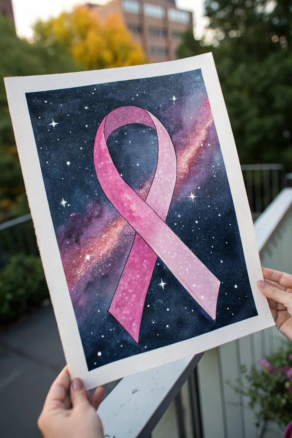
This stunning watercolor project combines the symbolism of the pink awareness ribbon with the ethereal beauty of a night sky. The contrast between the soft pink gradients and the deep, starry indigo background makes for a truly impactful piece of art.
How-To Guide
Materials
- High-quality watercolor paper (cold press, 140lb/300gsm)
- Watercolor paints (Indigo, Prussian Blue, Black, Magenta, Quinacridone Rose, White Gouache)
- Masking fluid (also called drawing gum)
- Round brushes (sizes 2, 6, and 10)
- Old/cheap brush or silicone tool (for applying masking fluid)
- Painter’s tape or Washi tape
- Pencil and eraser
- Reference image of a ribbon
- Two jars of water
- Paper towels
Step 1: Preparation and Sketching
-
Secure the paper:
Tape down all four edges of your watercolor paper to a board or table. This creates that crisp, clean white border seen in the final image and prevents the paper from buckling when wet. -
Sketch the ribbon:
Lightly sketch the outline of the looped ribbon in the center of your page. Ensure the loops cross elegantly and the perspective shows the twist in the fabric. -
Mask the subject:
Using an old brush or a silicone tool, apply masking fluid carefully inside the entire ribbon shape. This barrier will protect the white paper so you can paint the dark galaxy background freely without worrying about the edges. -
Add masking stars:
Dip a toothbrush or stiff brush into the masking fluid and flick it across the background area to create tiny preserved white stars. You can also manually dot a few larger stars with a small implement. -
Let it cure:
Wait until the masking fluid is completely dry and rubbery to the touch before getting your paints out.
Torn paper edges?
If your tape rips the paper upon removal, warm the tape slightly with a hairdryer first to soften the adhesive, and always pull away from the center of the artwork.
Step 2: Painting the Galaxy Background
-
Wet-on-wet technique:
Brush clean water over the entire background area (everything outside the masked ribbon). The paper should be glisten, but not have puddles. -
Lay down base colors:
While the paper is wet, drop in patches of Magenta and Quinacridone Rose near the ribbon to create a ‘nebula’ glow effect. Let these colors bleed softly outward. -
Deepen the sky:
Start adding your darker colors—Prussian Blue and Indigo—around the pink patches and toward the edges of the paper. Allow the blue to touch the wet pink paint so they blend into purple transitions. -
Add the void:
Mix a concentrated Indigo or a bit of Black watercolor into the very corners and edges to create the deepest depths of space. This high contrast makes the glowing parts pop. -
Create starbursts:
While the paint is still damp but losing its sheen, you can tap a clean, damp brush into the dark areas to lift a little pigment, creating soft hazy spots. -
Dry thoroughly:
Let this layer dry completely. If you are impatient like me, you can use a hairdryer on a low, cool setting. -
Add white stars:
Dilute some white gouache or acrylic ink. Tap your brush handle against another brush to splatter fine white mist over the dark galaxy. Paint a few larger ‘cross’ shapes for twinkling stars.
Milky, soft stars
For glowing stars, add a tiny drop of clean water onto the drying dark background. The water pushes the pigment away, creating perfect soft circles that look distant.
Step 3: Revealing and Painting the Ribbon
-
Remove masking fluid:
Once the background is 100% bone dry, gently rub off the masking fluid with your finger or a rubber cement pickup tool to reveal the pristine white paper of the ribbon. -
Base wash for ribbon:
Wet the inside of the ribbon shape with clean water. Apply a very pale wash of Quinacridone Rose. -
Build dimension:
While still damp, drop clearer, darker pink pigment into the areas that would be in shadow—where the ribbon twists under and along the edges. -
Create highlights:
Lift out pigment from the center of the ribbon curve using a thirsty, damp brush. This creates a rounded, 3D effect on the fabric. -
Outline details:
Once the ribbon paint is dry, use a very fine liner brush (size 0 or 00) with black paint or a waterproof archival pen to carefully outline the ribbon edges for a sharp, graphic look.
Step 4: Finishing Touches
-
Connect the scene:
If appropriate, add a very light splatter of white over the ribbon itself so it feels integrated into the space scene rather than just floating on top. -
Peel the tape:
Slowly peel the masking tape away from the paper at a 45-degree angle to reveal your clean white border.
Display this beautiful celestial tribute in a simple frame to let the vibrant colors speak for themselves

Have a question or want to share your own experience? I'd love to hear from you in the comments below!