I love how a dining room wall mural can turn a plain eating space into a little daily escape—like the room has a story to tell behind every meal. Here are my go-to statement wall ideas, starting with the classic crowd-pleasers and ending with a few artsy twists that feel extra special.
Classic Pastoral Landscape Backdrop
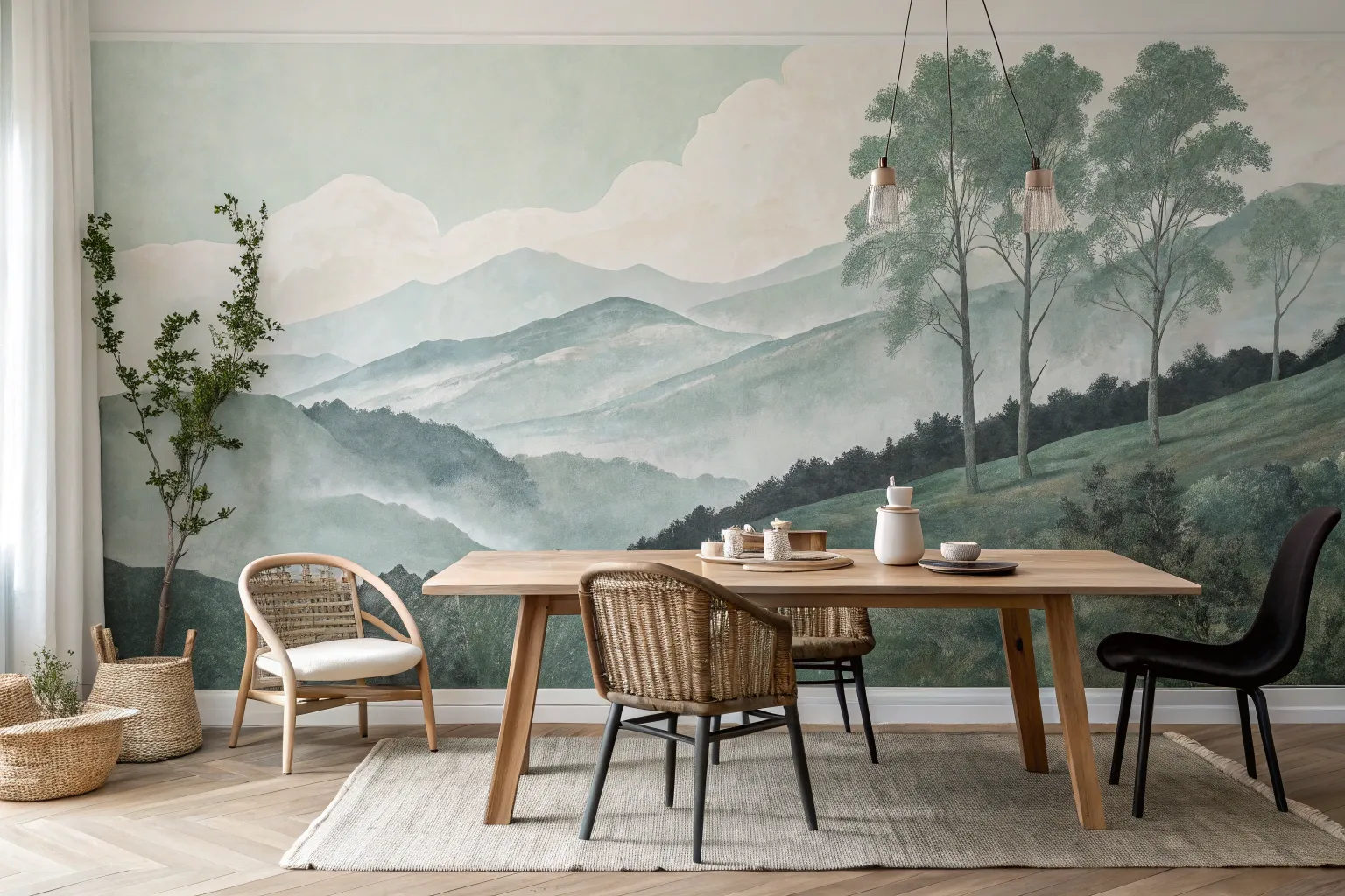
Transform your dining space into a serene countryside escape with this classical pastoral landscape mural. Soft, muted greens and expansive skies create a sense of depth and tranquility that pairs perfectly with traditional wainscoting.
Detailed Instructions
Materials
- Interior acrylic latex paints (Eggshell or Matte finish): Sky Blue, White, Cream, Olive Green, Sage Green, Deep Forest Green, Earthy Brown, Grey
- Large foam rollers and tray
- Assorted synthetic paintbrushes (2-inch sash, 1-inch flat, various round detail brushes)
- Painter’s tape
- Drop cloths
- Pencil and eraser
- Sea sponge (natural)
- Glazing liquid (acrylic)
- Ladder or step stool
- Reference photo of a landscape
- Measuring tape
Step 1: Preparation & Base Coat
-
Protect the perimeter:
Begin by taping off all edges of your wall, paying special attention to the wainscoting or baseboards below. Lay down drop cloths to protect your flooring from drips. -
Establish the horizon:
Measure about one-third of the way up from the bottom of your mural space (not the floor). Use a pencil to lightly sketch a rolling horizon line. This doesn’t need to be straight; gentle curves mimic nature best. -
Paint the sky:
Mix your Sky Blue with a significant amount of White to create a very pale, hazy blue. Roll this color onto the entire area above your horizon line. -
Create atmospheric clouds:
While the blue is still slightly tacky, use a sea sponge or a bunched-up rag dipped in White and Cream paint to dab in cloud formations. Keep the edges soft and blended.
Atmospheric Perspective
Objects further away should be paler and bluer than objects close up. Add a drop of blue or grey to your greens for distant hills to instantly create depth.
Step 2: Painting the Landscape
-
Block in distant hills:
Mix a pale, grey-green color. Paint the rolling hills furthest away, right at the horizon line. Keeping these colors desaturated creates the illusion of atmospheric perspective. -
Add mid-ground terrain:
Move down the wall, mixing a slightly warmer and darker Sage Green. Paint the next layer of hills, allowing them to overlap the distant ones. -
Define the foreground:
For the closest grassy areas at the bottom, use your richest Olive Green mixed with a touch of Earthy Brown. Paint this section with broader strokes. -
Blend the transitions:
I find it helpful to use a large, dry brush to gently sweep over the areas where different hill colors meet. This softens the lines so the landscape flows naturally rather than looking like stripes.
Step 3: Adding Trees & Details
-
Sketch the main tree:
Using a pencil, lightly outline the trunk and main branches of the large focal tree on the left side. It should span from the foreground up into the sky. -
Paint the trunk:
Mix Earthy Brown with a bit of Grey. Using a round brush, paint the trunk and branches, lifting pressure at the ends to create thin, tapering twigs. -
Stipple the leaves:
Load a worn-out bristle brush or a small sponge with Deep Forest Green. Lightly stipple clusters of leaves onto the branches, leaving plenty of open space for the sky to show through. -
Add highlights to foliage:
Mix a lighter Olive Green and dab it onto the top edges of your leaf clusters to simulate sunlight hitting the canopy. -
Insert distant vegetation:
Use a small detail brush to paint tiny vertical strokes along the ridges of the mid-ground hills. These represent distant Italian Cypress or poplar trees. -
Ground the scene:
Paint some darker, textured grasses and small bushes in the immediate foreground (bottom left and right corners) to anchor the composition.
Framed Art Effect
Install decorative picture frame molding around the edges of your mural to make the painted scene look like a massive, framed oil painting.
Step 4: Glazing & Finishing
-
Mix an antiquing glaze:
To get that vintage, ‘old world’ look shown in the image, mix a clear glazing liquid with a tiny drop of Raw Umber or warm grey paint. -
Apply the wash:
Using a large, soft brush, apply a very thin, translucent layer of this glaze over the entire dry mural. This unifies the colors and mutes any brightness. -
Remove the tape:
Once the wall is fully dry to the touch, slowly peel away the painter’s tape at a 45-degree angle to reveal your crisp edges against the wainscoting.
Step back and enjoy the calming, timeless view you have created right in your own home

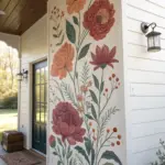
Oversized Botanical Blooms
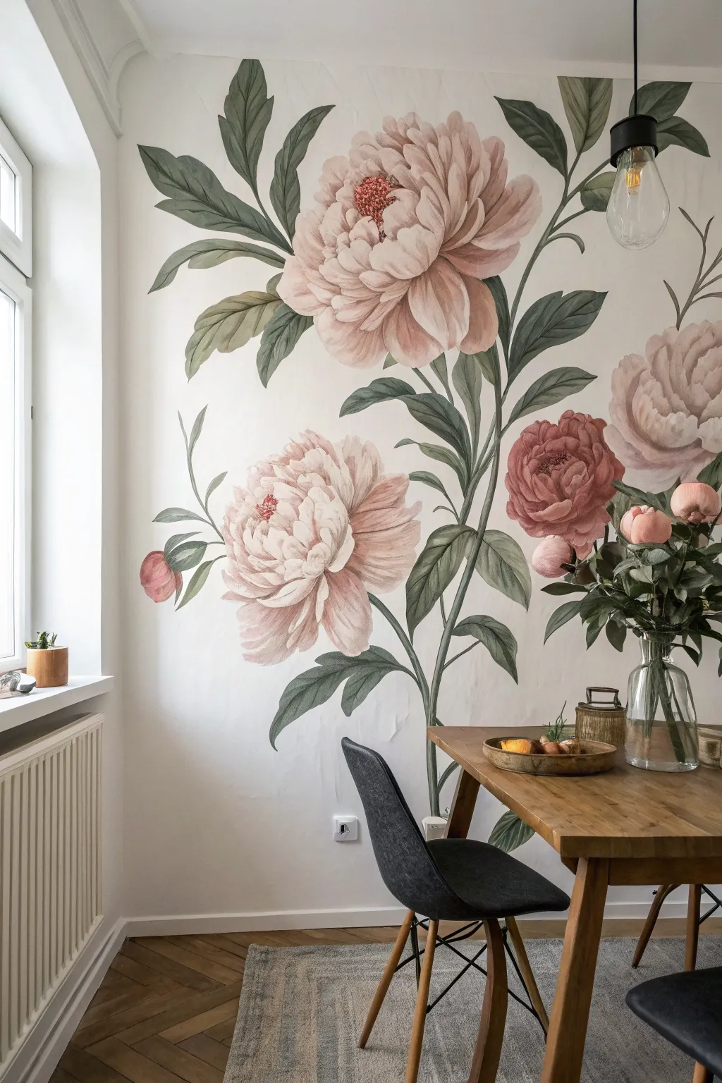
Transform a plain dining wall into a breathtaking botanical garden with this oversized floral mural. By using soft washes and a layered technique, you’ll achieve a dreamy, vintage-inspired look that feels both grand and delicate.
Step-by-Step
Materials
- High-quality interior latex paint (white/eggshell base)
- Acrylic paints (Soft Pink, Dusty Rose, Magenta, Sage Green, Olive Green, Deep Hunter Green, Burnt Umber)
- Glazing medium or water (for thinning)
- Large synthetic round brushes (sizes 10 and 12)
- Medium filbert brushes
- Small liner brush for details
- Projector (optional but recommended)
- Pencil and eraser
- Painter’s tape and drop cloths
- Mixing palettes or plastic plates
- Paper towels
- Step ladder
Step 1: Preparation & Sketching
-
Prepare the canvas:
Begin by clearing the wall area and taping off the trim and adjacent walls. Lay down drop cloths to protect your flooring. -
Prime the surface:
Ensure the wall is clean and painted with a fresh coat of white or off-white eggshell paint. This provides the perfect luminous background for the translucent floral layers. -
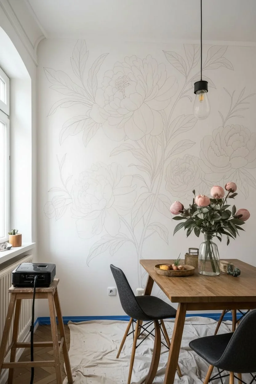
Project the design:
Set up a projector to display your reference image of large peony blooms onto the wall. Adjust the distance until the flowers are oversized and fill the space dramatically. -
Trace the outline:
Lightly trace the main shapes of the flowers, leaves, and stems using a pencil. Keep your lines faint so they won’t show through the lighter paint layers later. -
Refine the composition:
Step back and check the balance. If you aren’t using a projector, sketch freehand by blocking out large circles for flowers and sweeping lines for stems, then refining the petal shapes.
Watercolor Effect
Keep a spray bottle of water handy. Mist the wall lightly before applying paint to help the colors bleed and soften exactly like real watercolor paper.
Step 2: Painting the Foliage
-
Mix leaf greens:
Create three shades of green: a pale Sage (mixed with plenty of white), a mid-tone Olive, and a deep Hunter Green. Mix in a liberal amount of glazing medium or water to keep the paint semi-transparent. -
Base coat the stems:
Using a large round brush, paint the long, sweeping stems with the mid-tone Olive. Use long, confident strokes to prevent choppiness. -
Block in leaves:
Fill in the leaf shapes with your palest Sage green. Don’t worry about perfect coverage; a slightly uneven wash mimics the look of watercolor paper. -
Add leafy shadows:
While the base layer is still slightly tacky, blend the Hunter Green into the areas where the leaves attach to the stem and along the bottom veins to create depth. -
Define leaf veins:
Once the leaves are dry, use a smaller liner brush and the darkest green mixed with a touch of blue to paint delicate veins and crisp edges.
Step 3: Blooming the Peonies
-
Mix floral petal washes:
Prepare a very watery mix of Soft Pink and Dusty Rose. You want these to be sheer washes rather than opaque blocks of color. -
Paint the outer petals:
Start with the largest petals on the outer edges of the flowers. Apply the Soft Pink wash, dragging the brush towards the center of the bloom. -
Layering the inner petals:
Move inward with slightly smaller petal shapes. I like to let the outer petals dry just a bit before starting the next row so the shapes don’t bleed together entirely. -
Deepen the color:
Switch to the Dusty Rose mix for the shadowed areas between overlapping petals. This contrast makes the flower look three-dimensional. -
Add the vivid center:
Mix Magenta with a tiny drop of Burnt Umber. Dab this into the very center of the peony, stippling the brush to create texture. -
Highlighting petals:
Mix a creamy white with a touch of pink. Use a filbert brush to add highlights to the top edges of the petals where the light would naturally hit.
Add a buzzing friend
Paint a tiny, detailed bumblebee landing on one of the petals. It adds a delightful sense of scale and life to the composition.
Step 4: Pistils & Final Details
-
Detail the stamens:
Using the smallest liner brush and a mix of yellow-ochre or bright orange, paint tiny lines emerging from the dark center of the flower. -
Add pollen dots:
Dot the ends of those tiny lines with pure white or light yellow to represent pollen. -
Clean up edges:
Step back to view the whole wall. If any edges look too messy, use a flat brush with a tiny bit of your white wall paint to ‘erase’ and refine the silhouette. -
Erase pencil lines:
Gently erase any visible pencil marks, being careful not to scrub the painted areas. -
Protective coat (optional):
In a high-traffic dining area, you might apply a clear, matte water-based varnish over the mural once it has cured for 72 hours.
Enjoy dining in your permanent garden getaway, surrounded by blooms that never fade
Moody Tropical Leaf Statement Wall
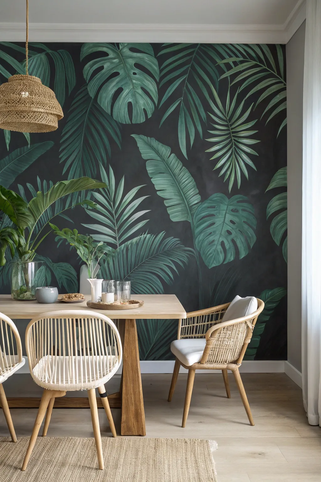
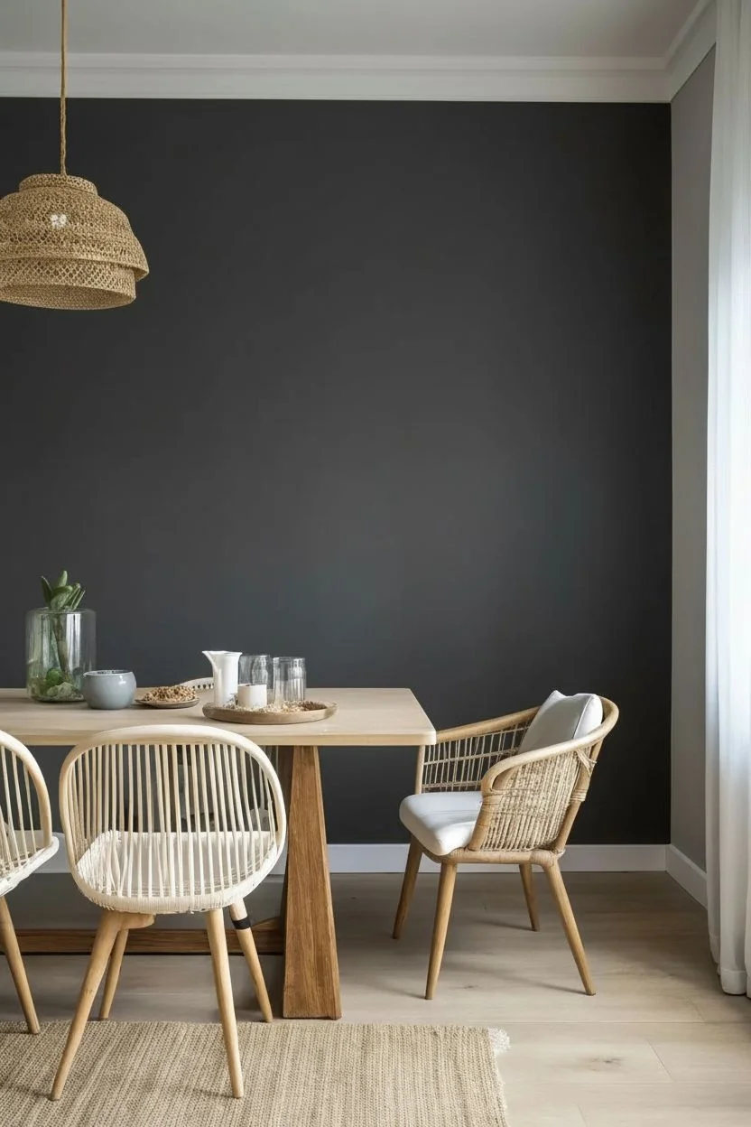
Transform your dining space with this dramatic statement wall, featuring lush, overscaled tropical foliage against a moody charcoal backdrop. The contrast between the deep, velvety background and the vibrant greens creates an immersive, sophisticated atmosphere perfect for evening dinner parties.
Step-by-Step Guide
Materials
- Interior latex paint (matte finish) in charcoal or soft black
- Various shades of green acrylic or latex paint (deep emerald, sage, lime, forest green)
- White and light grey acrylic paint for highlights
- Large foam roller and tray
- Painter’s tape and drop cloths
- Chalk (white or light grey)
- Wide flat synthetic brushes (2-3 inch)
- Angled sash brushes (1.5-2 inch)
- Round detail brushes (medium and fine)
- Mixing cups or paper plates
- Ladder
Step 1: Preparation & Base Coat
-
Prep the canvas:
Clear the wall completely, patch any holes, and sand smooth. Lay down drop cloths to protect your flooring and tape off the ceiling, baseboards, and adjacent walls. A clean surface is crucial for a smooth mural. -
Roll the dark background:
Apply your dark charcoal or soft black base color using a large foam roller. I recommend a matte finish to absorb light and enhance the moody effect. -
Second coat application:
Allow the first coat to dry according to the can’s instructions, then apply a second coat to ensure rich, opaque coverage with no streaks.
Step 2: Composition & Sketching
-
Plan your layout:
Study the reference image to understand the variety of leaf shapes—monstera, banana leaves, and fan palms. Notice how they overlap and extend off the edges of the wall to create a sense of vastness. -
Sketch with chalk:
Using white chalk, lightly sketch the outlines of the largest leaves first. Start with the big Monstera leaves and banana leaves as anchors. Don’t worry about details yet; focus on placement and scale. -
Fill in the gaps:
Sketch the thinner palm fronds and smaller foliage in the empty spaces between your anchor leaves. Keep the composition balanced but organic, avoiding perfect symmetry.
Pro Tip: Depth Perception
Paint leaves meant to look ‘further back’ with slightly darker, more muted greens. Keep brightest, crispest greens for the foreground leaves to create illusion of depth.
Step 3: Painting the Foliage
-
Block within base colors:
Mix a mid-tone green for each leaf type. Using your angled sash brush or a wide flat brush, paint the interior of your chalk outlines. It doesn’t need to be perfect; you just want to establish the shape. -
Add shadows:
While the base green is still slightly tacky or just dry, mix a darker forest green (or mix a little black into your green). Paint this along the veins and the base of the leaves where they would naturally be shadowed. -
Create the veins:
For the large banana and monstera leaves, use a smaller flat brush to paint the central vein lines. Use a lighter sage green so it stands out against the darker body of the leaf. -
Feathering technique:
For the palm fronds, use long, sweeping strokes with a medium brush. Start from the center stem and flick outward to create tapering, needle-like leaves. -
Layering details:
Go back to the monstera leaves. Add the characteristic holes and splits using the dark background color to ‘cut’ into the green shapes if you painted them solid, or simply paint around them. -
Mid-tone blending:
Mix a slightly lighter green and create strokes that follow the curve of the leaves. Blend this gently into the darker areas to give the leaves volume and a 3D effect.
Oops! Color too flat?
If a leaf looks like a sticker, mix a glazing medium with a tiny drop of black paint. Wash it over the shadowed areas of the leaf to instantly add dramatic volume.
Step 4: Highlights & Finishing
-
Mix your highlights:
Create a pale, minty green by mixing your lightest green with white. You want this color to be significantly lighter than your base tones to simulate light hitting the foliage. -
Apply crisp edges:
Using a fine round brush or the edge of a flat brush, apply this highlight color to the very edges of the leaves and the tops of the main veins. This step separates the leaves from the dark background. -
Soften the look:
I like to use a dry brush technique here. Wipe most of the paint off your brush and lightly drag it over the high points of the leaves to create texture without hard lines. -
Clean up:
Once dry, use a damp cloth to gently wipe away any visible chalk lines. Use a small brush and your background wall color to touch up any accidental splashes or wobbly leaf edges. -
Seal (Optional):
If this is a high-traffic dining area, consider rolling a clear, matte water-based polycrylic over the entire wall to protect your masterpiece.
Step back and admire your lush, personalized indoor jungle that brings life to every meal.


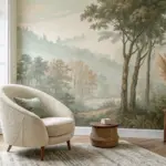
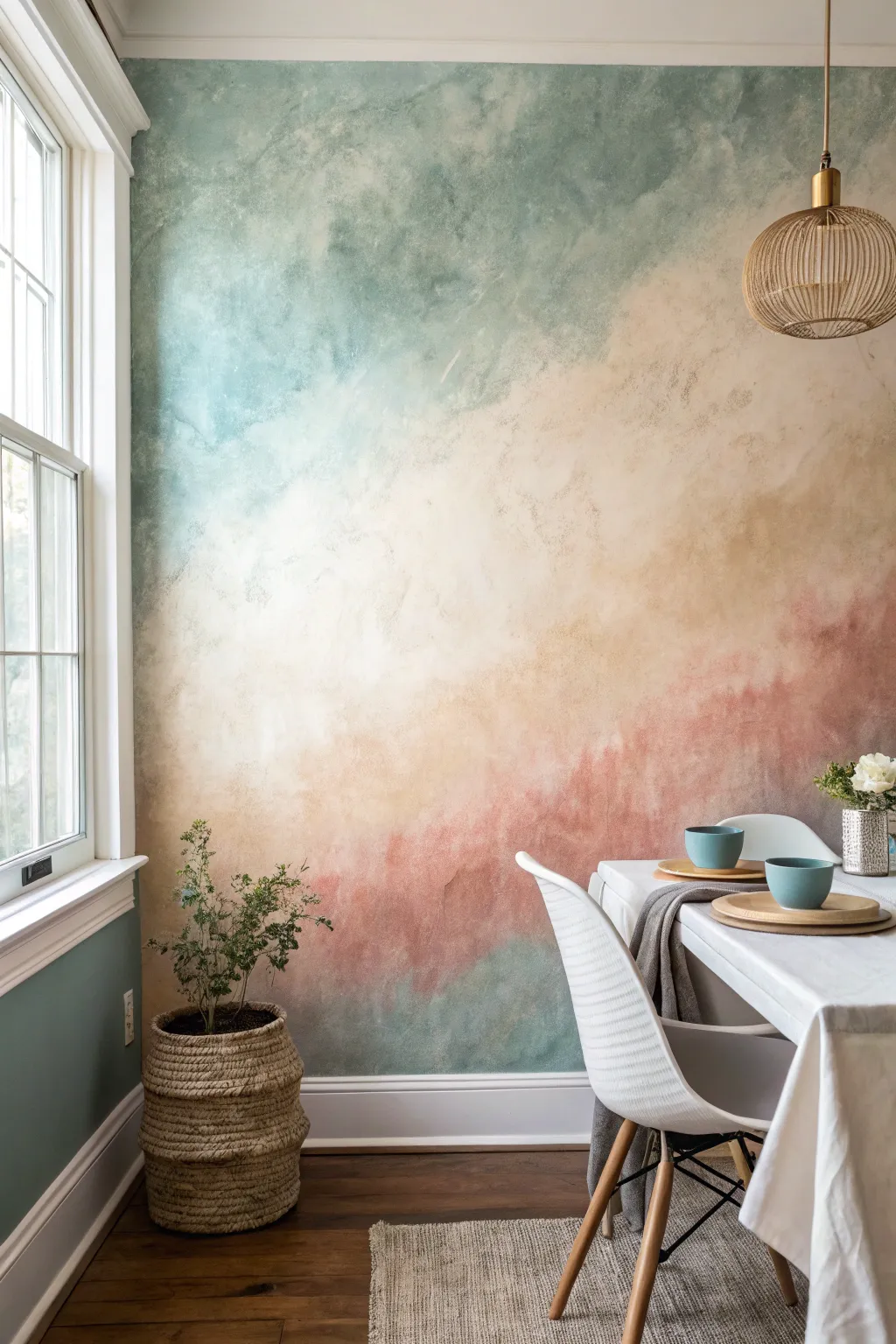
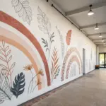
Soft Watercolor Mountain Wash
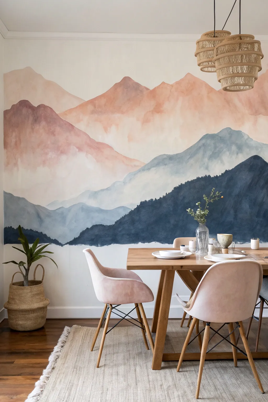
Bring the serenity of a misty sunrise into your dining space with this expansive watercolor-style mural. By layering diluted acrylics from dark foregrounds to hazy peaks, you’ll create a breathtaking sense of depth that transforms a plain wall into a piece of art.
Step-by-Step
Materials
- Interior latex paint or high-quality acrylics (Colors: Navy Blue, Slate Blue, Dusty Pink, Peach, Warm White)
- Glazing medium or water (for dilution)
- Large synthetic paintbrushes (3-4 inch flat brushes)
- Medium round brushes (for ridge details)
- Painter’s tape
- Drop cloths
- Pencil and eraser
- Sea sponge or rag (for blending texture)
- Mixing buckets or trays
- Ladder
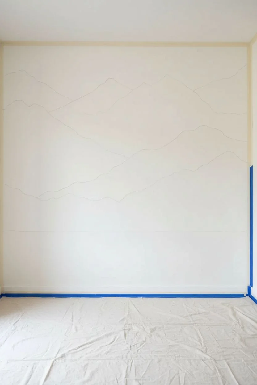
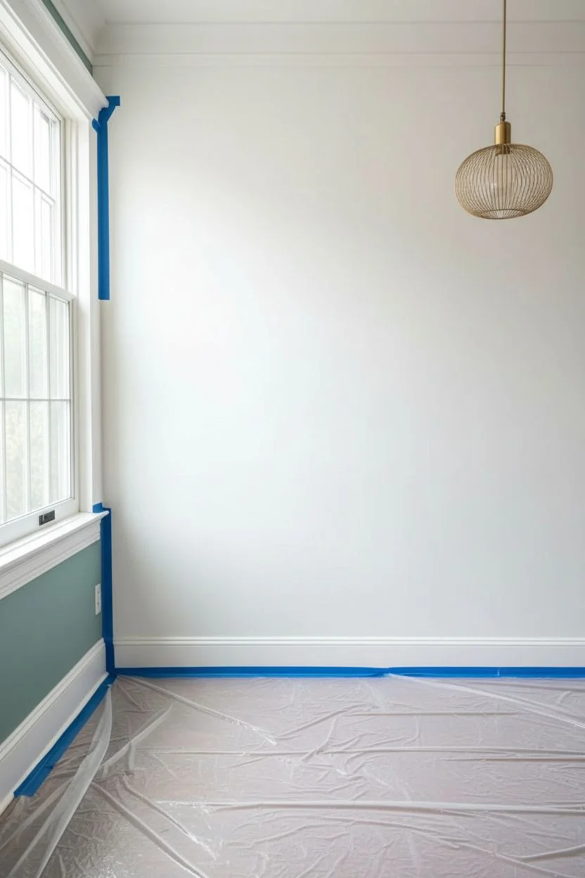
Step 1: Preparation & Sketching
-
Prepare the canvas:
Start by clearing the wall and wiping it down with a damp cloth to remove dust. Tape off your baseboards, ceiling line, and adjacent walls with painter’s tape, and lay down drop cloths to protect your floors. -
Map the landscape:
Using a pencil, lightly sketch the outlines of your mountain ranges directly onto the wall. Draw roughly 4-5 distinct layers, starting with the highest peaks near the top and working down to the foreground. -
Keep it organic:
When sketching, ensure your lines possess natural, jagged variations rather than perfect curves. The beauty of this mural lies in its organic, imperfect flow.
Step 2: Painting the Sky & Distant Peaks
-
Mix the sky wash:
In a bucket, mix a large amount of warm white paint with just a hint of peach and plenty of water or glazing medium. The consistency should be thin, almost like milk, to achieve that watercolor transparency. -
Apply the background:
Brush this pale wash over the entire upper section of the wall, overlapping slightly into where your first mountain range will start. Use broad, sweeping strokes. -
Paint the first peaks:
Mix a soft peach color with water. Apply this to the highest mountain range, letting the bottom edge remain wet and uneven. This layer should look distant and hazy. -
Create the fade:
While the paint is still damp, take a wet sponge or clean brush and gently drag the paint downward, fading the color out into white before it reaches the next mountain line.
Drips running too fast?
If the paint runs uncontrollably, your mix is too watery. Keep a dry rag handy to catch drips instantly, and add a bit more raw paint to thicken your mixture slightly.
Step 3: Mid-Ground Layers
-
Introduce pink tones:
For the second range, mix a dusty pink shade. Paint the defined top edge of the mountains carefully with a round brush, then fill the body with a larger brush. -
Blend the transition:
As you move down this pink layer, gradually introduce a little slate blue into your mix wet-on-wet. This creates that magical transition area seen in the reference where the warm sun hits the cool mist. -
Add the blue range:
Mix a light slate blue, keeping it quite diluted. Paint the third range of mountains, ensuring the top edge contrasts clearly against the pink layer above it. -
Enhance the watercolor effect:
Drip a little extra water onto the wall in random spots within the blue mountain range and dab it with a rag. This lifts some pigment and creates authentic ‘bloom’ textures.
Add metallic magic
Once the mural is dry, trace the very top edge of one or two mountain ranges with a thin line of gold leaf or metallic gold paint for a luxurious, light-catching accent.
Step 4: Foreground & Details
-
Deepen the color:
Prepare your darkest color—a deep navy or indigo—for the bottom-most mountain layer. This layer needs to be less diluted than the others to anchor the mural visually. -
Paint the forestry line:
Use a medium brush to stipple or dab the top edge of this dark layer, simulating the texture of distant pine trees along the ridge. -
Fill the bottom:
Fill the remaining bottom section with the solid navy color. I find using a roller here speeds up the process for the large solid area near the floor. -
Assess and adjust:
Step back to the other side of the room. Look for any areas where the transitions feel too harsh. If needed, use a clean, damp brush to soften edges while the paint is tacky. -
Add subtle highlights:
With a very watery white wash, you can add faint mist valleys between the mountain ranges to increase the perception of depth. -
dry and reveal:
Let the wall dry for at least 24 hours. Once fully dry, carefully peel away the painter’s tape at a 45-degree angle to reveal your crisp edges.
Now you have a stunning, custom vista that adds endless depth to your room
BRUSH GUIDE
The Right Brush for Every Stroke
From clean lines to bold texture — master brush choice, stroke control, and essential techniques.
Explore the Full Guide
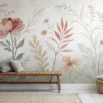
Vintage Garden Etching Look
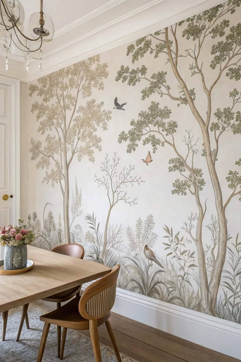
Transform your dining space with this serene, large-scale mural that mimics the delicate line work of vintage botanical plates. Soft earth tones and fine detailing create a sophisticated, nature-inspired backdrop without overwhelming the room.
How-To Guide
Materials
- Latex wall paint (off-white satin or eggshell for base)
- Pencil (HB or standard)
- High-quality architectural eraser
- Acrylic paints (muted olive greens, taupe, sepia, warm grey, burnt sienna)
- Glazing medium
- Projector (smart projector or standard) and laptop/phone
- Fine liner brushes (sizes 0, 1, and 2)
- Small flat brush (1/4 inch)
- Small round brush (size 4)
- Painter’s tape
- Drop cloth
- Reference image (vintage etching style landscape)
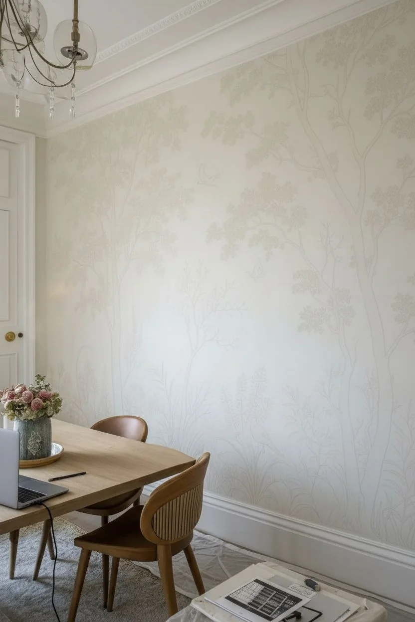
Step 1: Preparation & Mapping
-
Prepare the canvas:
Begin by ensuring your wall is clean and smooth. Apply a fresh coat of warm off-white or cream satin latex paint; this provides a smooth surface that allows your fine lines to glide easily and mimics aged paper. -
Set up your projection:
Once dry, dim the lights and set up your projector. Position it so your chosen vintage garden image fills the entire wall section you intend to paint. Align the horizon line slightly below eye level for a grounded feel. -
Trace the major structures:
Using a light hand and an HB pencil, trace the main structural elements. Focus on the trunks of the large trees, the major branches, and the horizon line where the grasses begin. -
Add detail elements:
Trace the outlines of the birds and the vague shapes of the larger foliage clusters. Don’t worry about individual leaves yet; just capture the ‘clouds’ of greenery.
Fixing Shaky Lines
If a branch line gets too thick or wobbly, don’t panic. Quickly use a damp Q-tip to wipe away the mistake, or wait for it to dry and feather the edge with the wall base color to thin it back down.
Step 2: Establishing the Trees
-
Mix your trunk colors:
Create a wash by mixing taupe and sepia acrylics with a generous amount of glazing medium. You want the paint to be translucent, like watercolor, rather than opaque. -
Paint the main trunks:
Start with the large trees using a size 4 round brush. Apply the wash in long, vertical strokes, adhering to the natural grain of bark. Let the wall color show through slightly to keep it airy. -
Add bark texture:
While the wash is still slightly tacky or just dry, take a size 1 liner brush with un-thinned sepia paint. Draw fine, shaky vertical lines up the trunk to simulate the etched texture of bark. -
Branching out:
Extend the branches outward using the same two-step process: a translucent wash for the shape, followed by fine, dark lines on the shadow side (usually the bottom) of the branch.
Level Up: Aged Patina
For a true antique vibe, lightly sponge a very watered-down ‘tea stain’ focusing on the corners and edges of the wall after the mural is dry. This creates a vignetted, old-paper effect.
Step 3: Foliage & Fine Work
-
Stipple the canopy:
Mix a muted olive green with glazing medium. Using a small, stiff flat brush, gently stipple (dab) clusters of leaves at the ends of your branches. Keep these clusters loose and separated. -
Define the leaves:
Switch to your size 0 liner brush. Over dry stippling, carefully paint tiny individual leaf shapes or ‘c’ curves in a darker green-grey. This creates the ‘etching’ look where detail sits on top of color. -
Paint the background grasses:
For the tall grasses at the bottom, use watered-down warm grey. Use long, sweeping upward strokes with a liner brush, varying the height. I like to cross them over each other to create density. -
Layer foreground botanicals:
Paint the more detailed foreground plants (like fern fronds or distinct weeds) in a darker sepia or charcoal mix. Press harder at the base of the stroke and flick upward to get a sharp tip.
Step 4: Birds & Final Touches
-
Block in the birds:
Fill the bird silhouettes with a solid base color—warm terracotta or soft grey depending on the species. -
Detail the feathers:
Use the finest brush (size 0) to add feather details. Use short, directional dashes to mimic the etched lines of the original style. Add a tiny dot of white for the eye reflection. -
Review and refine:
Step back to the other side of the room. Look for areas that feel too empty or too heavy. Add tiny floating leaves or thin twigs to balance the negative space. -
Erase pencil marks:
Once the paint is fully cured (give it 24 hours just to be safe), gently run your architectural eraser over any visible pencil lines that weren’t covered by paint.
Now you have a stunning, bespoke garden scene that adds quiet elegance to your dining experience
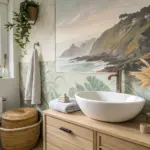
Forest Canopy Dining Escape
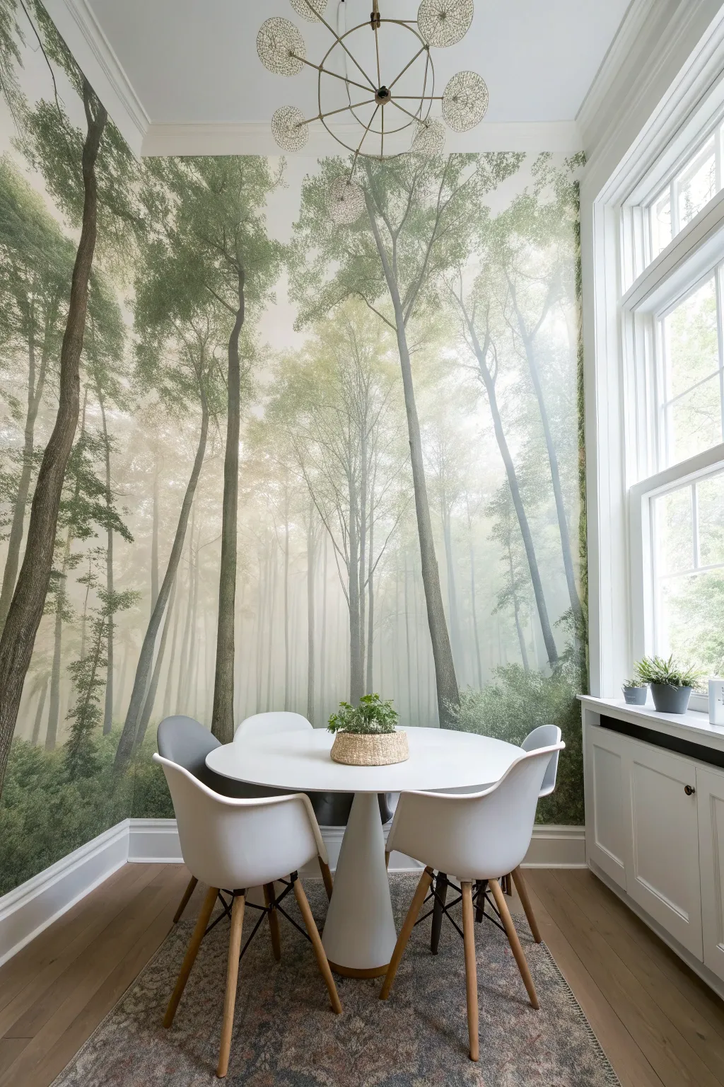
Transform a simple dining corner into an ethereal woodland retreat with a panoramic forest mural that wraps seamlessly across adjacent walls. This project uses high-quality peel-and-stick or paste-the-wall wallpaper panels to create an immersive, foggy atmosphere perfect for intimate meals.
Detailed Instructions
Materials
- Custom-sized panoramic forest mural (measure total width of all walls)
- Wallpaper paste (if not using peel-and-stick)
- Wallpaper smoothing tool or squeegee
- Sharp utility knife (snap-off blade type)
- Metal straight edge or ruler
- Stepladder
- Drop cloth
- Sponge and bucket of warm water
- Plumb line or laser level
- Seam roller
- Measuring tape
- Screwdriver (for removing outlet covers)
Step 1: Preparation & Planning
-
Measure twice, order once:
Measure the height and width of every wall you intend to cover. Add at least 2-3 inches to both dimensions to account for uneven floors or ceilings. When ordering a panoramic mural, ensure the image is scaled to flow continuously across the corner. -
Clear the canvas:
Remove all furniture, outlet covers, and light switch plates from the area. Fill any significant holes or cracks with spackle and sand them smooth once dry. Clean the walls with warm water and a small amount of mild detergent to remove dust and grease. -
Establish your anchor:
Decide where you want the main focal point of the trees to land. Usually, it’s best to start installation from the most visible corner or the left side of the main wall. Use your laser level or plumb line to draw a perfectly vertical guideline about 20 inches from the corner (or the width of your first panel minus 1 inch).
Air Bubble Blues?
If a stubborn bubble remains after smoothing, don’t peel the panel back. Prick the bubble with a sewing pin to release the air, then smooth it down gently toward the puncture hole.
Step 2: Installation
-
Apply adhesive:
If using traditional wallpaper, roll the paste directly onto the wall for the first panel section, extending slightly beyond the panel’s width. If using peel-and-stick, peel back just the top 10 inches of the backing paper. -
Hang the first panel:
Align the edge of your first panel with your plumb line. Ensure there is about 2 inches of excess paper at the top near the ceiling. Press the top of the panel against the wall. -
Smooth it out:
Using your smoothing tool, work from the center of the panel outwards and downwards. This pushes out air bubbles. I find moving in a sweeping arc motion works best to prevent creases. -
Tackle the corner:
When you reach the corner, the paper will need to wrap around. Smooth the paper firmly into the corner crease using the edge of your smoother, but be careful not to puncture it. Continue the panel onto the adjacent wall. -
Match the pattern:
Hold up the second panel and align the tree trunks and branches with the first panel. The pattern usually repeats or connects precisely. Butt the seams tightly against each other—do not overlap them unless the manufacturer specifically instructs it. -
Secure the seams:
Once the second panel is smooth, run a seam roller gently over the connection point. This prevents the edges from curling up later. -
Continue the install:
Repeat the pasting, hanging, and smoothing process for all remaining panels. Keep checking your vertical alignment with a level every few panels to ensure the forest isn’t tilting.
Step 3: Finishing Touches
-
Trim the excess:
Once all panels are up, use your metal straight edge to guide your utility knife along the ceiling line and baseboards. Change your blade frequently—a dull blade will tear wet paper rather than slicing it cleanly. -
Cut out outlets:
Locate the electrical boxes beneath the paper. Carefully cut an X over the box, peel back the flaps, and trim along the box edges. Reinstall your covers; the mural usually looks best if you don’t paper over the plastic covers themselves. -
Clean up paste:
Wipe down the entire mural with a damp (not soaking) sponge to remove any excess paste residue from the surface before it dries clear. Pay special attention to the seams.
Level Up: 3D Elements
Install real wood floating shelves or mount preserved moss art pieces over the less detailed sections of the mural to add tactile depth and merge the 2D image with your 3D room.
Now step back and enjoy dining in your permanently mist-filled, serene woodland escape

PENCIL GUIDE
Understanding Pencil Grades from H to B
From first sketch to finished drawing — learn pencil grades, line control, and shading techniques.
Explore the Full Guide
Vineyard or Orchard Still-Life Wall
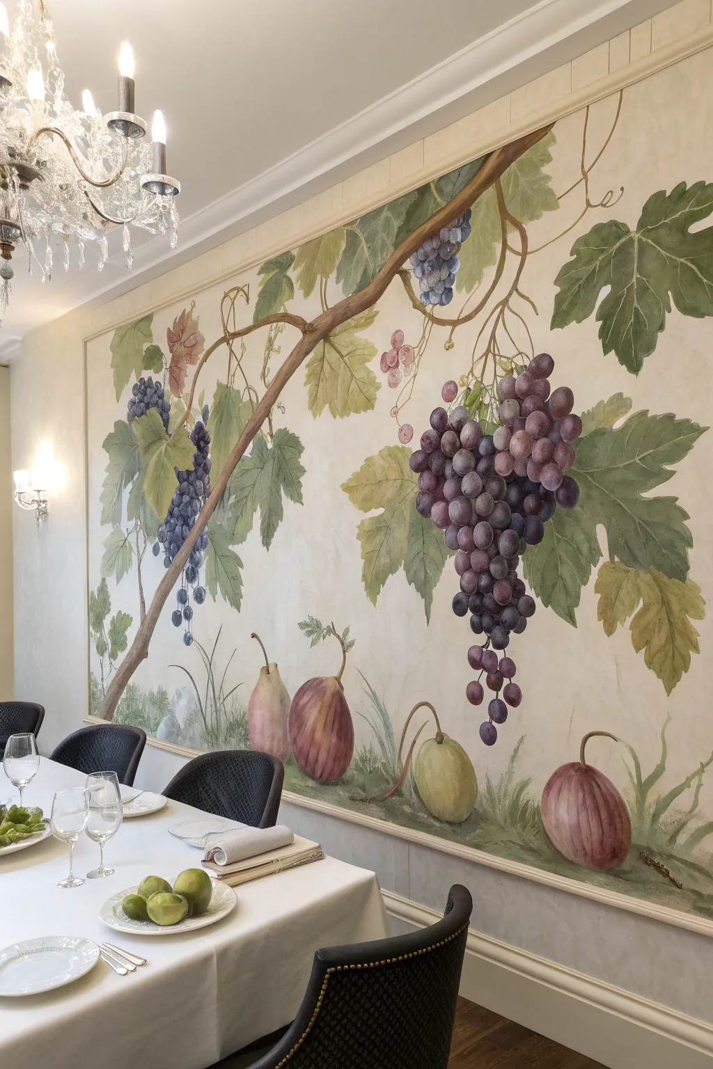
Transform your dining space into a Tuscan villa with this elegant, hand-painted wall mural featuring lush grapevines and ripening fruit. The soft, painterly technique mimics the look of an aged fresco, adding sophisticated warmth and grandeur to any meal.
Step-by-Step
Materials
- Interior latex wall paint (cream or parchment base)
- Acrylic paints (Titanium White, Burnt Umber, Yellow Ochre, Sap Green, Hooker’s Green, Dioxazine Purple, Alizarin Crimson, Raw Sienna)
- Large flat brush (2-3 inch) for base coat
- Assorted artist brushes: filberts (sizes 8-12), rounds (sizes 4-8), liner brush
- Pencil and eraser
- Level and measuring tape
- Painter’s tape
- Decorative molding for framing
- Acrylic glazing medium
- Sea sponge or clean rags
Step 1: Preparation and Background
-
Define the canvas area:
Using a level and measuring tape, mark a large rectangular area on your wall to serve as the mural’s ‘canvas’. This should take up a significant portion of the wall, leaving a border for the molding later. -
Establish the frame:
Install simple flat molding or decorative trim along your marked lines to physically frame the artwork. Caulk the edges, fill nail holes, and paint the molding to match your room’s trim color. -
Paint the background base:
Inside the frame, apply two coats of a soft cream or parchment-colored latex paint. Allow it to dry completely between coats. -
Create an aged texture:
Mix a small amount of Raw Sienna acrylic with glazing medium and water to create a translucent wash. Use a sea sponge or rag to lightly dab this mixture over the cream background, concentrating slightly more on the edges for a vignetted, aged plaster look.
Stubborn Sketch Lines?
Make sure your pencil sketch is very light. If marks are too dark, knead a gummy eraser to lift the graphite gently without damaging the wall paint before you start applying acrylics.
Step 2: Sketching and Vine Structure
-
Sketch the composition:
Lightly sketch the main branch structure with a pencil. Start the main vine from the top right, sweeping diagonally across to the bottom left. Add smaller tendrils and indicate where the large grape clusters will hang. -
Block in the main branch:
Mix Burnt Umber with a touch of White. Using a large filbert brush, paint the thick, woody vine following your pencil lines. Vary the thickness to make it look organic—nodes and twists add realism. -
Add highlights and shadows to wood:
While the brown is still slightly tacky, blend in darker pure Burnt Umber on the bottom edge of the branch for shadow, and a lighter tan (White + Yellow Ochre) on the top edge where the light hits.
Frescolasso Effect
To mimic an authentic Italian fresco, lightly sand the finished painting with fine-grit sandpaper (220 grit) in random spots. This scuffs the paint for a time-worn, historical texture.
Step 3: Painting Leaves and Fruit
-
Base coat the leaves:
Mix Sap Green with a little Yellow Ochre. Paint the broad shapes of the grape leaves, keeping the edges slightly ragged. Don’t worry about veins yet; just get the silhouette right. -
Leaf detailing:
Once dry, use a smaller round brush with a lighter green mix (add more White or Yellow) to paint the veins. I like to dry-brush a little darker Hooker’s Green near the stem of each leaf to create depth. -
Paint the grape base shapes:
For the grapes, don’t paint individual circles yet. Paint the general cone-like shape of the cluster in a medium purple tone (Dioxazine Purple + White). -
Define individual grapes:
Using a filbert brush, paint circles over the base shape. Use a dark purple for grapes in the back and a lighter, reddish-purple for those in the front. -
Add the ‘bloom’:
Grape skins have a dusty coating called ‘bloom’. Mix a very pale lavender or white glaze and dry-brush a small, C-shaped highlight on each grape to make them look round and frosted. -
Paint the bottom fruits:
Sketch the large fig or quince shapes at the bottom. Base coat them: one in a muted green-yellow, the others in a reddish-brown. -
Texture the ground fruit:
Add vertical striations to the reddish fruits using Alizarin Crimson and Burnt Umber. For the green fruit, blend yellow into the center to make it look ripe and round.
Step 4: Final Details
-
Add curly tendrils:
Thin down your brown paint with water until it’s inky. Use a liner brush to paint delicate, spiraling tendrils coming off the main vine. These should look loose and expressive. -
Ground the composition:
Paint wispy blades of grass along the bottom edge using various shades of green. This ‘seats’ the bottom fruits so they aren’t floating in space. -
Final highlights:
Step back and look at the whole mural. Add final touches of pure white highlights to the shiniest part of the grapes and the tops of the main branch. -
Seal the work:
Once the paint has cured for at least 48 hours, apply a clear matte water-based varnish over the mural area to protect it from dust and fading.
With your final glaze applied, you now have a timeless piece of art that invites guests to linger a little longer at the table
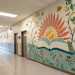
Citrus and Herb Pattern for a Breakfast Nook
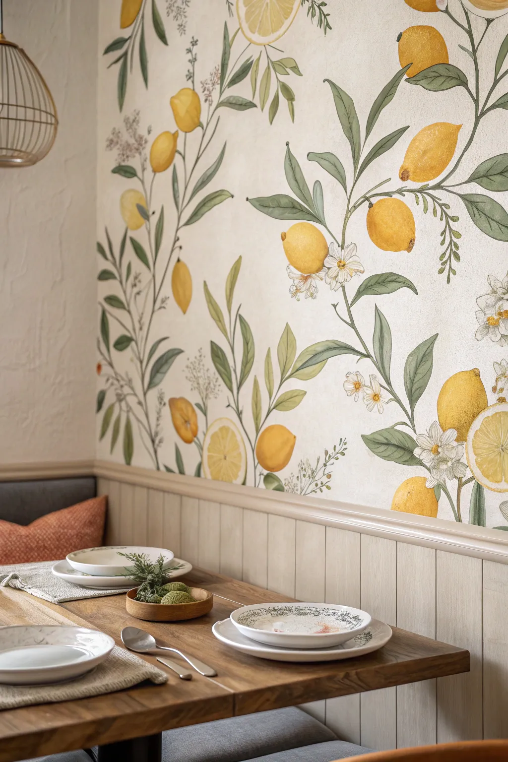
Bring the refreshing charm of a mediterranean orchard into your breakfast nook with this hand-painted citrus mural. The design features soft watercolor-style lemons, graceful leafy branches, and delicate blossoms for a bright and airy botanical finish.
Step-by-Step Guide
Materials
- Interior latex paint (soft cream/off-white for base)
- Acrylic paints (various greens, lemon yellow, ochre, white, warm brown)
- Glazing medium
- Pencil and eraser
- Projector (optional)
- Quality synthetic brushes (round sizes 4, 8, 12, and a liner brush)
- Painter’s tape
- Drop cloth
- Paper plate or palette
- Water cups and rags
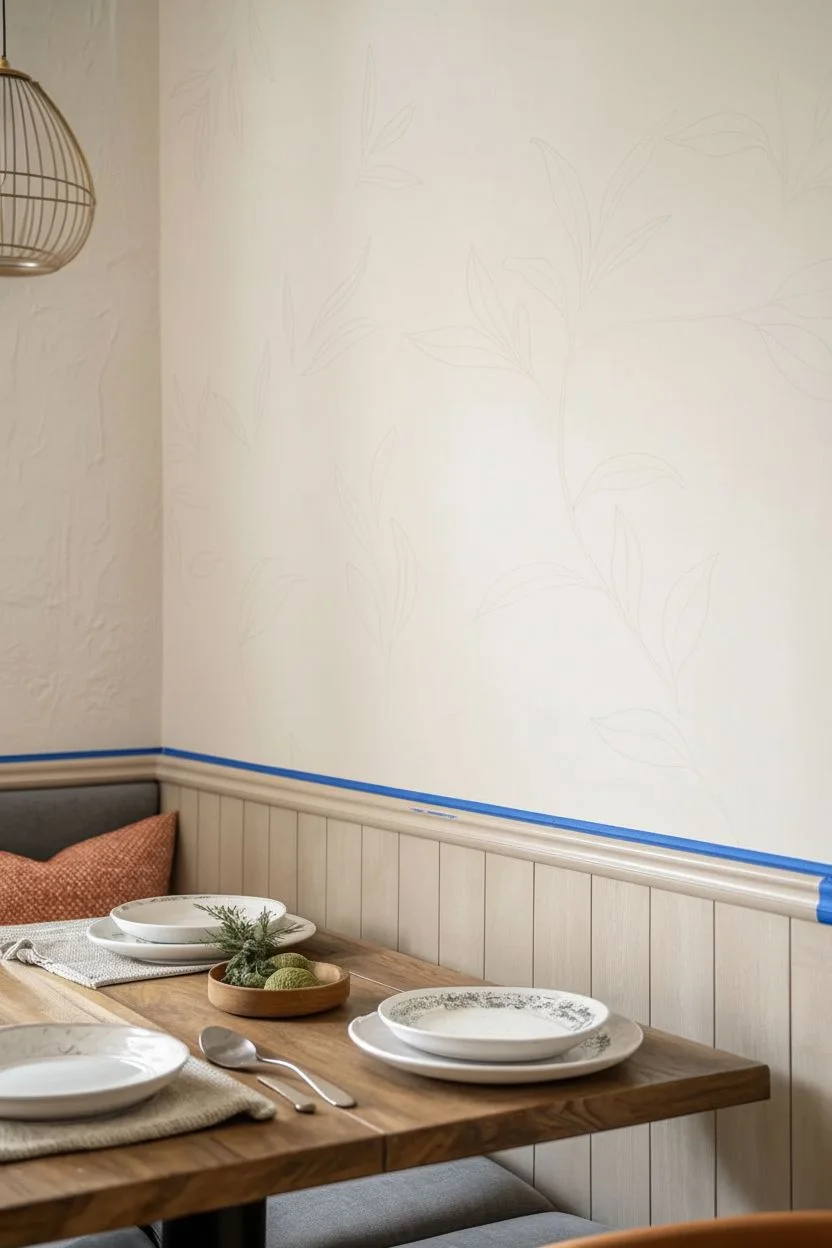
Step 1: Preparation & Base
-
Prime the Surface:
Begin by cleaning your wall thoroughly to remove any grease or dust. Once dry, apply a coat of your soft cream or off-white interior latex paint to create a fresh, neutral canvas that mimics textured paper. -
Protect the Area:
Use painter’s tape to protect any wainscoting, trim, or adjacent walls. Lay down a drop cloth to catch any accidental drips during the painting process. -
Plan the Composition:
Sketch your design lightly on paper first to visualize the flow of branches. The goal is an organic, climbing pattern that moves casually up the wall rather than a rigid grid. -
Transfer the Design:
Lightly sketch the main branches and placement of lemons directly onto the wall using a pencil. If you are less confident in freehand drawing, project your sketch onto the wall and trace the outlines lightly.
Uneven Coverage?
If your lemons look streaky, don’t panic. Apply another thin layer of yellow glaze once dry. Multiple thin layers creates a richer, more realistic skin texture than one thick coat.
Step 2: Painting the Foliage
-
Mix Leaf Greens:
Prepare three shades of green on your palette: a sage green, a deeper olive, and a lighter, yellowish-green. Mixing in a touch of glazing medium will help create that translucent, watercolor effect. -
Block in Stems:
Using a size 8 round brush and your mid-tone sage green, paint the main stems following your pencil lines. Keep the pressure varied to create natural undulations in the stem thickness. -
Paint Base Leaves:
Fill in the leaf shapes with your sage green mix. Focus on the overall shape rather than details; let the brush strokes follow the curve of the leaf. -
Add Depth to Leaves:
While the base coat is still slightly tacky or just dry, use the deeper olive green to shade the areas where leaves overlap or attach to the stem. -
Highlighting Foliage:
With the lighter green mixture, add soft highlights to the tips and upper edges of the leaves. I like to blend this gently with a damp brush for a soft transition.
Add Scented Charm
For a truly multi-sensory experience, mix a drop of lemon essential oil into your final clear matte topcoat if you choose to seal the wall, though this scent fades quickly.
Step 3: Adding the Citrus
-
Base Color for Lemons:
Mix a bright lemon yellow with a tiny dot of ochre and glazing medium. Paint the oval shapes of the lemons, keeping the application somewhat sheer to build depth later. -
Building Texture:
Once the first layer is dry, stipple (dab repeatedly) a slightly darker ochre-yellow mix onto the bottom curve of each lemon to suggest a textured rind and shadow. -
Creating Highlights:
Paint the top curves of the lemons with a pale yellow or creamy white. This mimics light hitting the fruit and gives them a round, three-dimensional volume. -
The Lemon Ends:
Use a small brush with a mix of brown and ochre to add the distinctive little nibs at the ends of the lemons, giving them their characteristic shape.
Step 4: Details & Blossoms
-
Painting Blossoms:
Using a small round brush and pure white acrylic, dab five-petal flower shapes near the fruit clusters. Keep these loose and organic. -
Flower Centers:
Add tiny dots of yellow and light brown to the center of each white blossom using your liner brush to define the stamens. -
Refining Stems:
Use the liner brush and a brownish-green mix to connect the lemons securely to the main branches with small, woody stems. -
Final Erasure:
Wait at least 24 hours for the paint to cure completely, then gently erase any visible pencil lines that weren’t covered by paint.
Step back and admire your fresh, everlasting citrus grove that brightens the room regardless of the season


Abstract Geometric Color Blocks
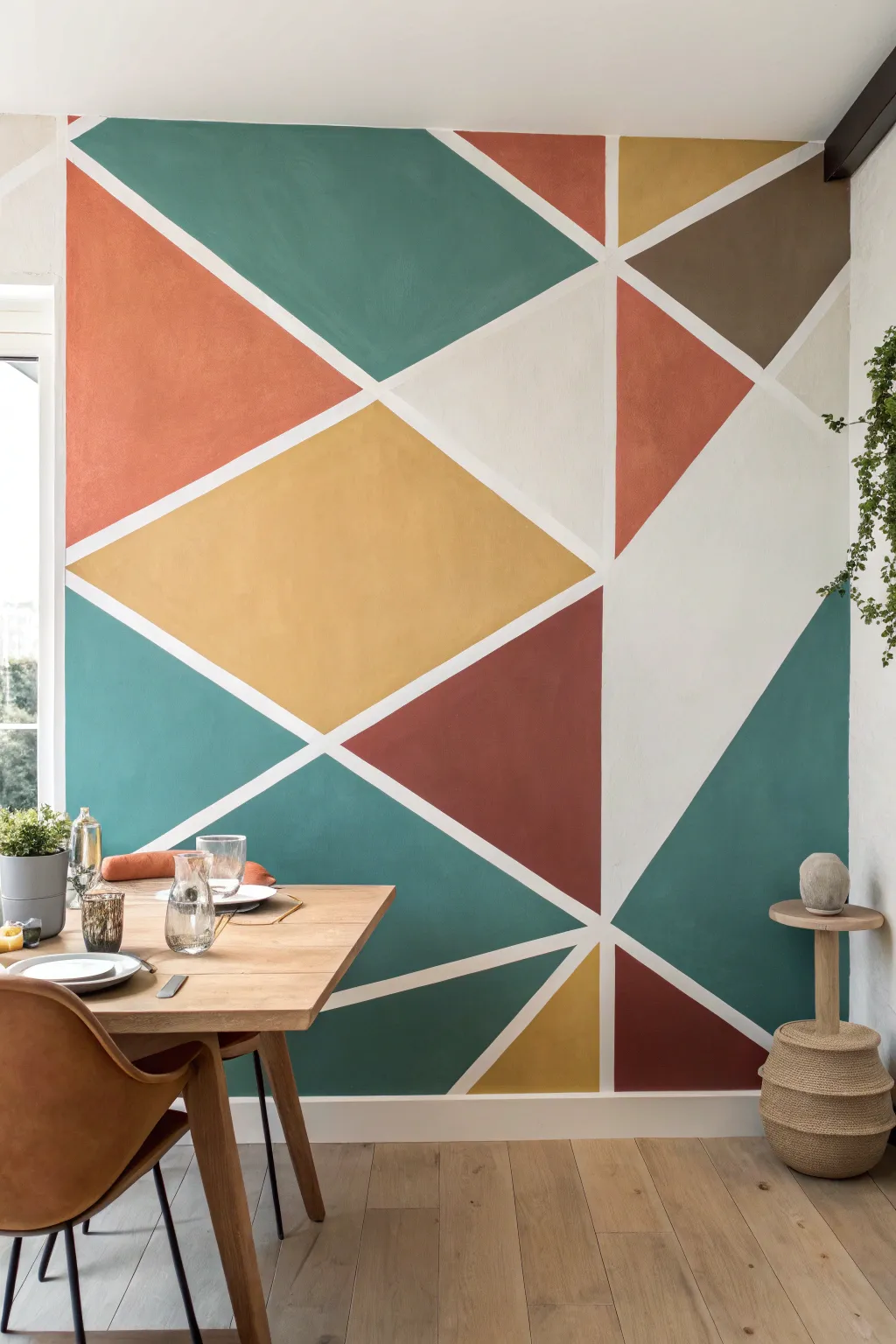
Transform a plain dining room wall into a stunning focal point with this large-scale geometric design. Featuring a warm, earthy palette of teal, terracotta, mustard, and chocolate brown, this mural uses simple masking tape techniques to create crisp, professional-looking shapes.
Detailed Instructions
Materials
- Painter’s tape (1-inch width works best, specific for delicate surfaces)
- Interior wall paint (finish of choice, eggshell recommended)
- Colors: Deep Teal, Terracotta/Rust, Mustard Yellow, Chocolate Brown, Warm White (for the base)
- Small foam rollers (4-inch size)
- Angled sash brush (2-inch)
- Drop cloth
- Pencil and level (optional)
- Paint tray and liners
- Clean rag or tack cloth
Step 1: Preparation and Base Coat
-
Prepare the surface:
Clear the dining area and lay down a drop cloth to protect your flooring. Ensure the wall is clean, dry, and free of dust by wiping it down with a damp rag or tack cloth. -
Apply base color:
Since the white lines in the final design are actually the wall color showing through, paint the entire wall with your chosen warm white or cream shade first. Apply two coats if necessary for full coverage. -
Allow to cure:
Let the base coat dry completely. I like to wait at least 24 hours before taping to ensure the tape doesn’t peel up any fresh paint.
Bleed-Through Blues?
If paint bleeds under the tape, let it dry completely. Then, place a piece of tape over the colored area (leaving the bleed exposed) and touch up with the white line color.
Step 2: Designing the Grid
-
Mark anchor points:
Visualize the wall as a large canvas. Lightly mark a few key intersection points with a pencil where you want your lines to converge. The design relies on diagonals, so finding a central point slightly off-center works well. -
Apply the tape lines:
Start applying long strips of painter’s tape to create the geometric web. Begin with the longest lines that span across the wall, then fill in with shorter connecting lines to create triangles and quadrilaterals. -
Vary shape sizes:
Aim for a mix of large and medium-sized shapes. Notice how the reference image features larger sections of teal and mustard to anchor the design, with smaller triangles of brown and rust for balance. -
Seal the edges:
Once the tape is up, press down firmly along every edge. For ultra-crisp lines, paint a thin layer of your *base* white color over the tape edges. This seals the tape so any bleed-through matches the lines, not the colored shapes.
Add Metallic Flair
For a glamorous twist, use metallic gold or copper paint for one of the smaller accent triangles, or paint the dividing lines gold instead of white using a steady hand.
Step 3: Applying Color
-
Plan your palette:
Before dipping your brush, stick small distinct pieces of colored tape or sticky notes into each shape to map out where each color will go. Ensure no two sections of the same color touch each other. -
Cut in edges:
Work one color at a time to minimize cleanup. Use the angled sash brush to carefully paint the edges and corners of a shape where the roller might not reach. -
Roll the fill:
Use a small 4-inch foam roller to fill in the rest of the shape. Foam rollers are excellent here because they leave a smooth finish without heavy texture marks. -
Apply second coats:
Allow the first coat of color to dry to the touch (usually 1-2 hours). Apply a second coat to ensure rich, opaque saturation, especially for the darker teal and rust tones. -
Repeat for all colors:
Wash your tools or switch to fresh rollers/brushes as you move to the next color in your plan. Continue until every taped-off section is filled.
Step 4: The Reveal
-
Check for dryness:
Wait until the final coat of paint is tacky but not fully hardened. Removing tape too late can cause the paint to chip. -
Peel the tape:
Slowly peel the painter’s tape away from the wall at a 45-degree angle. Pull gently and steadily to reveal the crisp white lines underneath. -
Touch ups:
Inspect the lines closely. If any paint bled under the tape despite your sealing efforts, use a tiny artist’s brush and your base white paint to correct the line.
Step back and admire how a weekend of painting has completely redefined the energy of your dining space
Textured Plaster-Look Gradient Mural
Transform a plain dining space into a dreamy sanctuary with this painterly, texture-rich mural technique. By layering semi-transparent glazes and mimicking the look of aged plaster, you create a soft, cloud-like gradient that adds incredible depth and warmth without overwhelming the room.
Step-by-Step Tutorial
Materials
- Matte latex interior paint (White base)
- Glaze medium (clear)
- Sample pots of latex paint (Teal/Seafoam, Terracotta/Dusty Rose, Cream/Beige)
- Wide paintbrushes (4-inch chip brushes work well)
- Sea sponges (natural)
- Lint-free rags
- Painter’s tape
- Drop cloths
- Plastic mixing buckets or trays
- Spray bottle with water
Step 1: Preparation and Base Coat
-
Prepare the workspace:
Clear the area of furniture, including your dining table and chairs. Lay down drop cloths to protect your flooring and apply painter’s tape to the trim, ceiling line, and adjacent walls to ensure crisp edges. -
Prime the wall:
If your wall is a dark color, apply a coat of white primer. If it is already light, ensure it is clean and creating a solid white base coat using matte white latex paint. Let this dry completely overnight.
Fixing Muddy Colors
If blending teal and pink creates an ugly brown, stop blending immediately. Let the layers dry completely, then paint a thin layer of cream over the muddy spot before reapplying fresh color.
Step 2: Mixing the Glazes
-
Create the teal mixture:
In a mixing bucket, combine 1 part of your teal or seafoam paint with 4 parts glaze medium. Stir thoroughly until the consistency is uniform. The transparency is key here, so test a small patch on scrap cardboard first. -
Create the warm tones:
Repeat the mixing process in separate containers for your terracotta/dusty rose color and your cream/beige color. Keep a separate bucket of clean water nearby for rinsing brushes.
Add Metallic Sheen
For a luxe upgrade, mix a small amount of pearlized or metallic gold glaze and sponge it sporadically over the cream sections. It catches the overhead light beautifully during dinner parties.
Step 3: Applying the Colors
-
Plan your zones:
Visualize the diagonal flow seen in the inspiration image. The teal will occupy the top left and bottom right corners, while the warm pinks and creams will drift through the center diagonally. -
Start with the teal:
Dip a wide chip brush into the teal glaze. Apply it loosely to the upper left corner using cross-hatch strokes (making X shapes). Do not aim for full coverage; leave plenty of white space showing through. -
Soften the edges:
Before the glaze dries, take a dampened sea sponge or a balled-up damp rag and dab at the edges of the painted area to blur the lines. This creates that clouded, airy effect. -
Apply the warm center:
Using a fresh brush, apply the terracotta/rose glaze in the central band of the wall. Bring it close to the teal wet edge but don’t overlap heavily yet. -
Introduce the cream:
While the pink layer is tacky, brush the cream/beige glaze into the transition areas between the pink and the white space. This acts as a bridge color to soften the transition. -
Add the bottom teal section:
Repeat the teal application in the bottom right corner (or wherever you want the darker accent to reappear), keeping the application loose and organic.
Step 4: Blending and Texturing
-
Mist and blend:
Lightly mist the wall with water from your spray bottle where two colors meet. Use a clean, dry chip brush to feather the colors into each other. The water helps reactivate the glaze for smoother gradients. -
Create texture:
Take a clean, dry rag and press it into wet areas of glaze, twisting slightly as you lift. This ‘ragging off’ technique removes some paint and reveals the white base, mimicking the look of old plaster. -
Layer for depth:
Once the first layer is touch-dry (about 30-60 minutes), evaluate distinct areas. I like to go back in with slightly more saturated glaze (less medium, more paint) to deepen the darkest parts of the teal layout. -
Add high-contrast details:
Dip a small sea sponge into undiluted cream paint and lightly pounce it over areas that became too dark or muddy. This brings back the light and adds a ‘stucco’ texture look.
Step 5: Finishing Touches
-
Assess from a distance:
Step back to the other side of the room. Look for any harsh lines or shapes that look too geometric. Mist and dab them out with a sponge to maintain the organic flow. -
Dry and seal:
Allow the wall to cure for at least 24-48 hours. Because untinted glaze can sometimes remain slightly tacky, you may want to apply a clear matte water-based polyurethane protective coat if this is a high-traffic dining area. -
Reveal:
Carefully remove the painter’s tape. Pull the tape away from the painted edge at a 45-degree angle to ensure a clean line.
Enjoy your new atmospheric dining backdrop which brings the charm of an old-world fresco into your modern home
Trompe L’Oeil Arches and Niches
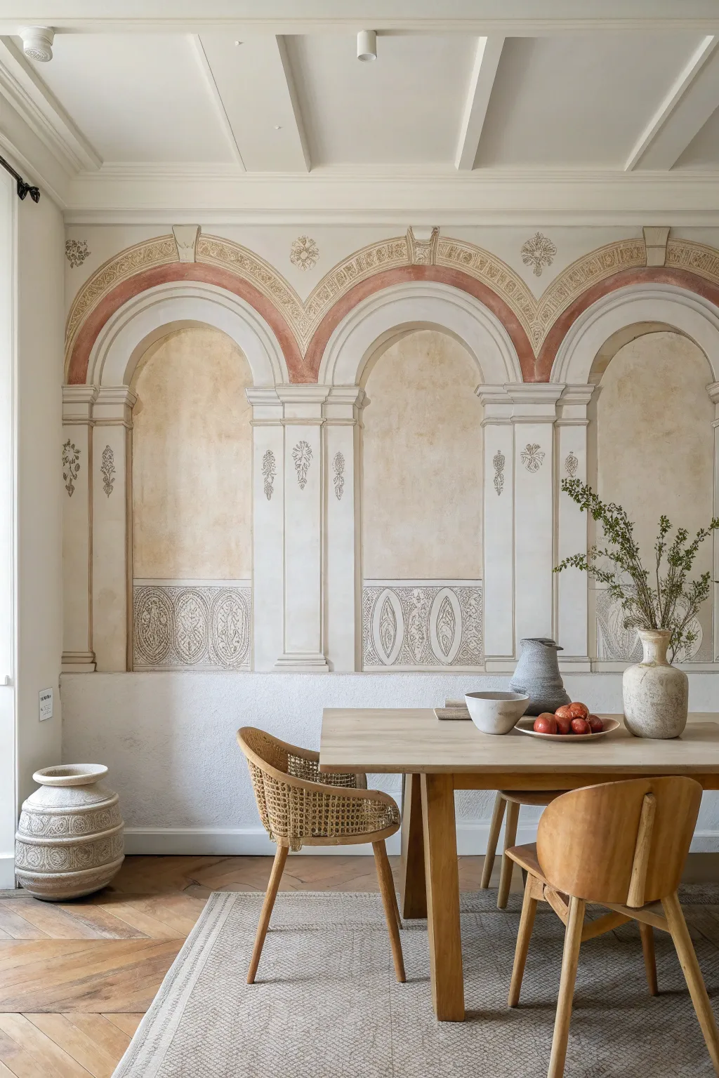
Transform a plain dining wall into a sun-drenched Italian loggia with this sophisticated faux finish mural. Using soft washes and warm earth tones, you’ll create the illusion of recessed stone arches and weathered architectural details that add instant history to your space.
Detailed Instructions
Materials
- Matte latex paint (white base)
- Acrylic glazing medium
- Acrylic paints (Raw Sienna, Burnt Sienna, Raw Umber, Yellow Ochre, Warm Grey)
- Painter’s tape (various widths)
- Large level and graphite pencil
- Chalk line
- Sea sponges (natural)
- Sash brushes (2-inch)
- Artist brushes (fine liner and flat shader)
- Cotton rags
- Large rulers or straight edge
- Measuring tape
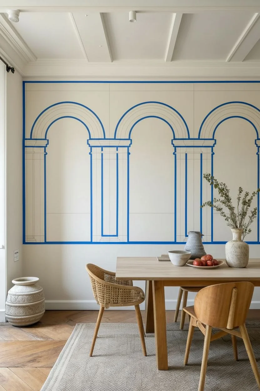
Step 1: Planning and Layout
-
Prepare the Base:
Begin with a clean wall painted in a warm, creamy off-white matte base coat. This will serve as your ‘plaster’ background and the highlight color for the stone. Allow this to cure fully for at least 24 hours before taping. -
Measure the Grid:
Determine the scale of your arches based on your wall width. Divide the wall into equal sections for the pillars and arches. Mark the vertical center lines for each pillar and arch opening lightly with a pencil. -
Draft the Architecture:
Using a long level and straight edge, draw the vertical lines for the pillars. These should include outer edges and inner recessed panels. Use a string and pencil like a compass (or a large architectural template) to draw the perfect semi-circles for the arch tops, ensuring they spring from the top of the pillar capitals. -
Tape the Main Structure:
Apply painter’s tape along the outside edges of your pencil lines to define the pillars and the main arch shapes. Mask off the negative space so you can paint the structure first. Press the tape edges firmly to prevent bleed.
Uneven Glaze?
If your glaze dries with hard watermarks, re-wet the area slightly with a damp sponge and feather the edges out before applying the next layer.
Step 2: Creating Texture and Depth
-
Mix the Stone Glaze:
Create a translucent glaze by mixing 1 part Raw Umber and 1 part Warm Grey paint with 4 parts glazing liquid. You want a very watery, sheer mixture that barely tints the wall. -
Apply the Base Wash:
Working in sections, apply the glaze over the pillar and arch areas with a large brush. Immediately dab and manipulate the wet glaze with a damp sea sponge to create a mottled, limestone-like texture. -
Define the Recessed Niches:
Remove the tape from the inner arch ‘openings’. Mix a warmer glaze using Yellow Ochre and a touch of Raw Sienna. Apply this to the inside of the arches (the niche) to push that visual plane backward. Keep the texture uneven and cloudy to mimic aged plaster. -
Add the Terracotta Detail:
Once the base layers are dry, tape off the curved band above the main arch. Mix a Burnt Sienna (terracotta) glaze. Paint this band, wiping back some areas with a rag to make it look worn and faded rather than solid red.
Add Realism
Use a darker glaze to paint tiny ‘cracks’ or chips in the faux stone, especially near corners or joints, to mimic centuries of wear.
Step 3: Architectural Details
-
Shadowing the Columns:
To make the flat pillars look 3D, you need shadows. Mix a darker grey-brown glaze. Using a small angled sash brush, paint a thin shadow line on the inner right side of every vertical line and under every horizontal line (like the capital). This assumes a light source from the left. -
Highlighting Edges:
With a small flat brush and your original base white paint, dry-brush a thin highlight line on the opposite side of the shadows (the top and left edges) to catch the imaginary light. -
Painting the Decorative Frieze:
At the bottom of the niche (dado level), use a stencil or sketch a repeating oval pattern. Paint the outlines in a diluted dark grey using a fine liner brush. Keep the lines sketchy and broken to simulate age. -
Adding Ornamental Motifs:
Sketch small floral drops or swag details on the face of the pilasters. Paint these loosely with a fine brush in a soft olive-grey tone. I find it helps to keep the brush fairly dry here so the details look like faint frescoes.
Step 4: Finishing Touches
-
Soften the Lines:
Step back and look at your work. If any tape lines look too crisp and modern, lightly sand them with fine-grit sandpaper or dry-brush a little of your background color over the edge to break the line. -
Enhance the Arch Depth:
Deepen the shading at the very top of the recessed niche curve with a slightly darker brown glaze. This gradient emphasizes the curvature of the ‘concave’ space. -
Final Clear Key:
Apply a very thin, watery white wash over areas that feel too dark or high-contrast to harmonize the entire mural and give it a chalky, cohesive patina. -
Seal the Work:
Once fully dry (give it 48 hours), recreate that flat fresco look by applying a clear, deadly matte varnish to protect your artwork without adding unwanted sheen.
Enjoy dining in your timeless, sun-washed architectural sanctuary.
Mural With a Mirror Layered on Top
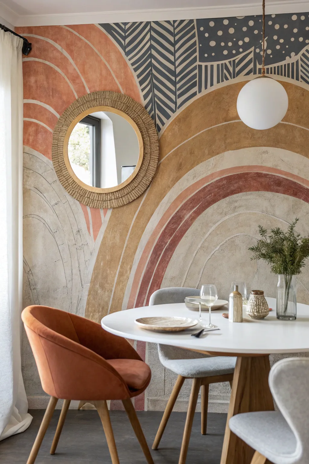
Transform a plain dining wall into a captivating focal point with this large-scale mural featuring organic arches and earthy textures. The interplay of warm terracotta tones, textured creams, and bold patterned accents creates a sophisticated yet relaxed backdrop perfect for layering decor.
How-To Guide
Materials
- Interior latex paint (terracotta, mustard yellow, dark charcoal, warm off-white, beige)
- Pencil and large eraser
- String and push pin (for creating arches)
- Small roller brushes (4-inch size)
- Angled sash brushes (2-inch)
- Artist brushes (flat and round for details)
- Painter’s tape
- Drop cloths
- Sea sponge or rag (optional for texture)
- Level
- Ladder
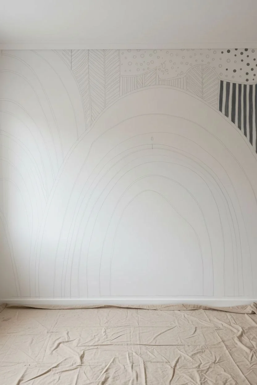
Step 1: Preparation & Mapping
-
Clear and Prep:
Start by clearing the wall completely. Remove any existing artwork, nails, or outlet covers. Wipe the surface down with a damp cloth to remove dust and ensure your paint adheres properly. Lay down drop cloths to protect your floor. -
Establish the Mirror Point:
Since this design centers around a mirror, decide exactly where your mirror will hang before you paint. Mark this center point with a pencil; this will be the anchor for your primary arch shapes. -
Sketch the Large Arches:
Connect a piece of string to a pencil. Hold the string at your center point (or a pivot point lower down, depending on the desired curve depth) and swing the pencil to lightly sketch your main arch lines. Don’t worry about perfect symmetry; a slightly organic hand-drawn look adds character. -
Draft the Secondary Shapes:
Sketch the additional flowing lines that intersect the main arch. Notice how the design in the photo includes a second set of curves entering from the left and a darker patterned section at the top. Outline these zones now so you have a complete ‘paint-by-numbers’ map on your wall.
Step 2: Blocking in Color
-
Paint the Base Arches:
Using a 4-inch roller or a wide brush, fill in the large beige and off-white sections. These lighter colors act as the background. Apply two coats if necessary for full coverage, allowing the first to proper dry to the touch. -
Apply the Terracotta:
Switch to your warm terracotta or rust color. Carefully cut in the edges of the curved bands using an angled sash brush, then fill the centers. The goal is a smooth curve, but if the edge is slightly wobbly, it enhances the bohemian plaster-like aesthetic. -
Add the Mustard Tones:
Paint the golden-yellow or mustard arch sections. I like to keep a wet edge here so the paint flows smoothly without lap marks. Ensure these sections dry completely before you paint any adjacent colors to avoid bleeding. -
Create the Texture:
To mimic the worn, plaster look seen in the photo, you can dry-brush a slightly lighter shade over your solid colors. Dip a dry brush into a small amount of paint, wipe most of it off on a paper towel, and lightly sweep it over the dried arches to create dimension.
Uneven Arches?
Don’t stress if your curves aren’t perfect geometrical semi-circles. The charm of this mural is its organic nature. Use a small brush to feather edges for a softer transition if a line feels too jagged.
Step 3: Detailing & Pattern
-
Fill the Dark Zone:
Paint the top section in your dark charcoal or deep blue-grey color. This high-contrast area creates a dramatic capstone for the mural. Ensure the bottom edge of this shape follows the curve of the arches below it. -
Draft the Patterns:
Once the dark paint is fully dry, use chalk or a light pencil to sketch the leaf veins and geometric patterns. In the photo, there are stylized palm fronds and a section with dots and irregular stripes. -
Paint the Light Details:
Using a fine artist brush and your off-white paint, carefully go over your sketches on the dark background. Paint the feather-like fern lines with steady, sweeping strokes. For the dots, simply dab the brush tip accurately. -
Refine the Lines:
Step back and look at the overall composition. Use a small angled brush to clean up any edges where colors meet. If you want a distinct separation, you can paint a thin, white dividing line between the major color blocks, as seen in the original finish. -
Add Subtle Sketch Lines:
For that artistic, illustrative feel, take a very fine brush with diluted grey paint (or a paint pen) and loosely outline some of the beige arches. These lines shouldn’t be perfect; they should look like pencil sketches showing through.
Enhance the Texture
Mix a small amount of plaster or joint compound into your paint for specific sections. This creates actual physical relief on the wall, making the ‘aged fresco’ look even more authentic.
Step 4: Finishing Touches
-
Erase and Clean:
Once the paint has cured for at least 24 hours, gently erase any visible pencil marks that weren’t covered by paint. Remove the drop cloths. -
Mount the Mirror:
Install the hardware for your round mirror at the mark you made in the very first step. Hang the mirror so it sits centrally within the specific arch or intersection you designed for it, completing the layered look.
Now you have a stunning, artful backdrop that anchors your dining space with warmth and creative flair
Hand-Lettered Menu Mural Wall
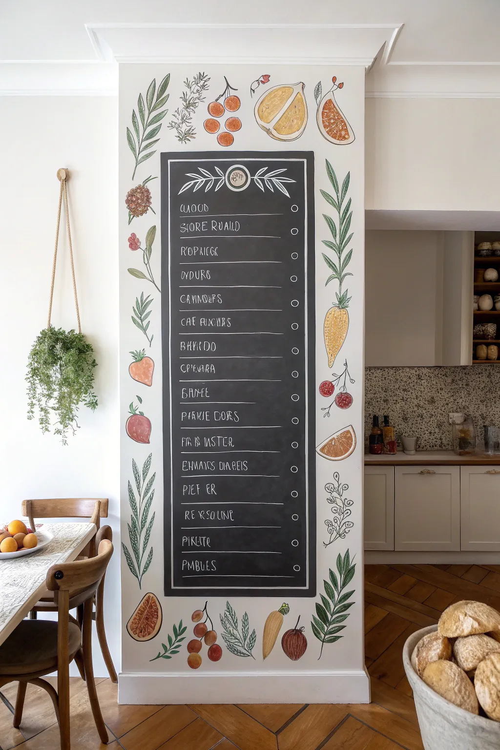
Transform a plain architectural column or narrow wall section into a functional piece of art with this charming illustrated menu board. Combining crisp chalkboard paint with delicate, watercolor-style botanical drawings creates a focal point that feels both vintage and fresh.
Step-by-Step Guide
Materials
- High-quality chalkboard paint (black)
- Painter’s tape (various widths)
- White emulsion or acrylic wall paint (base color)
- Acrylic craft paints (greens, oranges, reds, yellows, browns)
- Fine-grit sandpaper
- Pencil and large eraser
- Chalkola markers or fine-tip white paint pen
- Assorted brushes (small angled brush, fine liner brush, medium round brush)
- Ruler or level
- Matte clear sealer (optional)
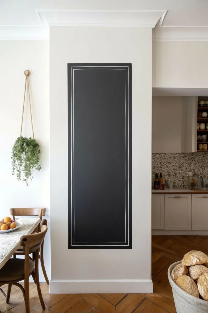
Step 1: Preparing the Canvas
-
Clean and mask:
Begin by thoroughly cleaning the wall surface to remove any grease or dust, which is crucial for kitchen areas. Once dry, tape off the surrounding ceiling, floor, and adjacent walls to isolate your painting area. -
Apply the base coat:
Paint the entire column or wall section with a creamy off-white or soft white acrylic wall paint. This provides a bright, neutral background for your illustrations and mimics the look of paper. -
Define the chalkboard area:
Using a long ruler and a bubble level, lightly draw a tall rectangle in the center of the wall, leaving a generous border (about 8-10 inches) on all sides for your artwork. This central column will become the menu board. -
Tape the border:
Apply painter’s tape just outside your pencil lines to ensure a crisp edge. Press the tape down firmly with your thumb or a putty knife to prevent bleed-through. -
Paint the chalkboard:
Apply the chalkboard paint inside the taped area. Use a small roller for a smooth finish or a brush for a slightly more textured look. You will likely need 2-3 coats, allowing complete drying time between each as specified by the can. -
Add the inner frame:
Once the black paint is fully cured and the tape is removed, use a ruler and a white paint pen (or thin brush with white paint) to draw a double-line border inside the black rectangle. This frames the menu space beautifully.
Masterful Lines
For steady outlines on vertical surfaces, rest your pinky finger against the wall as a pivot point while you paint with the liner brush.
Step 2: Adding Botanical Illustrations
-
Sketch the layout:
Lightly sketch your botanical border directly onto the white wall space using a pencil. Organize your composition so that larger items like carrots or leafy branches anchor the corners, while smaller herbs and berries fill the gaps. -
Paint base greens:
Start with the foliage. Mix a few shades of sage, olive, and forest green acrylics. Paint the leaves using a medium round brush, keeping the paint relatively thin to mimic a watercolor texture. -
Add fruits and veggies:
Block in the colors for your produce. Use muted oranges for carrots and citrus, and dusty reds for berries or radishes. Avoid using neon-bright colors; mixing a tiny dot of brown into your brights gives them that vintage, illustrative quality. -
Detail with outlines:
This is the most critical step for the style shown. Use a very fine liner brush with dark grey or brownish-black paint (diluted slightly) to outline your painted shapes. Add veins to leaves and texture to the fruit skins. -
Highlight and shade:
Add tiny white highlights to the glossy fruits and darker shading where leaves overlap. These small touches bring the flat illustrations to life.
Oops! Corrections
If you smudge the black chalkboard paint onto the white border, don’t wipe it! Let it dry completely, sand lightly, then touch up with white.
Step 3: Lettering the Menu
-
Create the header:
At the top of the blackboard section, draw a decorative header. Sketch a central medallion or logo circle, flanked by simple olive branch illustrations in white. -
Rule the lines:
Use a level and your white paint pen to draw thin, horizontal rules down the length of the board. I like to leave about 3 inches between each line for legibility. -
Checkboxes:
On the right side of each line, draw a small, neat circle. This adds an interactive ‘ordering’ element to the design. -
Lettering style:
Using your chalk marker, write out your menu items. The style in the image uses a tall, narrow, all-caps font that is slightly quirky. Varying the height of the crossbars on letters like ‘E’ and ‘H’ adds character. -
Final clean up:
Erase any remaining pencil marks on the white wall gently. If you want the botanical art to be permanent and scrubbable, apply a coat of matte clear sealer over the white portion of the wall only. -
Season the board:
Before using real chalk, take a piece of chalk on its side and rub it over the black paint, then wipe it off. This ‘seasons’ the surface so your first written words don’t leave permanent ghost images.
Now you have a stunning, customized menu wall ready for your next dinner party listing
Corner-Wrap Mural That Frames the Table
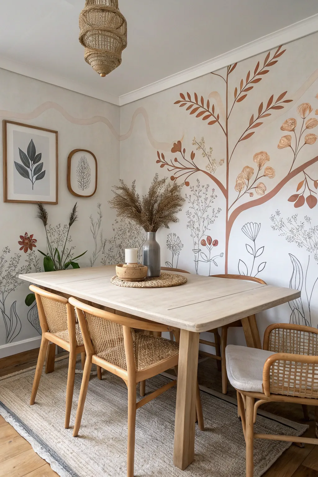
Transform a plain dining corner into an immersive botanical retreat with this illustrative mural that seamlessly wraps across two walls. Using a soothing palette of terracotta, sage, and charcoal, this project combines bold painted shapes with delicate line work for an organic, airy feel.
Detailed Instructions
Materials
- Latex wall paint (white or off-white base)
- Acrylic paints (terracotta/burnt orange, sage green, beige, ochre)
- Black acrylic paint or black paint marker (medium tip)
- Pencil and large eraser
- Painter’s tape
- Assorted brushes (1-inch flat brush, #4 round brush, #0 liner brush)
- Step ladder
- Drop cloth
- Damp rag
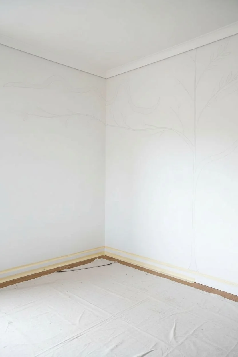
Step 1: Preparation & Layout
-
Clear and clean:
Begin by removing all furniture, artwork, and outlet covers from the corner area. Wipe down the walls with a damp rag to remove dust and grease, ensuring a pristine surface for the paint to adhere to. -
Protect the space:
Lay down your drop cloth to cover the flooring. Use painter’s tape to mask off the baseboards and the ceiling line where the mural will extend. -
Sketch the main structure:
Using a light pencil grip, sketch the primary ‘skeleton’ of your mural. Focus on the large tree-like structure on the right wall first, drawing a central trunk that branches out. Don’t press too hard; you just want faint guidelines. -
Map the corner transition:
Extend a long, waving branch horizontally from the right wall, across the corner, and onto the adjacent left wall. This continuous line is the key element that visually connects the two surfaces. -
Plan the wave:
Lightly sketch the undulating, ribbon-like wave shape near the ceiling. This abstract element adds movement and frames the botanical elements below without needing to be perfect.
Use a Paint Marker
For the intricate black line work, skip the brush! A water-based black acrylic paint marker offers way better control for thin stems and won’t drip down the wall.
Step 2: Painting the Base Forms
-
Paint the main branches:
Mix your terracotta acrylic paint with a tiny bit of the wall color to soften it. Using a 1-inch flat brush or a large round brush, paint the thickest parts of the tree trunk and main branches, following your pencil guides. -
Add the waving ribbon:
Using a very pale beige or diluted terracotta wash, paint the wavy line near the ceiling. Keep this layer semi-transparent or soft to make it feel like a background element. -
Create the large leaves:
Switch to a medium round brush. Along the terracotta branches, paint simple, almond-shaped leaves. Use a ‘press and lift’ motion: press the brush down to create the belly of the leaf, then lift as you pull away to create a sharp point. -
Layer in floral pods:
Mix an ochre or light beige tone. on the ends of some branches, dab roughly circular or bell-shaped blobs. These will become the dried flower heads later. Don’t worry about detail yet; just block in the color. -
Introduce secondary greenery:
I like to use a sage green color here for variety. Paint a few standalone stems rising from the floor level on the left wall, adding long, slender leaves to balance the composition. -
Let it cure:
Allow these base colors to dry completely for at least 2-3 hours. If the paint is still tacky, your fine lines in the next step might smudge or bleed.
Uneven Lines?
Wobbly lines actually help this style! Organic botanical art looks better with natural variation. If a line is too thick, balance it by thickening a neighbor.
Step 3: Detailing & Line Work
-
Outline the pods:
Using a liner brush dipped in black acrylic or a black paint marker, carefully draw the details over your dried ochre blobs. creating ruffled edges and interior lines to mimic dried poppy pods or seed heads. -
Draw wildflowers:
On the open white spaces of the wall, use your black marker or liner brush to draw delicate wildflowers. Create long, thin stems rooted at the baseboard, topped with simple line-art blooms. -
Add texture to leaves:
Go back to your painted terracotta leaves. Use a finer brush with a slightly darker shade of rust (or mixed with a dot of black) to paint a central vein on each leaf for dimension. -
Integrate the corner:
Ensure the black line drawings cross the corner seam effectively. Drawing a stem that starts on one wall and ‘growing’ onto the next helps erase the hard angle of the room. -
Review and refine:
Step back to the center of the room. Look for any empty spots that feel unbalanced. Add small floating petals, extra twigs, or dots of pollen with your liner brush to fill gaps. -
Erase guidelines:
Once the paint is 100% dry (give it overnight if possible), gently erase any visible pencil marks. Be careful not to scrub too hard over the painted areas.
Once the furniture is back in place, you’ll see how this custom artwork instantly makes the room feel larger and more cohesive
Have a question or want to share your own experience? I'd love to hear from you in the comments below!