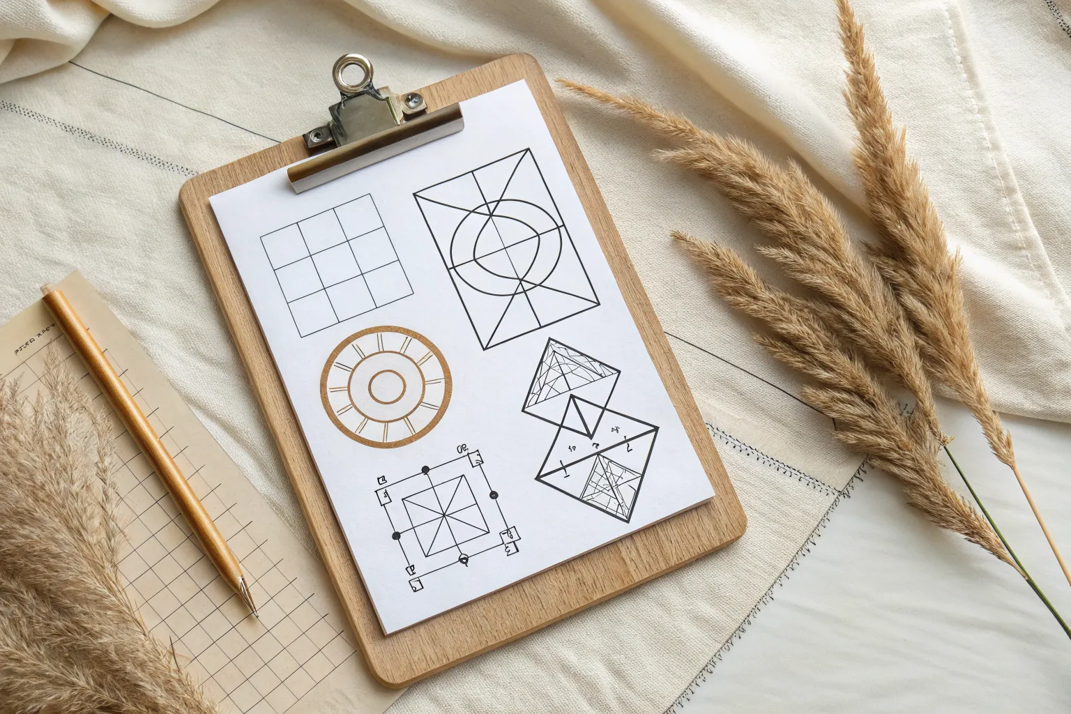
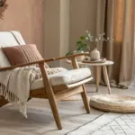
When composition clicks, it feels like your artwork suddenly has a backbone—everything lands where it needs to land. Here are my favorite art composition ideas that give you clear, usable frameworks while still leaving plenty of room for your style.
Golden Spiral Eye Path
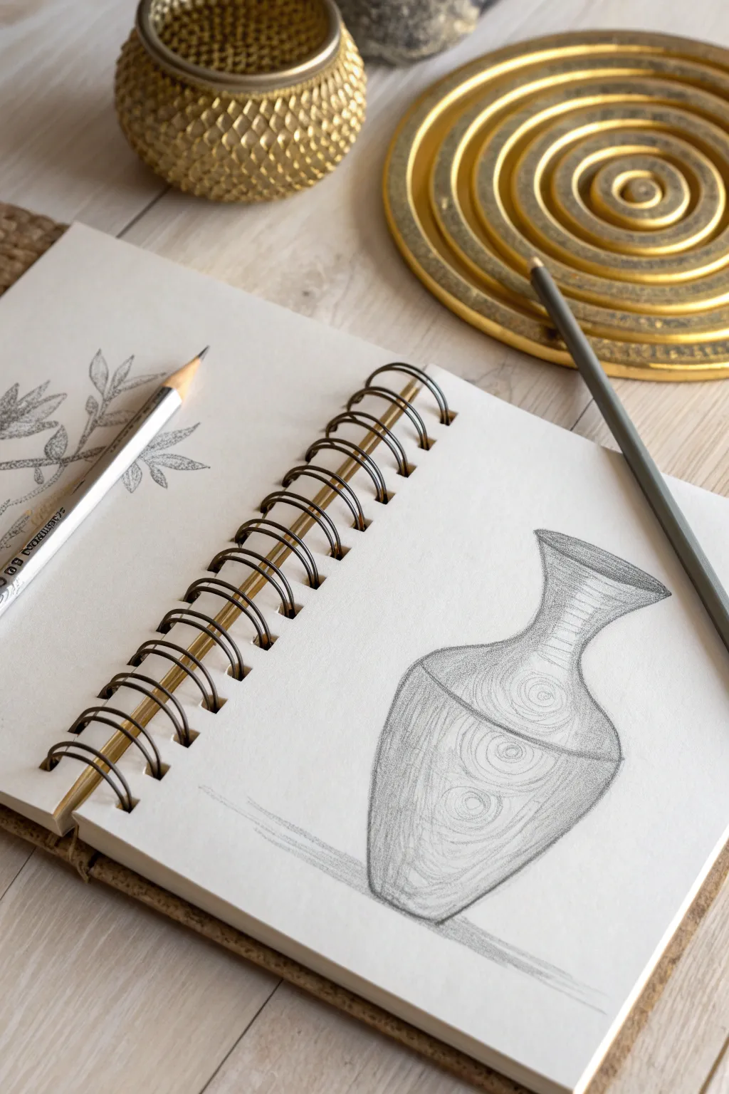
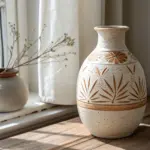
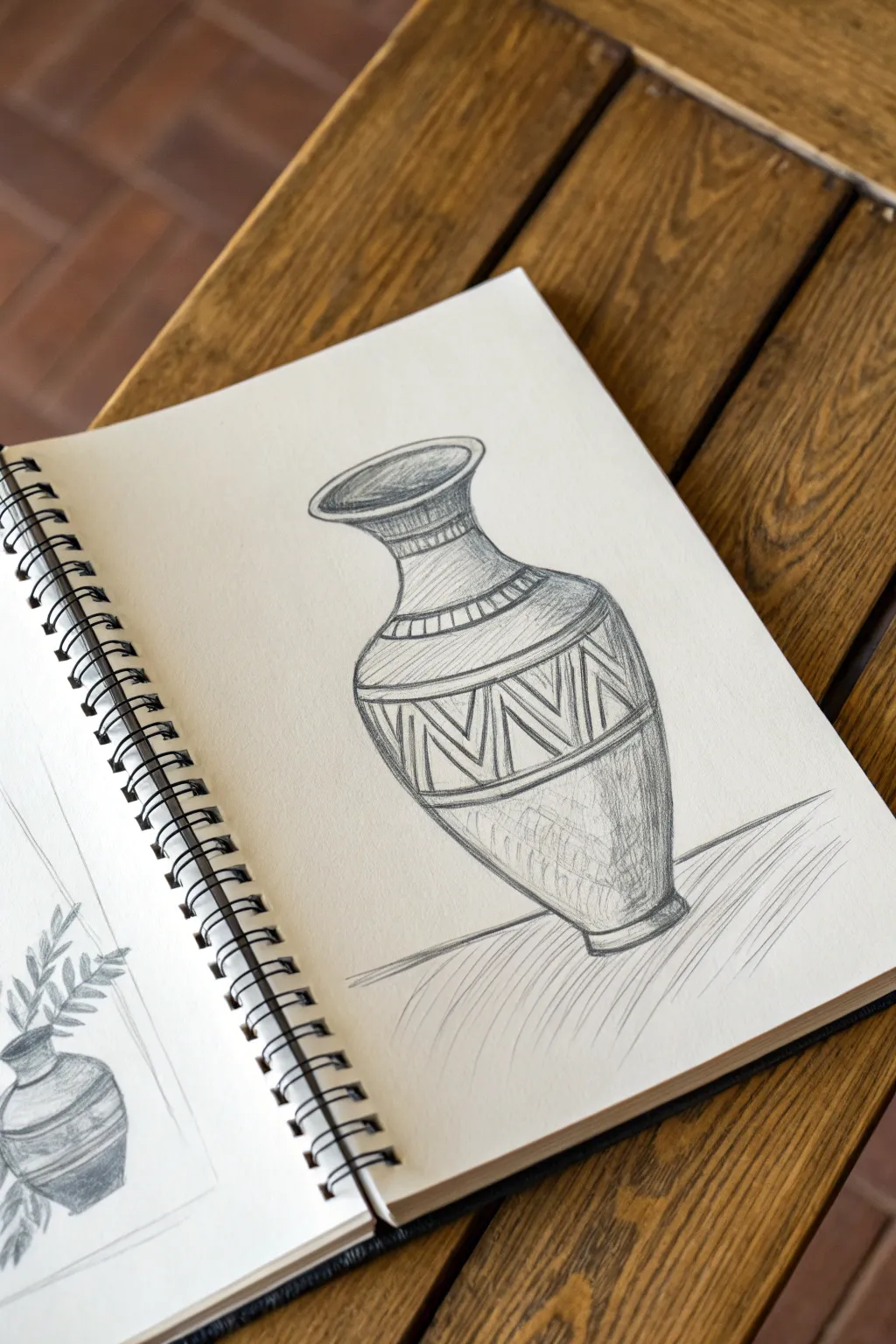
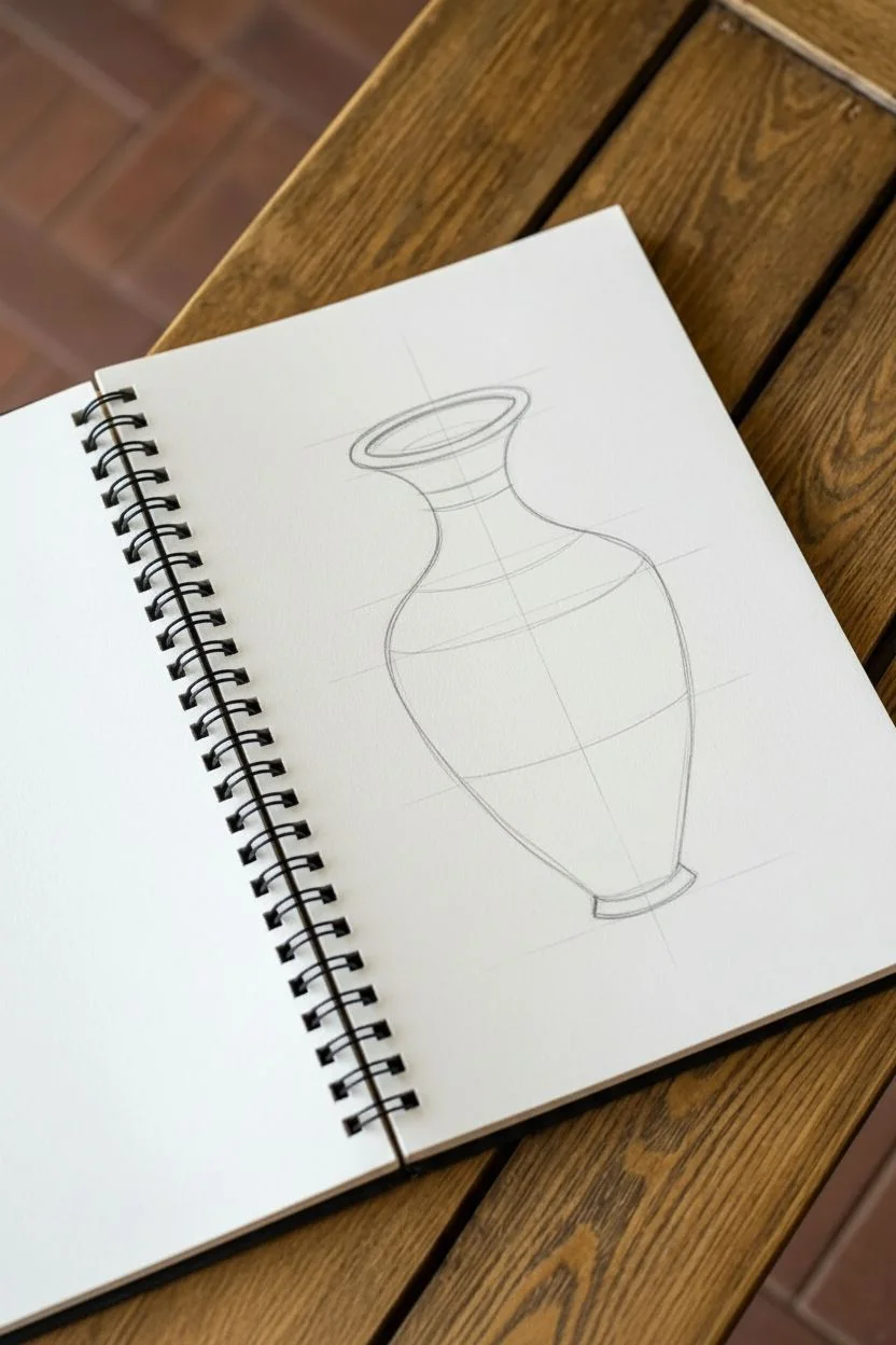
Capture the elegance of form and the rhythm of pattern with this simple yet striking pencil study of a spiral-patterned vase. This project focuses on building dimensionality through shading while guiding the eye with deliberate, curved motifs.
Step-by-Step Tutorial
Materials
- Spiral-bound sketchbook (medium tooth paper)
- Graphite drawing pencils (HB, 2B, 4B)
- Pencil sharpener
- Kneaded eraser
- Blending stump (optional)
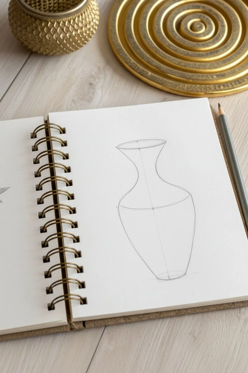
Step 1: Constructing the Form
-
Visualize the center line:
Start by lightly sketching a vertical line down the center of your page to act as the axis of symmetry basically ensuring your vase doesn’t lean to one side. -
Mark the boundaries:
Make small tick marks on this axis for the top opening, the narrowest point of the neck, and the bottom base of the vase. -
Define the ellipse:
Draw a flattened oval (ellipse) at the top tick mark to represent the opening of the vase. Ensure the sides are equidistant from your center line. -
Shape the neck:
Sketch two concave lines coming down from the ellipse, curving inward to create a graceful, slender neck. -
Round out the body:
From the base of the neck, draw convex lines that bulge outward significantly to form the main body of the vessel, tapering back in sharply toward the bottom base. -
Connect the base:
Join the bottom ends of your body lines with a slightly curved line—matching the curve of the top ellipse—to give the vase a solid footing.
Tip: Wrapping Lines
When drawing patterns on a round object, never draw straight lines. Always curve your lines to match the object’s contour to preserve the 3D illusion.
Step 2: Adding the Spiral Design
-
Map the central spiral:
Lightly draw a large oval shape on the main body of the vase. This shouldn’t be a perfect circle; skew it slightly to match the perspective of the rounded surface. -
Create the concentric rings:
Inside your main oval, sketch smaller and smaller ovals, mimicking the ripples in a pond. I find it helpful to keep the spacing somewhat loose to look organic. -
Draft the secondary spirals:
Above and below your main spiral, sketch partial oval shapes that disappear around the curve of the vase, suggesting a continuous pattern. -
Define the neck rings:
Add horizontal curved lines wrapping around the neck of the vase. These should curve downward slightly to reinforce the cylindrical volume.
Level Up: Charcoal Accent
Use a stick of white charcoal or a white gel pen to add sharp highlights on the left side of the vase (the lit side) to make the ceramic look glossy.
Step 3: Shading and Definition
-
Clean up lines:
Take your kneaded eraser and gently lift off the vertical center guide line and any stray construction marks. -
Establish the light source:
Decide on a light source (usually coming from the top left). This means the right side of the vase will be in shadow. -
Apply base shading:
Using a 2B pencil and a side-to-side hatching motion, apply a light layer of grey to the right side of the vase, fading out as you move toward the center. -
Deepen the shadows:
Switch to a 4B pencil to add darker values along the very edge of the right silhouette and under the bulge of the vase where the light would be blocked. -
Detail the rim:
Shade the inside of the rim darker on the left side and lighter on the right to create the illusion of a hollow opening. -
Enhance the pattern:
Go back over your spiral lines with a sharper HB pencil. Darken the lines where they enter the shadowed areas of the vase. -
Ground the object:
Sketch a simple shadow cast on the surface to the right of the vase base. Keep the strokes horizontal to suggest a flat table. -
Final touches:
Verify your contrast. Add your darkest darks now, particularly at the vase base and the deepest part of the neck curve.
Now you have a beautifully structured study that masters both volume and decorative flow
Circular (O-Shape) Containment
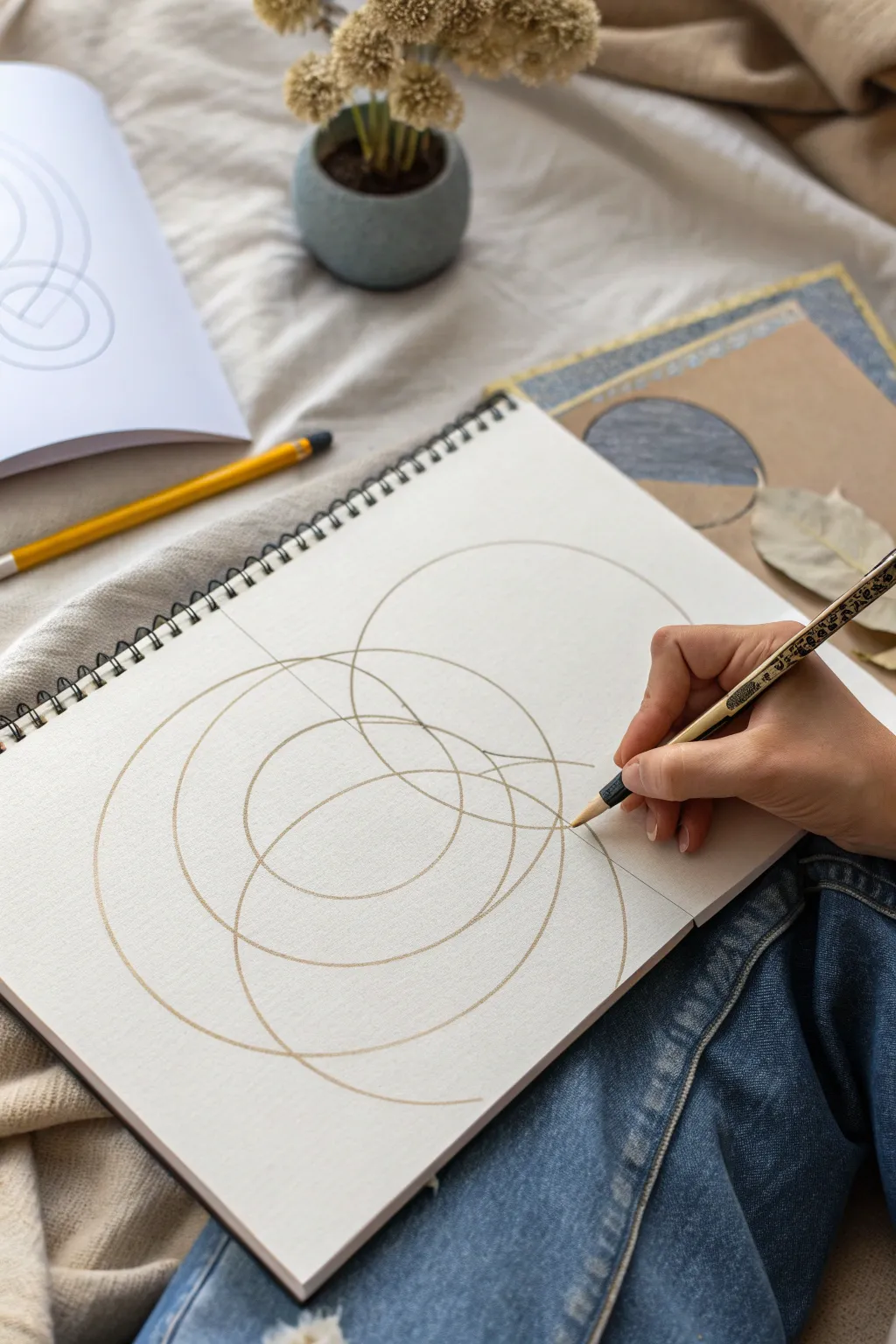
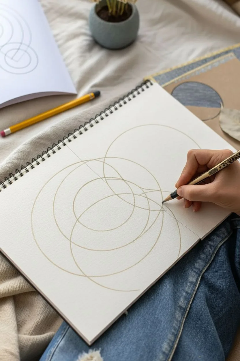
This minimalist sketching exercise explores balance and tension through overlapping O-shapes. By using simple circular forms, you will create a complex, harmonious composition that draws the eye into a central focal point.
Step-by-Step Guide
Materials
- Spiral-bound sketchbook (medium weight paper)
- Light graphite pencil (HB or 2H) for underlying structure
- Fine-point mechanical pencil or technical drawing pen
- Compass (optional but helpful)
- Kneaded eraser
- Ruler (for general placement)
Step 1: Planning the Layout
-
Set the Stage:
Open your spiral-bound sketchbook to a blank page. Ensure your workspace is well-lit and comfortable, as this drawing requires steady hand control. -
Visualize the Center:
Look at the blank page and imagine where the center of your composition will be. It doesn’t have to be the exact mathematical center of the paper; placing it slightly off-center can create dynamic tension. -
Initial Sketching:
Using a very light touch with your HB or 2H pencil, sketch a large, loose circle. This will serve as your primary anchor shape. -
Adding the Second Ring:
Draw a second circle that significantly overlaps the first one. Let this circle be roughly the same size or slightly smaller than your first. -
Creating the Intersection:
Introduce a third circle. Position this one so that it intersects the overlapping area of the first two circles. This creates a visually interesting ‘Venn diagram’ style junction in the middle.
Step 2: Refining the Forms
-
Check the Flow:
Step back and look at your three interlocking rings. Are the curves smooth? Adjust any flat spots or shaky lines lightly with your eraser before committing to darker lines. -
Adding Complexity:
Draw a fourth circle, perhaps slightly smaller, that nests within the existing cluster. I find that letting this one touch the edges of the others creates a sense of containment. -
Varying Sizes:
Sketch one or two much larger, partial circles that extend off the page boundaries or encompass the entire cluster. This implies that the pattern continues beyond the paper’s edge. -
Refining the Lines:
Begin to firm up your favorite lines. Instead of a single hard line, use a sketching motion to build up the curve, keeping the aesthetic organic and hand-drawn rather than rigid. -
Establish Line Hierarchy:
Decide which circles are in the ‘foreground.’ Darken the lines of the most central or important circles first to bring them forward visually.
Wobbly Circles?
Don’t stress about perfect geometry. If your hand-drawn circles are uneven, lock your wrist and draw by rotating your entire arm from the shoulder for smoother curves.
Step 3: Detailing and Depth
-
Highlighting Intersections:
Focus on the almond-shaped areas where the lines cross. Use your fine-point pencil to sharpen these intersections, ensuring the lines meet cleanly. -
Subtle Shading:
Very lightly shade the interior of the smallest intersection points. This adds a tiny amount of depth without overwhelming the linear style. -
Adding Weight:
Go over the outer perimeter of the entire cluster with a slightly heavier hand. This separates the composition from the background white space. -
Erase Construction Lines:
Take your kneaded eraser and gently dab away any stray marks or initial guide lines that detract from the final flow, leaving only the intended structure. -
Final Scan:
Look for balance. If one side feels empty, add a faint, large partial arc to balance the visual weight.
Add Color
Use watercolor pencils to tint the overlapping sections. Color the intersections a darker shade than the single layers for a transparency effect.
Enjoy the calming focus that comes from tracing these infinite loops and finding balance on the page


Steelyard Balance (Big + Small)
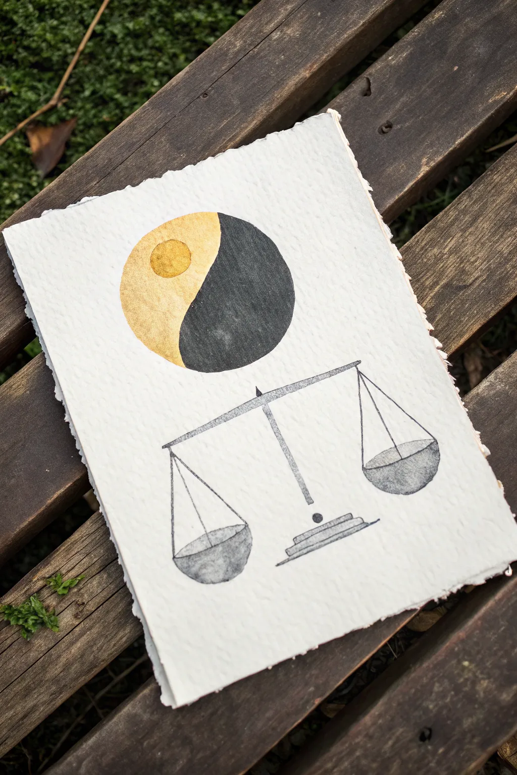
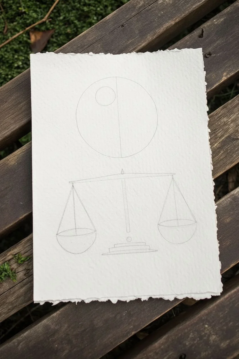
This minimalist mixed-media piece combines the ancient symbolism of Yin and Yang with the classic imagery of justice and equilibrium. Created on textured handmade paper, the contrast of shimmering metallic gold against matte charcoal ink creates a striking, modern aesthetic perfect for a study or office.
Detailed Instructions
Materials
- Heavyweight cold-press watercolor paper or handmade cotton rag paper (approx. 300gsm)
- Metallic gold watercolor paint or gold gouache
- High-quality black India ink or black gouache
- Compass or circle stencil
- Ruler
- Pencil (HB or H)
- Kneaded eraser
- Synthetic round brush (size 2 or 4)
- Fine liner brush (size 0 or 00) or pigment liner pen (0.3mm)
Step 1: Preparation & Layout
-
Paper selection:
Begin by selecting a piece of paper with significant texture. A handmade cotton rag with deckled edges work best to replicate the rustic, organic feel of the original image. -
Center alignment:
Lightly mark a vertical centerline on your paper with a pencil. This guide is crucial for ensuring the circle and the scale align perfectly. -
Drafting the circle:
Using a compass or a stencil, draw a perfect circle in the upper third of the paper. Keep your pencil pressure extremely light so the graphite doesn’t show through the gold paint later. -
Dividing the Yin-Yang:
Instead of the traditional S-curve, draw a simple vertical line splitting the circle directly down the middle. Inside the left semicircle, draw a smaller circle near the top center for the ‘dot’ element. -
Sketching the scale:
In the lower half of the page, draft the balance scale. Start with the central T-shape pillar, then add the horizontal beam. Use a ruler to ensure the triangles for the pans hang at perfectly even heights.
Bleeding Lines?
If your black ink bleeds into the gold, the gold wasn’t dry enough. Wait until the gold is cool to the touch. Use a tiny amount of white gouache to touch up mistakes.
Step 2: Painting the Elements
-
Gold application:
Load your round brush with metallic gold paint. I find that pre-wetting the pan a few minutes early helps get a creamy consistency. Fill in the left half of the large circle carefully. -
Leaving the negative space:
While painting the gold section, be very careful to paint *around* the small inner circle you sketched. This small circle needs to remain the gold color, but we will paint around it later. -
Painting the black half:
Once the gold side is completely dry, switch to your black ink or gouache. Paint the right half of the large circle. Use the fine liner brush for the straight edge where it meets the gold to keep the line crisp. -
The gold dot:
Return to the gold paint and fill in that small inner circle within the left hemisphere. Wait! Actually, looking closely at the reference, the small inner circle is gold *on top* of the gold background, or perhaps left slightly lighter. For high contrast, let’s paint the small circle solid gold.
Add Dimension
After the black ink dries, use a white gel pen to add tiny stippling or scratches on the scale pans. This mimics the texture of heavy iron or stone.
Step 3: Detailed Line Work
-
Outlining the scale beam:
Using your finest brush or a pigment liner pen, ink the horizontal beam of the scale. It should be a thin, long rectangle, slightly tapered at the ends. -
Drawing the central pillar:
Ink the vertical stand. Notice the detail where the beam rests on a triangular pivot point. Add the small circle weight at the bottom of the visible pillar. -
Creating the base:
Draw the stepped base at the bottom. These are essentially two or three flat, stacked rectangles. Keep the lines sketchy and organic rather than mechanically perfect. -
Hanging the pans:
Draw the triangular strings or chains hanging from the beam ends. Use a clear ruler to make sure these lines are straight. -
Creating texture on the pans:
For the bowls of the scale, don’t fill them with solid black. Instead, use a ‘dry brush’ technique or diluted ink washes to give them a textured, stony appearance similar to the reference. -
Final touches:
Once all ink is fully dry, gently erase any visible pencil guidelines with the kneaded eraser. Check the edges of your main circle to sharpen any fuzzy lines.
Now you have a piece representing perfect equilibrium to hang in your space
Negative Space as a Designed Shape
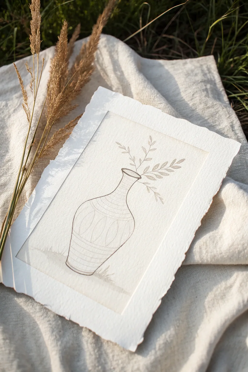
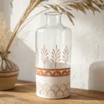
Embrace the elegance of simplicity with this delicate line drawing that emphasizes form and negative space. Using handmade paper and fine ink work, this project creates a serene, vintage-inspired piece perfect for rustic or modern decor.
Detailed Instructions
Materials
- Heavyweight handmade watercolor paper (cold press, roughly A5 size)
- Ruler or straight edge
- Pencil (HB or 2H)
- Kneaded eraser
- Fine liner pen (Sepia or warm grey, size 01 or 03)
- Water, cup, and paper towels (for deckling)
- Optional: Clean sponge or paintbrush
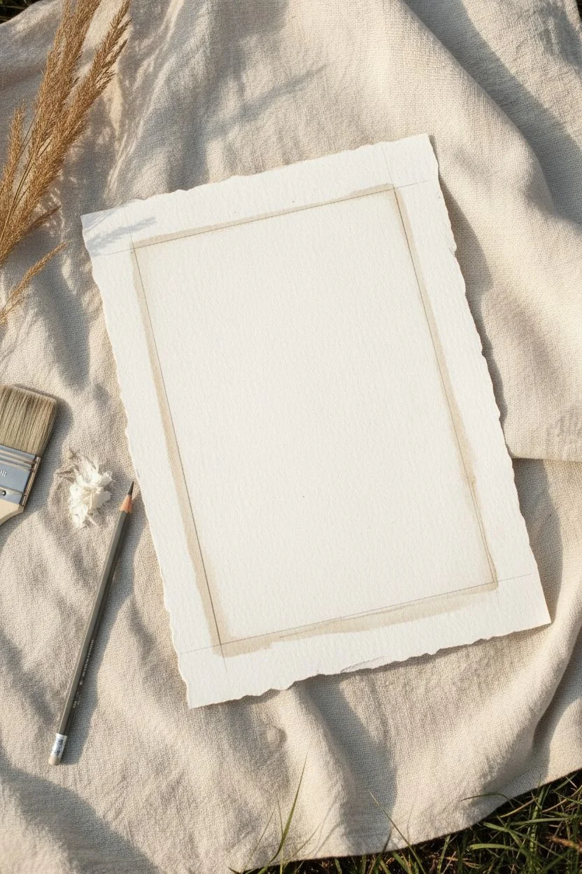
Step 1: Creating the Deckle Edge Canvas
-
Prepare your guidelines:
If you are starting with a standard sheet of paper, measure out an approximate 5×7 or A5 rectangle in the center. Lightly mark these boundaries with a pencil. -
Wet the edges:
Take a clean paintbrush or sponge dipped in plain water. Run it carefully along your marked cutting lines. You want the paper to be damp but not soaking wet. Wait about 30 seconds for the water to soften the fibers. -
Tear the paper:
Place your ruler flat against the wet line to act as a brace. Gently pull the outer paper edge away from the ruler. Tear slowly to create a soft, ragged ‘deckle’ edge rather than a sharp cut. -
Dry and flatten:
Allow the paper to dry completely. If the edges curl, I like to place it under a heavy book overnight, but you can also gently press it flat with your hands once dry.
Ink Smearing?
Handmade paper is absorbent and textured. If your pen snags, slow down your stroke speed. Always test your eraser on a corner first to ensure the ink doesn’t smudge.
Step 2: Sketching the Composition
-
Define the ground:
Using your pencil very lightly, draw a soft horizon line near the bottom third of the paper. This establishes where the vase sits so it doesn’t look like it’s floating. -
Outline the vase shape:
Sketch a central vertical line to help with symmetry. Draw an oval for the mouth of the vase, then curve outwards for the neck, expanding into a bulbous body before tapering back in at the base. -
Add surface details:
Sketch horizontal bands across the neck and base of the vase. In the center body of the vase, lightly pencil in vertical petal-like shapes or ovals to create a patterned texture. -
Draft the botanicals:
Draw three main stems rising from the vase mouth. Make them stiff but slightly curved, extending upward and outward. Add small skeletal leaves along the branches, keeping them sparse to maintain the minimalist look.
Step 3: Inking and Refining
-
Tracing the vase outline:
Switch to your sepia or warm grey fine liner. Carefully trace the outer silhouette of the vase. Keep your hand steady, but don’t worry if the line has a tiny bit of wobble—it adds to the hand-drawn charm. -
Inking the interior details:
Go over the horizontal stripes on the neck and base. For the central ‘petal’ patterns, use a slightly lighter touch or a broken line to make the texture feel softer than the outer rim. -
Defining the stems:
Trace the botanical stems. When drawing the leaves, use short, deliberate strokes. You can add a tiny central vein line to the larger leaves for added dimension. -
Adding the ground shadow:
Beneath the vase, add a few very sparse, scribbled horizontal lines or small tufts of grass with your pen to ground the object. This connects the vase to the imagined surface. -
Create the inner frame border:
Use a ruler or freehand a rectangular border around the drawing, leaving about an inch of white space between the line and the ragged paper edge. Use a very light, thin line here—it should frame the art, not overpower it. -
Erase pencil marks:
Wait at least 15 minutes to ensure the ink is entirely dry. Take your kneaded eraser and gently dab or roll it over the drawing to lift the graphite without damaging the paper surface.
Add Vintage Texture
Before drawing, lightly stain the paper with brewed black tea or coffee. Let it dry completely for an aged, antique parchment look that complements the sepia ink.
Step 4: Final Touches
-
Assess the balance:
Step back and look at your composition. If the vase feels too empty, you can add very faint hatching lines on the shadowed side (usually the right or left) to give it volume. -
Optional wash:
If you want slightly more depth, dilute a tiny drop of brown watercolor or tea. Paint a very faint wash at the bottom of the vase where it meets the ground.
Display your finished piece in a floating frame to show off those beautiful deckled edges you created
BRUSH GUIDE
The Right Brush for Every Stroke
From clean lines to bold texture — master brush choice, stroke control, and essential techniques.
Explore the Full Guide
Gesture Lines and Directional Arrows
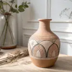
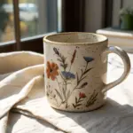
Learn to capture the elegant form of a classic vase using simple graphite techniques and consistent directional shading. This sketch focuses on building volume through hatching and adding interest with bold geometric patterns.
Step-by-Step
Materials
- Sketchbook (heavyweight paper preferred)
- HB Pencil (for initial outlines)
- 2B or 4B Pencil (for shading and details)
- Kneaded Eraser
- Pencil Sharpener
- Ruler (optional, for patterns)
Step 1: Form Construction
-
Establish the Axis:
Begin by lightly drawing a vertical centerline on your page. This line will act as your anchor to ensure the vase remains symmetrical as you build the form. -
Map the Proportions:
Mark horizontal ticks along your centerline to indicate where the top rim, neck, shoulder (the widest part), and base will sit. Keep the neck relatively short compared to the bulbous body. -
Draw the Oval Rim:
At the top mark, sketch a flattened oval (ellipse). Drawing the full oval, even though you only see the front, helps get the perspective right. Add a second, slightly smaller oval inside it to create the thickness of the rim. -
Define the Contour:
Connect your horizontal marks using smooth, curving lines. Curve inward for the neck, swell outward for the main body, and taper back in toward the base. Try to keep the left and right sides mirrored. -
Add the Base:
Sketch a small, curved footing at the bottom. The curve of the base should mimic the curve of the top rim to keep the perspective consistent.
Mastering The Curve
Turn your sketchbook as you draw the contours. Your hand naturally pivots in an arc, so rotating the paper helps you draw smoother, more symmetrical curves.
Step 2: Designing the Pattern
-
Create Pattern Bands:
Draw faint curved lines across the body of the vase to define the zones for your decoration. You’ll need a narrow band at the neck, a medium band at the shoulder, and a wider band for the main triangular pattern. -
Detail the Neck:
Inside the neck band, draw simple vertical hash marks. Keep them closely spaced to create a texture that contrasts with the smooth areas. -
Shoulder Decoration:
In the shoulder band, draw a series of small, vertical rectangles or thick dashes. These should follow the curve of the vase’s surface. -
Main Geometric Motif:
In the largest band across the belly of the vase, draw a zigzag line to create a row of triangles. Double up the lines to create nested triangles inside the larger ones. -
Refine the Linework:
Switch to a softer pencil like a 2B. Go over your outline and pattern lines with a darker, more confident stroke, cleaning up any messy sketch lines with your eraser.
Wobbly Symmetry?
If one side of your vase looks bulging, hold your drawing up to a mirror. The reverse view instantly reveals symmetry errors that your eyes had adjusted to.
Step 3: Shading and Texture
-
Establish Light Source:
Decide on your light source—in this drawing, the light appears to come from the upper left. This means the shadows will fall on the right side of the vase. -
Hatching the Vase Body:
using diagonal hatching strokes, shade the right side of the vase body. Curve your strokes slightly to follow the roundness of the pot. Leave the left side mostly white to represent the highlight. -
Darken the Interior:
Shade the inside of the rim opening. Since the light is coming from the left, the inner right side of the rim should be the darkest point in the drawing. -
Detail Shading:
Add smaller, tighter hatching marks inside the geometric triangles and pattern bands. I prefer to make the recessed areas of the pattern slightly darker to give them depth. -
Grounding the Object:
To place the vase on a surface, draw long, sweeping diagonal lines behind and underneath the vase. These lines represent the table surface. -
Final Contrast Check:
Review your drawing. Darken the very bottom edge of the vase and the rightmost contour line to make the object pop off the page.
Step back and admire how simple lines can build such a convincing three-dimensional form
Have a question or want to share your own experience? I'd love to hear from you in the comments below!