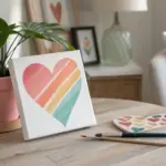
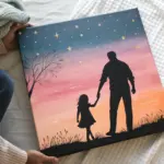
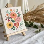
Valentine’s Day is the perfect excuse to pull out your favorite colors and paint something sweet, sentimental, and totally you. Here are my go-to Valentine’s Day painting ideas—starting with classic heart motifs and easing into playful, unexpected twists.
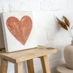
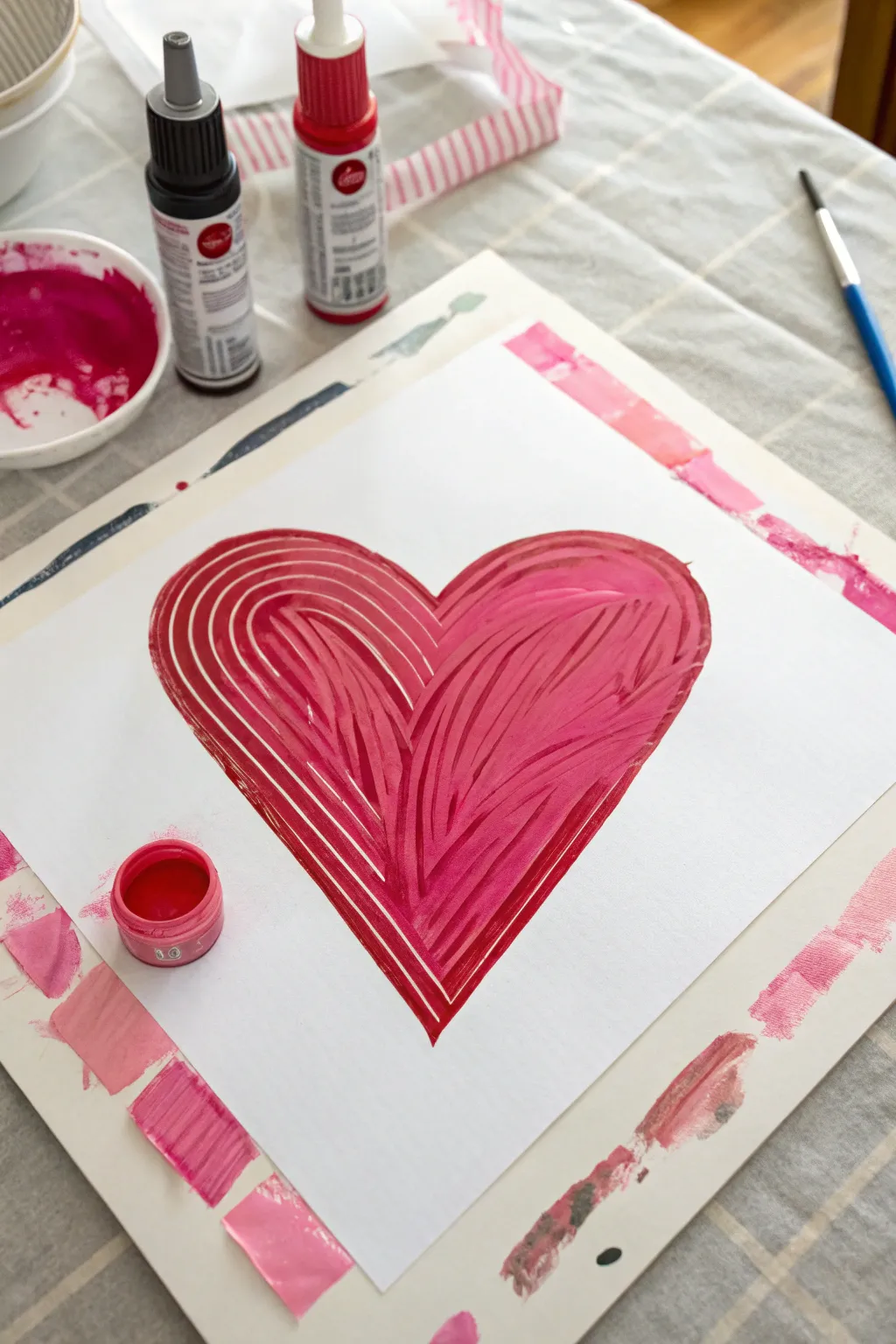
Classic Red Heart Gradient
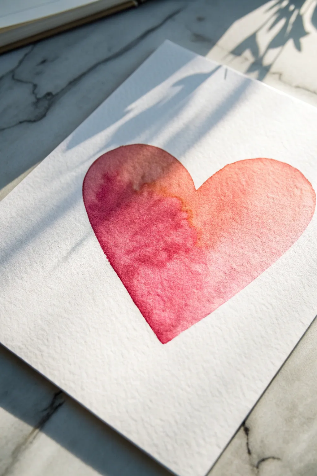
Capture the delicate beauty of love with this soft, gradient watercolor heart. The natural bleed of pigments creates a stunning transition from deep ruby to tender coral on textured paper, making it perfect for a heartfelt card or framed gift.
Step-by-Step Tutorial
Materials
- Cold press watercolor paper (140lb/300gsm)
- Watercolor paints (Alizarin Crimson or Deep Red, Vermilion or Coral)
- Large round watercolor brush (size 10 or 12)
- Clean water jar
- Palette or ceramic plate for mixing
- Paper towel
- Light pencil (HB or 2H)
- Kneaded eraser
Step 1: Preparation and Sketching
-
Prepare your workspace:
Set up your paints and ensure your water jar is filled with clean water. Tape down your watercolor paper to a board if you want to prevent warping, though for a single shape like this, you can often work directly on a block. -
Outline the shape:
Using a light pencil, gently sketch a large, symmetrical heart shape in the center of your paper. Keep your lines very faint so they won’t show through the translucent paint later. -
Refine the edges:
Use a kneaded eraser to lift up any heavy graphite, leaving just a ghost of the outline visible to guide your brush.
Pro Tip: Paper Texture
Use cold press paper! Its bumpy texture allows the pigment to settle into the valleys, creating the granulated, organic look seen in the reference image.
Step 2: Mixing and Wet-on-Wet Application
-
Mix the deep red:
On your palette, mix a generous puddle of your darkest red (such as Alizarin Crimson) with a moderate amount of water. You want a saturated, juicy consistency, not too watery. -
Mix the lighter coral:
In a separate well, mix your lighter red or coral shade. Add slightly more water to this mix to ensure it has a lighter, more transparent value than the deep red. -
Wet the paper:
Dip your clean brush into plain water and carefully paint the entire inside of the heart shape. The paper should be glisten with moisture evenly, but not have large puddles. -
Check the sheen:
Tilt your head to look at the paper in the light. If you see dry spots, add a touch more water. If there are pools, soak them up with a thirsty, dry brush. -
Apply the dark tone:
Load your brush with the deep red mixture. Start painting along the left curve of the heart, letting the wet paper pull the pigment slightly inward. -
Deepen the shadow:
Drop a bit more concentrated deep red directly into the wet paint on the left side to intensify the color saturation in that area. -
Introduce the light tone:
Rinse your brush partially or switch to the lighter coral mix. Start painting from the right edge of the heart, working towards the center. -
Blend the middle:
Where the two colors meet in the center, gently nudge them together with the tip of your brush. Let the water do most of the blending work to create that natural, organic gradient.
Level Up: Metallic Touch
Once the heart is completely dry, splatter a tiny bit of gold watercolor paint or ink over the design for a shimmering, elegant finish.
Step 3: Refining and Drying
-
Texturize the blend:
If I notice the blend looks too stiff, I sometimes tilt the paper slightly to encourage the darker pigment to flow naturally into the lighter area. -
Clean the edges:
Use the tip of your brush to carefully refine the outer edges of the heart, ensuring the shape represents smooth curves without jagged bumps. -
Create blooms (Optional):
For extra texture, you can drop a tiny amount of clean water into the drying paint near the blend lines, creating distinct watercolor ‘blooms’ or cauliflowers. -
Lift highlights:
If the color feels too heavy on the right side, dry your brush on a paper towel and gently lift off some pigment to regain luminosity. -
Let it dry completely:
Allow the painting to dry undisturbed. Do not use a hairdryer immediately, as the strong airflow might push the wet pigment around and ruin your gradient. -
Final erase:
Once the paper is bone dry and cool to the touch, gently erase any remaining visible pencil marks from around the outside of the heart.
Now you have a beautifully blended watercolor heart ready to express your affection


Heart-Shaped Tree Canopy
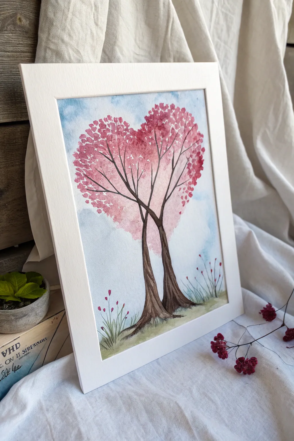
This romantic watercolor piece features two trees intertwining to form a single, lush heart-shaped canopy against a soft blue sky. The distinct symbolism of two individual trunks merging into one shared bloom makes it a perfect heartfelt gift or Valentine’s Day decoration.
Detailed Instructions
Materials
- Cold press watercolor paper (A4 or 8×10)
- Watercolor paints (Alizarin Crimson, Rose Madder, Burnt Umber, Cerulean Blue, Sap Green)
- Round brushes (Size 8 for washes, Size 2 or 0 for details)
- Pencil (HB or H)
- Masking tape
- Jar of clean water
- Paper towels
- Kneaded eraser
Step 1: Preparation and Sketching
-
Secure the paper:
Tape down all four edges of your watercolor paper to a board or table to prevent buckling when the paper gets wet. -
Sketch the outline:
Using a light hand, draw a large, symmetrical heart shape in the center of the upper half of the paper. This will be your canopy guide. -
Draw the trunks:
Sketch two tree trunks starting from the bottom center, curving upward and crossing over each other slightly before branching out into the heart shape. -
Flesh out the branches:
Draw several main branches extending from the trunks into the heart area, making sure they fan out to support the shape. -
Lighten the lines:
Gently roll a kneaded eraser over your sketch to lift up excess graphite, leaving only faint guidelines that won’t show through the transparency of the paint.
Natural Edges
Avoid outlining the heart shape with a solid line. Instead, let the ‘leaves’ create the edge. Vary the size of your dabs to make the foliage look organic rather than manufactured.
Step 2: Painting the Sky and Canopy
-
Prepare the sky wash:
Mix a very diluted wash of Cerulean Blue with plenty of water to ensure a soft, pale background. -
Paint the background:
Apply the blue wash loosely around the heart shape, letting it fade out towards the edges or keeping it somewhat uneven for a cloudy effect. Be careful not to paint inside the heart. -
Mix your pinks:
Prepare two puddles of pink paint: a lighter, watery Rose Madder for the base and a more concentrated Alizarin Crimson for the shadows. -
Start the canopy base:
Using the lighter pink, dab color onto the top left and right curves of the heart using a stippling motion to mimic leaves. -
Fill the heart shape:
Continue dabbing the light pink throughout the heart shape, leaving small white gaps here and there to let the paper breathe and suggest light filtering through. -
Add depth immediately:
While the first layer is still damp (wet-on-wet), drop the darker Alizarin Crimson into the bottom of the heart shape and near the center where the branches congregate. -
Create distinct leaves:
Once the main shape is semi-dry, use your smaller brush to paint individual heart-shaped or dot-like leaves around the outer edges to break up the solid outline.
Step 3: Trunks and Details
-
Paint the trunks:
Mix Burnt Umber with a touch of blue to create a cool, dark brown. Paint the trunks carefully, starting wide at the base and tapering as you go up. -
Extend the branches:
Use the very tip of your small brush to pull thin brown lines up into the pink canopy, connecting the main trunks to the blooms. -
Add bark texture:
Once the brown is dry, mix a slightly darker, more saturated brown and paint thin vertical lines on the trunks to suggest bark texture. -
Paint the ground:
Dilute Sap Green and sweep it horizontally across the bottom of the trunks to anchor the trees. -
Add grass details:
Looking at the reference, flick short, quick upward strokes with the green paint to create grass blades around the base of the trees. -
Paint the wildflowers:
Using a tiny amount of the Alizarin Crimson, dot small buds onto the tips of tall, thin grass strands to create the small wildflowers shown in the foreground. -
Final touches:
Check the balance of the painting. If the heart shape needs more definition, add a few more dark pink dots to the edges, then let the entire piece dry completely before removing the tape.
Add Sparkle
For a magical touch, mix a tiny amount of iridescent medium or pearl watercolor into your final pink layer. The tree will shimmer subtly when it catches the light.
Once framed, the vibrant pinks and interlocking trunks create a beautiful symbol of connection and growth


LOVE Lettering With Floral Accents
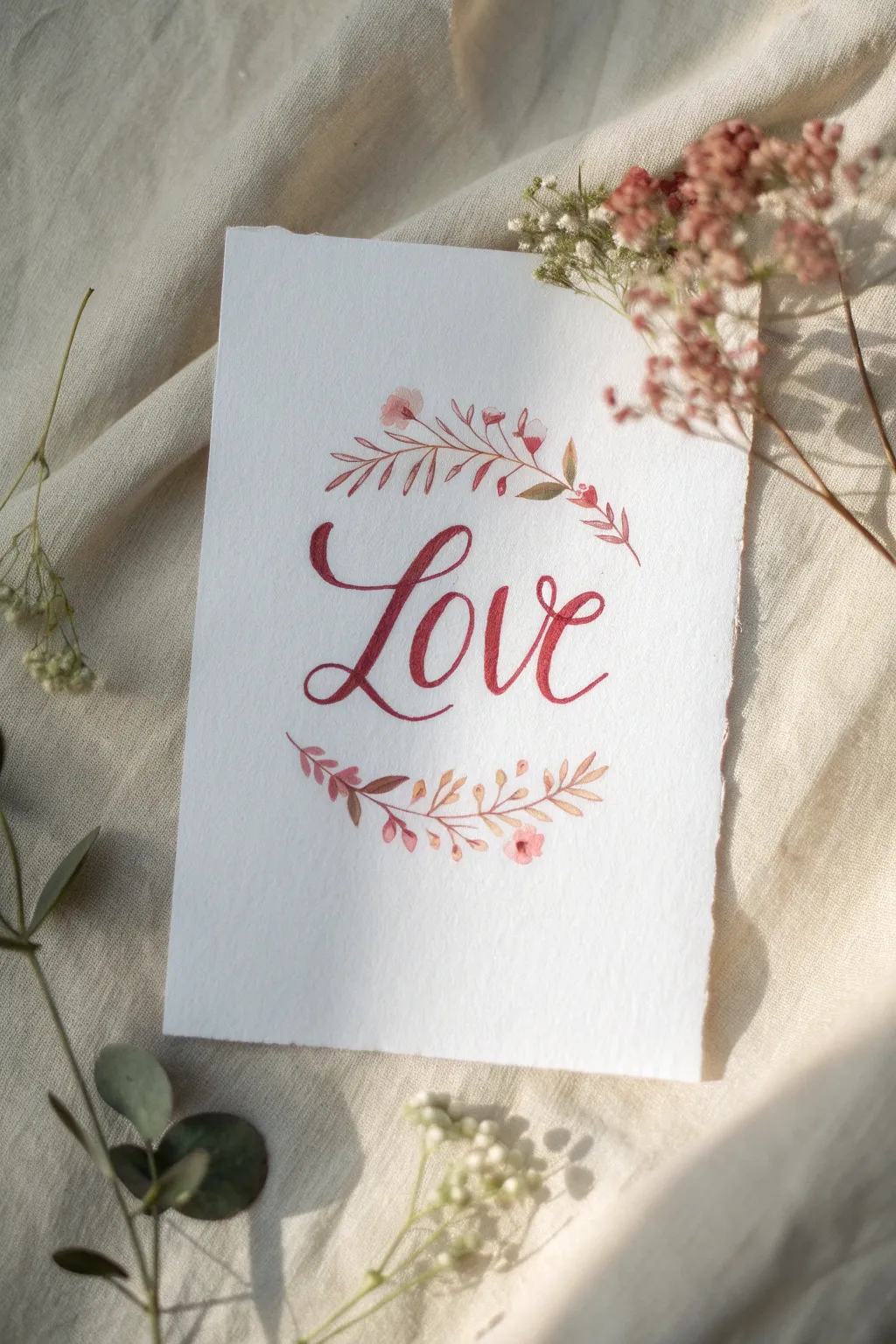
Capture the romance of Valentine’s Day with this delicate watercolor greeting, featuring graceful crimson calligraphy framed by a dainty floral wreath. The soft transitions of red and warm brown tones create a vintage, ethereal look perfect for a heartfelt card.
Step-by-Step Guide
Materials
- Cold-pressed watercolor paper (300 gsm)
- Pencil and Kneadable eraser
- Small round watercolor brush (size 0 or 1)
- Medium round brush (size 2 or 4)
- Watercolor paints (Alizarin Crimson, Burnt Sienna, Sap Green, Light Pink)
- Water jar and paper towel
- Ruler (optional)
Step 1: Planning the Layout
-
Paper Preparation:
Begin by tearing your watercolor paper to size rather than cutting it. Gently pull the paper against a ruler edge to create that organic, deckled edge look seen in the reference. -
Initial Sketch:
Using a pencil, lightly sketch a large oval or circle in the center of the paper to guide your wreath placement. -
Lettering Guidelines:
Inside the oval, lightly sketch the word “Love” in a cursive script. Pay attention to the flourish on the ‘L’ and the connecting strokes to ensure spacing is balanced. -
Refining the Shape:
Go over your pencil lines gently with a kneadable eraser so they are barely visible; you want just enough of a guide so the graphite doesn’t muddy the watercolor later.
Unsteady Hand?
If your brush lettering feels shaky, sketch the thick and thin letters with a pencil first, then simply fill them in like a coloring book using your brush.
Step 2: Painting the Lettering
-
Mixing the Red:
Create a rich berry red by mixing Alizarin Crimson with a tiny touch of Burnt Sienna to warm it up. The consistency should be inky, not too watery. -
Starting the Strokes:
Using your medium round brush, load it with the red mixture. Start with the letter ‘L’, applying more pressure on the downstrokes to make them thick and lifting to a fine tip on the upstrokes. -
Connecting Letters:
Continue painting ‘o’, ‘v’, and ‘e’, ensuring the letters connect seamlessly. I like to reload my brush frequently here to keep the color saturation intense and uniform. -
Clean Up:
If any edges look shaky, use the very tip of your smallest brush to carefully smooth them out while the paint is still slightly damp.
Go For Gold
Once the red paint is dry, use a metallic gold watercolor or gel pen to outline just one side of the lettering for a sophisticated shadow effect.
Step 3: Creating the Floral Wreath
-
Top Wreath Spine:
Mix a diluted, brownish-pink shade using Light Pink and Burnt Sienna. With the small brush (size 0 or 1), paint a delicate, curved line arching over the word ‘Love’. -
Bottom Wreath Spine:
Repeat this process for the bottom curve, mirroring the top arch but leaving the sides open. -
Adding Top Leaves:
Switch to a darker mix of Burnt Sienna and a hint of crimson. Paint small, almond-shaped leaves extending from the top spine, varying their direction for a natural flow. -
Top Floral Accent:
Dip your small brush into a soft pink wash. Add tiny, three-petaled bud shapes near the center and ends of the top branch to mimic small wildflowers. -
Bottom Leaf Variation:
For the bottom branch, mix a warmer, autumnal tone by adding a drop of yellow or ochre to your brown mix. Paint leaves that point outward from the center stem. -
Bottom Floral Details:
Add small pink buds to the bottom branch, similar to the top. Allow the pink paint to touch the wet brown leaves slightly in a few spots to let the colors bleed together naturally. -
Detailing the Tips:
Using the tip of your smallest brush and a saturated crimson, add tiny dots or ‘berries’ at the very ends of the sprigs for contrast.
Step 4: Final Touches
-
Evaluating Balance:
Step back and look at the composition. If the wreath looks too thin in places, add a few stray twigs or extra leaves using a very pale wash of your brown mix. -
Final Drying:
Let the entire piece dry completely flat to prevent the paper from buckling further. -
Erasing Guides:
Once the paint is bone dry, gently erase any remaining visible pencil marks from your initial sketch.
This charming handmade card is ready to be gifted to someone special or framed as a piece of seasonal decor

Negative-Space Heart Tape Resist
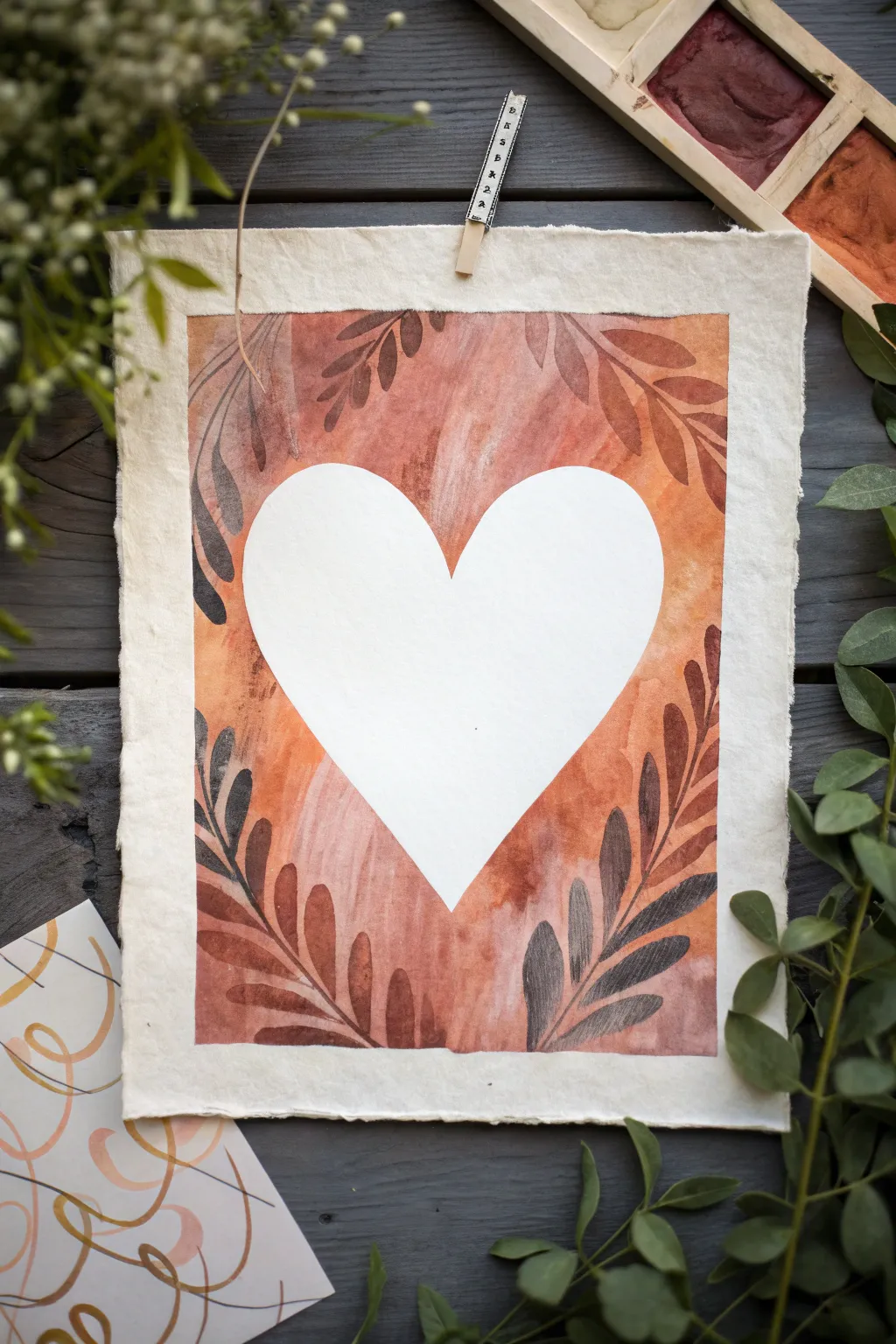
Embrace the warmth of nature with this rustic negative space painting that frames a crisp white heart in rich, earthy tones. The delicate leaf motifs and raw-edge paper give it a sophisticated, handcrafted feel perfect for a thoughtful Valentine’s gift.
How-To Guide
Materials
- Heavyweight cold-press watercolor paper with deckled edges (approx. 5×7 or A5)
- Contact paper, masking film, or wide artist tape
- Scissors and pencil
- Watercolor paints (Terracotta, Burnt Sienna, Sepia, and darker warm browns)
- Medium round brush (size 6 or 8)
- Fine liner brush (size 0 or 1)
- Palette for mixing
- Jar of water
- Paper towels
- Wooden clip (optional, for display)
Step 1: Preparation & Masking
-
Prepare your paper:
Begin with a sheet of high-quality handmade or cold-press watercolor paper. If your paper doesn’t have deckled edges naturally, you can carefully tear the straight edges against a ruler to create that soft, fibrous border. -
Create the heart stencil:
Cut a piece of contact paper or masking film slightly larger than the heart you want to create. Fold it vertically in half (sticky side in) and draw a half-heart shape along the fold to ensure symmetry. -
Cut the shape:
Carefully cut along your drawn line with sharp scissors. Unfold the heart to reveal your stencil. -
Mask the paper:
Peel the backing off your heart sticker. Place it directly in the center of your watercolor paper. Press down firmly, especially along all the edges, to prevent paint from seeping underneath. -
Tape the border:
Use artist tape or drafting tape to create a rectangular frame around the design area. Leave about a half-inch of unpainted paper showing between the tape and the actual edge of the sheet for that clean, matted look.
Pro Tip: Edge Protection
Before peeling your heart sticker, quickly run a hair dryer over it for 10 seconds. The slight heat softens the adhesive, reducing the chance of tearing the paper fibers.
Step 2: The Wash Layer
-
Mix your base color:
On your palette, mix a generous puddle of Terracotta or Burnt Sienna watercolor. You want a warm, earthy reddish-brown tone. Make it quite watery for the first layer. -
Apply the first wash:
Using your medium round brush, paint over the entire rectangle, painting right over the heart sticker. Don’t worry about being perfectly even; a little variety adds texture. -
Add variance:
While the paint is still wet, drop in slightly more saturated pigment near the edges of the heart and the tape borders to create depth. -
Dry completely:
This is crucial: Let this base layer dry completely. The paper should feel uniform in temperature and not cool to the touch.
Troubleshooting: Bleeding Paint
If paint bled under the tape, don’t panic! Use a white gel pen to clean up the edges of the heart once the paint is 100% dry. It acts like white-out but blends better.
Step 3: Painting the Foliage
-
Mix foliage colors:
Create a slightly darker version of your base color by adding a touch of Sepia or Burnt Umber. You want a subtle contrast, not a jarring one. -
Start the stems:
Switch to your fine liner brush. Paint delicate, curving stems originating from the bottom corners and sweeping upward around the curve of the heart. -
Paint the leaves:
Using the ‘press and lift’ technique with a small round brush, add leaves to your stems. Press the belly of the brush down to create the wide part of the leaf, then lift as you pull to create the tip. -
Add darker accents:
Mix an even darker brown, almost a charcoal-brown tone. Paint a few smaller, distinct leaves near the bottom corners to anchor the composition and add visual weight. -
Create ghost leaves:
I like to rinse my brush and use just dirty water or very diluted paint to add faint ‘ghost’ leaves in the background for extra dimension. -
Let it dry again:
Allow all the botanical details to dry thoroughly. Wait at least 15–20 minutes to ensure no paint smudges during the reveal.
Step 4: The Reveal
-
Remove the border tape:
Gently peel away the tape creating the rectangular frame. Pull it slowly at a 45-degree angle away from the painted area to avoid ripping the paper. -
Reveal the heart:
Now for the magic moment. Use a craft knife tip or fingernail to lift the edge of the heart sticker. Slowly peel it back to reveal the crisp white negative space in the center. -
Clean up edges:
If any paint bled under the sticker, use a clean, damp brush (blotted almost dry) to gently scrub and lift the unwanted pigment, or cover it with a tiny dab of white gouache. -
Final touches:
If the composition feels empty in spots, you can add tiny dots or specs of the dark brown paint around the leaves to simulate pollen or seeds.
Hang your finished piece with a rustic wooden clip to complete the natural aesthetic.
BRUSH GUIDE
The Right Brush for Every Stroke
From clean lines to bold texture — master brush choice, stroke control, and essential techniques.
Explore the Full Guide
Metallic-Accent Heart Highlights
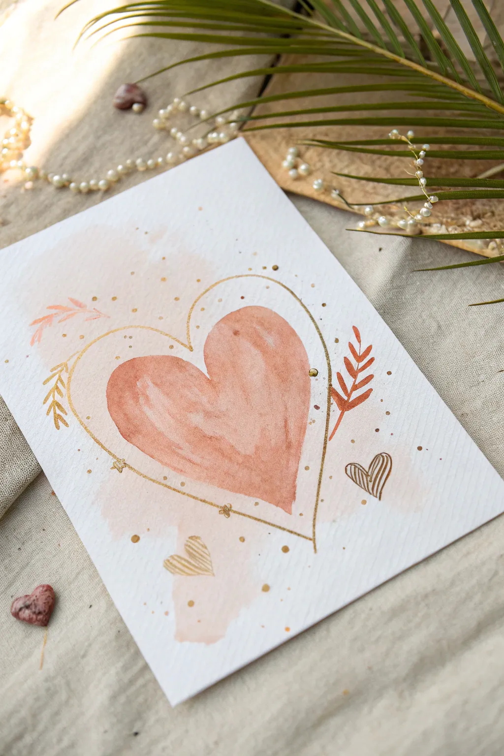
Capture the essence of romance with this delicate watercolor greeting card, featuring a soft peach heart embraced by elegant metallic accents. The combination of loose, watery washes and crisp gold lines creates a sophisticated yet handmade look perfect for Valentine’s Day.
Step-by-Step Guide
Materials
- Cold press watercolor paper (A5 or postcard size)
- Watercolor paints (Peach, Terracotta, or Coral)
- Gold metallic paint (or liquid gold leaf)
- Gold gel pen or fine liner
- Round watercolor brushes (size 6 and size 2)
- Pencil and eraser
- Palette
- Water jar
- Paper towel
Step 1: Setting the Background
-
Prepare the wash:
Mix a very watery, pale peach color on your palette. You want this to be quite transparent, so use plenty of water. -
Paint the background blotch:
Lightly wet the center of your paper with clean water in a rough, organic shape. Drop in your pale peach mix, letting it bloom softly outward without creating hard edges. -
Let it dry completely:
Allow this base layer to dry fully before moving on. The paper must be bone dry to prevent the next layers from bleeding uncontrollably.
Step 2: Painting the Main Heart
-
Sketch the heart:
Using a pencil, very lightly sketch a classic heart shape in the center of your background wash. Keep the lines faint so they won’t show through the paint. -
Mix the heart color:
Create a more saturated mix of your peach or terracotta color. It should be darker than the background but still retain that distinct watercolor translucency. -
Paint the left lobe:
Start by painting the left side of the heart. Use curved strokes that follow the shape of the lobe to create a sense of volume. -
Paint the right lobe:
Paint the right side, leaving a tiny sliver of white space or a lighter area where the two lobes meet in the middle to add dimension. -
Add a water drop:
While the paint is still wet, I like to drop in a tiny bit of clean water or a darker pigment into the center of the heart to create a ‘bloom’ texture as it dries. -
Dry properly:
Let this main heart layer dry completely. This step is crucial before adding the fine metallic details.
Uneven Watercolors?
If your heart dries with hard water lines (backruns), soften them with a slightly damp, clean brush while the paint is still barely tacky, rubbing gently.
Step 3: Adding Metallic Accents
-
Outline loosely:
Dip a fine liner brush into your gold metallic paint. Paint a thin, loose outline around the main heart, leaving a few millimeters of space between the pink paint and the gold line. -
Vary the line width:
Don’t try to make the line perfect. Let it break in places, or overlap slightly, pressing harder in some spots to thicken the line for an organic feel. -
Add leafy sprigs:
Using a small brush and terracotta paint, add small leaf shapes on the left and right sides of the heart outline, emanating outward. -
Draw additional leaves:
Switch to your gold paint or pen and draw simple, skeletal leaf branches near the painted leaves to create contrast. -
Create mini hearts:
With a gold pen or fine brush, draw two tiny hearts floating near the bottom: one solid gold and one striped. -
Sprinkle the magic:
Dip a toothbrush or stiff brush into the gold paint and flick it lightly to create a splatter of gold specks across the composition. -
Dot details:
Manually place larger gold dots specifically around the outline of the heart using the tip of your brush handle or a large dotting tool. -
Final touches:
Add tiny star shapes or cross-hatches along the gold outline to act as contact points or decorative flourishes.
Level Up: 3D Glitter
For extra sparkle, trace over the main gold heart outline with a clear glitter glue or apply dabs of specific gold foil glue and press real gold leaf onto the highlights.
Once dry, verify your pencil marks are erased and your metallic accents shine beautifully in the light.
Textured Heart Roller-and-Comb Marks
Create a striking piece of Valentine’s art by combining simple paint rolling with reductive techniques. This project uses the negative space created by removing wet paint to reveal a bold, linear heart design that pops against the white paper.
How-To Guide
Materials
- Heavyweight white paper or cardstock
- Red acrylic paint
- Pink or magenta acrylic paint
- Paint roller (small foam roller works best)
- Palette or paper plate for paint loading
- Paint comb or a DIY cardboard comb
- Paper towels
- Painter’s tape or washi tape
- Scrap paper or a craft mat
Step 1: Preparation and Base Layer
-
Secure the paper:
Begin by taping down your sheet of heavyweight white paper to your work surface. Use painter’s tape on the corners or edges to prevent the paper from shifting or buckling while you work. -
Prepare your palette:
Squeeze out a generous amount of red acrylic paint onto your palette. You want enough to fully load a small foam roller. -
Add a touch of pink:
Mix in a small amount of pink or magenta paint with the red if you want a slightly softer, berry-colored hue like the one in the example, or keep them separate for a two-tone effect. -
Load the roller:
Roll your foam roller through the paint several times until the foam is evenly saturated but not dripping with excess paint. -
Create the base block:
Roll a large, solid block of red paint in the center of your paper. This doesn’t need to be heart-shaped yet; just ensure the area is large enough to contain your final heart design. -
Ensure good coverage:
Go over the painted area a second time if needed. The goal is a thick, wet layer of paint that will hold texture well.
Stay Wet!
This technique relies on wet paint. Mix a retarder (slow-drying medium) into your acrylics to buy yourself extra working time for combing.
Step 2: Creating the Texture
-
Prepare the comb tool:
Get your texture comb ready. If you don’t have a plastic paint comb, you can quickly cut notches into a stiff piece of cardboard to create a custom toothed edge. -
Start the left curve:
While the paint is still very wet, place your comb at the bottom center point where the heart’s tip will be. -
Draw the first arc:
Drag the comb upwards and outwards to the left, curving around to form the top left lobe of the heart. Press firmly enough to reveal the white paper underneath. -
Wipe the tool:
Immediately wipe the excess paint off your comb onto a paper towel. Keeping the tool clean ensures crisp white lines for the next stroke. -
Start the right curve:
Place the clean comb back at the bottom center point, aligning it with your first stroke. -
Complete the heart outline:
Drag the comb upwards and to the right, mirroring your first curve to create the right lobe of the heart. -
Refine the shape:
Quickly assess the shape. If the lines didn’t cut through clearly, you can execute a second pass directly over the first grooves.
Gradient Love
Load your roller with red on one side and pink on the other side. Roll them together to create a beautiful ombre gradient before combing.
Step 3: Refining and Finishing
-
Add interior texture:
For added visual interest, use a smaller comb or just the corner of your tool to add additional swooping lines inside the main heart shape, following the contour of the outer edge. -
Clean up the edges:
Once you are happy with the combed texture, use a damp brush or a paper towel wrapped around your finger to carefully wipe away the excess red paint outside the heart shape. -
Alternative cutting method:
Alternatively, you can let the paint dry completely and then cut the heart shape out with scissors if you prefer a clean die-cut look over a painted edge. -
Test paint compatibility:
I like to test my texture tool on a scrap piece of painted paper first to see how fast the paint is drying before committing to the final piece. -
Check for pooling:
Inspect the grooves of your heart. If paint is pooling back into the white lines, use a Q-tip or a dry brush to lift it out carefully. -
Allow to dry:
Let the artwork sit undisturbed until the thick acrylic paint is completely dry to the touch, which may take longer than usual due to the density. -
Remove tape:
Once dry, carefully peel away the painter’s tape at a 45-degree angle to reveal your finished border.
Display your textured heart proudly or frame it for a modern, handcrafted Valentine’s decoration

PENCIL GUIDE
Understanding Pencil Grades from H to B
From first sketch to finished drawing — learn pencil grades, line control, and shading techniques.
Explore the Full Guide
Umbrella Kiss With a Red Accent
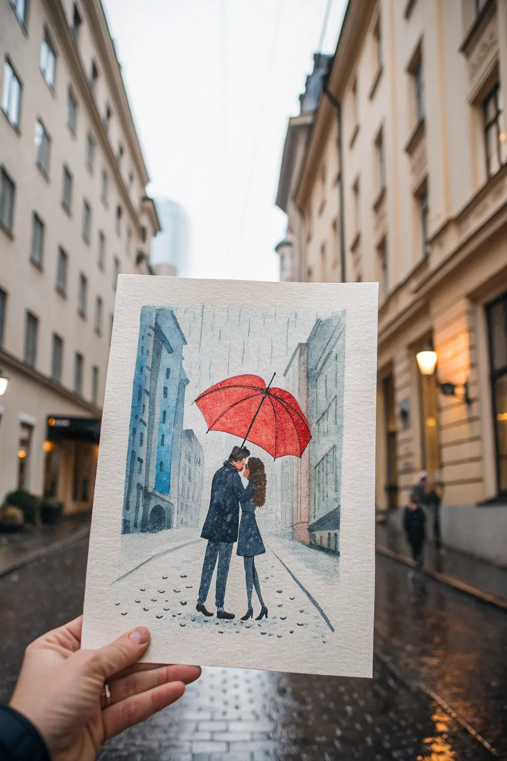
Capture the cozy magic of a rainy day stroll with this romantic watercolor piece. By contrasting a vibrant red umbrella against a cool, muted cityscape, you’ll create a striking focal point that draws the eye straight to the couple’s sweet moment.
How-To Guide
Materials
- Cold press watercolor paper (300 gsm)
- Watercolor paints (Cadmium Red, Payne’s Grey, Ultramarine Blue, Burnt Umber)
- Round brushes (sizes 2, 6, and 10)
- Fine liner brush or size 0 round brush
- Pencil (HB) and kneaded eraser
- Masking fluid (optional)
- White gouache or white gel pen
- Ruler
- Paper towels and water cup
Step 1: Sketching the Scene
-
Establish the horizon:
Begin by lightly drawing a horizon line about one-third of the way up the paper. Draw two converging diagonal lines for the street edges to create a sense of perspective leading into the distance. -
Outline the buildings:
Sketch tall rectangles on either side of the street to represent buildings. Keep the lines somewhat loose; they don’t need to be architectural blueprints, just simple shapes to frame the street. -
Position the couple:
In the center foreground, sketch the couple. Draw the man slightly taller, leaning in, and the woman facing him. Keep their forms simple—focus on the shapes of their coats and legs rather than facial details. -
Draw the umbrella:
Place a large, domed semi-circle over the couple’s heads. Add the ribs of the umbrella curving downward from the center point to give it volume and 3D form.
Muddy colors?
If your grey looks too brown or muddy, clean your water cup! Dirty water dulls vibrancy. Let layers dry fully before glazing over them to keep colors distinct.
Step 2: Painting the Backdrop
-
First wash for buildings:
Mix a watery wash of Ultramarine Blue and a touch of Payne’s Grey. Paint the buildings on the left side, keeping the color light and uneven to suggest texture. -
Varying the tones:
For the buildings on the right, use a slightly warmer grey by adding a tiny bit of Burnt Umber to your blue mix. This subtle difference adds depth. -
Adding architectural details:
While the paint is still damp but not soaking, drop in darker pigment to suggest windows and doorways. Let the paint bleed slightly for a misty, rainy look. -
Painting the street:
Use a very pale wash of grey for the pavement. Apply horizontal brushstrokes, leaving plenty of white paper showing to represent wet reflections and light.
Step 3: The Focal Point
-
The red umbrella:
Load your size 6 brush with vibrant Cadmium Red. Paint the umbrella carefully, leaving tiny slivers of white space along the ribs to act as highlights. This separation makes the umbrella look structured. -
Painting the coats:
Mix a deep, dark navy using Ultramarine Blue and Payne’s Grey. Paint the man’s coat and the woman’s dress, keeping the edges crisp against the lighter background. -
Legs and shoes:
Switch to a smaller brush (size 2) to carefully paint their legs and shoes in the same dark navy tone. Note the slight bend in the woman’s leg to show movement. -
Hair and skin:
Use Burnt Umber for the hair, adding texture with small strokes. For the small visible skin area, use a very diluted mix of red and yellow ochre.
Make it shimmer
For a magical touch, mix a tiny amount of iridescent medium into your rain streaks or the wet pavement area to make the painting glisten in the light.
Step 4: Rain and Atmosphere
-
Adding rain streaks:
Once the background is completely bone dry, mix a watery blue-grey. Use a ruler and a fine brush (or a pencil crayon) to draw vertical, slightly broken lines across the sky and buildings to simulate falling rain. -
Ground texture:
I like to add speckles to the ground to mimic raindrops hitting puddles. Use the tip of your brush to tap in small dots of grey on the pavement area. -
Final highlights:
Use white gouache or a gel pen to add final highlights on the umbrella’s peak and shoulders of the coats, enhancing the wet, glossy look.
Frame this charming scene in a simple mat to let the red accent really pop on the wall


Have a question or want to share your own experience? I'd love to hear from you in the comments below!