If you’re craving fresh watercolor painting ideas, I’ve got you—these are the kinds of projects I reach for when I want something fun, doable, and genuinely satisfying. Think quick wins that still teach you real skills like wet-on-wet blending, glazing, and confident brushwork.
Sunset Gradient Skies
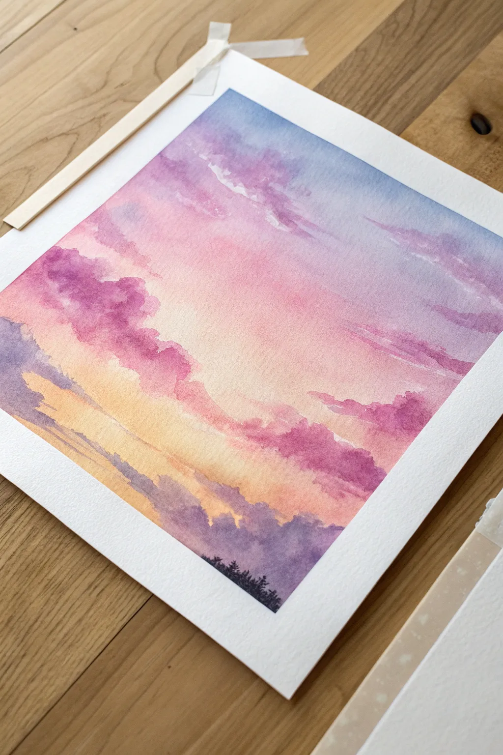
Capture the fleeting beauty of twilight with this soft, dreamy watercolor landscape featuring gentle gradients of pink, violet, and gold. This intermediate project teaches you how to layer translucent washes to build a glowing atmosphere before grounding the scene with silhouetted pines.
Step-by-Step Guide
Materials
- Cold press watercolor paper (140lb/300gsm)
- Watercolor paints (Violet, Rose Madder, Ultramarine Blue, Cadmium Yellow, Payne’s Gray)
- Taping board or hard surface
- Masking tape or Washi tape
- Large flat wash brush (1 inch)
- Round brush (size 8)
- Small round or detail brush (size 2)
- Clean water jars
- Paper towels
Step 1: Preparation and Base Gradient
-
Secure your paper:
Begin by taping your watercolor paper firmly to your board on all four sides. Press the tape down well to ensure clean borders and prevent the paper from buckling when wet. -
Pre-wet the sky area:
Using your large flat brush and clean water, apply an even coat of water across the entire paper surface. The paper should glisten but not have standing puddles. -
Apply the blue corner:
Mix a watery wash of Ultramarine Blue. While the paper is still wet, drop this color into the top right corner, letting it naturally diffuse downward and to the left. -
Introduce the pinks:
Immediately clean your brush and pick up a soft Rose Madder or pink hue. Apply this to the top left and sweeps across the center, allowing the edges to touch and blend slightly with the blue to create soft violets. -
Add the golden glow:
Toward the bottom third of the paper, paint a band of diluted Cadmium Yellow mixed with a tiny touch of Rose for a warm peach tone. Let this blend upwards into the pink section. -
Deepen the horizon:
At the very bottom, before the paper dries, add a light purple wash (mix Violet with a touch of Blue) to suggest distant atmospheric haze.
Step 2: Building Clouds
-
Wait for dampness:
Allow the initial wash to dry until the paper loses its sheen but feels cool to the touch. This stage is perfect for soft-edged clouds. -
Mix cloud colors:
Prepare a stronger, creamier mixture of Violet and Rose Madder. You want less water here so the paint doesn’t bloom uncontrollably. -
Paint the upper clouds:
Using a size 8 round brush, dab in irregular cloud shapes in the pink and blue areas. Use the side of the brush to create organic, non-uniform edges. -
Lift highlights:
If a cloud looks too heavy, rinse your brush, dry it on a paper towel, and gently lift some pigment from the top edge of the cloud to create a highlighted rim. -
Lower cloud layers:
Switch to a warmer violet tone and add horizontal, sweeping cloud formations near the yellow horizon line. Keep these flatter and thinner than the upper clouds to suggest distance. -
Add dark accents:
While the paint is still slightly damp, drop darker purple pigment into the bottom centers of the largest clouds to give them volume and shadow. -
Dry completely:
Let the painting dry fully. The paper must be bone dry before you add the final sharp details.
Soft Cloud Edges
To keep clouds fluffy, soften hard edges with a clean, damp brush immediately after painting the shape. Don’t overwork it.
Step 3: Final Details
-
Mix the silhouette color:
Create a dark, near-black mixture using Payne’s Gray and a little Violet. It should be opaque and saturated. -
Paint the tree line:
With your smallest detail brush, paint the very tips of pine trees along the bottom edge. Vary the heights to make the forest look natural. -
Fill the bottom edge:
Once the detailed treetops are defined, fill in the solid dark area at the very bottom of the paper securely. -
Reveal the border:
Once everything is completely dry, slowly peel away the masking tape at a 45-degree angle to reveal your crisp white edges.
Cauliflower Blooms?
If jagged ‘blooms’ appear in your sky, you likely added water to a drying wash. Let it dry fully, then glaze over to fix.
Step back and admire the peaceful transition of colors in your personal twilight sky


Starry Galaxy Night Wash
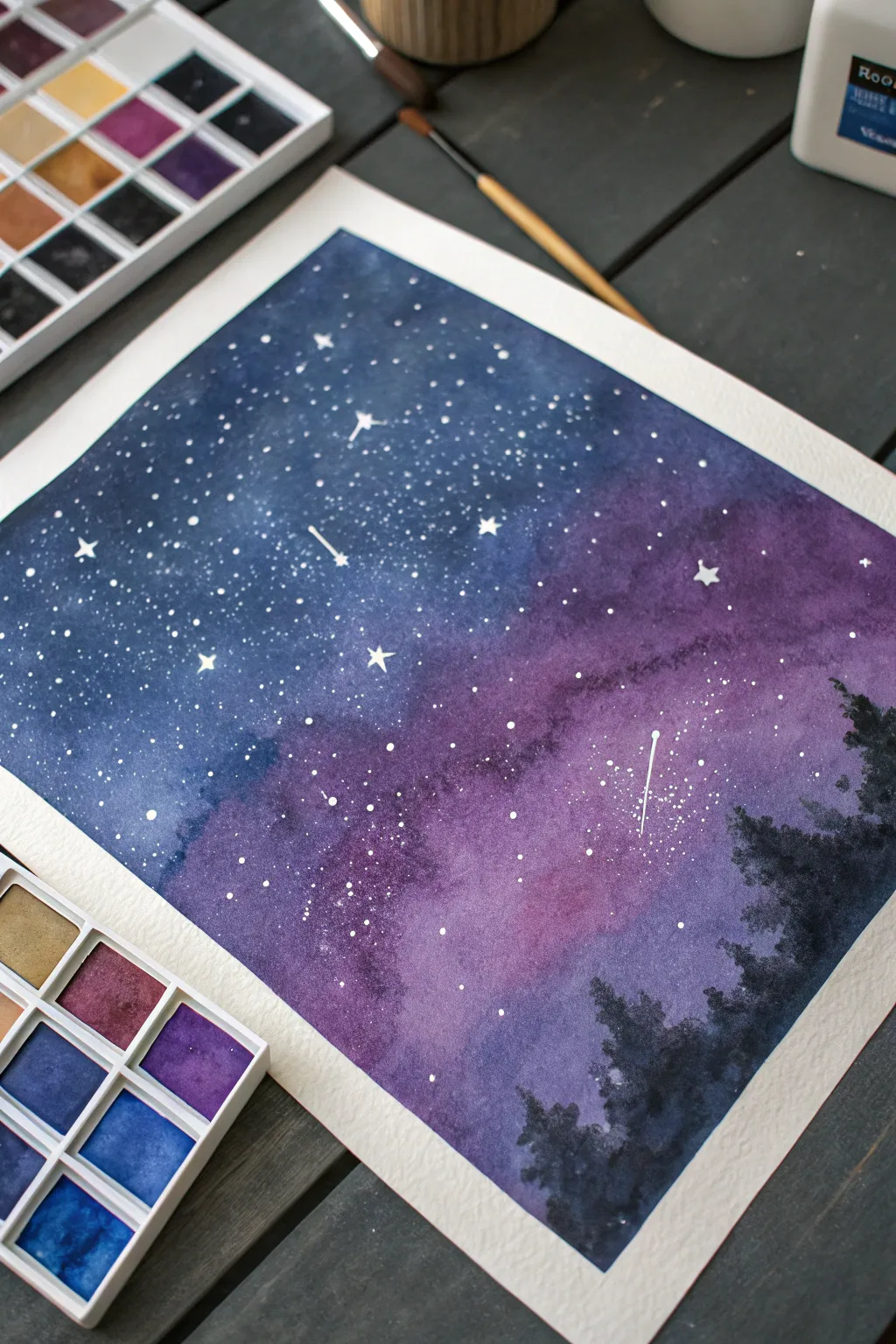
Capture the magic of a clear, starry night with this vibrant watercolor galaxy. By blending deep indigo with soft violet hues and silhouetted pines, you’ll create a breathtaking cosmic scene that looks far more complex than it actually is.
Step-by-Step Tutorial
Materials
- Cold press watercolor paper (taped down)
- Watercolor paints (Indigo, Prussian Blue, Violet, Magenta, Black)
- Flat wash brush (large)
- Round brush (size 6 or 8)
- Small detail brush (size 0 or 1)
- White gouache or white ink
- Jars of clean water
- Paper towels
- Old toothbrush (optional for splatter)
Step 1: Setting the Background
-
Prepare the Surface:
Begin by taping your watercolor paper securely to a board or table. This is crucial for heavy washes as it prevents the paper from buckling too much while wet. -
Wet-on-Wet Base:
Using your large flat brush, apply a generous layer of clean water across the entire surface of the paper. You want an even sheen, not puddles. -
Apply Blue Tones:
Load your brush with a deep Prussian Blue or Indigo. Start painting from the top left corner, sweeping the color downwards but leaving the center-right area fairly open for now. -
Introduce Violet Hues:
While the blue is still wet, rinse your brush and pick up a vibrant Violet or purple. Apply this to the top right section and drag it diagonally down toward the center. -
Create the Gradient:
Gently blend the edges where the blue and purple meet. Let the water do most of the work to create a soft, cloudy transition between the colors. -
Deepen the Tone:
Drop more concentrated Indigo into the very top corners to suggest the depth of space. Add a touch of Magenta into the violet area to give it a glowing warmth. -
Initial Dry:
Allow this first layer to dry completely. If the paper feels cool to the touch, it’s still damp. Be patient, as adding a second layer too soon will lift the first one.
Starry Splatter Tip
Cover the areas you want to keep dark (like the future treeline) with a scrap of paper before splattering starts. This prevents white dots from landing where your black trees will eventually go.
Step 2: Building Depth and Nebulas
-
Second Layer Glazing:
Re-wet the surface very gently or just apply wet paint directly if you are confident. Add a second layer of Indigo and Violet to intensify the darker areas, keeping the middle section lighter and somewhat textured. -
Cloudy Textures:
While wet, lift out a little pigment in the purple zone using a clean, thirsty brush or a crumpled paper towel. This creates the ethereal, cloudy look of a nebula. -
Full Dry:
Let this background layer dry thoroughly. You can use a hair dryer on a low setting if you need to speed up the process.
Step 3: Stars and Silhouettes
-
Prepare the Stars:
Squeeze out a small amount of white gouache or white ink. Dilute it slightly with water until it has the consistency of heavy cream. -
Splatter Effect:
Pick up the white mixture with an old toothbrush or tap your loaded paintbrush against another brush handle over the paper. This creates clusters of tiny, distant stars. -
Painting Major Stars:
Using your smallest detail brush (size 0), paint individual larger stars. Add tiny cross shapes to a few of them to make them twinkle. -
Shooting Stars:
Add a few shooting stars by painting a small dot and quickly flicking a thin tail downwards or diagonally. Vary their direction for visual interest. -
Painting the Forest:
Mix a very thick, opaque Black or dark Indigo. Using the tip of your round brush, start stippling a jagged treeline at the bottom right corner. -
Tree Details:
Work your way up from the bottom corner, tapping the brush to create the texture of pine needles. Make the trees taller on the right and shorter as they move toward the center. -
Solidifying the Base:
Fill in the solid area beneath the treetops completely with black to ground the image. -
Final Check:
Once everything is dry, remove the tape carefully at an angle to reveal your crisp white border.
Add Moonlight Glow
Before painting the black trees, lift a tiny line of color right along the horizon with a damp brush. This creates a subtle ‘glow’ behind the forest silhouette.
Peeling off the tape reveals a crisp border that makes your cosmic landscape look professionally framed and ready to display


Misty Pine Forest Layers
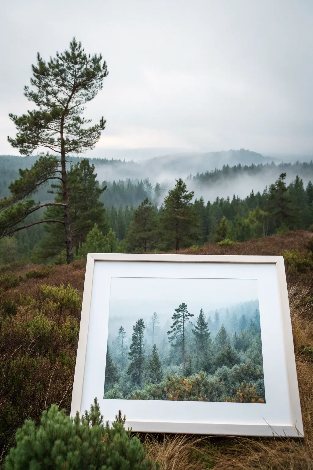
Capture the serene mystery of a foggy woodland with this atmospheric watercolor study. By mastering wet-on-wet techniques and managing tonal values, you will create a sense of depth where distant trees fade softly into the mist.
Step-by-Step Guide
Materials
- Cold Press watercolor paper (140lb/300gsm)
- Watercolor paints: Indigo, Prussian Blue, Sap Green, Payne’s Gray
- Flatwash brush (for background)
- Round brushes (sizes 4, 6, and 8)
- Clean water container
- Paper towels
- Masking tape
- White mat board frame (optional)
Step 1: Setting the Atmosphere
-
Prepare the workspace:
Secure your watercolor paper to a board with masking tape on all four sides. This ensures a clean border and prevents buckling when applying wet washes. -
Mix your atmospheric colors:
Create a very dilute, watery mix of Indigo and Payne’s Gray. You want a pale, foggy blue-gray tint that is almost transparent. -
Wet the paper:
Using a large flat brush, apply clean water across the entire upper two-thirds of the paper. The surface should be glistening but not holding puddles. -
First misty layer:
While the paper is wet, drop in your pale blue-gray mix horizontally across the middle section. Tilt the board slightly to let the paint drift downward, creating a soft, undefined fog bank.
Control the Mist
If your background trees are spreading too much, wait 60 seconds. The wetter the paper, the fuzzier the tree. Drier paper equals sharper details.
Step 2: Building Distance
-
Paint the background trees:
While the background is still slightly damp (but no longer shiny), use a size 6 round brush to paint the silhouettes of the furthest trees. Use a very watery mix of Prussian Blue and Payne’s Gray. -
Softening edges:
Because the paper is damp, these trees should bloom slightly, creating soft, fuzzy edges that suggest extreme distance. -
Allow to dry:
I like to let this layer dry completely before moving forward. You can tell it’s dry when the paper feels room temperature rather than cool to the touch. -
Middle ground layer:
Mix a slightly stronger value of blue-green, adding a touch of Sap Green to your gray mix. Paint a second row of trees lower down the paper, overlapping the ghostly background trees. -
Adding texture:
Use the tip of your brush to stipple small dots for pine needles on these middle-ground trees, keeping the shapes loose and organic.
Step 3: Foreground and Details
-
Mixing darks:
Create your darkest, most saturated mix using Indigo and Sap Green with very little water. This will be for the trees closest to the viewer. -
Painting the focal trees:
Using a size 4 brush, paint two or three detailed pine trees in the foreground. Focus on the jagged, asymmetrical nature of the branches. -
Grounding the scene:
At the bottom of the paper, paint the undergrowth using a wet brush to blend the base of your foreground trees into a soft, dark mass of bushes and shrubs. -
Splattering for texture:
Load a toothbrush or stiff brush with clean water and flick tiny droplets onto the drying foreground paint to create interesting ‘bloom’ textures that mimic foliage. -
Final dry brush details:
Once the paper is bone dry, take a nearly dry brush with dark pigment and gently drag it over the foreground bushes to suggest rough textures. -
Remove tape:
Carefully peel away the masking tape at an angle, revealing your crisp white border.
Warm Up the Foreground
Add a tiny drop of Burnt Sienna to your green mix for the closest bushes. This warmth pushes the cool blue trees further back visually.
Place your finished piece in a simple white frame to let the moody colors truly stand out


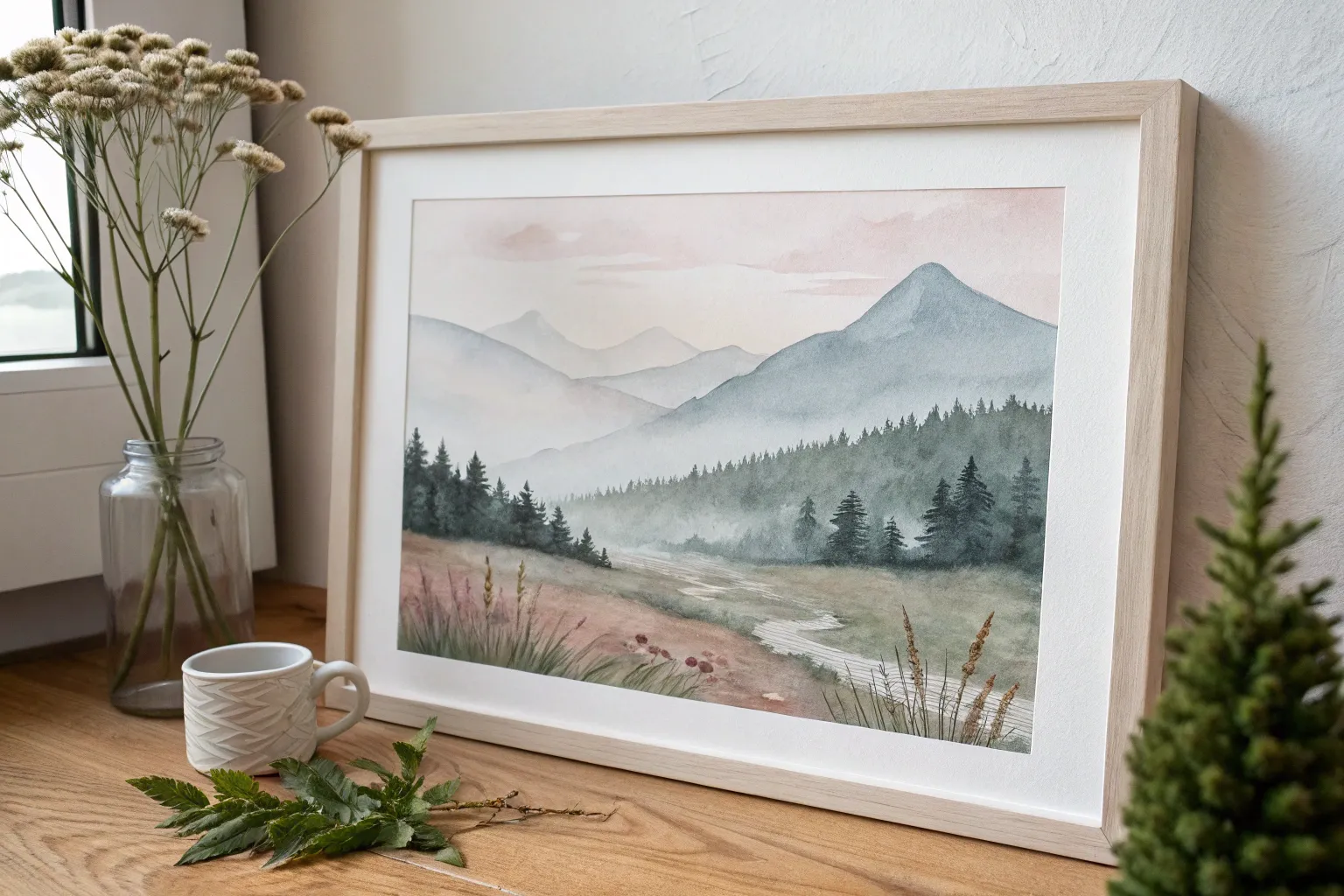
Mountain Silhouette Over a Wash
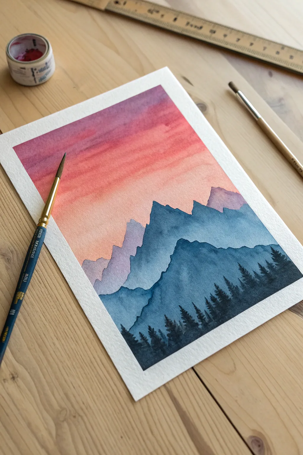
Capture the serene beauty of twilight with this gradient wash mountain landscape. By layering simple shapes and controlling color values, you’ll create a stunning sense of depth and atmospheric perspective.
Step-by-Step
Materials
- Cold press watercolor paper (140lb/300gsm)
- Masking tape or painter’s tape
- Watercolor paints (Violet/Purple, Alizarin Crimson, Orange, Indigo/Payne’s Gray)
- Round watercolor brush (size 6 or 8)
- Small round detail brush (size 0 or 2)
- Jar of clean water
- Paper towels
- Palette or white plate for mixing
- Wooden board or hard surface to tape paper onto
Step 1: Preparation and Sky Layer
-
Secure the paper:
Tape your watercolor paper down firmly to a board or table on all four sides. Press the tape edges down well to ensure clean, crisp borders later. -
Pre-wet the sky area:
Dip your large round brush in clean water and apply a light sheen of water to the top two-thirds of the paper where the sky will go. The paper should be damp, not soaking wet. -
Mix the sky gradient:
Prepare a watery mix of violet and a separate mix of orange or peach. Keep them fluid. -
Paint the upper sky:
While the paper is still damp, paint horizontal strokes of violet across the top quarter of the page. Let the color flow naturally. -
Blend downwards:
Rinse your brush slightly and pick up your orange/peach mix. Apply this below the violet, allowing the two colors to touch and bleed together softly to create a transition. -
Fade to horizon:
Continue painting the orange mix downward until it becomes very pale, fading out into the white of the paper near the middle. Let this sky layer dry completely before moving on.
Fixing “Cauliflowers”
If water blossoms appear in your sky, don’t scrub! Wait for it to dry, then gently lift the pigment with a stiff, damp brush, or glaze over it.
Step 2: Layering the Mountains
-
Mix the distant mountain color:
Create a very pale, watery lavender by mixing a tiny dot of purple with plenty of water. It should be transparent. -
Paint the first range:
Paint a jagged, uneven line across the middle of the paper just where the sky fade ends. Fill in the shape below this line with your pale wash. -
Dry the first layer:
Wait for this first mountain range to be touch-dry. If you paint too soon, the layers will bleed into one another. -
Darken the mix:
Add a little Indigo or Payne’s Gray to your lavender mix to make a slightly darker, cool blue-grey tone. -
Create the second range:
Paint a new mountain silhouette that starts slightly lower than the first one. Make the peaks distinct from the previous layer. -
Fill and dry:
Fill the area below this second line and let it dry completely. I usually use a hairdryer on a low setting here to speed things up. -
Paint the third range:
Mix a distinctly darker blue-grey, using more pigment and less water. Paint a third, large mountain shape in the foreground, covering the bottom third of the paper.
Starry Night Option
Before removing the tape, use an old toothbrush with white gouache to flick tiny stars over the dried purple sky for a magical night scene.
Step 3: Foreground Details
-
Prepare the darkest value:
Mix a concentrated Indigo or black, creating a creamy consistency with very little water. This needs to be opaque. -
Switch brushes:
Pick up your small detail brush (size 0 or 2) to handle the delicate tree shapes. -
Paint tree trunks:
While the bottom mountain layer is still just slightly damp or fully dry, paint thin vertical lines along the bottom edge and right slope to represent tree trunks. -
Add pine texture:
Starting at the top of a trunk, use a stippling or tapping motion to create horizontal branches that get wider as you move down the tree. -
Fill the forest:
Continue adding trees across the bottom, varying their heights. Group them closer together at the bottom right to anchor the composition. -
Final reveal:
Once the entire painting is bone dry, carefully peel off the masking tape at a 45-degree angle to reveal your crisp white edges.
Now you have a tranquil mountain scene ready to frame or gift to a friend
BRUSH GUIDE
The Right Brush for Every Stroke
From clean lines to bold texture — master brush choice, stroke control, and essential techniques.
Explore the Full Guide
Single Flower Close-Up Study

Capture the delicate beauty of a blooming peony with this gentle watercolor study that focuses on soft washes and fine details. By layering translucent colors and adding crisp outlines, you’ll create a piece that feels both illustrative and organic.
Step-by-Step
Materials
- Cold press watercolor paper block or sketchbook
- Watercolor paints (Peach, Salmon, Sap Green, Olive Green, Burnt Sienna)
- Round brushes (flats/filberts won’t work as well): Size 6 for washes, Size 0 or 2 for details
- HB Pencil and kneaded eraser
- Jar of clean water
- Paper towel or cloth
- Fine liner brush (optional, if not using size 0 brush)
Step 1: Sketching the Composition
-
Map out the flower:
Begin by lightly sketching a large, slightly flattened circle on the right side of your paper to represent the main flower head. This will serve as your boundary. -
Draw the center petals:
Inside your circle, draw a small cluster of irregular, wavy shapes for the flower center. These petals are tightly packed and upright. -
Expand the petals outward:
Work your way out from the center, drawing larger, overlapping petal shapes. Keep the lines wavy and organic, allowing some petals to curl slightly at the edges. -
Add flanking leaves:
Sketch long, slender stems extending from behind the flower. Add almond-shaped leaves to these stems—some pointing vividly upwards and others cascading down. -
Refine the sketch:
Once you are happy with the placement, gently roll a kneaded eraser over the pencil lines to lighten them until they are barely visible guides.
Step 2: Painting the Flower Head
-
Mix your base blush:
Create a watery mix of peach and a tiny touch of salmon pink on your palette. You want this first layer to be very pale and transparent. -
Wash the petals:
Using your size 6 brush, fill in the petals with this pale wash. Leave tiny slivers of white paper between some petals to define their edges naturally. -
Add depth while wet:
While the first layer is still damp, drop slightly more concentrated salmon pigment near the base of the petals (closest to the flower center). This creates a soft gradient. -
Let it dry completely:
Wait for the flower to become bone dry. If the paper feels cool to the touch, it’s still wet. -
Define shadows:
Mix a slightly darker, more saturated version of your peach color. Paint specific shadow shapes where petals overlap, emphasizing the layered structure.
Clean Edges Trick
To keep petal shapes distinct without outlines, leave a hairline gap of dry white paper between wet adjacent sections to prevent bleeding.
Step 3: Painting the Foliage
-
Mix varying greens:
Prepare two puddles of green: one warm, yellowish olive green and one cooler, muted sap green. This variety adds realism. -
Paint the main leaves:
Fill in the larger leaves using the sap green mix. Use the tip of your brush for the stem connection and press down to fill the belly of the leaf. -
Add pale accent leaves:
Dilute your olive green heavily with water. Paint the ghostly, lighter leaves in the background to suggest depth and distance. -
Create fern-like fronds:
Using the very tip of your brush and a mix of reddish-brown and peach, paint the delicate, fern-like sprig on the left side. Use quick, flicking motions. -
Add variegated touches:
While the green leaves are wet, I sometimes drop a tiny bit of the flower’s peach color into the leaf tips to tie the color palette together.
Metallic Magic
Once fully dry, use metallic gold watercolor on the stamen tips or leaf veins for a luxurious shimmer that catches the light.
Step 4: Final Details and Outlining
-
Paint the stamens:
Using a mix of burnt sienna and yellow ochre, dab small dots into the very center of the flower. Keep the texture stippled and loose. -
Enhance the center:
Add tiny lines extending from the center stippling outwards using a fine brush and brown paint to mimic filaments. -
Outline the petals:
With a size 0 brush and a watered-down burnt sienna or dark peach mix, carefully outline the petals. Keep the line thin and break it occasionally so it doesn’t look like a coloring book. -
Add leaf veins:
Once the leaves are dry, paint a delicate central vein using a darker green mix on just a few of the prominent leaves. -
Final assessment:
Step back and check your contrast. If the flower feels too flat, add a final glaze of pink to the shadowed areas.
Enjoy the peaceful process of watching your floral arrangement bloom on the page
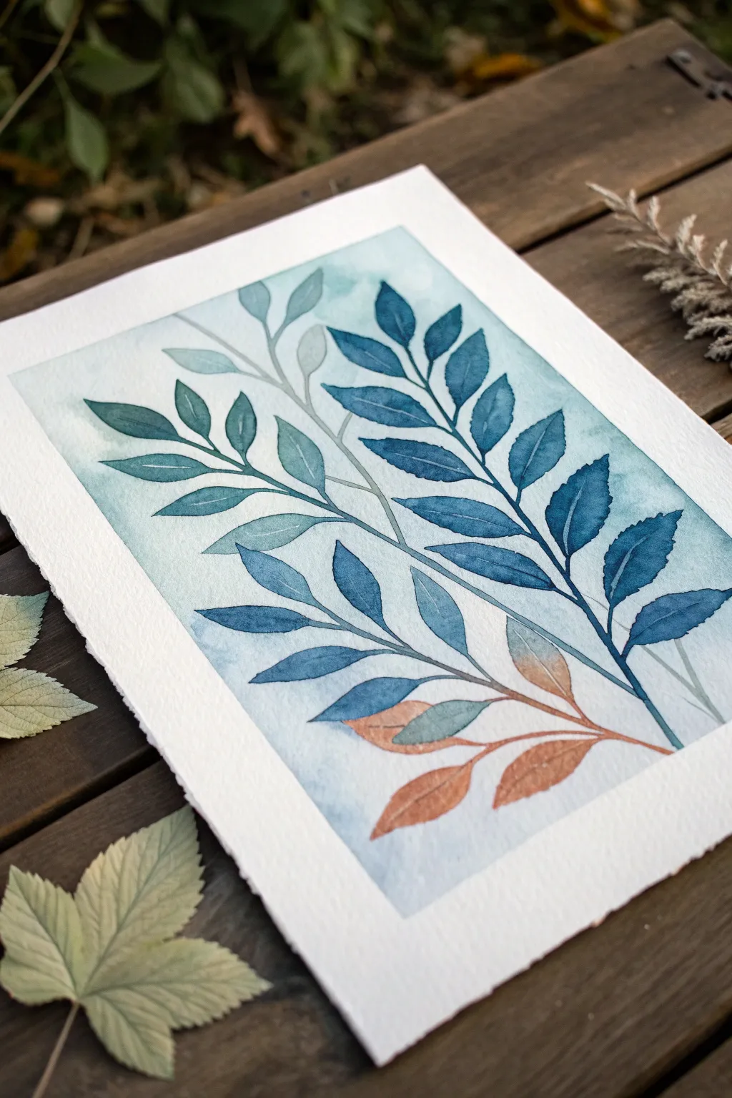
Leaf and Branch Botanical Swatches
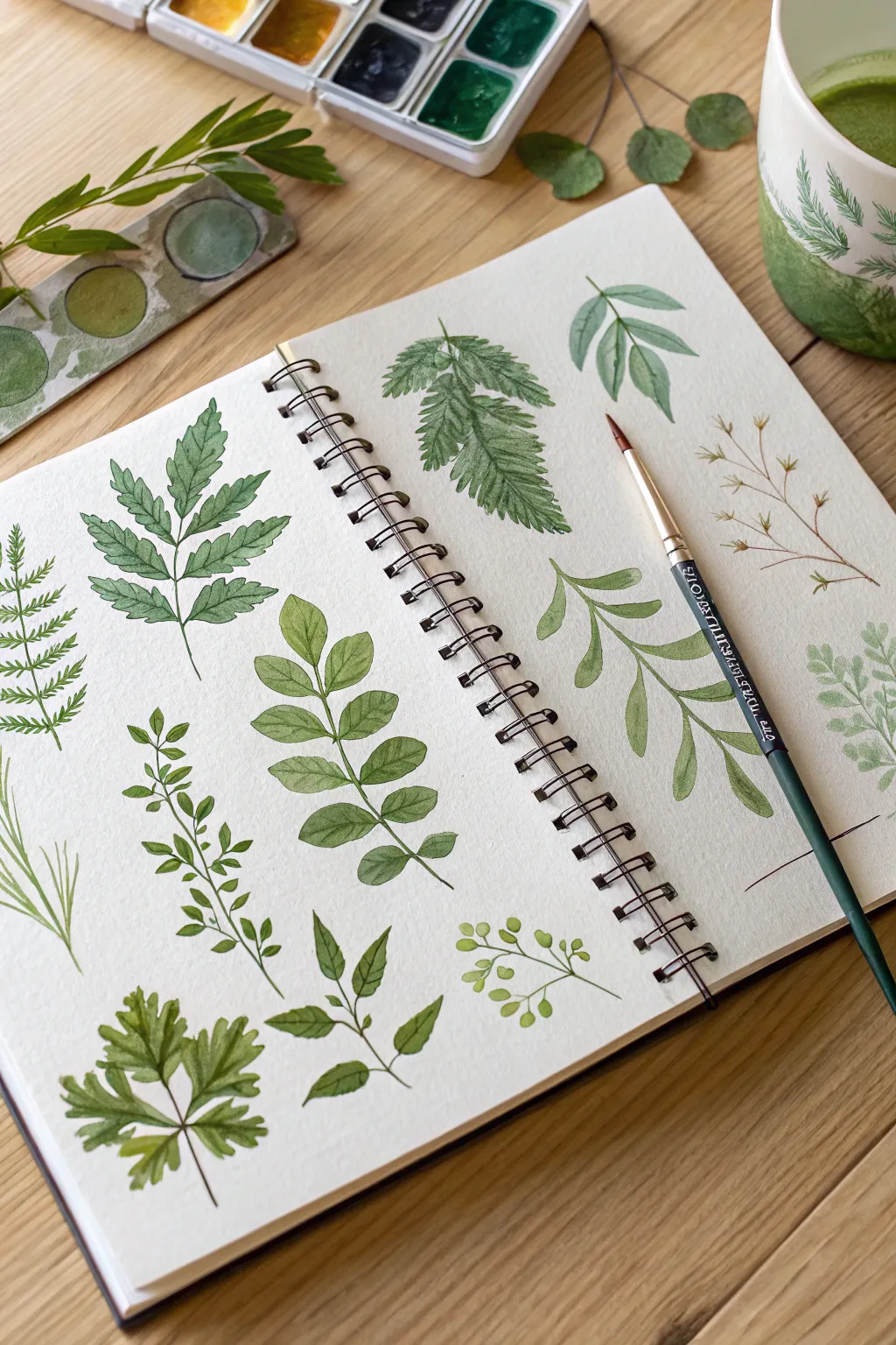
Fill a sketchbook page with a soothing collection of diverse leaf shapes and botanical textures. This exercise is perfect for practicing brush control and exploring the incredible range of greens you can mix from a limited palette.
Detailed Instructions
Materials
- Spiral-bound watercolor sketchbook (cold press paper recommended)
- Watercolor paints (various greens, yellow ochre, burnt sienna, indigo)
- Round watercolor brush (size 4 or 6)
- Small fine liner brush (size 0 or 1)
- Mixing palette
- Jar of clean water
- Paper towel
Step 1: Preparation & Color Mixing
-
Observe the Composition:
Before painting, take a moment to look at the layout. The leaves are arranged in a loose grid, with variations in size and direction to keep the page dynamic. You don’t need pencil lines; aim for a freehand approach. -
Prepare Your Greens:
Mix three distinct puddles of green on your palette. Create a warm, yellowish green (sap green + yellow ochre), a cool, deep green (viridian + touch of indigo), and an earthy, muted green (olive green + burnt sienna). -
Test Consistency:
Ensure your paint has a milky consistency. You want enough pigment for vibrant color but enough water to let the transparency shine through.
Muddy Greens?
If your greens look dull or brown, stop mixing all your colors together. Instead, mix fresh yellow and blue on the paper (wet-on-wet) for vibrant, clean transitions.
Step 2: Painting the Ferns & Complex Leaves
-
The Large Fern (Top Right):
Start with the large fern-like leaf. Paint the central stem first using a thin line of your deep green mix. While it’s wet, add the small leaflets on either side, using short, rhythmic strokes that taper at the ends. -
Adding Texture:
While the fern leaflets are still slightly damp, drop a tiny amount of darker pigment into the base of each leaflet to creating natural shadowing. -
The Jagged Ash Leaf (Top Left):
Using a medium green, paint a central vein. From this vein, extend paired leaflets with serrated edges. Use the tip of your round brush to carve out the jagged perimeter of each small leaf. -
Layering the Veins:
Allow the jagged leaf to dry completely. Once dry, mix a slightly darker version of the same green and use your fine liner brush to paint delicate veins on top of the dried shape.
Step 3: Painting Simple & Rounded Shapes
-
Rounded Leaf Sprig (Center):
Switch to your earthy, muted green mix. Paint a long, slightly curved stem. Press the belly of your round brush down firmly and lift up to create the teardrop shape of the rounded leaves, alternating sides as you move up the stem. -
Building Transparency:
For some leaves, dilute your paint with more water. This creates variations in transparency, making the foliage look lighter and more delicate. -
The Broad Leaf (Right Side):
Paint the broad, flowing leaves on the right focusing on curvature. Use two strokes for each leaf—one for the left half, one for the right—leaving a tiny sliver of white paper in the middle to represent the highlight on the main vein.
Varied Leaf Edges
Vary your pressure to change leaf edges! Press hard for round, smooth leaves, and wiggle the brush tip as you pull back for serrated or jagged edges.
Step 4: Delicate Details & Fillers
-
Tiny Boxwood Sprigs:
In the lower left, creates small, dense clusters of leaves. Use just the very tip of your brush with a bright, lime-green mixture. Keep these shapes small and erratic. -
The Dry Twig:
On the far right, paint a thin, branching twig structure using a brown or ochre mix. Add tiny, dry seed pods at the tips using quick, stippling motions. -
Grounding Element:
Create the large, five-pointed leaf at the bottom left (resembling parsley or cilantro). Start from the center point and paint outward, keeping the edges ruffled and irregular. -
The Simple Berry Branch:
At the bottom right, paint a simple twig with small round shapes attached. I like to keep these circles quite pale and watery to contrast with the sharper leaves nearby.
Step 5: Final Touches
-
Evaluate Balance:
Step back and look at your page. If there are large empty gaps, add small floating leaves or simple single-stroke grass blades to fill the space. -
Darkening Stems:
Go back over the main stems of the larger branches with a fine liner and a very dark green or brown to add structural definition. -
Erase and Dry:
Ensure all paint is 100% dry to the touch before closing your sketchbook to prevent smudging.
Flip through your new botanical library whenever you need inspiration for your next landscape painting

PENCIL GUIDE
Understanding Pencil Grades from H to B
From first sketch to finished drawing — learn pencil grades, line control, and shading techniques.
Explore the Full Guide
Citrus and Fruit Still Life
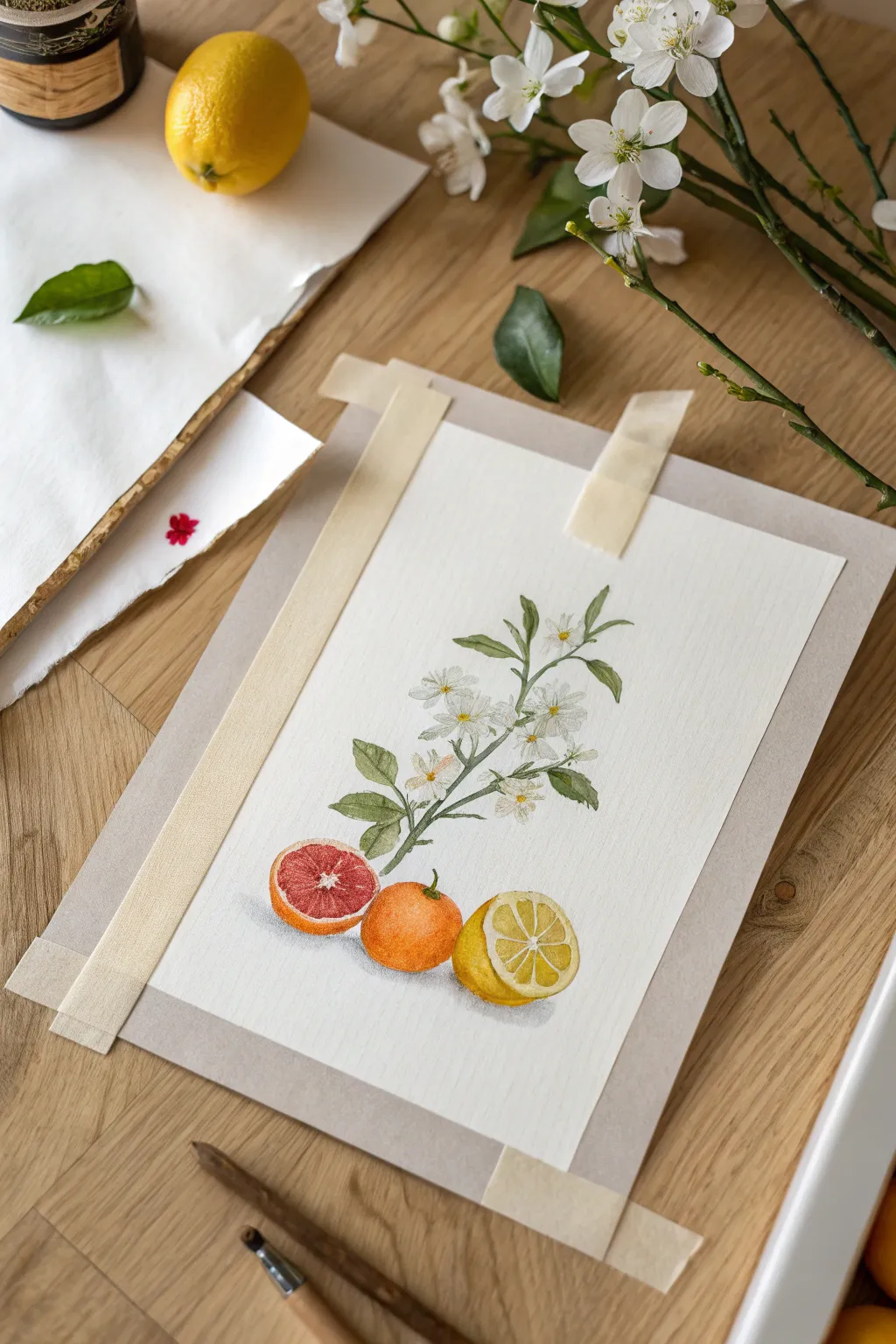
Capture the freshness of summer with this elegant botanical watercolor study featuring a flowering citrus branch and glowing fruit segments. This project combines precise botanical illustration with loose, vibrant washes to create a piece that feels both scientific and artistic.
Step-by-Step
Materials
- Cold press watercolor paper (300 gsm)
- Watercolor paints (Cadmium Yellow, Cadmium Red, Alizarin Crimson, Sap Green, Burnt Umber)
- Mechanical pencil (HB) and kneaded eraser
- Round watercolor brushes (sizes 2, 4, and 6)
- Masking tape (for securing paper)
- Drawing board or hard backing
- Water jars and paper towels
Step 1: Preparation and Sketching
-
Secure the paper:
Begin by taping your cold press paper securely to a hard backing board. Use masking tape on at least the top corners or all four sides to prevent buckling when the paper gets wet. -
Map the composition:
Lightly sketch a vertical central line for the branch stem. At the bottom, mark three rough circles to denote the positions of the blood orange slice, the whole mandarin, and the lemon half. -
Detail the branch:
Refine the branch sketch, drawing the central woody stem and branching off with smaller twigs. Use light, broken lines to shape the small, five-petaled white flowers clustered near the top and middle. -
Sketch the leaves:
Add slender, pointed leaves emerging from the stem junctions. Pay attention to how the leaves curve and twist; they shouldn’t look stiff or perfectly flat. -
Refine the fruit:
Detail the bottom fruits. Draw the segmented wheel of the cut lemon and the interior flesh of the blood orange slice. Keep pencil marks very faint so they don’t show through the transparency of the paint.
Step 2: Painting the Fruit
-
Lemon base wash:
Start with the lemon half. Mix a watery wash of Cadmium Yellow. Carefully paint the pith and segments, leaving tiny thin lines of white paper between the triangular segments to represent the membrane. -
Mandarin texture:
For the middle whole fruit, mix Cadmium Orange (or Yellow + Red). Paint the sphere, dabbing the brush slightly to create a texture that mimics citrus peel. Keep the top-center slightly lighter for a highlight. -
Blood orange depth:
Move to the cut grapefruit or blood orange on the left. Mix Alizarin Crimson with a touch of orange. Paint the inner circle, leaving the outer rim (the pith/rind) unpainted white for now. -
Adding skin details:
Once the lemon interior is damp-dry, paint the outer rind with a more saturated yellow. Do the same for the blood orange, adding a thin orange rim around the red flesh. -
Deepening fruit form:
Add shadows to give volume. Glaze a darker orange-brown on the bottom right of the mandarin and a darker red near the bottom of the blood orange slice. I like to drop a tiny bit of clean water into the drying mandarin to create a ‘bloom’ texture.
Muddy Colors?
If your citrus colors look dirty, you likely touched wet green paint into wet orange paint. Let the leaves dry completely before painting nearby fruit.
Step 3: Painting the Botanical Elements
-
Green stems:
Using a size 2 brush and Sap Green, paint the main stem. Vary the pressure to make the line thickness organic. While wet, touch in a tiny bit of brown near rough patches. -
Leaf base layers:
Paint the leaves with a watery Sap Green wash. Ensure the tips are pointed and crisp. Leave some areas slightly lighter to suggest light reflecting off the shiny waxy surface. -
Leaf shadowing:
Once the first green layer is dry, mix a darker green (add a touch of blue or brown). Paint the shadowed side of the leaves, usually along the central vein or where leaves overlap. -
Flower centers:
The petals are white, so rely on the paper’s white. Paint tiny yellow dots in the very center of the floral clusters for the stamens. -
Defining petals:
Mix a very faint, watery grey-blue. Carefully paint a tiny shadow on one side of a few petals to separate them from the white background, but be extremely subtle.
Try This Twist
Instead of a botanical study, turn this into a pattern! Repeat the lemon or orange element across the page to create custom wrapping paper designs.
Step 4: Final Details and Shadows
-
Fruit segment definition:
Go back to the cut lemon and blood orange. With a fine brush, add delicate radiating lines inside the segments to mimic juice sacs. Use a darker yellow and darker red respectively. -
Cast shadows:
Mix a cool grey (Burnt Umber + Cobalt Blue). Paint a soft, diffuse shadow underneath the three fruits to ground them so they don’t look like they are floating. -
Final assessment:
Erase any visible pencil lines gently. Add final touches of dark green to the leaf connections to sharpen the contrast.
Remove the tape slowly at an angle to reveal your crisp, beautiful citrus study.
Easy Ocean Wave Bands
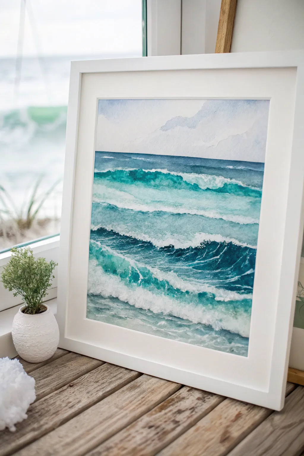
Capture the rhythmic beauty of the sea with this layered watercolor painting featuring distinct bands of crashing waves. This project focuses on building depth through sequential washes and preserving crisp whites to represent sea foam.
How-To Guide
Materials
- Cold press watercolor paper (300gsm)
- Watercolor paints (Phthalo Blue, Turquoise, Indigo, Payne’s Gray)
- Masking fluid
- Old brush or ruling pen for masking fluid
- Large flat wash brush (3/4 inch)
- Round brushes (size 4 and 8)
- Painter’s tape and backing board
- Pencil and eraser
- White gouache (optional)
Step 1: Preparation and Masking
-
Secure the paper:
Tape your watercolor paper down firmly on all four sides to a backing board. This prevents buckling when we apply heavy washes later. -
Sketch the wave bands:
Using a light pencil, draw four or five distinct horizontal bands across the paper. These lines don’t need to be straight; give them gentle curves and ragged peaks to mimic breaking water. -
Apply masking fluid:
Using an old brush or a ruling pen, apply masking fluid along the top edge of each wave band you just drew. Make the application jagged and irregular to look like sea foam. -
Add texture marks:
Splatter tiny drops of masking fluid in the trough areas between waves to create the look of sea spray and churning bubbles. -
Let it cure:
Wait until the masking fluid is completely dry and rubbery to the touch before opening any paint.
Step 2: Painting the Sky and Horizon
-
Wet the sky area:
With clean water and your large flat brush, wet the paper above the horizon line. -
Paint the sky:
Drop in a very diluted wash of Phthalo Blue or a soft grey-blue. Keep it pale to contrast with the dark ocean later. -
Define the horizon:
While the sky is damp, paint a sharp, dark line of Indigo right at the horizon. Soften the upper edge of this line so it blends slightly upward into the sky.
Tearing Paper?
If masking fluid tears your paper upon removal, the paper was likely still damp or cheap quality. Ensure bone-dry paper and use 100% cotton for best results.
Step 3: Layering the Waves
-
Mix your ocean palette:
Prepare three puddles of paint: a light Turquoise, a vibrant Phthalo Blue, and a deep Indigo mixed with Payne’s Gray. -
Start with the furthest wave:
Working on the band of water just below the horizon, apply a medium-strength blue wash. Use horizontal strokes that are darker at the bottom of the band and lighter near the top. -
Paint the middle waves:
Move to the next band down. Start with your Turquoise near the top (under the masked foam) and blend into Phthalo Blue as you move down the wave face. -
Add depth to the troughs:
While the wave face is still wet, drop the dark Indigo mix into the very bottom of the wave curve. This shadow creates the illusion that the wave is rising up. -
Repeat for foreground waves:
Continue this gradient process for the lower wave bands. I like to make the foreground waves slightly more green-blue to suggest shallower water. -
Create movement:
Use a damp, clean brush to lift out subtle streaks in the wave faces, following the curve of the water. This mimics light reflecting off the moving swell. -
Dry completely:
Let the painting dry thoroughly. Painting over damp paper in the next step could ruin the masking fluid removal.
Sparkle Effect
Sprinkle a pinch of salt onto the wet paint in the darker wave troughs. Brush it off when dry for a blooming texture that looks exactly like sea bubbles.
Step 4: Finishing Touches
-
Remove the mask:
Gently rub off the masking fluid with a clean finger or a rubber cement pickup tool to reveal the stark white paper underneath. -
Soften the foam:
The white areas might look too sharp. Take a damp round brush and gently scrub the bottom edge of the foam lines to blend them slightly into the water below. -
Add shadows to foam:
Mix a very watery violet-grey. Paint tiny shadows on the underside of the white foam crests to give them volume and 3D form. -
Enhance highlights (optional):
If you lost any white areas or want extra sparkle, use a small amount of white gouache to add final crisp highlights on the wave crests.
Frame your finished seascape behind glass to admire the soothing rhythm of the waves


Hot Air Balloon Mini Scene
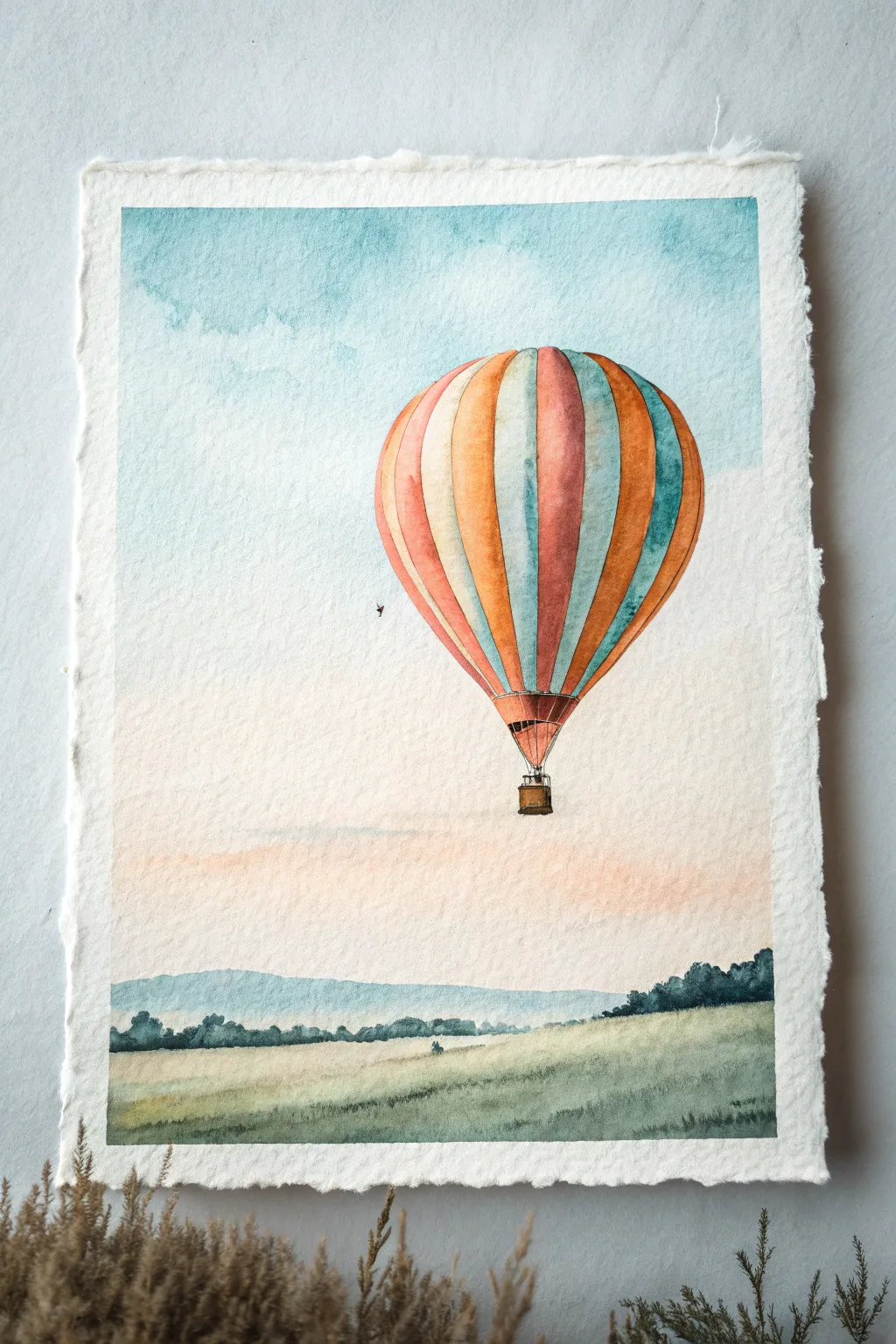
Capture the peaceful feeling of a morning flight with this gentle watercolor scene. You’ll master softly blended skies and vibrant stripes as you paint a colorful balloon drifting over misty rolling hills.
Detailed Instructions
Materials
- Cold-pressed watercolor paper (300 gsm or heavier)
- Watercolor paints (Cerulean Blue, Burnt Sienna, Orange, Alizarin Crimson, Sap Green, Payne’s Grey, Yellow Ochre)
- Round brushes (sizes 2, 6, and 10)
- Pencil (HB or H) and kneadable eraser
- Masking fluid (optional)
- Jars of clean water
- Paper towels
- Masking tape
Step 1: Preparation and Sketching
-
Paper prep:
Begin by taping down your watercolor paper to a board with masking tape. This prevents buckling and gives you that crisp, clean border seen in likely gallery pieces. -
Basic outline:
Lightly sketch the large balloon shape (an inverted teardrop) in the upper center. Draw a small basket dangling below it. -
Adding segments:
Draw curved vertical lines following the form of the balloon to create the striped segments. They should be wider in the middle and converge at the top and bottom poles. -
Horizon line:
Sketch a very faint, low horizon line. Add jagged shapes for distant trees and a sloping foreground hill.
Step 2: Painting the Sky and Background
-
Sky wash:
Wet the entire sky area with clean water, carefully avoiding the balloon shape. While wet, drop in diluted Cerulean Blue near the top right and left corners. -
Soft clouds:
While the paper is still damp, lift out a few cloud shapes using a crumpled paper towel or a thirsty brush to create soft white patches. -
Warm horizon:
As you move down the sky, mix in a tiny touch of very pale orange or pink into the wet paper near the horizon to suggest early morning light. Let the sky dry completely. -
Distant mountains:
Mix a watery wash of Payne’s Grey and Blue. Paint the distant mountain silhouette across the horizon, keeping the edges soft.
Bleeding Stripes?
If your balloon stripes are bleeding into each other, you’re painting adjacent sections too soon. Dry completely between stripes or paint non-touching sections first.
Step 3: The Balloon
-
First stripe color:
Choose your first color—perhaps the orange. Paint every third segment, carefully staying within the lines. Make the color more intense on the shadow side (left) and lighter on the right. -
Second stripe color:
Once the orange is dry or slightly tacky, paint the alternating stripes with a cool blue or teal. I like to leave a tiny sliver of white paper between stripes sometimes to prevent bleeding. -
Third stripe color:
Fill the remaining segments with a muted red or rust color. Remember to follow the curve of the balloon with your brushstrokes. -
Shadows and form:
To make the balloon look round, glaze a very watery purple or grey over the entire left side of the balloon once the first layers are bone dry. -
The basket:
Using a small size 2 brush and concentrated Burnt Sienna, paint the wicker basket. Add tiny dark dots for texture. -
Connecting ropes:
With the very tip of your smallest brush, draw fine lines connecting the basket to the balloon burner area.
Add Magic
Make it a festival! Once dry, paint several tiny, distant balloons in the background using faint, single-color washes to create incredible depth and scale.
Step 4: Foreground Landscape
-
Distant treeline:
Mix Sap Green with Payne’s Grey for a deep, cool green. Paint the uneven line of trees just below the distant blue mountains, varying the height to look natural. -
Grassy field:
Wet the foreground area. Apply a wash of Yellow Ochre and Sap Green, letting the colors merge on the paper. -
Texture:
While the foreground is damp but not soaking, flick a slightly drier brush with darker green upwards to suggest tall grasses. -
Finishing touches:
Add a tiny speck of a bird in the distance or a suggestion of a figure in the field for scale. Remove the tape carefully once everything is 100% dry.
Step back and admire the uplifting sense of freedom in your finished piece
Cute Animal Portrait in Soft Washes
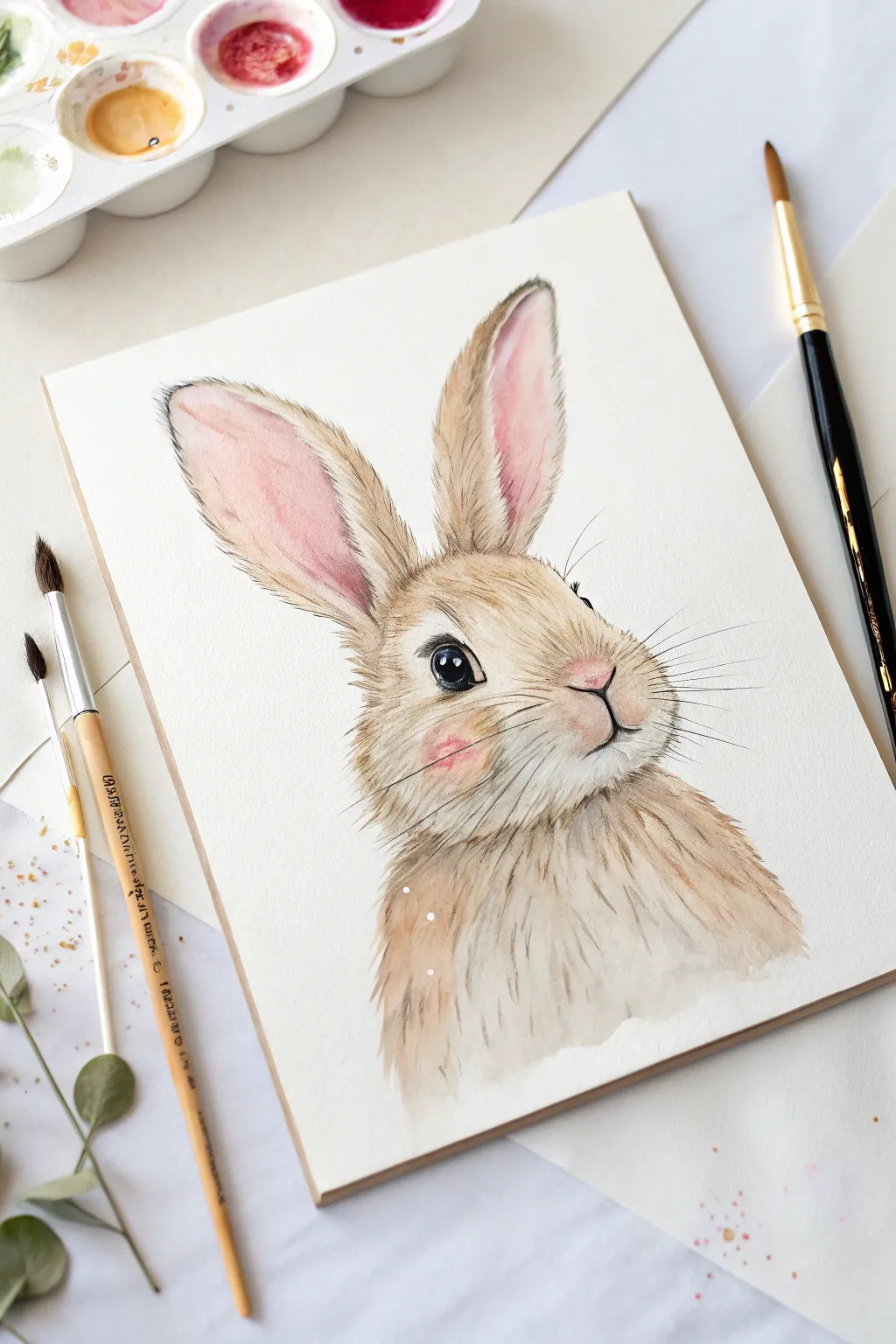
Capture the gentle spirit of a rabbit with this soft, loosely styled watercolor portrait. You’ll master wet-on-wet washes for fluffiness combined with fine liner work to bring out those expressive eyes and whiskers.
Step-by-Step
Materials
- Cold press watercolor paper (300 gsm)
- Watercolor paints: Burnt Umber, Yellow Ochre, Alizarin Crimson, Lamp Black
- Pointed round watercolor brushes (sizes 2, 6, and 8)
- Fine liner brush or waterproof archival ink pen (brown/black)
- Clean water and mixing palette
- HB Pencil and kneaded eraser
- White gouache or white gel pen
Step 1: Sketching & Base Washes
-
Light Sketching:
Begin with a very faint pencil sketch. Draw an oval for the head and two long, oblong shapes for the ears. Keep your lines minimal, marking only the eyes, nose, and the general direction of the fur tufts on the chest. -
First Ear Wash:
Mix a watery, pale pink using Alizarin Crimson and plenty of water. Paint the inner shape of the ears, letting the color pool naturally towards the bottom. While wet, drop a tiny hint of brown at the outer edges for shadow. -
Head Base Layer:
Create a tea-colored mix using Yellow Ochre and a touch of Burnt Umber. With your size 8 brush, apply a loose wash over the face area, carefully painting around the eye and nose to keep the paper white. -
Chest Fluff:
Extend that same tea-colored mix down into the chest area. Use jagged, sweeping strokes at the bottom edge to suggest loose fur texture rather than a solid line. -
Rosy Cheeks:
While the face wash is still slightly damp, dab a small amount of your pink mix onto the cheek area. This allows the blush to bloom softly into the fur color without harsh edges.
Muddy Fur?
If fur texture looks muddy, your base layer wasn’t dry enough. Wait for the paper to be bone-dry before adding distinct hair lines, otherwise, they will bleed into blobs.
Step 2: Building Texture & Depth
-
Defining the Fur:
Once the first layer is completely dry, switch to your size 6 brush. Mix a slightly darker brown (more Burnt Umber). Use quick, short flicks following the direction of hair growth on the forehead and cheeks. -
Ear Details:
Add texture to the ears by painting fine brown hairs along the outer rims. I find that quick, confident flicks prevent the fur from looking stiff. -
Deepening Shadows:
Mix a darker shadow color with Burnt Umber and a touch of black. Glaze this under the chin to separate the head from the chest, and add depth inside the folds of the ears. -
Chest Texture:
Return to the chest area. Instead of painting every hair, use longer, vertical strokes with a thirsty brush (damp, not soaking) to create dry-brush texture that mimics soft downy fur. -
Nose and Mouth:
Paint the nose with a slightly more saturated pink. Use a fine liner brush or pen to draw the ‘Y’ shape of the mouth, keeping the line delicate.
Step 3: Fine Details & finishing
-
The Eye:
This is the focal point. Paint the iris with a dark black-brown mix, leaving a small circle of white paper for the highlight. If you accidentally paint over it, don’t worry—we can fix it later. -
Eye Definition:
Outline the eye with a darker line to create a rim. Add a tiny wash of very pale blue or grey in the ‘white’ of the eye to make it look glassy and round. -
Whiskers:
Using your finest liner brush or a dedicated rigger brush, paint long, sweeping whiskers extending from the muzzle. Vary the pressure so the lines taper off nicely at the ends. -
Ink Accents:
If you want the illustrative look shown in the reference, use a fine brown ink pen to strictly reinforce the most important fur tufts and the outline of the ears. -
Final Highlights:
Use white gouache or a gel pen to add the final bright catchlight in the eye and a few tiny dots on the pupil for life. Add a few white whiskers overlapping the dark fur for dimension.
Pro Tip: Eye Depth
Don’t paint the eye solid black. Leave a tiny crescent of lighter brown at the bottom of the iris to simulate light passing through the cornea. It adds instant realism.
Now stepping back, you should see a charming, bright-eyed bunny ready to hop off the page
Line and Wash City Window View
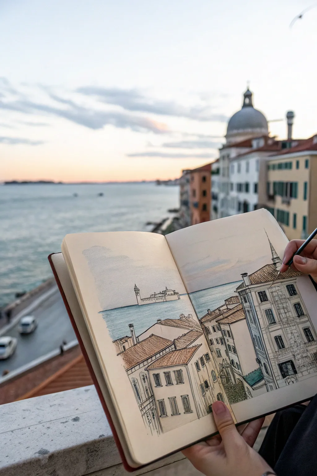
Capture the romantic atmosphere of a cityscape overlooking the water with this classic line and wash technique. By combining precise ink architecture with soft, airy watercolor washes, you’ll recreate the depth and charm of Venice right in your sketchbook.
Detailed Instructions
Materials
- Watercolor sketchbook (cold press paper recommended)
- Waterproof fine liner pens (0.1mm and 0.3mm)
- Watercolor paint set (Ultramarine Blue, Burnt Sienna, Yellow Ochre, Alizarin Crimson)
- Small round watercolor brush (size 4 or 6)
- Pencil (HB or 2B) and eraser
- Jar of water and paper towel
Step 1: Planning and Sketching
-
Establish the horizon:
Begin by lightly penciling a horizontal line across the double-page spread, positioning it about one-third of the way up the page to leave ample room for the sky. -
Block in major shapes:
Use simple geometric shapes to mark the position of the foreground buildings on the right page. Add a small rectangle in the distance on the left page for the island church. -
Refine the perspective:
Draw the main building on the right, ensuring the rooflines angle downward toward a vanishing point on the horizon line. Sketch the vertical lines for windows and corners. -
Add architectural details:
Lightly sketch in the rows of windows, the roof tiles, and the distant campanile (bell tower) on the island across the water. Keep these pencil lines faint as guides.
Loose Lines
Don’t connect every line perfectly at the corners. Leaving small gaps in your ink drawings allows the eye to complete the shape and adds a lively, sketched feeling.
Step 2: Inking the Scene
-
Start with the foreground:
Using a 0.3mm waterproof pen, ink the main structural lines of the nearest building on the right. Use confident, slightly broken lines to suggest aged stone rather than perfect ruler-straight edges. -
Detail the windows:
Switch to a finer 0.1mm pen to draw the window frames and shutters. Add quick scribbles inside some windows to suggest dark interiors without fully coloring them in. -
Texture the roofs:
Draw the roof tiles using rows of small ‘u’ or ‘v’ shapes. You don’t need to draw every single tile; suggest the texture in patches, especially near the edges and ridgelines. -
Ink the distance:
Use the 0.1mm pen with a very light touch for the distant island and tower on the left page. Keep detail minimal here to push it into the background. -
Clean up:
Once the ink is completely dry (give it a few minutes to be safe), gently erase all your visible pencil guidelines.
Step 3: Adding the Wash
-
Paint the sky:
Mix a very dilute wash of Ultramarine Blue with a touch of Alizarin Crimson for a soft purple-grey. Paint this loosely across the top of both pages, leaving some white paper showing for clouds. -
Wash the water:
With a slightly stronger mix of Ultramarine Blue and a hint of green (or Yellow Ochre), paint the water area. Use horizontal brushstrokes and leave white gaps near the horizon. -
Warm up the roofs:
Mix Burnt Sienna with a little Yellow Ochre. Apply this color to the roof areas on the right page. Variate the tone by adding more water in some spots for a sun-bleached look. -
Paint the buildings:
Use a very watery mix of Yellow Ochre or a creamy beige to wash over the building facades. Keep this extremely pale, as the white paper provides the light. -
Deepen the shadows:
Mix a dark grey using Ultramarine and Burnt Sienna. Apply this to the side of the building facing away from the light source to create 3D form. -
Add details:
Use the same dark grey mix (less watered down) to paint the dark window interiors and cast shadows under the eaves. -
Final touches:
Add a tiny touch of green for the copper awning or vegetation at the base of the building, and strengthen the blue of the water right at the horizon line for contrast.
Splatter Effect
Load your brush with clean water or very pale paint and tap it over the water area while still damp to create subtle ‘bloom’ textures that look like sea spray.
Now you have a charming travel sketch that perfectly preserves the memory of the view
Geometric Shape Color Mixing Page
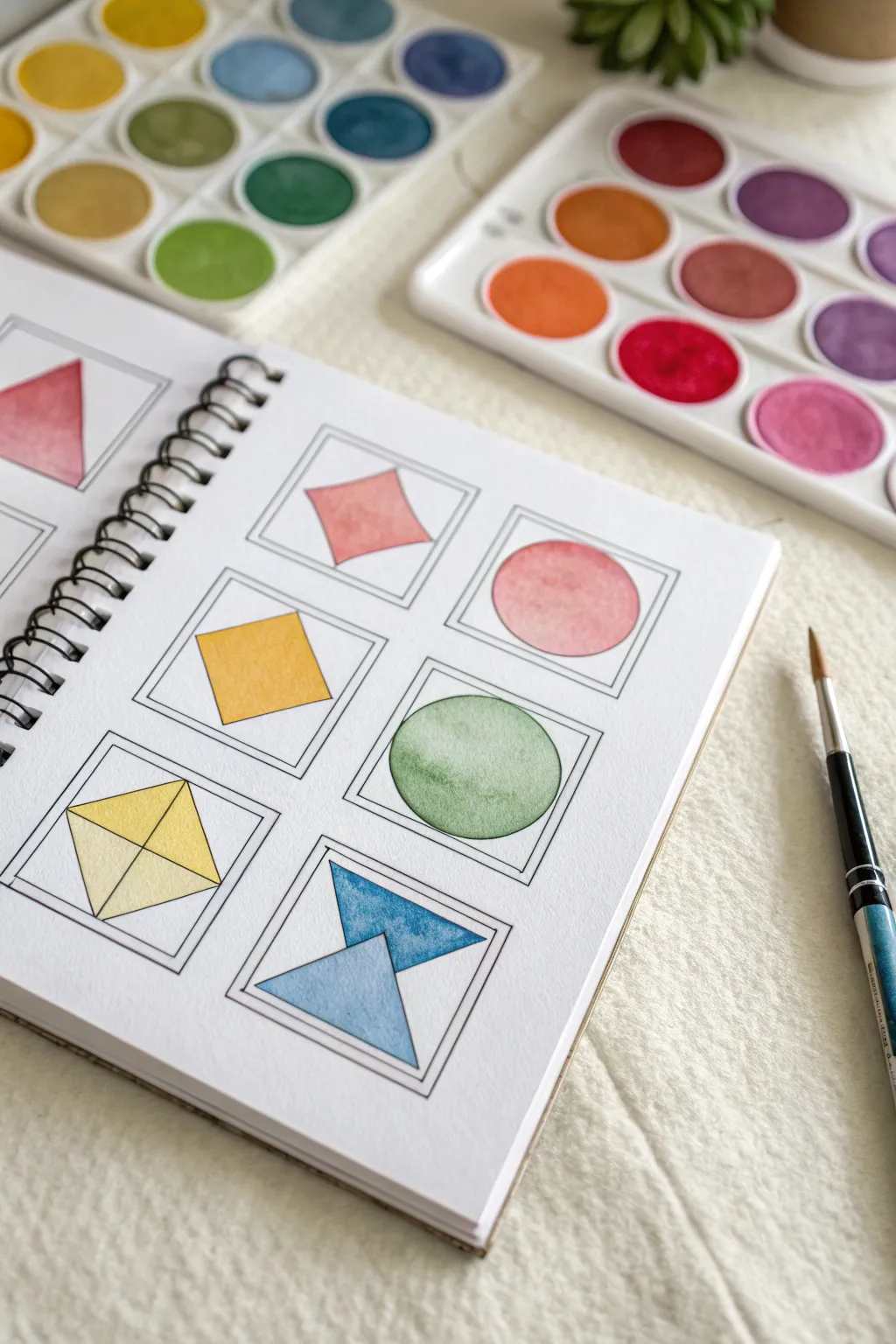
This clean and satisfying project transforms basic geometry into a study of color and transparency. By confining your watercolor practice within crisp inked frames, you can focus entirely on perfecting your washes and gradients without worrying about complex subjects.
Step-by-Step Guide
Materials
- Spiral-bound mixed media or watercolor sketchbook
- Watercolor paint set (pan sets preferred)
- Fine liner pen (waterproof, black, size 0.3 or 0.5)
- Ruler
- Pencil and eraser
- Round watercolor brush (size 4 or 6)
- Jar of clean water
- Paper towel
Step 1: Drafting the Layout
-
Grid structure:
Begin by lightly planning a 2×3 grid of squares on your page using a pencil and ruler. Leave about half an inch of space between each square to ensure the layout feels breathable and organized. -
Drawing frames:
Inside each grid space, draw a square frame. I find a 2-inch by 2-inch square works perfectly for this scale. Use your ruler to create a double border effect by drawing a slightly smaller square inside the first one. -
Inking lines:
Once you are happy with the pencil layout, trace over the double square frames with your waterproof fine liner pen. Keep a steady hand and rely on the ruler for crisp, straight edges. -
Adding shapes:
Sketch a different geometric shape inside the center of each frame. Aim for variety: try a diamond, a circle, a divided diamond (polyhedron style), and opposing triangles. -
Finalizing ink:
Ink the geometric shapes carefully. Be sure your pen is fully waterproof, as any smudging later will ruin the clean aesthetic. Erase all pencil marks once the ink is completely dry.
Clean Edges Tip
If you struggle with painting inside lines, lightly erase the graphite inside the shape before painting so the pencil gray doesn’t muddy your vibrant yellow or pink watercolors.
Step 2: Applying Color
-
Pre-wetting paint:
Add a drop of water to the pans in your watercolor palette to wake them up. For this project, you’ll want vibrant but transparent colors. -
Painting the square:
Start with a simple shape like the rotated square (diamond). Load your brush with a warm red or coral tone. Carefully paint the shape, using the tip of the brush to push pigment right up to the ink line without crossing it. -
Creating a pink circle:
Move to the next frame with a circle shape. Mix a watery pink wash. Apply it evenly, or try a ‘wet-on-dry’ technique where you lay down color and let it settle naturally for a textured look. -
Flat wash square:
For the solid yellow square, aim for a ‘flat wash.’ Load your brush with plenty of yellow pigment and water. Pull the bead of water across the shape from top to bottom for a smooth, streak-free finish. -
Texture variation:
Paint the circle in the next row with an earthy green. Here, you might want to lift a little pigment out with a thirsty brush while it’s still wet to create a subtle highlight. -
Two-tone shapes:
For the segmented diamond shape, choose two variations of yellow or ochre. Paint two sections first, let them dry completely, and then paint the adjacent sections to prevent the colors from bleeding into each other. -
Blue triangles:
Finally, tackle the opposing triangles (hourglass shape). Use two different shades of blue to create visual interest. Paint the top triangle a deeper teal and the bottom a softer cerulean. -
Drying time:
Allow the entire page to air dry. If the paper buckles slightly, you can place a heavy book on it after it is 100% dry to flatten it out.
Creative Twist
Instead of solid fills, try filling the shapes with mini patterns like polka dots or stripes using the same color palette for a more graphic design look.
Now you have a beautifully organized reference page for your favorite color mixes
Simple Watercolor Pattern Tiles
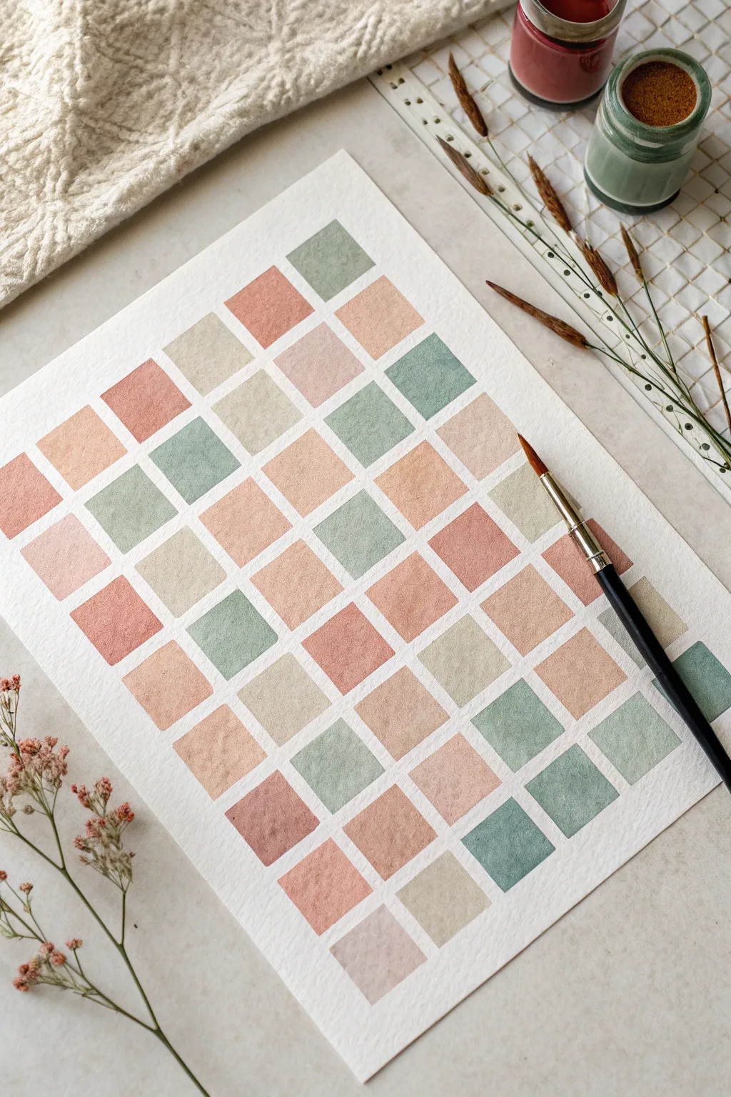
Create a soothing visual rhythm with this geometric watercolor study, featuring a grid of squares in a cohesive, earthy palette. This project focuses on color mixing and brush control to achieve crisp edges without the need for rigid masking tape.
Detailed Instructions
Materials
- Cold-pressed watercolor paper (140 lb/300 gsm)
- Watercolor paints (Terracotta, Sage Green, Beige, Blush/Peach, Warm Brown)
- Flat shader brush (size 6 or 8) or a round brush with a fine point
- Pencil (H or HB)
- Ruler
- Jar of clean water
- Paper towel or rag
- Palette for mixing
Step 1: Grid Preparation
-
Plan your layout:
Begin by deciding on the size of your squares. For a standard A4 or 9×12 inch sheet, 1-inch squares with a small gap (about 1/8th inch) between them work beautifully. -
Mark the paper:
Using your ruler and a hard pencil (like an H grade), verify your spacing. Create faint tick marks along the top and side edges of your paper to guide your lines. -
Draw the grid:
Lightly sketch the entire grid using your ruler. Ensure your pencil pressure is extremely light so the graphite doesn’t smudge into the wet paint later or show through the lighter colors. -
Erase excess:
If your lines extended past the main grid area, gently erase them now. You want the grid to float in the center of the page with a clean white border.
Straight Edge Secret
Use a flat shader brush instead of a round one. The square tip naturally creates straight lines and crisp corners with just one stroke.
Step 2: Color Assessment & Mixing
-
Mix the sage green:
Combine a standard sap green with a touch of burnt sienna and a lot of water to desaturate it. Test it on a scrap piece of paper to ensure it feels earthy, not electric. -
Create the terracotta:
Mix burnt sienna with a hint of red or orange. Add enough water to keep it semi-transparent; you want it to look like clay, not dark mud. -
Formulate the beige:
Dilute yellow ochre heavily with water and add the tiniest speck of violet or brown to neutralize the yellow brilliance. -
Prepare the blush pink:
Mix a red or alizarin crimson with plenty of water and a tiny drop of yellow ochre to warm it up. It should look like a soft sandstone color. -
Pre-mix puddles:
Ensure you have enough of each color mixed in your palette wells before you start painting to maintain consistency across the entire grid.
Uneven Drying?
If you get ‘backruns’ (cauliflower edges), you likely added water to a drying wash. Don’t touch a square once it starts losing its shine.
Step 3: Painting the Tiles
-
Start the first row:
Dip your brush into the sage green. Carefully paint the top right square. Use the flat edge of your brush (if using a shader) to create sharp, straight lines along your pencil marks. -
Alternate colors:
Move to a non-adjacent square for your next color, perhaps the terracotta. This ‘checkerboard’ approach prevents wet squares from touching and bleeding into each other. -
Control the water load:
Aim for a flat wash. If a puddle forms in the center of a square, dry your brush on a paper towel and touch the tip to the puddle to lift the excess liquid. -
Work diagonally:
I find it helpful to work diagonally across the page. Paint a few random squares with your beige mixture, ensuring you are distributing the colors evenly across the composition. -
Fill the gaps:
Once the first set of squares is touch-dry, go back in with your blush pink and finish the remaining empty grid spaces. -
Refine the edges:
As you paint, focus intently on the corners. A crisp 90-degree corner makes the pattern look professional. Use the very tip of your brush to pull paint into the corner point. -
Create texture (optional):
On a few squares, while they are still slightly damp, you can drop in a tiny bit more pigment or clear water to create subtle ‘blooms’ for texture variation. -
Final drying:
Let the entire piece dry completely flat. If the paper buckles slightly, you can flatten it under heavy books once it is 100% bone dry. -
Erase guidelines:
Once absolutely dry, take a clean kneaded eraser and very gently lift any visible pencil lines from the white gaps between the squares.
Enjoy the meditative repetition of filling in your colorful mosaic grid
Masking Tape Border Abstract Wash
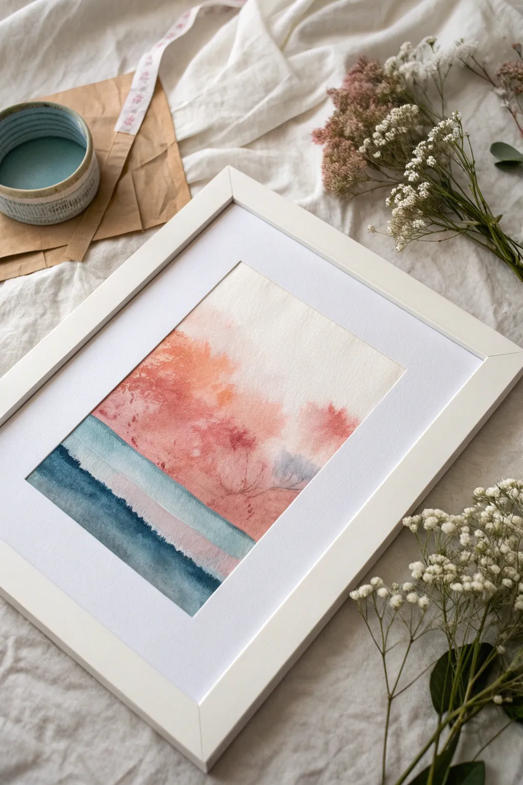
This evocative abstract landscape uses layers of color to suggest a serene meeting of sea and sky. By balancing precise washes with organic blooms, you will create a dreamy, misty horizon line that feels both structured and wildly free.
Step-by-Step
Materials
- Cold press watercolor paper (300 gsm)
- Painter’s tape or masking tape
- Watercolor paints: Indigo, Prussian Blue, Burnt Sienna, Alizarin Crimson, Light Red
- Soft round brushes (sizes 8 and 12)
- Flat brush (1 inch)
- Two cups of water
- Paper towels
- White or light wood frame (optional)
Step 1: Preparation and Base Structure
-
Tape the boundaries:
Begin by taping down all four edges of your watercolor paper to a board or table. Press the tape down firmly to ensure crisp, clean white edges later. -
Define the horizon:
Lightly sketch a horizontal line about one-third of the way up from the bottom of the paper. This will separate your abstract water from the sky. -
Wet the sky area:
Using your large clean brush, apply a coat of clear water to the entire area above your pencil line. You want the paper glistening but not swimming in puddles.
Blooms & Backruns
Cauliflower edges in the sky? Don’t panic. These textures often add to the organic, rusty landscape look. If they are too harsh, soften with a damp scrubber brush.
Step 2: Creating the Ethereal Sky
-
Mix the warm tones:
On your palette, prepare a watery mix of Light Red and a touch of Alizarin Crimson. You want a soft, coral-like salmon color. -
First bloom of color:
While the paper is still wet, drop the coral mixture into the upper left and center areas. Let the paint spread naturally across the wet surface. -
Add depth and texture:
Introduce a slightly thicker mix of Burnt Sienna or darker red into the wet wash. I like to dab this irregularly to simulate distant trees or clouds. -
Soften the edges:
Use a damp, clean brush to gently pull the color towards the right side of the paper, letting it fade into white space for an airy feel. -
Create the misty transition:
Right near the horizon line, drop in a very faint, watery grey-blue. Let this bleeding mingle slightly with the red above it to create a soft atmospheric perspective. -
Dry completely:
Allow the top section to dry fully. The paper must be bone-dry before you start the hard edges of the water section.
Step 3: Layering the Water
-
Paint the first water band:
Mix a diluted wash of Prussian Blue. Paint a horizontal stripe just below your dried sky section, leaving a tiny sliver of dry paper between them if you want a highlight. -
Let the first band dry:
Wait for this pale blue strip to dry. This patience is key to getting the layered ‘stripe’ effect seen in the reference. -
Apply the second band:
Mix a slightly darker, mid-tone blue. Paint the next horizontal section below the first one. You can let this wet edge touch the previous dry stripe for a hard line. -
The deepest depths:
For the bottom-most section, use concentrated Indigo paint. Apply this darkest value at the very bottom edge of the paper. -
Blend the water layers:
While the bottom Indigo layer is still wet, use a clean damp brush to slightly soften its top edge into the mid-tone blue above it, creating a subtle gradient.
Keeping It Crisp
To prevent paint bleeding under the tape, run a bone folder or the back of your fingernail firmly along the tape’s inner edge before you start painting.
Step 4: Final Details
-
Add subtle definition:
Once the sky is dry, use a small round brush with a faint reddish-brown mix to paint very delicate, branch-like veins in the darkest red areas. -
Assessment:
Step back and look at the balance. If the white space on the right feels too empty, add a very pale wash of dirty water to tint it slightly off-white. -
The reveal:
Wait until the painting feels cool to the touch (completely dry). Carefully peel the tape away at a 45-degree angle to reveal your crisp borders. -
Framing:
Place your artwork inside a mat and frame to see how the white border enhances the delicate colors of your abstract landscape.
Framing this piece with a wide white mat will emphasize the delicate textures of your new abstract landscape
Negative Painting Around Leaves
Capture the delicate beauty of nature with this layered watercolor study that combines positive leaf shapes with mysterious negative space depths. The interplay of cool teals and warm earthy tones creates a soothing, atmospheric botanical piece perfect for any wall.
Step-by-Step Guide
Materials
- Cold press watercolor paper (140lb/300gsm), taped down
- Watercolor paints: Indigo, Prussian Blue, Teal, Burnt Sienna, and Turquoise
- Round brushes: Size 2 (for details) and Size 6 or 8 (for washes)
- Pencil (HB or 2H)
- Kneaded eraser
- Two jars of water
- Paper towels
- Masking fluid (optional but helpful)
Step 1: Sketching and First Wash
-
Draft the composition:
Lightly sketch three main branches of leaves using your pencil. Create a sense of movement by curving the stems gently. Ensure the leaves overlap slightly in a few areas to create depth later. -
Lighten the lines:
Roll your kneaded eraser gently over the sketch. You want the graphite to be faint enough that it won’t show through the transparent watercolor layers, but visible enough to guide your brush. -
Prepare the first wash colors:
Mix a very watery, pale wash of Teal and a separate puddle of very diluted Burnt Sienna on your palette. -
Apply the background wash:
Wet the entire paper surface with clean water (wet-on-wet technique). Drop in the pale Teal at the top and let it gradient down. Near the bottom right, gently drop in the Burnt Sienna so it blends softly into the blue without creating harsh edges. -
Let it dry completely:
Allow the paper to dry fully until it is room temperature to the touch. This initial layer establishes the lightest tones of your painting.
Master the Wetness
For the smoothest background washes without ‘cauliflowers’ or back-runs, tilt your board slightly. Let gravity pull the bead of water down the page as you work from top to bottom.
Step 2: Defining the Leaves
-
Paint the background leaves:
Using a slightly more concentrated mix of Teal and grey (mix a little orange into your blue), paint the shapes of the ‘ghost’ leaves that sit in the background. Keep these edges soft or crisp depending on your preference, but ensure the value is light. -
Mix the main leaf colors:
Prepare a rich Indigo mixed with Prussian Blue for the darkest leaves, and a medium-strength Teal for the mid-tone leaves. For the bottom branch, mix Burnt Sienna with a touch of red. -
Paint the warm lower leaves:
Start with the bottom branch using your Burnt Sienna mix. Paint these leaves carefully, letting the color fade slightly near the stem to suggest light hitting them. -
Start the main blue branch:
Using your Size 6 brush, paint the large central branch with the medium Teal mix. While the paint is still wet, drop a tiny bit of darker blue into the base of each leaf to create volume. -
Add the darkest foliage:
Switch to your Indigo/Prussian Blue mix. Paint the uppermost or most prominent branch. These leaves should be the darkest elements on the page, creating a high contrast against the pale wash. -
Create distinct veins:
While the dark leaves are damp (not soaking wet), lift out a center line using a clean, damp brush (thirsty brush technique) to create a soft, light vein down the middle.
Add Magical Texture
While the background wash is still damp, sprinkle a pinch of table salt onto the wet paint. Let it dry completely before brushing it off to create beautiful, starry crystal textures.
Step 3: Negative Painting and Details
-
Negative shape definition:
Mix a cool, watery blue-grey. Carefully paint *around* some of the lighter leaf shapes essentially painting the negative space between branches to push the background further back. -
Refine the stems:
Using the Size 2 brush, carefully connect all leaves to their main stems. Ensure the stems taper naturally—thicker at the bottom and hair-thin at the tips. -
Glazing for depth:
Once the main leaves are dry, glaze a very transarent layer of blue over the bottom of a few overlapping leaves. This casts a shadow and visually separates the foreground from the background. -
Enhance the warm tones:
Return to the orange/brown leaves at the bottom. If they look too flat, add a second layer of Burnt Sienna to the tips or edges to give them a crisp finish. -
Final vein details:
For the crispest leaves, use your smallest brush with a concentrated dark blue to paint fine veins on top of the dried paint, rather than lifting them out. -
Clean up edges:
Creating this negative painting effect can leave jagged edges. Smooth out any awkward background shapes with a damp brush to ensure the flow feels organic. -
Assess and remove tape:
Step back to check the balance of dark and light. Once strictly dry, peel the tape away at a 45-degree angle to reveal the clean white border.
Frame your delicate botanical study and enjoy the peaceful atmosphere it brings to your space
Salt Texture Under a Sky Wash
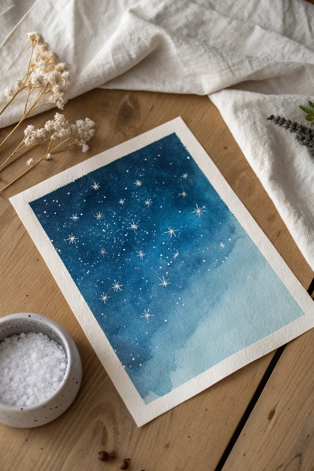
Capture the magic of a winter constellation with this simple yet stunning watercolor technique. By combining a smooth gradient wash with salt crystals, you’ll create a natural, frost-like texture that mimics the depth of a galaxy.
Detailed Instructions
Materials
- Cold press watercolor paper (A5 size recommended)
- Masking tape
- Watercolor paints (Indigo, Prussian Blue, Cerulean Blue)
- Flat wash brush (1/2 inch or larger)
- Round brush (size 4 or 6)
- Table salt or sea salt
- White gel pen (e.g., Sakura Gelly Roll) or white gouache
- Two jars of water
- Paper towels
Step 1: Preparation & First Wash
-
Tape edges:
Begin by taping down all four edges of your watercolor paper to a board or table. This creates a crisp white border and prevents the paper from buckling when wet. -
Mix colors:
Pre-mix three separate puddles of paint: a deep Indigo for the top, a mid-tone Prussian Blue for the center, and a watered-down Cerulean Blue for the bottom. -
Wet the paper:
Using your large flat brush, apply a layer of clean water over the entire paper surface. You want an even sheen, not puddles. -
Apply dark sky:
Load your brush with the dark Indigo mix. Paint horizontally across the top third of the paper, letting the color bleed downwards. -
Blend mid-tones:
Switch to Prussian Blue. Paint the middle section, slightly overlapping the Indigo so the two colors blend naturally on the wet paper. -
Finish gradient:
Rinse your brush and pick up the light Cerulean mix. Paint the bottom third, encouraging it to merge upwards into the Prussian Blue for a seamless fade.
Salty Science
Use coarse sea salt for large, dramatic blooms and fine table salt for subtle, sandy textures. Mixing both creates depth.
Step 2: Adding Texture & Details
-
Check dampness:
Wait for the shine on the paper to just start turning satin-matte. If it’s too wet, the salt will dissolve; too dry, and it won’t react. -
Sprinkle salt:
Take a pinch of salt and sprinkle it primarily over the darker, upper section of the sky. The salt absorbs pigment, creating star-like bursts as it dries. -
Patience is key:
Let the painting dry completely. This is the hardest part, but moving it too soon can ruin the salt effect. I usually leave it for at least an hour. -
Remove salt:
Once fully dry, gently brush the salt crystals off the paper using your hand or a dry, clean brush. -
Plan stars:
Look at the texture the salt left behind. Use these lighter patches as guides for where to place your biggest stars. -
Draw large stars:
Using a white gel pen, draw several eight-pointed stars scattered across the darker blue section. Keep the lines crisp and crossed. -
Add medium stars:
Fill in gaps with smaller four-pointed stars or simple crosses to create variety. -
Add distant stars:
Dot the pen lightly around the larger stars to create clusters of distant galaxies. Vary the pressure for different dot sizes. -
Create splatter:
If you want a denser star field, dip an old toothbrush or stiff brush into diluted white gouache and flick tiny specks over the top half. -
Dry details:
Allow the white ink or gouache to dry completely to avoid smudging. -
Reveal:
Carefully peel away the masking tape at a 45-degree angle to reveal your crisp white border.
Silhouette Style
Once dry, paint solid black pine tree silhouettes along the very bottom edge to ground your sky scene.
Enjoy the peaceful process of watching your own galaxy emerge from the wash
Limited Palette Monochrome Mood Study
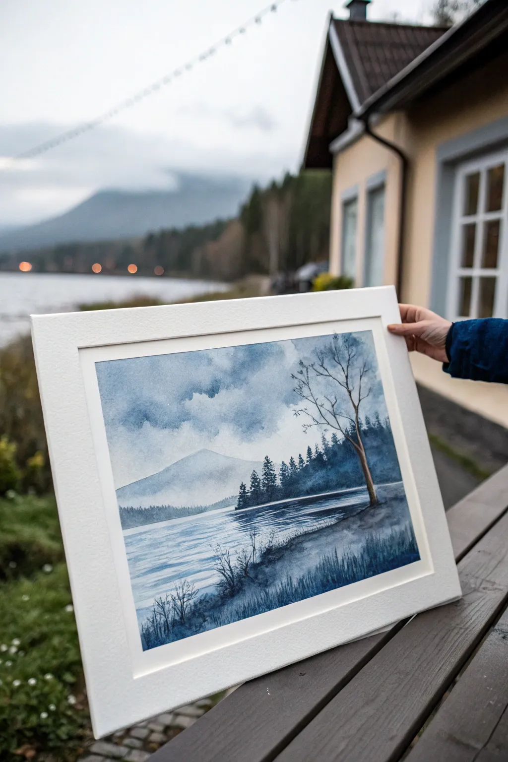
Master the art of atmospheric depth with this moody, single-color study that perfectly captures a Nordic lakeside scene. By using just one shade of indigo or Payne’s Gray, you’ll learn to control water-to-paint ratios to create everything from distant misty mountains to crisp foreground details.
Step-by-Step
Materials
- Cold Press Watercolor Paper (140lb/300gsm), approx 9×12 inches
- Watercolor Paint: Payne’s Gray or Indigo
- Large Flat Brush (3/4 inch)
- Medium Round Brush (Size 8 or 10)
- Small Detail Brush (Size 2 or Rigger brush)
- Two jars of water (clean and dirty)
- Paper towels
- Masking tape
- Pencil (HB) and kneaded eraser
Step 1: Planning and Sky
-
Tape and sketch:
Begin by taping down all four edges of your paper to a board to create a clean white border. Lightly sketch the horizon line about one-third up from the bottom, the outline of the distant mountain, and the main trunk of the foreground tree on the right. -
Wet the sky:
Using your large flat brush, wet the entire sky area with clean water, stopping at the mountain’s edge. The paper should be glistening but not forming puddles. -
Initial cloud layer:
Load your medium round brush with a very watery mix of indigo. Drop this pale wash into the wet sky, allowing it to bloom softly. Leave patches of white paper untouched to represent the brightest clouds. -
Deepening the storm:
While the paper is still damp, mix a slightly stronger concentration of paint. Dab this into the upper corners and areas where you want darker storm clouds, letting the wet-on-wet technique diffuse the edges naturally. -
Dry completely:
Let this layer dry fully. The paper must be bone-dry before proceeding to the mountains to avoid bleeding.
Pro Tip: The thirsty brush
To create the soft mist at the base of the mountains, use a clean, damp brush (a ‘thirsty’ brush) to lift color away from the bottom edge while the paint is still wet.
Step 2: Mountains and Middle Ground
-
Distant mountain wash:
Mix a very pale, watery wash. Paint the silhouette of the distinct mountain peak. As you move downward toward the horizon line, add more water to your brush to fade the color out, creating a misty effect at the base. -
Dry again:
For distinct layers, ensure the mountain shape is dry to the touch before starting the treeline. -
The treeline base:
Prepare a medium-strength mixture of paint. Using the belly of your round brush, paint a jagged horizontal shape across the horizon for the distant forest, varying the height to suggest treetops. -
Defining the pines:
Switch to your smaller brush. While the treeline shape is still wet, pull small vertical lines upward from the top edge to create the tips of individual pine trees. -
Adding depth:
Drop darker pigment into the bottom of this treeline strip while it’s still wet. This grounds the forest and adds volume.
Level Up: Salt texture
While the foreground bank is still wet, sprinkle a tiny pinch of table salt into the dark paint. Let it dry completely, then brush it off for a unique, gritty soil texture.
Step 3: Water and Foreground
-
Lake reflections:
Using the flat brush and a diluted wash, paint horizontal strokes across the water area. Leave thin slivers of white paper showing through to represent ripples catching the light. -
Darkening the shore:
While the water wash is damp, add a darker horizontal value right at the base of the treeline to show the reflection of the dark forest in the water. -
Foreground bank:
Once the water is dry, mix a strong, dark consistency of paint (cream-like). Paint the immediate foreground bank on the bottom right, using rough, textured strokes to suggest earth and grass. -
The main tree:
Using your medium brush and strong pigment, paint the trunk of the large tree on the right. Start from the base and lift pressure as you move up to taper the trunk. -
Branches:
Switch to your rigger or detail brush. Pull thin, spindly branches outward from the main trunk. I like to hold the brush loosely at the end of the handle to make the lines feel more organic and less stiff. -
Foreground grasses:
Use the detail brush to flick quick, upward strokes in the bottom foreground area. Vary the pressure to create thick-to-thin blades of tall grass. -
Wait and peel:
Allow the entire painting to dry completely—if the paper is cold to the touch, it’s still wet. Carefully peel off the masking tape at a 45-degree angle to reveal your crisp white border.
Frame your finished piece in a simple white mat to emphasize the dramatic contrast of your monochrome study


Have a question or want to share your own experience? I'd love to hear from you in the comments below!