When I’m craving something cute but don’t want a big, complicated project, I reach for small canvases and simple shapes. Here are my favorite easy painting ideas that come together fast and still look sweet enough to display (or gift).
Pastel Hearts on a Mini Canvas
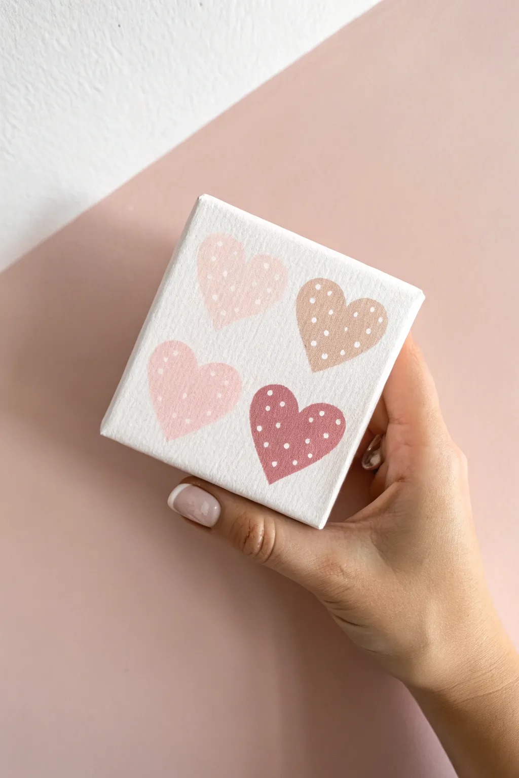
These sweet, pastel hearts painted on a tiny canvas make for adorable desk decor or a thoughtful little gift. The soft color palette and simple polka dot pattern create a charming, minimalist aesthetic that is incredibly easy to achieve.
Step-by-Step
Materials
- Mini square canvas (approx. 4×4 or 3×3 inches)
- Acrylic paints: white, pastel pink, dusty rose, light beige/tan, dark mauve
- Small flat synthetic paintbrush
- Fine detail paintbrush or dotting tool
- Pencil
- Paper plate or palette
- Cup of water and paper towel
Step 1: Preparation & Sketching
-
Prepare the canvas:
Start with a clean, dry mini canvas. If the surface texture is very rough, you can apply a thin coat of white gesso or white acrylic paint to smooth it out slightly, though the raw canvas texture adds nice character here. -
Establish placement:
Visualize a grid of four equal quadrants on your small canvas. You want one heart centered in each of these imaginary squares. -
Sketch the hearts:
Using a pencil very lightly, draw four hearts. They don’t need to be perfectly identical; a little hand-drawn variation adds charm. Aim for a slightly rounded, chubby heart shape rather than a sharp, elongated one. -
Refine the outlines:
Step back and check your spacing. Ensure there is a comfortable amount of white space between the hearts so they aren’t touching. -
Lighten the lines:
If your pencil lines look dark, use a kneaded eraser to gently lift the graphite until the guide is barely visible. This prevents the grey from dirtying your pastel paint.
Pro Tip: Toothpick Trick
If you don’t have a fine detail brush, a simple wooden toothpick makes excellent micro-dots. Dip just the very tip for consistent, tiny speckles.
Step 2: Painting the Base Colors
-
Mix your palette:
Squeeze out your four colors onto the palette. You need a light pastel pink, a warmer beige-pink, a classic tan/brown, and a deeper mauve-brown. I like to add a touch of white to each color to ensure they have an opaque, creamy finish. -
Paint the first heart:
Load your small flat brush with the lightest pink shade. Carefully fill in the top-left heart, using smooth strokes to cover the canvas texture. -
Paint the second heart:
Wash your brush thoroughly. Move to the bottom-left heart using a slightly darker, warm pink tone. Outline the shape first with the edge of the brush, then fill the center. -
Paint the third heart:
For the top-right heart, use the beige or light tan color. This neutral tone balances the pinks beautifully. -
Paint the fourth heart:
Finish the bottom-right heart with your darkest color, the deep mauve or reddish-brown shade. -
Check opacity:
Inspect your work once the first coat is touch-dry. If you can see the canvas weave too clearly through the paint, apply a second thin coat to make the colors solid and flat. -
Let it dry completely:
It is crucial that the base hearts are 100% dry before moving to the next step, or your dots will smear into the background color.
Level Up: Glossy Finish
Once the matte painting is fully cured, apply a coat of glossy varnish or Mod Podge just over the hearts (not the background) to make them look like stickers.
Step 3: Adding the Details
-
Prepare the white paint:
Use fluid white acrylic paint for the dots. If your heavy body paint is too thick, mix in a tiny drop of water so it flows easily off your tool. -
Choose your dotting tool:
You can use the very tip of a fine detail brush, a specialized dotting tool, or even the non-brush end of a paintbrush handle to stamp the dots. -
Test your dots:
Practice making a few dots on a scrap piece of paper to get the size right. You want small, delicate pin-pricks of white, not large blobs. -
Dot the first heart:
Start with the top-left heart. Gently tap small white dots in a random, scattered pattern. Keep the spacing fairly open so the pink still dominates. -
Continue the pattern:
Move clockwise to the beige heart, applying the same scattered dot technique. Try not to create rigid rows; a confetti-style arrangement looks more organic. -
Finish the remaining hearts:
Complete the pattern on the bottom two hearts. Vary the position of the dots near the edges—some can be fully inside, while others can touch the very edge of the heart shape. -
Clean up edges:
If any paint went outside the lines, use a clean brush with a tiny bit of white paint to tidy up the white canvas background once everything is dry. -
Final dry time:
Allow the entire piece to dry undisturbed for at least an hour to ensure the raised texture of the dots hardens completely.
Now you have a charming piece of miniature art ready to brighten up any small corner of your room


Simple Rainbow With Confetti Dots
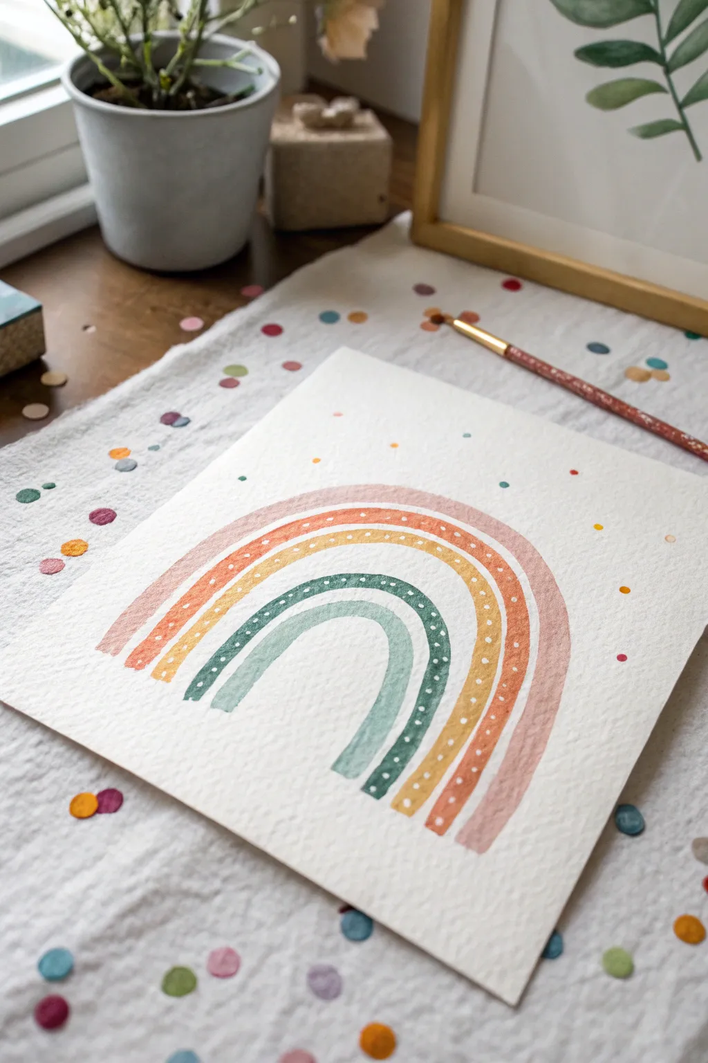
This charming watercolor project captures a whimsical, festive mood with muted, earthy tones and playful confetti details. It’s a perfect beginner-friendly piece that uses simple strokes to create a stylized rainbow that looks lovely on a nursery wall or greeting card.
Step-by-Step Guide
Materials
- Cold press watercolor paper (textured)
- Watercolor paints (dusty rose, muted orange, mustard yellow, forest green, sage green)
- Round paintbrush (size 6 or 8)
- Small detail brush (size 0 or 2)
- White gouache or white gel pen
- Pencil and eraser
- Jar of clean water
- Paper towel
Step 1: Planning and Sketching
-
Mark your spacing:
Start by finding the center of your paper. Using a light pencil touch, mark where you want the bottom left and right corners of your complete rainbow to sit. -
Sketch the arches:
Lightly sketch five concentric arches. Don’t worry about them being geometrically perfect circles; a slightly hand-drawn, taller shape adds to the cute, organic look seen in the photo. -
Lighten lines:
Before you pick up your brush, take a kneaded eraser and gently blot your sketch until the lines are barely visible. Watercolor is transparent, so dark graphite lines will show through otherwise.
Bleeding Colors?
If your rainbow arches run into each other, your paint is too wet or touches the neighbor. Let each arch dry for 2 minutes before painting the next one.
Step 2: Painting the Rainbow
-
Mix the first color:
Create a watery wash of dusty rose or muted pink on your palette. You want the paint to flow easily but still hold its color. -
Paint the outer arch:
Using your medium round brush, paint the largest, outermost arch in a single continuous stroke if possible. If you need to stop, lift your brush at the peak of the curve to hide the join. -
Apply the second color:
Mix a muted orange or terracotta shade. Paint the second arch directly under the first. Leave a tiny hairline gap of white paper between the arches to prevent the wet colors from bleeding into each other. -
Add the yellow layer:
Mix a mustard yellow tone. Carefully paint the third arch, maintaining that consistent width and the small white gap between this and the orange layer context. -
Paint the green arches:
For the fourth arch, mix a deep forest green. Follow this with a lighter, sage green for the smallest, innermost arch. Keep your hand steady and let the brush bristles flatten slightly against the paper to fill the width. -
Let it dry completely:
This is crucial—wait for the rainbow to be bone dry before moving to the next step. If the paint is even slightly damp, your crisp white details will feather and blur.
Step 3: Details & Confetti
-
Mix white gouache:
Squeeze a tiny dot of white gouache onto your palette and add just a drop of water to make it creamy like heavy cream. I find this opacity works much better than watercolor for overlaying details. -
Add rainbow dots:
Using your smallest detail brush or a white gel pen, add rows of tiny white dots on the green and yellow arches. Vary the patterns slightly between arches for interest. -
Stamp main confetti:
Go back to your leftover colored paints. Load your round brush with color (a bit less watery this time) and simply press the tip down randomly around the rainbow to create round ‘confetti’ shapes. -
Add mini dots:
Rinse your brush and switch colors frequently. Add smaller dots by just touching the very tip of the brush to the paper in empty spaces. -
Vary dot sizes:
Ensure you have a mix of larger ‘blobs’ and tiny speckles. Use the same five colors from your rainbow to keep the color palette cohesive. -
Overlap carefully:
Feel free to let one or two confetti dots overlap the edge of the rainbow slightly, but ensure the underlying paint is dry first to keep edges crisp.
Make It Sparkle
For a magical finish, replace the white gouache dots with metallic gold watercolor or a gold paint pen. It catches the light beautifuly!
Step back and admire your cheerful, handmade creation, ready to frame or gift


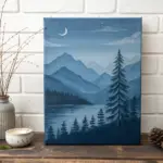
Crescent Moon in a Dreamy Gradient
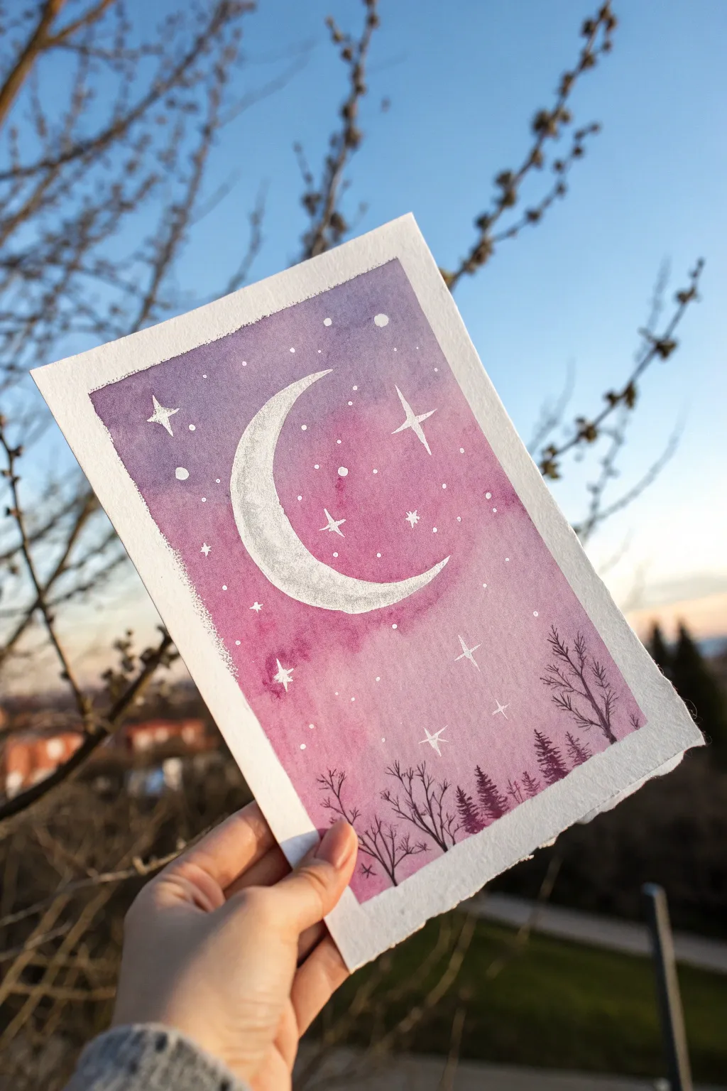
Capture the magic of twilight with this serene watercolor piece featuring a glowing crescent moon and silhouetted forest. The soft gradient of purples and pinks creates a dreamy backdrop perfect for beginners.
Step-by-Step
Materials
- Cold press watercolor paper (approx. 5×7 inches)
- Masking tape or painter’s tape
- Waterfall paints (Indigo, Purple, Magenta/Rose)
- White gouache or white gel pen
- Silver metallic watercolor (optional)
- Round brushes (flats for washes, small rounds for details)
- Clean water and paper towels
- Pencil and eraser
Step 1: Preparation and Sketching
-
Tape the edges:
Secure your watercolor paper to a board or table using masking tape. This creates that crisp, clean border you see in the final piece and prevents the paper from buckling when wet. -
Sketch the moon:
Lightly draw a large crescent moon shape in the center of your paper. Keep the lines very faint so they don’t show through the paint later. -
Mask the moon (optional):
If you struggle with painting around shapes, apply a thin layer of masking fluid to the moon area. Otherwise, you’ll just need to paint carefully around your pencil lines.
Blooms in the sky?
If you see cauliflower-like blooms in your gradient, you likely added water to paint that was already drying. Next time, work faster while the paper is evenly wet
Step 2: Painting the Sky Gradient
-
Pre-wet the paper:
Using a clean brush, apply a light wash of clear water to the sky area, carefully avoiding the moon shape. The paper should be damp and glistening, not soaking wet. -
Drop in dark purple:
While the paper is wet, load your brush with a deep purple or indigo mix. Apply this color to the top corners and edges of the paper, letting it flow naturally. -
Blend in magenta:
Rinse your brush slightly and pick up a bright magenta or rose color. Apply this to the middle section of the sky, blending it upwards into the dark purple while the paint is still wet. -
Fade to light pink:
Near the bottom horizon and around the moon, dilute your magenta with more water to create a very pale, soft pink. This creates a glowing effect. -
Let it dry completely:
Allow the sky wash to dry fully. If the paper feels cool to the touch, it’s still damp. Be patient to avoid back-runs or muddy colors.
Step 3: Adding Celestial Details
-
Paint the moon:
Remove masking fluid if you used it. Fill in the crescent moon with white gouache. For a textured crater look like the example, I like to dab a little gray or silver watercolor onto the wet white paint. -
Create star clusters:
Dip a toothbrush or stiff brush into white gouache (watered down slightly). Tap the brush over the painting to splatter tiny stars. Focus more splatters near the top darker areas. -
Draw larger stars:
Using a fine detail brush and white gouache (or a white gel pen), draw a few four-pointed stars by making cross shapes. Add tiny dots manually for variety.
Add Metallic Magic
Mix a tiny bit of iridescent medium or silver watercolor into get white paint for the moon. When the light hits it, the crescent will have a magical, subtle shimmer
Step 4: Forest Silhouette
-
Mix shadow color:
Mix a very dark concentrated purple or black color. It needs to be opaque enough to stand out against the background gradient. -
Paint pine trees:
On the right side of the horizon, use a small brush to paint vertical lines. Add jagged, downward-sloping branches to create tiny pine tree silhouettes. -
Paint bare branches:
On the left side and foreground, use a liner brush or very tip of a round brush to paint thin, spindly bare trees. flick the brush upwards to keep branches looking organic. -
Reveal the border:
Once everything is bone dry, slowly peel away the masking tape at a 45-degree angle to reveal your clean white edges.
Now you have a tranquil night scene ready to frame or gift to a friend

Easy Cherry Blossom Branch
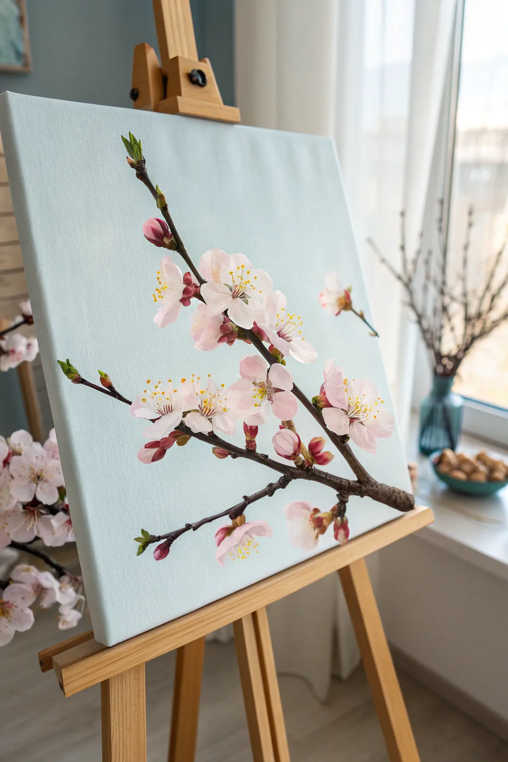
Capture the delicate beauty of spring with this stunningly realistic cherry blossom branch painting. Set against a serene pale blue background, this project uses simple acrylic techniques to create lifelike petals and textured bark.
Step-by-Step Tutorial
Materials
- Square canvas (stretched or panel)
- Acrylic paints: Titanium White, Burnt Umber, Raw Sienna, Alizarin Crimson, Sap Green, Phthalo Blue
- Flat brush (1 inch)
- Round pointed brushes (sizes 2 and 4)
- Fine liner brush (size 0 or 00)
- Palette
- Cup of water
- Paper towels
Step 1: Setting the Scene
-
Mix the background color:
Start by mixing a very large amount of Titanium White with a tiny touch of Phthalo Blue and the smallest speck of Sap Green. You want a very pale, airy sky blue tone. -
Paint the canvas:
Using your large flat brush, cover the entire canvas with your pale blue mix. Use smooth, horizontal strokes to ensure an even finish. Paint the sides of the canvas too for a professional look. -
Let it dry completely:
Allow the background to dry fully before moving on. While waiting, organize your palette for the branch colors.
Step 2: Structuring the Branch
-
Sketch the main branch:
Load a size 4 round brush with Burnt Umber mixed with a little water to make it flow ink-like. Paint a main diagonal line starting from the bottom right corner, moving upward toward the top left. -
Add character to the wood:
Don’t make the line perfectly straight. Press down and lift up on the brush to create varying thicknesses and ‘knots’ in the wood. -
Branch off:
Add smaller offshoot branches extending upwards and to the left. Keep these thinner and slightly jagged to look natural. -
Create texture:
Mix a little Titanium White into your Burnt Umber to make a lighter brown. dab this highlight color onto the top edges of the branch segments to simulate sunlight hitting the bark. -
Deepen the shadows:
Add a touch of black or dark blue to your Burnt Umber. With the liner brush, paint thin, dark lines underneath the branch segments and around the ‘knots’ for 3D volume.
Natural Petal Tip
Don’t make petals perfect ovals. Wiggle your brush slightly when painting the edges to give them that delicate, crinkled look of real cherry blossoms.
Step 3: Painting the Blooms
-
Mix your petal pinks:
Create three shades of pink on your palette: a medium pink (White + Alizarin Crimson), a very pale pink (mostly White + tiny Crimson), and pure White. -
Block in key flowers:
Using a size 4 round brush, paint the basic shape of 5-petal flowers. Place a large cluster near the center right and another near the top left branch. Don’t worry about detailing yet, just fill the shapes with the medium pink. -
Brighten the petals:
While the base pink is still tacky, layer the very pale pink on the outer edges of the petals, blending inward. This creates a soft gradient. -
Add highlights:
Dip the tip of your brush in pure White and dab the tips of the petals. This makes them look like they are catching the light. -
Paint the buds:
For unopened buds, paint small teardrop shapes using a darker pink mix (add a little more Alizarin Crimson). Place these at the ends of the smaller twigs. -
Detail the flower centers:
Mix Alizarin Crimson with a tiny bit of Burnt Umber for a deep red. Paint a small starburst shape in the very center of each open flower.
Level Up: 3D Texture
Mix a bit of modeling paste or thick gloss medium into your petal paint. This will physically raise the flowers off the canvas for a tactile effect.
Step 4: Fine Details
-
Add stamens:
Switch to your finest liner brush. Using Raw Sienna or a bright yellow, paint tiny dots hovering above the deep red centers of the flowers. -
Connect the stamens:
With extremely thin lines using white or pale yellow, connect those yellow dots back to the center of the flower. -
Add baby leaves:
Mix Sap Green with a little Raw Sienna. Paint tiny, pointed leaves emerging from the buds and along the thinner stems. Keep them sparse; the flowers are the star. -
Refine the composition:
Step back and look at your painting. If a space feels empty, add a floating petal or two to suggest a gentle breeze.
Hang your masterpiece in a spot that needs a permanent touch of spring cheer
BRUSH GUIDE
The Right Brush for Every Stroke
From clean lines to bold texture — master brush choice, stroke control, and essential techniques.
Explore the Full Guide
Dotted Wildflower Hills
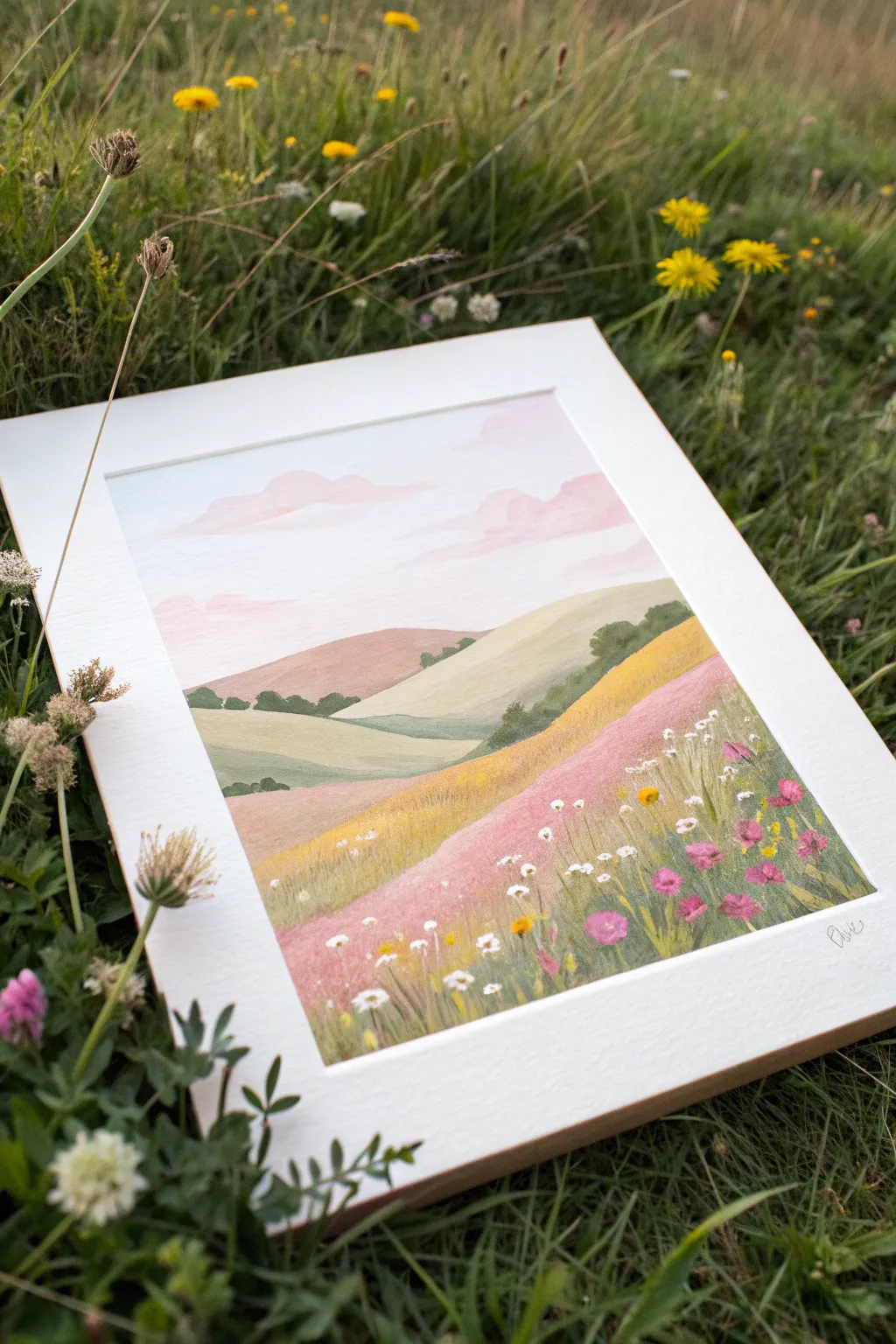
Capture the serenity of a sunset meadow with this dreamy landscape painting that features rolling hills in soft, muted tones. By layering opaque colors and adding tiny dotted details, you will create a field of wildflowers that feels both whimsical and textured.
Step-by-Step Guide
Materials
- Heavyweight watercolor or mixed media paper
- Gouache paints (Pink, White, Yellow Ochre, Olive Green, Phthalo Blue, Burnt Sienna)
- Wide flat brush (3/4 inch)
- Medium round brush (size 6)
- Small detail brush (size 0 or 00)
- Washi tape or masking tape
- Mixing palette
- Jar of water
- Paper towels
Step 1: Setting the Scene
-
Tape the borders:
Begin by taping down all four edges of your paper to a hard surface. This creates that crisp, clean border you see in the finished piece and keeps the paper from buckling. -
Mix the sky gradient:
Mix a large amount of white with a tiny dot of blue. Paint the top half of your paper with this very pale blue. While the paint is still wet, mix a pale blush pink and blend it gently into the bottom of the blue area to suggest a sunset horizon. -
Paint fluffy clouds:
Using a medium round brush and a slightly darker pink mixture, dab in soft cloud shapes near the top. Keep the edges irregular and smooth them out slightly with a clean, damp brush for a dreamy effect.
Chalky Finish?
If your dark colors look chalky when dry, you likely added too much white paint to the mix. Try thinning the pigment with a tiny bit of water instead of lightening it with white.
Step 2: Laying the Grounds
-
Block in the distant hills:
Mix a muted mauve-brown color using pink, burnt sienna, and white. Paint a low, rolling hill shape directly below the sky line. Let this layer dry completely. -
Add the middle ground:
Create a sage green by mixing olive green with plenty of white. Paint a second hill overlapping the first one, sloping downwards from right to left. -
Create the golden slope:
Mix yellow ochre with a touch of burnt sienna and white. Paint a large slope coming from the right side, overlapping your sage green hill. -
Paint the foreground hill:
For the closest hill where the flowers will sit, mix a dusty rose color. Paint this shape in the bottom left, sweeping it upwards to meet the golden slope. Ensure these base layers are fully opaque and solid.
Step 3: Adding Depth and Texture
-
Shadow simple trees:
Using a darker shade of green, paint small, irregular clumps along the ridges of the distant hills. These suggest faraway tree lines or bushes. -
Texture the golden field:
Take a thicker mix of your yellow ochre paint and a dry brush. Lightly streak vertical lines up the golden slope to mimic tall dry grasses. -
Detail the pink foreground:
Switch to your dusty rose mix, but make it slightly darker. Add vertical grassy strokes to the bottom foreground area to prepare the surface for flowers.
Natural Clouds
Avoid perfect circles for clouds. Flatten the bottoms of the cloud shapes and let the tops be puffy and irregular for a more realistic sky perspective.
Step 4: The Wildflower Meadow
-
Stems and greenery:
Using your smallest detail brush and dark olive green, paint thin, varying height lines in the foreground. I like to make some crisscross slightly to look more natural. -
Dotted white flowers:
Load your small brush with thick titanium white. Dot small clusters of three or four dots at the tops of some stems to create baby’s breath or chamomile. -
Pink blooms:
Mix a vibrant magenta or deep pink. Paint small, irregular blob shapes on other stems to represent poppies or clover. -
Yellow accents:
Add tiny dots of bright yellow to the centers of your white flowers, and scatter a few solitary yellow dots around the pink flowers for variety. -
Final highlights:
Add a few very faint white strokes on the tops of the distant green hills to catch the light. -
The reveal:
Wait until the painting is bone dry. Slowly peel away the tape at a 45-degree angle to reveal your clean white border.
Frame your beautiful meadow landscape in a simple mat to let those soft colors really shine
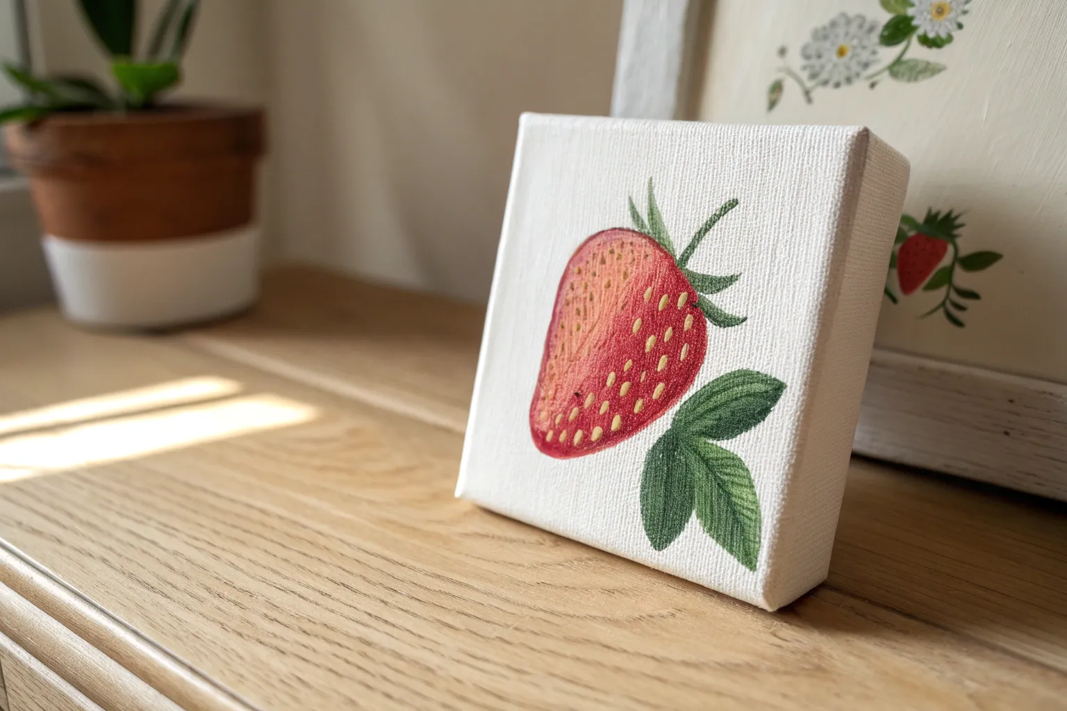
One-Icon Strawberry Study
Capture the sweetness of summer with this bold, singular strawberry study that focuses on texture and vibrant color. This project uses a wet-on-dry technique to create crisp edges and distinct seed details, making it a perfect exercise for mastering control.
How-To Guide
Materials
- Cold press watercolor paper (300 gsm or heavier, preferably with deckled edges)
- Watercolor paints (Alizarin Crimson, Sap Green, Cadmium Yellow, Burnt Umber)
- Round watercolor brush (size 6 or 8)
- Small detail brush (size 0 or 2)
- Pencil (HB or H)
- Kneaded eraser
- White gouache or white gel pen
- Clean water jar
- Paper towel
Step 1: Sketching and Base Layers
-
Outline the shape:
Begin by lightly sketching a large, rounded heart shape for the body of the strawberry on your deckle-edged paper. Keep your lines very faint so they don’t show through the final paint. -
Add the crown:
Draw the leafy hull (calyx) at the top. Sketch five to seven jagged, pointy leaves radiating from a central stem, making sure they overlap the top of the berry slightly for dimensional realism. -
Mark the seeds:
Lightly map out the placement of the seeds. Instead of perfect dots, draw small teardrop shapes angled toward the bottom tip of the berry. -
First red wash:
Mix a vibrant red using Alizarin Crimson and a touch of water. Carefully paint around your pencil seed marks, filling the berry body with a solid, even wash. -
Deepen the shadows:
While the red layer is still slightly damp but not soaking wet, drop in a more concentrated crimson mix along the right edge and bottom tip to create a rounded 3D effect. -
Paint the leaves:
Mix Sap Green with a tiny bit of blue for a cooler tone. Paint the leafy crown, using the point of your brush to get sharp tips on each leaf. -
Add leaf variation:
While the green is wet, drop a darker green mixture near the center point where the leaves meet to suggest depth and shadow.
Seed Precision Tip
Don’t stress about painting perfectly around every seed seed sketch. You can paint the berry solid red first, let it dry, and then paint opaque yellow gouache seeds on top.
Step 2: Detaling and Texture
-
Dry completely:
I prefer to let this dry naturally for about 15 minutes to prevent colors from bleeding, but you can use a heat tool if you are impatient. -
Fill the seeds:
Using your smallest detail brush, mix Cadmium Yellow with a little white gouache to make it opaque. Carefully fill in the teardrop shapes you left unpainted earlier. -
Add seed depth:
Once the yellow seeds are dry, take a translucent wash of Burnt Umber or a dark red. Paint a tiny crescent shadow inside the top left of each seed indentation to make them look recessed. -
Highlight the berry:
Observe where the light hits the fruit. You can lift a little color with a damp clean brush on the upper left side, or add a very subtle glaze of lighter red. -
Texturize the leaves:
Use a dry brush technique or a very fine liner brush to add faint veins to the green leaves using a darker green mix. -
Enhance the perimeter:
Go back around the outer edge of the strawberry with your main red color to crisp up any fuzzy lines, ensuring the silhouette is sharp against the white paper. -
Final seed highlights:
For that extra pop, place a tiny dot of pure white gouache or use a gel pen on the bottom right of select seeds to simulate a wet, glossy reflection. -
Calibrate contrast:
Step back and look at your piece. If the red looks too flat, glaze a thin layer of violet-red over the shadowed side to deepen the contrast without losing transparency.
Try a Vintage Look
To age your illustration, mix a tiny drop of tea or coffee into your paper texture before painting, or splatter minute specks of brown paint at the end.
Display your fresh fruit study on a mini-easel or frame it to add a splash of color to your kitchen counter

PENCIL GUIDE
Understanding Pencil Grades from H to B
From first sketch to finished drawing — learn pencil grades, line control, and shading techniques.
Explore the Full Guide
Smiling Sun and Puffy Clouds
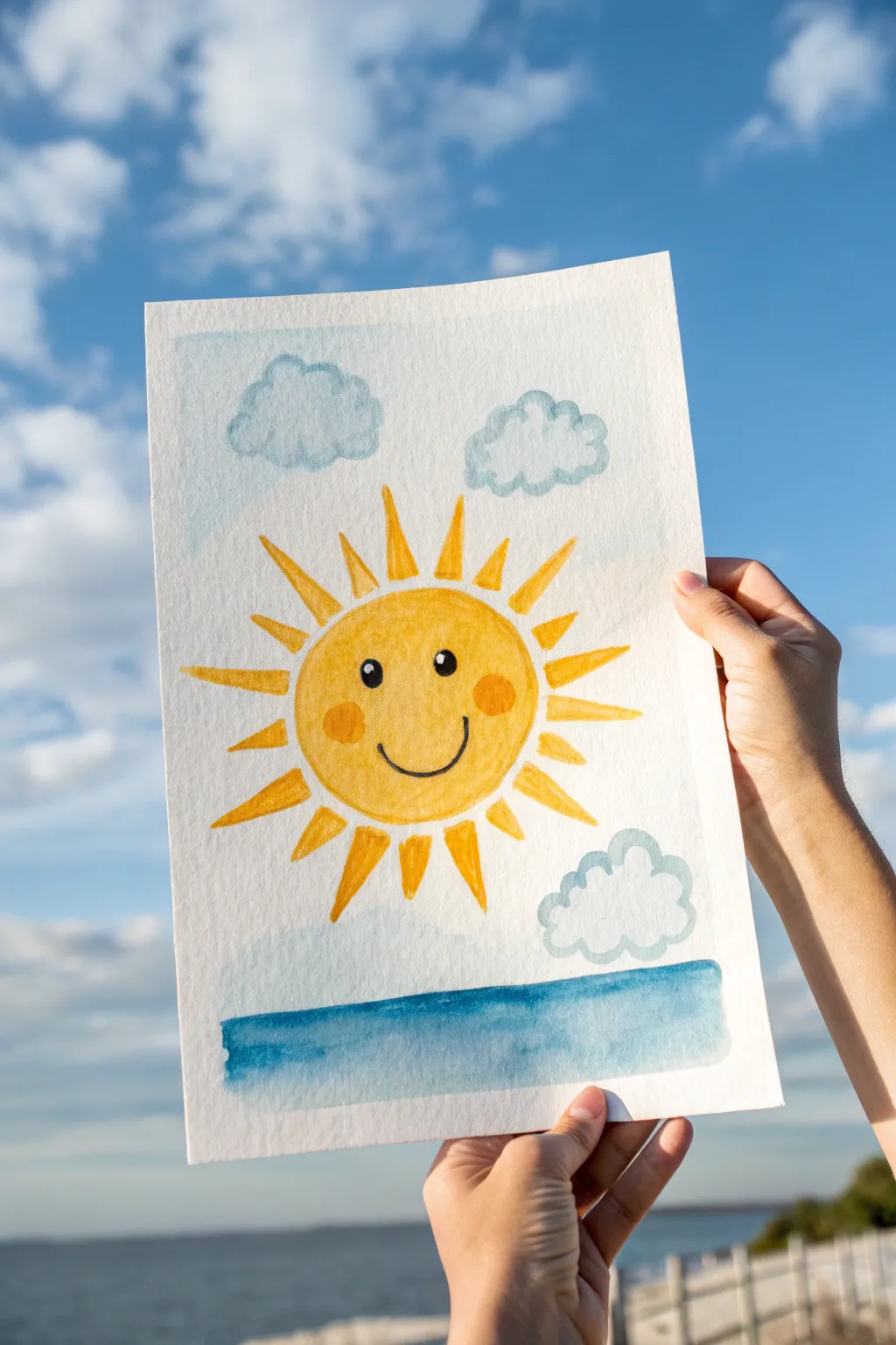
Capture the warmth of a perfect summer day with this cheerful watercolor painting featuring a bright, smiling sun and soft, puffy clouds. The simple shapes and happy expression make this a delightful project for beginners looking to practice basic washes and outlining.
Step-by-Step Tutorial
Materials
- Cold press watercolor paper (A4 or similar size)
- Watercolor paints (Yellow, Orange, Light Blue, Dark Blue, Black)
- Round watercolor brush (medium size, approx. size 6-8)
- Fine liner brush or black waterproof marker
- Jar of clean water
- Paper towels
- Pencil and eraser
Step 1: Sketching the Layout
-
Outline the sun:
Start by lightly sketching a large circle in the center of your watercolor paper using a pencil. This will be the face of your sun. -
Add the rays:
Draw triangular rays extending outward from the circle. Vary their lengths slightly, alternating between longer and shorter triangles to give it a dynamic, shining effect. -
Draft the clouds:
Sketch two fluffy clouds above the sun and one smaller cloud down in the lower right corner. Use bumpy, curved lines to keep them soft and cartoony. -
Mark the horizon:
Draw a straight horizontal line near the bottom of the page to separate the sky from the ocean water.
Step 2: Painting the Sun
-
First yellow wash:
Load your medium round brush with a bright, sunny yellow. Fill in the central circle of the sun. Keep the paint wet enough to flow but not puddling. -
Paint the rays:
Using the same yellow, carefully paint inside each triangular ray. I find it helpful to start at the tip of the ray and pull the brush back toward the sun’s center. -
Add contour definition:
While the yellow is still slightly damp (or just after it dries for a sharper look), outline the inner circle with a slightly darker orange paint to separate the face from the rays. -
Create rosy cheeks:
Mix a small amount of orange with your yellow to create a warm shade. Paint two small oval cheeks on the sides of the sun’s face.
Fixing Bleeds
If yellow paint bleeds into the blue sky, dab it quickly with a clean tissue. Let it dry fully, then gently re-paint the edge.
Step 3: Sky and Sea Details
-
Outline the clouds:
Dip your brush into a very diluted light blue paint. Carefully trace the bumpy outline of your pencil-sketched clouds. You can fill them in lightly if you want, or leave the centers white for maximum fluffiness. -
Paint the ocean base:
Switch to a deeper blue. Paint the area below your horizon line. You can use long horizontal strokes to mimic the calmness of the water. -
Add water texture:
While the blue strip is still wet, drop in a slightly pigment-richer blue along the very bottom or top edge to create a simple gradient effect. -
Let it dry completely:
Pause here and let all your paint layers dry fully. If the paper feels cool to the touch, it’s still wet.
Make It Sparkle
Add glitter glue to the sun rays after drying for a magical shimmering effect.
Step 4: The Final Face
-
Paint the eyes:
Using black paint and a fine tip brush (or a black marker), draw two small, filled-in ovals for the eyes. Leave tiny white dots inside each eye as ‘catchlights’ to make them look sparkling. -
Draw the smile:
Paint a simple, curved ‘U’ shape between the cheeks for a happy smile. Add small tick marks at the ends of the smile line for dimples. -
Clean up:
Once everything is bone dry, gently erase any visible pencil marks that weren’t covered by paint to clean up your masterpiece.
Now you have a piece of handmade sunshine to brighten up any room
Round Bear Face Portrait
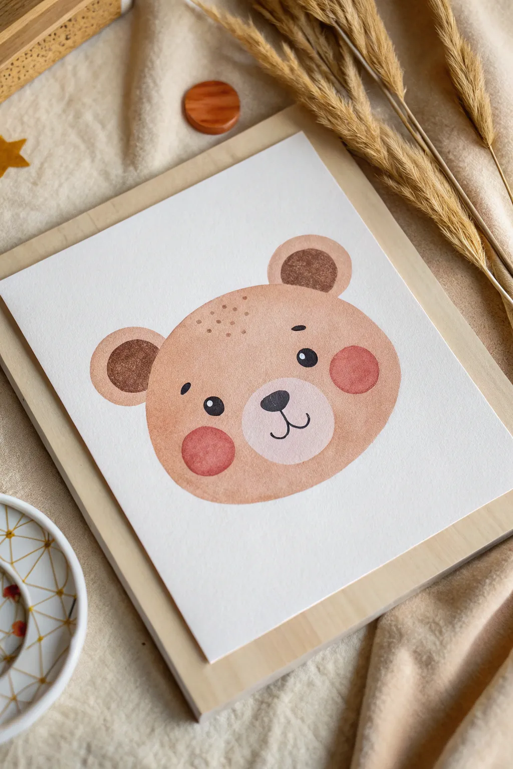
Capture the charm of woodland wildlife with this minimalist bear face portrait. Using warm earth tones and soft rounded shapes, you’ll create a friendly character perfect for nursery decor or greeting cards.
How-To Guide
Materials
- Cold press watercolor paper (white, heavyweight)
- Watercolor paints (tan/ochre, dark chocolate brown, soft rose pink, ivory black)
- Round watercolor brushes (size 6 or 8 for washes, size 2 for details)
- Pencil and eraser
- Jar of clean water
- Paper towels
- Optional: White gouache or gel pen for highlights
Step 1: Sketching the Shape
-
Outline the head:
Start by lightly sketching a wide oval shape for the bear’s main head. Keep the bottom slightly flatter than the top for a classic teddy bear look. -
Add the ears:
Draw two semi-circles on the top left and right corners of the head. Inside each ear, sketch a smaller semi-circle to define the inner ear area. -
Define the muzzle:
Place a smaller, slightly flattened oval in the lower center of the face for the snout area. This will remain unpainted or very light later. -
Mark features:
Lightly indicate positions for the eyes, nose, and cheeks so you know where to place your colors, but keep the lines very faint.
Wet-on-Dry Trick
Work wet-on-dry for the eyes and nose. If the fur layer is even slightly damp, your sharp black lines will bleed into fuzzy gray blobs.
Step 2: Painting the Base Layers
-
Mix the main fur color:
Create a watery mix of tan or yellow ochre with a tiny touch of brown. You want a warm, honey-like color that isn’t too dark. -
Paint the face wash:
Fill in the main head shape with your tan mixture. Work quickly to keep the edge wet so it dries smoothly, carefully painting around the muzzle oval and the circular cheek areas if you want them to remain distinct. -
Fill the outer ears:
Use the same tan wash to fill the outer rim of the ears. Let this base layer dry completely before moving on. -
Paint the muzzle:
For the snout, use an extremely diluted version of your tan paint—almost clear water—to give it just a hint of warmth while keeping it much lighter than the face.
Forest Friends
Create a gallery wall by painting a fox and a raccoon using the same simple oval shapes but swapping the ear style and colors.
Step 3: Adding Depth and Details
-
Darken the inner ears:
Mix a stronger, darker brown. Paint the inner semi-circles of the ears. The contrast between the light outer ear and dark inner ear gives the bear dimension. -
Paint the cheeks:
Load your brush with a soft rose or coral pink. Paint two perfect circles on either side of the muzzle. I like to dab the paint gently to create a soft, blotted texture rather than a solid flat circle. -
Add forehead texture:
While the main face paint is dry, use your tan color (slightly more concentrated this time) to dot tiny freckles or fur texture on the upper forehead area. -
Wait for dryness:
Ensure the paper is bone dry. If the paper is cool to the touch, it’s still wet. Painting clear features requires a totally dry surface.
Step 4: Facial Features
-
Paint the nose:
Using a small size 2 brush and black paint (or a very dark brown-black mix), paint an inverted soft triangle for the nose at the top of the muzzle area. -
Draw the mouth:
From the bottom point of the nose, paint a thin, straight vertical line down, then curve it outward to the left and right to create a happy smile. -
Add the eyes:
Paint two small black oval eyes above the muzzle. Add tiny eyebrows floating above them with quick, short strokes. -
Add light reflections:
Once the black eyes are dry, use a white gel pen or a dot of white gouache to add a tiny ‘sparkle’ highlight to each eye and the nose for liveliness.
Your adorable bear is now ready to be framed or gifted to a special friend


Tiny Turtle With Bubble Trail
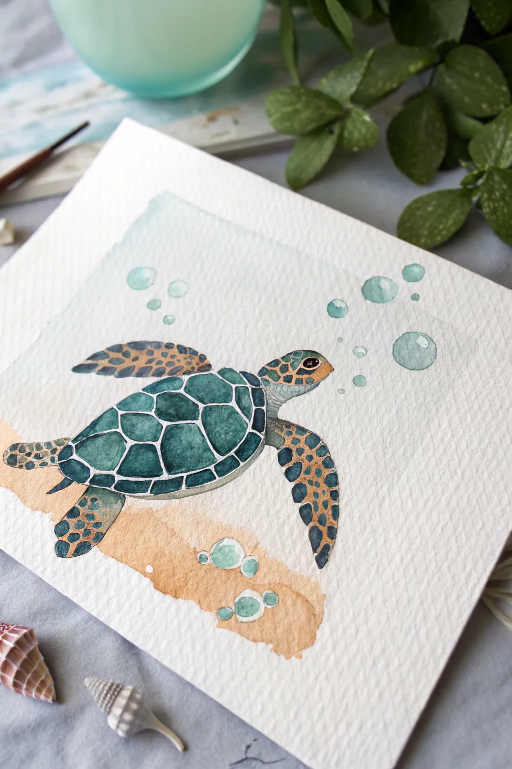
Dive into this charming watercolor project featuring a patterned sea turtle gliding over a sandy seabed. With distinct shell segments and bubbly accents, this piece captures the serene beauty of ocean life in a manageable, approachable format.
How-To Guide
Materials
- Cold press watercolor paper (300 gsm)
- Watercolor paints (Phthalo Green, Burnt Sienna, Yellow Ochre, Indigo, Payne’s Grey)
- Round brushes (size 4 and size 0 or 1 for details)
- White gouache or white gel pen
- Pencil (HB) and eraser
- Jar of water
- Paper towels
- Masking tape (optional for borders)
Step 1: Sketching the Outline
-
Draw the shell shape:
Begin lightly with your pencil in the center of the paper. Sketch an oval shape that is slightly pointed at the tail end to form the turtle’s carapace (shell). -
Add limbs and head:
Sketch the front flippers extending outward like wings, and smaller rear flippers tucking back. Draw a rounded head extending from the front of the shell. -
Map the shell patterns:
Inside the main shell oval, draw a central row of hexagonal shapes. Add pentagons and irregular shapes around them to create the classic tortoise-shell pattern, leaving narrow gaps between them for the outlines. -
Detail the flippers:
Lightly sketch small, irregular circular or oval shapes on the head and flippers to indicate where the scales will go. Finally, add floating circles of varying sizes above the head for bubbles.
Leaving the White Line
Does painting around the white grid lines feel too hard? Paint the whole shell teal first, let it dry completely, and draw the grid lines on top with a white gel pen later.
Step 2: Painting the Turtle Base
-
Paint the shell segments:
Mix a deep teal using Phthalo Green and a touch of Indigo. Carefully fill in the segments on the main shell, leaving thin white unpainted lines between each shape to define the pattern. -
Add dimension to the shell:
While the teal is still damp, drop a tiny amount of darker pigment (more Indigo) into the bottom right corner of each shell segment to create a shadowed, domed effect. -
Base coat for limbs:
Switch to a mix of Yellow Ochre and Burnt Sienna. Paint the base layer of the head and flippers with a very light wash of this golden-brown hue. -
Paint the limb scales:
Once the golden wash is completely dry, use your smallest brush and a dark grey-blue mixture. Carefully paint the negative space around the scales on the flippers and head, or paint the scales themselves if you prefer a darker look—here, we see dark scales painted over the light wash. -
Define the eye:
Paint the eye area dark brown or black, leaving a tiny speck of white paper (or add white later) for the highlight to bring the turtle to life.
Step 3: Background and Bubbles
-
Create the sandy bottom:
Dilute Burnt Sienna and Yellow Ochre with plenty of water. Paint a sweeping, irregular band of color beneath the turtle to suggest the ocean floor. -
Texture the sand:
While the sand wash is wet, tap in a slightly more concentrated brown near the bottom edge. I like to let this bloom naturally to create a textured, grainy appearance. -
Paint the water wash:
Mix a very watery pale blue-green. Paint a loose, rectangular background wash behind the turtle, stopping short of the paper edges for a framed look. Be careful not to reactivate the sanding paint. -
Color the bubbles:
Fill in the bubble circles with a pale aqua wash. Keep the color light and transparent. -
Add bubble shadows:
Once the bubbles dry, paint a thin crescent shape on the bottom right of each bubble using a slightly darker teal to give them spherical volume.
Muddy Colors?
If your green shell and brown sand touch while wet, they will bleed into a muddy mess. Ensure the turtle is 100% dry before painting the background water or sand near it.
Step 4: Final Details
-
Refine the shell:
If your white dividing lines on the shell got covered, use white gouache or a gel pen to re-establish the grid pattern between the shell scutes. -
Add highlights:
Use your white geometric tool (gouache or pen) to add small reflection dots on the top left of the bubbles and the top of the turtle’s head. -
Enhance texturing:
If the sand looks too flat, use a clean damp brush to lift out a few circular spots near the bottom, mimicking bubbles or stones on the floor.
Now you have a serene little ocean scene ready to frame or gift
Two-Shape Butterflies in Soft Blues
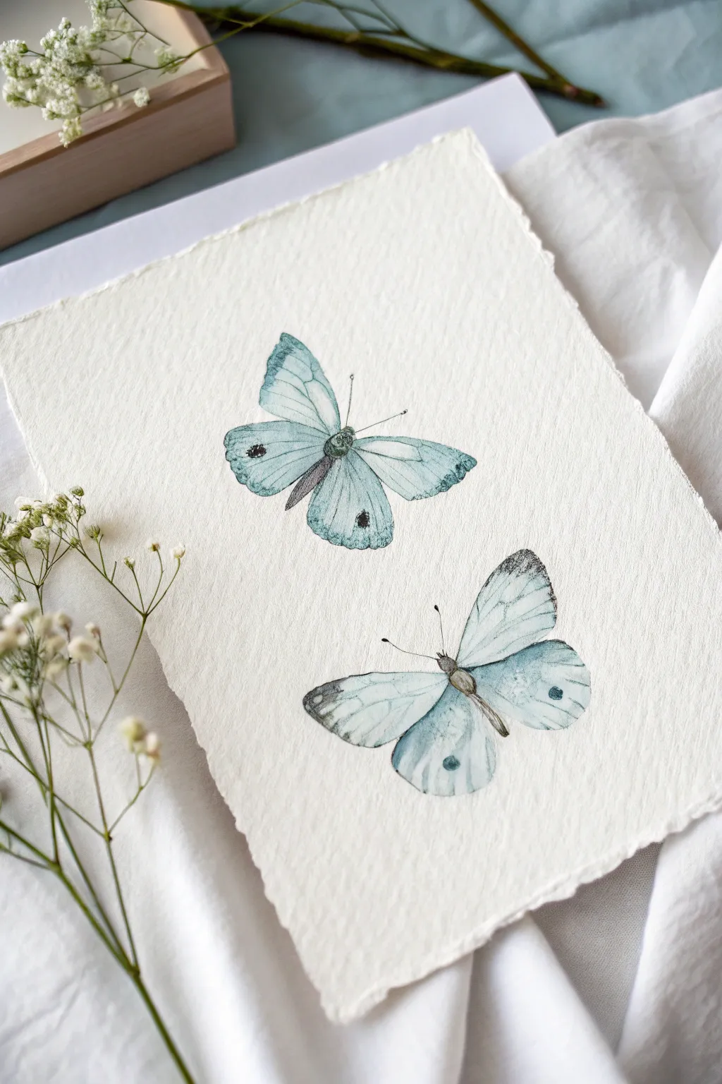
Capture the delicate beauty of nature with this serene watercolor study of two butterflies in ethereal soft blues. The rough-edged paper adds a beautiful, organic texture that complements the fragile, translucent feel of the insect wings.
Detailed Instructions
Materials
- Cold press watercolor paper (300 gsm or heavier, with deckled edges if possible)
- Watercolor paints (Cerulean Blue, Prussian Blue, Paynes Grey, Ivory Black)
- Round watercolor brushes (Size 4 for washes, Size 0 or 00 for details)
- HB or 2H pencil for light sketching
- Kneaded eraser
- Clean water jar
- Paper towels
- Mixing palette
Step 1: Sketching the Forms
-
Plan placement:
Visualize the composition before you begin. You want one butterfly positioned slightly higher on the left and the second hovering lower on the right to create a balanced diagonal flow. -
Outline the top butterfly:
Using an HB pencil, very lightly sketch the wings of the upper butterfly. Think of the forewing as a rounded triangle and the hindwing as a softer oval shape. -
Draw the lower butterfly:
Sketch the second butterfly, angling it slightly differently so it looks like it’s fluttering. Its wings should be open, mirroring the gentle curve of the first. -
Add body details:
Draw the slender central bodies (thorax and abdomen) nestled between the wings. Keep these lines faint so graphite doesn’t muddy your transparent watercolors later. -
Refine the edges:
Use a kneaded eraser to lift almost all visible graphite until only ghost lines remain. Hard pencil lines can ruin the delicate illusion of watercolor.
Deckle Edge Effect
If you don’t have handmade paper, you can fake the ‘deckle’ look. Crease your watercolor paper, wet the fold with a brush, and gently tear it along the wet line for a soft, fibrous edge.
Step 2: Washing the Wings
-
Mix your base color:
Create a very dilute wash of Cerulean Blue with plenty of water. You want a pale, almost transparent tint for the first layer. -
First wash – top butterfly:
Apply clean water to the wing area of the top butterfly first (wet-on-wet technique), then drop in your pale blue mix. Let the pigment spread naturally, keeping the edges slightly irregular. -
First wash – bottom butterfly:
Repeat the wet-on-wet process for the lower butterfly. Leave tiny slivers of dry white paper near the body or wing tips to represent highlights. -
Add depth while wet:
While the paper is still damp, touch a slightly stronger mix of Cerulean Blue to the outer edges of the wings. This creates a soft gradient where the color is denser at the tips. -
Wait for drying:
Allow these base layers to dry completely. If the paper feels cool to the touch, it is still wet inside the fibers.
Step 3: Adding Veins and Details
-
Paint the bodies:
Mix Paynes Grey with a touch of brown or black. Using your size 0 brush, paint the furry texture of the butterfly bodies, letting the color bleed slightly for softness. -
Draw the veins:
Switching to a fine liner brush and a diluted Prussian Blue or Grey, carefully drag thin, shaky lines from the body outward to the wing tips to mimic delicate veining. -
Darken the tips:
Using a drier brush (dry brush technique), scumble some dark grey or black pigment onto the very tips of the wings. The textured paper will help break up the stroke, making it look natural. -
Add signature spots:
With a concentrated dark grey, dab the singular round ‘eyespot’ on the forewings of each butterfly. Keep the edges soft, not perfectly circular. -
Final antennae:
Using your finest brush and black paint, sweep the antennae out from the heads with a quick, confident flick of the wrist. Hesitation creates wobbly lines, so move fast.
Bloom Patrol
If you see ‘cauliflower’ blooms forming where wet paint hits drying paint, quickly blend it out with a damp, clean brush before it sets hard. Timing is everything with water control.
Once dry, your delicate butterflies will look ready to flutter right off the textured page
Whale Tail Splash Silhouette
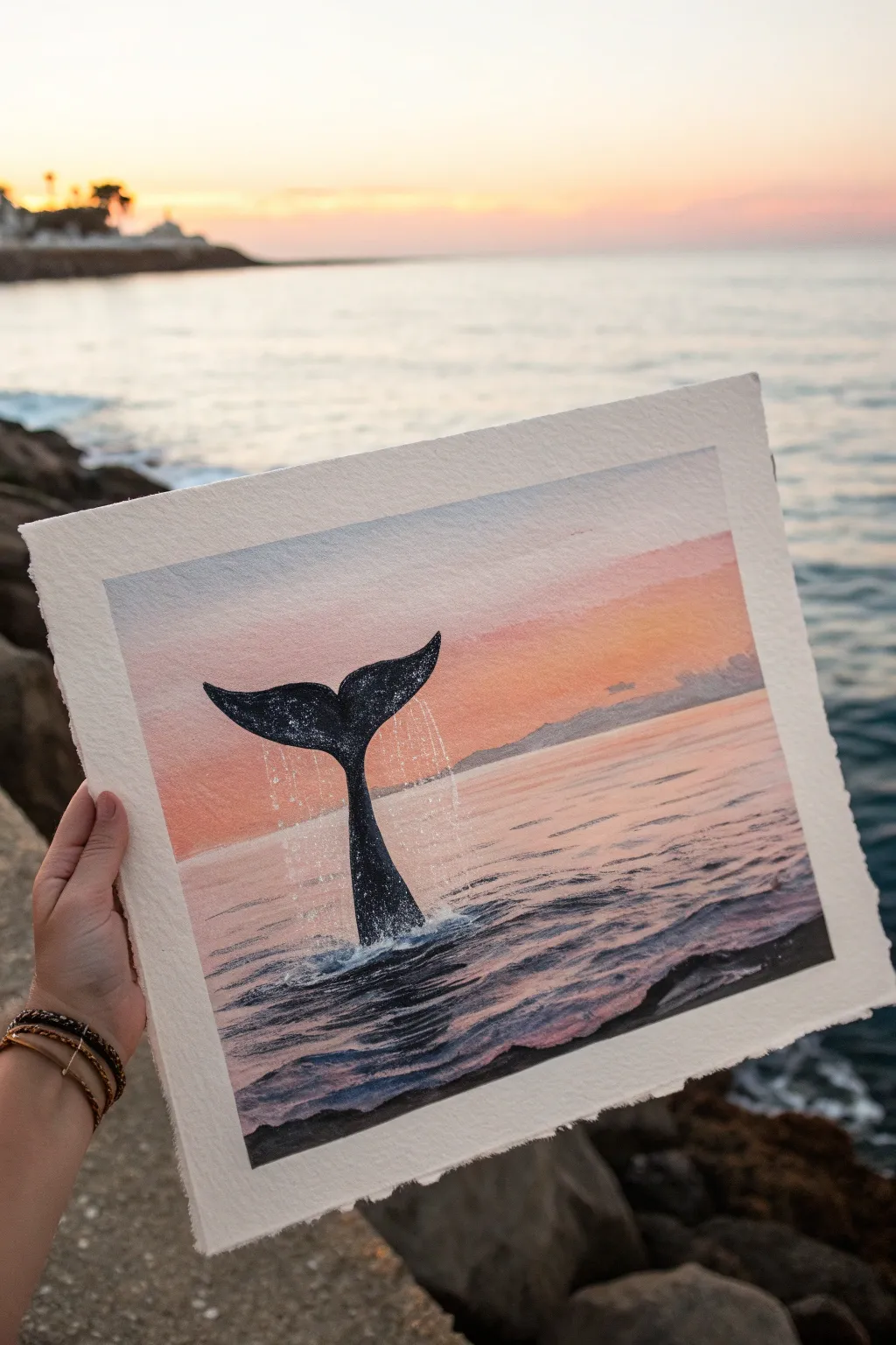
Capture the magic of a gentle ocean sunset with this watercolor project that features a striking whale tail silhouette. The soft gradient sky meets the shimmering water, creating a peaceful and artistic coastal scene.
Detailed Instructions
Materials
- Cold-press watercolor paper (300 gsm)
- Masking tape
- Watercolor paints (Indigo, Black, Ultramarine Blue, Rose Madder or Pink, Cadmium Orange, Burnt Sienna)
- White opacity gouache or gel pen
- Round brushes (sizing 4, 8, and a small liner brush)
- Jar of clean water
- Paper towels
- Pencil and eraser
- Salt (optional for texture)
Step 1: Preparation and Sketching
-
Secure the paper:
Tape down all four edges of your watercolor paper to a board or table. This creates that clean, crisp border you see in the photo and prevents the paper from buckling when it gets wet. -
Sketch the horizon:
Lightly draw a straight horizontal line across the paper, positioned roughly one-third of the way up from the bottom. This separates your sky from the sea. -
Outline the tail:
In the center, sketch the basic shape of the whale tail rising above the horizon line. Keep the lines very faint so they don’t show through the paint later. -
Mark the splash:
Draw loose, jagged oval shapes at the base of the tail where it meets the water to indicate where the foam and splashing water will be. We will keep this area lighter.
Starry Texture
For a magical touch on the whale skin, sprinkle a tiny pinch of table salt onto the wet black paint of the tail. Brush it off when dry for a textured effect.
Step 2: Painting the Sky
-
Wet the sky area:
Using your largest clean brush, apply a thin layer of clean water to the entire sky area above the horizon line. -
Start with orange:
While the paper is wet, horizontally stroke a pale wash of Cadmium Orange just above the distant horizon line. Let it bleed upward slightly. -
Blend in pinks:
Moving upward, introduce Rose Madder or a soft pink. Blend it gently into the orange while the paint is still wet to create a seamless sunset transition. -
Add the upper sky:
For the top of the sky, mix a very pale blue-grey. Paint this at the very top edge, letting it fade down into the pink. Keep this layer soft and dreamy. -
Paint distant mountains:
Once the sky is barely damp (not soaking), mix a light purple-grey. Paint faint, low mountain shapes right along the horizon line. Soften the bottom edge of these mountains with a damp brush so they fade into the upcoming water line.
Step 3: Creating the Ocean
-
Reflect the colors:
Below the horizon, mirror the sky colors. Start with a wash of pale pink and orange, but keep the paint strokes horizontal to mimic water ripples. -
Deepen the foreground:
As you move closer to the bottom of the page, mix Ultramarine Blue with a touch of purple. Paint strictly horizontal strokes, leaving tiny slivers of white paper showing through to represent sparkling light on the waves. -
Darken the waves:
While the blue layer is still damp, add darker Indigo streaks near the bottom corners and under the area where the tail will be. This reflects the deep ocean water. -
Dry thoroughly:
Wait for the entire background (sky and sea) to be completely bone dry before moving on to the silhouette. If you rush, the black paint will bleed.
Level Up: Metallic Pop
Mix a small amount of metallic gold watercolor into your orange sunset layer. When the light hits your finished painting, the sun’s reflection will actually shimmer.
Step 4: The Silhouette and Details
-
Paint the tail base:
Mix a strong, opaque black or deep Indigo watercolor. I prefer using quite thick paint here. Fill in the whale tail shape carefully. -
Add texture to the tail:
While the black paint is wet, you can lift out tiny spots with a dry tissue or drop in a hint of blue to suggest wet skin reflecting the sky, but keep it mostly dark. -
Create the splash:
Using white gouache or opaque white paint, stipple (dab) around the base of the tail where it enters the water. Create chaotic, small dots to look like foam. -
Detail the water drops:
Flick tiny specks of white paint from your brush bristles around the tail to simulate water droplets flying off the flukes. -
Define nearby waves:
Use a liner brush and dark navy paint to add thin, sharp ripple lines around the splash zone to show the water disturbance. -
Final highlights:
Add a few final bright white highlights on the very tips of the nearby waves with a gel pen or thick gouache to make the water look wet and glossy. -
Reveal the border:
Once the painting is 100% dry, peel the masking tape away slowly at a 45-degree angle to reveal your crisp white frame.
Hang your nautical masterpiece somewhere sunny to remind you of the ocean breeze
Mini Campsite Under a Starry Sky
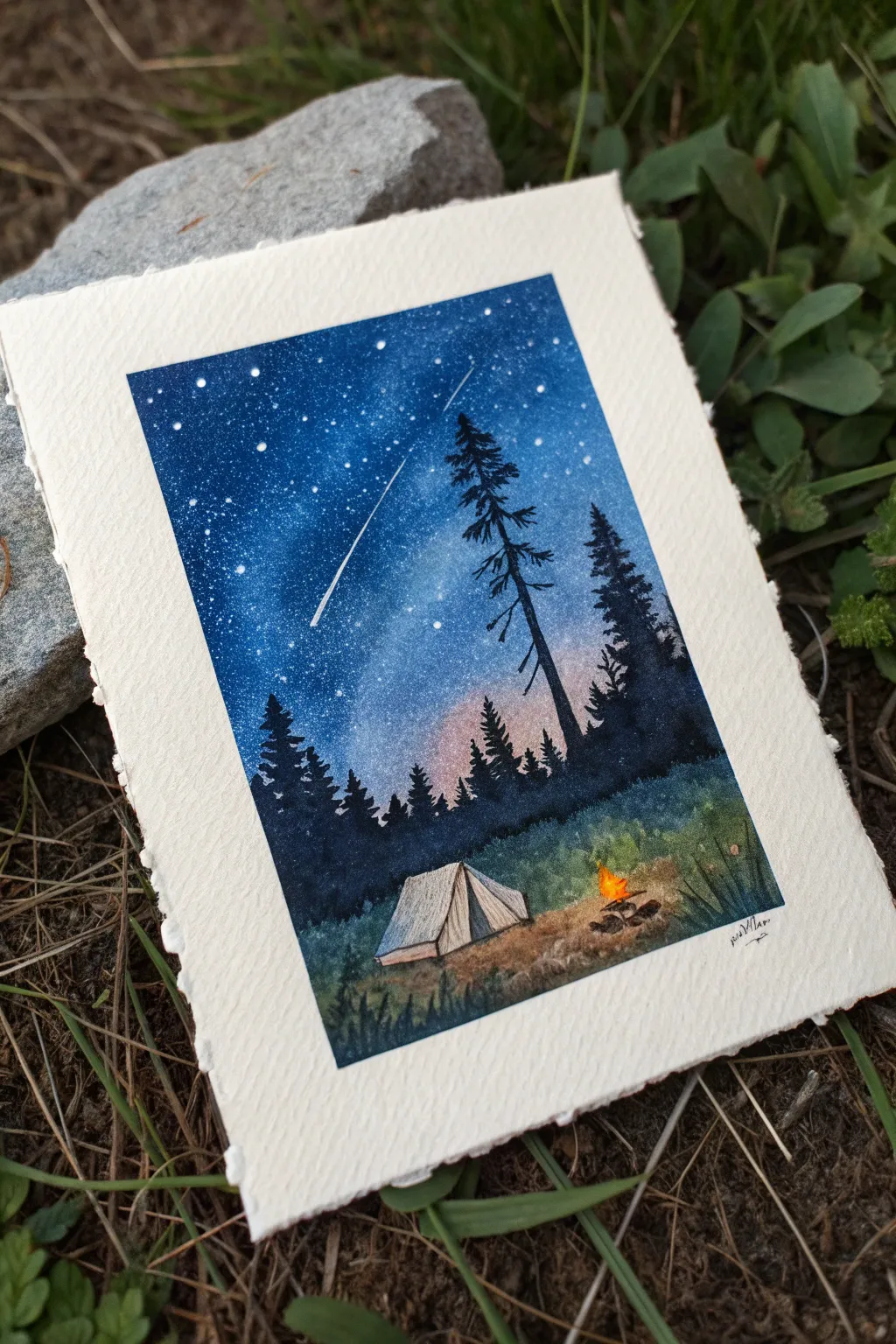
Capture the magic of a night under the stars with this enchanting watercolor miniature. Using a simple silhouette technique and vibrant colors, you’ll create a cozy scene featuring a glowing campfire and a brilliant shooting star.
Step-by-Step Tutorial
Materials
- Cold press watercolor paper (approx. 4×6 inches, deckled edge optional)
- Masking tape
- Watercolor paints (Indigo, Prussian Blue, Black, Burnt Sienna, Yellow/Orange)
- White gouache or white gel pen
- Soft round brushes (Size 4 and Size 0/detail)
- Old toothbrush (for splattering)
- Pencil and kneaded eraser
- Clean water and paper towels
Step 1: Sketching and Masking
-
Tape your edges:
Secure your paper to a hard board using masking tape. Create a crisp rectangular border, leaving a generous margin of white paper around the painting area to frame the scene. -
Lightly sketch the scene:
With a light hand, sketch the triangular shape of the tent near the bottom center. Add a rough horizon line for the ground behind it, keeping the pencil lines faint so they disappear under the paint.
Star Splatter Mess?
If you are worried about getting white splatter on your dark trees, paint the stars *before* you paint the trees. Or, cover the bottom half with a scrap paper mask while flicking paint.
Step 2: The Night Sky
-
Wet the sky area:
Using your larger brush, apply clean water to the entire sky area, stopping at the horizon line but painting over where the trees will eventually go. The paper should be glistening but not forming puddles. -
Establish the twilight glow:
Drop a very pale wash of diluted reddish-purple or burnt sienna just above the horizon line. This creates that faint ambient light often seen just before true darkness sets in. -
Deepen the blue:
While the paper is still wet, load your brush with Prussian Blue. Start at the top of the painting and work downward, letting the color naturally diffuse into the lighter horizon wash. -
Add the darkest night:
Mix Indigo with a touch of Black to get a deep, inky midnight blue. Apply this to the top corners and upper edge of the sky to create a vignette effect that draws the eye downward. -
Create the stars:
Once the sky is completely dry, mix white gouache with a tiny bit of water until it has a milk-like consistency.Load an old toothbrush and flick the bristles with your thumb to spray tiny stars across the blue sky. -
Paint the shooting star:
Use a white gel pen or a fine detail brush with white gouache to draw a single, sharp line diagonally across the sky. Verify the direction feels dynamic before committing.
Pro Tip: Glowing Fire
To make the fire really pop, put down a tiny dot of pure white gouache first, let it dry, and then glaze over it with your bright yellow watercolor. It adds intense luminosity.
Step 3: The Forest Silhouette
-
Mix your tree color:
Create a dark, almost black mixture using Indigo and Black. You want this paint to be fairly thick and opaque, not watery. -
Paint the tall pine:
Using your detail brush, draw a vertical line for the trunk of the main tree. Using a tapping motion, add jagged branches starting small at the top and getting wider as you move down. -
Build the forest line:
Fill in the background tree line with simpler, jagged shapes. Vary the heights to make the forest look natural, ensuring the paint is solid enough to block out the starry sky behind it.
Step 4: The Camp Scene
-
Paint the grassy slope:
Mix a dark green using your blue and a touch of yellow. Paint the ground area around the tent, using vertical flicking strokes near the bottom to suggest blades of grass. -
Define the tent:
Paint the tent using a very diluted wash of grey or brown, keeping it much lighter than the surroundings. I suggest adding a slightly darker shadow on the side facing away from the fire to give it dimension. -
Outline the structure:
Use a fine liner brush or pen to add thin, sketchy outlines to the tent folds and stakes. -
Build the campfire:
Paint small oval stones in a circle using dark brown. In the center, dab bright yellow and orange paint for the flames. -
Add the fire glow:
While the fire paint is slightly wet, gently soften the edges with a clean, damp brush to make the light look like it is radiating outward onto the grass and tent. -
Final details:
Add a few distinct grass blades in the foreground with your darkest green/black mix to create depth. Sign your work in the bottom corner once everything is bone dry. -
The reveal:
Carefully peel away the masking tape at a 45-degree angle to reveal your crisp, clean borders.
Now you have a peaceful wilderness escape that fits right in the palm of your hand
Speckled Planets on a Deep Night Background
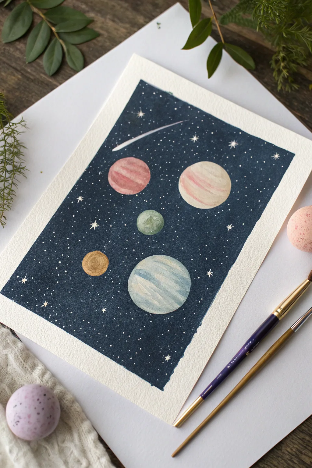
Capture the magic of the cosmos with this charming watercolor illustration, featuring soft, stripped planets floating in a deep indigo sky. The contrast between the dark background and the delicate planetary details makes for a striking yet simple piece of art.
Step-by-Step
Materials
- Cold press watercolor paper (A5 size works well)
- Watercolor paints (Indigo, White Gouache, Paynes Grey, warm pinks, muted greens, gold/yellow)
- Masking fluid (drawing gum)
- Round watercolor brushes (Size 6 for washes, Size 0 or 1 for details)
- Painter’s tape or masking tape
- Pencil and eraser
- Clean water jar and paper towels
- An old toothbrush (optional, for stars)
- Blow dryer (optional)
Step 1: Drafting the Design
-
Prepare the borders:
Begin by taping down all four edges of your watercolor paper to a hard surface. This creates the crisp white border seen in the example and prevents the paper from buckling when wet. -
Sketch the celestial bodies:
Lightly sketch five circles of varying sizes scattered across the page. Aim for two large planets, one medium, and two smaller ones to create a balanced composition. Faintly draw the curved tail of a shooting star near the top. -
Protect the planets:
Apply masking fluid carefully over each drawn circle and the shooting star shape. This step is crucial so you can paint the dark background freely without worrying about spoiling your planets.
Bleeding Masking Fluid?
If paint seeps under your masking fluid, the paper might be too textured or the fluid too thin. Press the fluid down firmly after applying, or choose smoother Hot Press paper.
Step 2: Creating the Night Sky
-
Mix the background color:
While the masking fluid dries completely, mix a deep, saturated wash. I like to combine Indigo with a touch of Payne’s Grey or Black to get that profound, seemingly infinite space color. -
Apply the wash:
Load a larger round brush and paint the entire background area. Work relatively quickly to ensure an even coat, letting the paint pool slightly for a rich texture, but avoid reworking drying areas to prevent blooms. -
Add first stars:
While the background is still slightly damp (but not soaking), you can gently tap a brush loaded with clean water over it to create subtle ‘stars’ or texture variations. -
Let it dry completely:
Allow the background to dry fully. It must be bone-dry before proceeding. You can use a blow dryer on a low setting to speed this up. -
Splatter the stars:
Mix a creamy consistency of white gouache or white watercolor. Load a stiff brush or an old toothbrush and flick the bristles to spray fine white speckles across the dark sky. -
Paint larger stars:
Using your smallest detail brush and pure white gouache, manually paint small four-point stars or larger dots in open areas to add variety to the galaxy.
Starry Depth Pro-Tip
Layer your stars! Splatter once with watered-down white for faint, distant stars, let dry, then splatter again with thick opaque white for bright, nearby stars.
Step 3: Painting the Planets
-
Remove the mask:
Once the white splatter is dry, gently rub off the masking fluid with your finger or a rubber cement pickup tool. You should now have stark white shapes against the dark blue. -
Paint the pink planet:
For the medium-sized planet, mix a watery reddish-pink. Paint curved stripes leaving thin slivers of white paper between them to simulate atmospheric bands. -
Detail the beige giant:
For the largest planet, use a very pale beige or cream wash. While wet, drop in a stripe of soft pink near the center to give it a gas-giant appearance. -
Color the blue planet:
On the lower large planet, use distinct strokes of pale blue and grey-blue. Curve your brush strokes to match the roundness of the circle, emphasizing its spherical shape. -
Fill the smaller planets:
Paint the smallest planet solid gold or yellow ochre. For the medium-small one, use a textured wash of sage green, dabbing the color to create a cratered look. -
Refine the shooting star:
Paint the head of the shooting star with opaque white, dragging it out into a faint, translucent tail that fades into the blue background.
Step 4: Final Touches
-
Clean up edges:
If any background paint bled into your planets, you can carefully lift it with a damp brush or cover it with opaque paint once the planet colors are dry. -
Remove the tape:
Slowly peel away the painter’s tape at a 45-degree angle. This final reveal creates that satisfying, professional white border framing your galaxy.
Hang your cosmic creation on the wall or gift it to a space-loving friend to enjoy
Sweet Bow Ribbon With Polka Dots
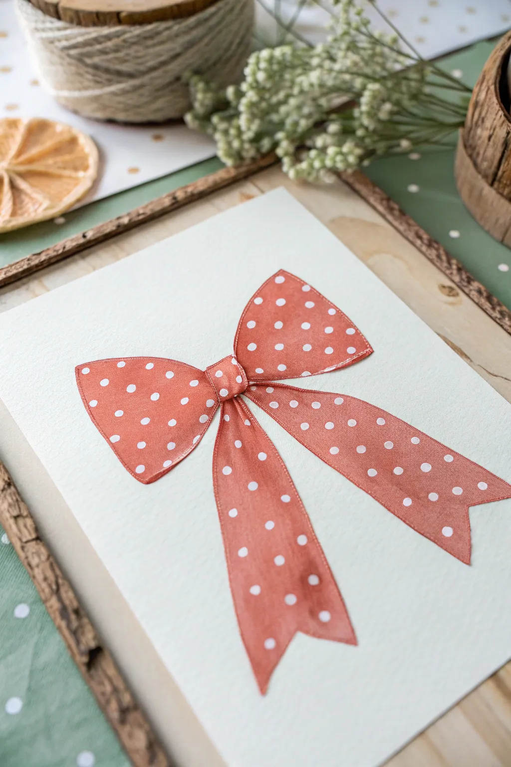
This charming project captures the delicate elegance of a fabric ribbon using watercolor techniques on textured paper. The soft salmon-pink hue combined with crisp white polka dots creates a nostalgic, vintage feel that looks beautiful framed or as a handmade card.
Detailed Instructions
Materials
- Cold press watercolor paper (300 gsm)
- Watercolor paints (Salmon pink, burnt sienna, crimson)
- Round watercolor brushes (Size 4 and Size 00 detail brush)
- White gouache or white gel pen
- HB pencil
- Kneaded eraser
- Clean water jar
- Paper towels
Step 1: Sketching the Shape
-
Center Knot:
Begin by lightly drawing a small, rounded square in the center of your paper. Make the edges slightly curved to mimic soft tension in the fabric. -
Upper Loops:
Sketch two large loops extending outward from the knot. The top edges should curve gently upward, while the bottom edges dip down before connecting back to the center. -
Lower Tails:
Draw two long tails hanging down from behind the knot. Let them flare out slightly towards the bottom and finish the ends with an inverted ‘V’ cut for a classic ribbon look. -
Refining Lines:
Go over your sketch to ensure symmetry, but keep it organic—fabric naturally has slight irregularities. Lighten your pencil lines with a kneaded eraser so they won’t show through the paint.
Bleeding Dots?
If your white dots are turning pink, the base layer wasn’t dry enough. Wait longer, or switch to a high-opacity white gel pen or acrylic marker for better coverage over the watercolor.
Step 2: Painting the Base Layer
-
Mixing the Color:
Create a watery mix of salmon pink. If you need to adjust the tone, add a tiny touch of burnt sienna to warm it up or crimson to make it deeper. -
First Wash – Left Loop:
Using your size 4 brush, paint the left loop with a clean, even wash of your pink mixture. Try to keep the edges crisp against the white paper. -
First Wash – Right Loop:
Repeat the process for the right loop. I like to leave a microscopic gap of white paper right where the loop meets the knot to help define the separate sections. -
Painting the Tails:
Fill in the two hanging tails with the same pink wash. Ensure the paint is distributed evenly to avoid unwanted blooming. -
Painting the Knot:
Finally, paint the center knot. This area is small, so switch to a smaller brush if necessary to stay within the lines. -
Let it Dry:
Allow this base layer to dry completely. The paper should feel room temperature to the touch, not cool.
Pro Tip: Masking Fluid
For ultra-crisp white dots, you can apply masking fluid dots *before* painting the pink layer. Rub them off at the end to reveal the expanding paper white underneath.
Step 3: Adding Depth and Detail
-
Shadow Mixing:
Take your original pink mixture and make it slightly more concentrated, adding a drop of red or brown to create a shadow tone. -
Depicting Folds:
Paint thin, glazing strokes near the center knot where the fabric bunches up. This creates the illusion of creases and tight folds. -
Edge Shading:
Run a very thin line of this darker color along the bottom edges of the tails and the inner parts of the loops to give the bow dimension. -
Smoothing Transitions:
If the shadow lines look too harsh, use a damp, clean brush to gently soften the edges before the paint dries.
Step 4: The Polka Dots
-
Prepping White:
Squeeze out a small amount of white gouache. You want a creamy consistency—thick enough to be opaque but fluid enough to flow off the brush. -
Mapping the Pattern:
Visualize faint diagonal lines across the bow to guide your placement. The dots should look evenly spaced but not mechanically perfect. -
Applying Large Dots:
Using the tip of your detail brush (or a gel pen), place the main polka dots across the loops and tails. -
Partial Dots:
Crucially, paint ‘half-dots’ along the edges and near folds. This tricks the eye into seeing the pattern wrapping around the three-dimensional form. -
Knot Detail:
Add just one or tiny two dots to the center knot, as the fabric there is crushed together and hides the pattern. -
Final White Highlight:
Add a few very faint, thin white lines on the upper curves of the loops to simulate light hitting the satin finish.
Once the white details are fully dry, frame your artwork to highlight those lovely vintage vibes
Tape-Resist Geometric Candy Hearts
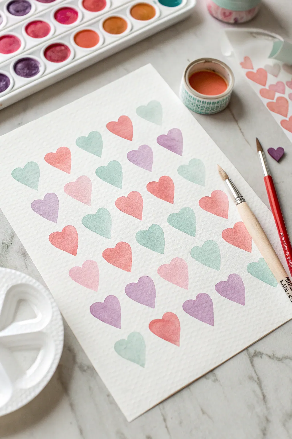
Create a charming, structured pattern of soft pastel hearts with this simple watercolor project. The repeating shapes and gentle color palette invoke the sweetness of candy hearts, perfect for framing or gifting.
Step-by-Step
Materials
- Cold press watercolor paper (approx. 9×12 inches)
- Small heart stickers (foam or vinyl work best)
- Watercolor paints (pan set with pinks, purples, peaches, and greens)
- Round watercolor brushes (size 4 and 8)
- Jar of clean water
- Paper towel
- Washi tape (optional, for securing paper)
- Pencil (very light hard lead, like 2H)
Step 1: Preparation & Layout
-
Secure the paper:
Start by taping down your cold press watercolor paper to a flat surface. This prevents buckling when the paper gets wet. -
Plan the grid:
Using a very light touch with a hard pencil, mark small dots or faint ‘x’ marks in a staggered grid pattern. Think of a brick wall layout, where hearts on the second row sit between the hearts on the first row. -
Test your stickers:
While this project can be done freehand, you can also use stickers as a resist technique. Firmly press heart stickers over your pencil marks if you want white hearts on a colored background, or use them as a visual guide for sizing if painting freehand. -
Prepare your palette:
Activate your watercolor pans with a drop of water each. You’ll want a palette of soft coral, mint green, lavender, blush pink, and peach. Mix plenty of water into the pigment to keep the colors translucent and pastel.
Oops! Bleeding Paint?
If hearts bleed into each other, your brush is too wet or you’re painting too fast. Let adjacent hearts dry for 5 minutes before painting neighbors.
Step 2: Painting the Pattern
-
Start the top row:
Dip your size 8 brush into the mint green paint. Paint the first heart in the top left corner. Use two simple strokes: press down and curve left, then press down and curve right to meet at the bottom point. -
Alternate colors:
Rinse your brush thoroughly. Pick up a coral or salmon color for the next heart in the row. Leave about an inch of white space between shapes to keep the look airy. -
Complete the first line:
Continue across the top row, alternating between your cool tones (mint, lavender) and warm tones (peach, pink). Aim for about four to five hearts per row depending on your paper width. -
Begin the staggered row:
Move to the second row. Position your first heart so it sits centrally beneath the gap of the two hearts above it. I find painting the outline first helps get the symmetry right. -
Vary the saturation:
As you paint, allow some hearts to have slightly more pigment and others to be more watery. This natural variation adds depth to the simple pattern. -
Continue the pattern:
Work your way down the page, row by row. If you make a mistake with a shape, don’t worry—organic imperfections make watercolor charming. -
The wet-on-dry technique:
Ensure you are applying wet paint onto dry paper. This keeps the edges of your hearts crisp and defined, rather than fuzzy and bleeding into the paper.
Make It 3D
Once dry, use a fine-tip white gel pen to add tiny ‘shine’ marks on the upper right curve of each heart for a cute, puffy sticker effect.
Step 3: Refining & Finishing
-
Check for balance:
Step back and look at your color distribution. If you have too much pink on one side, try to place a green or purple heart in the next available spot to balance the composition. -
Cleaning edges:
If any heart has a jagged edge while wet, engage a clean, barely damp small brush (size 4) to gently smooth the contour. -
Add a darker accent:
For visual interest, pick one or two random hearts and paint them with slightly less water, making them pop against the lighter pastels. -
Let it dry completely:
Allow the paper to dry naturally flat for at least 30 minutes. Do not use a heat gun too close, or you might push the liquid pigment around unevenly. -
Erase guidelines:
Once the paint is bone dry, gently erase any visible pencil marks from your initial grid planning using a kneaded eraser.
Enjoy the soothing rhythm of painting these shapes and displaying your sweet geometric masterpiece


Have a question or want to share your own experience? I'd love to hear from you in the comments below!