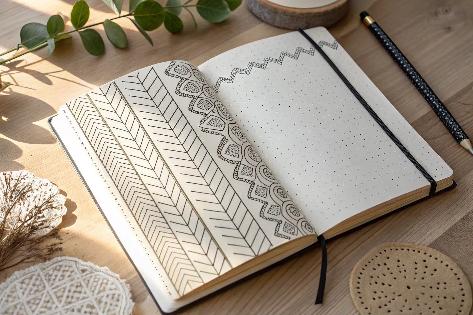
Whenever I’m stuck on a drawing, it’s usually not the subject—it’s that big blank space around it. Here are my favorite background ideas for drawing that fill the page with mood and texture without stealing the spotlight from your main sketch.
Simple Gradient Wash
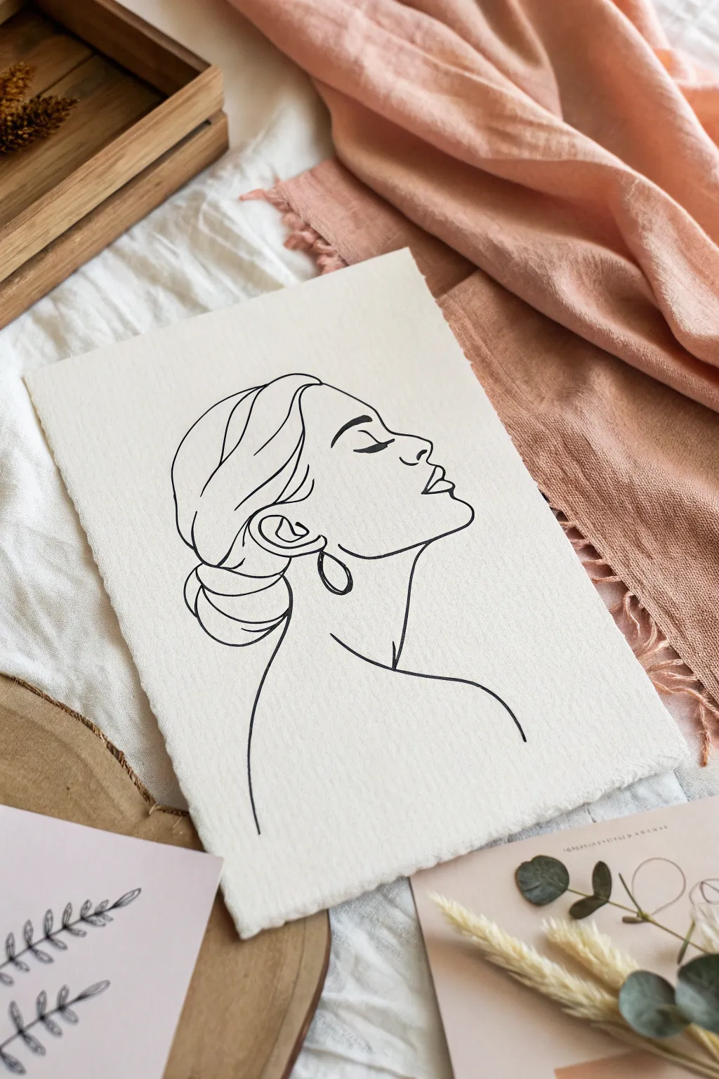
Capture the serene beauty of a silhouette with this refined continuous line drawing project. Using high-quality textured paper and confident ink strokes, you will create a timeless piece that evokes masterful simplicity.
Step-by-Step Tutorial
Materials
- Heavyweight textured paper (cold press watercolor or handmade cotton paper)
- Black archival fineliner pens (sizes 0.3mm and 0.5mm)
- Graphite pencil (HB or H)
- Kneaded eraser
- Tracing paper (optional)
- Ruler (optional for centering)
Step 1: Preparation and Sketching
-
Prepare the paper:
Select a piece of cream or off-white textured paper. If your paper doesn’t already have deckled edges, you can gently tear the edges against a ruler to create that soft, handmade look. -
Map the composition:
Lightly mark the center of your paper with your pencil to help position the profile. The face should look upwards towards the right, so leave slightly more space on the right side for the gaze to travel. -
Outline the head shape:
Using very faint pencil strokes, sketch the basic oval shape of the head and the curve of the neck. This serves as a loose scaffolding and won’t be part of the final art. -
Sketch the profile features:
Refine your sketch by drawing the forehead, nose, and lips. Keep the nose bridge straight and the lips slightly parted to capture the relaxed expression shown in the reference. -
Define the hair mass:
Lightly sketch the volume of the hair, focusing on the bun at the nape of the neck and the side-swept front section. Don’t worry about individual strands yet; just focus on the overall shapes. -
Detail the ear and jawline:
Place the ear relatively low, aligning the top with the eye line. Connect the jawline from the chin up to the ear with a smooth, sweeping curve. -
Add the eye and eyebrow:
Draw the closed eyelid with a simple curved line and add a thick, arched eyebrow above it. This simple detail is crucial for the serene expression. -
Refine the lines:
Go over your pencil sketch one last time to ensure the flow feels continuous. Erase any distracting construction lines so only the essential path remains.
Wobbly Lines?
If your hand shakes, try ghosting the stroke in the air before touching the paper. Drawing from your shoulder rather than your wrist creates smoother curves.
Step 2: Inking the Drawing
-
Start the ink work:
Switch to your 0.5mm fineliner. Begin at the forehead and move down the profile. I find that pulling the pen towards me allows for a smoother line than pushing it away. -
Ink the facial features:
Carefully trace the nose, lips, and chin. Lift your pen as little as possible to maintain the fluid aesthetic of line art, though you don’t need to do it in one single breath. -
Draw the neck and shoulder:
Extend a long, confident line down from the chin to form the neck, curving out to suggest a shoulder. Keep this line incredibly simple. -
Detail the hair contours:
Outline the hair sections using flowing, organic curves. Avoid jagged lines; think of the hair as ribbons wrapping around the head. -
Ink the bun:
Use overlapping curved lines to define the bun at the back. These lines should intersect slightly to suggest the twisted texture of the hair. -
Add the earring details:
Draw the drop earring shape below the earlobe. Keep the shape clearly defined against the neck, ensuring the lines don’t accidentally merge. -
Strengthen key lines:
For areas that need more emphasis, like the underside of the bun or the eyebrow, carefully re-trace or thicken the line slightly to add weight and contrast. -
Final clean up:
Wait at least 15 minutes for the ink to dry completely. Gently erase any remaining pencil marks with the kneaded eraser to reveal the crisp black lines.
Add a Splash
For a modern twist, add a single, loose watercolor wash in a muted tone (like sage or terracotta) behind the profile before you start inking.
Frame your delicate line drawing in a simple wood frame to complement its organic feel


One-Point Perspective Room
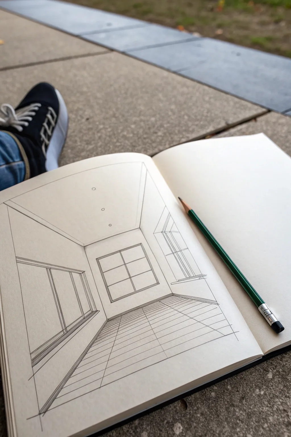
This tutorial guides you through creating a clean, architectural drawing of a room using single-point perspective. The result is a minimalistic yet spacious interior scene that pops off the page with precise lines and depth.
Step-by-Step Guide
Materials
- Sketchbook with smooth paper
- HB or 2B graphite pencil
- Ruler or straightedge
- Eraser (kneaded or vinyl)
- Pencil sharpener
Step 1: Setting the Structure
-
Establish the Vanishing Point:
Start by lightly marking a small dot near the center of your page. This will be your single vanishing point, and all diagonal lines for depth will radiate from here. -
Draw the Back Wall:
Around your vanishing point, use your ruler to draw a square or rectangle. This represents the far back wall of the room. Keep the lines light so you can adjust dimensions if needed. -
Create the Room Corners:
Draw diagonal lines extending from the vanishing point through each of the four corners of your back wall rectangle, continuing them all the way to the edges of your paper. These lines define where the side walls meet the ceiling and floor. -
Complete the Room Frame:
You should now see the basic shell of a room: a ceiling section, a floor section, and two side walls. Erase the guiding lines inside the back wall square, leaving just the vanishing point if you still need it for reference.
Keep it Sharp
Keep your pencil extremely sharp for architectural sketches. A dull tip creates fuzzy lines that ruin the precise, technical look of perspective drawings.
Step 2: Adding Architectural Features
-
Outline the Back Window:
On the back wall, draw a smaller rectangle centered within the wall space. This will be your main window. Since it’s on a flat plane facing you, these lines should be perfectly horizontal and vertical. -
Add Window Panes:
Divide the back window into four panes by drawing a cross in the center. I like to double up these lines to give the window frame some thickness and realism. -
Draft the Left Wall Window:
On the left wall, draw two vertical lines to mark the sides of a large window. Connect the tops and bottoms with diagonal lines that aim directly at your vanishing point. -
Detail the Left Window Frame:
Add thickness to the frame by drawing inner parallel lines. Remember, vertical lines stay vertical, but any horizontal depth lines must angle back toward the central point. -
Draft the Right Wall Feature:
Repeat the process on the right wall, perhaps creating a doorway or another window. Use vertical lines for the sides and extend diagonals from the vanishing point for the top and bottom lintels. -
Add Ceiling Lights:
Draw a few small circles on the ceiling section. To show perspective, make the circles smaller as they get closer to the back wall and slightly larger as they move toward the top of the page.
Add Some Life
To make the room feel lived-in, sketch a simple rug on the floor or a framed picture on the wall using the same perspective rules for the angles.
Step 3: Defining the Floor and Finishes
-
Draw Floor Grid Horizontals:
For the tiled floor, start by drawing horizontal lines across the floor section. Space them wider apart near the bottom of the page and closer together as they approach the back wall to create the illusion of distance. -
Draw Floor Grid Verticals:
Now, draw lines radiating from the vanishing point across the floor section. These will act as the vertical grout lines of your tiles. -
Add Baseboards:
Draw thin strips along the bottom edge of the left, right, and back walls to represent baseboards. Use the vanishing point to get the angle correct on the side walls. -
Refine Line Weight:
Go over your main structural lines with slightly more pressure to darken them. Leave construction lines lighter or erase them if they clutter the view. -
Clean Up Intersections:
Use your eraser to remove any accidental overshoots where the floor meets the walls or where window frames overlap. -
Final Polish:
Double-check your vertical lines with a ruler to ensure they haven’t slanted. A perfectly vertical line anchors the illusion of stability in architectural sketches.
Now you have a structured interior sketch ready for shading or color


Clouds and Sky Swirls

Capture the dreamy feeling of a breezy day with this intricate line art cloudscape. This drawing combines simple puffy clouds with stylized, wave-like rolling clouds filled with swirls and textures, perfect for a relaxing doodle session.
Step-by-Step
Materials
- Spiral-bound sketchbook or drawing paper
- Fine-liner pen (black, 0.3mm or 0.5mm)
- Pencil (HB or H for sketching)
- Eraser
Step 1: Planning and Sky Elements
-
Sketch the layout:
Begin by lightly sketching the general composition with your pencil. Mark out a horizon line about a third of the way up the page for the rolling clouds and decide where your floating puffy clouds will sit. -
Draw the main puffy clouds:
Using your fine-liner, draw two large, interconnected clouds in the center of the page. Use bumpy, rounded strokes to create that classic cartoon cloud shape. -
Add floating cloud details:
Around the main central clouds, add a few tiny circular bubbles or dots to suggest smaller wisps of vapor breaking away. -
Create the shooting star trail:
In the upper right corner, draw a large arc consisting of five long, curved parallel lines. These should taper slightly as they move toward the left, disappearing behind the puffy clouds or fading out. -
Add celestial elements:
Scatter small details in the open sky area. Draw a small crescent moon on the left, a few tiny four-pointed stars, and simple dots to represent distant stars.
Smooth Operator
Draw swirls from your shoulder, not your wrist. This locks your hand in place and creates smoother, more confident curves without shaky wobbles.
Step 2: Drawing the Rolling Cloud Bank
-
Outline the wave peaks:
Start drawing the bottom cloud formation. Instead of simple bumps, think of these as rolling waves. Draw large, curling peaks that resemble ocean waves crashing. -
Form the large swirls:
Inside each major wave peak, draw a large, continuous spiral line. These are the focal points of the lower pattern, so keep your curves smooth. -
Connect the forms:
Draw connecting curves between the large spirals. These lines should flow downwards, mimicking the movement of wind or water. -
Add secondary swirls:
Tuck smaller spiral shapes and curls into the crevices between the larger waves. Varying the size of your swirls keeps the composition dynamic. -
Draw inner concentric circles:
In the center of your largest swirls, draw small circles or ‘eyes’ to give the pattern more depth and an ornamental feel. -
Outline distinct sections:
Define specific sections within the waves to fill with texture later. Enclose areas along the top edges of the rolling clouds.
Add Some Dimension
Thicken the lines on the underside of the cloud curves. This line-weight variation mimics shadow and gives your 2D doodle instant 3D volume.
Step 3: Adding Texture and Pattern
-
Stipple the top edges:
In the sections you just defined along the top of the rolling clouds, add texture. Draw tiny circles, dots, or ‘U’ shapes to create a bubbly, foam-like texture. -
Detail the inner curves:
Add extra lines parallel to your main swirls. These ‘echo lines’ reinforce the flow and make the clouds look thicker. -
Extend the pattern left:
Ensure the pattern continues onto the left page if your drawing spans across the spiral binding. Match the height and style of the swirls so the scene feels continuous. -
Add final sky specks:
Step back and look for empty spaces in the sky. Add a few more clusters of three small bubbles or single dots to balance the negative space. -
Erase pencil marks:
Once the ink is completely dry, gently erase the initial pencil guidelines to reveal the crisp black and white contrast.
Your page is now filled with a wonderfully breezy and imaginative sky scene


Leafy Frame and Vines
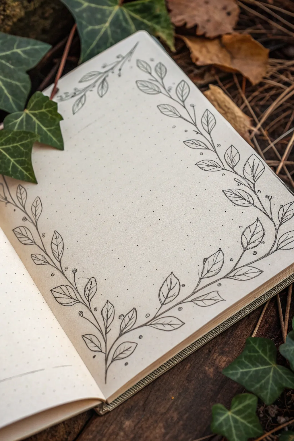
Transform a plain page into an inviting space for your thoughts with this elegant, hand-drawn vine border. Using simple line work on dot grid paper, this frame creates a natural, organic boundary perfect for journaling, quotes, or sketching.
How-To Guide
Materials
- Dot grid notebook or journal (A5 size recommended)
- Fine liner pen (black, 0.3mm or 0.5mm)
- Pencil (HB or 2B)
- Soft eraser
- Ruler (optional, for spacing check)
Step 1: Planning the Layout
-
Define the corners:
Visualize where your frame will sit. This design uses two main vine structures: one starting from the bottom left corner extending upwards and to the right, and another smaller one in the top right corner. -
Lightly sketch the primary stems:
Using your pencil, draw a long, curving S-shaped line starting from the bottom left corner. Let it curve gently up the left side and another branch curve along the bottom edge. -
Sketch the upper frame:
Repeat this process for the top right corner, but mirror the direction. Draw a main stem that sweeps down the right side and another that reaches across the top edge. Leave the very center of the page open.
Step 2: Inking the Vines
-
Trace the main stems:
Take your fine liner and confidently trace over your pencil stems. Don’t worry if the line isn’t perfectly smooth; small wobbles add to the organic wood-like texture. -
Add secondary branches:
From your main stems, draw shorter, thinner offshoot lines. These should curve outward in the direction of growth, creating attachment points for your leaves. -
Start the bottom-left leaves:
Begin adding leaves to the bottom-left vine. Draw simple pointy oval shapes at the end of each small branch. Vary the angles so they look like they are reaching for sunlight. -
Detail the top-right foliage:
Move to the top right corner and add leaves to those stems as well. Keep the size of the leaves consistent with the bottom corner for balance. -
Draw the center veins:
Inside each leaf shape, draw a single curved line down the middle. It doesn’t need to touch the tip or the base perfectly; a floating line often looks more artistic. -
Add side veins:
From the center vein, draw tiny diagonal flicks outward to suggest the texture of the leaf. I usually just do two or three per side to keep it from looking cluttered.
Uneven Lines?
Don’t stress over shaky lines. Thickening the line slightly at the curves or where the leaf meets the stem hides wobbles and adds depth.
Step 3: Embellishments and Cleanup
-
Incorporate berries:
Find empty spaces along the stem or near leaf clusters. Draw tiny circles attached to the main vine with short, thin stems to represent small berries or buds. -
Add floating dots:
Scatter a few tiny, unattached dots around the vines. These stippling marks add a bit of magic and help fill negative space without adding visual weight. -
Review the balance:
Look at the overall composition. If a section looks too empty, add a small extra curly tendril or another small leaf to fill the gap. -
Erase pencil guides:
Once the ink is completely dry (give it a full minute just to be safe), gently run your eraser over the whole drawing to remove the initial sketch lines. -
Refine the lines:
If any lines look too thin or faint after erasing, go over them once more to darken the black and make the illustration pop against the cream paper.
Add Some Color
Use watercolor pencils to lightly shade the inner leaves green, then brush with water for a soft, vintage botanical look.
You now have a beautiful, custom frame ready to surround your favorite quote or daily checklist
BRUSH GUIDE
The Right Brush for Every Stroke
From clean lines to bold texture — master brush choice, stroke control, and essential techniques.
Explore the Full Guide
Silhouette Landscape Strip
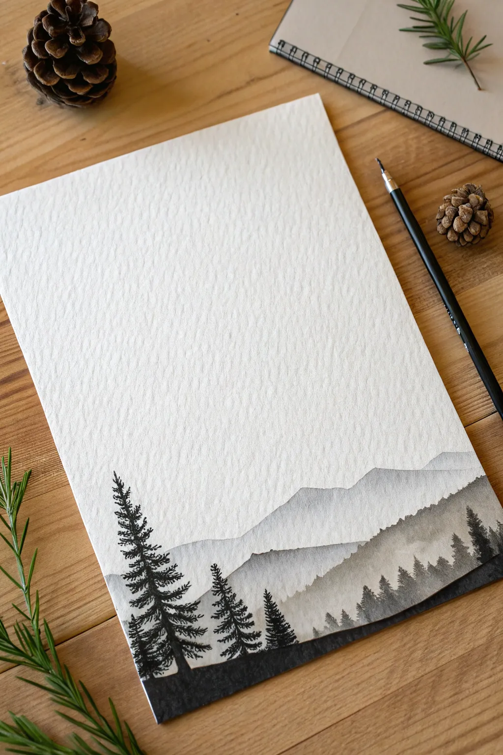
This elegant project creates a striking, minimalist border at the bottom of your page using layers of monochromatic watercolor washes and crisp ink details. The textured watercolor paper adds depth to the misty mountains, creating a moody, atmospheric foundation for further drawing or lettering above.
Step-by-Step
Materials
- Cold press watercolor paper (A4 or similar size)
- Black ink brush pen or fine liner (waterproof)
- Black watercolor paint
- Round watercolor brush (size 4 or 6)
- Clean water jar
- Palette for mixing washes
- Paper towel
Step 1: Painting the Atmospheric Layers
-
Prepare your washes:
Begin by creating three distinct puddles of black watercolor on your palette. One should be very diluted (pale grey), one medium strength (dark grey), and one concentrated (nearly black). -
Establish the horizon line:
Decide where your landscape strip will begin. For this minimal look, aim for the bottom quarter of the paper, keeping the majority of the page blank. -
Paint the furthest mountain range:
Load your brush with the scarcest, palest grey wash. Paint an irregular, wavy line roughly a third of the way up your designated landscape area to form the distant peaks. -
Fill the first layer:
Pull the pale wash down towards the bottom edge of the paper, ensuring the color remains consistent and light. Let the natural texture of the paper show through. -
Let it dry completely:
Wait until the first layer is bone dry. If the paper feels cool to the touch, it is still wet. This step is crucial to prevent the layers from bleeding into one another. -
Paint the middle range:
Using your medium-strength grey wash, paint a second mountain outline slightly below the first one. Make the peaks offset from the background layer for visual interest. -
Add texture to the middle ground:
While the medium grey paint is still wet, you can dab a tiny bit of darker pigment into the ‘valleys’ of this layer to suggest tree density. -
Fill and dry again:
Pull the medium wash down to the bottom edge, covering the lower part of the first layer. Allow this second layer to dry completely before proceeding. -
Create the foreground slope:
With the darkest, concentrated black watercolor, paint a final, closer hill shape at the very bottom. This should cover the base of the previous two layers. -
Feather the edges:
Before the dark black paint dries, you can experiment by using the tip of your brush to flick tiny, uneven upward strokes along the ridge to suggest a rough, grassy tree line.
Layering Pro Tip
For a true sense of depth, always ensure the wash gets darker as it moves closer to the bottom. The furthest mountains should be barely visible.
Step 2: Inking the Details
-
Switch to ink:
Once the watercolor layers are absolutely dry, switch to your black brush pen or fine liner. The ink needs to sit crisp on top of the paint. -
Start the main tree trunk:
On the left side of the composition, draw a vertical line for the tallest tree trunk. It adds character to make it slightly wavering rather than perfectly straight. -
add trunk thickness:
Thicken the base of the trunk where it meets the ground, creating a solid foundation. -
Draw the main branches:
Using short, quick strokes, add horizontal branches moving outward from the trunk. Keep them shorter at the top and wider as you move down. -
Texture the pine needles:
Use a stippling or scribbling motion over your branch lines to create dense, pine-needle textures. Leave small gaps between branches so the tree doesn’t look like a solid triangle. -
Add secondary trees:
Draw two or three smaller trees next to the large one. Vary their heights to create a natural-looking cluster. -
Draw the distant forest:
On the right side of the strip, use very small vertical strokes to create a jagged silhouette of tiny trees along the ridge of the medium-grey layer. -
Connect the ground:
Use your black ink or darkest watercolor to fill in the solid black ground beneath the detailed trees, ensuring the tree trunks serve as a seamless part of the silhouette. -
Final assessment:
Step back and check the balance. If the silhouette feels too heavy on one side, add a few tiny tree tops to the opposite ridge to even it out.
Fixing Blooms
If your watercolor dries with unwanted ‘cauliflower’ edges, simply re-wet that entire layer with a clean damp brush and smooth out the pigment.
Now you have a serene, atmospheric footer that perfectly frames the empty space above for your next creative idea


Have a question or want to share your own experience? I'd love to hear from you in the comments below!