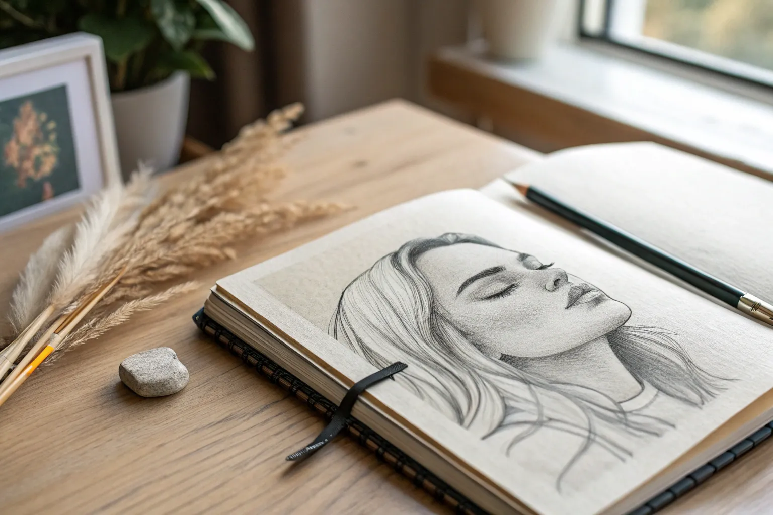
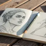
Whenever I’m stuck, I lean on good drawing ideas that feel doable in one sitting but still teach my hand something new. Here are my favorite go-to prompts—starting with the classics and easing you into more playful, wow-factor sketches.
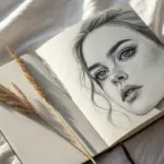
Realistic Eye Close-Up Study
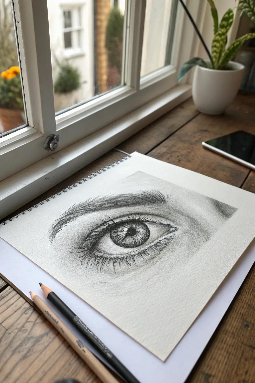
Capture the soul of the gaze with this detailed graphite study of a realistic human eye. This tutorial focuses on building subtle skin textures, lifelike iris depth, and wispy eyelashes to create a drawing that practically leaps off the sketchbook page.
How-To Guide
Materials
- High-quality sketchbook paper (medium tooth)
- Graphite pencils (suggested range: 2H, HB, 2B, 4B, 6B)
- Mechanical pencil (0.5mm HB) for fine details
- Kneaded eraser
- Blending stump or tortillon
- Soft tissue or cotton swab
- Pencil sharpener
Step 1: The Basic Framework
-
Light Outline:
Begin with a 2H pencil to lightly sketch the almond shape of the eye. Don’t press hard; we want these lines to disappear later. Mark the position of the tear duct on the inner corner and lightly indicate the crease of the upper eyelid and the curve of the eyebrow. -
Iris and Pupil Placement:
Draw a perfect circle for the iris, slightly obscuring the top third under the upper eyelid. In the exact center, draw a smaller circle for the pupil. Immediately sketch in a small, irregular shape for the highlight (reflection) overlapping the pupil and iris—preserving this white space is crucial for realism.
Uneven Tones?
If your shading looks scratchy, use a tortillon in small circular motions. Don’t press too hard, or you’ll burnish the paper and make it shiny.
Step 2: Shading the Eye
-
Darkening the Pupil:
Use a 4B or 6B pencil to fill in the pupil. Avoid the highlight area entirely. Make this the darkest value on your page to establish a contrast anchor. -
Iris Spokes:
Switch to a sharp HB or 2B pencil. Draw lines radiating outward from the pupil toward the outer rim of the iris, like bicycle spokes. Vary slight lengths and pressures to create a fibrous texture. -
Iris Depth and Rim:
Darken the outer ring of the iris (the limbal ring) with a 4B pencil, blending it slightly inward. Add shadow directly under the upper eyelid where it casts a shadow on the eyeball. -
Sclera Shading:
The white of the eye (sclera) isn’t truly white. Lightly shade the corners with a 2H pencil, leaving the center brightest to make the eye look spherical. Blend this with a tissue for a smooth, misty transition.
Pro Tip: The Waterline
Never connect the lower lashes directly to the white of the eye. Leave a small, light gap to represent the ‘waterline’ thickness of the lid.
Step 3: Skin and Texture
-
Eyelid Crease:
Define the crease above the eye with a 2B pencil. It should be a distinct, darker line that fades upwards. This creates the fold of skin. -
Under-Eye Volume:
Lightly shade the area beneath the lower lash line. Leave a tiny sliver of light immediately against the eyeball (the waterline) to show thickness. -
Building Skin Tone:
Using the side of an HB pencil, lay down a base tone for the skin around the eye. Use your blending stump to smooth this graphite out, creating a soft, fleshy texture. -
Adding Skin Texture:
I like to take a kneaded eraser and lightly tap the blended skin areas to lift distinct highlights, creating the look of pores or skin texture, especially on the upper lid.
Step 4: Hair and Fine Details
-
Eyebrow Foundations:
Sketch the eyebrow shape lightly. Instead of filling it in solid, draw individual hairs following the natural growth direction—upward at the inner corner, then flattening out toward the temple. -
Thickening Brows:
Layer darker strokes (4B) over lighter ones to add density. Keep the hairs slightly messy and overlapping for a natural look. -
First Layer of Lashes:
Using a mechanical pencil or very sharp 2B, draw the eyelashes. Start the stroke on the eyelid rim and flick outward quickly to get a tapered tip. Avoid making them straight; they should curve. -
Lash Variation:
Lashes clump together. Draw some hairs crossing over others or originating from the same point. Make the upper lashes longer and thicker than the lower lashes. -
Reflection Refinement:
Check the highlight in the eye. If it got smudged, use a mechanical eraser or the sharp edge of a typical eraser to bring it back to pure white. -
Final Contrast Check:
Step back and assess your values. Darken the pupil, the lash line, and the deepest crease shadows one last time to make the image pop.
Now you have a striking, soulful eye drawing to start your portrait portfolio


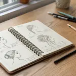
Hand Poses in a Mini Grid
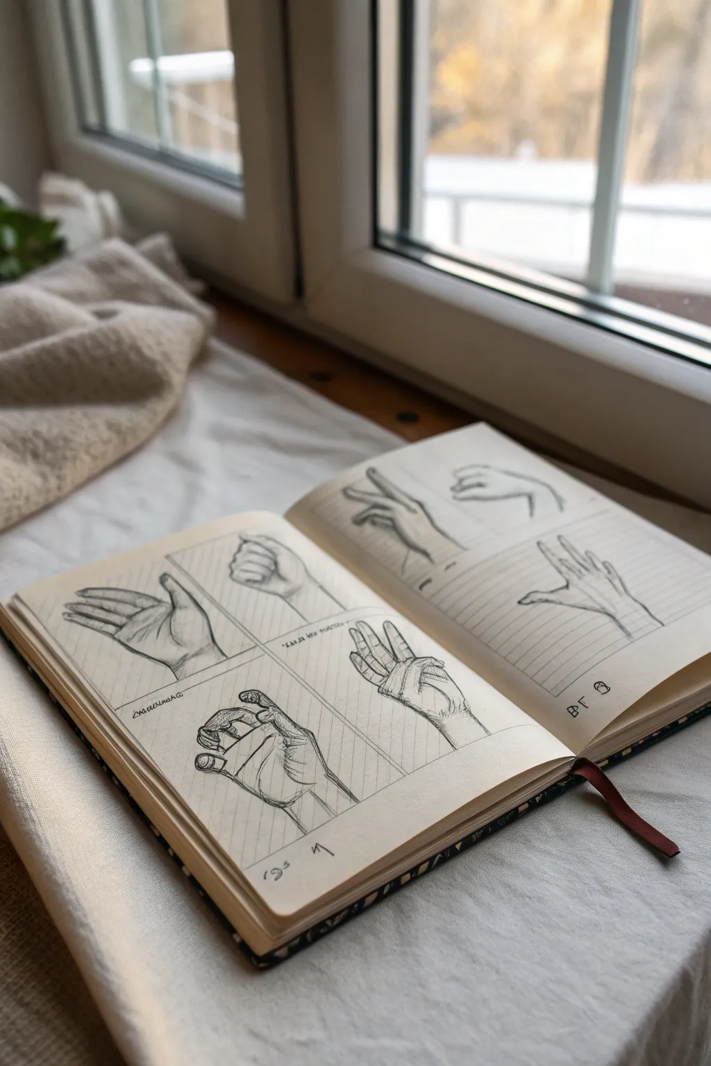
Mastering the complexities of the human hand becomes much more manageable when you break it down into a bite-sized grid of poses. This study sheet focuses on capturing various gestures and angles in pencil, creating a structured yet artistic reference page.
Detailed Instructions
Materials
- A5 Sketchbook or heavy drawing paper
- HB Graphite pencil (for initial layout)
- 2B or 4B Graphite pencil (for shading)
- Ruler
- Kneaded eraser
- Fine-liner pen (optional, for grid lines)
Step 1: Setting up the Grid
-
Space planning:
Begin by opening your sketchbook to a fresh two-page spread. Visualize dividing each page into four equal quadrants, giving you eight total spaces for drawing. -
Draw the frames:
Using your ruler and an HB pencil, lightly draw the dividing lines. You want a distinct cross shape on each page. Keep the pressure light so these lines remain subtle guides rather than harsh borders. -
Define the boundaries:
If you want a cleaner look like the reference creates, you can go over your grid lines with slightly more pressure or even a fine liner, but keeping them purely graphite allows the hands to be the main focus.
Wonky Fingers?
If fingers look like sausages, you likely forgot the knuckles. Draw the bony joints slightly wider than the segments between them to fix the structure.
Step 2: Basic Hand Construction
-
The palm block:
Start in the top-left box. Don’t try to draw fingers yet. Instead, lightly sketch a square or trapezoid shape to represent the main mass of the palm. -
Thumb structure:
Add a triangular wedge on the side of your palm block for the thumb’s base. This fleshy part is crucial for making the hand look three-dimensional. -
Finger flow lines:
Draw simple, single lines extending from the palm to indicate where each finger will go. This ‘stick figure’ phase helps you check the gesture before committing to details. -
Knuckle placement:
Mark small dots or circles on your flow lines where the knuckles will bend. Remember that fingers have three joints (except the thumb, which has two visible ones). -
Fleshing out:
Draw cylinders around your stick lines to give the fingers volume. Think of them as small tubes connected by the knuckle joints.
Use Your Own Hand
Take photos of your non-drawing hand in different lighting to use as a primary reference. It’s the most convenient model you’ll ever have.
Step 3: Exploring Poses
-
The relaxed open hand:
In the next box, try an open palm gesture. Focus on how the fingers naturally splay outward rather than staying perfectly parallel. -
The clenched fist:
For a fist pose, emphasize the tension. Draw the knuckles sharper and showing more angles. Notice how the thumb usually tucks across the first two fingers. -
Foreshortening practice:
Attempt a pose where a finger points toward the viewer. Draw that finger as a shorter, overlapping series of circles to create the illusion of depth. -
Pinching gesture:
Sketch a hand holding an invisible object. The key here is the negative space—the shape of the air between the thumb and index finger. -
Side profile:
Draw a hand from the side, focusing on the curve of the wrist and the thickness of the palm base.
Step 4: Refining and Shading
-
Outline confidence:
Switch to your softer 2B or 4B pencil. Go over your constructive sketch lines with darker, more confident strokes to define the final contours. -
Adding fingernails:
Sketch in the fingernails lightly. They help indicate the rotation of the finger tip. Ensure they wrap around the curve of the finger rather than sitting flat. -
Skin folds:
Add small creases at the knuckles and where the thumb meets the palm. These little lines add immense realism. -
Core shadows:
Identify where the light is coming from and lightly shade the side of the fingers opposite the light. I usually add a bit of shading under the palm to ground the hand. -
Wrist connection:
Don’t leave the hands floating; sketch a suggestion of the wrist or cuff at the bottom of each grid to anchor the drawing. -
Final notations:
Mimic the reference style by scribbling small notes or symbols (like ‘R’ or ‘L’ to denote right or left hand) near the drawings for that authentic sketchbook aesthetic.
Now you have a dynamic reference sheet that serves as both practice and a beautiful finished piece related to anatomy
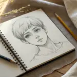
Facial Expressions Thumbnail Sheet
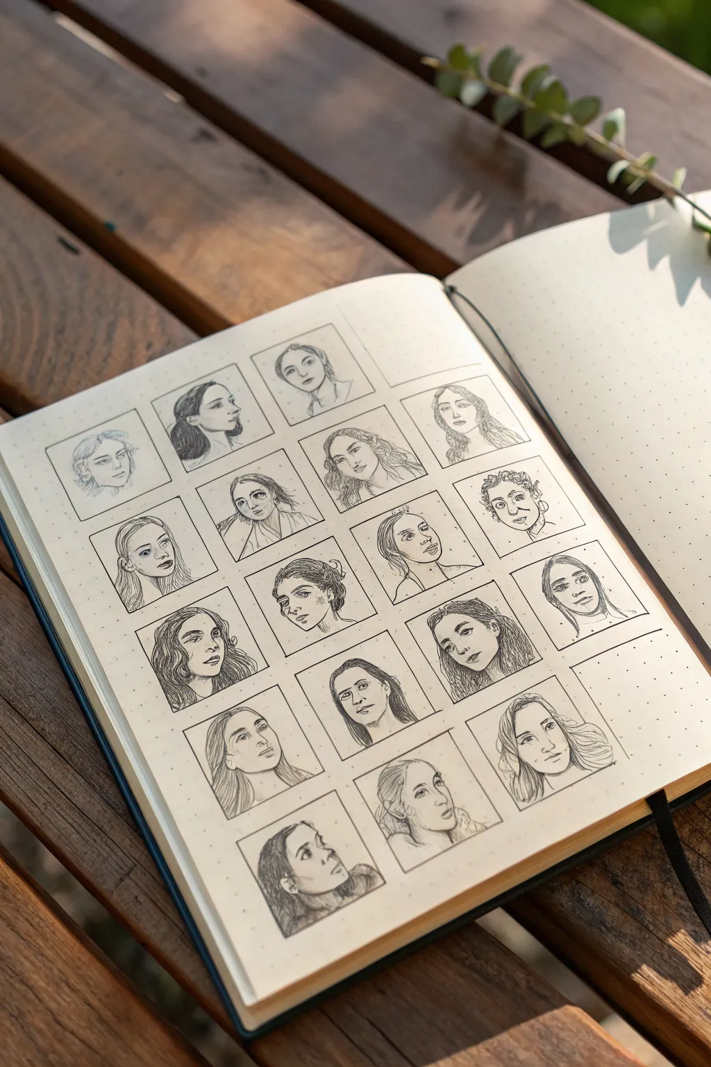
Capture the subtle nuances of human emotion with this organized facial expression study. By confining focused sketches into a neat grid, you create a visually satisfying collection that serves as both practice and a reference guide.
Step-by-Step Guide
Materials
- A5 Dot grid sketchbook (or blank paper with a ruler)
- Mechanical pencil (0.5mm, HB or B lead)
- Fine liner pen (0.1mm or 0.05mm, black)
- Ruler
- Eraser (kneaded preferred)
- Reference photos of faces
Step 1: Setting the Grid
-
Map out dimensions:
Begin by measuring the usable space on your sketchbook page. You’ll want to fit a grid of roughly 4 columns and 5 rows, depending on your paper size. -
Mark corner points:
Using your mechanical pencil and ruler, lightly mark the corners of your squares. Aim for squares that are approximately 3×3 cm or 4×4 cm. -
Draw the frame:
Connect your marks to create the grid. Keep your pencil pressure extremely light here, as you might want to ink these lines later or erase them for a borderless look. -
Ink the boxes:
Once satisfied with the spacing, trace over your grid lines with a fine liner pen. I find a ruler essential here to keep everything looking crisp and professional.
Smudged Ink?
If your ink smears when erasing, switch to a harder lead pencil (Like 2H) for sketching. It requires less pressure and is easier to erase without aggressive rubbing.
Step 2: Sketching the Faces
-
Select references:
Gather a variety of reference photos. Look for diversity in angles—profiles, 3/4 views, looking up, looking down—rather than just straight-on views. -
Gesture drawing:
Start with the first box. Lightly sketch the basic oval of the head and cross-lines for eye and nose placement to establish the angle. -
Feature placement:
Roughly place the eyes, nose, and mouth. Don’t worry about perfect likeness; focus on the direction the face is pointing and the emotion. -
Refining the outline:
Darken the jawline and hair shape. Notice how the hair frames the face and keep the strokes loose and flowing. -
Adding details:
Move to the next box and repeat. Try to vary the subject in each adjacent square so no two similar faces are next to each other. -
Shading basics:
Use light hatching to indicate shadows under the chin, nose, and distinct facial planes. This adds depth without needing full rendering. -
Working methodically:
Continue filling the grid row by row. If you get stuck on a difficult angle, skip it and come back later to avoid frustration.
Step 3: Finalizing the Lines
-
Review sketches:
Take a step back and look at the spread. Fix any proportions that look jarring—eyes that are too high or chins that are too small. -
Inking the portraits:
Using your fine liner, carefully go over your pencil sketches. Use broken lines for hair to keep it looking soft. -
Weight variation:
Press slightly harder on the underside of the jaw and hair to create line weight variation, which grounds the drawing. -
Minimalist shading:
Add very sparse hatching with the pen for the darkest areas, like pupils and nostrils. Keep the faces mostly clean line art. -
Erase pencil marks:
Wait at least 15 minutes for the ink to fully cure. Then, gently erase the underlying pencil structure, leaving only the crisp ink lines.
Pro Tip: Hair Flow
Don’t draw every single strand of hair. Draw the overall shape or ‘ribbon’ of the hair first, then add just a few internal lines to suggest texture and flow.
Now you have a stunning reference library of expressions right in your sketchbook


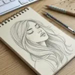
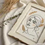
Side Profile Portrait Practice
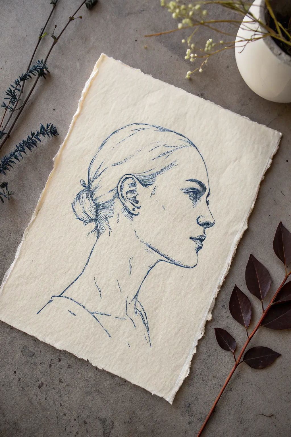
This elegant project focuses on capturing the delicate lines of a human profile using a single color of ink on textured paper. The result is a timeless, classical sketch that emphasizes form and contour over complex shading.
Step-by-Step
Materials
- Handmade or cold-press watercolor paper with deckled edges
- Fine liner pen (Navy Blue, 0.3mm or 0.5mm)
- Hard graphite pencil (2H or 4H) for initial sketch
- Kneaded eraser
Step 1: Laying the Foundation
-
Map out the head shape:
Begin with your hard pencil (2H). Lightly sketch a circle for the cranial mass and extend a jawline downwards to establish the basic shape of the head. -
Draw the center line:
Since this is a profile, draw a vertical line down the front edge of the face. This will be your guide for where the nose, lips, and chin protrude. -
Place the features:
Mark horizontal guidelines for the eye, the bottom of the nose, and the mouth. Keep these marks incredibly faint as you’ll want them to disappear later. -
Refine the profile silhouette:
With light pencil strokes, finalize the silhouette. Pay close attention to the slope of the forehead, the bridge of the nose, and the curve of the chin. -
Sketch the ear and neck:
Position the ear roughly between the eye and nose lines, set back on the head. Then, draw the sweeping curve of the neck and the hint of the collarbone. -
Outline the hair:
Block in the shape of the hair bun and the way the hair pulls back from the forehead. I find it helpful to focus on the overall mass of the hair rather than individual strands at this stage.
Step 2: Inking the Contours
-
Begin the ink outline:
Switch to your navy blue fine liner. Start with the most confident lines, likely the forehead and nose bridge. Use a broken, sketchy line quality rather than a single solid stroke to give the drawing life. -
Define the eye:
Carefully draw the eye in profile. Remember it looks like a sideways ‘V’ or triangle shape. Ink the pupil and iris, leaving a tiny white spot for a highlight. -
Detail the mouth and nose:
Ink the nostril and the lips. The upper lip usually overhangs slightly. Use very delicate pressure here; too much ink can make the features look heavy. -
Draw the ear structure:
Ink the complex curves of the ear. The helix and antihelix are just varying C-shapes and Y-shapes nested together.
Paper Choice Matters
The textured ‘tooth’ of cold-press or handmade paper naturally breaks up ink lines, creating that vintage, sketchy aesthetic instantly.
Step 3: Texture and Shading
-
Add hair texture:
Use long, sweeping strokes to mimic the direction of the hair pulled back into the bun. Keep the lines looser here than on the face. -
Create the bun:
Detail the bun itself with curved hatching lines that follow the spherical form of the hair knot. -
Shade with hatching:
Apply unidirectional hatching (parallel lines) to shadow areas: under the chin, beneath the nose, inside the ear, and at the nape of the neck. -
Cross-hatch darker areas:
For the deepest shadows, like the back of the hair bun or the corner of the jaw, add a second layer of lines perpendicular to your first set. -
Detail the neck muscles:
Add faint, somewhat vertical lines down the neck to suggest the sternocleidomastoid muscle without outlining it completely. -
Refine the shirt line:
Sketch in the suggestion of a shirt collar or shoulder line with loose, gestural strokes. This anchors the drawing so the head doesn’t look like it’s floating.
Try Sepia or Sanguine
For a Renaissance study look, swap the navy blue ink for a sepia (brown) or sanguine (reddish-brown) micro-pen or ink wash.
Step 4: Final Touches
-
Erase pencil marks:
Once the ink is absolutely dry (wait at least 15 minutes to be safe), gently roll your kneaded eraser over the paper to lift the graphite guidelines. -
Assess contrast:
Look at your drawing from a distance. If an area feels too flat, add a few more rapid hatching lines to deepen the blue tone.
Step back and admire how a single color can create such a striking sense of character and form
BRUSH GUIDE
The Right Brush for Every Stroke
From clean lines to bold texture — master brush choice, stroke control, and essential techniques.
Explore the Full Guide
Full-Body Gesture Drawing in Motion
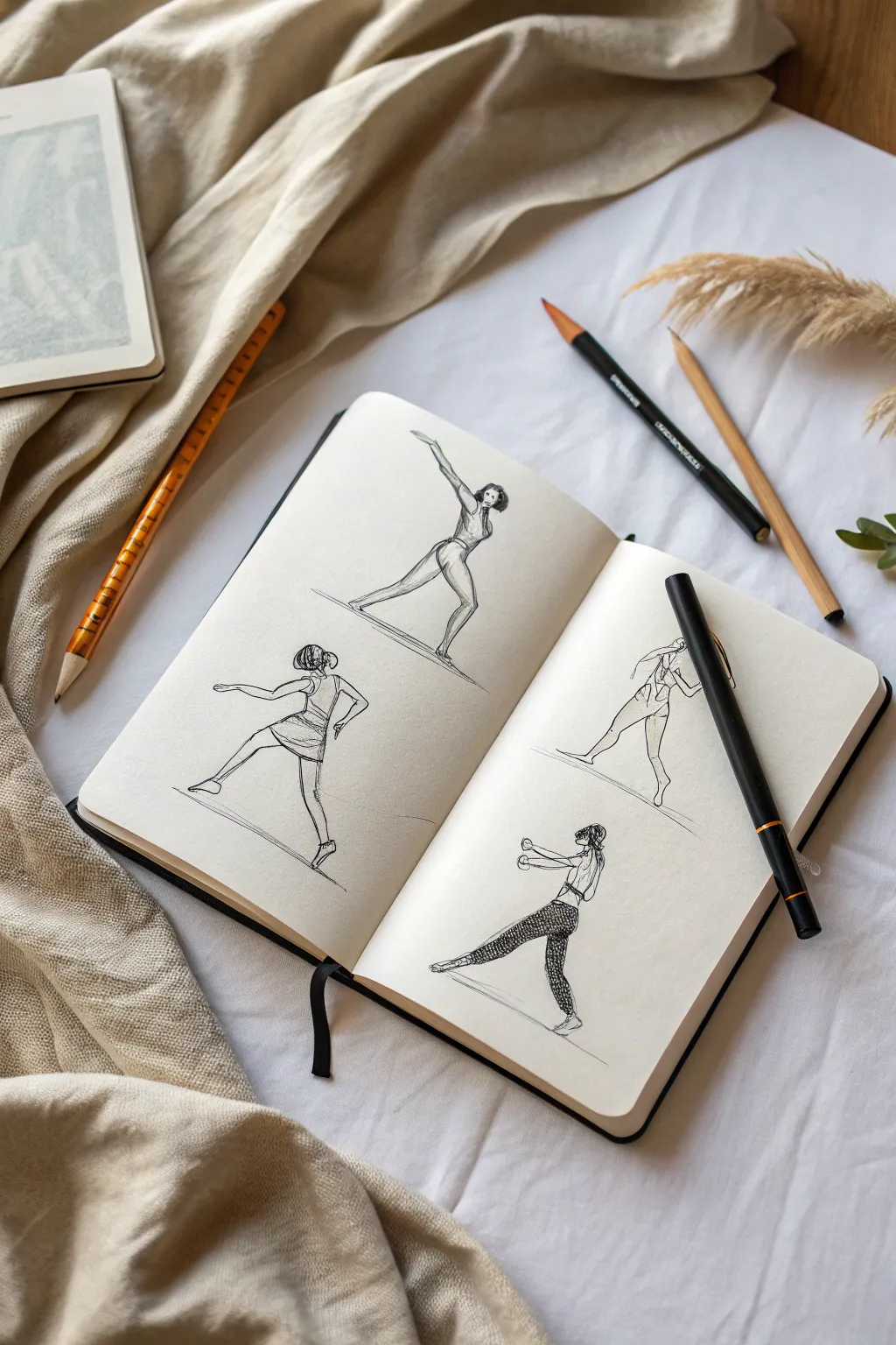
This project focuses on the fluid beauty of gesture drawing, capturing four distinct poses of movement across a double-page sketchbook spread. By combining loose pencil underlays with crisp ink lines, you’ll create a lively study of the human form in action.
Step-by-Step Tutorial
Materials
- Hardbound sketchbook (smooth paper)
- HB or 2B graphite pencil
- Fine liner pen (0.3mm or 0.5mm, black)
- Black brush pen or felt tip marker (optional for bolder lines)
- Eraser
- Reference photos of dancers or athletes
Step 1: Conceptual Layout
-
Divide the space:
Open your sketchbook to a fresh double-page spread. Mentally divide each page into roughly equal halves—top and bottom—to accommodate four figures total. -
Establish the ground lines:
Using your pencil very lightly, draw thin, diagonal lines beneath where each figure will stand. These don’t need to be perfectly straight; they act as a base to anchor the movement.
Step 2: Penciling the Forms
-
Gesture lines – Figure 1 (Top Left):
Start with the top-left figure. Sketch a long, sweeping curve for the spine and extended leg. Block in a triangular shape for the torso leaning forward and the arm reaching up. -
Refine Figure 1:
Flesh out the limbs with cylindrical shapes. Ensure the back leg is pushing off the ground line and the front leg is bent for stability. -
Gesture lines – Figure 2 (Bottom Left):
For the bottom-left pose, draw a C-curve spine. Position the figure in a crouch or lunge, with one arm extending backward for balance and the other reaching forward. -
Refine Figure 2:
Add details like the short skirt or tunic shape, which helps emphasize the movement of the hips. -
Gesture lines – Figure 3 (Top Right):
On the facing page, sketch a figure running or leaping away. Focus on the twist of the torso and the arms swinging in opposition to the legs. -
Refine Figure 3:
Outline the athletic wear, noting the racerback shape which creates interesting negative space on the back. -
Gesture lines – Figure 4 (Bottom Right):
Sketch the final figure in a defensive or martial arts stance. Draw a wide stance with knees bent and arms held up in a guard position.
Fixing Stiff Poses
If figures look stiff, exaggerate the ‘line of action’ (the main spinal curve) before drawing limbs. Push angles further than reality for dynamic effect.
Step 3: Inking Phase
-
Outline the contours:
Switch to your fine liner pen. Trace over your pencil lines, but keep the ink flowing and loose. Don’t worry about closing every single shape perfectly; gaps add energy. -
Define the clothing:
Ink the outlines of the clothing. For Figure 2 (bottom left) and Figure 3 (top right), add folds and seams to suggest lightweight fabric moving with the body. -
Add textural details:
For the bottom-right figure, create a pattern on the leggings. I find that stippling or small, tight scribbles allow you to build up a dark texture that contrasts nicely with the clean white paper. -
Refine hair:
Ink the hair shapes using quick, flicking strokes to simulate strands and movement. Keep the hair darker to frame the faces. -
Anchor the figures:
Go back over the diagonal ground lines with a single, confident ink stroke for each. This grounds the figures immediately. -
Erase guidelines:
Once the ink is completely dry (give it a few minutes to avoid smudges), gently erase all the underlying graphite sketch lines to reveal the clean ink work.
Level Up: Shadow Shapes
Use a light gray marker to add simple drop shadows under the feet or on the non-lit side of the limbs to give the figures instant volume.
Now you have a dynamic spread that captures the energy of movement with simple, elegant lines
Cute Pet Portrait From a Photo
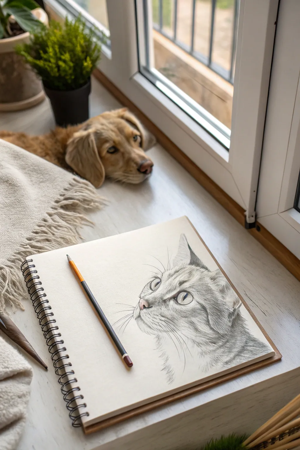
Capture the curious gaze of a feline friend with this detailed pencil study which balances soft fur textures with striking, sharp eyes. The finished piece has a lovely, classic sketch aesthetic that brings a sense of life and personality to the page.
Step-by-Step
Materials
- Heavyweight sketch paper or Bristol board (smooth surface preferred)
- Graphite pencils (HB, 2B, 4B, and 6B)
- Mechanical pencil (0.5mm HB) for fine details
- Kneaded eraser
- Stick eraser (tombow mono zero type)
- Blending stump or tortillon
- Reference photo of a cat looking up
Step 1: Initial Framework
-
Establish the basic shapes:
Begin by lightly sketching a large circle for the head and a smaller oval shape extending downwards for the neck and chest area. Keep your hand loose and use an HB pencil with very light pressure. -
Map facial guidelines:
Draw intersecting curved lines across the face circle to determine the angle of the head. Since the cat is looking up and to the left, your vertical center line should curve left, and the horizontal eye line should sit slightly higher on the circle. -
Place features loosely:
Mark the position of the eyes along the horizontal guide, keeping them almond-shaped. Sketch a small triangle for the nose and indicate the mouth and chin area below it. -
Refine the outline:
Connect your shapes to form the actual contour of the cat’s head, paying attention to the ears’ triangular shapes and the fluff of the cheek fur. Erase your initial construction lines with a kneaded eraser until they are barely visible ghosts.
Trouble with Smudging?
Place a scrap sheet of paper under your drawing hand. This protects your work from hand oils and prevents you from dragging graphite across the clean white background.
Step 2: Defining the Features
-
Detail the eyes:
Using a mechanical pencil or sharp 2B, outline the eyes crisply. Draw the pupils as vertical slits or ovals depending on the lighting in your reference. Leave a distinct, unshaded white circle in each eye for the highlight—this is crucial for life-like results. -
Shade the iris:
Fill in the pupils with a dark 4B or 6B. For the iris, use faint radial lines pointing toward the pupil, keeping the tone lighter near the bottom edge to simulate transparency. -
Sculpt the nose:
Define the nostrils with dark values. Shade the bridge of the nose lightly, leaving the top edge brighter to show dimension. -
Ear structure:
Darken the inner ear shadows using a 4B pencil, but ensure you draw around the tufts of light fur that grow inside the ear. Use negative drawing here—shading the dark skin to reveal the light hair shapes.
Step 3: Fur Texture and Shading
-
Directional mapping:
Before heavy shading, lightly stroke small arrows or lines indicating which way the fur grows in different areas: up the nose, curving around the cheeks, and sweeping down the neck. -
Base tonal layer:
Lay down a very soft, even layer of graphite over the shadowed areas of the face using an HB pencil. Smooth this gently with a blending stump to create a soft undercoat. -
Layering short strokes:
Switch to a sharp 2B pencil. Begin adding texture by drawing short, flicking strokes that follow your directional map. Start from the nose bridge and work outward towards the ears. -
Building contrast markings:
For the tabby markings or darker stripes, layer 4B strokes over your initial fur texture. Don’t color them in solid; build the dark stripe using hundreds of individual heavy hair strokes to maintain texture. -
Neck and chest fur:
The fur on the neck is typically longer and fluffier. Use longer, more sweeping pencil strokes here, and leave more white space between clusters to suggest volume.
Make it Yours
Try tinting just the eyes with colored pencils (like emerald green or amber) while keeping the rest of the fur in monochrome graphite for a striking focal point.
Step 4: Final Details
-
Deepen the blacks:
Take your 6B pencil and revisit the darkest points: the pupils, the deepest shadows inside the ears, and the core of the tabby stripes. This high contrast makes the drawing pop. -
Add whiskers:
Ensure your pencil is extremely sharp. Use quick, confident flicks for the whiskers. Press down at the muzzle and lift off as you sweep outward to get a tapered line. -
Whisker pores:
Add small, rhythmic dots on the muzzle pad where the whiskers originate. -
Lifting highlights:
I like to use a stick eraser (cut at an angle) to ‘draw’ white hairs back into the grey areas, especially around the ears and chin, and to clean up any smudges on the background paper.
Now you have a soulful pet portrait ready to be framed or gifted to a fellow animal lover

PENCIL GUIDE
Understanding Pencil Grades from H to B
From first sketch to finished drawing — learn pencil grades, line control, and shading techniques.
Explore the Full Guide
Bird on a Branch Silhouette Study
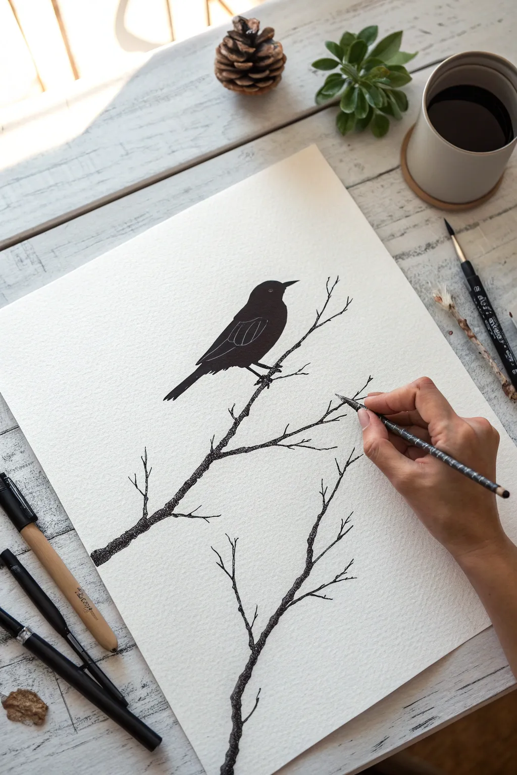
Capture the stark beauty of nature with this striking pen and ink illustration. Using a combination of solid fills and delicate stippling, this project teaches you how to render texture and contrast to create a minimalist yet detailed bird study.
Step-by-Step Guide
Materials
- Heavyweight textured drawing paper (hot press watercolor or bristol board)
- Black drawing ink or high-quality black gouache
- Fine-tipped sketching pencil (HB or H)
- Kneaded eraser
- Fine liner pens (sizes 0.1, 0.3, and 0.5)
- Small round brush (size 2 or 4)
- White gel pen or white gouache with a fine brush
Step 1: Sketching the Framework
-
Paper placement:
Begin by securing your paper to a flat, clean surface. If your paper is prone to curling, tape down the corners to keep it taut while you work. -
Outline the bird:
Using your HB pencil, lightly sketch the simplified shape of the bird. Start with an oval for the body and a smaller circle for the head, connecting them with a gentle slope for the neck. -
Refine the bird’s profile:
Firm up the silhouette. Define the sharp beak, the curve of the back, and the tail feathers extending downwards. Keep the lines faint so they can be erased later. -
Map the branches:
Sketch two main branches. Draw one diagonal line crossing from the bottom left upwards, passing under the bird’s feet. Draw a second, separate branch originating from the bottom center, reaching upwards into empty space. -
Add twig details:
Branch out from your main lines with smaller twigs. Keep these irregular and jagged to mimic nature—avoid perfect straight lines or smooth curves.
Ink Smudge Savior
Smudged the ink? Don’t panic. Wait for it to dry, then use white gouache or acrylic paint to carefully paint over the mistake. It acts like an artist’s correction fluid.
Step 2: Inking the Silhouette
-
Outline in ink:
Take your 0.5 fine liner or a brush with ink and carefully trace the final outline of the bird. Ignore the internal details for now; focus purely on the outer shape. -
Fill the body:
Using your small round brush and black ink (or a thick marker), fill in the entire body of the bird. Work slowly near the edges to keep the silhouette crisp and sharp. -
Detail the wing:
Once the black ink is completely dry, use a white gel pen or a very fine brush with white gouache to draw the wing details. Create a few curved lines to suggest the folded flight feathers against the dark body. -
Add the eye:
Place a single small white dot or tiny circle near the beak to represent the eye, giving the bird a spark of life.
Step 3: Texturing the Branches
-
Start the stippling:
Switch to your 0.1 fine liner. Instead of drawing solid lines for the branches, apply tiny dots (stippling) along your pencil guides. Concentrate the dots heavily on the underside of the branch to create shadow. -
Build the form:
Continue dots along the top edge of the branch but space them out more. This gradient from dense dots to sparse dots creates a cylindrical 3D effect. -
Connect the textures:
Use your 0.3 pen to add slightly larger dots or tiny dashes in the darkest areas of the bark. This variation in mark-making adds a rough, organic texture to the wood. -
Review the twig tips:
For the very ends of the delicate twigs, use the finest 0.1 pen and use fewer dots, allowing the line to fade out naturally rather than ending abruptly. -
Anchor the bird:
Ensure the bird’s feet look engaged with the branch. Add a little extra shading (more dots) right where the claws grip the wood to ground the subject. -
Clean up:
Wait at least 15 minutes to ensure all ink is bone dry. Gently erase any visible pencil sketch marks with your kneaded eraser to reveal the high-contrast finished piece.
Add a Splash
For a contemporary twist, dilute some watercolor or ink and add a soft, abstract wash of color behind the bird before you start inking to create an atmospheric background.
Now step back and admire the stark elegance of your high-contrast nature study
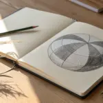
Mountain Scene Inside a Circle

This serene ink illustration captures the rugged beauty of a mountain landscape contained perfectly within a circular border. The stark contrast of black ink on textured paper creates a striking, minimal aesthetic that evokes the feeling of a quiet night in nature.
How-To Guide
Materials
- Sketchbook with textured or mixed-media paper
- Compass or a round object (approximately 3-4 inches diameter)
- Pencil (HB or H)
- Eraser (kneaded eraser preferred)
- Fine liner pen (01 or 03 size)
- Ultra-fine liner pen (005 size)
- Ruler (optional)
Step 1: Setting the Scene
-
Create the boundary:
Begin by lightly tracing a perfect circle in the center of your page using a compass or by tracing around a round object like a mug or jar lid. Keep your pencil pressure light so it can be erased later. -
Draft the mountain peaks:
Sketch the outline of two main mountain peaks. Place the taller peak slightly to the left of the center and a secondary peak to the right. Use jagged, angular lines to mimic rocky terrain. -
Add the foreground path:
Draw winding lines at the bottom of the circle to represent a river or a path leading toward the mountains. Let the lines widen as they approach the bottom edge to create perspective.
Don’t Rush the Hatching
When drawing shading lines on the mountains, pull the pen toward you in quick, confident strokes. Slow, hesitant lines often look shaky and unnatural.
Step 2: Inking the Structure
-
Inking the circle:
Take your 03 fine liner and carefully trace over the circular border. To give it a bit of weight and definition, draw a second circle just inside the first one, keeping the gap very narrow. -
Outline the mountains:
Switch to your 01 pen to ink the main outlines of the mountains. Don’t make the lines perfectly straight; let your hand wobble slightly to capture the organic roughness of the stone. -
Define the ridges:
Draw jagged lines down the center of each mountain peak to separate the light side from the shadowed side. These ridge lines dictate how simple or complex your shading will be later. -
Background details:
Ink a small crescent moon in the upper right sky area. Scatter a few tiny dots around the peaks for distant stars.
Uneven Circle?
If your freehand inking of the circle went astray, don’t worry. Simply thicken the line intentionally all the way around to hide the wobble and create a bold frame.
Step 3: Adding Nature Elements
-
Sketching the pine trees:
On the right side of the composition, draw a cluster of tall pine trees. Start with a vertical trunk line, then add horizontal zigzag strokes that get wider toward the bottom. -
Mid-ground forest:
Add a line of much smaller trees at the base of the mountains to create depth. These can be simple vertical dashes or tiny triangular shapes to imply a distant forest. -
Foreground trees:
Draw a few smaller, detailed pine trees on the left bank of the river/path. Keep these darker to ground the composition.
Step 4: Shading and Texture
-
Establishing light source:
Assume the light is coming from the upper right (implied by the moon). This means the left sides of the mountain slopes will be in shadow. -
Hatching the mountains:
Using the 005 ultra-fine pen, draw thin, parallel diagonal lines (hatching) on the shadowed side of the mountain peaks. Keep the lines close together for darker shadows. -
Adding rock texture:
On the lit side of the mountains, add just a few broken lines and dots to suggest cracks and crevices without overwhelming the white space. -
Stippling the ground:
Use a stippling technique (lots of tiny dots) to shade the banks of the river. Concentrate the dots near the tree lines and let them fade out toward the water. -
Water texture:
Draw long, horizontal lines across the water or path area. Keep these lines broken and sparse to suggest a reflective surface or flat ground. -
Final touches:
Darken the trees by going over their branches again if they look too faint. I usually find that a second pass adds necessary contrast. -
Cleanup:
Wait at least 10 minutes for the ink to dry completely, then gently erase all remaining pencil marks to reveal the crisp black lines.
You now have a miniature world captured elegantly on your page


Continuous-Line Contour of an Object
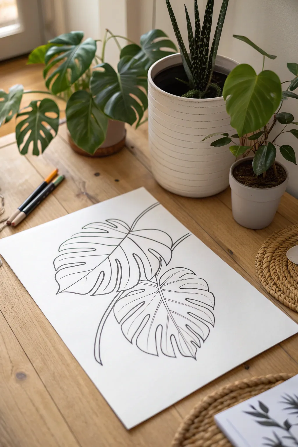
Capture the graceful, sweeping curves of tropical foliage with this elegant line drawing tutorial. By focusing on the distinctive silhouette and fenestration of the Monstera leaf, you’ll create a minimalist artwork that looks stunning in its simplicity.
Step-by-Step Guide
Materials
- High-quality white drawing paper (heavyweight cardstock or mixed media paper, A4 or A3 size)
- Black fineliner pen (0.4mm or 0.6mm tip)
- Thicker black marker or brush pen (optional, for line variation)
- HB Pencil
- Soft eraser
- Real or artificial Monstera leaves for reference (optional)
Step 1: Planning the Composition
-
Observe the shapes:
Begin by studying the structure of a Monstera leaf. Notice how it’s essentially a large heart shape that has characteristic splits (fenestrations) and holes. You’ll be drawing two overlapping leaves to create depth. -
Sketch the primary vein:
Using your HB pencil and very light pressure, draw a curved central line for the top leaf. This stem line gives the leaf its direction and flow. It should curve gently from the upper right toward the lower left. -
Outline the top leaf shape:
Lightly sketch a loose heart shape around the top stem. Don’t worry about the splits yet; just get the overall footprint of the leaf on the page. -
Position the second leaf:
Draw the central vein for the second leaf below the first one. Let it curve in a slightly different direction to add visual interest. Sketch the heart-shaped outline for this lower leaf, ensuring part of it tucks underneath the top leaf.
Shaky Lines?
Don’t fret if your hand wobbles. Instead of trying to fix it, drawing a second loose line right next to it can make the mistake look like intentional artistic style.
Step 2: Drafting the Details
-
Carve out the fenestrations:
Starting with the top leaf, sketch deep indentations into the side of your heart shape. These ‘fingers’ of the leaf should vary in width. Make them curve slightly backward toward the stem. -
Refine the leaf edges:
Connect the tips of your leaf sections. Instead of sharp points, give the tips a slightly rounded, organic feel. Ensure the lines flow smoothly from one section to the next. -
Add the veins:
Sketch the secondary veins branching out from the central midrib. These should aim toward the widest part of each leaf section. -
Repeat for the lower leaf:
Draft the splits and edges for the bottom leaf. Pay close attention to where the lines disappear behind the top leaf, creating a natural overlap. -
Review and adjust:
Take a step back. Erase any distracting construction lines and refine the pencil sketch until you are happy with the balance and negative space.
Step 3: Inking the Artwork
-
Begin the final outline:
Pick up your black fineliner. Start with the central stem of the top leaf. Draw this with a confident, continuous stroke if possible to avoid shaky lines. -
Trace the leaf contour:
Carefully ink the outer edges of the top leaf. I prefer to rotate the paper as I work so my hand always has a comfortable angle for the curves. Follow your pencil guides but allow small organic wobbles to remain. -
Ink the bottom leaf:
Proceed to the lower leaf. Remember to stop your pen line exactly where the bottom leaf meets the edge of the top leaf, preserving the illusion of overlap. -
Add internal details:
Draw the veins inside the leaves. You might want to make these lines slightly thinner or lighter than the exterior outline to suggest delicacy. -
Thicken key areas:
Go back over your main contour lines to add subtle line weight variation. Thickening the lines where the leaves overlap or curve downward can create a shadow effect. -
Connect the stems:
Ensure the stems trail off naturally at the top or join a theoretical main branch if you prefer a stemmed look.
Pro Tip: Line Weight
Use a slightly thicker marker for the absolute outer perimeter of the leaves and a very fine 0.4mm pen for the interior veins. This contrast makes the drawing pop.
Step 4: Final Touches
-
Let the ink set:
Wait at least 5-10 minutes for the ink to dry completely. If you erase too soon, the black ink (especially from rollerballs or gel pens) will smudge instantly. -
Erase pencil marks:
Gently rub your soft eraser over the entire drawing to remove the graphite guidelines, leaving only the crisp black ink. -
Clean up:
Brush away the eraser dust and inspect the lines. If you see any gaps in your black lines, reinforce them now for a solid, finished appearance.
Frame your new botanical illustration in a simple wood frame to bring a touch of nature indoors


Have a question or want to share your own experience? I'd love to hear from you in the comments below!