Color mixing often feels like alchemy—sometimes you create magic, and sometimes you end up with an uninspiring gray-brown paste. The difference lies not in mysterious talent, but in understanding how pigments behave and why certain color combinations produce brilliance while others produce mud. Let me walk you through the principles that make the difference.
What Is “Mud” and Why It Happens

Before we can fix muddy colors, we need to understand what creates them. Muddy colors are those desaturated, dull, brownish or grayish tones that lack vibrancy and appear lifeless in your work. They’re not always mistakes—sometimes you’ll intentionally mix them for shadows or weathered surfaces—but when they appear where you wanted brilliance, they can ruin an otherwise promising piece.
Muddy colors happen for specific, predictable reasons. The most common culprit is mixing complementary colors—those opposites on the color wheel like red and green, blue and orange, or yellow and purple. When these pairs combine, they neutralize each other, creating neutral grays or browns. Another frequent cause is overmixing: the moment you combine too many pigments together, they begin canceling each other out through chemical interaction.
Understanding these principles means you’re no longer at the mercy of random results. Instead, you gain control.


The Hidden Truth About Your Paints: Color Bias

Here’s what most beginners don’t realize: the red in your paint tube isn’t a “pure” red. Neither is your yellow or blue. Every pigment has a subtle lean or bias toward another color. A red might lean slightly yellowish (warm) or bluish (cool). Your yellows might hover toward green or red. Your blues might favor green or red. This isn’t a deficiency—it’s the nature of real pigments.
This matters enormously when mixing. When you want to create a brilliant purple, you can’t just grab any red and any blue. You need a red that leans blue (cool) and a blue that leans red (warm). Mixing these creates a vibrant purple because you’re bringing together only the colors you want—red and blue—without accidentally introducing unwanted undertones.
Conversely, if you mix a red that leans yellow with a blue that also leans yellow, you’ve accidentally introduced yellow into your purple mixture. Red plus blue plus yellow creates a neutral, muddy result because you’ve mixed all three primary colors together—the formula for brown.
Learning to identify color bias is transformative. Look closely at your paints. Compare a warm red (leaning yellow) with a cool red (leaning blue). The difference might seem subtle at first, but once you train your eye, you’ll see it clearly. The same principle applies to every color on your palette.
Quick Bias Identification Test:
- Hold two reds side by side. One should appear more orange-toned (warm), one more purple-toned (cool)
- Compare two blues. One leans toward green, one toward red
- Examine your yellows. One leans toward orange, one toward green
- If you can’t see the difference, move them closer to a light source. Bias becomes more obvious in good lighting
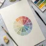


The Split Primary Palette Method: Your Secret Weapon

The most effective system for avoiding mud is the split primary palette—a method that addresses the fundamental limitations of real pigments. Instead of working with one red, one yellow, and one blue, you use two versions of each primary: one warm and one cool.
Your basic split primary setup includes:
- Two reds: a warm red (leaning toward yellow) and a cool red (leaning toward blue/magenta)
- Two yellows: a warm yellow (leaning toward orange) and a cool yellow (leaning toward green)
- Two blues: a warm blue (leaning toward red) and a cool blue (leaning toward green)
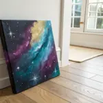
This system works because it ensures that no matter which color you’re mixing, you can find two primaries that share the bias you need. To mix brilliant orange, combine warm red with warm yellow—both colors that naturally lean toward orange. To mix vibrant green, combine cool yellow with cool blue—again, colors that both lean toward green. For radiant purple, mix cool red with cool blue.
The rule is simple: don’t cross the lines. Imagine your palette divided into three zones:
| Zone | Colors | Result | Rule |
|---|---|---|---|
| Warm (Oranges) | Warm Red + Warm Yellow | Vibrant Orange | Stay within warm primaries |
| Cool (Greens) | Cool Yellow + Cool Blue | Vibrant Green | Stay within cool primaries |
| Cool (Purples) | Cool Red + Cool Blue | Rich Violet | Stay within cool primaries |
When you stay within your zone, you create high-intensity color. When you cross the line and mix colors from different zones, you introduce that unwanted third primary and create muted tones.
Of course, sometimes muted tones are exactly what you want. For creating subtle background colors, shadows, or earth tones, crossing the lines intentionally gives you sophisticated, nuanced results without the harsh quality of added black or gray.

Color Temperature: The Subtle Dance

Temperature—the warmth or coolness of a color—is your most powerful tool for controlling brilliance and harmony. Warm colors are red, orange, and yellow. Cool colors are green, blue, and violet. But here’s the subtlety: temperature is relative. An ultramarine blue is cooler than a cerulean blue, but it’s still warmer than a pure green. A scarlet red is warmer than a magenta, but cooler than a pure orange.
When mixing, colors with similar temperature produce brighter, more vivid results. A yellowish-red mixed with a reddish-yellow creates a vibrant orange. A bluish-red mixed with a reddish-blue creates a rich purple. The colors are drawn toward their shared secondary goal, reinforcing each other rather than fighting.
When you mix colors with opposing temperatures—say, a warm yellow with a cool red—you introduce conflicting signals. The yellow pulls toward orange while the cool red pulls toward blue. Instead of a decisive orange, you get something ambiguous and desaturated.
This principle extends beyond simple color mixing into the entire feel of your work. A painting that uses predominantly warm colors feels energetic and inviting. A predominantly cool palette feels calm and distant. When you deliberately mix warm and cool in the same area, you create visual tension and interest—a valuable technique when you want to draw attention to specific elements.
Saturation and Brilliance: Controlling Intensity

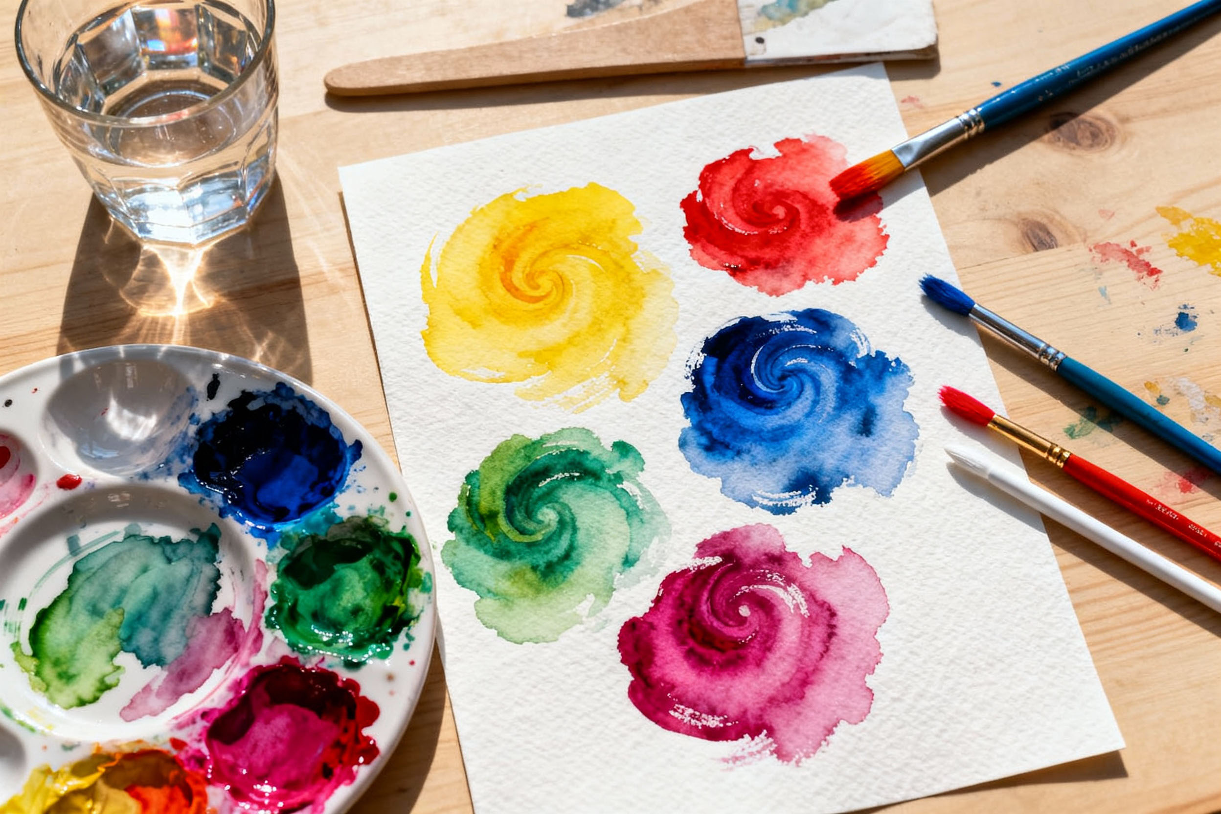
Saturation—also called chroma—describes how vivid, intense, or pure a color is. A fully saturated red is brilliant and unmixed. As you reduce saturation, the color becomes duller, grayer, and less intense until it approaches neutral gray.
Many beginning artists mistake highly saturated colors as lighter than they actually are. A vivid red can be surprisingly dark in value. Understanding this distinction matters because you’ll make better choices about where to place your most vibrant colors. Typically, you’ll use highly saturated colors sparingly—as accents and focal points. The dull, desaturated colors should occupy most of your painting, with vibrant hues used strategically.
To reduce saturation intentionally, you have several options:
- Adding white makes the color lighter but significantly reduces saturation (results in chalky, artificial-looking tints)
- Adding black darkens the color but also changes its character
- Adding gray reduces saturation while maintaining the color’s character
- Adding the complementary color provides the most elegant control—a tiny bit of green to reduce vivid red, for example
The most important principle: stop mixing before the color looks completely flat. Leave little streaks or swirls of the original colors showing. These subtle variations create depth and visual interest. Your colors will breathe.
Practical Recipes: Creating Brilliant Tones
Vibrant Oranges and Warm Yellows
For a brilliant orange, choose a red with warmth (leaning yellow) and a yellow that also leans warm (leaning orange). Mix them in roughly equal proportions, adjusting the ratio depending on whether you want more warmth or more golden tones. Cadmium Red and Cadmium Yellow produce vivid oranges that sing.
To create a warm yellow-orange, simply increase the yellow proportion. For a red-orange, increase the red. The key is that both colors naturally want to become orange—they’re not fighting each other.
Rich and Radiant Greens
This is where split primary work shines. A cool yellow (such as Cadmium Lemon or Hansa Yellow Light, which lean toward blue) mixed with a cool blue (Prussian Blue or Phthalo Blue Green, which lean toward yellow) creates greens of remarkable clarity and vibrancy.
For yellow-green, increase the yellow proportion. For blue-green, increase the blue. You can create an entire family of brilliant greens simply by adjusting proportions—all without adding black or gray.
If you mistakenly mix a warm yellow with a warm blue, you’ll get a muddy, dull green. This is because the warm yellow introduces red undertones while the warm blue introduces red undertones, and red plus blue plus yellow creates that inevitable brown-gray.
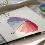
Brilliant Purples and Violets
For glowing purples, mix a cool red (such as Alizarin Crimson or Permanent Rose) with a cool blue (Prussian Blue or Ultramarine). Both colors naturally bias toward purple, so they reinforce each other’s secondary goal.
A reddish-purple emphasizes the red—useful for warmer, more aggressive purples. A bluish-purple emphasizes the blue for cooler, more retreating tones. Experiment with proportions to find the purple character you need.
Earth Tones and Sophisticated Neutrals
Paradoxically, the most beautiful earth tones come not from tubes of premixed Raw Umber, but from mixing primaries together intentionally. Raw umber is essentially a dull, darkened orange. To mix your own, combine red and yellow to create orange, then add a touch of blue to desaturate it. Adjust until you achieve that warm, earthy brown.
Quick Reference: Mixing Earth Tones
| Earth Tone | Base Mix | Refinement |
|---|---|---|
| Raw Umber | Red + Yellow | Add small touch of Blue to dull |
| Burnt Sienna | Red + Yellow (more saturated) | Add touch of Blue for richness |
| Yellow Ochre | Yellow + small Red | Add small Blue for ochered quality |
| Raw Sienna | Yellow + Red | Lighter, warmer than umber |
Burnt sienna is a similar dull orange, but warmer and slightly more saturated. Experiment with different proportions of red, yellow, and blue to find the character you prefer.
Yellow ochre is a dull yellow. Start with a warm yellow (Cadmium Yellow), add a tiny touch of red (to warm and darken it), then a tiny touch of blue (to desaturate it and create that ochered quality). Again, proportions determine character—more blue creates a cooler, grayer ochre; more red creates a warmer, more golden version.
For sophisticated neutral grays and browns, mix complementary colors in controlled proportions. Burnt Sienna plus Ultramarine Blue creates a much livelier neutral than purchased Payne’s Grey, which often contains black and looks flat. The beauty of this approach is that the neutral retains hint of warmth or coolness depending on which color dominates—allowing your neutrals to harmonize with your color scheme rather than appearing disconnected.
The Role of Transparency and Opacity
Not all pigments are created equal. Some—like Alizarin Crimson, Indian Yellow, and Phthalo Blue—are transparent. Light passes through them, giving them a luminous quality, especially when layered. Others—like Cadmium colors, Cerulean Blue, and Titanium White—are opaque. They sit on the surface with better coverage.
When you mix two transparent colors, the result maintains luminosity and brilliance. When you mix transparent with opaque, the result often appears duller and more chalky. If you want your mixes to shine with clean, bright color, prioritize transparent pigments in your initial washes and builds. You can add opaque colors later for texture and coverage if needed.
Understanding the transparency of your specific paints is worth the investigation. Create a simple test: paint a horizontal stripe of black paint. Let it dry. Then run vertical stripes of your colors over the black line. Opaque colors will sit on top, appearing to advance. Transparent colors will seem to recede behind the line. This single test teaches you more about your paints than any description.
Common Mistakes and How to Avoid Them
Overmixing. This is the most frequent mistake. Acrylic and watercolor paints blend beautifully, but that speed is deceptive. If you keep stirring until colors look completely uniform like pancake batter, you’ve killed the color’s vitality. The solution is simple: stop before it looks completely flat. Leave streaks and swirls.
Dirty brushes. Even minuscule amounts of leftover color from a previous mix can contaminate your new mixture. Rinse thoroughly between colors. Wipe your brush with a cloth after rinsing to ensure it’s truly clean. For precise color control, use a separate brush for each color or at minimum have two or three brushes designated for different color families.
Too many colors on the palette. More options sounds like freedom, but it’s actually a trap. With a limited palette—say, two reds, two yellows, two blues, and one earth tone—you quickly learn how each color interacts. You develop intuition. With dozens of colors available, you become overwhelmed and make random choices that look discordant. Restriction builds skill.
Ignoring color bias. This single mistake is responsible for more muddy colors than any other factor. Every time you reach for paints without considering their bias, you’re gambling. Train yourself to ask: Does this red lean warm or cool? Does my blue lean warm or cool? Do they share the bias I need? This habit takes seconds but prevents disaster.
Over-relying on white to lighten. White is useful, but overusing it reduces saturation dramatically and creates chalky, artificial-looking tints. Instead, consider lightening with a lighter color of the same hue, or mixing in a lighter complement. Yellow, for instance, is naturally light and can brighten many colors without the desaturating effect of white.
Layering improperly. When you paint wet-on-wet or blend damp paint excessively, unintended colors can mix. If you’re layering blue over yellow to create green, ensure your blue doesn’t have red undertones (which would create muddy brown instead). Allow layers to dry between applications for more control, or work with transparent glazes if you’re building optically mixed colors.
Practical Exercises to Build Your Skill: The Mixing Chart
This is the gold standard exercise, used by professional artists to understand their specific paints. Create a grid where each column and row represents a different color from your palette. In each cell where two colors intersect, mix them together and paint the result.
You’ll discover which combinations create vibrant secondaries and which create muted earth tones. You’ll learn your palette’s full range. This chart becomes a personal reference you’ll return to for years.
This printable guide provides a hands-on way to practice the split primary method. Print it out, gather your paints, and work through each zone. The comparison tests between vibrant and muddy mixes will cement your understanding faster than any amount of reading. Keep your completed exercise as a reference—return to it whenever you need to troubleshoot a color mixing problem.
Key Takeaways
Brilliant color doesn’t require expensive specialty paints or mysterious techniques. It requires understanding:
Color bias is fundamental. Every pigment leans toward another color. Identify these biases and choose complementary biases for brilliant mixing.
Split primaries solve the muddy color problem systematically. Two versions of each primary gives you the tools to create any color brilliantly.
Stay within zones. Warm primaries create warm secondaries. Cool primaries create cool secondaries. Crossing zones mutes.
Temperature matters. Similar temperatures reinforce; opposite temperatures neutralize.
Saturation is control. Use high saturation sparingly for impact. Let desaturated colors do the visual work.
Practical experience teaches. Theory informs, but hands-on mixing and testing builds genuine skill.
The next time you’re faced with a murky mixture, remember: you didn’t fail, you simply mixed the wrong combination. Now you know why—and how to choose better next time.


Have a question or want to share your own experience? I'd love to hear from you in the comments below!