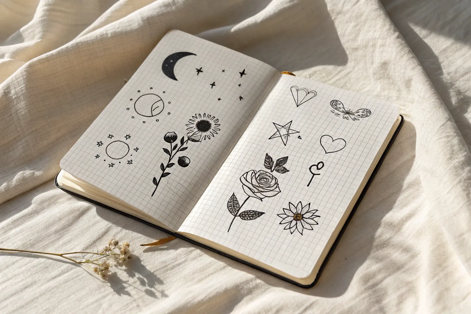
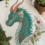
If you’re hunting for easy tattoo drawing ideas you can sketch fast and still feel proud of, you’re in the right creative headspace. I’m sharing my go-to linework designs that stay simple, read clearly at small sizes, and look awesome grouped together like a mini flash sheet.
Tiny Hearts and Simple Variations
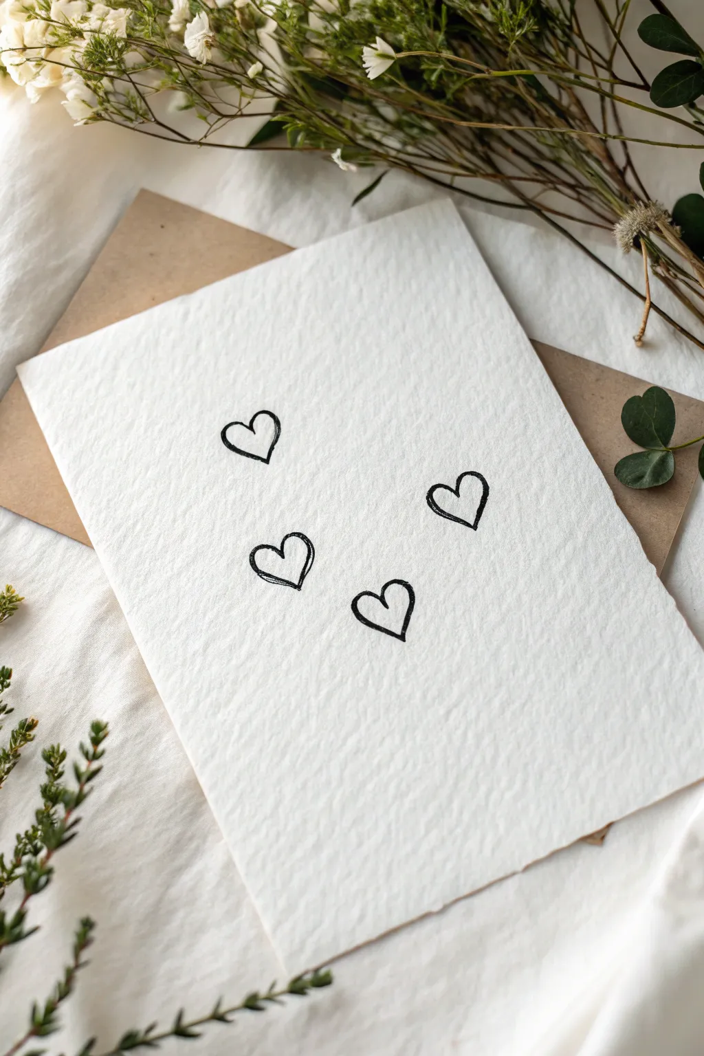
Capture the essence of simple love with this minimalist card design featuring four hand-drawn hearts on luxurious textured paper. The charm lies in the imperfect, sketchy lines that give the artwork an organic and heartfelt feel.
Step-by-Step
Materials
- Heavyweight textured paper (cold press watercolor or cotton rag)
- Fine liner pen (size 05 or 08) or felt-tip marker, black
- Pencil (HB)
- Kneaded eraser
- Brown kraft envelope (for display/sending)
Step 1: Preparation & Layout
-
Select your paper:
Choose a high-quality paper with visible texture. Cold press watercolor paper or handmade cotton rag paper works best to replicate the bumpy surface seen in the reference. -
Size the paper:
Cut your paper to a standard greeting card size, roughly 5×7 inches, or slightly smaller if you want it to nestle perfectly inside an envelope. -
Plan the composition:
Visualize where the four hearts will sit. They should float in the middle area, staggered naturally rather than in a rigid grid. -
Sketch placement lightly:
Using your HB pencil, very lightly mark four small dots or faint circles where the center of each heart will be. This acts as your anchor points. -
Draft the heart shapes:
Lightly sketch the outline of the four hearts with your pencil. Keep them small—about the size of a fingertip. Don’t worry about perfect symmetry; a slight tilt makes them cuter. -
Review the spacing:
Take a step back. Ensure the hearts aren’t too crowded. The top left and top right hearts should act as the upper boundary, forming a loose constellation with the lower two.
Step 2: Inking the Hearts
-
Prepare your pen:
Test your black fine liner or felt-tip marker on a scrap piece of the same paper. Textured paper can bleed, so ensure the ink holds a clean line. -
Ink the first heart:
Start with the top-left heart. Draw the outline with a confident motion. I find that lifting the pen slightly at the bottom point creates a nice tapered finish. -
Create the sketchy look:
Instead of one perfect continuous line, allow your hand to be a bit loose. Go over parts of the line a second time if needed to thicken it slightly, mimicking a doodle style. -
Ink the remaining hearts:
Proceed to the other three hearts. Vary the pressure slightly—some curves can be thicker, others thinner. This adds visual interest. -
add subtle imperfections:
If a line looks too perfect, add a tiny extra stroke right next to it or slightly unconnected at the cupid’s bow. This replicates the ‘sketch’ aesthetic.
Use the Grain
Draw slowly on textured paper. Let the pen nib ride the bumps rather than forcing a straight line; the wobble adds character.
Step 3: Finishing Touches
-
Let the ink dry:
Wait at least 5-10 minutes. Textured paper holds ink in its crevices, meaning it takes longer to dry than smooth paper. -
Erase pencil marks:
Gently dab—don’t rub—the paper with your kneaded eraser to lift the graphite guidelines. Rubbing too hard might damage the paper’s texture. -
Check line density:
Look at your black lines again. If the texture of the paper caused ‘skips’ or white spots in the ink, carefully touch them up to ensure the hearts look bold. -
Final inspection:
Brush away any eraser crumbs. Your artwork should look clean, with the stark black ink contrasting beautifully against the rough white paper. -
Presentation:
Place your finished drawing atop a brown kraft envelope or background to create the warm, rustic contrast shown in the project photo.
Add a Splash
For a subtle pop, paint a very faint, off-register watercolor wash of light pink or red behind just one of the hearts.
Now you have a charming piece of hand-drawn art ready to frame or gift to someone special

Classic Stars and Bold Star Fills
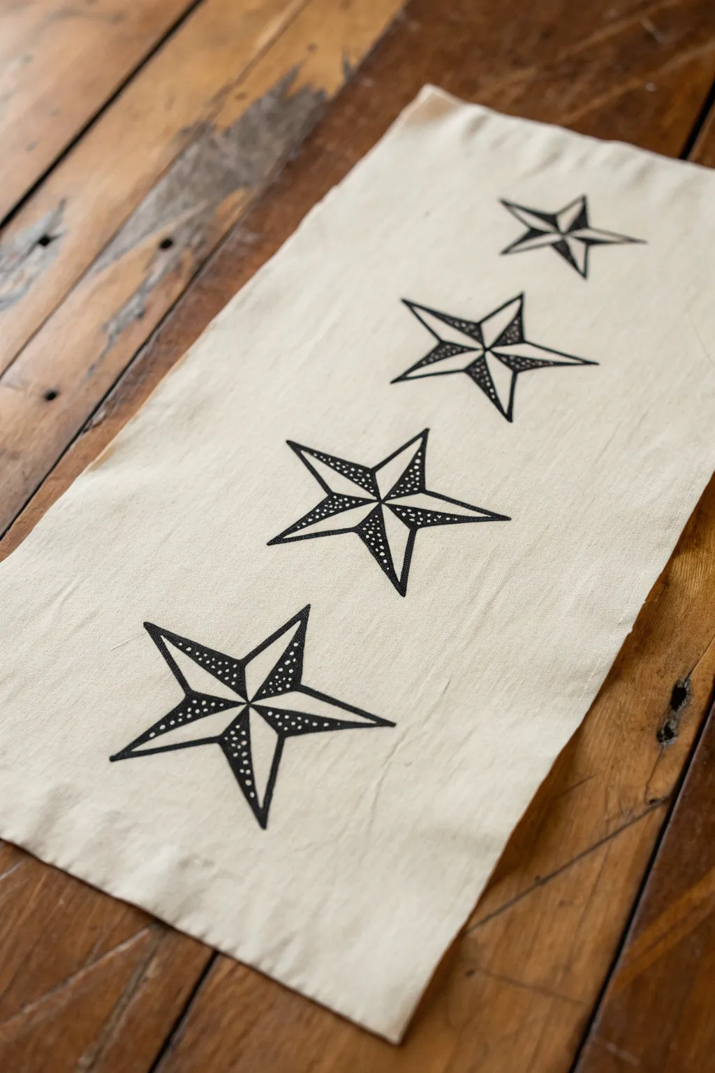
Create a striking piece of home decor with this block-printed table runner featuring classic nautical stars. The bold graphic lines and stippled shading evoke traditional tattoo artistry, bringing a touch of vintage maritime charm to your dining space.
Step-by-Step Guide
Materials
- Natural canvas or linen fabric runner
- Soft linoleum block (at least 4×6 inches)
- Linoleum carving tools (V-gouge and U-gouge)
- Black fabric block printing ink
- Brayer (rubber roller)
- Pencil and eraser
- Ruler
- Tracing paper
- Glass or acrylic sheet (for rolling ink)
- Barren or a clean wooden spoon
Step 1: Designing the Star Block
-
Draft the star shape:
Start by drawing a perfect five-pointed star on a piece of paper. Use a ruler to ensure the lines are straight and the points are even. You want the star to be roughly 4 to 5 inches in diameter for a bold look. -
Add internal split lines:
Draw a line from the tip of each star point directly to the center of the star. This divides each point into two triangles, creating the classic beveled nautical star appearance. -
Transfer to block:
Place tracing paper over your drawing and trace the lines with a soft pencil. Flip the tracing paper graphite-side down onto your linoleum block and rub firmly to transfer the image. -
Mark shading areas:
Before carving, clearly mark which triangles will be solid black and which will be left empty or stippled. In a nautical star, every other triangle alternates shading to create a 3D effect.
Pro Tip: Sharp Points
To keep the star points needle-sharp, always carve *away* from the intersection points toward the outside edge. This prevents the delicate linoleum tips from snapping off.
Step 2: Carving the Linoleum
-
Outline the shape:
Using your smallest V-gouge, carefully carve along all the pencil lines first. This ‘stops’ the cuts and prevents you from accidentally slicing into the parts of the design you want to keep. -
Clear negative space:
Switch to a wider U-gouge to clear away the large background areas around the star. Ensure you carve deep enough so the background doesn’t pick up ink. -
Create the stippling:
For the shaded sections that aren’t solid black, use a small gouge or a dedicated punch tool to create the stippled texture. Instead of carving away the whole triangle, just poke small, randomized holes into the surface. Leave the ‘white’ triangles completely uncarved (they will print solid black). -
Refine the edges:
Go back with a detail knife to clean up any jagged edges on the points of the star to ensure a sharp, crisp print.
Troubleshooting: Blotchy Ink
If your print looks patchy, your fabric might have sizing (stiffener) on it. Wash and dry the runner before printing to remove chemicals and help the fabric absorb ink evenly.
Step 3: Printing the Runner
-
Prepare the fabric:
Iron your fabric runner completely flat. Lay it out on a smooth, hard work surface. Mark the center line lightly with chalk if you need a guide for alignment. -
Ink the brayer:
Squeeze a small amount of black fabric ink onto your glass sheet. Roll the brayer back and forth until the ink sounds ‘sticky’ like velcro and has a velvety texture. -
Ink the block:
Roll the inked brayer over your carved star block. Apply a thin, even layer. Roll in multiple directions to ensure the textured stipple dots don’t get flooded with ink. -
First impression:
I always recommend doing a test print on a scrap of fabric first to check your carving and ink density. Once confident, position the block at one end of the runner. -
Press and burnish:
Press the block down firmly. Use a barren or the back of a wooden spoon to rub the back of the block in circular motions, ensuring the ink transfers fully to the fabric fibers. -
Repeat the pattern:
Carefully lift the block straight up. Re-ink the block and repeat the process, spacing the stars evenly down the length of the runner. You can rotate the star slightly if you want a more organic look, or keep them perfectly aligned. -
Clean up borders:
If you accidentally got ink smudges on the fabric from the background of the block, use a small brush with a tiny bit of water (or appropriate solvent) to lift it immediately, though prevention is best. -
Curing the ink:
Allow the print to dry for at least 24 hours. Most fabric inks require heat setting—run a hot iron (no steam) over the dried design for 3-5 minutes to make it permanent and washable.
Now you have a bold, custom table runner ready to add character to your next dinner gathering


Crescent Moon With Tiny Sparkles
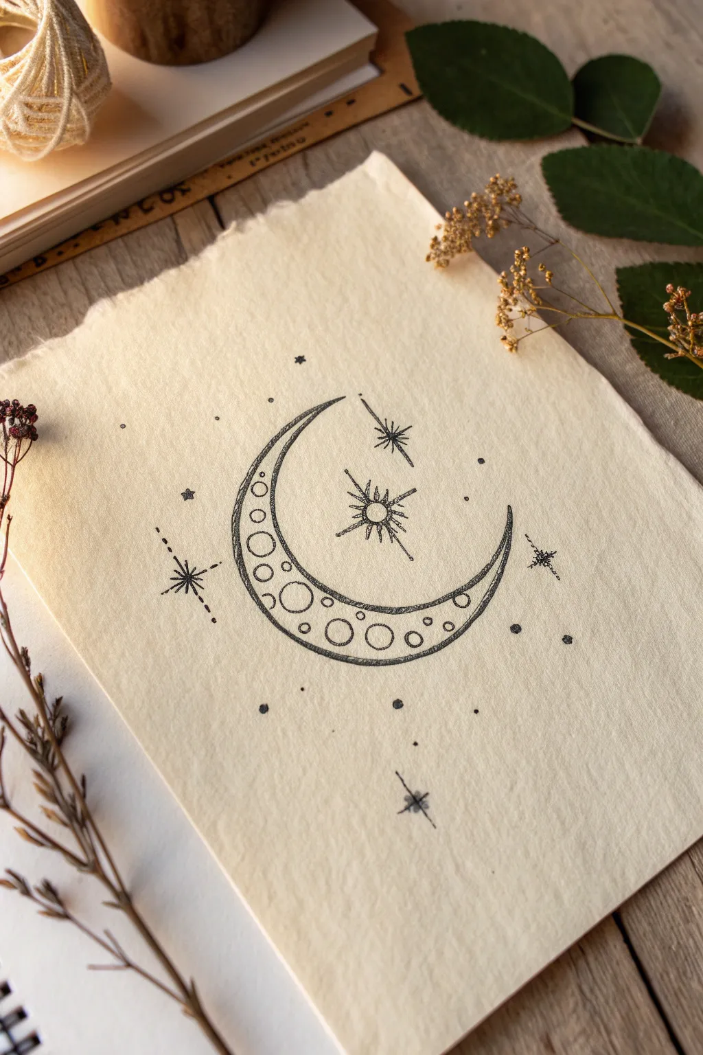
Capture the magic of the night sky with this delicate crescent moon design, featuring intricate circles and whimsical starbursts. This easy-to-draw motif makes for a perfect sketchbook addition or a beautiful concept for your next tattoo.
Step-by-Step
Materials
- High-quality textured paper (approx. 5×7 inches)
- Fine liner pen (0.3mm or 0.5mm, black)
- Pencil (HB or 2B for sketching)
- Eraser (kneaded preferred)
- Compass or circular object (optional)
Step 1: Planning and Outlining
-
Establish the Outer Curve:
Start by lightly sketching a large ‘C’ shape with your pencil. This will form the outer edge of your crescent moon. Keep the curve smooth and let the top point act as your guide for orientation. -
Define the Inner Curve:
Draw a smaller, parallel curve inside the first one. Taper the ends so they meet the outer curve at sharp points at both the top and bottom tips, creating the classic crescent shape. -
Central Star Placement:
Mark the center point of the open space inside the crescent curve. Lightly sketch a small circle here to serve as the core of your main central star. -
Ink the Crescent Perimeter:
Using your fine liner pen, carefully trace over your pencil lines for the moon. I find it helps to pull the pen toward you rather than pushing it away for a smoother line. -
Double the Line Weight:
Go over the moon’s outline a second time, specifically adding uneven texture. Instead of a perfect single line, add slight sketched overlaps to give it that organic, hand-drawn tattoo aesthetic.
Smudge Prevention
Place a scrap piece of paper under your drawing hand. This acts as a barrier, preventing oils from your skin or fresh ink from smearing across the textured paper.
Step 2: Adding Moon Details
-
Draw Large Circles:
Inside the crescent shape, draw three to four varying sizes of circles near the widest part (the bottom-middle). Let these ‘craters’ touch the inner and outer edges slightly. -
Add Medium Circles:
Work your way up the curve, drawing medium-sized circles. Ensure they are spaced out irregularly so the pattern doesn’t look too rigid. -
Fill with Tiny Circles:
In the remaining gaps, especially near the tapered tips, add very small circles. Leave some negative space so the moon doesn’t look overcrowded. -
Ink the Interior Details:
Go over all your pencil circles with the fine liner. Keep your hand steady, but don’t worry about perfect geometric circles; slightly wobbly lines add charm.
Step 3: Creating the Stars
-
Structure the Main Star:
Return to the central star mark. Draw a vertical line and a horizontal line through the center circle, making a cross. -
Complete the 8-Point Star:
Draw shorter diagonal lines in between the main cross lines. Connect the tips back to the center circle to form distinct triangular spikes. -
Highlight the Center:
Ink the small circle in the very middle of the main star, leaving the center uncolored or stippling it lightly. -
Add Secondary Stars:
Draw three smaller, simple 4-point or 6-point stars around the moon: one near the top tip, one to the left, and one near the bottom tip. -
Create a Shooting Star Effect:
For the star on the left, draw a dotted line trailing away from it to simulate movement or a constellation connection.
Perfect ‘Imperfect’ Circles
Don’t try to draw circles in one continuous motion. Use two ‘C’ strokes that meet; it’s easier to control and matches the sketchy style.
Step 4: Finishing Touches
-
Scatter Tiny Dots:
Using the very tip of your pen, tap random dots around the entire composition to represent distant stardust. -
Add Solid Planets:
Draw a few tiny, solid black circles (slightly larger than the stardust dots) to act as faraway planets or larger stars. -
Erase Guidelines:
Once the ink is completely dry—give it a minute or two to be safe—gently erase all underlying pencil sketch marks. -
Assess and Refine:
Look at the overall balance. If a spot looks too empty, add a small 4-point star or a cluster of three dots. -
Final Texture Pass:
Optionally, add very light hatching or stippling on the shadowed side of the crescent moon for extra depth.
Enjoy the calming process of inking your very own piece of the galaxy

Mini Sunburst and Simple Rays
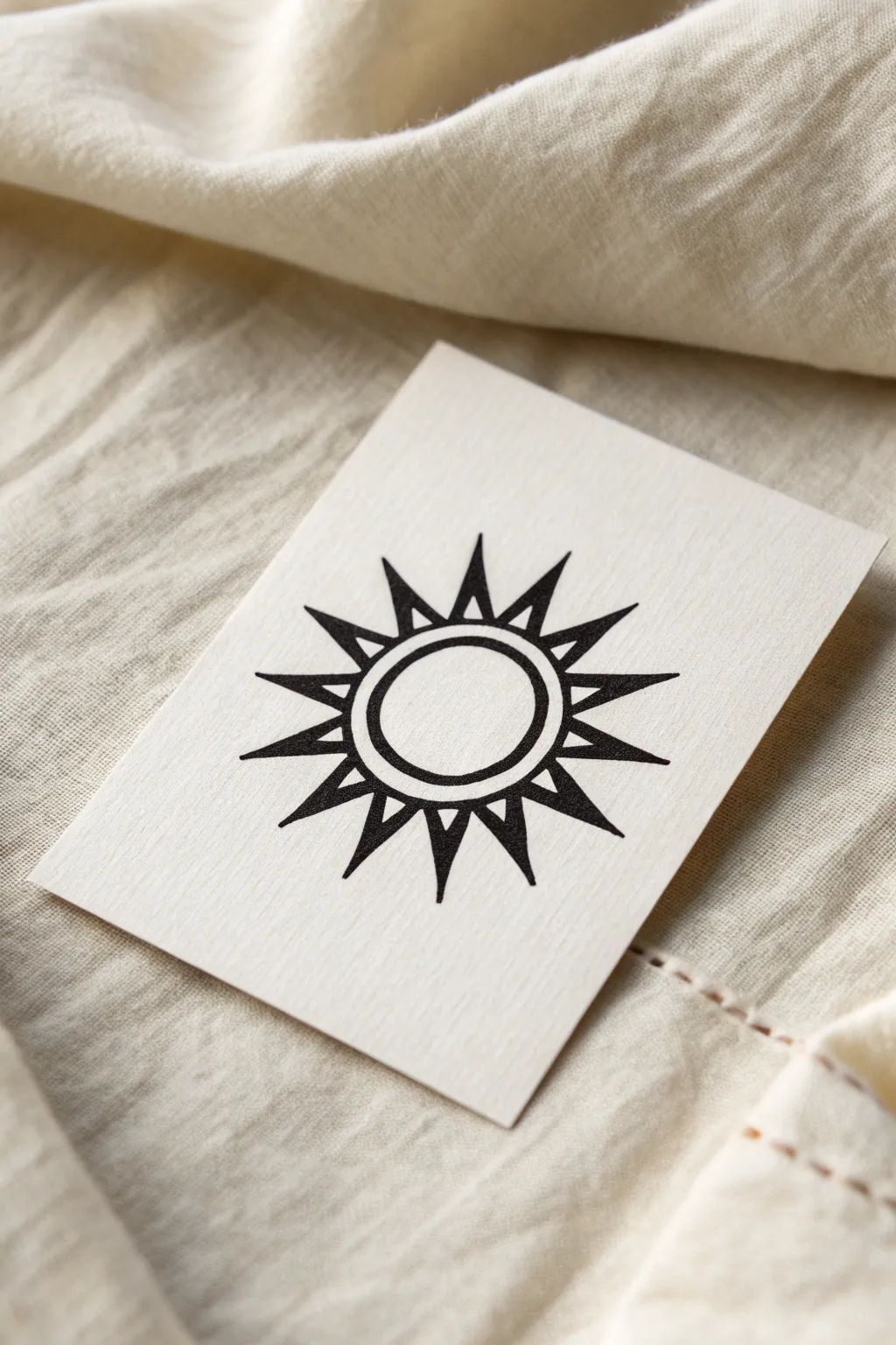
This minimal sunburst design combines clean circular lines with sharp, bold rays for a striking geometric look. The contrast of the deep black ink against the textured paper creates a modern, tattoo-ready aesthetic that feels both celestial and grounded.
Step-by-Step Guide
Materials
- Off-white, textured cardstock or heavy drawing paper (approx. 3×4 inches)
- Fine liner pen (0.3mm or 0.5mm)
- Thicker black marker or brush pen for filling
- Compass or circle template
- Pencil (HB or H)
- Eraser
- Ruler
Step 1: Drafting the Structure
-
Center the design:
Begin by finding the visual center of your small rectangular paper. Mark a tiny dot lightly with your pencil to serve as your anchor point. -
Draw the inner circle:
Using a compass or circle template centered on your dot, draw a small circle about 1 inch in diameter. Keep your pencil pressure light so it can be erased later. -
Draw the outer circle:
Create a second circle around the first one, leaving a gap of about 3-4 millimeters between them. This band will form the heavy ring of the sun. -
Mark the ray points:
To ensure symmetry, lightly draw a vertical line and a horizontal line through the center to divide the circle into four quadrants. Then, draw diagonal lines to split those quadrants, giving you eight guide lines. -
Add secondary guides:
Draw one more line exactly between each of your eight existing lines. You should now have sixteen radiating guide lines total, evenly spaced around the circle.
Uneven Rays?
If your triangles look wonky, try drawing a faint ‘limit circle’ on the outside. Make sure every ray tip touches this outer circle for perfect uniformity.
Step 2: Defining the Rays
-
Determine ray length:
Make a small mark on each of your sixteen guide lines about 1 inch out from the outer circle. This marks straight tip of the sun rays. -
Sketch the triangles:
Connect each tip mark back to the outer circle edge. Instead of connecting directly to the guide line base, connect to a point slightly to the left and right of where the guide line hits the circle. This creates the triangular base width. -
Check spacing:
Look at the negative space between your triangles. They should act like teeth on a gear—distinct and separate, not touching at the base.
Make It Golden
Swap black ink for metallic gold leaf or a metallic paint pen for the center ring to give the piece a luxurious, celestial glow.
Step 3: Inking and Refining
-
Outline the inner ring:
Switch to your fine liner pen. Carefully trace over your two concentric pencil circles. I find rotating the paper slowly while keeping my hand steady helps get a smoother curve. -
Outline the rays:
Trace the triangular outlines of your sun rays with the fine liner, ensuring the points are sharp and crisp. -
Erase guide lines:
Wait a moment for the outline ink to dry completely to avoid smudging. Then, gently erase all your pencil guides until only the clean ink outlines remain. -
Thicken the ring:
Using your thicker marker or brush pen, carefully fill in the space between the two concentric circles. Take your time near the edges to keep the circle shape perfect. -
Fill the rays:
Use the thicker marker to fill in each triangular ray. Start from the wide base and work toward the tip, switching back to the fine liner for the very point if needed to keep it sharp. -
Final inspection:
Look closely at the connection points where the rays meet the black ring. If there are any white gaps, touch them up with your fine liner so the silhouette looks like one solid, unified piece. -
Clean up:
Do one final pass with your eraser to remove any stubborn graphite dust, leaving the black design stark against the paper.
Now you have a bold, clean sunburst design ready to be framed or transferred as a stencil
BRUSH GUIDE
The Right Brush for Every Stroke
From clean lines to bold texture — master brush choice, stroke control, and essential techniques.
Explore the Full Guide
Lightning Bolt in Clean Monoline
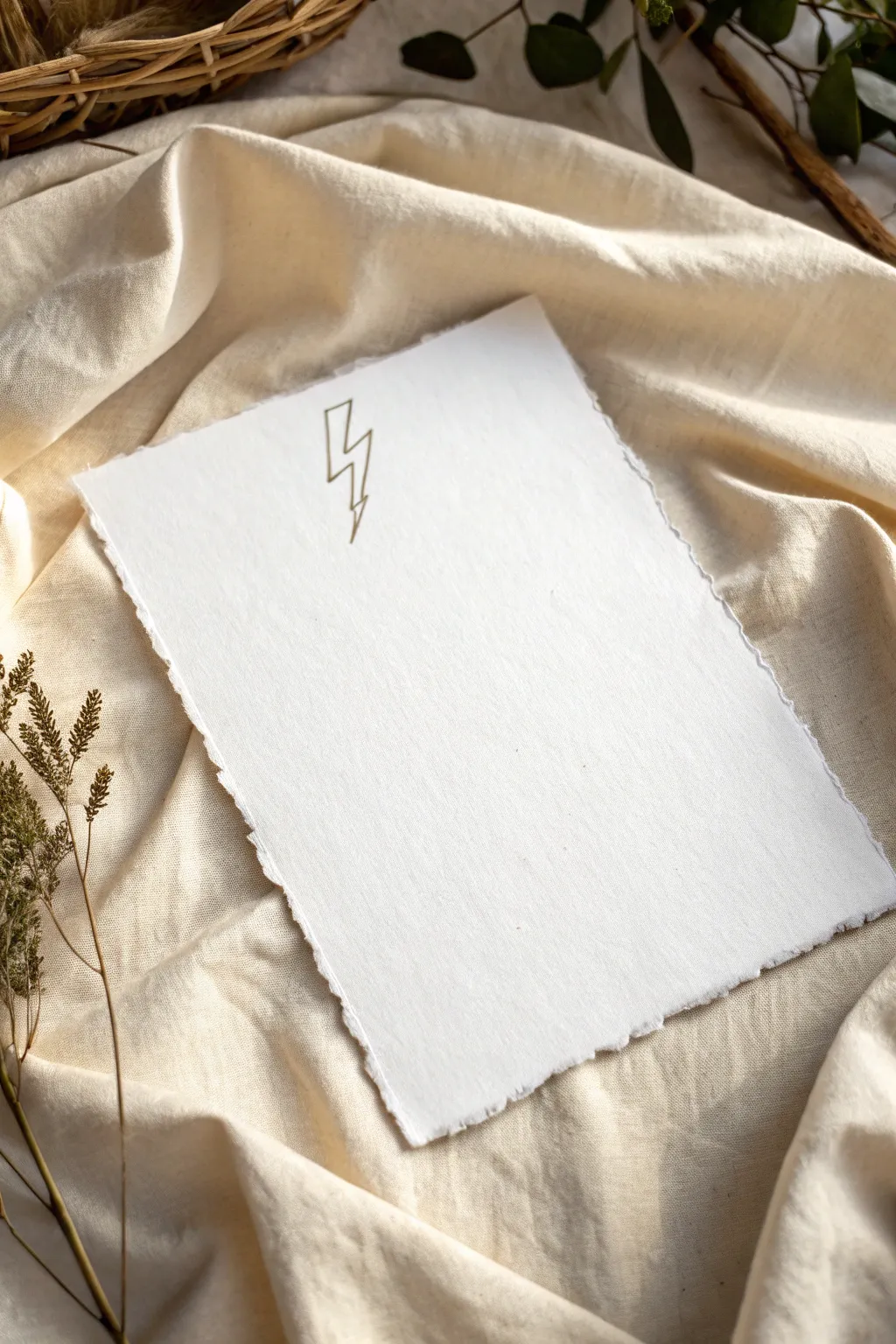
Master the art of understated elegance with this clean, monoline lightning bolt design. The simple geometric form paired with metallic ink creates a sophisticated finished piece perfect for framing or gifting.
Step-by-Step
Materials
- Heavyweight handmade cotton paper with deckle edges (A5 or 5×7 size)
- Gold metallic gel pen or fine-tip paint marker (0.5mm – 0.7mm)
- HB pencil
- Soft kneadable eraser
- Ruler (clear preferred)
- Scrap paper for testing
Step 1: Preparation and Sketching
-
Surface Prep:
Lay your handmade paper on a flat, clean surface. Since deckle-edged paper has a textured surface, you need a hard, smooth backing like a clipboard or a dense sketchbook underneath. -
Center Finding:
Lightly mark the approximate center of the paper mentally, or place a tiny, barely visible dot with your pencil about one-third of the way down from the top edge. -
Drafting the Initial Line:
Using your ruler and pencil with extremely light pressure, draw a short vertical line slightly angled to the right. This will be the top stroke of the bolt. -
Creating the Zig-Zag:
From the bottom of that first line, draw a sharp horizontal line connecting to the left. Keep this stroke short and snappy. -
Drafting the Middle Stroke:
Draw the second vertical section, angling it parallel to your first line. This one should be slightly longer than the top stroke to give the bolt momentum. -
Adding the Second Angle:
Sketch a second horizontal line moving back to the right. Try to keep the angle consistent with your first horizontal line for geometric harmony. -
The Final Strike:
Draw the final downward stroke, tapering it to a sharp point at the bottom. This tail should be the longest section, anchoring the design. -
Refining the Proportions:
Step back and look at your pencil sketch. The negative space inside the zig-zags should feel balanced. Gently erase and adjust angles until the bolt looks crisp.
Step 2: Inking the Outline
-
Test Your Pen:
On a scrap piece of paper, scribble with your gold pen to get the ink flowing smoothly. Metallic pens can sometimes skip if they haven’t been used in a while. -
First Ink Stroke:
Position your ruler along the top pencil line. Hold the pen fairly upright to ensure a consistent line width. Draw the first segment firmly. -
Handling Corners:
When you reach a corner, lift the pen cleanly. Reposition your ruler for the next segment. Don’t try to turn the corner in one continuous motion if you want those sharp, geometric vertices. -
Completing the Path:
Continue inking each segment, moving slowly. The texture of cotton paper can catch the nib, so use a deliberate, steady hand rather than a quick stroke. -
Checking Consistency:
Look closely at your lines. If the ink looks thin in places due to the paper’s tooth, go over that specific section one more time with the ruler to bolster the gold opacity.
Smudge Prevention
Handmade paper fibers can trap wet ink. Place a clean sheet of scrap paper under your hand as a ‘bridge’ while drawing to prevent oils or smearing.
Step 3: Creating the Monoline Effect
-
Closing the Shape:
Return to the top of the bolt. Draw a parallel line right next to your first path, creating a very thin, hollow shape. The distance between lines should be roughly 1-2mm. -
Connecting Ends:
At the very top and very bottom tip of the bolt, draw a tiny horizontal line to close the shape, turning the single line into a contained outline. -
Drying Time:
Let the metallic ink sit for at least 10-15 minutes. Metallic pigments sit on top of the paper fibers and smear very easily if touched too soon. -
Clean Up:
Once fully dry, take your kneadable eraser and gently dab (don’t rub aggressively) to lift the remaining graphite pencil marks. -
Final Inspection:
Inspect the corners. If any connections look disconnected, touch them up with the very tip of your pen for a seamless, continuous look.
Level Up: Embossed Look
After inking, firmly re-trace the lines with a dry stylus or an empty ballpoint pen. This presses the paper down, giving the gold a sunken, letterpress effect.
Your striking minimalist artwork is now ready to add a spark of creativity to your space
Minimal Rose Outline
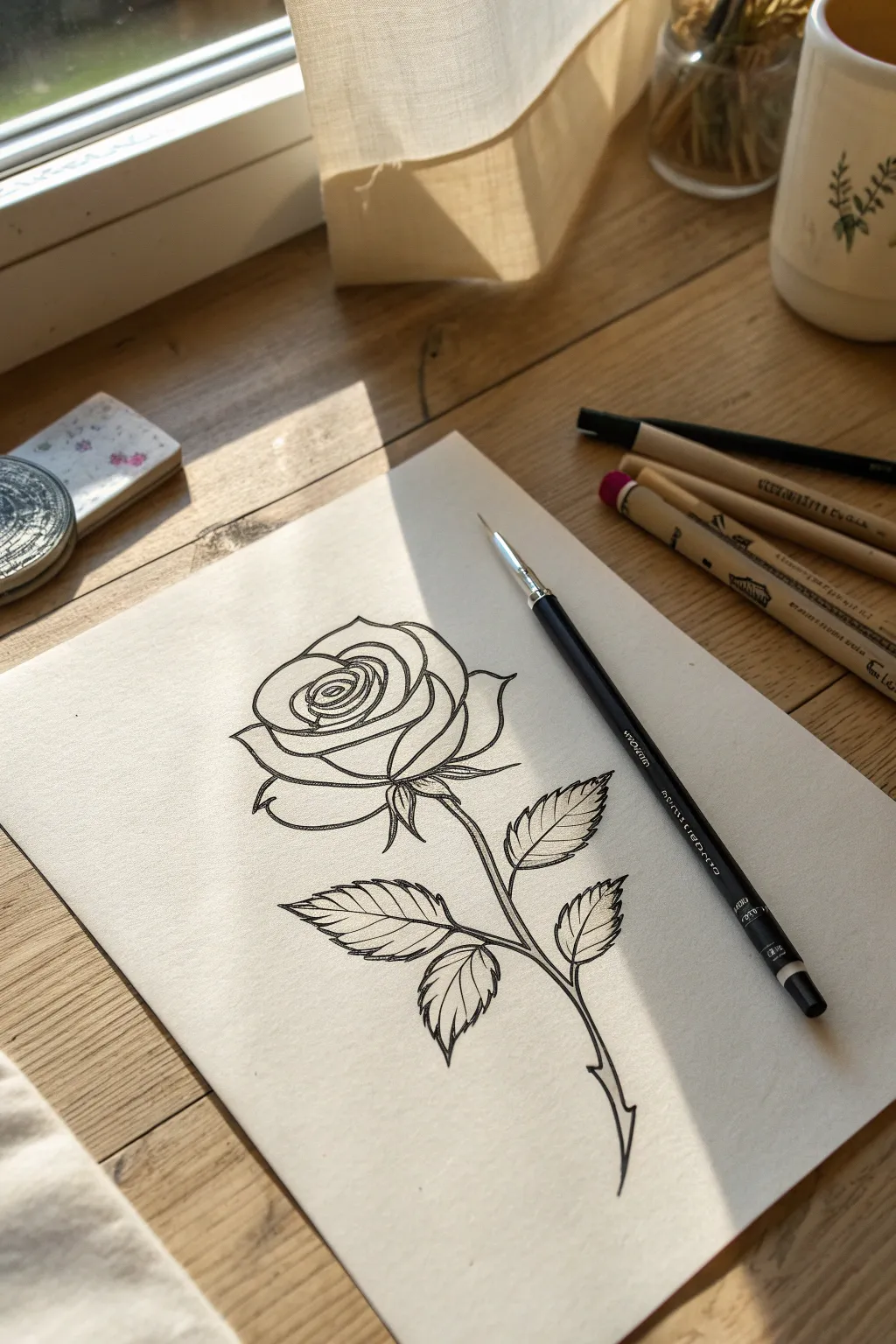
This classic, minimalist rose design focuses on clean lines and elegant curves, making it perfect for tattoo inspiration or a standalone piece. The drawing captures both the softness of the petals and the sharp detail of the leaves using precise ink work.
Step-by-Step Guide
Materials
- Smooth white bristol or marker paper
- HB or 2H graphite pencil (for sketching)
- Black fineliner pen (0.3mm or 0.5mm)
- Kneaded eraser
- Ruler (optional, for centering)
Step 1: Sketching the Guidelines
-
Mark the center point:
Begin by lightly marking the center of your paper. This is where the bud of the rose will sit. -
Define the rose bud shape:
Draw a loose, slightly flattened oval or egg shape near the top center. This will form the tight inner petals of the bloom. -
Map the stem direction:
From the bottom of your oval, draw a gentle S-curve line extending downward. This acts as the spine for your stem.
Linework Pro Tip
Pull the pen towards you rather than pushing it away. This gives you more control over the curve and helps maintain a consistent line weight.
Step 2: Building the Petals
-
Draw the spiral center:
Inside your initial oval, sketch a tight spiral. These lines shouldn’t be perfect circles; let them wobble slightly to mimic organic folded petals. -
Add the first outer petals:
Surround the spiral with larger, cup-shaped curves. Think of these as parentheses that hug the center bud. -
Expand the bloom:
Draw the largest, outermost petals. These should flare out wider, with slightly pointed tips at the top and rounded bottoms. -
Detail the petal folds:
Add small fold-over lines at the top edges of the outer petals to give the rose dimension and a sense of volume.
Step 3: Adding Greenery
-
Sketch the sepals:
Just under the main bloom, draw three small, leaf-like spikes (sepals) pointing downward. They connect the flower head to the stem. -
Thicken the stem:
Go back to your S-curve guideline and add a second line parallel to it to give the stem thickness. Taper it slightly at the very bottom into a sharp point. -
Place the leaf structures:
Add two short stems branching off the main stalk—one on the left, one on the right. Sketch broad, teardrop shapes for the leaves at the end of these branches. -
Serrate the leaf edges:
Refine the leaf outlines by adding tiny saw-tooth zigzags along the edges. This is crucial for a realistic rose leaf look. -
Add a thorn:
Near the bottom of the stem, sketch a small, sharp triangular curve facing downwards.
Fixing Wobbly Lines
If a line helps shaky, don’t try to redraw it. Instead, purposefully thicken that specific segment to hide the wobble. It often looks like intentional shading.
Step 4: Inking and Refining
-
Start the main outline:
Take your black fineliner. Begin tracing your pencil lines with a confident, steady hand. I find it helpful to start from the center spiral work outwards to avoid smudging. -
Add line weight variety:
As you ink the outer petals and the underside of leaves, press slightly harder or double up the line to make it thicker. This creates shadow and depth. -
Detail the leaf veins:
Draw a central vein down each leaf. Then, add quick, spacing strokes branching out towards the serrated edges for texture. -
Refine the stem connection:
Make sure the connection points between the stem and the leaves are smooth, not disjointed. -
Let the ink set:
Allow the ink to dry completely for at least 5-10 minutes. If you erase too soon, you risk creating gray smears across your crisp lines. -
Clean up the sketch:
Gently erase all the underlying graphite pencil marks with your kneaded eraser, revealing the clean black tattoo-style outline.
You now have a clean, elegant rose design ready for display or your next creative project

PENCIL GUIDE
Understanding Pencil Grades from H to B
From first sketch to finished drawing — learn pencil grades, line control, and shading techniques.
Explore the Full Guide
Simple Daisy or Wildflower Sprig
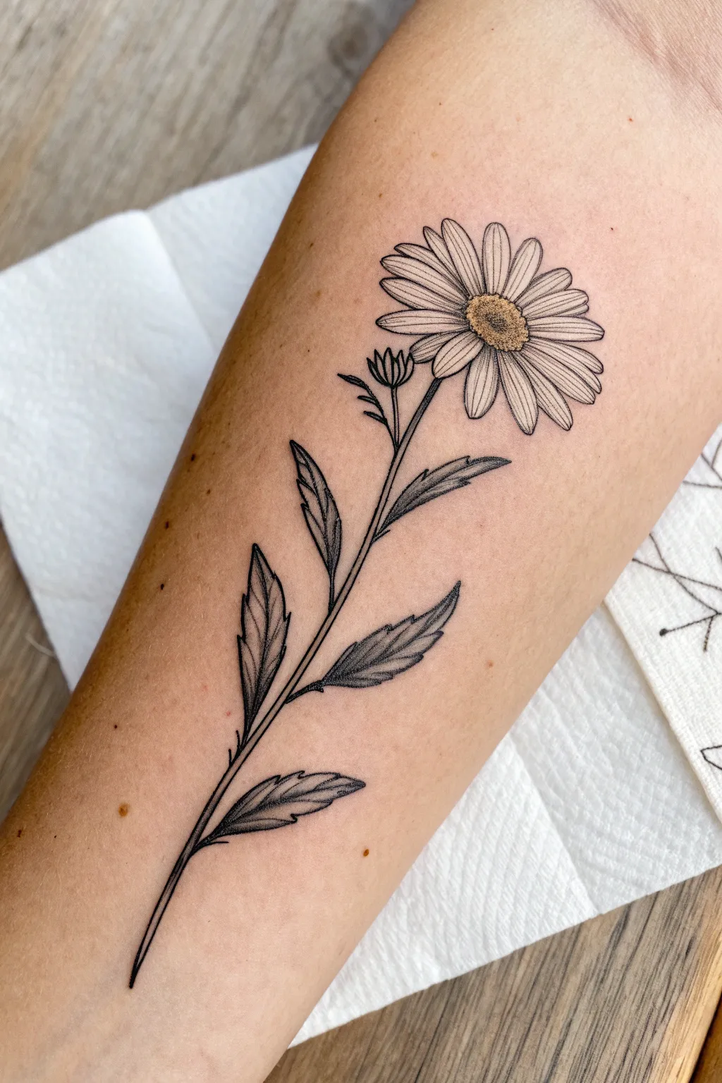
This classic daisy design combines delicate linework with subtle shading to create a piece that feels both organic and refined. It captures the simple beauty of a wildflower using techniques perfect for beginner tattoo artists or illustrators looking to practice botanical precision.
Step-by-Step
Materials
- Fine-point drawing pens (0.1mm, 0.3mm, 0.5mm) or tattoo liner needles (03RL, 05RL)
- Pencil (H or HB for sketching)
- Smooth drawing paper or synthetic practice skin
- Eraser (kneaded preferred)
- Reference photo of a daisy
- Optional: Yellow colored pencil or watercolor for the center
Step 1: Planning the Structure
-
Establish the curve:
Begin by lightly sketching a long, gently curved line for the main stem. This should not be perfectly straight; give it a slight ‘S’ curve or lean to make it feel natural and organic. -
Mark the landmarks:
Determine where the flower head will sit at the very top. Draw a rough oval to represent the center disk of the daisy, tilting it slightly to avoid a flat, 2D look. -
Position the leaves:
Mark out placement for four main leaves along the stem. Alternate them—two on the left, two on the right—spacing them unevenly to mimic nature. -
Add the bud:
Sketch a small, secondary branch stemming off near the top right, just below the main bloom. Draw a small, tight oval here for an unbloomed but.
Step 2: Drafting the Petals & Leaves
-
Petal direction:
Using your center oval as a hub, sketch light guidelines radiating outward. Daisy petals are long and narrow. Ensure the petals overlapping the front are slightly shorter than the ones in the back to create perspective. -
Refining petal shapes:
Outline the individual petals. Keep the tips slightly rounded but with jagged, imperfect edges. Don’t make them all identical; let some twist or overlap neighbor petals slightly. -
Leaf serration:
Flesh out the leaf shapes. Daisy leaves have deep, jagged serrations (teeth) along their edges. Sketch these irregular points, making sure they point generally toward the leaf tip. -
Sketch the center texture:
Inside the center oval, lightly sketch small circles or stippling dots to indicate where the pollen texture will go later.
Wobbly Lines?
If your long stem lines are shaky, try drawing faster. Slow hand movement often causes more jitters. Lock your wrist and move your whole arm.
Step 3: Inking the Outlines
-
Stem confidence:
Switch to your medium-weight pen (0.3mm or 05RL). Trace the main stem line with a steady hand. I find it helpful to pull the pen toward me rather than pushing it away. -
Main flower outline:
Ink the petals carefully. Use a lighter touch (0.1mm or 03RL) for the petals to keep them looking delicate. Breaks in the line where petals overlap are okay. -
Leaf edges:
Go over the jagged leaf outlines. Vary your line weight slightly—thicker at the base of the leaf, tapering thinner toward the tip. -
The unbloomed bud:
Ink the small bud stem and the tight cluster of sepals (the green parts) hugging the closed petals.
Level Up
Add a tiny bee or butterfly hovering near the bloom, or extend the design by adding a root system at the bottom for a botanical chart look.
Step 4: Shading and Texture
-
Center stippling:
Use your finest point (0.1mm) to create the flower center. Instead of drawing lines, use tiny dots (stippling). Dense packing of dots at the bottom edge creates shadow, getting sparser toward the top. -
Petal striations:
Add very fine, flicking lines starting from the base of each petal moving outward. These should be quick and light to mimic the texture of the flower without coloring it in fully. -
Leaf veins:
Draw a central vein through each leaf. Add gentle shading on one side of the vein using short hatching strokes to give the leaf dimension and curve. -
Deepening contrast:
Go back to areas where leaves attach to the stem or where petals overlap. Add a few more lines or dots there to deepen the shadows and separate the elements visually. -
Optional color pop:
If you are working on paper, lightly dust the center disk with a muted yellow pencil or watercolor wash, keeping it transparent so the ink work shows through.
Now you have a permanent piece of spring that never fades
Butterfly With Minimal Wing Shapes
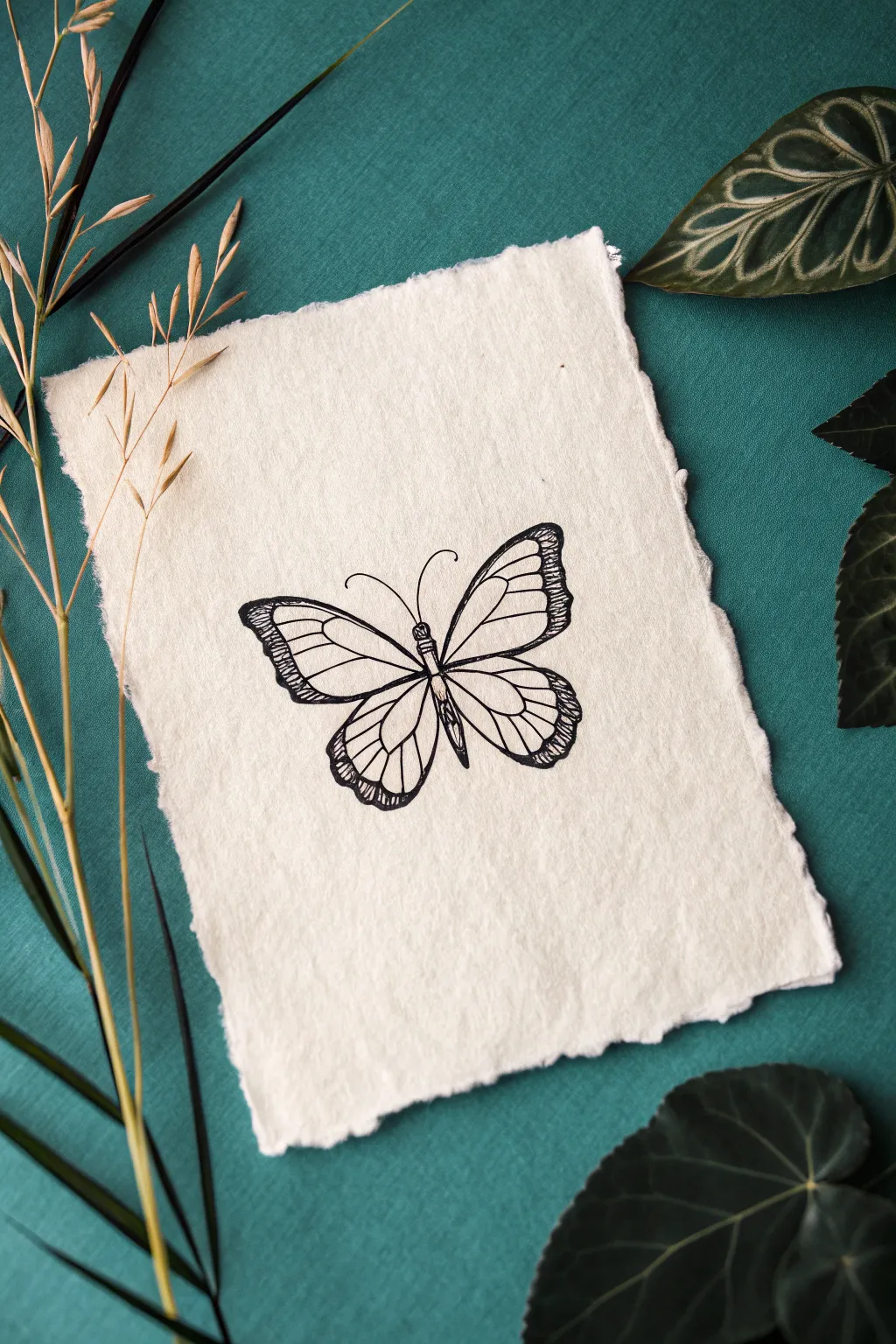
Capture the fragile beauty of a butterfly with this minimalist pen illustration on textured paper. This project combines simple line work with elegant, handmade-style paper for a timeless, vintage aesthetic suitable for framing or gifting.
Step-by-Step Tutorial
Materials
- Deckled edge watercolor paper or handmade cotton paper (approx. 5×7 inches)
- Fine liner pen (black, 0.1mm nib)
- Fine liner pen (black, 0.3mm or 0.5mm nib)
- Pencil (HB or H)
- Kneaded eraser
Step 1: Drafting the Form
-
Mark the center:
Begin by lightly sketching a vertical line down the center of your paper with your pencil. This will serve as the anchor for the butterfly’s body and help keep the wings symmetrical. -
Sketch the body:
Along the center line, draw a slender, segmented body. Make the thorax (upper section) slightly thicker than the abdomen (lower section), which should taper to a gentle point. -
Outline upper wings:
Start the top wings from the shoulder area of the thorax. Sketch a large, rounded triangle shape extending outward and upward, curving gently back toward the body. Keep your pencil pressure very light so adjustments are easy. -
Outline lower wings:
Draw the lower wings starting just below the upper wings. These should be slightly smaller and more rounded, like distinct teardrops that meet at the lower abdomen. -
Check symmetry:
Step back and look at your pencil sketch. The wings don’t need to be mirror images—nature rarely is—but ensure they feel balanced in size and angle.
Step 2: Inking the Outline
-
Trace the main lines:
Using the thicker fine liner (0.3mm or 0.5mm), carefully trace over your pencil outline of the wings and body. I like to use a confident, single stroke for each curve to avoid feathery, messy lines. -
Thicken wing edges:
Go back over the outer edges of the wings, specifically the top curves and the outer tips. Adding a second pass here gives the drawing weight and defines the perimeter clearly. -
Add antennae:
From the head, draw two delicate curves extending outward and curling slightly at the ends. Use a quick, flicking motion with your pen to keep these lines tapered and graceful.
Smudge Prevention
Place a scrap piece of paper under your drawing hand while you work. This protects the textured paper from hand oils and prevents you from smearing fresh ink.
Step 3: Detailing and Veining
-
Draw primary veins:
Switch to your 0.1mm fine liner. Draw the main veins extending from the body toward the outer edges of the wings. Imagine these like a fan opening up. -
Add secondary veins:
Connect the primary veins with smaller, branching lines near the outer edges. Create enclosed shapes (cells) along the perimeter of the wings. -
Detail the wing borders:
Along the outer rim of the wings, use short, repetitive hatching strokes or tiny scallops inside the border. This mimics the patterns often seen on Monarch or Painted Lady butterflies. -
Darken the body:
Add subtle texture to the body by stippling (lots of tiny dots) or small hatched lines along the sides of the thorax and abdomen, leaving the center slightly lighter to suggest roundness. -
Reinforce intersections:
Where the veins meet the body or outline, slightly thicken the connection points with tiny triangles of ink. It makes the structure look more organic and grounded.
Vintage Stain
Dip a tea bag in warm water and lightly dab it over the dry drawing. The tea stains will pool in the paper’s texture, giving it an authentically aged, antique specimen look.
Step 4: Finishing Touches
-
Erase guidelines:
Wait at least five minutes to ensure the ink is totally dry. Gently dab the drawing with a kneaded eraser to lift the graphite lines without damaging the paper surface. -
Final assessment:
Look for any lines that need connecting or areas that feel too light. A few extra dots on the wing tips can add nice contrast.
Now you have a timeless piece of nature art ready to display


Ocean Wave in One Flowing Stroke
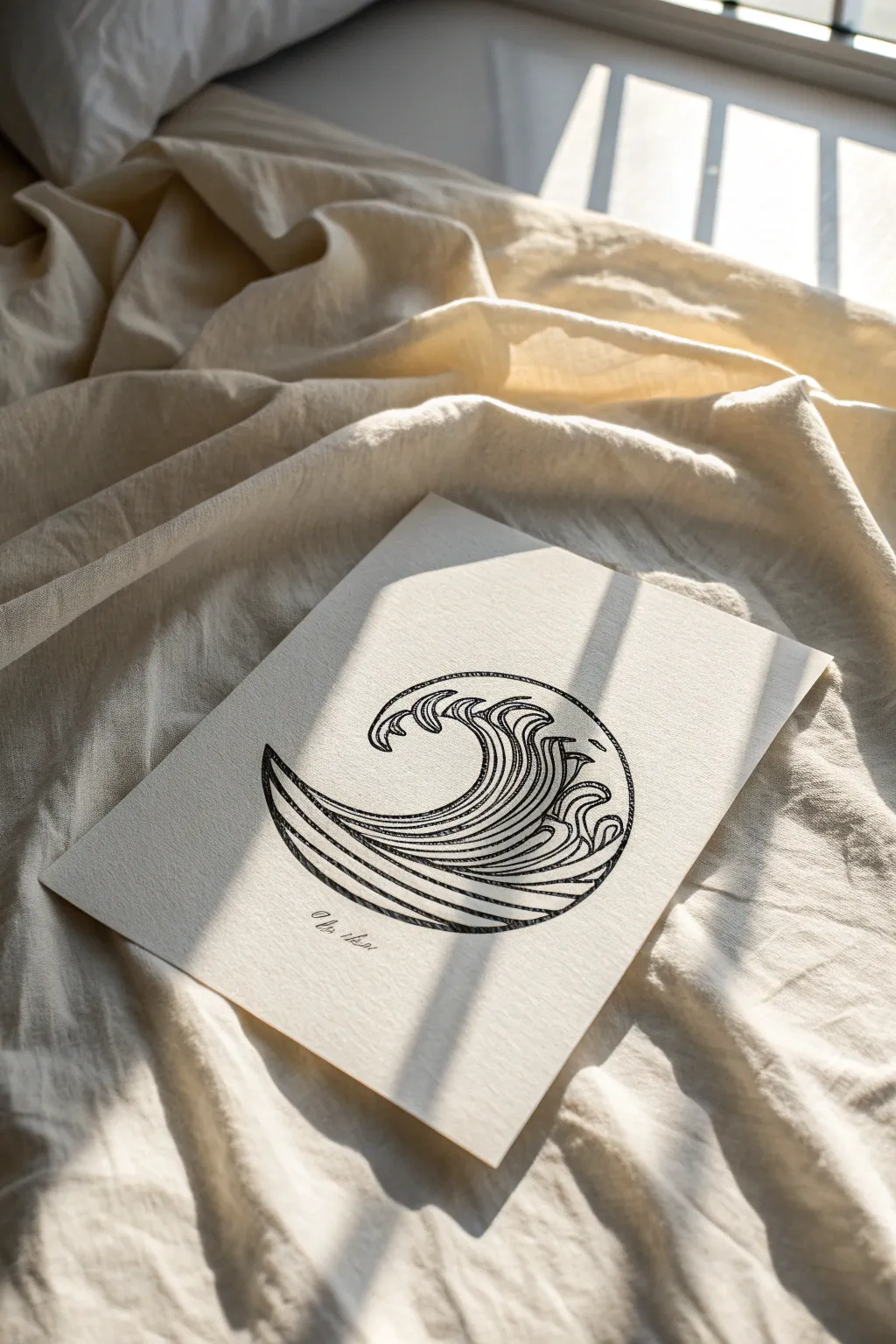
Capture the raw energy of the ocean in this simplified, stylized line drawing that mimics the flow of a classic woodblock print. This design fits perfectly into a circular motif, making it an excellent candidate for a clean, impactful tattoo concept or a striking piece of minimalist wall art.
Step-by-Step
Materials
- Heavyweight drawing paper (textured or cold press watercolor paper)
- HB or 2B pencil for sketching
- Fine liner pens (sizes 0.3mm, 0.5mm, and 0.8mm)
- Compass or a circular object to trace (approx. 4-5 inches diameter)
- Kneaded eraser
- Ruler (optional)
Step 1: Setting the Structure
-
Draw the boundary:
Begin by lightly tracing a perfect circle onto your paper using a compass or a round household object like a bowl rim. This will serve as the container for your wave design. -
Mark the horizon:
Visualize a diagonal line cutting through the lower third of the circle, sloping upwards from left to right. This will be the general direction your wave creates as it swells.
Step 2: Drafting the Wave Flow
-
Sketch the primary curve:
Using your pencil, draw a large, sweeping ‘C’ shape that starts at the bottom left of the circle and curls up towards the top center. The tip should hook over slightly to the left, forming the crest. -
Create the wave’s body:
Add parallel curves underneath your main line. These lines should start thick at the base (left side) and taper as they follow the flow upward, creating the visual weight of the water. -
Draft the secondary crests:
To the right of the main wave, sketch smaller, overlapping hook shapes. These represent the turbulence and foam as the wave crashes. Think of them as smaller, broken versions of the main curl. -
Fill the negative space:
Ensure the bottom right area of the circle is filled with horizontal, slightly curved lines that mimic the rolling swell of the ocean beneath the main crash.
Uneven Curves?
If your hand shakes during long curves, try ‘ghosting’ the motion—hover your pen over the paper doing the movement a few times before actually touching the nib down.
Step 3: Inking the Outline
-
Commit to the main lines:
Switch to your 0.5mm fine liner. Carefully trace over your main pencil sketches. I like to keep my wrist loose here to ensure the curves look fluid rather than jagged. -
Define the crests:
Use the 0.8mm pen for the very top edges of the waves. This slightly thicker line weight represents the power of the crest and draws the eye to the top of the composition. -
Detail the inner swirls:
Go back to the 0.3mm pen. Draw the internal lines of the wave body. These are the striations that show movement. Keep them closely spaced and following the curve of the main wave shape.
Level Up: Gold Leaf
Apply a tiny amount of gold leaf or metallic gold ink to the very crest of the wave. This adds a Japanese Kintsugi vibe and makes the artwork pop.
Step 4: Refining and Shading
-
Add hatching for depth:
Using the 0.3mm pen, add tiny hatching lines in the deepest curves of the wave (usually at the bottom of the swells). This creates shadow and makes the wave look three-dimensional. -
Create the circular border:
Because this design doesn’t have a solid circular outline, use the wave lines themselves to imply the circle’s edge. Extend your wave lines right up to your initial pencil guide without crossing it. -
Add texture to the water:
In the white spaces of the foam, add a few stippled dots or very short dashes to suggest spray and bubbles.
Step 5: Final Touches
-
Clean up the sketch:
Wait at least 10 minutes for the ink to dry completely. Gently erase all visible pencil marks with your kneaded eraser, being careful not to smudge your line work. -
Evaluate line weight:
Look at the overall balance. If the bottom feels too light, thicken the lowest curves slightly with your 0.5mm pen to ground the drawing. -
Sign your work:
Add a small, cursive signature or date just below the implied circle boundary for a professional finish.
You now have a serene, rhythmic piece of art that perfectly captures the motion of the sea within a simple shape
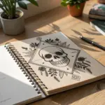
Tiny Skull With Flat Features

This minimal yet charming skull sketch balances spooky and sweet with its clean lines and prominent heart motifs. It’s perfect for practicing facial proportions in a simplified, tattoo-style aesthetic without getting bogged down in realistic shading.
Step-by-Step Tutorial
Materials
- Smooth sketchbook paper (medium weight)
- Pencil (HB or 2H for sketching)
- Black fine liner pen (0.5mm and 0.8mm)
- Eraser
Step 1: Sketching the Framework
-
Light circle:
Start by drawing a loose, light circle with your pencil. This will form the top dome of the skull (cranium). Keep your lines faint so they are easy to erase later. -
Jawline outline:
Extend a gentle U-shape down from the sides of your circle to create the jaw. Unlike a realistic skull, keep this jaw fairly rounded and integrated with the top circle, creating a combined shape that looks a bit like an inverted lightbulb. -
Feature placement:
Lightly mark a horizontal line slightly below the center of the face to guide where the eyes and nose will sit.
Wobbly Lines?
If your circles aren’t perfect, embrace the shakiness! A slightly uneven line actually makes the skull look more organic and aged, adding character to the bone structure.
Step 2: Drawing the Skull Features
-
Eye sockets:
Draw two large, rounded shapes for the eye sockets using your pencil. The one on the left can be a standard oval, while the one on the right should have a slight flatness on its right side to suggest a 3/4 turn perspective. -
Nose cavity:
Place a small, inverted heart shape or a rounded triangle just below and between the eye sockets. -
Forehead heart:
Sketch a simple, open heart directly in the center of the forehead area. This acts as a decorative element. -
Cheek contour:
On the left side of the skull, add a small indentation curve inward just below the eye socket to define the cheekbone. Do the same on the right side, making the cheekbone slightly more pronounced. -
Teeth placement:
Draw a curved line for the mouth. Sketch a row of small U-shapes hanging from the upper jaw line for the top teeth, and inverted U-shapes for the bottom teeth.
Step 3: Inking the Drawing
-
Outline the skull:
Switch to your 0.8mm black fine liner. Carefully trace over your pencil outline for the main shape of the skull, smoothing out any shaky sketch lines as you go. -
Fill the eyes:
Inking the eye sockets is satisfying; outline them first, then fill them in completely solid black. This creates that classic hollow skull look. -
Solid nose:
Fill in the nose cavity with solid black ink as well. -
Detailing the mouth:
Trace the teeth carefully with a finer 0.5mm pen if you have one. Outline the individual teeth, but leave the spaces between them white or add tiny gaps for clarity. -
Jaw and cheek accents:
Thicken the line work slightly on the underside of the cheekbones and the jaw to give the drawing some visual weight. -
Forehead heart:
Ink the heart on the forehead with a clean, single line. Keep the inside white. -
Decorative dots:
Add three small dots under each eye socket using the tip of your pen. This adds a bit of texture and decoration.
Make It Pop
Use a gold gel pen to fill inside the forehead heart or the teeth for a luxurious, mixed-metal look that contrasts beautifully with the black ink.
Step 4: Adding Surrounding Elements
-
Floating hearts:
Sketch two floating hearts outside the skull—one to the left and one below. Ink these outlines firmly. -
Heart patterns:
Inside these external hearts, draw a grid pattern or scrollwork. I like to keep these loose and doodle-like to contrast with the solid black eyes of the skull. -
Sparkle detail:
Add a simple four-point star or ‘sparkle’ to the right of the skull to balance the composition. -
Final erase:
Once the ink is completely dry (give it a full minute so it doesn’t smudge), gently erase all visible pencil lines to reveal the crisp black and white artwork.
Step back and admire your spooky little creation, which is now ready to haunt your sketchbook pages.
Anchor Icon With Simple Details
This classic maritime design features strong lines and subtle shading to create a dimensional, tattoo-ready icon. The textured look is achieved through careful hatching techniques, giving the anchor a weathered and authentic feel perfect for a sketchbook or portfolio.
Detailed Instructions
Materials
- Textured sketch paper or cardstock (beige/cream tone)
- HB graphite pencil for initial sketching
- Fine liner pen (0.5mm, black)
- Fine liner pen (0.1mm, black) for details
- Soft eraser
- Ruler (optional)
Step 1: Drafting the Structure
-
Establish the centerline:
Start by drawing a vertical line right down the middle of your paper using your pencil. This axis is crucial for keeping the anchor symmetrical. -
Add the crossbar guides:
Draw a horizontal line near the top of your vertical axis shorter than the width of the bottom hooks. This will become the stock (the top crossbar). -
Form the eye:
At the very top of the vertical line, draw a perfect circle sitting on top of the crossbar guide. Add a slightly smaller circle inside it to create the ring where a rope would attach. -
Outline the shank:
Draw two vertical lines parallel to your center axis, creating the main vertical shaft of the anchor. It should taper slightly inward as it goes down. -
Sketch the flukes (hooks):
At the bottom of the shank, draw a wide, upward-curving crescent shape. The tips of this curve should end in sharp, arrow-like points pointing outward. -
Add the stock details:
Flesh out the top crossbar. Draw it as a cylindrical shape with rounded knobs or caps on each end.
Steadier Hands
If you struggle with symmetry on those curved bottom hooks, sketch just the left side, then trace it onto tracing paper and flip it to mirror exactly on the right.
Step 2: Refining and Inking
-
Curve the rope path:
Lightly sketch a rope winding around the shank. Start from the left, go behind the shaft, and loop over to the front right. Keep the curves flowing naturally. -
Begin the main outline:
Switch to your 0.5mm fine liner. Carefully trace over the outer edges of the anchor, focusing on clean, confident lines. Don’t ink the parts of the shank that represent the ‘back’ or shaded side just yet. -
Ink the rope details:
Outline the rope segments. To make it look twisted, draw small diagonal identifying lines inside the rope shape. -
Refine the flukes:
Ink the arrow-shaped tips of the anchor. Make sure the points where the flukes meet the curved arm are distinct and sharp. -
Erase pencil guides:
Once the initial ink is completely dry, gently run your soft eraser over the entire drawing to remove the graphite sketch marks. I usually wait an extra minute here just to be safe so the ink doesn’t smear.
Step 3: Shading and Texture
-
Establish the light source:
Decide that your light is coming from the top left. This means shadows will fall on the right side and the bottom edges. -
Hatch the shank:
Using the 0.1mm pen, draw very thin, closely spaced diagonal lines along the right side of the main vertical shaft to create a cylindrical shadow. -
stipple the stock:
Add tiny dots and short ticks on the underside of the top crossbar and the rounded end-caps to give them a cast-iron texture. -
Shade the curved arm:
Apply hatching lines along the bottom curve of the anchor arms. Let the lines fade out as they move upward toward the light. -
Darken the rope shadows:
Where the rope passes behind the anchor or overlaps itself, add heavier black ink to create depth and separation. -
Add surface imperfections:
Draw a few tiny scratches or stray marks on the metal surface with your finest pen to suggest wear and tear. -
Sign your work:
Finish the piece with a loose, artistic signature near the bottom to balance the composition.
Vintage Vibe
To enhance the old-school tattoo aesthetic, use a light wash of diluted coffee or tea over the paper before drawing to create an aged parchment effect.
You now have a distinct, maritime-inspired anchor drawing ready to frame or scan.
Music Note Micro-Tattoo

This elegant and minimalist music illustration captures the essence of a melody with clean lines and classic symbols. It serves as perfect inspiration for a micro-tattoo design or simply as a charming addition to a handmade card or sketchbook page.
How-To Guide
Materials
- Textured off-white cardstock or watercolor paper (square)
- Fine liner pen (0.3mm or 0.5mm, black)
- Pencil (HB or H)
- Ruler
- Eraser
Step 1: Setting the Stage
-
Prepare your paper:
Cut a piece of textured off-white cardstock into a small square, roughly 4×4 inches. The texture adds a nice organic feel to the ink. -
Identify the center:
Lightly mark the center of the paper with your pencil to ensure your main design sits comfortably in the middle. -
Draw the staff guidelines:
Using your ruler and pencil, lightly draw five horizontal, parallel lines across the center. Keep them short—about 2 inches long is plenty—and space them evenly, roughly 2-3mm apart. -
Draft the treble clef:
With a light pencil touch, sketch the basic shape of the treble clef. Start the spiral on the second line from the bottom, loop up above the staff, cross down through the center, and hook at the bottom.
Ink Control
For the cleanest lines, pull the pen toward your body rather than pushing it away. This gives you more stability and control over curves.
Step 2: Inking the Treble Clef
-
Start the spiral:
Switch to your fine liner pen. Begin inking at the center spiral of the treble clef. Move slowly to keep the curve smooth. -
Create the loop:
Follow your pencil line upward, creating the large loop that extends above the top staff line. Keep your pressure consistent for an even line width. -
Draw the descending stem:
Bring the pen straight down through the center of your spiral. This vertical line anchors the symbol. -
Add the bottom hook:
Finish the shape by curving the line slightly to the left at the bottom and ending with a small, filled-in dot or bulbous terminal. -
Bold the lines:
Go over the treble clef one more time to thicken it slightly. I like to make the downstrokes just a tiny bit thicker to mimic calligraphy.
Step 3: Adding Notes & Details
-
Draft the notes:
Pencil in two small musical notes on the right side of the treble clef. Position a lower note on the bottom line and a higher note on the second line from the top. -
Ink the note heads:
Fill in the oval shapes for the note heads with solid black ink. Angle them slightly upward to the right for a traditional look. -
Draw the stems:
Draw vertical lines extending upward from the right side of the note heads. -
Connect the notes:
Draw a thick beam connecting the tops of the two stems. Make this line bold and slightly angled. -
Ink the staff lines:
Carefully trace over your pencil staff lines with the fine liner. Do not draw through the treble clef or notes; stop your line when it hits a symbol and restart on the other side to create a layered effect. -
Add floating detail:
In the top right corner of the paper, draw a tiny pair of beamed eighth notes as a floating accent. -
Clean up:
Wait at least 15 minutes for the ink to fully cure, then gently erase all remaining pencil guidelines to reveal the crisp design.
Make it Metallic
Trace over the staff lines with a gold gel pen instead of black for a sophisticated, mixed-metal look that catches the light.
You have now created a timeless piece of musical art that resonates with simple elegance
Crystal Stack With Geometric Cuts
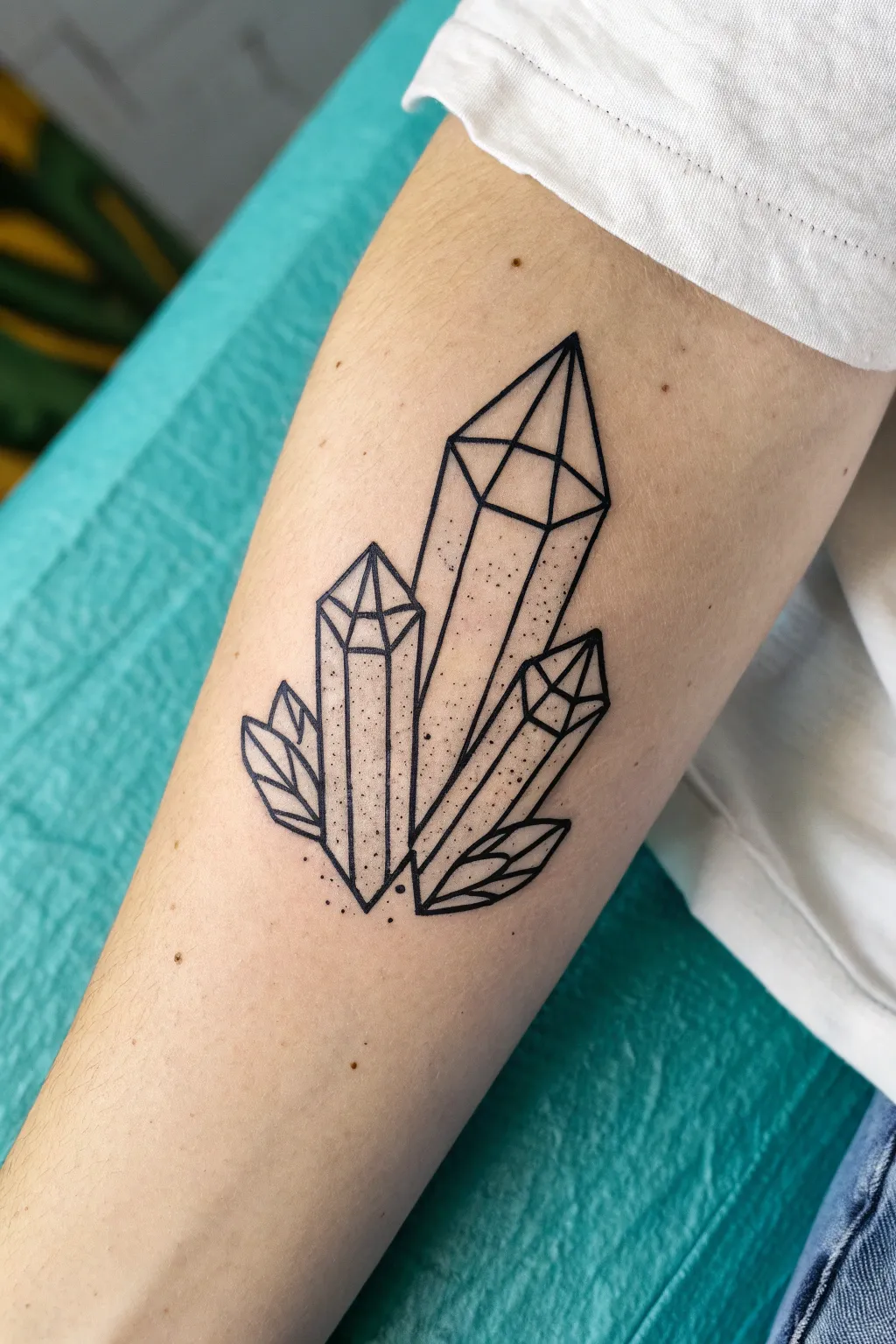
This striking design features a trio of sharp, hexagonal crystals accented by minimalist leaves, all rendered in clean black linework. The subtle stippling adds depth without the need for heavy shading, making it a perfect project for honing your precision drawing skills.
Step-by-Step
Materials
- High-quality drawing paper or sketchbook
- Pencil (HB or 2H for sketching)
- Eraser (kneaded preferred)
- Fine liner pens (0.1mm, 0.3mm, and 0.5mm)
- Ruler (optional, but helpful for crisp lines)
Step 1: Sketching the Structure
-
Establish the Central Spire:
Start by drawing a tall, vertical rectangle in the center of your page, slightly tapered towards the bottom. This will be the body of the main crystal. Don’t press too hard with your pencil; these are just guide lines. -
Add the Cap:
Top the central rectangle with a triangle. The point should be sharp and centered. This forms the termination point of the main crystal. -
Position the Side Crystals:
Draw two smaller, shorter crystal shapes flanking the main one. Place the left one slightly lower and angled outward to the left. The right one should be even lower and arguably thinner, angled outward to the right. -
Outline the Leaves:
Near the base of the left crystal, sketch two small leaf shapes pointing upwards. Repeat this on the right side with two leaves pointing down and away from the center. Keep these shapes simple and pointed.
Pro Tip: Line Weight
Make the outer boundary lines slightly thicker (0.5mm or 0.8mm) than the internal facet lines. This contrast makes the crystals pop and look more three-dimensional.
Step 2: Defining the Facets
-
Faceting the Main Crystal:
Inside the top triangle of the main crystal, draw an internal ‘V’ shape that connects the bottom corners to a point slightly below the top tip. Draw a vertical line from that internal point down the center of the crystal body. -
Refining the Main Shape:
Draw angled lines connecting the corners of the crystal’s ‘shoulder’ to the central vertical line. This creates the illusion of a translucent, 3D geometric form. -
Faceting the Side Crystals:
Repeat the geometric process for the two smaller crystals. Create a pyramid-like cap on each, drawing lines that connect the outer points to the center ridge. The goal is to make them look like cut quartz. -
Detailing the Leaves:
Draw a central vein line down the middle of each leaf. Add diagonal lines branching off the vein to indicate the leaf structure, keeping them fairly geometric rather than organic.
Troubleshooting: Wobbly Lines
If your long straight lines are shaky, try drawing from your shoulder instead of your wrist. You can also use a ruler for the main shafts of the crystals and freehand the smaller details.
Step 3: Inking and Refinement
-
Clean Up the Sketch:
Gently erase any stray sketch lines that clutter the drawing. You want a faint but clear guide before you start inking. -
Outline the Main Shapes:
Using a 0.5mm fine liner, trace the outermost perimeter of the entire crystal cluster and the leaves. Use confident, single strokes to keep the lines sharp. -
Inking Internal Lines:
Switch to a slightly thinner pen, like a 0.3mm. Carefully ink the internal geometric lines of the crystals—the facets and the central ridges. Also ink the separation lines between the crystals. -
Inking the Leaf Details:
Use the same 0.3mm pen to outline the leaves and their internal veins. Ensure the overlap points where leaves meet crystals are clean.
Step 4: Texturing
-
Prepare for Stippling:
I like to take a moment here to identify where the shadow would naturally fall. For this design, we will add texture to the lower sections and outer edges. -
Dotwork Base:
Using your finest pen (0.1mm), start adding small dots (stippling) inside the crystal bodies. Concentrate the dots more heavily near the bottom and along the outer edges of the facets. -
Creating Gradients:
Allow the dots to become sparser as you move upward toward the crystal tips. This gradient effect mimics light passing through the stone. -
Final Touches:
Add a few scattered dots outside the main outline near the base to give the drawing a floating, magical feel. Wait for the ink to dry completely, then erase all remaining pencil marks.
With these geometric steps complete, you have a crisp, modern crystal design ready for your portfolio
Playfully Imperfect Doodle Flash Icons
Capture the charm of hand-poked tattoos with this collection of playfully imperfect icons. Using simple fineliners on textured paper, you’ll create a flash sheet aesthetic that celebrates wonky lines and spontaneous creativity.
Step-by-Step Tutorial
Materials
- Heavyweight textured paper (cold press watercolor or linen finish)
- Black drawing pen (0.5mm tip)
- Black drawing pen (0.8mm or 1.0mm tip for bolder lines)
- Pencil (HB or lighter)
- Kneaded eraser
Step 1: Preparation & Layout
-
Paper Selection:
Cut a piece of heavyweight textured paper into a small rectangle, roughly A6 size or slightly smaller. The texture adds character to the ink lines. -
Light Sketching:
Using your pencil very lightly, map out where each icon will sit. Aim for a scattered, floating arrangement rather than a strict grid. You want plenty of negative space between each doodle. -
Center Placement:
Sketch a circle in the direct center of the page. This will become the classic smiley face anchor for the composition.
Ink Bleed Control
Test your pen on a scrap of the same paper first. If it bleeds too much, switch to a finer tip or move your hand faster.
Step 2: Drawing the Icons
-
Top Left: Lightning Bolt:
Start near the top left. Draw a zig-zag lightning bolt shape. Keep the lines open at the ends rather than closing the shape abruptly if you prefer a looser look, though this example uses a closed outline. -
Top Right: Crescent Moon:
On the top right, sketch a simple crescent moon. The curve should face inward toward the center of the page. -
Center: Smiley Face:
Go over your center circle with the 0.5mm pen. Add two small vertical ovals for eyes and a wide, U-shaped mouth. Add small tick marks at the ends of the smile for cheeks. -
Left Side: The Star:
To the left of the smiley face, draw a five-pointed star. Don’t worry about perfect symmetry; a slightly wonky star fits the aesthetic perfectly. -
Right Side: The Burst:
To the right of the smiley face, draw an asterisk shape made of three crossing lines (six points total). It mimics a spark or a simplified snowflake. -
Lower Left: The Sacred Heart:
Draw a heart shape. Inside, draw a cross and some scribbles. Outline the outer edge with small loops or scallops to give it a lace-like or radiating border. -
Lower Right: Tiny Heart:
Draw a very small, simple outline heart floating between the central smiley and the bottom edge. -
Bottom Center: The Box Face:
Draw a rectangle at the very bottom. Inside, draw a circle. Add a face to the circle with two large black eyes and a small smile.
Step 3: Inking & Finishing
-
Tracing:
Switch to your black pens. Trace over your pencil lines confidently. I find that moving the pen a bit slower than usual helps the ink bleed slightly into the paper texture for that tattoo look. -
Thickening Lines:
For the lightning bolt and the moon, go over the lines a second time or use the thicker pen to make them stand out more. -
Filling Details:
Fill in the eyes of the bottom box-face character completely black, leaving tiny white dots for highlights if possible. -
Adding Texture:
On the lace heart, add tiny dots inside the scalloped edge for extra detail. -
Erase Sketches:
Wait at least 15 minutes for the ink to fully dry. Gently roll your kneaded eraser over the entire page to lift the graphite without smudging the ink.
Uneven Lines?
Embrace the wobble! If a line isn’t straight, don’t try to correct it. Retracing often makes it look messy rather than intentional.
Now you have a charming piece of flash art ready to frame or gift


Have a question or want to share your own experience? I'd love to hear from you in the comments below!