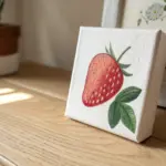
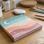
When you want cool painting ideas, it helps to pick concepts that look dramatic without demanding perfection. I lean on high-contrast silhouettes, glowy gradients, and a few clever composition tricks that make your piece feel instantly gallery-worthy.
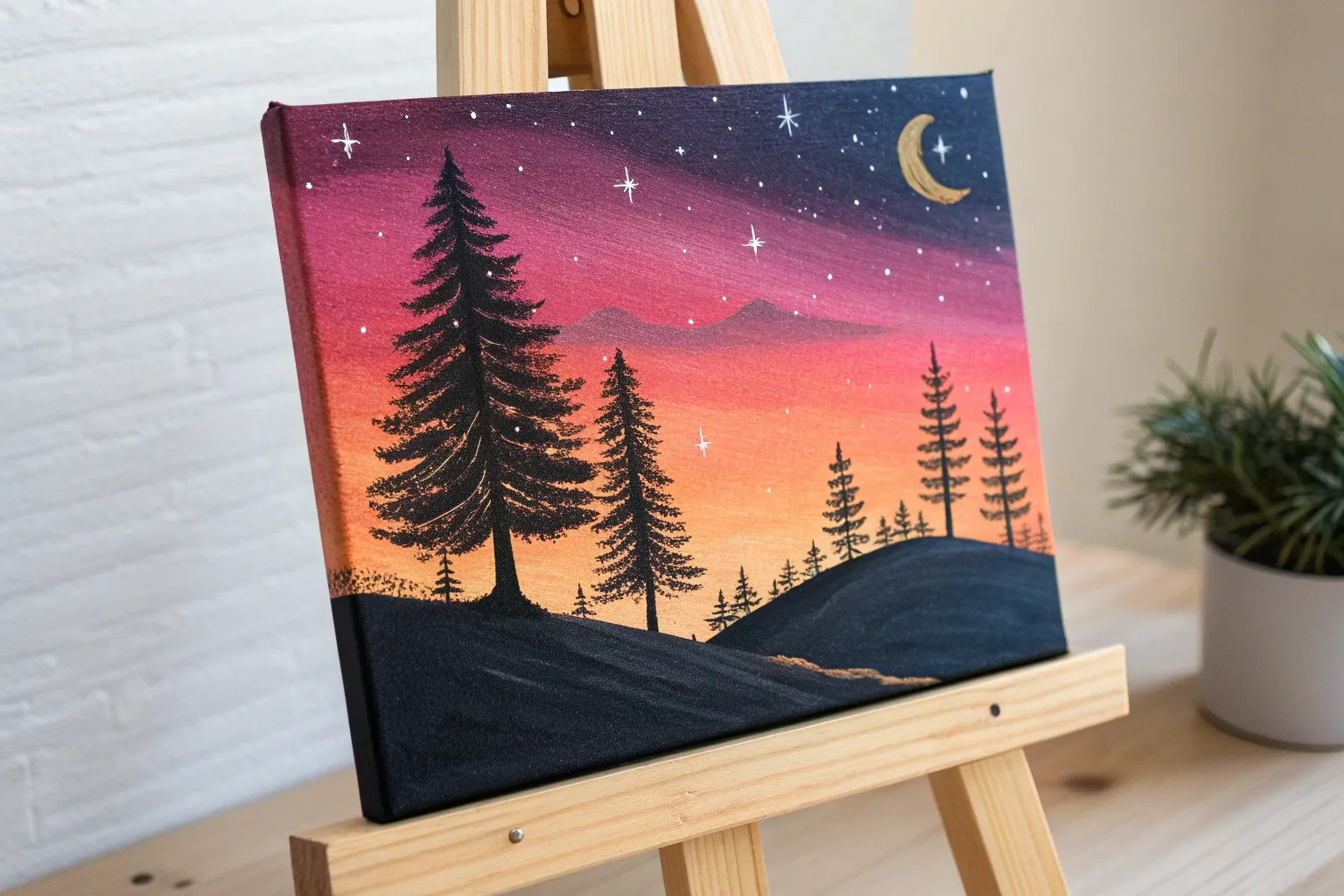
Sunset Gradient With a Silhouette
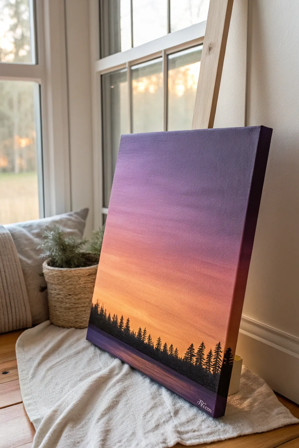
Capture the serene beauty of twilight with this striking gradient landscape painting. By blending deep purples into warm oranges, you’ll create a glowing backdrop for a crisp, black treeline silhouette that pops against the sky.
Step-by-Step Guide
Materials
- Stretched canvas (e.g., 11×14 or 16×20 inches)
- Acrylic paints: Deep Violet, Magenta, Orange, Yellow, Titanium White, Carbon Black
- Large flat brush or foam brush (for background)
- Medium round brush
- Small fine liner brush (for details)
- Cup of water
- Palette or paper plate
- Paper towels
- Easel (optional)
Step 1: Painting the Sky Gradient
-
Prepare your palette:
Squeeze out generous amounts of your sky colors: Deep Violet, Magenta, Orange, Yellow, and a touch of White. Keep the Black separate for later. Having your colors ready is crucial because acrylics dry fast, and speed helps with blending. -
Start at the top:
Load your large flat brush with Deep Violet. Begin painting the top quarter of the canvas using long, horizontal strokes. Ensure you paint the top edge and sides of the canvas as well for a polished, frameless look. -
Transition to magenta:
Without cleaning your brush fully, pick up some Magenta. Blend this into the lower edge of the violet section, moving downwards. The colors should mix on the canvas to create a seamless transition from dark purple to pinkish-purple. -
Add warmth with orange:
Wipe your brush on a paper towel to remove excess dark paint, then load it with Orange. Start painting just below the magenta area, blending upwards into the pink. Use confident, side-to-side strokes to smooth out any harsh lines. -
Introduce the glow:
Clean your brush thoroughly. Mix a little Yellow with White to create a pale, glowing sun color. Paint the bottom third of the sky area with this light yellow mixture, blending it upwards into the orange section. -
Final blending pass:
While the paint is still slightly tacky, use a clean, slightly damp brush to lightly sweep horizontal strokes across the entire gradient. This softens any remaining brush texture and unifies the transition zone. -
Create the reflection base:
At the very bottom of the canvas (where the water or ground would be), apply a strip of Deep Violet mixed with a tiny bit of Black. This creates a distinct horizon line and a darker base for the foreground. -
Let it dry completely:
Allow the background to dry fully before moving on. This usually takes about 20-30 minutes. If you try to paint the silhouette while the sky is wet, the black paint will turn muddy.
Sticky blending?
If acrylics are drying too fast while blending the sky, mist the canvas lightly with water or mix a slowing medium into your paints to keep them workable longer.
Step 2: Adding the Silhouette
-
Mix your black:
Prepare your Carbon Black paint. You want a consistency that is fluid enough to flow off a small brush but opaque enough to cover the background in one coat. Adds a tiny drop of water if it feels too thick. -
Establish the ground line:
Using a medium round brush, paint a solid black undulating line across the bottom of the canvas, covering the dark violet base strip you painted earlier. This creates the uneven forest floor. -
Start the trees:
Make vertical lines extending upwards from the ground line to mark the trunks of your pine trees. Vary the heights significantly—some should be tall and majestic, others short and young—to create a natural rhythm. -
Form the tree tops:
Switch to your small liner brush or the tip of a small round brush. Start at the very top of a trunk line and dab small, horizontal dashes that get slightly wider as you move down. -
Flesh out the branches:
Continue working down each tree trunk. Use a stippling motion (tapping the brush) to create the texture of pine needles. The branches should generally angle slightly downward and become denser near the bottom. -
Overlap the trees:
Don’t isolate the trees; let their lower branches overlap. This creates the look of a dense, impenetrable forest rather than individual stickers on a page. Fill in the gaps near the ground with solid black. -
Add fine details:
I like to go back with the liner brush and add a few very faint, thin vertical lines or tiny peaks in the gaps between larger trees to suggest distant growth. This adds depth to your silhouette. -
Sign your work:
Once the silhouette is dry, use a small brush with white or light violet paint to sign your name in the bottom corner, contrasting against the dark forest floor.
Starry Night
Once the sky is dry, flicker a toothbrush with watered-down white paint over the purple section to create a dusting of stars appearing in the twilight.
Now you have a stunning, peaceful landscape that brings the warmth of a sunset into any room

Moonlit Night Sky Over Pines
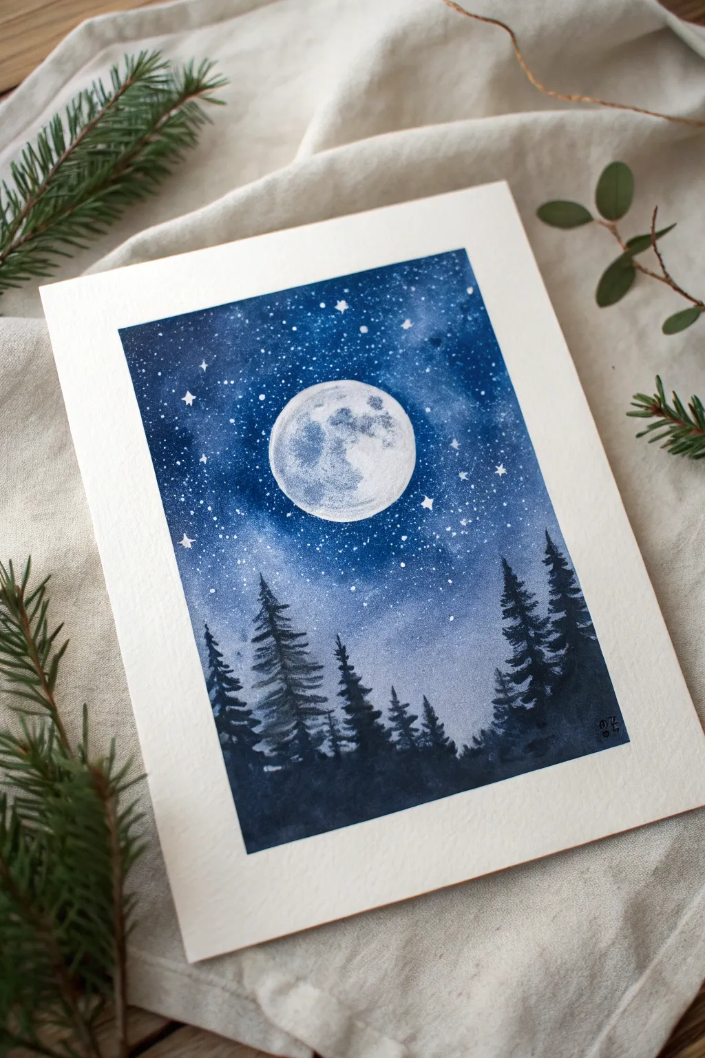
Capture the serene beauty of a crisp winter evening with this watercolor study of a glowing moon hovering above a shadowy pine forest. The high-contrast composition relies on deep indigo washes and speckled stars to create a magical, luminous effect.
How-To Guide
Materials
- Cold press watercolor paper (140lb/300gsm), taped down
- Indigo or Prussian Blue watercolor paint
- Black watercolor paint
- White gouache or opaque white ink
- Round watercolor brushes (size 8 for washes, size 2 for details)
- Masking fluid (drawing gum) and old brush
- Salt (optional, for texture)
- Old toothbrush
- Clean water and paper towels
Step 1: Preparation and Masking
-
Tape the edges:
Secure your watercolor paper to a board using painter’s tape or masking tape. This creates that crisp white border seen in the final piece and prevents the paper from buckling under heavy washes. -
Draft the moon:
Lightly sketch a circle in the center of the upper third of the paper. You can trace a small lid or cup to get a perfect shape. -
Protect the moon:
Using an old brush or a silicone applicator, carefully fill the moon circle with masking fluid. This preserves the white paper, which is crucial for the moon’s brightness later. Let it dry completely until it’s tacky and hard.
Unwanted Blooms
If you get ‘cauliflower’ blooms in your sky, don’t panic. These uneven drying marks actually add to the cosmic nebula look. If you hate them, glaze over with another layer.
Step 2: Painting the Night Sky
-
Wet the paper:
Once the masking fluid is dry, brush clean water over the entire sky area, stopping just short of where the treeline will be at the bottom. -
Apply the first wash:
Load your larger brush with a diluted Indigo or Prussian Blue. Drop the color into the wet paper, letting it bloom. Keep the color lighter around the moon to simulate a glowing halo. -
Deepen the cosmos:
While the paper is still wet, introduce concentrated Indigo and a touch of Black into the upper corners and edges. I like to tilt the board slightly to help the dark paint flow naturally toward the center without overwhelming the light area. -
Create texture:
If you want subtle galaxy-like textures, drop tiny hints of clear water back into the drying paint or sprinkle a few grains of salt into the damp wash. Let this layer dry completely. -
Layering for depth:
Once dry, assess the darkness. If it looks too pale, apply a second glaze of dark blue, ensuring you maintain the lighter gradient around the moon. Let this dry 100%.
Step 3: Stars and Moon Details
-
Splatter the stars:
Cover the bottom third of your paper (where the trees will go) with a scrap sheet. Dip an old toothbrush into white gouache mixed with a tiny bit of water. Flick the bristles to create a spray of fine white stars across the blue sky. -
Add larger stars:
Use a fine detail brush and thick white gouache to paint a few specific, larger stars. Add tiny cross shapes to make them twinkle. -
Reveal the moon:
Gently rub away the masking fluid with your finger or a rubber cement pickup to reveal the stark white circle. -
Paint lunar craters:
To make the moon look realistic, mix a very watery grey-blue. Dab random, irregular patches onto the white circle to suggest craters and shadows, leaving the edges mostly white for contrast.
Silver Linings
Trace the very tops of the pine trees with a faint line of silver watercolor or white gel pen. It mimics the moonlight catching the frost on the needles.
Step 4: The Silhouetted Forest
-
Mix the forest color:
Combine Indigo and Black to create a deep, near-black navy color. It needs to be fairly opaque, so use less water. -
Paint the tree structure:
Using the tip of your round brush, draw delicate vertical lines for the tree trunks. Vary the heights, placing taller trees on the sides and shorter ones toward the middle to frame the moon. -
Add pine branches:
Starting from the top of a trunk, use a zig-zag motion to paint the branches. Keep them narrow at the top and winder toward the bottom. Make the strokes jagged and irregular. -
Fill the dense forest:
As you move lower down the paper, merge the individual trees into a solid dark mass to represent the dense forest floor. Ensure the silhouette is darkest at the very bottom. -
Final touches:
Check for any gaps in the treeline that need filling. Peel off the border tape slowly at a 45-degree angle to reveal the clean edges.
Step back and admire the stark contrast between the bright moon and the deep, silent forest you’ve created

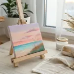
Mountain Peaks With Misty Layers
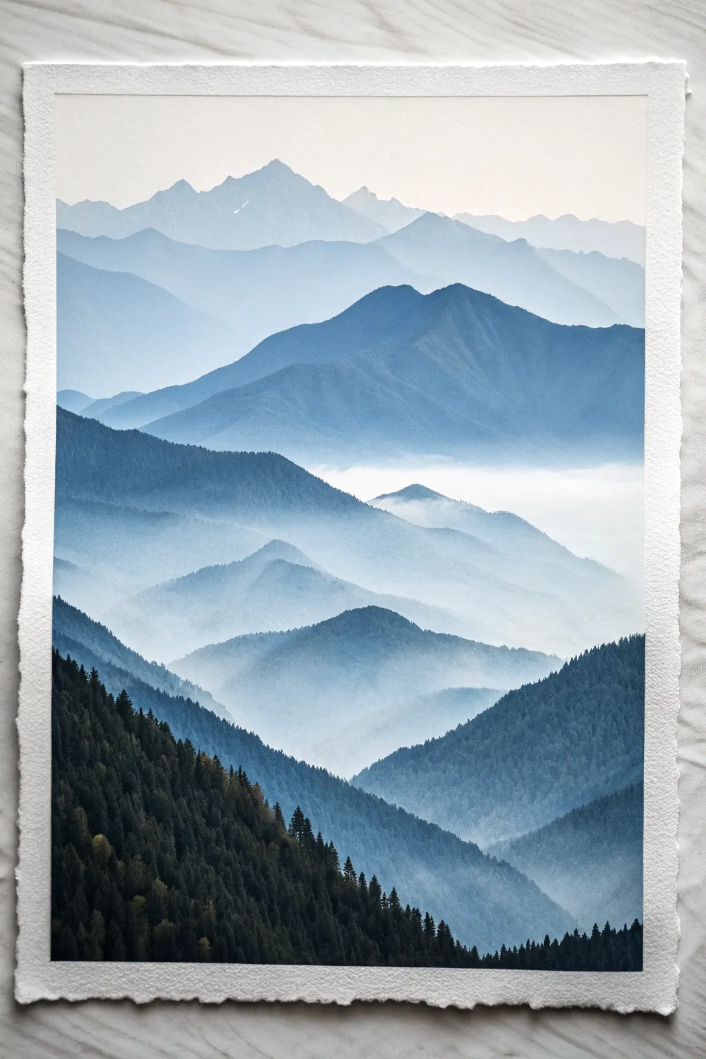
Capture the serene beauty of distant peaks fading into the fog with this atmospheric watercolor study. By carefully layering washes from light to dark, you’ll create an incredible sense of depth and vastness on a single sheet of paper.
Detailed Instructions
Materials
- Cold Press Watercolor Paper (300gsm/140lb)
- Watercolor paints: Indigo, Prussian Blue, Paynes Gray, Sap Green
- Large flat wash brush (3/4 inch or 1 inch)
- Medium round brush (size 8 or 10)
- Small detail round brush (size 2 or 4)
- Masking tape
- Two jars of water
- Paper towels
- Mixing palette
Step 1: Preparation and Sky
-
Secure Your Paper:
Begin by taping down all four edges of your watercolor paper to a board or table. This prevents buckling when we add water and creates that crisp, professional white border shown in the photo. -
Mix Your Base Palette:
In your palette, prepare puddles of your blues. You’ll need a very watery, pale mix of Indigo for the furthest mountains and a progressively stronger concentration for closer layers. Keep a separate mix of Sap Green and Paynes Gray ready for the foreground. -
Wet on Wet Sky:
Brush clean water across the top third of your paper. While it’s glistening but not swimming, drop in a tiny amount of your palest blue wash at the very top edge, letting it fade into white as it moves down. This subtle gradient sets the mood.
Pro Tip: The Mist Trick
Work on an inclined board (about 30 degrees). Gravity helps pull the pigment downward, naturally creating that beautiful gradient from a crisp top edge to a misty bottom.
Step 2: Building the Distant Range
-
First faint peaks:
Once the sky is bone dry, mix a very diluted, watery blue-grey. Using your medium round brush, paint the silhouette of the furthest mountain range. Keep the edge crisp but the body of the shape very transparent. -
Fading the Bottom:
Before the paint dries, rinse your brush and drag clean water along the bottom edge of this mountain shape. This softens the pigment downwards, creating the illusion of mist rising from the valley. -
Dry Completely:
Patience is key here. Verify that the first layer is completely dry before touching the paper again, otherwise, you’ll create unintentional blooms or lifting. -
Second Layer:
Mix a slightly darker value of your blue. Paint a second range of mountains slightly lower than the first, overlapping them. Vary the peak heights to keep the composition interesting. -
Create the Mist Again:
Just like before, I like to use a damp, clean brush to blur the bottom edge of this new geometric shape into nothingness. The white of the paper in these gaps acts as the fog.
Step 3: Mid-Ground and Depth
-
Darkening the Mix:
Add a touch more Indigo or Prussian Blue to your mix. Create a third, closer mountain range. Notice how the shapes in the reference image get larger and ‘taller’ as they come closer to the viewer. -
Refining Edges:
Use the tip of your round brush to give this layer slightly more detailed ridges. Continue the technique of fading the bottom edge into a misty blur. -
The Foggy Valley:
For the prominent white band of fog seen in the middle of the reference, ensure the layer above it fades completely to clear water. Leave a wide strip of unpainted white paper before starting the next darker layer below. -
Stepping Stones:
Continue this process for 2-3 more layers, moving down the paper. Each new mountain range should be significantly darker and bluer than the one behind it.
Level Up: Morning Light
Add a tiny drop of pale yellow or peach to the very first sky wash and the tip of the highest mountain. This adds a subtle ‘sunrise’ warmth to contrast the cold blues.
Step 4: The Foreground Forest
-
Mixing Forest Green:
For the closest layer, we need a deep, rich dark color. Mix Sap Green with Paynes Gray or Indigo until it looks almost black but retains a green undertone. -
Blocking the Shape:
Using your medium brush, block in the solid mass of the large foreground hill on the bottom left and the smaller hill on the right. Don’t worry about individual trees yet; just get the silhouette. -
Painting Pine Tops:
Switch to your small detail brush. Along the top ridge of this dark hill, paint tiny vertical spikes to represent the tops of pine trees. -
Adding Texture:
While the main dark wash is still wet, drop in slightly thicker pigment to create texture and vertical strokes that mimic tree trunks within the mass. -
Final Trees:
Add a few individual trees standing slightly apart from the main mass on the ridges to break up the solidity. Let everything dry completely before carefully peeling off the tape.
Step back and admire how simple layers of blue can create such a vast landscape


Simple Florals on a Bold Background
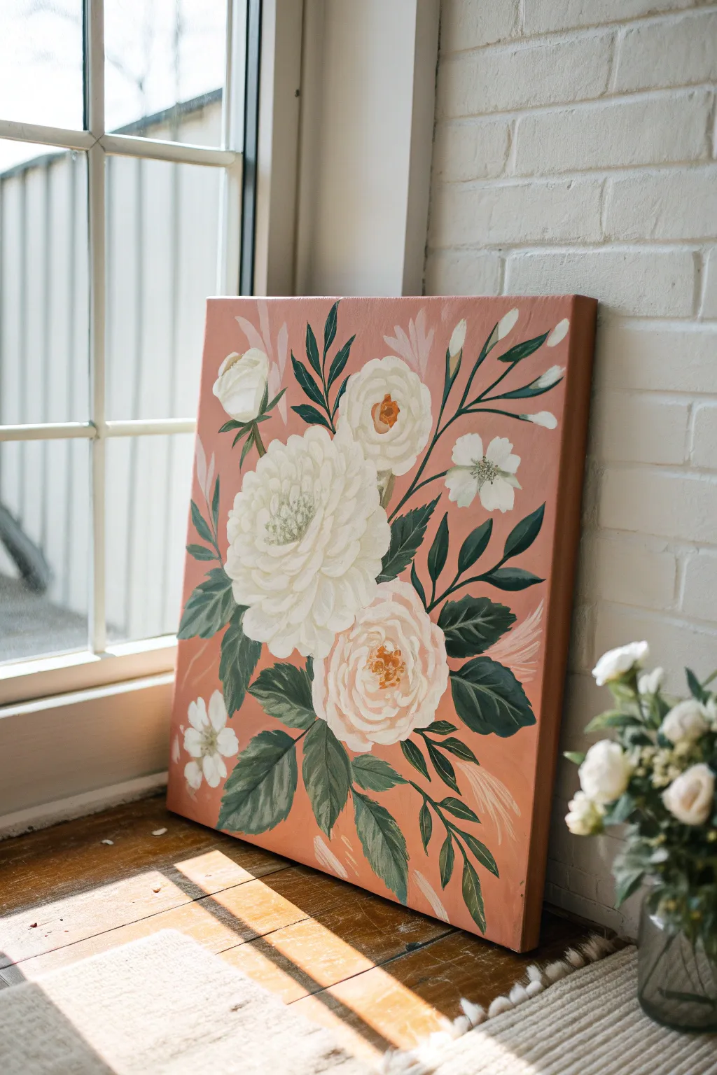
Embrace the warmth of nature with this romantic floral study, featuring creamy white blooms against a striking terra cotta background. The contrast between the soft petals and the earthy base color creates a modern, sophisticated piece perfect for brightening any corner.
Detailed Instructions
Materials
- Canvas (rectangular, e.g., 16×20 inches)
- Acrylic paints: Terra cotta/dusty pink, titanium white, cream/unbleached titanium, burnt umber, sap green, phthalo green
- Large flat brush for background
- Medium filbert brush (size 6-8)
- Small round brush (size 2-4)
- Palette
- Cup of water and paper towels
- Chalk or pastel pencil (white or light grey)
Step 1: Setting the Stage
-
Mix the background color:
Create a warm, earthy terra cotta shade. If using tube paints, mix a dusty pink with a touch of burnt sienna or orange. The goal is a matte, muted salmon color rather than a bright bubblegum pink. -
Apply the base coat:
Using your large flat brush, cover the entire canvas with the terra cotta mixture. Paint the sides as well for a finished look. Apply a second coat if the first looks streaky, then let it dry completely. -
Map out the composition:
Lightly sketch the placement of the flowers using a chalk or pastel pencil. Draw a large central circle for the main peony, a medium circle below it for the rose, and smaller circles for the buds and filler flowers. Keep the lines faint so they don’t show through later.
Paint feels transparent?
If your white paint looks streaky or translucent against the dark pink, stop layering immediately. Let it dry completely, then apply a second coat of white. Wet-on-wet will only muddy the colors.
Step 2: Blocking in the Blooms
-
Base layer for flowers:
Mix titanium white with a tiny bit of cream to create an off-white shade. Using the medium filbert brush, paint the rough silhouettes of the main flower shapes. Don’t worry about petals yet; simply fill in the circles. -
Add dimension to the centers:
While the white is still slightly wet, define the centers of the flowers. For the top main white bloom, use a very pale grey-green mix in the center. For the lower rose and top bud, dab a dot of burnt umber mixed with orange or yellow ochre into the direct center. -
Paint the smaller buds:
Using the same off-white mixture, paint the small teardrop shapes for the closed buds near the top right and main bloom. -
Create the filler flowers:
Switch to a smaller brush to paint the distinct five-petal shapes for the small white wildflowers scattered on the left and right sides.
Step 3: Layering the Leaves
-
Mix the dark green:
Combine sap green with a touch of phthalo green and a tiny bit of black or burnt umber. You want a deep, forest green that contrasts sharply with the pink background. -
Paint main stems:
With a liner or small round brush, draw thin, graceful lines connecting your buds and flowers. Aim for slight curves rather than straight rigid lines to keep the movement organic. -
Add the large leaves:
Using the filbert brush on its side, press and pull away to create the leaf shapes. Describe the jagged edges of rose leaves by wiggling the brush slightly as you pull the stroke. -
Fill in leaf clusters:
Group leaves in clusters of three around the base of the large blooms. I like to vary the green mixture slightly here, adding a touch of white to some leaves so they appear to catch the light.
Add Metallic Flair
Once the painting is dry, use a gold paint pen or thin brush with gold leaf paint to outline just a few petal edges or the centers of the flowers for a shimmering, elegant upgrade.
Step 4: Defining the Petals
-
Detail the main peony:
Now that the white base is dry, load your filbert brush with pure titanium white. Paint C-shaped strokes starting from the outer edge curved inward. Layer smaller strokes as you move toward the center to simulate layers of petals. -
Detail the lower rose:
For the lower rose, use a mix of white and a tiny drop of pink. Paint swirling strokes starting from the center and spiraling outward, leaving gaps of the darker undertone visible to define the separation of petals. -
Highlight the centers:
Use the small round brush and a yellow-orange mix to add small stamen dots to the centers of the open blooms, focusing on the lower rose and the small white filler flowers. -
Refine the stamens:
For the large top white flower, paint tiny pale green dots closely packed in the center to create texture.
Step 5: Final Touches
-
Add subtle accents:
Mix a very pale pink (lighter than the background) and paint wispy, feather-like strokes or ghost leaves in the background behind the main flowers and at the bottom. This adds depth without overpowering the main subject. -
Highlight the leaves:
Mix a lighter sage green and add a thin line down the center of a few main leaves to suggest a vein. -
Clean up edges:
If any background paint got onto your flowers, or vice versa, use your small brush to carefully touch up the edges for a crisp silhouette. -
Varnish:
Once the painting is completely dry (wait 24 hours), apply a satin or matte varnish to protect the surface and unify the sheen.
Hang your new botanical artwork near a window to let natural light enhance those creamy textures.
BRUSH GUIDE
The Right Brush for Every Stroke
From clean lines to bold texture — master brush choice, stroke control, and essential techniques.
Explore the Full Guide
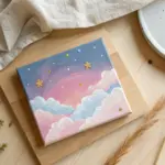
Loose Cloud Study in Pastel Tones
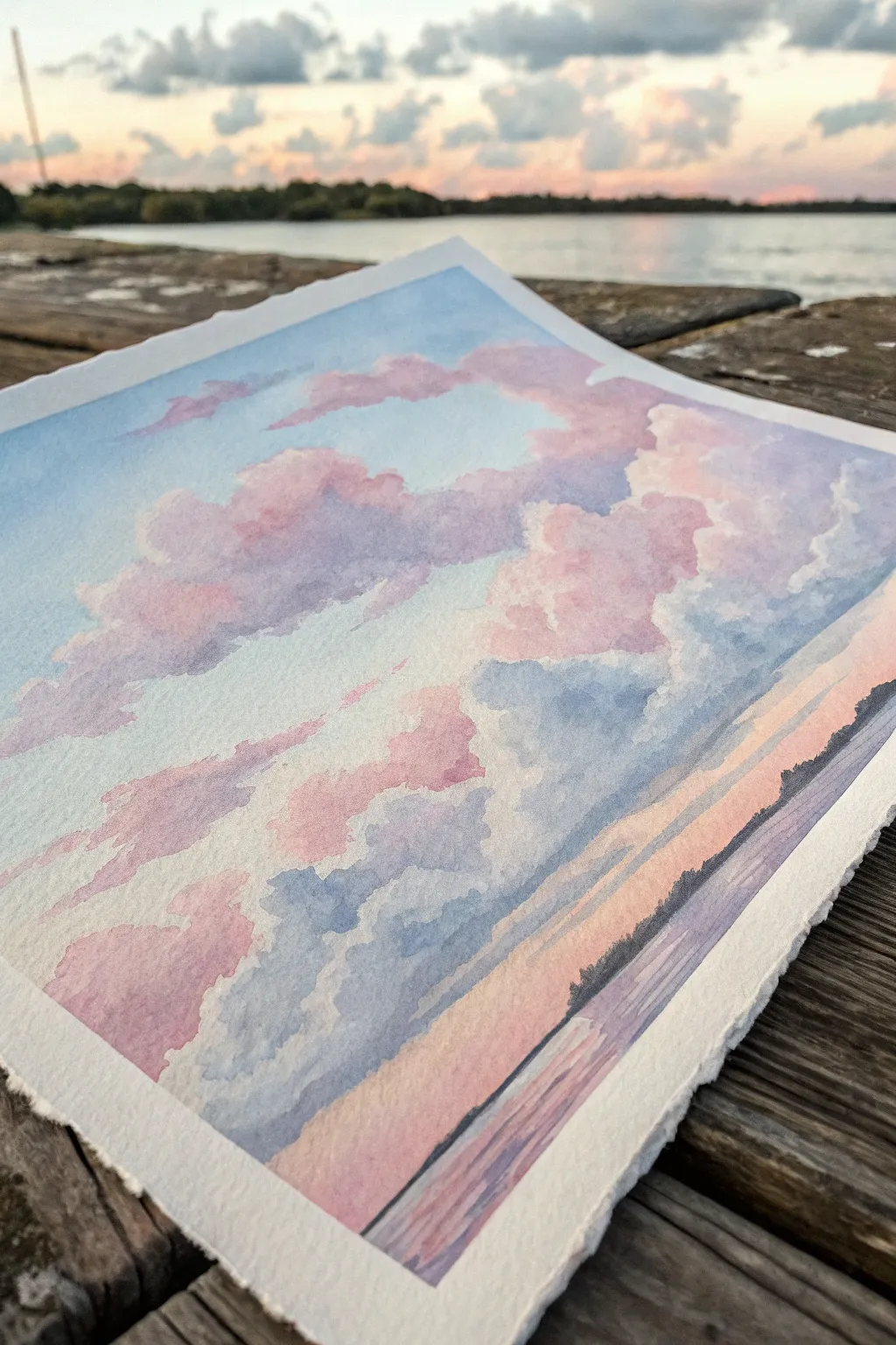
Capture the fleeting beauty of twilight with this soft, pastel-toned watercolor cloud study. By layering washes of blush pink, lavender, and sky blue, you will create a fluffy, atmospheric skyscape that feels light as air.
Step-by-Step Tutorial
Materials
- Cold press watercolor paper (140lb/300gsm)
- Watercolor paints (Alizarin Crimson, Cobalt Blue, Lemon Yellow, Ultramarine)
- Large round brush (size 10 or 12)
- Medium round brush (size 6 or 8)
- Masking tape
- Jar of clean water
- Paper towels
- Mixing palette
Step 1: Preparation and Sky Base
-
Secure your paper:
Tape down all four edges of your watercolor paper to a sturdy board using masking tape. This prevents the paper from buckling when wet and creates that crisp, professional border seen in the example. -
Mix your palette:
Prepare three main puddles of watered-down paint: a very pale sky blue (Cobalt Blue + lots of water), a soft lavender (Ultramarine + touch of Alizarin Crimson), and a warm blush pink (Alizarin Crimson + tiny bit of Lemon Yellow). -
Establish the horizon:
Using your large round brush, paint a horizontal band of pale peach or warm pink across the bottom third of the paper. This represents the glow of the setting sun near the horizon. -
Start the upper sky:
While the horizon strip is still damp, rinse your brush and pick up the pale sky blue. Paint the top third of the paper, using horizontal strokes but leaving large, irregular gaps of white paper in the middle section for the clouds.
Step 2: Building the Clouds
-
First cloud shapes:
Switch to your medium brush. Load it with the blush pink mixture. Lightly dab this color into the white spaces you left, allowing the edges to touch the wet blue sky in some areas for soft blends. -
Softening edges:
If an edge looks too hard, quickly rinse your brush, blot it slightly on a paper towel, and run the damp bristles along the edge of the paint to soften it into the paper white. -
Adding volume:
While the pink layer is damp but not soaking wet, drop in hints of lavender at the bottom of the pink cloud shapes. This creates natural-looking shadows and gives the clouds three-dimensional volume. -
Connecting the sky:
Use the pale blue wash to fill in the spaces between the pink clouds, being careful to carve out the shapes. You can let the blue overlap the pink slightly to create soft purples. -
Lower atmosphere:
Below the main cloud mass, paint streaks of lavender and peach horizontally. These represent distant, flatter cloud layers often seen near the horizon line.
Edge Control
For fluffier clouds, keep your paper slightly damp. This ‘wet-on-damp’ technique creates fuzzy edges naturally. If the paper is bone dry, your clouds will look hard and flat.
Step 3: Refining and Details
-
Deepening shadows:
Mix a slightly more saturated purple-grey. With a damp (not wet) brush, glaze this shadow color onto the bottom-right areas of the largest clouds to establish a clear light source coming from the left. -
Defining the water:
At the very bottom of the page, beneath the horizon glow, paint a block of soft lavender mixed with blue. This will act as the water reflecting the sky. -
Adding reflections:
While the water area is wet, drag through a few horizontal strokes of the pink and peach colors to mimic the reflection of the sunset on the water’s surface. -
The distant treeline:
Mix a dark, cool purple using Ultramarine and Alizarin Crimson with less water. Using the tip of your small brush, paint a thin, jagged silhouette line just above the water to suggest distant trees or land. -
Final assessment:
Step back and look at your composition. If the clouds look too separate, wet a clean brush and gently bridge the gap between shapes with very pale water to connect them. -
The reveal:
Allow the painting to dry completely—this is crucial to avoid tearing. I advise waiting until the paper is warm to the touch before carefully peeling away the masking tape at a 45-degree angle.
Level Up: Texture
While the sky is still damp, lightly sprinkle a tiny pinch of salt into the blue areas. As it dries, the salt pushes the pigment away, creating a unique, starry texture.
Once the tape is removed, you will have a serene slice of sunset ready to frame or gift
Abstract Waves With Clean Tape Lines
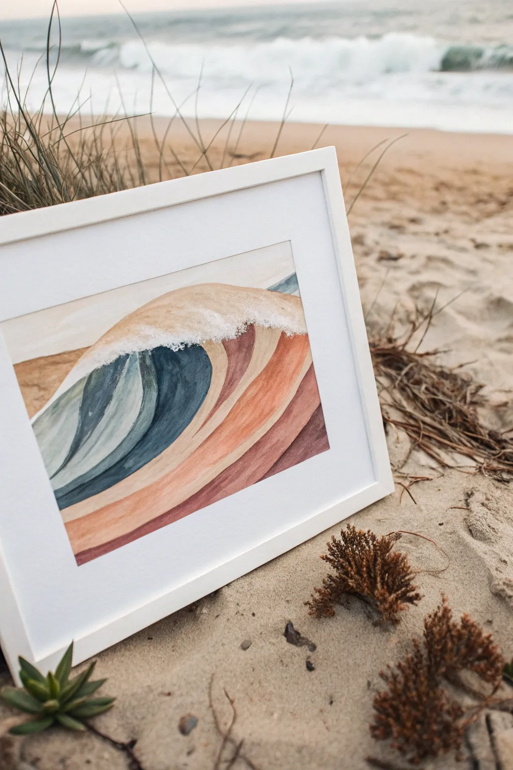
Capture the rhythm of the ocean with this stylized wave painting, featuring crisp white lines that define each colorful segment. The harmonious blend of deep indigos, muted teals, and warm terracotta tones creates a modern coastal aesthetic suitable for any room.
How-To Guide
Materials
- Cold press watercolor paper (300 gsm)
- Watercolor paint set (pans or tubes)
- Masking fluid or white artist’s tape (thin width, roughly 1/8 inch or 3mm)
- Round watercolor brushes (sizes 4, 6, and 10)
- Palette for mixing
- Pencil and eraser
- Paper towels
- Jar of clean water white gouache (opaque white paint)
- White or light wood frame (optional)
Step 1: Preparation & Sketching
-
Tape the border:
Begin by taping down all four edges of your watercolor paper to a hard board using painter’s tape or artist’s tape. This creates a clean white border and prevents the paper from buckling when wet. -
Visualize the wave:
Lightly sketch the main outline of a large, rolling wave using a pencil. Instead of drawing a realistic wave, think in broad, sweeping bands that curve upward and crash over. -
Define the bands:
Draw parallel curved lines within the main wave shape to separate the color zones. Ensure these lines follow the flow of the water, curling into the barrel of the wave. -
Masking the lines:
If you want the pristine white lines seen in the example, carefully apply thin masking tape or lines of masking fluid over your pencil marks. I prefer masking fluid for curves, as it’s easier to manipulate than stiff tape.
Torn Paper?
If removing tape rips the paper, try heating it slightly with a hair dryer first to loosen the adhesive, or pull it slower at a 45-degree angle.
Step 2: Applying Color
-
Mix the cool palette:
Prepare your cool tones first. Mix an indigo blue, a muted teal (add a touch of gray), and a lighter sea-glass blue. Keep the mixtures relatively watery for a transparent look. -
Mix the warm palette:
Next, mix your warm earth tones. You’ll need a pale sand/peach color, a terracotta rust, and a deeper reddish-brown. -
Paint the barrel:
Start with the innermost curve of the wave barrel using your deepest indigo. Apply the paint wet-on-dry to keep the edges sharp against your masking lines. -
Transition to teal:
Moving outward from the indigo, paint the next band with the muted teal. Allow the paint to pool slightly for texture, but don’t let it cross the masked barrier. -
Add warm stripes:
Paint the outer bands of the wave using your warm palette. Start with the peach tone, then the rust, and finally the deep reddish-brown at the very bottom, creating a beautiful contrast. -
Fill the background:
For the sky area behind the wave, use a very diluted wash of pale blue or gray-beige, keeping it significantly lighter than the wave itself for depth. -
Let it dry completely:
This is crucial: allow the entire painting to dry fully. If you try to remove masking material while the paper is damp, it will tear.
Pro Tip: Liquid Mask
For super smooth curves, use a distinct ruling pen or a silicone brush to apply masking fluid. Regular brushes will get ruined by the rubbery fluid.
Step 3: Details & Finishing
-
Reveal the lines:
Once the paper is bone dry, carefully peel away the masking fluid or thin tape to reveal the crisp white paper underneath. -
Add the foam:
Squeeze a small amount of opaque white gouache onto your palette. Using a stippling motion with an old or dry brush, dab the white paint along the top crest of the wave. -
Refine the spray:
Extend the white stippling slightly downward into the top color bands to simulate sea spray and foam breaking over the lip of the wave. -
Erase guidelines:
If any pencil marks are still visible in the white gaps, gently erase them with a soft eraser. -
Frame your work:
Place your finished piece in a simple white or light wood frame to complement the clean, airy aesthetic of the painting.
Now you have a serene, modern seascape to bring a touch of the coast into your home

PENCIL GUIDE
Understanding Pencil Grades from H to B
From first sketch to finished drawing — learn pencil grades, line control, and shading techniques.
Explore the Full Guide
Starry Galaxy With Color-Shift Blending
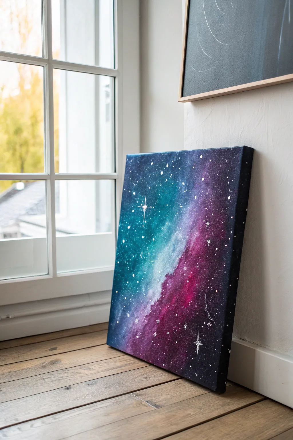
Capture the magic of deep space with this vibrant galaxy painting featuring a mesmerizing color shift from deep teal to electric magenta. This project utilizes simple blending techniques to create a misty nebula effect that looks incredibly professional.
Detailed Instructions
Materials
- Square stretched canvas (approx. 16×16 or similar)
- Acrylic paints (Phthalo Blue, Teal, Magenta, Deep Purple, Titanium White, Black)
- Large flat brush or sponge brush
- Medium round brush
- Small detail brush (liner brush)
- Old toothbrush
- Palette or paper plate
- Cup of water and paper towels
Step 1: Setting the Background
-
Prime the canvas:
Start by applying a solid coat of black acrylic paint to cover the entire canvas. This provides the necessary depth for a space scene. -
Let it dry completely:
Ensure the black base coat is bone dry before proceeding. Any wetness here will muddy your bright galaxy colors later. -
Map out the nebula:
Using a slightly damp sponge or large brush, lightly sketch a diagonal line across the canvas from top-left to bottom-right using white paint. This doesn’t need to be perfect; it just marks where the brightest part of your galaxy will be.
Wet-on-Wet Blending
Keep a mist spray bottle handy. A light spritz of water keeps acrylics wet longer, allowing for smoother, cloud-like blends between your nebula colors.
Step 2: Building the Color Shift
-
Apply the teal zone:
Load your brush with teal and a tiny touch of white. Sponge or dab this color onto the upper left section of the canvas, keeping it denser near the diagonal white line and fading it out as you move toward the corner. -
Deepen the blue:
While the teal is still tacky, blend Phthalo Blue into the far upper-left corner. This creates a gradient from dark space into the lighter nebula cloud. -
Apply the magenta zone:
Clean your brush thoroughly. On the lower right side of the diagonal line, dab on your magenta paint. Allow it to overlap slightly with the central white area, but keep it distinct from the teal. -
Blend the purple transition:
Mix a bit of deep purple with the magenta and apply it to the far bottom-right corner, blending inward to create depth. -
Create the milky way center:
Refresh the central diagonal line with pure Titanium White. Using a dry brush technique, gently feather this white into both the teal and magenta sides to create a glowing, foggy transition. -
Softening edges:
If any paint strokes look too harsh, use a clean, dry soft brush to lightly sweep over the transition areas. This blurs the brush marks and makes the nebula look gaseous.
Step 3: Stars and Details
-
Prepare splatter paint:
Mix a small amount of white paint with water until it reaches an ink-like consistency. It needs to be fluid enough to splatter but opaque enough to show up. -
Create distant stars:
Dip an old toothbrush into the thinned white paint. Point the bristles toward the canvas and run your thumb across them to spray a fine mist of stars over the entire painting. -
Add focused stars:
Using your smallest detail brush, manually dot larger stars in the darker corners of the painting to create variation in distance. -
Paint the major starbursts:
Select 2-3 spots for prominent ‘hero’ stars. Paint a small dot of pure white, then use a liner brush to drag very thin lines outward from the center—one vertical and one horizontal—to create a cross shape. -
Add diagonal flares:
For the largest star (like the one in the teal section), add smaller diagonal lines between the main cross lines to create an eight-pointed glimmer. -
Final highlights:
I like to add a tiny extra dot of thick white paint right in the center of the largest starbursts to make them look like they are glowing intensely. -
Paint the sides:
Don’t forget the edges of your canvas. Extend the black background and subtle color hints around the sides for a finished, gallery-ready look. -
Seal the artwork:
Once fully dry (give it at least 24 hours), apply a coat of gloss varnish to make the dark colors pop and protect the paint surface.
Adding Metallic Depth
Mix a tiny amount of silver glitter paint or iridescent medium into your white star splatter mixture for a galaxy that actually sparkles in the light.
Hang your new celestial masterpiece near a window to let natural light catch the subtle color transitions
Big Moon Behind Bare Branches
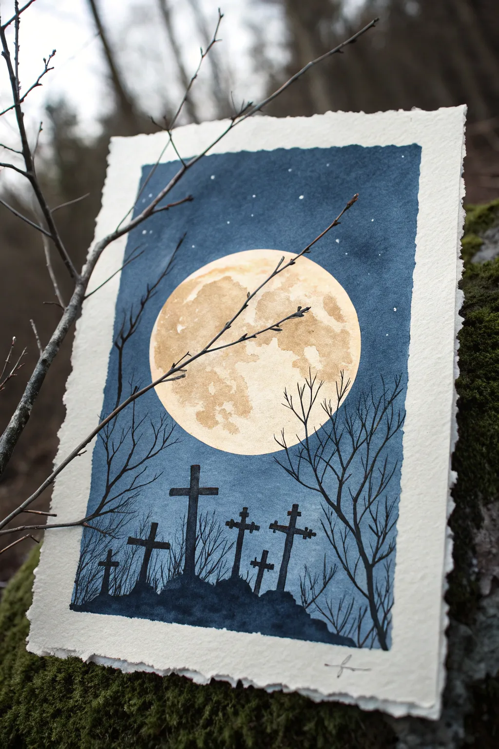
This atmospheric piece combines the ethereal glow of a giant full moon with the stark silhouettes of a graveyard on a crisp night. The contrast between the shimmering, textured lunar surface and the deep midnight blue sky creates a hauntingly beautiful scene perfect for beginners.
Detailed Instructions
Materials
- Cold press watercolor paper (deckled edge optional)
- Masking fluid (liquid frisket) and an old brush
- Watercolor paints: Indigo, Prussian Blue, Payne’s Gray
- Metallic watercolor or gouache: Gold and Pale Yellow
- Black ink or black gouache
- White gel pen or white gouache
- Round brushes (sizes 2, 6, and 10)
- Fine liner brush
- Masking tape
- Cup or circular object for tracing
- Table salt (optional)
Step 1: Preparing the Moon
-
Define boundaries:
Begin by taping down the edges of your watercolor paper to a board. If you want that ragged, floating look shown in the image, tape slightly inside the border, leaving a clean white margin around the painted area. -
Trace the moon:
Place a cup or circular object near the center of your paper and lightly trace a perfect circle with a pencil. -
Mask the moon:
Using an old brush (one you don’t mind ruining) or a silicone applicator, carefully fill the entire moon circle with masking fluid. This protects the white paper underneath while we paint the dark sky. -
Wait for the mask:
Allow the masking fluid to dry completely. It should feel rubbery and not tacky to the touch before you proceed.
Uneven Moon Edge?
If paint bled under your mask, don’t panic. Use white gouache or acrylic to touch up the circle’s edge, or intentionally rough it up for a spooky, hazy atmosphere.
Step 2: Painting the Midnight Sky
-
Wet-on-wet technique:
With a large round brush (size 10), pre-wet the entire sky area around the masked moon with clean water. The paper should be glistening but not forming puddles. -
Drop in color:
Load your brush with a mix of Indigo and Prussian Blue. Start dropping pigment onto the wet paper, letting the colors bloom and blend naturally. -
Deepen the edges:
While the paper is still wet, add concentrated Payne’s Gray or highly saturated Indigo to the corners and top edge to create a vignette effect, making the center feel like it’s glowing. -
Create texture:
If you want a subtle starry texture, sprinkle a tiny pinch of table salt onto the wet paint near the top. I find this creates interesting organic patterns as it dries. -
Complete drying:
Let the sky dry completely. If the paper feels cool to the touch, it’s still damp. Be patient, or use a hairdryer on a low setting.
Step 3: The Lunar Glow
-
Reveal the moon:
Gently rub away the masking fluid with your finger or a rubber cement pickup tool to reveal the stark white circle underneath. -
Base lunar wash:
Mix a very watery pale yellow watercolor. Paint a light wash over the entire moon circle. -
Adding craters:
While the yellow wash is still damp, dab in touches of metallic gold or a slightly darker ochre gouache. Use a tapping motion to create Cloud-like textures that mimic craters and lunar seas. -
Refining the surface:
Let the colors settle and separate slightly to create that craggy, textured look. Leave some areas lighter for highlight.
Level Up: Depth
Mix a tiny bit of blue into your black paint for the farthest trees. Pure black for the foreground items creates immediate atmospheric perspective and depth.
Step 4: Silhouettes and Stars
-
Grounding the scene:
Switch to black gouache or ink. Paint an uneven, hilly horizon line at the bottom third of the paper, overlapping the bottom edge of the moon slightly. -
Erecting the crosses:
Paint vertical lines for the crosses, varying their heights and angles. Add the crossbars, making some slightly crooked to suggest age and weathering. -
Adding bare trees:
Using a fine liner brush and black ink, pull thin lines upward from the sides of the horizon. Paint shaky, extending branches that reach up and over the moon. -
Fine details:
Add tiny twigs branching off the main limbs. The more fine lines you add, the more realistic the silhouette will look against the bright moon. -
Stars in the sky:
Using a white gel pen or a small brush with white gouache, dot tiny stars into the upper dark blue sections of the sky. Keep them sparse and random. -
Final reveal:
Once everything is bone dry, carefully peel away the masking tape to reveal your crisp, clean borders.
Now you have a moody, celestial landscape ready to display or gift


City Skyline in Rainy Reflections
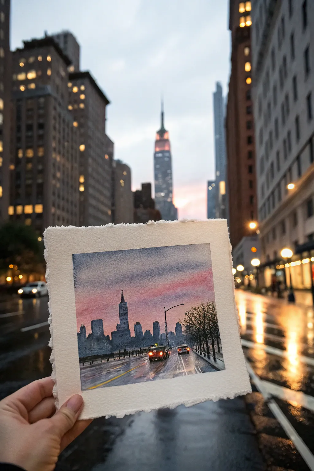
Capture the atmospheric beauty of a rainy city street at dusk with this moody watercolor project. You’ll layer soft washes to create a glowing pink sky contrasting against a dark, wet pavement filled with shimmering reflections.
Step-by-Step Tutorial
Materials
- Cold press watercolor paper (with deckle edge, approx 6×6 inch)
- Watercolor paints (Indigo, Payne’s Grey, Alizarin Crimson, Purple, Cadmium Yellow, Burnt Sienna)
- Masking fluid
- Flat wash brush (3/4 inch)
- Round brushes (sizes 4 and 8)
- Fine liner brush or rigger brush
- White gouache or white gel pen
- Two jars of water
- Paper towels
- Masking tape (optional)
Step 1: Setting the Scene
-
Preparation:
If you want a classic look, tape the edges of your deckle-edge paper to a board, or leave them free if the paper is heavy enough (300gsm+). Sketch the horizon line about 1/3 up from the bottom. -
Sky Sketching:
Lightly pencil in the skyline shapes. Place the tallest skyscraper (like the Empire State Building) slightly off-center. Keep the lines faint so they don’t show through the sky later. -
Preserving Lights:
Use a fine brush or applicator to apply small dots of masking fluid where the streetlights and car headlights will be. This reserves the pure white of the paper for the brightest glows.
Step 2: The Atmospheric Sky
-
Initial Wet-on-Wet:
With your large flat brush, wet the entire sky area with clean water. The paper should be glistening but not forming puddles. -
The Pink Glow:
While wet, drop in a diluted mix of Alizarin Crimson and a touch of Purple just above the horizon line. Let the color bloom upwards. -
Upper Sky:
Mix a stormy grey-blue using Indigo and a tiny bit of Burnt Sienna. Apply this to the top of the painting, blending it down into the pink area while everything is still damp. This creates that soft transition from storm to sunset. -
Drying Time:
Allow the sky to dry completely. If the paper feels cool to the touch, it’s still wet.
Muddy colors?
If your grey street looks brown or dirty, you likely over-mixed the warm (orange/red) and cool (blue) tones on the paper while wet. Let layers dry fully between warm and cool applications.
Step 3: Building the City
-
Silhouette Base:
Mix a strong, dark shade using Payne’s Grey and Indigo. It needs to be creamy, not too watery. Using a size 8 round brush, paint the silhouettes of the buildings. -
Varying Values:
For buildings further back, add more water to your grey mix to make them lighter and more atmospheric. Keep the foreground buildings darkest. -
Architectural Details:
Switch to a size 4 brush to add spire details and antennae on top of the skyscrapers. Don’t overwork it; suggestions of windows are better than painting every single one.
Add some grit
Splatter tiny specks of white gouache or clean water over the bottom half of the painting while it’s dry to mimic the texture of rain hitting the asphalt and camera lens.
Step 4: The Rainy Street
-
Street Foundation:
Re-wet the bottom third of the paper (the street area). Apply a medium wash of Payne’s Grey and Burnt Sienna, using horizontal strokes. Leave some white gaps for reflections. -
Reflecting the Sky:
While the street wash is wet, drop in hints of the pink sky color and yellow headlight color (Cadmium Yellow) directly onto the wet pavement. These colors should drag downwards vertically to mimic wet reflections. -
Defining the Road:
Once damp (not soaking), use a darker grey mix to paint horizontal streaks to suggest the road surface and movement. Establish the perspective lines leading toward the horizon. -
Adding Trees:
Use a rigger brush or fine liner with black/dark grey paint to create the bare winter trees on the right side. Use shaky, uneven strokes for natural-looking branches.
Step 5: Lights and Final Touches
-
Reveal the Lights:
Once the paint is 100% dry, gently rub off the masking fluid to reveal the white paper dots. -
Glowing Effects:
Paint over the white headlight dots with bright Cadmium Yellow. Use a slightly damp clean brush to soften the edges of the lights, creating a ‘halo’ effect in the misty air. -
Tail Lights:
Add small dabs of red for tail lights on cars moving away from the viewer. Let these reflect slightly onto the wet road surface below them. -
White Highlights:
Using white gouache or a gel pen, add the road markings. Make those closer to the viewer thicker and the distant ones thinner to enhance depth. -
Final Contrast:
Evaluate your darks. I like to add one final layer of pure Indigo to the darkest shadows in the immediate foreground to anchor the composition.
Peel off any tape carefully and admire your moody cityscape
Campfire Glow With Smoky Shapes
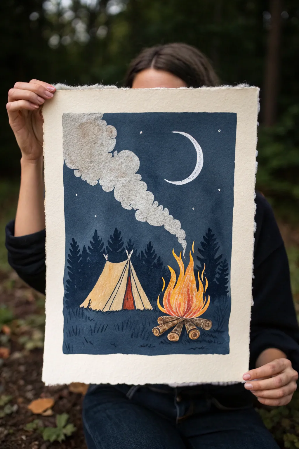
Capture the cozy magic of a night in the woods with this illustrative gouache painting. The contrast between the deep midnight sky and the warm, glowing campfire makes this piece really pop on textured paper.
Step-by-Step
Materials
- Heavyweight cold-press watercolor paper with deckled edges (approx. 300gsm)
- Gouache paints (Navy Blue, Prussian Blue, Black, White, Yellow Ochre, Burnt Sienna, Cadmium Orange, Lemon Yellow)
- Masking tape or painter’s tape
- Flat brush (3/4 inch)
- Round brushes (sizes 2, 4, and 6)
- Fine detail liner brush
- Pencil and eraser
- Mixing palette
- Two jars of water
- Paper towels
Step 1: Preparation & Sketching
-
Tape the Border:
Begin by taping off a clean rectangular border on your sheet of paper. Create a wide margin—about 1.5 to 2 inches—to frame the scene elegantly against the rough deckled edges of the paper. -
Lightly Sketch the Scene:
Using a hard pencil (like an H or HB) to keep lines light, outline the main elements. Place the triangular tent on the left and the campfire to the right. Sketch the rising smoke plume drifting diagonally upward and the crescent moon in the upper right. Don’t worry about the trees yet; they will be painted directly.
Patchy Sky?
If your large background area looks streaky, apply a second coat of gouache once the first is bone dry. Ensure your paint consistency remains creamy, like melted ice cream.
Step 2: Painting the Background
-
Mix the Midnight Blue:
On your palette, mix a generous amount of Navy Blue with a touch of Black and a hint of Prussian Blue. You want a deep, cold night sky color. Gouache dries lighter, so go slightly darker than you think necessary. -
Apply the Night Sky:
Using your large flat brush, paint the entire sky area. Carefully cut around the smoke shape, the moon, the tent, and the fire. Work quickly to keep a wet edge for a smooth, matte finish. -
Paint the Foreground Ground:
Add a little more Black or Prussian Blue to your sky mix to create a slightly distinct, shadowy color for the ground. Paint the bottom section, blending it gently where it meets the horizon line behind the tent and fire.
Step 3: Key Elements: Tent & Fire
-
Base Coat the Tent:
Mix Yellow Ochre with plenty of White to get a pale canvas color. Paint the main body of the tent. While wet, stroke in a slightly darker Ochre mix for the folds and shadows. -
Tent Details:
Use a size 2 round brush and Burnt Sienna to paint the open flap entrance and the structural poles. Add thin dark lines to define the edges of the tent fabric. -
Build the Fire Logs:
Using Burnt Sienna and a touch of Black, paint the logs in a radial star pattern at the base of the fire pit. Add little swirls associated with wood grain using a lighter tan color on the log ends. -
Ignite the Flames:
Start with a base of Cadmium Orange for the main body of the fire. While wet, blend in Lemon Yellow at the center and bottom for heat intensity. Use a small brush to flick wispy red-orange licks of flame upward.
Level Up: Metallic glow
Mix a tiny amount of metallic gold watercolor or gouache into the yellow flames or the stars to give the fire a genuine shimmer when the light hits the paper.
Step 4: Atmosphere & Details
-
Create the Smoke:
Mix a light grey using White with a tiny dot of your blue sky mix and Black. Paint the billowing smoke shape. I like to use a fairly dry brush here to create a cloudy, textured look. -
Highlight the Smoke:
Once the grey base is dry, use pure White to paint the top edges of the smoke billows, suggesting moonlight hitting the vapor. -
Moon and Stars:
Paint the crescent moon crisp white. Use your finest liner brush to dot small white stars around the smoke plume and moon. Keep them random for a natural starry effect. -
Paint the Forest:
Mix a dark shade using Prussian Blue and Black. With a round brush, paint pine tree silhouettes in the background. Start with a vertical line for the trunk, then dab horizontal branches that get wider toward the bottom. -
Add Grass Texture:
Using the same dark tree color, use a liner brush to flick small, upward grass strokes around the base of the tent and the fire logs to ground them in the scene. -
Final Touches:
Add highlight lines of white or pale yellow on the tent poles and log ends where the fire light would catch. Let the painting dry completely. -
The Reveal:
Carefully peel away your masking tape at a 45-degree angle to reveal the crisp, clean edges.
Now you have a serene little campsite you can visit on your wall anytime you need a moment of calm
Overhead Beach Scene as Graphic Shapes
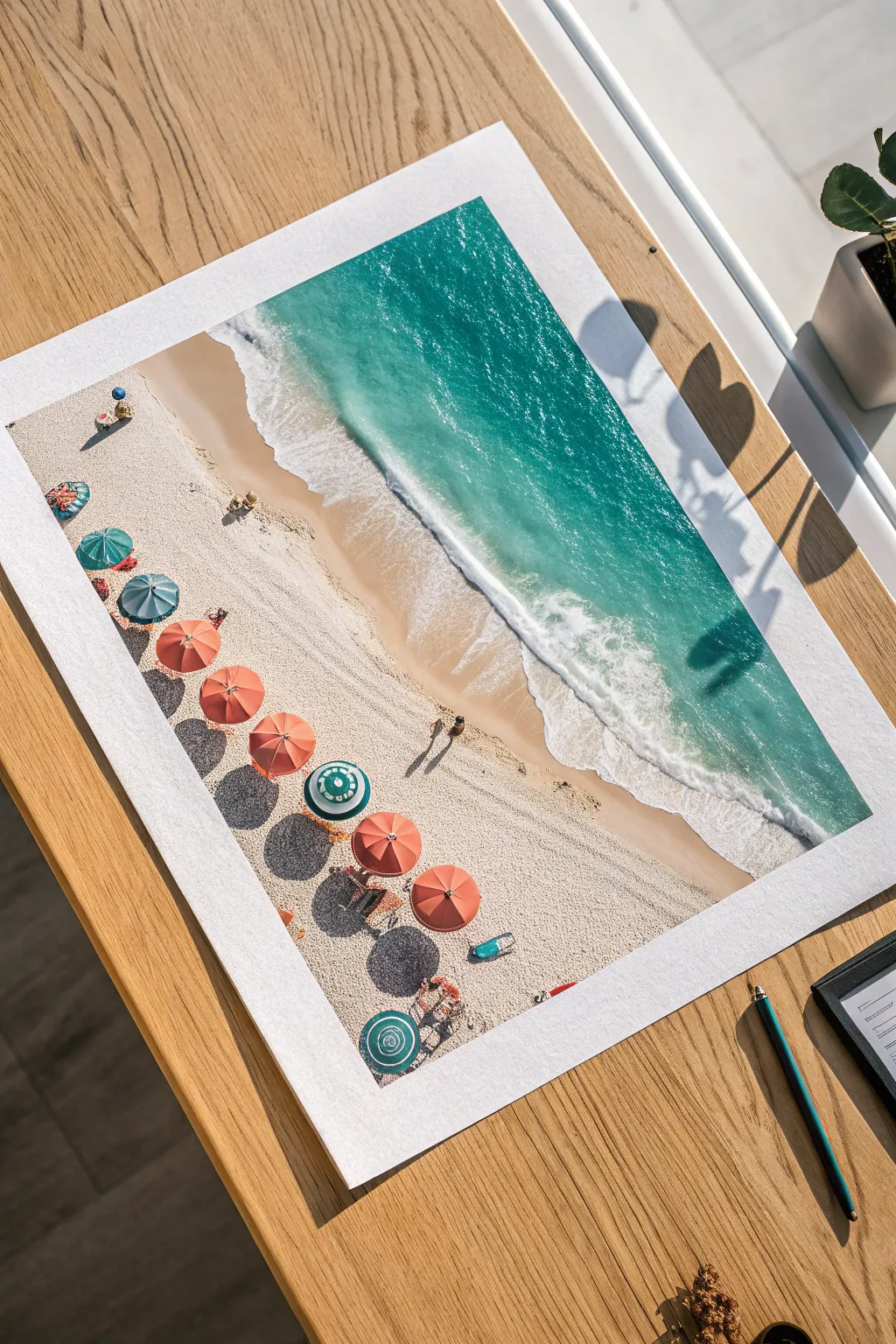
Transform a simple sheet of paper into a sun-soaked coastline with this aerial beach tutorial. By focusing on the interplay between deep turquoise waters, frothy white waves, and colorful geometric umbrellas, you’ll create a striking composition that feels both refreshing and design-forward.
Detailed Instructions
Materials
- Heavyweight watercolor paper (300gsm cold press recommended)
- Watercolor paints (Turquoise, Phthalo Blue, Burnt Sienna, Yellow Ochre)
- White Gouache (for opaque details and foam)
- Masking fluid (optional but helpful)
- Round brushes (sizes 2, 6, and 10)
- Fine liner brush (size 0 or 00)
- Pencil (HB or H)
- Eraser
- Paper towels
- Water cups
Step 1: Sketching the Layout
-
Establish the Shoreline:
Begin by lightly tracing a diagonal line across your paper, roughly dividing the page into two distinct zones: the sandy beach on the bottom left and the ocean on the top right. Don’t make this line perfectly straight; add subtle wobbles to mimic a natural coastline. -
Position the Umbrellas:
Along the beach section, sketch a row of small circles to represent the umbrellas. Keep them somewhat aligned but not rigid, varying the spacing slightly to spark visual interest. -
Mark Shadows and Details:
Lightly pencil in elongated oval shapes extending from each umbrella on the side away from your imagined light source. You can also sketch tiny dots or lines for towels and people, but keep these very faint.
Shadow Realism
For realistic shadows on sand, make the shadow edges closest to the object sharp and dark, letting them fade and blur slightly as they stretch further away.
Step 2: Painting the Ocean
-
Prepare the Water Colors:
Mix a vibrant turquoise using your Phthalo Blue and a touch of green. Create a separate, deeper blue mix for the water furthest from the shore where the ocean gets deeper. -
Wet-on-Wet Gradient:
Brush clean water over the ocean area of your paper, stopping just short of your pencil shoreline. While the paper is glistening, drop in your deep blue at the top corner. -
Transition to Turquoise:
As you move down toward the shore, switch to your bright turquoise mix. Let the colors bleed naturally into each other on the wet paper. -
Softening the Edge:
Before the paint dries, lift a little pigment near the shoreline with a thirsty (damp but clean) brush to suggest shallow, transparent water over sand.
Step 3: Creating the Sandy Beach
-
Sand Base Layer:
Mix a very watery wash of Yellow Ochre and a tiny dot of Burnt Sienna. Paint the entire beach area, carefully painting around your pencil circles for the umbrellas to keep them white for now. -
Adding Texture:
While the sand wash is still damp, I like to spatter infinitesimal drops of a slightly darker brown mix onto the paper. This creates the grainy texture of sand without needing to paint individual grains. -
Wet Sand Effect:
Where the water meets the sand, darken your sand color slightly to show where the beach is saturated by the tide.
Level Up: Texture
Sprinkle a pinch of real salt onto the wet ocean paint before it dries. The salt pushes the pigment away, creating incredible natural blooming textures that look just like sea foam.
Step 4: Waves and Foam
-
Painting the Crash:
Once the ocean layer is completely dry, use white gouache straight from the tube. Paint a jagged, organic line right where the deep water meets the wet sand to represent the breaking wave. -
Feathering the Foam:
Use a slightly damp brush to drag the back edge of the white paint out into the blue water, creating a misty, foamy transition rather than a hard line. -
Sea Spray Details:
Add tiny dots and thin, erratic lines of white gouache in the blue water just behind the main wave line to suggest sea spray and movement.
Step 5: Umbrellas and Life
-
Coloring the Canopies:
Choose a palette for your umbrellas—coral, teal, striped, or solid. Using your smallest round brush, carefully fill in the circular shapes. Leave tiny unpainted slivers or use white gouache later to show the umbrella ribs. -
Casting Shadows:
Mix a cool grey-purple (a mix of blue and brown works well). Paint the elongated shadow shapes you sketched earlier. Ensure the shadows all fall in the same direction to keep the lighting consistent. -
Tiny People:
With your fine liner brush, add infinitesimal specks for people. A tiny dot for a head and a quick dash for a body is often enough at this scale. Don’t overdetail; suggestion is key here. -
Final Touches:
Use a darker brown to add tiny shadows under the people specks. Step back and assess if any sandy areas need more texture or if the white foam needs brightening with a second layer of gouache.
Now step back and admire your sunny masterpiece, bringing a little slice of summer into your room regardless of the season
Keyhole Portal to Another World
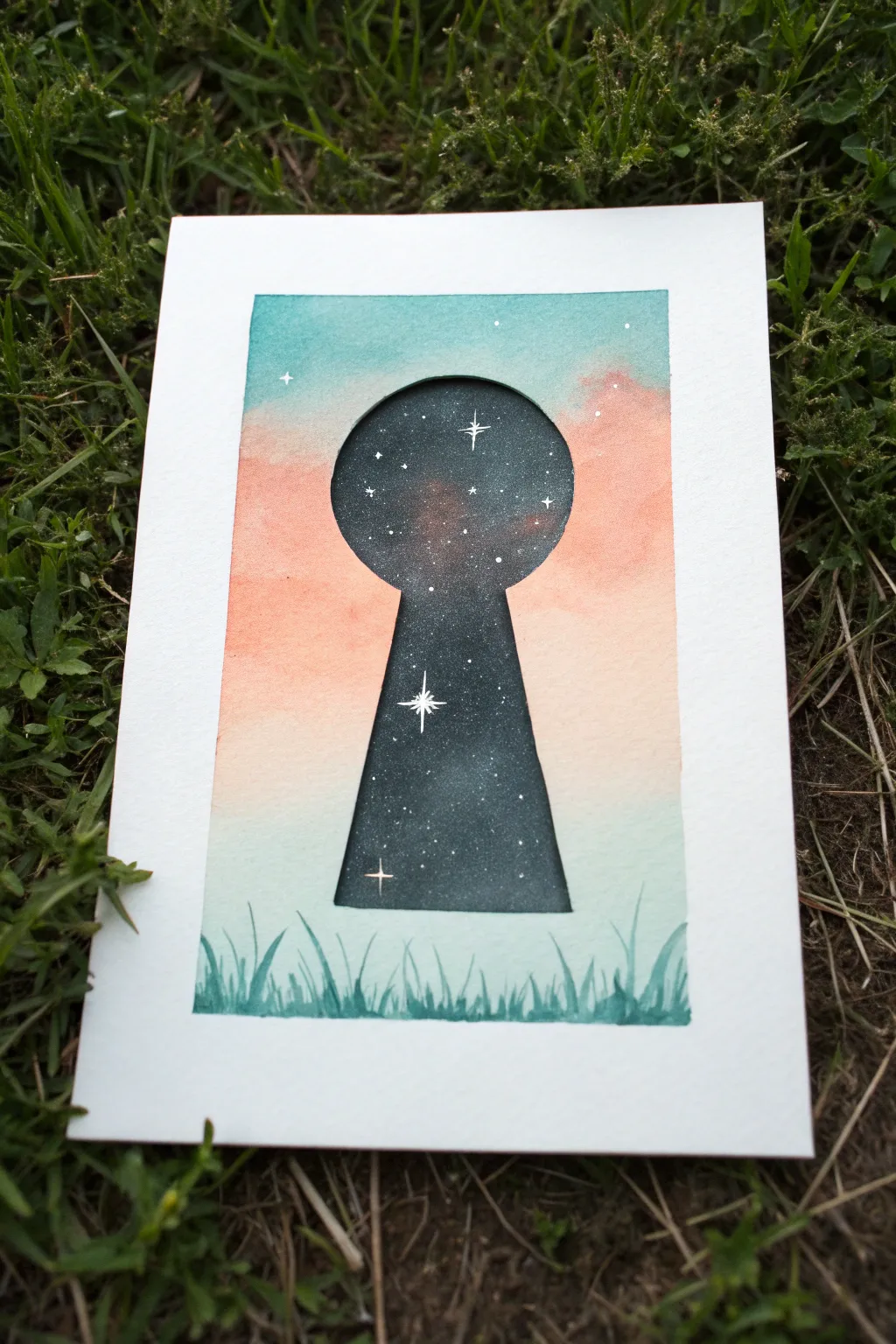
This whimsical watercolor project plays with negative space and contrasting worlds, depicting a starry galaxy hidden behind a soft pastel sky. It creates a magical portal effect using simple masking techniques and vibrant celestial colors.
Step-by-Step
Materials
- Cold press watercolor paper (cut to 5×7 or postcard size)
- Watercolor paints (teal, peach/coral, indigo, black, white gouache)
- Masking fluid or drawing gum
- Old brush or masking fluid applicator
- Round watercolor brushes (size 4 and 8)
- Pencil and eraser
- Ruler
- Masking tape or washi tape
- Paper towel
- Jar of water
Step 1: Preparation and Masking
-
Border the paper:
Tape down your watercolor paper onto a flat board or table using masking tape. Cover about a quarter-inch on all four sides to create that crisp white border when finished. -
Sketch the keyhole:
Lightly sketch a keyhole shape in the center of your paper. Draw a circle for the top and an elongated trapezoid for the bottom. Keep your pencil lines faint so they don’t show through the lighter paint later. -
Mask the keyhole:
Using an old brush or a dedicated applicator, fill in the entire keyhole shape with masking fluid. Be very careful around the edges to keep the shape smooth. Let this dry completely until it’s tacky and hard to the touch.
Clean Lines Pro-Tip
To prevent paint from bleeding under the masking tape border, run a tool or fingernail firmly along the tape edge to seal it before you start painting.
Step 2: Painting the Exterior World
-
Wet the background:
Once the masking fluid is dry, use a clean brush to wet the paper surrounding the keyhole with clean water. The paper should be glistening but not forming puddles. -
Apply the sky gradient:
Start at the top with a wash of teal or turquoise water. As you move down past the top of the keyhole, rinse your brush and pick up a soft peach or coral color. Blend the two gently where they meet to create a transitioning sky. -
Fade to bottom:
Continue the peach wash downwards, gradually adding more water so it fades into a very light, almost white wash near the bottom third of the paper. Let this layer dry completely. -
Paint the grass silhouette:
Mix a darker teal or green-blue shade. Using the tip of a smaller round brush, paint blades of grass along the very bottom edge. vary the height and direction of the blades, making some overlap the keyhole stem slightly if you want depth, though for this look, keep them below the keyhole entirely.
Step 3: Revealing the Galaxy
-
Remove the mask:
Ensure the background paint is 100% dry. Gently rub your finger or a rubber cement pickup tool over the masking fluid to peel it away, revealing the pristine white paper of the keyhole shape underneath. -
Base layer for the galaxy:
Wet the inside of the keyhole shape carefully with clean water. Drop in some deep teal and hints of rusty red or purple in random patches, letting them bleed together slightly. This adds dimension behind the darkness. -
Deepen the cosmos:
While the paper is still damp, load your brush with concentrated indigo and black. Drop this dark pigment around the edges of the keyhole and fill in the gaps between your lighter colors, creating a deep, space-like atmosphere. -
Refine edges:
If the edges look ragged, use the tip of a small brush with your darkest color to carefully trace the outline of the keyhole, ensuring the transition from the pastel sky to the dark galaxy is sharp. -
Dry thoroughly:
I usually let this sit for quite a while or use a heat tool, as the dark pigment needs to be bone dry before the final step.
Level Up: Metallic
For the larger stars inside the keyhole, swap the white gouache for metallic gold or silver watercolor to make the galaxy truly shimmer.
Step 4: Adding Starts and Finish
-
Add distant stars:
Load a toothbrush or stiff brush with watered-down white gouache or acrylic. Cover the pastel part of your painting with a scrap paper to protect it, then flick tiny speckles onto the dark keyhole area. -
Paint hero stars:
Using your smallest detail brush and pure white gouache, paint a few larger ‘cross’ shaped twinkle stars. Place one prominent star near the center alongside a few smaller ones for balance. -
Add outer sky sparkles:
Add just two or three tiny white dots in the pastel sky area to connect the two worlds subtly. -
Peel the tape:
Slowly peel away the border tape at a 45-degree angle to reveal your clean white edges.
Now you have a stunning piece of surreal art that invites the viewer to look a little closer at the universe within
Heartbeat Line Turning Into a Landscape
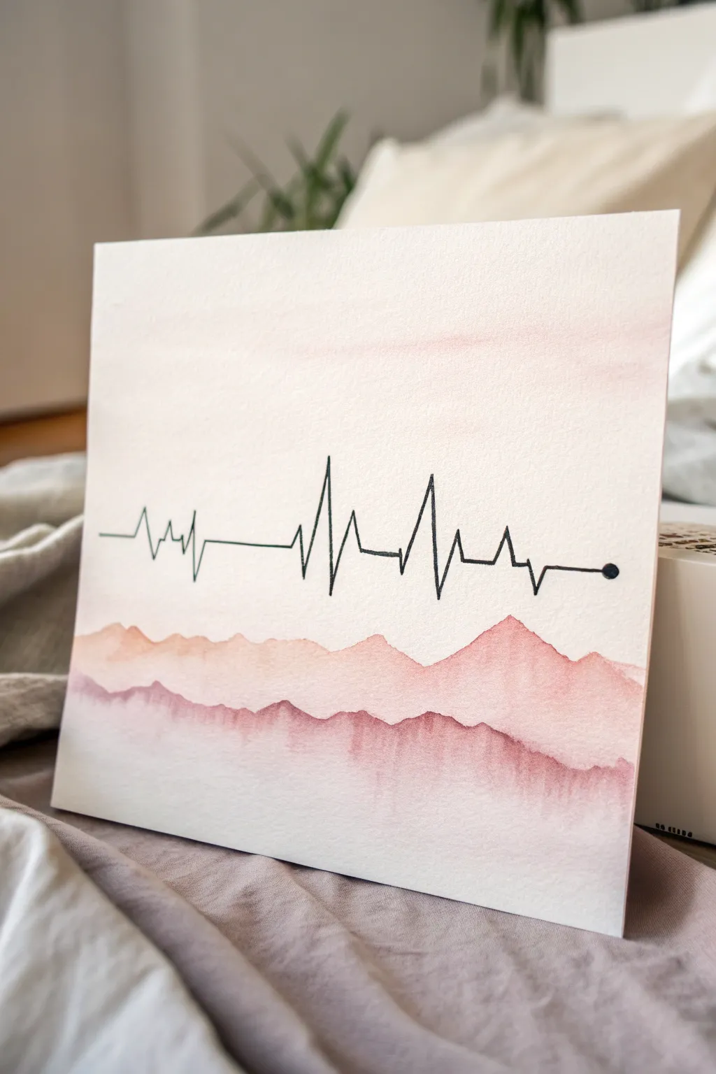
This minimalist mixed-media piece combines the sharp precision of a heartbeat monitor line with the soft, flowing nature of watercolor landscapes. It captures a beautiful metaphor of vitality grounded in nature, using a soothing palette of dusty pinks and mauves.
Step-by-Step Tutorial
Materials
- Heavyweight watercolor paper (300gsm, cold press textured)
- Watercolor paints (Alizarin Crimson, Burnt Sienna, Violet)
- Fineliner pen (Black, 0.5mm or 0.8mm, waterproof)
- Round watercolor brush (size 6 or 8)
- Ruler or straight edge
- Pencil (HB or lighter)
- Jar of clean water
- Paper towels
- Painter’s tape or masking tape
Step 1: Preparation and Sketching
-
Secure the paper:
Tape your watercolor paper down to a hard board or your work surface. This prevents buckling when the paper gets wet and creates a nice clean border if you frame it later. -
Mark the horizon line:
Using a ruler and a very light pencil touch, draw a horizontal guide across the middle of the paper. This will serve as the anchor for your heartbeat line. -
Sketch the peaks:
Lightly pencil in the shape of the EKG waves. Start with a flat line on the left, add a few small jagged zig-zags, then create two taller, dramatic spikes near the center before trailing off into a flat line on the right. -
Refine the line:
End the line on the far right with a small, filled circle point, indicating the ‘current’ moment. Ensure your spikes look sharp and clinical to contrast with the organic mountains we will paint later.
Step 2: Inking the Heartbeat
-
Trace with ink:
Take your black waterproof fineliner. Carefully trace over your pencil sketch. I prefer a slightly thicker nib like a 0.8mm here so the line stands out against the textured paper. -
Use a ruler for flats:
For the horizontal sections of the line on the left and right, use your ruler to keep them perfectly straight. Freehand the spikes to give them energy. -
Erase guidelines:
Wait at least 10 minutes for the ink to fully cure and dry. Gently erase the pencil guide line so you have a crisp black graphic on white paper.
Water Control Tip
For the soft gradients in the mountains, use the ‘wet-on-dry’ technique for the crisp top edge, then quickly switch to a wet brush to pull the color downward.
Step 3: Painting the Landscape
-
Mix your colors:
Prepare a watery wash of dusty pink. Mix a tiny bit of Burnt Sienna into Alizarin Crimson to desaturate it. You want a very pale, transparent consistency for the first layer. -
Paint the background wash:
Brush clean water across the top half of the paper (sky area) and add a very faint wash of your pink mix, fading it out as you go down so it’s barely visible behind the heartbeat line. -
First mountain range:
Load your brush with the light dusty pink mix. Paint an undulating mountain shape just below the heartbeat line. Keep the top edge crisp, but add water to the bottom edge to let it fade into white. -
Let it dry completely:
This is crucial. The first mountain layer must be bone dry before adding the next, or they will bleed into one blob. -
Darken the mix:
Add a touch of Violet to your existing pink mixture to create a deeper mauve. It should be slightly more saturated than the first layer. -
Second mountain layer:
Paint a second mountain range slightly lower than the first, overlapping it. Vary the peaks so they don’t perfectly mimic the first layer. -
Create the bleed effect:
While the bottom edge of this new layer is still wet, touch the very bottom with a brush loaded with slightly more concentrated pigment. Watch it bloom downward lightly. -
Final foreground layer:
Once dry again, mix your darkest shade—a deep berry color. Paint the bottom-most mountain shapes. This provides weight to the bottom of the composition. -
Soften the bottom edge:
Take a clean, damp brush and gently run it along the very bottom edge of the final paint layer to soften the transition into the white paper.
Smudged Ink?
If your fineliner bleeds when you paint near it, it wasn’t waterproof water-based ink. Next time, use an archival pigment liner like a Micron or fix it with white gouache.
Step 4: Finishing Touches
-
Review contrast:
Check if the black line stands out enough. If the mountains are too dark behind it, you can’t fix it, but if they are too light, you can glaze another sheer layer over the bottom section. -
The final dot:
Go back to the small black dot at the end of the line. Make sure it is solid black and opaque to serve as a defined endpoint. -
Allow 24 hours drying:
Let the paper sit flat for a full day before removing the tape to ensure the paper structure has settled and won’t curl.
Now you have a serene piece of art that perfectly balances minimalist linework with organic color forms, ready to frame or gift
Split Circle Painting of Four Seasons
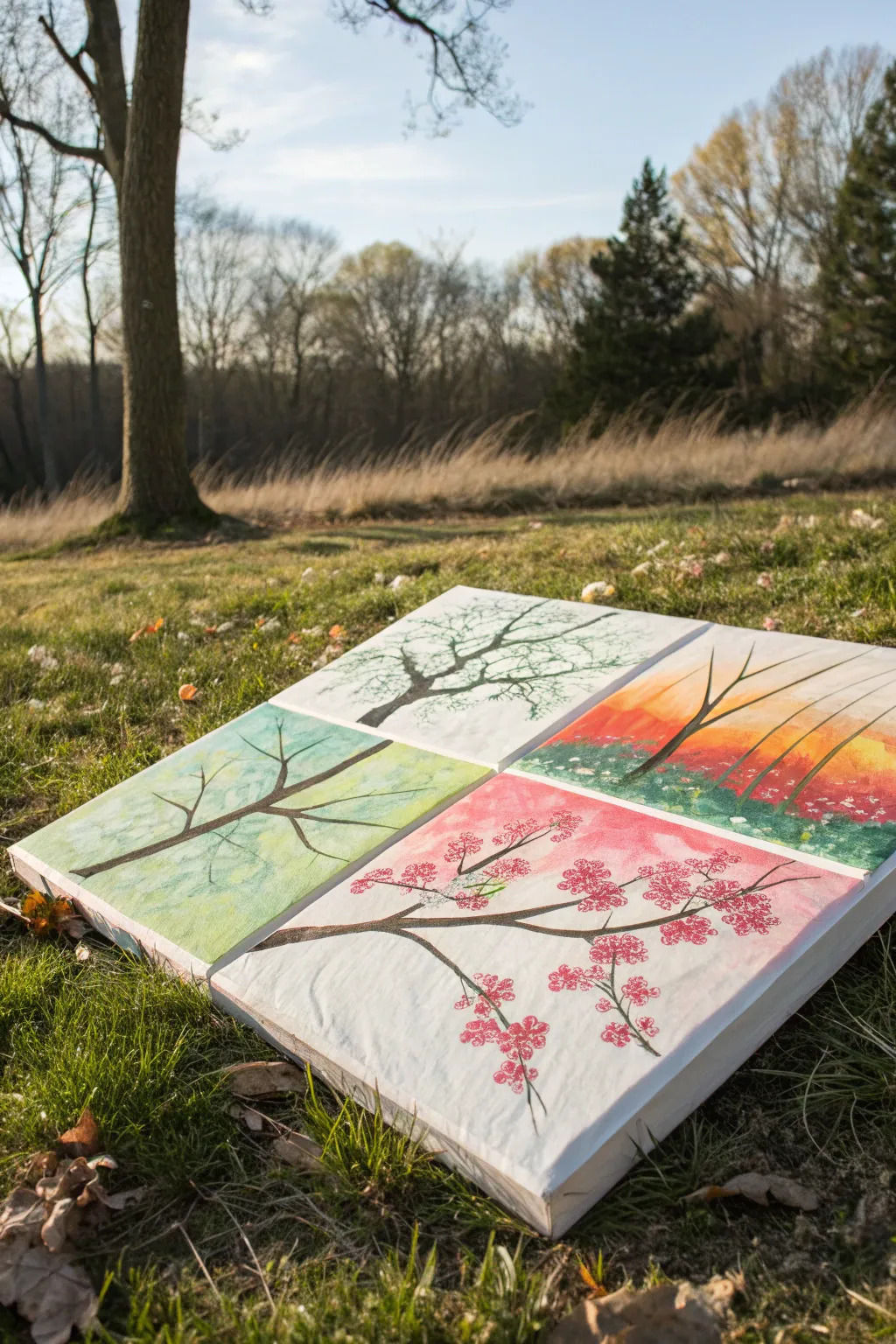
Capture the beauty of nature’s cycle with this striking quad-canvas project that depicts a single tree transforming through winter, spring, summer, and autumn. The split design creates a modern gallery wall effect, using simple techniques to render delicate blossoms, lush greenery, and bare branches across four distinct panels.
Step-by-Step
Materials
- 4 small square canvases (e.g., 8×8 or 10×10 inches)
- Acrylic paints (Titanium White, Mars Black, Burnt Umber, Sap Green, Cadmium Yellow, Alizarin Crimson, Phthalo Blue)
- Set of brushes: 1-inch flat brush, medium round brush, fine liner brush
- Bubble wrap (small piece)
- Q-tips (cotton swabs)
- Palette or paper plate
- Pencil
- Cup of water and paper towels
Step 1: Setting the Seasonal Backgrounds
-
Arrange your canvas grid:
Lay out your four canvases on a flat surface in a 2×2 square formation. Decide which canvas will represent which season: typically, top-left for Winter, bottom-left for Spring, bottom-right for Summer (or Fall), and top-right for Autumn. This guides your background colors. -
Paint the Winter sky:
For the winter canvas (top-left), mix a tiny dot of Phthalo Blue with a lot of Titanium White. Use your flat brush to paint a very pale, icy blue background. Fade it almost to pure white near the center where the branches will be. -
Create the Spring backdrop:
On the spring canvas (bottom-left), mix Sap Green with plenty of White and a touch of Yellow for a fresh, pale lime green wash. Apply this loosely, keeping the strokes soft and airy to suggest new growth. -
Apply Autumn warmth:
For the autumn panel (top-right), blend Cadmium Yellow and Alizarin Crimson to make brilliant oranges and reds. Paint a gradient, starting with yellow at the bottom and blending into orange and red towards the top, mimicking a sunset sky. -
Design the Cherry Blossom base:
For the flowering canvas (bottom-right), create a soft pink wash by mixing Alizarin Crimson and White. Apply this as a gentle background, perhaps leaving some white streaks to keep it light and dreamy.
Season Connector
To make the tree look continuous, line up the canvases while sketching the pencil branches, drawing across the gap before separating them to paint.
Step 2: Building the Tree Structure
-
Trace the main branches:
Once the backgrounds are fully dry, lightly sketch branch structures with a pencil. You don’t need to connect them perfectly across canvases, but ensure the general flow moves from the center of the 2×2 grid outward. -
Mix tree bark color:
Mix Burnt Umber with a tiny touch of Mars Black to create a deep, rich brown. Add a drop of water to improve the flow of the paint for smoother lines. -
Paint the Winter branches:
Using a fine liner brush and your dark brown mix, paint jagged, bare branches on the winter canvas. Keep the lines sharp and angular to emphasize the cold, dormant feel. -
Draft the Spring limbs:
On the spring canvas, paint slightly softer, curved branches extending from the bottom right corner towards the center. These will eventually hold fresh green leaves. -
Create the Autumn structure:
For the autumn section, paint upright, reaching branches. Make the main branch slightly thicker at the base to suggest weight. -
Detail the Blossom branches:
On the final canvas, paint elegant, sweeping branches. I like to add tiny ‘Y’ shapes at the ends of twigs to give clumsy blossoms a place to sit naturally.
Step 3: Adding Seasonal Details
-
Add Winter frost:
Dip a dry, old brush into pure White paint and wipe most of it off. Lightly dry-brush over the tops of the winter branches to simulate frost or snow settling on the wood. -
Stipple Spring leaves:
Bundle three Q-tips together with a rubber band. Dip them into a mix of Sap Green and Yellow. Dab repeatedly around the spring branches to create clusters of fresh leaves. -
Create Autumn foliage:
Crumple a small piece of bubble wrap or use a sea sponge. Dip it into orange and red paint, then lightly stamp it over the autumn branches to create a textured, canopy effect. -
Paint the Cherry Blossoms:
For the flowering panel, use a single Q-tip dipped in bright pink (Crimson + White). Dot clusters of flowers along the branches. Add a tiny dot of darker red in the center of a few clusters for depth. -
Refine the ground:
On the bottom two canvases (Spring and Blossom), add a suggestive ground line if desired using a slightly darker version of your background color, blending it upwards to ground the image. -
Final touches:
Step back and look at the composition as a whole. Use a small liner brush to touch up any branch connections that feel too disjointed, ensuring the visual flow works across the gap.
Metallic Magic
Add subtle gold leaf or metallic paint to the autumn leaves or winter snow for a shimmering effect that changes with the room’s lighting.
Hang your quartet of canvases with about an inch of space between them to complete the segmented effect
Negative Space Animals in a Neon Sky
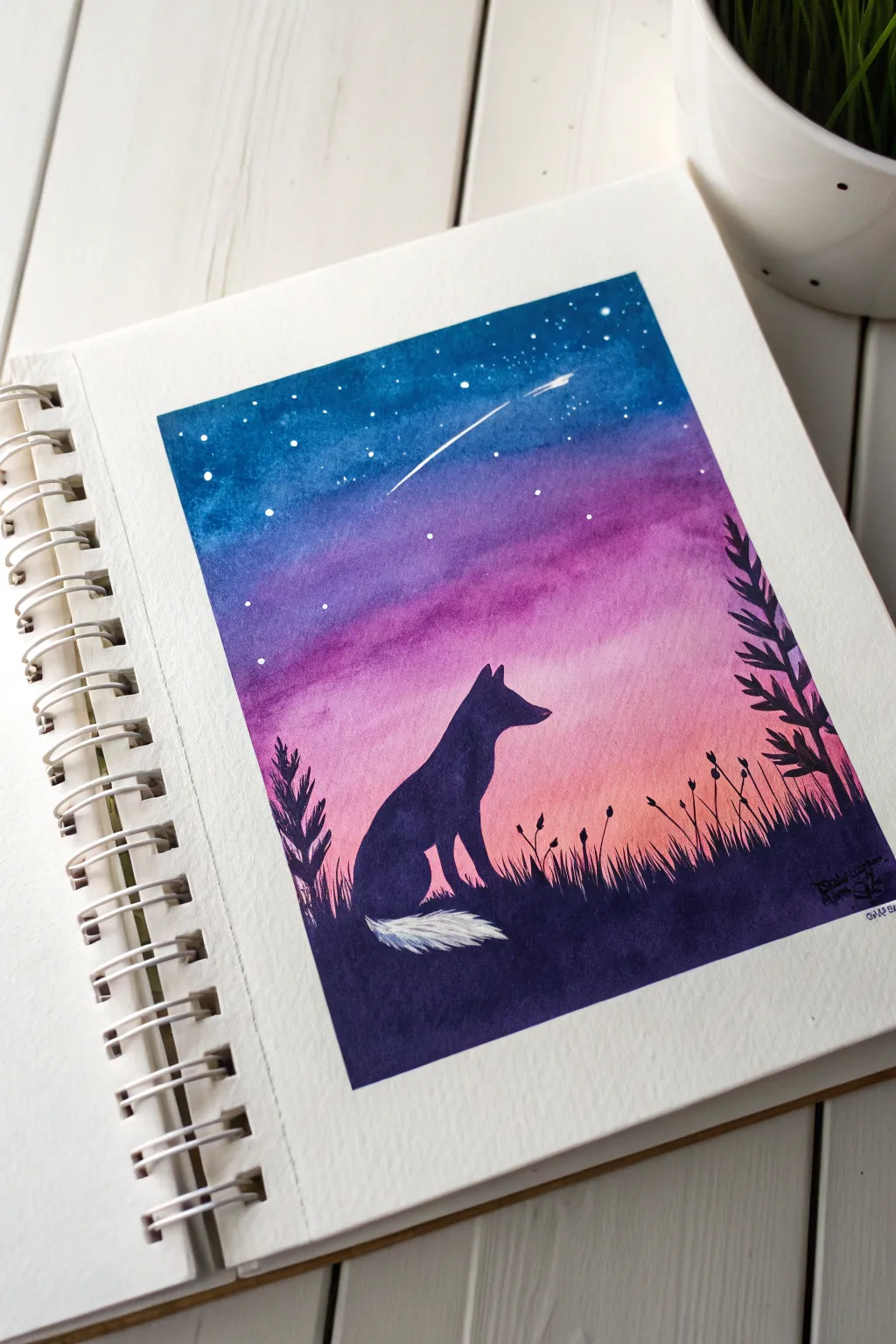
Capture the magic of a twilight sky with this dreamy watercolor project featuring a wolf silhouette gazing at a shooting star. By blending vibrant purples and blues behind a stark black foreground, you’ll create a striking contrast that makes the night sky truly glow.
Detailed Instructions
Materials
- Cold press watercolor paper (approx. 300gsm)
- Masking tape or painter’s tape
- Watercolor paints (Indigo, Purple/Magenta, Peach/Pink, Black/Payne’s Gray)
- White opacity paint (gouache or acrylic) or a white gel pen
- Flat wash brush (1/2 inch)
- Small round detail brush (size 0 or 1)
- Pencil and eraser
- Jar of clean water
- Paper towels
Step 1: Preparing the Sky Gradient
-
Taping the borders:
Begin by taping down all four edges of your watercolor paper to a board or table. This creates that crisp, clean white border shown in the original image and keeps the paper from buckling when wet. -
Sketching the outline:
Lightly sketch the silhouette of the wolf sitting in the grass. Keep the lines very faint, especially around the tail, as we want that area to remain white later. -
Pre-wetting the paper:
Using your flat wash brush and clean water, gently wet the sky area above your pencil sketch. Avoid getting water inside the wolf shape or the grassy ground area for now. -
Applying the horizon color:
While the paper is still glistening, load your brush with a watery peach or soft pink color. Paint a horizontal strip just above the grassy hills, letting the color bleed slightly upwards. -
Adding the mid-tones:
Quickly rinse your brush and pick up a vibrant purple or magenta shade. Apply this directly above the pink strip, blending the two colors where they meet so there is no harsh line. -
Deepening the night sky:
Load your brush with a deep indigo or dark blue. Paint the very top section of the sky, dragging the color down to meet and mix with the purple layer. -
Creating the shooting star:
While the blue paint is still wet, use a clean, slightly damp brush to lift a thin diagonal line of paint out of the blue section. This ‘lifting’ technique creates the soft trail of the shooting star. -
Drying completely:
Let the sky dry fully. I usually wait until the paper feels cool to the touch but not damp before moving on. Patience here prevents the black silhouette from bleeding into your beautiful sky.
Step 2: Painting the Silhouette
-
Mixing the silhouette color:
Mix a strong, saturated black watercolor. If your black feels flat, try mixing indigo with burnt umber for a rich, deep dark tone. -
Painting the animal:
Using your small round detail brush, carefully fill in the wolf shape. Work slowly around the ears and snout to keep the edges sharp. Leave the tip of the tail completely unpainted (white paper). -
Creating the tail texture:
Around the white tail tip, use very short, dry brush strokes with the black paint to simulate fur texture, rather than painting a straight line. -
Filling the foreground:
Switch back to a slightly larger brush to fill in the dark grassy ground. Ensure this black area connects seamlessly with the bottom of the wolf. -
Adding grass details:
With the small detail brush, flick upward strokes from the black ground into the pink sky area to create blades of grass. -
Painting plants:
Add variance to your landscape by painting distinct plant silhouettes. On the right side, add a taller, leafier plant, and scatter a few thin stems with seed pods on the left. -
Adding the stars:
Dip your small brush or an old toothbrush into white gouache (or acrylic paint) watered down to a cream consistency. Tap the handle against your finger to splatter tiny white stars over the dark blue sky. -
Final star details:
Use a white gel pen or the very tip of your detail brush with white paint to add specific larger stars and highlight the head of the shooting star for extra brightness. -
The reveal:
Once everything is bone dry, slowly peel away the masking tape at a 45-degree angle to reveal your clean edges.
Clean Lines Tip
To prevent paint from seeping under your tape, run a fingernail or a bone folder firmly along the inner edge of the tape right before you start painting.
Level Up: Galaxy Dust
Mix a tiny amount of iridescent or pearl watercolor medium into your purple layer. It won’t show much opaque color, but in the light, your sky will shimmer.
Step back and admire your serene nocturnal landscape.

Have a question or want to share your own experience? I'd love to hear from you in the comments below!