A plain canvas apron is basically a blank canvas you can wear, and it’s one of my favorite surfaces to paint on. Here are apron painting ideas that go from sweet-and-simple to seriously artsy, so you can make something that feels like you.
Handprint Bouquet Keepsake Apron
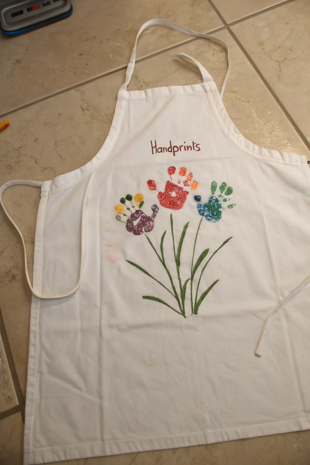
Capture a moment in time with this adorable wearable keepsake that turns little handprints into a blooming garden. This classic white apron features a trio of colorful handprint flowers with painted stems, making it perfect for gifting to grandparents or keeping as a treasured kitchen memento.
Step-by-Step
Materials
- White fabric apron
- Fabric paint (Red, Orange, Purple, Yellow, Blue, Green, Brown/Burgundy)
- Foam brushes or large paintbrushes
- Thin liner paintbrush for details
- Medium round paintbrush for stems
- Paper palette or paper plate
- Wet wipes or damp cloth
- Cardboard or parchment paper (to place inside apron)
- Iron (for heat setting, optional based on paint type)
Step 1: Preparation & Text
-
Prepare the workspace:
Lay the apron flat on a clean, hard surface. Place a piece of cardboard or parchment paper underneath the chest area where you will be painting to prevent the paint from bleeding through to the back of the apron, which is a crucial step for clean results. -
Plan the layout:
Visually divide the upper bib section of the apron. You will need space for the word ‘Handprints’ at the top and room below for three handprints arranged in a slight arc. -
Mix the text color:
Squeeze a small amount of Burgundy or dark Brown fabric paint onto your palette. If you don’t have a pre-mixed burgundy, you can mix red with a tiny touch of brown to get that earthy text color shown in the example. -
Paint the title:
Using a thin liner brush, carefully hand-paint the word ‘Handprints’ in the center of the upper bib area. Use a simple, slightly playful serif font as shown, keeping the letters distinct and neat. -
Let the text dry:
Allow the lettering to dry completely before moving on to the handprints. This prevents your hand or the child’s hand from accidentally smudging the wet text while positioning the flowers.
Little Wiggles Helper
Work one handprint at a time! Have wet wipes immediately accessible, and do a practice stamp on a piece of paper first to get the paint thickness just right.
Step 2: Creating the Blooms
-
Prepare the purple flower:
Start with the left flower. Using a foam brush, paint the palm of the child’s hand purple. Paint the fingertips (the ‘petals’) a bright yellow. Ensure the paint is thick enough to transfer but not so gloppy that it becomes a blob. -
Stamp the first flower:
Guide the child’s hand to the left side of the apron, below the text. Firmly press the hand down, fingers pointing upward and slightly outward. Press gently on each finger and the palm to ensure good contact, then lift straight up. -
Clean up:
Use wet wipes to thoroughly clean the child’s hand before switching colors. This keeps the colors distinct and prevents muddying the next flower. -
Prepare the red flower:
For the center flower, paint the palm a vibrant red and the fingertips a bright orange. This creates a warm, poppy-like appearance. -
Stamp the center flower:
Position this handprint directly in the middle, slightly higher than the first one to create a natural bouquet shape. Press firmly and lift cleanly to reveal the print. -
Prepare the blue flower:
Clean the hand again. For the final flower on the right, paint the palm blue and the fingertips a medium green. -
Stamp the final flower:
Place this print on the right side, mirroring the position of the first flower. Try to angle the hand slightly outward to the right to balance the composition. -
Dry the prints:
I usually let these dry for at least 20-30 minutes so I don’t smudge them while painting the stems.
Fixing Smudges
If a smudge happens outside the design, dip a Q-tip in water (or rubbing alcohol for stubborn spots) and gently lift the wet paint before it sets into the fabric fibers.
Step 3: Stems & Finishing Touches
-
Start the stems:
Load a medium round paintbrush with green paint. Start from the bottom center of the ‘bouquet’ (several inches below the prints) and paint three main lines extending upward toward the base of each handprint. -
Connect to the flowers:
Extend the green lines until they tuck just under the palm of each painted handprint, anchoring the flowers to the stems. -
Add grass blades:
Paint several long, thin strokes of green originating from the same central point at the bottom, extending upward between the main stems. Curve them slightly outward for a natural, grassy look. -
Paint side leaves:
Add smaller leaves branching off the main stems on the left and right sides. Use a flicking motion with your brush to taper the ends of the leaves to a point. -
Review and touch up:
Check for any uneven spots in the green paint and smooth them out. If any parts of the handprints actially didn’t transfer well, you can very carefully dab a little paint into the gaps with a small brush, though the rustic look is charming. -
Final cure:
Allow the apron to dry for at least 24 hours. Follow the instructions on your specific fabric paint bottle regarding heat setting (usually ironing on the reverse side) to make the design permanent and washable.
Once heat-set, this personalized masterpiece is ready to bring smiles to the kitchen for years to come.

Simple Name or Monogram Stencil Apron
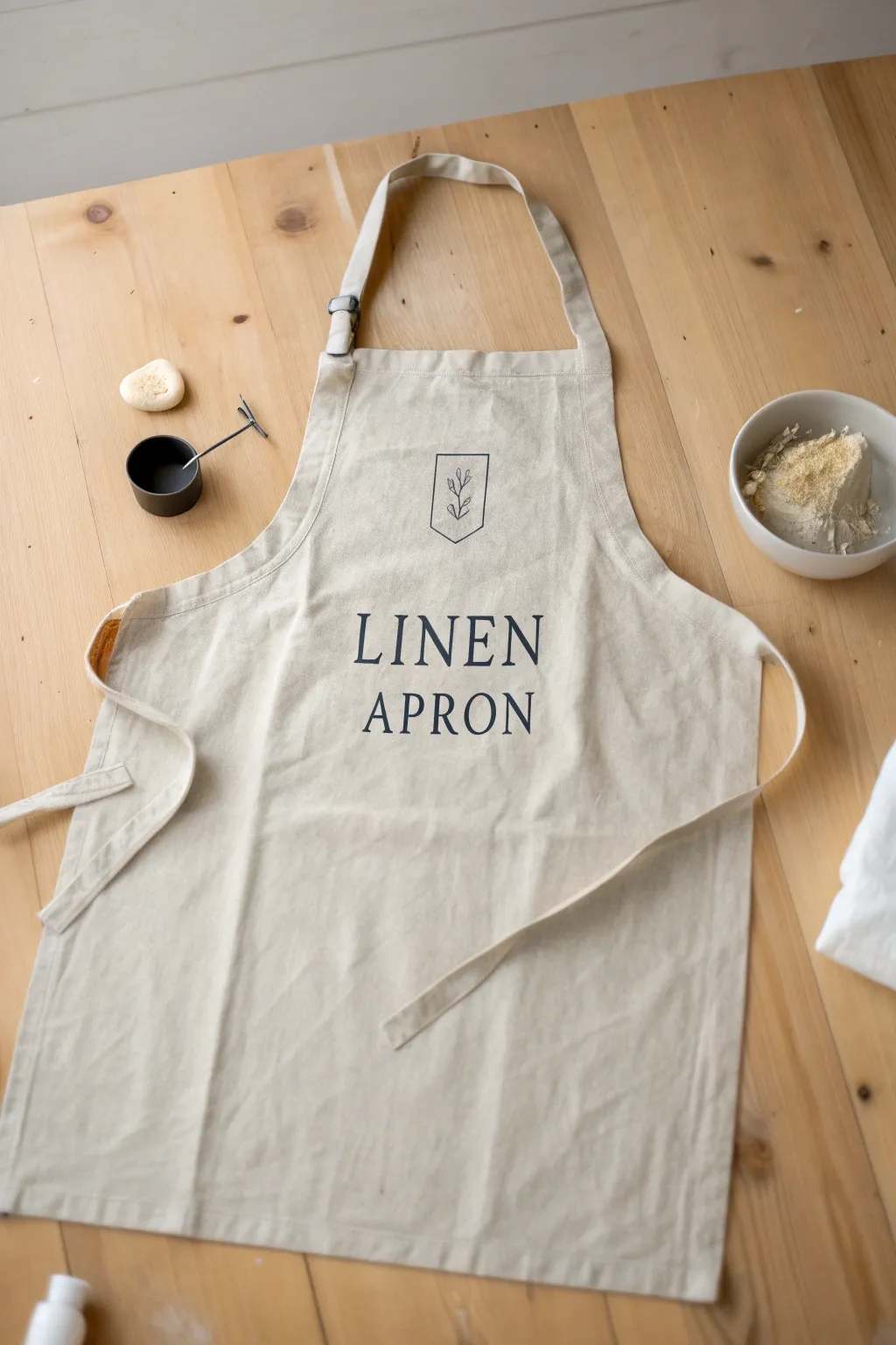
Embrace the beauty of simplicity with this elegant stenciled apron project, perfect for adding a personalized touch to your kitchen attire. The crisp dark lettering against natural linen creates a timeless, professional look that is surprisingly easy to achieve at home.
Step-by-Step Guide
Materials
- Light beige or natural linen apron
- Fabric paint or screen printing ink (dark charcoal or black)
- Stencil vinyl or freezer paper
- Transfer tape (if using vinyl)
- Electronic cutting machine (Cricut/Silhouette) or craft knife and cutting mat
- Sponge pouncers or stiff stencil brushes
- Iron and ironing board
- Cardboard or parchment paper
- Ruler or measuring tape
- Masking tape or painter’s tape
Step 1: Preparation and Design
-
Wash and Dry:
Begin by washing and drying your linen apron to remove any sizing or chemical stiffeners. Do not use fabric softener, as this can repel the paint. Iron the fabric completely smooth to ensure a flat working surface. -
Create the Design:
Design your stencil layout digitally. Choose a classic serif font for the text ‘LINEN APRON’ and find a simple botanical line drawing inside a shield shape for the logo above. You can also customize this with your own name or initials. -
Cut the Stencil:
Load your stencil vinyl or freezer paper into your cutting machine. Adjust the settings to ‘kiss-cut’ (cutting through the vinyl but not the backing). If cutting by hand, tape your freezer paper over a printed template and trace carefully with a sharp craft knife. -
Weed the Vinyl:
Carefully remove the parts of the design where you want the paint to go—this is called ‘weeding.’ Ensure you keep the centers of letters like ‘O’, ‘R’, and ‘P’ intact.
Step 2: Applying the Stencil
-
Prepare the Fabric:
Lay the apron flat on a hard surface. Slide a piece of cardboard or parchment paper inside the apron, directly behind the chest area where you will be painting. This prevents paint from bleeding through to the back layer. -
Find the Center:
Fold the bib of the apron in half vertically to create a faint crease line, or use a ruler to measure and mark the exact center point with a disappearing ink pen or chalk. -
Apply Transfer Tape:
If using adhesive vinyl, apply transfer tape over yourweeded stencil. Burnish it firmly with a scraper tool or credit card to ensure the vinyl sticks to the tape. -
Position the Stencil:
Peel the backing off the vinyl and position the design onto the apron, aligning it with your center mark. If using freezer paper, place it shiny-side and iron it directly onto the fabric until it adheres. -
Secure Edges:
Once positioned, press the stencil firmly onto the fabric, paying special attention to the edges of the letters and the fine lines of the logo to prevent paint seepage. Tape down the outer edges with masking tape for extra security.
Bleed-Proof Tip
Before applying your chosen paint color, dab a very thin layer of the fabric’s base color (or clear medium) over the stencil first. This seals the edges for ultra-crisp lines.
Step 3: Painting and Finishing
-
Load the Brush:
Dip your sponge pouncer or stencil brush into the fabric paint. ‘Offload’ most of the paint onto a paper towel or scrap paper until the brush is almost dry. Too much paint is the enemy of crisp lines. -
Start Stenciling:
Apply the paint using a straight up-and-down dabbing motion. Do not sweep or brush side-to-side, as this can push paint under the stencil edges. -
Build Coverage:
Apply a second thin coat if necessary for full opacity. I usually let the first layer dry to the touch for about 10 minutes before adding the second pass to keep the edges sharp. -
Remove Stencil:
While the paint is slightly tacky but not wet, carefully peel away the stencil. Use a weeding tool or tweezers to lift out the small center pieces of the letters and the logo details. -
Dry Completely:
Allow the painted design to dry completely according to the manufacturer’s instructions, usually 24 to 48 hours. -
Heat Set:
To make the design permanent and washable, heat set the paint. Place a pressing cloth over the design and iron on a high, dry setting for 3-5 minutes, keeping the iron moving constantly.
Embroidered Detail
After the paint dries, use embroidery floss to stitch over the ‘leaf’ branch design in the logo. This mixed-media approach adds beautiful texture and a high-end feel.
Once heat set, your custom linen apron is ready to wear for your next baking adventure or to wrap as a thoughtful handmade gift


Daisy Border Along the Hem
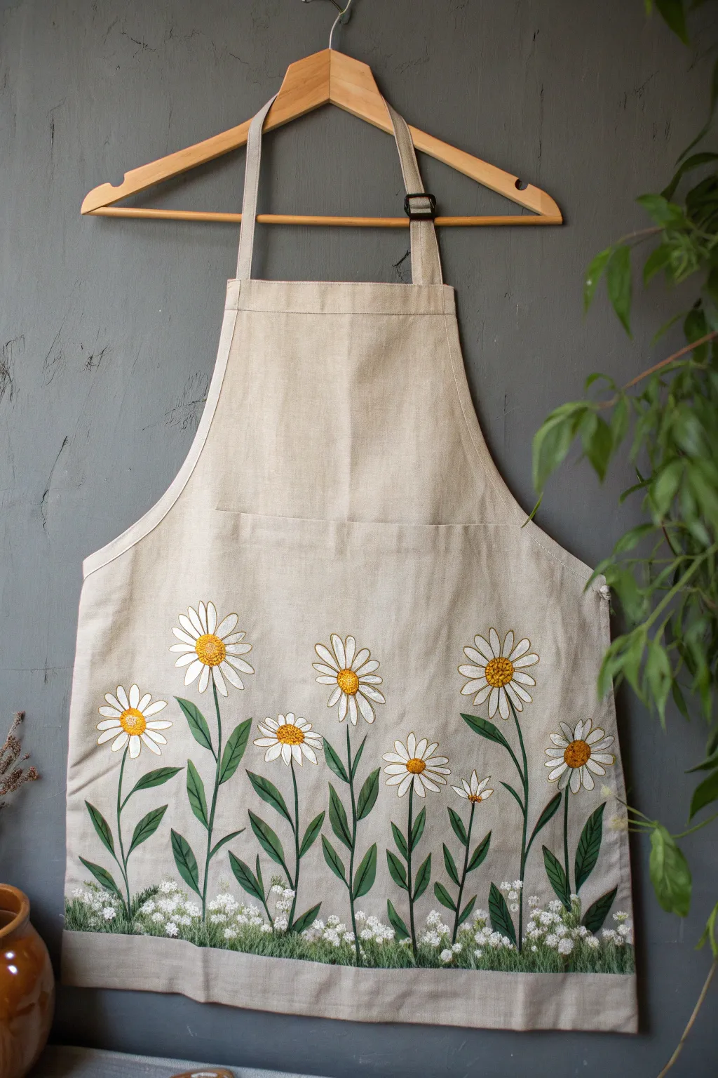
Transform a plain linen apron into a charming garden scene with this hand-painted daisy border design. The artwork features tall, elegant stems rising from a grassy hemline, creating a natural and whimsical look perfect for any gardener or baker.
Detailed Instructions
Materials
- Beige or oatmeal-colored linen apron (pre-washed)
- Fabric medium
- Acrylic craft paints (Titanium White, Golden Yellow, Ochre, Forest Green, Olive Green, Dark Hunter Green)
- Assorted brushes (small flat brush, fine liner brush, #4 round brush)
- Water-soluble fabric marker or chalk pencil
- Cardboard or wax paper (to prevent bleed-through)
- Paper plate or palette
- Iron (for heat setting)
Step 1: Preparation and Sketching
-
Prep the surface:
Before starting, ensure your apron is washed and dried to remove sizing, which helps paint adhere better. Iron it flat to remove creases. -
Protect the layers:
Slip a piece of thick cardboard or wax paper inside the apron, directly behind the area you plan to paint. This prevents the paint from soaking through to the back of the apron. -
Plan the composition:
Using a water-soluble fabric marker, lightly sketch the placement of the daisy heads first. Vary their heights, keeping the tallest ones toward the outer edges and center for balance. -
Draw the structure:
Sketch long, slightly curved vertical lines for the stems connecting to deeply serrated, lance-shaped leaves near the bottom. Draw a rough horizon line about 2 inches from the bottom hem for the grass area.
Uneven Petal Edges?
If your petal edges look ragged, wait for the paint to dry and use a very fine liner brush with slightly thinned white paint to outline and smooth the perimeter.
Step 2: Painting the Greenery
-
Mix your greens:
Mix one part fabric medium with roughly two parts acrylic paint for all colors from this point on. Create a base green by mixing Forest Green with a touch of Olive. -
Paint the stems:
Using a fine liner brush and your base green mixture, paint the long, thin stems. I like to keep my hand loose here so the lines aren’t perfectly straight, which looks more natural. -
Fill in the leaves:
Switch to a round brush to paint the long leaves extending from the stems. Start with light pressure, press down to widen the leaf, and lift up to create a sharp point. -
Add depth to leaves:
While the green is still slightly tacky, streak in a little Dark Hunter Green near the base of the leaves and stems for shadow. -
Create the grassy base:
At the bottom hem, use an old, scruffy brush or a fan brush. mix Olive Green and Forest Green, using short, vertical upward strokes to create a texture that looks like dense grass.
Paint Choice
Don’t skip the fabric medium! It prevents the acrylic paint from stiffening and cracking, keeping the apron soft and allowing it to drape naturally on the body.
Step 3: Creating the Daisies
-
Paint the petals:
Using Titanium White mixed with fabric medium and a small flat or round brush, paint the daisy petals. Start at the outer tip of the petal and stroke inward toward the center. -
Layering the white:
Fabric paint can be translucent on linen. Let the first layer of white dry completely, then apply a second coat to make the petals opaque and bright. -
Add petal definition:
For a realistic look, mix a tiny drop of grey or diluted blue into your white and add very thin, subtle lines between some petals to separate them visually. -
Paint the centers:
Dip a small round brush into Golden Yellow. Dab the center of each flower to create a textured, pollen-like circle. -
Shadow the centers:
While the yellow is wet, add a tiny dot of Ochre or light brown to the bottom curve of the yellow center to give it a 3D, rounded appearance.
Step 4: The Final Details
-
Add the wildflower meadow:
Dip a toothpick or the very tip of a liner brush into pure White paint. Dot clusters of tiny white specks into the dark green grass area at the bottom to mimic baby’s breath or tiny wildflowers. -
Refine the stems:
Check the connection points where the stems meet the flower heads. If there’s a gap, carefully fill it with a tiny stroke of green. -
Dry completely:
Allow the entire design to dry for at least 24 hours. Don’t rush this, as the paint needs to cure slightly before heat setting. -
Heat set the design:
To make the apron washable, place a clean cloth over the dry painted design and iron on a high setting (appropriate for linen) for 3-5 minutes to seal the paint.
Now you have a custom, garden-inspired apron ready for your next project in the kitchen or the backyard
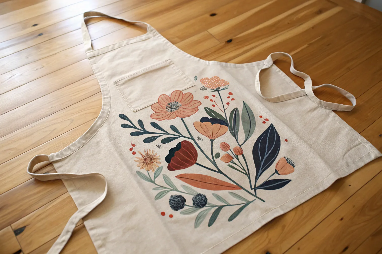
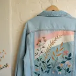
Loose Watercolor-Style Floral Apron
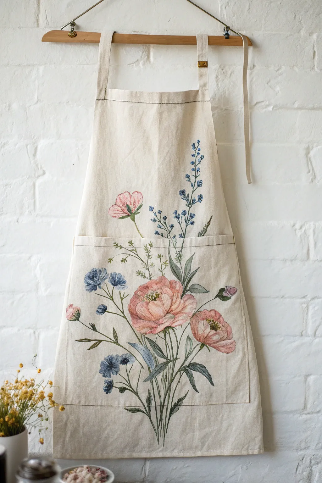
Transform a plain canvas apron into a wearable garden with this elegant floral design that mimics the soft, translucent look of watercolor paintings. Using fabric mediums and careful layering, you’ll create oversized peonies and delicate bluebells that look like they belong in a vintage botanical textbook.
How-To Guide
Materials
- Cotton or canvas apron (cream or beige)
- Fabric paint (soft pink, deep rose, muted blue, navy, olive green, sap green, white)
- Fabric medium (or textile medium to thin acrylics)
- Round brushes (sizes 2, 6, and 10)
- Fine liner brush (size 0 or 00)
- Water container and paper towels
- Cardboard insert (to prevent bleed-through)
- Iron (for heat setting)
- Pencil or disappearing ink fabric pen
Step 1: Preparation & Sketching
-
Prepare the fabric:
Start by washing and drying your apron without fabric softener to remove any sizing agents. Iron it flat to ensure a smooth painting surface. -
Insert a barrier:
Place a large piece of cardboard or a plastic cutting mat inside the apron, positioning it directly behind the area where you plan to paint. This is crucial to stop paint from bleeding through to the back of the apron. -
Establish the composition:
Lightly sketch the main stems first. Draw a long, central stem curving slightly right, reaching from the bottom hem up past the pocket line. Add two shorter, branching stems on the left side. -
Outline the blooms:
Sketch the large peony shapes. Place the biggest bloom centrally near the pocket line, a smaller bud angled right below it, and a small pink bud near the top left stem. Keep the lines very faint. -
Map the bluebells:
Draw the tall, vertical spike of bluebells extending high up the right side of the apron bib. Sketch the smaller clusters of blue flowers near the bottom left.
Bleed Control
Since fabric medium makes paint runny, paint stops when it hits a dry edge. Don’t overload your brush; working “dry-on-dry” gives you sharper control over petals.
Step 2: Painting the Pink Florals
-
Mix the watercolor base:
Mix your soft pink fabric paint with a generous amount of fabric medium. The consistency should be thin and fluid, almost like heavy cream, to achieve that transparent watercolor look. -
Base coat the peonies:
Using a size 6 round brush, wash the diluted pink over the main peony petals. Leave small negative spaces (unpainted fabric) between petals to define their separation naturally. -
Add depth to the petals:
While the base is still slightly damp, mix a darker rose shade. Touche this color into the base of the petals and the center of the flower, letting it bleed outward slightly for a soft gradient. -
Detail the centers:
Once the pink layers are dry to the touch, use white mixed with a tiny drop of yellow to create the stamen cluster in the center of the open blooms. Tap these on with the tip of a small brush.
Step 3: Painting Bluebells & Foliage
-
Create the blue tones:
Prepare a muted blue mix with fabric medium. Paint the small hanging bell shapes on the tall right stem. Vary the intensity, making some blooms darker at the bottom and lighter at the top. -
Paint the lower blue flowers:
Address the ruffled blue flowers on the lower left. Use a dabbing motion with a size 2 brush to create the textured appearance of the petals, using a darker navy for the centers. -
Paint the main stems:
Mix a muted olive green. Using the size 2 round brush, carefully trace over your pencil lines for the main stems. Keep the pressure light to maintain thin, elegant lines. -
Add the leaves:
Switch to the size 10 brush for the larger leaves at the base. Press the belly of the brush down and lift as you pull outward to create the tapered leaf shape. Use two shades of green—one lighter, one darker—for visual interest. -
Detail the tall spikes:
I prefer to use the liner brush here to connect the tiny bluebells to the main stem with very fine green filaments.
Antique Effect
Mix a tiny drop of brown paint into a cup of water. Use a large brush to spatter tiny droplets over the dried painting for an aged, vintage paper look.
Step 4: Finishing Touches
-
Refine the outlines:
Mix a very dark green or charcoal grey. With your finest liner brush, add extremely thin, broken outlines to some petals and leaves. This mimics the look of a vintage pen-and-ink botanical illustration. -
Add wispy details:
Paint delicate, hair-like sprigs of greenery extending from the main bouquet to soften the edges and fill empty spaces around the pocket line. -
Heat set the design:
Allow the paint to cure for at least 24 hours. Then, place a cotton cloth over the design and iron on a high, dry setting for 3-5 minutes to make the artwork permanent and washable.
Wear your new botanical masterpiece with pride in the studio or kitchen, knowing handle washing will keep it vibrant for years.
BRUSH GUIDE
The Right Brush for Every Stroke
From clean lines to bold texture — master brush choice, stroke control, and essential techniques.
Explore the Full Guide
Herb Garden Illustration Apron
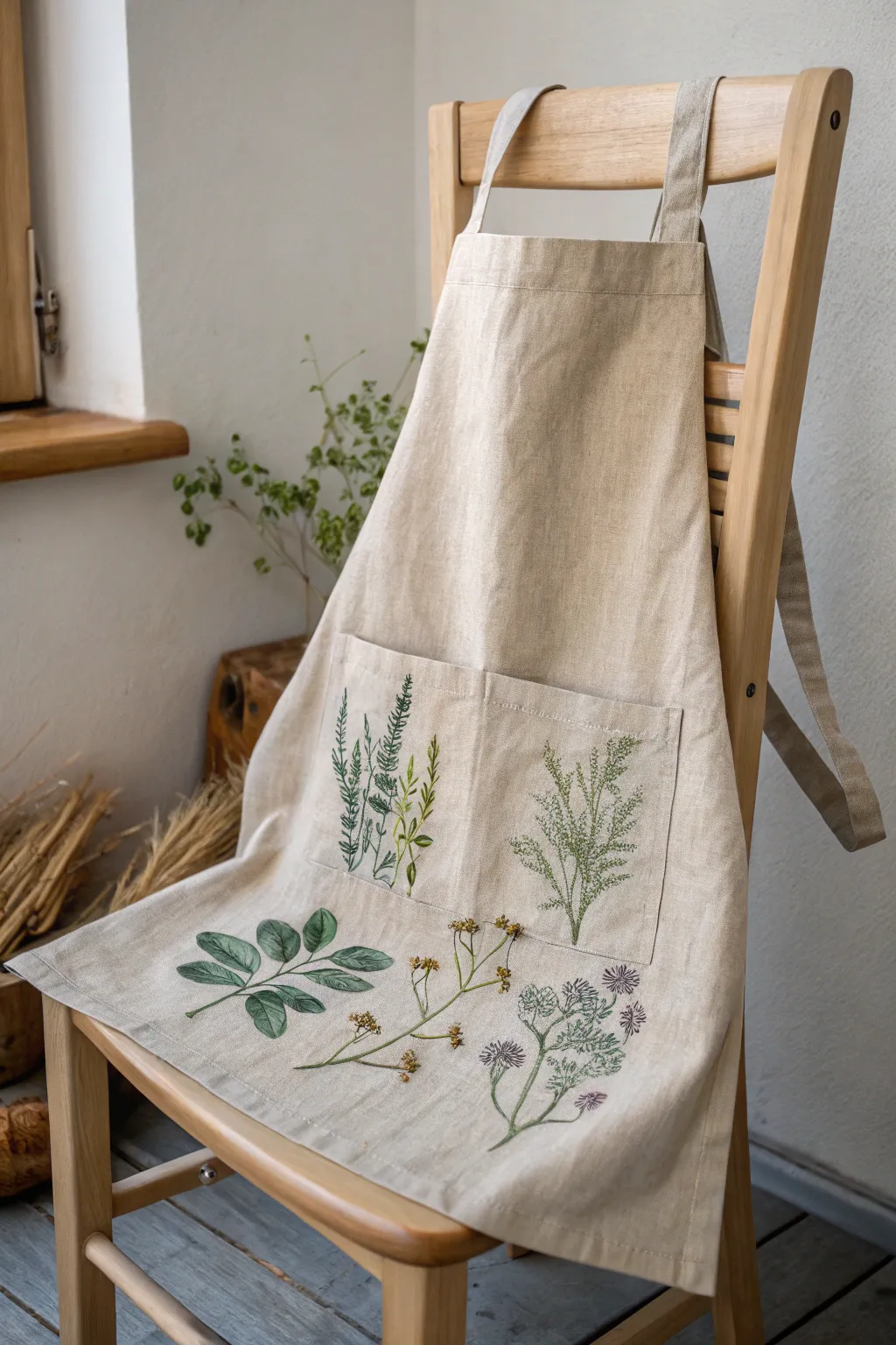
Transform a plain linen apron into a wearable herbarium with delicate, vintage-style botanical illustrations. This project combines fabric painting with fine line work to create an elegant, earthy aesthetic perfect for gardening or cooking.
Step-by-Step
Materials
- Natural linen apron (beige or oatmeal color)
- Fabric medium
- Acrylic paints (Sap Green, Olive Green, Burnt Umber, Yellow Ochre, Deep Purple)
- Fine detail brushes (sizes 0, 00, and 1)
- Fabric markers or fine-tip archival ink pens (green and brown)
- Pencil or disappearing ink fabric pen
- Cardboard or plastic sheet (to place inside pockets/under fabric)
- Iron for heat setting
Step 1: Preparation & Layout
-
Prepare the fabric:
Begin by washing and drying your linen apron without fabric softener to remove any sizing. Iron it smooth to ensure a flat painting surface. -
Protect the layers:
Insert a piece of cardboard or a plastic sheet inside the pockets and underneath the main body area where you plan to paint. This prevents paint from bleeding through to the back of the apron. -
Sketch the composition:
Using a pencil or disappearing ink pen, lightly sketch your botanical designs. Focus on placing the tall, grassy rosemary and dill sprigs on the pockets, and the larger leafy branches and delicate wildflowers on the lower skirt portion.
Paint Bleeding?
If paint feathers on linen, your mix is too watery or the brush is overloaded. Blot your brush on paper towel before touching fabric, and use less water.
Step 2: Painting the Greenery
-
Mix your base greens:
Mix Sap Green with a generous amount of fabric medium to create a transparent, watercolor-like consistency. I prefer adding a touch of brown to the green to mute it, matching the natural linen tone. -
Paint the pocket herbs:
Starting with the rosemary on the left pocket, use a size 1 brush to paint the main vertical stems. Use short, upward flicking strokes to create the needle-like leaves. -
Detail the rosemary:
Switch to a lighter olive shade and add highlights to the tips of the rosemary needles to give them dimension. -
Paint the dill sprigs:
On the right pocket, paint thin, branching stems for the dill or gentle fern-like plant. Keep the lines very fine, using just the tip of your 0 brush. -
Create the leafy branch:
Moving to the bottom left of the apron, paint the larger, oval leaves. Fill them in with a wash of cool, muted green, leaving the veins unpainted or negative space if possible. -
Add vein details:
Once the base green is dry, mix a darker green (Sap Green + tiny bit of Black or Purple) and use your thinnest brush (00) to paint the central vein and side veins on the large leaves.
Step 3: Flowers & Fine Stems
-
Paint the delicate stems:
For the wildflowers in the center and right, mix Burnt Umber with fabric medium. Paint very thin, spindly stems that curve naturally. -
Add yellow buds:
Dip the tip of a small round brush into Yellow Ochre mixed with a dot of brown. Dab small clusters of dots at the ends of the center stems to create seed heads or small buds. -
Paint purple blooms:
For the purple flowers on the right, use a thinned Deep Purple. Create star-burst shapes or thistle-like heads using quick, radiating strokes from a center point. -
Layer the colors:
Add a second, slightly darker layer of purple near the base of the flower heads to create depth and volume.
Vintage Texture Tip
For that aged, faded look, dry brush a tiny amount of raw sienna or tan paint randomly over the finished stems and leaves to ‘antique’ the illustration.
Step 4: Finishing Touches
-
Enhance with ink:
Once the paint is fully dry, use fine-tip fabric markers or archival pens to outline specific leaves or add textures, mimicking the look of a botanical textbook illustration. -
Cure the paint:
Allow the painted apron to dry for at least 24 hours. This ensures the moisture has completely evaporated from the fibers. -
Heat set the design:
Place a clean cotton cloth over your painted design and iron it on a med-high setting (no steam) for 3-5 minutes per section to permanently set the artwork.
Now you have a stunning, functional piece of art ready for your next kitchen adventure
Citrus Slice Pattern Apron
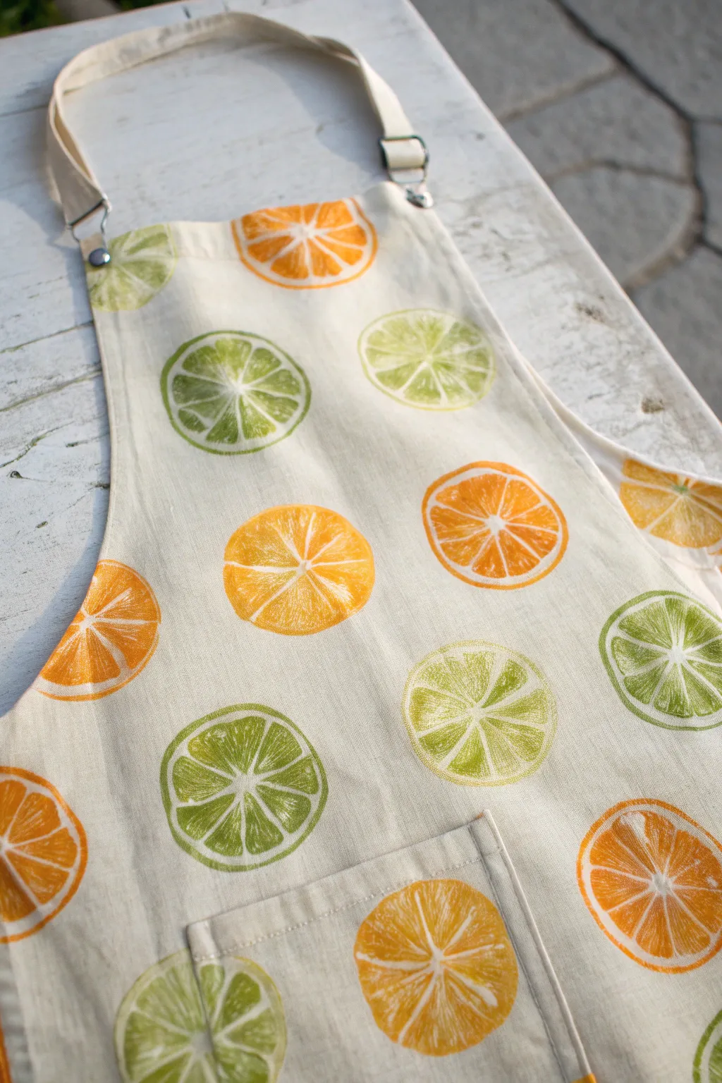
Bring a fresh squeeze of summer into your kitchen with this delightful citrus-print apron. Using simple block printing techniques, you will create a custom fabric design featuring vibrant orange and lime slices that look good enough to eat.
How-To Guide
Materials
- Plain white or cream cotton/canvas apron
- Fabric paint (Orange, bright yellow, lime green, moss green)
- Soft rubber carving block or lino sheet
- Linoleum cutter tool with V and U gouges
- Foam pouncers or small sponges
- Paper plate or palette
- Piece of cardboard (to fit inside apron pocket)
- Iron (for heat setting)
- Pencil and round object (to trace)
- Scrap fabric for testing
Step 1: Carving the Citrus Stamps
-
Trace your circle shape:
Find a circular object roughly 2.5 to 3 inches in diameter, like a jar lid or glass, and trace two circles onto your rubber carving block. -
Sketch the segments:
Inside each circle, lightly draw a smaller inner circle for the rind. Then, draw 8 to 10 triangular segments radiating from the center, leaving thin lines in between them to represent the pith. -
Carve the negative space:
Using a V-gouge cutter, carefully carve away the lines you drew for the pith. You want to remove the material where you want the white fabric to show through. -
Refine the edges:
Switch to a U-gouge to clear away the large area outside the main circle deep enough so it won’t pick up paint. Clean up the edges of your fruit segments to make them crisp. -
Create texture:
For a realistic look, I like to gently prick or slightly gouge the surface of the fruit segments to create a ‘juicy’ texture that mimics pulp, rather than leaving them perfectly smooth.
Step 2: Preparing the Paint
-
Mix your orange zest hue:
On your palette, pour out some orange fabric paint. Mix in a tiny drop of yellow to brighten it up if it looks too dark. -
Mix your lime green shade:
Combine lime green with a touch of moss green to give it depth so it doesn’t look neon. You want a natural, appetizing citrus color. -
Prepare the apron:
Wash and dry your apron without fabric softener to remove sizing. Iron it flat so you have a smooth surface for stamping. -
Protect the layers:
Place a piece of cardboard inside the apron pocket and another sheet underneath the main body of the apron to prevent paint from bleeding through to the back.
Uneven Texture is Good
Don’t worry if the paint looks mottled or uneven on the stamp. This distressed look mimics the natural texture of fruit pulp perfectly.
Step 3: Stamping the Design
-
Load the sponge:
Dip a foam pouncer into your orange paint mixture. Dab off the excess on a clean part of the plate so the layer is thin and even. -
Apply paint to the stamp:
Pounce the paint onto your first carved citrus stamp. Using a pouncer instead of dipping the stamp directly helps keep paint out of the carved grooves. -
Test on scrap fabric:
Press your stamp firmly onto a piece of scrap fabric first. Check the coverage and adjust the amount of paint if the details are getting lost. -
Stamp the oranges:
Begin stamping orange slices randomly across the apron. Rotate the stamp slightly each time so the imperfections look natural and varied. -
Stamp off the edge:
Create a professional textile look by stamping some oranges partially off the edge of the fabric or seams. -
Switch to lime:
Clean your stamp thoroughly or use the second stamp you carved. Load it with the green paint mixture using a fresh pouncer. -
Fill the gaps:
Look for empty white spaces between your oranges and fill them with lime slices. Aim for a balanced but random distribution. -
Stamp the pocket:
Don’t forget to stamp over the pocket area. Press firmly here, as the multiple layers of fabric can make the surface slightly uneven.
Paint Bleeding?
If paint squishes into the grooves, you are using too much. Use a dryer sponge and lightly tap the surface rather than flooding it.
Step 4: Finishing Up
-
Let it dry completely:
Allow the apron to air dry flat for at least 24 hours. The paint needs to be fully cured before the next step. -
Heat set the design:
Once dry, iron the reverse side of the fabric on a cotton setting (no steam) for several minutes to lock the paint into the fibers.
Now you are ready to cook up a storm in your fresh, custom-designed kitchen gear

PENCIL GUIDE
Understanding Pencil Grades from H to B
From first sketch to finished drawing — learn pencil grades, line control, and shading techniques.
Explore the Full Guide
Bold Color-Block Stripes
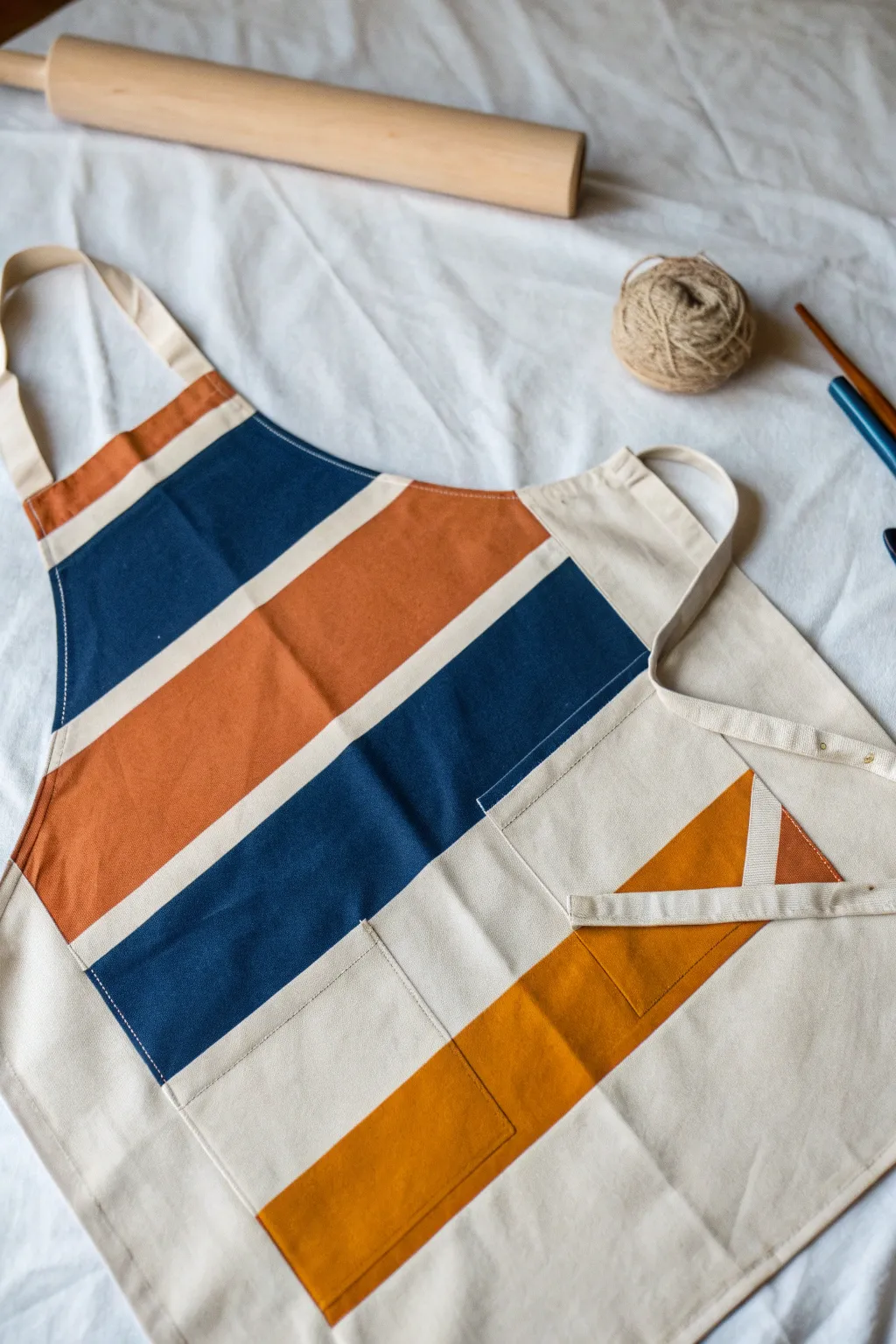
Transform a plain canvas apron into a striking statement piece with this bold, geometric design inspired by mid-century modern aesthetics. Using crisp painter’s tape lines and a warm, grounding palette of navy, terracotta, and mustard, you’ll create a graphic look that feels both contemporary and timeless.
Step-by-Step Guide
Materials
- Heavyweight cotton or canvas apron (cream/natural)
- Fabric medium
- Acrylic craft paints (Navy Blue, Burnt Orange/Terracotta, Mustard Gold)
- Wide painter’s tape (1.5 or 2 inch width)
- Flat paintbrushes (1-inch and 2-inch widths)
- Iron and ironing board
- Cardboard or scrap paper
- Ruler or straight edge
- Pencil
Step 1: Preparation & Mapping
-
Pre-wash the fabric:
Before you begin, wash and dry your apron without using fabric softener. This removes sizing chemicals that prevent paint adhesion. -
Iron flat:
Press the apron thoroughly to remove any wrinkles. A smooth surface is crucial for getting those super-crisp lines we want. -
Protect your surface:
Slide a piece of cardboard or thick scrap paper inside the apron (if it has layers) or underneath it to prevent paint bleeding through to the back or your table. -
Plan the diagonal:
Using a long ruler and a pencil, lightly mark your diagonal guide. Start from the top left chest area and angle it down towards the bottom right. This initial line establishes the angle for all subsequent stripes.
Bleed-Proof Lines
Before painting color, paint a thin layer of the *apron’s base color* (or clear medium) along the tape edge. This seals the tape, so any leaks are invisible.
Step 2: Taping the Design
-
Place the first tape line:
Apply your first strip of painter’s tape along your pencil guide. Press it down firmly. -
Create spacing:
Decide on the width of your first color block. For this look, the top blocks are quite wide. Measure about 4-5 inches down from your first tape line and apply a second strip of tape parallel to the first. -
Continue the pattern:
Work your way down the apron, adding tape strips to create negative space (the cream stripes) and positive space (the areas you will paint). Vary the widths slightly for visual interest. -
Handle the pocket:
If your apron has a pocket, tape right over it as if it’s part of the flat fabric. You’ll need to tuck the tape into the crevices where the pocket meets the main fabric to ensure a continuous line. -
Seal the edges:
Run a credit card or your fingernail firmly along the edges of every piece of tape. This is the secret to preventing paint from seeping under.
Step 3: Painting the Blocks
-
Mix the medium:
Mix your acrylic paints with fabric medium according to the bottle instructions (usually 2 parts paint to 1 part medium). This keeps the apron soft and washable. -
Start with the top color:
I like to begin at the top. Paint the uppermost section (the chest area) with the Burnt Orange/Terracotta mixture. Use a 1-inch flat brush for control near the edges. -
Apply the Navy:
Moving down, paint the next large section with your Navy Blue mix. Brush away from the tape edge initially to avoid forcing paint under it. -
Add the Mustard:
Paint the bottom-most wide stripe with the Mustard Gold. Ensure you get full coverage, as yellows can sometimes be translucent. -
Paint the pocket details:
Pay special attention to the pocket area. You may need to lift the pocket slightly to paint the side edges so no white canvas shows when the pocket gapes open. -
Check for saturation:
Let the first coat dry to the touch (about 15-20 minutes). If the colors look streaky or the canvas texture is showing through heavily, apply a second coat.
Level Up: Texture
Mix a tiny amount of baking soda into your paint for a matte, slightly raised ‘chalk paint’ texture that adds a tactile vintage feel to the stripes.
Step 4: Finishing Touches
-
Remove the tape:
While the paint is still slightly tacky (don’t wait until it’s bone dry), carefully peel back the tape at a 45-degree angle. This reveals your satisfyingly crisp lines. -
Touch up:
Inspect your lines. If any paint bled led through, use a tiny brush and white paint (or the original apron color) to clean up the edges. -
Let it cure:
Allow the apron to dry completely for at least 24 hours. Don’t rush this part. -
Heat set:
Once dry, heat set the paint by ironing the reverse side of the fabric on a medium-high setting for 3-5 minutes. This makes the design permanent and machine washable.
Now you have a custom, durable apron that brings a pop of artisan style to your kitchen or studio
Confetti Dots and Mini Flicks
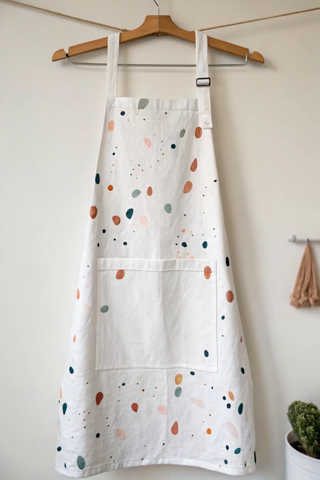
Transform a plain white apron into a modern, playful piece with this confetti-style painting project. The scattered pattern of organic shapes and tiny flicks mimics the trendy look of terrazzo stone using soft, earthy tones.
Step-by-Step Tutorial
Materials
- Pre-washed white cotton or linen apron
- Fabric medium
- Acrylic paints (terracotta, sage green, dark teal, blush pink, black)
- Small flat tip detail brush
- Old toothbrush or stiff bristle brush
- Cardboard (to place inside the apron)
- Paper plate or palette
- Paper towels
- Iron (for heat setting)
Step 1: Preparation & Mixing
-
Prep the fabric:
Start by washing and drying your apron without fabric softener to remove any sizing. Iron it flat to ensure a smooth painting surface. -
Protect your workspace:
Slide a piece of cardboard inside the apron, particularly behind the bib and pocket area, to prevent paint from bleeding through to the back layer. -
Mix your medium:
On your palette, mix each acrylic paint color with fabric medium according to the manufacturer’s instructions (usually a 1:1 or 2:1 ratio). This ensures the paint stays flexible and washable. -
Test your colors:
Swatch your mixed colors on a scrap piece of fabric or paper towel to ensure the earthy palette of terracotta, sage, teal, and blush looks cohesive together.
Oops, splatter too big?
If a paint flick lands as a large blob, don’t wipe it! Let it dry, then turn it into a deliberate oval shape using a brush and a complementary paint color.
Step 2: Painting the Large Shapes
-
Start with the main shapes:
Using your small flat tip brush, begin painting random, organic oval shapes with the terracotta color. Keep them roughly the size of a thumbprint, but vary the orientation. -
Add secondary colors:
Rinse your brush and repeat this process with the sage green and blush pink. Scatter these shapes widely, leaving plenty of white space between them. -
Introduce contrast:
Use the dark teal color to add slightly smaller, punchy accents. I like to place these near lighter colors to create visual interest. -
Don’t forget the pocket:
Continue the pattern seamlessly over the pocket area. Paint right over the seams to make the design look integrated rather than appliquéd. -
Let the base dry:
Allow these larger shapes to dry to the touch for about 15-20 minutes before moving on to the smaller details to avoid smudging.
Step 3: Adding Details & Speckles
-
Paint medium dots:
Switch to a smaller brush or the tip of your current brush. Add small, solid dots in black and dark teal. These act as anchors for the lighter shapes. -
Create tiny specks:
Dip a stiff toothbrush into slightly watered-down black or dark teal paint. Point the bristles toward the apron and run your thumb across them to flick tiny sprays of paint. -
Control the splatter:
Focus the splatters in empty white spaces, but don’t worry if some land on the colored shapes—it adds to the terrazzo effect. -
Add pastel flicks:
Repeat the flicking technique with the blush pink or terracotta paint for a softer, dusty texture in the background. -
Check the balance:
Step back and look at the apron from a distance. If any area looks too empty, manually dab a few extra dots or small dashes with your brush tip.
Make it Metallic
Mix a small amount of gold fabric paint into your splatter step. The subtle shimmer catches the light and elevates the rustic terrazzo look to something chic.
Step 4: Finishing Up
-
Dry completely:
Let the apron dry flat for at least 24 hours. The fabric paint needs to cure fully before it can be handled roughly. -
Heat set the design:
Once dry, turn the apron inside out or place a pressing cloth over the design. Iron on a cotton setting (no steam) for 3-5 minutes to permanently set the paint.
Now you have a custom, artist-grade apron ready for your next culinary adventure


Splatter With Tape-Resist Shapes
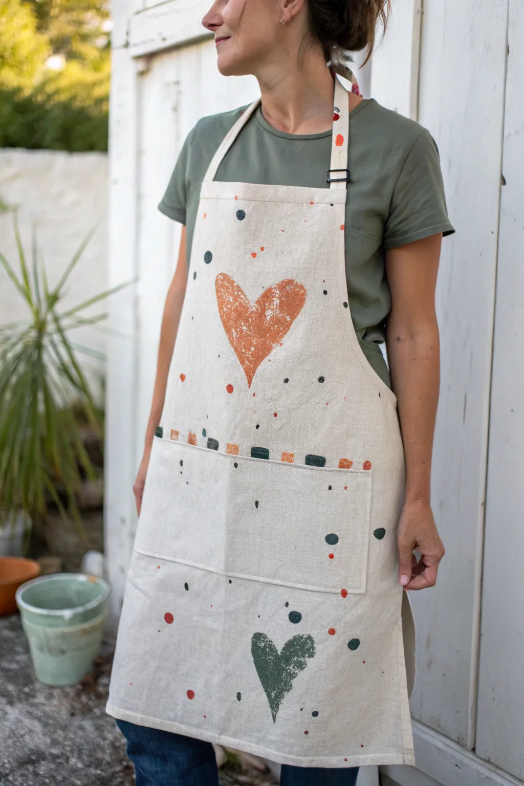
Embrace the effortless charm of this rustic apron, featuring block-printed hearts and playful splatters on natural linen. The earthy orange and deep sage green palette adds a warm, personalized touch perfectly suited for gardening or cooking.
How-To Guide
Materials
- Light beige or natural linen apron (washed and dried)
- Fabric paint (terra cotta orange, dark sage green, black)
- 2 Large raw potatoes (russet work well)
- Sharp paring knife
- Paper plates or palette
- Small square sponge or cut kitchen sponge (approx. 1 inch)
- Stiff bristle paintbrush or toothbrush
- Cardboard insert
- Paper towels
- Iron (for heat setting)
Step 1: Preparation & Carving
-
Prepare the fabric:
Begin by washing and drying your linen apron to remove sizing, but do not use fabric softener. Slide a large piece of cardboard inside the apron or underneath the single layer to prevent paint from bleeding through to the back. -
Cut the potatoes:
Cut one potato in half lengthwise to create a large flat surface. Cut the second potato in half widthwise to create a smaller surface for the bottom heart if you want size variation, or just reuse the first one. -
Carve the heart stamp:
Draw a rustic, slightly asymmetrical heart shape onto the cut face of the potato with a marker or scoring tool. Carefully cut away the potato flesh around the outside of your heart shape using the paring knife, leaving the heart design raised by at least a quarter inch. -
Dry the stamp:
Press the carved potato stamp firmly onto several layers of paper towels. Removing excess moisture from the potato is crucial for getting a crisp impression with the fabric paint.
Slippery Stamp Fix
If the potato is too slippery to hold while stamping, cut a ‘handle’ into the back (uncut) side of the potato, or stick a fork firmly into the back to give you a better grip.
Step 2: Printing the Design
-
Prepare the orange paint:
Squeeze a generous amount of terra cotta orange fabric paint onto a paper plate. Spread it out slightly so it’s even, but not too thin. -
Test the print:
Dip your potato stamp into the paint, blotting off any heavy excess on the side of the plate. Press it onto a scrap piece of fabric or paper first to get a feel for the pressure needed. -
Print the large heart:
Re-ink the stamp and press it firmly onto the center of the apron’s bib. Apply even pressure without rocking the potato, then lift straight up. Don’t worry if the texture looks distressed or uneven; that adds to the charm. -
Print the lower heart:
Clean the potato or carve a second one for the green paint. Using dark sage green, stamp a second heart near the bottom hem of the apron, slightly off to the side for a balanced composition. -
Create the pocket detail:
Take your small square sponge and dip one edge into the orange paint. Press it along the top edge of the pocket opening to create a dashed line. Alternate colors with the sage green paint, leaving small gaps in between the squares.
Textured Effect
To enhance the distressed vintage look, lightly sand the dried heart prints with fine-grit sandpaper before heat setting. This softens the paint and reveals the linen weave.
Step 3: Adding Texture & Finishing
-
Create large dots:
Use the rounded end of a paintbrush handle or a round sponge stippler. Dip it into black or dark grey paint and press random dots of varying sizes around the hearts and across the pocket area. -
Add colored accents:
Repeat the dotting process using the orange and green paints. Scatter these loosely, focusing on the empty spaces around the hearts to frame them without overcrowding the design. -
Prepare for splatter:
Dilute a small amount of black or dark grey fabric paint with a few drops of water until it reaches an ink-like consistency. -
Splatter the fabric:
Dip a stiff bristle brush or toothbrush into the thinned paint. Hold it over the apron and run your thumb across the bristles to flick fine speckles across the entire surface. I like to concentrate a few heavier splatters near the hearts. -
Dry completely:
Allow the painted apron to dry flat for at least 24 hours. The thick paint from the potato stamping may take longer to cure than the splatters. -
Heat set the design:
Once fully dry, heat set the paint according to the manufacturer’s instructions. Typically, this involves ironing the opposite side of the fabric on a high setting (no steam) for several minutes to make the design permanent and washable.
Put on your new custom apron and tackle your next project with style
Soft Ombre Painted Dip Hem
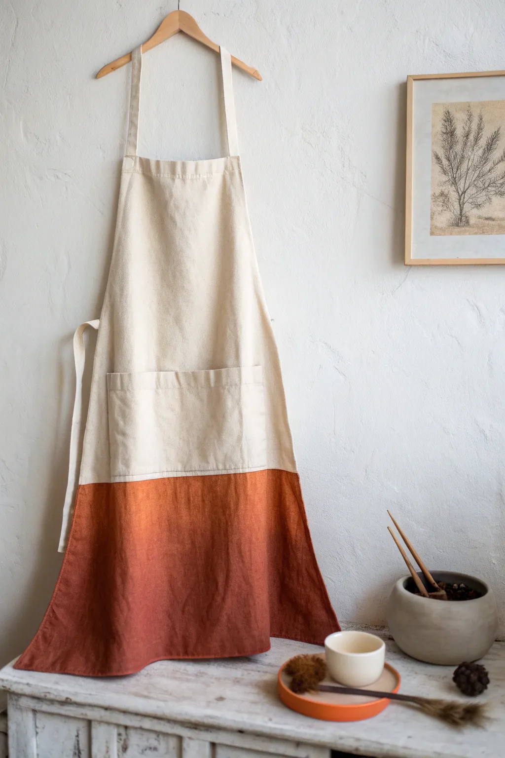
Elevate a simple linen apron with a warm, rust-colored gradient that evokes the feeling of a hazy sunset. This soft ombre effect adds an artisanal touch to your kitchen wear, creating a distinct line that gently fades upward rather than a harsh block of color.
Detailed Instructions
Materials
- Light-colored linen or cotton apron (pre-washed)
- Fabric paint (burnt orange or terracotta color)
- Fabric medium (optional, for softer feel)
- Old hanger
- Spray bottle with water
- Large flat paintbrush (2-3 inches wide)
- Painter’s tape or masking tape
- Drop cloth or plastic sheet
- Iron (for heat setting)
- Clean cloth or scrap fabric
Step 1: Preparation
-
Wash and Dry:
Start with a clean slate by washing and drying your apron without using any fabric softener. This removes factory sizing or finishes that might repel the paint. -
Setup Workspace:
Lay down a drop cloth or plastic sheet on a large flat surface. Alternatively, you can hang the apron against a protected wall if you prefer painting vertically, but laying it flat usually offers better control. -
Define the Horizon:
Decide how high you want your color block to go. Apply a strip of painter’s tape straight across the apron at this line. Press the edges down firmly to prevent initial bleeding. -
Dampen the Fabric:
Using your spray bottle, lightly mist the bottom section of the apron below the tape. The fabric should be damp but not dripping wet; this helps the paint spread evenly and soak into the fibers.
Step 2: Painting the Base
-
Mix the Paint:
Dilute your fabric paint with water in a 1:1 ratio. If you want a softer hand-feel, mix in fabric medium according to the bottle instructions instead of just water. -
Saturate the Bottom:
Dip your large brush into the mixture and begin painting the very bottom hem of the apron. Apply the paint generously here, as you want this area to be the darkest and most saturated. -
Work Upwards:
Brush upward from the hem toward the tape line. As you move up, use slightly less paint on the brush to start creating a very subtle gradation naturally. -
Paint to the Line:
Continue painting until you reach the painter’s tape. Ensure the entire area below the tape is covered. Don’t worry about perfect blending yet; just get the color down.
Wet-on-Wet Blending
Keep a spray bottle handy during the blending phase. If the paint starts to dry and drag, a quick mist revives it for smooth transitions.
Step 3: Creating the Ombre Effect
-
Remove the Tape:
Here is where the magic happens. While the paint is still wet, carefully peel away the painter’s tape. -
Soften the Hard Edge:
Immediately mist the harsh line where the tape was with clean water. I like to use a clean, damp brush or a sponge to gently drag the wet paint upward, feathering the edge into the unpainted fabric. -
Blend Downward:
Work the transition area by brushing downwards as well, ensuring there is a seamless melt from the natural fabric color into the rust tone. -
Add Depth:
If the bottom hem looks too light after drying slightly, add a second coat of undiluted paint solely to the bottom 2 inches to weigh down the gradient visually.
Paint Bleeding?
If paint bleeds too far up the unpainted section, use a clean, damp sponge to blot and lift the excess color immediately before it sets.
Step 4: Finishing Touches
-
Dry Completely:
Hang the apron up carefully on a hanger and allow it to air dry completely. This creates the natural drape seen in the finished look. 24 hours is usually best to ensure deep drying. -
Heat Set:
Once dry, heat seal the design to make it permanent. Place a scrap cloth over the painted area and iron on the highest heat setting suitable for the fabric (usually cotton/linen setting) for 3-5 minutes. -
Final Wash:
Wait at least 72 hours before washing the apron again. When you do, use a gentle cycle with cold water to preserve that lovely rust vibrancy.
Now you have a stunning, one-of-a-kind piece that brings warmth to your daily cooking routine
Negative Space Leaf Silhouette
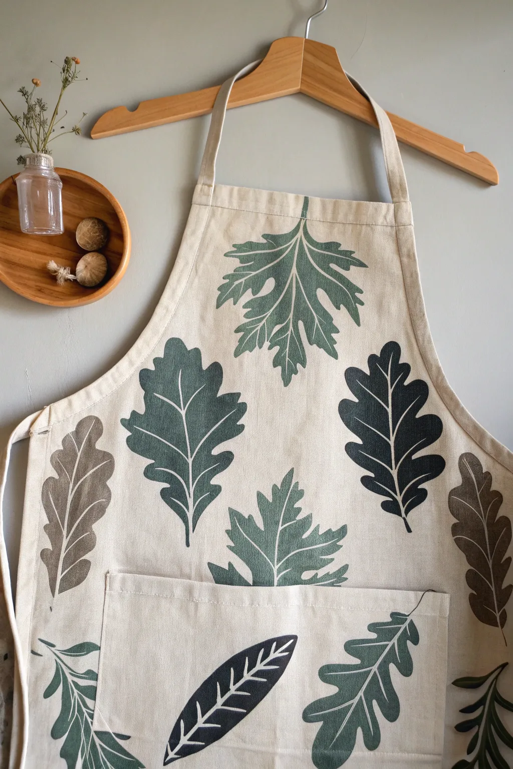
Bring the calming essence of the forest into your kitchen with this elegant leaf-motif apron. By using a clever reverse-stencil or block-printing technique, you’ll create crisp, organic leaf shapes defined by their striking white veins.
Step-by-Step
Materials
- Plain canvas or cotton apron (cream or beige)
- Fabric paint (Sage Green, Forest Green, Deep Charcoal/Black, Warm Brown)
- Large, varied artificial leaves (sturdy plastic or stiff fabric) or thick cardstock for stencils
- Dense foam crafting block or linoleum carving sheet (optional for block printing method)
- Carving tools (if using linoleum)
- Small fine-detail brush (size 0 or 1)
- Flat shader brush (size 6 or 8)
- Fabric medium (if using acrylic paints)
- Iron for heat setting
- Paper plate or palette
- Pencil
Step 1: Design & Preparation
-
Wash and Prep:
Begin by washing and drying your apron without fabric softener to remove any sizing chemicals. Iron it completely flat to ensure a smooth painting surface. -
Map Your Layout:
Lay the apron on a large flat surface. Place your artificial leaves or cardstock templates onto the fabric to plan the composition. Aim for a balanced scatter pattern, mixing large maple-style leaves with elongated oak-style leaves. -
Trace the Outlines:
Once satisfied with the placement, lightly trace the perimeter of each leaf onto the fabric using a pencil. Keep the lines faint so they won’t show through lighter paint colors later.
Fixing Wobbly Lines
If your vein lines get too thick or shaky, wait for them to dry, then use the original leaf color to ‘cut back’ into the line, narrowing it down.
Step 2: Painting the Leaves
-
Mix Your Palette:
Squeeze out your fabric paints. You want a natural, earthy palette. Mix a little black into the green for a deep forest tone, and perhaps a touch of brown into the sage for warmth. -
Base Coating – Center Out:
Starting with a large central leaf, apply the paint using your flat shader brush. I find it helpful to paint from the center of the leaf shape outward toward the edges to keep the outline crisp. -
Defining the Edges:
Carefully fill in the traced shape. Ensure the edges are sharp, mimicking the serrated or lobed edges of real foliage. The paint should be opaque enough to cover the fabric texture. -
Varying the Colors:
Move to the next leaf shape and choose a different color. Alternate between the sage green, deep charcoal, and brown tones to create visual interest. For the apron pocket, consider painting a leaf that partially wraps around the edge or sits at an angle. -
Let it Dry:
Allow the base leaf shapes to dry until they are dry to the touch. This usually takes about 20-30 minutes depending on the thickness of your paint application.
Step 3: Creating the Veins
-
The Negative Space Technique:
Instead of painting white veins on top, you will be painting ‘around’ the veins or adding a second layer that defines them. However, for the crispest look seen here, we will paint fine lines of the background color (cream/beige) on top of the dried leaves. -
Mix a Correction Color:
Mix a paint color that matches your apron’s fabric almost perfectly. This ‘eraser’ color allows you to draw the veins back in. -
Drafting the Veins:
Using your finest detail brush and the cream paint, start at the base of the leaf and pull a thin line up through the center to create the midrib. -
Adding Branching Veins:
Paint thinner veins branching off the main midrib. Taper your strokes so they get thinner as they reach the leaf edges, just like real nature. -
Alternative Method: Scratching:
If your paint is still slightly tacky (not fully dry), you can sometimes use a rubber-tipped tool to gently scrape away the paint to reveal the fabric underneath, though painting over with cream often yields a cleaner result.
Use Freezer Paper
For sharper stencils, cut your leaf shapes out of freezer paper. Iron the paper (shiny side down) onto the apron; it temporarily bonds to fabric preventing bleed!
Step 4: Finishing Touches
-
Review and Refine:
Step back and look at the apron. If any leaf edges look messy, smooth them out with the corresponding leaf color. -
Pocket Detailing:
Pay special attention to the pocket area. Ensure the paint didn’t bleed through to the layer of fabric underneath. If you haven’t painted the pocket leaf yet, place a piece of cardboard inside the pocket effectively to prevent bleed-through. -
The Final Cure:
Let the apron sit undisturbed for at least 24 hours to ensure the paint cures completely. -
Heat Setting:
Turn the apron inside out or place a pressing cloth over the design. Iron on a high setting (no steam) for 3-5 minutes over each painted area to permanently set the pigment.
Wear your new creation with pride during your next baking session or gardening afternoon.
Recipe-Inspired Lettering Panel
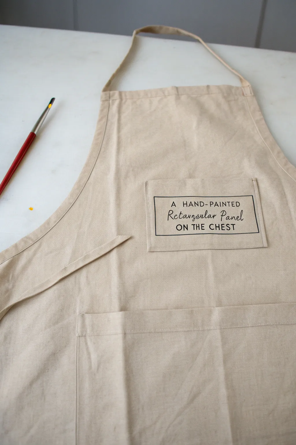
Transform a plain canvas apron into a modern culinary statement piece with this clever typography project. Using clean lines and a bold rectangular border, you’ll create a professional-looking graphic that mimics the aesthetic of vintage recipe cards.
Detailed Instructions
Materials
- Plain beige canvas apron
- Fabric for the chest panel (matching beige canvas)
- Black fabric paint or medium-body acrylic paint mixed with textile medium
- Fine liner brush (size 0 or 00)
- Small flat shader brush (size 2 or 4)
- Ruler or quilter’s square
- Pencil or disappearing fabric ink pen
- Iron and ironing board
- Fabric glue or sewing machine with beige thread
Step 1: Preparing the Panel
-
Measure and cut:
Cut a rectangle of matching beige canvas fabric approximately 6 inches wide by 4 inches tall. I find it helpful to cut it slightly larger at first to allow for seam allowances. -
Create the hem:
Fold the edges of your rectangle inward by about 1/4 inch on all four sides to create a clean edge. Press these folds firmly with a hot iron so they stay flat. -
Secure the edges:
You can either use a tiny dab of fabric glue under the flaps to hold them or run a simple straight stitch around the perimeter if you own a sewing machine. This cleaner edge mimics the patch pocket look seen in the example.
Step 2: Drafting the Design
-
Draft the inner box:
Using your ruler and a pencil, lightly draw a rectangle inside your fabric panel. Leave a generous margin of about 0.5 inches between your pencil line and the edge of the fabric. -
Sketch the primary text:
In the center of your drawn box, lightly sketch the main script text. The example uses a flowing, handwritten font for the middle words ‘Rectangular Panel’. -
Add the block lettering:
Above the script text, draft ‘A HAND-PAINTED’ in small, neat uppercase sans-serif letters. Below the script text, draft ‘ON THE CHEST’ in slightly larger uppercase letters to anchor the design. -
Check alignment:
Take a step back and check your spacing. The mix of script and block lettering works best when centered vertically, so adjust your pencil lines now before committing with paint.
Fixing Bleeds
If paint bleeds into the fabric weave, use a razor blade to gently scrape away excess dried paint, or cover the mistake with a tiny dab of beige paint.
Step 3: Painting the Design
-
Paint the border:
Dip your fine liner brush into black fabric paint. Carefully trace over your pencil rectangle. Use steady pressure to keep the line thickness consistent. -
Steady your hand:
Painting straight lines on fabric can be tricky due to the weave. I like to rest the heel of my hand on a piece of scrap paper to keep it steady without smudging the work. -
Letter the upper text:
Switch to your very finest brush tip. Paint the top line (‘A HAND-PAINTED’) using minimal paint on the brush to prevent bleeding into the fabric grain. -
Paint the script:
For the middle cursive words, focus on fluidity. Press slightly harder on the downstrokes to make them thicker, and lift pressure on the upstrokes for delicate, thin lines. -
Finish the bottom text:
Complete the design by painting the bottom block letters. Ensure these are bold enough to balance the top line. -
Clean up edges:
If any lines look a bit shaky, carefully go back over them with the shader brush to square off the ends of the block letters. -
Let it dry completely:
Allow the painted panel to dry flat for at least 24 hours. Don’t rush this step, as wet paint can smear easily during attachment. -
Heat set the paint:
Once dry, place a thin cloth over the painted design and press it with a hot iron (no steam) for about 3-5 minutes to permanently set the ink.
Level Up: Functional Pocket
Instead of sewing the panel flat on all four sides, leave the top edge open when attaching it to the apron to create a functional pen or recipe card pocket.
Step 4: Assembly
-
Position the panel:
Lay your main apron flat. Place your painted panel on the chest area, ensuring it is centered horizontally. -
Attach the panel:
Pin the panel in place. You can either stitch it onto the apron using a matching beige thread or use a strong, permanent fabric glue for a no-sew option. -
Final press:
Give the entire apron a final press to smooth out any wrinkles created during the handling process.
Now you have a custom, typography-focused apron ready for your next culinary adventure
Pocket-Only Mini Mural
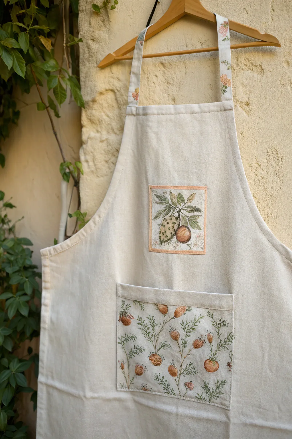
Transform a plain canvas apron into a vintage-inspired piece by focusing your artistic energy on two key areas: a central chest motif and a lush, patterned pocket. This project combines fabric painting with simple sewing techniques to create the illusion of custom-printed botanical patches.
How-To Guide
Materials
- Plain cream or off-white canvas apron
- Fabric medium
- Acrylic paints (olive green, sage green, burnt orange, terracotta, warm brown, cream)
- Fine detail brushes (sizes 0 and 00)
- Small flat shader brush (size 2)
- Rectangular scrap of canvas (for the chest patch)
- Larger rectangular scrap of canvas (for the pocket)
- Iron and ironing board
- Fabric glue or sewing machine with matching thread
- Pale peach fabric paint or bias tape (optional for border)
- Pencil for sketching
Step 1: Painting the Chest Motif
-
Prepare the canvas scrap:
Cut a small square of canvas, approximately 4×4 inches, leaving a little extra room for hemming or fraying. Tape it securely to your work surface to prevent shifting. -
Sketch the citrus design:
Using a light pencil touch, draw a central hanging fruit—think lemons or textured citrons—surrounded by a cluster of leaves. Keep the composition centered. -
Mix your base colors:
Mix your acrylics with fabric medium according to the bottle instructions. Create a muted olive for the leaves and a warm, brownish-yellow for the fruit skin. -
Block in the shapes:
Use the flat shader brush to fill in the main shapes of the leaves and fruit. Don’t worry about details yet; just get a solid base layer down. -
Add texture and shading:
Once the base is dry to the touch, use a smaller brush to stipple small dots onto the fruit skin for that characteristic citrus texture. Add darker greens to the veins of the leaves. -
Paint the border:
Create a faux-stitched look by painting a thin, pale peach border around the square motif. I like to keep this line slightly imperfect to mimic hand-embroidery.
Step 2: Creating the Botanical Pocket
-
Measure and cut:
Cut your larger canvas piece to the desired pocket size. Hem the top edge by folding it over twice and pressing it with an iron. -
Plan the repeat pattern:
Sketch a repeating pattern of delicate stems and seed pods (like rose hips or poppy pods) across the entire pocket fabric. Let the stems curve naturally and intertwine slightly. -
Paint the stems:
Using your finest liner brush and thinned olive green paint (mixed with fabric medium), carefully trace over your pencil lines to create graceful, thin stems and tiny leaves. -
Paint the pods:
Mix a terracotta or burnt orange shade. Paint the oval-shaped pods at the ends of the stems. Vary the opacity to make some look rounder and fuller. -
Add fine ink-like details:
Use a very dark brown or black paint with a 00 brush to add tiny textural lines on the pods and spikes on the stems, mimicking a vintage botanical ink drawing. -
Heat set the paint:
Allow all paint to dry completely (at least 24 hours). Then, iron the reverse side of the fabric on a high setting (no steam) to permanently set the design.
Vintage Patina Tip
Mix a tiny drop of tea or very watered-down brown paint into your background white before painting. It instantly ages the canvas for that old-world look.
Step 3: Assembly
-
Position the pieces:
Lay your apron flat. Place the small motif in the center of the bib and the large pocket panel on the lower section. -
Finish the edges:
Fold the raw edges of your painted patches underneath and press firmly with an iron to create crisp sides. -
Attach the artwork:
Sew the patches onto the apron using a running stitch or a sewing machine. Alternatively, use a strong permanent fabric glue for a no-sew option. -
Matching straps (optional):
If you have leftover painted fabric or a matching floral cotton, consider sewing strips over the original apron straps to tie the whole look together.
Level Up: Texture
Use actual embroidery floss to stitch over just a few stems or the border of the chest patch. The mix of paint and thread creates incredible depth.
Now you have a functional piece of art that makes time in the garden or kitchen feel extra special
Turn a Painted Canvas Into an Apron
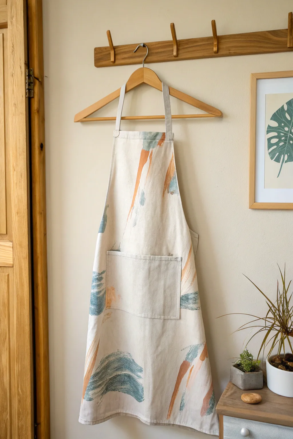
Transform a plain canvas drop cloth or heavy cotton fabric into a functional piece of wearable art with this painterly apron project. The design features loose, expressive brushstrokes in earthy terracotta and deep teal for a modern, artistic aesthetic.
Step-by-Step
Materials
- Heavyweight cream canvas fabric or cotton drop cloth (approx. 1 yard)
- Fabric medium
- Acrylic paints (Terracotta/Burnt Orange, Deep Teal/Slate Blue, White)
- Wide flat bristle brushes (2-3 inches)
- Smaller flat brush (1 inch)
- Sewing machine and thread (cream)
- Fabric scissors
- Pins
- Iron and ironing board
- Measuring tape
- Apron template or existing apron to trace
Step 1: Preparing the Fabric Canvas
-
Wash and dry:
Begin by washing and drying your canvas fabric to pre-shrink it. This ensures your final apron won’t distort after the first wash. -
Iron flat:
Press the fabric thoroughly to remove all wrinkles. A smooth surface is crucial for both cutting the pattern and applying the paint evenly. -
Cut the apron shape:
Lay out your fabric on a large flat surface. Using an existing apron as a guide or a paper template, trace the main body shape. You’ll need a large bib section transitioning into a wider skirt. -
Cut the straps:
From the excess fabric, cut two long strips for waist ties (approx. 30″ x 3″) and one shorter strip for the neck loop (approx. 20″ x 3″). -
Cut the pocket:
Cut a rectangle roughly 8″ x 7″ for the front pocket. Keep this separate for now as it’s easier to paint before attaching.
Dry Brush Mastery
To get the scratchy look, wipe 90% of the paint off your brush onto a paper towel before touching the fabric. Build color slowly rather than applying a thick blob.
Step 2: Creating the Abstract Art
-
Mix your medium:
Mix your acrylic paints with fabric medium according to the bottle instructions (usually a 2:1 or 1:1 ratio). This makes the paint flexible and washable. -
Test your colors:
On a scrap piece of canvas, test your colors. You might want to mix a little white into the teal to get that slightly faded, stonewashed look seen in the photo. -
Apply the base strokes:
Lay the main apron body and the pocket piece flat. Dip a wide, dry bristle brush into the terracotta paint. Offload most of the paint on a paper towel first. -
Create movement:
Use quick, confident sweeping motions to create long, streaky marks. Focus on vertical movement, starting from the bottom and sweeping upward, or vice versa. Leave plenty of negative space. -
Add the teal layer:
Once the orange strokes are touch-dry, switch to a fresh wide brush with the teal mixture. Apply these strokes over and around the orange ones, using a curving, ‘swooshing’ motion to create varied textures. -
Dry brush technique:
For the feathery edges shown in the image, ensure your brush is very dry. Drag just the tips of the bristles across the fabric to create that scratchy, canvas-like texture. -
Paint the pocket:
Paint the pocket piece separately, ensuring the pattern density matches the main body. I find it helpful to place the pocket on top of the apron temporarily to see how the strokes will align visually. -
Cure the paint:
Allow the paint to dry completely (usually 24 hours). Once dry, heat set the paint by ironing on the reverse side of the fabric for several minutes.
Step 3: Assembly and Finishing
-
Hem the pocket:
Fold the top edge of the pocket rectangle over twice (about 1/2 inch) and stitch across. Fold the remaining three sides in and press them flat. -
Attach the pocket:
Pin the pocket to the center of the apron skirt. Topstitch around the sides and bottom to secure it in place, reinforcing the top corners with a small backstitch. -
Prepare the straps:
Fold your strap strips in half lengthwise and press. Open, then fold the raw edges toward the center crease. Fold in half again to enclose raw edges and stitch down the length. -
Hem the apron body:
Fold the raw edges of the main apron body over twice to create a narrow double-fold hem. Pin and stitch all the way around the perimeter. -
Attach neck strap:
Pin the ends of the neck loop to the top corners of the bib (on the backside). Stitch essentially a square shape with an ‘X’ in the middle for durability. -
Attach waist ties:
Sew one end of each waist tie to the side corners where the bib meets the skirt, using the same reinforced box-x stitch method.
Make It Yours
Instead of painted canvas, try using a heavy drop cloth for a rustic texture, or add leather rivets at the pocket corners for an industrial, high-end finish.
Now you have a durable, custom-designed apron ready for your next artistic endeavor or culinary adventure
Signature Guestbook Painting Apron
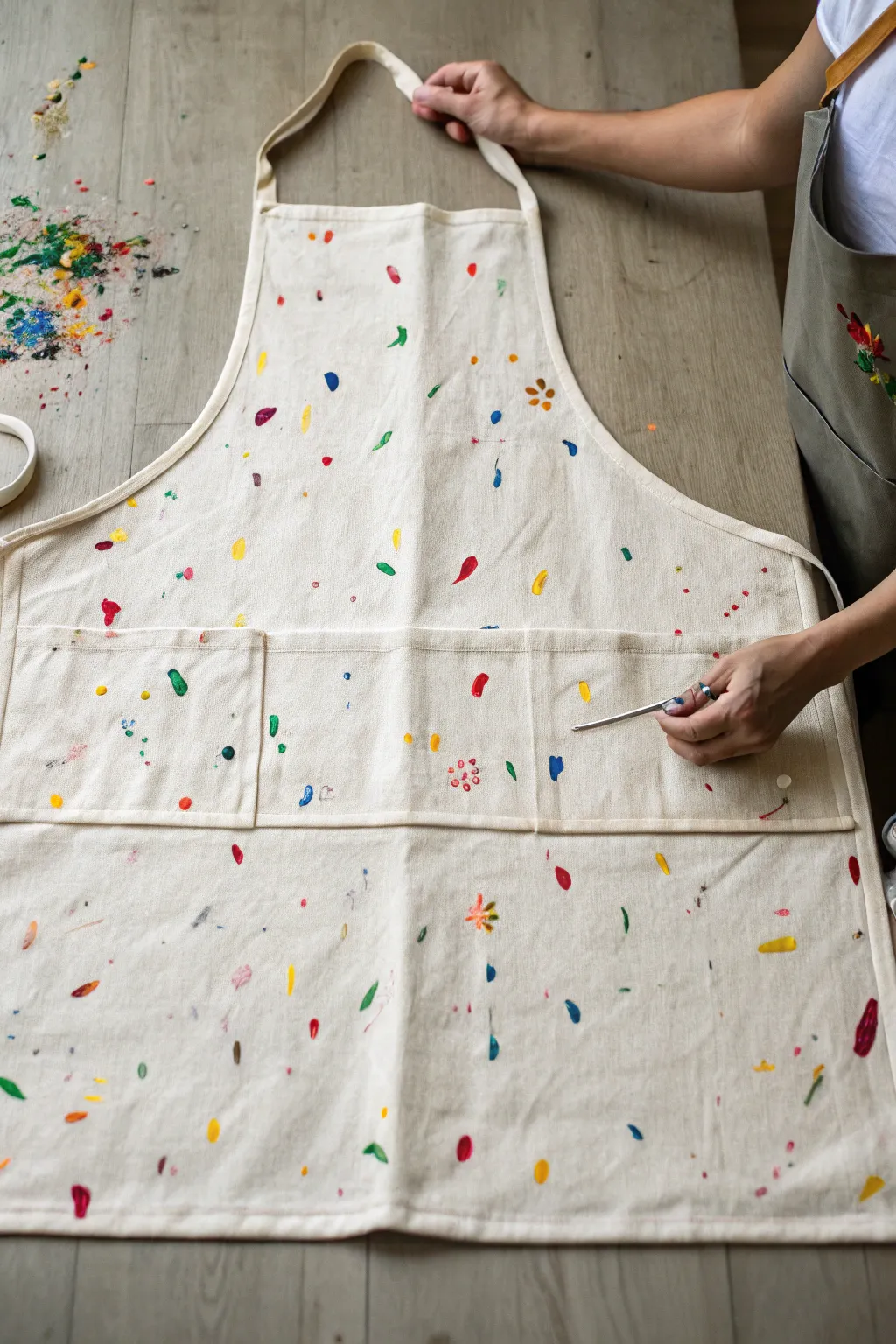
Turn a simple piece of workwear into a wearable memory with this vibrant, confetti-style painted apron. Featuring scattered brushstrokes in a rainbow of colors, this project doubles as a unique guestbook alternative or a fun group activity where every mark tells a story.
Step-by-Step Guide
Materials
- Light-colored canvas or cotton apron
- Fabric paints (assorted bright colors)
- Small round paintbrushes (sizes 2-4)
- Fine-tip fabric markers or paint pens
- Cardboard or parchment paper (for barrier)
- Palette or paper plates
- Water cup and paper towels
- Iron (for setting the paint)
Step 1: Preparation and Setup
-
Pre-wash the fabric:
Before adding any color, wash and dry the apron without using fabric softener. This removes sizing chemicals and ensures the paint adheres permanently to the fibers. -
Protect the layers:
Insert a piece of cardboard or parchment paper inside the apron, specifically behind the bib and pocket areas. This prevents paint from bleeding through to the back layer or the surface underneath. -
Smooth the surface:
Iron out any deep creases or wrinkles on the apron to provide a flat, easy-to-paint canvas for your guests or collaborators. -
Prepare the palette:
Squeeze dime-sized amounts of various fabric paint colors onto your palette. Aim for a mix of primary colors along with pinks, teals, and terracottas to match the lively aesthetic shown.
Step 2: Painting the Confetti base
-
Start with cool tones:
Begin by dipping a small round brush into blue or teal paint. Create small, organic shapes scatter across the apron—think teardrops, tiny dashes, and small circles. -
Add floral shapes:
Using a reddish-pink or coral shade, dab five small dots in a circle to create simple flower shapes. Leave the centers empty for now. -
Incorporate foliage:
Switch to a leaf green shade. Paint small, single-stroke leaves near some of the floral dots or floating independently in the white space. -
Introduce warmth:
Add scattered strokes of bright yellow and orange. I like to use a slightly drier brush here to create textured, feathery strokes that contrast with the solid blobs. -
Layering details:
Once the initial flower shapes are touch-dry, use a contrasting color (like yellow or orange) to add a single dot in the center of your flower clusters. -
Fill the pockets:
Don’t forget the pockets. Continue the pattern across the pocket seams, but be careful not to paint the pockets shut; ensure the paint doesn’t bridge the gap too heavily.
Clean Brush Tip
Keep a jar of water handy but dry brushes thoroughly between color swaps. Watery fabric paint bleeds into the cotton fibers and creates fuzzy edges instead of crisp marks.
Step 3: Signatures and Finishing
-
Invite participation:
If using this as a guestbook, hand out the brushes or paint pens now. Ask guests to add their own small symbol, initial, or brushstroke to fill in the empty spaces. -
Use paint pens for fine lines:
For legible signatures or tiny details like flower stamens, switch to fine-tip fabric paint pens. These offer more control than a brush for writing names. -
Balance the composition:
Step back and look at the apron as a whole. If there are large white gaps, fill them with tiny dots or micro-dashes in a color that is underrepresented in that area. -
Let it cure:
Allow the apron to dry completely flat for at least 24 hours. Don’t rush this step, as thick dabs of fabric paint can develop a skin while remaining wet underneath. -
Heat set the design:
Turn the apron inside out or place a pressing cloth over the design. Iron on a cotton setting (without steam) for 3-5 minutes per section to seal the paint.
Fixing Globs
If a paint drop lands too thick, don’t wipe it! Lift the excess gently with a corner of a paper towel, then let it dry. You can paint a new shape over it later.
Your personalized apron is now ready to wear for your next creative adventure or hang as a keepsake


Have a question or want to share your own experience? I'd love to hear from you in the comments below!