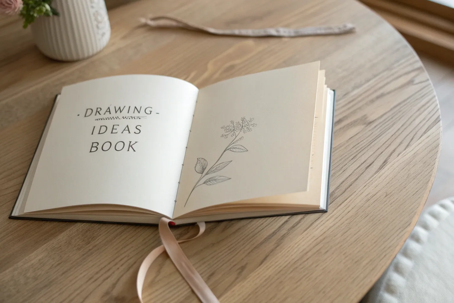
Whenever my sketchbook feels like a blank, awkward silence, a drawing ideas book turns it into a conversation I can actually jump into. Think of it as your personal stash of prompts, mini-lessons, and page layouts that gently nudge your hand forward.
Start With a Daily Prompt Page
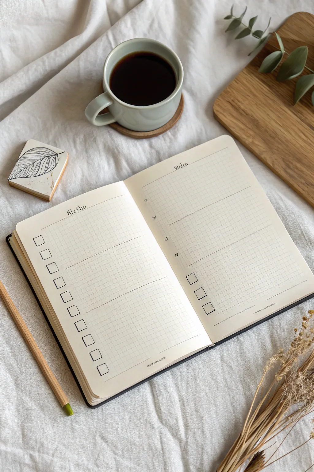
This clean, functional layout transforms a blank grid notebook into a structured creativity tracker. By utilizing the existing grid lines, you can create a professional-looking daily prompt page that feels organized yet open-ended.
Step-by-Step Tutorial
Materials
- A5 grid or dot-grid notebook (cream paper recommended)
- Black archival fineliner (0.3mm for lines)
- Black archival fineliner (0.5mm for text)
- Clear ruler
- Pencil and eraser
Step 1: Planning and Headers
-
Flatten the spine:
Begin by opening your notebook to a fresh spread and pressing the spine flat so the pages lay as evenly as possible. -
Define the header space:
Count four to five grid squares down from the top edge on both pages. Lightly mark this spot with a pencil to establish your header margin. -
Letter the left header:
Using the 0.5mm pen, write your left-page title (like ‘Tasks’ or ‘Weekly’) in a serif, typewriter-style font. Keep the letters slightly spaced apart for an airy look. -
Letter the right header:
Repeat the lettering process on the right page with a corresponding title like ‘Notes’ or ‘Ideas,’ ensuring it aligns horizontally with the left header.
Smudge-Free Lines
Tape a penny to each end of your ruler. The slight elevation prevents the ruler’s edge from dragging ink across the paper when you slide it.
Step 2: The Checklist Column
-
Position the checkbox column:
On the left page, move two grid squares in from the left margin. This will be the vertical axis for your checkboxes. -
Draw the first box:
With the 0.3mm pen, outline a square that is 2×2 grid units in size. Keep your lines crisp and corners sharp. -
Continue the column:
Skip one vertical grid unit below the first box and draw the next one. Repeat this pattern down the entire length of the page. -
Add spacing variation:
I prefer to leave a slightly larger gap (about 3-4 squares) after every set of five boxes to visually break up the list.
Add a Pop of Color
Use a mild highlighter in a muted tone (like grey or sage) to draw a single thick line behind your header text before writing over it.
Step 3: Structure and Dividers
-
Draw horizontal organizers:
On the left page, use your ruler to draw thin lines extending from your ‘break’ gaps across the rest of the page to create distinct sections. -
Set up the right page grid:
Move to the right page. This side is less rigid. Draw three horizontal lines across the full width of the page, dividing it into three large, equal rectangular zones. -
Add margin details:
In the left margin of the right page, write small Roman numerals (I, II, III) or tiny serif letters next to each dividing line to label the zones. -
Create a priority box:
In the bottom section of the right page, draw a small cluster of three checkboxes, arranged diagonally or in a short vertical stack, for high-priority items.
Step 4: Finishing Touches
-
Erase guidelines:
Wait at least five minutes for the ink to cure completely, then gently run your eraser over the headers to remove any pencil marks. -
Add subtle accents:
Use the 0.3mm pen to add tiny serifs to your checkboxes or re-trace any header letters that need more visual weight.
Now your spread is clean, organized, and ready to be filled with your daily prompts.


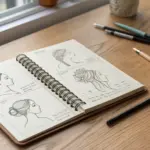
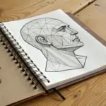
Keep a Shape-to-Form Practice Chapter
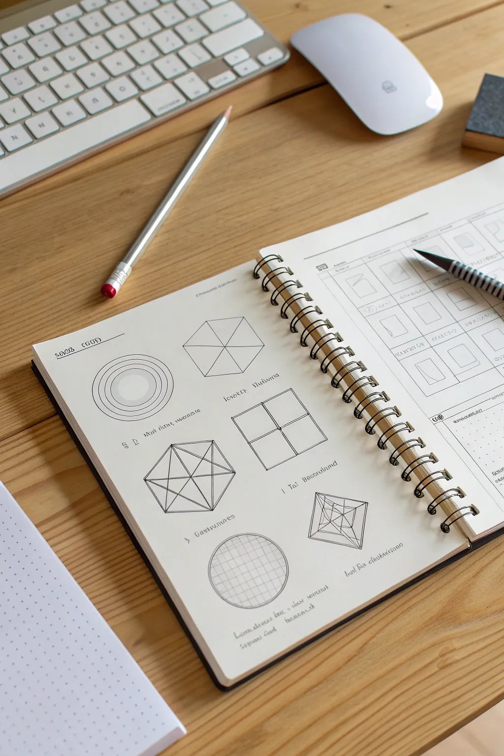
Master the fundamentals of dimension by creating a dedicated practice page that transforms simple 2D outlines into complex 3D wireframes. This exercise uses clean lines and structural blocking to help you visualize objects in space, perfect for sharpening your technical drawing skills.
Step-by-Step Guide
Materials
- Spiral-bound sketchbook (smooth or mixed media paper)
- Fine-liner pens (0.3mm and 0.5mm black)
- Mechanical pencil (HB lead)
- Technical ruler or straight edge
- Compass or circle template
- Eraser
Step 1: Setting the Layout
-
Define the grid:
Visualize your sketchbook page as a grid. Mentally divide the page into two columns to keep your practice organized and aesthetically pleasing. -
Add a title:
Using your 0.5mm pen, letter a simple header at the top left, like ‘Solid Forms’ or the cryptic script seen in the example, to designate the chapter.
Step 2: Drawing the Circles
-
Draft the outer circle:
Start at the top left. Use a compass to draw a perfect circle lightly in pencil. -
add concentric inner circles:
Draw three progressively smaller circles inside the first one. Spacing doesn’t need to be mathematically perfect, but try to keep the visual rhythm consistent. -
Ink the circles:
Trace over your pencil lines carefully with a 0.3mm pen. For the innermost circle, you can add very light shading or a solid fill to suggest depth, as if looking down a tube.
Use Dot Guides
If freehanding straight lines is tough, place tiny dots at start and end points before drawing. Your eye will naturally guide your hand to connect them.
Step 3: Drawing the Hexagon
-
Draft the hexagon perimeter:
To the right of your circles, lightly pencil a regular hexagon. Ensure all six sides are roughly equal in length. -
Connect the vertices:
Draw lines connecting opposite corners (vertices) to find the center point. This divides the hexagon into six equal triangles. -
Ink the hexagon:
Go over the perimeter and the internal ‘spokes’ with your pen. Keep your stroke weight consistent for a flat, graphical look.
Add Values
Take it further by adding grey marker washes or hatching to one side of each 3D form. This introduces a light source and enhances the illusion of depth.
Step 4: Drawing the Complex Polyhedrons
-
Start the 3D hexagon:
Below the first circle, draw another hexagon. Inside this one, draw a smaller hexagon that connects the midpoints of the outer hexagon’s sides. -
Create the star pattern:
Connect the corners of the inner hexagon to create a six-pointed star pattern. This creates a faceted, gem-like appearance. -
Draft the divided square:
To the right, draw a large square. Divide it into four quadrants with a simple cross. Then, draw diagonals across the entire shape to find the perspective center. -
Construct the pyramid view:
In the bottom right quadrant, draw a square that looks like a pyramid viewed from above. Draw a smaller square inside a larger one, then connect their corresponding corners. -
Add internal geometry:
Bisect the inner square of your pyramid with a cross, connecting lines to the outer corners to create a complex wireframe structure.
Step 5: Drawing the Sphere Grid
-
Outline the sphere:
At the bottom left, use your compass to draw a large, singular circle. -
Draw vertical longitudes:
Draw curved vertical lines traversing the circle. The center line should be straight, while lines moving outward should curve progressively more to mimic the surface of a ball. -
Draw horizontal latitudes:
Cross the vertical lines with horizontal curved lines. Again, the middle line is straight, while upper and lower lines curve to follow the sphere’s form. -
Ink the grid:
Carefully ink these grid lines. This is a crucial exercise for understanding how surface contour lines define volume.
Step 6: Final Inking and Notes
-
Add callout text:
Next to each shape, add small, stylized captions or notes. You can invent an alphabet or use standard block lettering to label the forms (e.g., ‘vertex,’ ‘plane’). -
Erase guidelines:
Once the ink is completely dry—I usually wait a full five minutes to be safe—gently erase all underlying pencil marks to reveal the clean black lines.
This clean, structured page will serve as a permanent reference for your future perspective drawings.


Create a Value and Shading Ladder
This project transforms a simple sketchbook spread into a powerful reference tool for understanding shading and light. By creating a structured gradient chart, you’ll practice controlling pencil pressure to achieve a full spectrum of tonal values from white to black.
How-To Guide
Materials
- Dotted grid journal or sketchbook
- Graphite pencils (HB, 2B, 4B, 6B)
- Fine liner pen (0.3mm or 0.5mm, black)
- Ruler
- Eraser
Step 1: Setting Up the Structure
-
Define the Value Page:
On the right-hand page of your spread, use your ruler to measure out a grid structure. You will need three columns of five squares each. The dotted grid on the paper makes this easy—counting 4×4 dots for each square usually works well. -
Draw the Boxes:
Using a very light pencil touch first, sketch the fifteen squares. Leave a small gap (about two grid units) between each square so they don’t touch. -
Ink the Outlines:
Once you are happy with the layout, go over your pencil lines with a fine liner pen. Keep your hand steady and use the ruler for crisp, clean edges. -
Add Labels:
At the top of the columns, write your headers in cursive script. Good options are ‘Practice,’ ‘Reference,’ and ‘Texture.’ Below each box, add small placeholder text or scribbles to mimic the technical notes seen in the example.
Smooth Shading Secret
To get that ultra-smooth look without visible pencil strokes, hold your pencil further back on the barrel and use the side of the lead, not the tip.
Step 2: Creating the Value Gradient
-
Start with White:
Leave the very top-left square completely blank. This represents the pure white of your paper and is the lightest value in your scale. -
Begin Light Shading:
Moving to the second square in the first column, use an HB pencil. Apply extremely light pressure, barely grazing the paper, to create a faint grey tone. -
Build the Mid-Tones:
As you move down the first column and into the second, gradually increase your pressure. Switch to a 2B pencil for the middle squares. Aim for a smooth, even texture by using small circular motions rather than back-and-forth scribbles. -
Deepen the Shadows:
For the bottom of the second column and the start of the third, switch to a 4B pencil. You want a distinct dark grey here. Layering is key—I often apply one layer, cross-hatch lightly, and then blend it visually. -
Achieve Maximum Black:
For the final square at the bottom right, use your softest pencil (6B or similar). Press firmly to fill the tooth of the paper completely, creating the darkest possible charcoal black.
Step 3: Designing the Left Page Layout
-
Create the Header:
On the left page, write a script title at the top, such as ‘Actions’ or ‘Notes.’ Draw a horizontal line extending from the text across the page. -
Draw the Vertical Divider:
Draw a vertical line about one-third of the way into the page. This creates a narrow column on the left and a wider workspace on the right. -
Add Horizontal Guides:
Using the straight-edge, draw horizontal lines across the wider section. Space them evenly to create rows for writing tasks or notes. -
Create the Mini Tracker:
At the bottom of the page, draw a small 4×4 or 5×5 grid of tiny squares. Shade the alternating squares in a checkerboard pattern using your fine liner or pencil to add a graphic element.
Level Up: Texture
Instead of smooth shading, try filling one column with different shading techniques like stippling (dots) or cross-hatching to see how value changes with texture.
Now you have a handy reference guide for your future drawings and a beautifully organized journal spread ready for use

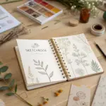
Make a Texture Library Page Set
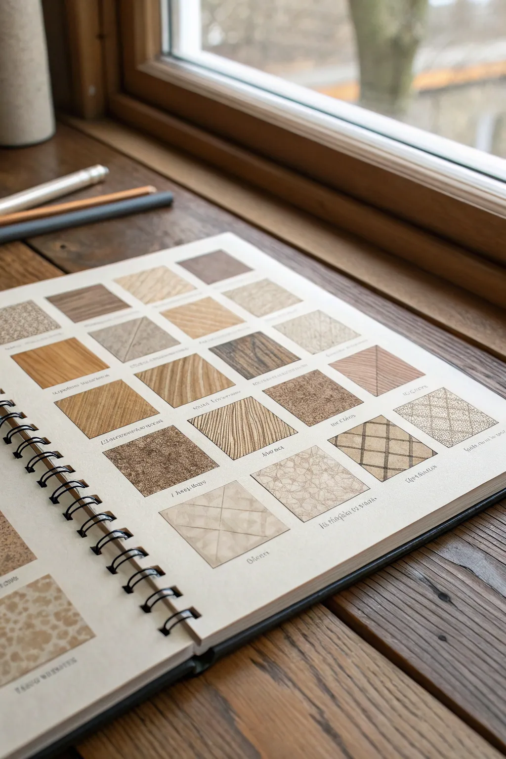
Create an invaluable reference tool for your art practice by dedicating a sketchbook page to a grid of meticulous texture studies. This visual dictionary mimics the look of interior design swatches, capturing the essence of wood grains, weaves, tiling, and organic surfaces in neat, satisfying squares.
Detailed Instructions
Materials
- Spiral-bound sketchbook (smooth or mixed-media paper)
- Ruler or T-square
- Pencil (HB or 2H for grid lines)
- Fine liner pens (sizes 0.05, 0.1, 0.3, and 0.5)
- Brown/Sepia fine liner or colored pencils (optional for warmth)
- Eraser (kneaded preferred)
Step 1: Setting the Grid
-
Define the margins:
Start by measuring equal margins around the edges of your sketchbook page to centre your composition. A 1-inch border usually frames the work nicely without feeling cramped. -
Grid layout calculation:
Decide on the size of your swatches. For this specific look, aim for squares that are roughly 1.5 to 2 inches (4-5 cm). Measure the total width available inside your margins and divide by the number of columns you want (4 or 5 is standard). -
Drafting the squares:
Using your ruler and a very light touch with an HB pencil, draw a grid of squares. Leave a small gap (about 1/4 inch) between each square to let the textures breathe. -
Label lines:
Draw incredibly faint guidelines directly underneath each square. This is where you will eventually write tiny descriptive labels, adding to that scientific specimen look.
Reference Real Life
Don’t just guess! Gather scraps of denim, wood chips, and leaves, or take detail photos around your house to serve as direct models for each square.
Step 2: Wood and Organic Textures
-
Basic wood grain:
Choose a square for a standard wood grain. Start with your 0.1 pen and draw slow, wavy, parallel lines. Occasionally creating ‘islands’ or knots where the lines diverse around a central point helps sell the effect. -
Varying line weight:
Go back over your wood grain with a slightly thicker 0.3 pen on the shadow side of the knots to create depth. -
Cork or particle board:
For a speckled texture like cork, use a stippling technique. Keep the dots random and vary the density—clump them together in some areas and spread them out in others to avoid a mechanical look. -
Woven rattan:
Drawing a diagonal weave requires structure. Lightly pencil diagonal grid lines first. Then, ink short, angled strokes in alternating directions to mimic the ‘over-under’ pattern of woven cane or fabric.
Add Color Washes
Once the ink is waterproof-dry, apply very dilute watercolor washes in earth tones (ochre, burnt sienna, slate grey) to differentiate materials.
Step 3: Geometric and Fabric Patterns
-
Herringbone pattern:
Draw a series of light vertical columns. Fill these columns with zig-zag diagonal lines that meet at the column edges. I find it helps to rotate the sketchbook slightly to keep my hand angle consistent. -
Diamond quilting:
Create a diagonal grid. Where the lines intersect, draw tiny circles or dots to represent stitching or buttons. Add slight curved shading under the lines to make the material look pillowy. -
Geometric tiling:
Map out a repeating geometric shape, like triangles or hexagons. Use a ruler for the main outlines, but hand-draw the inner details to give it an organic, sketched feel. -
Crackle finish:
For a stone or aged ceramic look, draw spontaneous, jaggy lines that resemble lightning bolts. Connect them randomly, leaving large open spaces.
Step 4: Finishing Touches
-
Adding labels:
Using your finest 0.05 pen, write small, handwritten captions under each square. Use whimsical names like ‘Aged Oak’, ‘Linen Weave’, or ‘Cracked Clay’. -
Warm shading:
If you have sepia tones or colored pencils, lightly glaze over the wooden or leather textures. Keep the color subtle; this is primarily a line-work study. -
Erase guidelines:
Once the ink is completely dry (give it at least 15 minutes to be safe), gently erase the original pencil grid and margin lines. Be careful not to smudge your shading. -
Refining edges:
Check the perimeter of your squares. If any texture spills over too messily, you can use a white gel pen to clean up the edges, or re-define the square border with a slightly bolder black line.
Now you have a stunning visual reference page to consult whenever you need inspiration for surface details in future drawings
BRUSH GUIDE
The Right Brush for Every Stroke
From clean lines to bold texture — master brush choice, stroke control, and essential techniques.
Explore the Full Guide
Do Quick Gesture Drawing Pages
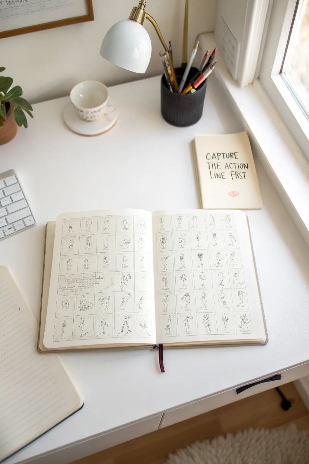
Transform a blank sketchbook page into a mesmerizing study of movement with this disciplined yet freeing exercise. By confining figure drawings to small uniform boxes, you force yourself to focus on pure action lines and simplified forms rather than getting lost in details.
Step-by-Step Guide
Materials
- Hardbound sketchbook (A4 or roughly 8.5×11 inches)
- Ruler or straight edge
- Fine liner pen (0.1mm or 0.3mm)
- Graphite pencil (HB or 2B)
- Eraser
- Reference photos of people in motion (sports, dance, or everyday actions)
Step 1: Preparing the Grid
-
Measure your margins:
Open your sketchbook to a fresh spread. Using your ruler and pencil, mark a perimeter margin of about 1/2 inch around the edges of both pages to frame your work. -
Calculate box dimensions:
Count how many boxes will fit comfortably. For the look in the image, you want a grid of roughly 5 columns by 6 rows on each page. Aim for squares that are approximately 1.5 to 2 inches in size. -
Draw vertical guides:
Lightly sketch the vertical lines for your columns using a pencil. I prefer to keep these lines very faint so they don’t overpower the final ink drawings. -
Draw horizontal guides:
Sketch the horizontal lines to complete your grid. Ensure the spacing is visually consistent, though it doesn’t need to be mathematically perfect. -
Ink the grid:
Trace over your pencil grid lines with a fine liner pen. You can do this freehand for a wobblier, more organic look, or use a ruler for crisp precision. -
Erase guidelines:
Once the ink is completely dry, gently erase the underlying pencil marks to leave a clean, empty framework.
Time Yourself
Set a timer for 30 seconds per box. The strict deadline forces your brain to prioritize the essential curves over unimportant details like fingers or fabric folds.
Step 2: Capturing the Poses
-
Select your first reference:
Choose a reference image with a clear line of action—someone running, jumping, or reaching works best. -
Identify the action line:
Look for the primary curve that runs through the figure’s spine. This ‘S’ or ‘C’ curve will be the foundation of your sketch. -
Sketch the skeleton:
Inside the first box, use your fine liner to quickly draw a stick-figure ‘skeleton’ following that action line. Keep stroke pressure light and swift. -
Flesh out the forms:
Add simple geometric shapes (ovals for the ribcage/hips, cylinders for limbs) over your stick figure skeleton. Don’t worry about clothes or facial features yet. -
Move to the next box:
Immediately start the next drawing. The goal is speed—try to spend no more than 60-90 seconds per box to keep the energy high. -
Limit your linework:
Try to capture the entire pose in as few strokes as possible. Focus on silhouette and gesture rather than anatomical precision. -
Vary the subjects:
Alternate between different types of movements. If one row is all sports poses, make sure the next row features more casual standing or sitting postures to create visual variety. -
Leave some breathing room:
If a drawing feels too complex, it’s okay to leave it unfinished or simplify it drastically. The grid unifies them, so individual ‘mistakes’ disappear into the texture of the page.
Color Accent
Use a single colored pencil (like a light blue or red) to sketch the initial action line before inking. This adds a beautiful, professional animation-studio aesthetic.
Step 3: Review and Annotate
-
Add handwritten notes:
Pick a few boxes where you learned something specific and scribble a tiny note next to or inside the box. Use a micro-pen for this text so it feels like a whisper on the page. -
Critique your layout:
Scan the page for any boxes that look too sparse. You can thicken the contour lines on those figures slightly to balance the visual weight of the spread. -
Optional shading:
Add very minimal cross-hatching to ground the figures, perhaps just a subtle shadow under the feet to show they are standing in space.
Now you have a dynamic library of poses that serves as both practice and inspiration for future illustrations
Plan Character Sheet Workbook Pages
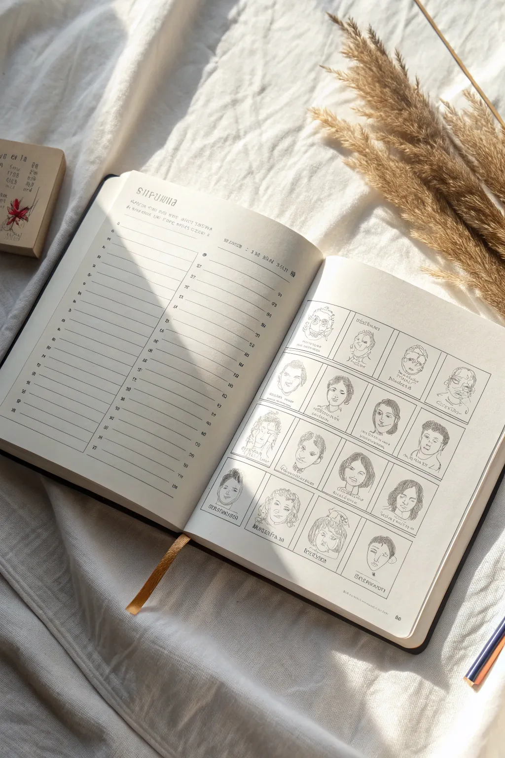
This creative journaling project combines organization with artistic practice, featuring a structured tracking page alongside a gallery of unique character portraits. The clean lines and minimal aesthetic make it a wonderful way to catalog facial features, expressions, and style variations in your sketchbook.
Detailed Instructions
Materials
- A5 or B5 Sketchbook (hardcover preferred)
- Fine liner pens (0.1mm, 0.3mm, and 0.5mm)
- Ruler or straight edge
- Pencil (HB or 2B)
- Eraser
- Gold ribbon bookmark (optional, for styling)
Step 1: Setting Up the Structure
-
Draft the left page layout:
Begin on the left-hand page. Use your ruler and pencil to lightly mark out a header section about 2 inches from the top. Below that, draw horizontal lines spaced about 1cm apart, extending almost to the bottom margin. -
Ink the left page lines:
Switch to a 0.3mm fine liner. Carefully trace over your horizontal pencil lines. For the vertical column divider, draw a single line about one-third of the way in from the left edge to create two columns (a narrower label column and a wider entry column). -
Add faux-calligraphy headers:
At the top of the left page, hand-letter a decorative title. You can mimic the runic or typewriter style shown in the image by keeping your vertical strokes heavy and horizontal strokes thin. Add smaller subtitles above the columns. -
Grid the right page:
On the right-hand page, use a pencil to measure out a grid for the portraits. You’ll want a 4×4 or 3×5 layout based on your page size. Aim for squares approximately 1.5 to 2 inches in size. Use your ruler to ensure the boxes are evenly spaced with small gutters between them. -
Ink the portrait frames:
Go over the pencil grid with your 0.1mm fine liner. Keep the lines crisp and delicate so they don’t overpower the drawings inside. I prefer a very thin line here to make the artwork pop.
Smudge Prevention
If you are left-handed or using slow-drying ink, place a piece of scrap paper under your drawing hand. Move it as you work across the grid to protect your lines.
Step 2: Drawing the Characters
-
Sketch the facial shapes:
Inside each box on the right page, lightly pencil in a basic head shape. Vary them intentionally—try ovals, squares, hearts, and triangles to suggest different personalities and ages. -
Add defining features:
Working row by row, sketch the facial features. Experiment with large eyes versus small ones, different nose bridges, and varying hairstyles. Don’t worry about perfect realism; this is about capturing character essence. -
Ink the portraits:
Use the 0.3mm pen for the main facial outlines (jaw, hair shape) and the 0.1mm pen for delicate internal details like eyelashes, wrinkles, or strands of hair. -
Apply texture and shading:
Add depth using hatching or stippling techniques. Use small, mindful strokes to texture the hair or add shadow under the chin and nose. -
Incorporate varied perspectives:
Ensure not all faces are looking straight ahead. Draw some in 3/4 view, some looking up, and others slightly down to keep the grid dynamic. -
Add character names:
At the bottom of each portrait box, write a small, fictional name or caption using a specialized font style. You can use a ‘blocky’ serif style to match the aesthetic of the left page.
Add Color Washes
Level up by adding a very pale watercolor wash (sepia or grey) over just one element of each character, like their hair or shirt, to create a cohesive spot-color effect.
Step 3: Finishing Touches
-
Erase guidelines:
Wait at least 10 minutes for the ink to fully cure to avoid smudging. Then, gently erase all visible pencil grid lines and sketch marks across both pages. -
Create a unified look:
Review the spread. If the left page feels too empty compared to the right, add small doodle embellishments or tiny icons next to the line numbers to balance the visual weight. -
Style the page:
For the final presentation, place a ribbon bookmark diagonally across the bottom corner or arrange dried florals nearby to enhance the vintage, academic atmosphere of the workbook.
Close your book knowing you’ve created a beautiful repository of character concepts ready for future stories

PENCIL GUIDE
Understanding Pencil Grades from H to B
From first sketch to finished drawing — learn pencil grades, line control, and shading techniques.
Explore the Full Guide
Try Nature “Specimen” Spreads
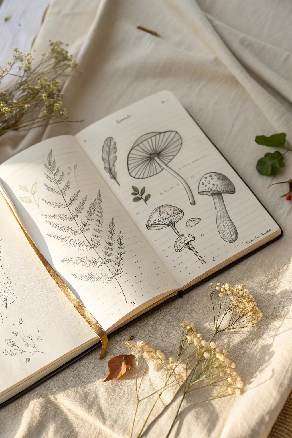
Capture the delicate beauty of the forest floor with this vintage-inspired botanical study. This project focuses on fine line work and observation, helping you create a scientific-style spread featuring elegant ferns and textured mushrooms.
How-To Guide
Materials
- Lined journal or sketchbook (cream or off-white paper preferred)
- Fine liner pens (sizes 0.05, 0.1, and 0.3)
- HB pencil for sketching
- Soft kneadable eraser
- Ruler (optional)
- Reference photos of ferns and mushrooms
Step 1: Planning the Layout
-
Establish the composition:
Begin by lightly marking where each specimen will sit on the double-page spread. Dedicate the entire left page to a large fern frond to create a focal point. -
Map out the mushrooms:
On the right page, sketch rough circles and ovals to indicate the caps of three distinct mushrooms: a large flat one, a taller rounded one, and a cluster of smaller ones. -
Add stem guidelines:
Draw faint, curved lines extending downwards from your mushroom caps to establish the flow and varying heights of the stems.
Pro Tip: Line Variation
Use a thicker pen (0.3) for outer contours and the thinnest pen (0.05) for shading and texture. This contrast prevents the drawing from looking flat.
Step 2: Drafting the Fern
-
Draw the main rachis:
Using your pencil, draw the central spine of the fern, giving it a gentle, natural curve towards the top right corner. -
Sketch the pinnae structure:
Mark the spacing for the side branches (pinnae) along the main stem. They should get progressively shorter as you reach the tip of the frond. -
Detail the leaflets:
Lightly sketch the individual leaflets on each branch. Don’t worry about perfection; natural variations make the drawing feel organic. -
Ink the outlines:
Switch to a 0.1 fine liner to trace your pencil lines. Use a slightly broken or jittery line for the edges of the leaves to suggest a serrated texture. -
Add the central vein:
Draw a very thin line down the center of each tiny leaflet. I find that lifting the pen pressure at the end of the stroke keeps it looking delicate.
Troubleshooting: Smudged Ink
If you accidentally smudge wet ink, don’t panic. Turn the smudge into a shadow or draw a fallen leaf over the mistake to incorporate it naturally.
Step 3: Illustrating the Mushrooms
-
Define the large cap:
On the right page, outline the large, flat mushroom cap with a 0.3 pen for a bolder look. Draw the radiating gills underneath, curving them slightly to show the cap’s concave shape. -
Texture the tall mushroom:
For the taller specimen on the right, draw the cap shape and add small, irregular spots or warts on top using a 0.05 pen. -
Shade the stems:
Use vertical hatching lines to shade the mushroom stems. Keep the lines closer together on one side to indicate a shadow source. -
Detail the gill structures:
Go back to the undersides of the caps. Use very fine, repetitive lines drawn from the center stem outward to the rim to create realistic gills. -
Add subtle elements:
Draw a small, detached leaf or a tiny seedling near the mushrooms to fill empty negative space and balance the composition.
Step 4: Finishing Touches
-
Erase pencil marks:
Wait until the ink is completely dry—usually about five minutes—then gently erase all underlying graphite sketches with a kneadable eraser. -
Deepen the shadows:
Look for areas where parts overlap, like where the fern stem meets a leaf. Add tiny stippling dots or cross-hatching here to add depth. -
Label your specimens:
Using your neatest handwriting or cursive, write the Latin or common names of the plants near each drawing. This enhances the ‘field guide’ aesthetic. -
Add a header:
Write a title or date at the very top of the page. Keeping the text small and centered maintains the clean, scientific look. -
Review and refine:
Scan the page for any lines that need connecting or areas that feel too light. A few extra dots for texture on the mushroom caps can make a big difference.
Now you have a timeless botanical spread that looks like it belongs in a Victorian explorer’s notebook
Use Thumbnail Grids for Composition
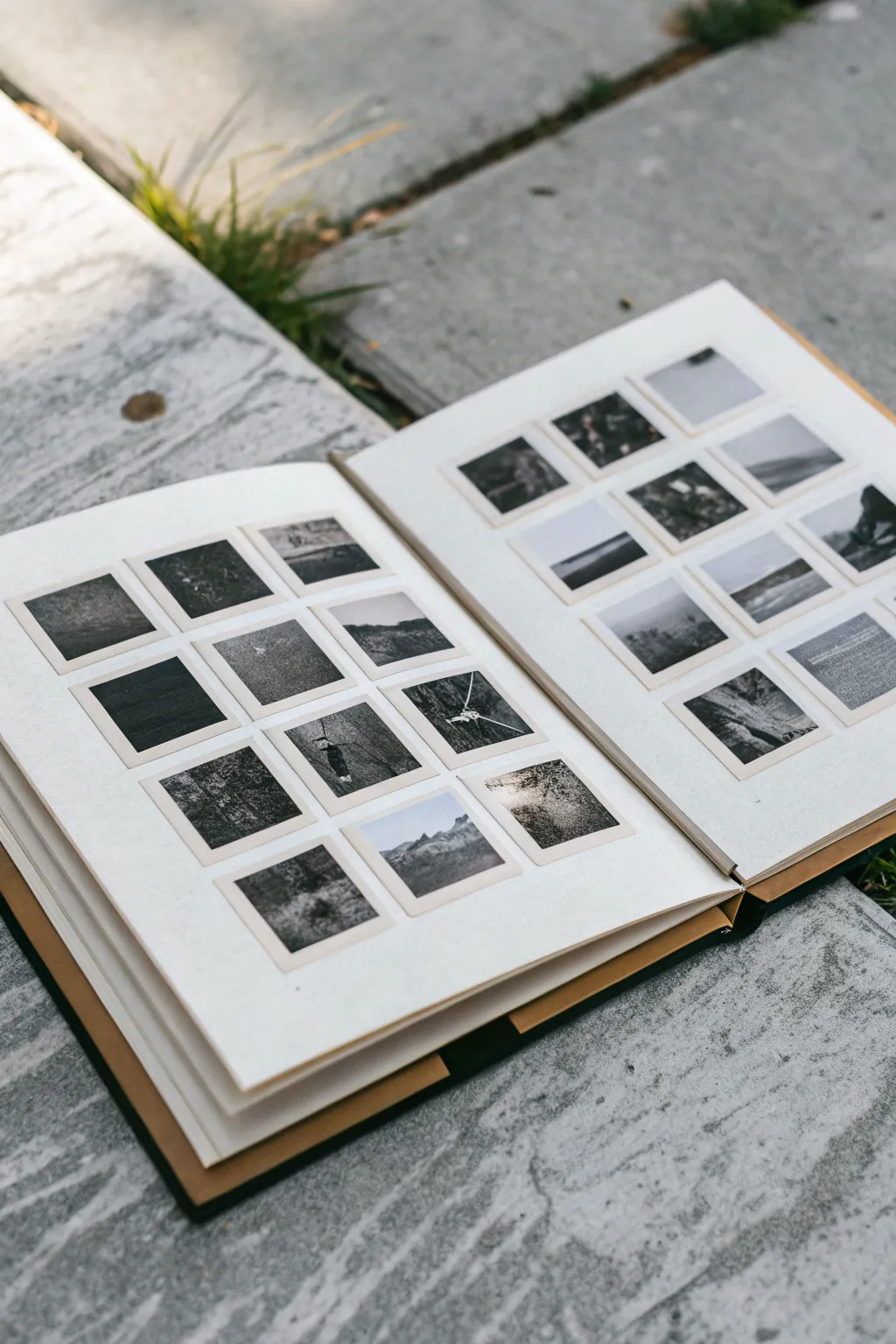
This project transforms a standard sketchbook spread into a stunning gallery of miniature compositions. By organizing small, square thumbnails in a precise grid, you can explore variations in value and landscape composition without the pressure of a full-scale drawing.
Step-by-Step
Materials
- Hardcover sketchbook (square or landscape format preferred)
- Ruler
- HB graphite pencil (for layout)
- Soft graphite pencils (2B, 4B, 6B) or charcoal pencils
- Fine-point black ink pen (optional)
- Kneaded eraser
- Blending stump or tortillon
- Calculator (optional, for grid math)
Step 1: Planning the Grid Layout
-
Measure your spread:
Open your sketchbook to a fresh two-page spread. Measure the usable height and width of one page, leaving a comfortable margin of about 1 inch around the outer edges. -
Calculate square size:
Decide on a square size for your thumbnails. Looking at the example, these are approximately 1.5 to 2 inches. Ensure you can fit a 3×4 or 4×4 arrangement on the page while maintaining consistent spacing. -
Mark the intervals:
Using your ruler and HB pencil, make tiny tick marks along the top and side of the page to indicate where each square begins and ends, including the gaps between them. I find a gap of 1/4 inch keeps things looking neat. -
Draw the grid:
Lightly draw the horizontal and vertical lines to create your grid. Press very gently so you can erase these guide lines later if desired, or simply ink over the squares.
Smudge Patrol
Graphite creates messy dust. Place a clean sheet of scrap paper under your hand as you draw to prevent smearing your finished squares while working on new ones.
Step 2: Creating the Frames
-
Define the borders:
Once your grid is penciled in, go over the perimeter of each individual square with a slightly darker pencil line or a fine-point pen. This creates a crisp ‘window’ for each sketch to live in. -
Repeat on the facing page:
Duplicate the exact same measurements and grid layout on the right-hand page so the spread feels cohesive and symmetrical. -
Clean up guidelines:
Erase any markings that fall in the ‘gutters’ (the spaces between the squares) so the frames stand out cleanly against the white paper.
Step 3: Filling the Thumbnails
-
Start with the horizon:
In your first square, sketch a simple horizon line. Vary the height—place it low for big skies or high for dominant foregrounds. Do not worry about details yet. -
Block in major shapes:
Using a 2B pencil, loosely block in the largest shapes: mountains, tree lines, or bodies of water. Treat these as silhouettes rather than detailed objects. -
Establish the darkest darks:
Switch to a softer pencil (4B or 6B). Identify where the deepest shadows should be in that tiny composition and fill them in boldly. This anchors the drawing immediately. -
Add mid-tones:
Use the side of your pencil or a blending stump to create grey mid-tones. Smudging slightly can create atmospheric effects like fog or distance. -
Create texture variations:
Experiment with different pencil strokes in different squares. Try vertical hatching for rain, stippling for foliage, or horizontal sweeps for calm water. -
Iterate on a theme:
I like to take one subject—like a lone tree or a mountain peak—and draw it three or four different ways in consecutive squares to test different angles. -
Refine the edges:
Use your kneaded eraser to lift out highlights within the squares, such as clouds or foam on waves. Ensure the drawings don’t spill over the border lines. -
Finalize the spread:
Continue filling each square until the grid is complete. Step back to view the spread as a whole; the contrast between the dark graphite and the clean white gutters is what makes this layout pop.
Tape it Down
For ultra-crisp edges, use low-tack artist’s tape or washi tape to mask off the grid lines before drawing. Peel it away at the end for perfect white borders.
Now you have a library of composition ideas ready to be expanded into larger artworks whenever inspiration strikes


Add Step-by-Step Breakdown Pages
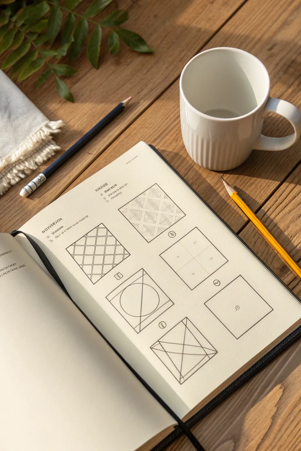
This project is a fantastic exercise in pattern recognition and line control, perfect for filling a sketchbook page with structured creativity. You will create a clean grid of six squares, each exploring a different geometric texture or spatial concept, ranging from cross-hatching to 3D perspective.
How-To Guide
Materials
- Sketchbook or drawing paper (A5 size recommended)
- Ruler or straight edge
- HB or 2B graphite pencil
- Fine-liner pen (0.3mm or 0.5mm, optional for inking)
- Clean eraser
Step 1: Setting Up the Grid
-
Measure the Page:
Begin by finding the center of your page to ensure your layout is balanced. Lightly mark the vertical and horizontal center lines. -
Draw the Frame:
Using your ruler, draw a large outer rectangle that leaves a comfortable margin on all sides of the paper. -
Divide into Squares:
Measure and divide this large rectangle into six equal squares—two wide and three tall. Ensure there is a small, consistent gap of about 5-10mm between each square for a clean, professional look. -
Add Labels:
If you wish to mimic the instructional look, leave room above the grid for a title and small circular number bubbles next to each square.
Clean Corners Pro-Tip
When ruling lines, lift your pencil swiftly exactly at the endpoint. Don’t linger, or you’ll deposit a graphite dot that makes corners look messy.
Step 2: Top Row: Pattern & Texture
-
Square 1: The Diamond Grid:
In the top-left square, use your ruler to draw diagonal lines from the bottom-left to top-right, spaced evenly. Repeat in the opposite direction to create a diamond lattice. -
Interlocking the Diamonds:
Starting from the top, draw a second set of lines close to the first ones to turn the single lines into narrow bands. This creates an ‘over-under’ woven effect. -
Square 2: Cross-Hatch Texture:
For the top-right square, draw a similar diagonal grid, but this time, fill every other diamond shape with tight vertical hatching lines. -
Cross-Hatching Detail:
Add horizontal hatching over the vertical lines in those same diamonds to create a denser, darker tone, contrasting with the empty white diamonds.
Level Up: Ink Wash
Apply a very light grey ink wash or watercolor to alternative sections of the grids (like the ‘woven’ diamonds) to add depth and make the patterns pop.
Step 3: Middle Row: Division & Space
-
Square 3: Simple Quadrants:
In the middle-right square, find the exact center. Draw a vertical line and a horizontal line through this center point to divide the square into four smaller, equal quadrants. -
Square 4: The Circle Study:
Move to the middle-left square (bottom of the opened page view). Draw a large circle centered within the square. It doesn’t need to be perfect; a hand-drawn circle adds character. -
Bisecting the Circle:
Draw a diagonal line cutting through the circle. Then, add a smaller, inner square that intersects with the circle’s perimeter, creating a study of overlapping geometric forms.
Step 4: Bottom Row: Perspective & Simplification
-
Square 5: Minimalist Box:
In the bottom-right square, simply draw a smaller square centered perfectly inside the frame. This creates a ‘frame within a frame’ effect. -
Square 6: The X-Box Construction:
In the final remaining square (bottom left), draw a large X connecting the corners. Then, draw a vertical line through the center. -
Adding Dimension:
Connect the bottom of the central vertical line to the midpoints of the side walls, creating triangular facets that suggest a pyramid or envelope shape. -
Review and Refine:
Go over your preferred lines with a slightly heavier pencil pressure or a fine-liner pen to make the geometry pop. -
Clean Up:
Once you are satisfied with the line weight, gently erase any smudges or initial guide marks that strayed outside your boxes.
Now you have a structured reference sheet that looks both technical and artistic.
Create a Prompt Index You Can Flip To
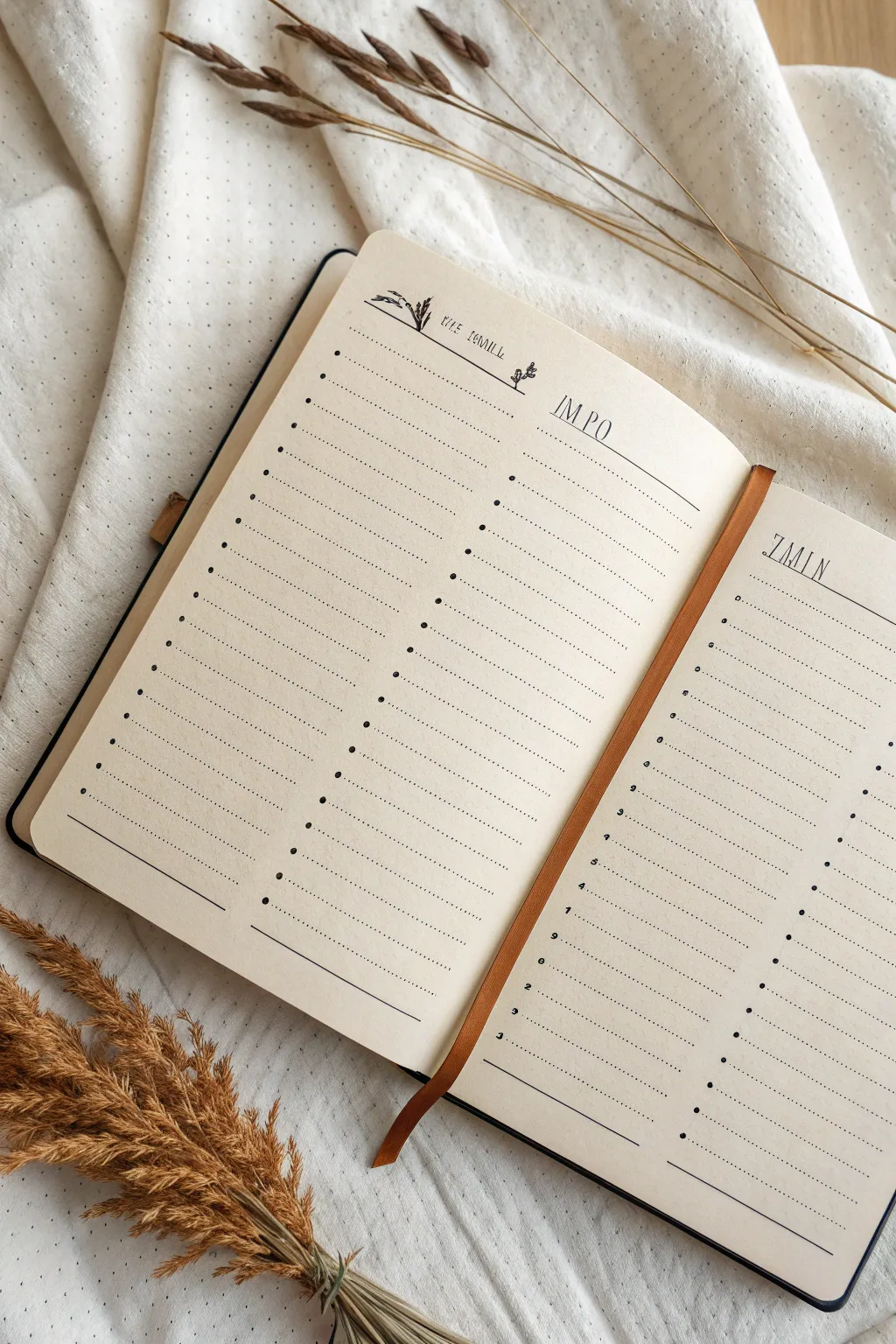
Create a beautifully minimalist index spread for your sketchbook to organize your drawing ideas and prompts. This layout features delicate botanical doodles, clean lines, and distinct columns for cataloging inspiration.
Step-by-Step Guide
Materials
- Blank notebook (cream or off-white paper recommended)
- Fine liner pen (black, 0.1mm or 0.3mm)
- Ruler
- Pencil
- Eraser
Step 1: Setting the Structure
-
Measure the margins:
Begin by deciding on the outer margins for your list. Measure about 1-2 cm from the outer edge of the page and lightly mark this vertical boundary with a pencil on both the left and right pages. -
Define the column width:
On the left page, you will need two main columns. Measure a vertical dividing line roughly one-third of the way across the page. This creates a narrower column on the left and a wider column on the right. -
Repeat for the right page:
Mirror this structure on the right page, keeping the layout symmetrical or adjusted to your preference. The example shows a similar list format. -
Draw the main header lines:
About 3 cm from the top edge of the paper, use your ruler to draw a horizontal line across the top of both pages where your list will begin. -
Mark the rows:
Using a ruler, make small tick marks down the vertical margin line every 0.8 cm or 1 cm to ensure your writing lines will be evenly spaced.
Step 2: Inking the Layout
-
Ink the structural lines:
Switch to your black fine liner. Carefully trace over your pencil header line. For the rows, you can choose to draw full horizontal lines or, for a cleaner look, use dotted lines. -
Create dotted rows:
I like to use a ruler as a guide but lift the pen rhythmically to create a dotted line for each row. This keeps the page looking airy and less rigid than a solid grid. -
Add bullet points:
At the start of each line in the left-hand column, draw a small, solid black dot. This acts as the bullet point for your list numbers or checkboxes. -
Ink the bottom border:
Draw a solid line at the very bottom of your list to close off the section, giving the table a finished appearance.
Uneven Dots?
If your dotted lines look messy, use a piece of graph paper underneath your page as a guide (if the paper is thin enough) to keep spacing consistent.
Step 3: Adding Headers and Decor
-
Pencil in the headers:
Above the top horizontal line, lightly sketch your headers. The example uses generic titles like ‘IMPO’ or ‘7MIN’. Choose headers that fit your needs, such as ‘THEMES’, ‘DATE’, or ‘SUBJECT’. -
Letter the titles:
Go over your pencil lettering with the fine liner. Use a tall, thin serif or sans-serif font to match the minimalist aesthetic. Keep the letters spaced out slightly for elegance. -
Sketch botanical accents:
On the top left of the left page, lightly sketch a small cluster of grass or wheat stalks. Keep them simple—just a few curved lines with feathery tops. -
Ink the doodles:
Trace the botanical sketches with your finest pen tip. Use quick, flicking motions to capture the texture of the grass tips without overworking them. -
Add tiny details:
Draw a small, solitary plant doodle near the center of the header line to break up the negative space. -
Erase guidelines:
Wait for the ink to dry completely to avoid smudging. Then, gently erase all pencil marks, leaving crisp black lines on the cream paper.
Add Functionality
Color-code your bullet points with markers to categorize prompts by difficulty or medium, turning your simple list into a smart data tracker.
Now you have a structured yet artistic space to catalog your next great ideas
Draw Stories as Mini Panel Sequences
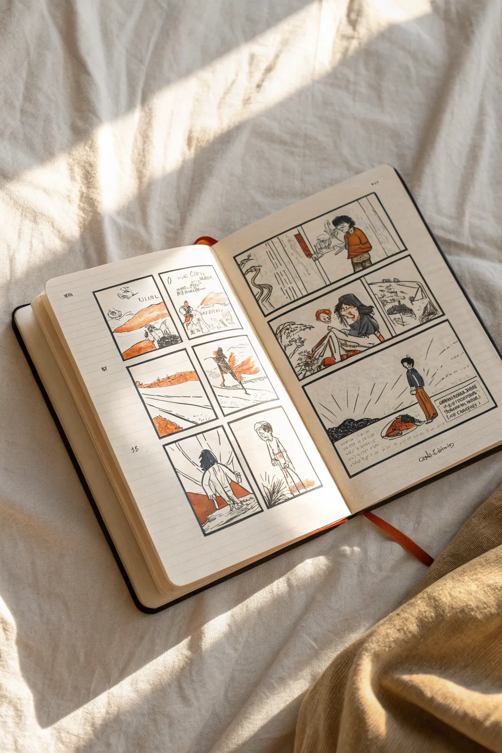
Capture the fleeting moments of your day or dreamscapes by breaking them down into simple, cinematic panel sequences. This project transforms a standard sketchbook spread into a dynamic narrative using loose ink lines and striking pops of terracotta pencil.
Detailed Instructions
Materials
- A5 or A4 sketchbook (preferably with cream or off-white paper)
- Fine liner pen (0.3mm or 0.5mm, black)
- Fountain pen or dip pen (optional, for varying line weight)
- Terracotta or rust-orange colored pencil
- Ruler (optional, freehand lines add character)
- HB pencil for drafting
Step 1: Setting the Scene
-
Select your narrative:
Choose a simple event from your day, a dream, or a micro-story. You don’t need a complex plot; even making coffee or a walk in the wind works beautifully as a sequence. -
Draft the layout:
Using your HB pencil, lightly sketch out a grid of rectangles across both pages. Don’t worry about perfect alignment—wobbly borders add to the organic, journal aesthetic seen in the example. -
Vary panel sizes:
Create visual interest by mixing square panels with wider, cinematic rectangles. Try placing six smaller panels on the left page and three to four larger, detailed panels on the right page.
Step 2: Inking the Framework
-
Commit to the borders:
Go over your pencil frames with a fine liner. I like to double-line some edges or let the corners cross over slightly to keep it looking sketched rather than engineered. -
Sketch the key action:
Lightly pencil in your characters and backgrounds. Keep figures gestural—think stick figures with volume. Focus on body language rather than facial details. -
Ink the drawings:
Use your pen to finalize the drawings. Use quick, scratchy strokes for textures like grass or hair, and cleaner lines for horizons and structures. -
Add dialogue bubbles:
If your story needs words, draw small, irregular speech balloons or simply write floating text near the characters. Keep the text small and unintrusive.
Loose Lines
Don’t rest your palm heavily on the paper. Holding the pen higher up the barrel encourages looser, more energetic lines that capture movement better.
Step 3: Atmospheric Coloring
-
Select your accent color:
Pick a single colored pencil, like a warm terracotta or rust orange. Limiting your palette to one color plus black ink creates a cohesive, sophisticated look. -
Block in key elements:
Apply the color selectively. Fill in a character’s shirt, a rolling hill, or a specific prop. Leave plenty of white space to let the paper allow the scene to breathe. -
Create texture with pencil:
Change your hand pressure. Press hard for bold, opaque shapes (like a sun or clothing) and use a light, side-shading motion for softer background elements like clouds or ground. -
Add movement lines:
Use your fine liner to add ‘action lines’ near moving objects or radiating lines from the sun to simulate light and energy.
Creative Expansion
Try a different monochromatic color for each new story or page spread to categorize your journal by mood—blue for sad days, yellow for happy ones.
Step 4: Finishing Touches
-
Annotate the margins:
Handwrite small notes, dates, or timestamps in the empty spaces around the panels. This turns the drawing into a diary entry. -
Review and refine:
Erase any visible pencil grid lines that distract from the ink. If a line feels too thin, go back and thicken it to add weight to the composition. -
Scuff it up:
To match the reference’s messy charm, don’t be afraid to scribble a bit of shading or hatching in the corners of the panels.
Close your book knowing you have captured a fleeting narrative in a style that is uniquely yours
Build a Creative Block Emergency Section
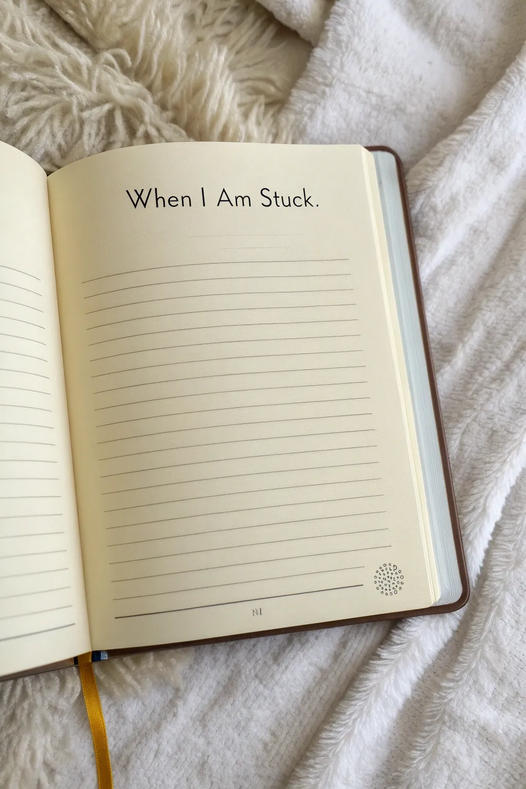
This project transforms a standard blank journal page into a structured sanctuary for overcoming artistic hurdles. Featuring clean typography and minimalist layout design, this page serves as a dedicated space to list your go-to strategies for when inspiration runs dry.
How-To Guide
Materials
- Blank journal (lined or unlined)
- Black fine-liner pen (0.3mm or 0.5mm)
- Ruler (preferably clear acrylic)
- Pencil (HB)
- Eraser
- Computer with word processing software (optional, for font reference)
- Printer paper (optional)
- Transfer paper (optional)
Step 1: Planning the Layout
-
Select your page:
Turn to page 81 or a similarly arbitrary page in the middle of your sketchbook. Choosing a page deep in the book signifies that this is a resource you can turn to at any point in your journey. -
Draft the header placement:
Using a ruler, measure about 1.5 inches down from the top edge of the page. Make a very light pencil mark at the center of the page to guide your title text. -
Pencil in the title:
Sketch the words ‘When I Am Stuck.’ in a clean, sans-serif font. Aim for a font height of about 0.5 inches. Center the text so there is equal white space on the left and right margins. -
Mark the lines:
If your journal is unlined, use your ruler to mark out spacing for writing lines. Start about 1 inch below the title. Mark faint ticks every 0.25 inches (6mm) down the page, leaving a 1-inch margins at the bottom.
Step 2: Inking the Header
-
Outline the letters:
Using your fine-liner pen, carefully trace over your pencil sketch of the title. Keep your hand steady and maintain consistent pressure for even line weight. -
Refine the typography:
Go back over the letters to thicken the vertical strokes slightly if you want a subtle calligraphy effect, or keep them monoline for a modern look. Ensure the period at the end is distinct. -
Let the ink set:
Pause for a moment to let the ink dry completely. I usually give this at least three to five minutes to avoid any heartbreaking smudges. -
Erase guidelines:
Gently erase the pencil marks under the title, brushing away the eraser crumbs carefully so you don’t wrinkle the paper.
Clean Lines Hack
If you struggle with straight lines even with a ruler, put a piece of lined graph paper underneath your page. If the paper is thin enough, the grid will show through as a perfect guide.
Step 3: Creating the Structure
-
Draw the horizontal lines:
Place your ruler on the first tick mark below the title. Draw a straight line across the page, leaving a uniform margin on the left and right sides (about 0.5 to 0.75 inches). -
Complete the page body:
Continue drawing horizontal lines down the page at each marked interval. Maintain consistent pressure so every line has the same opacity. -
Add a footer line:
Draw one final, slightly thicker line near the bottom of the page, separating the main writing area from the footer space. -
Insert page number:
In the center of the space below the bottom line, neatly print the number ’81’ (or your chosen page number) in a small, serif font.
Wobbly Text?
If your hand lettering looks shaky, don’t worry. Type the title on your computer in a font you like, print it out, and use transfer paper to trace the perfect outline directly onto your page.
Step 4: Final Details
-
Draw the corner graphic:
In the bottom right corner, just above the bottom-most line, pencil in a small circle about the size of a dime. -
Detail the mandala:
Fill this circular area with tiny stippled dots and very small open circles. Keep the density higher in the center and looser at the edges to create a radiating effect. -
Review and clean:
Scan the entire page for any stray pencil marks or uneven lines. Touch up any faint areas with your pen. -
Mark the spot:
Place a ribbon bookmark or a sticky tab on this page so you can find it instantly during a creative emergency.
Now you have a pristine, inviting space ready to be filled with your personal toolkit for getting unstuck


Have a question or want to share your own experience? I'd love to hear from you in the comments below!