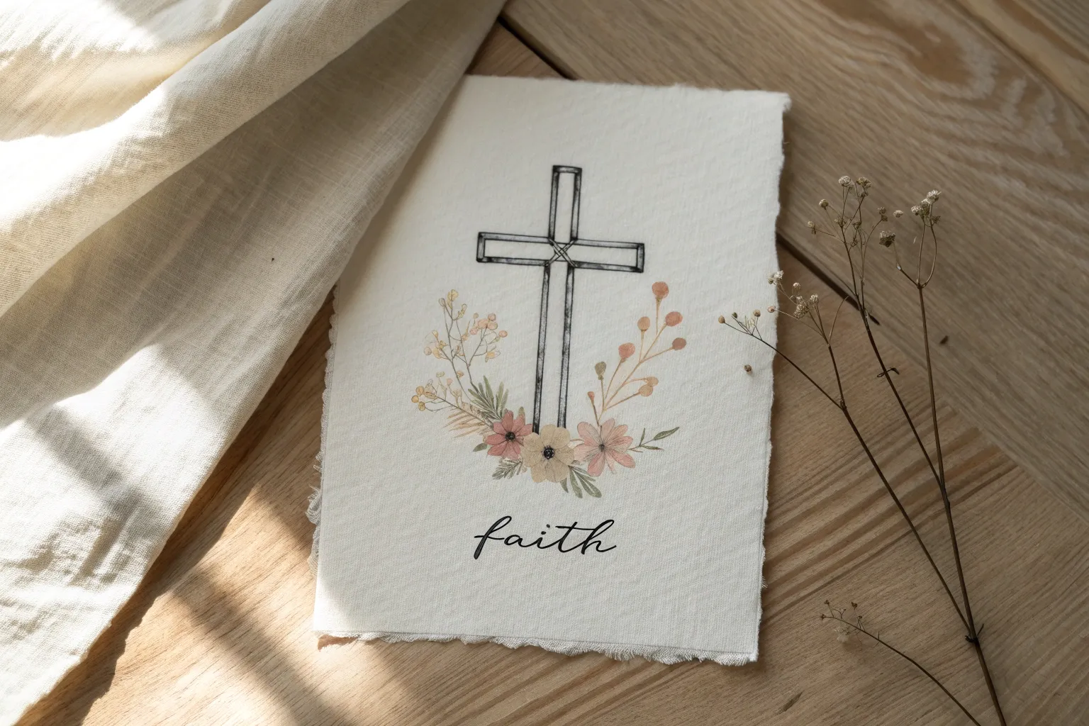
When I need to quiet my mind, I reach for my sketchbook and draw faith symbols that feel like little prayers on paper. These faith drawing ideas go from simple, soothing line work to bold, meaningful scenes you can really sink into.
Wooden Cross Sketch Study
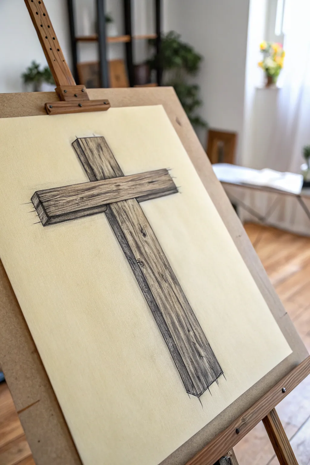
This sketch study focuses on capturing the rugged texture and three-dimensional form of a simple wooden cross. The result is a grounded, evocative piece that emphasizes the natural grain and weight of the timber through careful shading.
Step-by-Step Tutorial
Materials
- Cream or toned drawing paper (A3 or 11×14 inches recommended)
- HB graphite pencil for initial sketching
- 2B and 4B graphite pencils for shading and textures
- Ruler or straight edge
- Kneaded eraser
- Fine-liner pen (black, 0.3mm or 0.5mm) – optional for darkening contours
- Blending stump (tortillon)
Step 1: Constructing the Form
-
Establish the vertical beam:
Begin by lightly drawing two long, parallel vertical lines down the center of your page. Leave plenty of space at the top and bottom. This defines the width of the main upright post. -
Position the horizontal beam:
Determine where the crossbar will sit—usually about one-third of the way down from the top. Draw two horizontal parallel lines that intersect the vertical ones. Ensure the width of this beam mimics the width of the vertical one for consistency. -
Add perspective depth:
To give the cross a 3D appearance, add a third line to the left of the vertical beam and below the horizontal beam. Connect these with short diagonal lines at the corners to show the thickness of the wood planks. -
Define the ends:
Close off the ends of the beams. Instead of perfect straight lines, use slightly jagged or uneven strokes to suggest rough-cut timber rather than polished lumber. -
Refine the intersection:
Erase the internal lines where the two beams overlap. Decide which beam is in front—typically the horizontal beam is nailed onto the front of the vertical one—and ensure the lines reflect this overlapping structure.
Step 2: Adding Wood Texture
-
Base layer shading:
Switch to your 2B pencil. Lightly shade the side panels (the thickness we added earlier) to immediately establish a light source coming from the front-right. These side planes should be darker than the front face. -
Draw grain lines:
On the front face of the cross, draw long, flowing lines running parallel to the length of each beam. These shouldn’t be perfectly straight; let them waive and wobble slightly to mimic natural wood grain. -
Create knots and imperfections:
Pick a few spots, perhaps near the intersection or midway down the post, to add wooden knots. Draw a small, dark oval and wrap your grain lines around it like water flowing around a rock. -
Deepen the cracks:
Use a 4B pencil to draw sharper, darker cracks within the grain. I like to press harder at the start of a crack and lift the pencil pressure as I taper it off. -
Enhance the shadow side:
Go back to the side planes (the depth) and darken them significantly using the 4B pencil. Add vertical streaks here too, but keep this area quite dense to contrast with the lit face.
Uneven Grain lines?
If your wood grain looks too uniform or like stripes, break the lines up. Vary your pressure mid-stroke and intentionally stop and start lines abruptly to mock organic growth.
Step 3: Final Details & Weight
-
Cast shadow:
Under the horizontal crossbar, add a dark cast shadow onto the vertical beam. This crucial step separates the two pieces of wood and adds realistic depth. -
Rough edges:
Go over the outer perimeter. Add intentional ‘splinters’ or loose sketch lines extending off the ends of the beams, as seen in the reference, to give it that artistic, study-sketch vibe. -
Contrast check:
Squint at your drawing. Identify the darkest areas—usually the cracks, knots, and the side planes—and deepen them one last time with your softest pencil. -
Subtle blending:
Use a blending stump (or your finger) to very lightly smudge the grain lines in the direction of the wood. Don’t over-blend; you want to keep the texture visible, just slightly softened. -
Final clean up:
Use a kneaded eraser to pick up any graphite smudges from the background, keeping the paper around the cross clean to make the image pop.
Paper Choice Matters
Using toned tan or cream paper instantly adds warmth. You can then use a white charcoal pencil to add highlights on the lightest parts of the wood for extra dimension.
Now you have a beautifully textured study that captures both strength and simplicity in its form


Praying Hands in Realistic Pencil
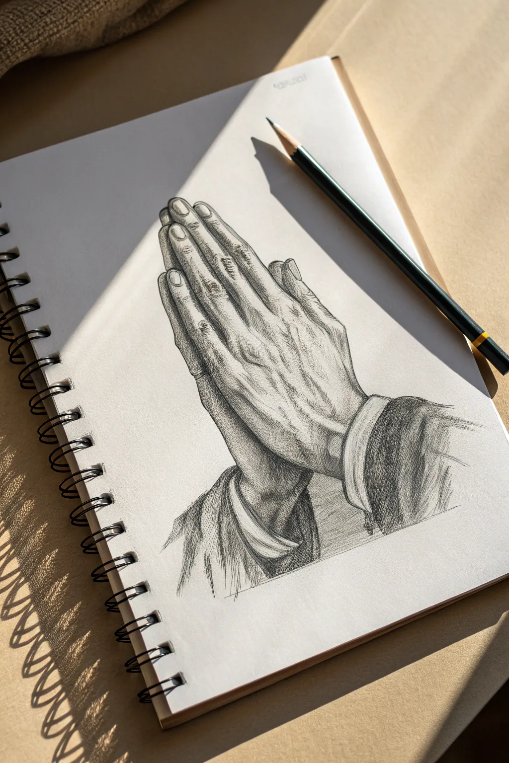
Capture the solemn beauty of faith with this detailed pencil study of praying hands. This project focuses on realistic anatomy, emphasizing the texture of aging skin and the play of light and shadow.
Detailed Instructions
Materials
- Spiral-bound sketchbook (smooth or vellum finish)
- Graphite pencils (HB for sketching, 2B and 4B for shading, 6B for deep darks)
- Kneaded eraser
- Pencil sharpener (or craft knife for long points)
- Blending stump or tissue
- Reference photo of Albrecht Dürer’s ‘Praying Hands’ (optional but helpful)
Step 1: Structural blocking
-
Establish the axis:
Begin with a light HB pencil. Draw a diagonal line roughly 45 degrees rising to the right to establish the central axis where the palms meet. -
Block in the palms:
Visualize the palms as a large, elongated wedge shape. Don’t worry about fingers yet; just get the mass of the hands centered on your axis line. -
Map the fingers:
Lightly mark the knuckles. Extend lines for the fingers, noting that the middle finger is the longest and the pinky curves inward slightly. Keep lines faint so they can be erased easily. -
Detail the thumbs:
Draw the visible thumb on the left side, pressing against the index finger. Pay attention to the knuckle joint’s placement, which sits lower than the finger knuckles. -
Sketch the cuffs:
Add the curve of the shirt cuffs at the wrists. These should look like ellipses wrapping around the arm to suggest volume.
Fixing Flat Hands
If hands look flat, your shadows are too uniform. Darken creases specifically where skin touches skin to force depth.
Step 2: Anatomical detailing
-
Refine the outline:
Go over your sketch using a slightly sharper HB or B pencil. Define the bumps of the knuckles and the slight indentations between fingers. -
Add fingernails:
Sketch the fingernails, ensuring they curve with the finger’s volume. Leave a tiny gap between the nail and the skin to show the cuticle. -
Map the veins:
Draw faint, wandering lines across the back of the hand to map out the prominent veins. These shouldn’t be straight; let them branch naturally. -
Mark skin folds:
I like to lightly indicate the major wrinkles at the knuckles and wrist joints now, as these will guide your shading later.
Aged Paper Effect
Lightly brush a tea-stained sponge over the paper before drawing (let dry fully!) to give the artwork an antique, spiritual feel.
Step 3: Shading and texture
-
Base tone application:
Using the side of a 2B pencil, lay down a soft, even layer of graphite over the shadowed areas (between fingers and under the hand). -
Define the fingers:
Switch to a 4B pencil. Darken the crevices between the fingers to separate them. The deepest shadows are where the fingers press tightly together. -
Modeling the veins:
Shade around the vein lines you drew earlier, not directly on them. This negative shading makes the veins look raised and three-dimensional. -
Highlight removal:
Take your kneaded eraser and pinch it into a fine point. Gently lift graphite off the tops of the veins and knuckles to create highlights. -
Adding skin texture:
With a sharp HB pencil, draw tiny, cross-hatching lines over the knuckles to simulate the wrinkles of aging skin. -
Shading the sleeves:
Use broad, sweeping strokes with a 4B or 6B pencil for the sleeves. The fabric should look darker and rougher than the skin, creating contrast. -
Deepening contrast:
Identify the darkest points—under the thumbs and inside the cuffs—and hit them with your 6B pencil for maximum depth. -
Refining the cuffs:
Add clean, parallel lines to the cuff edge to suggest stitching and structure, keeping the white paper bright for the shirt fabric. -
Final clean up:
Use the eraser to clean up any smudges around the outer border, sharpening the silhouette against the white page.
Step back and admire the serene depth achieved through your careful shading


Scripture Lettering in a Banner
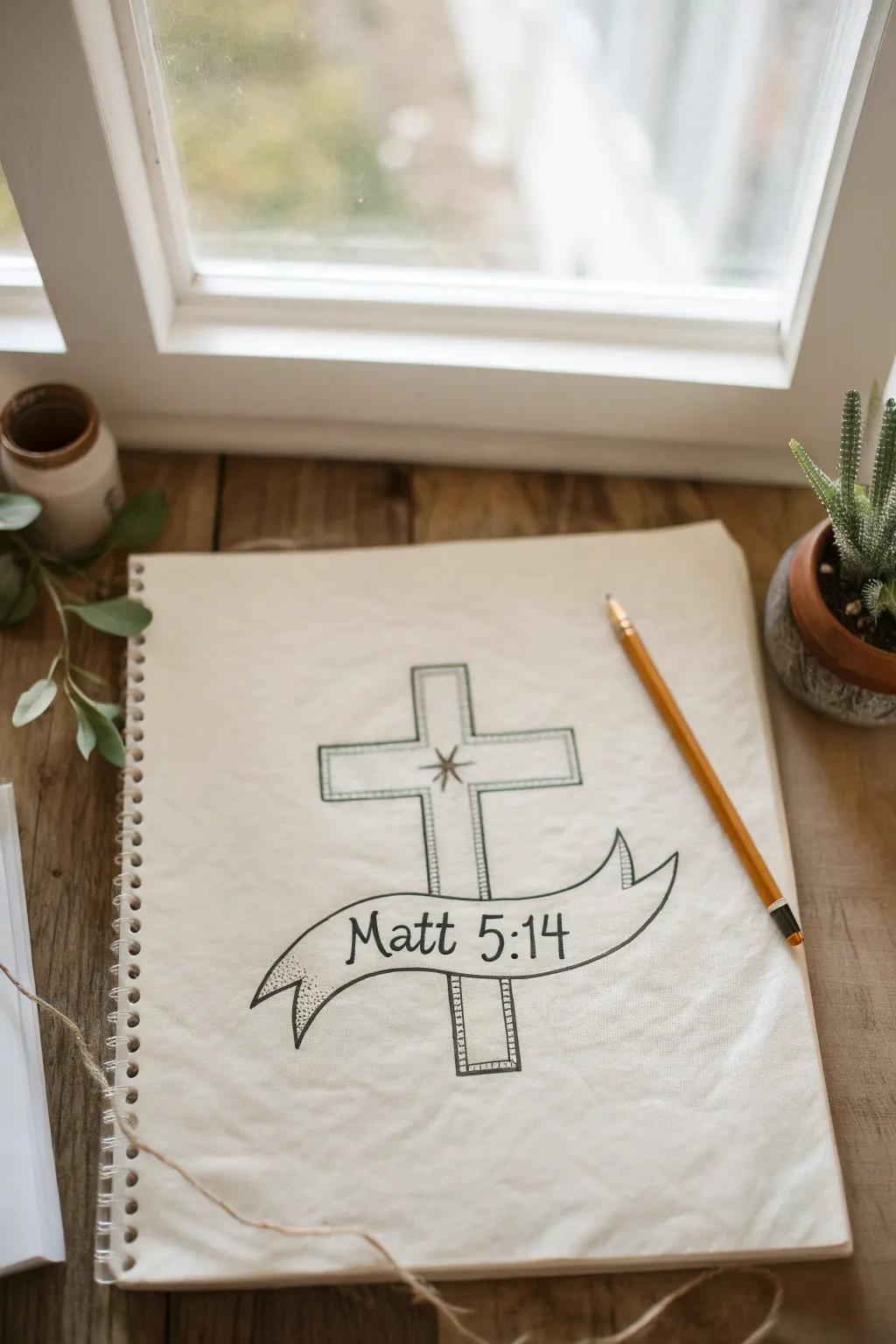
Combine a timeless symbol of faith with favorite verses using this clean line art technique. This sketch features a sturdy outlined cross draped in a flowing banner, creating a perfect focal point for Bible journaling or sketchbook meditation.
Step-by-Step Guide
Materials
- Sketchbook or drawing paper (heavyweight preferred)
- HB or 2B graphite pencil
- Fine-point drawing pen (black ink)
- Ruler or straight edge
- Eraser (kneaded or vinyl)
Step 1: Drafting the Structure
-
Establish the centerline:
Begin by lightly drawing a vertical line down the center of your page to guide the cross’s placement. This ensures symmetry right from the start. -
Draw the cross framework:
Using your ruler, sketch the main vertical beam and the horizontal crossbeam. Keep the lines light and erasable, focusing on getting the proportions pleasing to the eye. -
Create the outline thickness:
Add parallel lines around your initial framework to give the cross thickness. Leave the intersecting area in the center open for now. -
Sketch the banner path:
Draw a gently curving line across the lower third of the cross. This will be the top edge of your banner. Visualize how it flows in front of the vertical beam. -
Complete the banner shape:
Draw the bottom edge of the banner parallel to the top line. Add the folded ends (the ‘tails’) flipping backward and notched at the tips for a classic scroll look. -
Refine overlaps:
Erase the parts of the cross that are covered by the banner. It should look like the banner is physically wrapping around the front of the wood.
Curve Confidence
Draw the banner curves using your whole arm, not just your wrist. This creates smoother, more flowing lines for the ribbon.
Step 2: Inking and Details
-
Inking the main lines:
Switch to your fine-point pen. Carefully trace over your finalized pencil lines for the cross outline and the banner ribbon. Keep your hand steady for crisp edges. -
Double-outline the cross:
Draw a second, inner line inside the cross shape, roughly a few millimeters from the edge. This ‘double stroke’ effect adds a beautiful decorative border. -
Add corner details:
Connect the corners of the inner border to the outer border with tiny diagonal lines, creating a beveled or framed appearance. -
Draw the central star:
At the intersection of the crossbeams, draw a simple multi-pointed star or gleam. I often keep this minimal—just four main points and four smaller ones. -
Thicken the outlines:
Go back over the outermost lines of the cross and the banner to give them slightly more visual weight than the inner details. -
Shade the banner tails:
Use stippling (tiny dots) inside the folded-back parts of the banner tails. Denser dots near the fold create a shadow effect, adding depth to the ribbon.
Step 3: Lettering and Finalizing
-
Lightly pencil the text:
Inside the banner, lightly write out ‘Matt 5:14’ (or your chosen verse reference). Spacing is key here, so center it by starting with the middle character. -
Ink the lettering:
Go over your lettering with the pen. A serif font style (with little feet on the letters) complements the traditional look of the cross perfectly. -
Add hatching to the cross:
In the space between your double border lines on the cross, add small, evenly spaced perpendicular hash marks. This texture resembles stitching or architectural detail. -
Erase pencil guides:
Wait until the ink is completely dry to avoid smudging. Then, gently erase all remaining graphite lines to reveal the clean artwork. -
Final assessment:
Check your line weights. If the banner needs to pop more, slightly thicken its bottom outline to simulate a shadow underneath.
Ink Smudges?
If you smudge fresh ink, turn it into a shadow with stippling dots, or thicken the line slightly to cover the mistake.
Now you have a beautifully hand-drawn reminder of scripture that looks timeless in any journal


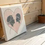
Heart and Cross Minimal Line Art
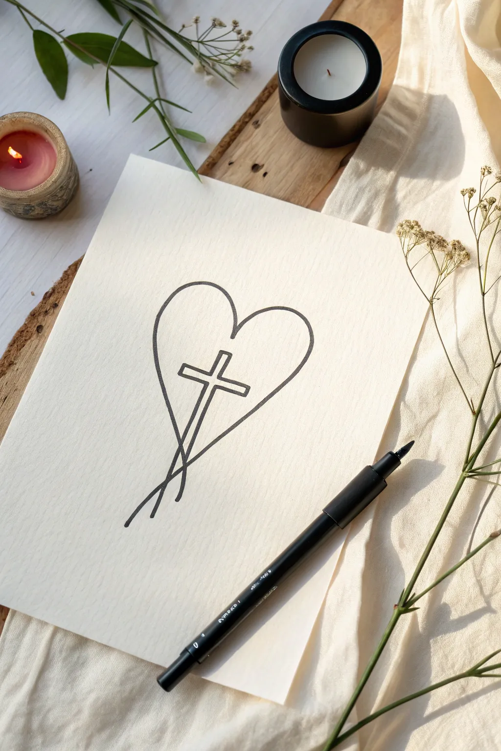
This minimalist line art piece combines two powerful symbols into a singular, fluid design that speaks to the connection between love and faith. Using simple, continuous-style lines, you’ll create an elegant and understated artwork perfect for hanging in a quiet corner or gifting to a friend.
Step-by-Step Tutorial
Materials
- High-quality textured paper (approx. A5 size, cream or off-white)
- Black fine liner pen (0.5mm to 0.8mm)
- Pencil (HB or H)
- Soft gum eraser
- Ruler (optional, for cross alignment)
Step 1: Planning and Sketching
-
Position your paper:
Set your textured paper on a flat, clean surface. Ensure you have good lighting so you can see the faint pencil lines you are about to make. -
Find the center:
Visualize the center of your page. Since this designs hangs vertically, you want the intersection of the heart and cross to sit slightly above the true center point. -
Draft the cross’s vertical beam:
Using your pencil very lightly, draw a vertical line that tilts ever so slightly to the left. This shouldn’t be perfectly straight up and down; a slight diagonal adds dynamism to the finished piece. -
Mark the crossbar:
Lightly sketch the horizontal bar of the cross. Place it about one-third of the way down the vertical line. The crossbar should be perpendicular to your tilted vertical line. -
Shape the left side of the heart:
Start your pencil sketch at the top center indentation of the heart. Curve upwards and outwards to the left, bringing the line down to cross over the vertical beam of the cross near the bottom. -
Shape the right side of the heart:
Repeat the curve on the right side. Start at that top center point, curve out, and bring the line down inward. This line should cross *behind* the cross’s vertical beam in your sketch logic, creating a tail that extends past the other line. -
Refine the intersection:
Examine where the bottom of the heart lines cross. In this design, the lines don’t just meet; they extend past each other to look like loose stems. -
Outline the cross thickness:
Now, sketch the actual thickness of the cross around your initial guide lines. Instead of a single stick figure lines, give the cross dimension by drawing a hollow outline. Keep it slender.
Step 2: Inking the Design
-
Test your pen:
On a scrap piece of paper, test your black fine liner to ensure the ink is flowing smoothly and isn’t blotchy. -
Ink the cross first:
Carefully trace the outline of the cross with your pen. Keep your hand steady and maintain consistent pressure for a clean, bold line. -
Start the heart outline:
Begin inking the heart from the top indentation. Move smoothly along the left curve. When you reach the crossbar, stop your line momentarily if you want the heart to appear ‘behind’ it, or draw right over it if the cross is behind. -
Decide on overlaps:
For this specific look, draw the heart lines firmly. Notice in the example how the heart outline passes *behind* the left arm of the cross but *over* the vertical beam. This weaving effect creates depth. -
Complete the left curve:
Continue the left heart line all the way down. Let it extend past the bottom point, straight down into a ‘tail’ that fades slightly at the end. -
Ink the right curve:
Trace the right side of the heart. Bring this line down to intersect the first tail line near the bottom. -
Finish the tails:
Ensure the two lines at the bottom cross elegantly. They should look like the gathered stems of a flower bouquet. -
Check line weight:
Look over your inked lines. If any areas look too thin or shaky, very carefully go over them precisely once more to crispen the edge.
Steady Hands
Work from your shoulder, not your wrist, to create smoother long curves for the heart shape. Exhale while drawing your longest lines.
Step 3: Finishing Touches
-
Let the ink cure:
This is crucial: wait at least 15 to 20 minutes for the ink to dry completely. Textured paper can hold wet ink in its grooves longer than smooth paper. -
Erase pencil marks:
Once totally dry, gently run your soft gum eraser over the entire design to lift away the graphite guides. Hold the paper taut so it doesn’t wrinkle. -
Final inspection:
Brush away the eraser crumbs and admire the clean contrast of the black ink against the cream paper.
Watercolor Wash
Once dry, gently paint a very pale wash of gold watercolor inside the cross or the heart for a subtle, glowing highlight.
Place your finished drawing in a simple wood frame to complement its natural, minimalist aesthetic
BRUSH GUIDE
The Right Brush for Every Stroke
From clean lines to bold texture — master brush choice, stroke control, and essential techniques.
Explore the Full Guide
Faith Moves Mountains Landscape
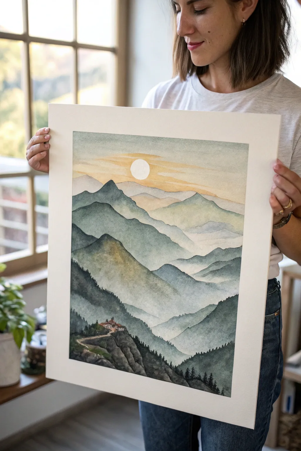
This serene landscape captures the majesty of fading mountain ranges, symbolizing the vastness of faith through atmospheric perspective. Using soft watercolor layers that drift from sage greens to warm sunset hues, you’ll create a piece that feels both grounding and ethereal.
How-To Guide
Materials
- Cold press watercolor paper (140lb/300gsm), approx. 12×16 inches
- Watercolor paints: Indigo, Payne’s Grey, Sap Green, Burnt Sienna, Yellow Ochre, and a touch of Ultramarine Blue
- Flat wash brush (1 inch)
- Round brushes (sizes 4, 8, and 12)
- Fine liner or rigger brush (size 0 or 1)
- Masking fluid
- Painters tape
- Pencil (HB or H)
- Two water jars
- Paper towels
Step 1: Preparation and Sketching
-
Secure the paper:
Tape down all four edges of your watercolor paper to a board with painters tape. This ensures a clean white border and keeps the paper flat during wet washes. -
Initial sketch:
Lightly sketch the contour lines of the mountain ranges. Start from the bottom foreground and work upward, creating jagged, uneven lines that overlap. Draw the circular sun near the top center and outline the small cliffside building in the lower left foreground. -
Protect the sun:
Apply a thin layer of masking fluid over the circle of the sun. Let this dry completely so the white of the paper remains pristine while you paint the sky.
Control Your Bloom
To keep misty valleys smooth and avoid ‘cauliflower’ blooms, ensure the water you use to fade out the mountain bottoms is clean, not dirty paint water.
Step 2: Painting the Sky
-
Wet-on-wet sky base:
With your large flat brush, wet the entire sky area with clean water, stopping just at the edge of the furthest mountain range. -
Adding warmth:
While the paper is wet, drop in a very diluted wash of Yellow Ochre mixed with a tiny bit of Burnt Sienna near the horizon line. Let it bleed upwards. -
Cooling the upper sky:
Near the top edge, introduce a very faint, watery mix of Indigo or Payne’s Grey. Tilt your board slightly to encourage the cool gray to blend softly downward into the warm yellow, creating a gentle gradient. -
Sun streaks:
Before the wash dries, use a clean, slightly damp brush to lift out horizontal streaks across the sun area, mimicking thin clouds drifting past the light source.
Step 3: Building the Mountain Layers
-
First range (furthest):
Wait for the sky to completely dry. Mix a very pale, watery wash of Payne’s Grey and a touch of Yellow Ochre. Paint the furthest mountain range. The color should be extremely transparent to suggest distance. -
Second range:
Once the previous layer is dry, mix a slightly stronger value using Indigo and a hint of Sap Green. Paint the next range down, ensuring the top edge is crisp against the pale mountain behind it. -
Creating misty effects:
For the middle ranges, paint the top edge cleanly, but as you move down the mountain shape, quickly rinse your brush and drag clean water along the bottom edge to fade the color out into white. This creates the look of mist settling in the valleys. -
Adding texture:
As you move to closer mountains, darken your mix with more Indigo and Sap Green. While the paint is still damp, dab in touches of slightly darker pigment near the peaks to suggest crags and shadows. -
The green mid-ground:
For the prominent mountain in the middle-left, warm up your green mix with a little Burnt Sienna. Paint this shape with more opacity, letting it dominate the mid-ground composition.
Add Metallic Touches
Use gold watercolor or metallic ink to outline the sun or highlight the path to the cliff monastery for a subtle, sacred glow.
Step 4: The Foreground and Detail
-
Darkest values:
Mix a concentrated dark green using Indigo, Sap Green, and a touch of Payne’s Grey. Paint the closest foreground hills on the left and right. The contrast needs to be strongest here. -
Pine tree texture:
Using the tip of your round brush (size 4) or a rigger brush, stipple the top edges of these foreground hills to create tiny, jagged vertical strokes that resemble distant pine trees silhouetted against the mist. -
Painting the cliffside building:
Switch to your smallest brush. Paint the roof of the small building with Burnt Sienna. Use a grey mix to define the walls and the winding path leading up to it. -
Rock details:
Use a nearly dry brush with dark grey pigment (dry brushing) to drag texture vertically down the cliff face under the building. This rugged texture contrasts beautifully with the soft mountains above. -
Final touches:
Once everything is bone dry, gently rub off the masking fluid from the sun. If the white is too stark, glaze over it with a very faint, watery yellow wash. -
Reveal the border:
I always find this part satisfying—slowly peel away the painters tape at a 45-degree angle to reveal your crisp, clean edges.
Step back and admire the peaceful depth you have created in your personalized mountain landscape
Be the Light Lightbulb Drawing

Illuminate your sketchbook with this charming drawing that transforms a standard lightbulb into a symbol of warmth and love. The textured paper and soft shading give the glass a realistic glow, while the heart-shaped filament adds a unique, faithful twist.
Detailed Instructions
Materials
- Textured watercolor paper or heavy mixed-media paper (cold press recommended)
- HB or 2H graphite pencil for sketching
- Fine-tipped black ink pen (0.3mm or 0.5mm)
- Colored pencils (teal/light blue, golden yellow/orange, grey, black)
- White gel pen (optional for highlights)
- Clean eraser
- Ruler (optional)
Step 1: Drafting the Structure
-
Outline the bulb shape:
Begin with your pencil by lightly drawing a circle. At the bottom of the circle, extend two lines downward that taper slightly inward to form the neck of the bulb. -
Add the screw base:
Below the neck, sketch a series of small, stacked rectangles with rounded edges to create the threaded metal base. Finish the bottom with a small, rounded tip. -
Draw the heart filament:
Inside the bulb, lightly sketch a large heart shape. Position it so it floats in the upper center, leaving plenty of room around the edges for the glass effect. -
Connect the filament:
From the bottom point of the heart, draw two lines extending down into the metal base. Add a small glass stem structure around these lines to hold them in place.
Step 2: Inking the Design
-
Trace the main lines:
Using your fine-tipped black pen, carefully go over your pencil lines. For the glass bulb itself, use a very light touch or a broken line in some areas to make it feel delicate. -
Detail the base:
Ink the threaded base with confident horizontal curves. Darken the spaces between the threads slightly to create depth right from the start. -
Ink the filament:
Trace the heart shape. You can sketch multiple thin lines inside the heart outline to give it a vibrating, glowing texture rather than a single solid line. -
Erase guidelines:
Wait a moment for the ink to fully dry to avoid smmudging, then gently erase all your pencil sketches.
Textured Paper Tip
Using cold-press watercolor paper adds a bumpy grain. When shading lightly with colored pencil, the texture catches the pigment, creating an airy, vintage look effortlessly.
Step 3: Adding Color and Glow
-
Color the filament:
Take your golden yellow or orange pencil and fill in the heart. Use upward strokes, pressing harder at the bottom and lighter at the top to simulate luminosity. -
Shade the glass:
Using a teal or light blue pencil, lightly shade the edges of the glass bulb. Keep the pressure very light; you only want a hint of color to suggest thickness. -
Creates glass reflections:
Leave clean white paper in the center of the bulb. Enhance the glass look by darkening the teal slightly on just one side of the curve, creating a shadow. -
Shade the metal base:
Use a grey pencil to shade the threaded base. Layer black pencil over the darkest areas between the threads to make the metal look shiny and dimensional. -
Draw the radiance:
Using the orange or golden yellow pencil again, draw short dash marks radiating outward from the bulb. Vary the length of the dashes—some short dots, some longer lines—to create a twinkling effect. -
Final touches:
If you have a white gel pen, add tiny highlights to the metal base and one small curved line on the glass bulb itself to make it pop.
Make It Personal
Instead of a simple heart, try spiraling the filament wire to spell out a short word like ‘LOVE’, ‘HOPE’, or ‘JOY’ in cursive script inside the glass.
Now you have a beautiful symbol of light to brighten your day or share with a friend

PENCIL GUIDE
Understanding Pencil Grades from H to B
From first sketch to finished drawing — learn pencil grades, line control, and shading techniques.
Explore the Full Guide
Floral Cross With Lilies
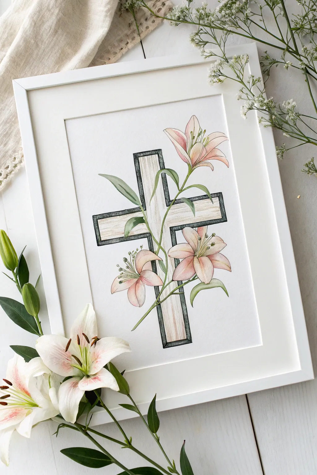
Celebrate renewal and grace with this elegant colored pencil drawing featuring a rustic cross intertwined with blooming pink lilies. The soft petals contrast beautifully against the wood grain texture, creating a serene piece perfect for framing or gifting.
Step-by-Step Tutorial
Materials
- Heavyweight drawing paper or Bristol board (white)
- H or HB graphite pencil (for initial sketch)
- Kneadable eraser
- Fine liner pen (black, 0.3mm or 0.5mm)
- Colored pencils (Soft pink, peach, cream, olive green, earthy brown, charcoal grey)
- Blending stump or cotton swab
- Ruler
Step 1: Sketching the Foundations
-
Draw the cross structure:
Begin by using your ruler to very lightly sketch a simple Latin cross in the center of your page. Keep the lines faint, as you’ll be erasing parts of them later where the flowers overlap. -
Add dimension to the cross:
Create the illusion of depth by drawing a second, slightly smaller cross inside the first one, leaving a narrow border. This inner cross will be the ‘wood’ face, while the border acts as a frame. -
Sketch the main lily positions:
Lightly sketch three main flower shapes: one at the top right, one near the center-right intersection, and one lower on the left vertical beam. Use simple star shapes or triangles as guides for the petals. -
Refine the petals:
Flesh out the lilies by drawing curved, trumpet-like petals. Notice how the top lily reaches upward, while the lower ones face outward. Let some petals overlap the lines of the cross to integrate the elements. -
Add the stem and leaves:
Draw a winding stem that snakes behind and around the cross, connecting your flowers. Add long, lance-shaped leaves that drape naturally—some pointing up, others curling down.
Natural Wood Grain
When doing the wood texture, vary your line weights. Create knots by drawing small, elongated ovals and allowing the grain lines to flow around them curves.
Step 2: Inking and Texturing
-
Outline the cross:
Switch to your black fine liner. Carefully ink the straight lines of the cross, but STOP whenever you hit a pencil line for a flower or leaf. The botanical elements should appear to be in front. -
Ink the botanicals:
Go over your flower and leaf sketches with a steady hand. Use lighter pressure for the delicate interior details of the petals, like the stamens. -
Add wood grain texture:
Inside the inner panels of the cross, use your fine liner (or a sharp pencil) to draw faint, vertical lines. These shouldn’t be perfectly straight; let them wiggle slightly to mimic natural wood grain. -
Clean up the sketch:
Once the ink is completely dry, use your kneadable eraser to gently lift away all the underlying graphite sketch lines.
Step 3: Coloring with Soft Hues
-
Base layer for the cross:
Take a cream or very light beige pencil and lightly color the ‘wood’ face of the cross. Keep the stroke direction vertical to match the grain. -
Shade the cross border:
Use a charcoal grey or soft black pencil to color the outer border of the cross. Apply firm pressure to make this dark and framing, which makes the inner wood part pop. -
Color the lily tips:
For the lilies, start by applying a soft pink to the tips of the petals, fading out as you move toward the center of the flower. -
Blend the petals:
I like to use a peach or cream pencil to color the centers of the petals, blending it outward into the pink tips for a smooth, gradient transition. -
Deepen the floral shadows:
Add a touch of deeper mauve or brown in the very center of the lilies where the petals meet to create depth. -
Color the leaves and stems:
Use an olive green for the leaves. Create highlights by leaving a small sliver of white or using a chartreuse pencil on the upper curves of the leaves. -
Final shadow accents:
Using a light grey pencil, add very subtle cast shadows on the cross directly underneath where the petals and leaves overlap it. This grounds the flowers so they don’t look like they are floating.
Metallic Accent
Trace the outer border of the cross with gold leaf pen or metallic gold paint instead of charcoal grey for a decorative, illuminated manuscript feel.
Place your finished drawing in a simple white frame to let the delicate colors truly shine
Crown of Thorns Study
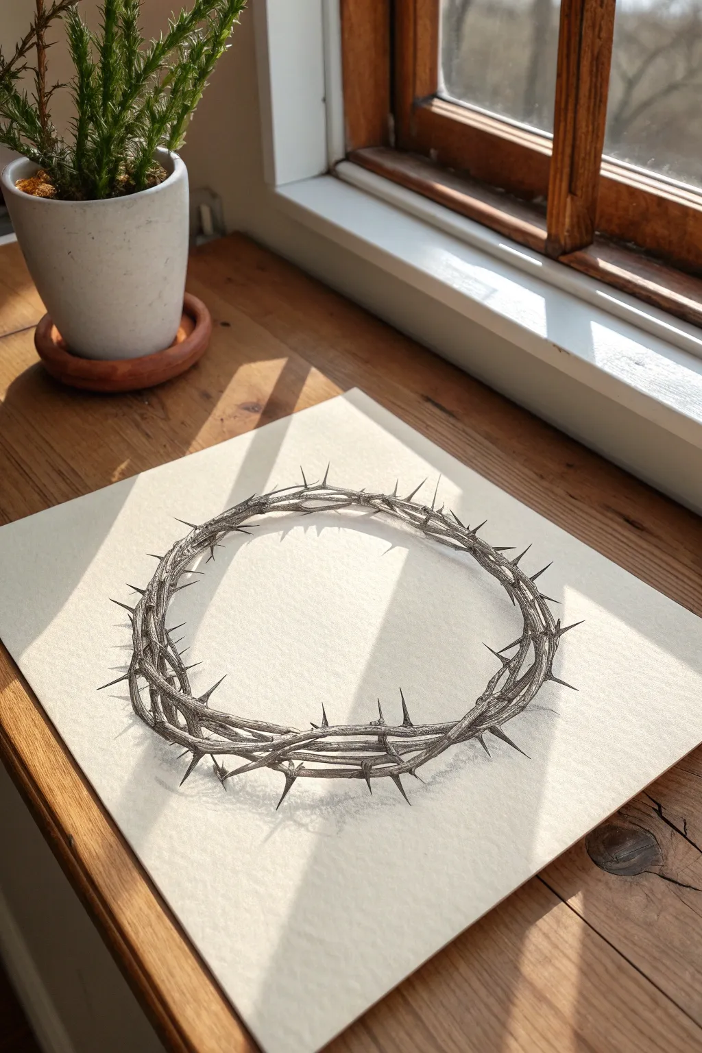
This project focuses on rendering a realistic crown of thorns using graphite pencils, emphasizing the interplay of harsh textures and delicate lighting. By observing how light rakes across the twisted vines, you will create a stark, emotive symbol suitable for Easter or Lenten reflection.
How-To Guide
Materials
- High-quality drawing paper (smooth or vellum finish, approx. 9×12″)
- Graphite pencils (specifically HB, 2B, 4B, and 6B)
- Mechanical pencil (0.5mm HB) for fine details
- Kneaded eraser
- Precision eraser (stick or fine-tip)
- Blending stump (tortillon)
- Artist tape (optional, for securing paper)
Step 1: Laying the Foundation
-
Establish the ellipse:
Begin by lightly sketching a wide, open oval in the center of your page using an HB pencil. This circle doesn’t need to be perfectly round, as organic vines are naturally irregular, but try to keep the perspective consistent so it looks like it’s laying flat. -
Map the main vines:
Draw two or three intertwining lines following your oval guide. Let these lines weave over and under each other loosely to represent the main structure of the thickest branches. -
Determine thorn placement:
Lightly mark small ticks or lines where the thorns will protrude. Vary the angles significantly—some should point inward, some outward, and others vertically, creating a chaotic and dangerous silhouette. -
Refine the outline:
Go back over your vines with a slightly firmer line, adding the knots and joints where thorns emerge. Erase your initial smooth guide lines so only the organic, bumpy twisted forms remain.
Step 2: Building Textural Depth
-
Establish the light source:
Decide on a light direction (in the reference, it comes from the top left). Lightly mark the areas that will remain the brightest white on the upper-left surfaces of the vines. -
Initial shading layer:
Using a 2B pencil, apply a base mid-tone to the shadowed sides of the vines. Use short, curved strokes that follow the cylindrical wrap of the wood to suggest roundness. -
Drawing the wood grain:
Switch to a mechanical pencil or a very sharp HB. specific Draw fine, jagged cracks and grain lines running lengthwise along the vines. I find that breaking these lines up helps the texture look old and brittle rather than smooth. -
Deepening the crevices:
With a 4B pencil, darken the areas where the vines overlap or twist underneath one another. These deep cast shadows are crucial for separating the strands and creating volume. -
Sharpening the thorns:
Outline the thorns with precision using the mechanical pencil. The tips should be incredibly sharp. Shade the base of each thorn darker, fading to a lighter value at the tip to make them look conical.
Drawing Wood Texture
Don’t draw straight lines for wood grain. Use shaky, broken strokes that wander. Imagine your pencil traveling over a bumpy surface to get that organic, dry look.
Step 3: High Contrast & Final Details
-
Adding the darkest values:
Take your 6B pencil and selectively punch up the darkest shadows—especially the deep pockets between twisted branches and the underside of the crown. This high contrast is what makes the drawing pop. -
Blending for volume:
Use a blending stump to gently soften the transition between your shadow and mid-tone areas. Be careful not to over-blend; you want to preserve the rough texture of the bark. -
Lifting highlights:
Take your kneaded eraser and mold it into a fine point. Dab or stroke along the top edges of the vines and the very tips of the thorns to lift off graphite, creating crisp highlights. -
Cast shadow placement:
Lightly sketch the cast shadow on the surface beneath the crown. Since the crown is an open ring, the shadow will be an irregular loop mirroring the shape of the vines. -
Softening the cast shadow:
Fill in the cast shadow with a 2B pencil. The shadow should be darkest right where the wood touches the paper and fade out slightly as it moves away. Use the blending stump to blur the edges of this shadow so it looks soft against the sharp thorns. -
Final assessment:
Step back and look at the overall balance. Reinforce the darkest darks with the 6B if the drawing looks too gray, and clean up any smudges on the white background with your precision eraser.
Keep It Clean
Graphite smudges easily on white paper. Keep a spare scrap sheet under your drawing hand to protect the finished areas while you work on the rest.
This stark rendering creates a powerful visual reminder of sacrifice through the simple medium of pencil and paper.


Faith Hope Love Venn Diagram
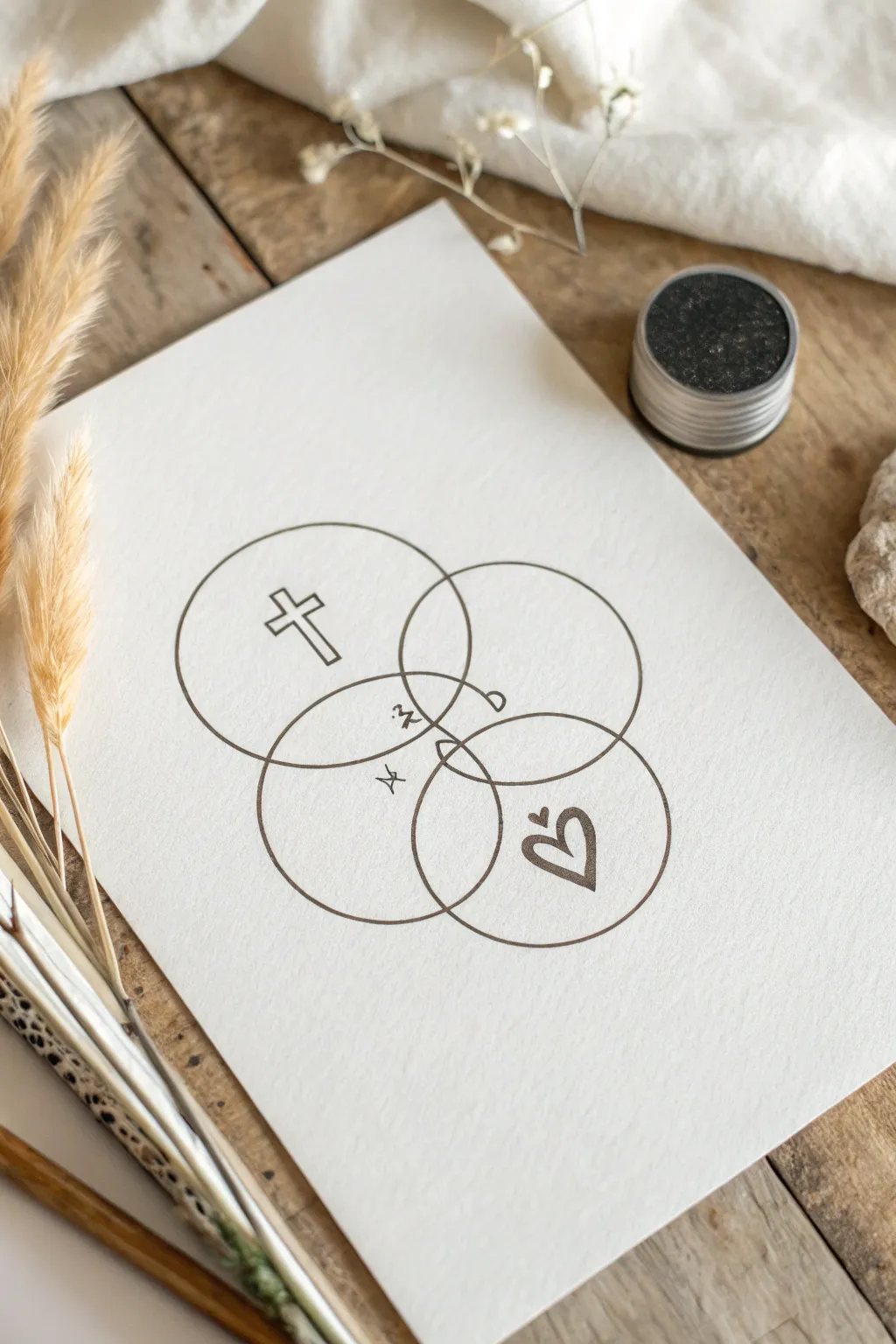
This elegant line drawing combines the symbols of faith, hope, and love into a geometric composition reminiscent of Borromean rings. Using simple intersecting circles and delicate ink work, you’ll create a modern piece of spiritual art perfect for framing or gifting.
Step-by-Step Guide
Materials
- High-quality white textured paper or cardstock (A5 or A4 size)
- Pencil (HB or 2H)
- Compass for drawing circles
- Fine liner pen (black, 0.3mm or 0.5mm tip)
- Eraser (kneaded eraser preferred)
- Ruler
Step 1: Planning the Geometry
-
Paper Preparation:
Begin by securing your textured paper on a flat surface. Determine the center of your page lightly with a pencil. -
Center Circle:
Set your compass to a radius of about 3-4cm (equalling a 6-8cm diameter circle). Place the needle just slightly below the center of the page and draw a faint guide circle. -
Second Circle:
Keeping the same compass width, place the needle on the top-left edge of your first circle. Draw a second circle that overlaps significantly with the first. -
Third Circle:
Reposition your compass needle on the top-right edge of the bottom circle. Draw the third circle. The goal is to have three circles clustered together, intersecting in the middle to form a triangular overlap zone. -
Refining the Shape:
Adjust the positioning if needed before committing to ink. The arrangement should look like an upside-down triangle made of circles.
Step 2: Adding Symbols
-
Sketching the Cross:
In the upper-left circle, lightly pencil a simple Latin cross. Center it within the available negative space of that specific circle. -
Sketching the Heart:
In the lower-right circle, sketch a stylized heart shape. You can add a small flourish or second line to give it character. -
Sketching the Amperstands:
In the central intersections where the circles overlap, pencil in two very small symbols. These appear to be abstract ‘scribbles’ or stylized ampersands connecting the concepts. -
Reviewing Composition:
Step back and look at your pencil marks. Ensure the symbols feel balanced against the weight of the circle outlines.
Wobbly Circles?
If you struggle to trace a perfect circle freehand over your pencil lines, attach a pen holder to your compass and use that to ink the final circles mechanically for precision.
Step 3: Inking the design
-
Tracing the Circles:
Using your fine liner pen, carefully trace over your pencil circles. Go slowly to maintain a steady, continuous line. I find it helps to rotate the paper as I curve around to keep my hand comfortable. -
Inking the Cross:
Outline the cross with clean, straight strokes. You can double the line thickness slightly here to make it stand out. -
Inking the Heart:
Go over the heart sketch with a fluid motion. If you want a brush-stroke look, vary the pressure slightly on the downstrokes. -
Detailing the Intersections:
Ink the small center symbols with very fine, delicate strokes. These should be thinner than the main circles if possible. -
Drying Time:
Let the ink sit for at least 15 minutes. Textured paper can hold wet ink in its grooves longer than smooth paper. -
Erasing:
Gently erase all pencil guidelines. Hold the paper taut with one hand while erasing with the other to prevent the paper from buckling. -
Final Touches:
Inspect the lines for any gaps. If your circle lines look too thin, you can re-trace them once more for a bolder, more graphic look.
Add Watercolor
After the waterproof ink dries completely, gently wash a different pastel watercolor hue into each circle (blue, yellow, pink) to show how colors mix at the intersections.
Now you have a serene piece of symbolic art ready to display on your desk or wall
Ichthys Fish in Negative Space
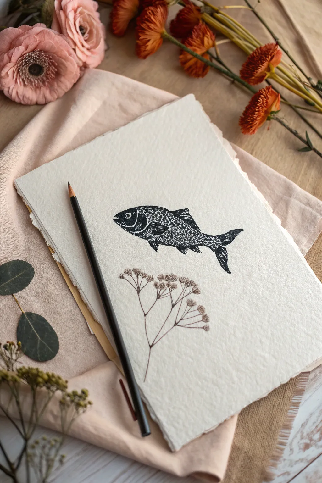
Recreate the ancient Ichthys symbol with a modern, artistic twist using block printing techniques on handmade paper. This project combines bold, textured ink work with delicate botanical line art for a serene and spiritual composition.
Detailed Instructions
Materials
- Soft-cut linoleum block or rubber carving block
- Linocut carving tools (V-gouge and U-gouge)
- Black block printing ink (water-soluble or oil-based)
- Brayer (rubber roller)
- Glass plate or acrylic sheet for rolling ink
- Heavyweight rag paper with deckled edges (cotton or khadi paper)
- Tracing paper
- Soft graphite pencil (4B or 6B)
- Fine liner pen (brown or sepia, 0.1mm)
- Wooden spoon or baren (for burnishing)
Step 1: Designing and Carving the Block
-
Draft the fish design:
Sketch a simple fish silhouette on a piece of scrap paper. Focus on distinct sections: the head, the scaled body, the fins, and the tail. Keep the outline strong and recognizable. -
Transfer to the block:
Place tracing paper over your sketch and trace it with a soft graphite pencil. Flip the tracing paper graphite-side down onto your carving block and rub the back firmly to transfer the image. Remember, the final print will be a mirror image of your carving. -
Outline the shape:
Using a fine V-gouge tool, carve a shallow line around the entire perimeter of the fish. This creates a ‘stop cut’ that prevents your tool from slipping and ruining the outline later. -
Carve the negative space:
Use a wider U-gouge to clear away all the material outside the fish shape. You want the background to remain completely unprinted, so carve deep enough that the roller won’t touch these areas. -
Detail the head and gills:
Switch back to your smallest V-gouge. Carve away thin lines to define the gill plate and the mouth. Creating the eye is tricky; try carving a small circle, leaving a tiny dot in the center raised to catch the ink. -
Create the scale texture:
For the body, instead of drawing individual scales, use the V-gouge to make short, rhythmic scoops. I find that staggering these small gouges creates a dense, organic texture that mimics scales perfectly when printed. -
Define the fins:
Carve thin, parallel lines into the dorsal and pectoral fins to suggest the delicate bones within them. Leave mostly raised areas here so they print dark and bold.
Fixing Patchy Prints
If your print looks too ‘noisy’ or white spots appear, your ink was likely too dry or applied too thinly. Add a drop of extender or water to your ink slab and re-roll for a smoother coat.
Step 2: Printing the Image
-
Ink the plate:
Squeeze a small line of black block printing ink onto your glass plate. Roll the brayer back and forth and lift it occasionally until the ink makes a sticky, sizzling sound like frying bacon. -
Apply ink to block:
Roll the inked brayer over your carved fish block. Apply thin, even layers. Roll in multiple directions to ensure the textured ‘scales’ and fine lines are adequately covered without filling the grooves. -
Position the paper:
Place your deckled-edge paper on a flat, clean surface. Carefully hover the inked block over the paper, aiming for the center-left area, and press it straight down. Do not shift it once it touches the paper. -
Burnish the print:
Flip the paper and block stack over carefully, or press from the top if your paper is thick. Use a wooden spoon or a baren to rub the back of the paper in circular motions, applying firm pressure to transfer the ink. -
The reveal:
Slowly peel the paper away from the block starting at one corner. Check the transfer as you go; if it looks spotty, layout it back down and rub that specific area again before fully separating them. -
Dry the print:
Set the print aside on a flat surface. Water-based inks may dry in an hour, but oil-based inks might need a day or two to fully cure. Ensure it is completely smudge-proof before moving to the next phase.
Step 3: Adding Botanical Details
-
Plan the placement:
Visualize where the stem should sit beneath the fish. It should balance the composition, occupying the space below the fish belly without touching the ink print. -
Sketch the primary stem:
Lightly trace the main vertical line of the plant with your pencil. Keep the line extremely faint so it won’t be visible under the final pen work. -
Draw the branches:
Using the brown or sepia fine liner, draw the main stem. Branch out with thin, angular lines to create the structure for an umbel-style flower (like dill or Queen Anne’s lace). -
Add delicate blooms:
At the end of each tiny branch, stipple small dots or draw tiny clusters of loops to represent the flower heads. Keep the pen pressure very light to contrast with the heavy black ink of the fish.
Clean Edges Trick
Before printing, wipe the uncarved edges of your linoleum block with a rag. Stray ink often catches on the block’s perimeter, creating unwanted square borders around your artwork.
Frame your handmade print in a shadow box to highlight the textural quality of the paper and ink
Lion of Judah Portrait
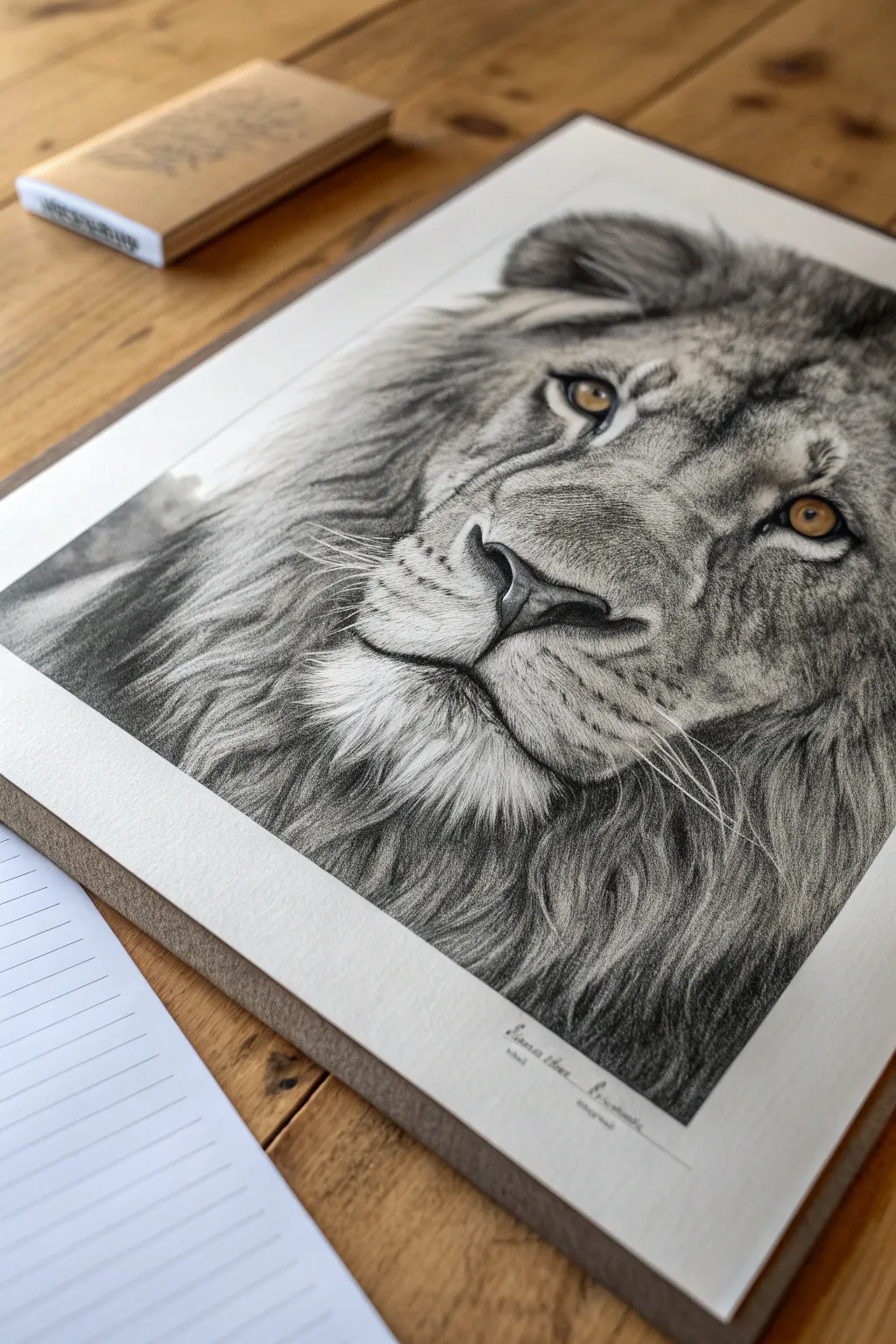
Capture the strength and majesty of the Lion of Judah with this hyper-realistic graphite drawing. By focusing on delicate fur textures and the piercing depth of the eyes, you will transform a blank page into a powerful testament of faith and artistry.
Step-by-Step
Materials
- High-quality Bristol board or smooth drawing paper (A3 recommended)
- Graphite pencil set (ranging from 4H to 8B)
- Mechanical pencil (0.5mm HB and 2B)
- Kneaded eraser
- Precision eraser or eraser pen
- Blending stumps (tortillons) and soft tissue
- White gel pen or gouache for highlights
- Reference photo of a lion
Step 1: Laying the Foundations
-
Establish the proportions:
Begin with a very light sketch using a harder pencil like a 2H. Focus on the geometry of the lion’s face—the triangle of the nose, the spacing of the eyes, and the broad curve of the muzzle. Avoid pressing hard; these lines are just guides. -
Map the fur direction:
Lightly draw arrows or flow lines to indicate which way the fur grows. The mane flows outward, while the fur on the nose bridge is short and tight. This road map is crucial for realism later on. -
Define the key features:
Refine the outline of the eyes, nostrils, and mouth line. I like to make sure the pupils are perfectly placed before moving on, as the eyes anchor the entire expression.
Smudge Control
Graphite loves to smear. Place a scrap sheet of paper under your drawing hand to protect your finished work as you move across the page.
Step 2: The Windows to the Soul
-
Base layer for the eyes:
Using an HB pencil, softly shade the iris. Leave the catchlight (the reflection) completely white. If you accidentally shade it, lift it out with your kneaded eraser. -
Deepen the pupil:
Switch to a 4B or 6B pencil to fill in the pupil. It needs to be the darkest point on the page to create convincing contrast. -
Add iris details:
Draw tiny, radiating lines outward from the pupil using a sharp mechanical pencil. This mimics the fibrous texture of the iris. -
Golden glow:
Carefully layer graphite around the outer rim of the iris to darken it, leaving the area near the pupil slightly lighter to suggest a golden, glowing transparency.
Step 3: Building the Mane and Face
-
Nose texture:
Use a stippling technique (dots) on the nose pad with a 2B pencil. Looking closely, a lion’s nose has a leathery, pebbled texture, not smooth skin. -
Short fur shading:
Start shading the bridge of the nose and cheeks. Use short, flicking strokes with an H or HB pencil. Always follow your directional map. Layer these strokes to build density rather than pressing harder. -
Mid-tone development:
Move to the shadowed areas around the muzzle and under the eyes. Use a blending stump to soften your initial pencil strokes, creating a smooth underpainting of grey. -
Drawing the whiskers:
Before shading the muzzle fully, identify where the whiskers will go. You can impress lines into the paper with a stylus or empty pen to keep them white, or carefully draw around them. -
Mane volume:
Switch to softer pencils (4B-8B) for the mane. Use long, sweeping strokes. Don’t draw every single hair; instead, draw ‘clumps’ or locks of hair by shading the shadows between them. -
Deepening contrast:
Go back into the deepest shadows of the mane—the areas closest to the face and neck—with your 8B pencil. This high contrast makes the lighter face pop forward.
Make It Golden
For a mixed-media touch, use gold leaf or metallic gold watercolor paint for the eyes instead of graphite. It adds a regal, supernatural element.
Step 4: Refining and Highlighting
-
Softening transitions:
Use a tissue to lightly blend the transition areas between the short facial fur and the long mane so there isn’t a harsh line separating them. -
Lifting highlights:
Take your precision eraser (or a sliver cut from a regular eraser) and ‘draw’ white hairs back into the grey areas of the mane and chin. This negative drawing technique adds incredible depth. -
Whisker refinement:
Define the whisker spots (roots) with dark dots. Ensure your white whiskers are visible; if you didn’t indent the paper earlier, use a white gel pen to draw crisp, confident lines over the graphite. -
Final eye sparkle:
Touch up the catchlight in the eye with a tiny dot of white gouache or gel pen if the paper isn’t bright enough. This brings the lion to life. -
Clean up:
Erase any smudges from your hand rest area and sign your work neatly at the bottom, perhaps adding a referencing scripture if desired.
Step back and admire the powerful serenity in the expression you have created
Armor of God Symbol Set
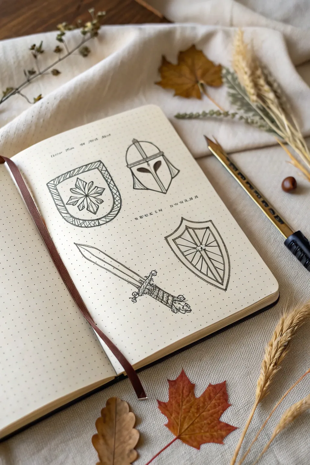
This bullet journal spread captures a rustic, hand-drawn study of spiritual armor using clean ink lines and stippling techniques. The result is a set of four distinct medieval-inspired icons perfect for adding a touch of chivalry to your faith journal.
Step-by-Step Tutorial
Materials
- A5 dotted grid notebook (cream or ivory paper recommended)
- Fine liner pens (sizes 0.1, 0.3, and 0.5)
- Pencil (HB or 2H)
- Kneaded eraser
- Ruler (optional, but helpful for sword alignment)
Step 1: Planning and Layout
-
Map the quadrants:
Visualize your page divided into four rough quadrants. You want the two shields to sit diagonally from each other to balance the visual weight of the page. -
Sketch the top-left shield:
Using your pencil lightly, draw a U-shape for the first shield. Sketch a thick border around the edge, and place a central focal point where the starburst design will go. -
Outline the helmet:
In the top right, sketch a dome shape for the helmet. Add a T-shaped visor area that curves down the cheeks, giving it a classic knightly appearance. -
Draft the sword:
For the bottom left, draw a long diagonal line to represent the blade’s center. Sketch the crossguard perpendicular to this line, then add the grip and pommel at the bottom end. -
Place the kite shield:
In the bottom right, sketch a classic kite shield shape—broad at the top and tapering to a point at the bottom. Divide it with a cross shape.
Mastering the Grip
For the straightest lines on swords and shields, lock your wrist and move your entire arm from the elbow as you draw, rather than just moving your fingers.
Step 2: Inking the Outlines
-
Define the first shield:
Switch to your 0.3 pen. Trace the outer and inner perimeter of the top-left shield. Instead of a solid fill, draw diagonal hatching lines inside the border frame to create texture. -
Draw the starburst emblem:
Inside that first shield, draw an eight-pointed star or flower. Start with a simple cross, then add the diagonal petals in between. Keep the lines crisp. -
Ink the helmet structure:
Go over your helmet pencil lines. Make the T-visor shape bold. Add a center ridge line running from the top of the helmet down to the nose guard. -
Detail the sword blade:
Draw the double-edged blade of the sword using a 0.1 pen for sharpness. Include the ‘fuller’ (the groove down the center of the blade) with two parallel lines. -
Complete the sword hilt:
Ink the crossguard with slightly curved ends. For the handle, draw horizontal bands to mimic leather wrapping, and finish with a decorative pommel. -
Finalize the kite shield:
Ink the outline of the bottom-right shield. Draw the internal cross geometry, creating sections meant for reinforcement designs like wood grain or metal plating.
Uneven Ink Flow?
If your fine liner skips over the textured paper, slow down your stroke speed. Moving too fast often breaks the ink flow on uncoated journal paper.
Step 3: Shading and Text
-
Add stipple shading:
Using your finest 0.1 pen, add tiny dots (stippling) on the right side of the helmet and the sword handle. This suggests a light source coming from the left. -
Hatch the kite shield:
On the bottom-right shield, use fine lines to radiate outward from the center cross. This ‘sunburst’ style hatching adds depth and interest to the flat surface. -
Letter the scripture headers:
Above the top two icons, lightly pencil in your script text—perhaps ‘Armor of God’ or specific verse references. Trace over this with a 0.1 pen in a loose, ancient-style serif font. -
Erase and refine:
Once the ink is completely dry—I usually give it at least five minutes to be safe—gently roll your kneaded eraser over the page to lift all pencil guides.
Enjoy seeing your spiritual armor come to life on the page as you meditate on its meaning
Faith Symbol Doodle Collage
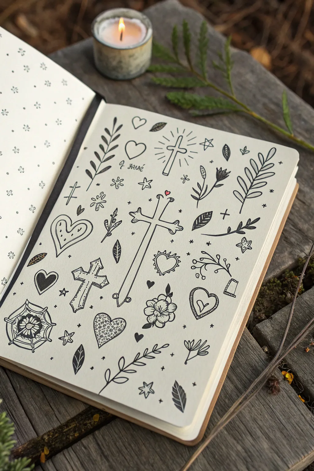
This project is a serene exercise in filling a sketchbook page with meaningful, faith-inspired icons in a classic tattoo-flash style. The clean black linework against cream paper creates a timeless, contemplative aesthetic perfect for journaling or meditation.
Detailed Instructions
Materials
- Sketchbook with cream or off-white paper (moleskine or mixed media)
- Fine liner pens (sizes 01, 03, and 05 – e.g., Sakura Pigma Micron)
- Pencil (HB or 2B)
- Kneaded eraser
- Ruler (optional)
- Reference sheet for symbols
Step 1: Conceptual Layout
-
Set the foundation:
Begin by lightly sketching the largest central element with your pencil. In this collage, it’s the tall, slender cross resting near the center of the page. Place it slightly off-center to allow room for surrounding motifs. -
Place anchor symbols:
Around the central cross, lightly sketch the positions for the other major icons: the large heart on the left, the radiant cross at the top right, and the vine branch at the bottom. -
Fill the gaps:
Scatter smaller pencil sketches of leaves, tiny crosses, hearts, and stars in the remaining negative space. Aim for a balanced composition where no single area feels too crowded or too empty.
Clean Lines Tip
Pull your pen towards you rather than pushing it away when drawing long straight lines like the cross stems. This gives you better control and prevents wobbles.
Step 2: Inking the Major Icons
-
The central cross:
Switch to your 05 fineliner for the main outlines. Carefully trace the central cross, giving it a ‘bone’ style aesthetic with slightly flared ends. Add a small break in the line near the intersection to imply dimension. -
Radiant cross details:
Move to the top right cross. Use the 03 pen to draw the outline, then switch to the 01 pen to flick quick, straight lines outward to create the glowing ‘rays’ or aura effect. -
Heart motifs:
Ink the various hearts scattered on the page. For the large heart on the left, draw a double outline to create a border. I like to add tiny dots or hatch marks inside the border for texture. -
Decorative cross:
On the bottom left, ink the ornate cross with the pointed ends. Use stippling (tiny dots) inside the arms of this cross to give it shading and an aged metal appearance.
Step 3: Nature Elements
-
Leafy branches:
Using a 03 pen, draw the stems of the various botanical elements. Keep your hand relaxed to create organic, slightly curved lines rather than rigid sticks. -
Adding leaves:
Draw the individual leaves attached to your stems. Vary the shapes—some should be smooth ovals, while others can be jagged or fern-like. Fill a few solid black for contrast. -
Floral details:
Ink the small flower near the bottom center. Start with the center circle and build the petals outward, adding small lines at the base of each petal to suggest curvature.
Level Up: Gold Leaf
Add sophistication by using a gold gel pen or real gold leaf size to fill in the ‘rays’ of light or the small stars. The metallic shine looks stunning on cream paper.
Step 4: Finishing Touches
-
Tiny fillers:
Take your finest 01 pen and ink the smallest details: the tiny four-pointed stars, micro-hearts, and floating crosses that act as confetti filling the background. -
Erase guidelines:
Once the ink is completely dry (give it at least five minutes to avoid smearing), gently rub your kneaded eraser over the entire page to lift the graphite sketches. -
Add emphasis:
Go back in with your 05 pen and thicken the outer profile lines of the largest symbols. This ‘line weight’ variation makes the drawings pop off the page. -
Texture and shading:
Use the 01 pen to add simple hatching (parallel lines) to shading areas, like one side of a leaf or the interior of a heart, to give the flat drawings a bit of depth. -
Optional color pop:
If you wish, add a single tiny dot of red ink to the small heart above the central cross, just like the subtle detail in the original artwork.
Now you have a beautifully composed page of symbols that serves as a visual prayer or meditation guide


Have a question or want to share your own experience? I'd love to hear from you in the comments below!