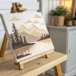
Soft pastels are my go-to when I want big, juicy color and that dreamy, blendable glow without overthinking every line. Here are 20 soft pastel drawing ideas that feel approachable but still look like you really meant it.
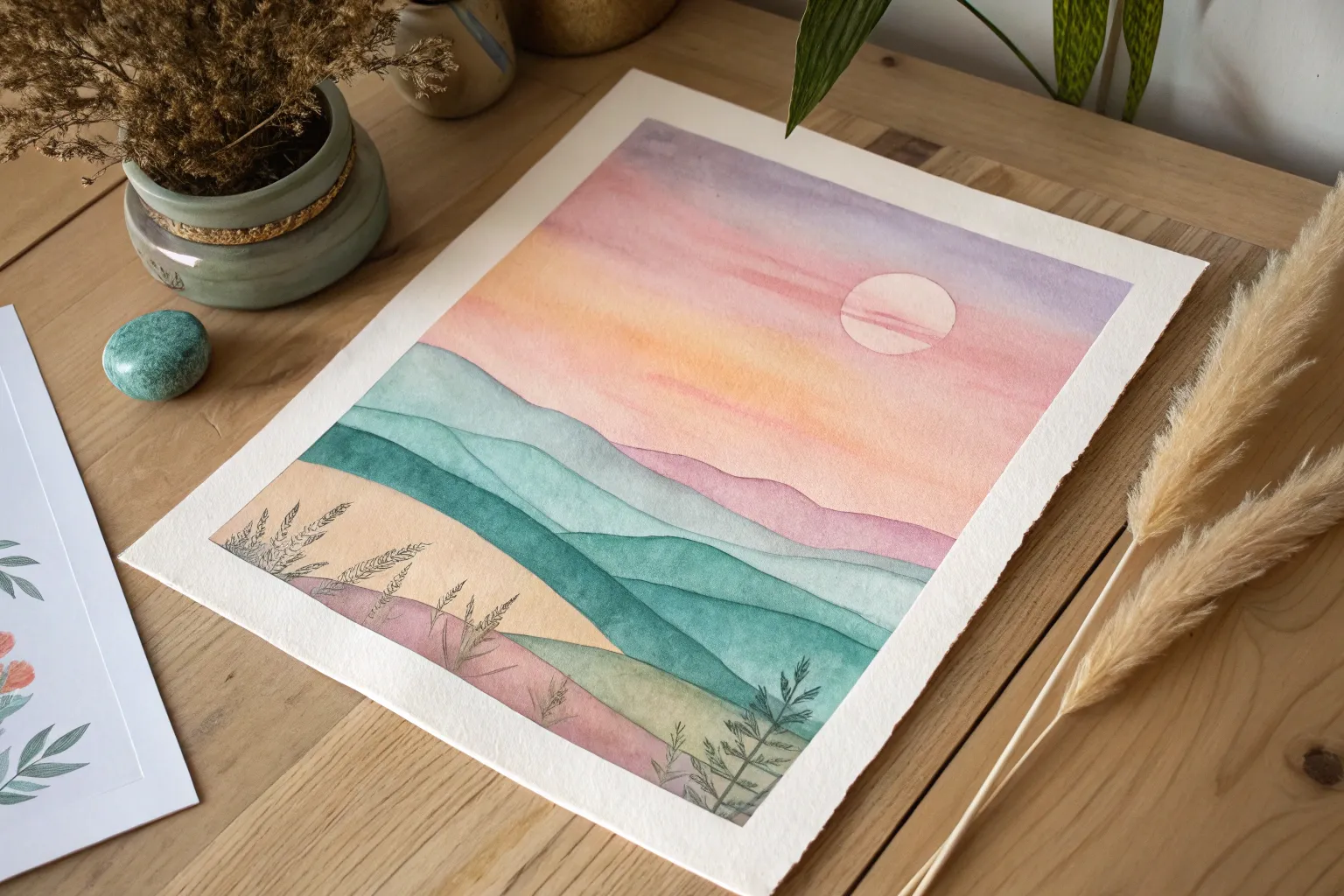
Ocean Horizon With Reflections
Capture the serene beauty of a setting sun casting its golden glow across gentle ocean waves with this soft pastel project. You will create a luminous, reflective seascape featuring dreamy pink clouds and a sparkling path of light on the water.
Step-by-Step
Materials
- Pastel paper (sanded or textured, white or light grey)
- Soft pastels (stick form)
- Pastel pencils (for details)
- Blending tools (tortillons, sponge applicator, or fingers)
- Kneaded eraser
- Fixative spray (workable)
- Masking tape
- Drawing board
Step 1: Setting the Sky and Horizon
-
Establish the horizon:
Begin by taping your paper to a board to create a clean border. Using a ruler and a light grey pastel pencil, draw a straight horizontal line slightly below the center of the page to separate the sky from the sea. Lightly sketch a small circle for the sun just above this line. -
Base layer for the sky:
Start at the very top of the paper with a soft, pale blue pastel stick. Apply it lightly, leaving irregular white spaces for clouds. As you move down towards the horizon, transition into a very pale yellow and then a soft peach tone around the sun area. -
Adding cloud hues:
Layer soft pink and lavender strokes horizontally across the upper sky, letting them mingle with the blue sections. Use the side of the pastel stick for broad, sweeping marks to keep the texture airy. -
Blend the sky gradient:
Using your fingers or a soft sponge tool, gently blend the sky colors. Work from the lightest colors (around the sun) outward to the darker blues to avoid muddying the brightness. The goal is a smooth, seamless transition between the blue, pink, and yellow zones. -
Define the sun:
Use a bright white pastel to fill in the sun circle you sketched earlier. Press firmly to make it opaque. Lightly smudge the edges outward into the surrounding peach tone to create a glowing, hazy effect rather than a hard sticker-like circle.
Keep it Clean
Keep a damp cloth nearby to wipe your fingers between colors. Pastel dust travels easily; clean hands prevent the bright yellow sun from turning green when you switch from blending blue sky.
Step 2: The Ocean and Reflection
-
Base water coloer:
For the distant ocean water just below the horizon, apply horizontal strokes of soft pink and lavender. This reflects the sky colors directly above. As you move closer to the foreground, introduce muted teal and steel blue tones. -
Create the sun path:
Directly beneath the sun, apply vertical zig-zag strokes of pale yellow and peach. This establishes the base for the sunlight reflecting on the water. Keep these strokes concentrated in the center. -
Blend the water base:
Lightly blend the water layers horizontally. Unlike the sky, you don’t want this perfectly smooth; keeping some texture helps mimic the movement of water. -
Add distant ripples:
With a sharpened dark blue or purple pastel pencil, draw very thin, straight horizontal lines in the distance to suggest small ripples. Break these lines up as they cross the sun’s reflection path.
Muddy Colors?
If your ocean looks muddy, you likely over-blended. Stop blending and apply fresh, unblended strokes on top. Let the texture of the paper grab the pigment to restore vibrancy.
Step 3: Foreground Waves and Highlights
-
Form the foreground waves:
In the lower third of the paper, use darker blues and charcoal greys to indicate the shadows of rolling waves. Create a slight curve to these shapes to show the water coming onto the shore. -
Add foam details:
Use a white pastel stick to add the crashing foam. Apply this with rough, dotted strokes along the crests of your dark wave shapes. Vary the pressure to create thick foam and thin spray. -
Refine the sun’s reflection:
Go back over the center reflection path with a sharp white pastel pencil or edge of a stick. Add crisp, bright horizontal dashes of white on top of the yellow base to make the water look like it is sparkling. -
Wet sand effect:
At the very bottom, blend peach, mauve, and a touch of brown to create the wet sand. Use horizontal strokes that slightly mirror the colors of the sky. -
Final shading touches:
Deepen the shadows under the white foam with a dark grey pastel pencil to increase contrast. This makes the white foam pop and appear three-dimensional. -
Remove tape:
Once you are happy with the balance of light and shadow, carefully peel away the masking tape to reveal your crisp white border.
Frame your beautiful seascape behind glass with a mat to protect the delicate surface


Glowing Moon Night Sky
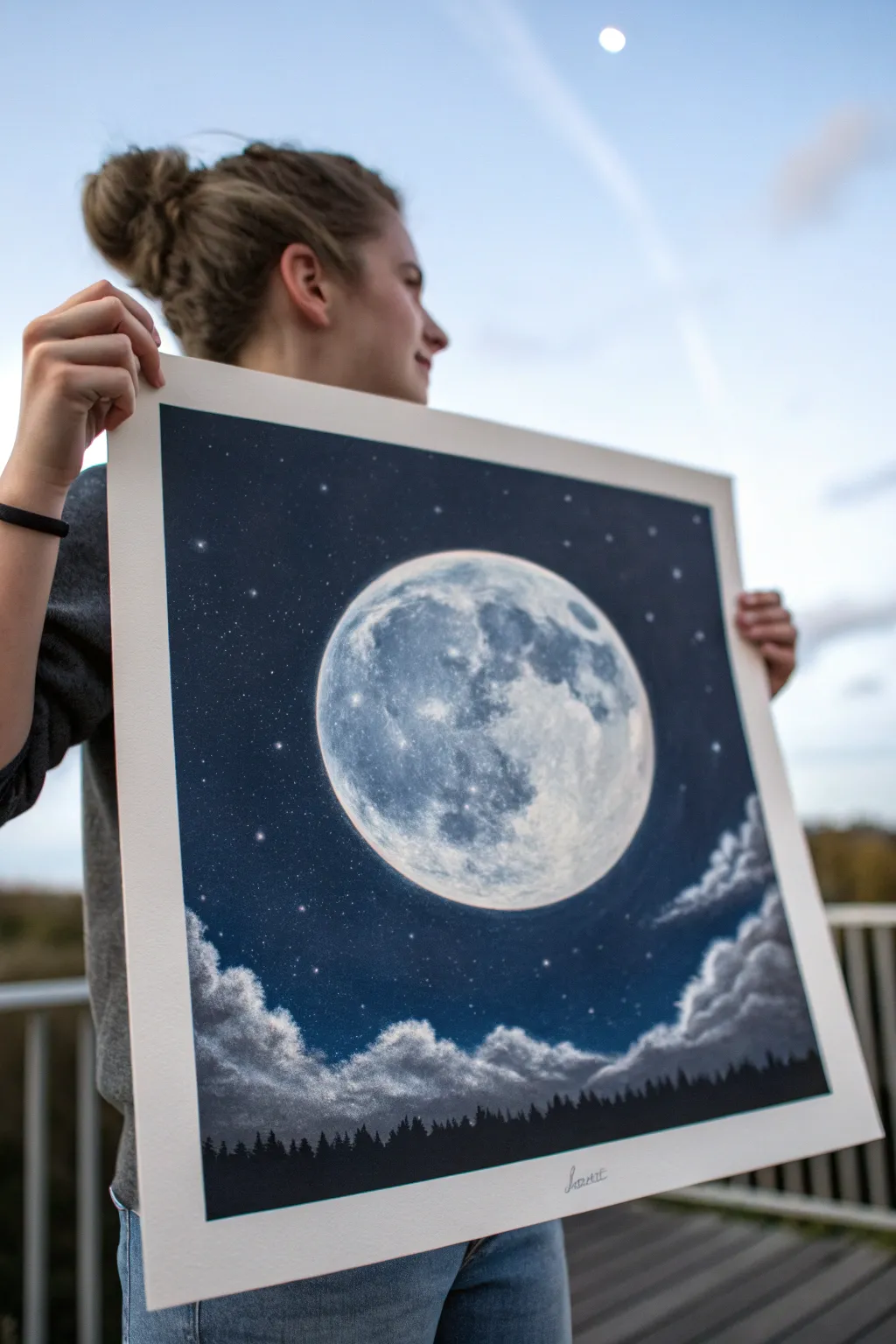
Capture the ethereal beauty of a full moon glowing against a deep, velvety midnight sky. This soft pastel project balances the sharp detail of lunar craters with the dreamy softness of clouds and a distant forest silhouette.
Detailed Instructions
Materials
- Large square sheet of dark grey or black pastel paper (such as Pastelmat or Canson Mi-Teintes)
- Soft pastels in shades of: Prussian Blue, Indigo, Black, White, Grey tones (light to dark), Cream
- Pastel pencils (White and Dark Grey/Black for details)
- Blending stumps or tortillons
- Kneaded eraser
- Workable fixative spray
- Traceable circular template (like a plate or a compass)
Step 1: Setting the Sky and Moon
-
Outline the orb:
Begin by lightly tracing a large, perfect circle in the center of your dark paper using a white pastel pencil. This will be your moon. Ensure it’s centered but leaves ample room at the bottom for clouds. -
Establish the background:
Around the moon circle, start applying your darkest blue (Prussian Blue or Indigo). Use the broad side of the pastel stick to cover the large expanse of the sky, working your way outward to the edges. -
Deepen the atmosphere:
Layer black pastel into the very corners and the top edge of the paper to create a vignette effect. Blend this into the blue using your fingers or a soft sponge tool to create a seamless, deep night gradient. -
Create the glow:
Taking a lighter blue or a cool grey, gently scumble a very thin ring of color immediately around the outside of your white circle outline. Smudge this outward softly to create a halo effect caused by the moonlight.
Clean Hands, Clean Art
Keep a damp towel nearby. Moon craters require pure whites; if your fingers have dark blue dust on them, you’ll muddy your bright focal point instantly.
Step 2: Detailing the Moon
-
Base layer:
Fill the entire moon circle with a base layer of white. Do not press too hard yet; you want tooth left on the paper for subsequent layers. -
Map the maria:
Using a reference photo of the moon, lightly sketch the large grey patches (the lunar ‘seas’ or maria) using a mid-tone grey pastel stick. -
Add texture:
Switch to your pastel pencils for precision. Use light grey and white pencils to add squiggly, irregular lines inside the brighter areas to mimic craters and ridges. -
Deepen shadows:
I like to use a dark grey or blue-grey pencil to deepen the darkest parts of the maria. This contrast makes the bright white areas pop significantly. -
Highlights:
Apply a pure, creamy white pastel heavily on the brightest edges of the craters and the moon’s rim to create a blindingly bright, reflective quality. -
Blend selectively:
Use a small blending stump to soften the grey patches, but leave the bright white crater lines sharp. This mix of soft and hard edges creates the illusion of distance and texture.
Step 3: Clouds and Forest
-
Draft the clouds:
Below the moon, sketch irregular, fluffy shapes using a light blue-grey pastel. Establish a general flowing direction for the cloud bank. -
Highlight cloud tops:
Take your white pastel stick and firmly stroke the top edges of these cloud shapes. This represents the moonlight catching the tops of the cumulus formation. -
Shadowing clouds:
Underneath the white highlights, blend in the dark blue from your sky color to shadow the bottom of the clouds. Use a circular rubbing motion with your finger to make them look billowy and soft. -
The treeline silhouette:
At the very bottom edge of the paper, use a sharp black pastel stick or pencil to draw a jagged line of vertical strokes. -
Refining trees:
Vary the heights of your vertical strokes to look like pine trees. Ensure the black is solid and opaque to contrast against the lighter clouds behind them. -
Starry finish:
Take a white pastel pencil and dot random stars throughout the indigo sky. Press harder for some and lighter for others to create depth. -
Final twinkle:
For the brightest stars, add a tiny cross shape to make them sparkle. Step back to ensure the balance of light and dark feels correct.
Add a Constellation
Personalize the sky by arranging the background stars into a real constellation, like the Big Dipper or Cassiopeia, for a hidden realistic detail.
Hang your lunar masterpiece on a wall where it can catch a bit of light to really make that moon glow


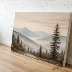
Easy Mountain Range Layers
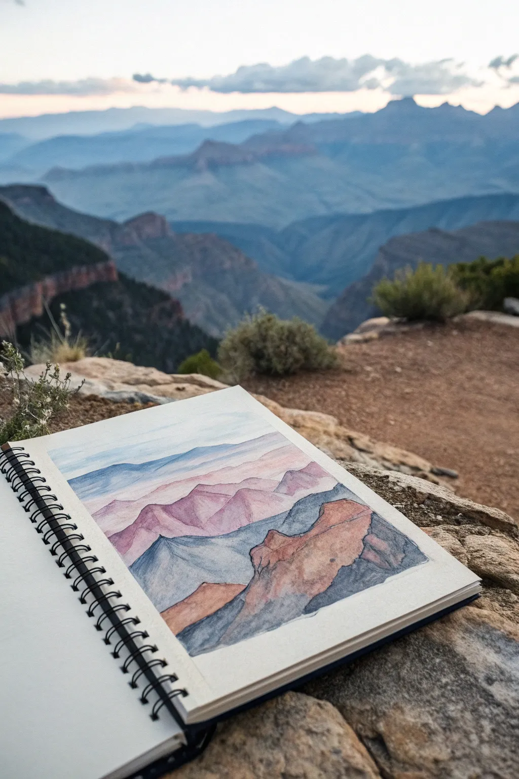
Capture the serene depth of a canyon landscape with this layered study in atmospheric perspective. This project focuses on building receding mountain ranges using soft, blended layers that transition from warm foreground tones to cool, misty blues in the distance.
Step-by-Step Tutorial
Materials
- Spiral-bound sketchbook (mixed media or pastel paper)
- Soft pastels (stick form)
- Pastel pencils for details
- Blending stump or tortillon
- Kneaded eraser
- Workable fixative
- Paper towel or rag for cleaning fingers
- Graphic tape or masking tape (optional for borders)
Step 1: Setting the Composition
-
Define the Horizon:
Start by lightly sketching a horizontal line about one-third of the way from the top of your page. This establishes where your sky meets the furthest mountains. -
Outline the Layers:
Using a very light touch with a neutral grey pastel pencil, draw the jagged outlines of four distinct mountain layers. Make the bottom-most layer the largest and most detailed, while the upper layers should be flatter and simpler. -
Mark the Foreground:
In the bottom right corner, sketch a large, rugged rock formation that rises up to overlap the distant ranges. This element will anchor your composition.
Step 2: Sky and Distant Range
-
Create the Sky Wash:
Take a pale blue soft pastel stick and gently shade the sky area using the side of the pastel. Keep it very light, almost white near the horizon. -
Blend the Atmosphere:
Use your finger or a soft cloth to rub the sky pigment into the paper, ensuring a smooth, cloud-like finish. I find circular motions work best here to eliminate stroke marks. -
The Furthest Blue Layer:
For the most distant mountain range, apply a cool, muted blue. Keep the color uniform and flat to suggest atmospheric distance. Blend it gently so it looks soft against the sky.
Clean Edges Trick
Use a piece of scrap paper as a shield when coloring adjacent mountain layers. Place it over the finished area to protect it while you vigorously shade the new section below.
Step 3: Mid-Ground Transition
-
Introduce Violet Tones:
Move to the second layer of mountains. Here, mix a light violet or mauve with your cool blue. This introduces a subtle warmth while keeping the range pushed back in the distance. -
Add Variation:
Unlike the flat top layer, let this violet layer have slight variations in pressure. Add a tiny bit of darker purple in the valleys of this range to suggest three-dimensionality. -
The Pinkish Ridge:
For the third layer down, switch to a warm, dusty pink or rose shade. This dramatic color shift helps separate the middle ground from the background. -
Define Ridges:
Use the edge of your pastel stick to create sharper peaks on this pink layer. Gently smudge the color downward, fading it slightly before it hits the next layer line.
Level Up: Texture
Try using rougher watercolor paper instead of smooth drawing paper. The grain will catch the pastel pigment, creating a natural stony texture for the canyon walls.
Step 4: Foreground Depth
-
Cool Shadow Layer:
The fourth layer—the one just behind the main foreground rock—should be a deep, steel blue or grey. This coolness contrasts with the upcoming warm foreground. -
Texture the Shadows:
Instead of blending this blue layer completely smooth, leave some of the paper’s tooth visible or make directional strokes that follow the slope of the hills. -
Main Foreground Base:
Now for the large rock formation in the front right. Fill the shape with a base of terracotta or burnt sienna. Press firmly to get rich, opaque coverage. -
Add Rock Facets:
Using a dark charcoal or dark brown pastel pencil, draw cracks and fissures over the terracotta base. These lines define the rocky texture. -
Deepen the Contrast:
Shade the shadowed side of the foreground rock (the right side) with a dark grey or deep violet to give it mass and weight. -
Final Highlights:
Take a cream or pale yellow pastel and hit the top edges of the foreground rock where the light would catch. This tiny detail makes the rock pop forward.
Now you have a stunning landscape that captures the majestic scale of a canyon view right in your sketchbook


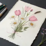
Wildflower Meadow Close-Up
Capture the whimsy of a summer meadow with this airy, scattered wildflower pattern drawn on textured paper. The soft, gentle strokes of pastel pencils create a natural, organic look that mimics pressed flowers.
How-To Guide
Materials
- Heavyweight rag paper or handmade paper with deckled edges
- Soft pastel pencils (greens, pinks, yellows, muted purples)
- Hard pastels (for sharper details)
- Kneadable eraser
- Workable fixative spray
- Small blending stump or tortillon
- Protective sheet (glassine or tracing paper)
Step 1: Preparation & Composition
-
Selecting the Paper:
Choose a paper with a strong texture and visible grain, ideally with rough, deckled edges to match the rustic aesthetic. The texture will help grab the pastel pigment. -
Planning the Scatter:
Visualize a loose, non-linear grid. You want the flowers to feel random, like seeds scattered by the wind, rather than perfectly aligned rows. Lightly tap your paper with a clean eraser to remove any surface dust.
Smudge Prevention
Place a clean sheet of glassine paper under your drawing hand. This prevents oils from your skin transferring to the paper and stops you from dragging your palm through finished flowers.
Step 2: Drawing the Base Greenery
-
Sketching Ferns:
Start with a dull olive green pastel pencil. Draw a long, slightly curved central stem. Add small, parallel leaflets along the stem, tapering them as you reach the tip to create a fern frond. -
Adding Leafy Sprigs:
Using a sage green shade, draw simple sprigs with opposite leaves. Keep your pressure light so the paper texture shows through the strokes, giving an organic feel. -
Creating Grass Blades:
With a sharper, yellow-green pencil, flick upward to create thin, singular blades of grass or wheat-like stalks. Vary the height and direction slightly for natural movement. -
Layering Greens:
Go back over the bottom of some stems with a slightly darker evergreen pencil to add grounding and depth, blending the transition gently with a tortillon.
Vintage Effect
Before drawing, lightly stain the paper edges with strong tea or coffee using a sponge. Let it dry completely for an aged, botanical journal appearance.
Step 3: Adding Floral Elements
-
Pink Daisies:
Select a soft dusty pink pencil. Draw five to seven small, oblong petals radiating from a center point. Keep the edges soft rather than outlining them harshly. -
Detailing the Centers:
Place a tiny dot of deep maroon or dark brown in the center of your pink flowers. I like to gently twist the pencil tip to create a textured dot. -
Yellow Wildflowers:
Use a warm ochre or sunflower yellow. Draw small clusters of three or four dots or tiny petals near the tips of some thin green stems to mimic wild mustard or buttercups. -
Purple Accents:
With a muted lavender or lilac pencil, draw small, bell-shaped flowers or scattered buds. These should be smaller than the pink daisies to maintain variety in scale. -
Seed Heads:
Use a light grey or beige pencil to draw delicate dandelion-style seed heads. Use very short, faint strokes radiating from a stem tip to suggest fluffiness.
Step 4: Refining and Fixing
-
Adding Veins:
Sharpen a hard pastel or firm pastel pencil to a very fine point. Lightly draw central veins on larger leaves, ensuring the line is barely visible for a subtle effect. -
Enhancing Contrast:
Check your composition for balance. If an area looks too empty, add a floating petal or a tiny falling leaf. Deepen shadows where stems overlap using a dark moss green. -
Cleaning Up:
Use your kneadable eraser to lift any stray pigment dust from the white space around the illustrations. The negative space needs to stay crisp to highlight the delicate drawings. -
Setting the Pastels:
Take the artwork outside or to a ventilated area. Hold the workable fixative spray about 12 inches away and give it a very light, even coat to prevent smudging without darkening the colors too essentially.
Enjoy the peaceful process of filling your page with this gentle meadow scene
BRUSH GUIDE
The Right Brush for Every Stroke
From clean lines to bold texture — master brush choice, stroke control, and essential techniques.
Explore the Full Guide
Simple Bird On A Branch
Capture the quiet beauty of meadow life with this detailed mixed-media study of a small bird perched among golden grasses. Using a combination of watercolor for softness and pastel pencils for intricate feather details, you will create a piece that feels both rustic and refined.
Step-by-Step Tutorial
Materials
- Heavyweight textured handmade paper (deckled edge)
- Soft pastel pencils (shades of ochre, burnt sienna, sepia, rose pink, slate blue, warm grey, black, and white)
- Watercolor paints (Yellow Ochre, Burnt Umber, Alizarin Crimson)
- Small round watercolor brush (size 2 or 4)
- Graphite pencil (HB) for initial sketching
- Kneadable eraser
- Fixative spray (optional)
Step 1: Planning and Sketching
-
Analyze the composition:
Notice how the branch cuts diagonally across the lower right, counter-balanced by the tall vertical grasses on the left. The bird sits right of center, creating a pleasing asymmetry. -
Lightly outline the bird:
Using your HB pencil with very light pressure, sketch the basic oval shape for the bird’s body and a smaller circle for the head. Connect them with a sloping neck line. -
Add structural details:
Mark the beak placement, the eye position, and the sweeping curve of the wing. Sketch the tail feathers extending downwards, ensuring the proportions look balanced. -
Draw the environment:
Sketch the main diagonal branch the bird is gripping. Add the thin, wispy lines of the background grasses, paying attention to the seed head clusters at the tops.
Gritty Pencils?
If your pastel pencil doesn’t lay down color smoothly, the paper grain might be too rough. try dulling the pencil point slightly on scrap paper first for softer coverage.
Step 2: Watercolor Base Layer
-
Tint the bird’s chest:
Mix a very watery wash of Alizarin Crimson with a touch of Burnt Umber to create a dusty rose color. Gently paint the breast area, letting the texture of the paper show through. -
Establish the greys:
Use a diluted grey-blue mix to wash in the head cap and the wing area. Keep this extremely light; we just want to map out the color zones, not finish them. -
Paint the grasses:
Mix Yellow Ochre with plenty of water. Paint the stems and seed heads loosely. The watercolor provides a warm undertone that the pastels will grip onto later. -
Let it dry completely:
Before moving to pastels, the paper must be bone dry. If it’s damp, the pastel pencils will gouge the surface.
Step 3: Detailing with Pastel Pencils
-
Define the eye and beak:
Take a sharp black pastel pencil. Carefully draw the eye, leaving a tiny speck of white paper for the highlight. Outline the beak, shading the darker areas with slate blue. -
Layer the pink plumage:
Using a rose pink pastel pencil, stroke over the dried watercolor wash on the chest using short, directional marks to mimic feathers. -
Add wing markings:
Use black and white pastel pencils to create the distinct wing bars. Press firmly to get crisp lines against the softer grey wing feathers. -
Detail the head and back:
I like to use a slate blue pencil mixed with warm grey here. Use tiny scumbling motions to create the soft, downy texture on the bird’s head and nape. -
Refine the tail:
Draw the long tail feathers with sharp strokes of dark grey and black. Add a subtle edge of white to define the separation between feathers. -
Texture the branch:
Use a sepia and burnt umber pencil to color the branch. Create knots and bark texture by varying your pressure and adding small, darker accent lines. -
Enhance the background grasses:
Go over the watercolor stems with ochre and golden brown pastel pencils. For the seed heads, use a stippling motion (dots) with burnt sienna to create fluffiness. -
Add foreground depth:
lightly sketch a few faint grass blades in the very front using a pale grey or green-grey pencil to create a sense of depth without distracting from the bird. -
Final highlights:
Use a white pastel pencil to add final brightness to the chest feathers and the tips of the wing bars. Clean up any smudges with your kneadable eraser.
Pro Tip: Feather Direction
Always stroke your pencil in the direction the feathers grow—from head to tail. This simple directional adherence is what makes the bird look realistic rather than flat.
Now you have a serene nature study that celebrates the subtle textures of the wild
Cozy Cat Portrait Study
Capture the gentle gaze of a feline friend with this mixed-media portrait that combines soft washes of color with precise pencil details. The result is a vibrant yet delicate study perfect for capturing the unique personality of any cat.
Step-by-Step Guide
Materials
- Heavyweight drawing paper or mixed media paper (smooth texture preferred)
- HB graphite pencil for sketching strings
- Soft pastels or watercolor paints (pink, orange, pale grey, cream)
- Pastel pencils or colored pencils (black, dark grey, white, burnt sienna, olive green, pink)
- Kneaded eraser
- Soft brush or cotton swab for blending
- Fixative spray (workable)
Step 1: Initial Sketch & Base Layers
-
Outline the form:
Begin with a very light HB pencil sketch to map out the cat’s head shape, ear placement, and the crucial eye positions. Keep your lines faint so they won’t show through the lighter fur later. -
Map the features:
Refine the shapes of the eyes, the triangle of the nose, and the mouth line. Pay attention to the direction the fur grows in different areas, marking lightly where major color changes occur. -
Apply base pinks:
Using a soft pink pastel or a very watery pink watercolor wash, gently fill in the inner ears and the chest area. This provides a glowing undertone that gives the drawing warmth. -
Add warm tones:
Layer a soft orange or cream tone around the muzzle, cheeks, and forehead. If using pastels, smudge this gently with a cotton swab or your finger to create a hazy, out-of-focus background for the crisp fur details to sit on top of. -
Cool shadows:
Introduce a very pale grey or lavender tone to the shadow areas, particularly under the chin and around the white muzzle area, keeping the application loose and soft.
Keep Pencils Sharp
Fur texture relies on thin, crisp lines. Sharpen your pastel or colored pencils every few minutes. A dull point will create a muddy, soft look rather than realistic fur.
Step 2: Eye Detail & Definition
-
Base eye color:
Switch to your pastel pencils or colored pencils. Fill the iris with a light olive or yellow-green base layer, avoiding the pupil and the bright white reflection highlight. -
Deepen the gaze:
Add depth to the eyes by layering a darker green or brown near the top eyelid and around the outer rim of the iris. This creates the shadow cast by the eyelid. -
Pupil and liner:
Use a sharp black pencil to draw the slit pupil and outline the eye shape. I like to thicken the line on the upper lid to act as ‘eyeliner,’ which makes the eyes pop. -
Nose texture:
Color the nose with a dusty rose pencil. Add tiny dots or stippling with a darker brown pencil to suggest the leather texture of the nose, and define the nostrils with dark grey.
Step 3: Fur Texture & Highlights
-
Start the fur flows:
With a sharp grey or light brown pencil, begin drawing individual hairs. Start from the nose and work outward, following the growth direction you mapped earlier. -
Layering colors:
In the orange patches, overlap your grey strokes with burnt sienna and ochre pencil strokes. Keep your pencil sharp to maintain crisp lines that look like individual strands. -
Ear tufts:
Use a white or light grey pencil to draw the long, wispy hairs inside the ears. These should be long, sweeping strokes that overlap the pink inner ear background you created earlier. -
Darkening details:
Deepen the darkest stripes on the forehead and cheeks using a dark grey or black pencil. Don’t draw solid lines; instead, use clustered, short strokes to mimic dense fur patterns. -
White muzzle fur:
On the white muzzle area, use a very light grey pencil to define the shadows between whisker pads, leaving the paper white for the brightest highlights. -
Adding whiskers:
With a steady hand and a sharp black pencil, draw the long whiskers sweeping out from the muzzle. Vary the pressure so the lines taper off naturally at the ends. -
Final highlights:
Use a white pastel pencil or even a white gel pen to add the brightest highlights in the eyes and on the wettest part of the nose. -
Clean up:
gently erase any stray graphite marks from your initial sketch that are still visible. If using pastels, apply a light coat of fixative to prevent smudging.
Tinted Paper Option
Try this drawing on light grey or tan paper. This allows you to use white pencil for highlights that will really pop against the toned background.
Step back and admire the soft, soulful expression you have brought to life on the page

PENCIL GUIDE
Understanding Pencil Grades from H to B
From first sketch to finished drawing — learn pencil grades, line control, and shading techniques.
Explore the Full Guide
Butterfly With Layered Wings
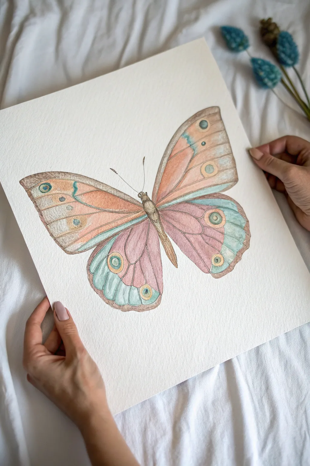
Capture the delicate beauty of nature with this soft pastel drawing, featuring gentle gradients of coral, rose, and teal. Using layering techniques, you’ll create a dusty, realistic wing texture that feels almost velvety to the touch.
Step-by-Step
Materials
- Textured pastel paper (white or off-white, heavyweight)
- Soft pastels (stick form) in peach, dusty pink, teal, light blue, and warm brown
- Pastel pencils for fine details (brown/sepia, black, cream)
- kneaded eraser
- Paper stump or blending tool
- Workable fixative spray
- Towel or cloth for cleaning hands
Step 1: Sketching the Framework
-
Measure and Mark:
Begin by lightly marking the center line of your paper with a neutral-colored pastel pencil. This will serve as the anchor for the butterfly’s body to ensure symmetry. -
Outline the Wings:
Draw the basic shapes of the wings using faint, loose strokes. The upper wings should be roughly triangular but with rounded edges, while the lower wings are fuller and more circular. -
Define the Body:
Sketch a narrow, segmented body along your center line. Add the head at the top and simple lines for the antennae, keeping the pressure very light so mistakes are easy to lift. -
Refine the Edges:
Go back over your wing outlines to create the scalloped edges typical of butterflies. Don’t worry about perfect symmetry; slight variations make it look more natural. -
Interior Vein Mapping:
Lightly sketch the major vein structure inside the wings. These lines radiate from the body outward and will act as boundaries for your different color zones.
Step 2: Adding Color and Texture
-
Base Layer – Upper Wings:
Using a soft peach or light coral pastel stick, lay down a base color on the upper wings. Use the broad side of the pastel for a wash of color, leaving some paper texture visible. -
Base Layer – Lower Wings:
Apply a dusty pink or mauve tone to the lower wings, focusing on the inner sections closest to the body. Keep your strokes gentle to avoid saturating the paper tooth too early. -
Initial Blending:
Use your finger or a paper stump to gently rub these base colors into the paper. This creates that characteristic soft, powdery look of moth or butterfly wings. -
Introducing Teal Accents:
Take a teal or light turquoise pastel and apply it to the outer edges of the lower wings and the accent stripe on the upper wings. Overlap slightly with the pinks to create a muddy but natural transition. -
Deepening Shadows:
Use a warm brown pastel pencil to darken the areas where the wings meet the body. This adds depth and suggests that the wings are attached and have volume.
Keep it Clean
Place a scrap piece of paper under your drawing hand while you work. This prevents the oils in your skin from smudging the pastel you’ve already laid down.
Step 3: Detailing and Refining
-
Drawing the ‘Eyes’:
Locate the circular ‘eye’ spots on the wings. Outline them with a brown pencil, fill the center with teal, and add a ring of cream or pale yellow around them. -
Vein Definition:
Switch to a sharpened brown pastel pencil. Carefully trace over your initial vein lines, thickening them slightly as they approach the body and letting them taper off near the edges. -
Texture Building:
Use a cream or white pastel pencil to add small, hatch-like strokes over the colored areas. This mimics the tiny scales on a butterfly’s wing and adds a shimmering effect. -
Body Detailing:
Fill in the body segments with dark brown and layer lighter brown on top for a fuzzy texture. Add the legs tucked underneath if visible, and refine the antennae. -
Edge Highlighting:
Run a very light layer of white or cream along the outer scalloped edges of the wings to separate them from the background paper. -
Final Dusting:
Take a step back to assess the color balance. If an area looks too flat, scumble (lightly scribble) a complimentary color over it lightly for more vibrancy.
Muddy Colors?
If your colors turn gray or muddy from over-blending, spray a light coat of fixative, let it dry completely, and then layer fresh, bright pastel on top.
Frame your delicate creation behind glass with a mat to protect the pastel surface
Sgraffito Scratch-Back Pattern
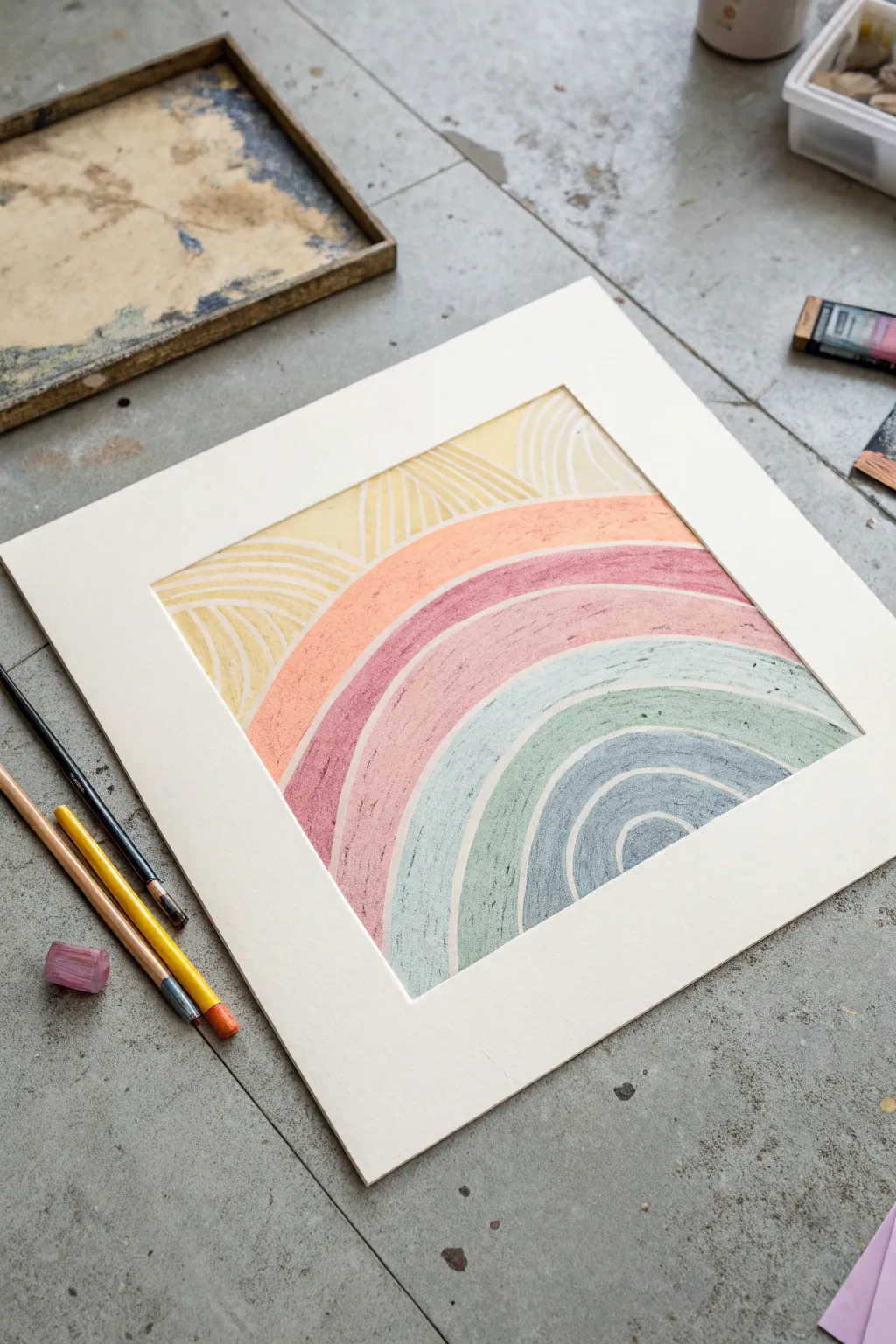
This project explores the satisfying sgraffito technique, where you layer vibrant soft pastels and then scratch through them to create defined patterns. The result is a textured, modern rainbow design with a sense of playful movement.
Step-by-Step Guide
Materials
- Heavyweight mixed media paper or pastel paper (square format)
- Soft pastels in warm yellow, coral, dusty rose, teal, and slate blue
- Pointed sculpting tool, stylus, or an empty ballpoint pen
- Masking tape or painter’s tape
- Paper mat/frame (optional, for final presentation)
- Fixative spray (workable)
Step 1: Preparation and Base Layout
-
Secure the paper:
Tape your square paper down to your work surface on all four sides. This keeps the paper from shifting while you apply pressure and creates a nice clean border if you decide to frame it without a mat later. -
Draft the arches:
Using a very light touch with a neutral-colored pastel or a pencil, sketch out your concentric arches. Start from the bottom right corner as your focal point and draw radiating curves expanding outward toward the top left. -
Define the sunrays:
In the top left section of the composition, where the rainbow ends, sketch faint lines radiating outward like sunrays. These don’t need to be perfect, just guides for where your color blocks will go.
Clean Lines Pro Tip
Keep a paper towel handy while scratching. Wipe the tip of your stylus or tool frequently to remove pigment build-up, ensuring your “white” lines stay crisp and don’t drag color into other sections.
Step 2: Color Application
-
Apply the inner arch color:
Start with the smallest semi-circle at the bottom right. Fill it in heavily with your slate blue pastel. You want a thick, dense layer of pigment here, so don’t be afraid to press firmly. -
Layer the second band:
Moving outward, fill the next arch band with a soft teal or sage green color. Work the pastel right up to the edge of the blue but try not to blend them excessively. -
Add the pink bands:
Continue the pattern with a wide band of dusty rose followed by a band of warm coral orange. Apply the pastel thickly enough that you can’t see the texture of the paper grain underneath. -
Fill the sunray section:
In the top left corner, fill the remaining space with a warm, sunny yellow. Ensure this layer is just as thick as the others to allow for clean scratching later. -
Smooth the surface:
Using your finger or a paper stump, gently rub the surface of each color band to push the pigment into the paper tooth. Wipe your finger between colors to keep the hues distinct and muddy-free.
Torn Paper Trouble?
If your tool is tearing the paper rather than just scratching the pigment, your pastel layer is too thin. Apply another heavy layer of color over the area and try scratching again with lighter pressure.
Step 3: The Sgraffito Technique
-
Test your tool:
Take your pointed scratching tool—I find a blunt stylus works perfectly—and test the pressure on a scrap piece of paper first to ensure you won’t tear through the sheet. -
Scratch the separation lines:
Firmly draw the tool along the boundary lines between each color band. This removes the pastel pigment, revealing the white paper underneath and creating a sharp, clean separation between colors. -
Detail the blue center:
Inside the slate blue arch, scratch concentric curved lines that mimic the shape of the rainbow. Keep the pressure consistent for a uniform white line. -
Pattern the teal band:
Move to the teal section and scratch similar curved lines. You can make these lines slightly closer together or further apart to add visual interest. -
Work through the pinks:
Repeat the process for the dusty rose and coral bands. The thick layer of pastel should scrape away like butter, leaving satisfyingly crisp tracks. -
Create the sunrays:
In the yellow section, scratch straight or slightly curved lines radiating from the rainbow arches outward to the edge of the paper. Group them in small fan shapes to add texture. -
Clean up debris:
You will generate little crumbs of pastel during this process. Do not wipe them with your hand, or you will smear the drawing. Instead, blow them away forcefully or tap the paper vertically on the table.
Step 4: Finishing Touches
-
Refine the edges:
If any lines look jagged or uneven, go back with your tool and gently refine them. You can also touch up the color next to the lines if you scraped away too much. -
Apply fixativ:
To prevent your hard work from smudging, take the drawing to a ventilated area and apply a light coat of spray fixative. Let it dry completely. -
Frame it:
Place a square mat over your artwork. The mat helps create visual breathing room and protects the pastel surface from touching the glass if you choose to frame it.
Hang your textured rainbow where it can catch the light and brighten your creative space


Negative Space Leaf Shapes
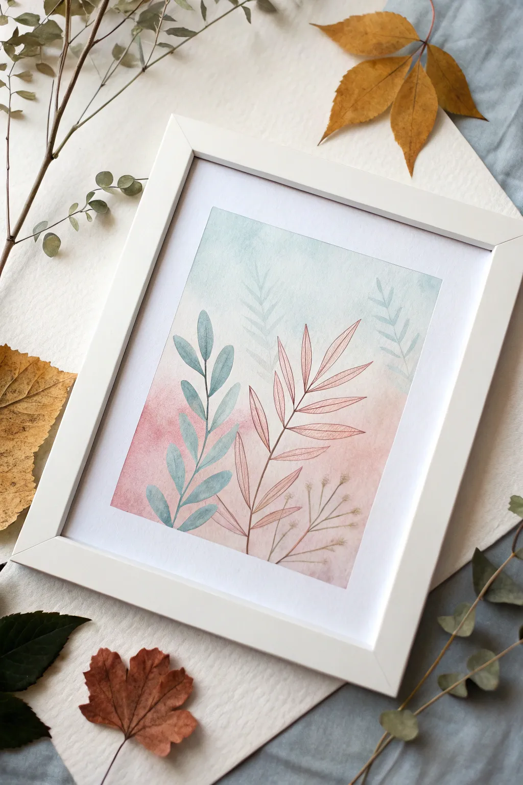
Soft pastels and watercolor washes blend effortlessly in this delicate botanical study that plays with transparency and layering. By combining a dreamy gradient background with crisp, fine-lined foliage, you’ll create a piece where the leaves seem to float within a hazy atmosphere.
Step-by-Step Tutorial
Materials
- Heavyweight watercolor paper or mixed media paper (cold press recommended)
- Soft pastels (teal/light blue, soft pink, peach, white)
- Watercolor paints or fluid acrylics (sage green, brownish-pink, muted gold)
- Medium round brush (size 6 or 8)
- Fine liner brush (size 0 or 1)
- Low-tack masking tape
- Fixative spray (workable)
- Pencil (H grade for light lines)
- Paper towels and water cup
Step 1: Creating the Ombré Background
-
Prepare the surface:
Begin by taping down your paper to a work surface with masking tape. This creates that clean, professional white border seen in the frame and prevents the paper from buckling when wet. -
Apply the upper gradient:
Using the side of a teal or light blue soft pastel stick, gently rub pigment onto the top third of the paper. Keep the application light; we want a soft haze, not opaque coverage. -
Transition the colors:
In the middle section, introduce a very pale neutral or white pastel to bridge the gap. Then, apply soft pink and peach pastels to the bottom third of the paper. -
Blend the wash:
Use a dry paper towel or your fingers to rub the pastel dust into the paper, blending the blue down and the pink up until they meet in a seamless, cloudy transition in the center. -
Add a wet wash layer (Optional):
To get the watercolor texture seen in the reference, I sometimes lightly dampen a large brush and drag it horizontally over the pastel. This liquefies the pigment slightly for a more painterly look. Let this dry completely. -
Seal the background:
Lightly spray the background with a workable fixative. This is crucial so your background colors don’t muddy the crisp leaf shapes you’re about to paint on top.
Smudged Background?
If your background gets messy while painting leaves, place a clean sheet of scrap paper under your hand as a ‘bridge’ to avoid dragging your palm through the soft pastel dust.
Step 2: Ghost Leaves & Negative Space
-
Sketch the layout:
Very faintly sketch the main sweeping curves of your plant stems with an H pencil. Plan for one main blue stem on the left and a pinkish-brown one on the right. -
Paint the background fronds:
Mix a very watery, pale blue-grey watercolor. Paint the fern-like fronds in the upper background. Keep the pigment ratio low so these look distant and faded compared to the foreground plants. -
Soften the edges:
While the background fronds are still slightly damp, touch the edges with a clean, wet brush to blur them slightly into the pastel background.
Add Metallic Details
Once the piece is dry, use a metallic gold pen or fine brush to trace just one side of the foreground leaves. It adds a subtle shimmer that catches the light beautifully when framed.
Step 3: Foreground Foliage
-
Mix the teal leaf color:
Create a sage-teal color using watercolors. It should be semi-transparent but darker than your background wash. -
Paint the left stem:
Paint the curved central stem on the left side first using your fine liner brush. Keep the line steady but organic. -
Add teal leaves:
Attached to the left stem, paint simple almond-shaped leaves. Notice how the leaves in the reference overlap the pink background section—this color contrast is key. -
Detail the veins:
While the teal paint is still wet, you can lift out a tiny line down the center of each leaf with a thirsty (dry) brush, or wait until dry and draw a vein with a darker pencil. -
Mix the warm tone:
Mix a reddish-brown or muted terracotta color for the right-hand plant. -
Paint the structural stem:
Draw the main stem and branches on the right side using the fine liner brush. This plant has a more geometric, pinnate structure compared to the leafy left stem. -
Add the needle leaves:
Using the very tip of your brush, flick outward to create the long, thin leaves. Press down at the base of the leaf and lift as you move outward to get a sharp point. -
Outline for emphasis:
For the specific illustrative look in the photo, take a sharpened colored pencil (in a similar rusty shade) and outline the painted leaves slightly to define their edges against the pastel haze. -
Add delicate filler:
At the bottom right, paint tiny, hair-thin stems with faint seed pods or buds using a very diluted brown wash. These should look fragile and subtle.
Step 4: Finishing Touches
-
Remove the tape:
Wait until the painting is completely bone dry. Slowly peel the masking tape away at a 45-degree angle to reveal your crisp white border. -
Final spray:
Give the entire piece one final coat of fixative to protect the pastel background and secure the watercolor layers.
This serene blend of soft textures and linear details brings a calm, natural focus to any wall it adorns
Tiny Series: One Subject, Five Palettes
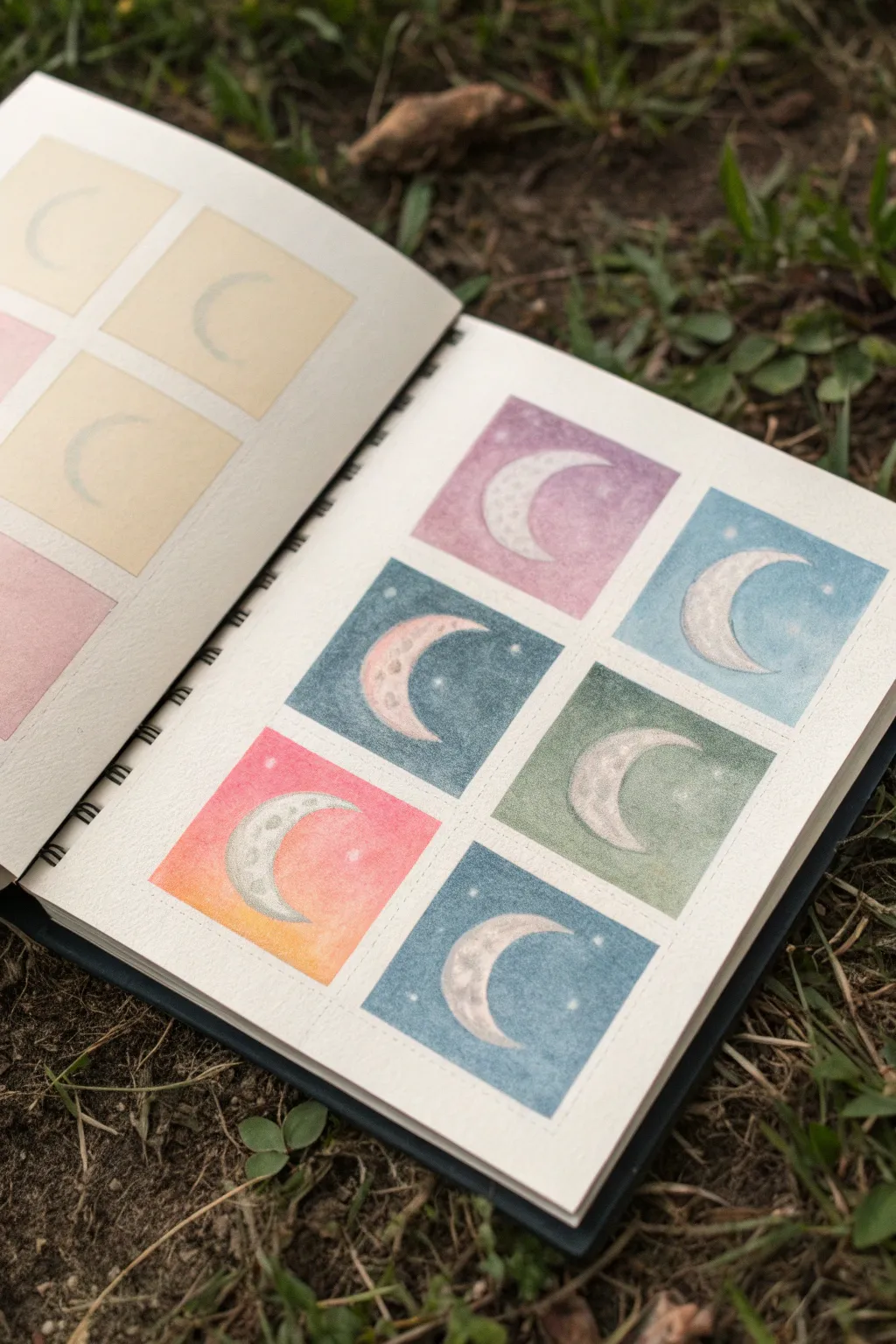
Explore the versatility of limited color schemes with this charming grid of crescent moons. By keeping the subject identical and simply shifting the hues, you’ll create a cohesive yet varied study in soft pastels that feels both magical and modern.
Step-by-Step Guide
Materials
- Small square sketchbook (spiral bound)
- Pastel paper or heavy-tooth drawing paper
- Soft pastels in various colors (purples, blues, teals, pinks, greens)
- White charcoal pencil or white pastel pencil
- Ruler
- Pencil (HB or H)
- Artist tape or washi tape (low tack)
- Blending stump or cotton swabs
- Kneaded eraser
- Workable fixative (optional)
Step 1: Preparing the Grid
-
Measure the squares:
Begin by lightly measuring out a 2×3 grid of squares on your sketchbook page. Leave a consistent border of white space—about a quarter-inch—between each square to let the colors breathe. -
Mask the borders:
Apply your low-tack artist tape along the measured pencil lines. This is crucial for achieving those crisp, sharp edges that make the miniature paintings pop against the white page. -
Sketch the crescents:
Within each taped square, lightly sketch a crescent moon shape using a hard pencil. Aim for consistency in size and curve, placing them centrally in each box.
Step 2: Applying Color Palettes
-
Palette 1: Lilac Dream:
For the first square (top left), gently rub a soft lavender pastel over the background area, avoiding the moon shape. Use a fingertip to push the pigment into the paper tooth for a smooth, hazy finish. -
Palette 2: Midnight Teal:
Move to the next square using a deep teal or denim blue. Apply the pastel heavier at the corners and lighter near the moon to create a subtle glow effect. -
Palette 3: Soft Sage:
Select a muted sage green for the third background. This earthier tone grounds the celestial theme. Blend carefully up to the tape edges. -
Palette 4: Sunset Gradient:
In the fourth square, create a gradient. Start with a warm pink at the top and blend it down into a soft orange or yellow at the bottom, mimicking a twilight sky. -
Palette 5: Deep Ocean:
Choose a darker, cooler blue for the final clearly visible square. I like to layer a bit of gray over the blue here to desaturate it slightly for a moody look.
Dust Control
If pastel dust muddies your white borders, keep a draft cleaning brush or a can of compressed air handy to blow particles away immediately.
Step 3: Detailing the Moons
-
Base layer for moons:
Using a white pastel stick, fill in the crescent shapes. Don’t worry about perfect coverage yet; a little underlying paper texture adds interest. -
Adding craters:
Take a light gray pastel pencil or a dirty blending stump and gently dab small circles onto the white crescents to suggest craters and lunar texture. -
Highlighting rims:
Reinforce the convex edge of each moon with a sharp white charcoal pencil to make it shine brightest against the colored background. -
Adding stars:
With the same sharp white pencil, dot tiny stars into the colored backgrounds. vary the pressure to create stars of different brightness.
Metallic Magic
Use metallic gold or silver watercolor paint for the stars or to outline the moons for a mixed-media touch that catches the light.
Step 4: Finishing Touches
-
Clean the edges:
Once all squares are colored and blended, very slowly peel away the tape. Pulling at a 45-degree angle away from the drawing helps prevent paper tearing. -
Erase strays:
Use a kneaded eraser to lift any pastel dust that might have migrated into the white borders during the blending process. -
Fixative layer:
If you’re worried about smudging, lightly spray a workable fixative over the page in a well-ventilated area to set the pigment.
Enjoy your collection of moons and seeing how different colors change the mood of the same simple shape


Have a question or want to share your own experience? I'd love to hear from you in the comments below!