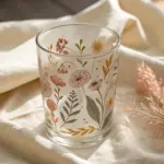
Whenever I’m craving something playful but still super design-y, I reach for cubism ideas—they turn everyday subjects into bold, broken-up shapes that feel instantly artful. If you’ve ever wanted to simplify what you see into geometric planes and color blocks, these prompts will get you there fast.
Fractured Face Portrait
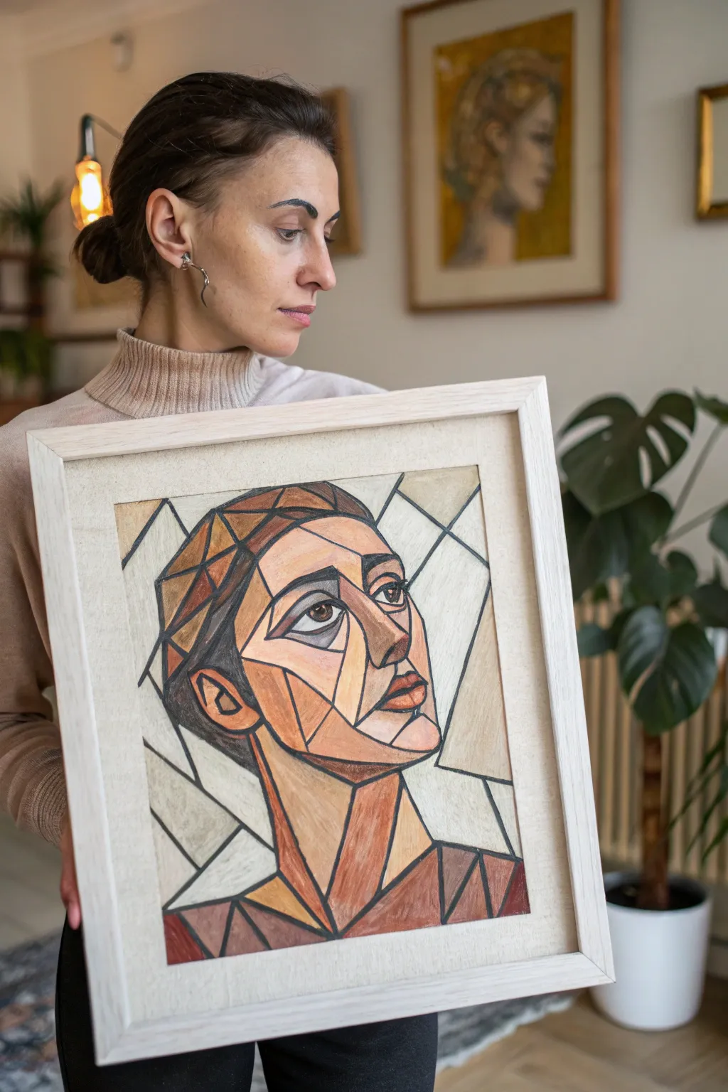
Capture the essence of early 20th-century modernism with this striking Cubist-inspired portrait, characterized by fragmented planes and earthy tones. By breaking a face down into geometric shards, you’ll create a sophisticated composition that feels both timeless and structurally complex.
Detailed Instructions
Materials
- Heavyweight mixed media paper or illustration board (A3 size)
- Graphite pencil (HB or 2B) for sketching
- Soft artist pastels or high-quality colored pencils (earth tones: sienna, ochre, umber, terracotta, grey)
- Black ink marker or fineliner (medium and thick nibs)
- Fixative spray (matte finish)
- Ruler or straight edge
- Eraser
- Blending stump or tortillon
- Frame with a mat (optional, for finishing)
Step 1: Conceptualizing and Sketching
-
Reference preparation:
Begin by selecting a reference photo of a face in three-quarter view. Look for a photo with strong lighting, as this helps identify the planes of the face that you will later fracture. -
Outline the head shape:
Lightly sketch the general oval of the head and the neck on your paper. Don’t worry about perfect realism; you are aiming for the general volume and placement. -
Map the features:
Place the eyes, nose, and mouth loosely where they belong. In Cubism, it is common to slightly skew the perspective—perhaps show the nose more in profile while the eye looks straight ahead. -
Fracture the face:
Using your straight edge, draw angular lines across the face. Create triangles and irregular quadrilaterals that cut across natural curves. I like to let these geometric shapes mimic the cheekbones and jawline. -
Develop the background:
Extend your geometric language to the background. Draw intersecting lines behind the head to create a shattered glass effect, ensuring the lines don’t distract too much from the main portrait. -
Refine the geometry:
Go over your sketch and firm up the shapes. Combine smaller shapes if the drawing looks too busy, or divide large empty areas if they look too plain. The goal is a balanced network of ‘shards’.
Muddy Colors?
If adjacent colors look messy, you likely over-blended. Cubism relies on hard edges. Use a ruler to mask edges while coloring, or erase smudges before inking the final black outlines.
Step 2: Applying Color
-
Select your palette:
Limit yourself to warm earth tones. Gather shades of brown, tan, cream, dusky red, and cool grey. A restricted palette is key to the authentic Cubist look shown in the example. -
Base layer for skin tones:
Start coloring the ‘lit’ planes of the face with your lightest creams and tans. Apply the pastel or pencil smoothly, filling the geometric shape completely. -
Adding shadow depth:
Move to the darker planes—the shadows under the chin, the side of the nose, and the hair. use burnt umber and terracotta tones here to push these shapes backward in space. -
Define the hair:
Treat the hair as a series of solid geometric blocks rather than individual strands. Use alternating shades of dark brown and lighter copper to suggest volume without texture. -
Color the eyes:
Fill in the almond shapes of the eyes. Use a stark white or light grey for the sclera and a deep brown for the iris, keeping the application flat and graphical. -
Background wash:
Color the background shapes with very pale, neutral tones—mostly off-whites and light greys. This negative space needs to remain subtle so the portrait pops forward.
Step 3: Texture and Definition
-
Create directional strokes:
Go back into your colored shapes and add subtle texture. If using pencils, layer hatch lines in different directions for adjacent shapes to emphasize the feeling of separate planes. -
Blend selectively:
Use a blending stump to smooth out the pigment in the smoother areas of the skin, but leave some areas rougher for visual interest. -
Inking the boundaries:
Take your black marker. Carefully trace over all your pencil lines. The lines should be consistent and bold, acting like the lead in a stained-glass window. -
Varying line weight:
Thicken the lines that define the outer silhouette of the head and the major features (like the jawline) to give the portrait structural weight. -
Filling negative voids:
If your composition has small gaps between shapes where lines intersect, fill these tiny triangles with solid black ink to increase contrast. -
Final highlights:
Use a white charcoal pencil or white pastel to add a sharp highlight to the bridge of the nose and the glint in the eye. -
Seal the work:
Take the artwork to a well-ventilated area and spray it lightly with fixative to prevent the pastels or soft pencils from smudging.
Pro Tip: Grain Direction
Change the direction of your pencil strokes for every neighboring shape. Vertical strokes next to horizontal ones create a subtle vibration that emphasizes the ‘fractured’ effect.
Once framed, this modern masterpiece will add a touch of avant-garde sophistication to your wall.
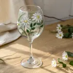
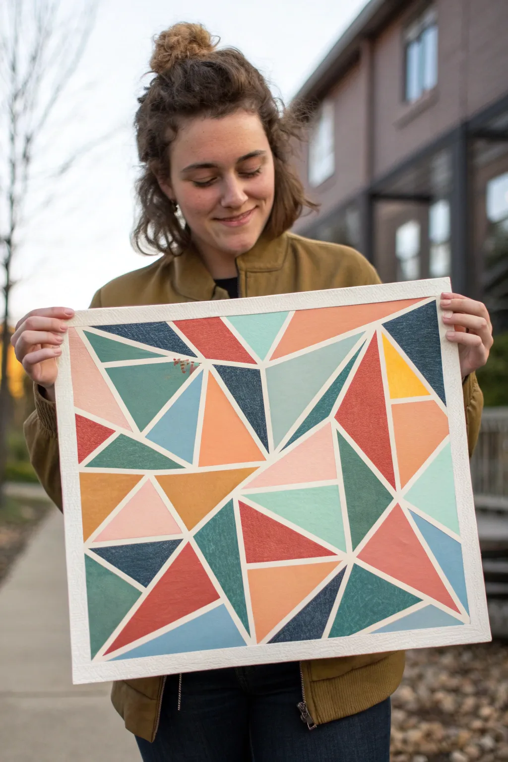
Bottle, Glass, and Fruit Planes
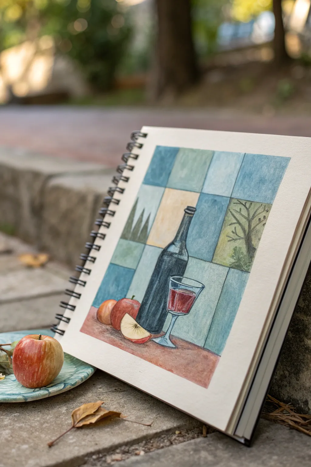
This sketchbook study blends traditional still life elements with a structured, geometric background inspired by Cubist fragmentation. By breaking the negative space into color blocks, you will create a sense of depth and modernity around a classic wine and fruit composition.
How-To Guide
Materials
- Hot press watercolor paper or mixed media sketchbook
- HB graphite pencil
- Kneaded eraser
- Fine liner pen (waterproof, black, 0.3mm or 0.5mm)
- Watercolor paints (Indigo, Burnt Sienna, Crimson, Sap Green, Yellow Ochre, Cerulean Blue)
- Small round brush (size 4) and flat brush (size 6)
- Ruler
- Cup of water and paper towels
Step 1: Drafting the Composition
-
Establish the grid:
Begin by lightly drawing a rectangular border for your composition using a ruler. Divide the interior into a grid of roughly square and rectangular sections. Don’t worry about perfect measurements; some variation adds character. -
Sketch the bottle:
Draw the wine bottle slightly off-center to the right. Start with a long cylindrical neck flaring into shoulders, then straight down for the body. The bottle should overlap several of your background grid lines. -
Add the glass:
Position the wine glass in front of the bottle. Sketch an elliptical rim, a tapered bowl, a thin stem, and a flat elliptical base. Mark the liquid line inside the bowl. -
Place the fruit:
To the left of the bottle, sketch two overlapping circles for the whole apples. In front of them, draw a wedge shape for the apple slice, showing both the skin and the flesh. -
Detail the background elements:
In the grid squares surrounding the main objects, lightly sketch faint suggestions of trees or foliage in just two or three panels to hint at an outdoor setting, keeping the other squares empty.
Uneven Washes?
If your tile colors look blotchy, you might be reworking the paper while it’s damp. Lay down the color in one go and let it dry completely before touching it again.
Step 2: Applying Color Washes
-
Paint the background tiles:
Mix watery washes of Cerulean Blue, a pale Yellow Ochre, and a muted Green. Paint the background squares individually using the flat brush. Alternate colors so no two identical shades touch. Leave the squares with tree sketches unpainted for now. -
Detail the scenic tiles:
For the panels with tree sketches, paint a pale yellow or light blue background. Once dry, use a small round brush with Sap Green and Brown to carefully paint the silhouette of branches or pine trees. -
Base coat the table:
Mix Burnt Sienna with a touch of Crimson to create a warm reddish-brown. Paint the entire bottom section representing the table surface, covering the area beneath the fruit and bottle. -
Paint the bottle:
Use a concentrated mix of Indigo and a tiny bit of Black. Paint the bottle, but be careful to leave small vertical strips of white paper on the neck and shoulder to represent strong highlights. -
Color the fruit:
Paint the two whole apples with a wash of Yellow Ochre, then drop in wet Crimson while it’s still damp to create a blush effect. For the apple slice, keep the flesh very pale cream and paint the skin red. -
Fill the wine glass:
Paint the liquid inside the glass with a rich Crimson. Dilute the paint significantly to add a faint wash to the empty upper part of the glass, giving it a transparent look.
Step 3: Refining and Inking
-
Add shadows:
I find that mixing a little purple into the table color creates a great shadow tone. Apply this mix underneath the apples, the apple slice, and the base of the bottle to ground them. -
Deepen contrasts:
Once the first layers are dry, go back into the bottle with a second coat of dark Indigo to make it opaque, sharpening the edges against the background squares. -
Outline the grid:
Take your fine liner pen and trace over the pencil lines of the background grid. You don’t need a ruler here; a steady hand-drawn line looks more organic. -
Define the objects:
Outline the bottle, glass, and fruit with the pen. Use a slightly broken or sketched line style rather than a single rigid stroke. -
Add texture marks:
Use the pen to add small hatching lines on the shadowed side of the apples and the wine bottle label area to suggest volume. -
Final highlights:
If the white paper highlights on the bottle or glass got covered by paint, you can bring them back with a small touch of white gouache or a white gel pen.
Cubist Dimension
Draw the grid lines partially ‘through’ the bottle and fruit. Painting slightly different shades inside these intersecting shapes creates a true transparent Cubist effect.
Now you have a charming still life that balances classical realism with abstract geometric design
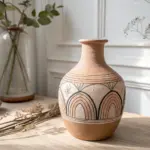
Vase of Flowers in Shards
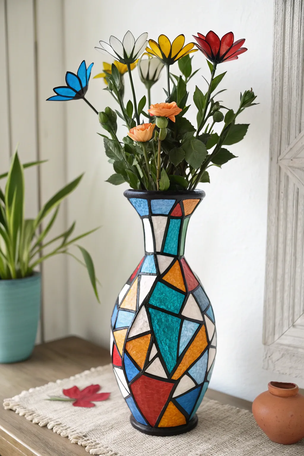
Transform a plain glass cylinder into a vibrant piece of cubist art using a faux-stained glass technique. This project combines bold geometric shards of color with thick black leading lines to mimic the look of a traditional mosaic without the sharp edges.
Detailed Instructions
Materials
- Tall, clear glass or white ceramic vase (hourglass shape preferred)
- Gallery Glass or similar liquid leading (black)
- Tissue paper in assorted colors (red, blue, teal, yellow, orange, white)
- Mod Podge (Gloss finish)
- Foam brush
- Soft synthetic bristle brush
- Scissors or craft knife
- Spray sealant (clear acrylic gloss)
- Translucent glass paints (optional alternative to tissue paper)
Step 1: Planning and Surface Prep
-
Clean the surface:
Begin by thoroughly cleaning your vase with rubbing alcohol or glass cleaner. Any oils from your hands can prevent the adhesive materials from sticking properly, so ensure it is completely dry and lint-free. -
Sketch the design:
Using a dry-erase marker directly on the glass, sketch out your geometric ‘shard’ pattern. Focus on creating triangles, irregular quadrilaterals, and sharp angles typical of cubism. If you make a mistake, simply wipe it away. -
Vary the shapes:
Ensure you have a mix of sizes. Large shards work well on the belly of the vase, while smaller, more intricate shapes are better suited for the neck and rim area.
Smooth Operator
To get the smoothest finish on tissue paper, mist the paper very lightly with water right before placing it on the glue. This relaxes the fibers preventing wrinkles.
Step 2: Creating the Mosaic Color
-
Cut the tissue paper:
Cut your colored tissue paper into sharp geometric shapes that roughly correspond to your sketched design. They don’t need to be perfect matches yet, as tissue paper is forgiving. -
Apply base adhesive:
Working in small sections, brush a thin layer of Gloss Mod Podge onto the vase surface. I like to start at the bottom and work my way up to avoid smudging wet areas. -
Place the color shards:
Press a piece of tissue paper onto the wet adhesive. Gently smooth it out with your finer or brush to remove large air bubbles. A little wrinkling adds texture that mimics real stained glass. -
Overlap for depth:
Feel free to slightly overlap different colors. When light shines through, a blue piece over a yellow piece will create a beautiful green section. -
Seal the paper layer:
Once a section is covered with paper, gently brush another coat of Mod Podge over the top to seal it. Be gentle here so you don’t tear the damp tissue. -
Fill the white space:
Continue this process until the entire vase is covered. Use white tissue paper for the areas that should remain neutral, rather than leaving the bare glass exposed, to maintain a consistent texture. -
Dry completely:
Let the vase dry fully. It will look cloudy while wet but will clear up significantly as it dries. Allow at least 2-3 hours.
Step 3: Leading and Detailing
-
Prepare the liquid leading:
Take your bottle of black liquid leading (often sold near glass paints). Tap the tip on a scrap paper to ensure the flow is smooth and get rid of air bubbles. -
Trace the outlines:
Draw thick black lines over the seams where your tissue paper shapes meet. This covers the messy edges and creates the distinct ‘lead came’ look of stained glass. -
Define the boundaries:
Make sure to add a solid line of leading around the very top rim and the bottom base of the vase to frame the artwork. -
Create the rim detail:
For the thick black rim seen in the image, you may need to apply multiple beads of leading side-by-side or use opaque black glass paint for a wider band. -
Let the leading cure:
Liquid leading takes longer to cure than Mod Podge. lay the vase on its side (if the leading isn’t too runny) or keep upright and let it set for at least 8 hours.
Glow Up
Place a battery-operated LED puck light inside the vase. The tissue paper acts as a diffuser, turning your art project into a stunning cubist mood lamp.
Step 4: Floral Accents (Optional)
-
Create wire stems:
To mimic the faux flowers in the image, cut floral wire to varying lengths. -
Shape petals:
Cut petal shapes from stiff acetate or rigid plastic sheets. Use glass paint to color them in solid primary colors like red, blue, and yellow. -
Assemble flowers:
Glue the petals to the wire stems using a strong craft glue or UV resin, adding a small bead center. -
Final assembly:
Arrange these geometric flowers alongside real greenery inside your finished vase for the complete look.
Place your vase near a window where the sunlight can illuminate the brilliant colors of your cubist creation
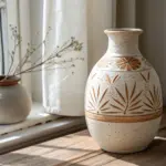

Cubist Bowl of Citrus Slices
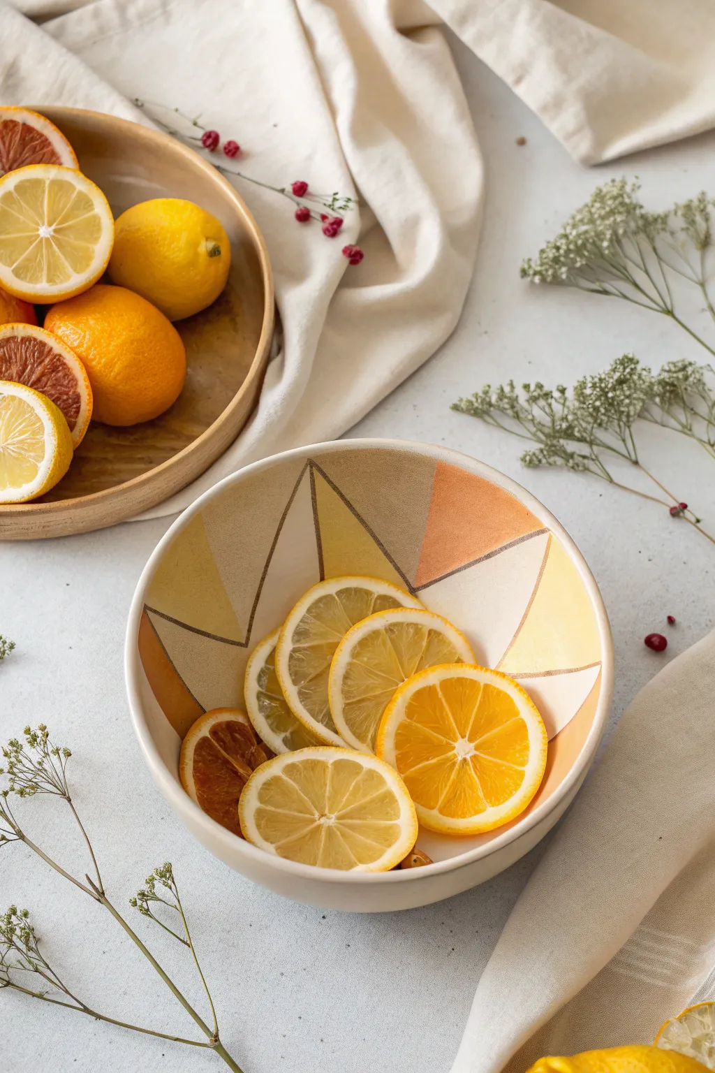
Transform a simple ceramic bowl into a modern, cubist-inspired centerpiece with angular wedges of warm color. This project combines geometric precision with the organic translucence of citrus for a striking, light-filled display.
Step-by-Step
Materials
- Plain white or cream ceramic bowl (matte finish preferred)
- Ceramic paints (Mustard Yellow, Burnt Orange, Terracotta, Tan/Beige)
- Soft synthetic paintbrushes (flat shader and fine liner)
- Thin masking tape or painter’s tape (1/4 inch width is ideal)
- Isopropyl alcohol and paper towel
- Pencil
- Oven (if using bake-to-set paints)
- Fresh lemons and oranges
- Dried orange slices (optional for texture variety)
Step 1: Planning the Design
-
Clean the surface:
Before you begin painting, thoroughly clean the inside of your ceramic bowl with isopropyl alcohol and a paper towel. This removes any oils or dust that might prevent the paint from adhering properly. -
Map out triangles:
Visualize a series of large, interconnected triangles radiating from the center or rim of the bowl. Using a pencil, lightly sketch these geometric divisions directly onto the ceramic surface. Don’t worry about perfection; the lines will be covered or washed off later. -
Tape the lines:
Apply thin masking tape along your pencil lines to create sharp boundaries. Press the edges of the tape down firmly with your fingernail to prevent paint bleed. I like to tape off non-adjacent sections first so I can paint them without waiting for neighbors to dry.
Crisp Line Secret
Paint a layer of clear medium or base color over the tape edge first to seal it. This prevents colored paint from bleeding under.
Step 2: Painting the Geometry
-
Mix your palette:
Prepare your ceramic paints. You want a warm, earthy palette: mix a little brown into your yellow to get that muted mustard tone, and ensure your orange isn’t too neon by softening it with a touch of tan. -
First color application:
Using a flat shader brush, fill in the first set of triangles with the Mustard Yellow. Apply the paint in thin, even layers to avoid globs. Two thin coats are better than one thick one. -
Add warmth:
Move to the next sections and apply the Burnt Orange shade. The goal is to alternate colors so that similar tones aren’t always touching, creating that fragmented, cubist look. -
Deepen the contrast:
Fill remaining sections with the darker Terracotta or Tan shades. These darker triangles act as shadows in your composition, giving the design depth. -
Let it dry:
Allow these first sections to dry completely according to the paint manufacturer’s instructions. This is crucial before moving the tape. -
Tape remaining sections:
Carefully peel off the initial tape. Now, apply new tape over the dried painted edges to protect them while you paint the adjacent empty triangles. This ensures crisp lines between every color block. -
Finish painting:
Fill in the final white spaces with your remaining colors. Feel free to leave one or two triangles unpainted (white) to let the ceramic base show through as a highlight.
Step 3: Refining and Setting
-
Detail lines:
Once all paint is dry and tape is removed, use a fine liner brush with a dark brown or metallic bronze paint to outline the triangles if you want extra definition. The reference image shows subtle separation, which can also be achieved by leaving a hairline gap between colors. -
Clean up errors:
If any paint bled under the tape, use a cotton swab dipped in alcohol or a craft knife to gently scrape or wipe away the excess for a sharp edge. -
Bake to set:
If your ceramic paint requires heat setting, place the bowl in a cold oven. Turn the heat to the specified temperature (often around 300°F or 150°C) and bake for the recommended time (usually 30 minutes). Let it cool completely in the oven before removing.
Metallic Accent
Use gold leaf pen on the dividing lines between triangles for a touch of Art Deco luxury alongside the rustic cubist vibes.
Step 4: Styling the Citrus
-
Prepare the fruit:
Slice fresh lemons and oranges into thin rounds. For the Cubist aesthetic, varying the slice thickness slightly adds visual interest. -
Include dried elements:
Incorporate a few dried orange slices alongside the fresh ones. The darker, translucent caramel tones of the dried fruit complement the painted geometric shapes perfectly. -
Arrangement:
Layer the slices inside the finished bowl. Overlap them casually so the geometric painted background peeks through the gaps in the fruit, merging the artwork with its contents.
Now you have a stunning, artistically driven vessel that turns a simple snack into a visual experience
BRUSH GUIDE
The Right Brush for Every Stroke
From clean lines to bold texture — master brush choice, stroke control, and essential techniques.
Explore the Full Guide
Fish With Stained-Glass Sections
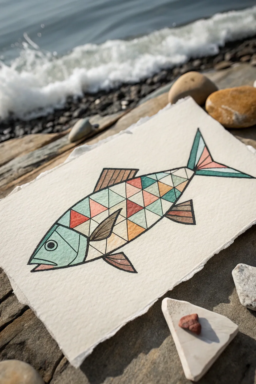
Capture the beauty of aquatic life through sharp angles and muted tones with this cubist-inspired fish illustration. By breaking the form down into triangles and distinct shapes, you’ll create a striking stained-glass effect on textured paper.
Detailed Instructions
Materials
- Heavyweight textured watercolor paper (cold press or rough)
- Fine liner pen (black, waterproof, 0.5mm or 0.8mm)
- Watercolor paints or high-quality colored pencils
- Ruler or straight edge
- Pencil (HB)
- Eraser
- Small round paintbrush (size 2 or 4, if using paint)
- Palette for mixing muted tones
Step 1: Drafting the Geometric Form
-
Establish the Basic Outline:
Begin by sketching the main body of the fish lightly with your HB pencil. Draw a long, tapered oval shape that points slightly downward at the nose. -
Add Fins and Tail:
Sketch a trapezoid shape for the dorsal fin on top and angled shapes for the pectoral and pelvic fins below. Draw a forked tail at the rear, keeping the lines straight and angular rather than curved. -
Define the Face:
Separate the head from the body with a curved vertical line. Draw a circle for the eye and a simple geometric mouth at the front tip. -
Create the Grid:
Using your ruler, lightly draw intersecting diagonal lines across the body of the fish. Aim to create a network of triangles and diamonds. -
Refine the Sections:
Go over your grid and select the best triangles to keep. You don’t need a perfect pattern; irregularity adds to the hand-drawn cubist charm.
Clean Lines Tip
When inking along a ruler, wipe the ruler’s edge with a tissue after every few lines. This prevents ink buildup from smearing onto your clean paper.
Step 2: Inking the Lines
-
Trace the Outline:
Switch to your waterproof black fine liner. Carefully trace the entire outer perimeter of the fish with a steady hand. -
Ink the Internal Grid:
Use your ruler again to ink the geometric lines inside the body. Press firmly to create clean, bold boundaries between your future color sections. -
Detail the Fins:
Instead of triangles, fill the fins with parallel lines or simple stripes to distinguish their texture from the body scales. -
Thicken the Lines:
Go back over your main outline a second time to make it slightly thicker than the internal grid lines. This helps contain the design visually. -
Erase Guide Lines:
Wait at least five minutes for the ink to dry completely to avoid smudging. Then, gently erase all remaining pencil marks.
Try Metallic Accents
Replace the beige/tan triangles with gold or copper metallic paint. The sheen will make the ‘stained glass’ effect pop when the light hits it.
Step 3: Adding the Color
-
Mix Your Palette:
Prepare a muted, earthy color palette. You’ll need a dusty teal, a soft salmon pink, a warm tan, and a darker brown. -
Paint the Head:
Using the dusty teal, fill in the main section of the head. I like to keep the paint slightly translucent here so the paper texture shows through. -
Establish a Pattern:
Select non-adjacent triangles on the body and color them with the teal shade. Working color by color prevents accidental mixing. -
Add Warm Tones:
Switch to the salmon pink. Fill in scattered triangles, focusing on creating balance against the cool teal sections. -
Fill with Neutrals:
Use the warm tan or beige to fill the remaining empty body triangles. This neutral tone acts as the ‘glass’ that ties the brighter colors together. -
Color the Fins:
Use the darker brown shade for the fins and tail sections. You can alternate strips of brown and tan for visual interest. -
Detail the Eye:
Fill the center pupil of the eye with solid black ink, leaving a tiny white dot for a highlight if possible. -
Final Touches:
Check for any uneven edges. If using colored pencils, burnish the layers to smooth them out; if using paint, let it dry fully before touching the paper.
Display your geometric catch in a simple frame to let the intricate linework shine
Simple Cubist Landscape Blocks
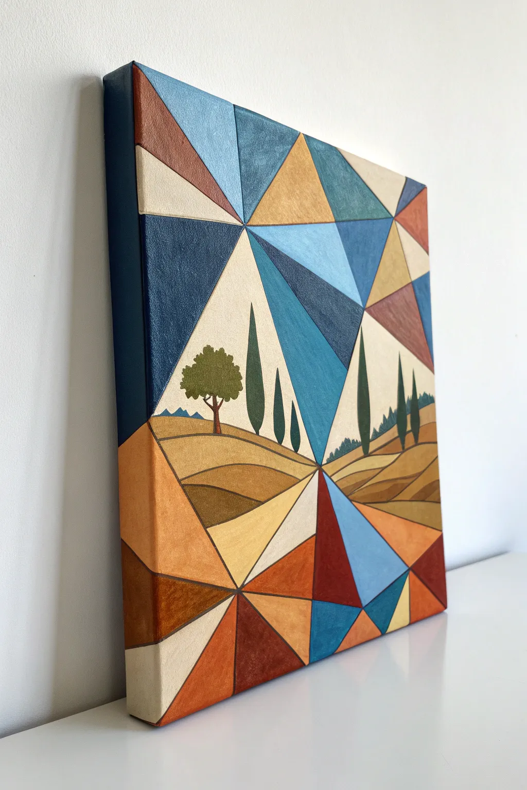
This striking acrylic painting blends modern geometric abstraction with the classic warmth of a Tuscan landscape. By fracturing the sky and ground into sharp triangular facets, you create a dynamic, kaleidoscope-like view of rolling hills and cypress trees.
How-To Guide
Materials
- Square stretched canvas (approx. 16×16 or 20×20 inches)
- Acrylic paints (Titanium White, Burnt Sienna, Yellow Ochre, Ultramarine Blue, Phthalo Blue, Sap Green, Burnt Umber, Cadmium Red)
- Painter’s tape (low-tack usually works best)
- Ruler or straight edge
- Pencil and eraser
- Flat synthetic brushes (various sizes: 1 inch, 1/2 inch, and small detail brush)
- Palette for mixing
- Jar of water and paper towels
Step 1: Drafting the Design
-
Establish the Horizon:
Start by finding the visual center of your canvas. Lightly sketch a horizon line that isn’t perfectly straight but dips slightly in the middle to create a valley effect. -
Sketch the Focal Point:
Draw the central landscape elements within a triangular or diamond-like opening in the center. Sketch rolling hills and position 4-5 vertical cypress trees of varying heights, plus one rounder tree on the left hill. -
Create the Geometric Grid:
Using your ruler, draw straight lines radiating outward from the central landscape area to the edges of the canvas. I like to make these random angles to create a fractured glass look. -
Subdivide the Shapes:
Within the large sections you just created, use the ruler to draw connecting diagonal lines, forming a network of triangles and trapezoids that surround the central scene. -
Extend to the Sides:
carry your main geometric lines over the edge of the canvas onto the sides. This ‘gallery wrap’ finish makes the artwork look professional without a frame.
Bleeding Lines?
If paint bleeds under tape, paint the base color over the tape edge first to seal it. Once dry, paint the new color on top for a perfect line.
Step 2: Blocking in the Central Landscape
-
Paint the Sky Wedge:
Mix a pale, creamy beige (White + tiny touch of Yellow Ochre). Fill in the two large triangular sections that frame the central vegetation, creating a calm backdrop for the trees. -
Base Coat the Hills:
Paint the rolling hills in the center. Use Yellow Ochre for the lighter, sunlit slopes and mix a little Burnt Sienna into it for the shadowed sides of the hills. -
Paint the Cypress Trees:
Using a small flat brush turned on its edge, paint the tall cypress trees. Mix Sap Green with a bit of Burnt Umber for a deep, dark olive tone. Keep the edges sharp. -
Detail the Round Tree:
Paint the texture of the round tree on the left using a stippling motion with lighter olive green, and paint a thin brown trunk grounding it to the hill. -
Add Hill Defines:
Once the base hill colors are dry, use a thin brush with dark brown (Burnt Umber) to outline the curvature of the fields, separating the light and dark sections clearly.
Metallic Pop
Swap one of the beige or ochre paint mixes for a metallic gold or copper acrylic. It adds a luxurious shimmer that catches the light beautifully.
Step 3: Painting the Geometric Border
-
Plan Your Palette:
Decide on your color balance. You want a mix of warm tones (terracotta, gold, tan) and cool tones (teal, navy, slate blue). It helps to mark the canvas lightly with initial letters (like ‘B’ for Blue) so you don’t paint two same-colored shapes next to each other. -
Tape Off Sections:
Tape off a few non-adjacent triangles. Press the edges of the tape down firmly to prevent paint bleed. This is crucial for those crisp, hard-edge lines. -
Apply the Dark Blues:
Mix Ultramarine Blue with a touch of black or dark brown for the deepest navy sections. Apply two coats if necessary for solid, opaque coverage. -
Paint the Warm Tones:
Move on to the earthy sections. Use pure Burnt Sienna for the rust colors, and mix Yellow Ochre with White for the sandy triangles. -
Add the Cool Teals:
Mix Phthalo Blue with White and a speck of Yellow to create the teal and slate blue geometric shapes. These cool tones balance the warmth of the ‘earth’ sections. -
Remove and Repeat:
Peel off the tape while the paint is still slightly tacky to avoid ripping. Let the painted sections dry completely, then re-tape to paint the remaining adjacent shapes. -
Enhance Transitions:
For a ‘stained glass’ depth, you can lightly glaze a darker shade on one side of a specific triangle, suggesting a shadow or gradient within the geometric shape itself.
Step 4: Final Touches
-
Clean Up Lines:
Inspect your geometric edges. If paint bled under the tape, use a small detail brush and the correct color to tidy up the straight lines. -
Detail the Center Horizon:
Add tiny distant mountains in blue-grey along the horizon line in the central diamond to give the landscape immense depth. -
Varnish:
Once fully dry (give it 24 hours), apply a coat of satin or matte varnish to unify the sheen of all the different colored paints.
Hang your modern masterpiece where the light can catch those bold angles and warm colors

PENCIL GUIDE
Understanding Pencil Grades from H to B
From first sketch to finished drawing — learn pencil grades, line control, and shading techniques.
Explore the Full Guide
Self-Portrait With Two Viewpoints
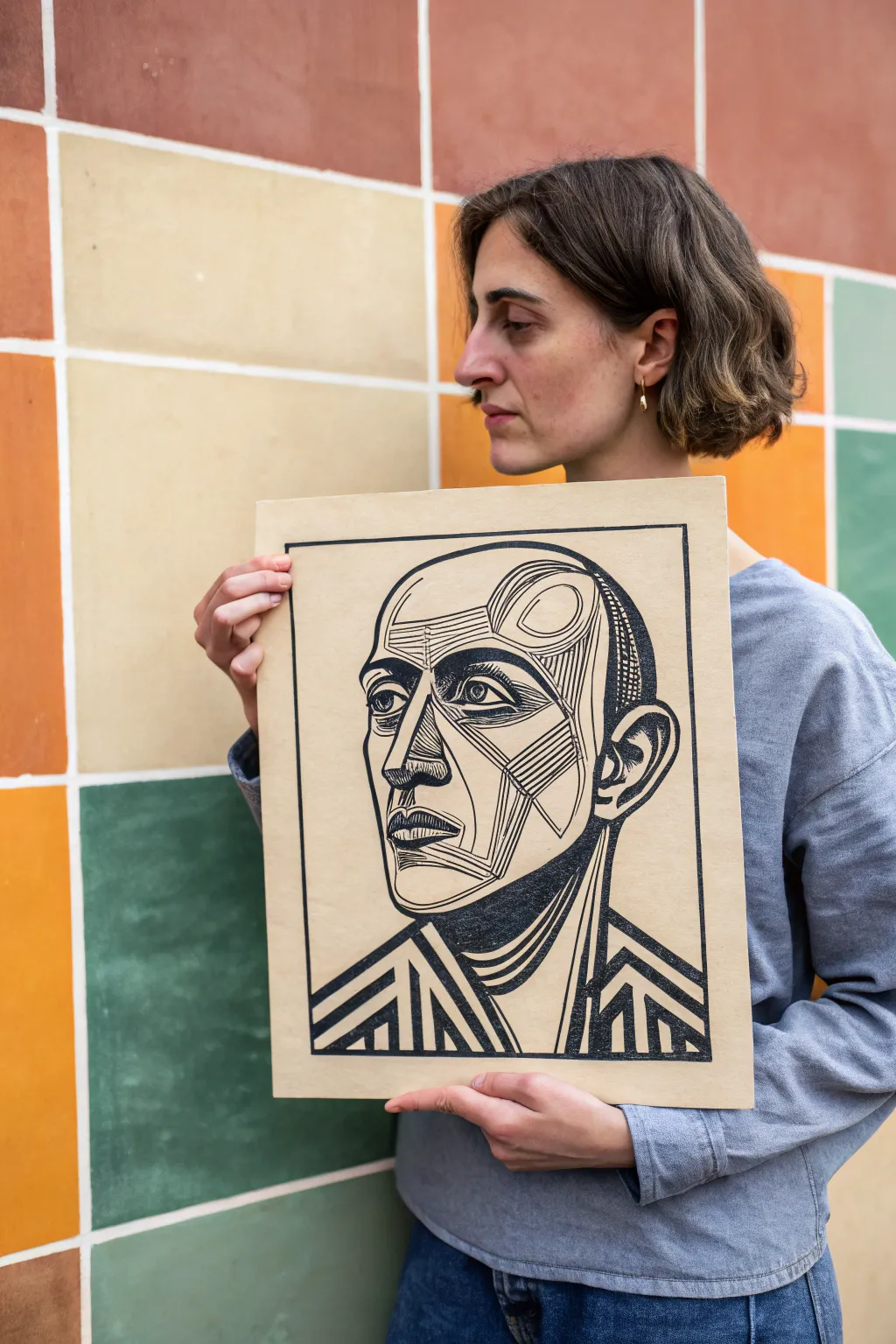
This project channels the fractured beauty of Cubism into a bold relief print, blending stark black ink with the warmth of tan paper. You will learn to carve geometric planes to construct a face that feels simultaneously modern and timeless.
Step-by-Step
Materials
- Soft-cut lino block (approx. A4 size)
- Linoleum cutters (V-gouge and square gouge)
- Tan or beige printmaking paper (heavyweight)
- Black block printing ink (water-soluble or oil-based)
- Brayer (rubber roller)
- Inking plate or piece of glass
- Tracing paper
- Pencil (HB or softer)
- Baren or a wooden spoon
- Carbon paper (optional)
- Permanent marker (fine tip)
Step 1: Drafting and Transfer
-
Sketch the concept:
Begin by sketching your portrait on regular paper. Focus on breaking the face down into angular planes and geometric shapes rather than smooth, realistic curves. Think about the ‘Two Viewpoints’ theme by perhaps shifting the nose or eyes slightly off-axis. -
Refine the lines:
Darken the lines you intend to keep black. Create variety by using thick, bold lines for the jaw and neck, and thinner, hatched lines for shading around the eyes and cheekbones. -
Reverse the image:
Since printing reverses the image, you need to flip your design. Trace your final sketch onto tracing paper, then flip the tracing paper over face-down onto the lino block. -
Transfer to block:
Rub the back of the tracing paper firmly to transfer the graphite onto the lino. If the lines are faint, go over them directly on the block with a permanent marker to ensure you don’t lose your guide while carving.
Clean Lines
Warm the lino block slightly with a hair dryer or on a radiator for a few minutes before carving. It softens the material, making it much easier to achieve smooth, fluid curves.
Step 2: Carving the Matrix
-
Outline fine details:
Using your smallest V-gouge, carefully carve along the outer edges of your thin lines first. This establishes your ‘stop’ cuts and prevents you from accidentally slipping into areas that should remain black. -
Carve the negative space:
Switch to a wider U-gouge to clear away the large open areas around the head and shoulders. Remember, whatever you carve away will be the color of the paper; whatever you leave creates the black image. -
Create texture with hatching:
For the shaded areas on the forehead and cheek, use the V-gouge to make parallel, rhythmic cuts. I find that varying the spacing between these lines adds a wonderful sense of depth. -
Clear the background:
Remove the material outside the border frame. You can leave some chatter (small ridges) if you like a rougher look, or smooth it completely for a clean background. -
Proof the block:
Place a piece of scrap paper over the block and rub specifically with a crayon or graphite stick to see a rubbing impression. This helps reveal any areas that need more clearing before you commit to ink.
Salty Inking?
If your black areas look speckled (called ‘salty’), you likely didn’t use enough ink or didn’t apply enough pressure. Apply a second thin layer of ink and burnish harder next time.
Step 3: Inking and Printing
-
Prepare the paper:
Cut your tan printmaking paper to size, ensuring you leave a generous margin around where the print will sit. Set up a clean station for your paper to avoid inky fingerprints. -
Charge the ink:
Squeeze a small bead of black block printing ink onto your inking plate. Roll the brayer back and forth and lift it frequently to create a smooth, velvety texture often called ‘orange peel’. -
Ink the block:
Roll the ink onto your carved block. Apply it in thin, even layers, rolling in multiple directions to ensure solid coverage on the raised surfaces without flooding the fine carved lines. -
Register the paper:
Carefully align your paper over the inked block and lower it gently. Once it touches the ink, do not shift or drag the paper, as this will smudge the sharp lines. -
Burnish the print:
Using a baren or the back of a wooden spoon, rub the back of the paper in small circles. Apply firm, consistent pressure, working from the center outwards to the edges. -
Check for transfer:
Holding the paper firmly in place with one hand, carefully peel back a corner to check the ink density. If it looks patchy, lay it back down and rub that specific area more vigorously. -
The reveal:
Slowly peel the paper entirely off the block to reveal your print. Any small imperfections are just part of the handcrafted charm. -
Drying:
Place the started print on a drying rack or hang it by a corner. Let the ink cure completely according to the manufacturer’s instructions—oil-based inks may take a few days.
Frame your geometric masterpiece simply to let the powerful lines speak for themselves
Monochrome Analytic Cubism Study
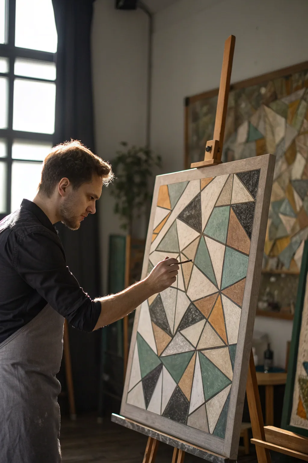
Embrace the structured beauty of analytic cubism with this geometric study featuring a muted, earthy palette. The interplay of triangles and polygons creates a dynamic yet balanced composition that explores form and spatial relationships through subtle color blocking.
Step-by-Step Tutorial
Materials
- Large stretched canvas (approx. 24×36 inches)
- Acrylic paints (Titanium White, Mars Black, Yellow Ochre, Raw Sienna, Sage Green, Slate Grey)
- Wide masking tape or painter’s tape
- Long ruler or yardstick
- Pencil and eraser
- Set of flat synthetic brushes (sizes 6, 12, and 1-inch)
- Palette knife (optional for texture)
- Matte medium or texture paste (optional)
Step 1: Planning and Structure
-
Prime the Surface:
Begin by applying a base coat of Titanium White mixed with a very small touch of Raw Sienna to kill the stark brightness of the canvas. Let this dry completely to establish a warm, neutral ground. -
Map Major Dividing Lines:
Using your yardstick and a light pencil, draw 3-5 major diagonal lines that traverse the entire canvas. These shouldn’t act as a grid, but rather as ‘fracture lines’ that break the space into large, irregular sections. -
Subdivide into Shapes:
Within those large sections, use the ruler to draw intersecting lines to create a network of triangles and quadrilaterals. Vary the sizes significantly—place clusters of small shards next to larger, open planes to create visual rhythm. -
Balance the Composition:
Step back and look at your line work. If an area feels too empty, bisect a few shapes to add density. The goal is an asymmetrical balance that feels deliberate rather than chaotic. -
Trace and Refine:
Once satisfied with the pencil layout, you can darken the lines slightly or leave them faint depending on whether you want visible borders. I prefer to keep them light so the paint defines the edge.
Step 2: Color Blocking and Texture
-
Mix Your Palette:
Prepare four main color pools: a dusty sage green (mix Sage Green with White and a dot of Black), a warm ochre (Yellow Ochre plus Raw Sienna), a charcoal grey (Mars Black and White), and a creamy off-white. -
Apply the Darkest Tones:
Start by painting the charcoal or black sections. Choose scattered triangles throughout the composition to serve as anchor points for the eye. Use a flat brush to keep the edges crisp. -
Textural Technique:
For a chalky, fresco-like appearance similar to the reference, don’t paint perfectly flat. Use a ‘scumbling’ technique: load a relatively dry brush with paint and drag it across the canvas grain so some underlying specks show through. -
Fill the Earth Tones:
Move on to the ochre and brown shapes. Adjacent shapes should rarely be the same color. If you have two ochre shapes touching, lighten one with white or darken with a touch of brown to create separation. -
Add the Greens:
Paint the sage green sections. This cool tone balances the warmth of the ochre. Ensure these are distributed evenly across the canvas so the color doesn’t feel heavy on just one side. -
Painting the Light Planes:
Fill the remaining shapes with your creamy off-white mixture. These light areas represent the highlights and open space in the composition, giving the darker shapes room to breathe.
Tape for Sharper Lines
For razor-sharp geometric edges, apply masking tape along your pencil lines before painting. Paint one distinct shape, let it dry, peel, and then tape the next section.
Step 3: Detailing and Refining
-
Edge Correction:
Once the initial blocking is dry, use a smaller flat brush to tidy up any messy intersections. The beauty of this style relies on sharp, clean meetings between the geometric forms. -
Dark Line Reinforcement:
In traditional analytic cubism, forms are often outlined. Use a thin brush with diluted black or dark grey paint to re-line only the most important structural lines, adding definition to the main intersecting planes. -
Create Depth with Glazing:
To make the flat shapes feel dimensional, mix a tiny amount of black with glazing medium. Lightly glaze one side of selected triangles to suggest a shadow or a slight tilt in the plane. -
Dry Brushing Highlights:
Take a clean, dry brush with a bit of unmixed white paint. Very lightly dust the center of the largest shapes. This enhances the texture and makes the surface look like worn stone or plaster. -
Final Assessment:
Prop the painting up and view it from a distance. If any color feels too dominant, glaze over it with a contrasting wash to knock it back. -
Seal the Work:
Once fully cured (wait at least 24 hours), apply a matte varnish. A glossy finish would distract from the earthy, structural quality of the piece, so matte is essential here.
Muddy Colors?
If your intersections look messy or muddy, let the first color dry completely before painting the adjacent shape. Wet acrylics bleed easily into one another.
Hang this striking piece in a well-lit area where the geometric shadows can play off the textured surface


Bright Synthetic Cubism Collage
Create a stunning, modern geometric composition that balances vibrant color blocks with crisp white negative space. This project uses a resist technique to achieve clean lines and sharp angles, resulting in a fractured, stained-glass effect that is surprisingly easy to execute.
Step-by-Step
Materials
- Heavyweight mixed media or watercolor paper (square format)
- Painter’s tape or drafting tape (1/4 inch width is ideal)
- Acrylic paints (Teal, Navy, Rust/Terracotta, Mustard Yellow, Salmon Pink, Sage Green)
- Flat shader brushes (medium and small)
- Palette for mixing
- Pencil
- Ruler (optional)
- Paper towels and water cup
Step 1: Planning the Structure
-
Prepare the Surface:
Begin by taping down the edges of your heavy paper to a flat work surface. This creates a clean border around the entire piece and prevents the paper from buckling when you apply paint. -
Initial Tape Layout:
Tear off varying lengths of painter’s tape. Start laying them down in random, intersecting linear patterns across the paper. -
Creating Triangles:
Focus on creating triangle shapes. Cross the strips of tape over one another to section off the canvas into varied geometric polygons. I like to make sure some shapes are large and others quite small for visual interest. -
Seal the Edges:
Once your design is laid out, run a credit card or your fingernail firmly over the edges of every piece of tape. This is crucial to prevent paint from bleeding underneath later.
Step 2: Applying Color
-
Color Selection:
Select a palette of 5-7 colors. For this specific look, mix a slightly desaturated or ‘dusty’ version of each hue—add a tiny drop of brown or grey to your brights to ground them. -
Start with Dark Tones:
Dip your flat brush into your darkest color, like navy or deep teal. Choose 3-4 scattered triangles across the composition to fill with this color. -
Paint Application Technique:
When painting near the tape, brush *away* from the tape edge or along it, rather than pushing paint *under* it. This ensures the sharpest possible lines. -
Adding Warmth:
Switch to your warm tones—rust, terracotta, and salmon pink. Paint non-adjacent sections with these colors to distribute warmth evenly across the piece. -
The Mid-Tones:
Fill in remaining larger sections with your mid-tones like mustard yellow and sage green. Try not to let two shapes of the same color touch each other. -
Fill the Gaps:
Use your lightest or remaining colors to fill in any tiny triangles left over. Don’t worry if the paint looks streaky; a little texture adds to the hand-painted charm. -
Second Coat (Optional):
If your acrylics are semi-transparent, let the first layer dry to the touch and apply a second coat for opaque, bold coverage.
Bleeding Lines?
If paint bleeds under the tape, wait for it to dry fully. Then, use a white gel pen or a fine brush with white acrylic to carefully paint over the mistake and restore the crisp line.
Step 3: The Reveal
-
Dry Time:
Allow the painting to dry completely. If you peel the tape while the paint is still wet, you risk smudging or lifting the paper surface. -
Removing the Tape:
Slowly peel back the tape at a 45-degree angle. Start with the pieces on top and work your way down to the base layer of tape. -
Handling the Border:
Finally, remove the border tape to reveal the clean white edge framing your artwork. -
Final Touch-ups:
Inspect your lines. If any paint bled led through, use a tiny brush with white paint (or white gouache for better opacity) to tidy up the intersections.
Pro Sealing Tip
Before applying color, paint a thin layer of clear matte medium or white paint over the tape edges. This seals the tape completely, ensuring your colored lines remain razor sharp.
Now you have a striking piece of modern art ready to frame and brighten up your wall
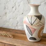
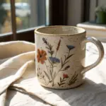
Patterned Planes and Texture Play
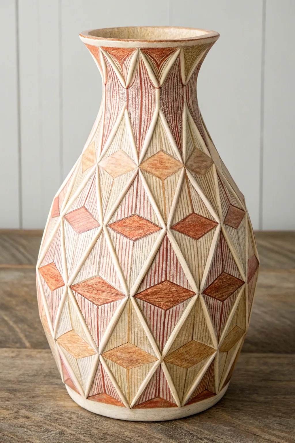
This striking vase transforms a simple vessel into a Cubist-inspired masterpiece using dimensional relief and earthy textures. By building up raised geometric patterns and applying colored pencil shading over a matte base, you’ll create a sophisticated faux-ceramic look full of depth and character.
Step-by-Step Tutorial
Materials
- Smooth glass or ceramic vase (prepped with primer)
- Air-dry clay or modeling paste
- Sculpting tools or craft knife
- Ruler and pencil
- Matte acrylic paint (cream or off-white)
- Colored pencils (terracotta, brown, ochre)
- Clear matte varnish spray
- Fine-grit sandpaper
- Strong craft glue (if using pre-made shapes)
Step 1: Base Preparation
-
Prime the surface:
Clean your vase thoroughly to remove any oils. Apply two coats of a high-quality primer designed for glass or ceramic to ensure your clay and paint will adhere properly. -
Draft the grid:
Once dry, use a flexible tape measure and a pencil to lightly mark a grid of diamonds around the circumference of the vase. You want them to interlock, so drawing diagonal lines that crisscross is the easiest method. -
Refine the pattern:
Within your grid, identify where you want the raised relief lines to go. The pattern consists of large diamonds subdivided into smaller triangles or smaller nested diamonds.
Clay peeling off?
If the dry clay pops off the glass, reattach it using super glue or strong epoxy. Glass is slick, so the initial bond is the tricky part.
Step 2: Sculpting the Relief
-
Roll the coils:
Take small amounts of air-dry clay and roll them into very thin, even coils or ‘snakes.’ These will form the raised boundaries of your geometric shapes. -
Apply the outlines:
Working in sections, apply a tiny amount of water or scoring slip to your pencil lines, then press the clay coils onto the vase. Flatten them slightly so they form narrow ridges rather than round tubes. -
Sharpen the angles:
Use a sculpting tool or craft knife to sharpen the intersections where lines meet. The beauty of this Cubist style relies on crisp, sharp corners, not rounded blobs. -
Let it cure:
Allow the clay to dry completely according to the package instructions. This usually takes 24 hours. If any cracks appear, fill them with a little fresh clay or spackle. -
Sand for smoothness:
Gently sand the clay ridges with fine-grit sandpaper to remove fingerprints and ensure the height is relatively uniform across the vase.
Go metallic
Instead of earthy tones, try a midnight blue base with gold leaf on the raised ridges for an Art Deco take on this geometric concept.
Step 3: Painting and Texturing
-
Apply the base coat:
Paint the entire vase—including the new clay ridges—with a matte cream or off-white acrylic paint. You may need two coats for full opacity. -
Create the scratch texture:
Once the paint is fully dry, take your colored pencils (start with a light brown/ochre). In specific geometric sections, draw vertical or diagonal hatching lines. Keep the lines close together to simulate a textured surface. -
Layer the colors:
Switch to a terracotta or rust-colored pencil. Shade the centers of the diamond shapes more heavily to create a sense of volume and shadow. I find that varying the pressure creates a nice organic feel. -
Define the ridges:
Leave the raised clay ridges mostly the cream base color, or lightly highlight them with a white pencil to make the structure pop against the darker shaded interiors. -
Add depth with dark brown:
Use a dark brown pencil to deepen the corners of the diamonds and the areas right next to the raised ridges. This mimics a shadow and makes the relief look much deeper than it actually is. -
Blend selectively:
If the pencil lines look too harsh, you can gently smudge them with a tortillon or your finger to soften the gradient, but try to keep some of that raw hatched texture visible. -
Seal the work:
Spray the entire piece with a clear matte varnish. This is crucial because colored pencil can smudge easily, and the varnish will lock in your design and protect the clay.
Place your finished vase in a spot with side lighting to really show off the dimensional texture and shadows
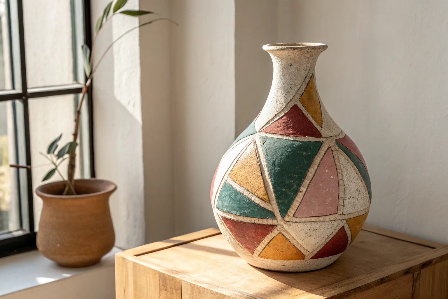
Shadow Shapes as Cubist Geometry
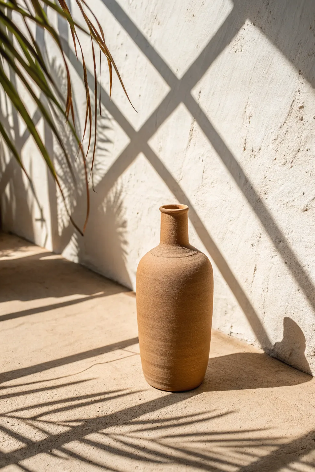
Capture the stark beauty of natural light and geometric shadows in this photography-inspired setup. You’ll learn to manipulate light sources to create bold, intersecting lines that mimic Cubist fragmentation on a simple clay vessel.
Step-by-Step Guide
Materials
- Tall terracotta vase or bottle (matte finish)
- Textured beige backdrop (stucco wall or textured paper)
- Corresponding beige floor surface (stone tile or painted board)
- Direct, hard light source (sunlight or focused strobe)
- Black foam core or cardboard strips (for grid shadows)
- Faux or fresh palm branch
- Camera or smartphone with manual controls
- Tripod
Step 1: Setting the Scene
-
Create the environment:
Begin by establishing your corner set. Arrange your textured beige backdrop vertically and place the matching floor surface horizontally to create a seamless, monolithic look reminiscent of Mediterranean architecture. -
Position the subject:
Place the terracotta vase in the center of your floor surface. Ensure it sits far enough from the back wall—about 12 to 18 inches—so that the shadows cast upon the wall are distinct from the vase itself. -
Establish the light angle:
Position your hard light source high and to the left, angling it down at roughly 45 degrees. If using natural sunlight, choose a time of day when the sun is intense and high, typically late morning or early afternoon.
Sharpen Your Shadows
For the crispest shadow lines possible, move your light source farther away from the subject, or move the shadow-casting object closer to the wall.
Step 2: Constructing the Shadows
-
Build the grid gobo:
To mimic the architectural window shadows, tape strips of black foam core or cardboard into a large ‘X’ or grid pattern. This object, known as a gobo (go-between), will block light to create shadows. -
Placement of the grid:
Hold or clamp your grid gobo between the light source and the set. Move it closer to the light for softer edges, or closer to the wall for the sharp, defined lines seen in the reference image. -
Introduce organic elements:
Position the palm branch on the left side, slightly visible in the frame but mostly acting as a shadow caster. The goal is to have the organic leaf shadows overlap contrastingly with the rigid geometric grid shadows. -
Fine-tune shadow alignment:
Adjust the grid and branch until the shadows intersect interestingly on the back wall. You want the heavy diagonal shadow to cut behind the vase, creating depth without obscuring the object’s form.
Cubist Fragmentation
Take multiple photos with shadows in different positions. In Photoshop, overlay them with reduced opacity to create a ‘fragmented’ motion effect.
Step 3: Capturing the Image
-
Camera setup:
Mount your camera on a tripod at a slightly low angle, nearly eye-level with the vase neck. This perspective emphasizes the stature of the object and the scale of the shadows. -
Focus and depth:
Set your focus point specifically on the texture of the terracotta vase. Use a narrower aperture (higher f-stop like f/8 or f/11) to ensure both the vase and the wall texture behind it remain relatively sharp. -
Exposure settings:
Expose for the highlights. The sunlit parts of the beige wall should be bright but not pure white; allow the shadows to fall into deep, rich darkness to maintain that high-contrast Cubist feel. -
Check the composition:
Look through the viewfinder. Ensure the shadows lead the eye toward the vase, not away from it. The diagonal lines should act as leading lines pointing to your subject. -
Refine the foliage shadow:
I find that sometimes the palm shadow can get too messy. Prune individual leaves or rotate the branch slightly until you get a clean, recognizable silhouette on the floor. -
Shoot and variations:
Take your shot. Experiment by slightly rotating the vase to reveal its best texture, or shifting the light source just an inch to change where the shadow grid intersects the bottle neck.
Step 4: Post-Processing
-
Enhance texture:
Open the image in your editing software. Increase the ‘Texture’ or ‘Clarity’ slider slightly to bring out the gritty surface of the stucco wall and the grain of the clay. -
Adjust contrast:
Boost the contrast to separate the bright beige tones from the dark grey shadows. This makes the geometric shapes of the shadows pop, reinforcing the Cubist theme. -
Warm the highlights:
Add a slight warm tint to the highlights to mimic the golden hour sun, while keeping the shadows neutral or slightly cool for color balance.
The final image creates a striking interplay between the solid form of the vase and the fleeting geometry of the light
Cubist Interior Corner Scene
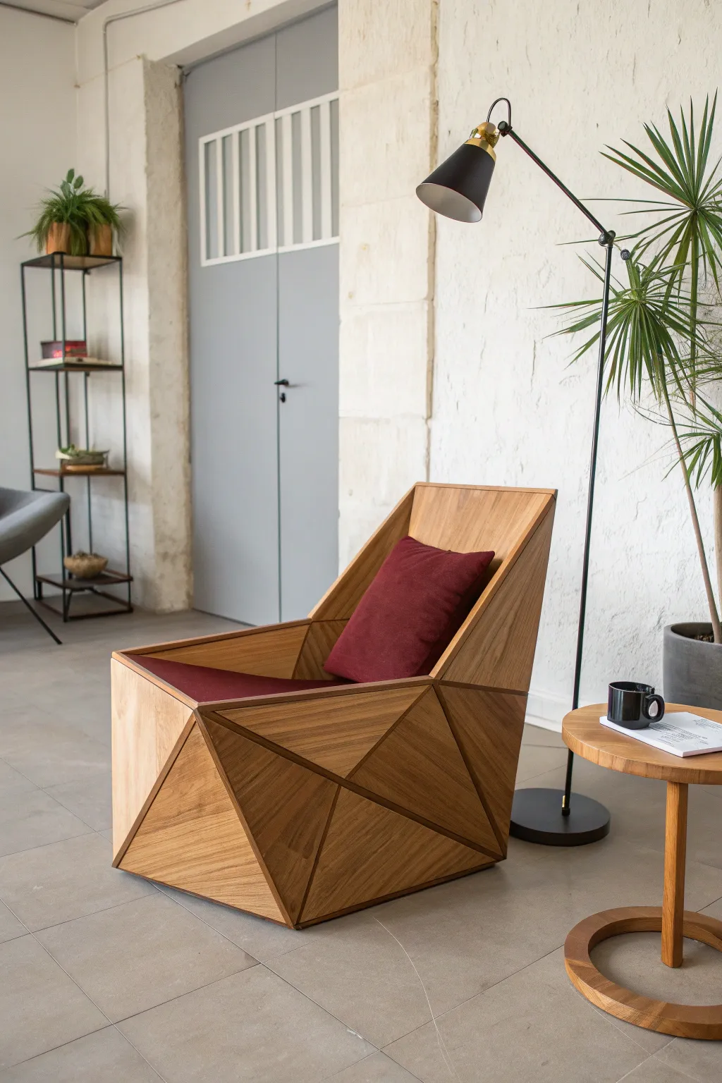
This ambitious woodworking project transforms standard lumber into a functional piece of functional sculpture inspired by Cubist geometry. The result is a striking, armchair with a faceted, prism-like exterior and a comfortable, angled seat.
Detailed Instructions
Materials
- Solid hardwood (Oak, Walnut, or Ash recommended)
- 3/4-inch furniture grade plywood (for interior structure)
- Table saw with miter gauge
- Track saw or circular saw with guide rail
- Wood glue (Titebond III)
- Clamps (lots of them: bar clamps and strap clamps)
- Random orbital sander
- Sandpaper (80 to 220 grit)
- Polyester upholstery foam
- Deep red upholstery fabric
- Spray adhesive
- Clear matte polyurethane or Danish oil
Step 1: Planning and Basic Frame
-
Design and Blueprint:
Before cutting any wood, sketch out the faceted design on graph paper or minimal CAD software. The key is establishing a basic boxy footprint, but planning for the exterior panels to meet at non-90-degree angles. Calculate the dimensions of your internal ‘skeleton’ box first, which will support the weight. -
Build the Internal Core:
Construct a simplified base and back structure using the 3/4-inch plywood. This won’t be visible in the end, but it gives the chair its strength. Think of it as a rough L-shape for the seat and backrest, tilted back slightly about 10-15 degrees for comfort. -
Create the Side Profiles:
Cut two large side panels from your hardwood that will define the chair’s overall profile. These should taper from the back height down to the front armrest height. Secure these to your plywood core using glue and pocket holes hidden on the inside.
Gaps happen
If your mitered angles aren’t perfect, don’t panic. Use a burnisher (or the round shaft of a screwdriver) to rub the wood fibers of the gap edges together, effectively blending the seam closed.
Step 2: Creating the Faceted Facade
-
Map the Triangles:
Using painter’s tape, mark out the triangular shapes directly on the side of your basic frame where the wood cladding will go. This visualizes exactly how the facets will intersect. -
Cut the Initial Facets:
This is the most critical step. Using your track saw, cut the hardwood into the triangular and trapzoidal shapes you mapped out. Be sure to label every single piece on the back side with a pencil so you don’t lose the puzzle. -
Bevel the Edges:
To make the facets meet cleanly without gaps, you’ll need to bevel the edges of your geometric pieces. I find it safest to sneak up on the angle—start with a shallow bevel and test the fit against its neighbor, adjusting as needed. -
Dry Fit the Cladding:
Lay the chair on its side and arrange your cut pieces on top without glue. Use masking tape to hold them together temporarily to check the ‘flow’ of the grain directions. Rotating the grain direction between adjacent triangles enhances the 3D effect. -
Glue Up the Sides:
Apply wood glue generously to the plywood substrate and the backs of your hardwood facets. Press them into place. Use strap clamps around the entire body if possible, or pin nails (which will need filling later) to hold tricky pieces while the glue sets. -
Construct the Front Apron:
Repeat the process for the front of the chair below the seat. These panels usually angle inward slightly. Ensure the bottom edge is perfectly flat so the chair doesn’t rock. -
Cap the Edges:
Install long strips of hardwood along the top armrest edges and the back rim to hide the plywood core’s end grain. Miter these corners sharply for a seamless look.
Level Up: Hidden Storage
Since the faceted sides are voluminous, hinge the seat panel instead of gluing it down. This creates a stealthy storage compartment inside the geometric shell for blankets or books.
Step 3: Finishing and Upholstery
-
Fill and Sand:
Mix sawdust from your cuts with wood glue to create a color-matched filler for any small gaps between facets. Once dry, sand the entire piece aggressively with 80 grit, moving up to 220 grit for smoothness. -
Eased Edges:
While we want a sharp look, razor-sharp wood corners fracture easily. Gently hand-sand all exterior corners just enough to break the edge without losing the geometric aesthetic. -
Apply the Finish:
Wipe away all dust with a tack cloth. Apply three coats of Danish oil or matte polyurethane. This brings out the grain contrast between the different facets, emphasizing the Cubist design. -
Cut the Foam:
Cut your upholstery foam to fit the seat and back cavity. A serrated bread knife works surprisingly well for this if you don’t have an electric carving knife. -
Sew the Cover:
Using the deep red fabric, sew a simple box cushion cover. Since the seat is angled, ensure your measurements account for the depth of the wedge shape at the back. -
Final Assembly:
Insert the foam into the cover and place the cushion into the wooden shell. A strip of heavy-duty velcro on the bottom can keep the cushion from sliding forward during use.
Now you have a stunning, architectural statement piece that is as comfortable as it is artistic.
Motion Study With Repeated Angles
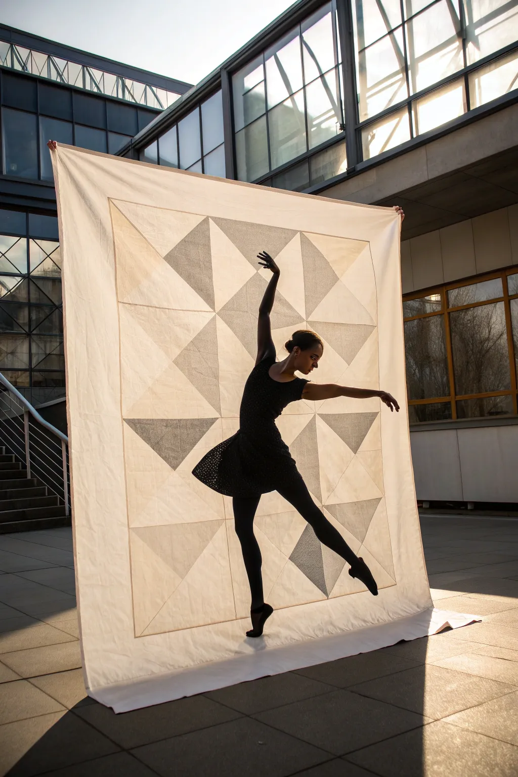
Capture the essence of cubism through textile art with this large-scale, translucent patchwork banner. The interplay of cream cotton and semi-sheer linen creates shifting geometric shadows that mimic motion even when the fabric is still.
Step-by-Step Guide
Materials
- 3 yards lightweight cream cotton or muslin (background)
- 2 yards semi-sheer linen or voile in taupe or dove grey (feature triangles)
- White cotton thread
- Sewing machine
- Rotary cutter and self-healing mat
- Clear quilting ruler (24 inch)
- Iron and ironing board
- Fabric shears
- Pins or fabric clips
Step 1: Cutting the Geometry
-
Determine scale:
For a large backdrop like the one shown, aim for a finished size of approximately 6 feet by 8 feet. The central design is a grid of 4×5 large blocks. -
Cut the background squares:
From your cream cotton, cut 20 large squares measuring 15 inches by 15 inches. These form the base of your block grid. -
Cut the contrast squares:
Cut 20 matching squares from the semi-sheer linen, also measuring 15 x 15 inches. -
Bisect the squares:
Stack your squares carefully. Using your rotary cutter and ruler, cut every square (both cream and linen) in half diagonally once to create two large right-angle triangles per square. -
Create the border strips:
Cut long strips of the cream cotton, approximately 6 inches wide, to serve as the wide outer border later.
Pucker Prevention
If sheer fabric is slipping or puckering while sewing, put a layer of tissue paper under the fabric while stitching. Tear it away gently after sewing the seam.
Step 2: Assembling the Half-Square Triangles
-
Pair the fabrics:
Take one cream cotton triangle and pairs is with one linen triangle. Place them right sides together, aligning the long diagonal edge. -
Sew the diagonal seam:
Sew along the long diagonal edge with a strict 1/4 inch seam allowance. Chain piecing—feeding pairs through one after another without cutting the thread—works best here to save time. -
Press perfectly:
Open the blocks and press the seam allowance toward the darker (linen) fabric. This prevents the seam from shadowing through the cream cotton. Square up the blocks to 14.5 inches if edges are uneven. -
Layout the design:
Find a large floor space. Arrange your half-square triangle blocks in a grid (4 wide by 5 tall). Rotate them to create the specific geometric pattern: large diamonds, pinwheels, or the random-scattering effect seen in the inspiration image.
Step 3: Constructing the Panel
-
Sew horizontal rows:
Pin the blocks of the top row together, matching seams carefully. Sew them into a strip. Repeat for all five rows. -
Press row seams:
I prefer to press the seams of the first row to the left, the second row to the right, and alternate down the line. This allows seams to ‘nest’ together perfectly when joining rows. -
Join the rows:
Pin row 1 to row 2, nesting those alternating seams. Sew together. Continue adding rows until the central panel is complete. -
Add the inner border:
This design features a very thin ‘spacer’ border. Cut narrow 1.5-inch strips of the cream cotton and sew them around the perimeter of your patchwork panel. -
Attach the wide outer border:
Adding visual weight, sew the 6-inch wide strips you cut earlier to the top, bottom, and sides of the panel. Miter the corners for a professional finish if you feel ambitious. -
Hem the edges:
Since this is a single-layer banner rather than a stuffed quilt, double-fold the raw outer edges (fold 1/2 inch, then another 1/2 inch) and stitch down to create a clean hem. -
Final press:
Give the entire piece a thorough pressing with plenty of steam to ensure it hangs completely flat and the geometric lines remain crisp.
Light and Shadow
Hang your finished banner near a window or backlit source. The different densities of the cotton versus the linen will illuminate the geometry beautifully.
Hang your stunning textile art and watch how the light transforms the geometry throughout the day
Cardboard-Style Cubist Relief Artwork
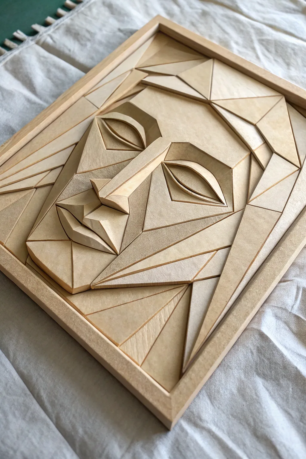
This project transforms flat sheets of crafting wood into a striking three-dimensional cubist face, playing with light and shadow through layered polygonal shapes. The result is a monochromatic masterpiece that looks like carved stone but is surprisingly lightweight and accessible to build.
How-To Guide
Materials
- Basswood or balsa wood sheets (various thicknesses: 1/8″, 1/16″, 3/16″)
- Wooden art panel or plywood backing board (approx. 8×10 inches)
- Square wooden dowels (for the frame)
- Craft knife or hobby blade (X-Acto style) with fresh blades
- Metal ruler
- Cutting mat
- Wood glue
- Fine-grit sandpaper (220-320 grit)
- Pencil and eraser
- Reference photo or sketch of the face design
Step 1: Design and Base Preparation
-
Sketch your blueprint:
Begin by drawing your cubist face design on a sheet of paper exactly the size of your backing board. Focus on breaking curvilinear facial features—like the nose, eyes, and chin—into sharply defined triangles and trapezoids. -
Map the depths:
Analyze your sketch and decide which areas should pop out furthest (like the nose bridge) and which should recede. Number these sections mentally or on paper to plan your layers. -
Transfer the design:
Use carbon paper or a graphite transfer method to copy the main outlines of your design onto the wooden backing board. This will act as your puzzle guide during assembly. -
Build the frame:
Measure and cut your square wooden dowels to fit the perimeter of your backing board. Glue them in place to create a contained ‘sandbox’ for your relief work.
Grain Direction
For visual texture, alternate the wood grain direction for adjacent pieces. Have one piece run vertically and its neighbor run horizontally.
Step 2: Cutting the Polygons
-
Create templates:
If you are worried about precision, cut your original paper sketch apart into its individual shapes. Use these paper cutouts as stencils on your wood sheets. -
Cut the base layers:
Start with the flattest, lowest layers (usually the cheeks and forehead base). Place your metal ruler against the wood grain where possible and slice firmly with your craft knife. -
Create the high points:
For features that need significant height, like the center of the nose, select a thicker piece of wood or plan to stack multiple thinner pieces together. -
Bevel the edges:
This is a crucial detail. Instead of cutting straight down at 90 degrees for every piece, angle your blade slightly for edges that meet at a peak (like the nose ridge). I find sanding these angles after cutting offers more control than trying to cut the angle perfectly on the first pass. -
Sand for smoothness:
Gently sand the edges of every single cut piece. You want to remove any splinters or fuzz, ensuring clean, sharp intersections between your polygons.
Gaps Between Pieces?
Don’t panic if small gaps appear. Mix sawdust with a drop of wood glue to create a perfectly matched filler paste. Press it in and sand flush.
Step 3: Assembly and Sculpting
-
Dry fit the puzzle:
Before glued touches wood, lay out your pieces on the backing board to ensure they fit snugly against each other. Trim any pieces that overlap or create unwanted gaps. -
Glue the foundation:
Apply a thin layer of wood glue to the back of your lowest-level pieces. Press them firmly onto the backing board, holding for a few seconds to set. -
Construct the eyes:
The eyes are complex; build them by gluing the ‘eyeball’ shape first, then attaching the upper eyelid piece at a slight angle so it overhangs the eye, creating a deep shadow. -
Build the nose bridge:
Glue triangular strips together to form the tent-like structure of the nose. It helps to let this sub-assembly dry independently before attaching it to the main face. -
Add the mouth details:
Form the lips using faceted diamond shapes. Ensure the upper lip catches light differently than the lower lip by tilting the wood planes in opposing directions. -
Fill the gaps:
Cut long, slender triangles to act as filler pieces or ‘rays’ radiating from the face to the frame edge, completing the composition. -
Final smooth:
Once the glue is fully cured, do one last very light pass with fine sandpaper to soften any sharp corners that feel too aggressive, wiping away all dust with a tack cloth.
Hang your geometric portrait near a window to watch the expression change as the sun moves across its facets

Have a question or want to share your own experience? I'd love to hear from you in the comments below!