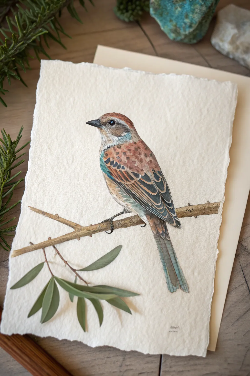
If you love the look of tile mosaics but want to keep it simple (and paper-friendly), mosaic drawing is such a satisfying way to build an image from tiny color moments. I’m sharing my favorite mosaic drawing ideas—from classic, beginner-friendly subjects to a few quirky ones that always get that “how did you do that?” reaction.
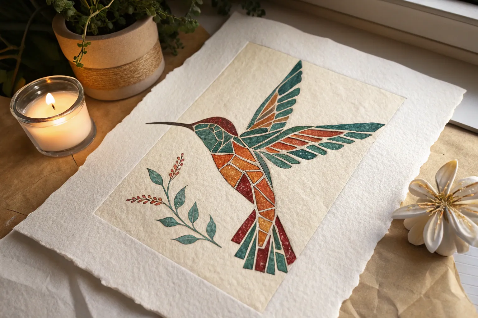
Bird Profile With Feather-Tile Layers
This project explores a unique approach to bird illustration by breaking down plumage into tile-like shapes, creating a subtle mosaic effect within a realistic profile. Using watercolor and fine liners on textured deckle-edge paper, you’ll build up layers of color to mimic the complexity of wings and feathers.
Detailed Instructions
Materials
- Heavyweight cold-press watercolor paper with deckle edge (300gsm+)
- HB graphite pencil for sketching
- Kneaded eraser
- Watercolors (Burnt Sienna, Ultramarine Blue, Yellow Ochre, Paynes Grey, Burnt Umber)
- White Gouache or white gel pen
- Fine liner pens (Black and Grey, 0.1mm and 0.05mm)
- Round watercolor brushes (Size 0, 2, and 4)
- Fresh green leaves or reference photo for styling (optional)
Step 1: Planning the Profile
-
Paper Preparation:
Begin by selecting a high-quality sheet of watercolor paper. If your paper doesn’t have a natural deckle edge, carefully tear the edges against a ruler to create that soft, fibrous border that frames the bird so beautifully. -
Basic Shapes:
Lightly sketch the bird’s main forms using your HB pencil. Start with an oval for the body and a smaller circle for the head, connecting them with a gentle neck curve. Keep your pressure extremely light so the graphite doesn’t muddy the watercolor later. -
Refining the Outline:
Detail the beak, the eye placement, and the long tail feathers. Sketch the branch diagonally across the lower third of the paper. Pay special attention to the claws wrapping around the wood; they anchor the subject. -
Mosaic Mapping:
Instead of drawing individual soft feathers, lightly map out the ’tiles’ of color on the wing and back. Draw small, distinct shapes where the darker patterns will go. This pre-planning is crucial for the mosaic look.
Step 2: Watercolor Washes
-
Initial Wash:
Mix a very dilute wash of Yellow Ochre and a touch of Burnt Sienna. Apply this loosely over the head, chest, and back of the bird, avoiding the white cheek patch and the eye ring. Let this layer dry completely. -
Wing Foundation:
Mix a stronger Burnt Sienna with a hint of Ultramarine Blue to get a rich rust color. using your Size 4 brush, paint the upper wing area, letting the brush strokes suggest the direction of the feathers. -
Cool Tones:
Introduce a slate blue or grey-blue (Ultramarine + Paynes Grey) to the lower wing feathers and the tail. Don’t worry about details yet; just block in the main color zones. -
The Branch:
Paint the branch with a mix of Burnt Umber and Yellow Ochre. While the paint is still damp, drop in darker brown on the underside for instant shadow and volume. -
Adding Foliage:
Use a mossy green mix to paint the leaves at the bottom left. Keep these looser than the bird to ensure the focus remains on your feathered subject.
Brilliant Beaks
To make the beak look realistic rather than flat, ensure the top mandible is slightly darker than the bottom one, and add a tiny white highlight line along the top ridge.
Step 3: Detailing the Mosaic
-
Defining the Eye:
Switch to your Size 0 brush. Paint the eye using concentrated Paynes Grey or black, leaving a tiny speck of white paper reserved for the highlight. This immediately brings the bird to life. -
Feather Tiles:
I like to use a fairly dry brush for this step. Mix a dark brown-black and paint the specific patterned markings on the wings. Treat each marking like a small stone in a mosaic—distinct edges, not too blended. -
Layering Wing Structure:
On the longer flight feathers, paint thin strips of dark blue-grey, leaving hairline gaps between them to separate the feathers visually. -
Texturing the Chest:
Using a dilute reddish-brown mix, stipple small dots and dashes across the chest area. This mimics the speckled plumage without needing to draw every single feather. -
Beak and Claws:
Paint the beak in a dark charcoal grey, fading to lighter grey at the base. Use the same dark tone for the claws, ensuring they look like they are gripping the branch tightly. -
White Accents:
Using white gouache or a gel pen, carefully add thin white lines to the edges of the wing feathers (the ’tiles’). This high contrast separates the layers and emphasizes the graphic mosaic style.
Muddy Colors?
If your wing patterns are bleeding into the base color, ensure the base wash is bone-dry before adding the darker ‘mosaic’ tiles. A hair dryer on low heat speeds this up.
Step 4: Final Touches
-
Shadows and Depth:
Mix a cool purple-grey and glaze it under the wing and belly to create roundness. Add a cast shadow on the branch right under the bird’s feet. -
Fine Liner Definition:
Take your 0.05mm grey pen and very selectively outline some of the wing feathers and the beak. Don’t outline the whole bird; broken lines look more natural. -
Branch Texture:
Add wood grain texture to the branch using the darker brown paint and a fine liner. Add tiny thorn-like bumps for realism. -
Final Assessment:
Step back and check the balance. If the leaves at the bottom feel too light, add another layer of green glaze. Sign your work in a subtle spot near the bottom.
Once dry, display your avian portrait on a wooden surface or in a floating frame to show off that beautiful deckle edge
High-Contrast Sunset Over Water Tiles
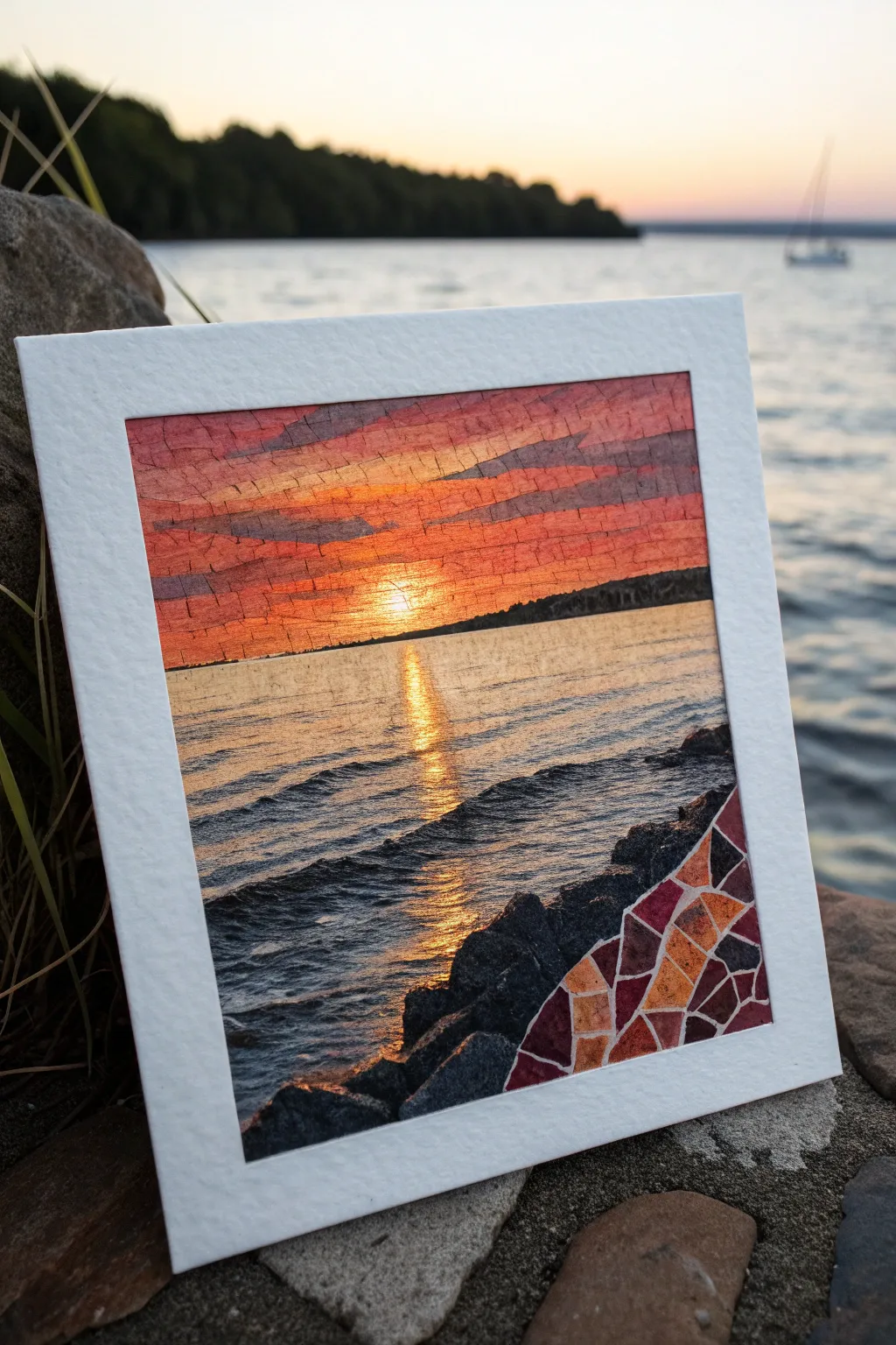
Capture the blazing beauty of a setting sun reflecting across rhythmic waves with this mixed-media mosaic project. By combining traditional painting techniques with a segmented, tile-like structure in the corner, you’ll create a unique piece that blends realism with geometric abstraction.
Step-by-Step Guide
Materials
- Heavyweight watercolor paper (300gsm or higher)
- Masking tape
- Watercolor paints (Alizarin Crimson, Cadmium Yellow, Ultramarine Blue, Burnt Umber, Lamp Black)
- Gouache paint (White, Yellow, Orange)
- Flat shader brushes (sizes 6 and 10)
- Small round brush (size 2)
- Pencil (HB) and eraser
- Ruler
- White gel pen or opaque white ink
- Cardstock for framing
Step 1: Planning and Sky
-
Prepare the workspace:
Begin by taping down your watercolor paper to a board. This prevents buckling and ensures you have a crisp white border if you aren’t adding a separate mat later. -
Sketch the horizon:
Using a ruler, lightly draw a straight horizon line just below the halfway point of your paper. Sketch a jagged, uneven line in the bottom right corner to define separate rock area. -
Grid the rock section:
Inside that bottom right corner section only, draw a web of irregular geometric shapes. These will become your mosaic ’tiles’ later, so keep the lines clear but light. -
Paint the sky gradient:
Wet the sky area with clean water. Start painting from the top with a mix of Alizarin Crimson and a touch of blue for a dusky purple, blending down into pure crimson. -
Add the sunset glow:
As you move toward the horizon line, mix in strong Cadmium Yellow and orange tones. Ensure the brightest yellow is centered just above the horizon where the sun sits. -
Layering clouds:
While the sky is still slightly damp but not soaking, use a thicker mixture of purple-grey paint to swipe in horizontal cloud streaks across the upper sky.
Grout Perfection
If your white gel pen drags on the textured paper, try a lining brush with diluted white gouache instead. It flows smoother over the rough grain.
Step 2: Water and Reflections
-
Base wash for water:
Once the sky is dry, wet the water area. Paint a wash that mirrors the sky colors: warm yellow in the center path, transitioning to purples and dark blues at the edges. -
Defining the sun path:
Using gouache (which is more opaque) or very thick watercolor, paint a strong vertical column of bright yellow and orange directly under the sun’s position. -
painting the waves:
Switch to a smaller flat brush. Use a dark mix of Ultramarine Blue and Lamp Black to paint the backs of the waves. Create rhythmic, horizontal strokes that get wider as they approach the bottom to suggest perspective. -
Adding highlights:
Between the dark wave shadows, paint thin lines of the sunset colors (orange and pink) catching the tops of the ripples. -
Sun glint:
In the central reflection path, use your brightest yellow or white gouache to add sharp, horizontal dashes. These mimic the intense sparkle of the sun on the water.
Step 3: Rocks and Mosaic Details
-
Silhouette the land:
Paint a distant treeline along the horizon using a very dark, almost black mix of green and brown. Keep the top edge slightly bumpy to suggest tree texturing. -
Paint regular rocks:
For the non-mosaic rocks (bottom left and center), use dark greys and blacks. Paint them solidly but leave rough edges to mimic stone texture. -
Fill the mosaic tiles:
In your pre-drawn corner section, paint each individual geometric shape with varying warm tones—deep reds, oranges, and purples—creating a stained-glass effect. -
Separate the tiles:
I like to use a white gel pen or very fine brush with white gouache to trace the lines between your colored shapes. This ‘grout’ line emphasizes the mosaic look. -
Mounting:
Carefully remove the tape. Cut a frame from white cardstock that perfectly fits your image, giving it a polished, gallery-ready appearance.
Metallic Accent
Use gold leaf or metallic watercolor for the sun’s reflection path and a few mosaic tiles to make the artwork actually shimmer in the light.
Now you have a stunning landscape that bridges the gap between impressionism and modern design


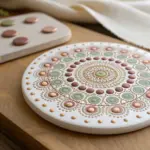
Circle Medallion Beach Mosaic
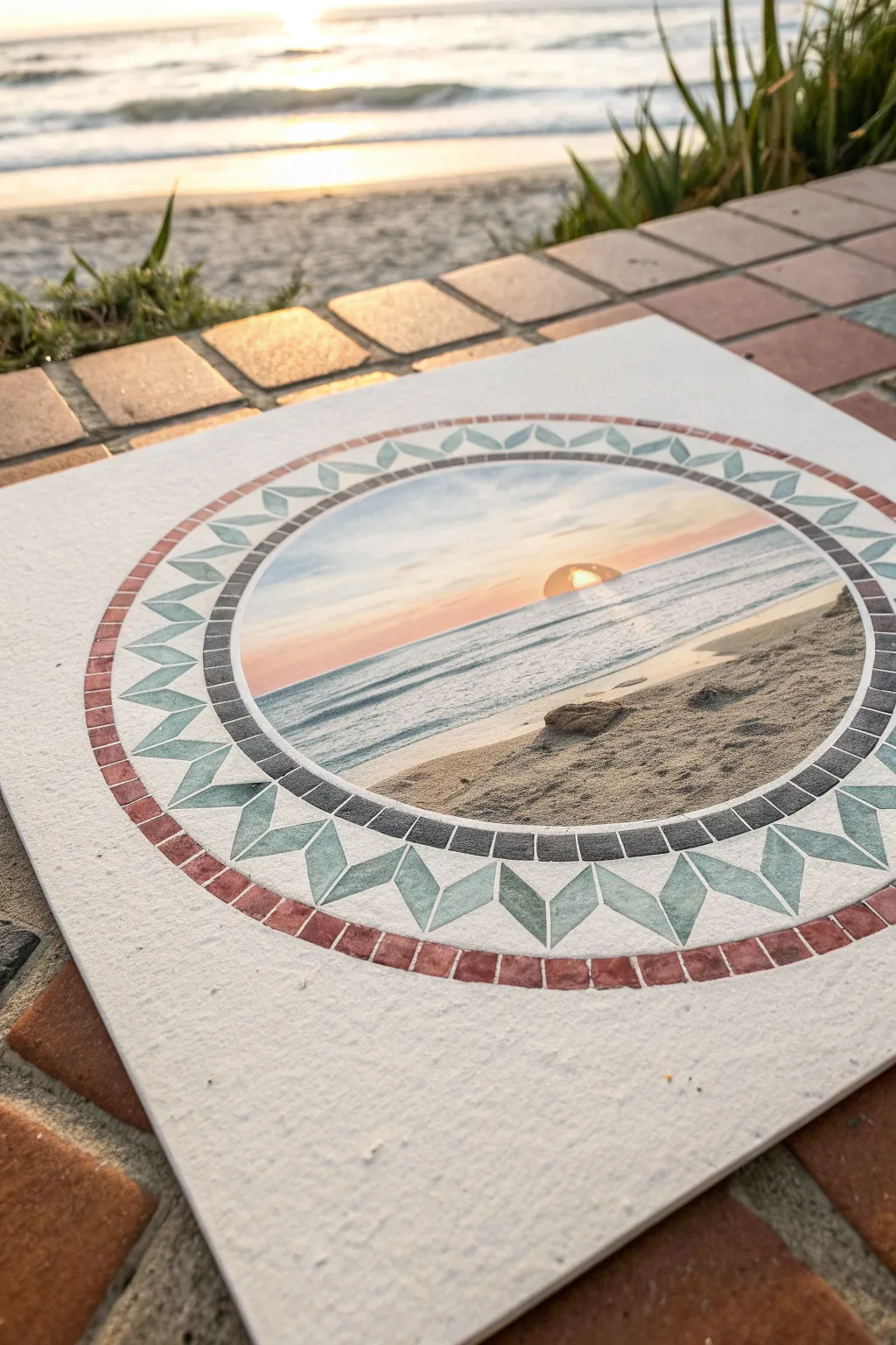
Capture the serenity of a coastal sunset with this intricate medallion design that mimics the look of traditional tile work. This project combines a central watercolor landscape with precise geometric borders to create a faux-mosaic effect on textured paper.
Step-by-Step Tutorial
Materials
- Heavyweight cold-press watercolor paper (300 gsm or higher)
- Watercolor paints (phthalo blue, burnt sienna, yellow ochre, alizarin crimson)
- Compass or circular template
- Ruler
- Pencil (HB) and eraser
- Fine liner pens (0.1mm and 0.5mm, waterproof black ink)
- Round watercolor brushes (sizes 2, 4, and 6)
- Masking tape
- White gel pen (optional for highlights)
Step 1: Drafting the Medallion
-
Find your center:
Locate the exact center of your watercolor paper using a ruler. Mark it lightly with a pencil dot. -
Draw the central circle:
Using a compass set to a radius of about 2.5 inches (or your desired size), draw the innermost circle. This will hold your main landscape scene. -
Create the inner border:
Widen your compass by about 0.25 inches and draw a second circle. This creates the narrow band that will eventually look like dark grey tiles. -
Draft the geometric ring:
Increase the compass radius by another inch and draw a third circle. This wider band is where the teal geometric diamonds will go. -
Finish the outer rim:
Add one final circle about 0.25 inches outside the previous one to create the outermost red tile border. -
Grid the geometric shapes:
Lightly divide the wide middle ring into even segments. I find it helpful to mark the four cardinal points first, then subdivide until you have about 32 even sections for the diamond pattern.
Step 2: Painting the Landscape
-
Sketch the horizon:
Inside the center circle, lightly sketch a horizon line just below the middle point. Draw a small semi-circle for the setting sun touching the water. -
Paint the sky gradient:
Wet the sky area with clean water. Drop in pale yellow around the sun, blending outward into soft pink and then pale blue at the top edges. Let the colors bleed naturally. -
Add the ocean layers:
Mix a diluted phthalo blue. Using horizontal strokes, paint the water, leaving small white gaps for sea foam. Darken the blue slightly as you get closer to the foreground. -
Texture the sand:
Mix yellow ochre with a touch of burnt sienna. Stipple this color into the bottom foreground for a sandy texture, making it slightly darker where the water meets the shore. -
Add the sun reflection:
While the water paint is still damp but not soaking, carefully lift out a vertical strip of color under the sun or paint a streak of yellow-orange to mimic the reflection.
Tile Texture Tip
Don’t paint the border colors perfectly flat. Let water create ‘blooms’ or vary the pigment density. These imperfections make the painted areas look more like real stone or ceramic tiles.
Step 3: Executing the Faux-MosaicBorders
-
Paint the diamonds:
Using a size 2 brush, fill in the diamond shapes in the wide ring with a soft teal or sage green watercolor. Keeping the paint transparency varies creates that organic tile look. -
Fill the outer rim:
Paint the outermost narrow ring with a muted terracotta red. Don’t worry about grid lines yet; just lay down a solid wash of color. -
Paint the inner framing ring:
Fill the innermost narrow ring (framing the landscape) with a dark charcoal or Payne’s grey. -
Wait for complete drying:
This is crucial: allow the entire piece to dry completely. If you touch it and it feels cool, it’s not dry yet. -
Ink the tile grout lines:
Take your fine liner pen. Wherever you have drawn pencil divider lines for the mosaic tiles, ink over them carefully. For the outer red and inner grey rings, draw small vertical lines every few millimeters to simulate individual rectangular tesserae. -
Outline the full structure:
Go over all the main concentric circles with a slightly thicker pen (0.5mm) to crisp up the medallion’s structure. -
Erase pencil marks:
Once the ink is fully set, gently erase any visible pencil guidelines to clean up the illustration.
Adding Realism
Once dry, use a very fine white gel pen to add tiny highlights on the upper-left corner of individual painted ’tiles.’ This creates a subtle 3D effect, making them look raised.
Step back and admire how your geometric borders perfectly frame the soft sunset scene.

Heart Icon Filled With Patchwork Tiles
Create a charming piece of wall art featuring a heart filled with geometric stained-glass style tiles. This project uses soft watercolors and textured paper to achieve a cozy, handmade patchwork aesthetic.
Detailed Instructions
Materials
- Cold press watercolor paper (textured)
- Pencil (HB or 2H)
- Watercolors (Sage Green, Light Peach, Rusty Pink, Cream/Beige)
- Fine tip black waterproof pen (0.3mm or 0.5mm)
- Ruler
- Eraser
- Small round paintbrush (Size 2 or 4)
- Jar of water
- Paper towels
Step 1: Drafting the Design
-
Outline the main shape:
Start by lightly sketching a large heart shape in the center of your watercolor paper. Don’t press too hard, as you want these initial lines to be easily adjustable. -
Create the border:
Draw a second heart line outside the first one, maintaining an even distance of about 1/4 inch to create a thick border that will surround your mosaic. -
Draw the central focal point:
Place a smaller, tilted heart shape roughly in the center of the larger heart. This will act as the anchor for your patchwork design. -
Sketch the mosaic tiles:
Using a ruler, begin breaking up the empty space between the inner heart and outer border into geometric shapes. Use a mix of triangles and quadrilaterals. -
Refine the border tiles:
Divide the outer border strip into small rectangular segments, like bricks or stones, that follow the curve of the heart. -
Inking the lines:
Once you are happy with the geometric layout, trace over all your pencil lines with a waterproof fine tip black pen. -
Erase pencil marks:
Wait a moment for the ink to dry completely, then gently erase all visible graphite lines to leave a crisp black framework.
Keep it clean
Paint non-adjacent tiles first and let them dry before painting their neighbors. This prevents wet colors from bleeding into each other across the black lines.
Step 2: Painting the Mosaic
-
Prepare your palette:
Mix your watercolor paints to get muted, pastel tones. You want watery consistencies for a translucent, stained-glass look. -
Paint the center heart:
Fill the central heart with a rusty pink or coral shade. Apply the paint evenly, but allow some texture from the paper to show through. -
Start the green tiles:
Select random geometric shapes throughout the design and fill them with your sage green mix. Try to scatter them so no two green tiles touch. -
Add peach tones:
Wash your brush and switch to a light peach color. Fill in another set of random shapes, balancing them against the greens. -
Fill with neutrals:
Use a cream or beige wash for the remaining shapes. Leaving these lighter helps the colored tiles pop. -
Paint the border:
Color the small border rectangles using the same alternating pattern of sage, peach, pink, and cream. -
Let it dry:
Allow the entire piece to dry completely. If the colors look too pale, you can add a second layer to specific tiles for depth. -
Add line detail:
I like to go back with the black pen and lightly re-trace or thicken any lines that might have been dulled by the paint, giving it a definitive ‘lead’ look. -
Create texture:
For a final touch, add tiny hatched lines or dots inside a few tiles with your pen to mimic the texture of fabric or stone.
Oops! Color bleeding?
If paint crosses a line, quickly dab it up with a corner of a clean paper towel. Once dry, you can re-draw the black line to cover the mistake.
Frame your beautiful mosaic heart or gift it to someone special to brighten their day
BRUSH GUIDE
The Right Brush for Every Stroke
From clean lines to bold texture — master brush choice, stroke control, and essential techniques.
Explore the Full Guide
Landscape With Layered Hill Tiles
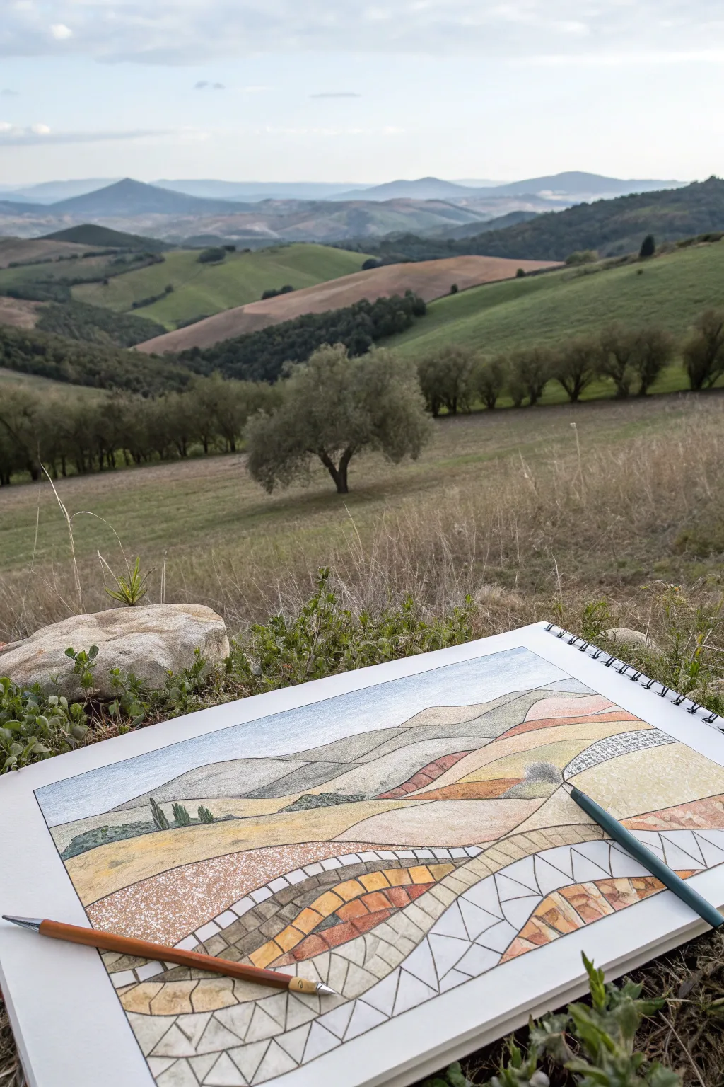
Blend the beauty of a natural landscape with the structured elegance of mosaic art in this unique drawing project. By transitioning from realistic hills at the top to geometric tiles at the bottom, you create a stunning visual effect that simulates a stone pathway or stained glass window.
Step-by-Step Tutorial
Materials
- Heavyweight drawing paper or mixed media sketchbook
- HB graphite pencil for sketching
- Colored pencils (earth tones: ochre, burnt sienna, olive green, sandstone)
- Fine-point black ink pen (0.3mm or 0.5mm)
- Ruler or straight edge
- Eraser
- Pencil sharpener
Step 1: Sketching the Landscape
-
Define the horizon:
Start by lightly drawing your horizon line about three-quarters of the way up the page. It doesn’t need to be perfectly straight; a slight undulation suggests distant mountains. -
Outline the hills:
Sketch a series of overlapping rolling hills below the horizon. Use sweeping, curved lines that intersect to create depth, making the hills in the foreground larger than the ones in the back. -
Add landscape details:
In the upper third of the drawing (the most distant hills), sketch small details like distant tree lines or patches of shadow. Keep these marks faint and organic. -
Draw the foreground curves:
For the bottom half of the composition, draw two or three dominant, sweeping curves that mimic the shape of the hills but will serve as the boundaries for your mosaic sections.
Uneven Grout Lines?
If your tile gaps vary too much, thicken the black ink lines universally. A thicker ‘grout’ line can hide irregularities and often makes the colors pop more vividly.
Step 2: Creating the Mosaic Grid
-
Section the foreground:
Focus on the bottom-most swooping sections you just drew. Using your pencil, divide these large bands into smaller, rectangular or trapezoidal ‘stones’ or tiles. -
Vary the tile shapes:
To make the mosaic look authentic, avoid making every tile a perfect square. Allow some to be angled or slightly irregular, fitting together like a puzzle. -
Create the transition zone:
Between the structured tiles at the bottom and the realistic hills at the top, create a transition area where the ‘stones’ become larger and more elongated, eventually blending into the standard coloring of the hills. -
Ink the mosaic lines:
Trace over your pencil lines in the mosaic section with a fine-point black pen. Do not ink the realistic landscape at the very top; keep those lines soft and pencil-only for contrast.
Step 3: Adding Color and Texture
-
Color the sky:
Lightly shade the sky with a pale blue pencil, keeping the pressure very light to suggest a hazy, bright day. -
Shade the distant hills:
Fill in the background hills with soft greens and muted browns. Use smooth, circular strokes to avoid harsh lines, mimicking the soft texture of distant grass. -
Color the mosaic tiles:
Select three or four earth tones (ochre, terracotta, tan). Begin coloring the individual tiles in the foreground, alternating colors so similar shades don’t touch. -
Add stone texture:
I find it helpful to vary the pressure on the tiles; press harder on the edges of each ‘stone’ and lighter in the center to create a slightly domed, 3D effect. -
Create a speckled effect:
For the middle ground hills—the transition zone—use a stippling technique or light, scumbled shading to give the impression of rough soil or dry grass. -
Detail the grout lines:
Go back over your black ink lines if they became smudged by the wax of the pencils. Ensure the ‘grout’ between the tiles remains crisp and dark. -
Enhance shadows:
Use a dark brown or dark grey pencil to add small cast shadows roughly in the same direction on each tile, imagining the sun is hitting the landscape from one side. -
Populate with trees:
Draw tiny, vertical strokes in dark green on the horizon of the middle hills to represent distant cypress or olive trees, anchoring the abstract tiles to the realistic scene. -
Final blends:
Use a white pencil or a blending stump to smooth out the transition area where the mosaic pattern fades into the realistic drawing, ensuring the shift feels intentional but gradual.
Add Metallic Accents
Use a gold or copper gel pen to outline specific tiles in the foreground. This adds a subtle shimmer that catches the light and emphasizes the ‘precious stone’ mosaic feel.
Step back and admire how your landscape seamlessly flows from structured geometry into organic nature
City Skyline at Dusk in Angular Tiles
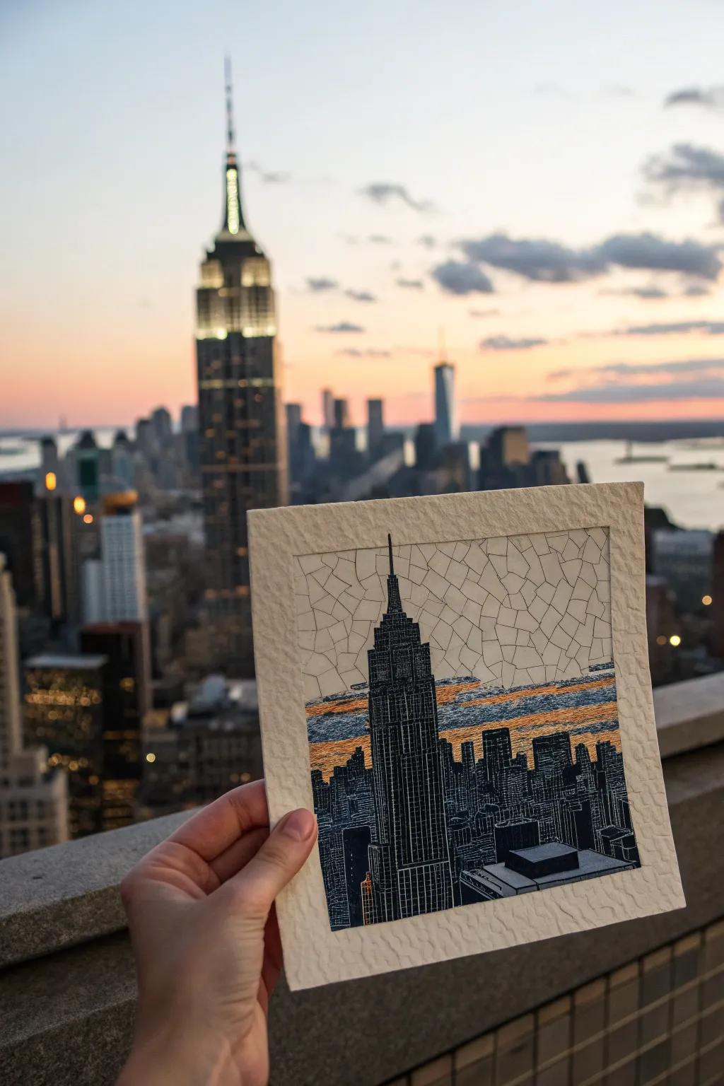
Capture the angular energy of New York City with this unique mixed-media project. By combining precise pen work with a ‘shattered glass’ sky effect, you’ll create a striking contrast between the rigid architecture and the organic atmosphere.
How-To Guide
Materials
- Heavyweight textured paper (ideally with deckle edge)
- Fine liner pens (sizes 005, 01, and 05)
- Black brush pen or India ink
- Metallic gold or burnt orange watercolor/gouache
- Pencil (HB) and eraser
- Ruler
Step 1: Sketching the Silhouette
-
Plan the composition:
Begin by lightly sketching the Empire State Building slightly off-center using your pencil. It should dominate the vertical space. -
Add the skyline:
Sketch the surrounding staggered heights of the lower skyscrapers. Don’t worry about window details yet, just focus on the outer shapes and stepped roofs. -
Mark the horizon band:
Lightly draw two horizontal lines behind the buildings: one just below the Empire State’s spire base and one near the lower rooftops. This will characterize the sunset zone.
Step 2: The Mosaic Sky
-
Draft the cracks:
In the white sky area above the sunset band, draw a web of irregular polygons using the 01 fine liner. Think of dried mud or cracked ice. -
Vary the shapes:
Avoid perfect squares. Create three-sided, four-sided, and five-sided shards that interlock without overlapping. -
Trace the horizon:
Stop your mosaic pattern exactly at the top line of the sunset band you marked earlier, leaving that horizontal strip empty for now.
Troubleshooting: Ink Bleed
If your fine lines bleed into the textured paper, switch to pigment-based liners (Microns) rather than water-based ones, and ensure your hand doesn’t smudge the wet ink.
Step 3: Color & Texture
-
Apply the sunset wash:
Using a small brush, paint the horizontal band with your metallic gold or orange paint. Keep the paint somewhat ‘dry’ to let the paper texture show through. -
Add distinct texture:
Once the color is dry, use a fine pen (005) to draw horizontal hatching lines across the colored band. This distinguishes the sunset texture from the cracked sky above. -
Integrate the clouds:
I like to add a few horizontal ‘cloud’ shapes within the mosaic area using the same horizontal hatching technique to tie the sky together.
Pro Tip: Line Weight
Use your thinnest 005 pen for the ‘mosaic’ sky cracks and a thicker 03 or 05 for the building outlines. This subtle difference pushes the sky into the background.
Step 4: Inking the City
-
Define the grid:
For the Empire State Building, use a ruler and a 005 pen to draw the vertical lines that run up the facade. -
block in the darks:
This is the most critical step for contrast. Carefully fill in the spaces *between* your grid lines with the black brush pen or thicker marker. -
Create negative space windows:
By coloring around your grid, you leave thin white lines of paper exposed. This creates the illusion of lit windows and structural steel without drawing with white ink. -
Fill the lower skyline:
For the smaller background buildings, simpler vertical hatching or solid black silhouettes work best to make the main tower pop. -
Final outlines:
Go over the main perimeter of the buildings with a 05 pen to give them a sharp, definitive edge against the sky.
Now mount your finished piece on a contrasting mat board to really show off those beautiful deckled edges.

PENCIL GUIDE
Understanding Pencil Grades from H to B
From first sketch to finished drawing — learn pencil grades, line control, and shading techniques.
Explore the Full Guide
Mountain Range in Cool-to-Warm Tiles
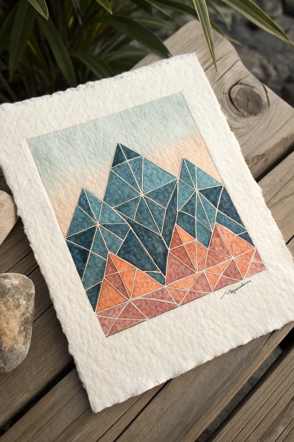
This stunning landscape breaks down a classic mountain range into sharp, geometric tiles for a modern mosaic effect. By blending deep teals into warm terracotta tones, you’ll capture the feeling of towering peaks and sun-baked foothills.
Step-by-Step
Materials
- Heavyweight cold-press watercolor paper (300gsm, rough or smooth texture)
- Ruler
- Pencil (HB or H)
- Fine liner masking fluid pen or thin masking tape (optional)
- Watercolors: Indigo, Prussian Blue, Burnt Sienna, Orange
- Small round or detail watercolor brushes (sizes 0-2)
- Palette for mixing
- Paper towels
- Eraser (kneaded preferred)
Step 1: Drafting the Design
-
Paper preparation:
Begin by tearing your heavyweight paper to size if you want those lovely, organic deckled edges shown in the reference. Alternatively, cut a 5×7 inch rectangle. -
Outline the range:
Using your pencil and ruler, lightly sketch three large triangular mountain peaks. The central peak should be the highest, flanked by slightly lower peaks on the left and right. -
Create the foothills:
Draw jagged, erratic lines near the bottom of your composition to represent the rocky ground or lower hills overlapping the main peaks. -
Subdivide into tiles:
Inside each large mountain shape, use your ruler to draw intersecting lines. Create a network of triangles and trapezoids of varying sizes. This forms the ‘grout’ lines of your mosaic. -
Finalize the geometry:
Ensure no single shape is too large; aim for balance. In the sky area, you can leave it blank for a wash later, or block it out lightly.
Bleeding Lines?
If your paint bleeds across the white gaps, your brush is too wet. Blot it on a paper towel before painting, or switch to a smaller brush for tighter control near edges.
Step 2: Painting the Gradient
-
Secure the grout lines:
This is the most crucial step for the mosaic look: You must leave the pencil lines unpainted. You can either paint very carefully around them or apply a thin line of masking fluid over your pencil grid. -
Mix your cool tones:
On your palette, prepare a deep, saturated mix of Indigo and Prussian Blue. This dark, moody blue will be for the highest mountain peaks. -
Paint the upper tiles:
Start filling in the triangular cells at the very top of the peaks. Vary the saturation slightly in each cell—some darker, some more watery—to create depth and texture within the mosaic. -
Transitioning colors:
As you move down the mountain faces, gradually introduce water to your blue mix to lighten it. Then, start mixing in a tiny touch of Burnt Sienna to dull the blue into a slate grey-green for the middle section. -
Mix your warm tones:
Clean your brush and prepare a mix of Burnt Sienna and Orange. This warm, earthy palette represents the foreground hills. -
Paint the lower tiles:
Fill in the geometric shapes at the bottom of the mountains. Keep the colors warmest and brightest at the very bottom edge, blending slightly darker where the orange meets the blue mountains. -
Let it dry completely:
Wait until every single tile feels dry to the touch. If you used masking fluid, gently rub it away with your finger or an eraser to reveal the crisp white channels between the colors.
Add Metallic Grout
Instead of leaving the gaps white, fill them in with a fine gold or silver gel pen after the paint dries. This creates a stunning ‘kintsugi’ stained-glass effect.
Step 3: The Background Sky
-
Wet the sky area:
Brush clean water over the sky area, stopping precisely at the edge of your painted mountain peaks. -
Apply the wash:
Drop in a very diluted wash of pale blue at the top edge of the paper and a whisper of pale peach near the horizon line to mimic a sunrise. Let the colors bleed softly. -
Final details:
Once fully dry, you can lightly erase any visible pencil marks remaining in the white gaps. Sign your name in fine ink below the warm foothills.
Now you have a serene, geometric landscape that balances crisp structure with fluid color
3D Cube Illusion Mosaic Pattern
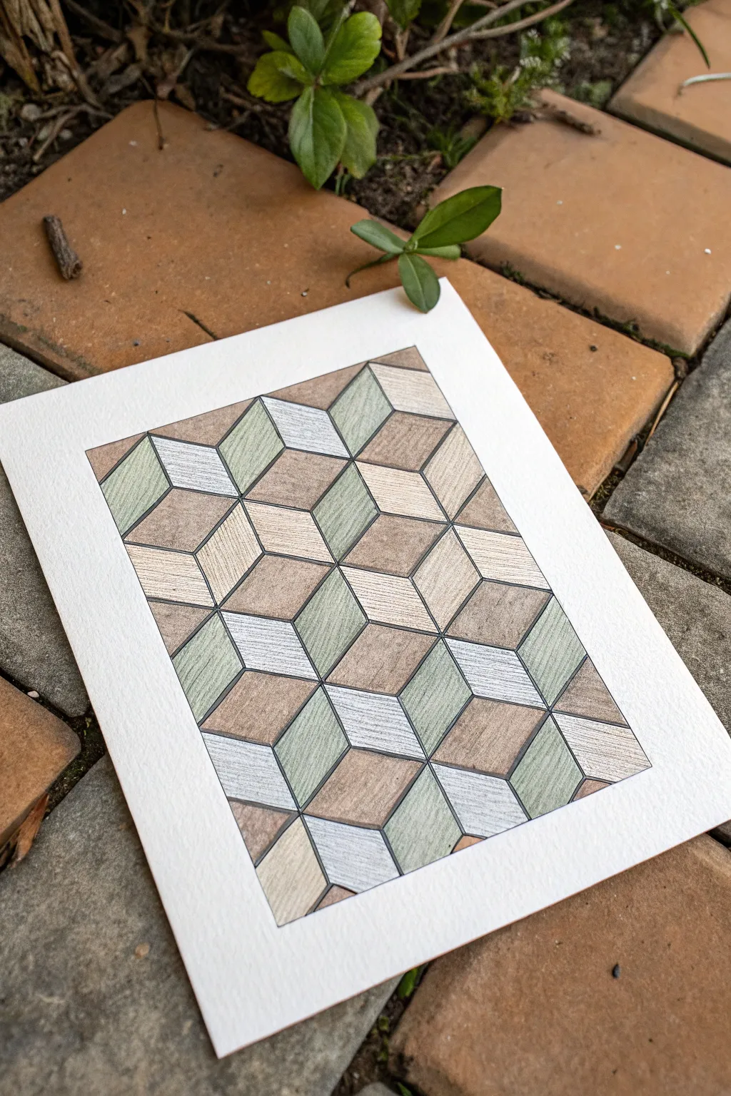
This tutorial guides you through creating a sophisticated optical illusion that mimics the look of textured stone or wood marquetry. By using a simple rhombic grid and careful shading with colored pencils, you’ll build a striking 3D surface that feels both organic and architectural.
Step-by-Step
Materials
- Heavyweight drawing paper or mixed media paper (smooth texture preferred)
- Ruler or straight edge
- Graphite pencil (HB or H for light lines)
- Fine liner pen (0.3mm or 0.5mm, black or dark grey)
- Set of colored pencils (muted palette: olive green, warm grey, tan/ochre, dark brown)
- Eraser (kneaded eraser works best)
- Protractor (optional, but helpful for 60-degree angles)
Step 1: Drafting the Grid
-
Establish the border:
Begin by measuring a rectangular frame in the center of your paper. Leave a generous white margin around the edge—about 2 inches—to give the artwork room to breathe. -
Mark baseline points:
Along the bottom edge of your inner rectangle, measure and mark points at equal intervals. A spacing of about 1 inch (or 2.5 cm) works well for this scale. -
Draw the first diagonal set:
Using a ruler, draw parallel diagonal lines rising to the right from your baseline marks. Ideally, these should be at a 60-degree angle. Draw these lines very lightly with your H pencil so they can be erased later if needed. -
Draw the opposing diagonals:
Now, draw a second set of parallel lines rising to the left, crossing the first set to create a grid of tall, skinny diamond shapes (rhombuses). -
Create the cube tops:
To complete the illusion, draw horizontal lines connecting the intersections of your diamonds. You will start to see the ‘tumbled block’ or 3D cube pattern emerge immediately.
Keep it Sharp
A very sharp pencil is key for the wood-grain texture. A blunt tip will smudge the lines, losing that crisp, tiled effect.
Step 2: Inking the Outline
-
Define the shapes:
Once you are happy with your pencil grid, trace over the lines with your fine liner pen. Use a ruler to keep the lines crisp and architectural. -
Clean up:
Allow the ink to dry completely for a few minutes to prevent smudging. Then, gently erase all the underlying graphite pencil marks with a kneaded eraser.
Step 3: Adding Color and Texture
-
Select your palette:
Choose three distinct colors for the three faces of each cube to enhance the 3D effect. The example uses a light warm grey for the ‘top’ faces, an olive green for the ‘left’ faces, and a tan/brown for the ‘right’ faces. -
Color the light tops:
Start with the top-facing diamonds (the horizontal ones). Fill them in with your lightest color, using directional strokes that mimic wood grain or stone striations rather than solid coloring. -
Shade the left faces:
Moving to the vertical diamonds facing left, apply your medium tone (the olive green). I like to press slightly harder at the bottom of each shape and fade upward to create a subtle gradient. -
Fill the right faces:
Color the remaining right-facing diamonds with your darkest tone (the tan/brown). Maintain that consistent grainy texture by keeping your pencil strokes linear and slightly rough. -
Add texture details:
Go back over random tiles with a sharpened darker pencil (like a dark brown or charcoal grey). Draw tiny, scratchy lines parallel to the side of the tile to simulate natural imperfections in the material. -
Deepen the shadows:
To make the cubes really pop, lightly shade the bottom corners of the vertical faces where they meet other cubes. This suggests a slight bevel or depth between the ’tiles’. -
Final assessment:
Step back and look at the overall pattern. If any areas look too flat, add a second layer of texture lines to increase the contrast and visual interest.
Lost the 3D effect?
Squint at your drawing. If the cubes flatten out, you need more contrast. Darken your shadow side significantly to fix the illusion.
Now you have a mesmerizing geometric artwork that looks remarkably like a real inlaid floor


Have a question or want to share your own experience? I'd love to hear from you in the comments below!