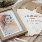
When you’re drawing identity, you’re basically turning the question “Who am I?” into something you can see on paper. I love identity prompts because they let you mix portrait skills with visual metaphors—the real magic sauce for personal, meaningful art.
Split-Face: Public Self vs. Private Self
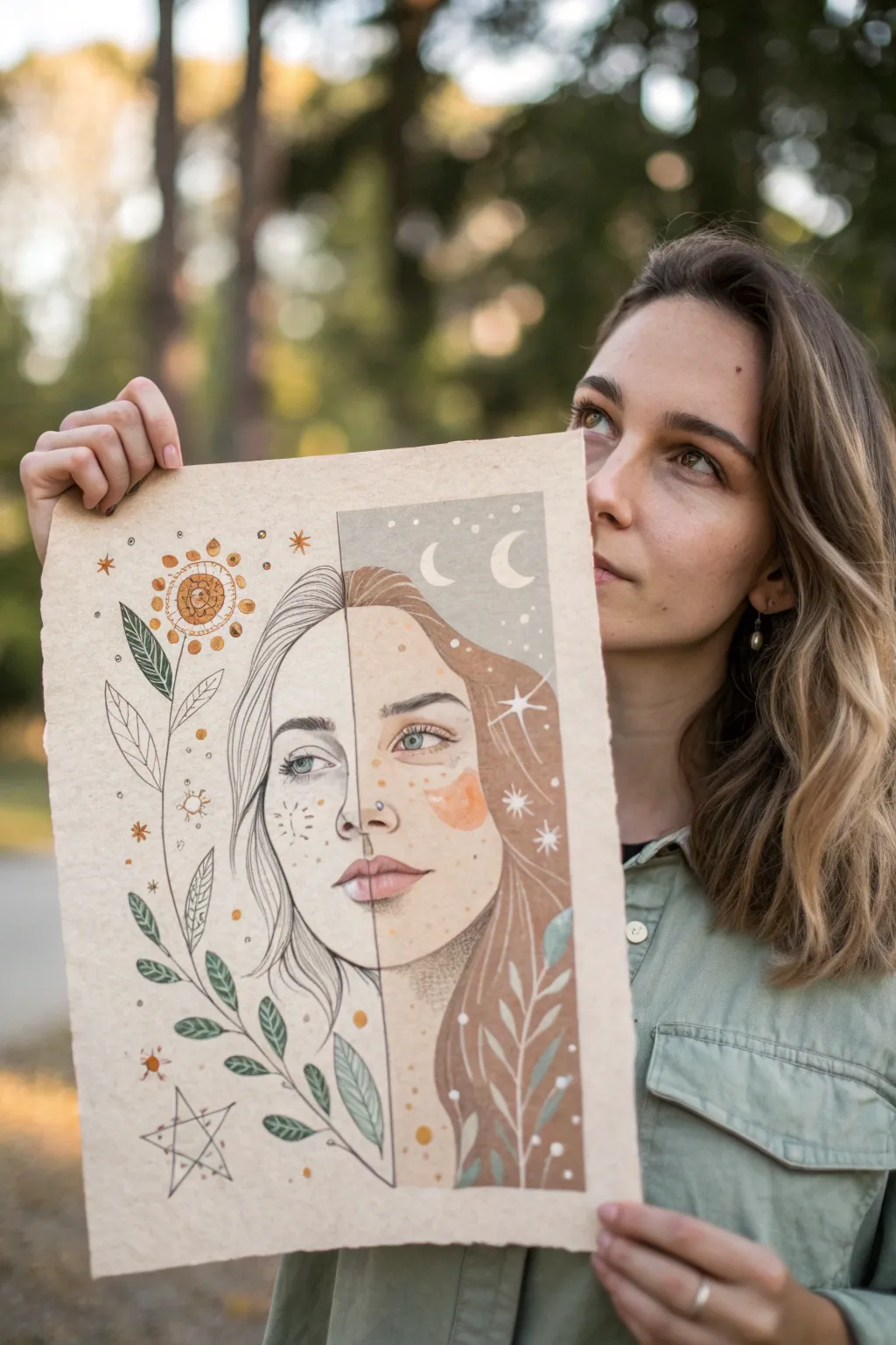
Explore the duality of identity with this striking split-face illustration that contrasts minimalist line art with soft, painted tones. One side captures the crisp clarity of daylight with ink detailing, while the other embraces the mysterious warmth of evening through color and celestial motifs.
Step-by-Step
Materials
- Heavyweight toned tan or beige paper (mixed media or watercolor)
- Graphite pencils (HB and 2B)
- Fine liner pens (black, sizes 0.1 and 0.3)
- Gouache or acrylic paints (white, skin tones, earthy browns, calming blues)
- Fine detail paintbrushes (rounds 0 and 2)
- Gold or metallic ink pen (optional)
- Ruler
- Eraser
Step 1: Planning and Sketching
-
Prepare the Paper:
Begin by selecting a high-quality sheet of toned paper. A tan or kraft-colored background works best to make the white highlights pop later on. If the edges are straight, you might want to carefully tear them against a ruler for that rustic, deckled edge look found in the reference. -
Divide the Canvas:
Using a ruler and a very light pencil touch, draw a vertical line directly down the center of your page. This will act as the boundary between your two worlds. -
Map the Facial Features:
Sketch the outline of a face that spans both sides of the line. Ensure symmetry for the eyes, nose, and mouth. The goal is for the features to align perfectly, even though the style will change at the border. -
Define the Split Styles:
Lightly sketch the hair. On the left (the ‘day’ side), keep the hair as loose open outlines. On the right (the ‘night’ side), fill in the volume where the hair will be painted.
Step 2: The Day Side (Line Art)
-
Ink the Features:
Switch to your 0.1 fine liner. Carefully trace the eye, nose, and half of the lips on the left side. Use broken or lighter lines for the skin wrinkles and freckles to keep it delicate. -
Draw the Flora:
Sketch a large, prominent stem with leaves rising from the bottom left corner. Add a stylized sun-flower at the top left. Use clean, confident strokes for the veins in the leaves. -
Add Celestial Details:
Scatter small sun symbols, stars, and dots around the face using an orange or gold pen if available, or stick to black ink for high contrast. Simplicity is key here. -
Erase Guidelines:
Once the ink is completely dry—give it a few minutes to be safe—gently erase the pencil sketches on this side, leaving only the crisp ink lines.
Fixing Wavy Paper
If your paper buckles from the wet paint, let it dry completely, then place it under a heavy book overnight. Using less water with gouache helps prevent this initially.
Step 3: The Night Side (Painting)
-
Base Skin Tone:
Mix a skin tone using your gouache or acrylics that is slightly lighter than the paper but natural. Paint the face on the right side, being careful to stop exactly at the center line. -
Add Shadows:
While the base is still slightly workable, blend in a darker, warmer tone around the eye socket, nose edge, and under the lip to create dimension. -
Paint the Hair:
Use a warm brown or auburn shade to fill in the hair. I find that painting in the direction of the hair growth helps create a natural texture even without drawing individual strands. -
Add the Eye Color:
Paint the iris with a striking blue or green to contrast the warm tones. Don’t forget a tiny dot of white so the eye looks alive. -
Highlighting:
Using pure white paint, add highlights to the nose, the brow bone, and the chin. This step is crucial on toned paper as it brings the face forward.
Make It Glow
Use metallic gold watercolor or gold leaf for the sun symbols and the crescent moon to make the artwork shimmer when it catches the light.
Step 4: Finishing Touches
-
Night Sky Elements:
Paint a section of background in the upper right corner using a soft grey-blue or muted slate color to represent the night sky. -
Moon and Stars:
Paint crescent moon shapes and small stars over the grey background using white. Add a few white stars directly onto the hair or cheek for a fantastical element. -
White Botanical Accents:
On the bottom right, paint the silhouette of leaves using semi-transparent white or a very pale blue. This mirrors the line-art plant on the left but in reverse. -
The Blush:
Add a distinct patch of orange or coral paint on the right cheek. You can shape it like a cloud or organic blob rather than a blended blush for that stylistic illustrative look. -
Final Symmetry Check:
Step back and look at the center line. If the paint bled over, touch it up with a white gel pen or a bit of paint to ensure that sharp, clean divide remains visible.
Display your finished piece in a floating frame to show off the beautiful paper texture and the story of two halves.

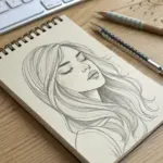
Self-Portrait With Personal Symbols
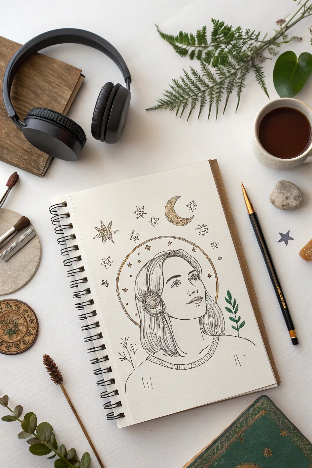
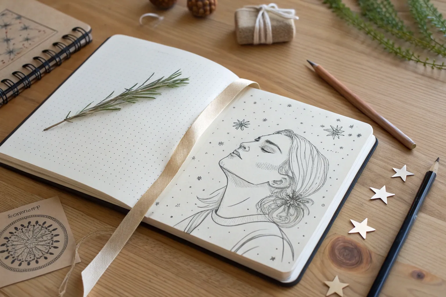
This whimsical self-portrait combines fine-line illustration with celestial symbolism to represent a dreamer’s identity. By blending a classic profile sketch with stylized stars, a moon, and orbital rings, you’ll create a piece that feels both grounded and magical.
Step-by-Step Guide
Materials
- Spiral-bound sketchbook (heavyweight paper preferred)
- Hard lead pencil (H or 2H) for initial sketching
- Soft lead pencil (HB) for refining
- Kneaded eraser
- Fine liner pens (Black, sizes 0.1, 0.3, and 0.5)
- Gold gel pen or gold metallic marker
- Green colored pencil or thin marker
- Compass or round object for tracing (optional)
Step 1: Drafting the Portrait
-
Establish the Head Shape:
Start with your hard pencil to lightly sketch an oval for the head and a gentle curve for the neck and shoulders. Since the subject is looking up, angle the oval slightly towards the upper right corner of the page. -
Map Facial Features:
Draw faint guidelines across the face to place the eyes, nose, and mouth. The eye line should curve upward following the head tilt; position the nose line just below halfway down the face. -
Detail the Profile:
Refine the jawline and chin. Sketch the nose in profile, keeping it soft, and draw the lips slightly parted or smiling to suggest a sense of wonder. -
Sketch the Eyes:
Draw the eyes looking upward. Focus on the iris and pupil placement to direct the gaze. Don’t worry about eyelashes yet; just get the shape and direction correct. -
Add Hair and Headphones:
Sketch a sleek bob haircut that falls just above the shoulders. Over the ears, draw large, cushioned headphones. These act as a compositional anchor and emphasize the ‘listening’ theme. -
Refine the Neckline:
Draw the collar of a sweater or shirt at the base of the neck. Add the simple curve of the shoulders extending to the bottom edge of the paper.
Smudge Prevention
Gold gel ink takes longer to dry than regular pigment liner. Work from top-left to bottom-right (if right-handed) to avoid dragging your hand through wet metallic ink.
Step 2: Adding Celestial Elements
-
Create the Orbit:
Lightly draw a large circle or halo that goes behind the head. It should frame the face, passing behind the neck and over the top of the head. Only draw the parts visible around the figure. -
Position the Moon:
To the upper right of the head, sketch a crescent moon. Give it a slightly textured, pitted surface to look like a cratered moon rather than a smooth cartoon shape. -
Scatter the Stars:
Around the head and inside the halo, sketch various star shapes. Mix classic five-point stars, four-point geometric stars, and small asterisk-style sparkles for variety. -
Add Botanical Touches:
On the bottom left and right, sketch small sprigs of leaves or branches peeking out from behind the figure. This adds an organic element to balance the cosmic ones.
Make It Personal
Replace the generic stars with your actual astrological constellation, or swap the headphones for a different accessory that represents your favorite hobby.
Step 3: Inking and Detailing
-
Outline the Face:
Switch to a 0.3 fine liner. Carefully trace your pencil lines for the face, neck, and shoulders. Keep the lines smooth and continuous. -
Texture the Hair:
Use the 0.1 fine liner for the hair. Instead of outlining the whole shape, use long, sweeping strokes in the direction of hair growth to create volume and texture. -
Define the Headphones:
Ink the headphones with the 0.5 pen for a bolder look. Add small vertical hatching lines on the ear cups to suggest volume and shadow. -
Ink the Celestial Symbols:
Trace the stars and moon. For the halo, you can use a broken or stippled line to make it feel ethereal, or a solid line for a graphic look. -
Add Gold Accents:
Take your gold gel pen or marker. Color in the crescent moon completely. Then, trace the large orbital halo line in gold. I like to add tiny gold dots inside the star shapes for extra shimmer. -
Color the Leaves:
Use a green colored pencil or fine marker to fill in the small botanical sprigs. Keep the color subtle so it doesn’t distract from the face. -
Final Touches:
Add tiny details like the ribbing on the sweater collar using thin vertical lines. Add small ‘movement’ lines near the shoulders if desired. -
Cleanup:
Wait at least 15 minutes for all ink—especially the gold gel—to dry completely. Gently erase all remaining pencil guidelines with your kneaded eraser.
Now you have a serene, personalized portrait that captures the feeling of getting lost in music or daydreams

Head Silhouette Filled With Your World
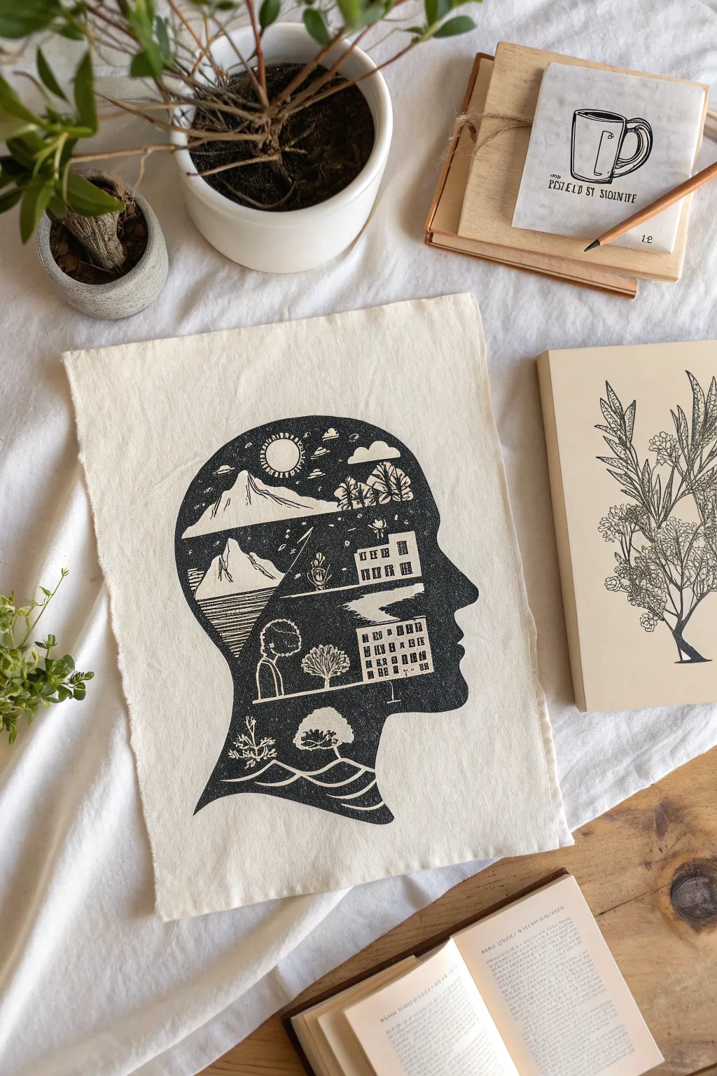
This striking project combines the classic profile silhouette with a detailed internal landscape, suggesting a rich inner world. Using block printing techniques on natural fabric, you’ll create a bold, high-contrast artwork that feels both rustic and deeply personal.
Detailed Instructions
Materials
- Soft-cut lino block (roughly A4 size)
- Lino cutting tools (V-gouge, U-gouge, and knife)
- Transfer paper or soft graphite pencil
- Tracing paper
- Black block printing ink (fabric-safe if printing on fabric)
- Brayer (rubber roller)
- Plexiglass sheet or mixing tray
- Barren or clean wooden spoon
- Natural cotton or canvas fabric swatch (or a tote bag)
- Pencil and eraser
- Paper for initial sketching
Step 1: Design & Transfer
-
Profile Sketch:
Start by drawing or tracing a side-profile silhouette of a head on paper. It helps to keep the neck line slightly curved at the bottom for an elegant finish. -
Interior Layout:
Lightly sketch the internal scene within the head shape. Break the space into three or four distinct horizontal zones: a sky with a sun and clouds at the top, a mountain range below that, followed by buildings or a cityscape, and finally organic elements like trees or waves at the neck. -
Detailing the Narrative:
Refine your sketch with high-contrast patterns. Remember, in block printing, what you cut away will be white (fabric color), and what you leave will be black. Plan for white outlines around the mountains and buildings to separate them from the dark background. -
Transfer to Block:
Place tracing paper over your finished drawing and trace the lines with a soft pencil. Flip the tracing paper onto your lino block (graphite side down) and rub the back firmly to transfer the image. The image on the block should be a mirror image of your final design.
Patchy Print?
If your black areas look ‘salty’ or speckled, you likely need a bit more ink on the roller. Add a tiny amount more to your tray and roll until the ‘velcro’ sound is louder.
Step 2: Carving the Block
-
Outline the Silhouette:
Using your fine V-gouge, carefully carve along the outer edge of the profile line first. This establishes the boundary of your print. -
Carve the Negative Space:
Switch to a wider U-gouge to clear away the large area outside the head. You want the background to be completely clean, so carve deep enough that the ink roller won’t catch these areas later. -
Define Internal Lines:
Return to the fine V-gouge for the interior details. Carve the lines that define the sun’s rays, the snow on the mountain peaks, and the windows of the buildings. -
Texture and Shading:
For the water or ground areas, use short, rhythmic carved strokes to suggest texture. I like to vary the pressure here to create organic, tapering lines rather than uniform grooves. -
Clear Large Whites:
Use a larger gouge to clear out the bigger white spaces, such as the sky around the sun or the large white sections of the mountains. Brush away any loose rubber crumbs frequently to see your progress. -
Final Cleanup:
Inspect the block for any tiny ridges in the negative space that might pick up unwanted ink. Ideally, trim the excess lino block material away entirely, leaving just the head shape, which makes printing cleaner.
Add Depth
Try painting watercolor or diluted acrylic into the white spaces (mountains, windows) after the ink is fully dry and set. This adds a pop of color to the monochromatic design.
Step 3: Inking & Printing
-
Prepare the Ink:
Squeeze a small line of block printing ink onto your mixing tray. Use the brayer to roll it out until you hear a sticky, velcro-like sound. The ink should be smooth and velvety, not gloopy. -
Ink the Block:
Roll the ink onto your carved block in thin, even layers. Roll in multiple directions to ensure solid coverage on the black areas, but be careful not to flood the fine details you just carved. -
Position the Fabric:
Lay your fabric flat on a smooth, hard surface. Carefully pick up the inked block and hover it over the desired spot before pressing it down firmly. Once it touches the fabric, do not shift it. -
Burnish the Print:
Using a barren or the back of a wooden spoon, rub the back of the block firmly in circular motions. Or, if you placed the fabric on top of the block, rub the fabric. Ensure you apply pressure to the edges and the center equally. -
The Reveal:
Slowly peel one corner of the block up to check ink transfer. If it looks patchy, lay it back down carefully and rub more. When satisfied, peel the block entirely off the fabric. -
Dry and Set:
Let the print dry completely. This can take 24 to 48 hours for oil-based inks. If using fabric ink, follow the manufacturer’s instructions to heat-set the design with an iron so it becomes washable.
Hang your fabric print on the wall or sew it onto a cushion to display your personal mindscape

Face Built From Descriptive Text
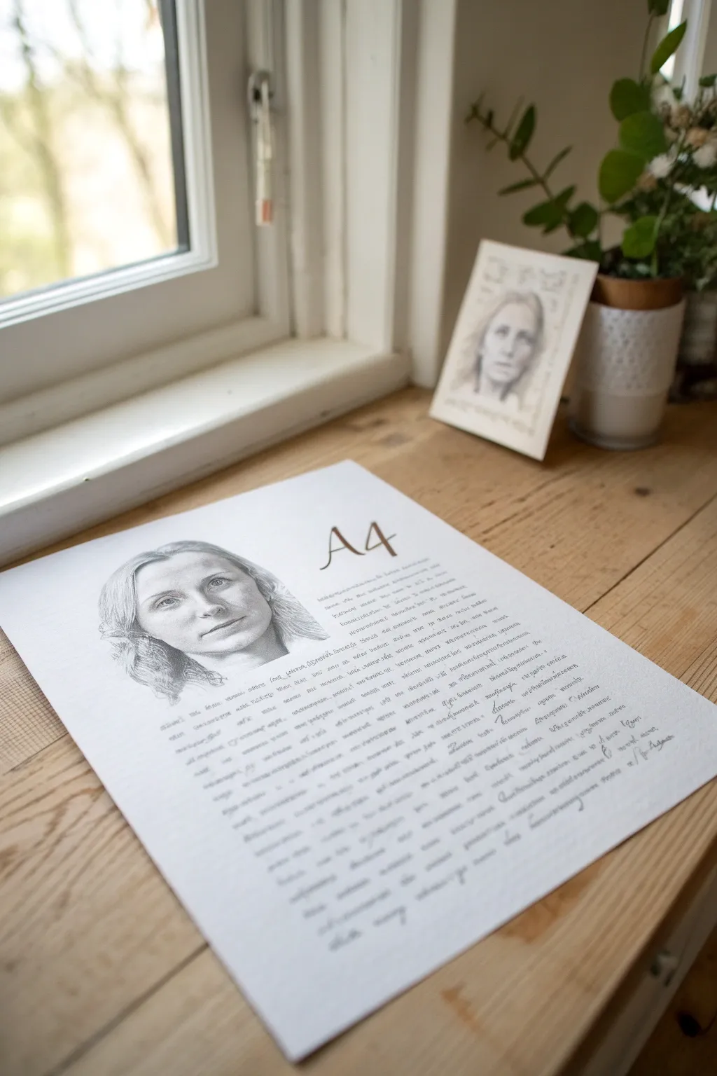
This elegant mixed-media project combines specific portraiture with biographical storytelling, creating a deeply personal piece of art. The result is a clean, classic composition where a detailed graphite sketch floats above a block of handwritten text.
How-To Guide
Materials
- High-quality A4 drawing paper (cream or white)
- Graphite pencils (HB, 2B, 4B)
- Fine-point calligraphy pen or archival ink pen (brown or black)
- Eraser (kneaded)
- Computer and printer (optional for layout)
- Ruler
- Source photo of subject
Step 1: Planning and Layout
-
Drafting the biography:
Before touching the paper, write out the text you want to include. This should be a descriptive narrative about the subject—their traits, history, or importance to you. Aim for about 200-300 words depending on your handwriting size. -
Establishing margins:
Using a ruler and a very light pencil touch, mark out margins on your A4 paper. Leave ample white space at the top and bottom to frame the work professionally. -
Positioning the elements:
Decide where the portrait will sit. In the reference image, the head floats in the upper left, with the text wrapping around or sitting below it. Lightly sketch a circle or oval to reserve this space. -
Creating guide lines:
Draw incredibly faint horizontal guidelines for your text block. Keep the spacing consistent to ensure the final writing looks neat and uniform.
Pro Tip: Digital Layout
Type your text on a computer first, format it to the right size, and print it very faintly directly onto your art paper. Then, simply trace over the letters with your pen for perfect spacing.
Step 2: Drawing the Portrait
-
Sketching the outline:
Using an HB pencil, lightly sketch the contours of the subject’s face. Focus on getting the proportions of the eyes, nose, and mouth accurate before pressing harder. -
Shading the eyes:
Start adding detail to the eyes. Use a sharp 2B pencil for the pupils and lash lines, keeping the highlights bright white to give the subject life. -
Building facial structure:
Use a 2B pencil to gently shade the hollows of the cheeks, the sides of the nose, and the eye sockets. I like to use a blending stump or tissue here to soften the graphite for a smooth skin texture. -
Detailed hair texturing:
Switch to a 4B pencil for the darker shadows in the hair. Create flow by using long, sweeping strokes that follow the natural direction of the hair growth. -
Refining the edges:
Soften the bottom edge of the portrait so it fades naturally into the white space rather than cutting off abruptly at a neck line. This creates that ‘floating’ ethereal look. -
Adding the title:
To the right of the portrait, sketch a large, stylized initial or title (like the ‘A4’ in the example) using a serif font style. Fill it in with a slightly warm brown tone or graphite.
Level Up: Watercolor Wash
Add a very faint, diluted watercolor wash in sepia or tea-stain color over the title or specific keywords in the text to draw the eye and add an antique feel.
Step 3: Adding the Text
-
Testing your pen:
On a scrap piece of the same paper type, test your ink pen to ensure it doesn’t bleed. A sepia or dark grey ink often looks softer and more artistic than harsh black. -
Inking the biography:
Begin writing your drafted text along the guidelines. Use your best cursive or print handwriting. Maintain a steady rhythm and consistent size for the letters. -
Navigating the portrait:
As you write near the portrait, be careful not to write over your drawing. Let the text block naturally stop before it hits the graphite shading. -
Breaking the block:
Don’t be afraid to leave small gaps or indentations in the paragraph structure to keep the text block from looking too dense. -
Adding a signature:
At the bottom right of the text block, add a signature or a final dedication line in a slightly looser script to signify the end of the piece.
Step 4: Final Touches
-
Erasing guidelines:
Wait for the ink to be completely dry—give it at least 20 minutes to be safe. Then, gently erase all your pencil guidelines. -
Cleaning up highlights:
Use a kneaded eraser to lift off any smudges around the text block or to brighten the highlights in the eyes one last time. -
Protecting the work:
Spray a light coat of fixative over the pencil drawing portion to prevent the graphite from smearing over time.
Once framed, this combination of visual and written identity creates a sophisticated keepsake to display

PENCIL GUIDE
Understanding Pencil Grades from H to B
From first sketch to finished drawing — learn pencil grades, line control, and shading techniques.
Explore the Full Guide
Eyes Reflect What You Value Most
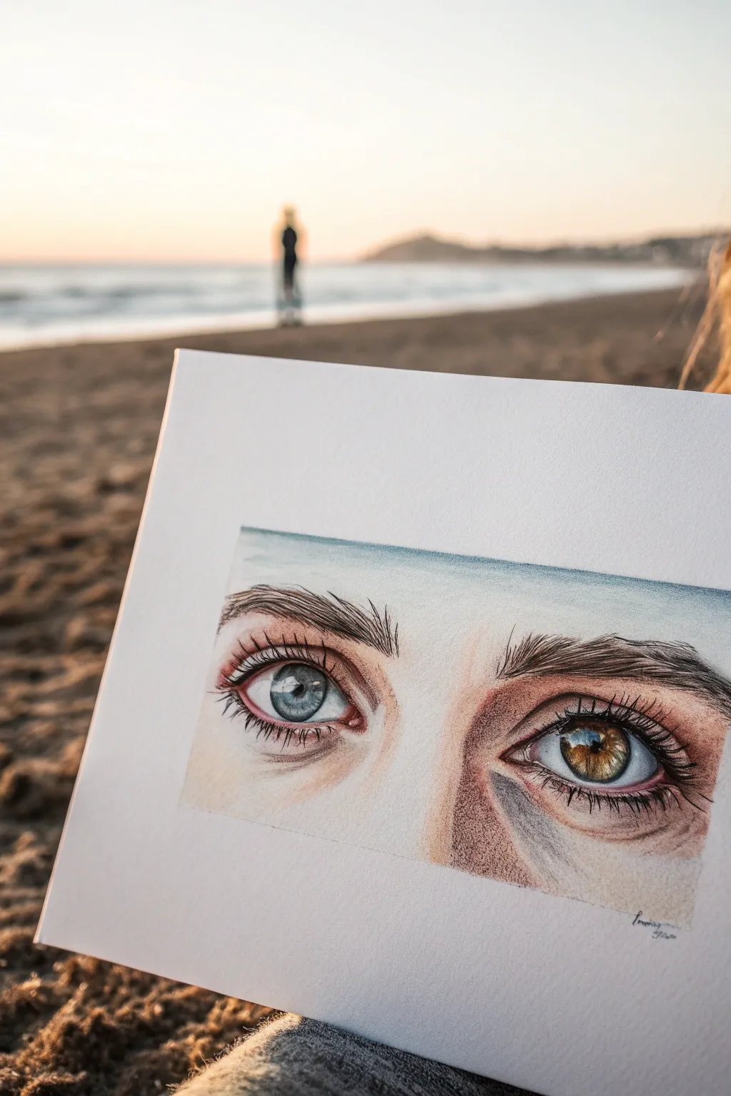
Capture the striking beauty of human identity through this detailed colored pencil study featuring heterochromia. This project focuses on realistic layering techniques to render the glossy texture of the eyes and the subtle variations in skin tone surrounding them.
Step-by-Step
Materials
- Heavyweight drawing paper (Bristol Vellum or Hot Press Watercolor paper)
- Set of artist-quality colored pencils (wax or oil-based)
- Graphite pencil (HB or 2H for sketching)
- Kneaded eraser
- White gel pen or gouache (for highlights)
- Pencil sharpener
- Blending stump or cotton swab
Step 1: Initial Sketching
-
Outline the Composition:
Begin by lightly sketching a rectangular frame on your paper to constrain the drawing, similar to a cinematic aspect ratio. Within this frame, lightly map out the almond shapes of the two eyes, ensuring there is roughly one eye-width of space between them. -
Mark Key Features:
Draw the circles for the irises and pupils. Be careful not to make the irises perfect circles; the top and bottom should be slightly cut off by the eyelids. Sketch in the tear ducts and the crease of the upper eyelids. -
Lighten the Guides:
Before adding color, gently roll your kneaded eraser over the graphite sketch. You want the lines to be barely visible so the graphite doesn’t muddy your colored pencil work later.
Keep it Sharp
A jagged pencil tip ruins fine lash details. Keep a piece of sandpaper nearby to constantly re-sharpen your tips to a needle point without wasting wood.
Step 2: The Blue Eye (Left)
-
Base Layering:
Start with the left eye. Fill the pupil with a deep black, leaving a tiny spot empty for the reflection if you wish, though we can add bright white later. Lay down a very light wash of cool grey over the sclera (the white of the eye), keeping the center brightest to show curvature. -
Iris Details:
For the blue iris, start with a light sky blue base. Use a sharp slate blue pencil to draw lines radiating from the pupil outward, like spokes on a wheel. This creates the muscle texture of the iris. -
Defining the Rim:
Darken the outer ring of the iris (the limbal ring) with a midnight blue or charcoal color. Softly blend this inward slightly to avoid a harsh cartoon contour.
Reflect Your World
Customize the reflection inside the pupil. Instead of a generic white dot, paint a tiny silhouette of a person or a specific landscape to add a hidden narrative.
Step 3: The Brown Eye (Right)
-
Warm Undertones:
Move to the right eye. Apply a base layer of yellow ochre or light goldenrod to the iris area. This underlying warmth is crucial for a realistic hazel or brown eye. -
Layering Browns:
Layer burnt sienna and raw umber over your yellow base, using the same radiating stroke technique as before. Vary the pressure to create depth and interesting flecks of lighter color within the brown. -
Adding Reflection:
The reference image shows a landscape reflection in the eye. Use tiny touches of blue and green within the highlight area of the brown eye to mimic a reflected horizon line.
Step 4: Skin and Texture
-
Skin Tone Base:
Select a pale peach or cream color as your base for the skin. Apply this lightly around the eyes, focusing on the eyelids and the under-eye area. -
Building Shadows:
Use a terra cotta or light brown pencil to deepen the shadows in the crease of the eyelid and the hollows near the nose. Use small, circular motions to blend the pigment into the paper’s tooth. -
Adding Warmth:
Introduce subtle pinks or salmon tones near the tear ducts and the waterline of the lower lid to make the skin look alive and vascular. -
Refining the Creases:
I prefer to use a sharp purple-grey pencil to define the deepest folds of the skin, rather than using black, which can look too harsh on skin tones. -
Drawing Eyelashes:
Ensure your black or dark brown pencil is extremely sharp. Draw lashes with quick, confident flicks that start at the eyelid rim and curve outward. Remember that lashes clump together slightly and aren’t perfectly evenly spaced. -
Eyebrows:
Sketch the eyebrow hairs following the direction of growth—upward near the nose and angling outward toward the temples. Use short, feathery strokes.
Step 5: Final Polishing
-
Cast Shadows:
Lightly shade the upper part of the eyeball (just under the upper lashes) with a cool grey. This cast shadow adds immense three-dimensional volume to the eye. -
The Highlights:
Using a white gel pen or a fine brush with white gouache, add the sharpest specular highlight to the pupil/iris boundary. Also add tiny dots of moisture along the lower waterline. -
Clean Up:
Use an eraser to clean up the rectangular border, ensuring crisp edges that contrast with the organic forms inside.
Step back and admire how the dual-colored gaze brings a unique and soulful story to your sketchbook
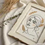
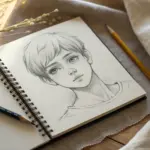
Identity as a Timeline Portrait
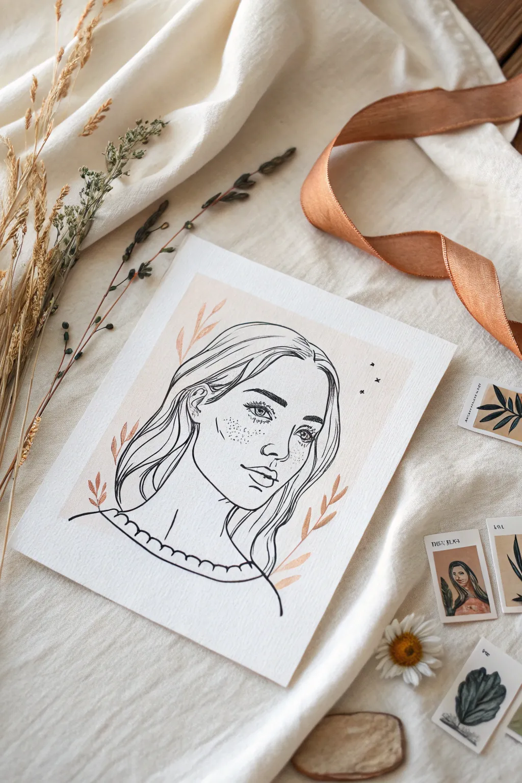
Capture the essence of identity through this delicate line art portrait, featuring intricate facial details and flowing hair against a soft blush background. The combination of precise ink work and subtle watercolor washes creates a timeless, dreamlike quality perfect for reflective journaling.
Step-by-Step Tutorial
Materials
- Cold press watercolor paper (A5 size)
- Fine liner pens (005, 01, and 03 sizes)
- HB graphite pencil
- Kneaded eraser
- Pale blush or peach watercolor paint
- Small flat brush (size 4 or 6)
- Round brush (size 2)
- Metallic copper or rose gold gouache/watercolor (optional)
Step 1: Setting the Background
-
Prepare the paper:
Begin by taping down your cold press watercolor paper to a flat surface using masking tape. This prevents the paper from buckling when you apply the wash and creates a clean border if you choose to paint to the edges. -
Mix the blush wash:
Dilute your peach or blush watercolor with plenty of water. You want a very transparent, subtle tone rather than a concentrated pop of color. Test transparency on a scrap piece of paper first. -
Paint the central shape:
Using your flat brush, paint a rectangular wash in the center of the paper, leaving plenty of white space around the edges. It doesn’t need to have perfect geometric edges—a slightly organic feel works well here. -
Let it dry completely:
Allow the background wash to dry thoroughly. The paper must be bone dry before you start sketching, or the graphite will smudge and the ink might bleed.
Don’t Overwork The Hair
Avoid drawing every single strand of hair. Instead, focus on the overall shape and add just a few internal lines to suggest direction and volume.
Step 2: Sketching the Portrait
-
Map out proportions:
With an HB pencil, lightly sketch the basic oval of the face. Mark horizontal guidelines for the eyes, nose, and mouth to ensure symmetry. -
Draft facial features:
Draw the almond shapes of the eyes, the curve of the nose, and the lips. Keep your pencil marks extremely faint so they are easy to lift later. -
Outline the hair:
Sketch the general volume of the hair. Focus on big, sweeping curves that frame the face rather than individual strands. Add the scalloped neckline of the shirt at the bottom. -
Add decorative elements:
Lightly place floating leaves or botanical sprigs on the left and right sides of the portrait. Add tiny stars or birds in the upper right corner for balance.
Step 3: Inking the Details
-
Outline the face shape:
Switch to your 03 fine liner. Carefully trace the jawline and chin. Use confident, single strokes rather than feathery, broken lines for a cleaner look. -
Ink the eyes:
Use a finer 01 pen for the eyes. Draw the upper lash line thicker than the lower one. Add the iris and pupil, leaving a tiny white circle for the highlight. -
add nose and mouth:
Ink the nostrils and the shadow side of the nose, but avoid drawing a solid bridge line to keep the face soft. Outline the lips, emphasizing the center line. -
Detail the hair:
Using the 03 pen again, ink the main outlines of the hair. Switch to a 01 or 005 pen to add a few internal strands that suggest flow and movement. -
Create the freckles:
With your 005 pen, gently stipple dots across the nose and cheeks. Vary the spacing—some close together, some further apart—for a natural freckled effect. -
Ink the accessories:
Go over the scalloped collar and the botanical branches. If you have metallic ink, tracing the leaves in rose gold adds a lovely dimension; otherwise, black ink works beautifully too.
Ink Bleeding on Wash?
Creating clean lines over painted sections requires patience. If your ink bleeds or feathers, your watercolor background wasn’t 100% dry. Use a hair dryer.
Step 4: Finishing Touches
-
Erase pencil marks:
Wait at least 15 minutes to ensure the ink is totally cured. Gently roll a kneaded eraser over the entire drawing to lift the graphite guidelines without damaging the paper surface. -
Enhance the botanicals:
If you used black ink for the leaves, consider painting over them with a slightly more concentrated mix of your blush watercolor, or add touches of copper gouache for shimmer. -
Final assessment:
Step back and look at the composition. If the hair feels too empty, add one or two more very thin directional lines with your 005 pen.
Frame your portrait or tuck it into your journal as a gentle reminder of self-expression
BRUSH GUIDE
The Right Brush for Every Stroke
From clean lines to bold texture — master brush choice, stroke control, and essential techniques.
Explore the Full Guide
Self-Portrait With Cultural Motifs
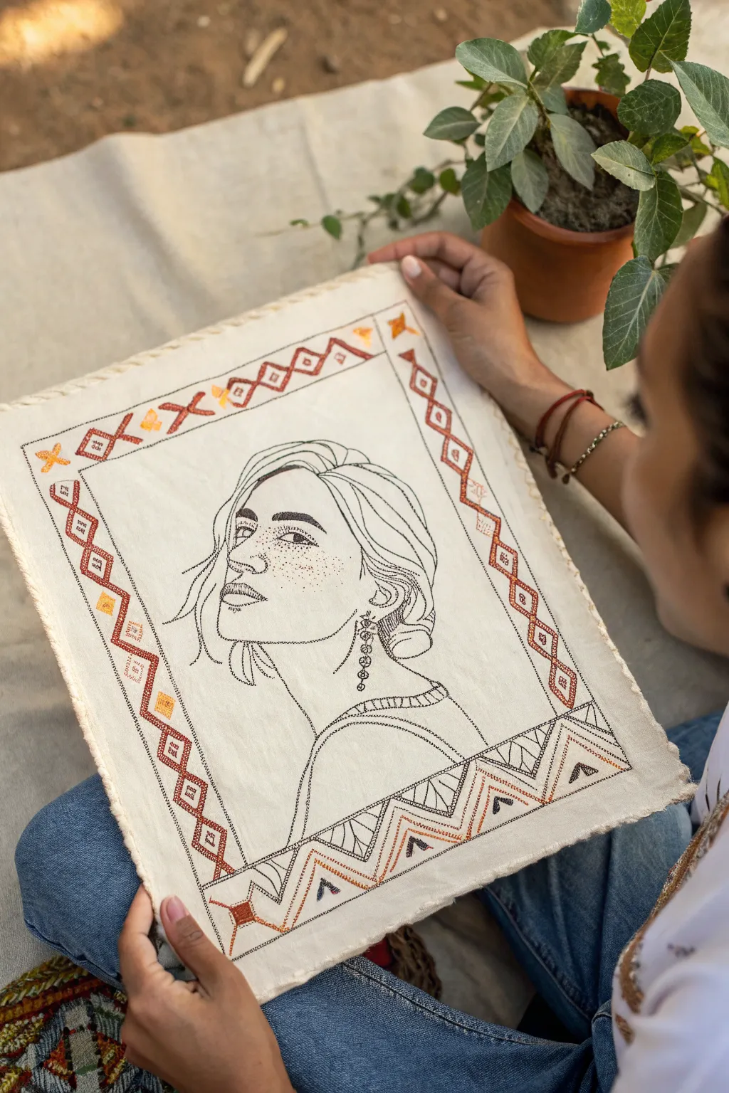
This elegant mixed-media project combines the simplicity of continuous line drawing with the texture of hand embroidery. By framing a minimalist self-portrait with a geometric border inspired by traditional textile motifs, you create a piece that honors both personal identity and cultural roots.
Step-by-Step
Materials
- Unbleached cotton or linen fabric (cream or off-white)
- Black embroidery floss (6-strand)
- Deep rust or terracotta embroidery floss
- Mustard yellow embroidery floss
- Embroidery hoop (8-10 inch recommended)
- Fabric transfer pen or carbon paper
- Embroidery needles (size 5-7)
- Pencil and sketchbook for drafting
- Scissors
Step 1: Designing the Portrait
-
Draft your sketch:
Begin by sketching your self-portrait on paper first. Aim for a ‘contour line’ style, focusing on the main outlines of your face, hair, and neck rather than shading. Keep the details minimal, like the distinct earring shown in the example. -
Create the geometric border:
Around your portrait sketch, design a rectangular border. Use repeating geometric shapes like diamonds, triangles, and zig-zags. These patterns mimic traditional weaving or rug designs, adding cultural significance. -
Transfer to fabric:
Cut your fabric to size, leaving ample margins. Place your final sketch under the fabric (if it’s thin enough) and trace with a transfer pen. If the fabric is opaque, use dressmaker’s carbon paper between the sketch and fabric to transfer the lines firmly.
Keep it Clean
Wash hands frequently when working with unbleached light fabric. Natural oils or tiny smudges show up easily on cream backgrounds.
Step 2: Stitching the Portrait
-
Prepare your hoop:
Secure the fabric tightly in your embroidery hoop. Drum-tight tension is crucial here to prevent the line work from puckering. -
Outline the face:
Thread your needle with a single strand or two strands of black floss. Use a neat backstitch or stem stitch to follow the main contours of the face. Keep your stitches small to navigate curves smoothly. -
Detail the hair:
Move to the hair, using long, flowing stitches to suggest movement and strands. You don’t need to close every line; leaving some ends open creates a lighter, sketchy aesthetic. -
Add facial features:
Stitch the eyes, nose, and lips with precision. For the freckles seen in the example, use tiny French knots or single seed stitches scattered across the nose and cheeks. -
Stitch the jewelry:
If your design includes earrings or necklaces, stitch these now. This element adds a nice focal point and breaks up the continuous flow of the facial lines.
Level Up: Mixed Media
Add depth by lightly painting the fabric inside the border shapes with diluted watercolor before stitching the outlines.
Step 3: Adding the Cultural Border
-
Outline the geometric shapes:
Switch to your colored floss. Use a rust or terracotta color to backstitch the outlines of the diamonds and triangles in your border design. I prefer using three strands here to make the border bolder than the portrait. -
Fill selected areas:
Identify specific shapes within the border to fill, such as the small ticks inside the diamonds or the triangles at the base. Use a satin stitch or simple straight stitches to add blocks of color. -
Add accent colors:
Thread your needle with mustard yellow floss. Add small stars, crosses, or fill in alternate shapes within the border pattern to create a warm, earthy contrast against the rust color. -
Complete the bottom pattern:
The example feature a more complex zig-zag or mountain pattern at the bottom. Stitch these jagged lines carefully, intercutting black thread with the colored threads to tie the central portrait to the frame.
Step 4: Finishing Touches
-
Remove transfer lines:
Once all stitching is complete, remove the visible transfer pen lines according to the manufacturer’s instructions (usually with water or heat). -
Create the frayed edge:
Cut the fabric into a rectangle, leaving about an inch of border. Carefully pull out the horizontal and vertical threads at the very edge of the fabric to create a soft, raw fringe effect. -
Press the fabric:
Place the artwork face down on a fluffy towel and iron the back gently. This smooths the fabric without flattening your beautiful stitching.
Now you have a deeply personal piece of art that weaves your image into the patterns of your heritage
Environment Shapes Me Portrait
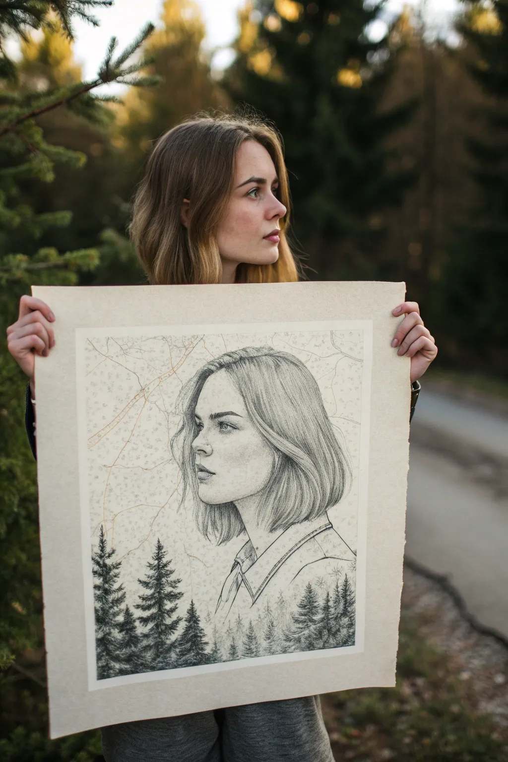
This introspective mixed-media piece blends realistic portraiture with natural landscapes, symbolizing how our environment shapes who we are. By combining precise graphite shading with delicate topographic lines, you’ll create a surreal and deeply personal map of identity.
How-To Guide
Materials
- Large sheet of textured cream/off-white drawing paper (approx. 18×24 inches)
- Graphite pencils (HB, 2B, 4B, 6B)
- Fine liner pens (0.05mm and 0.1mm, light brown or sepia)
- Kneaded eraser
- Precision eraser or eraser pencil
- Reference photo of a profile portrait
- Reference images of pine forests
- Ruler
- Blending stump or tortillon
- Tracing paper (optional)
Step 1: Mapping the Composition
-
Establish the frame:
Begin by lightly measuring a large rectangular border on your paper, leaving a generous margin of about 2-3 inches on all sides. This breathing room is essential for the map aesthetic. -
Sketch the profile outline:
Using an HB pencil, softly sketch the outline of your subject’s profile in the center of the frame. Focus on the major landmarks: the forehead, nose, lips, and chin line. -
Determine the horizon line:
Decide where the portrait will transition into nature. Lightly mark a line across the bottom third of the paper where the dark pine trees will eventually anchor the composition. -
Block in hair shapes:
Outline the general mass of the hair. Instead of drawing individual strands immediately, just define the shape where the hair falls around the face and neck.
Mapping Tip
Look at real topographic maps for inspiration. The lines (iso-lines) never cross each other; they follow the contours of a shape. Try making your lines follow the curve of the skull slightly.
Step 2: Rendering the Portrait
-
Detail the features:
Start refining the facial features. Use the 2B pencil to define the eye, nostril, and corner of the mouth, keeping your lines crisp but not overly dark yet. -
Shade the skin:
Apply light shading to the face using the HB pencil. Focus on the planes of the face—adding shadow under the eyebrow, beside the nose, and under the jawline. -
Smooth the complexion:
Gently use a blending stump to soften your pencil strokes on the skin, creating a smooth, realistic texture. Keep the shading significantly lighter than you plan the hair to be. -
Build hair texture:
Switch to a 4B pencil to start adding strands. Draw in the direction of hair growth, starting from the roots and sweeping outward. Leave highlights white or erase them back later. -
Deepen hair shadows:
Use a 6B pencil to add contrast in the deepest parts of the hair, particularly behind the ear and at the nape of the neck. This contrast is vital.
Level Up: Double Exposure
For a surreal twist, hide small silhouettes of birds or tiny houses within the negative space of the hair or the shirt, deepening the story of the environment.
Step 3: The Forest & Topography
-
Sketch the treeline:
At the bottom of the composition, begin sketching the tops of pine trees. Ensure they vary in height to look natural. -
Initial tree shading:
Using a 4B pencil, start filling in the trees. Use short, downward strokes to mimic pine needles. I prefer to start with the trees closest to the foreground to establish the darkest values. -
Blend portrait into landscape:
Fade the bottom of the subject’s clothing or neck into the treetops. The shirt collar or shoulder line should seemingly dissolve into the forest canopy. -
Darken the forest:
Go in with your heavy 6B pencil to make the trees the darkest element of the piece. This weight grounds the drawing visually. -
Draw topographic lines:
Switch to your fine brown or sepia liner. Lightly draw wandering, map-like lines across the background and over parts of the face. -
Add connecting paths:
Create a few slightly thicker lines in orange or brown to represent roads or main trails, connecting different parts of the ‘map’ around the head. -
Stipple details:
Add tiny dot clusters or small hatched symbols in the background area to represent terrain features, mimicking the look of an old survey map.
Step 4: Final Touches
-
Refine the eyes:
Return to the eye and sharpen the details. Add a tiny reflection catchlight with a precision eraser to bring the subject to life. -
Clean the edges:
Use your kneaded eraser to lift any stray graphite smudges from the borders of the paper, ensuring the map boundary is clean. -
Final contrast check:
Step back and squint at the drawing. Strengthen the darks in the trees and the hair one last time to ensure the image pops against the pale background.
This masterful combination of geography and humanity is now ready to be framed as a statement piece about where you come from


Collage-Style Identity Orbit
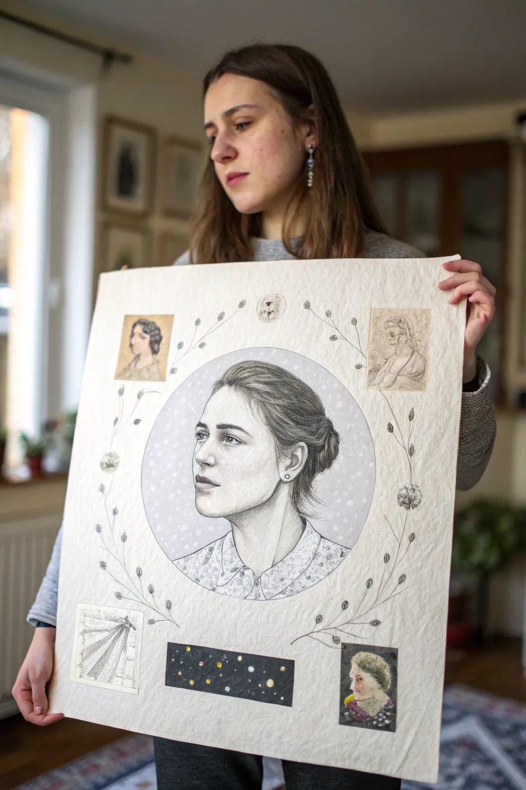
This introspective mixed-media piece centers a realistic graphite portrait within a constellation of personal symbols and historical fragments. The composition combines precise pencil realism with delicate botanical line work and collage elements to create a map of the self.
How-To Guide
Materials
- Large sheet of heavyweight, off-white printmaking paper or mixed-media paper (approx. A2 size)
- Graphite pencils (HB, 2B, 4B, 6B)
- Mechanical pencil for fine details (0.5mm)
- White gel pen or white gouache
- Printed collage elements (vintage portraits, architectural sketches)
- Deep black paper or cardstock
- Gold and silver metallic pens or acrylic paint
- Adhesive (glue stick or archival spray mount)
- Compass or circular object for tracing
- Fine-liner pen (black, 0.1mm or 0.2mm)
- Kneaded eraser and blending stump
Step 1: The Central Portrait
-
Establish the focal point:
Begin by lightly tracing a large circle in the center of your paper using a compass or a round template. This will contain the main portrait. Keep the line faint so it doesn’t distract later. -
Map facial proportions:
Sketch the basic structure of the face in three-quarter view. Use an HB pencil to lightly mark the eye line, nose placement, and jawline. Ensure the gaze is looking outward, past the viewer, to create a thoughtful mood. -
Build graphite layers:
Start shading the skin tones using a 2B pencil. Apply graphite in light, circular motions to avoid harsh streaks. I like to build up the darker values around the eyes and jawline gradually rather than pressing down hard immediately. -
Refine facial features:
Switch to a 4B or 6B pencil to deepen the pupils, nostrils, and corners of the mouth. Use a mechanical pencil to draw individual eyelashes and the fine hairs of the eyebrows. -
Render the hair:
Treat the hair as masses of shape first, shading the dark underside of the bun. Then, use sharp strokes to define individual strands flowing back from the face, leaving paper white for highlights. -
Complete the garment:
Draw the collar and shoulders. For the floral pattern on the shirt, keep the sketching loose and suggestive to contrast with the high realism of the face.
Step 2: Background Atmosphere
-
Add background tone:
Fill the space inside the circle, behind the head, with a soft, even layer of graphite. Use a blending stump to smooth it out into a uniform grey mist. -
Create starlight:
Using a clean kneaded eraser, lift out small, random dots from the grey background to create a ‘bokeh’ or snowy effect. You can enhance these with tiny touches of white gel pen for extra brightness.
Smudge Control
Graphite smudges easily on large paper. Place a clean sheet of scrap paper under your drawing hand at all times to protect the white space and keep your shading crisp.
Step 3: The Orbital Elements
-
Prepare collage pieces:
Select 3-4 small vintage images—portraits, architectural diagrams, or scientific sketches. Trim them into neat rectangles. Print them on paper with a slightly yellowed tone to match the antique aesthetic. -
Create the cosmic strip:
Cut a rectangular strip of black paper. Use metallic gold and silver pens to draw planets, stars, and orbital rings. Glue this strip near the bottom center of the composition. -
Position the collage:
Arrange your vintage cutouts symmetrically around the central circle—two near the top corners, two near the bottom. Secure them with adhesive once you are happy with the balance.
Make it Personal
Replace the vintage collage faces with sketches of your ancestors or photos of places you’ve lived to turn this orbit into a literal family tree or personal history map.
Step 4: Botanical Connectors
-
Sketch vine pathways:
Using a fine-liner or a sharp pencil, draw long, sweeping curves that act as stems. These should originate from the collage pieces and curve inward toward the central portrait, visually connecting the outer elements to the center. -
Add delicate leaves:
Drawing small, paired leaves along the stems. Keep the style illustrative and flat, referencing botanical textbooks, rather than trying to make them realistic. -
Integrate seed pods:
At the ends of some stems, draw small circular seed pods or simple flowers. These act as punctuation marks in your visual sentence. -
Final shading touches:
Review the entire piece. Darken the deepest shadows in the central portrait one last time to ensure it pops against the lighter paper and delicate surrounding sketches.
Step back and admire how the delicate outer elements frame the strength of your central portrait
Head Opening: Thoughts Escaping
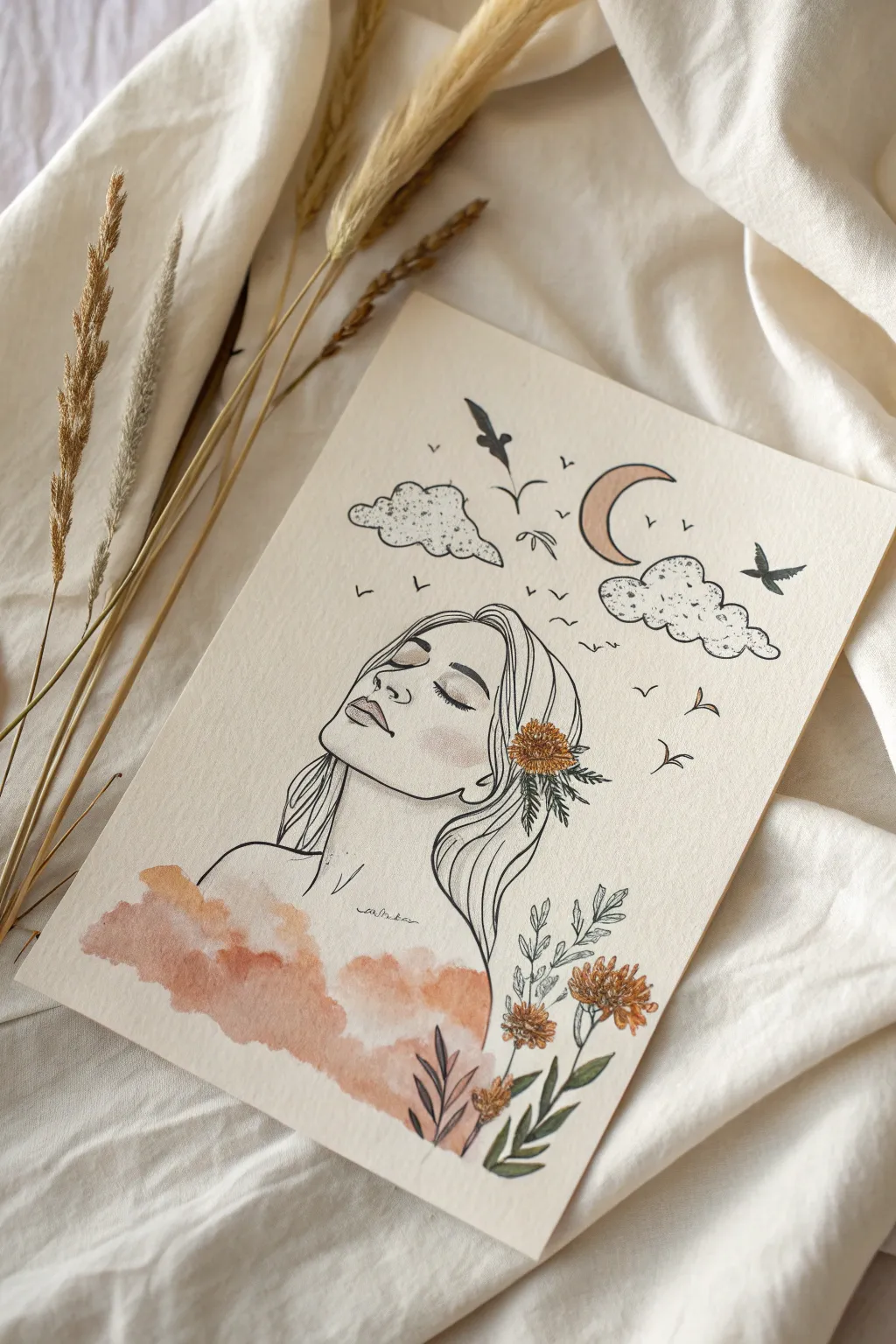
This serene mixed-media piece combines delicate line art with soft watercolor washes to visualize the quiet beauty of inner thoughts escaping into the night sky. The contrast between precise ink lines and free-flowing paint creates a dreamy, ethereal aesthetic perfect for exploring themes of identity and imagination.
Step-by-Step Tutorial
Materials
- Cold press watercolor paper (A4 or 5×7)
- Fine liner pens (0.1mm, 0.3mm, and 0.5mm, waterproof archival ink)
- Watercolor paints (burnt sienna, yellow ochre, sap green, gentle pink)
- Round watercolor brush (size 4 or 6)
- Pencil (HB or 2B)
- Kneaded eraser
- Jar of clean water
- Paper towel
Step 1: Planning the Composition
-
Rough sketch:
Begin by lightly sketching the central figure with an HB pencil. Place the head slightly lower than center to leave ample room for the floating elements above. -
Face structure:
Define the profile of the face. Focus on a tilted chin, closed eyes with soft lashes, and a relaxed mouth to convey a sense of peaceful dreaming. -
Hair flow:
Sketch the hair cascading down, leaving the ear visible. Incorporate a small cluster of wildflowers tucked behind the ear, letting the leaves intermingle with the hair strands. -
Floating elements:
Above the head, lightly draw two fluffy clouds, a crescent moon, and several birds in flight to represent escaping thoughts. -
Botanical base:
To the right of the figure, sketch vertical stems of wildflowers rising up, creating a natural frame for the composition.
Step 2: Inking the Lines
-
Facial features:
Using a 0.1mm fine liner, carefully trace the facial features. Keep your hand light for the nose and lips to maintain a delicate look. -
Hair texture:
Switch to a 0.3mm pen for the main hair outlines. Use long, sweeping strokes to mimic the flow of strands, rather than drawing every single hair. -
Floral details:
Ink the flowers behind the ear and the standing botanicals. Add small stippling dots to the center of the flowers for texture. -
Sky elements:
Outline the clouds with a wiggly, broken line to keep them feeling airy. Ink the moon and birds with clean, sharp strokes. -
Erase guidelines:
Once the ink is completely dry—I usually wait at least 5 minutes to be safe—gently roll your kneaded eraser over the entire paper to remove all pencil marks.
Ink Smearing?
If your black lines bleed when adding watercolor, your pen isn’t fully waterproof. Test your pen on a scrap piece of paper with water first, or ink the drawing *after* painting and drying.
Step 3: Adding Watercolor
-
Cloud wash base:
Mix a diluted wash of burnt sienna and a touch of pink. Apply this wet-on-dry to the bottom left area, creating a cloud-like shape that covers the figure’s shoulders. -
Softening edges:
While the paint is still wet, dip your clean brush in water and touch the edges of the cloud wash to let the color bleed out softly, avoiding hard lines. -
Skin tone basics:
Add a very pale, watered-down wash of burnt sienna to the lips and cheek for a subtle blush effect. -
Painting the moon:
Fill the crescent moon with a light wash of pale pink or diluted yellow ochre. -
Floral colors:
Use a mix of ochre and burnt sienna for the flower heads. Dab the color loosely; it doesn’t need to stay perfectly inside the lines.
Pro Tip: Texture
Add salt to the wet watercolor ‘cloud’ wash at the bottom. As it dries, the salt absorbs pigment, creating beautiful crystallized textures perfect for ethereal dreamy effects.
Step 4: Final Details
-
Leaves and stems:
Paint the leaves with a muted sap green. Vary the intensity of the green to create depth between the leaves tucked in the hair and the standing plant. -
Cloud texture:
Return to the inked clouds above the head. Using a 0.1mm pen, add tiny stippling dots inside the clouds to give them volume and shading. -
Bird silhouettes:
Fill in the flying birds with solid black ink or dark grey watercolor to make them pop against the pale paper. -
Atmospheric birds:
Draw tiny ‘v’ shapes in the background to suggest distant birds, creating a sense of scale and distance. -
Assess and refine:
Sign your name near the shoulder line in small, cursive script to finish the piece.
Enjoy the peaceful moment of reflection captured in your newly created artwork
Fragmented Self Portrait in Pieces
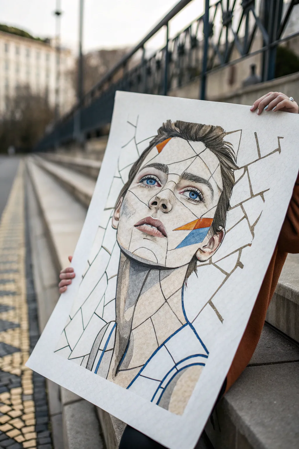
Explore the multi-faceted nature of identity with this striking portrait concept that visually breaks the face into geometric shards. By combining realistic pencil shading with deliberate negative space and bold graphical lines, you’ll create a piece that feels both fragile and resilient.
Step-by-Step Guide
Materials
- Large format drawing paper (A2 or 18×24 inch, heavyweight cartridge paper)
- Graphite pencils (HB, 2B, 4B, 6B)
- Mechanical pencil (0.5mm, HB) for fine lines
- Colored pencils or fine-tip markers (orange, cyan blue)
- Ruler or straight edge
- Kneadable eraser
- Blending stumps (tortillons)
- Reference photo of subject looking slightly upward
Step 1: Drafting the Foundation
-
Capture the reference:
Start with a high-quality photo of your subject looking slightly away or upward. This aspirational gaze works beautifully with the shattered theme. -
Sketch the initial contours:
Using your HB pencil, lightly sketch the basic outline of the head, neck, and shoulders. Keep your pressure extremely light so these lines can be erased or adjusted later. -
Map facial features:
Place the eyes, nose, and mouth carefully. Focus on getting the proportions accurate now, as the fragmentation effect later will make corrections difficult. -
Draw the fracture lines:
Lightly draw a web of connecting straight lines across the face and background. Think of how a mirror cracks—radiating outward or creating random geometric islands. Don’t overthink it; randomness looks more organic. -
Refine the shards:
Go over your fracture lines with a ruler and a slightly darker pencil to firm them up. Ensure some shards cut awkwardly through facial features to enhance the ‘broken’ effect.
Step 2: Shading and Definition
-
Define the eyes:
Start shading with the eyes using 2B and 4B pencils. Render the irises with high detail, as they anchor the humanity of the piece. Leave a crisp white highlight in the pupil. -
Shade the central fragments:
Select the main shards covering the central face (nose, mouth, cheek) to render realistically. Use your blending stump to smooth out the graphite for a skin-like texture. -
Create disconnected zones:
Here is where the magic happens: deliberately leave some shards completely blank or only lightly outlined. This contrast between hyper-realism and white space creates the ‘missing pieces’ narrative. -
Work on the hair:
Draw the hair stroke by stroke, but stop abruptly where a fracture line intersects the hair. The hair should exist inside the shard but disappear outside of it. -
Deepen the shadows:
Use a 6B pencil to darken the deepest shadows around the neck and jawline. High contrast is essential to make the drawing pop from a distance.
Uneven Shading?
If your graphite looks patchy on the large paper, use a tissue wrapped around your finger to blend large areas, then come back with an eraser to reclaim the highlights.
Step 3: Color and Final Touches
-
Add graphical lines:
Using a mechanical pencil or a very sharp HB, re-trace the geometric fracture lines with varying line weights. Some lines should be thick, others vanishingly thin. -
Inject color accents:
choose two triangular shards on the cheek or forehead. Fill them solidly with orange and cyan blue colored pencil or marker. This modern geometric pop disrupts the classic portrait style. -
Shade the background shards:
Identify a few shards floating away from the head in the background. Lightly shade inside them to imply that the background itself is cracking, not just the face. -
Clean the edges:
Use your ruler and eraser to sharpen the edges of every shard. The separation lines need to be crisp, like cut glass. -
Final assessment:
Stand back and look for balance. If the face looks too solid, erase a section inside a shard to turn it back into white space. I prefer to leave the outer edges more abstract.
Level Up: 3D Depth
Add a tiny drop shadow behind one or two of the ‘shards’ to make them look like they are physically lifting off the paper surface.
Now you have a powerful visual metaphor for identity that is as thought-provoking as it is beautiful
Identity Map With Lines and Connections
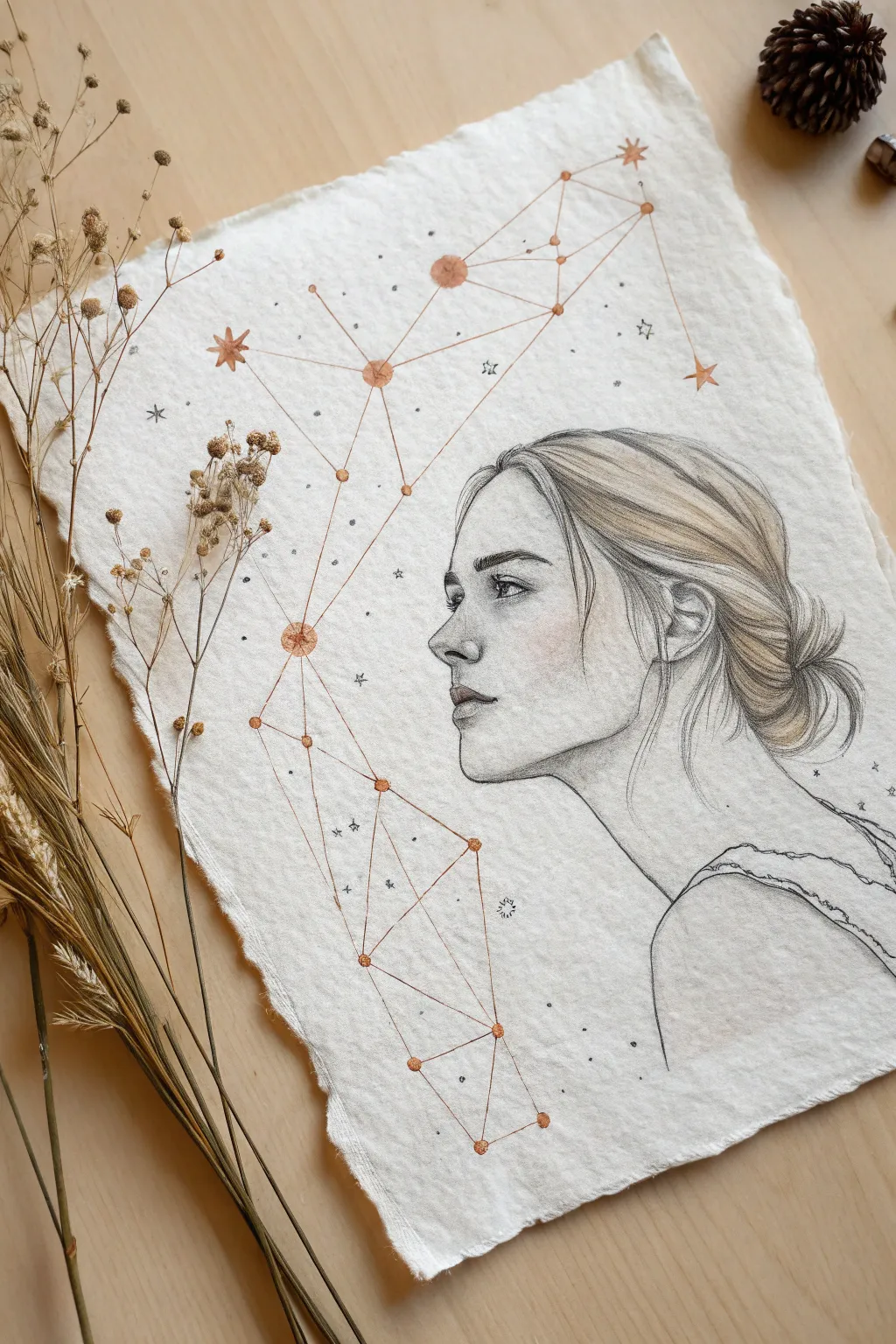
This evocative artwork merges a delicate pencil portrait with a geometric layer of constellations, suggesting the invisible connections that form our identity. Using textured paper and a mix of graphite and metallic ink, you’ll create a piece that feels both grounded and ethereal.
Step-by-Step
Materials
- Heavyweight textured paper (deckle-edge watercolor or handmade cotton paper)
- Graphite pencils (HB, 2B, 4B)
- Fine-point mechanical pencil (0.5mm)
- Copper or rose gold metallic pen (fine liner or gel)
- Black fine liner pen (0.1mm)
- Blending stump (tortillon)
- Kneaded eraser
Step 1: Drafting the Profile
-
Plan the composition:
Begin by lightly marking where the head will sit on the right side of the paper, leaving the left side open for the constellation design. Ensure the gaze direction has ample ‘breathing room’ on the page. -
Sketch the basic shapes:
Using an HB pencil with a very light hand, block out the cranium as a circle and the jawline as a gentle curve. Sketch a vertical line for the profile guide. -
Refine the features:
Draw the forehead, nose, lips, and chin. The nose in this reference is straight with a subtle upturn, and the lips are slightly parted. Keep these lines faint so they can be adjusted easily. -
Outline the hair:
Sketch the hair pulled back into a low, messy bun. Focus on the major clumps of hair first—the swoop over the ear and the bulk of the bun—rather than individual strands.
Choosing Your Paper
For that authentic, old-world look, rip the edges of your paper against a ruler instead of cutting. Handmade cotton rag paper absorbs graphite beautifully.
Step 2: Developing the Portrait
-
Detail the eye:
Switch to a sharpened 2B pencil to define the eye. Draw the iris and pupil clearly, leaving a small white highlight. Shade the upper lash line darker to add depth. -
Shade the face structure:
Apply light graphite shading to the cheekbone, the side of the nose, and under the jawline. I like to use a blending stump here to soften the graphite into the textured paper for a smooth skin tone. -
Add blush and warmth:
If desired, very lightly layer a tiny amount of red pencil or pastel dust on the cheek and ear for a subtle flushed look, blending it seamlessly into the graphite. -
Define the hair texture:
Use a 4B pencil to draw confident, sweeping strokes following the direction of hair growth. Create darker values at the nape of the neck and where the hair tucks behind the ear to suggest volume. -
Refine the hairline:
Add wispy stray hairs at the forehead, temple, and nape of the neck using a sharp mechanical pencil. These ‘flyaways’ add realism and movement to the drawing. -
Draw the clothing:
Sketch the simple strap of the dress or top. Keep this sketchy and loose, letting the line fade out toward the bottom of the page to maintain focus on the face.
Step 3: Mapping the Identity Grid
-
Mark the star points:
Switch to your copper or rose gold metallic pen. Place small dots randomly but harmoniously across the negative space on the left and above the head. -
Draw the main nodes:
Select 5-7 key points to be your ‘major stars.’ Draw small, solid circles over these points with the copper pen to emphasize them. -
Connect the constellations:
Use a ruler or a steady freehand motion to draw straight lines connecting your dots. Create triangular and geometric shapes that span from the top right corner down to the bottom left. -
Add celestial details:
Draw small four-pointed or eight-pointed star shapes at a few intersections. These act as the ‘brightest’ stars in your identity map. -
Integrate background elements:
Using a very fine black pen, sprinkle tiny dots and miniature stars around the copper lines. This adds depth and makes the metallic ink pop against the paper. -
Final touches:
Review the connection between the portrait and the grid. You might choose to have one or two grid lines gently overlap the hair or shoulder to visually integrate the two layers.
Smudged Pencil?
Place a clean sheet of scrap paper under your drawing hand. This prevents your palm from dragging graphite across the white space while you work details.
Step back and admire how the rigid geometry balances the softness of the face, capturing a unique visual identity
Metamorphosis Portrait: Who You’re Becoming
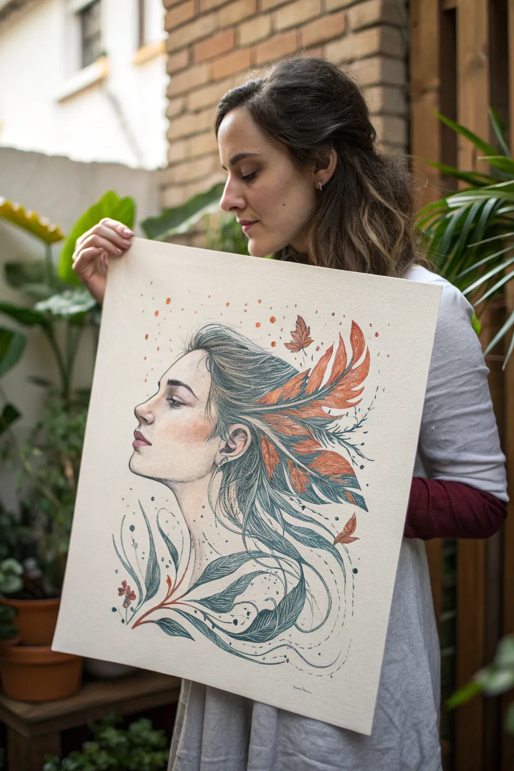
This elegant mixed-media portrait captures the concept of personal growth through a striking visual metaphor, blending a realistic side profile with illustrative natural elements. The piece combines delicate line work with soft earthy tones, creating a dreamlike transition from human features into feathers and flowing leaves.
Step-by-Step Guide
Materials
- Large heavy-weight mixed media paper (A2 or 16×20 inches)
- Graphite pencils (HB, 2B, 4B)
- Fine liner pens (Black or Sepia, sizes 0.1, 0.3, 0.5)
- Watercolor paints (Earthy greens, terracotta, burnt orange, skin tones)
- Round watercolor brushes (sizes 4 and 8)
- Colored pencils (optional, for adding texture)
- Kneaded eraser
- Paper towel and water jar
Step 1: Drafting the Foundations
-
Map the composition:
Begin with a very light HB pencil sketch to place the head. Ensure the face is positioned on the left side of the paper, leaving ample negative space on the right for the hair’s transformation. -
Sketch the profile:
carefully draw the profile of the face. Focus on the curves of the forehead, nose, lips, and chin. Keep the expression neutral or contemplative, looking outward toward the left edge of the page. -
Outline the transformation:
Instead of drawing standard hair, sketch flowing lines sweeping back from the forehead and ear. Allow these strands to gradually morph into leaf shapes and feather structures as they move further from the face. -
Refine facial features:
Tighten up the details on the eye, eyebrow, and ear. The eye should be detailed but soft, with a distinct lash line. Shade lightly under the jawline to define the neck. -
Detail the nature elements:
Flesh out the leaves and feathers. Draw distinct veins in the leaves and barbs in the feathers. Intertwine them to make the transition from hair to nature feel organic and seamless.
Step 2: Inking and Definition
-
Ink the profile:
Using a 0.1 fine liner, trace over the facial features with a very delicate hand. Use broken lines for less defined areas like the bridge of the nose to keep it soft. -
Ink the hair and flora:
Switch to a 0.3 or 0.5 pen for the hair and leaves. Use long, confident strokes to mimic the flow of wind. Vary your line weight—thicker on the shadowed undersides of leaves, thinner on the tips. -
Add stippling details:
Add tiny dots (stippling) around the hairline and where the feathers emerge to create texture and depth. This helps blend the skin into the illustrative elements. -
Erase pencil guides:
Once the ink is completely dry, thoroughly erase the graphite sketch underneath using a kneaded eraser to leave a clean, crisp line drawing.
Flow & Movement
Keep your wrist loose when drawing the hair-to-leaf transition. Long, continuous S-curves create a sense of wind and movement that stiff, short lines cannot achieve.
Step 3: Bringing Color to Life
-
Paint the skin base:
Mix a watery wash of your skin tone watercolor. Apply it lightly to the face, avoiding the highlight areas on the cheekbone and tip of the nose. -
Add facial depth:
While the base is slightly damp, drop in a slightly darker, rosier hue on the cheek, eyelids, and lips to give the face warmth and dimension. -
Wash the leaves:
Using a muted teal or sage green, paint the leaves at the bottom of the composition. Keep the color transparent, allowing the ink lines to show through clearly. -
Paint the feathers:
Use burnt orange and terracotta watercolor for the feathers. I like to paint these loosely, letting the color bleed slightly outside the lines for an ethereal effect. -
Layering darker tones:
Once the first layers are dry, go back in with more concentrated paint to add shadows where the leaves and feathers overlap. This creates spatial depth. -
Splatter texture:
Load a brush with watered-down terracotta paint and tap it against your finger to create fine splatters around the feathers, mimicking pollen or magical dust. -
Final dry accents:
Use colored pencils to strengthen the finest details, such as individual hairs or the sharp tips of the leaves, adding a bit of friction and texture to the smooth watercolor.
Muddy colors?
If your greens and oranges look brown where they touch, let one section dry completely before painting the neighbor. Wet-on-dry prevents unwanted blending.
Step back and admire how the natural elements seem to breathe life and movement into your portrait self-reflection

Have a question or want to share your own experience? I'd love to hear from you in the comments below!