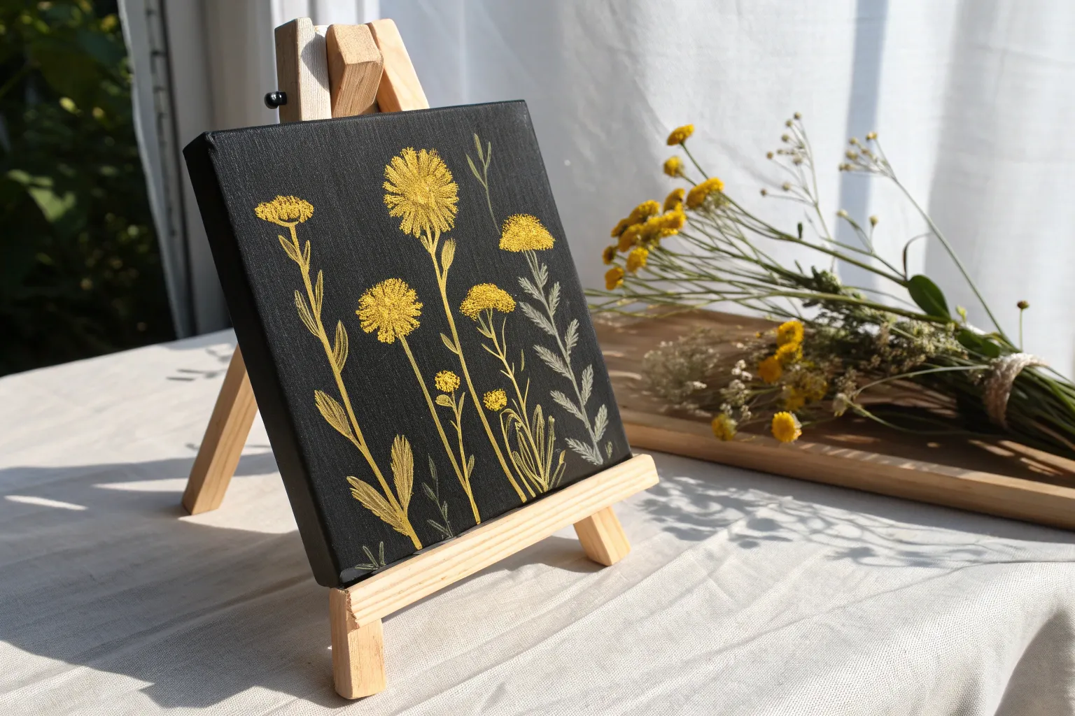
If you’re craving a color that instantly lifts a painting, yellow is my go-to for warmth, light, and energy. Here are my favorite yellow painting ideas—starting with the classics you’ll actually want to try, then drifting into more playful, surprising ways to let yellow steal the show.
Sunflower Close-Up Study
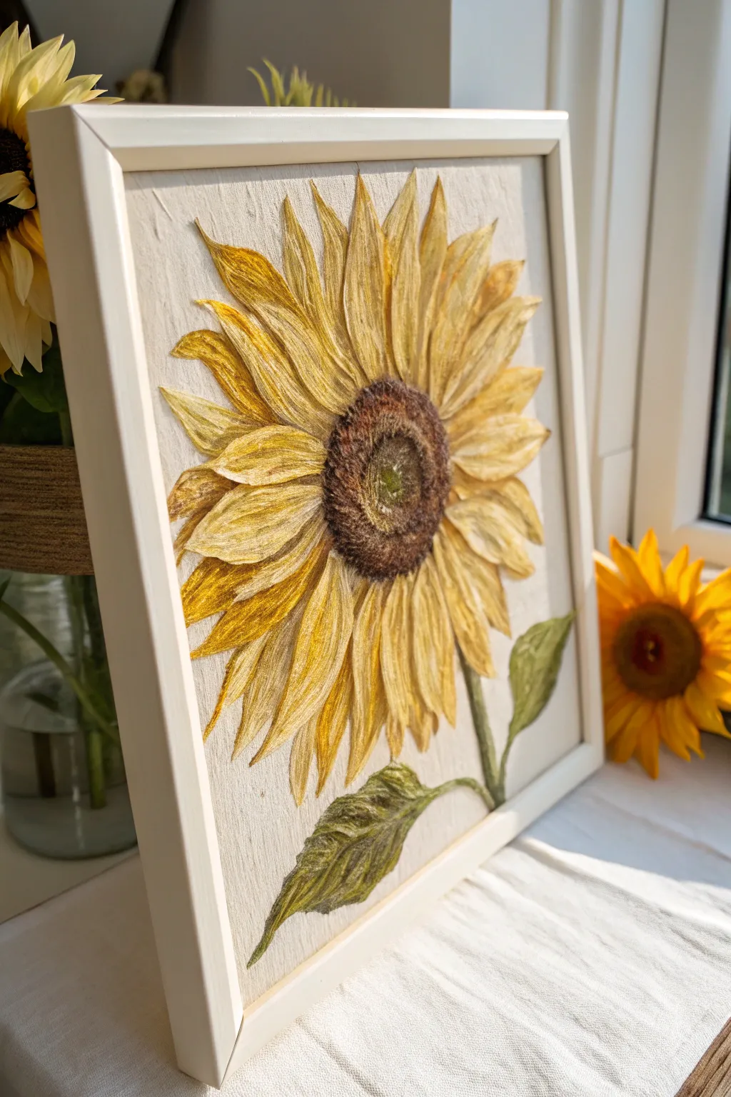
Capture the warmth of late summer with this highly textured, three-dimensional sunflower study. By combining acrylic mediums with sculpted paper or fabric stiffener, you will create petals that literally pop off the canvas for a striking, tactile effect.
Step-by-Step Tutorial
Materials
- Square wood panel or deep-edge canvas (approx. 10×10 or 12×12 inches)
- White or light beige fabric (linen or cotton)
- Heavy body acrylic paints (Titanium White, Cadmium Yellow, Yellow Ochre, Burnt Umber, Sap Green)
- Modeling paste or texture paste
- Tissue paper or thin crepe paper
- PVA glue or decoupage medium
- Painting knives and small palette knives
- Set of small, stiff-bristled brushes
- Clear matte varnish
- White floating frame (optional)
Step 1: Preparing the Base
-
Wrap the Canvas:
Begin by stretching your linen or cotton fabric tightly over the wood panel or canvas. Secure it on the back with staples or strong adhesive, ensuring the front surface is drum-tight and smooth. -
Prime the Surface:
Apply a thin layer of clear gesso or a diluted mix of PVA glue and water to the fabric. This seals the fibers without hiding the beautiful natural texture of the weave. Let it dry completely. -
Sketch the Outline:
Lightly sketch the large sunflower head using a watercolor pencil. Draw a large central circle for the seeds and radiating lines for where the petals will flow.
Boost the Texture
For even more dimension, mix real dried coffee grounds into the modeling paste for the flower’s center. It mimics the look of seeds perfectly.
Step 2: Sculpting the Petals
-
Prepare the Petal Mixture:
Mix a generous amount of modeling paste with a small splash of PVA glue. This mixture needs to be stiff enough to hold ridges but pliable enough to shape. -
Form the Base Petals:
Using a palette knife, apply petal shapes directly onto your sketched lines. Start with the outer layer first. Build them up to be slightly thicker in the middle and tapering at the tips. -
Add Texture with Paper:
While the paste is wet, I like to press crumbled, glue-soaked tissue paper into the wet paste for the larger petals. This creates those deep, vein-like ridges you see in the reference image. -
Carve the Veins:
Use the edge of your palette knife or a toothpick to score deep vertical lines down the length of each petal. This is crucial for mimicking the fibrous look of a real sunflower. -
Sculpt the Center:
Apply a thick, circular mound of paste to the center. Unlike the smooth petals, this area should be stippled. Use an old stiff brush to dab repeatedly into the wet paste, creating a rough, fuzzy texture. -
Create the Stem and Leaves:
Fashion the stem and lower leaves using the same paste and tissue technique. Twist the tissue paper slightly before adhering it to simulate the tough, fibrous stem. -
Dry Thoroughly:
This is the patience phase. Allow the texture to dry for at least 24 hours. The thickest parts must be rock hard before painting.
Step 3: Applying Color
-
Base Leaf Color:
Start by painting the stem and leaves with a mix of Sap Green and a touch of Burnt Umber. Keep the paint somewhat thin so it settles into the crevices. -
Base Petal Layer:
Paint the entire petal area with a base coat of Yellow Ochre mixed with Titanium White. This provides a warm, neutral undertone. -
Deepen the Shadows:
Mix a wash of burnt umber and gently glaze the crevices between the petals and the deep carved veins. This emphasizes the 3D relief work. -
Brighten the Highlights:
Using a dry-brush technique, sweep pure Cadmium Yellow and Titanium White over just the raised ridges of the petals. The color should catch the high points, leaving the darker ochre in the valleys. -
Paint the Center Disc:
Paint the textured center with Burnt Umber. While wet, dab in spots of darker black-brown around the outer ring and lighter ochre spots directly in the middle to create depth. -
Add Green Accents:
Lightly dry-brush a tiny amount of pale green into the very center of the sunflower disc to show new growth. -
Final Varnish:
Once fully dry, apply a coat of matte varnish to protect the textured surface and unify the sheen. -
Framing:
Mount your finished piece into a white floating frame to replicate the clean, modern look of the example image.
Cracking Paste?
If your petal paste cracks while drying, simply fill the cracks with a little more paste or heavy body paint. It adds to the organic look.
Hang your relief painting near a window where the changing daylight will catch all those beautiful ridges and textures

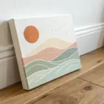
Golden Hour Sunset Silhouettes
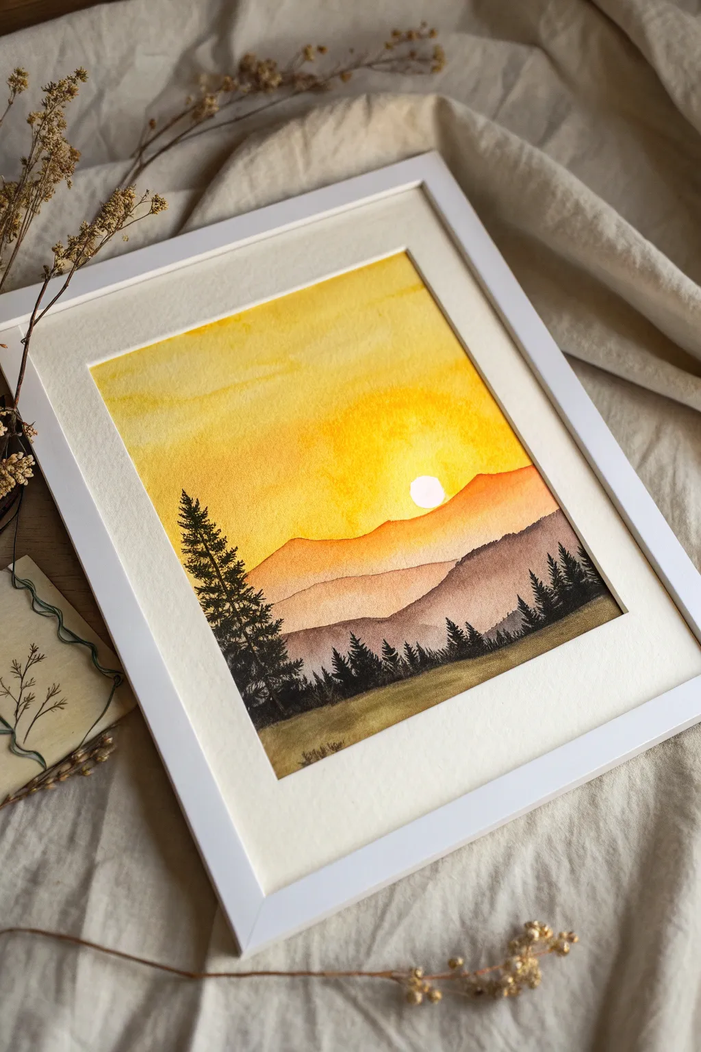
Capture the serene warmth of a mountain sunset with this glowing watercolor project. By layering translucent washes of gold, ochre, and deep earthy browns, you’ll create atmospheric depth topped with crisp pine silhouettes.
Step-by-Step Guide
Materials
- Cold press watercolor paper (140 lb/300 gsm)
- Watercolor paints (Cadmium Yellow, Yellow Ochre, Burnt Sienna, Burnt Umber, Payne’s Gray/Indigo)
- Masking fluid or white gouache (optional)
- Round watercolor brushes (size 8 or 10 for washes, size 0 or 2 for details)
- Pencil and eraser
- Painter’s tape or Washi tape
- Two jars of water
- Paper towels
- White or light cream mat board and frame
Step 1: Preparation and Sketching
-
Secure the Paper:
Begin by taping your watercolor paper securely to a hard board or your work surface. Ensure the tape edges are firmly pressed down to create a crisp border later. -
Sketch the Sun:
Lightly draw a small circle for the sun using a hard pencil (like 2H) so the lines remain faint. Place it slightly off-center to the right, about one third of the way down from the top. -
Outline the Mountains:
Sketch three to four undulating lines across the paper to represent the mountain ranges. The top line should interact with your sun placement, while the lower lines should become progressively flatter. -
Preserve the Sun:
Carefully apply drawing gum (masking fluid) over the sun circle to keep it perfectly white. If you don’t have masking fluid, you can carefully paint around it later, but masking makes painting the sky wash much easier.
Step 2: Painting the Sky
-
Wet the Sky Area:
Using a clean, large round brush, apply clean water to the entire sky area, stopping right at the distinctive line of the farthest mountain range. -
Apply the Base Yellow:
While the paper is wet, drop in a vibrant Cadmium Yellow near the top and around the sun area. Let the pigment bloom naturally into the wet paper. -
Deepen the Gradient:
Mix a bit of Yellow Ochre or a touch of orange into your yellow. Paint this warmer mixture near the horizon line of the mountains to suggest the intensity of the setting sun. -
Let it Dry Completely:
This is crucial: allow the sky later to dry fully. If you rush this step, your sharp mountain ridges will bleed into the sky.
Pro Tip: Glowing Sun
After removing the masking fluid, soften the hard edge of the sun slightly with a damp, clean brush. This makes the light look like it’s glowing rather than just a cutout hole.
Step 3: Layering the Mountains
-
Paint the Farthest Mountain:
Mix a light wash of Burnt Sienna with plenty of water. Paint the most distant mountain ridge, pulling the color down to the line of the next mountain range. -
Create Atmospheric Perspective:
While that layer is still slightly damp, dry your brush and lift a tiny bit of color at the bottom edge to create a soft, misty transition. -
Paint the Middle Range:
Once the previous layer is dry, mix a slightly darker tone using Burnt Sienna and a touch of Burnt Umber. Paint the middle mountain shape, ensuring the top edge is crisp against the lighter mountain behind it. -
Paint the Nearest Hills:
For the closest landmasses, mix a rich, dark brown using Burnt Umber and a hint of purple or blue to cool it down. Paint the foreground hills, making this the darkest value of your land layers.
Level Up: Birds in Flight
Use a 005 micron pen or a single hair brush to add two or three tiny V-shaped birds silhouetted against the sun for an extra touch of life and scale.
Step 4: Adding Details and Finishing
-
Mix the Pine Color:
Create a very dark, near-black green. I prefer mixing Payne’s Gray with a deep Sap Green or Indanthrone Blue with a dark earth tone rather than using straight black. -
Practice Tree Shapes:
On a scrap piece of paper, practice using the tip of your smallest brush to tap small, jagged marks that widen as they go down, mimicking pine branches. -
Paint Distant Trees:
Add tiny, suggestion-like trees along the ridge of the middle mountain range. Keep these small to maintain the illusion of distance. -
Paint the Foreground Tree:
On the left side of the foreground, paint a large, detailed pine tree. Start with a thin trunk line and work your way down with horizontal, textured strokes for the branches. -
Add Foreground Texture:
Use a dry-brush technique with your dark green mixtures to add grass texture and smaller shrubs along the very bottom edge of the painting. -
Remove Masking:
Once the paper is bone dry, gently rub off the masking fluid with your finger or a rubber cement pickup to reveal the crisp white sun. -
Frame the Piece:
Remove the tape slowly at an angle. Place your finished artwork behind a white mat and frame to enhance the brightness of the yellow sky.
Hang your new masterpiece in a spot that catches the afternoon light to double the golden hour effect
Dandelion Wish on a Yellow Wash
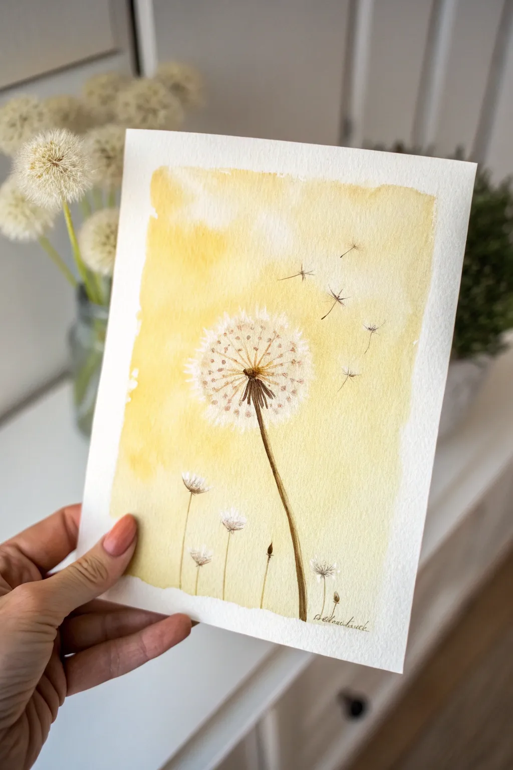
Capture the fleeting beauty of a dandelion seed head with this soft, sunlit watercolor painting. The gentle yellow wash creates a warm, hazy afternoon atmosphere, while precise pen or fine brush details bring the delicate seeds to life.
Step-by-Step Guide
Materials
- Cold press watercolor paper (140lb/300gsm)
- Masking tape or painter’s tape
- Yellow watercolor paint (e.g., Yellow Ochre or Naples Yellow for warmth)
- Brown watercolor paint (e.g., Van Dyke Brown or Sepia)
- White gouache or white gel pen
- Fine liner brushes (size 0 and 00)
- Medium round brush (size 6 or 8) for washes
- Drawing masking fluid (optional but recommended)
- Pencil and eraser
- Cup of water and paper towels
Step 1: Preparation and Background
-
Secure the paper:
Tape down all four edges of your watercolor paper to a board or table. This creates that crisp, professional white border seen in the reference image and prevents the paper from buckling when wet. -
Sketch lightly:
Using a pencil, very faintly sketch the position of the main dandelion stem and the large seed head. Mark the circle where the fluff will be, but keep lines barely visible so they don’t show through the yellow later. -
Protect the white fluff:
To keep the dandelion seeds pure white against the yellow background, use masking fluid. Dot small clusters inside your circle shape to represent the fluff. If you don’t have masking fluid, you can carefully paint around these spots, but fluid makes it much easier. -
Prepare the yellow wash:
Mix a generous amount of warm yellow paint with water. You want a diluted, tea-like consistency that will flow easily across the page without looking too heavy. -
Apply the first wash:
Dip your medium round brush into clean water and wet the rectangular area where you want the color to go. Then, load your brush with the yellow mix and touch it to the wet paper, letting the color bloom and spread naturally. -
Create texture:
While the wash is still wet, you can lift out some color with a thirsty (clean, damp) brush to create soft, cloud-like variations in the background. Leave the bottom area slightly lighter if you wish. -
Let it dry completely:
This is crucial. The paper must be bone dry before you add the fine details, otherwise, your crisp lines will bleed into the background. Use a hairdryer if you’re impatient.
Brush Control Tip
For the finest lines on the seed parachutes, hold your brush perpendicular to the paper and use only the very tip with minimal pressure.
Step 2: Painting the Main Dandelion
-
Remove masking fluid:
If you used masking fluid, gently rub it away with your finger or an eraser to reveal the stark white paper underneath. -
Paint the center:
Mix a dark brown watercolor. Using your smallest brush, paint the tight cluster of seeds at the very center of the dandelion head. Use tiny, stipppling dots to build up density. -
Draw the stem:
With the same brown mix, paint the main stem. Start from the center of the flower and pull the brush down in a slightly curved line. Make it thicker at the top and taper it slightly as it descends. -
Add radial spokes:
Switch to your finest liner brush. Draw very thin, delicate lines radiating outward from the dark center like spokes on a wheel. These don’t need to be perfectly straight; slight wobbles add realism. -
Define the seeds:
At the end of each radial spoke, add tiny ‘V’ or ‘Y’ shapes to represent the parachute mechanisms of the seeds. Keep these marks incredibly light and airy. -
Enhance with white:
I like to use a touch of white gouache or a gel pen here to add extra fluffiness to the seed head, layering white dots over the faint yellow wash areas near the center for depth.
Step 3: Flying Seeds and Details
-
Paint flying seeds:
Choose a spot in the upper right corner to add floating seeds. Draw a tiny brown ‘seed’ speck, then a thin line extending up, topped with the delicate parachute fluff shape. -
Vary the direction:
Ensure the floating seeds are angled differently, as if caught in a gentle breeze. Some can be closer to the main flower, others drifting further away towards the edge. -
Add lower stems:
Near the bottom of the painting, add a few very thin vertical brown lines for smaller wildflowers or grass stems. This grounds the composition. -
Detail the small flowers:
Top these lower stems with small, semi-circular white shapes using gouache or negative painting to suggest closed buds or smaller dandelions. -
Final touches:
Review your painting. If the main stem looks too flat, add a slightly darker brown to one side to create a shadow and rounded form. -
Sign and reveal:
Once fully dry, sign your work at the bottom. Then, peel off the masking tape slowly at a 45-degree angle to reveal your crisp, professional edges.
Add Metallic Sparkle
Mix a tiny bit of gold watercolor or ink into the center of the dandelion head for a magical shimmer that catches the light.
Frame this sunny piece in a simple wood frame to keep the focus on the delicate details

Bumblebees and Wildflower Sprigs
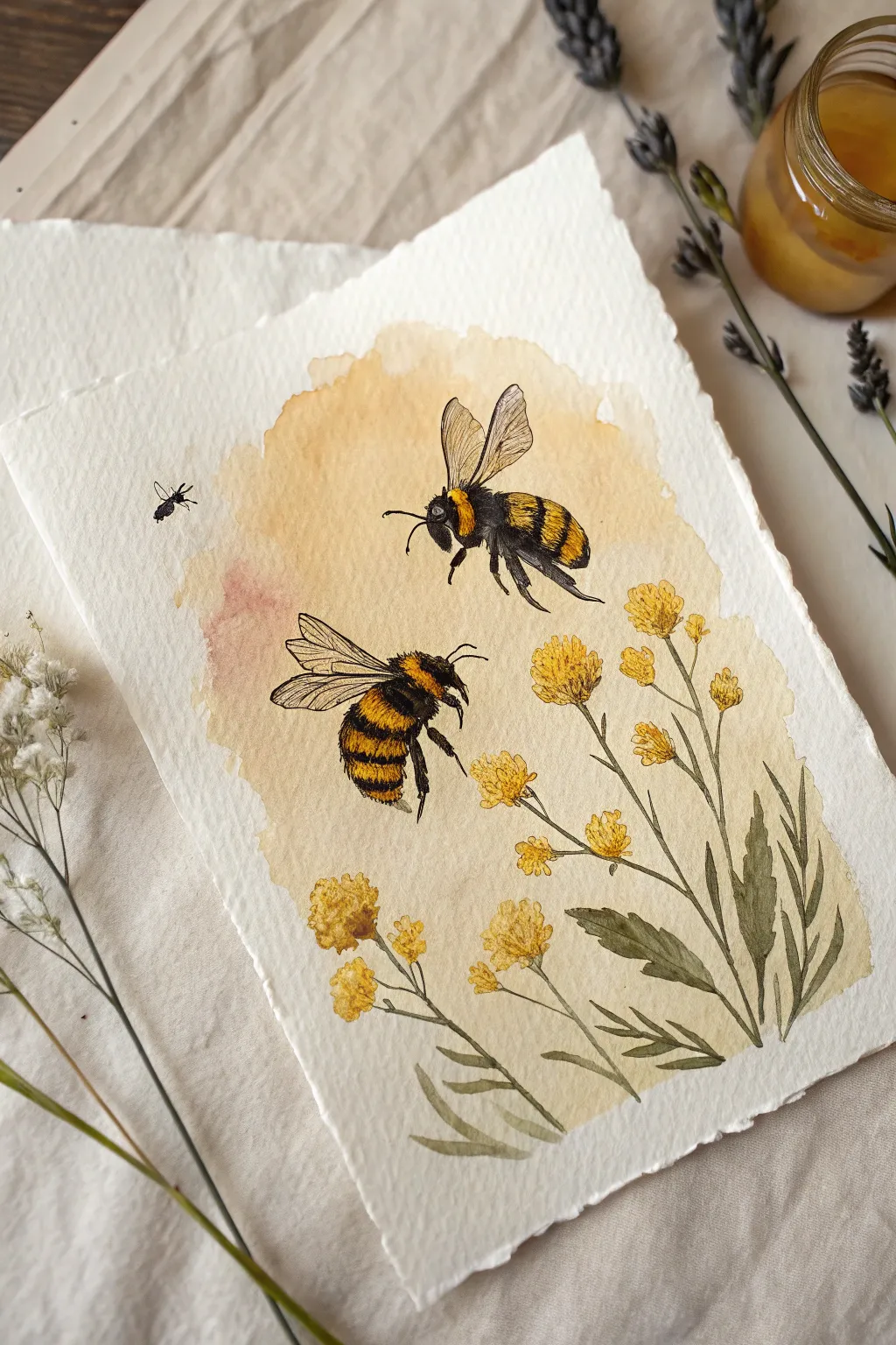
Capture the golden warmth of a summer afternoon with this delicate watercolor composition featuring two fuzzy bumblebees and wispy yellow wildflowers. The soft, diffuse background wash contrasts beautifully with the detailed pen-and-ink style rendering of the bees, creating a piece that feels both vintage and fresh.
Step-by-Step
Materials
- Cold press watercolor paper (deckle edge preferred)
- Watercolor paints: Yellow Ochre, Raw Sitemap, Burnt Umber, Sap Green, Payne’s Grey (or black)
- Round watercolor brushes (Size 6 for washes, Sizes 0 or 1 for details)
- Fine liner pen (black, water-resistant, 0.1mm or 0.3mm)
- Pencil (HB or H)
- Kneaded eraser
- Clean water jar
- Paper towels
- Masking fluid (optional)
Step 1: Golden Backdrop
-
Sketch the layout:
Begin by lightly sketching the positions of the two main bees and the tall stems of the wildflowers. Keep the lines incredibly faint, as you want the watercolor to feel organic and unconstrained by rigid outlines. -
Mix the background wash:
Create a watery mix of Yellow Ochre with a tiny touch of Burnt Sienna to warm it up. You want a very diluted, transparent puddle of color. -
Apply the wet-on-wet base:
Brush clear water onto the center of your paper in an organic, uneven oval shape. While the paper is still glistening, drop in your yellow mixture, letting it bloom outward without painting hard edges. -
Add warmth:
While the yellow wash is still damp, drop a tiny hint of reddish-brown or concentrated ochre into the left side of the wash to create that subtle blush color seen near the bee’s wings. -
Let it dry completely:
Patience is key here. Let the background wash dry fully before proceeding, or you risk the detailed foreground bleeding into the soft background.
Muddy Colors?
If your yellow stripes look green where they touch black, wait for the yellow to be 100% dry before adding black. Always wash your brush thoroughly between colors.
Step 2: The Wildflowers
-
Paint the stems:
Mix Sap Green with a bit of Burnt Umber for a muted, olive tone. Using your fine brush, paint thin, sweeping lines for the stems, starting from the bottom right and curving upward. -
Add the leaves:
With the same green mix, press the belly of your brush down and lift sharply to create the elongated, narrow leaves. Vary the pressure to make some leaves appear twisted or turned. -
Block in flower heads:
Using a slightly more opaque Yellow Ochre, dab small clusters of dots and uneven shapes at the tips of the stems to form the flower heads. -
Define the petals:
Once the flower base is dry, mix a darker amber or light brown. Use the very tip of your smallest brush to add tiny specks and shadow details within the yellow clusters to give them texture. -
Ink the stems (optional):
For illustrative definition, you can use your fine liner to add very broken, delicate outline segments to the stems and leaves, but keep the lines discontinuous.
Step 3: The Bumblebees
-
Paint the yellow stripes:
Load a small brush with bright, saturated yellow. Paint the bands on the bees’ thorax and abdomen, leaving white gaps between them for the black stripes. -
Add the black body:
Using Payne’s Grey or black watercolor, carefully fill in the heads, legs, and alternate stripes. Use a fairly dry brush technique here to mimic the texture of fur. -
Rough up the edges:
While painting the black sections, flick the brush tip outward slightly into the white surroundings or the yellow stripes to create a ‘fuzzy’ hairy appearance. -
Wash the wings:
Dilute a tiny drop of grey with plenty of water. Paint the translucent shape of the wings. I prefer to keep this wash almost invisible, just enough to show presence. -
Detail with ink:
Once the paint is bone dry, use your fine liner pen to draw the veins in the wings, the antenna, and the tiny legs. Scribble loosely over the black painted areas to enhance the furry texture. -
Add the tiny fly:
Don’t forget the tiny insect on the left! A simple black dot with minimal wing lines balances the composition perfectly.
Vintage Vibe
To enhance the antique biological illustration look, dip the edges of the paper in strong tea or coffee and let dry for an aged, parchment effect.
Frame your delicate pollinator study in a simple wooden frame to let those warm yellow tones shine.
BRUSH GUIDE
The Right Brush for Every Stroke
From clean lines to bold texture — master brush choice, stroke control, and essential techniques.
Explore the Full Guide
Golden Autumn Trees on a Dark Sky
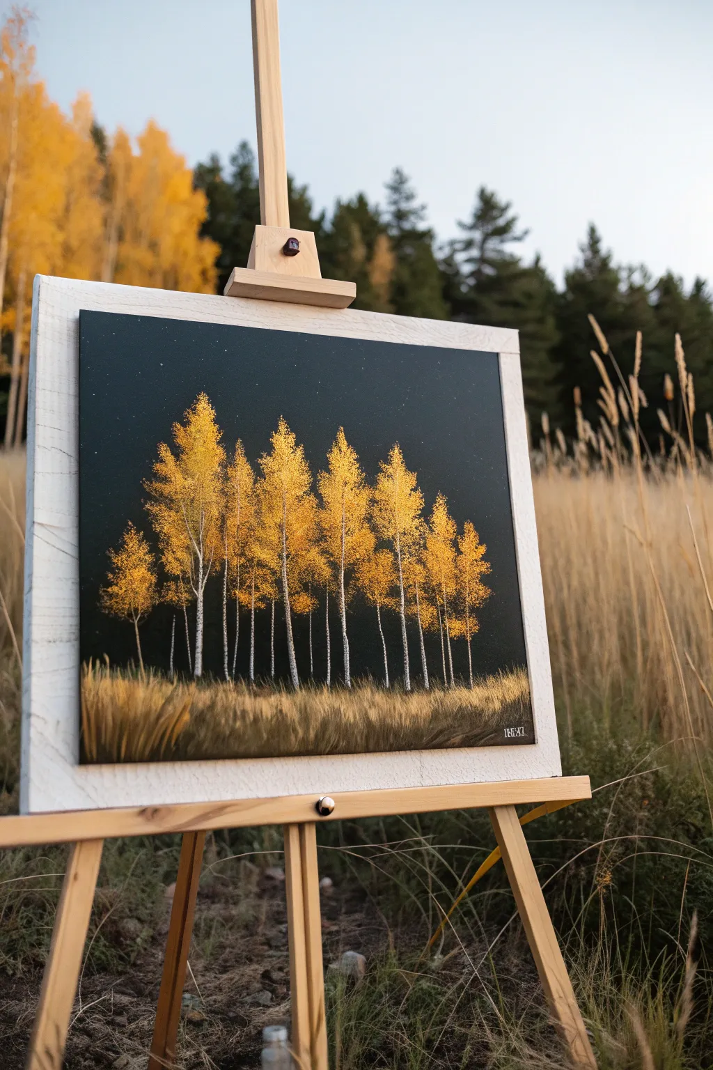
Contrast is the star of this project, featuring vibrant golden aspens popping against a deep, dark night sky. This acrylic painting captures the serene beauty of autumn trees standing tall in the quiet of the night.
Detailed Instructions
Materials
- Stretched canvas (rectangular, portrait orientation)
- Black gesso or black acrylic paint
- Titanium White acrylic paint
- Cadmium Yellow acrylic paint
- Yellow Ochre acrylic paint
- Burnt Umber acrylic paint
- Flat brush (1-inch for background)
- Small round brush (size 1 or 2)
- Fan brush or stippling brush
- Rigger brush or liner brush
- Toothbrush (optional for stars)
- Palette and container
- Paper towels
Step 1: Setting the Night Scene
-
Prime the canvas:
Begin by covering your entire canvas with black gesso or black acrylic paint. Apply it evenly with a large flat brush to ensure no white canvas peeks through. -
Create a gradient (optional):
While the black is still slightly wet, you can mix a tiny drop of Phthalo Blue into black at the very top to give a hint of atmosphere, though a solid matte black works perfectly for high contrast. -
Add the stars:
Once the background is completely dry, mix a thin wash of Titanium White with water. Dip a stiff toothbrush or bristle brush into it and flick the bristles with your thumb to spray tiny stars across the upper half of the canvas. Keep them sparse for a realistic look.
Step 2: Building the Trees
-
Map the trunks:
Using a thin rigger brush or liner brush loaded with titanium white mixed with a touch of gray, paint vertical lines for the tree trunks. Start near the bottom third and pull upward, letting the lines taper off as they reach the top. -
Add trunk texture:
Birch and aspen trees aren’t solid white. Take a little black paint on the very tip of your small round brush and add small horizontal dashes and markings along the white trunks to create that characteristic bark texture. -
Plant the forest floor:
At the base of the trunks, paint a horizontal band of dark grass using Burnt Umber mixed with black. Use upward flickering strokes to simulate tall, shadowed grass blades. -
Highlight the grass:
Mix Yellow Ochre with a bit of Burnt Umber. Using a fan brush or an old, splayed flat brush, paint upward strokes over the dark grass base, creating a golden field that anchors the trees.
Muddy colors?
Make sure your black background is 100% dry before painting the white trunks. If it’s wet, the black will mix in and turn your bright birch trees gray.
Step 3: Creating the Foliage
-
Prepare the base leaf color:
Mix a dark golden color using Yellow Ochre and a small touch of Burnt Umber. This will be the shadow layer for the leaves. -
Stipple the first layer:
Using a stippling brush or the corner of a sponge, dab this dark gold color onto the upper branches. Focus on creating vertical, conical shapes for the tree crowns, leaving gaps so the black sky shows through. -
Brighten the mix:
Clean your brush and switch to pure Cadmium Yellow. Stipple this vibrant color freely over your first layer, concentrating on the center of the tree masses where the foliage is thickest. -
Add spacing:
When adding foliage, remember to leave some ‘air’ between the trees. Don’t merge them into one solid lump; let the individual tree shapes stand out against the dark background. -
Dab lower branches:
Bring some of the yellow foliage down the trunks slightly. Aspens often have small clusters of leaves growing directly from the main trunk or lower branches. -
Add final highlights:
Mix a tiny amount of Titanium White into your Cadmium Yellow to create a pale lemon yellow. Lightly dab this on the very tops and left sides of the trees to simulate moonlight hitting the leaves. -
Create falling leaves:
Use the tip of your smallest brush to make tiny yellow dots floating down near the base of the trees and settling into the tall grass below.
Metallic Magic
Swap the Cadmium Yellow highlights for Metallic Gold acrylic paint. It will make the trees shimmer beautifully when the light hits the canvas.
Step 4: Finishing Touches
-
Refine the grass:
Return to the grassy area with your highlight yellow color. Add a few sharp, distinct blades of grass in the immediate foreground to give the painting depth. -
Check the contrast:
Step back and look at your work. If the trunks have gotten lost behind the leaves, carefully re-whiten visible sections of the bark to ensure they stand out.
Once dry, this piece brings a wonderful glow to any room
Yellow Abstract Color Blocks
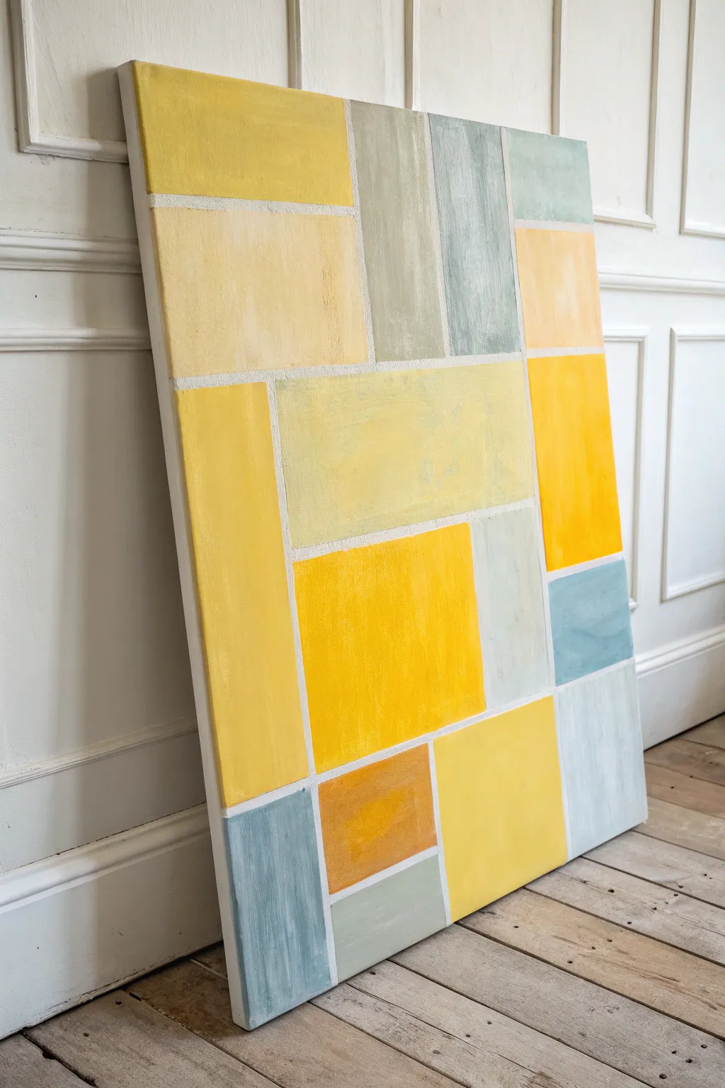
Bring the warmth of sunlight into your space with this structured yet cheerful abstract painting. Using simple masking techniques and a palette of yellows, soft greys, and muted blues, you’ll create a modern geometric composition that feels like a stained glass window made of stone.
Step-by-Step
Materials
- Large stretched canvas (e.g., 24×36 inches or larger)
- Painter’s tape or dedicated drafting tape (1/4 inch width is ideal)
- Acrylic paints: Cadmium Yellow, Yellow Ochre, Titanium White, Payne’s Grey, and a touch of Cerulean Blue
- Flat synthetic brushes (various sizes like 1-inch and 2-inch)
- Ruler or shimmer-square
- Pencil
- Palette or paper plates for mixing
- Water cup and paper towels
Step 1: Planning and Taping
-
Prime the canvas:
Ensure your canvas is clean. If it’s not pre-primed, apply a coat of white gesso. Since the lines between the blocks will remain white, give the entire canvas a solid coat of Titanium White acrylic paint to ensure those gaps stay bright and clean later. -
Sketch the layout:
Lightly sketch a grid of rectangular blocks using a pencil and ruler. Don’t aim for perfect symmetry; vary the sizes to create visual interest. Think of it like arranging bricks or paving stones—some vertical, some horizontal. -
Review the composition:
Step back and look at your pencil conceptualization. Ensure there is a nice balance of large ‘hero’ blocks and smaller supporting rectangles along the edges. -
Apply the tape:
Carefully place your painter’s tape over your pencil lines. The tape represents the white grout lines in the final piece. Press the edges of the tape down firmly with your fingernail or a credit card to prevent paint from sneaking underneath. -
Seal the edges:
For extra crisp lines, paint a very thin layer of Titanium White over the tape edges. This seals the tape, meaning any bleed-through will just be white-on-white, keeping your colored blocks sharp.
Step 2: Painting the Color Blocks
-
Mix your yellows:
Create three distinct yellow mixes: a bright pure lemon yellow, a creamy pastel yellow (lots of white added), and a deeper mustard tone (add a tiny dot of ochre). -
Mix the cool tones:
Prepare a soft blue-grey by mixing white with a small amount of Payne’s Grey and a hint of Cerulean Blue. You want these to be muted and pale to contrast with the vibrant yellows. -
Start with the main yellows:
Choose 3-4 scattered blocks to be your brightest yellow. Apply the paint with vertical brushstrokes, keeping the texture slightly visible for an organic feel. -
Apply the secondary yellows:
Fill in neighboring blocks with your pastel yellow and mustard mixes. Try not to put two identical shades right next to each other. -
Add the cool accents:
Fill the remaining rectangles with your grey and blue-grey mixes. These cool tones act as ‘resting’ spaces for the eye amidst the yellow warmth. -
Create texture:
While the paint is wet, I like to gently drag a dry brush over some blocks to give them a weathered, linen-like texture. It keeps the distinct blocks from looking too much like plastic. -
Check for opacity:
Yellow can be a transparent pigment. Let the first coat dry and apply a second coat to the yellow blocks if you can still see the canvas grain too clearly.
Clean Lines Hack
Use a gel medium to seal your tape edges instead of white paint. It dries clear and creating an impenetrable barrier against color bleed.
Step 3: The Reveal
-
Let it cure:
Allow the painting to dry significantly, but not until it’s rock hard. Waiting about 30-45 minutes is usually the sweet spot. -
Peel the tape:
Gently peel the tape off at a 45-degree angle. This is the magic moment where your messy edges suddenly become crisp, white lines. -
Touch up:
Inspect your white lines. If any paint bled through, use a small detail brush and Titanium White to carefully tidy up the grout lines. -
Paint the canvas sides:
Finish the piece by painting the deep sides of the canvas white to match the internal lines, giving it a gallery-ready look. -
Varnish:
Once fully cured (usually 24 hours), apply a satin varnish to unify the sheen of the different paint mixes and protect your artwork.
Sticky Tape Trouble?
If your tape is pulling up the base layer of paint, heat it gently with a hair dryer on a low setting before peeling to soften the adhesive.
Hang your new masterpiece in a room that needs a permanent splash of sunshine

PENCIL GUIDE
Understanding Pencil Grades from H to B
From first sketch to finished drawing — learn pencil grades, line control, and shading techniques.
Explore the Full Guide
Yellow Butterflies in Loose Watercolor
Capture the delicate translucency of butterfly wings with this detailed watercolor study featuring three distinct yellow specimens. Using a mix of wet-on-wet washes and fine dry-brush details, you will create a scientific illustration style that feels both vintage and fresh.
Step-by-Step Guide
Materials
- Hot press watercolor paper (300 gsm)
- Pencil (HB or 2H)
- Kneaded eraser
- Watercolor paints: Lemon Yellow, Cadmium Yellow Medium, Yellow Ochre, Burnt Umber, Sepia, Ivory Black
- Synthetic round brushes (sizes 0, 2, and 4)
- White gouache or gel pen (optional for highlights)
- Mixing palette
- Two jars of water
- Paper towels
- Kraft cardstock (for mounting)
Step 1: Planning and Sketching
-
Prepare the paper:
Begin by tearing your watercolor paper down to size (approx. 5×7 inches) using a ruler as a straight edge to create that organic, deckled look. -
Sketch the layout:
Lightly sketch three butterflies using an HB pencil. Place a large one near the top, another large one at the bottom right, and a tiny one in the middle left. Focus on the triangular shapes of the wings first. -
Refine the outlines:
Refine the wing shapes, noting the subtle scalloped edges on the top butterfly and the rounded curves on the bottom one. Draw the slender bodies and antennal lines very faintly. -
Lighten the graphite:
Roll your kneaded eraser gently over the entire sketch. You want the graphite lines to be barely visible so they won’t show through the transparent yellow paint.
Step 2: Painting the Base Layers
-
Top butterfly: First wash:
Mix a watery Lemon Yellow. With your size 4 brush, wet the wings of the top butterfly with clean water first, then drop the pigment into the center of the wings, pulling it outward but keeping the edges slightly lighter. -
Adding warmth:
While the top butterfly is still damp, dot a small amount of Cadmium Yellow or Yellow Ochre near the body and wing roots to create a natural gradient. -
Bottom butterfly: Base color:
For the bottom butterfly, mix a stronger Cadmium Yellow. Paint the forewings and hindwings, leaving tiny slivers of white paper between the wing sections to define the veins naturally. -
Tiny butterfly wash:
Paint the smallest butterfly using a very diluted mix of Lemon Yellow and a touch of Green Gold if you have it, or just a hint of Ochre. Keep this one very pale and ethereal. -
Let it dry completely:
Wait for all base layers to happen. This is crucial—painting wet-on-wet for the details will ruin the crisp lines we need later.
Muddy colors?
Work in layers and let each dry fully. Mixing black directly into yellow turns it green; use purples or browns to darken your yellow shadows instead.
Step 3: Adding Details and Veining
-
Top butterfly: Veining:
Switch to your size 0 brush. Mix a thin wash of Yellow Ochre and Sepia. Carefully paint the delicate veins radiating from the body to the wing edges. -
Top butterfly: Dark spots:
Using a thicker mix of Sepia and Black, dab in the characteristic spots on the wings. Soften the edges of these spots slightly with a clean, damp brush so they don’t look like stickers. -
Bottom butterfly: Wing tips:
The bottom butterfly has darkened tips. Use a dry-brush technique with Burnt Umber mixed with Black to scuff color onto the outer edges of the upper wings and the very bottom edges of the lower wings. -
Bottom butterfly: Definition:
Strengthen the veins on the bottom butterfly with a mix of Sepia and Cadmium Yellow. I like to keep these lines slightly broken rather than continuous for a more organic feel. -
Tiny butterfly details:
Using the size 0 brush and very watery Sepia, add the minimal veining and a tiny dark eye spot on the small butterfly’s wing.
Level Up: Texture
Splatter tiny droplets of watered-down Sepia or Gold paint across the paper before mounting it to give the piece an aged, field-journal aesthetic.
Step 4: Bodies and Final Touches
-
Painting the bodies:
Mix a dark, creamy Sepia. Paint the thorax and abdomen of each butterfly. Leave a tiny highlight in the center or lift pigment out with a thirsty brush to give the body volume. -
Antennae:
With your finest brush and an inky consistency of Black, paint the antennae. Use a quick, confident flick of the wrist to keep the lines smooth and tapering. -
Final assessment:
Look at the overall balance. If the yellow looks too flat, add a very transparent glaze of orange-yellow over the shadowed areas of the wings. -
Mounting:
Once dry, use a small amount of glue or double-sided tape to mount your deckle-edged paper onto a piece of kraft cardstock or cardboard to complete the rustic look.
Display your mounted butterfly study alongside some dried flowers to complete the naturalist vibe.
Monochrome Yellow Gradient Ombré
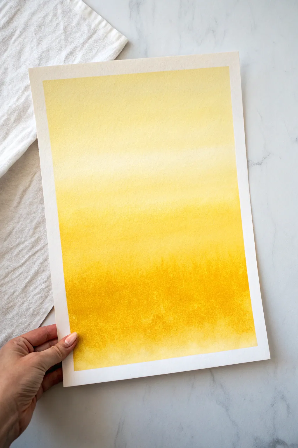
Capture the warmth of a summer day with this luminous monochrome study. This project teaches you to master the gradient wash technique, creating a seamless transition from whisper-soft lemon to a rich, deep golden ochre.
How-To Guide
Materials
- Cold press watercolor paper (140lb/300gsm)
- Masking tape
- Flat wash brush (1 inch or larger)
- Round watercolor brush (size 8 or 10)
- Lemon Yellow watercolor paint
- Yellow Ochre or Indian Yellow watercolor paint
- Two jars of clean water
- Paper towels
- Mixing palette
- Drawing board or hard surface
Step 1: Preparation
-
Secure the Paper:
Begin by taping your watercolor paper down to a sturdy board on all four sides. Leave about a quarter-inch border to create that crisp white edge seen in the final piece. -
Pre-mix Your Colors:
Prepare three puddles of paint on your palette. First, a very watery, pale Lemon Yellow. Second, a medium-strength pure Lemon Yellow. Third, a concentrated mix of Yellow Ochre or Indian Yellow for the darkest values. -
Wet the Paper:
Using your large flat brush and clean water, apply an even coat of water across the entire paper surface. The paper should glisten with a satin sheen but not have standing puddles.
Step 2: Painting the Gradient
-
The Lightest Wash:
Load your large flat brush with the palest Lemon Yellow mix. Start at the very top of the paper and paint horizontal strokes back and forth, moving downward about a third of the way. -
The Mid-Tone Transition:
Without cleaning your brush, dip it into the medium-strength Lemon Yellow puddle. Continue your horizontal strokes from where you left off, overlapping the previous section slightly to initiate blending. -
Tilt for Gravity:
At this stage, slightly tilt your board directly towards you. This encourages the wet paint to flow downward, naturally softening the transition between the pale and medium zones. -
Deepening the Color:
Pick up the darker Yellow Ochre mix with your brush. Apply this to the bottom third of the paper, working your strokes horizontally and moving upward just enough to meet the middle yellow section. -
Smoothing the Blend:
Clean and dry your flat brush so it’s damp, not dripping. Gently run it horizontally across the seam where the medium and dark yellows meet to help them marry together.
Pro Tip: Moisture Control
Work quickly! The key to a smooth gradient is ensuring the whole page stays wet. If a section dries, stop working immediately to avoid streaks.
Step 3: Refining and Texture
-
Adding Depth at the Bottom:
While the bottom section is still damp but not soaking wet, drop in pure pigment of your darkest yellow or a touch of raw sienna along the very bottom edge for maximum contrast. -
Creating Subtle Texture:
Switch to a round brush if you want more control. I like to dab a little extra concentrated pigment randomly into the wet bottom area to create the blooming, organic texture visible in the reference. -
Managing the Bloom:
Watch for ‘backruns’ or blooms where water pushes pigment away. If the top is drying too fast, don’t add more water there, or you’ll ruin the smooth gradient. -
The Gravity Trick:
Leave the board tilted at a slight angle for a few more minutes. This ensures the pigment settles heavily at the bottom, reinforcing the ombré effect. -
Initial Drying Phase:
Let the painting sit undisturbed until the shine disappears from the paper surface. Resist the urge to touch it or move it abruptly.
Level Up: Golden Hour
Add a tiny drop of orange or reddish-brown into your darkest bottom mix. This creates a ‘burning sunset’ vibe that makes the yellow pop even more.
Step 4: Finishing Touches
-
Full Dry:
Allow the paper to dry completely. If the paper feels cold to the back of your hand, it is still holding moisture inside. -
Check the Gradient:
Assess the transition. If the middle area looks too harsh, you can’t easily fix it now, but note for next time to keep the paper wetter during the middle phase. -
Remove the Tape:
Once bone dry, carefully peel the masking tape away from the paper. Pull it slowly at a 45-degree angle away from the painting to prevent tearing the paper surface. -
Flattening:
If the paper has buckled slightly from the water, place the finished painting under a heavy book overnight to flatten it out perfectly.
Enjoy the simple beauty of your sun-drenched gradient study


Yellow Impasto Texture Sampler
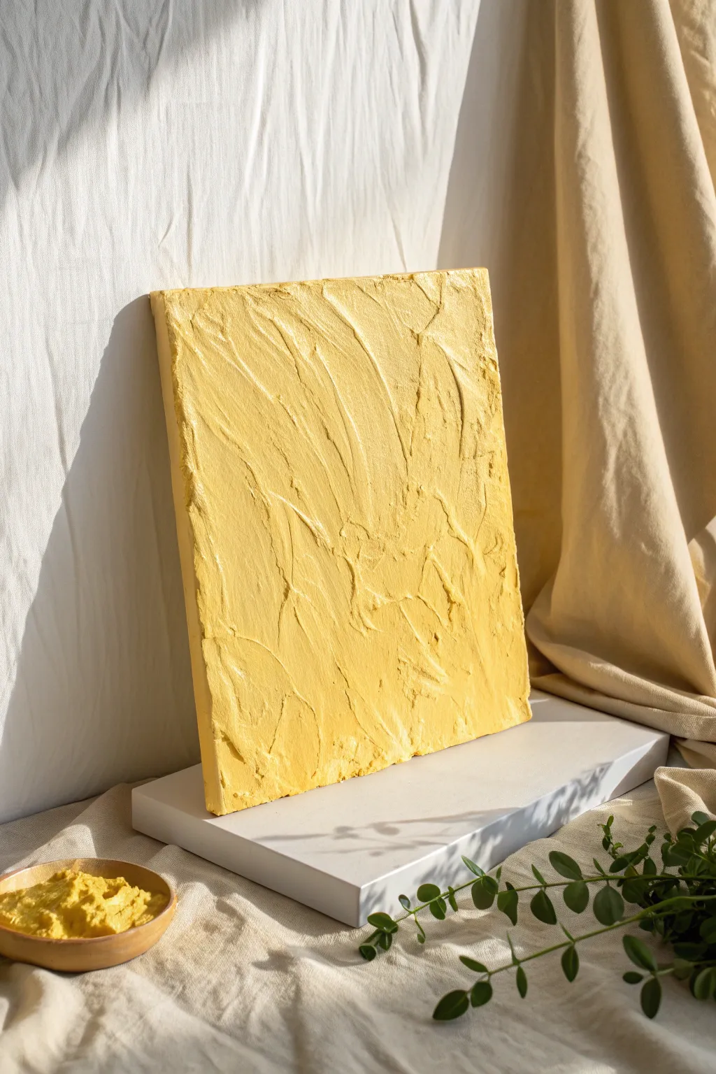
Embrace the warmth of monochromatic art with this heavily textured impasto piece that mimics the surface of dried plaster or churned butter. By focusing on a single, sunny hue, you can direct all attention to the tactile peaks and valleys created by bold palette knife strokes.
Step-by-Step Tutorial
Materials
- Stretched canvas (8×10 or 11×14 inches)
- Heavy body acryic paint (Titanium White and Cadmium Yellow Light)
- Modeling paste or thick impasto gel medium
- Large palette knife (trowel style)
- Medium palette knife (diamond shape)
- Disposable palette or glass mixing slab
- Gesso (optional, for priming)
- Drop cloth or protective paper
Step 1: Preparation & Mixing
-
Prime the Surface:
Begin by applying a thin coat of white gesso to your canvas if it isn’t pre-primed. This ensures the heavy texture medium adheres properly without soaking into the fibers. -
Create the Texture Base:
Scoop a generous amount of modeling paste or impasto gel onto your mixing surface. You will need enough to cover the entire canvas in a layer at least 1/4 inch thick. -
Mix the Color:
Add your Cadmium Yellow Light acrylic paint to the white modeling paste. Mix thoroughly with a palette knife until the color is uniform. -
Adjust the Value:
If the yellow feels too neon or translucent, mix in a touch of Titanium White. The goal is a creamy, opaque custard yellow or warm ochre tone. -
Check Consistency:
Test the mixture; it should be stiff enough to hold a peak, similar to frosting or meringue. If it’s too runny, add more paste; if too stiff, a tiny drop of water or fluid medium will help.
Keep it Clean
Wipe your palette knife clean every few strokes with a rag. Dried acrylic builds up fast and can ruin the smooth, buttery look of your fresh impasto swipes.
Step 2: Applying the Texture
-
Initial Application:
Using your largest palette knife, trowel a thick layer of the yellow mixture onto the center of the canvas. -
Technical Spread:
Spread the medium outward toward the edges, ensuring the entire white surface of the canvas is concealed. Don’t worry about texture yet; just aim for full coverage. -
Cover the Sides:
Gently gently extend the paste over the edges of the canvas for a gallery-wrapped look. This gives the finished piece a sculptural, 3D quality when hung. -
Create Vertical Motion:
Take the medium-sized diamond palette knife and drag it vertically through the wet paste. Use varying pressure to create deep furrows. -
Add Cross-Hatching:
Working diagonally, slash the knife across the vertical lines you just made to break up the uniformity. This creates the chaotic, organic ridge structure. -
Lift and Peak:
Press the flat side of the knife into the paste and pull straight up rapidly. This creates small, jagged peaks that catch the light beautifully. -
Smooth Specific Areas:
I like to leave some areas slightly smoother than others to give the eye a place to rest. Use a clean knife to gently flatten a few select ridges. -
Detail the Edges:
Run the edge of your knife along the perimeter of the canvas face to create a defined, slightly raised border that frames the internal chaos. -
Inspect Lighting:
Hold the canvas under a side light to see how the shadows fall. If the texture looks too flat, add more paste to build up the highest points.
Step 3: Finishing Touches
-
Initial Drying Time:
Lay the canvas flat in a dust-free area. Because the application is thick, the outer skin will dry first, but the center will remain wet. -
Full Cure:
Allow the piece to dry undisturbed for at least 24 to 48 hours. Heavy impasto can sometimes take days to fully harden depending on humidity. -
Protective Seal:
Once fully cured and hard to the touch, apply a spray varnish (matte or satin works best) to protect the crevices from dust accumulation.
Add Subtle Depth
Mix a tiny drop of raw sienna into just one scoop of your paste. Swirl this darker tone partially in for a marbleized effect that adds dimension to the ridges.
Hang your textured masterpiece where natural light hits it from the side to truly emphasize those dramatic ridges and valleys
Neon Yellow Accent Portrait
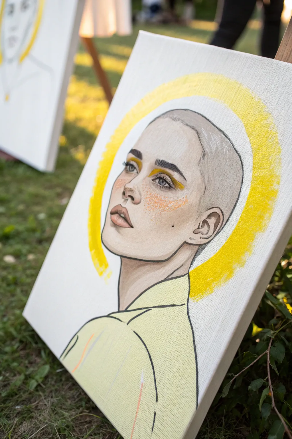
Blend classical portraiture with graphic design elements in this striking mixed-media canvas piece. The combination of delicate facial shadings and a bold, textured neon halo creates a focal point that feels both ethereal and deeply grounded.
Step-by-Step Guide
Materials
- Stretched canvas (11×14 or similar)
- Graphite pencil (HB or 2B)
- Black fine-liner pens (0.3mm and 0.5mm)
- Acrylic paint (Neon Yellow, Pale Yellow, Flesh Tones, White)
- Flat brush (1-inch) for the halo
- Small round brushes (size 2 and 4)
- Orange or dark yellow stippling sponge or old stiff brush
- Reference photo of a profile/face
Step 1: Sketching the Bones
-
Establish the Head Shape:
Begin by lightly sketching the outline of the head and shoulders on your canvas using the HB pencil. Focus on the geometry of the jawline and the curve of the bald head, keeping the lines loose. -
Place Feature Markers:
Draw faint guidelines for the eyes, nose, and mouth. Since the subject is looking upward and to the side, ensure the perspective lines tilt slightly diagonally. -
Refine the Eyes and Brows:
Detail the eyes. Sketch distinct, thick eyebrows which are a key character trait here. Leave the iris area open for detailing later. -
Define Lips and Nose:
Sketch the nose profile and full lips. Don’t press too hard with the pencil; you want these lines to be guides, not permanent scars on the canvas. -
Add Clothing Lines:
Draw the collar and shoulder line of the shirt. Keep this very simple and linear, as the focus will be on the bold outlines later.
Muddy Skin Tones?
If your shadows look dirty, you likely used black to darken the flesh tone. Use burnt umber or dark blue instead to keep the complexion lively.
Step 2: Flesh Tones and Values
-
Mix Your Base Skin Tone:
Create a very pale, neutral skin tone using white, a touch of ochre, and a tiny dot of red. Thin the acrylic slightly with water to create a semi-opaque wash. -
Apply the Base Layer:
Paint the face and neck area with this pale wash. It doesn’t need to be perfectly opaque; letting some canvas texture show through adds to the illustrative feel. -
Shadowing the contours:
Mix a slightly darker, cooler grey-brown shade. Apply this to the hollow of the cheek, the side of the nose, and inside the ear to create volume. -
Deepen the Neck Shadow:
Add a stronger shadow under the jawline on the neck. This creates the necessary separation between the head and the body. -
Paint the Lips:
Mix a soft muted mauve or pink. Paint the lips carefully, keeping the edges slightly soft rather than harsh lines. -
Define the Brows and Lashes:
Using a very small brush and dark grey or diluted black paint, fill in the eyebrow hairs and the eyeliner/lash line. I usually find short, flicking strokes work best for realistic hair texture.
Add Metallic Flair
Swap the neon yellow halo for gold leaf application. Apply sizing in the circle shape, wait for tackiness, and lay down gold sheet for a true icon look.
Step 3: The Yellow Pop
-
Graphic Eyeliner:
Load a small round brush with pure neon yellow acrylic. Paint a bold, graphic shape on the eyelids, extending out past the eye. -
Stipple the Freckles:
Mix a bright orange-yellow shade. Using a stippling sponge or an old, stiff-bristled brush, lightly tap ‘freckles’ across the nose and cheeks. Concentrate them heavily on the cheekbone. -
Painting the Shirt:
Fill the clothing area with a pale lemon yellow wash. Let it be somewhat streaky or uneven to maintain an artistic, hand-painted aesthetic. -
Create the Halo:
Using the 1-inch flat brush and bright yellow paint (neon mixed with a little primary yellow for opacity), paint a large, thick circle behind the head. Use a dry-brush technique at the edges to create that rough, textured border.
Step 4: Inking and Finalizing
-
Outline the Face:
Once the paint is 100% dry, take your 0.5mm black fine-liner or a very steady brush with black paint. Trace the main contours of the face—jaw, chin, and head shape. Vary the line weight (thick to thin) for interest. -
Detail the Ear and Features:
Use the finer 0.3mm pen or brush to outline the intricate curves inside the ear and add definition to the nostrils and lips. -
Bold Clothing Lines:
Use your thickest black line to outline the shirt collar and shoulders. Be deliberate and confident with these strokes to mime the look of a comic or fashion illustration. -
Add the Mole:
Place a single, distinct black dot (beauty mark) on the cheek or neck for a touch of character. -
Final Highlights:
Add a tiny dot of pure white paint to the pupil of the eye and the fullest part of the lower lip to make the portrait look wet and alive.
Step back and admire how the simple splash of color transforms a sketch into a modern masterpiece
Yellow City Lights in Mist
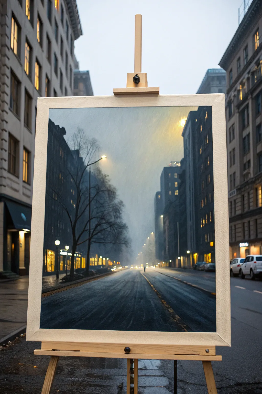
Capture the moody atmosphere of a wet city street where cool slate blues meet warm, glowing streetlights. This oil painting tutorial guides you through creating depth with atmospheric perspective, mastering wet pavement reflections, and achieving that soft, misty glow.
How-To Guide
Materials
- Stretched canvas (18×24 or similar)
- Oil paints: Ultramarine Blue, Burnt Umber, Titanium White, Cadmium Yellow Medium, Alizarin Crimson, Ivory Black
- Odorless mineral spirits or turpentine
- Linseed oil medium
- Large flat brush (size 10-12)
- Medium filbert brushes (size 4-6)
- Small round detail brush (size 0-1)
- Palette knife
- Easle
- Lint-free rag
Step 1: Setting the Atmosphere
-
Tone the Canvas:
Begin by covering the entire white canvas with a thin wash of Burnt Umber mixed with plenty of mineral spirits. Wipe it back with a rag to create a warm, neutral mid-tone. Let this dry completely before proceeding. -
Sketch the Composition:
Using a small round brush and thinned paint, rough in the major shapes: the perspective lines of the street converging slightly off-center, the vertical blocks for buildings, and the skeletal shape of the bare tree on the left. -
Establish the Sky Value:
Mix a large pile of cool grey using Ultramarine Blue, a touch of Burnt Umber, and plenty of Titanium White. Paint the central sky area, keeping strokes vertical and loose to suggest falling mist. -
Create the Glow:
While the sky paint is still wet, blend in a soft mix of Cadmium Yellow and White near the top center right to imply the hidden light source behind the fog. Blend edges softly.
Muddy colors?
If your yellows turn green when mixing with the blue sky, clean your brush thoroughly and let the blue layer dry to the touch before applying the yellow lights.
Step 2: Building the Structure
-
Block in Distant Buildings:
For the buildings furthest away in the mist, mix a pale blue-grey that is only slightly darker than the sky. Paint these shapes flatly, avoiding sharp edges to maintain the foggy illusion. -
Paint Mid-Ground Buildings:
Darken your grey mix with more blue and a hint of black for the closer buildings on the right. These should have harder edges than the distant ones but still feel soft against the sky. -
Establish the Darkest Values:
On the left side, paint the nearest building facade using a dark mix of Alizarin Crimson, Ultramarine Blue, and Burnt Umber. This high contrast anchors the foreground. -
Paint the Wet Street:
Using horizontal strokes, lay down the base color for the asphalt. Mirror the sky colors—cool greys and blues—but keep the value slightly darker than the sky itself.
Step 3: Details and Light
-
Add Foreground Trees:
Switch to a rigger or small round brush. With dark, thinned paint, draw the trunk and branches of the tree on the left. Keep the upper twigs faint where they dissolve into the mist. -
Place the Streetlights:
I like to use pure Cadmium Yellow mixed with a tiny bit of White for the light sources. Dot in these lights along the street perspective lines, making distant lights smaller and fainter. -
Create the Halo Effect:
Around each light, strictly dry-brush a very thin glaze of yellow-orange to simulate the glow cutting through the fog. -
Paint Reflections:
Add vertical streaks of yellow and orange directly beneath the streetlights on the road surface to show the wet pavement reflection. Drag these colors downwards with a soft brush. -
Strengthen Road Texture:
Use a palette knife or dry brush to scumble some lighter grey texture onto the road, suggesting tire tracks and uneven asphalt grain. -
Final Adjustments:
Check your values. If the fog doesn’t feel thick enough, scumble a very thin layer of white over the distant buildings to push them further back. -
Varnish:
Allow the painting to cure for at least six months before applying a final layer of retouch varnish to unify the sheen.
Add life
To inhibit static feelings, paint a small, solitary figure or the taillights of a car in the distance using pure red to create a focal point and sense of scale.
Step back and admire how a few simple colors can conjure such a realistic, atmospheric mood.

Have a question or want to share your own experience? I'd love to hear from you in the comments below!