A plain ballpoint pen can do way more than sign receipts—it can build rich shadows, crisp textures, and surprisingly soft gradients if you let it. Here are my favorite ballpoint pen drawing ideas to help you practice pressure, linework, and that addictive ink layering magic.
Realistic Eye Study in Ballpoint Pen
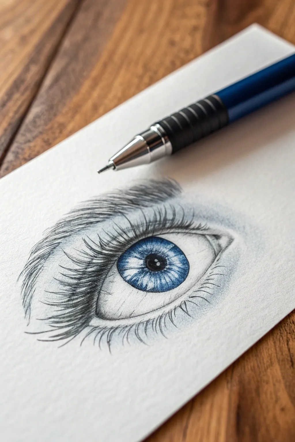
Master the delicacy of ballpoint pen shading with this realistic blue eye study. This project focuses on building layers of ink to create a convincing sense of depth, texture, and luminescence in the iris.
How-To Guide
Materials
- High-quality blue ballpoint pen (fine point preferred)
- Black ballpoint pen (fine point)
- Heavyweight textured drawing paper (vellum or cold press finish)
- Pencil (HB for initial sketch)
- Kneaded eraser
- Scrap paper for testing ink flow
Step 1: The Framework
-
Light Sketching:
Begin with an HB pencil to lightly outline the almond shape of the eye. Draw the circle of the iris, making sure the top is slightly cut off by the upper eyelid. Indicate the pupil in the center and, crucially, mark out a small irregular shape for the highlight (catchlight) near the pupil. This white space must remain untouched. -
Refining Shapes:
Outline the crease of the upper eyelid and the subtle curve of the lower lid. Sketch the general flow and direction of the eyebrow hairs above. Keep the pencil lines extremely faint, as ballpoint pen cannot be erased and you don’t want graphite showing through. -
Initial Outline:
Switch to your blue ballpoint pen. Use a very broken, light line to trace the iris and eyelids. Do not press hard; a hard outline kills realism. Keep your wrist loose and let the pen barely graze the paper texture.
Ink Blob Prevention
Ballpoint pens accumulate ink sludge at the tip. Every 2-3 minutes, wipe the pen tip on a scrap paper or tissue to prevent dropping an ugly dark blob on your shading.
Step 2: The Iris & Pupil
-
The Darkest Point:
Using the black ballpoint pen, fill in the pupil. Work in small circular motions to build up a solid, dark tone, being extremely careful to preserve the white highlight shape you marked earlier. -
Iris Spoking:
With the blue pen, start drawing lines radiating outward from the pupil toward the outer edge of the iris, like bicycle spokes. Vary the length and pressure. Some lines should be short and dark near the pupil, others longer and lighter. -
Outer Ring Definition:
Darken the outer edge of the iris (the limbal ring) with the blue pen. Make this jagged and soft, drawing strokes inward toward the center to blend it with the radiating lines. -
Complex Layering:
Add a second layer of blue strokes inside the iris. Create intricate patterns—wiggles and zig-zags—between the straight lines to mimic the fibrous tissue of the stroma. Leave some areas lighter blue to suggest depth and transparency. -
Shadowing the Iris:
Add a faint shadow across the top third of the iris where the upper eyelid casts shade. Use gentle, diagonal hatching with the blue pen to deepen this area without obscuring the details underneath.
Step 3: Lashes & Skin Texture
-
Upper Lashes Base:
Start the upper eyelashes using the black pen. Place your pen tip at the lash line, press down, and flick upward in a curved motion. Release pressure at the end of the stroke to create a tapered hair. -
Clumping Lashes:
Eyelashes aren’t perfect soldiers; they clump together. Draw V-shapes or crossing hairs. Make the lashes near the outer corner longer and more curved, and shorter as you move toward the tear duct. -
Lower Lashes:
Using a lighter touch with the black pen, draw the lower lashes. These are much shorter, thinner, and more sparse. Space them out irregularly and curve them downward. -
Eyebrow Foundation:
Switch back to the blue pen for a stylistic touch (or stick to black if you prefer). Draw individual hairs for the eyebrow, following the growth direction sketched earlier. Start strokes from the root and flick outward. -
Building Brow Density:
Layer more hairs over the first pass to create density. I like to vary the angle slightly so the hairs look natural and bushy rather than combed flat. -
Skin Shading:
Use the blue pen for the skin shading to keep the drawing cohesive. Hold the pen far back on the barrel and use the side of the tip to create a soft wash of tone in the crease above the eye. -
Under-Eye Depth:
Add very light, barely-there shading under the lower lid to suggest the ‘bag’ or fold of the eye. This should be the lightest shading on the page.
Moist Eye Effect
Use a white gel pen to add tiny, sharp dots of moisture along the lower eyelid rim (the waterline) and in the tear duct. This wet look instantly boosts realism.
Step 4: Final Details
-
Sclera Shadowing:
The white of the eye (sclera) isn’t flat white. Add extremely faint hatching in the corners and under the upper lid to give the eyeball a spherical, 3D form. -
Blood Vessels:
If you want extra realism, draw tiny, broken squiggles in the corners of the eye with the lightest possible touch to represent veins. Keep this very subtle. -
Highlight Cleanup:
Check your main highlight. If ink accidentally strayed into the white area, you can use a tiny dot of white gel pen or opaque white gouache to reclaim the brightness.
Step back and admire the intense gaze you have created with just a simple office pen


Simple Portrait With Ink Layering
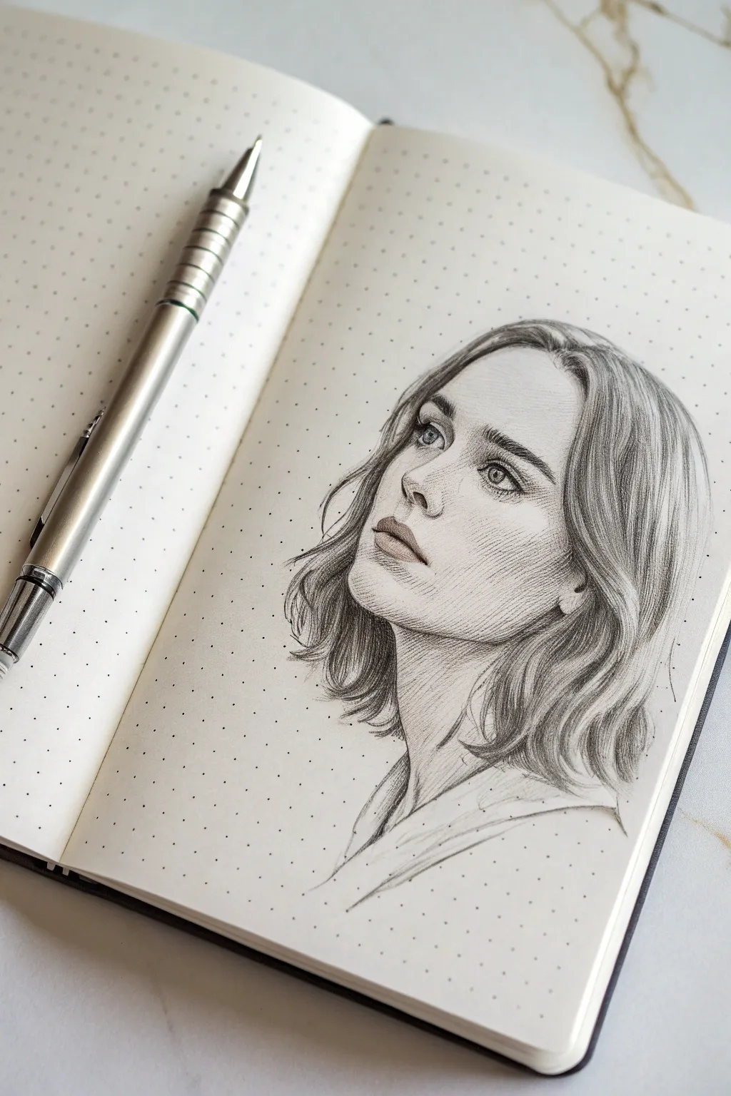
Capture a moment of quiet reflection with this delicate ballpoint pen portrait. By using subtle hatching and careful ink layering, you’ll build up soft shadows and lifelike textures that bring the subject’s upward gaze to life.
Step-by-Step Guide
Materials
- Fine-point black ballpoint pen (0.5mm or smaller recommended)
- Dot grid journal or smooth bristol paper
- HB Graphite pencil (for underdrawing)
- Kneaded eraser
- Ruler (optional for proportion checking)
Step 1: Structural Foundation
-
Map the Head Angle:
Begin with a light pencil sketch. Draw an oval that tilts slightly upward and to the left. Mark a vertical center line that curves with the face shape to establish the three-quarter view direction. -
Place Facial Features:
Lightly sketch horizontal guidelines for the eyes, nose base, and mouth. Since she is looking up, the jawline should appear slightly extended, and the nose will show more nostril definition than a straight-on view. -
Refine the Outline:
Sketch the specific shapes of the eyes, the soft curve of the nose, and the parted lips. Outline the hair loosely, focusing on the big waves framing the face rather than individual strands. Keep your pencil pressure extremely light so it erases easily later.
Ink globbing?
Ballpoint pens accumulate ink sludge at the tip. Wipe the nib on a scrap paper every few minutes to prevent sudden dark blobs on your delicate drawing.
Step 2: Initial Ink Layers
-
Anchor the Gaze:
Switch to your ballpoint pen. Start with the eyes, outlining the iris and pupil very gently. Leave small white circles for highlights to keep the eyes looking alive. -
Define the Lashes:
Using quick, outward flicks, draw the upper eyelashes. Keep them clustered at the outer corners. Add just a hint of a line for the lower lid, keeping it broken and soft. -
Nose and Mouth Construction:
Ink the nostrils and the corners of the mouth first, as these are the darkest points. Connect the lips with very faint, broken lines. Don’t outline the bridge of the nose fully; suggest it later with shading. -
Erase the Guides:
Once your primary ink lines are dry (give it a minute to avoid smearing), gently roll your kneaded eraser over the paper to lift the graphite sketch, leaving only your faint ink guide.
Pro Tip: Pressure Control
The secret to realism is pressure. barely touch the paper for skin shading—ghost over the surface. Only press down firmly for pupils and deep hair crevices.
Step 3: Shading and Texture
-
Hatching the Skin Tone:
This is where the ‘ink layering’ happens. Start with diagonal hatching strokes on the shadowed side of the face (the right side in this image). Keep your pen angle low and pressure minimal to create grey, not black. -
Deepening Facial Planes:
Add a second layer of hatching in a slightly different direction (cross-hatching) under the jawline, beneath the nose, and inside the eye socket. This builds depth without harsh lines. -
Sculpting the Cheeks:
On the cheekbone, use long, sweeping hatch lines that follow the curvature of the face. I find that curving these lines slightly helps the face look round rather than flat. -
Detailing the Lips:
Shade the upper lip vertically to mimic lip texture. Leave the center of the lower lip mostly white for a highlight, shading only the outer edges and underneath the bottom lip for volume.
Step 4: Hair and Final Touches
-
Flowing Hair Strands:
For the hair, use long, confident strokes that follow the wave pattern you sketched earlier. Start your strokes from the root or the clear shadow areas and flick outward to taper the line. -
Creating Hair Volume:
Cluster your dark strokes where the hair tucks behind the ear or overlaps near the neck. Leave the high points of the waves largely white to represent shine. -
Neck Shadows:
Cast a shadow on the neck under the chin using tighter cross-hatching. This separates the head from the neck and emphasizes the upward tilt. -
Clothing Suggestion:
Sketch the collar of the shirt with loose, gestural lines. Don’t over-detail this area; keep the focus on the face by leaving the clothing largely white and abstract. -
Final Contrast Check:
Step back and look at your drawing. Darken the pupils, the nostrils, and the deepest shadows in the hair one last time to ensure the image has enough ‘pop’ and contrast.
You now have a wonderfully expressive portrait that proves simple tools can create sophisticated art


Seashell Study With Curved Hatching
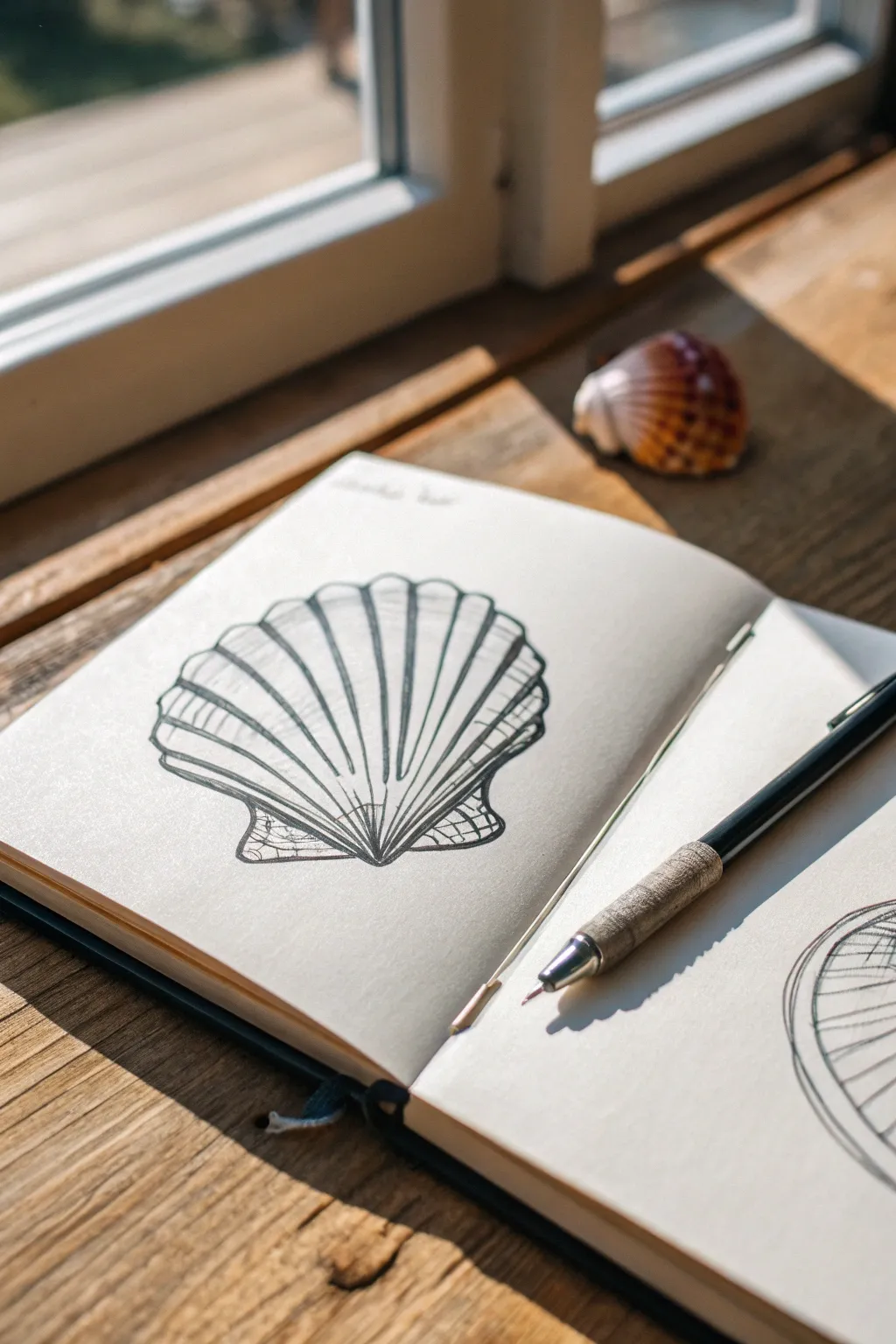
Capture the graceful, ribbed texture of a scallop shell using simple ballpoint pen techniques. This study focuses on using curved hatching lines to create volume and depth without needing complex shading.
Step-by-Step Guide
Materials
- sketchbook or drawing paper
- Black ballpoint pen (medium or fine tip)
- Pencil (HB or 2B for sketching)
- Eraser
- Real seashell or reference photo
Step 1: Planning the Shape
-
Outline the base:
Start with your pencil to lightly sketch the overall fan shape of the shell. Draw a curved semi-circle at the top that tapers down to a central point at the bottom. -
Add the wings:
At the bottom point where the shell converges, sketch two small triangular ‘wings’ or auricles on either side. These form the hinge of the scallop shell. -
Mark the ribs:
Lightly draw guidelines radiating from the bottom center point up to the top curved edge. These lines will determine where the main ridges of the shell will go. -
Refine the edges:
Use your pencil to scallop the top edge of the shell, connecting the radiating lines with small, concave curves.
Ink Flow Tip
Keep a scrap piece of paper nearby. Wipe the tip of your ballpoint pen on it every few minutes to prevent ink blobs from building up and ruining your clean lines.
Step 2: Inking the Structure
-
Trace the outline:
Switch to your ballpoint pen. Carefully go over your outer pencil lines with a steady, continuous stroke. Keep the pressure even for a clean look. -
Draw the main ribs:
Draw the vertical lines radiating from the bottom center to the top edge. These shouldn’t be perfectly straight; give them a slight curve outward as they reach the sides to show the shell’s convexity. -
Double the lines:
To give the ribs thickness, draw a second line right next to each radiating line you just made. This creates the ‘valleys’ and ‘peaks’ characteristic of a scallop shell. -
Define the hinge:
Ink the small triangular wings at the bottom base, adding a simple internal outline to define their border.
Try Sepia Ink
Instead of standard black office pens, try this study using brown or sepia fineliners. The warmer tones mimic natural shell colors and give the drawing a vintage scientific look.
Step 3: Adding Texture and Volume
-
Start horizontal hatching:
This is the key technique for this study. Inside the ribs on the far left side, begin drawing short, curved horizontal lines. -
Follow the form:
When hatching these cross-contours, curve your pen strokes downward slightly to mimic the rounded surface of each individual rib. -
Vary the spacing:
Keep the hatching denser near the bottom of the shell and looser near the top. This gradient implies shadow and depth near the hinge. -
Work across the shell:
Continue this curved hatching process for each section, moving from left to right. Adjust the curve of your hatch marks so they correspond to the angle of each rib. -
Detail the wings:
Add a crisp, geometric texture to the small bottom wings. Use a cross-hatching pattern or a ‘crazy paving’ style with small intersecting lines to differentiate this texture from the smooth ribs. -
Darken the valleys:
Go back into the deep grooves between the ribs with your pen. Add a second layer of ink or press slightly harder to darken these crevices, which makes the ribs pop forward. -
Clean up:
Wait about a minute to ensure the ballpoint ink is completely dry and won’t smudge. -
Erase guidelines:
Gently erase all visible pencil marks underneath your ink drawing to leave a crisp, final illustration.
You now have a clean, textured study of a seashell ready to join your sketchbook collection


Leaf With Bold Negative Space
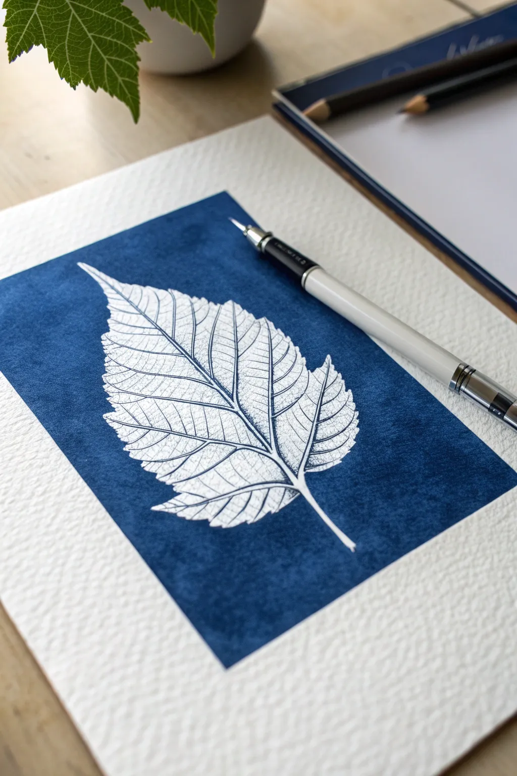
Reverse the traditional drawing process by coloring in the background instead of the subject, creating a striking negative space effect. This project mimics the high-contrast beauty of a cyanotype print using nothing but deep blue ink and patient layering.
Step-by-Step Tutorial
Materials
- Heavyweight cold-press watercolor paper (300gsm)
- Blue ballpoint pen (medium or 1.0mm tip)
- Blue fineliner or gel pen (optional, for filling large areas)
- Graphite pencil (HB or 2H)
- Kneaded eraser
- Real leaf for reference (optional)
Step 1: Drafting the Outline
-
Observe your subject:
Find a leaf with interesting serrated edges—like a birch or elm leaf—or use a reference photo. Study how the main stem branches out into primary and secondary veins. -
Sketch the main shape:
Lightly sketch the outer contour of the leaf using your graphite pencil. Keep the lines very faint, as you’ll want to erase them later without leaving grooves in the paper. -
Define the veins:
Draw the central stem running from the leaf base to the tip. Branch out lightly to mark the major veins, creating a map for where the white space will remain. -
Mark the border:
Use a ruler to lightly draw a rectangular frame around the leaf. This defines the area you will color in, giving the artwork a clean, finished edge.
Step 2: Defining the Negative Space
-
Outline with ink:
Switch to your blue ballpoint pen. VERY carefully trace the outer edge of the leaf. This line creates the barrier between your white subject and the blue background. -
Trace the frame:
Go over your rectangular border lines with the pen to seal the composition. -
Detail the veins:
Inside the leaf shape, start drawing the veins. Unlike a normal drawing, remember that the ink represents shadow. Draw thin lines *next to* the veins you sketched, leaving the pencil line itself white. -
Add texture to the veins:
Use very delicate, broken stippling or tiny hatching marks along the vein structures to give them depth without making them solid black (or blue). The veins should look delicate, not heavy.
Ink Blot Prevention
Ballpoint pens can accumulate globs of ink on the tip. Keep a scrap paper nearby and wipe the tip every few minutes to prevent dropping a dark blob on your pristine white leaf.
Step 3: Filling the Background
-
Start the base layer:
Begin coloring the area outside the leaf but inside the rectangle. I find it best to work in small sections, using circular motions to avoid harsh directional streaks. -
Protect the edge:
Be extremely careful when coloring right up to the serrated edge of the leaf. You want a crisp boundary to make the white paper pop. -
Build saturation:
Apply a second layer of ink over the background. Vary the direction of your strokes (cross-hatching) to cover the white specs of the paper texture. -
Deepen the blue:
Continue layering until you achieve a rich, deep indigo tone. The textured paper will likely influence the look, giving it a slightly mottled, organic appearance similar to denim or a cyanotype. -
Clean up details:
Look closely at the leaf again. Add tiny etched lines or stippling on the *shadow side* of the veins to make them look rounded rather than flat.
Uneven Background?
If the background looks scribbly, embrace the texture of the paper. Use small, tight circles rather than straight back-and-forth lines to get smoother coverage.
Step 4: Finishing Touches
-
Clean the edges:
If your rectangular border needs straightening, run the pen along a ruler one final time to crisp up the edges. -
Erase guidelines:
Wait at least 15-20 minutes to ensure the ink is completely dry and set. Then, gently use the kneaded eraser to lift any visible graphite lines from the white areas of the leaf. -
Check contrast:
Step back and view the piece. If the background looks patchy, go back in with the ballpoint pen and spot-fill the lighter areas to unify the dark field.
The result is a stunning, high-contrast botanical study that looks far more complex than the simple tools required to make it

PENCIL GUIDE
Understanding Pencil Grades from H to B
From first sketch to finished drawing — learn pencil grades, line control, and shading techniques.
Explore the Full Guide
Animal Head Close-Up With Fur Layers
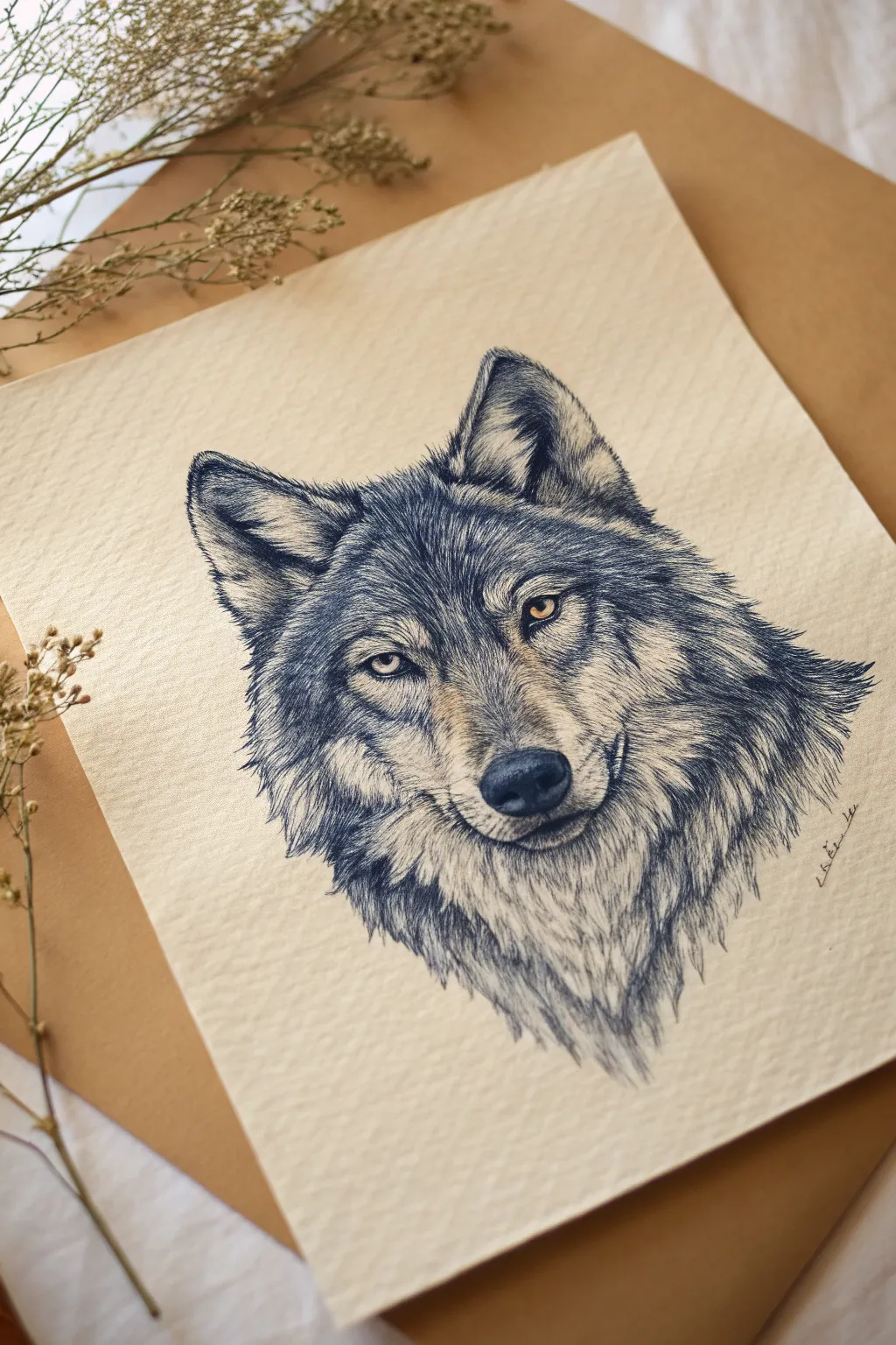
Capture the intense stare of a wolf using nothing but a simple blue ballpoint pen. This project focuses on building realistic fur textures through patient hatching and layering, resulting in a monochromatic portrait with a striking pop of yellow in the eyes.
Step-by-Step
Materials
- High-quality, thick textured paper (e.g., watercolor or mixed media paper, visible tooth)
- Blue ballpoint pen (standard Bic or similar)
- Light pencil (HB or 2H)
- Kneadable eraser
- Yellow-orange colored pencil or gel pen
- Scrap paper for testing ink flow
Step 1: Sketching the Foundation
-
Map basic shapes:
Start with a light pencil sketch. Draw a large circle for the head and a smaller oval for the muzzle. Add triangular shapes for the ears, ensuring they are asymmetrical to give the wolf a natural, slightly turned posture. -
Refine the features:
Place the eyes carefully; they should be angled slightly downward towards the nose. Sketch the nose leather and the mouth line. Don’t press hard—you want these lines to be barely visible guidelines for your ink. -
Indicate fur direction:
Lightly sketch arrows or sweeping lines to map out which way the fur grows. Around the eyes, it radiates outward; on the neck, it flows down. This map is crucial for the inking phase.
Clean Tip Pro Tip
Ballpoint pens accumulate ink ‘blobs’ on the tip while coloring. Wipe the tip on scrap paper every few minutes to avoid accidentally dropping a dark sludge blob on your delicate fur render.
Step 2: The Eyes and Focal Points
-
Inking the pupils:
Switch to your blue ballpoint pen. Fill in the pupils with solid, heavy pressure to get the darkest possible blue. Leave a tiny speck of white paper for the catchlight to give the eye life. -
Outline the eye rim:
Draw the thick dark rim around the eyes using short, firm strokes. This ‘eyeliner’ effect frames the iris and adds intensity to the stare. -
Adding the color pop:
Before adding ink texture to the iris, lightly fill it in with your yellow-orange colored pencil. Once established, use extremely delicate ballpoint stippling (dots) near the upper eyelid to simulate a shadow over the colored iris. -
Nose texture:
Ink the nose pad. Instead of distinct hairs, use a tight stippling or tiny circular scumble motion to create a leathery, bumpy texture. Make the nostrils pitch black, fading into lighter greys on top.
Step 3: Layering the Fur
-
Start with the darkest markings:
Locate the dark patterns relative to your reference—usually the tips of the ears, the ‘mask’ around the eyes, and the neck ruff. Begin hatching here first. -
Short hatching technique:
Use quick, flicking strokes where the pen lifts off the paper at the end of each line. This tapering creates the illusion of a hair tip. Keep strokes short for facial fur. -
Building density:
Don’t try to get the full darkness in one pass. I find it better to do a layer of diagonal hatching, let the ink dry for a second, and then cross-hatch slightly to deepen the tone. -
The mid-tones:
Move to the lighter grey areas (snout bridge and cheeks). Use much lighter pressure here. Hold the pen further back on the barrel to reduce the weight of your hand. -
Define the ear interiors:
The inside of the ear needs long, wispy strokes. Leave plenty of white paper showing between lines to make this fur look fluffy and soft compared to the sleek face.
Uneven Shading?
If your hatching looks too scribbly, you’re likely drawing too fast. Slow down your strokes. Consistent spacing and pressure are key to making ink lines look like soft fur.
Step 4: The Mane and Final Details
-
Lengthen the strokes:
As you move down from the jaw to the neck ruff, make your pen strokes significantly longer and wavier. This implies the thicker, coarser winter coat. -
Create distinct clumps:
Fur doesn’t lay perfectly flat; it clumps together. Group your strokes into V-shapes or jagged clusters, focusing heavily on shadow areas where clumps overlap. -
Erase guidelines:
Once the ink is completely dry (ballpoint can smudge easily!), gently run your kneadable eraser over the drawing to lift the initial graphite sketch. -
Review contrast:
Step back and squint at your drawing. Deepen the shadows under the chin and around the ears with one final layer of firm hatching to make the head pop off the page. -
Add signature:
Sign your work subtly near the shoulder line, following the angle of the fur for a cohesive finish.
Step back and admire the fierce spirit you’ve captured in blue ink
Architectural Corner With Crisp Perspective Lines
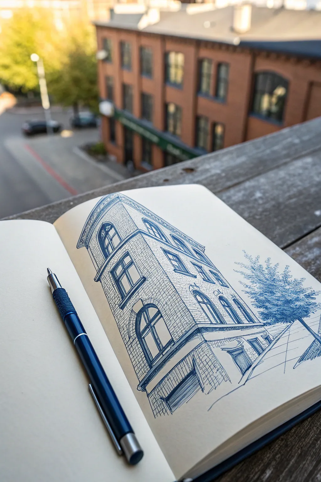
Capture the stark beauty of urban architecture with this crisp, monochromatic study using nothing but a trusty blue ballpoint pen. This project focuses on sharp perspective lines and cross-hatching textures to bring a brick building to life on cream-colored paper.
Detailed Instructions
Materials
- High-quality sketchbook (cream/off-white paper recommended)
- Blue ballpoint pen (medium point, e.g., 1.0mm)
- Ruler or straight edge (optional, for guidelines only)
- Pencil (HB or 2H) and eraser for initial under-drawing
Step 1: Planning and Perspective
-
Establish the Corner Line:
Begin by drawing a vertical line slightly to the left of the page center. This will be the main corner of your building, closest to the viewer. -
Set the Vanishing Angles:
From the top and bottom of your vertical line, lightly sketch diagonal lines angling sharply downward to the left and more gradually downward to the right. This creates a two-point perspective exaggerated slightly for dramatic effect. -
Block in Floor Levels:
Mark off the horizontal divisions for the street level, the first floor, and the top cornice. Keep these lines parallel to your initial top and bottom diagonal guidelines. -
Define the Penthouse/Roof:
Sketch the triangular top section of the building, ensuring the roofline follows your established perspective angles.
Ink Blotches?
Ballpoint pens can accumulate ink sludge on the tip. Keep a scrap paper nearby and wipe the tip every few minutes to keep your lines crisp and clean.
Step 2: Drafting Details
-
Map Out Windows:
Lightly outline the arched windows on the main facade. The windows on the left side should appear narrower due to the sharp perspective angle. -
Add Architectural Trim:
Draw the detailed horizontal bands (cornices) that separate the floors. I like to double-check my perspective here, as these thick lines ground the structure. -
Sketch the Ground Floor:
Outline the larger storefront openings at the base, including the awning or garage-style door on the left face.
Step 3: Inking and Texturing
-
Ink the Main Outlines:
Switch to your blue ballpoint pen. Confidently trace over your pencil structure with clean, solid lines. Use a ruler if you want machine-perfect edges, or freehand it for more character. -
Darken the Windows:
Fill in the window panes. Leave the frames white, but use heavy pressure to make the glass areas dark blue, creating contrast. -
Create Brick Texture:
Start adding the brickwork pattern. Instead of drawing every single brick, suggest them with grid-like hatching that follows your perspective lines. -
Shade the Left Facade:
Since the light source is coming from the right, cross-hatch the entire left side of the building heavily. Use vertical strokes first, then overlay diagonal strokes to deepen the shadow. -
Detail the Cornices:
Add small vertical ticks and shadows under the protruding horizontal bands to give them three-dimensional weight.
Add Depth
Try varying your pen angle. Holding it upright creates thin, sharp lines, while tilting it to the side can produce softer, wider shading strokes.
Step 4: Atmosphere and Finishing
-
Sketch the Tree:
To the right of the building, use loose, scribbly motions to create the foliage of a tree. Keep the texture distinct from the rigid building lines to show it’s organic. -
Ground the Scene:
Draw a few simple diagonal lines extending from the bottom right corner to suggest a sidewalk or street, anchoring the building to the ground. -
Deepen Contrast:
Go back over the darkest areas—specifically the window interiors and the heavy shadow under the roof eave—with a second layer of ink. -
Clean Up:
Once the ink is fully dry (give it a minute to avoid smudging), gently erase any visible pencil guidelines.
Enjoy the satisfying permanence of ink as you admire your finished architectural study
BRUSH GUIDE
The Right Brush for Every Stroke
From clean lines to bold texture — master brush choice, stroke control, and essential techniques.
Explore the Full Guide
Botanical Bouquet in Monochrome Ink
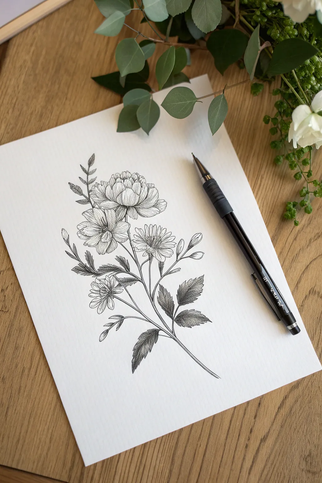
This elegant botanical study captures the delicate textures of petals and leaves using nothing but standard black ink. The result is a timeless, high-contrast illustration that looks far more complicated than it actually is.
How-To Guide
Materials
- Smooth bristol board or heavy drawing paper
- Fine-point black fineliner pen (0.3mm)
- Medium-point black ballpoint pen or gel pen (0.5mm)
- H pencil (for sketching)
- Quality eraser
Step 1: Structural Sketching
-
Map the stem:
Begin by lightly drawing a single, long curve sweeping from the bottom right towards the center left. This will serve as your main anchor stem. Branch off two smaller lines near the top where your main blooms will sit. -
Block in flower shapes:
At the top of your main stem, lightly sketch rough circles or ovals to represent the flower heads. Place a larger, fuller oval at the very top for the peony-style bloom, and two smaller circles below it for the daisy-like flowers. -
Add leaf placements:
Draw simple, pointed oval shapes extending from the lower half of the main stem. Keep them loose; these are just placeholders for the serrated leaves we’ll detail later. -
Refine the petals:
Using your pencil sketches as a guide, carefully define the individual petals. For the top flower, create tight, overlapping layers that curve inward. For the lower flowers, draw longer, separate petals radiating from a central disk.
Clean Lines Tip
Keep a scrap paper nearby. Ballpoint pens accumulate ink ‘goop’ on the tip; wipe it frequently to avoid accidental blobs on your drawing.
Step 2: Inking the Outlines
-
Trace the blooms:
Switch to your fine-point fineliner (0.3mm). Start with the central petals of the topmost flower, outlining them with deliberate, smooth strokes. Work your way outward to the larger petals. -
Define the lower flowers:
Ink the daisy-like blooms below. Avoid making the lines perfectly uniform; a slight wobble adds organic realism to the petal edges. -
Ink the leaves:
Outline the leaves, adding serrated (jagged) edges as you go. Instead of a smooth curve, use small zig-zag motions to create that saw-toothed leaf margin typical of garden foliage. -
Connect the stems:
Draw the final stem lines, ensuring they connect logically to the base of each flower and leaf. Thicken the main stem slightly at the bottom for stability. -
Erase the graphite:
Once the ink is completely dry—give it a full minute or two—gently erase all underlying pencil marks to reveal a clean line drawing.
Smudge alert?
If you are left-handed, place a clean sheet of paper under your hand as you draw to prevent dragging wet ink across the white paper.
Step 3: Shading and Texture
-
Start hatching petals:
Using the very tip of your ballpoint pen, add fine, parallel lines (hatching) at the base of the top flower’s petals where they tuck inward. This creates depth and shadow. -
Detail the flower centers:
For the lower flowers, fill the center disks with tiny, tight scribbles or stippling dots to simulate a fuzzy, pollen-rich texture. -
Add petal veins:
Draw very faint, sweeping lines from the base of the open petals toward the tips. Keep these lines broken and light; they shouldn’t be solid outlines. -
Shade the leaves:
This is where we build contrast. Densely hatch the leaves, focusing the darkest ink near the central vein and leaving the edges lighter. I find that cross-hatching (layering lines in opposing directions) works best for the darkest leaf shadows. -
Enhance the buds:
Add small, curved hatching lines to the round bodies of the unopened buds to give them a spherical, 3D volume. -
Deepen the contrast:
Review your drawing. Go back into the deepest crevices between petals and underneath leaves with your pen, adding more pressure to create ‘blackout’ zones that make the white pop.
Now you have a sophisticated botanical illustration ready to frame or scan for cards
Insect Macro Drawing With Patterned Wings
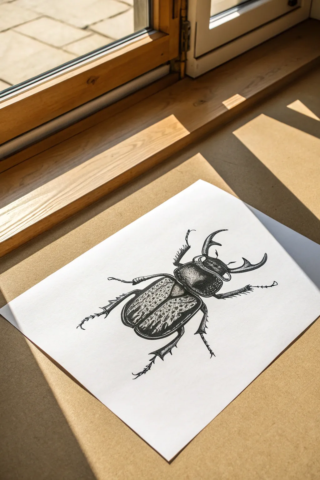
Capture the intricate details of nature with this striking illustration of a stag beetle, rendered entirely in black ink. Using high-contrast shading and meticulous dot work, you’ll create a textured, three-dimensional effect that makes the insect pop off the page.
Step-by-Step
Materials
- Smooth white bristol board or heavyweight drawing paper
- Fine-point black ballpoint pen or fine liner (0.1mm and 0.5mm)
- HB graphite pencil
- Soft eraser
- Ruler (optional for reference grid)
Step 1: Sketching the Framework
-
Establish the central axis:
Start by drawing a very faint vertical line down the center of your paper using your pencil. This axis line will help you maintain symmetry, which is crucial for a realistic insect. -
Map out the head and thorax:
Lightly sketch the top section (the head) and the middle section (the thorax). The thorax should be a rounded rectangle shape, wider than the head, with smooth, curved edges. -
Outline the elytra (wing cases):
Draw the large abdomen section below the thorax. Split this down the center line to create the two wing cases, making them curve gently outward and taper to a rounded point at the bottom. -
Add the mandibles and legs:
Sketch the prominent, curved mandibles extending from the head. Add the legs—three on each side—ensuring the front pair reaches forward near the head and the back pair extends backward. -
Refine the outline:
Go over your sketch, tightening the shapes and adding small details like the joints in the legs and the jagged inner teeth of the mandibles. Keep your pencil pressure very light.
Ink Smearing?
Place a scrap piece of paper under your drawing hand. This acts as a shield, preventing oils from your skin from warping paper and stopping your hand from dragging wet ink.
Step 2: Inking the Contours
-
Trace parts of the main body:
Switch to your thicker pen (0.5mm). Carefully outline the thorax and head. Use a confident, continuous line for the outer edges to define the beetle’s hard exoskeleton. -
Detail the legs:
Outline the legs, paying close attention to the spiky textures (tibial spurs) on the forelegs. These jagged edges add realism to the insect’s anatomy. -
Create the wing separation:
Draw the line separating the two wing cases. Keep this line crisp, but allow it to curve naturally with the beetle’s rounded back.
Metallic Sheen
To make the beetle look extra shiny, leave the highlights completely stark white (no ink). Sharp transitions between solid black and white create a wet, glossy effect.
Step 3: Shading and Texture
-
Establish the darkest blacks:
Identify the deepest shadows, mainly on the sides of the thorax and the underside of the body. Fill these areas in completely black, leaving small slivers of white for highlights on the shiny shell. -
Stipple the head:
Switch to your 0.1mm pen. Using a stippling technique (tiny dots), add texture to the head and mandibles. Concentrate dots heavily near the edges for shadow and disperse them toward the center for highlights. -
Render the thorax shine:
Shade the thorax using a mix of hatching and stippling. Leave a prominent, curved white highlight on the top left and right sides to simulate a glossy carapace. -
Outline the wing patterns:
On the wing cases, lightly draw the irregular, mottled shapes that form the pattern. These shouldn’t be perfect circles but organic, jagged patches. -
Darken the wing background:
Fill in the space *around* the mottled shapes on the wings. I prefer to use dense hatching here, making the background very dark so the patterned spots remain the white of the paper. -
Texture the wing spots:
Inside the white wing spots, add very sparse, delicate dots. This keeps them from looking like empty holes and gives them a slightly cloudy texture. -
Detail the leg hairs:
Add tiny, directional strokes along the legs to simulate fine hairs. These should follow the direction of the leg segments. -
Deepen the contrast:
Go back over the darkest areas of the thorax and the connection points between body segments. High contrast is key to the metallic look. -
Cleanup:
Once the ink is completely dry—give it a few minutes to be safe—gently erase all underlying pencil sketch lines to reveal the crisp blackwork.
Now you have a stunning, museum-worthy specimen illustration ready for display


Landscape Inside a Silhouette Shape
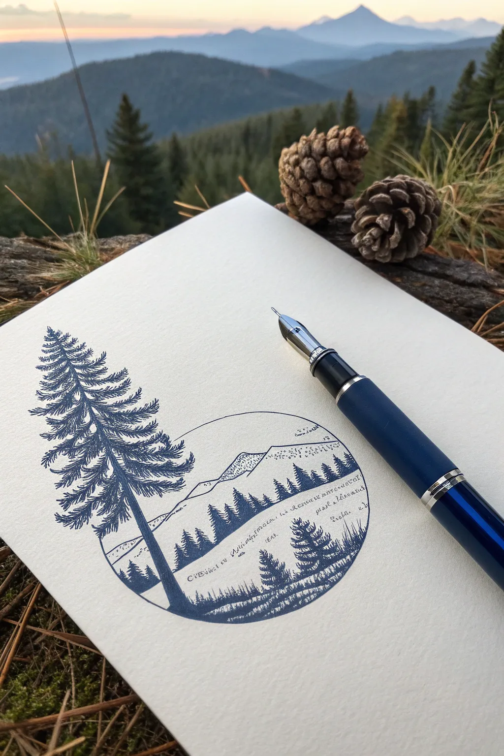
This project combines precise geometric framing with organic nature elements, capturing a serene mountain landscape within a circular vignette while a majestic pine tree breaks the boundary. The monochromatic blue ink gives it a classic, crisp feel perfect for sketching outdoors or at your desk.
Step-by-Step Guide
Materials
- Fine-nib fountain pen or quality blue ballpoint pen
- Heavyweight textured drawing paper or cardstock
- Compass or a circular object to trace (approx. 3-4 inches diameter)
- Pencil (HB or H)
- Eraser
- Ruler (optional)
Step 1: Planning and Layout
-
Draw the circular boundary:
Begin by lightly tracing a circle in the center of your page using a compass or by tracing around a jar lid. Keep your pencil pressure very light so these lines can be erased later without leaving grooves. -
Sketch the main tree structure:
Lightly sketch a tall vertical line on the left side of the circle to represent the trunk of the main pine tree. Extend this line well above the top of the circle and down to the bottom edge. -
Outline the tree silhouette:
Roughly block in the triangular shape of the tree’s foliage. It should be narrow at the top and widen as it reaches the circle’s base. Ensure the branches extend slightly outside the circle on the left. -
Draft the background landscape:
Inside the circle, sketch a simple horizon line about one-third of the way up. Above that, draw the jagged outlines of distant mountains. Add a sloping hill in the foreground on the right side.
Ink Smudging?
Place a scrap piece of paper under your drawing hand as you work. This acts as a shield, preventing oils from your skin from hitting the paper and stopping your hand from smearing wet ink.
Step 2: Inking the Main Pine Tree
-
Define the trunk:
Switch to your pen. Draw the trunk, making it thicker at the base and tapering comfortably as it rises. Fill it in with vertical strokes to suggest bark texture, leaving tiny slivers of white for highlights. -
Start the foliage at the top:
Begin inking the branches at the apex. Use short, flicking strokes that radiate outward and slightly downward to mimic pine needles. Keep the top sparse. -
Thicken the middle branches:
As you move down the tree, make the branches wider and denser. Create layers by leaving small gaps of white space between branch clusters to prevent the tree from looking like a solid blob. -
Detail the lower branches:
For the widest branches near the bottom, use distinct, scribbly textures. Let the tips of the branches feather out delicately. I find that varying the pressure here adds nice depth to the needles.
Try a Double Exposure
Instead of a mountainside, fill the circle with a contrasting scene, like a starry night sky or an underwater view, to create a surreal ‘double exposure’ effect inside the shape.
Step 3: Inking the Landscape
-
Outline the circular frame:
Carefully trace over your pencil circle with the pen, but skip the sections where the large tree trunk and branches overlap the line. The tree should appear to be ‘in front’ of the window. -
Draw the distant tree line:
Along the mid-ground hill inside the circle, draw a row of tiny, vertical jagged shapes. These represent a distant forest. Fill them in solid blue to create contrast against the white mountains. -
Add mountain textures:
Use very sparse stippling (dots) or tiny hatching lines on the shadowed sides of the distant mountains. Keep the mountaintops mostly white to simulate snow or bright sunlight. -
Create the foreground slope:
In the lower right area of the circle, draw a few smaller pine trees. These should be much smaller than the main tree but larger than the distant forest line. -
Suggest grassy texture:
At the very bottom of the circle, use short, vertical dashes to indicate tall grass or marshland vegetation. This grounds the scene. -
Add script details (optional):
If you wish to replicate the journal style, add rows of very small, illegible scribbles or actual text across the open areas of the hills to simulate field notes or topography markings.
Step 4: Final Touches
-
Deepen the shadows:
Go back to the main pine tree and add a second layer of ink to the underside of the branches and the shadowed side of the trunk. This increases the contrast and makes the tree pop. -
Erase pencil guides:
Wait at least 10-15 minutes for the ink to dry completely. Gently erase all visible pencil marks, being careful not to smudge the heavy ink areas.
Now you have a serene little window into nature captured right in your sketchbook
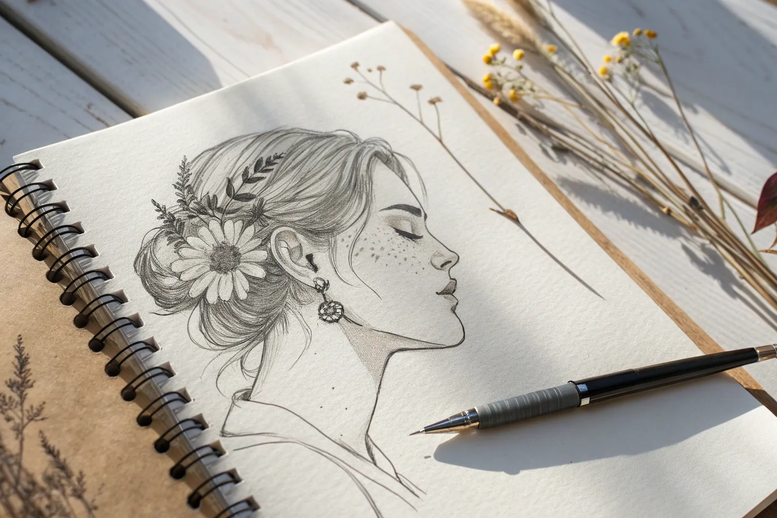
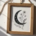
Surreal Portrait With Botanical Elements
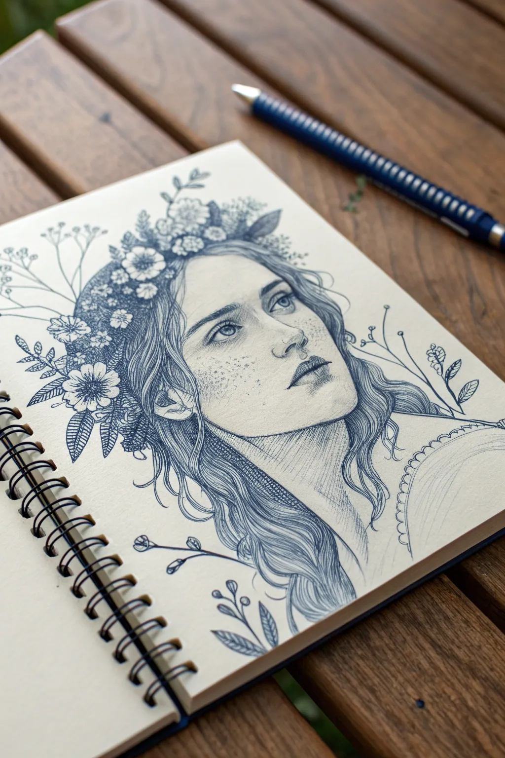
This project combines the delicate precision of a classical portrait with the organic chaos of wildflowers, all rendered in the humble yet powerful medium of blue ballpoint pen. The result is a surreal, dreamlike illustration where nature and humanity seamlessly intertwine on the page.
Detailed Instructions
Materials
- High-quality blue ballpoint pen (fine point, around 0.7mm)
- Heavyweight sketch paper or Bristol board (smooth surface preferred)
- H or HB pencil for initial sketching
- Kneaded eraser
- Scrap paper for testing pen pressure
Step 1: Conceptual Sketching
-
Establish the Head Shape:
Begin with your graphite pencil. Draw a loose oval for the head, tilting it slightly upward and to the right. Mark a faint vertical line down the center of the face to guide the angle of the nose and eyes. -
Map Facial Features:
Sketch horizontal guidelines for the eyes, nose, and mouth. Position the eyes wide and almond-shaped, the nose slightly upturned, and the lips full. Keep these lines extremely light, as ink is permanent. -
Outline the Hair and Wreath:
Instead of a full hairline, envision where a thick floral wreath would sit. Sketch diverse flower shapes—daisies, small buds, and leaves—wrapping around the forehead and temples. Let the hair blow loosely down from beneath this floral crown.
Ink Blob Blues?
Ballpoint pens accumulate ink sludge at the tip. Wipe your pen tip on a scrap paper or tissue every few minutes to prevent sudden, dark blobs from ruining your delicate shading lines.
Step 2: Inking the Face
-
Define the Eyes:
Switch to your blue ballpoint pen. Start with the eyes, outlining the upper lid with a slightly heavier line. Add the iris and pupil, leaving a tiny white highlight to bring life to the gaze. -
Nose and Mouth Contour:
Ink the nostrils and the shadow under the nose using short, light strokes. For the lips, outline the center line first, then use soft hatching to shade the upper lip, keeping the lower lip lighter to suggest volume. -
Delicate Stippling for Freckles:
Instead of drawing dots heavily, gently tap the pen tip across the nose and cheeks. Vary the spacing to create a natural, sun-kissed freckle pattern that adds texture to the skin. -
Jawline and Neck Shading:
Define the jawline with a confident, continuous line. Use directional hatching—parallel diagonal lines—on the neck to create a shadow cast by the jaw, helping the head feel three-dimensional.
Add Surrealism
Make the portrait more surreal by having the hair transform into roots or vines at the bottom, or replace the pupil of the eye with a tiny flower center.
Step 3: The Floral Crown
-
Inking the Main Blooms:
Select the largest flowers in your wreath sketch. Outline their petals clearly. For the centers, use tight, tiny scribbles or stippling to create a pollen-textured look. -
Adding Foliage and Filler:
Fill the gaps between main flowers with leaves and smaller sprigs. Use a darker pressure here to create depth within the wreath, making the lighter flowers pop forward. -
Extending the Botanicals:
Draw wispy stems extending outward from the wreath and neck area. These shouldn’t act like realistic hair but rather like floating surreal elements. Keep the lines thin and graceful.
Step 4: Hair and Finishing Details
-
Flowing Hair Strands:
Draw the hair flowing down from the wreath. Use long, sweeping strokes that follow the curve of the strands. I find it helpful to lift the pen at the end of each stroke to taper the line naturally. -
Building Hair Volume:
Layer your strokes in the shadowed areas of the hair (behind the neck and under the wreath) to build up a deep, rich blue tone. Leave areas where the light hits the hair much sparser. -
Cross-Hatching the Neck:
Return to the neck area. Add a second layer of hatching lines perpendicular to your first set to deepen the shadows further, ensuring smooth transitions. -
Garment Details:
Sketch the hint of a garment at the shoulder with a scalloped edge. Use very light hatching to suggest the curve of the shoulder without drawing a hard outline. -
Cleanup:
Wait at least five minutes to ensure the ink is completely dry. Gently erase all visible pencil guidelines with your kneaded eraser, being careful not to smudge the ink.
Step back and admire how simple blue lines have converged to create a soulful and organic portrait


Have a question or want to share your own experience? I'd love to hear from you in the comments below!