A good border is like the perfect frame—it instantly makes your page feel finished and intentional. Here are my go-to painting border ideas you can repeat easily, whether you’re decorating a sketchbook page, a card, or a quote space.
Clean Double-Line Frame
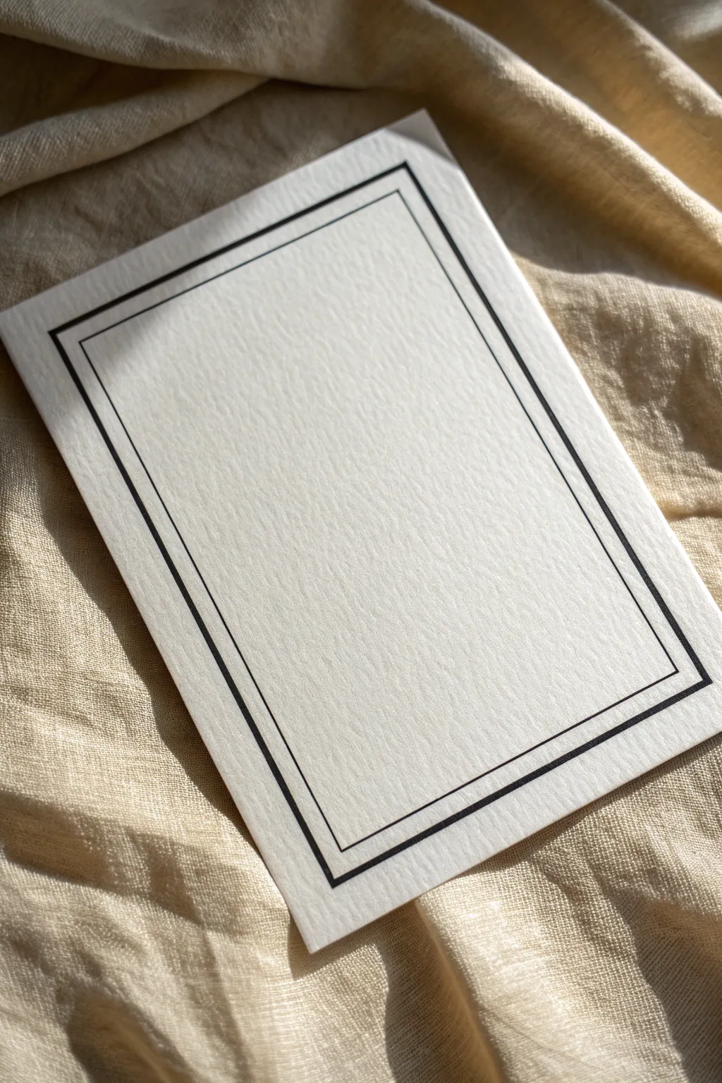
For a look that screams understated elegance, this clean double-line frame is the perfect choice. Using high-contrast black ink on textured paper creates a sophisticated finish that works beautifully for invitations, greeting cards, or framed quotes.
Step-by-Step Guide
Materials
- High-quality textured cardstock or cold-press watercolor paper
- Ruler (preferably clear with grid lines)
- Pencil (HB or H)
- Fine-point black drawing pen (size 01 or 03)
- Medium-point black drawing pen (size 05 or 08)
- Kneaded eraser
Step 1: Planning and Measuring
-
Prepare your paper:
Cut your textured cardstock to your desired size. A standard 5×7 inch rectangle works well for this design, giving you ample space for the border. -
Mark the outer margin:
Using your ruler, measure 1/2 inch (or roughly 1.5 cm) inward from the edge of the paper on all four sides. Make tiny, light tick marks with your pencil to guide your first line. -
Mark the inner margin:
Measure an additional 1/8 inch (about 3-4 mm) inward from your first set of marks. This small gap will separate your two border lines. -
Sketch the guidelines:
Very lightly connect your pencil marks using the ruler to create two concentric rectangles. Keep your touch gentle so the graphite doesn’t embed deeply into the paper’s texture.
Uneven Ink Lines?
If your pen skips over the paper texture, slow down your drawing speed. This gives the ink more time to flow into the tiny valleys of the cardstock.
Step 2: Inking the Border
-
Line up the ruler:
Place your ruler along the outermost pencil guideline. To prevent smudging, adhere a few small pieces of masking tape or post-it notes to the underside of the ruler to lift it slightly off the paper. -
Draw the outer line:
Take the medium-point pen (size 05 or 08). Holding the pen vertically to ensure a consistent line width, trace along the ruler edge for the outer rectangle. -
Handle the corners:
Stop precisely where the horizontal and vertical lines meet. I find it helpful to lift the pen straight up rather than dragging it to avoid ink pooling at the corners. -
Rotate and repeat:
Carefully rotate your paper and continue inking the other three sides of the outer rectangle until the frame is complete. -
Switch pens:
Swap to your fine-point pen (size 01 or 03). We want the inner line to be noticeably thinner to create visual interest. -
Draw the inner line:
Align your ruler with the inner pencil guideline. Draw this inner rectangle with the same steady motion, being careful to maintain an even distance from the thicker outer line. -
Check the gap:
As you work, keep an eye on the white space between the two lines. This negative space is just as important as the ink itself for a clean look. -
Let the ink set:
Wait at least 15 to 20 minutes for the ink to dry completely. Textured paper can hold ink longer than smooth paper, and smearing now would be heartbreaking.
Add Gold Accents
For a luxe touch, trace over the thinner inner line using a gold gel pen or metallic marker. The contrast between matte black and shimmer is stunning.
Step 3: Finishing Touches
-
Erase pencil marks:
Gently dab and roll a kneaded eraser over the border lines to lift the graphite guidelines. Avoid rubbing vigorously, which can damage the paper’s texture. -
Inspect line quality:
Look closely at your corners. If any gaps exist where lines meet, carefully touch them up with the very tip of your finer pen. -
Flatten the paper:
If the paper has bowed slightly from handling, place it under a heavy book overnight to ensure it sits perfectly flat.
Now you have a pristine, professional-looking border ready to frame your next artistic creation


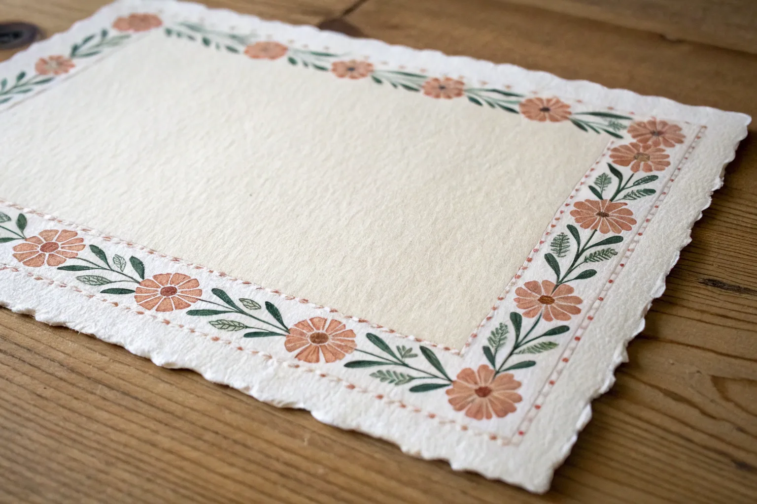
Soft Watercolor Wash Frame
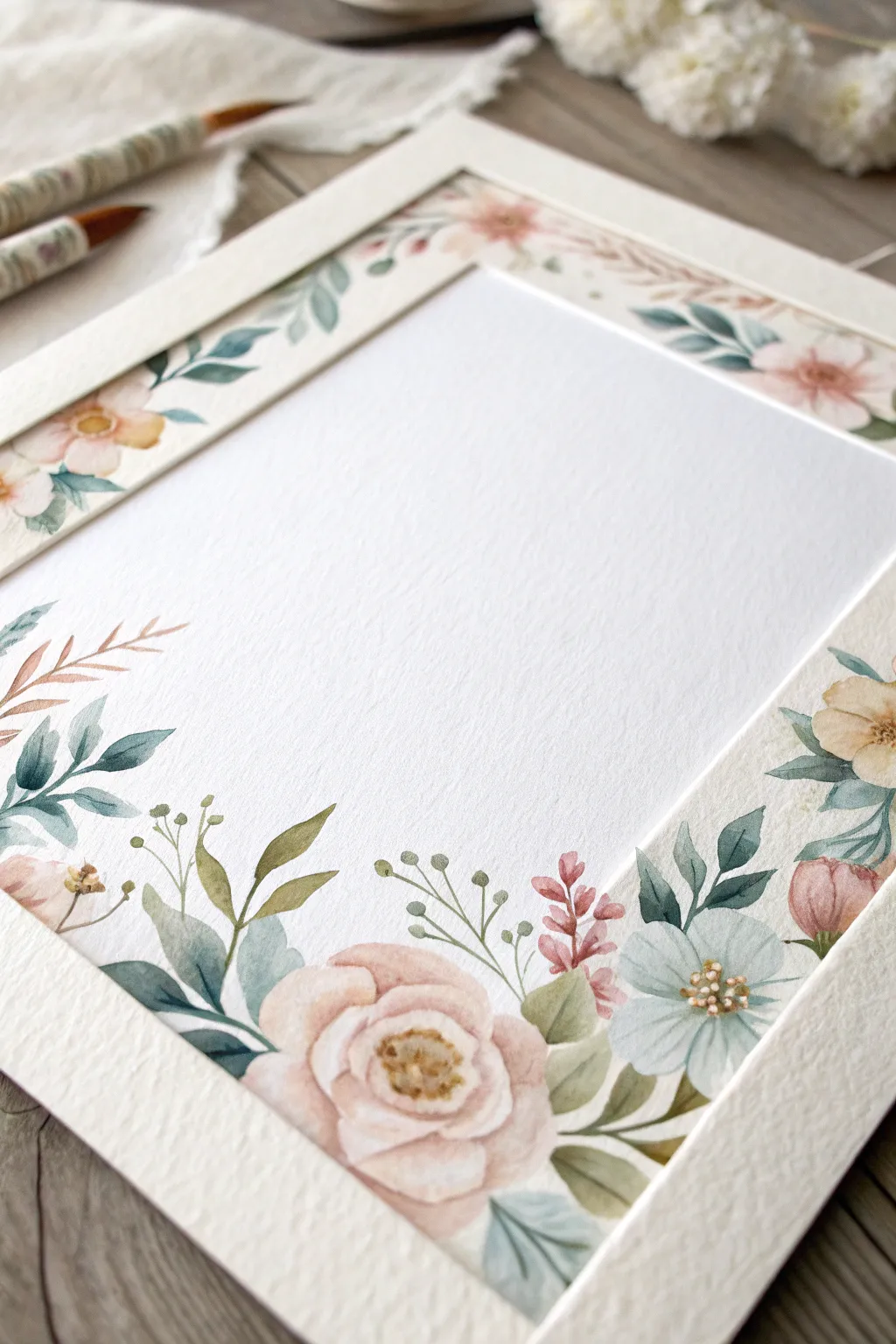
This project creates a soft, romantic frame using gentle watercolor techniques on heavy textured paper. The result is a sophisticated border featuring blush roses, dusty blue wildflowers, and sage greenery that perfectly surrounds a blank center for your calligraphy or favorite photo.
How-To Guide
Materials
- Cold press watercolor paper (300 gsm or heavier for texture)
- Watercolor paints (Blush Pink, Peach, Dusty Blue, Sage Green, Sap Green, Burnt Umber)
- Round watercolor brushes (Size 2, 4, and 6)
- Pencil (HB or H)
- Kneaded eraser
- Ruler
- Masking tape or painter’s tape
- Two jars of water
- Paper towels
Step 1: Preparation & Layout
-
Define the borders:
Begin by taping down your paper to a hard surface to prevent buckling. Use a ruler to lightly measure an inner rectangle about 1.5 to 2 inches from the paper’s edge. This inner box will remain blank. -
Sketch the primary blooms:
With a hard pencil, very faintly sketch the position of the large roses. Place the largest blooms at the bottom corners to anchor the design, with smaller clusters near the top corners. -
Fill in the foliage:
Lightly draw sweeping lines connecting the flowers to form the frame structure. Sketch in leaf shapes—mix rounded eucalyptus styles with pointed fern-like leaves for variety.
Step 2: Painting the Main Flowers
-
Start the rose centers:
Mix a watery Blush Pink. Using a size 4 brush, paint the tight, C-shaped strokes that form the center of the bottom-left rose. -
Expand the petals:
Rinse your brush slightly so it holds more water and less pigment. Paint larger, looser C-curves around the center strokes, letting the water create soft gradients. -
Add peach tones:
While the pink is still damp, touch a tiny bit of Peach or diluted Burnt Umber into the shadowed crevices of the petals to create depth without harsh lines. -
Paint secondary blooms:
Move to the blue wildflowers. Using Dusty Blue, paint five simple petal shapes for each flower, leaving a tiny bit of white space in the very center. -
Create buds:
Use a mix of Pink and Peach to paint small, closed buds scattered near the blue flowers. Keep these shapes oval and simple.
Fixing Water Blooms
If water pushes pigment into a ‘cauliflower’ edge where you don’t want it, wait for it to dry, then soften the hard edge with a damp, clean brush (scrubbing gently).
Step 3: Adding Greenery & Details
-
Paint the main leaves:
Load a size 6 brush with Sage Green. Press the belly of the brush down and lift up to create tapered leaves that tuck under the rose petals. -
Vary the greens:
Mix a little Dusty Blue into your Sap Green for the cooler-toned leaves. I like to use this shade for the longer, darker leaves that provide contrast against the pale pinks. -
Add delicate stems:
Switch to a size 2 liner brush. Using a very thin consistency of green, paint wispy stems extending outward from the main clusters, some curving into the white space slightly. -
Paint filler branches:
Using a reddish-brown mix, add sprigs of tiny, grain-like detailing or small berries between the larger green leaves to break up the color palette. -
Detail the blue flowers:
Once the blue petals are fully dry, mix a concentrated Ocher or Brown. Dot the centers of the blue flowers using the very tip of your smallest brush. -
Add flower centers:
Return to the large pink rose. If dry, add a few tiny dots of dark yellow or brown in the very center to define the stamen.
Level Up: Gold Accents
For an elegant wedding-stationery look, trace the thin veins of the leaves or the stamen of the flowers with metallic gold watercolor or a gold gel pen.
Step 4: Finishing Touches
-
Create the paper frame effect:
To mimic the ‘inset’ look seen in the reference, mix a very pale, watery gray-beige. Carefully paint a straight, transparent strip along the inner edge of your floral border. -
Soft glaze:
If any leaves look too stark, glaze over them with a very watered-down blue or pink to harmonize the colors with the flowers. -
Erase guidelines:
Ensure the painting is completely bone-dry. Take your kneaded eraser and gently dab (don’t rub hard) to lift any remaining pencil lines. -
Remove tape:
Peel your masking tape away slowly at a 45-degree angle to reveal the crisp outer edge of your paper.
Now you have a beautifully framed artwork ready for a handwritten poem or a precious photograph.
Polka Dot Border in Two Sizes
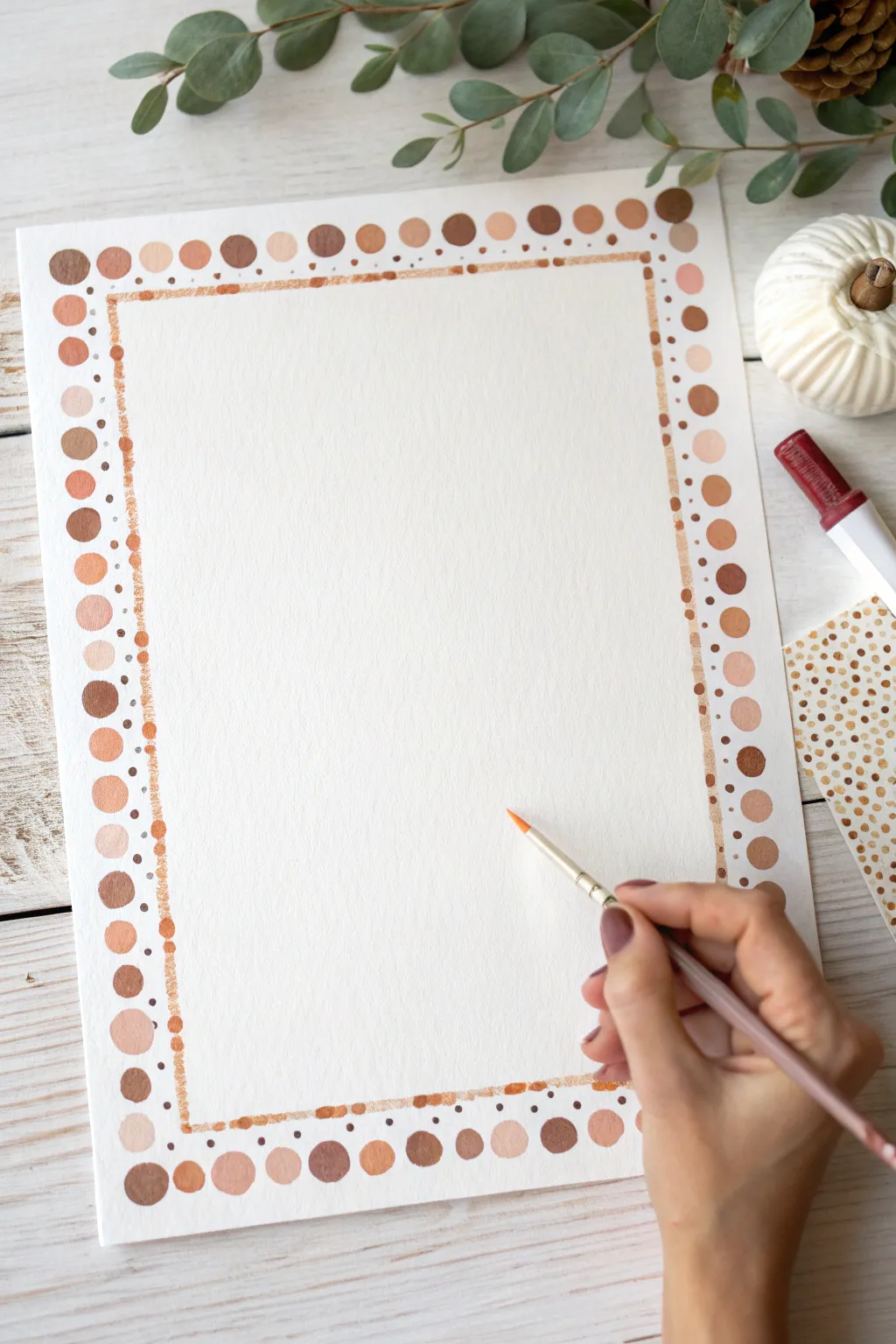
Embrace a warm, autumnal palette with this charming double-layer border design. Mixing large statement dots with a delicate inner frame creates a perfectly balanced look for stationery or art prints.
How-To Guide
Materials
- High-quality watercolor paper or cardstock
- Gouache or watercolor paints (shades of brown, tan, and terracotta)
- Round paintbrush (size 4 or 6 for dots)
- Fine liner brush or metallic pen (copper or bronze)
- Ruler
- Pencil
- Palette for mixing colors
- Cup of water and paper towels
Step 1: Planning the Layout
-
Measure the margins:
Use your ruler to lightly mark a margin about 1 to 1.5 inches from the edge on all four sides of your paper. This will be the center line for your large polka dots. -
Mark the inner frame:
Measure a second rectangle roughly 0.5 inches inside your first set of marks. This interior rectangle will guide your fine metallic line later. -
Lightly sketch guides:
Very faintly connect your marks with a pencil to visualize where the border elements will sit. Keep these lines extremely light so they are easy to erase or cover with paint.
Paint Consistency
Keep your gouache the consistency of heavy cream. Too watery and the dots will bloom; too thick and they may crack when dry.
Step 2: Painting the Large Dots
-
Mix your palette:
Prepare 4-5 distinct shades of earthy tones on your palette. Aim for a gradient ranging from deep chocolate brown to warm terracotta, soft beige, and a pale sandy peach. -
Start the corners:
Begin by painting a medium-sized circle in each of the four corners first. This helps ensure your spacing remains even across the entire page. -
Fill in the edges:
Using your size 4 or 6 round brush, paint circles along the outer pencil guide you created. Vary the colors randomly so two identical shades rarely sit next to each other. -
Vary the sizes slightly:
While keeping the dots roughly uniform, allowing slight variations in size adds an organic, handmade charm to the piece rather than looking machine-printed. -
Let it dry:
Allow these large dots to dry completely. If the paint is still wet, you risk smudging it with your hand while working on the inner details.
Add Metallic Accents
Mix a tiny amount of gold mica or shimmer medium into your lightest peach shade to make random dots sparkle in the light.
Step 3: Adding the Inner Detail
-
Paint the inner line:
Switch to a metallic copper paint or a fine liner brush with a warm brown shade. Paint a thin, continuous (or slightly broken) line along your inner pencil guide. -
Add texture to the line:
I like to dab the brush slightly rather than dragging it perfectly smooth; this gives the line a textured, almost glittery appearance that catches the light. -
Connect the layers:
Using a very fine tip or a toothpick, add tiny micro-dots between the large outer circles and your new inner line. This bridges the gap and makes the design feel cohesive. -
Erase guidelines:
Once you are absolutely certain all paint is bone dry, gently run a clean eraser over the paper to remove any visible pencil marks.
Now you have a beautifully framed space ready for calligraphy or a special illustration


Simple Leafy Garland Border
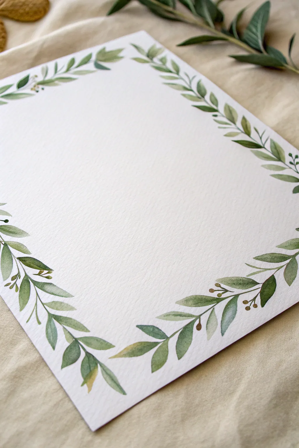
Simple yet classic, this leafy garland border frames your page with gentle, organic movement using varied shades of green. It captures the delicate texture of watercolor, perfect for custom stationery, wedding invitations, or framing a favorite quote.
Step-by-Step Tutorial
Materials
- Cold-press watercolor paper (300 gsm recommended)
- Round watercolor brushes (Size 2 and Size 4)
- Watercolor paints (Sap Green, Olive Green, Hooker’s Green, Burnt Umber)
- Palette for mixing
- Pencil (HB or H)
- Kneaded eraser
- Jar of clean water
- Paper towel
Step 1: Planning the Layout
-
Define the margin:
Lightly sketch a rectangle about one inch from the edge of your paper using a ruler and an H pencil. This will serve as the invisible spine for your garland. -
Sketch movement lines:
Along that rectangular guide, draw loose, wavy lines that intersect and weave around the straight edge. Don’t make them uniform; allow the line to curve inwards and outwards slightly to creating organic flow. -
Mark leaf positions:
Very faintly sketch the positioning of major leaf clusters. Focus on the corners where you want the foliage to be denser, tapering off toward the middle of the sides.
Step 2: Painting the Foliage
-
Mix your base greens:
Prepare three puddles of green on your palette: a light yellow-green (Sap Green mixed with a touch of yellow), a mid-tone olive, and a deeper cool green. Keep them quite watery for transparency. -
Paint the main stems:
Using the tip of your size 2 brush and the mid-tone olive mix, trace your pencil guidelines with a thin, broken line. I like to lift the brush occasionally so the stem isn’t a solid, heavy wire. -
Start the corners:
Load your size 4 brush with the mid-tone green. Starting at a corner, paint leaves by pressing the belly of the brush down to create width and lifting up to create a point. -
Vary the leaf shapes:
As you move away from the corner, make some leaves long and slender like willow leaves, and others shorter and rounder like olive leaves. -
Incorporate color variation:
While the first leaves are still slightly damp, drop a tiny amount of the deeper cool green into the base of a few leaves to add shadow and depth naturally. -
Add lighter foliage:
Rinse your brush and switch to your lightest yellow-green mix. Paint smaller, filler leaves in the gaps between the darker ones, ensuring they face different directions for a natural look. -
Create overlapping effects:
Allow some leaves to touch or slightly overlap. The transparency of the watercolor will create beautiful darker intersections where the pigments pool together.
Muddy Greens?
If your greens look dull, stop mixing too many colors. Stick to two pigments max per puddle. Let layers dry fully before glazing to keep colors crisp and vibrant.
Step 3: Details and Refining
-
Add tiny berries or buds:
Mix a small amount of Burnt Umber with a touch of green to create a brownish-olive. using the very tip of your size 2 brush, add tiny round buds or berries attached to fine stems. -
Connect floating elements:
Check for any leaves that look like they are floating in mid-air. Use your finest brush to draw delicate stems connecting them back to the main vine. -
Intensify specific areas:
Once the first layer is dry, glaze a second, slightly darker layer of green over just half of select leaves. This suggests a fold in the leaf or a cast shadow. -
Erase guidelines:
Wait until the painting is completely bone dry—if the paper feels cool to the touch, it’s still wet. Gently dab the kneaded eraser over the page to lift any visible pencil lines without damaging the paint.
Leaf Shape Pro Tip
Practice the ‘press and lift’ motion on scrap paper first. The amount of pressure dictates leaf width; a quick lift creates that perfect tapered point.
Your page is now framed with a fresh, botanical elegance ready for your handwritten notes
BRUSH GUIDE
The Right Brush for Every Stroke
From clean lines to bold texture — master brush choice, stroke control, and essential techniques.
Explore the Full Guide
Continuous Floral Vine Border
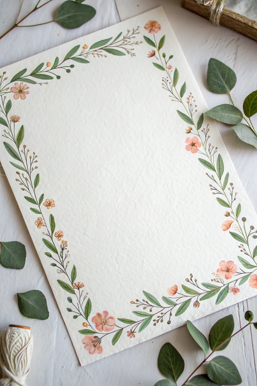
Capture the elegance of nature with this flowing continuous floral vine border painted on textured paper. This project uses soft peach tones and muted greens to create a vintage-inspired frame perfect for stationery or decorative art.
Step-by-Step
Materials
- Cold-press watercolor paper (300 gsm recommended)
- Watercolor paints (Sap Green, Olive Green, Peach/Salmon, Burnt Sienna)
- Round watercolor brushes (sizes 2 and 4)
- Detail brush (size 0 or 00)
- Pencil (HB or H)
- Kneaded eraser
- Clean water jar
- Paper towels
Step 1: Sketching the Framework
-
Lightly Mark Corners:
Begin by lightly marking the four corners of your paper with a pencil to define the outer limits of your border. Keep these marks very faint so they are easily erased later. -
Draw the Main Vine:
Sketch a single, continuous wavy line that travels around the perimeter of the page. Allow the line to meander organically rather than making it a perfect geometric rectangle. -
Add Vine Splits:
Along the main vine, draw small diverging lines to indicate where secondary stems will branch off. Aim for asymmetry to keep the look natural. -
Plan Leaf Placement:
Sketch small oval shapes along the stems to map out where the leaves will go. Alternate sides of the stem to create a balanced, rhythmic flow. -
Position the Flowers:
Identify key focal points—corners and midway points—and sketch small circles where the peach blossoms will sit. Add tiny dots for buds on the thinner, outer ends of the vines.
Step 2: Painting the Foliage
-
Mix Your Greens:
Create the two shades of green shown in the reference: a darker, cooler green (mix sap green with a touch of blue) and a warmer, lighter olive green. Having variety adds depth. -
Paint the Main Stems:
Using a size 2 brush and the darker green mix, carefully trace over your pencil line for the main vine stems. Keep the pressure light to maintain a thin, delicate line. -
Paint Elongated Leaves:
Switch to the size 4 brush. Load it with the lighter green, touch the tip to the paper, press down to widen the stroke, and lift up to create a pointed leaf shape. -
Add Darker Leaves:
While the first set of leaves is drying, paint a second set using your darker green mix. Place these behind or adjacent to the lighter leaves to create a sense of layering. -
Connect Leaves to Stems:
Use your size 0 detail brush to paint tiny, thin petioles connecting each leaf back to the main vine stem.
Natural Variation
Don’t clean your brush perfectly between green leaves. Letting a little brown or yellow remain on the bristles creates natural, variegated color shifts in the foliage.
Step 3: Adding Florals and Details
-
Base Layer for Flowers:
Mix a watery peach or salmon color. Paint the basic five-petal shapes for the open flowers using a size 2 brush. Keep the paint fluid and transparent. -
Paint the Buds:
Use the same peach mix to dab small, rounded shapes at the tips of the thinner stems to represent closed buds. -
Add Flower Centers:
Once the peach petals are dry, mix a slightly darker reddish-orange. Dot the centers of the open flowers to give them dimension. -
Detail the Stamens:
With your smallest brush and a dark brown or burnt sienna, paint tiny, fine lines radiating from the flower centers for the stamens. -
Paint Tiny Berries:
Using a brownish-orange hue, add small clusters of tiny dots or berries on separate, fine stems that branch off the main vine. -
Refine the Edges:
Look for empty spaces that feel unbalanced. Add a stray lead or a tiny curling tendril with the detail brush to fill gaps without crowding. -
Erase Pencil Lines:
Wait until the paint is completely bone dry. Gently roll a kneaded eraser over the artwork to lift any visible graphite sketches.
Level Up: Deckled Edges
For a truly vintage look like the photo, tear the edges of your watercolor paper against a ruler before painting to create a soft, deckled border.
Now you have a beautifully framed piece ready for calligraphy or display
Corner Floral Cluster Frame
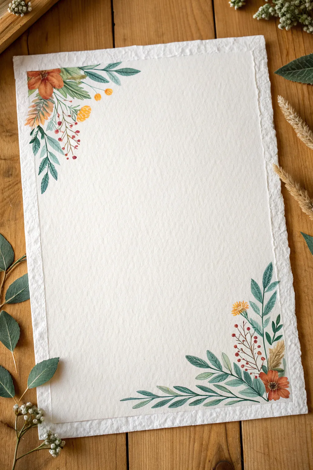
This tutorial guides you through creating delicate, vintage-inspired floral clusters on textured paper, perfect for framing poetry or invitations. The soft watercolor tones and organic deckled edges give the piece a timeless, handmade charm.
How-To Guide
Materials
- Heavyweight textured watercolor paper (300gsm, handmade or deckled edge preferred)
- Watercolor paints (Sage Green, Forest Green, Terracotta/Burnt Sienna, Yellow Ochre, Deep Red)
- Round watercolor brushes (Size 2 and 4)
- Fine liner brush (Size 0 or 00 for details)
- HB pencil and kneadable eraser
- Jar of clean water
- Paper towel
Step 1: Planning and Sketching
-
Paper Preparation:
Select a high-quality, textured watercolor paper. If your paper doesn’t have a natural deckled edge, you can create a faux one by wetting the edges with a brush and gently tearing the paper against a ruler. -
Light Composition:
Using your HB pencil, very lightly sketch the main curves of the stems in the top-left and bottom-right corners. Keep your lines faint so they don’t show through the transparent watercolor later. -
Blocking Shapes:
Roughly outline the main flower heads—a larger bloom in the top corner and a smaller one at the bottom. Mark the positions of the larger leaves just to map out the balance.
Loose & Lively
Don’t overwork the leaves. A single, confident stroke often looks fresher than filling in an outline. Let the brush shape do the work.
Step 2: Painting the Top-Left Cluster
-
Base Layer for the Main Flower:
Load your size 4 brush with a diluted Terracotta or Burnt Sienna. Paint the petals of the large flower in the corner, keeping the center slightly lighter. Allow the paint to pool naturally for texture. -
Adding Depth:
While the terracotta paint is still slightly damp, touch a more concentrated amount of the same color into the center of the flower and the base of the petals to create a soft gradient. -
Painting the Leaves:
Mix a soft Sage Green. Using the tip of your brush, paint the serrated leaves extending downwards. Use a ‘press and lift’ motion: touch the tip, press down to widen the belly of the brush, and lift again to form a point. -
Darker Foliage Accents:
Switch to a Forest Green. Tuck a few darker, smaller leaves behind the main flower to add contrast and make the orange pop. -
Yellow Buds:
Using Yellow Ochre, dab in small, rounded shapes for the billy button-style buds near the main flower. Keep them loose and organic. -
Berry Sprigs:
With your fine liner brush and a mix of brown and red, draw thin, branching stems. Dot the ends with Deep Red to create tiny berries.
Step 3: Painting the Bottom-Right Cluster
-
Establishing the Corner Anchor:
Start with the bottom corner flower using the same Terracotta mix. It helps to rotate your paper so your hand doesn’t smudge the top work. -
Sweeping Stems:
Paint long, sweeping stems extending leftwards along the bottom edge using your Sage Green mix. These should act as a border line. -
Leaf Variation:
Paint leaves along this bottom stem. Try alternating the green tones—some sage, some slightly bluer or darker—to simulate natural light and shadow. -
Vertical Growth:
Add vertical stems reaching slightly upward from the corner cluster. These help frame the empty space in the middle. -
Adding Texture Elements:
Paint a feathery, wheat-like element using a pale, diluted Yellow Ochre or brown. Use quick, dry flicks of the brush to mimic the texture of dried grass. -
Connecting Details:
Add another sprig of the red berries, ensuring the stems are extremely fine. These delicate lines contrast beautifully with the wider leaves.
Golden Touch
For a magical finish, add tiny dots of metallic gold paint to the flower centers or berries. It catches the light beautifully on textured paper.
Step 4: Final Touches
-
Center Details:
Once the flower heads are completely dry, use a dark brown or black mixture on your smallest brush to stipple tiny dots in the centers for pollen. -
Vein Work:
If you want more definition, use a slightly darker green to paint a thin central vein on a few of the larger leaves. Don’t do every leaf; just a few adds enough detail. -
Cleanup:
Gently erase any visible pencil marks with the kneadable eraser, but only after ensuring the paint is 100% bone dry to avoid smudging.
Now you have a beautifully framed piece of paper ready for your favorite quote or a heartfelt letter

PENCIL GUIDE
Understanding Pencil Grades from H to B
From first sketch to finished drawing — learn pencil grades, line control, and shading techniques.
Explore the Full Guide
Zigzag and Dot Folk Border
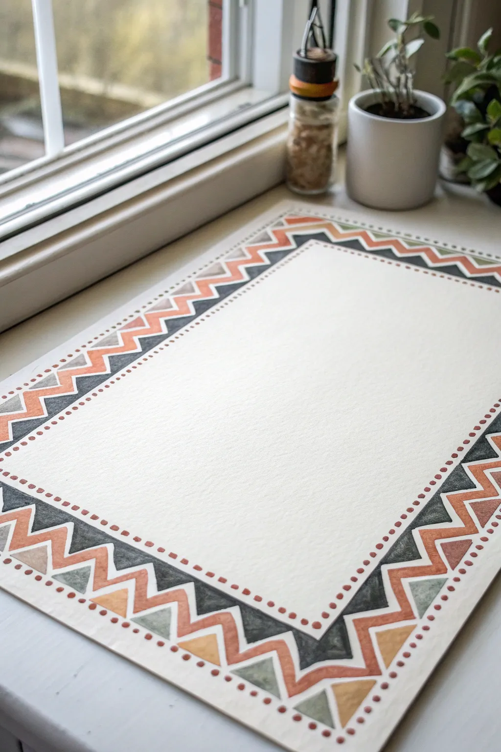
This rustic, folk-inspired border combines bold zigzags with delicate stippling to frame your artwork or calligraphy beautifully. Using earthy terra cotta, sage, and charcoal tones, this pattern creates a warm, handmade feel that works perfectly on textured watercolor paper.
Step-by-Step Guide
Materials
- Cold press watercolor paper (white or cream)
- Watercolor paints (Charcoal/Payne’s Gray, Terracotta/Burnt Sienna, Sage Green, Mustard Yellow)
- Small flat brush (size 2 or 4)
- Fine round brush (size 0 or 1)
- Ruler
- HB Pencil
- Eraser
- Masking tape
- Water cups and palette
Step 1: Setting the Structure
-
Secure the paper:
Tape your watercolor paper down to a flat surface or drawing board. This prevents buckling when wet and gives you a nice clean edge if you tape over the border area, though for this project, we’ll paint freely within the page. -
Mark the outer boundary:
Using a ruler and a light pencil touch, draw a rectangle about 1 to 1.5 inches in from the edge of the paper. This will be the outermost limit of your design. -
Establish the inner boundary:
Measure inward about 1 inch from your first rectangle and draw a second, smaller rectangle. The space between these two lines is where your zigzag pattern will live. -
Create the zigzag guide:
Lightly sketch a single zigzag line that runs through the center of your border channel. Try to keep the peaks and valleys evenly spaced, aiming for triangles that are roughly the same size.
Uneven Triangles?
Don’t panic if your zigzags vary in size. This style relies on folk-art charm. Simply paint the next triangle slightly wider or narrower to gradually correct the spacing as you go.
Step 2: Painting the Charcoal Layer
-
Mix your dark color:
Prepare a watery but pigmented mix of Charcoal or Payne’s Gray. You want it dark enough to provide contrast but transparent enough to show the paper texture. -
Paint the outer triangles:
Using your small flat or round brush, fill in the triangles that sit against the *outer* pencil line. Start with the top edge. Paint every alternating triangle solid dark grey. -
Complete the dark layer:
Continue painting these dark gray triangles around the entire perimeter on the outer edge only. Let this dry completely before moving to the next color to avoid bleeding.
Clean Corners
Plan your corners first! Sketch the corner triangles before filling in the sides. This ensures the pattern turns 90 degrees neatly without leaving an awkward gap at the end.
Step 3: Adding Earth Tones
-
Apply the terracotta zigzags:
Load your brush with the terracotta or burnt sienna paint. Paint a continuous zigzag band that hugs the inner edge of your charcoal triangles. This line should be about 1/4 inch thick and follow the V-shape perfectly. -
Fill the inner triangles:
Now focus on the triangles pointing inward (against the inner pencil box). Fill these with alternating softer colors. I like to switch between a muted sage green and a mustard yellow for variety. -
Paint corner details:
When you reach the corners, you might need to adjust the triangle shape slightly to make the turn. Just ensure the mitered angle connects seamlessly with the next side. -
Check consistency:
Look over your painted shapes. The watercolor look is charming because it isn’t perfect, so don’t worry if some edges interpret the pencil lines loosely.
Step 4: The Dotted Finish
-
Mark the dot guide:
Lightly sketch one final rectangle about 1/4 inch inside your painted border. This invisible line will help you keep your dots straight. -
Mix the dot color:
Use the terracotta/rust color again, perhaps slightly more concentrated this time so the dots appear crisp. -
Paint the stippled line:
Using your finest round brush (size 0 or 1), dip the tip into the paint. Gently press down along your guide line to create small, evenly spaced dots. -
Maintain spacing:
Try to keep the rhythm steady—dot, space, dot, space. Reload your brush frequently to ensure the dots stay the same size and opacity. -
Erase guidelines:
Once the paint is 100% bone dry (give it plenty of time!), gently run your eraser over the area to remove any visible pencil marks.
Now you have a warm, geometric frame ready for a quote, a poem, or a central illustration
Triangle Repeat Geometric Border
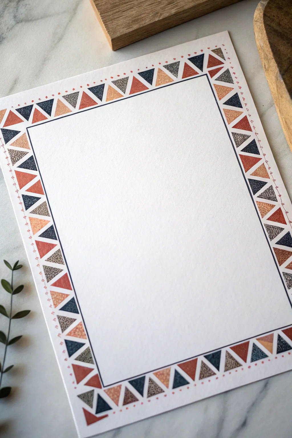
Add a touch of warmth and structure to your stationery with this hand-painted geometric border featuring repeating triangles in earthy tones. The combination of navy, rust, ochre, and taupe creates a cozy, folk-art aesthetic that frames the blank space perfectly.
Step-by-Step
Materials
- Heavyweight cold-press watercolor paper or cardstock (8.5 x 11 inches)
- Ruler
- Pencil (HB or H for light lines)
- Eraser
- Fine liner pen (Navy blue or black, 0.3mm or 0.5mm)
- Watercolor paints or gouache (Navy blue, Rust red/Terracotta, Ochre/Mustard, Taupe/Grey)
- Small round brush (Size 0 or 2)
- Small flat brush (optional, for straight edges)
- Cup of water and paper towels
Step 1: Setting the Grid
-
Measure the margins:
Start with your blank sheet of paper. Using your ruler and pencil, lightly mark a margin about 1 to 1.5 inches from the edge on all four sides. This will define the outer limit of your border. -
Draw the inner frame:
Measure inwards another 0.75 inches from your first marks. Draw a clean, straight rectangle here. This will eventually be inked, so make sure your corners are sharp. -
Create the triangle guides:
Between the outer paper edge and your inner frame line, you have a channel for the pattern. Use your ruler to mark equal intervals along this channel (approx. 0.75 inches wide) to define the base of each triangle. -
Sketch the zig-zag:
Lightly sketch a zig-zag line connecting these interval marks. You want a continuous row of triangles, alternating between pointing inward and pointing outward.
Step 2: Inking the Structure
-
Ink the inner border:
Take your navy blue fine liner pen. Carefully trace over the inner rectangular frame line you drew in step 2. Use the ruler as a guide to keep this line perfectly crisp. -
Add detail dots:
On the very outer edge of the paper (outside where the triangles will be), add a tiny decorative detail. Draw a small dot or a tiny ‘v’ shape aligned with the peak of every outward-pointing triangle. -
Connect the details:
Draw a vary faint, broken line or series of tiny dots connecting these outer decorative marks, creating a delicate outer rim. This adds a lovely hand-drawn charm.
Texturing Tip
For the grey triangles, mix a tiny pinch of salt or sand into the wet paint. When it dries and you brush it off, it leaves a speckled, stone-like texture.
Step 3: Painting the Triangles
-
Prepare your palette:
Mix your four key colors: a deep navy, a warm terracotta rust, a golden ochre, and a muted textured grey-taupe. Keep the consistency relatively thick, like heavy cream, especially if using gouache for opacity. -
Plan the color sequence:
Decide on a repeating pattern (e.g., Navy, Rust, Grey, Ochre). I usually place a tiny dot of paint in each triangle first to ensure I don’t mess up the sequence before committing. -
Paint the Navy triangles:
Start with the navy blue. Fill in every fourth triangle (or according to your pattern). Use the fine tip of your brush to get crisp corners. -
Apply the Rust tones:
Next, fill in the rust-colored triangles. For a textured look, you can dab the paint on slightly dry or use a paper towel to lift a tiny bit of pigment while wet. -
Add the Ochre accents:
Paint the mustard/ochre triangles. This lighter color contrasts beautifully with the dark navy. Keep the edges neat where the triangles touch. -
Paint the Taupe texture:
Finally, fill the remaining triangles with the taupe/grey paint. To mimic the grainy texture in the reference, you might use a ‘stippling’ motion with a mostly dry brush.
Uneven Triangles?
If your hand-painted triangles look wobbly, outline them with the fine liner pen after the paint dries. This hides uneven edges and adds a bold illustrative look.
Step 4: Finishing Touches
-
Check for gaps:
Look closely at where the triangles meet the inner inked line. If there are white gaps, carefully touch them up with the appropriate paint color. -
Clean up:
Let the paint dry completely—give it at least 20 minutes. Once bone dry, gently erase any remaining pencil marks from your initial grid. -
Flatten the paper:
If the paper has buckled slightly from the water, place it under a heavy book overnight to flatten it out perfectly.
Now you have a beautifully framed piece of stationery ready for calligraphy or a special letter.


Checker and Grid Mini-Blocks
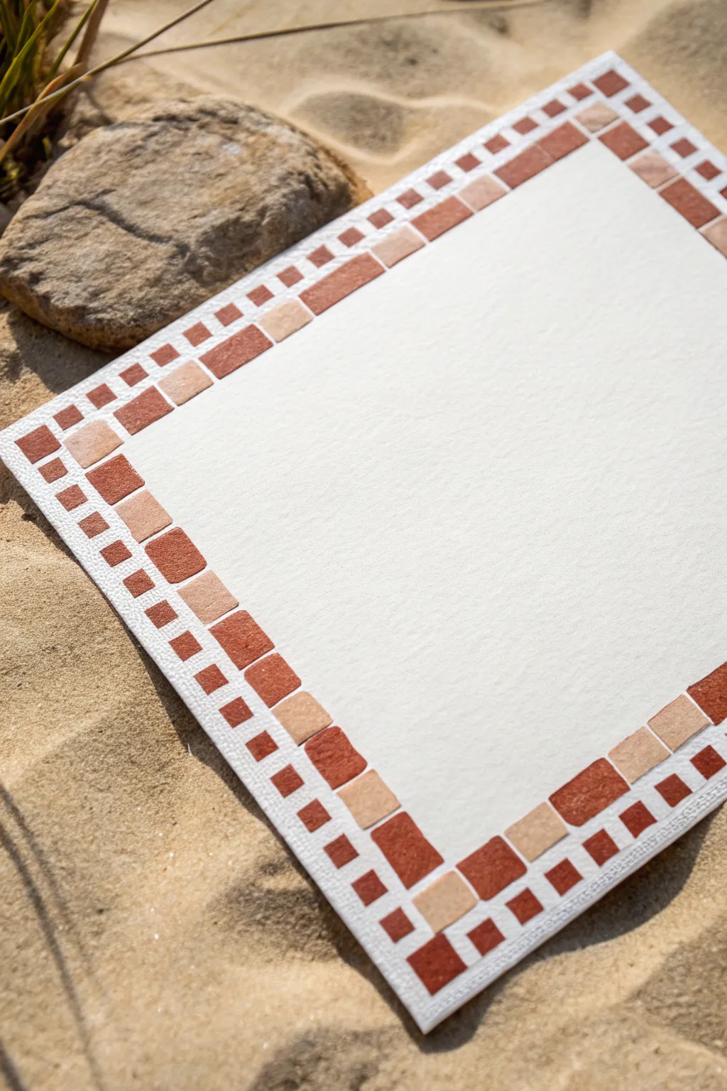
Capture the earthy warmth of terracotta tiles with this deceptively simple geometric border design. Using just two shades of brown and a steady hand, you can frame your artwork with a classic grid pattern that feels both ancient and modern.
Detailed Instructions
Materials
- Cold press watercolor paper (300 gsm recommended)
- Small flat shader brush (size 2 or 4)
- Watercolor or gouache paints (Burnt Sienna and Yellow Ochre)
- Ruler
- Pencil (HB or H)
- Kneaded eraser
- Mixing palette
- Cup of water
- Painters tape or masking tape
Step 1: Grid Preparation
-
Measure the border width:
Decide how wide you want your total border to be. For the look in the photo, measure in about 1.5 inches from the edge of your paper and make light tick marks with your pencil. -
Draw the main frame lines:
Using your ruler, connect your tick marks to create a faint rectangular frame inside the paper. This defines the inner limit of your border. -
Create the grid structure:
This design relies on a specific rhythm: a large block row and a small block row. Lightly rule two additional lines within your border area to divide it into three distinct concentric strips. -
Establish the block spacing:
Now, lightly mark vertical divisions along the border. The larger blocks are roughly square, while the smaller outer blocks are about half the size. I find it helpful to mark the corners first to ensure they resolve neatly. -
Refine the pencil lines:
Go over your grid lightly, defining exactly where the large central blocks and the floating mini-blocks on the outer edge will sit. Erase any confusing construction lines now so you don’t paint over them later.
Step 2: Mixing and Painting
-
Mix the dark terracotta:
On your palette, mix a rich, reddish-brown. Burnt Sienna is a perfect base; add a tiny touch of red if it feels too dull. You want it to look like clay tile. -
Mix the sandy accent tone:
For the lighter squares, mix Yellow Ochre with a significant amount of water (if using watercolor) or white (if using gouache) to create a soft, sandy beige. -
Paint the large dark blocks:
Load your flat shader brush with the dark terracotta mix. Paint the large inner squares first, skipping every other space to leave room for the lighter tone. -
Fill the large light blocks:
Rinse your brush thoroughly. Pick up the sandy beige mix and fill in the alternating large squares in that same inner row. -
Start the outer rim:
Moving to the outer edge of the paper, begin painting the small ‘floating’ squares. Use the dark terracotta color for the squares that align with the gap between the inner blocks. -
Paint aligned mini-blocks:
Continue around the outer rim. Notice the pattern: two dark mini-blocks generally sit above one large inner block. -
Address the corners:
The corners in this design use the dark terracotta tone to anchor the frame. Paint the corner squares carefully to maintain a sharp 90-degree angle. -
Add variance:
To make it look like natural stone, don’t worry if the paint opacity varies slightly. Letting some water pool creates a lovely texture as it dries.
Uneven Grid?
If your squares look wobbly, don’t panic. This style mimics hand-laid mosaic tiles, so slight irregularities actually add to the rustic, authentic charm.
Step 3: Finishing Touches
-
Let it dry completely:
Allow the paint to fully set. If the paper feels cool to the touch, it is still damp. -
Erase guidelines:
Take your kneaded eraser and gently roll it over the dry painting to lift up any visible pencil lines between the blocks. -
Add canvas texture (optional):
If you want the texture visible in the photo, you can lightly drag a dry brush over the paper surface, or simply start with a rough-tooth watercolor paper.
Level Up: Grout Lines
After the paint dries completely, use a very heavy body white paint or a white gel pen to draw thin lines between the blocks, simulating real tile grout.
Now you have a warm, structured border ready to showcase your next masterpiece.
Metallic Accent Line Border
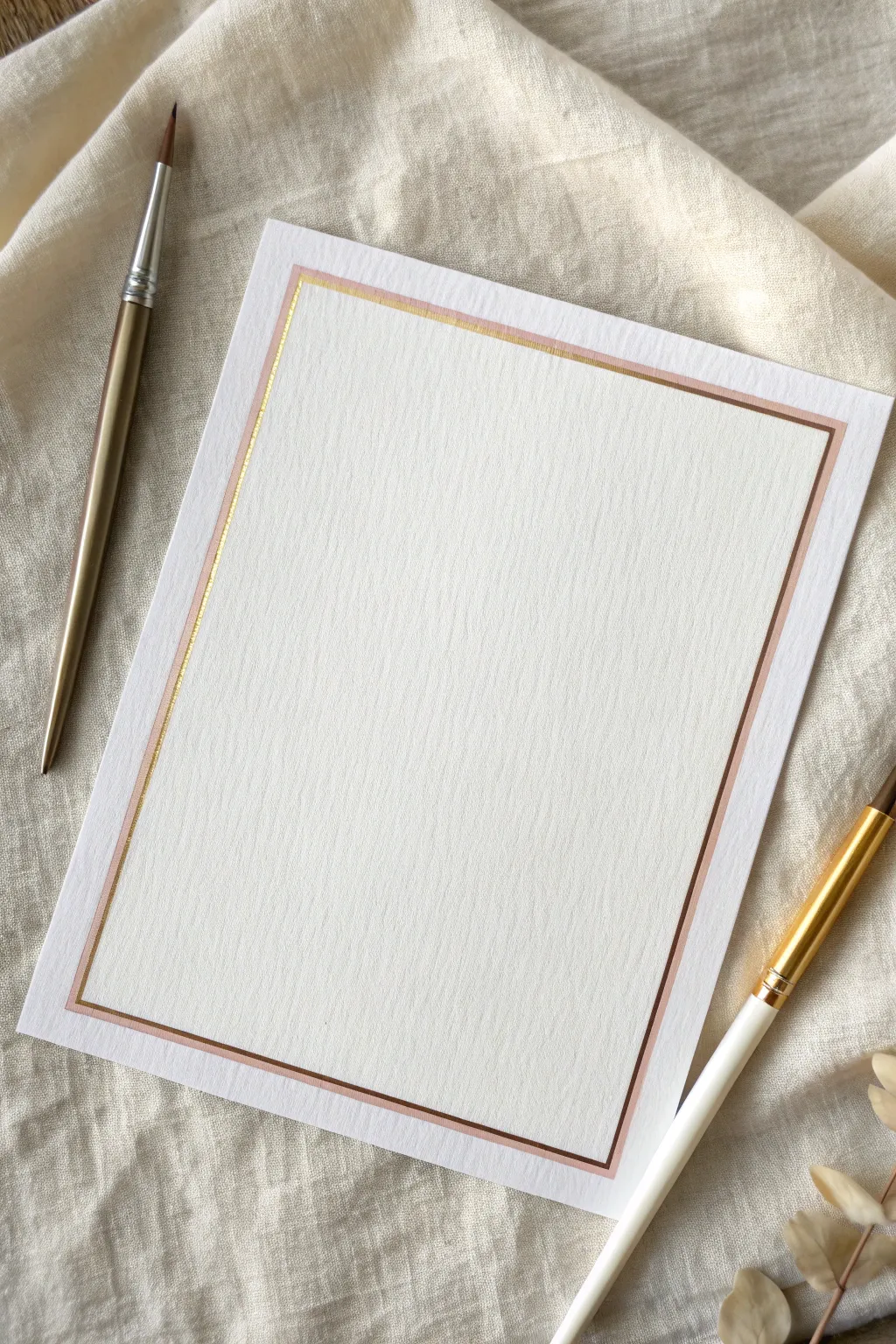
Elevate simple stationery into elegant correspondence with this sophisticated dual-tone border. By pairing a soft rose wash with a crisp gold accent, you create a timeless frame perfect for wedding invitations, menus, or heartfelt letters.
Step-by-Step
Materials
- High-quality cold press watercolor paper (A5 size or custom cut)
- Rose gold or metallic copper watercolor paint
- Fine gold metallic paint or ink
- Flat shader brush (size 4 or 6)
- Fine liner or script liner brush (size 0 or 00)
- Ruler (preferably clear acrylic with a beveled edge)
- Pencil (H or 2H hardness)
- Kneaded eraser
- Painter’s tape or washi tape
- Two cups of water
- Paper towels
Step 1: Preparation & Layout
-
Paper selection:
Begin by selecting a heavyweight cold press watercolor paper. The texture is crucial here, as it adds depth to the metallic pigments and prevents the paper from buckling under the wash. -
Prepare the workspace:
Tape down your paper to a flat, clean surface using painter’s tape or washi tape. This ensures the paper stays flat and prevents it from shifting while you are ruling your lines. -
Measure the margins:
Using your ruler and a light pencil touch, measure about 0.75 inches (approx. 2cm) inward from all four edges of the paper. Mark small dots at the corners to guide your lines. -
Draft the outer box:
Lightly connect your corner dots to draw a faint rectangle. This will serve as the guide for the wider rose gold band. Ensure your lines are parallel to the paper’s edge. -
Draft the inner box:
To create the guide for the thin gold accent, measure inward about 1-2mm from your first rectangle line. Draw a second, slightly smaller rectangle inside the first one.
Step 2: Painting the Rose Gold Band
-
Mix the rose gold:
Activate your metallic rose gold or copper watercolor. Aim for a creamy, opaque consistency—not too watery—so the metallic sheen is prominent on the textured paper. -
Load the flat brush:
Generously load your flat shader brush. Test the stroke on a scrap piece of the same paper to ensure the width matches your outer pencil guideline. -
Paint the first edge:
Align the edge of your flat brush with the outer pencil line. Paint the first vertical stroke in one confident motion if possible. If you need to stop, lift the brush gently to avoid pooling. -
Complete the rose rectangle:
Continue painting the remaining three sides of the outer rectangle. Be mindful at the corners to keep them crisp; you can use the corner of the brush to sharpen them if needed. -
Let it dry completely:
Allow this first layer to dry fully. Metallic paints can smudge easily if damp, so patience is key before moving to the inner line.
Wobbly Line Woes?
If you struggle with freehand straight lines, use your ruler as a bridge. Place it upside down or prop it on coins to avoid smearing wet ink.
Step 3: Adding the Gold Accent
-
Prepare the gold paint:
Prepare your fine gold metallic paint. This mixture should be fluid enough to flow smoothly from a thin brush but pigmented enough to shine. -
Switch to the liner brush:
Switch to your size 0 or 00 liner brush. These brushes hold enough paint for long lines but keep a very sharp point for precision. -
Paint the inner line:
Carefully trace the inner pencil rectangle you drew earlier. This line should be very thin and sit extremely close to the rose gold band, creating a ‘shadow’ or highlight effect. -
Manage brush pressure:
Keep your pressure consistent. I find that holding your breath slightly just as you start the line helps stabilize your hand for that initial contact. -
Refine the corners:
Connect the corners of the thin gold line precisely. Avoid crossing the lines; try to make them meet perfectly at a 90-degree angle.
Make It Luxe
Wait for the paint to dry fully, then lightly burnish the metallic lines with the back of a spoon to make them shine even brighter.
Step 4: Finishing Touches
-
Check for gaps:
Inspect your work once both borders are dry. If you see any uneven patches in the rose gold, you can carefully add a second coat, but be wary of disturbing the first layer. -
Erase guidelines:
Using a kneaded eraser, gently dab away any visible pencil marks. Do not rub vigorously, as rubbing can dull the metallic sheen of the paint. -
Remove tape:
Slowly peel away the painter’s tape, pulling it away from the paper at a low angle to prevent tearing the paper surface.
Now you have a stunning, hand-painted border ready to frame your calligraphy or thoughtful notes
Stamped Circle Border With Cardboard Roll
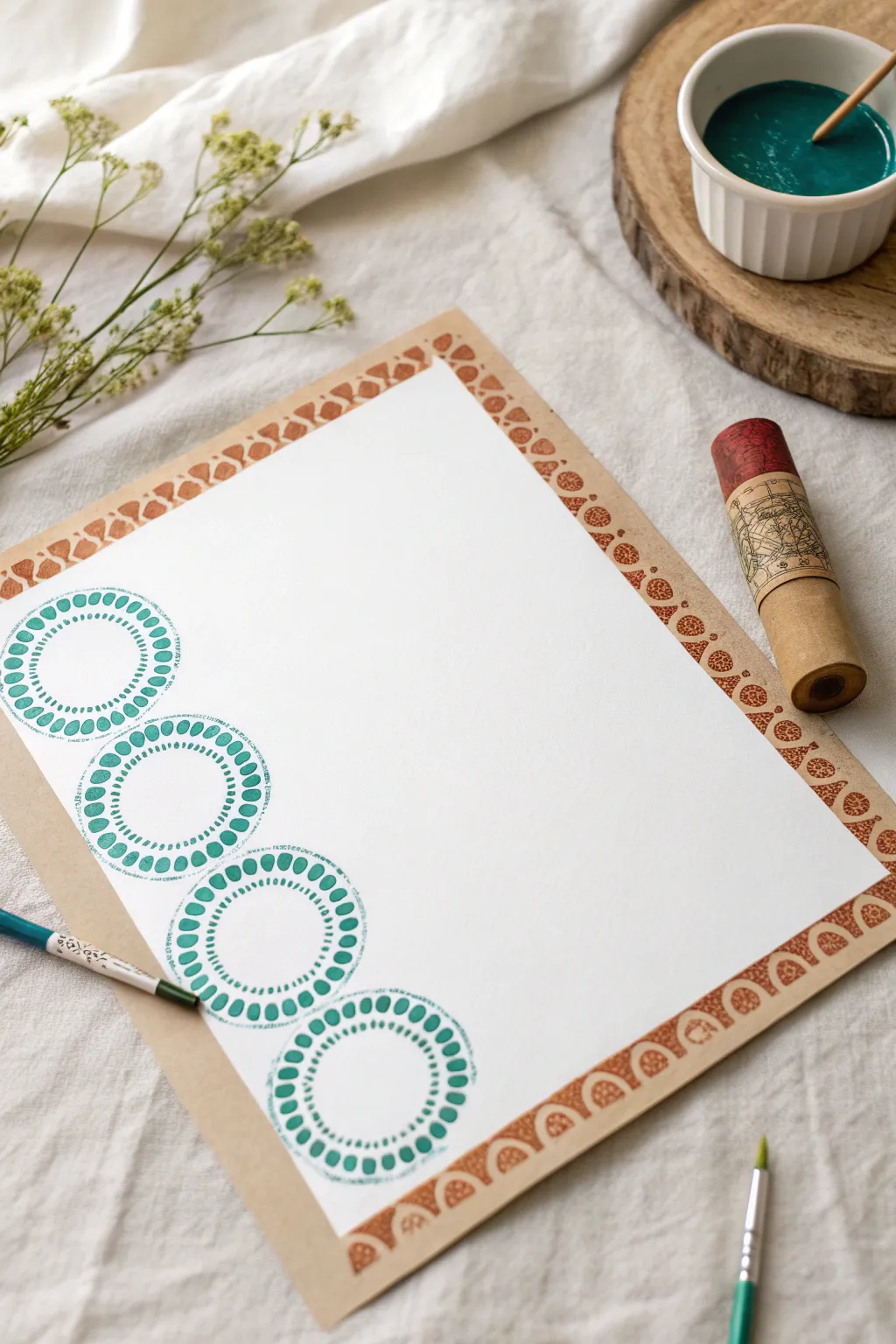
This rustic and charming border project proves you don’t need expensive tools to create beautiful art. By repurposing a simple cardboard tube, you can stamp intricate, concentric circles in a striking teal hue alongside a warm geometric frame.
How-To Guide
Materials
- White drawing paper or watercolor paper (A4 or similar size)
- Kraft paper or brown cardstock (larger than the white paper)
- Cardboard roll (toilet paper roll or paper towel tube)
- Acrylic paint (Teal/Turquoise)
- Acrylic paint (Copper or Warm Brown)
- Small flat paintbrush
- Fine detail paintbrush
- Bubble wrap (small bubbles)
- Rubber band
- washi tape or masking tape (optional)
- Small ceramic dish or palette
- Scissors
Step 1: Preparing the Canvas
-
Mount the paper:
Begin by centering your white drawing paper on top of a larger sheet of kraft paper or brown cardstock. The brown paper acts as both a frame and a surface for the secondary border. -
Secure the corners:
Use a very small loop of tape or a gluestick on the back of the white paper to secure it flat against the kraft paper so it doesn’t shift while you stamp. -
Prepare the teal paint:
Pour a generous amount of teal acrylic paint into a small dish. You want enough depth to dip a stamp, or enough surface area to brush paint onto your stamping tool.
Step 2: Creating the Circle Stamp
-
Cut the bubble wrap:
Cut a strip of bubble wrap that is roughly the same width as your cardboard roll and long enough to wrap around the end of the tube. -
Attach the texture:
Wrap the bubble wrap strip over one open end of the cardboard tube. The bubbles should be facing outward to create the dot pattern. -
Secure with a band:
Fasten the bubble wrap tightly in place using a rubber band around the tube. Ensure the surface across the opening is relatively flat and taut. -
Test the stamp:
I always recommend doing a quick test stamp on a scrap piece of paper. Dip the bubble-wrapped end into the paint and press down to check if the circles are forming clearly.
Even Pressure Tip
When stamping with the tube, place a folded towel under your paper. The slight cushion helps the stamp make better contact for a crisper print.
Step 3: Stamping the Teal Border
-
Load the stamp:
Dip your bubble-wrap tool into the teal paint, or use a brush to apply an even coat of paint onto the bubbles for more control. -
Stamp the first circle:
Starting at the top left corner of the white paper, press the stamp firmly down. Rock it very slightly to ensure all the bubbles make contact with the paper. -
Continue the pattern:
Re-load the paint and stamp a second circle directly below the first one. Leave a small gap between them or let them just barely graze each other. -
Complete the vertical line:
Repeat this process until you have a column of four or five circles running down the left side of the page. Let this teal paint dry completely.
Metallic Accent
Once the teal circles are dry, use a gold gel pen to add tiny dots inside the center of each circle for a hint of elegance.
Step 4: Adding the Geometric Frame
-
Prepare the brown paint:
Squeeze out some copper or warm brown acrylic paint onto your palette. -
Create a triangle stamp:
You can carve a small triangle shape out of a spare piece of potato, an eraser, or simply cut a small geometric shape from a kitchen sponge. -
Start the outer rim:
Dip your small geometric stamp into the brown paint. Press it onto the kraft paper border, right at the edge where it meets the white paper. -
Build the pattern:
Continue stamping the brown shapes all around the perimeter of the white paper, creating a rustic ‘frame’ effect on the brown background. -
Refine details:
If your brown stamps look a bit faint, create contrast by using a fine detail brush to carefully outline the stamped shapes or fill in any missing gaps once the first layer is tacky. -
Final drying time:
Allow the entire artwork to sit undisturbed for at last 30 minutes to ensure both thick paint applications cure fully.
Now you have a beautifully textured piece of stationery perfect for writing a special letter or framing as modern art


Have a question or want to share your own experience? I'd love to hear from you in the comments below!