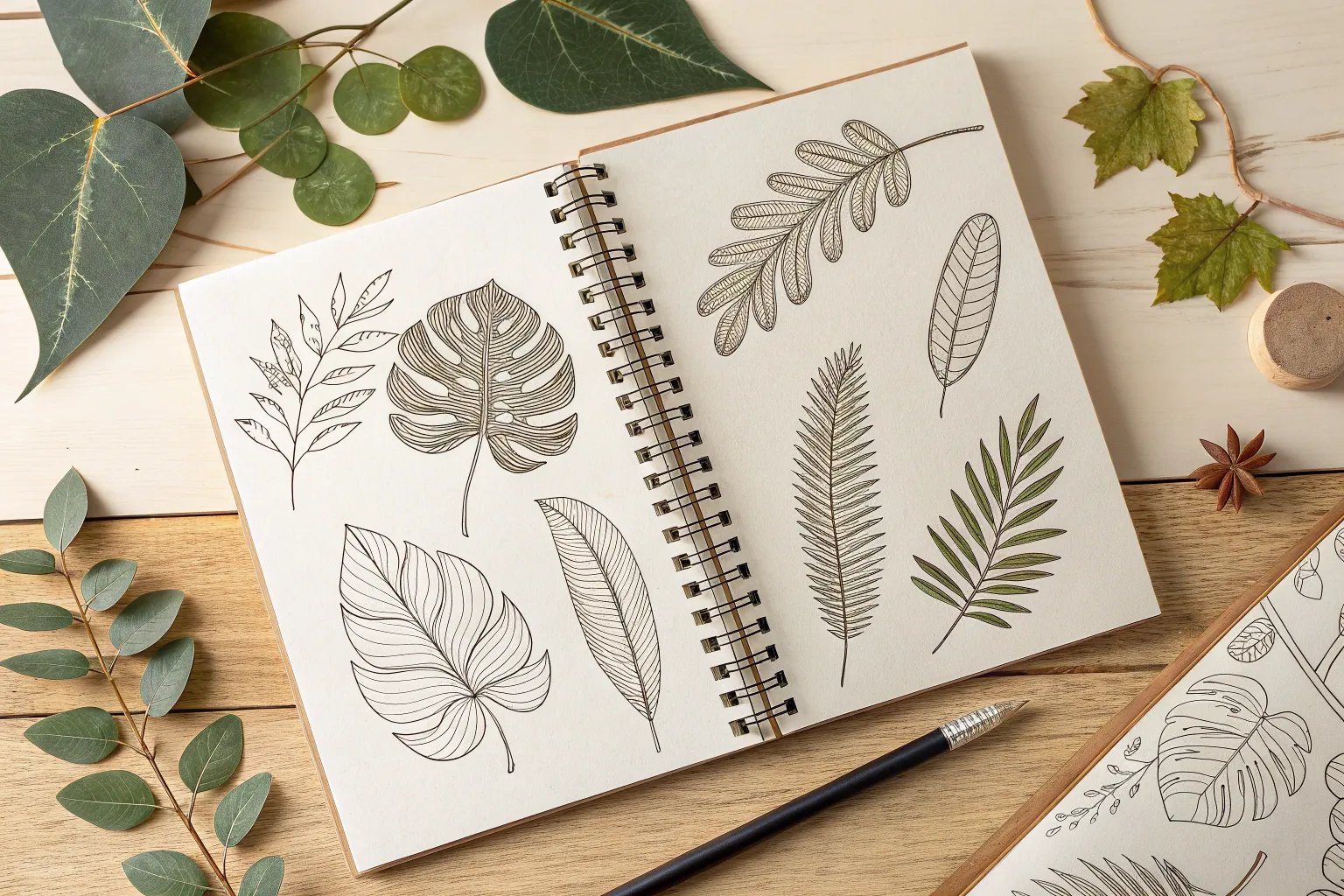
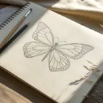
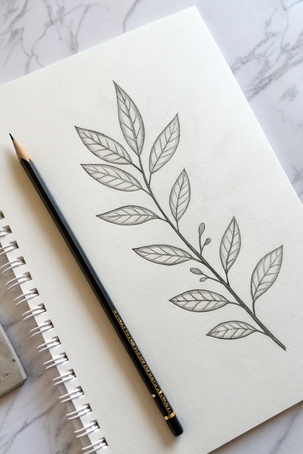
Whenever I’m stuck on what to draw, leaves are my go-to because they’re basically endless—simple shapes, gorgeous veins, and so many textures. Here are my favorite leaf drawing ideas to help you go from quick doodles to seriously satisfying studies.
Simple Leaf Outline Doodles
Fill your sketchbook page with this charming collection of minimalist leaf designs that blend organic shapes with structured line work. This project focuses on eight distinct botanical motifs, utilizing clean black ink to create a modern, illustrative look perfect for bullet journals or meditative drawing.
Step-by-Step Tutorial
Materials
- Blank sketchbook or journal (heavyweight paper preferred)
- Fine liner pen (black, size 03 or 05)
- Pencil (HB or H for sketching)
- Eraser (soft vinyl or kneaded)
- Ruler (optional for spacing)
Step 1: Setting the Composition
-
Map out the layout:
Begin by envisioning a grid on your page to house eight separate drawings. Using a pencil very lightly, mark the center point of each imaginary box to ensure your leaves will be evenly spaced and not crowded. -
Sketch the primary spines:
For the leaf designs, lightly pencil in the central veins or stems first. This acts as the skeleton for each doodle, defining the curve and direction of the leaves before you commit to ink.
Steady Hand Trick
Rest the side of your hand on a scrap piece of paper while drawing. This prevents hand oils from getting on the page and keeps your lines steady.
Step 2: Drawing the Stylized Shapes
-
Create the heart-shaped leaf:
Starting at the top left, draw a heart shape. Instead of a standard straight line down the middle, draw a central vein that reaches only halfway up. Add horizontal veins branching out, giving it a stylized, geometric feel. -
Outline the classic elm shape:
To the right of the heart, draw a standard teardrop leaf shape with a pointed tip. Draw a central spine that extends past the leaf base to form a stem. -
Fill with veins:
Fill this elm shape with closely spaced, diagonal parallel lines on both sides of the spine to create a dense, textured look. -
Draft the tall fern branch:
Moving down to the next row on the left, draw a long, slightly curved central stem. Along this stem, add pairs of small, narrow leaves that point upward, getting smaller as they reach the tip. -
Detail the fern leaves:
Draw a single straight line down the center of each small leaflet on your fern branch to add dimension without clutter. -
Create the broad veined leaf:
In the center of the page, draw a large, wide leaf shape similar to a Bodhi leaf. Add a central spine, and then draw distinct, widely spaced veins that curve upwards toward the leaf edges. -
Sketch the berry sprig:
To the right of the broad leaf, draw a branching stem. Add simple, open oval leaves to the lower branches. At the top right of this sprig, draw small circles clustered together to represent berries.
Step 3: Adding Texture and Detail
-
Draw the darkened foliage:
For the bottom left design, draw a structured stem with small, opposite leaves. Instead of veins, fill these small leaves with tight scribbles or cross-hatching to make them dark and dense. -
Outline the final striped leaf:
For the bottom middle design, draw a simple lance-shaped leaf. I find it helpful to rotate the sketchbook slightly here to get a comfortable angle for the lines. Draw horizontal stripes across the leaf, skipping the center vein area. -
Refine pencil sketches:
Review your pencil marks. If any shapes look wonky or unbalanced, adjust them now before reaching for the pen.
Add a Splash of Green
Once the black ink is totally dry, use a watercolor brush pen to add a single, loose swipe of pale green over just one or two leaves for a pop of color.
Step 4: Inking and Finishing
-
Ink the outlines:
Switch to your fine liner pen. Carefully trace over the outer contours of each leaf first. exactness isn’t crucial; a little wobble makes it look organic. -
Ink the internal details:
Go back and ink the veins, stripes, and internal patterns. Use a lighter touch here than you did for the outlines to create subtle line weight variation. -
Add detail to the berries:
On the berry sprig, carefully ink the small circles. You can add a tiny dot inside each berry to suggest a reflection or focal point. -
Let the ink cure:
Allow the ink to dry completely for at least 5 to 10 minutes. Smudging is the enemy of a clean doodle page. -
Erase guidelines:
Gently erase all visible pencil marks using a soft eraser, being careful not to crumple the paper as you rub. -
Final assessment:
Look at the overall balance. If the page feels too empty in spots, you can add tiny dots or small floating leaves to fill the negative space.
Now you have a reference sheet of botanical doodles ready to decorate your next journal entry


Classic Maple Leaf Sketch
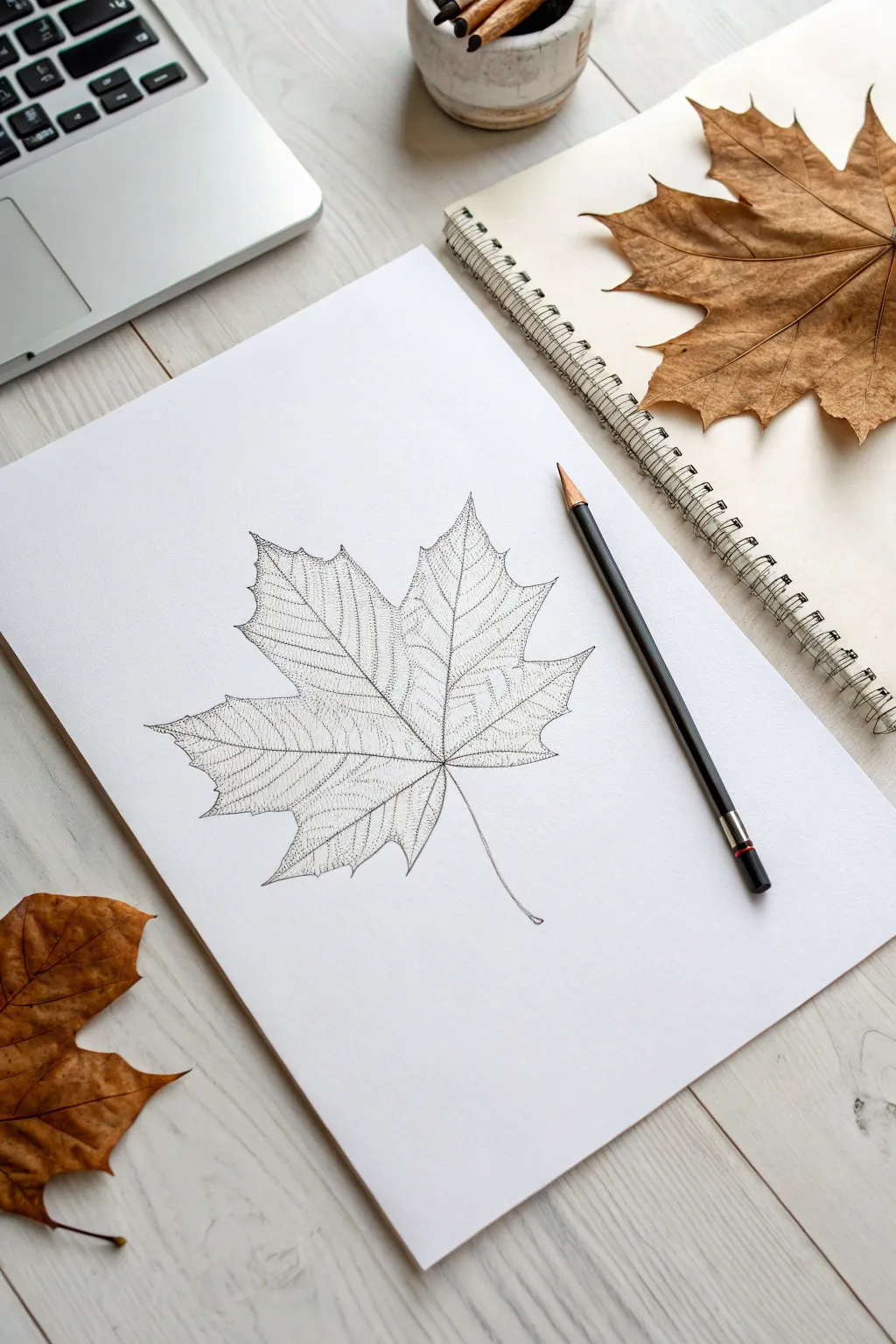
Capture the intricate beauty of autumn with this delicate maple leaf study, focusing on structure and vein patterns. Using fine stippling and light linework, you’ll create a semi-transparent, skeletonized effect that looks incredibly realistic.
Detailed Instructions
Materials
- High-quality white drawing paper or cardstock (smooth bristol is ideal)
- H or HB pencil for initial sketching
- Fine-liner pen (0.1mm or 0.05mm black)
- Kneaded eraser
- Real maple leaf for reference (optional but helpful)
Step 1: Structural Foundation
-
Mark the center point:
Start by lightly marking a small dot in the lower middle of your page. This will be the junction point where the petiole (stem) meets the main veins. -
Draw the primary veins:
From your center point, draw the five main structural lines. Draw one vertical line straight up, two lines angling out at roughly 45 degrees, and two lower lines angling downwards. These form the skeleton of the leaf. -
Outline the lobes:
Lightly sketch the U-shaped dips between the lobes first. Connect the tips of your structural lines to these dips using jagged, irregular lines to create the iconic maple leaf points. -
Refine the edges:
Go over your perimeter outline, adding smaller teeth and serrations along the edges. Maple leaves are rarely perfectly smooth, so let your hand wobble slightly for a natural look. -
Add secondary veins:
Branching off from your five main veins, sketch finer lines that reach out toward the edges of each lobe. Keep these very faint as they are just guides.
Step 2: Inking and Detailing
-
Ink the main veins:
Switch to your fine-liner pen. Carefully trace the five central veins, but don’t use a solid, heavy line. Use broken lines or rows of tiny dots to keep it delicate. -
Define the perimeter:
Ink the outer edge of the leaf using a fine, shaky line. Emphasize the sharp points of the lobes, ensuring they look crisp and distinct. -
Begin the texture:
This drawing relies on a ‘skeletonized’ look. Instead of shading, draw tiny, intricate web-like patterns between the secondary veins. -
Create the netting:
Fill the space inside the lobes with irregular, microscopic shapes—almost like a cracked mud pattern or a map of city streets. I find it helpful to work one small section at a time. -
Stipple the shadows:
To add depth without heavy shading, place clusters of tiny dots (stippling) near the central junction point and along the main veins.
Uneven Ink Flow?
If your pen skips or blots, the paper might be too textured. Switch to Smooth Bristol board or high-quality hot-press watercolor paper for cleaner lines.
Step 3: Final Touches
-
Fade outward:
As you move from the center of the leaf toward the tips, make your textural lines lighter and more spaced out. This gives the leaf a dimensional, slightly curved appearance. -
Draw the stem:
Draw the stem (petiole) extending downward. Use a slightly confident curve and thicken the very bottom just a tiny bit where it would attach to a branch. -
Erase pencil marks:
Once the ink is completely dry (give it a few minutes to be safe), gently roll a kneaded eraser over the drawing to lift the graphite guides. -
Assess contrast:
Step back and look at your drawing. If the leaf looks too flat, add a few more dots of ink in the deepest creases to boost the contrast.
Level Up: Autumn Tones
Use a subtle watercolor wash in burnt orange or yellow over the dried ink. The waterproof ink will show through, creating a lovely stained-glass effect.
Step 4
Now you have a permanent piece of autumn to keep on your desk year-round

Oak Leaf With Rounded Lobes
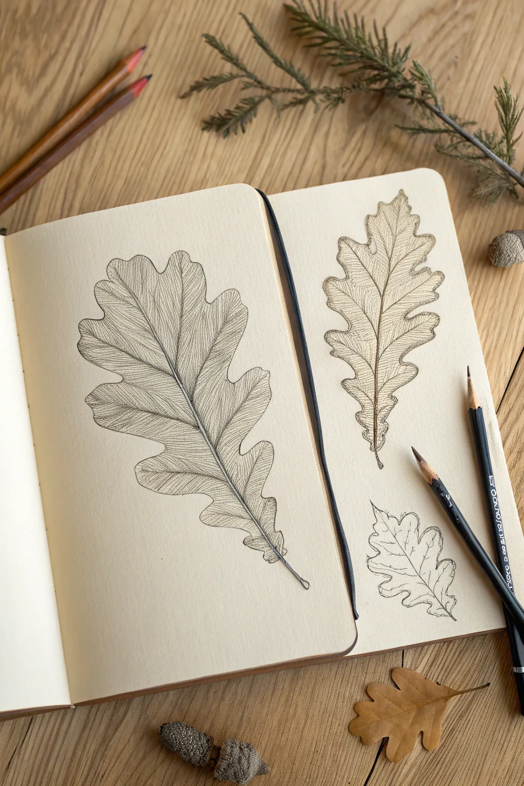
Capture the intricate beauty of nature with this fine-line study of oak leaves. This project focuses on realistic textures and organic shapes, perfect for filling a sketchbook page with varying sizes and perspectives.
Step-by-Step Guide
Materials
- Sketchbook with cream or off-white paper (smooth or light tooth)
- HB or 2B graphite pencil (for initial sketch)
- Fine liner pens (0.05mm, 0.1mm, and 0.3mm in black or sepia)
- Kneaded eraser
- Real oak leaf (optional, for reference)
Step 1: Drafting the Main Leaf
-
Establish the Central Vein:
Begin on the left page by drawing a gentle, curving line diagonally across the paper. This represents the midrib (main vein) and determines the leaf’s overall flow. -
Map Out the Lobes:
Lightly sketch the rounded lobes of the oak leaf. Aim for asymmetry; oak leaves rarely have perfectly matched sides. Create deep indentations (sinuses) that curve inward toward the main vein. -
Refine the Outline:
Go over your initial rough shape with a slightly more definitive pencil line. Add small wobbles and irregularities to the edge to mimic a dried or natural leaf texture, rather than a perfect geometric shape. -
Sketch Interior Veins:
Draw the secondary veins branching off the midrib into each lobe. These should taper as they reach the outer edges. Keep your pencil pressure light so these can be adjusted.
Ink Smudging?
If you are right-handed, work from left to right on the page to avoid smearing fresh ink. Lefties should work right to left. Always test ink dryness before erasing.
Step 2: Inking and Texturing
-
Outline with Fine Liner:
Switch to a 0.1mm fine liner. Carefully trace the perimeter of the leaf. I like to lift the pen occasionally to create broken lines, which adds to the organic feel. -
Drawing the Primary Veins:
Ink the midrib and the main veins extending into the lobes. Make the base of the midrib slightly thicker (perhaps using a 0.3mm pen) and let it taper into a fine line at the tip. -
Start the Cross-Hatching:
This style relies heavily on texture. Using your finest 0.05mm pen, begin drawing tiny, closely spaced lines that follow the curve of the veins. These lines should flow outward from the center. -
Building Density:
Add more hatching lines in the ‘valleys’ of the leaf (where the veins dip) to create depth. The areas near the midrib should generally be darker and denser with ink. -
Creating Surface Texture:
Fill the spaces between veins with delicate, wandering lines. These shouldn’t be straight; let them curve and intersect slightly to resemble the microscopic network of plant cells. -
Emphasizing Shadows:
Return to the edges where the lobes overlap or curl. Use tighter hatching or stippling here to create small pockets of shadow, making the leaf look three-dimensional. -
Finishing the Stem:
Draw the petiole (stem) at the bottom. Give it a tiny loop or irregular end where it would have detached from the branch, and shade one side to make it look cylindrical.
Natural Texture
Don’t connect every single line. Leaving small gaps in your hatching allows the paper color to show through, creating ‘highlights’ that make the leaf look crispy.
Step 3: Adding Variety on the Right Page
-
Sketch the Second Leaf:
On the facing page, draw a second, slightly smaller leaf. Try a different orientation—perhaps more vertical—to create visual interest across the spread. -
Ink the Second Leaf:
Repeat the inking process, but experiment with slightly wider spacing in your hatching to make this leaf appear lighter or less dried out. -
Add a Small Study:
Below the second leaf, sketch a small, fragmented or curled leaf. This ‘study’ drawing can be less finished, focusing just on the outline and the main vein structure. -
Erase Sketches:
Once the ink is completely dry (wait at least 5 minutes), gently run your kneaded eraser over the pages to remove any visible graphite guidelines.
Now you have a serene botanical spread that celebrates the details of the forest floor


Long Willow Leaf Gesture Lines
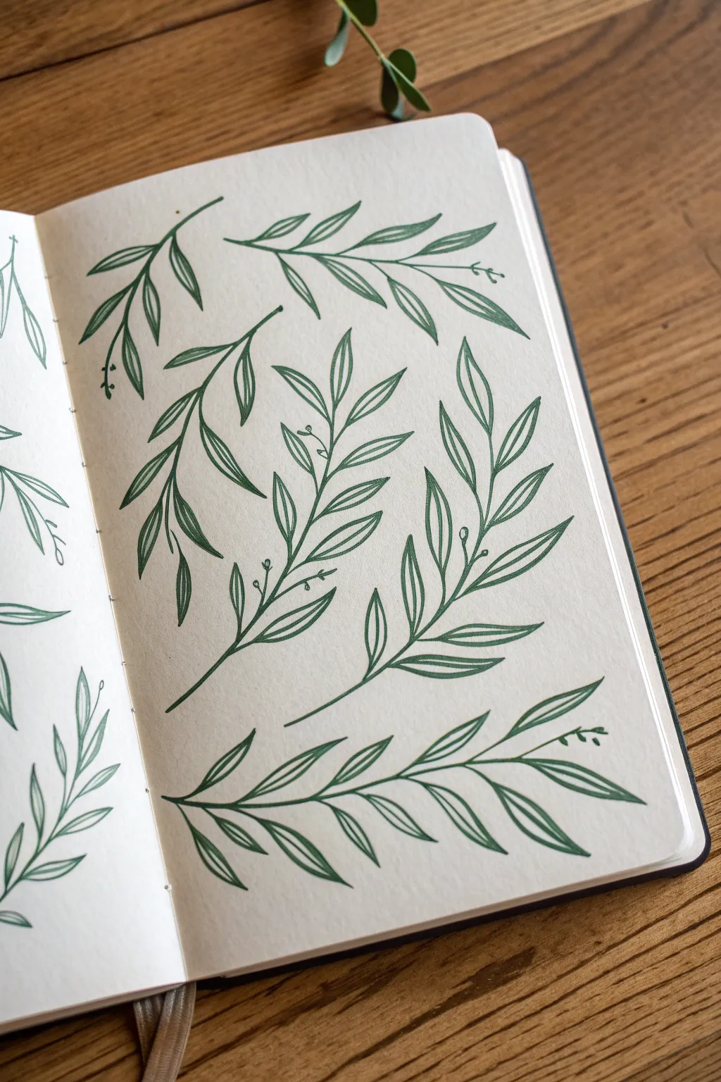
Master the art of botanical simplicity with this page of flowing willow branch studies. Using a single green fineliner, you’ll practice capturing the graceful curves and elongated shapes of willow leaves to fill your sketchbook with organic movement.
Step-by-Step Tutorial
Materials
- Smooth sketchbook paper (cream or off-white recommended)
- Dark green pigment fineliner (0.3mm or 0.5mm)
- Pencil (optional for initial blocking)
- Eraser (optional)
Step 1: Planning the Composition
-
Visualize the Flow:
Before putting pen to paper, look at your blank page. Imagine 5-6 invisible curved lines sweeping across the space. These will act as the ‘spines’ for your branches, ensuring they don’t crowd each other. -
Establish the Stems:
Starting with the top left branch, draw a smooth, slightly S-curved line for the main stem. Keep your hand loose to avoid a shaky, stiff line. -
Add Secondary Stems:
Draw the remaining main stems across the page. Notice how the bottom branch sweeps horizontally while the middle ones reach upward. Varying the direction creates a dynamic composition.
Step 2: Drawing the Upper Branches
-
Start the Top Left Cluster:
On your top-left stem, begin adding leaves. Draw a long, slender teardrop shape attached to the stem. The tip should be pointed and the base tapered. -
Add the Central Veins:
Inside that first leaf, draw a single line from the base almost to the tip. This simple line defines the willow look instantly. -
Build the Branch:
Continue adding leaves in pairs or alternating patterns down that first stem. Keep them long and vary their angles slightly to mimic natural growth. -
Create the Top Right Branch:
Move to the top right section. Draw a horizontal stem that curves downward at the end. Add leaves that drape downwards, reinforcing the ‘weeping’ quality of a willow.
Wobbly Lines?
Leaf outlines looking shaky? Speed up your hand movement. Drawing faster creates smoother curves, while slow drawing often records every tiny muscle twitch in your hand.
Step 3: Refining the Leaf Shapes
-
Middle Branch Construction:
For the large central vertical branch, draw leaves that point aggressively upward. Make these slightly larger than your previous ones to create visual weight. -
Curving the Edges:
As you outline these leaves, I try to add a tiny wobble or curve to the edge rather than making it perfectly straight. It makes the foliage feel softer. -
Overlap Moments:
Allow a few leaves to overlap the main stem or even other leaves. When this happens, stop your line where the overlap occurs to create depth. -
Grouping the Foliage:
Notice how some leaves stem from the same point. Draw clusters of two or three leaves originating from a single node on the branch for variety.
Leaf Variation
Don’t just draw flat leaves. Try drawing one leaf ‘folded’ by making one side of the outline narrower than the other, suggesting it’s turned slightly away from the viewer.
Step 4: The Final Flourishes
-
The Bottom Sweeper:
Draw the large, horizontal branch at the very bottom. Extend this line almost the full width of the page. -
Symmetry vs. Asymmetry:
On this bottom branch, place the leaves fairly symmetrically on opposite sides of the stem, creating a fern-like or palm-like appearance. -
Tiny Details:
Look closely at the reference. Add tiny little circles or ‘buds’ at the very tips of some stems or in the axils where leaves meet the stem. -
Stem Thickening:
Go back over the bottom portions of your main stems. Carefully add a second line very close to the first to thicken the woodier parts of the branch. -
Review and Balance:
Scan the whole page. If a branch looks too sparse, add a small, partial leaf peeking out from behind the stem.
Your page is now filled with a serene botanical collection that celebrates organic lines and natural forms.
BRUSH GUIDE
The Right Brush for Every Stroke
From clean lines to bold texture — master brush choice, stroke control, and essential techniques.
Explore the Full Guide
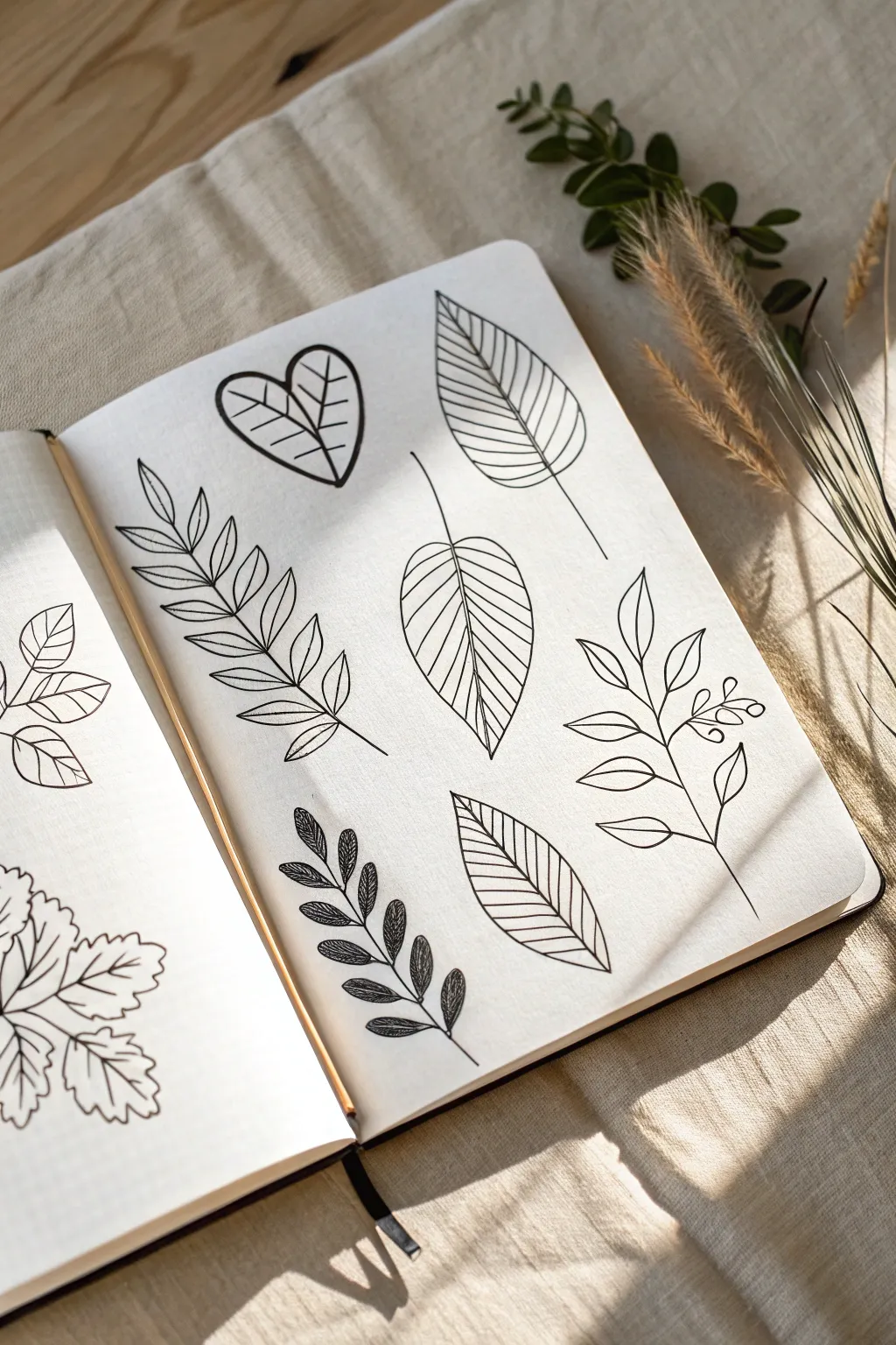
Leaf Vocabulary Grid
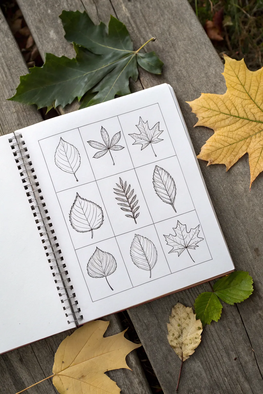
Capture the delicate variety of nature with this structured yet organic study page. By organizing different leaf shapes into a clean 3×3 grid, you create a satisfying collection that highlights the unique venation and silhouette of nine distinct botanical specimens.
How-To Guide
Materials
- Spiral-bound sketchbook with smooth white paper
- Ruler
- Pencil (HB or 2H)
- Fine liner pen (0.1mm or 0.3mm, black)
- Eraser
- Reference photos of varied leaves (Maple, Birch, Elm, etc.)
Step 1: Setting the Structure
-
Measure the page:
Begin by determining the usable space on your sketchbook page. Leave a generous margin around the edges, perhaps an inch or so, to frame your work nicely. -
Calculate the grid:
Divide your horizontal and vertical measurements by three. For example, if your drawing area is 6 inches by 6 inches, each square will be 2 inches wide. -
Draw the grid lines:
Using your ruler and a light pencil touch, draft a 3×3 grid. Keep these initial lines very faint, as you’ll be inking over them later. -
Check the spacing:
Step back and ensure your squares look relatively equal. Symmetry is key to the clean, scientific aesthetic of this layout.
Uneven Grid Lines?
Don’t panic if lines aren’t perfect. Simply thicken the grid border slightly with a broader pen tip to hide wobbly sections.
Step 2: Sketching the Leaves
-
Select your specimens:
Choose nine distinct leaf types to ensure variety. Think about mixing shapes: lobed leaves like Maples, serrated ovals like Birch, and compound leaves. -
Establish the spines:
In the center of the first box, lightly pencil the central vein (midrib) of your first leaf. This simple line dictates the curve and flow of the entire leaf. -
Draft the outline:
Sketch the perimeter of the leaf around your central spine. Don’t worry about perfect details yet; just focus on capturing the general silhouette. -
Repeat the process:
Move through the remaining eight squares, sketching a different leaf in each. I try to alternate pointing directions slightly—some leaves tilting left, some right—to create dynamic rhythm. -
Add vein details:
Go back to each sketch and lightly pencil in the secondary veins branching off the main spine. Observe your references: do the veins extend to the edge or curve inward?
Level Up: Color Wash
After the ink is fully waterproof, add a light wash of watercolor in autumnal shades like ochre, rusted orange, or olive green to each leaf.
Step 3: Inking and Refining
-
Ink the grid:
Take your fine liner pen and carefully trace over your ruler-drawn grid lines. Use a straightedge for this step to maintain crisp, sharp boundaries. -
Outline the leaves:
Switching to freehand, ink the outer contours of your first leaf. Use a broken or slightly wavering line for serrated edges to mimic organic textures. -
Draw the main veins:
Ink the central midrib and the primary veins. A slightly heavier hand here can help anchor the leaf visually. -
Detail the texture:
Use extremely light, thin strokes to add the fine network of smaller veins. For some leaves, use hatching lines to suggest curvature or shadow. -
Complete the set:
Systematically ink the remaining eight leaves. Take your time to ensure the line weight is consistent across all squares. -
Let it dry:
Wait several minutes to ensure the ink is completely set. Smudging is the enemy of a clean grid layout. -
Erase pencil marks:
Gently gently erase all underlying pencil sketches and grid guides. Brush away the eraser dust carefully. -
Final touches:
Assess your grid. If any line ends look too abrupt, you can taper them slightly with a quick flick of your pen.
Now you have a beautifully organized gallery of nature’s designs right in your sketchbook
Step-by-Step Leaf Construction
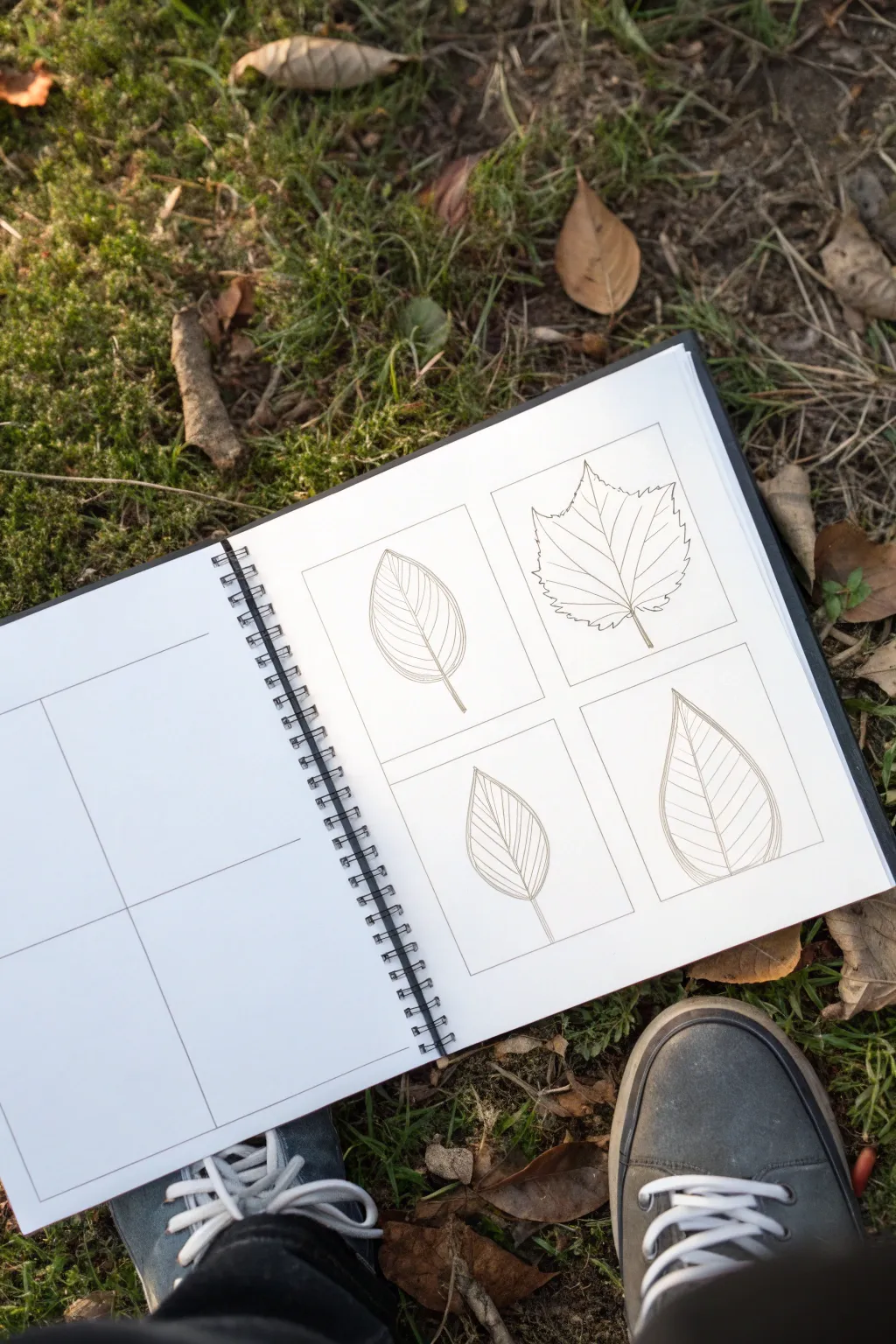
This tutorial guides you through creating a clean, botanical study page featuring four distinct leaf varieties. Using simple geometric framing and precise line work, you will learn to capture the delicate vein structures and serrated edges of common foliage.
Step-by-Step
Materials
- Spiral-bound sketchbook (heavyweight paper preferred)
- HB or 2B graphite pencil
- Fine-point pigment liner (0.1mm or 0.3mm) – optional
- Ruler
- Eraser (kneaded eraser works best)
- Real leaves for reference (optional)
Step 1: Preparation & Layout
-
Define the grid:
Begin by opening your sketchbook to a fresh spread. On the right-hand page, use your ruler to measure out a 2×2 grid of equal-sized rectangles. Leave a comfortable margin between the boxes to let the drawings breathe. -
Draft the frames:
Lightly draw the four rectangular frames using your pencil. Keep your pressure minimal so the lines remain crisp but distinct. These boundaries will help contain your botanical studies and give the page a structured, scientific look. -
Repeat on adjacent page:
If you wish to create a full spread like the reference, replicate the same grid measurements on the left-hand page, leaving these boxes empty for future studies or notes.
Step 2: Drawing the Ovate Leaf (Top Left)
-
Establish the spine:
In the top-left box, draw a central curved line (the midrib) starting from the bottom center and extending towards the top tip. Let it curve slightly to the left for a natural feel. -
Outline the shape:
Sketch a simple teardrop or ovate shape around the spine. Ensure the base is wider and it tapers gently to a point at the top. -
Add veining:
Draw curved veins extending from the midrib outward to the edges. Space them evenly, angling them upwards as you move up the leaf. Keep lines light and consistent.
Symmetry Struggles?
If a leaf looks lopsided, turn your sketchbook upside down. This tricks your brain into seeing the shapes abstractly, making it much easier to spot and correct imbalance errors.
Step 3: Drawing the Maple-Like Leaf (Top Right)
-
Map the points:
For the top-right box, start by marking five points that will become the tips of the leaf lobes. One at the top, two at the upper sides, and two lower down. -
Connect the veins:
Draw the main veins radiating from a single point at the stem base out to your five marked tips. This creates the skeleton of the palmately veined leaf. -
Create the jagged edge:
Connect your vein tips with jagged, serrated lines. Instead of smooth curves, use small V-shapes to mimic the toothed edge of a maple or sycamore leaf.
Pro Tip: Line Weight
Vary your pressure. Make the outer perimeter of the leaf slightly darker and thicker, while keeping the internal veins gossamer-thin. This adds instant depth to flat drawings.
Step 4: Drawing the Lanceolate Leaf (Bottom Left)
-
Draw the center line:
In the bottom-left box, draw a straight or very slightly curved vertical line for the midrib. -
Form the perimeter:
Sketch a narrower, pointed oval shape. This leaf should look more slender than your first one, resembling a beech or willow leaf. -
Detail the veins:
Add tightly spaced, parallel veins running directly from the midrib to the edge. I find it helpful to angle these quite sharply upwards to capture that specific botanical character.
Step 5: Drawing the Cordate Leaf (Bottom Right)
-
Sketch the heart shape:
For the final box, drawn an upside-down heart shape (cordate). The base should dip in where the stem connects. -
Refine the tip:
Elongate the top point so it doesn’t look too cartoonish; real leaves often have an extended ‘drip tip’. -
Final vein work:
Draw arc-shaped veins that follow the curve of the leaf’s outer edge, connecting back to the clear central midrib.
Step 6: Refinement
-
Clean up lines:
Review all four drawings. Erase any stray sketch marks or guidelines that fall outside your intended outlines. -
Darken the details:
Go over your final lines with slightly more pressure or a fine liner pen to make the drawings pop against the white paper. Keep the box frames sharp and distinct.
Now you have a structured, elegant botanical study ready for field notes or watercolors.

PENCIL GUIDE
Understanding Pencil Grades from H to B
From first sketch to finished drawing — learn pencil grades, line control, and shading techniques.
Explore the Full Guide
Contour Drawing Without Looking
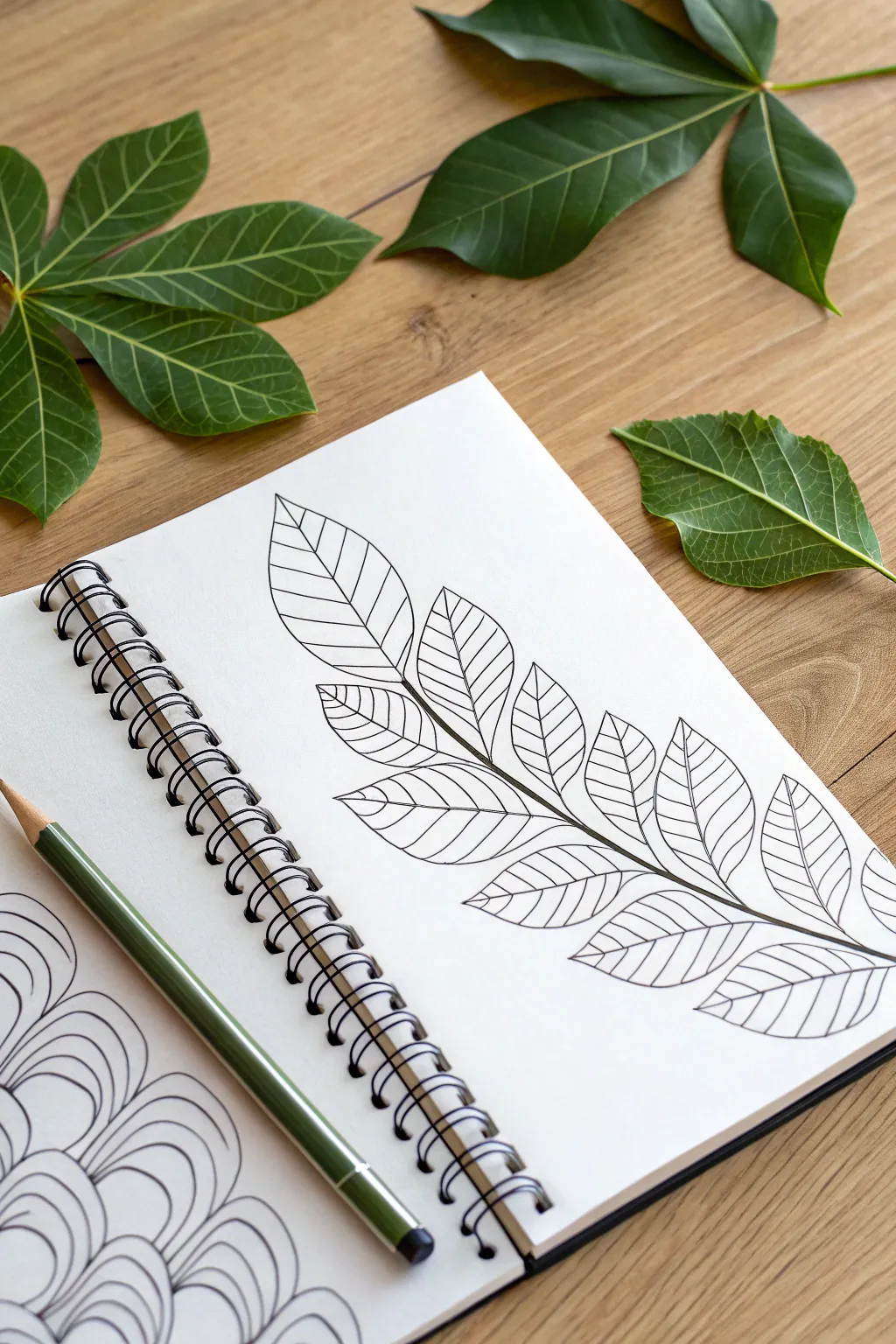
This elegant drawing exercise focuses on the simplicity of form found in nature, translating a complex compound leaf into a striking linear design. By using deliberate, confident lines without shading, you create a minimalist botanical illustration that feels both modern and organic.
Detailed Instructions
Materials
- Spiral-bound sketchbook with smooth, heavyweight paper
- Fine liner pen (black, 0.5mm or 0.8mm)
- Pencil (HB for sketching)
- Soft eraser
- Real leaves for reference (compound leaves like ash, walnut, or rowan work best)
- Green colored pencil (optional, for decorative placement)
Step 1: Setting Up the Form
-
Observe your subject:
Begin by finding a real compound leaf to look at, or use the reference image provided. Notice how the leaflets (the smaller leaves) are arranged in pairs along the central stem, with a single leaflet at the very tip. -
Sketch the central spine:
Using your pencil very lightly, draw a long, sweeping curve diagonally across your page. This will be the main vein (rachis) that supports all the leaflets. I like to start from the bottom right and curve gently upward toward the top left to fill the page dynamically. -
Mark leaflet positions:
Along your central spine, make small, faint tick marks where each pair of leaflets will attach. Ensure the spacing is somewhat regular but natural—nature isn’t perfectly rigid. -
Draft the leaflet shapes:
Lightly sketch the outline of each leaflet using almond or teardrop shapes. They should point outward and slightly upward. Start with the terminal leaflet at the tip, then work your way down the stem in pairs. -
Refine the proportions:
Step back and look at your light pencil sketch. Adjust the size of the leaflets if needed; usually, the ones in the middle are slightly larger than those at the very top or bottom.
Blind Contour Warm-up
Try drawing a single leaflet on scrap paper without looking at your hand. This ‘blind’ method loosens up your wrist for smoother curves.
Step 2: Inking the Contours
-
Start the central line:
Switch to your black fine liner. Begin at the bottom of the stem and draw a confident, smooth line up toward the first pair of leaflets. This line should be bold and unhesitant. -
Outline the first leaflet:
Moving to the bottom-most leaflet, trace its outer edge. Instead of a jagged edge, use a smooth, continuous line that curves gently to a point and returns to the stem. -
Add vascular details immediately:
Before moving to the next leaf, draw the central vein of the leaflet you just outlined. Then, add simple, curved lines branching off this vein to the leaf edge. Keep these internal lines slightly thinner or lighter in touch if possible. -
Connect to the stem:
Draw the short segment of the main stem that leads to the next pair of leaves. This connects your drawing physically and visually. -
Repeat the process upward:
Continue this pattern: draw the stem segment, outline the leaflet, and fill in its veins. Working methodically from the base to the tip helps prevent smudging the fresh ink with your hand. -
Detail the leaf tips:
When outlining the leaflets, ensure the tips come to a relatively sharp point. This gives the drawing a crisp, defined look. -
Vary the vein angles:
As you draw the internal veins of each leaflet, vary the spacing slightly. Perfect symmetry can look artificial, so allow some lines to be closer together than others.
Make It Pop
Use a thicker pen (0.8mm) for the outer shape of the leaves and a very fine pen (0.1mm) for the internal veins to create stunning depth.
Step 3: Final Touches
-
Ink the terminal leaflet:
Finish the drawing by inking the single leaflet at the very top of the stems. Make this one slightly more prominent to cap off the composition. -
Review line weight:
Look over your inked lines. If the main central stem feels too thin compared to the leaves, re-trace it carefully to thicken the line weight, giving the structure more stability. -
Let the ink dry:
Give your drawing at least 5-10 minutes to dry completely. Black ink can smear easily if you erase too soon. -
Erase pencil guides:
Gently erase all the underlying pencil sketches. Hold the paper taut with one hand to prevent crinkling the page while you erase. -
Optional styling:
For a photo-ready finish like the example, place your pen alongside the drawing and scatter a few real leaves around the sketchbook to blur the line between art and reality.
Your sketchbook page now holds a crisp, permanent botanical record that captures the essence of the leaf without getting lost in shading
Vein Patterns as the Star
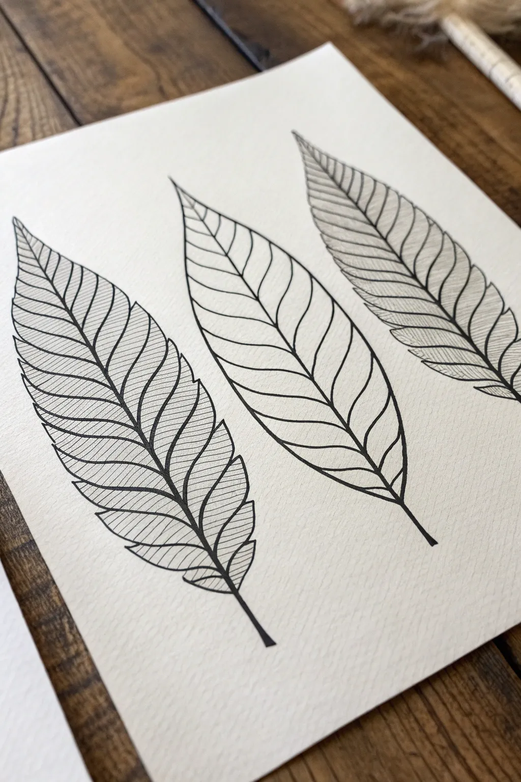
Explore the power of simple ink lines with this trio of leaves, where the focus shifts from the outline to the intricate patterns within. By varying the direction and density of your hatching, you can turn identical leaf shapes into three distinct studies of texture and light.
Step-by-Step Tutorial
Materials
- High-quality textured paper (approx. 140lb or similar cold press finish)
- Fine liner pens (sizes 0.1, 0.3, and 0.5)
- Pencil (HB or 2H)
- Soft eraser
- Ruler (optional, for spacing)
Step 1: Drafting the Shapes
-
Outline the central veins:
Begin by spacing out three gentle curves across your paper using your pencil. These will be the spines (midribs) of your leaves. Give each one a slightly different sway to keep the composition organic. -
Define the leaf margins:
Sketch the outer contour of each leaf. Aim for a classic lanceolate shape—tapered at the top and bottom, wider in the middle. Don’t worry about perfect symmetry; natural variations add character. -
add secondary veins:
Draw the side veins extending from the spine to the outer edge. Space them evenly, curving them slightly upward as they reach the margin. These lines create the ‘cells’ you will fill later. -
Ink the main structure:
Switch to a thicker pen (around size 0.5). Trace over your pencil outlines, central spines, and secondary veins. Keep your hand steady but fluid. Let the ink dry completely before gently erasing all pencil marks.
Step 2: Pattern 1: The Left Leaf
-
Analyze the diagonal fill:
For the first leaf, the texture is created by straight diagonal lines. Notice how the lines in each segment run roughly parallel to each other but angle slightly differently depending on the vein curve. -
Start hatching:
Using a 0.1 fine liner, start at the spine of the bottom-left segment. Draw fine, straight lines extending outwards. Keep the spacing tight and consistent. -
Repeat up the leaf:
Work your way up the left side of the leaf, filling each segment. Then, move to the right side of the spine. The key here is uniformity—this leaf should look ordered and clean.
Master the Flick
For the shaded leaf (right), practice a ‘flicking’ motion on scrap paper. Plant the pen firmly at the start and lift it quickly as you pull away to create tapered, natural-looking lines.
Step 3: Pattern 2: The Center Leaf
-
Minimalist approach:
The middle leaf is the ‘breathing room’ of the composition. We will leave the segments largely empty to contrast with its neighbors. -
Thicken the key lines:
Take your 0.3 or 0.5 pen and go back over the vein lines you already drew. Add a tiny bit of weight where the veins meet the spine, creating a subtle varying line width. -
Add subtle contouring:
Only if you feel it needs it, add one or two extremely faint contour lines inside the segments, following the curve of the veins, but generally, I prefer to keep this one stark and open.
Smudge Alert
Textured paper holds ink longer than smooth paper. If you are right-handed, work from the left leaf to the right leaf to prevent your hand from resting on wet ink.
Step 4: Pattern 3: The Right Leaf
-
Introduce density:
The third leaf uses a denser, slightly more chaotic shading style to suggest shadow or darker pigmentation. -
Create the heavy hatch:
Use your 0.1 pen again. Start hatching from the spine outward, but this time, place your strokes very close together. You want the area near the spine to appear almost solid black. -
Fade the lines:
As you draw your strokes toward the outer edge of the leaf, lift your pen pressure slightly or stop the lines halfway across the segment. This creates a gradient effect. -
Vary the direction:
Unlike the first leaf, allow these lines to have a very slight curve to them, mimicking the roundness of the leaf surface. -
Final touches:
Review all three leaves. If any outer edges look too thin compared to the interior textures, strengthen the perimeter line with the 0.5 pen to contain the artwork.
Step back and admire how simple lines can build such distinct botanical personalities


Leaf in Foreshortened Perspective
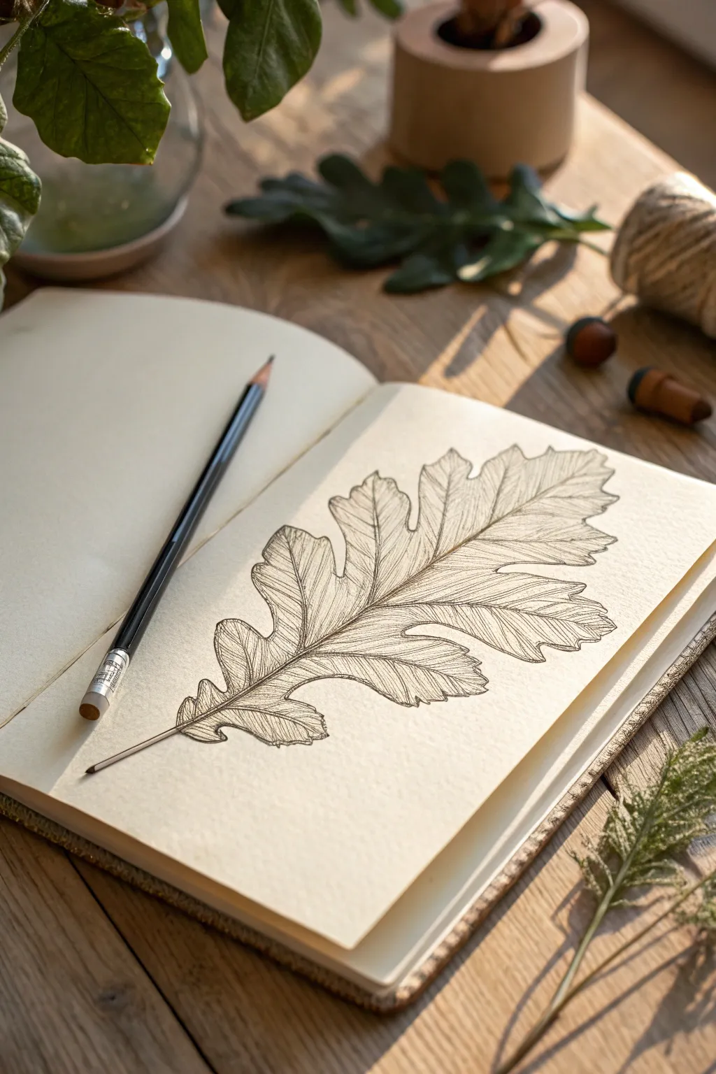
Capture the intricate beauty of nature with this detailed linear study of an oak leaf. The style focuses on precise contour lines and delicate internal vein patterns to create a realistic, textured botanical illustration.
Step-by-Step Tutorial
Materials
- Sketchbook with smooth-textured paper (cream or white)
- HB graphite pencil (for initial sketch)
- Fine liner pen (0.1mm or 0.3mm black)
- Kneadable eraser
- Real oak leaf or reference photo
Step 1: Layout and Structure
-
Define the axis:
Begin by lightly drawing a curved central line in pencil. This will serve as the midrib of your leaf, dictating the flow and gentle curve of the final drawing. -
Mark the boundaries:
Lightly sketch an oval or diamond shape around your central line to establish the overall width and length limits, ensuring the leaf fits comfortably on your page. -
Block in the lobes:
Using faint geometric shapes or simple curves, map out where the lobes of the oak leaf will sit. Oak leaves typically have deep, rounded lobes, so spacing is key here rather than detail. -
Refine the perimeter:
Go over your blocked shapes to create the specific wavy outline of the oak leaf. Pencil in the characteristic divots and rounded tips, paying attention to asymmetry for a natural look. -
Draw primary veins:
Sketch the main veins extending from the midrib out to the center of each lobe. These should flow smoothly and taper as they reach the edges.
Don’t Smudge!
Place a scrap piece of paper under your drawing hand while adding the fine interior lines. This prevents oils from your skin from transferring and protects your fresh ink from smearing.
Step 2: Inking the Contours
-
Outline the stem:
Switch to your fine liner pen. Start at the base of the stem, drawing two parallel lines that taper slightly as they merge into the leaf blade. -
Trace the leaf edge:
Carefully ink the outer perimeter of the leaf. Use a slightly broken or uneven line weight occasionally to mimic the organic, potentially dried texture of the edges. -
Ink the midrib:
Draw the central vein with confidence. I find it helpful to draw this line slightly thicker at the base and let it become whisper-thin near the leaf tip. -
Define side veins:
Ink the primary veins leading into the lobes. Ensure these lines connect cleanly to the central midrib. -
Erase pencil guides:
Once the ink is completely dry—wait at least five minutes to be safe—gently use your kneadable eraser to lift away the graphite underdrawing.
Old Paper Effect
Before drawing, lightly stain your paper with cool tea or diluted coffee and let it dry flat. This creates a vintage botanical study vibe that complements fine ink work perfectly.
Step 3: Texturing and Detailing
-
Start secondary veins:
Inside each lobe, begin drawing thinner, branching veins that split off from the primary vein. Keep these lines very light and delicate. -
Add directional texture:
Fill the spaces between veins with fine hatching lines. These lines should follow the contour of the leaf surface, generally curving outward from the center. -
Build density:
Add more hatching lines near the midrib and in the ‘valleys’ between lobes. This clustering of lines creates shadow and depth without needing actual shading. -
Create surface interest:
Include small imperfections like tiny spots or a small tear in the edge to give the leaf character and realism. -
Refine the stem:
Add a few vertical lines running up the length of the stem to give it a woody, fibrous texture. -
Final assessment:
Step back and look for any areas that feel too empty. Add very faint, stray marks or broken lines to balance the texture across the whole leaf.
With your fine lines complete, you have a timeless botanical sketch ready to be framed or kept as part of a nature journal
Leaf Sprig With a Simple Stem
This elegant botanical drawing uses the stippling technique to create depth and texture without harsh lines. By building up tiny dots, you’ll achieve a soft, sophisticated shading effect that brings this simple sprig to life.
Detailed Instructions
Materials
- Sketchbook with smooth paper
- HB or 2H pencil (for initial sketch)
- Fine liner pen (01 or 03 size) or sharp black pencil
- Kneaded eraser
Step 1: Sketching the Framework
-
Draw the central stem:
Start by drawing a gentle, curving line for the main stem. It should start from the bottom right and curve upwards toward the top left, ending with a slight straighter section. Keep your pressure extremely light so this can be erased later. -
Mark leaf positions:
Along the stem, make small tick marks where your leaves will attach. Space them out somewhat evenly, alternating sides (left, right, left) as you move up the stem to create a natural growth pattern. -
Sketch the leaf shapes:
Draw the outline of each leaf. These are simple almond or lanceolate shapes—pointed at both ends and wider in the middle. The leaves near the bottom should be slightly larger, getting gradually smaller as you reach the top of the sprig. -
Add the veins:
Draw a central vein running down the middle of each leaf. From this central vein, sketch smaller side veins that angle upwards toward the leaf tip. Don’t worry about perfection; nature is asymmetrical. -
Add buds (optional):
If you wish to match the reference closely, sketch two small, oval-shaped buds on tiny stems branching off the main stalk near the middle right section.
Dot Control
Keep your pen vertical. If you hold it at an angle, your dots turn into tiny dashes or commas. Vertical strokes ensure perfect distinctive circular points.
Step 2: Inking the Outlines
-
Trace stem and edges:
Using your fine liner pen or a very sharp dark pencil, carefully go over your pencil lines. Wobbly lines actually help here—they make the plant look organic rather than manufactured. Give the main stem a little thickness by drawing a double line, very close together. -
Detail the veins:
Ink the central vein of each leaf. For the side veins, make the lines very thin and try breaking them slightly so they aren’t solid, heavy strokes. This adds delicacy to the drawing. -
Erase pencil marks:
Wait for the ink to dry completely to avoid smudging. Then, gently use your kneaded eraser to lift away all the graphite guidelines, leaving only your clean ink artwork.
Step 3: Shading with Stippling
-
Start dots on the stem:
Begin your shading on the main stem. Place tiny dots densely along one side of the stem (the shadow side) and space them out as you move to the center. This creates a cylindrical 3D look. -
Define the leaf tips:
Move to the leaves. Focus your stippling density at the tips of the leaves and near the base where the leaf meets the stem. This gradient makes the leaves look slightly curved. -
Shadow the veins:
Place a concentration of dots along the central vein of each leaf. I find it effective to shade just one side of the vein more heavily to suggest light hitting the leaf surface. -
Edge shading:
Add a light scattering of dots along the outer edges of the leaves. This defines the shape without needing a heavy outline. -
Blend the gradients:
Look for areas where the dots go from ‘dense’ to ’empty’ too quickly. Add intermediate dots in these transition zones to create smooth, grey gradients.
Go Green
Try two shades of green fineliners instead of black. Use dark green for outlines and heavy shadows, and a lighter lime green for the sparse stippling areas.
Step 4: Final Touches
-
Deepen the contrast:
Step back and look at the drawing as a whole. Identify the darkest areas (usually where leaves overlap or attach to the stem) and add one more layer of dense dots to punch up the contrast. -
Refine the buds:
If you included the small buds, stipple the bottom half of each oval heavily, fading to white at the top, to make them look round and bulbous.
This meditative drawing technique results in a beautiful, classic botanical illustration you can be proud of
Negative Space Leaf Shapes
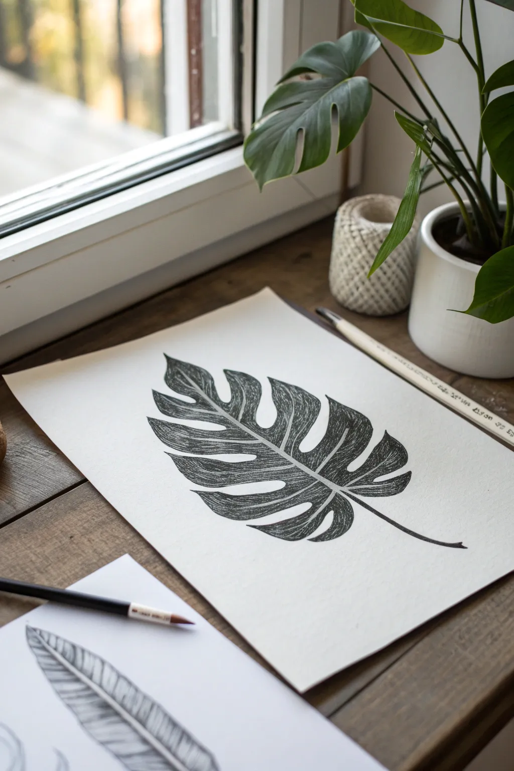
Embrace the elegance of detail with this bold black-and-white botanical illustration. This project focuses on high-contrast line work and texture to create a realistic Monstera deliciosa leaf that almost lifts off the page.
Step-by-Step
Materials
- Heavyweight drawing paper or mixed media paper (smooth texture preferred)
- HB or 2B graphite pencil
- Kneaded eraser
- Fine liner pen (01 or 03 size)
- Brush pen or medium black marker (for filling)
- White gel pen (optional for corrections)
Step 1: Sketching the Framework
-
Establish the centerline:
Begin by lightly drawing a curved line diagonally across your paper. This will serve as the midrib (the central vein) of the leaf and dictates the flow of the entire drawing. -
Draft the outer boundary:
Visualize a large heart shape around your central line. Using very faint pencil strokes, sketch this rough outline to determine the overall size of the leaf before adding details. -
Carve out the fenestrations:
Monstera leaves are famous for their splits (fenestrations). Along the edges of your heart shape, sketch deep, V-shaped cuts pointing toward the center vein. -
Add inner holes:
Draw a few oval or teardrop-shaped holes within the leaf body itself, closer to the midrib, if you want a more mature leaf look, though the reference image focuses mostly on deep side splits. -
Refine the segments:
Go over your outline, curving the edges of the splits so they look organic and soft rather than sharp and geometric. The leaf segments should look like flowing ribbons. -
Thicken the midrib:
Turn your single center line into a double line that tapers to a point at the leaf’s tip. This creates the white negative space we will preserve later. -
Add vein guidelines:
Lightly sketch curved lines branching from the midrib into each leaf segment. These don’t need to be perfect, as they just guide your texturing later.
Ink Smudging?
If you smudge wet ink, don’t wipe it! Let it dry fully, then use a white gel pen or a tiny dot of white gouache to paint over the mistake.
Step 2: Inking and Definition
-
Outline the perimeter:
Switch to your fine liner pen. Carefully trace the outer edge of your leaf design. Keep your hand steady and confident for a crisp boundary. -
Define the midrib:
Ink the two lines forming the central vein. Ensure you leave the space between them completely empty; this white spine is crucial for the high-contrast aesthetic. -
Erase pencil marks:
Once the ink is completely dry—I usually give it a full minute just to be safe—gently use your kneaded eraser to lift away all the graphite sketches.
Step 3: Texturing and Filling
-
Start the hatching:
This is the most time-consuming but meditative part. Using your fine liner, begin drawing tightly spaced lines that run from the midrib outward toward the leaf edge. -
Follow the form:
Your hatching lines should curl slightly to mimic the contour of the leaf surface. They shouldn’t be ruler-straight; a slight curve adds volume. -
Leave highlights:
As you fill the sections, lift your pen pressure slightly in the middle of each segment or near the veins to create lighter areas, suggesting a glossy surface. -
Deepen the shadows:
Go back over areas near the midrib and the outer edges with a second layer of hatching or stippling to make those areas darker. -
Refine the veins:
Instead of drawing solid black lines for veins, create them using negative space. Let your hatching lines stop just short of where a vein would be, leaving a thin white gap. -
Solidify the darkest areas:
If you want the leaf to look very bold, use a brush pen to fill in the deepest shadow areas completely black, blending them into your hatching lines. -
Check the balance:
Step back and look at the whole piece. If the leaf looks too grey, add more black ink to increase the contrast against the white paper. -
Final touch-ups:
Extend the stem slightly at the bottom if it feels too short, and use a white gel pen to clean up any ink that might have crossed into your pristine white veins.
Directional Consistency
Make sure all your texture lines flow outwards from the center vein like a rib cage. Inconsistent angles will flatten the 3D effect of the leaf.
Place your finished monochrome leaf in a simple frame to appreciate the dramatic contrast you’ve created
Pattern-Filled Zentangle Leaves
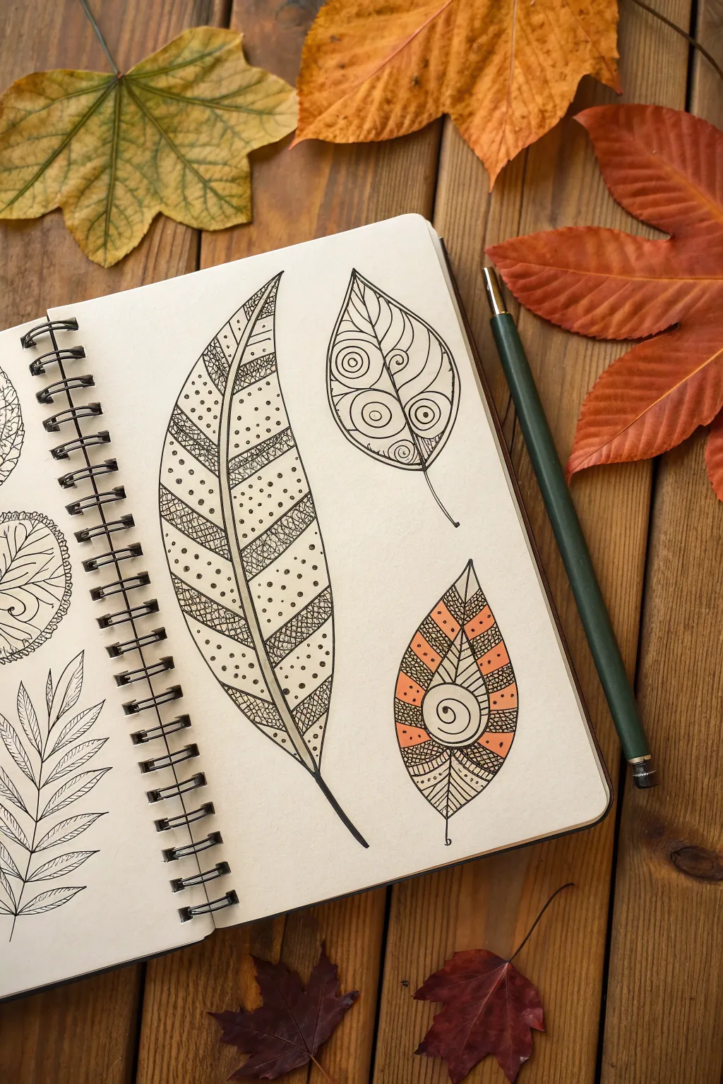
Transform simple leaf outlines into captivating works of art using repetitive patterns and bold ink lines. This meditative drawing project combines the structure of nature with the creative freedom of Zentangle-style doodling, resulting in a sketchbook page full of personality.
Step-by-Step Tutorial
Materials
- Spiral-bound sketchbook (smooth paper recommended)
- Fine liner pens (sizes 01, 03, and 05)
- Pencil (HB or 2B)
- Eraser
- Orange colored pencil or marker (optional)
- Ruler (optional for straight lines)
Step 1: Drawing the Base Outlines
-
Sketch the Feathery Leaf:
Start on the left side of your page. Using your pencil, draw a long, gently curved central vein. From the tip, descend to create a long, lance-shaped leaf contour that tapers widely at the bottom before connecting to a short stem. -
Add the Round Leaf:
To the upper right of your first leaf, sketch a shorter, teardrop-shaped leaf. Give it a slightly pointed tip and a gently curving stem. Divide this leaf in half with a central vein line. -
Outline the Pointed Leaf:
Below the round leaf, draw a third shape—an almond or eye-shaped leaf with a sharper point at the top and bottom. Add a central vein running vertically through it. -
Refine the Shapes:
Go over your pencil sketches to ensure the curves are smooth. Once you are happy with the proportions, trace over your three main outlines and central veins with a size 03 or 05 fine liner pen.
Smudge Alert
If your hand tends to drag across the paper, place a clean scrap sheet under your drawing hand. This acts as a shield to prevent oils and sweat from smudging your fresh ink lines.
Step 2: Patterning the Large Feather Leaf
-
Divide the Space:
Using a 01 fine liner, draw diagonal bands across the leaf. I like to space them somewhat evenly, angling them upwards from the central vein to the outer edge. -
Create Texture Bands:
Select every other band to be filled with a denser texture. Draw a tight grid or cross-hatching pattern inside these specific sections to create contrast. -
Add Dotted Details:
In the remaining empty bands, fill the space with stippling (dots). Place the dots randomly but densely enough to give the section a speckled appearance. -
Thicken Lines:
Go back over the dividing lines between the bands with a slightly thicker pen stroke to separate the patterned sections clearly.
Level Up: Shadow Play
Use a light gray marker or a soft pencil to add a drop shadow to one side of each leaf. This simple trick makes your 2D drawings look like they are floating slightly above the paper.
Step 3: Detailing the Round & Pointed Leaves
-
Spiral Sections:
Move to the upper right leaf. Draw curved lines radiating from the central vein to the outer edge, dividing the leaf into segments. Inside specific segments, draw a spiral or ‘bullseye’ circle pattern. -
Curved Fillers:
In the segments without spirals, draw closely spaced curved lines that follow the contour of the leaf section, similar to veins. -
Geometric Segmentation:
For the bottom right leaf, draw chevron-style lines angling upwards from the center vein. This creates distinct V-shaped sections. -
Add the Central Focus:
In the middle of this bottom leaf, draw a prominent spiral circle right over the central vein, letting the chevron lines radiate out from behind it. -
Incorporate Color:
If desired, use an orange colored pencil or marker to fill in alternating chevron bands on the bottom leaf. This adds a warm autumn accent. -
Final Ink Textures:
Fill the non-colored bands with varied ink patterns. Try small scallops, tiny circles, or dense vertical hatching to create visual interest against the orange.
Step 4: Finishing Touches
-
Erase Pencil Marks:
Wait at least five minutes to ensure all ink is completely dry. Gently erase the underlying pencil sketches to clean up the drawing. -
Weighted Lines:
Take your thickest pen (05) and re-trace the very outer perimeter of each leaf. This increased line weight helps the leaves pop off the page. -
Stem Definition:
Darken the stems of the leaves, thickening them slightly at the base where they would attach to a branch.
Enjoy the relaxing rhythm of filling each section as you watch your unique botanical page come to life
Leaf Mandala Arrangement
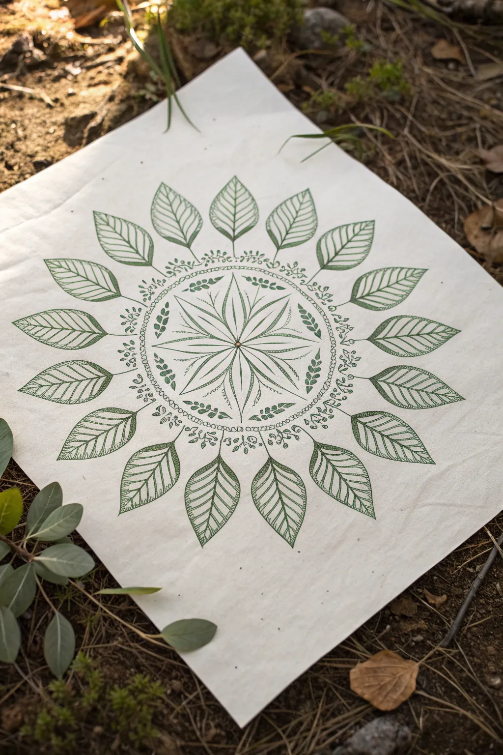
Capture the serenity of nature with this intricate green leaf mandala drawn on natural textured paper. This radial design combines delicate vine work with bold leaf shapes, creating a balanced and calming piece of botanical art.
Step-by-Step
Materials
- Square sheet of thick, off-white textured paper or primed canvas (approx. 12×12 inches)
- Fine liner pens (Archival ink, Dark Green, sizes 0.1, 0.3, and 0.5)
- Compass
- Protractor
- HB Pencil
- Kneaded eraser
- Ruler
Step 1: Planning the Structure
-
Find the Center:
Use your ruler to lightly mark an ‘X’ from corner to corner to find the precise center of your square paper. -
Draw Guide Circles:
Using your compass, draw three concentric circles starting from the center point. The smallest should be about 2 inches in diameter, the middle guiding ring about 5 inches, and the largest outer ring about 9 inches. -
Mark Radial Lines:
With a protractor, mark every 22.5 degrees around the circle. Use a ruler to draw light lines through the center connecting these marks. This will give you 16 equal sections to ensure your mandala stays symmetrical.
Symmetry Hack
Can’t get the leaves even? Draw one perfect leaf on cardstock, cut it out, and use it as a stencil to trace onto your pencil guide lines.
Step 2: Drawing the Inner Starburst
-
Draft the Petals:
In the innermost circle, sketch eight long, slender petals that stretch from the center point out to the edge of the first circle. They should follow every other radial line. -
Add Texture Lines:
Switch to your 0.1 fine liner. Carefully ink the outline of these petals. Inside each petal, draw a central vein and delicate, parallel lines fanning out to give the appearance of ribbed texture. -
Create Interstitial Details:
Between each main petal, draw a simple straight line radiating outward, flanked by two shorter curved lines, resembling stamens or smaller vegetative growth.
Step 3: Creating the Vine Border
-
Outline the Band:
Around the inner starburst, draw a narrow band using two concentric circles close together. Fill this band with tiny, repetitive circles or ‘seeds’ using the 0.3 pen. -
Draft the Vines:
Surrounding the seed band, lightly pencil a ring of flowing vines. I find it helpful to draw small clusters of berries and tiny leaves at the intersection of each radial guide line. -
Ink the Botanical Details:
Go over your pencil sketches with the 0.3 green pen. Alternate between small, solid leaves and clusters of open circles for berries to create visual rhythm. -
Add Leafy Sprigs:
interspersed within the vine ring, draw small, solid fern-like sprigs pointing inward towards the center to add density.
Smudge Prevention
Place a scrap piece of paper under your drawing hand. This prevents skin oils from transferring to the nice paper and stops you from smearing fresh ink.
Step 4: The Outer Leaf Ring
-
Position the Main Leaves:
On the largest outer circle guide, sketch the varying shapes of the sixteen main leaves. Point the tips outward along the radial lines. -
Outline the Leaves:
Using the 0.5 pen for a bolder look, trace the perimeter of each leaf. Make the edges slightly serrated or wavy rather than perfectly smooth for realism. -
Draw Central Veins:
Draw a straight line down the center of each leaf, stopping just short of the tip. -
Add Vein Details:
With the 0.1 pen, fill the leaves with detailed veining. Draw diagonal lines from the center vein to the edge, keeping them closely spaced and parallel. -
Connect to the Center:
Draw a small stem connecting the base of each large leaf to the decorative vine ring you created earlier.
Step 5: Finishing Touches
-
Erase Guide Lines:
Wait at least 15 minutes to ensure the ink is completely dry. Then, gently erase all pencil circles and radial lines with a kneaded eraser. -
Refine Contrast:
Look over the drawing. If certain areas look too light, go back with the 0.5 pen and thicken the outer edges of the largest leaves to make them pop. -
Final Inspection:
Check for any gaps in the ink flow or uneven spots and careful touch them up with your finest pen.
Now you have a timeless piece of botanical art ready to display on your wall
Leaves With Unexpected Colors
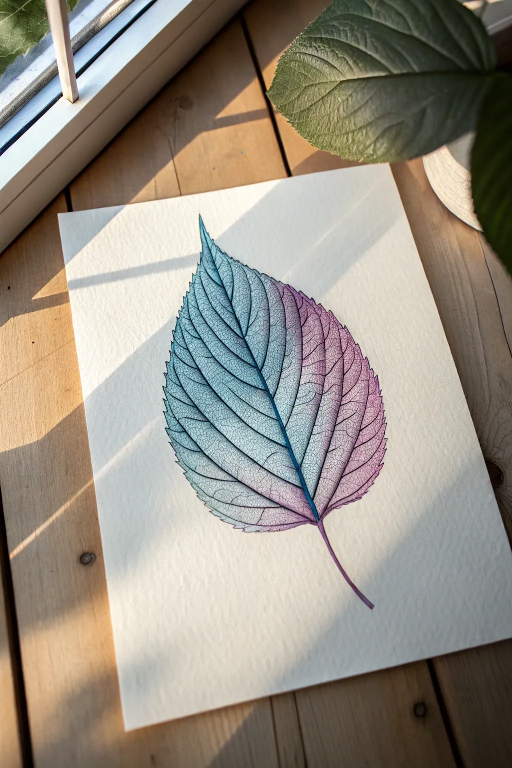
This stunning project turns a simple botanical subject into a mesmerizing study of color and transparency. By blending cool teals into warm purples within a delicate network of veins, you’ll create a leaf that feels fragile, modern, and almost skeletal.
How-To Guide
Materials
- Hot press watercolor paper (or smooth mixed media paper)
- HB pencil and eraser
- Fine liner pens (black, 0.05mm and 0.1mm)
- Watercolor paints (Teal/Turquoise and Magenta/Violet)
- Small round brushes (size 0 and 2)
- Clean water and paper towel
Step 1: Sketching the Skeleton
-
Establish the curve:
Begin by lightly sketching a central spine line with your HB pencil. Give it a gentle, organic curve that extends past the bottom to form the stem. -
Define the perimeter:
Draw the outer contour of the leaf. Aim for an elongated heart shape or lanceolate form with serrated edges. Don’t worry about perfect symmetry; nature is rarely perfect. -
Map the primary veins:
Sketch the main lateral veins that branch off the central spine. They should angle upwards toward the tip of the leaf, spacing them somewhat evenly but varying the distances slightly for realism.
Step 2: Inking the Details
-
Outline the spine:
Switch to your 0.1mm fine liner. Carefully trace the central spine and the stem, making the line slightly thicker at the base and tapering it toward the tip. -
Trace the main veins:
Go over your pencil lines for the primary lateral veins. Keep your hand loose to allow for natural jitters in the line, preventing it from looking like a stiff diagram. -
Create the secondary network:
Using the ultra-fine 0.05mm pen, begin drawing the smaller network of veins that connect the main ones. Think of this like creating a stained-glass window pattern. -
Refine the edges:
Ink the serrated outer edge of the leaf. Connect the tips of your lateral veins to the sharp points of the serrated edge for structural logic. -
Clean up:
Once the ink is completely dry, gently erase all underlying pencil marks to keep the paper pristine for the painting phase.
Vein Variation
Don’t connect every single vein line perfectly. Leaving tiny gaps in the finest netting creates a lighter, airier feel and prevents the drawing from looking heavy.
Step 3: Adding the Gradient Wash
-
Prepare your palette:
Mix two separate puddles of watercolor: a vibrant teal or turquoise and a rich magenta or violet. Ensure they are watery enough to be transparent but pigmented enough to show color. -
Wet the surface:
With clean water and your size 2 brush, very lightly glaze the entire inside of the leaf. You want the paper damp, not soaking wet, to help the colors bleed softly. -
Apply the teal:
Load your brush with the teal paint and drop it onto the left side of the leaf. Let the color flow naturally toward the center spine. -
Apply the magenta:
While the paper is still damp, load your brush with magenta and apply it to the right side of the leaf. Carefully nudge the paint toward the center. -
Blend the transition:
Where the teal and magenta meet at the spine and in the middle, allow them to touch and mix on the paper. I find that tilting the paper slightly helps them merge into a beautiful deep indigo transition. -
Lift excess pigment:
If the color is too dark in some cells, dab your brush on a paper towel and lift a little pigment out of the center of the vein sections to create a highlighted, dimensional look. -
Paint the stem:
For the stem, start with teal at the base of the leaf and transition into magenta at the very bottom tip, mimicking the gradient of the leaf body.
Metallic Magic
Once the watercolor is dry, trace just the central spine with a metallic silver or gold gel pen. It adds a surprising shimmer that catches the light beautifully.
Step 4: Final Touches
-
Dry completely:
Allow the wash to dry fully. If the paper feels cool to the touch, it is still wet deep down. -
Reinforce shadows:
Use your 0.05mm pen or a slightly darker mix of paint to add tiny shadows right next to the thickest veins. This creates depth and makes the veins appear raised.
Step back and admire how the simple gradient brings a sense of life and movement to your botanical illustration
Leaf Skeleton Study
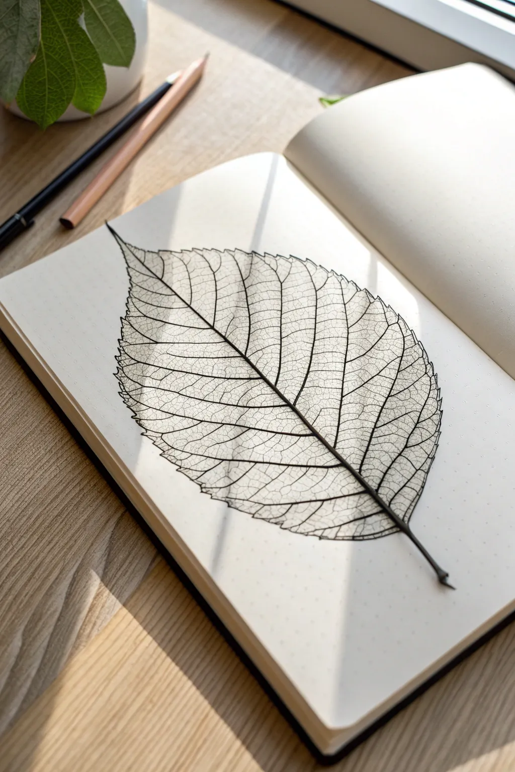
Capture the delicate, lace-like beauty of nature with this detailed leaf skeleton study. By focusing on negative space and fine lines, you’ll create a striking botanical illustration that highlights the complex architecture usually hidden within a leaf.
Step-by-Step Tutorial
Materials
- Dotted or grid notebook (heavyweight paper preferred)
- H or HB pencil (for initial sketching)
- Fine liner pens (sizes 0.05, 0.1, and 0.3)
- Kneaded eraser
- Reference photo of a skeletonized leaf (or the image provided)
Step 1: Laying the Framework
-
Mark the boundaries:
Start by lightly marking the top and bottom points of your leaf on the dotted grid. This ensures your drawing stays centered and fits perfectly on the page. -
Draw the central midrib:
Sketch a gently curved line connecting your top and bottom points. This main vein doesn’t need to be perfectly straight; a slight S-curve gives the leaf a more natural, organic flow. -
Outline the leaf shape:
Lightly sketch the outer contour of the leaf. Aim for a teardrop shape with serrated or jagged edges. Don’t worry about perfect symmetry—nature is rarely perfect. -
Add secondary veins:
From the central midrib, branch out the secondary veins extending toward the leaf edges. Space them fairly evenly, curving them slightly upward as they reach the margins.
Ink Smudging?
Work from top-left to bottom-right if right-handed (or opposite if left-handed) to avoid dragging your hand through wet ink.
Step 2: Defining the Structure
-
Switch to ink:
Take your 0.3 or 0.1 fine liner to go over the main structural lines. Ink the midrib first, making it slightly thicker at the base and tapering off toward the tip. -
Ink the perimeter:
Trace your outer edge sketch with the pen. Instead of a smooth line, use small, jagged strokes to mimic the dried, crisp edge of a skeleton leaf. -
Refine the secondary veins:
Ink the main branches you sketched earlier. Ensure these lines connect firmly to the midrib and extend all the way to the outer edge. -
Erase pencil marks:
Once the main structure is inked and completely dry, gently roll your kneaded eraser over the page to lift the graphite guidelines.
Level Up: Shadow Play
Use a light gray marker to add a faint drop shadow to just one side of the leaf and vein structure to simulate sunlight hitting the page.
Step 3: Creating the Lattice
-
Start the tertiary veins:
Switch to your finest pen (0.05). Begin drawing smaller veins that bridge the gap between the secondary veins. These should look like crooked ladders or a disorderly web. -
Subdivide the spaces:
Continue breaking down the larger empty spaces into smaller and smaller geometric shapes. Think of them as tiny, irregular polygons nesting inside each other. -
Vary aperture sizes:
Keep the shapes irregular. Some holes in the mesh should be tiny specks, while others can remain slightly larger. This variety creates depth and realism. -
Work section by section:
I find it helpful to focus on one section between two secondary veins at a time. This prevents the intricate details from becoming overwhelming. -
Add subtle imperfections:
Intentionally break the pattern occasionally. A skeleton leaf often has small tears or areas where the webbing is thicker. -
Thicken intersections:
Go back with your 0.1 pen and add tiny dots or extra weight where the major veins meet. This mimics the biological structure where veins are naturally sturdier. -
Check balance:
Step back and look at the overall density. If one area looks too open compared to the rest, add a few more hair-thin dividing lines to balance the texture. -
Final stem details:
Darken the stem at the very bottom, adding a small shadow or uneven cut mark to ground the drawing.
Now you have a stunning botanical record preserved in your notebook forever
Tiny Leaf Border and Corner Flourishes
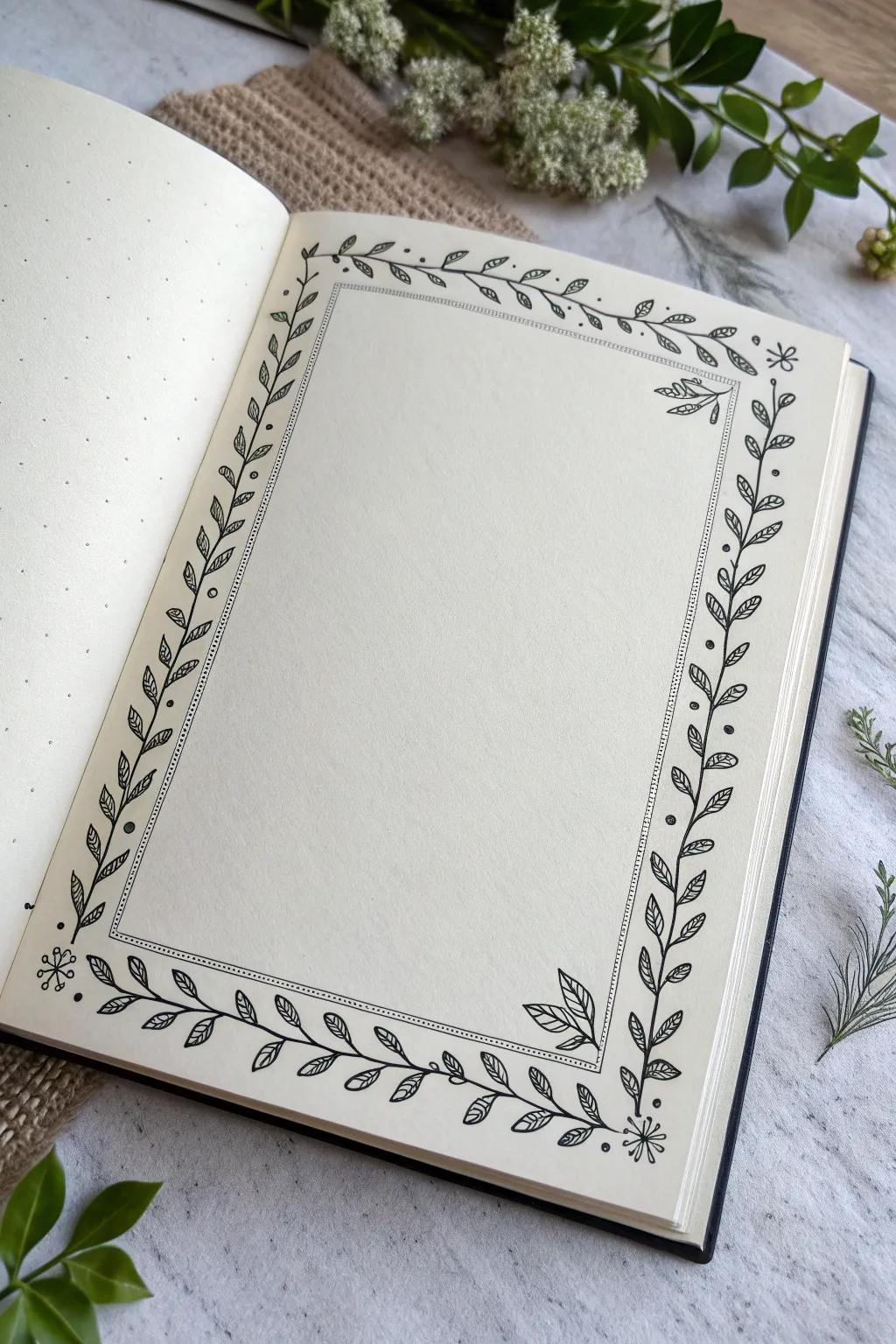
Transform a blank journal page into an inviting space for journaling or quotes with this delicate leafy frame. This project combines simple vine structures with tiny details to create a border that feels both organic and structured.
How-To Guide
Materials
- Dotted or blank notebook (A5 size recommended)
- Pencil (HB or 2H)
- Eraser
- Ruler
- Fine liner pen (0.3mm or 0.5mm)
- Ultra-fine liner pen (0.05mm or 0.1mm)
Step 1: Setting the Framework
-
Define the boundaries:
Start by lightly sketching a large rectangle in pencil on your page. Leave about 1 inch of margin around the outside edges of the paper to ensure the border doesn’t feel cramped. -
Create the inner frame:
Sketch a second, smaller rectangle inside the first one. The gap between these two rectangles will define the width of your vine border; aim for a gap of about 1.5 to 2 centimeters. -
Mark the corners:
Lightly mark the four corners where your vines will either originate or meet. This helps in planning the flow so the leaves don’t look awkward at the turns.
Natural Flow Tip
Rotate your notebook as you draw so your hand is always pulling the pen in a comfortable direction, usually toward your body.
Step 2: Drawing the Vines
-
Inking the main stems:
Using your 0.3mm or 0.5mm pen, draw the main wavy vine line. Instead of a straight line, let it meander gently within the pencil guidelines you created. Start from one corner and work your way to the next. -
Turning the corners:
When you reach a corner, curve the stem softly rather than making a sharp 90-degree angle. You can let the ends of the vines overlap slightly or curl inwards. -
Adding basic leaves:
Begin adding leaves along the vine. Draw small, teardrop or almond shapes in pairs or alternating along the stem. Keep them angled towards the direction the vine is growing. -
Varying size and direction:
To make it look natural, I prefer to vary the size of the leaves slightly—making some smaller near the tips of the vines and larger in the middle sections. -
Creating corner flourishes:
At the corners, add a few extra leaves or a small cluster of three leaves to emphasize the frame’s shape. This anchors the design visually.
Step 3: Adding Details
-
Drawing vein details:
Switch to your thinner 0.05mm pen. Draw a single central line down the middle of each leaf. You don’t need to connect it fully to the tip; a floating line often looks more artistic. -
Adding decorative dots:
Using the thicker pen again, place small solid black dots randomly in the empty spaces around the vines. This acts as ‘filler’ and adds texture to the white space. -
Drawing tiny flowers:
In open areas or corners, draw simple 5-petal flowers or tiny starbursts. Keep them small so they accent the leaves rather than overpowering them. -
The inner dotted line:
Using your ruler and the fine pen, draw a straight line or a tightly dotted line just inside the inner boundary of your vine border. This creates a clean ‘mat’ for whatever you write inside. -
Double-checking balance:
Step back and look at the composition. If a section looks too sparse, add a small curling tendril or an extra leaf to fill the gap.
Fixing Wobbly Lines
If a vine line goes crooked, don’t erase! Add a leaf exactly over the mistake or thicken the line slightly to disguise the wobble.
Step 4: Finishing Touches
-
Let the ink settle:
Wait at least 15 minutes for the ink to dry completely. Smudging happens often if you erase too soon. -
Erase guidelines:
Gently erase all your pencil marks, holding the paper taut so it doesn’t crinkle. -
Final inspection:
Look closely at your ink lines. If the eraser faded any blacks, go over them lightly one last time to ensure deep contrast.
Now you have a beautifully framed page ready to house your favorite memories or monthly goals


Have a question or want to share your own experience? I'd love to hear from you in the comments below!