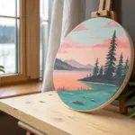
A round canvas changes everything—in the best way—because it asks you to think in curves instead of corners. Here are my favorite circle canvas painting ideas that lean into that shape so your composition feels naturally at home.
Sunset Horizon Split
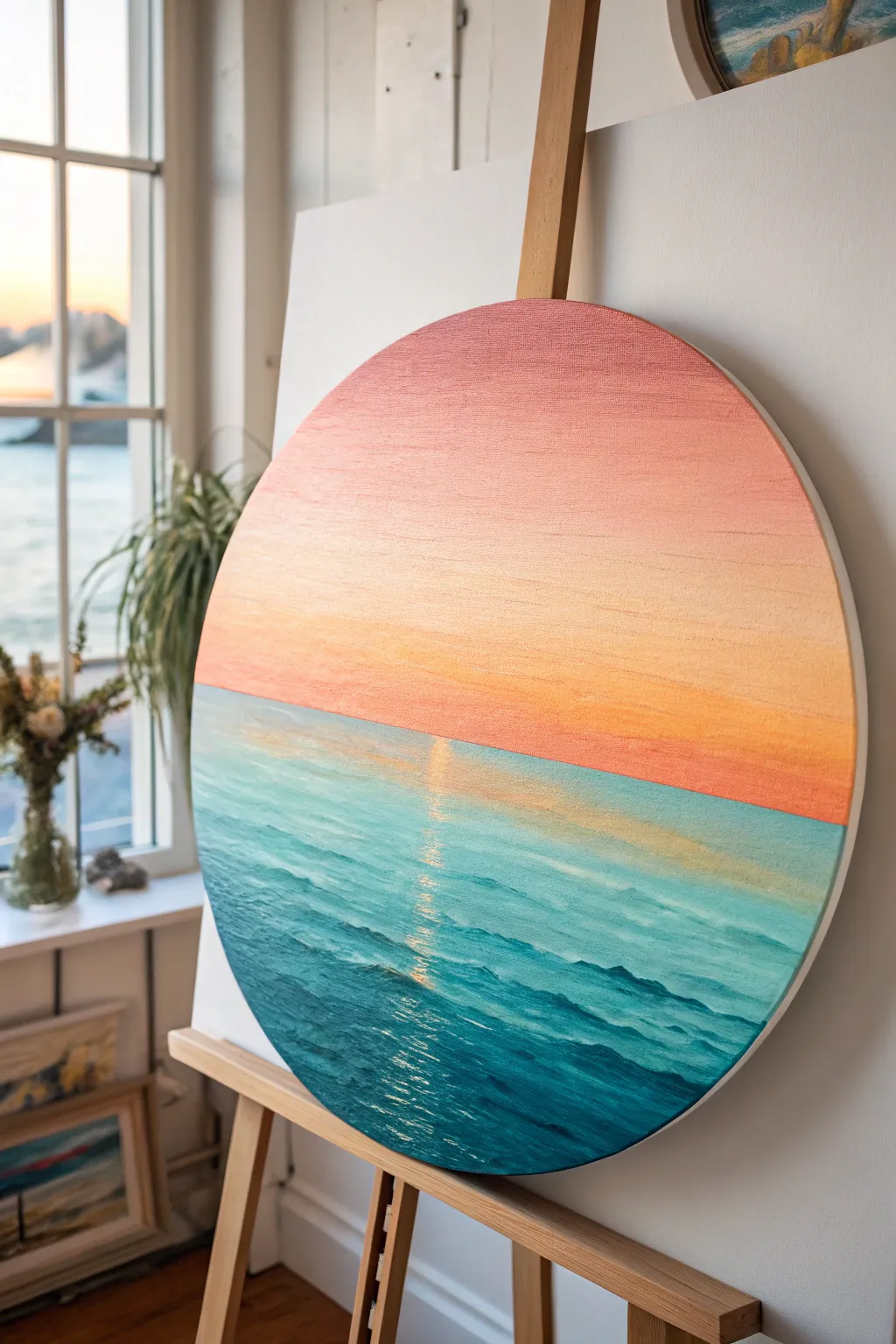
Capture the perfect calm of a sunset hitting the water with this balanced composition on a round canvas. The split-horizon design emphasizes the contrast between the smooth, gradient sky and the textured, shimmering ocean waves.
How-To Guide
Materials
- Round stretched canvas (approx. 16-20 inches/40-50 cm)
- Acrylic paints: Titanium White, Cadmium Yellow Medium, Cadmium Orange, Alizarin Crimson, Phthalo Turquoise, Ultramarine Blue, Hooker’s Green
- Large flat wash brush (2 inch)
- Medium flat brush (1 inch)
- Small filbert brush
- Rigger or liner brush
- Painter’s tape or masking tape
- Palette knife
- Jar of water
- Paper towels
Step 1: Setting the Sky
-
Define the horizon:
Place a strip of painter’s tape horizontally across the canvas, slightly below the center line. This ensures a crisp, straight horizon line, which is crucial for this composition. -
Mix your sky palette:
Prepare three piles of paint for your gradient: a pale peach (white + tiny touch of orange), a warm coral (orange + touch of crimson + white), and a deeper dusty rose (crimson + touch of blue + white). -
Apply the top layer:
Using your large flat brush, paint the top third of the sky with the dusty rose mixture. Brush horizontally, following the curve of the canvas edge at the top. -
Blend the middle section:
While the top paint is still wet, apply the warm coral color to the middle section of the sky. Use long, horizontal strokes to blend it seamlessly into the dusty rose above. -
Finish the horizon glow:
Paint the area directly above the tape with the pale peach mixture. Blend upwards into the coral to create a soft, glowing effect closest to the horizon. -
Smooth the gradient:
Take a clean, dry flat brush and very lightly sweep back and forth across the entire sky to eliminate harsh transitions. Let this section dry completely before removing the tape.
Paint drying too fast?
If your acrylics are dragging or drying before you can blend the sky gradient, mist the canvas lightly with water or add a slow-drying medium to your paint mix.
Step 2: Creating the Ocean
-
Establish the base water color:
Remove the tape. Mix a mid-tone turquoise using Phthalo Turquoise, white, and a tiny bit of yellow. Paint the entire bottom section with horizontal strokes as a base coat. -
Deepen the foreground:
Mix a dark teal using Phthalo Turquoise and Ultramarine Blue. Apply this to the bottom third of the canvas, closest to the viewer, to create depth. -
Add horizon distance:
Mix a very pale aqua (white + tiny bit of turquoise). Using a 1-inch flat brush, paint horizontal streaks right up against the horizon line to suggest distant, calm water. -
Create wave texture:
Switch to a small filbert brush. Using the dark teal mix, dab small, choppy horizontal strokes throughout the lower half of the ocean to simulate movement and wave shadows. -
Highlight the waves:
Mix a lighter turquoise (add more white to your base mix). Paint the tops of the choppy waves in the foreground, leaving the darker paint visible in the troughs.
Step 3: Reflection and Details
-
Start the sun path:
Mix a warm yellow-white highlighting color. Using a small flat brush, gently dry-brush a vertical column down the center of the water, starting from the horizon. -
Broken shimmer lines:
The reflection should not be a solid line. Use horizontal dashes that get wider as they come closer to the bottom edge, mimicking light catching individual wave crests. -
Intensify the center:
Add pure white to your yellow mix. Go back over the very center of the reflection path with smaller, brighter dashes to make the water look like it is sparkling. -
Refine the horizon line:
If the paint bled under the tape earlier, take a liner brush with the appropriate color and tidy up the line where the sky creates a sharp edge against the water. -
Final blending touch:
I prefer to take a dry brush and very softly feather the edges of the sun reflection horizontally, so the light looks integrated into the water rather than sitting on top.
Pro Tip: Rounded Edges
Don’t stop at the front face! Paint the sides of your round canvas. Continue the sky color around the top rim and the ocean teal around the bottom rim for a polished look.
Step back and admire how the round shape enhances the feeling of looking through a ship’s porthole at a beautiful evening sea
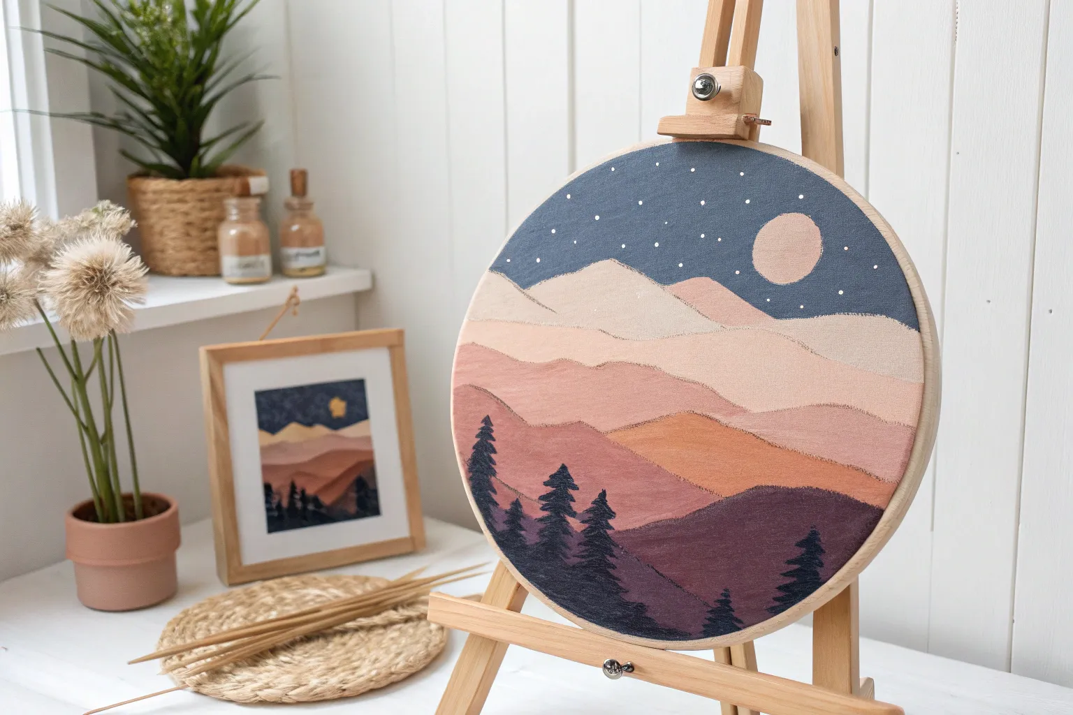
Full Moon Night Sky
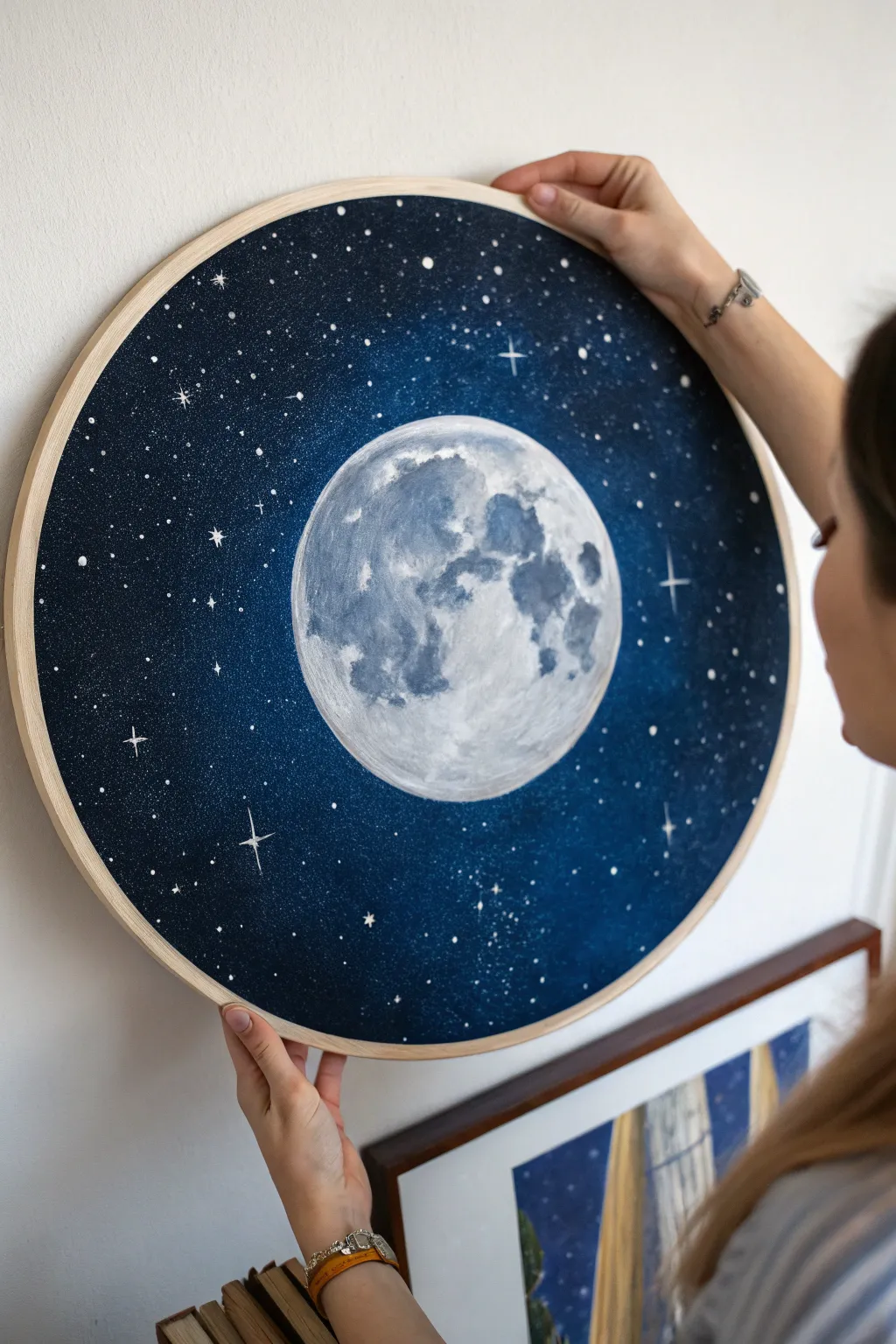
Capture the serene beauty of a moonlit night with this striking circular painting. The deep blue gradient and meticulously detailed cratered moon make for a stunning piece that feels like looking through a telescope.
Step-by-Step
Materials
- Round stretched canvas (approx. 16-20 inches diameter)
- Acrylic paints: Titanium White, Mars Black, Phthalo Blue (or Prussian Blue), Ultramarine Blue, Neutral Grey
- Large flat brush or sponge applicator
- Medium round brush
- Fine liner brush (size 0 or 00)
- Small sea sponge or stippling brush
- Compass or a round plate for tracing
- Pencil
- Palette for mixing
- Water cup and paper towels
- Old toothbrush (optional for stars)
Step 1: Setting the Scene
-
Base sketch:
Begin by finding the exact center of your round canvas. Use a compass or trace a circular object (like a dinner plate) to draw a perfectly round circle in the middle for your moon. Keep your pencil lines light so they don’t show through the paint later. -
Background base coat:
Mix a deep, dark blue using Phthalo Blue and a touch of Mars Black. Using your large flat brush, paint the outer ring of the canvas—the space representing the night sky—being careful to cut in neatly around your pencil circle. -
Creating the gradient:
While the paint is still wet, blend in slightly lighter shades of blue (Ultramarine mixed with a tiny drop of white) as you move closer to the moon’s edge. This creates a subtle glow effect, as if the moonlight is illuminating the surrounding atmosphere. -
Deepening the edges:
Add more black to your blue mix and darken the very outer rim of the canvas. This vignette effect draws the viewer’s eye straight to the center. Let the background dry completely before moving on.
Step 2: Painting the Moon
-
Moon base layer:
Paint the entire inner circle with a solid coat of Titanium White. You might need two thin coats to ensure the canvas texture is fully covered and the white is opaque. -
Mapping the maria:
Mix a light grey wash using water, white paint, and a speck of black. Roughly map out the ‘seas’ or darker patches (maria) of the moon. I find looking at a reference photo of the real moon helps with placement here, though exact realism isn’t strictly necessary. -
Building texture:
Dip a small sea sponge or a stiff stippling brush into a mid-grey tone. Lightly dab this over your mapped grey areas to create a cratered, rocky texture. Don’t press too hard; you want an organic, uneven look. -
Adding depth:
Mix a darker charcoal grey. Use your sponge again, focusing on the edges of the grey patches to create deeper shadows. This adds three-dimensionality to the sphere. -
Highlighting:
Clean your sponge and pick up pure Titanium White. Dab this onto the brightest parts of the moon, blending slightly into the grey areas to soften the transitions. This contrast makes the craters pop.
Dry Brushing Tip
For the moon’s craters, wipe most of the paint off your brush first. This ‘dry brush’ technique drags pigment across the canvas weave for instant rocky texture.
Step 3: Starlight Details
-
Splatter stars:
Cover your dry moon painting with a paper towel or round cutout to protect it. Dilute some white paint with water until it’s the consistency of ink. -
Applying the splatter:
Load an old toothbrush or a stiff bristled brush with the thinned paint. Flick the bristles with your thumb to spray tiny droplets across the blue background, creating a distant field of stars. -
Painting large stars:
Remove the moon cover. Using your fine liner brush and pure white paint, carefully dot in distinct, larger stars scattered randomly around the sky. -
Adding cross stars:
Choose a few of the larger white dots to turn into twinkling stars. Paint a thin cross (+) shape through the center, feathering the lines out so they taper to nothing at the ends. -
Final touches:
Inspect the edge where the moon meets the sky. If it looks messy, use a fine brush with your background blue color to clean up the curve for a crisp finish. -
Varnishing:
Once fully dry (give it at least 24 hours), apply a satin or gloss varnish to protect the surface and deepen the dark blue tones.
Uneven Circle?
If your painted moon looks lopsided, don’t repaint the white. Instead, use the dark blue background paint to ‘cut in’ and reshape the circle’s edge.
Hang your celestial masterpiece on a contrasting wall to let the moonlight shine
Ocean Porthole View
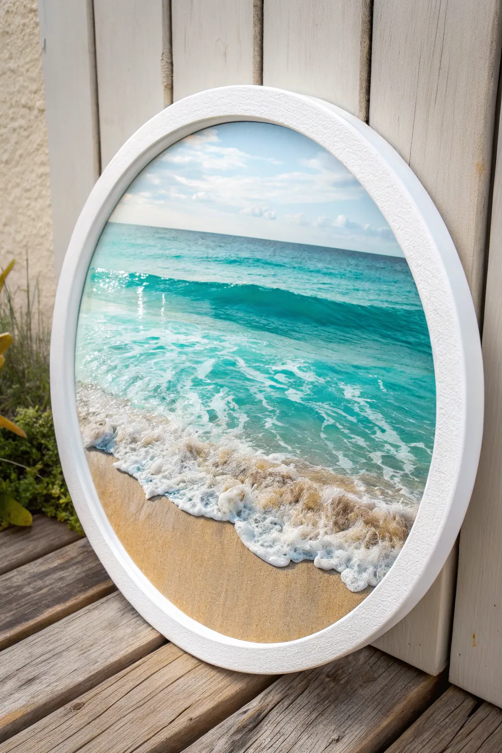
Transform a simple round canvas into a breathtaking window to the sea, capturing the translucent turquoise waters and frothy shoreline of a perfect beach day. This project focuses on layering acrylics to achieve depth and utilizing texture for realism, all framed within a crisp white border.
Step-by-Step Guide
Materials
- Round stretched canvas (12-16 inch diameter)
- Wide floating frame for round canvas (white)
- Acrylic paints: Titanium White, Phthalo Blue, Phthalo Green, Turquoise, Yellow Oxide, Burnt Sienna, Payne’s Gray
- Large flat wash brush
- Medium filbert brush
- Small round detail brush
- Fan brush (soft bristles)
- Palette knife
- Modeling paste (optional for frame texture)
- Glass of water and paper towels
- Sea sponge (natural)
- Acrylic glazing medium
Step 1: Planning and Sky
-
Prime the Surface:
Ensure your round canvas is clean. If it’s not pre-primed, apply a coat of gesso. Since we are aiming for a horizon line, lightly sketch a straight horizontal line about one-third down from the top edge. -
Mix the Sky Gradient:
Prepare a very pale blue by mixing a large amount of Titanium White with a tiny dot of Phthalo Blue. You want this to be soft and airy. -
Paint the Sky:
Using the large flat wash brush, work from the top edge down towards the horizon line. Add a little more white as you approach the horizon to create atmospheric perspective. -
Add Subtle Clouds:
While the sky is still slightly tacky, use a small amount of pure white on your filbert brush to scumble in soft, indistinct cloud shapes. Keep them horizontal and flat near the horizon.
Step 2: Deep Water and Horizon
-
Establish the Horizon:
Using a piece of masking tape or a steady hand with a flat brush, paint a straight, darker blue line on the horizon using Phthalo Blue mixed with a touch of Payne’s Gray. This defines the deep ocean. -
Transition to Teal:
As you move down from the deep blue horizon, start mixing Phthalo Green and Turquoise into your blue. Blend downwards, lightening the color gradually with white to create that glowing tropical water look. -
Create the Wave Ridge:
About halfway down the canvas, paint a darker, curved band of teal blue. This represents the back of the breaking wave. Soften the top edge of this band into the lighter water behind it.
Muddy colors?
Clean your brush thoroughly between the sky (cool blues) and the sand (warm yellows). Accidental mixing turns coastline colors green or grey.
Step 3: The Breaking Wave
-
Paint the Wave Face:
Below the dark ridge, mix a translucent, bright turquoise (Turquoise + White + Glazing Medium). Paint vertical strokes that follow the curve of the wave, simulating the light shining through the water. -
Form the Foam Lip:
Using pure Titanium White and a detail brush, paint the ragged, bright top edge of the wave where it is just beginning to crumble. Keep the line uneven and natural. -
Texture the Surf:
Behind the main wave, use a dry fan brush or sea sponge with white paint to dab lightly on the water surface, creating the look of disturbed water and whitecaps.
Level Up: Resin Finish
Pour a clear coat of art resin over the water area only (masking the sand and sky) for a permanent, hyper-realistic wet look.
Step 4: The Shores and Sand
-
Base the Sand:
Mix Yellow Oxide with a little Burnt Sienna and plenty of White to get a warm beige sand color. Paint the bottom third of the canvas in a curving shape to mimic the shoreline. -
Wet Sand Effect:
Where the water meets the sand, darken your sand mixture slightly with a touch of Burnt Sienna or raw umber to show the wet, packed sand beneath the receding water. -
Applying Sea Foam:
This is the crucial step for realism. Load a fan brush or palette knife with thick Titanium White. Tap it gently along the edge where the water meets the sand to create the bubbly sea foam. -
Soften the Foam Edges:
Use a clean, slightly damp brush to gently smooth the bottom edge of the white foam, blending it slightly into the wet sand color to make it look transparent. -
Add Shadow to Foam:
Mix a tiny amount of blue-grey glaze and paint a very thin shadow line right underneath the thickest parts of the white foam. This lifts the foam off the sand visually.
Step 5: Finishing Touches
-
Highlights and Sparkle:
Add tiny dots of pure white on the crest of the wave and on the wet sand to simulate sunlight reflecting off the water. -
Frame Preparation:
For the specific look in the photo, take your white round frame. If it is smooth wood, consider dabbing it with modeling paste or heavy body white paint using a sponge to give it that stucco-like texture. -
Assembly:
Once the painting is completely dry, place it into the frame. Securing it from the back ensures that the clean white border really makes the turquoise colors pop.
Hang your new seascape in a hallway or bathroom to create an instant window to a sunny vacation spot

Mountain Peak Center Focus
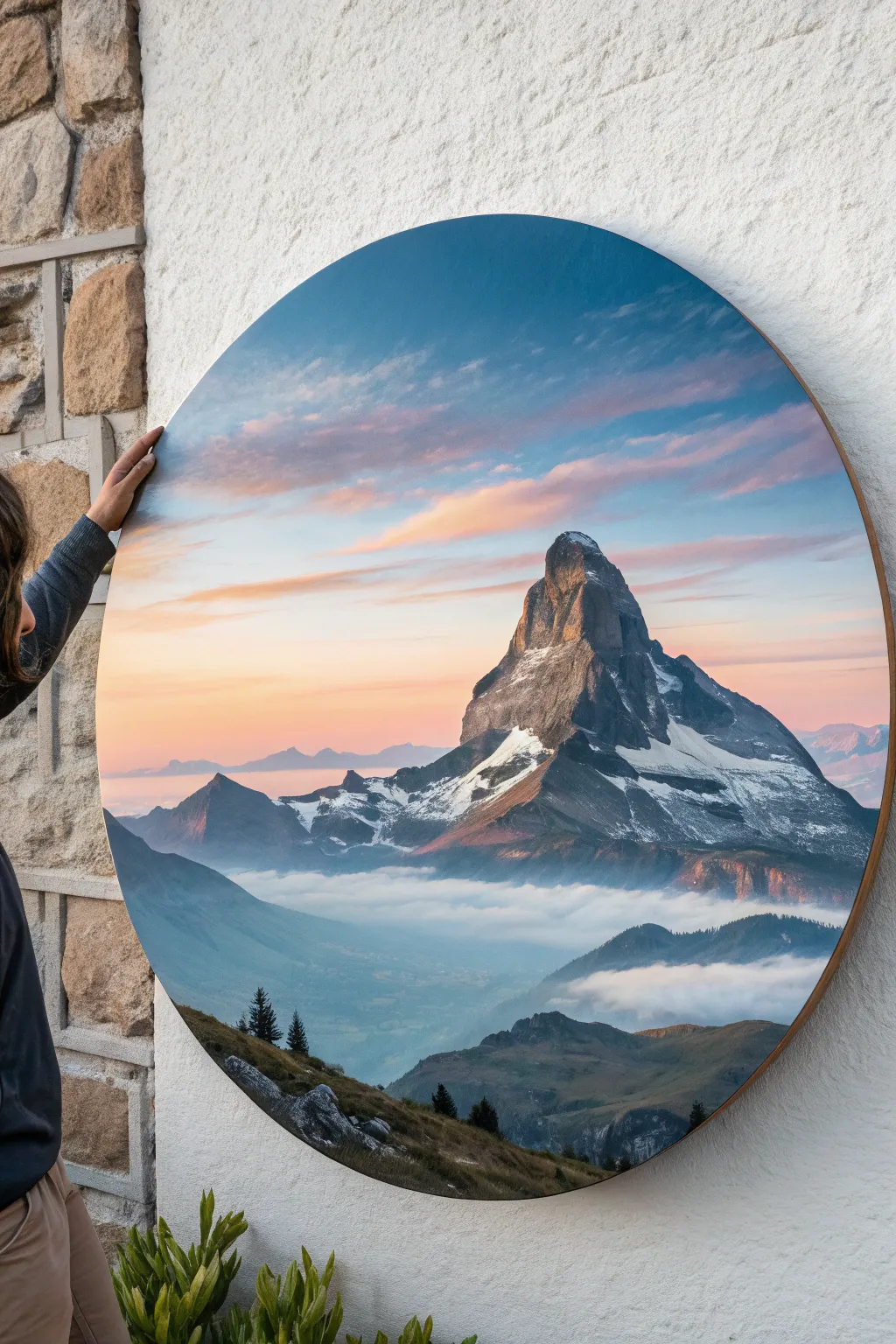
Capture the breathtaking serenity of an alpine sunrise with this circular canvas project featuring a striking mountain peak piercing through morning mist. The round format acts like a portal or window, focusing the viewer’s gaze directly on the dramatic interplay of light and shadow.
Step-by-Step
Materials
- Large circular stretched canvas (24-36 inch diameter)
- Acrylic paints (Titanium White, Mars Black, Phthalo Blue, Alizarin Crimson, Cadmium Orange, Burnt Umber, Sap Green)
- Assorted brushes (large flat wash, medium filbert, small liner, fan brush)
- Palette knife
- Water container and paper towels
- Easel or flat working surface
- Gesso (optional)
Step 1: Sky and Atmosphere
-
Prime the Surface:
Ensure your circular canvas is clean and ready. Apply a coat of gesso if needed to smooth out the texture, which helps when painting detailed clouds later. -
Map the Horizon:
Lightly sketch the horizon line about a third of the way up from the bottom. Outline the iconic pyramid shape of the mountain (the Matterhorn) slightly off-center to create a dynamic composition. -
Base Sky Gradient:
Mix a soft gradient for the sky. Start at the top with a mix of Phthalo Blue and White, transitioning into a pale, warm pink near the horizon using White and a tiny touch of Alizarin Crimson. -
Adding Clouds:
While the sky paint is still slightly wet, blend in streak-like clouds. Use a mix of Cadmium Orange and White for the sunlit undersides, feathers them out diagonally to suggest wind movement. -
Deepening the Blue:
Reinforce the top edge of the canvas with a slightly deeper blue to create a vignette effect, drawing the eye toward the center.
Palette Knife Magic
Use the flat edge of a palette knife to drag white paint down the mountain face. It skips over the canvas weave, perfectly mimicking rocky snow.
Step 2: The Mountain Peak
-
Block in the Mountain:
Mix a dark grey using Mars Black and a touch of Blue. Block in the main shape of the mountain peak. Use your reference photo to capture the craggy, jagged silhouette accurately. -
Establish Light Source:
Decide on your light source coming from the left. Paint the left face of the mountain with a lighter, warmer grey (mix in some orange or brown) to represent the morning sun hitting the rock. -
Shadow Side:
Keep the right face of the mountain in deep shadow. Use pure Mars Black mixed with Phthalo Blue to create a cold, recessive dark tone. -
Adding Snow:
Using a palette knife or a firm brush, scumble Titanium White onto the ridges and crevices. Don’t paint solid white; let the texture of the canvas break the paint to look like scattered snow and ice. -
Refining Rocks:
Take a small liner brush with dark paint to define the sharp cracks and fissures in the rock faces. This detailing gives the mountain its massive, rugged scale.
Make it Metallic
Mix a tiny amount of gold or copper paint into the sunrise cloud highlights. It will make the artwork catch the light beautifully when hung.
Step 3: Valley and Foreground
-
Distant Mountains:
Paint the smaller, distant mountain ranges in the background using a pale, hazy blue-purple mix. These should lack detail to push them far into the distance. -
Valley Mist:
Create a layer of fog at the base of the main peak. Keep your mixture very watery or use a dry brush with white and pale blue to create a soft, ethereal cloud layer that hugs the valley floor. -
Valley Floor Details:
Below the mist, block in the valley floor with muted greens and blues. I find suggest tiny hints of buildings or fields with small dabs of paint adds a sense of immense scale. -
Foreground Slope:
Paint the immediate foreground hill at the very bottom edge. used a mix of Burnt Umber and Sap Green to create a dark, earthy base that anchors the composition. -
Texture the Grass:
Stipple lighter greens and dull yellows onto the foreground slope to suggest rough alpine grass and terrain. -
Add Tiny Trees:
Using a small fan brush or liner brush, paint tiny silhouette pine trees along the ridge of the foreground hill and the lower mountain slopes. -
Final Highlights:
Add the brightest highlights: pure white on the sun-struck snow and a brilliant touch of pale orange on the cloud edges nearest the sun. -
Varnish:
Once completely dry (wait at least 24 hours), apply a satin or gloss varnish to protect the paint and deepen the dark colors.
Hang your new masterpiece in a spot where it can catch natural light to enhance those subtle sunrise hues
BRUSH GUIDE
The Right Brush for Every Stroke
From clean lines to bold texture — master brush choice, stroke control, and essential techniques.
Explore the Full Guide
Pine Tree Silhouette Ring
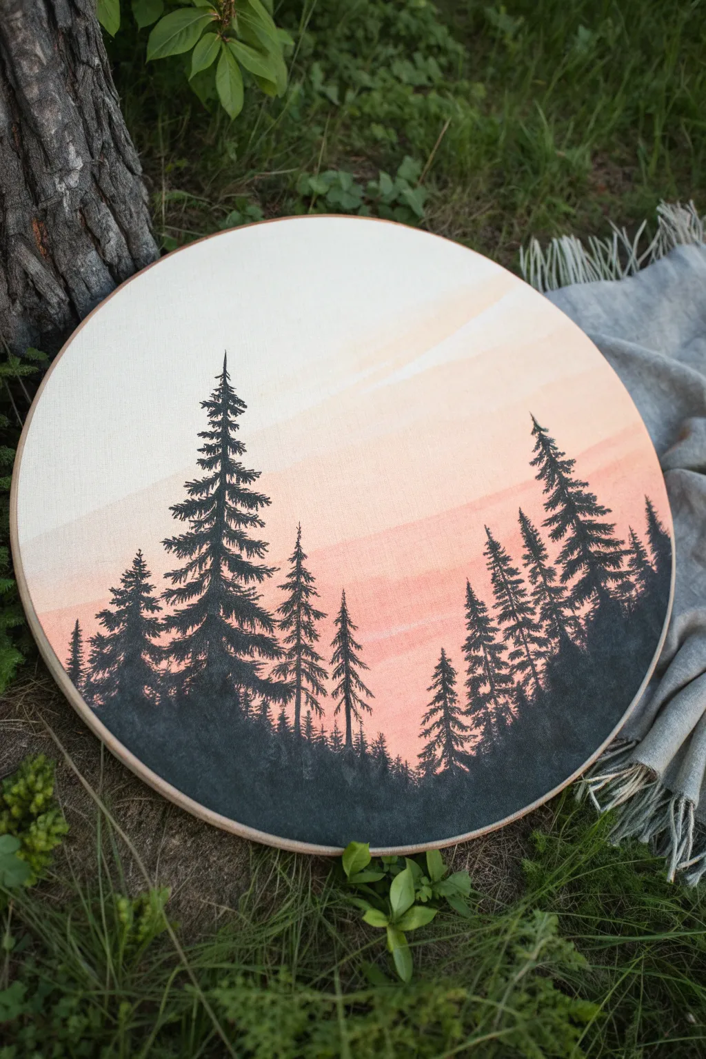
Capture the serene beauty of a misty forest morning with this layered silhouette painting. The soft, gradient sky provides a breathtaking, warm backdrop for the crisp, dark details of the evergreen trees.
Detailed Instructions
Materials
- Round stretched canvas (10-12 inch diameter)
- Acrylic paints: Titanium White, Peach/Coral, Light Pink, Burnt Umber, Carbon Black
- Wide flat wash brush (1-inch)
- Small fine liner brush (size 0 or 00)
- Medium round brush (size 4)
- Palette or mixing plate
- Cup of water and paper towels
Step 1: Painting the Gradient Sky
-
Prepare the canvas:
Ensure your round canvas is clean. If it’s raw canvas, apply a coat of gesso first. Position the canvas so the grain runs vertically to help with the tree textures later. -
Mix the sky colors:
On your palette, prepare three main puddles: pure Titanium White, a very pale creamy peach (White + tiny dot of Peach), and a deeper coral pink (Peach + Light Pink). -
Apply the top layer:
Using the wide flat brush, paint the top third of the circle with the pure white paint. Use horizontal, slightly curved strokes to mimic the curvature of the atmosphere. -
Blend the middle section:
While the white is still wet, pick up the pale creamy peach color. Apply this to the middle section of the canvas, brushing slightly upward into the wet white to create a seamless, soft fade. -
Add the horizon warmth:
With the same brush (wiped clean but damp), apply the deeper coral pink to the bottom third. Blend this upward into the peach tone. The goal is a gentle ombré effect from white to pink. -
Create distinct cloud bands:
I like to take a mostly dry brush with a tiny bit of the darker pink and swipe a few very faint, diagonal bands across the lighter upper sections to suggest wispy clouds. -
Let it dry completely:
This step is crucial. The background must be bone dry before you start the trees, or the black paint will muddy the sky. A hair dryer on low heat can speed this up.
Dry Brush Texture
For realistic pine needles, use a brush that is almost dry. The bristles will split naturally, creating multiple tiny scratchy lines that look exactly like distant pine needles.
Step 2: Creating the Pine Silhouettes
-
Mix the silhouette color:
Don’t use straight black; it looks flat. Mix Carbon Black with a small amount of Burnt Umber to create a rich, warm charcoal tone. -
Establish the horizon line:
Using the medium round brush, paint a solid, undulating mound of dark color along the bottom edge of the canvas. This is the forest floor. -
Mark tree positions:
With the fine liner brush, paint thin vertical lines to mark exactly where your tallest trees will stand. Vary the heights to keep the composition natural. -
Paint the tree tops:
Starting at the very top of a vertical line, use the liner brush to dab tiny, horizontal dashes that get slightly wider as you move down. -
Build the branches:
Switch to a slightly loaded liner brush. Use a ‘dab and flick’ motion, pulling creating downward-sloping branches. Leave gaps between branches to let the sky peek through. -
Thicken the lower canopy:
As you reach the bottom third of the tree, merge the branches more solidly. The silhouette should be denser near the base. -
Vary the tree styles:
Make some trees distinct and detailed, and others slightly softer or shorter. The trees on the far left and right edges should curve slightly inward to frame the piece. -
Fill the undergrowth:
Between the main trees, use the medium brush to dab in shorter, indistinct spiky shapes. This creates the illusion of distant trees and dense underbrush. -
Final darkening:
Once the first layer of trees is dry, go back over the solid black bottom area with a second coat to ensure it is opaque and dark against the light background.
Starry Night Twist
Transform this from dawn to dusk by painting the sky deep indigo to violet. Once dry, flick watered-down white paint across the top for stars before adding trees.
Hang your finished round canvas on a gallery wall or prop it on a shelf to bring a breath of fresh air indoors
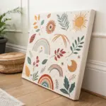
Simple Floral Wreath Border
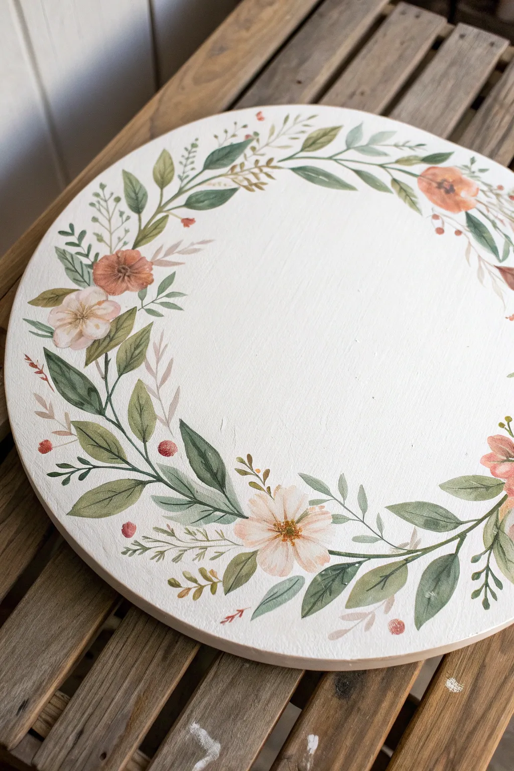
Embrace the delicate beauty of botanicals with this soft, watercolor-style floral wreath painted on a round canvas. The design features trailing vines and gentle blooms that frame the circular shape perfectly, making it an ideal piece for nursery decor or a thoughtful handmade gift.
Step-by-Step Tutorial
Materials
- Round canvas or wood panel (10-12 inches)
- White Gesso (if using wood panel)
- Acrylic paints (White, Deep Green, Olive Green, Salmon Pink, Burnt Sienna, Cream/Light Yellow)
- Glazing medium or water (for watercolor effect)
- Round paintbrushes (Sizes 2, 4, and 6)
- Liner brush (Size 0 or 00)
- Pencil for sketching
- Palette for mixing
- Paper towels
Step 1: Preparation & Sketching
-
Prime the Surface:
If you are using a raw wood panel, start by applying two generous coats of white gesso to create a smooth, bright white background. Sand lightly between coats if necessary for a super smooth finish. If using a pre-primed round canvas, you can skip this step, though a fresh coat of white paint ensures a clean slate. -
Plan the Layout:
Visualize the wreath shape. The design in the image isn’t a perfect circle but rather two main curving branches that meet at the bottom and curve upwards, leaving the top slightly open or connected by thinner vines. -
Lightly Sketch Vines:
Using a very hard pencil (like an H or 2H) to keep lines faint, sketch the main skeletal curves of your vines. Start from the bottom center and sweep upwards along the left and right edges. -
Mark Leaf and Flower Placement:
Roughly mark where your three main flower clusters will sit: one on the bottom left, one on the bottom right/center, and a smaller one near the top right. Add small dashes to indicate direction for the larger leaves.
Watercolor Look with Acrylics
To get that translucent look without watercolor paint, simply mix a glazing medium or water into your acrylics. Build color slowly in thin, watery layers rather than thick globs.
Step 2: Painting the Greenery
-
Mix Your Base Greens:
Create two main green tones on your palette: a deeper, cool green (Deep Green mixed with a touch of Burnt Sienna) and a lighter, warmer olive tone (Olive Green mixed with a little Yellow or White). -
Paint the Main Stems:
Using your size 2 round brush and the deeper green mixture, paint the main stems following your pencil lines. Keep the pressure light so the lines taper naturally at the ends. -
Lay Down Base Leaves:
Switch to a size 4 or 6 brush. Load it with watered-down olive green to get that translucent, watercolor look. Press the belly of the brush down to create the wide part of the leaf and lift as you pull away to create the point. -
Add Darker Leaf Accents:
While the olive leaves are drying but still slightly damp, paint a few darker leaves interspersed among them using your Deep Green mix. This creates depth and makes the wreath look fuller. -
Create Vein Details:
Once the leaves are touch-dry, use your liner brush (size 0) and the darkest green mix to paint extremely thin central veins on the larger leaves. Keep these lines steady but organic. -
Add Filler Sprigs:
Mix a very pale grey-green. Using the liner brush, add delicate, fern-like sprigs and tiny off-shoot branches sticking out from the main vine. These should look airy and light.
Fixing Heavy Blobs
If you accidentally apply too much paint and lose the airy feel, quickly dab the wet paint with a clean, dry paper towel to lift the excess pigment before it dries completely.
Step 3: Painting the Blooms
-
Mix Flower Colors:
Prepare a soft salmon pink by mixing Salmon Pink with plenty of White, and a warm cream color. You want these to be quite opaque but soft in tone. -
Paint the Main Blossoms:
Using the size 6 brush, paint the five-petal flowers. Start from the outside of the petal and stroke inward toward the center. Don’t worry about perfect coverage; a little streaking mimics the texture of petals. -
Add Secondary Buds:
Paint smaller, tighter buds using a slightly darker shade of the pink (less white mixed in). Place these near the ends of the vines, particularly on the upper right side. -
Detail the Flower Centers:
Once the petals are dry, dip your size 2 brush into Burnt Sienna. Dab a small, irregular circle in the center of each open flower. -
Add Stamen Details:
Using the liner brush and a dark brown or black, paint tiny radiating lines from the center of the flowers. Dot the ends of these lines with yellow or white for pollen. -
Include Berries:
Scattered throughout the greenery, paint small, round berries using a reddish-brown or rusty orange color. These add a nice pop of warmth to balance the greens.
Step 4: Final Touches
-
Layering for Depth:
I like to take a step back here and look for gaps. If the wreath feels too sparse, mix a very watered-down green glaze and paint subtle ‘shadow’ leaves behind the main ones. -
Highlighting:
Mix a tiny amount of white into your lightest green. Add tiny, thin highlights to the tops of a few leaves and stems where the light would naturally hit. -
Refine Edges:
If any paint went outside the desired lines or looks messy, use a small brush with white acrylic (or your background color) to clean up the edges and sharpen the leaf shapes. -
Erase Pencil Lines:
Wait until the painting is completely bone dry—give it at least an hour. Then, gently erase any visible pencil sketch marks with a kneaded eraser. -
Seal the Artwork:
To protect your painting, apply a coat of matte or satin varnish. This is especially important for the ‘watercolor’ acrylic technique, as the thin paint layers are delicate.
Hang your beautiful floral wreath on a wall or door to bring a permanent touch of spring into your home

PENCIL GUIDE
Understanding Pencil Grades from H to B
From first sketch to finished drawing — learn pencil grades, line control, and shading techniques.
Explore the Full Guide
Cherry Blossoms From the Rim
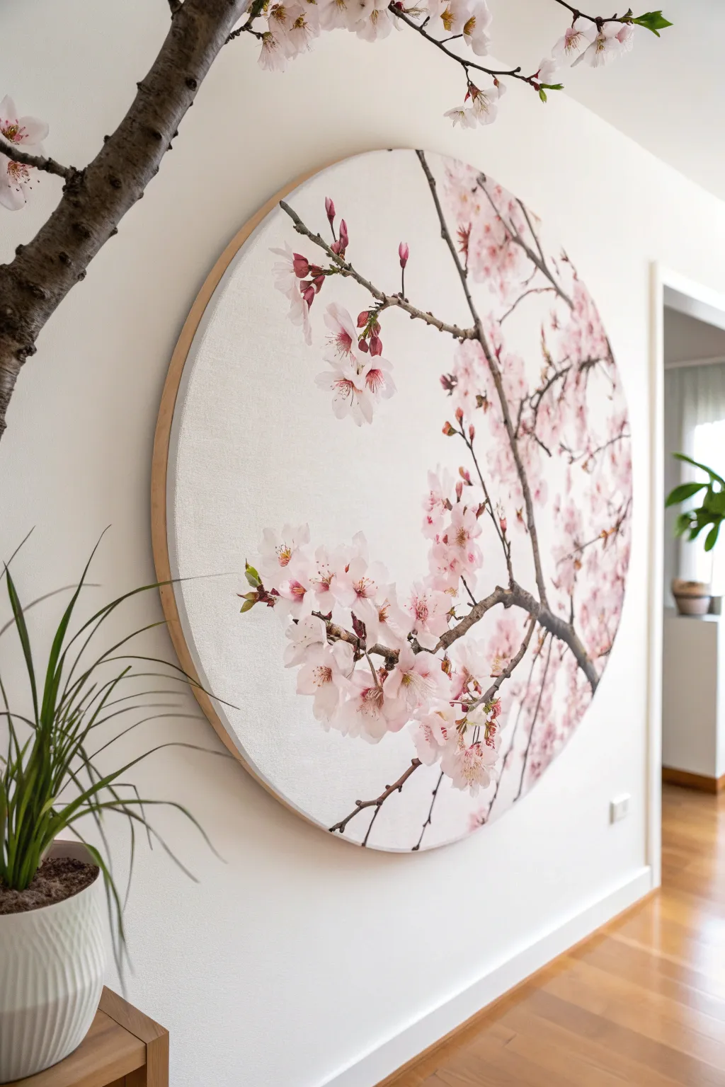
This circular canvas captures the delicate beauty of spring by focusing on cherry blossom branches extending inward from the edge. The composition utilizes negative space to create an airy, modern feel that mimics looking through a window into a blooming tree.
Step-by-Step
Materials
- Large round stretched canvas (24-36 inch diameter)
- Acrylic paints (Titanium White, Alizarin Crimson, Burnt Umber, Raw Sienna, Sap Green, Ultramarine Blue)
- Gesso (if canvas is unprimed)
- Assorted brushes: 1-inch flat brush, #6 round brush, #0 or #00 liner brush
- Palette knife
- Clean water and paper towels
- Pencil for sketching
- Matte medium or flow improver (optional)
Step 1: Preparation & Background
-
Prime the Surface:
Even if your round canvas is pre-primed, apply a fresh coat of Gesso to ensure a smooth, bright white surface. Use broad, sweeping strokes with a large flat brush to minimize texture. Let it dry completely. -
Plan the Composition:
Lightly sketch the main branches with a pencil. The key to this look is asymmetry; start your branches from the right-hand rim, curving them inward towards the center-left, but leaving plenty of open ‘sky’ space. -
Mix a Subtle Backdrop:
Create a very pale off-white for the background to differentiate it from the pure white of the potential blossoms. Mix a tiny dot of Raw Sienna and a speck of Ultramarine Blue into a large pile of Titanium White. Paint the entire negative space around your sketch, blending softly.
Step 2: Painting the branches
-
Base Branch Color:
Mix Burnt Umber with a touch of Ultramarine Blue to get a deep, cool brown. Using the #6 round brush, paint the main thick branches, following your pencil lines. Keep the edges slightly organic and uneven, not perfectly smooth. -
Adding Twigs:
Switch to a smaller brush or add a little water to your paint for better flow. Branch out from the main limbs with thinner, jagged twigs. These should look erratic and angular, characteristic of cherry trees. -
Highlighting Bark:
Mix Burnt Umber with White and a little Raw Sienna to create a medium grey-brown. With a mostly dry brush, drag this lighter color across the tops of the branches to simulate texture and light hitting the bark. -
Deepening Shadows:
Take your darkest brown mix again and reinforce the undersides of the branches and the crooks where smaller twigs join larger limbs to add dimension.
Muddy Pinks?
If your pinks look dull or brownish, you likely mixed in complementary colors (greens/yellows) by accident. Clean your brush thoroughly and use a fresh palette area for mixing pristine pinks.
Step 3: Creating the Blossoms
-
Mixing Pink Tones:
Prepare three piles of paint: pure Titanium White, a very pale pink (White + tiny dot of Crimson), and a medium pink (White + a bit more Crimson). -
Blocking in Flower Shapes:
Start with the medium pink. Using a filbert or round brush, dab in the general shapes of the flower clusters. Don’t worry about individual petals yet; just place organic cloud-like shapes along the twigs. -
Defining Petals:
Dip your brush into the pale pink and press down to create individual petal shapes on top of your darker base. Cherry blossoms usually have five petals with a small notch at the end. -
Adding Highlights:
Layer pure Titanium White onto the tips of the petals that are catching the most imaginary light. This layering technique creates that fluffy, dimensional look. -
Painting Buds:
Near the ends of the thinnest twigs, paint small, tight tear-drop shapes in a darker, more saturated pink to represent unopen buds. I find these add a lovely sense of growth to the piece. -
Adding Centers:
Mix a small amount of yellow-green using Sap Green and Raw Sienna. Dot the very center of the open blossoms. -
Detailed Stamens:
This is the most delicate step. Use your thinnest liner brush (#00) with watered-down reddish-brown paint. Flick tiny lines radiating from the green centers, topping each with a microscopic dot of yellow or orange pollen. -
Falling Petals:
For a sense of movement, paint one or two single petals floating in the empty white space, as if they have just drifted off the branch.
add 3D Texture
Mix modeling paste into your white and pink acrylics before applying the petals. Use a palette knife to impasto the petals, literally lifting them off the canvas surface.
Step 4: Finishing Touches
-
Review Contrast:
Step back from the canvas. If the flowers look too flat, add a subtle glaze of watered-down Crimson near the centers to deepen the cup of the flower. -
Clean the Edges:
If any paint smudged onto the unfinished wooden rim (if your canvas has a floating frame look) or the wrapped edge, clean it up or paint the edges white for a crisp finish. -
Varnish:
Once fully dry (give it 24 hours), apply a coat of matte or satin varnish to protect the artwork and unify the sheen of the different paint layers.
Now you have a serene, circular window into spring that brings an elegant softness to your wall
Galaxy Swirl Spiral
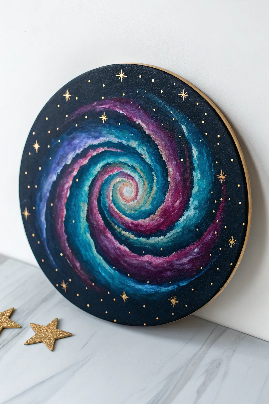
Capture the mesmerizing beauty of deep space with this vibrant galaxy spiral on a round canvas. The swirling arms of teal and magenta against a starry black backdrop create a hypnotic effect that looks far more complex than it actually is.
How-To Guide
Materials
- Round stretched canvas (approx. 10-12 inches)
- Acrylic paints: Black, Prussian Blue, Titanium White, Teal/Aqua, Magenta/Purple
- Metallic gold acrylic paint or paint pen
- Flat shader brush (medium)
- Round brush (small/detail)
- Fine liner brush
- Palette for mixing
- Cup of water and paper towels
Step 1: Setting the Stage
-
Prime the Background:
Start by painting the entire surface of your round canvas with black acrylic paint. While the black is still wet, mix in a tiny amount of Prussian Blue around the edges to give the space depth rather than a flat darkness. -
Paint the Edge:
Don’t forget the sides! Paint the curved edge of the canvas gold now if you want a clean frame look, or extend the black background over the edge. I prefer doing a gold rim first so I can clean up any messes later. -
Map the Spiral:
Once the background is fully dry, use a very light pencil or white chalk to faintly sketch a spiral shape starting from the center and winding outward. This doesn’t need to be perfect; it’s just a guide for your paint placement.
Muddy Colors?
If your teal and purple are turning brown when they touch, let the first color dry completely before adding the second. You can glaze over the dry layer later.
Step 2: Creating the Nebula
-
Lay Down the Teal:
Mix your teal paint with a tiny bit of white to make it opaque. Using the flat brush, paint thick, curved strokes following your spiral guide. Leave gaps between the strokes for the other colors. -
Add the Magenta:
In the gaps between the teal, add your magenta or deep purple paint. Allow the magenta stroke to slightly touch the wet teal paint so they begin to blend naturally at the borders. -
Blend the Transitions:
Clean your brush and leave it slightly damp. Gently drag it along the seam where the teal and purple meet to soften the transition, creating a muddy but magical blur. -
Deepen the Shadows:
Mix a dark blue or purple shade. Apply this to the outer edges of your spiral arms to separate them from the black background, giving the galaxy volume and roundness.
Step 3: Adding Light and Detail
-
Highlight the Core:
The center of the galaxy needs to be the brightest point. Mix a generous amount of white with a drop of teal and paint the very center spiral tight and bright. -
Create Stardust Texture:
Take a dry, stiff brush with very little white paint on it. Lightly stipple or dab along the center of your colored spiral arms to simulate clouds of stars and gas. -
Paint the Outer Glow:
Glaze over the painted spiral with a very watery layer of your lightest teal. This unifies the colors and makes the galaxy look like it’s glowing from within. -
Refine the Edges:
If your spiral got too messy, use black paint to cut back into the shape, sharpening the arms and re-establishing the dark void of space.
Pro Tip: The Toothbrush
For realistic tiny stars, dip an old toothbrush in watered-down white acrylic and flick the bristles for a fine mist spray over the spiral.
Step 4: The Golden Touch
-
Dot the Stars:
Using your smallest round brush or a dotting tool dipped in metallic gold paint, place random dots across the black background. Vary the sizes—some tiny specks, some larger planets. -
Paint Major Stars:
Select 5-7 spots for larger ‘hero’ stars. Paint a simple cross shape (+) first for these, using a fine liner brush. -
Add Star Flares:
Over your cross shapes, paint a smaller diagonal x to create an eight-pointed starburst effect, or simply extend the vertical and horizontal lines to make them sharp and twinkling. -
Inner Galaxy Dust:
Add a few tiny gold specks inside the colored spiral arms themselves. This integrates the metallic element so it doesn’t look like it’s just sitting on top. -
Gild the Rim:
If you didn’t paint the edge gold in the beginning, do it now. A solid gold rim frames the galaxy beautifully and hides staples.
Hang your cosmic creation on the wall and get lost in your own personal universe


Crescent Moon With Clouds
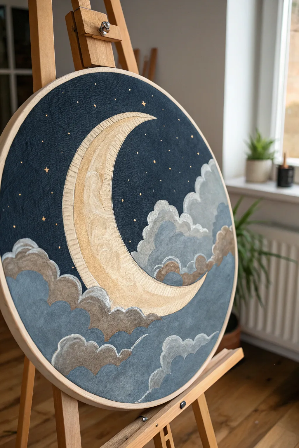
This serene composition captures the magic of a starry night with a stylized, golden crescent moon resting among soft, billowing clouds. The contrasting deep navy background makes the metallic and pastel tones pop, creating a dreamy piece perfect for a bedroom wall.
Step-by-Step Tutorial
Materials
- Round stretched canvas (approx. 12-16 inches)
- Acrylic paints: Deep Navy Blue, Titanium White, Grey, metallic Gold, metallic Bronze/Copper
- Gesso (optional, for priming)
- Pencil and eraser
- Compass or large circular object (for tracing)
- Round brushes (sizes 2, 4, and 8)
- Detail liner brush (size 0 or 00)
- Palette for mixing
- Cup of water and paper towels
Step 1: Preparation and Sketching
-
Prime the Surface:
If your canvas isn’t pre-primed, apply a coat of gesso to ensure a smooth painting surface. Let it dry completely before starting your sketch. -
Outline the Moon:
Using a compass or by carefully freehanding, draw a large crescent shape slightly off-center. Make the crescent broad and substantial, tapering to sharp points at the top and bottom. -
Sketch the Cloud Formations:
Lightly sketch billowy cloud shapes clustering at the bottom of the canvas and overlapping the lower tip of the moon. Also, add a rising column of clouds on the right side to balance the composition. -
Detail the Moon’s Border:
Draw a secondary line inside the outer curve of the moon to create a distinct border or rim, which will be painted with a textured effect later.
Pro Tip: Texture
When painting the gold moon, use slightly thicker paint application. As it dries, the brush strokes will remain visible, mimicking the look of wood grain or crater texture.
Step 2: Painting the Background
-
Apply the Base Navy:
Mix a deep, rich navy blue. Using your largest round brush, carefully paint the entire sky area around the moon and clouds. I like to work wet-on-dry here to get solid, opaque coverage. -
Refine the Edges:
Switch to a smaller brush to cut in cleanly around the pencil lines of the moon and clouds. Don’t worry if you overlap the pencil slightly; the lighter paint will cover the navy if it’s applied thickly enough later. -
Second Coat:
Once the first layer is dry, apply a second coat of navy blue if necessary to eliminate any streaky brushstrokes and achieve a velvety night sky.
Step 3: Creating the Celestial Moon
-
Base Coat for the Moon:
Paint the entire moon shape with a base coat of pale cream or unbleached titanium white. This ensures the metallic gold will shine brightly without the dark canvas showing through. -
Apply the Gold:
Using your metallic gold paint, fill in the main body of the crescent. Use sweeping, curved brushstrokes that follow the arc of the moon to simulate texture. -
Add Decorative Swirls:
Mix a slightly lighter gold or mix white into your gold. Paint subtle, decorative swirls inside the moon’s body to give it an old-world, storybook feel. -
paint the Rim:
Paint the outer rim section you sketched earlier with a flat, distinct shade of gold or a light beige to separate it from the inner textured area. Add tiny ticking lines across this rim to mimic an engraved edge.
Level Up: Crystals
Glue small, flat-backed Swarovski crystals or gold rhinestones over the center of your painted stars for genuine sparkle that catches the light as you move.
Step 4: Painting the Clouds
-
Block in Darker Clouds:
Mix a blue-grey shade and paint the lower/shadow portions of the cloud clusters. Focus on the bottom edges where the clouds would be densest. -
Add Mid-tone Greys:
Using a medium grey, paint the middle sections of the clouds, blending slightly into the darker blue-grey areas while the paint is still tacky. -
Highlight the Tops:
Use Titanium White to paint the fluffy, rounded tops of the clouds. Use a dabbing motion with a dry brush to creating a soft, misty transition between the white tops and grey bodies. -
Define the Edges:
Take a very fine brush with white paint and outline the very tops of the cloud curves to make them pop against the dark background. -
Add Metallic Accents:
Using a bronze or copper metallic paint, add small, curved accents to the shadowed areas of the clouds. This warms up the cool grey tones and ties the clouds to the moon.
Step 5: Final Details
-
Paint the Stars:
Using your smallest detail liner brush (size 00) and gold paint, dot small stars scattered across the navy sky. Vary the sizes slightly for a natural look. -
Create Starbursts:
choose 3-5 of your larger dots and carefully pull tiny lines outward North, South, East, and West to create twinkling starburst shapes. -
Clean Up:
Check the edges where the navy meets the gold or clouds. If any lines are messy, use the appropriate color to touch up and sharpen the boundaries.
Hang your finished piece or lean it on a shelf to enjoy a peaceful slice of night sky anytime
Rolling Desert Dunes
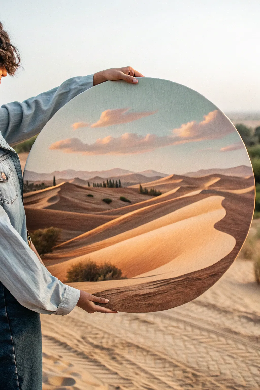
Capture the serene warmth of a vast desert landscape on a unique round canvas. This project features soft, blended skies and striking sand dunes that seem to undulate right off the surface, bringing a sense of calm and depth to any room.
Step-by-Step Tutorial
Materials
- Large round stretched canvas (24-30 inch diameter recommended)
- Acrylic paints: Titanium White, Burnt Sienna, Yellow Ochre, Raw Umber, Ultramarine Blue, Cadmium Orange, Alizarin Crimson
- Gesso (if canvas is unprimed)
- Large flat brush (2-inch)
- Medium filbert brush
- Small round brush for details
- Fan brush (optional, for blending)
- Palette and water container
- Easel or flat working surface
Step 1: Sky and Atmosphere
-
Prime the Surface:
Ensure your round canvas is ready to go. If it feels rough, apply a thin coat of gesso and sand it smooth once dry. This helps achieve those seamless gradients in the sky. -
Mix Sky Colors:
Create a gradient palette for the sky. Mix Titanium White with a touch of Ultramarine Blue for the top third. For the horizon, mix White with a tiny dot of Alizarin Crimson and Cadmium Orange to create a soft, warm peach tone. -
Paint the Gradient:
Using your large flat brush, start at the top with the pale blue mixture. Work your way down, slowly introducing the peach tone as you reach the middle of the canvas. Use long, horizontal strokes to blend the transition smoothly. -
Add Soft Clouds:
While the sky is still slightly tacky, use a medium filbert brush to dab in cloud shapes using a mix of White and a hint of Burnt Sienna for warmth. Keep the edges soft and fluffy, letting them drift horizontally across the upper third. -
Define Distant Mountains:
Mix a hazy purple-grey using Ultramarine Blue, Alizarin Crimson, and White. Paint a low, undulating mountain range right where your sky meets the ground area. Keep this color muted to push the mountains into the background.
Step 2: Sculpting the Dunes
-
Block in Base Colors:
Mix a base sand color using Yellow Ochre, Titanium White, and a touch of Burnt Sienna. Roughly block in the shapes of your dunes, starting from the horizon and moving forward. -
Establish Light Source:
Decide on your light source—in this case, it’s coming from the right. Mix a lighter highlight shade (add more White to your base sand) and a shadow shade (add Raw Umber and a touch of purple to the base). -
Paint Dune Highlights:
Apply the highlight mix to the right-facing slopes of the dunes. Use sweeping, curved strokes that follow the contour of the sand to suggest volume. -
Carve the Shadows:
Apply the shadow mix to the left-facing slopes. The crucial part here is the ‘spine’ or ridge of the dune—create a sharp, clean line where the light meets the shadow to define the crest. -
Deepen the Valleys:
Where the dunes dip low, deepen the shadow color with a bit more Burnt Sienna. This emphasizes the rolling nature of the ladscape. -
Blend the Transitions:
Use a clean, dry brush (a fan brush works well here) to very lightly feather the paint where shadows transition into mid-tones on the curved surfaces, keeping the ridge lines sharp.
Keep it Sharp
The secret to realistic dunes is contrast. Ensure the line between the sun-drenched slope and the shadowed slope is crisp and confident, not blurry.
Step 3: Details and Foreground
-
Add Texture to Sand:
Mix a slightly watery version of your shadow color. Using an old toothbrush or a stiff bristle brush, gently flick tiny specks onto the foreground dunes to simulate sand grain texture. -
Paint Distant Shrubs:
Mix a deep green-black using Ultramarine Blue and Yellow Ochre with a touch of Burnt Sienna. Use the small round brush to dot in tiny, distant trees or shrubs near the base of the mountains. -
Foreground Vegetation:
Using the same dark green mix, paint larger shrubs in the immediate foreground and lower left corner. Use a stippling motion to create the look of prickly desert bushes. -
Highlight the Vegetation:
Add a touch of Yellow Ochre to your green mix and dab highlights on the sun-facing (right) side of the shrubs to give them dimension. -
Final Foreground Ridge:
Paint the very bottom edge of the canvas with a darker, textured brown (Burnt Sienna + Raw Umber) to ground the composition and create a sense that the viewer is standing on a dune. -
Refine Edges:
Go back with your fine brush and sharpen any dune crests that got messy. I often find this final touch-up makes the whole painting pop.
Golden Hour Glow
Glaze the finished (dry) painting with a very thin wash of watered-down Cadmium Orange over the sunlit areas to intensify the sunset warmth.
Hang your circular masterpiece and enjoy the warmth of the desert sun in your home
Koi Fish Yin-Yang Flow
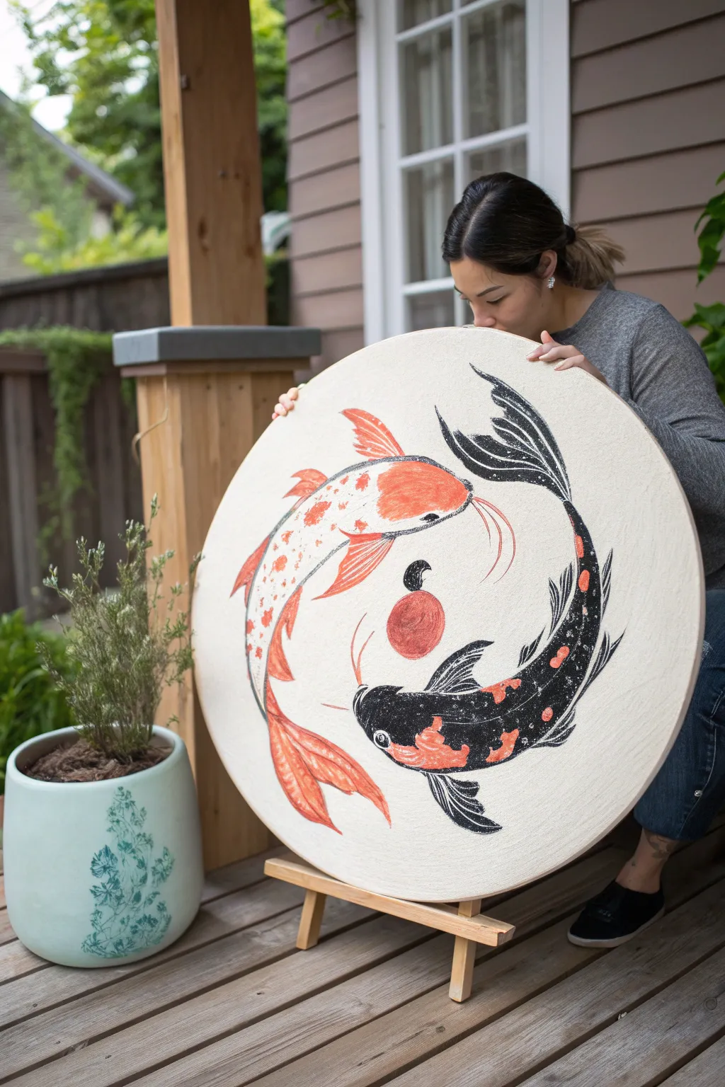
Balance your creative energy with this striking circular canvas painting featuring two koi fish in an eternal dance. The bold contrast of black ink and fiery orange acrylics creates a modern, illustrative look that mimics traditional woodblock prints.
Step-by-Step Tutorial
Materials
- Large circular stretched canvas (24-30 inch diameter)
- Black acrylic paint or India ink
- Orange-red acrylic paint (Vermilion or Cadmium Red Light)
- White acrylic paint
- Pencil and large eraser
- Large flat brush (1-inch)
- Medium round brush (size 6 or 8)
- Fine liner brush (size 0 or 1)
- Tracing paper (optional)
- Compass or string and pin for measuring
Step 1: Conceptual Layout
-
Establish the curve:
Begin by lightly sketching a large ‘S’ curve through the center of the circular canvas. This line will serve as the spine for both fish, guiding their movement around the central point. -
Define the bodies:
Sketch the outline of the top fish first, following the upper curve of your ‘S’ line. Give it a wide head that tapers down to a fluid tail. Repeat this process for the bottom fish, inverted, so they chase each other’s tails. -
Add fin details:
Draw large, fan-like pectoral fins on the sides of each fish. Add a dorsal fin along the back and flowing tail fins that curve to emphasize the circular motion. -
Mark the center:
In the negative space between the two fish (the center of the ‘S’), sketch a small circle for the red sun or pearl motif. Keep it perfectly centered.
Uneven Curves?
If your fish shapes look lopsided, trace a large bowl or plate to get the initial outer curve of their bodies perfect, then freehand the inner details.
Step 2: Painting the Orange Koi
-
Apply the base warmth:
For the top fish (the ‘Yang’ fish), start by painting the main body shape with a wash of white acrylic mixed with a tiny drop of orange. This creates a pale, warm base. -
Define the patterns:
Using your medium round brush and the vibrant orange-red paint, create organic blotches along the spine and head. Don’t make them too uniform; natural koi patterns are irregular. -
Outline and detail:
Once the color is dry, switch to your fine liner brush and black paint. Carefully outline the entire fish. I prefer to use broken, sketchy lines here to mimic a textured print style rather than a cartoon outline. -
Texture the scales:
Inside the white areas of the body, add small, delicate ‘C’ shaped strokes with a diluted grey or very thin black paint to suggest scales without overpowering the white.
Step 3: Painting the Black Koi
-
Block in the darks:
For the bottom fish (the ‘Yin’ fish), use your flat brush to fill in the majority of the body with solid black paint. Leave specific patches empty for the orange spots. -
Add color accents:
Fill the empty patches with your bright orange-red paint. You may need two coats of orange to ensure it pops effectively against the surrounding black. -
Create texture:
To give the black fish depth, use a dry-brush technique with a little dark grey or white. Lightly whisk over the black areas to create a ‘heathered’ or stone-washed look, implying scales reflecting light. -
Detail the fins:
Use the fine liner brush and white paint to draw thin spines within the black tail and pectoral fins. This high contrast brings the anatomy to life.
Gold Leaf Accents
For a luxurious twist, replace the orange sun or the spots on the black fish with gold leaf. Apply sizing glue carefully and press the leaf on for shimmer.
Step 4: Final Touches
-
Paint the sun:
Fill in the central circle with your solid orange-red paint. Keep the edges crisp. You can add a small black swirl or leaf shape above it for extra dynamic movement. -
Add whiskers:
Using your steadiest hand and the fine liner brush, paint long, flowing barbels (whiskers) extending from the mouths of both fish. The orange fish gets red whiskers; the black fish gets white or grey ones for visibility. -
Check the flow:
Step back and look at the overall balance. If the canvas background looks too stark, you can add very subtle, textural noise using a sponge with off-white paint. -
Seal the work:
Once fully dry (give it at least 24 hours just to be safe), apply a matte varnish to protect the surface and unify the sheen of the different paint colors.
Hang your circular masterpiece in a entryway or living space to welcome a sense of flow and equilibrium into your home
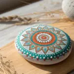
Botanical Mandala Centerpiece
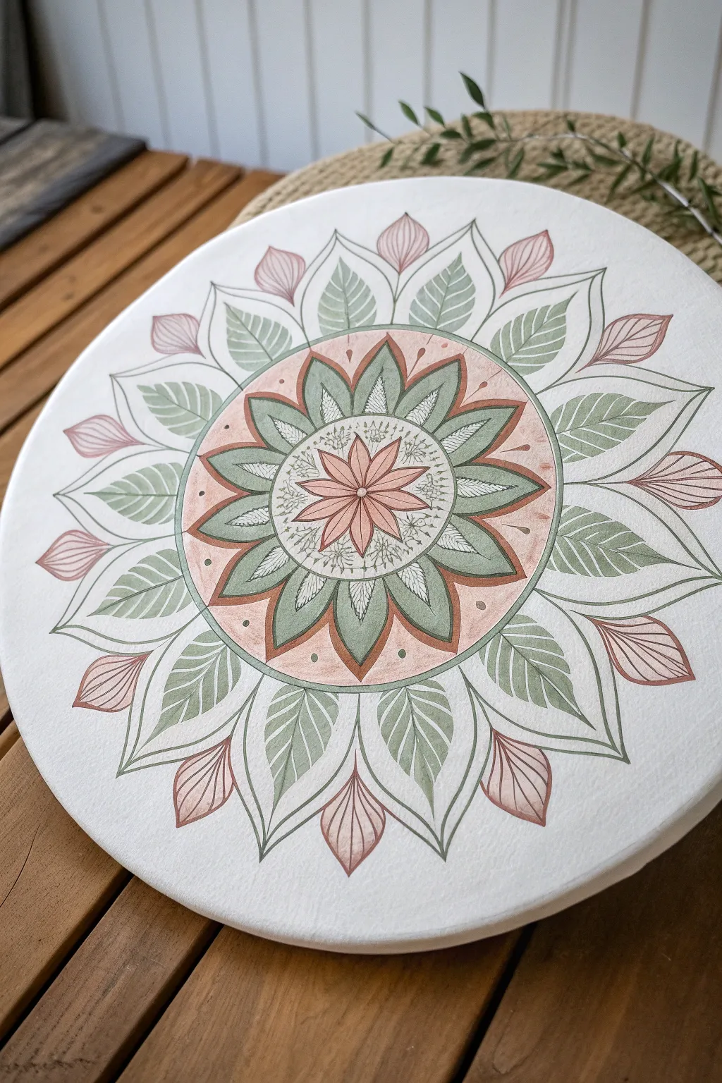
This project combines the symmetrical calm of a traditional mandala with organic, leaf-inspired motifs for a softer, nature-focused look. The muted sage greens and dusty pinks create an inviting, earthy palette that brings a sense of serenity to any space.
Detailed Instructions
Materials
- Round stretched canvas (12-16 inch diameter)
- Acrylic paints: Sage green, dusty pink/blush, white, burnt sienna
- Pencil and eraser
- Compass and ruler
- Fine liner brushes (sizes 0 and 1)
- Flat shader brush (size 4 or 6)
- Black or dark grey fine-tip paint pen or micron pen
- Mixing palette
- Water cup and paper towels
Step 1: Planning and Sketching
-
Find the center:
Start by laying your canvas flat. Use a ruler to lightly draw two diameter lines across the circle to locate the exact center point. -
Create guide circles:
Using your compass, draw a series of concentric circles radiating from the center. You’ll need four distinct zones: a small central circle for the flower, a medium ring for the first leaf layer, a larger band for the colored background, and an outer ring for the final leaves. -
Establish symmetry lines:
Divide your circle into equal wedges. Start with 8 primary sections, then divide those again to get 16 sections. These lines will help ensure your petals and leaves stay uniform. -
Sketch the central flower:
In the innermost circle, sketch an 8-petaled flower shape. The petals should be pointed and touch the edge of your smallest guide circle. -
Add the first leaf layer:
Drawing outwards from the flower, add a layer of pointed leaves. These should sit in the ‘valleys’ between the central petals, creating an alternating pattern. -
Detail the background band:
In the wide band surrounding the center, sketch larger, curved leaf shapes. I like to make these slightly wider at the base. -
Draw the outer wreath:
For the final outer layer, draw large, sweeping leaves that point outward, alternating with smaller bud shapes in between them.
Step 2: Painting the Base Layers
-
Mix your palette:
Prepare your colors. Mix a soft sage green by adding a touch of burnt sienna and white to your green. Create a dusty pink by mixing red, a tiny bit of burnt sienna, and plenty of white. -
Paint the central flower:
Using your fine brush, fill in the central flower petals with the dusty pink. Keep the paint application smooth and flat. -
Fill the inner leaves:
Switch to your sage green mix and paint the first layer of leaves surrounding the flower. Let the paint dry completely before continuing. -
Paint the background band:
This step requires a steady hand. Paint the circular band (behind the middle layer of leaves) with the dusty pink color. You can dilute the paint slightly with water for a more transparent, watercolor-like wash if preferred. -
Define the middle leaves:
Paint the leaves that sit on top of that pink band with your sage green. Use the flat shader brush to get crisp edges. -
Complete the outer ring:
Paint the largest outer leaves with a lighter version of the sage green (add more white). Paint the small buds between them with the dusty pink.
Wobbly Lines?
If your hand shakes while outlining, rest your pinky finger on the dry canvas for stability. Alternatively, use a posca pen instead of a brush for better control.
Step 3: Detailing and Outlining
-
Add intricate veins:
Once all base colors are bone dry, use your finest brush or a white gel pen to draw delicate veins inside the green leaves. Keep the lines thin and feathery. -
Outline the shapes:
Using a very fine liner brush with dark grey paint, or a fine-tip paint pen, carefully outline every petal and leaf. This step creates the crisp, illustrative look. -
Embellish the center:
Add tiny stippled dots or small doodle-like details in the white space immediately surrounding the central pink flower. -
Add decorative accents:
Place small dots of dark paint in the pink background band, centering one dot between each green leaf tip. -
Final inspection:
Erase any visible pencil grid lines that weren’t covered by paint. Clean up any smudges with a touch of white paint.
Add Texture
Mix a little modeling paste into your acrylics for the leaves. This will give the mandala a subtle 3D relief effect, making the botantical elements pop off the canvas.
Now step back and admire the rhythmic balance of your botanical creation
Topographic Contour Lines
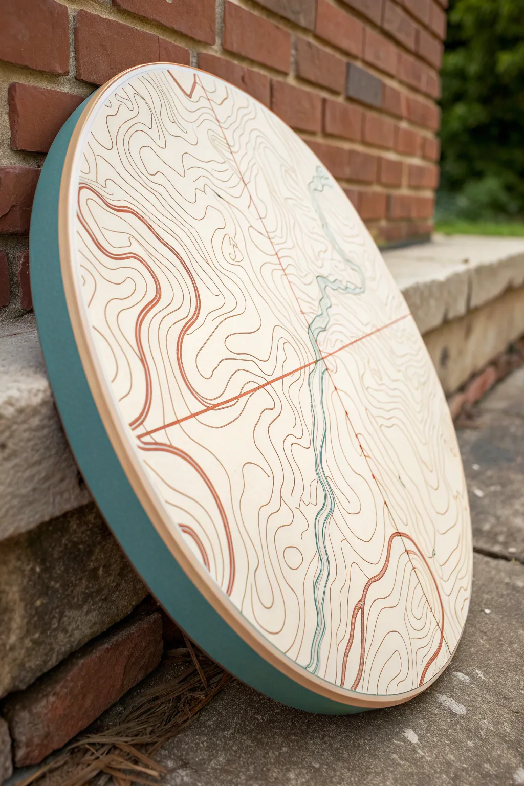
Transform a simple round canvas into a striking piece of modern map art using organic lines and a muted, earthy color palette. This project combines the natural flow of topographic contours with a pop of teal on the edge for a contemporary finish that looks great on any wall.
Step-by-Step
Materials
- Round wooden panel or stretched canvas (12-18 inch diameter)
- Acrylic paints: cream/off-white (base), terra cotta, burnt sienna, deep brown, teal/blue-green
- Fine liner brushes (sizes 0 and 00)
- Flat brush (1 inch) for base coat
- Pencil and eraser
- Ruler
- Mixing palette
- Painter’s tape (optional)
Step 1: Prepping the Surface
-
Base coat application:
Begin by painting the entire face of your circular panel with the cream or off-white acrylic paint. Use your large flat brush for smooth, even coverage. -
Second layer:
Once the first coat is dry to the touch, apply a second coat to ensure the wood grain or canvas texture is fully obscured and the background is solid. -
Edge painting:
While the face dries, paint the thick outer edge of the panel with your teal paint. This creates a bold frame that will tie in with the river details later. -
Clean borders:
I like to carefully check the rim where the teal meets the cream face. If you have a shaky hand, you can use painter’s tape to mask off the dry cream face before painting the edge.
Step 2: Drafting the Map
-
Divide the space:
Using a ruler and a very light pencil touch, draw a large ‘X’ or cross dividing the circle into four roughly equal quadrants. This helps structure your map composition. -
Sketch the river:
Draw a wiggly, organic line flowing from top to bottom, generally following the vertical line of your cross but meandering naturally like a real river. -
Start the contours:
Begin sketching the topographic lines around the river. These lines should never cross each other. Think of them as ripples in water or tree rings extending outward. -
Create distinct zones:
Sketch a few focal points where the lines form tighter circles to represent peaks or hills, then let the lines spread out wider for flatter terrain. -
Line variation:
Ensure your lines are not perfectly parallel; let them bulge and squeeze together to create visual interest and simulate diverse landscape features.
Steady Hand Pro Tip
For ultra-smooth lines, dilute your heavy body acrylics with a high-flow medium or water until it creates an inky consistency that glides off the brush.
Step 3: Painting the Lines
-
Mix your colors:
Prepare your palette with your earth tones: terra cotta, burnt sienna, and deep brown. Add a thinning medium or a drop of water to make the paint flow like ink. -
Painting the quadrant lines:
Using a medium-tone terra cotta and your fine liner brush, paint over your initial straight pencil cross lines. This structural element acts as the skeleton of the map. -
River detail:
Switch to your teal paint (the same shade as the edge) and carefully paint the central river line. You can add a second thinner line parallel to it to give the water more weight. -
Trace the contours (Light):
Start painting the topographic lines using the lighter burnt sienna color. Focus on the wider, more open areas of the map first. -
Trace the contours (Dark):
Switch to the darker deep brown for the lines that are tightly packed together or define the steepest peaks, adding depth to the composition. -
Hand position:
Rest the side of your hand on a clean scrap of paper or a bridge to keep it steady while doing this fine detail work. Good lighting is crucial here. -
Varying line weight:
Intentionally make some lines slightly thicker than others. In real topo maps, ‘index contours’ are bolded, so mimicking this adds realism. -
Cleanup:
Once the paint is completely dry (give it at least an hour), use a clean eraser to gently remove any visible pencil marks that weren’t covered by paint.
Shaky Lines?
Don’t stress over wobbly lines! Nature is imperfect. If a line goes astray, thicken it slightly to correct the curve, or turn the mistake into a new terrain feature.
Hang your abstract cartography piece and enjoy the adventurous spirit it brings to your room
3D Shell Beach Texture
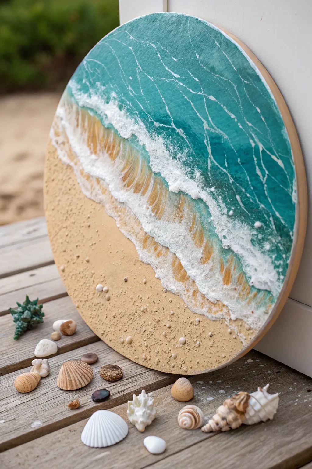
Capture the essence of the shoreline with this stunning 3D mixed media project on a round canvas. By combining actual sand texture with impasto wave techniques, you’ll create a tactile piece that feels like a slice of the beach.
Step-by-Step Tutorial
Materials
- Round stretched canvas (approx. 12-16 inch diameter)
- Acrylic paints: Turquoise, Phthalo Blue, White, Yellow Ochre, Burnt Sienna
- Texture paste or modeling paste (heavy body)
- Fine craft sand or real beach sand
- Gloss medium or pouring medium
- Palette knives (assorted sizes)
- Flat brushes (1-inch and small detail brush)
- Tiny sea shells and small pebbles
- Strong craft glue (like E6000) or heavy gel medium
- Water cup and paper towels
Step 1: Setting the Scene
-
Plan the horizon:
Visualize a diagonal line across your round canvas where the water meets the shore. The composition works best if the sand takes up about one-third to one-half of the circle. -
Mix the sand base:
In a cup, mix your texture paste with a generous amount of Yellow Ochre and a tiny touch of Burnt Sienna to create a warm ‘wet sand’ color. Add a spoonful of actual sand to this mixture for gritty realism. -
Apply the beach:
Using a palette knife, spread the sandy mixture onto the bottom section of your canvas. Don’t smooth it out perfectly; varying the thickness adds to the organic feel. -
Embed the treasures:
While the paste is still wet, gently press your tiny shells and small pebbles into the ‘sand’ near the bottom edge. Push them deep enough so the paste grip them as it dries. -
Let it cure:
Allow this sandy section to dry completely. This creates a solid barrier so your ocean paints won’t muddy up the beach texture later.
Natural Texture
Don’t have texture paste? Mix baking soda into your acrylic paint and glue mixture. It creates a gritty, puffy texture perfect for sand and sea foam.
Step 2: Painting the Ocean Depth
-
Base coat the water:
Paint the upper section of the canvas with a mix of Turquoise and a little White. Near the top edge, blend in some Phthalo Blue to suggest deeper water. -
Create the gradient:
While the paint is wet, blend a lighter turquoise (more white added) as you move closer to the sand line. The water should be palest right where it is about to meet the beach. -
Add water movement:
Mix a glaze using Gloss Medium and a tiny bit of white paint. Use a fine liner brush or the edge of a clean palette knife to create thin, irregular wiggly lines and marbling in the darker water to mimic light refraction.
Level Up: Resin Finish
Pour a thin layer of clear epoxy resin over just the water section after painting. It creates a glass-like depth that makes the ocean look incredibly realistic.
Step 3: Sculpting the Waves
-
Prepare the foam mixture:
Mix a fresh batch of heavy modeling paste with pure Titanium White acrylic paint. You want this to be thick and stiff, holding its shape like frosting. -
Build the first wave:
Using a palette knife, apply a thick ridge of the white paste right over the transition line where the blue water meets the dried sand texture. -
Shape the crash:
Pull the white paste slightly backward into the blue water to create the ‘back’ of the wave, and tap the front edge with the knife to create a rough, foamy texture. -
Add secondary waves:
Create a second, smaller ridge of white paste further out in the blue water. Keep this one thinner and more broken up than the main shoreline crash. -
Add wash-up foam:
Apply very thin, semi-transparent smears of white paint (dry brushing works well here) extending from the main wave onto the textured sand, mimicking the water receding. -
Highlight the water:
Once the main colors are dry, use a small brush to add distinct white highlights on the blue water between the white foam ridges to show wetness and sparkle.
Step 4: Final Details
-
Deepen the shadows:
Mix a watery glaze of Burnt Sienna. Carefully paint a thin shadow line right underneath the thickest part of the white foam wave where it casts a shadow on the sand. -
Shell detailing:
If your embedded shells got covered in paint, gently wipe them clean with a damp Q-tip or touch them up with a bit of clean paint or varnish to make them shine. -
Seal the piece:
Once absolutely everything is dry (give the thick paste 24 hours), apply a coat of gloss varnish over the water area to make it look wet, leaving the sand matte for contrast.
Hang your circular seascape in a well-lit spot where the shadows can play off the textured waves throughout the day
Negative Space Eclipse Glow
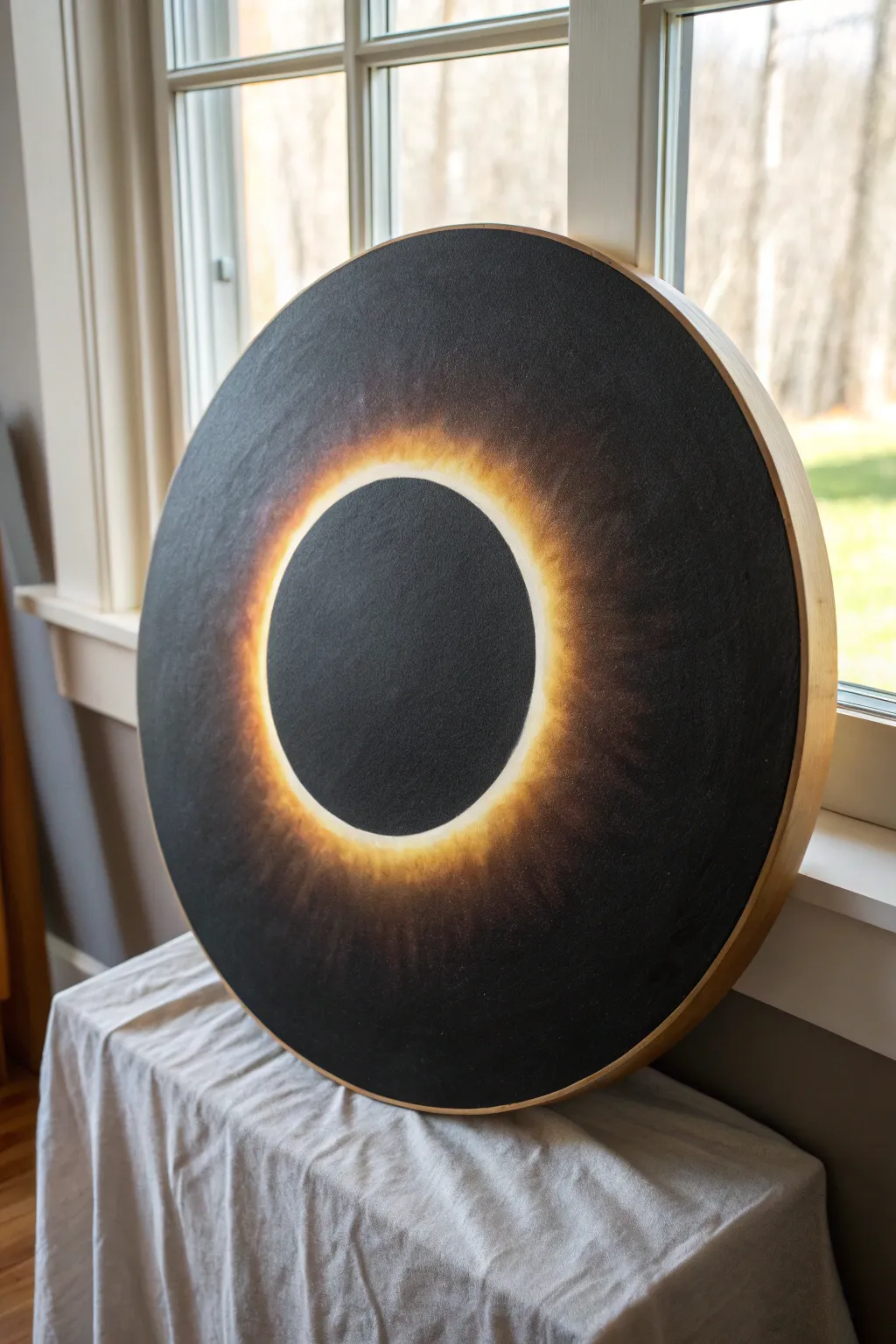
Capture the ethereal drama of a solar eclipse with this striking negative space painting. By building up layers of luminous acrylics behind a stark black silhouette, you’ll create a glowing halo effect that seems to radiate light from the canvas.
Step-by-Step
Materials
- Large round stretched canvas (24-inch or similar)
- Heavy body acrylic paints: Carbon Black, Titanium White, Cadmium Yellow, Cadmium Orange, Burnt Umber
- Large flat brush (2-inch)
- Medium round brush
- Small detail brush or stiff bristle brush
- Circular object or compass for tracing
- Chalk or pencil
- Painter’s tape or a large stencil (optional)
- Matte or satin varnish
Step 1: Preparation and Mapping
-
Prime the surface:
Begin by ensuring your round canvas is clean. If it isn’t pre-primed black, apply two smooth coats of Carbon Black acrylic over the entire surface, including the edges. Let this dry completely to create a uniform dark base. -
Mark the center:
Find the exact center of your round canvas. This symmetry is crucial for the eclipse effect to feel balanced and realistic. -
Outline the moon:
trace a perfect circle in the center using chalk. You can use a dinner plate, a bowl, or a large compass. This inner circle represents the moon blocking the sun and will remain pure black throughout the painting process.
Fixing Wobbly Circles
If your central black circle isn’t perfect, use a paper plate as a shield. Hold it firmly over the center and paint the glow outward from its edge for a crisp line.
Step 2: Creating the Corona Glow
-
Lay the foundation:
Using a medium round brush, mix a dark, warm brown using Burnt Umber and a touch of Cadmium Orange. Paint a ring roughly 2-3 inches wide just outside your chalk line, feathering the edges outward aggressively. -
Intensify with orange:
While the brown layer is still slightly tacky but mostly dry, start layering pure Cadmium Orange. Apply this closer to the chalk line, again brushing outwards in radial strokes to simulate rays of light. -
Build the yellow brightness:
Mix Cadmium Yellow with a little Orange. Apply this concentrated color in a tighter ring towards the center circle. Use a dry brushing technique here—wipe most of the paint off your brush and scrub the color on to create a soft, hazy texture. -
Add the blinding light:
Mix Titanium White with a tiny amount of Yellow. This is your brightest value. Paint a very thin, energetic line right up against the chalk boundary. Determine the ‘hot spots’ of the eclipse create slight irregularities; eclipses are rarely perfectly uniform all the way around. -
Blend the transition:
With a clean, dry stiff-bristle brush, gently scumble the edges where the yellow meets the orange and the orange meets the black background. You want a soft, misty fade rather than hard lines.
Step 3: Defining the Negative Space
-
Re-establish the silhouette:
The glowing paint likely overlapped your initial chalk circle. Take your Carbon Black and a steady hand (or your stencil/plate) and repaint the perfect black circle in the center. -
Sharpen the edge:
I find it helpful to use a small detail brush for this specific edge. The contrast between the pure black moon and the bright white-yellow rim must be razor-sharp to create that visual ‘pop’ sensation. -
Darken the outer corners:
Inspect the outer edges of your canvas. If any glow traveled too far, glaze over it with a wash of watered-down Carbon Black to push those areas back into the shadows.
Diamond Ring Effect
Add a singular, intensely bright starburst at one point on the ring’s edge to simulate the famous ‘diamond ring’ effect just before totality.
Step 4: Fine Tuning and Finish
-
Add subtle flares:
Mix a translucent glaze of orange and painting medium. Add faint, whisper-thin streaks radiating outward into the black space to suggest the sun’s corona extending further out. -
Check visibility:
Step back about five feet from the canvas. The glow should look like it’s emitting light. If it looks flat, add another layer of pure white mixed with yellow right at the very boundary line. -
Clean the perimeter:
Paint the wooden rim of the canvas (if it’s a gallery wrap) or the side edges black to match the background, ensuring a professional look from all angles. -
Seal the work:
Once the thickest paint layers have dried for at least 24 hours, apply an even coat of matte or satin varnish. A glossy varnish might reflect too much room light and ruin the illusion of the deep black void.
Hang your new celestial masterpiece near a natural light source to see how the glow shifts throughout the day

Have a question or want to share your own experience? I'd love to hear from you in the comments below!